

A magnolia drawing is one of those projects that rewards you the moment you sit down with it: a few soft petals, a quiet branch, and suddenly the page feels like spring. Colored pencil suits this flower perfectly, letting you build those blush pinks and creamy whites in slow, gentle layers until the bloom glows against the white paper.
Below you will find 27 magnolia scenes, from a single blossom resting on an open book to a full tree glowing at dusk. Each one is sized to fit a single sitting, so pick whichever calls to you first and let the pencils do the rest.
Using these images: free for personal projects such as printing, coloring, cards, journals and gifts. Handmade items that include them may be sold up to 30 pieces per design. More than that is commercial use and is not permitted, and neither is selling or sharing the images themselves or passing them off as your own. Please ask before any other use.
Start with the vase itself, a simple cylinder or tapered jar drawn lightly in graphite so you have a clean container for the branch. Keep the glass mostly white paper with just a few curved pencil lines to suggest the rim and a soft grey shadow along one edge, since glass reads best when you draw around it rather than filling it in.
Place the branch next, angling it so it leans slightly rather than standing dead straight, which keeps the whole piece relaxed. Block in two or three large blossoms in pale pink and cream, working from the center of each petal outward, then add the smaller buds and leaves last so they do not compete with the open flowers.
The common slip here is making the vase too detailed and the flowers too flat. Spend your blending energy on the petals, where soft pink fades into white gives the whole drawing its quiet, elegant feel, and leave the glass loose.
If you do not have a pale pink pencil, layer a light red very softly over white paper and blend with a colorless blender to soften it instantly.
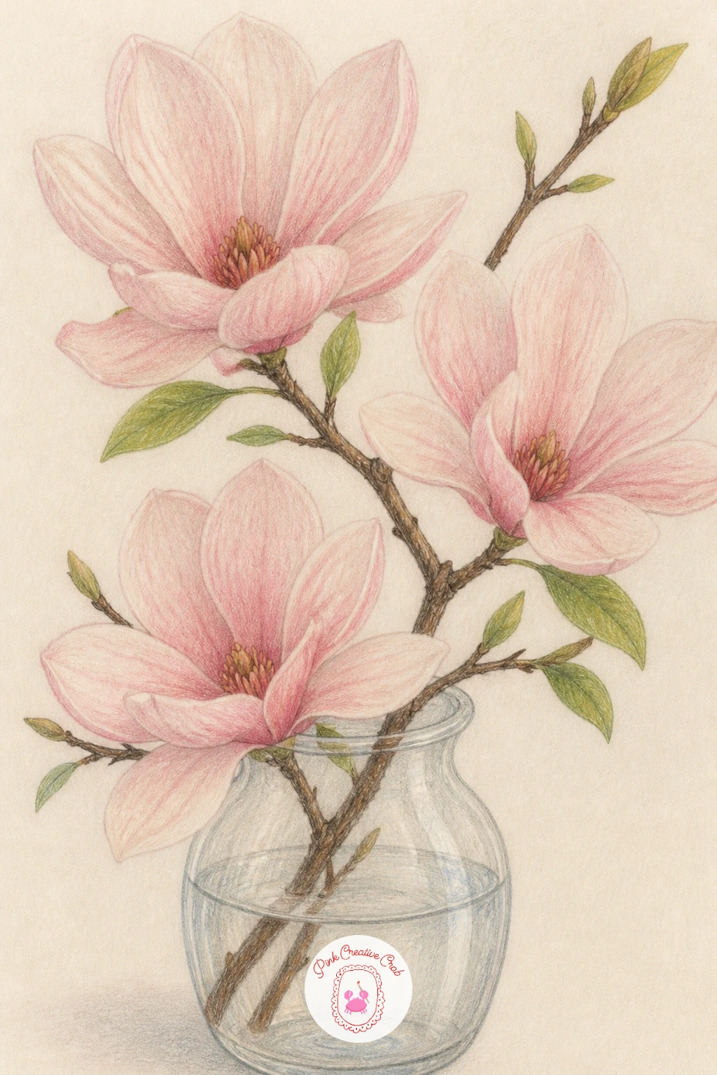
Palette: Blush Pink,Cream,Sap Green,Burnt Umber
Building a whole tree can feel daunting, so measure before you draw a single branch: compare the tree’s height to the width of a nearby fence post or doorway sketched lightly in the background, and let that ratio guide how tall you make the canopy. This keeps the tree from accidentally towering over or shrinking against the house beside it.
Rough in the trunk and main branches first in light brown, letting them fork unevenly rather than symmetrically, since real magnolia branches rarely split in neat pairs. Then build the canopy as overlapping clusters of pink, not individual blossoms, working from the back of the tree toward the front so nearer clusters sit darker and more detailed.
A front garden needs just enough context to feel like a scene: a strip of green lawn, a fence line, maybe one path stone, nothing more. If the tree starts looking too busy, step back and simplify the lawn to a single flat tone.
No pink pencil set on hand? Mix a warm red lightly with white pencil pressed on top to lift and soften it into blossom pink.
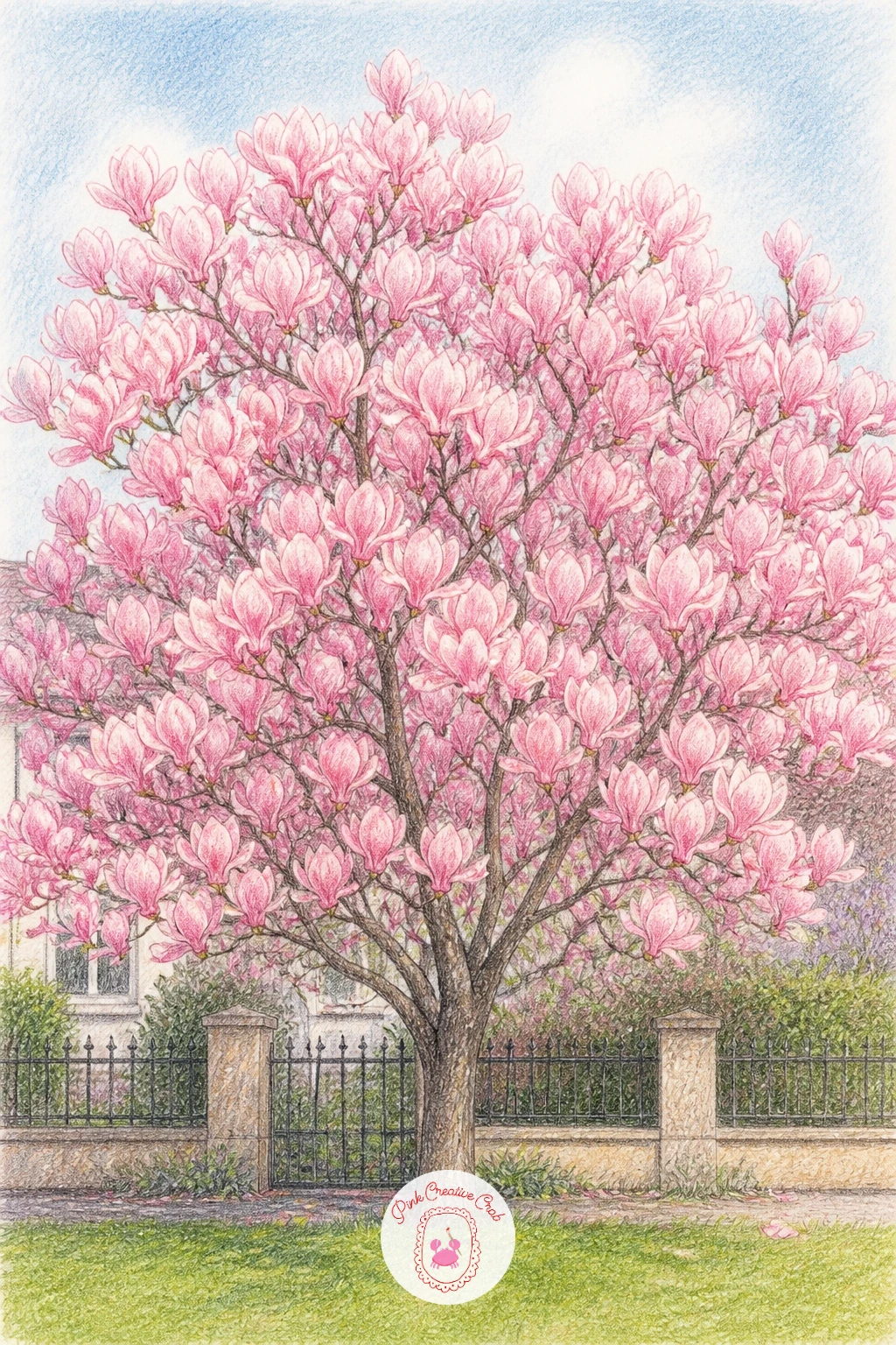
Palette: Carmine Pink,Cream,Grass Green,Burnt Umber
Choosing where the eye sits changes everything here: set your viewpoint slightly above the book, looking down at a gentle angle, so the cover reads as a flat plane and the bloom sits clearly on top of it rather than floating beside it. That downward eye line is what sells the whole still life.
Draw the book first as a simple rectangle with a slightly thicker spine edge, keeping the cover in a muted color like dusty blue or soft brown so it never competes with the flower. Once that is settled, build the magnolia bloom directly on top, letting a petal or two overlap the book’s edge to anchor it in place.
Light from one side matters more than you expect: pick a direction, keep every shadow on the same side of the petals and the book, and the whole piece will feel coherent even if the drawing itself stays loose.
If you want this to feel even more intimate, this pairs nicely with other quiet botanical studies, the kind found among butterfly drawing pencil ideas that also rest a single subject on a plain surface.
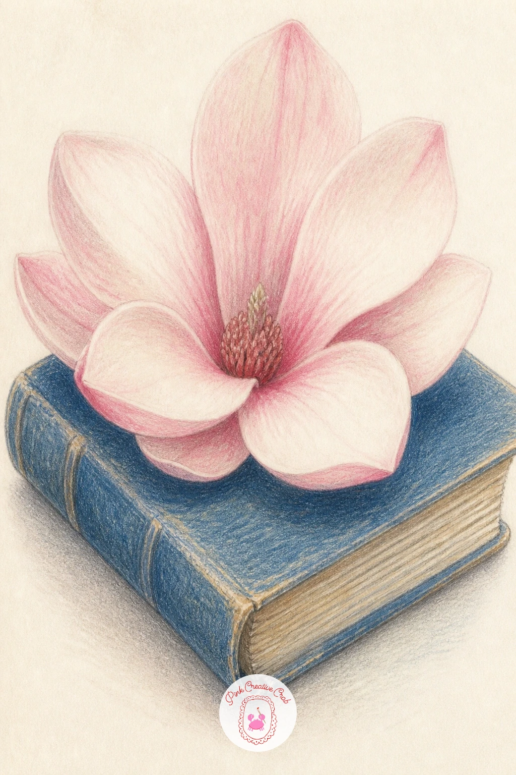
Palette: Blush Pink,Dusty Blue,Cream,Burnt Umber
Scatter comes next, after flowers that stay whole and contained. Sketch a simple path first, two converging lines going back into the page with a few paving cracks or gravel texture kept light, since the path is only a stage for the petals.
Drop the petals in loosely, varying their size and rotation so none face the same direction, then shade one edge of each petal a touch darker to lift it off the stone. Working larger petals in the foreground and smaller, paler ones further back gives the path real depth without any extra linework.
The place this goes wrong is overcrowding, petals piled edge to edge until the path disappears. Leave generous bare paper between clusters so the eye can rest, and the scene reads as a breezy spring moment rather than a mess.
For the quick version, ten minutes gets you a dozen loose petals and a plain path; the forty-minute version adds cast shadows under each petal and a soft tonal gradient along the stone to suggest afternoon light.
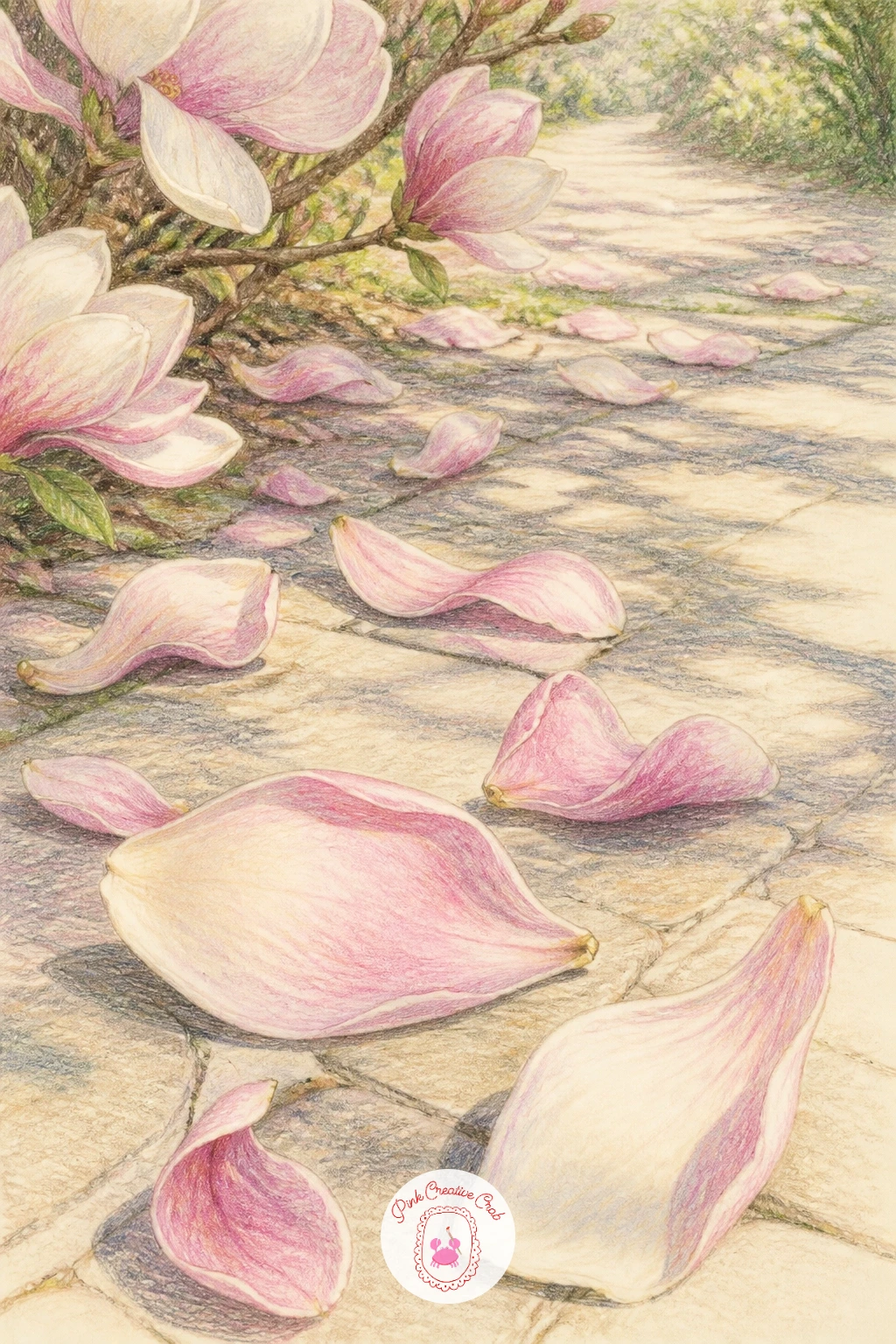
Palette: Blush Pink,Plum,Warm Grey,Cream
Perching birds live or die on proportion, so compare the bird’s body length to the thickness of the branch beneath its feet before you commit to a size. A bird roughly twice as long as the branch is wide usually looks believable perched rather than balanced precariously.
Draw the branch first, a confident curving line in brown, then add the bird’s body as a simple teardrop shape gripping the branch with two small curved lines for feet. Build the blossoms around and slightly behind the bird so it reads as part of the scene rather than pasted on top.
If you enjoy drawing birds, this pairs naturally with ideas from a dedicated bird pencil drawing session, where posture and feather direction get more room to explore.
Keep the bird’s coloring simple, soft grey or warm brown, so the pink blossoms stay the star of the piece rather than fighting for attention.
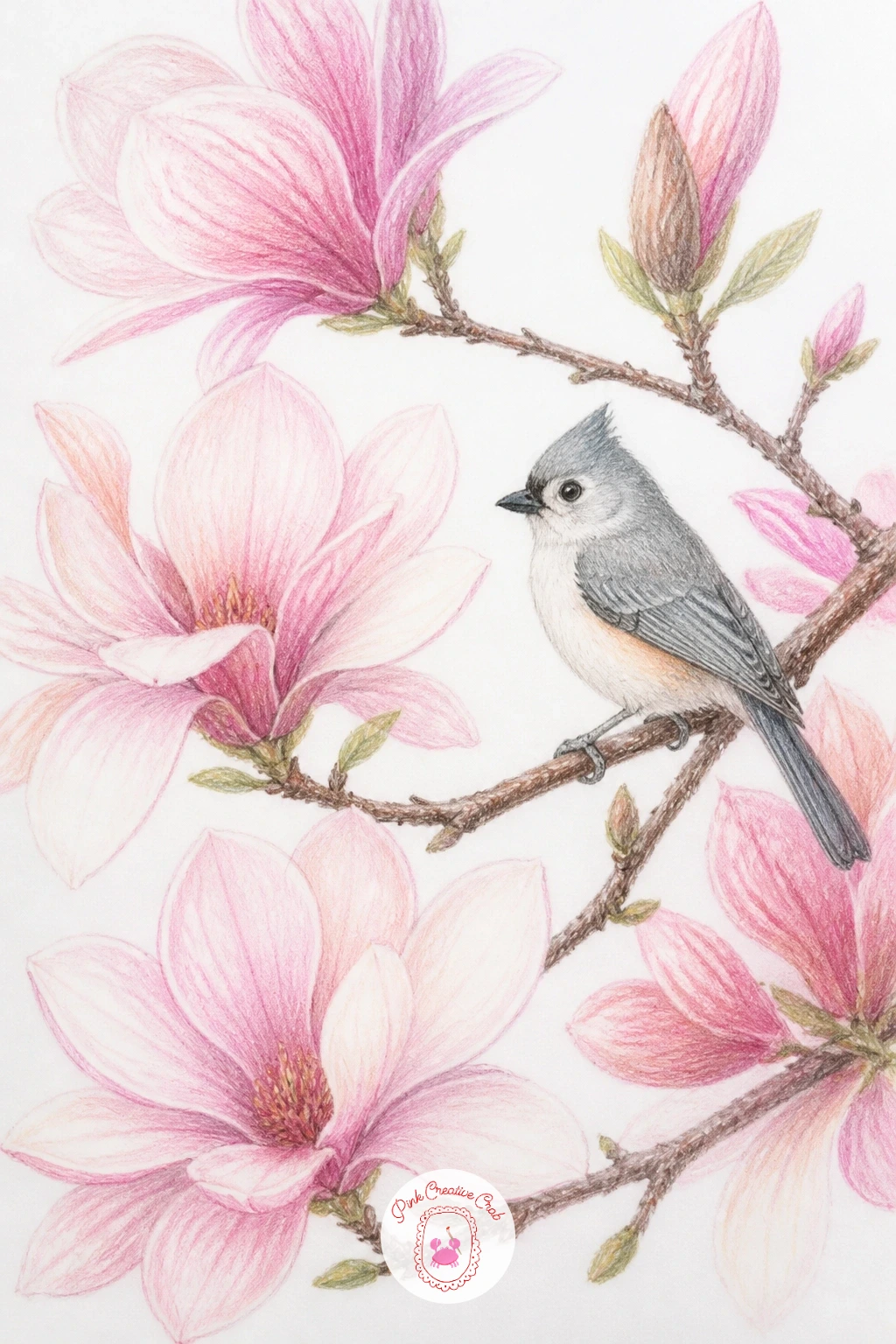
Palette: Blush Pink,Warm Grey,Burnt Umber,Cream
Zooming in close means the petal edges carry the whole drawing, so this is the idea to practice lifting color for texture. Lay down a very light grey-blue shadow layer across the petal first, then use a kneaded eraser pressed and lifted, not rubbed, to pull out pale veins and highlight streaks running from base to tip.
Start with the center of the bloom, the cluster of soft yellow stamens, and work outward petal by petal, keeping each one slightly different in curve and shadow so the flower feels alive rather than symmetrical. White petals need gentle grey, blue and violet shadows to read as white at all, since untouched paper alone looks flat.
The usual mistake is outlining every petal edge in hard pencil line. Instead, let petals meet through shifts in shadow value, and the edges will look soft and natural.
No kneaded eraser handy? A rolled bit of white tack or even a soft pencil eraser corner works almost as well for lifting small highlights.
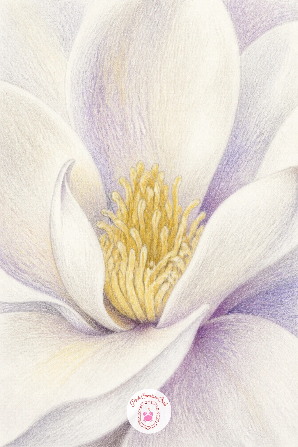
You Will Need
- kneaded eraser
Palette: Titanium White,Pale Violet Grey,Soft Yellow,Sap Green
Circles are unforgiving if they are not planned, so lightly trace a dinner plate or bowl to get a true round guide before adding a single blossom. Erase the guide lightly once your branch shapes are placed, keeping just a faint trace to follow.
Build the wreath from greenery first, a ring of loose leaves and twigs following your circle, then tuck magnolia blossoms into three or four clusters around the ring rather than spacing them evenly, which looks more natural and less like a clock face. Vary bloom size so the eye moves around the circle instead of landing on one spot.
Wreaths often end up looking heavy on one side once finished. Step back, squint at the drawing, and add a small bud or leaf to whichever side feels empty.
If a plate is not handy, trace the rim of a mug or a roll of tape for a smaller, equally accurate circle.
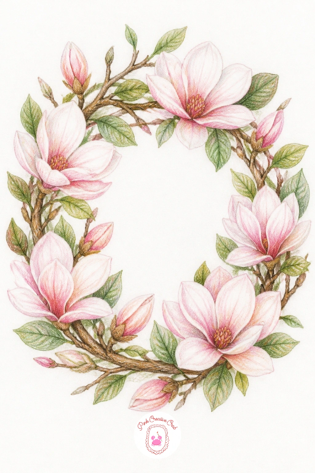
You Will Need
- a plate or bowl to trace a circle
Palette: Blush Pink,Sap Green,Cream,Burnt Umber
A teapot arrangement needs its container to feel solid before any flowers go in, so draw the teapot first as two linked ovals (body and lid) with a simple curved spout and handle, keeping proportions generous and round rather than tall and narrow. A squat teapot reads instantly as cozy and domestic.
Let one or two magnolia stems rise from the spout opening, angling them in different directions so the arrangement feels gathered rather than stiff. Shade the teapot in a soft solid color, white, sage or soft blue china tones work beautifully, and keep its surface simpler than the blossoms so attention stays on the flowers.
If the teapot’s shadow looks too dark and heavy, soften it with a blending stick in small circular motions until it fades gently rather than sitting as a hard grey patch.
No colored pencil in a matching china tone? A pale grey-green pencil over white paper gives a convincing soft celadon finish.
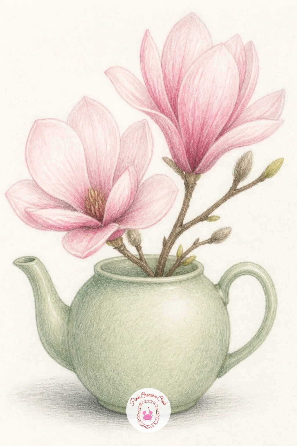
Palette: Sage Green,Blush Pink,Cream,Burnt Umber
Working out where the figure sits in the scene starts with the horizon: place the girl’s eye level roughly a third of the way up the page, with the tree’s lowest branches arching just above her head, so the canopy feels sheltering rather than distant.
Draw her as a simple standing or seated silhouette first, a soft dress shape and loosely sketched hair, since detailed faces are not needed for this scene to feel warm and complete. Build the tree around and slightly behind her, letting a few petals drift down near her shoulders to connect the two.
If figures feel tricky, this pairs well with ideas from girl pencil drawing practice, where posture and simple clothing folds get dedicated attention.
Keep her clothing in one soft, muted color so the pink blossoms above her stay the brightest, most eye-catching part of the whole piece.
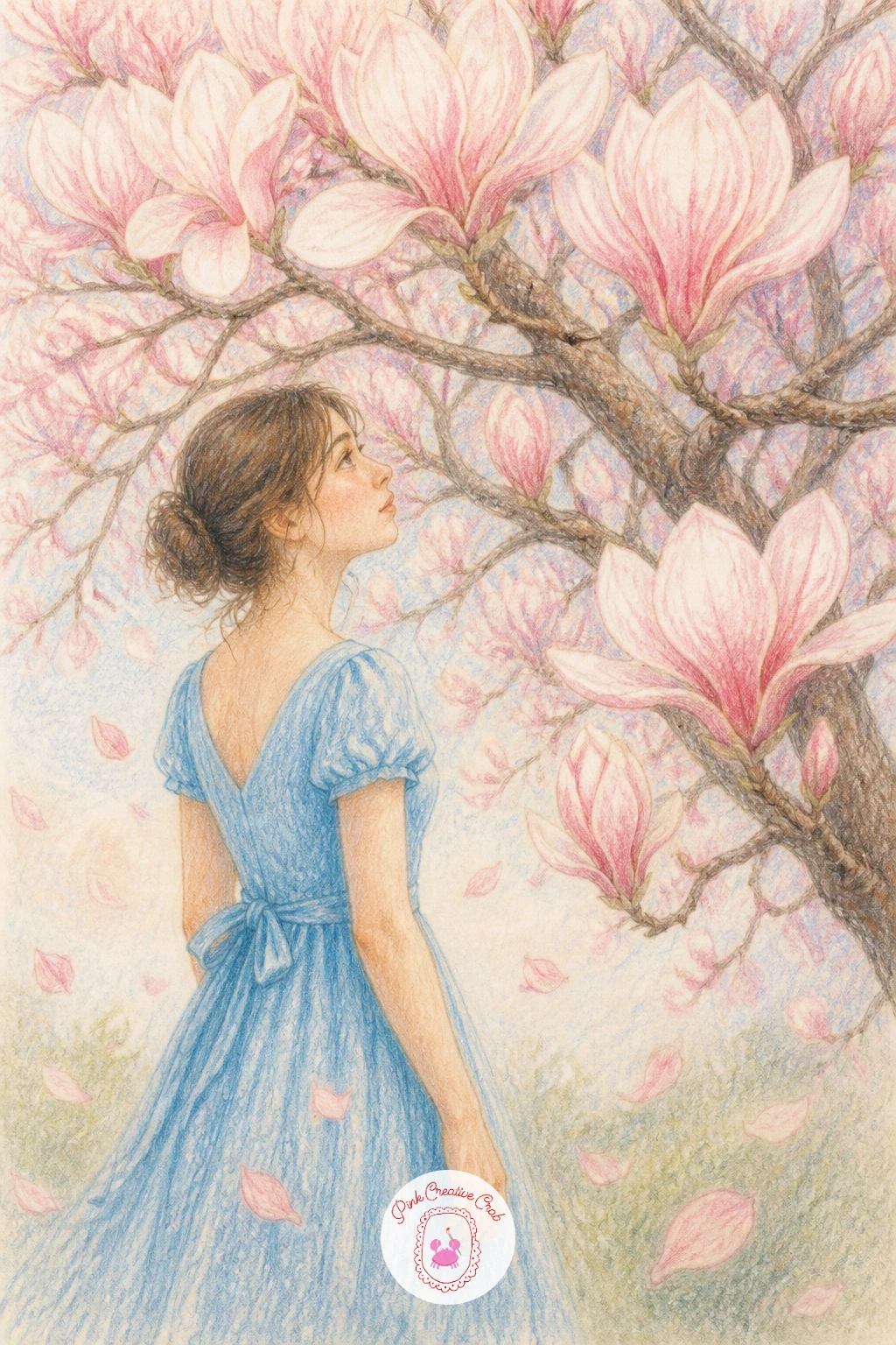
Palette: Blush Pink,Dusty Blue,Cream,Burnt Umber
Capture a bud mid-opening rather than fully closed or fully bloomed, since that in-between moment is what makes this idea interesting. Start with the furry outer sepal, a soft grey-brown casing drawn with short, slightly rough pencil strokes to suggest its fuzzy texture, before any pink appears.
Let two or three petal tips peek out from the top of the casing, colored in the palest blush you have, deepening slightly toward their base where they meet the sepal. Keep the stem short and simple, since the bud itself carries the whole drawing.
The fuzzy sepal is the one place dry brush-style pencil work really helps: use light, quick, slightly scratchy strokes rather than smooth blending, which keeps that soft, slightly hairy texture believable.
If your grey-brown pencil feels too flat, layer a little warm orange underneath it first for a more lifelike, slightly dusty casing.
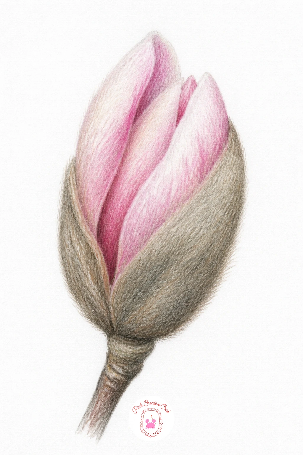
Palette: Grey Brown,Blush Pink,Cream,Burnt Umber
Pair the bloom with a simple teacup to build a cozy little still life, perfect if you only have ten minutes: sketch the cup as an oval rim and curved body with a small loop handle, add a flat saucer beneath, and lean one magnolia stem gently against the cup’s side. That quick version alone makes a complete, charming piece.
Given forty minutes instead, add steam rising from the cup in a few soft curling grey lines and a light cast shadow stretching from the cup toward the flower, which ties the two objects together convincingly on the table.
Keep the cup’s pattern minimal, a thin colored rim or one small detail, so it never competes with the blossom beside it. Simplicity here reads as elegant rather than unfinished.
If you do not have a true teacup reference handy, any round mug works just as well as a stand-in shape.
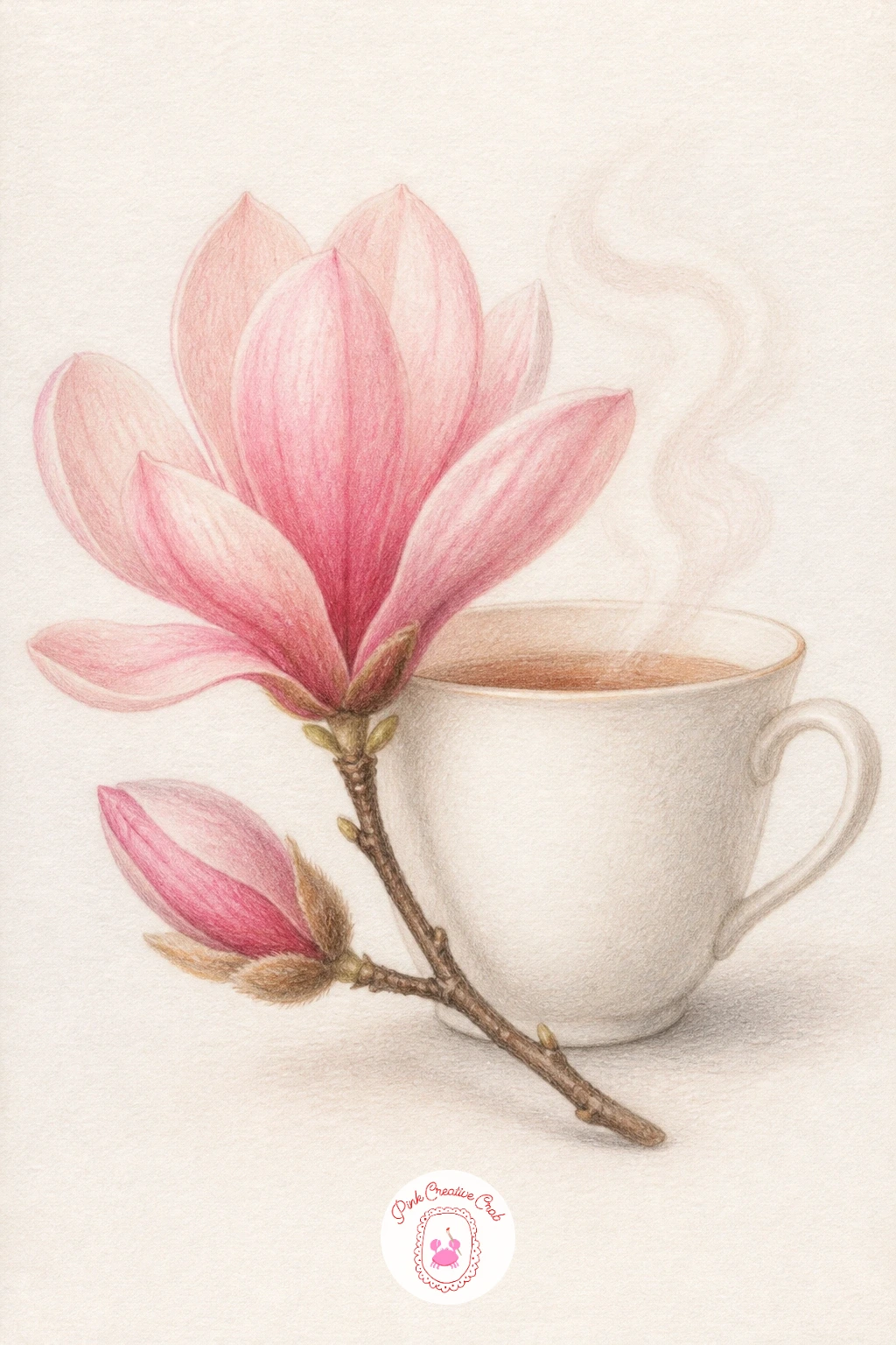
Palette: Blush Pink,Cream,Warm Grey,Sap Green
Perspective carries this whole scene, so set your eye level low, roughly where a seated person’s eyes would be, and let both rows of magnolia trees lining the path shrink and converge toward a single point in the distance. That single vanishing point is what turns two tree rows into a believable alley.
Block in the path first as two converging lines, then place trees along each side, largest and most detailed in the foreground, smaller and softer in color toward the back where distance naturally mutes color and detail.
Canopies can overlap the path edges loosely, letting a few drooping branches arch inward, which makes the alley feel enclosed and romantic rather than just two rows of trees side by side.
If the perspective feels off, lightly rule two straight guidelines in pencil first, erase them once your trees are placed, and the alley will hold together.
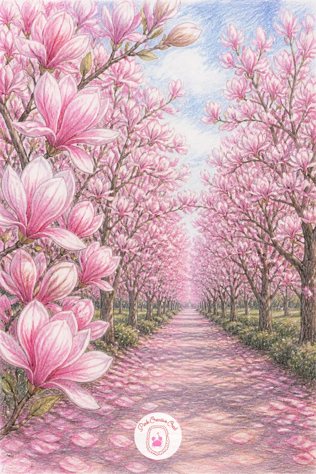
Palette: Blush Pink,Dusty Lilac,Sap Green,Warm Grey
Frame the whole scene with a window this time, drawing a simple square or arched frame first with a visible sill, since the window edges do most of the compositional work here. Keep the glass itself mostly untouched white paper, just a faint diagonal pencil line for reflection.
Let a magnolia branch arch in from one side as though growing just outside, with a blossom or two pressing close to the glass as if peeking in. Shade the area beyond the window softly, a pale wash of grey-green suggesting garden without any real detail, so the branch stays the clear focus.
Window scenes can look stiff if the frame is too rigid. Soften the sill’s edge slightly and let one petal rest right on it, which relaxes the whole composition instantly.
If you enjoy cozy framed scenes like this, a similar quiet charm shows up in village scene drawing ideas that also use a window or doorway as a frame.
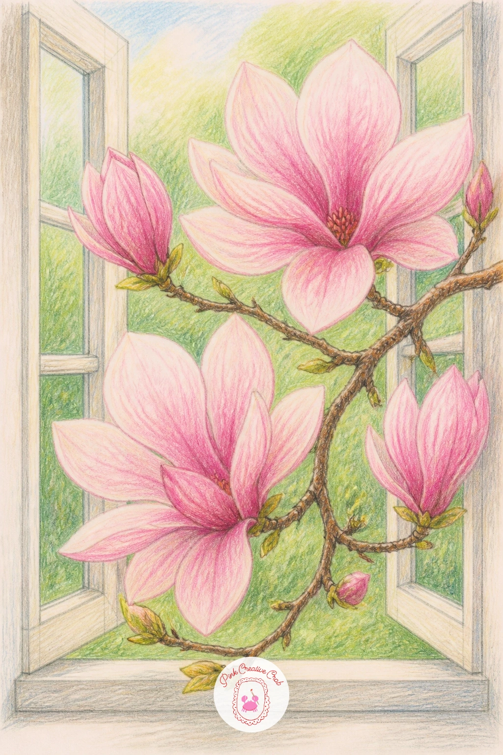
Palette: Blush Pink,Pale Grey Green,Cream,Burnt Umber
Star magnolias differ from the classic cup-shaped bloom in one key way, so measure before shading: count the narrow, strap-like petals radiating from the center (usually ten to fifteen) and sketch them as thin, pointed shapes rather than the rounder petals used elsewhere in this list. That petal count is what makes a star magnolia read correctly.
Work from the center outward, placing the small cluster of stamens first, then building each narrow petal individually so they overlap only slightly near the base. Keep the color paler than other magnolia blooms, closer to white with just a blush at the petal base, since star magnolias are naturally lighter.
The common error is drawing petals too wide, which turns the flower into a generic blossom. Keep them slim and slightly irregular in length for an authentic star shape.
If your pencil set lacks a true near-white pink, barely touch pale pink to the paper and blend it almost away with a colorless blender.
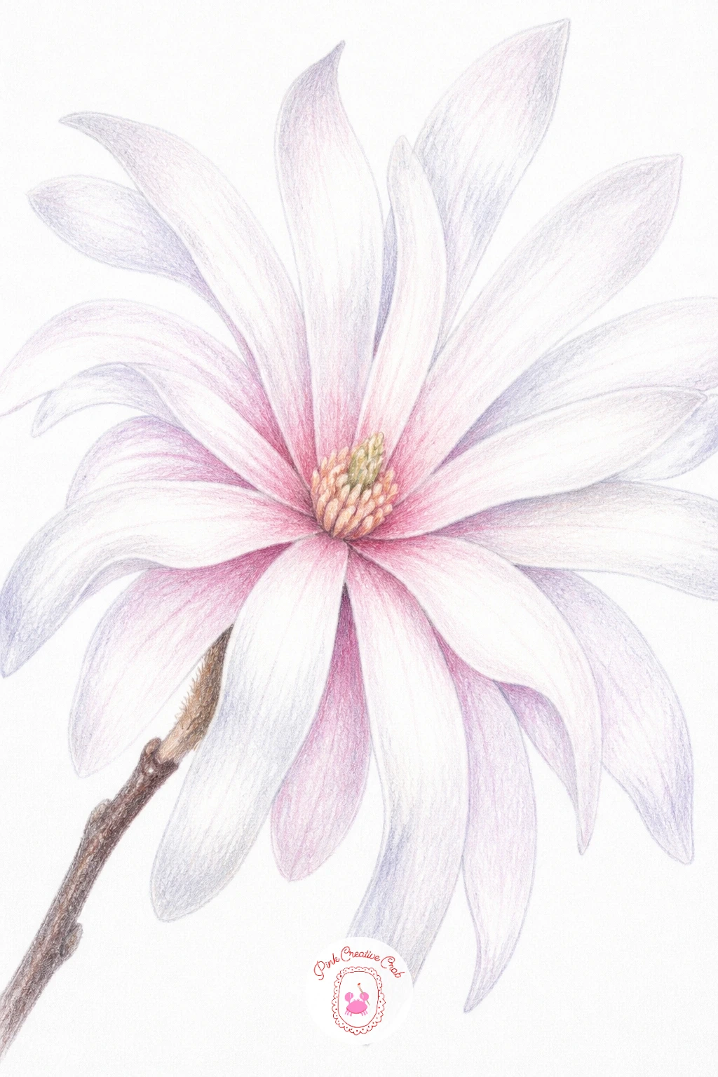
Palette: Near White,Pale Blush,Burnt Umber,Sap Green
Place a single bloom resting on an open envelope or folded letter for a quiet, romantic still life. Draw the paper first, a simple rectangle with a soft fold crease and one torn or deckled edge, in warm cream rather than stark white so it reads as aged stationery.
Rest the magnolia stem diagonally across the paper, letting one petal edge overlap onto the page itself, which anchors the flower firmly in the scene rather than floating above it. A faint shadow beneath the stem sells the contact completely.
Keep any suggested handwriting on the letter as loose wavy lines rather than real words, just enough texture to suggest writing without distracting from the flower resting on top.
This idea pairs beautifully with soft, nostalgic paper textures, the kind explored in vintage junk journal pages if you enjoy that aged paper feeling.
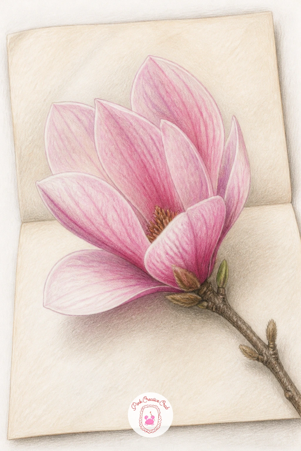
Palette: Cream,Blush Pink,Warm Grey,Sap Green
Scale matters enormously once an insect joins the scene, so compare the bee’s body length to a single petal’s width before drawing it in: a bee should sit noticeably smaller than one petal, which keeps the whole drawing believable at a glance.
Draw the blossom first, fully open and facing slightly toward the viewer so there is a clear landing spot at its center, then add the bee perched among the stamens with simple oval body segments and two small transparent wing shapes left mostly as white paper with just a faint outline.
Keep the bee’s stripes simple, two or three bands of black and warm yellow, since too much detail on something this small makes it look cluttered rather than delicate.
If fine linework for the wings feels tricky, a very light grey pencil line is easier to control than black and still reads clearly against the pink petals.
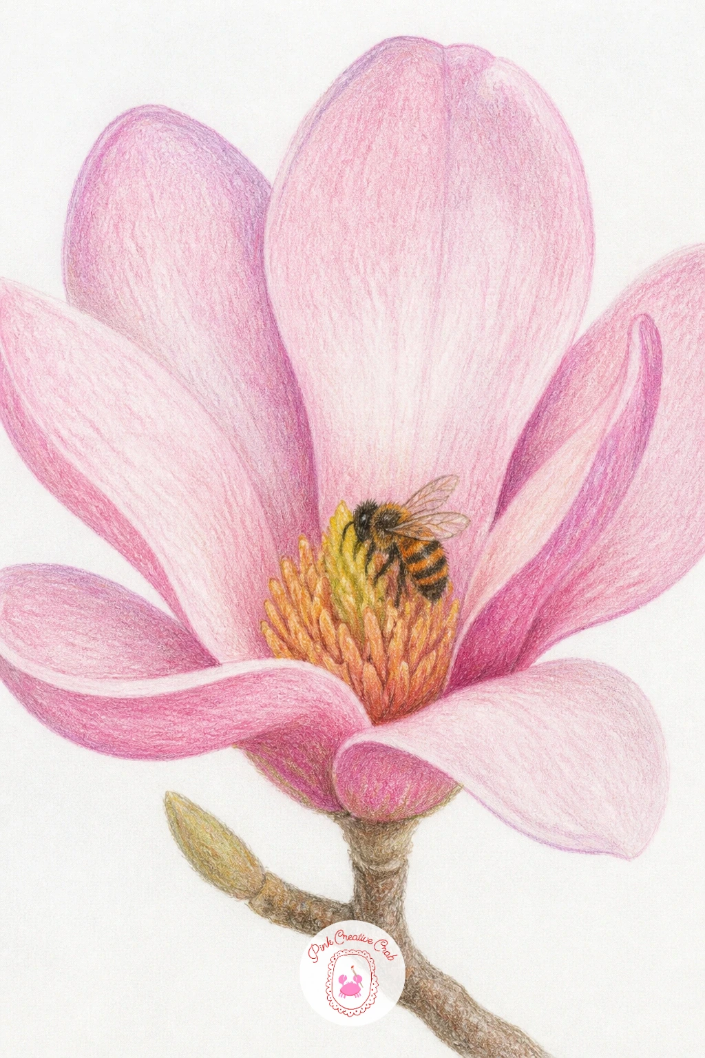
Palette: Blush Pink,Soft Yellow,Charcoal Grey,Cream
Look at real bee photos for wing placement if this is your first time drawing one. Wings sit flat and slightly angled back, never upright like a butterfly’s.
Gather a small bundle of stems into a woven basket for a cozy, gathered-from-the-garden feeling. Draw the basket first as a simple rounded container, suggesting the weave with short diagonal pencil strokes rather than drawing every individual reed, which keeps it looking handmade rather than stiff.
Let three or four magnolia stems rise from the basket at slightly different heights and angles, since uniform stems look artificial. Work the largest, most open bloom toward the front and let smaller buds tuck in behind.
If the basket’s weave texture starts looking too busy, simplify it to just a few key strokes along the rim and base, leaving the middle mostly smooth. The eye fills in the rest.
No basket reference on hand? A simple rounded flowerpot works just as well as a container and is quicker to draw.
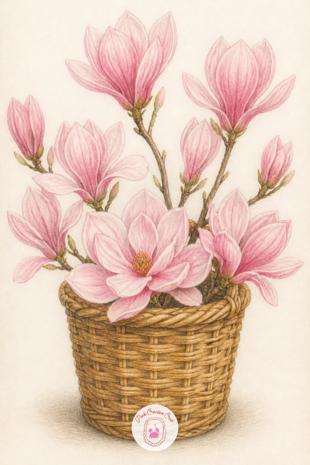
Palette: Burnt Umber,Blush Pink,Sap Green,Cream
Vary the usual palette for this one, since yellow magnolias exist and make a lovely change of pace once the pink and white versions feel familiar. Layer a pale lemon base across each petal first, then deepen toward the petal base with a warm gold or soft orange, blending the two gently so the transition feels natural rather than banded.
Build the bloom with the same open, layered petal structure used for the white close-up idea, just with this warmer color story, and keep the leaves a slightly cooler green so they do not clash with the yellow tones.
Yellow can look washed out if left too pale throughout, so make sure at least the petal centers carry real depth of color, even if the outer edges stay soft and light.
If you do not own a true soft yellow pencil, layer pale pink under light yellow for a warmer, more golden tone.
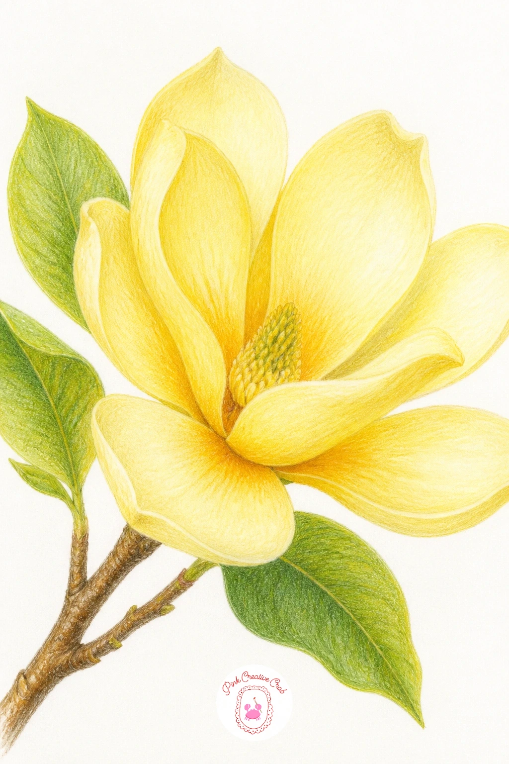
Palette: Pale Lemon,Warm Gold,Sap Green,Burnt Umber
Place a blooming tree beside a simple white house for a scene that feels like a storybook spring morning. Draw the house first as a plain rectangular shape with a triangular roof and a few simple window squares, keeping every line straight and the walls left mostly white paper with just soft grey shadow along one edge.
Position the tree beside or slightly in front of one corner of the house, letting its canopy overlap the roofline a little, which ties the two shapes together instead of leaving them as separate elements side by side.
Keep the house simpler than the tree in every way: fewer colors, flatter shading, minimal detail. The blossoms should be the most alive, most colorful part of the whole piece.
If straight architectural lines feel tricky freehand, lightly rule the house’s edges with a ruler before adding the tree by hand.
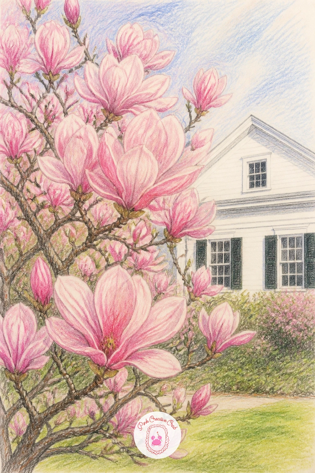
Palette: Blush Pink,Warm Grey,Sap Green,Cream
Circular compositions need a steady base, so trace a bowl shape using a mug or small plate as a guide before adding a single petal. Draw the bowl’s rim as a simple ellipse, keeping the inside mostly pale blue-grey to suggest water without drawing every ripple.
Scatter petals across the water’s surface, some fully visible and flat, others angled as though just settling, with a small soft reflection beneath each one to anchor it to the water rather than letting it float awkwardly above the bowl’s surface.
Reflections are the forty-minute addition here: a quick version skips them entirely and still looks charming, while adding faint mirrored color beneath each petal brings real depth once you have more time.
If ellipses feel difficult freehand, draw a square first, then round its corners gradually into an oval shape.
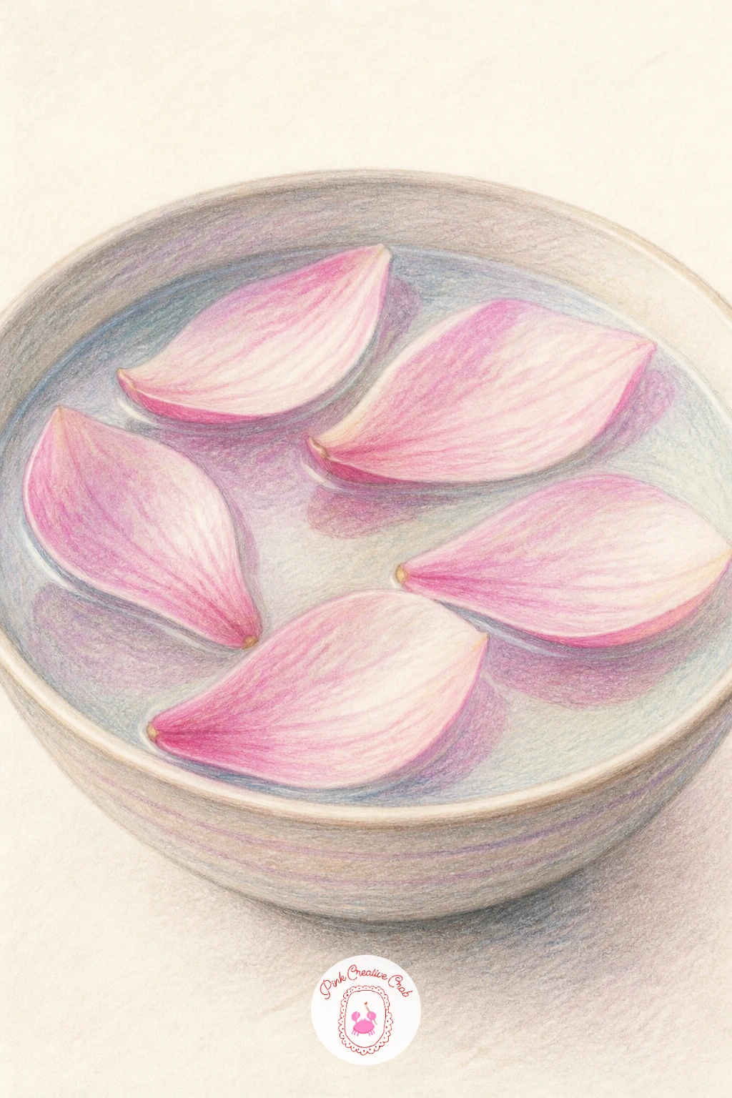
You Will Need
- a mug or plate to trace a circle
Palette: Pale Blue Grey,Blush Pink,Cream,Warm Grey
Build a delicate flower crown by thinking of it as a wreath designed to curve around a head rather than lie flat, so sketch a gentle arch shape first, wider and lower at the sides, higher in the middle, before placing any blossoms.
Tuck three or four magnolia blooms along the arch at varied angles, filling gaps between them with small leaves and buds so no bare twig shows through. Let one larger bloom sit slightly off-center as the visual anchor, which feels more natural than perfect symmetry.
Crowns can start looking flat if every blossom faces forward. Angle a few blooms slightly sideways or partly turned away, which gives the whole piece more dimension and movement.
If you enjoy delicate crown and wreath subjects like this, a similar decorative sensibility runs through aesthetic coloring page designs built around circular wreaths and garlands.
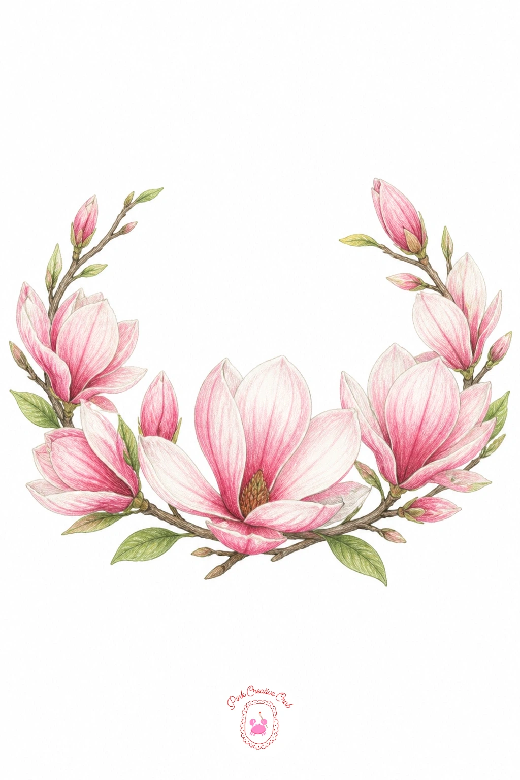
Palette: Blush Pink,Sap Green,Cream,Burnt Umber
Light and weather work together in this one, so decide where a soft, overcast light sits (usually flat and from above with no strong shadow side) before you touch pink to paper, since rain scenes read best with muted, even tones rather than sharp contrast.
Draw the tree first in slightly cooler, more muted pinks and greys than a sunny version would use, then add rain as a series of thin, closely spaced diagonal pencil lines over the whole scene, lightest over the blossoms and slightly heavier in the background sky.
Wet petals on the ground benefit from a little sheen, so leave a thin streak of bare white paper along one edge of each fallen petal to suggest reflected light on wet stone.
If straight diagonal rain lines feel shaky freehand, use the edge of a ruler as a guide for just the first few lines to set the angle, then continue by hand.
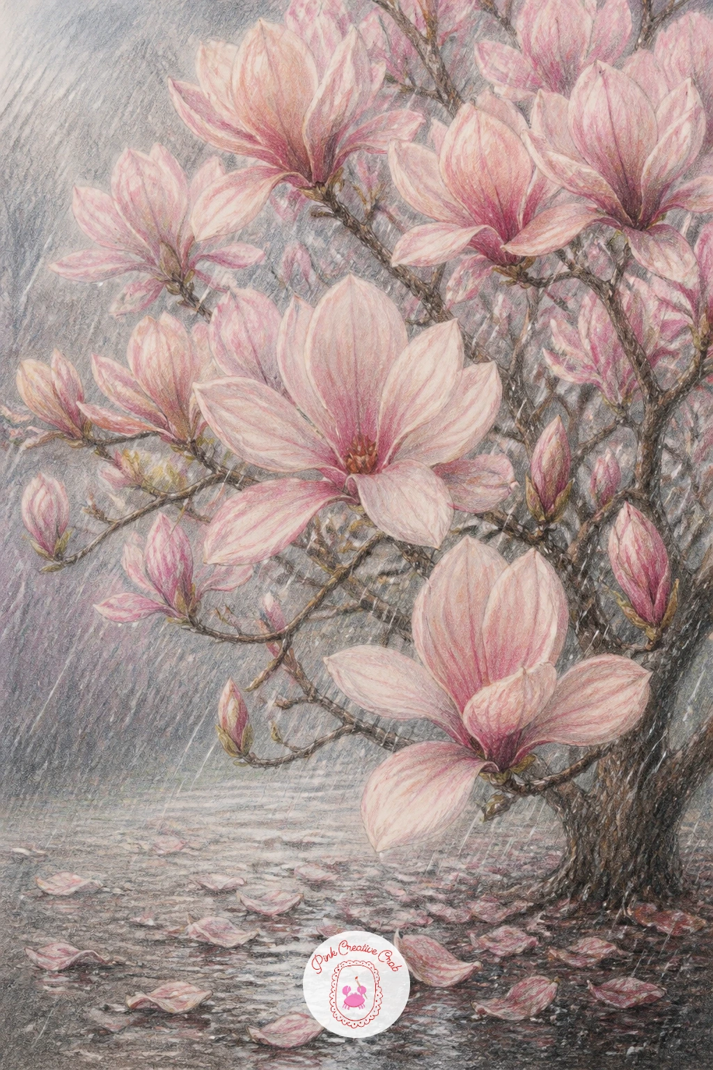
Palette: Muted Pink,Warm Grey,Sap Green,Cool Grey
A bouquet is really several magnolia ideas gathered into one tight cluster, so plan the overall shape first as a loose teardrop or rounded triangle before adding a single bloom, which keeps dozens of petals from turning into a shapeless blob.
Place two or three large open blooms as the visual anchors near the bouquet’s center, then fill around them with smaller buds, greenery and a trailing ribbon or two at the base tied in a simple bow, drawn last so it does not get buried under the flowers.
Bouquets look best with the most finished blooms toward the front and simpler, softer ones receding behind, so save your most detailed blending for just those two or three anchor flowers.
If ribbon folds feel tricky, keep the bow simple: two loops and two trailing tails, shaded with just one darker line along each fold.
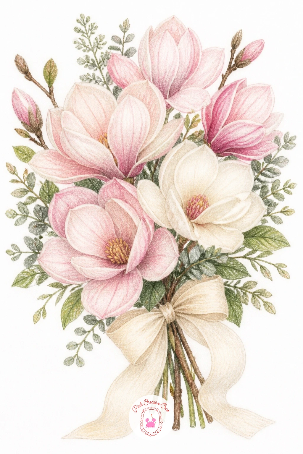
Palette: Blush Pink,Cream,Sap Green,Ivory Ribbon
Table settings ask for a sense of looking slightly down at a flat surface, so keep your eye level high and every object (plate, napkin, branch) drawn as a shallow ellipse or flattened shape rather than viewed straight on, which makes the whole arrangement feel like a tabletop rather than a wall.
Draw a simple plate and folded napkin first, keeping both pale and minimally patterned, then lay a magnolia branch diagonally across one corner of the setting, letting it overlap the plate’s edge slightly to tie the elements together.
Keep cutlery, if you include any, reduced to simple thin shapes with minimal shading, since fussy metal reflections will pull focus from the soft blossoms resting beside them.
If ellipses for the plate feel uneven, lightly trace a small saucer or coaster for a perfectly round guide before adding the napkin and branch.
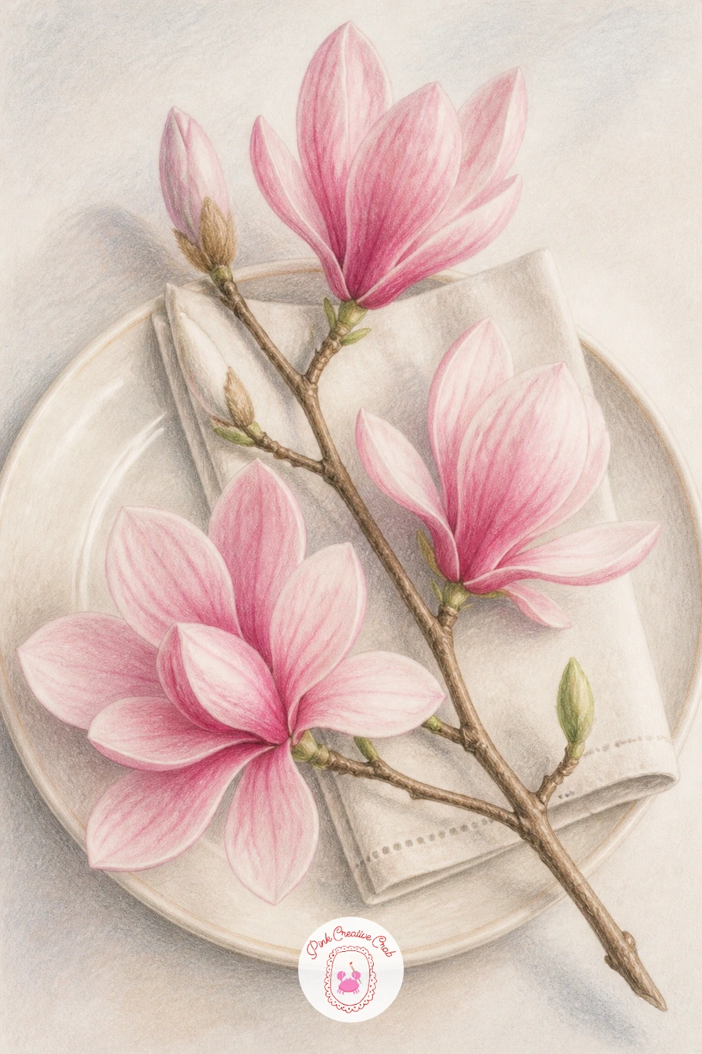
You Will Need
- a saucer or coaster to trace a circle
Palette: Cream,Blush Pink,Warm Grey,Sap Green
Fabric changes how the flower sits on the page, so this time let the blossoms follow soft, draped folds rather than a flat, static layout. Sketch the scarf first as a loosely curved rectangle with a few gentle fold lines, as though it is lying casually across a surface rather than pinned flat.
Place magnolia blossoms and leaves along the fabric, letting them bend slightly at each fold line so the pattern feels printed onto real cloth rather than floating above it. Keep the repeat loose and irregular rather than perfectly even, since hand-drawn scarves feel warmer with a little natural variation.
Shadows along the folds matter more here than on any other idea in this list: a soft grey line along each crease is what convinces the eye this is fabric and not flat paper.
If fold shadows look too harsh, soften them immediately with a blending stick in light circular strokes.
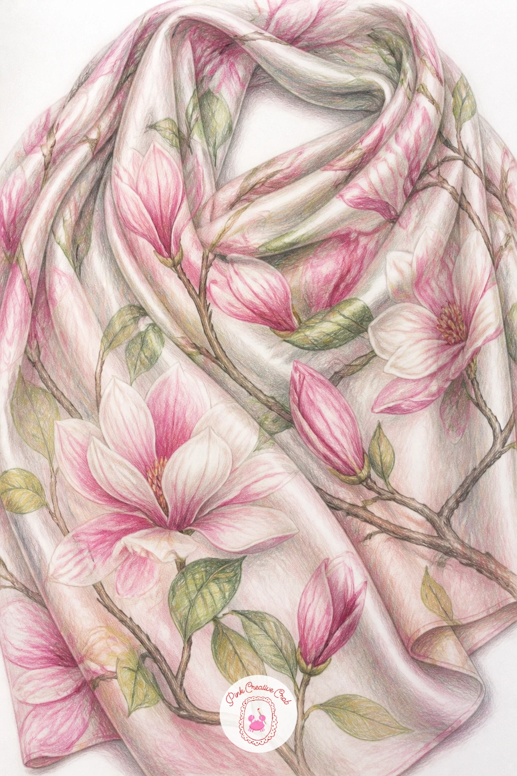
Palette: Blush Pink,Plum,Cream,Warm Grey
Seed pods make a lovely, less common addition to a magnolia collection, since most people draw only the bloom. Draw the pod’s cone-like cluster shape first, slightly bumpy and irregular rather than smooth, using warm brown and rust tones instead of the pinks used everywhere else in this list.
Add the small bright red or orange seeds peeking from open segments of the pod last, since these little spots of warm color are what make the whole subject recognizable and give the drawing its focal point.
Texture is everything here: use short, slightly rough pencil strokes across the pod’s surface rather than smooth blending, which captures its naturally knobby, dried look far better than flat shading would.
If you do not have a true rust-colored pencil, layer orange and brown together, darker underneath and warmer on top, for a convincing dried pod color.
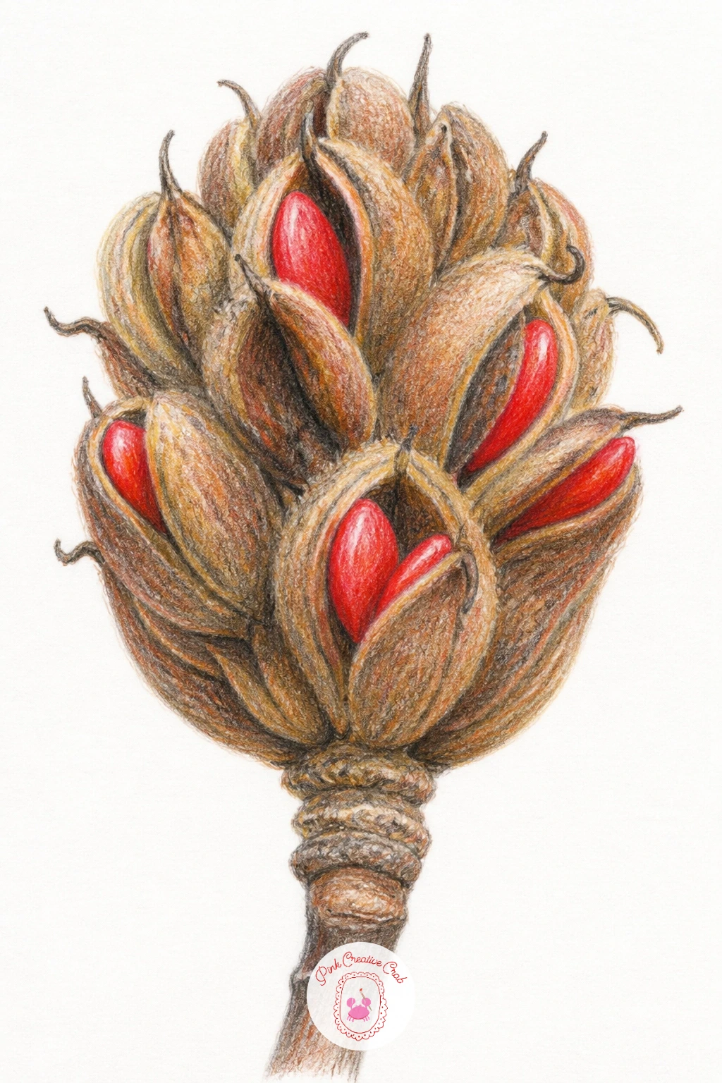
Palette: Rust,Burnt Umber,Scarlet,Warm Grey
Close the series with a quieter mood, since dusk changes nearly every color decision made so far. Decide where the fading light sits, usually low and warm along one horizon edge, and let that warm glow touch just the tops of the blossoms while the rest of the tree sinks into cooler, deeper tones.
Build the sky first in soft layered purples, dusty blues and a touch of warm peach near the horizon, blended smoothly before the tree goes on top, since a painted sky is much easier to work around than one squeezed in later.
Shade the tree itself darker and more muted than any daytime version in this list, saving your palest, warmest pink only for blossoms catching that last direct light. This single contrast is what makes a dusk scene feel convincing rather than just a dimmer daytime tree.
If blending a smooth sky feels difficult, work in small circular motions with a blending stick, moving from the darkest edge toward the lightest.
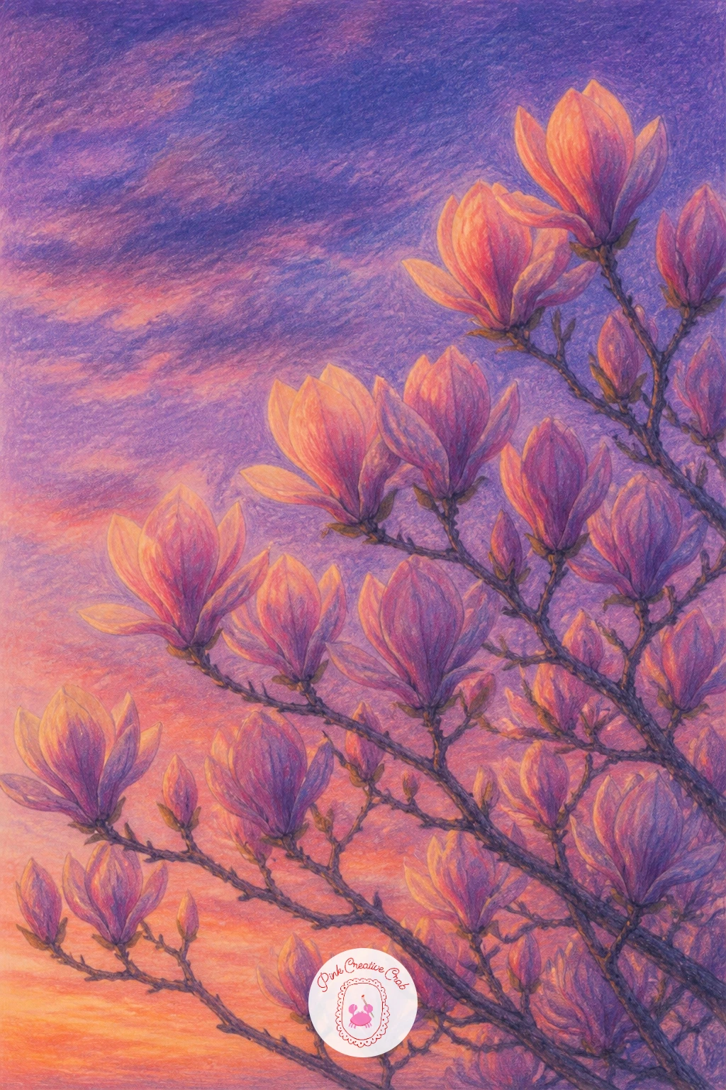
Palette: Dusty Purple,Muted Pink,Peach,Deep Umber
What to Do Next
Pick whichever magnolia idea matches your mood today, grab a sheet of smooth white paper, and let the first bloom guide your pencil before you worry about the rest of the scene.
Frequently Asked Questions
What is the easiest way to start a magnolia drawing?
Start with a single bloom on plain paper before attempting a full branch or tree. Block in the overall petal shape loosely first, then layer color from the center outward, building depth gradually rather than going dark too soon.
Which colored pencils work best for magnolia petals?
Soft blush pink, cream and pale violet grey give the most realistic petal tones. Layer them lightly and blend with a colorless blender or blending stick so transitions stay smooth rather than streaky.
How do you make white magnolia petals look white on white paper?
Add pale grey, blue or violet shadows between petals rather than leaving everything blank. Those cool shadow tones are what make the untouched white paper actually read as a white flower.
How do you keep magnolia branches from looking stiff?
Draw branches at uneven angles with occasional small forks rather than straight symmetrical lines. Real branches twist and lean, so a little irregularity makes the whole drawing feel more natural.
Can a beginner draw a magnolia tree in one sitting?
Yes, a simplified tree with loosely blocked canopy clusters and a basic trunk takes most beginners well under an hour. Skip individual leaf and petal outlines and build the canopy in soft overlapping shapes instead.
Have any thoughts?
Share your reaction or leave a quick response — we’d love to hear what you think!
-
 0
-
0
-
0
-
0
-
0
-
0


