

Carnation drawing gets a bad reputation it does not deserve. People picture a stiff grocery store bunch, but those ruffled petals are actually some of the most satisfying marks you can make in colored pencil, all those tiny folded edges building up into something soft and full on the page.
Below you will find carnations in every setting worth drawing, a buttonhole, a teacup, a wedding bouquet, a crown of petals, then a run of other frilly garden flowers that reward the same loose, layered touch. Pick whichever one is calling to you and keep your pencils close, because every idea here fits into one sitting.
Using these images: free for personal projects such as printing, coloring, cards, journals and gifts. Handmade items that include them may be sold up to 30 pieces per design. More than that is commercial use and is not permitted, and neither is selling or sharing the images themselves or passing them off as your own. Please ask before any other use.
Start simple with a pink carnation in a buttonhole, just one bloom and a lapel corner to frame it. Sketch the flower first with a light fineliner, a ragged circle for the petal mass sitting slightly off center, then add the suggestion of a jacket lapel as two straight folded edges below it.
Build the petals in carnation pink colored pencil using short jagged strokes that point toward the center, never a smooth curve, since that ragged edge is what reads as a carnation instead of a rose. Layer a deeper pink or coral into the shadow side where petals overlap, then leave the lightest petals almost bare paper.
Most beginners make the flower too round and tidy. Save it by going back in with your fineliner and adding a few stray torn edges once the pencil is down, which instantly loosens the whole shape.
If you do not have a coral pencil, mix pink and a touch of orange with light layered strokes instead. Finish today by adding one small green calyx shape where the petals meet the stem, it grounds the whole drawing in seconds.
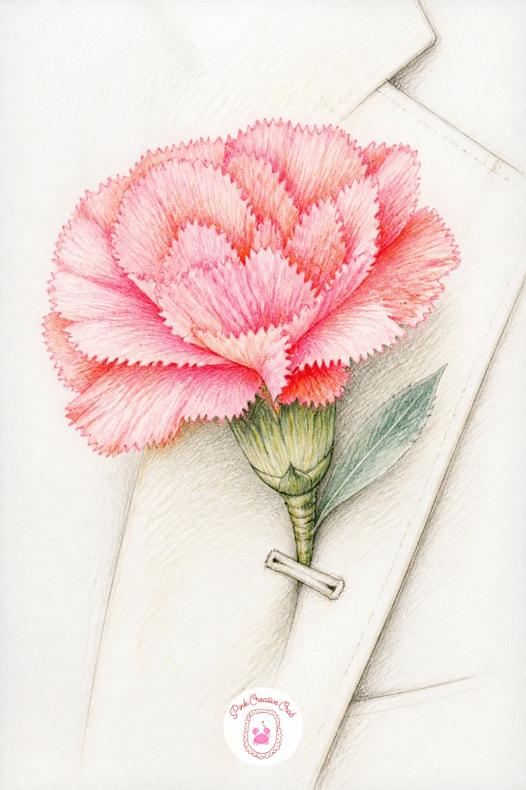
Palette: Carnation Pink,Coral,Sage Green,Cream
Once one carnation feels comfortable, try a bouquet of carnations in newspaper, the classic market-wrap bundle. Block in the wrapped cone shape first in fineliner, loose triangular folds of paper, then scatter five or six overlapping circles above it for the flower heads at different heights.
Work the carnations from back to front, lightest ones first in pale pink and cream, then add coral and deeper pink to the blooms sitting in front so they read as closer to you. The newspaper wrap itself just needs a few faint grey pencil lines suggesting print columns, nothing legible, plus a soft grey shadow along each fold.
The trouble spot is usually the overlap, where flowers start to merge into a flat pink mass. Rescue it by outlining two or three key petal edges in a slightly darker pink pencil to separate the blooms again.
No grey pencil on hand means a very light touch of your darkest neutral works fine. Finish by adding one or two sage green stems poking out from the paper for contrast.
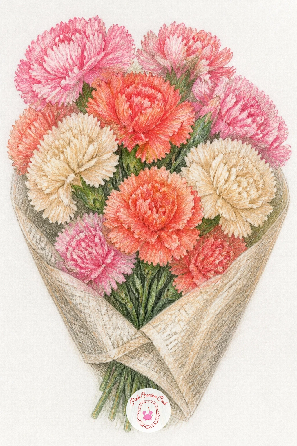
Palette: Carnation Pink,Coral,Payne’s Grey,Cream,Sage Green
A carnation in a bud vase is the perfect subject for practicing proportion, since the narrow glass next to the wide ruffled bloom makes any sizing mistake obvious right away. Measure first with your pencil held at arm’s length, comparing the vase height to the flower head width, most bud vases are taller than the bloom is wide, and that ratio is easy to lose once you start drawing.
Sketch the vase as a simple tapered cylinder in fineliner, keep the lines light so glass still reads as glass, then build the carnation head on top using the same ragged short strokes from before.
Color the glass with the thinnest possible layer of cream or pale grey, leaving white paper for highlights down one side, while the carnation gets full pink and coral layering. If the vase looks too heavy, erase a vertical strip of color with a kneaded eraser to open up a highlight.
A small jar works as a stand-in for any bud vase shape. Today’s tip: draw the waterline inside the glass as one faint curved line, it sells the whole vase instantly.
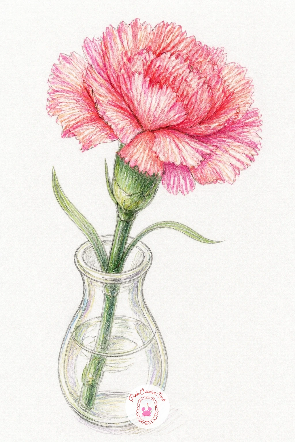
Palette: Carnation Pink,Coral,Pale Grey,Sage Green
Hold your pencil up against the drawing to double check the vase to flower ratio before you commit to color, it is much easier to fix in line than after layering.
Red carnations for Mother’s Day call for a slightly fuller cluster, three or four heads bunched close with no vase at all, just the flowers themselves filling the page. Start with overlapping circles in fineliner, varying the sizes so it does not look like a row of identical dots, then add the frilled petal edges radiating from each center.
Layer true red first as your base, then push a deep red or maroon into the overlap shadows and a touch of coral or pink into the lit petals facing the paper’s light source, assuming it comes from the upper left. That contrast between warm light and cool shadow is what makes red carnations look dimensional instead of flat.
Red can go muddy fast if you blend too much, so keep strokes short and let some white paper show between layers rather than pressing hard and smoothing everything out.
No deep maroon pencil means layering red over a little brown gets you there. A ribbon tied around the stems in a soft sage or cream color finishes the whole piece in one more pass.
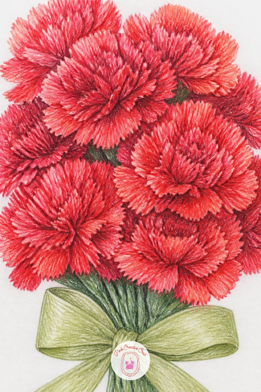
Palette: True Red,Maroon,Coral,Sage Green
A carnation behind an ear brings a small figure element into the mix, just the suggestion of hair and the curve of an ear tucked beside a single bloom. Keep the figure minimal, a few loose waves of hair in fineliner and one simple ear shape, so the flower stays the star of the drawing.
Think about light direction here before you color: if the light comes from the front, the hair strands facing you catch highlights while the carnation’s near side goes slightly brighter than its tucked underside. Pencil the hair in warm brown or a soft grey using long flowing strokes that follow its natural fall, then build the carnation in pink and coral exactly as before, letting a few petals overlap the hairline for depth.
Hair often ends up too stiff and helmet-like. Loosen it by varying stroke length and leaving gaps of white paper between sections rather than one solid block of color.
Skip the figure work entirely if you prefer and just draw the ear and a few hair strands as a small vignette. Add one tiny petal fallen below the ear as a finishing touch.
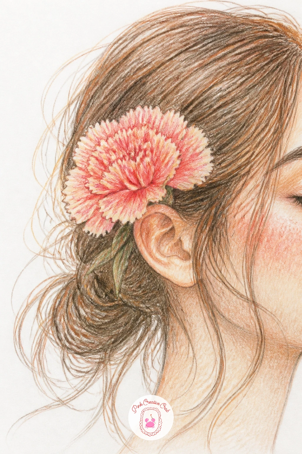
Palette: Carnation Pink,Coral,Warm Brown,Cream
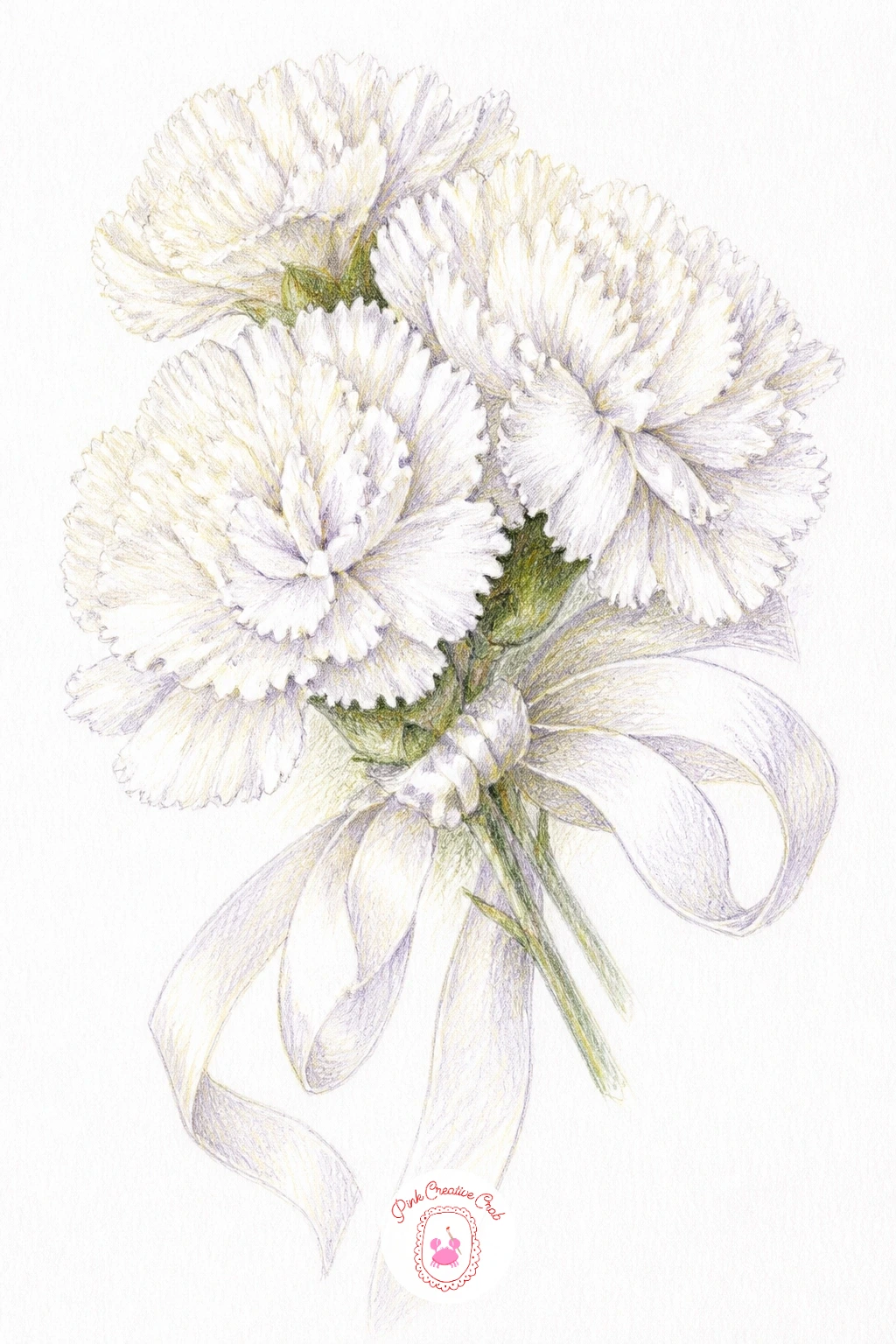
White carnations at a wedding push you to draw white on white, which sounds tricky but is really about shadow more than pigment. Sketch a small cluster of blooms as if tucked into a bridal bouquet, overlapping circles again, then add thin trailing ribbon lines curling below the flowers.
Instead of white pencil, build the whole flower using only shadow colors, a pale grey or lavender grey in the folds between petals and a hint of warm cream where light grazes the edges, leaving the paper itself as your brightest white. This is the forty-minute approach; the ten-minute version just blocks in a few shadow shapes loosely without worrying about every petal edge.
The flowers can disappear into the page if the shadows stay too light, so do not be afraid to push the grey a shade darker in the deepest overlaps than feels natural.
A pale blue pencil works as a swap for lavender grey if that is what you have. One strand of pearl-like white gel pen dots along the ribbon adds a nice final touch.
You Will Need
- white gel pen (optional)
Palette: Lavender Grey,Pale Grey,Cream,Sage Green
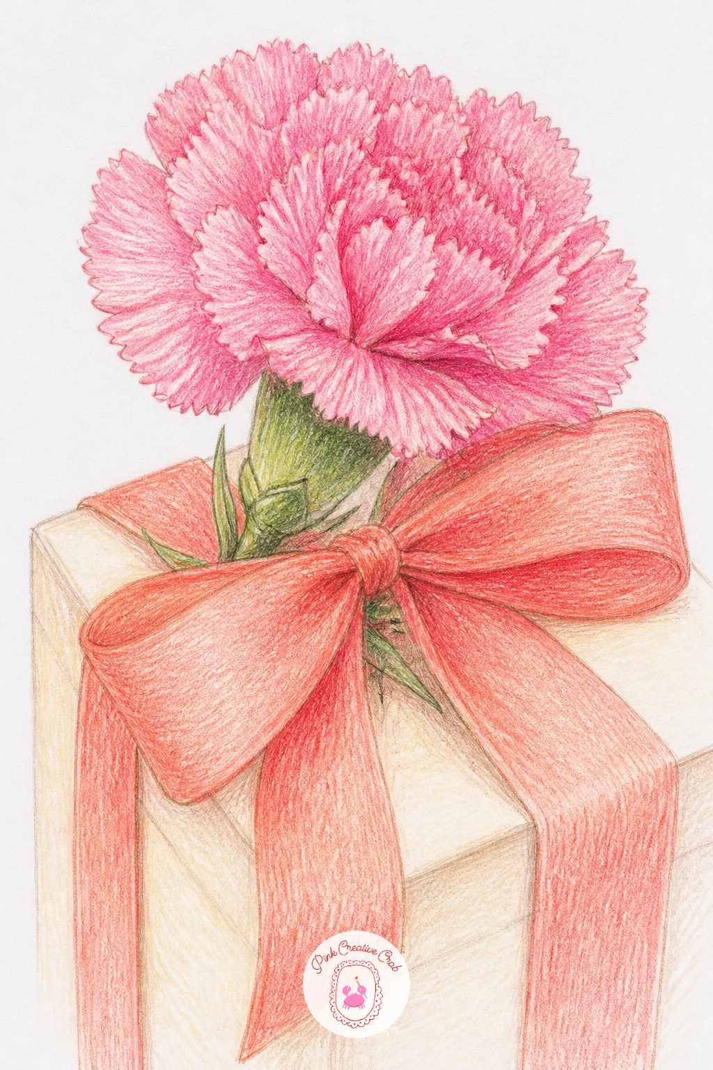
A carnation with a ribbon on a gift turns the flower into part of a tiny still life, a wrapped box corner with one bloom tucked under the bow. Draw the box first as simple straight edges in fineliner, then the ribbon crossing it in two wide bands before placing the carnation where the bands meet.
Color the box in a flat cream or soft sage, keeping it simple so it does not compete with the flower, then give the ribbon its own color, perhaps a deeper coral, with a few fold lines in a shadow shade to suggest the fabric catching light. The carnation itself gets the full pink and coral treatment, its ragged petals contrasting nicely against the ribbon’s smooth curves.
If the ribbon looks flat, it is usually missing a shadow cast onto the box underneath it, a thin dark line along the lower edge of each ribbon band fixes that instantly.
No box to reference means a simple rectangle guessed from imagination works fine at this scale. Add one small gift tag shape beside the ribbon to finish the scene.
Palette: Carnation Pink,Coral,Sage Green,Cream
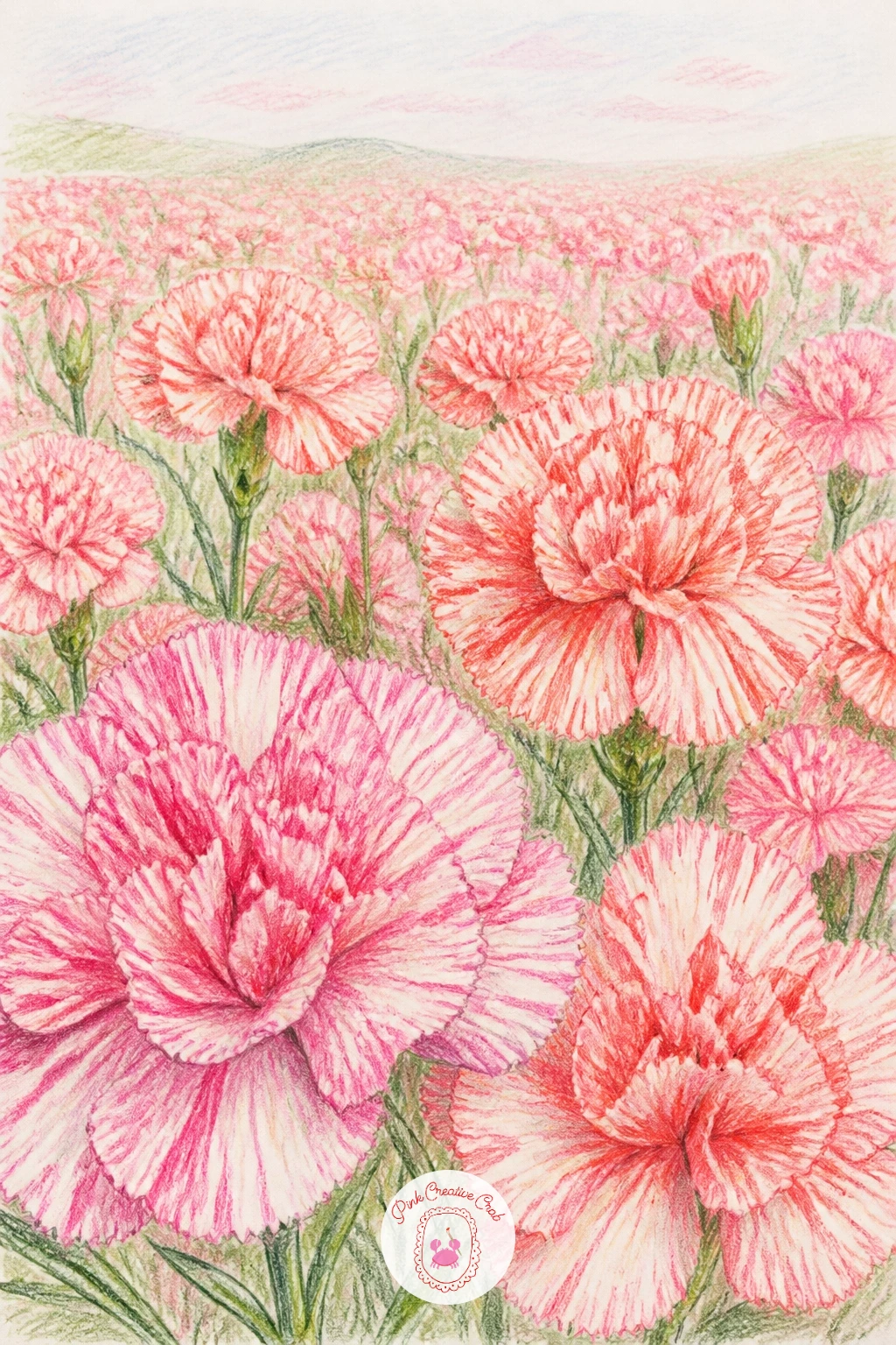
A field of striped carnations is where perspective comes in, since a field reads as a field only once you place blooms at different sizes receding into the distance. Draw the largest two or three flowers big and detailed in the foreground, then scale everything else down fast, the back of the field becoming little more than small pink dabs near a soft horizon line.
For the stripes themselves, lay down a base of cream or pale pink first, then add fine coral or deeper pink lines radiating outward along each petal, following the same direction the petal ridges already run rather than cutting across them.
Fields often go flat without that size change from front to back, so resist the urge to make every flower the same scale just because they are the same subject.
No field reference on hand means three sizes of the same flower repeated loosely does the trick. Keep the background blooms as soft pink smudges with no petal detail at all, that blur is what pushes them into the distance.
Palette: Carnation Pink,Coral,Cream,Sage Green
A carnation in a teacup borrows the cozy, collected feel of book stack drawing, another subject built from everyday objects arranged with a little charm. Sketch the teacup first, an oval rim and a curved body with a simple handle loop, then let one carnation stem rise from inside it with the bloom sitting just above the rim.
The quick ten-minute version keeps the teacup as flat color with one shadow line underneath the rim, while the forty-minute version adds a painted pattern, thin stripes or tiny dots in sage or coral around the cup’s body, plus a soft reflected highlight on the porcelain.
Teacups often look lopsided if the oval rim is drawn too narrow, so check that it is wider than it looks before adding the handle.
A small mug works as a stand-in shape if a teacup feels fussy to draw. Finish with a thin curl of steam in pale grey pencil rising beside the flower for a cozy touch.
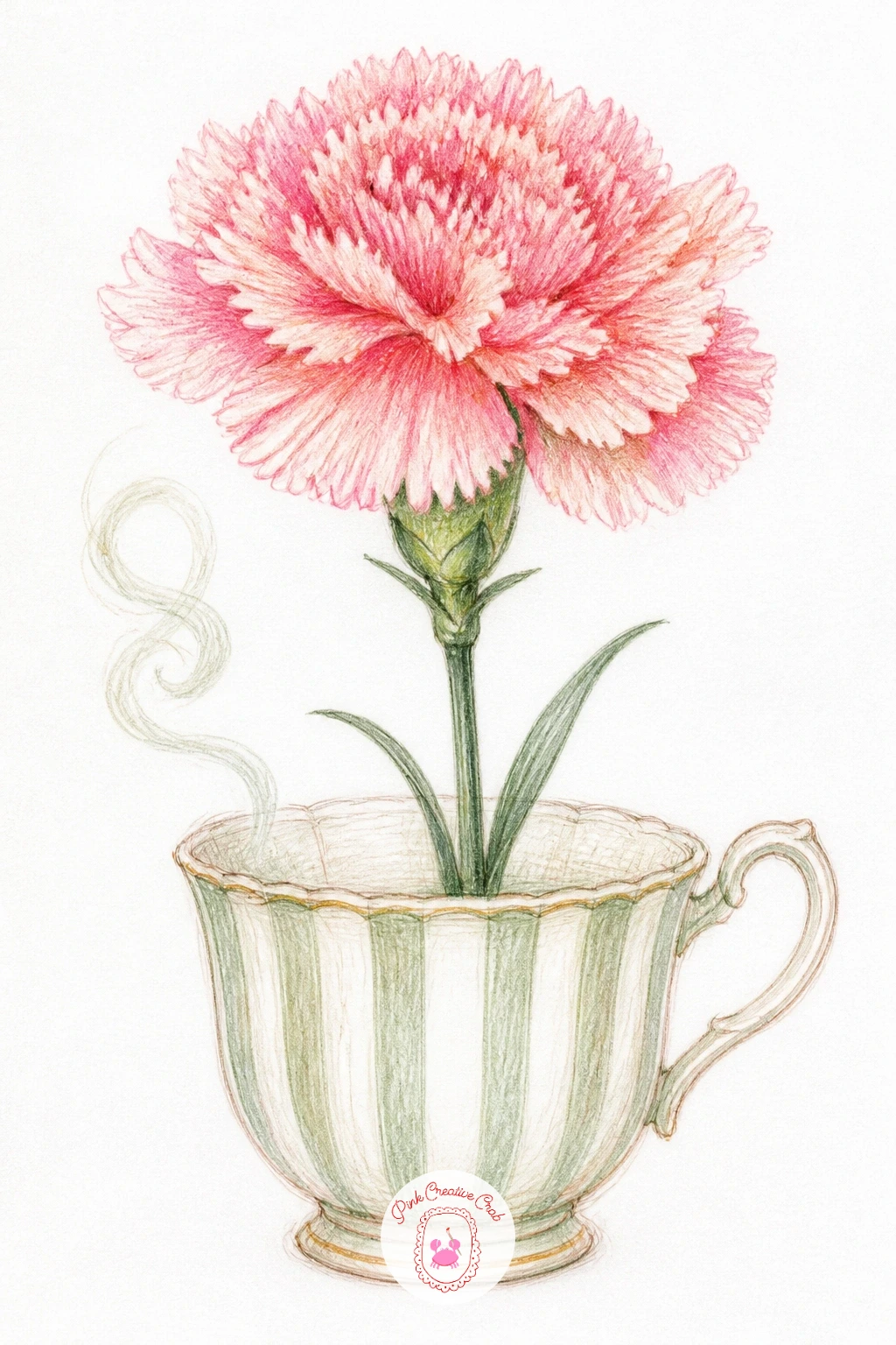
Palette: Carnation Pink,Coral,Sage Green,Cream
A carnation crown asks you to think in a circle rather than a line, blooms linked in a continuous band that wraps around an implied head shape you do not actually draw. Start with a light curved guideline, like the top arc of a circle, then space out five or six flower centers evenly along it before filling in petals.
Vary the petal color slightly from bloom to bloom, some leaning more pink, others more coral or cream, so the crown does not read as one repeated stamp. Small sage leaves tucked between the flowers break up the pink and give the eye somewhere to rest.
Spacing is the main trap here, flowers bunched too close at one end and too sparse at the other. Fix uneven spacing by marking all your flower centers lightly first before adding a single petal.
If drawing a true arc feels tricky, trace a plate or bowl lightly for the guideline and erase it once the flowers are sketched in. Add a thin ribbon trailing from one side for a finished, worn-crown feel.
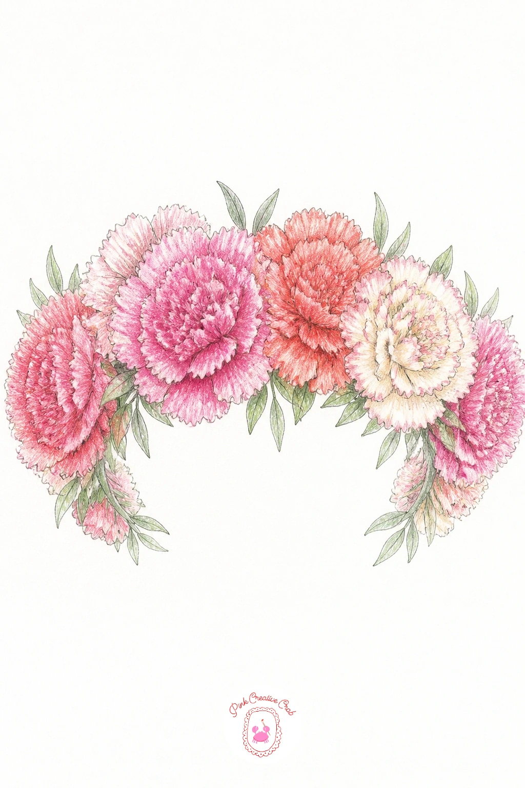
You Will Need
- a small plate or bowl to trace (optional)
Palette: Carnation Pink,Coral,Cream,Sage Green
A carnation pressed in a letter has a flattened, papery quality that is different from every bloom so far, the petals splayed outward rather than cupped, as if weight has settled on them. Sketch the flower wider and flatter than a fresh carnation, petals fanning almost like a sunburst, then add a torn or folded paper edge behind it suggesting the letter page.
Color the petals in muted, slightly faded pink and coral rather than the bright saturated tones used earlier, since a pressed flower loses some of its vibrancy. A few petals can even be left in soft cream or tan to suggest age.
The temptation is to draw it too perky and three-dimensional, which fights the pressed effect. Keep every petal flat against the page with no overlap shadow and it will read correctly.
No faded pencils on hand means pressing lightly with regular pink and coral gets a similar muted look. A thin handwritten-style line or two faintly visible behind the flower completes the letter feel without needing real words.
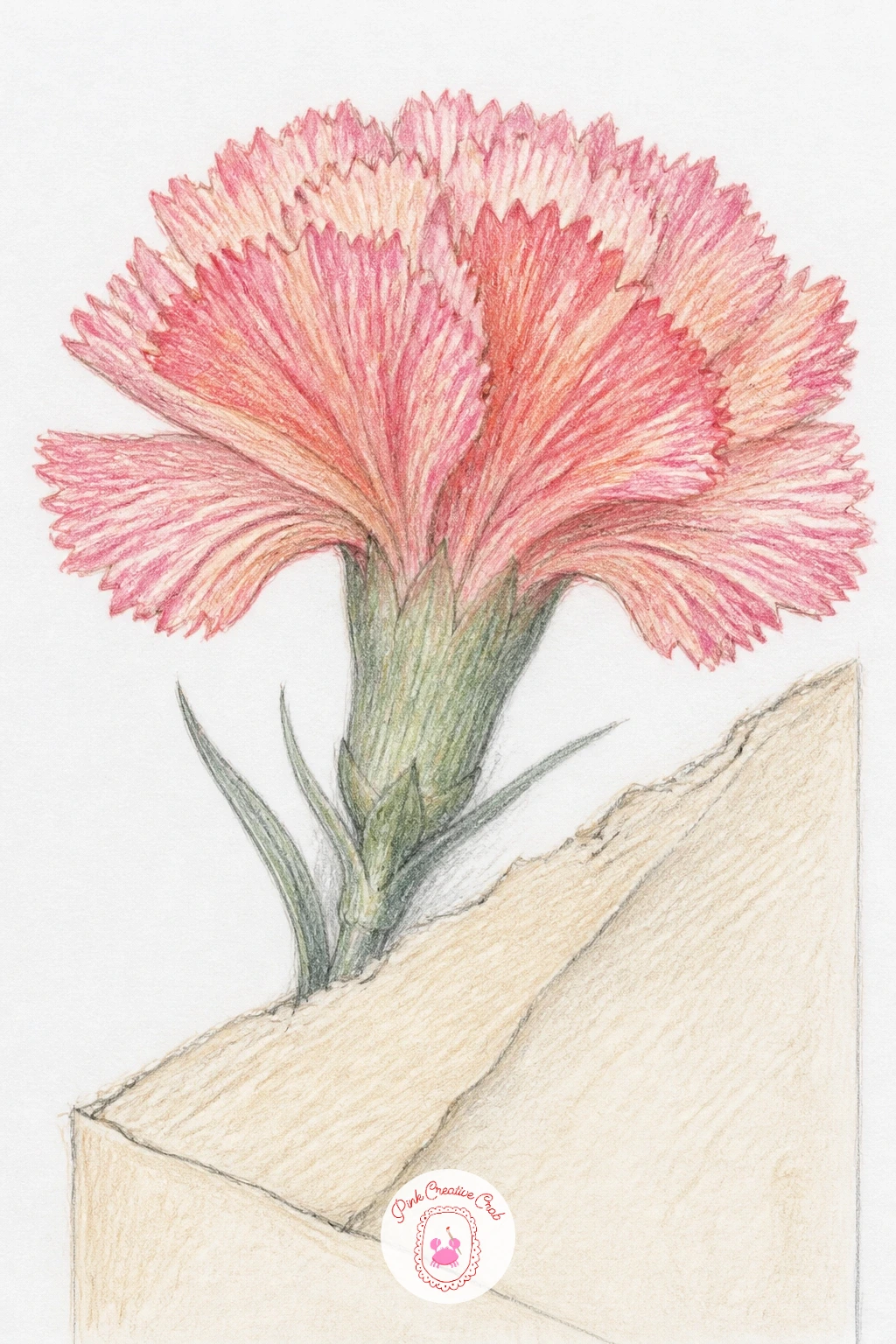
Palette: Faded Pink,Muted Coral,Tan,Cream
From pressed carnations, move into the wider world of ruffled flowers starting with a ranunculus in a jar, a bloom made almost entirely of tightly packed concentric petal layers. Build it from the center outward in fineliner, a small spiral core surrounded by rings of increasingly larger petals, each ring slightly looser than the one before it.
Color from the inside too, a deeper coral or peach at the core fading out to pale pink or cream at the outer petals, which gives the whole flower a natural glow. The jar underneath can stay simple, a plain cylinder with one or two highlight strips left as bare paper.
Ranunculus often end up looking like cabbage if the petal rings get too even and mechanical, so vary the size and tilt of petals within each ring rather than spacing them with a ruler in your head.
A small glass or jam jar works fine as the container reference. Finish with a few loose pencil lines suggesting water level inside the jar glass.
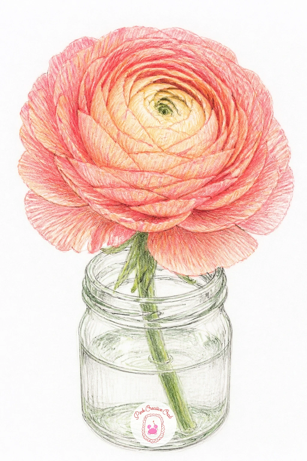
Palette: Peach,Coral,Carnation Pink,Cream
A ruffled peony bud works best drawn from a low eye level looking slightly upward, since that angle shows off the tight cluster of petals at the bud’s crown rather than flattening them into a circle. Sketch the bud shape first as a rounded oval, then mark where the petals just begin to unfurl at the very top, a few curling edges peeking out before the rest stays closed.
Layer pink from the outer closed petals, keeping them smooth and tightly wrapped, then let the color loosen and ruffle only at that top opening where the bud is starting to bloom. That contrast between tight and loose is what makes a bud read as a bud rather than a full flower.
The stem often gets forgotten and the bud ends up floating. Anchor it with a confident sage green stem curving slightly, plus one or two leaves angled toward the light.
No peony reference handy means a rounded rose bud shape makes a fine stand-in to study the same tight-to-loose petal logic. Keep the final petal tips a touch darker coral for depth.
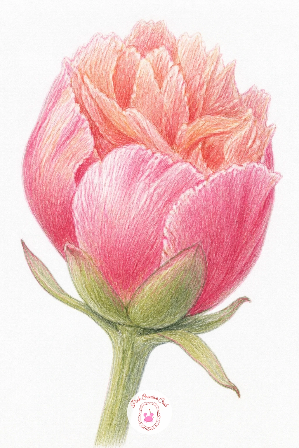
Palette: Carnation Pink,Coral,Sage Green,Cream
Sweet william in a border shifts the scale down, since this flower grows in small flat clusters of tiny blooms rather than one large head. Sketch several flat cluster shapes along a loose horizontal line in fineliner, like little bouquets growing side by side, then dot in individual five-petal flowers within each cluster, keeping them small and slightly irregular.
Color in clusters of pink, deep red and white mixed together within the same group, since sweet william often grows in mixed shades on one plant. A dry brush style stroke with the pencil, meaning short, light, slightly broken strokes rather than solid fill, helps each tiny flower stay distinct instead of blurring into a pink smudge.
The biggest risk is overworking the detail until the cluster turns into mush. Pull back and leave some flowers as just a few dots of color rather than fully rendering every single bloom.
No red or white pencil on hand means pink alone in varying pressure still reads fine as a border. Finish with a thin green line connecting the clusters to suggest the border’s edge.
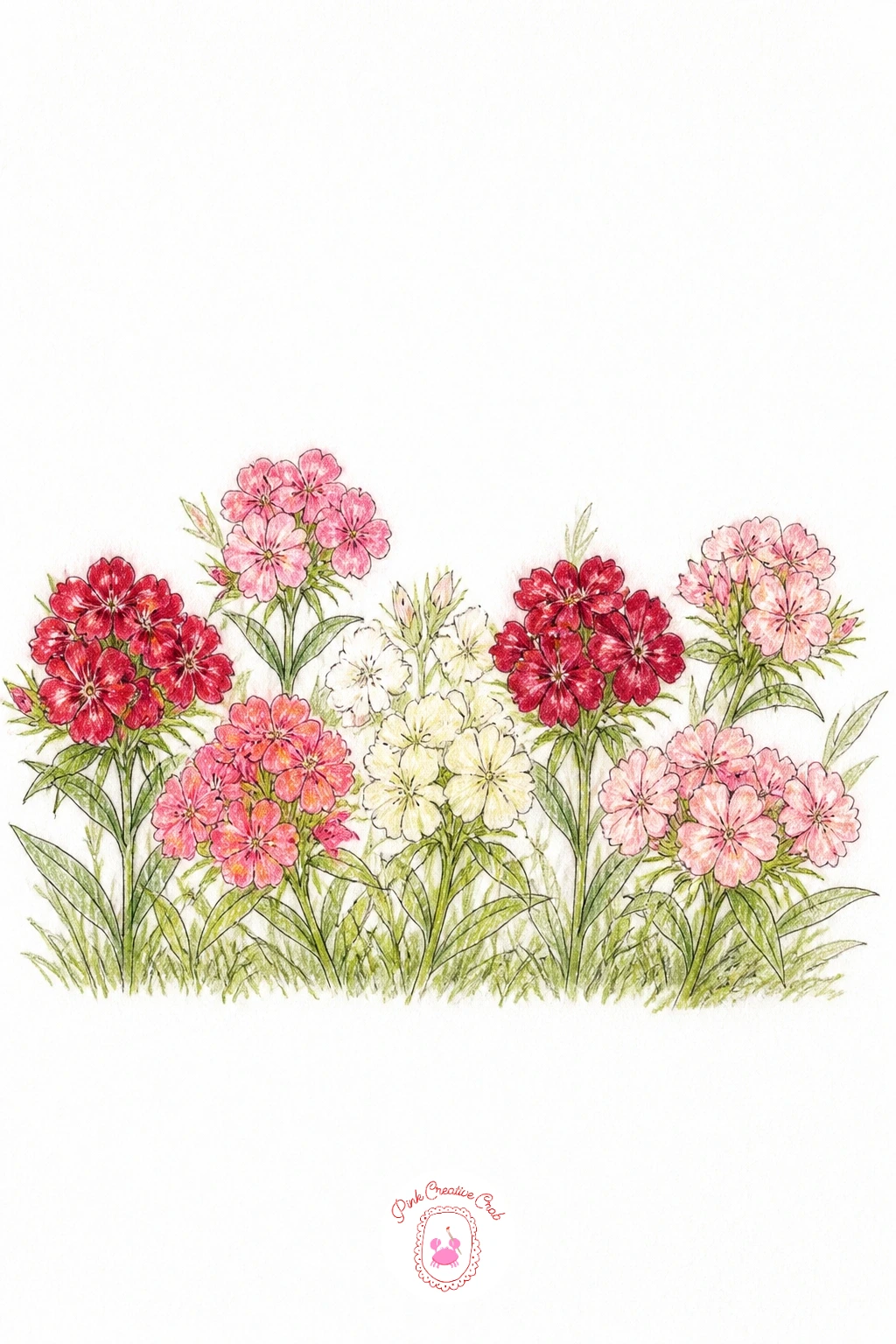
Palette: Carnation Pink,Deep Red,Cream,Sage Green
A double tulip trades the usual smooth tulip cup for a ruffled, peony-like head, making it a nice bridge subject here. Sketch the familiar tulip stem and leaf shape first, then build the flower head as several layers of rounded, slightly frilled petals rather than the typical three simple curves, with the outer layer opening wider than the tightly packed center.
Light matters a lot on this one: decide where it comes from, then keep the petals facing that direction brighter in pink or cream while the petals curling away or tucked underneath get deeper coral or a touch of maroon in their shadows. That single light decision is what separates a flat tulip silhouette from one with real volume.
Double tulips can look overly busy if every petal edge gets the same ruffle treatment, so keep the ruffling heaviest at the center and let the outer petals stay a touch smoother.
A regular tulip shape with a few extra petal layers added works as the simplified version. Add one bent leaf at the base for a natural, slightly top-heavy look typical of this flower.
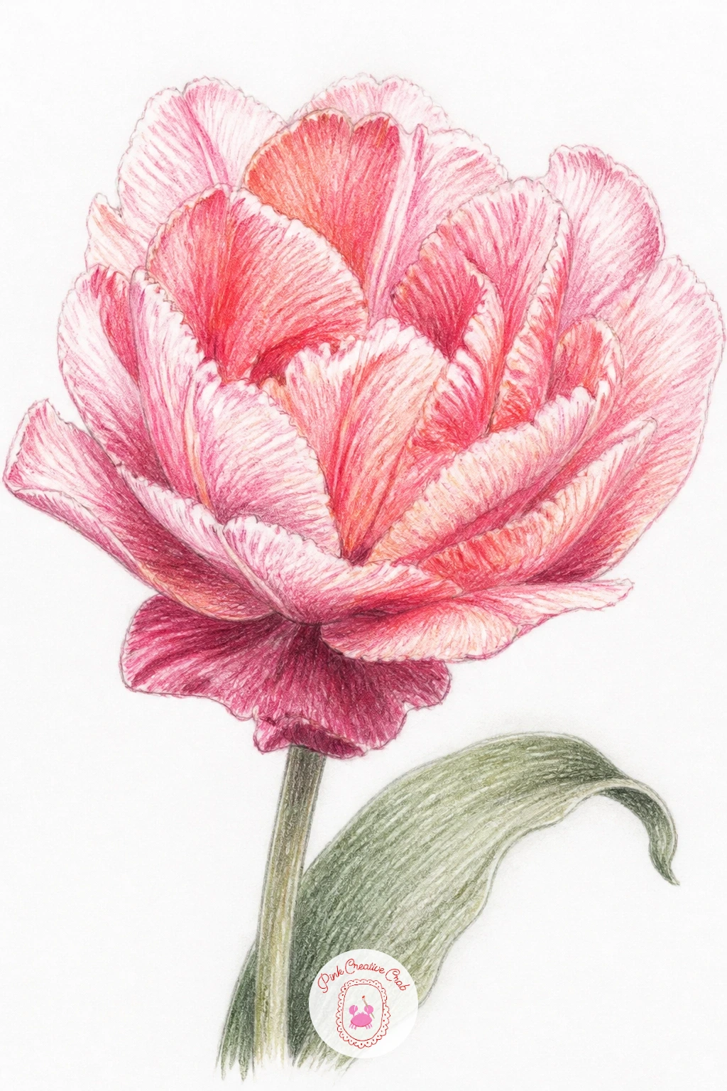
Palette: Carnation Pink,Coral,Maroon,Sage Green
A ruffled poppy brings in paper-thin petals that practically beg for a lifting technique once the color is down. Sketch four or five large overlapping petal shapes in fineliner, each with a soft crinkled edge, around a dark central seed pod with fine stamens radiating from it.
Lay down coral or deep pink across the petals first, then use a kneaded eraser pressed and lifted, not rubbed, to pull back thin streaks of color radiating out from the base of each petal, mimicking the natural creases poppy petals have. That lifted texture does more work than any added pencil stroke.
The center often ends up too small and gets lost against the bold petals. Make the seed pod and stamens larger and darker than feels natural, poppies really do have a bold, almost black center that anchors the whole flower.
No kneaded eraser on hand means a regular eraser corner, used gently, gives a similar lifted streak. Finish with one petal showing a small tear or fold for extra realism.
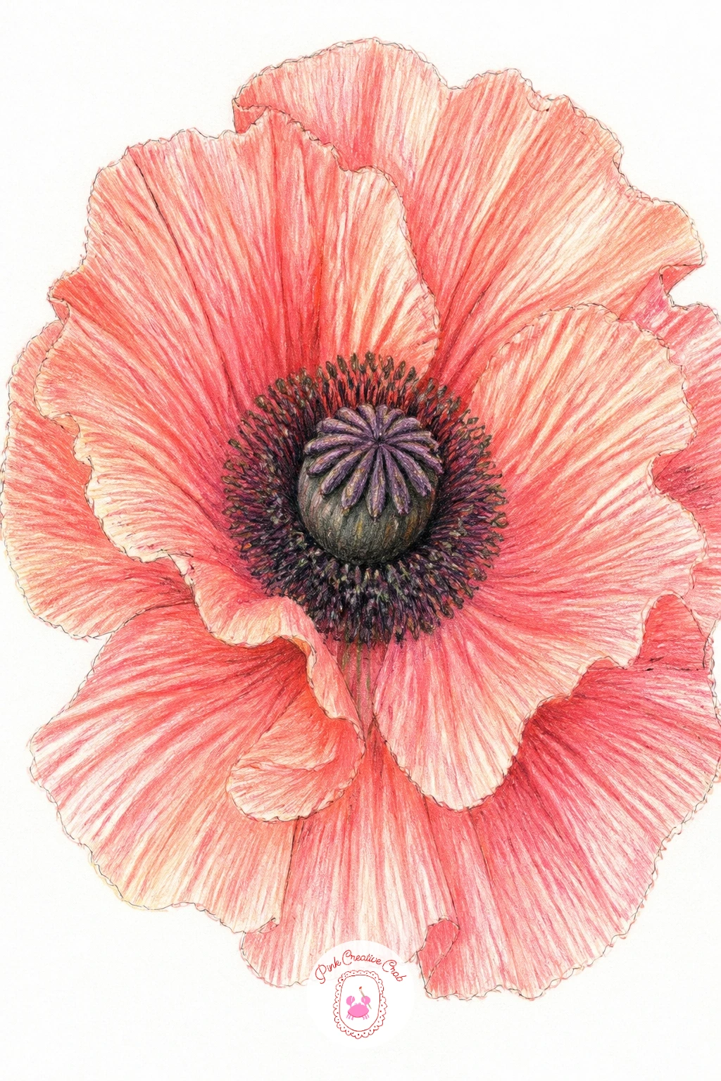
You Will Need
- kneaded eraser
Palette: Coral,Deep Pink,Payne’s Grey,Sage Green
A garden rose, the loose, many-petaled kind rather than the tight florist bud, gives you a chance to try the quick and slow versions side by side. The ten-minute version blocks in a simple spiral of overlapping petal shapes from the center outward with minimal shading, enough to read clearly as a rose at a glance.
The forty-minute version takes that same spiral and adds individual shadow shapes between every overlapping petal, a gradient from deep coral at the core to pale pink at the outer edges, plus tiny creases within each petal using a sharp pencil point.
Roses tend to look stiff when every petal is the same size and evenly spaced, so let the outer petals grow larger and looser than the tightly curled inner ones.
No rose in front of you means working from memory with the simple spiral logic still gets a convincing result. For an extra push, see how romantic flower drawing ideas handle the same loose, full-bloom feeling in a different medium.
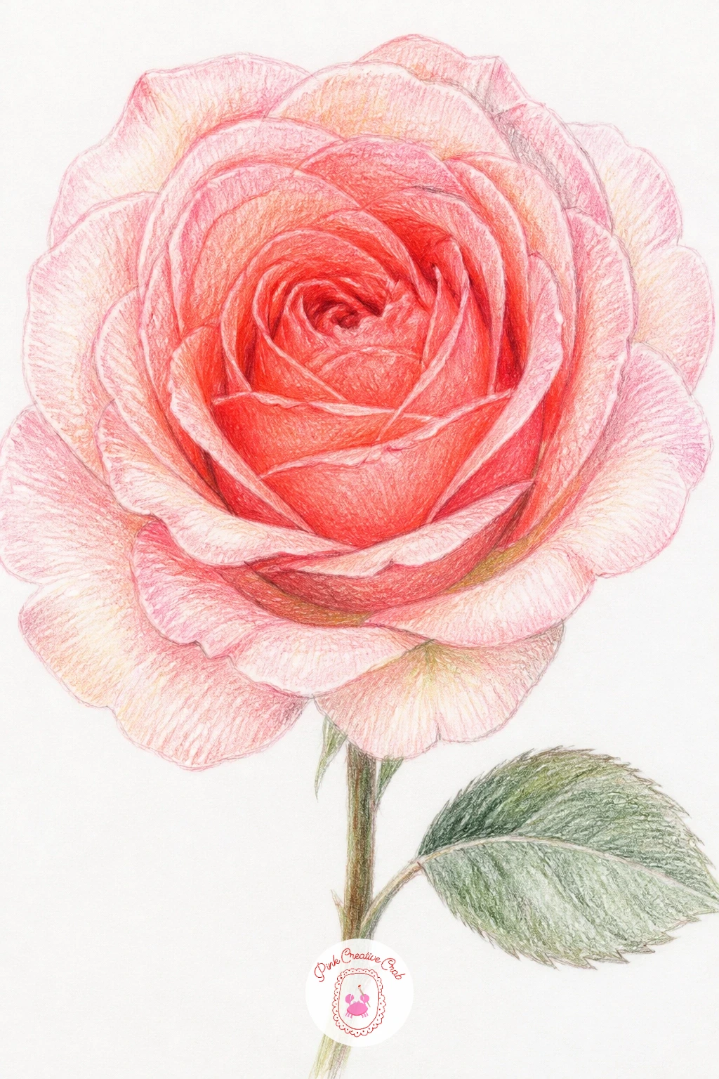
Palette: Carnation Pink,Coral,Deep Pink,Sage Green
A frilly iris introduces a very different petal structure, three upright petals standing tall and three drooping ones called falls, each with a ruffled, almost lace-like edge. Sketch the upright petals first as tall narrow shapes meeting near the center, then add the falls curving downward and outward below them, each edge drawn with small wavy bumps rather than a smooth line.
Color the upright petals in a cooler lavender or soft sage-blue, then shift the falls to a richer purple or deep pink with a small yellow or cream streak marking the classic iris signal patch near the base of each fall. That streak is a tiny detail but it is the thing that makes an iris instantly recognizable.
Beginners often flatten the falls into the same plane as the upright petals. Keep the falls angled downward and slightly foreshortened, shorter than they’d be if laid flat, to preserve that drooping, three-dimensional look.
No purple pencil on hand means layering blue and pink together builds a convincing substitute. Finish with one thin sword-shaped leaf rising beside the stem.
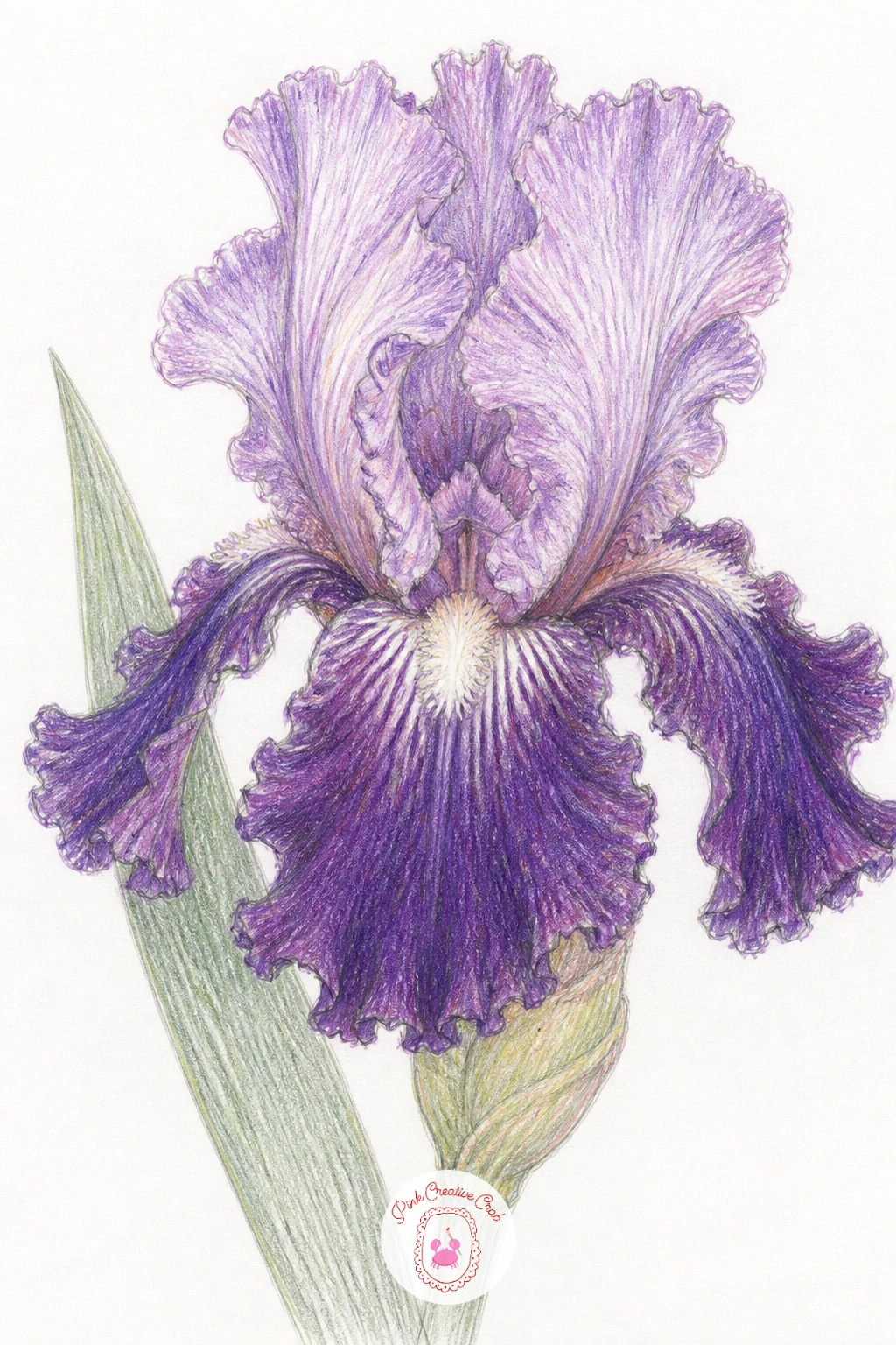
Palette: Lavender,Deep Purple,Cream,Sage Green
A dianthus in a pot is the carnation’s smaller cottage garden cousin, fringed petals in a compact, low-growing clump rather than one tall stem. Sketch a simple terracotta pot shape first, then build several small flower heads clustered just above the rim, each petal edge cut with tiny fringed notches, finer and more delicate than a carnation’s ruffle.
Color the pot in warm terracotta orange with a darker band near the rim for shadow, then build the dianthus flowers in pink and white with a tiny contrasting eye at the center of each bloom, a small darker dot or ring that dianthus flowers are known for.
The fringed petal edges can turn messy if you try to draw every notch the same size. Vary the notch depth slightly across each petal, it actually looks more convincing less tidy.
A plain pot shape with no terracotta texture works fine as a simpler version. Add a few thin grass-like leaves at the base of the pot to finish the cottage garden feel.
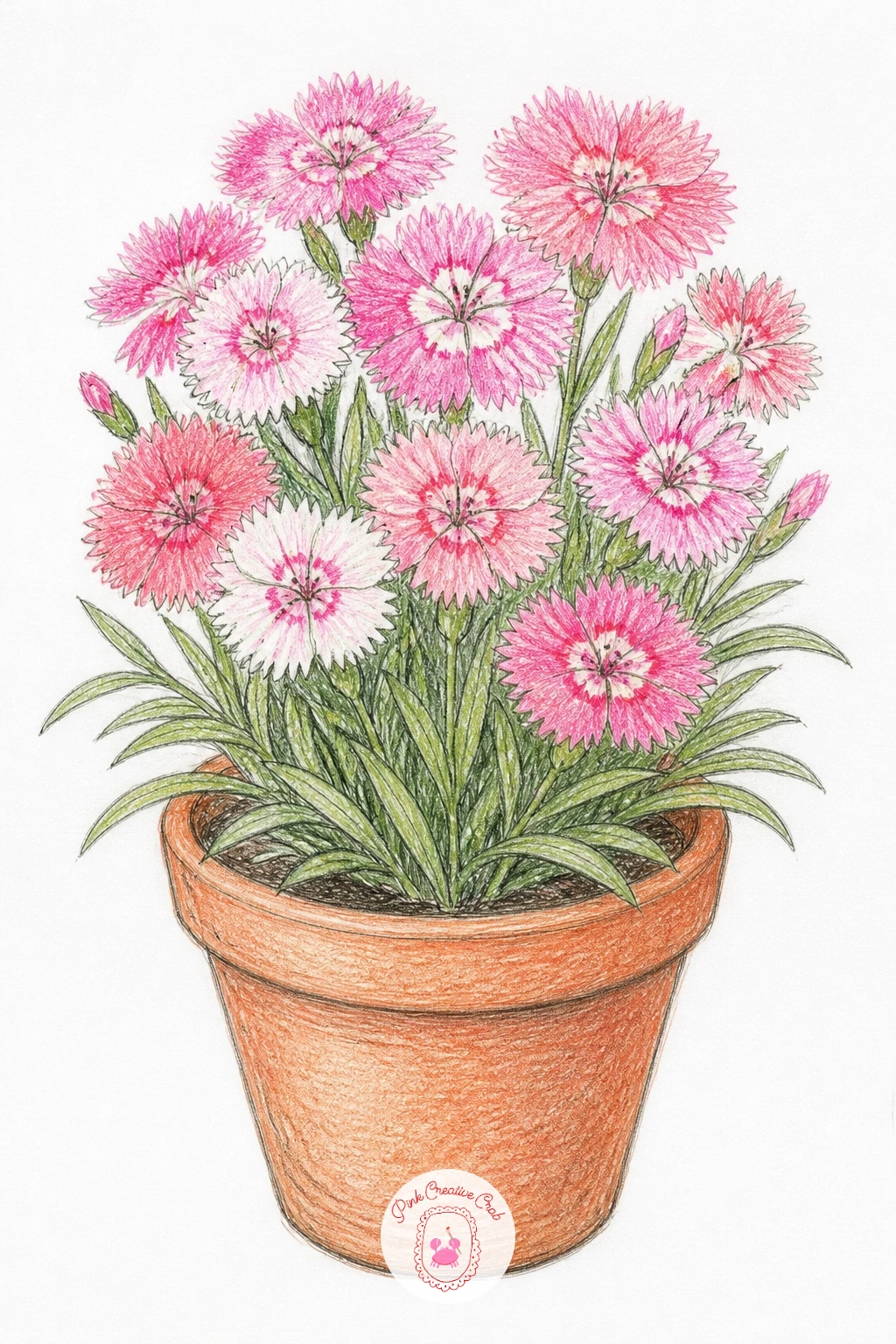
Palette: Carnation Pink,Terracotta,Cream,Sage Green
A lisianthus stem is worth drawing for its rose-like ruffled blooms paired with buds at different stages along one tall, graceful stem, which makes it a nice study in variety within a single subject. Sketch the stem first as a gentle curve, then place a fully open bloom at the top, a half-open one below it, and one or two tight unopened buds further down.
Give each stage its own petal treatment: the open bloom gets full loose ruffled layers in soft pink or cream, the half-open one shows just a few petals starting to peel back from a tighter center, and the buds stay smooth and closed with barely a hint of color peeking through.
It is easy to make every bloom on the stem the same size and stage by accident. Keep checking that the top bloom is genuinely more open and slightly larger than the ones still budding below it.
No real stem to study means picturing a rose at three different ages, just opened, closed, and fully out, works as a mental stand-in. Finish with narrow pointed leaves growing in pairs along the stem.
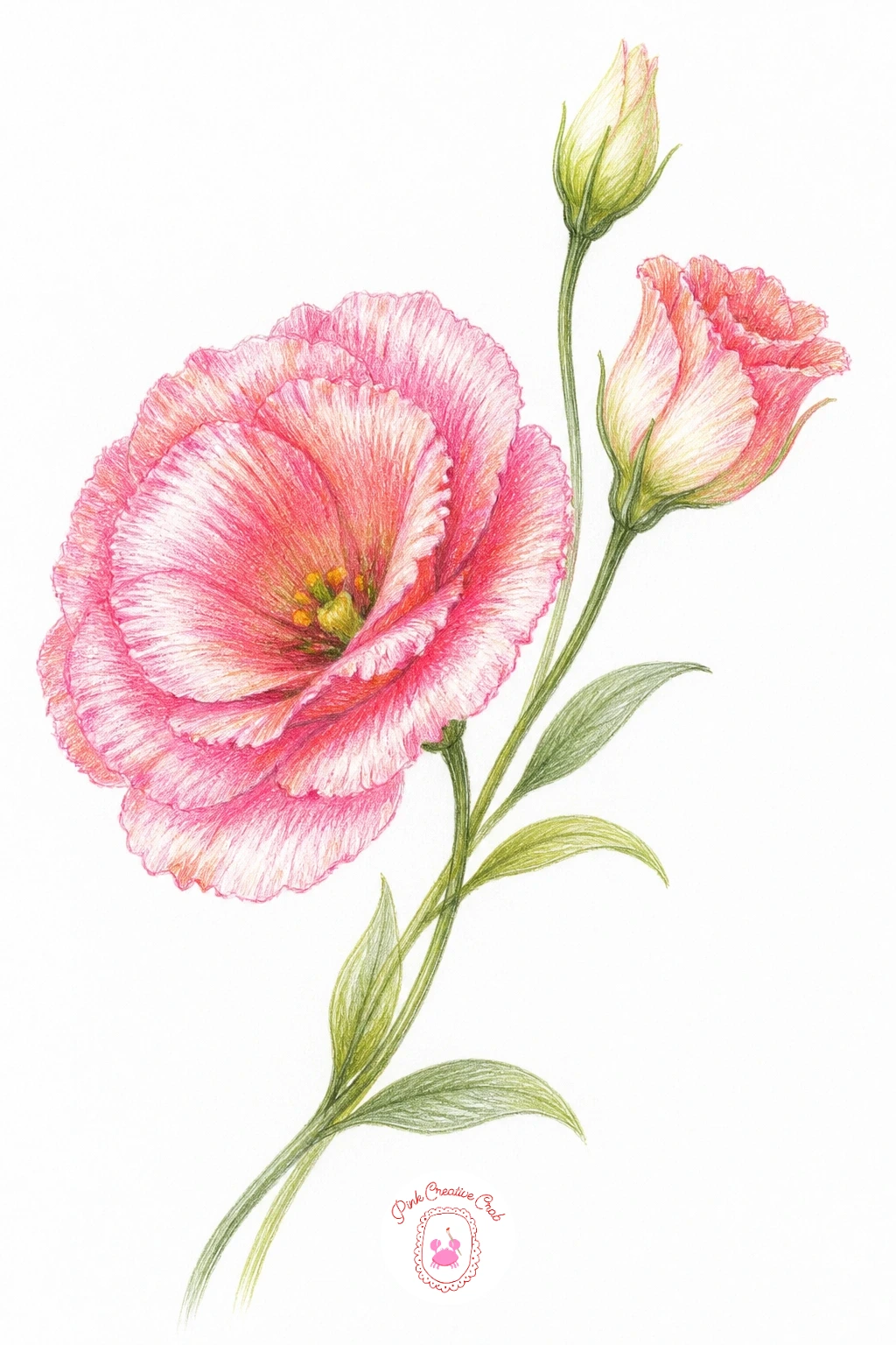
Palette: Carnation Pink,Cream,Sage Green,Coral
A zinnia with a bee adds a small bit of life to the page, the flower’s flat, layered petals making a nice stage for one visiting insect. Sketch the zinnia as a series of flat, slightly pointed petals arranged in overlapping rows around a textured central disc, then place the bee resting on one of the outer petals or hovering just above the center.
Color the zinnia in bold coral or deep pink, keeping petal rows distinct with a thin shadow line where one row overlaps the next, then give the center disc a stippled texture, lots of tiny dots in brown and yellow rather than smooth color. The bee needs just a few confident strokes, black and yellow stripes on a simple oval body with two small translucent wing shapes left mostly as bare paper.
Bees often come out looking too cartoonish if the wings get outlined too heavily. Keep the wing edges very light, just a faint curved line, so they read as delicate rather than solid.
No bee reference handy means a simple striped oval with two small wing ovals behind it reads clearly enough at this scale. If this is your first time drawing an insect, practice the stripe pattern separately before committing to the final page.
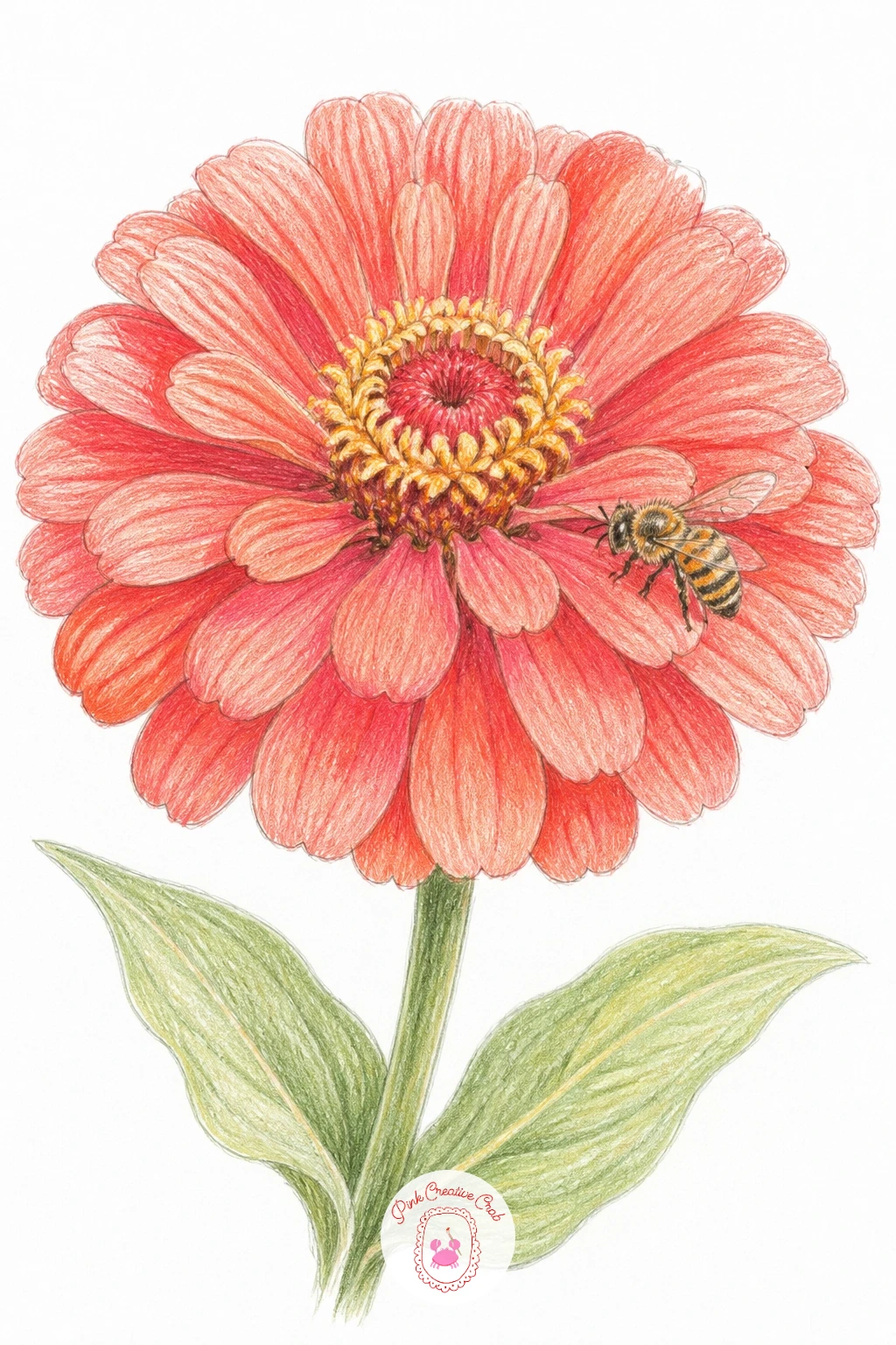
Palette: Coral,Deep Pink,Mustard Yellow,Payne’s Grey
A ruffled hibiscus gives you a big, dramatic bloom with wide trumpet-shaped petals and one standout feature, the long curving stamen reaching out past the petals. Sketch five broad overlapping petals first, each edge gently ruffled rather than smooth, then add the stamen as a single curving line extending from the center with small round anther shapes clustered at its tip.
Color the petals from a pale cream or yellow throat deepening out to coral or deep pink at the outer edges, a classic hibiscus gradient achieved by layering light colors first and building darker tones only at the petal tips and overlaps. The stamen gets its own warm yellow or cream color, kept separate and bright so it stands out clearly against the petals behind it.
The stamen is the easiest part to get wrong, either too short to notice or too thick to look delicate. Draw it as a fine, slightly curved line with the anther cluster kept small and precise, that contrast in scale is what sells the whole flower.
No hibiscus to reference means studying any trumpet-shaped flower photo for the gradient and stamen placement works well enough. Add one large leaf behind the bloom to balance its size on the page.
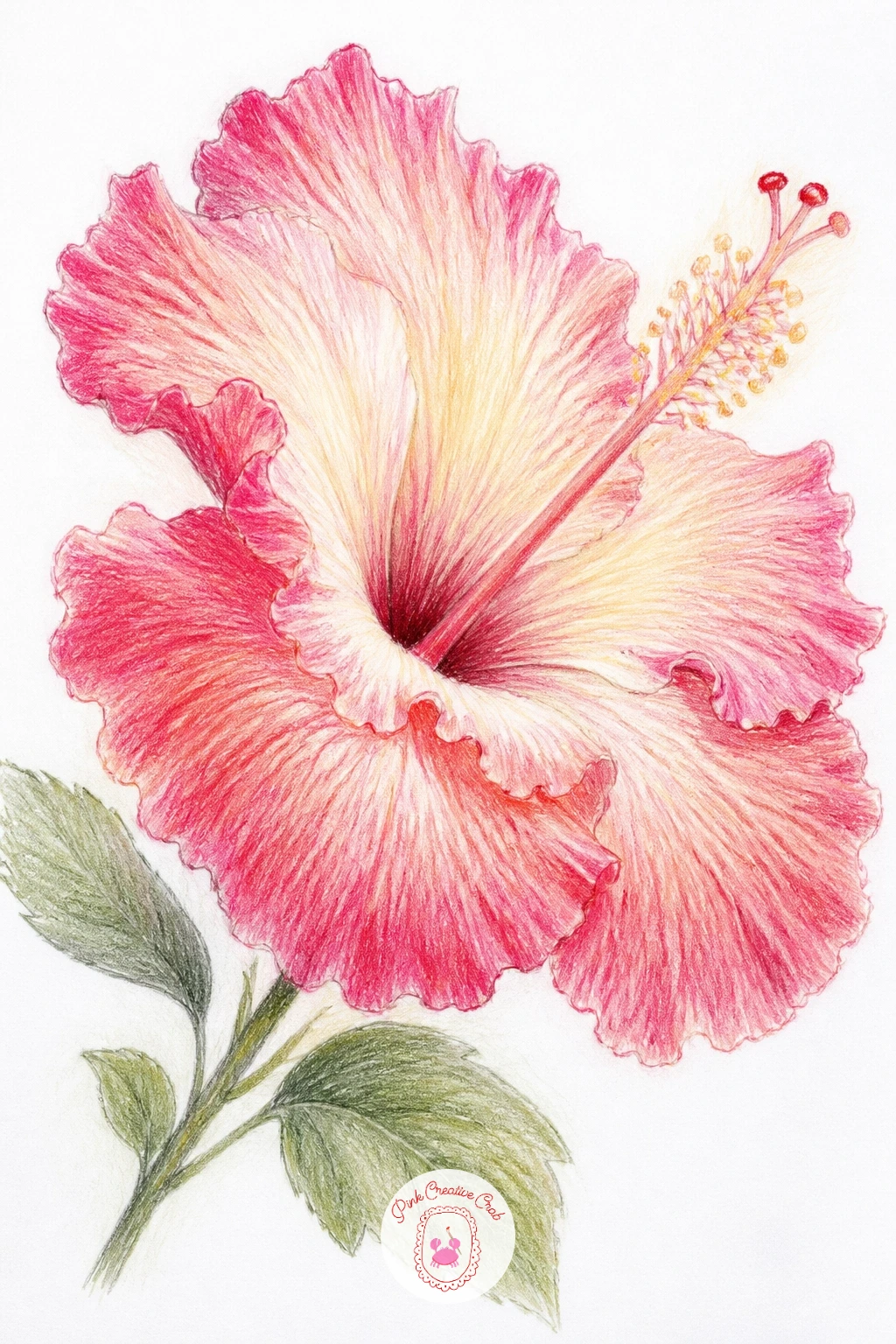
Palette: Cream,Coral,Deep Pink,Sage Green
A chrysanthemum on a dresser places the flower in a small quiet scene, a single stem leaning against a mirror or propped in a low dish on a bedroom surface. Sketch the dresser surface as just one horizontal line with perhaps the edge of a mirror frame behind it, keeping the setting minimal so the flower’s mass of thin layered petals stays the focus.
Build the chrysanthemum from the center outward with dozens of thin, slightly curling petal strokes rather than a few broad shapes, since this flower’s charm is in that sheer density of fine petals radiating in every direction. Work in two or three tones of pink or coral, lightest at the tips, so individual strokes do not all blend into one solid blob.
This is the subject where overworking shows fastest; too many strokes on top of each other turns delicate into muddy. Stop adding petal strokes before you think you are done, chrysanthemums read as full even with plenty of visible white paper between strokes.
A simple flat surface line with no mirror at all works fine if the dresser detail feels like too much. Finish with a soft reflected pink glow sketched faintly on the surface beneath the bloom.
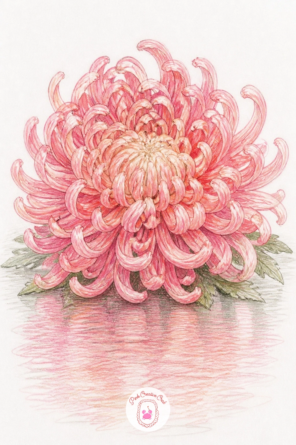
Palette: Carnation Pink,Coral,Cream,Payne’s Grey
A marigold garland strings several compact, ruffled blooms along a single curving thread, a nice change of pace after single-stem subjects. Sketch a loose wavy line first to mark the garland’s path, then space six or seven small marigold heads along it, each one a tight cluster of short overlapping petals rather than one smooth circle.
Color each bloom in warm orange or golden yellow, using short layered strokes radiating from the center the same way you handled carnation petals earlier, since marigolds share that same dense, ruffled structure just in a warmer palette. Vary the orange depth slightly between flowers so the garland does not read as one repeated stamp.
Garlands often go stiff if every flower sits at the exact same angle along the string. Tilt a few heads slightly up or down and vary the spacing a touch so the line feels like it is actually hanging rather than laid out with a ruler.
No orange pencil on hand means yellow and a touch of red layered together builds a close substitute. Add a thin green thread line connecting every bloom to finish the garland shape.
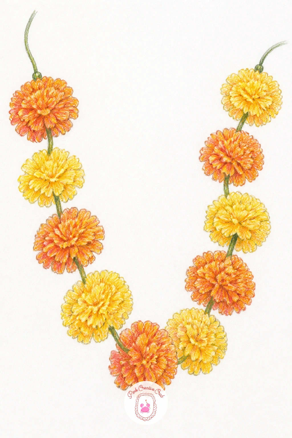
Palette: Golden Yellow,Orange,True Red,Sage Green
A cosmos in wind captures movement with just a few confident choices, the thin stem bending and petals angled as if caught mid-gust. Sketch the stem leaning at a clear diagonal rather than straight up, then draw the flower head tilted in the direction the wind is pushing it, petals slightly overlapping on the leeward side and more spread on the side facing the gust.
Color the simple, flat cosmos petals in soft pink or white with a yellow center, keeping the strokes light and airy since cosmos petals are thin and almost papery compared to a carnation’s density. A few fine, feathery leaves drawn as thin curving lines rather than solid shapes reinforce that wind-blown feeling.
The flower can end up looking merely tilted rather than genuinely wind-blown if the stem stays rigid. Add a gentle S-curve to the stem and let one or two petals appear slightly lifted or flipped, as if caught separately by the gust.
No wind reference needed, picturing a flag or hair blowing sideways gives you the same diagonal logic to copy. Finish with one small loose petal drawn floating just off the stem to suggest it just blew free.
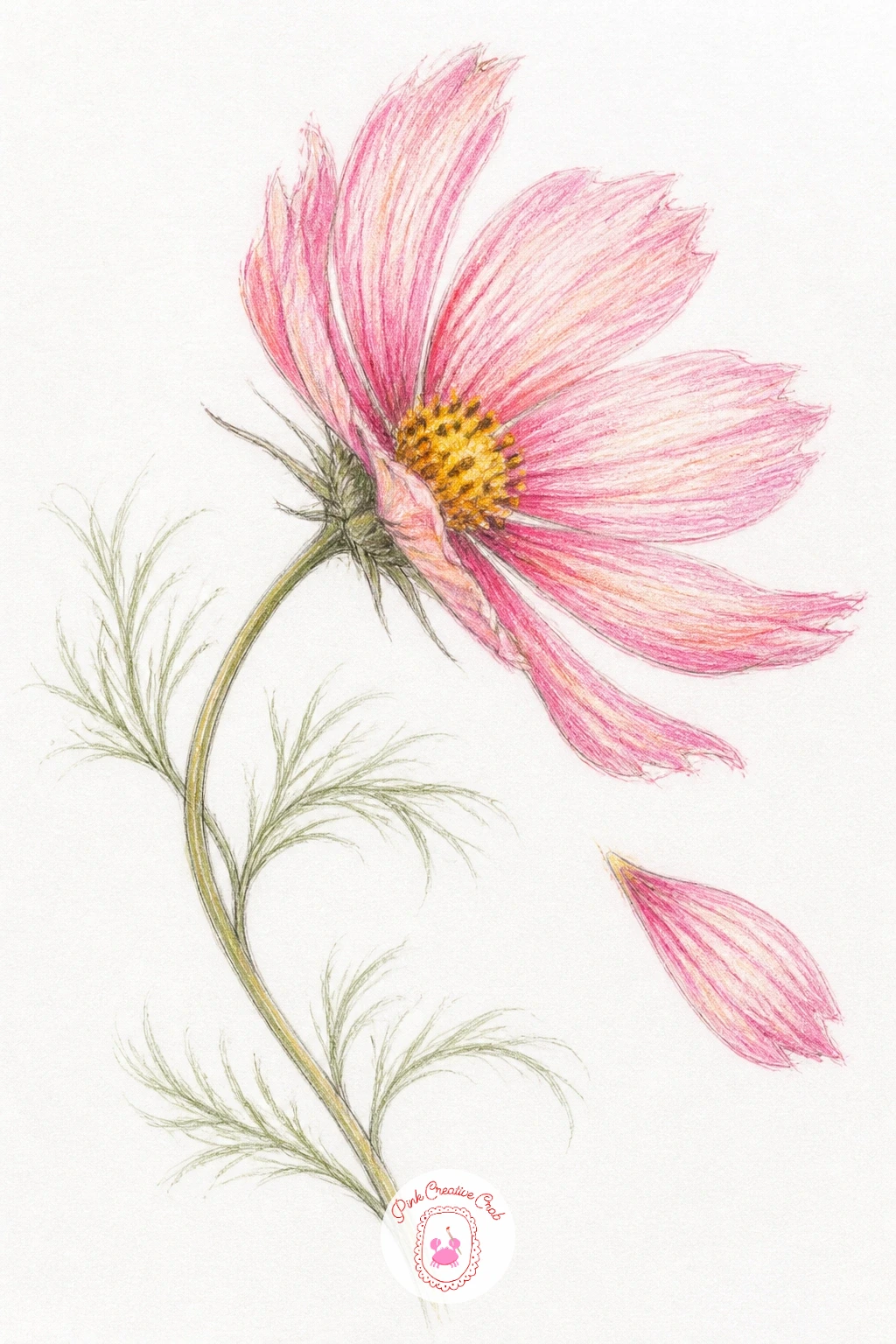
Palette: Carnation Pink,Cream,Golden Yellow,Sage Green
A gerbera in a glass is a good subject for practicing bold, flat color blocking, since this flower’s petals are long, smooth and simple compared to the ruffled ones before it. Sketch a wide circle of narrow pointed petals radiating evenly from a textured central disc, then add a simple straight-sided glass beneath it with the stem visible through the glass.
Color the petals in one strong coral or pink with minimal shading, just a touch of deeper tone near the center where petals meet the disc, letting the flat boldness of the color do the work rather than heavy blending. The disc itself gets a stippled texture in brown and yellow dots, and the glass gets a few vertical highlight strips left as bare paper with the stem drawn as a visible bent line distorted slightly by the water.
Petals can look stiff and ruler-straight if drawn too evenly. Let a few petals curve or twist very slightly rather than keeping every single one perfectly radial.
A plain glass or jar works fine in place of anything fancy. Add one small air bubble shape near the stem inside the glass for a nice realistic touch.
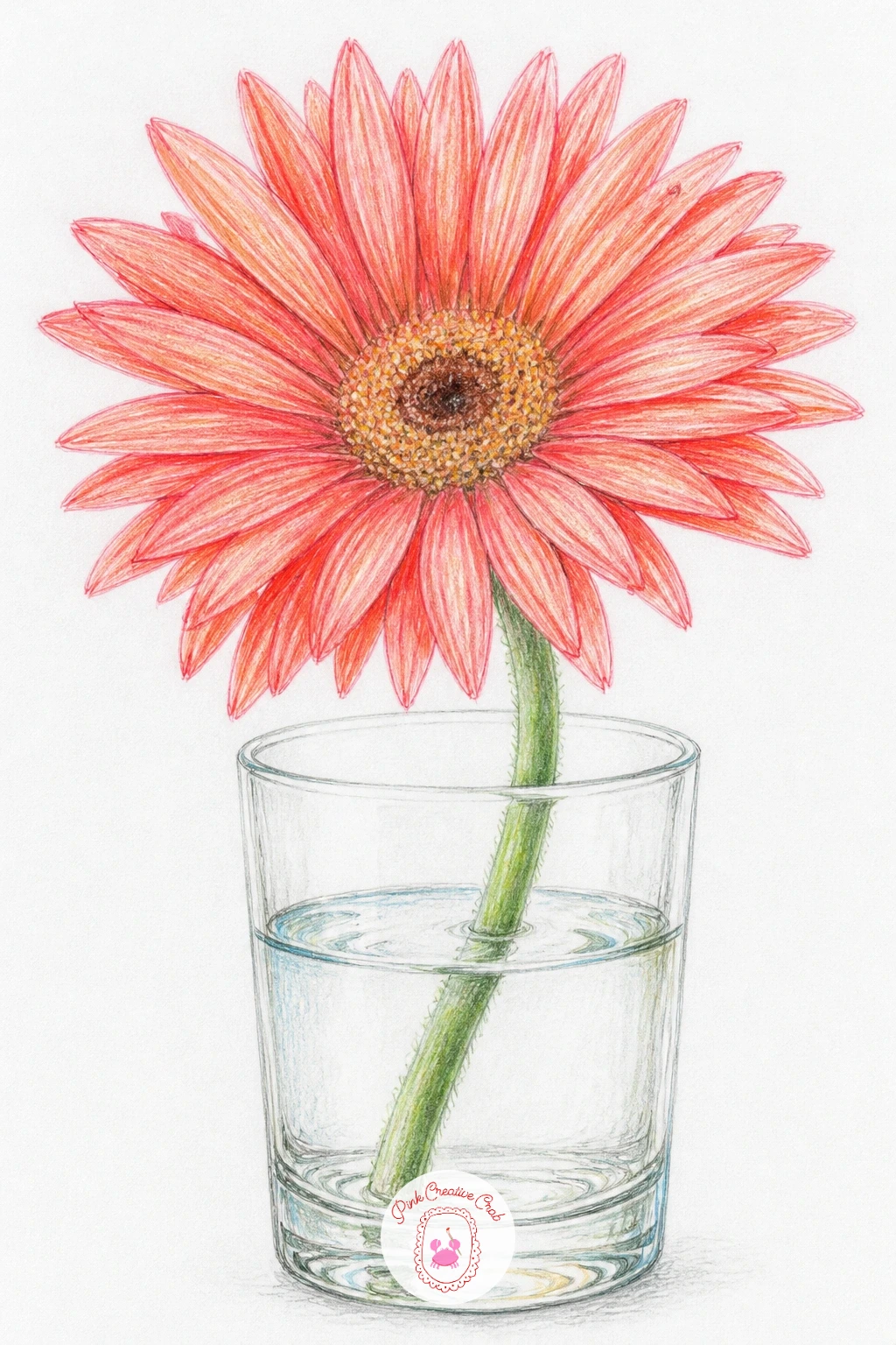
Palette: Coral,Deep Pink,Mustard Yellow,Sage Green
A flower stall bucket of ruffled flowers brings several of your subjects together at once, a mixed bunch of carnations, ranunculus and garden roses all crowded into one metal bucket. Sketch the bucket first as a simple tapered cylinder, then build the flower mass above it in loose overlapping circles before deciding which circle becomes which flower type.
Vary the petal style flower by flower, ragged carnation edges here, tight ranunculus spirals there, looser rose layers elsewhere, while keeping the palette consistent across all of them so the bunch feels unified despite the mixed flower types. Save the bucket itself for last, a flat metal grey with one or two scratched highlight lines.
A mixed bouquet like this can turn into visual chaos fast if every flower gets equal, maximum detail. Pick two or three blooms to render fully and let the rest stay looser and simpler, exactly how a real glance at a flower stall actually works, your eye catches a few blooms clearly and blurs the rest.
No real stall to reference means combining any three flower shapes you already know how to draw works just as well. Finish with a price tag or small paper label tucked into the bucket’s rim for charm.
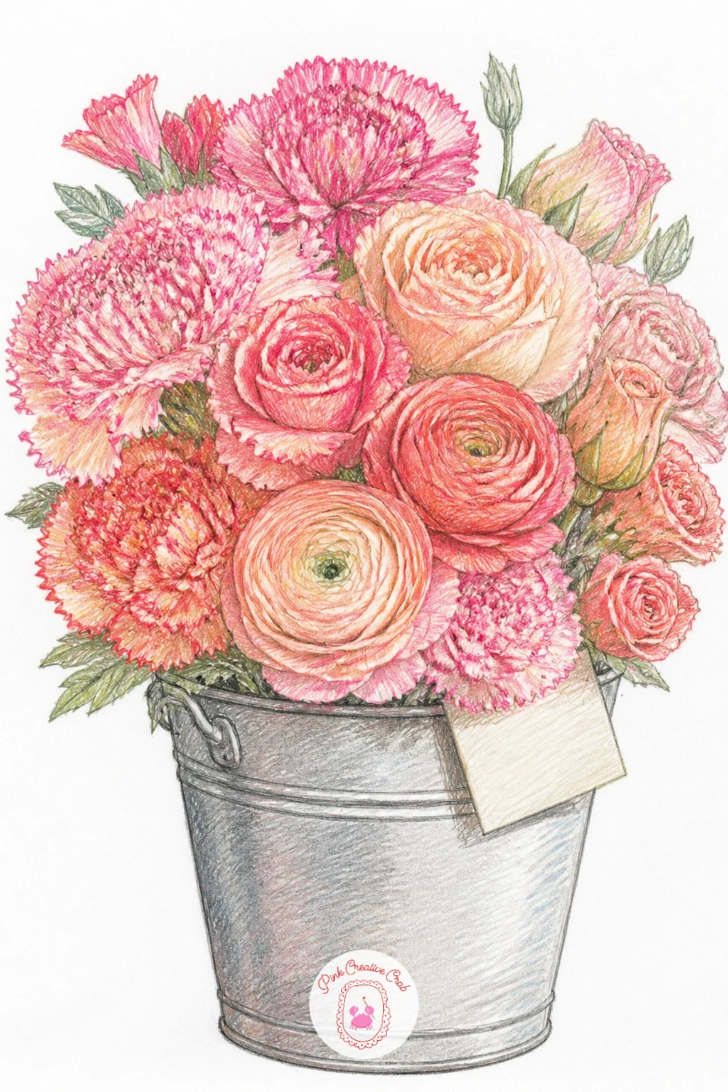
Palette: Carnation Pink,Coral,Payne’s Grey,Sage Green
For more mixed-bouquet practice in a different medium, the ideas in simple watercolor flowers work through the same pick-a-few-and-simplify-the-rest logic.
Close out the series with a girl carrying an armful of carnations, bringing a figure back in alongside a full mass of blooms. Keep the figure simple, just the curve of two arms crossed to cradle the bouquet and a hint of shoulder and dress fabric, so the flowers stay the clear focus of the page.
Build the armful using the same layered circle approach from the newspaper bouquet earlier, lightest blooms toward the back, boldest pink and coral toward the front where the flowers sit closest to the viewer, with a few stems and sage leaves spilling out at the bottom edge. The arms and dress need only flat, simple color, a soft neutral or cream, so they read as support for the bouquet rather than a competing subject.
The figure can overwhelm the flowers if hands and arms get too much linework. Simplify the hands to soft rounded shapes tucked mostly behind the blooms rather than drawing every finger.
No figure reference on hand means two simple curved arm shapes cradling the flower mass works fine without any further detail. Finish with one stray carnation slipping loose from the armful for a nice sense of movement.
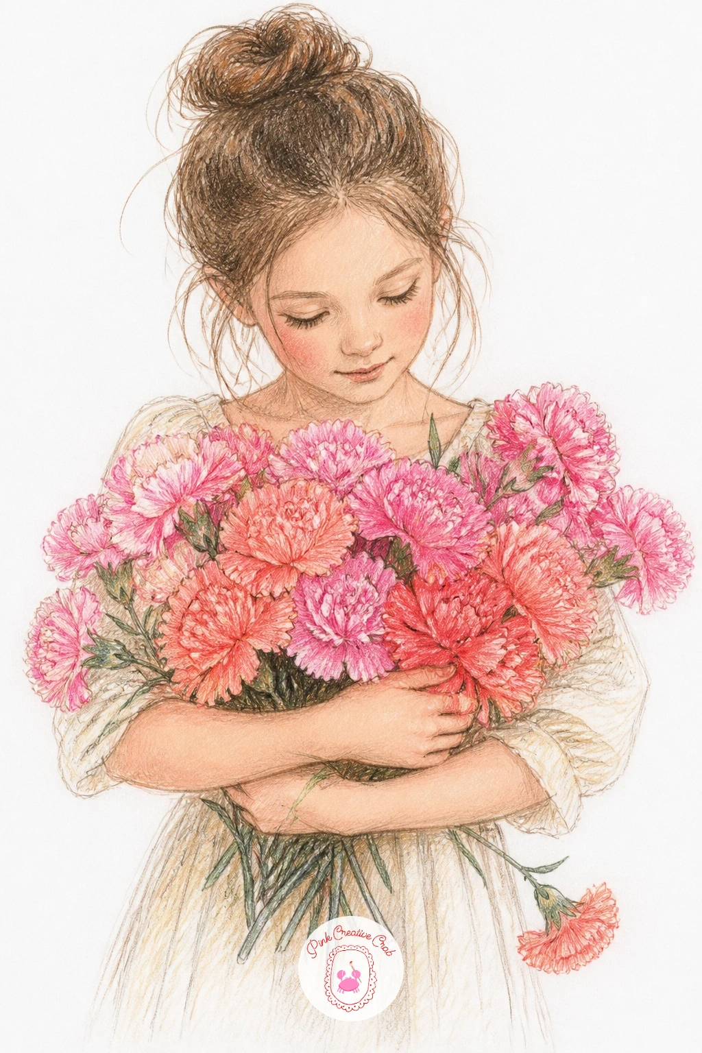
Palette: Carnation Pink,Coral,Cream,Sage Green
What to Do Next
Start wherever feels most fun, a single carnation in a teacup is a gentle entry point, while the flower stall bucket or the girl with an armful make a satisfying finishing project once a few blooms feel comfortable. Grab a smooth sheet of paper, sketch loosely in fineliner first, and let the pink and coral pencils do the rest.
Frequently Asked Questions
What colors do you need for a carnation drawing?
A basic carnation drawing needs pink, coral, cream and a soft green for the stem and calyx. A few deeper shades like maroon or deep pink add shadow between the ruffled petals once the base layers are down.
How do you draw carnation petals so they look ruffled?
Draw ruffled petals with short, jagged strokes pointing toward the flower’s center rather than smooth curved outlines. Vary the stroke length and leave small gaps of white paper between petal sections to keep the edges loose and natural.
Is carnation drawing good for beginners?
Yes, carnations are a forgiving subject because their ragged, irregular petals hide small mistakes that would show on a smoother flower like a tulip. Starting with one bloom in a buttonhole or vase is an easy first attempt.
What paper works best for colored pencil flower drawings?
A smooth to lightly textured bristol or drawing paper works best, since it lets colored pencil layer cleanly without the tooth eating up too much pigment. Heavier weight paper also holds up to a fineliner sketch underneath without bleeding through.
How do you keep a bouquet of flowers from looking flat?
Keep a bouquet from looking flat by coloring the blooms farthest back first in paler tones, then building the front flowers with stronger, deeper color so they visually sit closer to the viewer. A few cast shadow lines where flowers overlap help too.
Have any thoughts?
Share your reaction or leave a quick response — we’d love to hear what you think!
-
 0
-
0
-
0
-
0
-
0
-
0


