

Valentines watercolor is at its best when it stops being a single red heart and starts being a little scene: a letter with a dropped wax seal, two coffee cups fogging up a window, a bunny holding a heart almost as big as it is. That is the whole charm of this trend, and it is why these pages are so satisfying to paint in one sitting: small vignettes, soft cherry and blush washes, a little gold pen at the end to make it glow.
Below you will find 31 of these scenes, ordered from the simplest wash-and-go subjects to the ones with a bit more going on, so you can pick one that matches how much time you actually have today. Each one tells you what to paint first, where it tends to go wrong, and how to fix it, so you can start with wet paper and finish with something you want to frame.
Using these images: free for personal projects such as printing, coloring, cards, journals and gifts. Handmade items that include them may be sold up to 30 pieces per design. More than that is commercial use and is not permitted, and neither is selling or sharing the images themselves or passing them off as your own. Please ask before any other use.
Start with a love letter, the simplest scene on this list and the best warm-up for the whole trend. Pencil a loose rectangle for the folded paper, then paint it with a thin wash of cream or warm white so the paper has a tone before any ink goes on, rather than staying stark white.
Once that wash is dry, add a few wavy pencil lines to suggest handwriting, then a small red circle for the wax seal, left rough at the edges so it reads as melted wax rather than a sticker. The place this goes wrong is painting the seal too neatly: drop a little extra cherry red into the wet circle and let it bloom outward unevenly, that irregularity is what sells it.
If you do not have cherry red in your set, mix cadmium red with a touch of alkizarin crimson or any cool red you own. Finish with a fine gold pen for a tiny monogram or heart pressed into the seal.
Keep the envelope or paper edges a little uneven rather than ruler straight, it reads as handmade and soft instead of printed.
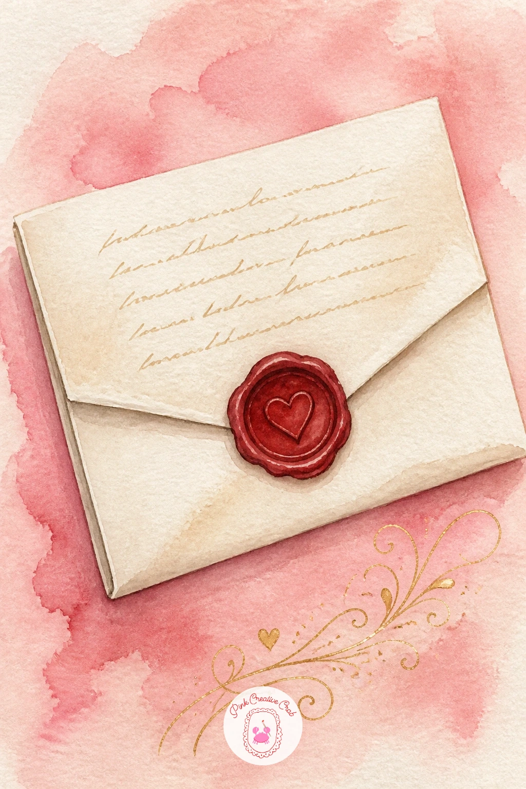
Palette: Cadmium Red,Cream,Payne’s Grey,Gold
Following on from the letter, a bouquet of red roses is the next natural subject, and it teaches you the wet-in-wet bloom you will reuse all through this list. Wet each rose shape first with clean water, then drop in cherry red and a touch of alizarin crimson near the center, letting the color spread on its own rather than pushing it with the brush.
Paint the roses before the wrapping paper, working from the top of the bouquet down, and leave tiny slivers of white paper between each bloom so they do not merge into one red blob. That merging is the most common mistake here: if it happens, once dry, use a fine brush with clean water to lift a thin line and separate two shapes.
Add the stems and a few sage green leaves last, then wrap the paper cone in kraft brown or blush with a single gold ribbon line. If you only own one red, warm it slightly with a touch of orange for the sunlit roses and keep it cooler with blue for the shaded ones.
Today’s tip: paint the darkest rose center while the paper is still damp so the color feathers softly into the petal.
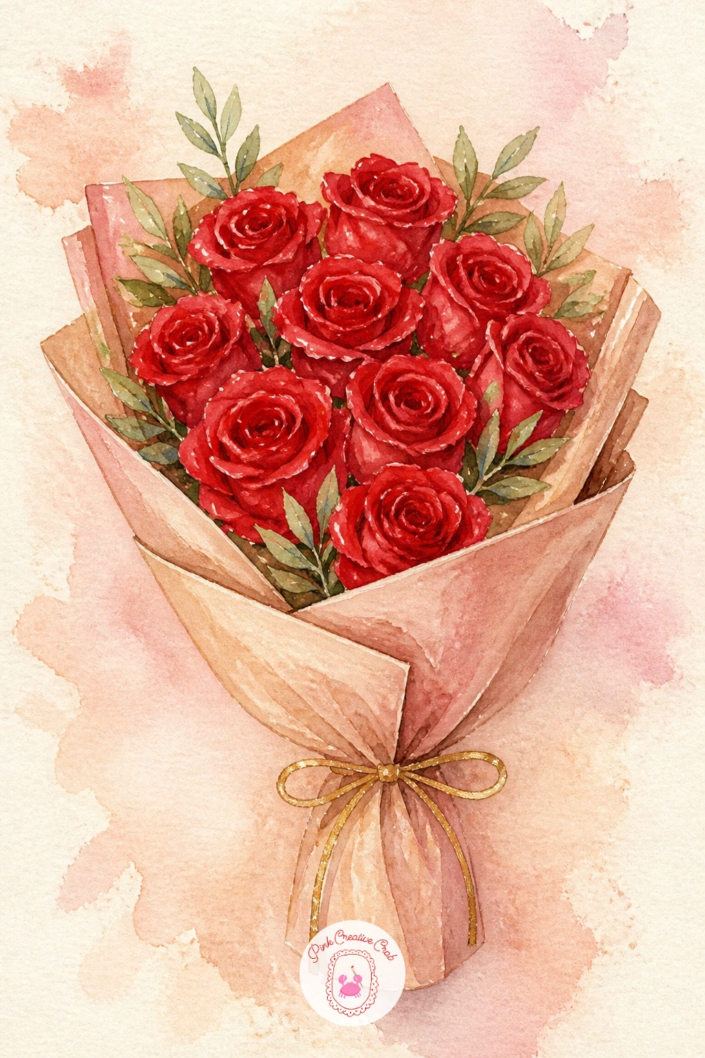
Palette: Alizarin Crimson,Cherry Red,Sap Green,Kraft Brown
For more bloom ideas at this same pace, the roundup of simple watercolor flowers ideas covers several other shapes worth trying.
Shrink the scale right down now and paint a cherry pair with a bow, the single most repeated motif in this whole trend and worth mastering early. Paint two overlapping circles in cherry red, leaving a small white highlight unpainted on the upper left of each so they look glossy rather than flat.
While the cherries are still slightly damp, drop a touch of deep maroon into the shadowed underside of each one so the color shifts naturally instead of staying one flat red. The stems come next in sap green or brown, crossing at the top where the bow sits.
Paint the bow in blush pink with two quick triangular strokes and a small knot, keeping the loops loose and slightly asymmetrical, since a too-perfect bow looks stiff. If pink feels too sweet, swap it for cream or soft gold instead.
Leave that white highlight dot on each cherry unpainted from the very start, it is the easiest way to make them look wet and round rather than like two red circles.
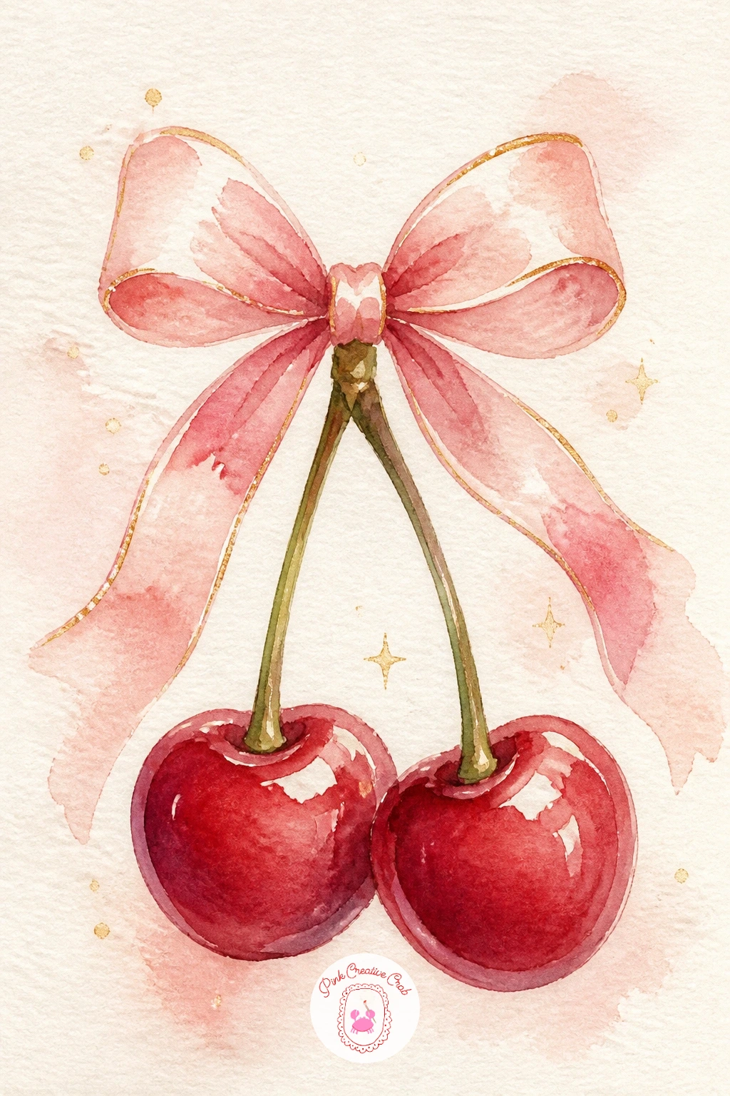
Palette: Cherry Red,Maroon,Blush Pink,Sap Green
Scale up to a heart-shaped cake with piping, where the eye level does most of the romantic work. Paint it from a slight three-quarter angle rather than straight on, so you can show both the flat iced top and a sliver of the front side, which reads as a real cake sitting on a surface rather than a flat heart cutout.
Wash the top in soft cream or blush first, let it dry fully, then paint the front face one shade darker to show where the light falls from above. Use a fine brush loaded with thick white or cream paint to pipe small dots and a shell border along the heart’s edge, working from one point of the heart around to the other so the spacing stays even.
A few loose cherry red strokes on top suggest berries or a drizzle. If the piping dots blur into the cake wash, wait for the base layer to dry completely before adding them, wet on wet is what causes the bleed.
For more practice with this exact angle and piping technique, the lessons in cake drawing aesthetic step by step are built around the same kind of vintage bow and cherry detail.
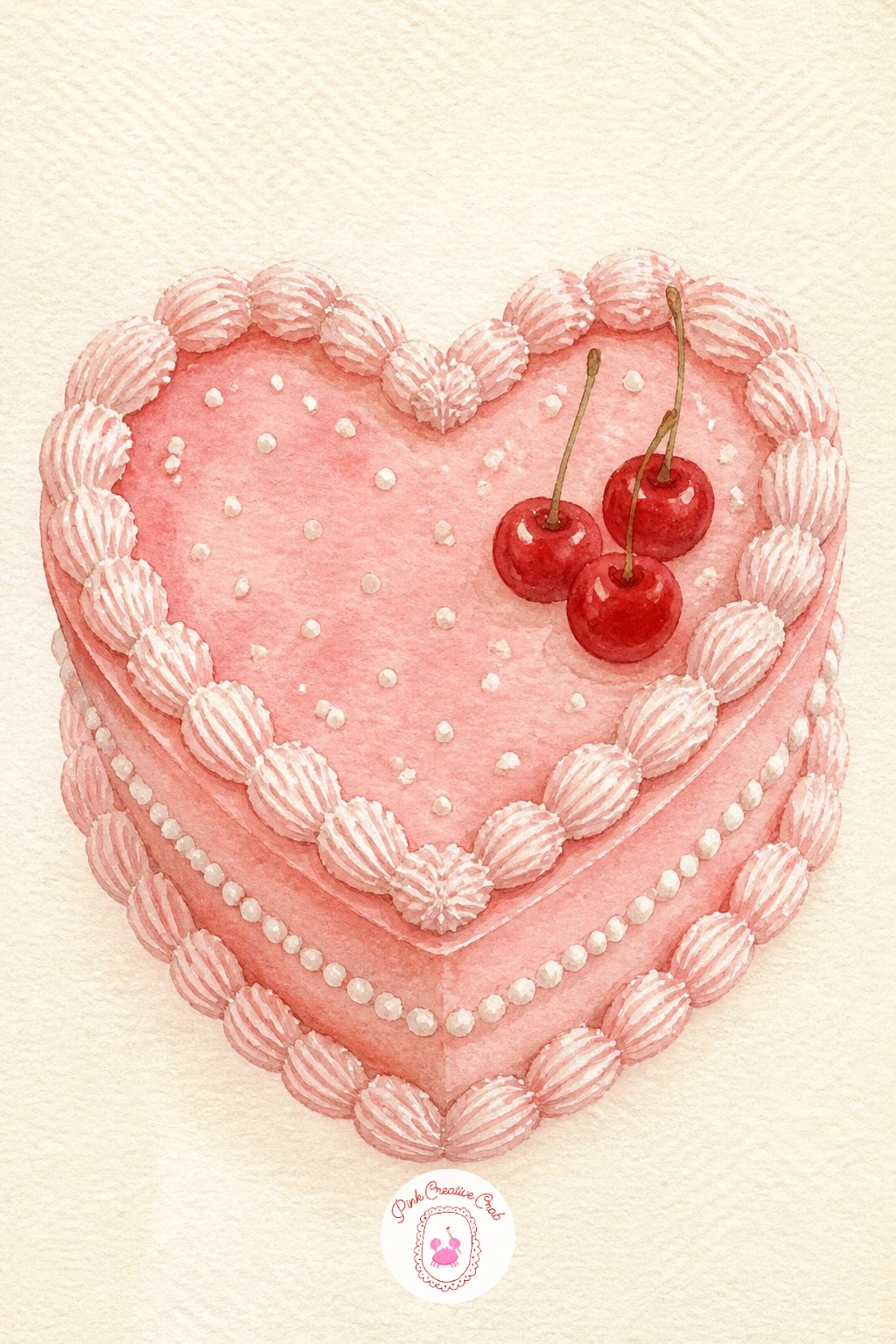
Palette: Blush Pink,Cream,Cherry Red,Warm White
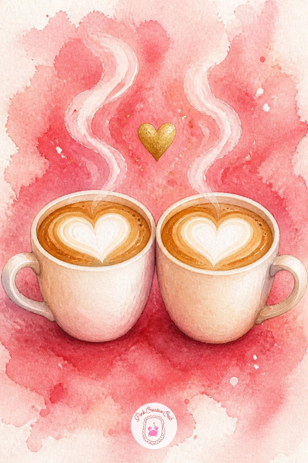
Keep the mood cozy with two coffee cups with heart foam, a scene that leans on light more than any idea so far. Decide where the window light comes from before you paint a single wash, then keep the cup on that side a touch brighter and the other cup slightly more shaded, so the pair feels lit rather than evenly flat.
Paint the cups first in cream or soft white, add the coffee as a warm brown wash inside the rim, then while that brown is still damp, paint a small heart shape in white gouache or by lifting paint with a damp brush for the foam art. A paper towel dabbed gently on wet paint also lifts color cleanly if you do not own gouache.
Finish with a thin steam line rising from each cup in pale grey, curving gently rather than straight up, and a small gold heart or ribbon between the two cups to tie them together. If the heart foam looks too crisp, soften its edge with a damp brush right after painting it.
You Will Need
- white gouache or opaque white paint
Palette: Warm Brown,Cream,Soft Grey,Gold
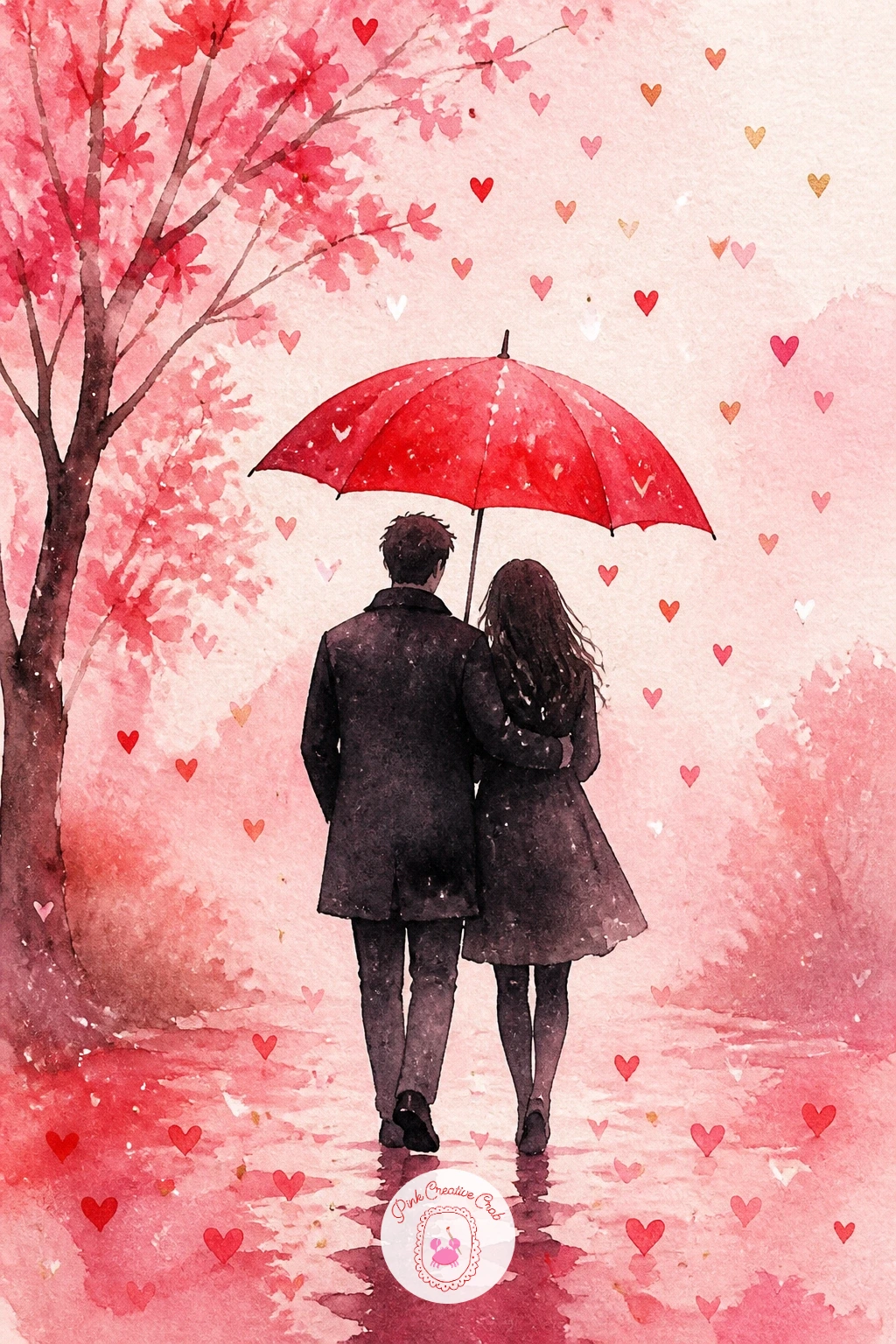
Move into a small landscape now with a couple sharing an umbrella, which depends entirely on keeping the figures simple. Block in the umbrella first as a flat cherry red half-circle, then paint the two figures underneath as soft silhouette shapes, coats and legs only, no facial detail needed at this scale.
Work the background next in loose blush and grey washes for rain or mist, painting it wet in wet so the color stays soft and the figures in front stand out crisply by contrast. The most common slip here is making the figures too tall and thin, so before you commit in ink, hold your pencil up to the sketch and check that each figure is roughly four heads tall, that proportion keeps them looking like a couple rather than two lampposts.
Add a scatter of small hearts falling like rain around the umbrella in pale pink, and a gold edge along the umbrella’s rim. Swap the cherry umbrella for cream with pink polka dots if solid red feels too heavy for the scene.
Palette: Cherry Red,Charcoal Grey,Blush Pink,Gold
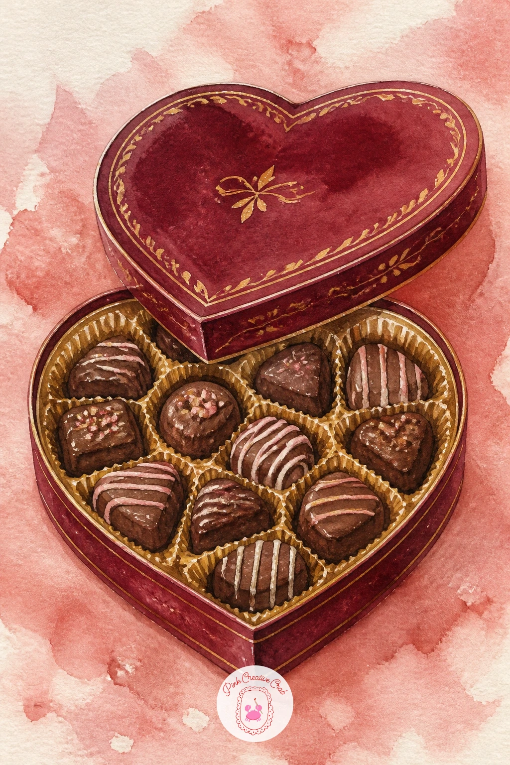
Settle back into still life territory with a vintage heart box of chocolates, one of the two classic motifs worth keeping from the familiar Valentine set. Paint the box lid as a heart shape in deep cherry or maroon, then while it dries, mix a warm brown for the chocolates sitting just above the open edge of the box.
Paint each chocolate as a small rounded blob with a slightly different shape and a thin cream drizzle on top, since uniform rows of identical chocolates look stamped out rather than hand painted. Add a gold foil edge along the inside rim of the box lid with your gold pen once everything is fully dry, that single line of gold is what makes the whole box read as vintage rather than modern packaging.
If maroon feels too dark for your palette, dusty rose works just as well for a softer, more pastel box. Keep the chocolates slightly uneven in size, it reads as handmade rather than a printed pattern.
You Will Need
- fine gold paint pen
Palette: Maroon,Warm Brown,Cream,Dusty Rose
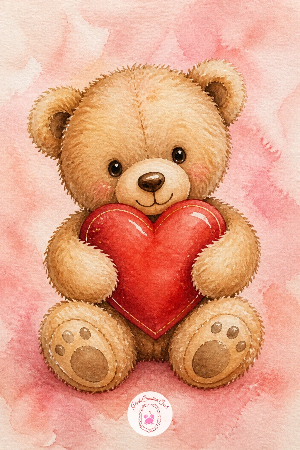
Soften the mood again with a teddy bear holding a heart, a forgiving subject since fur hides most small mistakes. Paint the whole bear shape first in one flat warm tan wash, rounding the ears, belly and paws into simple soft forms rather than anything anatomically precise.
Once that base is dry, go back in with a slightly darker brown along the underside of the arms, legs and ears to suggest shadow and shape without drawing a single line, this is where the dry brush trick helps most: load a nearly dry brush with the darker brown and drag it lightly over the fur direction so the edge looks textured rather than painted flat.
Paint the heart the bear holds in cherry red last, slightly overlapping the paws so it looks held rather than floating beside them. A small stitched cross in cream thread on one paw is a nice last touch if you want it, otherwise leave the bear plain.
If brown feels flat, warm it with a touch of orange toward the bear’s belly where light would naturally catch.
Palette: Warm Tan,Burnt Sienna,Cherry Red,Cream
Pick up the pace with a pink champagne toast, two glasses clinking that rely on clean negative space more than careful detail. Paint the glass outlines lightly in pencil first, then fill the champagne itself with a pale blush wash, leaving the glass rim and a thin vertical highlight down one side completely unpainted.
That unpainted highlight is the whole trick to glass: once the pink wash is dry, add a few tiny bubbles as small unpainted dots inside the liquid, and a thin grey shadow line along the base of each glass to ground it on the surface. Keep the glass stems thin and slightly wobbly rather than ruler straight, it reads as sketched by hand rather than traced.
A scatter of pink rose petals or confetti hearts around the base finishes the scene nicely. For the quick ten minute version, paint just the two glasses and liquid; for the fuller forty minute version, add a small side table, a vase of flowers, or a pair of hands clinking the glasses together.
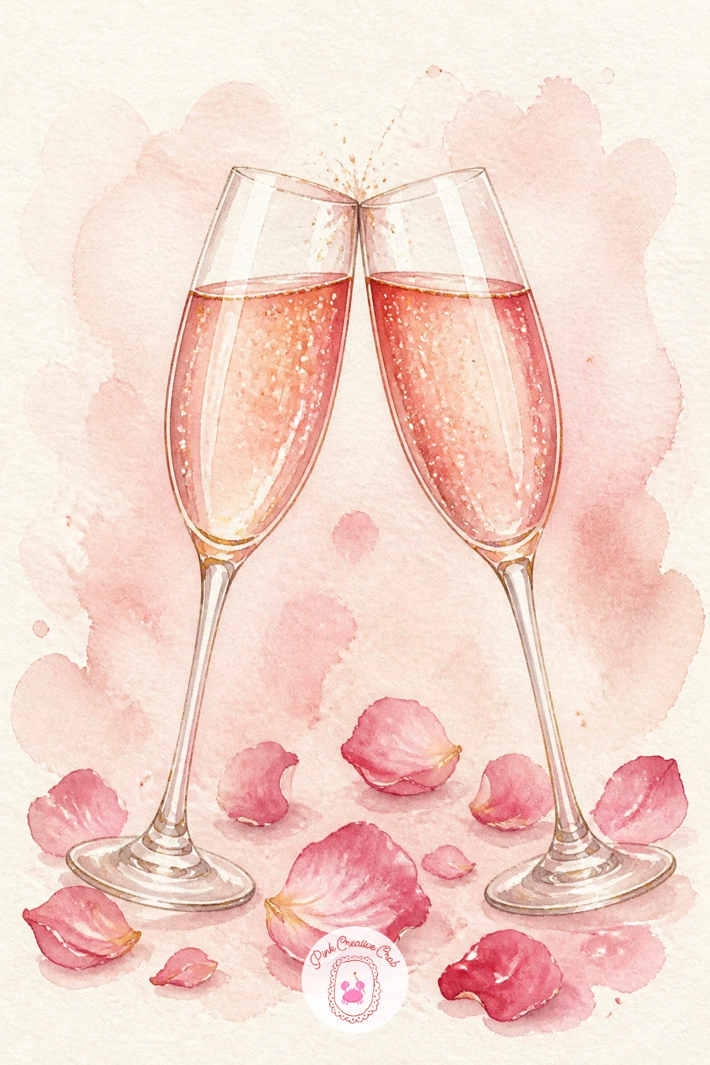
Palette: Blush Pink,Soft Grey,Cherry Red,Gold
Step back for a window scene now with a heart garland strung across the glass, which turns on perspective more than anything painted so far. Decide the window is seen from inside looking out, which means the garland and panes sit closest to you and stay crisp, while anything visible through the glass, like sky or a blurred street, stays soft and pale behind it.
Paint the window frame first in cream or soft grey, then the sky or background beyond it in a loose wet wash of pale blue or blush, kept deliberately blurry since it is meant to recede. Once dry, string a thin grey or brown thread line across the window and hang small cherry red paper hearts along it, each one a simple folded triangle shape rather than a rounded heart, which reads more like paper bunting.
Keep the hearts slightly uneven in spacing and a few tilted, store-bought garlands hang in perfectly even rows and that evenness is what looks stiff on paper. A little gold pen sparkle in the corner of the glass adds a nice final touch.
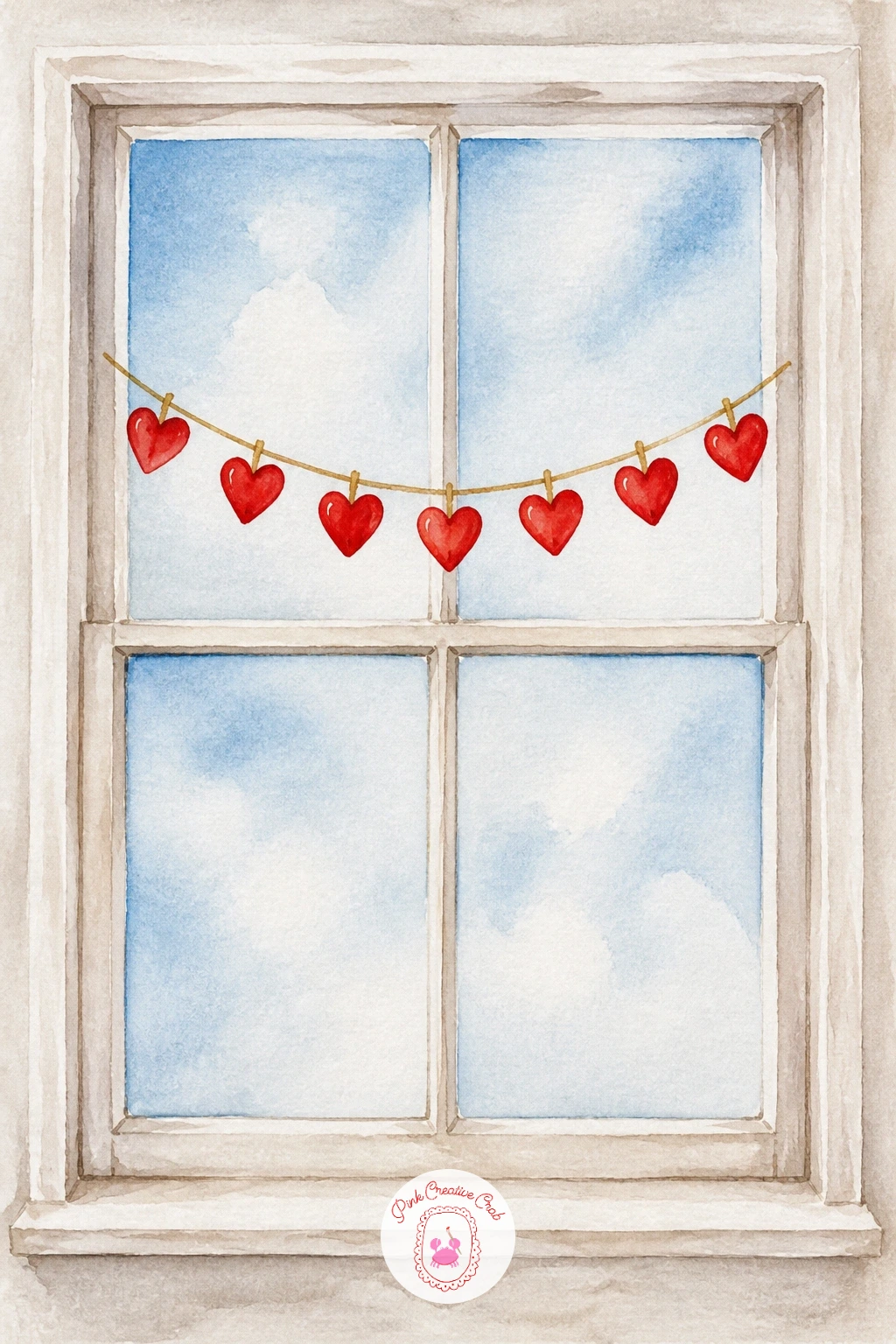
Palette: Cherry Red,Pale Blue,Cream,Soft Grey
Bring in a figure properly with a girl reading a love note, where keeping proportions simple matters more than any likeness. Sketch the head as an oval and the shoulders as a soft trapezoid beneath it, checking that the head sits about one fifth of the total figure height if you are painting her from the waist up, that single check keeps the head from ending up too large, which is the single most common mistake with figures at this level.
Paint her hair and simple dress in flat color blocks first, cherry red or blush work well, then add the note she holds as a small cream rectangle tilted slightly in her hands. Her face needs only the barest suggestion, a soft blush on the cheek and perhaps closed eyes if you would rather skip features altogether, which many of these vintage style prints do anyway.
A few loose curls or waves in her hair and a small gold heart necklace finish her. If full figures feel daunting, crop the scene to just her hands and the letter, that trims the risk and still tells the whole story.
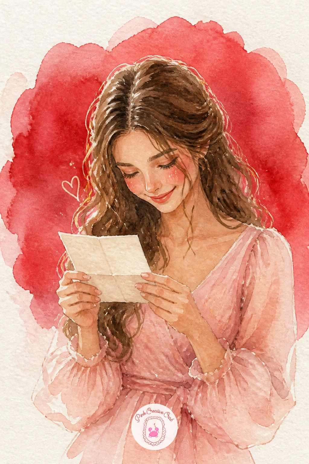
Palette: Cherry Red,Blush Pink,Warm Brown,Cream
Lighten things with a dog with a heart balloon, a subject that rewards a loose, playful hand more than precision. Paint the dog’s body first as one simple rounded shape, whatever breed you like, a puppy works best since round ears and a short snout are easiest to get looking cute on the first try.
Leave the balloon string as the last thing you paint, a single curving line from the dog’s mouth or paw up to a cherry red heart-shaped balloon floating above, and keep that line a little wavy rather than taut, it suggests movement and play. Paint the balloon itself with a small white highlight left unpainted near the top so it reads as glossy and inflated rather than flat.
If the dog’s proportions feel off once painted, a few extra strokes of darker fur color along the back and legs will often rescue it by adding shadow and shape after the fact. Swap the breed for whatever dog you know best, a corgi, a dachshund or a scruffy terrier all work equally well here.
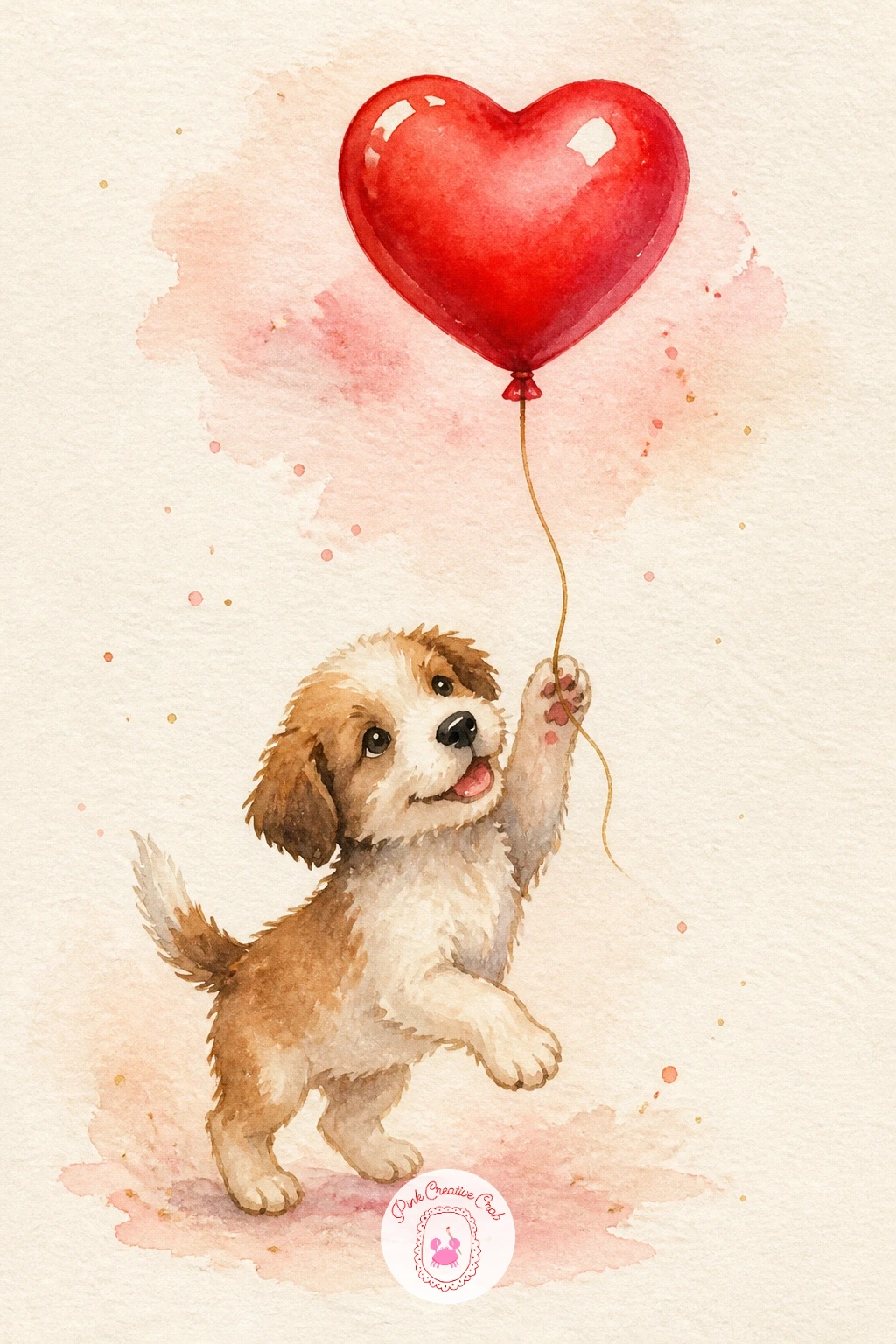
Palette: Warm Tan,Cherry Red,Cream,Soft Grey
Take a breather with conversation hearts in a bowl, a quick and colorful subject built almost entirely from the same small shape repeated. Paint the bowl first as a simple rounded container in cream or pale blue, then fill it loosely with small heart shapes in a mix of pastel colors, blush, mint, lilac and pale yellow scattered rather than lined up in rows.
Leave each heart unpainted in the very center or add a tiny pencil squiggle once dry to suggest the printed word without actually writing legible letters, which keeps the painting from turning into a lettering exercise. Vary the tilt of each heart as you paint it, some flat, some on their edge, so the bowl reads as genuinely full rather than a flat pattern glued on top.
A few hearts spilling over the rim onto the table add a nice sense of abundance. If your palette runs short on pastels, mix any color with a good amount of white or simply thin it with extra water for a paler wash.
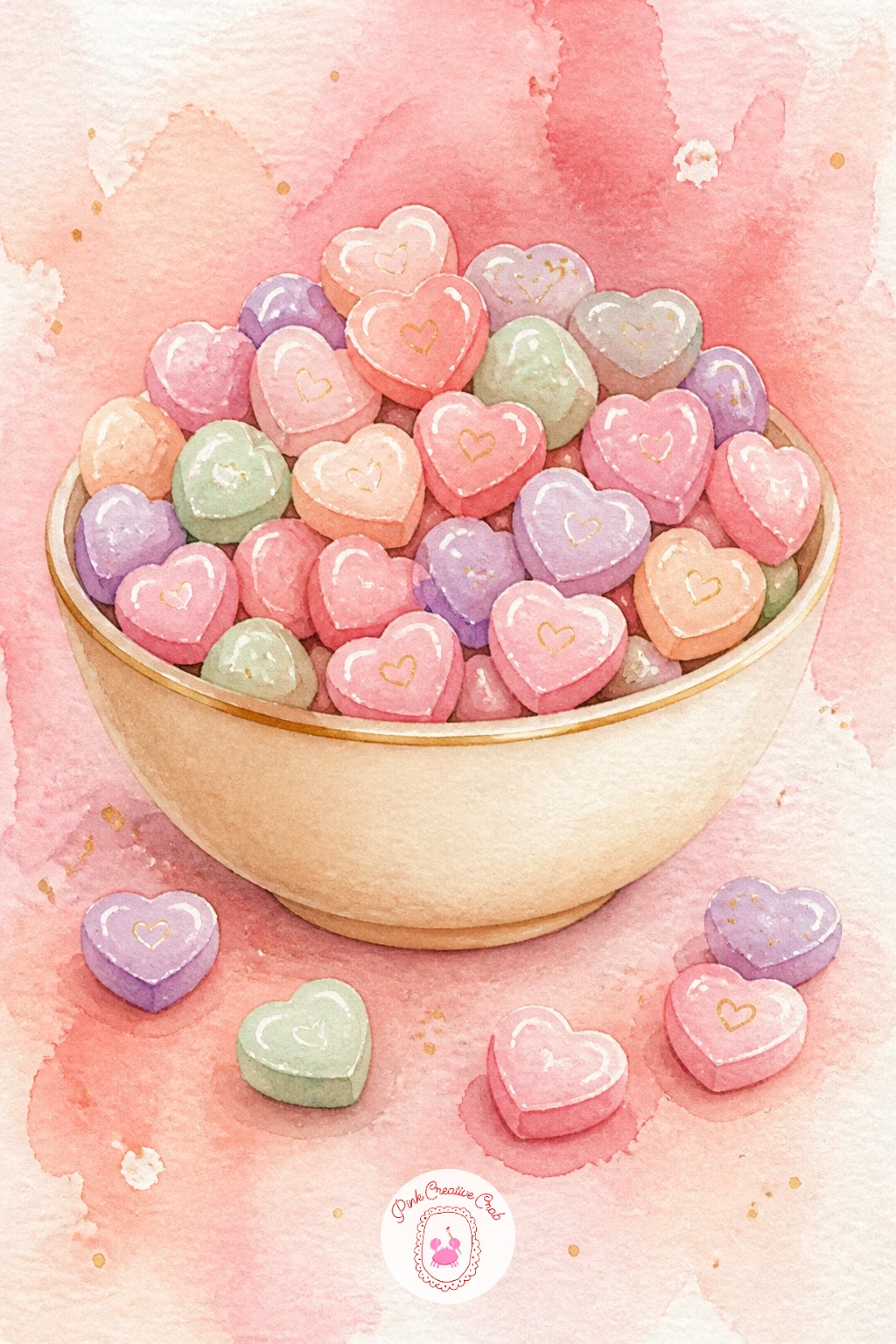
Palette: Blush Pink,Mint Green,Soft Lilac,Pale Yellow
Expand the scene with a picnic for two, which asks you to think about eye level before you sketch a single thing. Choose a view looking slightly down onto the blanket, as if standing just above it, since that angle lets you show the whole spread, the basket, glasses and plates, without any one object blocking another.
Paint the blanket first as a flat checked or striped shape in cherry and cream, then work outward to the basket, a bottle, and a small plate of strawberries, keeping every object simple and slightly overlapping so the eye reads them as one grouping rather than scattered items. Grass or ground around the blanket’s edge can stay a loose, unfussy green wash, it does not need detail since it only frames the real subject.
If the whole spread feels cluttered once sketched, remove one item rather than adding more, a picnic with four confident shapes reads better than one with eight crowded ones. For another angle on painting small food scenes like this, the ideas in easy watercolor food ideas use a similar top-down view.
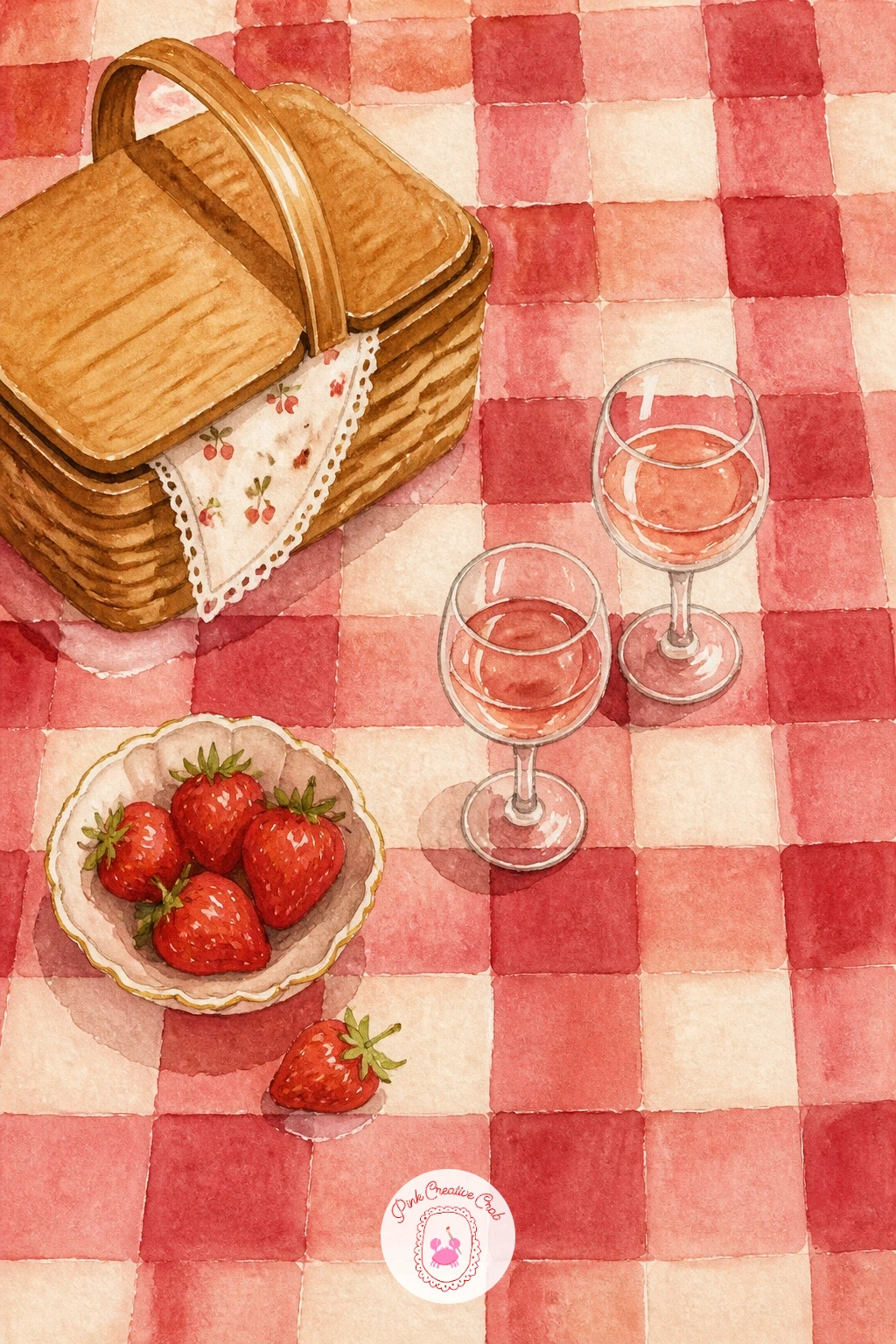
Palette: Cherry Red,Cream,Sap Green,Warm Brown
Return to a tighter still life with a vintage telephone with a bow, where getting the shape right depends on one simple comparison. Before you paint, look at the phone’s base and handset side by side and note that the base is usually about twice as wide as the handset is long, holding that ratio in mind keeps the whole object from looking pinched or oversized at either end.
Paint the body of the phone first in a flat cream or dusty rose, then add the coiled cord as a loose spiral line connecting base to handset, keeping the coils uneven rather than perfectly regular since real cords never are. A small bow tied around the handset in cherry red or blush finishes the vintage feel, painted with the same loose double-loop stroke used on the cherry pair earlier in this list.
Shade the underside of the phone’s curves with a touch of grey once the base color is dry, to give it some roundness rather than leaving it flat. A rotary dial sketched lightly in pencil and gone over with a fine brush adds detail if you want it, or leave it plain for a simpler read.
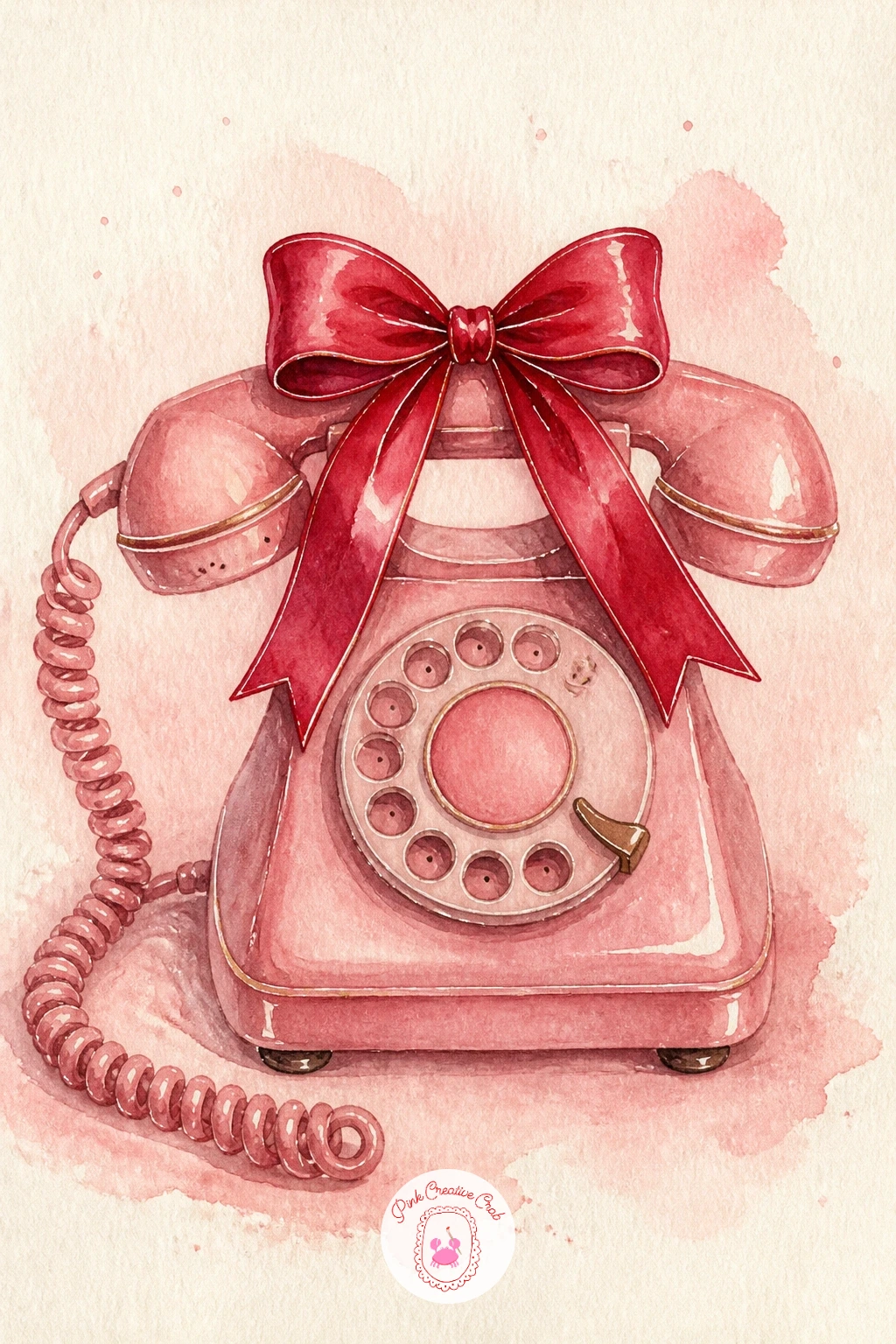
Palette: Dusty Rose,Cream,Cherry Red,Soft Grey
Bring the scene outdoors briefly with a Valentine card on a doorstep, where light direction decides most of the mood. Pick a warm late afternoon light coming from one side, then let the doorstep, door and card all carry a soft golden cast on that lit side and a cooler shadow tone on the other, rather than painting every surface the same flat color.
Paint the door first as a large simple shape, any color you like, cherry red or soft sage both suit the trend, then the step beneath it in grey or warm stone, and finally the small cream envelope resting against the door, tilted slightly as if just delivered. A cast shadow stretching from the envelope across the step grounds it in the scene.
If the door looks flat once painted, a few vertical panel lines in a slightly darker shade of the same color add just enough structure without extra effort. Swap the single envelope for a small bouquet left on the step instead, for a softer, less postal version of the same idea.
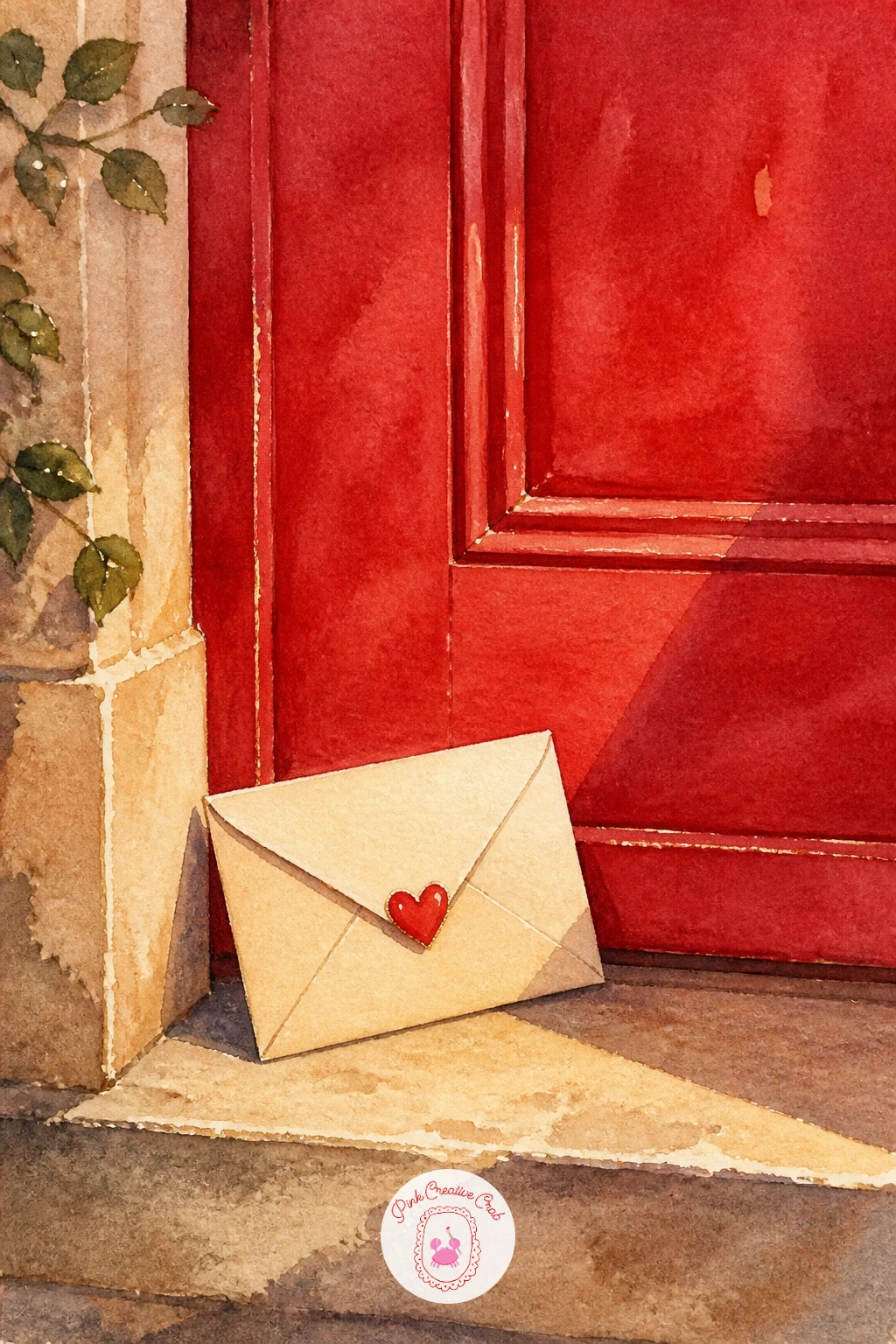
Palette: Cherry Red,Warm Stone,Cream,Soft Grey
Slow down for strawberries dipped in chocolate, a small food study that leans entirely on edges and texture. Paint the red strawberry body first, leaving the tiny seed dots unpainted as small white specks scattered over the surface, then once dry, paint the chocolate dip as a separate darker shape over the top half, letting its edge drip unevenly downward in a few thin trails rather than one clean straight line.
That drippy, irregular edge is the one hands-on trick that makes chocolate look like chocolate instead of a brown hat: while the dip layer is still slightly damp, touch a nearly dry brush to the bottom edge and pull a few short downward strokes to suggest dripping before it sets.
Group two or three strawberries together at slightly different angles so the plate or dish reads as a real little pile rather than cut out copies. A gold-rimmed plate underneath ties it to the rest of the collection, or simply let them sit on a plain cream background if you would rather skip the dish.
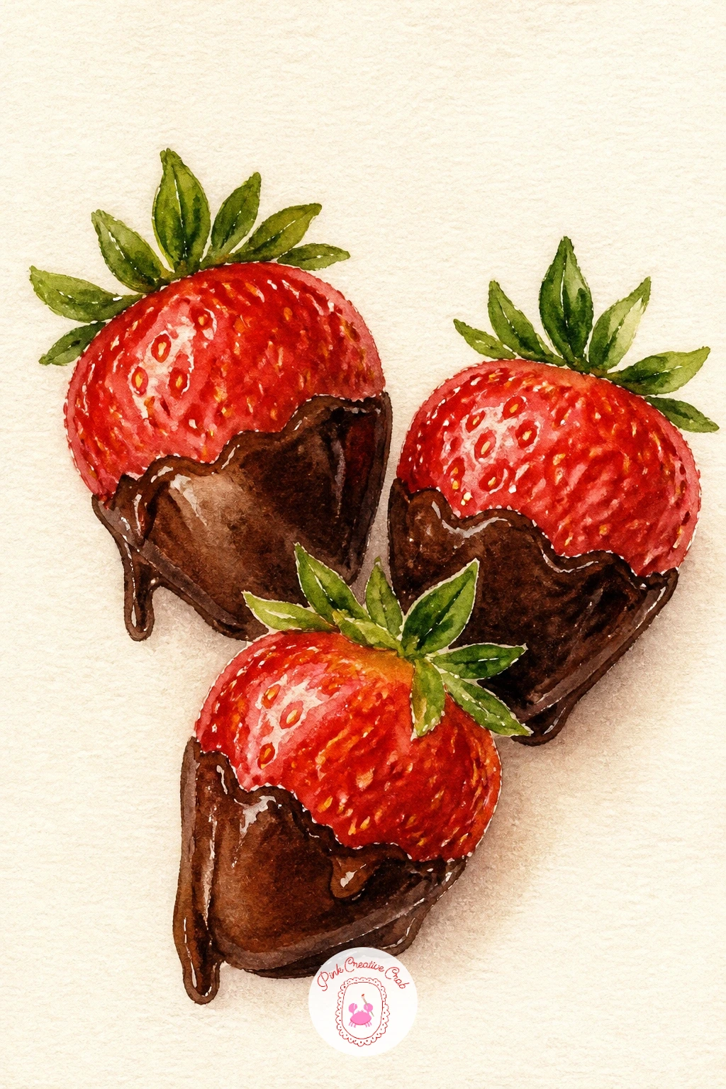
Palette: Cherry Red,Dark Chocolate Brown,Cream,Gold
Widen the view with a heart lock on a bridge, a scene that uses perspective to pull the eye into the distance. Paint the bridge railing first, angling the top and bottom rails so they converge slightly toward one side of the page, that small convergence is what makes the railing feel like it recedes into the distance rather than sitting flat across the page.
Hang the heart-shaped lock from the railing in cherry red or gold, painting its small keyhole as a tiny unpainted shape left in reserve. Behind the bridge, a loose wash of soft blue or lavender suggests sky or water, kept pale and blurry since it sits furthest from the viewer and should never compete with the lock itself.
A scatter of smaller locks in blush and gold along the same railing, painted looser and smaller as they recede toward the vanishing point, reinforces the sense of distance. If the railing feels tricky to angle correctly, lightly pencil in two converging guide lines before painting and erase them once the paint is dry.
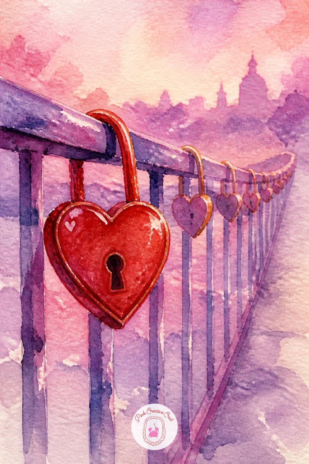
Palette: Cherry Red,Gold,Soft Lavender,Soft Grey
Return to something small and graphic with a red lipstick kiss on a letter, a quick confident subject once you commit to the shape. Paint the letter or card background first in cream, let it dry completely, then paint the lip shape directly on top in one or two bold, loaded strokes of cherry red, pressing the brush down to fan out slightly at the center the way a real lipstick print would.
Do not go back over the lip shape once it is painted, overworking it is the one mistake that kills this idea, since lipstick kisses look best a little rough and a little uneven, exactly as a real one would. If the first stroke misses the shape, let it dry and paint a cleaner one beside or over it rather than trying to fix wet paint, watercolor rarely forgives a second pass on the same wet mark.
A small gold heart stamped beside the kiss, or a few words sketched in script beneath it, round out the card. This is the quickest idea on the whole list, ten minutes start to finish, so it is a good one to practice a few times on scrap paper first.
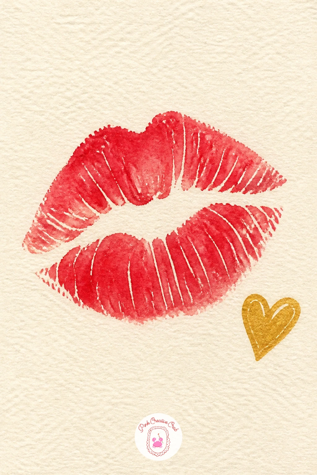
Palette: Cherry Red,Cream,Gold,Maroon
Practice the kiss shape several times on a scrap sheet before committing to the good paper, confidence shows in the stroke far more than careful planning does.
Pair the kiss with a bow on a perfume bottle, a tidy little study in glass and light. Paint the bottle as a simple geometric shape first, leaving a vertical strip of white paper unpainted down one side to suggest the glass catching light, the same trick used earlier for the champagne glasses, since that unpainted sliver reads instantly as shine once it sits beside painted color.
Once the glass wash is dry, paint the liquid inside in a soft blush or pale gold, slightly darker toward the base of the bottle where more of it pools, and the stopper or cap in a deeper rose or gold. The bow tied around the bottle’s neck comes last, painted loose and slightly lopsided with the two loop ends trailing unevenly down the glass.
A sprinkle of tiny gold dots scattered around the bottle like light catching dust finishes the scene prettily. If glass feels intimidating, simplify the bottle to a plain rounded shape with just the one white highlight strip, the bow and liquid color do most of the work regardless.
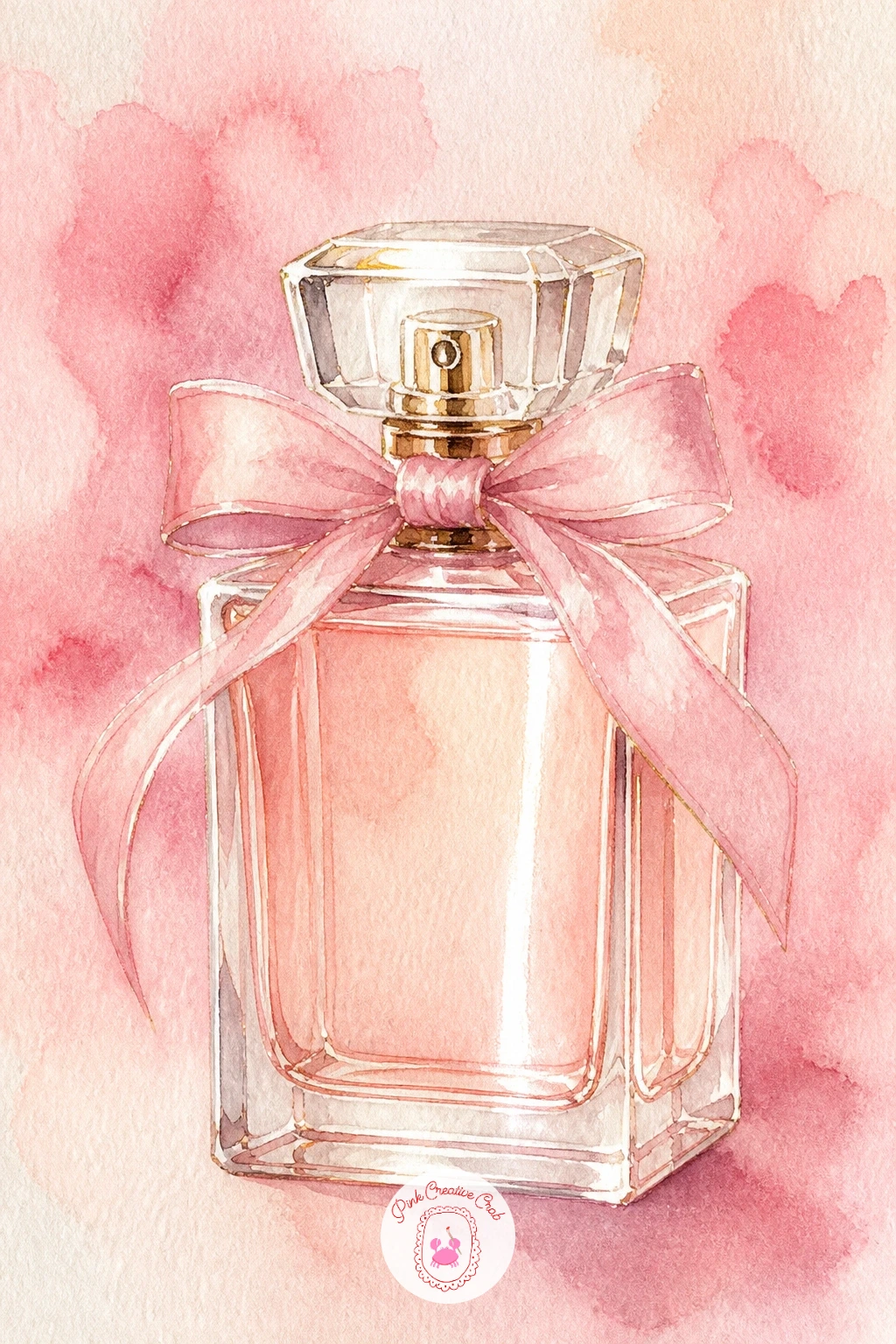
Palette: Pale Gold,Blush Pink,Deep Rose,Soft Grey
Move into a cozier scene with breakfast in bed with a rose, where the eye level sits directly above the tray looking straight down. That top-down view is what makes a breakfast tray read clearly, since it lets you show the plate, cup and rose all at once without any object hiding behind another, so sketch everything as simple circles and ovals from that bird’s eye angle before adding any color.
Paint the tray surface first in warm wood tone or cream, then the plate and cup as pale shapes on top, and finally the single rose laid across the tray in cherry red, its stem crossing diagonally to break up all those round shapes with one straight line. A soft white or cream blanket peeking in at the edges of the frame suggests the bed beneath without needing to paint the whole room.
If the tray items look like they are floating, add a thin grey shadow beneath each one, that single step anchors everything to the surface. Swap the rose for a sprig of eucalyptus or a few berries if red feels like too much next to a busy tray.
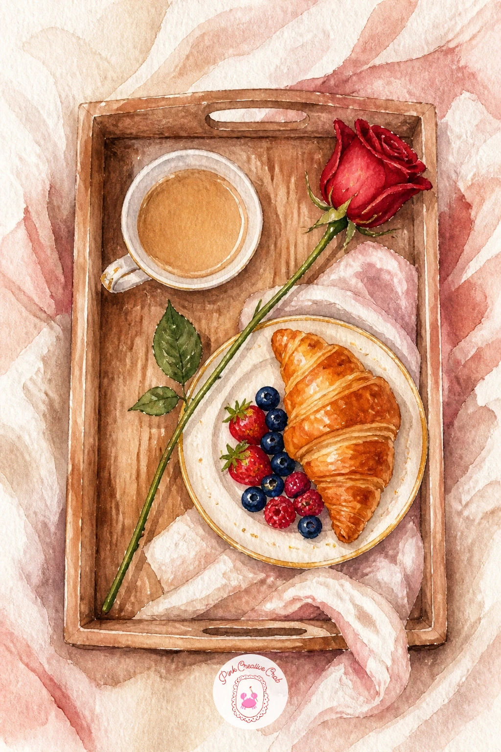
Palette: Warm Wood Brown,Cream,Cherry Red,Soft Grey
Lighten the mood again with a bunny with a heart, a quick charming subject built from just two soft shapes. Paint the bunny’s body and head as one continuous rounded form, long ears folding gently rather than standing stiff and straight, since floppy ears instantly read as softer and more appealing than rigid ones.
Leave the belly and inner ears unpainted or very pale, then shade the back and outer edges of the ears with a slightly deeper warm grey or tan while the first wash is still a touch damp, so the color blends softly rather than sitting in a hard band. The heart the bunny holds between its paws goes in last, cherry red and slightly larger than feels proportionate, since an oversized heart against a small bunny reads as sweet rather than wrong.
A tiny pink nose and closed eyes keep the face simple without needing any real detail work. If grey feels too cool for the fur, warm it with a touch of brown for a cream colored bunny instead.
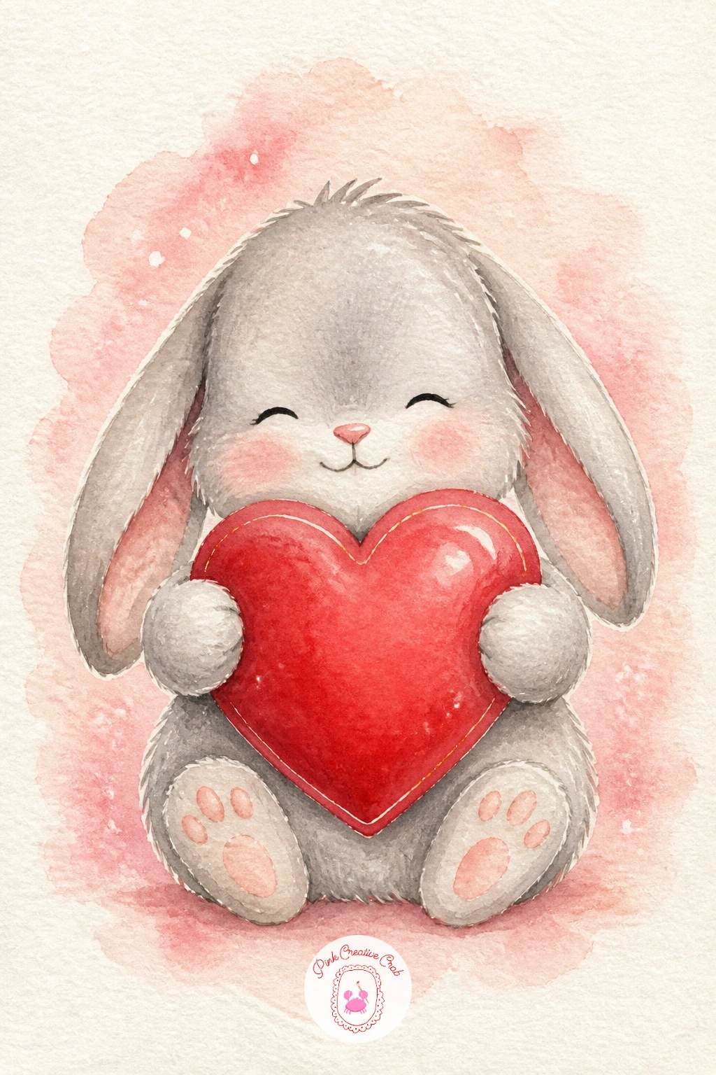
Palette: Warm Grey,Cream,Cherry Red,Soft Pink
Bring in something playful with a heart-shaped pizza, a fun departure from the softer subjects around it that still fits the romantic theme. Paint the crust first as a heart outline in warm golden brown, then fill the center with a cherry red tomato sauce wash, keeping the crust edge a shade lighter so the two layers read distinctly from each other.
Scatter a few toppings on top once the sauce layer is dry, small pepperoni circles in deep red, flecks of green herb, or melted cheese strands painted in loose cream streaks across the surface. Keep the toppings a little uneven in placement and size, a too-regular scatter looks printed rather than baked.
A thin wisp of steam rising from one corner in pale grey adds warmth and movement to the scene. If the heart shape comes out lopsided on the first try, that is fairly forgiving here, a slightly wonky heart pizza still reads charmingly handmade rather than like a mistake.
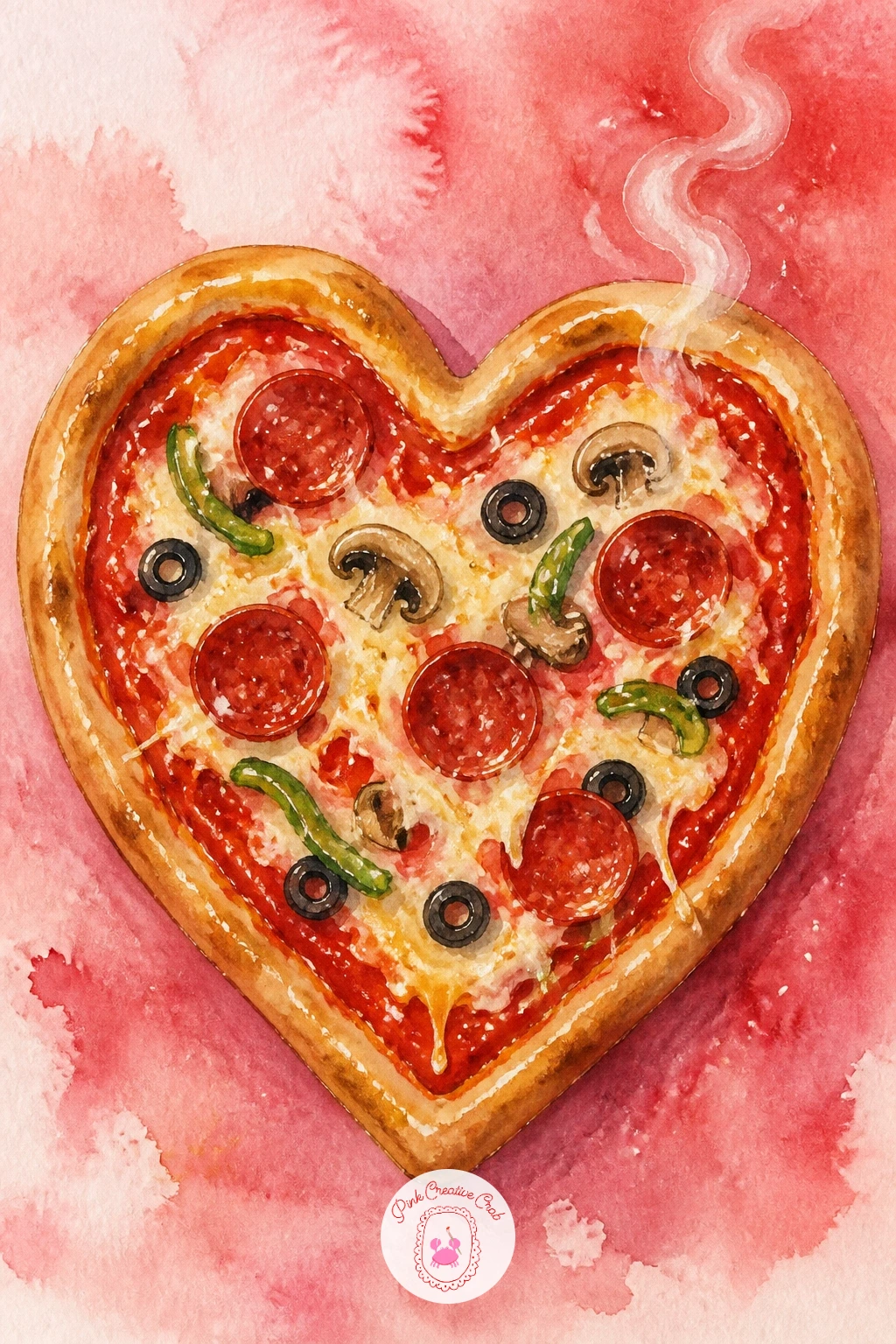
Palette: Golden Brown,Cherry Red,Cream,Sap Green
Try something with more structure now in a kiss in a photo booth strip, four small frames stacked in one tall column. Divide your paper into four even rectangles first with a light pencil line, checking the measurements with a ruler rather than eyeballing them, since even slightly uneven frames throw off the whole strip’s charm.
Paint the background of each frame in a slightly different flat color, cherry, blush, cream and soft grey work nicely in sequence, then paint two simple silhouette figures within each frame getting progressively closer together from the first frame to the last, ending in a kiss silhouette in the final square. Keep every figure loose and gestural rather than detailed, since a photo booth strip is about mood and motion, not precision.
A thin white border separating each frame and a small curling edge at the strip’s bottom finish the vintage photo booth look. For the quick version, paint just two frames rather than four, for the fuller version, add tiny date-stamp numbers in the corner of each frame with a fine pen.
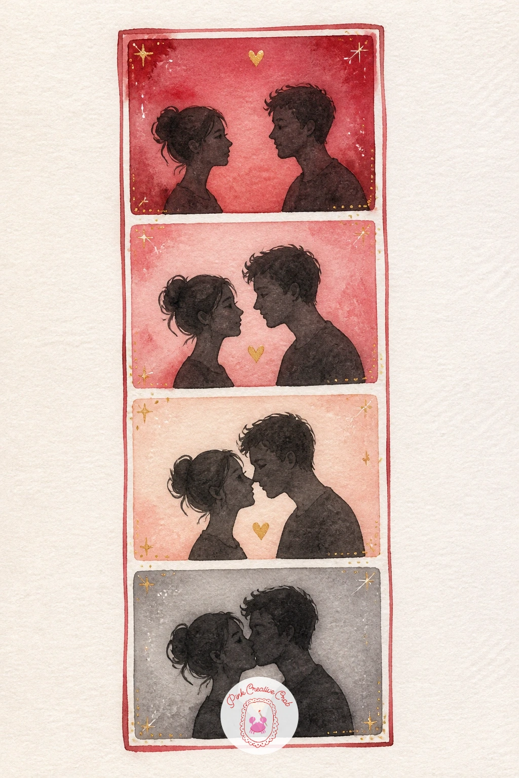
Palette: Cherry Red,Blush Pink,Cream,Soft Grey
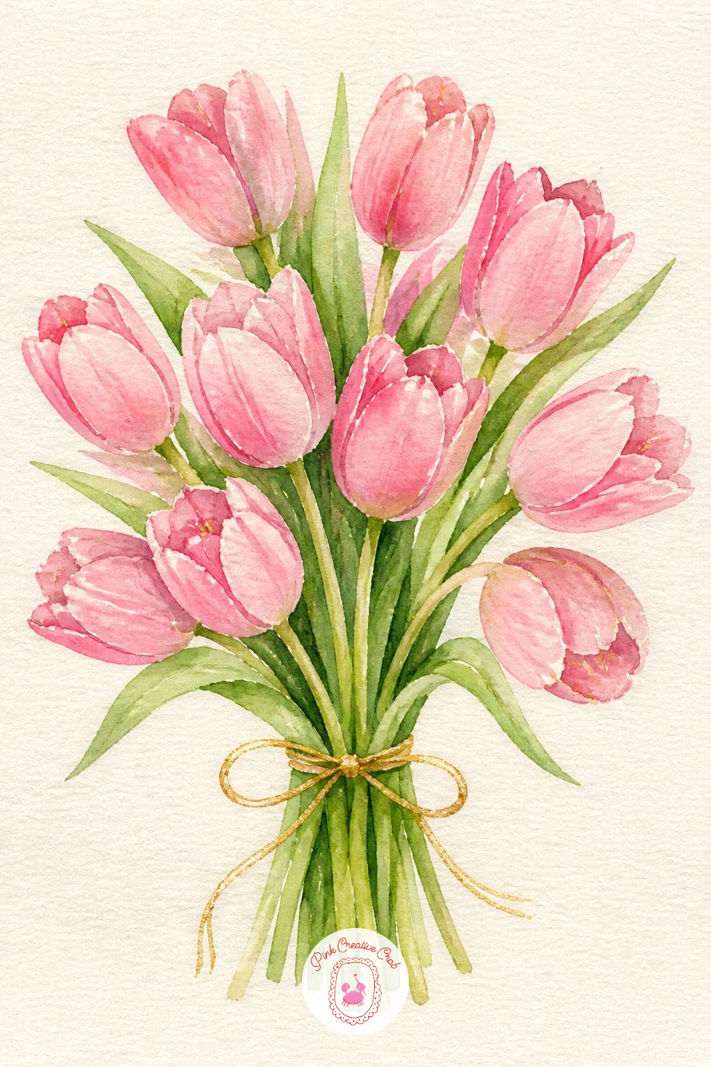
Return to flowers with a pink tulip bouquet, a nice contrast to the rounder rose shapes earlier in the list since tulips are built from clean simple cups. Paint each tulip head as a closed oval shape in blush or soft pink, leaving the bottom edge of each petal slightly open and unpainted so the cup shape reads clearly rather than looking like a solid lollipop.
Vary the tilt of each tulip head as you paint the bunch, a few upright, a few leaning, since tulips in a real bouquet rarely all face the same direction, that variety is what keeps the arrangement looking gathered rather than lined up. The stems go in last in one confident green wash, slightly overlapping each other near the base where they are tied together.
A thin gold or blush ribbon wrapped around the stems ties the whole bouquet together visually. If pink feels too uniform across every tulip, mix in one or two in a deeper rose or soft peach for variety, exactly the kind of small change worth trying on a second attempt at this same subject.
Palette: Blush Pink,Deep Rose,Sap Green,Gold
If tulips feel too similar to the roses earlier, the ideas in easy watercolor flowers for beginners cover several more shapes to vary a bouquet with.
Have some fun now with cupid on a cloud, a whimsical figure scene that depends on a soft, low light source. Paint the cloud first as a loose, puffy white and pale grey wash, built wet in wet so the edges stay feathered rather than sharp, since a cloud with hard edges looks more like a painted rock than something soft to sit on.
Once the cloud is dry, paint the small cupid figure on top in simple soft shapes, a round belly, short limbs and tiny wings in cream or pale gold, kept deliberately chubby and sweet rather than anatomically precise. His little bow and arrow can be suggested with just two or three confident lines rather than careful detail.
Light the whole scene from behind and slightly above, so the cloud’s upper edge catches a warm golden glow and the underside stays in cool shadow, that single choice gives the whole scene a soft heavenly feel. A trail of tiny hearts following the arrow’s path adds a last playful touch.
Palette: Soft White,Pale Grey,Warm Gold,Cherry Red
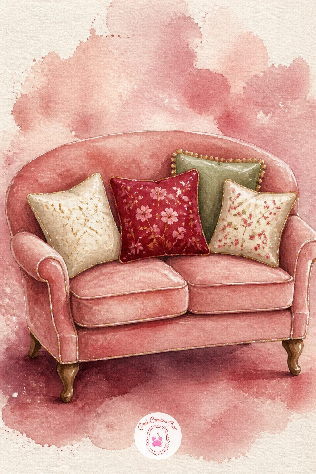
Settle into an interior scene with a love seat with cushions, which needs just enough perspective to feel like real furniture rather than a flat cutout. Sketch the seat from a slight angle rather than straight on, so one armrest appears a touch larger and closer than the other, that small size difference between the two ends is what convinces the eye it is a three-dimensional object rather than a flat silhouette.
Paint the main body of the seat first in a soft blush or dusty rose wash, then add two or three plump cushions on top in a mix of cream, cherry and soft sage, each one painted with a slightly darker fold line through the middle to suggest it is stuffed and soft rather than flat fabric glued on.
A curved wooden leg or two peeking out beneath the seat grounds it on the floor. If the perspective angle feels tricky to judge, simplify by painting the seat almost straight on with just a hint of angle at one armrest, the cushions and color do most of the charm regardless of how precise the angle is.
Palette: Dusty Rose,Cream,Cherry Red,Sage Green
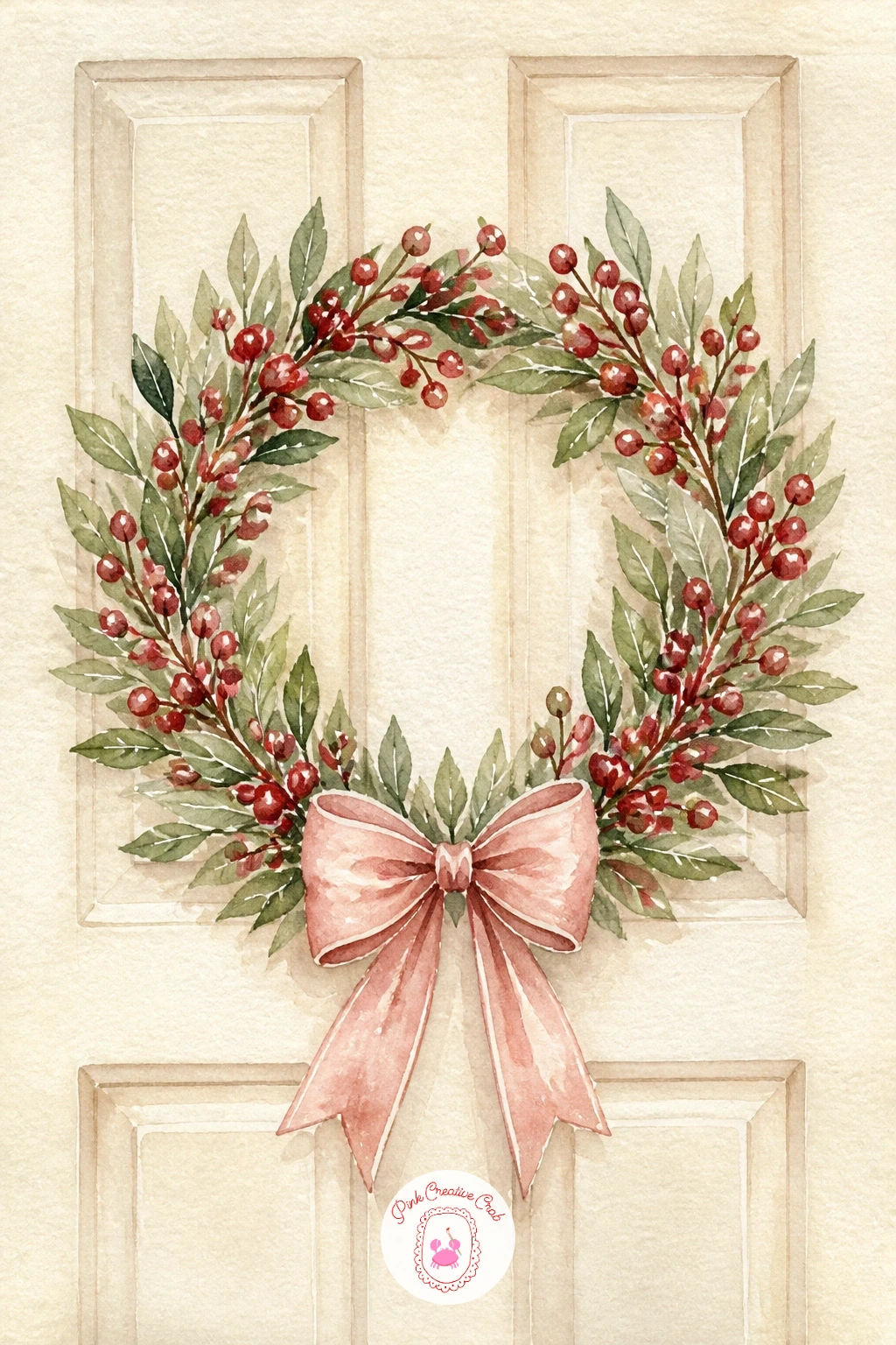
Move back outside briefly with a heart wreath on a door, a circular subject that is easiest to get right with one simple measuring trick. Before painting, lightly pencil a circle using a small plate or jar lid as a guide rather than freehanding it, an uneven wreath shape is the fastest way to lose the charm of this subject, so a traced guide circle is worth the extra minute.
Build the wreath itself from small overlapping leaf and berry shapes painted around that circle in sage green and cherry red, working around the ring in clusters of three or four strokes at a time rather than one continuous line, which keeps the texture varied and lifelike. A blush or cherry bow at the base or top of the wreath, painted with the same loose double-loop technique used earlier for the cherry pair, finishes the shape.
Paint the door behind the wreath in a single flat color, cherry, sage or cream all suit the trend, so the wreath itself stays the clear focus of the piece. Leave small gaps of unpainted paper between leaf clusters so the wreath has some breathing room rather than reading as one solid green ring.
Palette: Sage Green,Cherry Red,Blush Pink,Cream
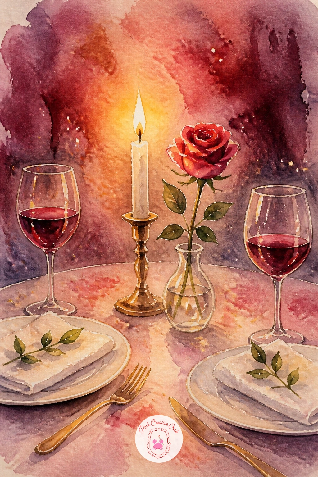
Build toward the final stretch with a candlelit dinner, the moodiest lighting exercise on the whole list. Decide the single candle flame is the only light source in the scene, then paint everything around it with that in mind: the tablecloth and plates nearest the flame stay warm and pale, while anything further from it, the edges of the table, the chairs, the background, fades into cooler, deeper shadow.
Paint the tablecloth first in cream, then the candle and its small warm glow, leaving a soft halo of unpainted or barely-washed paper directly around the flame itself before the surrounding color darkens outward from there. Plates, glasses and a single rose in a small vase come next, each one catching a touch of that same warm glow on the side facing the candle and staying shadowed on the side facing away.
That warm-to-cool shift across every object in the scene is what makes candlelight convincing, far more than painting the flame itself in detail. If the whole thing feels too dark once finished, a few soft dabs of warm cream around the table’s center will open it back up without losing the mood.
Palette: Cream,Warm Gold,Cherry Red,Deep Grey Blue
For another subject built entirely around a single warm light source, the evening scenes in Christmas watercolor ideas for slow December evenings use the same candle-glow approach.
Return once more to cherries, this time cherries in a heart dish, a quieter echo of the cherry pair from earlier in the list now grouped together as a small pile. Paint the dish first as a simple heart-shaped outline in cream or pale pink, then fill it with a loose cluster of cherries, each one painted as a rounded shape with that same unpainted highlight dot used on the first cherry pair.
Vary the depth of red across the cluster, some cherries a touch darker and more maroon, others a brighter cherry red, since a pile of identically colored cherries looks flat compared to one with some natural variation in tone. Let a few stems cross over the dish’s rim rather than keeping every cherry neatly contained inside it, that small overflow makes the pile look genuinely full.
A thin gold rim painted around the edge of the dish once everything else is dry ties it to the gold accents used throughout this whole collection. If a heart-shaped dish feels tricky to paint symmetrically, trace a simple heart template lightly in pencil first and paint over it.
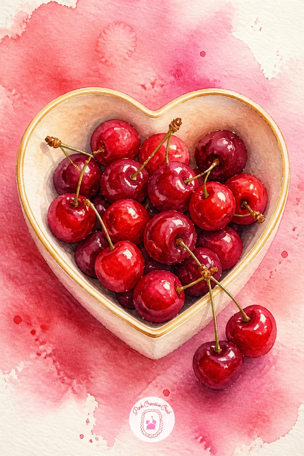
Palette: Cherry Red,Maroon,Cream,Gold
Close the whole collection with a mailbox full of valentines, a fitting last scene since it gathers so many of the smaller motifs from earlier ideas into one spot. Paint the mailbox itself first as a simple rounded box shape in cherry red or soft sage, leaving its small flag raised at one side, then let that base layer dry completely before adding anything spilling out of it.
Fill the open mailbox with a loose bundle of small cream envelopes and cards, a few tilted at different angles and a couple tucked only halfway in, since a too-tidy stack looks staged rather than genuinely overflowing with mail. A tiny red heart sticker or wax seal glimpsed on one or two of the envelopes ties this closing scene back to the very first idea on this list.
Ground the mailbox on a simple post or a patch of grass at the base, kept loose and unfussy so it does not compete with the envelopes above it. For an easy next variation, swap the valentines for a bundle of flowers peeking out instead, the same composition works for several occasions beyond this one.
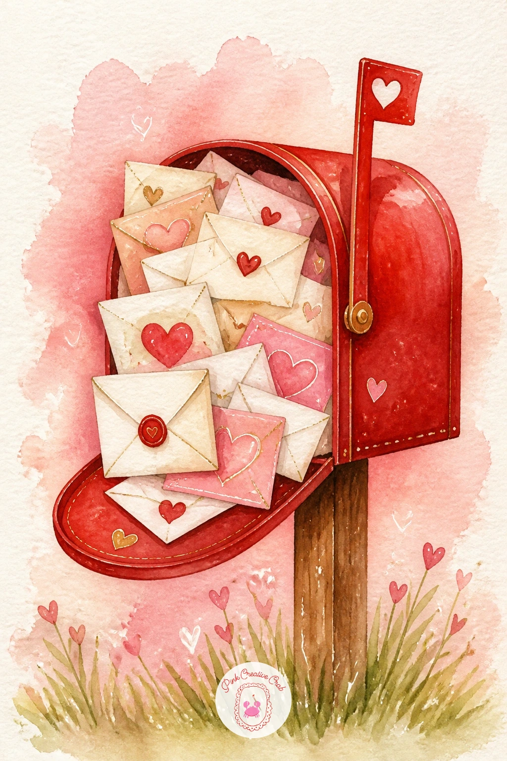
Palette: Cherry Red,Cream,Sage Green,Soft Grey
If this closing scene has you wanting more paper-and-envelope subjects, the pages in valentines junk journal pages full of old love letters make a lovely companion project.
What to Do Next
Pick whichever of these feels closest to what you are already in the mood for today, the cherry pair with a bow or the lipstick kiss are the fastest if your time is short, and work on a small sheet of cold press paper so the whole scene finishes in one sitting.
Frequently Asked Questions
What colors should I mix for a convincing cherry red in watercolor?
Start with a warm red like cadmium red or pyrrole red and deepen it with a touch of alizarin crimson or permanent rose rather than black, which dulls the color. Add a tiny bit of blue only in the deepest shadows.
How do I keep the blush and cream washes soft instead of blotchy?
Wet the paper first with clean water, then drop in diluted pigment and let it spread on its own rather than brushing it around. Tilt the paper slightly to guide the color and avoid going back over a drying wash.
Do I need gold paint or will a gold pen work for the accents?
A fine gold paint pen works perfectly and is easier to control than gold watercolor for thin lines, rims and tiny details. Add it only once the painted layers are completely dry so it sits cleanly on top.
What paper size suits these small Valentine scenes best?
A quarter sheet or a postcard-sized piece of cold press paper suits most of these subjects well, since the scenes are small and finish quickly. Keep a few sheets ready so you can repeat a favorite subject with a different color mix.
How do I stop red and pink washes from bleeding into each other?
Let each shape dry fully before painting a neighboring one in a different color, and leave a thin sliver of unpainted white paper between them if the shapes touch. A hairdryer on a cool setting speeds drying without disturbing the pigment.
Have any thoughts?
Share your reaction or leave a quick response — we’d love to hear what you think!
-
 0
-
0
-
0
-
0
-
0
-
0


