
Table of Contents
You’ve likely noticed how watercolor flowers can look either stunningly romantic or frustratingly muddy—and the difference comes down to technique. Roses and peonies demand a specific approach that balances spontaneity with control, letting pigments bloom naturally while maintaining the structure that makes these flowers recognizable. Whether you’re struggling with flat-looking petals or wondering how to capture that dreamy, ethereal quality, these twelve methods will transform your approach to painting the most beloved blooms in art.
Key Takeaways
- Use wet-on-wet techniques by applying water first, then dropping diluted pigment to create soft, natural petal blends and gradations.
- Layer translucent glazes strategically where petals fold or overlap to build dimensional depth without losing luminosity.
- Mix romantic colors like permanent rose, quinacridone magenta, and opera pink, adding burnt sienna for sophisticated shadows.
- Vary pigment concentration between light washes for distant petals and rich saturation for foreground elements to create depth.
- Control water-to-pigment ratios to achieve delicate pale washes or darker tones, transforming florals into atmospheric compositions.
Start With Loose Watercolor Washes for Soft Petal Foundations
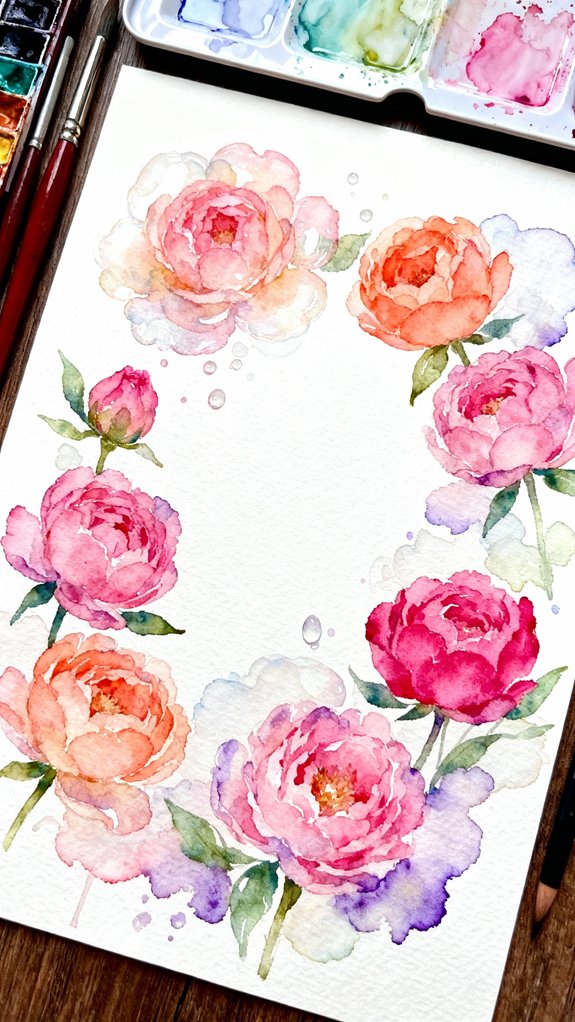
When you’re painting romantic flowers in watercolor, the secret to achieving soft, dreamy petals lies in starting with loose, wet-on-wet washes. Apply pure water to your paper first, then drop diluted pigment into these damp areas. Watch the colors bloom and merge organically, creating ethereal foundations for roses and peonies.
This damp paper application allows pigments to flow naturally, forming gradients that mimic real petals’ delicate shifts. You’ll achieve luminosity impossible with heavy-handed approaches. Once your initial washes dry, layer additional details using the wet on dry technique for crisp edges and definition.
Control comes later. Initially, embrace unpredictability. Let water guide your pigments, building transparent layers that capture light. Remember that your water-to-pigment ratio determines whether you achieve pale, delicate washes or darker, more saturated tones for your floral foundations. This innovative approach transforms traditional florals into contemporary, atmospheric compositions.
Layer Translucent Glazes to Build Dimensional Rose Petals
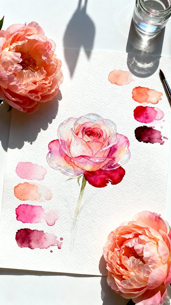
After your foundation washes have dried completely, you’re ready to create depth through strategic layering. This technique transforms flat petals into sculptural forms that capture light beautifully.
Mix your rose pigments with varying paint consistency—from diluted to moderately concentrated—to establish shadow areas and curved surfaces. Apply each glaze only where petals fold or overlap, maintaining translucency so underlying layers remain visible.
Vary your paint concentration strategically, glazing only folded areas while preserving translucency to reveal the luminous layers beneath.
Wait for complete drying between applications. You’ll build complexity through patience, not opacity. Focus your darkest values where petals tuck behind one another, gradually shifting to lighter tones.
This creates atmospheric dimension that suggests volume rather than stating it explicitly. Three to four strategic glazes typically achieve professional results. When adding soft shadows between petals, consider using the shiny wet stage to create naturally blended edges that enhance realism. Recollect: you’re sculpting with light and shadow, letting transparency do the dimensional work while preserving that signature watercolor luminosity.
Master Wet-on-Wet Techniques for Natural Petal Blending
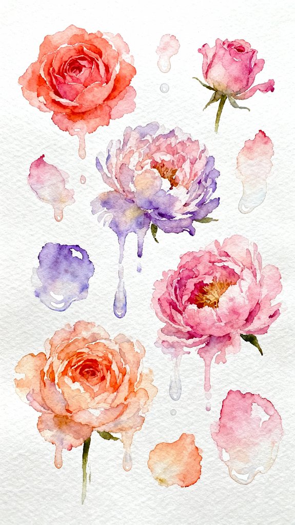
While glazing builds structure through patience, wet-on-wet painting captures the spontaneous softness that makes flower petals feel alive. You’ll want to saturate your paper first, then drop concentrated pigment into the wetness, watching colors merge organically. This technique demands confident timing—work quickly before the surface dries.
To maintain wet on wet saturation throughout your composition, keep a spray bottle nearby and mist sections as needed. The key lies in controlling water ratios: too much creates muddy blooms, too little prevents proper blending.
Utilize feathered brush strokes along petal edges where colors shift. Load your brush with diluted pigment, then gently pull outward from the petal’s center. This creates those delicate gradations that distinguish romantic flowers from rigid botanical illustrations. Mastering gradation techniques allows you to achieve smooth transitions from light to dark values, enhancing the dimensional quality and natural curvature of each petal.
Mix the Perfect Romantic Color Palette for Peonies and Roses
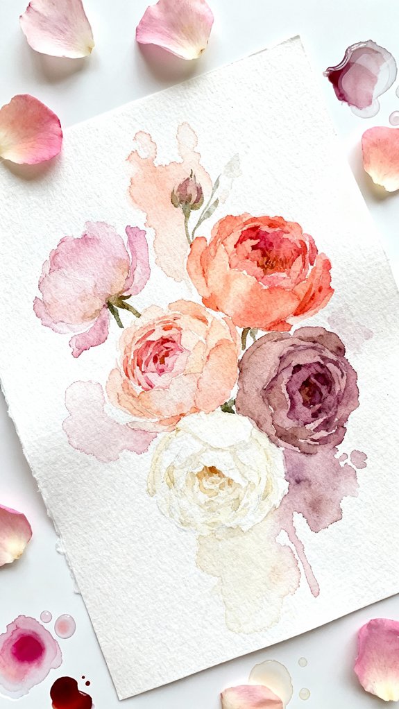
Three essential colors form the foundation of any romantic flower palette: permanent rose, quinacridone magenta, and opera pink. You’ll achieve dimensional petals by mastering soft color blending techniques that shift seamlessly between these hues. Start with diluted washes, then layer progressively deeper tones while the paper remains damp.
Varying watercolor opacity creates striking depth—use translucent glazes for lighter petals and concentrated pigment for shadow areas. Mix permanent rose with quinacridone magenta for classic rose undertones, or blend opera pink with minimal water for vibrant peony centers. Don’t limit yourself to premixed shades; experiment with custom ratios to discover unique variations.
Add touches of burnt sienna or violet to create sophisticated shadows that push your florals beyond conventional interpretations. For preliminary sketches before painting, consider using graphite pencils since they offer superior erasability compared to other dry mediums, allowing you to refine your floral outlines without residue.
Paint Delicate Petal Edges Using the Lifting Technique
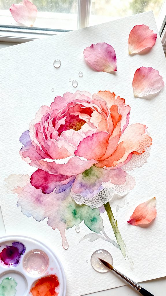
Since petal edges define the ethereal quality of romantic flowers, you’ll need to master the lifting technique to create soft, luminous borders. Start with wet on wet layering—apply your base pigment while the paper’s still damp. Before it fully dries, use a clean, barely-damp brush to gently lift color from the edges. This creates luminous lift effects that mimic how light naturally passes through delicate petals.
Experiment with timing: lift too early, and you’ll remove excessive pigment; wait too long, and nothing budges. The sweet spot occurs when your wash appears glossy but no longer pools. For peonies’ ruffled edges, use short lifting strokes. Roses demand smoother, curved motions. You’re essentially painting with negative space, revealing the paper’s brightness to accomplish those gossamer-thin shifts. This technique takes advantage of watercolor’s unique transparency and white paper relationship, where the unpainted surface creates luminosity that no amount of white paint can replicate.
Create Depth by Varying Your Watercolor Concentration
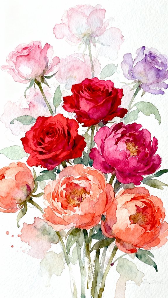
Because watercolor’s translucent nature allows underlying layers to show through, controlling pigment concentration becomes your most powerful tool for building dimensional flowers. You’ll create striking depth by varying opacity throughout your composition—use diluted washes for distant petals and concentrated pigment for foreground elements. This technique naturally guides the viewer’s eye through your artwork.
Start with water-rich mixtures for base layers, then gradually increase pigment density as you develop focal points. Controlling saturation lets you distinguish overlapping petals without relying solely on line work. Mix three distinct concentrations before painting: light (80% water), medium (50% water), and rich (20% water). This pre-mixing strategy modulates the progression while maintaining spontaneity. Your roses and peonies will gain realistic volume when you master this fundamental principle of watercolor depth. Consider preserving your watercolor flower studies in a themed journal where you can document your technique progression and favorite color combinations.
Capture the Ruffled Texture of Peony Blooms With Controlled Blooms
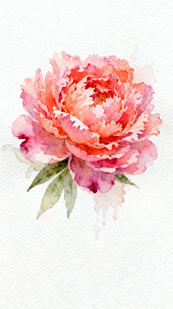
Peonies’ signature ruffled appearance emerges from a watercolor technique called “controlled blooms”—intentional wet-into-wet applications that create organic texture without chaotic spreading. You’ll achieve controlled petal textures by dampening individual petal sections with clean water, then dropping concentrated pigment at strategic points. The color diffuses naturally but stays confined within your moistened boundaries.
Work quickly to establish varied petal curvatures—apply paint to the petal’s base while the tip remains drier, creating dimensional folds. Let each layer semi-dry before adding adjacent petals; this prevents unwanted bleeding while maintaining soft shifts. You’re orchestrating natural-looking randomness through deliberate technique.
For maximum impact, alternate between warm and cool tones within a single bloom. This temperature variation enhances the three-dimensional quality that makes peonies alluring. Understanding how reflected light appears in the shadowed areas of curled petals will further enhance the realistic depth of your floral paintings.
Add Realistic Shadows Between Overlapping Flower Petals
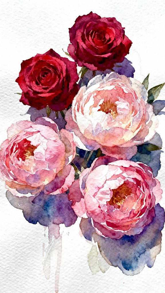
Those dimensional folds you’ve created need shadows to truly come alive on paper. Study shading techniques by observing how light naturally falls between layered petals—notice the gradual shifts from dark recesses to illuminated edges. Mix a deeper value of your base color, then apply it while the petal beneath remains slightly damp for seamless blending.
Explore overlapping petal shadows by identifying where upper petals cast darkness onto lower ones. These strategic dark accents create spatial relationships that transform flat paintings into three-dimensional blooms. Load your brush with concentrated pigment and paint directly into the crevices, allowing the watercolor to settle naturally. The wet medium will soften harsh edges automatically, producing organic gradations that mimic nature’s subtle complexity without overworking your composition. For richer shadow tones, consider mixing darks without black by combining complementary colors, which creates more natural-looking depth than using tube black directly.
Use Negative Painting to Define Individual Rose Petals
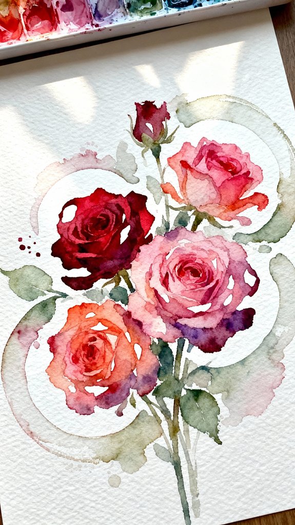
While traditional painting builds forms by adding color directly to shapes, negative painting works in reverse by darkening the spaces around your rose petals to make them emerge from the background. You’ll paint the shadows between petals rather than the petals themselves, creating depth through strategic contrast. This technique demands precision—load your brush with a deeper value and carefully navigate around each petal’s edge, leaving the lighter areas untouched.
Master this approach by layering transparent washes gradually. Start with diluted pigment and intensify shadows progressively, allowing each layer to dry completely. This method draws on the principles of chiaroscuro, using dramatic contrasts between light and shadow to define form. You’ll discover unprecedented control over petal definition while softening petal edges where needed. The negative space becomes your sculpting tool, carving out dimensional forms that appear to lift off the paper with remarkable three-dimensional presence.
Paint Loose Greenery and Stems for a Balanced Composition
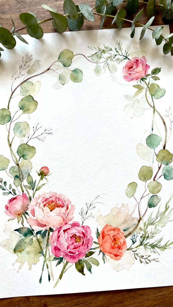
After perfecting your roses through negative painting, balance your composition by introducing greenery with intentional looseness that contrasts beautifully with your detailed blooms. You’ll achieve dynamic energy through painterly brushstrokes that don’t obsess over botanical accuracy. Let your stems flow with gestural confidence, varying pressure to create organic thickness variations.
Mix sap green with touches of burnt sienna for dimensional depth, then add color blended foliage by wet-on-wet techniques. Don’t overthink placement—trust your instincts to guide leaf clusters where composition needs weight. Layer translucent washes to build subtle complexity without overworking. Mastering effective use of light and shadow in your greenery helps create convincing depth that supports your focal flowers. This strategic spontaneity prevents stiffness while creating visual pathways that guide viewers’ eyes through your arrangement. Your looser approach to greenery makes those meticulously painted petals shine even brighter.
Preserve Luminous Highlights by Planning Your White Spaces
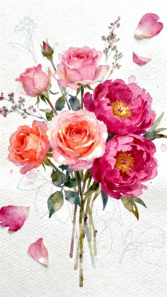
Because watercolor’s translucent nature means you can’t add opaque white highlights later, you’ll need to protect your brightest areas from the start. Map out where light naturally hits your petals—the crown of a rose, peony edges, dewdrop reflections—before your brush touches paper.
Strategic white space preservation techniques:
- Sketch light guideposts marking luminous zones where pigment shouldn’t flow
- Apply liquid masking fluid to safeguard intricate light-catching details like stamen tips
- Paint around reserved whites rather than attempting to lift color afterward
Resist the urge to overblend these precious highlights into surrounding washes. Instead, balance negative space deliberately, letting crisp white areas breathe against saturated darks. This contrast creates the dimensional glow that distinguishes masterful floral paintings from flat renderings.
Finish With Fine Details Using a Rigger Brush for Stamens and Veins
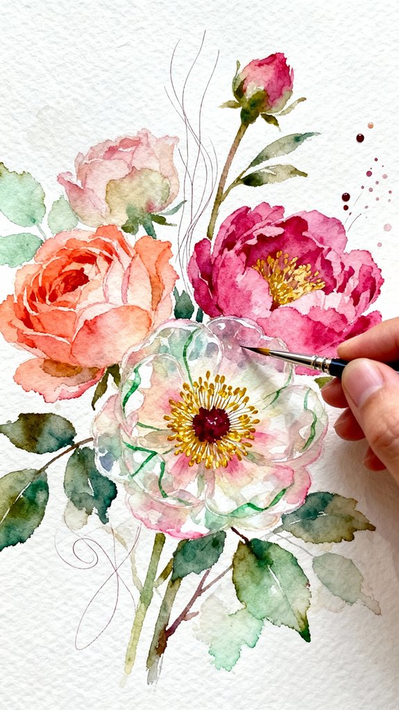
Once your washes have dried completely, you’ll transform your flowers from beautiful to botanical with precision linework. Load your rigger brush with concentrated pigment and execute delicate stamens that radiate from the flower’s center.
Precision linework with a loaded rigger brush elevates watercolor florals from merely beautiful to authentically botanical in character.
Varying brush strokes creates organic authenticity—apply light pressure for gossamer veins, increase it for prominent stems. Mastering glazing techniques allows you to layer translucent lines over dried petals without disturbing underlying color.
Work methodically: start with primary veins, then branch into secondary networks that follow natural growth patterns. Your rigger’s elongated bristles enable continuous strokes without reloading, essential for maintaining consistent line quality.
Consider diluting your pigment slightly for subtle veins on lighter petals, intensifying concentration on shadowed areas to enhance dimensional depth and realistic botanical character.
Frequently Asked Questions
What Type of Watercolor Paper Weight Works Best for Painting Roses?
You’ll achieve stunning results with 140lb (300gsm) paper as your ideal paper weight for roses. This weight handles wet techniques beautifully while the paper surface texture—whether cold-pressed or hot-pressed—influences your petals’ delicate details and luminosity.
How Long Should I Wait Between Layers to Prevent Colors Bleeding?
Wait 5-10 minutes between layers for controlled bleeding effects. Drying time recommendations vary with paper surface texture importance—rough textures need longer. You’ll achieve innovative dimensional petals by experimenting with semi-dry layering techniques.
Which Brushes Are Essential for Beginners Painting Romantic Flowers?
You’ll access floral magic with just three essentials: a medium round brush for versatile strokes, a small detail brush for delicate edges, and a large wash brush. These brush shapes and brush sizes cover every petal’s journey.
Can I Use Masking Fluid to Preserve White Areas in Florals?
Yes, you’ll achieve stunning highlights using masking fluid. Apply it with precision tools like ruling pens or fine brushes for delicate stamens and petal edges. Once dry, remove it gently by rubbing to reveal pristine whites.
How Do I Fix Mistakes When Watercolor Paint Dries Incorrectly?
You’ll want to blot excess paint with a damp brush or tissue while wet. Once dry, layer with patience by adding transparent glazes to adjust values and reinvent problem areas into intentional texture variations.
Conclusion
You’ve gathered the techniques—now comes the moment that’ll test your courage. Can you let go of perfection and trust the water to guide your brush? Will you dare to paint with abandon, allowing blooms to emerge through spontaneous washes and unexpected bleeds? Your next rose won’t just sit on paper; it’ll breathe, unfold, and reveal secrets you didn’t know you possessed. Pick up that brush. What you’re about to create might surprise you.
Have any thoughts?
Share your reaction or leave a quick response — we’d love to hear what you think!
-
 0
0 -
0
-
0
-
0
-
0
-
0


