Table of Contents
Pencil drawing is the foundation of all visual art. Armed with just a pencil and paper, you can create everything from quick sketches to photorealistic masterpieces. Whether you’re picking up a pencil for the first time or looking to refine techniques you’ve been practicing, this comprehensive guide will take you from basic mark-making to advanced rendering.
You’ll learn how different pencil grades work, fundamental techniques like hatching and blending, how to create realistic shading and form, and solutions to common problems that frustrate beginners. We’ll cover the technical aspects that make drawings work, practical exercises to build your skills, and proven approaches for tackling different subjects.
This guide is designed for anyone interested in drawing – complete beginners with no art experience, artists from other mediums exploring drawing, students needing to improve their skills, and intermediate artists ready to advance their technique. By the end, you’ll have a solid foundation in drawing principles and the confidence to create your own artwork.
According to art educators and institutions worldwide, including The Metropolitan Museum of Art’s drawing collection, drawing remains the most accessible and fundamental skill for visual artists. Pencil drawing requires minimal investment, works anywhere, and builds observational skills that benefit every other art form you might explore.
Why Pencil Drawing is Perfect for Beginners
Pencil drawing offers unique advantages that make it ideal for learning fundamental art skills.
Accessibility and Affordability
You need minimal supplies to start – a few pencils and paper. Unlike painting, which requires brushes, paints, palettes, and canvases, drawing requires items you probably already own. A basic set of quality drawing pencils costs less than a single tube of professional paint.
This low barrier to entry means you can start immediately without significant financial investment. As your skills develop, you can gradually add specialized supplies, but you’ll create satisfying drawings with basic materials from day one.
Portability and Convenience
Drawing supplies fit in a small bag or even a pocket. You can draw anywhere – at home, in a coffee shop, outdoors, while traveling. There’s no setup time, no cleanup, and no drying time to manage. This convenience encourages more frequent practice, which accelerates skill development.
Immediate Feedback and Easy Correction
Pencil is forgiving. Erasers let you correct mistakes easily, unlike ink or paint where corrections are difficult or impossible. This forgiving nature reduces anxiety for beginners and encourages experimentation. You can try an approach, erase if it doesn’t work, and try again.
Builds Fundamental Skills
Drawing develops observational skills, hand-eye coordination, understanding of form and value, and composition sense. These fundamentals transfer directly to painting, sculpture, digital art, and every other visual medium. Many professional artists in other mediums still sketch in pencil daily because it keeps their observational skills sharp.
Complete Control
Pencil responds directly to pressure and angle, giving you precise control over mark-making. There’s no drying time changing your values, no medium flowing unpredictably. What you see as you draw is what you get, making it easier to learn cause and effect.
Rich Tonal Range
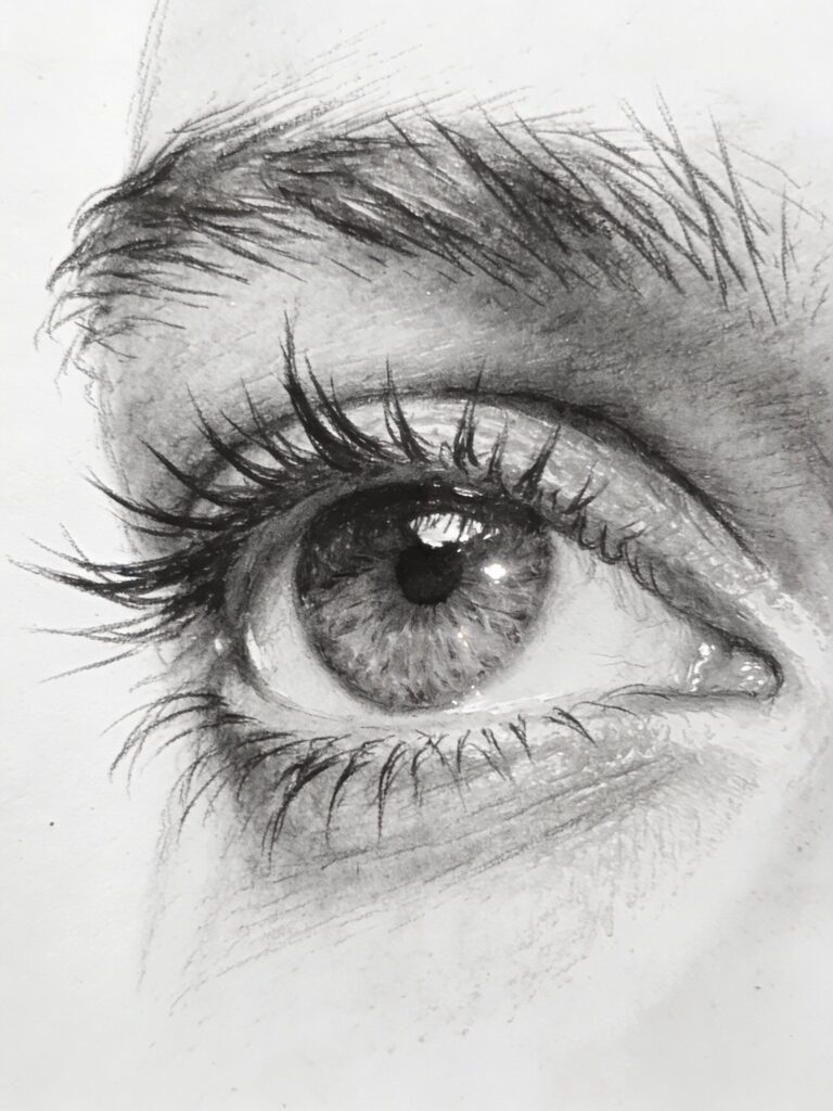
Despite being monochromatic, graphite pencils can create an impressive range of values from pure white (the paper) to deep black. This range allows you to create dimension, form, and realistic rendering. Learning to see and reproduce values in graphite prepares you for working with color later.
Understanding Graphite Pencils
Graphite pencils aren’t all the same. Understanding pencil grades helps you choose the right pencil for each task.
The Graphite Grading Scale
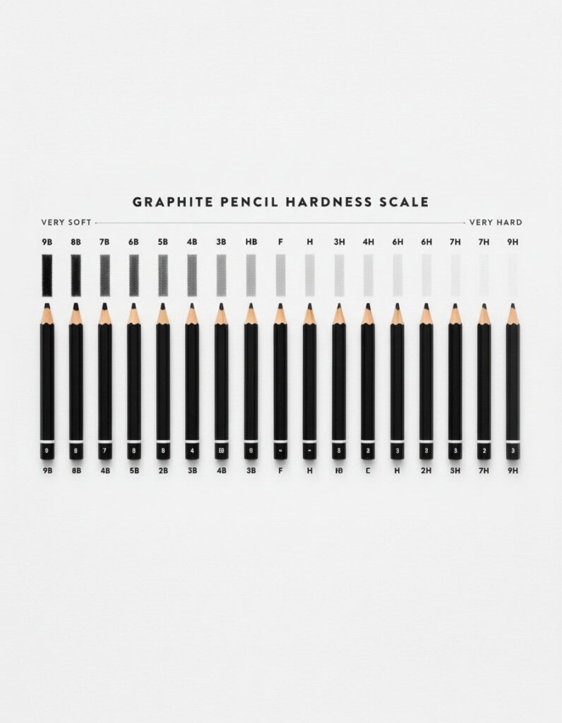
Pencils are graded by hardness using letters and numbers. The scale ranges from very hard to very soft, affecting both the darkness of the mark and how the pencil feels on paper.
H scale (Hard):
- 9H, 8H, 7H, 6H, 5H, 4H, 3H, 2H, H
- Hard graphite creates light, fine lines
- Difficult to erase completely
- Used for technical drawing, light guidelines, fine details
- Less suited for shading large areas
F and HB:
- F (Fine Point): Between H and HB, good for writing
- HB (Hard Black): The middle of the scale, balanced hardness and darkness
- Standard pencil for general drawing and writing
B scale (Black/Soft):
- B, 2B, 3B, 4B, 5B, 6B, 7B, 8B, 9B
- Soft graphite creates dark, broad marks
- Easier to blend and smudge
- Used for shading, dramatic darks, expressive drawing
- Can be messy (smudges easily)
According to Faber-Castell’s technical documentation, the grading system was standardized to help artists and technical drafters choose appropriate pencils for specific applications.
Which Pencils You Actually Need
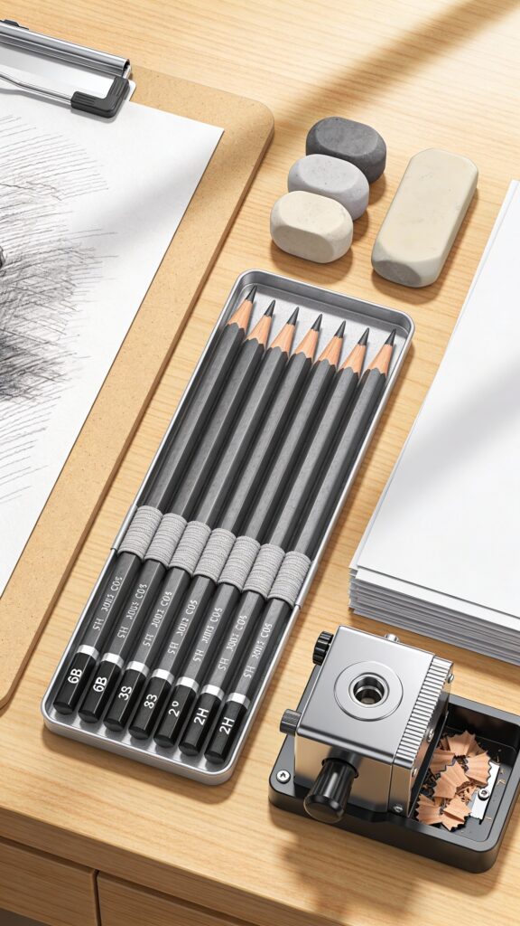
You don’t need the entire range immediately. Start with 4-6 pencils covering light, medium, and dark values:
Essential beginner set:
- 2H: Light values, guidelines, initial sketches
- HB: General drawing, middle values
- 2B: Versatile workhorse, slightly darker
- 4B: Dark values, shading
- 6B: Very dark values, deep shadows
This range handles 95% of drawing needs. The Staedtler Mars Lumograph Drawing Pencil Set provides excellent quality at reasonable prices and includes this essential range.
As you advance, add:
- 4H or 6H: Very light values, detailed technical work
- 8B or 9B: Extremely dark values (though these can be messy and difficult to control)
How Pencil Grade Affects Your Drawing
Hard pencils (H range):
- Create light, precise lines
- Maintain sharp points longer
- Difficult to create dark values
- Can indent paper if pressed hard
- Best for: initial sketches, light details, technical work
Soft pencils (B range):
- Create dark, rich marks
- Wear down quickly (need frequent sharpening)
- Easy to blend and smudge
- Can cover large areas quickly
- Best for: shading, dramatic contrast, expressive work
Mixing grades: Professional drawings typically use multiple pencil grades. Use harder pencils for lighter areas and softer pencils for darker areas. This approach creates a wider value range than using a single pencil for everything.
Pencil vs. Mechanical Pencil
Traditional wooden pencils:
- Wider variety of grades available
- Can create various mark widths (side vs. point)
- More control over mark quality
- Require sharpening
- Preferred by most artists for finished work
Mechanical pencils:
- Consistent line width
- Never need sharpening
- Great for technical drawing and detailed work
- Limited grade options (usually HB, 2B, sometimes others)
- Convenient for sketching and note-taking
For learning to draw, traditional wooden pencils provide more versatility and control. Learn more about pencil types in our complete drawing pencils guide.
Essential Drawing Supplies
Quality supplies make learning easier, but you don’t need expensive professional materials to start.
Drawing Pencils
For beginners: Start with the Staedtler Mars Lumograph Drawing Pencil Set or Faber-Castell 9000 Art Set. Both offer excellent quality at reasonable prices and include the essential 2H through 6B range.
For advancing artists: Consider professional-grade pencils like Caran d’Ache Graphite Line which offer smoother graphite, more consistent grading, and superior blending properties.
What to avoid: School-grade pencils (like standard #2 pencils) have inconsistent graphite quality and limited range. Invest in actual drawing pencils even as a beginner.
Drawing Paper
Paper quality significantly affects your results. Cheap paper with rough texture or poor tooth makes smooth shading nearly impossible.
Paper weight:
- Use 70-80 lb (100-130 gsm) paper minimum for drawing
- Heavier paper (90-100 lb) handles more erasing and reworking
Paper texture:
- Smooth (plate or hot press): Best for detailed, realistic work
- Medium texture (vellum): Versatile, good for most drawing
- Rough texture (cold press): Creates textured effects, good for expressive work
Paper recommendations:
- For practice: Canson Recycled Drawing Pad offers good quality at affordable prices
- For finished work: Strathmore 400 Series Drawing Paper provides excellent tooth and durability
- For detailed work: Bristol board (smooth) gives you perfect control for realistic rendering
Paper color: White or off-white paper works for most drawing. Toned paper (gray, tan, or cream) adds dimension when you use white highlights and creates a different aesthetic.
Erasers
Different erasers serve different purposes. You need at least two types.
Essential erasers:
Kneaded eraser:
- Moldable putty-like eraser
- Lifts graphite gently without damaging paper
- Perfect for lightening areas, creating highlights, cleaning smudges
- Doesn’t leave crumbs
- Essential for every artist
- Prismacolor Kneaded Eraser is reliable and long-lasting
Vinyl/plastic eraser:
- Firm, white eraser that removes marks completely
- Good for correcting mistakes and creating hard-edged highlights
- Can damage paper if used too aggressively
- Staedtler Mars Plastic Eraser is the professional standard
Optional but helpful:
Eraser pencil: Precision eraser in pencil form for tiny details and fine highlights.
Electric eraser: Battery-powered eraser for quick, clean removal of large areas. Professional tool but not necessary for beginners.
Sharpeners
Sharp pencils are essential for detailed work and clean lines.
Handheld sharpener: Simple, portable, adequate for most needs. Get one with two holes (different sized openings) for various pencil diameters.
Long-point sharpener: Creates longer exposed graphite, ideal for shading and sketching. Kum Long Point Sharpener is specifically designed for artists.
Craft knife: Many professional artists sharpen with craft knives for complete control over point length and shape. This takes practice but offers maximum versatility.
Blending Tools
Blending softens pencil marks and creates smooth gradations.
Paper stumps (tortillons): Tightly rolled paper tools in various sizes for blending and smoothing. Essential for realistic rendering.
Blending stumps: Similar to tortillons but typically thicker. Can be sharpened with sandpaper to restore tip.
Cotton swabs and tissues: Useful for large-area blending, though less precise than stumps.
Your finger: Works for blending, though oils from your skin can affect paper quality over time. Some artists use it effectively; others avoid it.
Additional Useful Supplies
Essential:
- Drawing board or clipboard (provides firm surface)
- Pencil extenders (use short pencils completely)
- Sandpaper block (for sharpening stumps and creating graphite powder)
Helpful additions:
- White vinyl eraser shield (metal template for precise erasing)
- Fixative spray (protects finished drawings from smudging)
- Drawing glove (prevents hand oils on paper)
- Ruler and T-square (for perspective and technical drawing)
Fundamental Pencil Drawing Techniques
Master these core techniques and you’ll have the foundation for any drawing you want to create.
Holding the Pencil
How you hold your pencil affects mark quality and drawing comfort.
Writing grip (detail work): Hold the pencil like you’re writing, with control from fingers and wrist. This grip provides precision for details and small areas but limits mark variety and can cause hand fatigue during long sessions.
Overhand grip (sketching and shading): Hold the pencil like you’re holding a paintbrush, with the pencil resting on your thumb and controlled by your whole arm. This grip allows looser, more expressive marks and prevents hand cramping. Use for large areas, gesture drawing, and general sketching.
Variety is key: Switch between grips based on what you’re drawing. Use writing grip for eyes, details, and precise work. Use overhand grip for shading, sketching, and expressive marks.
Line Quality and Control
Different types of lines serve different purposes in drawing.
Contour lines: Outline the edges of forms. These should vary in weight (thickness) – heavier where forms turn away from light, lighter where they catch light. Varying line weight creates more interesting, dimensional drawings than uniform outlines.
Gesture lines: Quick, expressive lines capturing movement and energy. Use loose, confident strokes rather than careful, timid ones. Gesture drawing builds confidence and improves observation.
Construction lines: Light guidelines establishing proportions and placement. Use hard pencils (2H or H) with light pressure. These lines get covered or erased as your drawing develops.
Confident vs. tentative lines: Hairy, sketchy lines from repeatedly going over the same area look uncertain and messy. Practice making confident, single strokes. If you need to adjust, erase and redraw rather than repeatedly correcting with more lines.
Basic Mark-Making
Understanding different mark types expands your drawing vocabulary.
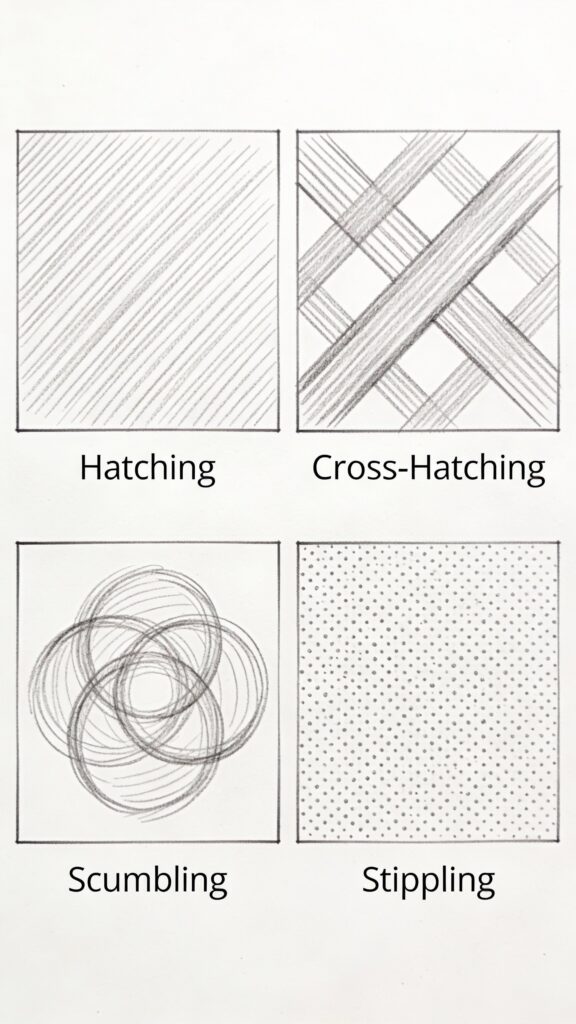
Hatching: Parallel lines create value and texture. Lines can be straight, curved, or follow form contours. Closer lines create darker values; spaced lines create lighter values.
Cross-hatching: Layered hatching in different directions builds darker values. First set of lines in one direction, second set crossing at an angle. Add more layers for even darker values.
Scumbling: Random, circular scribbles create soft, even texture. Good for backgrounds, atmospheric effects, and organic textures like foliage.
Stippling: Dots create value and texture. More dots create darker values. Time-consuming but creates unique, precise effects.
Each mark-making technique creates different visual textures and serves different subjects. Experiment with all of them to expand your capabilities. Learn more techniques in our drawing techniques encyclopedia.
Mastering Shading and Values
Shading creates the illusion of three-dimensional form on flat paper. Understanding value structure is fundamental to realistic drawing.
Understanding Value
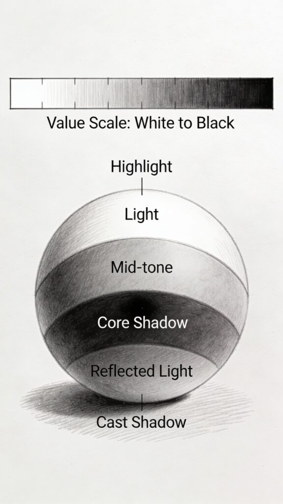
Value means the lightness or darkness of a tone. In drawing, you work with a value scale from white (the paper) to black (the darkest your pencil can create).
The value scale: Most artists work with a 5-9 value scale:
- Value 1: White (paper)
- Value 2-3: Light grays
- Value 4-5: Middle values
- Value 6-7: Dark grays
- Value 8-9: Black (darkest graphite)
Why values matter: Values create form, depth, and realism more than outlines do. Two forms can have identical outlines but look completely different based on their value structure. Mastering values is mastering drawing.
The Form Principle
All forms can be reduced to basic 3D shapes: spheres, cylinders, cubes, cones. Understanding how light hits these basic forms helps you shade any complex object.
Light on a sphere:
- Highlight: Brightest spot where light hits directly
- Light area: Area receiving direct light
- Mid-tone: Area where form begins turning away from light
- Core shadow: Darkest area where form turns away from light completely
- Reflected light: Subtle lightening within shadow from light bouncing off nearby surfaces
- Cast shadow: Shadow the object casts on the ground/surface
This same value pattern appears on every curved form – faces, apples, vases, anything round. Recognizing this pattern helps you shade realistically.
Shading Techniques
Different approaches create smooth, even value transitions.
Blending for smooth gradations:
- Apply graphite with the side of your pencil, using light pressure and overlapping strokes
- Blend with a paper stump, moving in circular motions or following the form’s contours
- Build up gradually, adding more graphite and blending repeatedly
- Use softer pencils (4B-6B) for darker areas, harder pencils (2H-HB) for lighter areas
Directional shading: Follow the form’s contours with your pencil strokes. For a sphere, use curved strokes. For a cylinder, use vertical strokes. This approach creates dimension and describes surface direction.
Layering for rich darks: Build dark values gradually through multiple layers rather than pressing hard with one layer. This creates richer, more controllable darks. Layer different pencil grades – start with HB or 2B, add 4B, finish with 6B for deepest shadows.
Preserving highlights: Plan your lightest lights from the beginning. Leave paper white for brightest highlights. Trying to erase back to white after covering an area rarely works perfectly, especially on textured paper.
Learn complete shading methods in our shading techniques guide.
Creating Smooth Gradations
Smooth value transitions are hallmarks of skilled drawing.
The process:
- Start light: Begin with light pressure and light pencil grades (HB or 2B). You can always go darker; it’s nearly impossible to go lighter.
- Overlap strokes: Each stroke should slightly overlap the previous one. Gaps between strokes create unintentional texture.
- Blend progressively: Blend after laying down initial tone, add more graphite, blend again. Multiple light layers create smoother results than one heavy layer.
- Use appropriate pencil grade: Trying to create very dark areas with a 2H pencil requires excessive pressure that damages paper. Switch to softer pencils (4B-6B) for dark values.
- Burnish for extra smoothness: Lightly rub the area with a hard pencil (2H or harder) after blending. This fills in paper texture and creates ultra-smooth surfaces.
Value Contrast and Focal Points
Strategic use of contrast directs viewer attention and creates visual impact.
High contrast = attention: The area of highest contrast (lightest light next to darkest dark) naturally draws the eye. Place this at your focal point – the area you want viewers to notice first.
Low contrast = supporting areas: Reduce contrast in less important areas. This doesn’t mean making everything mid-tone, but rather avoiding the strongest darks and lights outside your focal area.
The squint test: Squint at your drawing. The overall pattern of lights and darks should create a pleasing composition with a clear focal point. If everything looks equally detailed and contrasted, your focal point isn’t clear.
Advanced Drawing Techniques
Once comfortable with fundamentals, these advanced techniques expand your capabilities.
Texture Rendering
Creating convincing texture requires observing and replicating surface characteristics.
Smooth surfaces (glass, metal, polished stone):
- High contrast between highlights and darks
- Sharp, defined edges on reflections
- Smooth blending with no visible pencil marks
- Use hard pencils (H-2H) for crisp highlights and edges
Rough textures (bark, stone, fabric):
- Varied mark-making
- Less smooth blending
- Directional marks suggesting surface direction
- Combination of techniques (hatching, stippling, scumbling)
Soft textures (fur, hair, fabric):
- Directional strokes following flow
- Varied value within texture
- Softer edges and gradations
- Overlapping strokes building density
Approach: Study your reference closely. What makes this texture unique? Recreate those specific characteristics rather than using generic “texture marks.”
Drawing Different Materials
Different materials require different approaches.
Reflective surfaces: Notice that reflections are always slightly darker than the objects being reflected. Use sharp value changes and careful observation of shapes within reflections.
Transparent materials: Glass and water show light passing through, refraction, and reflections simultaneously. Focus on accurately drawing what you see rather than what you think should be there.
Fabric and drapery: Fabric creates predictable fold patterns based on how it’s supported and pulled. Core shadows run along the bottoms of folds. Highlights sit on top of rounded surfaces.
Negative Space Drawing
Drawing the spaces around and between objects rather than the objects themselves improves accuracy and observation.
The technique:
- Instead of drawing the object, focus on drawing the shapes around it
- Observe these negative spaces as abstract shapes, ignoring what they represent
- Draw these shapes accurately
- The positive form (your object) emerges automatically
Why it works: Your brain’s object-recognition makes you draw what you think you know rather than what you actually see. Negative space drawing bypasses this, forcing accurate observation.
Applications:
- Complex subjects like hands, trees, or mechanical objects
- Checking proportions and angles
- Creating accurate compositions
Creating Depth with Atmospheric Perspective
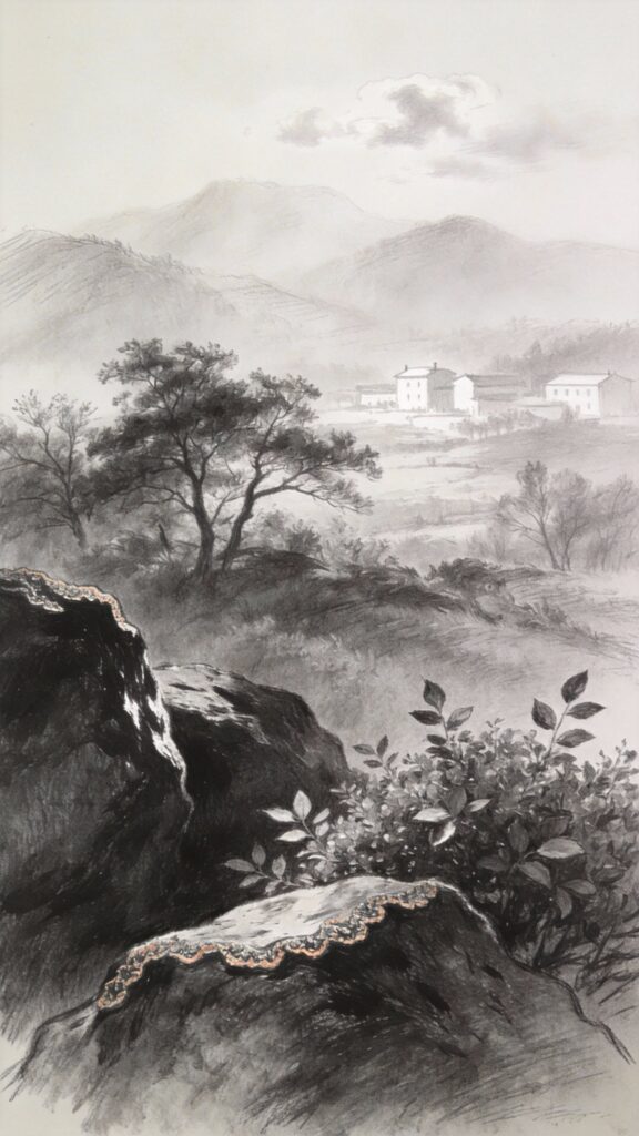
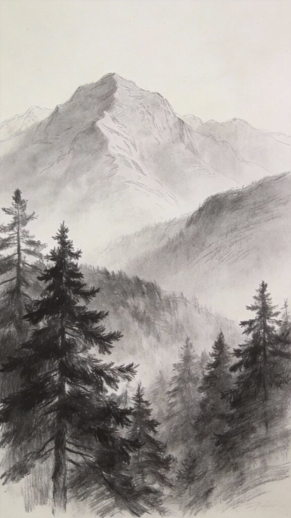
Objects appear lighter, less detailed, and lower in contrast as they recede into the distance.
The principles:
- Foreground: Darkest darks, sharpest details, highest contrast
- Middle ground: Moderate values, moderate detail, moderate contrast
- Background: Lighter overall, minimal detail, low contrast
In practice: For a landscape drawing, your foreground tree should have deep blacks, crisp edges, and visible bark texture. Middle-ground trees should have less contrast and less detail. Background mountains should be light gray with no detail, soft edges, and minimal contrast.
This mimics how atmosphere affects our vision and creates convincing depth even in simple drawings.
Photorealism Techniques
Creating photorealistic drawings requires patience, precision, and systematic approaches.
Grid method: Draw a grid over your reference photo and a corresponding grid on your paper. Draw what appears in each square, focusing on shapes and values rather than recognizing objects. This breaks complex subjects into manageable sections.
Proportional measuring: Use your pencil as a measuring tool, comparing proportions (this eye is 1.5 times wider than it is tall, the distance between eyes equals one eye width, etc.).
Working dark to light: Some artists work in reverse, starting with darkest darks and gradually adding mid-tones, preserving highlights throughout. This ensures maximum value range.
Layering patience: Photorealism typically requires 10-20+ hours on a single drawing with hundreds of subtle layers. There are no shortcuts – only patient, systematic building of values and details.
Common Drawing Mistakes and Solutions
Every artist encounters these challenges. Understanding them accelerates your progress.
Problem 1: Everything Looks Flat
What it looks like: Your drawings look like outlines or silhouettes with no depth or dimension. Objects appear pasted onto the paper rather than existing in space.
Why this happens: Relying on outlines without proper shading creates flat drawings. Insufficient value range (using mostly mid-tones without dark darks or light lights) also prevents form from emerging. Additionally, not understanding how light creates form leads to flat, symbol-based drawing.
How to fix it:
- Eliminate outlines: Objects in nature don’t have lines around them. What we perceive as edges are actually changes in value. Reduce or eliminate outlines and let value changes define edges.
- Increase value range: Use the full value scale from white to black. Most beginner drawings live in values 3-6, never reaching true darks or preserving true lights. Push your darks darker.
- Study form: Understand how light creates the highlight-light-mid-tone-core shadow-reflected light-cast shadow pattern. Apply this to every form you draw.
- Add cast shadows: Objects interact with surfaces they sit on. Cast shadows ground objects in space and create depth.
- Use atmospheric perspective: Objects further away should be lighter with less contrast.
How to prevent it:
- Plan your value structure before starting
- Reserve your lightest lights and darkest darks for important areas
- Study how light behaves on basic forms
- Practice drawing simple forms (sphere, cylinder, cube) with proper shading
Problem 2: Proportions Look Wrong
What it looks like: Elements in your drawing are the wrong size relative to each other. Eyes are too big, heads are too small, arms are different lengths, etc.
Why this happens: Your brain’s object-recognition distorts what you see. You draw what you know (“eyes are important, heads are big”) rather than measuring what’s actually there. Not checking proportions before adding details compounds errors.
How to fix it:
- Measure everything: Use your pencil as a measuring tool. Compare heights to widths, measure distances between features, check angles.
- Use comparative measuring: Rather than guessing absolute sizes, compare relationships (“this distance equals this other distance twice”).
- Establish proportions first: Sketch overall proportions and placement with light lines before adding any details. Fix proportion problems while everything is still guidelines.
- Grid method: For complex subjects, use a grid on your reference and paper to ensure accuracy.
- Check negative spaces: Measure the spaces between and around objects, not just the objects themselves.
How to prevent it:
- Always start with light proportion guidelines
- Check measurements repeatedly before committing
- Use reference photos and measure from them
- Practice measuring exercises until it becomes automatic
- Study typical proportions for subjects you draw often (human proportions, animal proportions, etc.)
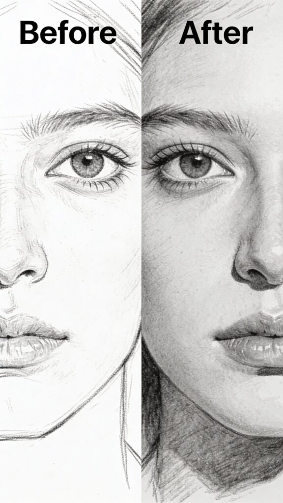
Problem 3: Smudging and Dirty Paper
What it looks like: Your drawing has unintentional smudges, gray areas where you didn’t want them, and overall dingy appearance. Your hand leaves marks where it rests on paper.
Why this happens: Graphite smudges easily. Your hand resting on completed areas spreads graphite. Softer pencils (4B and up) are especially prone to smudging. Dirty erasers spread graphite rather than removing it.
How to fix it:
- Use a barrier: Place a sheet of clean paper under your drawing hand. This protects finished areas from hand oils and smudges.
- Work from top to bottom, left to right (reverse if left-handed): Complete upper areas before lower areas so your hand doesn’t rest on finished work.
- Clean your erasers: Kneaded erasers should be kneaded regularly to expose clean surfaces. Plastic erasers can be cleaned by rubbing on scrap paper.
- Use fixative: Spray finished drawings (or finished sections of large drawings) with workable fixative to prevent smudging. Always spray outside or in well-ventilated areas.
- Lift gently: When using your kneaded eraser, press and lift rather than rubbing. Rubbing spreads graphite.
How to prevent it:
- Always use a barrier sheet under your hand
- Keep erasers clean
- Consider a drawing glove (covers pinky and palm, leaves fingers free)
- Store drawings between sheets of glassine or wax paper
- Spray with fixative when complete
Problem 4: Can’t Get Dark Enough Values
What it looks like: Your drawings look washed out and gray. Even your “darkest” areas appear medium-toned. Drawings lack punch and contrast.
Why this happens: Using hard pencils (H, HB, 2B) for dark areas prevents achieving true darks. Being timid with pressure or not layering enough limits darkness. Textured paper may not accept enough graphite to create deep blacks.
How to fix it:
- Use softer pencils: Switch to 4B, 6B, or even 8B for dark areas. Soft graphite creates much darker values than hard graphite.
- Layer progressively: Start with 2B, add 4B layer, finish with 6B. Multiple layers create richer, darker values than single heavy layers.
- Increase pressure gradually: Don’t be afraid to press moderately hard with soft pencils. Just avoid pressing so hard you damage paper.
- Burnish: After layering soft pencils, lightly go over the area with 2H or H pencil using moderate pressure. This burnishes (polishes) the graphite into paper tooth, creating darker, smoother results.
- Consider your paper: Very textured paper has deep tooth that resists filling completely. For maximum dark values, use smoother paper (Bristol board or hot-press).
How to prevent it:
- Keep 4B-6B pencils sharp and ready
- Don’t be timid – commit to dark values
- Build values gradually through layers
- Use the squint test to check if your darks are dark enough
- Study value scales to understand the range you should achieve
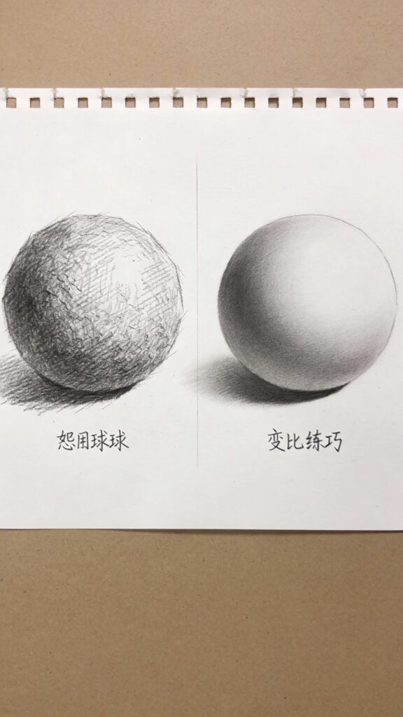
Problem 5: Shading Looks Scratchy or Uneven
What it looks like: Your shading shows visible pencil strokes, uneven patches, or scratchy texture instead of smooth gradations. Areas that should be smooth look rough and amateurish.
Why this happens: Too much pressure creates grooves in paper. Pencil isn’t sharp enough. Strokes don’t overlap sufficiently. Not blending enough or blending improperly. Using only pencil tip instead of side.
How to fix it:
- Use lighter pressure: Apply graphite with light pressure and build through multiple layers. Heavy pressure creates grooves that can’t be fixed.
- Overlap strokes completely: Each stroke should overlap the previous one with no gaps. Gaps create unintentional texture.
- Use the pencil’s side: Hold pencil at an angle and use the side of the exposed graphite. This creates broader, softer marks than the point.
- Blend properly: Use paper stumps in circular or directional motions. Don’t scrub aggressively – blend gently with multiple passes.
- Keep pencils sharp: Dull pencils create broad, uncontrollable marks. Sharpen frequently for smooth shading.
- Choose appropriate paper: Very rough paper makes smooth blending nearly impossible. Use smooth or medium-textured paper for smooth gradations.
How to prevent it:
- Practice gradient exercises (smooth transition from light to dark)
- Use appropriate tools (paper stumps, not fingers)
- Use side of pencil for broad areas
- Build layers slowly with light pressure
- Blend after each layer before adding more graphite
Problem 6: Overworking the Drawing
What it looks like: Your drawing looks labored, fussy, or muddy. Paper surface is damaged from excessive erasing or overworking. Drawing has lost freshness and spontaneity.
Why this happens: Going back into areas repeatedly disrupts paper tooth and lifts previous layers. Trying to fix every tiny imperfection creates more problems. Not knowing when to stop. Excessive erasing damages paper surface.
How to fix it:
- Accept imperfections: Drawings don’t need to be perfect. Small inconsistencies add character and life.
- Plan before executing: Sketch lightly first, plan your approach, then execute confidently. Planning reduces indecision that leads to overworking.
- Limit erasing: Each erasing damages paper surface slightly. Make corrections count rather than repeatedly erasing the same area.
- Walk away: If you feel frustrated or feel like you’re making it worse, stop. Return with fresh eyes later.
- Learn when to stop: Drawing is often about knowing when to stop more than knowing what to add.
How to prevent it:
- Set clear goals before starting (what am I trying to achieve?)
- Work from general to specific (big shapes before tiny details)
- Take breaks to view your work from distance
- Protect your paper (don’t erase excessively in one spot)
- Practice deliberate, confident mark-making
Problem 7: Drawings Look Too Tight or Stiff
What it looks like: Your drawings appear overworked, rigid, or mechanical. They lack life, energy, or natural flow. Every mark looks careful and tentative.
Why this happens: Fear of making mistakes creates tentative, careful marks. Focusing on tiny details too early prevents seeing overall composition. Drawing slowly and carefully throughout rather than using varied approaches for different stages.
How to fix it:
- Loosen your grip: Hold pencil with overhand grip for sketching and broader work. Physical looseness translates to visual looseness.
- Draw faster: Set time limits forcing you to work quickly. Speed prevents overthinking and creates more spontaneous, lively marks.
- Gesture drawing practice: Do 30-second to 2-minute quick sketches daily. This builds confidence and looseness.
- Vary your approach: Sketch loosely first, tighten selected areas later. Not everything needs equal detail and precision.
- Embrace imperfection: Some of the most appealing drawings have loose, sketchy qualities. Perfection can look sterile.
How to prevent it:
- Practice gesture drawing regularly
- Sketch daily with no expectation of creating finished pieces
- Work larger (bigger drawings encourage looser marks)
- Use varied mark-making rather than one careful technique throughout
- Study artists who work loosely for inspiration
Drawing Different Subjects
Different subjects benefit from different approaches and considerations.
Drawing Still Life
Still life offers controlled lighting and stationary subjects, making it ideal for learning.
Setup considerations:
- Use single light source (window or lamp) for clear shadow patterns
- Arrange objects with varied heights and overlapping forms
- Include different textures and materials for variety
- Keep background simple to focus attention on objects
Approach:
- Sketch overall composition lightly
- Establish proportions and placement
- Identify light source and plan shadow areas
- Build values gradually from light to dark
- Add details and refine last
Common objects for practice:
- Fruit (apples, oranges – simple forms with clear light patterns)
- Fabric/drapery (teaches form and shadow)
- Glassware (teaches transparency and reflection)
- Wooden objects (teaches texture)
Drawing Landscapes
Landscapes challenge you with atmospheric perspective, complex foliage, and varied textures.
Simplification: Don’t draw every leaf, blade of grass, or brick. Suggest detail through texture and value patterns rather than rendering everything literally.
Depth creation:
- Foreground: Darkest values, most detail, highest contrast, textured marks
- Middle ground: Medium values, moderate detail, moderate contrast
- Background: Lightest values, minimal detail, soft edges, low contrast
Common landscape elements:
Trees: Start with overall shape and value mass. Add branches with varied thickness (thicker near trunk, thinner at tips). Suggest foliage with textured marks rather than drawing individual leaves.
Water: Water reflects sky and surroundings (usually slightly darker than what’s reflected). Still water has horizontal marks. Moving water has directional marks suggesting flow.
Skies: Gradated values typically work better than flat tones. Clouds have clear light and shadow sides. Smooth blending creates realistic atmospheric effects.
Drawing Portraits and Faces
Faces are challenging because tiny inaccuracies are immediately noticeable. However, understanding basic proportions helps immensely.
Basic facial proportions:
- Eyes sit halfway down the head (not at the top as many beginners draw)
- Distance between eyes equals one eye width
- Bottom of nose sits halfway between eyes and chin
- Mouth sits roughly one-third of the way from nose to chin
- Ears align with eyebrows at top and nose bottom at bottom
Approach:
- Block in overall head shape (oval or egg-shaped)
- Draw centerline (vertical line showing face direction)
- Mark eye line (horizontal line halfway down head)
- Place features based on proportions
- Check everything against reference before adding details
- Build values gradually, focusing on form and structure
- Add details last (eyelashes, hair texture, etc.)
Common mistakes:
- Placing eyes too high
- Making eyes too large
- Not considering head as 3D form
- Adding details before establishing proportions
- Missing subtle value changes that create form
Drawing Animals
Animals combine challenges of proportion, texture (fur/feathers), and capturing character.
Understanding structure: Study animal anatomy basics. Understanding skeletal structure helps you draw animals convincingly even in different poses. Notice how animal proportions differ from humans (legs versus arms, head size, body length, etc.).
Fur rendering:
- Direction: Fur grows in specific directions. Follow these patterns with your marks.
- Layers: Build fur through multiple layers, gradually darkening
- Individual hairs: Only render individual hairs at edges and highlights. Suggesting texture over large areas is more effective than rendering every hair.
- Value variation: Even within “white” fur or “black” fur, values vary considerably based on form and lighting
Capturing character: Eyes convey personality and life. Get eye placement, size, and direction accurate first. Add catchlights (small highlights in eyes) to bring them to life.
Drawing Hands
Hands are notoriously difficult but follow predictable proportions.
Basic hand proportions:
- Palm length roughly equals finger length (middle finger)
- Fingers have three segments in decreasing sizes
- Thumb has two segments
- Fingers curve naturally, rarely perfectly straight
- Knuckles fall on gentle arc, not straight line
Simplified approach: Break hand into basic shapes – rectangular palm, cylindrical fingers, wedge-shaped thumb. Get these basic shapes positioned correctly before adding details.
Practice: Draw your own hand repeatedly from different angles. This provides constant, free reference material and builds understanding of hand structure and mechanics.
Practice Exercises for Skill Building
Targeted practice accelerates skill development more effectively than random drawing.
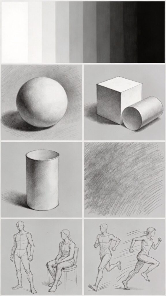
Exercise 1: Value Scale Practice (20 minutes)
Goal: Master creating smooth gradations and full value range
Process:
- Draw 9 boxes in a row
- Leave first box white (paper)
- Create smooth gradation from white to black across all boxes
- Last box should be deepest black your pencil can create
- Each box should transition smoothly into the next
Repeat with different pencil combinations to understand how different grades create different effects.
Exercise 2: Basic Forms Shading (45 minutes)
Goal: Understand how light creates form
Process:
- Draw basic 3D shapes: sphere, cube, cylinder, cone
- Establish single light source
- Shade each form showing highlight, light, mid-tone, core shadow, reflected light, cast shadow
- Blend smoothly with proper gradations
Repeat from different light angles to understand how form responds to lighting changes.
Exercise 3: Texture Studies (30 minutes each)
Goal: Learn to observe and recreate different textures
Subjects:
- Smooth (glass, metal, polished stone)
- Rough (bark, concrete, stone)
- Soft (fabric, fur, hair)
- Organic (leaves, wood grain, water)
Process:
- Study reference closely – what makes this texture unique?
- Create small (2×2 inch) texture sample
- Focus on characteristic marks, not photo-realism
- Build texture library for future reference
Exercise 4: Negative Space Drawing (30 minutes)
Goal: Improve observational accuracy
Process:
- Choose object with interesting negative spaces (chair, plant, hand)
- Draw only the spaces around and between, ignoring the object itself
- The object emerges from accurately drawn negative spaces
- Compare to reference for accuracy
Exercise 5: Timed Gesture Drawing (15 minutes daily)
Goal: Build confidence and looseness
Process:
- 30 seconds: 10 quick poses
- 1 minute: 5 poses
- 2 minutes: 3 poses
Focus on capturing movement, proportions, and gesture rather than details. Use your whole arm, work quickly, embrace imperfection.
Exercise 6: Copy Master Drawings (1-2 hours)
Goal: Learn techniques from skilled artists
Process:
- Choose drawing by artist you admire
- Study their mark-making, value structure, composition
- Recreate the drawing, focusing on understanding their process
- Note what techniques they used and how they solved problems
Not about passing off as your own – this is education through copying, a traditional learning method.
Exercise 7: Daily Object Studies (30 minutes daily)
Goal: Build consistent practice habit and observational skills
Process:
- Draw one object daily
- Vary subjects (fruit, cup, tool, whatever’s nearby)
- Focus on accurate proportions and values
- Complete within time limit
- Date each drawing
Review after 30 days to see remarkable progress.
Developing Your Drawing Skills
Continuous improvement requires deliberate practice and smart learning strategies.
Structured Learning Approach
Progressive skill building:
- Months 1-2: Master values, basic forms, simple objects
- Months 3-4: Add complex forms, textures, multiple objects
- Months 5-6: Tackle challenging subjects (faces, hands, animals)
- Ongoing: Refine style, explore personal interests, push boundaries
Don’t rush through fundamentals. Solid basics make advanced work exponentially easier.
Effective Practice Methods
Deliberate practice: Simply drawing a lot isn’t enough. Identify specific weaknesses, create exercises targeting those weaknesses, practice with focus and attention. Ten minutes of focused, deliberate practice beats an hour of mindless sketching.
Study from life: Drawing from photos is convenient, but drawing from life builds superior observational skills. Photos flatten three dimensions into two and distort colors/values. Real objects teach you about form, light, and space in ways photos can’t.
Rotate subjects: Practice varied subjects rather than only drawing what you’re already good at. Variety builds versatile skills and prevents stagnation.
Analyze your work: After each drawing session, identify what worked and what didn’t. What would you do differently? What new challenge did you overcome? This reflection accelerates learning.
Learning from References
Using photo references effectively:
- Work from your own photos when possible
- Study the reference, don’t just copy mindlessly
- Understand what you’re drawing, not just copying values
- Don’t be a slave to the reference – make artistic decisions
When to work without reference: Drawing from imagination requires extensive visual library built through observation. Start with references, gradually work toward drawing without them as your understanding deepens.
Developing Personal Style
Your style emerges naturally through practice, but you can guide its development.
Experimentation: Try different approaches – loose sketching versus detailed rendering, expressive marks versus careful blending, high contrast versus subtle gradations. Discovery requires exploration.
Study artists you admire: Analyze their techniques, but don’t just copy. Understand why their approach works and adapt elements to your own work.
Accept your natural inclinations: Some artists love detail, others prefer loose expression. Both approaches are valid. Work with your temperament rather than forcing yourself into a style that doesn’t feel natural.
Building a Drawing Habit
Consistency beats intensity: Drawing 15 minutes daily builds skills faster than drawing 3 hours once weekly. Consistent practice keeps skills sharp and compounds over time.
Sketchbook practice: Carry a small sketchbook. Sketch during commutes, while waiting, during lunch breaks. These sketches don’t need to be masterpieces – they’re skill-building exercises.
Set realistic goals: “Draw daily for 15 minutes” is achievable. “Create a masterpiece every week” leads to frustration and burnout. Set process goals (actions you control) rather than outcome goals (results you can’t fully control).
Joining the Drawing Community
Share your work: Sharing drawings online or with local groups provides feedback, encouragement, and accountability. Constructive criticism helps you see blind spots.
Take classes or workshops: Instruction from experienced artists accelerates learning. Classes provide structure, feedback, and techniques you might not discover alone.
Study drawing resources: Quality books provide deep technical knowledge. Look for books by experienced artists and art instructors covering fundamentals, not just “how to draw cute animals” style books.
Tracking Progress
Keep everything: Save all drawings, even “bad” ones. Looking back after 6-12 months shows incredible progress invisible day-to-day.
Take progress photos: Photograph your work regularly. Comparing drawings from different periods reveals your development.
Set milestone projects: Every few months, create a “best effort” finished drawing showing your current skill level. These milestones mark clear progress points.
Conclusion & Next Steps
Pencil drawing provides the foundation for all visual art. You’ve learned fundamental techniques, how to create form through value, solutions to common problems, and practice approaches that build skills systematically.
Your next steps:
- Gather essential supplies if you haven’t already. Quality pencils, paper, and erasers make learning significantly easier.
- Work through practice exercises systematically. Master basic forms and values before attempting complex subjects.
- Draw daily – even 15 minutes builds skills faster than occasional long sessions.
- Study shading techniques in depth through our complete shading techniques guide to create realistic three-dimensional forms.
- Explore related techniques in our drawing techniques encyclopedia for expanded technical vocabulary.
- Compare drawing mediums in our graphite vs colored pencil vs charcoal guide to understand how pencil fits into the larger drawing landscape.
Remember that every skilled artist started exactly where you are now. The drawings you create today might not match your vision, but each drawing builds skills bringing you closer to creating the art you imagine.
Pencil drawing rewards patient observation and deliberate practice. Focus on understanding what you’re drawing rather than mindlessly copying. Build skills systematically through targeted exercises. Most importantly, enjoy the process – drawing should challenge you while remaining satisfying and engaging.
Start drawing today, practice consistently, and trust the process. Your skills will grow with every mark you make.
FAQ
Q: How long does it take to learn to draw well with pencils?
A: With consistent practice (4-5 times weekly), most people develop solid fundamental skills within 6-12 months. You’ll create satisfying drawings much sooner – within weeks – but mastering advanced techniques like photorealism takes years of dedicated practice. Progress is continuous, and you’ll notice meaningful improvement every few weeks with regular practice. The key is consistency rather than intensity – drawing 20 minutes daily outperforms drawing 3 hours once weekly.
Q: What pencils do I actually need as a beginner?
A: Start with 4-6 pencils covering the value range: 2H (light values), HB (middle), 2B (versatile), 4B (dark), and 6B (very dark). This range handles 95% of drawing needs. The Staedtler Mars Lumograph set provides excellent quality and includes these essential grades. You don’t need the full 9H to 9B range immediately – having a few quality pencils you understand beats having many pencils you don’t know how to use effectively.
Q: Should I draw from photos or real life?
A: Both have value. Real-life drawing builds superior observational skills because you see true three-dimensional form and can study subjects from multiple angles. However, photos provide convenience and stationary subjects that don’t move. For beginners, start with real objects when possible (still life setups, objects around your home), then progress to photos for subjects you can’t access directly. Eventually, develop skills in both approaches.
Q: How do I make my shading look smooth instead of scratchy?
A: Smooth shading requires several techniques working together: use light pressure building through multiple layers rather than pressing hard once; overlap strokes completely with no gaps; use the side of your pencil rather than just the tip; blend with paper stumps using gentle circular motions; and keep your pencils sharp. Practice gradient exercises (smooth transition from white to black) to develop this skill. Learn more in our shading techniques guide.
Q: Why can’t I get my drawings dark enough?
A: This typically happens when using hard pencils (H, HB, 2B) for dark areas. Hard pencils can’t create truly dark values. Switch to softer pencils (4B, 6B, 8B) for dark areas. Additionally, build darkness through multiple layers rather than one heavy layer – start with 2B, add 4B, finish with 6B. Don’t be afraid to press moderately hard with soft pencils. If you’re still struggling, your paper texture might be too rough, preventing graphite from filling the tooth completely.
Q: How do I fix proportions that look wrong?
A: Measure everything before committing to details. Use your pencil as a measuring tool to compare heights, widths, and distances. Check negative spaces (spaces around and between objects) as well as positive shapes. Establish overall proportions with light guidelines before adding any details – it’s much easier to fix proportion problems when everything is still light construction lines. If you’ve already gone too far, sometimes starting over saves time compared to trying to fix major proportion issues.
Q: What’s the difference between drawing paper and sketch paper?
A: Drawing paper (typically 70-90 lb) has more tooth (texture) and durability, handling heavy shading, blending, and erasing well. It’s designed for finished work. Sketch paper (typically 50-60 lb) is lighter, smoother, and less expensive, perfect for practice, quick sketches, and studies but not ideal for finished pieces requiring heavy shading or multiple layers. Start practicing on sketch paper to save money, but use quality drawing paper like Strathmore 400 Series for finished work.
Q: How do I draw realistic hair and fur?
A: Hair and fur require building texture through multiple layers. Start with overall shape and value mass. Add directional strokes following hair growth direction. Build gradually darker through layers. Only render individual hairs at edges and highlights – suggesting texture over large areas is more effective than trying to draw every strand. Vary your pressure and pencil grades to create depth within the texture. Hair is never uniform – include value variation, direction changes, and areas of different density.
Q: Should I outline my drawings or not?
A: In nature, objects don’t have lines around them – what we perceive as edges are actually value changes. For realistic drawing, minimize or eliminate outlines and let value changes define edges. However, lighter contour lines with varying weight (thicker in shadows, lighter in highlights) can add dimension without looking flat. Many artists start with light construction lines that get covered or erased as shading develops. Experiment to find what works for your style.
Q: How do I prevent my drawings from smudging?
A: Place a sheet of clean paper under your drawing hand to prevent direct contact with your drawing. Work from top to bottom and left to right (reverse if left-handed) so your hand doesn’t rest on finished areas. Keep erasers clean – kneaded erasers should be kneaded frequently; plastic erasers cleaned on scrap paper. When your drawing is finished, spray it with workable fixative in a well-ventilated area to permanently protect it from smudging. Consider a drawing glove that covers your palm and pinky while leaving drawing fingers free.
Related Resources
Complete Guides:
- Watercolor Painting: Complete Beginner to Advanced Guide
- Pencil Drawing: Complete Guide
- Color Mixing: Everything You Need to Know
- Junk Journaling: Complete Handbook
- Art Fundamentals Guide
- Art Supplies Glossary: 200+ Terms Every Artist Should Know
Comparison Guides:
Technique Deep-Dives:
- Wet-on-Wet Watercolor Technique
- Shading Techniques for Realistic Drawing
- Drawing Techniques Encyclopedia
Have any thoughts?
Share your reaction or leave a quick response — we’d love to hear what you think!
-
 1
1 -
1
-
0
-
0
-
0
-
0


