Shading transforms flat drawings into three-dimensional artwork. It’s the difference between a simple outline and a drawing that looks like it could jump off the page. Whether you’re sketching portraits, still life, or imaginary creatures, mastering shading techniques is essential for creating depth, dimension, and realism.
In this comprehensive guide, you’ll learn seven fundamental shading techniques used by professional artists, from basic hatching to sophisticated chiaroscuro. Each technique has unique characteristics and applications, and understanding when and how to use them will dramatically improve your drawing skills.
What you’ll learn:
- Seven core shading techniques with step-by-step instructions
- How to analyze and replicate light and shadow
- Which techniques work best for different subjects
- How to combine methods for maximum impact
- Solutions to common shading challenges
Who this guide is for:
- Beginners learning to shade for the first time
- Intermediate artists refining their technique
- Anyone wanting to add realism to their drawings
- Artists transitioning between different drawing mediums
This guide covers shading primarily with graphite pencils, but these techniques apply to charcoal, colored pencils, and other dry media as well. Let’s start with the fundamentals of how light creates the shadows we’ll be drawing.
Understanding Light and Shadow: The Foundation of Shading
Before you can shade effectively, you need to understand what you’re actually drawing. Shading isn’t random – it’s a visual representation of how light interacts with form.
The Five Elements of Shading
Every three-dimensional object lit by a single light source displays five distinct value zones:
1. Highlight The brightest point where light hits the object directly. Often left as pure white paper in pencil drawings.
2. Midtone The true color or value of the object in neutral light. This transitions between highlight and shadow.
3. Core Shadow The darkest part of the object itself, where light doesn’t reach directly. This appears on the side of the object facing away from the light source.
4. Reflected Light A subtle lightening within the shadow area caused by light bouncing off nearby surfaces. This prevents shadows from appearing completely flat.
5. Cast Shadow The shadow the object projects onto surrounding surfaces. Darkest where it meets the object, gradually lightening as it extends away.
Light Direction and Form
The direction of your light source determines where these five elements appear. According to principles taught at art institutions, understanding light direction is fundamental to realistic drawing.
Single light source (most common):
- Creates clear, defined shadows
- Easiest to understand and replicate
- Best for beginners learning to shade
Multiple light sources:
- Creates complex, overlapping shadows
- More challenging to render accurately
- Common in indoor settings with artificial lighting
Diffused light:
- Softer transitions between light and shadow
- Subtle core shadows
- Common on overcast days or in shaded areas
Value Scale: Your Shading Roadmap
Value refers to how light or dark something appears. Professional artists use a value scale from 1 (pure white) to 10 (pure black) to plan their shading.
Creating your own value scale:
- Draw ten connected squares
- Leave the first square white (value 1)
- Make the last square as dark as possible (value 10)
- Gradually shade the squares in between
- Keep this reference visible while drawing
This value scale becomes your guide for every shading decision. When you look at your subject, you’re identifying which value (1-10) each area represents, then recreating that value with your chosen shading technique.
Form and Shading Patterns
Different three-dimensional forms require different shading approaches:
Spheres and cylinders: Gradual transitions from light to dark create the illusion of curved surfaces. The smoothest blending techniques work best here.
Cubes and angular objects: Sharp transitions between planes. Distinct value changes where surfaces meet at angles.
Organic forms: Irregular surfaces with complex shadow patterns. Require observation and adaptation rather than formulas.
Understanding these fundamentals means you’re not just copying what you see – you understand why shadows appear where they do. This knowledge lets you shade from imagination and correct errors more effectively. Now let’s look at the tools you’ll need.
Essential Shading Supplies
The right tools make learning shading techniques significantly easier. You don’t need expensive materials to create beautiful shading, but certain supplies will give you better results and more control.
Essential Supplies
Graphite Pencils: You need a range of hardness grades to achieve different values. The pencil grading system ranges from hard (H) to soft (B), with HB in the middle.
For shading, focus on the B range:
- 2B: Light shading, preliminary work
- 4B: Medium shading, general work
- 6B: Dark shading, deep shadows
- 8B or 9B: Darkest values, final accents
Start with the Staedtler Mars Lumograph Pencil Set, which provides excellent range from 2H through 8B at an affordable price. For professional quality, consider Faber-Castell 9000 Art Set.
Drawing Paper: Smooth paper (Bristol, plate finish) works well for blended shading techniques. Textured paper (medium tooth) is better for hatching and cross-hatching where you want visible pencil strokes.
The Strathmore 400 Series Drawing Pad offers versatile medium-tooth paper perfect for practicing all shading techniques. For smoother blending, try Canson Bristol Smooth.
Erasers:
- Kneaded eraser: Lifts graphite gently, creates highlights
- Precision eraser: For tight details and corrections
- White vinyl eraser: For larger areas
Blending Tools:
- Blending stumps (tortillons): Compressed paper tools for smooth blending
- Cotton swabs: Inexpensive alternative for soft blending
- Tissues or paper towels: For large, soft blending areas
- Your finger: Works in a pinch, though less controlled
Recommended Supplies
Mechanical Pencils: Maintain consistent point width, excellent for controlled hatching. The Pentel GraphGear 1000 offers professional quality with multiple lead grade options.
Fixative Spray: Protects finished drawings from smudging. Krylon Workable Fixatif allows you to continue working after spraying.
Drawing Board: Provides firm, angled surface. Improves ergonomics and control.
Pencil Sharpener: Both handheld and electric sharpeners have advantages. The Prismacolor Premier Pencil Sharpener is reliable and preserves pencil length.
Optional Supplies
Charcoal: Creates deeper blacks than graphite. Excellent for dramatic shading but messier to work with.
Graphite Powder: Enables quick coverage of large areas. Apply with soft brush or tissue.
Colorless Blender Pencil: Burnishes and blends without adding graphite. Useful for final smoothing.
Light Box: Helpful for transferring sketches, not essential for shading techniques.
Budget-Friendly Alternatives
Starting out? You can practice effectively with:
- Basic pencil set (HB, 2B, 4B, 6B)
- Regular printer paper or sketchbook
- Kneaded eraser
- Cotton swabs for blending
- Tissues for large areas
Total investment: under $20
As you develop your skills and preferences, invest in higher-quality materials that suit your specific drawing style. Learn more about choosing drawing supplies in our complete pencil drawing guide.
Core Shading Techniques
Now we’ll explore seven fundamental shading techniques every artist should master. Each method creates different visual effects and works better for certain subjects than others.
1. Hatching
Hatching uses parallel lines to create value. The closer the lines, the darker the value appears. This technique maintains visible pencil strokes, creating texture and energy in your drawing.
How to hatch:
- Hold your pencil at a 45-degree angle for consistent line weight
- Draw parallel lines in one direction only
- Space lines closer together for darker values
- Keep hand motion fluid – draw from the shoulder, not the wrist
- Maintain consistent line length within each area
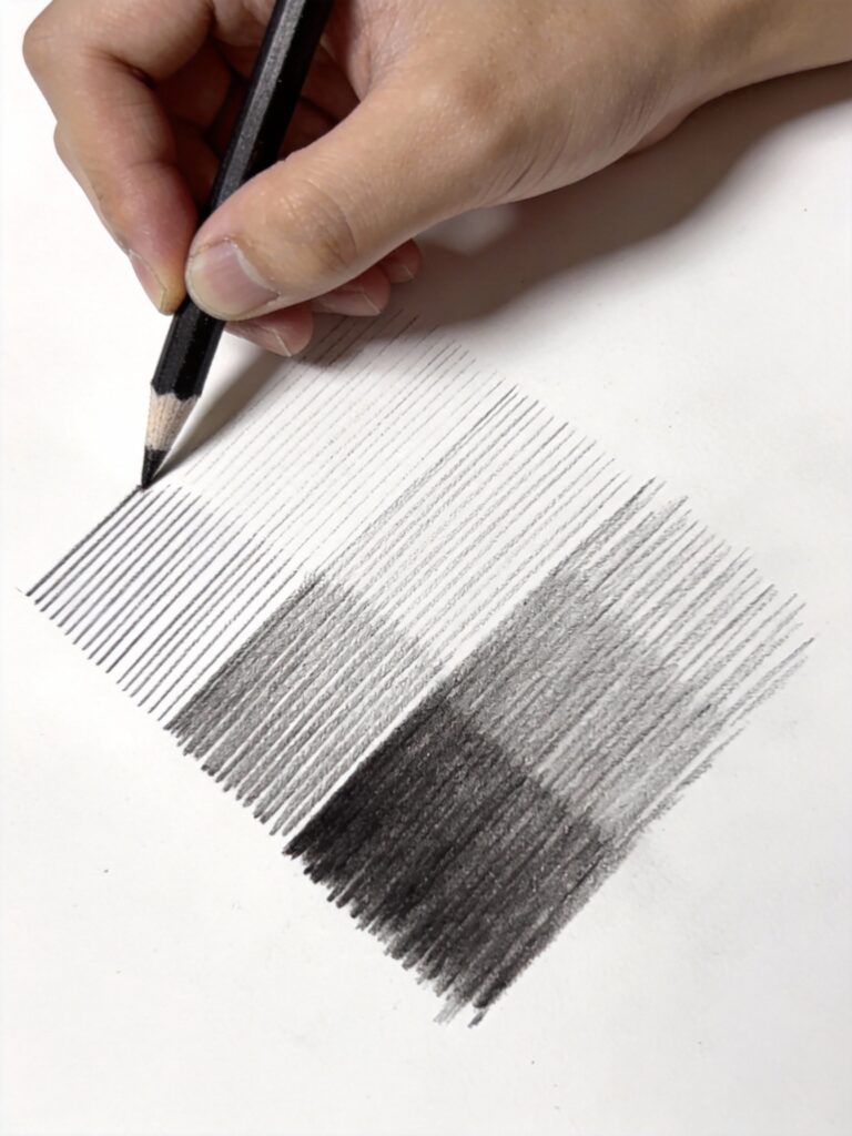
Hatching shading technique demonstration showing parallel pencil lines spaced at different intervals creating gradual value transitions
Best for:
- Technical drawings and sketches
- Creating texture (wood grain, fabric)
- Quick studies and gesture drawings
- Subjects where visible stroke adds character
Common mistakes:
- Varying line direction within one area (looks messy)
- Pressing too hard (creates grooves in paper)
- Lines too far apart (creates striped appearance)
- Inconsistent spacing (disrupts value flow)
Practice exercise: Draw five squares. In each square, use hatching to create a different value (light to dark). Focus on consistent line spacing and direction.
2. Cross-Hatching
Cross-hatching layers multiple sets of hatching lines at different angles. Each new layer darkens the overall value while creating rich, complex texture.
How to cross-hatch:
- Start with basic hatching in one direction
- Add a second layer of lines at a different angle (typically 45-90 degrees from first)
- Add additional layers as needed for darker values
- Vary line density rather than pressure for darker areas
- Keep all lines within one set parallel to each other
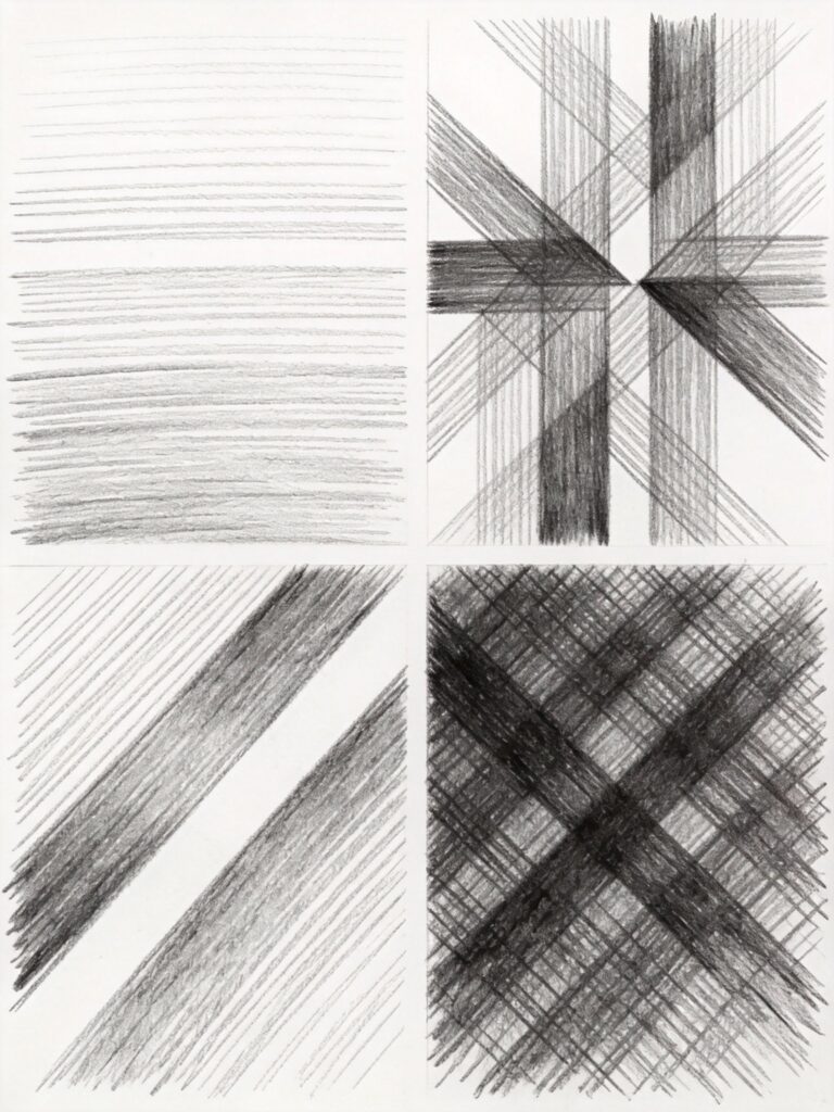
Cross-hatching technique showing layered parallel lines at different angles building up dark values for three-dimensional shading
Best for:
- Creating deep, rich darks
- Dimensional forms (spheres, cylinders)
- Portraits (especially with rough paper)
- Drawings with energetic, sketchy quality
Angle guidelines:
- First layer: 45 degrees
- Second layer: -45 degrees (perpendicular to first)
- Third layer: Vertical or horizontal
- Fourth layer: Opposite of third
You don’t always need all four layers. Stop when you achieve the value you want.
Advanced tip: Vary the angle slightly between different areas to follow the form of your subject. This technique, called “following the form,” makes objects appear more three-dimensional.
3. Smooth Blending (Circulism)
Smooth blending creates seamless value transitions without visible pencil strokes. This technique uses tiny circular motions or overlapping strokes blended together.
How to blend smoothly:
- Apply graphite in small circular motions, overlapping each circle
- Use light pressure – multiple layers create darker values
- Blend with blending stump, tissue, or cotton swab
- Add more graphite where needed and blend again
- Continue layering and blending until smooth
[IMAGE PROMPT: Smooth blending technique demonstration showing gradual transition from light to dark with no visible pencil strokes, blending stump visible, clean white background, tutorial style, 4k quality]
Alt text: Smooth blending shading technique showing seamless gradient from light to dark created with circular pencil motions and blending tools
Blending tools ranked by smoothness:
- Blending stump (smoothest, most controlled)
- Cotton swab (smooth, slightly softer)
- Tissue (soft, less controlled)
- Finger (least recommended – oils from skin affect paper)
Best for:
- Realistic portraits (skin texture)
- Smooth surfaces (glass, metal, polished objects)
- Soft, atmospheric effects
- Detailed, photorealistic drawings
Common problems:
- Graphite becomes shiny when over-blended
- Paper texture shows through as white specks
- Losing your darkest darks through over-blending
- Creating flat, lifeless shading
Solutions:
- Use multiple light layers instead of heavy pressure
- Work on smooth paper for best blending
- Preserve highlights – blend around them
- Add final darks after blending
According to Strathmore’s paper guide, smooth Bristol paper gives the best results for blended shading techniques.
4. Stippling
Stippling uses dots instead of lines to create value. More dots create darker values, fewer dots create lighter areas. This technique is time-consuming but creates unique, textured results.
How to stipple:
- Hold pencil perpendicular to paper
- Make small dots by tapping pencil point to paper
- Concentrate dots closely for dark areas
- Space dots farther apart for light areas
- Blend values by gradually changing dot density
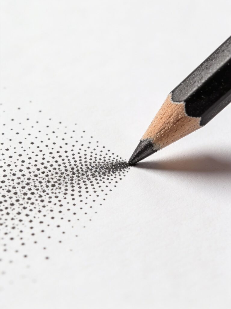
Stippling shading technique showing individual pencil dots creating value gradient from light to dark areas
Best for:
- Creating specific textures (stone, rough surfaces)
- Portraits with character and age
- Illustrations requiring particular aesthetic
- Areas requiring subtle value control
Dot size variation:
- Sharp pencil point: Fine, controlled stippling
- Dull point: Larger, softer dots
- Mix both for varied texture
Time investment: Stippling is the most time-intensive shading technique. A small portrait might require several hours of dotting. However, the results are worth it for the right subject.
Pro tip: Work in sections, completing each area before moving on. This helps you maintain consistent dot density and prevents accidentally smudging completed areas.
5. Scumbling
Scumbling creates texture through random, scribbled circular motions. Unlike smooth circulism, scumbling maintains visible strokes for a rough, energetic appearance.
How to scumble:
- Use loose, irregular circular or looping motions
- Overlap strokes randomly – avoid regular patterns
- Vary pressure for darker and lighter areas
- Keep motion relaxed and spontaneous
- Build up layers for richer values
[IMAGE PROMPT: Scumbling technique demonstration showing loose circular scribbled marks creating textured shading, energetic pencil strokes visible, tutorial style, 4k quality]
Alt text: Scumbling shading technique showing random circular pencil strokes creating rough textured value areas
Best for:
- Organic textures (foliage, rough bark, clouds)
- Sketchy, expressive drawings
- Backgrounds with atmospheric quality
- Quick studies where texture matters more than precision
Energy levels:
- Tight scumbling: Small circles, controlled
- Loose scumbling: Large circles, spontaneous
- Mix both for visual interest
This technique feels liberating after practicing controlled methods like stippling. Don’t overthink it – let your hand move naturally.
6. Contour Shading
Contour shading follows the form of your subject with curved, flowing lines. These lines describe the surface direction, making objects appear three-dimensional.
How to shade with contours:
- Observe the surface direction of your subject
- Draw lines that follow that direction
- Curve lines around rounded surfaces
- Keep lines closer together in shadow areas
- Space lines farther apart in light areas
Best for:
- Cylindrical and spherical forms
- Drapery and fabric
- Organic subjects (bodies, plants)
- Dynamic, dimensional drawings
Following the form: Imagine you’re wrapping the lines around your subject like threads. On a sphere, lines curve around the surface. On a cylinder, lines run parallel to the axis.
Advanced application: Combine contour shading with cross-hatching. First layer follows the form, second layer crosses at an angle. This creates dimension while building darker values.
7. Chiaroscuro
Chiaroscuro (Italian for “light-dark”) emphasizes dramatic contrast between light and shadow. This technique uses strong value differences to create mood and focus.
How to use chiaroscuro:
- Identify your lightest lights and darkest darks
- Push contrast – make lights lighter and darks darker than they appear
- Use limited mid-tones – mostly lights and darks
- Create clear separation between light and shadow areas
- Use cast shadows dramatically
Chiaroscuro shading technique showing dramatic contrast between bright highlights and deep dark shadows creating strong dimensional effect
Best for:
- Portraits with dramatic mood
- Still life with strong lighting
- Creating focal points through contrast
- Artwork with emotional impact
Techniques within chiaroscuro: Chiaroscuro is more of an approach than a specific method. You typically combine it with other techniques:
- Blending for smooth transitions
- Cross-hatching for rich darks
- Scumbling for atmospheric shadows
Historical context: According to art history resources, chiaroscuro was pioneered by Renaissance masters like Caravaggio. They understood that extreme contrast creates drama and draws the viewer’s eye.
Practical application: Set up still life with single, strong light source (desk lamp from one side). The resulting shadows will naturally create chiaroscuro conditions perfect for practicing this approach.
Advanced Shading Methods
Once you’ve mastered the core techniques, these advanced methods will add sophistication and realism to your drawings.
Combining Techniques for Depth
Real mastery comes from knowing when to combine different shading methods within a single drawing.
Strategic combination:
Portraits:
- Smooth blending for skin
- Cross-hatching for hair texture
- Stippling for stubble or pores
- Contour shading for clothing folds
Landscapes:
- Scumbling for clouds and foliage
- Hatching for distant details
- Smooth blending for sky gradients
- Cross-hatching for tree bark texture
Still life:
- Smooth blending for glass and metal
- Cross-hatching for wood grain
- Stippling for rough ceramic texture
- Chiaroscuro approach for dramatic lighting
Gradation: The Foundation of Realism
Gradation is the smooth or gradual transition from one value to another. Mastering gradation separates amateur drawings from professional work.
Types of gradation:
Linear gradation: Value changes in one direction (light to dark from left to right). Common in cylindrical forms.
Radial gradation: Value changes from a central point outward or inward. Essential for spheres and rounded forms.
Complex gradation: Value changes in multiple directions simultaneously. Necessary for organic forms and irregular surfaces.
Creating smooth gradations:
- Start with light pressure and soft pencil
- Gradually increase pressure where darker values needed
- Blend carefully, preserving lightest lights
- Add additional layers to deepen darks
- Use kneaded eraser to lighten if values get too dark
Form Shadow vs Cast Shadow
Understanding the difference between these shadow types is crucial for realistic shading.
Form shadow:
- Appears on the object itself
- Shows the object’s three-dimensional form
- Contains reflected light within it
- Gradual value changes
Cast shadow:
- Projected onto other surfaces
- Darkest where it meets the object
- Lightens as it extends away
- Sharper edges than form shadow
Rendering both correctly: Form shadows should show gradation with reflected light. Cast shadows should be darkest at their origin, gradually lightening. The core shadow (darkest part of form shadow) should not be as dark as the cast shadow where it meets the object.
Edge Quality: Hard, Soft, and Lost
The quality of edges between values creates different effects and guides the viewer’s eye.
Hard edges:
- Sharp, clear transition between values
- Created where light abruptly changes direction
- Draw attention and focus
- Common at cast shadow origins
Soft edges:
- Gradual, blended transition
- Created on curved surfaces
- Feel natural and realistic
- Common in form shadows
Lost edges:
- No visible edge at all
- Values blend into each other
- Creates mystery and atmosphere
- Prevents drawings from feeling overworked
Strategic edge application: Use hard edges at your focal point to draw attention. Use soft and lost edges elsewhere to create depth and prevent visual competition.
Reflected Light: The Secret to Dimension
Reflected light is subtle but essential. It’s the light that bounces off nearby surfaces into shadow areas, preventing them from appearing flat and dead.
Where to find reflected light:
- Within form shadows, opposite the light source
- More visible on reflective surfaces
- Stronger when nearby surfaces are light-colored
- Subtle but crucial for realism
How to render reflected light:
- Shade your form shadow darker than you think you need
- Use kneaded eraser to gently lift a thin band of graphite
- This lifted area is your reflected light
- Keep it subtle – never as light as your midtones
- It should be a slight lightening, not a highlight
Common mistake: Making reflected light too bright. Reflected light should be noticeably darker than your midtones but lighter than your core shadow. It’s a subtle effect – if it jumps out at you, it’s too bright.
Atmospheric Perspective in Shading
Atmospheric perspective affects how you shade objects at different distances.
Principles:
- Closer objects: Stronger contrast, darker darks, lighter lights
- Distant objects: Less contrast, values closer to middle gray
- Edges: Sharp edges near, soft edges far
- Detail: More detail near, less detail far
Application in shading: When drawing landscapes or scenes with depth, intentionally reduce contrast as objects recede. This creates the illusion of atmospheric depth even in simple pencil drawings.
Your closest object might use chiaroscuro with strong contrasts. Middle-ground objects use moderate contrast. Distant objects use values between 4-6 on your value scale with soft, blended edges.
Learn more about creating depth in our complete art fundamentals guide.
Combining Techniques for Realistic Effects
Understanding individual techniques is important, but professional artists think strategically about which techniques to use where. Let’s explore practical applications.
Portrait Shading Strategy
Portraits demand the most sophisticated approach to shading because viewers intimately understand how faces should look.
Skin: Smooth blending is essential. Use circular motions with soft pencils (2B-4B), then blend thoroughly with blending stumps. Build values gradually through multiple light layers rather than pressing hard.
Hair: Combine contour shading (to show hair flow) with cross-hatching (for depth and dark values). Individual hair strands should follow the overall hair direction.
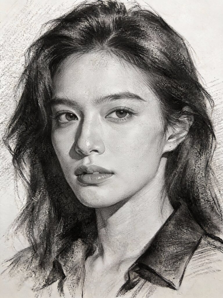
Portrait drawing demonstration showing smooth blending for skin, contour shading for hair, cross-hatching for clothing with reference comparison
Clothing: Cross-hatching works well for most fabrics. Follow the contours of folds with your pencil strokes. Use denser hatching in deeper creases.
Eyes: The area requiring most precision. Smooth blending for iris and whites, with sharp highlights left as pure white paper. Darken the upper eyelid area and pupils significantly – they should be among your darkest values.
Common portrait pitfalls:
- Making skin too smooth (loses character)
- Not going dark enough in shadows
- Forgetting reflected light under chin and nose
- Overworking eyes until they look lifeless
Still Life Shading Strategy
Still life subjects often combine multiple textures requiring different approaches.
Reflective surfaces (metal, glass): Use smooth blending with extreme contrasts. Highlights should be pure white paper, and shadows very dark. Transitions can be quite abrupt on highly reflective surfaces.
Matte surfaces (ceramic, unglazed pottery): Cross-hatching or smooth blending works well. Transitions are softer than reflective surfaces. Values tend toward middle range rather than extremes.
Organic textures (fruit, wood): Scumbling and contour shading capture surface irregularity. Don’t blend completely smooth – maintain some texture. Observe carefully how light interacts with surface bumps and variations.
Fabric and drapery: Contour shading following folds, combined with cross-hatching in deeper creases. Pay attention to edge quality – soft edges on gradual curves, harder edges where fabric folds sharply.
Landscape Shading Strategy
Landscapes require managing multiple textures and creating depth through atmospheric perspective.
Skies: Smooth blending creates realistic skies. Blend horizontally for traditional skies, or use scumbling for dramatic clouds. Remember skies are lighter near horizon, darker overhead.
Trees and foliage: Scumbling captures foliage texture efficiently. Don’t draw every leaf – suggest mass and volume. Use darker values underneath canopy where less light reaches.
Ground and terrain: Combine hatching for grassy textures with smooth blending for smooth surfaces like water or sand. Cross-hatching works well for rough terrain and rocky surfaces.
Distance management:
- Foreground: All techniques, strong contrast, hard edges, visible texture
- Middle ground: Primarily hatching and blending, moderate contrast, mixed edges
- Background: Smooth blending, low contrast, soft edges, minimal detail
Creating focal point: Use your strongest contrasts and sharpest edges at your focal point. This naturally draws the viewer’s eye where you want it.
Animal and Pet Shading Strategy
Animals, especially furry pets, present unique shading challenges.
Fur direction: Always shade in the direction fur grows. Use contour shading following the body form beneath. Vary your pencil stroke length to avoid repetitive patterns.
Fur layers:
- Base layer: Light value establishing overall form
- Middle layer: Medium values showing fur direction and clumps
- Top layer: Individual hairs and highlights for realism
Short fur (dogs like pit bulls): Smooth blending with subtle contour strokes. Fur direction is important but less pronounced than long-haired animals.
Long fur (cats, collies): Distinct pencil strokes following fur flow. Use variety in stroke length. Leave small gaps between strokes to suggest individual hairs.
Eyes and noses: These should be your darkest darks and sharpest details in animal portraits. The catchlight (highlight) in eyes is crucial – leave it as pure white paper.
Common animal drawing mistakes:
- Making all fur strokes the same length (looks like grass)
- Not varying pencil pressure (flat appearance)
- Ignoring body form beneath fur (floating fur effect)
- Forgetting fur has thickness (edge quality matters)
Learn more about drawing animals in our drawing techniques encyclopedia.
Common Shading Problems and Solutions
Even experienced artists encounter shading challenges. Here’s how to identify and fix the most common issues.
Problem 1: Flat, Lifeless Shading
What it looks like: Your drawing has shading, but objects still look flat and two-dimensional rather than having form and depth.
Why this happens:
- Not enough value range (everything is similar gray)
- Missing gradation (values don’t transition smoothly)
- No reflected light (shadows appear as solid dark blocks)
- Uniform shading technique throughout (no variation)
How to fix it:
- Increase your value range: Identify where your lightest lights and darkest darks should be. Push these extremes further than you initially thought necessary. Your lightest light might need to be pure white paper, and your darkest dark might need to be 8B graphite.
- Add gradation: Look at any single shadow area. Does the value change within it? It should. Add gradual value shifts within shadows to show form. Use your blending stump to smooth harsh transitions.
- Include reflected light: In your form shadows, use a kneaded eraser to lift a subtle band of graphite on the side opposite your light source. This reflected light should be darker than midtones but lighter than core shadow.
- Vary your technique: Don’t use the same shading method everywhere. Smooth blending for some areas, cross-hatching for others. Technique variation creates visual interest and suggests different textures.
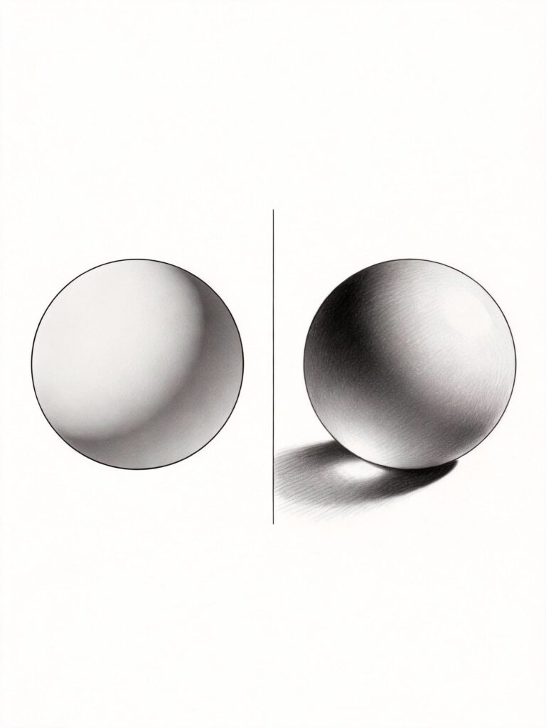
Prevention: Before starting to shade, squint at your reference. This eliminates detail and lets you see just values. Map out where your lightest and darkest areas will be before you begin shading.
Problem 2: Muddy, Overworked Shading
What it looks like: Your drawing looks dirty, smudged, and unclear. Details have disappeared into a gray mess. The paper surface feels slick or shiny.
Why this happens:
- Too much blending (graphite fills every paper texture gap)
- Pressing too hard (burnishes paper surface)
- Using dirty blending tools (spreading old graphite everywhere)
- Working and reworking same area repeatedly
How to fix it:
- Start fresh in worst areas: Use white vinyl eraser to completely lift muddy sections. Redraw with lighter touch.
- Layer, don’t press: Build dark values through multiple light layers rather than pressing hard with one application.
- Clean your tools: Replace dirty blending stumps or tissues. Contaminated tools spread muddy graphite everywhere.
- Know when to stop: Sometimes you can’t save overworked areas. Learning when to stop is as important as learning techniques.
How to prevent it:
- Use light pressure with soft pencils rather than hard pressure with hard pencils
- Change blending tools frequently during one drawing
- Work section by section, finishing each before moving on
- Spray fixative on completed sections to prevent accidental smudging
- Place protective paper under your drawing hand
Problem 3: Inconsistent Pencil Strokes
What it looks like: Your hatching or cross-hatching looks messy and irregular. Lines go in random directions or vary in weight and spacing unintentionally.
Why this happens:
- Drawing from wrist instead of shoulder (limited control)
- Changing pencil grip or angle mid-stroke
- Not planning stroke direction before starting
- Working too quickly without focus
How to fix it:
- Slow down: Quality over speed. Each stroke should be intentional.
- Draw from shoulder: Lock your wrist and draw from your shoulder for longer, more consistent strokes. This feels awkward initially but produces better results.
- Maintain pencil angle: Hold your pencil at the same angle throughout a hatched area. Changing angle mid-section creates inconsistent line weight.
- Practice stroke sets: Before applying to actual drawing, practice your hatching on scrap paper. Get into a rhythm.
Practice exercise: Draw 10 squares. In each one, practice parallel lines in the same direction. Focus on consistent spacing, pressure, and length. Do this daily for a week – you’ll see dramatic improvement.
Problem 4: Can’t Achieve Dark Enough Values
What it looks like: Even your “darkest” areas look light gray. Your drawing lacks punch and contrast.
Why this happens:
- Using only hard pencils (H, HB, 2B)
- Not layering enough applications
- Blending too much (spreads graphite thin)
- Wrong paper (too textured, white shows through)
How to fix it:
- Use softer pencils: For true darks, you need 6B, 8B, or 9B pencils. Softer graphite deposits more pigment.
- Layer strategically: Apply graphite, blend slightly, apply more graphite, blend again. Build up dark values through this layering process.
- Cross-hatch for darks: Multiple layers of cross-hatching in different directions creates richer blacks than single-direction hatching.
- Use proper pressure: In your darkest areas only, you can use more pressure. Just don’t burnish the entire drawing.
- Consider charcoal: For extremely dark values, charcoal creates deeper blacks than graphite can achieve. According to Daniel Smith’s material guide, charcoal offers a wider value range than graphite.
Comparison:
- Light value (1-3): H through 2B pencils
- Middle value (4-6): 2B through 4B
- Dark value (7-10): 4B through 9B
Don’t try to achieve darks with hard pencils – it won’t work.
Problem 5: Losing Highlights and Light Values
What it looks like: Everything in your drawing is too dark. You’ve shaded everywhere and lost your lightest lights. The drawing feels heavy and lacks sparkle.
Why this happens:
- Not planning highlights before shading
- Accidentally shading over areas that should stay light
- Compensating for weak darks by darkening everything
- Fear of white paper (feeling compelled to shade everywhere)
How to fix it:
- Use kneaded eraser: Gently lift graphite to create highlights. Kneaded erasers are perfect because you can shape them into points for small highlights.
- Work light to dark: Start with light values throughout, then gradually add darker values. It’s easier to darken than to lighten.
- Identify highlights first: Before shading anything, lightly mark where your brightest highlights will be. These areas should stay pure white paper.
- Embrace white paper: White paper is your friend. It represents your light source. Don’t feel obligated to shade everything.
Prevention technique: Place small pieces of masking tape or frisket over areas that must remain white (like highlights in eyes or reflections on glass). Remove after shading nearby areas. This guarantees pure white highlights.
Problem 6: Unnatural-Looking Blended Shading
What it looks like: Your smooth blending looks artificial, plastic, or dead. It’s technically smooth but doesn’t look real.
Why this happens:
- Over-blending (eliminating all pencil texture)
- Missing form shadows and reflected light
- Not varying edge quality (everything too smooth)
- Blending instead of observing light behavior
How to fix it:
- Preserve some texture: Don’t blend to complete smoothness. A hint of pencil stroke adds realism and character. Look at professional portraits – you’ll often see subtle pencil texture within blended areas.
- Add reflected light: Use your kneaded eraser to lift a thin line within shadows. This single addition makes objects appear three-dimensional instead of flat.
- Vary edge quality: Not every edge should be soft. Include some hard edges where surfaces change direction sharply. Mix soft, hard, and lost edges throughout.
- Observe real light: Set up a simple still life with dramatic lighting. Study how light actually behaves on three-dimensional objects. Your shading should replicate this behavior, not just create smooth gradients.
Advanced tip: After blending an area smooth, very lightly add subtle texture back with appropriate shading technique (light cross-hatching, gentle scumbling). This “texture over blending” approach gives you smooth form with realistic surface quality.
Practice Exercises for Each Technique
Deliberate practice with these exercises will develop your shading skills faster than random drawing. Complete them in order, spending at least 30 minutes on each.
Exercise 1: Value Scale Mastery (30-45 minutes)
Objective: Create smooth value transitions and understand your pencil range.
What you need:
- Pencils from 2H to 8B
- Smooth drawing paper
- Ruler
Instructions:
- Draw ten 1-inch squares in a row using ruler
- Leave square 1 completely white (value 1)
- Make square 10 as dark as possible using 8B pencil (value 10)
- Fill squares 2-9 with even gradations between white and black
- Each square should be one value darker than the previous
- Blend each square smooth – no strokes should be visible
- Squint at finished scale – transitions should appear even
Success criteria: When you squint, you shouldn’t be able to identify where one square ends and the next begins. The transition should be seamless.
What this teaches:
- Control over value creation
- Understanding your pencil range
- How many layers needed for each value
- Subtle value differences
Keep this value scale visible during all drawing sessions as a reference guide.
Exercise 2: Hatching Gradation (30 minutes)
Objective: Master consistent hatching with smooth value transitions.
Instructions:
- Draw a rectangle 4 inches wide by 2 inches tall
- Using only hatching (parallel lines), create smooth gradation from left (white) to right (dark)
- Lines should gradually get closer together moving left to right
- All lines must be parallel and in same direction
- Line spacing determines value – don’t vary pressure
- Repeat exercise three times, improving each time
Challenge level: Make 5 distinct value zones within your rectangle, each slightly darker than the last. The transitions between zones should be smooth, not abrupt.
What this teaches:
- Line spacing control
- Patience and consistency
- How hatching creates value
- Hand steadiness
Exercise 3: Cross-Hatching Sphere (45-60 minutes)
Objective: Apply cross-hatching to create three-dimensional form.
Instructions:
- Draw a circle 3-4 inches in diameter
- Decide on light source direction (typically upper left)
- Use only cross-hatching to shade the sphere
- First hatching layer follows the sphere’s contours
- Additional layers at different angles build darker values
- Leave highlight as white paper
- Include subtle reflected light opposite the light source
- Render cast shadow beneath sphere
What this teaches:
- Directional hatching
- Building dark values through layers
- Form shadow vs cast shadow
- Creating dimension with lines
Advanced variation: Draw three spheres. Shade one with hatching only, one with cross-hatching, one with smooth blending. Compare the different effects each technique creates.
Exercise 4: Texture Studies (60 minutes)
Objective: Match shading technique to different surfaces.
Instructions:
Draw six 2-inch squares. In each, render a different texture using the most appropriate shading technique:
- Smooth glass – Smooth blending with extreme contrasts
- Rough tree bark – Scumbling with varied pressure
- Woven fabric – Cross-hatching following weave direction
- Smooth stone – Blending with subtle stippling for grain
- Weathered wood – Combination of hatching for grain and scumbling for roughness
- Brushed metal – Contour shading following surface direction
What this teaches:
- Technique selection based on subject
- How different methods create different surface qualities
- Observational skills
- Technical versatility
Exercise 5: Form Study – Basic Shapes (90 minutes)
Objective: Master shading on fundamental three-dimensional forms.
Instructions:
Set up a simple still life with:
- White sphere (ball)
- White cylinder (paper towel roll)
- White cube (box)
- Single light source from one direction
Draw and shade each object using smooth blending technique:
- Observe the five elements of shading on each form
- Map out value zones before shading
- Use appropriate blending for curved vs flat surfaces
- Include cast shadows
- Pay attention to reflected light
What this teaches:
- How light behaves on different forms
- When to use gradation vs distinct value changes
- Shadow projection
- Foundation for drawing complex objects
Advanced variation: After completing with blending, redraw the same setup using only cross-hatching. Compare how different techniques affect the final appearance.
Exercise 6: Portrait Feature Studies (60 minutes each)
Objective: Develop control for realistic portrait shading.
Practice each feature separately:
Eyes (60 minutes):
- Study reference photos of eyes
- Practice smooth blending for iris
- Sharp highlights in pupils
- Subtle shading on whites (they’re never pure white)
- Eyelid creases with precise value changes
Nose (60 minutes):
- Focus on subtle value changes
- Soft edges on most transitions
- Careful placement of cast shadow
- Reflected light under nose tip
Mouth (60 minutes):
- Individual lip texture using small strokes
- Darker line where lips meet
- Shading beneath lower lip
- Highlights on curved lip surface
What this teaches:
- Feature-specific shading challenges
- Subtlety in value changes
- Where to use hard vs soft edges
- Patience with details
Don’t attempt full portraits until you’re comfortable with individual features. Learn more about portrait drawing in our complete pencil drawing guide.
Exercise 7: Light Direction Studies (45 minutes)
Objective: Understand how light direction affects shading.
Instructions:
- Draw the same simple object (sphere or cube) four times
- Shade with light source from different direction each time:
- Top light
- Side light (left)
- Front light
- Back light (rim lighting)
- Note how shadow placement, size, and intensity change
- Observe how form shadows shift position
What this teaches:
- Light source analysis
- Shadow prediction
- When subjects need different shading approaches
- Flexibility in technique application
Daily practice routine: Spend 15 minutes daily doing quick shading exercises:
- Monday: Value scales
- Tuesday: Hatching practice
- Wednesday: Simple sphere with different techniques
- Thursday: Texture studies
- Friday: Photograph study
- Weekend: Longer practice drawing
Consistent daily practice beats occasional marathon sessions. These exercises build muscle memory and observational skills that improve all your drawings.
FAQ
Q: What’s the best shading technique for beginners? A: Start with hatching and cross-hatching. These techniques are easier to control than blending, teach you about value through line density, and work on any paper. Once comfortable with hatching, add smooth blending to your skillset. Most professional artists use multiple techniques within single drawings, so learning several methods serves you better than mastering just one.
Q: How do I know which pencil grade to use for different values? A: Create a value scale with each of your pencils from 2H through 8B. You’ll discover that each grade produces a limited value range. Generally: 2H-HB for light values (1-3), 2B-4B for middle values (4-6), 6B-9B for dark values (7-10). However, pressure and layering matter more than pencil grade. You can achieve relatively dark values with a 2B using multiple layers and pressure, or light values with 6B using gentle pressure.
Q: Why does my shading look streaky instead of smooth? A: Streaky shading typically results from three issues: using paper that’s too textured (the tooth shows through), not blending enough (pencil strokes still visible), or using hard pencils with heavy pressure (creates grooves). Solutions: switch to smoother paper like Bristol, blend more thoroughly with blending stumps, use softer pencils (4B-6B) with lighter pressure and multiple layers instead of hard pencils with heavy pressure.
Q: How can I make my drawings look more three-dimensional? A: Five key elements create dimension: sufficient value range (include very light lights and very dark darks), gradual value transitions (gradation) showing curved surfaces, reflected light within shadows preventing flat appearance, varied edge quality (mix hard, soft, and lost edges), and cast shadows that ground objects in space. Most flat-looking drawings lack adequate value range – push your contrasts further than feels comfortable.
Q: Should I blend with my finger or use blending tools? A: Use blending tools (blending stumps, cotton swabs, tissues) instead of fingers. Your fingers contain oils that transfer to paper, affecting how it accepts graphite and potentially causing uneven patches. Blending tools give better control and create smoother results. However, in pinch situations, a clean finger works acceptably – just wipe it frequently to prevent transferring oil.
Q: How do I fix areas where I’ve shaded too dark? A: Use a kneaded eraser to lift graphite. Press the kneaded eraser onto over-darkened areas and lift repeatedly until you achieve the desired value. For stubborn areas, use white vinyl eraser with gentle pressure (it lifts more graphite but can damage paper if too aggressive). Prevention is easier than correction – work light to dark, building values gradually. You can always make something darker, but lightening significantly is difficult.
Q: What causes those dark spots and smudges in my drawings? A: Common causes include: resting your hand directly on drawn areas (smearing graphite), dirty blending tools spreading old graphite, pencil tips depositing clumps of graphite, working over already-completed sections, and oils from hands darkening paper. Solutions: place clean paper under your drawing hand, clean or replace blending tools frequently, keep pencils sharp, spray fixative on completed sections, and wash hands before drawing sessions.
Q: How long should I practice each shading technique? A: Spend at least 30-45 minutes practicing each core technique before moving to the next. However, technique mastery requires weeks or months of regular practice. A realistic timeline: 1-2 weeks on hatching basics, 2-3 weeks on cross-hatching, 2-4 weeks on smooth blending (it’s challenging), 1 week each on stippling and scumbling. Practice techniques in isolation before combining them. Most artists never stop refining their shading – it’s a lifelong development process.
Q: Can I use these shading techniques with colored pencils or charcoal? A: Yes, all these techniques transfer to other dry media. Colored pencils use identical methods but require attention to color layering order and pressure (you can’t fully erase colored pencil). Charcoal creates richer darks than graphite and blends even more smoothly but is messier and requires fixative. The fundamental principles of light, shadow, and value remain the same regardless of medium. Master these techniques with graphite first, then apply them to other media.
Q: Why do my shadows look too harsh or too soft? A: Shadow edge quality depends on light source characteristics. Hard-edged shadows result from small, direct light sources (sunlight, spotlights). Soft-edged shadows come from large, diffused light sources (overcast sky, large windows with sheer curtains). If your shadows don’t match your reference, you’re not matching the light source type. Also check your technique – blending creates softer edges, hatching creates harder edges. Match your technique to the desired shadow quality.
Related Resources
Complete Drawing Guides:
- Pencil Drawing: Complete Beginner to Advanced Guide – Master all aspects of pencil drawing from basic supplies through advanced techniques
- Art Fundamentals: Complete Guide to Drawing & Painting Basics – Essential principles including perspective, composition, and proportion
- Drawing Techniques Encyclopedia: 50+ Essential Methods – Comprehensive coverage of techniques beyond shading
Specific Technique Deep-Dives:
- Wet-on-Wet Watercolor: Master This Essential Technique – For artists working in watercolor
- Color Mixing Guide: Everything You Need to Know – Understand color theory and application
Comparison Guides:
- Acrylic vs Watercolor vs Oil vs Gouache: Which Medium Should You Choose? – Explore painting options
- Graphite vs Colored Pencil vs Charcoal: Complete Comparison – Understand different drawing media
Related Techniques:
- Watercolor Techniques Encyclopedia – Master painting techniques
- Junk Journaling: The Complete Beginner to Advanced Handbook – Apply shading to mixed media
Have any thoughts?
Share your reaction or leave a quick response — we’d love to hear what you think!
-
 0
0
-
0
-
0
-
0
-
0
-
0


