Table of Contents
Every artist you admire – from classical masters to modern illustrators – built their skills on the same foundation: art fundamentals. These aren’t boring rules to memorize. They’re the visual language that lets you translate what you see and imagine onto paper or canvas.
Here’s what makes fundamentals powerful: they work across every medium and style. Whether you’re sketching with graphite, painting with watercolors, or drawing digitally, these principles guide your decisions. Master them, and suddenly you’re not guessing anymore – you know why something looks right or wrong.
This guide breaks down seven essential fundamentals that form the backbone of all visual art: line, shape, form, value, color, space, and texture. You’ll learn what each one does, why it matters, and how to practice it effectively. No art school required, no complicated theory – just practical knowledge you can use immediately.
What you’ll learn:
- The seven core art fundamentals and how they work together
- Why some drawings look “off” and how to fix them
- Practical exercises to build each skill
- How fundamentals apply to both drawing and painting
- Common beginner mistakes and their solutions
- How to see like an artist instead of just looking
Who this guide is for:
- Complete beginners starting their art journey
- Self-taught artists with gaps in foundation knowledge
- Anyone whose art “doesn’t look right” but can’t figure out why
- Artists wanting to improve faster by strengthening basics
- Students preparing for formal art education
Think of fundamentals as the alphabet of visual art. You could technically write without knowing proper letters, but it would be messy and frustrating. Learn the alphabet first, and everything else becomes exponentially easier.
Why Art Fundamentals Matter
You’ve probably seen it: someone draws for years but doesn’t really improve. They practice constantly but their work still feels… off. Usually, they’re missing fundamental knowledge.
Here’s the truth about art fundamentals – they’re not restricting your creativity, they’re enabling it. According to Artists Network, professional artists consistently credit mastery of fundamentals as the turning point in their development.
What Happens When You Skip Fundamentals
Your proportions feel wrong but you can’t pinpoint why. You redraw the same eye five times and it still doesn’t sit right on the face.
Your colors look muddy despite using quality paints. Everything turns brownish-gray when you mix, and you don’t understand what you’re doing wrong.
Your drawings look flat like cardboard cutouts. You want depth and dimension but achieve flatness instead.
Progress feels impossible. You practice but don’t improve because you’re reinforcing bad habits instead of building solid skills.
What Changes When You Understand Fundamentals
You start seeing the world differently. A face becomes a collection of shapes and planes. A landscape reveals its values and spatial relationships. You stop copying blindly and start understanding what you’re actually drawing.
Problems become solvable. That portrait looks wrong? You can identify it’s a value issue – the shadows aren’t dark enough. The flower looks flat? You recognize it needs stronger form definition.
You learn faster. Instead of trial and error, you understand cause and effect. You know that adding complementary colors creates vibration, that overlapping creates depth, that lighter values recede.
Your unique style emerges. Paradoxically, learning rules frees you to break them intentionally. You develop personal style built on solid foundation rather than compensating for lack of knowledge.
The Seven Core Fundamentals
Every art form, from Renaissance paintings to modern graphic novels, relies on these seven elements:
- Line – The foundation of drawing, creating edges and movement
- Shape – Two-dimensional areas that build composition
- Form – Three-dimensional volume creating believable objects
- Value – Light and dark that create depth and mood
- Color – Hue, saturation, and temperature working together
- Space – Depth and distance creating realistic scenes
- Texture – Surface quality adding realism and interest
Each fundamental builds on the others. Master line and you can create shapes. Understand shapes and you can build form. Control form and value together, and suddenly your drawings have dimension. Add color knowledge, and you’re unstoppable.
Let’s break down each fundamental in detail.
Line: The Foundation of Everything
Understanding Line
Line is the most basic element in art – literally where everything starts. When you put pencil to paper, you’re creating line. But line does way more than just outline objects.
Line defines edges where one thing ends and another begins. The edge of a face against the background. Where shadow meets light. The contour of a flower petal.
Line creates movement leading the viewer’s eye through your composition. Flowing lines feel graceful, jagged lines create tension, horizontal lines suggest calm, vertical lines imply strength.
Line suggests texture through quality and repetition. Rough, broken lines feel different than smooth, continuous lines. Dense parallel lines create shading, scattered marks suggest chaos.
Line conveys emotion. Confident, bold lines feel assertive. Tentative, sketchy lines feel uncertain or energetic. The way you draw the line matters as much as where you draw it.
Types of Lines
Contour Lines Following the outer edge of objects. This is usually where beginners start – drawing the outline of what they see. Contour drawing trains your eye-hand coordination and forces you to really observe.
Cross-Contour Lines Lines that wrap around form, showing the three-dimensional surface. Imagine drawing lines that follow the curve of an apple or the roundness of an arm. These lines describe volume, not just edge.
Gesture Lines Quick, loose lines capturing movement and energy. Used in figure drawing to capture the essence of a pose in 30 seconds to 2 minutes. Trains you to see overall action instead of details.
Implied Lines Lines that don’t actually exist but your brain completes. When objects point toward something, your eye follows that invisible line. Powerful composition tool that guides attention.
Line Quality and Variation
Dead, uniform lines make boring art. Line variation creates visual interest and dimension.
Line weight – Thickness variation. Press harder for thick lines (foreground, emphasis, shadows), lighter for thin lines (background, delicate details, highlights).
Line texture – Smooth vs rough, continuous vs broken. Smooth lines feel finished and deliberate, broken lines suggest texture or atmospheric distance.
Line speed – Fast lines feel energetic and loose, slow lines feel controlled and precise. Most good drawings mix both.
Practice Exercise: Line Control
Warm-up (5 minutes): Fill a page with parallel lines, trying to keep spacing consistent. Draw slow, draw fast, draw with pressure variation. Get comfortable with your tool.
Contour Drawing (10 minutes): Pick an object (your hand, a shoe, a plant). Draw only the outer edge without looking at your paper. This “blind contour” exercise forces you to really see instead of drawing what you think you see.
Line Weight Practice (15 minutes): Draw simple objects (cups, books, fruit) using varied line weight. Make edges closest to you darker and thicker, edges farther away lighter and thinner. This creates instant depth.
Gesture Drawing (20 minutes): If possible, draw someone in various poses, spending only 30-60 seconds per pose. Focus on capturing the overall movement, not details. Use flowing, continuous lines. Can’t find a model? Use yourself in a mirror or reference photos online.
Shape: Building Blocks of Composition
Understanding Shape
Shape is any two-dimensional area with defined boundaries. Shapes are everywhere – the silhouette of a tree, the shadow on a wall, the highlights on a sphere. Learning to see shapes instead of “things” transforms your drawing ability.
Most beginners draw objects: “I’m drawing an eye.” Artists draw shapes: “I’m drawing this almond shape, then this circle, then this curved triangle shape where light hits the iris.” See the difference?
The Three Basic Shapes

Everything you draw can be simplified into three fundamental shapes:
Circle/Sphere Rounds objects – balls, heads, fruit, planets. When shaded, circles become spheres with volume.
Square/Cube Angular objects – books, buildings, boxes, structured forms. The foundation of perspective drawing.
Triangle/Cone Directional shapes – arrows, trees, noses, mountains. Creates movement and points attention.
Complex subjects break down into combinations of these shapes. A face? Oval (circle) with triangular nose, rectangular jaw. A car? Multiple cubes and cylinders. A flower? Circular center with triangular petals.
Positive and Negative Shape
Positive shapes are the objects themselves – the vase, the figure, the tree.
Negative shapes are the spaces between and around objects – the shape of sky between tree branches, the space between a bent arm and torso.
Here’s the revelation: negative shapes are just as important as positive shapes. In fact, drawing negative shapes often produces more accurate results because your brain doesn’t interfere with preconceptions about how things “should” look.
Try this: instead of drawing the chair, draw the shapes of space around and between the chair legs. Your drawing will likely be more accurate because you’re seeing shape purely, not thinking “this is a chair leg.”
Organic vs Geometric Shapes
Geometric shapes have clean, mathematical edges – squares, circles, triangles, polygons. Man-made objects tend toward geometric shapes.
Organic shapes have irregular, natural edges – leaves, clouds, water, living things. Nature tends toward organic shapes.
Most subjects combine both. A tree trunk is an organic cylinder, buildings have geometric structure with organic weathering, faces have geometric skull structure with organic skin and features.
Practice Exercise: Shape Recognition
Simple Object Breakdown (15 minutes): Find 5 objects around you. For each, sketch just the basic shapes that build it – no details, no shading, just the fundamental circles, squares, and triangles. A lamp? Circle head on rectangular shaft with circular base.
Negative Space Drawing (20 minutes): Find an object with interesting negative spaces (a chair, scissors, your hand making a gesture). Draw only the negative spaces – the holes and gaps – not the object itself. When you’re done, the object appears from the spaces around it.
Silhouette Study (15 minutes): Look at objects as pure silhouettes. Squint your eyes until you can barely see details, just the overall shape. Draw these simplified shapes. This trains you to see overall form before getting lost in details.
Shape Accuracy Check: Draw an object normally. Then, on tracing paper over your drawing, trace just the outer shapes. Compare these shapes to the actual object. Are your shapes accurate? Most beginners discover their shapes are distorted, which explains why the drawing doesn’t look right.
Form: Creating Three-Dimensional Volume
Understanding Form
Shape is flat, form is three-dimensional. Form is what makes your drawings look like they exist in real space instead of just sitting flat on paper.
You create the illusion of form through:
- Value (light and shadow)
- Contour lines that wrap around surfaces
- Overlapping (objects in front block objects behind)
- Size variation (closer objects appear larger)
- Atmospheric perspective (distant objects lighter and less detailed)
The Five Basic Forms
Just as everything breaks into three basic shapes, everything also breaks into five basic forms:
Sphere Balls, heads, fruit, anything round. Light gradually transitions from highlight to shadow with no hard edges (unless there’s a cast shadow).
Cube Boxes, buildings, books. Clear planes with distinct edges where value changes abruptly as planes angle differently toward light.
Cylinder Tubes, arms, legs, tree trunks, columns. Gradual value change around the curve, but distinct top and bottom planes.
Cone Pointed objects – party hats, mountains, ice cream cones. Combines the point of a triangle with the curved surface of a cylinder.
Pyramid Sharp-edged objects with triangular sides meeting at a point. Clear planes like a cube but converging.
Master drawing and shading these five forms, and you can draw anything. A face? Sphere modified with planes. An arm? Cylinder with muscle undulations. A tree? Cylinder trunk with sphere clusters of foliage.
Planes and Facets
Complex forms are made of planes – flat surfaces at angles to each other. Think of how 3D models are built from polygons, or how a gemstone has facets.
Your face isn’t one smooth egg shape – it has planes. The front of the forehead is one plane, the side of the forehead angles differently, the cheekbone creates another plane, the area below creates another. Light hits each plane differently, creating value changes that describe form.
Artists often do “planar analysis” – redrawing organic forms as angular planes to understand the underlying structure. This might seem backward (making smooth things angular), but it clarifies how light and shadow work.
Practice Exercise: Form Studies
Basic Form Rendering (45 minutes): Draw the five basic forms – sphere, cube, cylinder, cone, pyramid. Place them in a single consistent light source. Carefully shade each one showing how light wraps around the form. This is fundamental – do it well, and you can render anything.
Form Relationships: Set up 3-5 simple objects (balls, boxes, cups, fruit) with a single light source. Draw them focusing entirely on how light reveals form. Squint to simplify values into 3-4 distinct levels: highlight, light, shadow, core shadow.
Object Breakdown: Choose a complex object (coffee maker, backpack, plant). Break it down into basic forms using light lines. Then shade each form appropriately. This “see the forms inside the object” approach is how professional artists tackle complexity.
Planar Head Study: Find a reference photo of a face with strong lighting (known as Asaro head references). Try to see the planes – forehead plane, nose planes, cheek planes, jaw planes. Draw the face using angular planes instead of smooth curves. This exercise dramatically improves portrait drawing.
Value: The Most Important Fundamental
Understanding Value
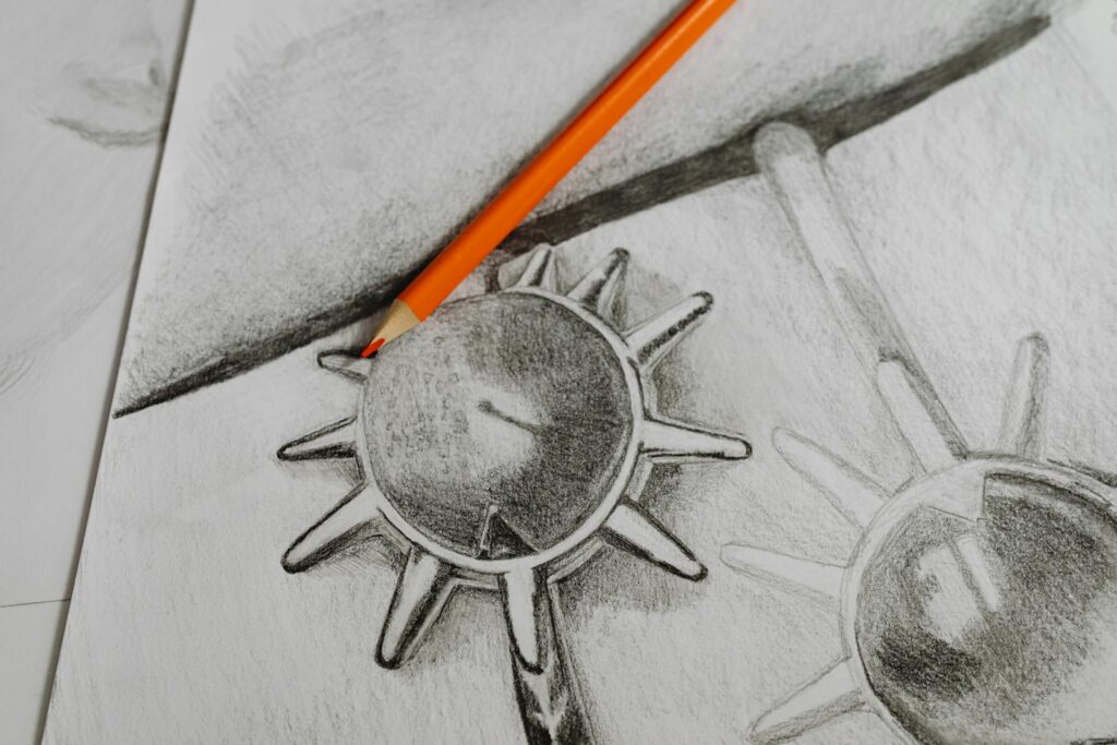
Value is the lightness or darkness of a color, independent of the color itself. A pale yellow and a dark navy blue have the same “yellowness” or “blueness” (hue) but vastly different values.
Here’s why value matters more than any other fundamental: value creates the illusion of light, and light creates the illusion of reality. You can draw with terrible proportions, wonky perspective, and weird colors, but if your values are right, the drawing will still read as three-dimensional and believable.
Conversely, perfect proportions with wrong values look flat and unconvincing. According to Winsor & Newton, master artists often work in monochrome first specifically to nail values before adding color complexity.
The Value Scale
Values exist on a scale from white to black, typically divided into 9-10 steps:
- White (paper/canvas)
- Lightest light
- Light
- Light-mid
- Middle value
- Mid-dark
- Dark
- Darkest dark
- Black (darkest your medium can achieve)
Most scenes use 5-7 of these values. More than that gets muddy and confusing, fewer feels too simple and graphic.
Value Relationships
Local value – The inherent lightness or darkness of an object’s color. A lemon is light value, a blueberry is dark value, regardless of lighting.
Value pattern – How light and dark areas arrange across your composition. Strong value patterns (like big light shape against big dark shape) create impact and readability.
Value contrast – The difference between adjacent values. High contrast (light next to dark) creates focus and drama. Low contrast creates mood and atmosphere.
Value gradation – Smooth transition from light to dark. This creates form and suggests curved surfaces. Abrupt value changes suggest edges and plane changes.
Squinting: The Artist’s Secret Weapon
Here’s a technique that instantly improves your art: squint at your subject and your drawing.
When you squint, details disappear and you see only the major value masses. This reveals:
- Whether your value pattern is strong and clear
- If your light/shadow separation is distinct
- Whether your values match the reference
- Where you need more or less contrast
Professional artists squint constantly while working. It’s not optional – it’s essential for seeing values accurately.
Common Value Mistakes
Mistake 1: Not going dark enough Beginners fear dark values. They shade tentatively, never achieving true darks. Result? Everything looks washed out and flat. Solution: Push your darks. Use 6B-9B graphite, press harder with colored pencil, or layer washes in painting. Your darkest dark should approach black.
Mistake 2: Not preserving lights Once you’ve covered paper with graphite or paint, getting back to pure white is tough. Solution: Identify and preserve your lightest lights from the start. In watercolor, leave white paper. In graphite, work around highlights. In painting, add highlights last.
Mistake 3: Using too many values More values don’t mean better art. Too many create confusion. Solution: Simplify to 4-5 main values. Squint and group similar values together.
Mistake 4: Ignoring reflected light Nothing is pure black, even in shadow. Light bounces off nearby surfaces into shadows, creating subtle reflected light. This prevents shadows from looking like holes. Solution: Observe shadows carefully – they contain information and subtle value variation.
Practice Exercise: Value Mastery
Value Scale Creation (20 minutes): Create a 9-step value scale using your medium. Make each transition smooth and even. This scale becomes your reference for all future work. Compare your values constantly against this scale.
Thumbnail Value Studies (30 minutes): Create 2″x3″ tiny sketches of compositions using only 3-4 values. Work fast – 5 minutes each. Focus only on value pattern, not details. This trains you to see and plan value relationships.
Monochrome Still Life (1-2 hours): Set up simple objects with single light source. Draw using only graphite (or one color + white if painting). Focus entirely on value accuracy. Squint constantly. Check values against your reference by squinting at both.
Photo Value Study: Find a black and white photo with strong lighting. Trace or grid the basic shapes, then try to match every value accurately. Use your value scale as reference. This trains your eye to see and mix accurate values.
Color: Theory Meets Practice

Understanding Color
Color intimidates beginners because it seems complex and mysterious. Here’s the reality: color has only three properties – hue (what color it is), value (how light or dark), and saturation (how intense or muted). Master these three aspects, and color becomes logical.
The Three Properties of Color
Hue – The actual color: red, blue, yellow, green, orange, purple. This is what most people mean when they say “color.”
Value – How light or dark the color is. Lemon yellow has high value (light), navy blue has low value (dark). This is independent of hue.
Saturation – How pure and intense vs. grayed and muted. Traffic cone orange is highly saturated. Dusty mauve is desaturated. Also called chroma or intensity.
Understanding these three properties lets you mix any color you see. “That wall color? It’s a mid-value, slightly desaturated, warm orange.” Now you know exactly what to mix.
Color Temperature
Colors feel warm or cool:
Warm colors – Reds, oranges, yellows. Feel like fire, sun, heat. Advance visually (appear closer).
Cool colors – Blues, greens, purples. Feel like water, ice, shadow. Recede visually (appear farther).
But here’s the twist: every color has warm and cool versions. Cadmium red (orange-ish) is warm, alizarin crimson (purple-ish) is cool. Ultramarine blue (purple-ish) is warm, phthalo blue (green-ish) is cool.
This matters because warm/cool variations create subtle color mixing that adds life and depth. According to Golden Artist Colors, understanding color temperature is one of the fastest paths to better color mixing.
Primary, Secondary, and Tertiary Colors
Primary colors – Red, yellow, blue. Cannot be mixed from other colors (in traditional color theory).
Secondary colors – Orange (red + yellow), green (yellow + blue), purple (red + blue). Mixed from two primaries.
Tertiary colors – Red-orange, yellow-orange, yellow-green, blue-green, blue-purple, red-purple. Mixed from primary + adjacent secondary.
The Color Wheel
The color wheel organizes colors by relationship:
Complementary colors – Opposite on the wheel (red/green, blue/orange, yellow/purple). Create maximum contrast and vibration when placed side by side. Mix to create neutral grays and browns.
Analogous colors – Adjacent on the wheel (blue, blue-green, green). Create harmony and unity. Nature uses analogous colors constantly.
Triadic colors – Evenly spaced (red, yellow, blue or orange, green, purple). Create vibrant, balanced palettes.
Color Mixing Fundamentals
To darken a color: Don’t add black (makes it dead and murky). Add its complement or a darker version of itself. To darken red, add dark red or small amounts of green.
To lighten a color: Don’t just add white (makes it chalky). Add a lighter, similar color. To lighten blue, add light blue or small amounts of white + yellow.
To gray/mute a color: Add its complement. This creates natural, beautiful grays instead of muddy mess. Red too intense? Add tiny bit of green.
To create shadow colors: Shadows aren’t just darker versions of local color. Add the complement plus blue/purple. Shadow on red apple? Dark red + green + blue = rich, believable shadow.
Common Color Mistakes
Mistake 1: Using color straight from the tube Nature rarely shows pure, saturated colors. Solution: Mute most colors slightly with complement. Reserve highest saturation for focal points.
Mistake 2: Mixing too many colors More than 3 colors in a mixture creates mud. Solution: Limit mixtures to 2-3 colors maximum. Know your color bias (is your blue warm or cool?).
Mistake 3: Ignoring value in color Beginners focus on hue but ignore value. Two colors might both be “blue” but if values don’t match reference, painting looks wrong. Solution: Check values constantly by squinting or using phone camera’s black-and-white filter.
Mistake 4: Same saturation everywhere Real scenes have saturation variation. Solution: Use highest saturation sparingly at focal points. Reduce saturation in backgrounds and shadows.
Practice Exercise: Color Mastery
Color Wheel Creation (45 minutes): Mix and paint a 12-color wheel showing primaries, secondaries, and tertiaries. Use only three primaries – no premixed secondary colors allowed. This reveals how colors actually mix.
Value/Color Relationship Study (30 minutes): Choose 6 different colors. Mix each at three values: light, mid, dark. This separates hue from value in your brain – crucial for accurate painting.
Complementary Mixing Exercise (20 minutes): Take each complementary pair. Mix them in varying ratios: 80/20, 60/40, 50/50, 40/60, 20/80. Discover the range of neutrals and earth tones hiding in complementary mixtures.
Limited Palette Painting (1-2 hours): Create a small painting using only three colors (one red, one yellow, one blue) plus white. This forces you to really learn color mixing without relying on convenience colors. You’ll be amazed what’s possible with just three colors.
For deeper color understanding, see our complete color mixing guide.
Space and Depth: Creating the Third Dimension
Understanding Spatial Illusion
Paper is flat. Canvas is flat. Your job as an artist is creating the illusion that it’s not. Space and depth are how you convince eyes that they’re looking into three-dimensional space instead of at a flat surface.
Linear Perspective
Linear perspective is the mathematical system for drawing depth using converging lines.
One-point perspective – All lines converge to single vanishing point on horizon. Used for roads, hallways, railroad tracks stretching into distance.
Two-point perspective – Two vanishing points on horizon. Used for buildings, boxes, furniture viewed at an angle.
Three-point perspective – Three vanishing points including one above or below. Used for extreme viewpoints – bird’s eye view or looking up at skyscrapers.
The rules seem rigid, but here’s the secret: you don’t need perfect perspective for most art. You just need enough understanding to make things look believable. Cars don’t need to perfectly vanish to correct points – they just need to feel like they’re sitting in space correctly.
Atmospheric Perspective
Also called aerial perspective. As objects recede into distance:
- Value contrast decreases – Darks get lighter, lights get slightly darker, everything moves toward mid-value
- Edges soften – Details blur, hard edges disappear
- Colors cool and desaturate – Atmospheric haze (water vapor and particles) makes distant things bluer and grayer
- Saturation decreases – Intense colors mute
This happens because air isn’t completely transparent. Miles of atmosphere between you and distant mountains scatter light, creating that characteristic blue-gray haze.
Atmospheric perspective works even in indoor scenes over shorter distances. Far corner of room has slightly softer edges and less contrast than nearby objects.
Overlapping
The simplest depth cue: objects in front block objects behind. Overlapping instantly establishes spatial relationships. A person overlapping a building must be in front of the building.
Use overlapping generously – it’s the easiest, most reliable depth cue available.
Size and Scale
Objects appear smaller as they move farther away. A person 10 feet away looks larger than the same person 100 feet away. This seems obvious, but beginners often draw objects the same size regardless of distance.
Relative scale – Compare sizes of objects at different distances. That distant figure should be 1/4 the size of the near figure if they’re the same size in reality.
Foreground, Middle ground, Background – Organize compositions in these three depth zones. Largest objects and highest contrast in foreground, medium sizes and contrast in middle ground, smallest objects and lowest contrast in background.
Depth Through Detail
Nearby objects show more detail and texture. Distant objects simplify.
You can see individual leaves on a nearby tree but only see the overall mass on distant trees. Individual bricks on near buildings become texture pattern at middle distance, disappear at far distance.
This mimics how human vision actually works – we see detail where we focus, less detail in periphery and distance.
Practice Exercise: Creating Depth
Perspective Study (30 minutes): Draw a simple street scene or hallway using one-point perspective. Draw the horizon line, mark vanishing point, draw guidelines from vanishing point, build scene using those guidelines. Even if you never use technical perspective again, this exercise trains your eye.
Atmospheric Layers (45 minutes): Create a landscape with three depth zones. Foreground: dark values, high contrast, sharp edges, saturated colors. Middle ground: mid values, moderate contrast, somewhat soft edges, less saturated. Background: light values, low contrast, soft edges, cool muted colors. This demonstrates atmospheric perspective clearly.
Overlap Study: Draw or paint simple objects deliberately overlapping each other. Pay attention to how overlapping immediately creates depth hierarchy. Practice creating clear, confident overlaps – no ambiguity about what’s in front.
Size Progression Exercise: Draw the same object (tree, person, car) at three different distances. Foreground version large with detail, middle ground medium sized with less detail, background version small and simplified. This trains you to scale appropriately.
Texture: Adding Surface Reality
Understanding Texture
Texture is the surface quality of objects – rough bark, smooth glass, soft fabric, wet metal. Texture adds realism and sensory richness, making viewers feel like they could reach out and touch your subject.
Actual vs Implied Texture
Actual texture – Real physical surface variation you can feel. In traditional media, this is impasto paint creating ridges, or collaged materials adding dimension.
Implied texture – Visual illusion of texture on flat surface. Most texture in 2D art is implied – marks and values that make paper look like it has texture.
Creating Textural Effects
Different mark-making creates different texture illusions:
Smooth textures (glass, water, polished metal) – Gradual value transitions, minimal marks, precise edges, strong reflections
Rough textures (bark, stone, rust) – Irregular marks, broken edges, varied values in small areas, detail variation
Soft textures (fur, fabric, clouds) – Directional marks following form, soft value transitions, slightly blurred edges
Hard textures (metal, ceramic, plastic) – Sharp value transitions, crisp edges, strong highlights
Texture Through Technique
Your medium and technique affect texture:
Graphite – Smooth application with blending, or visible hatching for textural effects. Cross-hatching creates rough texture illusion.
Colored pencil – Layering creates smooth texture, directional marks create fur/fabric texture, burnishing creates polished texture.
Charcoal – Smudged charcoal creates soft texture, compressed charcoal with rough paper creates gritty texture.
Watercolor – Wet-on-wet creates soft diffused textures, dry brush creates rough textures, salt creates crystalline textures.
Acrylic – Thin washes create smooth texture, thick impasto creates actual physical texture, palette knife application creates rough texture.
See our watercolor techniques guide and drawing techniques encyclopedia for medium-specific texture methods.
Texture and Focus
Here’s a key principle: use most textural detail at focal points, less texture in less important areas.
Your eye is drawn to texture, so strategic texture placement guides viewer attention. Detailed texture on face draws eye there, while simplified texture on clothing keeps attention on face.
Too much texture everywhere creates visual chaos – nothing stands out. Varied texture creates hierarchy and interest.
Practice Exercise: Texture Studies
Texture Samples (45 minutes): Create a page of 2″x2″ texture samples. Try to replicate: tree bark, stone, glass, fur, water, fabric, metal, wood grain, hair. Use only graphite or pen. This builds your texture vocabulary.
Textural Still Life (1-2 hours): Set up objects with contrasting textures: smooth glass, rough stone, soft cloth, hard metal. Draw/paint focusing on capturing each distinct texture. Pay attention to how technique changes for each surface.
Texture Map: Find a photo with interesting textures (weathered building, animal close-up, textured landscape). Create a “map” showing what techniques would create each texture. This separates seeing texture from executing it.
Detail Variation Study: Draw same subject twice – once with texture everywhere, once with texture only at focal point and simplified elsewhere. Compare the impact. The selective texture version almost always reads better.
Composition: Arranging Elements Effectively
Understanding Composition
Composition is how you arrange elements within your picture plane. Good composition guides the viewer’s eye, creates balance, establishes mood, and makes your subject compelling. Bad composition makes technically perfect artwork feel wrong.
The Rule of Thirds
Divide your picture plane into thirds both horizontally and vertically (like a tic-tac-toe grid). Place important elements along these lines or at their intersections rather than dead center.
Why does this work? Off-center placement creates dynamic tension and visual interest. Centered subjects feel static and snapshot-like. Rule of thirds feels natural and balanced while remaining interesting.
Is it an absolute rule? No. But it’s a great default until you understand why to break it.
Focal Point
Every composition needs a clear focal point – where the viewer’s eye should go first. You create focal points through:
- Highest contrast – Light against dark draws the eye
- Most detail – Detailed areas attract attention
- Brightest color – Saturated, bright colors demand attention
- Convergent lines – Lines leading toward an area guide eyes there
- Isolation – Single object surrounded by space stands out
- Face or eyes – Human eyes gravitate toward faces automatically
Common mistake: Everything competing for attention means nothing gets attention. Choose one main focal point, possibly one secondary point. Everything else supports these.
Balance
Visual weight needs distribution across your composition. Balance doesn’t mean symmetry – it means the composition feels stable.
Symmetrical balance – Mirror image on both sides. Feels formal, stable, static. Used in architecture, formal portraits, religious art.
Asymmetrical balance – Different elements of equal visual weight on each side. Small dark object balances large light object. Feels dynamic and interesting.
Visual weight factors:
- Dark heavier than light
- Saturated heavier than muted
- Detailed heavier than simple
- Large heavier than small
- Solid heavier than transparent
- Textured heavier than smooth
Leading Lines
Use lines (actual or implied) to guide viewer’s eye through composition. Roads, fences, rivers, extended arms, sight lines between figures – all create paths for the eye to follow.
Lead lines toward your focal point, not out of frame. Lines leading out of the picture plane pull viewer’s attention away – usually undesirable.
Unity and Variety
Unity – Elements feel related and cohesive. Achieved through:
- Repeated colors across composition
- Similar shapes echoing throughout
- Consistent style and technique
- Related subject matter
Variety – Elements have enough difference to create interest. Achieved through:
- Value contrast
- Size variation
- Shape diversity
- Textural differences
The balance between unity (harmony) and variety (interest) determines whether composition feels cohesive yet compelling or boring or chaotic.
Positive and Negative Space
We discussed this under Shape, but it’s crucial for composition too. The empty space around and between subjects (negative space) is as important as the subjects themselves.
Good negative space creates breathing room, shapes that support the composition, and paths for the eye to travel. Bad negative space creates awkward shapes or competing focal points.
Practice Exercise: Composition Strength
Thumbnail Studies (30 minutes): Before starting any drawing or painting, create 4-6 tiny (2″x3″) thumbnail sketches exploring different compositions. Try different:
- Focal point placements
- Balance arrangements
- Cropping options
- Format orientations (horizontal vs vertical)
Choose the strongest thumbnail before committing to full-size work. This saves hours of frustration.
Value Pattern Planning (20 minutes): Create your thumbnail in only 3 values – light, mid, dark. Ignore details and color. Does the value pattern read clearly? Is focal point obvious? Are lights and darks balanced across composition?
Masterwork Analysis: Study paintings by master artists (Edward Hopper, John Singer Sargent, Rembrandt, contemporary illustrators). Trace compositional lines, mark focal points, analyze balance. Understanding how masters compose trains your intuitive sense.
Rule Breaking Exercise: Once you understand compositional principles, deliberately break them. Center your subject, create symmetry, ignore rule of thirds. Sometimes breaking rules creates impact. But you must know the rules to break them effectively.
Common Beginner Mistakes and Solutions
Mistake 1: Drawing What You Think Instead of What You See
The problem: Your brain has symbols for objects (circle with stick rays = sun, stick figure = person). When you draw, you draw these symbols instead of observing reality.
Solution: Practice observation exercises. Blind contour drawing forces observation. Upside-down drawing prevents symbol recognition. Negative space drawing bypasses brain’s object recognition.
Key insight: Learn to “see like an artist” – as shapes, values, and relationships rather than named objects.
Mistake 2: Not Using References
The problem: Drawing from imagination before you understand reality leads to incorrect proportions, impossible lighting, and unconvincing results.
Solution: Use photo references, real objects, or mirrors. Master reality first, then stylize or invent. Even professional artists use references constantly.
Key insight: References aren’t “cheating” – they’re essential learning tools and professional practice.
Mistake 3: Fear of Making Mistakes
The problem: Working so carefully and tentatively that drawings feel stiff and lifeless. Erasing constantly. Never committing to marks.
Solution: Accept that mistakes are part of learning. Work in a sketchbook where nobody sees practice work. Set timer and force yourself to complete something in 15 minutes – no time for perfectionism.
Key insight: Quantity leads to quality. A hundred loose, imperfect drawings teach more than ten precious, cautious ones.
Mistake 4: Focusing on Details Too Early
The problem: Starting with the eye and carefully rendering it before establishing overall proportions. Finishing one area while others remain blank.
Solution: Always work from general to specific. Block in overall proportions and relationships first, refine gradually, add details last. Work over entire drawing together rather than completing one section at a time.
Key insight: If proportions are wrong, perfect details don’t matter.
Mistake 5: Ignoring the Entire Process
The problem: Wanting finished results immediately. Skipping warm-ups, studies, and planning. Jumping straight to “final” work without preparation.
Solution: Embrace the process:
- Warm up with gesture drawing or value scales (5-10 minutes)
- Do thumbnail composition studies (10-15 minutes)
- Create value study or sketch (15-30 minutes)
- Then work on final piece
Key insight: Preparation prevents frustration and produces better results.
Mistake 6: Not Studying Values Enough
The problem: Spending time on color, detail, and technique while values remain weak. Results look flat regardless of other skill levels.
Solution: Do regular value studies in monochrome. Master graphite or single-color painting. Train your eye to see value independent of color. Squint constantly.
Key insight: Value is more important than color, proportion, or detail for creating convincing art.
Mistake 7: Comparing to Others Instead of Past Self
The problem: Seeing others’ best work and feeling discouraged about your current level. Forgetting that everyone started as beginner.
Solution: Compare your current work to your work from 6 months ago, 1 year ago. Track progress. Remember that artists you admire have thousands of hours of practice you don’t see.
Key insight: Your only competition is yesterday’s version of yourself.
Creating a Fundamentals Practice Routine
Consistent practice beats occasional inspiration. Here’s a sustainable practice routine:
15-Minute Daily Practice
Short, focused practice beats marathon sessions that lead to burnout.
Week 1-2: Lines and Shapes
- 5 min warm-up: parallel lines, circles, varied line weights
- 10 min: contour drawing of objects around you
Week 3-4: Values
- 5 min warm-up: value scale practice
- 10 min: simple object shading focusing on accurate values
Week 5-6: Form
- 5 min warm-up: basic form sketches
- 10 min: rendering one basic form with lighting
Week 7-8: Color (if working in color)
- 5 min warm-up: color mixing exercises
- 10 min: limited palette color study
Week 9-10: Composition
- 5 min warm-up: quick thumbnail compositions
- 10 min: value planning for composition
Week 11-12: Integration
- 15 min: complete small study combining all fundamentals
Weekly Challenge Projects
In addition to daily practice, complete one “challenge” piece weekly applying fundamentals:
- Week 1: Accurate shape drawing
- Week 2: Value-focused still life
- Week 3: Form study of complex object
- Week 4: Limited palette painting
- Week 5: Composition-focused piece
- Week 6: Texture study
- Week 7: Depth and space emphasis
- Week 8: Integration of all elements
Assessment and Adjustment
Every month, review your work:
- What fundamentals feel comfortable?
- Which need more practice?
- Are you seeing improvement?
- What specific challenges arise repeatedly?
Adjust practice emphasis based on assessment. If values remain weak, dedicate more time there. If composition clicks easily, spend less time practicing it.
Moving Beyond Fundamentals
When Are You “Done” Learning Fundamentals?
Never. Professional artists with decades of experience still practice fundamentals. But you reach a point where fundamentals become intuitive rather than conscious effort.
Signs you’ve internalized fundamentals:
- You automatically see shapes and values instead of “things”
- Proportions feel natural without constant measurement
- Value relationships make intuitive sense
- Composition decisions happen naturally
- You know why something looks wrong and how to fix it
This typically takes 6-24 months of consistent practice, depending on intensity and prior experience.
What Comes Next?
Once fundamentals feel solid:
Develop personal style – Your unique way of interpreting and expressing subjects
Master your medium – Deep dive into specific medium techniques
Explore genres – Portraiture, landscape, still life, figure, abstract
Study specific skills – Anatomy, perspective, color theory depth, lighting
Create series – Cohesive body of work exploring themes
Share work – Get feedback, build community, consider selling
The Fundamental Truth About Fundamentals
Here’s what nobody tells you: learning fundamentals isn’t the boring prerequisite before “real” art starts. Fundamentals ARE real art. Every master painting demonstrates fundamental principles applied with skill and intention.
The goal isn’t to “get through” fundamentals to reach some magical point where they don’t matter. The goal is to internalize fundamentals so deeply they become your artistic language – how you think, see, and create.
Your relationship with fundamentals evolves from “consciously applying rules” to “intuitive visual understanding” to “creative manipulation and innovation.” But they remain present throughout your entire artistic journey.
FAQ
Q: How long does it take to learn art fundamentals? A: Basics take 6-12 months of regular practice. Solid proficiency takes 1-2 years. True mastery is lifelong. But you don’t need mastery to create good art – just solid understanding. Start seeing improvement within weeks if practicing consistently.
Q: Should I learn to draw before learning to paint? A: Yes, generally. Drawing teaches observation, proportion, values, and composition without color complexity. Many fundamentals (line, shape, form, value) are easier to learn in drawing. That said, if painting excites you and drawing doesn’t, start with painting – enthusiasm beats perfect learning order.
Q: Can I learn fundamentals from books and videos alone? A: Books and videos provide information, but skill comes from practice. You need both: learning from resources plus hours of hands-on application. Online courses, books, YouTube tutorials work fine, but actually drawing/painting every day matters more than any resource.
Q: Do I need to learn perspective to be a good artist? A: You need to understand basic perspective principles, but don’t need mastery of technical perspective drawing unless you’re doing architecture or technical illustration. Most artists develop intuitive understanding of how things sit in space without precise vanishing points.
Q: Why does my art still look beginner despite understanding fundamentals? A: Understanding and executing are different skills. You may intellectually grasp fundamentals but lack hand-eye coordination and muscle memory to execute them. This is normal and improves with practice. Also, critically judging your own work is actually a good sign – it means your taste is developing faster than your skills (which eventually catch up).
Q: Should I focus on one fundamental at a time or practice all together? A: Start focusing on one at a time (value for a week, then form, etc.) to build understanding. Once you grasp each individually, practice them integrated together since real art uses all fundamentals simultaneously. The daily practice routine in this guide balances both approaches.
Q: Is there a “correct” order to learn fundamentals? A: Line → Shape → Form → Value is natural progression since each builds on previous. Color comes after value (since color contains value). Space/depth and composition can integrate throughout. But this isn’t rigid – if something clicks out of order, go with it.
Q: How important is anatomy knowledge? A: Depends on what you want to create. Portrait and figure artists need solid anatomy. Landscape artists need minimal anatomy. Abstract artists need none. Start with basic proportions and add anatomy study if your subject matter requires it.
Q: Can I skip fundamentals and develop my own style? A: “Style” built on weak fundamentals looks unintentional rather than artistic. Develop solid fundamentals first – paradoxically, this frees you to develop personal style from position of knowledge rather than limitation. Artists you admire with unique styles all have strong fundamental understanding underneath.
Have any thoughts?
Share your reaction or leave a quick response — we’d love to hear what you think!
-
 0
0 -
0
-
0
-
0
-
0
-
0


