

3d illusion drawing turns a plain sheet of paper into something that seems to tear open, drip, or lift right off the desk, and that little jolt of disbelief is exactly why these pages are so satisfying to make. Every trick here runs on the same handful of ideas: a strong light source, a cast shadow placed with intent, and a line that looks like the edge of the paper itself has moved.
Below you will find twenty seven separate scenes, from a simple floating cube to a full staircase that never seems to end. Work through them in order if you like, since the tricks build on each other, or jump straight to the one that matches what is already sitting on your desk today.
Using these images: free for personal projects such as printing, coloring, cards, journals and gifts. Handmade items that include them may be sold up to 30 pieces per design. More than that is commercial use and is not permitted, and neither is selling or sharing the images themselves or passing them off as your own. Please ask before any other use.
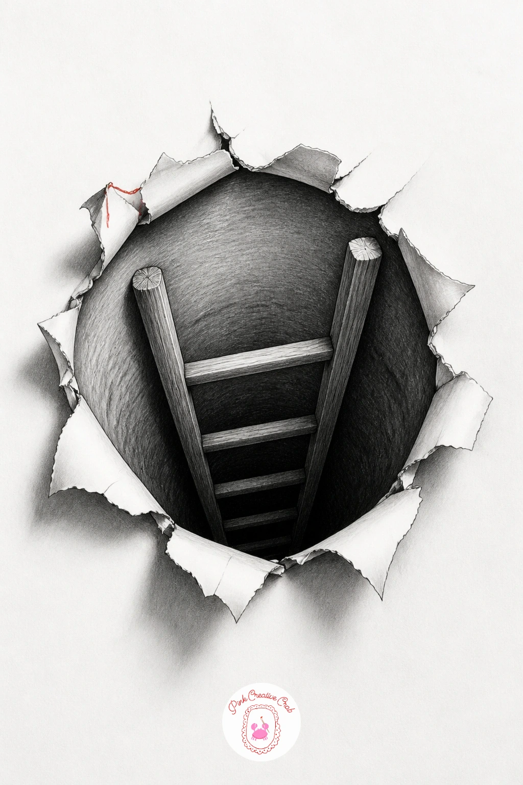
Start with the easiest illusion in the set: a hole with a ladder going down into it. Draw a rounded or torn-edged hole shape first in pencil, then commit to the outline in fineliner so the opening reads as a clean break in the paper rather than a doodle.
Shade the inside of the hole almost black near the top, fading to a mid grey a few inches down, so the eye reads depth instead of a flat circle. Add the ladder last, drawn smaller and fainter as it goes down, with the rungs closer together toward the bottom to fake distance.
The common mistake is making the hole edge too thin and wobbly, which flattens the whole effect instantly. If you only have a pencil and no fineliner yet, go over the hole’s outer edge two or three times with heavy graphite instead, since a dark enough line does the same job.
Keep the paper around the hole completely white and untouched today, so the contrast does all the convincing.
Palette: Graphite Black,Cool Grey,Paper White
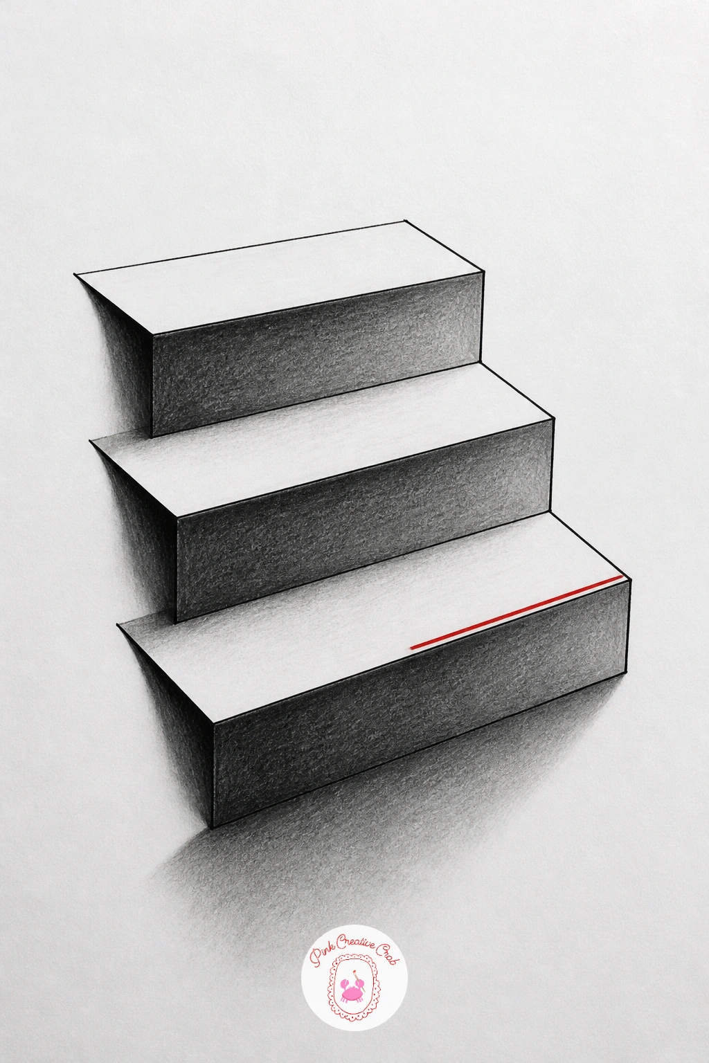
Once a hole feels easy, flip the trick upside down with stairs that rise up out of the page instead of sinking into it. Pencil a simple side-view staircase first, three or four steps, using straight ruled lines so every step stays the same height and depth.
Measure the first step against your thumb width and copy that same measurement for each step after it, since uneven step sizes are what make a staircase illusion collapse. Shade the riser of each step dark and the tread lighter, then add one strong cast shadow falling to the same side on every step so the light source stays consistent.
Go over the final outlines in fineliner once the pencil layout looks right, then erase the guide lines. If a ruler is not to hand, fold a scrap of paper into equal sections and use the folds as your step markers instead.
Finish by darkening the very front edge of the bottom step, which is what makes it look closest to you.
Palette: Graphite Black,Warm Grey,Paper White
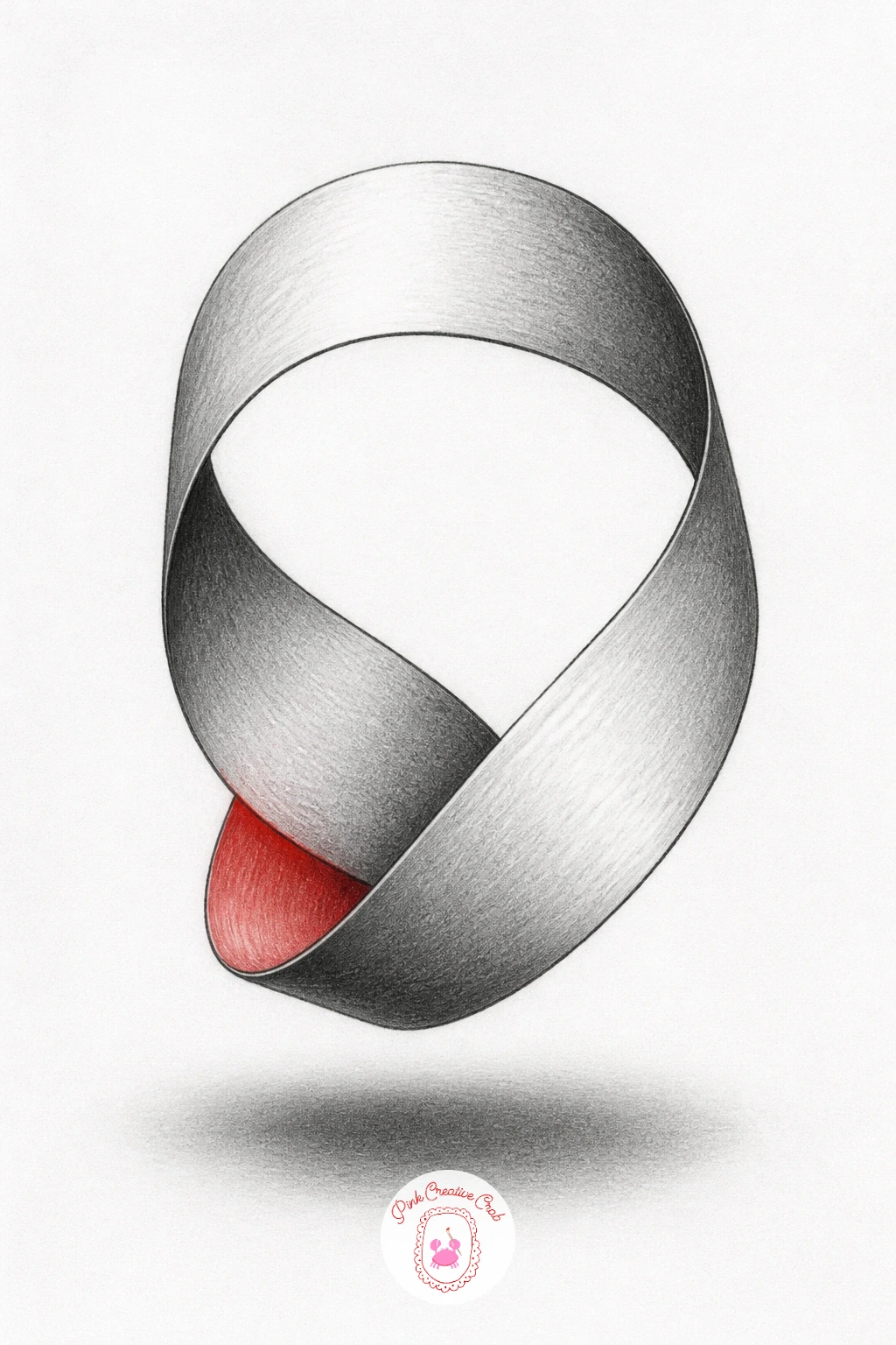
After straight steps, loosen up with a ribbon that loops and twists as if floating just above the paper. Draw it as a flattened S shape first in light pencil, letting the ribbon cross over itself once in the middle of the loop.
Light one side of the ribbon from the upper left and leave the underside of every curve in shadow, since a ribbon only looks three dimensional when the light and dark sides swap consistently as it twists. Use the fineliner for the crisp outer edges, then blend the graphite shading with a stump so the surface looks smooth rather than scribbled.
The usual error is shading both sides of a curve the same tone, which flattens the loop back into a flat squiggle. Drop a soft oval shadow beneath the lowest point of the ribbon on the paper to finish convincing the eye that it is hovering.
No blending stump at home works fine too, a cotton bud does the same smoothing job.
You Will Need
- blending stump or cotton bud
Palette: Graphite Black,Soft Grey,Accent Red
Try the ribbon in a thin accent color instead of plain grey, keeping the shadow side graphite dark, for a bolder version of the same loop.
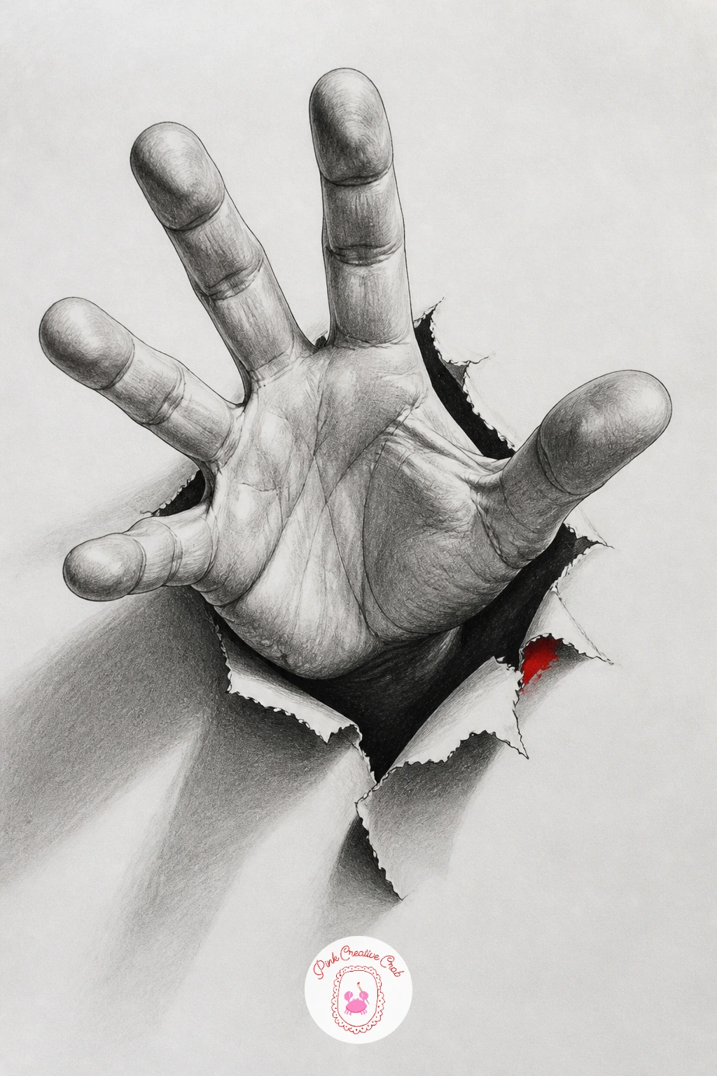
Bring the illusion closer to home with a hand that appears to push straight out of the paper’s surface. Sketch your own hand from a photo or from life, palm facing out, fingers slightly spread, keeping the wrist disappearing into a drawn torn or folded edge behind it.
Work out where the light falls across the knuckles first, since hands have enough small planes that getting the light direction consistent across all five fingers is what sells the roundness. Shade the fingers darkest where they meet the paper’s torn edge, which is also where you add the deepest cast shadow.
People often flatten the fingers by outlining them too evenly in fineliner before the pencil shading is finished, so always build the graphite tone first and only ink the final edges last. A mirror or your own free hand held up at the angle you want works as a simple reference if no photo is handy.
Add fine white paper fibers torn around the wrist with a kneaded eraser to finish the tearing effect.
You Will Need
- kneaded eraser
Palette: Graphite Black,Skin Grey-Brown,Paper White
Shift from realism to pure line illusion with a heart built entirely from parallel curved lines that wrap around its own form. Pencil a simple heart outline first, then draw a second smaller heart nested just inside it, repeating that nested shrinking outline five or six times toward the center.
Keep every line’s curve matching the one before it exactly, since the slightest wobble between the nested outlines is what breaks this illusion rather than any shading choice. Ink the lines in fineliner once the pencil version looks even, then add a cast shadow beneath the heart’s lowest point so it reads as sitting above the page rather than printed flat on it.
If spacing the nested lines by eye feels tricky, lightly mark five or six evenly spaced dots along one edge first and curve each new line through the next dot in. A compass is not needed here, only a steady hand and patience with the pencil layer.
Try one accent color filling only the outermost heart outline for a soft glow effect.
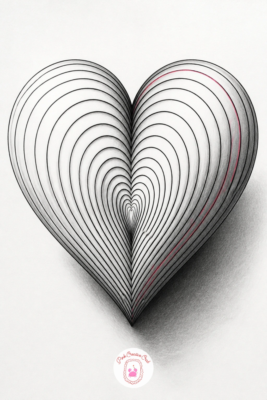
Palette: Graphite Black,Accent Pink,Paper White
Carry that same nested-line patience into a fold in the paper that peels back to reveal open sky underneath. Draw the triangular fold shape first, treating it like a flap with a straight crease line and a curled corner lifting away from the page.
Shade the underside of the fold almost black close to the crease, then let it lighten gradually as it curls up, mimicking how light wraps around real paper. Behind the lifted corner, draw a small patch of sky with soft graphite clouds or a thin wash of blue colored pencil, kept much lighter than the fold itself so it reads as distant.
A flat, evenly shaded fold with no gradient is the fastest way to lose the three dimensional feel, so always work from dark at the crease to light at the curling tip. If you want a quicker ten minute version, skip the sky detail and leave that patch plain white, since the folded shadow alone already carries the illusion; the forty minute version adds a few birds or a soft cloud layer for extra depth.
Use a ruler for the crease line only, and keep the curling edge freehand.
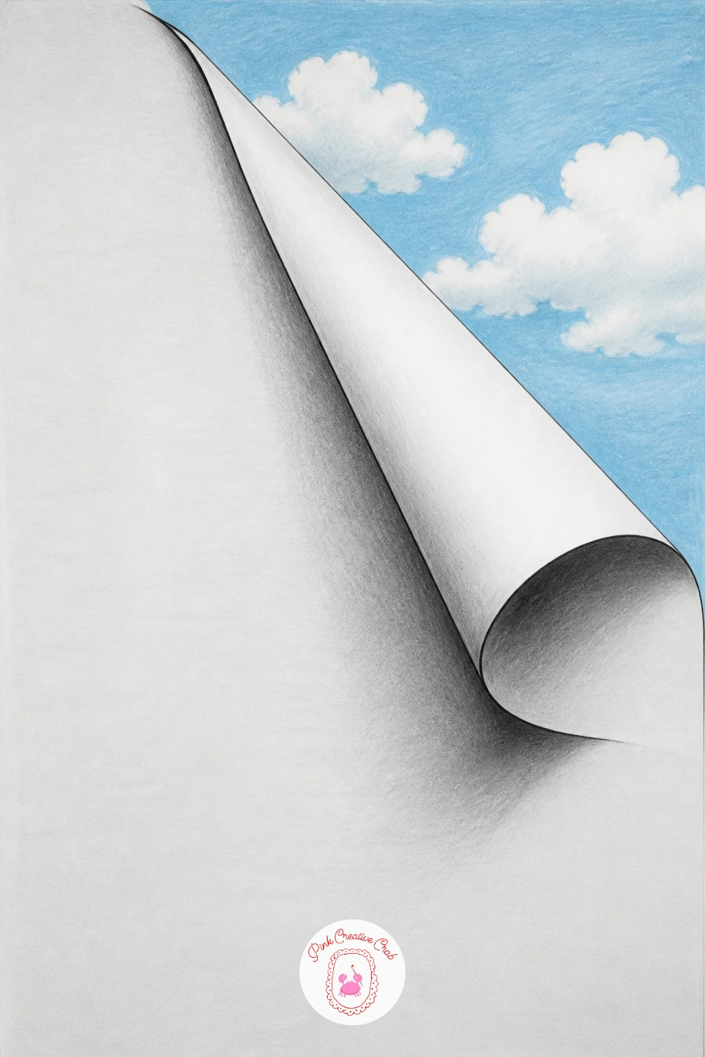
Palette: Graphite Black,Sky Blue,Paper White
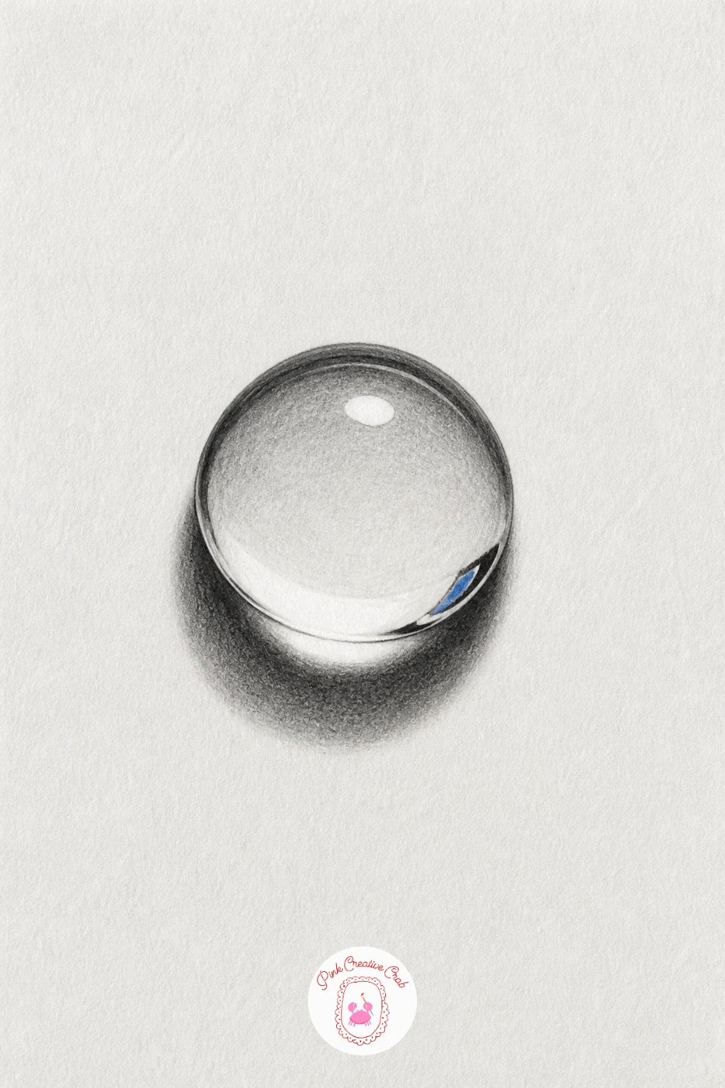
Move into pure light and reflection with a single drop of water sitting on the paper’s surface. Draw a simple teardrop or dome outline first, flattened slightly at the base where it touches the page.
Place one small bright highlight toward the upper edge of the drop and leave it completely white, since that one untouched spot of paper is what convinces the eye of wet glass more than any other mark you make. Shade the rest of the drop in a tight gradient from dark at the rim to lighter toward the highlight, and add a tiny inverted reflection of whatever sits nearby, like a hint of a leaf shape, upside down inside the drop.
Overworking the highlight by shading over it is the single mistake that kills this illusion fastest, so protect that white spot from the first pencil stroke onward. Finish with a thin, sharp cast shadow directly under the drop, kept small and tight rather than soft, since water drops sit close to the surface.
A dab of white gel pen can rescue a highlight you shaded over by accident.
You Will Need
- white gel pen
Palette: Graphite Black,Cool Grey,Paper White
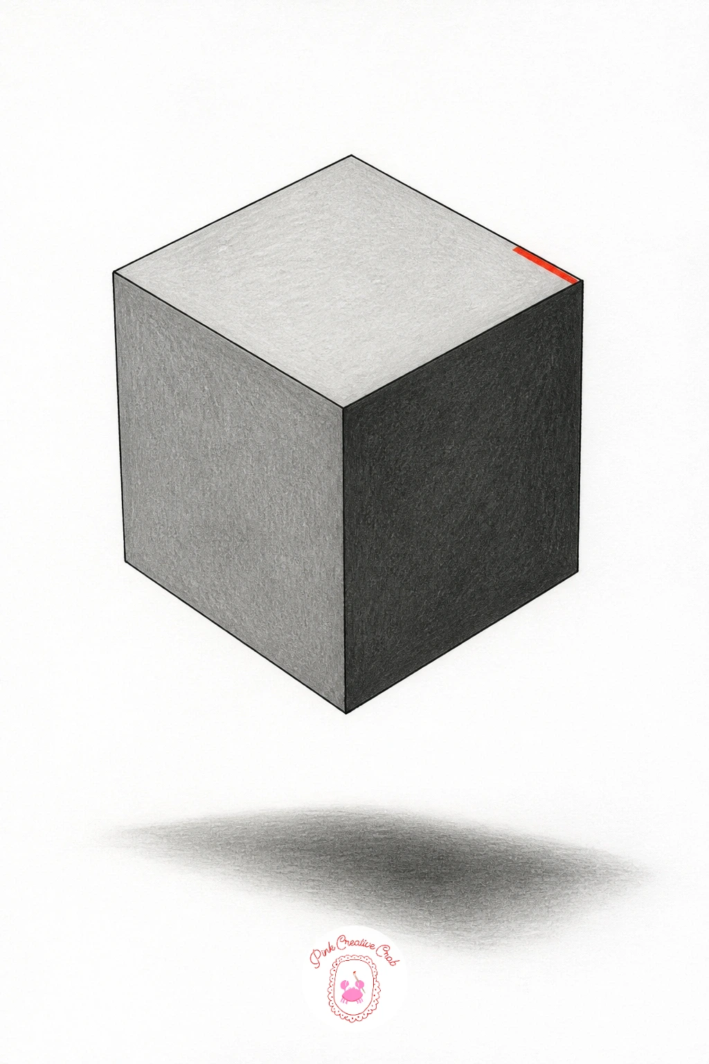
Build real geometry now with a simple cube floating just above the page. Draw it as three visible faces using a basic one point perspective guide, a light pencil cross to mark where your vanishing lines converge, so all three faces of the cube stay in proportion to one another.
Shade the top face lightest, the front face medium, and the side face darkest, keeping that same order no matter which direction the cube is tilted, since a consistent light to dark order across the three faces is what makes a cube read as solid rather than a flat hexagon. Drop a soft elongated shadow on the paper below and slightly to one side of the cube, separated by a thin strip of white paper between the cube and its shadow, which is the detail that makes it float rather than sit.
Erase the vanishing point guidelines once the cube is finished in pencil, before adding fineliner edges. Next time, try stacking two cubes at different heights to turn this into a small floating puzzle.
Finish with one firm fineliner edge along the cube’s front corner to pull it forward visually.
Palette: Graphite Black,Mid Grey,Light Grey
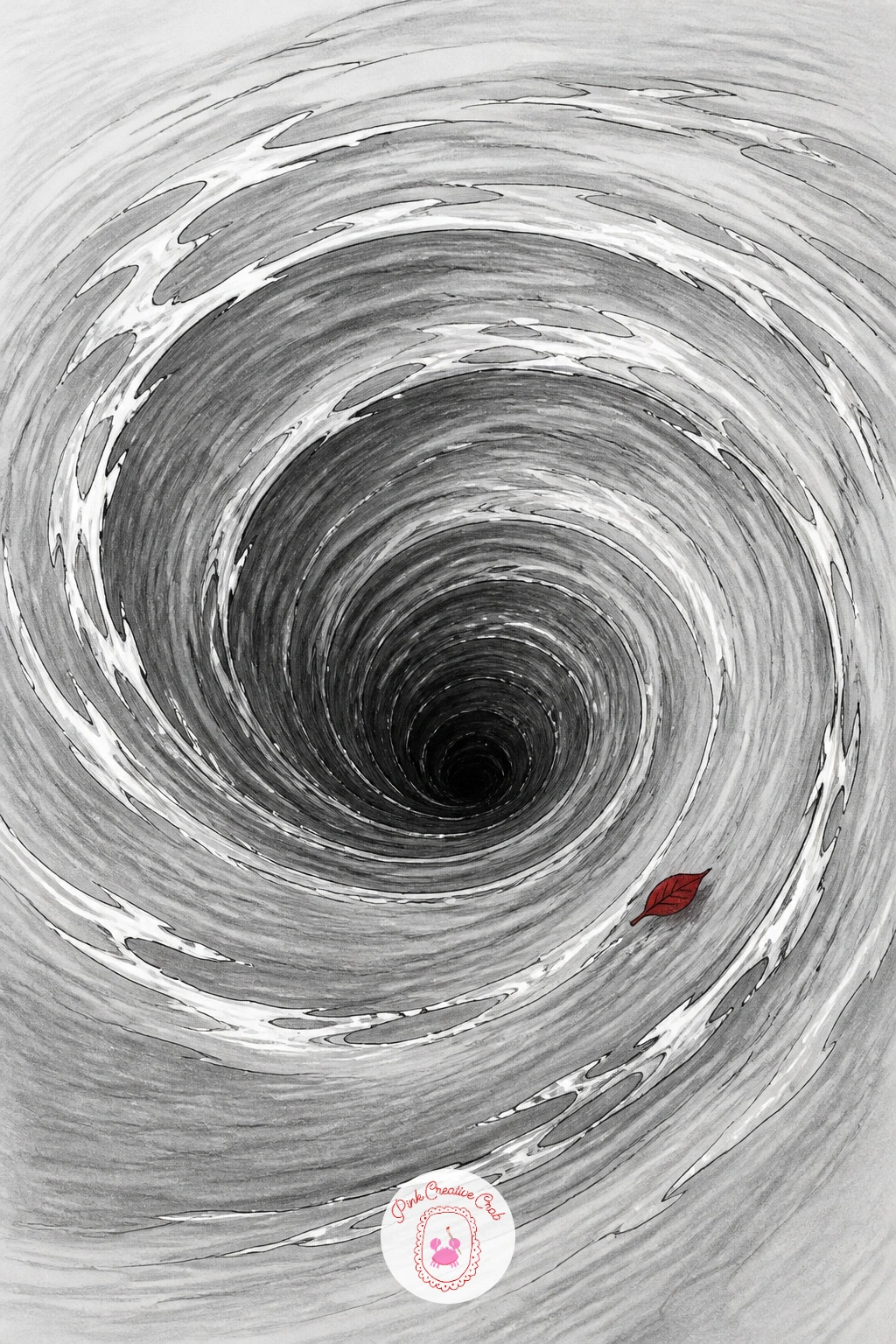
Take that same layered shading further with a whirlpool that spirals down into the paper. Pencil a loose spiral starting wide at the outer rim and tightening toward a dark center point, keeping the spiral lines evenly spaced rather than bunched.
Shade each ring of the spiral slightly darker than the one before it as it moves inward, so the very center becomes almost solid black, which is what creates the sensation of looking down into real depth. A kneaded eraser pulled gently along the outer rings in soft curved strokes lifts a little graphite back out, suggesting the movement of water catching light as it spins.
Flat, same-depth rings are the main reason whirlpool drawings stop looking like a hole and start looking like a target, so always keep that gradient moving from light outside to dark inside. If you are short on time, a ten minute version stops after three rings of shading; the forty minute version adds fine radiating lines across the rings to suggest spray and current.
Add a few tiny white paper highlights with the eraser along the rim to suggest splashing water.
You Will Need
- kneaded eraser
Palette: Graphite Black,Deep Blue Grey,Paper White
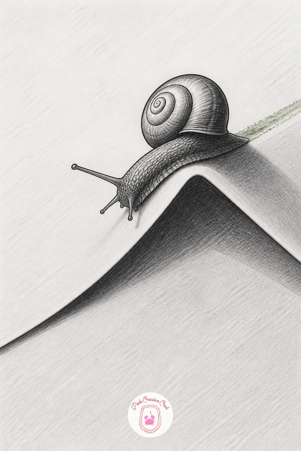
Slow the pace down with a small snail crawling across a soft paper fold. Draw the fold first as a gentle curved ridge running across the page, shaded dark on its underside and light along the raised top edge, then place the snail’s shell and body straddling that ridge so part of it sits in the fold’s shadow.
Compare the snail’s shell width to its own body length as you sketch, keeping the shell roughly the same size as the head and foot combined, since snails look wrong fastest when the shell is drawn too small for the body beneath it. Shade the shell in tight concentric rings from dark at the outer edge to light at the center spiral, echoing the same light logic used for any curved form.
Leave a thin trail of faint graphite smudge behind the snail along the fold to suggest its path. If you would rather paint this one, a single grey or brown watercolor wash under the pencil lines works as a quick swap for shading by hand.
Keep the fold’s shadow darker than the snail’s own shading so the paper reads as the deeper element.
Palette: Graphite Black,Warm Brown,Paper White
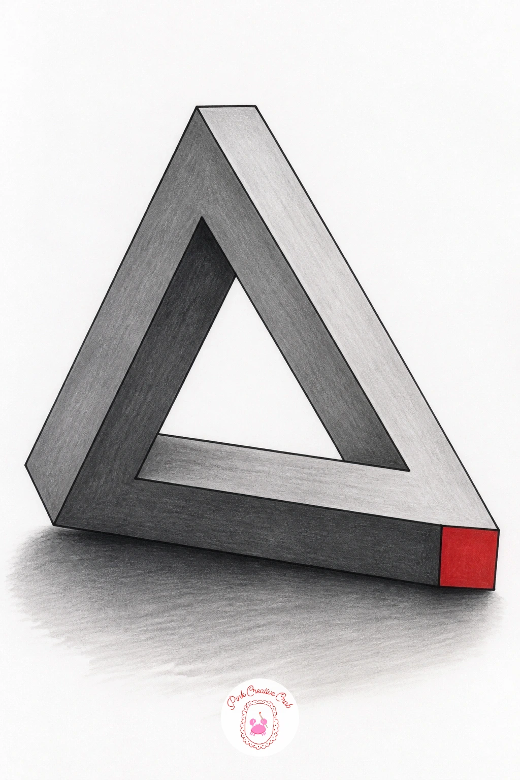
Step into pure geometry with the impossible triangle, a classic optical trick built from three beams that seem to connect in a way that cannot really exist. Draw it in light pencil first using three overlapping rectangular prisms, each one’s far end tucking behind the next in a loop, and this is the one shape worth measuring carefully, since all three beams need the same width for the illusion to hold together.
Shade each beam’s three visible faces in the same light, medium, dark pattern used for any cube, keeping the light source consistent across all three beams even though they point in different directions. Ink the final outlines in fineliner only once every overlap looks convincing in pencil, since this shape is unforgiving of changed lines later.
The trick breaks down the moment one beam looks thicker or thinner than the others, so check all three with a careful glance before inking. Add a soft shadow beneath the whole triangle on the paper to ground it, as if the impossible object is resting on the page.
Palette: Graphite Black,Mid Grey,Light Grey
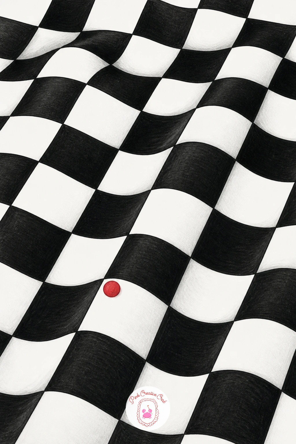
Carry the same careful geometry into a checkerboard pattern that ripples as if the paper itself has buckled. Rule a grid of straight lines first in pencil, then redraw every line as a gentle wave, keeping each wave’s peak and trough lined up with the ones beside it so the ripple reads as one continuous surface rather than scattered squiggles.
Fill alternating squares solid black once the wavy grid is finished in fineliner, and this is where the illusion actually happens, since the eye reads the distorted black and white squares as a surface bending in physical space. Shade a very thin sliver of grey along the underside of each wave crest to add a touch of real shadow on top of the pattern trick.
Uneven wave spacing between rows is the fastest way to flatten this illusion back into a random pattern, so keep a light pencil guide of evenly spaced horizontal bands before drawing any waves. For a next-time variation, try curving the whole grid into a dome instead of a flat wave for a different kind of bulge.
Work the black squares in with a fine marker instead of fineliner if you want flatter, more even fills.
Palette: Graphite Black,Paper White,Soft Grey
Bring motion into the mix with a fish leaping up out of a pond that is itself only a drawing. Sketch a simple oval pond outline first with a few flat ripple lines across its surface, then draw the fish mid-leap, body arched, with water droplets trailing off its tail.
Place the fish’s shadow on the pond’s surface slightly offset from directly below it, since a leaping fish’s shadow falls where the fish will land, not where it currently is, and that small offset is what makes the jump feel like a frozen moment rather than a sticker pasted on top. Shade the fish’s scales in short overlapping strokes from head to tail, darkest along the top of its back where the light source is weakest.
A fish drawn perfectly flat side-on with no arch to its spine is the most common reason this scene feels static rather than mid-jump, so always curve the body even slightly. Add a few fine droplet shapes flicking off the tail, each with its own tiny highlight dot left white.
Keep the ripple lines on the pond loose and only lightly shaded so the fish stays the clear focus.
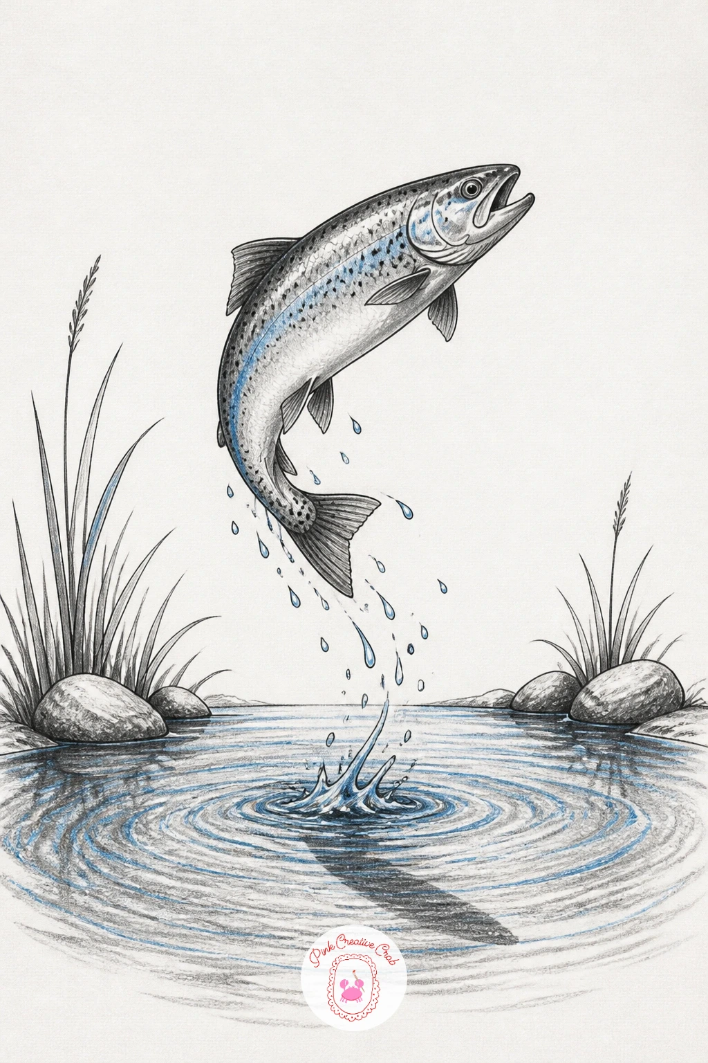
Palette: Graphite Black,Pond Blue Grey,Paper White
Return to pure depth tricks with a tunnel built from a series of shrinking rings leading into darkness. Draw the largest ring near the paper’s edge, then nest progressively smaller rings inside it, spacing them slightly closer together as they shrink toward the center to mimic how distance compresses in real tunnels.
Check the eye level you are drawing from before placing the rings, since a tunnel viewed straight on needs perfectly concentric rings, while one viewed from slightly above or below needs the inner rings nudged up or down, and that small shift is what tells the eye where the viewer is standing. Shade each ring’s inner wall from light where it faces the viewer to dark where it curves away, building toward solid black at the tunnel’s deepest point.
Rings that stay the same thickness all the way down flatten the tunnel instantly, so taper each ring’s drawn thickness slightly as it recedes. Finish with a few fine radiating lines along the tunnel’s inner walls to suggest texture catching the light.
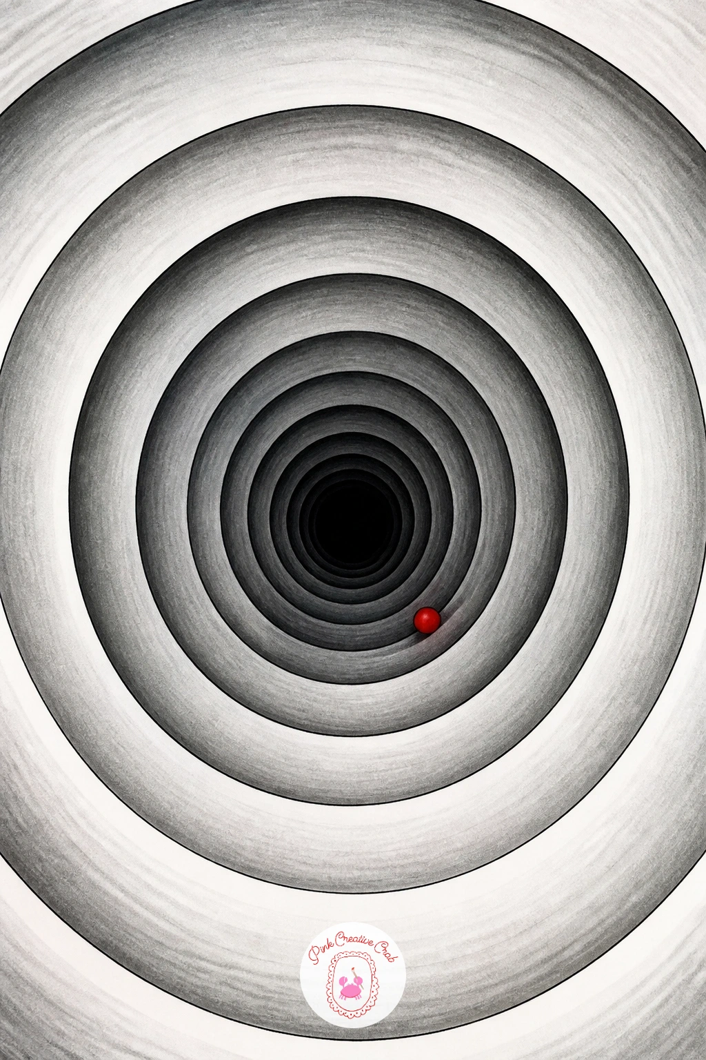
Palette: Graphite Black,Mid Grey,Paper White
Pair that same deep perspective with a torn section of page revealing a small garden scene behind it. Draw the torn edge first with an irregular jagged line, curling slightly away from the page, then sketch a simple garden view behind the opening, a few flower shapes and a fence line kept soft and smaller in scale than the torn paper itself.
Shade the torn paper’s curling edge heavily on its underside while keeping the garden scene behind it lighter and less detailed overall, since a background drawn with as much contrast as the foreground tear will flatten the whole illusion instead of receding. Use a thin strip of white paper fiber texture along the very edge of the tear, scratched lightly with the tip of a craft knife or the back of a pin, to suggest real torn fibers catching light.
This piece benefits from the architectural thinking behind the architecture sketchbook ideas list, especially around keeping background elements simpler than the foreground. If a craft knife feels risky, simply leave a few tiny white gaps unshaded along the tear instead.
Keep the garden’s colors, if you add any, muted compared to the stark black and white of the torn paper itself.
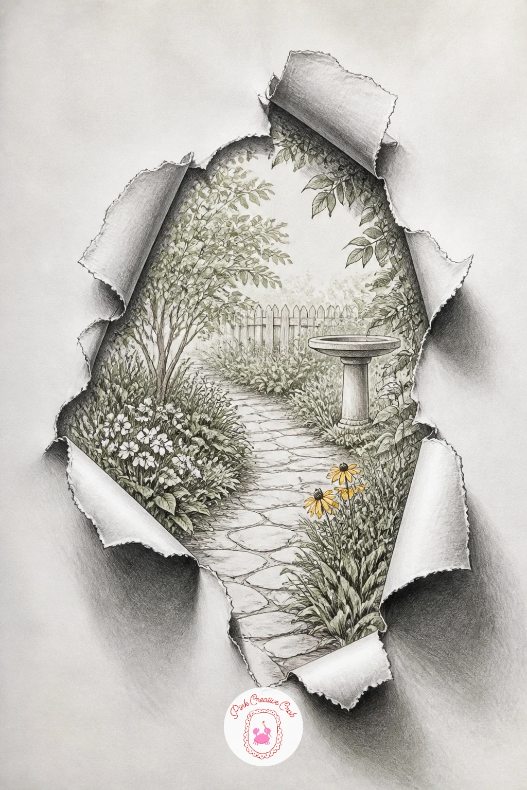
You Will Need
- craft knife or pin for paper texture
Palette: Graphite Black,Soft Green,Paper White
Keep the paper-as-object trick going with a single balloon that appears to lift one corner of the page right off the desk. Draw the balloon first as a simple rounded teardrop shape, then curl the paper’s corner upward beneath its string, showing the underside of the lifted paper in heavy shadow.
Shade the balloon itself with a tight highlight near the upper left and a graduated dark edge on the lower right, the same light logic as the water drop earlier, since round glossy objects all follow that same highlight and shadow pattern regardless of size. The lifted paper corner needs its own separate light logic though: shade its underside dark near the fold and let it lighten as it curves back toward flat, exactly like the paper fold idea from earlier in this list.
A balloon drawn with even shading all the way round loses its roundness fast, so protect that one bright highlight spot from the first pencil mark onward. Finish with a thin string connecting balloon to paper corner, slightly slack rather than perfectly straight, which reads as more believable under real gravity.
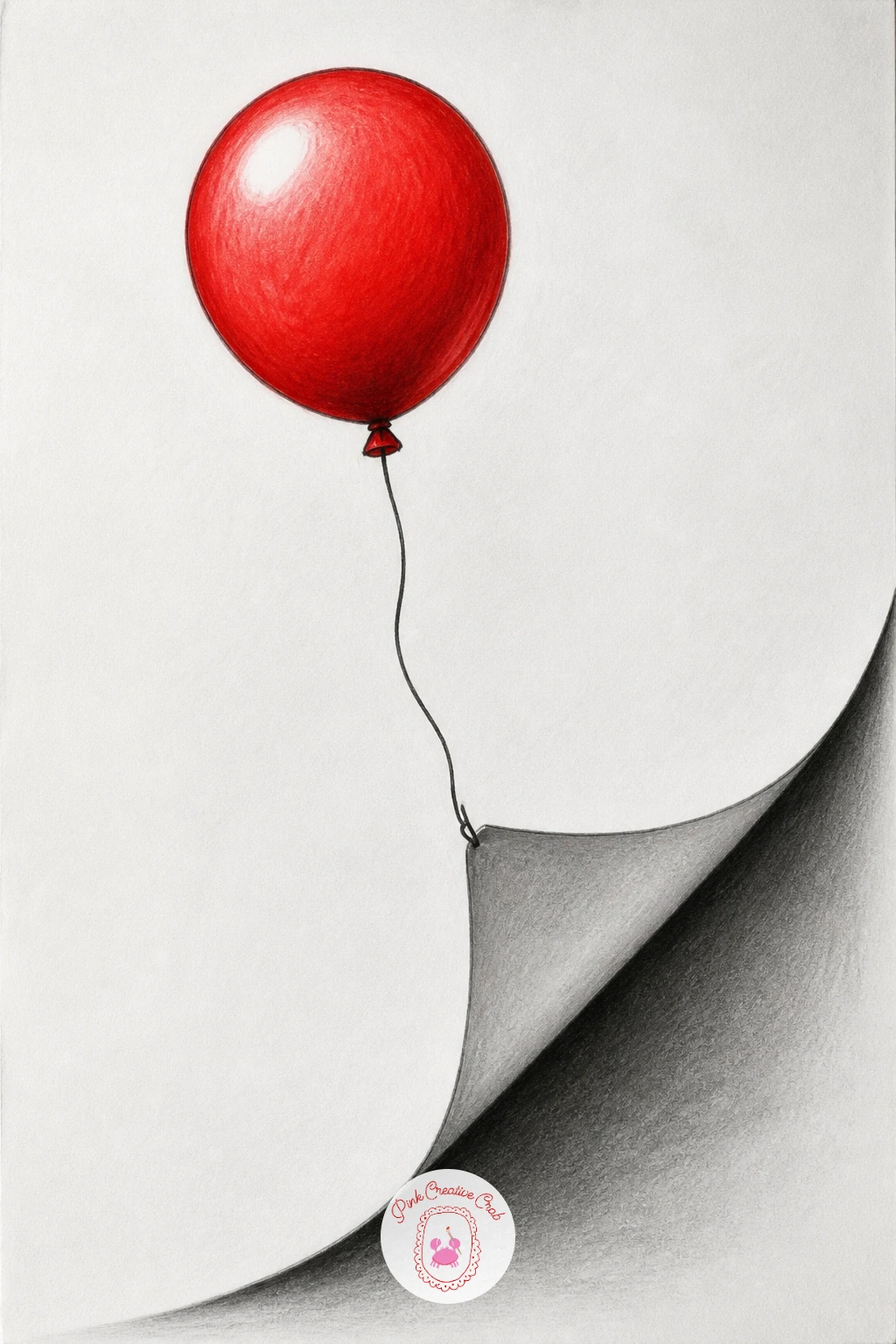
Palette: Graphite Black,Accent Yellow,Paper White
Soften the mood with a cat peeking out through a torn hole in the page, a nice companion piece if you enjoyed the hand coming out of the paper earlier. Draw the hole’s ragged edge first, then fit the cat’s head and one paw through the opening, keeping the body implied as sitting just behind the paper rather than drawn in full.
Compare the width of the cat’s head to the width of the hole as you sketch, leaving a small gap of shadow around the head so it looks tucked through the opening rather than drawn flat across it. Shade the fur in short directional strokes following the way fur actually grows across a cat’s face, darkest around the ears and along the edge nearest the hole’s shadow.
A cat’s face drawn too symmetrically front-on tends to look pasted rather than peeking, so angle the head very slightly to one side for a more natural, curious tilt. For a loose reference on structuring cat features at this level, the cat pencil drawing ideas for beginners cover the same basic proportions.
Leave a whisker or two crossing over the hole’s torn edge to help sell the depth.
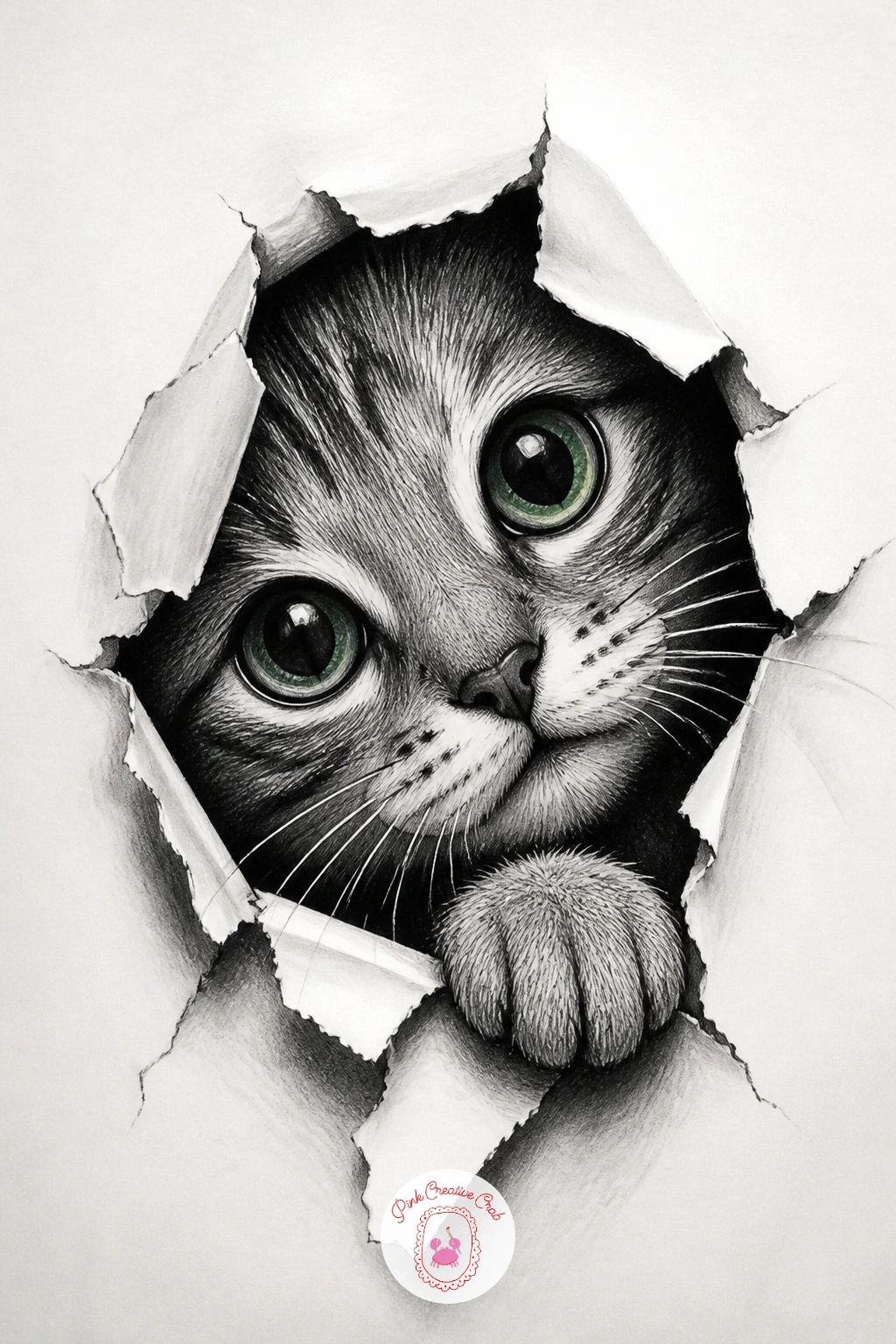
Palette: Graphite Black,Warm Grey,Paper White
Switch into lettering with a single block letter drawn to look fully three dimensional and lifted off the paper. Choose one bold letter and sketch its front face first as a simple flat shape, then extend a second parallel outline behind and slightly offset to each side, connecting the two outlines with straight lines to form the letter’s visible depth.
Shade the front face lightest, the top edge medium, and the side edge darkest, keeping that light order consistent exactly as with the floating cube, since every flat-faced 3D object you draw really runs on this same three tone rule. Ink the final edges in fineliner once the pencil layout sits correctly, then add a cast shadow stretching from the letter’s base along the direction opposite your chosen light source.
Letters drawn with the depth offset going in two different directions at once are the main reason this trick looks broken, so keep every depth line parallel to the others. Try this with your own initial first, since a single familiar letter is the easiest shape to judge for symmetry.
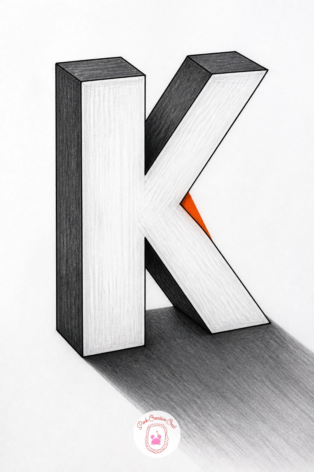
Palette: Graphite Black,Mid Grey,Light Grey
Settle into a quieter, more realistic illusion with a simple mug sitting on a drawn wooden table, the kind of piece that rewards close observation over any trick of torn paper. Draw the mug’s ellipse rim first, checking that both sides of the oval curve evenly, since a lopsided rim is the single fastest way to make a mug look wrong before any shading even begins.
Work out where the light source sits before adding any tone, since the handle’s inner curve, the mug’s shaded side, and the shadow it casts across the table all depend on that one decision. Shade the table’s wood grain in long straight strokes running in one direction, then shade the mug itself with a smooth graduated tone from a bright highlight near the rim to a darker band low on its side.
The table surface is the detail beginners most often forget, leaving the mug floating on blank paper with no grounding shadow beneath it, so always draw the cast shadow and a few wood grain lines before calling the piece finished. If you enjoy this kind of still object study, the structured approach in fruit drawing pencil sketches for beginners uses the same light and shadow logic on a different subject.
Add a thin wisp of steam curling up from the mug’s rim for a touch of warmth.
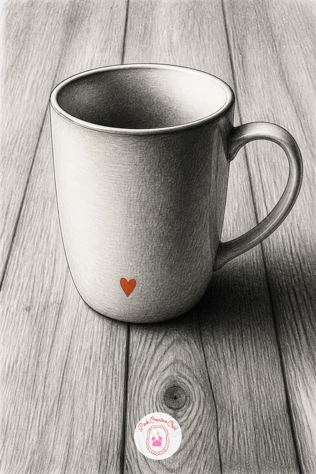
Palette: Graphite Black,Warm Brown,Paper White
Return to the paper-as-object theme with a rolled corner that peels back to reveal a night sky full of stars underneath. Draw the curl first as a tight cylindrical roll rather than a loose flat fold, since a rolled corner needs its own visible underside and a small tube-like shadow running along the inner curl to read as paper rather than a flat triangle.
Shade the roll’s outer surface light where it catches the light and progressively darker as it wraps around and out of view, then fill the revealed patch behind it with solid black or deep graphite, scattering small white dots left as untouched paper or lifted with a kneaded eraser for the stars. Keep the stars varying slightly in size rather than evenly spaced, which reads as far more natural and convincing than a neat grid of dots.
A roll that stays the same width along its whole length looks like a tube rather than a curling edge, so taper it slightly thinner at the tip. A white gel pen works well for adding a few extra bright stars on top of the black once the graphite layer is dry.
Finish with a thin crescent moon shape tucked near one edge of the star patch for extra atmosphere.
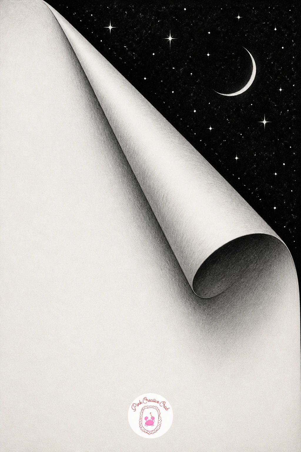
You Will Need
- white gel pen
- kneaded eraser
Palette: Graphite Black,Deep Navy,Paper White
Challenge your sense of perspective with a spiral staircase drawn as if looking straight down from above it. Start with a single small circle marking the staircase’s center column, then build outward in a tightening spiral of steps, each one a slightly curved wedge shape radiating from that center point.
Fix your eye level directly overhead for this one, which means every step’s visible tread is a flattened curved shape with almost no riser showing, quite different from a side-view staircase, and that single decision about viewpoint is what makes the whole spiral believable. Shade each step’s tread with a slight gradient toward its inner edge near the center column, where shadows naturally pool in a real spiral stair.
Steps that all look the same width from center to outer edge flatten this view back into a flat target pattern, so taper each wedge slightly wider at the outside and narrower near the column. Keep the whole piece in grey tones only, since color tends to fight with this kind of busy radiating pattern.
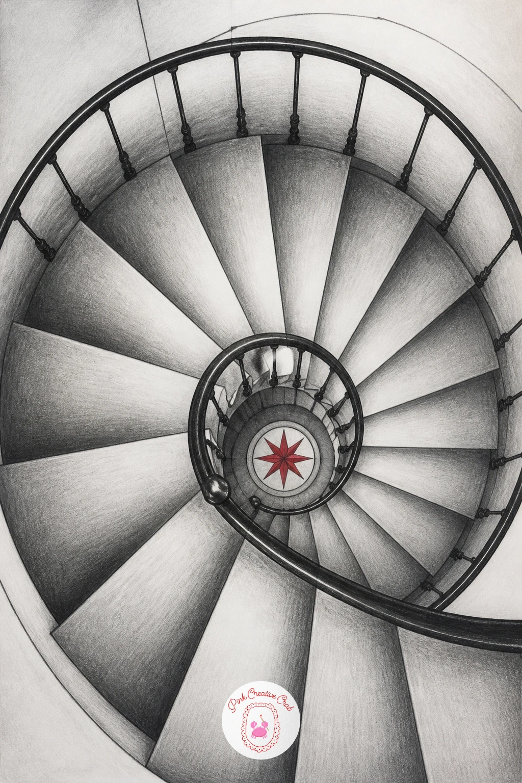
Palette: Graphite Black,Mid Grey,Light Grey
Keep working with overhead perspective but add a sense of real risk with a small bridge spanning a torn gap in the page. Draw the two torn edges of the gap first, shaded dark along their undersides exactly like the earlier torn page idea, then span a simple plank bridge between them with visible rope rails on each side.
Place the horizon or vanishing point for the bridge’s planks low on the page if you want the viewer to feel like they are standing at one end looking across, which changes how steeply the planks appear to recede compared to a straight-on view. Shade the gap beneath the bridge almost solid black to suggest real depth, with the bridge’s underside catching a sliver of reflected light near its edges.
A bridge drawn with planks that stay the same width all the way across loses the sense of distance, so taper them narrower toward the far end. Add small loops of rope rail post by post rather than as one continuous line, which reads as more structurally believable.
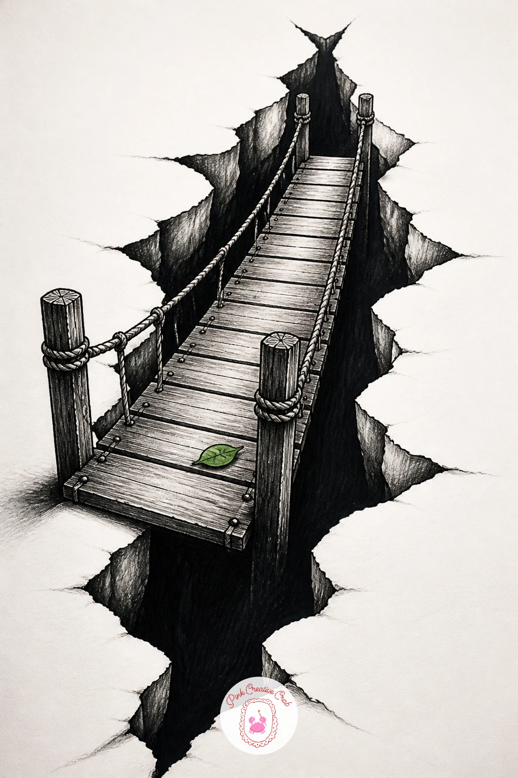
Palette: Graphite Black,Rope Tan,Paper White
Bring in some botanical softness with a single flower that appears to push forward out of the paper’s surface. Draw the petals first in a simple layered arrangement, overlapping the front petals over the back ones, then add a torn or folded ring of paper around the stem’s base where it seems to emerge from the page.
Compare each petal’s length against the flower’s own center to keep the proportions even, since flowers with one noticeably longer petal tend to look lopsided rather than lifelike. Shade the petals from the base outward, darkest where they overlap each other and lightest at their outer tips, then shade the torn paper ring at the stem’s base heavily, exactly like the earlier torn page and hole illusions, to ground the flower in the paper rather than floating free.
If this appeals to you, the detailed petal layering covered in watercolor romantic flower ideas translates well into pencil shading too. Finish with one leaf curling away from the stem to break up the otherwise straight vertical line.
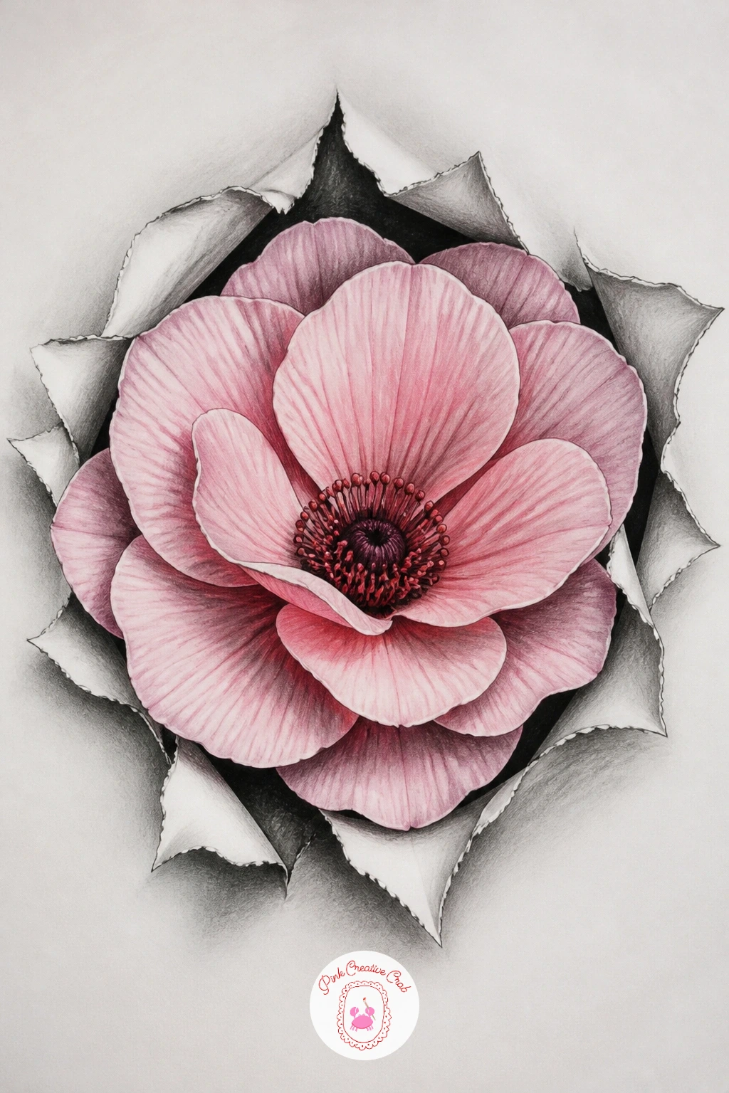
Palette: Graphite Black,Soft Pink,Soft Green
Take the torn-paper trick in a more mechanical direction with a zipper that appears to unzip the page itself. Draw the zipper’s teeth first as a tight row of small triangular shapes running down the center of the page, then open one side wider than the other near the bottom, curling that opened edge back exactly like the earlier paper fold.
Shade the zipper teeth with a quick highlight down the center of each tooth and shadow along both sides, since metal teeth read as shiny mainly through that narrow bright highlight rather than heavy overall shading. Behind the opened gap, keep whatever you draw simpler and darker than the zipper itself, whether that is plain black shadow or a hint of pattern, so the zipper stays the clear star of the piece.
Teeth drawn all the exact same size in a perfectly straight row can look stiff, so allow the very slightest size variation and a gentle curve to the zipper’s path for a more natural metal look. A silver or grey colored pencil run lightly along the highlight of each tooth adds a nice metallic touch if you want to go beyond plain graphite.
Finish with the zipper pull drawn slightly turned to one side, casting its own small shadow onto the teeth below it.
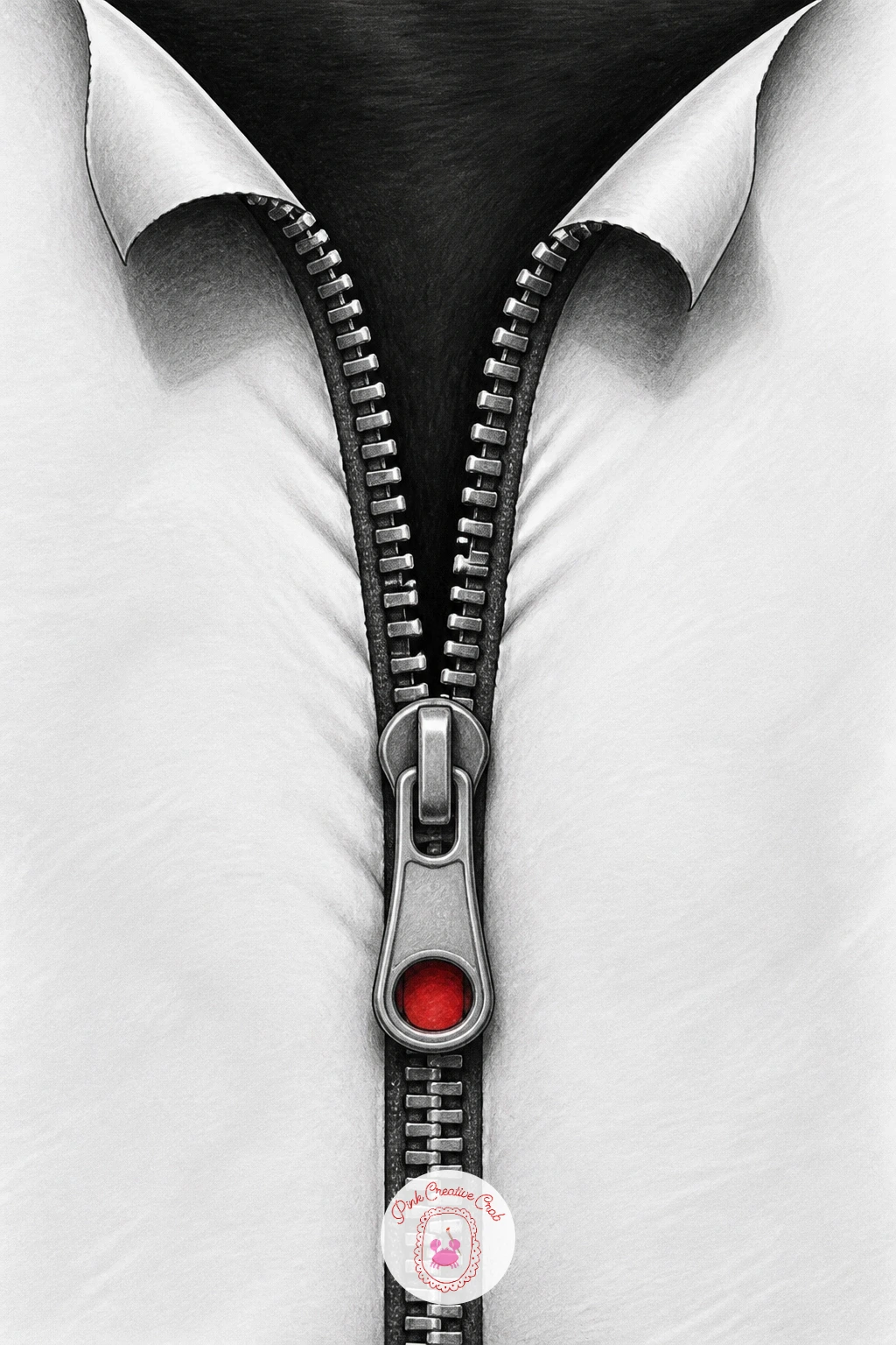
Palette: Graphite Black,Metal Silver,Paper White
Lighten the mood again with a small frog perched right on the paper’s own edge, legs tucked under, as if the page itself were a lily pad. Draw the frog’s body first as a rounded wedge shape, then position its front feet gripping over the paper’s actual physical edge, with the very tips of its toes drawn slightly curling past the border.
Measure the frog’s eye bumps against the width of its head, keeping them roughly equal in size on both sides, since even slightly mismatched eye bumps are the fastest way to throw off a frog’s whole expression. Shade the frog’s back darkest along its spine and lightest along its rounded sides, then add a thin cast shadow falling from its toes onto the paper edge itself to show real contact with the surface.
A frog drawn sitting flat in the middle of the page loses the trick entirely, so always plan the composition around the paper’s actual edge before adding any color. One dab of green colored pencil along the back, left mostly as graphite elsewhere, keeps the piece from feeling overworked.
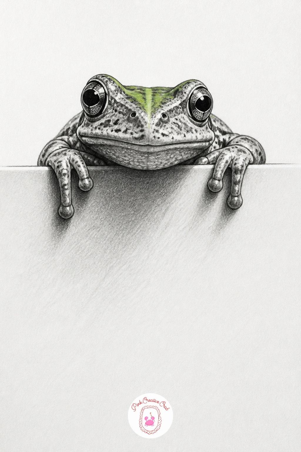
Palette: Graphite Black,Frog Green,Paper White
Build toward the final stretch of this list with a curtain drawn as if pulled back to reveal the blank paper behind it like a stage. Sketch the curtain’s folds first using long vertical S curves bunching toward one side, where the fabric gathers into a tied-back knot.
Shade each fold from dark in its deepest crease to light along its rounded outer edge, repeating that same light to dark rhythm across every single fold so the fabric reads as one continuous piece of cloth rather than separate ribbons. Leave the revealed area behind the curtain almost entirely blank white paper, maybe with one small detail like a drawn window frame or a single star, since the contrast between the busy curtain and the empty space is what makes the reveal feel dramatic.
Folds shaded with the same flat tone all the way down lose their fabric quality fast, so always vary the depth of shadow within each individual fold. The village scene drawing ideas for beginners use a similar fold and fabric approach for roof thatching if you want more practice with that rhythm.
Add a tasseled tie-back cord at the gathered point to finish the stage curtain feel.
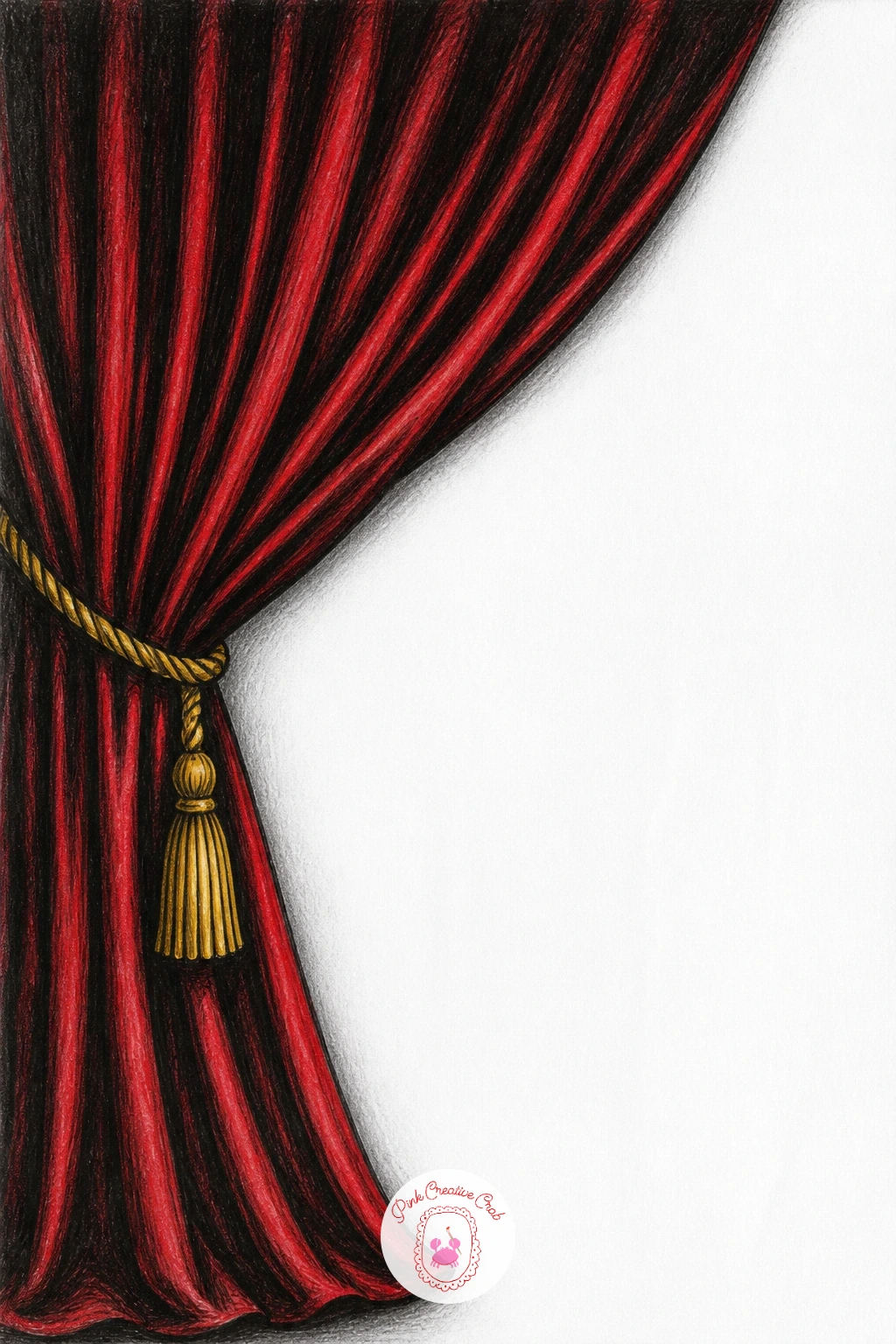
Palette: Graphite Black,Deep Red,Paper White
Close the list with the most ambitious trick of all: a staircase that loops back on itself so it appears to climb forever without ever actually going anywhere, in the style of the famous impossible stair illusions. Build it from four separate short staircases arranged in a square, each one’s top step connecting directly into the next staircase’s bottom step, so the whole loop reads as one continuous climb.
Plan this one carefully in pencil first using a light grid to keep all four staircases at matching angles and step sizes, since this illusion depends entirely on every single step being measured the same as the others, more than any other piece on this list. Shade each staircase’s risers and treads with the same light to dark pattern used for the very first stairs idea, but rotate the shadow direction slightly as the staircase turns each corner, which is the detail that tricks the eye into accepting the impossible loop.
Ink the final lines only once the whole pencil loop checks out correctly from a short distance away, since small errors are far easier to catch before committing to fineliner. This is a true forty minute piece, so set the quicker ideas on this list aside for a day when you want a longer, more satisfying challenge.
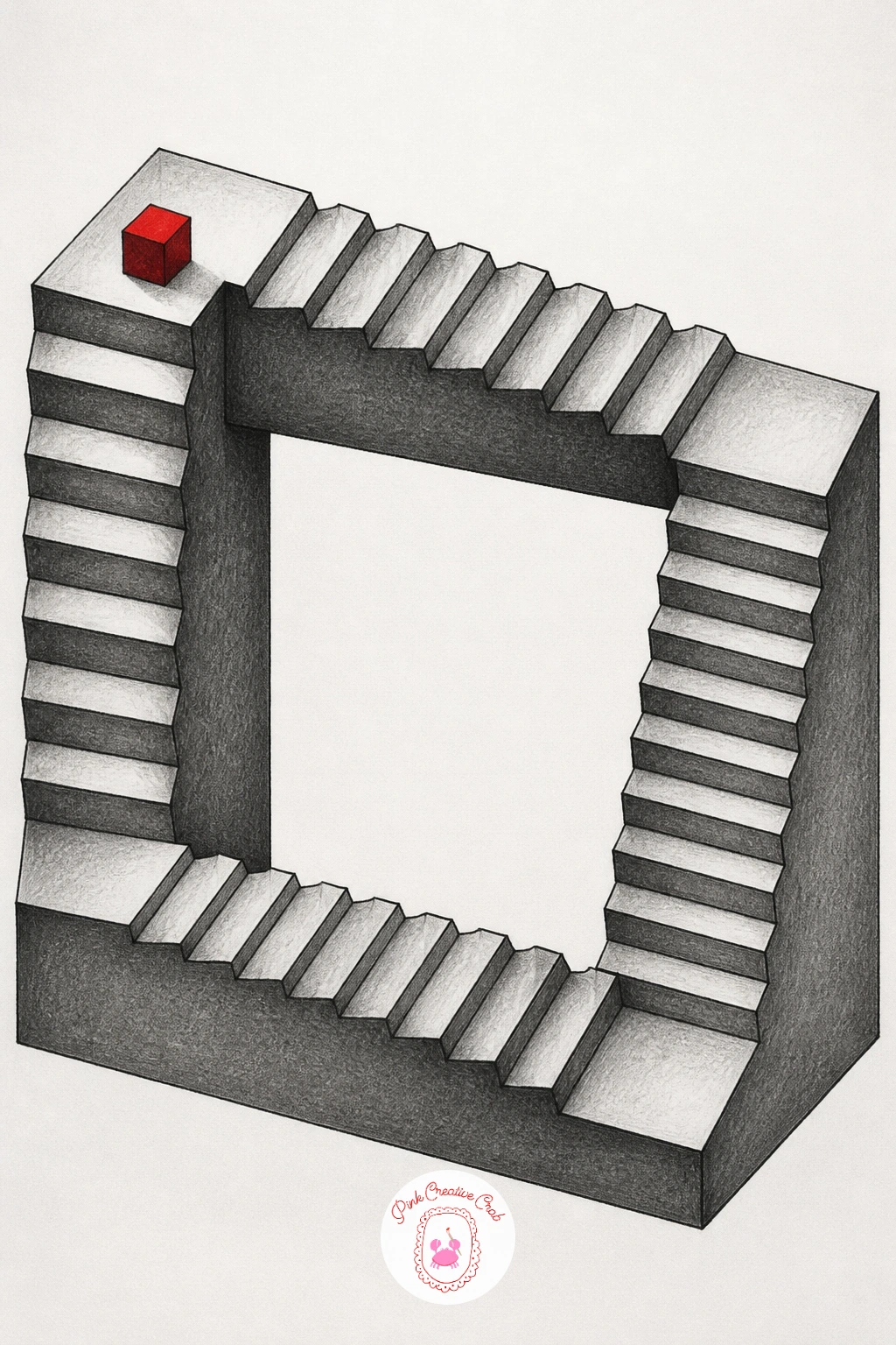
Palette: Graphite Black,Mid Grey,Light Grey
What to Do Next
Pick one idea that matches what is already sitting on your desk today, a sheet of smooth paper, a pencil and a fineliner are really all you need to start. Begin with an easier piece like the floating cube or the water drop before working up to the endless stairs loop, since the shading habits carry straight across every illusion on this list.
Frequently Asked Questions
What paper works best for 3d illusion drawing?
Smooth bristol or marker paper works best for 3d illusion drawing, since a tight surface keeps fineliner edges crisp and graphite shading smooth. Rough textured paper breaks up fine gradients and softens the sharp edges these illusions depend on.
Do I need special pencils for 3d illusion drawing?
No special pencils are required, a standard graphite set from 2H to 6B covers every illusion in this list. A kneaded eraser and a black fineliner for final edges round out the full kit comfortably.
Why does my 3d illusion drawing look flat instead of raised?
A flat result almost always comes from inconsistent light direction or missing cast shadow, the two things that convince the eye of real depth. Check that every shaded face follows one single light source and that a shadow sits where the object meets the paper.
How long does one 3d illusion drawing take to finish?
Most of these ideas finish in twenty to forty minutes once the pencil layout is settled, with simpler ones like the water drop or floating cube closer to ten. The impossible staircase loop and torn garden scene take longer since they rely on careful measuring.
Can I use color instead of only graphite for these illusions?
Yes, one accent color works well layered over graphite shading, as shown through small touches like red ribbon or green frog skin in this list. Keep the accent limited to one area so it highlights the illusion rather than competing with the shadow work that creates it.
Have any thoughts?
Share your reaction or leave a quick response — we’d love to hear what you think!
-
 0
-
0
-
0
-
0
-
0
-
0


