

A waterfall painting gives you everything that makes acrylic fun on a small canvas: a strong shape falling down the middle, smooth color blocks either side, and a little story happening somewhere in the scene. Every idea below is a complete waterfall with one clear detail to anchor it, a swimmer, a bridge, a deer at the water’s edge, so the canvas feels like a real moment rather than a generic landscape.
You will find pieces that suit a first attempt at acrylic and others that ask for a steadier hand with edges and light, all scaled to finish in one sitting. Pick whichever setting calls to you, mix your palette first, and let the water carry the rest of the painting.
Using these images: free for personal projects such as printing, coloring, cards, journals and gifts. Handmade items that include them may be sold up to 30 pieces per design. More than that is commercial use and is not permitted, and neither is selling or sharing the images themselves or passing them off as your own. Please ask before any other use.
Start with the easiest version of a woodland falls: a narrow white ribbon of water dropping through two walls of green. Block in the background first with a mid green for the far trees, then paint the canyon walls either side of the fall in a darker shade so the water reads as the brightest shape on the canvas.
Once the walls are dry, paint the fall itself in white with a touch of pale blue at the base where the pool sits. Add the ferns last with a round brush, short upward flicks in two greens, letting some overlap the rock edges so the forest feels full without turning fussy.
The usual snag is ferns that end up as a solid green smudge. Keep each flick separate and let the canvas color peek through between them. If you only have one green, mix it lighter with white for the far ferns and leave the front ones darker, and that alone will carry the depth.
One tip for today: paint the water before the ferns, always, so the ferns can overlap its edge and anchor it to the forest floor.
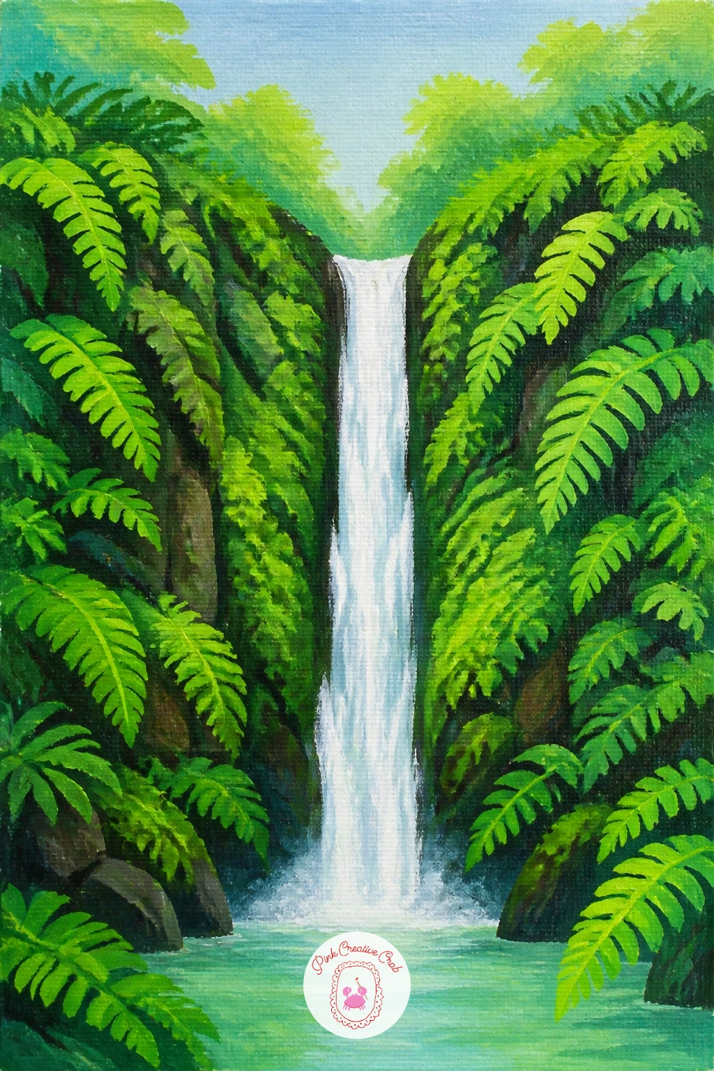
Palette: Hooker’s Green,Sap Green,Titanium White,Payne’s Grey
Give your fern forest a companion piece with a pool built for a swimmer. Block the pool first in a flat turquoise, slightly darker near the fall and lighter toward the front edge, then paint the surrounding rock in warm grey so the water pops forward.
Add the waterfall itself as a simple white diagonal or vertical shape, then paint the swimmer last as a small dark silhouette with just a hint of a pale arm or shoulder catching light. Keep the figure simple: a rounded head, a curved back, nothing more detailed than that at this scale.
Where this one goes wrong is a swimmer painted too large, which crowds the pool and kills the sense of space. Keep the figure under a tenth of the canvas height and let the water do the talking. If your turquoise looks flat, drag a dry brush of white across the surface near the fall to suggest ripples.
Finish with one tip: paint the swimmer’s shadow in the water directly beneath them, a thin dark smudge, and the figure will sit convincingly on the surface rather than floating above it.
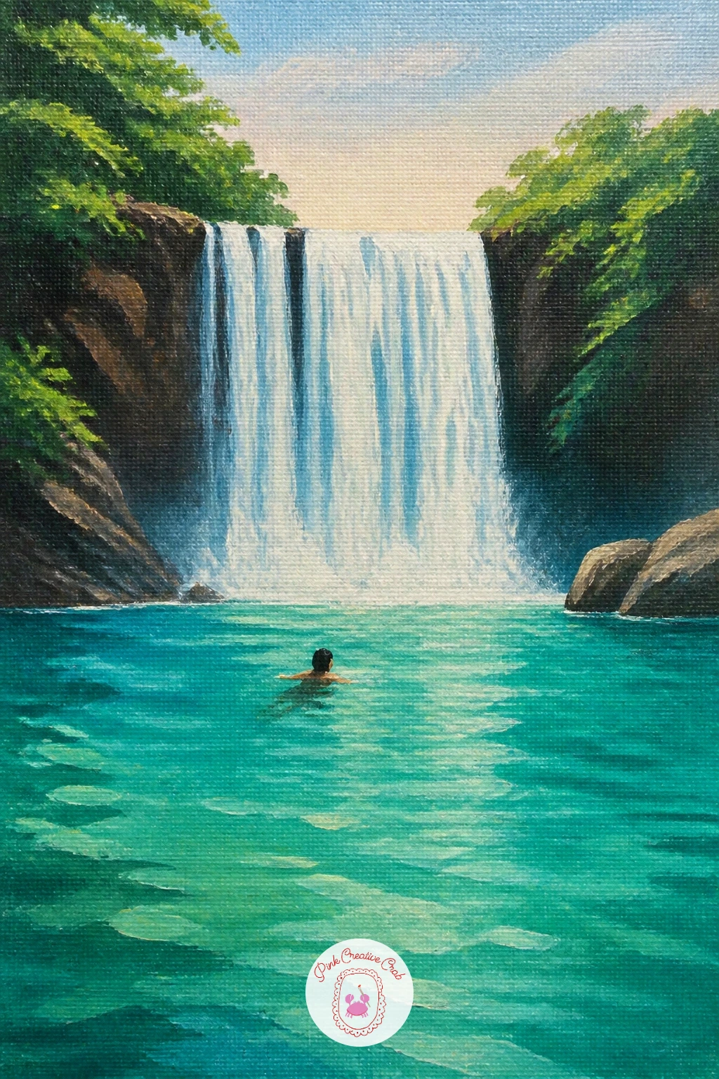
Palette: Turquoise,Titanium White,Payne’s Grey,Raw Umber
Light is the trick here, so decide early where your sun sits: place it just above and behind the fall and the rainbow arcs naturally away from it, low across the mist. Block in a pale sky first, then the white waterfall shape, then the rock.
Paint the rainbow last with a thin round brush, a soft arc of red through violet laid in short overlapping strokes rather than one hard line. Keep the colors slightly diluted so they glow through the white mist beneath them instead of sitting on top like a sticker.
Beginners often paint the rainbow too solid and too saturated, which flattens the whole scene. Thin your paint with a little water and build the arc in two light passes rather than one heavy one. If you do not have a full rainbow of pastels, three bands, pink, yellow, blue, read just as well at this size.
One useful habit: paint the mist as a soft white cloud at the base of the fall before you add the rainbow, so the colors have something pale to glow against.
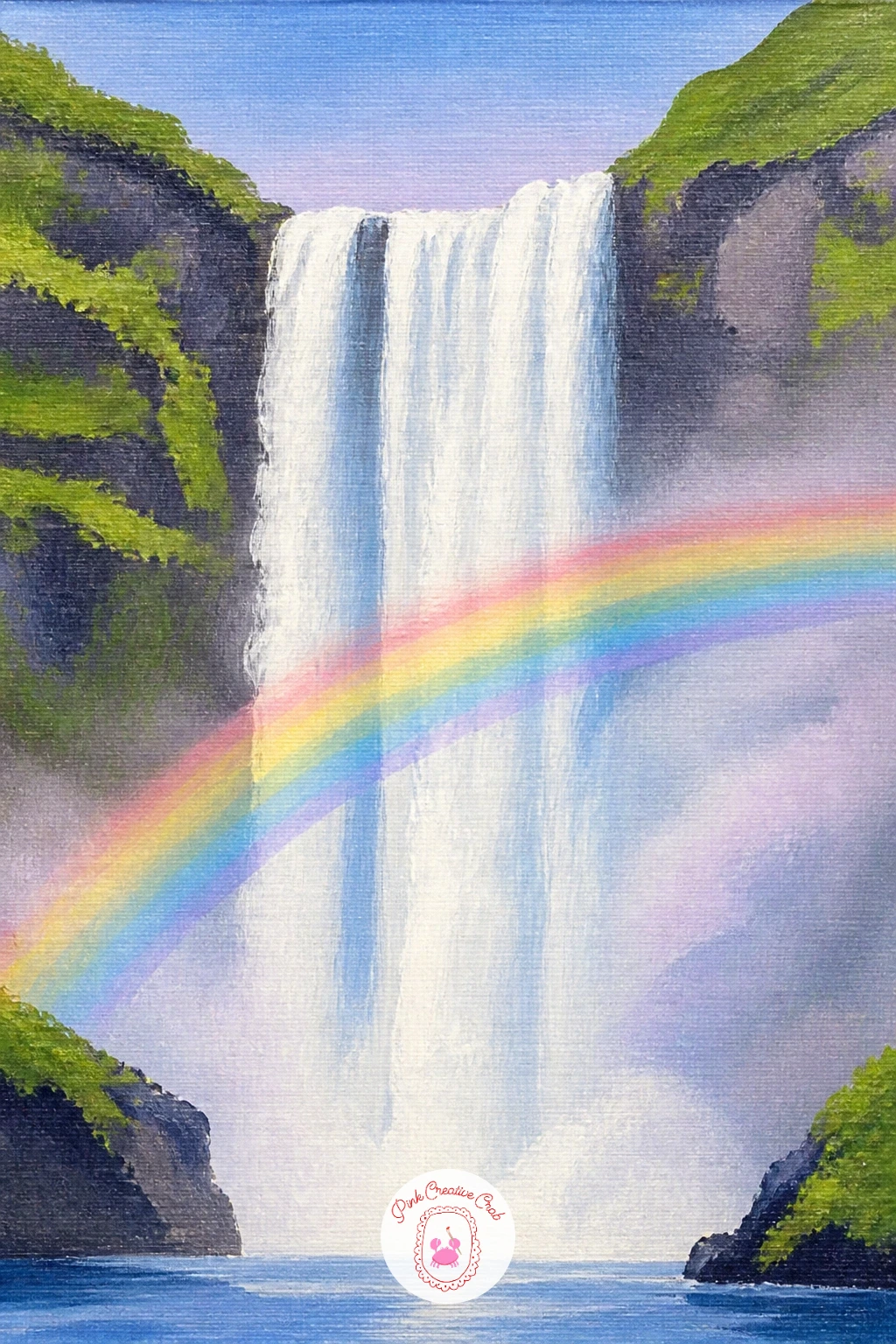
Palette: Titanium White,Alizarin Crimson,Cadmium Yellow Light,Cerulean Blue
Try spattering a little water onto wet white paint at the base of the fall with a toothbrush for a soft, natural mist texture before the rainbow goes on.
Move from jungle greens to open, cool tundra for this one. Compare your waterfall’s width to the sheep before you paint either: the fall should read as the tallest shape on the canvas, while each sheep sits no taller than a third of the fall’s width, which keeps the scale believable.
Block the sky in pale grey blue, then the wide waterfall as a broad white sheet rather than a narrow ribbon, since Icelandic falls tend to spread. Paint the moss green hills either side, then add two or three sheep as simple white ovals with tiny black legs and faces, scattered along the lower slope.
The common mistake is sheep that look like clouds with legs. Keep each body a slightly irregular oval, not a perfect circle, and add one darker grey shadow beneath each to ground it on the hillside. No black paint on hand works fine with a dark mix of blue and brown instead.
Finish today by adding a thin line of dark rock just where the water meets the pool, which sharpens the whole fall instantly.
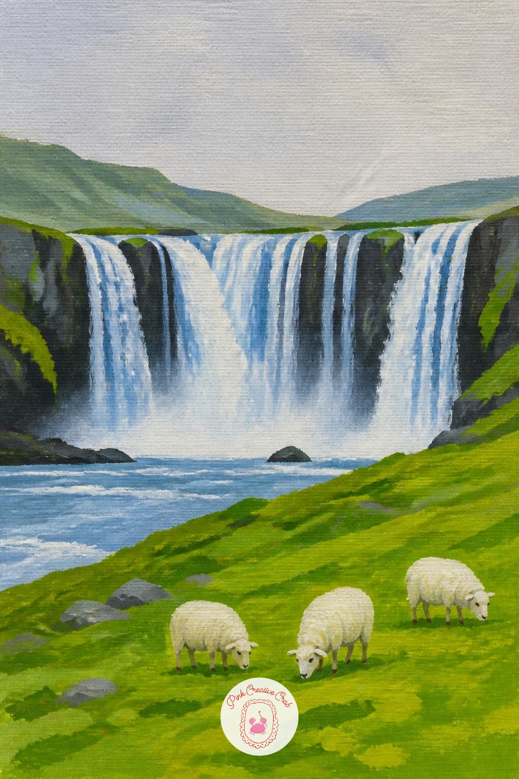
Palette: Payne’s Grey,Titanium White,Olive Green,Raw Sienna
Bring in warmth and color after Iceland’s cool palette with a jungle scene built around two bright parrots. Paint the background first in layered greens, dark at the top, lighter where the mist catches light near the fall, then add the white water as a bold vertical shape slightly off center.
Once dry, paint the parrots perched on a branch to one side, simple rounded bodies in red or blue with a flash of yellow at the wing. Keep their shapes chunky and simple, a curved beak and one dot for the eye is plenty of detail at this scale.
The eye naturally goes to bright color first, so place the parrots where you want the viewer to look second, after the fall itself. If your jungle greens all blend into one flat mass, add one warm yellow green highlight down the sunlit side of the canvas to separate foreground from background, the kind of light trick that also works well in any palm tree painting with tropical foliage.
One tip: paint the branch before the birds, then let the parrot’s feet overlap it, which locks them convincingly in place.
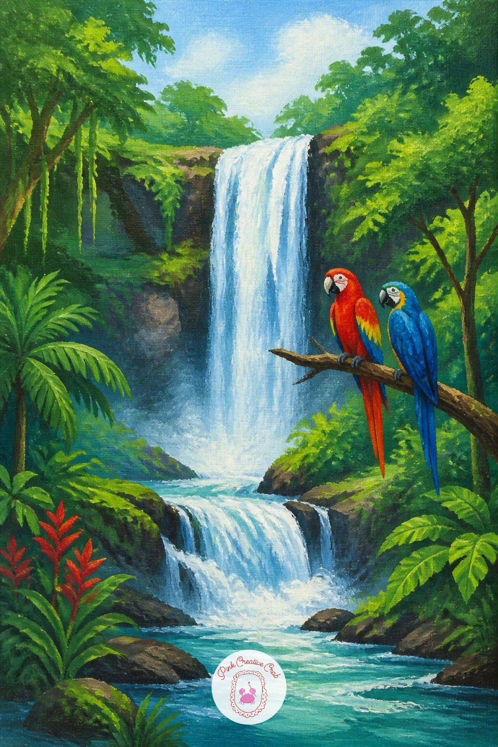
Palette: Hooker’s Green,Cadmium Red,Cerulean Blue,Cadmium Yellow
Swap jungle green for a full autumn palette and let the forty-minute version earn its extra time. For the quick ten-minute pass, block the hillside in two or three autumn tones, orange, gold, rust, paint the white fall through the middle, and stop there.
For the fuller version, go back in once the base is dry and dot individual leaf clusters along the tree line with a small round brush, mixing warm reds and ochres so no two patches match exactly. Add a few fallen leaves floating on the pool’s surface as small flecks of orange, which does more to sell the season than almost anything else.
Where this goes wrong is leaves that stay too uniform in color, reading as a flat orange mass rather than a real autumn woodland. Vary your mix constantly, more red here, more yellow there, even within a single tree shape. No cadmium orange on hand mixes easily from yellow and a touch of red.
Today’s tip: paint the water slightly cooler than the surrounding color, a hint of blue grey, so it reads as cold against the warm woodland.
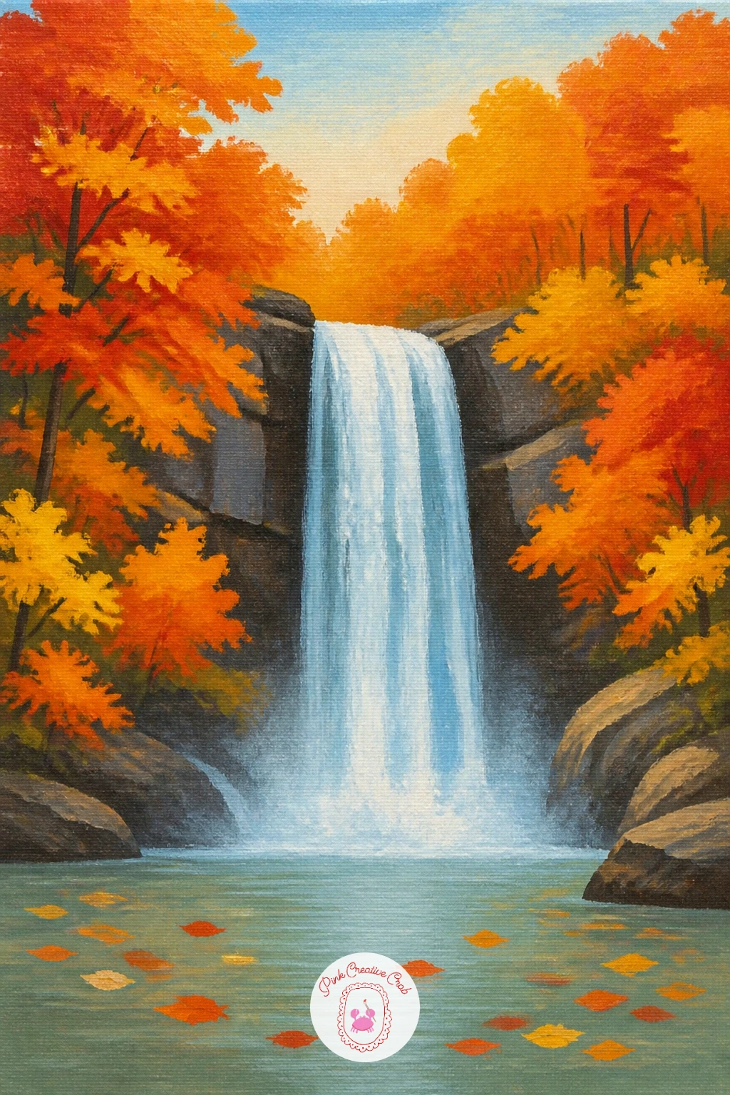
Palette: Cadmium Orange,Burnt Sienna,Cadmium Yellow,Titanium White
Trade flowing water for stillness and let light carry the whole scene. Decide first where your light source sits, usually a low winter sun to one side, since that single choice determines every icicle shadow you paint next.
Block the background in pale blue grey, then build the frozen fall in layered whites and light blues, leaving the canvas itself to show through in thin streaks for the brightest ice. Paint vertical icicle shapes hanging from the ledges with a thin round brush, each one tapering to a point, then add a short dark shadow line along the side away from your light source.
The usual trap is painting ice as plain white, which looks flat rather than frozen. Mix at least two blues into your whites, a warmer one and a cooler one, and let them sit side by side unblended for that crystalline look. A palette knife dragged lightly through wet white paint also gives a convincing icy texture if you want to try it.
Finish with one small white gel pen highlight along the sunlit edge of the largest icicle once the paint is dry.
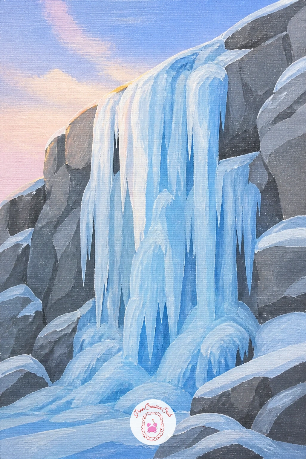
You Will Need
- white gel pen
Palette: Titanium White,Cerulean Blue,Payne’s Grey,Ice Blue
Compare the bridge to the fall before you paint a single plank: it should sit at roughly a third of the canvas height and well below the top of the water, so it reads as a small human addition rather than the main subject. Mark its position lightly before committing to paint.
Block the fall and forest first, then paint the bridge last, a simple arched or flat shape in warm brown, with just a few vertical lines for rails rather than every individual plank. Let one end of the bridge disappear behind a rock or tree trunk, which does more for depth than careful detail ever could.
Bridges often end up too straight and stiff. Curve the top line very slightly, even on a flat bridge, and vary the brown tone along its length so it feels weathered rather than drawn with a ruler. If your canvas feels too busy afterward, mute the forest greens slightly so the bridge and water stay the brightest shapes.
One tip: paint a thin dark shadow beneath the bridge where it meets the rock, which settles it into the scene immediately.
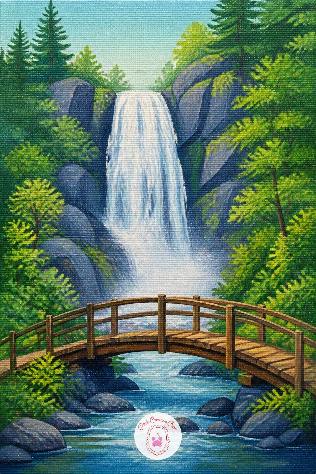
Palette: Burnt Umber,Hooker’s Green,Titanium White,Payne’s Grey
Give the waterfall a quiet foreground story with a small picnic set on the bank. Paint the falls and pool first as usual, then block in a patch of grass in the lower third of the canvas, warm green, slightly lighter where sunlight hits it.
Add the picnic last as a few small simple shapes: a red and white blanket as a flattened diamond, a basket as a brown oval with a curved handle, maybe one small cup. Keep every object small and loosely painted, since detail here competes with the waterfall for attention.
The mistake beginners make is painting the picnic items too large and too detailed, which turns a landscape into a still life. Keep the whole picnic group under a fifth of the canvas width and let a single red blanket do most of the work of telling the story. Not keen on red and white check, a plain yellow blanket reads just as clearly.
Finish with one tip: scatter two or three small dark dots nearby for scattered leaves or pebbles, which settles the blanket onto real ground.
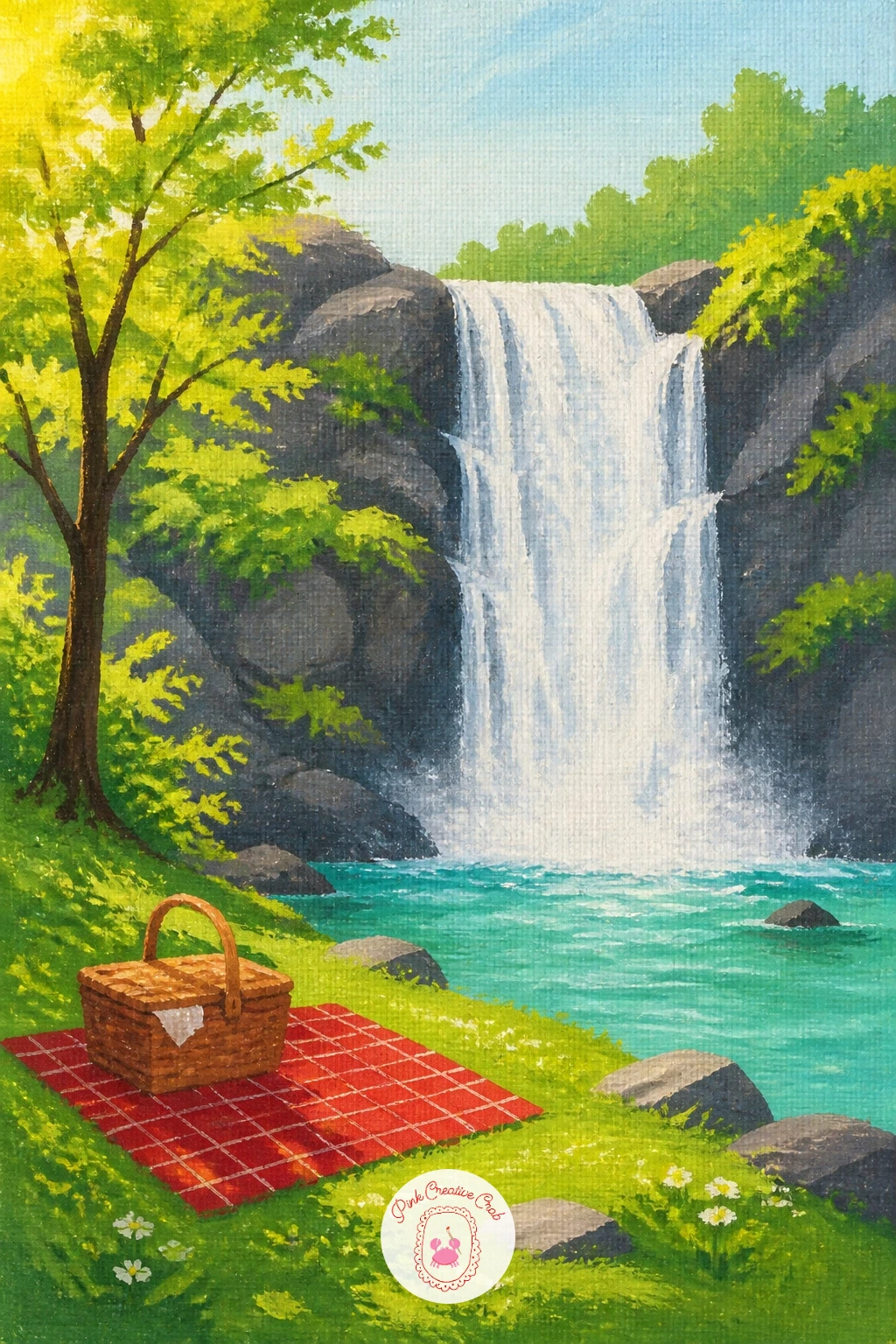
Palette: Hooker’s Green,Cadmium Red,Titanium White,Burnt Sienna
Shift the whole mood inward for a cave scene lit from behind the water. Place your light source behind the fall itself, a pale glow filtering through, and every other shadow in the painting should fall away from that one source.
Block the cave interior first in dark blue grey, then paint the waterfall as a semi transparent white curtain in front of the opening, thinner and more diluted than your usual white so the cave glow shows faintly through it. Add rock texture around the cave mouth with a dry brush dragged lightly over the dark base coat.
The common issue is a cave that reads as flat black rather than a real hollow space. Build at least three values of dark blue grey inside it, darkest furthest back, and let a sliver of warm light touch the cave floor just behind the falling water. If dry brushing feels tricky, a sponge dabbed lightly over the rock gives a similar broken texture.
One tip for today: leave a thin unpainted gap of canvas glow between the white water and the dark cave wall, which does the lighting work for you.
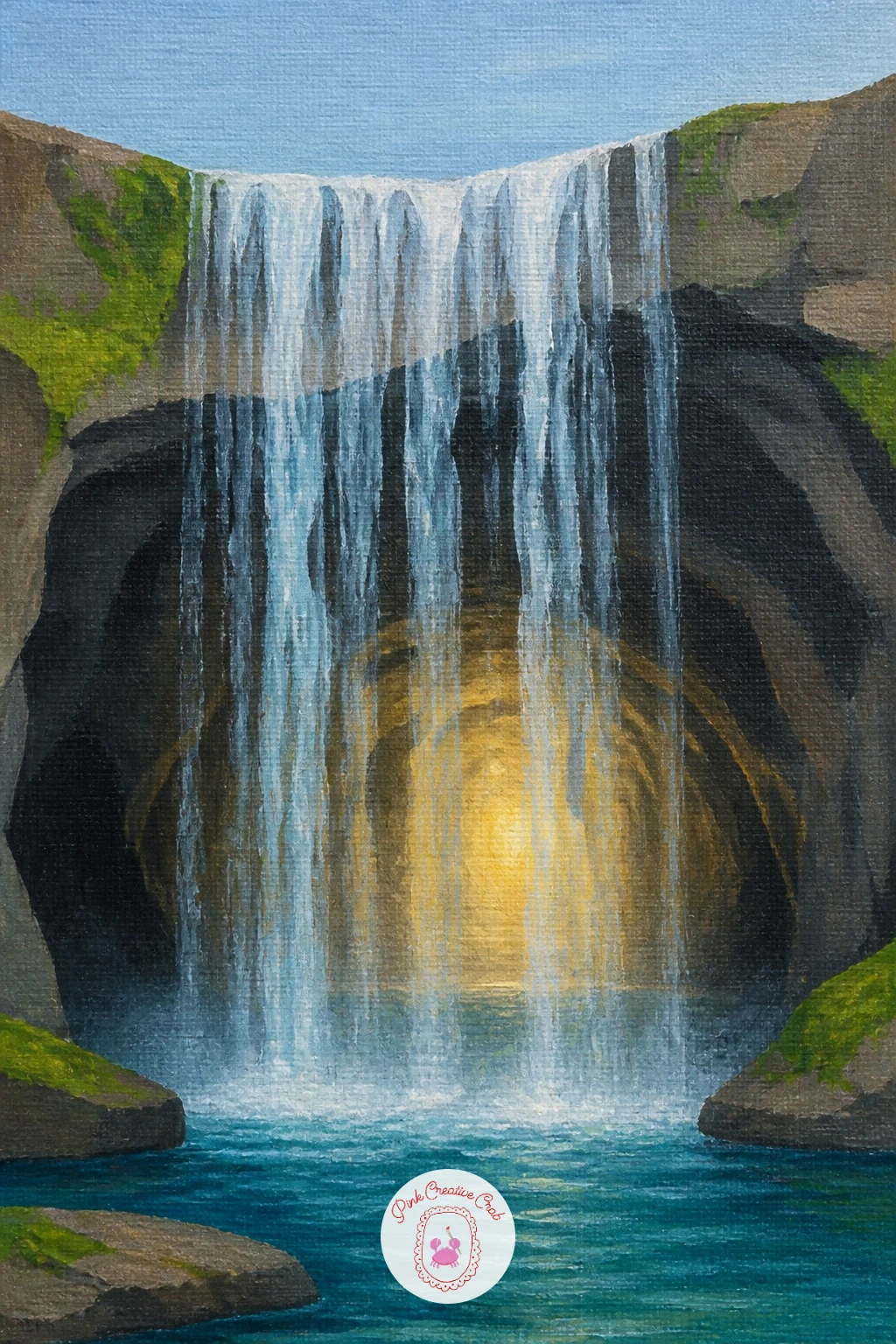
Palette: Payne’s Grey,Titanium White,Raw Umber,Pale Gold
Build this one in stacked horizontal bands rather than one tall drop. Measure the canvas into three or four roughly equal tiers before you paint anything, lightly marking each with a pencil line, so the terraces stay even rather than drifting as you work down the canvas.
Paint the rock shelves first in warm grey, each tier slightly different in tone, then add the water as thin white sheets spilling over each edge into a small pool before continuing down. Keep each pool a slightly different shape so the terraces do not feel mechanically repeated.
The trap here is making every tier identical in width and spacing, which looks more like a staircase than a natural formation. Vary the width of each shelf and let one terrace curve slightly off to the side rather than stacking dead center. If a straight edge wobbles, a strip of painter’s tape laid along the rock line before painting keeps each tier crisp.
One tip: paint the lowest pool slightly larger and bluer than the others, since that reads as the resting point the whole eye travels down toward.
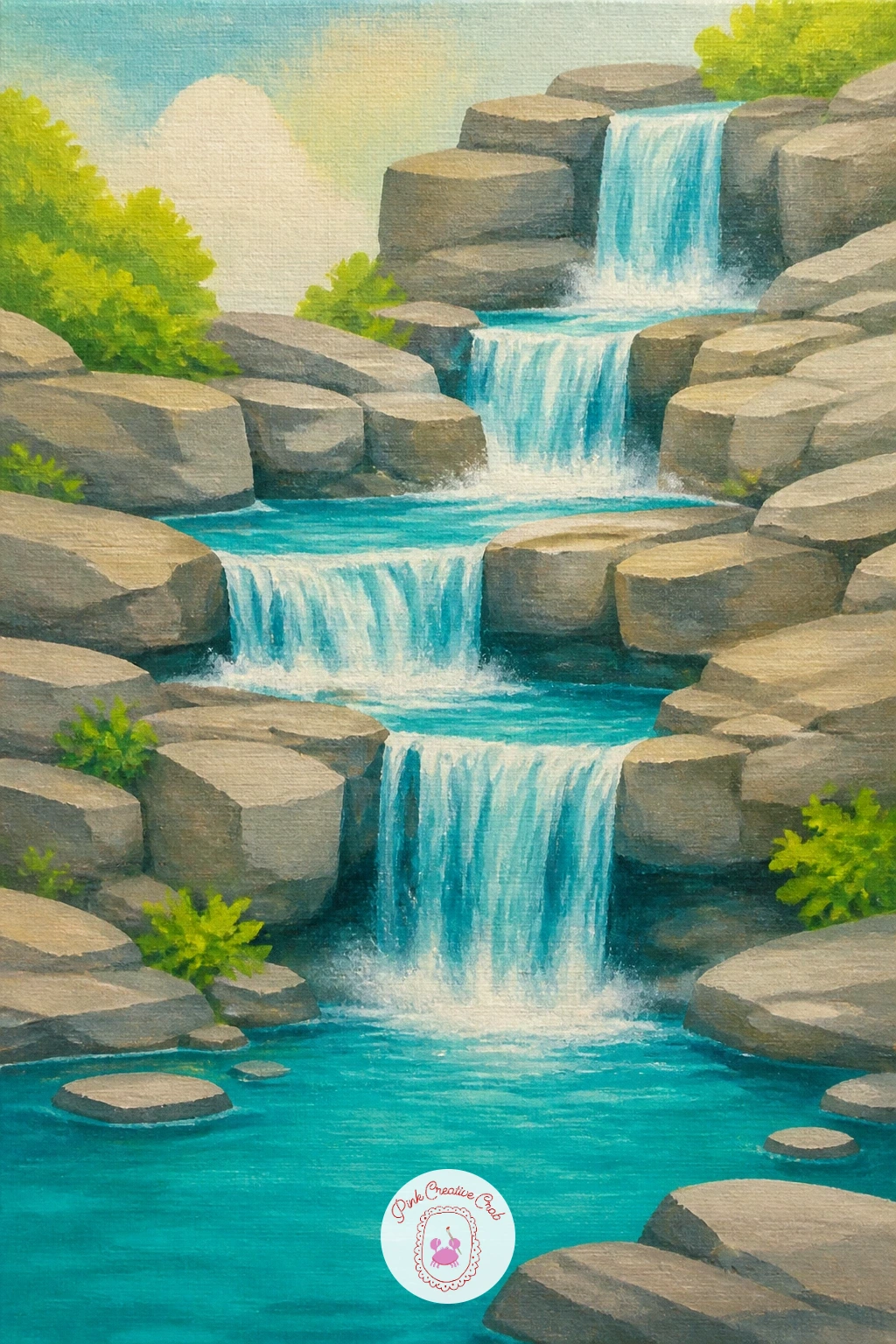
You Will Need
- painter’s tape (optional)
Palette: Raw Sienna,Titanium White,Turquoise,Payne’s Grey
Place the deer before you paint the surrounding forest, since its position decides where the eye settles first. Keep it small, near the base of the fall at the water’s edge, head lowered, which tells the whole story in one simple pose.
Block the forest and falls first, then paint the deer as a simple warm brown silhouette, rounded body, thin legs, one curved neck line down to the water. A single white gel pen dot or two for spots on a fawn adds charm without extra brushwork.
Deer painted front on often look stiff and flat. Paint it from the side instead, a simple profile silhouette, and it reads instantly as a deer even with almost no detail. If your brown looks muddy, warm it slightly with a touch of orange rather than adding more black.
Finish with one tip: paint a faint reflection of the deer’s legs in the water directly below it, a few soft smudged strokes, which grounds the whole animal convincingly at the water’s edge.
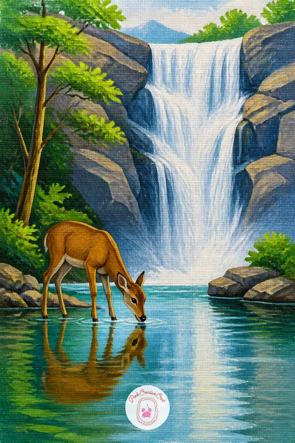
You Will Need
- white gel pen (optional)
Palette: Burnt Sienna,Hooker’s Green,Titanium White,Payne’s Grey
Let the light do almost all of the work here. Decide the sun’s position first, low and just above the horizon behind the fall, since every warm glow and every cool shadow in the painting answers to that one point.
Paint the sky first in soft bands of peach, pink and pale yellow, blended wet into wet while the paint is fresh. Add the waterfall next in white warmed slightly with a touch of that same peach near the top, cooling to blue white lower down where it catches less direct light, then block in the dark silhouetted rock and trees last.
Beginners often paint the rock too light, which flattens the glow of the sky behind it. Keep the foreground rock and trees almost solid dark silhouette, since that contrast is what makes a sunrise read convincingly. No pink in your set mixes easily from white, a little red and a touch of yellow.
One tip: paint the sky before anything else and let it dry fully, so your dark silhouette edges stay crisp against it rather than muddying together.
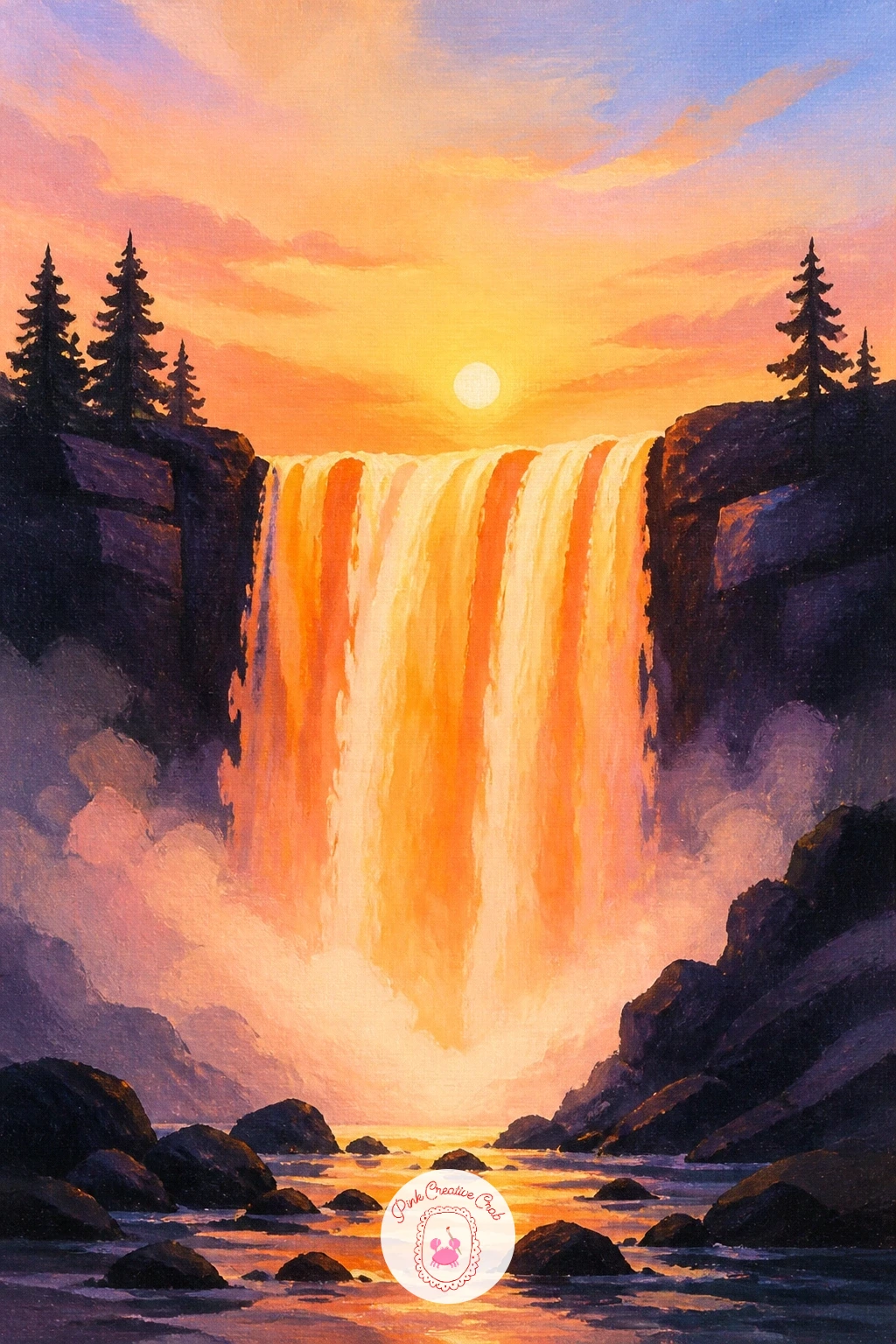
Palette: Peach,Cadmium Yellow Light,Payne’s Grey,Titanium White
Bring in a small structure for scale and story. Measure the cabin against the fall before painting it: keep the roofline below the halfway point of the waterfall’s height, which keeps the water as the star and the cabin as a cozy detail beside it.
Block the fall and forest first, then paint the cabin last as a few simple rectangles, a triangle roof, one small dark window, a thin chimney line. A single warm yellow dot in the window suggests light inside without any extra detail.
Cabins often end up too perfectly geometric, which looks pasted on rather than settled into the landscape. Let the front corner overlap slightly behind a tree or bush, and keep the roofline very slightly uneven rather than ruler straight. This kind of cozy small-structure scene works the same way in a quiet winter forest painting, where one small cabin light carries the whole mood.
One tip: paint a thin curl of smoke from the chimney with a dry brush and very little paint, dragged lightly upward, for a soft believable wisp.
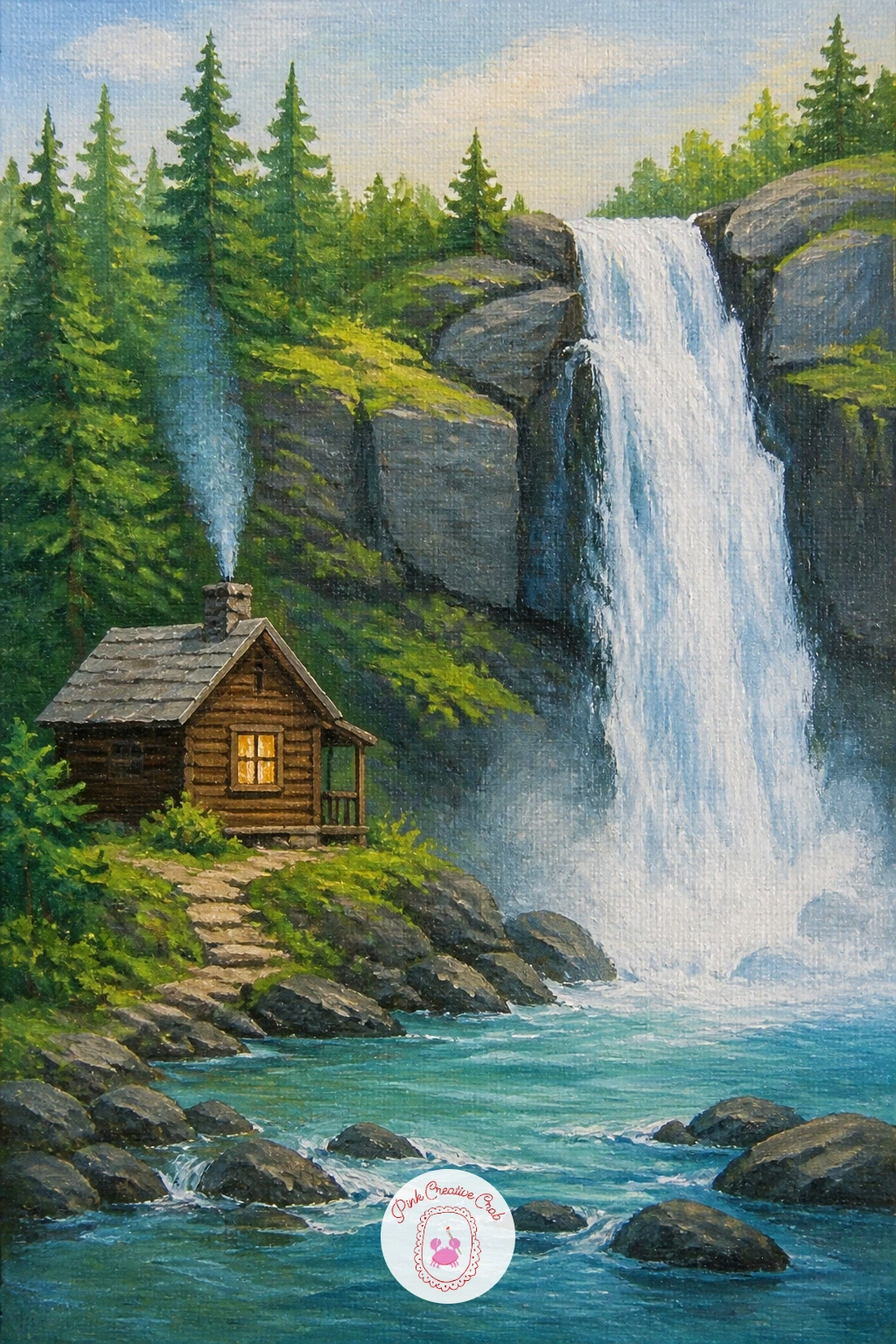
Palette: Burnt Umber,Hooker’s Green,Cadmium Yellow,Titanium White
Add movement and energy below the fall with a small kayak. Keep the ten-minute version simple: block the fall, the pool, and one kayak as a thin curved shape with a tiny paddler silhouette, done.
For the fuller forty-minute version, add white spray around the kayak’s bow where it cuts through the water, a few short curved white strokes, and paint a faint wake trailing behind it toward the edge of the canvas. That trailing wake is what turns a static boat shape into something that reads as moving.
The common slip is painting the kayak flat on the water with no sense of motion at all. Tilt it slightly, bow up, and always include that wake line, even a short one, since it does more than any other single mark to suggest speed. If painting a tiny paddler feels fiddly, a simple dark bump for a seated figure reads perfectly well at this scale.
One tip for today: paint the kayak itself in a bright color, red or yellow, so it stands out clearly against the blues and greens around it.
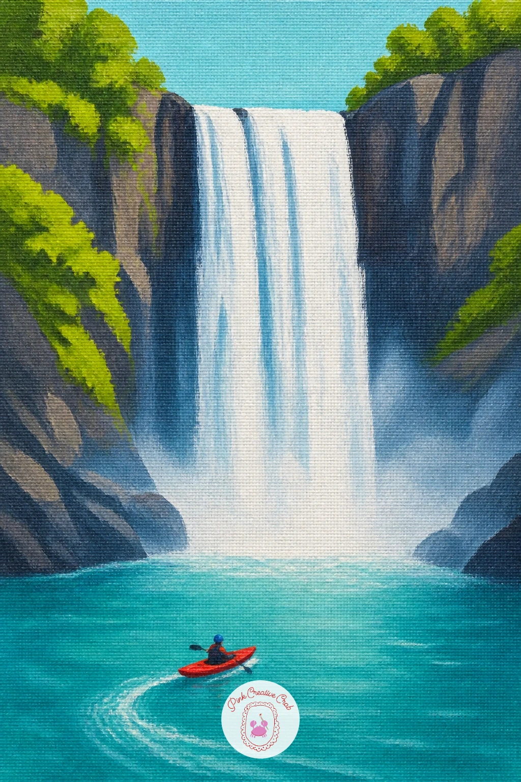
Palette: Cadmium Red,Turquoise,Titanium White,Payne’s Grey
Scale shifts here, so compare the width of the fall to the width of the canyon walls before you start: the water should look narrow against the towering rock either side, which is what makes a canyon feel vast. Sketch that proportion lightly first.
Block the canyon walls in warm layered tones, rust, ochre, pale pink, stacked in uneven horizontal bands to suggest sedimentary rock, then paint the thin white waterfall dropping through a narrow gap between them. Keep the pool at the base small and tucked into shadow.
Walls painted as one flat color lose all sense of scale. Break each wall into at least three bands of slightly different warm tone, and let the bands tilt or step rather than running perfectly level, which reads as real rock layering. If you want a simpler version, two canyon tones instead of three still works at this size.
One tip: paint the waterfall noticeably narrower than you think it should be, since a thin white thread against towering rock sells the grandeur far better than a wide one.
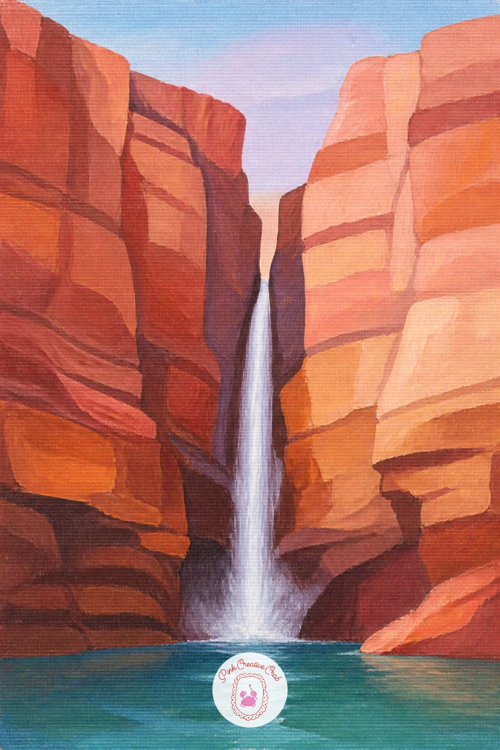
Palette: Burnt Sienna,Raw Sienna,Dusty Pink,Titanium White
Slow the pool down with a few floating water lilies near its edge, a quieter detail after the drama of a canyon. Paint the pool first in flat turquoise or deep green, then the waterfall behind it, letting the two blend softly where mist meets still water.
Add the lily pads last as flattened green ovals floating on the surface, three or four scattered near one side rather than spread evenly across the whole pool. Paint one or two simple pink or white flowers among them, a small cluster of pointed petals around a yellow center.
The mistake is scattering too many lily pads evenly across the water, which looks planted rather than natural. Group them loosely to one side and leave the rest of the pool open and reflective. No pink paint handy, white lilies with a yellow center look just as lovely against dark water.
One tip: paint a thin dark outline along the edge of each lily pad once it has dried, which lifts it clearly off the water’s surface.
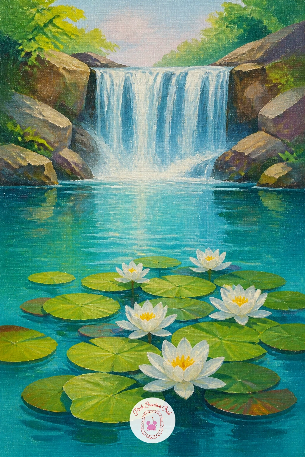
Palette: Hooker’s Green,Turquoise,Titanium White,Cadmium Yellow
Bring a sense of playfulness to the pool with a simple rope swing hanging from an overhanging branch. Paint the fall and pool first, then add a tree trunk and one thick branch reaching out over the water from the upper corner of the canvas.
Paint the rope as one thin curved line hanging down from the branch, a small knot shape at the bottom, swinging slightly off vertical rather than hanging perfectly straight down, which suggests it is mid motion. A single small figure silhouette mid swing, if you want one, keeps the energy going.
Ropes painted perfectly straight and centered look stiff and static. Curve the line slightly and offset it from dead center under the branch, and consider adding a faint splash shape in the water below where a jumper might have just landed. If a figure feels too tricky, the swing alone still tells the story perfectly well.
One tip: paint the branch thicker and darker than feels necessary at first, since a thin branch will not look strong enough to hold a swing convincingly.
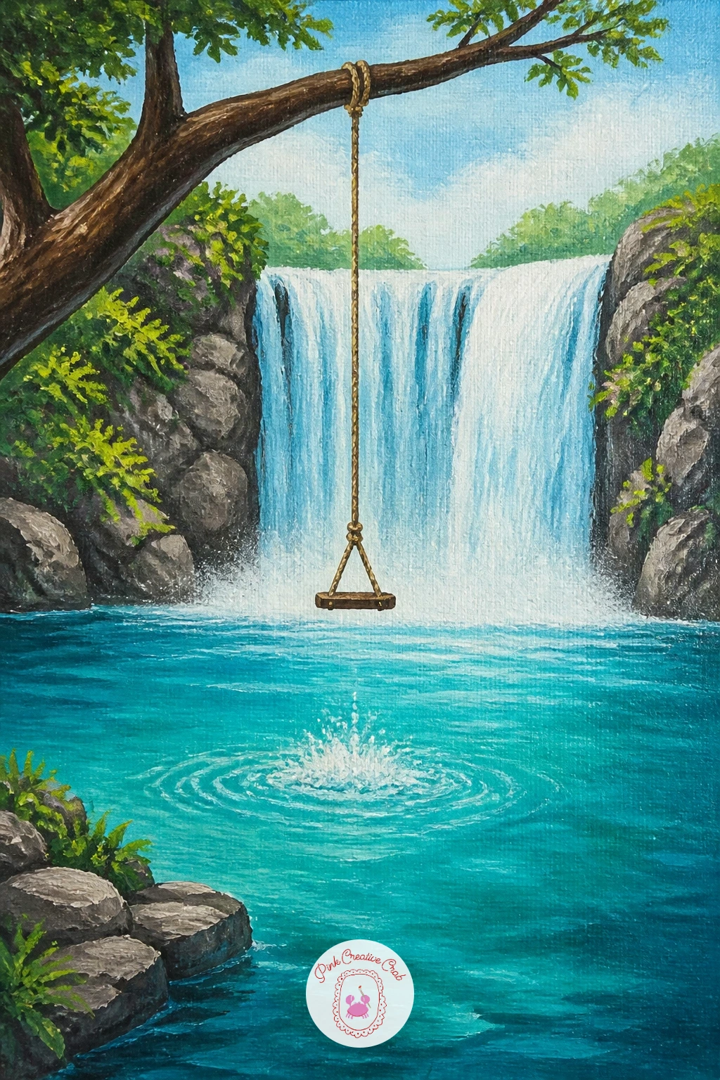
Palette: Burnt Umber,Turquoise,Titanium White,Hooker’s Green
Move from wild nature to a tended one with a small garden waterfall and koi pond. Keep this version tighter and more composed than the wilder scenes: a short stacked rock fall trickling into a round pond, bordered by a few neat plants rather than a full forest.
Block the pond in dark green or near black, since koi show up best against a deep background, then paint the fall as a short white trickle over two or three stacked stones. Add two or three koi last, simple curved oval bodies in orange and white, each with a thin dark line or two for pattern.
Painting koi too pale against a pale pond loses them completely. Keep the pond water dark and let the orange bodies glow against it, adding just a hint of white reflection above each fish to suggest the water’s surface. If orange feels too bright for your taste, a pale gold koi works just as well.
One tip for today: paint one koi partly overlapped by a lily pad or shadow, which makes the pond feel deeper and more alive than fish floating in open water.
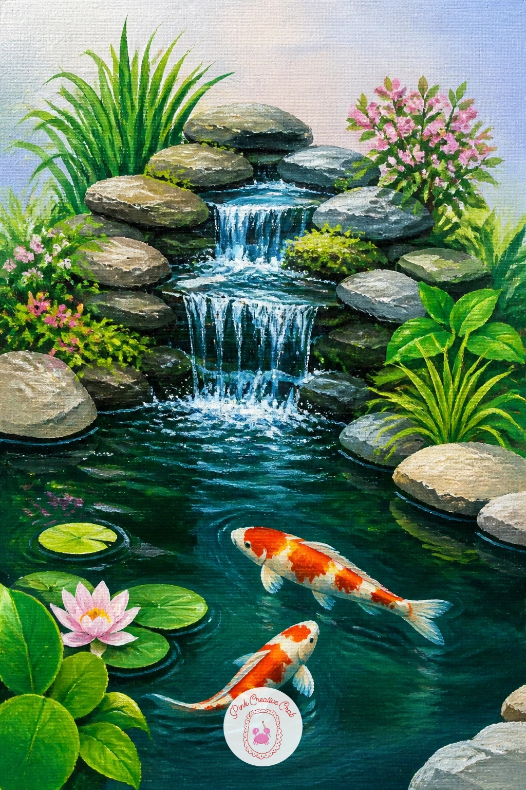
Palette: Payne’s Grey,Cadmium Orange,Titanium White,Hooker’s Green
Bring soft pink into the palette with a cherry blossom branch framing the fall. Paint the background and waterfall first as usual, then add one or two blossom branches reaching in from a top corner, thin dark branch lines with small pink blossom clusters dabbed along them.
Use the end of a round brush or a cotton swab to dab small clusters of pale pink, each cluster just a few dots close together rather than one solid pink blob, which reads far more like individual blossoms. Let a few loose petals fall and scatter near the base of the fall or drift on the pool’s surface.
Painting too many blossoms crowds the fall and turns it into a pink wall. Keep the branches to one or two corners and leave most of the canvas open around the water. If a round brush tip feels too large for small dabs, the wrong end of a paintbrush dipped in paint makes neat tiny dots.
One tip: vary the pink slightly from cluster to cluster, warmer here, paler there, so the blossoms never look stamped from the same shape twice.
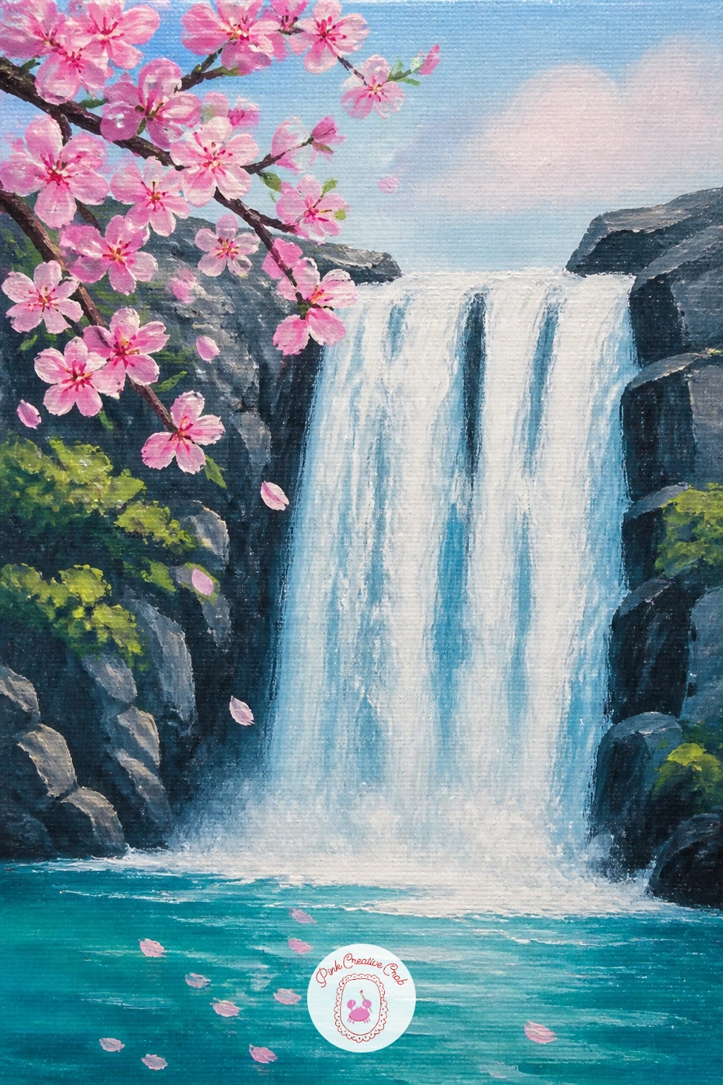
You Will Need
- cotton swab (optional)
Palette: Pale Pink,Burnt Umber,Titanium White,Payne’s Grey
Put a tiny figure into the landscape to give the fall a sense of real scale. Compare the hiker to the waterfall carefully before painting: the figure should stand no taller than roughly a tenth of the fall’s height, placed on a rock ledge or path to one side rather than dead center.
Block the fall and forest first, then paint the hiker last as a simple standing silhouette, a backpack as a small rounded bump, maybe one arm raised to shade the eyes. Keep the whole figure loose and gestural rather than detailed, since at this distance a few confident shapes read more convincingly than careful rendering.
The common error is a hiker painted too large, which shrinks the waterfall and turns the whole painting into a portrait instead of a landscape. Keep checking the proportion against the fall as you paint, and when in doubt, go smaller rather than bigger.
One tip for today: paint a short dark shadow beneath the hiker’s feet, even just a small smudge, which plants the figure firmly on the rock rather than letting it float.
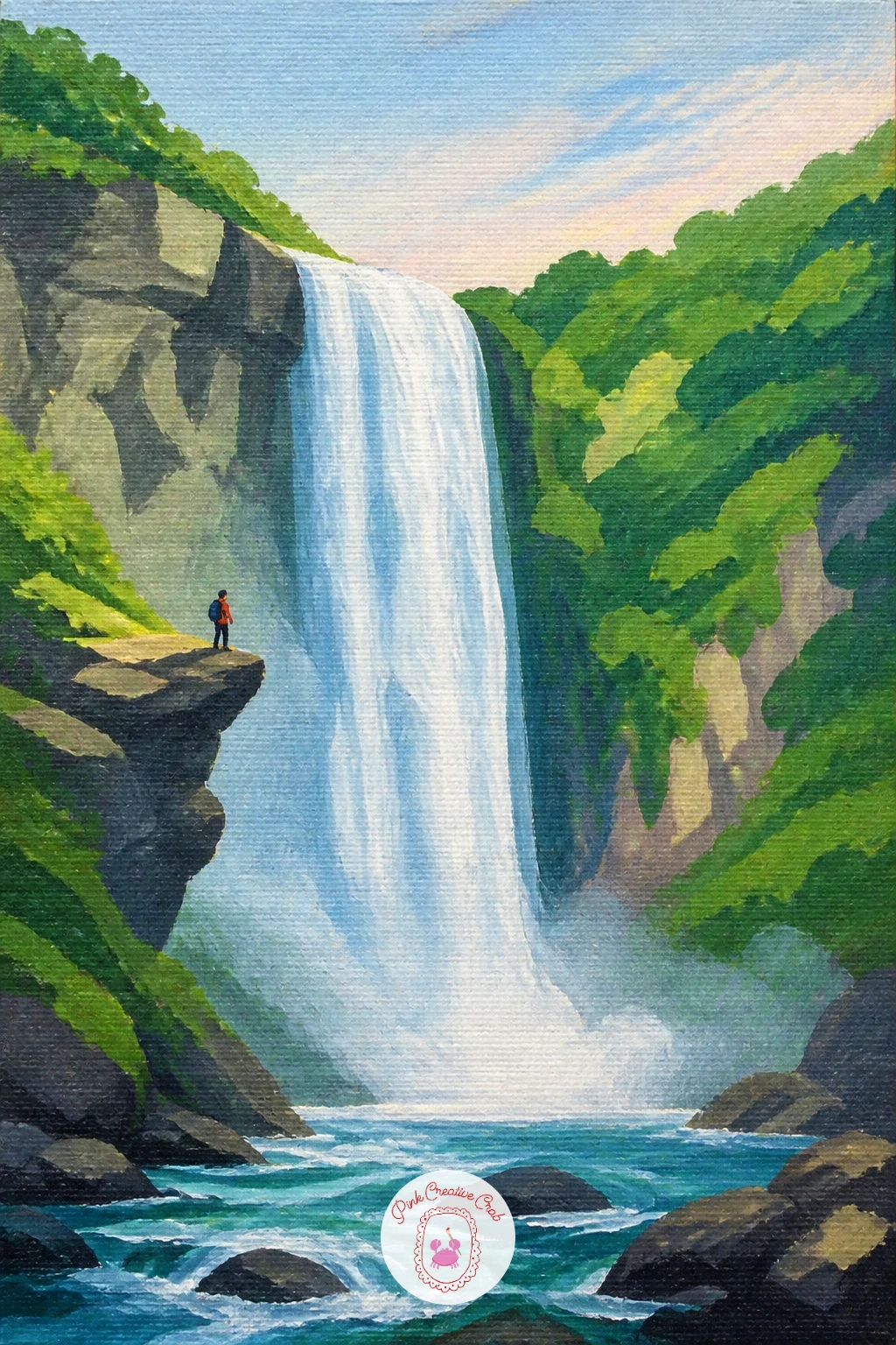
Palette: Payne’s Grey,Burnt Sienna,Hooker’s Green,Titanium White
Focus entirely on texture for this one, a close, tangled corner of rock and water rather than a wide scene. Block the rocks first in grey brown, then build moss on top with a dry brush loaded with very little green paint, dragged lightly so the bristles leave a broken, speckled texture rather than a solid coat.
Add the water last in thin vertical white streaks trickling between and over the mossy stones, using a liner brush or the very tip of a round brush for the thinnest threads. Let some streaks disappear behind a rock and reappear lower down, which reads as water finding its own path rather than a painted line.
Moss painted as one flat green patch looks pasted on rather than grown. Dry brush in at least two greens, dark and lighter, and leave some grey rock showing through between patches. If a liner brush is not in your kit, the edge of an old credit card dragged through thin paint makes a surprisingly good substitute for fine lines.
One tip: keep the whole piece close and cropped, no sky, no distance, just rock and water filling the frame edge to edge.
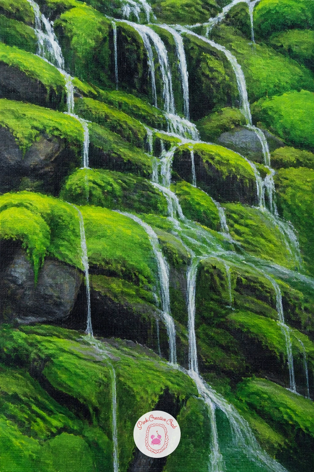
You Will Need
- liner brush (optional)
Palette: Payne’s Grey,Olive Green,Hooker’s Green,Titanium White
Scale up the setting for a dramatic coastal version where a fall drops straight from a clifftop into open ocean. Think about eye level before you paint: set the horizon fairly high in the canvas so the viewer looks slightly down onto the scene, which suits a cliffside vantage point.
Block the sea first in deep blue, lighter and foamier near the base of the fall where fresh water meets salt water, then paint the cliff face in warm grey and the waterfall as a tall white column dropping the full height of the canvas. Add a thin line of white foam where the fall hits the sea surface, spreading slightly outward.
Painting the sea and the waterfall the exact same white loses the drop entirely. Keep the falling water cleaner and brighter than the churned, slightly green tinted foam at its base, so the eye can follow the water all the way down. No deep blue on hand, a mix of cerulean and a touch of black gets close enough.
One tip: angle the cliff edge slightly rather than painting it perfectly horizontal, which adds drama without any extra effort.
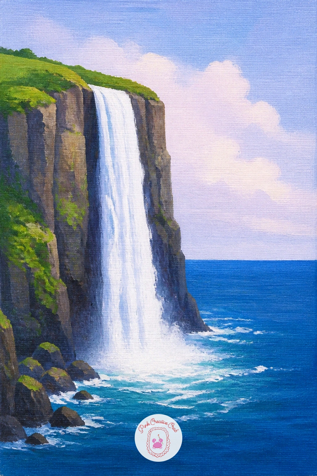
Palette: Cerulean Blue,Payne’s Grey,Titanium White,Raw Sienna
Return to stillness with a single heron standing at the pool’s edge. Decide the light source first, since a heron’s long legs and curved neck throw a distinctive shadow that only reads correctly once you know where the sun sits.
Block the pool and fall first, then paint the heron last as a tall simple silhouette, thin legs, an S curved neck, a long pointed beak, standing perfectly still in shallow water near the edge. Grey blue works well for the body, with a touch of white along the back catching the light.
Herons painted with straight stiff necks lose all their elegance immediately. Curve that neck into a clear S shape and keep the legs thin and slightly bent rather than ramrod straight, since that bend is what makes the pose feel alive rather than carved. If grey blue feels flat, warm the underside slightly with a touch of buff.
One tip for today: paint a thin, slightly broken reflection of the heron in the water beneath it, which does more than any other single detail to sell the stillness of the scene.
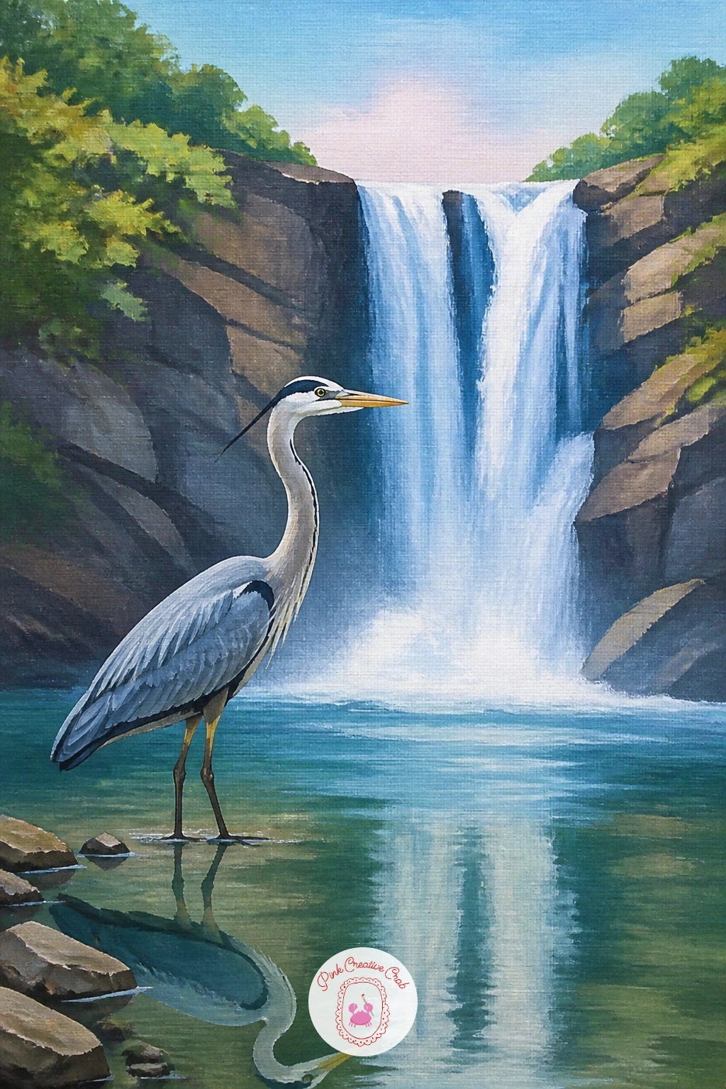
Palette: Grey Blue,Titanium White,Buff,Payne’s Grey
Bring bold color back in with large tropical blooms framing the fall’s edge. Paint the jungle backdrop and white water first, then add one or two large flowers, hibiscus or bird of paradise shapes work well, in the foreground to one side.
Build each flower from a few bold curved petal shapes in red, orange or pink, painted with confident single strokes rather than fussy small ones, then add one contrasting center detail, a thin yellow stamen line or a dark throat, once the petals are dry. Keep the leaves broad and glossy looking with a lighter green stripe down the center of each.
Small, timid petal strokes make tropical flowers look wilted rather than bold. Load the brush well and paint each petal in one confident sweep, overlapping slightly rather than leaving gaps. If bird of paradise shapes feel too tricky, a simple five petal hibiscus is just as striking and much easier to get right.
One tip: paint the flower noticeably larger than feels natural, since tropical blooms read as bold and oversized compared to temperate ones, and that scale is part of the charm.
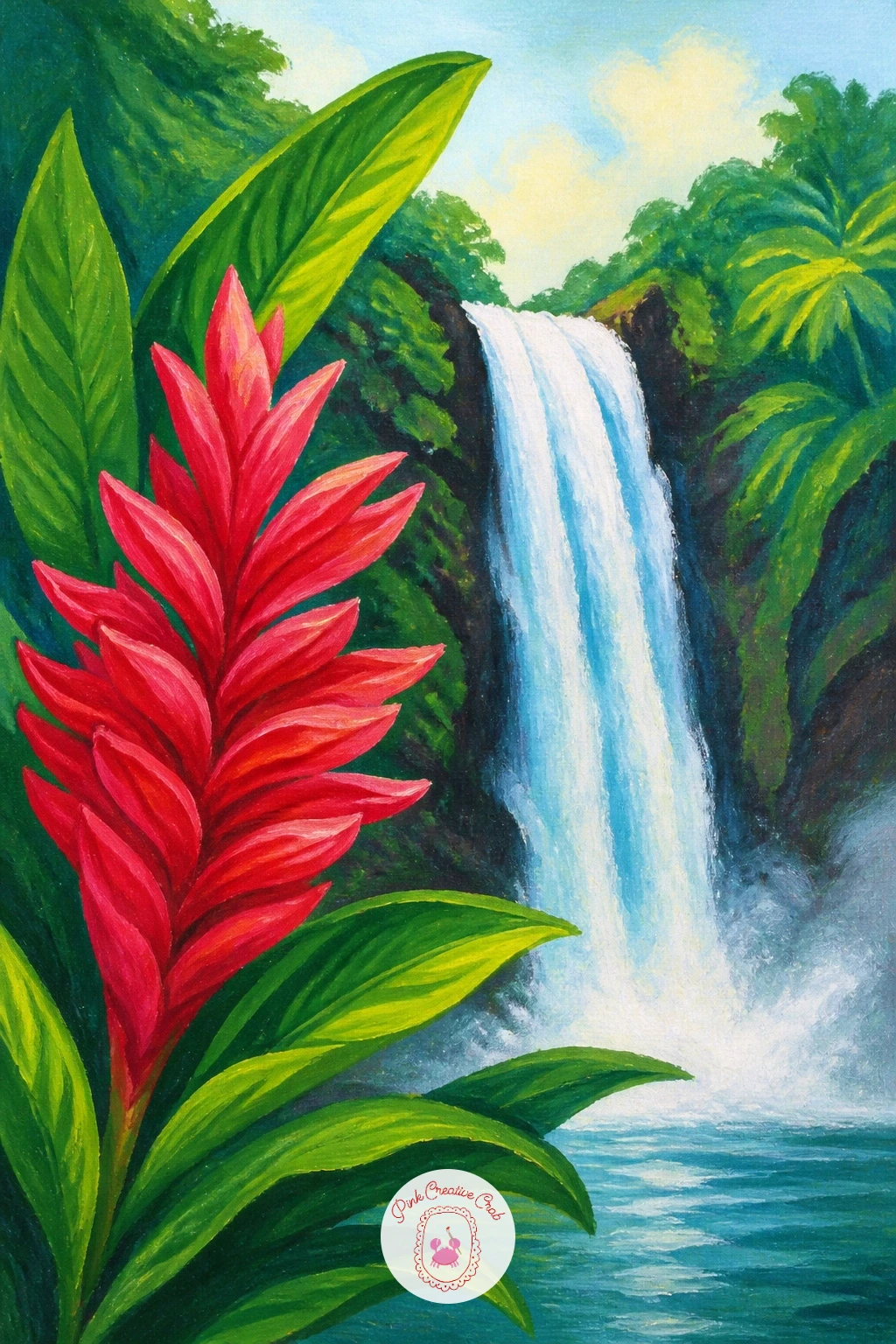
Palette: Cadmium Red,Cadmium Orange,Hooker’s Green,Cadmium Yellow
Guide the eye across the pool with a simple line of stepping stones. Paint the fall and pool first, then place three or four flat oval stones crossing the water at a gentle diagonal, each one a slightly different grey brown tone so they do not read as identical copies.
Add a thin pale highlight along the top edge of each stone where it catches the light, and a soft dark reflection trailing beneath each one in the water. Let the stones get smaller as they recede toward the far bank, which adds a simple sense of distance without any complicated perspective work.
Stones painted all the same size and evenly spaced look mechanical rather than natural. Vary both the size and the gaps between them, and angle the line slightly rather than running it in a dead straight path across the pool. If grey brown feels too plain, a touch of green moss dabbed on one or two stones adds welcome variety.
One tip for today: leave a thin ring of lighter water right around the base of each stone, which does most of the work of making them look wet and solid.
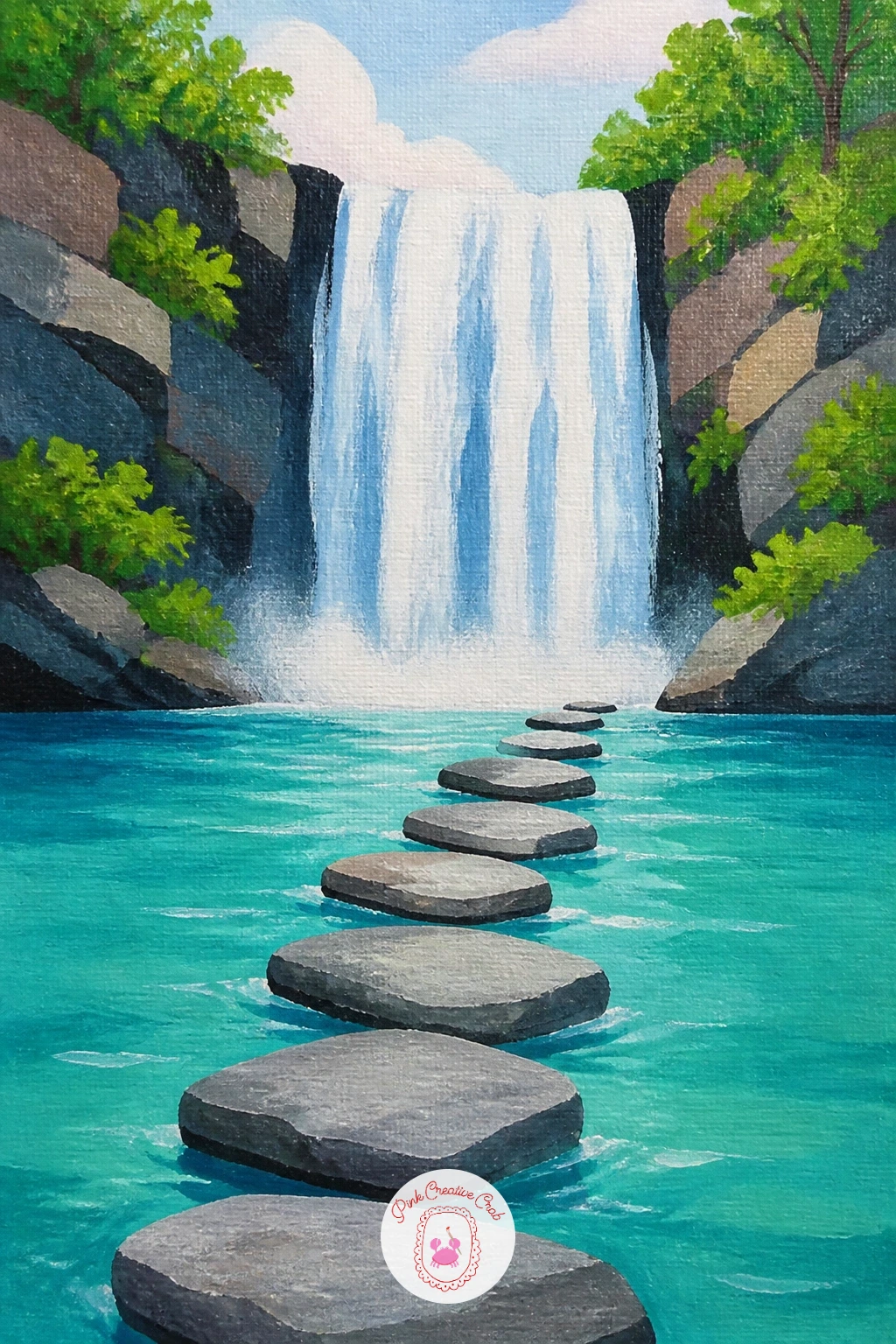
Palette: Payne’s Grey,Raw Umber,Turquoise,Titanium White
Close the list with a framed glimpse rather than a full view, letting tree trunks do the composing for you. Paint the waterfall and pool first as a complete, fully rendered scene, since the trees come last and will cover parts of it.
Once the background is dry, paint two or three tall, narrow tree trunks across the foreground, dark and slightly blurred at the edges compared to the crisp waterfall behind them, which pushes them forward in space. Add just a few leaf clusters at the very top and bottom of each trunk rather than full branches, keeping the middle open so the fall still reads clearly through the gaps.
Trees painted too solid and detailed block the fall entirely and defeat the whole idea. Keep the trunks simple vertical shapes and resist adding full canopies, since the gaps between trunks are doing the real work of framing the view. If your trunks look too stiff, vary their width slightly from base to top rather than painting perfect straight columns.
One tip: soften the trunk edges slightly with a dry brush so they sit clearly in front of the crisper waterfall rather than fighting it for focus.
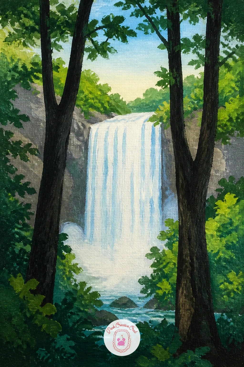
Palette: Burnt Umber,Hooker’s Green,Titanium White,Payne’s Grey
What to Do Next
Pick one waterfall that matches how much time you have today, start with the water and the rock, and let the story detail, a swimmer, a heron, a rope swing, go in last once everything else has dried. A small stretched canvas and your usual acrylic set are all you need to get going.
Frequently Asked Questions
What is the easiest way to paint falling water in acrylic?
Keep falling water as a simple flat white or pale blue shape first, then add thin vertical white streaks on top once it dries. Avoid overworking it, since a few confident strokes read as water better than many fussy ones.
What colors make a good waterfall painting palette?
A clean mix of white, blue grey and one or two greens handles most waterfall scenes well. Add warm accent colors, orange, pink or red, only where the story detail needs them, like autumn leaves or a bright kayak.
How do I make a small canvas waterfall painting look less flat?
Vary your greens and blues by at least two tones each rather than using one flat color per area. A single light source, decided before you start, also adds the shadows and highlights that give the scene real depth.
Do I need special brushes for a waterfall painting?
A basic set of flat and round acrylic brushes covers nearly everything here. A thin liner brush helps with fine water streaks and icicles, but the tip of a small round brush works almost as well if that is all you have.
How long does a beginner acrylic waterfall painting take to finish?
Most of these ideas finish in under an hour once the background dries enough to add details on top. Simpler scenes with no figures or animals can finish in twenty to thirty minutes working wet into wet.
Have any thoughts?
Share your reaction or leave a quick response — we’d love to hear what you think!
-
 0
-
0
-
0
-
0
-
0
-
0


