

A lighthouse painting is the kind of subject that looks far harder than it actually is: a tall simple shape, a strip of sky, a strip of sea, and you are already most of the way there. That is exactly why it suits a small canvas and an afternoon, and why it keeps turning up on moodboards for coastal corners and cottage walls.
Below you will find 27 different lighthouse scenes, each with its own small story detail, from a red and white tower on a cliff to a keeper’s cottage with a bicycle leaning by the door. Pick the one that matches your mood, keep your shapes flat and clean, and you will have something framed by dinner.
Using these images: free for personal projects such as printing, coloring, cards, journals and gifts. Handmade items that include them may be sold up to 30 pieces per design. More than that is commercial use and is not permitted, and neither is selling or sharing the images themselves or passing them off as your own. Please ask before any other use.
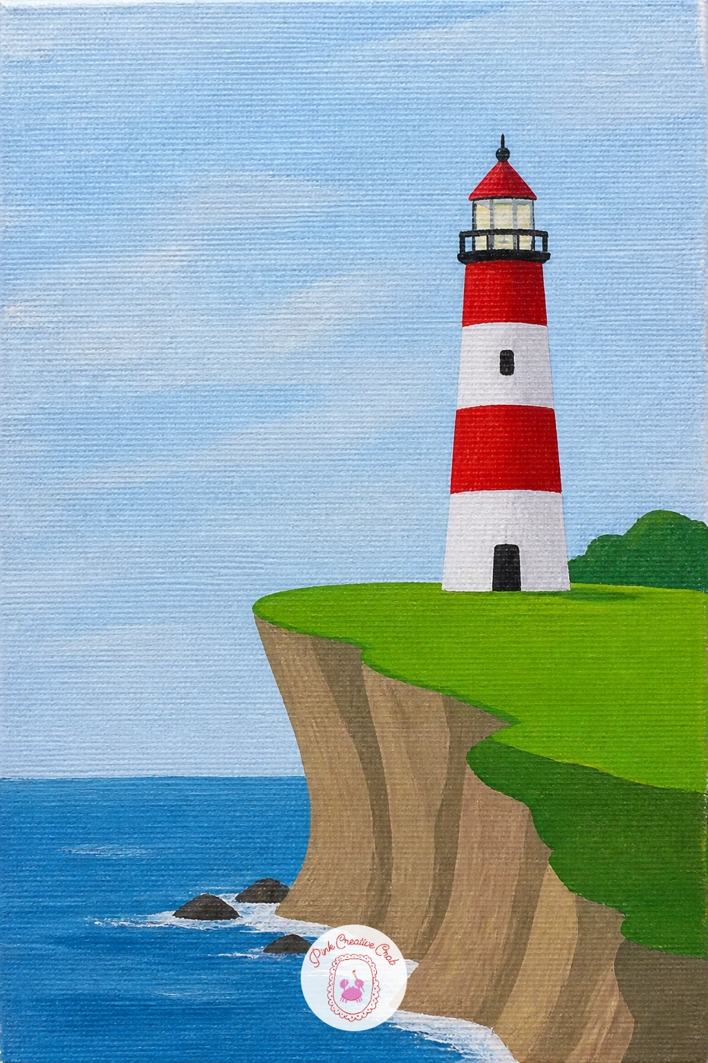
Start with the cliff, because a red and white lighthouse on a cliff stands or falls on how solid that base looks. Block in a pale sky first, then a darker band of sea, then paint the cliff as one chunky wedge shape in a warm grey-green before the tower goes anywhere near it.
Paint the tower itself as a simple cone: a light base coat, then tape off even bands for the red stripes so the edges stay crisp rather than wobbly. Add the lantern room as a small dark square on top with a white cap, and keep the whole structure narrower than you think it should be, lighthouses read taller when they are slim.
The common mistake is making the cliff too flat and the tower too fat, so it looks squat. A quick trick fixes both: hold your brush at arm’s length and compare the tower’s height to its width before you commit to the final shape, it should be at least four or five times taller than it is wide.
If you do not have masking tape for the stripes, a ruler and a steady round brush will do the same job, just go slowly.
You Will Need
- painter’s tape
Palette: Cadmium Red,Titanium White,Sap Green,Cerulean Blue
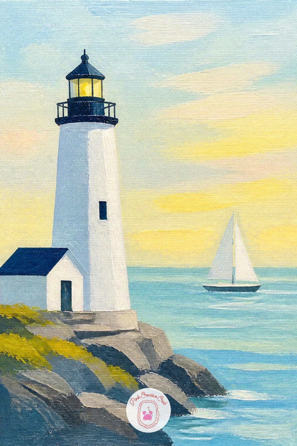
Once you have painted one tower, a lighthouse with a sailboat passing is a nice second canvas because it adds a moving story without much extra work. Paint the lighthouse first, off to one side rather than dead center, so there is open sea for the boat to sail across.
Keep the sailboat tiny and simple: a white triangle for the sail, a thin dark line for the hull, placed well below the lighthouse’s eye level so it feels distant. Paint the sea as two or three flat bands of blue getting paler toward the horizon, then drop the boat in last on top.
Where this goes wrong is a sailboat painted too large, which fights the lighthouse for attention. Think of the boat as a punctuation mark, not a second subject, and if you are unsure, paint it smaller than feels right.
No fine liner brush at hand, use the very tip of a round brush loaded thin with paint for that small sail shape.
Palette: Titanium White,Payne’s Grey,Cerulean Blue,Naples Yellow
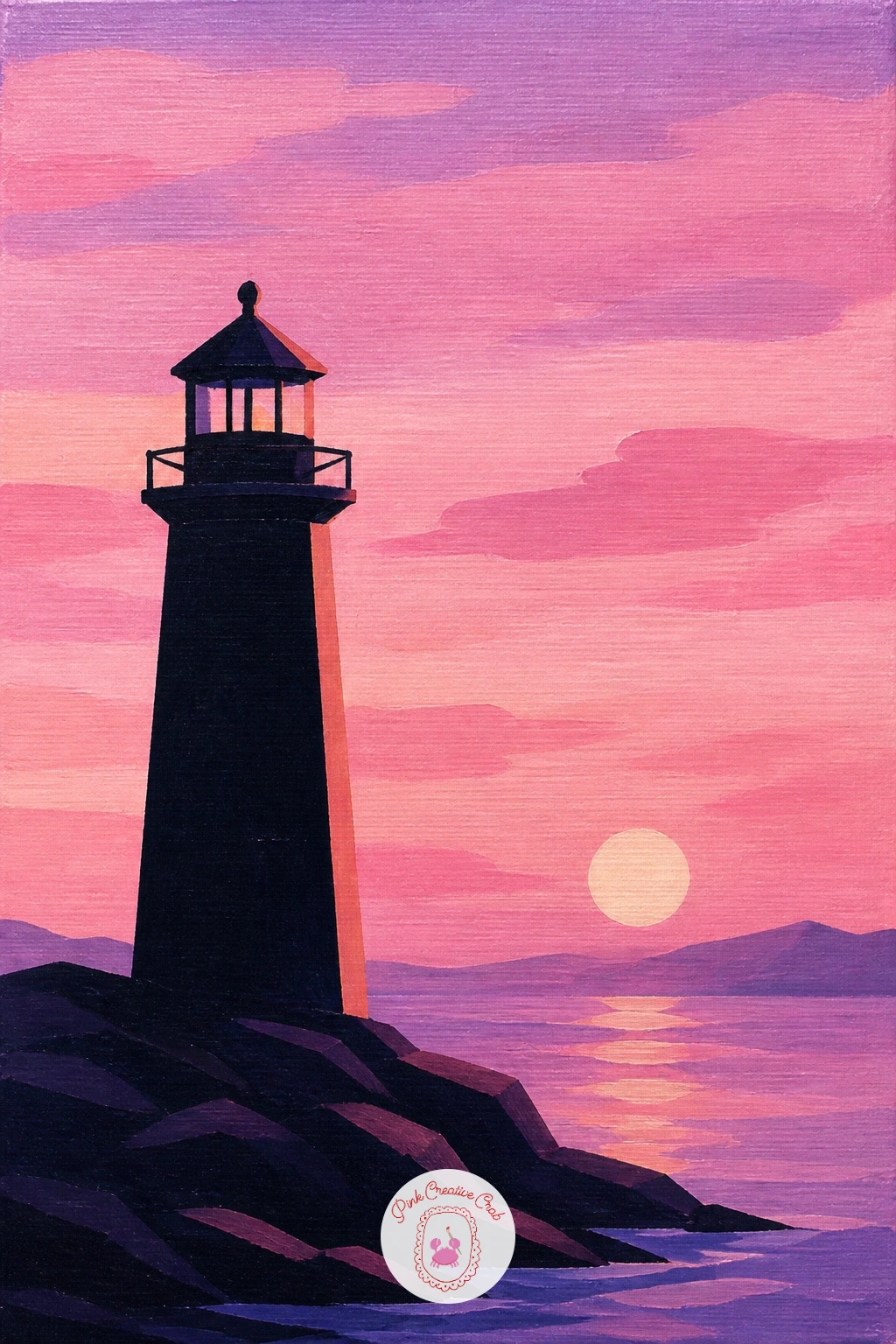
Light is the whole subject here, so a lighthouse under a pink sunrise asks you to paint the sky before anything else gets near the canvas. Mix three soft bands, pale yellow near the horizon, pink above it, lilac at the top, and blend them gently where they meet while the paint is still wet.
Let that sky dry fully, then paint the lighthouse as a dark silhouette against it, almost black at the base and warming slightly where the sunrise catches its side. A thin stripe of reflected pink light along one edge of the tower sells the whole scene.
The eye level matters more than usual in a sunrise scene: keep the horizon low, in the bottom third of the canvas, so the glowing sky has room to do the work. If the lighthouse disappears into the bright sky, paint it a shade darker than feels natural.
Add a close-up tip: a dry brush loaded with a touch of white, dragged lightly across the lower sky, suggests soft clouds without extra detail.
Palette: Titanium White,Quinacridone Pink,Pale Lilac,Payne’s Grey
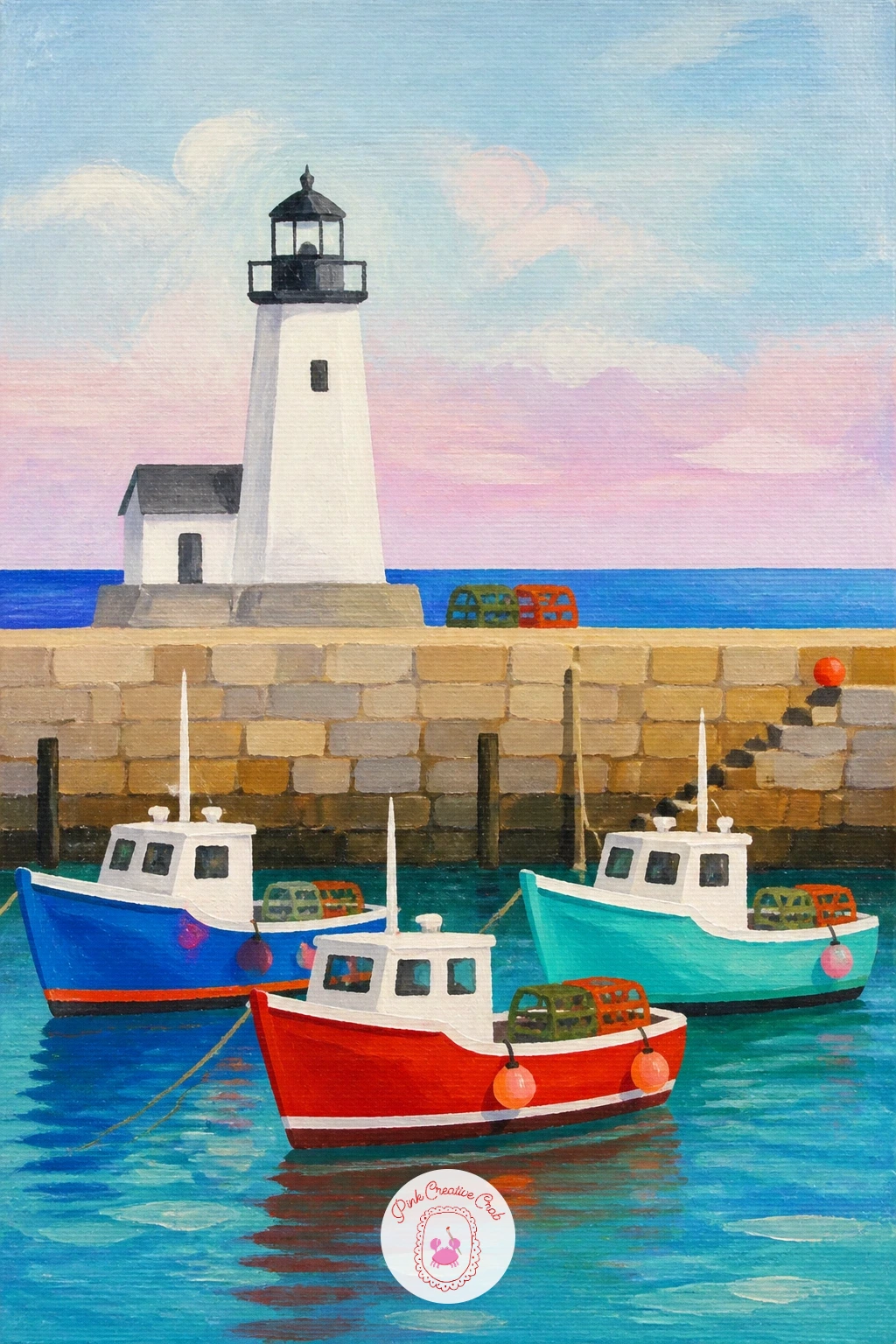
A busier scene now: a lighthouse in a harbor with fishing boats gives you a little village feeling in one small canvas. Paint the lighthouse smaller than the others on this list, since it sits in the background here while the boats sit closer to the viewer.
Block in a stone harbor wall as a flat grey-brown shape across the lower third, then two or three simple fishing boats in bright flat colors, red, blue, yellow hulls, each just a rounded rectangle with a short mast. Paint the lighthouse last, tucked behind the wall near the harbor mouth.
This scene gets cluttered fast if every boat is painted with the same amount of detail, so pick one boat to be the hero with a little more care and keep the rest as simple shapes. That one trick to save it is working largest and nearest to smallest and farthest.
If you want an easier version for today, paint just two boats instead of three and leave more open water between them.
Palette: Cadmium Red,Cerulean Blue,Yellow Ochre,Warm Grey
Give the ground as much love as the tower in this one, because a lighthouse among wildflowers is really a meadow painting with a lighthouse standing in it. Paint the sky and a soft green hillside first, keeping the horizon fairly high so there is plenty of ground to fill with flowers.
Once the lighthouse is painted and dry, come back to the foreground with small dabs of color for the flowers, poppy red, daisy white, a touch of blue, using the end of a round brush or even a cotton bud for quick dots. Work from the back of the meadow toward the front, making the dots slightly bigger as they get closer to the bottom edge.
If this is your first time dotting flowers this way, practice the dabbing motion on scrap paper first, too much pressure turns a dot into a smear. For a bolder, more confident version next time, try painting a few taller flower stems in silhouette right at the front edge of the canvas.
A fan brush, if you have one, makes quick grassy strokes under the flowers without much fuss.
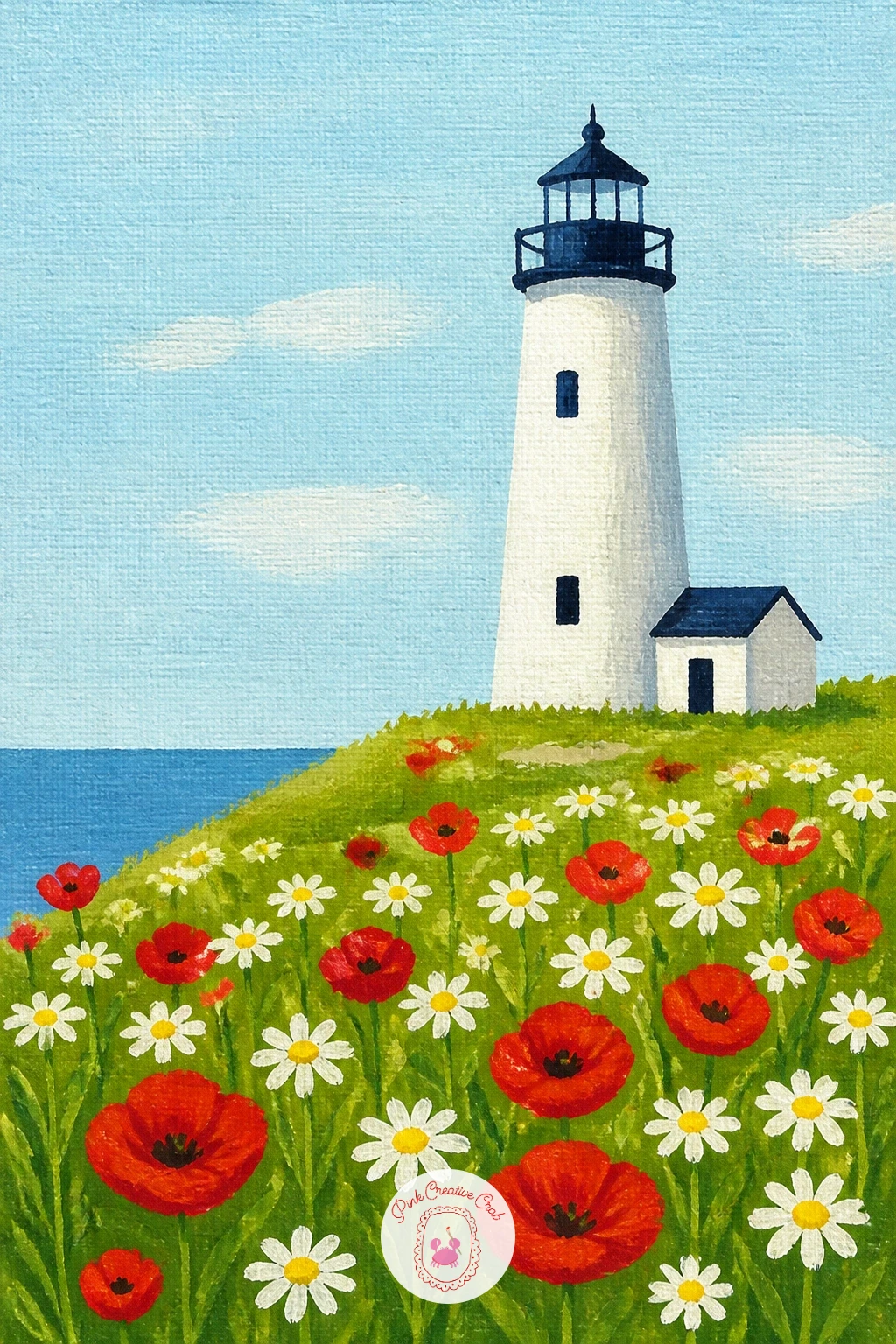
Palette: Sap Green,Poppy Red,Titanium White,Cerulean Blue
Movement and drama belong here, so a lighthouse with waves crashing is the moment to loosen your brushwork a little after all those flat calm scenes. Paint the lighthouse and rocky base first and let it dry completely, since the next step needs to go over it with confidence.
Mix a dark stormy blue-grey for the sea and paint it in bold diagonal strokes, then load a dry, almost paint-free brush with white and drag it quickly across the point where a wave meets the rocks for that frothy spray texture. Less paint on the brush gives a better spray than more, so scrape off excess before you touch the canvas.
The usual mistake is painting the spray too neatly, in careful little dots, which reads as snow rather than water. Load the brush, test the stroke on scrap paper once, then commit to one or two confident drags on the real canvas.
No proper dry brush texture yet, an old flat brush with the bristles slightly splayed works just as well.
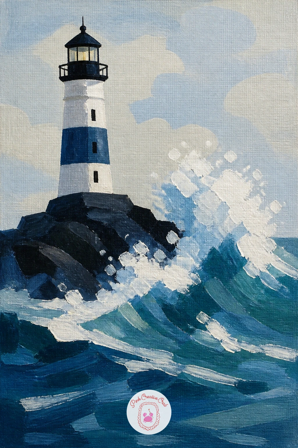
Palette: Payne’s Grey,Titanium White,Prussian Blue,Warm Grey
Look at photos of waves hitting a seawall for reference on where spray actually lands, it almost always flies higher on one side than the other.
After the drama of crashing waves, slow things right down with a keeper’s cottage beside a lighthouse, a quiet pairing of two simple shapes side by side. Paint the lighthouse first as a tall cone, then the cottage next to it as a low rectangle with a triangle roof, keeping the cottage roughly a third of the lighthouse’s height.
Give the cottage a single small window and a door painted in one bright accent color, which is the detail that makes the whole scene feel lived in. Keep the walls of both buildings in flat, unshaded color and let a soft pastel sky do the atmosphere for you.
Comparing the two buildings’ sizes before you paint either one keeps them in proportion: hold your brush up and measure the lighthouse height against the cottage height on the actual scene or photo you are working from, then copy that ratio onto the canvas.
For something you can finish in ten minutes, paint just the two flat shapes with no window or door detail at all, add them back in for the fuller forty-minute version.
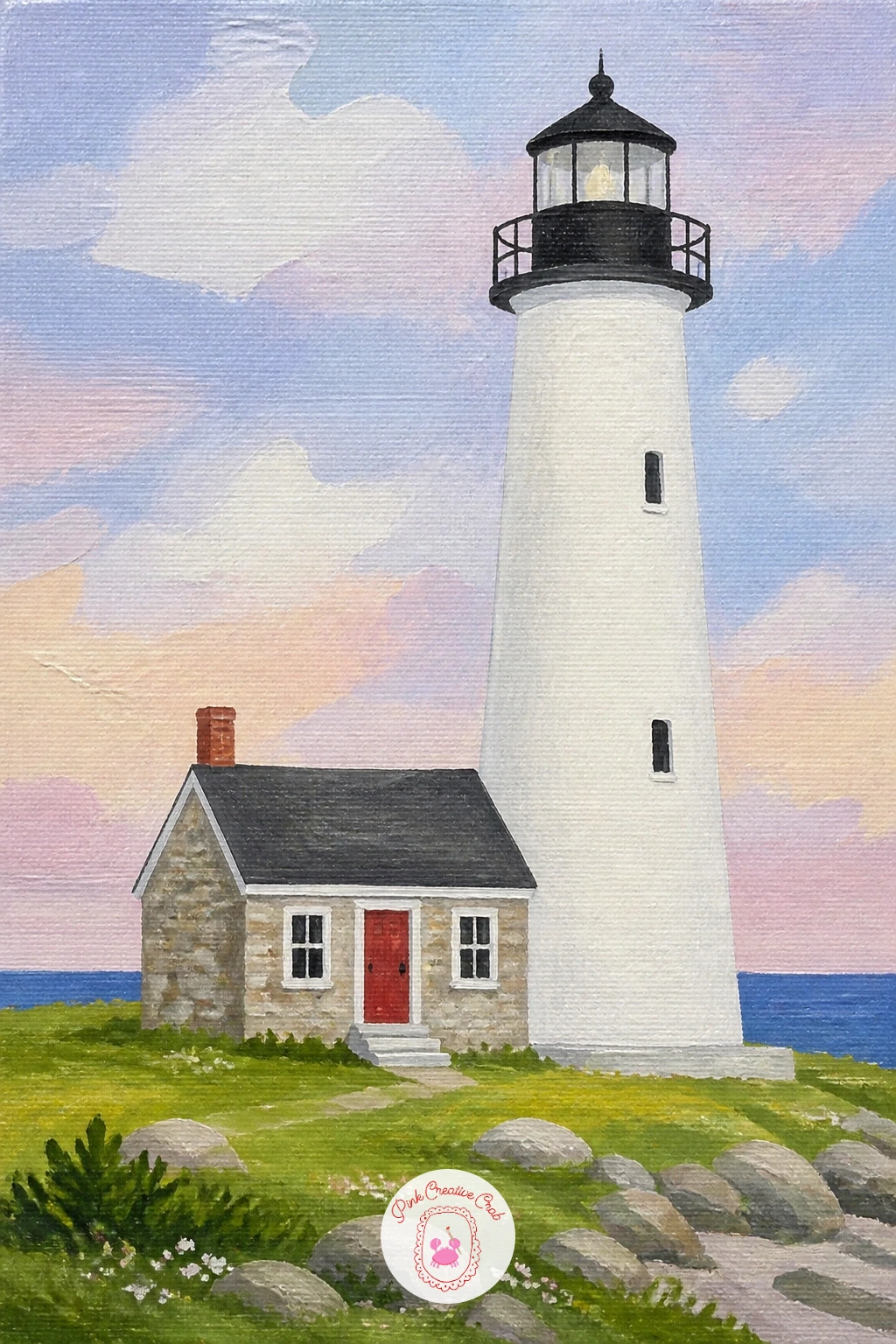
Palette: Titanium White,Cadmium Red,Yellow Ochre,Sap Green
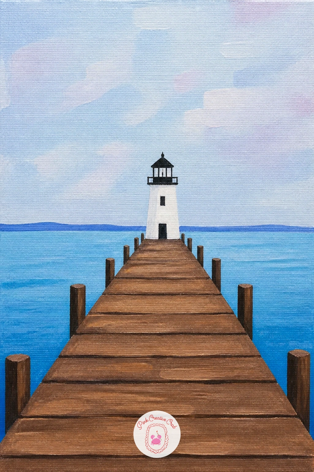
Straight lines do most of the work in a lighthouse at the end of a pier, a composition built almost entirely from perspective. Draw or lightly paint one long pier running from the bottom edge of the canvas out to where the lighthouse stands, making the pier’s planks narrower as they travel toward the horizon.
Paint the lighthouse small at the far end, since distance is what makes this scene work, then come back and add a simple railing or a few wooden posts along the pier using short straight strokes that also get smaller toward the back. Keep the sea on either side in flat calm color so the pier stays the star.
Getting the perspective right matters more than detail here: keep your eye level low, roughly a third up the canvas, and every line on the pier should point toward the same spot near the lighthouse. If the pier looks like it is sliding sideways, check those lines all meet at one point.
A ruler helps keep the pier’s edges straight if your hand is not steady today.
You Will Need
- ruler
Palette: Warm Grey,Titanium White,Cerulean Blue,Yellow Ochre
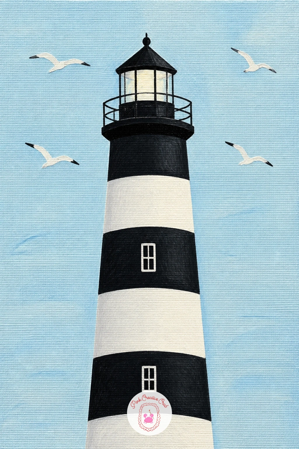
Bring in some life above the tower with a striped lighthouse with seagulls, which is really the red and white lighthouse idea’s cousin but busier at the top. Paint the striped tower first using the same taped-band method, black and white stripes this time instead of red, for variety across your collection.
Once dry, add seagulls as small simple shapes: two curved brush strokes meeting in a shallow V, nothing more, dotted around the lantern room and the sky at different sizes to suggest distance. Keep every gull the same simple shape so they read as a flock rather than individually fussy birds.
The edges of the stripes are where this one can look messy, so after taping and painting each band, lift the tape while the paint is still slightly tacky rather than fully dry, it peels cleaner that way. If a stripe still bleeds, a thin white line painted carefully along the edge afterward fixes it.
No tape on hand, a straight ruler held as a painting guide gives a similar crisp line.
You Will Need
- painter’s tape
Palette: Payne’s Grey,Titanium White,Cerulean Blue,Warm Grey
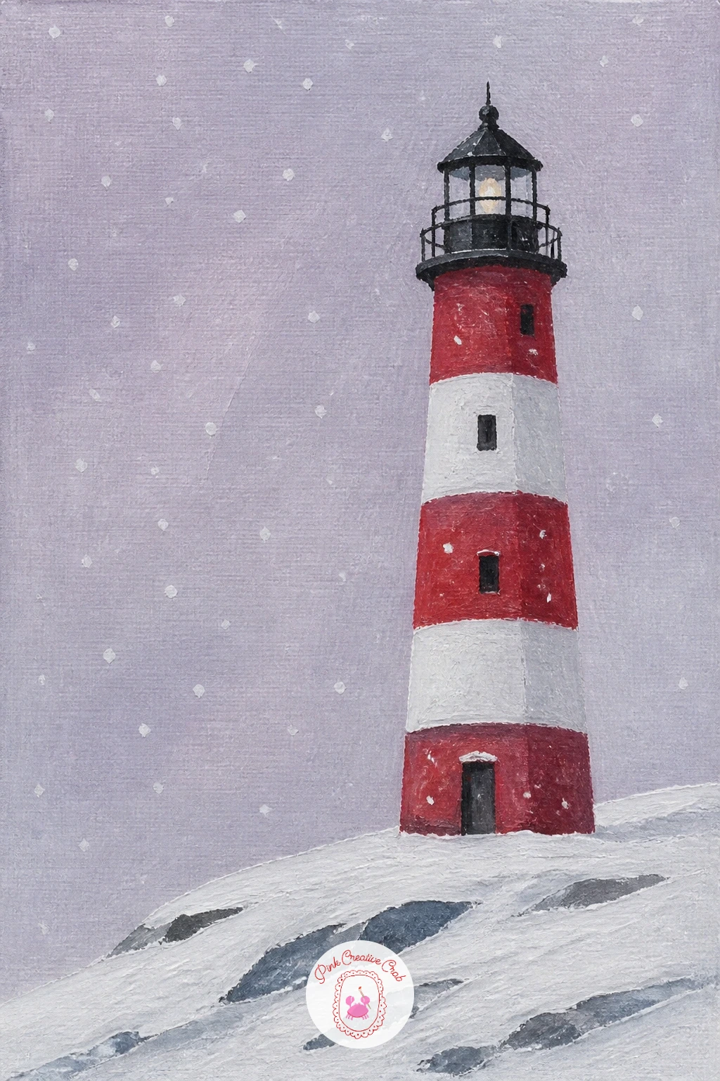
Swap the usual coastal palette for something cooler with a lighthouse in snow, a nice one to paint when you want a change of season without leaving the subject. Paint a soft grey-lilac sky first, then a white, slightly blue-tinted ground that covers most of the lower half of the canvas.
Paint the lighthouse in its usual colors but mute them slightly, winter light softens everything, then add snow sitting on top of any ledges or the lantern roof with small flat strokes of pure white. A scattering of tiny white dots over the whole scene, added last with the tip of a brush, reads as falling snow.
The easy mistake is painting snow as bright white everywhere, which flattens the whole scene. Keep your white for the snow on surfaces pure, but let the sky and sea carry a little grey or blue in them so the true white pops by contrast.
If you want extra texture on the snowy ground, dab a sponge lightly in white paint for a soft uneven surface instead of a flat brushstroke.
Palette: Titanium White,Payne’s Grey,Pale Lilac,Cerulean Blue
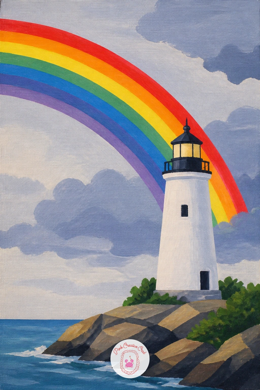
After all that snow, warm back up with a lighthouse with a rainbow, a cheerful scene that leans on one simple arc more than any fine detail. Paint the sky and lighthouse first, using a slightly stormy grey-blue sky on one side to make sense of the rainbow appearing against it.
Mix your rainbow colors ahead of time in small separate dabs on your palette, red through violet, then paint the arc in one smooth curved sweep using a thin brush held at a steady angle, working from the outer red band inward to violet. Let each band dry a little before painting the one beside it if you want cleaner separation between colors.
A rainbow drawn too perfectly round looks stiff, so aim for an arc that feels slightly uneven and hand-painted rather than measured with a compass. If your bands wobble, a thin white line traced between each color afterward sharpens the whole arc.
Next time you paint this scene, try a double faint rainbow for variety, a second paler arc just outside the first.
Palette: Cadmium Red,Yellow Ochre,Sap Green,Cerulean Blue,Pale Lilac
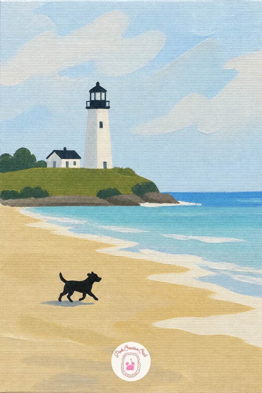
Add a small warm character to the shoreline with a lighthouse seen from the beach with a dog, a scene that works because of one tiny figure rather than any fussy detail. Paint your beach as flat bands, pale sand in the foreground, sea, then the lighthouse small on the far headland, before anything else goes on the canvas.
The dog comes last and stays tiny: a simple dark silhouette shape, four short legs, a tail, standing or trotting along the sand facing toward the water or the lighthouse. Keeping it as one flat silhouette rather than a detailed portrait is what keeps it in scale with everything else.
This is a good one to compare proportions on: the dog should sit clearly smaller than the lighthouse, even though it is much closer to the viewer, since nearer things still need to respect the overall scene’s scale. Hold your brush up against your reference photo to check the dog is not accidentally painted the size of a small building.
If a dog feels tricky today, a simple running shape works better than a detailed standing pose.
Palette: Warm Sand,Cerulean Blue,Payne’s Grey,Titanium White
Bring the story right up close with a lighthouse with a picnic on the grass, where the lighthouse moves into the background and a small picnic blanket takes the foreground spotlight. Paint the sky, lighthouse and a green hillside first, keeping the tower fairly small since it is now scenery rather than the main subject.
For the picnic, paint a simple checked blanket as a flat rectangle shape, red and white squares kept loose rather than perfectly ruled, then add two or three small round shapes for a basket and a couple of pieces of fruit on top. A few dots of color nearby suggest wildflowers scattered around the blanket edge.
The checked pattern is the fiddly part, so rather than painting every square, paint the blanket as solid red first, then add white stripes across it in both directions once dry, which reads as checks from a normal viewing distance. For a quicker ten-minute version, skip the checks entirely and paint a plain colored blanket.
A small flat brush held on its edge makes neat straight stripes for the blanket pattern.
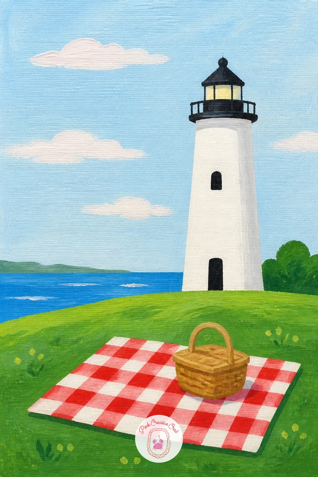
Palette: Cadmium Red,Titanium White,Sap Green,Yellow Ochre
Isolate your subject completely with a lighthouse on a tiny island, a satisfying composition because the water does almost all the framing for you. Paint a flat expanse of sea first, covering most of the canvas, then paint a small rocky island shape sitting roughly in the center or slightly off to one side.
The lighthouse sits on top of that island, scaled so the whole island and tower together still look small against the surrounding water, which is what sells the feeling of isolation. Keep the island’s rock shape simple and slightly irregular rather than a neat circle, with maybe one or two low bushes painted as small green dabs.
If the island ends up looking too large, the quickest fix is painting more sea around it, since the ratio of water to land is what creates the “tiny” feeling, not the island’s size alone. Step back from the canvas and check that the water clearly outweighs the land before you call it finished.
For a bolder version, add a thin reflection of the lighthouse in the water directly below it.
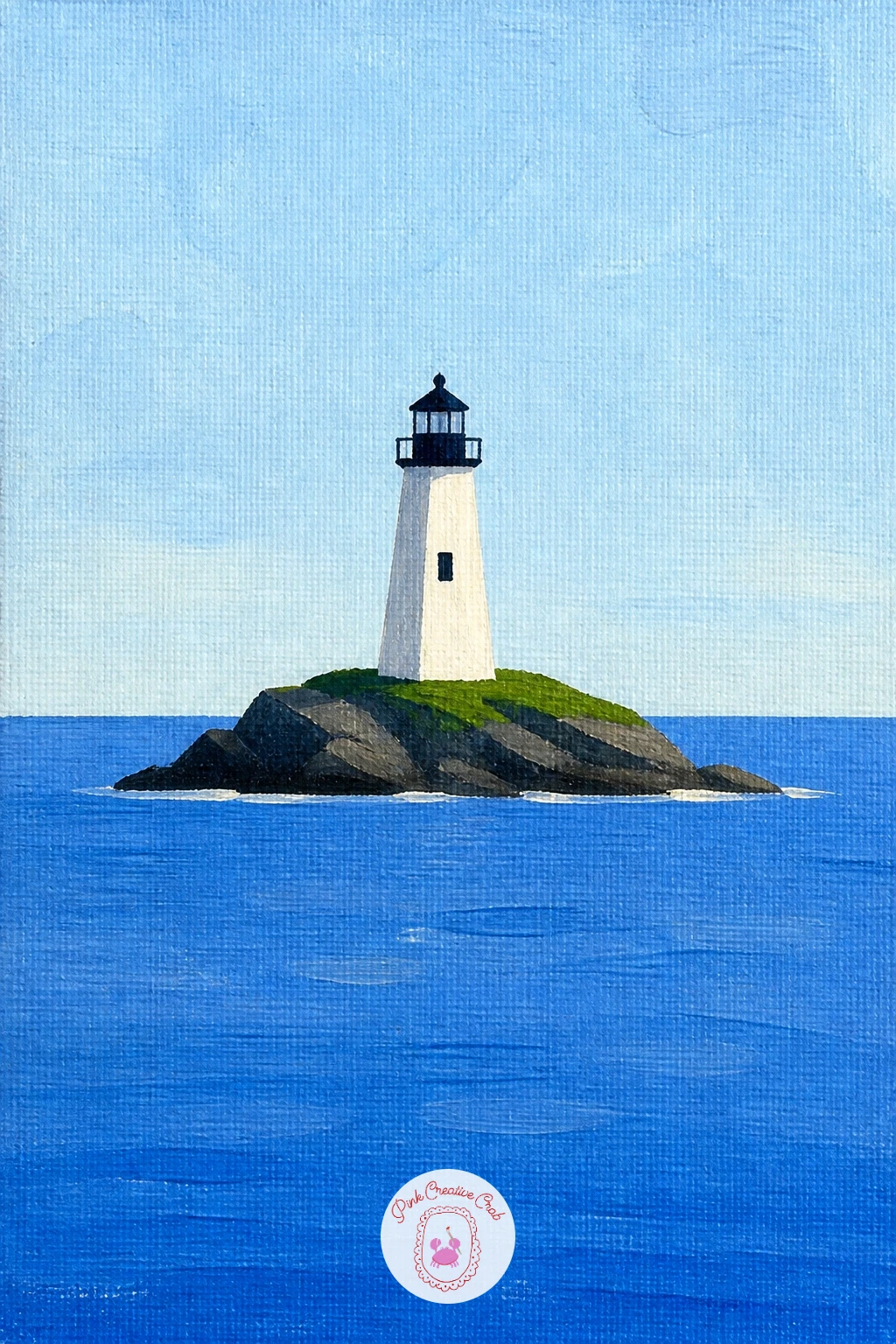
Palette: Cerulean Blue,Warm Grey,Sap Green,Titanium White
Focus entirely on light for this one: a lighthouse beam on a pale dusk sky is less about the building and more about the glow it throws. Paint the dusk sky first in soft fading bands, pale peach near the horizon moving up into dusty blue, and let it dry fully before the beam goes anywhere near it.
Paint the lighthouse as a simple dark shape, then for the beam, mix a pale warm yellow and paint a wide triangle sweeping out from the lantern room across the sky, thickest near the tower and fading as it spreads. A slightly dry brush, loaded lightly, lets you drag that fade softly instead of leaving a hard edge.
The light source matters completely here: decide where the beam points before you paint anything else, usually sweeping out over open water, and keep every other shadow in the scene consistent with light coming from that same lantern room. A beam painted with a hard straight edge looks like a stripe rather than light, so always soften its outer edge with a dry brush once it is down.
Save some of that same yellow for one or two small reflected glints on the water below the beam.
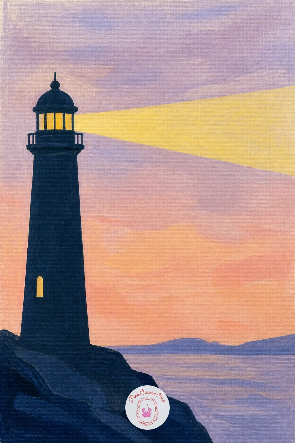
Palette: Payne’s Grey,Naples Yellow,Dusty Peach,Pale Lilac
Come back down to a small domestic detail with a lighthouse with a bicycle by the door, which pairs nicely with the keeper’s cottage idea earlier if you want two canvases that share a story. Paint the lighthouse and its base first, then leave a clear patch of ground near the door for the bicycle to lean against.
Keep the bicycle genuinely simple: two circles for wheels, a thin triangle frame between them, a small curved handlebar, painted in one bright flat color with a few thin dark lines for the frame details. Resting it at a slight angle against the lighthouse wall, rather than standing perfectly upright, makes it look parked rather than floating.
If you have not painted bicycle wheels before, a small plate, lid or coin traced lightly first gives you two even circles to paint inside, which solves the most common wobble in this idea. Once the circles are even, the rest of the bike is just straight and curved lines.
A fine brush or the thin edge of a palette knife makes crisp spokes if you want a little more detail in the wheels.
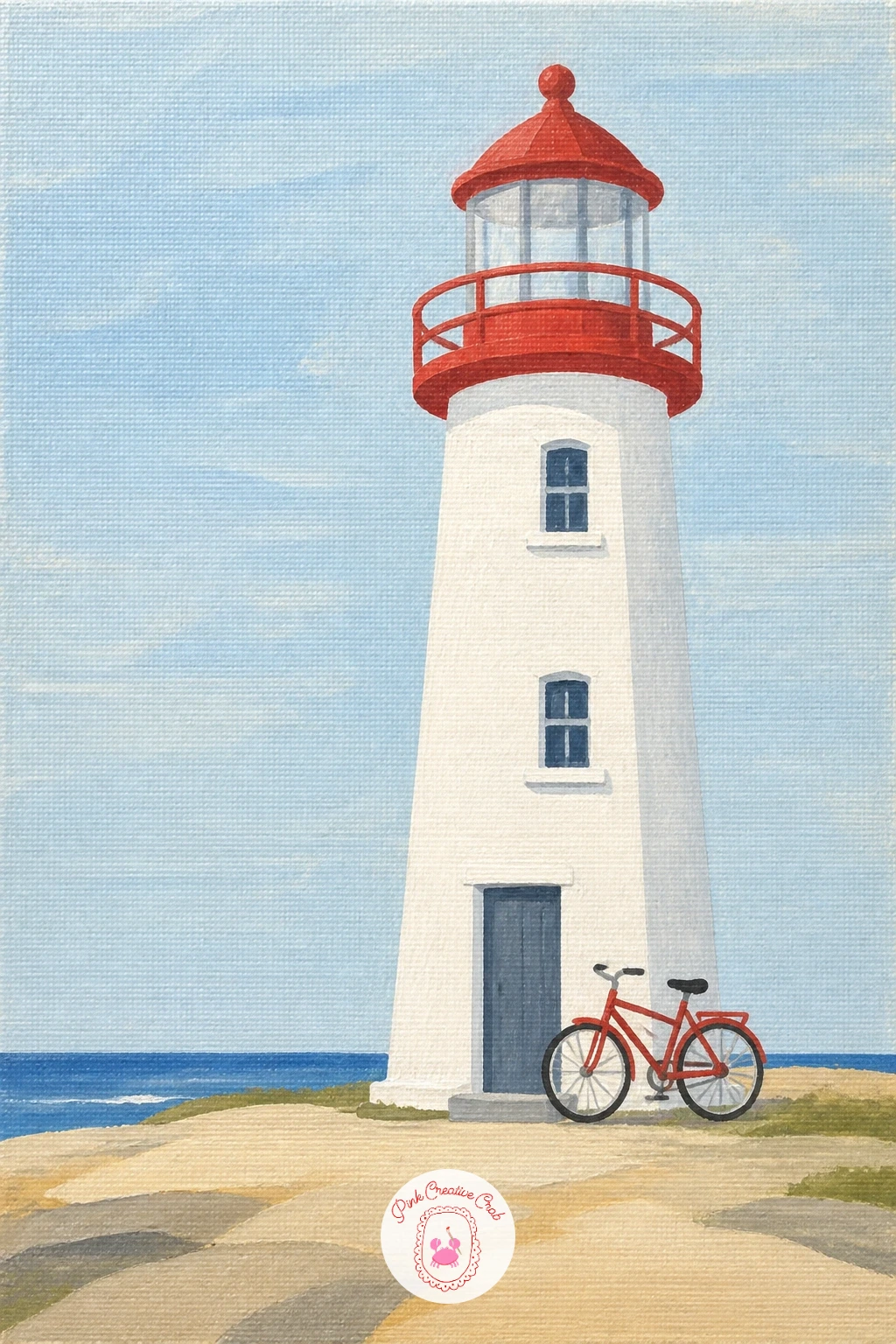
You Will Need
- small plate or lid to trace circles
Palette: Cadmium Red,Payne’s Grey,Titanium White,Yellow Ochre
Soften everything right down with a lighthouse in morning fog, a scene built almost entirely from how much you hide rather than what you show. Paint a flat pale grey-white background first, covering the whole canvas, then paint the lighthouse as a soft shape with blurred rather than crisp edges, slightly lighter in value than it would be on a clear day.
The trick for believable fog is painting the base of the lighthouse barely visible, almost disappearing into the ground, while the lantern room at the top stays a touch clearer, since fog usually sits thicker low down. Blend the edges where the tower meets the fog using a dry brush dragged gently outward rather than a hard painted line.
The common mistake is painting the fog too white and flat, with no sense of depth, so mix in the faintest hint of blue or grey rather than pure white for the background itself. If the whole thing feels too flat afterward, a very thin wash of grey glazed over the lower half, dry-brushed on, adds just enough atmosphere.
For an even quicker version today, skip the blending step and simply paint the lighthouse paler than usual against a plain grey sky.
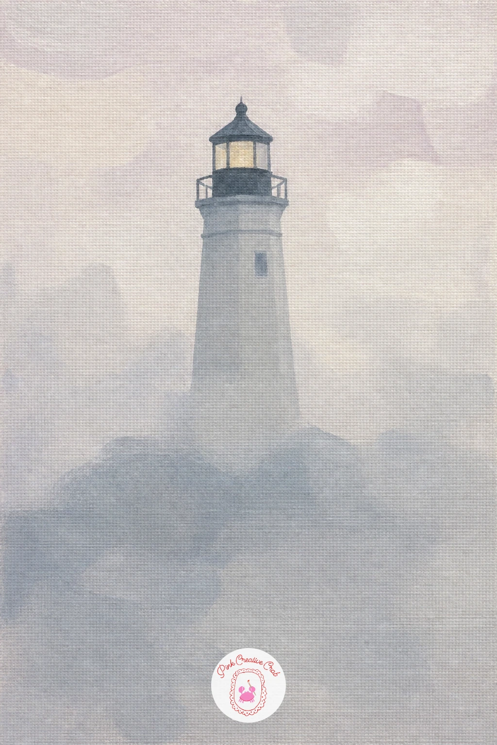
Palette: Warm Grey,Titanium White,Payne’s Grey,Pale Lilac
Give the sea a quiet surprise with a lighthouse with a whale tail offshore, a small story detail that needs almost no extra skill once your sea is painted. Paint your usual flat sea and sky with the lighthouse on a headland or cliff as before, keeping plenty of open water in the lower half of the canvas.
The whale tail itself is just one dark curved triangle shape rising out of the water, painted last with a confident single brushstroke rather than built up slowly, with a thin paler line along its top edge to catch the light. Place it well away from the lighthouse, out in the open sea, so it reads as a glimpse rather than crowding the scene.
Painting it with hesitant, repeated small strokes is what makes a whale tail look unconvincing, a shape like this reads best fast and sure. Mix the color first, test the stroke once on scrap paper, then paint it in one or two confident moves straight onto the canvas.
A loaded round brush held almost flat against the canvas gives the cleanest single sweep for this shape.
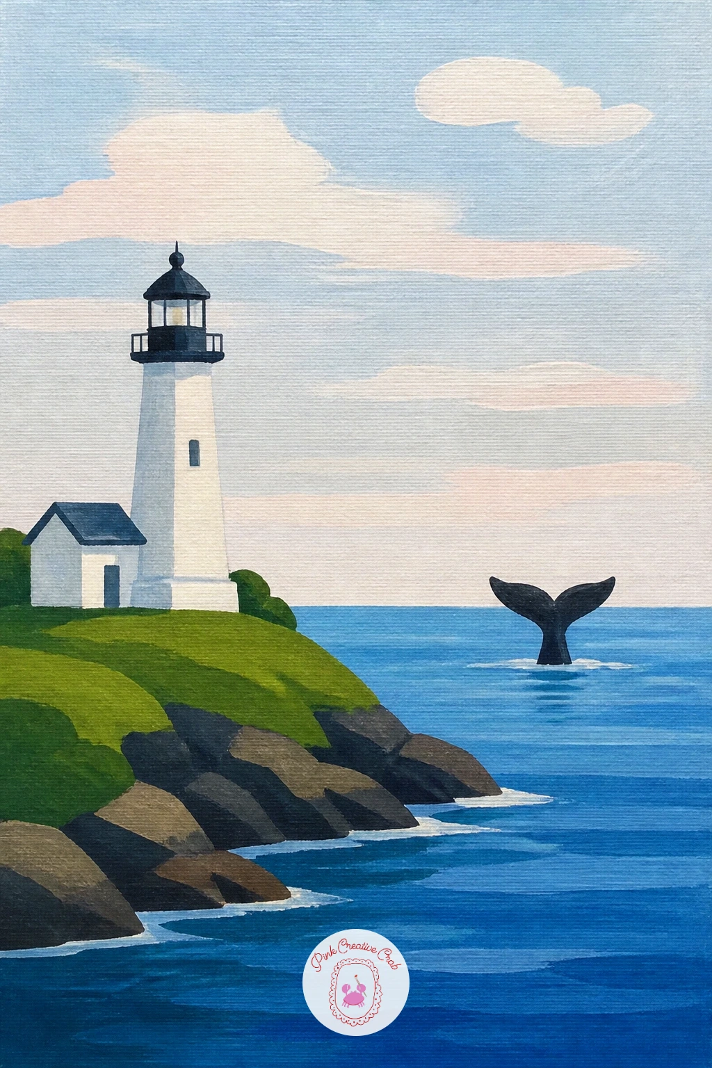
Palette: Payne’s Grey,Cerulean Blue,Titanium White,Prussian Blue
Bring a little coastal character onto the rocks with a lighthouse with puffins, swapping the earlier seagulls for a bird with much more personality to paint. Paint the lighthouse and its rocky base first, then add two or three puffins standing on the rocks nearby rather than flying, since their shape reads better standing still.
Each puffin is a simple rounded black and white body shape with an orange-red triangular beak and small orange feet, painted in that order, body first, beak and feet last once the body paint has dried a little so the colors stay crisp rather than bleeding together. Keep every puffin roughly the same small size and let them face slightly different directions so they feel like a little group rather than copies.
The beak is the part most likely to go wrong, since it is easy to paint it too large and cartoonish, so paint it smaller than feels right and compare it against the size of the puffin’s head before adding more. If it still looks too big, a thin line of white around its edge helps shrink it visually.
No bright orange on your palette, mixing red with a touch of yellow gets you there.
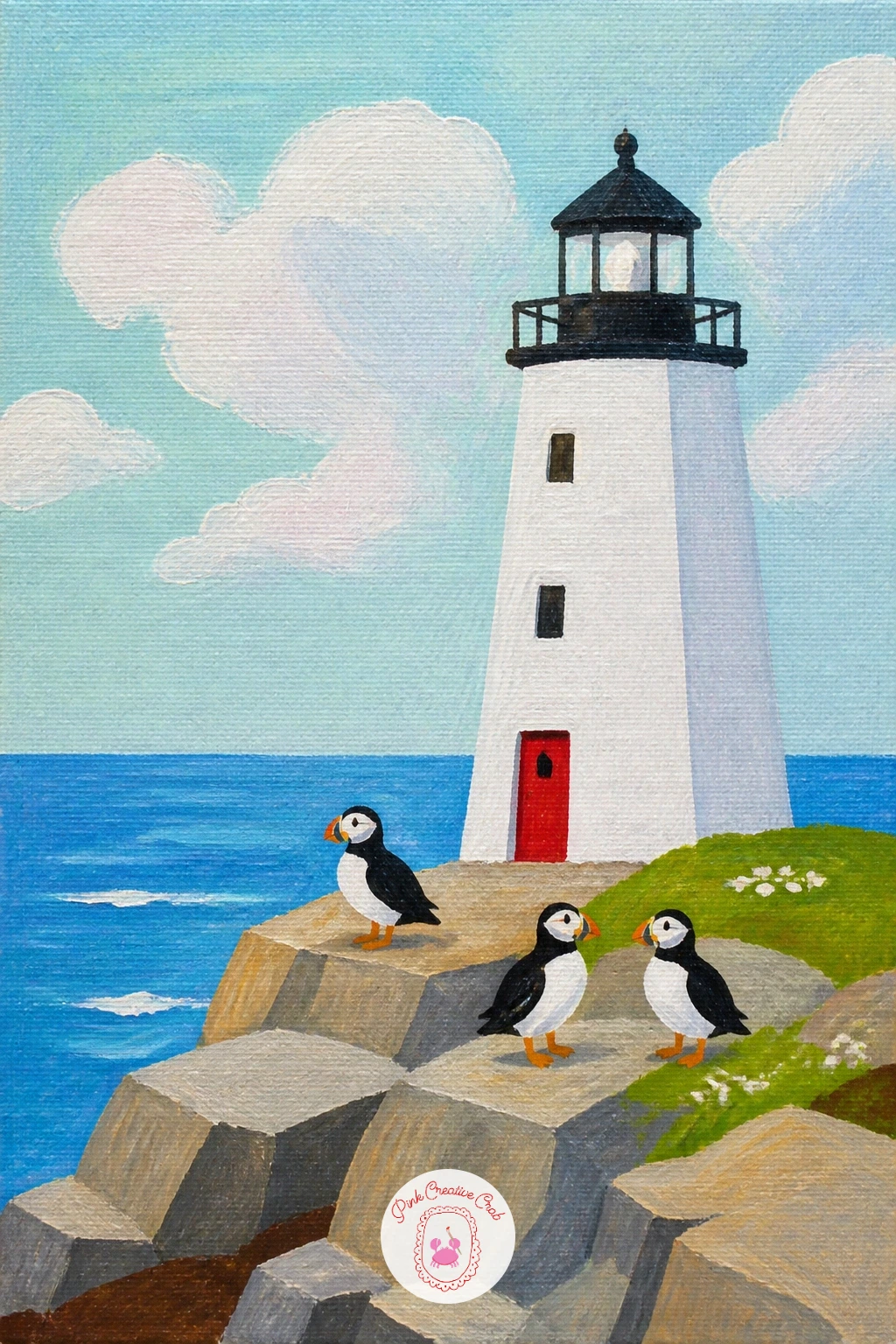
Palette: Payne’s Grey,Titanium White,Cadmium Orange,Warm Grey
Add a row of color beneath your tower with a lighthouse beside beach huts, a lively scene that pairs well with the pastel palette this whole style favors. Paint the lighthouse and sky first, then a simple strip of sand, before adding three or four small beach huts in a row along the foreground, each one just a rectangle with a flat or pointed roof.
Paint each hut a different bright flat color, keeping the row of colors cheerful but not clashing, maybe a soft blue, a coral, a yellow, repeating one of the hues near the lighthouse itself to tie the whole scene together. A single thin vertical line down the middle of each hut suggests a door without needing any real detail.
Huts painted all exactly the same height in a perfectly straight row can look stiff, so vary their height slightly and let the row curve gently rather than running dead straight, which also helps with the perspective back toward the lighthouse. If you enjoy this one, a quick look at how easy acrylic painting ideas for beginners handles flat shapes is worth a browse for more of this block-color approach.
If straight little roofs feel fiddly, simple flat-topped huts are just as charming and much quicker.
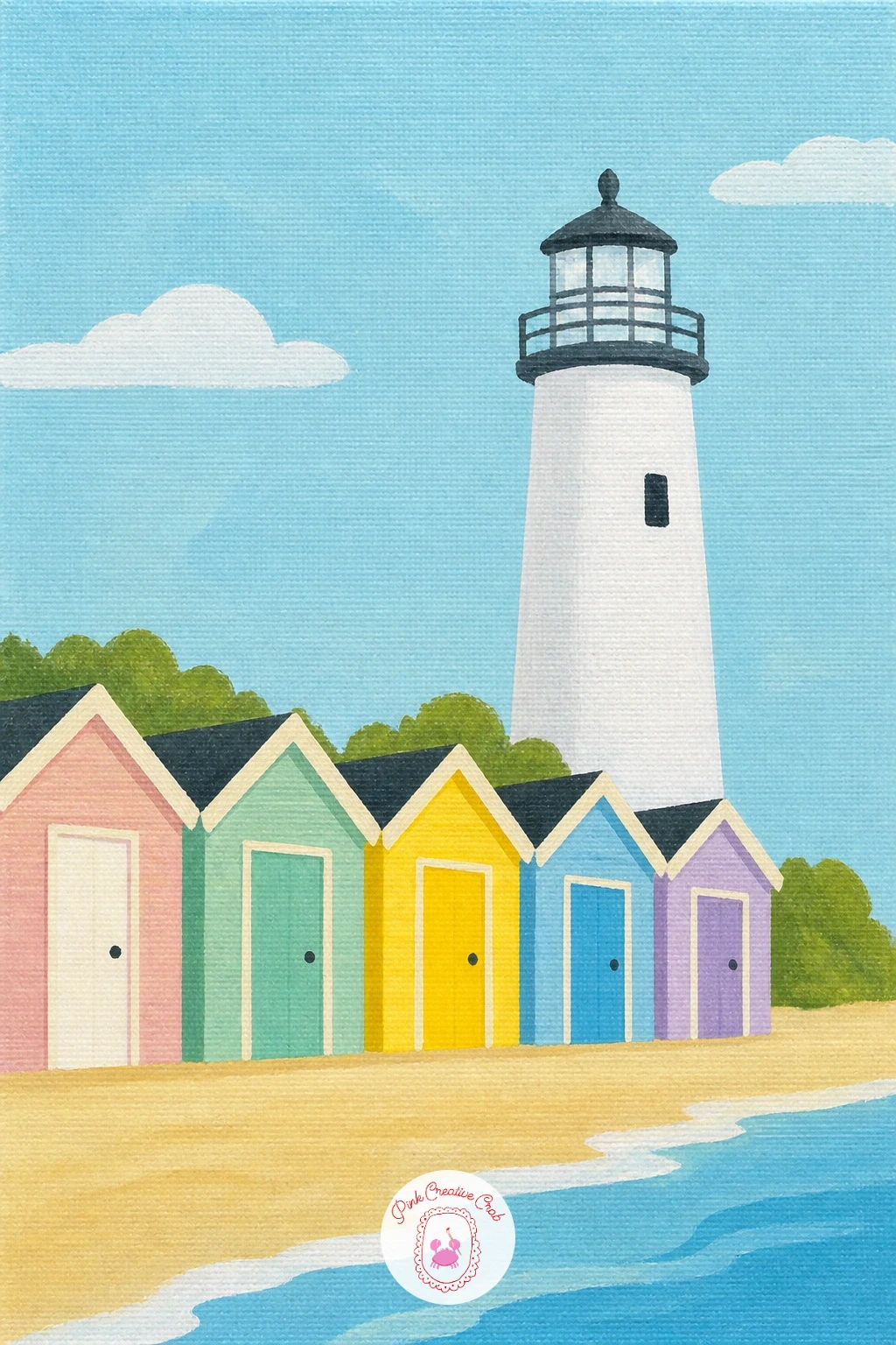
Palette: Coral,Cerulean Blue,Yellow Ochre,Titanium White
Water becomes a mirror in this one, so a lighthouse reflected at low tide rewards patience more than any new technique. Paint the lighthouse and sky exactly as you would normally, then paint a flat band of wet sand or shallow water beneath it, and let the lighthouse layer dry completely before starting the reflection.
The reflection itself is a loose, slightly stretched echo of the lighthouse painted directly below it, flipped upside down, using the same colors but a touch more muted and with soft wavy edges rather than the tower’s crisp outline. Dragging a dry brush horizontally through the wet reflection paint breaks up the shape just enough to read as water rather than a mirror image.
Reflections painted too sharp and identical to the original look like a sticker rather than water, so always soften and slightly distort the reflected shape. If yours comes out too neat, a few thin horizontal white lines dragged across it afterward settle it back into looking wet.
No dry brush technique practiced yet, a slightly damp sponge dabbed gently over the reflection gives a similar broken texture.
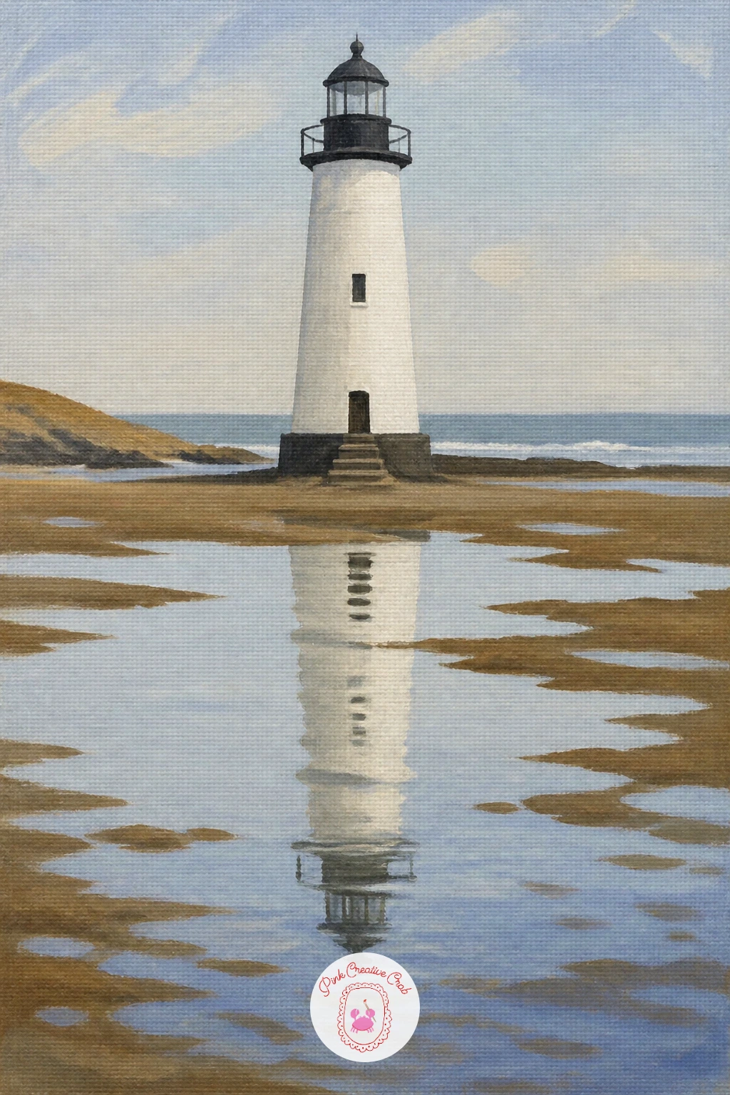
Palette: Cerulean Blue,Warm Grey,Titanium White,Payne’s Grey
Sometimes the smallest detail is the whole point, and a lighthouse with a red door proves that: paint a plain white or pale tower against a plain pastel sky, with nothing else in the scene at all, so the one bright red door at its base becomes the entire story. Paint the tower shape first, keep it simple and clean, and let it dry before adding the door.
The door is a small rectangle near the base, painted in a strong flat red with maybe one thin dark line down the middle to suggest it is slightly open or paneled. Because there is so little else competing for attention, take an extra moment getting that rectangle’s edges straight and its color flat and even.
This is a genuinely easy one to vary next time: paint the same simple tower again with a yellow door, then a blue one, and you quickly have a little set of lighthouse studies that look great grouped together on a shelf or wall.
Close with this tip for today: paint the door’s red slightly stronger and more saturated than anything else on the canvas, since it only works if it is clearly the brightest thing there.
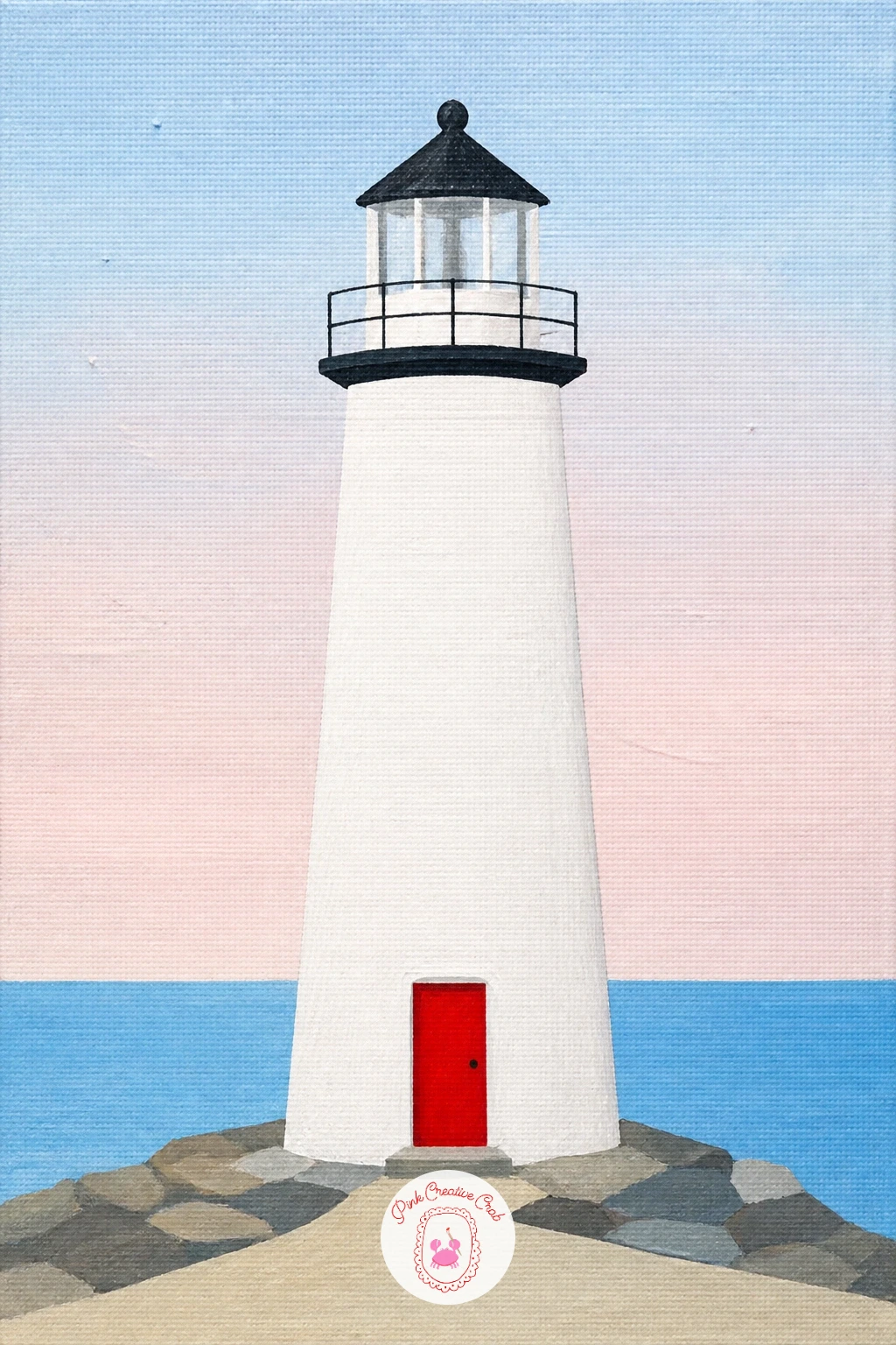
Palette: Titanium White,Cadmium Red,Pale Lilac,Payne’s Grey
Carry the seasonal idea a little further with a lighthouse in autumn grass, a scene that lets you use a warmer palette than most of the others on this list. Paint a soft pale sky first, then a hillside of grass in warm golden and rust tones rather than the usual green, before the lighthouse goes in on top.
Paint the lighthouse in its usual colors, then come back to the grass with a few looser, longer brushstrokes in a slightly darker rust color scattered through the lighter gold base, which reads as windblown autumn grass without needing individual blades. A few dried seed heads or tall grass stems, painted as thin dark lines with a small round top, add just enough texture near the front edge.
Working the grass from the back of the hill toward the front, making the strokes longer and the color a touch darker as they come forward, gives a believable sense of depth without any real perspective drawing. If the hillside looks too uniform afterward, a few scattered darker strokes break it up instantly.
A fan brush, dragged lightly, makes quick convincing grass texture if you want to skip painting individual blades.
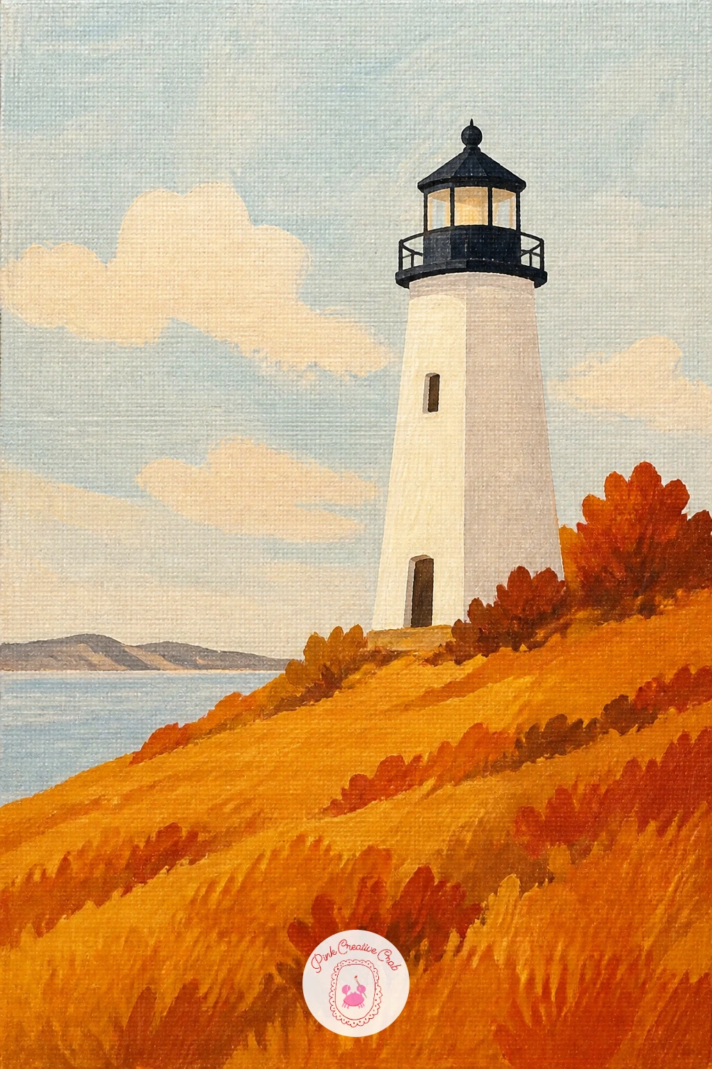
Palette: Yellow Ochre,Burnt Sienna,Titanium White,Payne’s Grey
Multiply the single sailboat idea from earlier into a lighthouse with a sailing regatta, a busier scene that still stays simple if you keep every boat the same basic shape. Paint the lighthouse, sky and sea first exactly as usual, then scatter five or six tiny white triangle sails across the water at varying distances and angles.
Vary only the size and tilt of each sail to suggest the boats are moving at different speeds and distances, rather than making each one a different shape, which keeps the regatta feeling unified rather than chaotic. A thin dark line under each sail for the hull is all the extra detail each boat needs.
Too many boats painted at exactly the same size all facing the same direction looks static rather than like a race, so tilt a few sails slightly and stagger their positions unevenly across the water. If the water starts to feel crowded, remove a boat or two rather than adding more.
If your sailboats need practice first, the simple hull and sail shapes used in bicycle watercolor painting ideas use a similar economy of line worth studying before you commit to a busier scene like this.
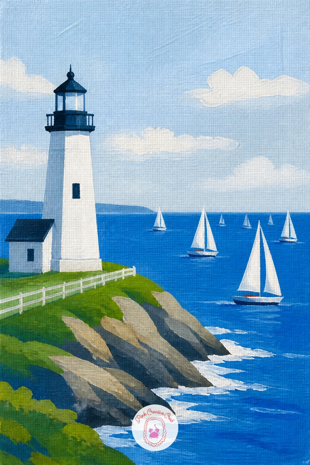
Palette: Titanium White,Cerulean Blue,Payne’s Grey,Cadmium Red
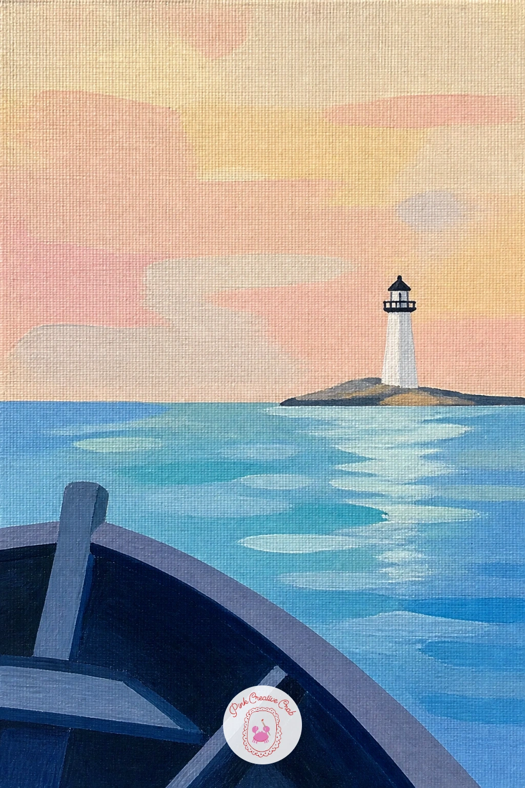
Flip the viewpoint entirely with a lighthouse seen from a boat, which changes your whole composition since now part of a boat’s deck or bow sits in the foreground looking out toward the tower. Paint the sky and lighthouse first, small and distant on the horizon, then the sea between the viewer and the shore.
The foreground boat detail can be as simple as a curved dark shape along the very bottom edge of the canvas, suggesting a bow or railing, with maybe a coiled rope or a single cleat painted as a small dark shape on top of it. Keeping this foreground element dark and fairly abstract, rather than a fully detailed boat interior, stops it from distracting from the lighthouse itself.
Eye level is the whole trick with this one: sitting low on a boat means your horizon line should sit higher in the composition than in the cliff or beach scenes earlier, with more sea visible above the foreground boat shape and less sky overall. If the scene feels unbalanced, raise or lower that horizon line until the lighthouse sits clearly above it.
A simple curved dark triangle in the bottom corner is often all the “boat” a scene like this actually needs.
Palette: Payne’s Grey,Cerulean Blue,Titanium White,Warm Grey
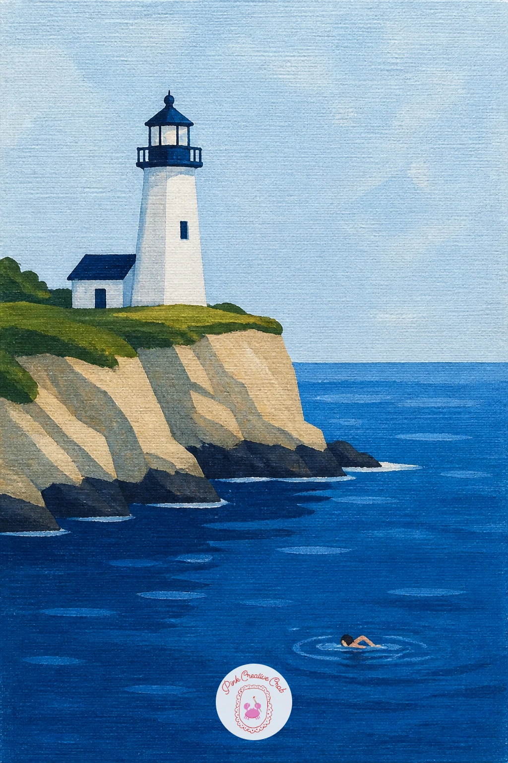
Bring a human figure right into the water with a lighthouse with a swimmer below, a scene that works on scale and a single confident shape rather than any real detail in the figure. Paint the lighthouse on its cliff or headland first, then the sea as usual, leaving a patch of open water in the middle distance for the swimmer.
The swimmer is just a small dark oval for the head, a short curved stroke for a raised arm mid-stroke, and a faint ripple of lighter paint around it, nothing more detailed than that is needed at this distance. Paint it after the sea has dried so the ripple strokes sit cleanly on top rather than blending into wet paint.
Keeping the swimmer genuinely small compared to the lighthouse is what makes this scene feel like open water rather than a shallow pool, so resist the urge to add more detail to the figure to make it clearer, smaller and simpler reads as farther away and more convincing. Measure the swimmer’s size against the lighthouse’s width, not its height, before you paint the final mark.
A single pale ripple ring, painted with a dry brush in a loose circle, says “water moving” far better than trying to paint individual waves around the figure.
Palette: Cerulean Blue,Payne’s Grey,Titanium White,Warm Grey
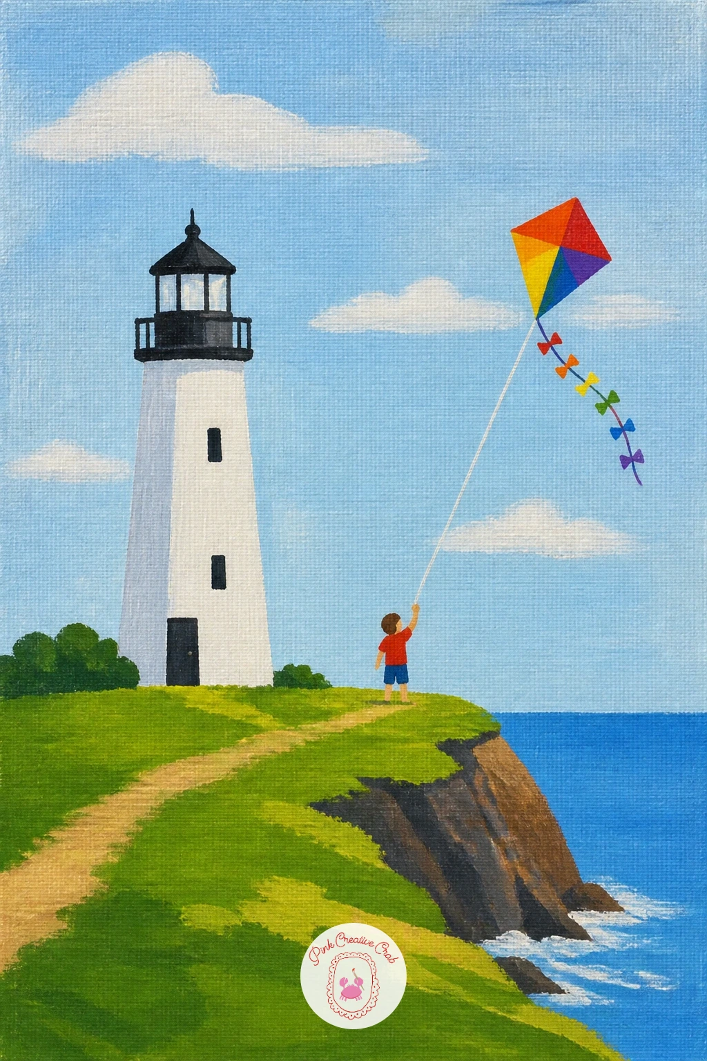
Close the series out on a breezy note with a lighthouse with a kite flyer, a cheerful final scene that adds one more small human moment to the cliff top itself. Paint the lighthouse and sky first, then a simple standing figure on the grass nearby, just a small dark silhouette with legs apart and one arm raised, no facial detail needed.
The kite is a simple diamond shape painted in a bright color up in the sky, connected to the figure’s raised hand by one thin curved string line, which can bow slightly in the middle to suggest wind. Painting that string last, in one single confident stroke rather than several short joined ones, keeps it looking like taut line rather than a shaky scribble.
If you want the quick ten-minute version of this scene, paint just the lighthouse, the figure and the kite with no tail or extra detail, then for the fuller forty-minute version add two or three short ribbon tails trailing from the kite’s bottom point, each a thin curved stroke in alternating colors.
A ruler held loosely as a guide, rather than pressed flat, gives the kite string a gentle natural curve instead of a perfectly straight line.
Palette: Cerulean Blue,Cadmium Red,Yellow Ochre,Payne’s Grey
What to Do Next
Pick whichever lighthouse scene matches your mood today, set up a small canvas, and block in the sky first before anything else touches it. One finished painting is all it takes to want to start the next one from this list.
Frequently Asked Questions
What kind of canvas works best for a lighthouse painting like these?
A small stretched canvas, around eight by ten inches, works best because it keeps the tall tower shape manageable in one sitting. Anything larger makes flat color blocks harder to keep even for a beginner.
Do I need to sketch the lighthouse first before painting?
A light pencil sketch helps, especially for the tower’s proportions and any straight piers or horizon lines. Keep it simple, just the main shapes, since acrylic covers pencil marks easily as you paint over them.
How do I keep my lighthouse stripes neat without tape?
A ruler held steady as a painting guide gives nearly the same crisp edge as tape if you work slowly with a loaded round brush. Painting each stripe in one smooth pass, rather than going back over it, also helps.
What is the easiest lighthouse scene to start with as a complete beginner?
The red and white lighthouse on a cliff or the lighthouse with a red door are the simplest starting points. Both rely on flat shapes and one bold color accent rather than any tricky brushwork.
How do I stop my acrylic paint drying out before I finish a section?
Work in small batches of paint and mist your palette lightly with water between colors if it starts to skin over. A stay-wet palette, if you have one, keeps acrylic workable for a whole painting session.
Have any thoughts?
Share your reaction or leave a quick response — we’d love to hear what you think!
-
 0
-
0
-
0
-
0
-
0
-
0


