

Forest painting gives you the best of landscape work without the fuss of a whole sky or a stretch of ocean to fill. A few trunks, some canopy, a patch of light on the ground and you already have a scene, which makes it a forgiving place to practice color blocking and composition in acrylic.
Below you will find thirty one forests, one per season and one per mood, each built around a single point of interest: a cabin, a tent, a bridge, a person on the path. Pick whichever one matches the canvas on your table right now and you can have it finished before the light changes outside your own window.
Using these images: free for personal projects such as printing, coloring, cards, journals and gifts. Handmade items that include them may be sold up to 30 pieces per design. More than that is commercial use and is not permitted, and neither is selling or sharing the images themselves or passing them off as your own. Please ask before any other use.
Start with the sky, because everything else sits on top of it. Block in a pale peach to lavender gradient behind the trees, then while it is still workable, blend in some soft white near the horizon to suggest the mist burning off.
Paint the furthest row of pines as flat, pale blue green silhouettes, then a middle row a shade darker, and save your deepest pine green for the trunks closest to the viewer. This layering is what sells the distance, so resist the urge to make every tree the same tone.
Add two or three narrow, almost straight bands of pale yellow light cutting down through the trees at an angle, slightly fanning out as they near the ground. If the rays look too solid, soften their edges with a dry brush loaded with the sky color.
If you only have one green on your palette, mix white into it in three steps to get your three distance values instead of buying more paint.
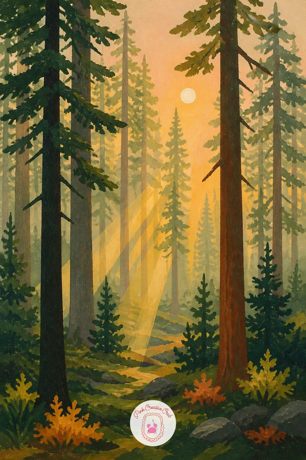
Palette: Titanium White,Hooker’s Green,Payne’s Grey,Naples Yellow
Mossy path paintings live or die on the curve, so sketch the path first as a simple S shape narrowing toward a vanishing point between the trees, not a straight line down the middle of the canvas. That single curve carries the whole sense of depth.
Block the path in a warm terracotta brown, then paint the tree trunks as tall narrow shapes on either side, taller and closer together near the front edge of the canvas and shorter toward the back. Keep the trunks flat dark brown or grey green, no bark texture needed at this level.
Dab moss onto the path edges and the base of the trunks with a small flat brush loaded with two greens, a mustard green and a deeper pine green, pressed on rather than stroked, so it reads as clumps rather than a smear.
If your brush is too wet, blot it on a paper towel first. A drier brush gives you a better moss texture than a loaded one.
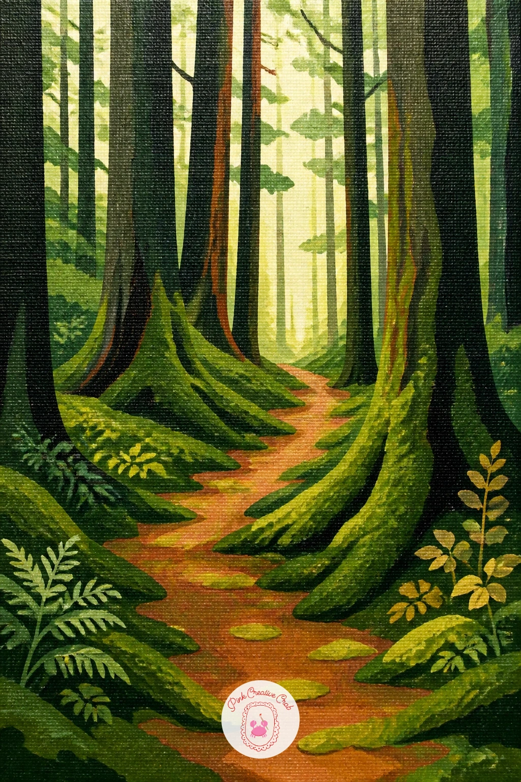
Palette: Burnt Sienna,Sap Green,Olive Green,Payne’s Grey
Give the cabin the smallest footprint on the canvas and let the pines do most of the work around it, since a cabin that is too large stops reading as “in the forest” and starts reading as a building portrait. A simple rectangle with a triangle roof is enough.
Paint the pines first as flat dark green silhouettes behind and beside the cabin, then paint the cabin itself in warm brown with a mustard yellow glow at the one window. Add the chimney last, a short grey rectangle with a thin curl of pale grey white smoke drifting up and sideways.
The smoke is the part people overwork. Use a dry, almost empty brush and just one or two soft curved strokes; more than that and it stops looking like smoke and starts looking like a cloud stuck to the roof.
If you want a quicker painting, skip the window glow and let a plain dark cabin against bright pines carry the whole piece.
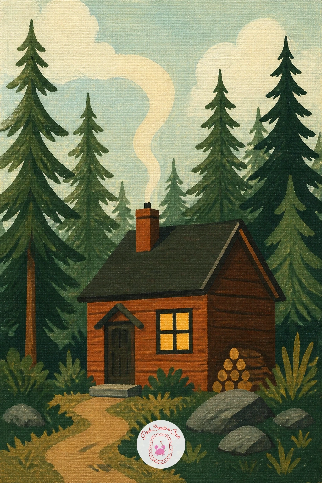
Palette: Burnt Umber,Hooker’s Green,Mustard Yellow,Titanium White
Try this one on a square canvas. The centered cabin and symmetrical pines on either side suit a square format better than a wide rectangle.
Give yourself a clearing before you touch the tent: a loose oval of warm green grass left lighter than the surrounding tree shadow, so the tent has somewhere to sit. Paint the ring of trees around the edge of the canvas first, darker at the base and slightly lighter where the canopy opens to sky.
Drop the tent in as two or three flat triangular planes, a brighter red facing the light and a deeper red brown in shadow. This is your point of interest, so it can be the most saturated color on the whole canvas.
Finish with a short dark line for the guy rope and a tiny dot of grey for a tent peg, then scatter a few short dry brush strokes of yellow green in the grass for texture. Too much detail in the grass competes with the tent, so stop at a handful of strokes.
No cadmium red on hand works fine with a mix of alizarin crimson and a touch of orange instead.
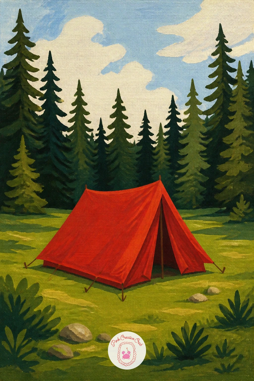
Palette: Cadmium Red,Alizarin Crimson,Sap Green,Yellow Ochre
Measure before you paint a single trunk. Hold your brush handle up at arm’s length against the canvas and check how many brush widths apart your birches should stand, then mark their positions lightly so they are not evenly spaced like fence posts, which flattens the whole painting.
Paint the gold autumn canopy first as a loose flat shape across the upper half, then add the white trunks on top, each one a narrow vertical stroke with short dark grey horizontal dashes for the bark markings. Vary the dash spacing from tree to tree.
Birches go wrong when the trunks come out perfectly straight and perfectly white. Let one or two lean slightly and warm the white with a touch of yellow ochre where the autumn light hits them.
If gold paint feels too bright, mix yellow ochre with a little white rather than reaching for a pure cadmium yellow.
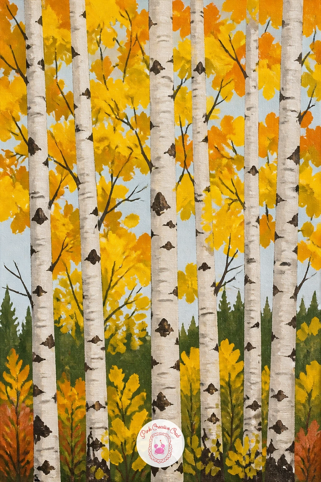
Palette: Titanium White,Payne’s Grey,Yellow Ochre,Burnt Sienna
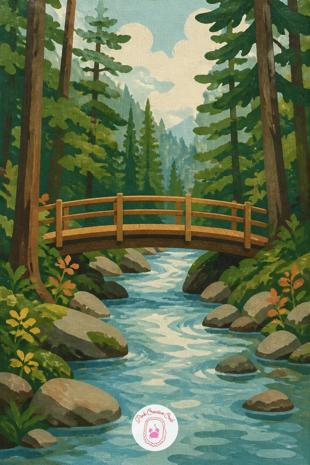
Set your eye level low, roughly a third of the way up the canvas, so you are looking slightly up at the bridge rather than down on it. That low viewpoint makes the bridge feel close and walkable rather than like a model on a table.
Paint the stream first as a pale blue grey band curving from one side of the canvas to the other, then build the bank and trees around it in your usual layered greens. The bridge goes in last: two simple wooden rails on posts, angled to match the low eye level, crossing the stream at its narrowest point.
Keep the water reflections as a few horizontal dry brush strokes under the bridge rather than a mirror image of it; a full reflection is fiddly and rarely worth the effort at this scale.
If straight rails wobble under your brush, lay a strip of painter’s tape along each rail line and paint right over the edge for a crisp result.
If you enjoy bridges and running water together, the ideas in this waterfall painting list give you more ways to handle moving water.
You Will Need
- painter’s tape for the rail lines
Palette: Burnt Umber,Payne’s Grey,Sap Green,Titanium White
Build this one from the ground up instead of the sky down, because the bluebell carpet is the whole point. Block a soft violet blue across the lower half of the canvas first, then paint the beech trunks standing in it as tall smooth grey columns, thicker at the base.
Once the trunks are dry, go back into the blue carpet with short upward dabs of a slightly lighter violet and a touch of white, working in loose diagonal drifts rather than an even scatter, the way real bluebells grow in patches.
The canopy above can stay simple: a flat fresh green with small gaps of pale sky showing through. If the bluebells end up looking like a solid blue lawn, break up the carpet with a few taller strokes of green grass poking through.
Swap violet for a mix of ultramarine and a touch of alizarin crimson if you do not keep a tube of violet on hand.
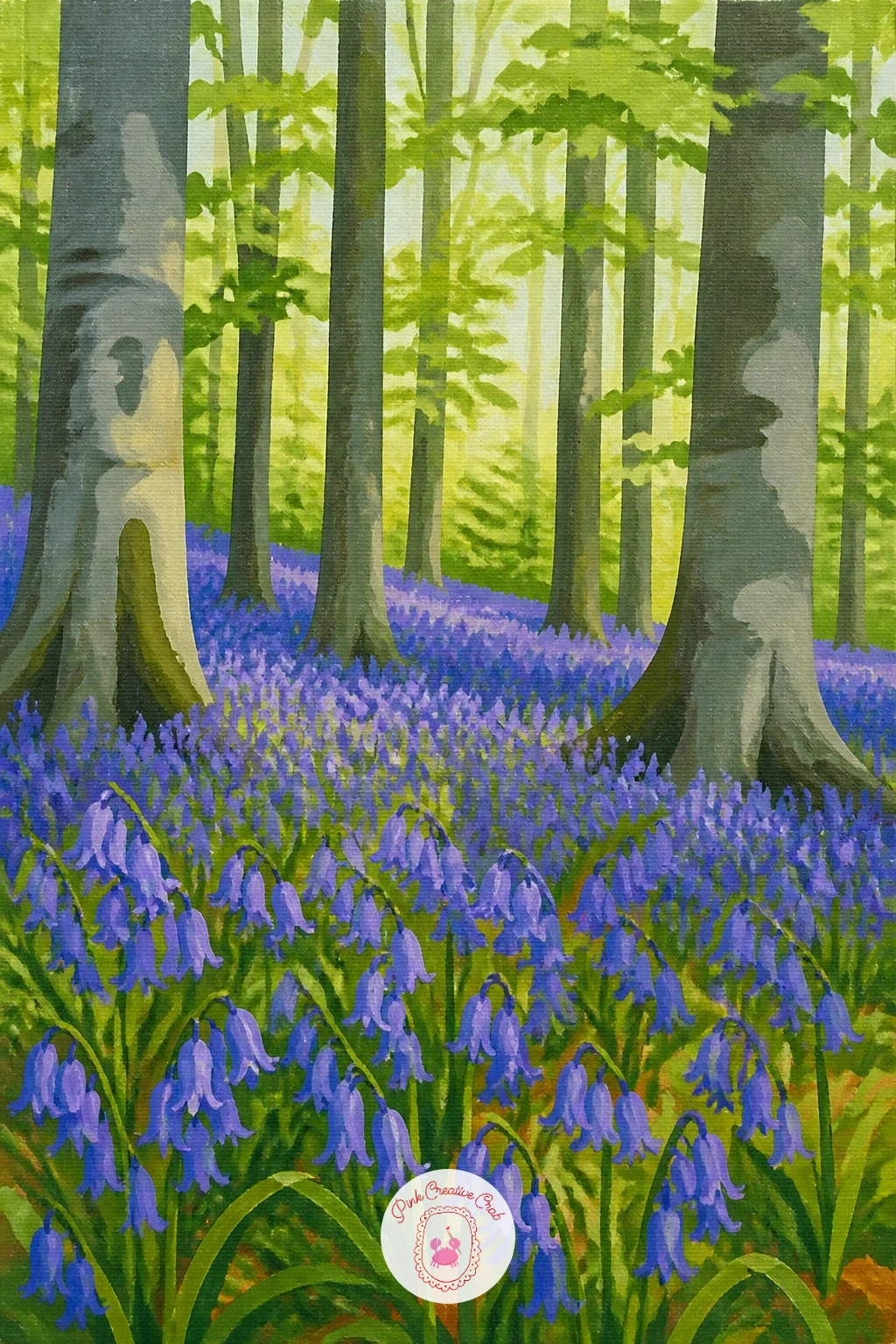
Palette: Ultramarine Blue,Violet,Sap Green,Titanium White
Place the figure off center, about a third of the way in from either edge, and let the ferns around her knees do most of the detail work so she stays the clear focal point. A simple standing pose, walking stick legs and a rounded hood, reads perfectly well at this scale.
Paint the ferns first as loose fan shaped clusters of two greens, then add the figure on top once they are dry. Keep her raincoat as two or three flat yellow shapes, a brighter tone catching the light on one side and a deeper mustard yellow in shadow on the other.
Faces are easy to overdo here. Leave hers as a simple pale shape under the hood with no features, or just a hint of a nose and chin, and let the bright coat carry the whole figure instead.
If yellow raincoats feel too cheerful for your palette, a deep red coat works just as well as the single warm accent against the ferns.
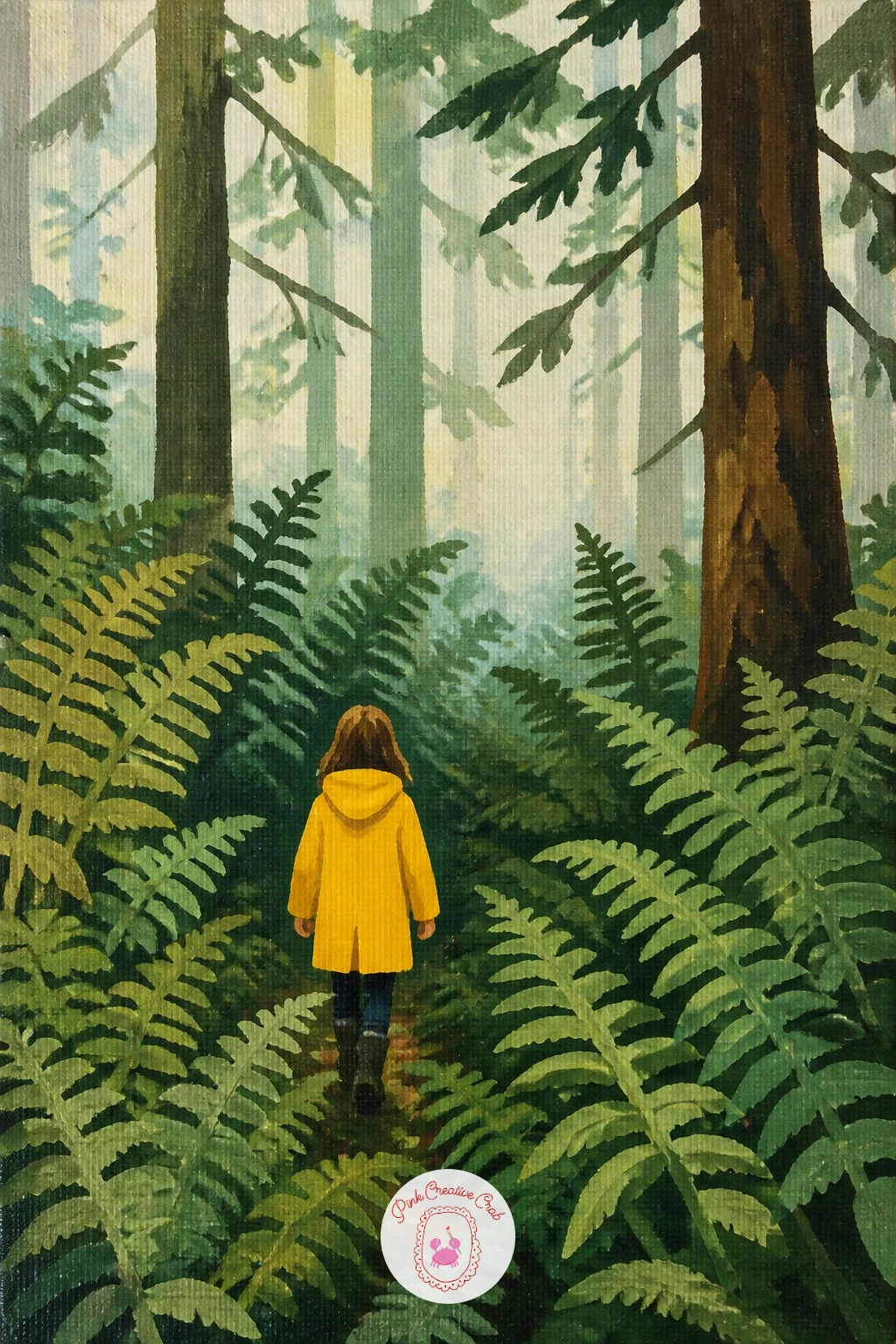
Palette: Cadmium Yellow,Mustard Yellow,Sap Green,Olive Green
Split the canvas in half with a single horizontal line for the waterline, then paint everything above it, the pines and pale sky, before you touch the water at all. This keeps the two halves honest mirrors of each other rather than two unrelated paintings stacked up.
Flip the exact same pine and sky colors below the line, but flatten the brushstrokes into horizontal bands rather than the vertical pine shapes above, since water reads as reflection through direction of stroke as much as color.
Add a few short, slightly wavy dry brush lines in pale blue white across the water to break up the reflection and suggest gentle ripples. Too many of these lines and the lake stops looking calm, so three or four strokes is usually plenty.
If the reflected colors come out too perfectly matched, mute the ones below the waterline very slightly with a touch of grey; water never reflects quite as brightly as the sky itself.
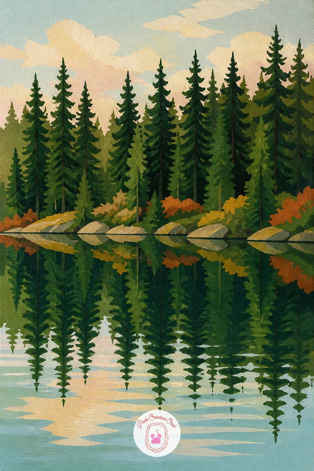
Palette: Hooker’s Green,Payne’s Grey,Titanium White,Cerulean Blue
Lay the log along a diagonal across the lower third of the canvas rather than straight across, which gives the composition more movement than a log lying perfectly horizontal. Paint it as a simple rounded cylinder shape in warm grey brown, darker along the underside.
Once the log is dry, dab moss onto its upper surface with a dry, stiff brush loaded with yellow green, pressing straight down rather than dragging, so the texture comes from the brush itself rather than from painted detail.
Add three or four tiny mushrooms along the top edge of the log, each one just a small white or cream dome on a thin pale stem, grouped in twos rather than spaced evenly. Clustering them this way reads far more naturally than a neat row.
If the moss ends up too flat, lift a little paint off the highest points with a slightly damp cloth while it is still wet to let the warm wood show through.
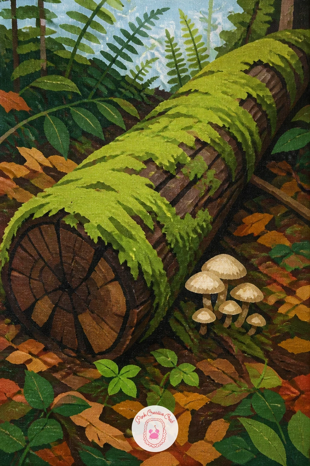
Palette: Burnt Umber,Olive Green,Titanium White,Raw Sienna
Scale is the entire idea here, so set it up before you paint anything else: pencil in the hiker first as a tiny figure no taller than one of your fingernails, standing at the base of the canvas, then build the trunk up from there at a scale that makes it tower over them.
Paint the trunk as a single wide, slightly tapering column in deep red brown, with a few long vertical strokes of a darker tone for the bark ridges. Let it run off the top of the canvas rather than showing the crown of the tree, which reinforces just how tall it is.
Keep the hiker simple, a small dark silhouette with a backpack bump, since any more detail at that size will only look muddy. The contrast between the huge flat trunk and the tiny figure is what makes the painting work.
If you are short on deep red paint, burnt sienna mixed with a touch of Payne’s grey gives a convincing redwood bark color.
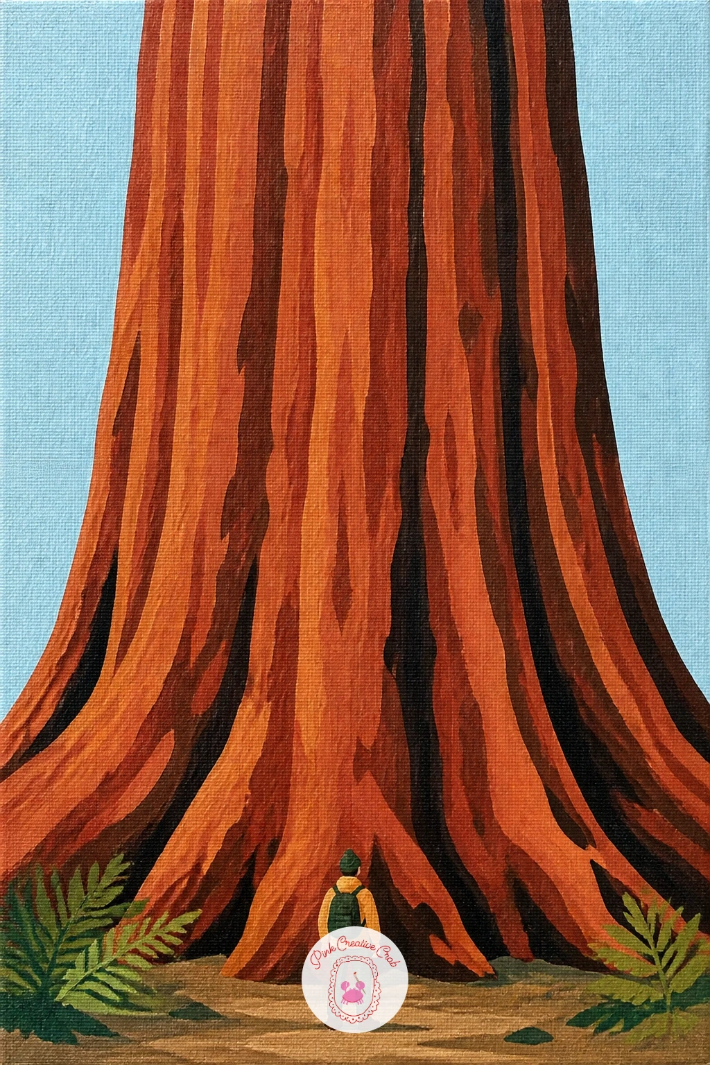
Palette: Burnt Sienna,Payne’s Grey,Raw Umber,Titanium White
Keep the sky light here, a pale blue white or soft lavender, since a snowy scene reads as cheerful rather than cold once the sky stays bright. Block the snow-covered ground first as a flat pale blue white shape sweeping across the lower half of the canvas.
Paint the pine trunks as simple dark vertical shapes with soft white snow caps sitting on the branches, built with a few confident dabs of titanium white rather than an even dusting over everything. Leave some dark green showing through so the trees do not disappear into the snow.
Lean the red sled against one trunk near the front, a simple curved runner shape under a flat rectangle seat. That one bright warm shape against all the cool blues and whites is what gives the painting its point of interest.
If pure white paint looks too stark against your sky, warm it very slightly with a touch of yellow ochre before you paint the snow caps.
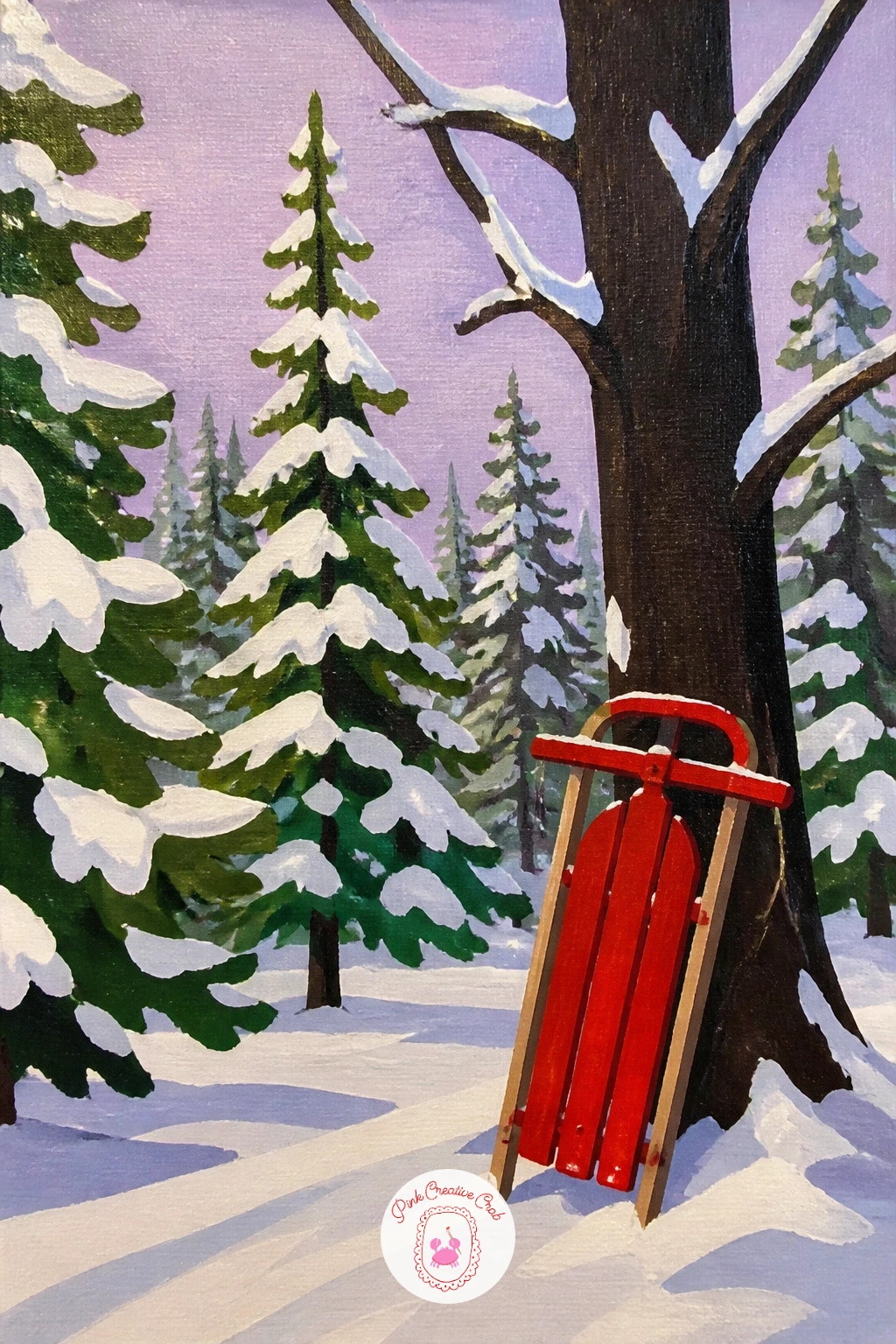
Palette: Titanium White,Cerulean Blue,Hooker’s Green,Cadmium Red
For more cold weather forest scenes in this palette, the ideas in this winter forest painting list build on the same snowy mood.
Build the road as a simple path of perspective lines, converging toward a point roughly a third of the way up the canvas, before the trees go in at all. A road that narrows correctly does more to create depth here than any amount of detail in the leaves.
Paint the maple canopies on either side as loose, rounded flat shapes in warm orange and red, arching slightly inward so their outer branches nearly meet above the road. Keep the trunks themselves narrow and mostly hidden behind the canopy color.
Scatter a handful of fallen leaf shapes along the dirt road in the same oranges and reds, just simple short dashes of color rather than individually painted leaves, which keeps this section quick without looking empty.
If you want the ten minute version, stop after the canopy and road; the forty minute version adds the scattered leaves and a soft dry brush haze of orange light where the road vanishes into the distance.
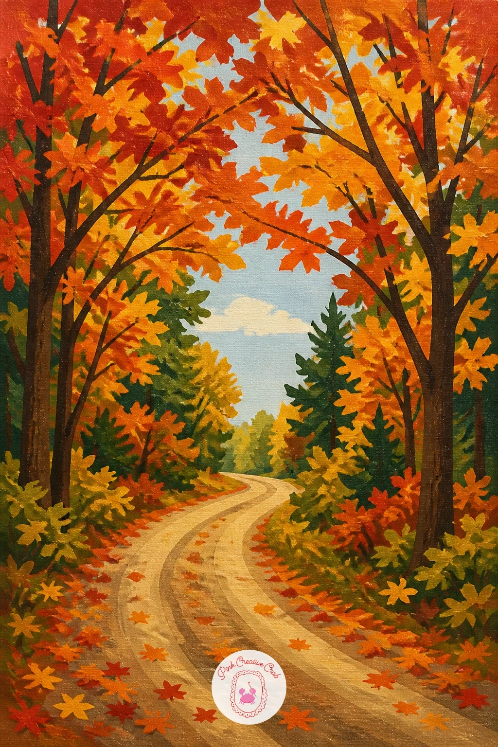
Palette: Cadmium Orange,Alizarin Crimson,Raw Umber,Yellow Ochre
Rough in the oak’s canopy as one large soft cloud shaped mass before you place a single branch, since the treehouse needs to sit convincingly inside that shape rather than floating in front of it. A flat mid green works fine for this first layer.
Paint the trunk and one or two thick main branches in dark brown, then set the treehouse into a fork in the branches, a small simple box shape with a peaked roof and a tiny window, painted in warm weathered wood tones. A thin dark line for a rope ladder hanging down finishes the structure.
Go back into the canopy around the treehouse with slightly lighter green dabs to suggest gaps where light gets through, which helps the structure read as nestled into the leaves rather than stuck on top of them.
If the treehouse window looks flat, add one small triangle of warm yellow inside it to suggest light within, the same trick used for the cabin earlier in this list.
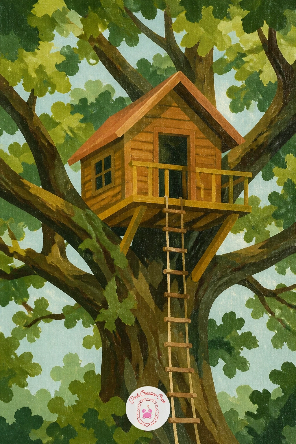
Palette: Hooker’s Green,Burnt Umber,Raw Sienna,Mustard Yellow
Sketch the waterfall first as a simple vertical band, slightly wider at the top than where it meets the pool below, since water narrows as it falls and this small taper makes a big difference to how convincing it looks.
Paint the dark rock walls of the gully on either side before the water itself, then come back with vertical strokes of pale blue white for the falling water, leaving thin ragged edges where it meets the rock rather than a clean straight line.
Once that layer is dry, drybrush a few short horizontal white strokes at the base where the water hits the pool, to suggest spray and foam. This is the trick that saves a flat looking waterfall: a little texture only at the point of impact, left smooth everywhere else.
Line the gully with a cluster of fern fronds in two greens along the rock edges, which also softens any hard lines left from the rock color underneath.
The full run of ideas in this waterfall painting list is worth a look if gullies and falling water are your favorite part of forest scenes.
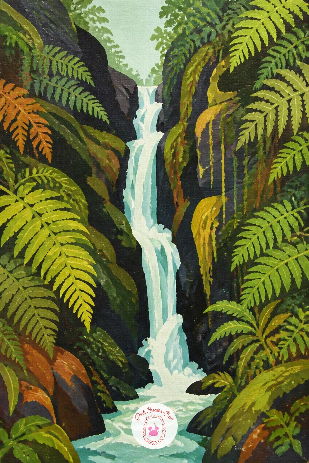
Palette: Payne’s Grey,Titanium White,Sap Green,Hooker’s Green
Give the trunk the whole height of the canvas, a single wide vertical column in warm grey brown, with a few long dark strokes for bark texture running the length of it rather than scattered all over.
Place the woodpecker about a third of the way up, in profile, clinging to the bark with simple stick-like feet. Block it in as two or three flat shapes, black and white body, a flash of red on the head, before adding the beak as one small triangle pressed against the bark.
The eye of the viewer should land on that red head flash first, so keep every other color in the painting slightly muted by comparison. If your red looks too orange next to the black and white, a touch of alizarin crimson cools it down.
If you would rather skip the bird, a simple round knot hole in the same spot on the trunk makes a fine point of interest on its own.
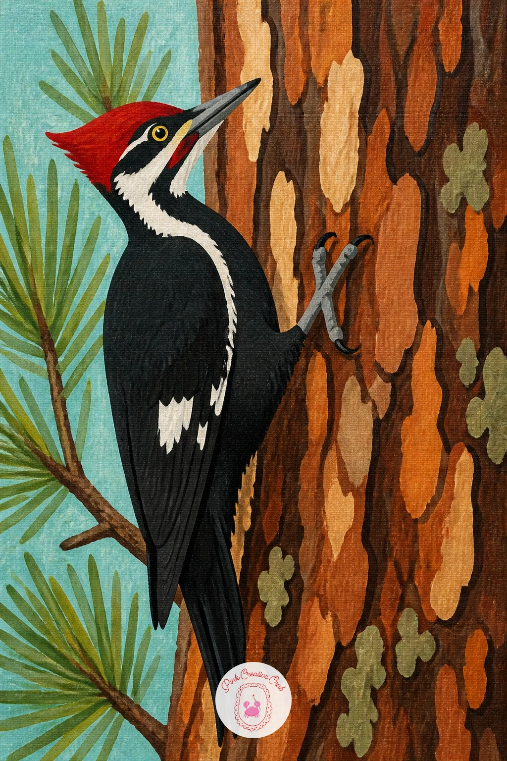
Palette: Burnt Umber,Titanium White,Mars Black,Cadmium Red
Set the eye line low again here, so the viewer feels like they are standing right at the treeline looking out, rather than hovering above the scene. Paint the dark tree trunks as a tall irregular band down one side and across the top of the canvas, framing the opening rather than filling it.
Block the field beyond as a warm pale green meadow running to a soft horizon, then scatter the wildflowers as small dabs of color, reds, yellows, whites, loosely clustered rather than spread evenly, thinning out as they recede into the distance.
The spot this goes wrong is the transition itself: if the dark forest edge meets the bright field too cleanly, it looks like two separate paintings taped together. Soften that line with a few short strokes of mixed color right along the boundary.
If you enjoy painting flower fields on their own, the ideas in this acrylic flower painting list give you plenty more ways to handle that meadow detail.
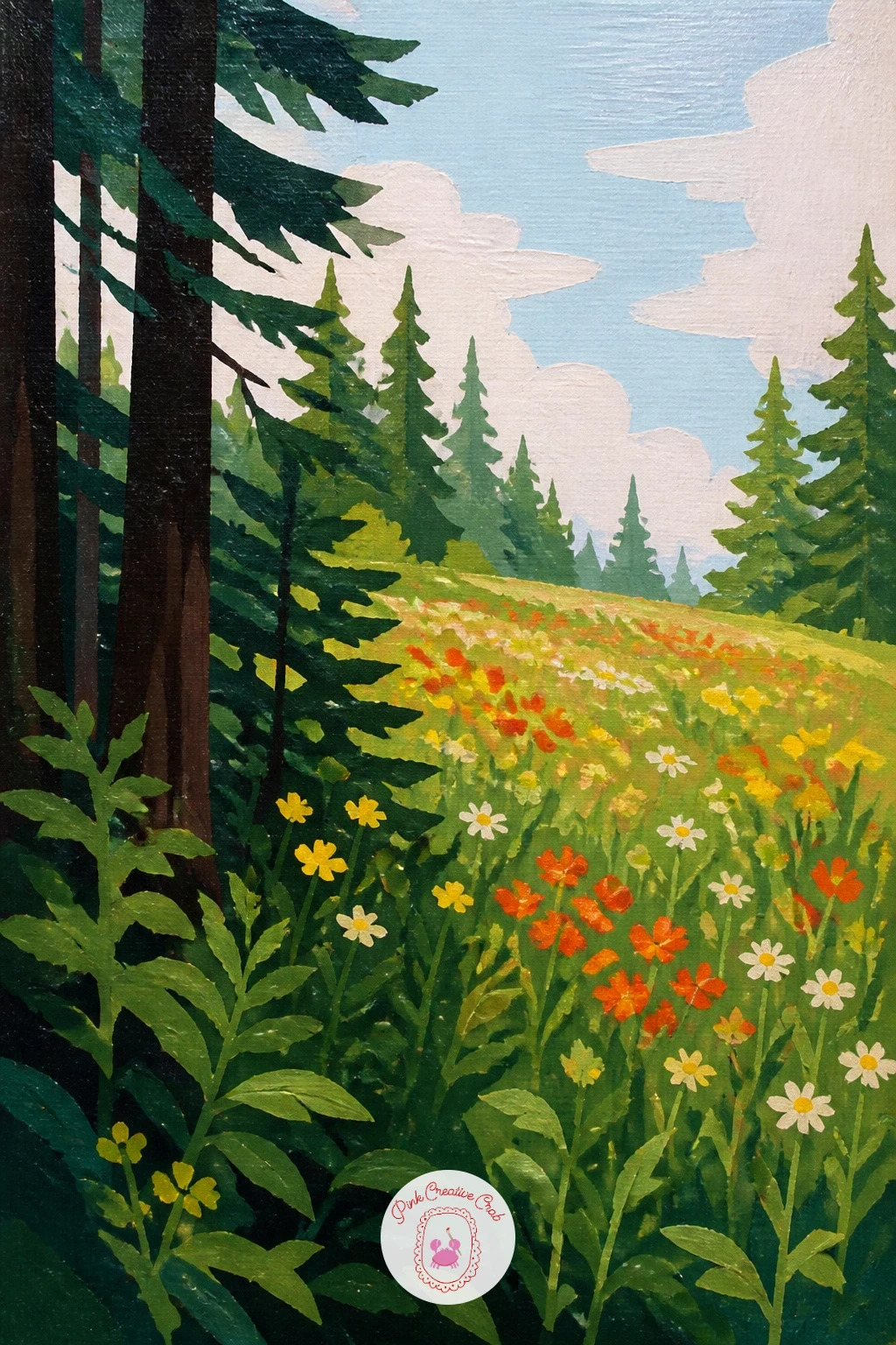
Palette: Hooker’s Green,Sap Green,Cadmium Red,Cadmium Yellow
Look down on this one instead of across it: set your horizon very high, near the top edge of the canvas, almost a bird’s eye view, since that change in eye level is what turns an ordinary pine forest into something more dramatic.
Paint the forest as a dense flat carpet of overlapping pine canopy shapes in varying greens, textured with small rounded dabs rather than tall tree silhouettes, since from above you see tops of trees, not trunks. Leave the river for last.
Cut the river through the canopy as a curving pale blue band, wider in the foreground and narrowing as it winds toward the high horizon, with a few short white dashes along its edge for light catching the water.
If the canopy dabs start looking repetitive, vary your brush size every few dabs, a mix of small and slightly larger strokes reads far more like a real forest canopy than one uniform texture.
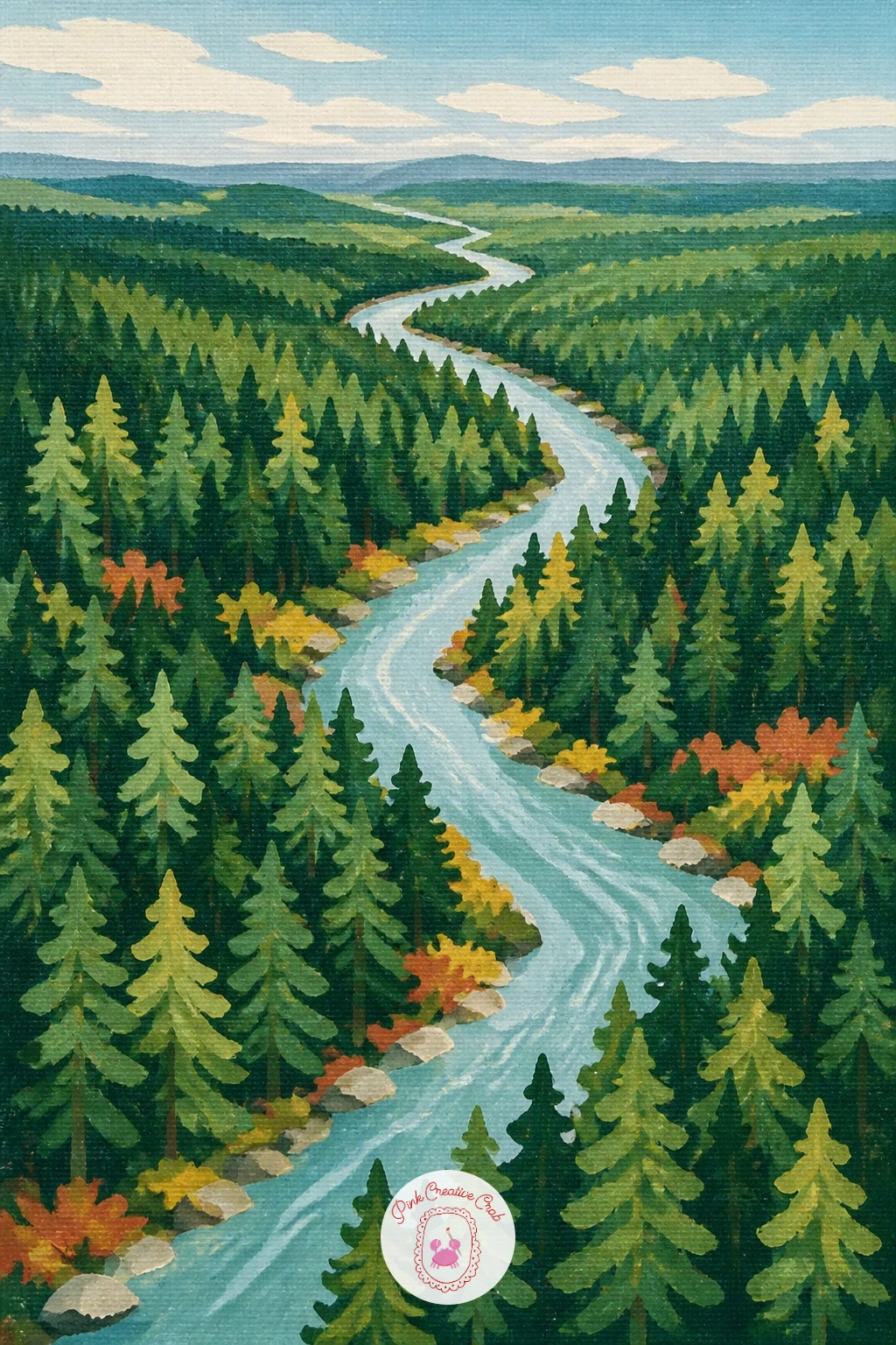
Palette: Hooker’s Green,Sap Green,Olive Green,Cerulean Blue
Mix your pastel dusk sky before anything else, a soft gradient of lavender into peach, and let it dry fully before you add a single tree, since any wet blending into the dark pines will muddy that clean pastel color immediately.
Paint the pines as simple dark silhouettes lining both sides of a curving path, then add the cabin as a small warm shape in the distance at the end of that path, its one window glowing.
Place two or three small lanterns along the path itself, each just a tiny warm yellow dot with a soft glow painted around it using a slightly damp brush to blur the edge. These glowing dots are what carry the eye down the path toward the cabin.
If the lantern glow looks too hard-edged, soften it further with your fingertip while the paint is still workable, a trick that works especially well on acrylic before it sets.
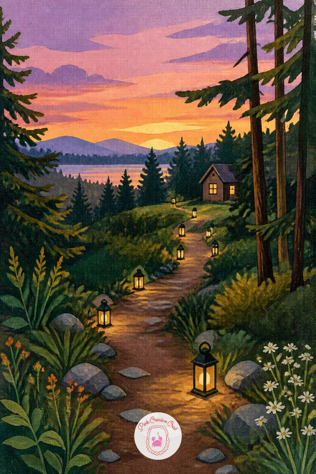
Palette: Lavender,Peach,Payne’s Grey,Mustard Yellow
Choose your two trunks first and space them with the hammock’s curve in mind: close enough that the hammock sags into a clear U shape, not so close that it looks cramped. Paint both trunks as simple vertical columns before the hammock goes anywhere near the canvas.
Block the hammock in as a single curved shape in warm cream or soft stripe colors, hanging lower in the middle and attached to each trunk with a short straight rope line. Keep the stripes, if you add them, to two or three bands rather than a dozen thin ones.
Dappled light is the natural companion to this scene, so once the hammock is dry, scatter a few soft yellow green dabs of light across it and the ground beneath, as if sun is coming through gaps in the canopy above.
If stripes feel fiddly at this stage, a plain cream hammock with just the dappled light on top reads just as well and finishes faster.
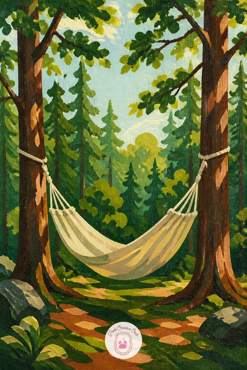
Palette: Cream,Terracotta,Sap Green,Mustard Yellow
Let the light source sit high and slightly behind the trees, which means your brightest greens belong near the top of the canopy, fading to deeper greens lower down where less light reaches. Set this up with a loose gradient before any leaf detail goes in.
Paint the beech trunks as smooth pale grey columns rising up through that gradient, thinner and closer together than the oaks or pines elsewhere on this list, since young spring beech reads as slender and upright.
Add the fresh leaf canopy with small rounded dabs of bright yellow green near the top, shifting to a cooler green further down, leaving small gaps of pale sky showing through here and there to suggest the light breaking through.
If the canopy ends up too solid, go back in with the tip of a round brush and pick out a few extra gaps of sky color once everything else is dry.
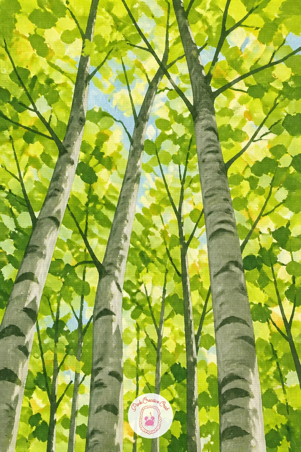
Palette: Chartreuse,Sap Green,Titanium White,Payne’s Grey
Give the stump a flat top and a slightly rounded edge, painted in warm brown with visible growth rings sketched on top as a few thin curved lines, since a stump without any ring detail can read as a plain brown box.
Rest the backpack on top as two or three simple rounded shapes, a main body and a smaller front pocket, in a color that contrasts with the brown stump and green surroundings, terracotta or deep mustard work well. Keep the straps as thin dark lines hanging down one side.
Build the trail and trees behind as a simple soft focus background, slightly looser brushwork than the stump and backpack in front, which helps the point of interest stay sharp and close while the forest recedes behind it.
If you want this one finished quickly, the ten minute version stops at the stump and backpack alone against a plain green wash; the forty minute version adds the layered trail and trees behind.
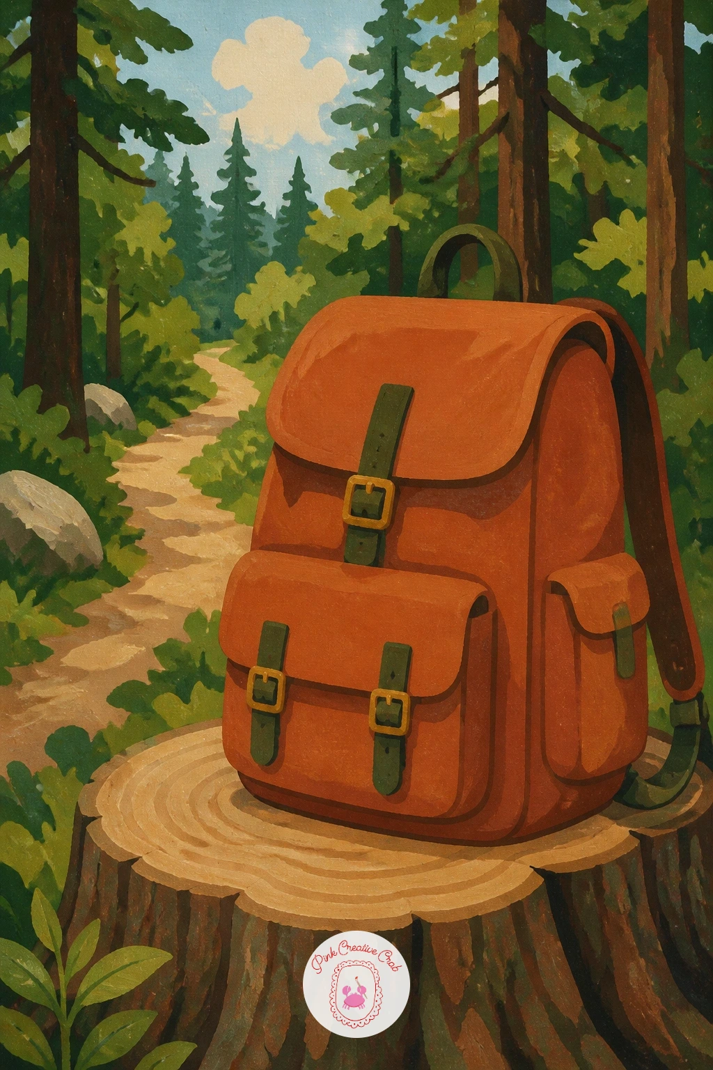
Palette: Burnt Umber,Terracotta,Sap Green,Olive Green
Build the clearing as a simple bright patch of grass surrounded by darker trees, the same approach used for the tent idea earlier, since a clearing reads instantly once there is a clear value jump between the open middle and the shaded edges.
Paint the stump first, flat on top, then set the picnic basket on it as a woven brown box shape with a curved handle and a checked cloth draped over one side, painted as two or three simple diagonal stripe blocks rather than a full checkerboard pattern.
Scatter a small cluster of wildflowers at the base of the stump to tie it into the surrounding clearing, using the same quick dab technique from the wildflower field idea earlier in this list.
If the checked cloth pattern feels fussy, a plain red or cream cloth with one fold line still reads clearly as a picnic cloth from across the room.
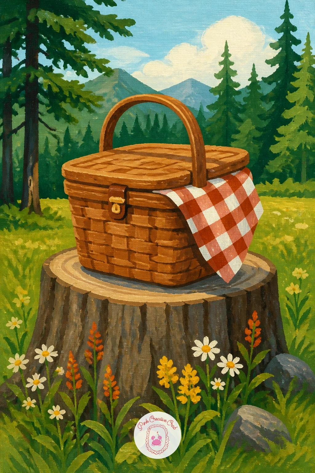
Palette: Burnt Sienna,Cadmium Red,Sap Green,Cream
Keep this one almost monochrome before the umbrella goes in: block the whole canvas in soft layered greys and pale greens, trees fading to near nothing toward the back, so the fog feels believable through value alone rather than any painted haze on top.
Place the figure holding the umbrella small and slightly off center, a simple dark coat shape under a bright red dome. That dome is the only truly saturated color allowed in the whole painting, which is exactly why it works as the point of interest.
If the fog ends up looking too grey and flat overall, warm the nearest tree trunks very slightly with a touch of burnt umber, since even foggy forests keep a hint of warmth close to the viewer.
Swap the umbrella for a bright yellow raincoat hood instead if you would rather echo the earlier figure idea in this list with a different silhouette.
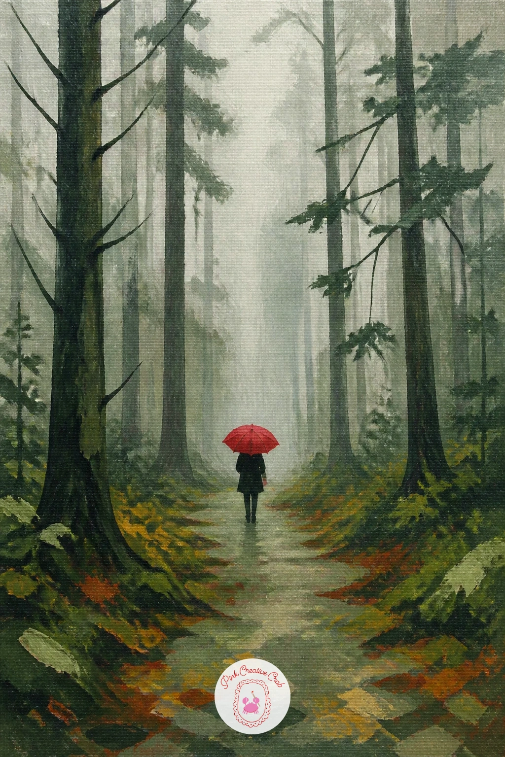
Palette: Payne’s Grey,Titanium White,Cadmium Red,Burnt Umber
Lay the stream as a curving pale blue band first, then place the stepping stones directly on top as simple flat ovals, slightly different sizes and spaced with a believable stride between them, since stones spaced too evenly look planted rather than natural.
Paint each stone with a darker shadow along its lower edge where it meets the water, which does more to seat them into the stream than any amount of surface detail on the stones themselves.
Add a thin ring of lighter blue white around each stone where the water catches against it, using a small round brush and a light touch, since too heavy a ring makes the stones look like they are floating rather than sitting in the current.
If straight edged stones keep appearing under your brush, round every corner off with one more pass of the base stone color before adding the shadow and water ring.
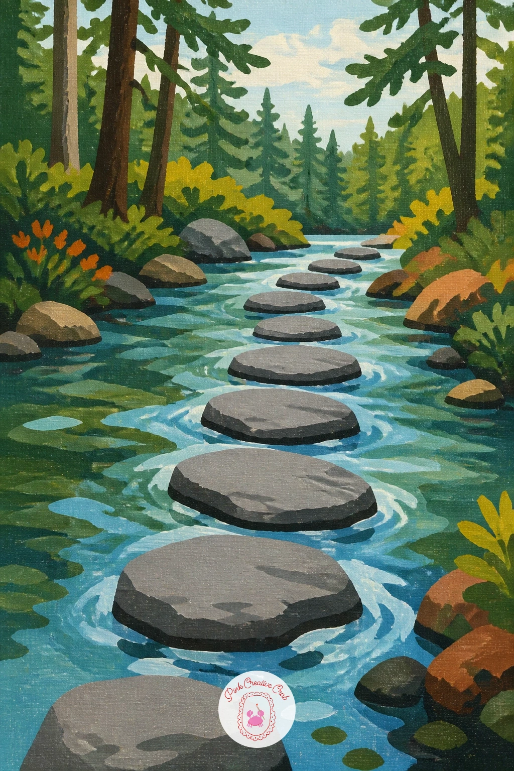
Palette: Payne’s Grey,Cerulean Blue,Titanium White,Sap Green
Work the slope first, since larches grow on a diagonal rise rather than flat ground: paint the mountainside as a single angled plane running from lower left to upper right, or the reverse, in warm pale rock and grass tones before a single tree goes on top.
Paint the larches as slim, slightly conical shapes in warm gold, standing upright against the angled slope, smaller and more closely spaced toward the top of the mountainside and larger near the front. This contrast against the angled ground is what makes the mountainside read correctly.
Vary your gold slightly from tree to tree, some leaning toward mustard, some toward a warmer orange, since a whole hillside of identical gold trees looks flat compared to one with some natural variation.
If you have painted the birch idea earlier in this list already, this is a good next variation to try: same layering approach, warmer palette, sloped ground instead of flat.
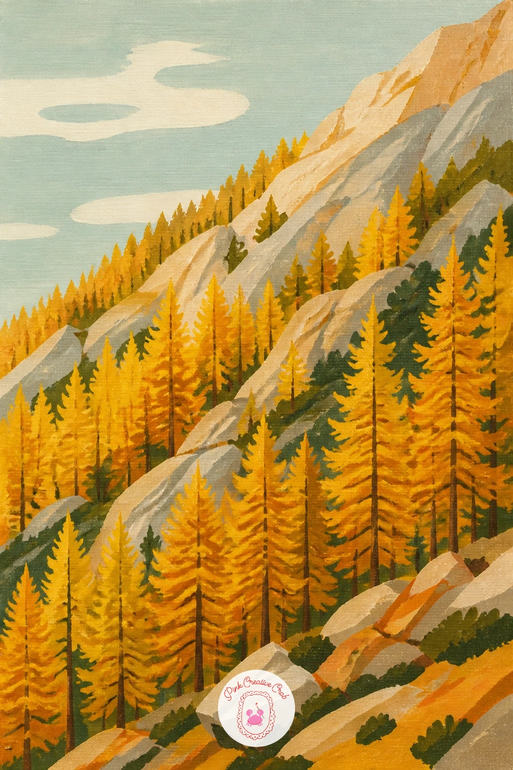
Palette: Mustard Yellow,Cadmium Orange,Raw Sienna,Payne’s Grey
Build the ruin as a simple broken shape, a section of wall with a gap or a single standing archway, rather than a whole building, since a full structure takes far longer to paint convincingly and a fragment is more atmospheric anyway.
Block the stone in cool grey with a few darker cracks and shadowed gaps, then let the surrounding trees close in around it on both sides so the ruin feels found deep in the forest rather than standing in an open field.
Add the ivy last, climbing up from the base in loose trailing strokes of two greens, thicker at the bottom and thinning out as it climbs, with a few individual leaf shapes picked out near the top edge where the climb ends.
If the stone looks too clean, drag a dry brush loaded with a darker grey lightly across the surface before the ivy goes on, to suggest age and weathering underneath.
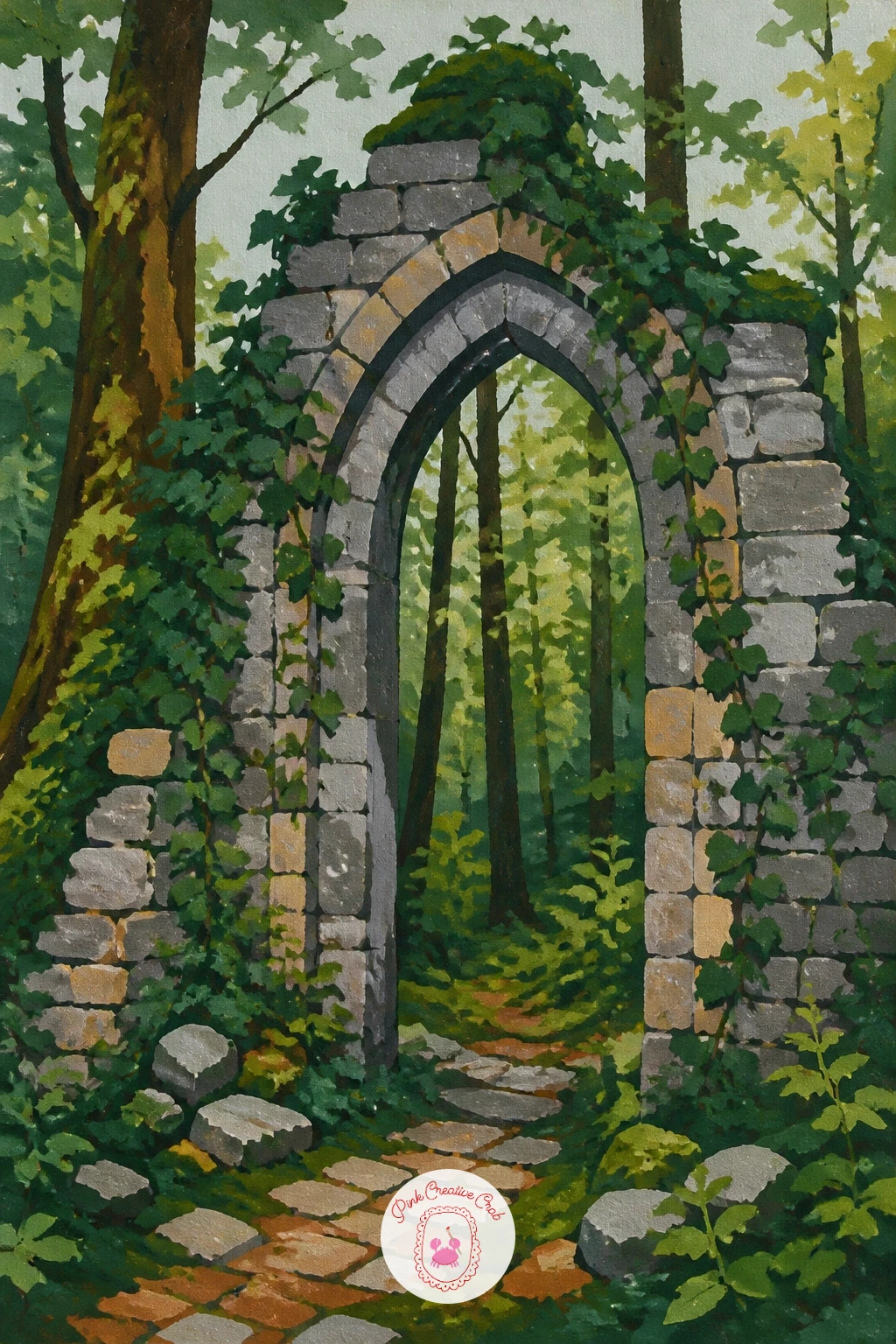
Palette: Payne’s Grey,Sap Green,Olive Green,Titanium White
Build the horse and rider as a single connected silhouette before you separate out any detail, a simple curved back line running from the horse’s neck up through the rider’s shoulders, since getting that one line right does more for believability than any amount of leg or hoof detail.
Paint the path beneath them first in warm brown, narrowing into the trees ahead, then set the horse and rider onto it in flat color, a deep brown or grey horse body and a simple dark jacket on the rider, both kept as clean shapes with minimal internal detail.
The easiest way to lose this painting is to overwork the legs trying to show motion; keep them as a few simple angled strokes suggesting a walking gait rather than attempting a galloping pose, which is much harder to get right at this scale.
If you would rather simplify further, paint the horse and rider as a single dark silhouette shape with no internal color breaks at all, which still reads perfectly well against the lighter path and trees.
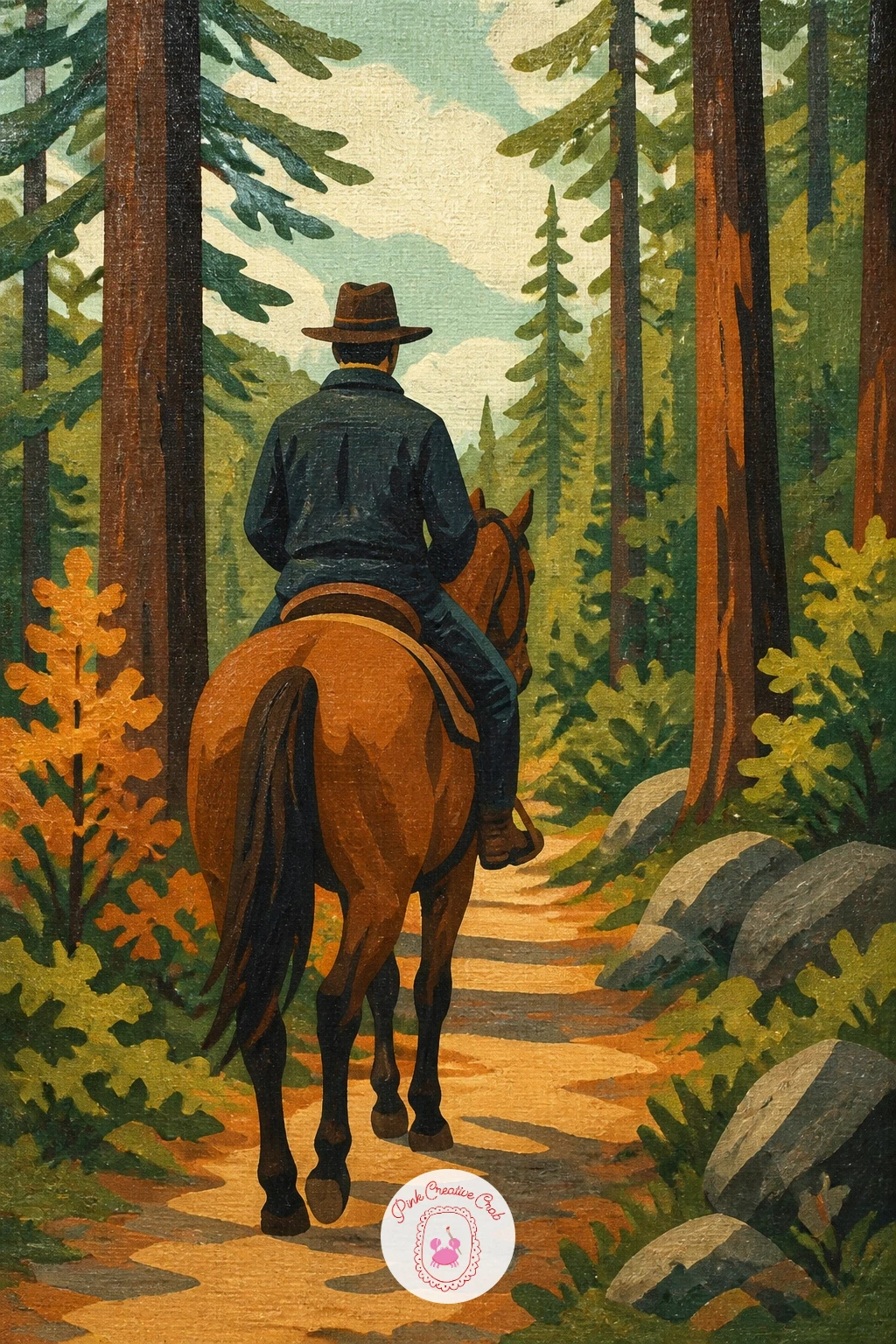
Palette: Burnt Umber,Payne’s Grey,Raw Sienna,Sap Green
Block the pond first as a flat pale oval with a soft reflection of the trees around it, then place the moose at the water’s edge with its head lowered toward the surface, since that lowered head is what instantly reads as drinking rather than simply standing nearby.
Paint the moose as a large dark brown silhouette, keeping the body simple but giving the antlers a bit more care: two or three flat branching shapes rather than a solid mass, which keeps them readable instead of looking like a dark blob on the head.
Add a small ripple ring where its nose touches the water, just a thin pale curved line or two, which ties the animal convincingly into the pond rather than leaving it floating in front of the scene.
If antlers prove tricky, a female moose without them is just as striking a subject and considerably easier to get right on the first attempt.
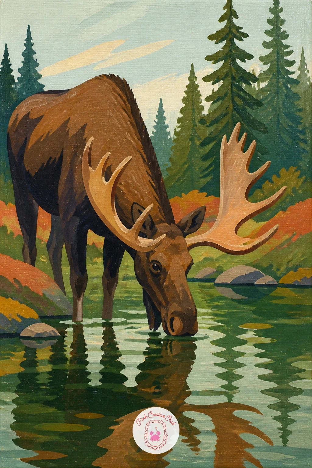
Palette: Burnt Umber,Payne’s Grey,Cerulean Blue,Sap Green
Set this one in full daylight rather than dusk, so the fire reads as a point of interest through color rather than through contrast against darkness: a bright warm orange and red flame shape against the cool greens and greys of the clearing around it does the job on its own.
Paint the ring of logs first, simple flattened cylinder shapes arranged in a rough circle, then the kettle resting on a small stand or stone beside the fire, a simple curved shape with a thin dark handle. Add the flames last, two or three overlapping teardrop shapes rather than a scribble.
Keep the smoke minimal, the same light touch used for the cabin chimney earlier in this list, just a thin pale curl rising and drifting to one side.
If you want a quicker version, paint the fire and logs alone without the kettle; adding the kettle and a bit more background detail is the natural forty minute extension.
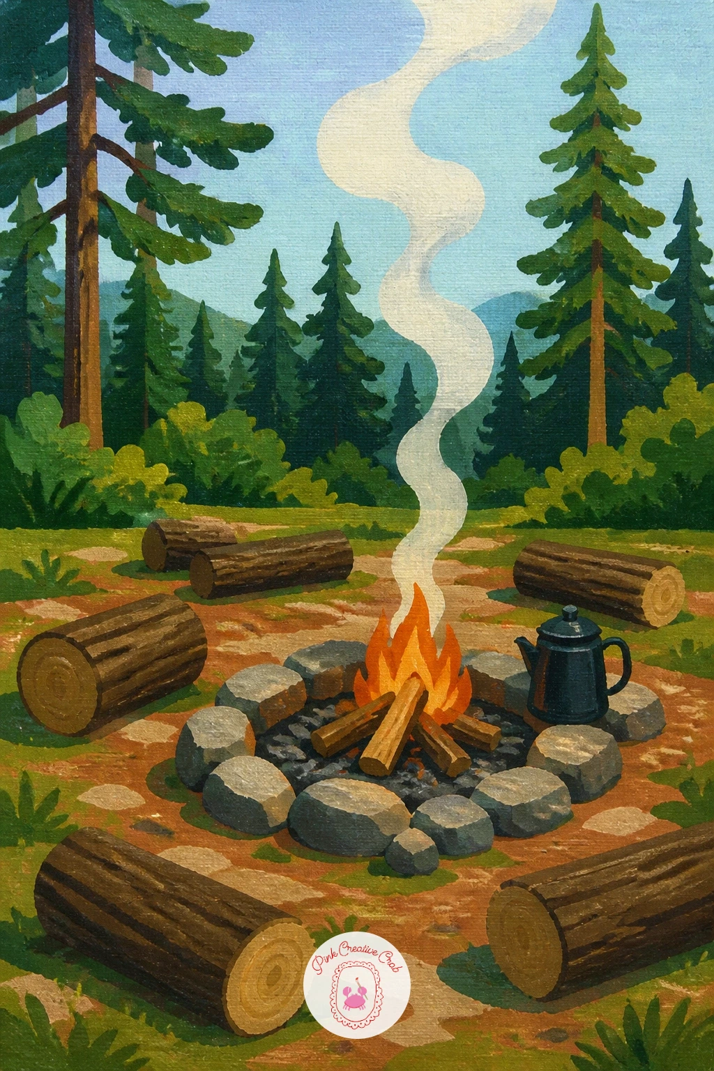
Palette: Cadmium Orange,Cadmium Red,Burnt Umber,Payne’s Grey
Close out the list with a road painting that uses the same converging perspective lines as the autumn maple idea earlier, but curving rather than straight, since a curve gives the eye more to follow and suits a van parked or driving partway along it.
Paint the road and surrounding trees first in your chosen season’s palette, then set the van along the curve, a simple boxy shape with rounded corners, a flat color body and a darker windshield band. Keep the wheels as two small dark ovals rather than detailed circles.
A little rust or weathering along the lower edge of the van, a few short strokes of burnt sienna dragged over the base color, adds real character without taking much extra time.
If you have already tried several of the other ideas on this list, this is a good one to finish with: it lets you reuse whatever seasonal palette you enjoyed most, pines and snow, autumn gold or spring green, behind the van itself.
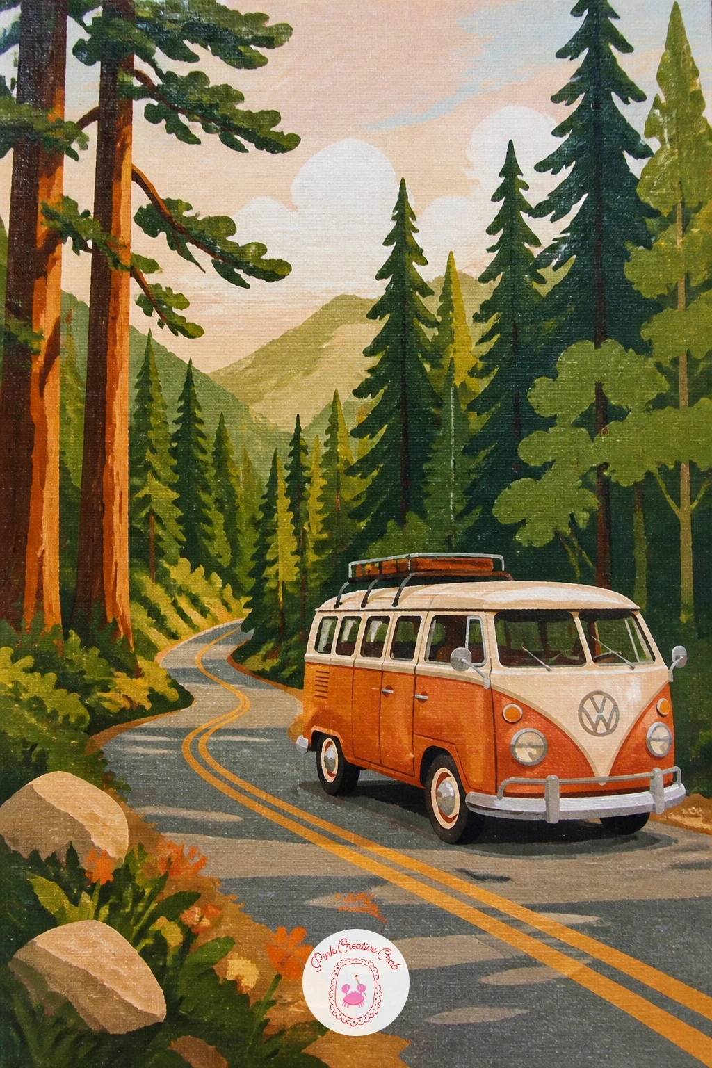
Palette: Terracotta,Cream,Payne’s Grey,Sap Green
What to Do Next
Pick whichever forest matches the light outside your window right now, pull out a small canvas, and start with the sky or the furthest trees first, exactly as each idea above walks you through. One finished painting today beats a long list of good intentions.
Frequently Asked Questions
What is the easiest forest painting idea for a first attempt in acrylic?
The mossy path or the birch trees in autumn gold work well first, since both rely on simple flat trunk shapes and layered greens rather than any tricky figure or reflection work.
How do you make acrylic forest trees look less flat?
Paint three distance values of the same green, lightest furthest back, darkest nearest the viewer, rather than one flat green for every tree; that single layering trick creates most of the depth.
What size canvas suits these forest painting ideas?
A small canvas, around eight by ten inches or similar, suits every idea on this list well, since each subject is designed to fill that size in one sitting without needing extra detail to fill a larger surface.
How do you keep a forest painting bright instead of dark and heavy?
Lean on a pale sky, whether misty white, soft lavender or pastel peach, and keep your darkest green reserved for just the nearest trunks rather than filling the whole canopy with deep shadow.
Can these forest painting ideas work in a different medium like gouache or watercolor?
Yes, the flat color block approach described here adapts well to gouache with only small changes to drying time, though watercolor needs a looser, more transparent layering order.
Have any thoughts?
Share your reaction or leave a quick response — we’d love to hear what you think!
-
 0
-
0
-
0
-
0
-
0
-
0


