

New york watercolor scenes are the ones that make a sketchbook feel like a love letter to the city. Every corner has a little story in it, a dog walker juggling leashes, steam rising off a cart, someone reading on a sunny step, and that is exactly what ink and wash were made to catch.
Below are twenty nine scenes to paint, ordered from quick and forgiving to a little more involved, each one a full moment of city life you can finish in a single sitting. Grab a water brush, a fine black pen, and work your way down the avenue.
Using these images: free for personal projects such as printing, coloring, cards, journals and gifts. Handmade items that include them may be sold up to 30 pieces per design. More than that is commercial use and is not permitted, and neither is selling or sharing the images themselves or passing them off as your own. Please ask before any other use.
Start with the easiest scene on the list: a brownstone stoop with flowers spilling out of pots on either side of the steps. Sketch the steps first with a ruler-free, slightly wobbly line, since a hand-drawn stoop reads warmer than a perfectly straight one, then add the door and a row of windows above.
Ink the architecture before you paint, keeping the lines loose so the watercolor has room to breathe over them. Wash the brownstone in a warm burnt sienna, let it dry, then drop in small dots of red and pink for the flower pots while the paper is still slightly damp so the colors bloom softly.
If this is your first time painting brick, resist outlining every single brick: a few dashed ink marks along the top course suggest the whole wall. No sienna on hand, burnt umber mixed with a touch of cadmium red works just as well.
Finish with one concrete tip: paint the flower pots last and keep them the brightest spot on the page, so the eye lands there first.
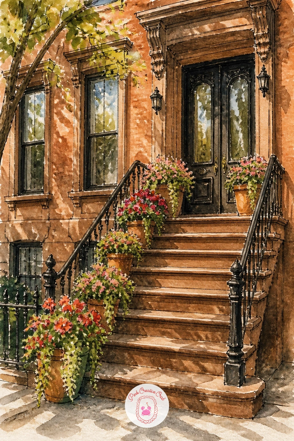
Palette: Burnt Sienna,Cadmium Red,Sap Green,Payne’s Grey
Move from a quiet stoop to a busy avenue with a yellow cab caught in the rain. Pencil in the cab at a simple three-quarter angle, keep the body shape blocky and recognizable rather than detailed, and sketch a loose row of buildings fading behind it.
Paint the wet street first with a flat gray wash pulled down the page, then while it is still damp, drag a dry brush loaded with the same gray horizontally to suggest reflections. Once that layer dries, paint the cab in a clean cadmium yellow and ink the window lines and door seams last so they sit crisp on top.
The place this goes wrong is a street that looks dry: if yours does, lift a little color out with a damp brush in streaks under the cab to fake reflected light. No yellow ochre handy, straight cadmium yellow with a touch of orange gets the same cab color.
One tip for today: paint the headlights as tiny unpainted white dots left from the start, since adding white later never glows the same way.
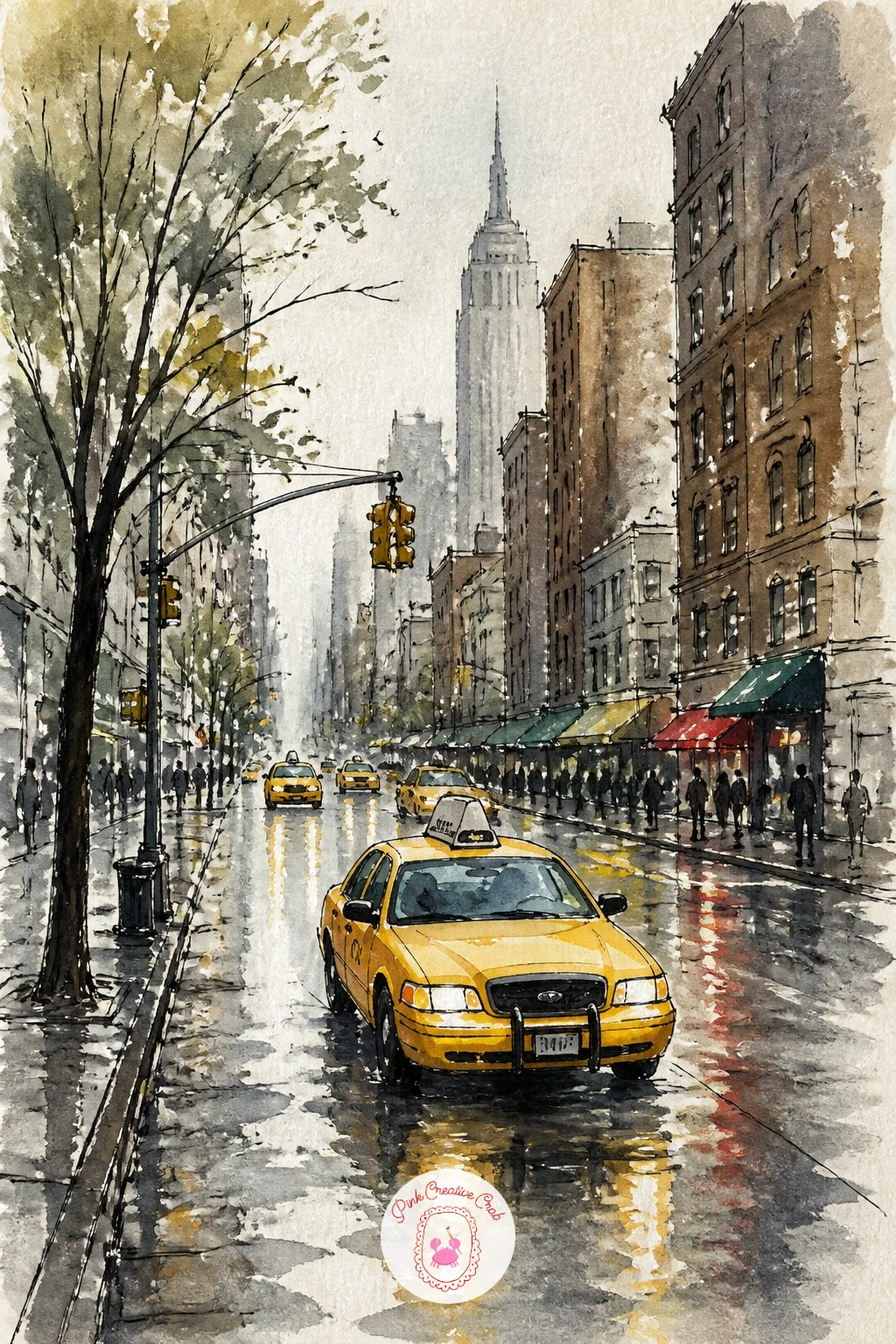
Palette: Cadmium Yellow,Payne’s Grey,Ivory Black,Cerulean Blue
After all that traffic, settle into Central Park in autumn with a single bench under a canopy of color. Lightly pencil the bench low in the frame and keep the path curving gently away from it, then build the trees as loose round shapes rather than individual leaves.
Here is a proportion trick worth remembering: the bench should sit no taller than a third of the tree canopy above it, which keeps the whole scene feeling like a big park rather than a small yard. Paint the canopy first in overlapping washes of gold, orange and a touch of green, let it dry, then ink the bench and a few tree trunks on top.
If the trees start to look like a solid orange blob, break them up with small gaps of white paper left unpainted between clusters. No orange in the palette, mix cadmium yellow with a touch of cadmium red.
Finish with a single sitting figure on the bench painted as a simple dark silhouette, which gives the whole page instant life.
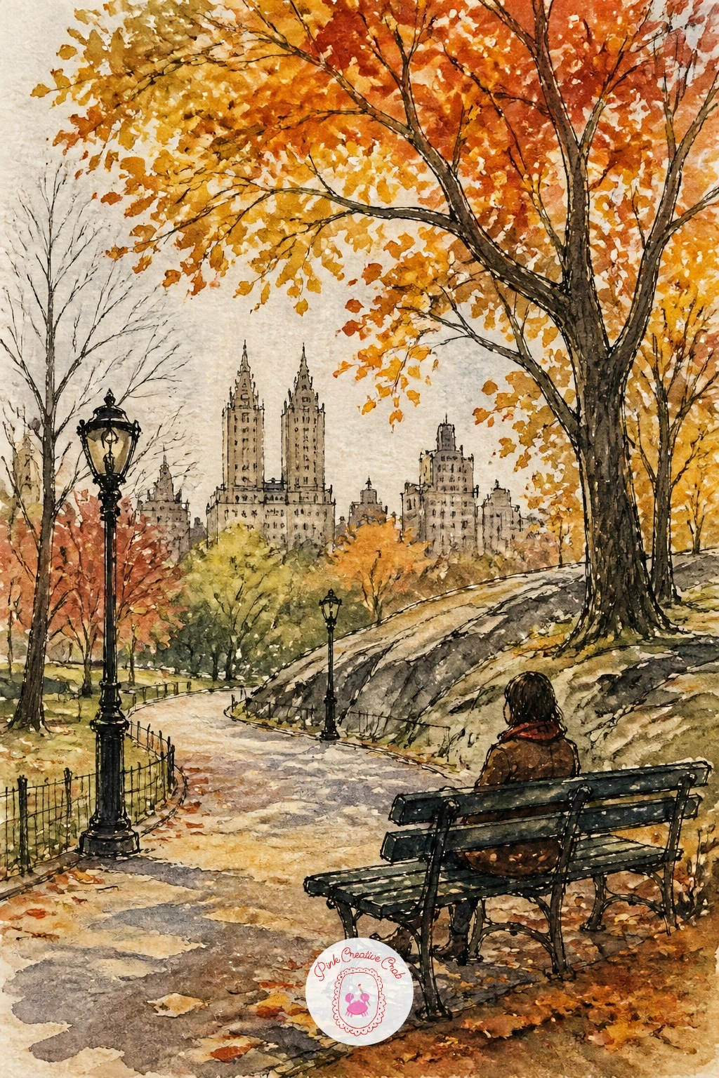
Palette: Cadmium Orange,Cadmium Yellow,Sap Green,Payne’s Grey
Bring the city a little closer with a coffee cart on a street corner, steam curling up into the morning air. Draw the cart as a simple boxy shape with an umbrella on top, keeping the proportions a touch oversized so it feels friendly rather than realistic.
Paint the umbrella first in a confident blue or yellow, then wash the cart body in a muted gray-brown and let both dry before inking the handles, the little serving window, and the vendor’s shape behind it. Steam is the fun part: use a nearly dry brush with just a whisper of gray paint and flick it upward in soft curls.
The common mistake is painting steam too solid, which makes it look like smoke instead. If that happens, dab it gently with a tissue while still damp to lighten it back down; no tissue on hand, a clean dry brush works to lift color too.
Try the quick version in ten minutes with just the cart and umbrella, and use the extra time in a longer sitting to add a small line of customers waiting.
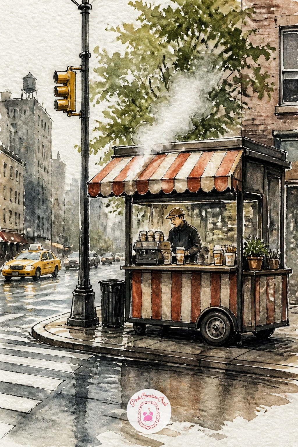
Palette: Cerulean Blue,Payne’s Grey,Yellow Ochre,Burnt Umber
From a small corner cart to one of the city’s grand views: the Brooklyn Bridge at sunset, its cables catching the last light. Draw the bridge towers first as two tall arches, then add the cables as a fan of straight lines radiating down, drawn freehand rather than with a ruler so they keep some life.
This is the idea to think about light direction on: the sun sits low behind the bridge, so wash the sky in warm orange and pink near the horizon fading up into a cooler violet, and keep the bridge itself mostly in silhouette against it. Paint the sky wet into wet for a soft blend, let it dry fully, then ink the towers and cables in solid black so they read crisply against the glow.
If the cables look stiff, varying their spacing slightly as they fan out keeps them believable; too even a spread looks drawn with a ruler even if it was not. No violet in the set, mix a little blue into your cadmium red.
Add a few small walkers crossing the pedestrian path as simple dark marks for scale.
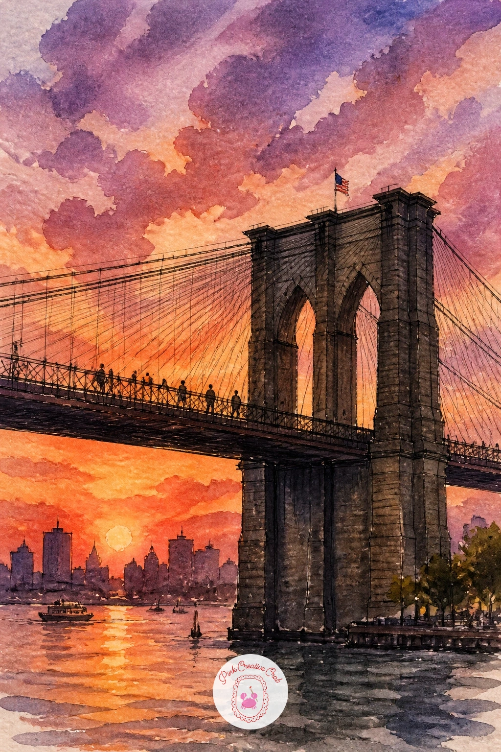
Palette: Cadmium Orange,Quinacridone Rose,Dioxazine Violet,Ivory Black
Step off the bridge and into a bagel shop window stacked with rows of fresh bagels behind the glass. Sketch the window frame first, then fill it with loose circles of varying sizes, some overlapping, to suggest trays stacked two or three deep.
Paint the bagels in warm golden brown with tiny unpainted highlights left on top of each one, then wash the window glass in a pale gray-blue over the whole thing once the bagels are dry, which pulls everything behind a believable sheet of glass. A faint reflection of the street painted faintly across the glass sells the effect even further.
The place this trips people up is painting the glass wash too dark, which hides all the bagels underneath. If that happens, lift some color back out with a clean damp brush while it is still wet; no lifting brush handy, a cotton swab works in a pinch.
One tip for today: add a small hand-lettered sign in the corner of the window, even just a few squiggly ink lines, to suggest a price board without drawing actual letters.
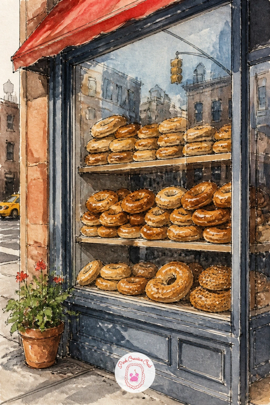
Palette: Yellow Ochre,Burnt Sienna,Cerulean Blue,Payne’s Grey
Trade the bakery warmth for cold air with ice skaters at a park rink, a scatter of tiny figures gliding across the ice. Block in the rink as a simple oval shape first, then scatter five or six small figures around it at different angles, varying their poses so none repeat exactly.
Paint the ice in pale blue-gray with a few streaky brushstrokes left visible to suggest its sheen, then let it dry completely before adding the skaters as small, simple silhouettes in solid color, a red scarf here, a yellow hat there. Keeping the figures small and loose is what makes a whole rink of skaters possible in one sitting.
If the figures start looking stiff, painting them off-balance, one leg trailing, arms slightly out, immediately reads as motion. No pale blue in the set, mix a touch of cerulean into a lot of white space, barely tinting the paper.
Try a quick ten minute version with just three skaters, and in a longer sitting, add bare trees ringing the rink behind them.
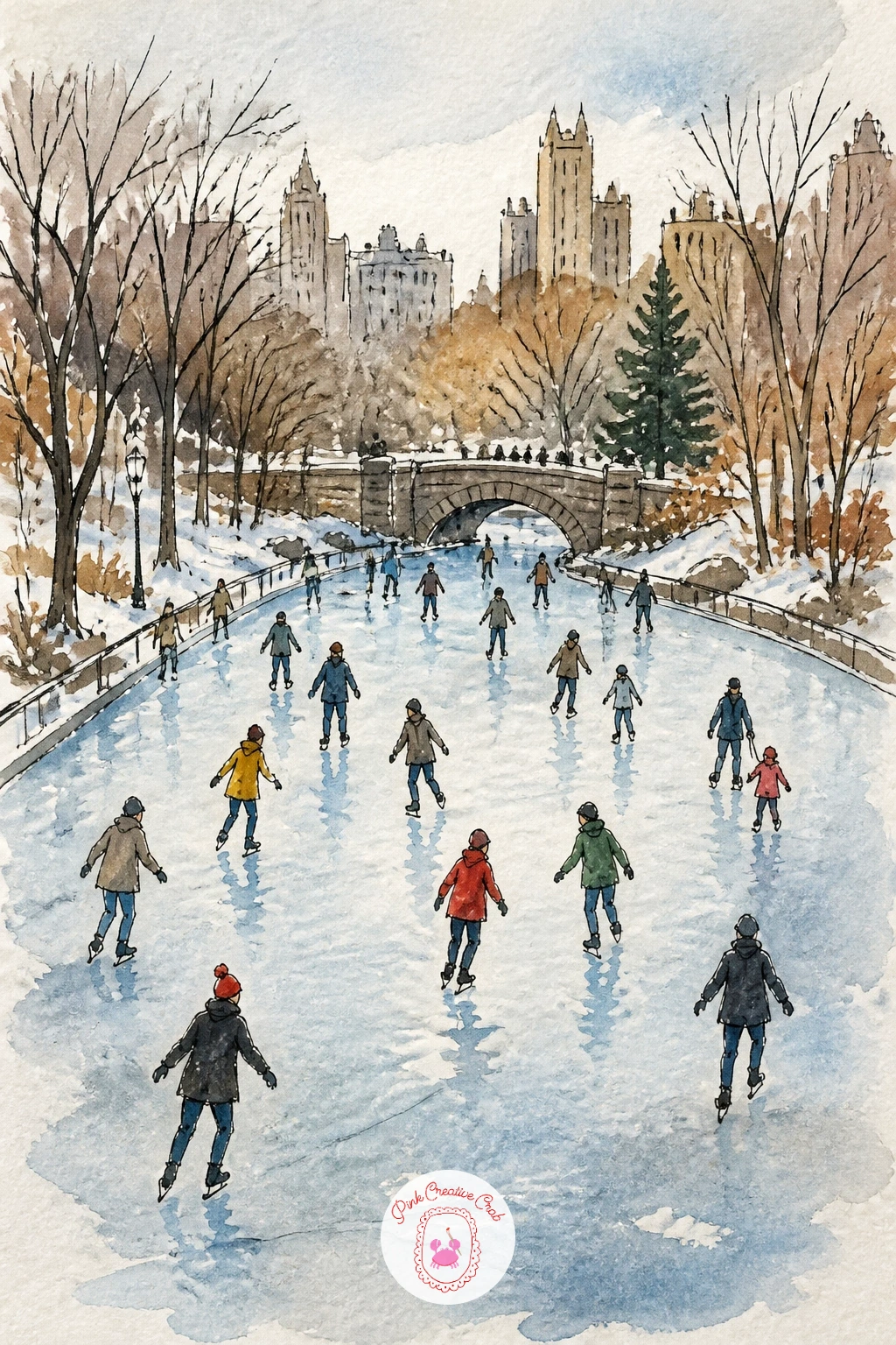
Palette: Cerulean Blue,Payne’s Grey,Cadmium Red,Cadmium Yellow
Head underground for a subway platform with commuters waiting in a loose row. Sketch the platform edge as a strong horizontal line first, then stand a handful of simple figures along it at different heights and widths so the crowd feels varied rather than cloned.
Here is the eye level trick: since you are standing on the platform too, the horizon sits roughly at the commuters’ shoulders, which keeps the whole scene feeling like you are part of the wait rather than looking down on it. Paint the tunnel wall behind them in a flat gray-green tile color, then the figures as simple dark silhouettes with just a touch of color, a red coat, a yellow bag, to break up the gray.
If the platform feels empty, a few scattered ink marks for trash, a pole, or a bench fill it in without much extra work. No gray-green on hand, mix Payne’s grey with a touch of sap green.
Finish with a pair of headlights glowing faintly in the tunnel mouth, left as warm yellow against the cool gray, to hint a train is coming.
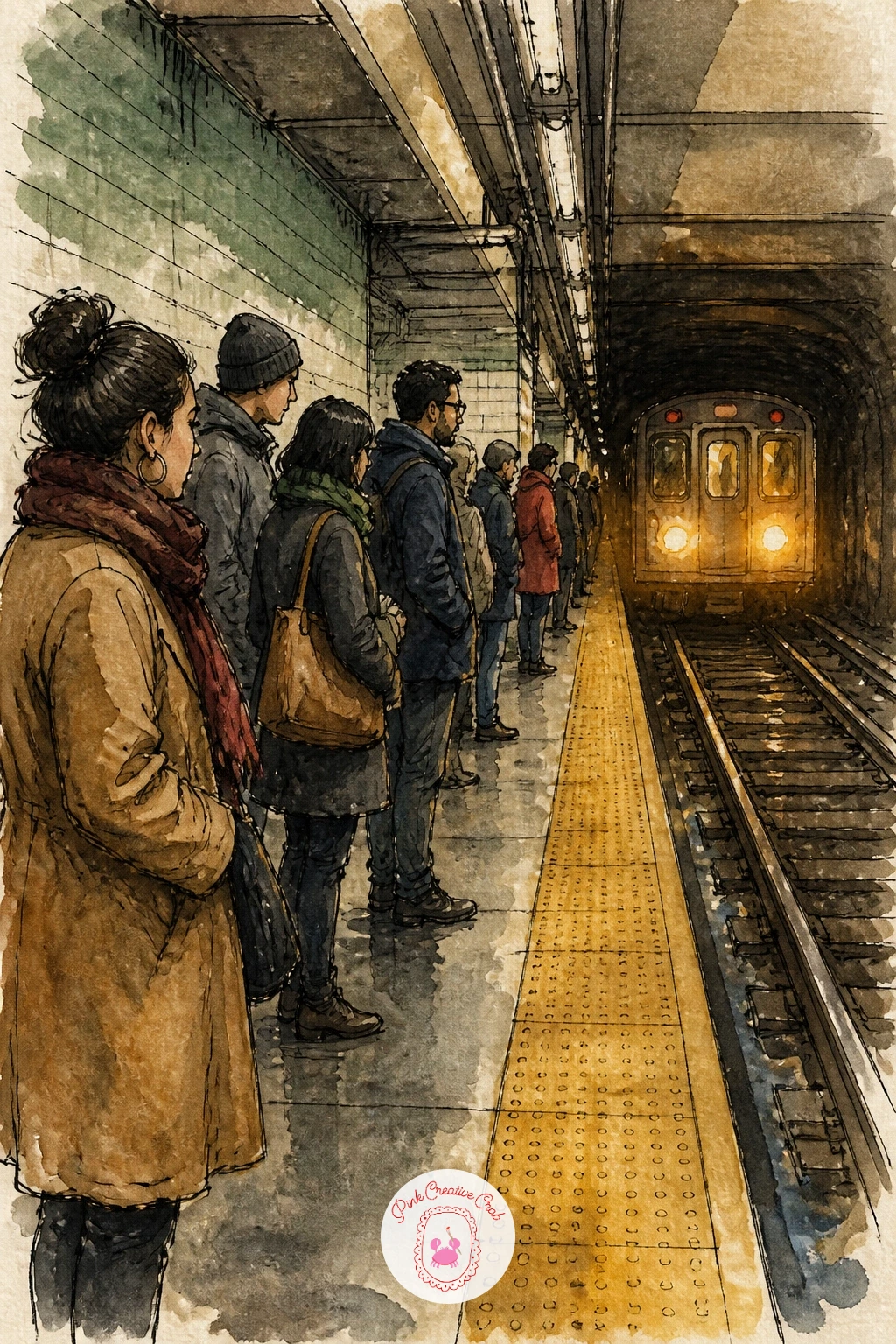
Palette: Payne’s Grey,Sap Green,Cadmium Red,Cadmium Yellow
Bring the energy back above ground with a hot dog stand parked at the curb, umbrella up and a small line forming. Draw the cart’s umbrella first since its stripes anchor the whole composition, then build the cart body underneath it as a simple rectangle with a little serving window cut into the front.
Paint the umbrella stripes in alternating red and white, leaving the white as untouched paper, then wash the cart in a metallic-feeling gray-blue once the umbrella is dry. Ink the vendor as a simple standing shape behind the window, and one customer in front holding a hot dog as a small orange and white shape.
The common slip is painting the umbrella stripes too evenly, which flattens them; curving them very slightly to follow the umbrella’s shape makes it read as rounded rather than flat. No red paint handy, cadmium red mixed with a touch of orange works just as well.
Add a single pigeon pecking near the cart’s wheel for a small extra laugh.
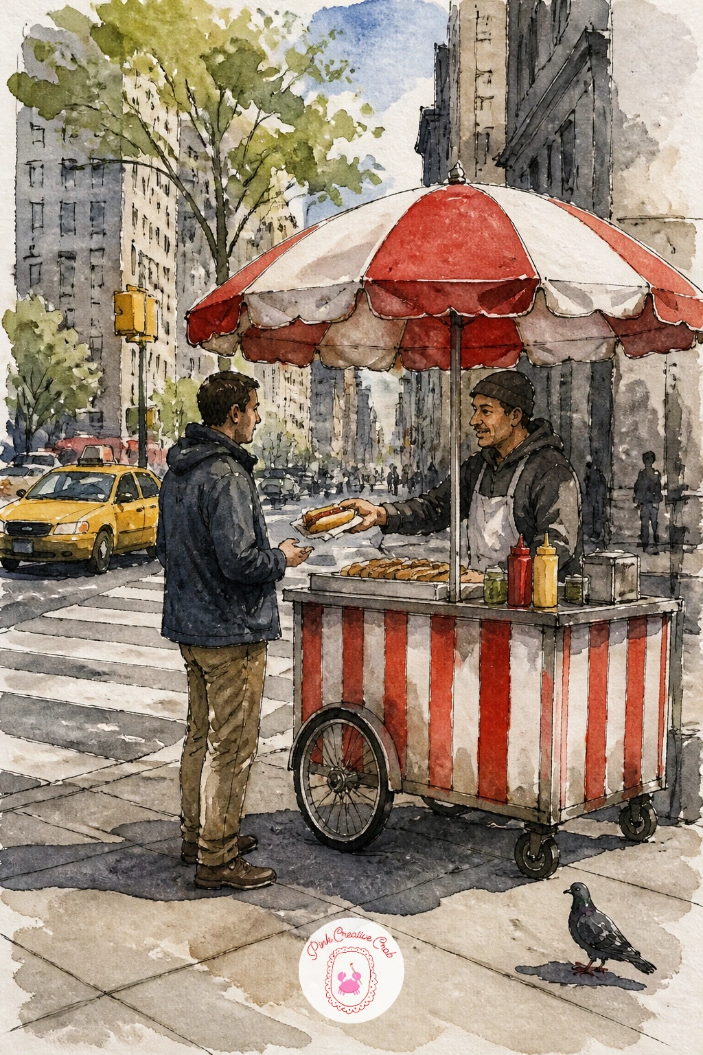
Palette: Cadmium Red,Payne’s Grey,Cadmium Yellow,Ivory Black
Look up now for a fire escape with plants spilling through its iron railings. Ink the zigzag of the fire escape stairs first, since getting that geometry right early makes everything else easier, then sketch pots and trailing vines tucked between the bars.
Paint the brick wall behind in a warm reddish brown, let it dry fully, then paint the iron railings in a cool dark gray over the top so they sit clearly in front of the brick. The plants go in last in bright greens, painted loosely so leaves overlap the railing lines rather than stopping neatly at them.
If the ironwork looks too stiff and ruler-straight, a slightly wobbly, hand-inked line over the pencil guide brings back the charm of old iron. No reddish brown mixed, burnt sienna with a touch of Payne’s grey gets close.
Try the quick ten minute version with just one potted plant, and in a longer sitting let vines trail all the way down past the next landing.
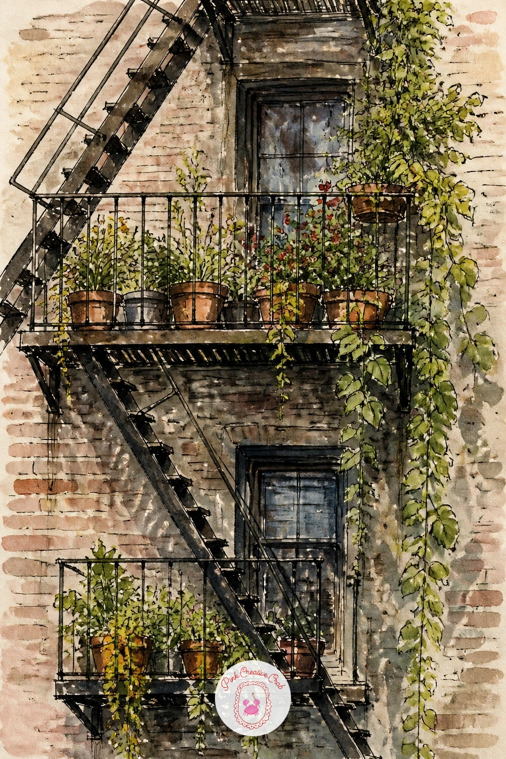
Palette: Burnt Sienna,Payne’s Grey,Sap Green,Viridian
Follow the vines down to street level for a girl walking with shopping bags on Fifth Avenue, striding past storefronts. Sketch her figure first in a simple walking pose, one leg forward, arms swinging naturally, keeping proportions loose rather than fashion-illustration perfect.
Paint her coat in one confident color, a deep red or camel, before adding the shopping bags in a contrasting bright color so they pop against her outfit. Once she is dry, wash in simplified storefronts behind her using flat blocks of color and a few ink window lines, keeping the background much less detailed than she is so she stays the focus.
If her pose looks frozen, tilting her head slightly and letting one bag swing forward while the other trails back brings in a sense of motion immediately. No camel paint mixed, yellow ochre with a touch of burnt sienna works well for a coat.
One tip for today: paint her in a stronger, more saturated color than anything behind her, which does the work of making her the center of the scene without extra effort.
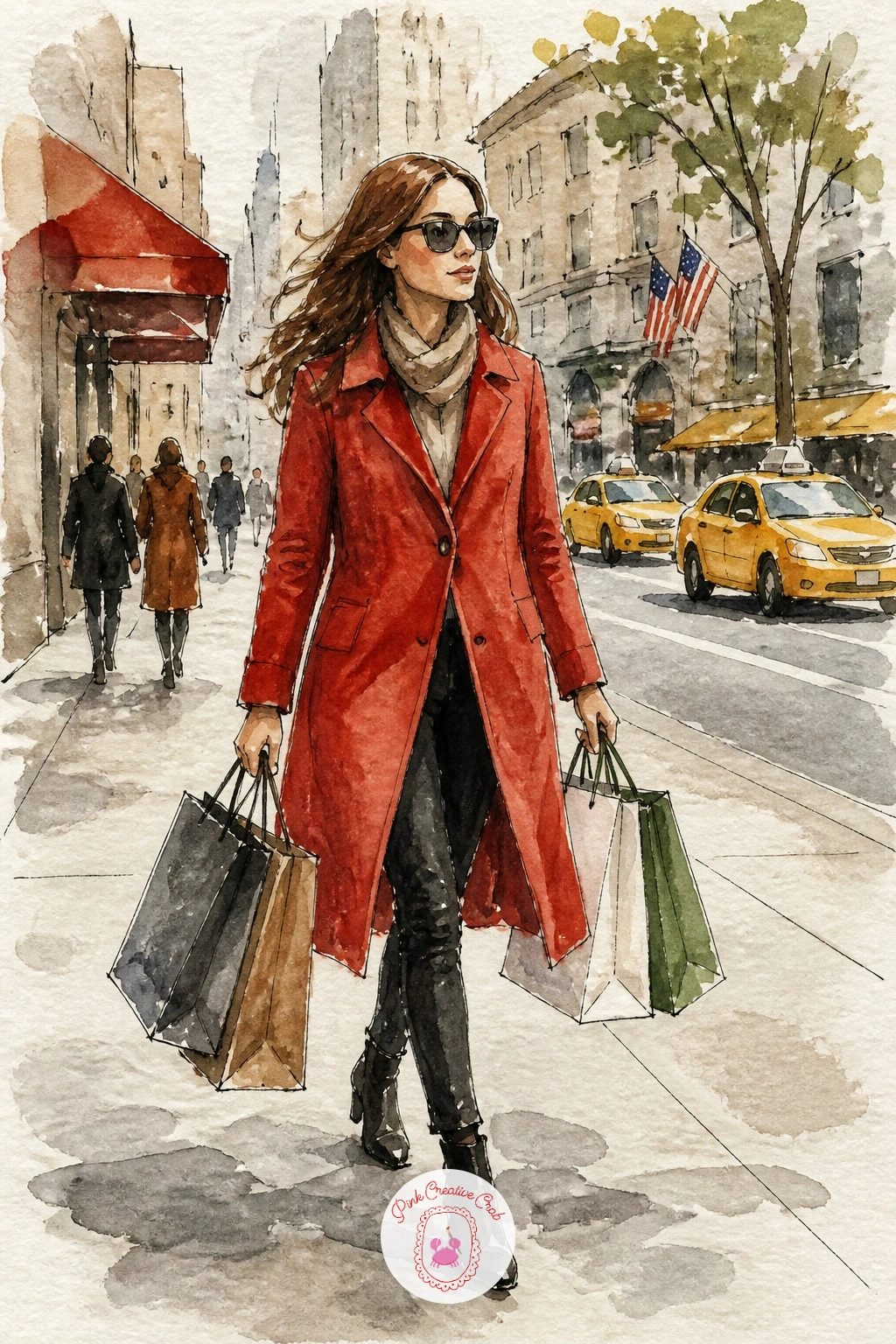
Palette: Cadmium Red,Yellow Ochre,Payne’s Grey,Cerulean Blue
Pause at a flower stand at a deli, buckets of blooms crowding the sidewalk in front of the awning. Draw the buckets first as simple cylinders lined up in a loose row, then fill each one with a different cluster of flower shapes rather than repeating the same bloom in every bucket.
Paint each bucket of flowers wet into wet, letting the colors bleed softly within their own cluster, then once everything is dry, ink in just enough stem and petal detail to tie the blooms together without over-drawing them. The deli awning behind gets a flat wash of green or red with simple white lettering left as unpainted paper.
If you have not tried mixed florals before, this guide to easy watercolor flowers for beginners covers a few reliable petal shapes worth practicing first. No real bucket shapes to reference, a few overlapping rectangles read as buckets just fine.
Finish with one bright splash of color per bucket left a shade stronger than the rest, which keeps the whole stand feeling abundant rather than muddy.
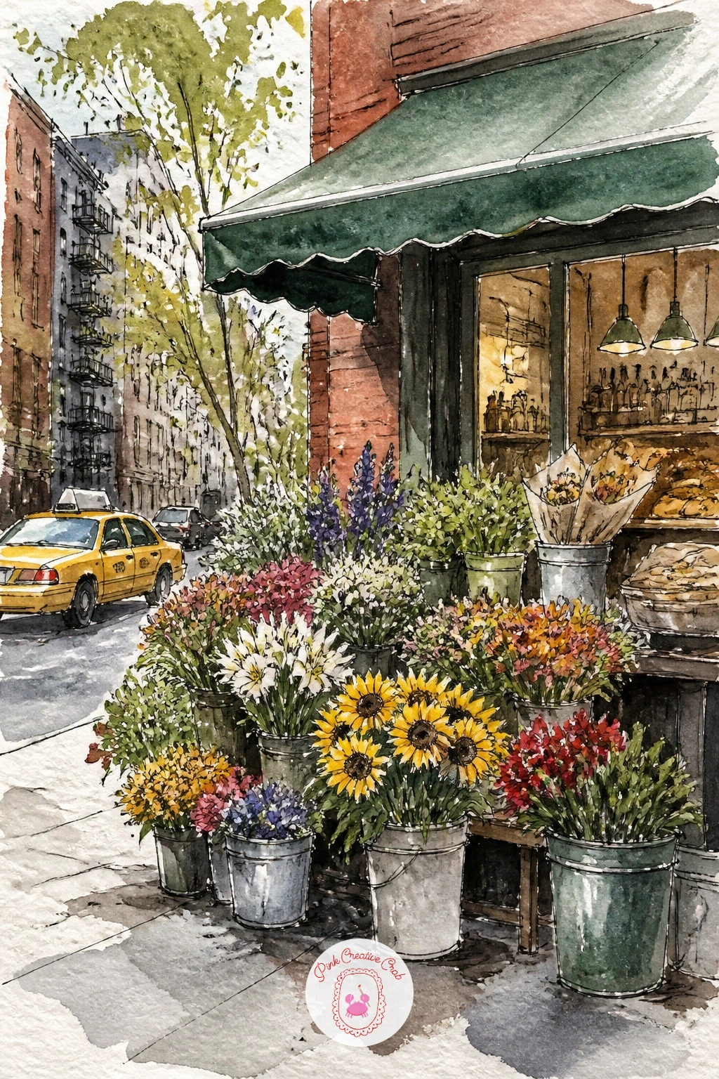
Palette: Quinacridone Rose,Cadmium Yellow,Sap Green,Cadmium Red
Keep the park mood going with a carriage in Central Park, horse and driver moving along a tree-lined path. Measure the horse first against the carriage wheel: the horse’s body length should run about twice the height of the wheel, which keeps the proportions convincing without needing anatomy study.
Paint the horse in a warm brown wash, leaving the mane and tail as slightly darker dry-brush strokes pulled in the direction they fall, then paint the carriage in black with a single colored accent, a red wheel rim or seat cushion. The path and trees behind stay simple and soft so the carriage reads as the sharpest, most detailed shape on the page.
If the horse’s legs look stiff or stick-like, thickening them slightly where they meet the body and tapering toward the hooves makes them feel more natural. No warm brown mixed, burnt sienna with a touch of Payne’s grey works for the coat.
Add a small passenger silhouette inside the carriage for scale and story.
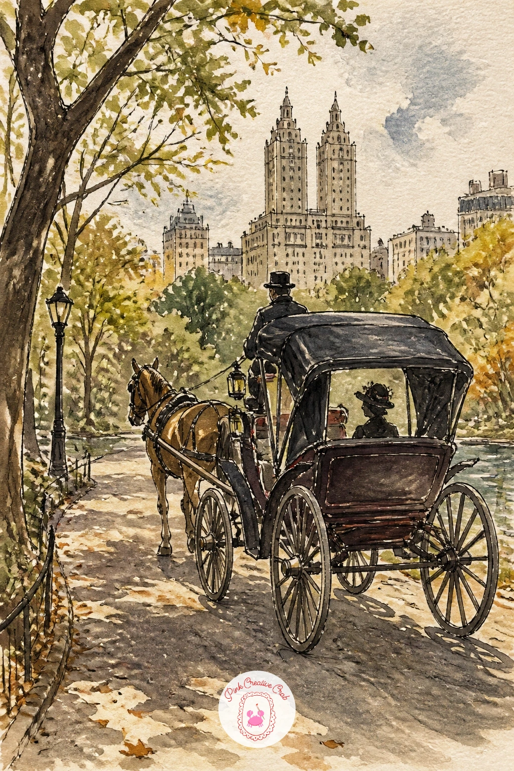
Palette: Burnt Sienna,Payne’s Grey,Ivory Black,Cadmium Red
Climb up for a rooftop with a water tower, that familiar wooden barrel shape silhouetted against the sky. Draw the tower’s conical roof and barrel body first using simple geometric shapes, then add the thin stilt legs underneath, spaced slightly unevenly so it does not look mechanically perfect.
Paint the sky behind it first in a soft gradient, pale blue near the top fading to a warm peach near the horizon, then once dry, paint the water tower itself in weathered brown with a dry brush dragged over the surface to suggest aged, splintering wood. Other rooftops and chimneys around it stay as simple flat gray shapes so the tower stands out clearly.
If the dry brush texture is not showing up, your brush may be too wet; blot it firmly on a paper towel before dragging it across the barrel again. No dry brush technique tried before, a slightly damp sponge dabbed lightly gives a similar weathered effect.
One tip for today: leave a thin strip of unpainted paper along one edge of the barrel to suggest sunlight catching the wood.
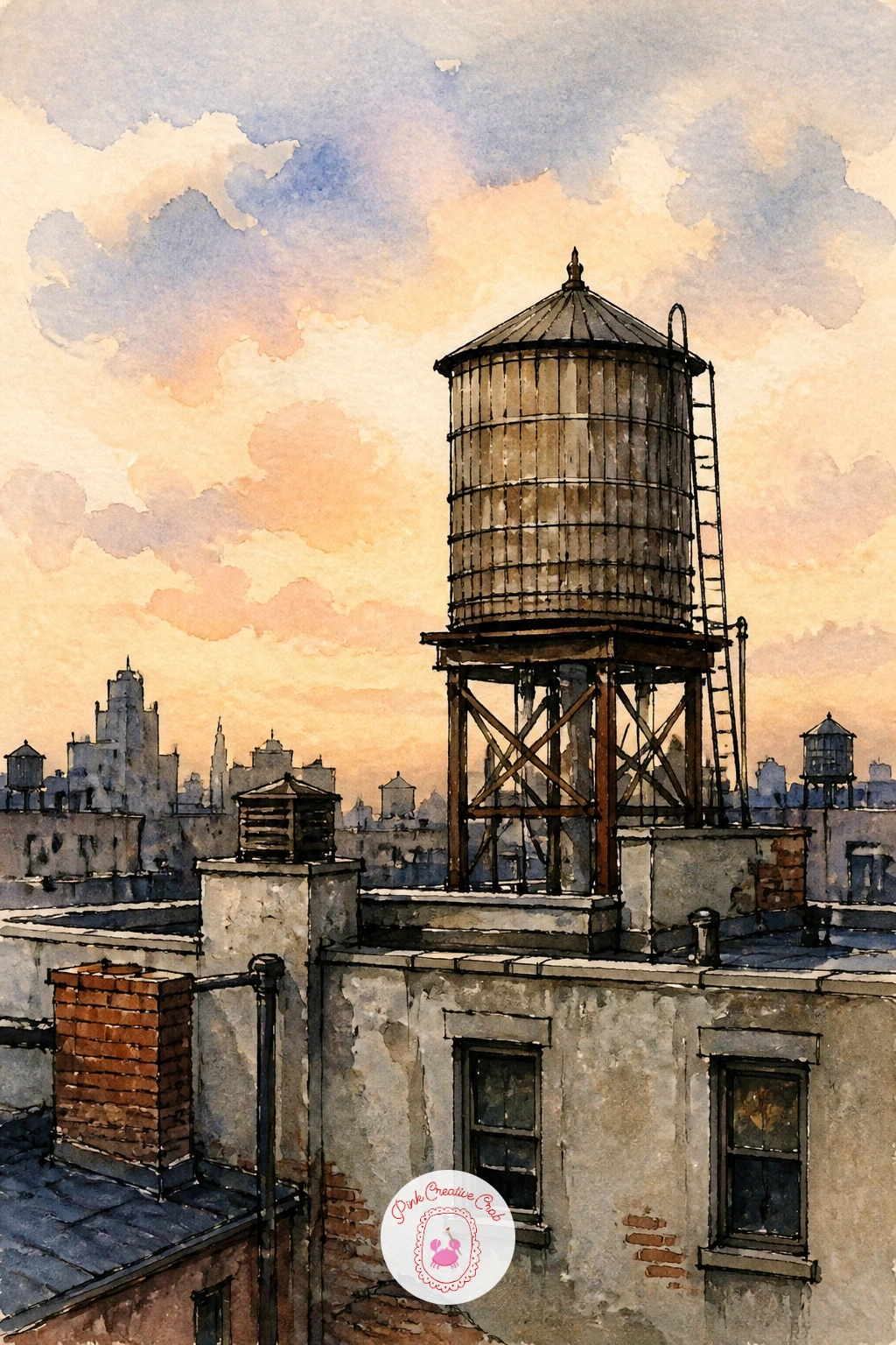
Palette: Burnt Umber,Payne’s Grey,Cerulean Blue,Cadmium Orange
Come back down to street level for a bookstore in the West Village, its window crammed with books and a striped awning overhead. Sketch the window frame and awning first, then fill the display with loose stacks of books drawn as simple rectangles of varying heights and colors rather than individual titles.
Paint the awning stripes in a confident green and white or red and white, then wash the brick storefront around it in warm brown. The book stacks inside the window get quick dabs of color, no two spines the same shade, which does more to suggest “bookstore” than careful detail ever could.
If the storefront feels flat, adding a small reflection of the street in the glass, just a faint streak of gray, gives the window some depth. No striped awning fabric reference needed, alternating evenly spaced vertical bands of two colors reads as a striped awning instantly.
Try the quick version in ten minutes with just the window and books, and in a longer sitting add a cat curled in the display, a common sight outside real Village bookshops.
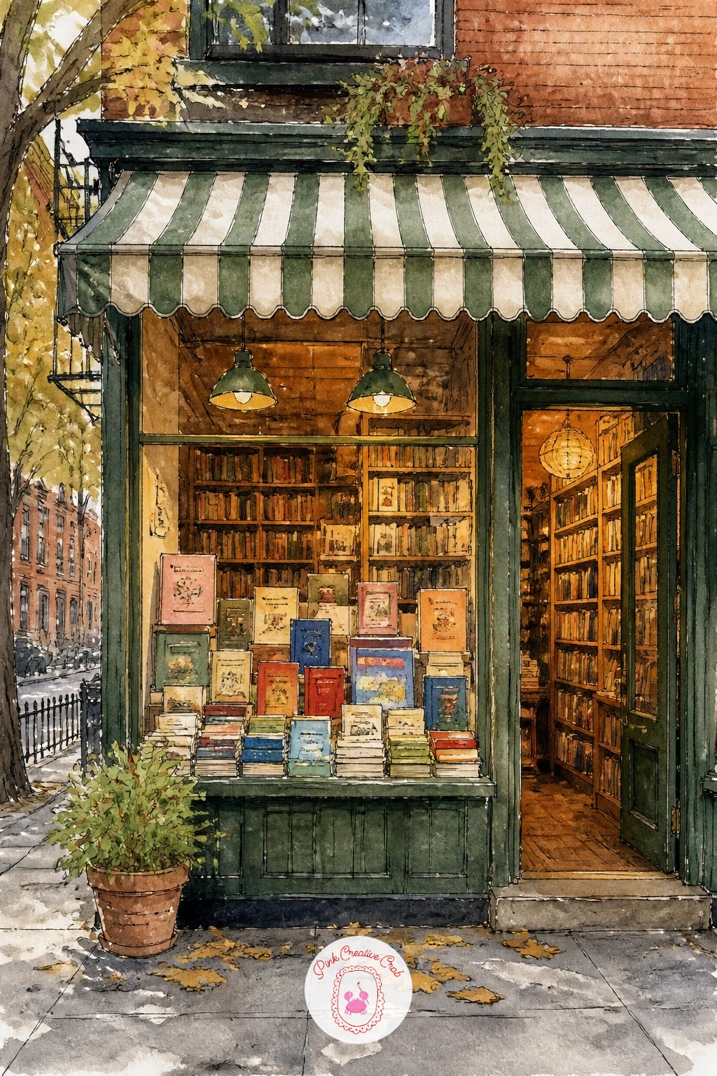
Palette: Sap Green,Burnt Sienna,Cadmium Red,Payne’s Grey
Zoom in close for a pizza slice on a paper plate, cheese still glistening, folded in half the New York way. Draw the slice’s triangle shape first, then fold one edge slightly inward with a curved ink line to show it being held the classic way, in hand or ready for one.
Paint the cheese in a warm pale yellow first, scattering a few small dots of red for pepperoni before the yellow dries so they bleed softly into the cheese at the edges. The crust goes in last with a dry brush loaded with golden brown, dragged lightly to leave a textured, slightly charred edge.
If the cheese looks flat, a few streaks of slightly darker yellow dragged while still damp suggest the grease and shine that makes pizza look appetizing. No pepperoni-red on hand, cadmium red straight from the tube works fine.
One tip for today: leave a small triangle of white paper near the tip of the slice unpainted, since that single highlight makes the cheese look glossy.
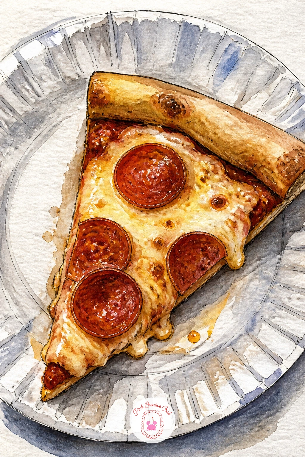
Palette: Cadmium Yellow,Cadmium Red,Yellow Ochre,Burnt Sienna
Head back outdoors for the High Line with greenery, that elevated path threading through wild grasses and city views. Sketch the railing and walkway first as simple parallel lines receding into the distance, then let plantings spill over both sides in loose, irregular clumps.
Paint the greenery in several shades of green, sap, olive and a touch of yellow-green, applied wet into wet so they blend softly rather than sitting in flat separate patches. Once dry, ink in a few individual grass blades and seed heads on top to add texture without repainting the whole bed.
If the plants start to look like one solid green mass, varying the size of your brush, a fine round for grass blades, a larger one for soft background clumps, breaks up the texture naturally. No olive green mixed, sap green with a touch of yellow ochre gets close.
Add one or two small figures strolling the path in the distance, painted as simple dark shapes, to show the scale of the greenery around them.
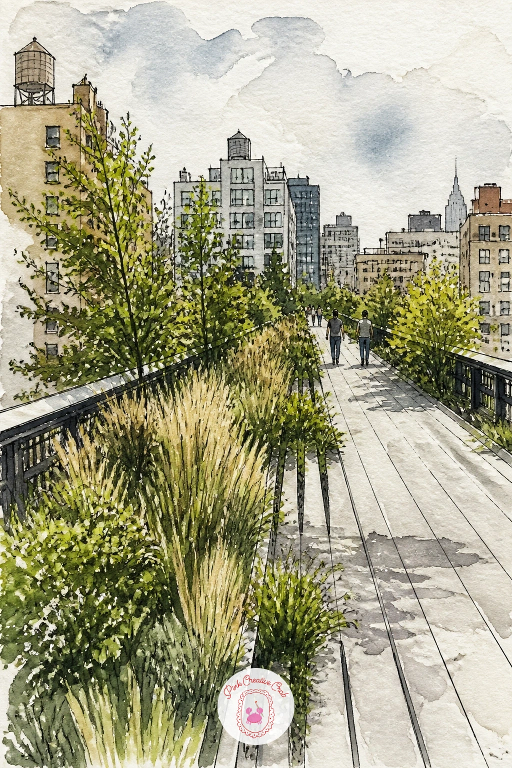
Palette: Sap Green,Olive Green,Cadmium Yellow,Payne’s Grey
Bring in some chaos and charm with a dog walker juggling many dogs, leashes crossing every which way. Draw the walker first as a simple standing or leaning figure, then fan the dogs out around them at varying distances and sizes, three or four different breeds keeps the group visually interesting.
Paint each dog a distinct color before inking the leash lines connecting them all back to the walker’s hand, since painting the leashes last keeps them crisp rather than lost under wet color. Vary the dogs’ poses, one sniffing the ground, one trotting ahead, one sitting, so the group reads as a real moment rather than a lineup.
If the tangle of leashes starts to look confusing, simplifying to four or five lines rather than drawing every single leash keeps the composition readable. No reference for dog breeds needed, simple shapes (a round terrier, a long dachshund, a floppy-eared spaniel) read clearly even loosely painted.
One tip for today: give the walker a slightly off-balance lean, as if being tugged, for instant movement and humor.
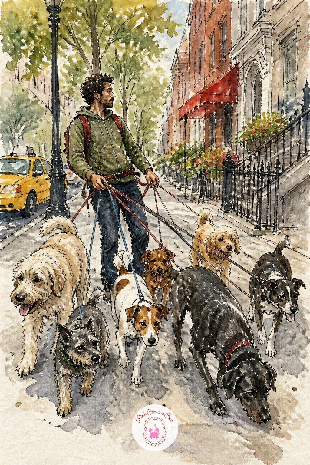
Palette: Burnt Sienna,Ivory Black,Yellow Ochre,Payne’s Grey
Slip inside for a jazz club in Harlem, a trio playing under low, warm light. Sketch the musicians first as simple seated and standing shapes around their instruments, a saxophone’s curve, a double bass’s rounded body, a small drum kit, keeping each figure loose and gestural rather than detailed.
Here is where light matters most: the stage light sits low and warm, usually from one side, so paint deep shadows in dark blue-violet on the far side of each figure and warm gold where the light hits. This single light source is what turns a flat lineup of musicians into a scene with real atmosphere.
Paint the instruments in warm brass tones before the figures’ clothing, since the brass glow is the brightest note in the whole piece and easier to place first. If the scene feels too dark overall, leaving small unpainted highlights on instrument edges and faces keeps it readable even in a dim room.
No gold or brass tone mixed, yellow ochre with a touch of burnt sienna gets close enough for brass instruments under warm light.
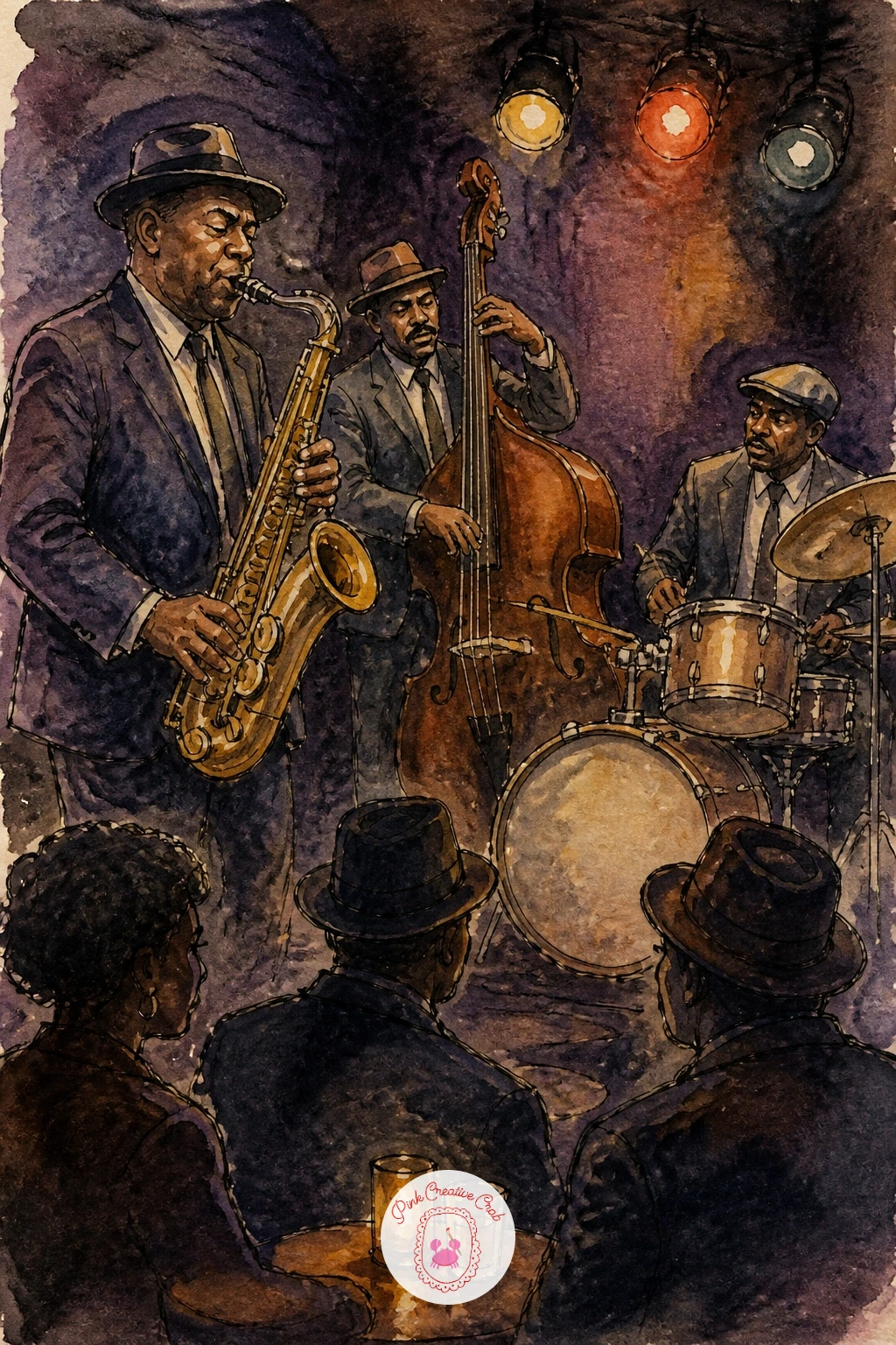
Palette: Yellow Ochre,Burnt Sienna,Dioxazine Violet,Payne’s Grey
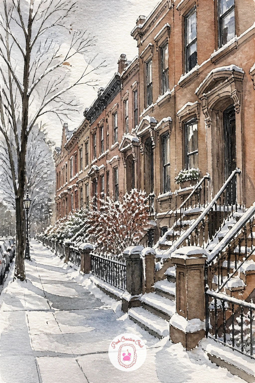
Go back outside for snow on a brownstone street, rooftops and stoops dusted white under a quiet gray sky. Sketch the row of brownstones first, keeping their rooflines slightly uneven since real blocks never line up perfectly, then plan where the snow will sit before you paint a single drop of color.
Paint the sky in flat cool gray first, then the brownstone facades in warm browns and reds, leaving the roofline edges, window ledges and stoop railings as untouched white paper to read as snow. This is the trick worth remembering: snow is almost always unpainted paper plus a shadow, not white paint added on top.
Once the buildings are dry, add pale blue-gray shadows just beneath each snowy ledge to give it dimension, since flat white with no shadow looks like missing paint rather than snow. No masking fluid for crisp snow edges, careful dry-brush white gouache added at the very end achieves a similar sparkle.
One tip for today: scatter a few small footprints in ink along the sidewalk for a lived-in, quiet morning feel.
You Will Need
- white gouache (optional for snow sparkle)
Palette: Burnt Sienna,Payne’s Grey,Cerulean Blue,Cadmium Red
Turn up the energy for Times Square lights at night, a wall of glowing signs and crowds below. Block in the buildings first as simple dark silhouettes, since everything bright in this scene needs a dark background to glow against, then leave irregular rectangles of white paper where the biggest signs will sit.
Paint the sky and buildings in deep blue-black first and let it dry completely, then fill those saved white shapes with bright, saturated color, hot pink, electric yellow, bold red, applied in flat confident strokes. The crowd below gets painted as small dark figures with the occasional tiny dot of color for a coat or umbrella.
If the lights look dull instead of glowing, the buildings around them probably are not dark enough; deepening the surrounding black makes any color look brighter by contrast alone. No electric pink in the set, quinacridone rose straight from the tube reads plenty vivid against black.
Add one or two faint reflections of the lights on the wet pavement below for extra sparkle.
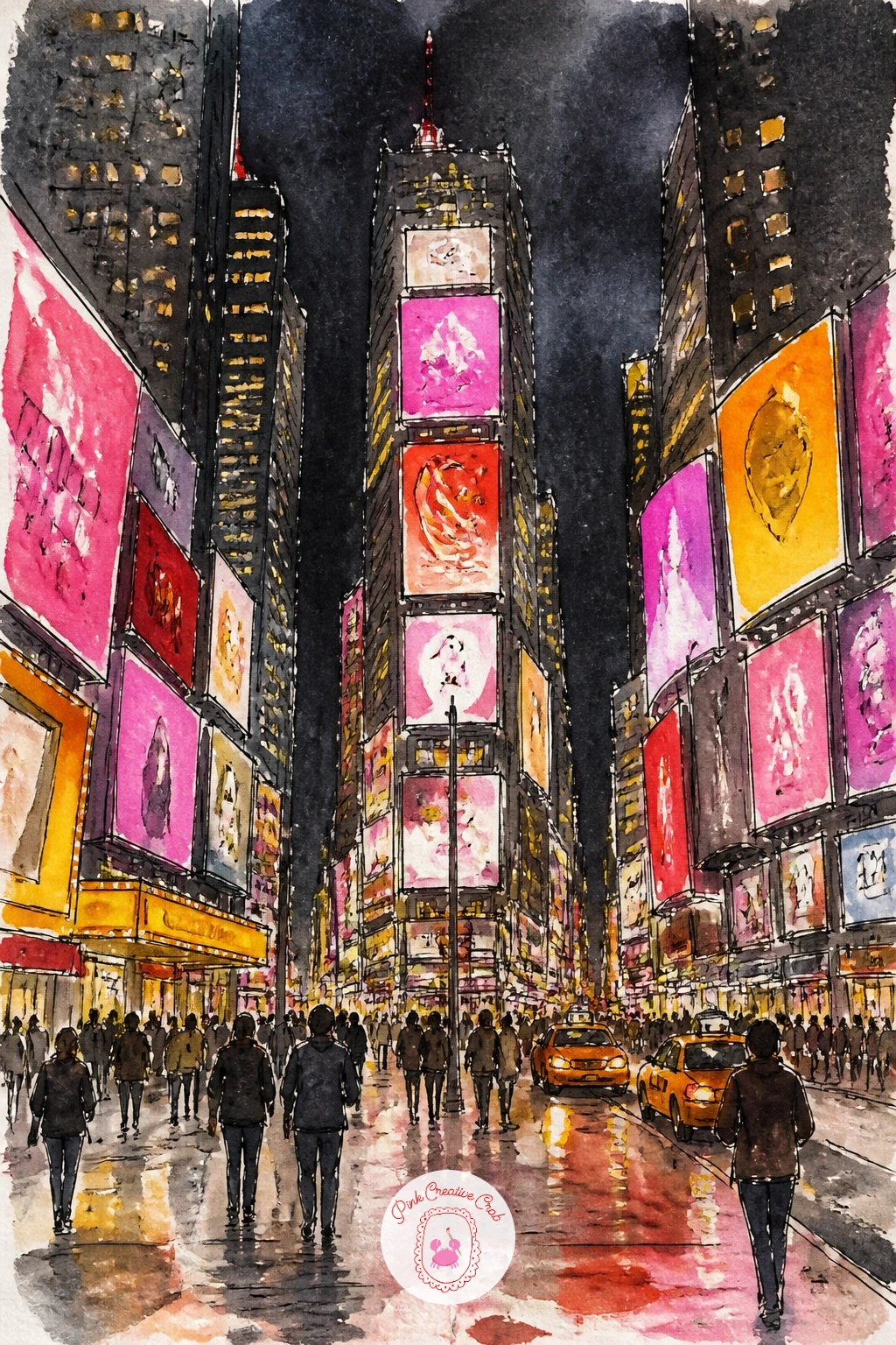
Palette: Payne’s Grey,Quinacridone Rose,Cadmium Yellow,Cerulean Blue
Cool back down with a cafe in Soho, little bistro tables spilling onto the sidewalk under a cast-iron facade. Sketch the cast-iron building front first, since Soho’s columns and arched windows give the scene its character, then add a scatter of small round tables and chairs along the curb below.
Paint the building in soft gray with a dry brush texture dragged across for that worn iron surface, then once dry, add a cafe awning in a warm color, burgundy or forest green, with simple white lettering left unpainted. Seat one or two figures at the tables, sipping from small cups, painted as simple relaxed shapes rather than detailed portraits.
If the iron facade feels flat, scratching a few fine lines back out of the damp paint with the end of your brush handle reveals texture underneath that reads as aged metal. No dry brush trick working yet, lightly dragging a nearly empty brush across dry paper first gives a feel for the right amount of paint to load.
For more café and coffee scenes, this list of easy watercolor food ideas has a few that pair nicely with this one.
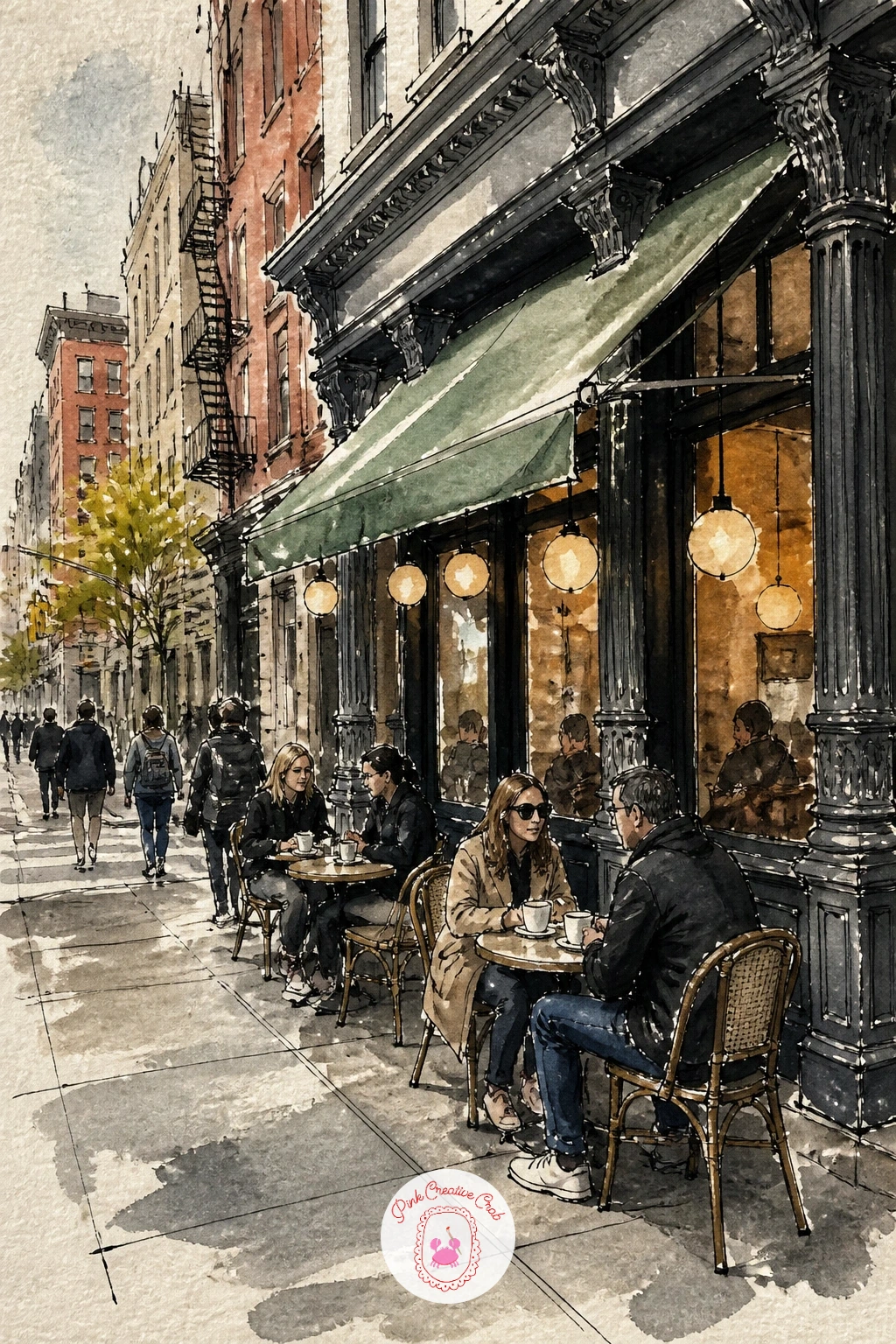
Palette: Payne’s Grey,Viridian,Burnt Sienna,Cadmium Yellow
Stay outdoors for a farmers market in Union Square, crates of produce lined up under rows of white tents. Draw the tent shapes first as simple triangles along the top of the page, then build rows of crates below, each one filled with a different loose cluster of color for apples, greens, or flowers.
Paint each crate’s contents wet into wet so the colors blend softly within their own crate, reds for apples, oranges for pumpkins or squash, greens for leafy vegetables, then once dry, ink in just enough crate lines and a few vendor figures standing behind the tables to tie the market together.
If the market feels too busy to finish in one sitting, limiting yourself to three or four crates rather than a long row keeps the scene manageable while still reading clearly as a market. No orange or deep red mixed exactly right, cadmium red and cadmium yellow blended on the page gets both close enough.
One tip for today: paint one crate noticeably larger in the foreground, which gives the whole busy scene a clear focal point.
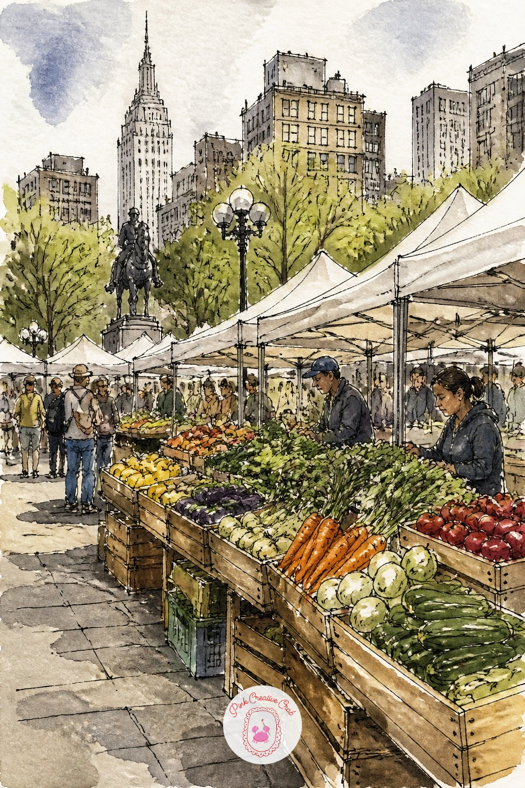
Palette: Cadmium Red,Cadmium Orange,Sap Green,Payne’s Grey
Head out onto the water for the ferry to the Statue of Liberty, passengers gathered at the rail for a view. Sketch the ferry’s hull low across the page first, then add the statue small and pale green in the distance, since getting her scale right compared to the boat is what sells the whole composition.
Measure it loosely: the statue should stand no taller than the ferry’s upper deck in your composition, keeping her clearly distant rather than looming unnaturally close. Paint the harbor water first in streaky blue-gray, then the ferry in white and gray with a few passengers at the railing as small dark silhouettes, and finally the statue in soft oxidized green, kept simple since detail this far away would look out of place.
If the statue ends up too large and dominates the page, painting over part of her with a touch more sky blue can push her back into the distance again. No oxidized green mixed, viridian with a touch of gray gets close.
Add a few gulls as small dark checkmarks in the sky for extra life.
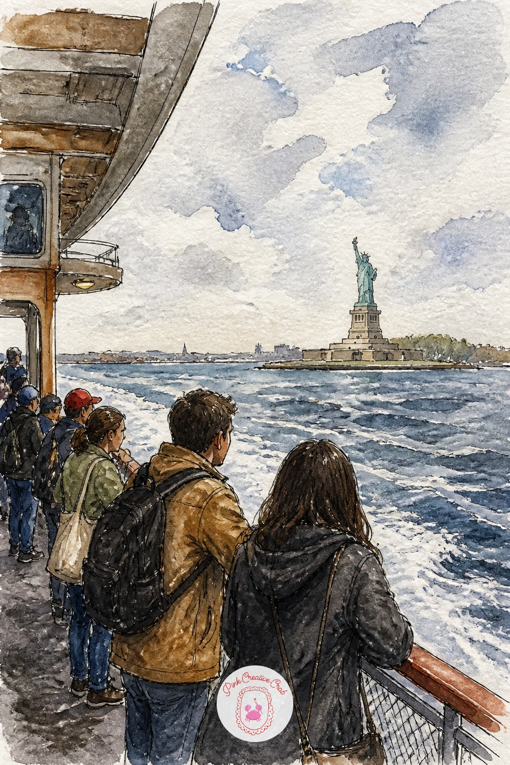
Palette: Cerulean Blue,Payne’s Grey,Viridian,Ivory Black
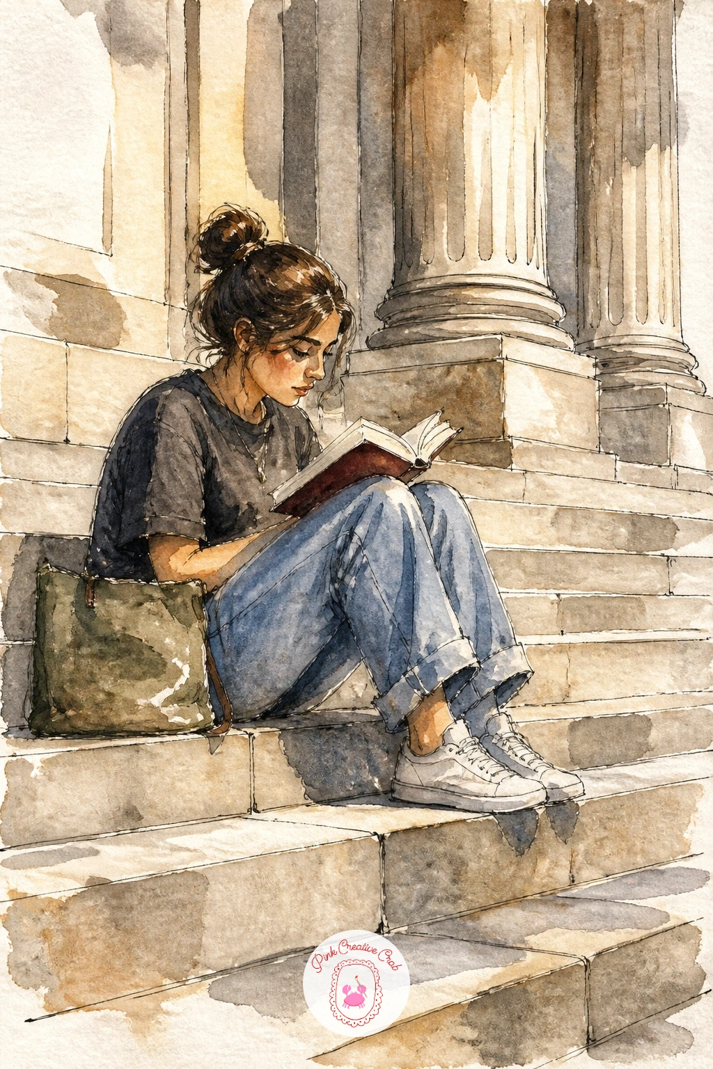
Come back to land for a girl reading on the Met steps, legs tucked up, book open against the backdrop of the museum’s columns. Sketch her seated pose first, since a comfortable, slightly curled posture reads far more natural than a stiff upright one, then block in the Met’s columns behind her as simple tall rectangles.
Paint her clothing in one or two warm colors before the stone columns behind, which keeps her the clear focus even against such a grand backdrop. Wash the columns in pale warm gray, letting the wash go a little uneven and streaky, since real limestone is never perfectly flat in color.
If her figure gets lost against the columns, outlining her shape with a slightly stronger ink line than the architecture behind her helps her pop back to the front of the scene. No pale gray mixed for stone, a very diluted Payne’s grey wash works just as well.
One tip for today: leave her open book as simple unpainted white pages with just a couple of fine ink lines, more detail there competes with her face for attention.
Palette: Burnt Sienna,Payne’s Grey,Cadmium Red,Yellow Ochre
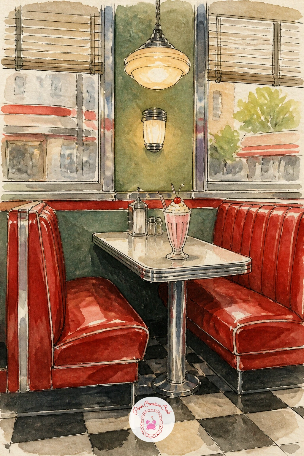
Duck inside for a vintage diner booth, red vinyl seats and a chrome-edged table set with classic diner details. Sketch the booth’s basic shape first, the curved seat backs and straight table edge, then add a milkshake glass, napkin dispenser, and salt and pepper shakers as a few simple small objects on the tabletop.
Paint the vinyl seats in a confident cherry red, leaving streaks of unpainted white paper along the curves to suggest the shine of vinyl under diner lighting. The chrome trim gets painted in cool gray with a sharp white highlight left along one edge, since that contrast of warm red against cool silver is what makes a diner booth feel authentically retro.
If the chrome looks dull instead of shiny, adding one single crisp white highlight line (rather than several soft ones) reads as a hard reflective surface much more convincingly. No cherry red mixed exactly, cadmium red with a touch of alizarin crimson gets close.
Fans of a nostalgic palette might also enjoy these retro junk journal pages for more mid-century color inspiration.
Palette: Cadmium Red,Payne’s Grey,Cadmium Yellow,Ivory Black
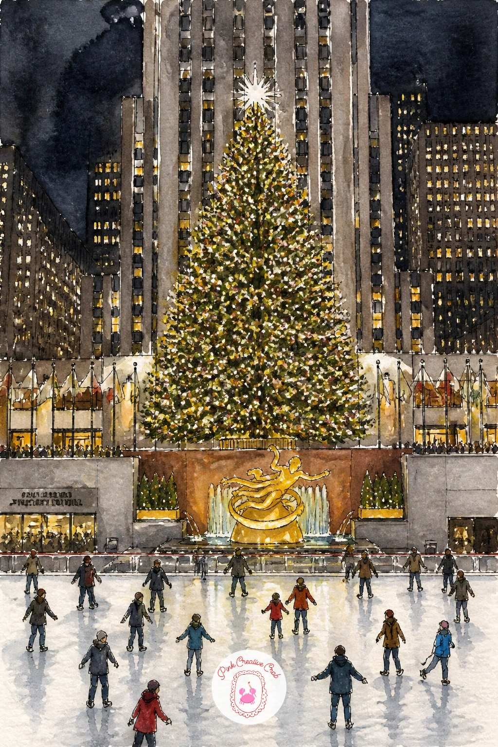
Bring in the holiday crowd for the Christmas tree at Rockefeller Center, lit from base to star and towering over the rink below. Sketch the tree’s triangle shape first, keeping the branches slightly uneven and layered rather than perfectly symmetrical, then add the ice rink curving at its base with a scatter of tiny skaters.
Paint the sky behind the tree in deep blue-black first so the lights have somewhere dark to glow against, then once dry, dot in small bright points of yellow, red and white across the tree for lights, scattered rather than in neat rows for a more natural twinkle. The gold star on top gets a single bright, confident dab of paint.
If the tree ends up looking like a flat green triangle, varying the green from dark at the center to lighter at the branch tips, plus those scattered light dots, brings the shape to life immediately. No deep blue-black mixed, Payne’s grey with a touch of dioxazine violet works well for a night sky.
For more holiday scenes in the same spirit, this Christmas painting ideas list has plenty of companions for this one.
Palette: Sap Green,Payne’s Grey,Cadmium Yellow,Cadmium Red
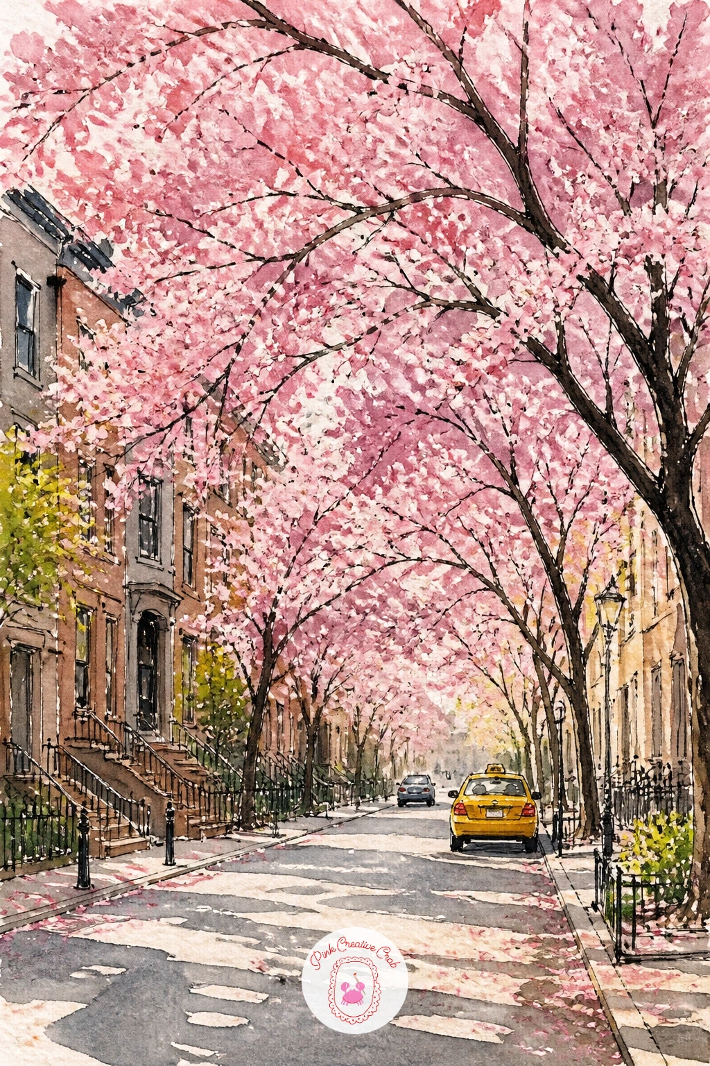
Soften things up with a cherry blossom street in spring, pink canopies arching over a quiet sidewalk. Sketch the tree trunks and branches first as a loose, twisting framework, then plan where the densest blossom clusters will sit before adding any color at all.
Paint the blossoms using a dry brush technique, loading the brush lightly and dabbing rather than stroking, which leaves soft clustered texture instead of a flat pink blob. Let that dry, then paint the tree trunks and branches in dark brown-gray over and around the blossom clusters, so dark trunk lines appear to grow naturally through the pink.
If the blossoms look too uniform, mixing in a few deeper pink or white-highlighted clusters among the lighter ones adds believable variety to the canopy. No dry brush technique mastered yet, dabbing with a slightly crumpled paper towel dipped in pale pink gives a similar soft, clustered texture.
For more ideas built around spring color and bloom, this collection on spring watercolor paintings is worth a look.
Palette: Quinacridone Rose,Cadmium Red,Burnt Umber,Payne’s Grey
End close and quiet with a pigeon on a park bench, puffed up and perfectly at home in the middle of the city. Sketch the pigeon’s round body shape first, since getting that plump, compact silhouette right is most of the work, then add the bench beneath it as a few simple slats.
Paint the pigeon’s body in soft gray, then while still slightly damp, drop in a touch of green and purple at the neck, since real pigeon feathers shimmer with those iridescent tones and even a hint of it brings real charm to a simple subject. Let that dry before inking the eye, beak and feet with a few confident small marks.
If the shimmer at the neck looks muddy, dropping the green and purple in as two separate small dots rather than blending them fully keeps each color distinct and more convincingly iridescent. No purple paint on hand, a touch of dioxazine violet goes a long way in a small dot.
One tip for today: paint the bench slats loosely in just two or three strokes, since too much detail there competes with the pigeon for attention.
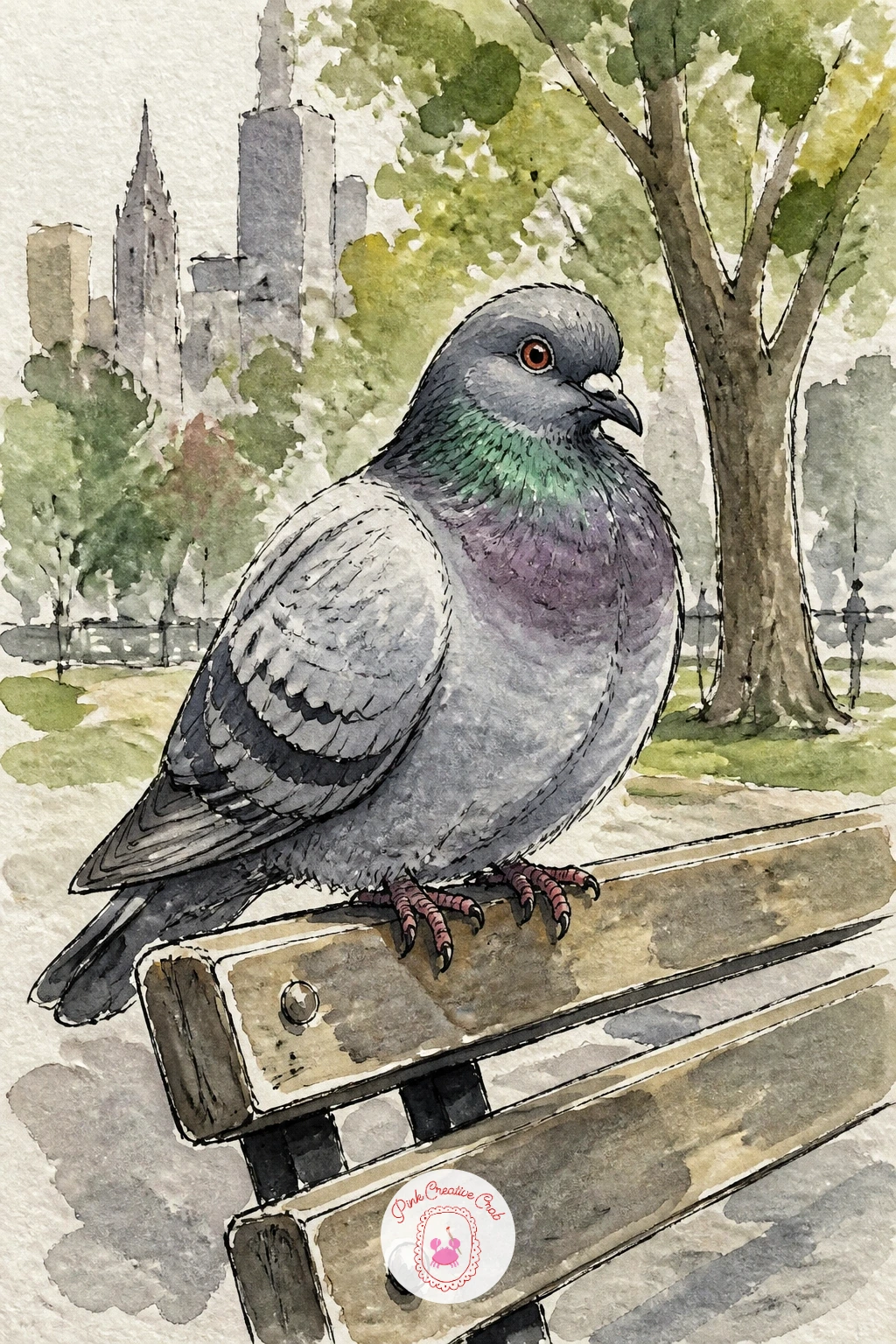
Palette: Payne’s Grey,Viridian,Dioxazine Violet,Burnt Sienna
Try this one larger than you normally would, filling most of the page with just the pigeon, which makes an ordinary city bird feel like a proper portrait.
What to Do Next
Pick one scene that matches the mood you want today, a quiet brownstone stoop for a calm afternoon or Times Square at night when you want to push some bold color, and start with a loose pencil sketch on a half sheet of cold press paper. One finished page is plenty to begin a whole sketchbook of New York.
Frequently Asked Questions
What paper works best for new york watercolor scenes like these?
Cold press watercolor paper around 140lb handles ink and wash well without warping too much. Its slight texture suits loose city scenes, giving brick, pavement and sky a bit of natural grain without fighting the fine linework.
Should you ink before or after painting a new york watercolor scene?
Ink first for crisp architecture, or ink last for a looser, painterly look. Most scenes here ink the structure first and add fine details like window lines after the wash dries, which keeps edges controlled while washes stay loose.
How do you keep city buildings from looking stiff in watercolor?
Draw rooflines and window rows slightly uneven rather than perfectly straight. Real buildings settle and lean a little, and a hand-drawn wobble reads as character rather than as a mistake.
What colors capture the New York watercolor look best?
City grays and warm browns carry most of the scene, with yellow, red and green reserved for cabs, awnings and signs. Keeping accent colors few and saturated makes them pop against the muted architecture around them.
Can beginners paint people into a new york watercolor scene?
Yes, simple silhouettes work better than detailed figures at any level. Painting people as flat, confident shapes with one accent color, a red coat, a yellow bag, gives scenes life without needing portrait skills.
Have any thoughts?
Share your reaction or leave a quick response — we’d love to hear what you think!
-
 0
-
0
-
0
-
0
-
0
-
0


