

Watercolor makeup is the perfect excuse to paint something glossy, pink and a little bit glamorous without ever leaving your desk. Every bottle cap, lipstick bullet and compact mirror below is a tiny beauty editorial of its own, built from the same loose washes and ink linework that make magazine illustration look effortless.
Pick whichever vignette catches your eye first, from a single red lipstick on marble to a full bridal makeup table, and work through the list in any order. Each one is sized for a single sitting, so you can finish a page, prop it by your mirror, and start the next tomorrow.
Using these images: free for personal projects such as printing, coloring, cards, journals and gifts. Handmade items that include them may be sold up to 30 pieces per design. More than that is commercial use and is not permitted, and neither is selling or sharing the images themselves or passing them off as your own. Please ask before any other use.
Start the whole set with a red lipstick, cap off, lying on a marble tray. Pencil the bullet first as two simple shapes, a cylinder for the tube and a soft bevelled cone for the lipstick itself, then ink only the edges you want crisp: the metal rim and the angled tip.
Wash the marble in pale grey mixed with a whisper of blue, then drop in a few diagonal veins with a fine brush while the paper is still damp so they feather softly instead of sitting as hard lines. Paint the lipstick in two passes, a flat cadmium red base left to dry, then a darker alizarin crimson shadow down one side to round the cylinder.
If the red turns muddy, lift paint while it is still wet with a clean damp brush rather than fighting it with more pigment. No red watercolor in your set works too, mix it from magenta and a touch of orange.
Finish with one dot of white gouache on the metal cap for the gloss: that single highlight is what makes the whole tray read as polished.
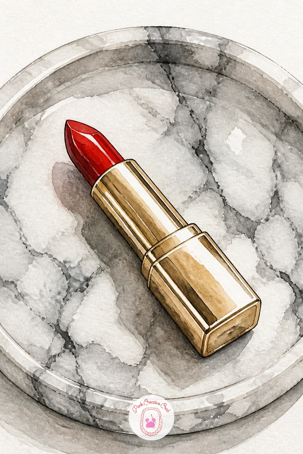
Palette: Cadmium Red,Alizarin Crimson,Payne’s Grey,Gold Ochre
An eyeshadow palette lets you practice painting several small warm colours side by side without worrying about one big wash going wrong. Draw the open palette as a simple rectangle with a hinged lid tipped up behind it, then divide the pan area into six or nine small squares in pencil before any paint goes down.
Compare the squares to each other as you paint rather than to the real thing: keep two consistently lighter than the rest and one noticeably darker so the palette reads as a proper gradient instead of random patches. Paint each shadow pan wet-in-wet so the pigment pools slightly in the centre, which mimics how pressed powder catches light.
Lay the fluffy brush across the corner last, in loose dry strokes of warm grey with a few stray bristle lines in ink. If your shadows look flat, go back once dry and add a tiny crescent of white gouache to two or three pans for shimmer.
Group your warmest shadow nearest the brush, it pulls the eye through the whole composition.
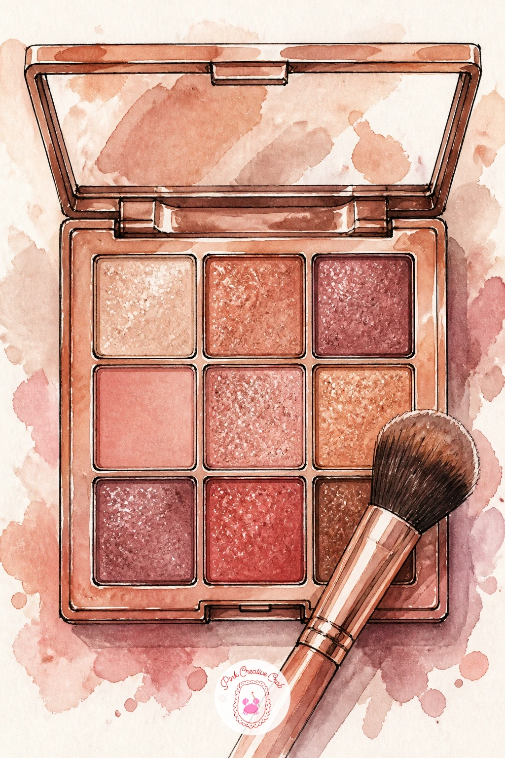
Palette: Burnt Sienna,Naples Yellow,Rose Madder,Warm Grey
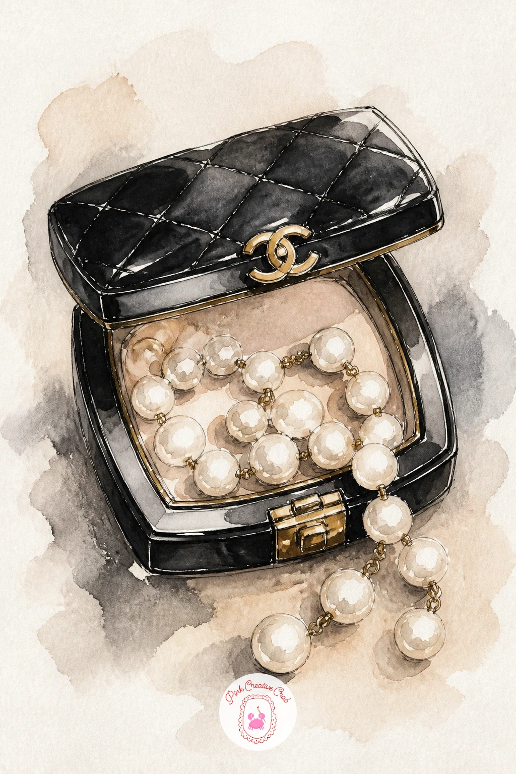
Move to something more luxe with a Chanel-style compact, its lid open, draped with a loop of pearls. Sketch the compact as a flattened oval, mark the quilted lid pattern lightly in pencil as a diamond grid, and ink only the outer rim and the double-C clasp with a confident single line.
Paint the compact body in black ink wash thinned with water so it stays a soft charcoal rather than flat black, leaving a slim unpainted edge along the top for shine. The eye level sits slightly above the compact looking down into the open powder, so the mirror inside tilts as a narrow ellipse, not a full circle: get that ellipse too round and the whole object looks like it is floating upright.
Paint the pearls last as a loose string of pale cream circles, each with one tiny white highlight left unpainted rather than added after.
If gold paint is not in your kit, mix Naples yellow with a touch of burnt sienna and add the gouache highlight once it dries.
You Will Need
- gold paint or gold gel pen
Palette: Ivory Black,Naples Yellow,Cream,Blush Pink
A spilling makeup bag is really several of the earlier objects arranged together, which makes it a good test of everything learned so far. Block in the bag shape first as a soft slouched pouch in ink outline, then sketch three or four items tumbling out: a lipstick, a compact, a brush, maybe a nail polish bottle.
Work from back to front so the pieces overlap convincingly, painting the furthest object first and letting its edge dry before the next one crosses in front of it. Keep the bag itself in one flat wash of dusty rose or quilted black so it does not compete with the brighter items spilling from it.
The common mistake is making everything the same size, which flattens the pile. Vary the scale deliberately, one larger hero item like the lipstick and the rest smaller, so the eye has somewhere to land first.
No pink in your palette for the bag works just as well in soft grey or cream, the spilled contents still carry the colour.
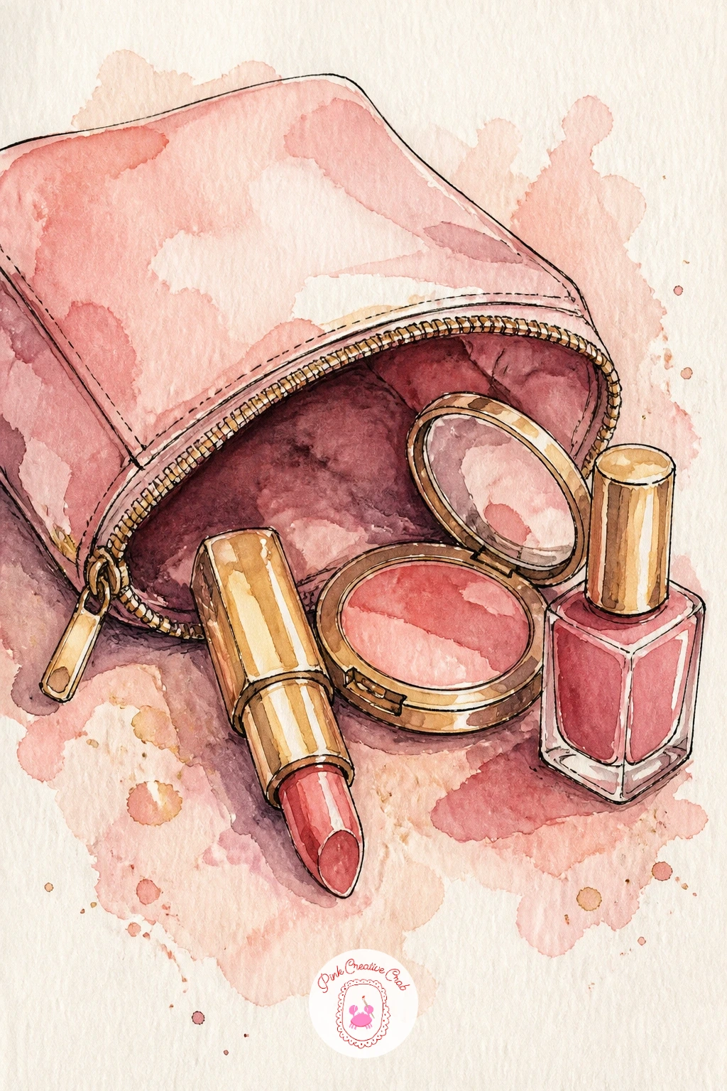
Palette: Dusty Rose,Cadmium Red,Ivory Black,Naples Yellow
Pair a round blush compact with a single peony bloom resting across it for one of the prettiest colour studies in the set. Draw the compact as a plain circle first, ink its rim, then place the peony so its petals overlap the edge rather than sitting politely beside it.
Paint the peony before the compact: build it from loose overlapping petal shapes in pale pink, dropping a slightly deeper rose into the base of each petal while the paper is still wet so the colour blooms outward on its own. Once the flower is dry, wash the compact in a flat warm pink and add the mirrored lid as a thin arc of grey-white.
If the peony petals bleed into one shapeless blob, your paper was too wet. Blot gently with a tissue and let it dry fully before adding the next petal layer, working from light to dark.
A fan brush loaded with pale pink makes quick soft petals if you are short on time and want to work bigger and looser.
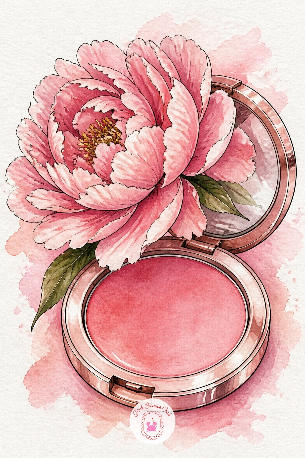
Palette: Opera Pink,Rose Madder,Blush Pink,Warm Grey
Look at a real peony photo for petal count before you start, even a loose painting reads better with five or six overlapping shapes instead of two or three.
Mascara and a lash curler side by side bring in some proper metal and tricky reflective surfaces, which is exactly the kind of practice worth doing once the softer subjects above feel comfortable. Decide where the light comes from before you draw anything: a single light from the upper left keeps every highlight and shadow consistent across both objects.
Ink the mascara tube as a slim cylinder with a tapered cap, and the curler as two hinged ovals with a thin rubber pad marked across the middle. Paint both in flat black or deep plum first, then go back once dry and lift a thin vertical streak of highlight on the side facing your chosen light using a damp brush or a kneaded eraser if the paint has not fully set.
The curler’s hinge is the part that usually goes flat and shapeless. Keep its ink line slightly darker than the rest so it reads as the mechanical joint it is.
Swap the plum for warm brown if black feels too stark against your paper.
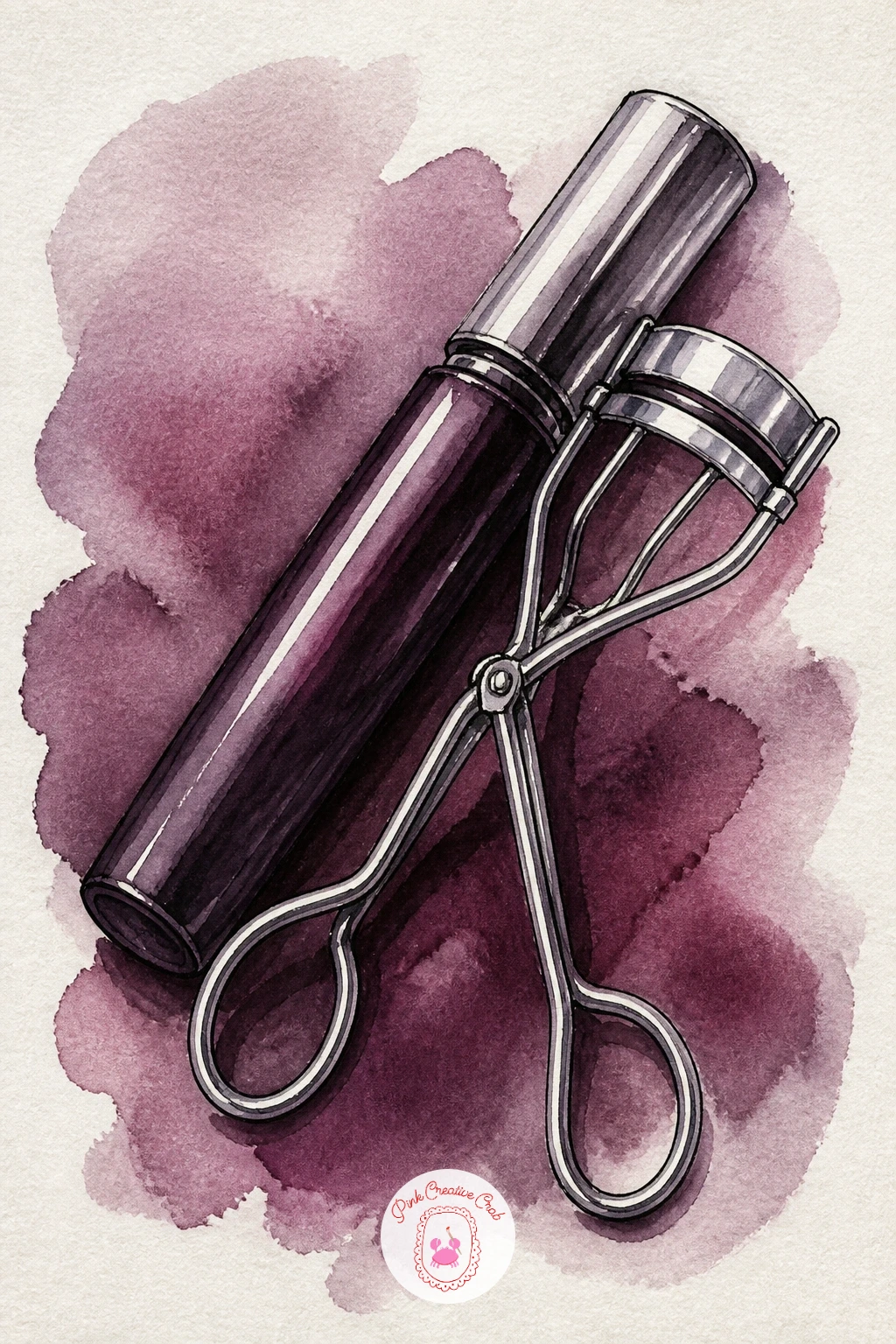
Palette: Ivory Black,Deep Plum,Silver Grey,Blush Pink
This is the first figure in the set, so keep her simple: a Hollywood-style vanity mirror ringed with bulbs, a girl’s face and shoulders reflected in it applying lipstick. Sketch the mirror as a large rounded rectangle first and space the bulbs evenly around the frame in pencil before inking a single dot for each.
Draw the face loosely, more suggestion than portrait: a soft oval, a tilted angle as she looks into the mirror, one hand raised with the lipstick near her mouth. Paint skin tone in one thin wash first, let it dry completely, then add the lipstick colour, a flush on the cheek and the shadow under her jaw as separate small washes once the base is dry, so nothing bleeds together.
Faces are where confidence usually drops. If features feel wrong, simplify further: a closed eye, a soft mouth shape and minimal linework reads as elegant rather than unfinished, which fits this beauty-editorial style anyway.
Warm the bulbs with a thin yellow glow around each one for extra sparkle.
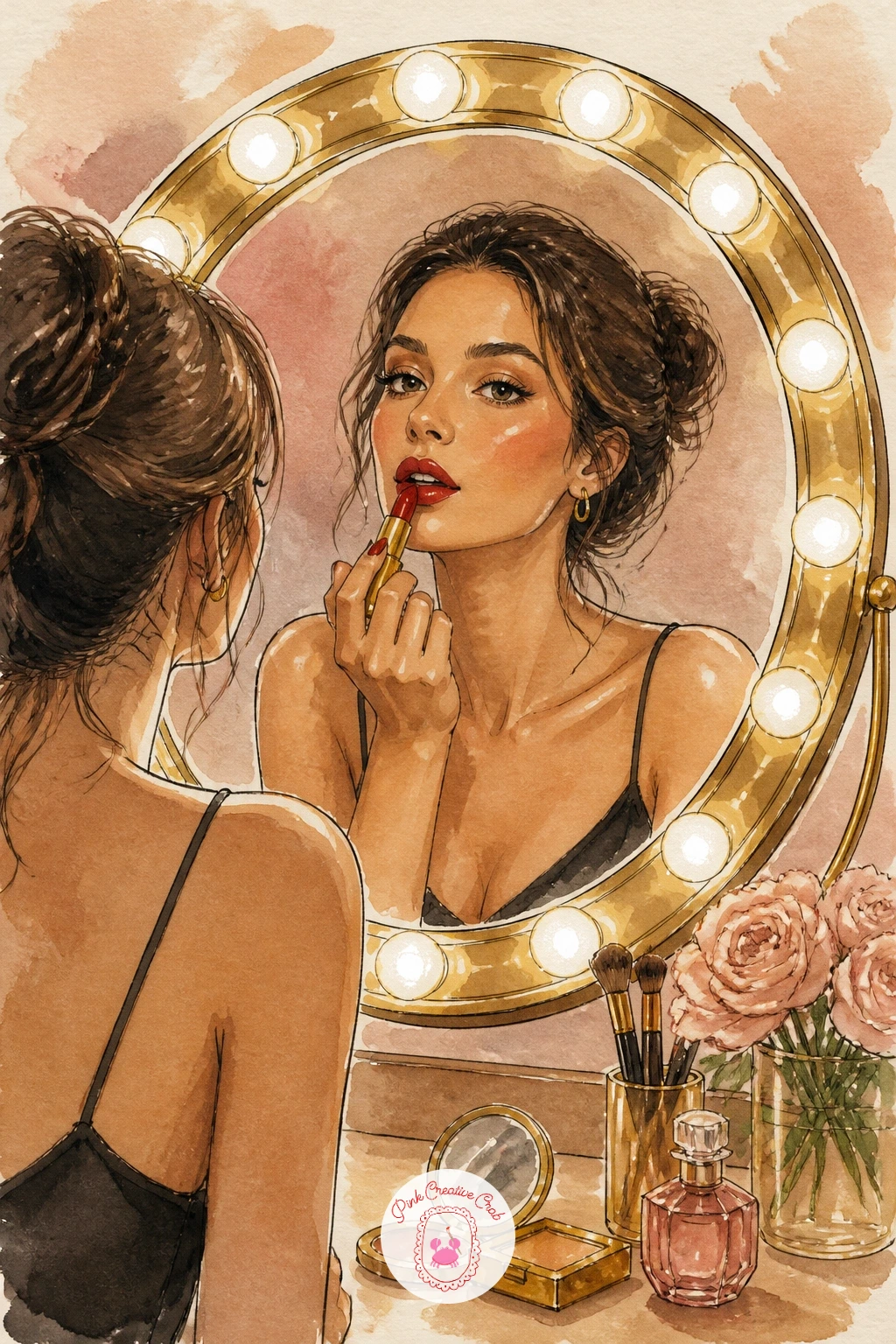
Palette: Naples Yellow,Rose Madder,Skin Tone (Raw Sienna mix),Cadmium Red
After a figure, settle back into object work with a Dior-style lip oil, its clear glossy barrel tied with a pink bow. Draw the bottle as a simple tapered rectangle, then leave a vertical strip of the paper completely unpainted down one side before you wash in the surrounding glass in the palest grey-pink: that untouched strip becomes the glossy highlight without any extra work later.
Paint the oil visible through the clear plastic as a warm rose wash sitting lower in the bottle, with a thin horizontal line marking the liquid level. Add the label lettering as loose implied marks rather than readable text, just enough ink to suggest a logo.
Tie the bow last in a brighter pink than the bottle so it pops forward, painting the ribbon loops as simple overlapping triangles with one shadow fold in a deeper shade.
If your paper buckles around the unpainted highlight strip, tape it down with low-tack tape before you start and the edge will stay crisp.
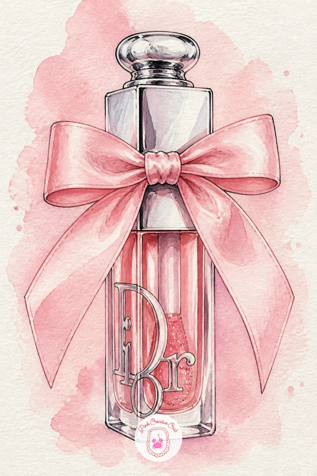
You Will Need
- low-tack tape (optional)
Palette: Opera Pink,Rose Madder,Silver Grey,Blush Pink
A cup of makeup brushes is a lesson in grouping similar shapes without them blurring into one mass. Sketch the striped cup first, keep the stripes in pencil as evenly spaced vertical lines, then draw five or six brushes fanning out above the rim at slightly different heights and angles.
Paint the cup’s stripes in two alternating colours, leaving thin white gaps between them so each stripe stays crisp rather than muddy. Paint the brush handles next in a single pass each, then come back for the bristle heads using a dry brush technique: load only a little paint, blot most of it off on scrap paper, and drag it lightly across the paper so the bristle texture shows through as broken, uneven marks.
Overworked bristles are the main pitfall here. Stop after one or two dry-brush passes, more layers just flattens the texture you were trying to create.
A cheap flat brush is honestly better for this bristle texture than an expensive round one.
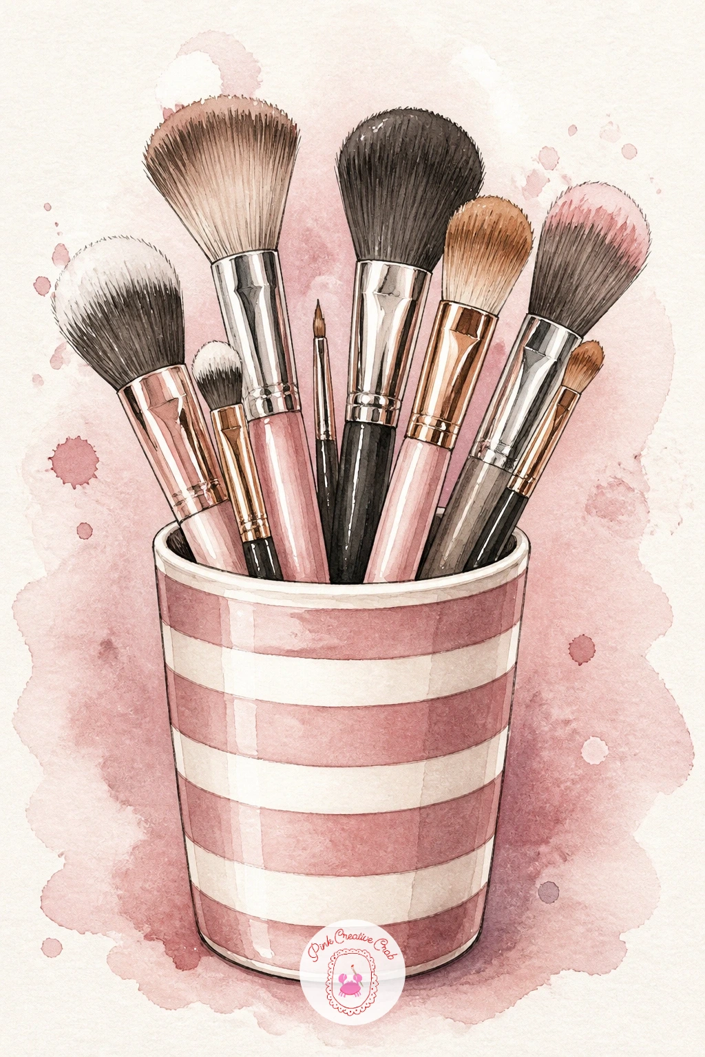
Palette: Dusty Rose,Cream,Burnt Sienna,Gold Ochre
Line up a small collection of pastel nail polish bottles for a quick study in glass and colour variety. Draw four or five bottles of slightly different shapes and heights, each with a simple rounded cap, standing in a loose row rather than a perfectly straight line so the arrangement feels casual.
In ten minutes you can block each bottle in one flat pastel wash, lavender, mint, baby pink, pale yellow, and call it done with a single white gouache highlight dot on each. Given forty minutes, build every bottle in two layers instead, a light base wash left to dry fully, then a slightly deeper tone of the same colour painted only on one side to round the glass.
Keep the caps consistent in one neutral tone, white or soft grey, so the eye reads them as a matching set rather than randomly coloured parts.
If a colour dries too pale to read, a second thin glaze once dry deepens it without muddying the glass look.
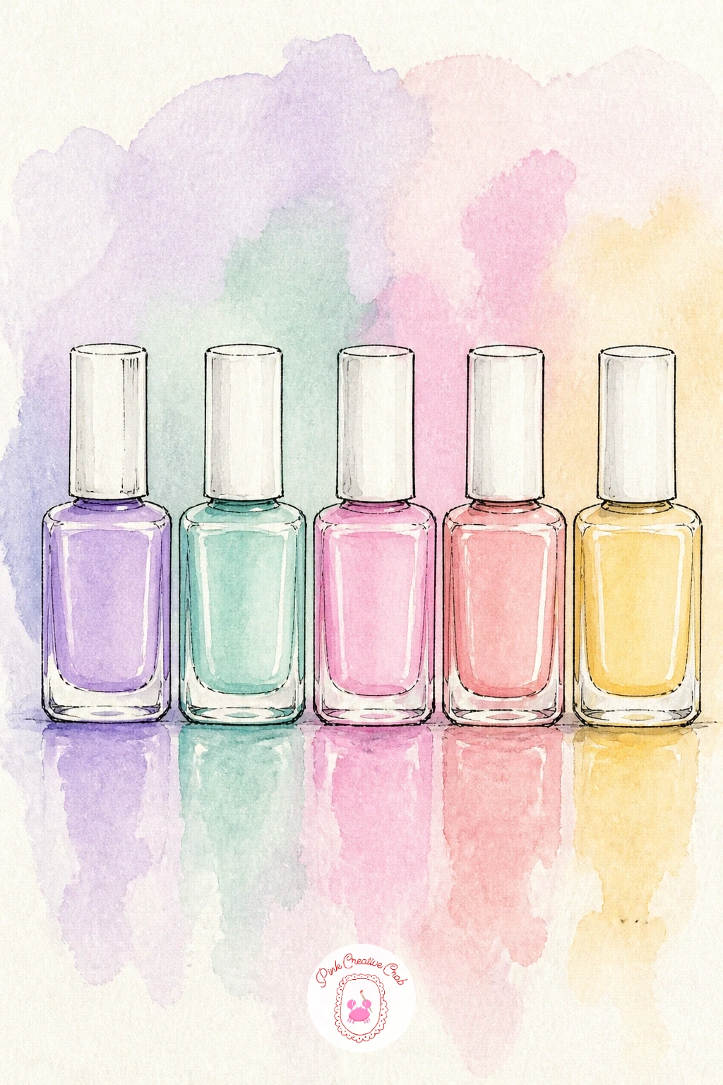
Palette: Lavender,Mint Green,Baby Pink,Pale Yellow
A highlighter swatch on a wrist is a small, satisfying subject built almost entirely around one shimmer effect. Draw the forearm loosely as a simple curved shape, just enough wrist and hand to anchor the swatch without needing full hand anatomy.
Paint the skin in one thin even wash first and let it dry completely before touching the swatch area. Mix a warm champagne colour for the highlighter and drag it across the wrist in one confident diagonal stroke with a flat brush, then immediately dab a little clean water along its upper edge so the colour softens into the skin the way cream highlighter does on real skin.
While still slightly damp, dot in flecks of white gouache for the shimmer: this only works if the paint beneath is still a little wet, so do not let it dry fully first. Too dry and the gouache dots sit flat and obvious instead of catching light.
If gouache is not on hand, a white gel pen does the same job once the wash is fully dry.
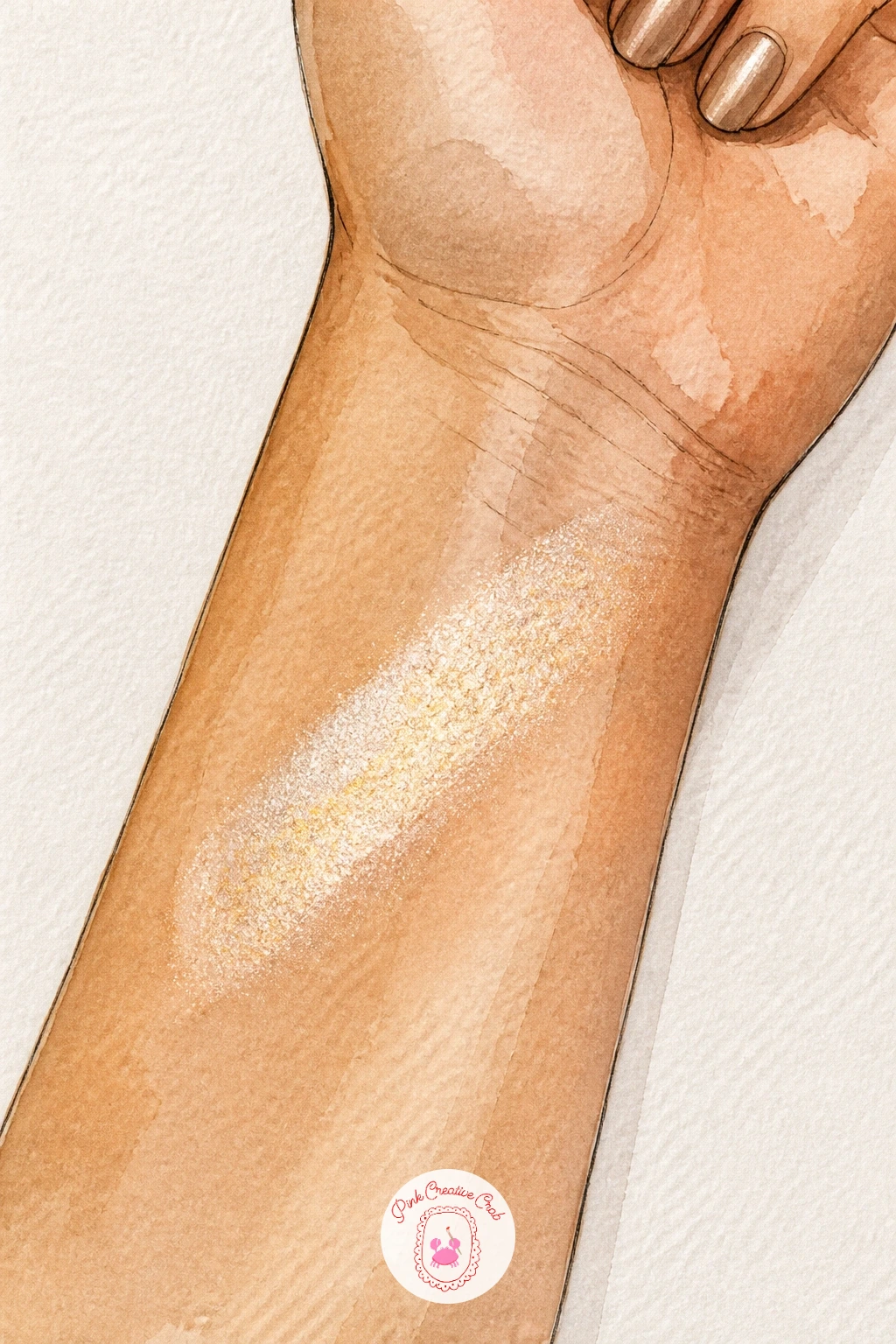
You Will Need
- white gel pen (optional)
Palette: Skin Tone (Raw Sienna mix),Champagne Gold,Cream
Follow the highlighter with something glossier still: a clear lip gloss tube paired with a single cherry, stem and all. Draw the gloss wand resting beside the tube, its tip coated, then place the cherry so it slightly overlaps the base of the tube to tie the two objects together in the composition.
Paint the cherry first in two rounds of cadmium red, building the shape with a darker patch where it curves away from the light, then leave one small unpainted highlight near the top that you fill with white gouache once dry. The gloss tube gets the same unpainted-strip trick as the lip oil earlier: skip a vertical band of paper entirely to suggest clear plastic catching light.
Edges are what make or break glossy subjects. Keep the cherry’s outline soft by painting wet-in-wet, but keep the gloss tube’s outline crisp with a dry brush and firm ink line, the contrast between soft fruit and hard plastic is what sells both textures.
A touch of green for the stem finishes it in seconds.
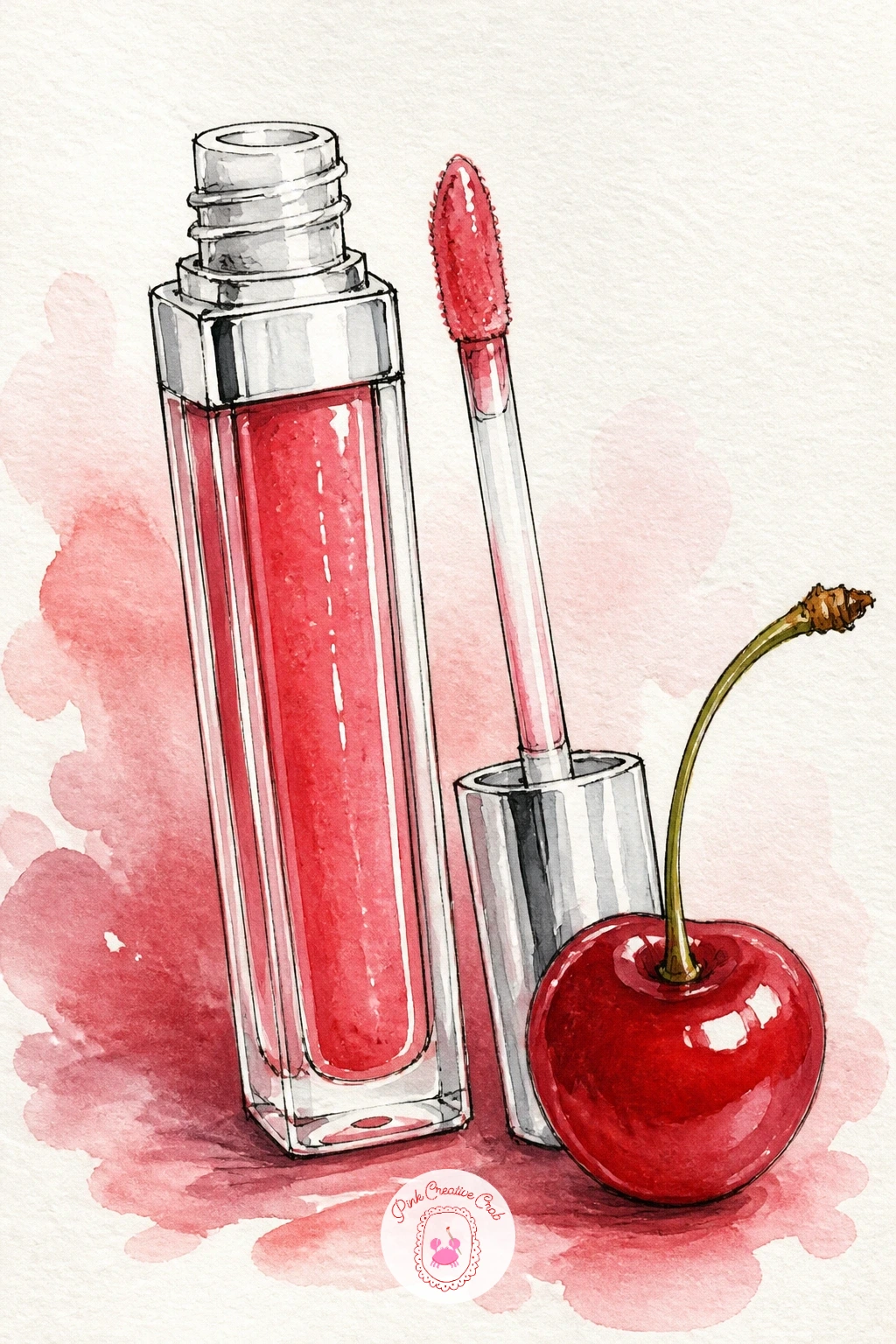
Palette: Cadmium Red,Alizarin Crimson,Sap Green,Silver Grey
A beauty blender draped over a puddle of silk scarf is a nice break from hard objects into pure soft shapes and fabric folds. Draw the sponge as a simple teardrop, rounded at the base and narrowing to a point, sitting in a loose fold of fabric sketched beneath it.
Paint the scarf first in long sweeping strokes of one colour, letting the paint pool slightly in the fold lines so the fabric reads as silk rather than flat paper. Once that layer is dry, paint the sponge in a flat pink wash, then drop a slightly deeper pink into its lower third while still damp so it shades naturally from light at the tip to deeper at the base.
The scarf folds are where this goes wrong most often: too many fold lines and the fabric looks crumpled rather than silky. Stick to two or three long sweeping folds and leave the rest of the scarf smooth.
No silk-pink in your palette, a pale peach or lavender scarf works just as well under the pink sponge.
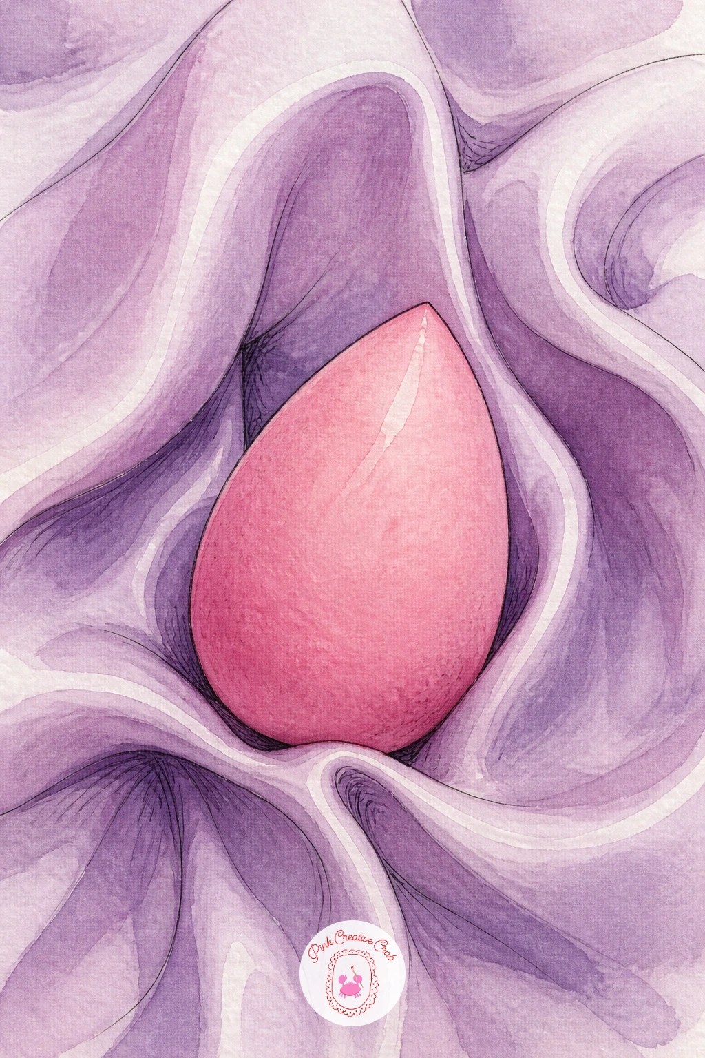
Palette: Blush Pink,Rose Madder,Lavender,Cream
Switch to a vintage mood with an old-fashioned powder puff resting half out of its compact. Draw the compact lid open at a wide angle so you can see both the mirror inside and the round puff sitting on the powder, then keep every line slightly looser and more hand-drawn than the sleeker modern objects earlier in the list, which suits the vintage feel.
Paint the puff using a dry-brush technique from the start: load a soft round brush lightly with pale cream, blot it almost dry, and press rather than stroke it onto the paper so the fluffy edge comes from the texture of the brush itself, not from any linework. Build the compact’s metal casing in warm gold beneath it once the puff is fully dry.
If the puff’s edge still looks too hard, soften it immediately with a clean damp brush before the paint sets, pulling tiny fibres of colour outward.
A stiff old toothbrush, barely loaded, gives the same soft stippled edge if a round brush feels too controlled.

You Will Need
- old toothbrush or stiff dry brush (optional)
Palette: Cream,Gold Ochre,Warm Grey,Blush Pink
A shelf of skincare and makeup bottles lined up together is the most object-heavy scene so far, a good chance to practice keeping a crowd of shapes readable. Sketch the shelf as one simple horizontal line first, then draw five or six bottles and jars of different heights standing along it, overlapping slightly where they crowd together.
Measure each bottle against its neighbour before you paint anything: hold your pencil up to the sketch and compare heights directly rather than guessing, since shelf scenes fall apart fast when every bottle ends up the same size. Paint the tallest two or three items first in flat washes of their main colour, let them dry, then fill in the smaller jars between them once the big shapes are settled.
Keep labels as loose ink marks rather than full text, a few confident lines read as a label from a normal viewing distance.
Group bottles by colour family, pale blues and greens together, warm pinks together, and the whole shelf reads as curated rather than cluttered.
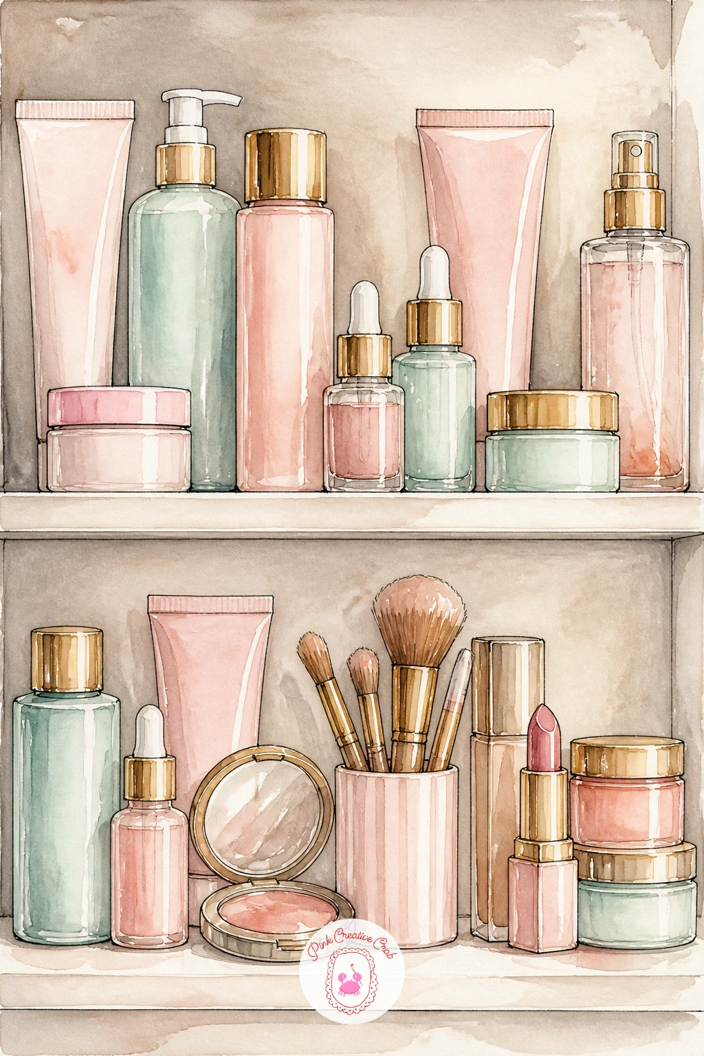
Palette: Mint Green,Blush Pink,Cream,Silver Grey
Bring the figure back for a cosier scene: a girl with a face mask on, holding a cup of tea. Draw her face as a simple oval first, the mask indicated by a flat even tone rather than any real detail, eyes and mouth left as the only visible features against it, which actually makes this an easier face to paint than the lipstick mirror scene earlier.
Paint the mask in one solid pass of pale clay or mint, whichever shade you prefer, and let that dry fully before adding her eyes, brows and a small relaxed smile in a few quiet ink lines. The teacup comes last, painted smaller and slightly lower in the frame so it supports the face rather than competing with it.
Hair is the easiest place to lose confidence here. Paint it as a few large flat shapes first, dark at the roots fading lighter at the ends, and only add a handful of loose strand lines once that base is dry.
Steam rising from the tea in a few curved pencil-thin lines finishes the cosy mood.
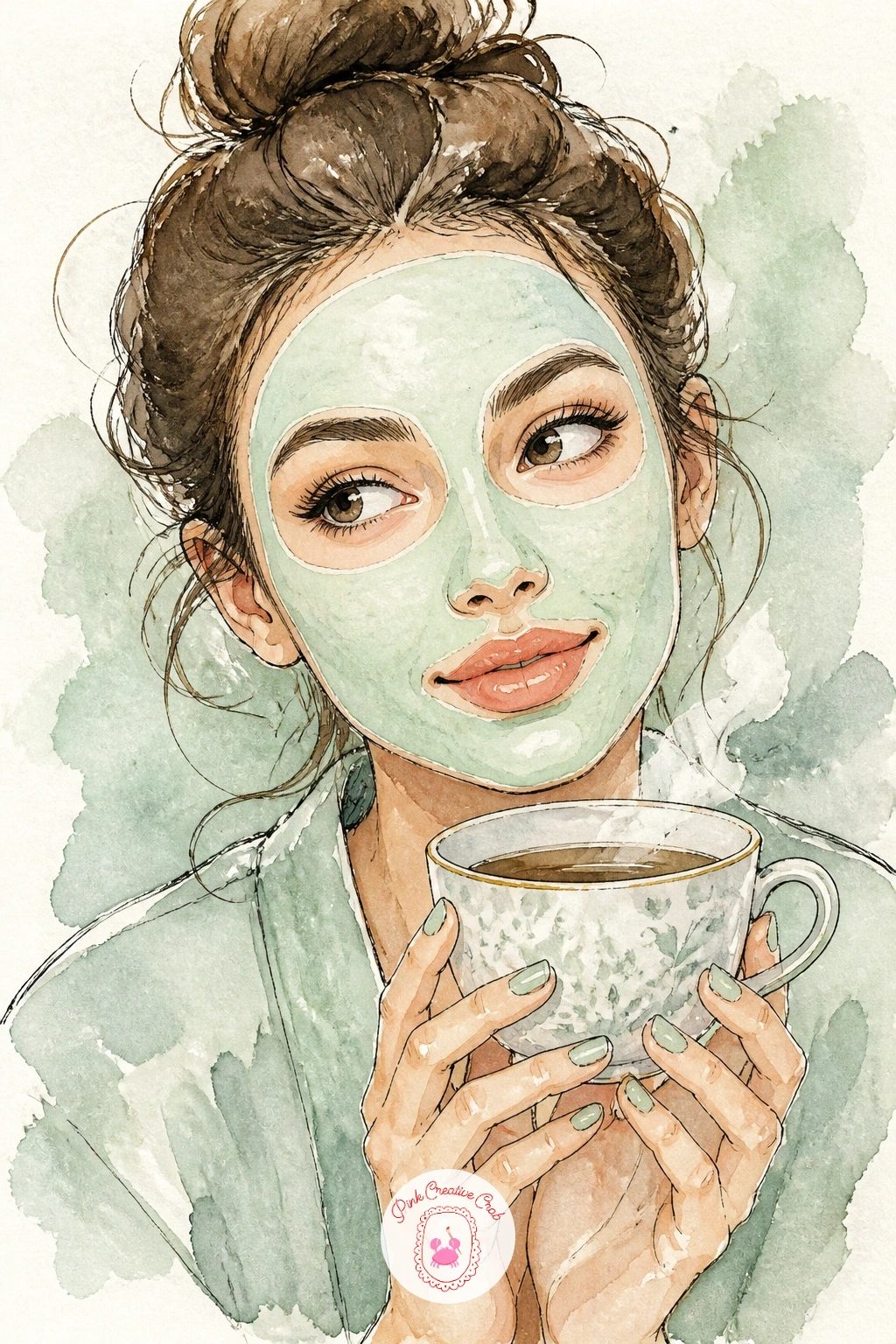
Palette: Clay Green,Skin Tone (Raw Sienna mix),Burnt Sienna,Cream
A makeup bag tossed open on a hotel bed brings in soft bedding texture alongside the usual small objects. Draw the bedspread first as a few large folded shapes, then place the open bag slightly off centre with a couple of items, a lipstick, a brush, spilling just beyond its zip.
Paint the bedding in one pale wash, white, cream or soft grey, and drop in shadow folds while still damp so they blend softly rather than sitting as hard lines across the fabric. Once dry, paint the bag itself in a bolder colour so it reads clearly against the pale bedding, then add its spilled contents in quick confident shapes.
The bedding often ends up looking stiff rather than soft. Keep every fold line curved, never straight, and vary their spacing so the fabric feels draped rather than pleated.
If you enjoy this kind of travel vanity scene, a similar sense of gathered small objects shows up in these picnic drawing ideas, worth a look for more practice arranging clusters of things.
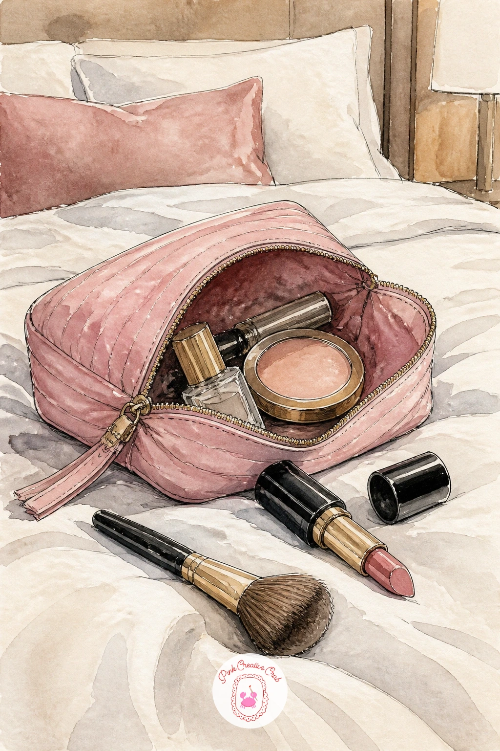
Palette: Cream,Dusty Rose,Warm Grey,Cadmium Red
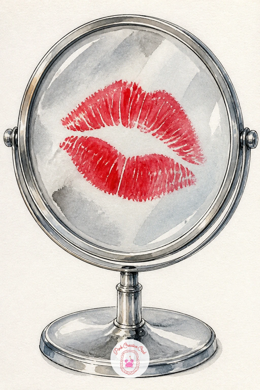
A lipstick kiss print on a mirror is one of the simplest ideas here but depends entirely on getting the shape right. Draw the mirror as a plain oval or rectangle frame in ink first, then lightly pencil the kiss mark as two overlapping lip shapes before touching any paint, since freehand lip shapes painted directly tend to come out lopsided.
Paint the kiss in one bold wash of true red, leaving a few tiny unpainted gaps where lipstick texture naturally skips across lip lines rather than filling in perfectly solid. Once dry, add the mirror’s glass with a very pale grey wash around the kiss mark, leaving the kiss itself untouched so it stands out starkly against the glass.
If the lips look too neat and stamped rather than kissed, go back with a nearly dry brush and drag a few short lines radiating outward from the centre, mimicking the fine lines of a real lip print.
A silver gel pen traced lightly around the mirror frame adds a nice reflective edge.
You Will Need
- silver gel pen (optional)
Palette: Cadmium Red,Alizarin Crimson,Silver Grey
A Glossier-style pink pouch is a clean, minimal subject after the busier mirror and bedding scenes, good for practicing confident flat shapes. Draw the pouch as a simple rounded rectangle with a zip line across the top, keeping the silhouette soft rather than boxy to match the brand’s signature pillowy look.
Paint the whole pouch in one flat wash of bubblegum pink, no shading yet, and let it dry completely. Once dry, add shadow only at the base and along one side using a slightly deeper pink, which is enough to give it form without losing that clean, minimal feel the subject calls for.
The zip pull is a nice small detail to practice precise ink work: one short confident line and a tiny loop, nothing more. Overworking this one small detail is the main risk, since the whole appeal of the subject is its simplicity.
No bubblegum pink in your set, mix a touch of white gouache into magenta for a close match.
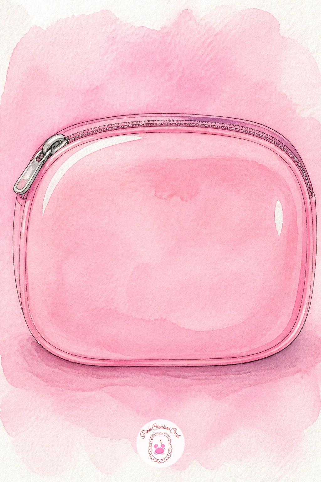
Palette: Bubblegum Pink,Rose Madder,Cream
Pair a perfume bottle with a lipstick on a small tray for a lesson in contrasting glass and matte textures side by side. Draw the perfume bottle first with a faceted body, a few straight pencil lines marking where each flat side catches light differently, then stand the lipstick beside it, slightly shorter, cap resting next to the base.
Light the whole tray from one side consistently: paint the perfume’s facets closest to that light in pale gold, and the facets turning away from it in a deeper amber, which is what makes faceted glass look three-dimensional rather than flat. The lipstick gets a single even red wash by comparison, since matte lipstick has none of that faceted light play.
Painting the glass too uniformly is the main trap. Commit to at least two distinct tones across the perfume bottle’s faces even if it feels like overdoing it while wet, it settles once dry.
The tray beneath can be a quick flat wash of warm grey, just enough to ground both objects.
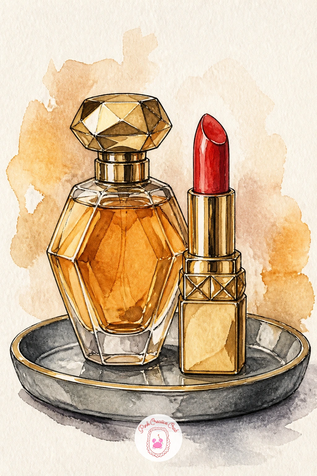
Palette: Gold Ochre,Amber,Cadmium Red,Warm Grey
Take the earlier eyeshadow palette further with a full rainbow palette, every pan a different hue arranged in a gradient. Draw the palette as a wide rectangle and divide it into a neat grid of small squares, more pans than the warm palette earlier since the rainbow effect depends on having enough steps between colours.
Paint in spectrum order, red through orange, yellow, green, blue and violet, mixing a touch of white gouache or leaving paper showing through for paler steps between the main hues. Work left to right in one sitting if possible so the colours stay consistent in strength, since returning to this later often means your mixes do not quite match.
Muddy transitions happen when wet pans touch their still-wet neighbours. Leave a hair’s width of dry paper between each square as you paint, or wait for one to dry before filling the next.
Once this version works, try it again as a duochrome palette next time, just two colours shifting gradually across the whole pan for a completely different, more sophisticated mood.
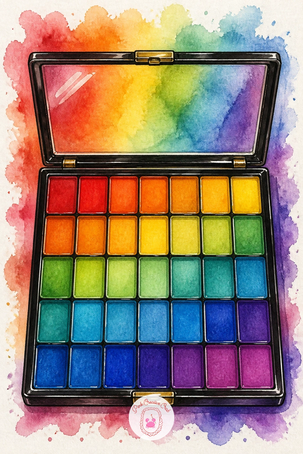
Palette: Cadmium Red,Naples Yellow,Sap Green,Lavender
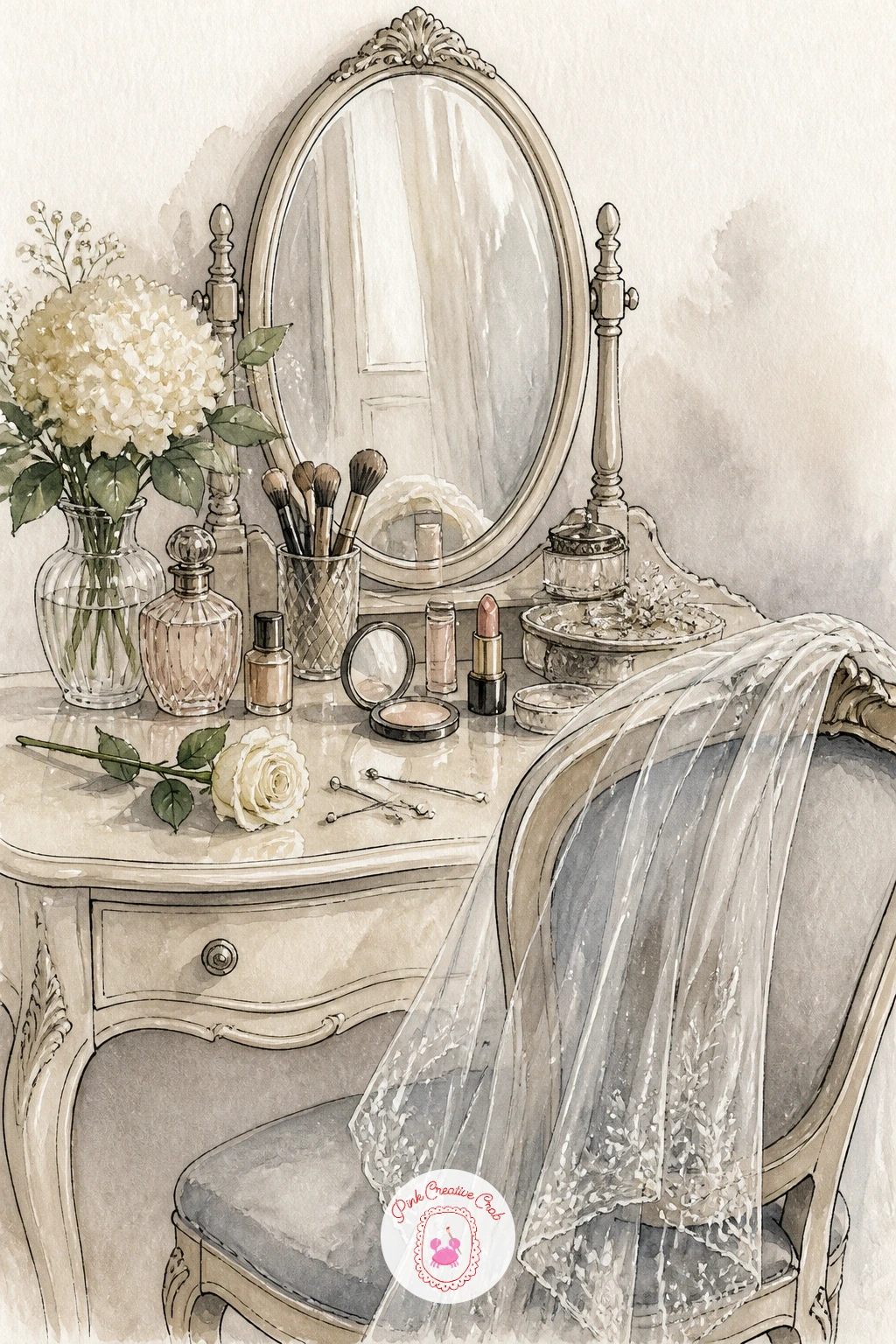
Build a small bridal makeup table next, bringing together several objects from earlier ideas into one composed scene: a mirror, a veil draped over a chair back, a scattering of pins and a single white rose. Draw the mirror first as the anchor of the composition, then work outward, adding the veil as a few long soft shapes flowing down one side.
Paint the veil almost entirely in clean water with the faintest hint of grey or cream pigment dragged through it, since real tulle reads as barely-there in a painting, not solid. Add the rose in crisp white petal shapes defined mostly by their shadow sides rather than any white paint, letting the paper itself be the white.
Too much colour in the veil is the classic mistake, it should almost disappear next to the bolder mirror and rose. If it overwhelms the scene, lift pigment immediately with a damp tissue while still wet.
This quieter, romantic mood pairs nicely with the soft florals in these simple watercolor flower ideas if you want to practice the rose separately first.
Palette: Warm Grey,Cream,Sap Green,Gold Ochre
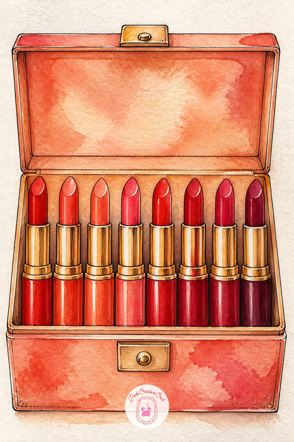
A box of lipsticks standing upright, each a different shade, is a satisfying repeat-shape exercise after the more varied bridal scene. Draw the box first as a simple open rectangle, then stand six or eight lipstick tubes inside it at slightly different heights so the row has gentle rhythm rather than looking like a row of identical soldiers.
Paint every tube using the same two-step method from the very first idea in this list, a flat base colour followed by a shadow pass down one side, but vary the actual colour on each one, reds, corals, mauves, berries, so the collection reads as curated rather than repeated. Keep the box itself simple, one flat warm wash, so the colourful lipsticks stay the clear focus.
Repetition is where energy drains from a painting. Vary cap colours slightly too, not just the lipstick shades, to keep the whole row lively rather than mechanical.
Ten minutes gets you a loose row of five tubes, forty minutes lets you add individual labels and a cast shadow beneath each one.
Palette: Cadmium Red,Rose Madder,Opera Pink,Burnt Sienna
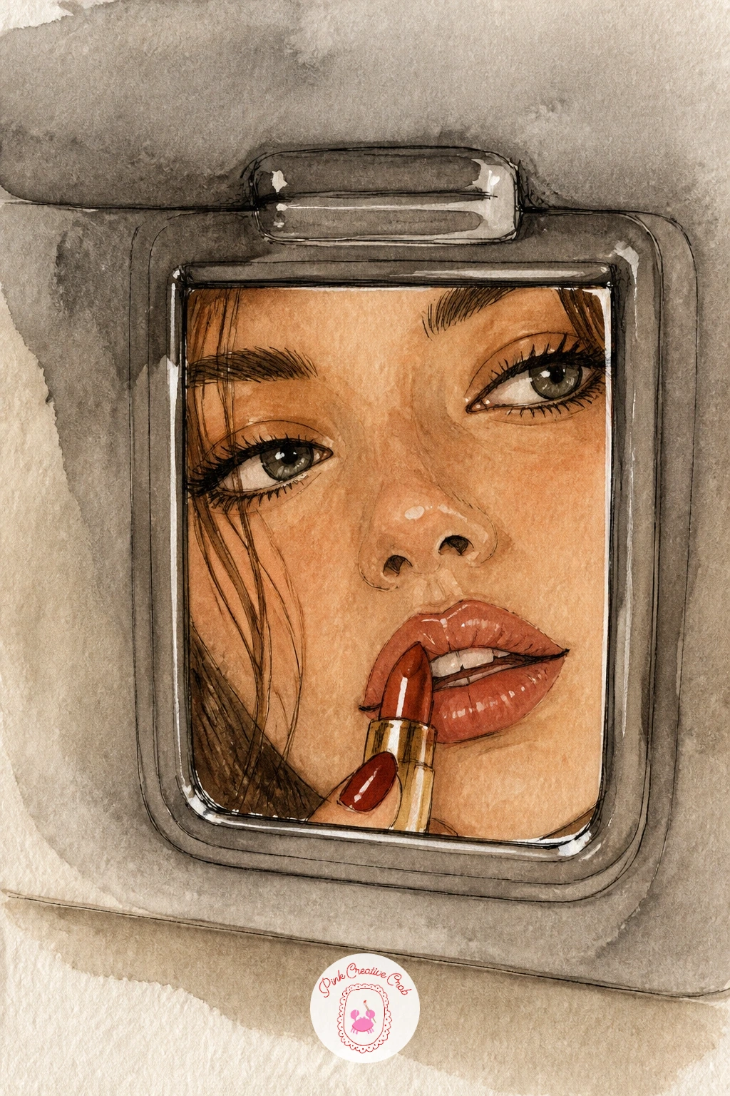
Bring the figure back once more for a candid moment: a girl checking her lipstick in a car’s sun visor mirror. Sketch just her eyes, brow and the top of her nose framed tightly by the small mirror shape, since a car mirror crops the face naturally and gives you permission to paint far less than a full portrait.
Paint the visor and mirror frame first in flat grey or beige, then work on the small sliver of face last, building it in thin layers the same way as the earlier vanity mirror scene. A warm interior light from above her, through the car’s roof, means the shadow under her brow sits slightly flatter than full daylight would give.
Keeping the crop tight is what makes this idea work. Resist the urge to draw more of the car interior around the mirror, the tighter and more intimate the crop, the more natural the moment feels.
A single smudge of mascara shadow under the lash line adds believable detail fast.
Palette: Skin Tone (Raw Sienna mix),Warm Grey,Cadmium Red,Burnt Sienna
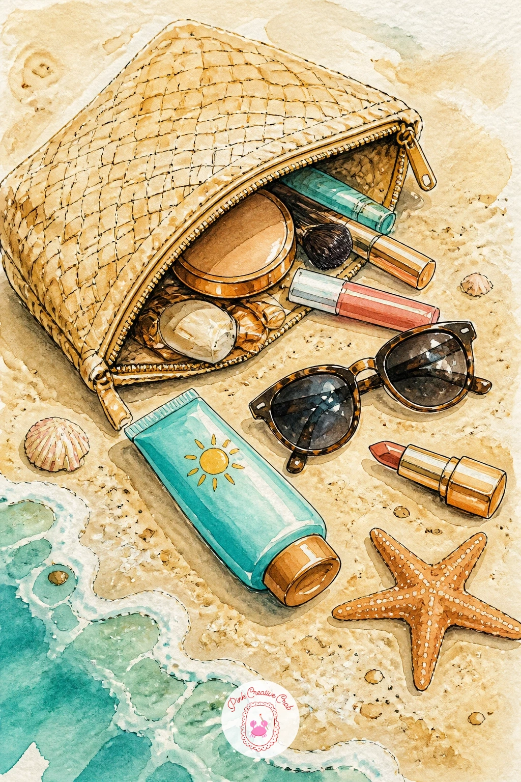
Move the makeup bag outdoors for a breezier scene: a straw-textured pouch half open on sand, sunglasses and a tube of sunscreen spilling beside it. Draw the bag with a slightly irregular woven texture in your pencil lines, then scatter two or three beach items loosely around it rather than in a tidy row.
Paint the sand first in a wide pale wash of warm yellow ochre, and while it is still damp, flick a little clean water or extra pigment across it with a dry brush to suggest grainy texture without drawing individual grains. Once dry, paint the bag and its spilled items on top in bolder, more saturated colours so they lift clearly off the sandy ground.
Sand painted too smoothly looks like plain paper. That flicked-texture trick is the one thing that sells it, so do not skip it even if it feels fussy.
A toothbrush loaded with thinned paint and flicked with your thumb gives the same grainy sand texture if a dry brush feels too subtle.
You Will Need
- toothbrush for texture (optional)
Palette: Yellow Ochre,Turquoise,Cadmium Red,Cream
Return indoors for a quieter vintage vanity scene: a hand mirror resting face-up beside a scattering of hairpins and a small perfume atomiser. Draw the hand mirror’s handle at a diagonal angle, the mirror face itself as a simple ellipse, then arrange the smaller objects loosely around its base so the eye travels around the handle rather than straight past it.
Paint the mirror’s glass as the lightest value in the whole scene, almost pure pale grey-blue, since a mirror should read as reflecting light rather than absorbing it like the other solid objects nearby. Build the ornate handle in warm gold or tortoiseshell brown with a few confident ink flourishes suggesting engraving, rather than trying to paint every curl of detail.
Overworking the handle’s decoration is the main risk in a vintage piece like this. Three or four ink marks suggesting filigree read as far more convincing than an attempt at drawing every line literally.
If you enjoy this older, softer mood, the same restrained linework shows up well in retro junk journal pages, worth a browse for more vintage object ideas.

Palette: Silver Grey,Gold Ochre,Burnt Sienna,Cream
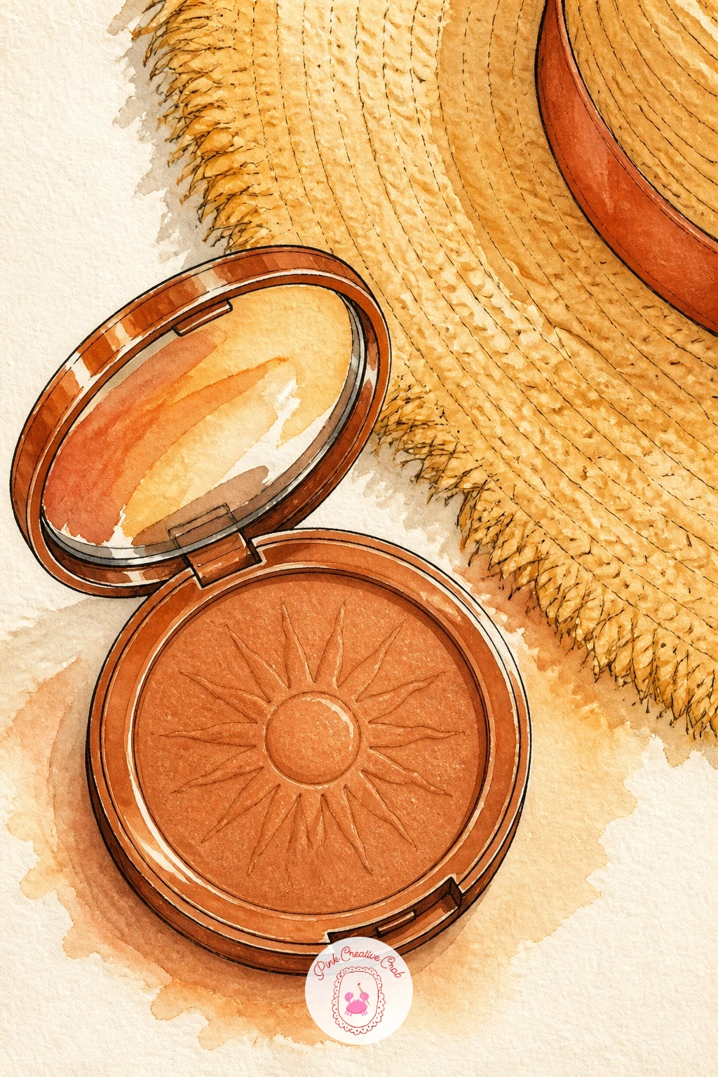
A bronzer compact paired with a woven sun hat brim curling into frame brings a warm, sunlit mood back into the set. Draw the compact as a simple round shape first, the bronzer’s surface marked with light swirl lines in pencil, then let the hat brim enter from one corner rather than sitting fully in frame, which gives the scene a cropped, candid feel.
Paint the bronzer itself in warm terracotta with the swirl lines picked out in a slightly deeper shade once the base dries, the same two-step method used for the lipsticks and perfume earlier in this list. Paint the straw hat brim using the same dry-brush bristle technique as the makeup brushes idea, dragging a half-loaded brush across the paper so individual straw fibres show as broken strokes rather than a flat woven block.
If the straw ends up too even and blanket-like, that is too much paint loaded on the brush. Blot it further on scrap paper and try again lighter.
A warm yellow glow washed loosely around both objects suggests sunlight without needing any extra elements.
Palette: Terracotta,Gold Ochre,Naples Yellow,Burnt Sienna
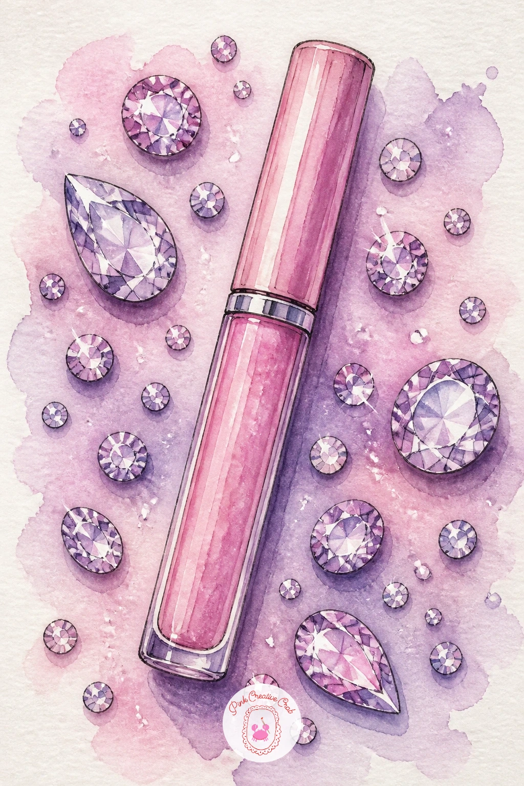
Close the set with the most sparkly subject of all: a small tube of lash glue beside a scatter of loose rhinestones ready for a party look. Draw the glue tube as a simple slim cylinder with a tiny precision tip, then scatter six or eight rhinestones around its base in varied sizes, a few overlapping slightly for interest.
Paint the tube in a quick flat wash, clear or soft pink, using the same unpainted-strip trick from the lip oil and gloss ideas earlier for its glossy highlight. For the rhinestones, paint each as a tiny faceted shape in pale grey-blue, then once fully dry, add one bright white gouache dot and one tiny coloured fleck to each stone to suggest the way rhinestones throw small rainbows of light.
Rushing the gouache dots before the base paint dries is what ruins this one, the white blurs into a grey smudge instead of sitting crisp on top. Wait it out, even if that means stepping away and coming back.
If gouache is not available, a silver or white gel pen gives the same crisp sparkle dot with no drying time needed.
You Will Need
- white gouache or gel pen
- fine detail brush
Palette: Silver Grey,Blush Pink,Cream,Lavender
What to Do Next
Pick one idea that matches the mood you are in today, maybe the red lipstick on marble if you want something quick, or the bridal makeup table if you have a longer afternoon ahead. Tape down a small sheet of cold press watercolor paper, pencil in the main shapes loosely, and let the first wash dry before you add a single highlight.
Frequently Asked Questions
What paper works best for watercolor makeup illustrations like these?
Cold press watercolor paper around 140lb works best for this style. It holds enough water for soft blends on fabric and skin while still taking crisp ink linework on metal compacts and lipstick tubes without the paper pilling.
Do I need to draw a pencil sketch before painting each vanity scene?
Yes, a light pencil sketch helps enormously for these object-heavy scenes. Mapping proportions and overlaps first, especially for grouped items like a spilling makeup bag or a shelf of bottles, prevents the composition from going wrong partway through.
How do I get that glossy highlight look on lipstick and glass bottles?
Leave a thin strip of paper completely unpainted where the light would hit, rather than painting it white later. Add a single dot of white gouache or gel pen once everything else is dry for the brightest glass or metal highlights.
Can I paint these watercolor makeup ideas without using real brand names?
Absolutely, every idea works just as well as a generic compact, lipstick or lip oil. Simply skip the specific logo details and focus on the shapes, colours and glossy highlights that make each object recognisable.
What is the easiest idea on this list for a first attempt at watercolor makeup art?
The red lipstick on a marble tray is the simplest starting point. It uses only two or three shapes and one confident highlight, making it a quick, low-pressure way to practice the techniques used throughout the rest of the set.
Have any thoughts?
Share your reaction or leave a quick response — we’d love to hear what you think!
-
 0
-
0
-
0
-
0
-
0
-
0


