

Poppy painting is one of those subjects that rewards confidence more than careful detail, which makes it perfect for an afternoon at the easel. A few loose, opaque strokes of red against a pale sky and you already have something that looks like summer. That is the whole appeal: big shapes, bold color, very little fuss.
Below you will find 31 poppy scenes to paint, from a single bloom against blue sky to full fields with girls in white dresses, dogs, picnics and farmhouses. Pick whichever one matches your mood today, gather acrylics in red, gold, blue and green, and work loose.
Using these images: free for personal projects such as printing, coloring, cards, journals and gifts. Handmade items that include them may be sold up to 30 pieces per design. More than that is commercial use and is not permitted, and neither is selling or sharing the images themselves or passing them off as your own. Please ask before any other use.
Start with the simplest and most forgiving scene on this list: a red poppy field with a girl in a white dress standing or walking through it. Block in the sky first with a wide flat brush, then bring a mixed green and gold field up to about a third of the canvas, keeping the horizon line low so the field dominates.
Paint the girl next as a simple white triangle shape with a small head and thin arms, no facial detail needed. Let the poppies come last, dabbed in with the end of a round brush loaded with poppy red, scattering larger dots near the bottom edge and smaller ones toward the horizon for distance.
The field usually goes wrong when every poppy ends up the same size. If this is your first time, use three sizes of dot only: big ones close to you, medium in the middle, tiny near the horizon, and the depth takes care of itself.
Try this today: mix your field green a little differently in three batches so the grass has variation instead of one flat color.
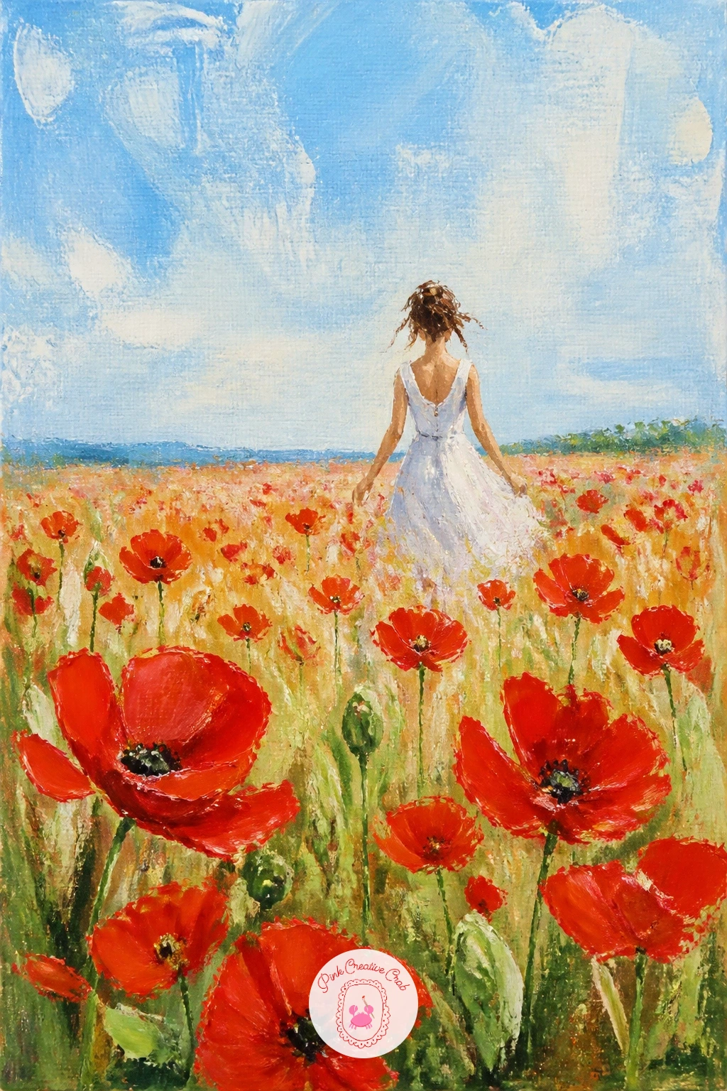
Palette: Cadmium Red,Titanium White,Sap Green,Naples Yellow,Cerulean Blue
Keep things minimal with one single poppy against a blue sky, the kind of image that teaches you poppy shape without any landscape to manage. Paint the sky background first across the whole canvas with a soft gradient from deeper blue at the top to pale near the bottom, and let it dry fully before touching the flower.
Build the poppy from four or five overlapping petal shapes in red, each one a loose curved triangle with a slightly ruffled edge. Add the dark seed pod center last with a small round brush, a near-black mix of blue and brown, then flick a few short black stamens outward from it.
Proportion is the trick here: hold your brush out at arm’s length and check that the flower head is no wider than about a third of the canvas, or it starts to look flat and cartoonish rather than floating in space.
Use a fan brush dry, barely loaded with white, to soften a few petal edges into the sky if they feel too hard-edged against it.
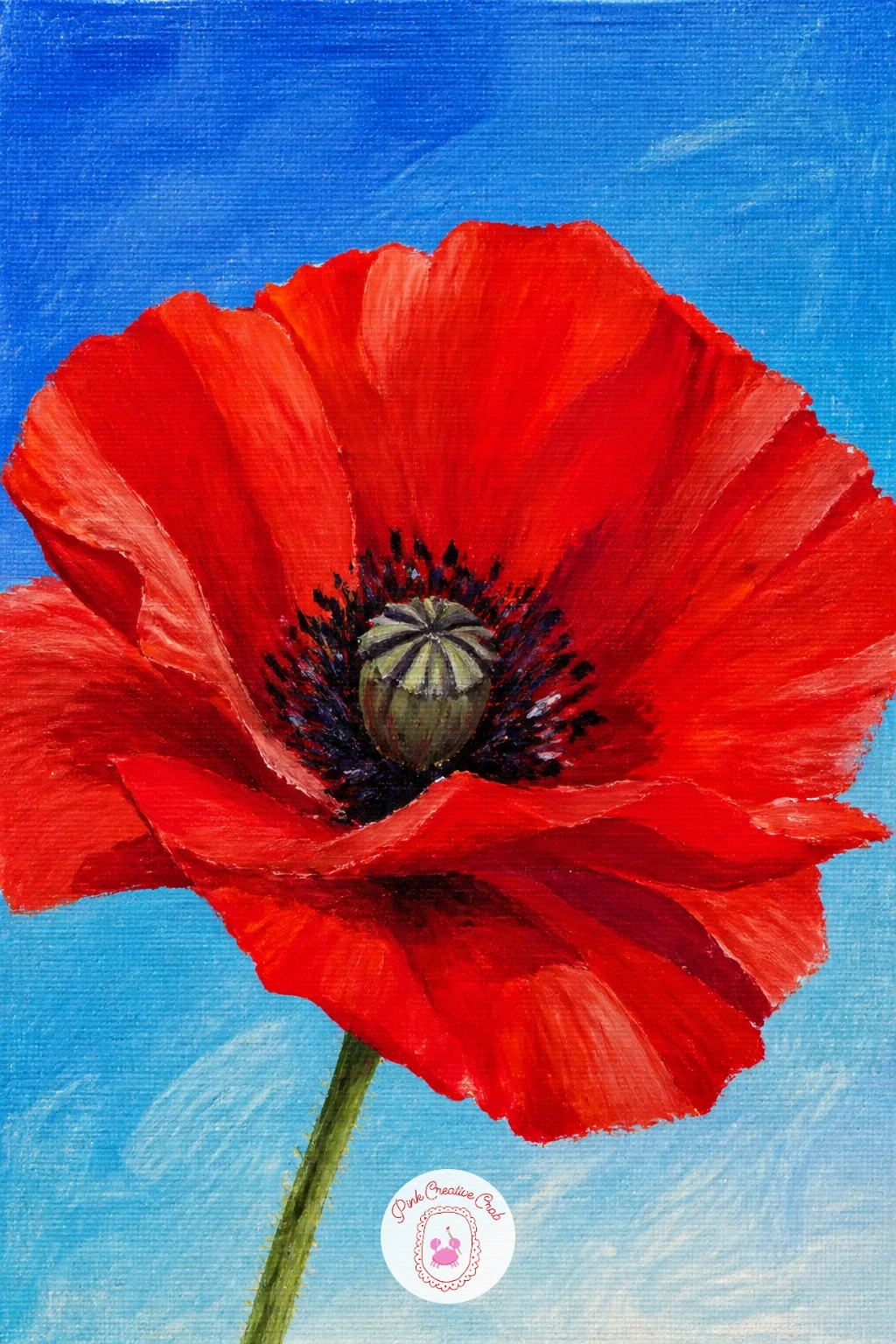
Palette: Cerulean Blue,Cadmium Red,Alizarin Crimson,Payne’s Grey
Move from field color to something softer with pastel Icelandic poppies in a jar, which lean toward apricot, cream and soft pink rather than true red. Sketch the jar shape lightly first in pencil, a simple cylinder or mason jar outline, then paint the background wall or table in a muted neutral so the pale petals read clearly against it.
Work the jar in transparent-feeling grey-blues, leaving a bright highlight stripe down one side unpainted, then build the poppies from loose tissue-paper petal shapes in your pastel mixes, each flower just three or four strokes.
Icelandic poppies have thin wiry stems that often get painted too thick. Use the very tip of a liner brush, thinned paint, and pull each stem in one continuous stroke from flower to jar rim.
If you want a quick ten-minute version, paint just two or three blooms loosely; a slower forty-minute version adds the water line in the jar and a cast shadow on the table.
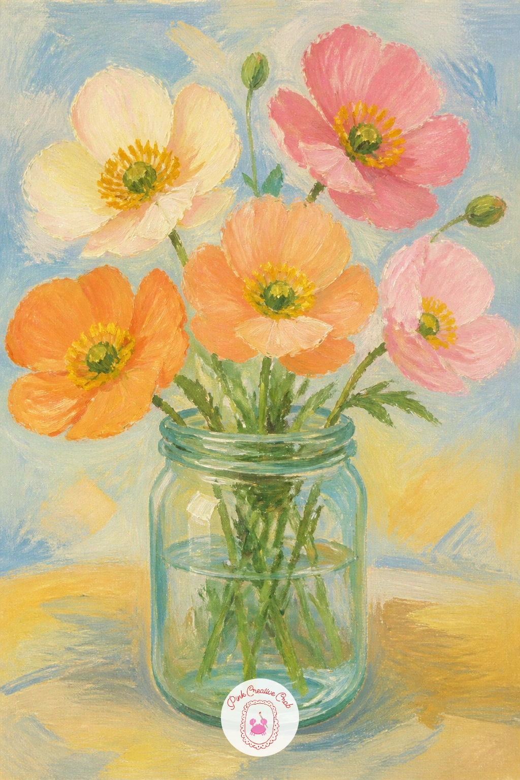
Palette: Naples Yellow,Shell Pink,Pale Apricot,Payne’s Grey,Titanium White
Bring in warmer orange tones with California poppies on a hillside, a scene that leans on sweeping brushwork more than individual flowers. Lay in a rolling hillside shape first with a big flat brush, keeping the horizon curved rather than straight, then let a pale sky sit above it with barely any detail.
Once the green-gold hill is dry, load a flat brush with cadmium orange and drag it sideways in short choppy strokes across the slope rather than dotting individual flowers, letting the texture suggest thousands of blooms at a glance.
The hillside often goes flat if every orange stroke faces the same direction. Angle your brush strokes to follow the curve of the hill, steeper near the top, flatter near the bottom, so the slope reads in three dimensions.
No palette knife on hand? A stiff old toothbrush dragged flat across the canvas gives a similar broken, textured stroke.
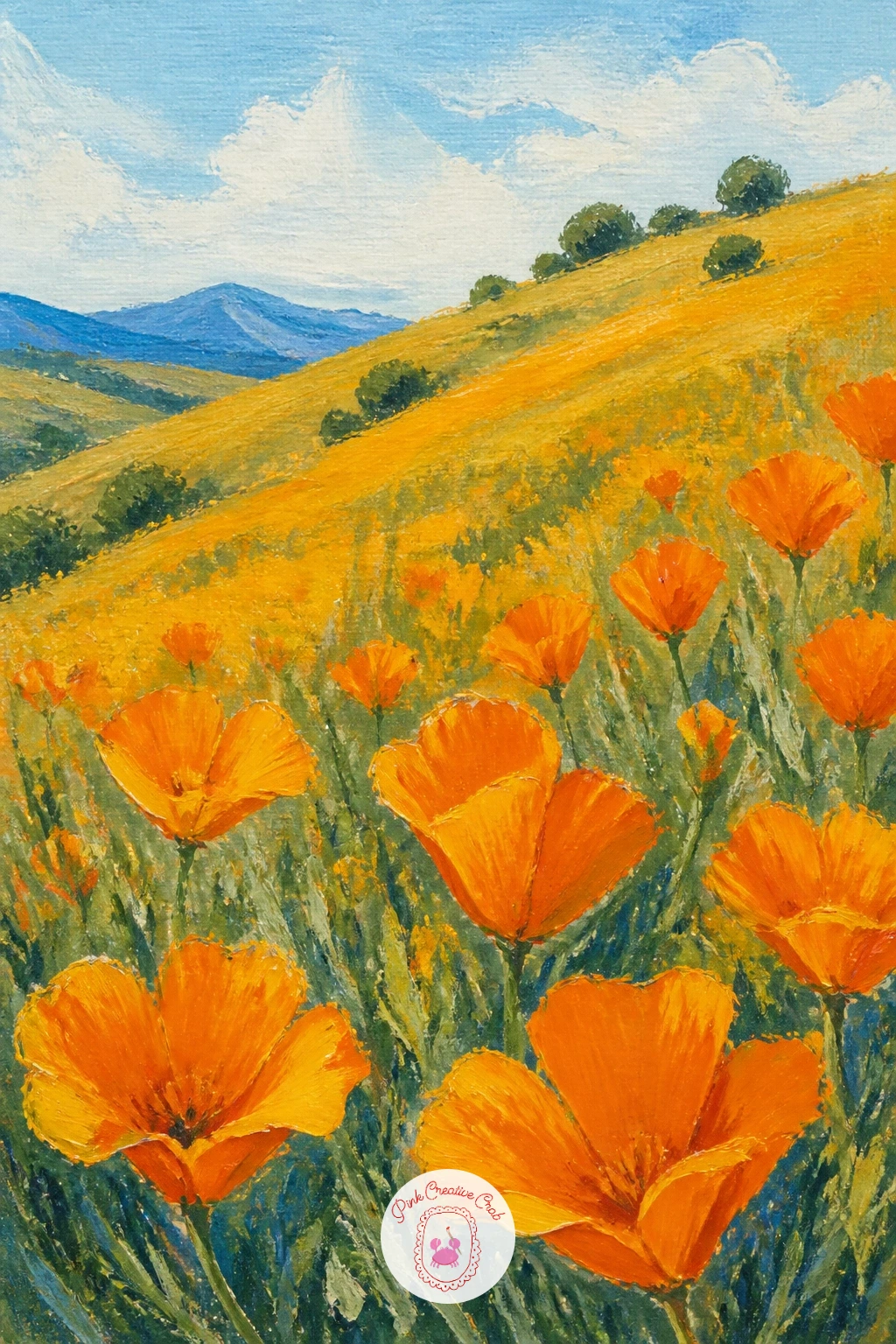
Palette: Cadmium Orange,Yellow Ochre,Sap Green,Cerulean Blue
Add a human touch of place with poppies along a railway line, a classic countryside sight that gives your composition strong leading lines. Pencil in the two rails first, converging toward a vanishing point a little above center, then paint the gravel bed and distant embankment in muted greys and greens before anything else.
Work the field of poppies along both sides of the track afterward, keeping them dense and bright close to the viewer and fading to looser dabs near the vanishing point, which strengthens the sense of distance.
Because the rails sit at your eye level, keep that horizon line consistent across the whole canvas or the track will look like it tilts. Hold a ruler up to check both rail lines meet at the same point.
A fine liner brush or a paint marker works well for the thin rail lines once the base layers are fully dry.
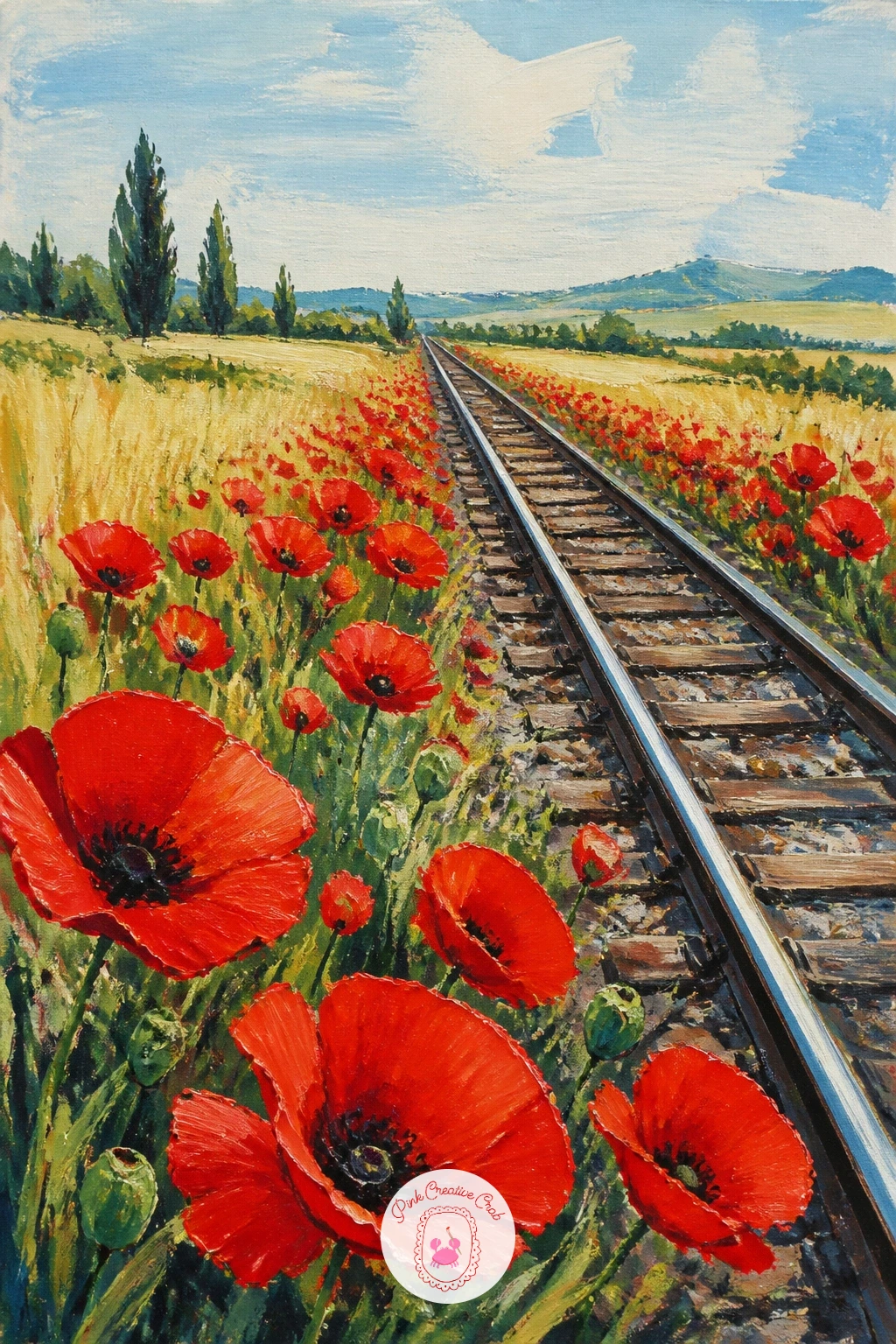
Palette: Payne’s Grey,Cadmium Red,Sap Green,Yellow Ochre
Slow down and study one small moment with a poppy bud bursting open, the papery outer sepals peeling back as the crumpled red petals push through. Sketch the bud shape lightly, an oval with one or two curling sepal flaps lifting away from the top, before any paint touches the canvas.
Paint the furry green-grey sepals first in a dry, scrubby stroke, since poppy buds have a soft fuzzy texture that benefits from a slightly starved brush. Add the red petals peeking through the gap last, scrunched and overlapping rather than smooth.
This is a good subject for the dry brush trick: load very little paint, wipe most of it off on a rag, then drag the brush sideways over the sepal area so some canvas texture shows through for that fuzzy look.
Swap a stiff old brush for a fresh one here; the worn bristles actually help the scrubby texture.
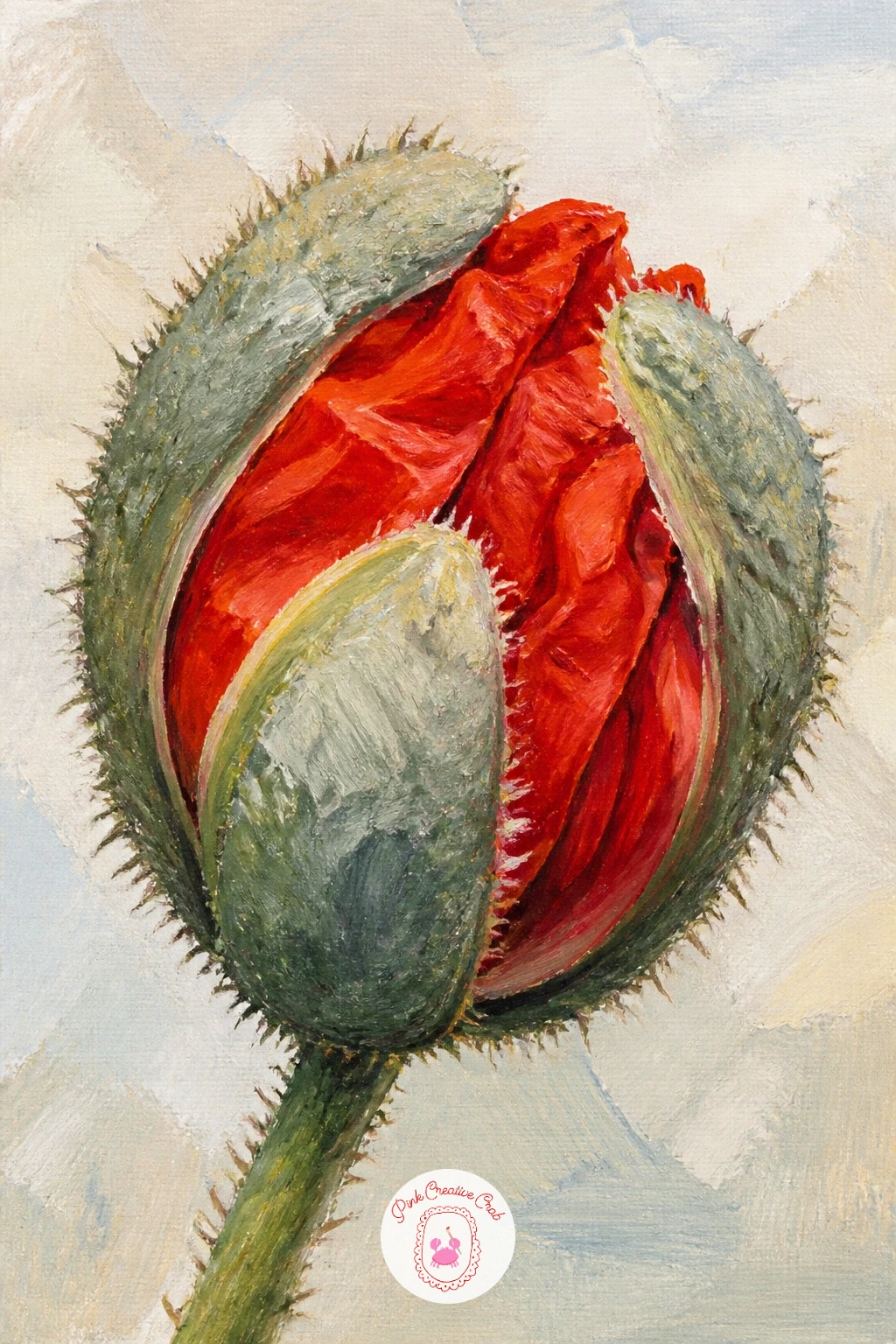
Palette: Sap Green,Payne’s Grey,Cadmium Red,Titanium White
Widen the palette with poppies and cornflowers among wheat, a classic countryside combination of red, blue and gold. Block in the wheat field first with vertical, upward strokes in ochre and pale gold, keeping the strokes loose and varied in height so it reads as grain rather than solid color.
Scatter the poppies through the lower two-thirds using the same dot technique as earlier ideas, then add cornflowers as small five-petaled blue stars tucked between the red, using far fewer of them so the red still leads the eye.
If this is your first time mixing three flower colors in one field, paint all the wheat first, let it dry, then add poppies, let those dry, and add cornflowers last. Painting wet into wet here quickly turns everything to mud.
A fine round brush with thinned white paint flicked lightly over the wheat tops suggests sunlight catching the grain.
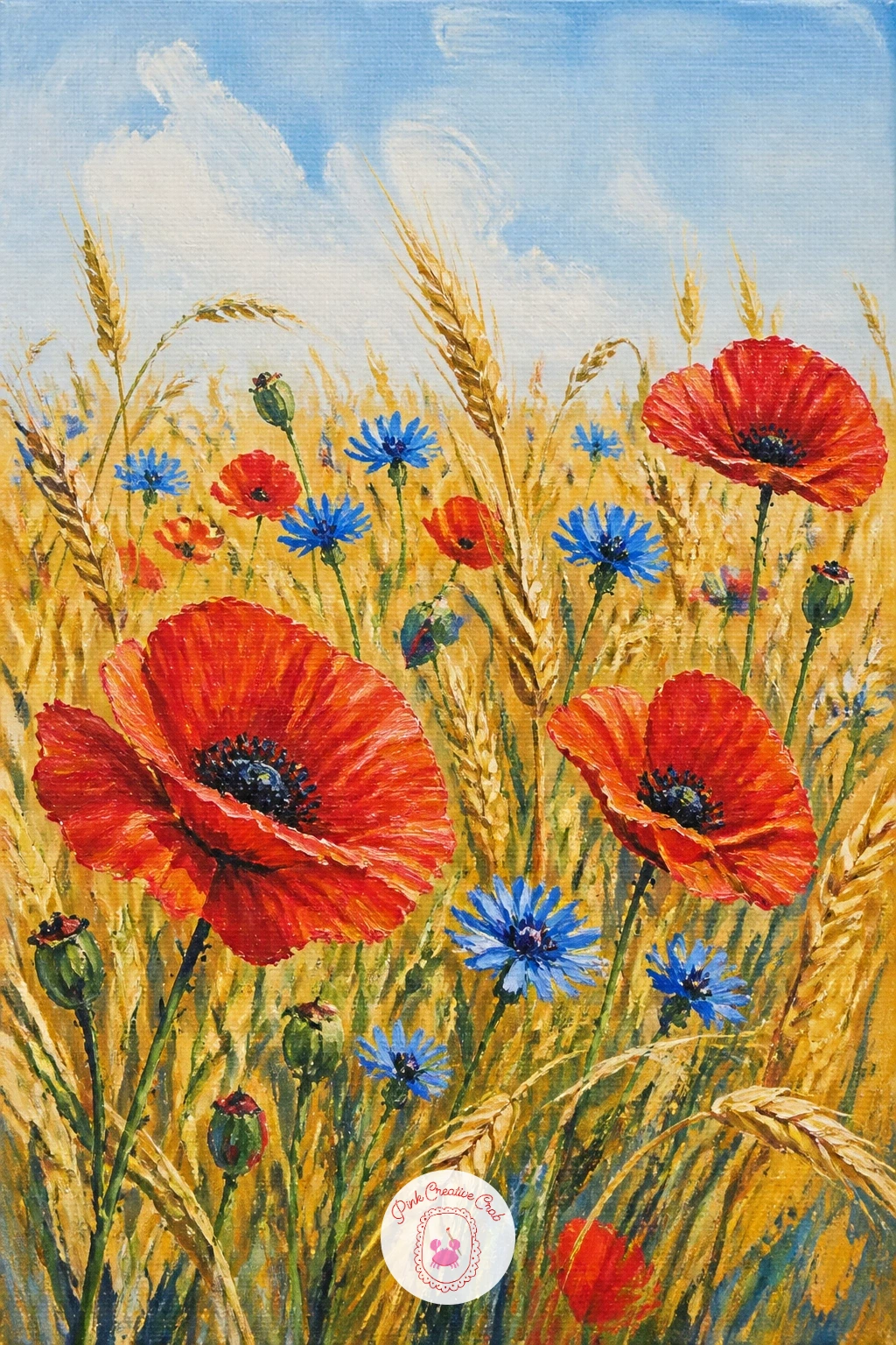
Palette: Yellow Ochre,Cadmium Red,Ultramarine Blue,Sap Green
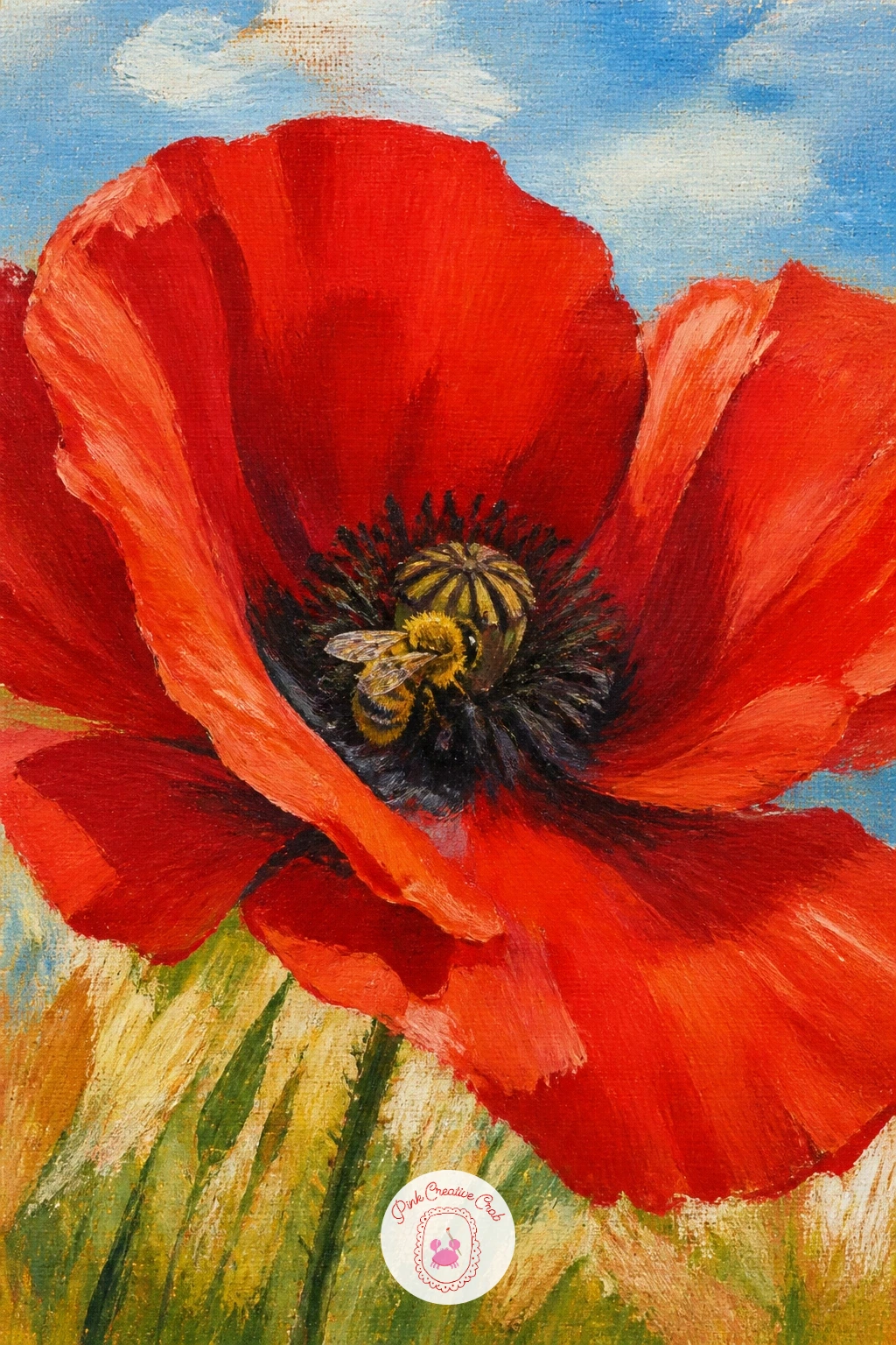
After painting fields from a distance, come in close with a bee inside a poppy, resting on the dark center among the stamens. Paint the poppy large first, filling most of the canvas, with petals pulled back slightly to one side so there is a clear pocket of shadow at the center for the bee to sit in.
Keep the bee simple: an oval golden-brown body, two or three dark stripes, and a pair of translucent wings suggested with thin grey-white paint rather than outlined in detail.
Because the bee sits inside the poppy’s own shadow, that shadow needs to be convincingly dark, a mix of alizarin crimson and payne’s grey rather than plain black, or the bee will look stuck on top instead of nestled in.
A toothpick dipped in white paint makes a quick, precise highlight dot on the bee’s back and wing edge.
You Will Need
- toothpick for tiny highlight dots
Palette: Cadmium Red,Alizarin Crimson,Payne’s Grey,Yellow Ochre
Build a fuller landscape with a poppy field with a farmhouse, a simple stone or whitewashed building sitting low on the horizon. Start with the sky and distant hills, then place the farmhouse as a basic rectangle with a triangular roof before any field detail goes in, since everything else needs to relate to its size and position.
Once the house is blocked in and dry, paint the field sweeping up toward it in green and gold, then scatter poppies thickest in the foreground and thinning as they approach the house so it reads as further away.
Perspective matters most here: keep the farmhouse small, no more than a tenth of the canvas width, and set it slightly off-center rather than in the middle, which makes the field feel much bigger around it.
A painting knife dragged in one short stroke gives a convincing stone or render texture on the farmhouse wall.
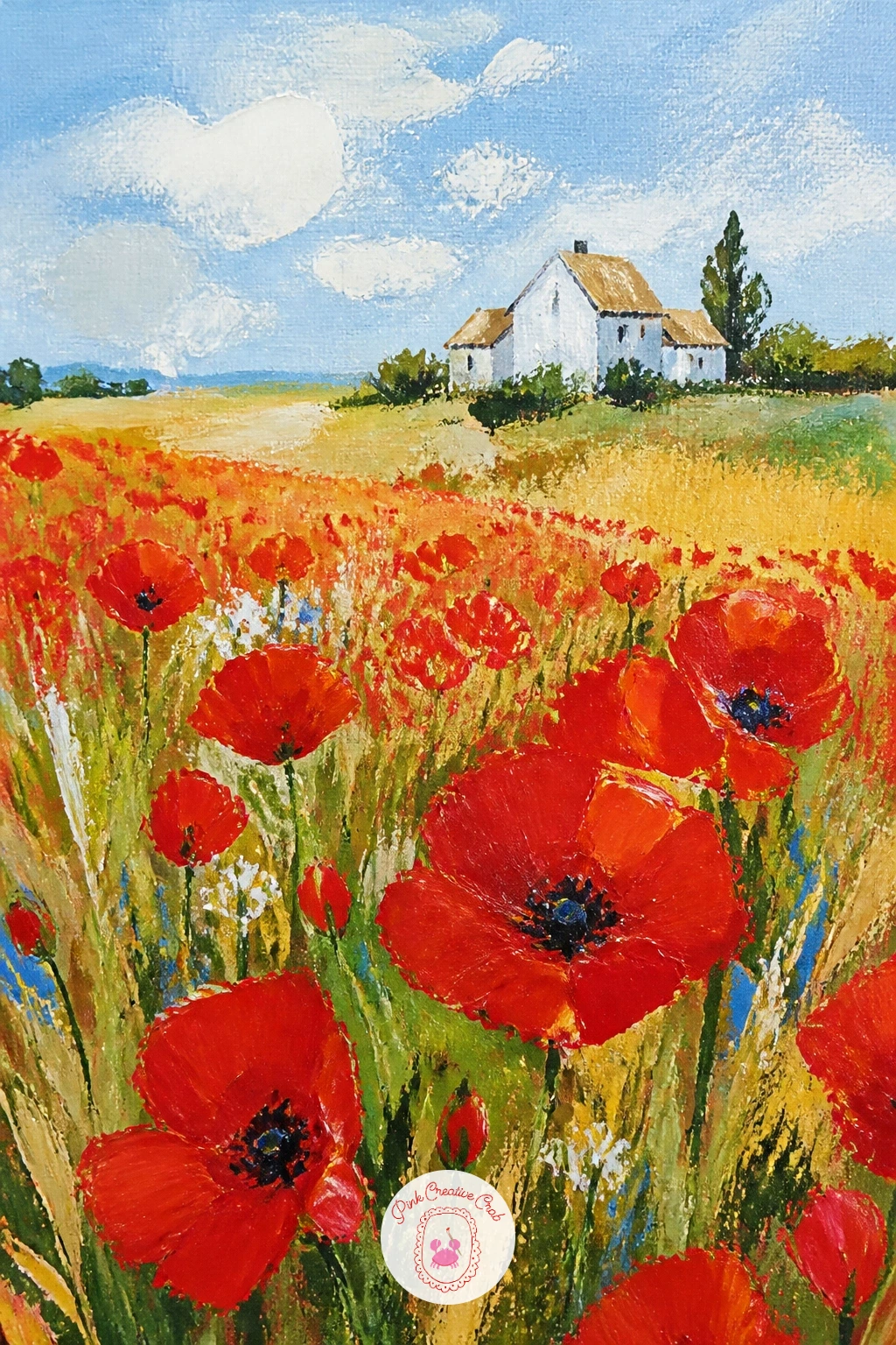
Palette: Titanium White,Yellow Ochre,Sap Green,Cadmium Red,Payne’s Grey
For more field and farmhouse composition practice, this easy landscape painting for beginners step by step guide covers horizon placement in detail.
Bring the countryside indoors with poppies in a vase on a windowsill, a cheerful still life with a view of the field beyond. Paint the window frame and glimpse of landscape outside first, keeping it loose and soft so it reads as background, then add the windowsill as a simple horizontal band.
The vase comes next as a basic cylinder or jug shape in a muted color that will not compete with the red, then build the poppies on top working from the back blooms forward so the front ones overlap convincingly.
This scene often goes wrong when the outdoor view is painted as crisply as the indoor vase. Keep the window view noticeably softer and less detailed, since it is further away and slightly out of focus to the eye.
If your canvas is small, a quick ten-minute version skips the outdoor view entirely and uses a plain wall; the forty-minute version adds that landscape glimpse for real depth.
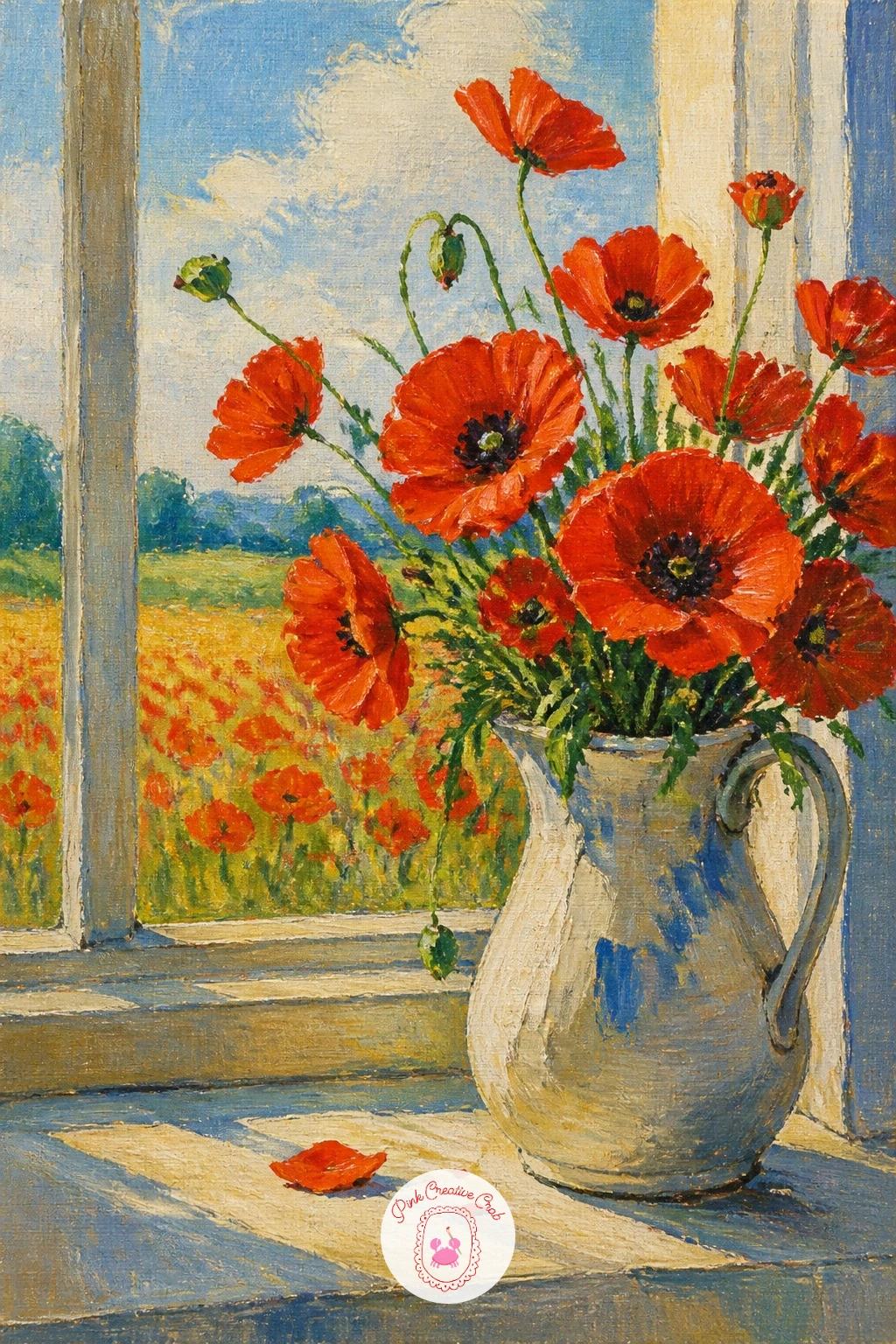
Palette: Cadmium Red,Sap Green,Cerulean Blue,Payne’s Grey
Shift to a garden setting with oriental poppies in a cottage garden, known for their huge crinkled petals and dark blotched centers. Sketch two or three large flower heads at different angles first, since oriental poppies are much bigger than field poppies and the scale should feel generous.
Paint the garden background loosely behind them, a soft mix of greens and other cottage flowers suggested with quick dabs rather than painted in detail, then bring the poppies forward with bold, almost black-red petals and a distinctive dark purple-black blotch at the base of each one.
That dark blotch is the detail that makes oriental poppies recognizable, so save it for last with a small brush once the red petals are fully dry, or the colors will bleed together into mud.
Try this today: mix your red slightly differently for each of the three blooms so they do not look identical.
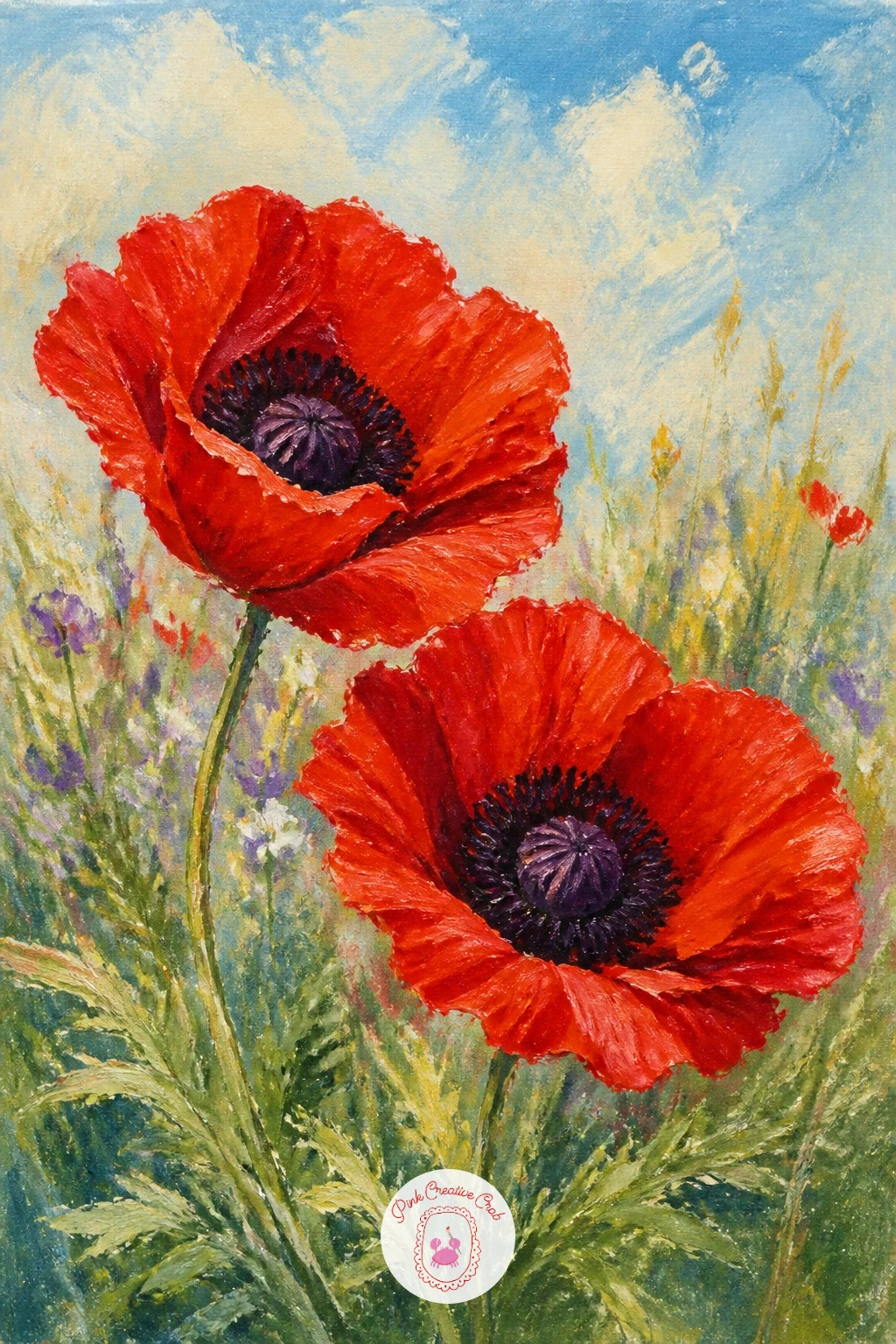
Palette: Cadmium Red,Alizarin Crimson,Dioxazine Purple,Sap Green
Try a quieter palette with white poppies in a meadow, which rely on shadow and shape rather than bold color to read clearly. Paint the meadow background first in soft greens and golds, a little more muted than your red-poppy fields since white flowers need a gentler setting to stand out.
Build each white poppy from petal shapes using titanium white with a whisper of grey or blue mixed in for the shadow side of each petal, since pure flat white will look like paper cutouts against the field.
The meadow often swallows white flowers if the background is too pale. Check your field value is clearly darker than your lightest petal highlight before you add a single poppy, adjusting the green with more shadow if needed.
A kneaded eraser works well if you sketch these in pencil first, lifting soft highlight shapes out of a graphite underlayer before you paint over it.
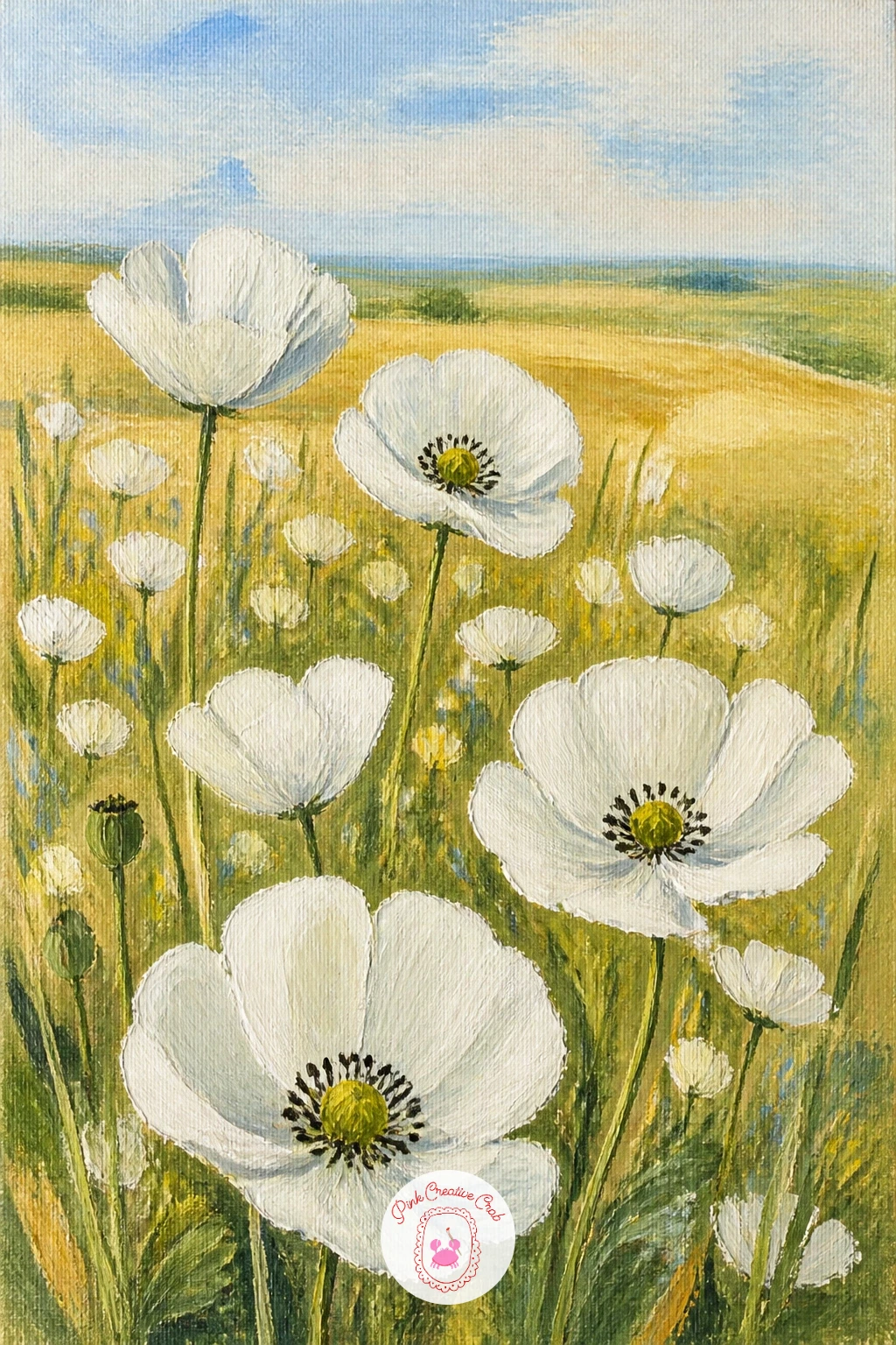
Palette: Titanium White,Payne’s Grey,Sap Green,Yellow Ochre
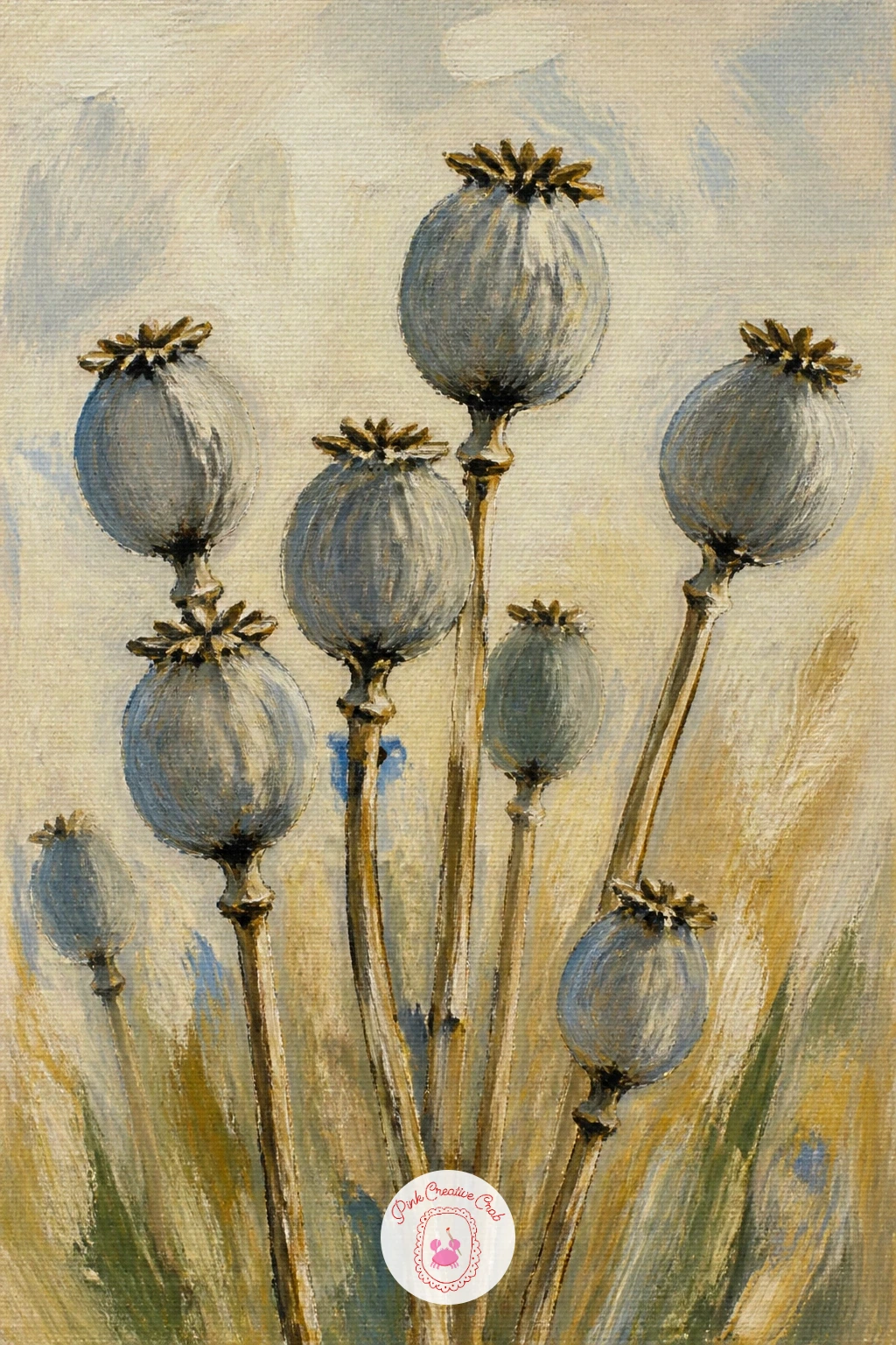
Give the flowers a rest and paint poppy seed heads drying instead, the papery blue-grey pods left behind once the petals have dropped. Sketch a small cluster of three or four pods on thin stems first, varying their heights and angles so they feel like a natural gathering rather than a neat row.
Paint the pods in cool greys and dusty blues with a slightly chalky, matte finish, then add fine stem lines last with a liner brush loaded thin, pulling upward in one confident stroke per stem.
Seed heads have a subtle ribbed texture at the top that is easy to overwork. Touch in just a few short curved lines with the tip of a dry brush rather than outlining the whole ribbed pattern, and let the suggestion do the work.
No liner brush available? The edge of an old credit card dipped in thin paint can drag a surprisingly fine, controlled stem line.
Palette: Payne’s Grey,Sap Green,Yellow Ochre,Titanium White
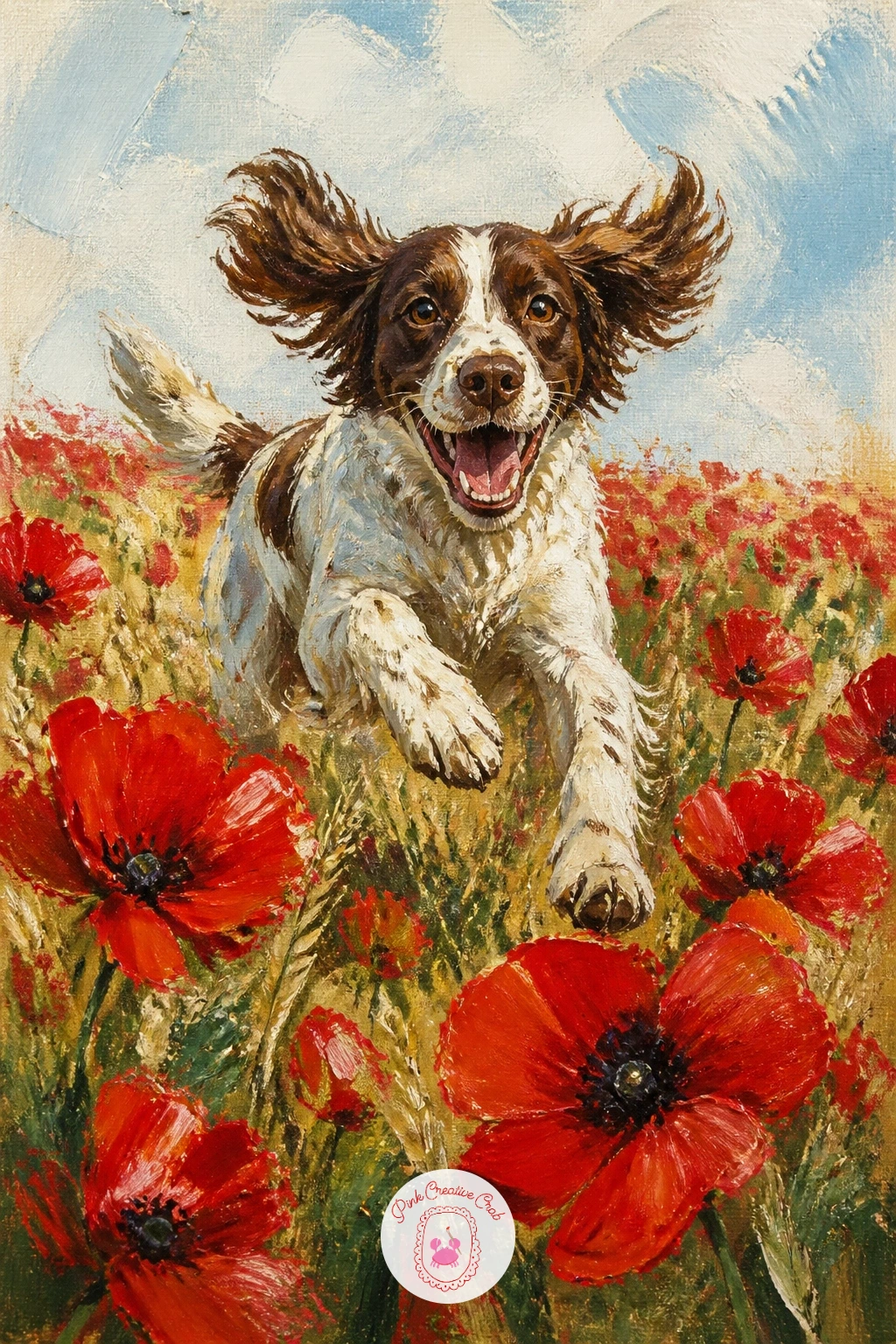
Add movement with a dog running through poppies, a joyful scene that works well with loose, energetic brushwork throughout. Block in the field and sky first, then sketch the dog mid-stride with legs spread and ears flying, keeping the pose simple rather than anatomically precise.
Paint the dog’s body in two or three value blocks, a base color, a shadow side, and one bright highlight, before adding any poppies around it, since the flowers in front of the dog should overlap its legs slightly to plant it in the field rather than floating above it.
Movement reads best when something is blurred. Drag a dry brush lightly along the back legs and tail to soften those edges, while keeping the head and front legs crisper, which tricks the eye into reading speed.
If your dog shape feels stiff, compare it to a running cat or horse pose instead of overthinking the breed; the gesture matters far more than the detail.
Palette: Burnt Sienna,Titanium White,Cadmium Red,Sap Green
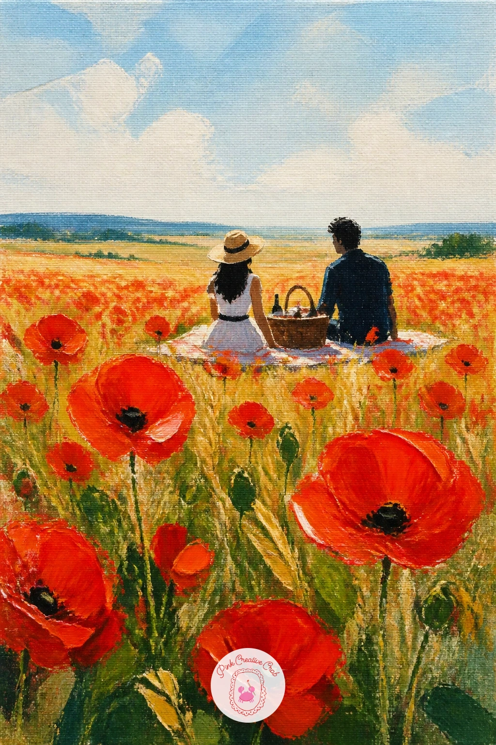
Slow the pace again with a couple picnicking among poppies, a gentle narrative scene built from simple shapes rather than detailed figures. Paint the field and sky first, then place a small picnic blanket shape low in the composition, with the two figures as simple seated silhouettes, one leaning slightly toward the other.
Keep faces entirely suggested or left out altogether, since from this distance a small dot of shadow for an eye reads as more natural than an attempt at a detailed portrait. Add a basket and a scattering of small objects on the blanket last, two or three shapes only.
Figures at this scale often go wrong when they are painted too large and dominate the field. Compare the height of a seated figure to the width of the poppy patch around it, aiming for the figures to take up no more than a fifth of the canvas height.
Round out your countryside scenes further with ideas from this summer watercolor painting ideas roundup for more outdoor gathering compositions.
Palette: Cadmium Red,Titanium White,Yellow Ochre,Sap Green
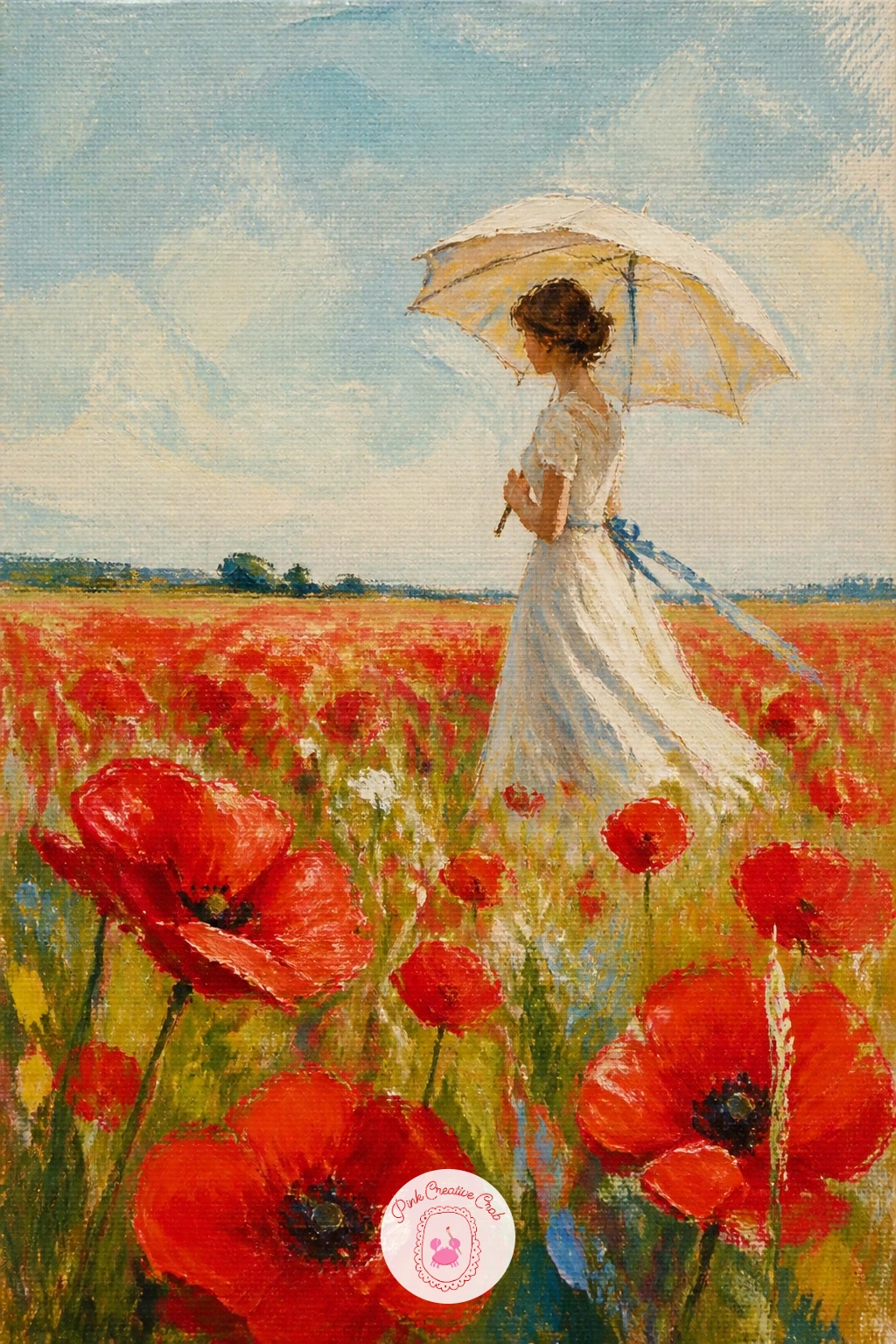
Borrow a classic impressionist mood with a woman with a parasol in a poppy field, standing slightly off-center against a bright sky. Place the horizon low, then sketch the figure first as a simple cone-shaped dress with the parasol as a half circle held above the head, since this silhouette is instantly recognizable even without facial detail.
Paint the sky and field around the figure once her basic shape and shadow are blocked in, letting a few poppies overlap the hem of her dress so she sits convincingly within the field rather than pasted on top.
Light direction matters most in this one: decide where the sun sits before you start, then keep the parasol’s cast shadow falling consistently across her shoulder and the ground beside her, which does more than anything else to make the scene feel real.
Close with a thin white-paint outline along the sunlit edge of the parasol and dress to catch the light.
Palette: Titanium White,Cadmium Red,Cerulean Blue,Sap Green
Travel further with poppies in Tuscany with cypress trees, pairing the red field with the tall dark silhouettes that define that countryside. Paint the rolling golden hills and pale sky first, then add the cypress trees as a line of thin dark green vertical shapes marching up a distant slope, varying their heights slightly so the row feels natural rather than stamped.
Bring the poppy field across the foreground last, keeping it loose and broad near the viewer so the cypresses remain the quiet vertical accent rather than competing with the red.
Distance is the thing to manage: make the cypress trees noticeably smaller and cooler in color than anything in the foreground, since warm, large, detailed shapes always read as closer regardless of where you place them on the canvas.
A fan brush works well for the cypress shapes, pulled upward in one motion per tree to keep their tapered silhouette.
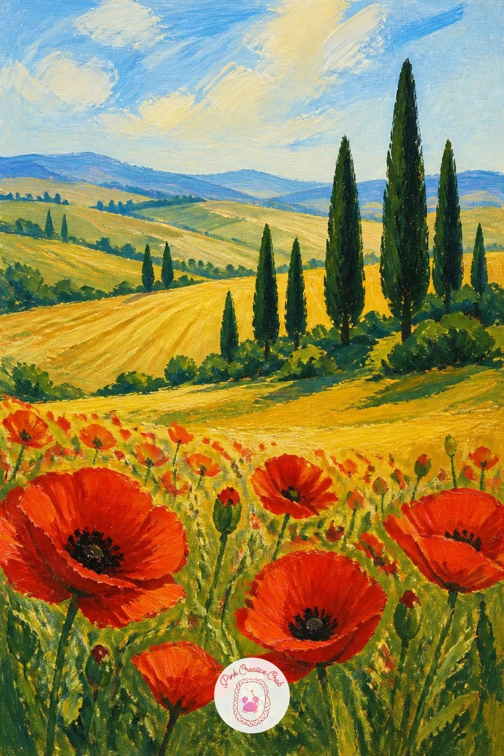
Palette: Yellow Ochre,Sap Green,Cadmium Red,Cerulean Blue
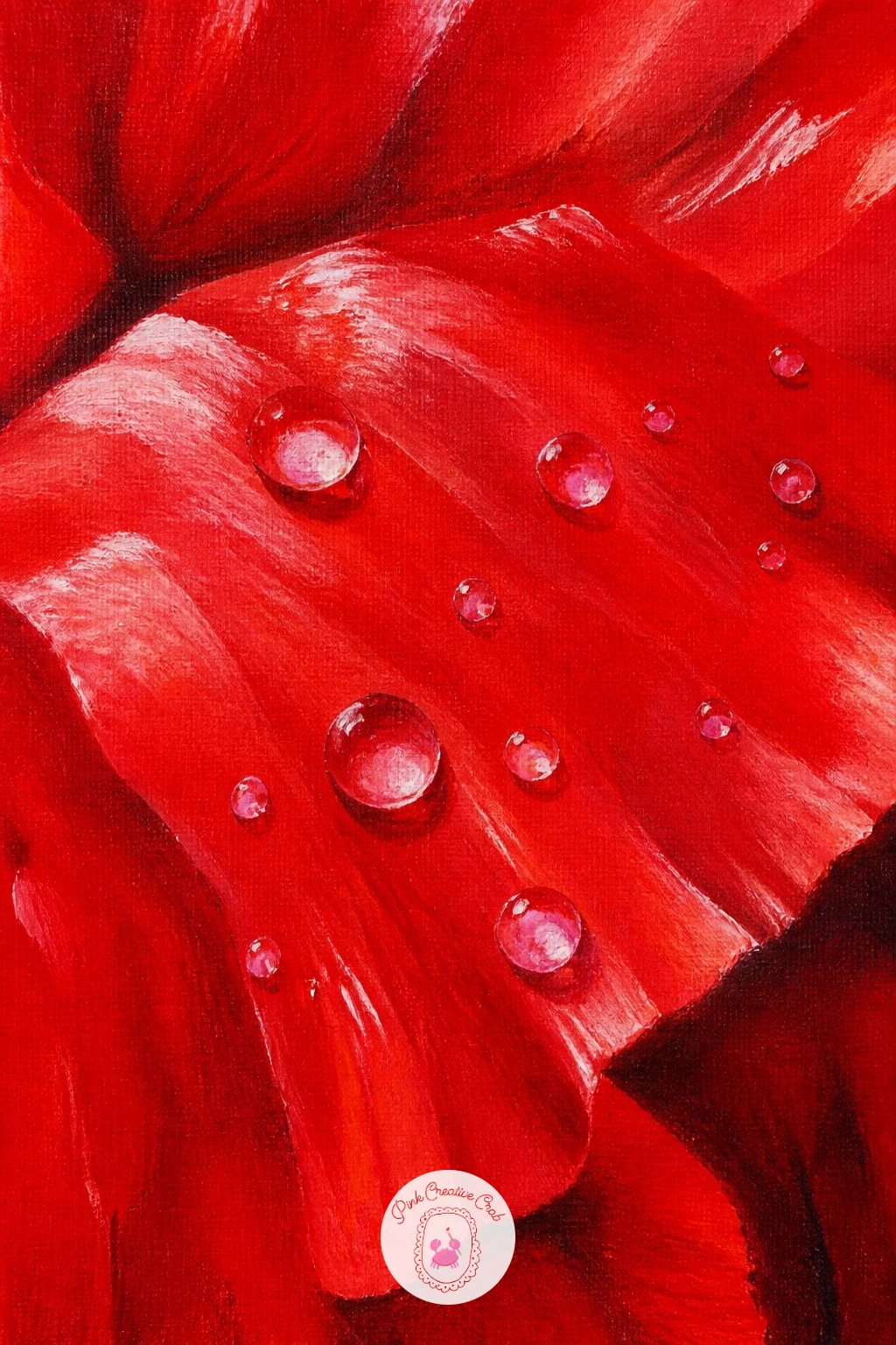
Zoom right in with a poppy close-up with dew, a subject that is all about light rather than composition. Paint the large red petals first, filling most of the canvas, building up two or three value layers from a darker base red to a brighter highlight red near the center.
Once dry, add the dew drops last using small dabs of near-white with a tiny crescent of pure white on one side of each drop for the sharp highlight, since a convincing droplet needs that strong contrast of light and dark rather than an even grey dot.
Dew drops that look like stickers rather than water usually skip the shadow. Add a thin curved line of darker red directly beneath each drop, where the petal is in its shadow, before the white highlight goes on top.
A toothpick or the end of a fine brush handle, dipped straight into white paint, gives the cleanest small highlight dot.
You Will Need
- toothpick or fine brush handle for dew highlights
Palette: Cadmium Red,Alizarin Crimson,Titanium White,Payne’s Grey
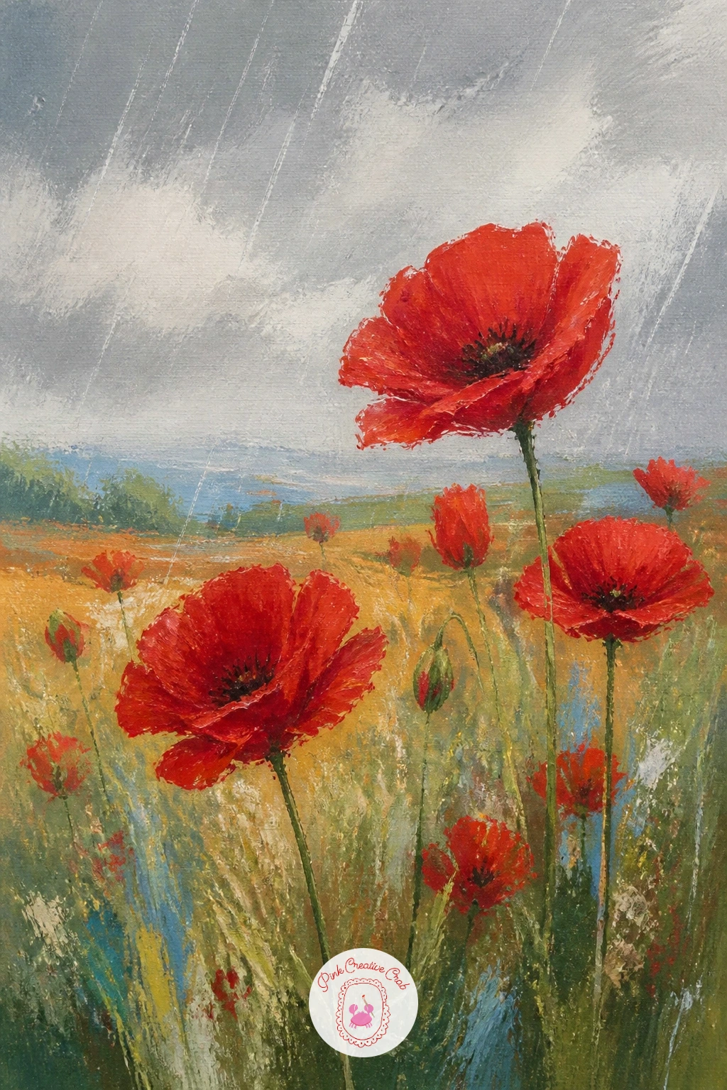
Change the mood with poppies in the rain, softer and more atmospheric than the bright sunny scenes earlier on this list. Paint the sky in muted greys first, blending wet into wet so there are no hard edges, then bring in the field below using slightly desaturated greens, since everything looks softer and cooler under cloud.
Add the poppies with less crisp edges than usual, letting a damp brush blur the outer edge of each petal into the background so the whole scene reads as slightly misted rather than sharp.
The quick ten-minute version stops there with soft shapes and muted color. The forty-minute version adds thin diagonal rain lines scratched in with the end of a brush handle through wet paint, plus a few bright droplets caught on the nearest petals.
If your paint dries too fast for this blending, a few drops of flow improver or a retarder medium buy extra working time.
You Will Need
- flow improver or retarder medium, optional
Palette: Payne’s Grey,Cadmium Red,Sap Green,Titanium White
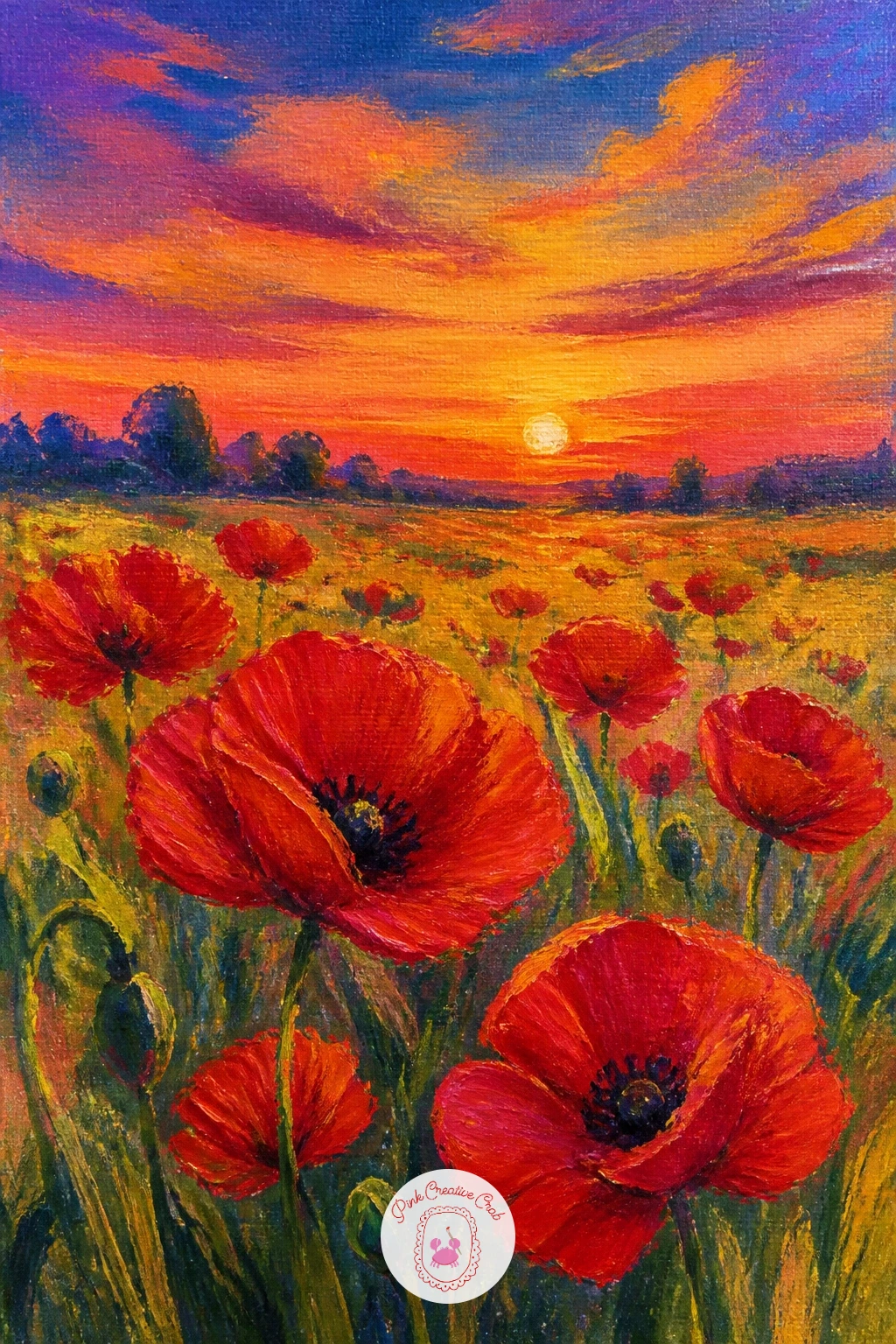
Turn up the warmth with a poppy field at sunset, where the sky does most of the emotional work. Paint the sky first with a wide flat brush, blending bands of deep orange, pink and gold from the horizon upward into cooler blue at the top, while the paint is still wet so the colors merge softly.
Once the sky is dry, silhouette the field and any distant trees in near-black or deep purple-brown, then add poppies as warm dark-red silhouettes near the horizon, brightening to true poppy red with the last of the light caught on the nearest blooms in the foreground.
Sunset skies often go wrong when every color band is given equal space. Let the warmest color, right at the horizon, take up the thinnest strip, with the cooler blue above it taking up much more of the canvas, which matches how light actually behaves at dusk.
Keep foreground poppies brighter and warmer than anything behind them to hold the sense of fading light.
Palette: Cadmium Orange,Alizarin Crimson,Dioxazine Purple,Cadmium Red
Switch palette entirely for blue Himalayan poppies, one of the few genuinely blue flowers in the garden world and a nice change of pace after so much red. Sketch a few flower heads first with their distinctive papery, slightly cupped petals and a cluster of golden stamens at the center.
Mix a true, slightly violet-leaning blue for the petals rather than a flat primary blue, since Himalayan poppies have a particular silvery-lilac cast that reads as unmistakably different from cornflowers or delphiniums. Paint the golden stamens last with small dabs of yellow ochre once the blue petals are dry.
Blue flowers often look muddy if mixed with too much black for shadow. Use a touch of dioxazine purple or payne’s grey instead of black to shade the petal folds, keeping the blue clean and a little luminous.
Group three or four blooms at different angles rather than painting just one, which shows off that distinctive cupped shape better.
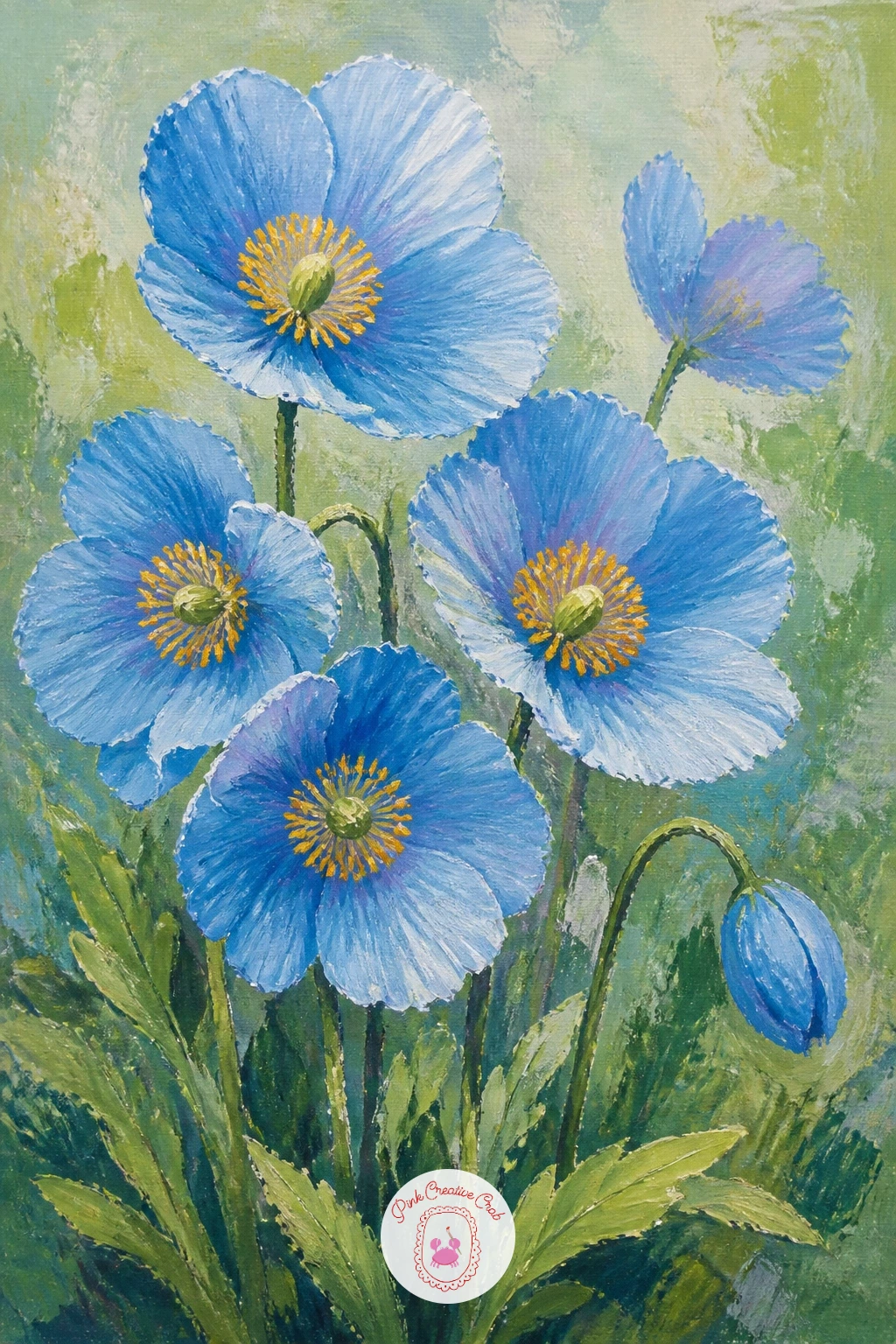
Palette: Ultramarine Blue,Dioxazine Purple,Yellow Ochre,Titanium White
Return to a still life with poppies in a ceramic pitcher, letting the vessel’s shape and glaze add character beyond the flowers themselves. Paint the pitcher first as a confident, slightly rounded shape, blocking in a base color then adding a reflected highlight stripe and a darker shadow side to give it real weight on the table.
Bring the poppies in afterward, arranging them with varied heights and a few leaning outward over the pitcher’s rim rather than standing in a stiff, even row, which keeps the arrangement looking freshly cut.
A ceramic surface catches light differently from glass or metal, so look at where the single brightest highlight sits, usually one tight spot rather than a long streak, and keep every other mark on the pitcher duller than that one point.
No real ceramic pitcher to reference? A mug or jug from the cupboard, propped up and lit by a window, works just as well as a stand-in.
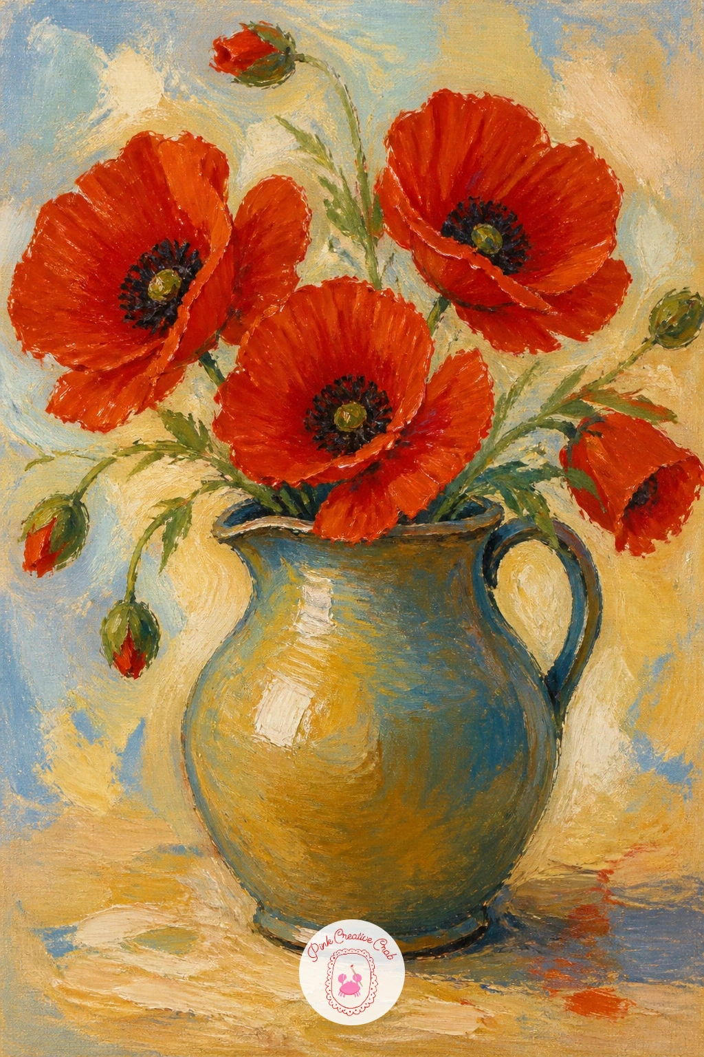
Palette: Cadmium Red,Burnt Sienna,Titanium White,Sap Green
Add a dash of nostalgia with a vintage bus passing a poppy field, a charming subject for anyone who loves countryside road scenes. Paint the field and sky first across the whole canvas, then place a simple road as a thin pale band low in the composition, with the bus sketched as a boxy rectangle with rounded corners and a few simple window shapes.
Keep the bus small relative to the field, since it is a passing detail rather than the main subject, and paint it in a single cheerful color like cream or soft red so it stands apart from the poppies without clashing.
This scene often goes wrong when the bus is painted too crisply against a loose, painterly field. Soften its bottom edge slightly into the road with a dry brush so it feels part of the same loose world rather than cut out and pasted on.
Next time, try the same composition with a tractor or a cyclist instead of the bus, using the same small-object-on-a-road approach.
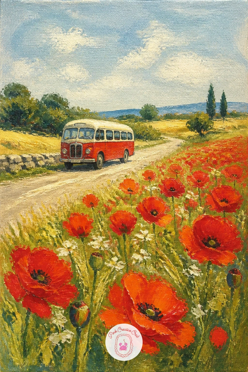
Palette: Cadmium Red,Titanium White,Sap Green,Payne’s Grey
Capture an everyday moment with a child picking poppies, bent slightly forward with one hand reaching toward a bloom. Block in the field and sky first, then sketch the child as simple rounded shapes, a soft triangle for a dress or dungarees, small round head, and one arm extended downward toward the flowers.
Paint the child’s clothing in a color that pops gently against the red and green, a soft yellow or pale blue works well, then add a small cluster of already-picked poppies held in the other hand once the figure is dry.
Children’s proportions are easy to get wrong by making the head too small. Keep the head roughly a quarter of the total figure height rather than the eighth you would use for an adult, which instantly reads as childlike.
If you enjoy figures in botanical scenes like this, the acrylic painting flowers ideas for beginners list has more simple figure-with-flowers compositions to try.
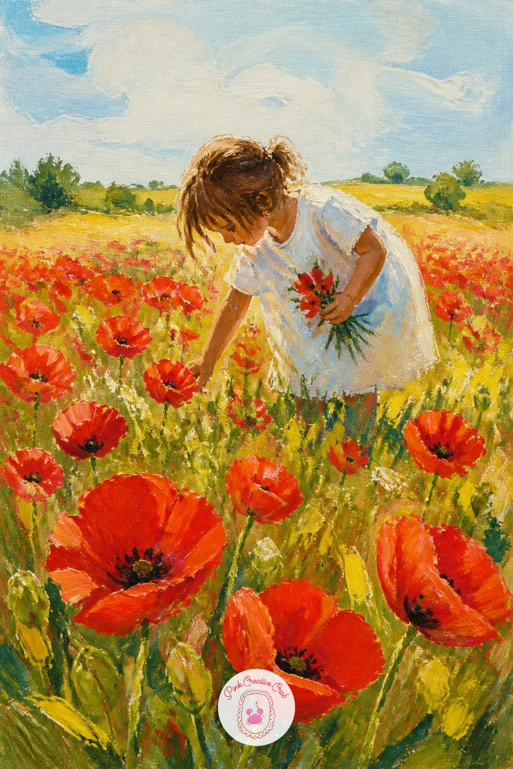
Palette: Cadmium Red,Naples Yellow,Sap Green,Titanium White
Shift the viewpoint with a girl lying in poppies looking at clouds, seen from slightly above or from the side so the field surrounds her rather than sitting behind her. Paint the sky first with soft rounded cloud shapes, since this sky carries more weight in the composition than in the standing-figure scenes earlier on the list.
Sketch the reclining figure next as a simple elongated shape lying diagonally across the lower half of the canvas, arms loosely folded behind the head, before bringing the poppy field up and around her so a few blooms overlap her dress and hair.
Eye level changes everything in this one: because you are looking slightly down at her from a standing position, her feet should appear a touch larger and closer than her head, which tilts gently away from you.
Leave a patch of sky unobstructed just above her face so the viewer’s eye naturally follows her gaze upward.
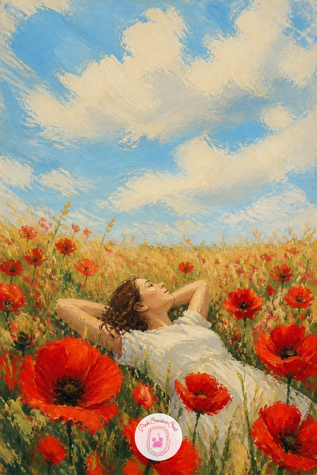
Palette: Cerulean Blue,Titanium White,Cadmium Red,Sap Green
Bring the flowers to a market setting with poppies in a market bucket, loosely gathered as if fresh from a flower stall. Paint the metal or enamel bucket first as a simple trapezoid shape, adding a darker shadow side and a bright rim highlight to suggest its shine before any flowers go on top.
Build the poppies up from the rim outward in a loose cluster, mixing in a few green leaves and buds among the open blooms so the bunch feels generous and a little wild rather than neatly arranged.
A crowded bunch like this often collapses into one red blob. Vary the angle of each flower head clearly, some facing forward, some in profile, some tilted back, so individual blooms stay readable within the group.
No bucket to paint from? A simple tin can or jug gives the same loose, informal container feel.
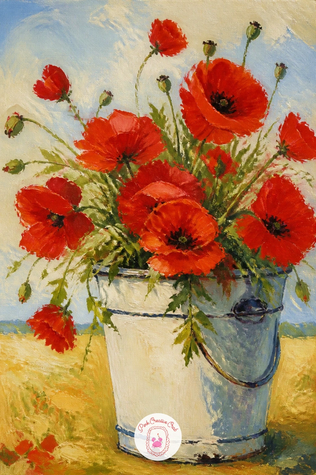
Palette: Cadmium Red,Payne’s Grey,Sap Green,Titanium White
Give the field some structure with poppies beside a stone wall, a lovely contrast between rough grey stone and soft red bloom. Paint the wall first as a horizontal band of irregular stone shapes, using a palette knife to drag short overlapping strokes of grey, beige and brown that read as individual stones without outlining every one.
Once the wall is dry, let the poppies grow up along its base and spill slightly over the lower edge, since wildflowers naturally colonize the gaps at the foot of old walls more than growing in a neat row beside them.
The wall can flatten the whole scene if every stone is the same tone. Darken the lower stones slightly and lighten the upper ones where the sun catches them, which gives the wall real form even at a loose, impressionistic level.
Try this today: leave one or two small gaps in the wall unpainted down to the canvas color, then tuck a poppy bloom right into that gap.
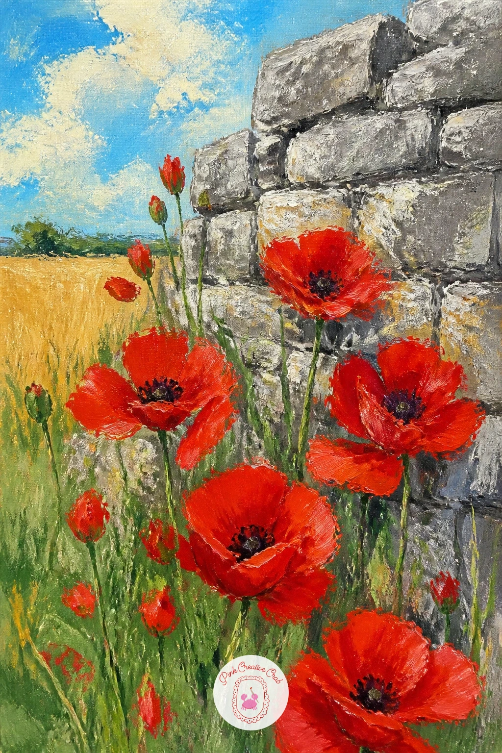
Palette: Payne’s Grey,Burnt Sienna,Cadmium Red,Sap Green
Add a softer, frillier bloom with pink Shirley poppies, known for their delicate crinkled edges and range from pale blush to deep rose on a single plant. Sketch a small cluster of three or four flower heads at varying stages, a tight bud, a half-open bloom and a fully open one, since Shirley poppies look best shown at different ages together.
Paint each bloom with two or three shades of pink rather than one flat color, keeping the frilled petal edges loose and slightly ragged with the tip of a round brush rather than a smooth clean line.
Shirley poppies often look too uniform if every petal is the exact same pink. Mix a fresh batch of pink for each flower, nudging one toward coral and another toward a cooler rose, so the cluster has the natural variation real plants show.
A fine liner brush flicked outward from each petal base adds the delicate darker veining Shirley poppies are known for.
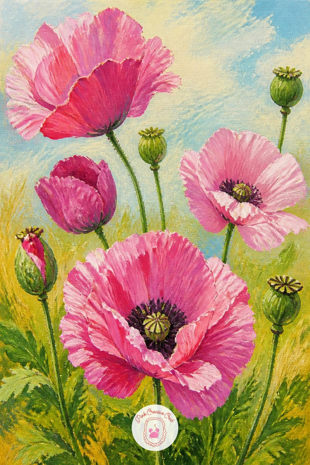
Palette: Shell Pink,Alizarin Crimson,Cadmium Orange,Titanium White
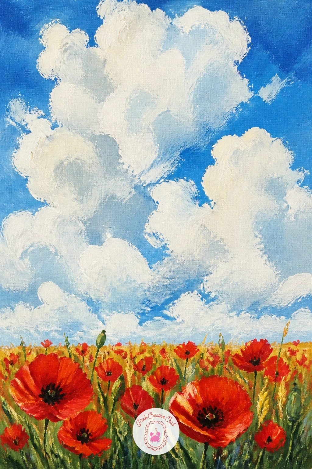
Make the sky the real subject with a poppy field under big summer clouds, letting towering white clouds take up well over half the canvas. Paint the sky first, blocking in large rounded cloud shapes with a mix of titanium white and a touch of grey for the shadowed undersides, keeping the blue sky visible in the gaps between them.
Once the sky feels right, bring in a narrow strip of poppy field along the very bottom of the canvas, kept simple and a little smaller in detail than you might expect, since its job here is to ground the composition rather than dominate it.
This is a quick subject to finish: a ten-minute version uses three or four big cloud shapes and a simple red strip below. A forty-minute version adds subtle color reflected from the field up into the cloud undersides, warming them slightly where they meet the horizon.
Keep your cloud edges soft by blending while the sky paint is still wet rather than painting hard white shapes on top of dry blue.
Palette: Cerulean Blue,Titanium White,Payne’s Grey,Cadmium Red
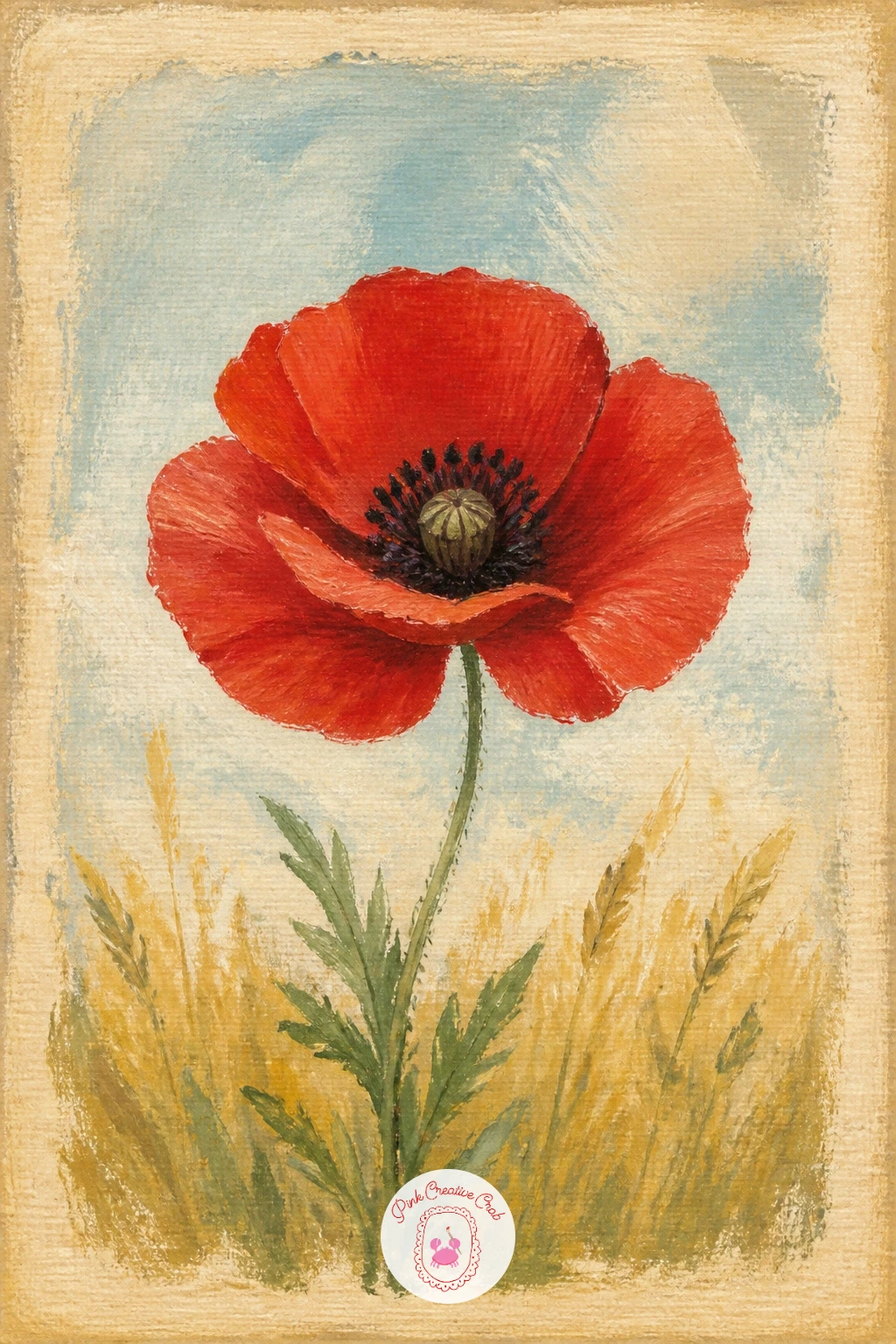
Try something with a printed, nostalgic feel through a poppy on a vintage postcard, where the flower sits inside a faded border like an old botanical print. Paint a soft aged background first, a warm cream or tea-stained tone across the whole surface, then add a simple thin border a short distance from the edges to suggest the postcard frame.
Place a single poppy centered within that border, painted with slightly muted, softer color than your usual bright red to match the aged feel of the piece, and keep the brushwork tidier here than in the loose field scenes.
Where this idea usually goes wrong is a background too clean for the vintage feel. Once the paint is dry, dab a little thinned burnt sienna or payne’s grey unevenly around the edges with a dry brush or sponge to suggest age and foxing.
A fine pen or thin brush can add tiny decorative corner flourishes along the border if you want a more finished, printed look.
You Will Need
- small sponge for aged-edge effect
Palette: Burnt Sienna,Naples Yellow,Alizarin Crimson,Payne’s Grey
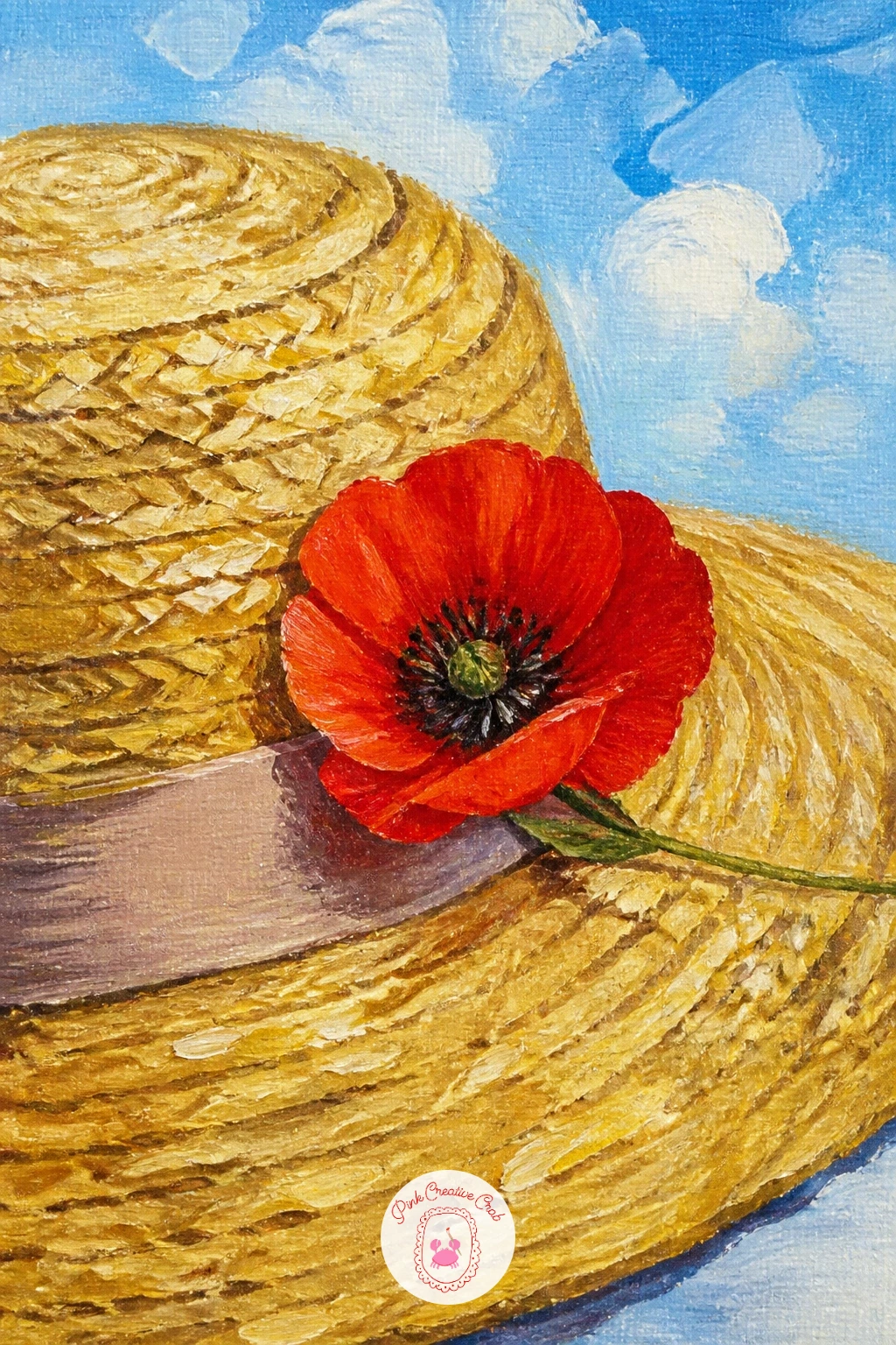
Close the list with a poppy pinned to a straw hat, a charming small still life that works well as a quick finishing piece. Paint the straw hat first as a simple rounded brim shape, using short overlapping diagonal strokes in warm gold and tan to suggest woven straw texture without painting individual strands.
Once the hat is dry, add a single poppy tucked into the brim or band, painted with the same bold technique as the rest of this list, then finish with a thin ribbon band in a color that complements the red, a soft cream or sage works nicely.
The straw texture is the part most likely to look flat. Vary the direction of your short diagonal strokes slightly across the brim and let a few lighter gold strokes sit over the darker base once it is dry, which gives the woven look real depth.
If you enjoy small still life studies like this one, the still life oil painting ideas for beginners list has more object-based compositions to explore next.
Palette: Yellow Ochre,Naples Yellow,Cadmium Red,Sap Green
What to Do Next
Pick one scene that matches your mood today, whether that is a single bloom against blue sky or a full field with a farmhouse, and set up on canvas or heavy painting paper with your reds, greens and golds ready to go. Keep the brushwork loose, trust the big shapes, and let the details stay few.
Frequently Asked Questions
What paint colors do I need for a poppy painting?
A basic set covers it: cadmium red, alizarin crimson, sap green, yellow ochre, cerulean or ultramarine blue, and titanium white. Mixing from these five or six handles almost every poppy scene on this list, including shadows and highlights.
Is acrylic or watercolor better for painting poppies?
Acrylic suits bold, opaque poppy petals best because it covers in one or two confident strokes without fighting the paper. Watercolor works too for a softer, more translucent look, but needs more careful layering to keep petal edges crisp.
How do I stop my poppy field from looking flat?
Vary the size, spacing and color of individual poppy dots, with larger warmer ones near the viewer and smaller cooler ones toward the horizon. Mixing your field green in small batches rather than one flat color also adds real depth.
What is the easiest poppy subject for a first attempt?
A single poppy against a blue sky is the simplest, since it removes the field, perspective and any figures from the equation. Four or five overlapping petal shapes plus a dark center give a satisfying result quickly.
How do I paint the dark center of a poppy without it looking muddy?
Mix the center from payne’s grey and a touch of alizarin crimson rather than plain black, and add it only once the surrounding red petals are fully dry. Painting wet into wet at this stage is what causes the muddy look.
Have any thoughts?
Share your reaction or leave a quick response — we’d love to hear what you think!
-
 0
-
0
-
0
-
0
-
0
-
0


