

Peacock watercolor paintings give you everything a jewel-toned palette was made for: teal and sapphire feathers, flashes of gold, and that satisfying wet-into-wet bloom where colors meet on the page. There is something genuinely relaxing about letting pigment pool and spread on its own while you paint one of the most dramatic birds in nature, and you do not need fine detail skill to make it glow.
Below you will find 29 ideas, starting with peacocks in every pose a grand garden could offer, then moving on to the swans, cranes, pheasants and doves that share their world. Pick whichever one matches your mood tonight, and let the paper do some of the work for you.
Using these images: free for personal projects such as printing, coloring, cards, journals and gifts. Handmade items that include them may be sold up to 30 pieces per design. More than that is commercial use and is not permitted, and neither is selling or sharing the images themselves or passing them off as your own. Please ask before any other use.
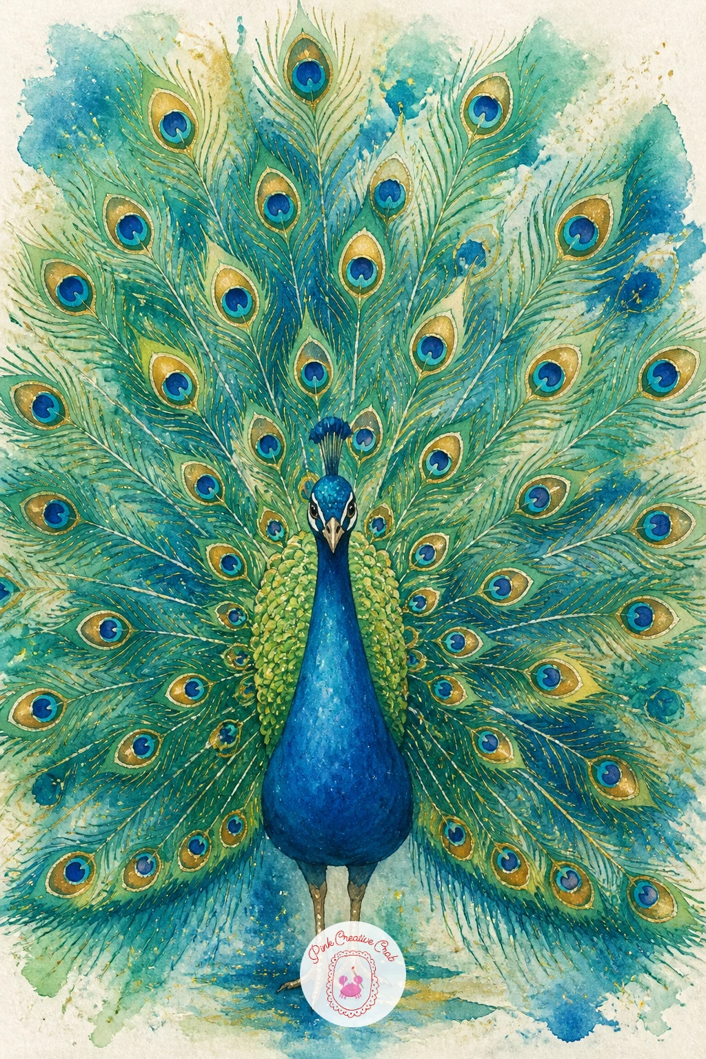
Start with the easiest confidence builder in the whole list: a peacock with its tail fully open, fanned out like a jeweled sunburst behind a small body. Sketch a light pencil circle for the fan shape first, then a small oval body and a simple curved neck inside the bottom third of that circle. The fan is mostly empty space waiting for color, so resist the urge to draw every feather before you paint.
Wet the fan area with clean water, then drop in teal, emerald and a touch of sapphire so the colors bleed into each other loosely. While still damp, lift a few lines out with a thirsty brush or tissue to suggest feather rays moving outward from the body.
Once dry, use a fine brush and dark paint to add the feather spines radiating out, and finish each one with a small iridescent eye shape in blue-green with a dark center. If this is your first time blending jewel tones, keep your water very clean between colors so they stay bright instead of turning muddy.
Add gold gouache or a gold gel pen dot at the center of a few feather eyes once everything is bone dry, for that final shimmer.
You Will Need
- gold gel pen or metallic gouache
Palette: Peacock Teal, Emerald Green, Sapphire Blue, Payne’s Grey, Gold
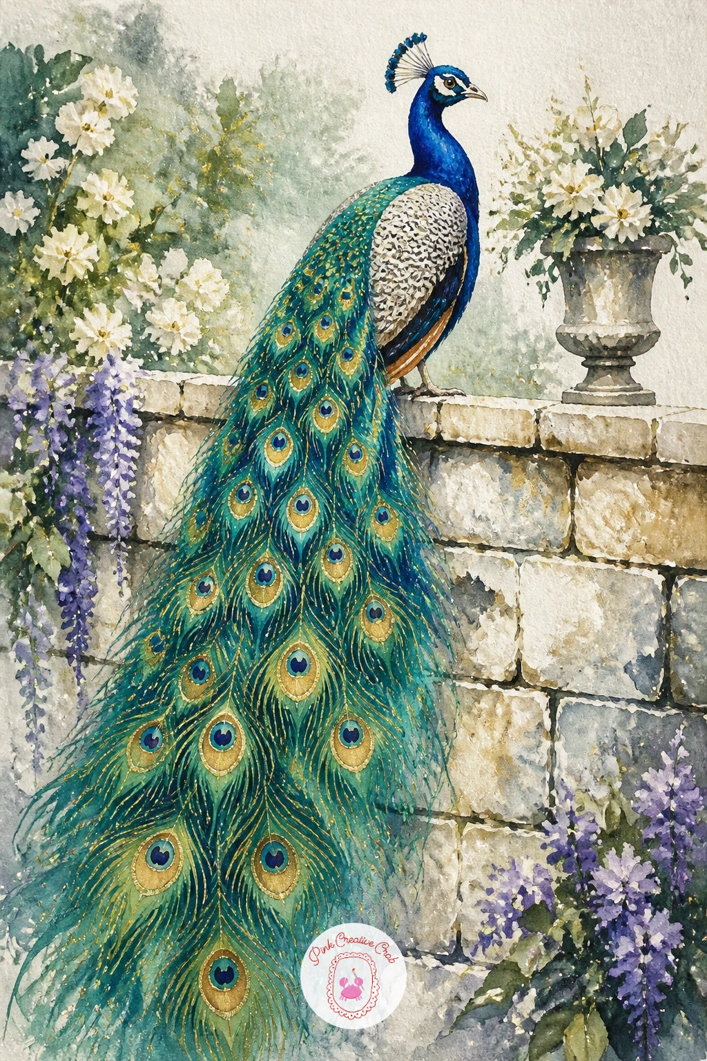
Perching the bird changes the whole feel, so try a peacock on a garden wall next, tail trailing down over weathered stone. Block in a simple rectangle of stone first in warm grey and ivory, letting the edges stay soft and uneven so it reads as old masonry rather than a ruler-drawn block. Paint the bird’s body and folded wing on top once the wall is dry, using sapphire and teal in smooth curved strokes.
Let the tail cascade down the front of the wall in loose vertical strokes of teal and emerald, adding a few dark feather eyes only near the top where they would catch the light. The place this goes wrong is a tail that looks stiff and flat against the stone; keep the feather strokes slightly wavy and vary their length so gravity feels real.
If you do not have a grey paint, mix a little Payne’s grey into ivory for an instant soft stone tone. A kneaded eraser lifts any pencil lines that peek through the dried stone wash before you move on to the bird itself.
Finish with a dry brush dragged lightly over the stone to add texture without covering the color beneath.
Palette: Ivory, Payne’s Grey, Sapphire Blue, Peacock Teal
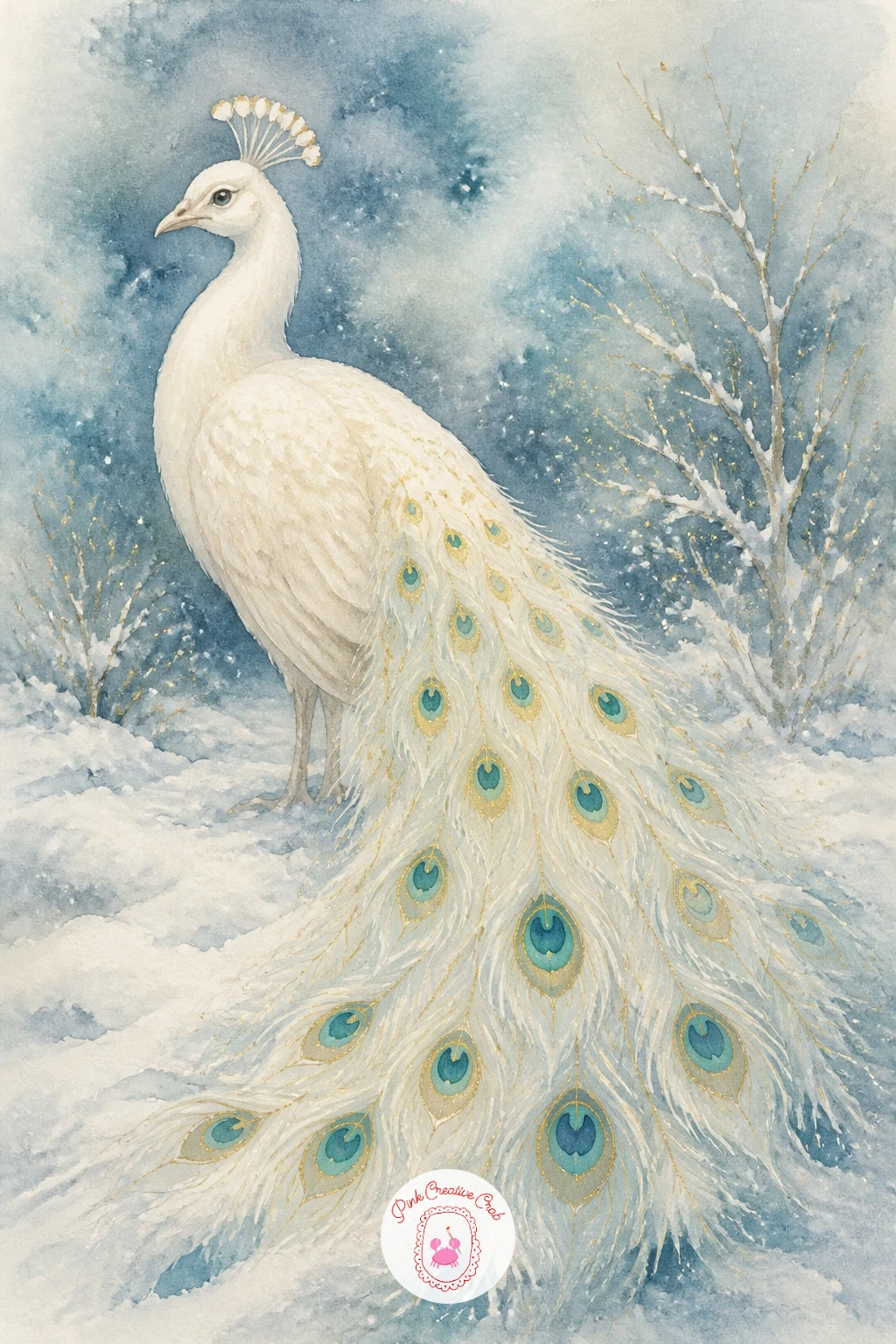
Switch the palette entirely for a white peacock in snow, where the drama comes from ivory shapes against a cool blue-grey ground instead of bright color. Paint the background first: a wash of pale blue-grey across the whole sheet, leaving the bird’s entire shape untouched as dry white paper. This reverse approach feels strange at first but is the whole trick to a convincing white bird.
Once the background wash dries, shade the bird using only very pale blue-grey and a touch of lilac, just enough to suggest the curve of the body, the fold of the tail and a few soft feather lines. Keep your brush almost dry for this step so the shading stays a whisper rather than a block of color.
Eye level matters here: paint the peacock slightly below your own eye line, with the snow line and distant trees sitting low in the frame, so the bird feels tall and regal rather than squashed into the middle. A few dabs of titanium white gouache on top once dry can lift snow highlights back out of the blue wash.
If gouache is not on hand, a white gel pen gives the same crisp sparkle on the snow and feather tips.
You Will Need
- white gouache or white gel pen
Palette: Payne’s Grey, Lilac Grey, Titanium White, Ivory
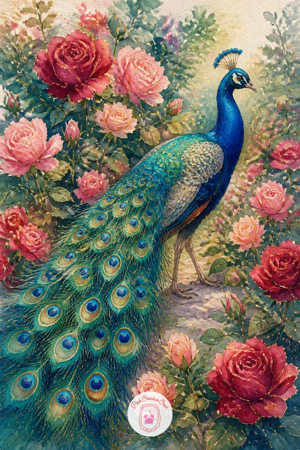
Bring the bird back into full color with a peacock walking through a rose garden, where roses in blush and crimson give the teal feathers something to glow against. Paint the roses first as loose clusters of pink and red, using wet-into-wet blooms rather than tight petal shapes, scattered across the lower half of the page. Let them dry completely before adding the bird on top.
Build the peacock’s body in profile, walking left to right, with the tail trailing behind through the leaves rather than fully open. This is a good subject to practice overlap: paint a rose stem crossing in front of a tail feather here and there so the bird feels placed inside the garden rather than floating above it.
The common mistake is letting the greens of the leaves and the teal of the peacock turn identical and flat. Mix your leaf green with a touch more yellow than the peacock teal so the two stay distinct even side by side.
No crimson on hand? Alizarin crimson mixed with a touch of rose or even plain red works fine for the roses.
Palette: Peacock Teal, Rose Pink, Alizarin Crimson, Sap Green
Give the scene some architecture with a peacock on a palace balustrade, perched along one of those carved stone rails you see edging grand terraces. Sketch the balustrade as a simple row of rounded posts in light pencil first, keeping the perspective shallow so you are not wrestling with a vanishing point: a straight horizontal rail with evenly spaced posts reads as grand enough on its own.
Paint the stone in warm ivory and soft grey, then let it dry fully before placing the peacock standing across two or three of the posts, body angled slightly toward the viewer. Working this way, stone first and bird last, keeps the crisp carved edges from getting muddied by wet feather color bleeding sideways.
Eye level here sits low, looking slightly up at the balustrade, which makes the bird feel important against the sky behind it. Paint that sky in a soft wash of pale gold or dusty blue so it does not compete with the ivory stone.
If carved detail feels fussy, a few simple vertical lines on each post are enough to suggest the balusters without drawing every curve.
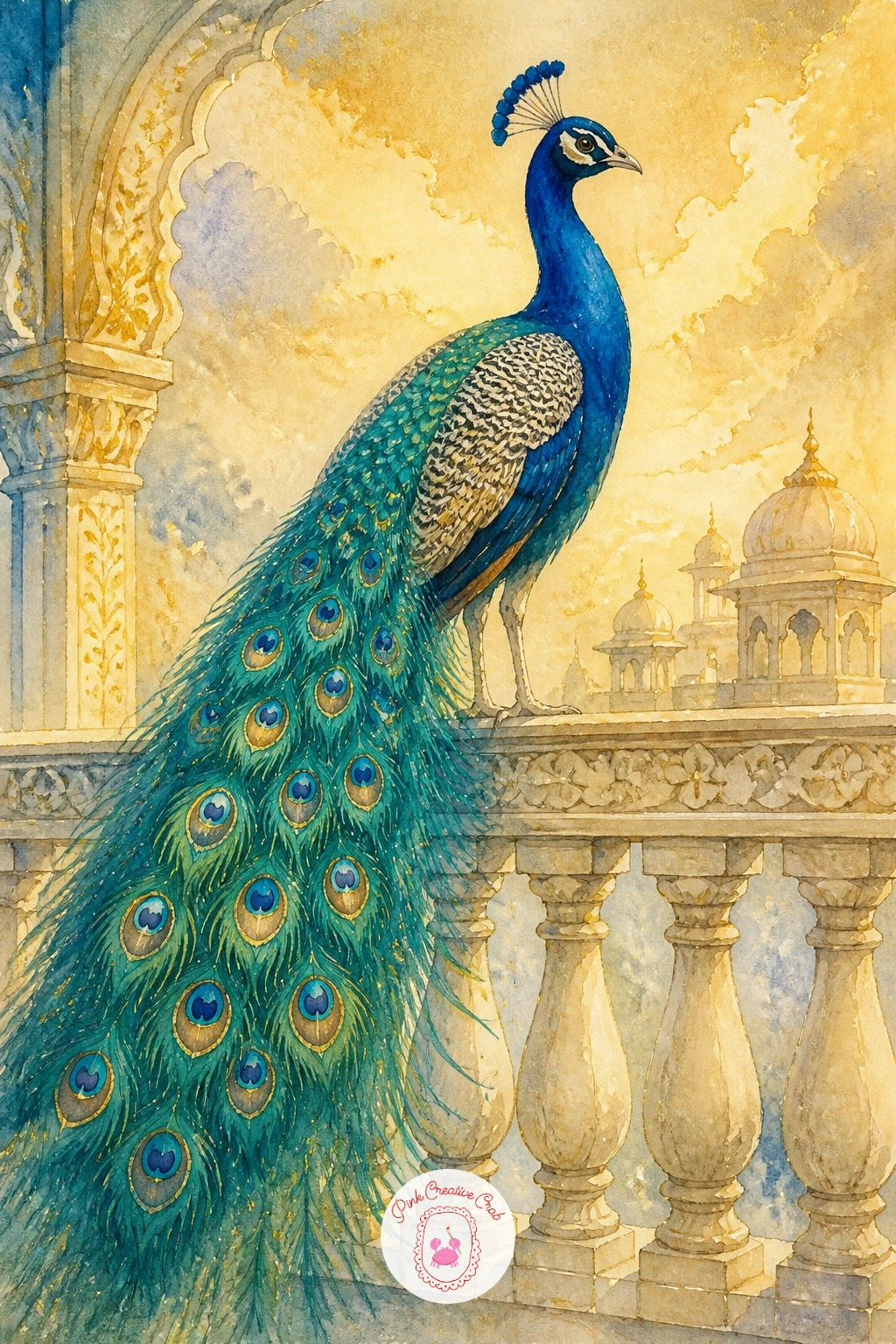
Palette: Ivory, Payne’s Grey, Peacock Teal, Soft Gold
Mirror images are easier than they look, and a peacock reflected in a pond is the perfect place to try one. Paint the bird first on the upper half of the paper in its usual jewel tones, then flip your reference mentally and paint a softened, slightly stretched version directly below it, as though the pond surface were a slightly wavy mirror.
The reflection should use the same colors but diluted and less detailed, since water always softens what it shows. Once both halves are dry, drag a dry brush loaded with pale blue-grey horizontally across the reflection only, to suggest gentle ripples breaking up the mirror image.
Where this goes wrong is a reflection painted too crisp, which flattens the whole illusion; keep every edge in the lower half just slightly blurred compared to the bird above. A damp brush run along wet paint edges while still wet does this softening for you automatically.
For the quick version, paint the reflection as simple color blocks in ten minutes; for a fuller forty-minute piece, add lily pads floating at the waterline where the two halves meet.
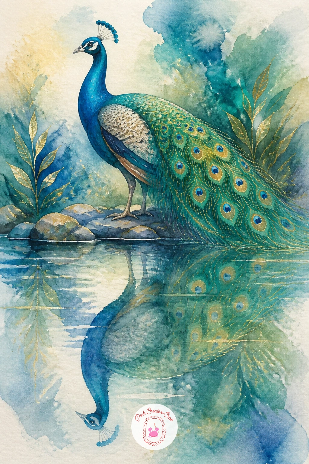
Palette: Peacock Teal, Sapphire Blue, Payne’s Grey, Sap Green
Move indoors for a peacock on a velvet chair, perched on the curved back of an upholstered armchair in a grand sitting room. Paint the chair first in a deep jewel color, sapphire or emerald, using a slightly dry brush dragged in one direction over the fabric areas to suggest the nap and sheen of velvet. Leave the chair’s outline soft rather than hard-edged.
Once dry, paint the peacock perched along the top rail of the chair back, letting its tail spill down over the seat and armrest in long teal strokes that pool slightly where they meet the darker velvet beneath. This overlap of two deep colors is the one hands-on trick here: work wet-on-dry so the tail feathers stay crisp against the velvet instead of bleeding into it.
A dab of gold at the chair’s carved wooden feet or trim ties the whole piece to its grand interior setting. If velvet texture feels tricky, a plain flat wash still reads perfectly well as upholstery from a short distance.
Finish with a kneaded eraser to lift any stray pencil lines around the chair’s silhouette.
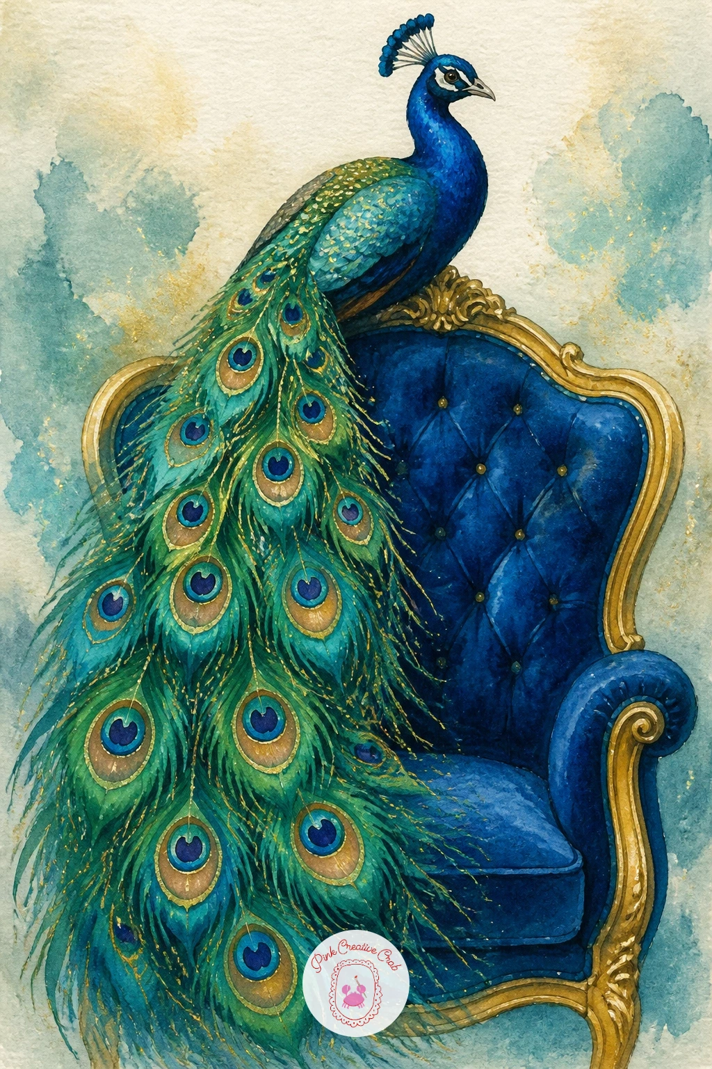
Palette: Sapphire Blue, Emerald Green, Peacock Teal, Gold
Let the setting turn tranquil with a peacock among lotus flowers, standing at the edge of a quiet pool thick with pink and white blooms. Paint the lotus flowers first as soft rounded petal clusters in pale pink and white, leaving plenty of white paper between them so they do not merge into one pink blur. Large round lily pads in flat green sit beneath and around them.
Add the peacock standing among the flowers once they are dry, keeping its legs mostly hidden behind pads and stems so you do not need to worry about painting delicate bird feet. This is a forgiving compositional trick worth remembering for any garden scene with tall foliage.
The mistake to watch for is a lotus pink that turns muddy next to peacock teal; rinse your brush thoroughly between the two and test on scrap paper if you are unsure. A touch of white gouache dropped wet-into-wet into a lotus petal lifts a soft highlight without any lifting technique needed.
No pink paint on hand? A little red mixed heavily with white or a lot of water gives the same soft lotus blush.
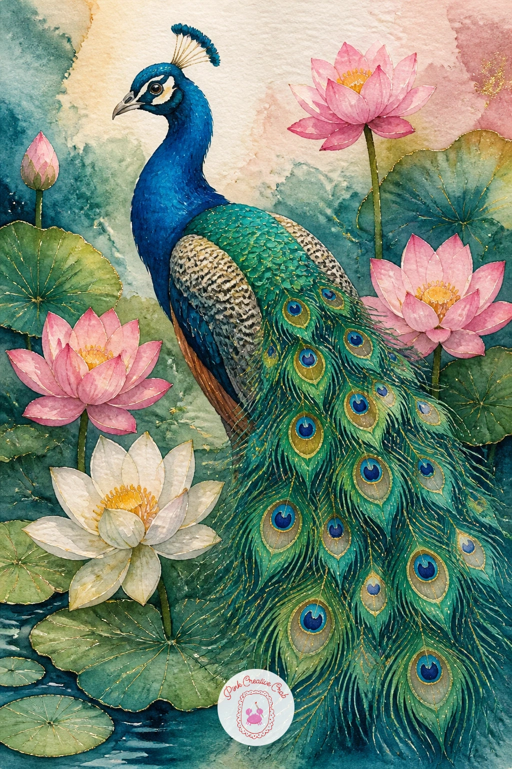
You Will Need
- white gouache (optional for highlights)
Palette: Lotus Pink, Titanium White, Sap Green, Peacock Teal
Capture motion with a peacock spreading feathers on a lawn, caught mid-display with the tail only halfway open, as though you interrupted the moment. Sketch the fan shape at an angle rather than straight on, with one side of the arc wider than the other, which instantly suggests movement compared to a perfectly symmetrical fan.
Paint the half-open tail in the same wet-into-wet jewel tones as a full display, but tilt your paper slightly while the wash is wet so the color drifts in the direction of the turn. This small trick adds energy that a flat, evenly painted fan cannot give you.
Ground the whole scene with a simple green lawn wash beneath the bird’s feet, kept loose and uneven rather than a solid block of color, so it reads as grass rather than carpet. The quick ten-minute version stops there; a fuller forty-minute piece adds a soft shadow beneath the bird and a second, smaller peahen watching from one side.
Try this again later with the tail at a different angle each time, since no two real displays ever look the same.
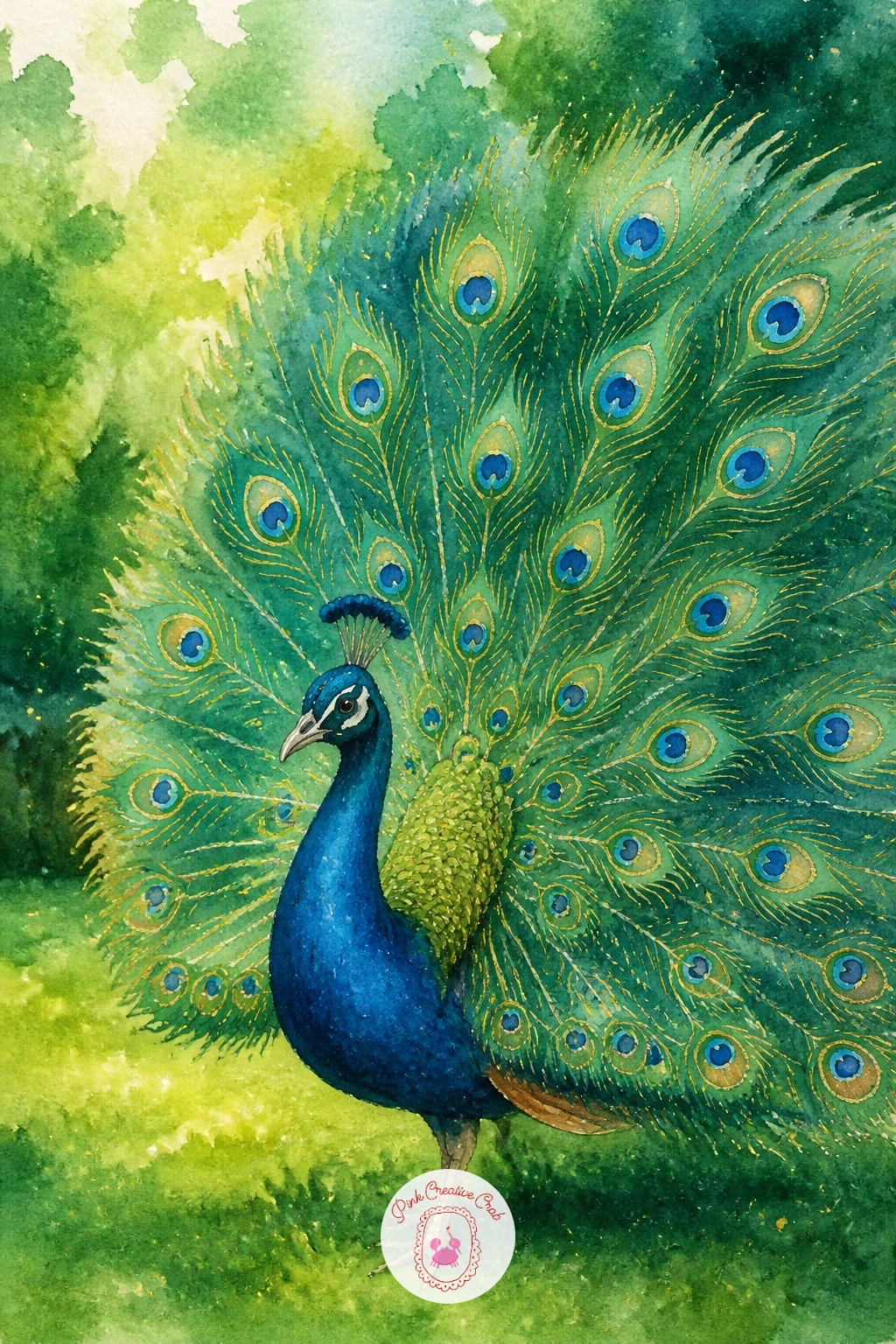
Palette: Peacock Teal, Emerald Green, Sap Green, Gold
Turn the subject decorative with a peacock on a chinoiserie vase, painted as though it were the hand-painted design curling around a tall porcelain jar. Draw the vase outline first as a simple classic silhouette, wide shoulders tapering to a narrow neck, and paint the body of the vase in a flat ivory or pale blue base wash.
Once that base is bone dry, paint the peacock design directly onto the vase surface in teal, sapphire and gold, keeping the lines more graphic and stylized than a realistic bird, closer to pattern than portrait. Thin gold scroll lines curling around the peacock finish the chinoiserie feel and are best added last with a fine brush or gold gel pen.
Where this goes wrong is painting the bird too loosely for a “porcelain” look; keep edges cleaner and strokes more controlled here than in your looser garden scenes, since the whole appeal is a painted object, not a live bird in nature. If gold gel pen is not available, a yellow ochre paint mixed thick works as a stand-in shimmer.
For your own twist next time, try the same vase shape with a crane or a pair of swans worked into the design instead.
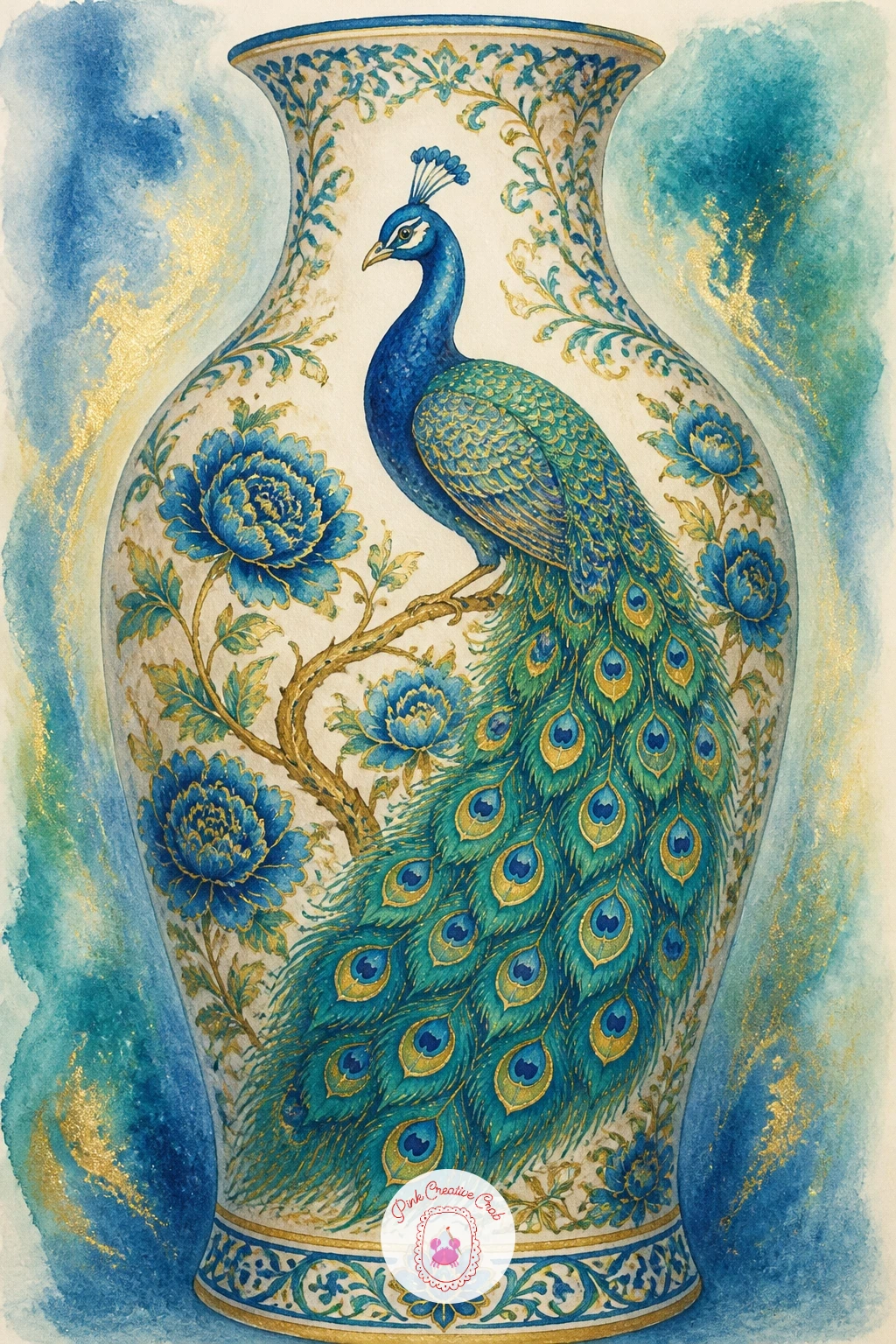
You Will Need
- gold gel pen or metallic paint
Palette: Ivory, Peacock Teal, Sapphire Blue, Gold
Leave the peacocks for now and glide onto the water with a pair of swans on a palace lake, their necks curved into mirrored S shapes side by side. Paint the swans’ bodies as simple soft white ovals, left as dry paper or the faintest wash of pale grey, with the necks curving toward each other so they nearly form a heart shape between them.
Shade only the undersides and tail with a thin wash of pale blue-grey while the surrounding water is still dry, then paint the lake itself in a soft blue-green wash once the swans are fully dry, leaving their white shapes untouched. A few loose horizontal strokes across the water suggest gentle ripples without needing fine detail.
The eye tends to paint swan necks too stiff and straight; look at the curve as closer to a question mark than a straight line, and keep both necks gently asymmetrical even when mirrored. A dry brush dipped in white gouache can tap in a few soft highlight feathers along the wings once everything dries.
If you would like another bird pairing after this one, the watercolor birds tutorial has more garden bird poses to borrow ideas from.
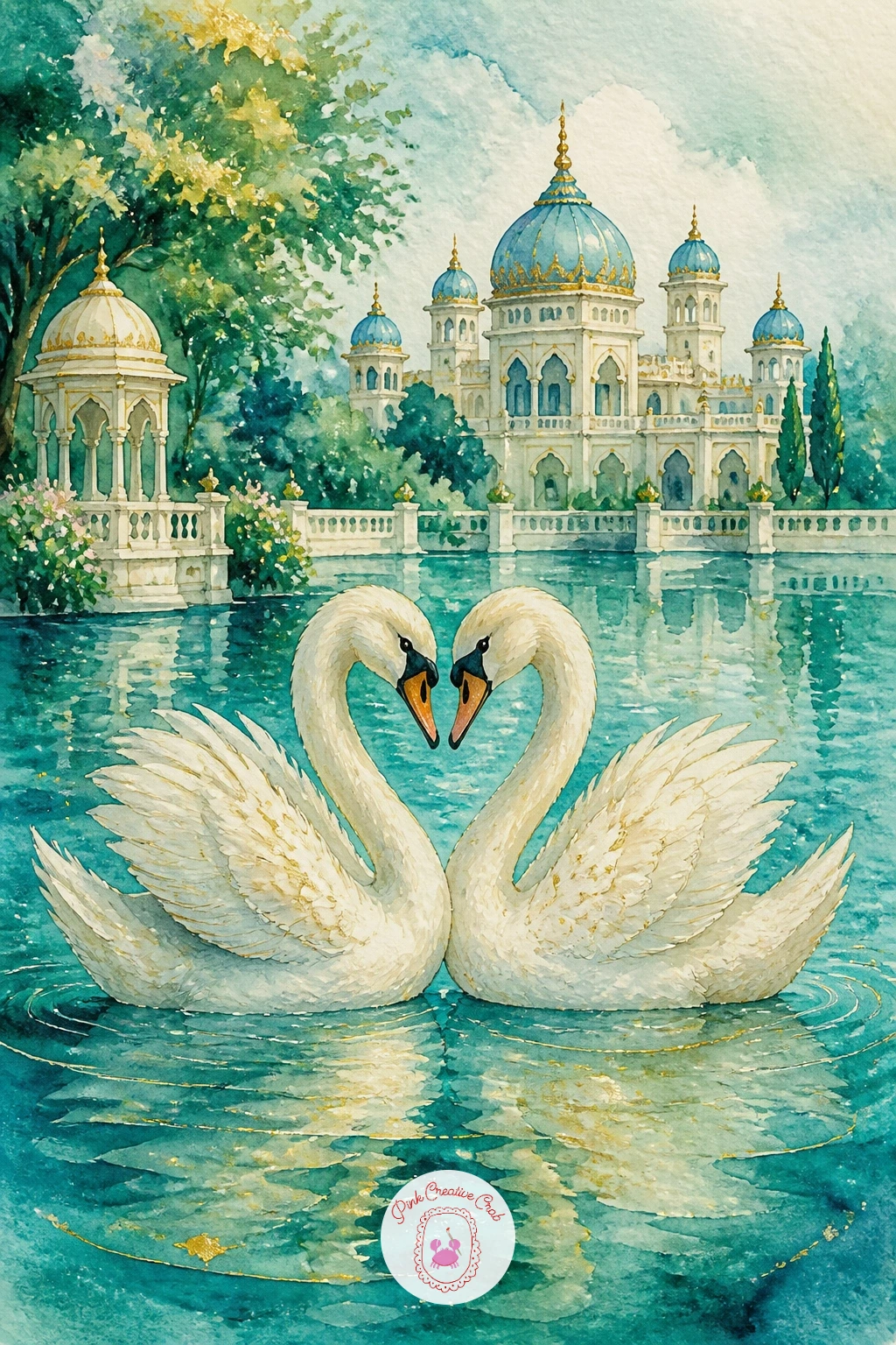
Palette: Titanium White, Payne’s Grey, Teal, Sapphire Blue
Bring in warmer color with a golden pheasant in a formal garden, a small bird but one of the boldest in pattern, with a fiery gold crest and deep red body. Paint the body first in a wash of warm red-orange, then let it dry before adding the long, barred tail in black and gold stripes using a fine brush, working from the base of the tail outward in short confident strokes.
The golden crest at the head is the detail people notice first, so paint it as a solid warm gold shape before adding a few thin dark lines to suggest its feathered texture. Keep the formal garden behind it simple, a clipped hedge shape in flat green and a strip of gravel path in pale ochre, so the bird’s color stays the clear star of the page.
The common slip is a tail pattern that turns into a solid black blob; paint the gold stripes first, let them dry, then add thin black lines between them rather than trying to paint both colors at once. If you do not own a true gold paint, yellow ochre mixed with a touch of orange gets you close enough.
Try the quick version with just the head and curled tail tip peeking from behind a hedge for a ten-minute study.
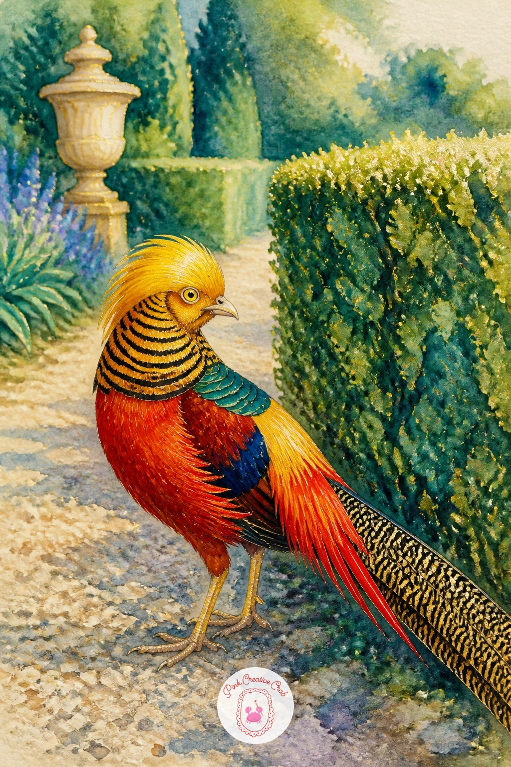
Palette: Golden Yellow, Vermilion Red, Payne’s Grey, Sap Green
White doves on a fountain gives you a chance to practice painting white birds against stone and water together in one small scene. Paint the fountain first as a simple tiered stone shape in soft grey and ivory, keeping the top basin wide and the base narrower, and let a thin wash of blue suggest water pooling in the bowl.
Once dry, add two or three doves perched along the fountain’s rim, their bodies left mostly as white paper with only the thinnest grey shadow along one side to show form. Keep their shapes simple and rounded, more soft pillow than sharp bird, which suits doves perfectly at this scale.
Painting several birds close together risks them blurring into one shape, so vary their poses slightly: one with head tucked, one looking up, one mid-preen. A fine dry brush with a little grey paint flicked lightly over the fountain’s water adds sparkle without any special tools.
No grey paint mixed yet? A touch of Payne’s grey or simply blue and brown mixed together gives you the same soft stone tone.
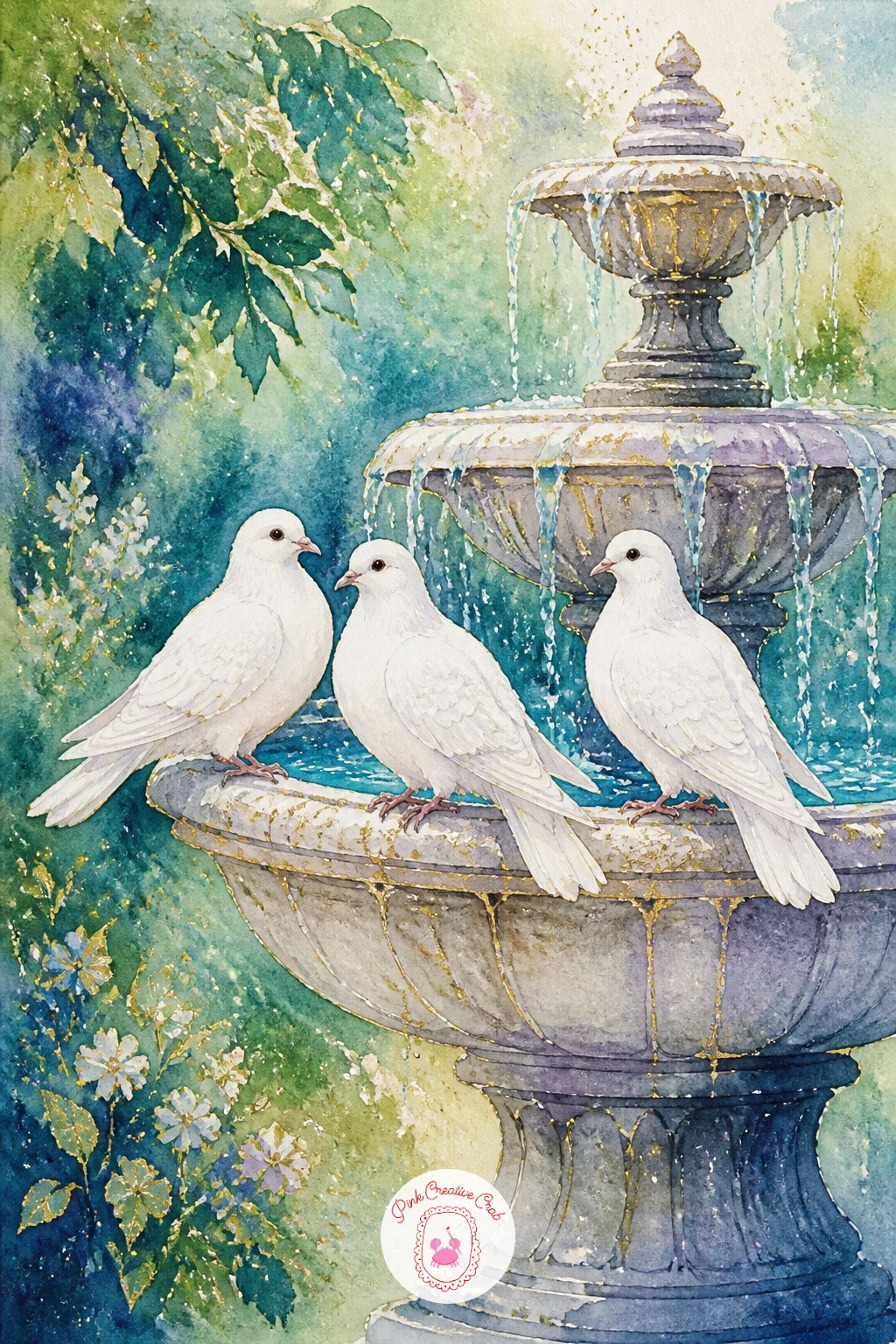
Palette: Ivory, Payne’s Grey, Soft Blue, Titanium White
Height and pattern take center stage with a crowned crane in tall grass, instantly recognizable by its halo of golden spiky feathers atop the head. Paint the body first as a tall, elegant standing shape in soft grey and white, with long thin legs sketched lightly in pencil before any paint touches the page, since getting their length right early saves a lot of frustration later.
Compare the leg length to the body height as you sketch: cranes’ legs usually run as long as the body itself, so if the legs look short, lengthen them before you paint. Once the body is dry, add the golden crown of feathers at the head with small quick brush flicks radiating outward, and a patch of red near the cheek for the crane’s signature marking.
Tall grass behind the bird can be suggested with a handful of upward dry-brush strokes in two greens, darker behind the bird and lighter in front, which also helps it stand forward from the background. If a dry brush is new to you, load very little paint and drag the brush fast and light rather than pressing down.
Keep the crane’s neck curved rather than ramrod straight for a more natural, graceful stance.
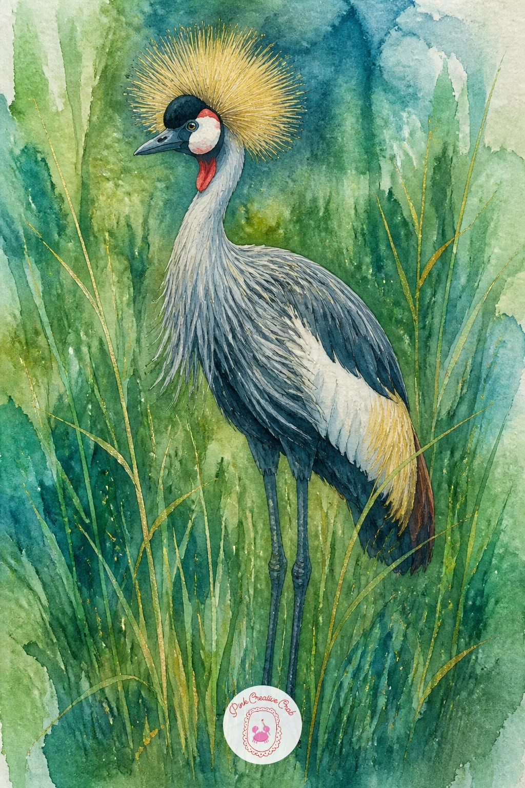
Palette: Payne’s Grey, Titanium White, Golden Yellow, Sap Green
Look up a reference photo of a grey crowned crane before starting, since the golden feather halo is easy to underdraw if you work from memory alone.
Switch the swan palette entirely for a black swan with cygnets, a striking dark bird leading a few soft grey babies across the water. Paint the adult swan’s body in a deep wash of Payne’s grey and black mixed together, building up two or three layers once each is dry so the feathers read as richly dark rather than flat and inky.
Its signature bright red beak is the detail that makes this bird instantly recognizable, so paint it last in a small confident stroke of vermilion once the body is fully dry. The cygnets trailing behind can be far simpler: a few small soft grey ovals, smaller than the parent and lower in the water, needing only a suggestion of a beak and no feather detail at all.
The place this painting can go flat is a swan that reads as a plain black blob; leave a few thin lines of untouched white paper along the top of the wing to suggest light catching individual feathers before the dark wash fully dries.
If black paint alone looks too harsh, mix it with a little Payne’s grey or dark blue for a softer, more natural black.
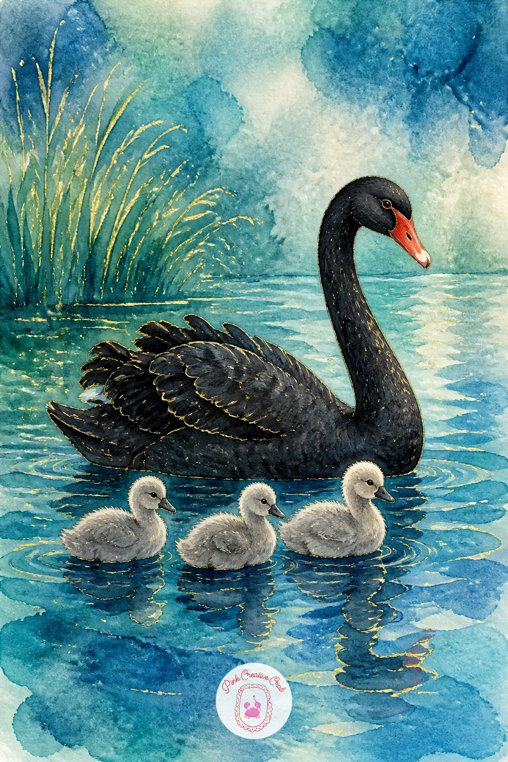
Palette: Payne’s Grey, Ivory Black, Vermilion Red, Soft Blue
Pair soft pink and sharp black and white with a silver pheasant under a cherry tree, a striking contrast bird beneath a canopy of spring blossom. Paint the cherry blossoms first, scattered loosely across the top of the page in soft pink dabs made with the tip of your brush, leaving plenty of white space between clusters so the branch does not feel too heavy.
Once the blossoms are dry, paint the pheasant’s body in crisp white with fine black barred lines running across the back and tail, using a very fine brush and steady, short strokes rather than long sweeping ones. Its face has a patch of bold red skin that should go in last, a single confident dot of vermilion that instantly brings the bird to life.
The barred pattern is where beginners often rush and smudge the lines together; wait until the white base layer is completely dry before adding a single black line, and pull each line in one smooth motion rather than scrubbing back and forth.
No fine liner brush on hand? A sharpened watercolor pencil in black gives you the same crisp line for the barring.
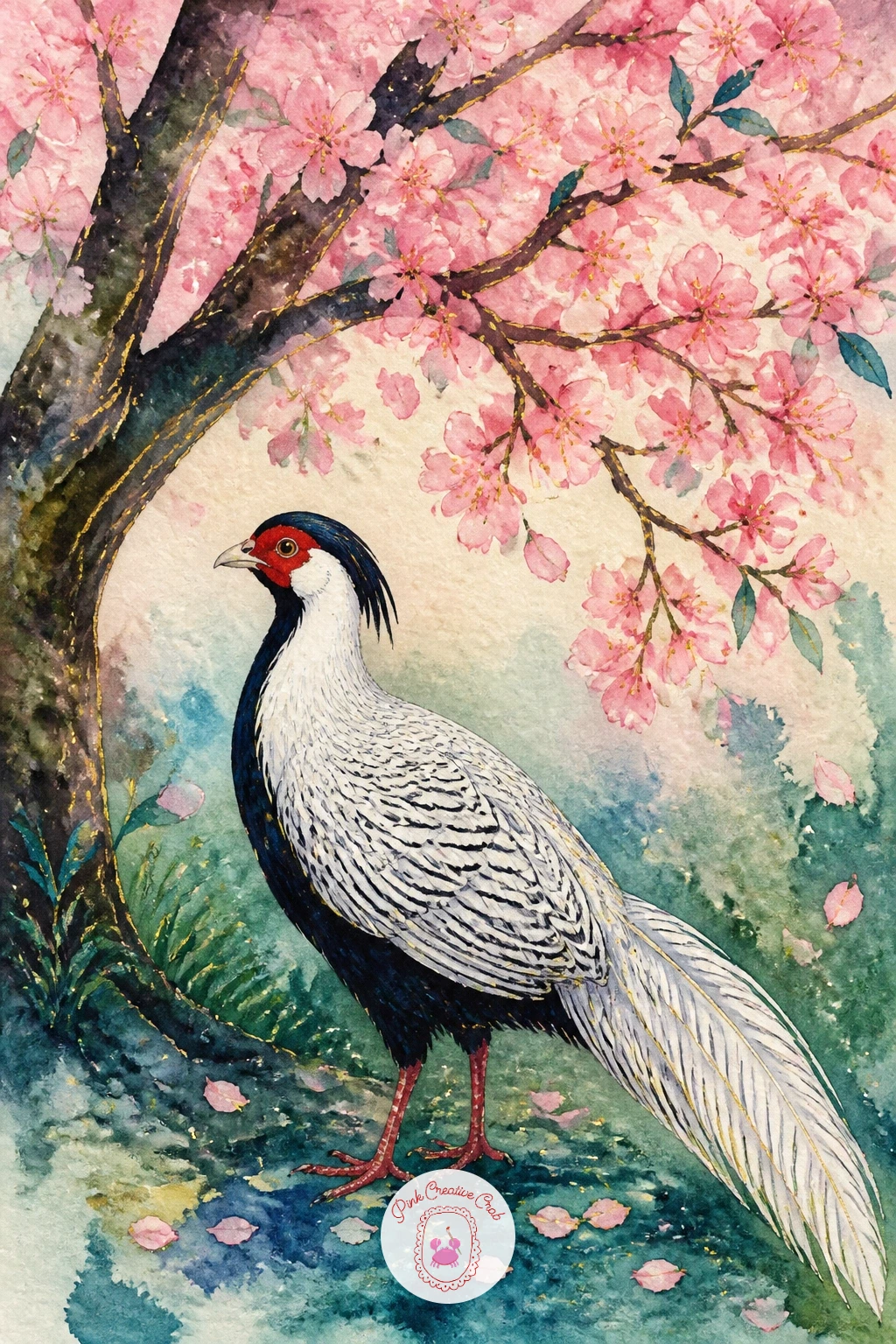
Palette: Titanium White, Ivory Black, Vermilion Red, Cherry Blossom Pink
Return briefly to the peacock family with a peahen and her chicks, a gentler, more muted scene than any of the showy male displays. Paint the peahen’s body first in soft browns and muted teal-grey rather than the bright jewel tones of the male, since her coloring is naturally quieter and that contrast is part of what makes this subject interesting to paint.
Scale is the whole trick with chicks: paint each one no taller than the peahen’s leg, in simple rounded fuzzy shapes with a stripe of soft brown down the back, and cluster them close around her feet rather than spreading them across the page. Comparing their size directly against her leg as you sketch keeps them convincingly small.
A light wash of warm ochre ground beneath them all ties the family group together and suggests sunlit garden soil. If your chicks start looking too much like plain circles, a single thin dark line for a tiny wing fold on one or two is enough to bring them to life without overworking the rest.
Keep your brush small and your strokes short for the chicks; they read better rough than overly neat.
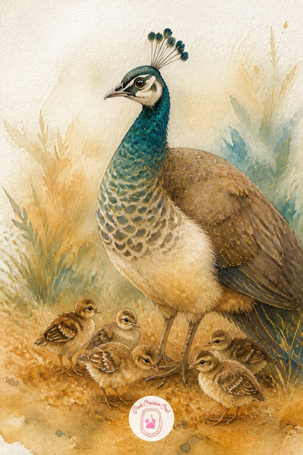
Palette: Soft Brown, Muted Teal, Warm Ochre, Ivory
Few garden birds carry as much pattern as a lady Amherst pheasant, with its black and white scalloped collar and a tail striped in black and white that runs almost the full length of its body. Paint the body in two stages: a deep green chest and back first, then the collar as a series of small overlapping white scallops edged in black, working around the neck in a ring before moving to the tail.
The tail is the real showpiece, extremely long and striped, so measure it against the body before you commit to paint: a Lady Amherst’s tail is usually two to three times the length of the body itself, and drawing it short is the single most common mistake with this bird. Let the stripes run the tail’s full length in alternating black and white bands, slightly wavy rather than ruler-straight.
A small patch of red near the head and a touch of gold at the crest finish the color story. If painting every scallop on the collar feels like too much for tonight, suggest just a few at the front and let the rest fade into a soft white and black blur.
Try this one again later with the tail curved instead of straight, trailing off the edge of the page for drama.
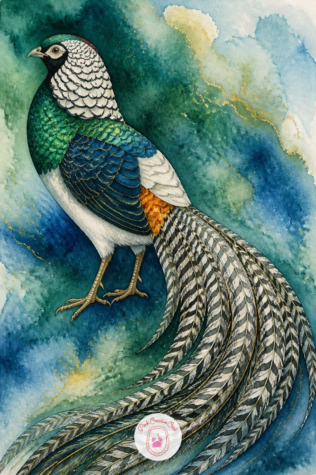
Palette: Emerald Green, Ivory Black, Titanium White, Vermilion Red
Keep things quiet and sculptural with a white dove on a garden urn, perched on the rim of a classical stone planter overflowing with greenery. Paint the urn first in warm ivory and soft grey, using a slightly curved, classical silhouette, wider at the top and narrowing toward a small pedestal base, and let trailing ivy spill down one side in loose green strokes once the stone is dry.
The dove itself needs almost no pigment at all: leave its whole body as untouched white paper, shaded only along one side with the thinnest wash of blue-grey to show where the light falls. This is the same “paint around the white” approach as the snow peacock earlier in this list, and it works just as well at a smaller scale.
Where beginners struggle is making the dove’s shadow heavy enough to read as form without turning the bird grey all over; keep that shading confined to a thin curved band, never a flat wash across the whole shape. A single small dark dot for the eye and a thin grey line for the closed wing are the only details this bird truly needs.
If stone grey feels tricky to mix, a pre-mixed neutral tint or warm grey paint works just as well straight from the pan.
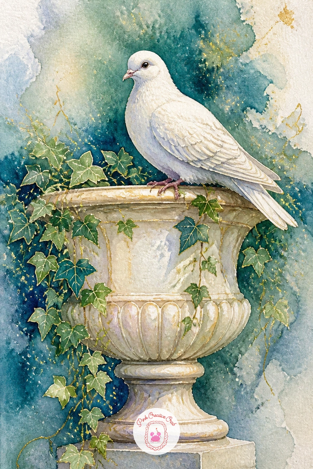
Palette: Ivory, Payne’s Grey, Sap Green, Titanium White
Add architecture back into the water scenes with swans under a stone bridge, a composition that lets you practice an arched shape and reflected light together. Sketch the bridge’s single low arch first in light pencil, keeping the curve gentle, then paint the stone in warm grey and ivory, leaving the arch opening itself as untouched paper until the water goes in.
Paint the water flowing through and around the arch in a soft blue-green wash, and add the swans gliding either just in front of the bridge or partly visible through the archway, whichever you find easier to place. Working the bridge first and the water second keeps the stone edges crisp instead of bleeding into the wash below.
The eye level for this scene usually sits just above the water, looking slightly up at the underside of the arch, which gives the bridge a sense of real scale next to the small swans. A touch of darker grey shadow tucked just under the arch adds real depth with very little extra work.
No access to a bridge reference nearby? A single simple semicircle sketched freehand reads perfectly well as a stone bridge at this scale.
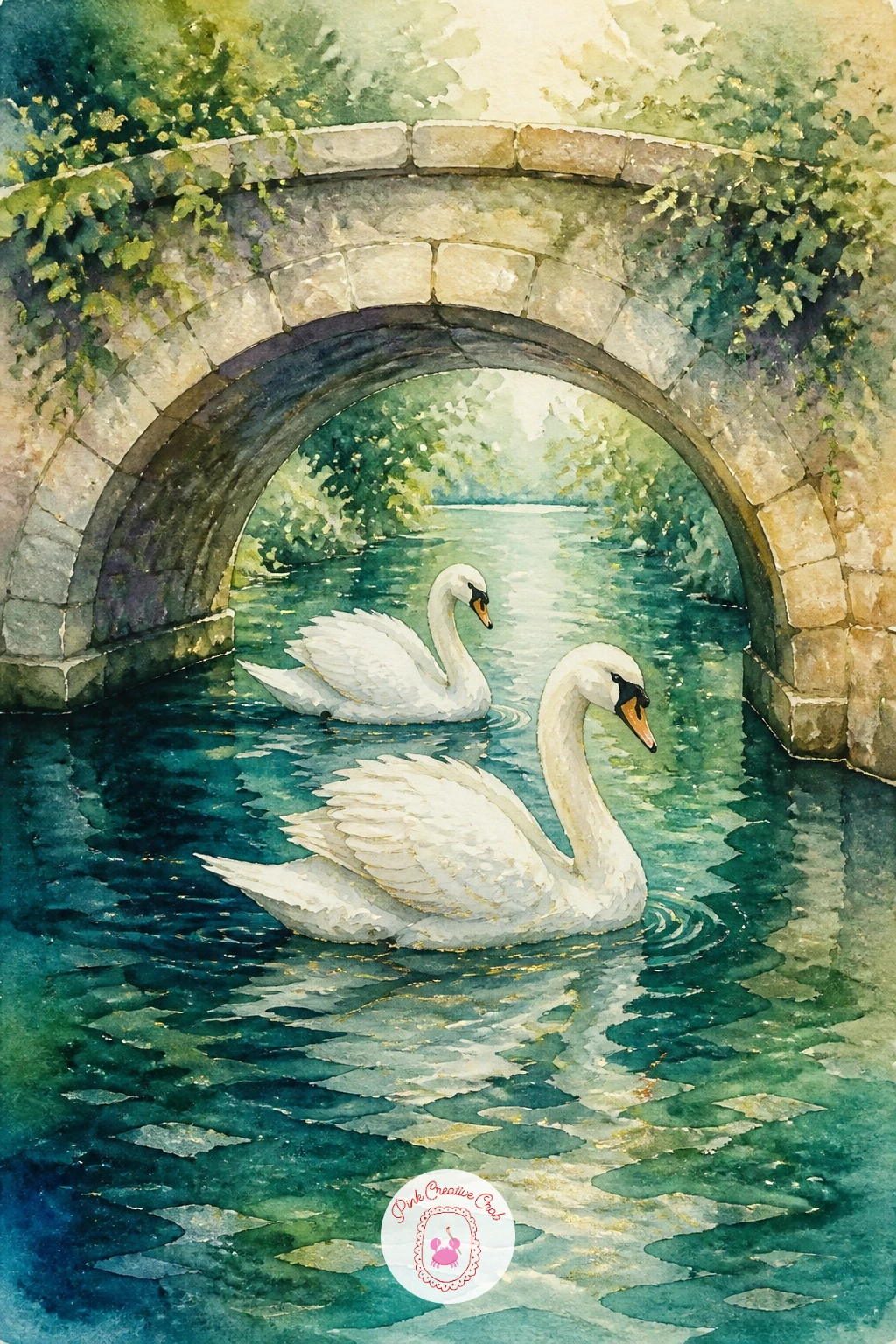
Palette: Ivory, Payne’s Grey, Soft Blue, Titanium White
Soften the whole page with a crane dancing in mist, wings half lifted mid-movement and the background barely there at all. Wet the entire background first with clean water, then drop in the faintest wash of pale grey-blue, letting it feather out to nearly nothing toward the edges of the paper so the mist feels like it dissolves rather than stops at a hard line.
While that background is still slightly damp, paint the crane’s body in soft white and grey with one wing lifted and the neck arched back, letting the edges blur gently into the wet mist around it. This soft-edge technique is the whole point of the piece, so resist going back in with a dry brush to sharpen anything until the piece is fully dry and you can see what actually needs it.
A small patch of red at the crown and thin dark legs are the only crisp, dry-brush details that should stay sharp against all that softness, added once everything else has dried completely.
For a quicker version, skip the lifted wing and paint the crane simply standing in the mist; the full dancing pose is the forty-minute addition once the soft background technique feels comfortable.
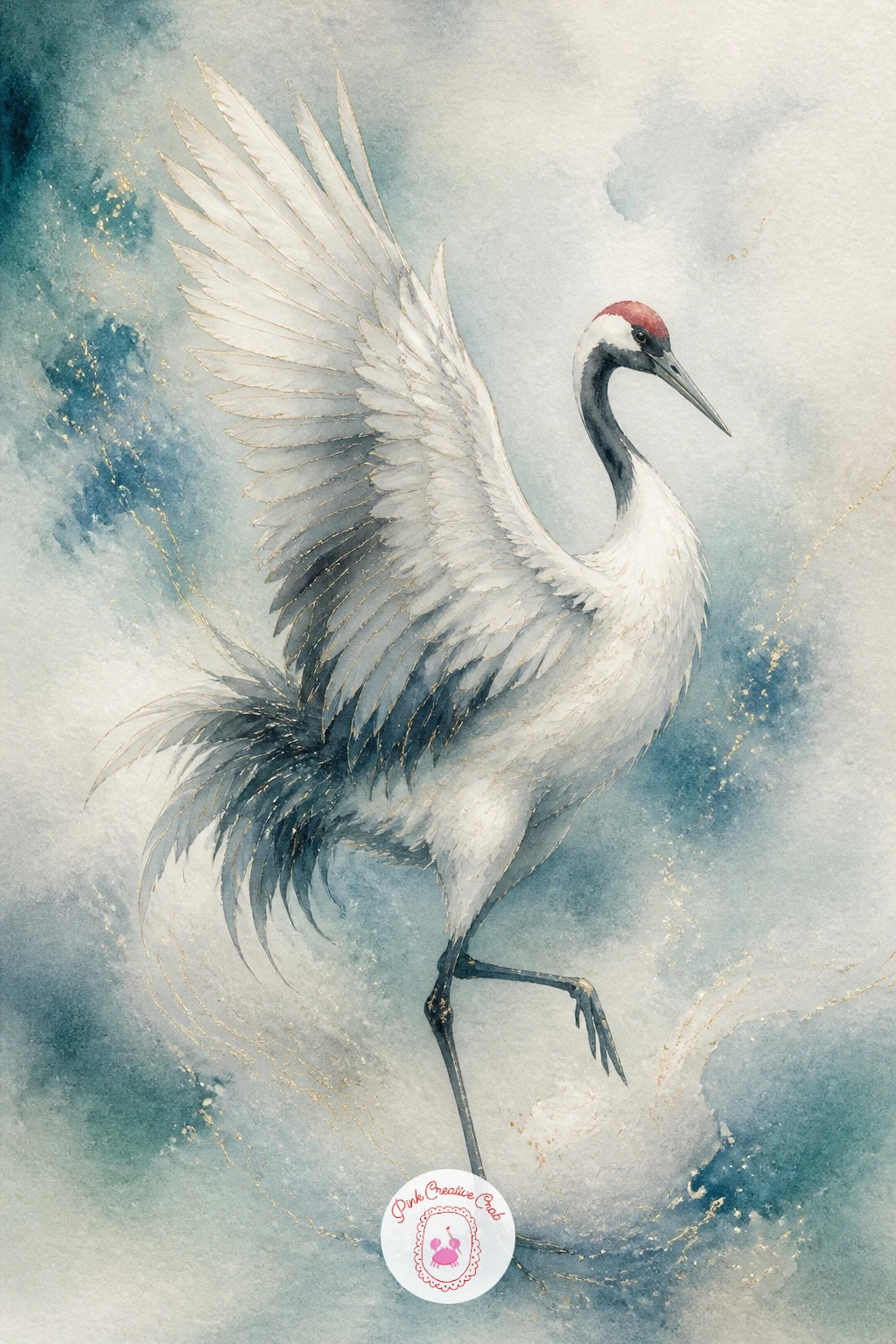
Palette: Payne’s Grey, Soft Blue, Titanium White, Vermilion Red
Warm the palette again with a pheasant in autumn leaves, a classic ring-necked bird standing among a scatter of fallen color. Paint the body first in warm copper and deep brown, with a bold white ring around the neck left as a clean band of untouched paper before any darker color goes in around it.
Once the body is dry, scatter loose leaf shapes around its feet in orange, rust and gold, using quick single-stroke marks rather than carefully drawn leaf outlines, so the ground feels windblown rather than arranged. A few leaves overlapping the bird’s tail or feet help root it into the scene instead of floating above the leaf litter.
The tail’s long, pointed feathers are easy to paint too short; hold your brush at arm’s length and compare the tail length against the body one more time before committing to the final strokes. A damp brush dragged quickly through a still-wet leaf shape lifts a soft highlight if any leaf ends up too dark.
If copper paint is not in your set, mix burnt sienna with a touch of orange for a close match.
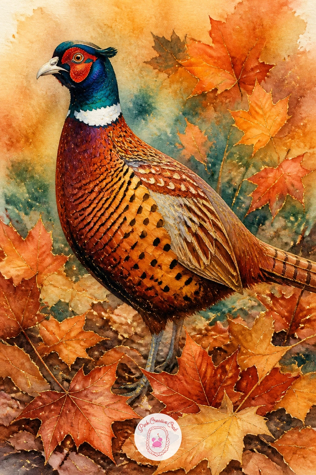
Palette: Burnt Sienna, Warm Ochre, Titanium White, Vermilion Red
Step into full decorative mode with birds on a hand-painted wallpaper panel, a design-led piece inspired by the botanical wallpapers found in old grand houses. Choose two or three birds from earlier in this list, perhaps a small peacock and a pair of doves, and arrange them loosely among painted branches and leaves across a tall rectangular format rather than a single square scene.
Work in flatter, more pattern-like color than your other paintings here: block in each bird’s main shape with a single confident wash rather than layered shading, closer to a printed design than a realistic portrait. Leaves and branches threading between the birds should also stay simple and repeated, since the pattern itself is the point rather than any one bird’s detail.
Flat pattern work like this often ends up feeling static, so angle at least one bird differently from the rest, head turned or wing slightly lifted, to keep the eye moving across the panel. If the cottagecore wall art style appeals to you, this piece sits happily alongside it on a gallery wall.
Gold ink or a gold gel pen traced along a few branch lines once dry gives the whole panel a proper decorative finish.
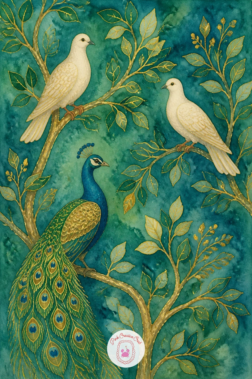
You Will Need
- gold gel pen or gold ink
Palette: Peacock Teal, Sap Green, Ivory, Gold
Add a touch of whimsy with a swan boat on a palace pond, one of those ornate carved boats shaped like a giant swan that once drifted across grand estate lakes. Paint the boat’s swan-shaped hull first in crisp white with a bold orange beak at the front, keeping the overall shape simple and rounded like a toy rather than fussing over carved detail.
Gold trim along the boat’s edge and a small striped canopy or seat inside give it that palace-grand feel, best added with a fine brush once the white hull is completely dry so the gold lines stay crisp rather than bleeding into damp white. The pond beneath it can be painted in the same soft blue-green wash used elsewhere in this list, with a few ripple lines fanning out behind the boat to suggest gentle movement.
The scale between boat and water is where this piece can go wrong; keep the boat fairly large in the frame; a swan boat painted too small loses all its charm and reads as a real swan instead. A thin wash of pale pink or gold on the horizon suggests late afternoon light without adding any extra elements to the scene.
If gold paint runs low, a yellow ochre and white mix gives a similar soft glow for the trim.
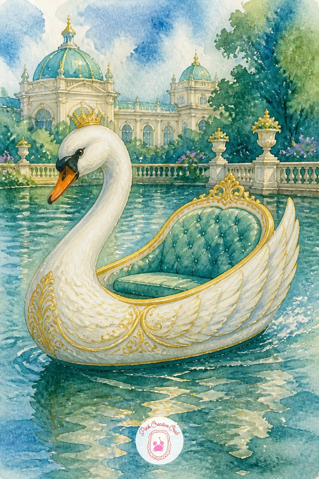
You Will Need
- gold paint or gold gel pen
Palette: Titanium White, Vermilion Red, Gold, Soft Blue
Gather several of your favorite garden birds into one piece with a garden aviary with birds, a tall domed cage structure set in a formal garden with a few birds perched inside and around it. Paint the aviary’s dome first as a simple rounded wire structure, using thin dark lines for the wire frame over a very pale blue wash to suggest glass or open sky showing through.
Add two or three birds, a dove, a small pheasant, perhaps the tip of a peacock tail, perched on branches or the frame itself, painted in solid color before any wire lines cross over them, so the birds read as behind the structure rather than painted on top of it. This layering order matters more here than in any other piece on this list, since getting it backward makes the whole cage look flat.
Keep the wire lines thin and slightly irregular rather than ruler-straight, which reads as hand-forged ironwork rather than a drawn grid. If fine linework feels shaky, a ruling pen or the edge of a credit card dipped lightly in paint can steady a long straight line.
A soft green garden wash at the base ties the whole aviary into its grand setting.
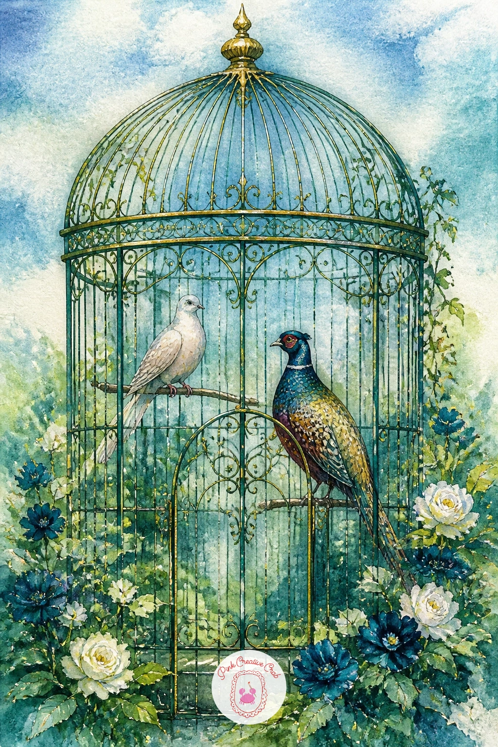
Palette: Payne’s Grey, Soft Blue, Peacock Teal, Sap Green
Bring two of this list’s grandest birds together with a peacock and a swan by one fountain, a composition that lets jewel teal and soft white sit side by side. Paint the fountain first in the center of the page, the same tiered stone shape used earlier in this list, then let it dry fully before placing a swan resting at its base and a peacock standing just beside it, tail partly open.
Balance matters most here: keep the swan’s pale, quiet shape on one side and the peacock’s bright, busy tail on the other, so neither bird fights the other for attention in the middle of the page. A little water trickling from the fountain between them, just a few thin blue lines, gives the eye a path to follow from one bird to the other.
Painting two very different birds in one piece can leave the page feeling cluttered, so simplify the stone and water around them more than you might for either bird alone, keeping backgrounds quiet wherever the birds themselves carry detail. For more ways to pair garden birds in one scene, the watercolor garden paintings ideas offer further inspiration.
Finish with a touch of gold at the fountain’s base to unite both birds under one grand setting.
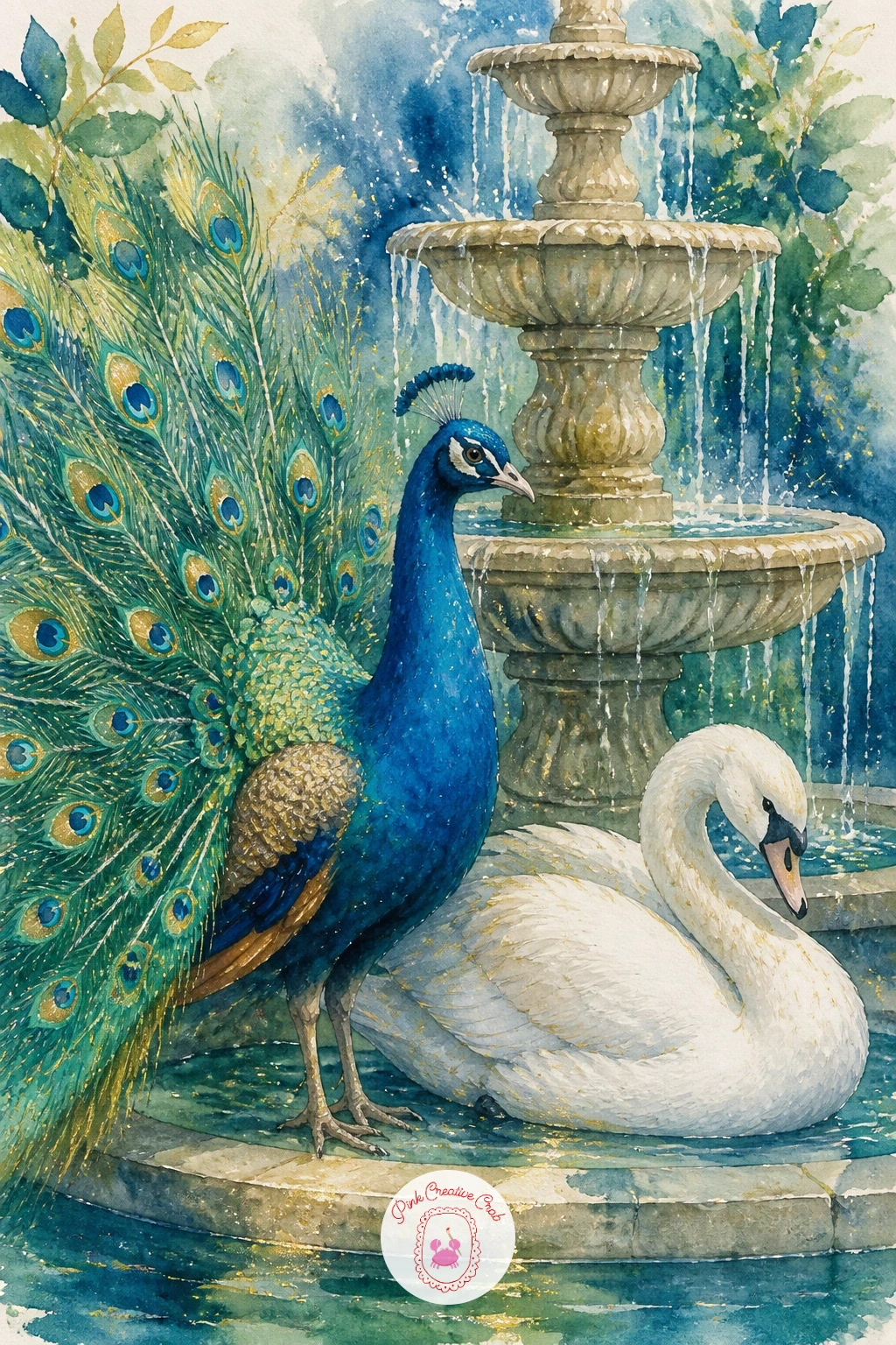
Palette: Peacock Teal, Titanium White, Ivory, Gold
Add a storybook touch with a dove carrying a ribbon, wings spread mid-flight with a long trailing ribbon held in its beak. Sketch the dove’s flying pose first, wings up and spread wide, body angled slightly as if caught mid-glide, then paint the whole body in the same untouched-white technique used for the other doves in this list, shading only the underside of the wings with pale grey.
The ribbon is the fun part: paint it in a confident jewel tone, sapphire or emerald, in one long flowing curve trailing from the beak and twisting gently as it moves away from the bird, with a couple of soft folds where the ribbon catches the light. Keep the ribbon’s color vivid since it is meant to be the single bright accent against the soft white dove.
Wings in flight often end up looking flat and paddle-like; curve the leading edge of each wing slightly forward and taper the tip to a soft point rather than squaring it off, which reads far more convincingly as movement.
If you want a second version later, try the same flying dove with a sprig of greenery in its beak instead of a ribbon, for a different occasion piece entirely.
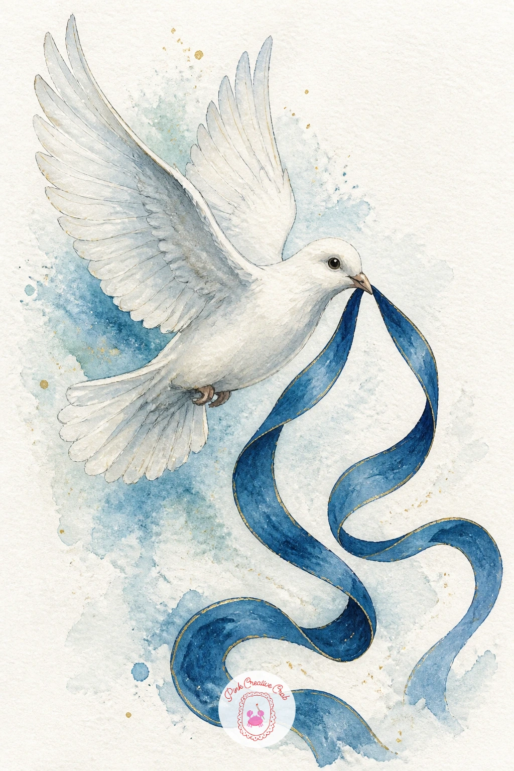
Palette: Titanium White, Payne’s Grey, Sapphire Blue, Emerald Green
Return to a cold palette with a pheasant in snow, a ring-necked bird’s warm copper feathers standing out sharply against pure white ground. Paint the snow first as the untouched white of the paper itself, adding only the faintest blue-grey shadow strokes where drifts curve and dip, before any bird color goes on top.
Once that groundwork is settled, paint the pheasant’s body in warm copper, rust and a crisp white neck ring, keeping the colors slightly richer and more saturated than you might in a summer scene, since warm color against snow reads best when it is bold rather than muted. A few bare twigs or dried grass stems poking up through the snow near its feet add a touch of season without much extra work.
The same mistake as the earlier snow piece applies here: shade the snow too heavily and it stops reading as snow at all. Keep the blue-grey shadow strokes thin, cool and confined to the curves of each drift.
If pure white paper feels too stark on its own, a single pass of very pale blue-grey across the whole background first, left to dry, gives the snow a softer overall tone before the bird goes in.
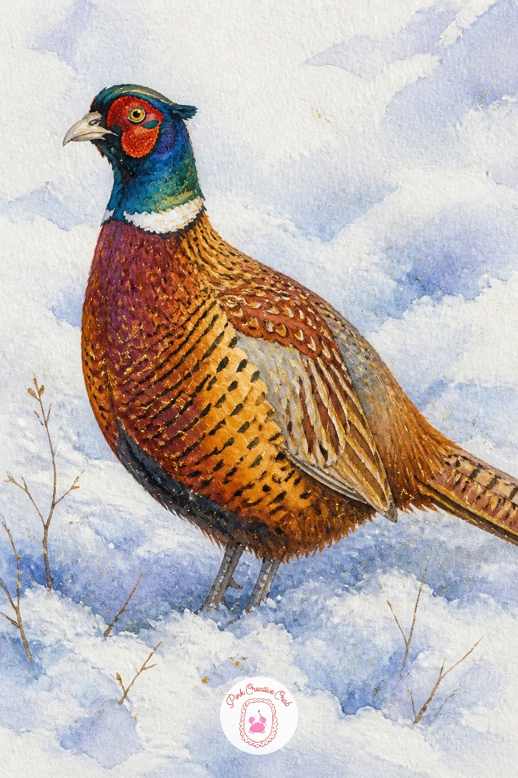
Palette: Burnt Sienna, Titanium White, Payne’s Grey, Warm Ochre
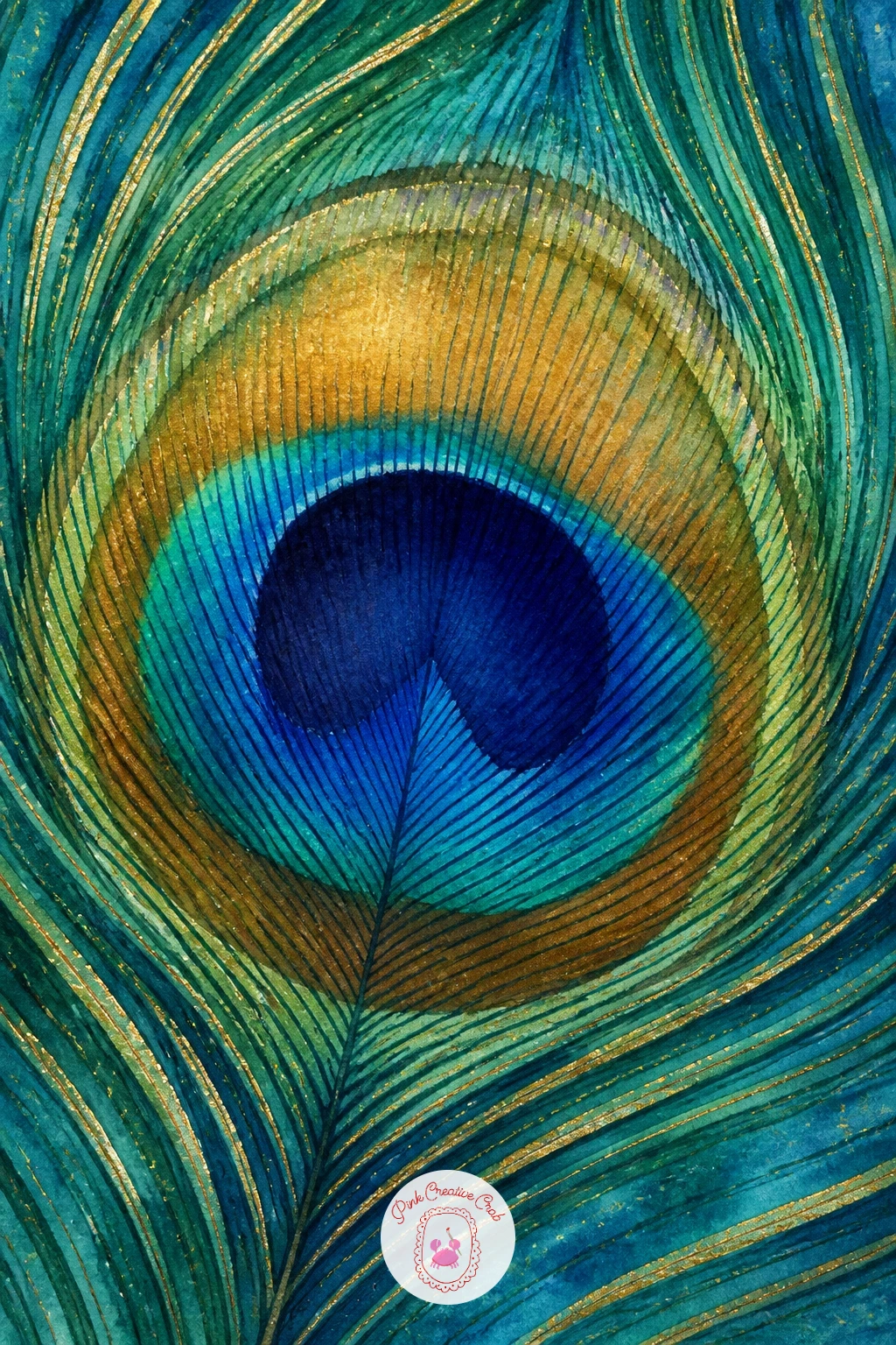
Close the list with its most zoomed-in subject, a peacock feather close-up, where the whole page becomes one single feather eye and its surrounding plume. Paint the central eye shape first as a layered oval: deep sapphire at the core, a ring of bronze-green around it, then a soft halo of teal fading out at the edges, each layer added wet-into-wet before the one before it fully dries so the colors melt together.
Once that eye is dry, use a fine brush to add the thin barbs radiating outward to fill the rest of the page, working from the eye outward in slightly curved strokes rather than straight lines, since real feather barbs always have a gentle sweep to them. This is the one subject on the list where filling the entire frame with a single element works beautifully, so do not hesitate to let the feather run right to the paper’s edges.
The richest color here depends entirely on wet layering rather than detail work, so if your colors are drying flat, work faster and keep your brush well loaded rather than going back over dry paint. If true iridescent shimmer paint is not in your kit, a little gold or copper mixed sparingly into the teal gives a convincing glow.
Try the same technique again at a larger scale filling an entire canvas, since this close-up composition scales up beautifully as a larger decor piece.
You Will Need
- iridescent or metallic watercolor (optional)
Palette: Sapphire Blue, Peacock Teal, Bronze Green, Gold
A small natural sponge dabbed lightly at the edge of the feather eye while still damp softens the color transition and mimics the real feather’s soft blur.
What to Do Next
Pick whichever bird is calling to you tonight, tape a sheet of cold press watercolor paper to your board, and let the first wash go down loose and wet. One finished peacock or swan is all it takes to want to paint the next one on this list.
Frequently Asked Questions
What colors do I need for peacock watercolor paintings?
Peacock watercolor paintings mainly need teal, sapphire blue, emerald green and a dark grey or black for detail. Gold paint, gouache or a gel pen adds the iridescent shimmer that finishes the jewel-toned look.
How do I keep peacock feathers from looking muddy?
Keep peacock feathers vivid by rinsing your brush thoroughly between colors and letting each wet layer dry before adding the next. Working wet-into-wet only within one color family, then adding dark detail once dry, keeps teal and sapphire from blending into grey-brown.
What paper works best for these bird paintings?
Cold press watercolor paper around 140 pounds works best, since it handles the wet-into-wet blooms these paintings rely on without buckling. A paper with a little texture also helps feather washes spread softly rather than pooling in hard edges.
Do I need to draw a detailed sketch before painting a peacock?
A light, simple pencil sketch is enough, mainly to place the body, neck curve and tail shape before paint goes down. Overly detailed pencil lines under watercolor tend to show through and compete with the loose, bloomed feather color.
How can a beginner make a peacock tail look realistic without fine detail skill?
Let wet-into-wet color do most of the work by dropping teal, emerald and sapphire into wet paper and allowing them to blend on their own. Add only a handful of dark feather eyes once dry, since a few confident details read better than many uneven ones.
Have any thoughts?
Share your reaction or leave a quick response — we’d love to hear what you think!
-
 0
-
0
-
0
-
0
-
0
-
0


