

Sketchbook spread ideas work best when both pages talk to each other instead of sitting there as two separate drawings. That is the whole point of this list: every spread below starts on the left page and finishes on the right, with the gutter folded into the composition instead of ignored by it. A breakfast table seen from above, a street that keeps going past the fold, a cat curled up in six different naps: one little story, told across two pages, done by the time you close the book tonight.
Pick whichever one matches your mood and the hour you actually have free. Some of these are quick, loose and forgiving for a first attempt, others reward a slower afternoon with tea nearby. All of them use the same kit: a fineliner for the bones of the drawing and thin watercolor washes to carry the light across the spread, so once you have tried two or three you will start reading every blank double page as a small stage waiting for its story.
Using these images: free for personal projects such as printing, coloring, cards, journals and gifts. Handmade items that include them may be sold up to 30 pieces per design. More than that is commercial use and is not permitted, and neither is selling or sharing the images themselves or passing them off as your own. Please ask before any other use.
Start with the easiest trick in the book for any overhead spread: block in the table edge as one soft curve running corner to corner across both pages, so it reads as a single surface instead of two unrelated squares. Lay the big shapes first in fineliner, plate, mug, small jam jar, folded napkin, keeping every object as a simple oval or circle seen from directly above.
Work left to right so the gutter sits naturally between two groupings rather than cutting through one object. Wash the plate and mug with the lightest color first, then drop in the jam, egg yolk or coffee last, while the paper is still slightly damp so the colors settle softly instead of sitting as hard blobs.
The usual snag with any from-above spread is objects that drift into side views by accident. Keep circles round, not oval and tilted, by checking each shape against a coin or lid before you ink it. If you only have a fineliner and no paint today, cross-hatch the shadows instead and let the drawing carry the spread on its own.
Measuring trick for today: hold your pen at arm’s length against the table edge in your sketchbook to check that the far side of the table is genuinely shorter than the near side, which is what sells the overhead angle.
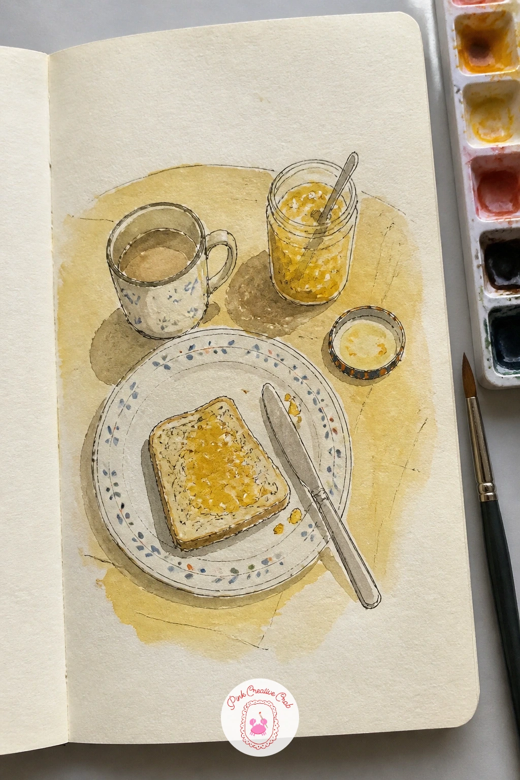
Palette: Raw Sienna,Cadmium Yellow Pale,Burnt Sienna,Payne’s Grey
Follow the breakfast table with something that moves through time instead of just space: a day at the beach, morning on the left page and sunset on the right. Pencil in a simple horizon line first, running straight across the gutter so both pages share one sea and one sky, then sketch a few beach umbrellas, a towel and a scattering of footprints in fineliner.
Paint the left page in cool, pale blues and sandy yellows for morning light, then shift the right page into warmer orange and pink for the sunset half, letting the two palettes meet somewhere near the gutter rather than switching abruptly. This is where eye level and light direction matter most: keep the sun low and to one side on the sunset page, and let every shadow fall away from it in the same direction.
If the colors fight each other where they meet, soften the line with a damp brush and let them bleed together on purpose. A cotton swab lifts out a stray wash if the sky goes muddier than you wanted.
Try this: paint the sky washes first on both pages before any other detail, so the light story is settled before the umbrellas and figures go in on top.
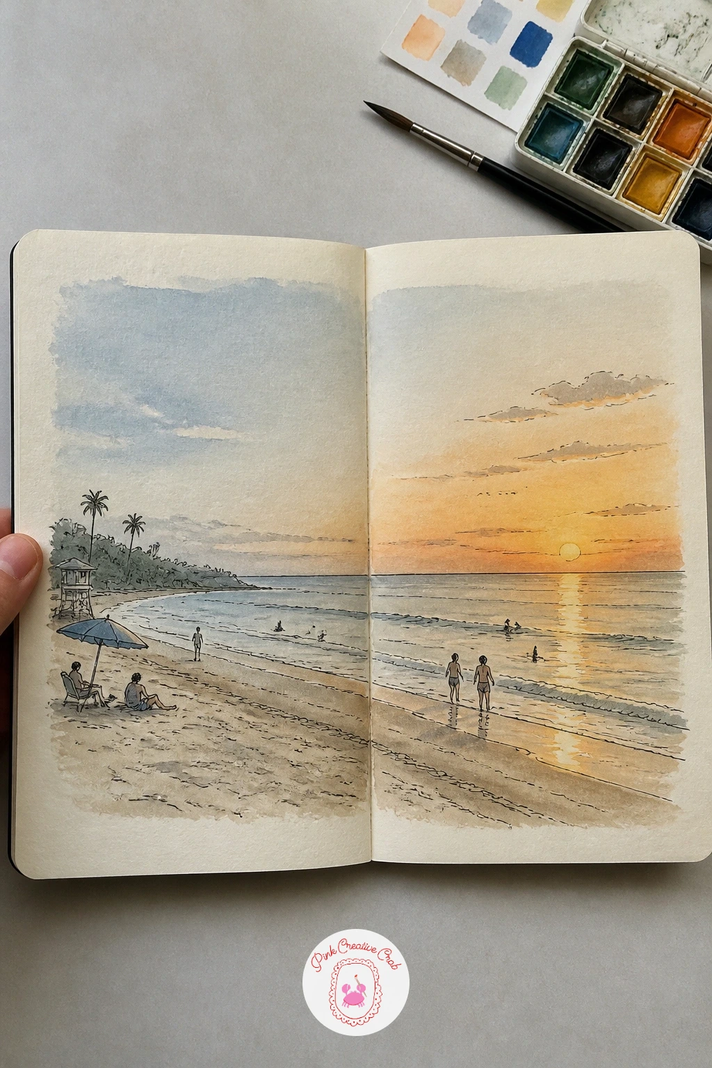
Palette: Cerulean Blue,Naples Yellow,Permanent Rose,Orange Lake
Split this one cleanly by location rather than by time: the bookshop window and its display on the left page, a cozy reading corner with a chair and a lamp on the right. Draw the window as a simple rectangle with a few book spines and a hanging sign, then let the right page open up into an armchair, a small side table and a stack of books on the floor.
Ink the architectural bits first, the window frame and the chair’s outline, since straight edges are easier to get right before softer shapes crowd the page. Wash the window glass with a pale grey-blue to suggest reflection, and keep the reading corner warmer, with a mustard or rust throw over the chair.
Straight lines going wobbly is the usual trouble spot here. Steady your hand by resting your little finger on the page and drawing window frames in short confident strokes rather than one long shaky one, or trace a ruler lightly in pencil first if you need to.
If you enjoy pairing two connected scenes like this, the couple sketchbook ideas list works the same way, with two moments sharing one page.
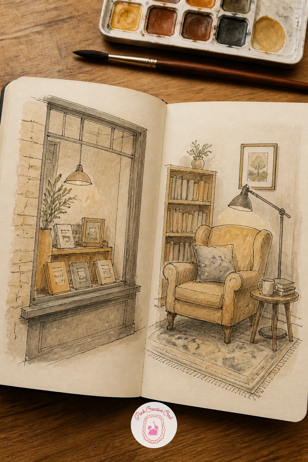
Palette: Payne’s Grey,Yellow Ochre,Burnt Umber,Sap Green
Rule the spread into four even boxes before you draw anything else, two on each page, so spring, summer, autumn and winter each get their own frame without crowding the next one. Keep the same patch of garden, maybe one tree and one flower bed, in every box so the eye reads it as the same place changing rather than four different gardens.
Pencil the tree’s bare branch structure once and trace it lightly into all four boxes before inking, that keeps its shape consistent while the leaves, blossom or snow change around it. Work box by box with a clean brush between each season so spring green does not bleed into the next frame.
The quick version in ten minutes covers just the tree and sky in each box with flat washes. Given forty minutes, add a few fallen leaves in autumn, a robin in winter and scattered petals in spring to give each box its own small detail.
Vary it next time by swapping the subject from a tree to a window box or a single rose bush, so the four-season trick becomes a spread you can return to all year.
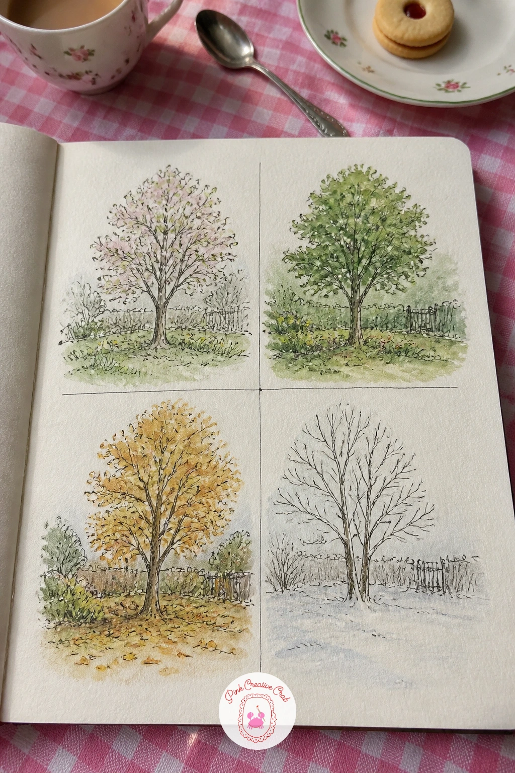
You Will Need
- ruler for the four boxes
Palette: Sap Green,Cadmium Yellow Pale,Burnt Sienna,Titanium White
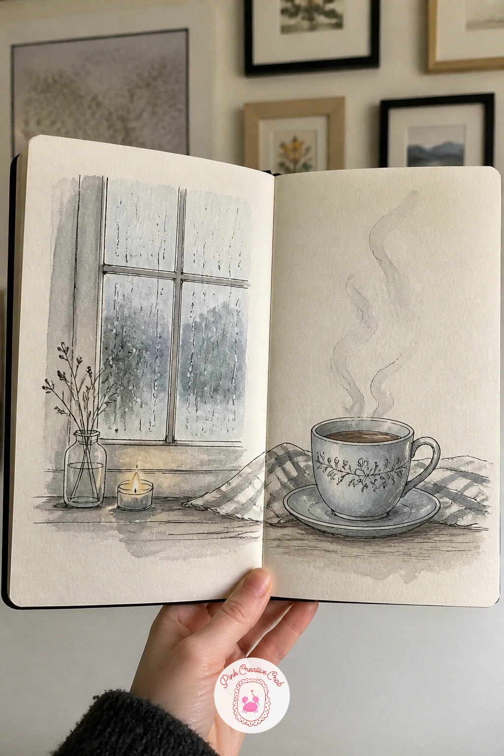
Center this spread on two quiet anchors, a rain-streaked window on the left page and a teacup resting nearby on the right, and let the connecting thread be the grey light falling across both. Draw the window first, keeping the panes simple rectangles, then add a few diagonal rain lines in fineliner before any paint goes near the page.
Wash the window glass in a cool grey-blue while the paper is still damp so the rain streaks blur softly instead of sitting as hard lines, this is the dry brush and lifting moment: once the wash is nearly dry, drag a dry brush lightly through a streak or two to soften its edge, or lift color out with a clean damp brush where you want a hint of window light.
The teacup on the right page wants a confident single curved line for its rim rather than several overlapping attempts. If the curve goes wrong, a kneaded eraser lifts pencil guidelines cleanly before you commit to ink.
No gouache or watercolor handy today, colored pencil in soft grey and blue layers just as well for this quieter palette.
You Will Need
- kneaded eraser
Palette: Payne’s Grey,Cerulean Blue,Burnt Sienna,Naples Yellow
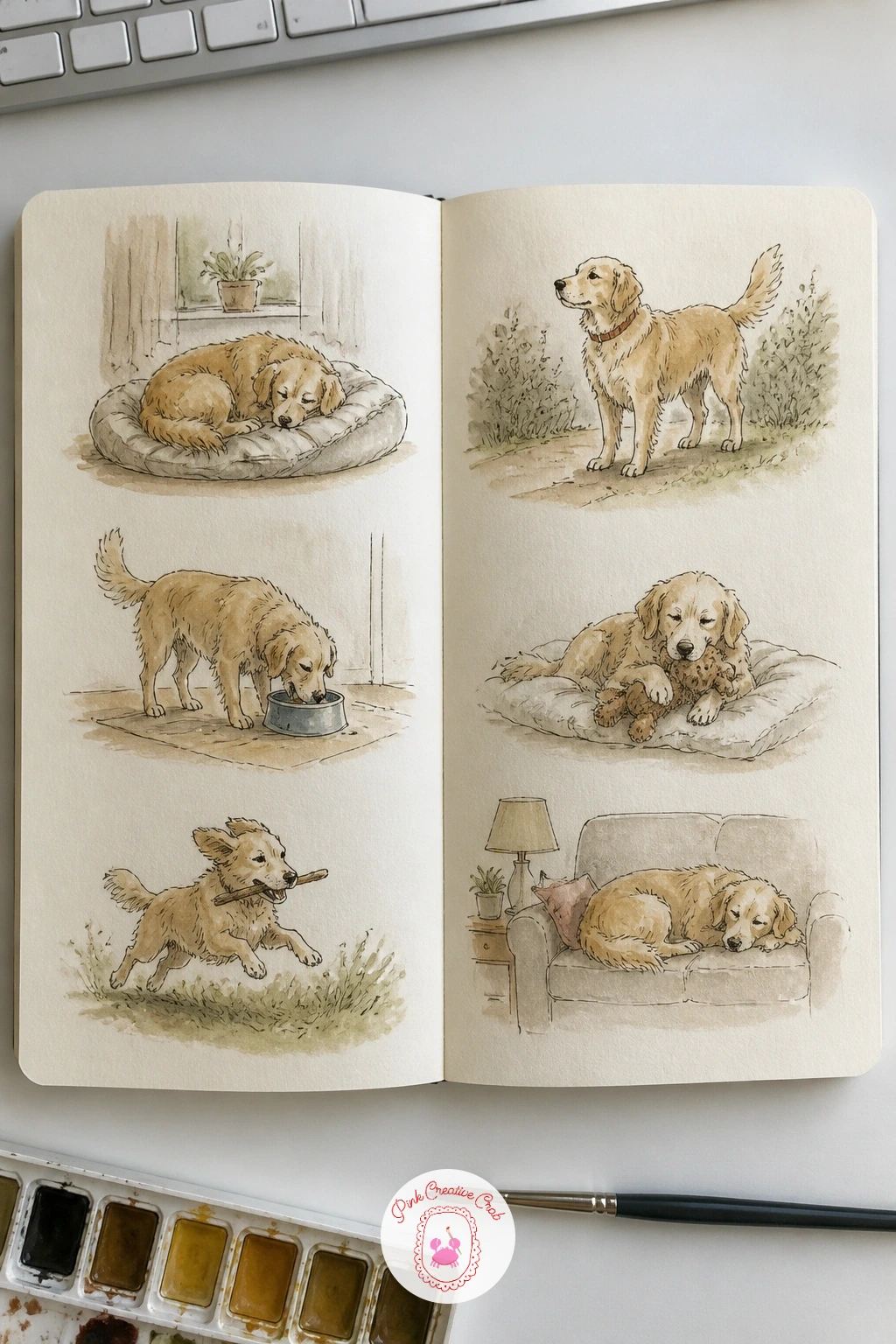
Carry the cozy mood into motion by filling the spread with small vignettes instead of one big scene: a pet’s daily routine broken into five or six little circles or boxes scattered across both pages, morning stretch, breakfast bowl, nap in the sun, afternoon zoomies, evening curl by the fire. Sketch each vignette small and loosely framed, leaving generous white space between them so the page does not feel crowded.
Draw the animal in its simplest pose first in every vignette, just the body mass and head shape, before adding ears, tail or whiskers, that keeps proportions consistent across a page full of small drawings. Paint each vignette with one or two quick washes rather than full detail, since the charm here comes from repetition, not finish.
Vignettes going lopsided against each other is the common issue when there are several on one spread. Pencil a faint light guideline across the page first to keep heights roughly level, then erase it once the ink is dry.
If cats are the pet in question, the cute sketchbook ideas page has more small animal poses worth borrowing for extra vignettes.
Palette: Burnt Sienna,Yellow Ochre,Payne’s Grey,Sap Green
Reference your own pet’s real routine for the poses, a stretch, a food bowl, a sunny nap spot, rather than inventing generic ones, the specific details are what make the spread feel personal.
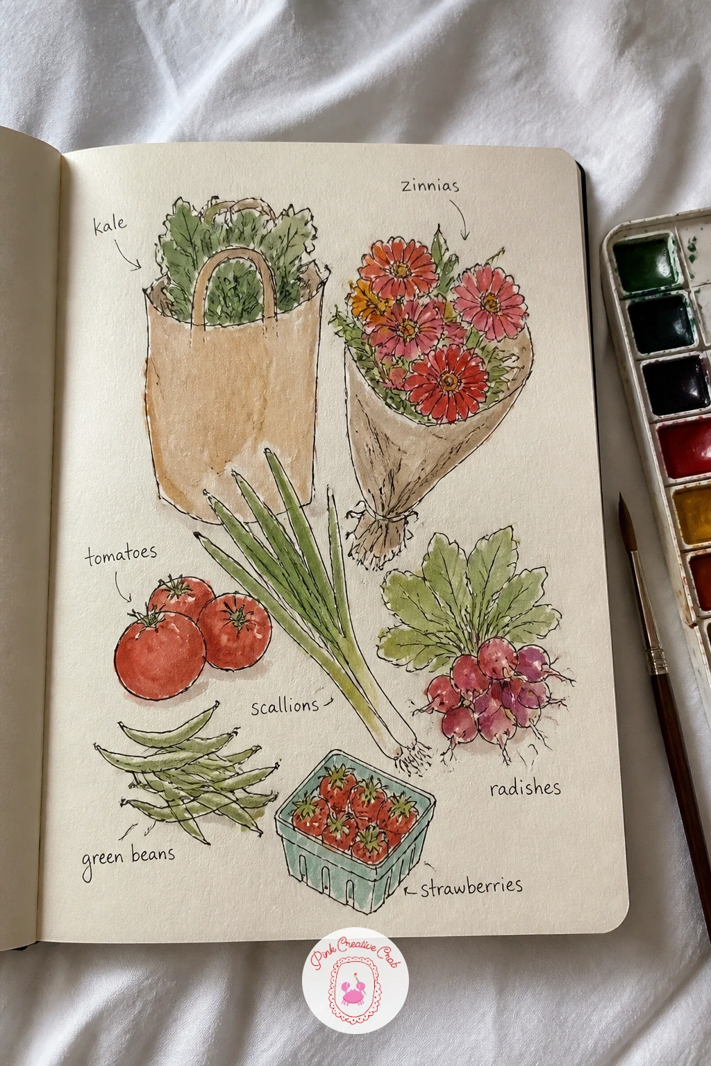
Arrange a farmers market haul across the spread the way you would actually unpack a bag onto a table: a loose cluster of vegetables, a bunch of flowers and a paper bag or two, with small handwritten labels tucked beside each item. Sketch the biggest shapes first, a bundle of carrots or a cabbage, then fill in smaller items like radishes and herbs around them so nothing competes for the same space.
Ink the outlines loosely, this spread likes a slightly wobbly, hand-drawn line more than a tight one. Wash each vegetable in its true color but keep every wash thin, a market haul reads better pale and sunny than heavy and saturated.
Labels are the detail that makes this spread feel finished, write a word or two under each item in your own handwriting once the paint is fully dry so the ink does not smear. If you are short on colors, a single warm red and a single green cover most market produce convincingly.
Overlap two or three items slightly rather than lining everything up in a neat row, that small overlap is what makes a haul look just-unpacked instead of arranged for a photo.
You Will Need
- fine black pen for labels
Palette: Cadmium Red,Sap Green,Yellow Ochre,Burnt Umber
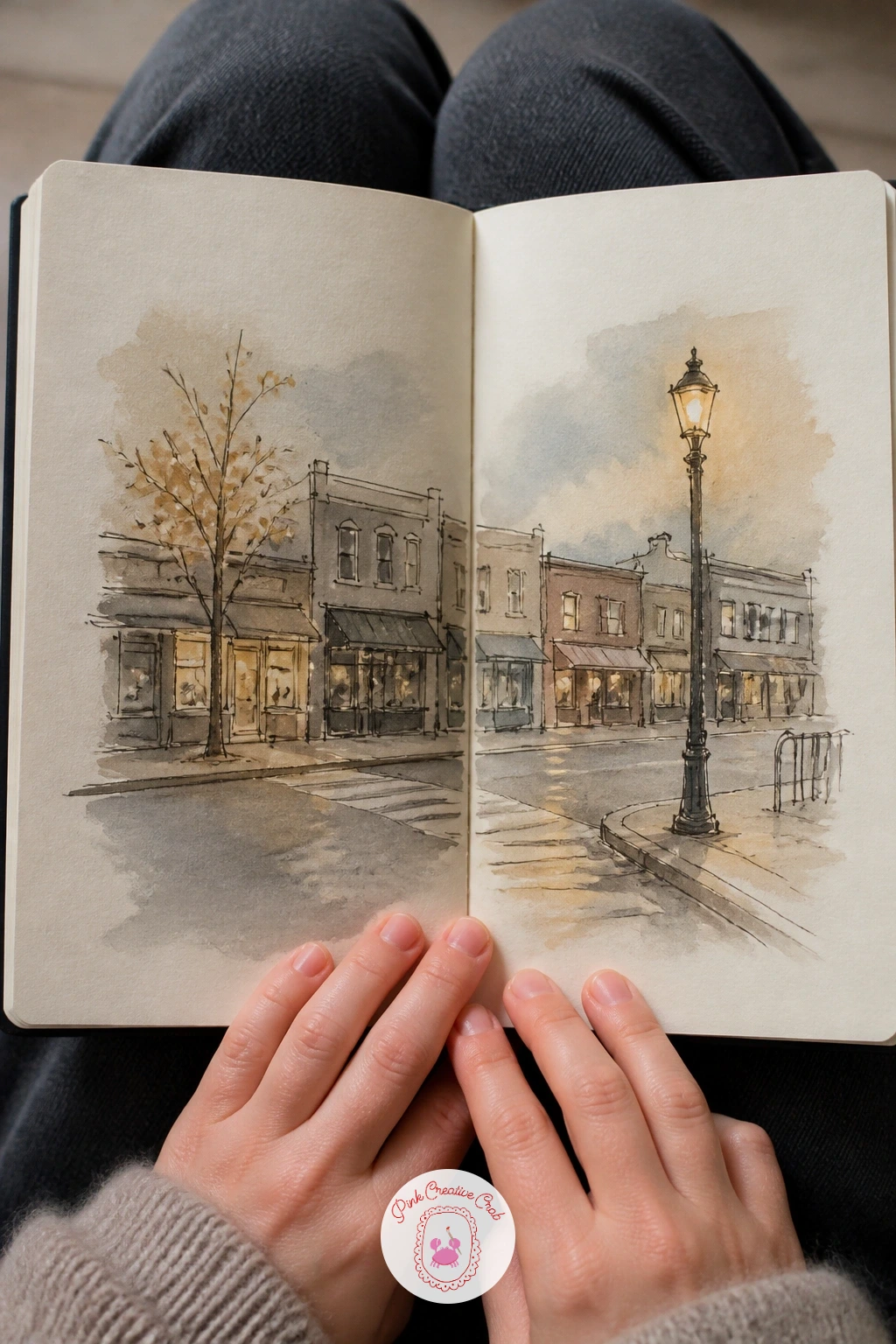
Let a row of buildings run straight across the gutter so the fold becomes a street corner instead of an obstacle, with shopfronts continuing their roofline from one page to the next. Start with a single horizon line for the rooftops, then block in each building as a simple rectangle before adding windows, awnings or a lamppost.
Keep the eye level low, close to the ground, and every window and door should shrink slightly toward whichever end of the street feels farthest away, that is the perspective trick that makes a drawn street recede convincingly instead of looking flat. Light a single lamppost or shop sign warmly against cooler building walls to give the street one clear source of glow.
Wobbly verticals are the usual issue with architecture drawn freehand. Hold the pen loosely and draw each building edge top to bottom in one unbroken stroke rather than inching along, a slight lean reads as charm rather than a mistake here.
Try the quieter version of a town like this in the mini sketchbook ideas list if you want more small building studies to practice on.
Palette: Payne’s Grey,Burnt Sienna,Cadmium Yellow Pale,Indigo
Give the picnic blanket’s pattern the job of unifying both pages, a checked or striped cloth drawn edge to edge so the gutter simply falls between two squares of the same grid. Pencil the blanket’s pattern lightly first, keeping lines straight but loose, then scatter a basket, a few pieces of fruit and a book or two across it without lining anything up too neatly.
Ink the blanket pattern before the objects sitting on top of it, that way each object’s outline can interrupt the grid cleanly rather than fighting with lines drawn around it later. Wash the blanket in one or two alternating colors and keep the objects on top brighter so they lift off the pattern.
If the checked pattern starts looking too mechanical, loosen your ruler lines by drawing them freehand instead, a slightly uneven grid actually reads as fabric more convincingly than a perfect one.
Quick version: cover just the blanket pattern and one piece of fruit in ten minutes. With forty, add the basket’s woven texture and a second food item for a fuller scene.
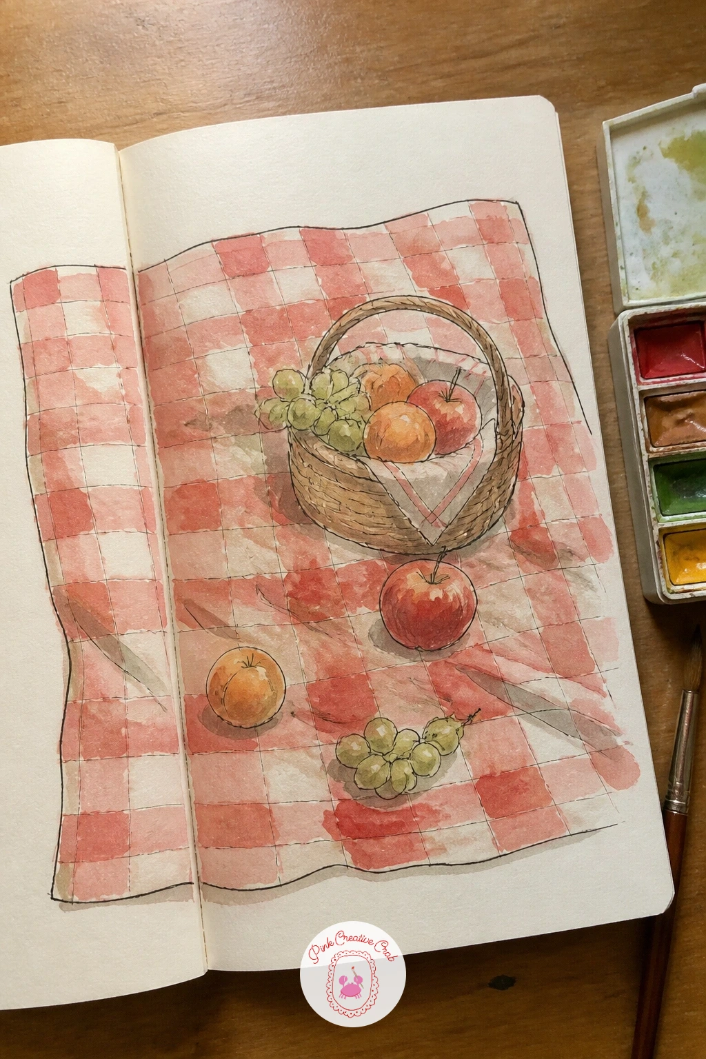
Palette: Cadmium Red,Titanium White,Sap Green,Yellow Ochre
Treat the shelf itself as the line that joins both pages, one continuous plank running across the gutter with small favorite objects lined along it, a candle, a framed photo, a plant, a stack of books. Draw the shelf first as two simple parallel lines, then place each object resting on it before adding any detail inside the objects themselves.
Work left to right in the order the objects actually sit, that keeps spacing natural instead of cramming everything toward one page. Wash each object in its own distinct color so the shelf reads as a collection rather than one blurred shape, keeping shadows underneath each item short and consistent since the light source for a shelf spread usually sits to one side, like a window just out of frame.
Objects looking like they float above the shelf is the most common fix needed here, ground each one with a thin shadow line directly beneath it once the object itself is dry.
If a plant features on your shelf, the botanical sketchbook pages article has more small plant studies worth copying into the mix.
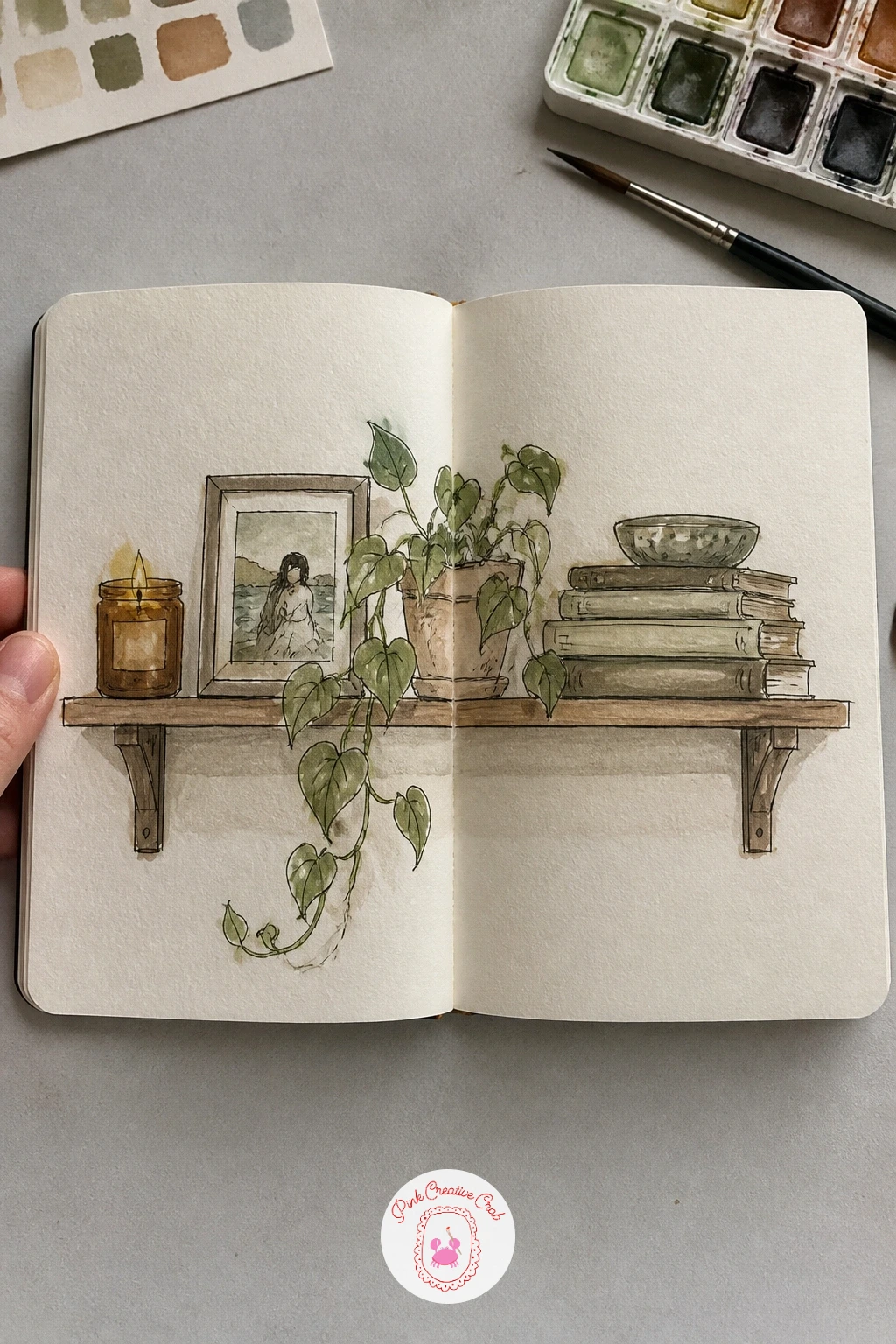
Palette: Burnt Umber,Sap Green,Naples Yellow,Payne’s Grey
Send the camper van itself across the gutter, front half on the left page and back half on the right, with a road and a bit of scenery trailing behind it to tie the two halves together. Block in the van’s rounded shape first in pencil, checking that the roofline and wheel positions line up across the fold before you commit to ink, a ruler held flat against both pages helps confirm the horizon stays level.
Ink the van’s outline in one continuous pass where possible, then add window reflections and a luggage rack or surfboard on top for character. Wash the van body in one confident flat color, saving white space for window highlights rather than painting them in afterward.
If the two halves of the van end up misaligned once inked, a thin painted road line running beneath the wheels on both pages will visually knit them back together even if the body is slightly off.
Swap a camper van for an old pickup truck or a bicycle with a trailer next time you want this same cross-gutter trick with a different vehicle.
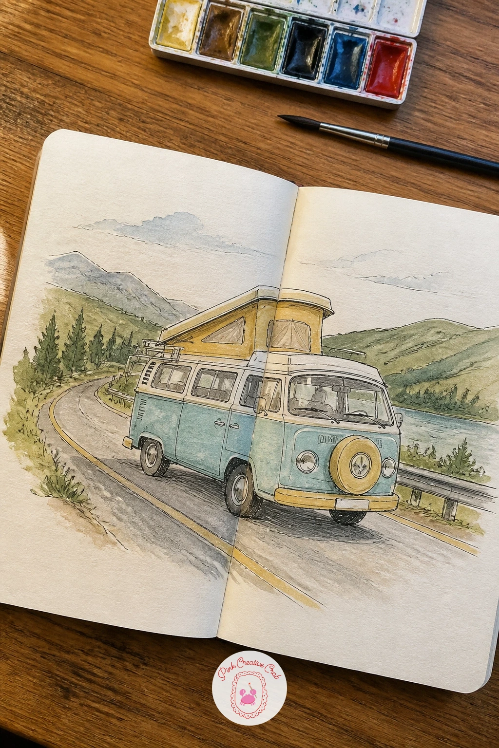
Palette: Cerulean Blue,Naples Yellow,Burnt Sienna,Sap Green
Arrange a row of small moon phases along the top of both pages, then let a quiet night garden grow underneath them, joining the sky story to the ground story on the same spread. Use a circle template, a coin or a small lid, to keep every moon phase perfectly round before shading in the dark portion, this is the trick that stops a moon phase row from looking uneven.
Draw the garden shapes below in simple silhouette first, a few tall flower stems, a small shrub, maybe a cat sitting quietly among them, since night scenes read better from strong shapes than from fine detail. Wash the sky in deep indigo moving into a paler blue near the horizon, then keep the moons themselves nearly untouched white or a pale grey so they glow against the dark wash around them.
Muddy moons are the usual trouble spot, keep the wash around each one thin near its edge and darker further out, rather than one flat tone that flattens the glow.
A cat among night flowers pairs naturally with the sleeping poses idea later in this list if you want two linked spreads in one sitting.
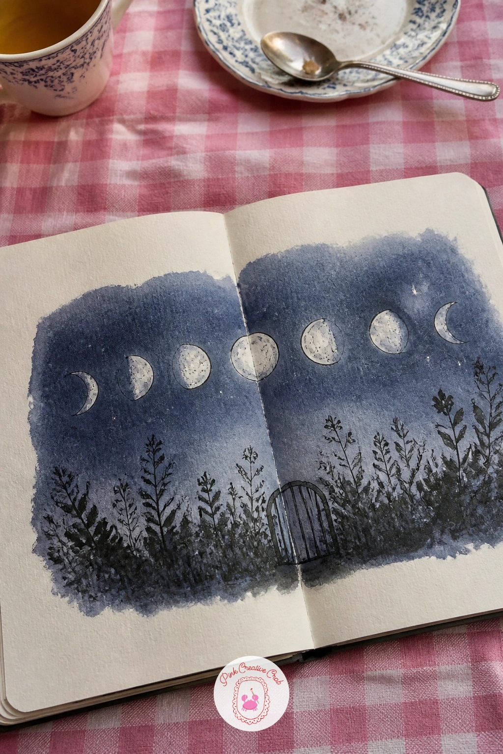
You Will Need
- small circle template or coin
Palette: Indigo,Payne’s Grey,Titanium White,Sap Green
Divide this spread by role rather than by object: the barista working behind the counter on the left page, a few customers seated at small tables on the right. Sketch the counter and espresso machine first since they anchor the left page’s perspective, keeping the machine as a simple stack of rectangles and circles rather than attempting every dial and lever.
Draw the customers in loose, simple poses, a figure reading, another with a cup halfway to their mouth, keeping faces minimal or turned away entirely, which is far easier to get right and still reads warmly. Light the whole spread from one large window, letting it fall strongest on the nearest table and fading toward the counter.
Figures are the part most likely to go wrong here, if a pose feels stiff, simplify it further rather than adding detail, a slouched shoulder or a tilted head reads more naturally than a carefully drawn hand.
The teapot drawing lessons are a gentle warm-up for café still life if figures feel like too much for today.
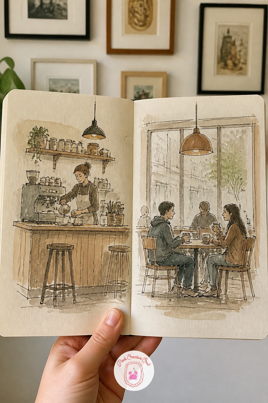
Palette: Burnt Umber,Burnt Sienna,Payne’s Grey,Naples Yellow
Fill the whole spread with a close-up forest floor, a cluster of mushrooms of different shapes and sizes scattered across both pages among moss, fallen leaves and a few small ferns. Draw each mushroom cap as a simple dome or cone first, then add the stem beneath, varying the sizes noticeably so the cluster does not read as identical copies.
Ink the mushroom gills or spots last, after the basic shapes are settled, since adding detail too early tends to lock in proportions you might still want to adjust. This is a good spread for dry brush work: once the base washes are dry, drag a nearly dry brush loaded with dark green across the page edges to suggest moss texture without painting every leaf individually.
Overcrowding is the main risk with a forest floor full of small shapes, leave a few patches of bare cream paper between clusters so the eye has somewhere to rest.
No real forest mushrooms needed as reference, a quick image search for one or two varieties gives you enough cap shapes to invent the rest from.
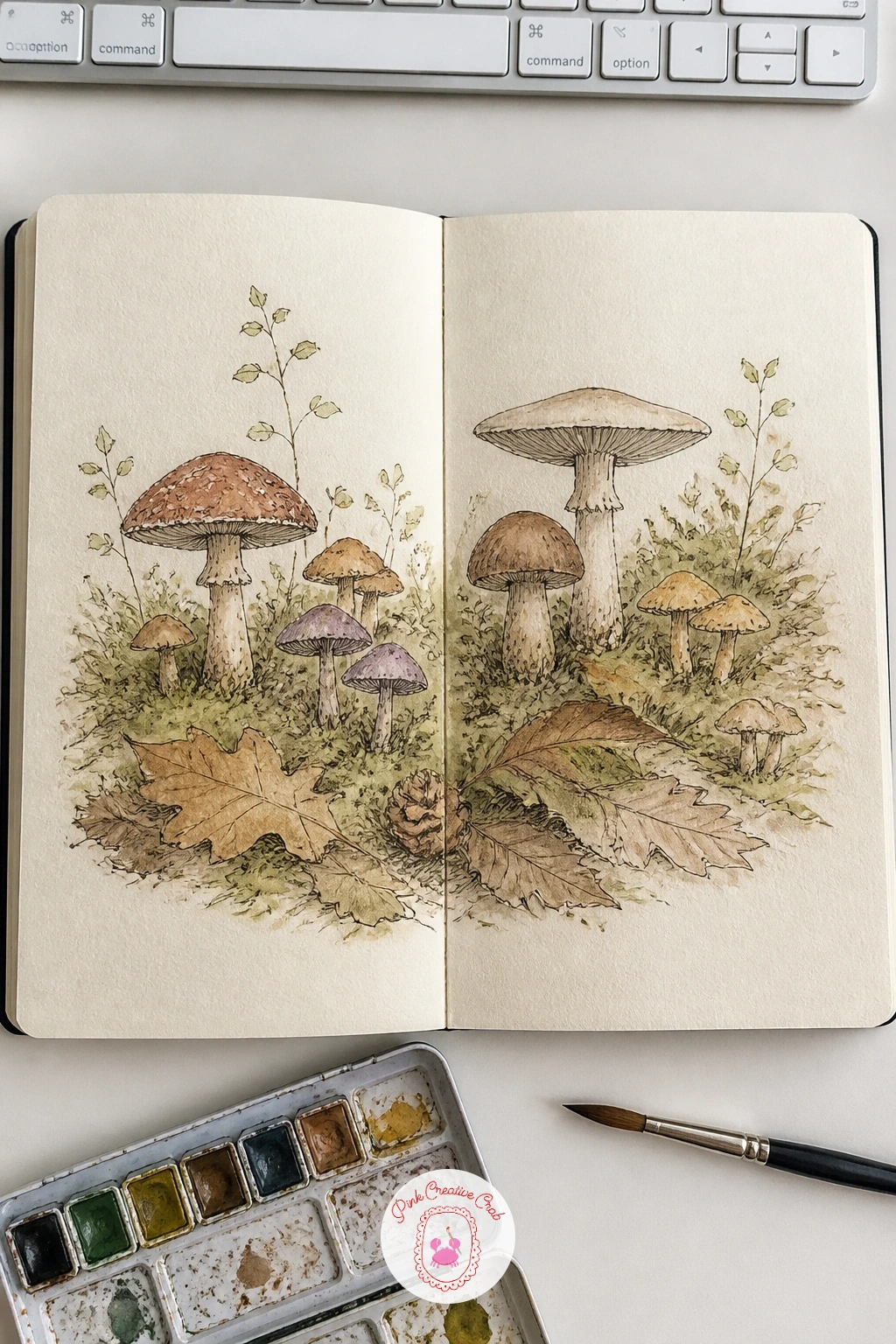
Palette: Burnt Sienna,Sap Green,Yellow Ochre,Payne’s Grey
Stack this village up the page rather than along it, small houses climbing from the harbor at the bottom of both pages toward a hill crest near the top, with the gutter running up through the middle like a narrow street. Block in the hill’s silhouette first in pencil, then place roofs along it at slightly varying heights so the climb feels natural rather than stepped evenly.
Keep your eye level low, near the harbor, which makes houses higher up the hill appear smaller and slightly tilted, that single adjustment does most of the work of selling the steep climb. Paint roofs in two or three alternating warm colors against pale stone-colored walls, and let the sea at the bottom stay the coolest tone on the page to anchor the whole palette.
If the houses start looking identical, vary just one feature per house, a different roof angle, a chimney, a single window shutter, rather than redesigning each one from scratch.
Try this: paint the sea and sky washes first, then let the houses go in once that base is dry, so the warm rooftops really lift off the page.
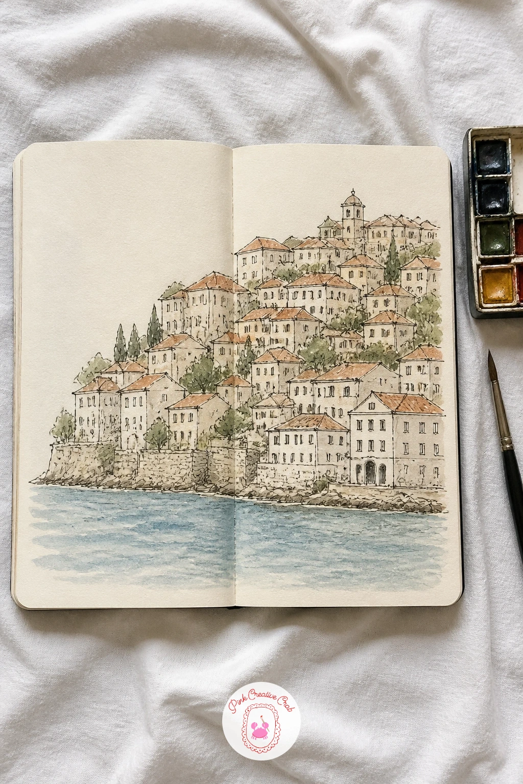
Palette: Cerulean Blue,Burnt Sienna,Cadmium Red,Naples Yellow
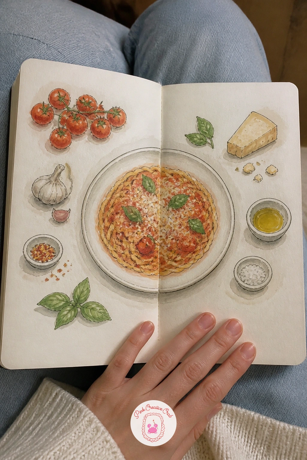
Center the finished dish in the middle of the spread, then ring it with small drawings of its ingredients across both pages like a recipe card come to life. Sketch the main dish first since it sets the scale for everything orbiting it, then place each ingredient around it with a little breathing room rather than packing them edge to edge.
Ink the central dish with slightly heavier lines than the surrounding ingredients, that visual hierarchy keeps the eye landing on the right spot first. Wash each ingredient in its true color, keeping the washes thin so a page full of small items still feels light rather than heavy.
A handwritten ingredient list or a few steps jotted in the margins finishes the page, write these only once the paint is fully dry so pencil or ink does not smear under a damp hand.
For more plated food studies to borrow ingredient shapes from, the Christmas food drawing ideas cover plenty of dishes worth adapting to any season.
You Will Need
- fine pen for recipe notes
Palette: Cadmium Red,Yellow Ochre,Sap Green,Burnt Sienna
Lay this spread out like a short comic strip, a few small panels showing a bouquet coming together: loose stems on the left page, the arrangement taking shape across the gutter, the finished bouquet tied with ribbon on the right. Draw each stage small and simply, a handful of stems, then the same stems gathered, then the final bunch, keeping the flower types consistent across all three stages.
Choose two or three flower shapes you already draw comfortably rather than a different bloom in every panel, repetition across the stages is what makes the sequence read clearly as one bouquet being built. Wash the final full bouquet the most richly, keeping the earlier stages paler so the sequence visually builds toward that last, fullest panel.
If the flowers start looking too similar to each other panel to panel, vary just the angle of one or two stems rather than redesigning the whole bunch.
Once this sequence works, try it next with a flower crown being woven or a table centerpiece being assembled, the same step by step structure suits either.
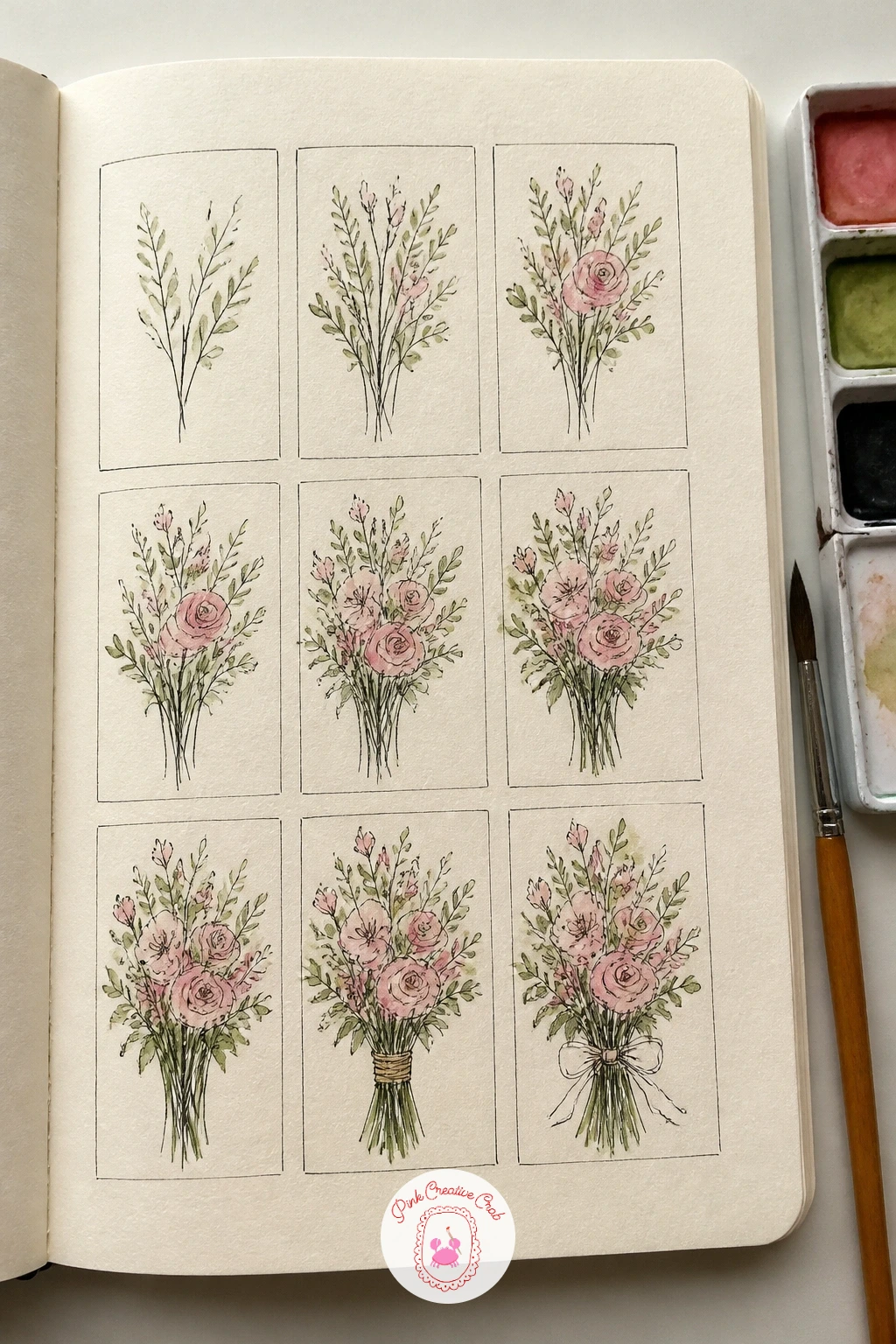
Palette: Permanent Rose,Sap Green,Cadmium Yellow Pale,Naples Yellow
Fill the left page with a row of washing machines and the right page with a folding table where a couple of neighbors sort and fold clothes, letting a shared bench or basket sit near the gutter to connect the two halves. Draw the machines as simple rounded rectangles with circular doors first, since their repetition gives the page a steady rhythm to build the rest around.
Sketch the figures loosely, a person leaning to load a machine, another standing at the folding table, keeping hands simple mitten shapes and faces turned slightly away, which keeps this approachable even if figures usually worry you. Wash the machines in cool greys and whites, then warm up the folding table side with a stack of colorful clothes to give the right page its own small burst of color.
If the room starts to feel flat, add one strong light source, a single overhead bulb or a window, and let shadows fall consistently from it across both pages.
For more gentle everyday figures in small scenes, the funny junk journal pages are worth a browse for pose ideas.
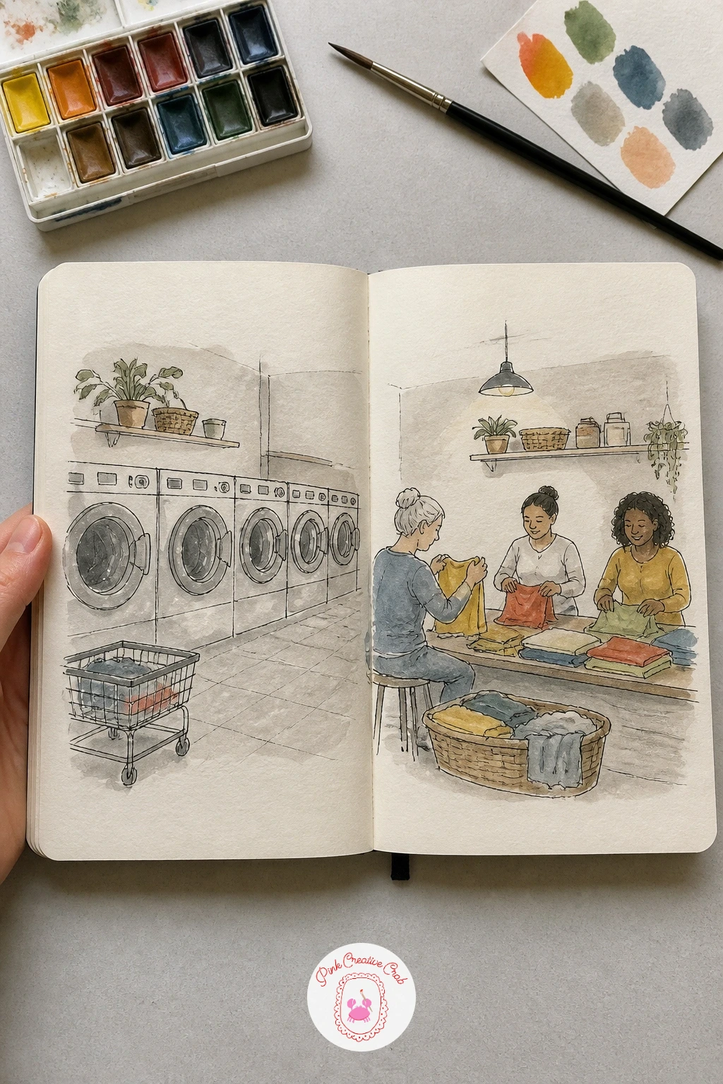
Palette: Payne’s Grey,Titanium White,Cadmium Red,Cerulean Blue
Place the birdwatcher on the left page with binoculars raised, then send a line of ducks swimming across the gutter toward the right page, so the gaze and the subject of that gaze physically connect the two halves. Draw the water first as a few long horizontal lines with small ripple marks, then add the ducks sitting lightly on top of that water line rather than floating independently of it.
Keep the birdwatcher’s pose simple, seated or standing with binoculars at eye level, and let the light come from behind the ducks so their bodies catch a thin rim of warm light along one edge, a small detail that sells the outdoor morning feel instantly. Wash the lake in cool blue-green with a few darker ripple lines added once the base is dry.
Ducks drawn too identically can flatten the scene, vary at least one duck’s head angle, maybe one dipping underwater, to break the repetition naturally.
A short version in ten minutes covers just the ducks and water; given forty, add reeds along the shore and a notebook resting on the birdwatcher’s lap.
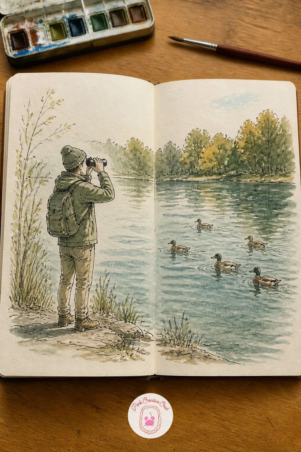
Palette: Sap Green,Cerulean Blue,Burnt Umber,Yellow Ochre
Treat both pages as one tall viewing window, a wash of deep blue water running edge to edge with a handful of fish, a few plants and maybe a small diver figure scattered through it. Draw the fish shapes first, keeping each one a simple oval body with a triangular tail, then vary their sizes so some feel nearer the glass and some farther back.
Paint the background water first in one smooth graded wash, darker toward the top of the page and paler near the bottom, before any fish go in on top, that single step does most of the work of making the water feel deep. Add the fish in flat bright colors once the background is fully dry, so their edges stay crisp against the softer water behind them.
If fish start overlapping confusingly, group them in twos and threes with clear gaps between groups rather than scattering them evenly across the whole spread.
No deep blue in your palette, a mix of your cerulean and a touch of black gets close enough for this one.
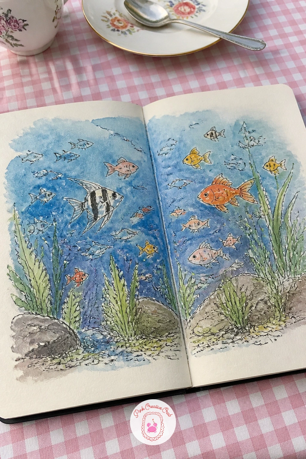
Palette: Indigo,Cerulean Blue,Cadmium Yellow Pale,Cadmium Red
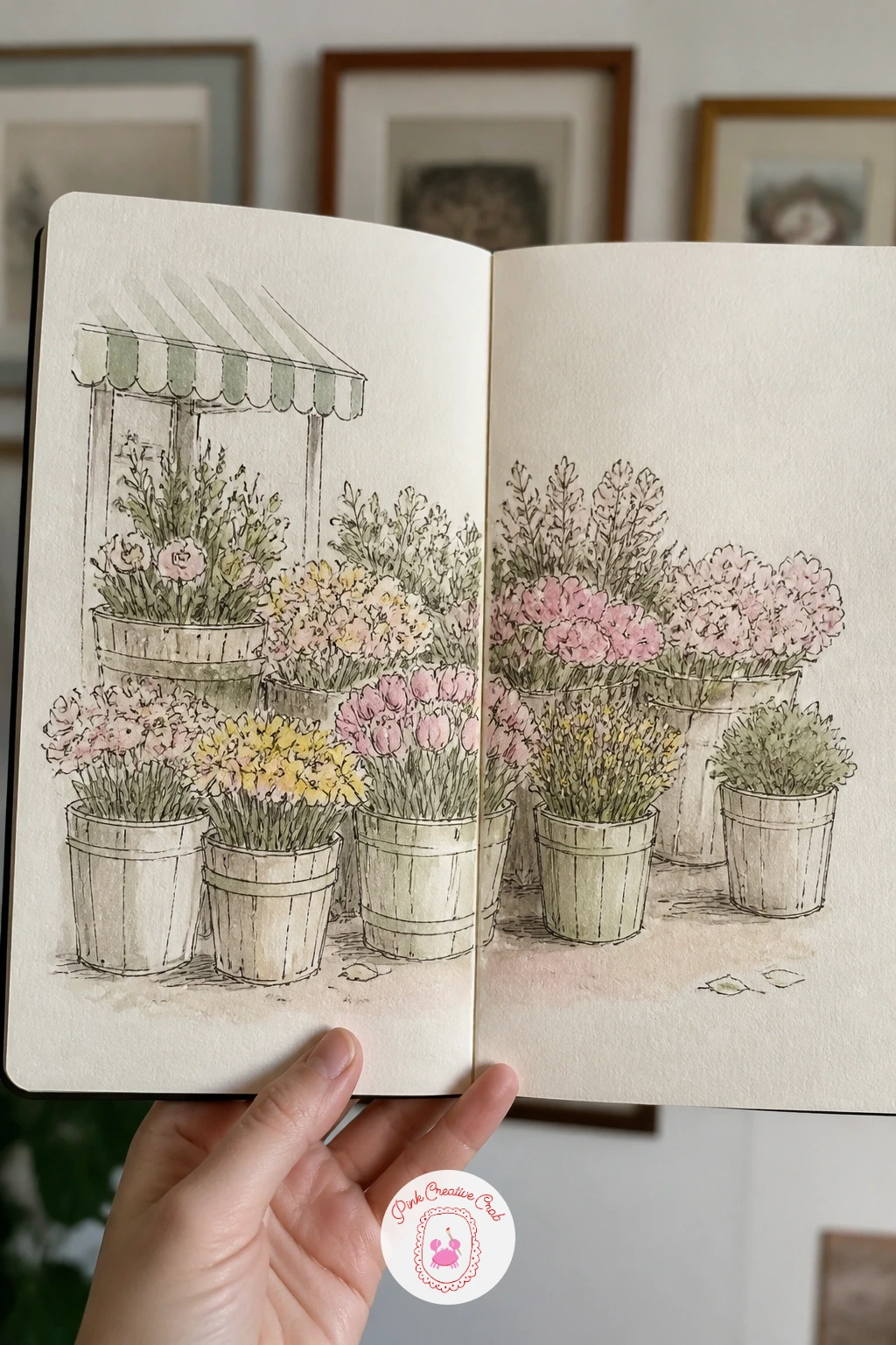
Build the stall as a simple wooden frame first, then fill both pages with buckets of flowers lined up along it, each bucket holding one clear variety so the stall reads as organized rather than a tangle of stems. Sketch the bucket shapes and the stall’s crossbeams before any flowers go in, that structure keeps the whole busy spread from sliding into chaos once color arrives.
Paint one bucket at a time, finishing its flowers and foliage before moving to the next, rather than laying in all the greenery first across the whole spread, which tends to blur one bucket into another. Keep a price tag or two in a corner, written small once everything else is dry.
A market stall this full of flowers risks feeling overworked, if that starts happening, leave one bucket as a loose colored blob with barely any detail, the contrast actually makes the more finished buckets stand out.
The botanical sketchbook pages article has specific flower shapes worth practicing separately before tackling a whole stall of them.
You Will Need
- fine pen for price tags
Palette: Permanent Rose,Cadmium Yellow Pale,Sap Green,Burnt Umber
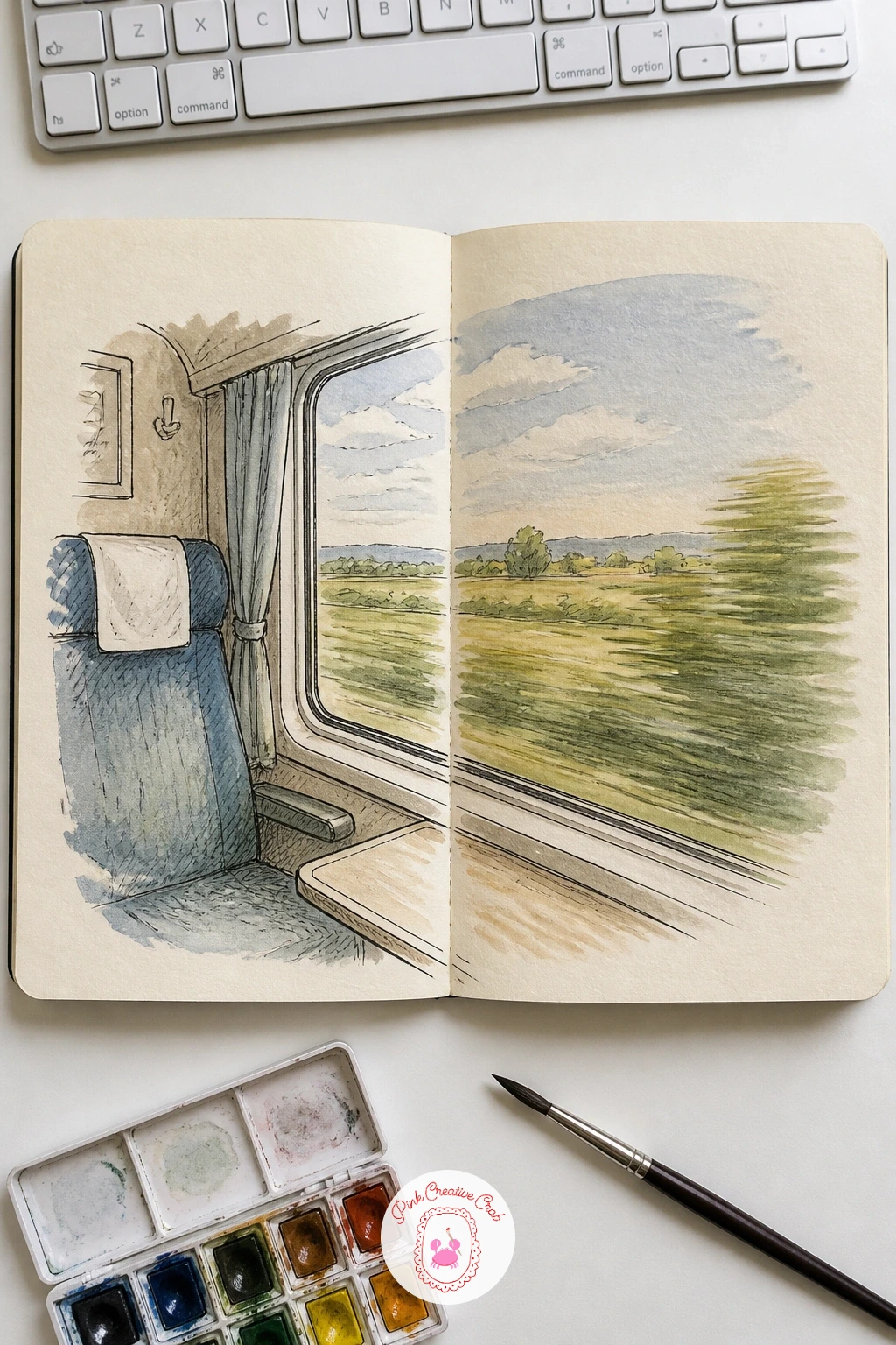
Split the spread between the train car’s interior on the left page and the view rushing past its window on the right, a seat and luggage rack on one side, fields or rooftops blurring on the other. Draw the window frame as the dividing shape first, since everything else, both interior and exterior, needs to sit correctly against its edges.
Keep the interior detailed and still, a seat, a cup, a folded newspaper, while the outside view gets looser, smudged horizontal washes rather than crisp shapes, that contrast in handling is what actually makes the window feel like it is moving. Wash the interior in warm, settled tones and the exterior in cooler, streakier ones.
If the outside view ends up too detailed and stops looking like it is in motion, drag a damp brush horizontally across it once dry to blur the shapes slightly, exactly the smudge a speeding train produces.
Swap the countryside view for city rooftops or a coastline next time for an easy variation on this same split composition.
Palette: Burnt Sienna,Sap Green,Cerulean Blue,Payne’s Grey
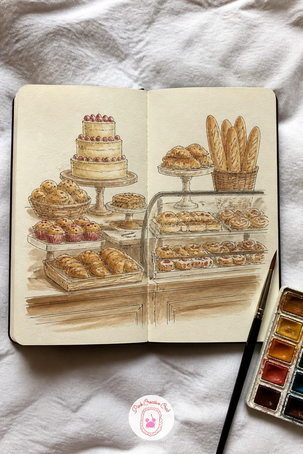
Line up a bakery counter across both pages, a row of pastries, loaves and a cake stand behind a thin counter line, each item simple enough to read at a glance from across a crowded display. Draw the counter edge first as one straight horizontal running the full width, then place each pastry sitting on top of it, varying shapes clearly, croissants, round buns, a braided loaf, a tiered cake.
Ink each pastry’s basic shape before adding texture like swirls, seeds or icing drips, since piling detail on before the shape is settled tends to make pastries look lumpy rather than appetizing. Wash everything in warm golden brown tones with one or two accent colors, a cherry red filling or a dusting of white icing, kept deliberately sparse so they stand out.
Flat, dull pastries usually mean the wash was too even, once dry, add a thin darker line along one edge of each item to suggest the glossy baked crust catching light.
The tea party junk journal pages have plenty of small cake and teacup shapes worth borrowing for extra counter items.
Palette: Burnt Sienna,Yellow Ochre,Cadmium Red,Titanium White
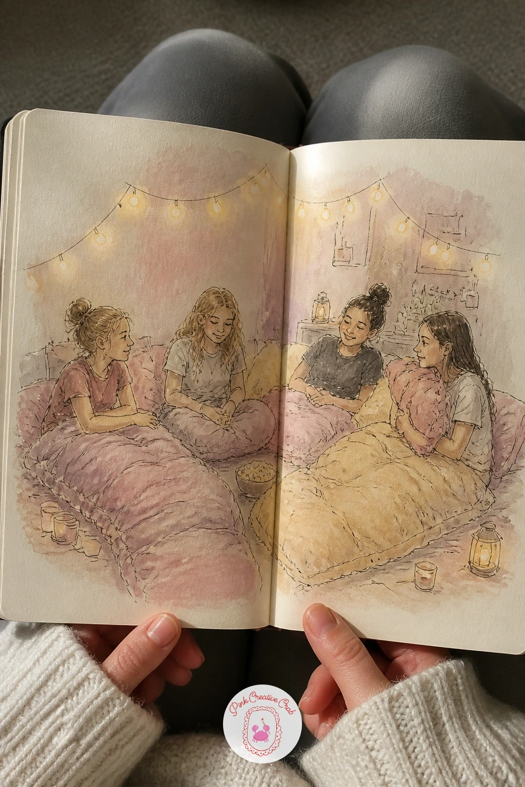
Scatter sleeping bags, pillows and snacks across both pages with a few friends in loose poses, one sitting up talking, another already asleep, a third reading by flashlight, so the spread reads as one shared room rather than separate portraits. Sketch the sleeping bags first as simple rounded shapes on the floor, since they set the overall rhythm the figures then nestle into.
Keep faces minimal, a few dots and a curved line for an eye closed in sleep or a smile mid-laugh, figures this small do not need more than that to read clearly. Light the whole scene with one warm lamp or string of fairy lights in a corner, letting that warm glow touch the nearest pillow and fade gently across the rest of the spread.
If the room starts feeling too busy, group the snacks and small props into one or two clusters rather than spreading them evenly across every gap, that gives the eye clear places to land.
For more cheerful small figures to practice first, the kawaii sketchbook ideas cover simple friendly faces that adapt easily into a slumber party cast.
Palette: Permanent Rose,Naples Yellow,Cerulean Blue,Burnt Umber
Scatter balloons of varying size across the whole spread rather than lining them up evenly, with the biggest one or two nearest the bottom of the page and smaller ones drifting higher and farther across the gutter. Draw each balloon as a simple rounded shape with a basket hanging beneath it, varying the stripe or panel pattern on each one so they read as a varied fleet rather than copies.
Place the largest, nearest balloon low on the page and the smallest highest and farthest, that size shift alone creates the sense of distance and height without needing any other perspective tricks. Wash the sky behind them in a soft gradient, paler near the horizon and deeper blue toward the top, letting the balloons’ bright colors sit clearly against it.
If the sky wash dries patchy, work quickly in one pass corner to corner rather than stopping partway, or switch to a damp sponge instead of a brush for a smoother gradient.
Quick version in ten minutes covers three balloons and a simple sky; with forty, add clouds, a distant landscape below and basket detail on the nearest balloon.
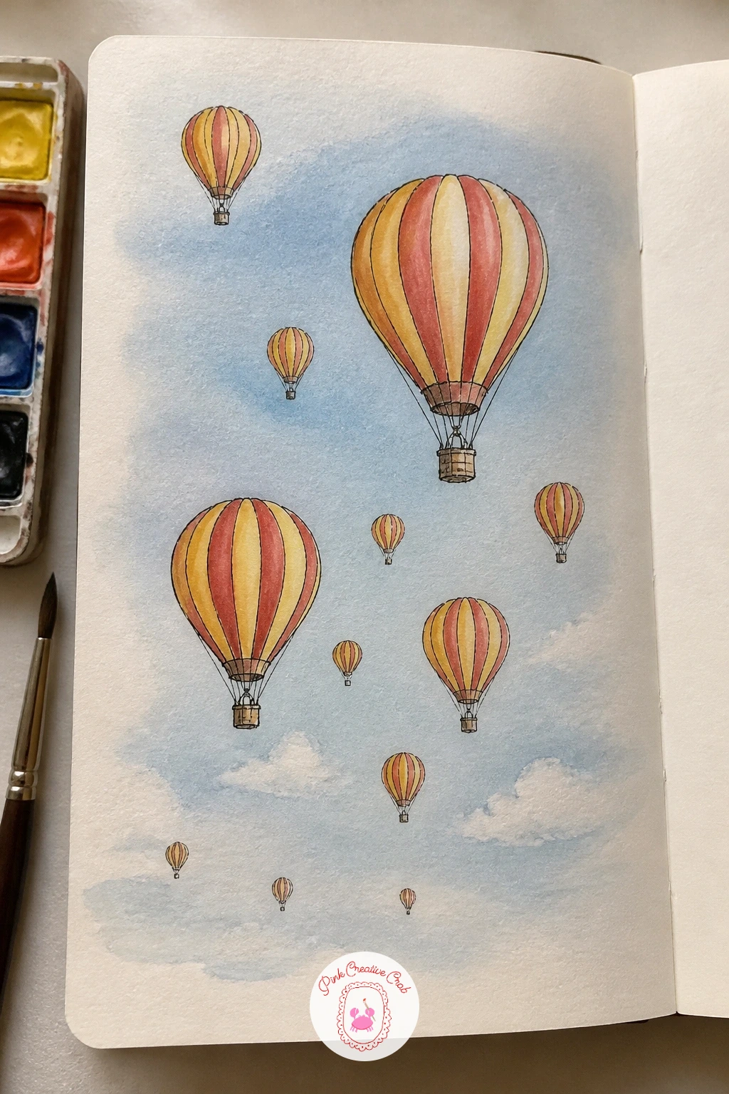
Palette: Cerulean Blue,Cadmium Red,Cadmium Yellow Pale,Permanent Rose
Keep the desk itself spanning both pages, with the artist’s hand and sketchbook on the left and a cat lying across the paper’s far edge on the right, so the cat appears to be physically interrupting the very page the artist is drawing in. Sketch the desk surface first as a simple flat plane, then place the open sketchbook, a jar of pencils and the cat’s relaxed body on top of it.
Draw the cat’s pose as one long loose curve first, since cats lying down read almost entirely through that single silhouette line, then add ears, tail and a few whisker marks last. Light the desk from one side, a window or lamp, letting the cat’s fur catch a soft highlight along its topmost curve.
If the cat’s proportions feel off, measure its body length against the sketchbook page it is lying on, a cat usually stretches close to one and a half times the width of an open book.
For more cat poses in this same relaxed mood, the cute sketchbook ideas page has several worth sketching as warm-ups.
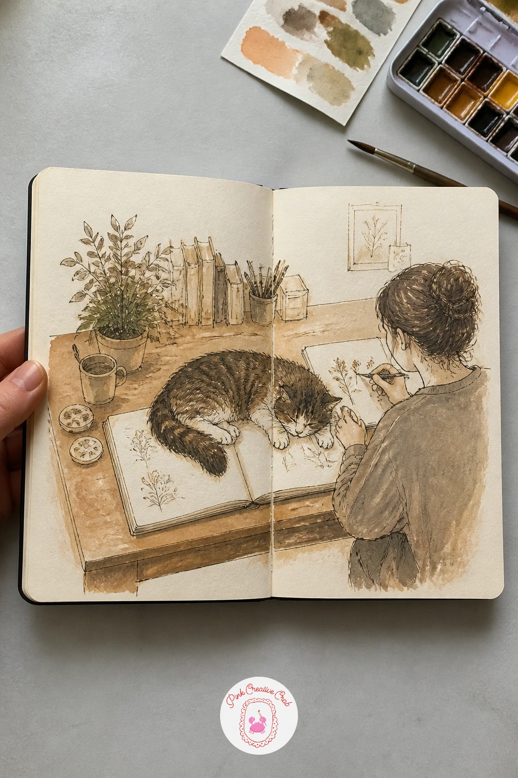
Palette: Burnt Umber,Yellow Ochre,Payne’s Grey,Naples Yellow
Draw this one from directly above, a tiny town map spreading across both pages with little rooftops, a winding main street, a park and a small river, each building reduced to its simplest roof shape seen from the sky. Start with the main street as one curving line running through both pages, then place buildings along it in small clusters rather than a strict grid, which keeps the map feeling like a real, slightly irregular town.
Vary rooftop colors deliberately, two or three repeating shades across the whole town, so the map reads as a cheerful pattern rather than a flat technical plan. Add tiny labels for a few landmarks, the bakery, the church, the square, once the ink and paint are both fully dry.
If the streets start looking too rigid, loosen them by adding a slight curve or a small dead-end alley here and there, real towns rarely run in perfectly straight lines.
For a close cousin of this idea with a different scale and mood, the cool sketchbook pages article covers an entire tiny town run by robots, worth a look for layout inspiration.
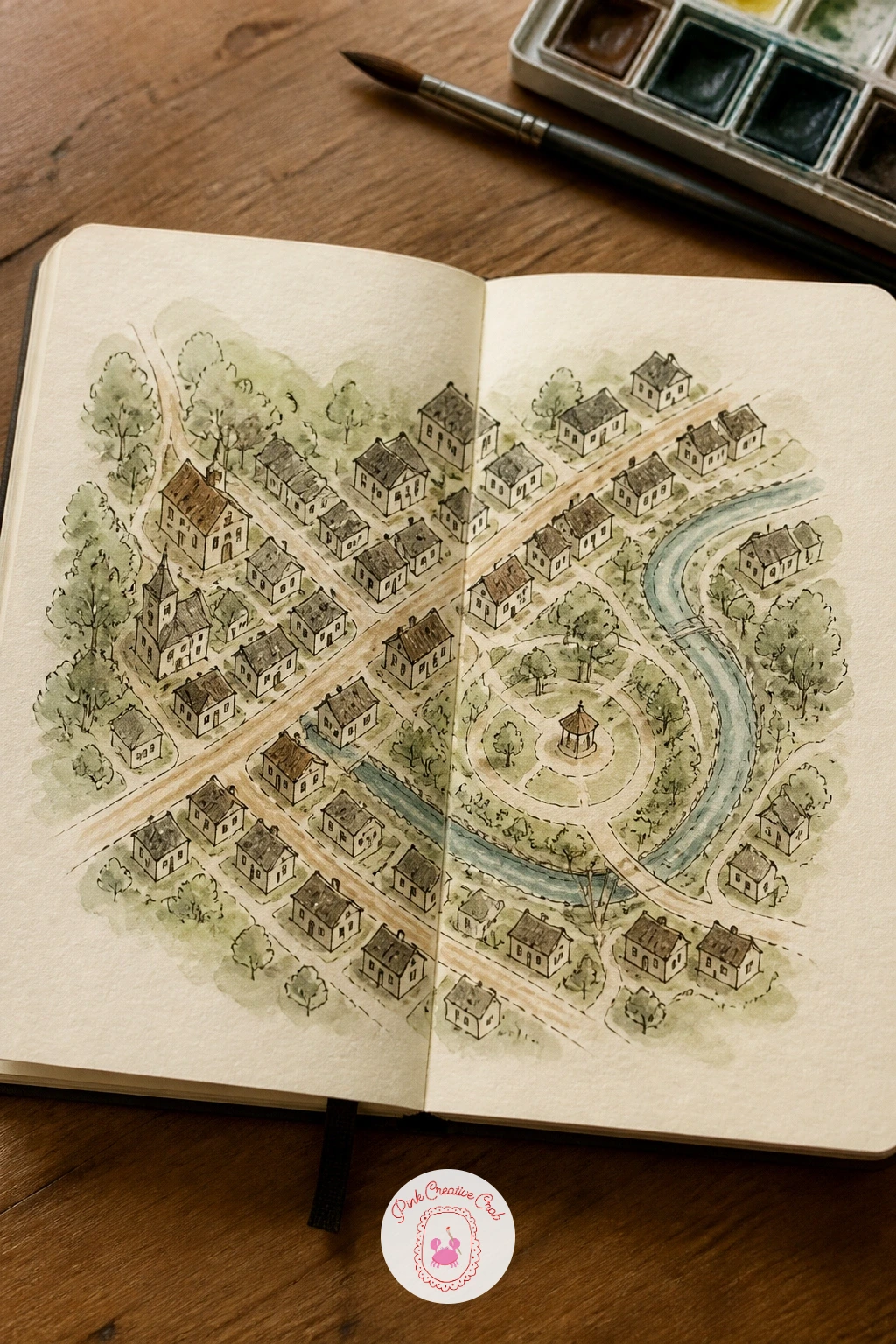
You Will Need
- fine pen for landmark labels
Palette: Burnt Sienna,Sap Green,Cerulean Blue,Yellow Ochre
Fill both pages with rows of lemon trees receding into the distance, a couple of small figures on ladders picking fruit among the nearer trees to give the whole grove some life and scale. Block in the nearest trees larger and lower on the page, with rows behind them getting smaller and rising higher, that simple size and placement shift is what makes a grove read as deep rather than flat.
Draw the ladder and figure shapes small and loose, just enough gesture to show someone reaching up into the branches, before adding any individual lemons. Wash the foliage in varied greens, darker where trees overlap and paler in the sunlit gaps between rows, then dot in lemons last using the tip of a small brush rather than outlining each one in pen first.
If the lemons end up looking pasted on rather than growing from the branches, tuck a few partly behind leaf shapes instead of placing every one fully in the open.
No yellow ochre on hand, a warm cadmium yellow mixed with a touch of green covers lemon color just as well.
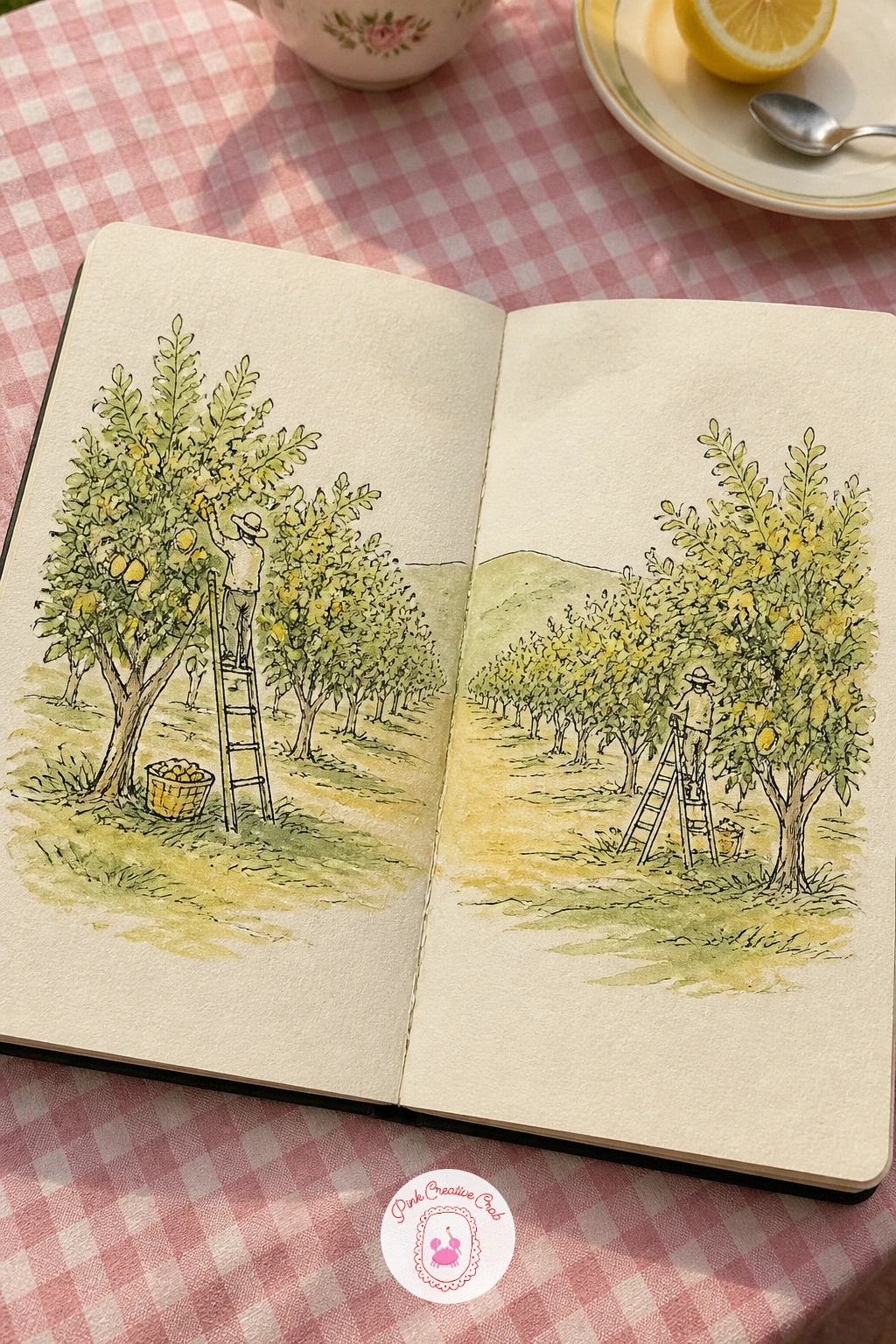
Palette: Sap Green,Cadmium Yellow Pale,Yellow Ochre,Burnt Sienna
Line a shelf or bathtub edge with spa day essentials across both pages, a few bottles, a candle, a small plant and a rolled towel, keeping every object a soft rounded shape to match the relaxed mood of the scene. Draw the shelf line first as a simple horizontal, then place bottles and jars on top of it varying their heights so the row has a pleasant, uneven rhythm rather than a straight line of identical shapes.
Keep labels on bottles as simple rectangles left blank or with just a tiny scribbled word, too much detail on packaging tends to pull focus away from the softer, steamier mood of the whole spread. Wash everything in pale, muted tones, sage, dusty pink, soft cream, and leave small white highlights on glass bottles unpainted to suggest reflected light.
If the shelf feels cluttered, remove one object entirely rather than shrinking all of them to fit, a spa shelf reads calmer with fewer, larger items than many tiny ones.
Try this: paint one candle’s flame as the single warmest color on the page, everything else can stay cool and pale around it for contrast.
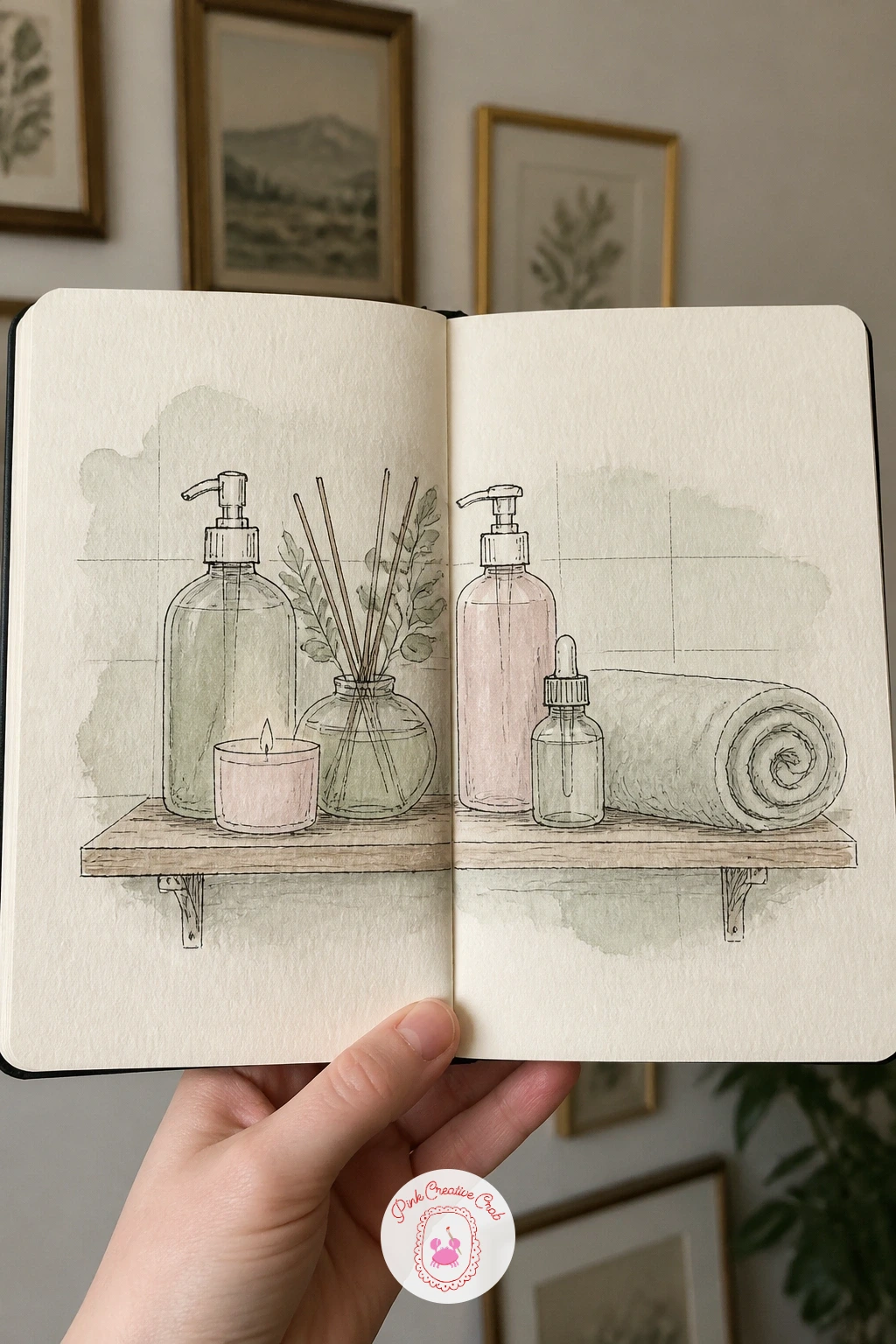
Palette: Sage Green,Dusty Pink,Titanium White,Naples Yellow
Scatter six or seven small sleeping cats across both pages instead of one big drawing, curled in a ball, stretched flat on one side, tucked into a loaf shape, each pose kept small enough to finish in a few minutes. Sketch every cat’s silhouette first with one continuous loose line, since sleeping cats read almost entirely through outline rather than internal detail.
Vary the poses as much as possible rather than repeating the same curl with small tweaks, that variety is what makes a whole page of sleeping cats charming instead of repetitive. Wash each cat in a slightly different coat color or pattern, a tabby stripe here, a solid grey there, so the page reads as several individual cats rather than one shape copied.
If poses start looking stiff, warm up first with quick thirty-second pencil scribbles of each pose before inking any of them, loose warm-up sketches almost always beat a first careful attempt for a relaxed subject like this.
For a full page devoted to just this idea with more poses to copy, the cute sketchbook ideas article is worth a visit before you start.
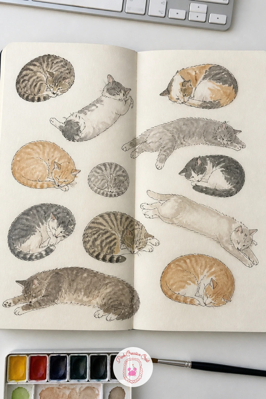
Palette: Burnt Sienna,Payne’s Grey,Titanium White,Burnt Umber
Place a girl kneeling among vegetable rows on the left page with a dog beside her, basket of harvested vegetables spilling slightly toward the right page so the two pages share one moment rather than splitting into separate scenes. Draw the garden rows first as a few simple receding lines, then add the girl’s kneeling pose as one simple curved back shape before placing the dog’s body relative to her for scale.
Keep the dog’s proportions checked against the girl, a mid-size dog’s shoulder usually sits around knee height on a kneeling adult, a quick comparison that keeps the pairing believable rather than guessed at. Light the scene from overhead sunlight, casting short shadows beneath both figures and the vegetable rows, which reads as midday and keeps the mood bright and cheerful.
If the figures end up too stiff, loosen the girl’s pose by drawing her weight clearly shifted onto one knee rather than balanced evenly, that small asymmetry reads as natural movement.
A girl and dog pairing like this works just as well set at a market stall or on a walk, so keep the same proportion check in mind whenever you draw them together again.
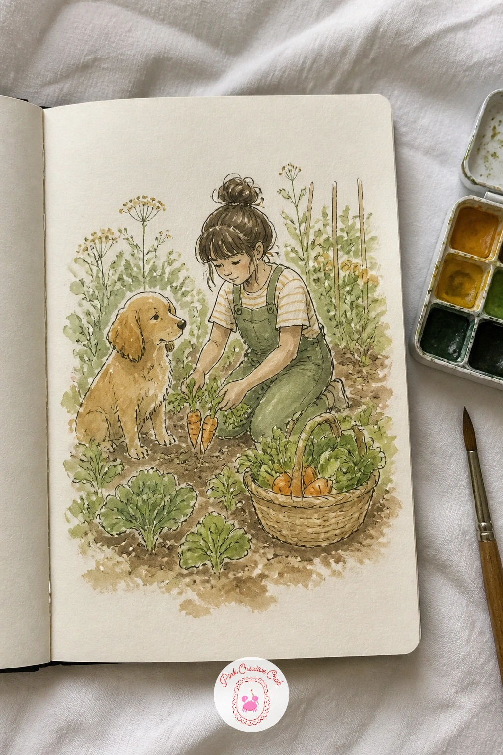
Palette: Sap Green,Burnt Sienna,Cadmium Red,Yellow Ochre
Close the list the way a good spread should, with one more inside and outside split: a cozy cabin interior on the left page, fireplace and a blanket over a chair, and the snowy exterior with the same cabin’s roofline on the right, smoke curling from its chimney. Draw the dividing wall or window frame first, since it needs to line up convincingly with the cabin’s exterior wall drawn on the facing page.
Keep the interior warm, deep oranges and browns from the fire’s glow, while the exterior stays cool, pale blues and soft greys for snow, letting that strong temperature contrast across the gutter do most of the storytelling work. Wash the snow with a slightly textured dry brush pulled across the page for a soft, gritty feel rather than a perfectly flat white.
If the two halves feel disconnected, repeat one small detail on both sides, smoke outside matching the fire’s glow inside, or a window frame visible from both perspectives, to tie the story together.
Round off your sketchbook session by flipping back through all thirty-two spreads once the paint is dry, since seeing them together often sparks the next one.
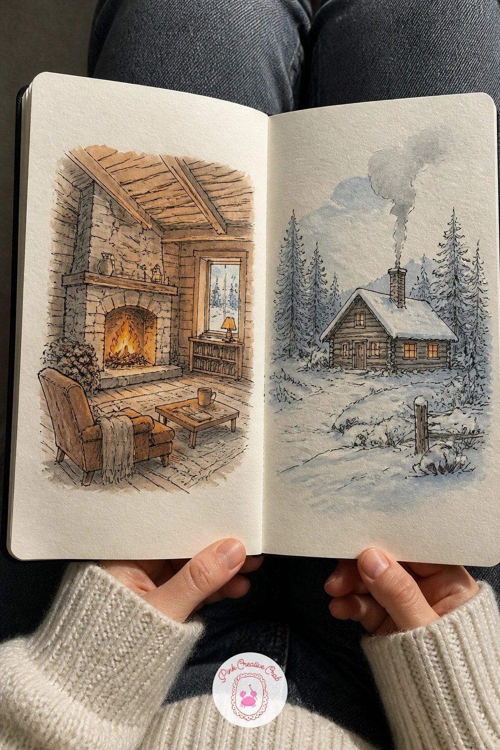
Palette: Burnt Sienna,Payne’s Grey,Cerulean Blue,Titanium White
What to Do Next
Pick one spread that matches the hour you actually have today, open your sketchbook flat so both pages sit level, and pencil in whichever line needs to cross the gutter first. Everything else follows from that one decision, so start there and let the rest of the page fill in around it.
Frequently Asked Questions
What paper works best for sketchbook spread ideas with watercolor washes?
A heavier watercolor sketchbook, at least 140 pound or 300 gsm, handles thin washes without buckling badly. A mixed media sketchbook works too for light washes, but true watercolor paper gives cleaner color and lets you lift mistakes without tearing.
How do I stop the gutter from ruining a two page composition?
Plan one element, a horizon, a shelf, a road, to cross the gutter deliberately before drawing anything else. Sketching that connecting line first in pencil across both pages keeps the composition reading as one scene instead of two separate drawings.
Do I need to finish a whole spread in one sitting?
Most of these spreads are built to finish in one sitting, but ink work holds fine overnight if you need to split line art and painting across two sessions. Just keep washes within one sitting so colors blend evenly rather than drying unevenly between sessions.
What if I am not confident drawing people or animals for these spreads?
Simplify figures to their basic silhouette and leave faces minimal, a dot or a curved line reads clearly at small scale. Several ideas on this list, like the laundromat or slumber party, work well even with very loose, simplified figures.
How many colors do I actually need for a spread like this?
Four to six watercolors cover almost every idea here comfortably. A warm red, a yellow ochre, a green, a blue and a grey mix most of the palettes listed, so a small travel set is genuinely enough to start.
Have any thoughts?
Share your reaction or leave a quick response — we’d love to hear what you think!
-
 0
-
0
-
0
-
0
-
0
-
0


