

A red painting has a way of waking up a whole room, and this list gives you thirty-one of them, each with its own shade story. Some lean toward poppy and tomato, others sit closer to brick or raspberry, and every one is built from flat gouache shapes with crisp edges so you can actually finish it today.
Scroll through flowers, food, little street scenes and quiet everyday corners, from a red front door with potted geraniums to a jar of raspberry jam with a spoon resting in it. Pick whichever one makes you want to pick up a brush right now, squeeze out your reds, and get going.
Using these images: free for personal projects such as printing, coloring, cards, journals and gifts. Handmade items that include them may be sold up to 30 pieces per design. More than that is commercial use and is not permitted, and neither is selling or sharing the images themselves or passing them off as your own. Please ask before any other use.
Start the whole list with a poppy field, because nothing says confident red like a hillside of them. Block in a soft green-gold field first with a flat brush, then let that dry fully before touching the red. Add the girl’s straw hat and dress shape as a simple silhouette near the lower third of the page, small against the land.
Paint the poppies last, as separate flat dabs of poppy red and a touch of darker red at the base of each petal, scattered thicker near her and thinner toward the horizon. If your field gets muddy, wipe it back while wet and let one clean layer dry before adding poppy dots on top.
Compare her height to the field width before you commit to paint: she should be no taller than an eighth of the page, which is what keeps the poppies as the real subject. If you enjoy this one, the poppy painting ideas page has more ways to paint them.
Tip of the day: mix two reds for the poppies, a warm poppy red and a cooler crimson, so the field reads as full of flowers rather than one flat color repeated.
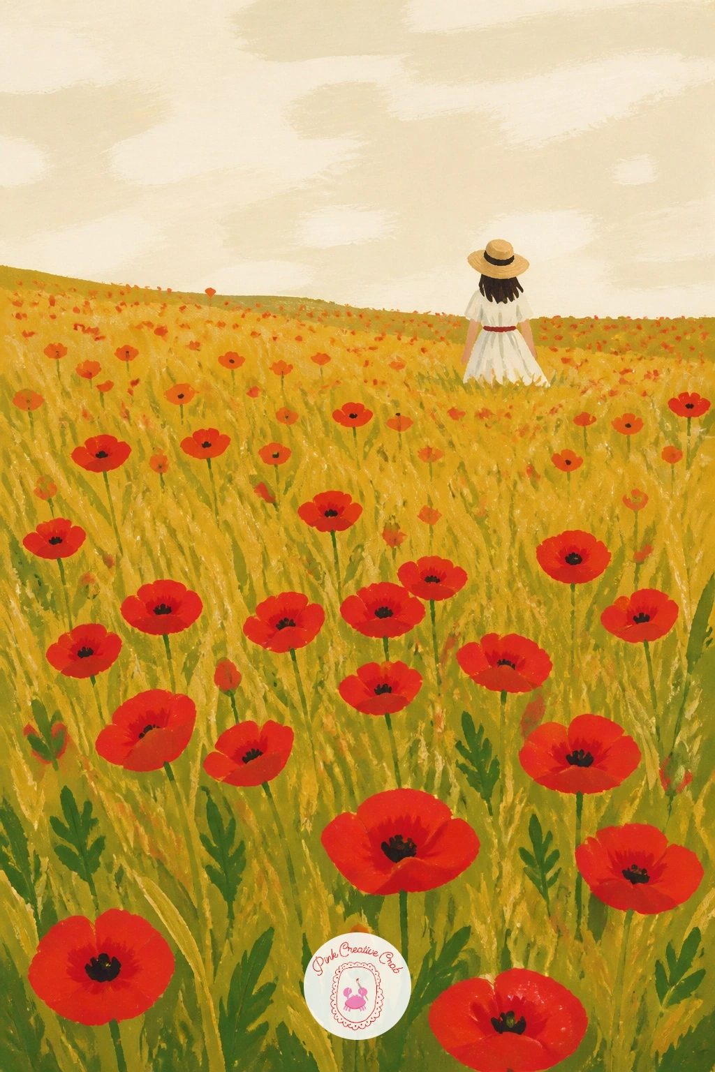
Palette: Poppy Red,Crimson,Straw Yellow,Sap Green
Move from a field to a doorstep for something graphic and architectural. Draw the door as one large rectangle filling most of the page, then paint it in a flat brick red with a dry brush dragged lightly over the surface once dry, to suggest old painted wood without actual texture work.
Add the brass knocker and door number with a small round brush loaded with a warm gold gouache, and keep both shapes geometric and simple. Paint the potted geraniums at the base last, in poppy red with leaf green, so they sit forward of the door.
If your brass knocker looks flat, go over it once more with gold mixed with a touch of white gouache for a highlighted side, which gives it just enough shine to read as metal. Swap brass for black iron hardware if that is what you have on hand.
Finish with one confident outline in a darker red along the door’s edge, drawn freehand with a fine brush, to sharpen the whole shape against the cream background.
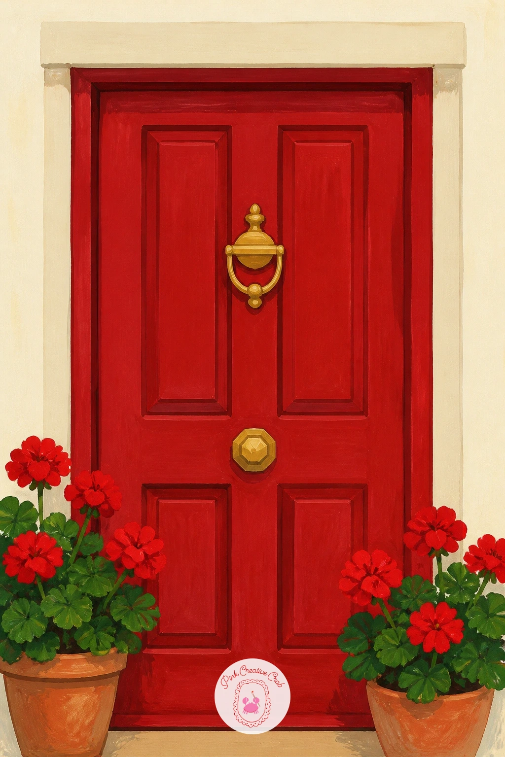
Palette: Brick Red,Gold Ochre,Poppy Red,Sap Green
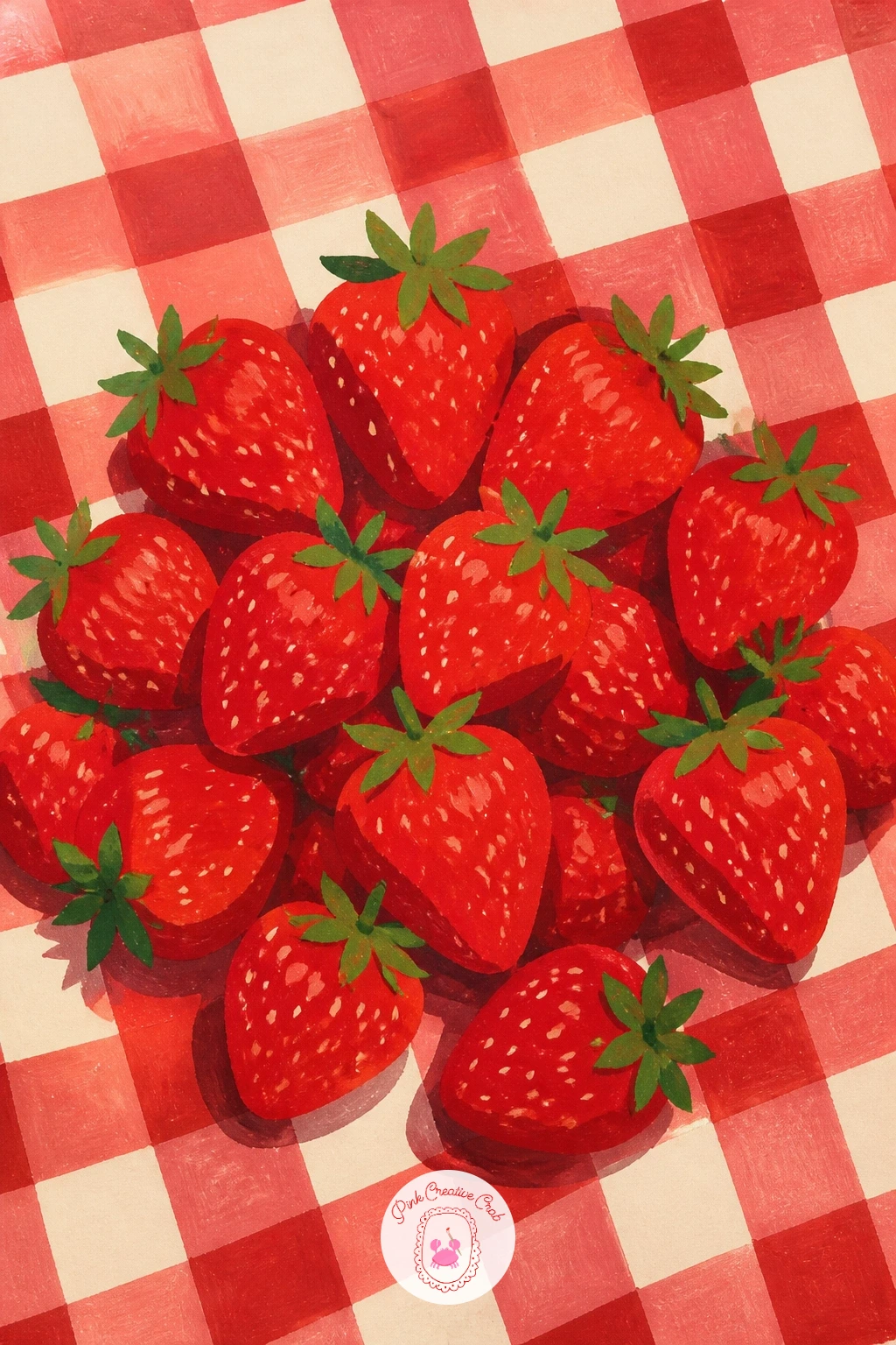
Lay down the red gingham blanket as your base, painting the grid pattern with a ruler-guided fine brush in two values of red crossing over a lighter pink-red, so the woven look reads without fuss. Let this dry completely before adding anything on top of it.
Paint the strawberries as a loose pile in one corner, each one a simple red teardrop with a few quick green star-shaped tops, and a scatter of tiny white gouache dots for the seeds added last with a toothpick or the tip of a fine brush. Keep the pile uneven so it looks tipped out rather than arranged.
Beginners often lose the gingham grid under the strawberries: paint the blanket pattern first and leave the fruit for a second layer once everything is bone dry, never both wet at once. If gingham feels fiddly, a plain red blanket with a cream border works just as well.
Try the forty-minute version by adding a wedge of cheese or a lemonade glass beside the strawberries for a fuller picnic scene.
You Will Need
- toothpick or fine detail brush for seeds
Palette: Strawberry Red,Pale Pink Red,Sap Green,Titanium White
Give the picnic a rest and paint a London telephone box, a shape that rewards clean straight edges more than careful blending. Pencil in the tall rectangle first, divide it into its panel sections with light guide lines, then fill the body in a strong postbox red with a flat brush.
Paint the window panes in a pale grey-blue so they sit back from the red frame, and add the crown detail near the top in gold or cream. Finish with a dark grey pavement strip at the base to ground the box.
Straight edges go wrong fast on paper, so use a ruler for the pencil lines even if you paint freehand after, and touch up any wobble with a thin red line once the first coat is dry. If London subjects appeal to you, the London painting ideas list has plenty more street corners like this one.
For a quick version, paint just the top half of the box cropped close, which still reads instantly as a phone box.
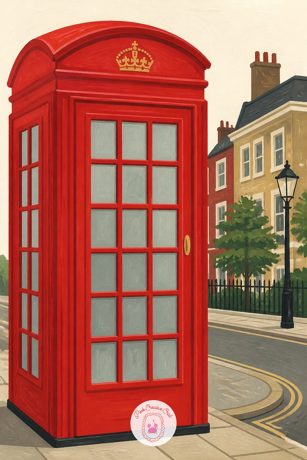
Palette: Postbox Red,Pale Grey Blue,Gold Ochre,Charcoal Grey
After a street scene, settle into something quieter: a bowl of cherries. Paint the bowl shape first in a soft white or cream with grey shadow edges, then fill it with a pile of cherries in two reds, a bright cherry red on the lit side of each one and a deeper crimson in the shadow.
Add the stems last with a fine brush loaded thin, curling a few over the bowl’s edge so the pile feels like it could spill. One white gouache highlight dot on each cherry, placed on the same side throughout, sells the roundness instantly.
If the cherries look flat, it is almost always because every highlight dot sits in a different spot: decide where your light comes from before you start and keep all the dots consistent. No cherries on hand to reference? A bag of grapes or tomatoes shows the same round-fruit-in-a-pile logic. The cherry painting ideas page has more ways to paint them if this one hooks you.
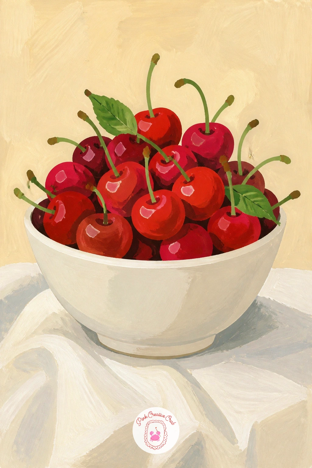
Palette: Cherry Red,Deep Crimson,Leaf Green,Titanium White
Paint the tablecloth with one soft grey shadow beneath the bowl rather than leaving it pure white, which keeps the whole page from looking flat.
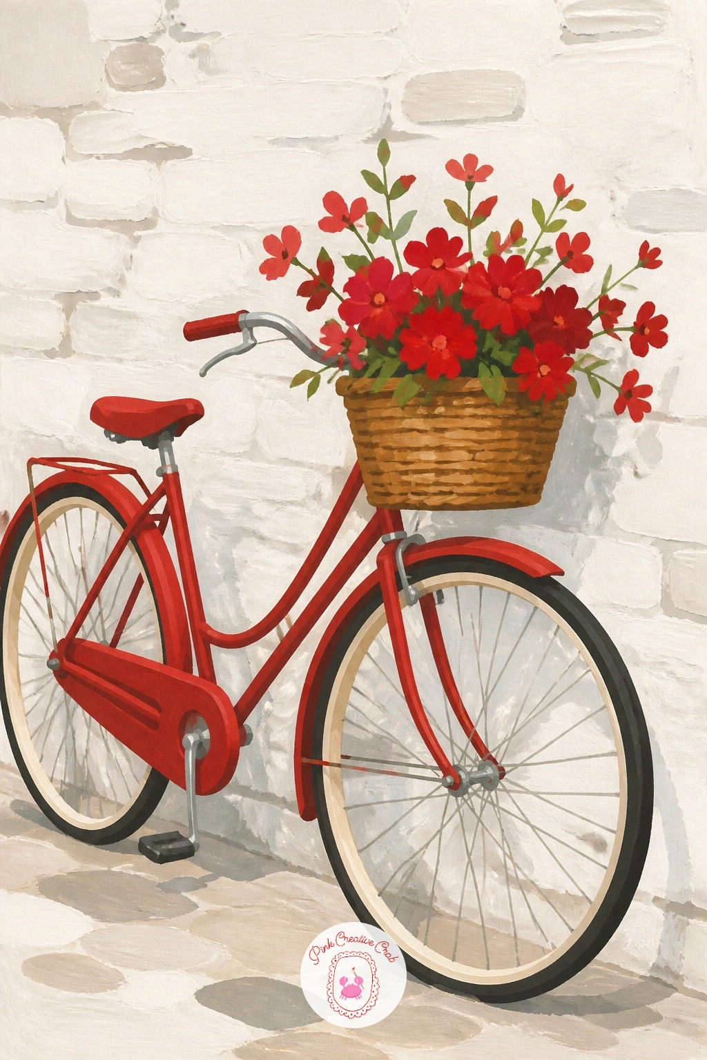
Swap fruit for an object with real personality: a red bicycle. Paint the whitewashed wall first as a flat pale cream block covering most of the background, then add the bicycle frame on top in a bold red, working the triangular frame shapes before the wheels.
Paint the wheels as two dark circles, a plate or a lid traced in pencil keeps them properly round, then add thin spokes with a fine brush once the tire color is dry. A woven basket on the front in warm brown, holding a few loose red flowers, finishes the scene with a nice color echo.
Wobbly circles are the most common slip here, so trace around a round object for the wheels rather than freehanding them. If you want the quick ten-minute version, crop in close on just the frame and basket and skip the full wall.
Vary it next time by leaning the bicycle against a blue door instead, which makes the red pop even harder.
You Will Need
- small plate or lid to trace the wheels
Palette: Poppy Red,Warm Brown,Cream White,Charcoal Grey
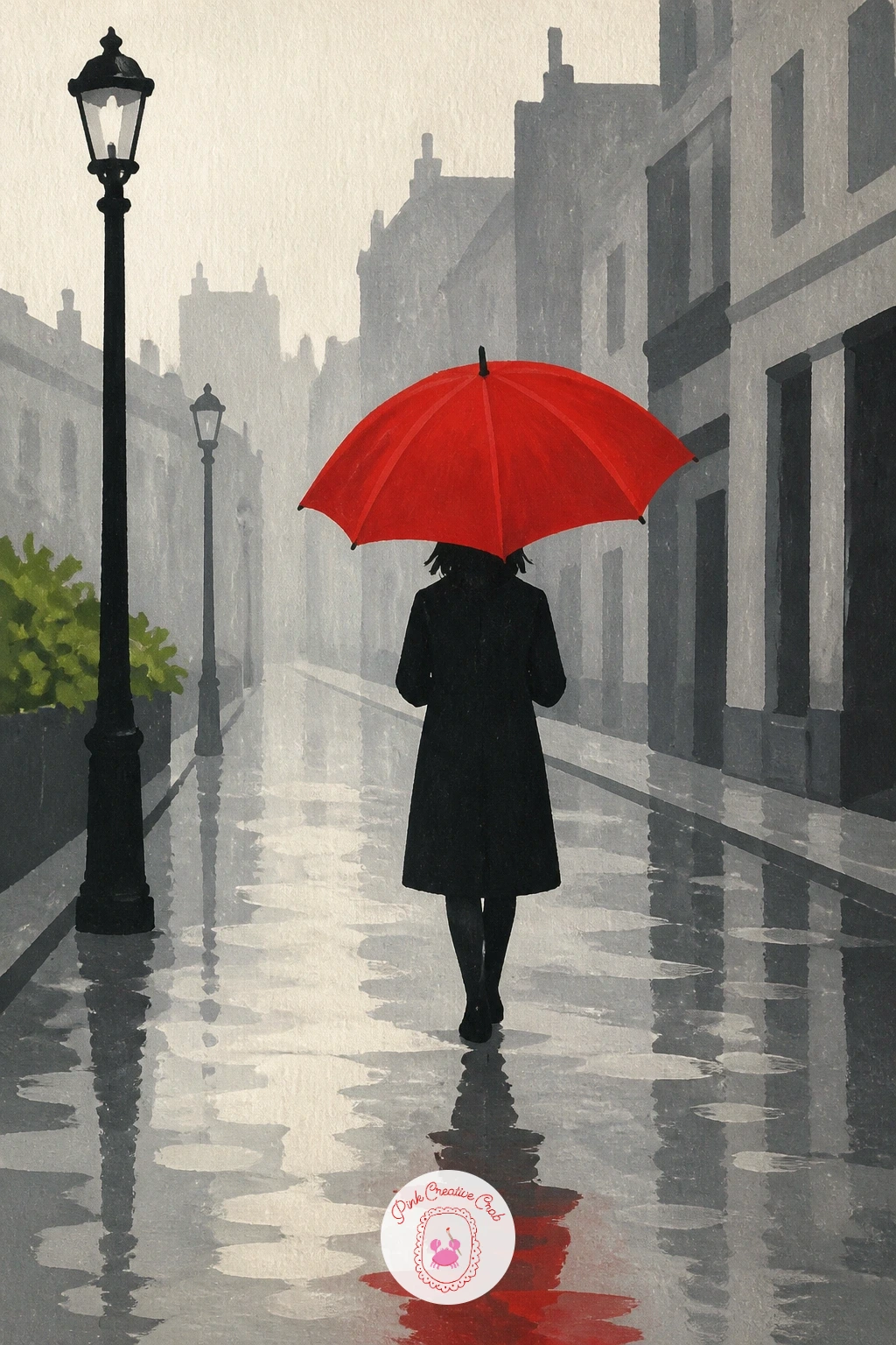
Give the red a grey stage to shine against. Paint the street and buildings first in muted greys and soft blue-greys, flat and simple, leaving the umbrella shape untouched as cream paper or a light undercoat. Once the background is dry, paint the umbrella in a saturated red, keeping its edges crisp against all that grey.
Add a few vertical streaks of a pale grey-blue for rain, dragged down with a half-dry flat brush, and a scatter of small reflective puddle shapes at street level. The person holding the umbrella can stay a simple dark silhouette, which keeps all the attention on the red canopy.
The grey often ends up too busy and competes with the umbrella: keep buildings as flat simple blocks with only one or two window details, not a facade full of them. No grey gouache mixed yet? Black and white gouache mixed fresh works just as well.
One tip for today: paint the umbrella last, after everything grey is fully dry, so its red stays clean and unmuddied.
Palette: Poppy Red,Slate Grey,Pale Grey Blue,Charcoal Grey
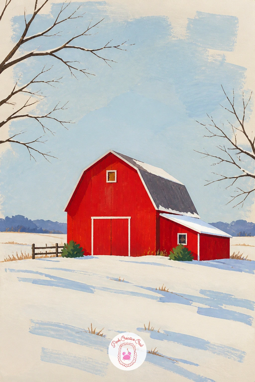
Carry that same grey-against-red idea into a landscape: a red barn in snow. Paint the sky and snowy ground first in soft whites and cool pale blues, leaving a barn-shaped gap, then fill that gap with a strong barn red once the snow layers are dry.
Add the barn’s roofline, door and a hayloft opening in a darker red or near-black, and dot in a few bare tree branches at the edges with a fine brush. A scatter of small blue-grey shadow shapes under the snowdrifts gives the ground some form.
Eye level matters here: set the horizon low, in the bottom third of the page, so the barn stands tall against a big open sky, which reads as a wide winter field rather than a cramped yard. Swap snow for a plain gold field if winter is not the season you feel like painting.
If you enjoy pairing red with a frosty palette, the autumn-to-winter transition ideas on the autumn sketchbook ideas page follow a similar seasonal mood.
Palette: Barn Red,Snow White,Pale Winter Blue,Charcoal Grey
Move from a landscape to something closer up and warmer: a crate of fresh tomatoes. Paint the wooden crate first in warm brown with visible plank lines drawn in with a fine brush, then fill it with a pile of tomatoes in varying reds, from bright poppy to a deeper almost-brick tone.
Work the tomatoes as simple overlapping circles, darkest where they sit behind one another, and add a few green stems poking out at odd angles for life. A single white highlight on the top of each tomato, same side throughout, finishes the roundness.
If the pile looks like a flat row instead of a heap, overlap the shapes more and vary their sizes, since uniform circles read as a pattern rather than a harvest. No wooden crate texture skill yet? A simple woven basket shape is an easier swap and still tells the same story.
Try this one in ten minutes by painting just three or four tomatoes loose on the cream page, no crate at all, for a quick still life.
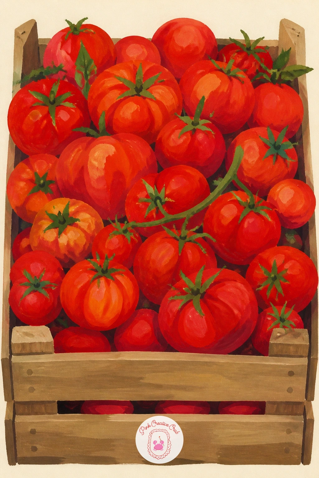
Palette: Poppy Red,Brick Red,Warm Brown,Sap Green
Bring in one of the classic winter reds with a twist: paint the snowman’s hat as the real subject, bold and knitted-looking, rather than the whole figure. Build the snowman’s body first in soft white and pale blue shadow shapes, then crown it with a chunky red hat painted in thick, confident strokes.
Suggest the knit texture with short diagonal dry-brush marks over the red once the base coat is dry, rather than trying to paint individual stitches. A striped scarf in the same red, with a cream stripe running through it, ties the hat to the rest of the figure.
If the red hat looks too smooth and plastic, that dry-brush texture pass is the fix, dragged lightly so some white paper or undercoat shows through. Swap the knitted hat for a simple pointed one if texture work feels like too much today.
Vary it next time by giving the snowman a red mitten instead of a hat, same texture trick, different spot.
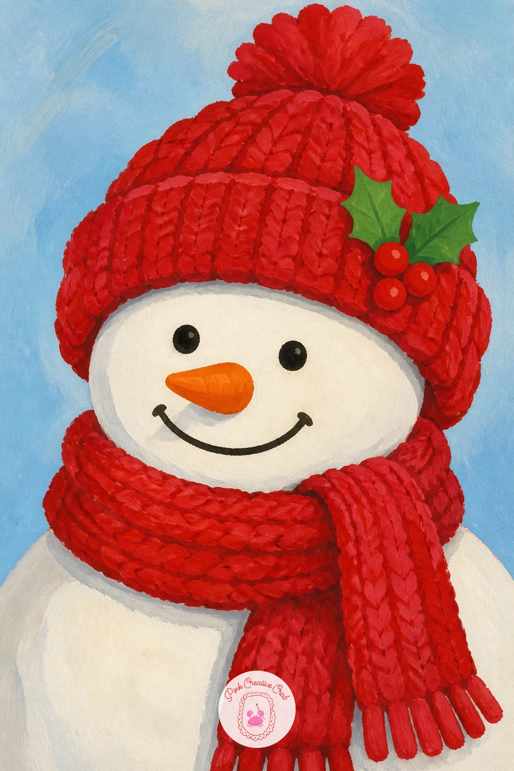
Palette: Cardinal Red,Snow White,Pale Winter Blue,Charcoal Grey
From snow to sunshine: a red vintage scooter parked outside a cafe. Paint the scooter’s rounded body first, since its curves are the whole charm of the shape, working from the front shield back through the seat and rear in one confident red. Let the chrome details (mirrors, trim) wait until this base layer is dry.
Add the chrome in a pale grey mixed with a touch of white, placed only on the edges that would catch light, and paint the cafe awning behind it in a contrasting stripe of cream and green. A small round cafe table and chair in the background grounds the scene without needing much detail.
Rounded vehicle shapes often come out lumpy on a first try: sketch the scooter lightly in pencil first and check the wheel sizes match before committing any paint. If a scooter feels too complex, a simple red moped silhouette does the same job with far fewer curves.
One tip for today: paint the cafe background first and let it dry completely so the scooter’s red edge stays sharp when you add it on top.
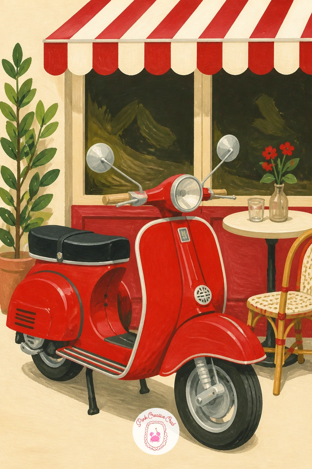
Palette: Poppy Red,Pale Grey,Cream White,Sap Green
Bring the flowers back with a bouquet instead of a field. Paint the newspaper wrapping first as a loose cone shape in cream and grey with a few faint scribbled lines to suggest print, then add the red tulips emerging from the top, each bloom a simple closed cup shape in two or three reds.
Work from the back blooms forward, darker reds behind and brighter poppy red on the tulips nearest the viewer, so the bunch has depth without much effort. Green stems and a leaf or two tucked into the wrap finish the bouquet.
Tulip cups collapse into blobs if you rush them, so paint each one as a simple rounded trapezoid, flat on top, rather than a full circle. If newspaper feels fussy, plain brown kraft paper wrapping is an easy swap and just as charming.
For more ways to paint this flower, the tulip painting ideas list is full of them, including other wrapped bouquet setups.
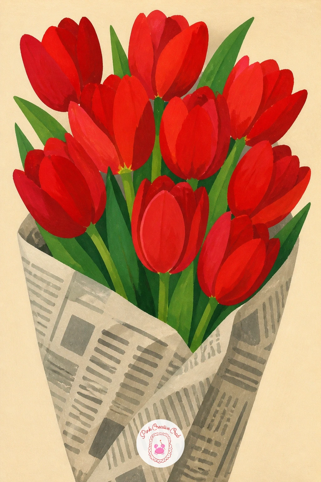
Palette: Poppy Red,Deep Crimson,Sap Green,Newspaper Grey
Take the red somewhere coastal: a single beach hut on the sand. Paint the sky and sea first in soft blues, then the sand in a warm pale gold, leaving the hut’s rectangle as a gap until both layers are fully dry. Fill the hut in a bold red with a contrasting white or cream door and trim.
Add a small striped flag or a pair of beach chairs beside it in a secondary red tone, which keeps the color story unified without making the hut fight for attention. A few simple gulls as small dark checkmarks in the sky finish the scene.
Horizon placement decides the mood here: a low horizon with lots of sky feels breezy and open, a higher one makes the hut feel cozy and close. If beach huts are not familiar where you live, a red lifeguard tower or boat shed works the same way.
Try the quick version by painting just the hut and a strip of sand, no sea or sky detail at all, cropped tight.
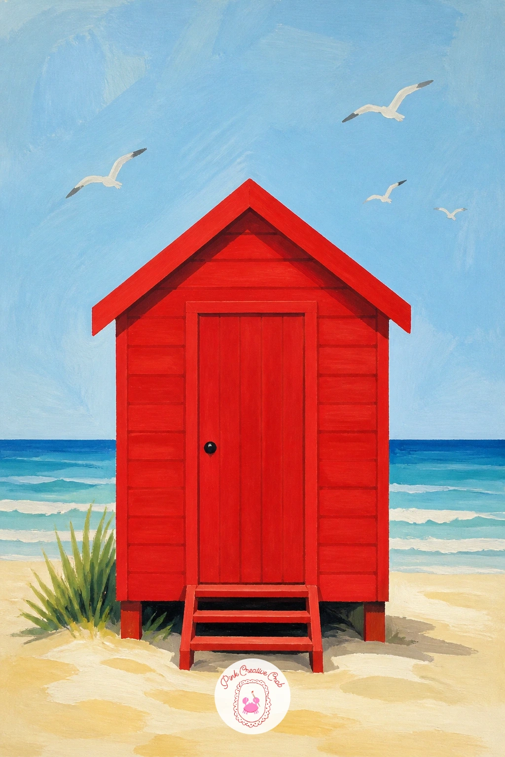
Palette: Poppy Red,Sea Blue,Sandy Gold,Cream White
Climb from the beach into an orchard. Paint the tree canopy first as a loose rounded mass of leaf green with darker green shadow patches, then add a wooden ladder leaning into the branches, painted in warm brown with simple parallel rungs.
Scatter red apples through the canopy as small flat circles, thicker where the light would hit, and add one or two fallen apples at the base of the ladder for a bit of story. A basket hung on a ladder rung in the same warm brown ties the whole scene together.
Apples scattered too evenly look like polka dots rather than fruit, so cluster a few together and leave open gaps of green elsewhere. If ladders feel tricky to draw straight, a wheelbarrow of apples beside the tree is an easier substitute with the same orchard feeling.
Vary this one next time with pears or plums instead of apples, same canopy and ladder setup, different fruit color.
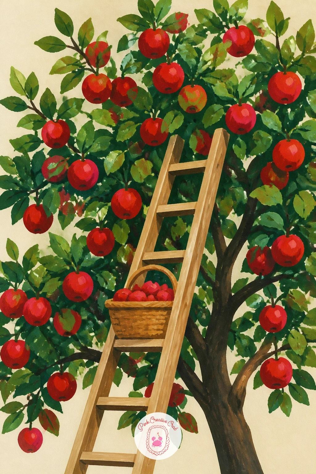
Palette: Apple Red,Leaf Green,Warm Brown,Cream White
Trade the orchard for an autumn path lined with maple leaves. Paint the path itself first as a simple pale curve running through the page, then build the leaf drift along its edges in overlapping maple shapes, each one a flat five-pointed silhouette in a different red, from bright poppy to deep brick.
Work from the back of the drift forward, letting earlier leaves dry before overlapping new ones on top, which keeps the edges crisp rather than muddy. A few loose leaves scattered onto the path itself, smaller and more spread out, suggest movement and wind.
Maple leaf shapes turn into blobs if painted too fast, so keep the brush small and work each point of the leaf as a separate little stroke rather than one sweep. If maple leaves are not local to you, oak or sweetgum leaf shapes carry the same red drift just as well.
One tip for today: vary the leaf sizes a good deal, since uniform leaves read as a pattern rather than a natural drift.
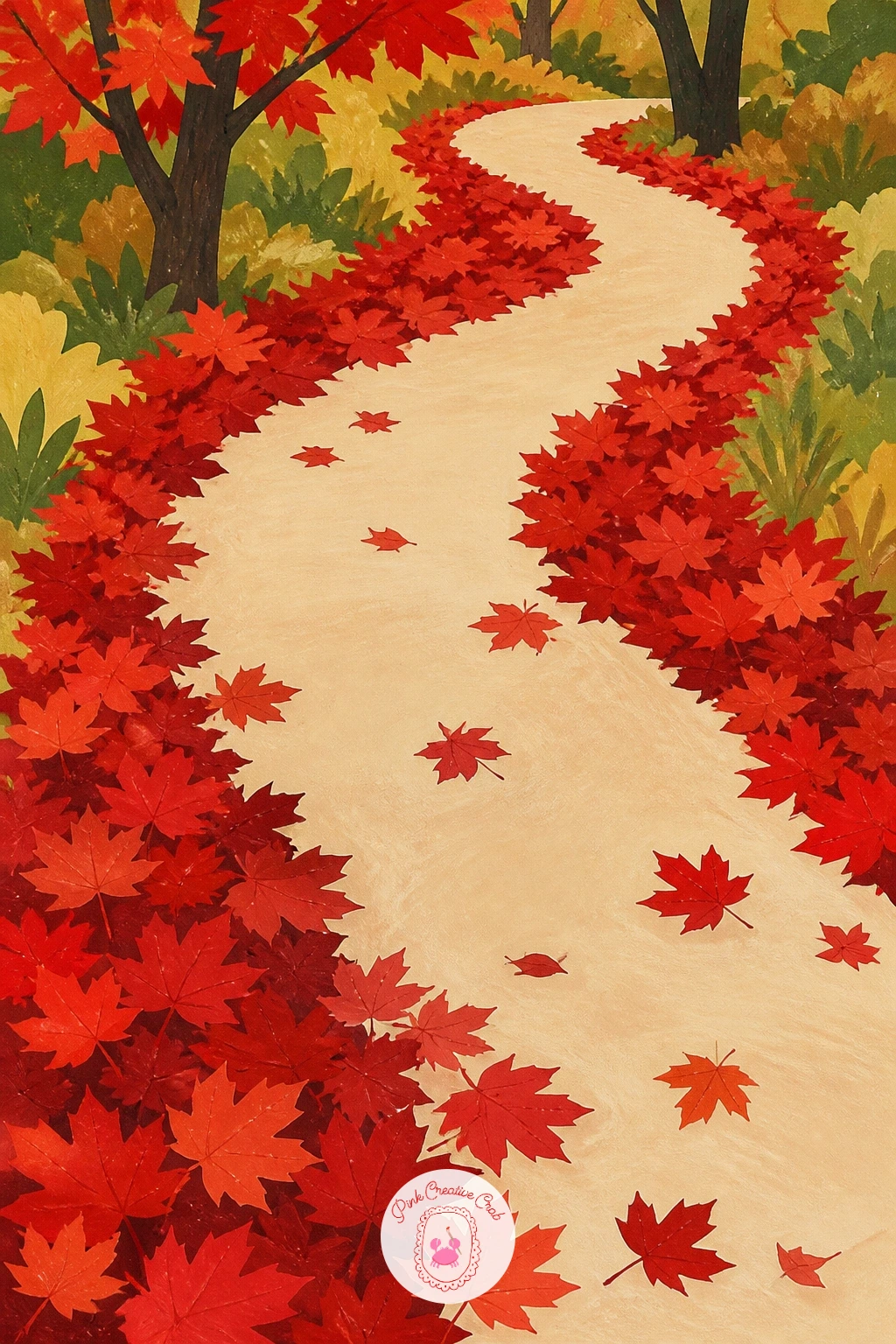
Palette: Maple Red,Brick Red,Warm Orange Red,Pale Path Grey
Step indoors for something cozy: a red teapot sitting on a stovetop. Paint the teapot’s rounded body first, working the curve from spout to handle in one smooth red shape, then add the lid and handle details once that base is dry. A small puff of steam in pale grey-white above the spout suggests it has just boiled.
Paint the stovetop surface behind it in a flat dark grey or black, which makes the red teapot pop hard against it, and add one or two burner rings as simple dark circles for context. Keep the kitchen background minimal, maybe just a tiled wall edge in pale blue.
Rounded teapot bodies often end up lopsided, so sketch a simple oval guide in pencil first and check it looks even before adding the spout and handle. If a full stovetop feels like too much, crop in tight on just the teapot and steam against plain cream.
If you like this cozy, everyday-object kind of painting, the gouache painting ideas for beginners page has more simple subjects in this same spirit.
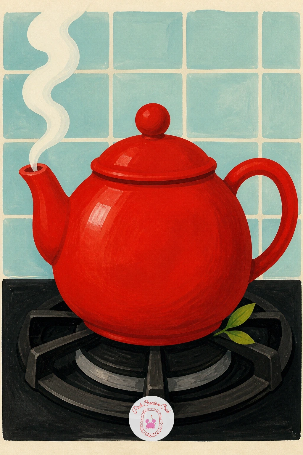
Palette: Cardinal Red,Charcoal Grey,Pale Grey,Pale Blue
Take the red up high this time, hanging above a narrow street. Paint the street and buildings first in muted warm greys and browns, narrowing toward the top of the page to suggest a tight alley, then hang the red lantern shape from a simple line or bracket near the top.
Paint the lantern itself as a rounded shape in a glowing red, with a touch of warm orange mixed in near where a light would sit inside it, and a few thin black lines for its frame ribs. A soft cream halo painted loosely around it suggests the glow without needing any blending.
If the glow looks too hard-edged, soften just the very outer ring of cream with a slightly damp clean brush before it dries completely, which gives a gentle spread without losing the lantern’s crisp main shape. No alley setting on hand to imagine? A single lantern on a plain cream background works as its own quiet subject.
Try the ten-minute version with just the lantern and its glow, skipping the street entirely.
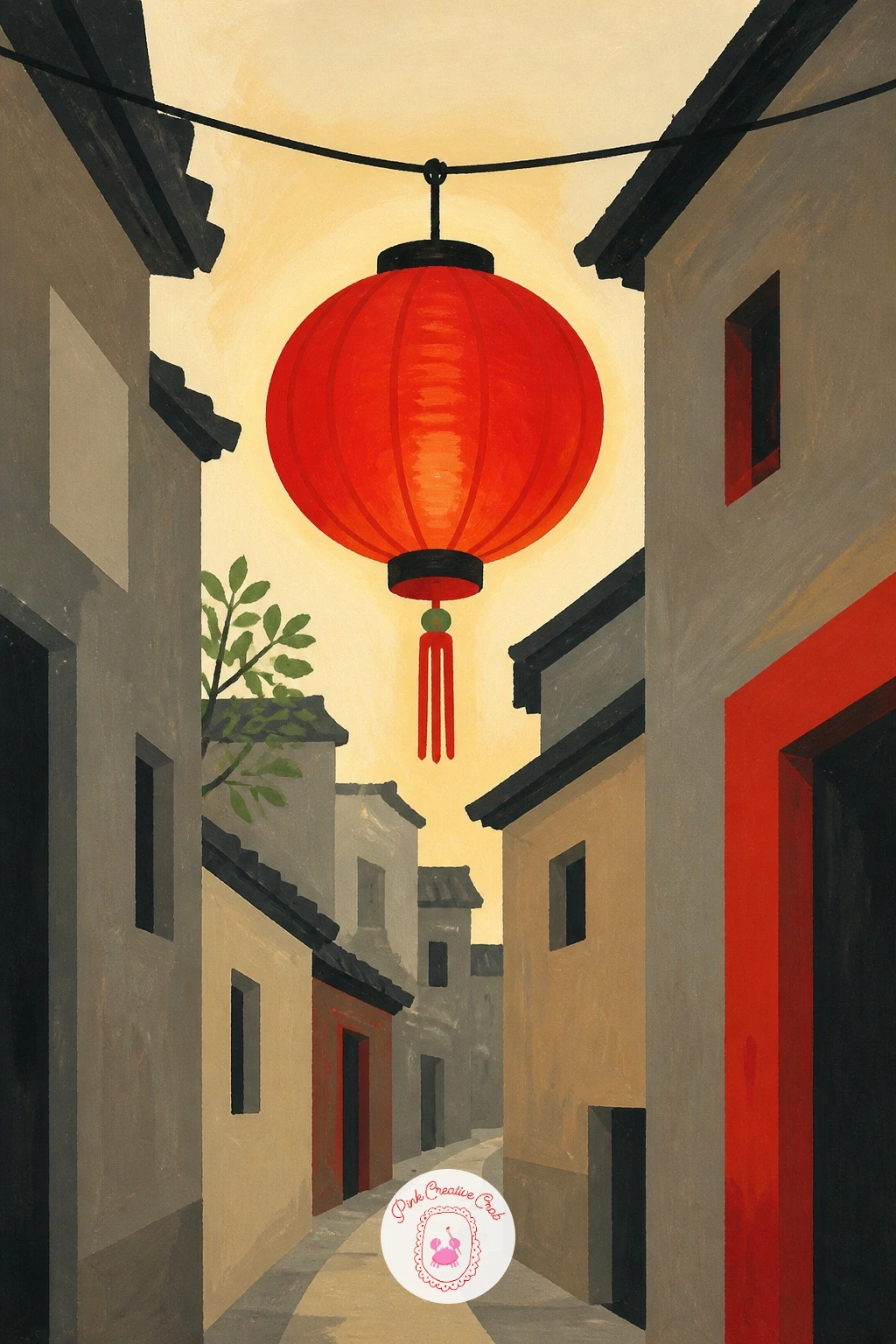
Palette: Lantern Red,Warm Orange,Cream Glow,Warm Grey Brown
Bring the scene back out into open air with a rowboat on still water. Paint the lake first as a flat pale blue-grey wash covering most of the page, then add the red rowboat sitting on the surface, its hull painted as one simple curved shape with the inside bench line added once dry.
Paint a soft reflection of the boat directly beneath it in a muted, slightly greyed version of the same red, stretched a little longer than the boat itself to suggest gentle water movement. A pair of oars resting across the boat in warm brown finishes it.
Eye level sits low and close to the water here, right at the boat’s waterline, which is what makes the reflection believable rather than just a mirrored copy pasted underneath. If a full lake background feels like too much space to fill, crop in so the boat takes up most of the frame with just a narrow band of water showing.
Vary it next time with two boats instead of one, overlapping slightly, for a busier little harbor feel.
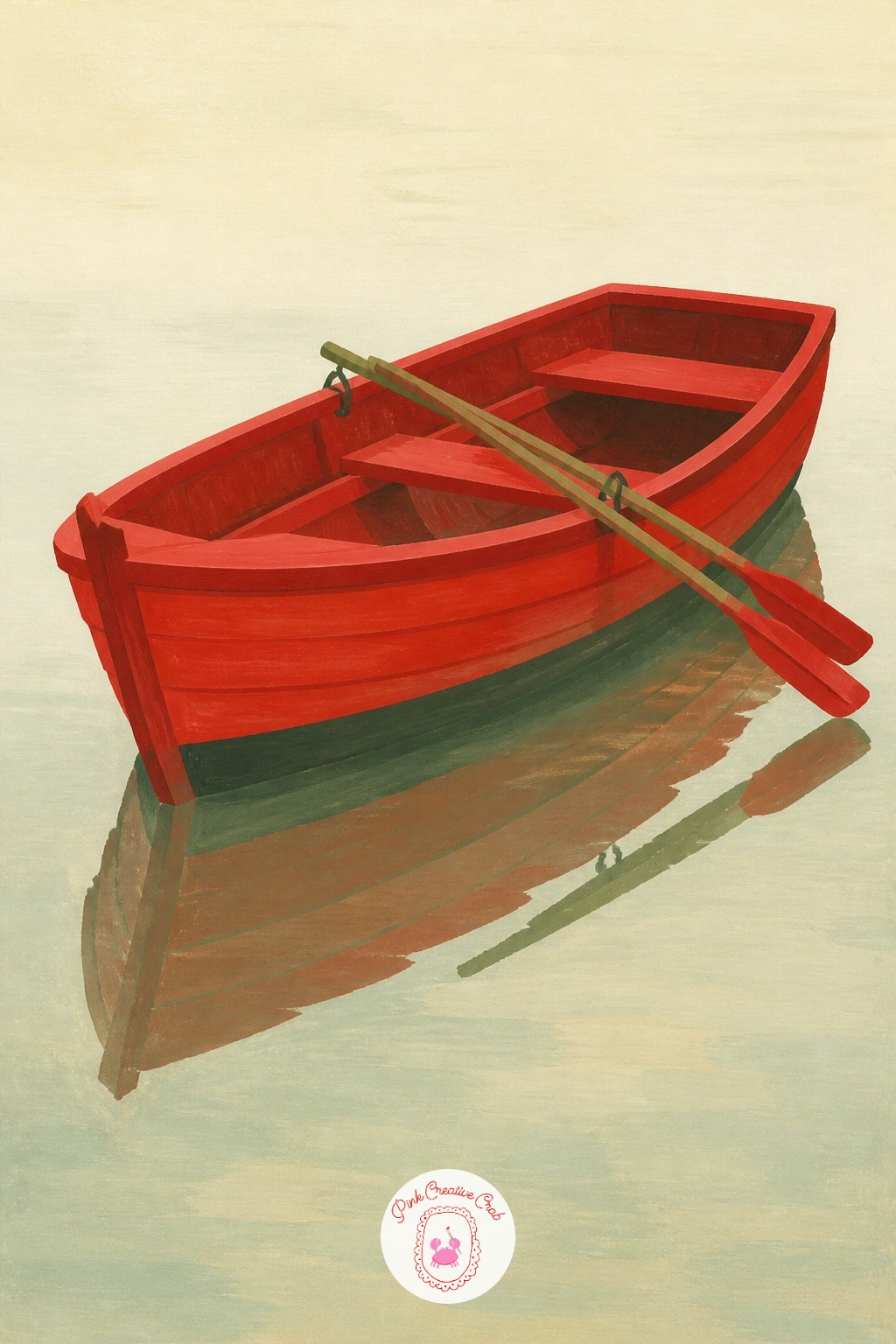
Palette: Boat Red,Pale Lake Blue,Muted Reflection Red,Warm Brown
Head back indoors for dessert: a red velvet cake with one slice already cut away. Paint the cake’s round body first in a deep brick-red, leaving the cream frosting layer between the sponge as a separate pale band painted once the red is dry. Cut the slice shape as a clean wedge removed from the front, revealing the layered cross-section.
Paint that exposed cross-section in alternating red sponge and cream frosting stripes, slightly darker in the shadowed inside edge than on the outer surface of the cake, which gives it real depth. A cake stand in pale grey or white beneath it grounds the whole thing.
The layered cross-section is where this goes wrong fastest, so keep the stripes straight and evenly spaced with a ruler-guided pencil line before you paint over it freehand. No red velvet reference in mind? Treat it exactly like a chocolate layer cake, just swap the sponge color to red.
One tip for today: paint the frosting on top of the cake slightly thicker and whiter than the layers inside, since that contrast sells the richness of the cake.
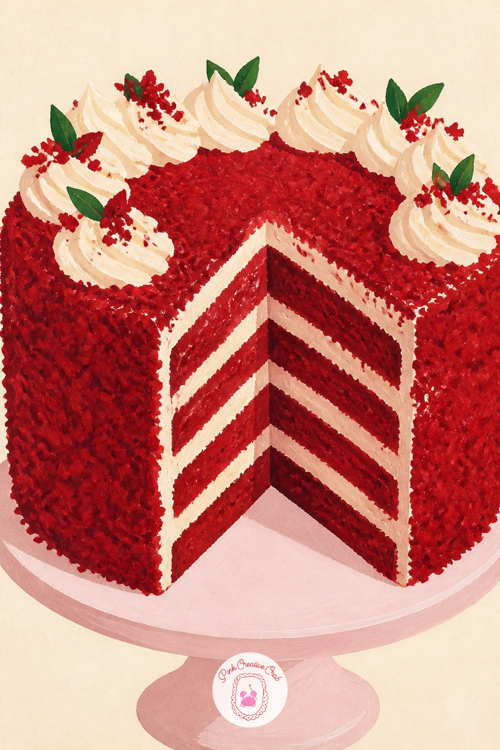
Palette: Velvet Red,Cream Frosting,Deep Red Crumb,Pale Grey
Turn to something quieter and more personal: a red dress on a hanger. Paint the wardrobe door first as a flat panel in warm wood tone or soft grey, then hang the dress on top once that layer is dry, working the fabric as a simple A-line shape that falls straight from the hanger.
Add folds in the fabric with two or three values of red, darker where the fabric would naturally fold inward and a lighter red catching the outer curves, rather than trying to paint every wrinkle. A thin black hanger line and hook finish the top of the shape.
Fabric folds often turn into scribbles if you chase every wrinkle, so limit yourself to three or four confident fold shapes and leave the rest of the dress flat. If a dress feels too fitted to paint confidently, a simple red coat on a hook is an easier stand-in with the same hanging-fabric idea.
Try the quick version with just the dress and hanger on plain cream, no wardrobe door at all.
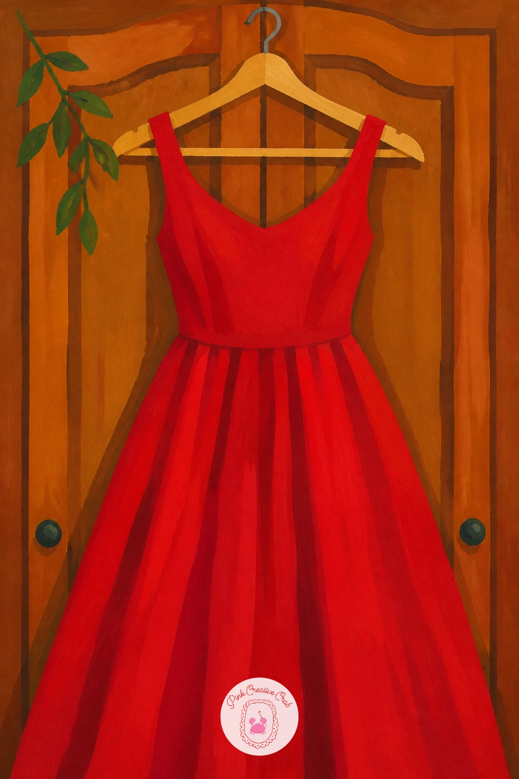
Palette: Dress Red,Deep Fold Red,Warm Wood,Charcoal Grey
Send the red uphill with a cable car crossing a steep view. Paint the hillside and sky first in soft greens and pale blues, sloping diagonally across the page, then add the cable line as a single thin dark stroke running the length of the frame. Paint the cable car itself as a simple boxy shape in bold red, hanging from that line partway up.
Add small window shapes in pale blue-grey along its side and a thin dark cable attachment at the top. A scatter of tiny buildings or trees at the base of the hill gives a sense of how high the car has climbed.
Perspective is the whole trick here: keep the cable car smaller than you think it should be, since a car painted too large flattens the sense of height the hillside is meant to create. Swap a cable car for a simple funicular train on tracks if that shape feels more familiar.
One tip for today: angle the cable line slightly, never perfectly horizontal, which does most of the work of making the hill feel steep.
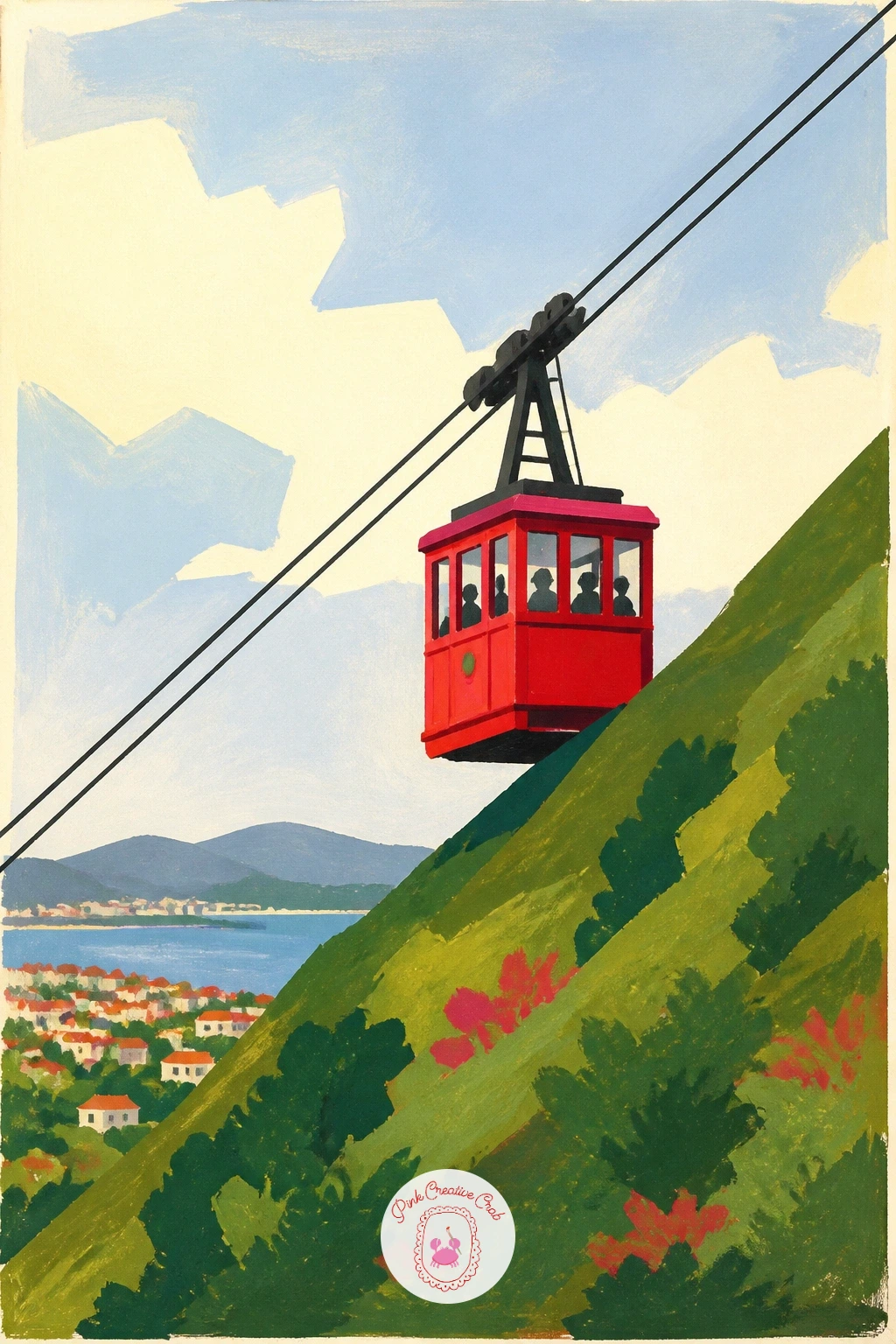
Palette: Cable Car Red,Hillside Green,Pale Sky Blue,Charcoal Grey
Come back down to a quieter country scene: a red mailbox by the road. Paint the farmhouse in the background first, soft and simple in cream and pale grey, then plant the mailbox on its post in the foreground in a strong confident red, much closer to the viewer and therefore larger than the house behind it.
Add the little red flag on the mailbox’s side in the same red, and a few loose wildflowers or tall grass around its post in green and a touch of yellow. Keep the farmhouse behind it loose and undetailed, since the mailbox is the real subject here.
Scale is the lesson in this one: the mailbox should read as clearly nearer and bigger than the house, and beginners often paint both the same size out of habit, which flattens the whole scene. If a mailbox feels like an odd shape to invent, look at any photo of a post box for the basic post-and-box proportions before you start.
Vary it next time with the mailbox flag down instead of up, a small story change that costs nothing extra.
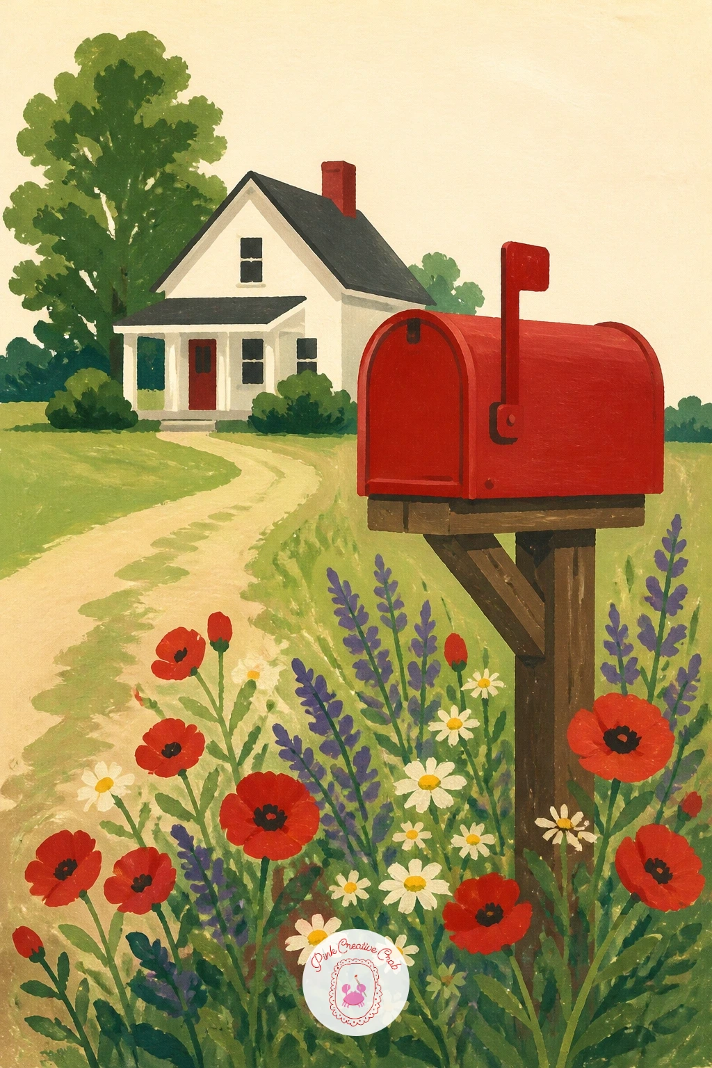
Palette: Mailbox Red,Cream White,Pale Grey,Sap Green
Warm things up with a simple bowl of soup. Paint the bowl first in a soft white or cream with a grey shadow edge, then fill it with the soup itself in a rich red-orange, working a slightly darker red ring around the bowl’s inner edge where the surface meets the ceramic.
Add a swirl of cream drizzled on top in a loose curling line, painted with a fine brush in one confident stroke rather than built up slowly, since a hesitant line looks scratchy instead of smooth. A few flecks of green herb scattered across the surface finish the bowl.
If the swirl comes out wobbly, practice the curl a few times on scrap paper first, since this is a one-shot mark that loses its charm if gone over twice. No cream gouache mixed? A pale yellow works just as well for the swirl and still reads clearly against the red.
Try the quick version with just the bowl and soup, no swirl or herbs, for a plainer but still satisfying ten-minute piece.
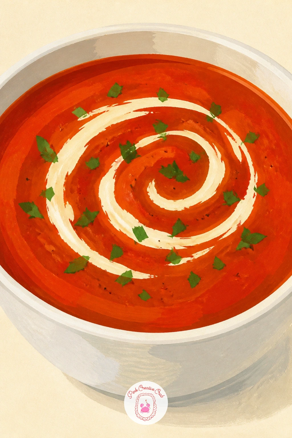
Palette: Tomato Red,Deep Red Orange,Cream Swirl,Sap Green
Take the red back outdoors and up into open sky: a kite flying over a hill. Paint the hill first as one broad green curve filling the lower half of the page, then add the pale sky above it, leaving room near the top for the kite itself.
Paint the kite as a simple diamond shape in bold red, with a long curling tail made of small fabric bows trailing below it in alternating red and cream. A thin taut string running from the kite down to a tiny figure at the base of the hill ties the whole scene together.
The string is easy to overthink: one single confident line, slightly curved rather than ruler-straight, reads far more naturally than a perfectly taut one. If a figure flying the kite feels like too much to add, just the kite and its tail against the sky is a complete picture on its own.
One tip for today: angle the kite slightly off from vertical, since a perfectly upright diamond looks static while a tilted one looks like it is actually catching wind.
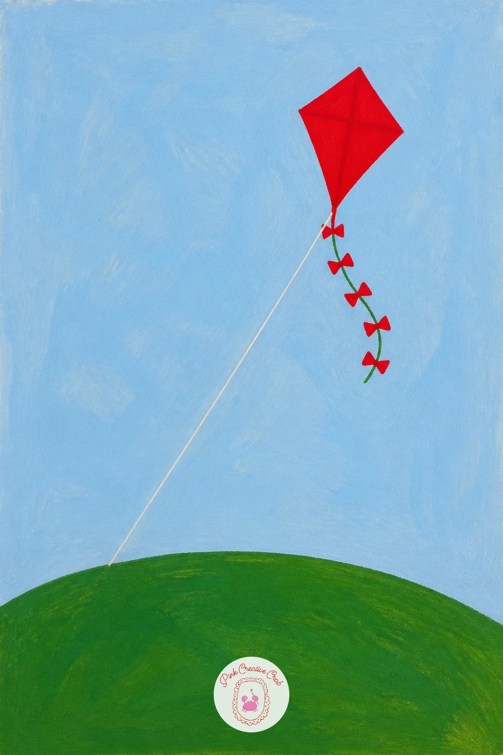
Palette: Kite Red,Hillside Green,Pale Sky Blue,Cream White
Bring the red to the table with a whole lobster dinner. Paint the plate and table surface first in pale cream and soft blue, then build the lobster itself on top once dry, working the body and tail as connected curved segments in a rich cooked-red, darker in the joints between segments.
Add the claws last, since they are the most recognizable part, painting them as rounded pincer shapes slightly lighter in tone where the light catches the top curve. A lemon wedge and a sprig of green beside the lobster round out the plate with a nice color contrast.
Lobster anatomy trips people up fast, so simplify it to five or six overlapping curved segments rather than trying to render every joint accurately, since the color and the pose sell it more than precision does. No seaside setting needed: a plain cream tablecloth background keeps the focus entirely on the plate.
Vary this one next time with a crab instead of a lobster, same cooked-red color story, a rounder simpler shape.
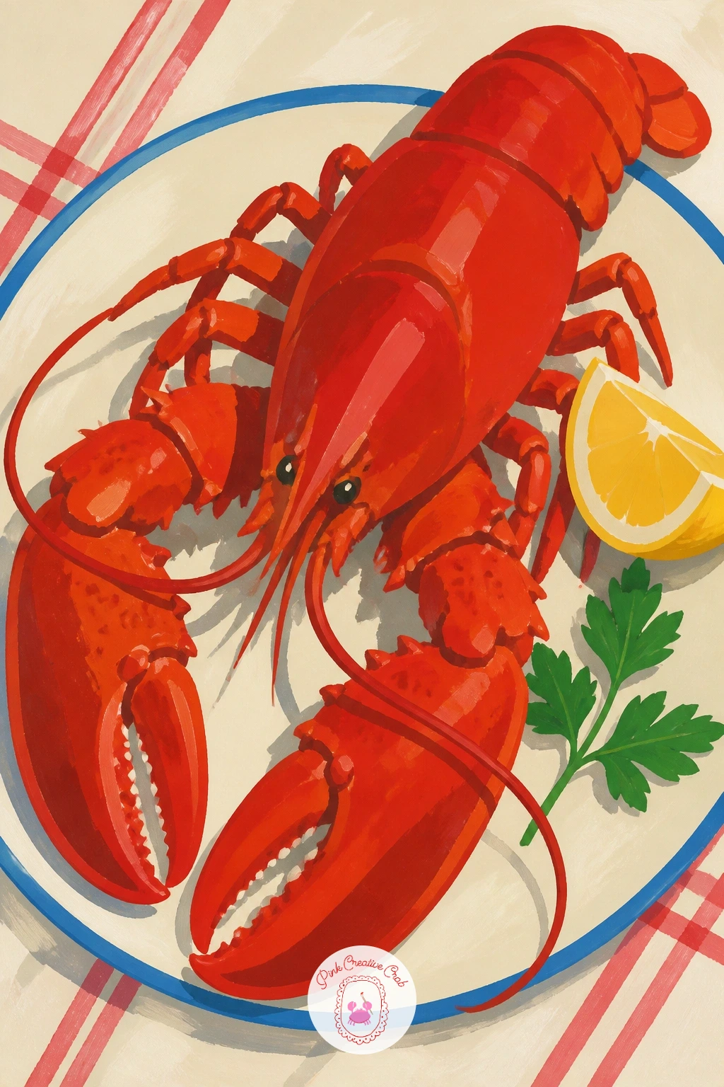
Palette: Cooked Lobster Red,Deep Shell Red,Lemon Yellow,Sap Green
Bring in a little street humor: a red fire hydrant with a dog sniffing beside it. Paint the hydrant first as a simple rounded shape with two side caps and a top knob, all in a bold confident red, keeping the whole form geometric and solid like a small statue.
Add the dog next to it as a simple silhouette in a contrasting warm brown or black, caught mid-sniff with its nose near the base of the hydrant, which gives the whole painting a little story rather than just an object. A strip of grey pavement beneath both grounds the scene.
If the hydrant looks flat and toy-like, add one line of darker red shadow down one side to suggest its cylindrical form, which is all the three-dimensional cue it needs. If dogs feel tricky to draw confidently, a simple cat shape beside the hydrant works just as well for the story.
One tip for today: keep the dog smaller than the hydrant in your composition, since a dog too large flattens the joke of a small animal next to a solid red object.
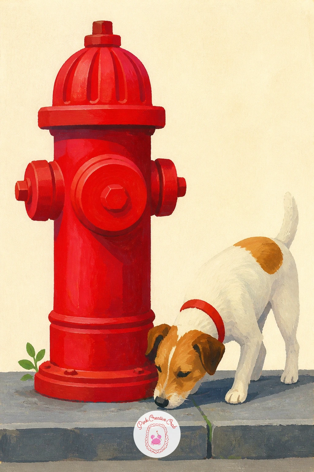
Palette: Hydrant Red,Deep Shadow Red,Warm Brown,Pale Grey
Return to flowers with something more architectural: a rose arch over a gate. Paint the arch frame first in warm wood tone or weathered white, a simple curved structure spanning the page, then build the roses climbing over it once that frame is dry.
Work the roses as small overlapping rounded clusters in two or three reds, thicker along the top curve of the arch and thinning out toward the sides, with a few leaf-green sprigs tucked between the blooms. The gate itself, painted small and simple beneath the arch, can stay a plain dark silhouette so the roses stay the star.
Painted too evenly, the roses read as a solid red stripe rather than individual blooms, so vary the cluster sizes and leave small cream gaps of background showing through here and there. The pink painting ideas page has a softer version of this same arch idea if you want to try it in a gentler palette too.
Try the ten-minute version by painting just a short section of the arch close up, roses filling the whole frame.
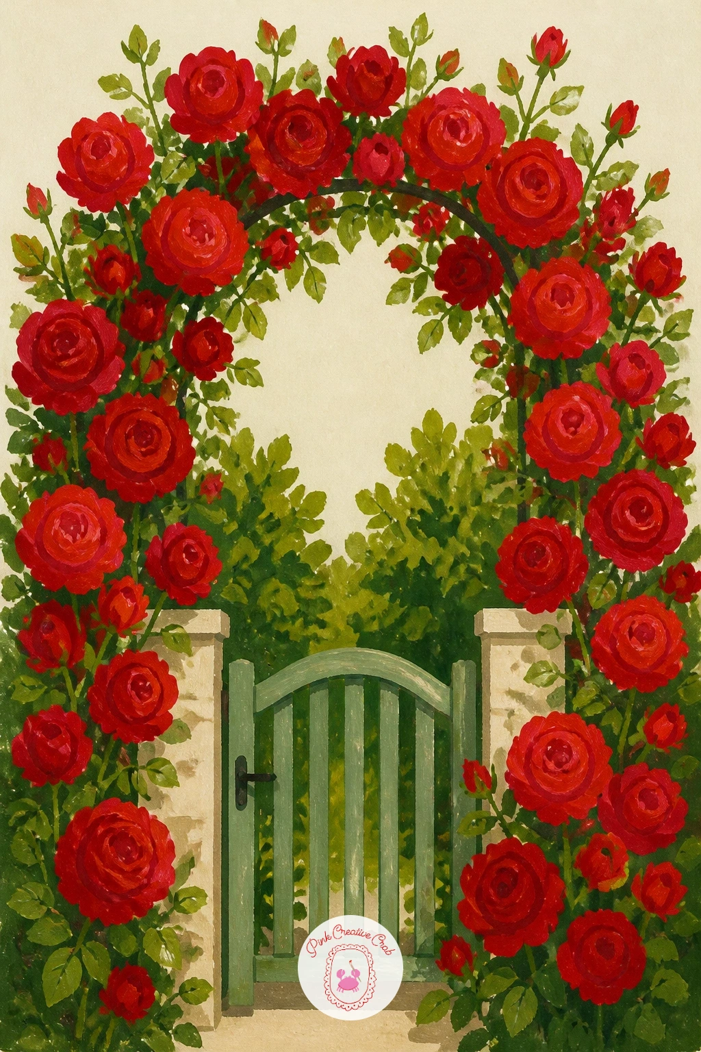
Palette: Rose Red,Deep Rose,Leaf Green,Warm Wood
Head somewhere further afield with a tram climbing a narrow Lisbon street. Paint the steep street and pale tiled buildings behind it first, since the tram needs that narrow backdrop to feel like it belongs. Add the tram itself in bold red, its boxy body painted as a simple rectangle with rounded corners and a row of small cream windows along its side.
Paint the overhead wire as one thin dark line running the length of the page, connecting to the tram’s roof with a small simple pole. A hint of cobblestone texture at street level, suggested with a few short dry-brush dashes rather than painted stone by stone, finishes the scene.
Steep streets are easier than they look if you tilt the whole composition diagonally rather than trying to paint a true perspective angle, letting the buildings and street both lean the same direction. If Lisbon’s pale tiles are unfamiliar, plain cream buildings carry the same contrast with the red tram.
One tip for today: keep the tram’s red consistent and the background muted, since that contrast is what makes this scene feel instantly recognizable.
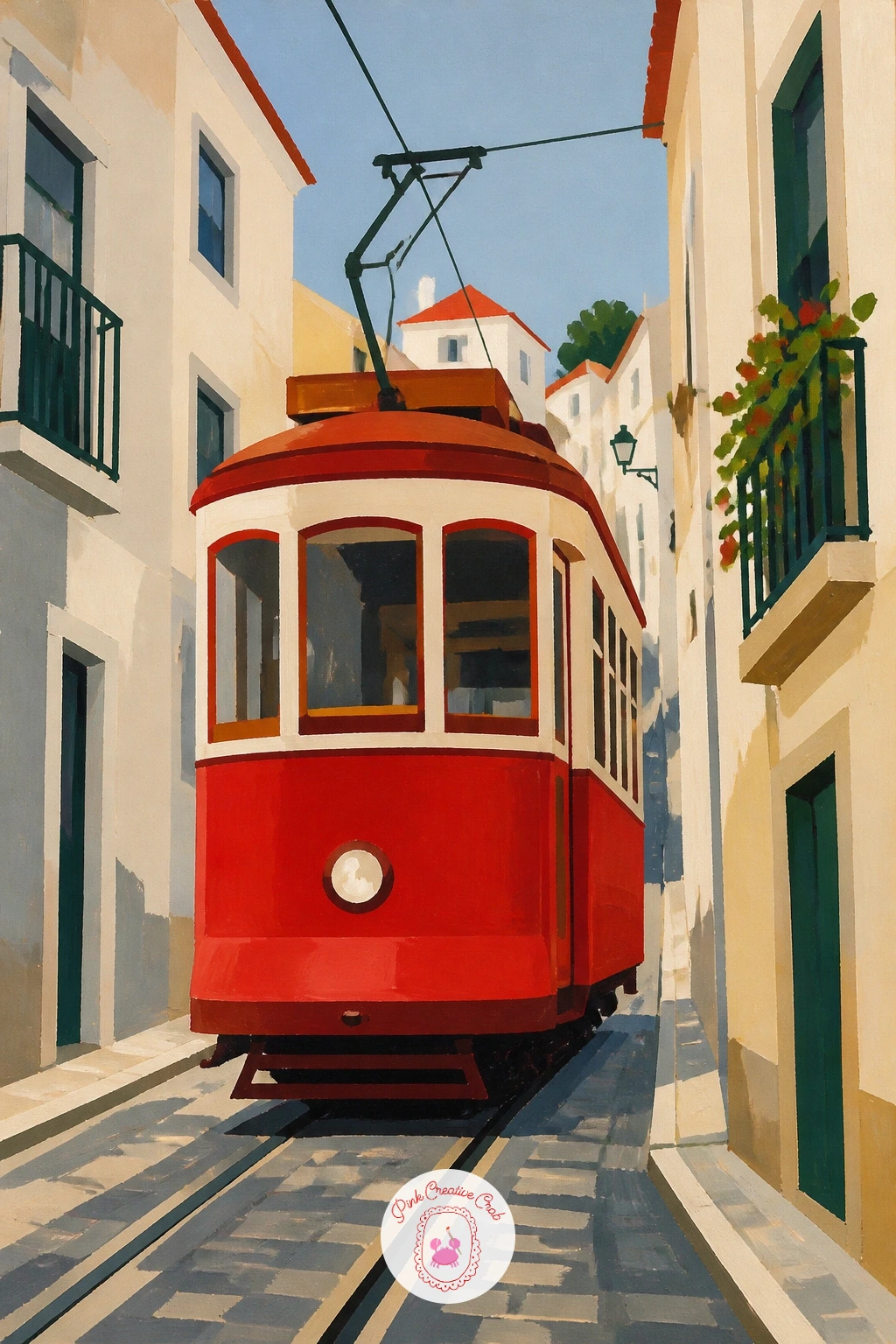
Palette: Tram Red,Pale Tile Cream,Charcoal Grey,Warm Grey
Zoom right in for something small and simple: a ladybird resting on a daisy. Paint the daisy first, a ring of simple white petals around a bright yellow center, then let it dry before adding the ladybird perched on one petal or at the flower’s center.
Paint the ladybird’s body as one smooth red oval, adding the black head and a thin black line down its back once the red is dry, followed by a scatter of small black dots placed slightly unevenly for a natural look. A single leaf green stem beneath the daisy completes the small scene.
Perfectly symmetrical dots look stamped on rather than drawn, so place them a little off-pattern and vary their sizes slightly. If a daisy feels too plain, a red clover or a single leaf works just as well as a landing spot for the ladybird.
This is a lovely one to practice tiny confident shapes before moving to anything larger, since the whole piece can finish in well under ten minutes.
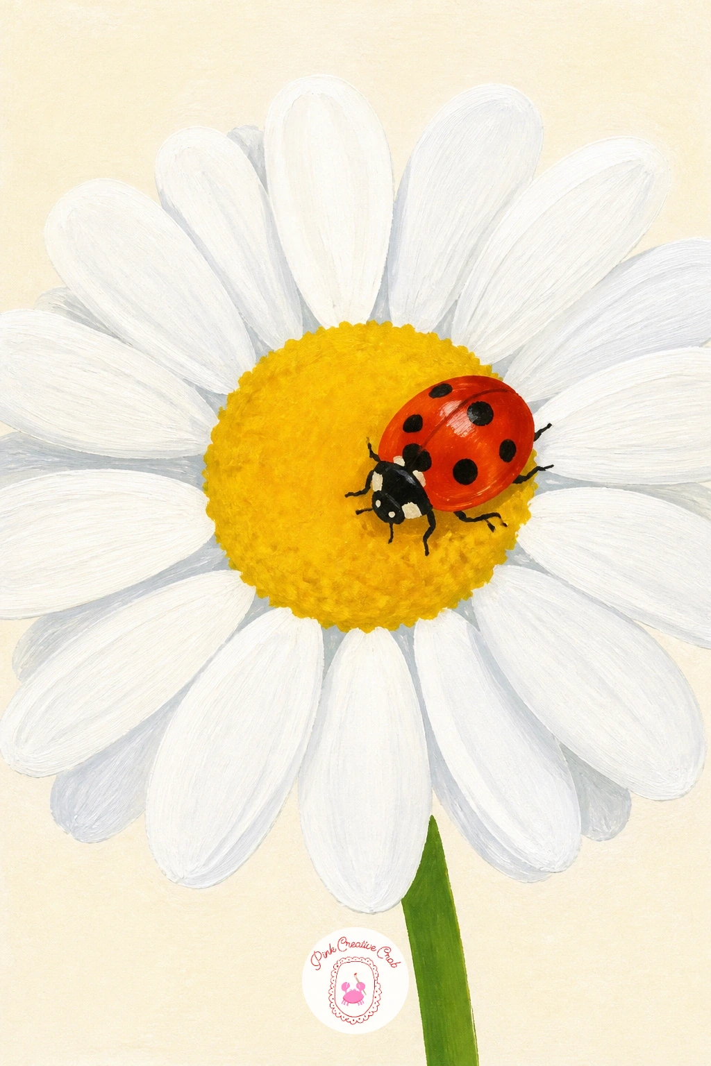
Palette: Ladybird Red,Charcoal Black,Daisy White,Leaf Green
End on something still and comforting: a red cardigan draped over a chair beside an open book. Paint the chair first as a simple wooden silhouette, then drape the cardigan over its back, working the knit shape loosely with soft folds rather than a crisp tailored outline, since a cardigan should look relaxed rather than hung with care.
Add a few dry-brush strokes over the red once the base layer is dry to suggest the knit’s ribbed texture, especially along the cuffs and hem. Paint the open book resting on the chair’s seat last, pale cream pages with a few loose pencil-thin lines for text, which needs no real detail to read clearly.
If the cardigan looks stiff, loosen the fold lines, since a cardigan draped in use always has a slightly lopsided, lived-in shape rather than a symmetrical one. Swap the book for a mug of tea resting on the seat if that feels more like your own reading chair.
Close the whole set with one tip: let this cardigan’s red be slightly muted compared to the boldest reds earlier in the list, since a quieter red suits a quiet, cozy subject.
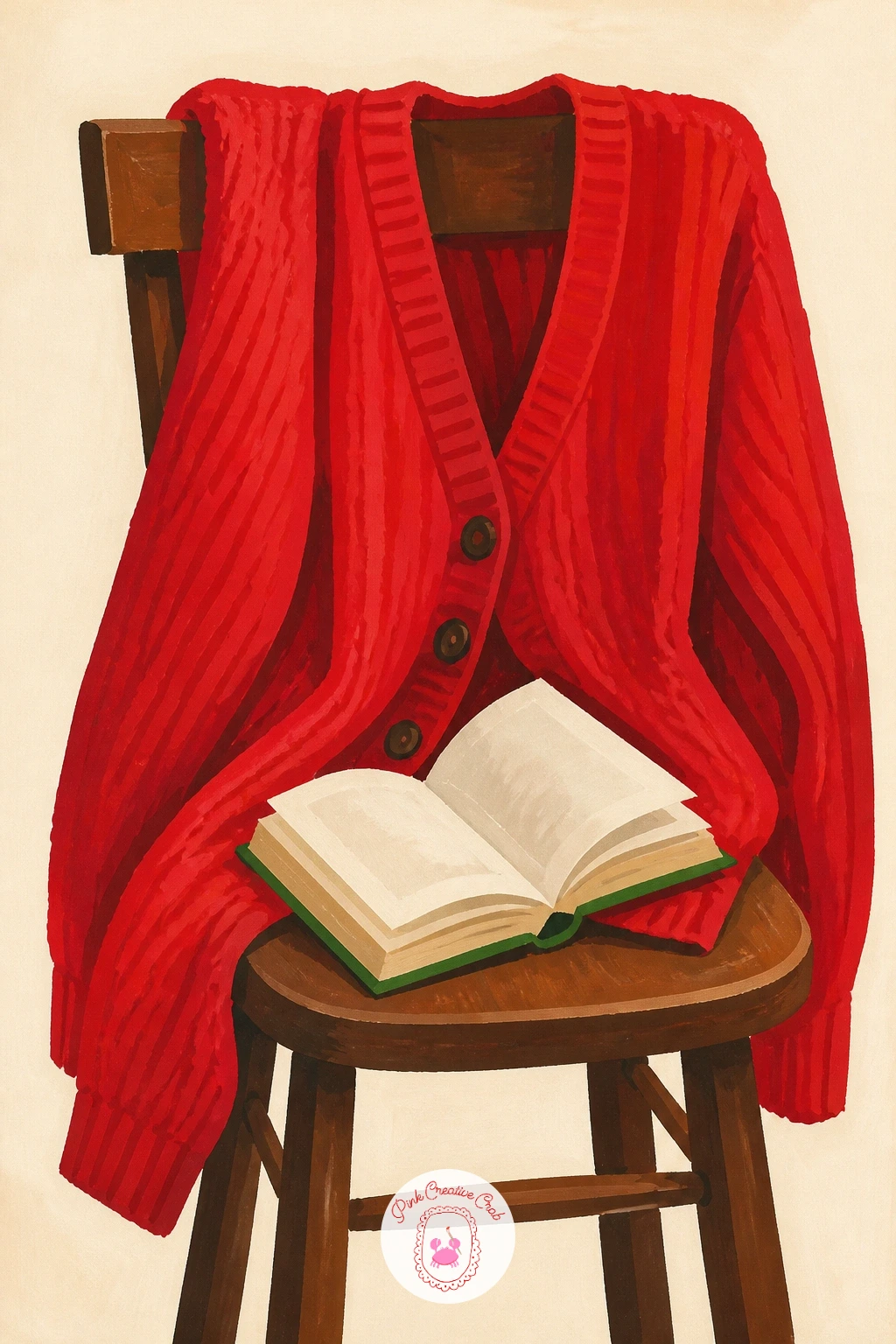
Palette: Muted Cardigan Red,Warm Wood,Cream Pages,Charcoal Grey
Close the whole list the way a good picnic ends: with a jar of raspberry jam. Paint the glass jar first as a simple cylinder shape, leaving a few small highlight streaks of plain cream paper showing through to suggest glass, then fill it with jam in a deep raspberry red once that outline is dry.
Add a spoon resting against the jar’s rim, angled out toward the viewer, in a pale silver-grey with a small smear of the same raspberry red caught on its bowl. A gingham or plain fabric lid tied at the jar’s neck, in a muted red to match the gingham blanket from earlier in this list, brings the whole set full circle.
Glass is the trickiest part here: keep the highlight streaks simple and vertical rather than trying to render full transparency, since a few confident light streaks read as glass far more convincingly than careful shading. No raspberry color mixed yet, a deep crimson with a touch of blue-violet gets you there fast.
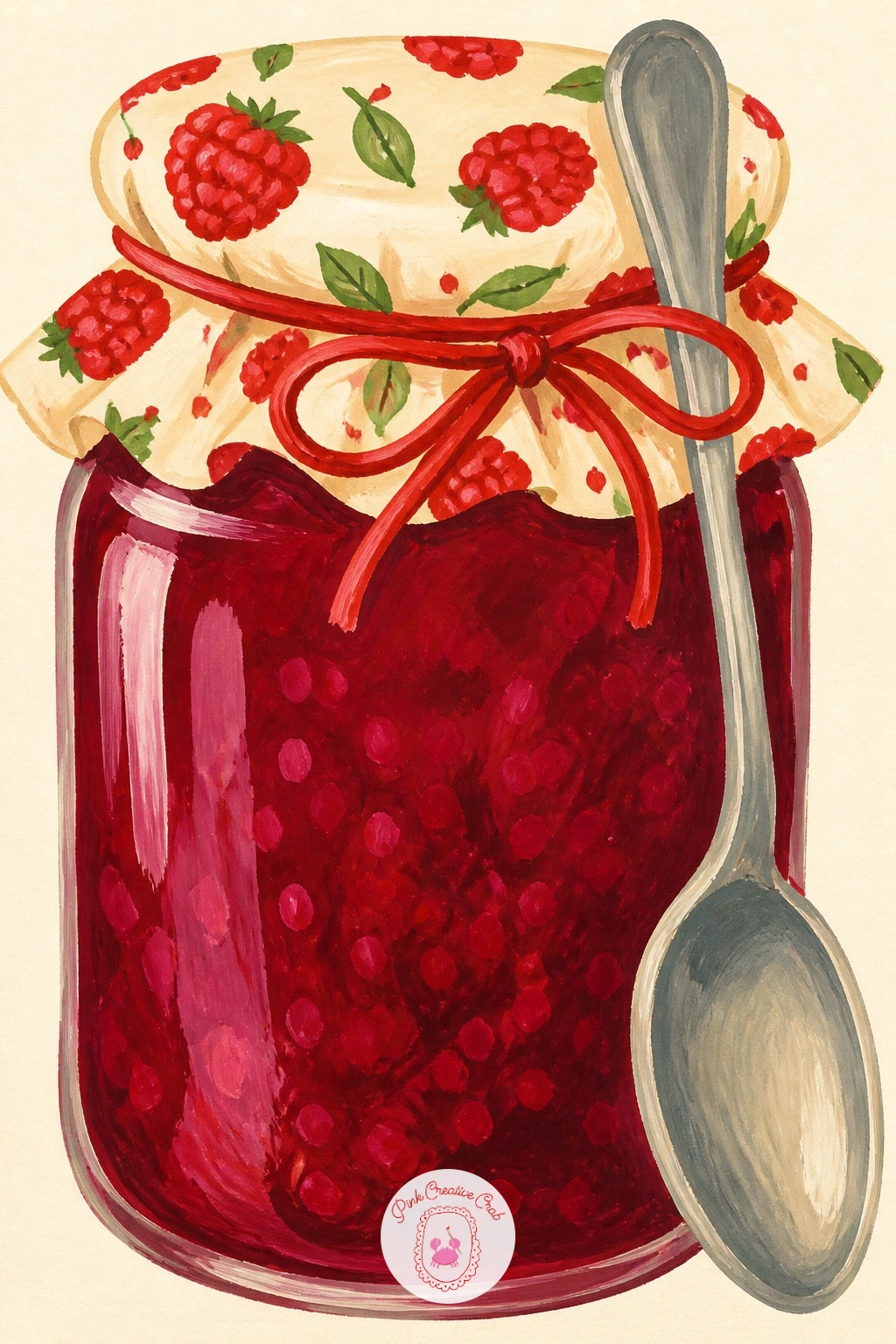
Palette: Raspberry Red,Pale Glass Highlight,Silver Grey,Gingham Red
If you enjoyed painting fruit and jam colors like this, the watercolor strawberries ideas linked elsewhere on this blog explore a similarly sweet, fruity palette in a different medium.
What to Do Next
Pick whichever idea matches the mood you are in right now, whether that is a quiet teapot or a whole poppy field, and start with the background shapes before any red touches the page. Keep a sheet of mixed media paper and your reddest reds within reach, and let today’s painting be the first of several from this list.
Frequently Asked Questions
What gouache reds work best for a red painting with lots of shade variety?
A warm poppy red, a cool crimson or alizarin, and a deep brick or maroon cover most of this list. Mixing between just these three, with white or a touch of green to mute them, gives every shade from bright to dusty without buying a dozen tubes.
How do you stop gouache reds from drying patchy or streaky?
Mix enough paint before you start and apply it in one even layer rather than scrubbing back into a drying patch. Gouache reactivates with water, so a quick second thin coat once the first is fully dry smooths out any streaks.
How do you keep red from overpowering the rest of a painting?
Surround it with a small amount of its opposite, green, and keep the background pale and simple, as these ideas do with cream. A little muted grey or brown nearby also lets the red read as bold rather than harsh.
Can these red painting ideas work in acrylic instead of gouache?
Yes, acrylic paint handles flat, crisp shapes in a very similar way to gouache, just dries faster and permanently. Keep the same simple order, background first and the sharpest reds last, and the ideas translate directly.
What is the easiest red painting idea on this list for a first attempt?
The red ladybird on a daisy is the simplest, with only a few clean shapes and no complicated texture work. It finishes quickly and still teaches the basic gouache habit of flat color and crisp edges.
Have any thoughts?
Share your reaction or leave a quick response — we’d love to hear what you think!
-
 0
-
0
-
0
-
0
-
0
-
0


