

A willow tree painting never gets old, because the tree itself is happy to stand still while everything around it tells a different story. One sitting it bends over a sleepy pond, the next it shades a red barn or hides a picnic behind its own curtain of leaves. That flexibility makes it a forgiving subject for gouache, where flat shapes and clean edges do most of the work for you.
Below you will find twenty-eight small scenes built around a willow, arranged from the simplest shapes to the more layered compositions. Each one gives you a place to start, a point where it tends to go wrong, and a way to fix it, so you can pick whichever mood suits your afternoon and finish it before the light changes.
Using these images: free for personal projects such as printing, coloring, cards, journals and gifts. Handmade items that include them may be sold up to 30 pieces per design. More than that is commercial use and is not permitted, and neither is selling or sharing the images themselves or passing them off as your own. Please ask before any other use.
Start with the shape that gives every willow its personality: a soft dome of foliage on a short trunk, with long thin branches drooping down like a fringe. Block the dome in with a mid green gouache using the side of a flat brush, then let that layer dry completely before adding the darker green strands that fall from it with a fine round brush.
Paint the pond as one flat shape of pale blue-grey first, then drop in the reflection of the willow once the water layer has dried, using the same green but a touch darker and slightly softened at the edges so it reads as a mirror and not a copy.
The usual trap is painting every hanging branch the same length, which flattens the whole tree. Vary them, some reaching the water and some stopping short, and the willow instantly feels alive rather than stencilled.
If your paper buckles under the wash, tape it down on all four sides before you start and it will dry flat.
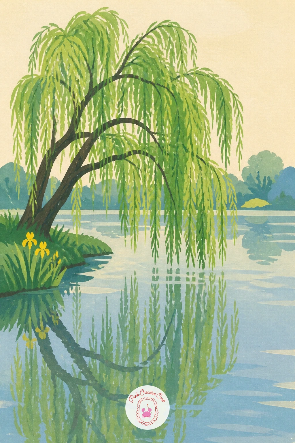
Palette: Sap Green,Payne’s Grey,Pale Blue,Butter Yellow
Build on that same willow dome, but this time let the branches sweep down over a small wooden rowboat tied to shore. Paint the boat first as two or three simple flat shapes, a curved hull in a warm wood tone and a thin rope in a darker line, before the willow branches go in on top so they feel like they are hanging in front of it.
Measure the boat against the trunk before you commit to size, since a boat painted too large will crowd the whole scene and a boat too small gets lost under the leaves. Holding your brush at arm’s length against the reference helps you judge that proportion before the first stroke.
Keep the water beneath the boat a flat, slightly darker blue than the pond around it, which reads instantly as shadow without any extra blending.
If straight lines for the rope wobble, use the edge of a scrap of paper as a ruler guide.
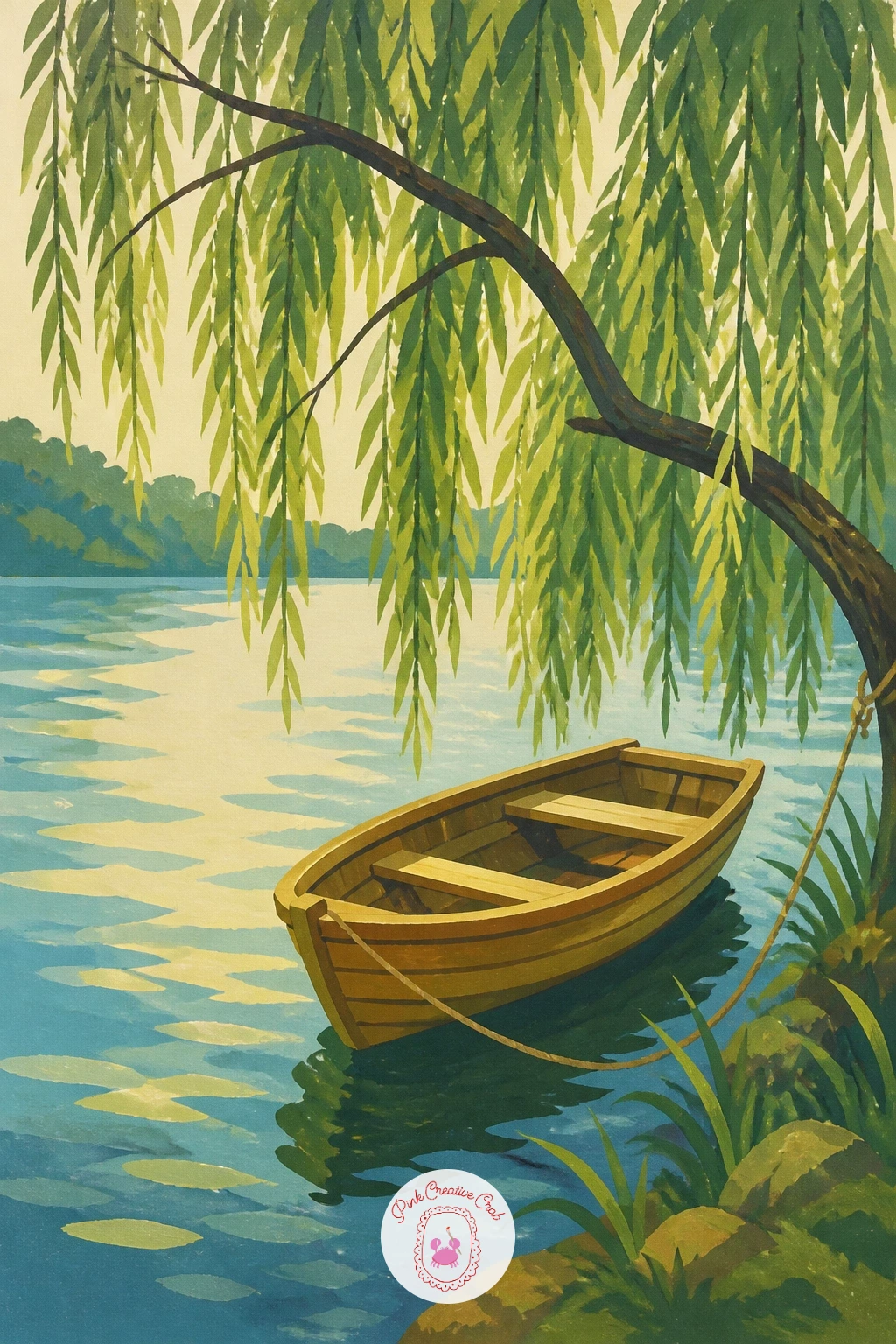
Palette: Raw Umber,Sap Green,Soft Blue,Cream
Give the willow a job to do by hanging a simple rope swing from one of its lower branches. Paint the trunk and main limb first, thick near the base and tapering out, then add the rope as one continuous curved line in a warm grey-brown before the seat, a flat rectangle of wood tone, sits at the bottom.
Eye level matters here: place the horizon low on the page so you are looking slightly up into the branch, which makes the swing feel like it is really hanging rather than pasted flat against the tree.
A common slip is painting the rope perfectly straight, which looks stiff. Let it curve gently with the pull of the seat’s weight, and the whole thing relaxes.
If you want a bolder version, swap the plain background for a wash of warm late afternoon light behind the branch.
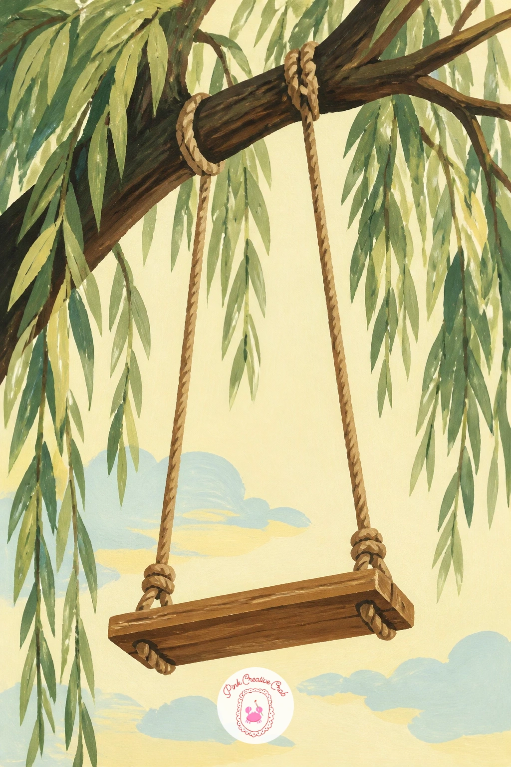
Palette: Olive Green,Warm Brown,Butter Yellow,Cream
A stone bridge gives the willow something solid to lean against, and the contrast between the tree’s softness and the bridge’s hard geometry carries the whole composition. Paint the bridge first as a flat arch shape in warm grey, keeping the stones suggested with a few simple lines rather than drawn one by one.
Place the willow to one side rather than centred, letting its branches drape partway across the arch, which pulls the eye through the scene instead of splitting it in two.
Dry brush works well here for the stone texture: load a flat brush lightly, wipe off most of the paint, then drag it across the arch so flecks of the cream paper show through. That small bit of texture keeps the bridge from looking flat next to the leafy willow.
No flat brush on hand, an old round brush squeezed to a fan shape with your fingers does the same job.
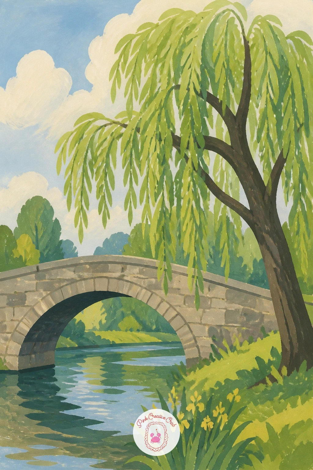
Palette: Warm Grey,Sap Green,Soft Blue,Cream
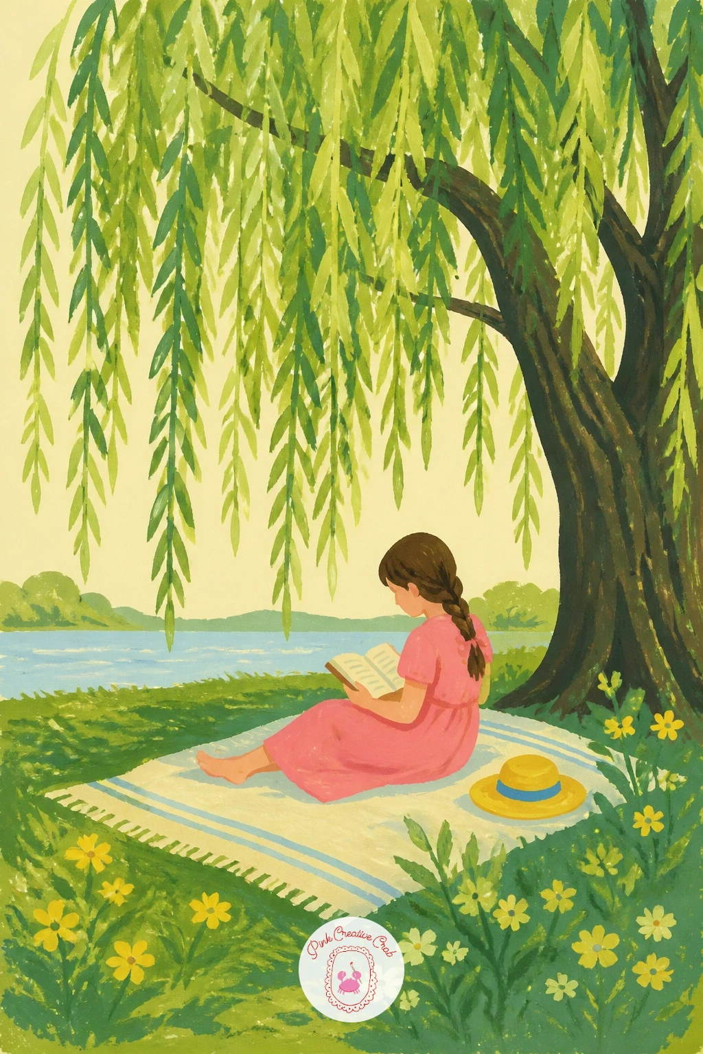
Bring a small human moment into the scene by tucking a girl with a book onto a blanket beneath the willow’s canopy. Paint the blanket first as a flat shape with one simple pattern, a stripe or checker in two colors, then add the figure in a few confident shapes: a rounded head, a simple dress, knees bent toward the book.
Keep the figure small against the trunk, no more than a third of the tree’s height, so the willow still feels like the main subject and the girl reads as a detail within it.
If the figure looks stiff, soften the shoulders and tilt the head slightly down toward the page, which instantly suggests someone absorbed in reading rather than posing.
Skip the face entirely if faces worry you. A simple shape with hair and a tilted head tells the story just as well, and this approach pairs nicely with the loose, graphic figures used in many gouache painting ideas for beginners.
Palette: Sap Green,Dusty Pink,Warm Brown,Cream
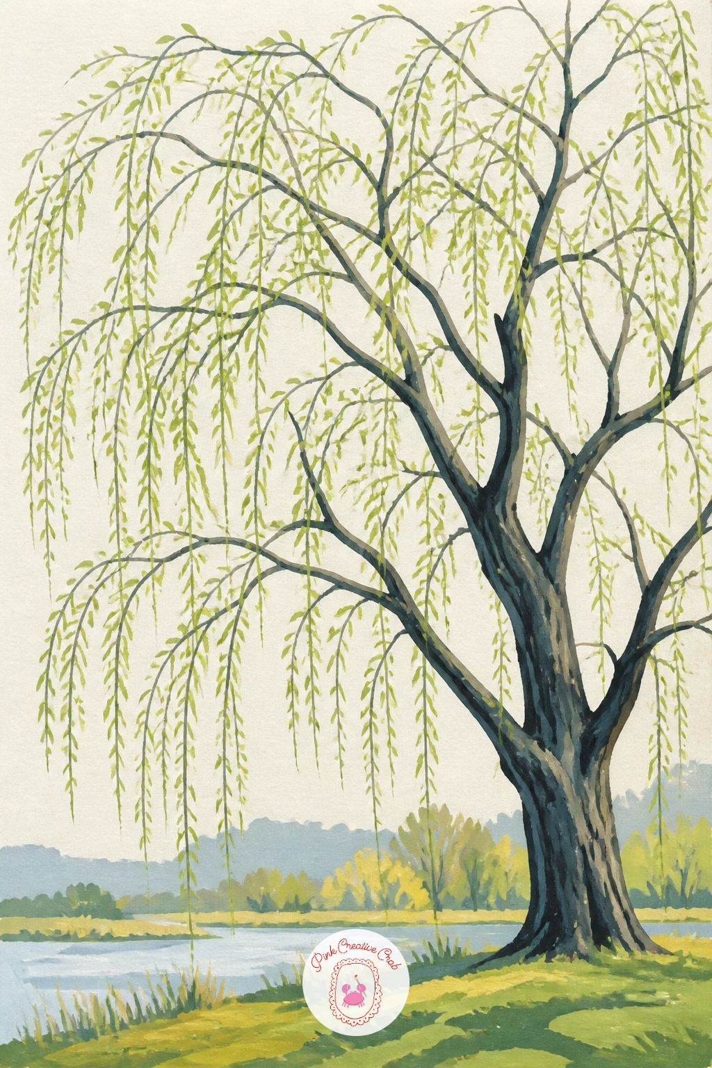
Catch the willow at its freshest moment, when the branches carry only pale new leaves rather than a full curtain. Paint the trunk and bare branch structure first in a warm grey-brown, letting the lines show through, then dab small flat touches of pale green along the branches rather than covering them completely.
This is the quick version of a willow painting: ten minutes gets you the branch structure and scattered leaf dabs, finished and charming on its own. Give it forty minutes instead and you can add a soft wash of pale sky behind the branches and a second, slightly deeper green dabbed in for depth among the new leaves.
The mistake to watch for is over-filling the branches with leaves, which loses the spring feeling entirely. Leave plenty of bare branch showing between the dabs.
One concrete tip: load your brush once and make several leaf dabs before reloading, so the color naturally varies and looks more like real new growth.
Palette: Pale Green,Warm Grey,Soft Blue,Cream
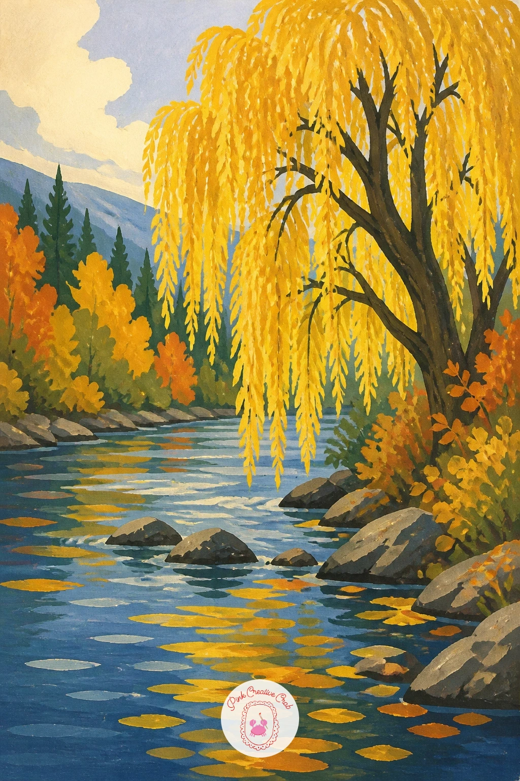
Swap the greens for warm gold and the pond for a moving river, and the same willow shape carries a completely different season. Block in the canopy with a buttery gold-yellow first, then add a few strokes of a deeper orange-brown underneath for shadowed areas within the foliage.
The river beneath should run in one direction with simple horizontal bands of blue and reflected gold, which reads as gentle current without needing any detailed water texture.
Golden foliage can easily look muddy if you mix too many colors into it. Keep the palette to two or three warm tones and let the cream paper show through in small gaps for sparkle.
If gouache yellow looks too pale once dry, a second thin layer once the first is fully dry deepens it without muddying the edge.
Palette: Butter Yellow,Burnt Orange,Soft Blue,Cream
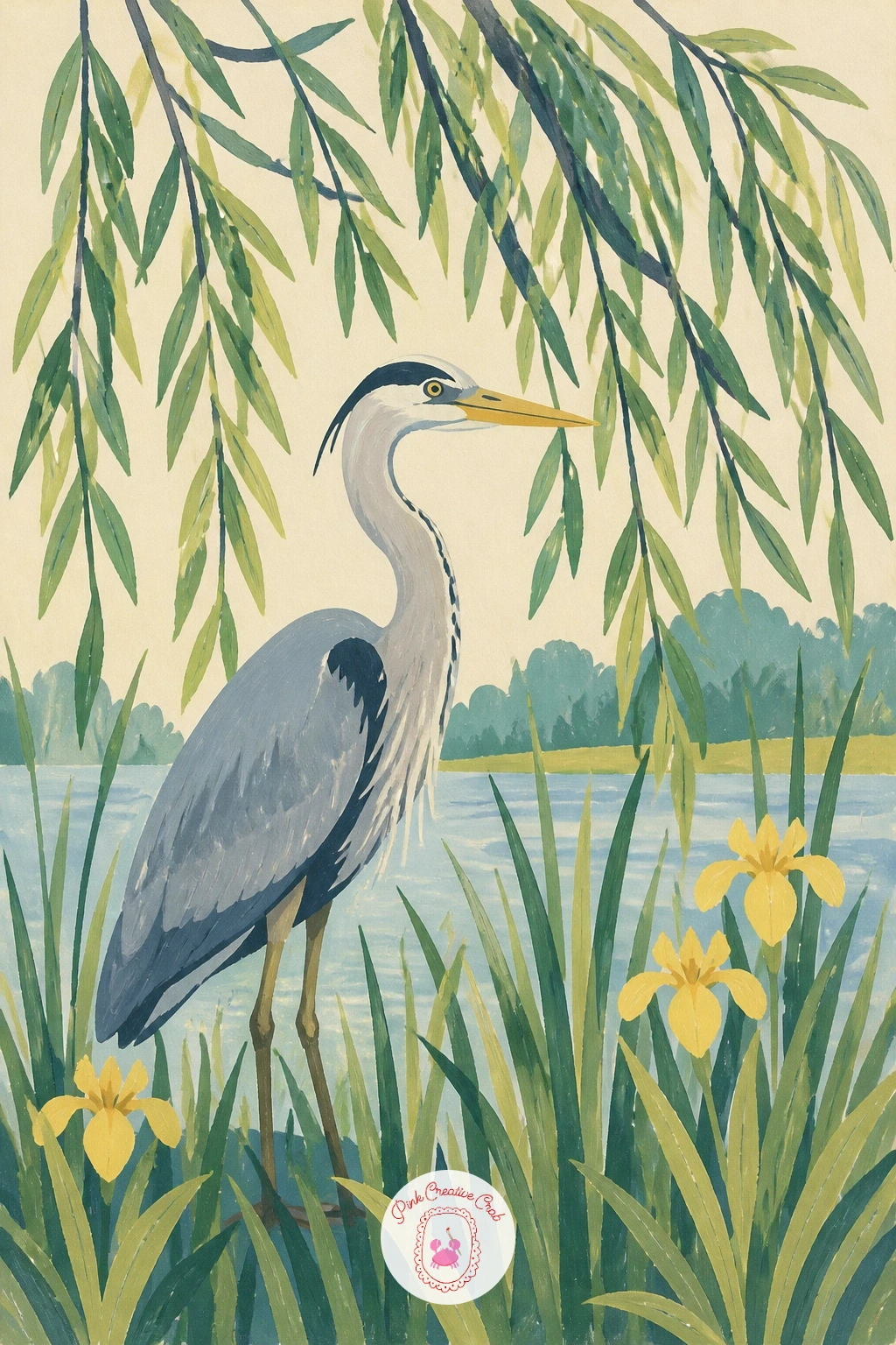
Add a heron standing still among reeds at the base of the willow for a quiet focal point low in the composition. Paint the reeds first as a cluster of tall thin vertical strokes in two greens, then place the heron as a few simple shapes: a long curved neck, an oval body, thin legs.
Where the light comes from matters for this one. If you paint the sun low behind the willow, the heron’s body can carry a darker silhouette edge on one side, which gives it weight without any extra detail.
Herons often go wrong at the neck, which can look either too stiff or too long. Sketch the curve lightly first and compare it to the leg length before you paint it solid, since the neck should roughly match the body in length.
No fine liner brush for the legs, the tip of a round brush loaded thin does the same clean line.
Palette: Sap Green,Warm Grey,Soft Blue,Cream
Set the willow next to a red barn and let the tree’s soft green play off the barn’s flat, graphic red. Paint the barn first as simple rectangles and a triangular roof, keeping the red completely flat with no shading, then bring the willow in beside it slightly overlapping one corner.
Compare the barn’s height to the willow’s trunk before you paint either one fully, since a barn too tall will fight the tree for attention and a barn too small looks like an afterthought. Aim for the barn roofline to sit roughly level with the lowest hanging branches.
The red can bleed visually if the green beside it is too similar in value. Keep the willow’s green a little darker where it meets the barn wall so the two shapes stay distinct.
A butter yellow door or window on the barn echoes the accent color running through the rest of the series.
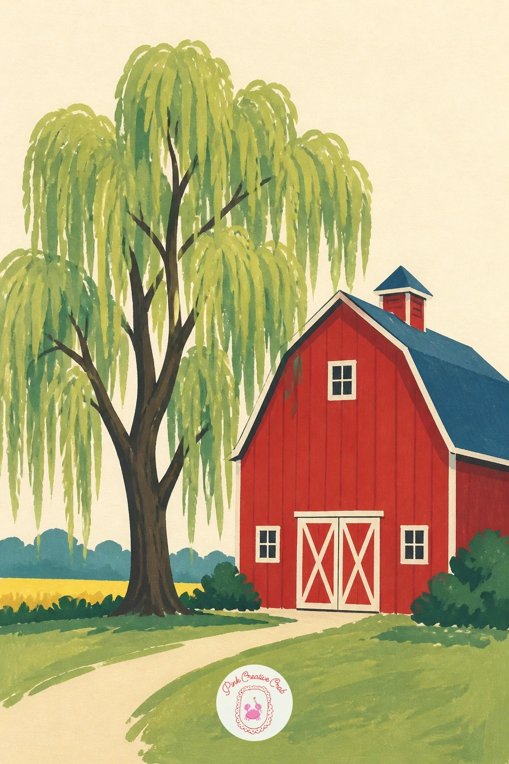
Palette: Barn Red,Sap Green,Butter Yellow,Cream
Let the willow stand behind a cottage garden gate, with flowers crowding the foreground and the tree rising softly behind. Paint the gate first as a simple flat white or pale grey shape with a few thin dark lines for the pickets, then build the garden in front with small dabs of color for flowers before the willow goes in last, softer and slightly muted so it reads as background.
Keep the flower dabs varied in size and color rather than evenly spaced, which makes the garden feel grown rather than planted in a row.
If the willow and the flowers compete for attention, mute the willow’s green very slightly with a touch of grey mixed in, pushing it back visually behind the busier gate and blooms.
This layered approach works well alongside the garden color mixing covered in hydrangea painting ideas, if you want more practice with small flower dabs.
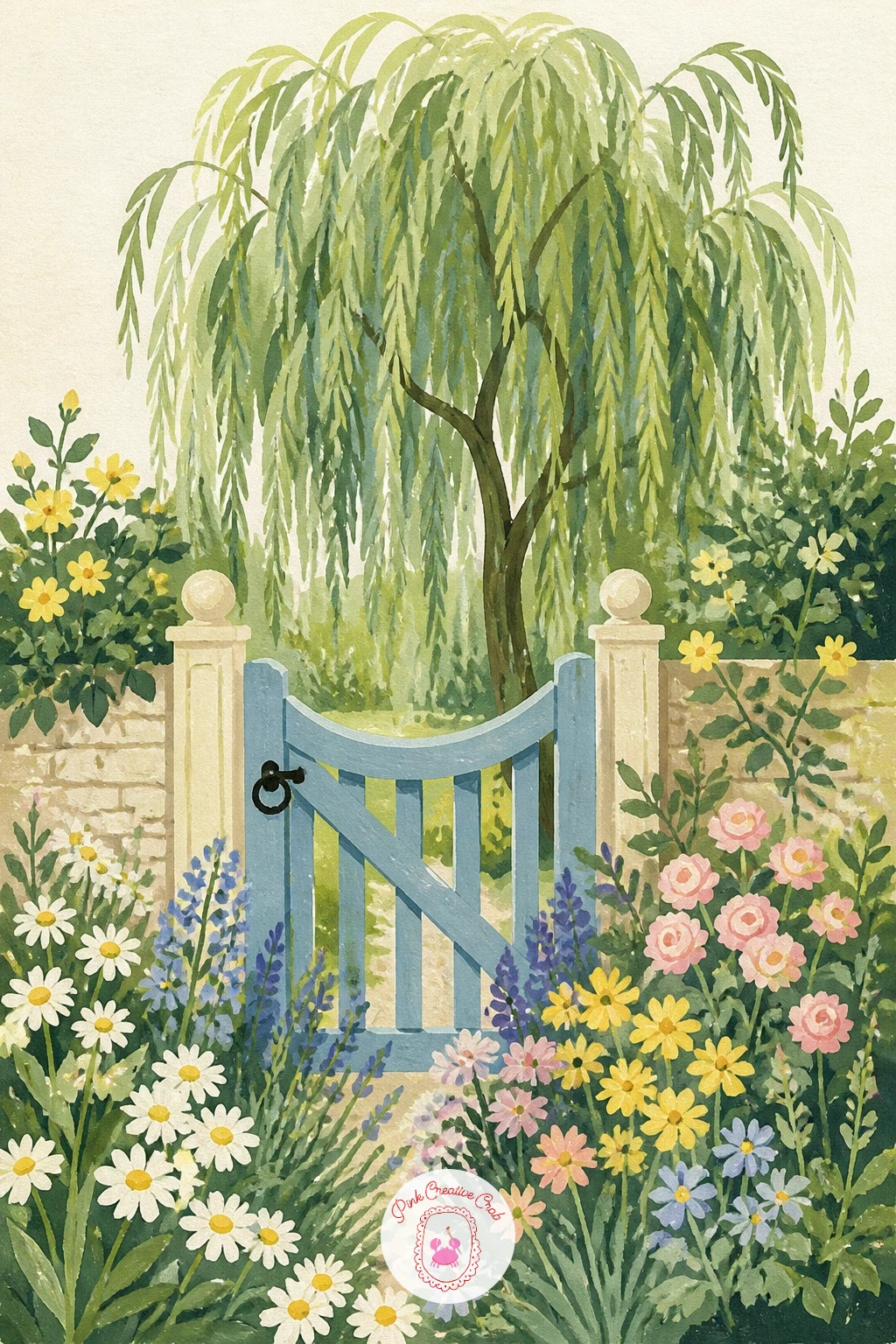
Palette: Sap Green,Dusty Pink,Soft Lavender,Cream
Place the willow at the edge of a lake with simple mountain shapes rising behind it, giving the scene real depth without much extra work. Paint the mountains first as flat pale blue-grey triangles furthest back, then the lake as a mid blue band, and only then the willow in front, darker and more detailed than anything behind it.
That order, back to front, light to dark, is the whole trick to perspective here: things further away stay paler and flatter, while the willow close to you carries the richest color and the only real texture.
A frequent mistake is making the mountains too detailed, which pulls them forward and flattens the depth you just built. Keep them as plain, soft shapes with no texture at all.
If you want the water to feel glassier, add one thin horizontal line of the mountain’s color reflected faintly in the lake.
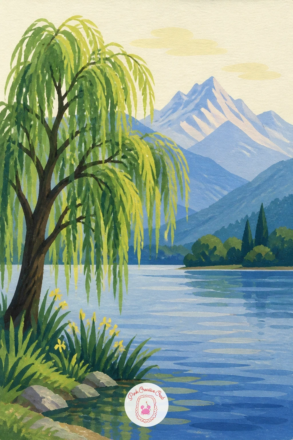
Palette: Pale Blue-Grey,Mid Blue,Sap Green,Cream
Strip the willow back to its bare winter shape beside a simple park bench dusted with snow. Paint the ground first as a flat pale blue-white shape, then the bare branches in warm grey-brown over the top, letting the paper’s cream show through as the lightest snow highlight rather than mixing a separate white.
The bench gives you a useful size reference: paint it first at a clear, believable scale, then build the willow’s trunk so it stands roughly three or four bench-heights tall, which keeps the whole scene in proportion.
Bare branches often end up looking like a tangle. Paint the main limbs first, let them dry, then add only a few of the thinnest twigs on top rather than every single one.
A dab of white gouache flicked from a stiff brush adds a light scatter of falling snow if you want more atmosphere.

You Will Need
- white gel pen or stiff brush for flicked snow
Palette: Warm Grey,Pale Blue-White,Soft Blue,Cream
Paint the willow’s hanging branches as a loose curtain around a small picnic tucked just inside, so the scene feels like a secret room. Start with the branches as the outer frame, long vertical strokes of green from top to bottom, leaving a clear gap in the centre where the picnic will sit.
Build the picnic itself with a few flat shapes: a blanket, a basket, maybe a plate, kept simple since they are the detail inside a much larger frame.
The branches can easily swallow the picnic if they are painted too dark or too dense in front of it. Keep the branches nearest the viewer a touch lighter in value so the eye reads through them to the scene behind.
If you prefer a bolder version, add one warm patch of sunlight falling through a gap in the branches directly onto the blanket.
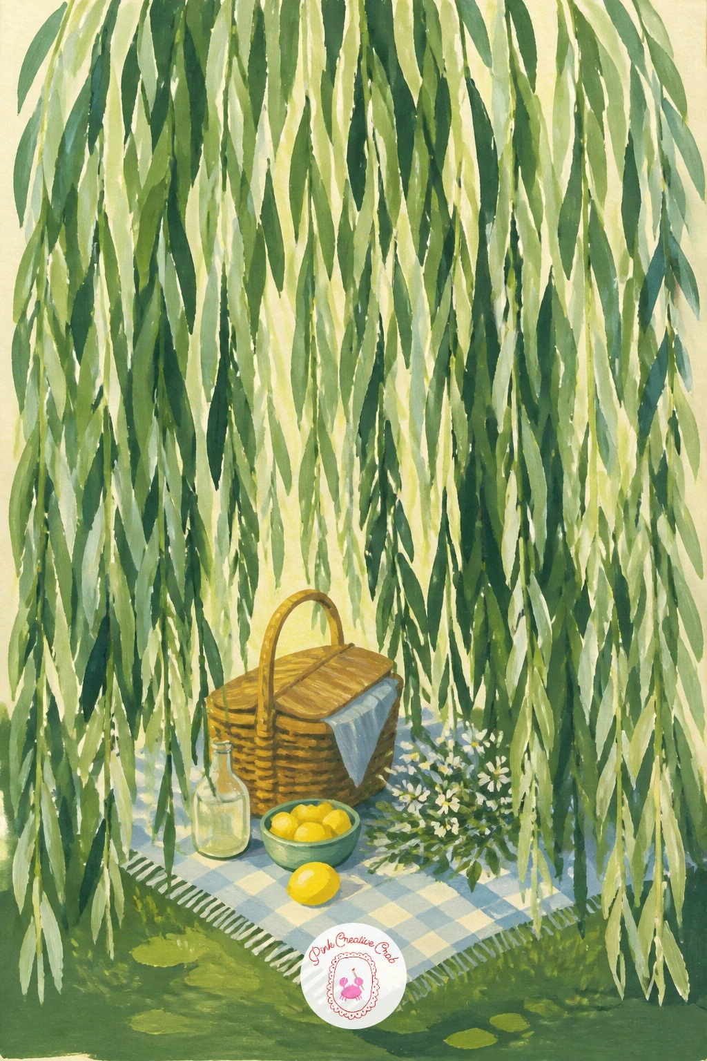
Palette: Sap Green,Warm Brown,Dusty Pink,Cream
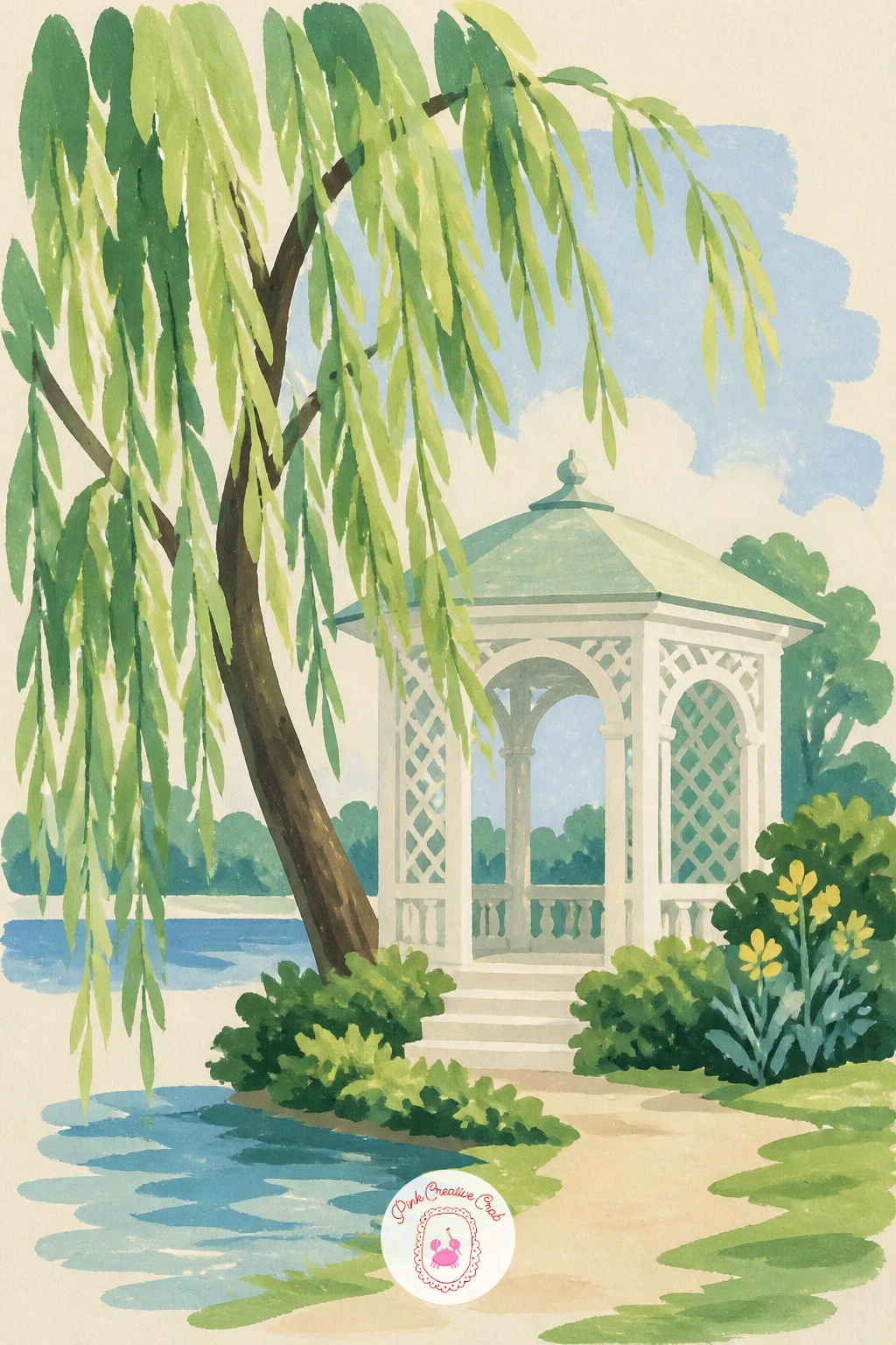
Give the willow a touch of elegance with a small garden pavilion beside it, its white columns and pointed roof contrasting against the tree’s soft lines. Paint the pavilion first as flat white or cream shapes with a few thin dark lines marking the columns, then let the willow lean in from one side.
Keep the roofline straight and the columns evenly spaced before the willow’s branches cross over them, since a wobbly pavilion will look unfinished no matter how well the tree turns out.
If the white pavilion disappears into the cream background, add a thin pale grey shadow line along its base and roof edge to lift it forward from the paper.
A light wash of soft blue behind both shapes unifies the whole scene without adding any extra detail.
Palette: Cream White,Sap Green,Soft Blue,Warm Grey
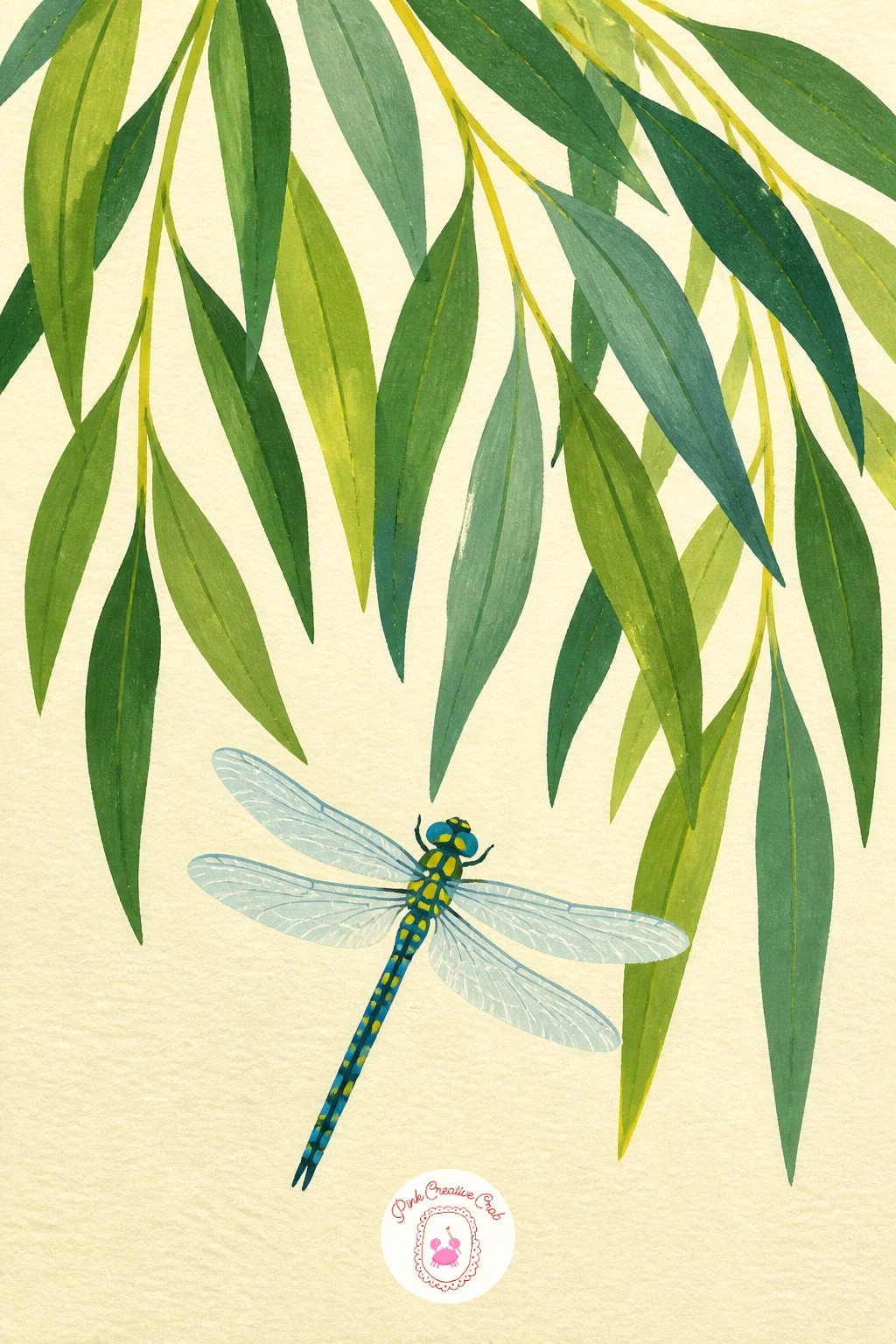
Zoom in closer than most of these scenes and let a single dragonfly hover beneath a cluster of willow leaves. Paint the leaf cluster first as a loose group of simple elongated shapes in two greens, then add the dragonfly last as a thin body and two pairs of wings, kept pale and slightly transparent looking against the green.
For the wings, thin the gouache with a little more water than usual so the color goes on almost see-through, which reads instantly as insect wing rather than solid shape.
Dragonflies often end up looking stiff if the wings are placed symmetrically and flat. Angle one pair slightly higher than the other, as if caught mid-flight, and the whole insect feels more alive.
No fine brush available, the very tip of a round brush dipped lightly gives the same delicate line for the wing edges.
Palette: Sap Green,Soft Blue,Pale Green,Cream
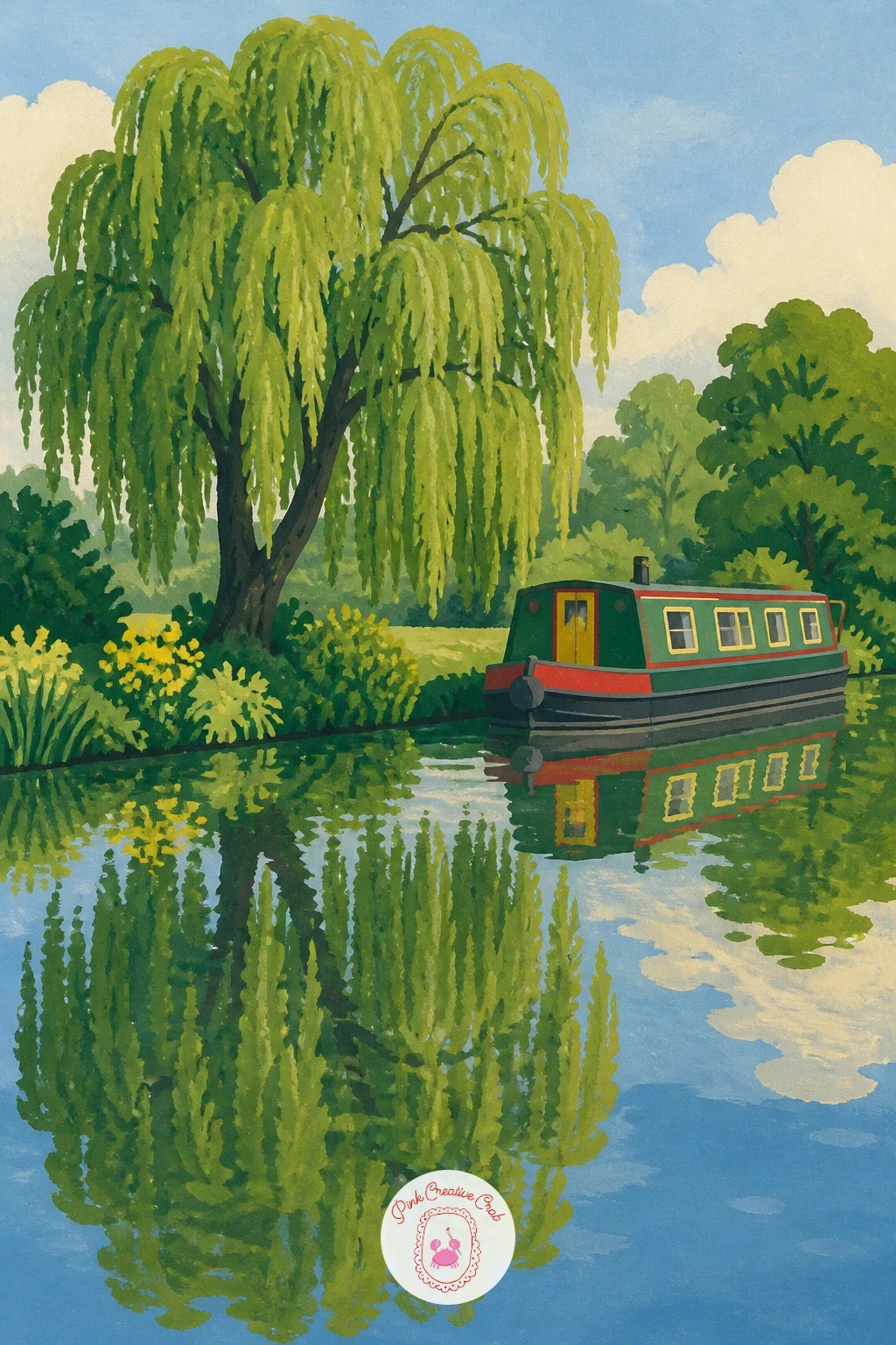
Move the willow to a canal bank and let a narrowboat drift past below it, with the tree’s reflection breaking gently in the water’s surface. Paint the boat first as a long flat shape with a simple cabin, in one or two bold colors, then the willow above it, and only last the reflection of both in the canal, smudged slightly softer than the originals.
To get a convincing reflection, flip your reference mentally and paint the mirrored shapes slightly shorter and less saturated than what sits above the waterline, since reflections always read a touch duller than the real thing.
A flat mirror-still reflection can look lifeless. Drag a dry brush lightly across the reflected area in one direction to suggest the faintest ripple without losing the mirrored shape.
If you enjoy this kind of water study, the reflection tricks here carry straight over into pond paintings as well.
Palette: Barn Red,Sap Green,Mid Blue,Cream
Paint the willow almost fading into mist along a quiet riverbank at first light. Lay down a very pale, slightly uneven wash across the whole background first, pale pink-grey for the dawn sky, before any part of the willow goes in, so the tree sits inside the mist rather than on top of a white page.
The willow itself should lose definition the further it sits back from the water’s edge: the nearest branches painted with clear edges, while any trees further along the bank get softened and lighter in value to suggest the mist swallowing them.
The mistake here is painting every tree with equal detail, which kills the sense of distance entirely. Pick one willow to be sharp and let everything else go soft.
A barely-there warm yellow glow low on the horizon, just a hint, sells the dawn light without needing a full sunrise.

Palette: Pale Pink-Grey,Soft Blue,Sap Green,Butter Yellow
Try this one on slightly damp paper so the pale background wash spreads a little on its own, giving the mist a natural soft edge before you add any crisp detail on top.
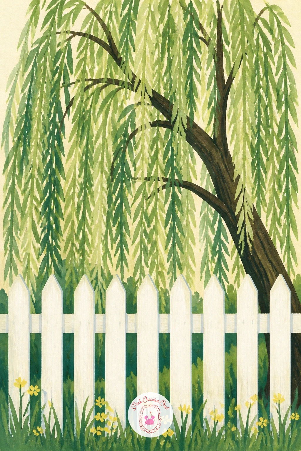
Set the willow just behind a simple white picket fence, letting the fence’s regular rhythm contrast with the tree’s loose, drooping shapes. Paint the fence first as a row of evenly spaced flat white rectangles with thin grey shadow lines along one side of each post, then bring the willow in behind, its branches overlapping the fence top in a few places.
Measure the fence posts against each other before painting, keeping their spacing and height consistent, since an uneven fence reads as a mistake while an uneven willow just reads as nature.
If the white posts vanish against the cream background, that same thin grey shadow line along their base lifts them forward just enough to register clearly.
A single branch drooping low enough to rest against the fence top ties the two shapes together nicely.
Palette: Cream White,Warm Grey,Sap Green,Soft Blue
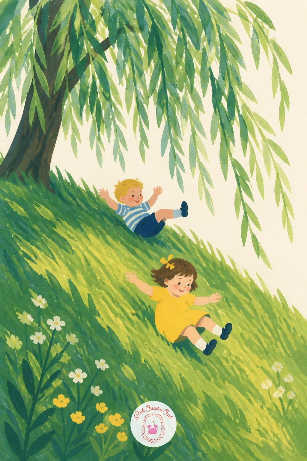
Add movement to the scene with two small children rolling down a grassy bank beneath the willow’s shade. Paint the hill first as one flat sloped green shape, then place the children as simple rounded forms, limbs tucked in, painted at a slight diagonal angle to suggest the roll rather than a standing pose.
Keep both figures small against the hill and the willow above, no more than a sixth of the tree’s height, which keeps the scale of the whole scene readable and the willow firmly in charge of the composition.
Figures in motion often end up looking frozen if every limb is drawn too neatly. Let the arms and legs overlap the body slightly rather than spreading them out cleanly, and the tumbling feels more convincing.
If figures feel tricky, start with just one child and add the second only once the first looks right.
Palette: Sap Green,Dusty Pink,Butter Yellow,Cream
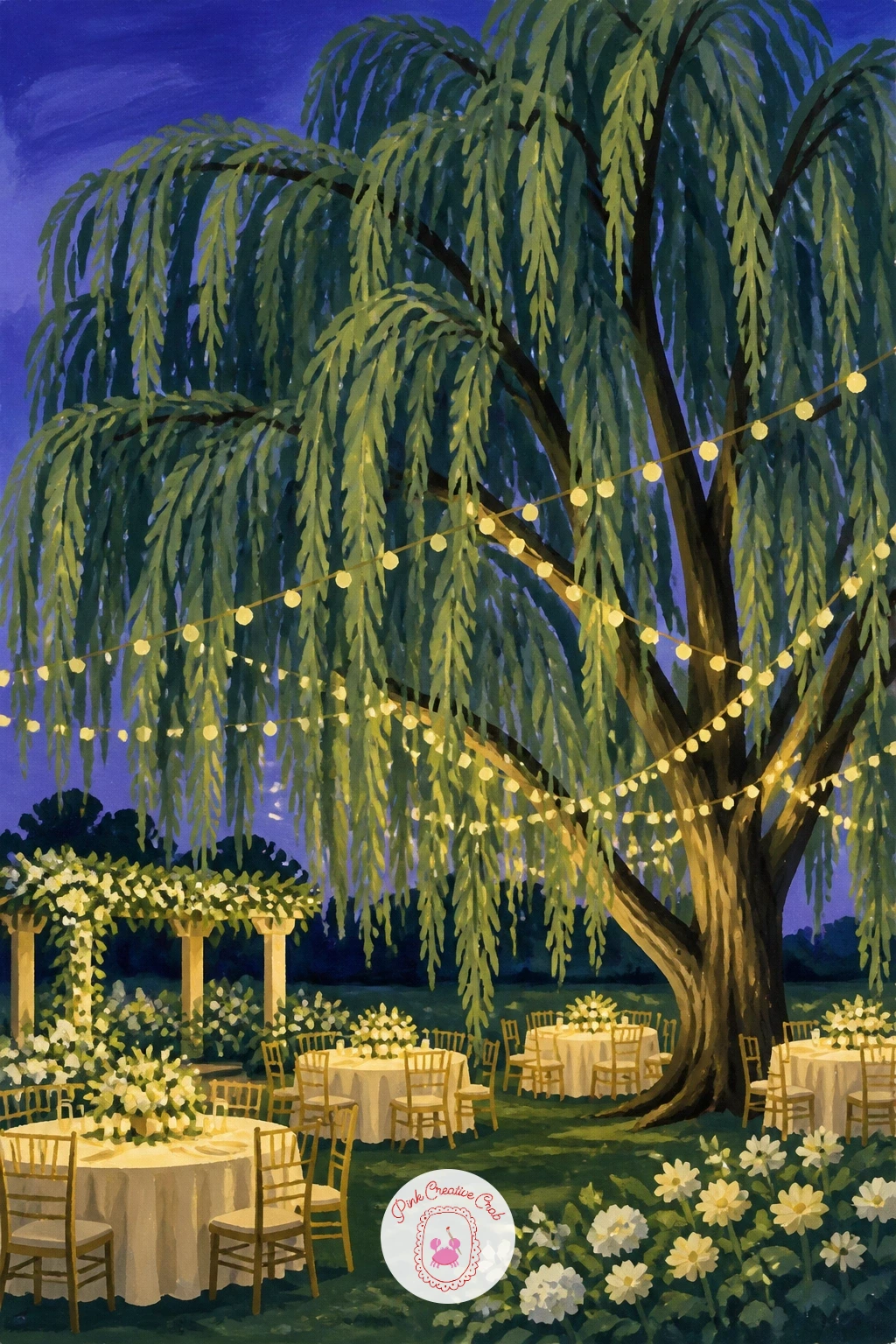
Dress the willow up for an evening wedding by hanging a string of small lights through its branches. Paint the willow and a soft dusk sky first, a deeper blue-violet than the daytime scenes, then add the string lights last as a loose curved line of tiny butter yellow dots following the natural droop of a branch.
Keep the dots irregular in spacing rather than perfectly even, which looks more like real string lights caught mid-swag than a printed pattern.
The background needs to stay dark enough for the lights to glow convincingly. If your dusk sky dries too pale, a second thin layer of the same blue-violet deepens it without losing the smooth flat finish.
A tiny white gel pen dot at the centre of each light, added once the gouache is fully dry, gives a believable spark of highlight.
You Will Need
- white gel pen for light highlights
Palette: Blue-Violet,Sap Green,Butter Yellow,Cream
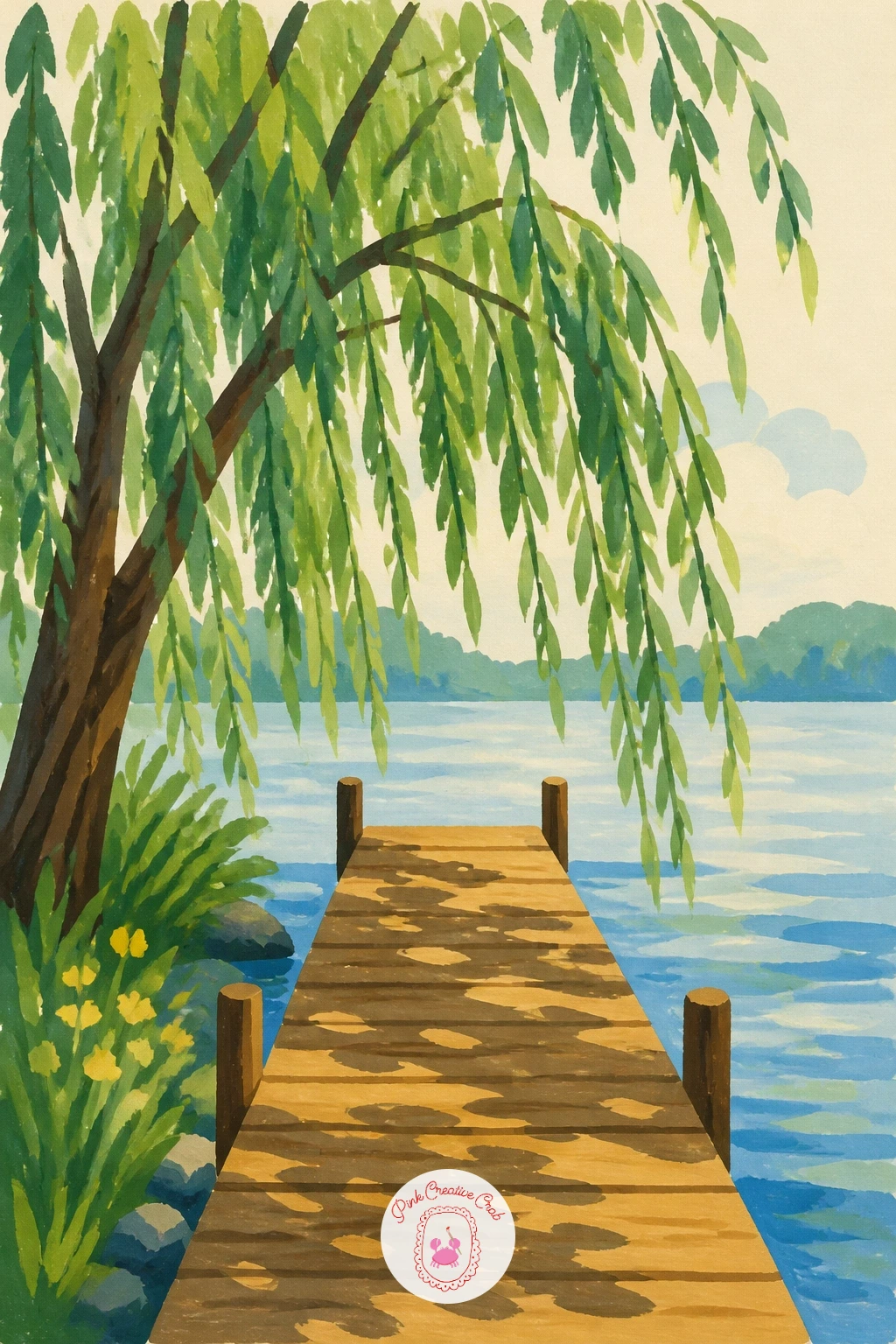
Let the willow lean out over a simple wooden dock reaching into calm water. Paint the dock first as a row of flat plank shapes in a warm wood tone, slightly narrower as they recede toward the water to suggest the angle, then bring the willow in from one side, its branches reaching partway across the dock’s end.
That narrowing of the planks is the whole perspective trick here: wider boards closest to you, narrower further out, which makes the dock recede convincingly without any complicated vanishing point work.
Dock planks can look like a flat ladder if every gap between them is identical. Vary the width of the gaps slightly and add one or two thin dark lines for shadow between planks nearest the willow.
If wood tones run too orange, a touch of Payne’s grey mixed in cools it down to a more weathered look.
Palette: Warm Wood,Payne’s Grey,Sap Green,Soft Blue
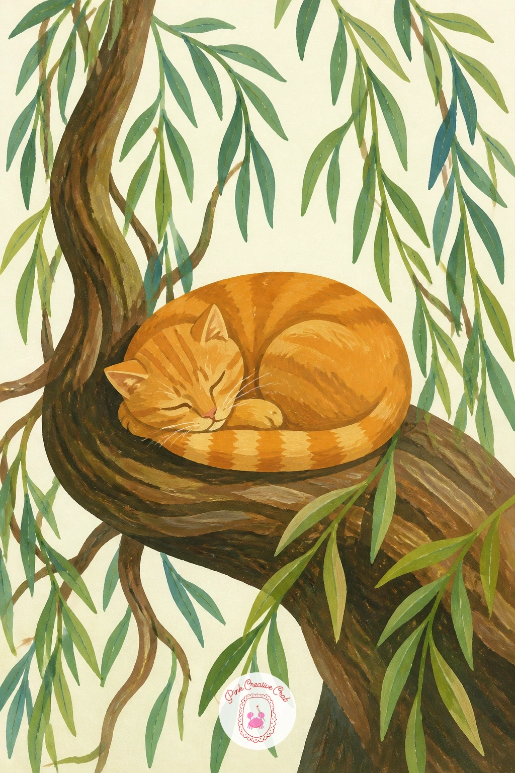
Tuck a napping cat onto one of the willow’s thick exposed roots for a quiet, cosy focal point low on the page. Paint the root first as a smooth curved shape in warm brown, raised slightly above the ground line, then add the cat curled on top as one simple rounded form with a tucked tail and closed eyes.
Keep the cat’s shape compact and egg-like rather than drawing out separate legs and paws, since a sleeping cat reads best as a few soft curves rather than an anatomically precise pose.
If the cat’s fur color is too close to the root beneath it, a thin line of darker brown where the two meet separates them clearly without any extra shading.
Orange tabby, grey, or solid black all work equally well here, so pick whichever color sits best against your willow’s green.
Palette: Warm Brown,Burnt Orange,Sap Green,Cream
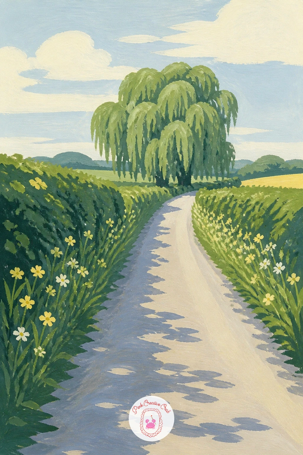
Place the willow at the far end of a long, narrowing country lane, using the road itself to pull the eye straight toward the tree. Paint the lane first as two converging lines of pale dusty color, wider at the bottom of the page and meeting in a point near the willow, then the hedgerows along each side in flat green before the willow goes in last at the vanishing point.
That converging lane is a straightforward way to handle perspective: the willow sitting exactly where the two lines meet will automatically feel like the furthest point in the scene, without any extra tricks needed.
If the lane looks too empty, a single fence post or a patch of longer grass along one edge gives the eye somewhere to rest on the way to the tree.
Keep the willow itself smaller and less detailed than the trees you’d paint up close, since its distance is what makes the lane feel long.
Palette: Dusty Tan,Sap Green,Soft Blue,Cream
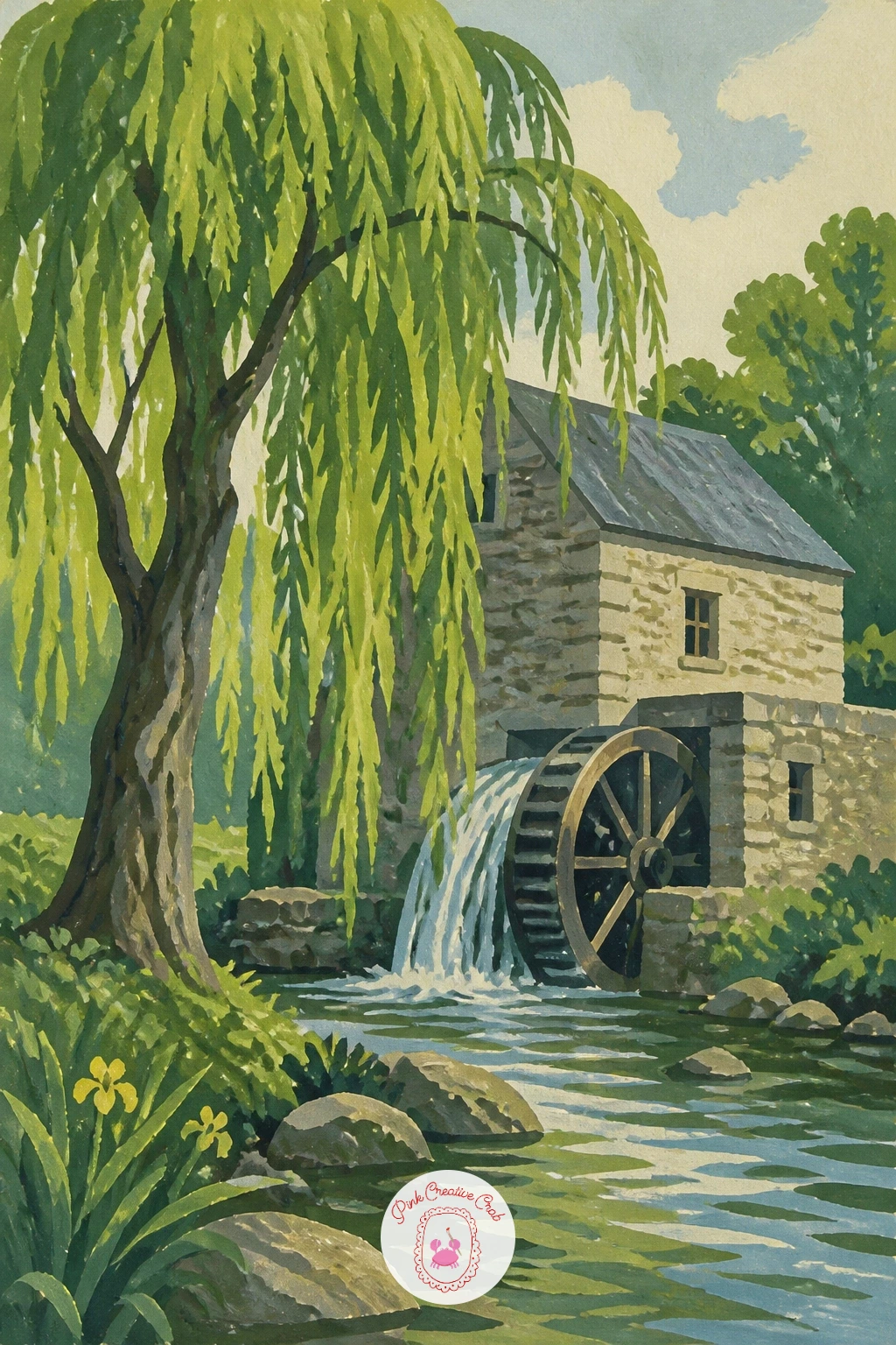
Give the willow a working companion in the form of an old water mill, its wheel sitting half in the stream below the tree. Paint the mill building first as a simple flat structure with a pitched roof, then the wheel as a circle divided into simple spokes, partly overlapped by the water’s edge, before the willow leans in from the side.
A plate or a round lid traced lightly in pencil keeps the wheel properly circular before you paint it, which matters more here than almost anywhere else in this list since a lopsided wheel is hard to miss.
Keep the wheel’s lower half slightly darker and more blended into the water shape to suggest it sits partly submerged, while the upper half stays crisp and flat like the rest of the scene.
If stone walls feel flat, the same dry brush technique used for the stone bridge earlier adds a little texture here too.
You Will Need
- plate or round lid to trace the mill wheel
Palette: Warm Grey,Sap Green,Soft Blue,Warm Brown
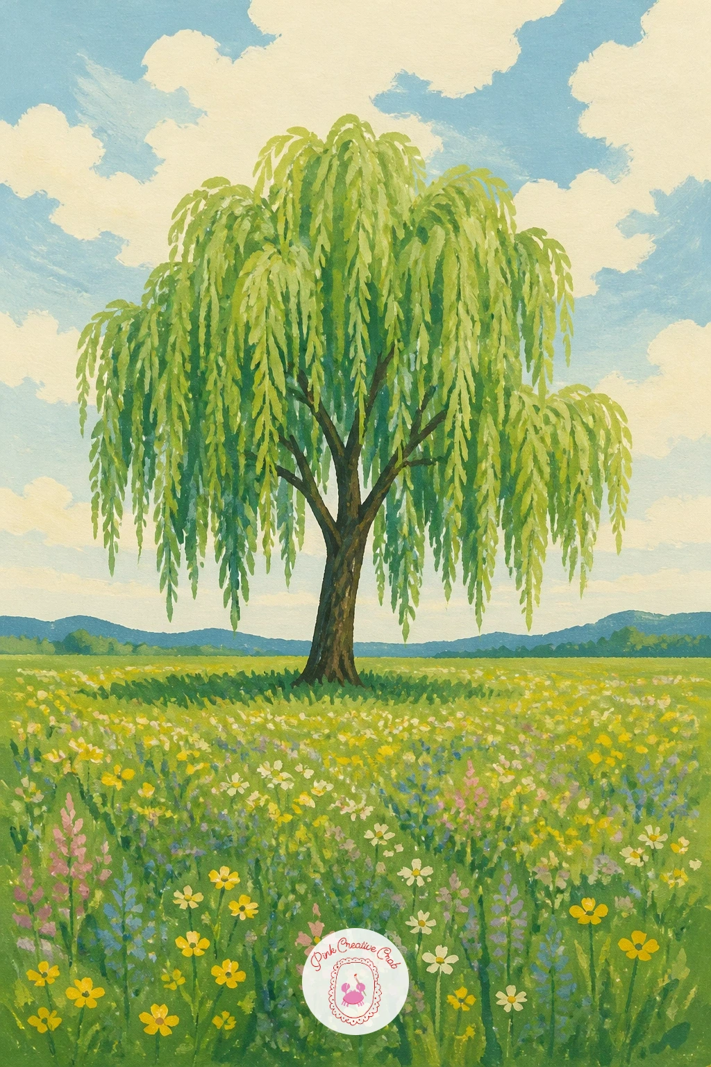
Stand a single willow alone in the middle of an open meadow scattered with wildflowers, giving it room to breathe on the page. Paint the meadow first as a broad flat green field, then scatter small dabs of color across it for flowers before the willow goes in as the one tall shape rising from all that flatness.
Vary the flower dabs in size and keep most of them clustered toward the lower half of the page, leaving the area right around the willow’s base a little clearer, which keeps the tree readable as the main subject rather than lost in the scatter.
A meadow painted with flowers of identical size across the whole page looks more like wallpaper than a field. Mix a few larger blooms near the front with smaller, quicker dabs further back.
No time for a detailed meadow, the ten-minute version is just the willow and a simple green field with a handful of flower dabs near the base.
Palette: Sap Green,Dusty Pink,Butter Yellow,Soft Lavender
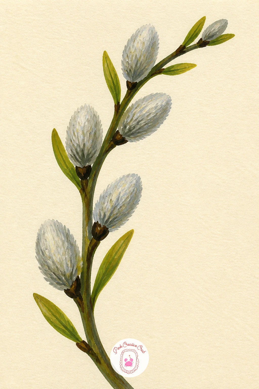
Move in close for this one and paint just a single willow branch carrying soft grey catkins, filling the page with detail rather than a whole landscape. Paint the branch itself first as one confident curving line, then add the catkins along it as small soft oval dabs in pale grey-green, slightly fuzzy at the edges.
To get that soft, fuzzy catkin edge, dab the paint on with a slightly dry brush and leave the edges uneven rather than painting a clean outline, since a hard edge instantly looks wrong for something this soft.
Keep the background completely plain, just the light cream page, so nothing competes with the texture of the catkins themselves.
If catkins look too flat and round, a few tiny flicks of a darker grey along one side of each gives them just enough shadow to feel three-dimensional.
Palette: Pale Grey-Green,Warm Grey,Olive Green,Cream
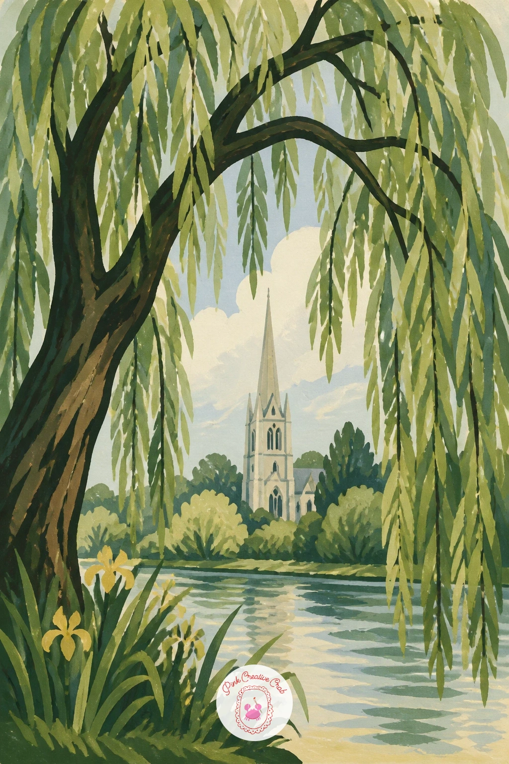
Use the willow as a natural frame for a distant church spire rising beyond it. Paint the spire first as a simple pale triangle and thin rectangle far in the background, kept light and soft in value, then build the willow up large in the foreground so its branches arch over and around the spire without fully hiding it.
That size difference, a small pale spire against a large detailed willow, is what sells the distance between them, so resist the urge to paint the spire with much detail at all.
Leave a clear gap in the willow’s branches directly in front of the spire so it stays visible rather than swallowed by foliage, which is the easiest way this idea goes wrong.
A faint wash of pale blue behind the spire helps push it further back in space before the willow goes in on top.
Palette: Pale Grey,Soft Blue,Sap Green,Cream
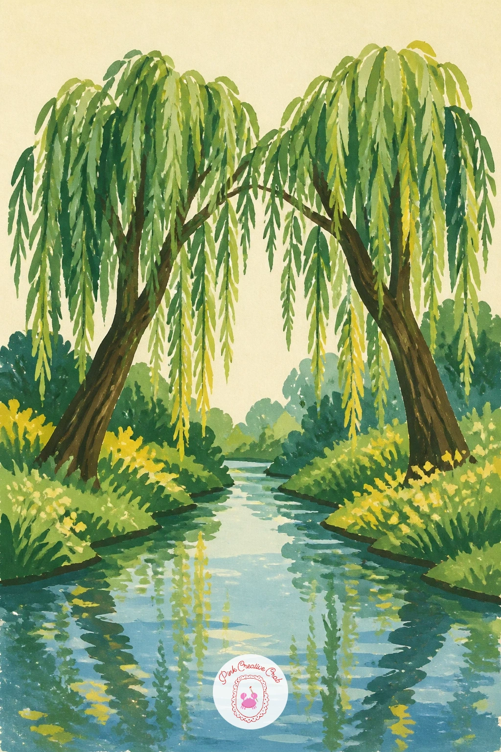
Close the series with two willows leaning toward each other from opposite banks of a narrow stream, their branches almost meeting in the middle. Paint one willow fully first, from trunk to hanging branches, then the second on the facing bank, keeping it slightly smaller or lighter in value so the two don’t compete equally for attention.
Once this pairing works, vary it next time by changing the season, the same two leaning willows look completely different painted bare in winter or golden in autumn, using the color shifts from earlier ideas in this list.
The stream between them should stay a simple flat band of blue, with just a thin reflection of each willow dipping slightly toward the centre where the branches nearly touch.
If the two trees end up looking identical, change the angle or height of one trunk slightly, since real paired trees are never perfect mirrors of each other.
Palette: Sap Green,Soft Blue,Warm Brown,Cream
Once this composition feels comfortable, it is worth revisiting the quiet water studies in watercolor pond ideas for more reflection and stream techniques that suit this same gentle mood.
What to Do Next
Pick whichever willow matches the time you actually have today, a quick branch close-up if you have ten minutes, a full pond or canal scene if you have the whole afternoon. Tape a sheet of cold press paper down first, mix your greens before you start, and let the tree lead the way from there.
Frequently Asked Questions
What gouache colors do you need for a willow tree painting?
A basic set covers it: a mid green, a darker green, a warm brown for bark, soft blue for sky or water, and one warm yellow accent. These five mix into nearly every scene in this list.
How do you paint willow branches so they don’t look stiff?
Vary the length and angle of each hanging branch rather than repeating the same curve. A few branches reaching further down than others makes the whole tree feel windblown and natural instead of symmetrical.
Is gouache or watercolor better for painting a willow tree?
Gouache suits a flat, graphic willow with clean edges, since it stays opaque and layers well once dry. Watercolor gives softer, more blended foliage, so choose based on the crisp or loose look you want.
What paper works best for gouache willow paintings?
Cold press watercolor paper or illustration board handles gouache best, since it takes several flat layers without warping. Tape the edges down first if you plan to use more than one or two washes.
How do you keep a willow’s reflection from looking like a copy of the tree?
Paint the reflection slightly softer, darker and less detailed than the willow itself. Dragging a dry brush once across the water in one direction also breaks up the mirror just enough to feel like real water.
Have any thoughts?
Share your reaction or leave a quick response — we’d love to hear what you think!
-
 0
-
0
-
0
-
0
-
0
-
0


