

Train station drawing gives you a whole world of little scenes without ever leaving your sketchbook: a clock above a crowd, a dog waiting by the tracks, steam curling off an old engine. Stations are full of shapes that already want to be drawn, the long lines of the platform, the arches of a roof, the small human moments that happen in between trains.
Below are 27 stations big and small, each one built from a thin fineliner outline and smooth alcohol marker color, so you can pick whichever moment catches you and finish it today. Work down the list from the simplest platform to the busiest station hall, or just jump to the one that matches the trip you wish you were taking.
Using these images: free for personal projects such as printing, coloring, cards, journals and gifts. Handmade items that include them may be sold up to 30 pieces per design. More than that is commercial use and is not permitted, and neither is selling or sharing the images themselves or passing them off as your own. Please ask before any other use.
Start with the simplest station on the list: one small platform, a wooden bench, and a flower bed running along the edge of the track. Block in the station building first as a low rectangle with a sloped roof, then draw the platform edge as a single long line running toward the corner of the page so the whole scene has somewhere to go.
Outline the bench and the flower bed in fineliner before any color touches the paper, keeping the flowers as simple round clusters rather than individual petals. This is the easiest place on the page to lose proportion, since a bench drawn too tall will make the whole station feel like a dollhouse, so measure the bench against the station door and keep it roughly half that height.
Lay cream and soft green marker across the building and grass first, then drop in warm pink and yellow for the flower bed last, while the other colors are still wet enough to blend softly at the edges. If you do not have a pink marker, a warm red worked lightly over the yellow gives the same effect.
Keep the sky as plain paper or one pale grey-blue strip so the flower bed stays the brightest thing in the picture.
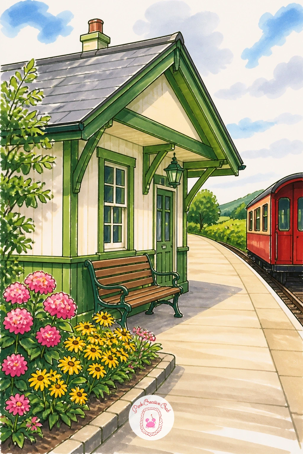
Palette: Sap Green,Cream,Warm Pink,Soft Yellow
Once a small platform feels comfortable, try the station hall, the kind with a great arched glass roof holding up the whole sky. Draw the roof first as a series of curved ribs meeting at the top, all converging toward one point near the center of the page, since this one point is what makes the hall feel like it goes back into distance rather than sitting flat.
Sketch the floor level next with a horizon line about a third of the way up the page, then add tiny figures along it for scale, no more than simple standing shapes with a line for shoulders and legs. The glass panes are the part that usually goes wrong if you draw every single one, so group them in rows of three or four and let the fineliner lines get looser toward the edges of the roof.
Color the roof in pale grey-blue with white left for the glass glare, then warm the floor and walls in cream so the whole hall feels lit from above. A grey marker swapped for light blue colored pencil gives a softer, hazier glass if your markers run too dark.
Finish by adding one or two tiny red details, a suitcase or a coat, so the eye has somewhere to land in all that open space.
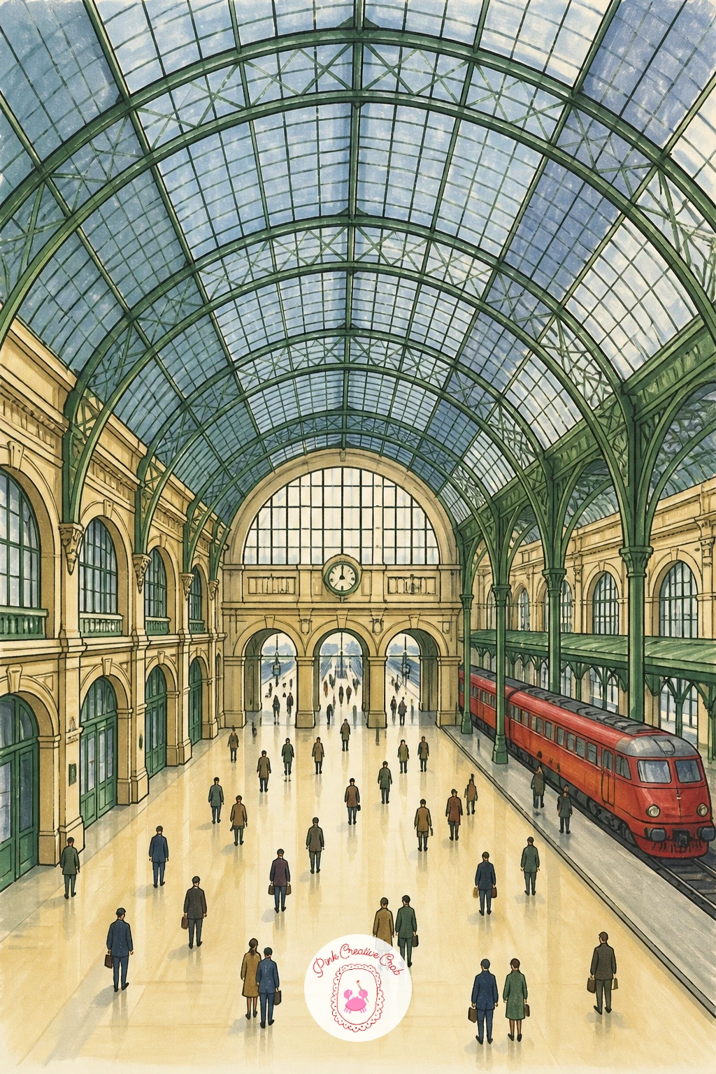
Palette: Payne’s Grey,Pale Blue,Cream,Red Accent
Look at one real photograph of a glass-roofed station before you start, just to see how the ribs actually curve; it saves a lot of guessing with the perspective lines.
Move from architecture to a human moment: two figures standing close together on an otherwise empty platform, a suitcase at their feet. Block both figures in as simple standing shapes first, one slightly turned toward the other, before you add any clothing or faces, since getting the two heights and the gap between them right matters more than any detail that comes after.
A good proportion check is to compare both heads to the suitcase beside them, a suitcase usually reaches about knee height on an adult figure, and that single comparison keeps the whole pair from floating out of scale with their own luggage. Draw the platform edge and one lamp post behind them to anchor the scene, then let the train itself stay mostly off to one side or even just implied by a sliver of red at the edge of the page.
Color the coats in muted tones, a soft grey and a deeper green work well together, and save the red for one small accent, a scarf or the edge of the train, so the eye goes straight to the couple. If faces feel tricky, turn both figures three-quarter away from the viewer so you only need to suggest a cheek and jaw line.
Keep the background plain so nothing competes with this quiet pause before the train pulls away.
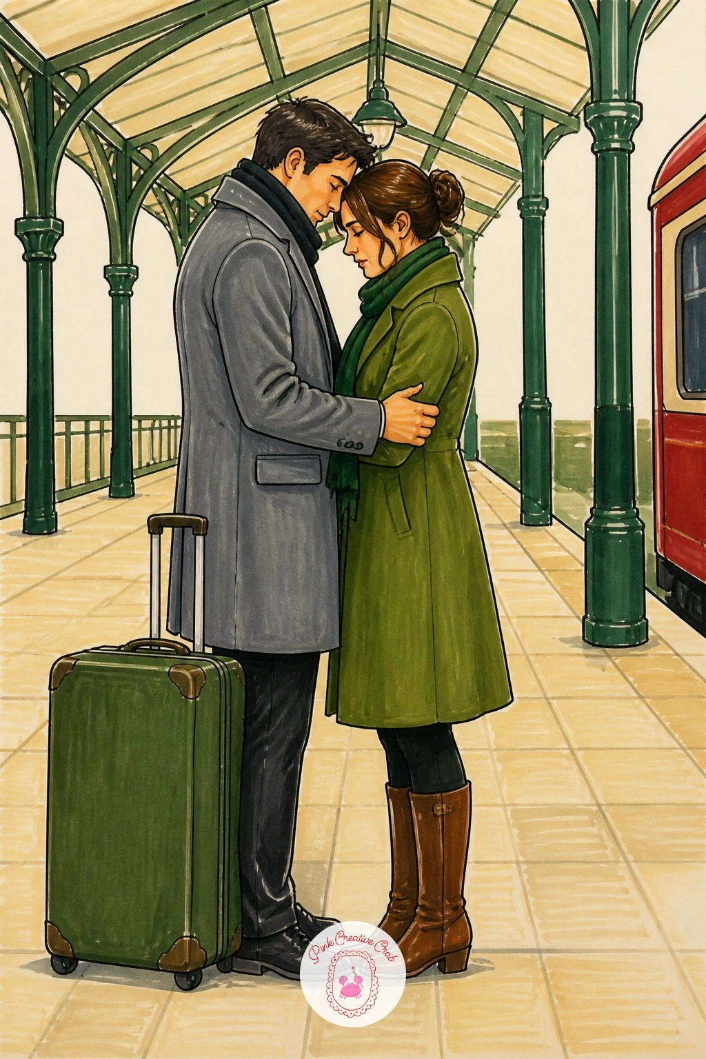
Palette: Payne’s Grey,Forest Green,Cream,Red Accent
Bring the clock into focus next, the big round face that every station seems to have hanging somewhere over the middle of the hall. Draw the circle first with a plate or a round lid for a clean edge, then place the hour marks before the hands, since guessing the hands first almost always leaves them floating off center.
Shift the eye level low, as if you are standing on the floor looking up, which means the bottom of the clock’s bracket shows more than its top and the crowd below gets drawn from slightly beneath, heads tilted up toward the clock rather than straight ahead. This single change in eye level does more to make the scene feel busy and real than any extra figures would.
Keep the crowd as loose silhouettes in grey and cream, varying the heights and the tilt of a few heads, with no faces needed at the small scale they sit at under the clock. A black fineliner alone for the crowd, with color saved only for the clock face and one coat, keeps the composition calm.
Finish the clock face in cream with black numerals so it reads clearly even from across the room.
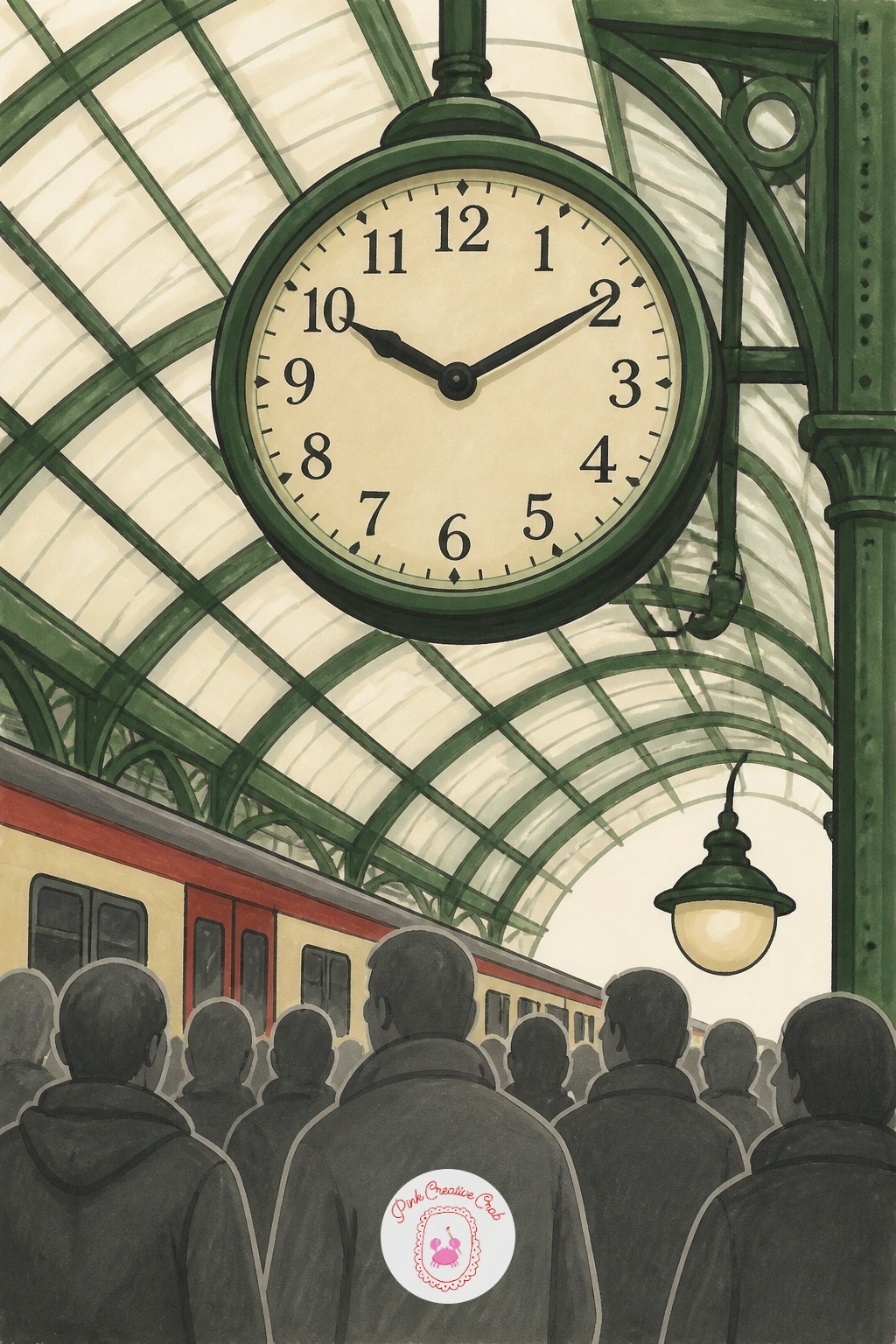
Palette: Cream,Payne’s Grey,Charcoal,Red Accent
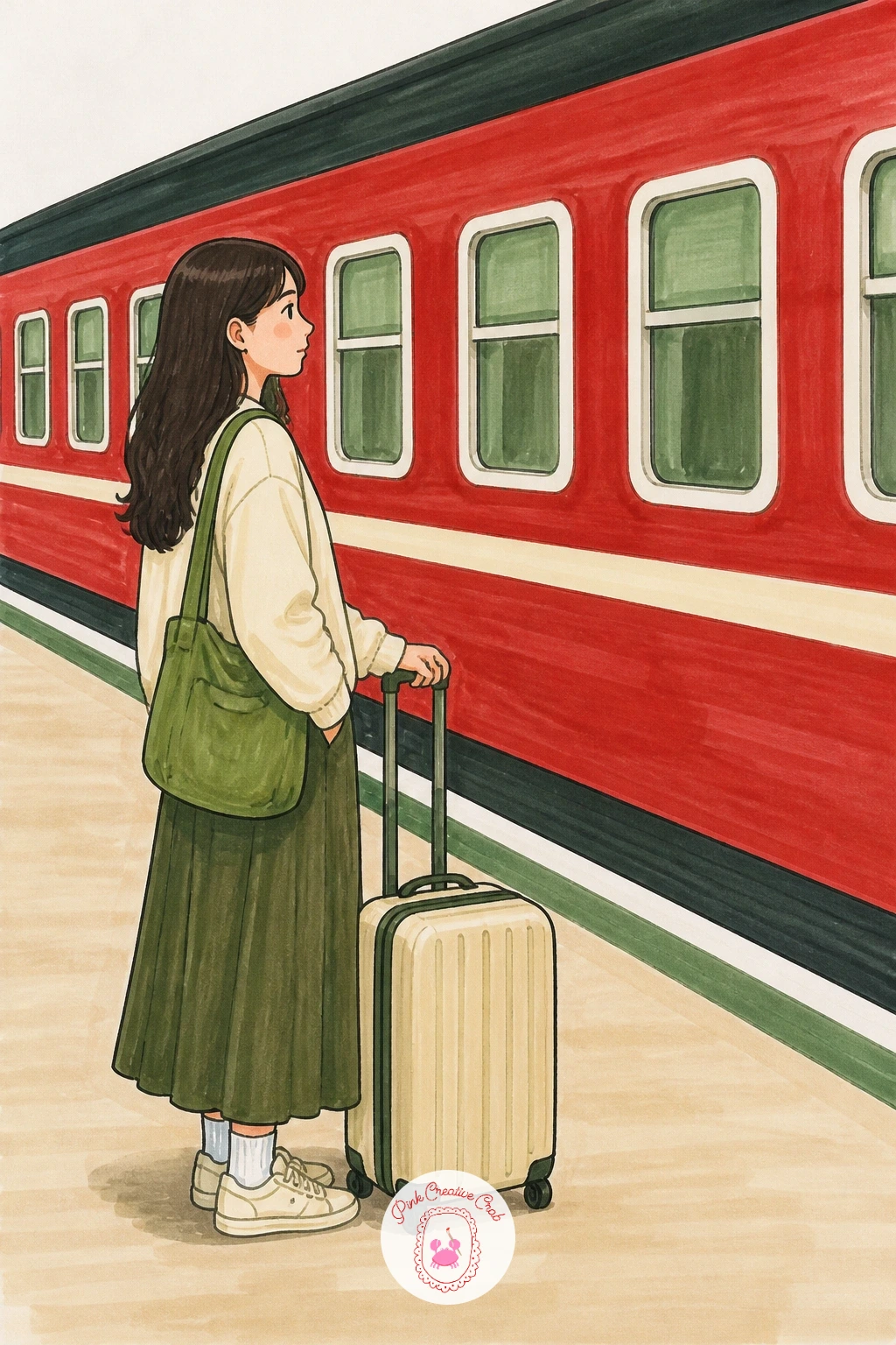
Give one figure the whole page this time: a girl standing beside her suitcase, waiting with the train’s long red side filling the background behind her. Draw the train carriage first as a single long rectangle running the width of the page, with just enough window shapes repeated along it to read as a train without drawing every rivet.
Build the girl next, starting with a simple standing pose, weight on one hip, one hand resting on the suitcase handle, which reads as patient waiting far better than a stiff straight stance. For a quick ten-minute version, leave her coat as one flat block of color and the train as flat red with white windows; for a fuller forty-minute version, add a shadow under the suitcase and a second, paler red tone along the lower half of the train to suggest reflected platform light.
Color the train last so its red does not bleed into her coat while everything is still wet, and keep her clothing in a color that contrasts, mustard or soft blue both sit nicely against station red.
If red markers run patchy on a large area, lay a pale pink base first and build the red over it in two thin layers.
Palette: Red Accent,Mustard,Cream,Soft Blue
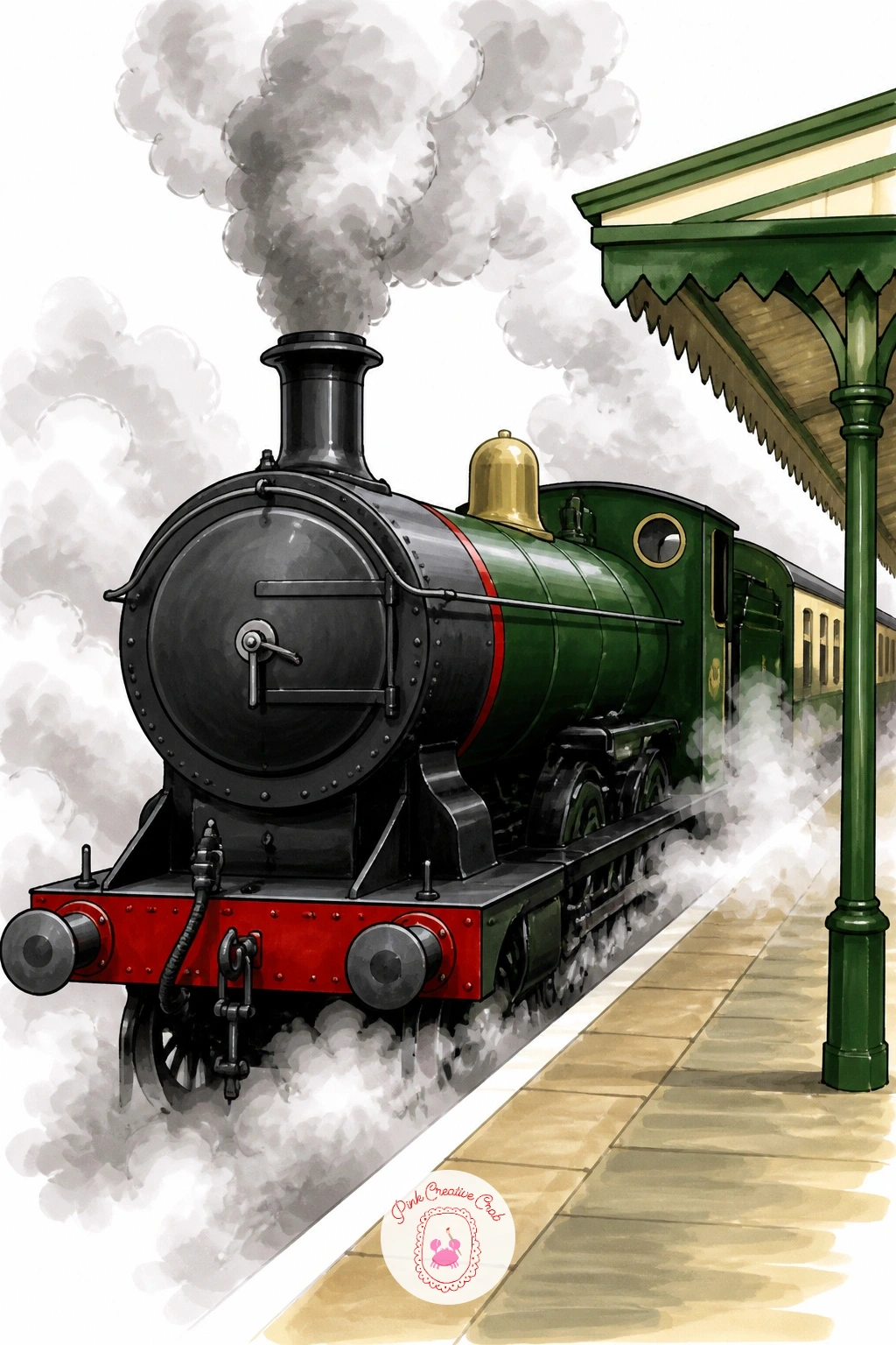
Steam trains ask for a little more confidence with shape, so start with the engine’s rounded front and the big circular wheels, keeping the boiler as one long cylinder rather than a collection of separate parts. Draw the platform edge low in the frame so most of the page is left for the engine itself and the cloud of steam rising off it.
The steam is the part most people either overdo or leave looking stiff, so work it with a dry brush marker technique: color the cloud shapes with a light grey marker, then go back over the edges with an almost-dry marker tip dragged outward, which softens the line into something closer to real vapor than a hard-edged cartoon puff.
Keep the engine itself in deep green or black with one red accent band along the boiler, since a fully red engine will fight with the red you are saving for smaller details elsewhere in the article’s scenes. White gel pen flicked lightly over the darkest steam shapes afterward adds a last touch of highlight without redrawing anything.
If you do not have grey markers for the steam, cotton-wool-soft pencil shading under a thin wash of marker gives a similar effect.
You Will Need
- white gel pen
Palette: Forest Green,Charcoal,Pale Grey,Red Accent
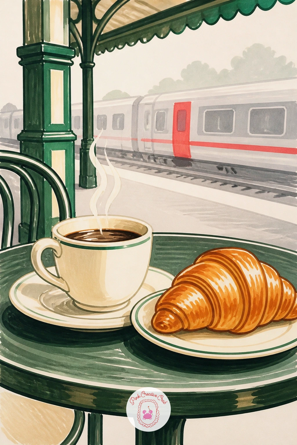
Pull back from the tracks for a quieter corner: a small cafe table at the edge of the platform, a coffee cup and a croissant sitting on it. Draw the table and the two objects first at a fairly large scale, since this idea works best filling most of the page rather than sitting small in a busy station scene.
Shade the coffee cup’s curve with a single darker ring of marker around its base to suggest the table surface catching a shadow, and use the croissant’s crescent shape as a chance to practice short, curved pen strokes radiating out from its center for texture, rather than one smooth outline. Warm golden-brown over the croissant and a rich dark brown in the cup, with a thin cream ring left unmarked at the rim, keeps both objects looking appetizing rather than flat.
A station sign or a blurred train shape sketched loosely behind the table in pale grey gives just enough context to place this cafe scene inside a station without pulling focus from the food. Anyone drawing cafe interiors a lot might enjoy the watercolor European cafe scenes for more table-and-cup compositions.
If golden-brown markers run out, layer yellow under a light brown for the same warm tone.
Palette: Golden Brown,Dark Brown,Cream,Pale Grey
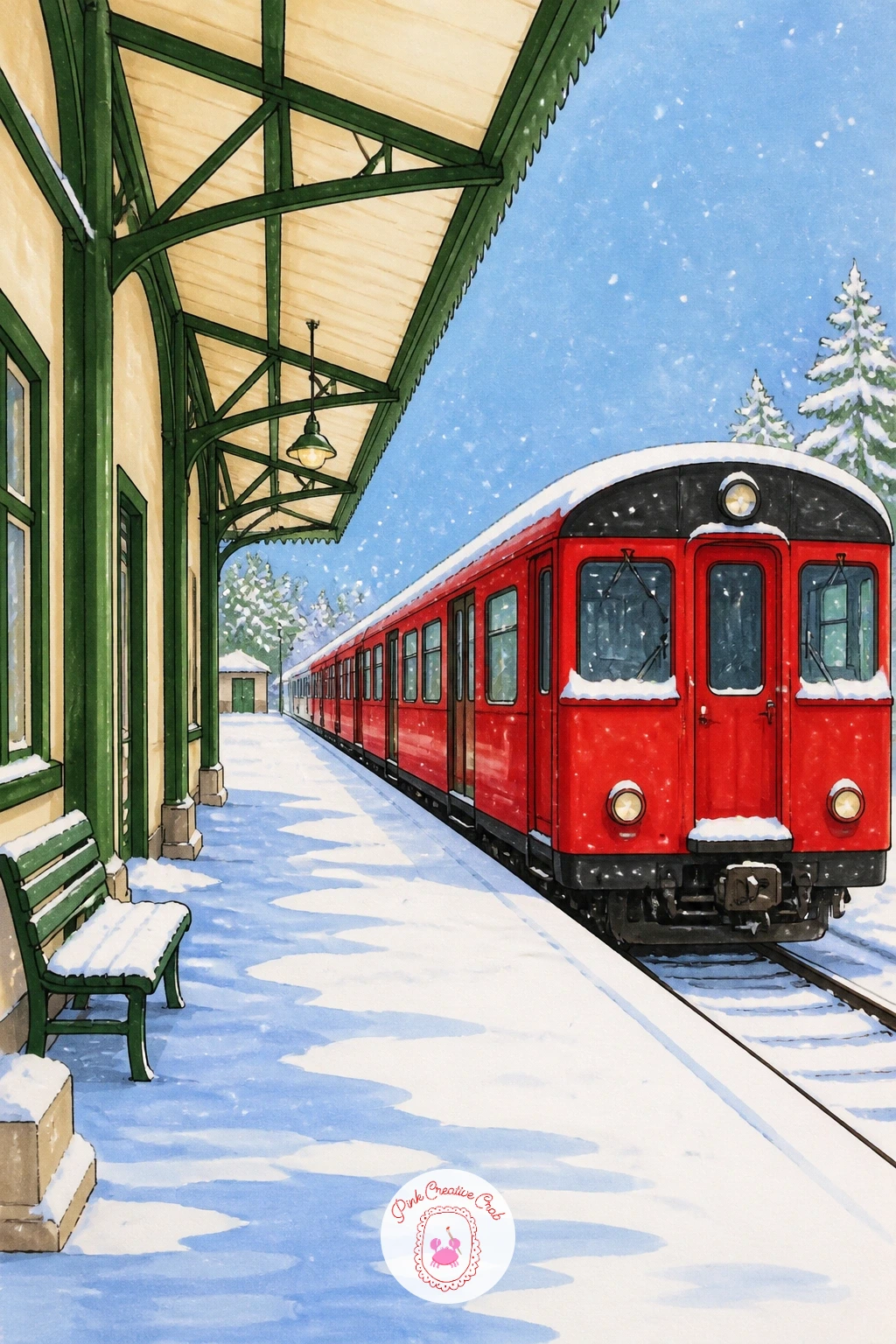
Snow scenes change the usual order of working, since the white of the paper is doing most of the job that a marker would normally do. Draw the platform roof and the red train first, leaving generous white gaps along every edge and rooftop where snow will sit, then work the darker areas, the train windows, the platform posts, and any figures, before touching any grey shadow tones.
Light in a snow scene usually comes from a flat, overcast sky rather than a single strong sun, so keep shadows pale blue-grey rather than dark, and place them only directly under objects, the train wheels, a bench, a lamp post, to show what is sitting on the snow without darkening the whole platform.
The red train becomes the single strongest color in the whole scene against all that white and pale blue, so keep it clean and saturated, laying two light layers rather than one heavy one to avoid streaking. A light dusting of white gel pen dots flicked across the final piece reads as falling snow and hides any blotchy marker edges underneath.
If your paper buckles under wet snow washes, switch to colored pencil for the pale blue shadow areas instead of marker.
You Will Need
- white gel pen
Palette: Red Accent,Pale Blue Grey,Charcoal,White
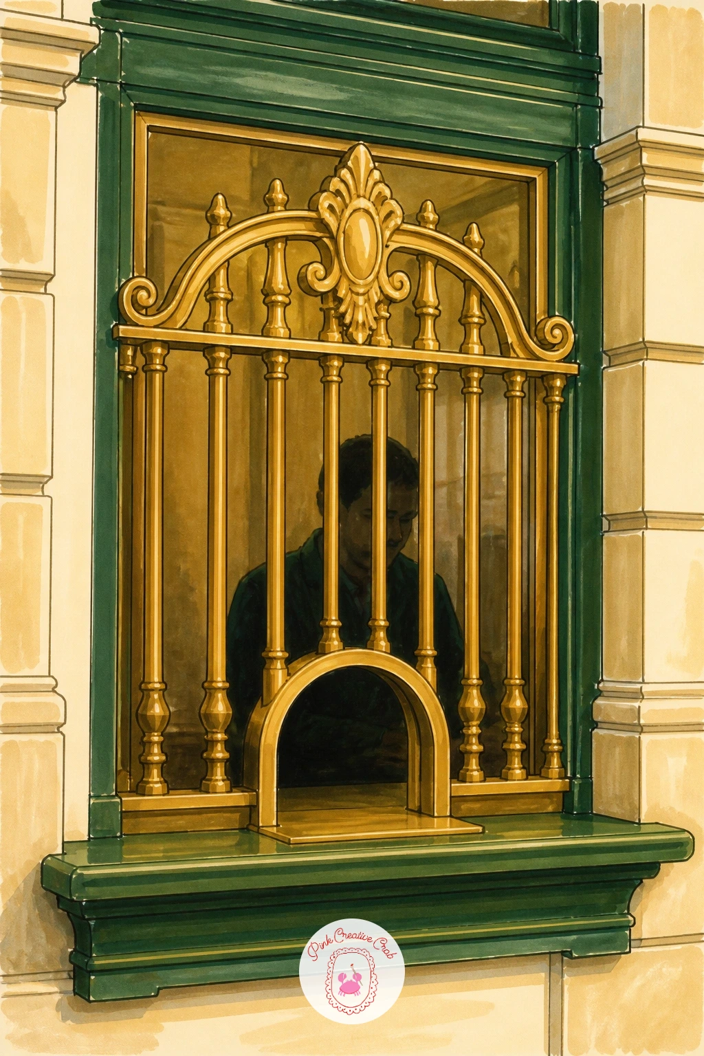
Give a small architectural detail its own page: the ticket window, with its brass grille and the dark little gap beneath it where tickets and change pass through. Draw the grille pattern first as a simple grid of diagonal or crossed lines over a rectangle, keeping the pattern loose rather than mathematically even, since a hand-drawn irregularity reads as more charming than a ruler-straight grid.
Measure the window against the surrounding wall stonework to keep the proportions sensible: a ticket window is usually about the height of a seated person’s head to chest, so use that as a quick guide rather than guessing freehand. Behind the grille, a dim suggestion of a clerk’s shape or simply a dark shadow works just as well, since too much detail behind the brass actually competes with it.
Color the brass in warm gold-brown with a few bright yellow highlight strokes along the raised parts of the grille pattern, and keep the stone or wood surround in cool cream or grey so the warm brass pops forward. White gel pen along the very edges of the grille bars finishes the metallic shine.
A gold or ochre colored pencil layered under the marker gives extra warmth if the brass looks flat.
You Will Need
- white gel pen
Palette: Ochre,Bright Yellow,Cream,Charcoal
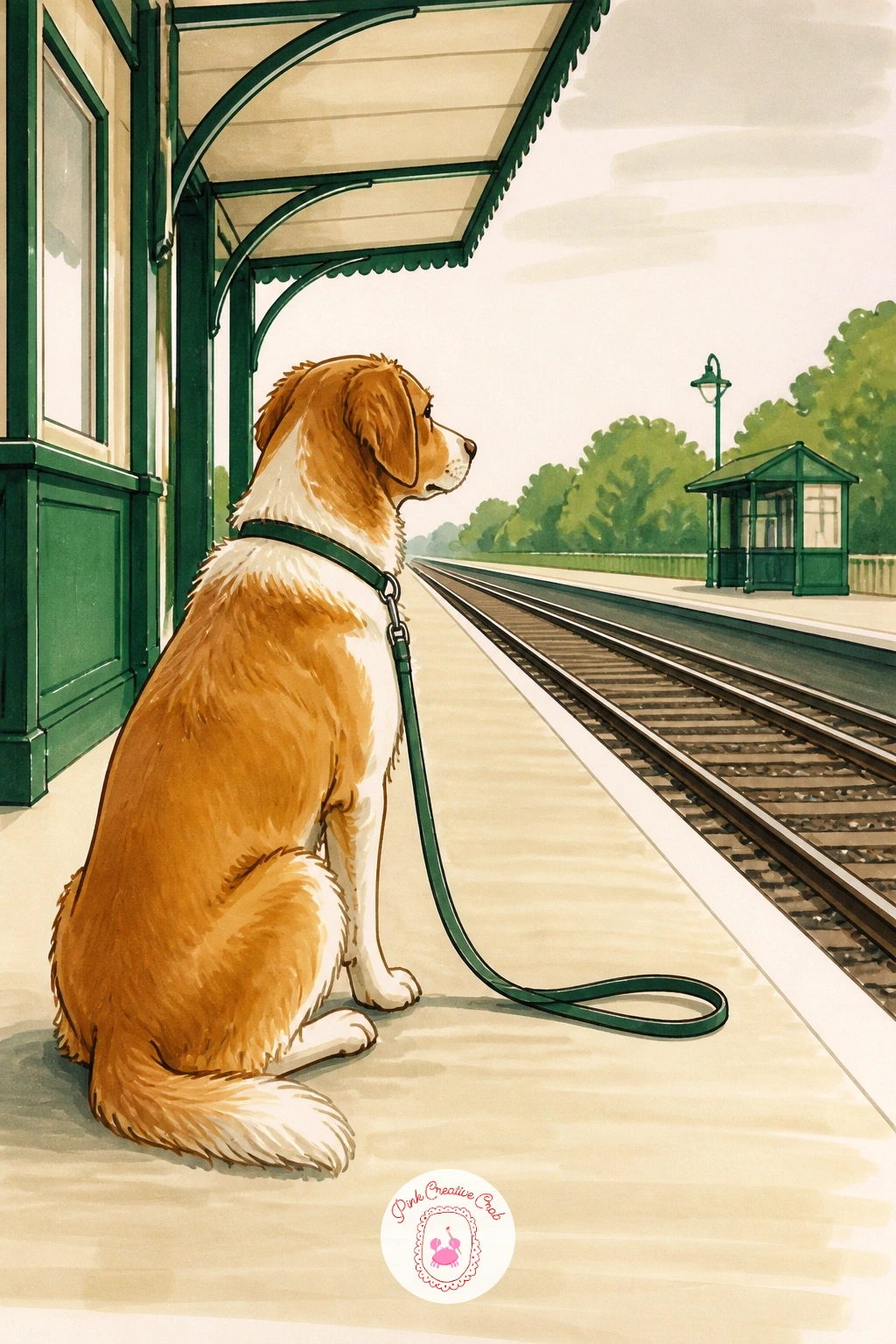
Bring in the one animal on this list: a dog sitting patiently on the platform, lead trailing loose, eyes fixed somewhere down the track. Start with the dog’s basic sitting shape, an oval body and a rounded head, before adding ears, tail or any fur texture, since a sitting dog’s proportions go wrong fastest around the length of the legs compared to the body.
Keep the fur mostly flat color with the fineliner doing the work of suggesting texture through short broken strokes along the back and chest, rather than trying to shade every hair with marker. A kneaded eraser pulled lightly over any pencil underdrawing before inking keeps the final lines clean rather than smudged under the marker layers.
Any medium to large breed with simple coloring, a brown and cream mix or solid black, works best at this scale, since very patterned coats get fiddly fast in marker. Leave the platform mostly empty around the dog so the whole composition reads as patient waiting rather than a busy crowd scene; readers who enjoy animal subjects might also like the dog pencil drawing ideas for more simple poses to practice.
If marker fur looks too flat, go back in with a darker brown colored pencil along the back for soft extra depth.
Palette: Warm Brown,Cream,Charcoal,Red Accent
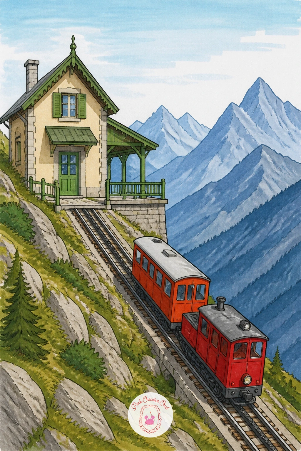
Take the station up into the mountains next, with a little cog railway train climbing a steep slanted track beside the platform. Draw the slope first as a strong diagonal line running from one corner of the page to the other, since this single diagonal is what sells the whole idea of altitude and climb before any mountain shapes go in behind it.
Place the mountain peaks well back from the station, layering two or three overlapping ridges in progressively paler blue-grey to push them into the distance, with the nearest ridge holding the most detail and the furthest kept almost flat. The little cog train itself can be quite simple, a boxy red carriage with visible teeth along its underside wheel, since the dramatic slope does most of the storytelling.
Color the near slope in richer green, fading to pale grey-green further up where the air gets thinner, and keep the sky a clean pale blue with no clouds to keep the whole scene feeling crisp and high up.
If blending pale blues is tricky, start with the lightest shade first and add darker tones only at the very base of each mountain ridge.
Palette: Forest Green,Pale Grey Blue,Red Accent,Soft Blue Sky
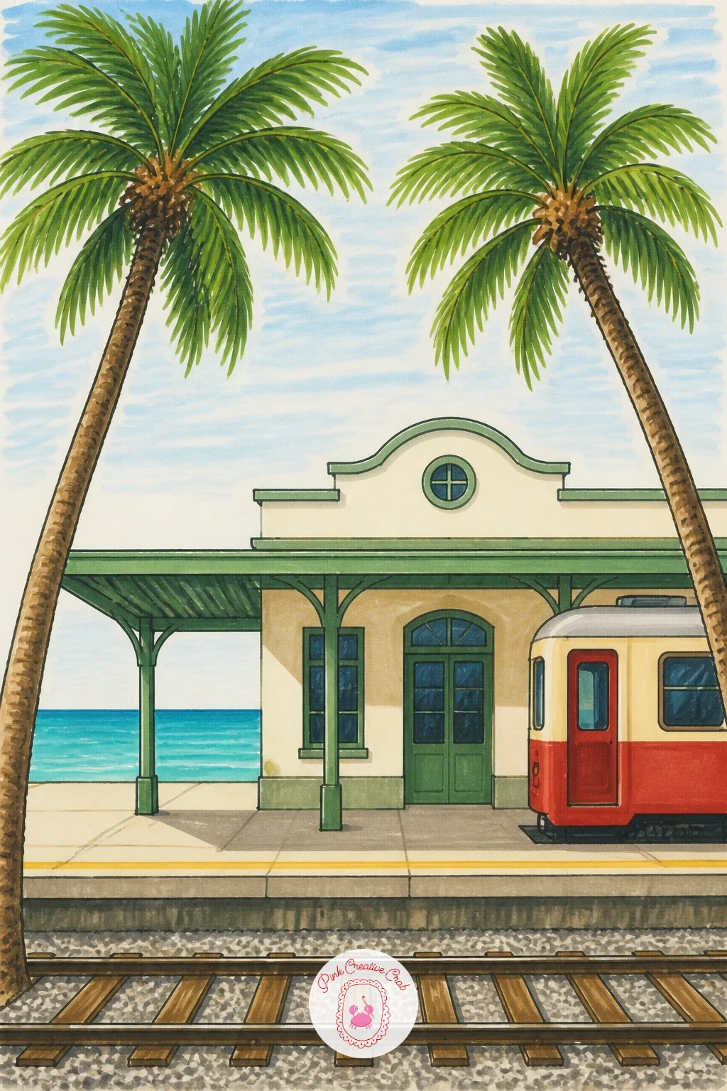
Swap mountains for sea air with a little station framed by a couple of leaning palm trees and a strip of blue visible beyond the platform. Draw the palms first since their curved trunks and fanning leaves set the whole mood, using one continuous curved line for each trunk rather than a straight one, which instantly makes them feel wind-bent and coastal.
Keep the station building itself quite plain and pale, cream or white, so it does not compete with the palms and the blue beyond, and place the sea or sky as a single flat band of turquoise along the top edge of the page rather than trying to paint waves or detail into it.
The palm fronds are the one part worth taking slowly: draw each leaf as a single confident stroke from the center point outward, overlapping a few at different angles rather than placing them symmetrically, which keeps the whole tree from looking stiff.
Color the trunks in warm grey-brown with darker horizontal texture marks, and the fronds in two greens, a yellow-green for the sunlit side and a deeper green for the shaded side of each cluster.
If turquoise markers run streaky over a large sky band, lay a pale yellow base first for a warmer, softer blend.
Palette: Turquoise,Yellow Green,Deep Green,Warm Grey Brown
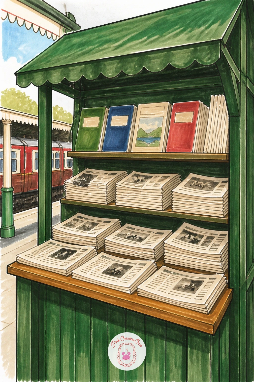
Fill the page with a cluttered little bookstall next, newspapers and magazines stacked and pinned along a wooden frame. Sketch the stall’s basic wooden structure first, a simple rectangle with a slanted roof overhang, then divide the front into rows before placing any individual papers, since trying to draw each title before the rows exist leads to a crooked, uneven stack.
Keep most of the papers as flat rectangles in varied cream and white tones with just a few colored mastheads suggested by a single bold stroke of red or blue rather than actual lettering, since real text at this scale always looks cramped and messy in marker. A handful of magazine covers can get a quick spot of brighter color, pink or yellow, to break up the rows of newsprint.
Shadows under the stall’s roof overhang and between the stacked rows are what give the whole thing depth, so add a thin line of grey marker under each shelf edge once the main colors are dry. Readers who enjoy this kind of layered, cluttered scene might also like building a collage drawing around the same stacked-paper idea.
If straight shelf lines wobble freehand, a ruler kept just for the structural lines keeps the stall looking sturdy.
Palette: Cream,Warm Brown,Red Accent,Soft Blue
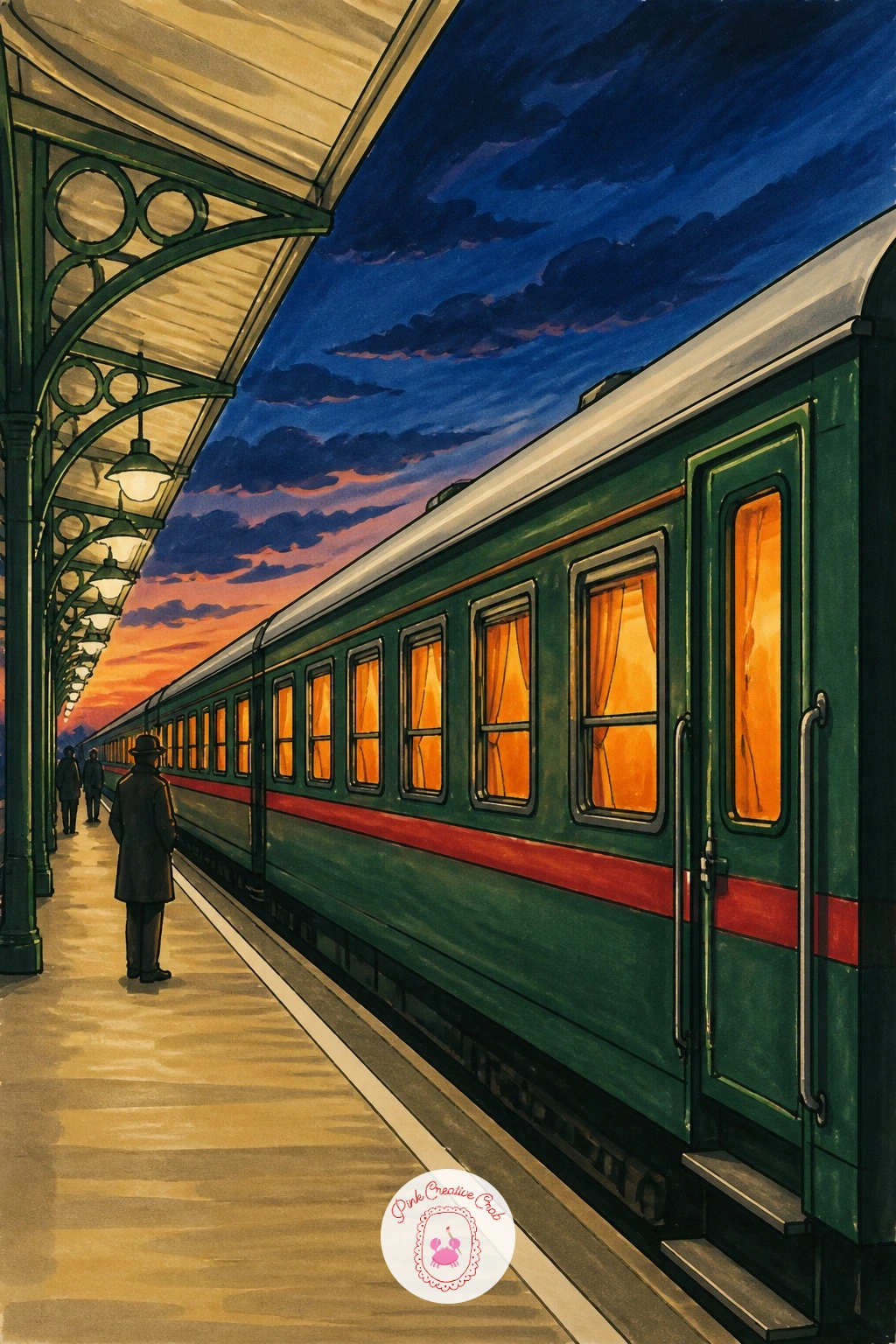
Move into the evening with a sleeper train standing at a quiet platform, its windows glowing warm against a darkening sky. Draw the train’s long body first across most of the page width, then decide the light source before adding a single window, since every window needs to glow the same warm color against the same cool surrounding dusk for the scene to feel consistent.
Work the sky and platform in cool blue-grey tones first, going darker toward the top of the page, then let the train’s windows be the one warm interruption, a soft yellow-orange that you lay down last so it sits clearly on top of the cooler base without muddying.
A dry brush pass of dark blue marker along the very top edge of the sky, dragged quickly with little pressure, gives a soft gradient into near-night without a hard line, which sells the hour far better than a flat dark blue block.
Keep figures on the platform as small dark silhouettes against the glowing windows rather than detailed people, since at dusk that is really all a figure reads as anyway.
If you do not have a true dark blue, mixing navy and purple markers in light layers gets close.
Palette: Navy,Warm Orange,Charcoal,Deep Purple
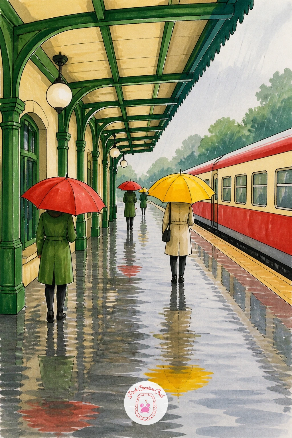
Rain scenes ask for a little restraint, so draw the station building and platform first in plain, simple lines before adding a single raindrop, keeping the overall shapes soft rather than crisp since rain softens every edge it touches. A scattering of open umbrellas, four or five at most, gives the scene its crowd without needing a single face.
Each umbrella can be a simple dome shape with a few straight spokes, colored in whatever bright tones feel cheerful against all the grey, since a rainy scene with a few bold red or yellow umbrellas reads far better than one drawn entirely in muted tones.
Wet reflections on the platform ground are the detail that sells the whole scene, so lay a thin vertical streak of each umbrella’s color directly below it on the ground, slightly softened at the edges, rather than trying to reflect the whole scene in detail.
Rain itself works best as a handful of short diagonal fineliner lines added last, over the dry marker color, angled consistently in one direction so it reads as wind-driven rather than random.
If marker reflections bleed too much on the ground, switch that area to colored pencil for better control.
Palette: Pale Grey,Red Accent,Bright Yellow,Charcoal
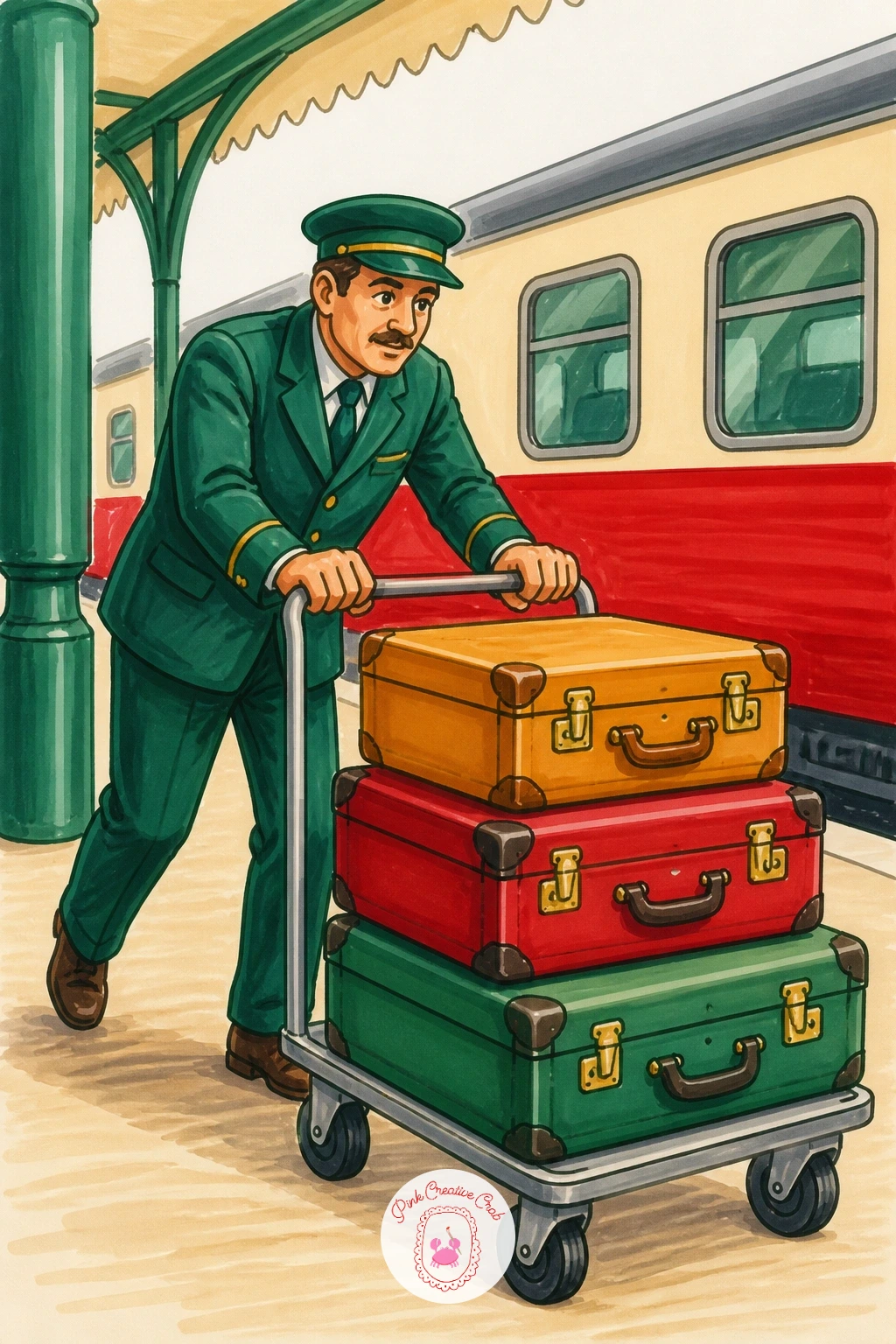
Put a working figure at the center of the page this time: a porter pushing a trolley stacked with cases of different sizes. Draw the trolley first as a simple flat platform on two wheels, then stack the suitcases on top in a rough pyramid, largest case at the bottom, before adding the porter figure leaning into the push behind it.
The lean is what makes this pose work, so angle the porter’s whole body forward from the ankles, not just the arms, as if real weight is being pushed rather than carried. Compare the trolley’s height to the porter’s hip, since a trolley handle usually sits around hip height on an adult, and that single check keeps the whole composition from looking like a toy pushed by a giant.
Color each suitcase a different solid tone, mustard, deep red, soft green, so the stack reads as a varied pile rather than one blurred mass, and keep the porter’s uniform in one consistent neutral so he does not visually compete with his own luggage.
If the trolley wheels look flat, a short curved shadow drawn directly beneath each one lifts it off the ground convincingly.
Palette: Mustard,Red Accent,Forest Green,Charcoal
Let the landscape take over for this one: a very small station building almost lost in a field of red poppies stretching to the horizon. Draw the station small and set back, no more than a sixth of the page width, before touching the field, since the whole charm of this idea depends on the building staying modest against all that open red.
Work the field next in loose, varied green strokes for the grass and stems, then scatter the poppies as small red dabs rather than fully drawn flowers, since at this scale a poppy only needs a dot of red with a tiny dark center to read clearly from a short distance.
Keep the dabs denser near the bottom of the page and sparser toward the horizon line where the station sits, which pushes the building back into the distance without any extra perspective work. A faint train track drawn in thin grey lines leading up to the tiny platform gives the eye a path to follow through all that color.
If red marker dots bleed together into a solid mass, space them out more generously and let a little green show between each one.
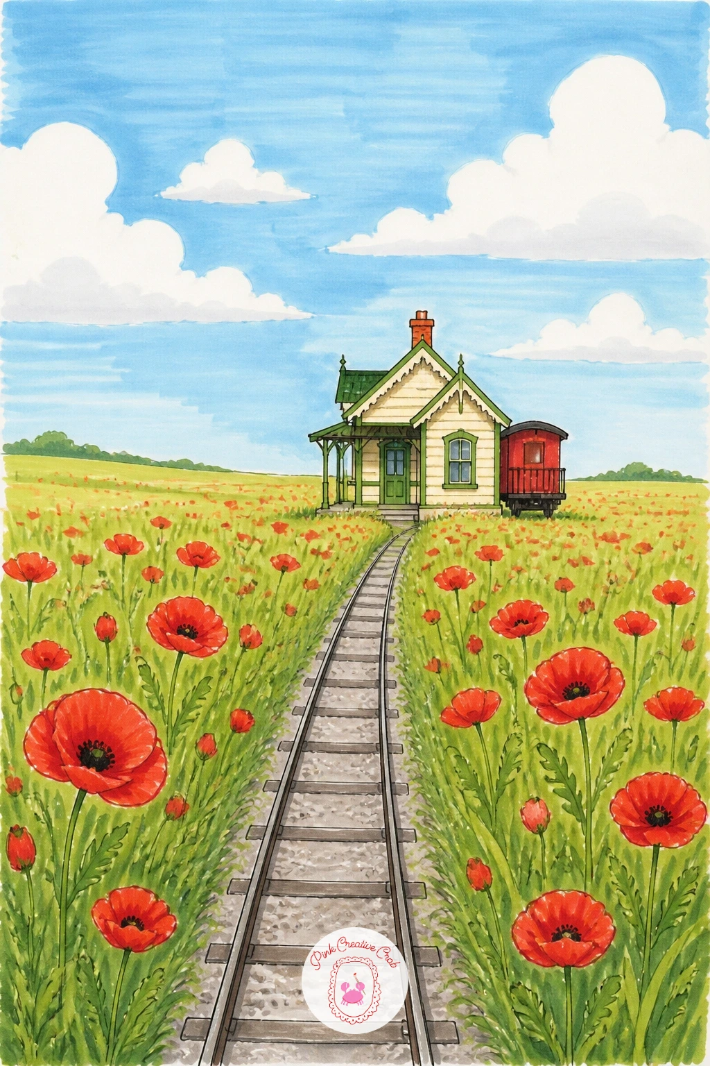
Palette: Red Accent,Sap Green,Cream,Pale Grey
Bring in a sleek modern train for contrast: a Japanese-style bullet train, its long nose pointed and smooth, pulling into a clean minimal platform. Draw the train’s nose first as one long tapering curve, since this single sweeping line defines the whole train’s character more than any window or door drawn after it.
Keep the platform architecture simple and geometric, straight canopy lines, plain pillars, with very little ornament, which matches the clean modern feel of the train itself and keeps the whole scene from looking cluttered. A light source from directly above, as if under the station’s own canopy lighting, means shadows fall straight down and stay short, which reads as crisp, indoor daylight rather than outdoor sun.
Color the train body in cool white and soft blue-grey with a single thin colored stripe running its length, a common real detail that instantly makes the design feel authentic without any extra drawing.
If a perfectly smooth nose curve is hard freehand, trace the curve lightly in pencil first using a circular object as a guide, then ink over it once you are happy with the shape.
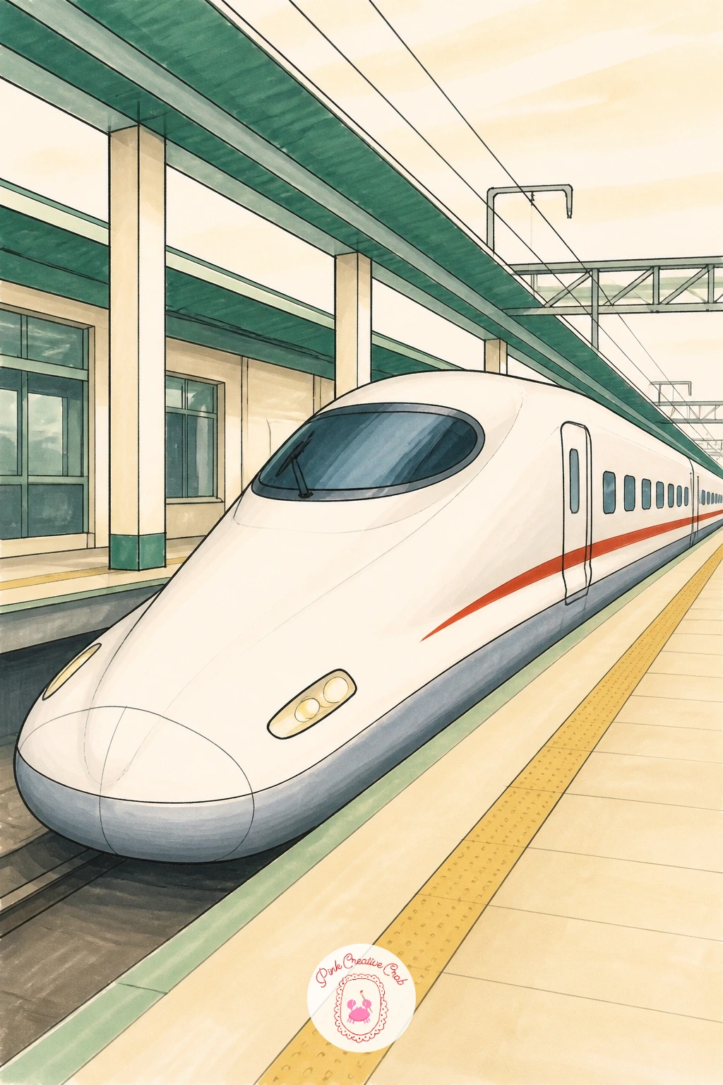
Palette: Cool White,Pale Blue Grey,Charcoal,Red Accent
Step indoors for a quiet waiting room scene, rows of old wooden benches facing each other under a plain ceiling. Draw the benches first using one simple repeated shape, a straight back and seat on sturdy legs, placed in receding rows that get smaller toward the back of the page to build the sense of a long narrow room.
This receding size change is the whole trick to this idea: measure the first bench’s height against the second one and make the second noticeably shorter, then shrink each row again by roughly the same amount, which creates convincing depth without any complicated vanishing point lines.
Keep the wood tone warm and consistent across every bench, a honey brown with slightly darker shading along the underside of each seat, and leave the walls and floor in plain cream so the repeated bench shapes stay the clear subject of the piece.
A single figure seated alone on one bench, small and still, gives the whole empty room a quiet, waiting mood without needing any other detail added.
If the receding rows start to look uneven, lightly pencil in two straight guide lines from a point at the top of the page before inking the benches.
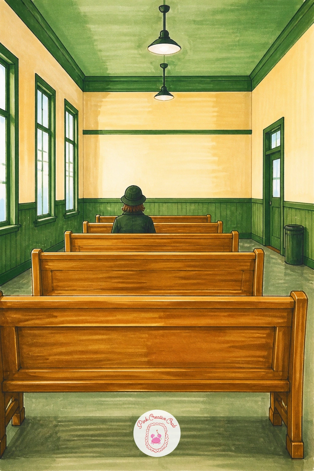
Palette: Honey Brown,Cream,Charcoal,Pale Grey
Zoom right in for this one: just a train window and a child’s face pressed close against the glass from inside, looking out. Draw the window frame first as a simple rounded rectangle filling most of the page, then place the child’s face and hands against the glass before adding anything in the background beyond it, since the framing device only works if the face sits convincingly flat against that inner surface.
A fogged patch of breath on the glass right around the child’s mouth and nose is the detail that makes this idea click, so leave a soft pale oval unmarked or very lightly colored in that spot while the rest of the window gets a faint blue-grey tint from the glass itself.
Keep the view outside the window loose and blurred, a quick smear of green and brown marker suggesting trees or platform rushing past, since a sharp detailed background would fight with the clear foreground face. For a simpler ten-minute version, skip the outside view entirely and leave it as plain pale blue; the fuller version adds that blurred motion behind the glass.
If skin tone markers run blotchy on a small face, a single light base layer followed by one soft shadow stroke under the chin is enough detail at this scale.
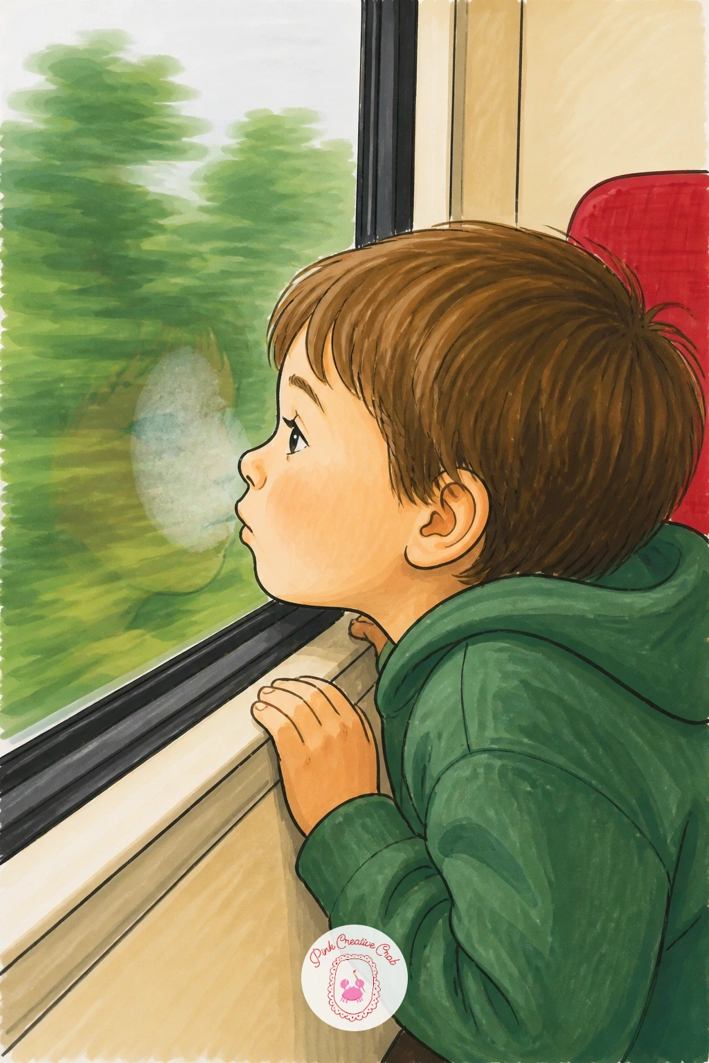
Palette: Soft Blue Grey,Warm Skin Tone,Sap Green,Warm Brown
Pull the camera back for a wider view: a train crossing a tall stone viaduct with a small station visible at one end of the bridge. Draw the viaduct’s repeated arches first, keeping each arch the same width and height by measuring the first one and copying it along a straight guideline, since uneven arches are the fastest way to make a stone bridge look unstable rather than grand.
Place the train crossing partway along the viaduct rather than right at one end, which gives the composition a stronger sense of ongoing motion than a train that has already arrived or not yet started across. The station itself can stay small and simple at one end of the bridge, mostly a rooftop and a platform edge, since the viaduct is clearly the star of this particular scene.
Color the stone arches in warm grey with darker shading along the underside of each arch to give them real weight and curve, and let the train’s red stand out clearly against all that grey stone. A thin strip of pale green valley below the arches, glimpsed through the gaps, adds depth without much extra work.
If repeated arches drift out of line freehand, a strip of paper held as a straightedge keeps each arch’s base level.
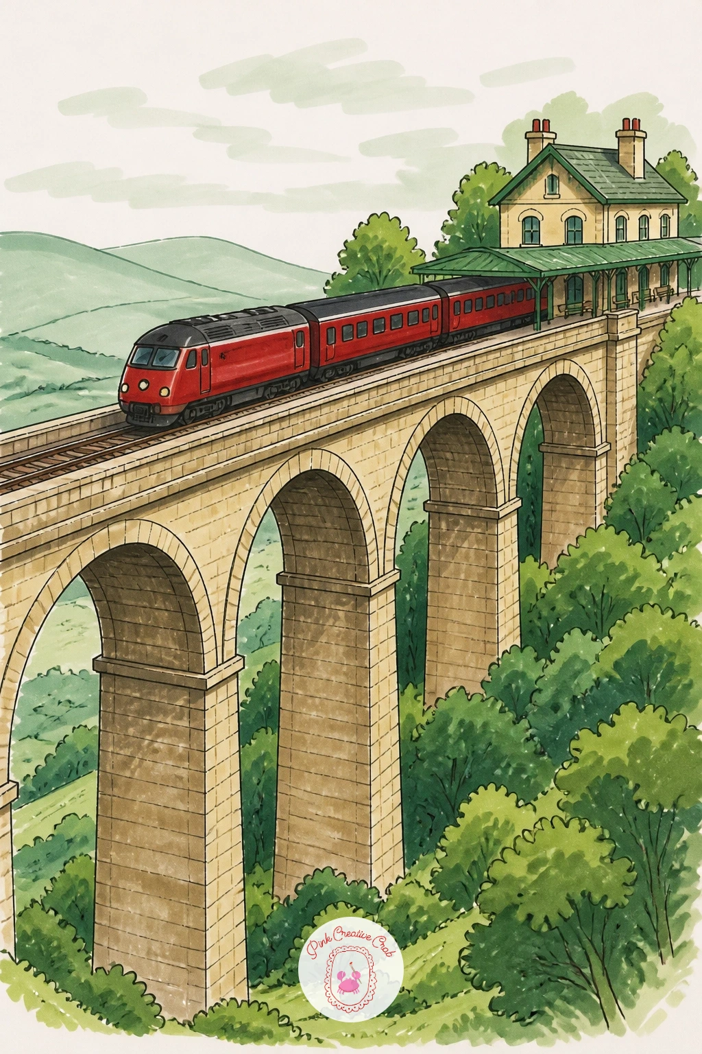
Palette: Warm Grey,Red Accent,Sap Green,Charcoal
Bring color back to the foreground with a station flower stall, buckets of blooms crowded together under a simple awning. Draw the stall’s frame and awning first, then place each flower bucket as a rough cylinder before filling it with blooms, since the buckets give structure that keeps a page full of flowers from turning into a shapeless tangle.
Vary which flower type fills each bucket rather than repeating the same bloom throughout, a few round dahlia shapes in one, some simple daisy shapes in another, long tulip forms in a third, which reads as a believable mixed stall rather than one flower drawn many times. Keep each flower’s shape simple and a little loose, since a stall full of flowers needs speed and looseness more than botanical accuracy at this scale.
Color each bucket’s flowers in a different warm or cool family, pinks and reds in one, yellows and oranges in another, so the stall reads as a rainbow of small color groups rather than one blended mass. Readers who enjoy flower subjects on their own might also like exploring lotus flower drawing for a slower, single-bloom study.
If the stall feels crowded and busy, leave a little plain cream awning or wall visible around the edges to give the eye somewhere to rest.
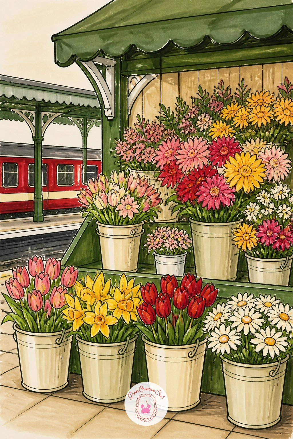
Palette: Warm Pink,Bright Yellow,Sap Green,Cream
Give the empty platform its quietest moment: no people, no train, just pale morning light washing across the ground and roof. Draw the platform structure first in simple clean lines, then decide where the sun sits just off one edge of the page, since everything about the lighting in this scene depends on that single choice made early.
With the light source low and off to one side, the shadows should stretch long and soft across the platform floor, all running in the same direction away from that unseen sun, which is the detail that makes a sunrise scene feel coherent rather than randomly lit. Blend pale pink, peach and soft lavender across the sky in soft bands, lightest near the horizon and deepening slightly higher up, using a light touch so the colors stay pastel rather than saturated.
Keep every other color in the scene muted to match that soft light, since a bright red train or bold sign here would break the calm entirely; if you want one small red accent, keep it tiny and distant.
If pastel blending looks patchy, work fast while each marker layer is still slightly wet so the colors melt into each other on the page.
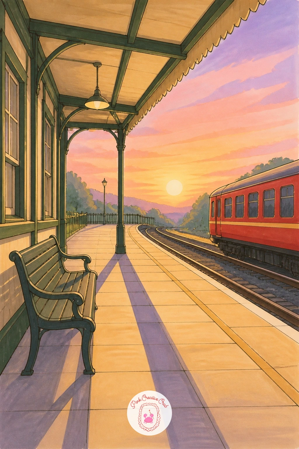
Palette: Peach,Soft Lavender,Pale Pink,Pale Grey
Climb up above the platform for this one: a covered footbridge crossing over several tracks, seen from a slight angle below. Draw the bridge’s structure first as a simple box shape with a sloped or flat roof, set it crossing diagonally through the page rather than straight across, since a diagonal placement makes the whole composition feel less static than a bridge running parallel to the frame’s edge.
The tracks running underneath are what sell the height of the bridge, so draw three or four parallel rails converging slightly as they head toward the horizon, with the bridge’s shadow falling across them in one clean dark band. Small figures crossing the bridge, seen only from behind or above, give a sense of scale without needing any detailed faces.
Color the bridge structure in cool grey or green with the roof slightly darker than the walls to suggest it catching less direct light, and keep the tracks themselves a plain dark grey-brown rather than bright metal, since real rail tracks read as fairly dull and weathered rather than shiny.
If the converging tracks drift out of alignment, a very light pencil guideline from a single vanishing point keeps them honest before you commit to ink.
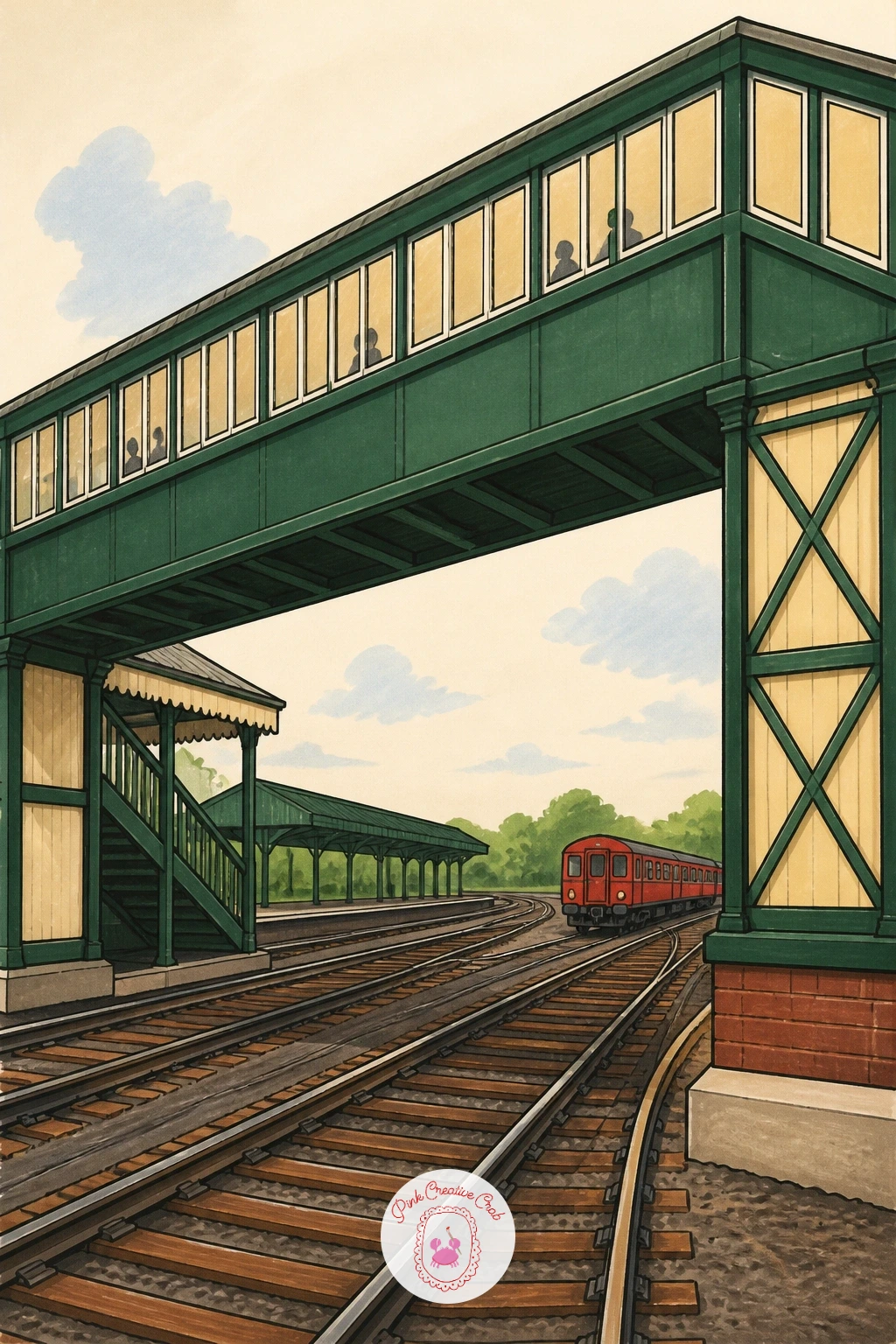
Palette: Cool Grey,Forest Green,Dark Grey Brown,Charcoal
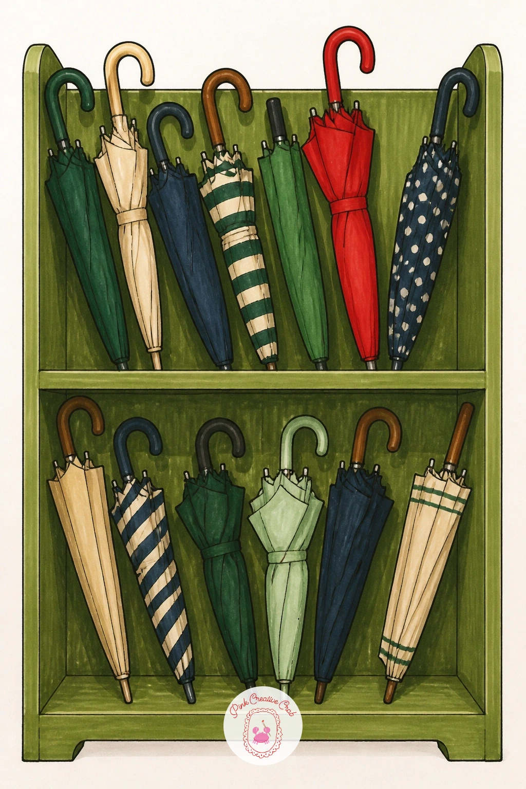
Try a small, quietly funny detail next: a shelf or rack crowded entirely with mismatched lost umbrellas, folded and leaning in every direction. Draw the shelf or rack structure first as a simple frame, then fill it with umbrella shapes of varying lengths and lean angles, since no two forgotten umbrellas should lean or stand exactly the same way.
Vary the pattern and color of each umbrella deliberately, stripes on one, a solid color on another, a tiny polka dot pattern hinted at with just a few dots on a third, which turns a potentially boring row of identical shapes into a small, charming collection worth looking at closely. Keep the patterns simple enough to suggest with just a handful of marks rather than fully rendering fabric texture on every single umbrella.
Shade the gaps between the umbrellas in a soft grey to help each individual shape read clearly against its neighbors, and let one or two brighter colors, a yellow or red, stand out among a row that is otherwise fairly muted.
If the shelf starts to look too tidy and orderly, tilt a few umbrella handles at odd angles and let one or two overlap their neighbors slightly.
Palette: Pale Grey,Bright Yellow,Red Accent,Soft Blue
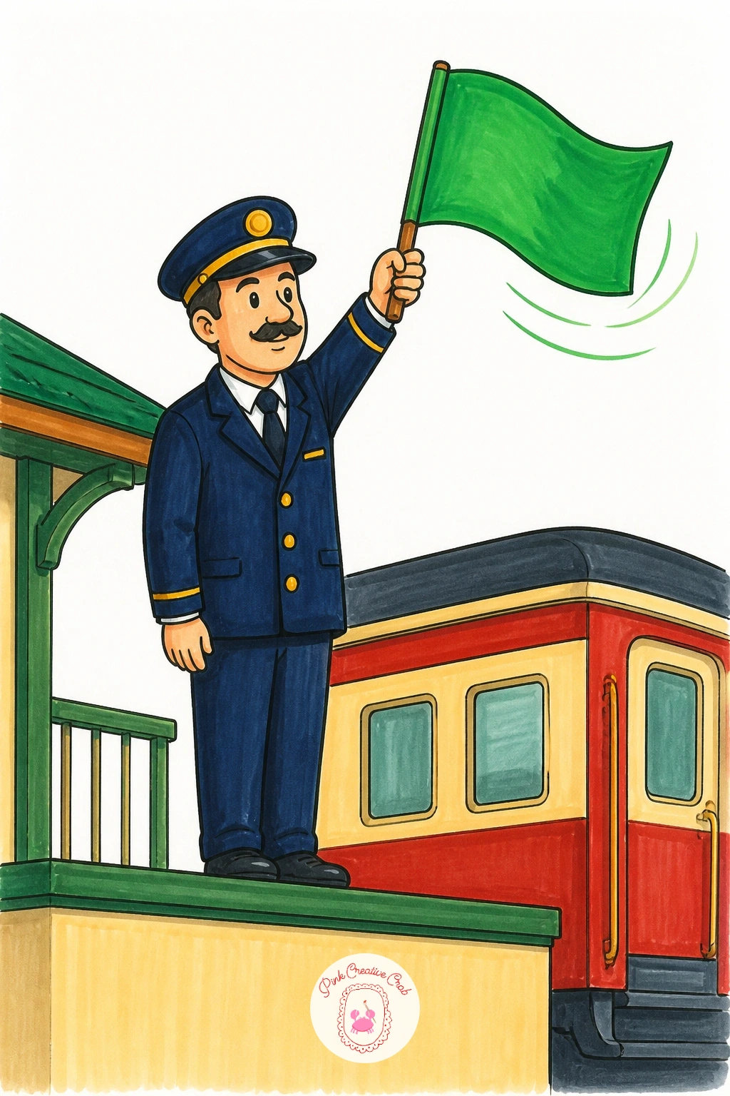
Put motion and gesture at the center with a conductor standing mid-platform, arm raised, flag caught at the moment of the wave. Draw the figure’s pose first as a simple stick framework, arm raised at a clear diagonal angle above the shoulder, before adding the uniform or the flag itself, since the whole energy of this drawing depends on that raised arm reading as a confident, decisive gesture rather than a stiff, static one.
Compare the raised arm’s length to the figure’s own torso to keep it in proportion, an extended arm usually reaches roughly the same length as the torso it is attached to, and that quick check stops the arm from looking too short or oddly long once the sleeve and flag are added.
Keep the uniform in a simple dark navy or black with just the flag itself in bold color, a bright green or yellow, since the flag’s color is traditionally meaningful and also gives the eye a clear, bright focal point against the darker uniform.
A short motion line or two trailing from the flag’s edge, drawn last in fineliner, suggests it is actively being waved rather than simply held still.
If the raised arm pose feels awkward, look at your own arm in a mirror held at that angle before committing to ink.
Palette: Navy,Bright Green,Charcoal,Cream
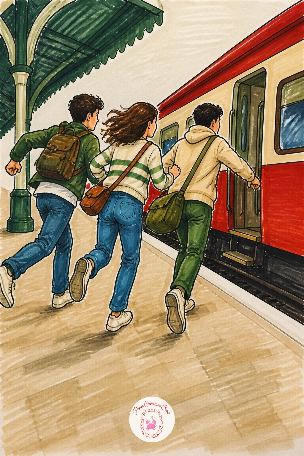
Close the list with the most energetic scene of all: two or three friends running together across the platform, trying to catch a train about to leave. Draw each figure’s pose first with a strong forward lean and legs caught mid-stride, one arm swinging back and one swinging forward on each figure, since a running pose with both arms in the same position looks frozen rather than in motion.
Vary each friend’s speed and position slightly rather than lining them up evenly, one slightly ahead, one glancing back, one laughing, which turns a simple running group into a small story rather than three identical figures copy-pasted across the page. A bag or scarf trailing out behind one runner, drawn with a loose curved line, adds to the feeling of speed without extra work.
Color each friend in a different outfit so they stay easy to tell apart at a glance, and keep the platform and train behind them simpler and more loosely colored than the figures themselves, since the running friends are clearly the subject here. For more playful group poses like this, the friends drawing ideas collection has plenty of other running, laughing moments to try.
If a running pose looks stiff, exaggerate the forward lean a little further than feels natural; it almost always reads better exaggerated than straight.
Palette: Mustard,Soft Blue,Red Accent,Cream
What to Do Next
Pick whichever station is calling to you tonight, start with a light pencil sketch of the main shapes, then go over it in fineliner before the markers come out. Keep a scrap of smooth paper nearby to test each color first, and let one finished platform lead you straight to the next.
Frequently Asked Questions
What markers work best for a train station drawing?
Alcohol markers give the smoothest blends for this subject, since they layer well over fineliner without leaving streaks. A grey set plus a few bold accent colors covers most station scenes.
How do you keep station perspective from looking wrong?
Pick one eye level and one vanishing point before you draw any lines, then keep every parallel edge, platform, roof rib, track, heading toward that same point for a convincing, settled look.
What is the easiest train station idea to start with?
A small country station with a bench and a flower bed is the simplest, since it needs no perspective tricks, no crowd and only a few simple shapes to reach a finished picture.
How do you draw steam or smoke convincingly with markers?
Work the cloud shape in light grey first, then drag an almost-dry marker tip outward along its edges. This dry brush technique softens hard lines into something closer to real vapor.
Do station drawings need people in them to work?
No, an empty platform at sunrise or in the snow can feel just as complete. People add a sense of moment and story, but quiet, empty scenes carry their own mood just as well.
Have any thoughts?
Share your reaction or leave a quick response — we’d love to hear what you think!
-
 0
-
0
-
0
-
0
-
0
-
0


