

A lotus flower drawing is the kind of page that slows your hand down on purpose. The petals ask for patience and soft layers, the water asks for quiet blues and greens, and the whole thing comes together without any fuss over hard edges or tricky perspective.
Below you will find twenty eight calm water garden scenes, starting with every mood a lotus can hold, from a tight bud to a floating lantern, then easing into water lilies, irises, cattails and other plants that share the same still pond. Pick whichever one catches your eye first and work through it from sketch to final layer in one sitting.
Using these images: free for personal projects such as printing, coloring, cards, journals and gifts. Handmade items that include them may be sold up to 30 pieces per design. More than that is commercial use and is not permitted, and neither is selling or sharing the images themselves or passing them off as your own. Please ask before any other use.
Start with a pink lotus in full bloom, since the open flower is the most forgiving shape to practice on: a loose circle of overlapping petals sitting on a round, flat pad. Sketch the center bud shape first, then ring petals around it in two or three layers, each layer a little wider and looser than the last.
Go over the pencil lines with a fine black fineliner once you are happy with the petal count, then erase the graphite and bring in color. Layer Soft Pink from the petal base outward, leaving the tips lighter, and fill the pad beneath in Jade Green with a few darker green strokes for its ribbed texture.
If the petals start to look flat, compare each one against its neighbor before you ink it: a lotus bloom reads correctly when the petals closest to you are noticeably wider than the ones curling toward the back, so check that ratio before committing to fineliner.
Keep your first pink layer light. You can always add a second pass of color once the petal shapes are settled, but a petal colored too dark too early is hard to soften again.
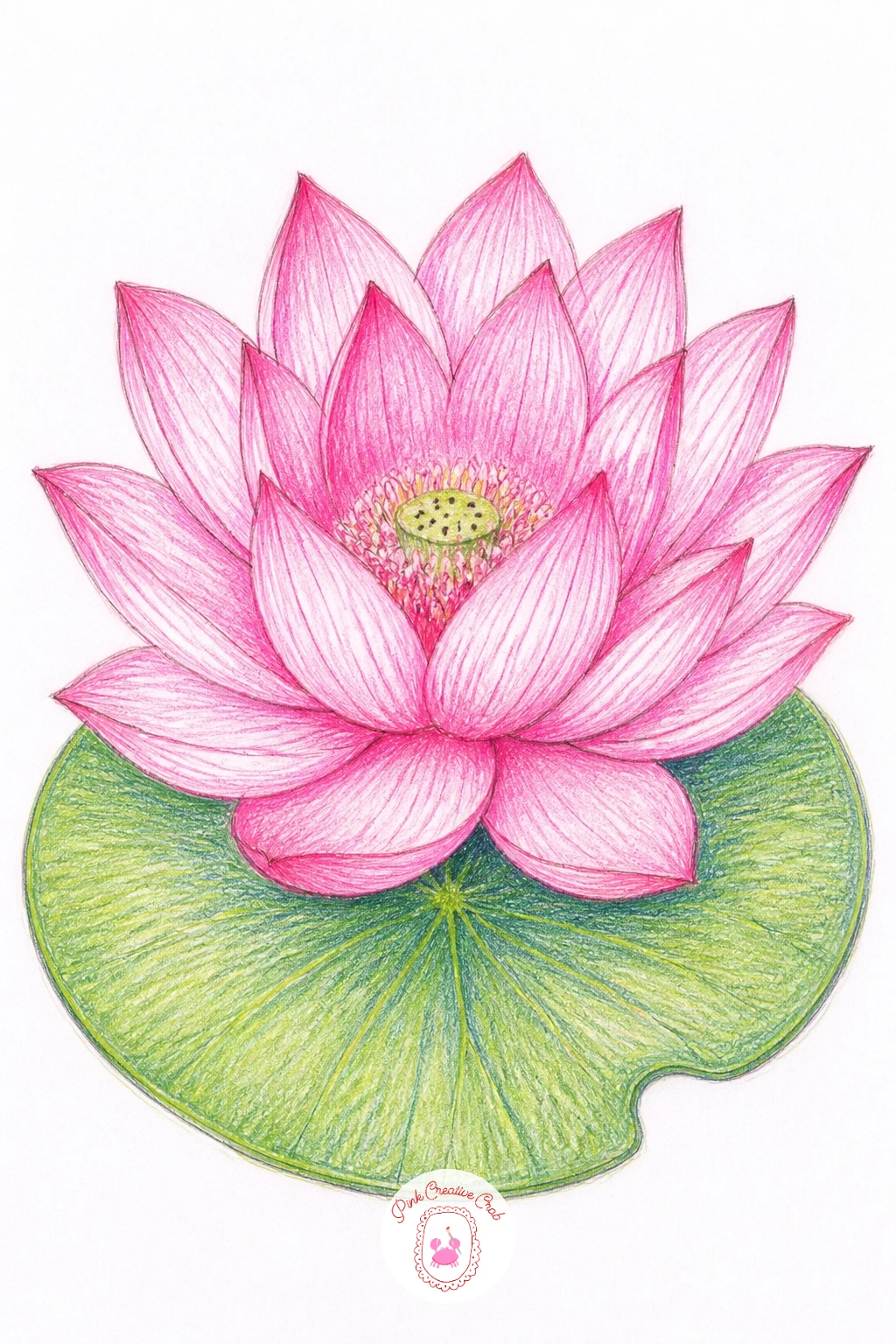
Palette: Soft Pink,Jade Green,Pond Blue,White
A lotus bud is a calmer cousin of the full bloom, just a few tight petals wrapped around a pointed tip, rising on a straight stem from a simple water line. Draw the stem first, anchoring it at the bottom of the page, then build the bud as a teardrop shape with two or three curved petal lines wrapping around it.
Outline in fineliner once the proportions feel right, then color the bud in Soft Pink near the base, fading to pale pink at the tip where the petals are still closed tight. Add a thin wash of Pond Blue across the bottom third of the page for the water, keeping the line where stem meets water soft rather than sharp.
Picture the stem coming from an eye level just above the water surface, since that low viewpoint is what makes the bud look like it is genuinely rising rather than just floating in space, and it also gives you room for a gentle reflection line beneath it.
If you only have one green pencil, use it for both the stem and a hint of pad at the base. One concrete tip for today: draw the stem slightly curved rather than ruler straight, since a perfectly straight stem is what makes a lotus bud look stiff on paper.
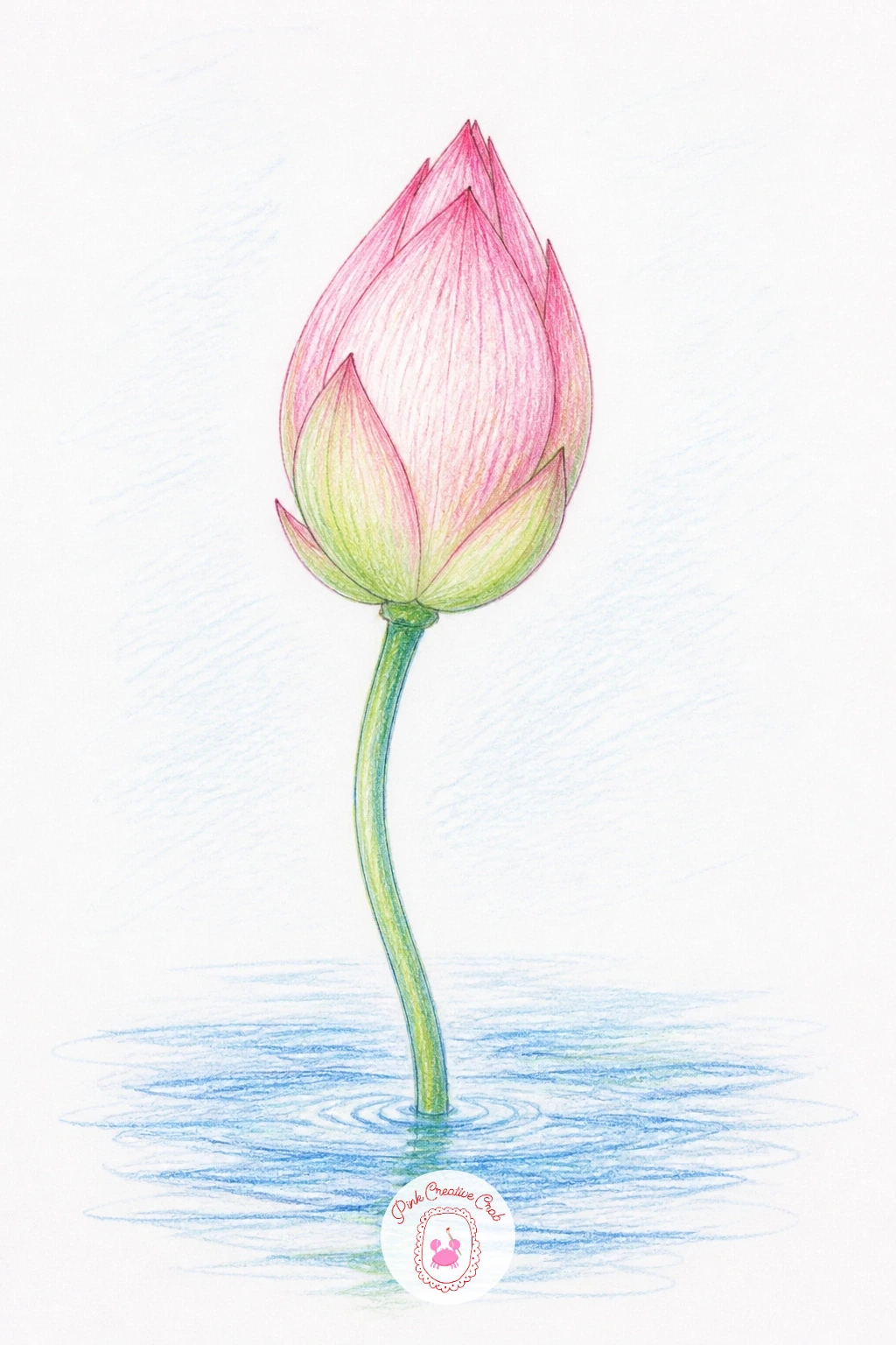
Palette: Soft Pink,Jade Green,Pond Blue
Once a single lotus feels easy, try a lotus pond at sunrise, where two or three small blooms and pads sit scattered across a soft horizontal wash of water. Block in the water band first with light Pond Blue, leaving a pale strip near the top where the sunrise glow will sit, then place your lotus shapes at different sizes to suggest distance.
Keep the farthest flower smallest and least detailed, just a pink smudge and a green dash, while the nearest one gets full petal lines in fineliner and careful shading. Warm the pale strip near the horizon with a touch of Soft Pink blended into the blue so the light source reads clearly without needing an actual sun drawn in.
Since the light comes from low on the horizon here, let the side of each pad facing the glow stay lighter and the side facing you pick up a thin cool shadow in Pond Blue, which is what gives the whole scene its sense of early morning rather than midday.
If a full wash feels daunting, a quick ten minute version just needs the water band and one lotus; the forty minute version adds the extra blooms and a soft ripple line under each pad. Blend the horizon colors while they are still fresh for the smoothest glow.
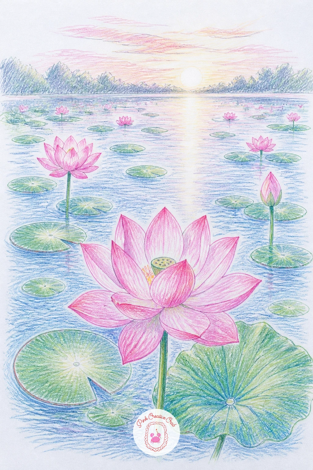
Palette: Pond Blue,Soft Pink,Jade Green,White
Try this scene again later with the blooms clustered to one side instead of spread evenly, which reads as more natural and less like a pattern.
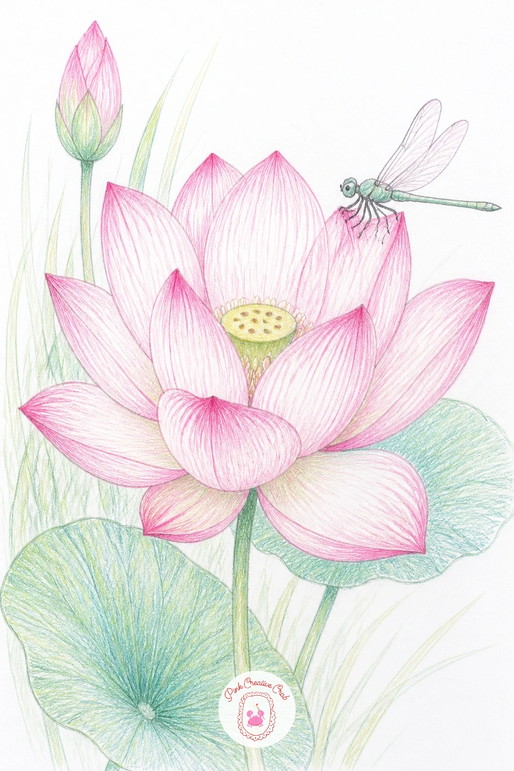
Bring in a dragonfly for this one, perched right on a lotus bud or hovering just beside an open bloom, since the contrast of its thin wings against the soft petals is what makes the page interesting. Draw the lotus first using the same bud or bloom steps as earlier ideas, then add the dragonfly last so it sits confidently on top rather than getting lost in the petals.
Keep the dragonfly’s body as a simple elongated oval with a thin tail, and its four wings as narrow, almost transparent shapes you outline in fineliner but barely color, just a faint Pond Blue tint along the edges. A tiny bit of white gel pen can add a highlight glint to the wings once the pencil work is done.
The easiest way to save a dragonfly that looks lumpy is to erase it back to a faint line with a kneaded eraser and redraw just the wing outlines thinner; dragonfly wings read as delicate mainly through how narrow and simple their shapes stay.
No gel pen on hand is no problem, since leaving the wings as plain white paper works just as well for that glassy look. Keep the dragonfly small relative to the flower so the lotus stays the star of the page.
You Will Need
- white gel pen (optional)
Palette: Soft Pink,Jade Green,Pond Blue,Payne’s Grey
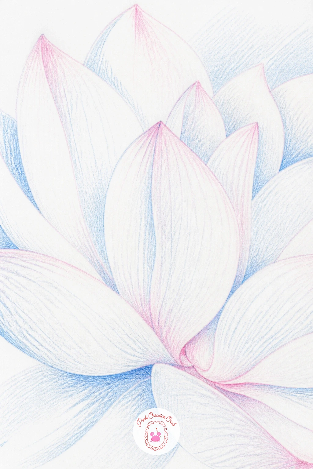
Zoom right in for a white lotus close-up, filling nearly the whole page with just three or four petals seen up close rather than the whole flower. This one lives or dies on edges, since white petals need shadow and gentle color shifts to read as three dimensional rather than flat paper.
Sketch the petal edges loosely first, overlapping them generously since close-up crops always feel more convincing with some petals tucked behind others. Ink the outer contour lines only in fineliner, then build the petal surfaces with very light layers of Pond Blue and a touch of Soft Pink in the shadowed folds, leaving the lit areas as bare white paper.
This is where a kneaded eraser earns its keep: press it gently into any area that goes too grey or too blue and lift color back out, restoring the clean white highlight down the center of each petal, which is the main thing that sells a white flower as white.
Swap colored pencil for graphite shading alone if you want to keep the whole piece monochrome, which also makes a nice companion piece to a pencil colour drawing flower page elsewhere in your sketchbook. Keep shadows cool rather than grey for the cleanest white petals.
Palette: White,Pond Blue,Soft Pink,Payne’s Grey
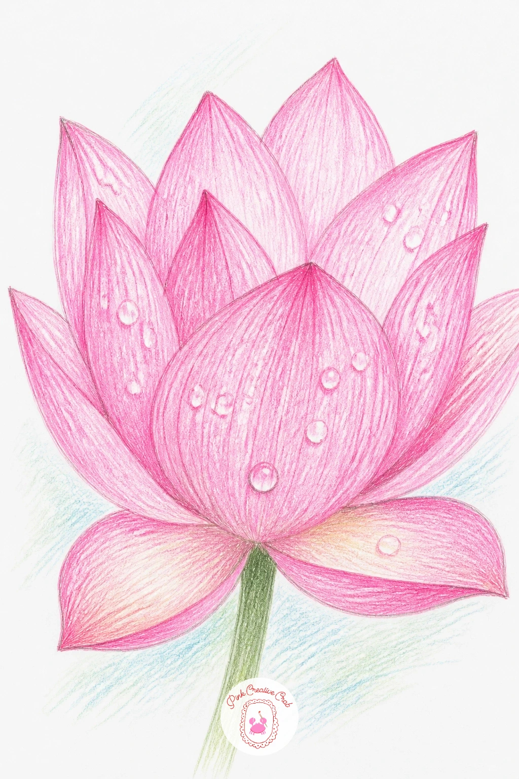
Scatter a few dew drops across a lotus petal next, which is a small, satisfying detail exercise rather than a whole new flower to plan. Draw your bloom as usual, then before you ink the petals, pencil in a handful of small circles and teardrops where the drops will sit, varying their size so they feel scattered rather than lined up.
Color the petal fully first, then go back into each drop shape and leave a tiny white gap near the top for the highlight, with a thin curved line of darker pink or green just beneath it to suggest the drop’s weight pulling the color down slightly. A white gel pen dot on top of the dry pencil layer finishes the shine.
The quick ten minute version is three or four drops on one petal; the forty minute version spreads a dozen smaller drops across the whole bloom and onto the pad as well, which takes real patience but reads beautifully once finished.
If gel pen is not available, a sharp white colored pencil pressed firmly gives nearly the same glint. Keep every drop’s highlight on the same side, since that consistency is what makes them look lit by one light source instead of randomly placed.
You Will Need
- white gel pen
Palette: Soft Pink,Jade Green,White
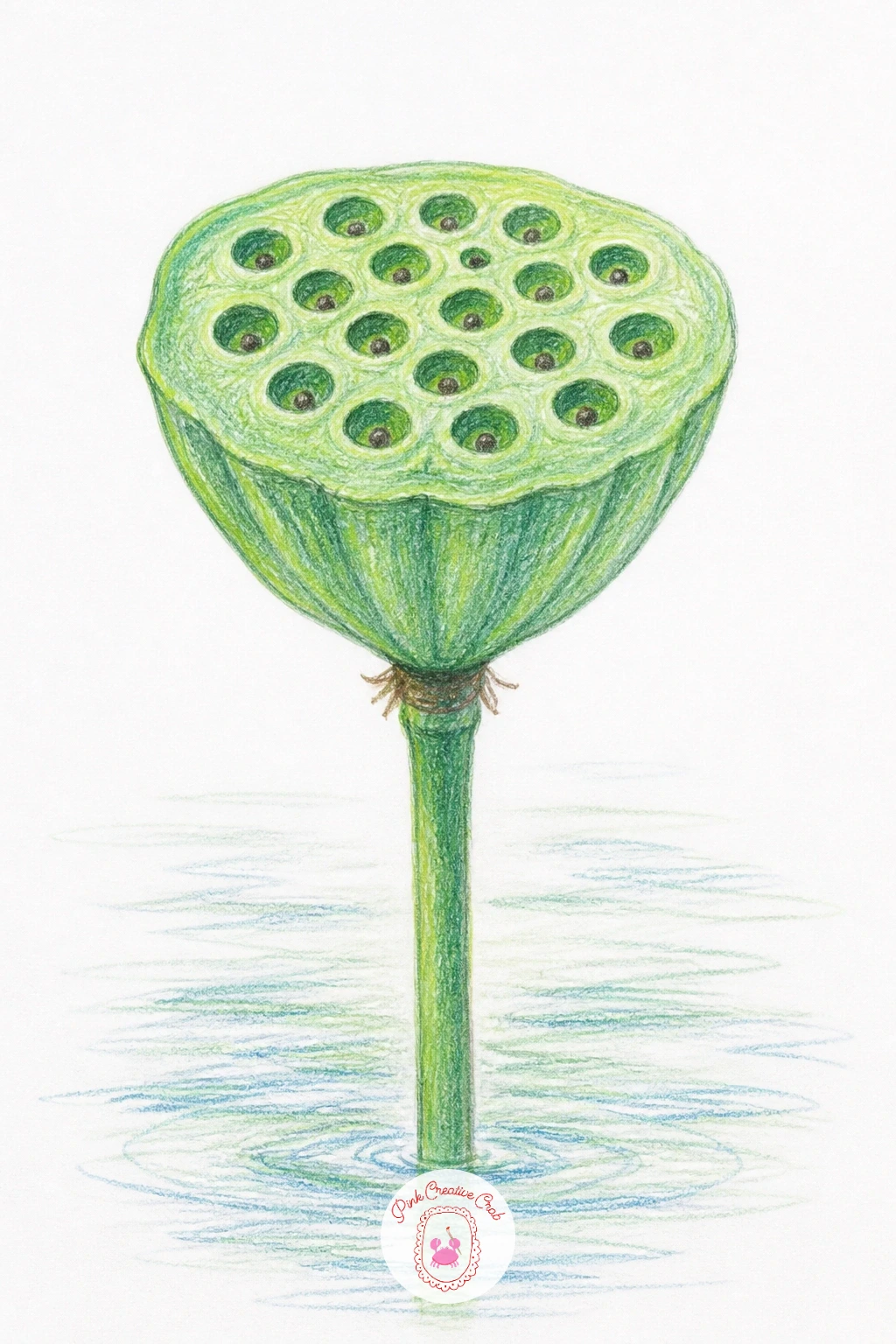
Give the flower a rest and draw a lotus seed pod instead, that flat topped cone studded with round seed holes that looks almost architectural compared to the soft petals you have been drawing. Start with the basic cone shape and a slightly domed top, then pencil in a grid of small circles across the top face, keeping them irregular rather than perfectly even.
Ink the outer cone shape and each circle in fineliner, then shade the body in Jade Green with Payne’s Grey worked into the shadowed underside, and leave the seed holes themselves mostly open with just a thin dark ring inside each one.
The spacing of those seed holes is what makes or breaks this drawing, so lightly mark a faint grid of guide dots before you draw any circles rather than placing them freehand, which keeps them from drifting unevenly toward one edge.
Stand the pod on a short stem over a plain wash of water, or set it on a pad like the first idea for continuity across your pages. A fine brush pen can replace the fineliner if your pen runs dry mid drawing.
Palette: Jade Green,Payne’s Grey,White
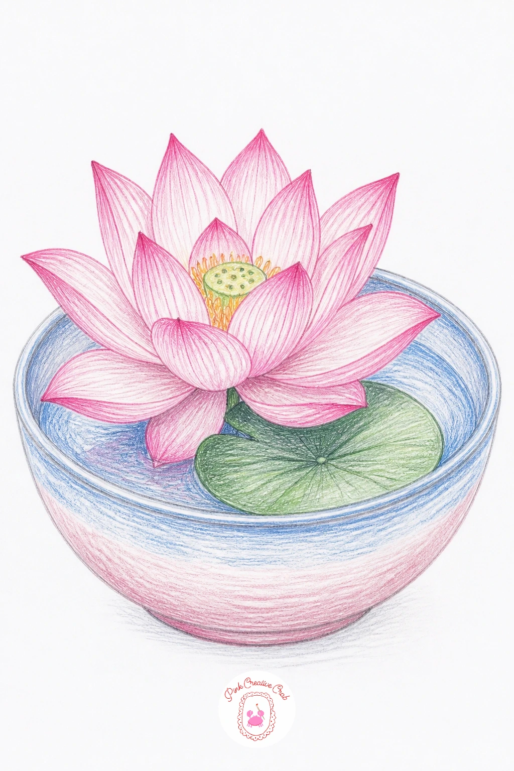
Move the lotus indoors for a lotus in a ceramic bowl, a cut bloom and a leaf or two resting in shallow water inside a simple round bowl rather than growing in a pond. Draw the bowl first as a wide oval rim with a gently curved base, then place the flower and leaf shapes sitting inside and slightly overlapping the rim for a natural, just placed look.
Ink the bowl’s outline before the flower’s, since getting its proportions settled first keeps the whole composition balanced. Color the bowl in a soft neutral or pale blue with a thin darker line along the inner rim to suggest the water line, then bring the usual Soft Pink and Jade Green into the lotus and leaf.
If the bowl’s water line looks awkward, simplify it to one confident curved stroke rather than several short ones, since a single clean line reads as still water far better than a jagged one.
No ceramic bowl to reference means any round dish or even a mixing bowl from the kitchen works as a stand in for shape. Keep the bowl’s pattern, if you add one, simple enough not to compete with the flower.
Palette: Soft Pink,Jade Green,Pond Blue,White
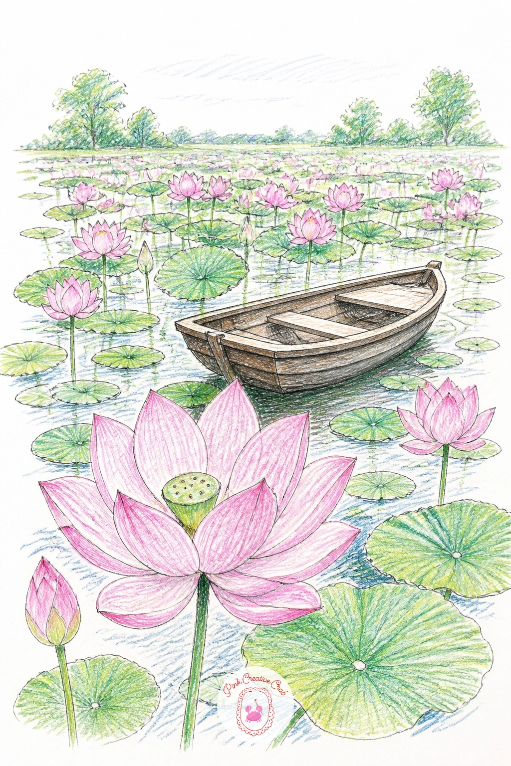
Widen the view again for a lotus field with a boat, a small wooden rowboat tucked among scattered pads and blooms that stretch toward the back of the page. Lay the boat in first as a simple curved hull shape sitting slightly below the lotus leaves around it, then scatter pads and a few blooms around and behind it, shrinking them as they move toward the horizon.
Ink the boat with slightly heavier, more confident fineliner lines than the softer lotus outlines, which helps it read as the solid object among the plants. Color the hull in a warm neutral brown and let the lotus pads around it stay in the familiar Jade Green and Pond Blue.
Try the quick version with just the boat and three or four nearby pads; the longer version fills the whole background with smaller, lighter blooms fading toward the top of the page for real depth.
Fans of garden and pollinator scenes might also enjoy pairing this one with a page from bee watercolor ideas for a matching set of calm nature spreads. Keep the boat’s reflection as one soft wobbly line beneath it rather than a mirror copy.
Palette: Jade Green,Pond Blue,Soft Pink,Burnt Sienna
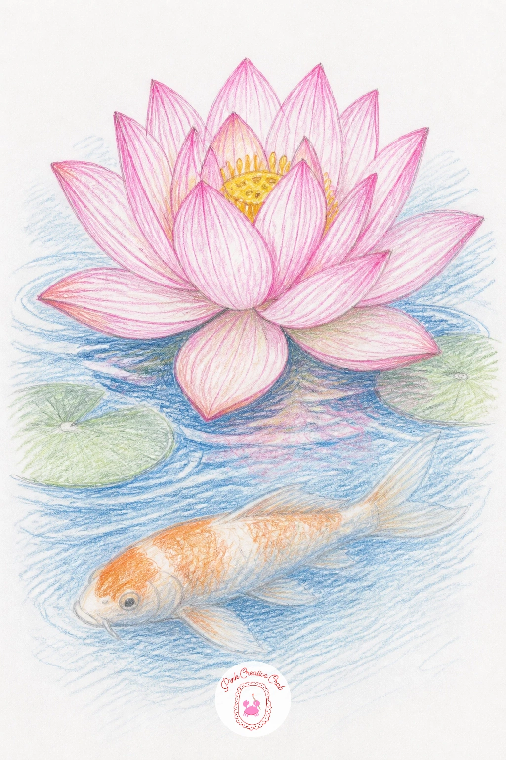
Add a koi fish drifting beneath the surface for this next scene, its pale orange shape half hidden under a lotus pad and bloom above. Draw the lotus and pad on the water’s surface first, then sketch the koi as a simple curved body shape beneath it, slightly distorted and softened at the edges to suggest it is seen through water.
Ink the lotus normally but keep the koi’s outline looser and lighter, almost dissolving at the tail, which is what sells the feeling of looking down through water rather than at a fish on dry land. A thin wash of Pond Blue over the koi afterward pushes it further back visually.
If the koi ends up looking too sharp and solid, soften its edges with a blending stump or your finger right after laying down the orange, before it sets, which smears it just enough to feel submerged.
No blending stump means a cotton swab works nearly as well for that soft underwater edge. Keep the koi smaller than the lotus above it so your eye still lands on the flower first.
You Will Need
- blending stump (optional)
Palette: Soft Pink,Jade Green,Pond Blue,Burnt Sienna
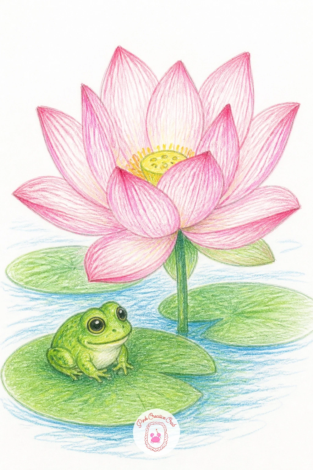
Perch a small frog on a pad beside the lotus for a bit of gentle character in the scene. Draw the pad large enough to hold both the frog and part of the flower’s stem, then build the frog from two overlapping circles, a rounder body and a slightly smaller head, with simple bump shapes for the eyes sitting on top.
Ink the frog’s outline with a slightly thicker line than the delicate lotus petals nearby, which helps its solid little body stand apart from the soft flower. Color it in Jade Green with a paler green belly, and add a tiny dark dot inside each eye bump for the pupil.
Frog proportions go wrong fastest at the legs, so compare the length of the back legs to the body before inking: tucked frog legs are usually no longer than the body itself, and making them too long is what tips a cute frog into looking awkward.
Keep the frog simple and round rather than detailed, since a cartoon-simple frog actually suits this calm botanical style better than a realistic one. Sit it slightly off center on the pad for a more natural pose.
Palette: Jade Green,Soft Pink,White
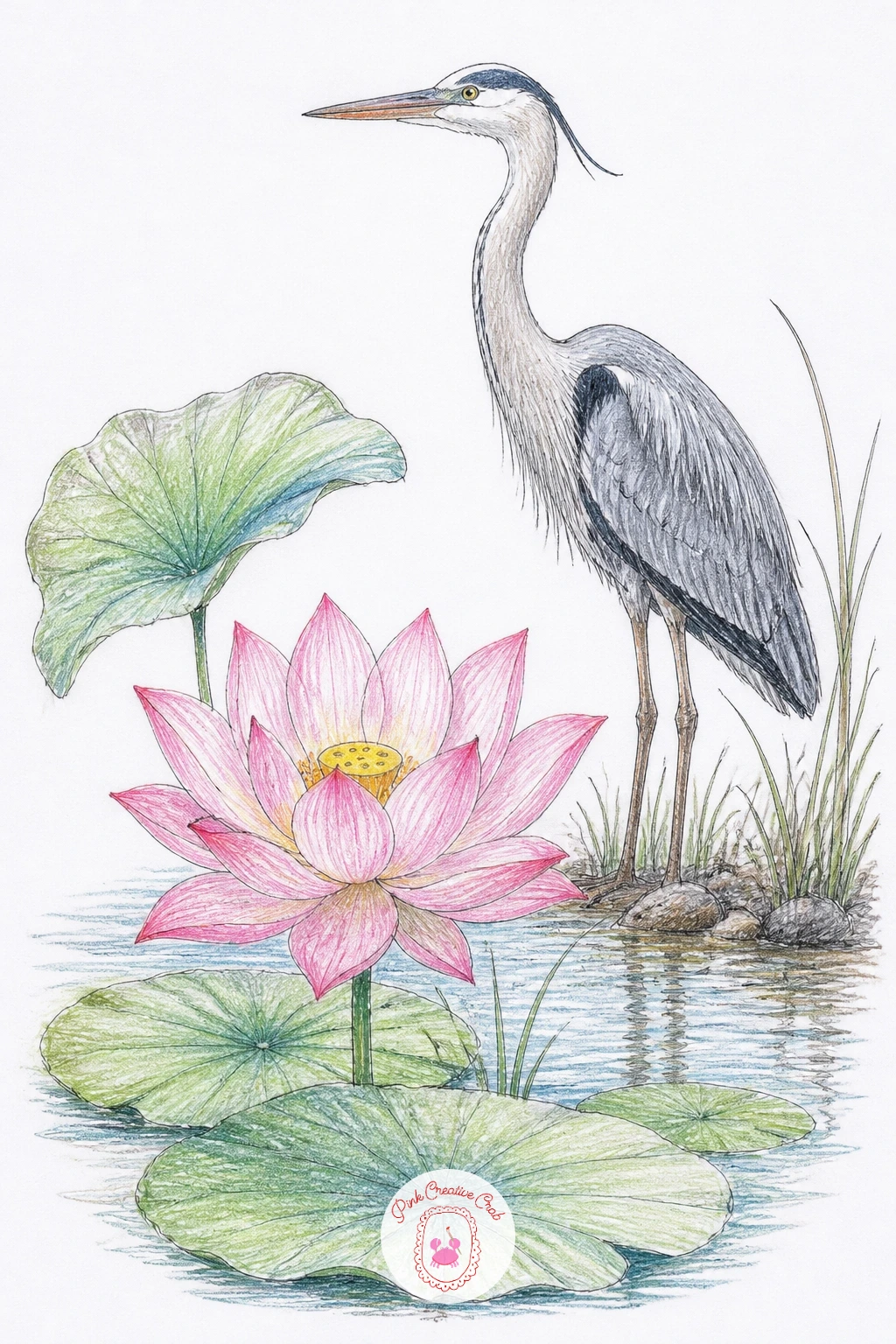
Bring in a heron standing at the water’s edge for a taller, more elegant companion to the lotus. Sketch the heron’s long legs and curved neck first as simple flowing lines, since getting that S-curve of the neck right early makes everything else fall into place, then add the lotus blooms at a lower level nearby so the bird’s height has something to contrast against.
Ink the heron with thin, confident lines along its legs and beak, and keep its body feathers suggested with just a few short curved strokes rather than fully rendered. Color it mostly in soft greys and white, with a touch of Payne’s Grey along the wing and back.
If the legs look too thick or clumsy, thin them with careful eraser work rather than redrawing from scratch, since heron legs read as elegant mainly through how fine and straight they stay.
This pairs naturally with other graceful water bird subjects, so if you enjoy this one, the swan painting ideas make a lovely next page to try. Keep the heron’s stance still and balanced on one leg for extra calm.
Palette: Payne’s Grey,White,Soft Pink,Jade Green
Try a lotus shaped lantern floating on dark water next, a lovely subject for anyone who enjoys a bit of glow in their drawings. Shape the lantern just like an open lotus bloom, but add a small flame or warm glow at its center, and let the petals look slightly papery and folded rather than soft and natural.
Ink the lantern’s petal folds with a few extra crease lines compared to a real flower, since that detail is what reads as paper rather than petal. Color it in warm Soft Pink and a touch of golden yellow near the center, then darken the water around it with layered Pond Blue and Payne’s Grey so the lantern’s glow stands out by contrast.
The easiest way to make the glow convincing is to leave a soft ring of untouched or very pale paper around the flame before you darken the surrounding water, rather than coloring everything evenly and trying to add light back in afterward.
Short on a yellow pencil, a pale orange works just as well for the warm center glow. Keep the water dark and simple so all the warmth stays focused on the lantern itself.
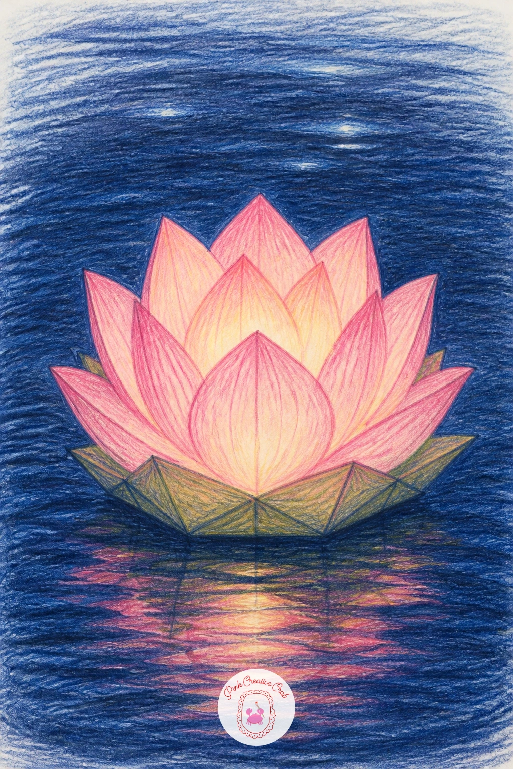
Palette: Soft Pink,Golden Yellow,Pond Blue,Payne’s Grey
Keep the indoor theme going with a lotus in a small glass vase, one of the trickier subjects on this list because glass needs careful handling of light and transparency. Draw the vase as a simple cylinder or gently curved shape first, then place the flower and a leaf inside it, letting the stems bend slightly where they would appear to break at the waterline inside the glass.
Ink the vase’s outer edges only, then shade it with the lightest touches of Pond Blue along one side and leave most of the glass as bare white paper, since glass reads as transparent mainly through what you leave uncolored rather than what you add.
If the water-filled part of the vase looks confusing, simplify it to one horizontal line marking the waterline and a faint vertical shadow where the stem bends, rather than trying to render the glass realistically throughout.
A clear jam jar makes a fine stand-in reference if you do not have an actual vase nearby. Keep the stem’s bend subtle, just a slight shift rather than a sharp angle, for a believable refraction.
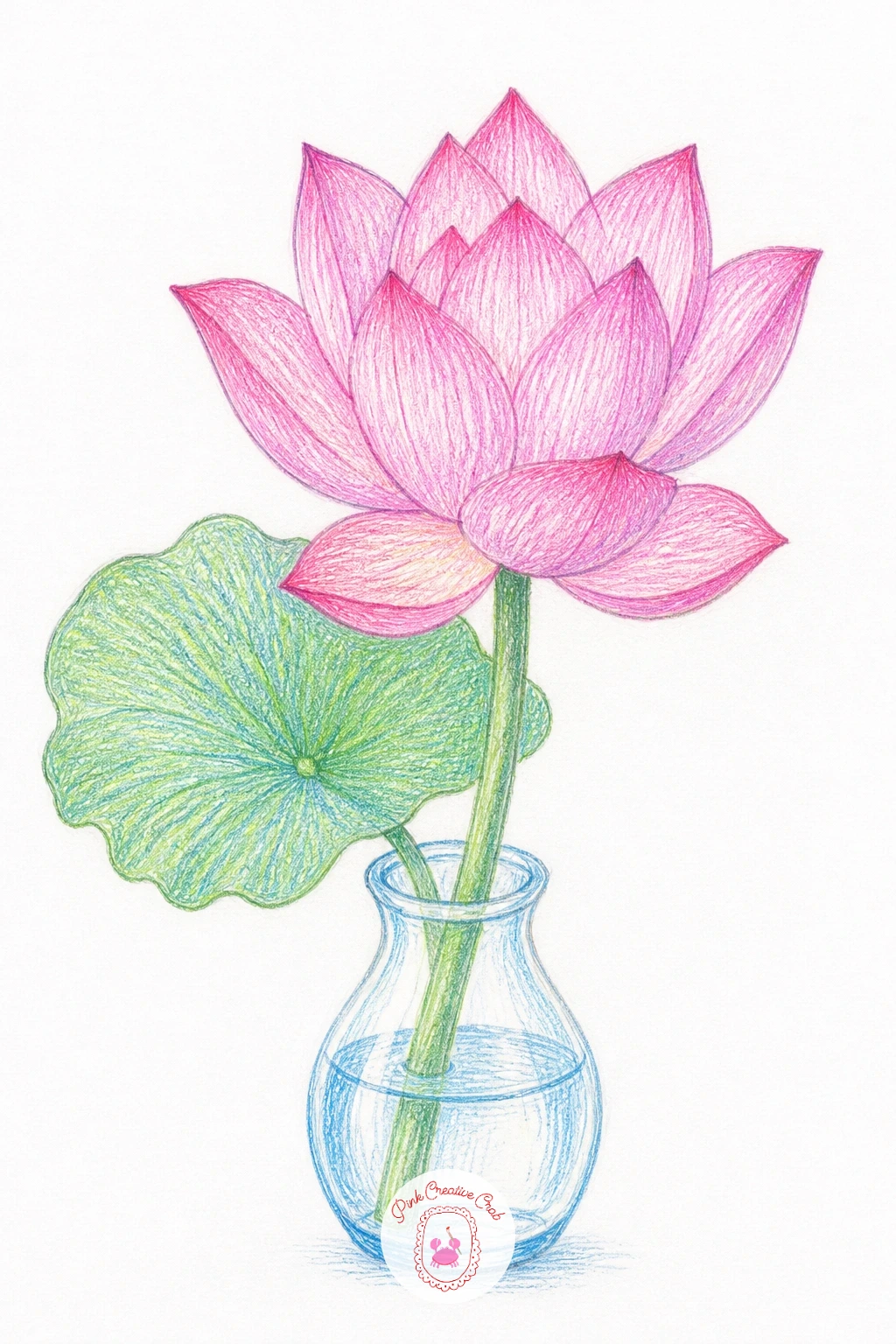
Palette: Pond Blue,Soft Pink,Jade Green,White
Give this one a quiet night mood: a lotus bloom silhouetted against a full moon with its reflection rippling on dark water below. Place the moon as a large pale circle first, positioned slightly off center near the top of the page, then draw the lotus bloom and pad so part of it overlaps the moon’s lower edge for a dramatic silhouette.
Ink the lotus with a heavier, darker outline than usual since it sits mostly in silhouette here, and leave the moon itself nearly white with just a faint grey crescent shadow for roundness. Build the water below in deep Payne’s Grey and Pond Blue, then add a few short broken horizontal lines beneath the moon to suggest its reflection breaking on ripples.
The moon’s reflection is what makes or loses this piece, so keep the reflected lines directly beneath the moon and slightly shorter as they go down, rather than scattering them randomly across the water.
If dark colored pencils feel too light to get a true night sky, layer Payne’s Grey over a base of dark green or blue for more depth before adding a final black layer only where needed. Keep the moon the brightest point on the page.
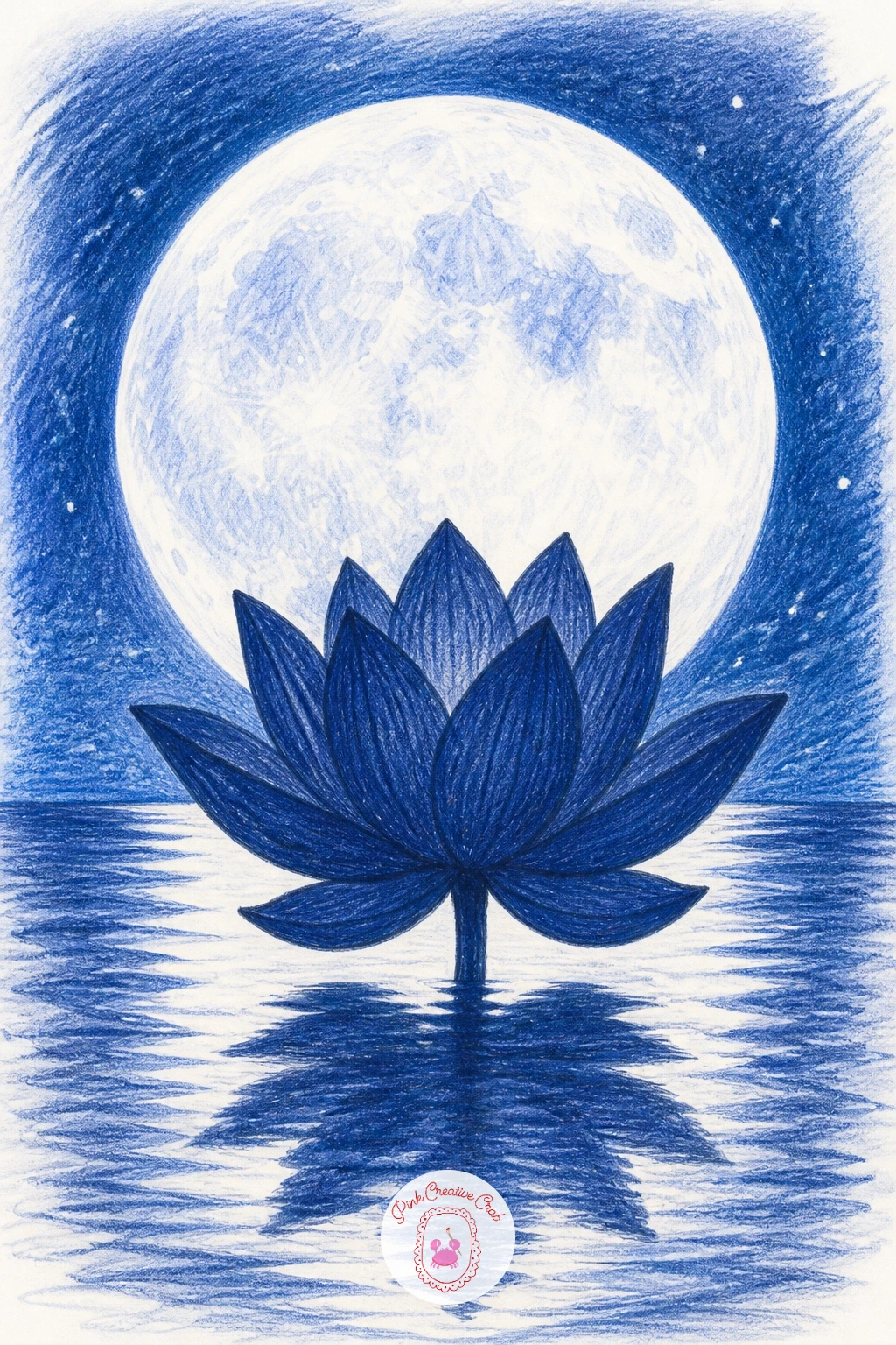
Palette: Payne’s Grey,Pond Blue,White,Jade Green
Move on now to the lily’s own pond, starting with a water lily and its pad, which looks close to the lotus but has flatter, more pointed petals and a notched pad with a slit cut toward the center. Sketch the star-pointed petal ring first, then draw the pad beneath it with that single characteristic notch cut into one edge, which is the detail that tells a lily pad apart from a lotus pad at a glance.
Ink the petals with slightly sharper points than you used for the lotus, then color in White or pale Soft Pink with just a touch of yellow at the very center where the stamens cluster.
If the petal points look too soft and round, sharpen just the very tip of each one with a fresh fineliner stroke after the color is down, which crisps the whole flower up without needing to redraw it.
Any pale pink or white pencil works if you are missing a dedicated lily shade. Keep that pad notch visible and clear, since it is the single easiest way to tell this flower apart from the lotus pages before it.
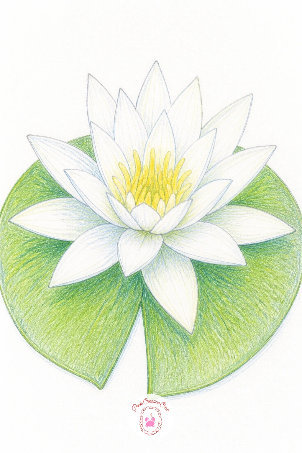
Palette: White,Soft Pink,Golden Yellow,Jade Green
Try the same lily shape again but in blue this time, since a blue water lily lets you lean fully into the Pond Blue end of your palette for a change of mood from all the pink so far. Build the petal structure exactly as before, then layer Pond Blue from the petal base outward, deepening it slightly at the center where the petals overlap most.
Keep the very tips of the petals paler, almost white, since that light-to-dark gradient from tip to base is what gives each petal a sense of form rather than flat color. Ink the outlines before or after color depending on which you find easier to control, both work fine here.
If the blue starts to look muddy where layers overlap too much, lift some color back out with a kneaded eraser before adding more, rather than piling on darker blue to try to fix it.
No deep blue pencil on hand, a mix of light blue with a little purple layered on top gets you close. Keep the yellow center small and bright so it still pops against all that cool blue.
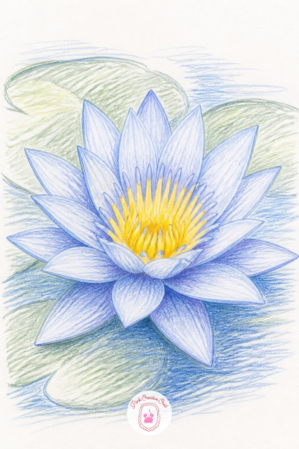
Palette: Pond Blue,White,Golden Yellow,Jade Green
Swap in a lilac or lavender pencil next time instead of pure blue for a softer, more unusual lily color variation.
Water hyacinth makes a lovely change of pace, its rounded, slightly puffy leaves and tall spike of small purple flowers looking quite different from anything drawn so far. Start with the bulbous leaf base shapes clustered together at the bottom, since those puffy stems are what the plant is known for, then add the upright flower spike rising from the center with several small bell shaped blooms stacked along it.
Ink the puffy leaf bases with soft rounded outlines and keep the flower spike’s individual blooms small and simple, just a few petal strokes each rather than fully detailed flowers. Color the leaves in Jade Green and the blooms in a soft lilac or pale purple with a tiny yellow dot at the center of each.
If the puffy leaf bases end up looking too much like plain ovals, add one or two curved highlight lines along their rounded sides to suggest that swollen, air filled texture that makes this plant float.
A light purple pencil can stand in for lilac if that is what is in your set. Keep the whole plant looking buoyant by leaving a little white space between each leaf cluster.
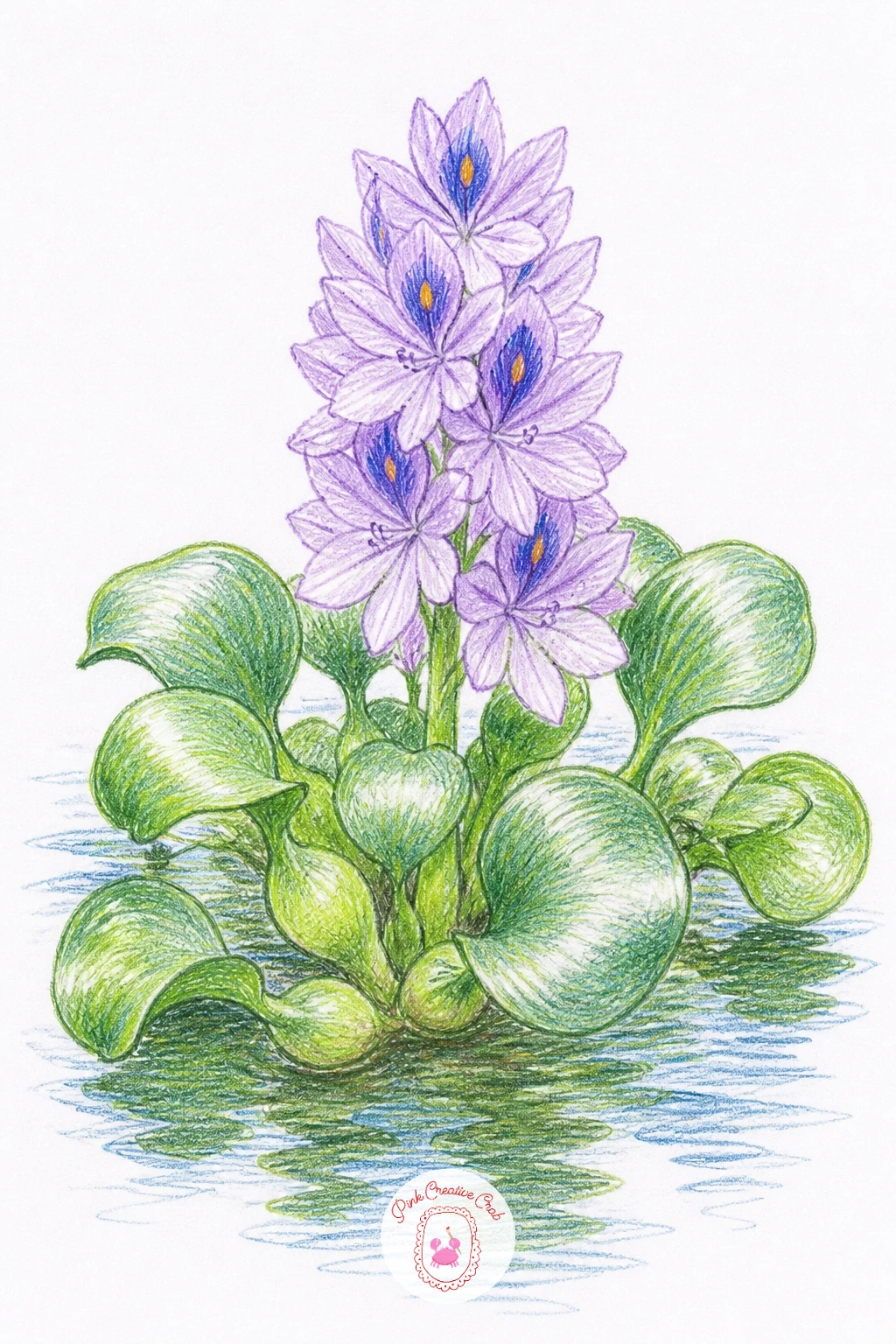
Palette: Jade Green,Lilac,Golden Yellow,White
An iris growing at the pond’s edge brings tall, narrow leaves and those distinctive ruffled falling petals into the mix. Draw the sword shaped leaves first as a loose fan rising from the base, then add the flower above them with three petals curving upward and three more falling downward, each with a slightly ruffled edge.
Ink the flower’s ruffled petal edges with small wavy strokes rather than smooth lines, since that waviness is exactly what gives iris petals their character. Color the petals in a rich purple or blue with a touch of yellow detailing at the base of the falling petals, and keep the leaves in a slightly grey-green rather than pure Jade Green for contrast.
If the ruffled edges end up looking messy instead of elegant, keep the waviness small and even along each edge rather than large and irregular, which reads as careless instead of naturally frilled.
For more purple garden flower practice afterward, the iris painting ideas make a fitting next stop. Keep the leaf fan a bit taller than the flower itself for a natural proportion.
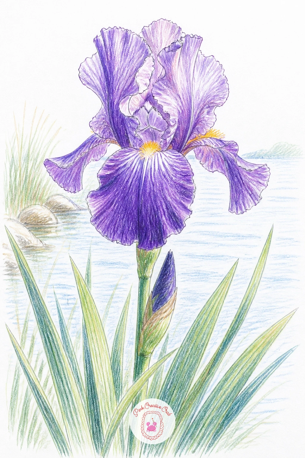
Palette: Lilac,Golden Yellow,Jade Green,Payne’s Grey
Cattails offer a satisfying break from petals altogether, since the whole plant is really just tall straight leaves and a few brown velvety spikes. Draw three or four leaf blades first as long gently curving vertical lines of varying height, then add the cylindrical brown spikes partway up a few of them, each one a simple elongated oval shape.
Ink the leaves with long confident single strokes rather than short choppy ones, since a cattail leaf should look like it was drawn in one smooth motion. Color the spikes in a warm brown with tiny flecks of darker brown dabbed on for that fuzzy texture, and keep the leaves in muted Jade Green fading toward a yellower green at the tips.
If the leaves come out looking stiff, loosen your wrist and redraw just one or two with a slight wave partway up, since real cattail leaves rarely stay perfectly straight top to bottom.
A dry brush or even a slightly blunt pencil edge dragged lightly over the spike gives a nice rough, fuzzy texture without needing any special tool. Keep spikes at varied heights along the cluster for a natural look.
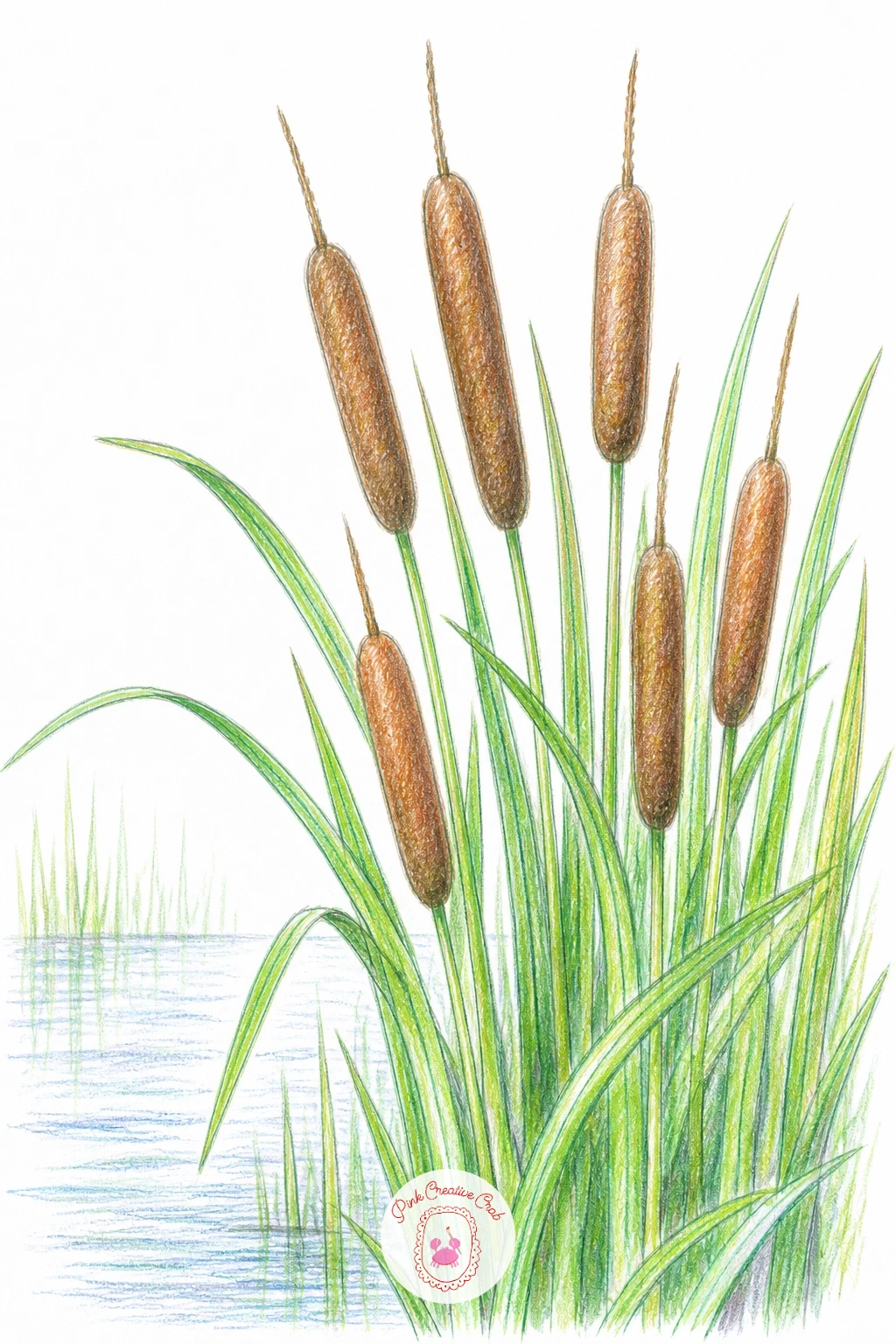
Palette: Burnt Sienna,Jade Green,Payne’s Grey
Pickerelweed gives you another tall spike flower, but softer and more delicate than the cattail, its small purple-blue blooms clustered densely along a single upright stalk above heart shaped leaves. Draw one or two large heart shaped leaves low on the page first, then add the flower spike rising above them, built from a tight cluster of tiny five petal blooms stacked close together.
Rather than inking each tiny bloom individually, which gets fussy fast, outline the spike’s overall cone shape in fineliner and only suggest a few individual flower shapes near the edges, letting the rest read as texture. Color the spike in Lilac with small darker purple dots scattered through it, and keep the heart leaves in a glossy looking Jade Green with a pale highlight stroke down the center.
If the flower cluster starts looking like a solid purple blob, break it up with three or four short white gaps scattered through the color, which reads instantly as individual tiny blooms without extra drawing.
No lilac pencil handy, light purple over a thin blue base gets a close match. Keep the leaves large relative to the spike, since pickerelweed’s leaves are genuinely substantial next to its flowers.
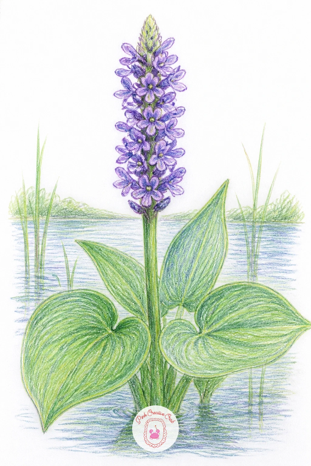
Palette: Lilac,Jade Green,White
Marsh marigold brings warm yellow back into the palette with its cheerful, buttercup-like blooms and rounded glossy leaves. Draw the rounded kidney shaped leaves first in a loose cluster, then add several simple five or six petal flowers scattered above and among them, each petal a smooth rounded shape rather than pointed.
Ink the flowers with soft rounded petal outlines, then color them in bright Golden Yellow with a slightly darker yellow or orange shading near the center where the petals meet. Keep the leaves in a glossy Jade Green with a confident white highlight stroke left along the curve of each one to suggest their shine.
If the yellow flowers start blending into the background too much, deepen the green around their edges slightly, which pushes the warm yellow forward by contrast without needing to darken the flowers themselves.
This is a lovely one to revisit later scattered loosely across a page instead of in one tight cluster, letting a few blooms sit further apart as if spread along a longer stretch of marsh.
One concrete tip for today: leave those white highlight strokes on the leaves before you color anything else nearby, since it is much easier to leave white space early than to lift it back out later.
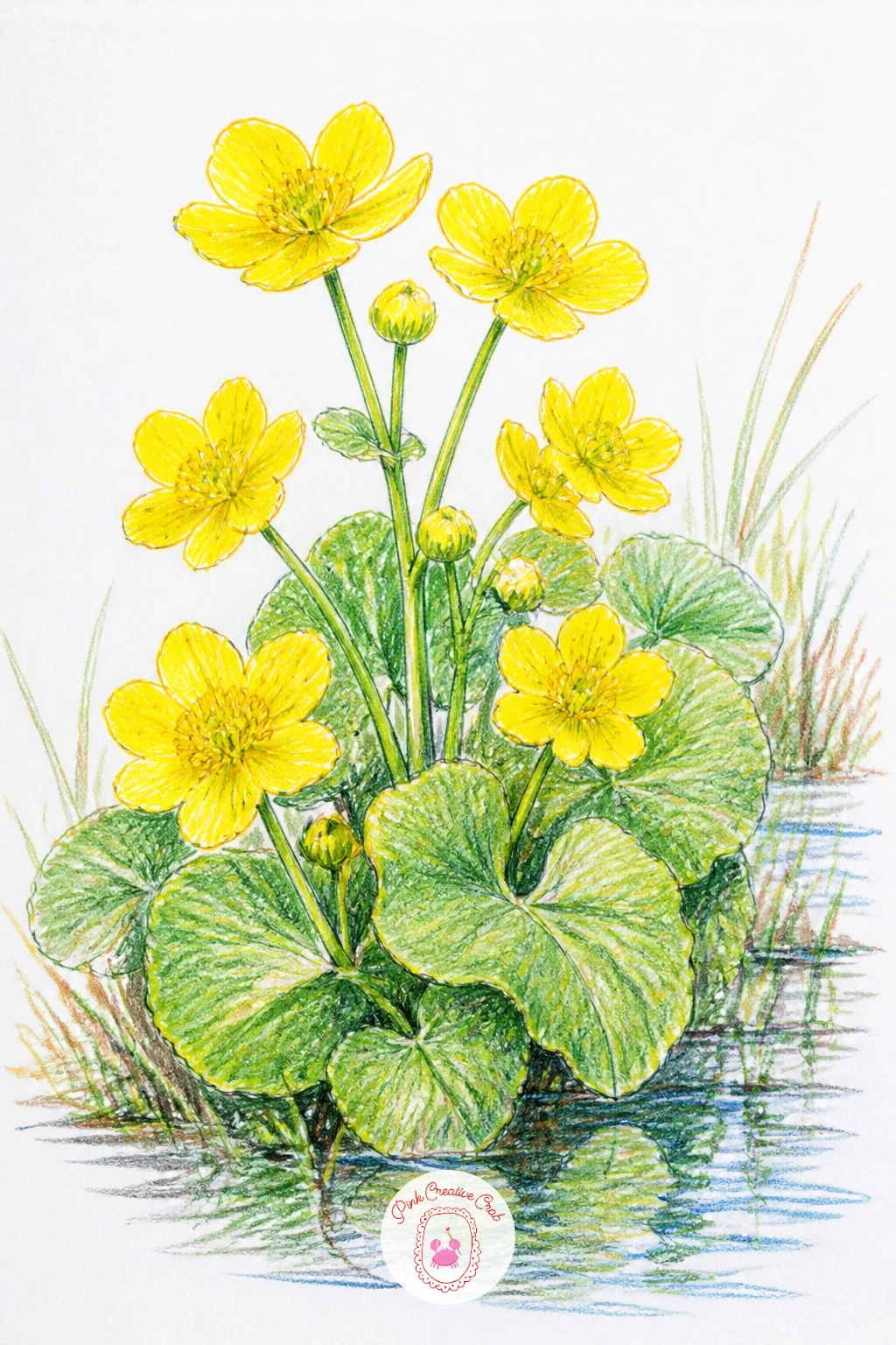
Palette: Golden Yellow,Jade Green,White
Bring a tiny snail onto a single floating lily pad for a quiet, close-up moment with almost no flower in sight. Draw the pad large, filling most of the page, with its characteristic notch cut into one edge, then add the snail perched near the rim, its shell a simple tight spiral and its body a small curved line trailing beneath it.
Ink the pad’s edge with a slightly wavy, organic line rather than a perfectly smooth curve, since real lily pads ripple gently at the edges. Color the pad in layered Jade Green, lighter near the center and deepening toward the rim, and give the snail’s shell a warm Burnt Sienna with a thin spiral line in a darker brown.
If the spiral shell looks lumpy, draw it as one continuous curved line from the center outward in a single confident stroke rather than several short connected arcs, which is what keeps a spiral looking smooth.
No brown pencil in the set, a mix of yellow and a touch of red layered together gets you close enough. Keep the snail small relative to the pad so the whole scene still feels calm and spacious.
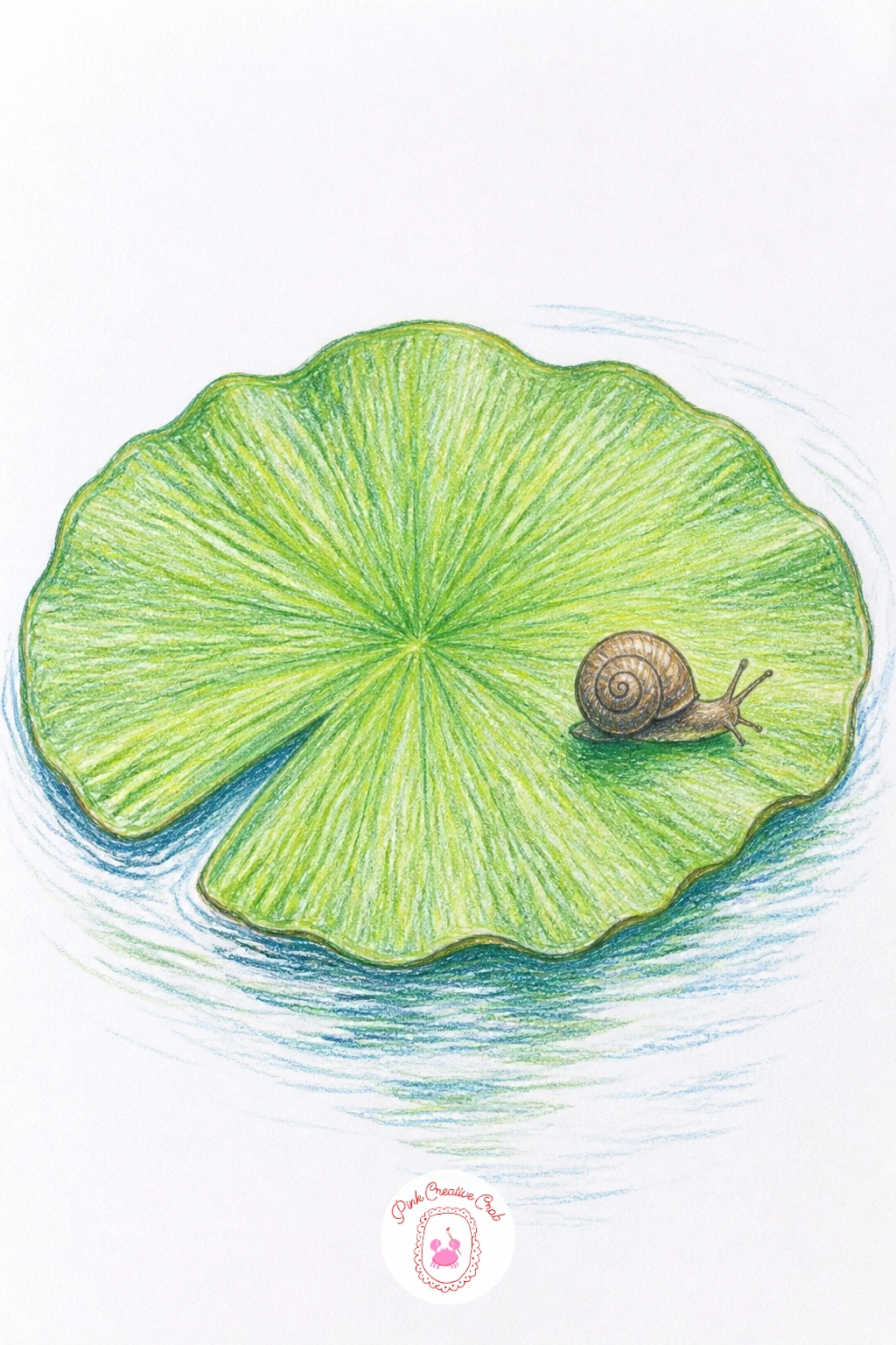
Palette: Jade Green,Burnt Sienna,White
Pull back for a wider view again with a water lily pond and a small arched bridge crossing it in the background. Place the bridge first as a simple curved arch spanning the upper portion of the page, then scatter several lily pads and blooms across the water below, keeping the ones nearest the bridge smaller to suggest distance.
Ink the bridge with clean, slightly heavier lines than the soft lily shapes, giving it a sense of solid structure against the loose organic plants. Color it in a muted grey or soft red depending on the look you want, then fill the water below in your familiar Pond Blue with scattered white and pink lilies breaking up the surface.
If the bridge’s arch looks uneven, lightly sketch a faint guideline circle first and trace just the lower portion of it for the curve, rather than freehanding the whole arch in one go.
For another calm bridge and water composition to compare notes with, the easy watercolor flower for beginners ideas offer a nice contrast in medium. Keep the bridge smaller in the frame than the lilies in front, so the flowers still read as the main subject.
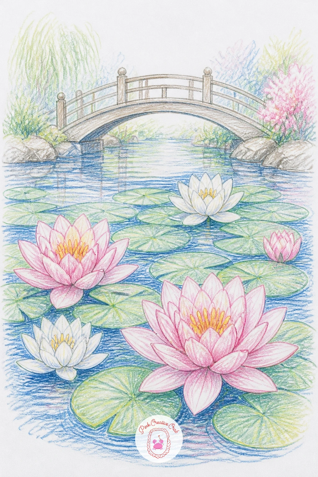
Palette: Pond Blue,White,Soft Pink,Payne’s Grey
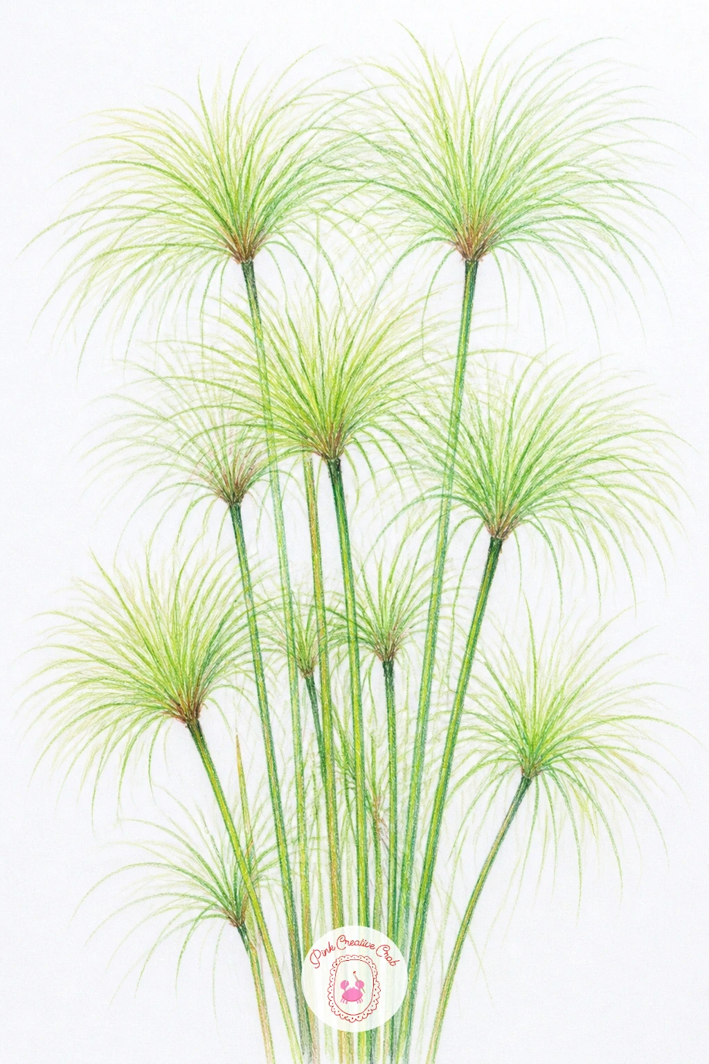
Papyrus brings an almost architectural pattern into the mix, its tall bare stems topped with a burst of thin feathery fronds that fan out like little fireworks. Draw the stems first as a cluster of tall straight vertical lines of varied height, then add the frond bursts at the top of each one, made from many thin lines radiating outward from a single point.
Ink each frond burst one stem at a time rather than trying to do them all at once, since keeping track of a single radiating cluster is much easier than juggling several together. Color the stems in a soft yellow-green and the frond tips in a slightly deeper Jade Green, letting a few individual thin lines stay uncolored as highlights.
If the frond bursts start looking too even and mechanical, vary the length of a few lines within each burst so they splay slightly unevenly, which reads as far more natural than a perfectly symmetrical starburst.
A fine brush pen or an extra sharp pencil point helps keep those thin radiating lines crisp if your fineliner has started to wear down. Keep the stems clean and simple so the busy frond tops stay the clear focus.
Palette: Jade Green,Golden Yellow,White
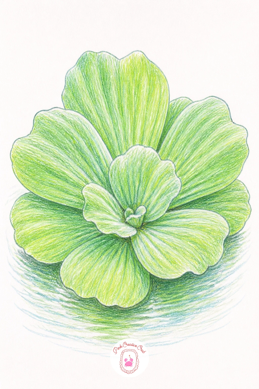
Water lettuce floats as a neat rosette of ribbed, velvety leaves that looks almost like a small floating cabbage, and it makes a nice simple single-subject piece to finish quickly. Draw the rosette as a tight circular cluster of overlapping leaf shapes, each one a rounded scallop with visible rib lines running from base to tip.
Ink those rib lines carefully since they are the main texture feature here, keeping them slightly curved to follow the natural fold of each leaf rather than drawing them perfectly straight. Color the leaves in a pale, slightly silvery Jade Green, leaving the rib lines themselves a touch lighter than the surrounding leaf surface.
If the leaves start to look flat and papery instead of velvety, go back in with very light, closely spaced colored pencil strokes following the direction of the ribs, which builds a soft textured surface more convincingly than one even flat layer.
No silvery green pencil in your set, a regular light green with a thin layer of grey over the top gets a similar muted effect. Keep the whole rosette small and compact, since water lettuce sits low and tight on the water rather than spreading wide.
Palette: Jade Green,White,Payne’s Grey
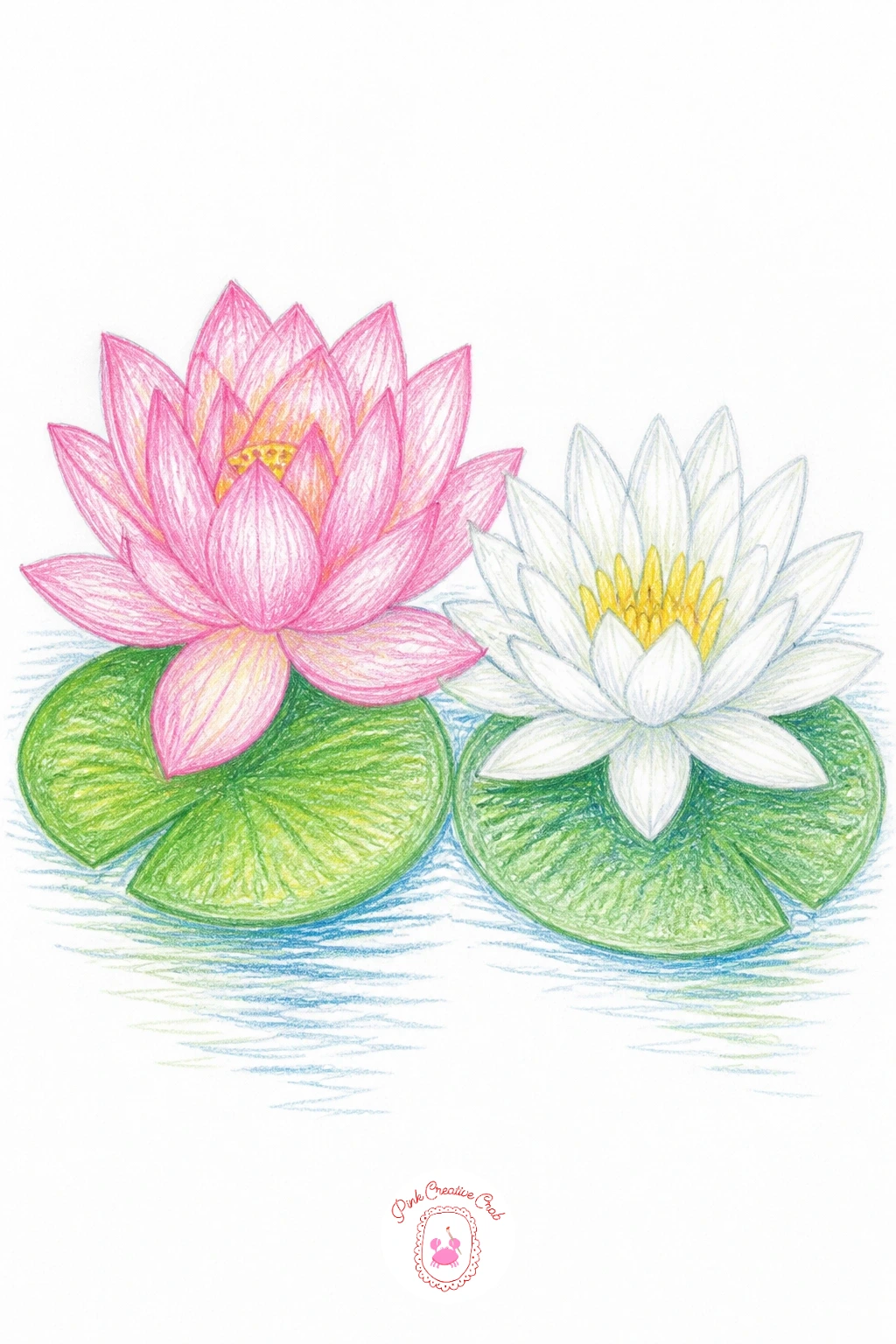
Bring the two main flowers of this whole article together now, a lotus and a water lily floating side by side so the differences between them finally sit right next to each other on the page. Draw the lotus on one side with its rounder, more overlapping petals and its characteristic raised pad, then add the lily on the other side with its flatter, more pointed star shaped petals and notched pad.
Ink each flower using the techniques from earlier in this list, the lotus with its layered petal rings and the lily with its sharper petal points, keeping a little open water space between them rather than letting them touch. Color the lotus in Soft Pink as before and the lily in White or pale yellow, so the contrast in both shape and color reads clearly at a glance.
If the two flowers start to look too similar once colored, double check the petal counts and pad notch again before finishing, since those two details are what actually separate a lotus from a lily rather than color alone.
This pairing also makes a lovely two-flower companion to a page from peony painting ideas if you want to keep building a set of calm floral studies. Keep both flowers roughly the same size so neither one dominates the composition.
Palette: Soft Pink,White,Jade Green,Pond Blue
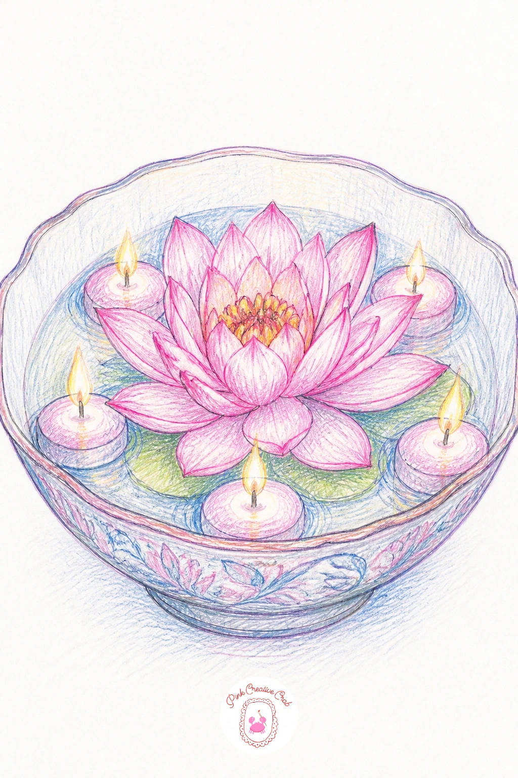
Close the whole set with a lotus bowl with floating candles, a wide shallow bowl holding a cut lotus bloom alongside a few small floating candles, their flames giving the page one last warm glow to finish on. Draw the bowl as a wide, shallow oval first, then place the lotus bloom toward one side and scatter two or three small round candles with tiny flames across the remaining water surface.
Ink the bowl and flower as in the earlier ceramic bowl idea, then treat each candle flame the way you handled the lantern’s glow earlier: leave a pale ring of untouched paper around each flame before coloring the surrounding water, so the light appears to come from within rather than being painted on top.
If the candles end up looking too stiff and evenly spaced, nudge one or two off a straight line and vary their distance from the flower slightly, which makes the whole arrangement feel placed by hand rather than measured out.
A pale orange pencil works as well as yellow for the flame centers if that is what you have. Keep this last piece a little looser than your earlier ones, a relaxed way to close out the whole set.
Palette: Soft Pink,Golden Yellow,Pond Blue,Jade Green
What to Do Next
Pick whichever bloom pulled you in first, whether that is the full pink lotus at the top of the list or the quiet little snail on its lily pad near the end, and gather just your fineliner and a handful of colored pencils before you sit down. One page, one calm scene, finished today.
Frequently Asked Questions
What is the easiest way to start a lotus flower drawing?
Start with the center and build petals outward in loose rings. Sketch lightly in pencil first, check the petal proportions, then ink with a fineliner before adding color so mistakes stay easy to erase.
What colors do I need for a lotus flower drawing?
A soft pink, a pale green, a light blue and white or pale yellow cover most of this list. A handful of extra shades like lilac, golden yellow and Payne’s grey round out the water garden scenes.
How do I stop the lotus petals from looking flat?
Shade from the base of each petal outward, keeping the tip paler than the base. Leaving a thin strip of white or very light color down the center of each petal gives it a sense of curve rather than a flat fill.
What is the difference between drawing a lotus and a water lily?
A lotus has rounder, more overlapping petals and sits raised above the water on a tall pad. A water lily has flatter, more pointed star shaped petals and floats closer to the surface on a notched pad.
Do I need special paper for colored pencil lotus drawings?
Smooth bristol or a similar fine toothed drawing paper works best since it lets colored pencil layer smoothly without the texture fighting the fineliner lines underneath.
Have any thoughts?
Share your reaction or leave a quick response — we’d love to hear what you think!
-
 0
-
0
-
0
-
0
-
0
-
0


