

Sketchbook background ideas turn a plain cream page into something worth opening again and again, and the trick is simple: paint the mood first, draw the subject second. A wash of color or a quick pattern gives you a stage, and then a small fineliner drawing walks right onto it, so the page feels finished in minutes instead of hours.
Below you will find 28 of them, from a one-wash pink sky with a sleepy cat to a tiny sailboat riding a sea-colored page. Keep your water jar close, pick whichever mood matches today, and work your way down the list whenever you want a page that looks far more thought out than the time it actually took.
Using these images: free for personal projects such as printing, coloring, cards, journals and gifts. Handmade items that include them may be sold up to 30 pieces per design. More than that is commercial use and is not permitted, and neither is selling or sharing the images themselves or passing them off as your own. Please ask before any other use.
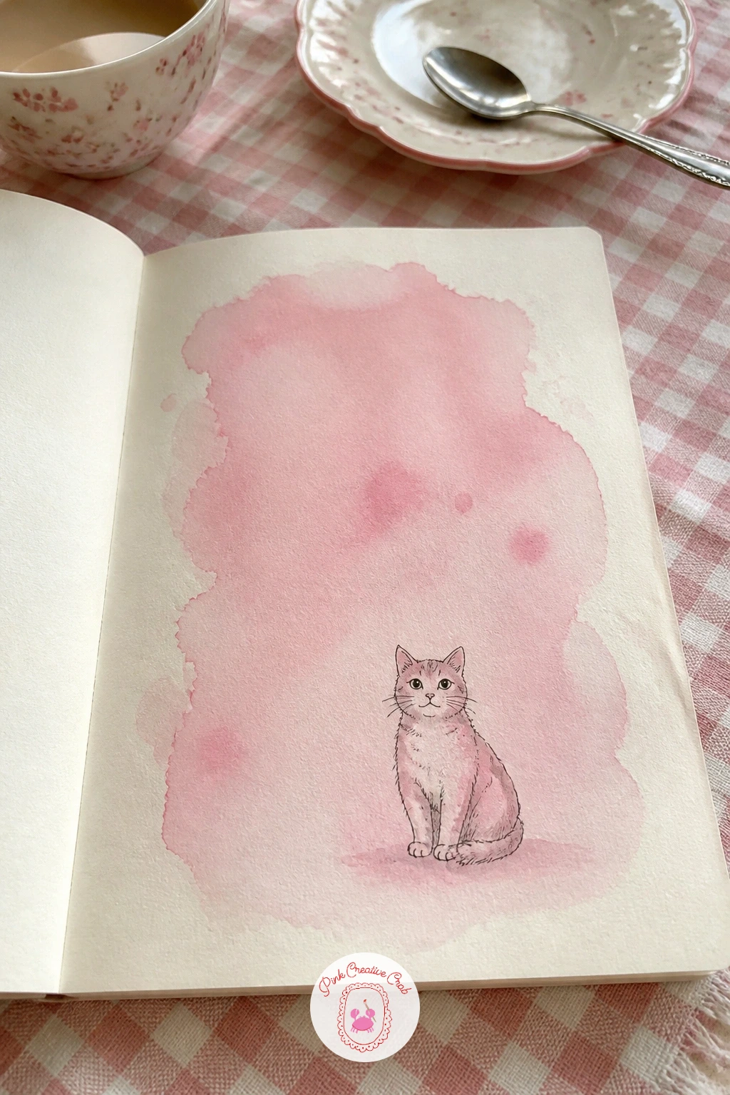
Start the whole list with the easiest trick in the book: wet a clean patch of your page with plain water, then drop in a pale pink watercolor wash and let it pool and lighten toward the edges. Tilt the page slightly so the color settles unevenly, which looks far prettier than a flat tone ever could.
Once the wash is bone dry, pick up a fine black fineliner and draw a simple sitting cat near the bottom third of the page: a rounded body, two triangle ears, a curved tail wrapped around the paws. Keep the line loose and a touch wobbly, that is what gives sketchbook drawings their charm.
If the wash dries blotchy in the middle, do not panic, a cloud of darker pink there just reads as shadow once the cat sits on top of it. No watercolor on hand yet? A pink alcohol marker scribbled and softened with a water brush gets you the same soft glow.
Tip for today: draw the cat slightly off-center rather than dead middle, it makes the whole page feel more like a candid sketch than a stiff illustration.
Palette: Opera Pink,Pale Rose,Ivory Black
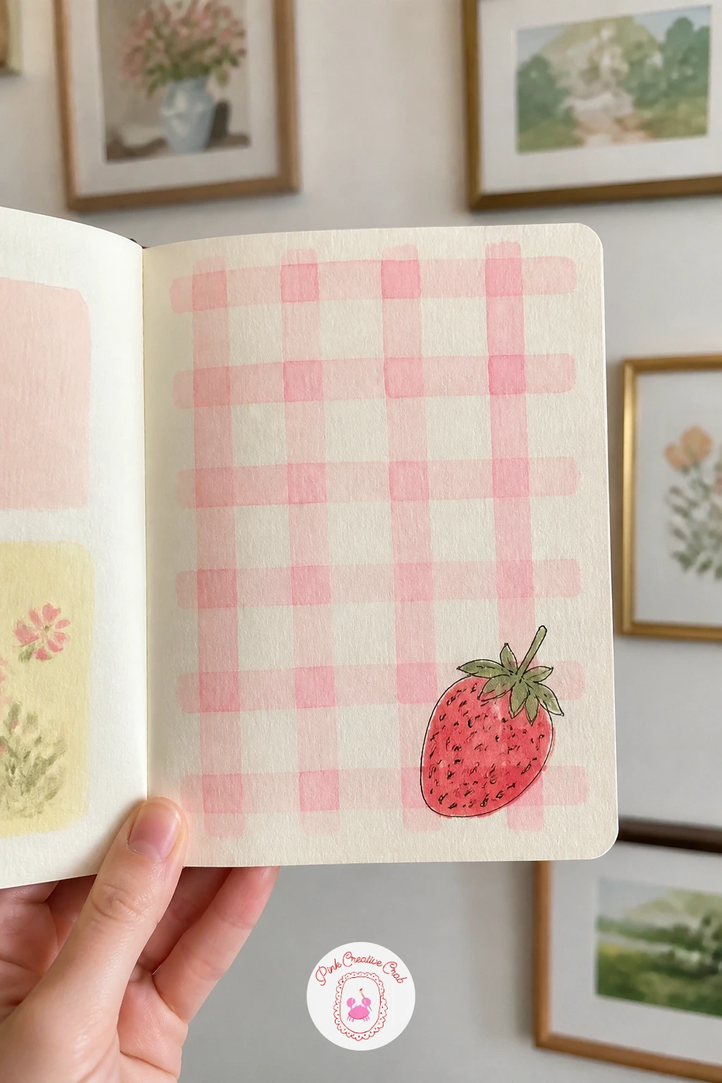
Gingham sounds fiddly but it only needs two steps: a light grid of horizontal pencil lines, then vertical ones crossing them, spaced about the width of your fingertip apart. Fill every other square with a pale pink or sage wash and leave the rest cream, and wherever two colored lines overlap, add a slightly darker touch so the checks read as proper woven gingham.
Once that grid dries, draw one plump strawberry sitting on top near a corner of the page, seeds dotted on with your fineliner and a small green cap of leaves. A single strawberry reads sweeter here than a full bunch would, since the pattern is already doing a lot of visual work.
If your lines wobble, a ruler rescues the grid instantly and nobody will notice the strawberry isn’t ruler-straight too. No watercolor handy? Light pink and sage markers block in the gingham just as fast, since this pattern lives or dies on clean small shapes rather than soft blending.
If strawberries have become a favorite subject, the watercolor strawberries collection has more ways to paint them.
You Will Need
- ruler
Palette: Sage Green,Pale Pink,Cherry Red
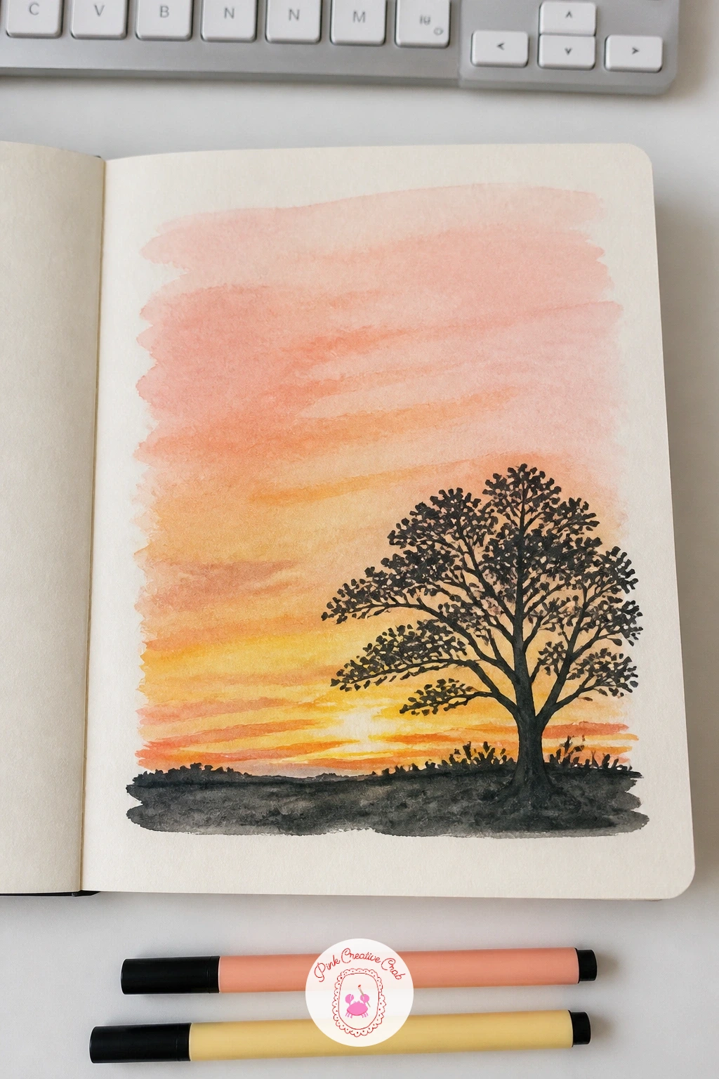
Mix up three puddles of color before you touch the page: butter yellow, soft peach and a dusty pink, then lay them in horizontal bands across the top two thirds of the page, letting each color bleed softly into the next while the paper is still damp. This gradient is the whole trick, so work quickly and let the water do the blending rather than fussing with a brush.
Once it dries, paint or draw one tree as a flat silhouette along the bottom edge: a single trunk splitting into a few bare branches works better here than a full leafy crown, since the shape needs to read instantly against the sunset.
If the bands dry with hard lines instead of blending, a slightly damp brush can soften the seam before it fully sets, or you can call it a stylized striped sky and move on. Soft pastel chalk rubbed with a finger gives a similar gradient glow if you are out of watercolor.
Tip for today: paint the tree silhouette with a flat brush dipped straight in dark paint rather than outlining it in pen first, it keeps the edges soft and true to the sunset mood.
Palette: Butter Yellow,Peach,Dusty Plum
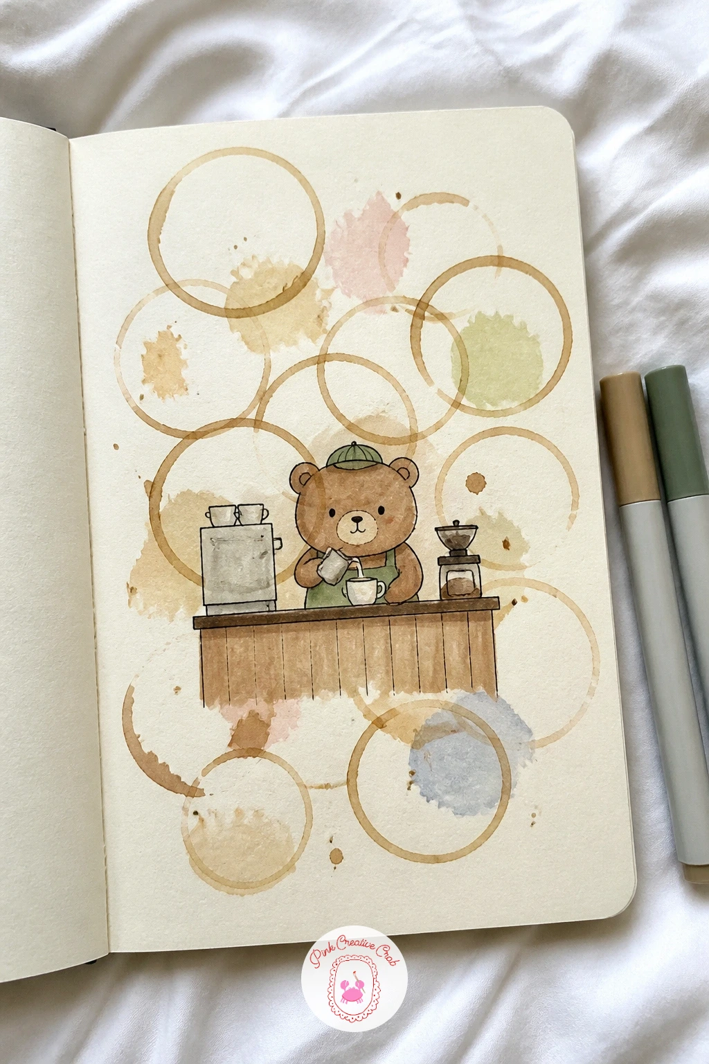
This background skips paint almost entirely: press the bottom of an actual coffee mug onto the page a few times with leftover coffee or diluted brown watercolor, overlapping the rings slightly so they look like real stains left on a cafe table. Let a few drips run down from one ring for extra charm.
Once everything dries flat, draw a small round bear behind a tiny coffee counter, wearing a bow tie or apron, holding up one paw as if presenting a drink. Keep the bear built from simple rounded shapes, an oval body, round ears, so he stays quick and friendly rather than fussy.
The stains sometimes buckle thin paper, so press the page under a heavy book once dry to flatten it back out. If you would rather not risk real coffee on your sketchbook, diluted burnt sienna watercolor dabbed with a sponge gives the same ring effect without the smell lingering in the pages.
Tip for today: let one coffee ring overlap right where the bear’s counter sits, it ties the drawing into the background instead of leaving it floating on top.
You Will Need
- real coffee or diluted brown watercolor
- a mug for stamping rings
Palette: Burnt Sienna,Raw Umber,Cream Base
Wet the page lightly and lay a flat sky blue watercolor wash across it, then while it is still damp, lift a few soft cloud shapes out with a dry tissue or a clean dry brush, pulling the pigment away rather than adding more. This lifting trick gives you fluffy clouds without ever picking up white paint.
Once dry, draw one round hot air balloon basket shape floating among the clouds, with a simple striped balloon top in two alternating colors. Keep the basket small compared to the balloon so the proportions read correctly, a common place this idea goes wrong is drawing the basket too large and heavy for its balloon.
If your lifted clouds look patchy, a touch more white gouache dabbed in afterward cleans up the edges nicely. No tissue nearby? A dry flat brush dragged firmly through the wet wash lifts color almost as well.
Tip for today: draw the balloon’s strings as slightly curved rather than ruler-straight, it reads as gentle movement through the air instead of a static shape pinned to the page.
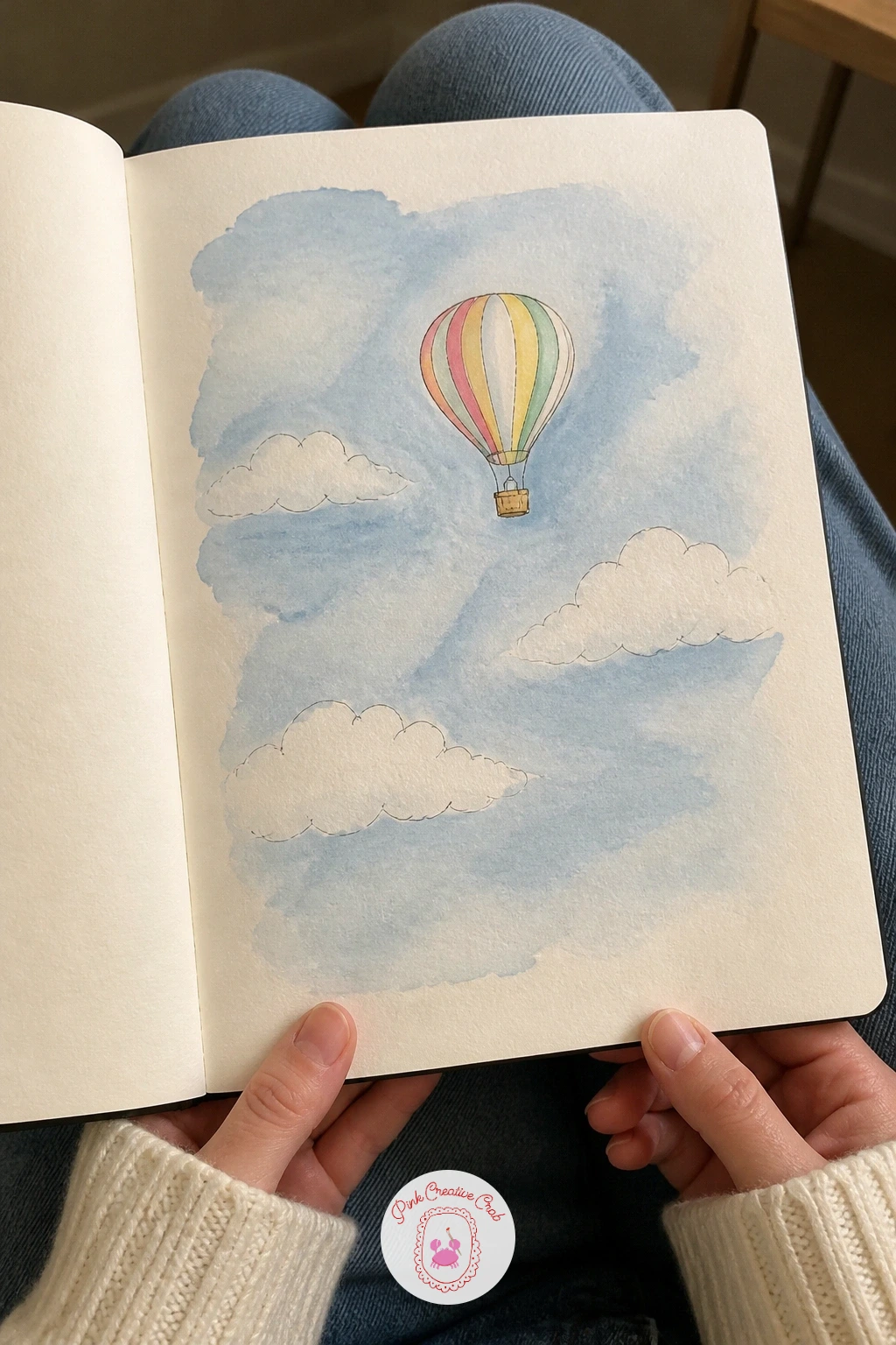
Palette: Sky Blue,Titanium White,Coral
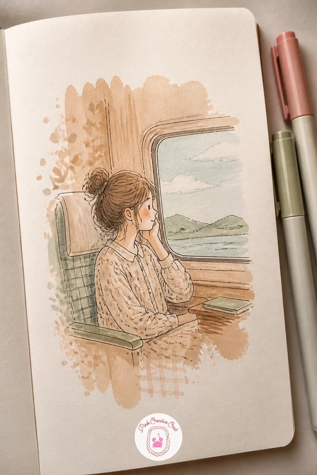
Brew a strong cup of tea, let it cool, then brush it generously across the whole page and dab a few drops in random spots for extra mottling before letting it dry completely. The paper will warp slightly, which only adds to the vintage feel once it’s flat again under a book.
Draw a simple girl sitting by a train window once the tea wash is dry, her profile turned toward the glass, one hand resting on the sill, with a few quick horizontal lines behind her suggesting the view rushing past. Keep her shape loose, since the warm tea tone is already carrying most of the page’s character.
If the tea pools too dark in one corner, let it be, it reads as an aged patch rather than a mistake on this kind of background. No tea bags around? Diluted raw umber watercolor brushed on thin gives nearly the same warm vintage tone.
For more painted pages with a figure and a setting, cute sketchbook ideas has plenty of similar little scenes.
You Will Need
- brewed tea for staining paper
Palette: Raw Umber,Antique Gold,Soft Black
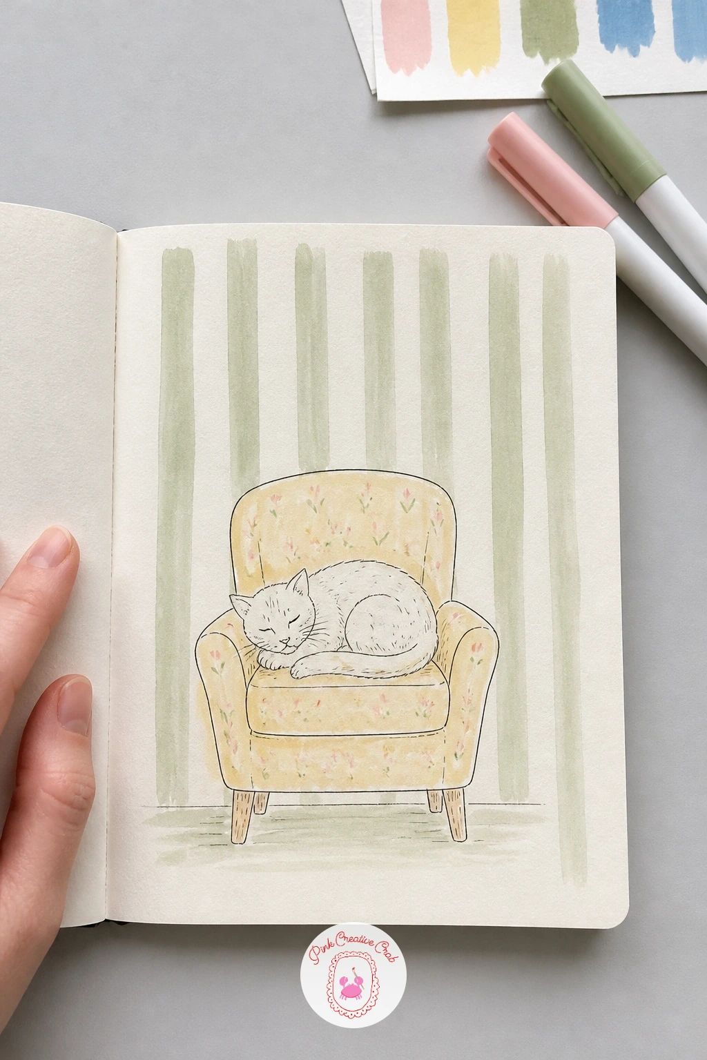
Rule a set of evenly spaced vertical pencil lines down the page first, then fill every other stripe with a flat sage or soft pink wash, keeping the lines crisp by painting right up to your pencil guide rather than freehand. This is the one background on the list that rewards a careful hand, since wobbly stripes read as a mistake rather than a style.
Once the stripes are dry, draw a cozy armchair in the lower half with a cat curled up or sitting primly inside it, paws tucked under. Compare the armchair’s width to roughly two stripe-widths as you sketch it in pencil first, which keeps the furniture sitting convincingly inside the pattern rather than floating oddly over it.
If a stripe bleeds past its pencil line, a thin cream gouache line painted back over the edge fixes it invisibly. Washi tape pressed down before painting also keeps the stripe edges perfectly sharp if you own some.
Tip for today: leave the armchair’s outline in pencil until the stripes are fully dry, then ink it on top, so wet stripe paint never smudges your furniture lines.
You Will Need
- ruler
- washi tape (optional, for sharp stripe edges)
Palette: Sage Green,Blush Pink,Warm Taupe
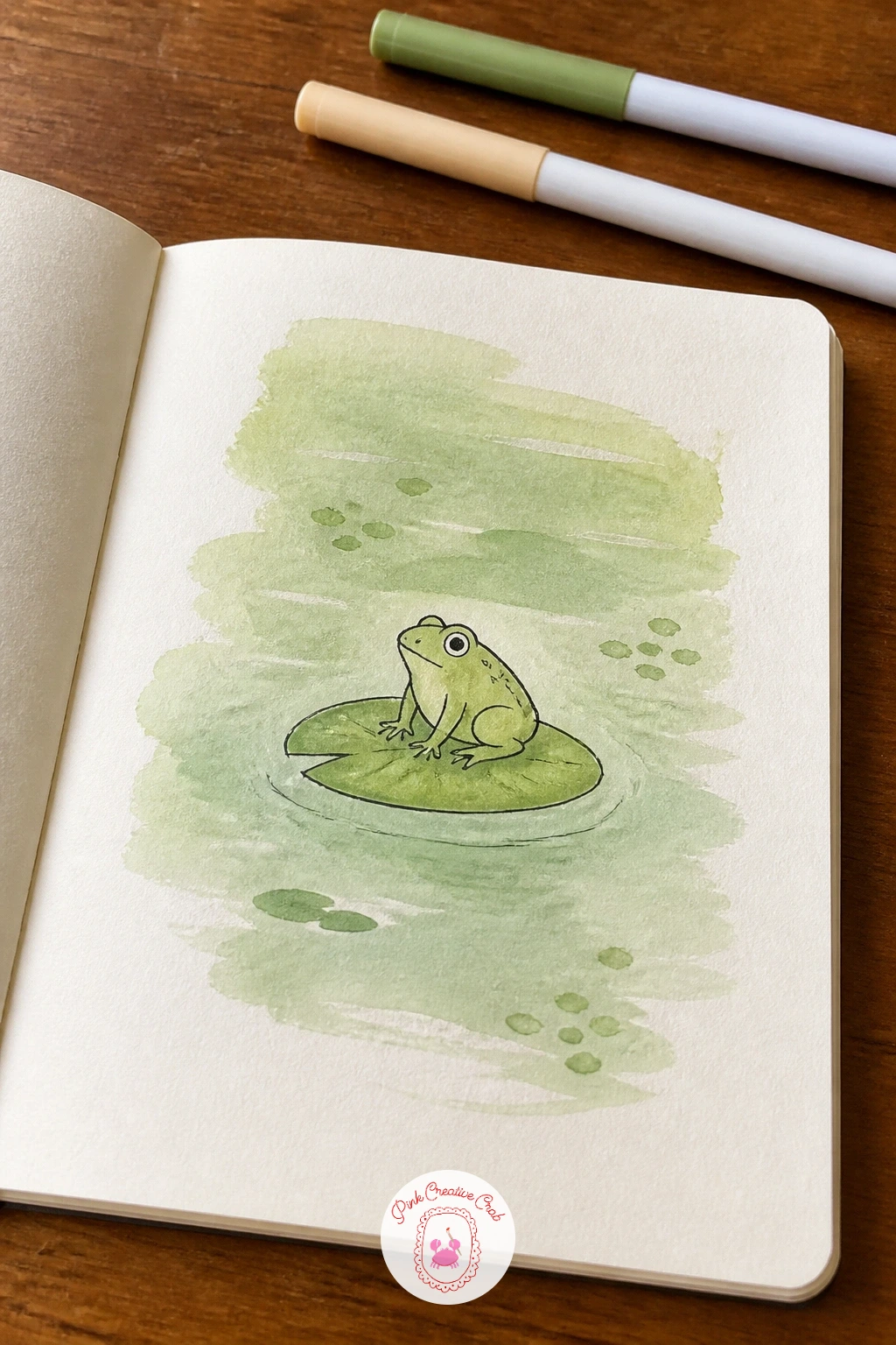
Lay down a loose, uneven green wash across the page, mixing sap green with a touch of yellow in places so it reads more like pond water or grass than a flat tone. Let a few streaks stay lighter where the water pooled thin, this variation does most of the scene-setting work for you.
Once dry, draw a round-bodied frog sitting on a simple lily pad shape near the center, with bulging oval eyes and bent back legs tucked beneath him. For the texture of his skin, try a dry brush loaded with a slightly darker green and dragged lightly over the ink lines, it catches on the paper’s tooth and leaves a speckled, lifelike texture instead of a flat fill.
If the dry brush skips too much or too little, adjust by wiping most of the paint off the brush first and testing on scrap paper before committing. No second green on hand? A fine stipple of dots with your fineliner mimics the same speckled skin.
Tip for today: keep the lily pad simple and round, a frilly or overly detailed pad competes with the frog instead of supporting him.
Palette: Sap Green,Hooker’s Green,Lemon Yellow
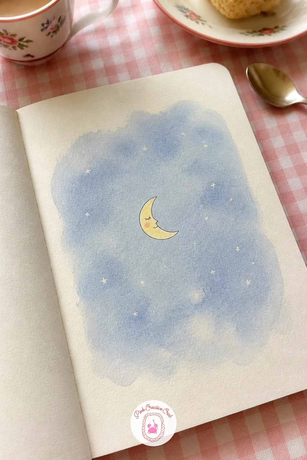
Brush a pale blue-grey wash across the page, darkest near the top corners and softening toward the center, so the eye naturally lands in the middle where your subject will go. While it is still slightly damp, flick a few tiny dots of white gouache or a white gel pen once dry for stars scattered loosely rather than evenly spaced.
Draw one sleepy crescent moon with a simple closed-eye face and a soft smile sitting just off-center in the wash, small enough that the night sky still feels spacious around it. Eye level matters less here than light direction: keep any glow or halo radiating gently from the moon itself, since it is the only light source on the page.
If the wash dries too even and flat, a second thin glaze of blue over just the corners once the first layer is dry adds the depth back in. No white gel pen yet? A fine white colored pencil presses stars on just as well over dry watercolor.
Tip for today: draw the moon’s face with the simplest possible closed eyes, just two short curved lines, so the sleepy mood reads instantly.
You Will Need
- white gel pen
Palette: Payne’s Grey,Pale Periwinkle,Titanium White
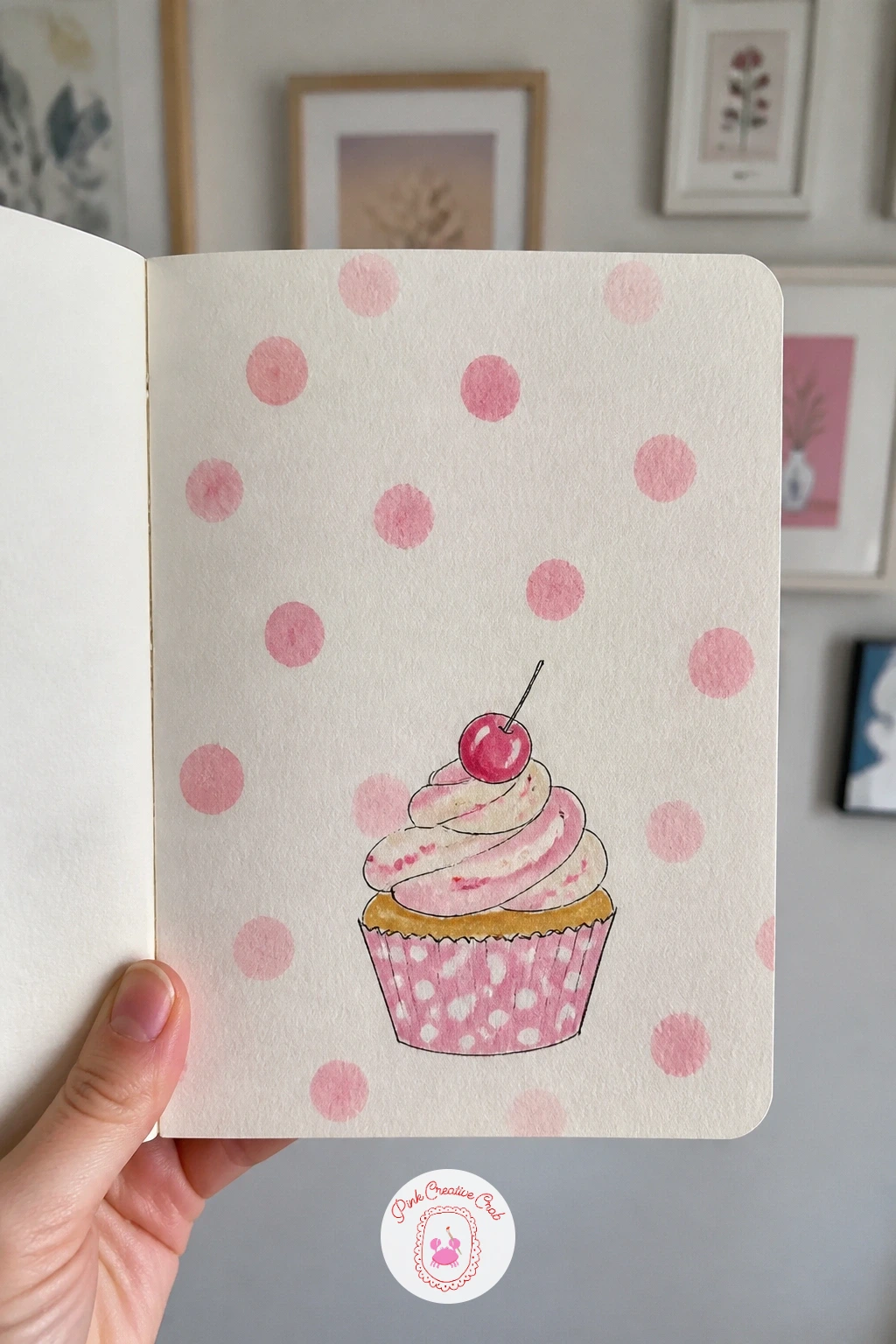
Dip the end of a pencil, a cotton swab or a small round brush into pale pink or butter yellow paint and dot it evenly across the page in loose rows, leaving generous cream space between each dot so the pattern stays light rather than busy. Vary the pressure slightly so some dots come out fainter than others, which keeps the pattern from looking stamped by machine.
Once the dots dry, draw a single cupcake in the lower half with a scalloped paper liner, a swirl of frosting on top and one small cherry or sprinkle detail. Keep the frosting swirl drawn in one continuous looping line rather than lots of short strokes, it reads far more convincingly as soft icing.
If your dots come out uneven in size, that unevenness actually reads as hand-painted charm rather than a flaw, so resist the urge to fix every one. A pencil eraser dipped in paint makes an even faster, more uniform dot stamp if you want tidier spacing.
Tip for today: leave a dot-free halo of plain cream paper directly around the cupcake so it does not fight the pattern for attention.
Palette: Pale Pink,Butter Yellow,Cherry Red
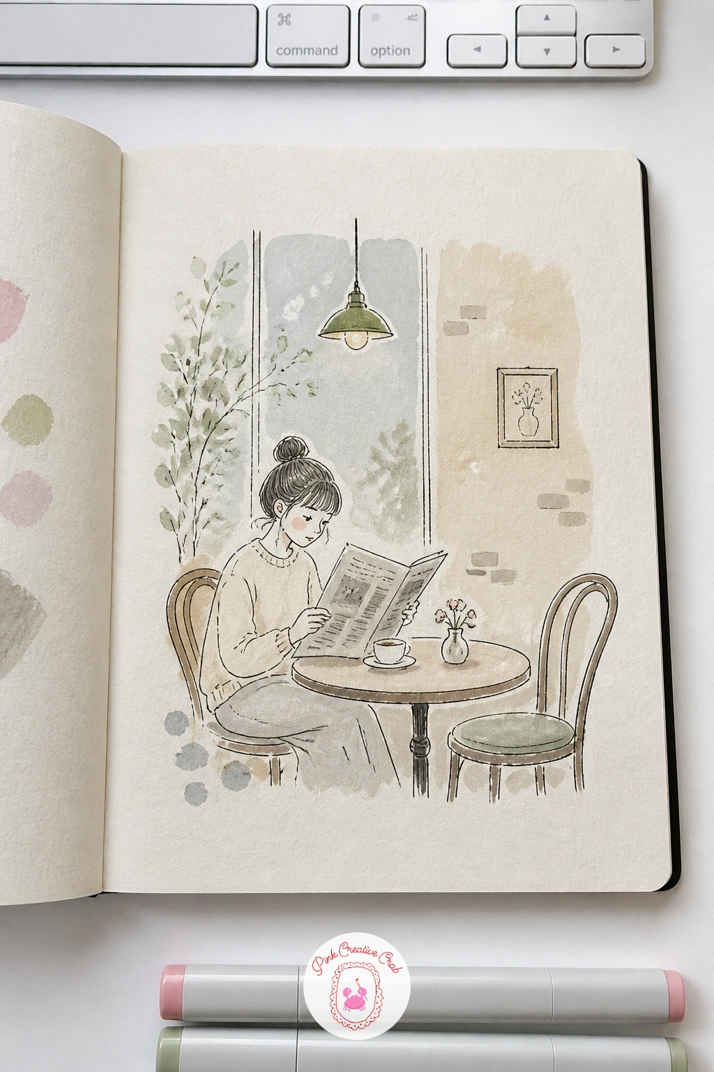
Tear or cut a few scraps of real newspaper, or simply draw loose wavy lines across the page in grey marker to imitate columns of text, then glue the paper scraps down flat or let the drawn lines stand as the texture. Either way, keep the “text” illegible scribbles rather than actual words, since real sentences pull focus from your drawing.
Draw a girl sitting at a small round cafe table in front of this backdrop, a cup of coffee beside her and a book or paper held up in her hands, her head tilted down as if reading. Place her roughly in the lower third of the page so the newsprint texture reads as the wall behind her rather than crowding her out.
If glued newspaper buckles the page, weigh it under a heavy book overnight before you draw on top of it. No newspaper scraps handy? Thin grey pen lines scribbled loosely across the page mimic the look without any cutting or gluing at all.
For more cafe and figure sketches in this relaxed style, color pencil drawing ideas creative is worth a look.
You Will Need
- scrap newspaper and glue stick (optional)
Palette: Warm Grey,Soft Black,Cream Base
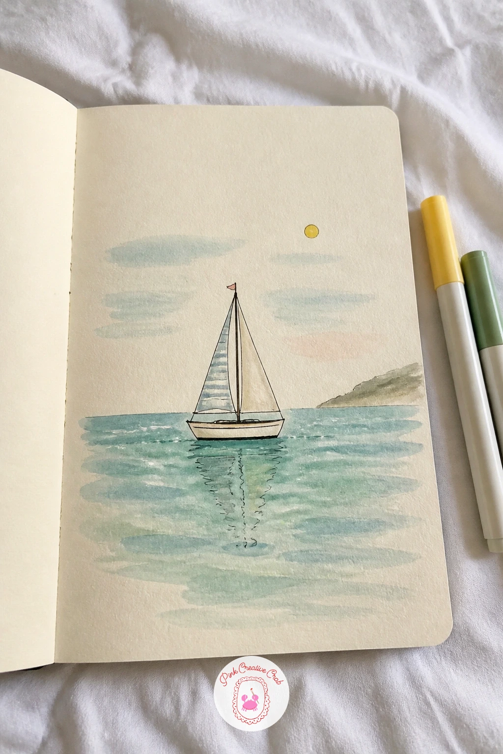
Lay a horizontal band of blue-green watercolor across the lower half of the page for the sea, keeping the top edge loose and uneven rather than a straight horizon line, and leave the upper half plain cream or a faint wash for sky. Tip the page gently while wet so the color settles in soft horizontal streaks like real moving water.
Once dry, draw a single small sailboat sitting right where sea meets sky, a simple triangle sail and a curved hull, with a thin reflected line dropped straight down into the water beneath it. That reflection line is the one trick that convinces the eye the boat is floating rather than pasted on, so do not skip it even if it is just a few wobbly strokes.
If your sea wash dries with a hard edge at the top, a soft sponge dabbed with clean water along that line while still slightly damp blurs it back into the sky. Salt sprinkled into the wet wash also gives the sea a lovely mottled texture if you want to try it.
If open water scenes are becoming a favorite, easy beach watercolor ideas has more in the same spirit.
You Will Need
- table salt (optional, for texture)
Palette: Cerulean Blue,Teal Green,Cream Base
Drip a few loose puddles of grey, white and pale pink watercolor close together on wet paper, then tilt the page in different directions and let the colors run and merge into thin veining, never touching them with a brush once they start to move. This hands-off approach is the entire trick to a convincing marble texture, so resist the urge to blend it smooth.
Once fully dry, draw a small ornate perfume bottle sitting on top, a rounded or faceted base with a tapered stopper, adding a few fine ink lines to suggest cut glass catching light. Keep the bottle shape symmetrical by lightly sketching a center guideline in pencil first and mirroring each side before inking.
If your marble veins pool too dark in one corner, dab it gently with a dry tissue the moment you notice, before it fully sets. No watercolor paper suited to wet pooling on hand? A baby wipe dragged through wet ink on regular paper creates a similar, quicker marbled effect.
Tip for today: add one or two thin grey veins crossing directly behind the bottle itself, it ties the object into the marble rather than leaving it sitting apart from it.
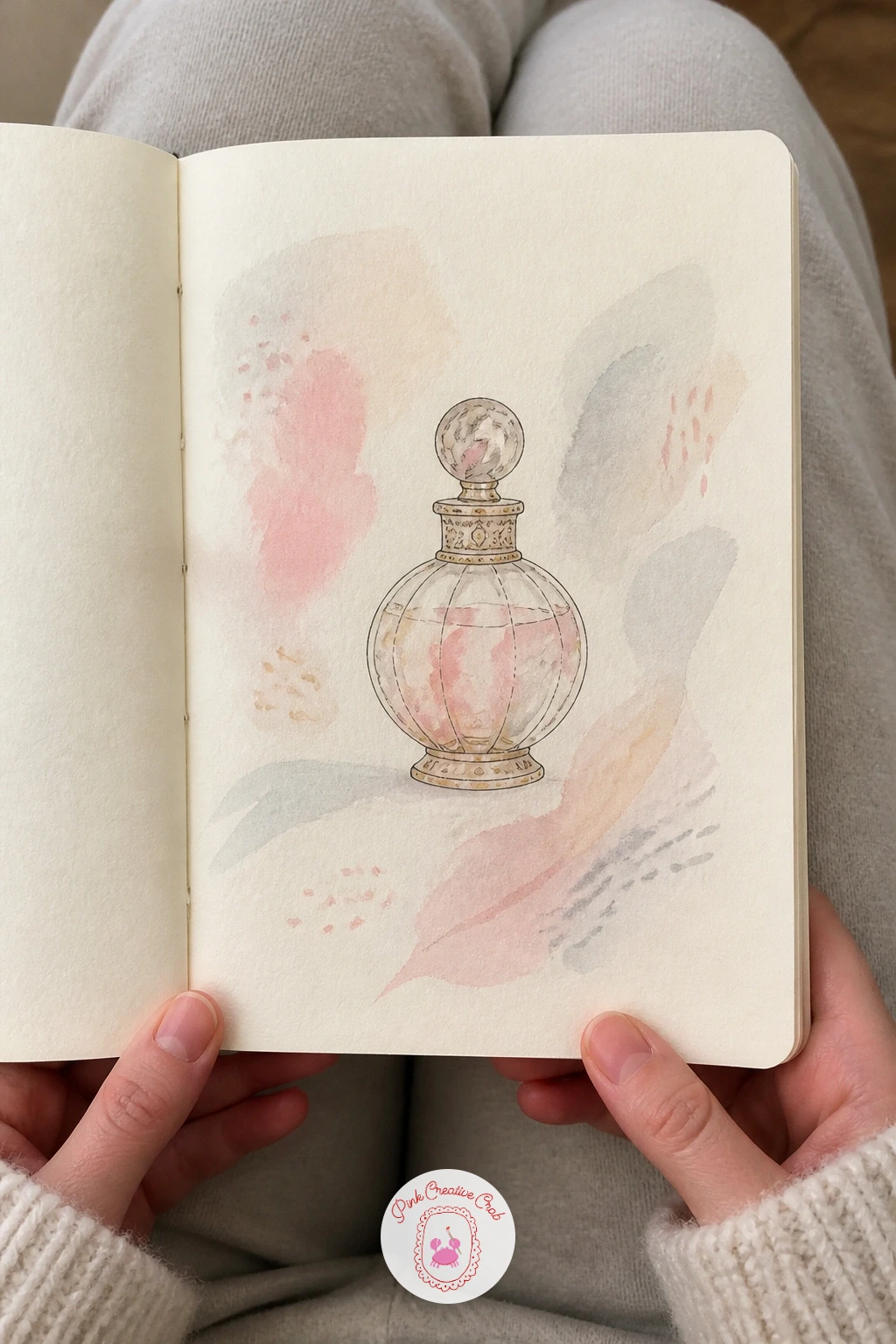
Palette: Payne’s Grey,Pale Pink,Titanium White
Brush a loose lavender wash across the page in soft overlapping strokes, letting some areas dry paler than others so the color has gentle movement rather than sitting flat. Leave a patch slightly lighter near the center, which gives your butterfly somewhere to land without disappearing into the background.
Once dry, draw a symmetrical butterfly there: sketch one wing lightly in pencil first, then fold your visual line down the body’s center and mirror it for the second wing, the same proportion trick painters use to keep wings matching without a ruler. Add a few small dots or stripes along the wing edges in a darker purple or soft pink once the ink is dry.
If the wings end up uneven, a careful trim of extra ink is riskier than simply mirroring the smaller wing’s shape back onto the larger one with white gouache. No lavender paint mixed yet? A light wash of violet watercolor softened with plenty of water gets close enough.
Tip for today: keep the butterfly’s body thin and simple, a single curved line with short antennae, so the wings stay the star of the page.
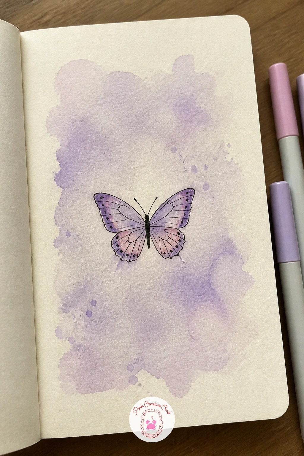
Palette: Lavender,Soft Violet,Blush Pink
Rule a light grid of evenly sized squares across the page, then fill in alternating squares with a flat wash, keeping each square painted edge to edge for that crisp checkerboard look. A small flat brush makes neater squares than a round one here, since straight edges matter more than soft blending.
Once the checks are dry, draw a single cherry with its stem looping up and over, placed so it sits across two or three squares rather than tucked neatly inside just one, which keeps it from looking stamped onto the grid. A quick cast shadow in pale grey beneath the cherry grounds it onto the pattern convincingly.
If your squares come out slightly uneven in size, keep going rather than starting over, a few wobbly checks still read as handmade and charming at this scale. No ruler nearby? Folding the page into equal sections first gives you crease lines to paint along instead.
Tip for today: let the cherry’s stem cross over at least one grid line, overlapping the pattern slightly is what makes the fruit feel like it is resting on top of it rather than floating above.
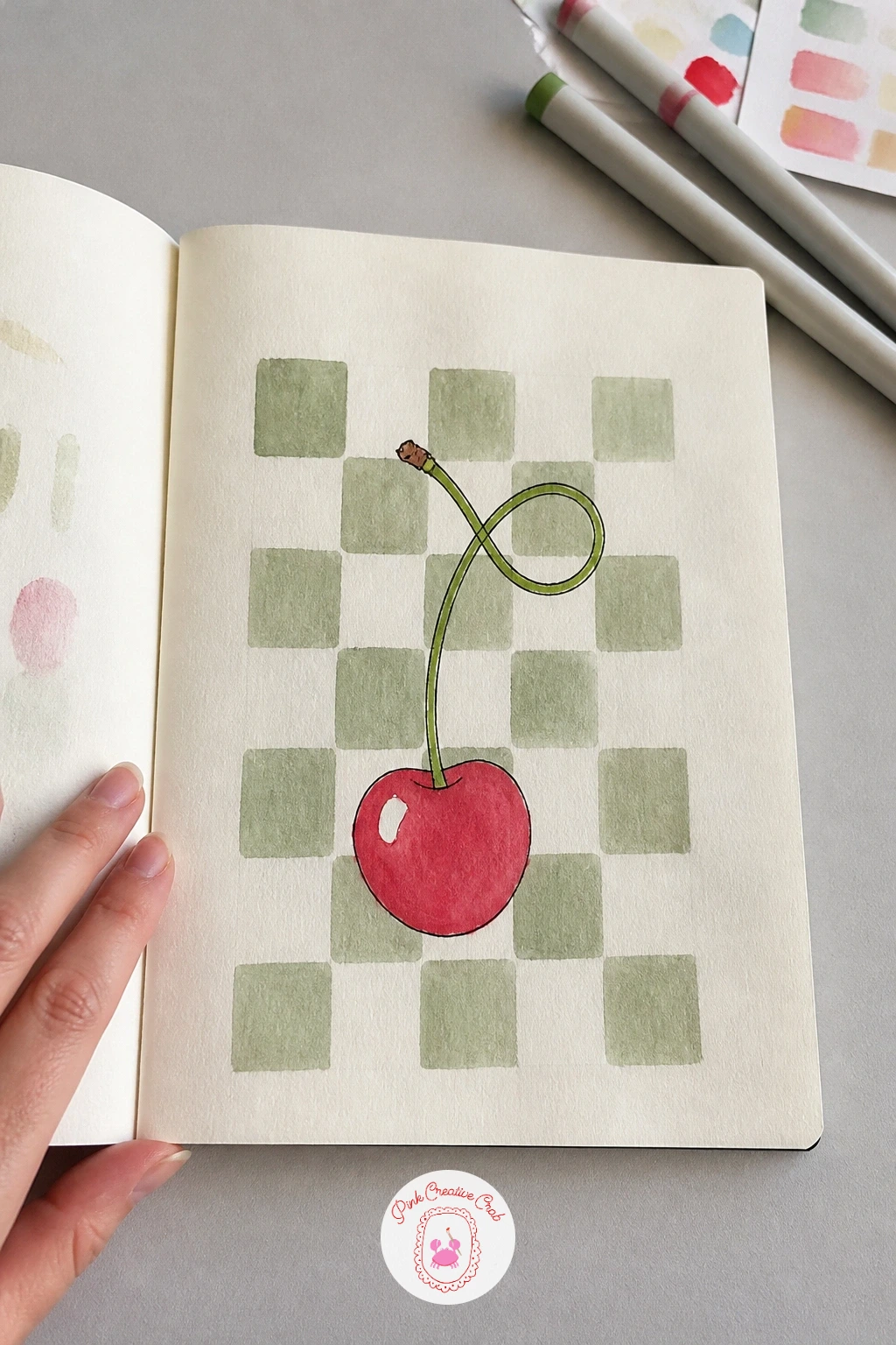
You Will Need
- ruler
Palette: Cherry Red,Sage Green,Soft Black
Tear a small natural sponge or crumple a piece of plastic wrap, dab it into a muted brown or sage watercolor, then press it across the lower portion of the page in an uneven cluster to suggest leaf litter or forest floor. Lift and re-dab rather than dragging, which keeps the texture looking porous and organic instead of smeared.
Once the texture dries, draw two or three mushrooms rising out of it at slightly different heights, rounded caps on short curved stems, with tiny white or cream spots dotted across the largest cap. Working in ten minutes, a quick version stops right there, while a slower forty-minute version adds soft cast shadows beneath each cap and a second lighter sponge layer around them for depth.
If the sponge texture turns muddy, let it dry completely before judging it, damp sponge marks often look much better once fully set. No sponge on hand? A stiff old toothbrush dipped in paint and dragged across the page with a thumb gives a similar speckled ground.
Tip for today: vary the mushroom heights and cap sizes rather than drawing them identical, it reads far more like a real patch of ground.
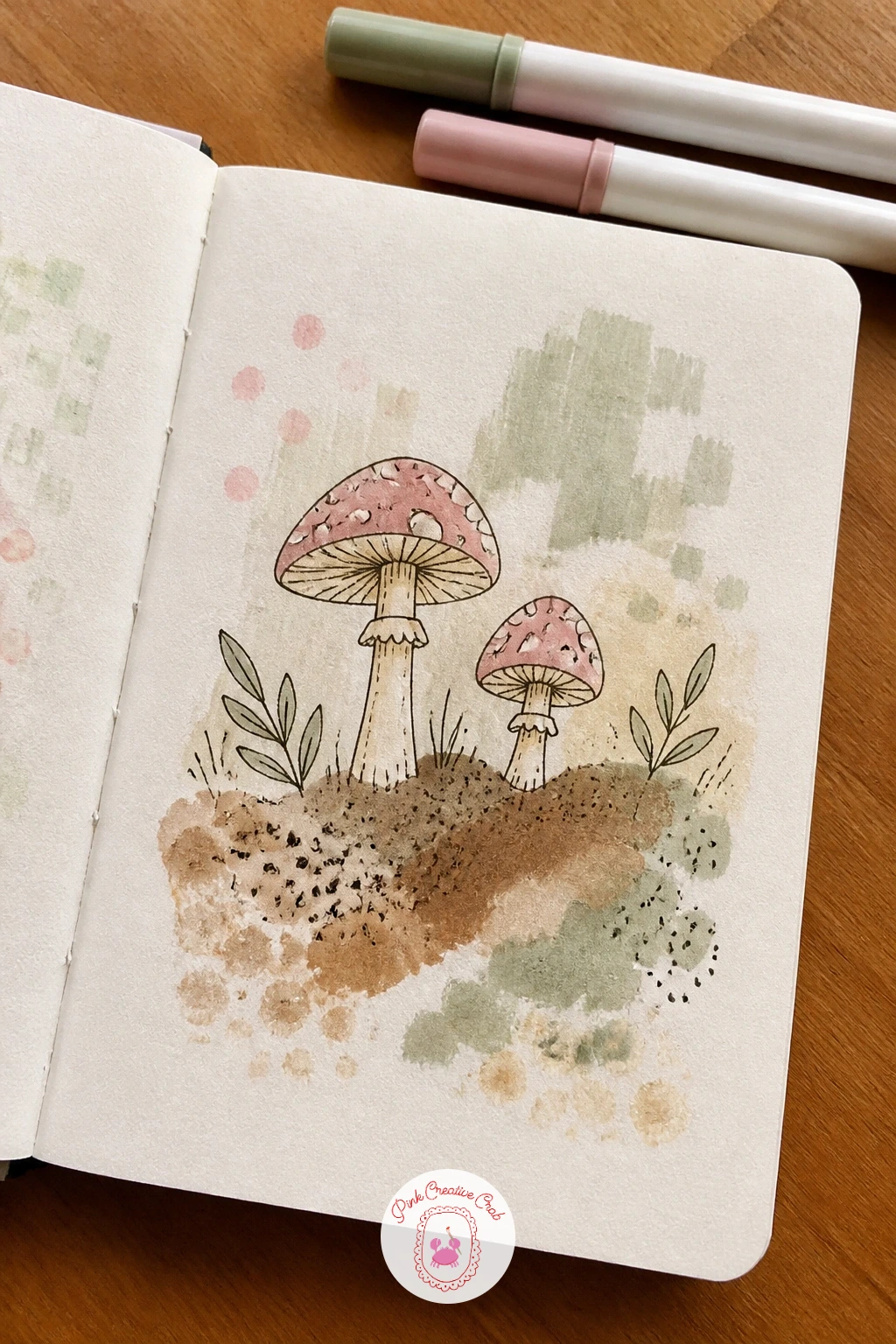
You Will Need
- natural sponge or plastic wrap
Palette: Raw Umber,Sage Green,Cream Base
Paint a series of soft horizontal stripes across the page in a gentle rainbow order, pink, yellow, sage and sky blue, keeping each band loose at the edges so they blend slightly rather than forming hard lines. Working wet into wet here gives the stripes a watercolor softness that keeps the rainbow from looking like a flag.
Once dry, draw a hot air balloon floating across the stripes, its basket small and its balloon top large, divided into simple panels that pick up colors from the stripes behind it. Keeping the balloon noticeably larger than its basket is the proportion check that keeps this shape looking right, since a basket drawn too big makes the whole balloon look like it could never lift off.
If your stripes bleed into a muddy middle band, let it dry and simply call that band a transition tone, most rainbows have a soft overlap somewhere anyway. No full rainbow of paints on hand? Three colors spaced evenly across the page still read as a cheerful stripe pattern.
Tip for today: draw the balloon’s basket with a slightly darker outline than the balloon itself, it helps the eye separate the two shapes at a glance.
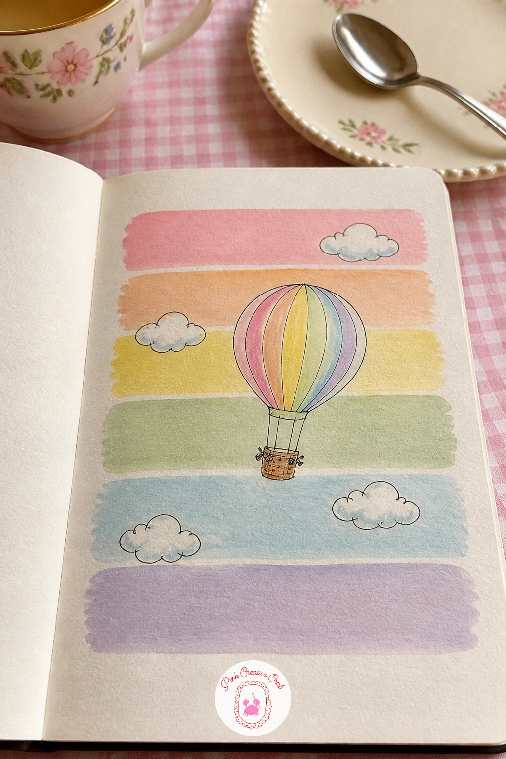
Palette: Pale Pink,Butter Yellow,Sky Blue,Sage Green
Wet the page evenly, then brush a strong peach wash at the top, pulling a damp brush downward so the color fades gradually into plain cream by the bottom edge. Keep the brush moving in one direction and resist going back over areas already drying, since reworking a gradient usually leaves streaks rather than fixing them.
Once dry, draw a single lemon sitting in the lower, paler part of the page, its oval shape slightly pointed at both ends, with a few short curved lines suggesting its dimpled skin and one leaf attached at the stem. Placing the lemon in the lightest part of the gradient keeps good contrast between fruit and background, so avoid drawing it where the peach sits darkest.
If the gradient dries patchy instead of smooth, going over it with a second light peach glaze once fully dry evens it back out. No large flat brush for broad gradients? A makeup sponge loaded with diluted paint blends an ombre wash just as smoothly.
Tip for today: leave a thin ring of pure white paper around the lemon’s edge before filling in its yellow, it makes the fruit glow against the warm gradient.
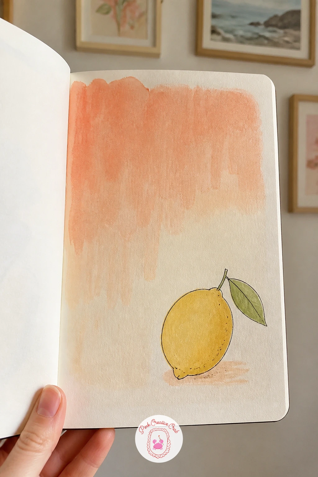
Palette: Peach,Lemon Yellow,Sap Green
Sketch loose wavy lines across the page to suggest roads and borders, then fill a few small shapes between them with pale sage or butter yellow for “land” areas, leaving some patches plain cream for open space. Add a handful of tiny dashes and dots for texture, imitating the fussy detail of an old map without needing to draw anything legible.
Once the map texture is dry, draw one small house sitting where two “roads” cross, simple triangle roof, square walls, one chimney with a curl of smoke. Keep the house smaller than it feels like it should be, a map background works best when the house reads as one tiny marked location rather than the main subject of the page.
If the map lines start looking too busy, stop adding detail the moment the house still stands out clearly against them. No sage or yellow mixed yet? A worn tan or beige wash alone gives a convincing old-paper map feel without any extra colors.
Tip for today: circle the house loosely with a dotted ink line, like a pin marking a spot on a map, it instantly explains what the drawing is about.
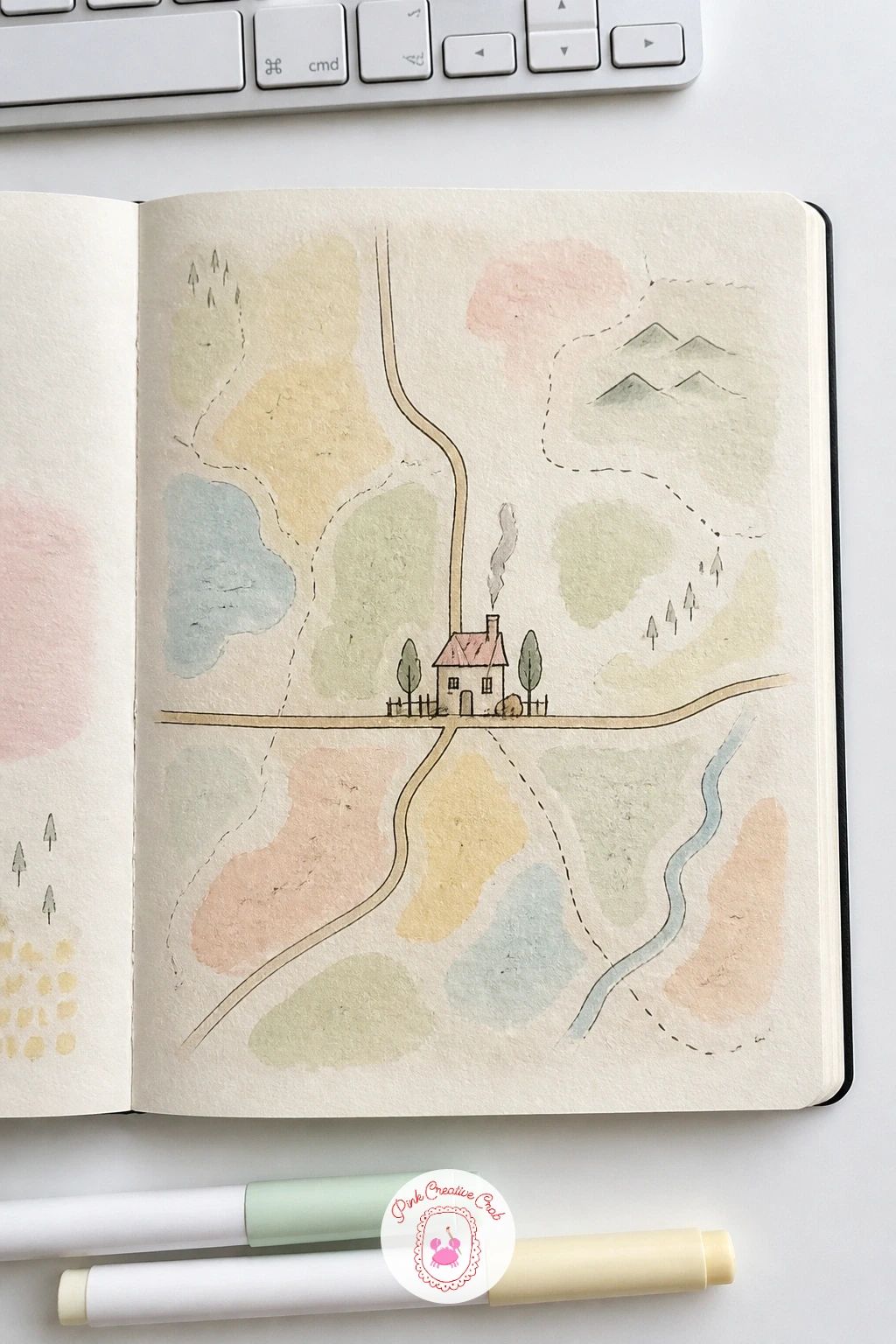
Palette: Sage Green,Antique Gold,Soft Black
Draw five faint horizontal lines in pale grey pen running across the page to suggest a musical staff, then add a scattering of simple note shapes, ovals with short stems, along the lines without worrying whether they form real music. A light wash of butter yellow or cream behind the staff lines ages the page nicely if you want extra warmth.
Once that’s in place, draw a small bird perched on one of the staff lines as though it were a branch, its body a simple teardrop shape, head tilted, beak slightly open as if mid-song. Resting the bird’s feet directly on a staff line ties the whole idea together, so take care the perch lines up exactly rather than floating just above or below it.
If your staff lines wobble out of parallel, a ruler and a light pencil guide underneath keeps all five lines even before you ink them. No pale grey pen on hand? A very diluted black ink or watered down graphite pencil gives the same soft, faded staff look.
For more small birds built the same simple way, bird pencil drawing beginner ideas offers a good next step.
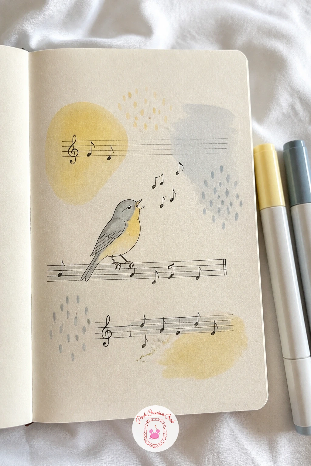
You Will Need
- ruler
Palette: Warm Grey,Butter Yellow,Soft Black
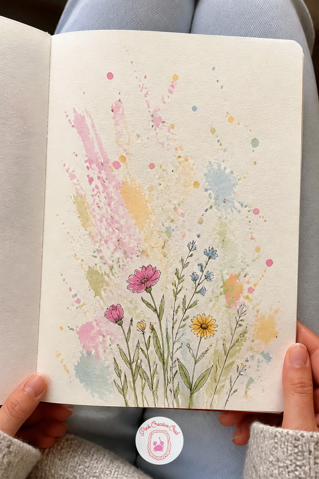
Load an old toothbrush with thin watercolor and run your thumb back across the bristles to flick a loose spray of tiny dots across the page, working over scrap paper nearby since this step gets messy. Use two or three colors in turn, letting each dry a little before the next, so the splatter layers without turning muddy.
Once the splatter settles, draw a small cluster of simple flowers growing up from the bottom edge, a few rounded petals per bloom and a couple of leaves, letting one or two flowers overlap the splattered dots rather than avoiding them. That overlap is what makes the splatter feel like part of the same scene instead of a random mess sitting behind unrelated flowers.
If the splatter lands too heavy in one spot, let it dry and simply treat that cluster as a shadow or a patch of soil beneath your flowers. No toothbrush at hand? A stiff round brush tapped firmly against a finger flicks a similar fine spray.
If loose floral pages like this one appeal to you, flower sketchbook ideas for beginners has many more in the same spirit.
You Will Need
- old toothbrush for splatter
Palette: Sage Green,Blush Pink,Butter Yellow
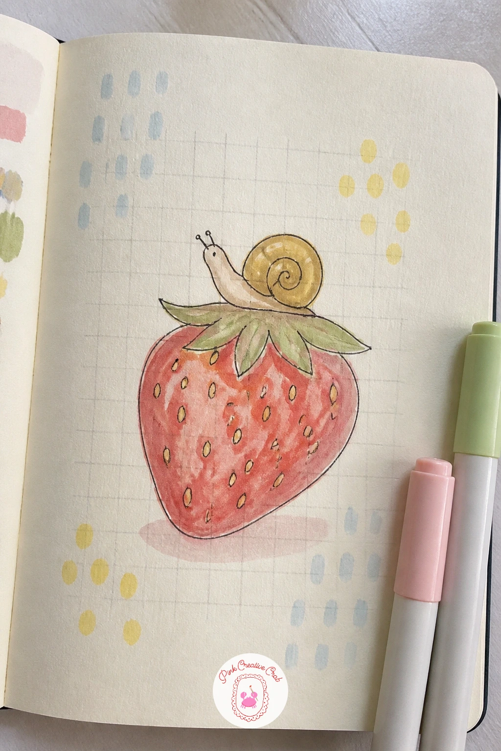
Rule a fine, even grid of small squares across the whole page in pale pencil or light grey pen, keeping the lines thin so the grid reads as graph paper rather than a bold pattern competing with your drawing. This is a background that stays mostly quiet, letting the drawing carry the page.
Once the grid is in, draw one large strawberry near the center, its seeds following the grid’s rhythm a little for fun, then add a small snail with a round spiral shell resting right on top of it as though it just wandered up. Comparing the snail’s shell size to roughly one grid square keeps its scale believable against the fruit beneath it.
If the grid lines come out uneven, a ruler and a sharp pencil fix that fastest, since this is one background where straight lines genuinely matter. No fine pen for grid lines? A very light pencil grid left unInked still reads nicely as graph paper under watercolor fruit.
Tip for today: color the strawberry in flat watercolor first and let it dry completely before inking the snail on top, so wet paint never smudges the shell’s spiral lines.
You Will Need
- ruler
Palette: Cherry Red,Sage Green,Warm Grey
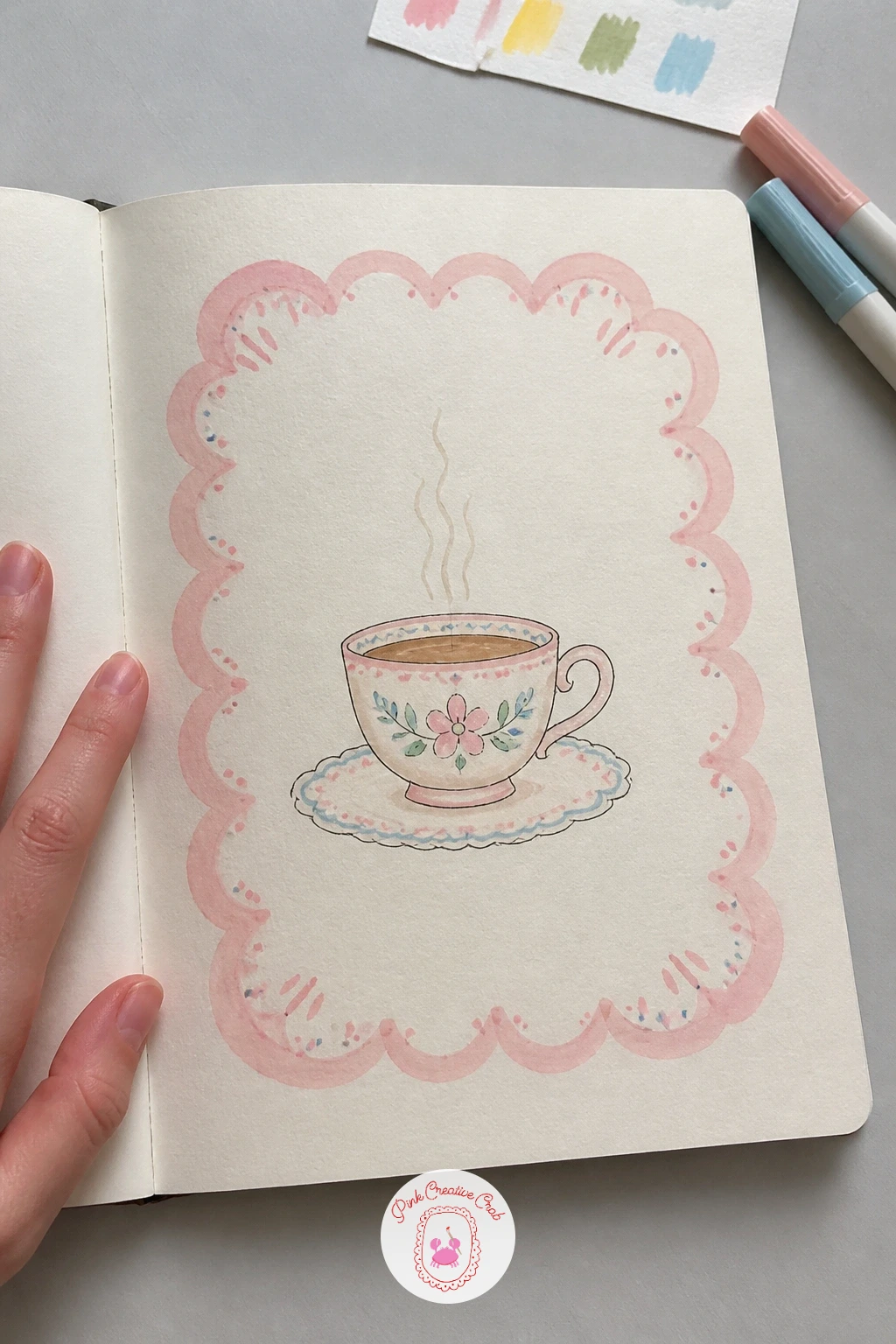
Draw a loose scalloped border around the edge of the page, a row of small connected half circles, using a coin or bottle cap as a guide if your freehand curves feel shaky. Fill the border itself with a light wash of pink or sage so the frame stands apart gently from the plain cream center.
Once the border dries, draw a single teacup and saucer resting in the open center of the page, a simple curved handle, a thin wisp of steam rising above the rim. Working the quick ten-minute version, stop at a plain outlined cup, while the slower forty-minute version adds a painted floral pattern around the cup itself and a soft cast shadow beneath the saucer.
If the scallops come out uneven in size, keep tracing the same coin for every curve rather than freehanding each one, consistency matters more than perfect roundness here. No coin handy for tracing? A small lid or even the cap of your paint tube works just as well.
Tip for today: leave the very center of the page, right where the teacup sits, completely free of any wash so the cup stays the brightest point on the page.
You Will Need
- coin or bottle cap for tracing scallops
Palette: Blush Pink,Sage Green,Warm Grey
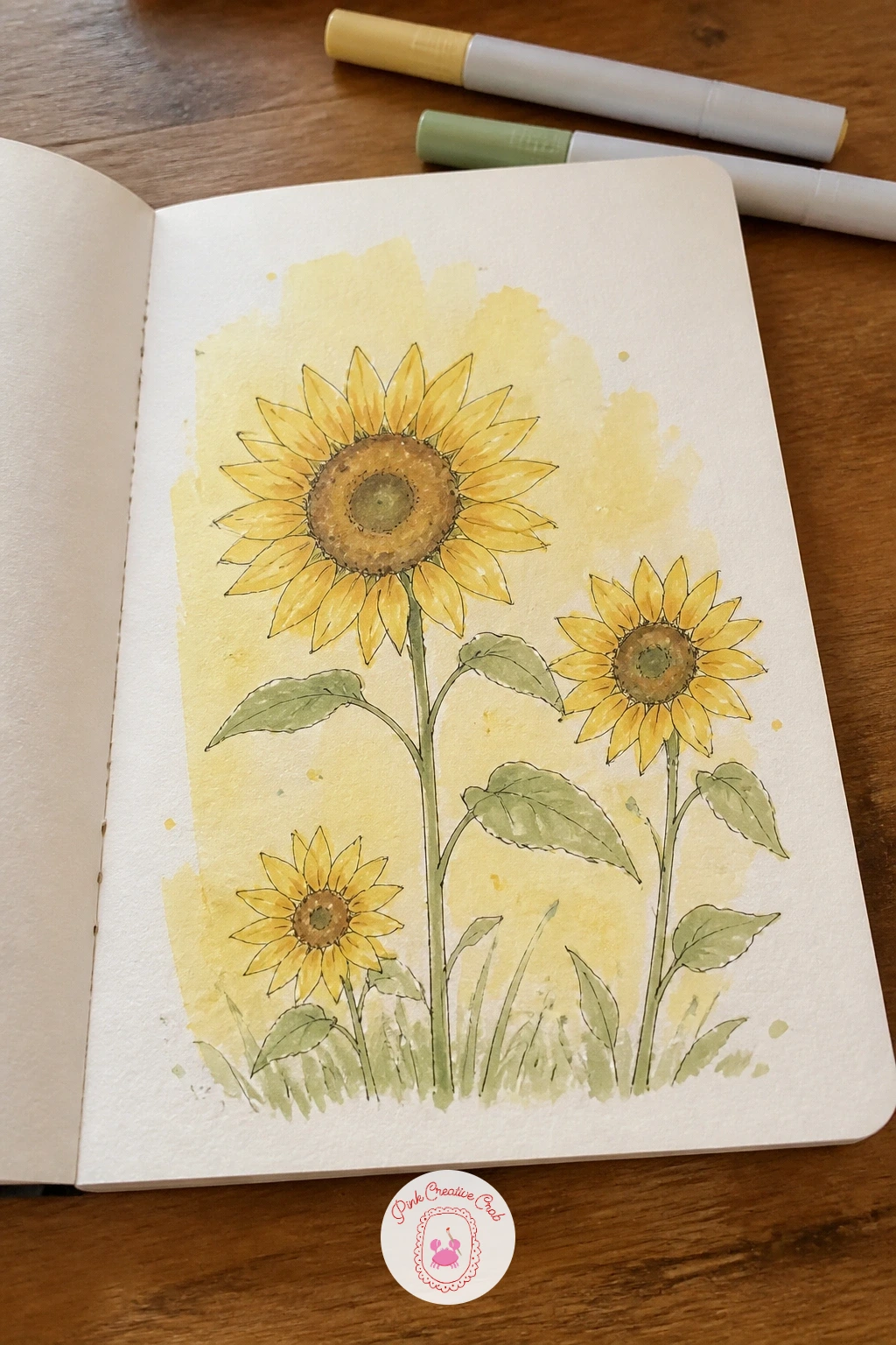
Brush a warm yellow wash across the whole page, slightly deeper toward the bottom, so the paper itself feels sun-warmed before anything else goes on it. Let it dry fully, since sunflowers painted over damp paper tend to bleed into fuzzy, indistinct shapes rather than crisp petals.
Once dry, draw two or three sunflowers rising from the bottom edge at varying heights, each with a round dark center ringed by pointed petals, and simple leaves branching off the stems. Keeping the eye level low, as though looking slightly up at the flowers, makes them feel tall and sunlit rather than flat against the page, so let the tops of the tallest bloom reach near the upper edge.
If the petals come out uneven in length, that unevenness actually suits sunflowers, whose real petals rarely match perfectly either. No yellow watercolor mixed yet, just a butter yellow marker scribbled loosely and softened with a damp brush gets a similar warm glow.
For a full step-by-step on painting the bloom itself, how to paint a watercolor sunflower walks through it in more detail.
Palette: Butter Yellow,Burnt Sienna,Sap Green
Dab a soft white and pale grey wash across the page in loose, puffy cloud shapes, leaving generous cream space between them so the page still feels airy rather than fully covered. A barely damp sponge dabbed in thin paint gives cloud edges a nice soft fuzziness that a brush alone struggles to match.
Once that texture dries, draw a small cat curled into a tight sleeping loop, resting right on top of one of the larger cloud shapes as though it drifted up there for a nap. Keep the cat’s outline soft and rounded with no sharp angles anywhere, which matches the cloud texture beneath it far better than crisp lines would.
If the clouds dry too grey and heavy, a final light dab of plain white gouache around their edges lifts them back toward fluffy. No sponge for texture on hand? Cotton balls dipped lightly in paint dab a similar soft puffy mark.
Tip for today: tuck the cat’s tail around its body in one continuous curved line rather than a separate shape, it keeps the sleeping pose reading as one soft rounded form.
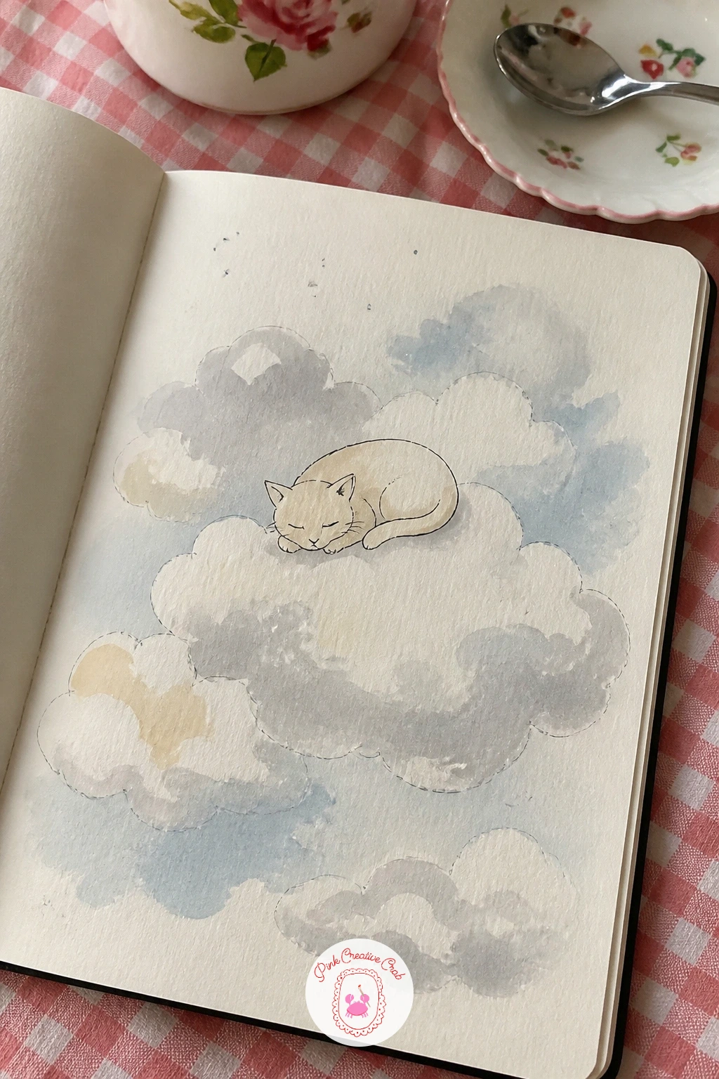
Palette: Pale Grey,Titanium White,Soft Black
Paint a scattered pattern of small simple flowers across the page first, a few dabs of pink or sage for petals with a single dot center, repeated loosely rather than lined up in rows, leaving plenty of cream space between each one. This pattern works best kept light, since a figure needs room to sit clearly on top of it.
Once the pattern dries, draw a girl standing or sitting among the flowers, her dress or hair picking up one of the pattern’s colors so she feels connected to the background rather than pasted over it. Keep her pose simple, a basic standing figure with soft curved lines, since this is a background-led idea rather than a detailed portrait study.
If the pattern competes too much with the figure, erase or paint over a few flowers directly behind her to create a calmer patch for her shape to rest in. No two colors of paint ready? A single color repeated in different sizes of flower still makes a convincing pattern.
Tip for today: draw the girl’s outline first in pencil before adding pattern flowers nearby, so you can leave a clear, flower-free halo around her before committing to ink.
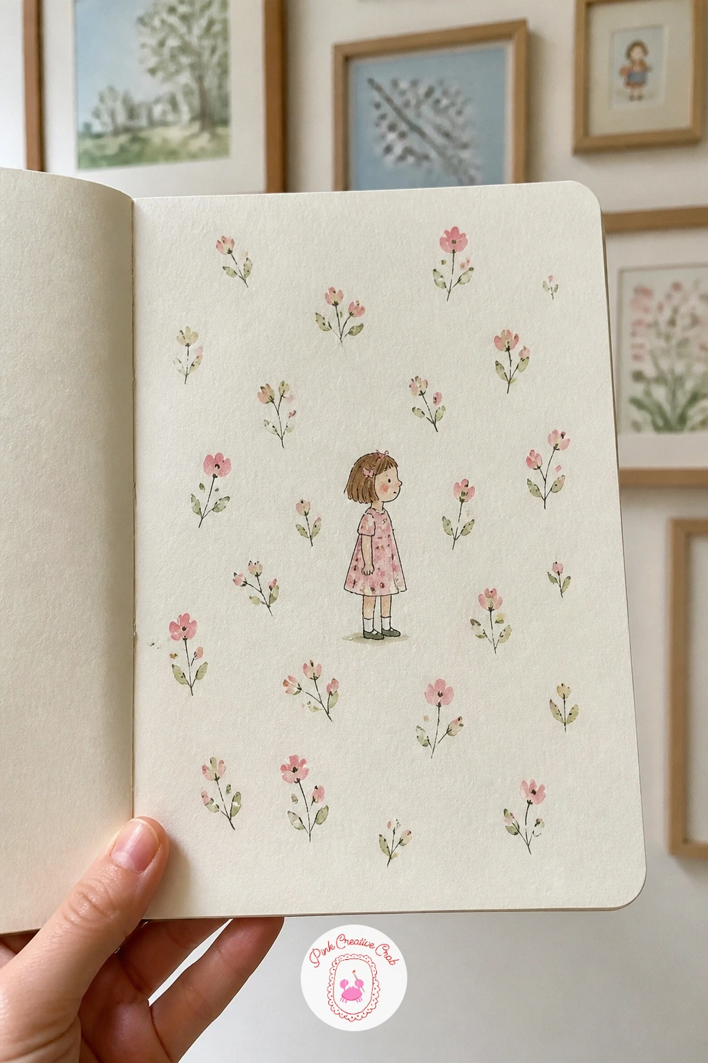
Palette: Blush Pink,Sage Green,Soft Black
Mark a faint, evenly spaced dotted grid across the page using a fine pencil or light grey pen, just small dots at regular intervals rather than full lines, the kind found in bullet journal paper. Keep the dots pale enough that they recede behind whatever gets drawn on top.
Once the grid is marked, draw two or three simple potted plants in a row along the bottom, varying their leaf shapes, one tall and spiky, one round and leafy, one trailing slightly over its pot’s edge. Varying leaf size and pot height between the three keeps the row visually interesting, since three identical plants in a line tend to look stiff rather than charming.
If your dots come out uneven in spacing, a ruler marked lightly at regular intervals along both edges first keeps every dot lined up before you commit pen to paper. No fine pen for tiny dots? The tip of a sharp pencil pressed lightly does the same job just as well.
Tip for today: paint each pot a slightly different color so the row reads as a little collection rather than three copies of the same plant.
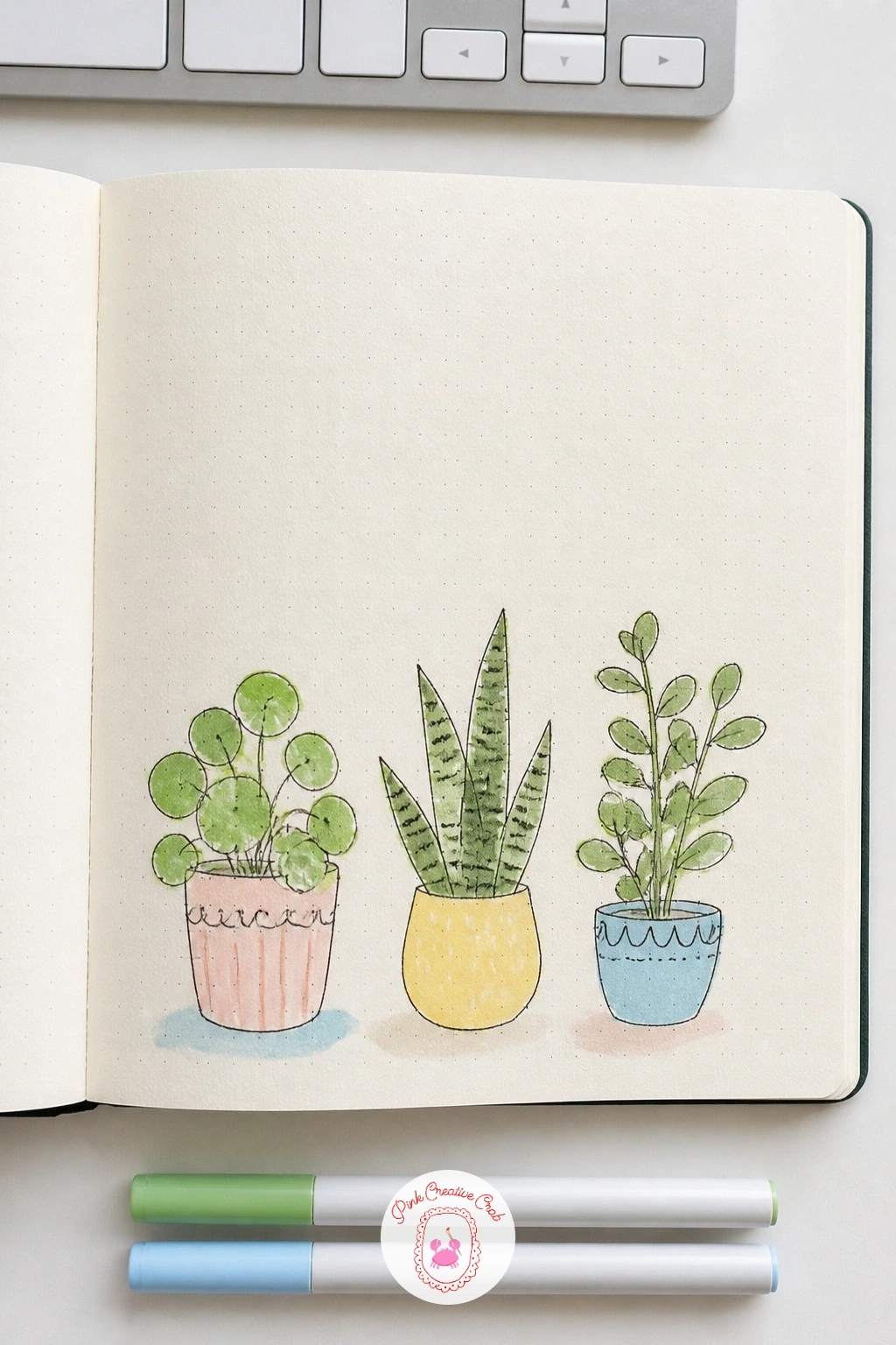
You Will Need
- ruler
Palette: Sage Green,Burnt Sienna,Warm Grey
Tear small irregular pieces of colored tissue paper in blues and greens, then glue them down in overlapping patches across the lower half of the page with a thin layer of diluted craft glue brushed over the top to seal them flat. Let it dry fully and flat under a heavy book, since tissue paper buckles the page more than any wash on this list.
Once dry, draw a single fish swimming across the collaged area, a simple curved body, a fan-shaped tail, one round eye, with a few fine ink lines added over the tissue to suggest scales or the shimmer of water. Letting the torn tissue edges show through near the fish’s tail, rather than covering every scrap with ink, keeps the collage texture visible as part of the finished scene.
If the tissue bleeds its color onto your hands or the next page, a thin coat of diluted glue sealing the surface once dry stops that completely. No tissue paper on hand? A loose blue and green watercolor wash with a dab of texture from crumpled plastic wrap gives a similar broken-color effect.
Tip for today: draw the fish’s eye slightly larger than feels natural, it gives the whole shape a cheerful, approachable expression that suits this lighthearted page.
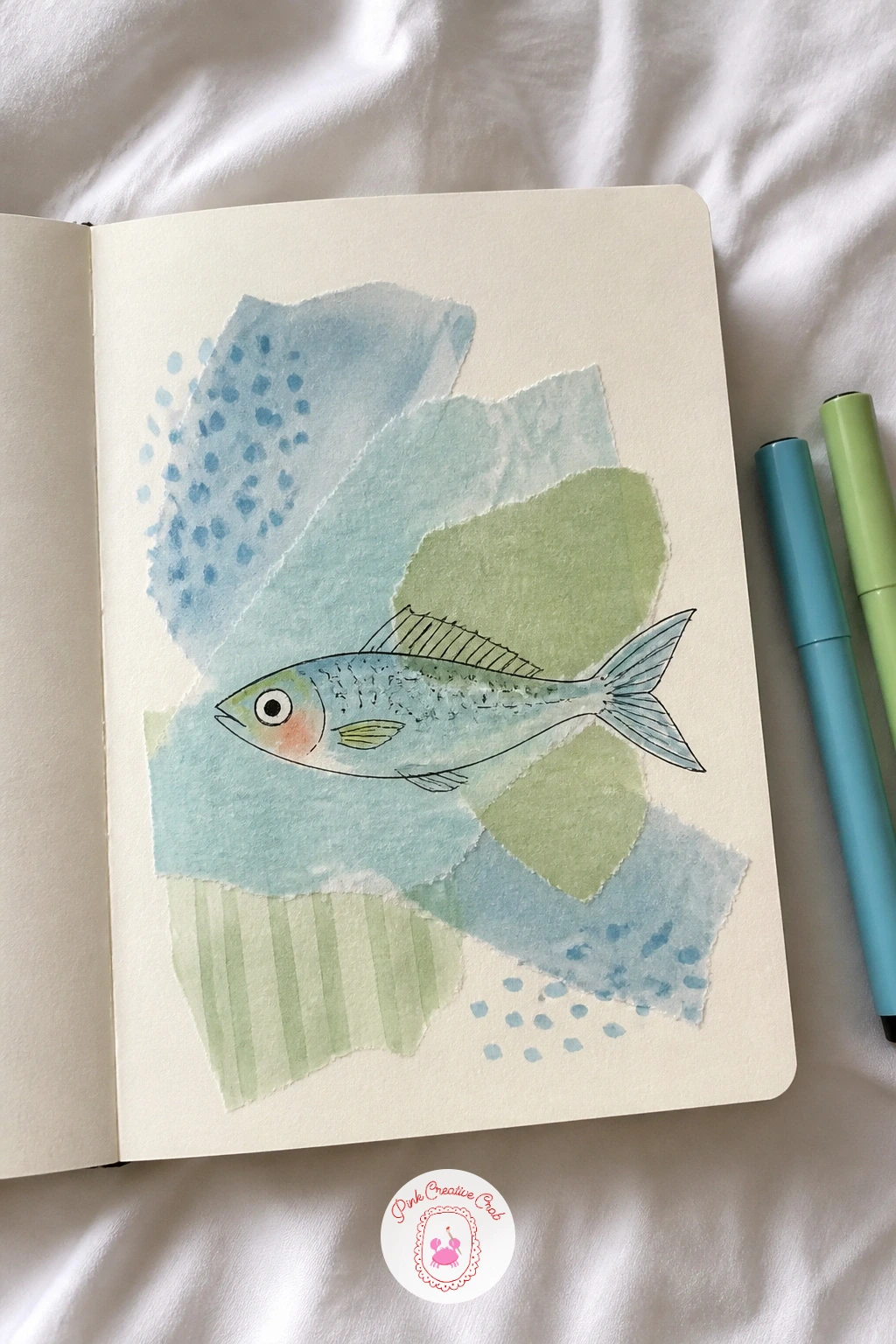
You Will Need
- colored tissue paper
- craft glue
Palette: Teal Green,Cerulean Blue,Titanium White
What to Do Next
Pick whichever mood suits today, mix one simple wash or pattern, let it dry, then add the small drawing on top in fineliner. Start with a spare page near the back of your sketchbook if you want to practice the technique before committing it to a page you love.
Frequently Asked Questions
What paper works best for painted sketchbook backgrounds?
A cream toned watercolor sketchbook works best, since it handles wet washes without buckling badly. Look for at least 140 pound paper if you plan to use wet techniques like staining or lifting regularly.
Do I need watercolor paint or can I use markers instead?
Either works well for these backgrounds. Watercolor gives softer, more varied washes, while alcohol or water-based markers blended with a water brush give quicker, more controlled color for anyone short on time.
How do I stop the background from overpowering my drawing?
Keep the background lighter in value than your main drawing’s ink lines. Leaving a small area of plain or paler wash where the subject will sit, planned before you paint, keeps the drawing clearly readable on top.
Can I draw the subject before painting the background?
It usually works better to paint the background first and let it dry completely. Drawing the subject afterward avoids smudged ink and lets you plan the composition around whatever happened naturally in the wash.
What is the fastest way to add texture to a sketchbook background?
A sponge, an old toothbrush, or crumpled plastic wrap dipped in thin paint add texture in seconds. Dab or flick rather than brush, since dragging flattens the texture these tools are good at creating.
Have any thoughts?
Share your reaction or leave a quick response — we’d love to hear what you think!
-
 0
-
0
-
0
-
0
-
0
-
0


