

Daffodil drawing has a way of making late winter feel over before it really is, which is probably why a yellow trumpet shows up on your phone screen at exactly the right moment. There is something satisfying about painting the one flower that always knows spring is coming before anyone else believes it.
Below you will find twenty seven small scenes to work through, starting with daffodils in jugs, boots and bike baskets, then moving on to the whole cast of early spring flowers that bloom alongside them. Every one is sized to finish in a single sitting, loose and light on white paper, so pick whichever makes you want to get your paints out right now.
Using these images: free for personal projects such as printing, coloring, cards, journals and gifts. Handmade items that include them may be sold up to 30 pieces per design. More than that is commercial use and is not permitted, and neither is selling or sharing the images themselves or passing them off as your own. Please ask before any other use.
Start daffodil drawing with the easiest composition on this whole list: a handful of blooms gathered into an enamel jug. Pencil in a loose oval for the jug body first, keep it slightly wonky on purpose, then sketch five or six trumpet shapes fanning out above the rim at different heights.
Paint the jug in a thin grey wash with a few dry brush strokes left white for the enamel shine, then drop yellow and a touch of orange into the petals while the paper is still damp so the color blooms softly. Once everything is dry, go back with a fine ink pen to add the trumpet edges, a few stem lines and the little chip marks enamel jugs always have.
The mistake here is painting every flower head the same size and angle, which flattens the whole arrangement. If you do not own an enamel jug to copy, any chipped metal pitcher or even a jam jar works just as well for the shape.
Try this today: paint the water line inside the jug rim as a thin grey curve, it instantly reads as glass or metal holding real water.
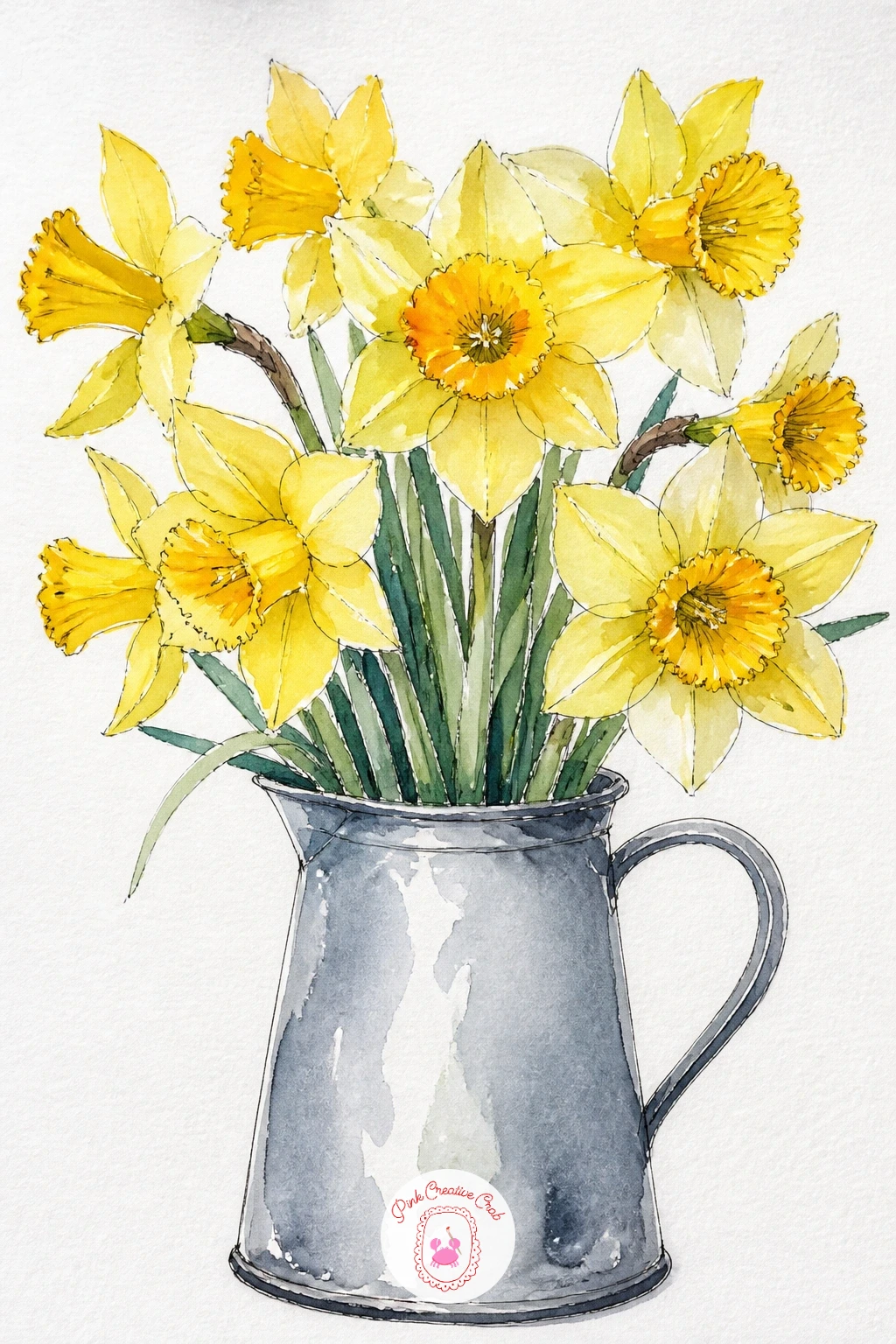
Palette: Cadmium Yellow,Payne’s Grey,Sap Green,Burnt Orange
Zoom right in for this one and let a single daffodil trumpet fill the whole page, petals and all. Lightly pencil six petals in a loose star shape around a central ruffled cup, keeping the petals slightly uneven in length since real daffodils never grow perfectly symmetrical.
Here is the proportion trick that saves this flower every time: the trumpet should be roughly as tall as one petal is long, not shorter and not much taller, so hold your pencil up to compare the two before you commit to paint. Wash the petals in pale lemon yellow, then drop a deeper golden yellow or soft orange into the trumpet while damp so it reads as the darker, deeper part of the bloom.
Once the paint has dried, add the frilled trumpet edge and a few petal vein lines with your fine ink pen. If your yellow paint looks thin and washed out, mix in a touch of the orange directly on the petals rather than adding more yellow, it warms the color without muddying it.
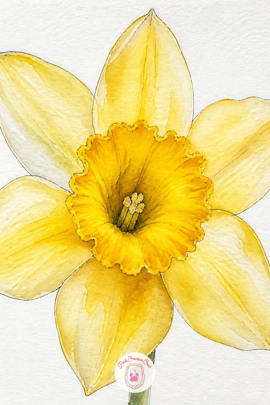
Palette: Lemon Yellow,Cadmium Orange,Sap Green
Pull back from the single bloom and try painting a whole field of daffodils rolling off toward the horizon. Keep the composition simple: a low horizon line about a third of the way up the page, with everything below it given over to yellow.
This is where eye level matters. Set your horizon low and the field reads as endless and wide, which is exactly the feeling you want. Wash in a pale green ground first, then while damp dab clusters of yellow across the lower two thirds using the tip of your brush, denser and larger near the bottom of the page, smaller and fewer as they near the horizon to suggest distance.
Skip individual petals entirely here, just a few ink dots and short flicks once dry are enough to suggest trumpets without drawing every flower. The usual mistake is painting the far flowers the same size as the near ones, which flattens the whole field, so keep shrinking them as you move up the page.
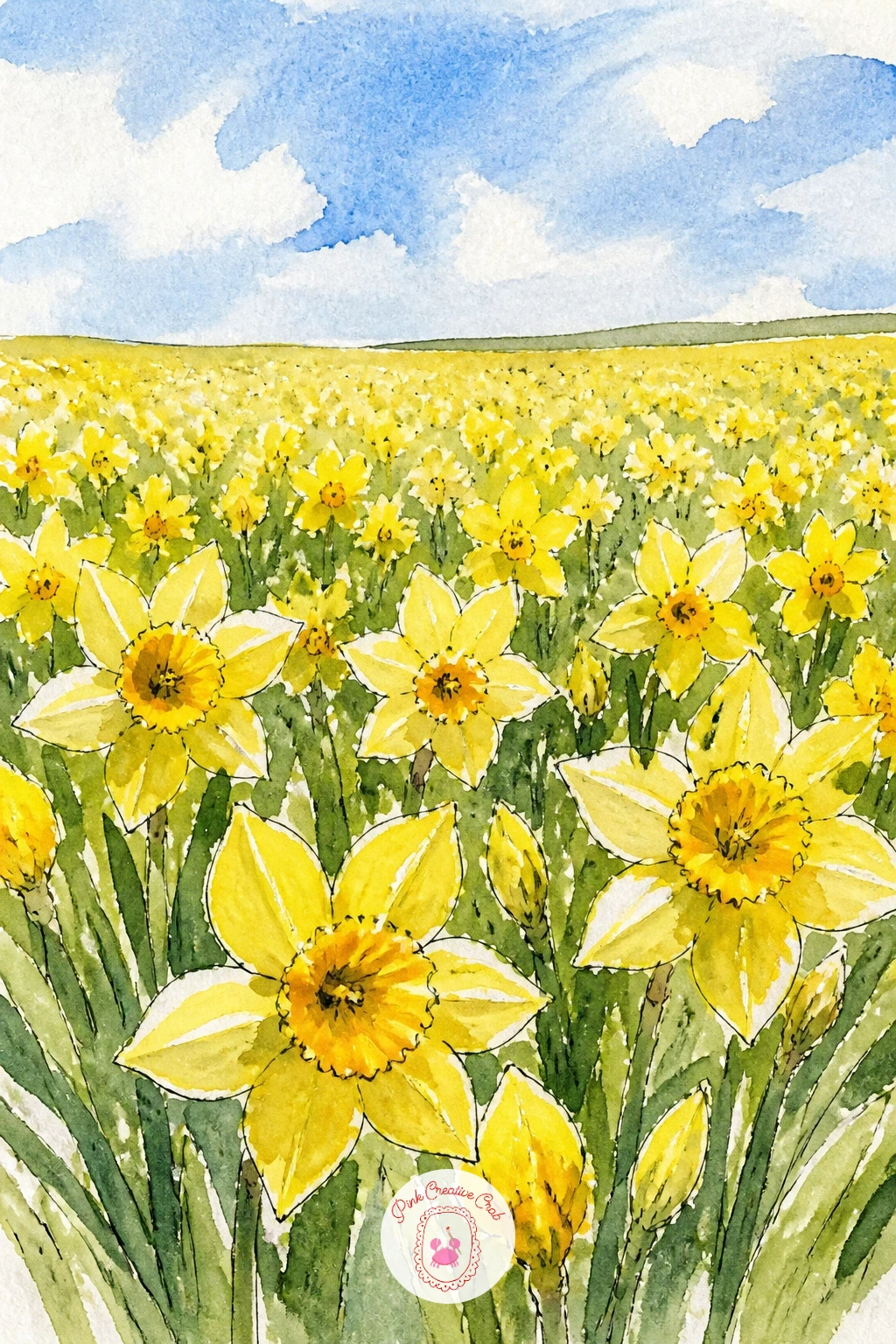
Palette: Lemon Yellow,Sap Green,Cerulean Blue
Try a dry brush dragged sideways for the distant grass, it softens the horizon and keeps the far field from looking too crisp against the sky.
Give daffodil drawing a bit of narrative with daffodils spilling from a bike basket, which only needs the front wheel, handlebars and basket to read as a whole bicycle. Sketch the basket as a simple woven rectangle sitting just above the wheel, then let a loose bunch of daffodils tumble over its front edge.
Paint the wheel and handlebars in thin grey or black ink line work rather than solid washes, since a line drawing bike reads just as clearly as a painted one and keeps the flowers as the star of the page. Wash the basket in warm ochre with a few crosshatch pen lines for the weave, then build the daffodils the same way as the earlier ideas, yellow washes with deeper trumpet centers.
If the bike shape worries you, trace a photo of a basket and front wheel lightly in pencil first, nobody will know. The flowers spilling past the basket edge, rather than sitting neatly inside it, is what makes the whole scene feel alive instead of staged.
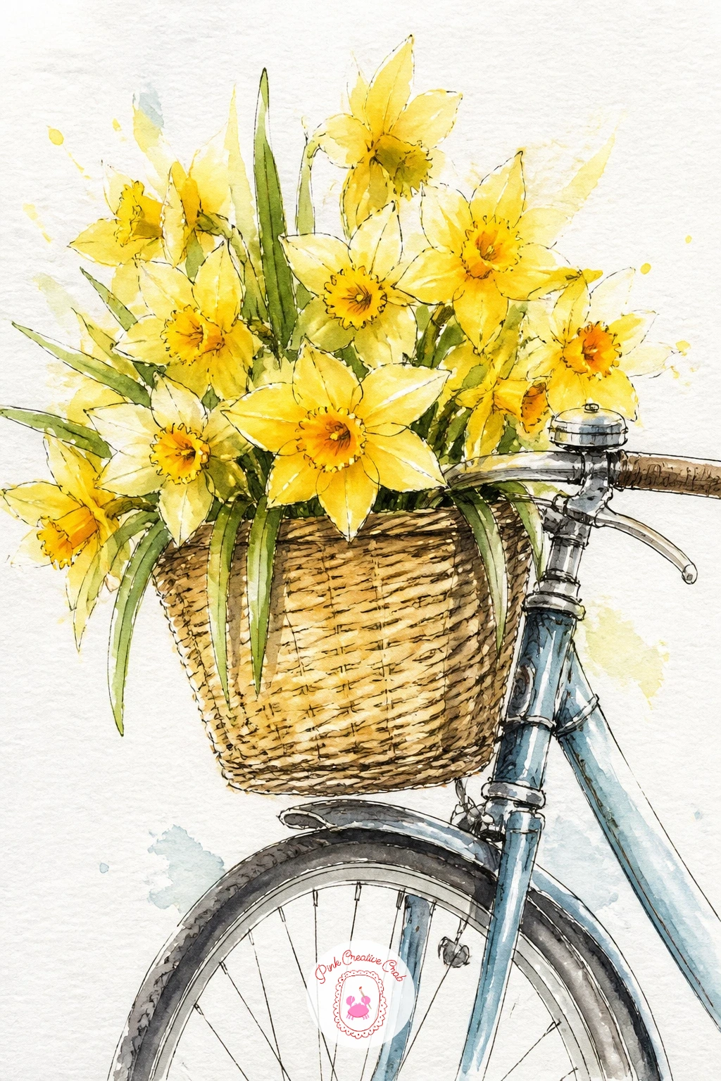
Palette: Yellow Ochre,Cadmium Yellow,Payne’s Grey,Sap Green
Move from the bike into a tighter still life with a daffodil bouquet wrapped in brown paper, the kind you carry home from a farm stand. Draw the paper cone first as a simple triangle shape, loosely crumpled at the top where it gathers around the stems, then fan the daffodil heads out above the fold.
Mix a warm burnt sienna wash for the paper and let it pool unevenly so the folds show themselves naturally rather than being drawn in first. Once that layer is dry, add the creases and the twine or string tying the bundle with a few confident ink lines, then paint the daffodils on top in your usual yellow washes.
Ten minutes gets you the paper cone and a handful of simple flower shapes blocked in. Give it forty and you can add individual petal shading, a few green leaves tucked among the stems, and texture lines in the paper itself for a fuller, more finished page.
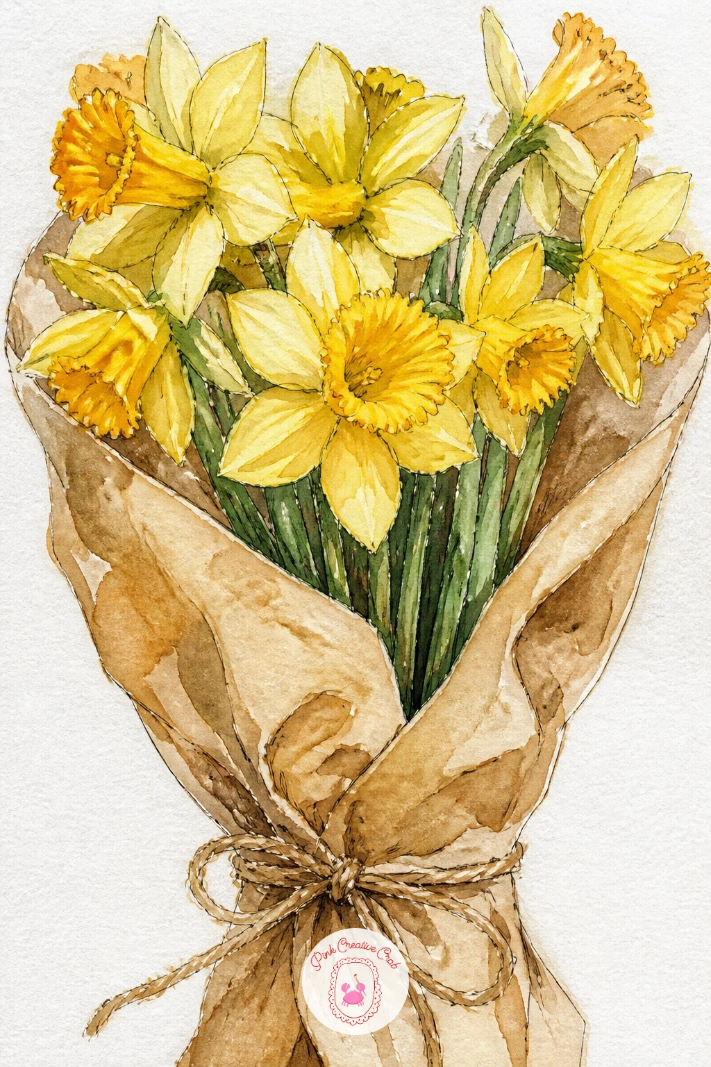
Palette: Burnt Sienna,Cadmium Yellow,Sap Green,Payne’s Grey
Switch out the yellow for white with a pot of paperwhites, the narcissus that blooms indoors in the middle of winter. Sketch a simple terracotta pot first, then let a cluster of thin upright stems rise from it, each topped with a small cluster of star shaped white flowers rather than one trumpet each.
Since the petals are white, the trick is painting everything around them instead of the petals themselves: wash the terracotta pot in warm orange brown, drop pale green behind the stems, and leave the flower shapes as bare white paper. Once dry, use your fine ink pen to draw the petal outlines and tiny orange centers, which is what actually makes the white shapes read as flowers rather than blank gaps.
If your paper picks up pencil smudges in the white areas, a kneaded eraser pressed gently over the dry paint lifts graphite without disturbing the color underneath. Keep the stems slightly bending in different directions, perfectly straight stems look stiff and unnatural.
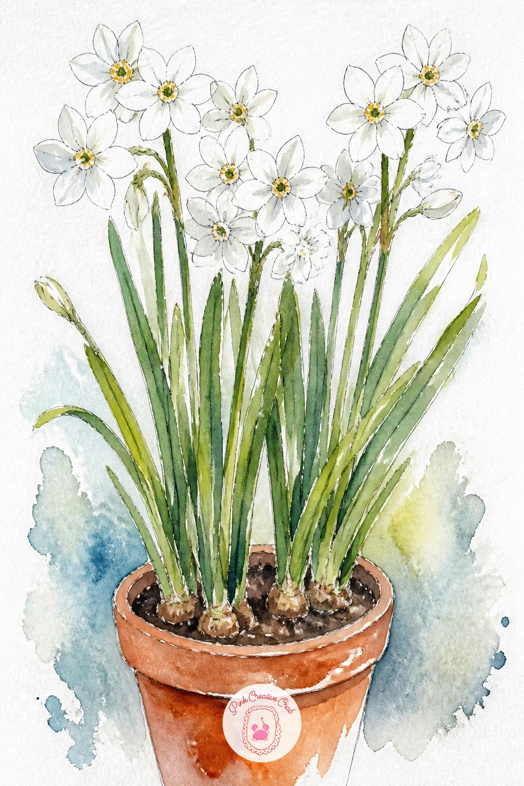
Palette: Terracotta,Sap Green,Cadmium Orange,Payne’s Grey
Keep the cottage feeling going with daffodils planted in an old wellington boot, a favorite garden container for anyone who loves a bit of whimsy. Draw the boot shape first, a simple curved cylinder with a folded cuff at the top, then let the daffodil stems and leaves rise out of the opening in a loose cluster.
Paint the boot in a solid color, deep green or faded red both work well, leaving a lighter dry brushed patch where the light catches the rubber curve. The texture of old rubber comes from dragging a half dry brush lightly over the surface once the base wash is down, which leaves small broken marks instead of a flat, smooth color.
Build the daffodils on top the same way as the jug idea, yellow washes with deeper trumpet centers, letting a few leaves spill over the boot’s edge. If you do not have a reference boot handy, any tall rubber boot shape from memory works fine, the fold at the top is the detail that sells it.
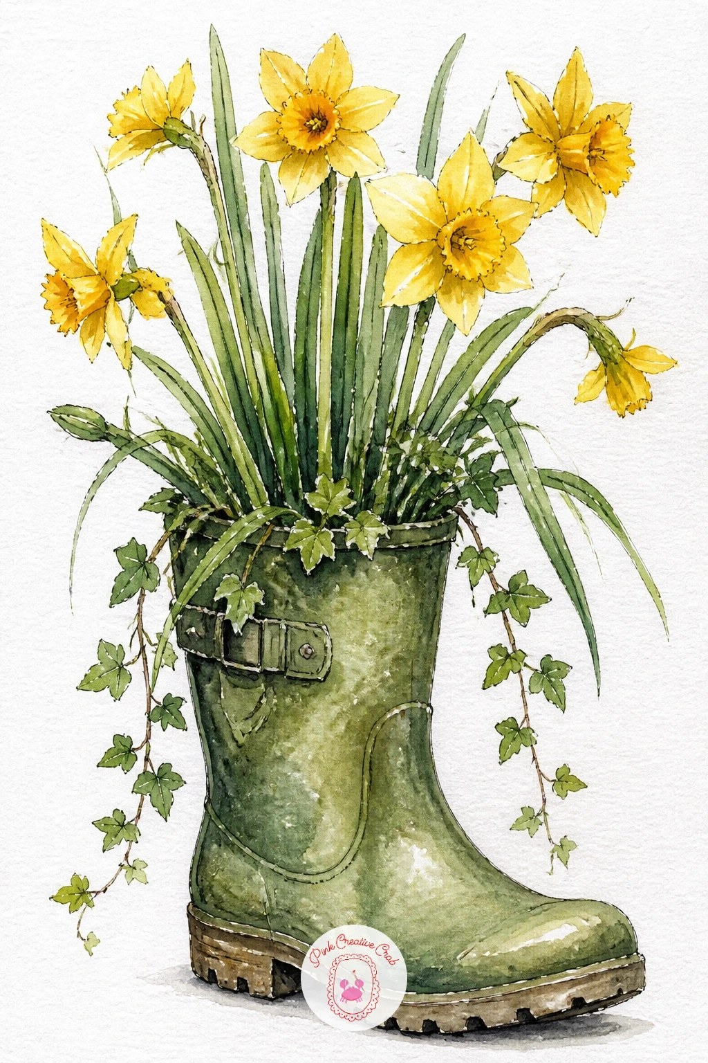
Palette: Deep Green,Cadmium Yellow,Burnt Orange,Sap Green
Set a small pot of daffodils on a cottage windowsill and you get a whole scene in a few quick shapes: a window frame, a sill, a flower pot and a hint of glass. Draw the window as a simple grid of straight lines first, since a slightly wobbly grid is far more forgiving than a wobbly curve would be.
Think about where the light is coming from before you paint, because it decides everything else. If the light source sits outside the window, the sill and the near side of the pot stay in shadow while the daffodils themselves catch a warm highlight on their sunlit edges. Wash the window glass in a pale blue grey, leave small white gaps for reflections, then build the pot and flowers on the sill in your usual layered washes.
A loose watercolor cottage scene like this pairs well with the softer window light techniques covered in this cottagecore watercolor painting guide, if you want to take the whole windowsill idea further.
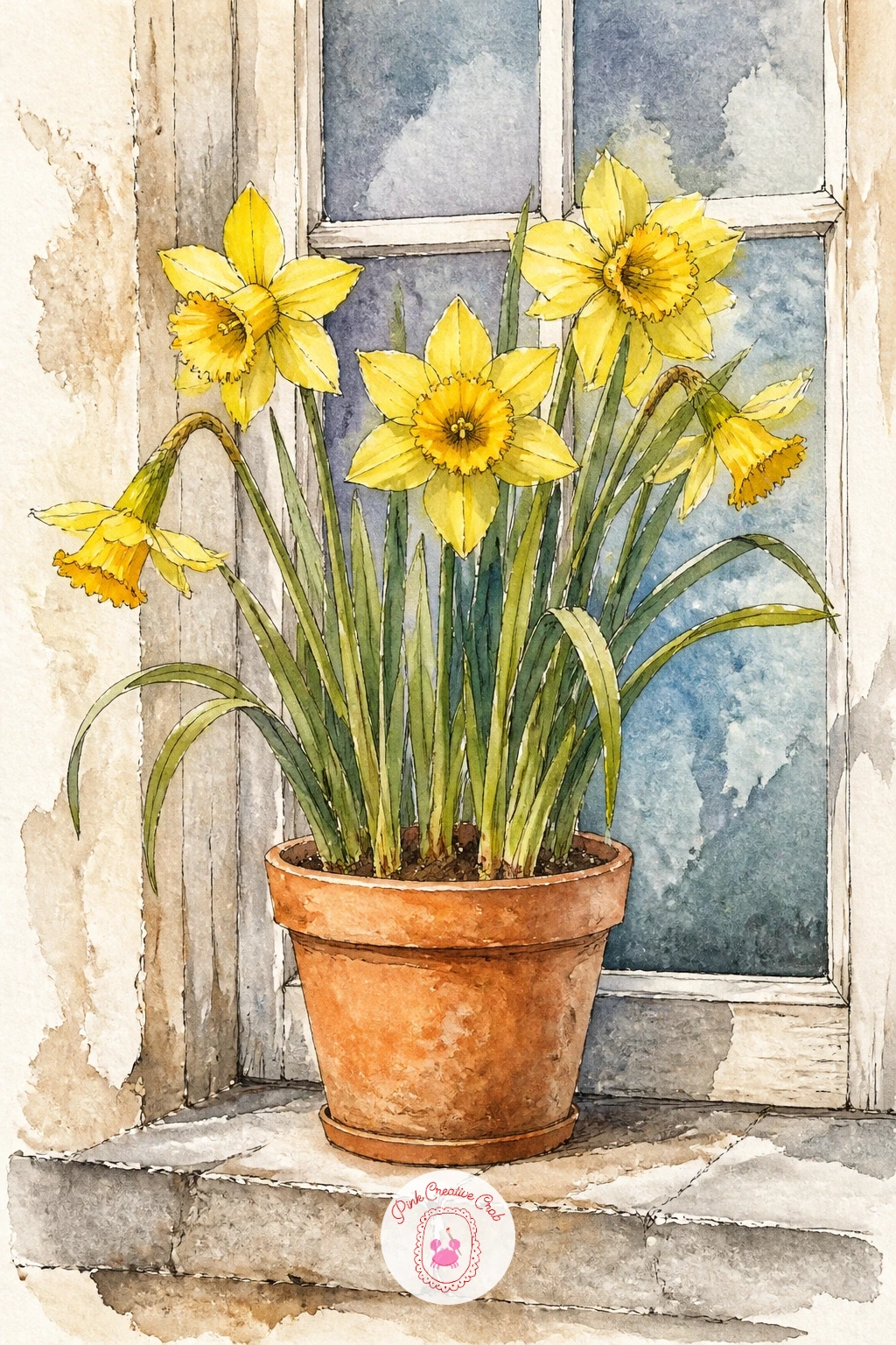
Palette: Cadmium Yellow,Payne’s Grey,Terracotta,Cerulean Blue
Bring a little life onto the page with a bee resting on a daffodil trumpet, a small addition that turns a flower study into a tiny story. Draw the daffodil first using the single trumpet method from earlier, then tuck the bee into the lower edge of one petal, drawn small and slightly rounded rather than detailed.
The edges are what make or break this one. Paint the bee’s body in warm gold with dry brush strokes left visible for the fuzzy texture, then once that layer is fully dry, use your fine ink pen for the wing outlines and black stripe bands, keeping the wings as two simple translucent ovals rather than solid shapes.
If dry brush texture feels fiddly on something this small, a slightly thirsty brush with less water than usual does the same job more gently. Keep the bee smaller than you think it should be, an oversized bee on a flower this size tips the whole scene into cartoon territory.
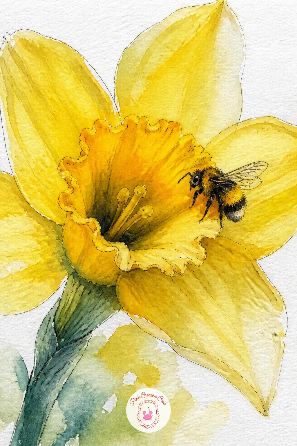
Palette: Cadmium Yellow,Payne’s Grey,Burnt Orange,Sap Green
Turn the daffodil theme into a small figure scene with a girl selling daffodils from a market stall or basket, which only needs a simple standing figure and a bunch of flowers to carry the whole idea. Sketch the figure loosely first, a soft dress or coat shape, simple rounded hands, and keep the face mostly suggested rather than drawn in detail, since a few small pen marks for eyes and a mouth read as a face at this scale without demanding careful proportions.
Build her coat or dress in one confident wash of color, then let the bunch of daffodils she is holding or arranging be the brightest, most detailed part of the page. Add her features and any basket or stall details last, once the clothing wash is fully dry, so the ink stays crisp instead of bleeding into wet paint.
If figures feel daunting, keep her turned slightly away or looking down at the flowers rather than straight at the viewer, it is far more forgiving. For more confidence with figures at this level, the girl pencil drawing ideas for beginners cover simple proportion tricks that carry over nicely into watercolor.
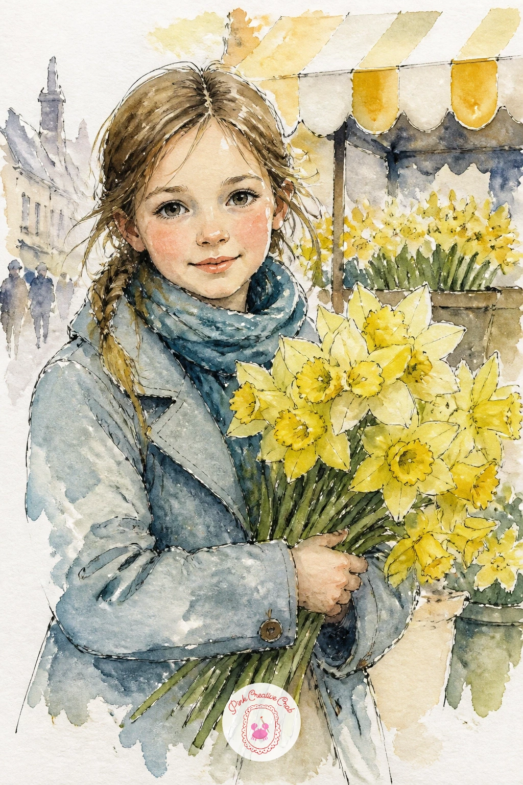
Palette: Cadmium Yellow,Dusty Rose,Payne’s Grey,Burnt Sienna
Spread daffodils across a checked picnic blanket for a sunny little scene that works well filling the whole page corner to corner. Draw the blanket as a simple rectangle in gentle perspective, wider at the front edge and narrower toward the back, then lay the grid of checks over it once that basic shape feels right.
Paint the blanket checks in two alternating colors, leaving some squares as plain white paper so the pattern does not overwhelm the flowers scattered on top. Once dry, scatter a handful of loose daffodil heads and a few stems across the blanket surface, some lying flat, some gathered in a small loose pile near one corner.
The common mistake is making every check perfectly even, which looks stiff against the softness of the flowers. Let a few lines wobble slightly as the fabric folds, it actually makes the blanket read as real cloth rather than a drawn grid.
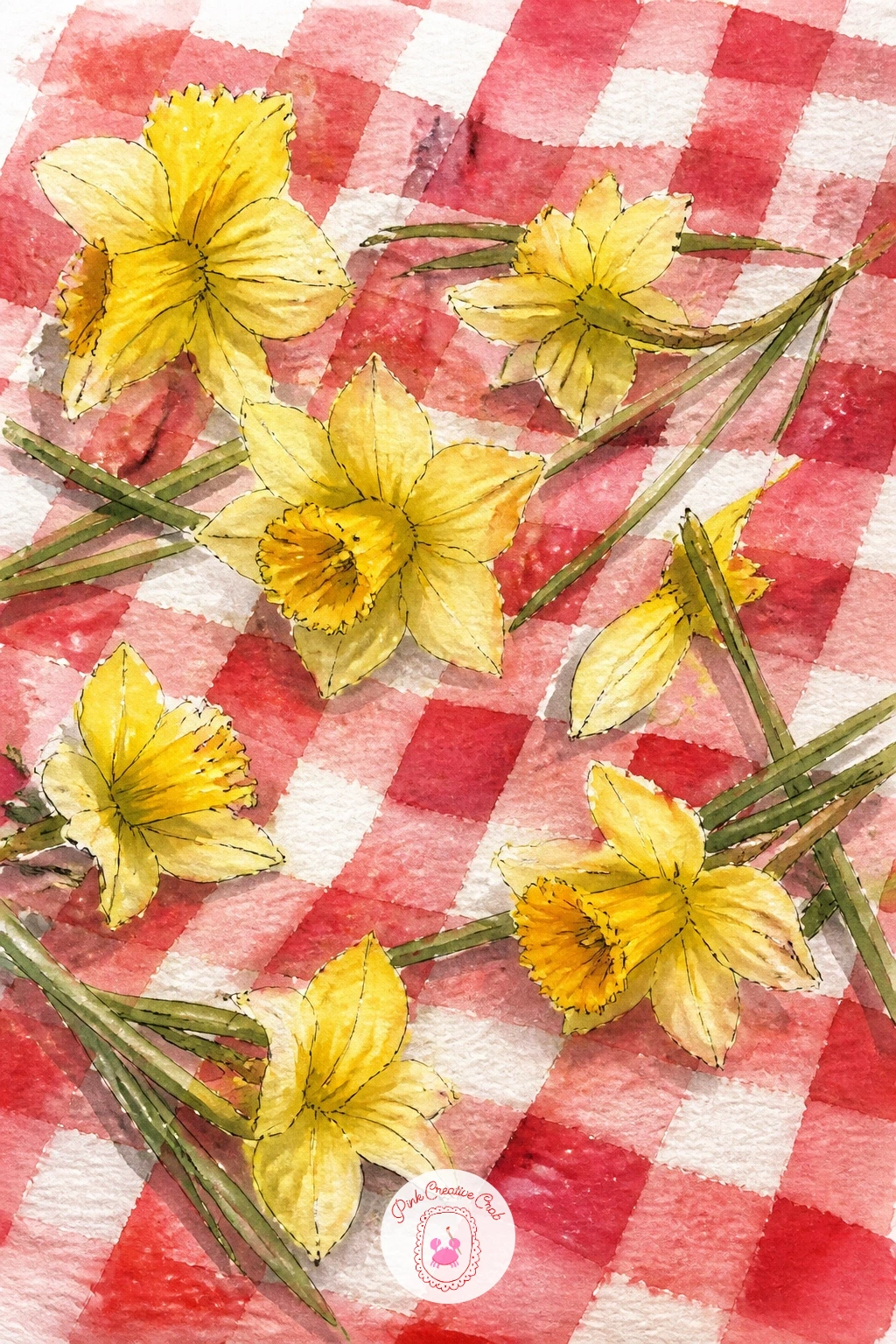
Palette: Cadmium Red,Cadmium Yellow,Sap Green,Ivory White
Pair the season’s other favorite sign of spring with daffodils by painting a lamb standing among them in a short patch of grass. Sketch the lamb’s body as a simple rounded oval with four short legs and a small head, keeping the wool texture suggested rather than drawn strand by strand.
Wash the lamb’s body in warm cream, then while still slightly damp, dab a dry brush loaded with a touch more cream or pale grey around the edges to suggest the curled wool texture without painting every curl. Once that layer is dry, surround the lamb’s feet with a scattering of daffodil heads using the same yellow wash method as the earlier ideas, keeping the flowers smaller near the lamb so it stays the focal point.
If the lamb’s proportions feel off, compare the head width to the body length before you commit in ink, a lamb’s head is roughly a third the length of its body, not half. A soft grey ink line for the legs and face keeps the whole figure gentle rather than harsh.
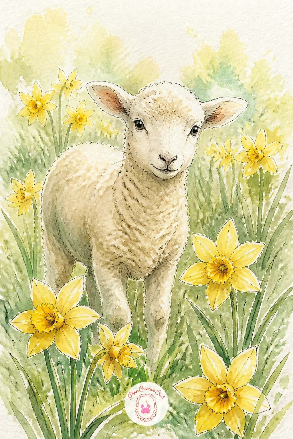
Palette: Ivory White,Payne’s Grey,Cadmium Yellow,Sap Green
Give daffodil drawing a landscape feel with a cluster growing along a riverbank, the water doing most of the work of framing the flowers. Set the horizon low on the page and let the river curve in from one side, wider near the bottom edge and narrowing as it bends away into the distance.
Painting moving water is mostly about restraint: wash in a pale blue grey, then drag a few horizontal dry brush strokes across it while still slightly damp to suggest ripples, and resist the urge to add more detail than that. Once the water is dry, paint the daffodils clustered along the near bank in your usual yellow washes, letting a few lean out over the water’s edge.
If river water feels tricky, practice the dry brush ripple technique on a scrap corner first before committing to the page. For more river and water composition ideas at a similar beginner level, the easy landscape painting lessons cover rivers and fields in more depth.
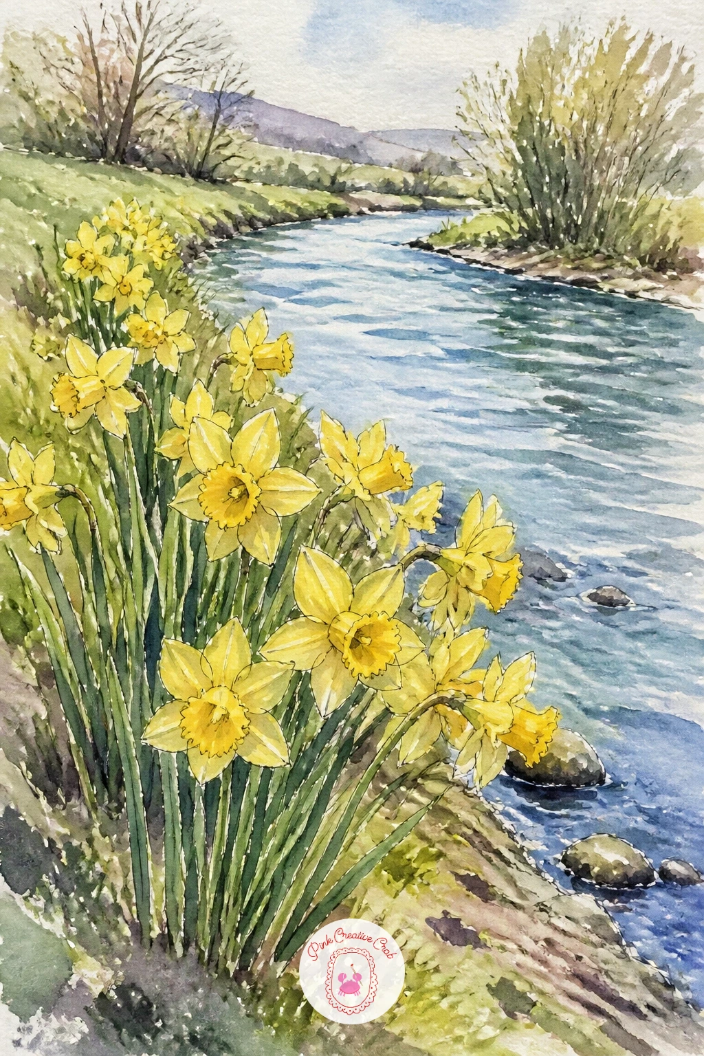
Palette: Cadmium Yellow,Cerulean Blue,Sap Green,Payne’s Grey
Build a daffodil crown as a ring of blooms woven together, a lovely subject for anyone who wants a slightly more decorative page. Lightly sketch a large oval or circle guide first, faint enough to erase later, then place daffodil heads evenly around it rather than drawing the ring itself as a solid shape.
Vary the angle of each flower around the circle, some facing outward, some tilted toward the center, which keeps the crown from looking like a row of identical stamps stuck in a circle. Paint each bloom with the usual yellow washes, then once everything is dry, add a few trailing green leaves and ribbon ends between the flowers with fine ink lines to tie the ring together visually.
Once this version works, try it again as a smaller crown of mixed spring flowers instead, daffodils alternating with grape hyacinths or primroses for a different color rhythm each time. Erase the pencil guide circle fully before adding final ink details so no stray lines show through the white paper background.
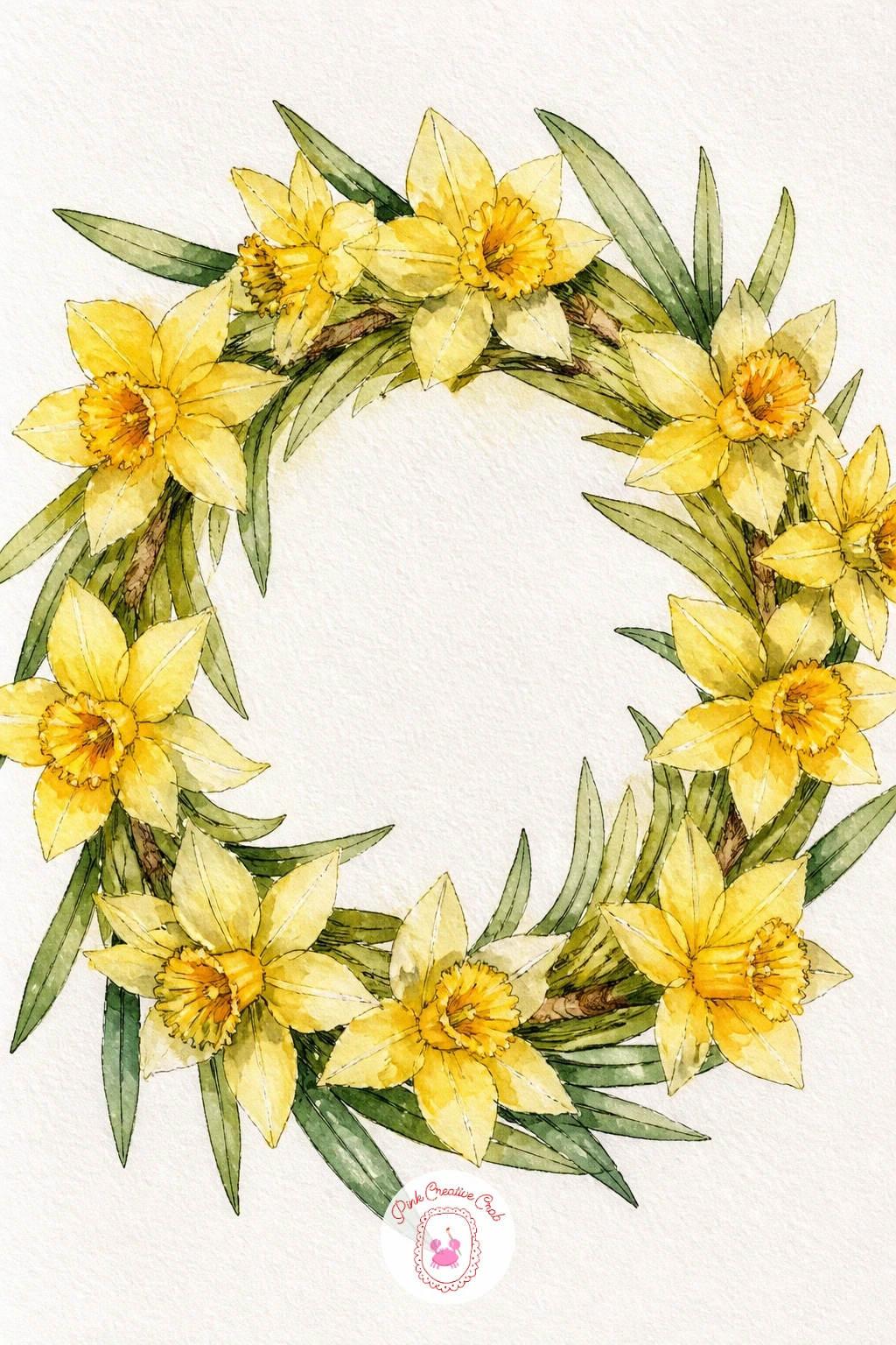
Palette: Cadmium Yellow,Sap Green,Burnt Orange,Payne’s Grey
Move into the next flower on this early spring list with a potted hyacinth, whose tight cone of tiny blossoms makes a nice change of shape from the open trumpets you have been painting so far. Draw the terracotta pot first, then a single thick stem rising from it topped with a dense, slightly conical cluster of small flowers.
Rather than painting each tiny blossom separately, wash the whole cluster shape in one color first, purple, pink or blue all work, then once that base layer is dry, dab short dry brush strokes across the surface to suggest the texture of many small flowers packed together. Add the individual ink marks for petal tips only where the light catches the edge of the cluster, not across the whole thing.
If the color looks too flat and solid, mix two closely related shades, say a cooler and a warmer purple, and drop the second one in while the first is still slightly damp so they blend softly. Keep the leaves broad and strappy rather than thin, hyacinth leaves are noticeably wide at the base.
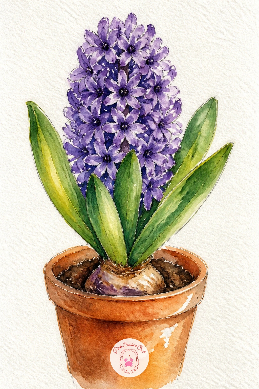
Palette: Violet,Dusty Rose,Sap Green,Terracotta
Scatter a handful of crocuses low in a patch of grass for one of the quickest ideas on this whole list. Sketch a loose row of simple cup shapes close to the ground, each one just a few short petal strokes rather than a fully drawn flower, since crocuses are small and simple by nature.
This is a nice one to try both quick and slow. Ten minutes gets you a scatter of purple and white cup shapes with a few green blade leaves poking up between them. Give it forty and you can vary the cup colors between purple, white and soft yellow, add a faint cast shadow under each bloom, and build the grass behind them in layered green washes instead of one flat color.
The easiest way to keep the crocuses from looking stiff is varying how open each cup is, some barely cracked open, others fully spread, since real crocus patches never bloom in unison. A damp brush dragged quickly through wet green paint gives the grass blades without drawing each one by hand.
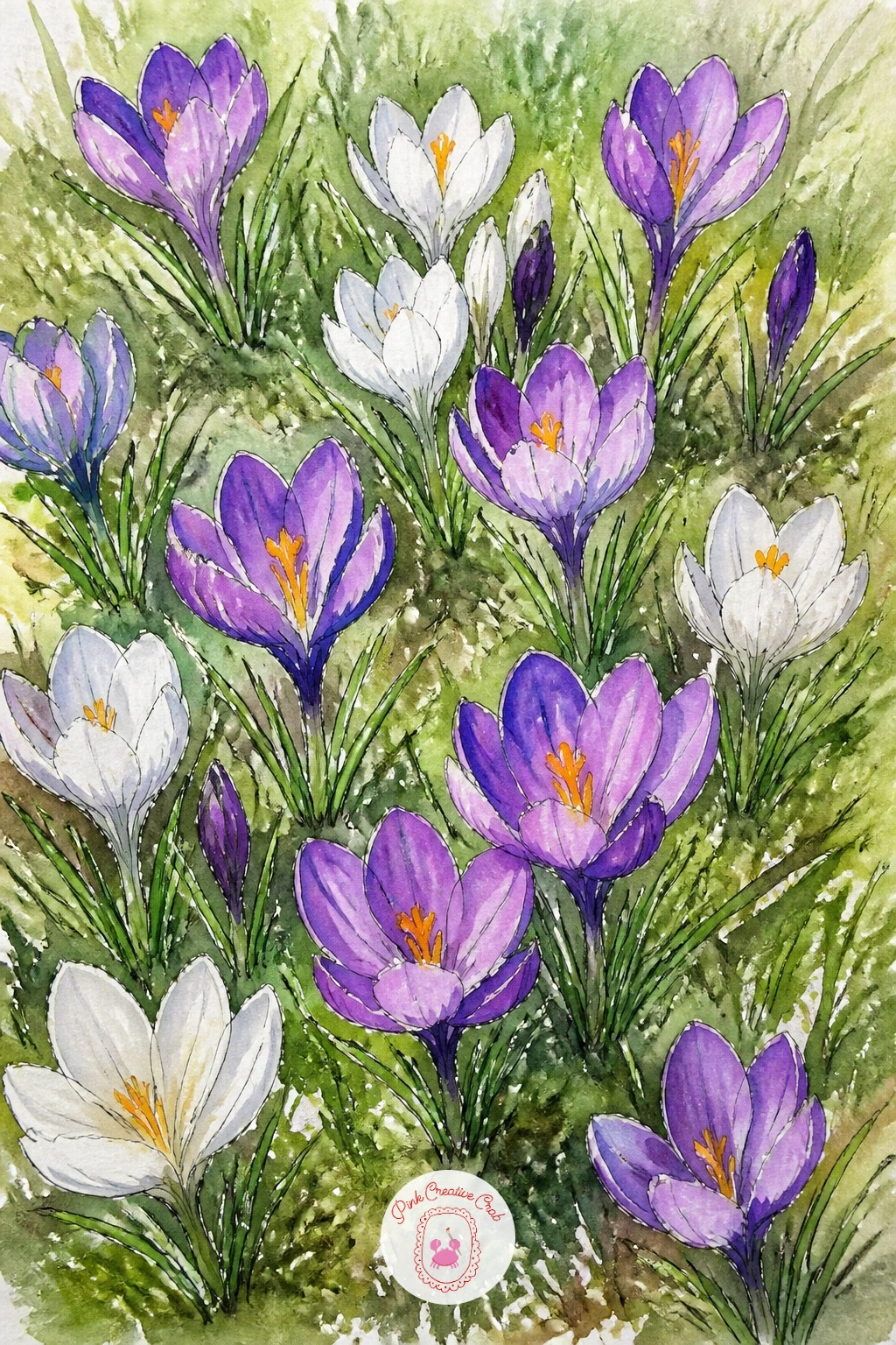
Palette: Violet,Ivory White,Sap Green,Cadmium Yellow
Tuck a cluster of snowdrops beneath the bare branches of a tree for a quiet little scene that leans on contrast rather than color. Sketch the tree trunk first as a simple curved line with a few bare branches forking off, then place a small cluster of nodding white snowdrop heads low near its base.
Since snowdrops are nearly white, the trick again is painting the negative space around them: wash the ground in a cool pale green grey, add a soft brown wash to the tree trunk, and leave the snowdrop shapes themselves as bare paper. Once everything is dry, use a fine ink pen to outline each drooping petal and add the faint green markings snowdrops carry near their tips.
If the white shapes feel too stark against a dark background, soften the edge where ground meets flower with a damp clean brush before it fully dries, which lifts a touch of color back toward white and blends the transition. Keep the flower heads nodding downward, snowdrops never face up the way daffodils do.
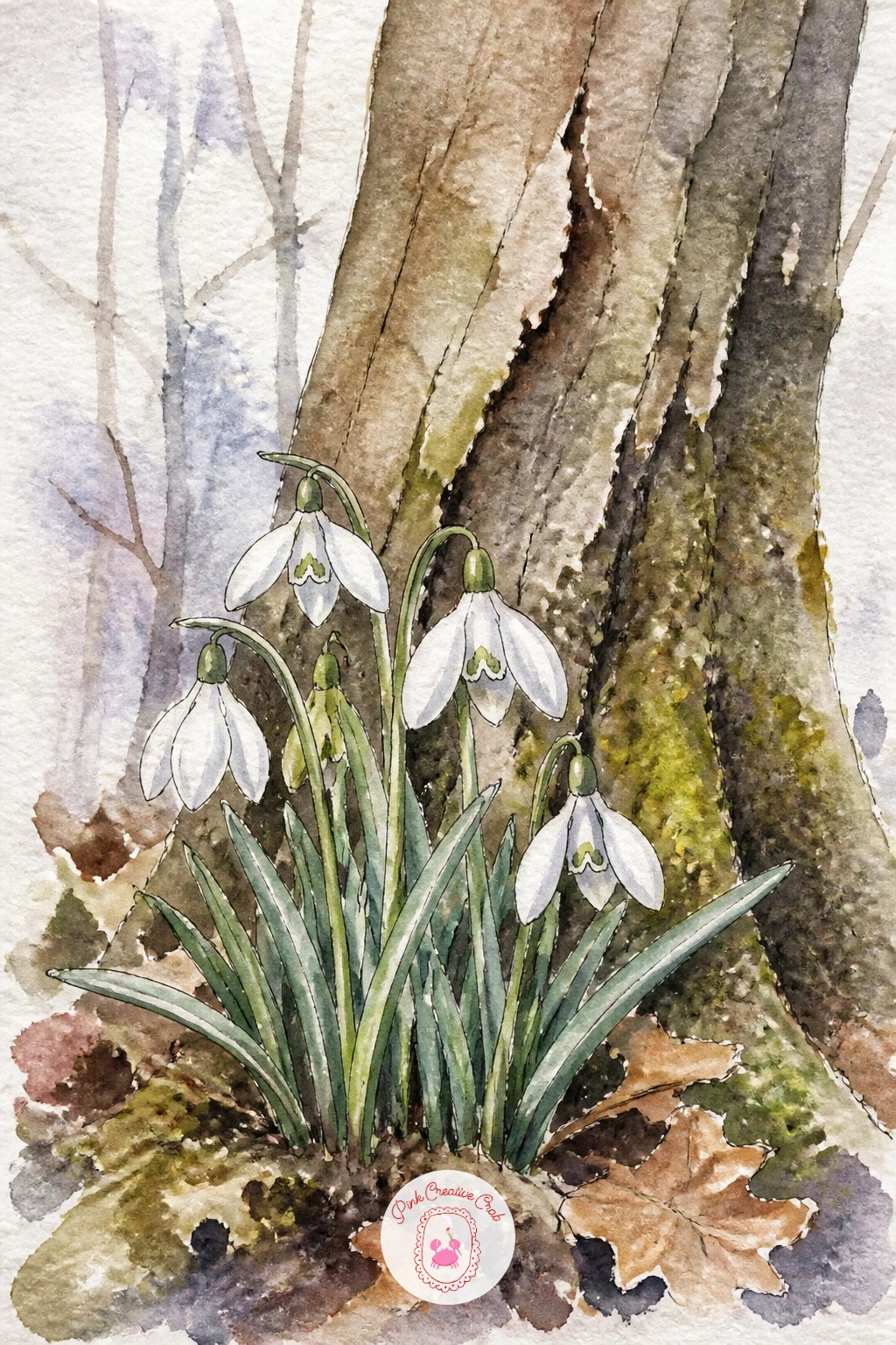
Palette: Sap Green,Burnt Sienna,Payne’s Grey,Ivory White
Combine two of spring’s best known flowers in one bouquet by painting tulips and daffodils together, a nice test of handling two very different petal shapes in the same piece. Sketch the tulips as simple closed cup shapes on straight stems, then weave the more open, ruffled daffodil trumpets in between and around them for contrast.
Keep the tulips at a slightly higher eye level than the daffodils in your sketch, with their cups mostly closed rather than open wide, since that shape difference is what makes the two flowers read as distinct even before any color goes down. Wash the tulips in red, pink or soft orange first, then build the daffodils around them in the usual yellow, letting the two color families sit close enough to touch but not blend into mud.
If the colors start to run together where the flowers meet, let each wash dry fully before starting the next bloom beside it rather than working wet into wet across the whole bouquet. A loose scatter of green leaves threaded through both flower types ties the whole arrangement together.
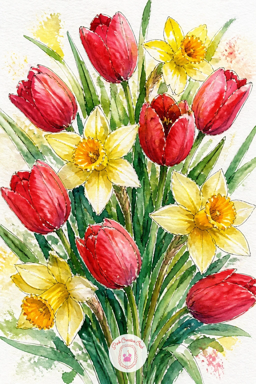
Palette: Cadmium Red,Cadmium Yellow,Sap Green,Dusty Rose
Paint a small cluster of grape hyacinths next, whose tight cones of tiny deep blue bells make them look almost like a bunch of grapes on a stem, which is exactly where the name comes from. Sketch a handful of thin upright stems, each topped with a small tapered cluster shape, keeping the clusters narrower and shorter than the hyacinth pot from earlier.
Wash each cluster in deep blue violet in one go, then while still damp, lift tiny dots of color out with a dry, clean brush tip pressed gently into the wet paint, which leaves pale flecks that read as the individual bell shapes catching light. This lifting trick works far better here than trying to paint each bell separately at such a small scale.
Once dry, a few fine ink dots scattered across the cluster add just enough definition without overworking it. If lifting color feels fiddly with a brush, a piece of paper towel dabbed lightly onto the wet paint does a similar job and is easier to control the first time.
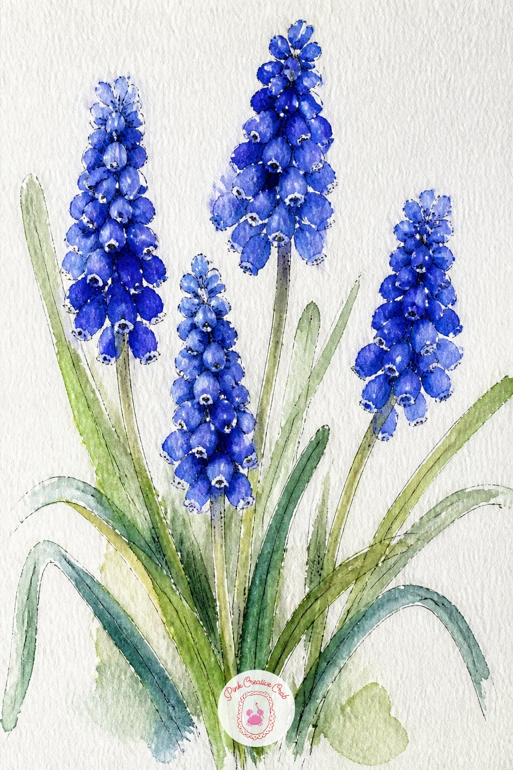
Palette: Ultramarine,Violet,Sap Green
Gather a handful of primroses into a small woven basket for a cheerful, cottage garden feeling subject. Draw the basket first as a simple rounded shape with a curved handle, cross hatching a few lines across the front for the woven texture, then let the primroses spill gently over its rim.
Primroses have a distinctive flat, open face with a small yellow eye at the center, so sketch each bloom as a simple five petaled flat shape rather than a cup, which separates them clearly from the daffodils and tulips earlier in this list. Wash the petals in soft yellow, pink or cream, then once dry, add the tiny yellow eye and a few fine radiating petal lines with your ink pen on each flower.
Keep the basket weave suggested with a handful of confident pen strokes rather than an even grid, real woven baskets are never perfectly regular. If you enjoy composing flowers in containers like this, the gathered basket arrangements in this junk journal flowers collection offer more layout ideas worth borrowing.
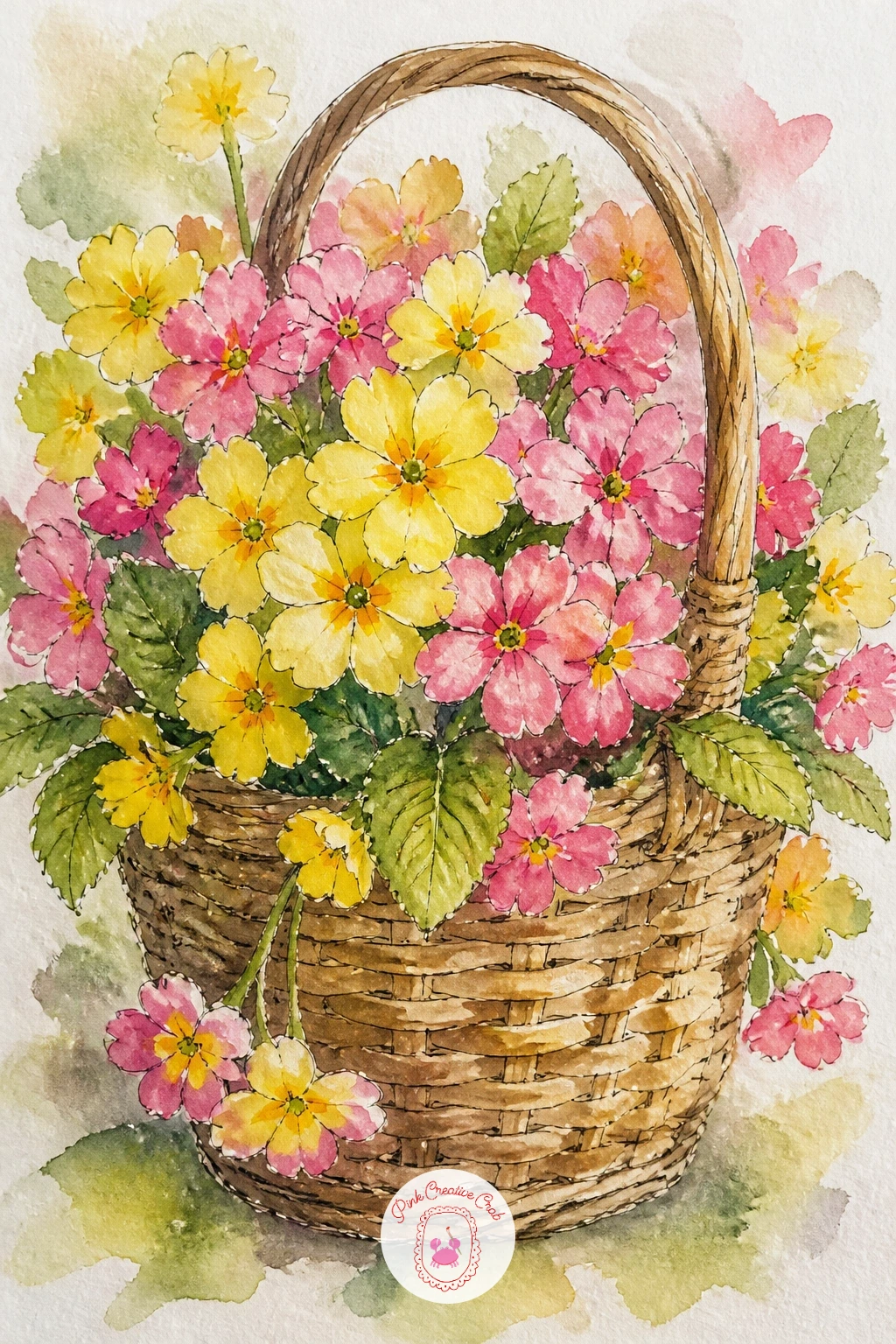
Palette: Cadmium Yellow,Dusty Rose,Burnt Sienna,Sap Green
Step into a bluebell wood for one of the more atmospheric scenes on this list, where a carpet of blue flowers under a few tall tree trunks does most of the visual work. Sketch two or three simple vertical tree trunks first, placed unevenly across the page rather than centered, then leave the whole lower half open for the bluebell carpet.
Where you set the light source changes this scene more than almost any other idea here. Light filtering down through the trees from one upper corner means the trunks get a bright edge on that side and a shadow side opposite, while the bluebell carpet below glows brighter wherever that light lands and sits cooler and dimmer in the shaded patches. Wash the carpet in layered blues and violets, lighter where the light falls, then once dry, scatter in a few individual bell shaped flower heads near the front edge with your ink pen for scale.
If the trunks look too stiff, add a slight curve or lean to at least one of them, perfectly straight trunks read as artificial. Keep most of the bluebell detail implied through color rather than drawn flower by flower, it is a carpet, not a bouquet.
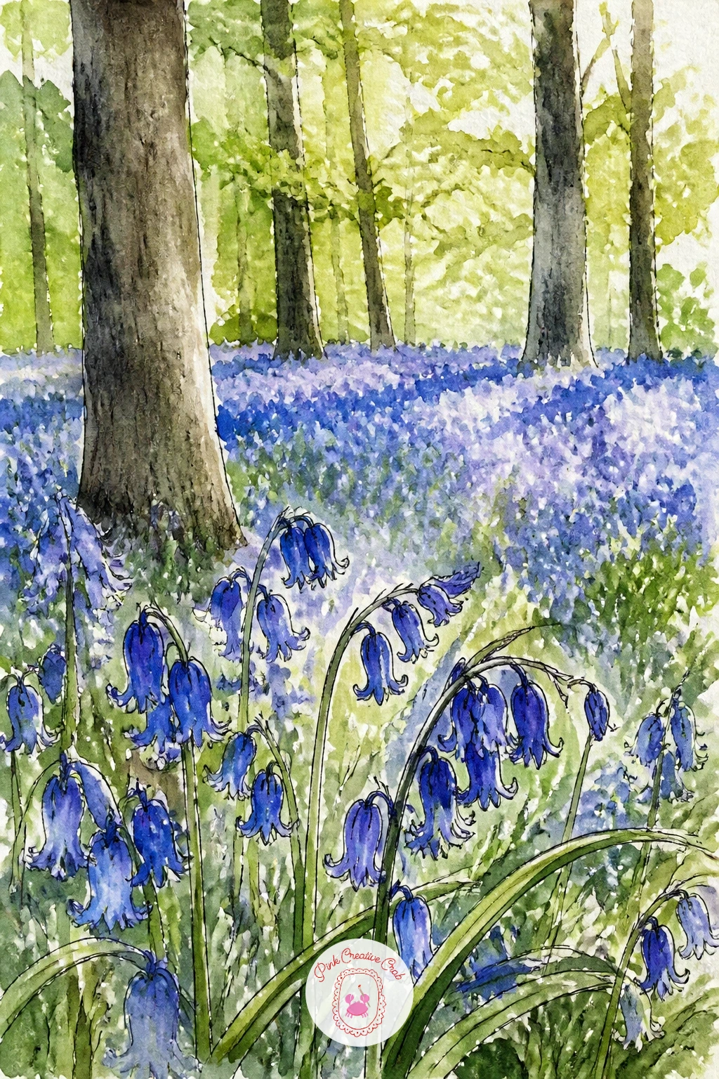
Palette: Ultramarine,Violet,Burnt Sienna,Sap Green
Paint a single hellebore next, sometimes called the Lenten rose, whose nodding, slightly cupped flower head sits a little differently than anything else on this list so far. Sketch the bloom facing slightly downward on its stem, with five broad, rounded petals overlapping gently rather than fanning fully open.
Hellebore petals often carry a soft blush of color toward their edges while staying pale or greenish near the center, so wash the petals starting pale in the middle and dropping a touch of dusty pink or deep plum toward the outer edge while the paper is still damp, letting the two tones merge softly rather than sitting in hard bands. The cluster of small dark stamens at the flower’s center is best added last in ink, once the petal washes are completely dry, as a small tight group of dots rather than individual lines.
If the overlapping petals start to look flat, darken the paint slightly where one petal tucks behind another, that small shadow is what gives the bloom its gentle cupped dimension. Hellebore leaves are broad, leathery and deeply notched, worth including at least one of behind the bloom for contrast.
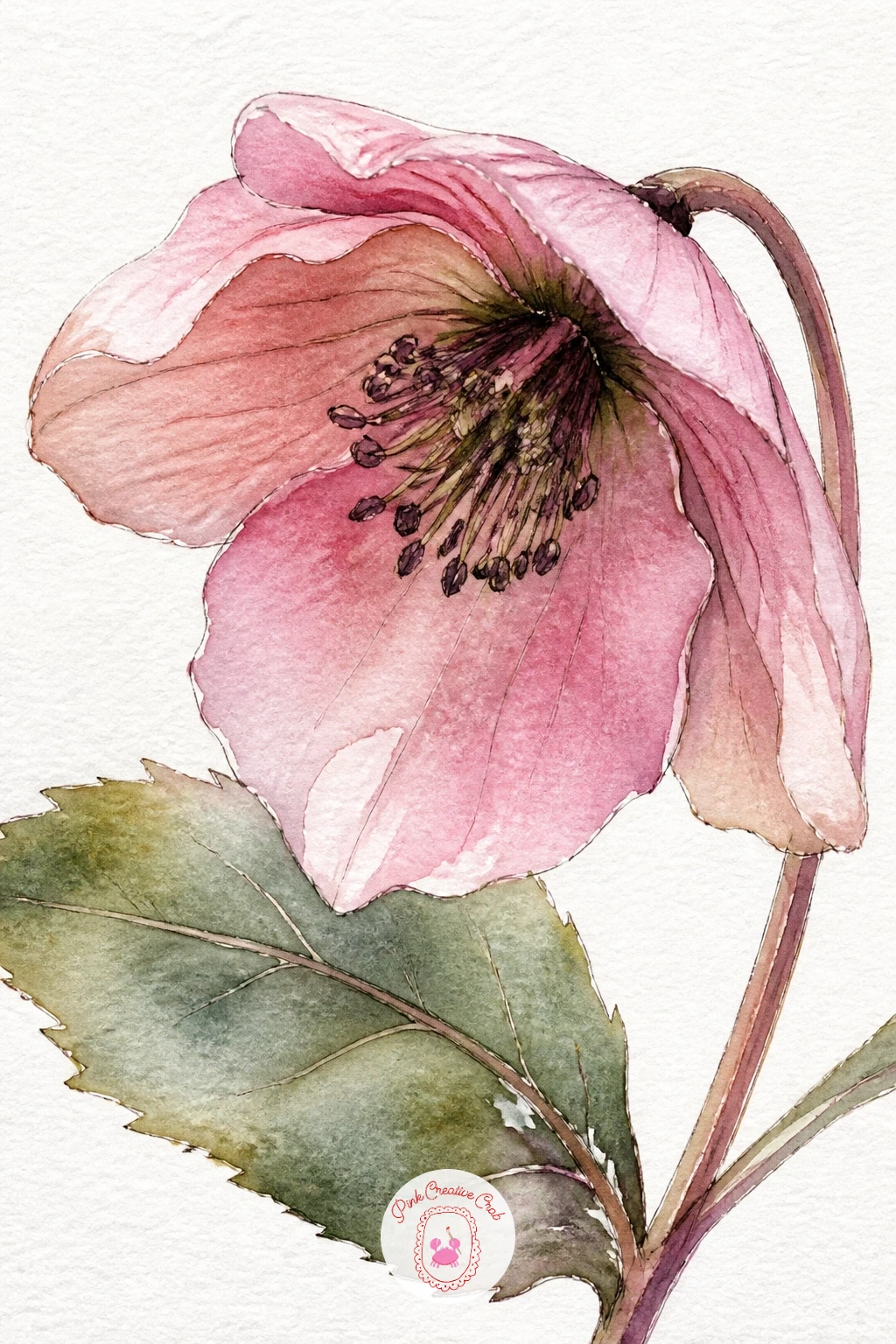
Palette: Dusty Rose,Plum,Sap Green,Ivory White
Place a small bunch of anemones in a teacup for a delicate subject with one of the most striking flower centers in this whole list. Sketch the cup first as a simple rounded shape with a handle, then let a few anemone stems rise from it, each topped with rounded, slightly cupped petals around a dark central disc.
The dark center is what makes an anemone instantly recognizable, so paint the petals first in white, soft pink, red or deep purple, leave them to dry completely, then drop in the near black center as a small confident circle once everything else is settled. Rushing this step while the petals are still damp lets the dark paint bleed outward and ruins the crisp contrast that gives anemones their character.
A ring of fine black stamens radiating just outside the dark center, added last in ink, finishes the look convincingly. If you only have watercolor and no black paint, mix a very dark blue violet instead, it reads as near black on paper without needing true black in your palette.
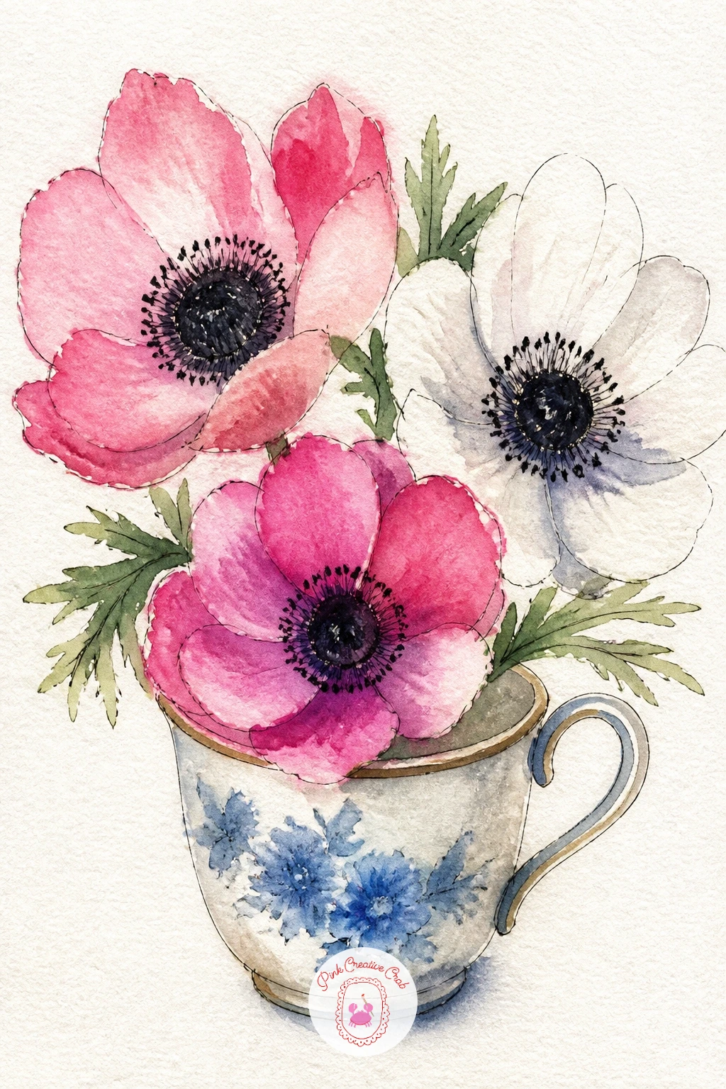
Palette: Plum,Ivory White,Payne’s Grey,Cadmium Red
Paint a single forsythia branch next, the shrub that bursts into small yellow blossoms along its bare stems before any leaves appear, making it one of the most recognizable early spring signs after daffodils themselves. Sketch one or two curving branches diagonally across the page, keeping them loose and slightly irregular, then mark small clusters of tiny flower buds along their length rather than evenly spaced dots.
Work branch first here: paint the woody stem in warm brown with a few darker knots where side branches join, let it dry fully, then dab small clusters of bright yellow directly onto the branch using the tip of your brush for each tiny four petaled blossom. Varying the density of blossoms along the branch, thicker in some sections, sparser in others, keeps it from reading as a row of evenly spaced dots.
If the tiny petal shapes feel too fiddly to paint individually, simplify them into small confident dabs and let a few ink dots suggest petal separations only where the branch is closest to the viewer. Keep the composition mostly empty page around the branch, forsythia reads best with plenty of white space.
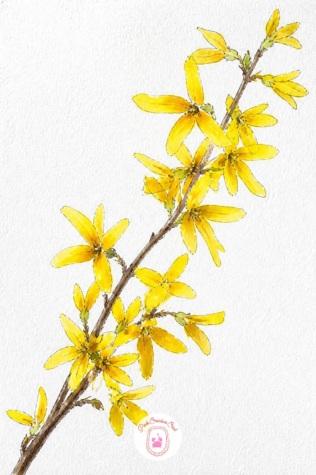
Palette: Cadmium Yellow,Burnt Sienna,Payne’s Grey
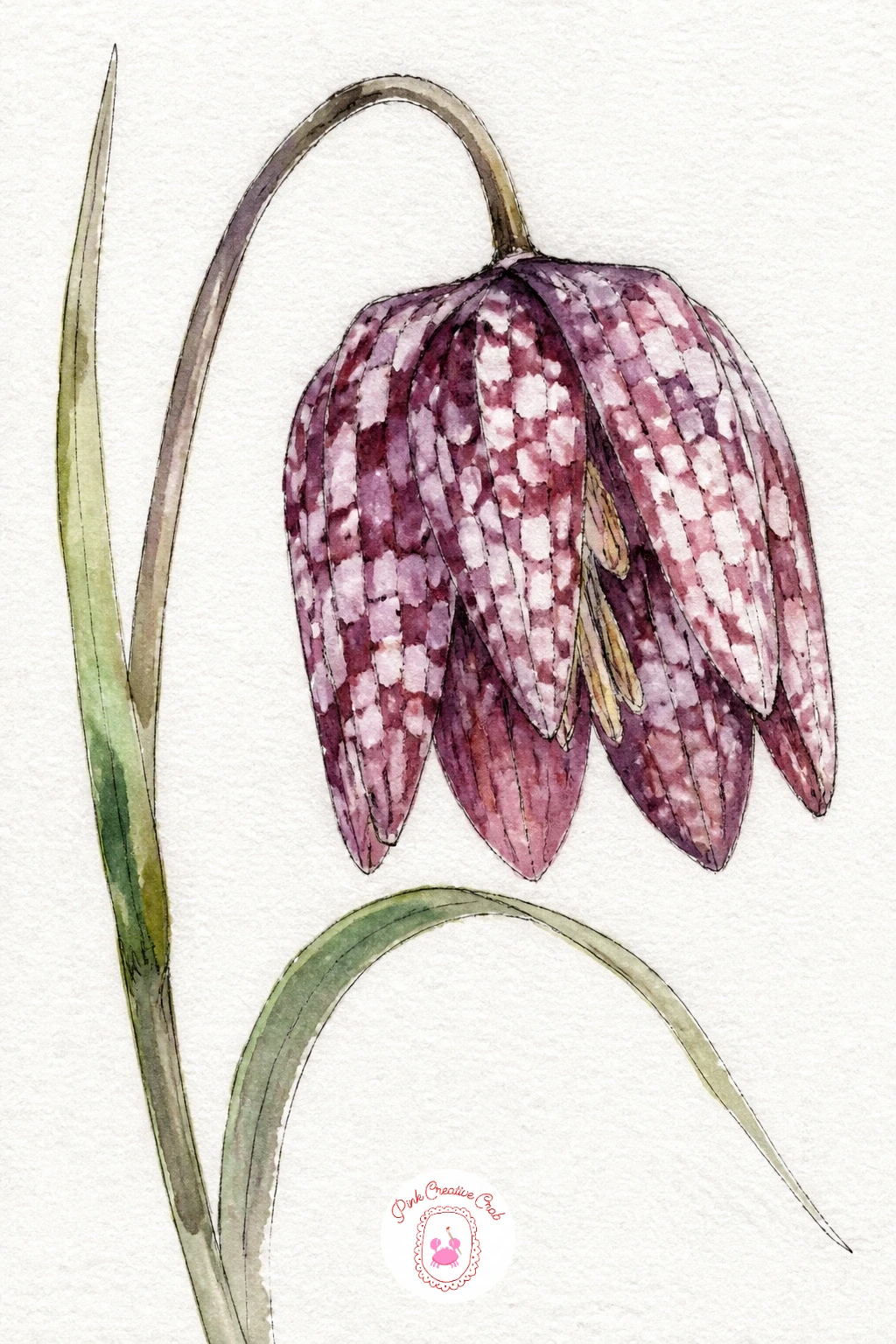
Paint a snake’s head fritillary for one of the most unusual flowers on this whole list, its nodding bell shaped bloom covered in a distinctive checkered pattern of dusky purple and white. Sketch the flower head hanging downward on a thin curving stem, drawn as a simple bell shape rather than anything open or flat.
The checkered pattern is the whole point of this flower, so once the petal shape is drawn, lightly pencil in a loose grid of small squares across its surface before you paint, then fill alternating squares with deep plum and leave others pale, letting the colors blur softly at the edges rather than sitting as crisp little tiles. This slightly imprecise checker pattern is actually more convincing than a perfectly even grid would be, since the real flower’s markings are never mechanically regular.
Once the washes are dry, a few fine ink lines reinforcing the strongest checker edges and the thin nodding stem pull the whole bloom together. If the pattern feels intimidating at first try, practice the checkered fill on a spare scrap of paper before committing to the real page.
Palette: Plum,Ivory White,Sap Green,Payne’s Grey
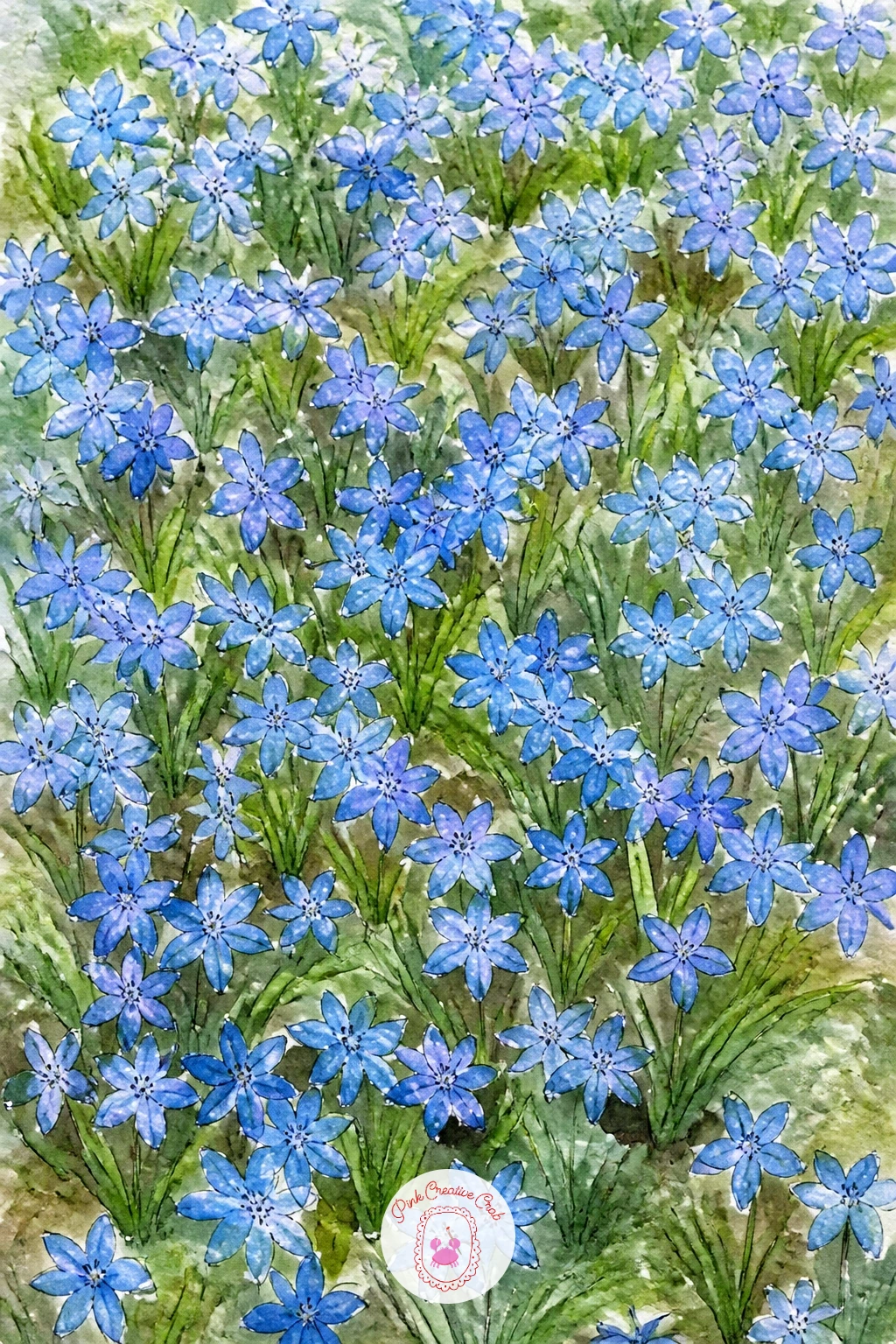
Paint a carpet of scilla next, the small star shaped blue flowers that often appear in sheets across lawns and woodland edges in early spring, similar in spirit to the bluebell wood but lower, flatter and bluer in tone. Rather than drawing a vertical scene with trees, keep this one closer to a bird’s eye view looking down across a patch of ground scattered thickly with small blue stars.
Wash the ground in a base of green first, then while still slightly damp, spatter and dab small strokes of true blue across the surface using the tip of a round brush, denser in some patches and thinner in others to avoid an evenly spread, artificial look. A few individual star shaped flowers drawn larger near the front edge in ink, with simple pointed petals, give the eye something specific to rest on among the general blue scatter.
If spattering feels messy at first, practice flicking a loaded brush against your finger over scrap paper to judge how much paint lands and where. Keep the overall color scheme cooler and more saturated than the bluebell wood, scilla reads as a brighter, more electric blue against its grass.
Palette: Cerulean Blue,Ultramarine,Sap Green
A toothbrush dipped in diluted blue paint and flicked gently with your thumb gives a finer, more scattered spatter than a brush alone across this ground.
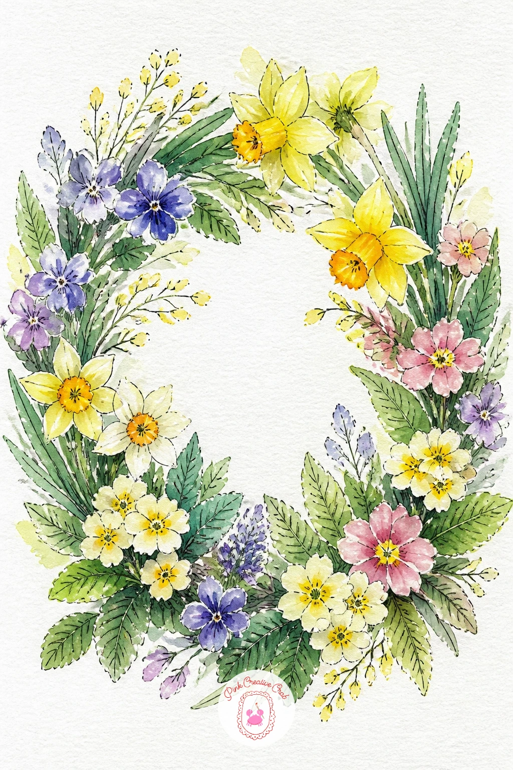
Close out this collection with a spring wreath, a round arrangement that lets you bring together several of the flowers from earlier ideas into one finished piece. Lightly sketch a large circle guide first, faint enough to erase, then build a base of green leaves and twisting stems around the ring before adding any flowers on top.
Vary which flower you use most heavily next time you try this, daffodils and tulips for a bold ring, or primroses and grape hyacinths for something softer and more pastel, since the same wreath structure looks completely different depending on which blooms dominate. Paint the greenery first in layered washes, then add flower clusters at three or four points around the ring rather than spacing them perfectly evenly, which keeps the composition feeling gathered by hand rather than printed.
Once everything is dry, a scattering of fine ink lines for stems, tendrils and petal details ties the whole ring together. Leave a gap of plain green at the bottom of the wreath for a ribbon or bow if you want to add one, it gives the eye a place to land after circling the flowers.
Palette: Sap Green,Cadmium Yellow,Dusty Rose,Violet
What to Do Next
Pick whichever idea made you want to reach for your brush first, whether that is a simple daffodil trumpet or the full spring wreath at the end, and set up a sheet of cold press watercolor paper before you start. One finished page today is worth more than a long list left untouched, so start loose, let the colors run a little, and see where the first wash takes you.
Frequently Asked Questions
What is the easiest way to start a daffodil drawing for the first time?
Start with a single daffodil trumpet filling the page, since one flower drawn large teaches the petal and trumpet shapes without the extra challenge of arranging several blooms together.
How do you get the yellow right in a daffodil drawing?
Layer two yellows rather than relying on one, a pale lemon wash for the petals and a deeper golden or orange yellow dropped into the trumpet while still damp for natural depth.
Why does my daffodil painting look flat or stiff?
Flatness usually comes from making every petal and flower head the same size and angle, so vary the tilt of each bloom and keep stems gently curved rather than perfectly straight.
What paper works best for loose watercolor daffodil drawing?
Cold press watercolor paper around 140 pounds handles washes and dry brush texture well, holding enough water for soft blooms while still taking fine ink line work cleanly once dry.
Can I draw daffodils with pencil or ink only, without paint?
Yes, sketch the petal and trumpet shapes in pencil first, then build form with fine ink cross hatching for shadow areas, leaving the brightest petal edges as plain white paper.
Have any thoughts?
Share your reaction or leave a quick response — we’d love to hear what you think!
-
 0
-
0
-
0
-
0
-
0
-
0


