

Learning how to fill your sketchbook gets so much easier once you stop waiting for a worthy subject and start giving each page a small, specific job. A page of everything blue in a room, or a map of a street you walk every week, takes the pressure off completely because there is no wrong way to draw it, only your own version.
Below are 31 page themes to work through in any order, each one small enough to finish in a single sitting with a pencil, a fineliner and whatever colored pencils are already in the tin. Open to a clean page, pick whichever idea matches your mood today, and let the sketchbook fill itself one ordinary little page at a time.
Using these images: free for personal projects such as printing, coloring, cards, journals and gifts. Handmade items that include them may be sold up to 30 pieces per design. More than that is commercial use and is not permitted, and neither is selling or sharing the images themselves or passing them off as your own. Please ask before any other use.
Start the hunt for blue by walking through one room with your sketchbook open and a pencil behind your ear. Everything blue in one room might be a mug, a book spine, a sock on the floor and a corner of curtain, and that mix of unrelated objects is exactly what makes the page interesting.
Sketch each object small and loose in graphite first, scattered across the page rather than lined up, leaving gaps between them. Go over the lines in fineliner once you are happy with the shapes, then bring in colored pencils and let every object sit in its own patch of blue, from navy to powder.
If every blue looks the same on the page, the picture goes flat. Press harder for the darkest navy object and barely touch the pencil down for the palest one, so the range of blues does the work of making the page feel full.
Keep a white or cream object nearby and compare its shadow to the blues: shadows often read as a grey-blue, and noticing that now saves confusion later. Swap colored pencil for a blue fineliner and cross-hatching if you only have the one pen today.
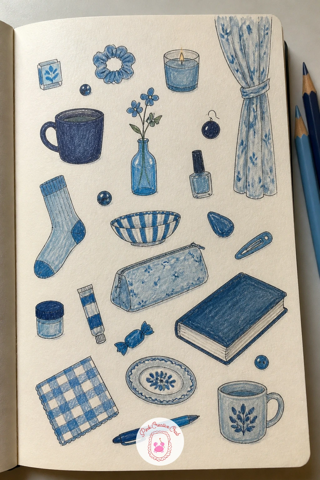
Palette: Prussian Blue,Powder Blue,Cerulean,Payne’s Grey
Set a banana on the counter and draw it first thing, before it tempts you into eating it. One banana drawn every day as it ripens turns a single piece of fruit into a short story that unfolds in yellow, green and brown, one small drawing at a time.
Draw the outline lightly in pencil each day, keeping the same size and angle so the drawings line up down the page like a little calendar. Go over the outline in fineliner, then color with colored pencil, watching the skin shift from firm green-yellow to speckled brown over the course of the week.
The usual snag is forgetting a day and breaking the sequence. Leave a gap and keep going rather than starting over, and write the date under each drawing so the gap reads as part of the record rather than a mistake.
For a ten-minute version, draw the banana once a day in three quick lines and a scribble of color. Given forty minutes, add the tiny brown freckles and the slight droop of the stem as the days pass, since that detail carries most of the story.
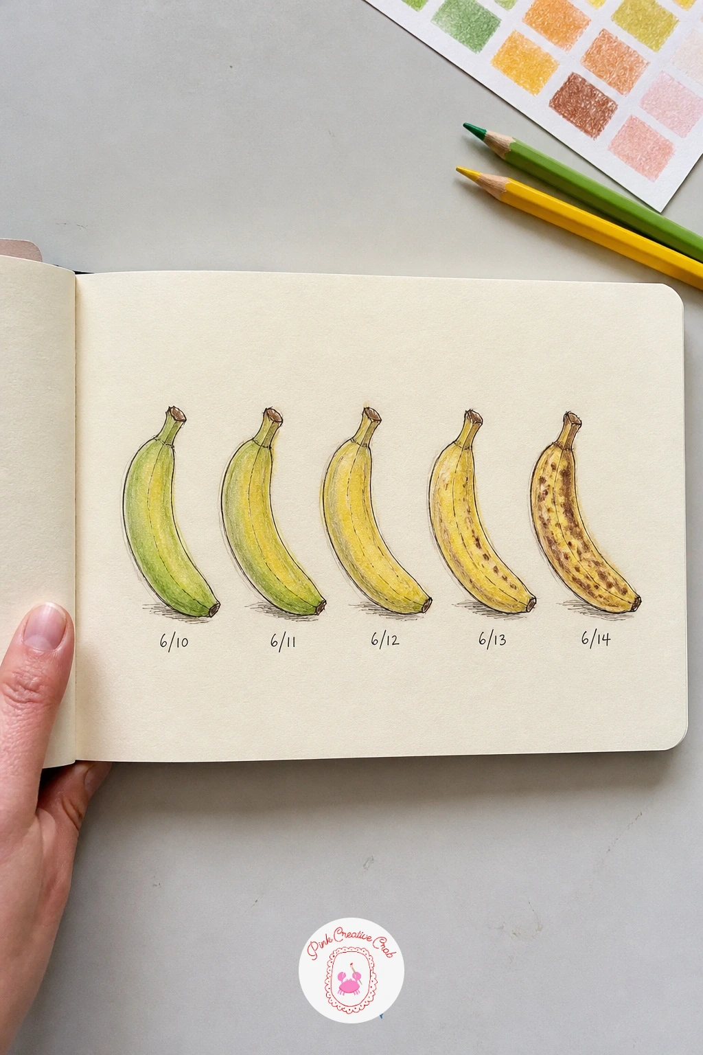
Palette: Lemon Yellow,Olive Green,Raw Umber,Burnt Sienna
Walk out your own front door in your mind and draw the streets you actually know. A map of your neighborhood with tiny houses works best loose and a little wrong, since nobody is checking it against a real map, and the charm is in the small houses rather than the accuracy.
Sketch the main road first as a light pencil line across the page, then add the side streets branching off it. Draw each house as a tiny box with a triangle roof and a dot for a door, fineliner over the pencil, then color the houses in soft, varied tones so the street reads as a row of neighbors rather than one repeated shape.
Measuring real distance is pointless here and will only slow you down. Instead, compare houses to each other by eye, keeping corner houses a touch bigger than the ones in between, which is enough to suggest a believable street without any ruler work.
Label a few landmarks in small handwriting, the shop on the corner, the tree everyone parks under, and the map stops being generic and starts being yours. If you would rather build a whole page of tiny buildings from other places too, the mini sketchbook ideas page has more of them.
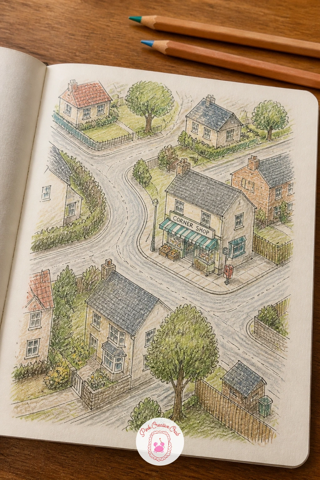
Palette: Terracotta,Sap Green,Payne’s Grey,Cream
Settle into a cafe seat where you can see feet under other tables without staring at faces. A page of strangers’ shoes at a cafe is a gentle way into people-watching, since shoes hold still far longer than the people wearing them and nobody minds being drawn from the ankle down.
Pencil in the shoe shapes first, paying attention to where the foot bends and how the laces or straps sit, then ink over the lines you are sure of. Scatter four or five pairs across the page at different angles rather than lining them up, so the page feels like a glance around a room.
Shoes that end up looking like blobs usually skipped the sole. Draw the thin line of the sole along the ground first, since that single line is what makes a shoe look like it is standing rather than floating.
Color lightly with colored pencil, leaving some white paper showing for shine on leather or canvas. A pencil-only version works just as well if you want to keep this page purely graphite and add color another day.
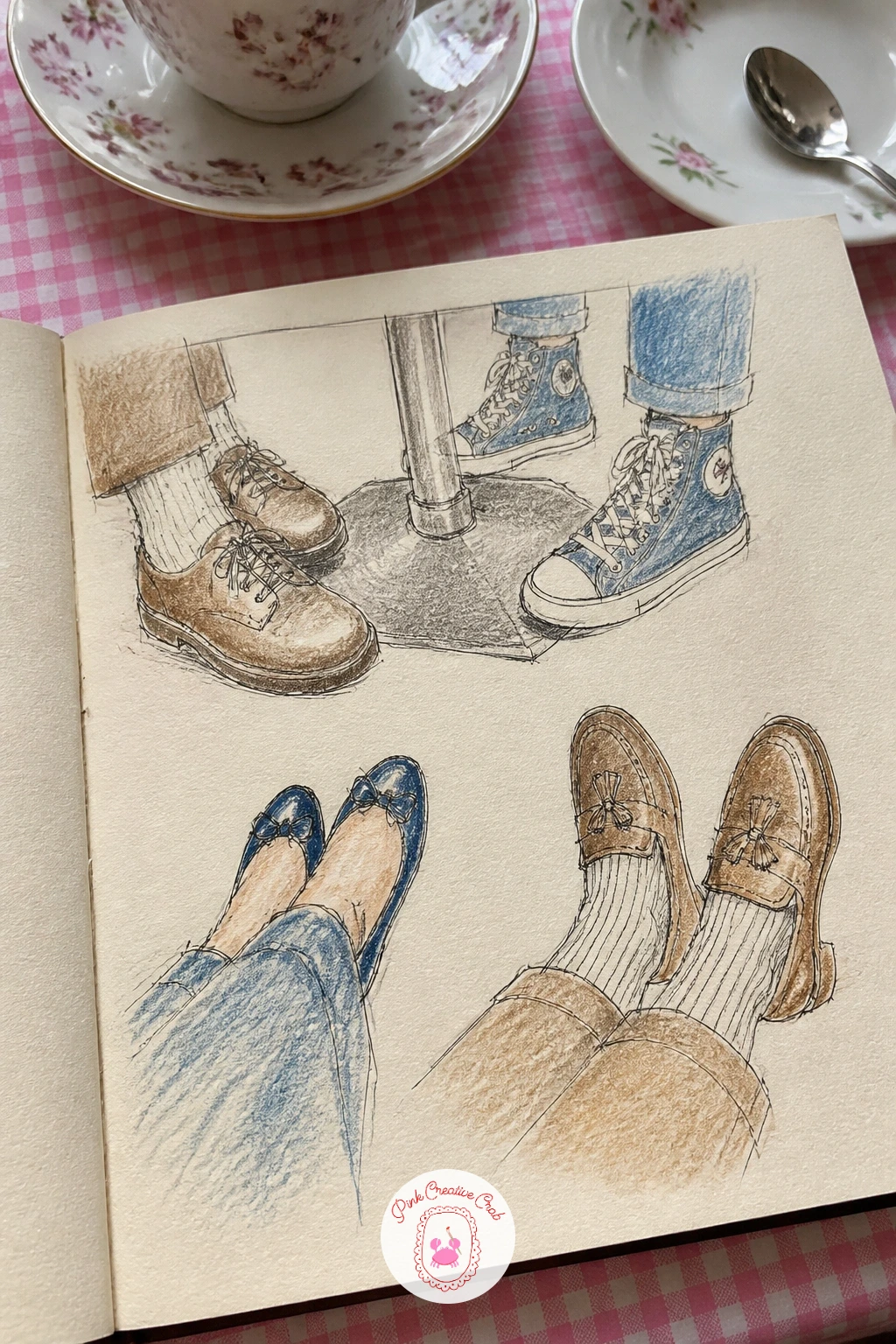
Palette: Burnt Umber,Charcoal Grey,Denim Blue,Tan
Pick one tree you pass often, ideally one with an obvious silhouette even bare. The same tree in four seasons is a page that rewards patience, since you draw it four times across the weeks and watch your own drawing get more confident as the tree changes.
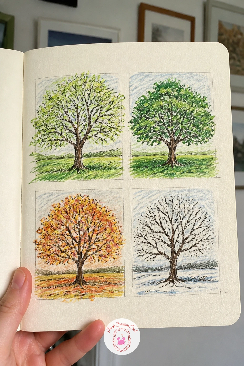
Palette: Sap Green,Burnt Sienna,White,Raw Umber
Photograph the tree each time you draw it, so on a rushed day you can work from the photo and still keep the sequence going.
Keep the sketchbook open on the table through the day and add to it after each meal rather than trying to remember everything at bedtime. A page of everything you ate today becomes a quiet diary, and it is one of the few sketchbook pages where the subject arrives on its own schedule without you having to go looking for it.
Draw each item small, from toast to a cup of tea, in the order it actually happened, working left to right or top to bottom down the page. Keep the pencil loose and finish each one in fineliner and color before moving to the next, so the page builds gradually rather than all at once in the evening.
The temptation is to make every meal look perfect, which flattens the page into something stiff. Let a rushed breakfast look rushed and a slow dinner look slow, since that contrast in how much detail each drawing gets is honest and more interesting than uniform polish.
Add a tiny time stamp beside each drawing. One concrete tip for today: draw the thing you are least proud of eating first, since getting it down loosens up the rest of the page completely.
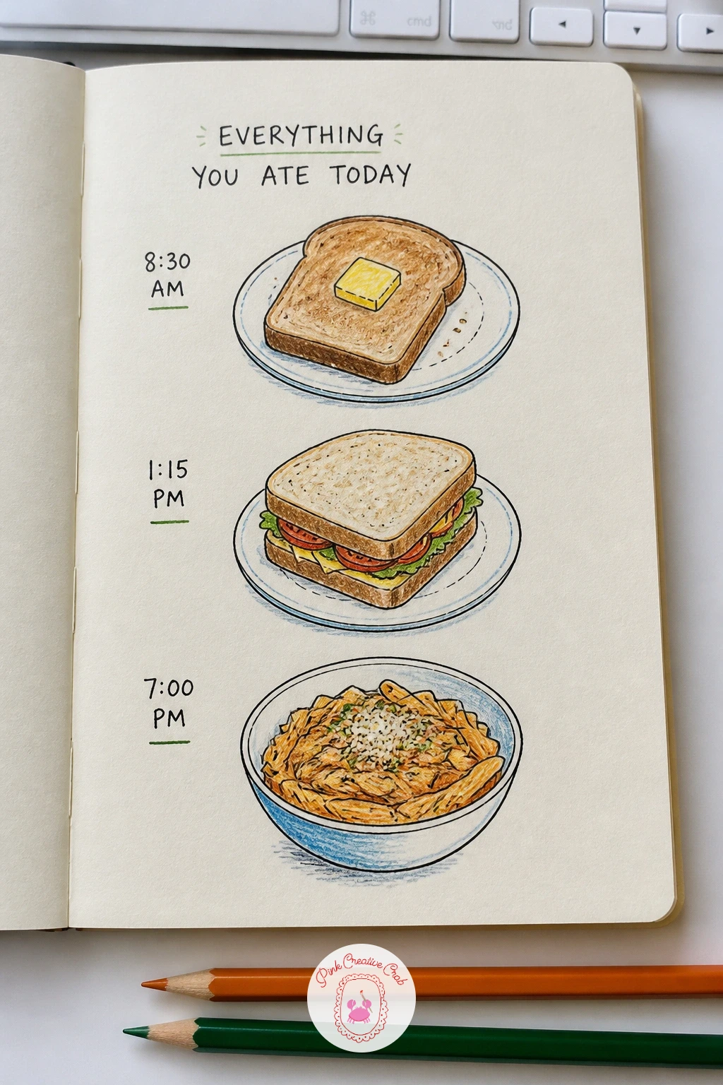
Palette: Golden Yellow,Tomato Red,Sap Green,Warm Brown
Pick up the shiniest spoon in the kitchen drawer and hold it at arm’s length. A self-portrait reflected in a spoon sidesteps the usual fear of self-portraits, because the distortion in the curved metal means nobody expects a careful likeness, only an honest sketch of what the spoon actually shows.
Notice how the bowl of the spoon stretches your face wide and curves the straight lines of a door or window into arcs behind you. Pencil in the big rounded shape of your head first, then the stretched features, before switching to fineliner for the details and colored pencil for skin tone and the metallic grey of the spoon itself.
Faces drawn from a curved reflection often end up looking only mildly odd instead of properly warped, which makes them look like a mistake rather than a style choice. Push the distortion further than feels natural, bulging the center and pinching the edges, since a half-hearted warp reads as bad proportion rather than a fun reflection.
Leave a bright highlight of white paper where the spoon catches the most light. Try the back of the spoon next time for a different kind of curve entirely.
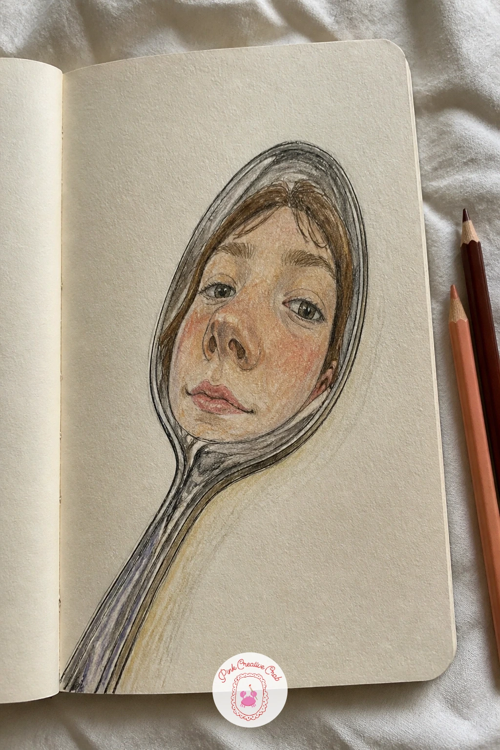
Palette: Silver Grey,Warm Skin Tone,Charcoal,Soft Pink
Gather every mug from the cupboard onto the counter, or just draw them from memory if everyone has a favorite. Your family’s mugs side by side makes an easy, satisfying page because mugs are simple cylinders with a handle, and the real character comes from the pattern or chip or faded print on each one.
Draw each mug as a simple rounded rectangle for the body with a curved handle, keeping them the same rough height so they line up like a shelf. Ink the shapes once the proportions look right, then spend most of your coloring time on what makes each mug recognizable: a stripe, a cartoon, a crack mended with glue.
Handles are the part that usually goes wrong, ending up too big or stuck on at an odd height. Look at where the handle meets the mug on a real one before you draw it, roughly a third of the way down from the rim, and that alone fixes most handle problems.
Label each mug with whose it is in tiny handwriting underneath. For more drawings built around a single kitchen object, the sketchbook pages roundup has related ideas.
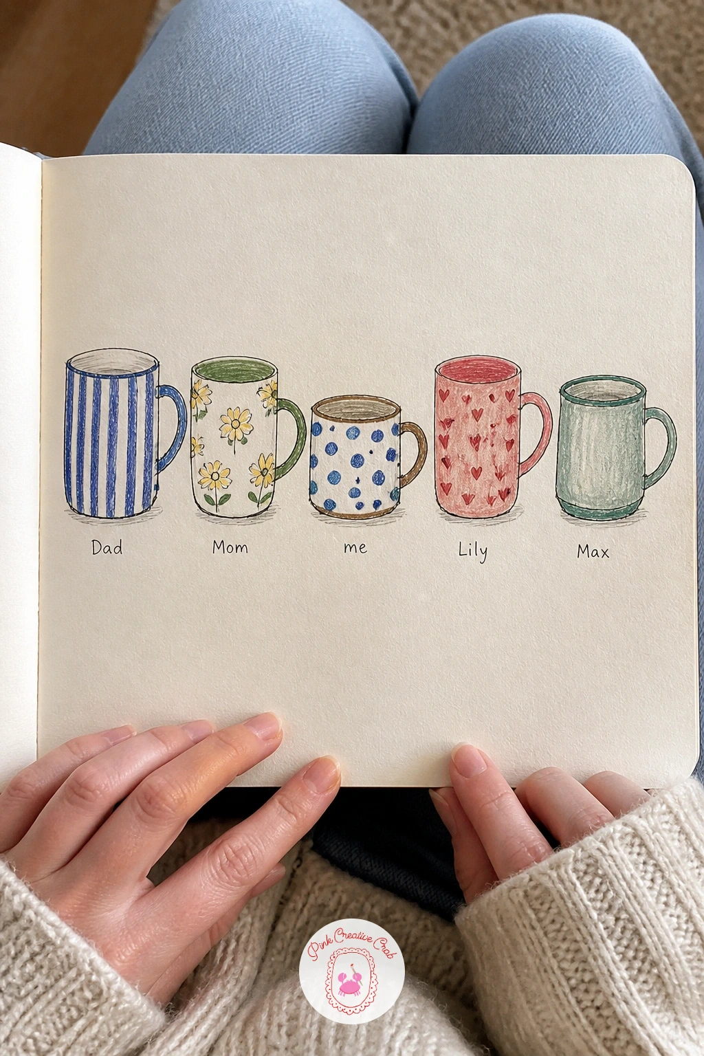
Palette: Terracotta,Forest Green,Mustard Yellow,Charcoal Grey
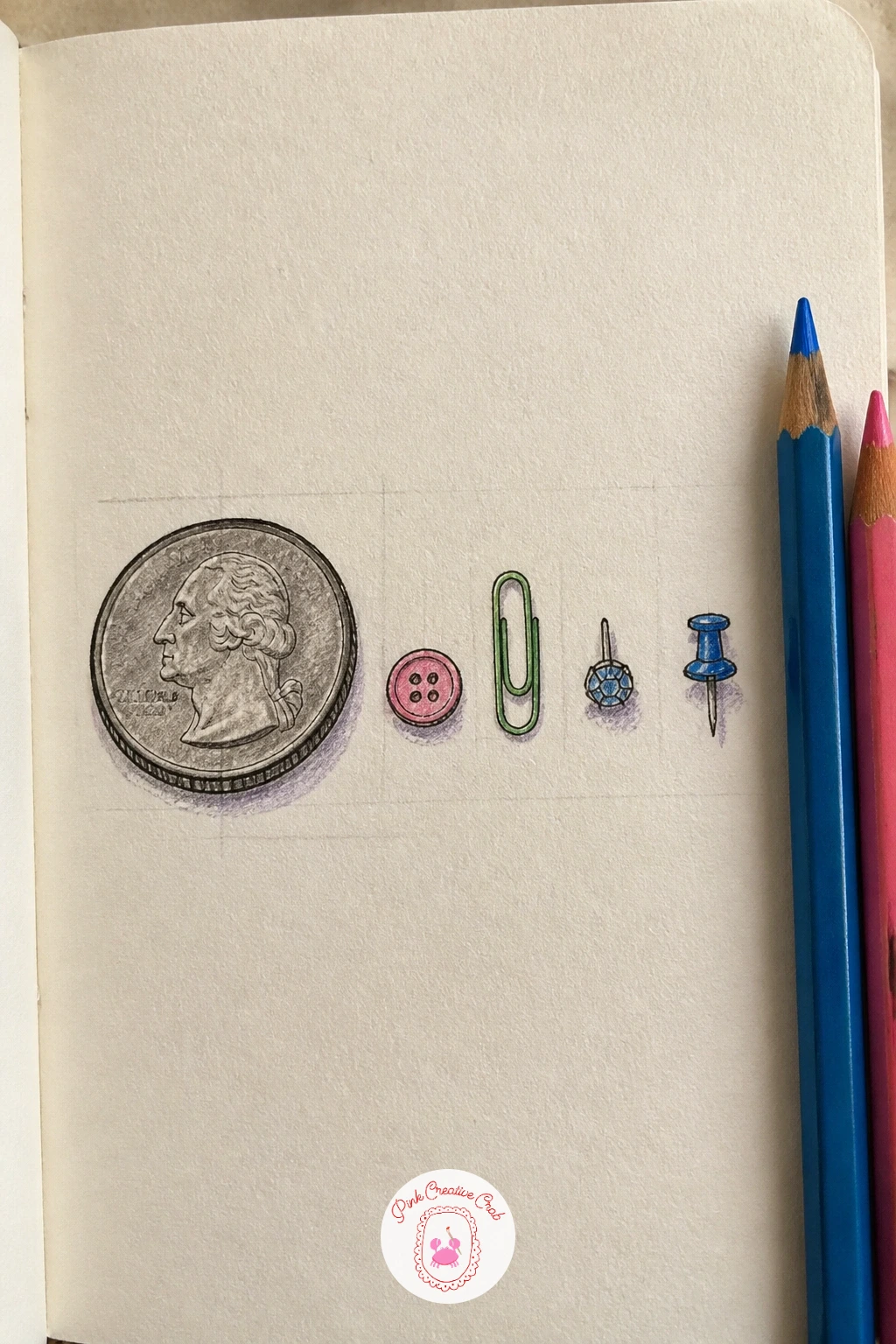
Empty a junk drawer or a jewelry box and look for anything that would fit on a coin. A page of things smaller than a coin turns ordinary clutter, a button, a paperclip, a single earring, into a page about scale, since every object on it needs to look genuinely tiny next to the next.
Draw a coin lightly in one corner first as your size reference, then pencil each small object close to its true size beside it, comparing constantly rather than guessing. Ink the outlines with a fine nib, since a thick pen will swallow details on objects this small, and color with a sharp pencil point for the same reason.
Objects drawn too big for the page theme lose the whole joke of smallness. Keep checking each new object against the coin before you commit to ink, and if one object insists on being larger, draw it slightly off to the side with a note that it is not to scale.
Group the objects loosely by color or type rather than scattering them randomly, which helps the eye settle on the page. A magnifying glass, if you have one, makes the real details far easier to copy accurately.
You Will Need
- a coin to measure against
- a magnifying glass, optional
Palette: Silver Grey,Brass Gold,Deep Red,Charcoal
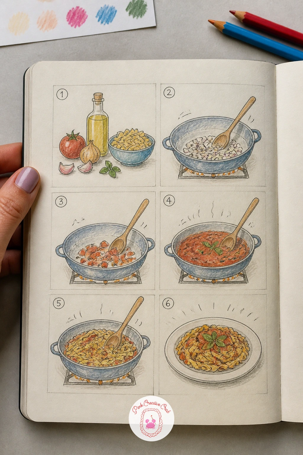
Pick something simple you already know how to cook, tea or toast or a basic omelette. A recipe drawn step by step as little pictures turns instructions into a comic strip, and it is one of the few sketchbook pages that is genuinely useful to read back later.
Divide the page into five or six small boxes in pencil first, then draw one step in each box: the ingredients laid out, the pan heating, the stirring, the plate at the end. Keep every drawing simple, a few lines and a shape, since the sequence does the storytelling rather than any single detailed picture.
Steps that look identical to each other confuse the sequence. Change the angle or the main object in focus for each box, a closeup of the pan in one, a wider view of the whole counter in the next, so your eye can tell the steps apart at a glance.
Number each box in the corner and add a short caption under it. For a quicker version, draw only three steps, the start, the middle action and the finished plate, and still get a complete little recipe.
Palette: Golden Yellow,Warm Brown,Sap Green,Charcoal
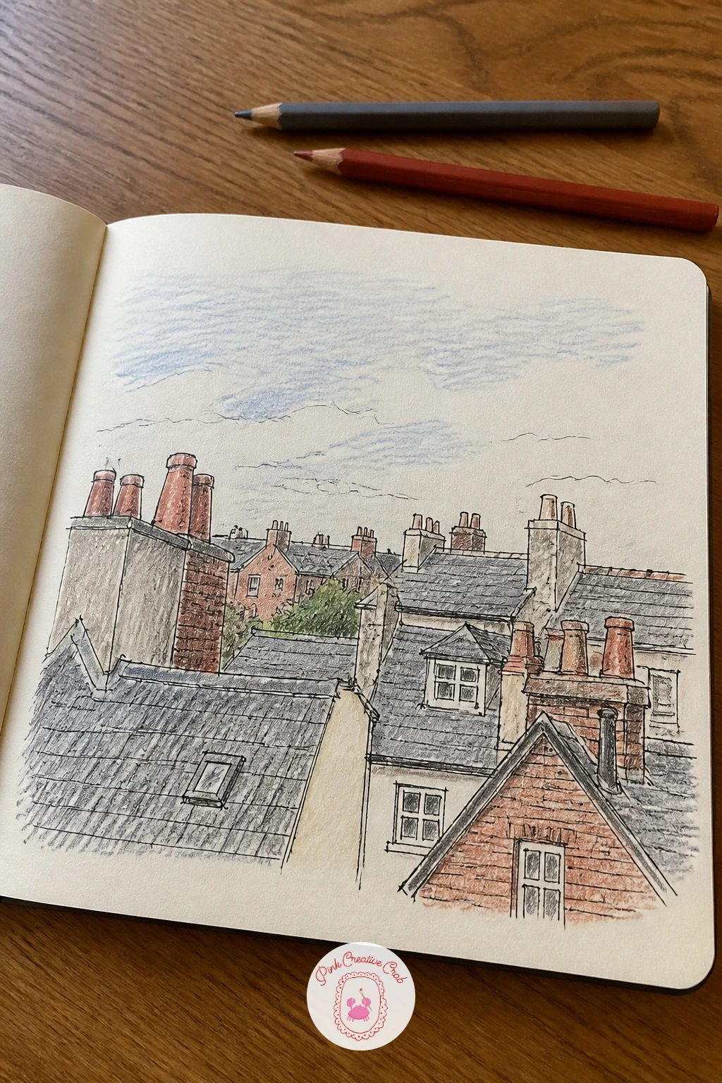
Stand at the window that gets the most interesting view and look up rather than straight ahead. Rooftops and chimneys from your window rewards exactly that habit, since roofs and chimney pots make a surprisingly satisfying jumble of triangles and rectangles once you stop looking at the street below them.
Draw the furthest, smallest rooftops first near the top of the page and work your way down to the nearer, larger ones, which keeps the sense of distance believable without any real perspective lines. Chimney pots and aerials go in last, once the roof shapes are settled, since they are the small details that make the skyline specific to your actual view.
Roofs drawn with eye level ignored tend to tip sideways. Picture a single horizon line roughly where your eyes sit and keep every roofline sloping toward or away from it consistently, which is the one adjustment that makes a messy row of roofs click into place.
Shade the undersides of overhanging eaves a touch darker to ground each roof. Try the same window at dusk next time, when lit windows add warm little squares of color to the rooftops.
Palette: Slate Grey,Brick Red,Warm Grey,Soft Blue
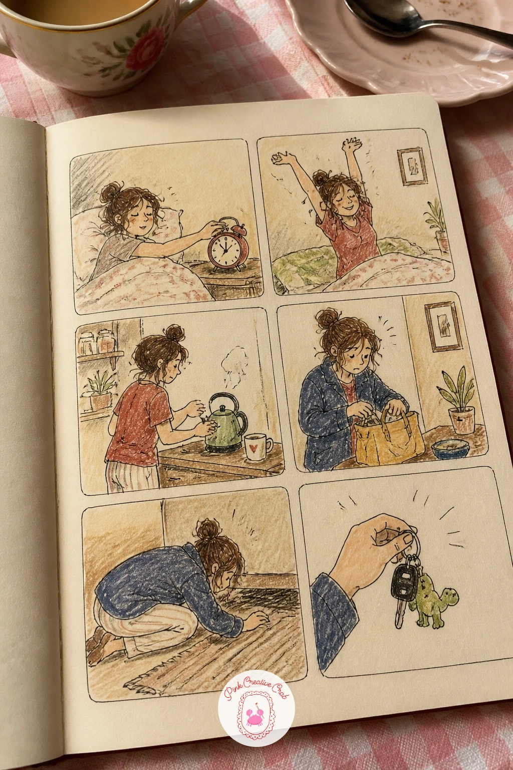
Think back over the last ordinary morning you had, the alarm, the kettle, the search for keys. A comic strip of your morning routine turns that string of small moments into panels, and because the events already happened in order, you never have to invent what comes next.
Draw a row of four to six boxes across the page, then fill each with one clear action in simple lines, a stick figure works fine here since the gestures matter more than the likeness. Add one speech bubble or short caption to the panel that needs it most, usually the moment something goes slightly wrong.
Panels that are all drawn from the same angle and distance can feel flat and repetitive. Zoom into a closeup for one panel, the kettle boiling or a hand hitting snooze, and pull back for a wider view in another, which gives the strip the rhythm of a real comic.
Keep the linework quick and a little rough rather than careful, since speed suits the subject. Color just one recurring object, like a mug or a dressing gown, through every panel to tie the strip together.
Palette: Soft Red,Charcoal,Mustard Yellow,Pale Blue
Take your usual walk and notice everything you pass without stopping to draw any of it yet. A walk drawn in order, everything you passed, works as a memory exercise as much as a drawing one, built right after you get home while the route is still fresh.
Draw a loose path shape down or across the page first, then add small sketches of the things you passed in the order you passed them, a postbox, a dog, a particular gate. Keep each drawing tiny and quick, since the point is the sequence of the whole walk rather than any single object getting full attention.
Trying to remember everything perfectly leads to a stalled page and a blank middle section. Let gaps stay blank or fill them with a word instead of a drawing, since an incomplete honest walk beats an invented complete one.
Label a couple of landmarks so the route is readable later. Doing this walk again next week and comparing the two pages is a gentle way to notice what actually changes on an ordinary street.
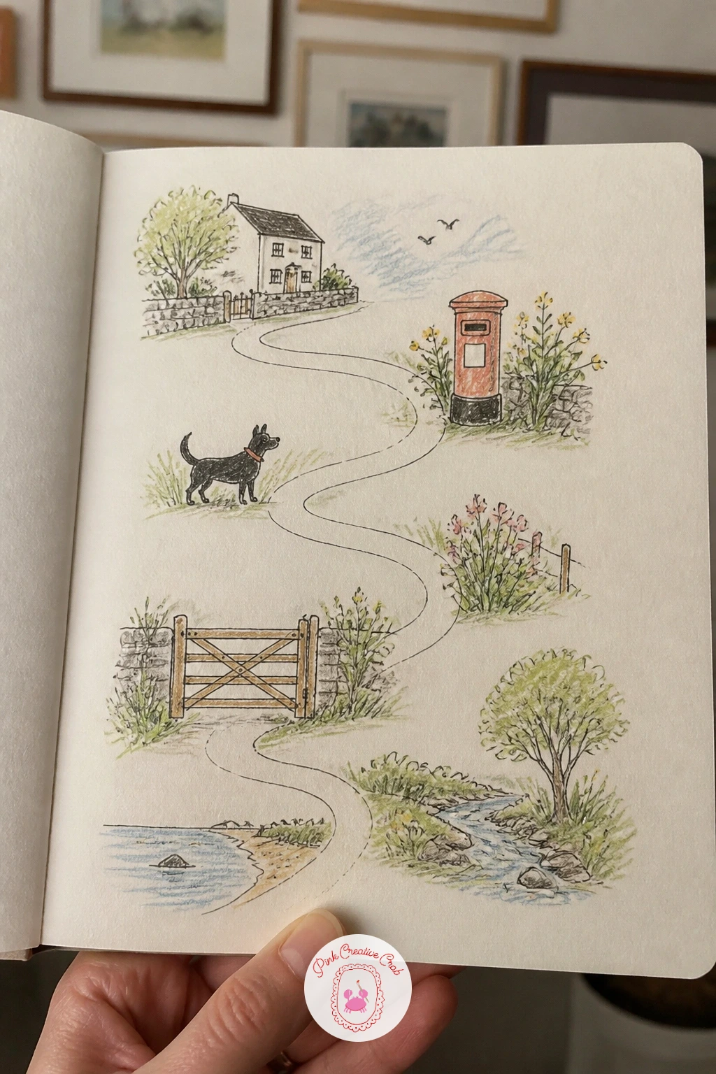
Palette: Sap Green,Terracotta,Charcoal Grey,Sky Blue
Open the book you reread most often and flip to a scene you can picture clearly without looking at the page. Scenes from your favorite book let you draw from imagination with a safety net, since the words already describe the setting and you only need to decide how it looks.
Pick one small moment rather than a whole chapter, a character at a window, a specific room, and sketch the main shapes loosely in pencil first. Add the one or two details the book actually mentions, since a single well-chosen detail convinces the eye far more than a crowded, generic scene.
Drawing a scene exactly as a film version shows it can feel like copying rather than imagining. Close the book and the film from your mind for a minute and draw what the words alone suggest to you, even if it comes out rougher, since that version is the one worth keeping.
Ink and color after the pencil feels settled, keeping the palette a little muted to match the mood of the passage. If a particular story world keeps pulling at you, the Alice in Wonderland pages show one way to keep building on a single book across several spreads.
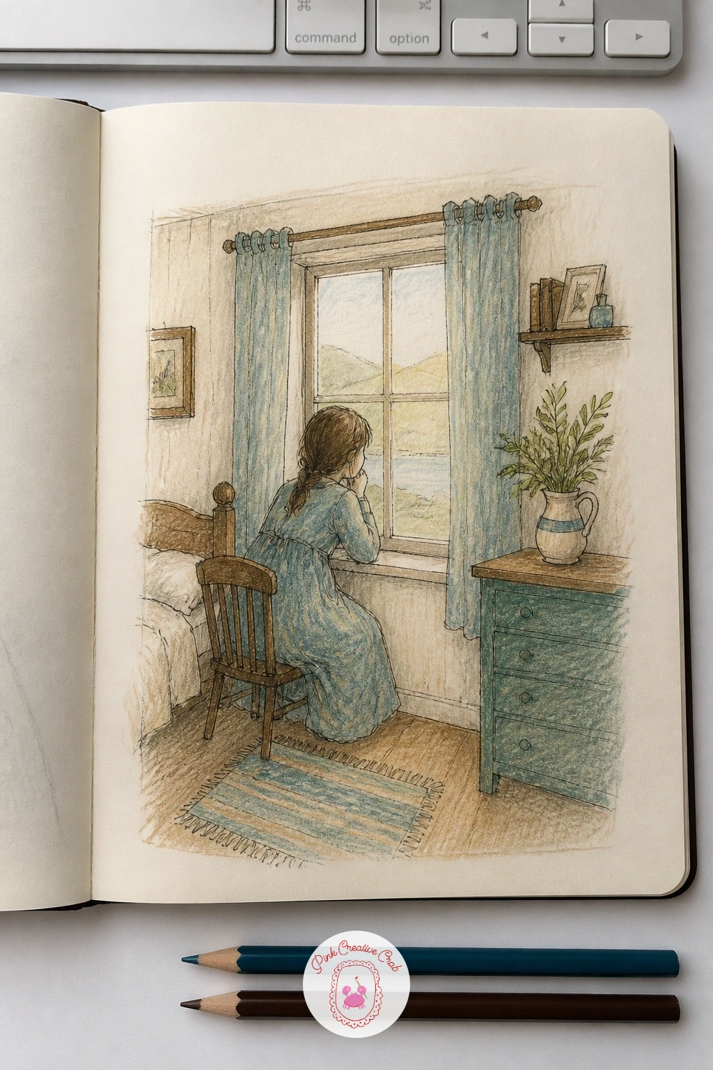
Palette: Deep Teal,Warm Brown,Dusty Purple,Cream
Look down at your own hand and give it something to hold, a pencil, a cup, a phone. A page of hands holding different objects is a quiet way to practice hands without the pressure of a full portrait, since the object gives the hand a reason to bend the way it does.
Sketch the basic shape of the hand first as a loose mitten form, fingers added as simple tubes, before placing the object into the grip. Draw the object second so the fingers wrap convincingly around it, then ink the hand lines first and the object’s outline second, since hands read better when their lines sit on top.
Fingers that all look the same length flatten a hand immediately. Hold up your own hand next to the page as you draw and notice how the middle finger is longest and the others step down from it, which is the one comparison that fixes most hand drawings.
Color skin tone lightly, leaving the knuckles slightly paler where the skin stretches. Draw the same hand holding five different objects across the page for a quick set that still reads as one complete theme.
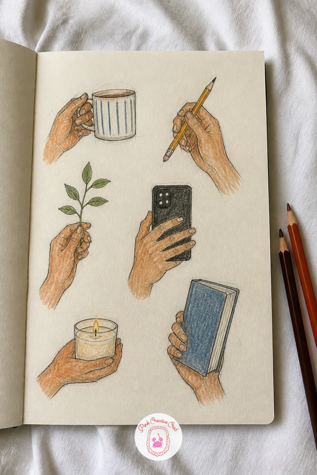
Palette: Warm Skin Tone,Charcoal,Soft Brown,Pale Pink
Choose any three colored pencils from the tin before you decide what to draw, which flips the usual order and makes the limit the whole point. A page using only three colors forces choices that a full set of forty pencils never asks of you, and the page ends up more cohesive for it.
Draw whatever is in front of you, a bowl of fruit, the corner of a room, using only those three colors for everything: the shadows, the highlights, the background. Pencil the shapes first as usual, then build color in layers, mixing the three by overlapping them rather than reaching for a fourth.
The page can go muddy fast if all three colors get piled on top of each other everywhere. Keep one color dominant and use the other two sparingly for accents and shadow, since an even three-way split usually reads as brown mush rather than a deliberate palette.
Pick colors that are not already close to each other, a warm, a cool and a neutral, for the most useful range. Try the same exercise next time with three totally different colors and compare how much the mood shifts.
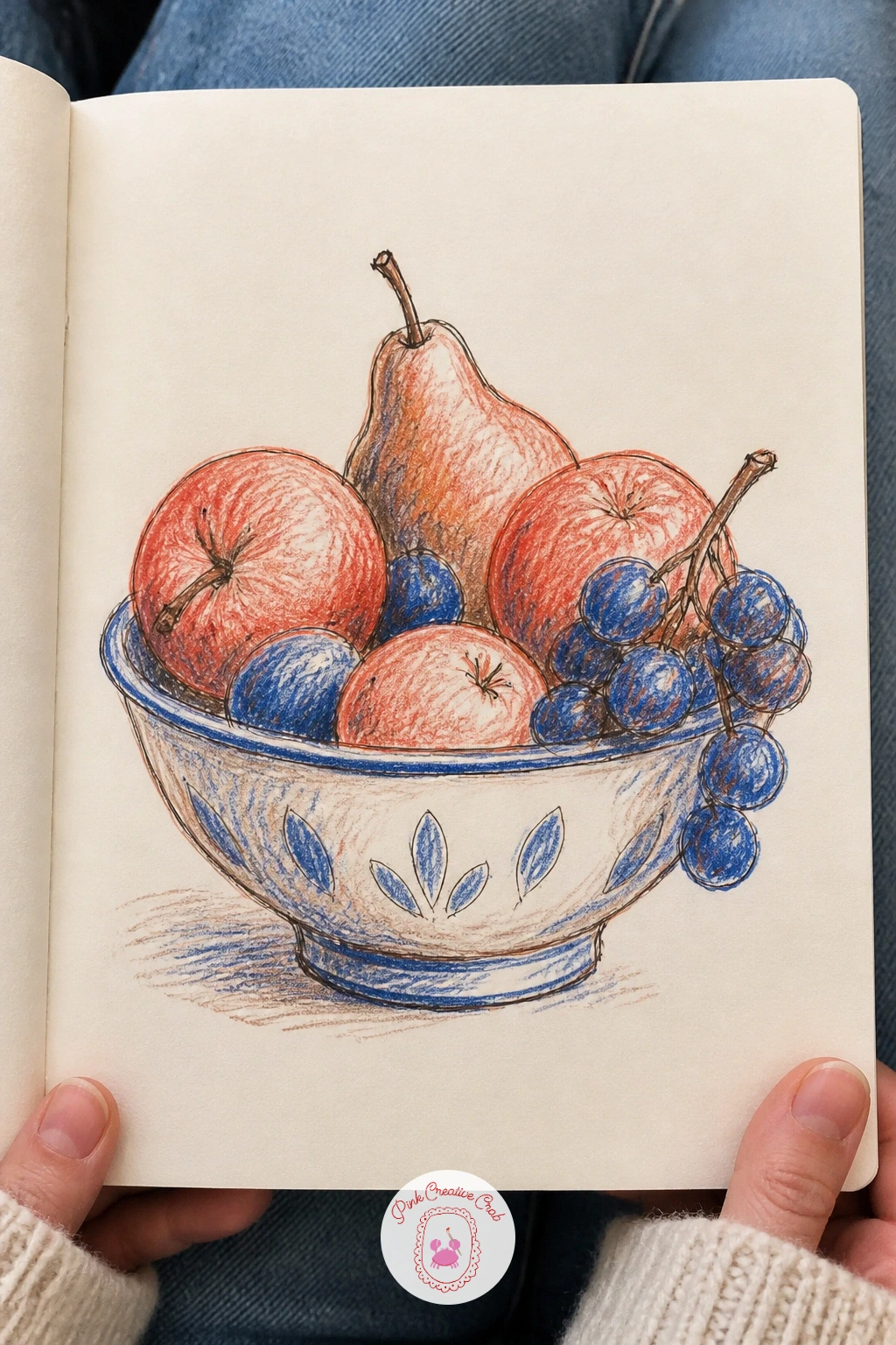
Palette: Indian Red,Prussian Blue,Raw Umber
Choose a flower you can watch over a couple of weeks, a tulip in a vase or one in the garden works equally well. One flower from bud to seed stretches across several short sessions rather than one, so the page becomes a record of how a single plant actually changes rather than a single frozen moment.
Draw the tight bud first, then come back every few days to add the next stage along the page, the flower opening, fully bloomed, petals dropping, finishing with the seed head if the plant produces one. Keep the pencil light for each new stage until the shape feels right, then ink and color before moving on.
Stages drawn too far apart in size on the page make the sequence hard to read. Keep a rough grid of equal boxes in light pencil before you start, so each stage gets a similar amount of space and the eye can follow the flower’s progress easily down the page.
Label each stage with the date so the gaps between drawings tell their own small story. A single potted flower on a windowsill is the easiest subject to keep returning to, since it will not move or get thrown out early.
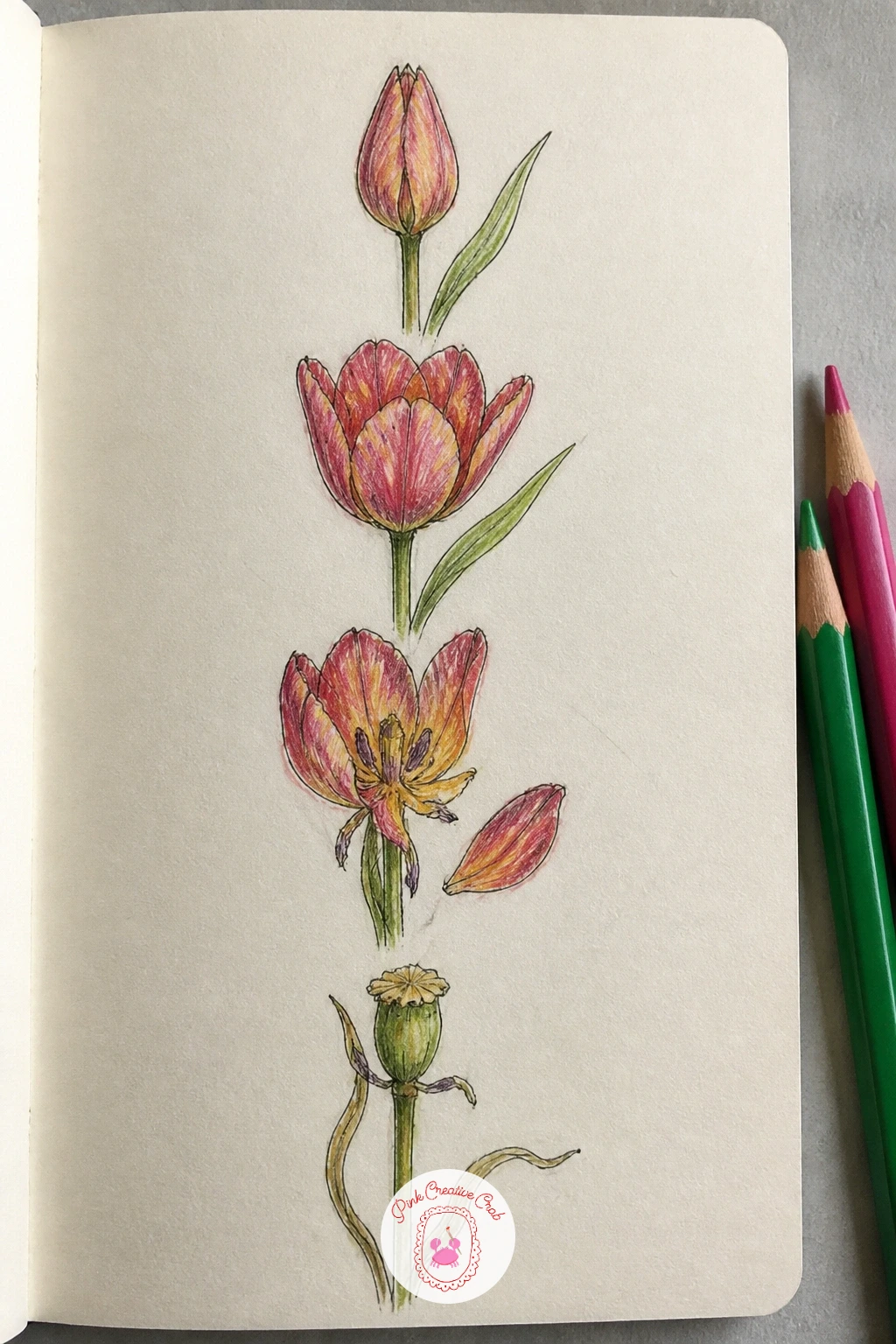
Palette: Magenta Pink,Sap Green,Golden Brown,Soft Yellow
For a wider set of flower stages and shapes to practice between sessions, the flower sketchbook ideas roundup has more beginner-friendly botanicals.
Dig out a postcard, a ticket stub or a photo from any trip you have taken, even a short one. Postcards redrawn from a trip lets you work from a flat, already-framed image, which makes composition decisions for you and leaves you free to focus purely on the drawing itself.
Pencil in the main shapes of the view first, roughly matching the postcard’s composition, then ink the lines you are confident about before adding color. Keep the palette close to the original postcard’s colors rather than inventing new ones, since that is part of what makes the redrawn version feel like a genuine souvenir.
Copying a photo too literally can make a drawing feel stiff and overworked. Simplify busy backgrounds into a few shapes and colors rather than rendering every detail, since a loose, confident redrawing beats a tight, exhausted copy every time.
Write the place and date in the corner like a real postcard caption. If you want a whole sketchbook built around travel memories like this one, the camping watercolor ideas page has a similar nostalgic angle in paint.
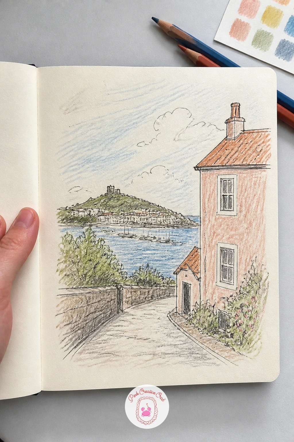
Palette: Sky Blue,Terracotta,Sap Green,Sun Yellow
Look at the plants on your windowsill and notice which one always seems to be leaning, drooping or reaching somewhere. Houseplants drawn as characters takes that personality and exaggerates it slightly, giving each plant a tiny face or a posture that makes it feel like it has opinions.
Draw the real shape of the plant first in pencil, the pot, the stems, the leaf pattern, keeping it reasonably accurate as a base. Then add the character on top, two small dot eyes and a simple line mouth tucked into a leaf or the pot, and ink both the plant and the face together so they read as one drawing rather than a sticker stuck on top.
Faces added without matching the plant’s actual shape can look pasted on and awkward. Place the eyes where a leaf naturally curves or where the pot has a seam, so the character seems to grow out of the plant’s real structure instead of floating over it.
Color the pot and leaves normally and save personality for the expression alone, not bright random colors. Draw the whole windowsill of plants as a little family for a bigger version of the same idea.
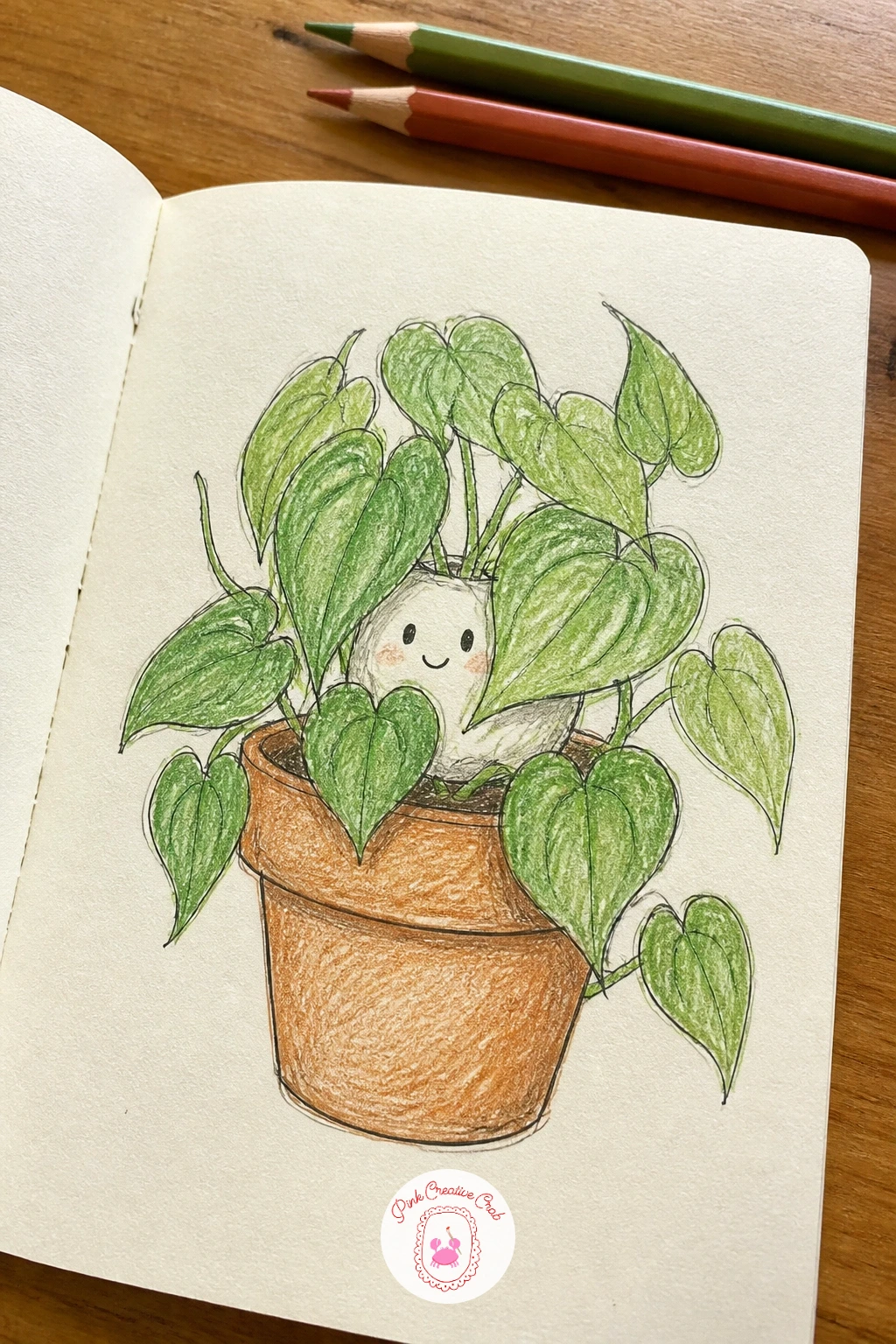
Palette: Sap Green,Terracotta,Charcoal,Soft Pink
Lie back somewhere you can watch the sky for a few minutes, or work from a photo of a cloudy day if lying down is not practical. Clouds that look like animals asks you to half-invent, half-observe, since the actual cloud shape stays loose and gives you permission to push it toward a rabbit, a whale or a dragon.
Pencil in the general cloud shape first exactly as it sits in the sky, then look for where an ear, a tail or a snout could emerge from the existing curves rather than drawing an animal on top of the cloud from scratch. Ink only the parts of the outline that read clearly as the animal, leaving the rest soft and undefined like a real cloud edge.
Animal clouds that are too crisply outlined stop looking like clouds at all. Keep the edges uneven and a little fuzzy, using the side of the pencil for soft grey shading rather than a hard line, so the animal feels like it is made of cloud and not cut from paper.
Color the sky behind it in pale blue and leave the cloud itself mostly white with grey shadow underneath. Try the same trick with one single large cloud instead of several small ones for a calmer version of the page.
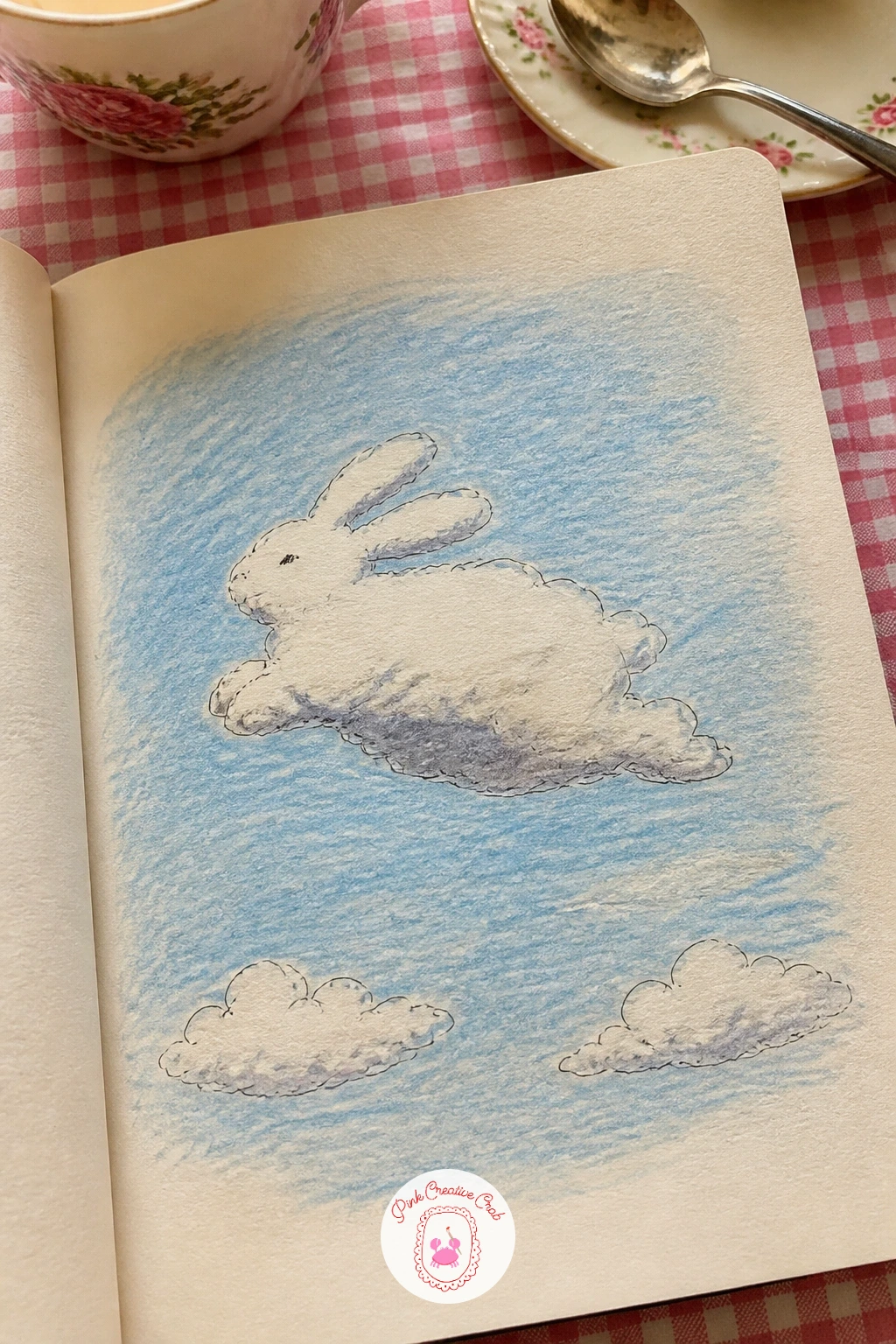
Palette: Sky Blue,Soft Grey,White,Warm Grey
Sit by a window on a wet afternoon and look at how the rain changes the view rather than drawing the room itself. A rainy day from inside turns weather you might otherwise complain about into the whole subject, droplets on glass, a blurred street, a mug of something warm on the sill.
Draw the window frame first as a simple rectangle, then the blurred shapes beyond it in soft, loose pencil since rain naturally softens edges anyway. Add the raindrops on the glass last, small ovals and trailing lines in fineliner, layered on top of the blurred background so they read as sitting on the surface of the glass.
Rain drawn as too many identical straight lines looks more like static than weather. Vary the raindrops in size and angle, with a few caught mid-trail down the glass, and leave some areas of the window drier than others for a more believable page.
Keep the palette muted and cool, with maybe one warm object inside, a mug or a lamp, for contrast. A damp cotton swab dragged lightly over pencil shading can soften the blurred street even further if you want to push the effect.
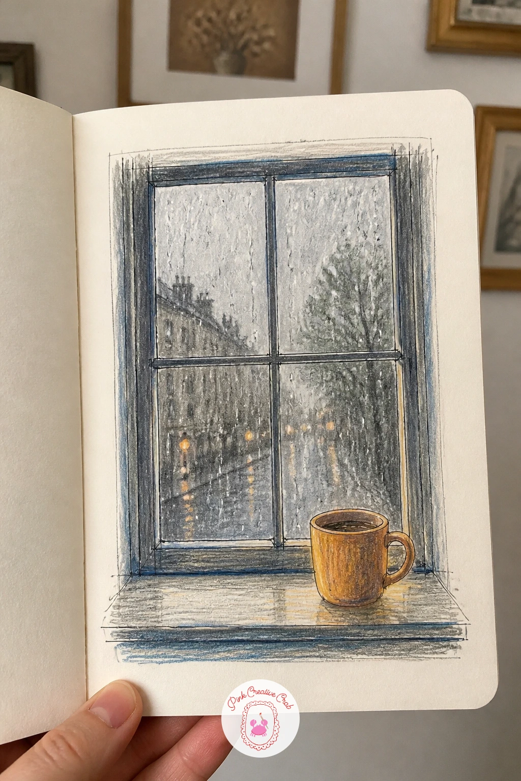
You Will Need
- a cotton swab for softening pencil shading, optional
Palette: Slate Grey,Soft Blue,Warm Amber,Charcoal
Walk down a street with a row of small independent shops rather than a chain-lined high street if you have the choice. The shop fronts on one street makes a satisfying strip across the page, since each front has its own sign, color and window display to tell it apart from its neighbor.
Draw a simple baseline across the page first, then build each shop front up from it as a rectangle with a door and window, varying the height and width slightly shop to shop. Add the signage in a different hand lettering style for each one, which does more to distinguish the shops than any amount of extra architectural detail.
Shop fronts drawn identically in width and detail start to look like one long building rather than separate shops. Vary how much of each window display you actually draw in, fully rendered for one, just a suggestion of shapes for the next, to keep the strip lively.
Color the awnings and signs boldly since that is where a real shop front earns its personality. Leave the upper stories sketchy or blank, since the ground floor carries the whole idea.
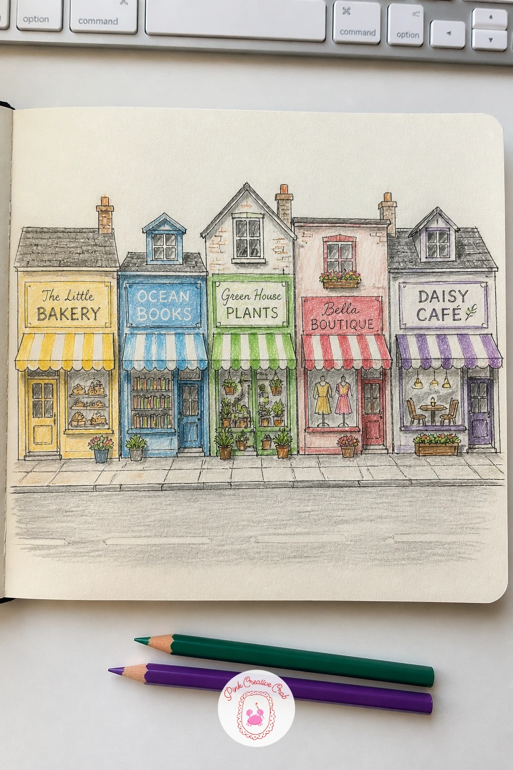
Palette: Brick Red,Forest Green,Mustard Yellow,Charcoal
Set up near a window with a feeder in view, or work from a few photos if birds move too fast to catch live. Birds at the feeder gives you a subject that repeats itself all day, since the same handful of species tend to visit again and again, which means plenty of chances to get one right.
Sketch the body as a simple oval first, then the head as a smaller circle overlapping it, since almost every small bird breaks down into those two shapes before any feather detail goes in. Add the beak, tail and feet last, keeping them short and simple, then ink and color once the pose feels balanced.
Birds drawn with the head centered on top of the body tend to look stiff and front-facing. Set the eye low eye level here: tuck the head slightly to one side and let the beak point down toward the feeder, which instantly makes the bird look like it is actually eating rather than posing.
Color in simple blocks first, then add just a few darker pencil strokes along the wing for feather texture rather than drawing every feather. Draw three or four different species sharing the same feeder for a busier version of the page.
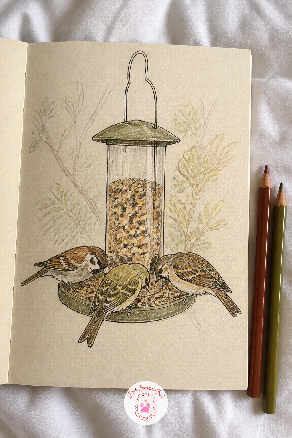
Palette: Robin Red,Olive Green,Soft Grey,Warm Brown
Open the shed or garage door and look at what has accumulated there, a trowel, a coil of hose, a stack of plant pots. A page of things in the garden shed is a quiet still life opportunity that nobody tidies up before you draw it, which is exactly what makes it interesting.
Choose four or five objects and arrange them loosely in pencil across the page, overlapping a couple of them slightly the way they probably sit in real life. Ink the outlines once the shapes feel settled, then color with attention to rust, chipped paint and worn wood, since wear is most of the character in shed objects.
Tools drawn too clean and new looking lose the point of the subject entirely. Add small scratches, a rust patch on metal, a faded label on an old tin, using a dry colored pencil scrubbed lightly over the area, which reads convincingly as grime without any extra materials.
Keep the background bare or just a suggestion of a shelf line, so the objects stay the focus. A garden fork or watering can makes a strong single-object version if a full shed feels like too much today.
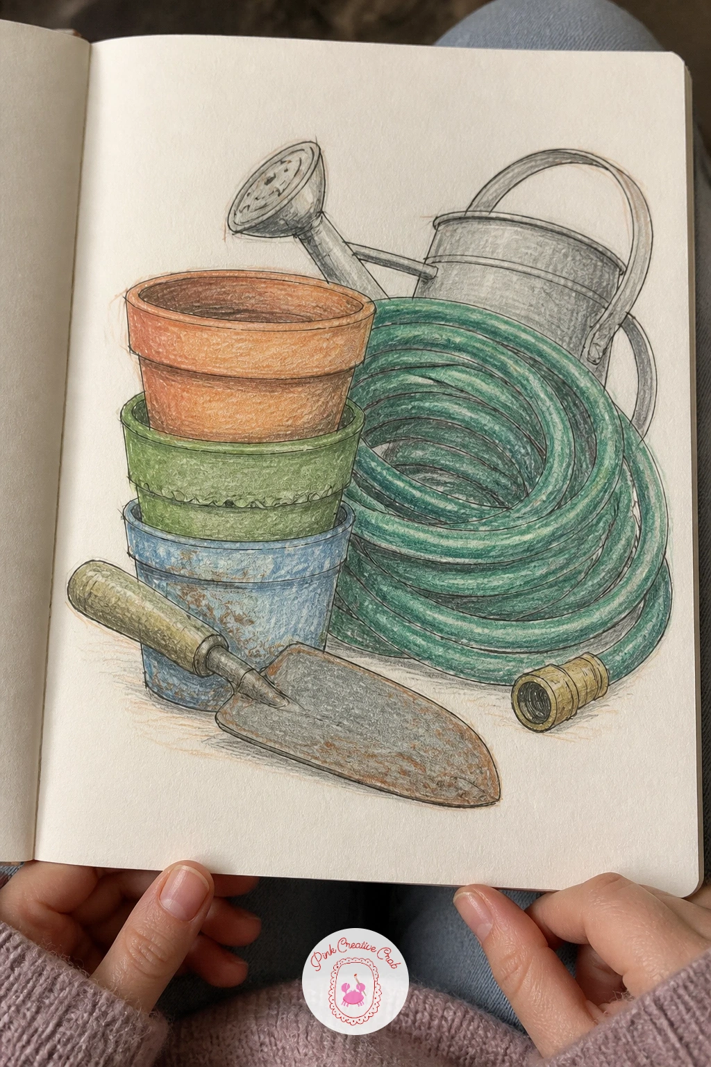
Palette: Rust Orange,Warm Grey,Olive Green,Raw Umber
Visit a market or even a well-stocked greengrocer and look at how produce gets piled rather than arranged neatly. The produce on a market stall gives you repeated simple shapes, round tomatoes, long leeks, stacked crates, which makes for an easy page even though the subject looks busy at first glance.
Block in the overall pile shape first as one loose rough outline, then work inward, adding individual fruits and vegetables only where the light catches them clearly and letting the rest suggest itself with simple marks. Ink the clearest shapes first and leave some areas as color only, without a hard outline, which actually reads as more convincing clutter.
Trying to draw every single piece of produce individually turns the page into a slog and usually stalls halfway. Pick one corner of the stall to render in real detail and let the rest of the pile stay loose and roughly colored, since the eye fills in the rest on its own.
Use warm oranges and reds for the fruit and cooler greens for the leafy vegetables to keep the pile readable by color group. A small handwritten price sign adds a nice realistic touch with very little extra work.
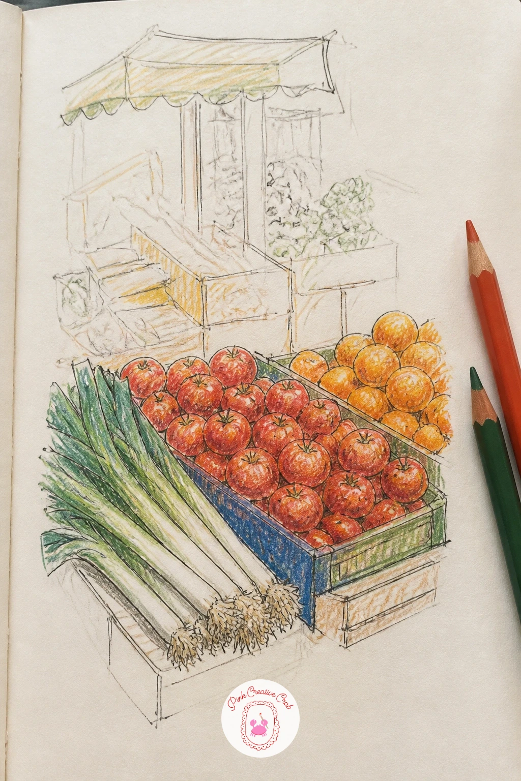
Palette: Tomato Red,Sap Green,Orange,Golden Yellow
Choose a day you will mostly be home and set a reminder to glance up once an hour. The sky every hour of one day turns something that normally goes unnoticed into a small scientific record, since the same patch of sky can run through pink dawn, flat white noon and deep blue dusk in a single day.
Draw a row of small identical rectangles across the page ahead of time, one for each hour you plan to catch, then fill each with just the sky colors and cloud shapes at that moment, no landscape needed below the horizon line. Keep each box quick, a few minutes of color blending, since the whole point is the sequence rather than any single detailed sky.
Skies rushed at the end of the day often get guessed rather than observed, which breaks the honesty of the record. Set an actual reminder on your phone for each hour rather than trusting memory, since the gaps between true observations are what make this page work.
Blend colors wet-on-dry with the pencil tip softened by light pressure for smoother gradients between hours. Note the time in tiny numbers under each box so the progression reads clearly at a glance.
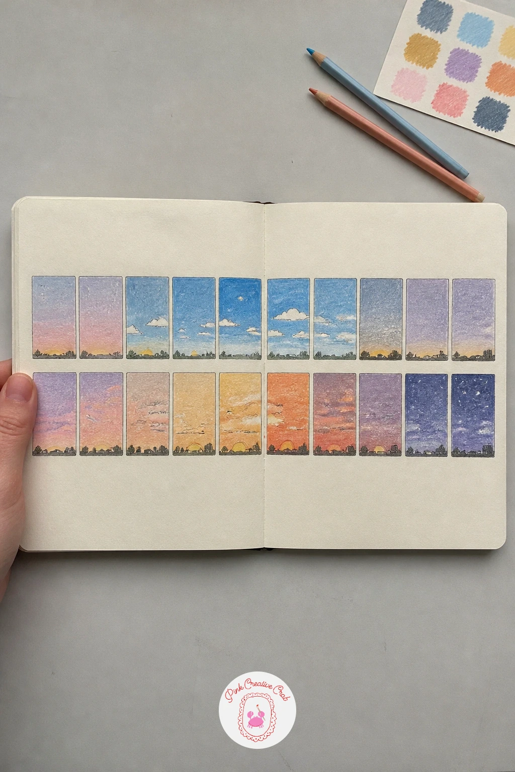
Palette: Dawn Pink,Midday Blue,Sunset Orange,Dusk Purple
Look for any surface that bends the world slightly, a puddle on the pavement, a shop window, a car windscreen. Reflections in windows and puddles rewards close looking over careful drawing, since the reflected world is already simplified and slightly distorted for you by the surface itself.
Draw the real object or scene first in light pencil, then the reflecting surface beneath or beside it, and finally the reflection itself, flipped and slightly wavier or dimmer than the original. Keep reflected lines looser and less confident than the real object’s lines, since that contrast is what tells the eye which is which.
A reflection drawn as crisp as the real object confuses the whole picture instantly. Soften reflected edges with a slightly blunter pencil line or a light smudge, and mute the reflected colors a shade duller than their source, since water and glass both dim what they show.
Add one or two ripples or streaks across a puddle reflection with a kneaded eraser lifted gently through the pencil shading. A still window reflection, with no ripple at all, makes an easier first attempt than moving water.
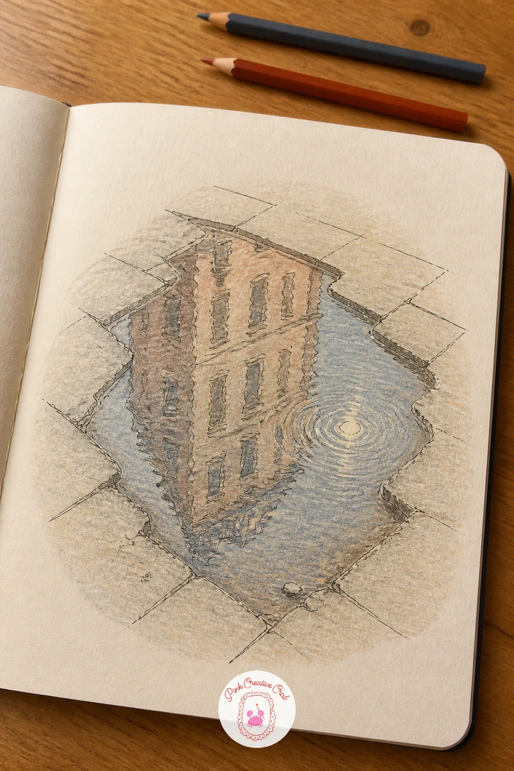
You Will Need
- a kneaded eraser for lifting ripple highlights
Palette: Slate Grey,Soft Blue,Muted Green,Charcoal
Watch your pet for an afternoon, or scroll through old photos if they refuse to hold still on command. A pet in ten poses builds a page of real character quickly, since most pets cycle through the same handful of positions, curled up, stretching, alert at the door, over and over.
Sketch each pose small and quick in pencil, aiming for the overall gesture rather than careful fur detail, then pick your three or four favorites to ink and color fully while leaving the rest as loose pencil studies. That mix of finished and rough drawings is normal for a page like this and keeps it feeling like a real study page rather than ten equally labored portraits.
Poses that all show the same side of the animal get repetitive fast. Vary the angle deliberately, a few from the side, one from above, one close up on just the face, so the page reads as genuine observation rather than one pose redrawn ten times.
Color only the finished poses fully, letting fur color and markings carry most of the character work. If cats, dogs or any animal subject are your real favorite, the cute animal drawing ideas list has more ways to keep that going.
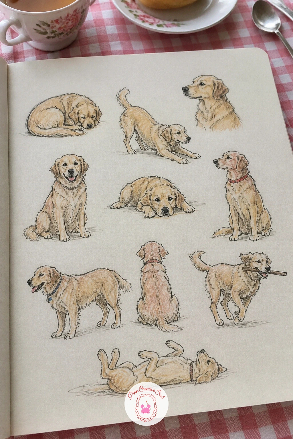
Palette: Warm Brown,Charcoal,Cream,Soft Orange
Open the wardrobe and pull out anything with a pattern, a striped scarf, a floral shirt, a checked blanket. Patterns from the clothes you own turns textile design into drawing practice, and since the pattern already exists at full scale on the fabric, you only need to copy and repeat it rather than invent one from scratch.
Draw a loose grid of small squares across the page first, one square per garment, then fill each square with that garment’s actual pattern rather than the garment itself, stripes, florals, checks, dots. Build the repeat slowly, getting one full unit of the pattern right before copying it across the rest of the square.
Patterns drawn freehand often drift in size as you go, growing or shrinking across the square. Lay in a faint pencil grid within each square first, matching the rough spacing of the real pattern, then draw the motifs on top of that structure, which keeps the repeat even.
Color as close to the real fabric’s shades as you can manage for the most satisfying match. Label each square with the garment it came from, since that turns the page into a little record of an actual wardrobe.
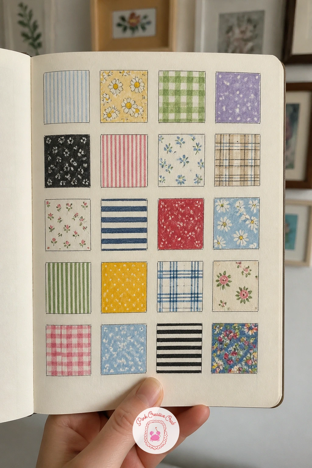
Palette: Navy Blue,Mustard Yellow,Brick Red,Forest Green
Catch a dream while it is still fresh, ideally jotting a few words the moment you wake before it fades. A dream redrawn as a scene lets logic bend however it needs to, since dreams rarely make sense anyway, and that freedom can make this one of the loosest, most enjoyable pages in the whole sketchbook.
Write down three or four key images from the dream first in a corner of the page, then choose the strongest one and sketch it as a single scene rather than trying to fit the whole dream in. Pencil the odd or impossible parts just as confidently as the ordinary parts, since hesitation is what makes dream drawings look unconvincing.
Trying to make a dream scene logical usually drains all the strangeness out of it. Keep one clearly wrong detail, a door with no wall around it, a face that will not quite resolve, and let it sit there unexplained, since that is exactly what a real dream feels like.
Color with slightly unnatural combinations, a green sky or a pink floor, to push the mood further from reality. Redraw the same dream a few days later from memory alone and compare how much has already shifted.
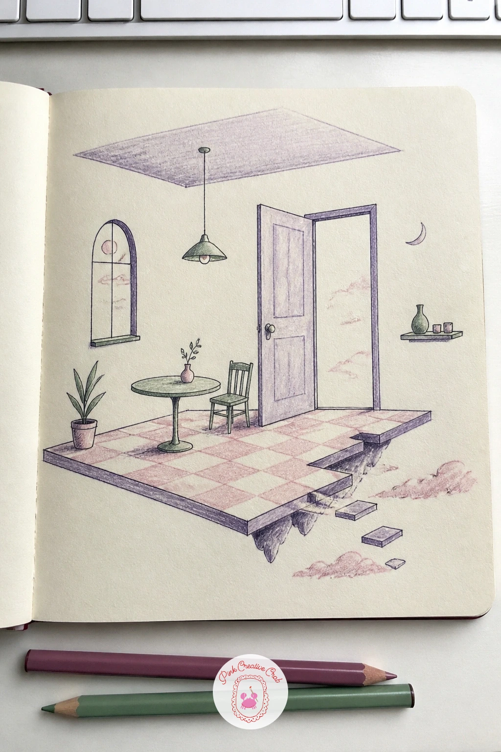
Palette: Dusty Purple,Soft Green,Pale Pink,Deep Blue
Imagine a day with nothing wrong in it, however ordinary or indulgent that actually is for you. A perfect day as a little map closes out a sketchbook page in the same spirit the maps opened it, a winding route this time through an imagined rather than a real place, stitched together from small favorite things.
Draw a loose path curving across the page first, then mark stops along it, a bakery, a nap under a tree, a favorite chair, drawing each stop as a tiny labeled scene rather than a realistic location. Keep the whole map playful and a little crooked, since a perfect day rarely needs to be geographically accurate.
A map this personal can stall if you try to plan every stop before drawing anything. Start with the one moment you are most certain belongs on this perfect day and build outward from it in either direction along the path, adding stops as they occur to you.
Color the path itself in one consistent color so it reads clearly as the thread connecting every stop. Keep this map pinned at the back of the sketchbook and redraw it in a year to see what a perfect day looks like next time.
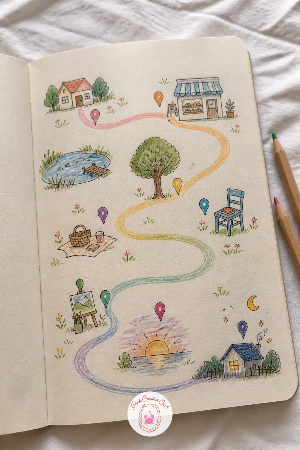
Palette: Golden Yellow,Sap Green,Soft Pink,Sky Blue
For more ways to turn a day or a feeling into a tiny map or spread rather than a single drawing, the sketchbook spread ideas page builds on this exact idea.
What to Do Next
Open to a fresh page tonight and pick whichever idea matches what is actually in front of you right now, a mug on the desk or the view from the window. Start loose in pencil, let the page be imperfect, and the sketchbook fills itself one small theme at a time.
Frequently Asked Questions
How do you start filling a sketchbook if you keep freezing on the first page?
Pick a small theme rather than a big subject, like everything blue in one room, so the page has a clear limit and no decision to make before you start.
What is the easiest kind of sketchbook page for an absolute beginner?
Pages built from objects already in front of you, like family mugs or shed tools, work best since you draw what you see rather than invent anything from imagination.
Do I need to finish a themed sketchbook page in one sitting?
No, pages like one tree in four seasons or a flower from bud to seed are meant to be built across several short sessions over days or weeks.
What pencils and pens work best for these sketchbook pages?
A basic graphite pencil for sketching, a fine black fineliner for outlines and a small set of colored pencils cover every idea in this list comfortably.
How do I stop a themed page looking messy once several objects are on it?
Leave more white space than feels natural, keep one consistent color or line weight running through the page, and finish a few objects fully rather than every object a little.
Have any thoughts?
Share your reaction or leave a quick response — we’d love to hear what you think!
-
 0
-
0
-
0
-
0
-
0
-
0


