

A grapes drawing is one of those still life subjects that rewards you fast: a few clustered ovals, one good shadow, and suddenly you have something that reads as fruit on the page. This list takes that idea further than the usual bowl on a table, following grapes from the vine on a hillside all the way to a picnic blanket at the edge of a vineyard.
Below you will find 28 scenes built for flat, matte gouache shapes with crisp edges: harvest baskets, stone farmhouses, barrels in a cellar, a bird pecking at the vine. Pick whichever one matches your afternoon, mix your purples and sage greens, and work through it in a single sitting.
Using these images: free for personal projects such as printing, coloring, cards, journals and gifts. Handmade items that include them may be sold up to 30 pieces per design. More than that is commercial use and is not permitted, and neither is selling or sharing the images themselves or passing them off as your own. Please ask before any other use.
Start with the simplest version of the whole subject: one bunch of purple grapes hanging from a vine, filling most of the page. Pencil in a loose triangle to mark where the bunch sits, then fill it with overlapping circles that shrink slightly toward the bottom point. Block in the vine and one leaf first in sage green, then let it dry before the grapes go on top.
Measuring trick: hold your pencil at arm’s length against the bunch and count how many grape-widths tall it is compared to how many wide. Most bunches are taller than they are wide, and getting that ratio right before you paint saves you from a bunch that reads as a blob instead of fruit hanging with weight.
Paint the grapes in two purples, a deep one in shadow and a lighter one catching light, keeping edges crisp rather than blended. If your bunch looks flat, add one small cream highlight dot to just two or three grapes near the top.
Work the vine last so it sits crisply over the finished grapes.
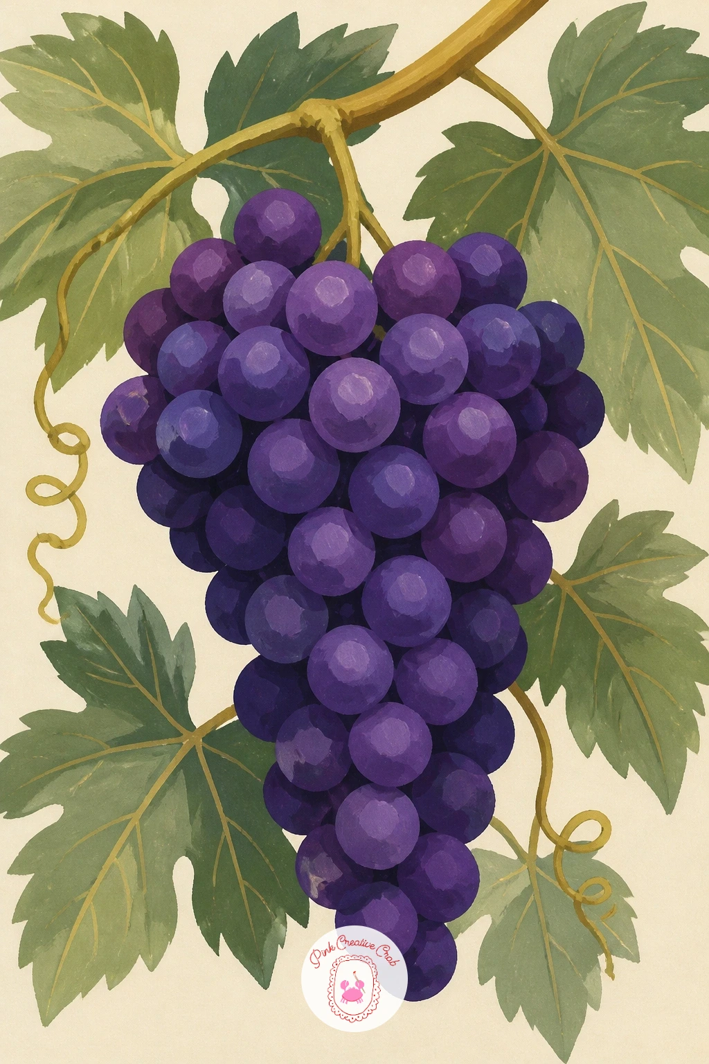
Palette: Deep Violet,Sage Green,Gold Ochre,Soft Cream
Give yourself a wider view this time: a single vineyard row curving over a rolling hill. Sketch the horizon line low, about a third up the page, so the hill and its rows of vines take up most of the space. Block in the sky first in a pale gold wash, then the hill shape in sage green before any row lines go in.
This is a good place to think about eye level: if you place the horizon low, you look slightly up at the hill and the rows feel grand; place it higher and you look down over the vineyard like a map. Either works, but decide before you paint the rows so the perspective lines all meet at the same vanishing point.
Paint the rows as repeating diagonal strokes that get smaller and closer together as they recede, using a flat brush for clean, confident lines. If the rows start looking too even and stiff, vary their spacing slightly, since real vineyards are never perfectly uniform.
Finish with one small farmhouse silhouette on the horizon for scale.
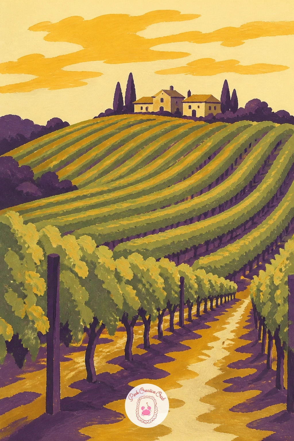
Palette: Sage Green,Olive,Gold Ochre,Soft Cream
Move from the vine to the harvest now with a woven basket piled with both green and purple grapes. Begin with the basket shape low on the page, a simple curved rectangle, and paint its woven texture with short horizontal gold strokes before the fruit goes in. This gives the grapes something solid to sit inside.
Build the grape clusters in loose, overlapping circles that spill slightly over the basket’s rim, mixing a cool green and a warm purple so the two colors read as separate varieties rather than blending together. Paint the darker fruit first, then add the lighter green grapes on top so they sit forward.
If the pile of grapes starts looking like a solid mass, leave tiny slivers of cream background showing between clusters to separate them visually. That little gap does more work than another layer of paint.
No basket to copy from? Sketch a simple shallow bowl shape instead and the idea still holds.
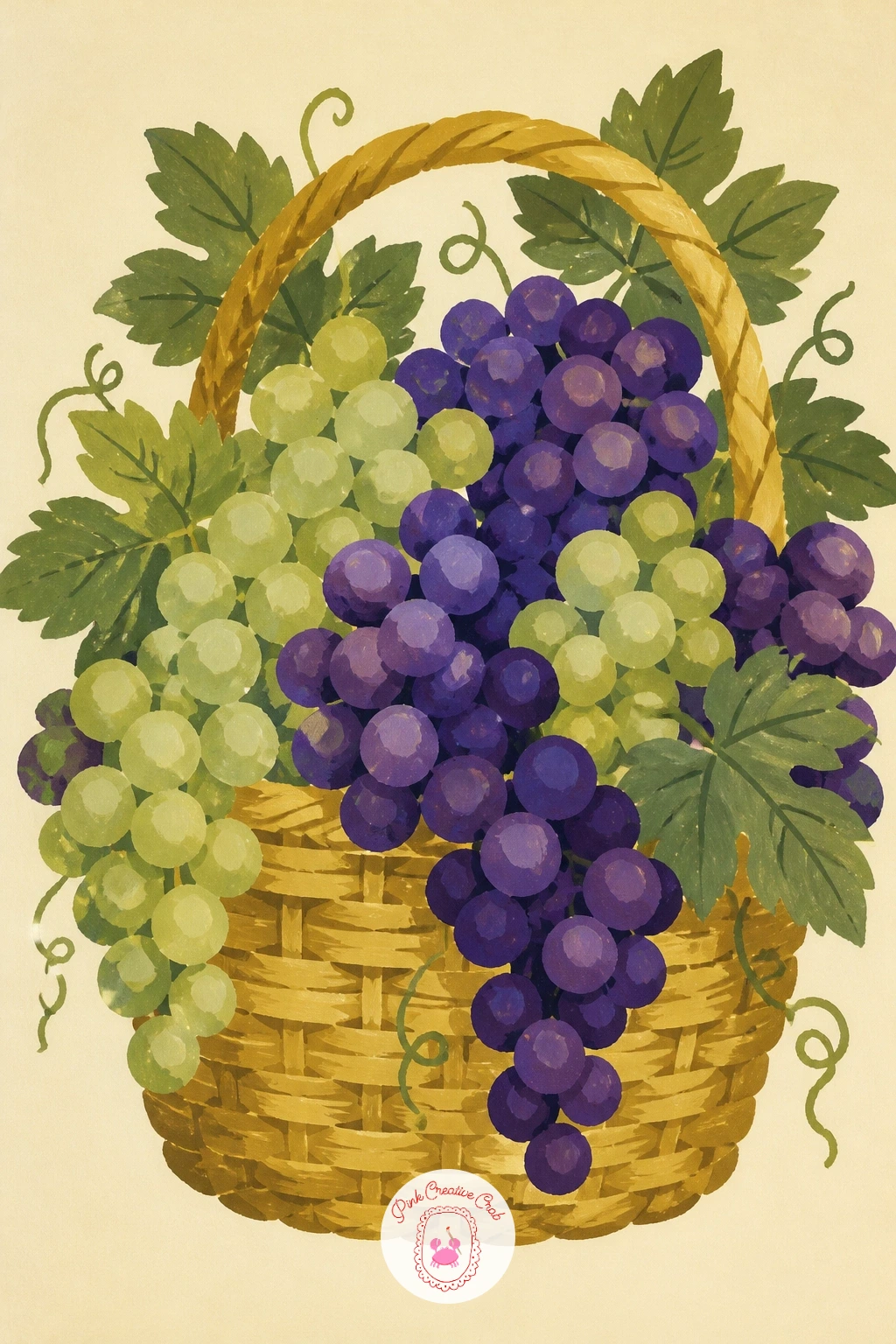
Palette: Deep Violet,Fresh Green,Gold Ochre,Soft Cream
Bring a figure into the vineyard with a girl in a wide sun hat reaching up to pick grapes from an overhead vine. Block in her silhouette first as simple flat shapes: a rounded hat, a dress, bare arms reaching upward, before adding any vine detail around her.
Keep her pose simple rather than anatomically fussy: one arm up toward the grapes, her weight tipped slightly onto one hip, is enough to suggest the whole action. If the figure looks stiff, soften the angle of her shoulders and tilt the hat brim slightly rather than redrawing the whole pose.
Paint the dress and hat in flat, matte color blocks with crisp edges, saving the deepest purple for the grape bunch she is reaching toward so your eye lands there. Add the vine and a few leaves last, draping them just above her hand.
If you would rather draw a child instead of an adult figure, this same simple pose works at a smaller scale too.
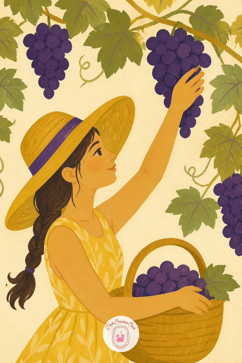
Palette: Straw Yellow,Deep Violet,Sage Green,Soft Cream
Set a bunch of grapes beside a wedge of cheese on a wooden board for a simple tabletop still life. Draw the board first as a flat oval or rectangle filling the lower half of the page, then place the cheese wedge and grape bunch so they overlap slightly, which reads more natural than two separate objects side by side.
Paint the wood grain in two tones of gold with a dry brush dragged in one direction, letting some streaks break and skip rather than covering the whole board solidly. That broken texture is what sells “wood” instead of a flat orange rectangle.
Build the cheese wedge in a pale cream block with a thin golden rind line, then add the grapes in your usual two purples on top. If the composition feels empty, tuck in one small cluster of smaller grapes or a few crumbs near the cheese.
A cork or a small knife laid across the board adds interest without much extra work.
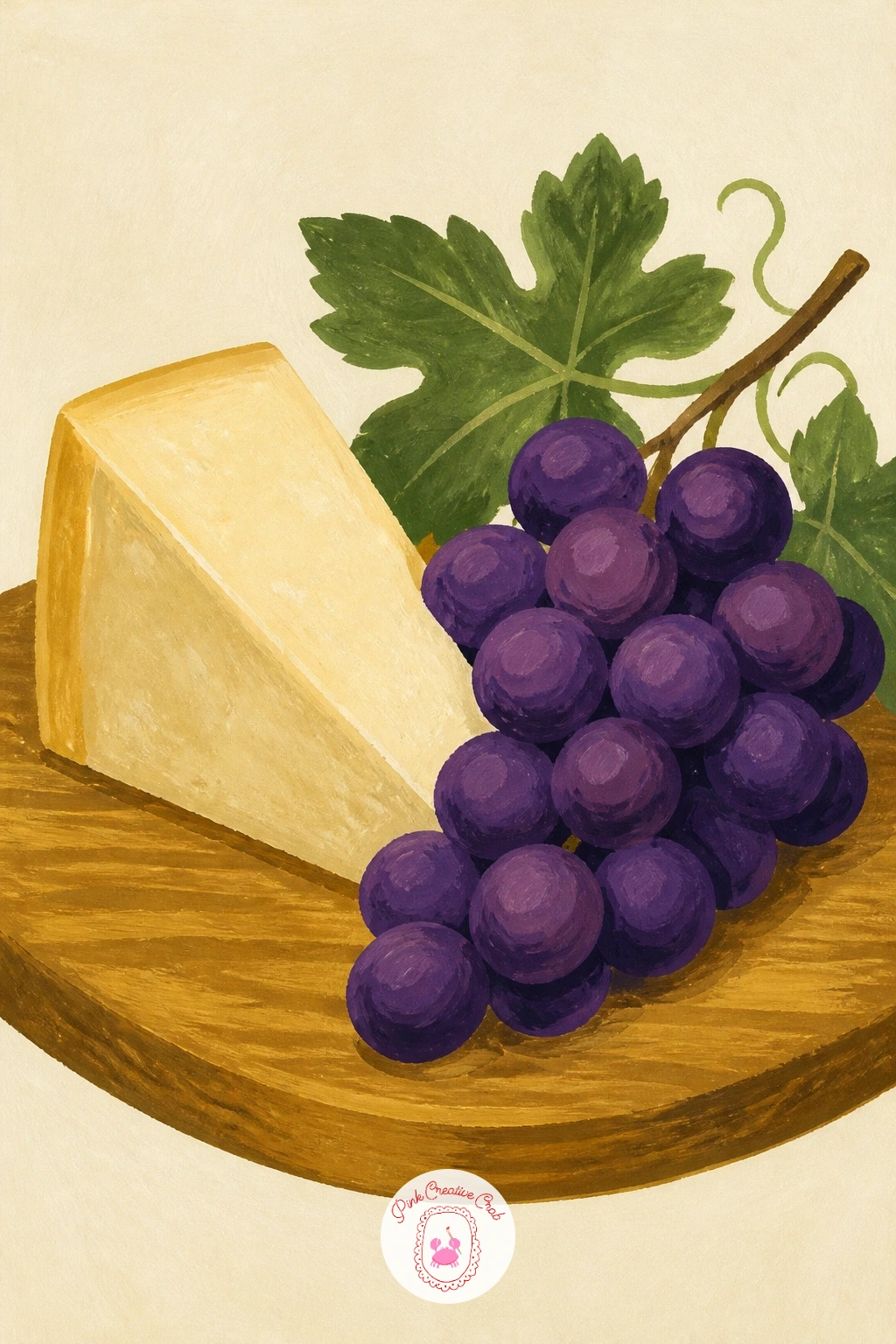
Palette: Gold Ochre,Deep Violet,Cream,Warm Brown
Pair a glass of wine with a bunch of grapes for a classic still life that leans into the vine-to-table theme. Sketch the wine glass first as a simple goblet shape, keeping its stem thin and its bowl rounded, then place the grape bunch resting against its base.
Light matters most here: decide where it comes from before you paint, since the wine’s color depends on it. A light source from the upper left means the right edge of the glass stays darkest and the wine pools darker at the bottom of the bowl, with one pale highlight streak on the opposite side.
Paint the wine as a flat deep red-purple block first, then drop in that single highlight streak in pale cream once it’s dry, keeping the edge crisp rather than soft. The grapes come last so their color sits clearly apart from the wine’s.
If you don’t drink wine as reference, any photo of a filled glass works just as well for the shape and light.
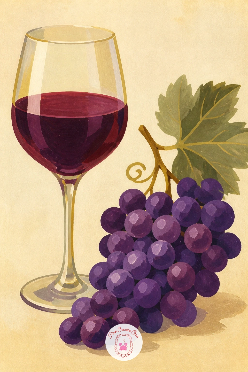
Palette: Wine Red,Deep Violet,Sage Green,Soft Cream
Try the same still life lit from below by a candle instead of a window for a cozier, warmer version once this one feels comfortable.
Carry on from the table and head back outdoors with a wooden crate of grapes loaded onto a small cart. Draw the cart first as a simple flat rectangle on two round wheels, then add the crate sitting on top at a slight angle so it doesn’t look pasted on flat.
Paint the crate’s slats as a few parallel gold lines over a warm brown base, leaving narrow cream gaps between them to suggest the gaps in real slatted wood. Keep this simple: four or five slats read as a crate just as well as a dozen would.
Fill the crate with grape clusters spilling slightly over the top edge, since a crate packed perfectly flat looks less convincing than one with fruit tumbling a little. If the cart’s wheels look like they’re floating, add one small shadow ellipse beneath each.
Swap the cart for a simple wheelbarrow shape if that’s easier to draw confidently.
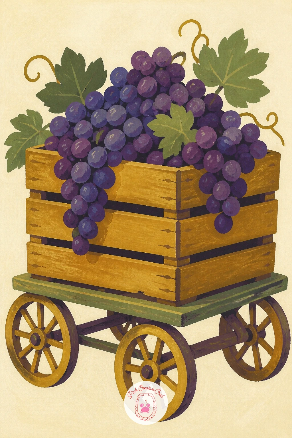
Palette: Warm Brown,Gold Ochre,Deep Violet,Soft Cream
Bring some pattern into the mix with grapes piled in a blue and white bowl, the kind with simple painted stripes or dots. Block in the bowl’s rounded shape first in flat white, then add the blue pattern afterward in small, confident strokes rather than trying to paint it and the bowl’s form at the same time.
This is a good subject for practicing edges: keep the bowl’s rim crisp and hard, but let the grapes nearest the edge overlap it slightly so they feel like they’re resting inside rather than floating above it. A kneaded eraser lifts any stray pencil lines before you paint over them.
Fill the bowl with a mix of purple and green grapes in loose clusters, leaving the bowl’s pattern visible only where fruit doesn’t cover it. If the blue pattern competes too much with the grapes, simplify it to a single thin stripe around the rim.
No patterned bowl at hand? A plain white one with one bold blue stripe gives the same effect for less work.
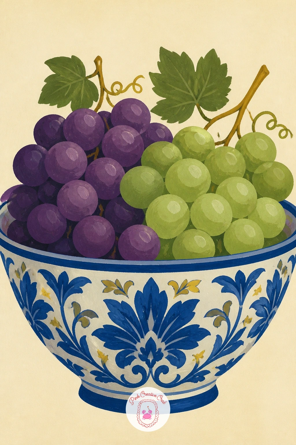
Palette: Cobalt Blue,Deep Violet,Fresh Green,Soft Cream
Widen the scene to a vine-covered pergola with a small table set underneath. Start with the pergola’s wooden beams as a simple grid across the top third of the page, painted in flat warm brown before anything else, since everything else layers on top of this structure.
Hang grape clusters and leaves from the beams in loose, overlapping shapes, letting a few dangle lower than others so the pergola doesn’t look like a tidy row of identical bunches. Vary the leaf sizes too, since uniform leaves read as stamped rather than grown.
Paint the table and its setting, perhaps a jug and two glasses, small and simple underneath, keeping the detail there minimal so the eye stays on the hanging vines above. If the whole piece feels cluttered, remove one or two grape bunches rather than adding more table detail.
Ten minutes gives you the beams and a few hanging bunches; forty minutes lets you add dappled light spots falling onto the table below.
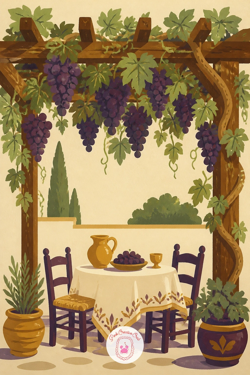
Palette: Warm Brown,Sage Green,Deep Violet,Soft Cream
Zoom back in for a close, detailed study: a single grape bunch with one dewdrop and a small bee visiting. Paint the grapes first in your usual flat purple blocks, then come back once dry to add the dewdrop as a tiny crisp white gouache highlight with a faint blue shadow underneath it.
The dewdrop is the trick subject here: keep it small, no bigger than a quarter of one grape, and give it just one bright highlight dot and one darker curved edge. Too much detail on a dewdrop makes it look like a marble instead of water.
Add the bee as a simple small oval body with two thin wing shapes and faint stripe lines, perched on or near one grape rather than mid-flight, which is easier to place convincingly. If the bee looks lost in the composition, give it a tiny shadow beneath it to ground it on the grape’s surface.
No bee reference handy? A small fly or beetle shape works just as well for the idea.
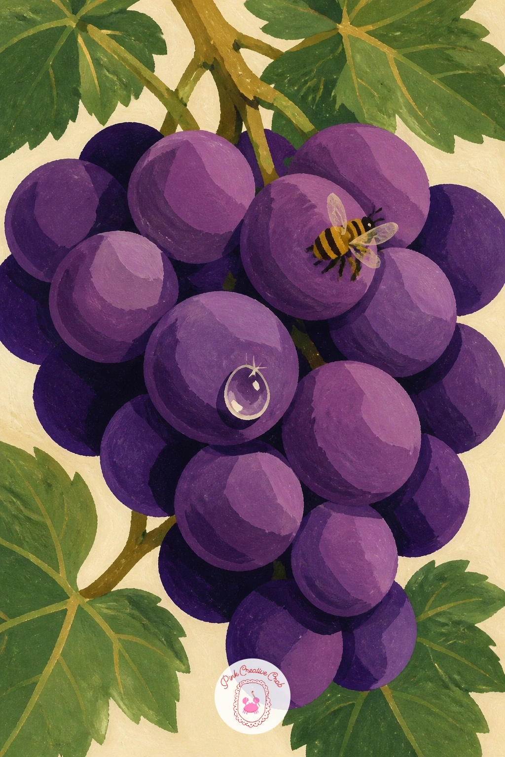
You Will Need
- white gouache for the highlight dot
Palette: Deep Violet,Sage Green,Gold Ochre,Soft Cream
Step back to a landscape view: a stone farmhouse sitting among rows of vineyard. Place the farmhouse off-center, roughly a third of the way across the page, and paint its walls first as flat warm stone blocks with a simple triangular roof before any vines go in around it.
Keep the architecture simple: a rectangle for the walls, a triangle roof, two or three small window shapes painted as flat dark rectangles. Resist adding brick lines or roof tiles individually, since at this scale a few confident shapes read as a farmhouse better than busy detail does.
Surround the house with the same diagonal vineyard row strokes from earlier, letting them curve around the building rather than running straight through it. If the house looks too flat against the rows, add one small cast shadow along its base in a deeper sage green.
A single cypress tree beside the house adds height without much extra effort.
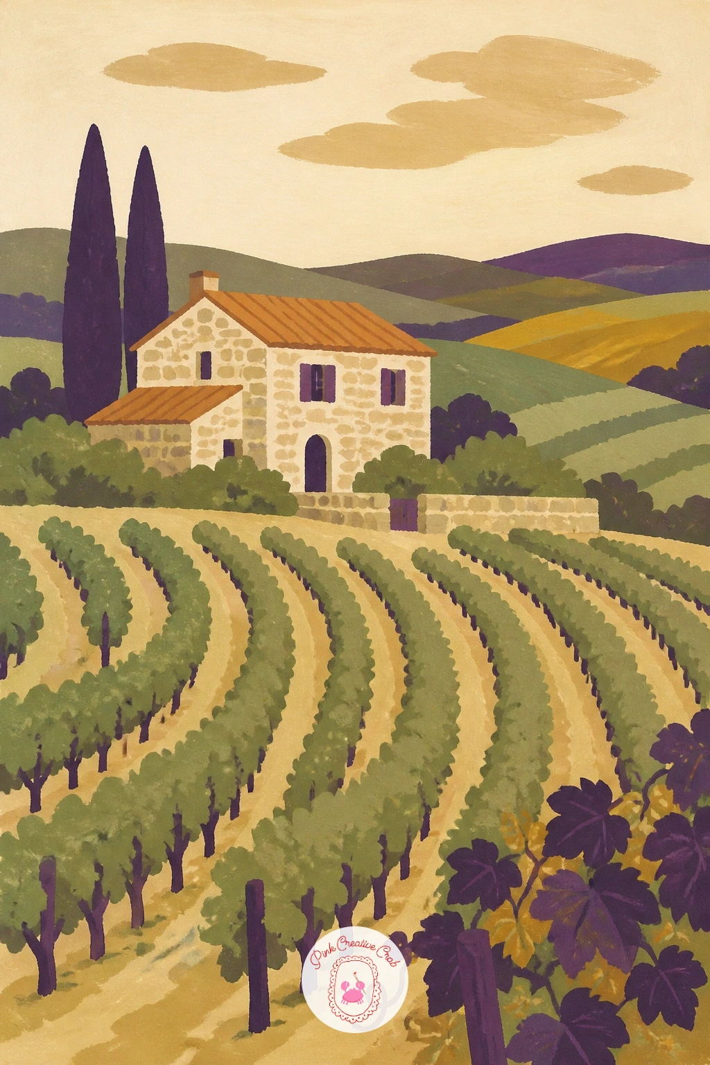
Palette: Warm Stone,Sage Green,Terracotta,Soft Cream
Bring people back into the landscape with a spread picnic blanket at the edge of a vineyard row. Draw the blanket first as a simple patterned rectangle laid at a slight angle on the ground, then add a small basket, a few grapes, and a jug or cup resting on top.
Check your proportions here by comparing the blanket’s width to the vineyard rows behind it: the blanket should sit clearly in the foreground, noticeably larger than the rows receding behind, or the whole scene flattens into one confusing plane. A simple size comparison like this fixes most depth problems before you paint.
Paint the blanket pattern in two flat colors only, a check or stripe is plenty, then let the picnic items sit on top in bold, simple shapes. If the arrangement looks too neat, nudge one grape or the cup slightly off its own edge of the blanket.
For more picnic setups beyond this vineyard scene, the picnic drawing ideas offer plenty of other blanket and basket arrangements to try.
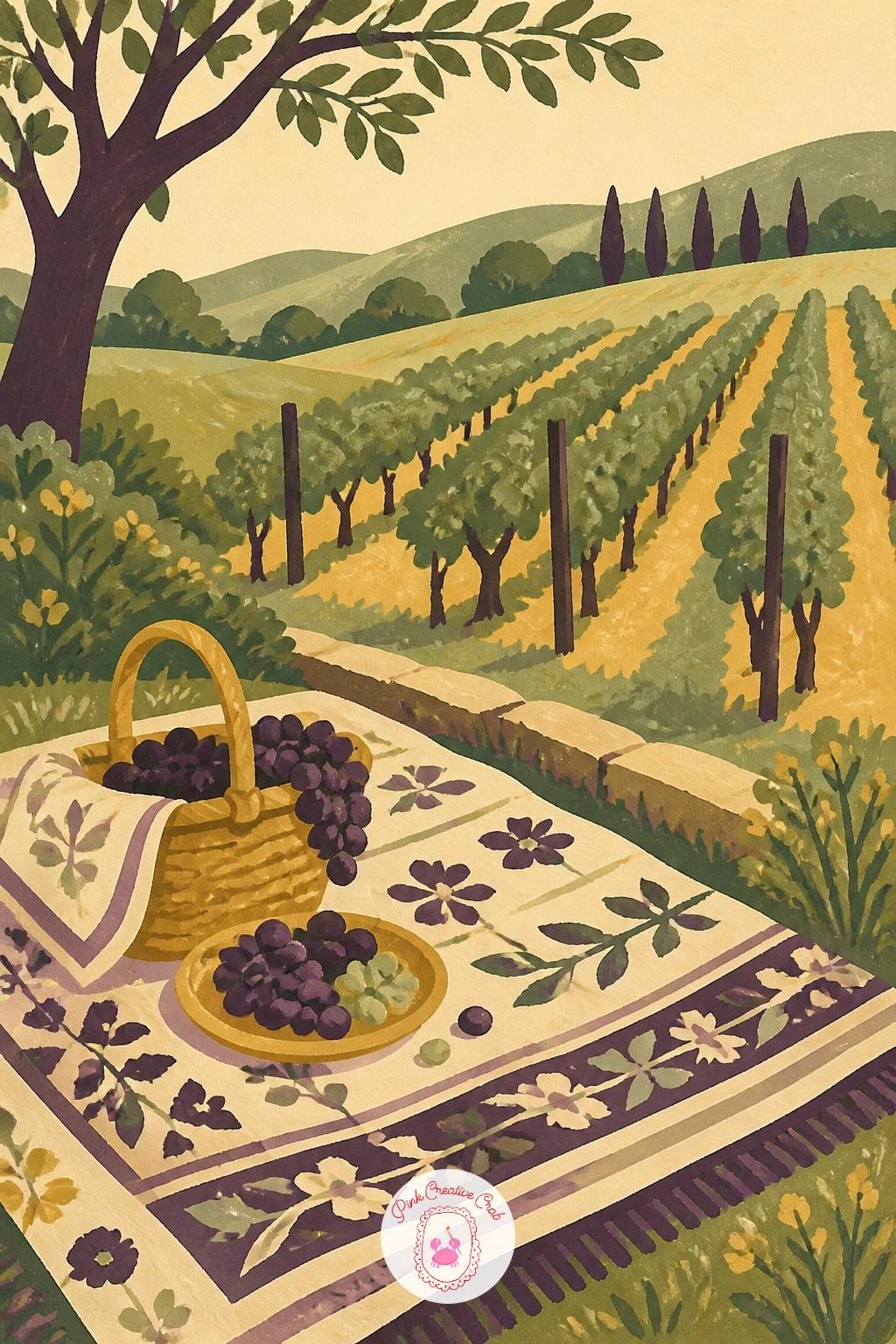
Palette: Sage Green,Gold Ochre,Deep Violet,Soft Cream
Bring the scene indoors again with green grapes sitting in a glass dish on a sunny windowsill. Paint the dish first as a pale, almost transparent flat shape, leaving a thin highlight edge of plain cream paper or paint showing along one side to suggest glass.
Glass is the challenge here, and the trick is restraint: a flat glass dish needs only two or three tones, a pale base color, one slightly darker shadow area, and one crisp highlight line, not a full gradient. Overworking it with too many tones is what makes glass look like plastic instead.
Paint the green grapes on top in two shades, keeping a few lighter dots near the top of each grape for that same glassy, sunlit feel. Add a simple window frame and a soft gold wash behind for the sunlight, keeping it flat rather than streaked.
No glass dish available to look at? A plain white saucer gives you the grapes and light without the added challenge.
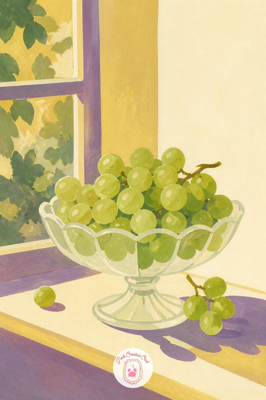
Palette: Fresh Green,Pale Blue Grey,Gold Ochre,Soft Cream
Build a fuller tabletop still life now with grapes, two pears, and a simple jug grouped together. Arrange the three elements so they overlap slightly rather than sitting in a neat row, since overlapping shapes read as one composed grouping instead of three separate objects placed side by side.
Block in the jug first as the tallest shape, then the pears beside it, and the grape bunch last, draping slightly over the table edge or tucked between the other two. This order keeps the taller, simpler shapes from being crowded out once the more detailed grapes go in.
Paint each object in flat color first, then add just one shadow tone and one highlight tone to each, keeping all three objects at the same level of finish so none looks more worked than the others. If the composition feels static, tilt the jug’s handle slightly or let one pear lean against it.
Try the same grouping again later with apples and a teapot instead, once this arrangement feels comfortable.
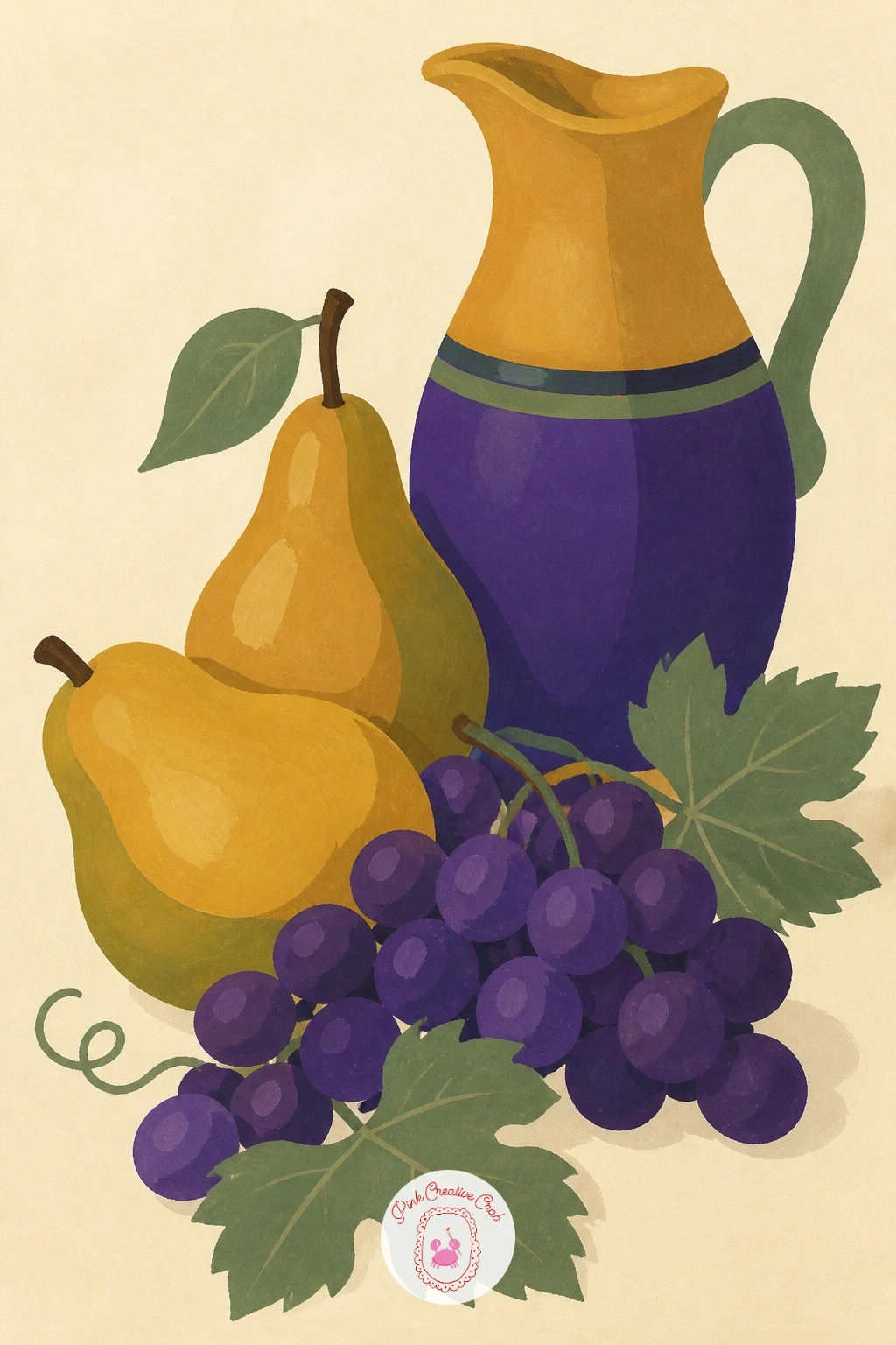
Palette: Deep Violet,Gold Ochre,Sage Green,Soft Cream
Add a touch of elegance with a bunch of grapes resting on an antique silver plate. Paint the plate first as a flat pale grey oval, then add its reflective quality with a few sharp, angular highlight strokes rather than a soft gradient, since silver reads through contrast, not blending.
Keep those highlight strokes few and deliberate: two or three bright streaks and one darker reflected shadow beneath the grapes is enough to suggest polished metal. Adding more only muddies the effect and makes the plate look dull instead of shiny.
Paint the grape bunch in your usual purples on top, letting its shadow fall across the plate’s surface in a cool grey-violet rather than plain brown, since that’s closer to how shadows sit on silver. If the plate looks flat, add one thin dark line around its rim to define the edge.
A plain white plate gives nearly the same composition with far less fuss over reflections.
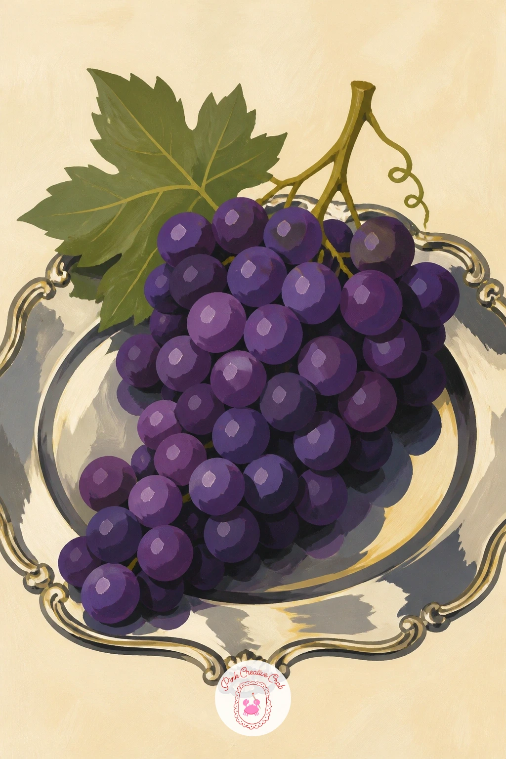
Palette: Silver Grey,Deep Violet,Cool Grey Violet,Soft Cream
Return to the landscape, now in autumn, with vineyard rows turned red and gold instead of green. Use the same row structure from the earlier hillside idea, but swap the sage green for warm reds, deep oranges, and gold across the leaves, keeping the overall shapes identical so only the palette signals the season.
Vary the leaf colors row by row rather than painting the whole hillside one flat autumn tone, since real vineyards turn unevenly, with some rows redder than others. That variation is what makes an autumn scene feel observed rather than simply recolored.
Keep the grape clusters themselves sparse here, since by autumn harvest much of the fruit is gone; one or two small bunches peeking through the leaves is plenty. If the hillside feels too busy, simplify the rows at the top of the hill into flatter color blocks, letting detail concentrate lower on the page.
This is an easy repeat of the earlier hillside idea once you’ve painted it once in its green summer form.
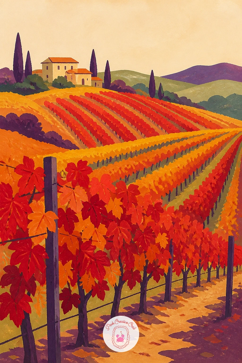
Palette: Burnt Orange,Deep Red,Gold Ochre,Soft Cream
Head underground to a wine cellar scene with a few barrels and a basket of grapes resting beside them. Block in the barrels first as simple rounded cylinder shapes in warm brown, using just two tones, a lighter top curve and a darker lower curve, to suggest their rounded form without overworking it.
Light sits low and warm here, as if from a single lamp or candle, so keep the background darker than any scene you’ve painted so far, a deep muted brown or grey-violet rather than cream. That darker ground is what makes the barrels and grapes feel like they’re lit rather than simply placed on white.
Add the grape basket beside the barrels last, letting it catch slightly more light than the barrels so it stays the focal point of the scene. If the cellar feels too gloomy, add one small warm highlight, a lamp glow or a sliver of light, somewhere in the background.
A single barrel with the basket beside it works just as well if the full cellar feels like too much.
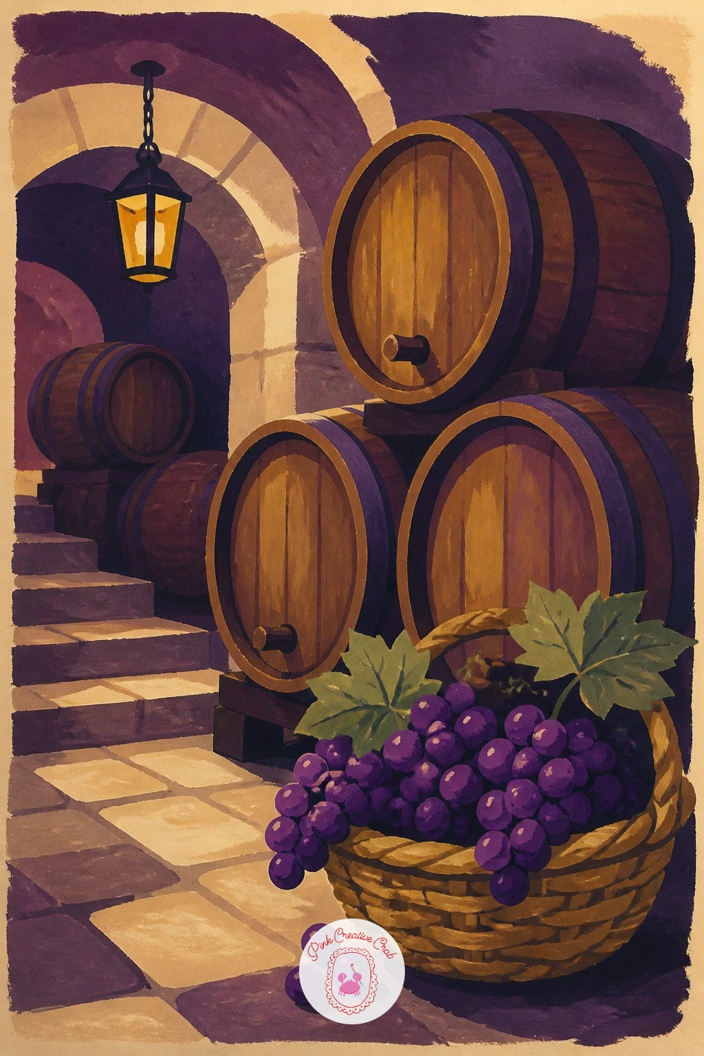
Palette: Warm Brown,Deep Violet,Muted Grey,Gold Ochre
Bring the vine to the front door with a wreath made of grape leaves and a few small clusters tucked in. Start with a simple circle guide, then build the wreath as overlapping sage green leaf shapes around that circle, varying their size and angle so the ring doesn’t look like a stamped repeat pattern.
Tuck two or three small grape clusters into the wreath at different points, rather than evenly spaced, since real foliage bunches unevenly. This is also a good spot to practice soft edges: a dry brush dragged lightly over a few leaf tips suggests the fuzzy, slightly dry texture of late-season leaves without extra detail work.
Paint the door behind the wreath as a flat simple color block, perhaps a soft blue or warm white, so the wreath’s green and purple stand out clearly against it. A small ribbon or bow at the top finishes it, though it’s entirely optional.
If leaves feel fussy to draw, three or four larger simplified leaf shapes work just as well as a dozen small ones.
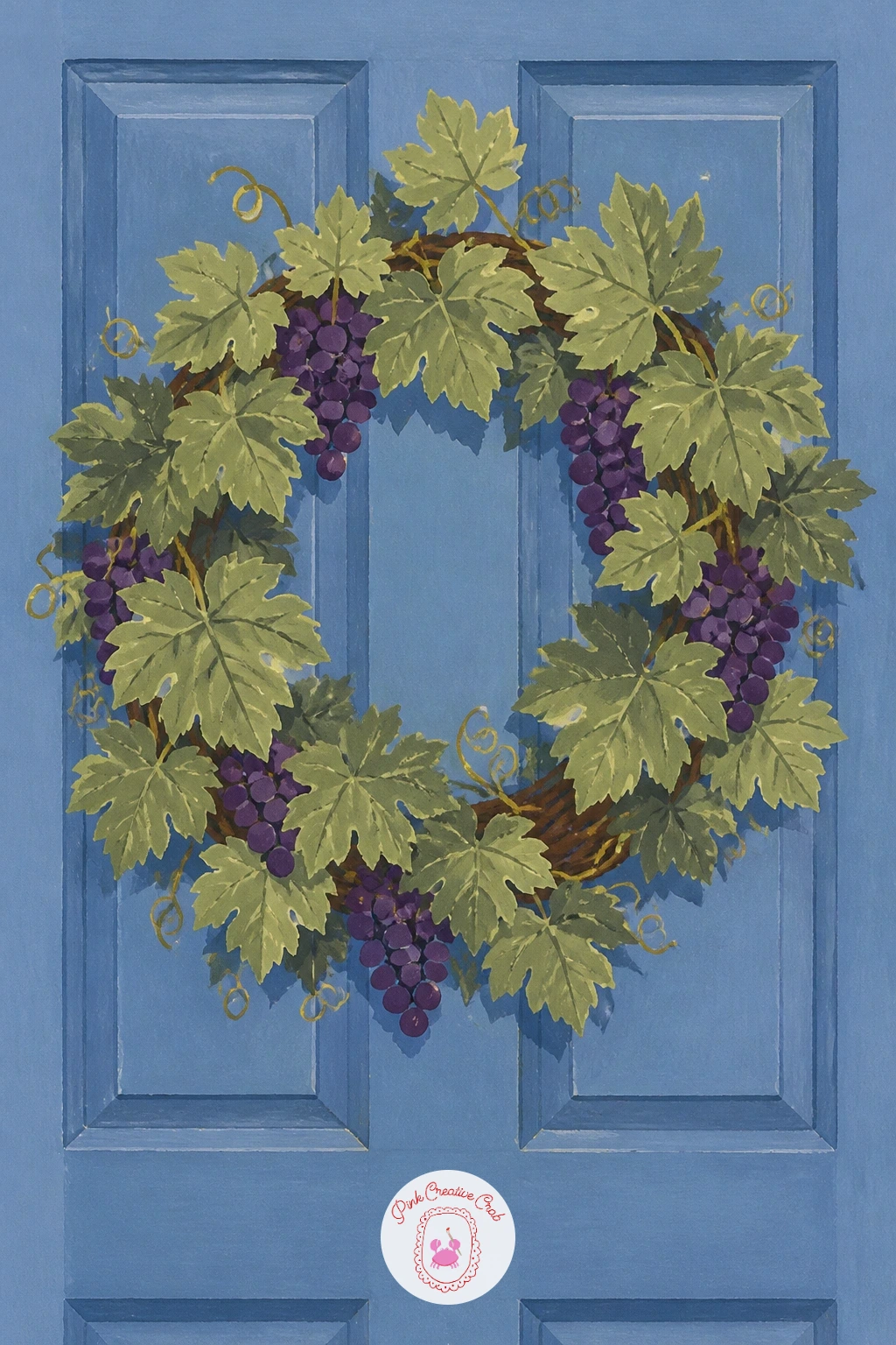
Palette: Sage Green,Deep Violet,Soft Blue,Gold Ochre
Bring the scene back inside with a small everyday moment: a child eating grapes at a kitchen table. Sketch the child first as simple rounded shapes, a round head, soft shoulders, one hand lifting a grape toward their mouth, keeping the pose relaxed rather than overly posed.
This kind of quiet action is easiest to capture by focusing on just one clear gesture: the lifted hand and tilted head say “eating grapes” far better than a fully detailed face would. If the figure feels stiff, loosen the angle of the head and shoulders slightly so the pose reads as a mid-motion moment rather than a stiff portrait.
Paint the table, a simple bowl of grapes, and the child’s clothing in flat, confident color blocks, saving your most saturated purple for the grapes themselves so they stay the visual anchor of the scene. Keep the background simple, a plain wall or window shape, so the focus stays on the small human moment.
A sibling or a pet nearby adds warmth without much extra painting.
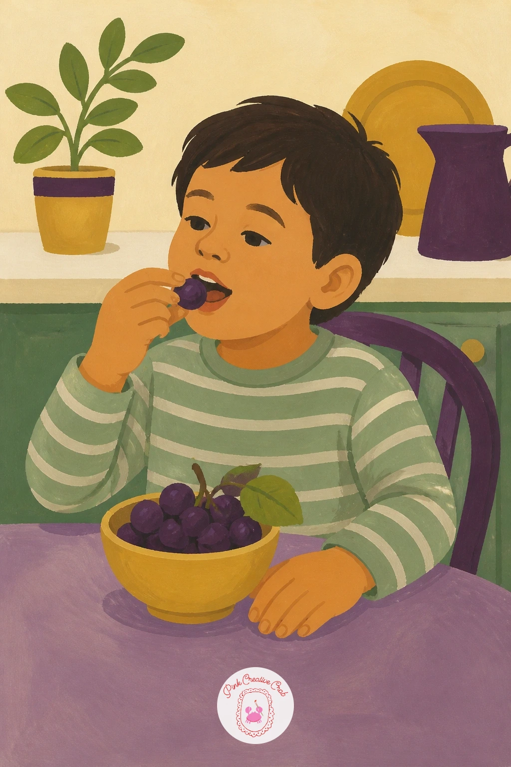
Palette: Deep Violet,Soft Peach,Gold Ochre,Soft Cream
Return to the vine with a small bird caught in the act of pecking at the grapes. Paint the grape bunch and leaves first using your established approach, then add the bird perched on the vine beside it, keeping its body as a few simple rounded shapes rather than detailed feather work.
Position the bird’s beak just touching or slightly overlapping one grape, since that small point of contact is what tells the story of the whole scene. A bird sitting nearby without touching the fruit reads as two separate subjects instead of one little moment.
Keep the bird’s color palette distinct from the grapes and leaves, perhaps a warm rust or soft grey, so it stands out clearly against the purple and sage green rather than blending into the vine. If the bird looks too stiff, angle its tail slightly upward and tilt the head toward the fruit.
A small songbird shape works for any region; there’s no need to paint a specific species to make the scene convincing.
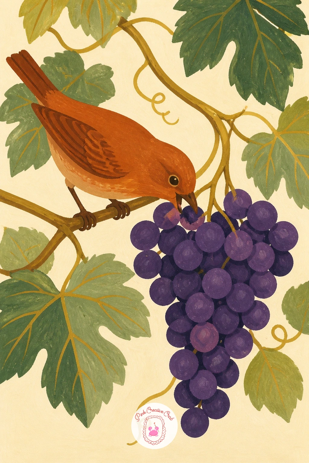
Palette: Rust Orange,Deep Violet,Sage Green,Soft Cream
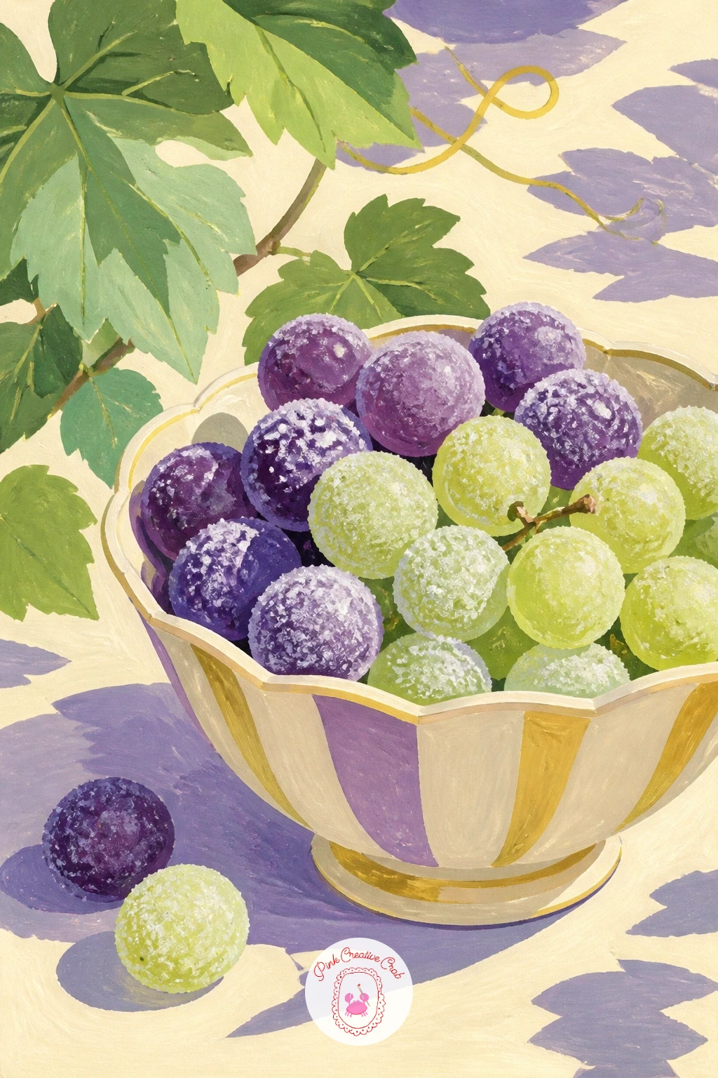
Cool things down with a bowl of frosted, frozen grapes set out on a summer table. Paint the grapes in your usual purple and green tones first, then come back once dry to add a thin, dry-brushed layer of pale white or icy blue over their surface to suggest the frost.
Dry brush is the key tool here: load very little paint onto a flat brush, wipe most of it off on scrap paper, then drag it lightly across the grape shapes so the texture breaks and catches only on the raised parts. A fully loaded brush will just cover the grapes solid instead of frosting them.
Set the bowl on a simple sunny table background, perhaps with a glass of lemonade nearby, so the warm setting contrasts with the cold, frosted fruit. If the frost effect looks too heavy, scrape a little paint back off with a dry brush or cloth while it’s still slightly wet.
No frost texture needed at all if you’d rather paint the grapes simply glossy and fresh instead.
You Will Need
- dry flat brush for the frost texture
Palette: Deep Violet,Fresh Green,Icy White,Soft Cream
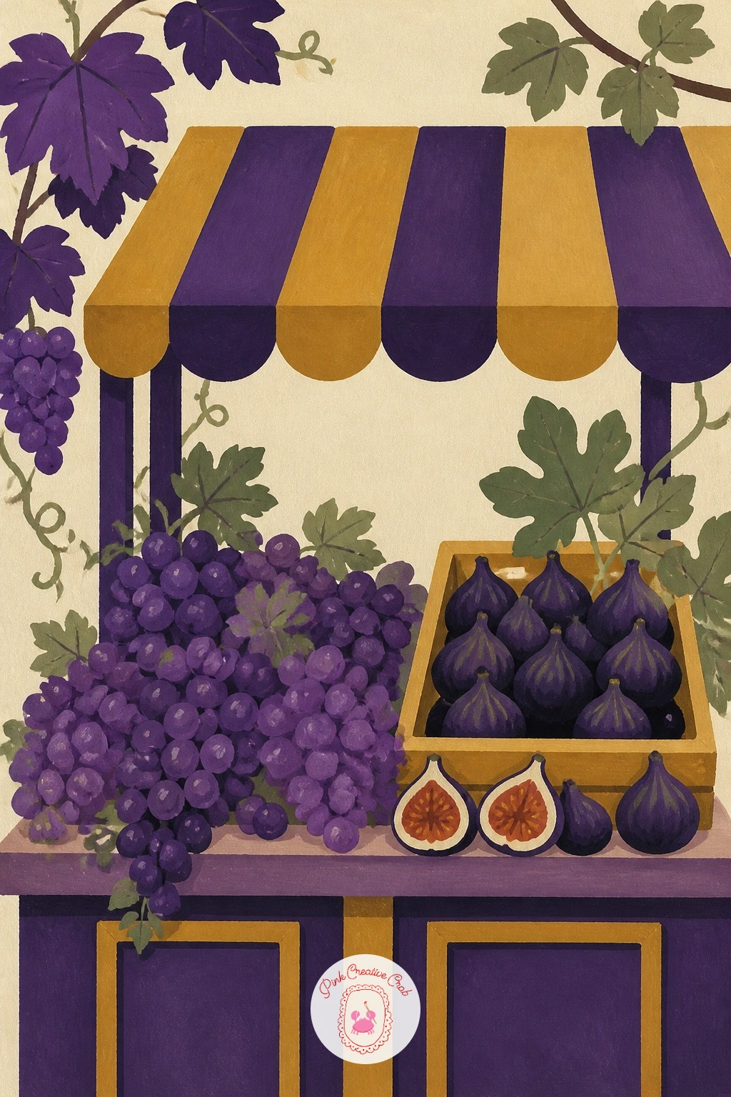
Widen the harvest theme into a small market stall scene with grapes and figs displayed together. Build the stall first as a simple flat wooden structure, a counter and perhaps a striped awning above, before filling it with produce, since the structure gives you a frame to arrange the fruit inside.
Group the grapes and figs in separate small piles rather than mixing them together, since two distinct clusters read more clearly at this scale than one jumbled pile. Paint the figs as simple teardrop shapes in deep purple-brown with one pale cut cross-section showing on a cut fig for variety.
Keep the awning and stall structure in flat, bold stripes or a single solid color, saving the detail for the produce itself. If the stall looks empty, add one small crate or a hand-written price sign tucked into a corner.
A single table of fruit without the full stall structure works too if you’d rather keep this one quick.
Palette: Deep Violet,Plum,Gold Ochre,Soft Cream
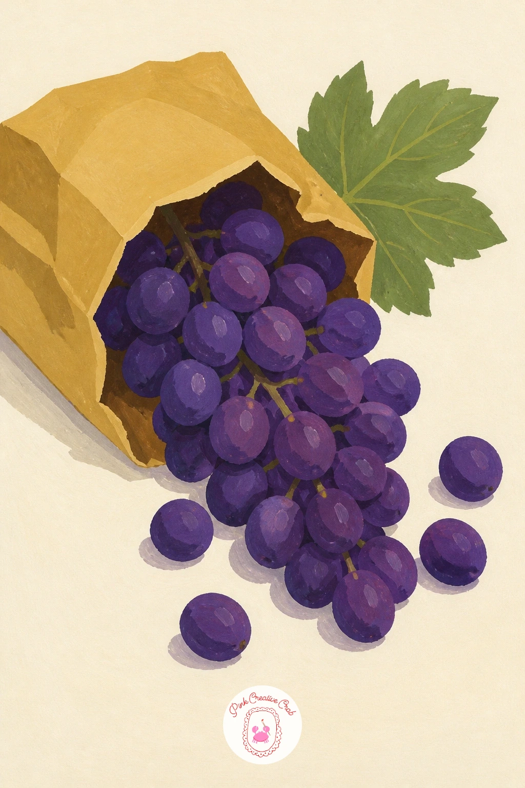
Capture a small moment of motion with grapes spilling out of a torn paper bag. Paint the bag first as a simple flat warm tan shape, torn or folded open at the top, before adding any fruit, so you have a clear container for the spill to pour out of.
Arrange the spilling grapes in a loose diagonal line flowing away from the bag’s opening, with the largest cluster still inside and smaller groups scattering outward, since that gradual spread is what reads as motion rather than a static pile. Keep a few single grapes rolling furthest from the bag for extra energy.
Paint the bag’s texture with a few creased fold lines in a darker tan, using a dry brush for a slightly rough, papery edge rather than a smooth one. If the spill looks too scattered, pull a couple of stray grapes back closer to the main group to keep the composition balanced.
A simple brown paper lunch bag from any kitchen drawer makes perfect reference for the folds.
Palette: Warm Tan,Deep Violet,Fresh Green,Soft Cream
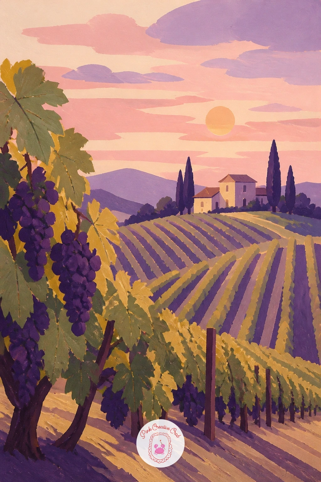
Return once more to the vineyard hillside, this time lit by a pastel sunset. Use the same row structure as your earlier daytime hillside, but shift the whole palette toward soft pink, lavender, and warm gold, with the rows themselves painted in a deeper muted violet rather than green.
Light direction changes everything in this version: with the sun low on the horizon, the rows nearest it should carry warm gold highlights along their tops, while the rows further away sit in cooler violet shadow. That shift from warm to cool across the hillside is what makes a sunset read convincingly rather than just looking like a pink-tinted daytime scene.
Keep the sky as two or three flat soft bands of color rather than a blended gradient, in keeping with the flat matte style, with perhaps one small sun shape low on the horizon. If the whole scene feels too soft and hazy, add one dark silhouette, a single tree or farmhouse, for contrast.
This pairs naturally with the earlier autumn version for a pair of seasonal vineyard scenes.
Palette: Soft Pink,Lavender,Gold Ochre,Deep Violet
Focus in tight on a single grape bunch paired with one curling vine tendril, a nice detail study after all the wider scenes. Paint the grapes using your usual layered purple approach first, then add the tendril last in a thin confident line, since tendrils are easiest to place once you know exactly where the bunch sits.
A curling tendril is really just a spiral, and the trick is drawing it in one continuous confident line rather than several short hesitant strokes. Practice the spiral a few times on scrap paper before committing it to the final piece, since a shaky tendril is far more noticeable than a shaky grape.
Keep the tendril thin and pale sage green against the deeper purple grapes so it reads clearly rather than getting lost. If your spiral comes out uneven, a few small leaf shapes nearby can distract the eye and balance the composition.
This simple pairing also makes a nice small study to practice brush control between larger scenes.
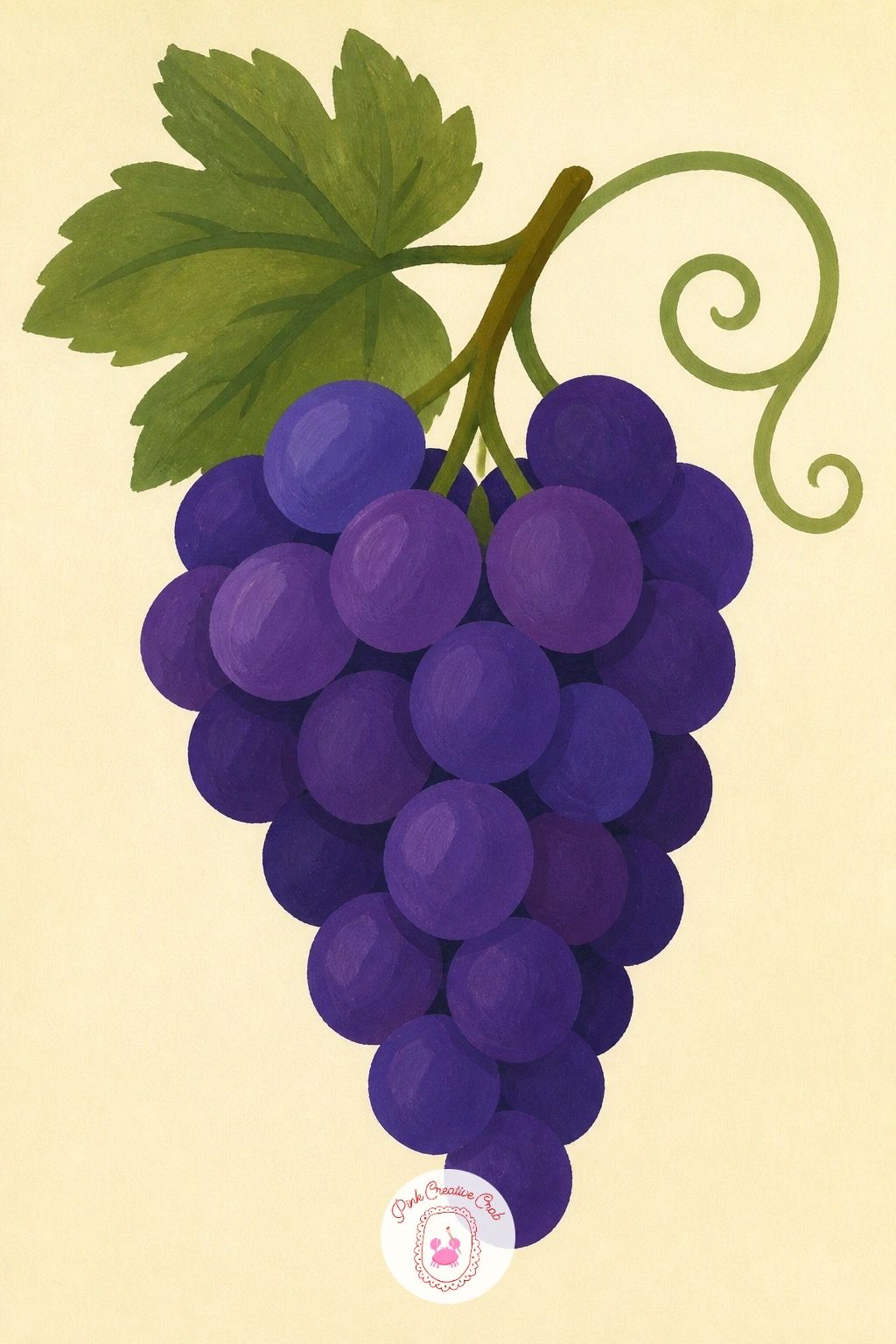
Palette: Deep Violet,Sage Green,Gold Ochre,Soft Cream
Build a fuller outdoor scene with a terrace lunch set among vineyards, plates, bread, and a bowl of grapes on a sunlit table. Start with the table itself as the main flat shape across the lower half of the page, then add the vineyard hills behind it as a simpler, less detailed background, since the table setting is the real subject here.
Arrange plates, a bread loaf, and the grape bowl so they overlap slightly rather than sitting in a neat row, echoing the same grouping approach from the earlier still life idea. Keep the background vineyard rows as simple flat color blocks with far less detail than the tabletop items, so depth reads clearly through that contrast in finish.
Paint warm terracotta and gold tones throughout to tie the whole scene together, saving your most saturated purple for the grape bowl so it anchors the composition. If the terrace feels empty, one simple chair or a stone wall edge adds just enough context.
A smaller version with just the table and grapes, leaving out the hills, works fine as a quicker alternative.
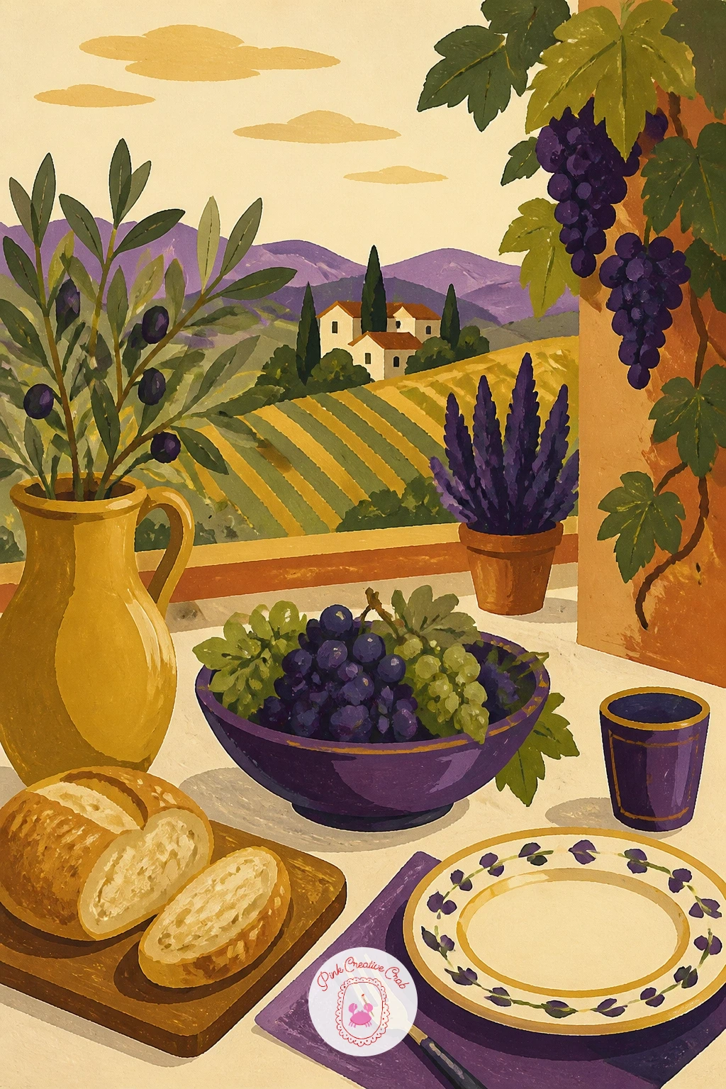
Palette: Terracotta,Gold Ochre,Deep Violet,Sage Green
Scale right back down for a playful, small-scale idea: a tiny imagined grape harvest inside a teacup. Paint the teacup first as a simple rounded shape with its handle, then treat the inside of the cup as a miniature vineyard scene, tiny rows of vines or a small pile of grape clusters filling the bowl of the cup.
This works well as a quick ten-minute piece: a cup, a few small grape shapes, and one leaf is enough. Given forty minutes, add a tiny ladder leaning against the inside rim, or a few dot-sized figures to suggest a whole little harvest taking place in miniature.
Keep every shape inside the cup small and simple, since trying to add fine detail at this scale usually backfires; a few confident dots of purple read as grapes far better than tiny over-detailed clusters. Paint the cup itself last so the miniature scene inside stays the clear focus.
A small saucer beside the cup, with a single stray grape rolled onto it, adds a nice finishing touch.
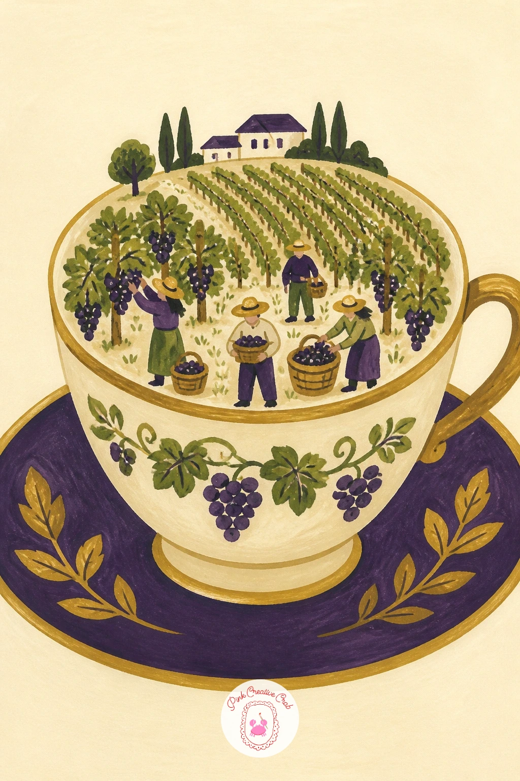
Palette: Deep Violet,Sage Green,Soft Cream,Gold Ochre
Look at the collage drawing ideas in this list for more ways to play with small, imaginative scale shifts like this one.
Close the series back where it began, with grapes on a vine, this time climbing up a garden wall rather than hanging free. Paint the wall first as a flat stone or brick surface filling most of the page, using two tones of warm grey or tan so it has some texture without much extra work.
Let the vine climb upward in a loose, winding line rather than a straight one, with leaves and grape clusters branching off at a few points along its length rather than evenly spaced. Real vines grow unevenly, with clusters bunching near the strongest branches, and that irregularity is what makes the climb feel natural.
Paint the grape clusters in your established purple tones, keeping them smaller near the top of the climb and larger lower down where the vine is older and thicker. If the wall looks too bare, add a few cracks or a small window shape tucked into one corner.
This makes a satisfying final piece if you’ve worked through the vineyard and harvest ideas before it, since it brings the whole vine-to-table idea full circle.
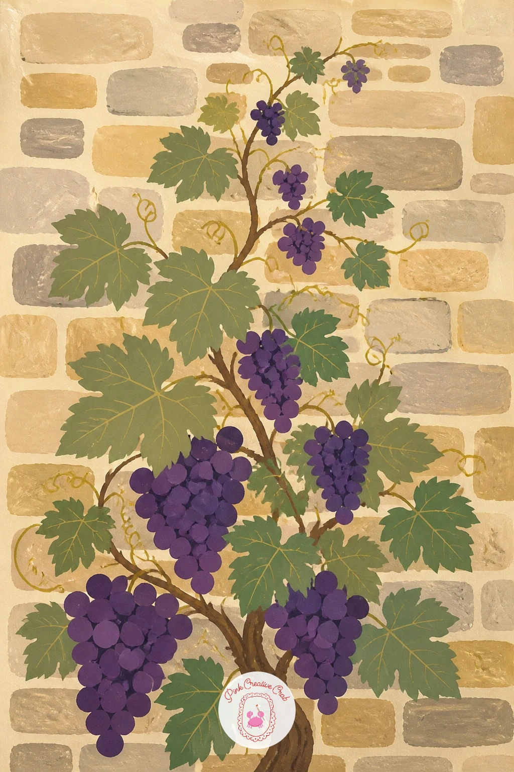
Palette: Warm Grey,Deep Violet,Sage Green,Soft Cream
What to Do Next
Pick one idea that matches the mood of your afternoon, whether that is a quiet tabletop still life or a wider vineyard hillside, and set up a sheet of heavyweight paper before you mix any paint. Block in the largest shapes first, let each layer dry, and keep your purples and greens flat and crisp rather than blended, the way the whole set is built.
Frequently Asked Questions
What is the easiest way to start a grapes drawing in gouache?
Start with a single hanging bunch on a vine, using overlapping circles inside a loose triangle guide. Block in the vine and one leaf first, let it dry, then add the grapes in two purples so the shapes stay crisp and separate.
How do you make painted grapes look round instead of flat?
Use two tones of the same color, a deeper shade for the shadowed side and a lighter one for the lit side, with a tiny cream highlight dot on just a few grapes. Keep the edges crisp rather than blending the tones together.
What colors work best for a grapes drawing with a vineyard theme?
Deep violet and sage green form the core palette, with gold ochre for sunlight and warm wood tones, against a soft cream background. Shifting these toward pink and lavender also works well for a sunset version.
Can you paint a realistic grapes drawing without blending gouache smoothly?
Yes, flat matte shapes with crisp edges read as convincing grapes once you add one shadow tone and one highlight per grape. The contrast between the two flat tones does the work that blending would otherwise do.
What is a good first project for someone new to painting grapes?
The single bunch hanging from a vine is the simplest starting point, since it needs only a vine, a leaf, and overlapping circles. Once that feels comfortable, add a bowl, a table, or a wider vineyard setting around it.
Have any thoughts?
Share your reaction or leave a quick response — we’d love to hear what you think!
-
 0
-
0
-
0
-
0
-
0
-
0


