

Grab your markers, because a cheese drawing is one of the most satisfying food subjects you can tackle in a single sitting. Cheese is all soft rounded wedges, warm yellows and little melty drips, which means it forgives a wobbly fineliner line far more than fruit or flowers ever do.
Below you will find 28 cheesy little scenes, from a simple cheese board to a French market stall in the Netherlands and a mouse sneaking out of a holey wheel. Work through them in order if you like, starting easy and building up to the busier party scenes, or just pick whichever one is making you hungry right now.
Using these images: free for personal projects such as printing, coloring, cards, journals and gifts. Handmade items that include them may be sold up to 30 pieces per design. More than that is commercial use and is not permitted, and neither is selling or sharing the images themselves or passing them off as your own. Please ask before any other use.
Start your cheese drawing journey with the classic board, because it teaches every shape you will need later: a wedge, a round, a cluster of grapes and a drizzle of honey. Sketch a rough oval plate shape lightly in pencil first, then ink it with your fineliner, keeping the plate edge loose rather than a perfect circle.
Build the cheese pieces next: one wedge with a flat cut face, one small round with a rind line, a few crackers overlapping like fallen dominoes. Grapes go in last as a tight cluster of overlapping circles, never spaced evenly, since real bunches clump unevenly.
If this is your first time blending alcohol markers, lay the palest yellow down first and work a warmer tone into the shadow side while it is still workable, so the colours melt together instead of leaving a hard line. No honey-coloured marker on hand? A warm ochre over pale yellow gets you there.
One concrete tip: draw the honey drizzle last in white gel pen over a slightly darker marker patch, so it reads as glossy rather than flat.
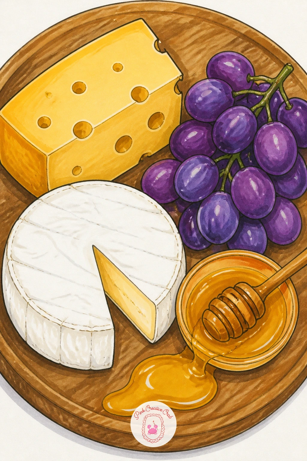
Palette: Banana Yellow,Cream,Grape Purple,Honey Gold
Move from a board to a single wheel, since getting the proportions right here will save every future cheese drawing you attempt. Measure the wheel’s height against its width before you ink anything: most cheese wheels sit roughly one third as tall as they are wide, so a wide, low ellipse reads correctly while a tall one looks like a hat.
Draw the full ellipse lightly in pencil, then mark the cut wedge as a triangular slice removed from the front edge, showing the pale interior face and the darker rind band around the outside. Ink the rind first since it anchors the whole shape, then the cut face.
Colour the rind in a deeper gold or brownish tone and leave the interior pale cream with a few small holes dotted unevenly, never in a neat grid. If your marker set is limited, mix the rind colour by layering orange over yellow rather than buying a new pen.
Tip for today: shade the inside of the wedge cut slightly darker near the back to suggest depth into the wheel.
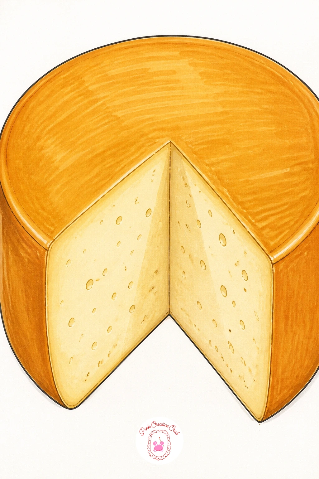
Palette: Straw Yellow,Rind Brown,Pale Cream
Bring in some steam and motion with a fondue pot drawing, a lovely busy subject once the board and wheel have warmed you up. Light matters here: decide early whether the pot glows from a candle flame underneath or sits under warm kitchen light, since that decides where your darkest shadows fall on the pot’s belly.
Ink the pot shape first as a rounded vessel on short legs, then add the melted cheese surface as a wavy line rather than flat, with two long forks angled into it holding cubes of bread. Keep the forks thin and confident in one single fineliner stroke each.
The melted cheese itself goes wrong when it looks solid rather than liquid, so drag your marker in short upward strokes to suggest the surface catching light, and dot a few bubbles near the pot’s edge. No orange marker handy? Warm yellow layered twice gets a convincing melted look.
Finish with a small flame or candle glow drawn in white gel pen under the pot for one final warm tip.
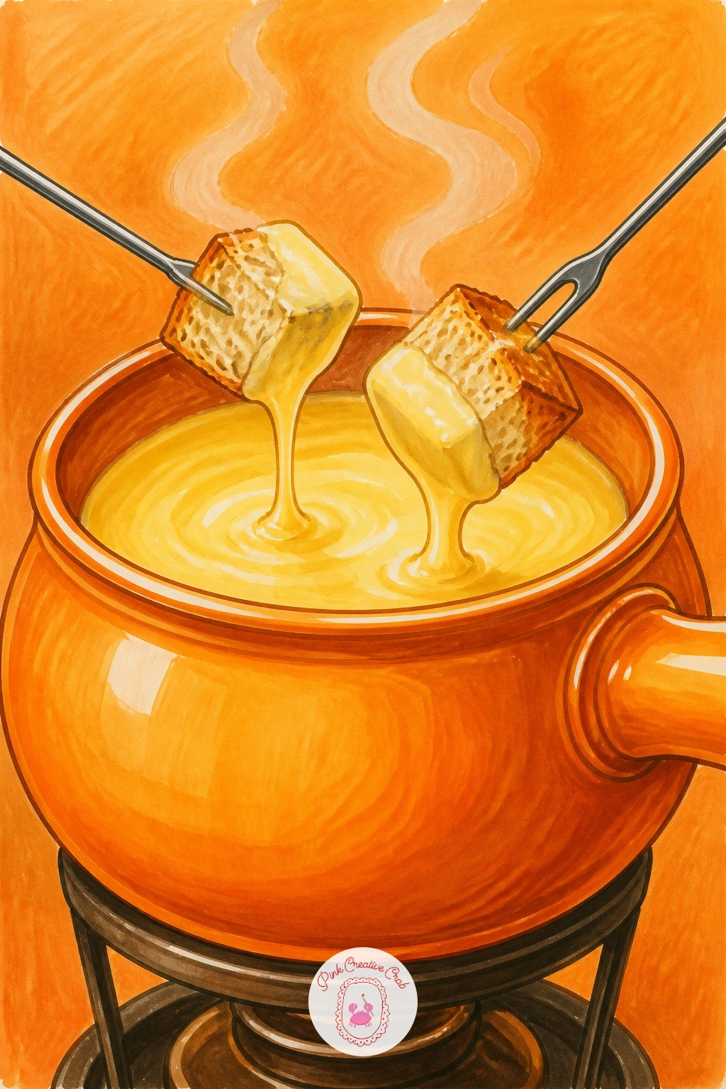
Palette: Melted Orange,Cheese Yellow,Charcoal,Bread Crust
Try a tiny dab of warm pink or coral beneath the pot to suggest candlelight glow without drawing an actual flame shape.
Give your cheese drawing a sense of place with a tiny fromagerie window, somewhere a shopper might pause on a cobbled street. Start with the window frame itself as a simple rectangle with a shelf inside, since the architecture does the heavy lifting here and does not need to be elaborate.
Fill the shelf with a small crowd of cheese shapes of different heights, wheels, wedges and a log shape, rather than drawing each one identically sized. A painted shop sign or a few letters above the window add character, and if lettering feels daunting, a simple striped awning does the same job.
The trap with shop window scenes is making everything too flat, so use your darkest marker along the lower shelf edge and lightest tones on the cheeses nearest the glass to suggest the window catching light. If you enjoy drawing storefronts, the flower shop drawing ideas use the same window trick with blooms instead of cheese.
Today’s tip: add one small price tag or ribbon on a single cheese to give the eye somewhere to land first.
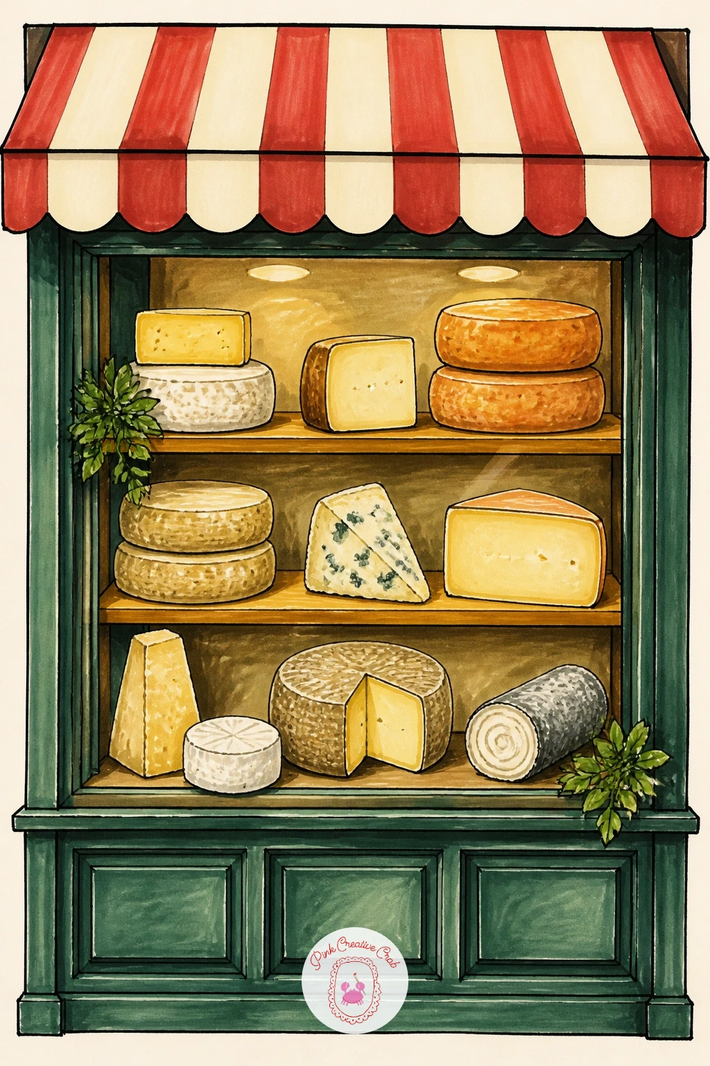
Palette: Awning Red,Shop Cream,Cheese Gold,Window Blue
After a quiet shopfront, draw something with real action: a grilled cheese sandwich mid-pull, the kind of image that stops a scroll. The pull is the whole point, so plan it before you ink anything else, sketching two bread halves pulled apart with a long stretchy strand of melted cheese connecting them.
Ink the bottom bread slice first, then the top half held slightly above it, and finally the cheese pull as a single wavering ribbon rather than a straight line, since real melted cheese sags and thins unevenly. Toasted bread gets its crisp look from small irregular dots and short dash marks along the crust.
This goes wrong when the pull looks too stiff, so once inked, go back with your lightest yellow marker and leave tiny unmarked gaps along its length for shine. In a hurry, a ten minute version skips the crumbs and steam lines entirely and just nails the pull and the toasted crust.
Given forty minutes, add scattered crumbs on the plate and a faint steam curl rising from the toast for a cosier finished feel.
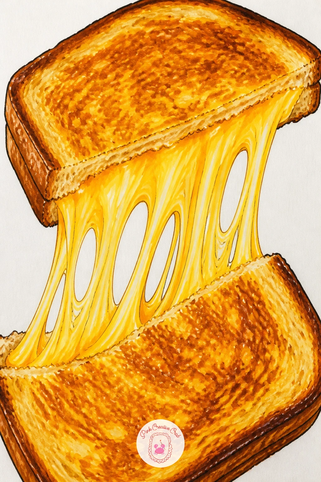
Palette: Toast Gold,Melted Cheese,Crust Brown,Plate White
Add a character to your cheese drawing with a small mouse poking out of a block of Swiss-style cheese, a scene that practically draws itself once you nail the proportions. Compare sizes before inking: the mouse’s head should fit easily through one hole, roughly a third the width of the cheese block, so sketch the hole first and size the mouse to match it rather than the other way round.
Ink the cheese block as a simple rounded rectangle, scatter a few irregular holes across its face, then add the mouse peeking through the largest one with just its head, paws and whiskers visible. Keep the mouse’s features minimal: two round ears, dot eyes, a few whisker lines.
The mistake here is making every hole the same size, which flattens the whole drawing, so vary them generously. If grey marker is not in your set, a warm brown works just as well for the mouse’s fur.
For more tiny mouse characters to pair with this one, the mouse drawing ideas have plenty of cosy poses to borrow from.
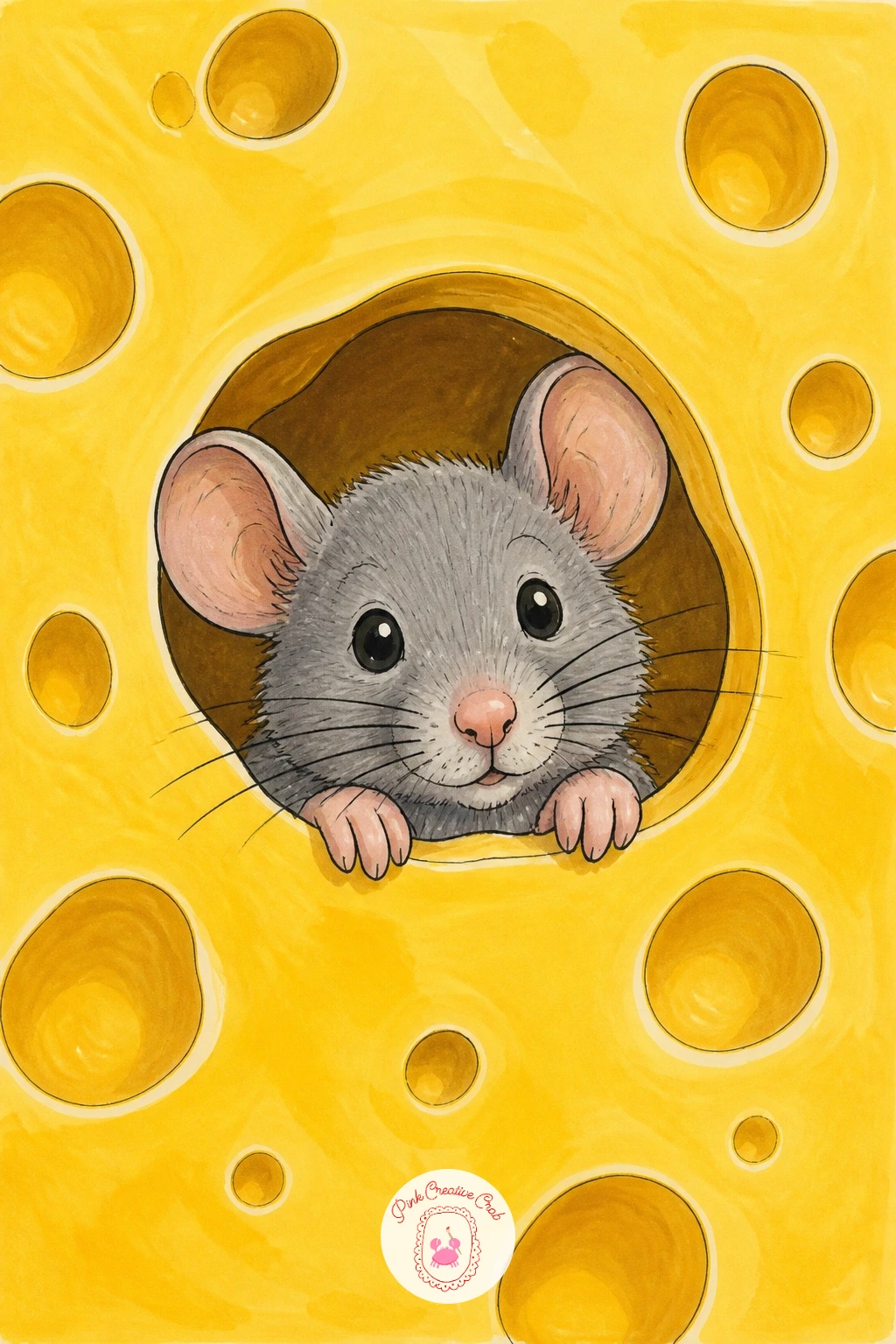
Palette: Cheese Yellow,Mouse Grey,Pink Nose,Cream
Take the cheese outdoors with a picnic basket scene, a lovely subject once you are comfortable grouping several props together. Think about eye level before sketching: looking slightly down into the open basket, as if standing over it, makes the arrangement read clearly rather than flattening everything into one row.
Ink the woven basket first using short overlapping curved strokes to suggest wicker texture, then nestle in a wedge of cheese, a baguette poking out at an angle, and a cluster of grapes spilling slightly over the rim. Let the baguette break the basket’s outline for a relaxed, lived-in feel.
Basket weave is where most people overwork things, so keep your strokes loose and let the marker colour do most of the work rather than inking every single line of the weave. A woven placemat pattern makes a fine substitute if a basket feels fiddly.
One tip: tuck a small blue gingham cloth corner under the basket for an instant outdoor feel with very little extra drawing.
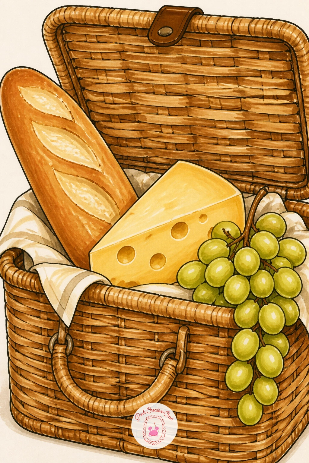
Palette: Basket Tan,Baguette Gold,Grape Purple,Cheese Cream
Switch gears to a cosy bowl of mac and cheese, a comforting subject that rewards a loose, playful hand rather than careful precision. Start with the bowl as a simple curved shape seen slightly from above, then fill the inside with small overlapping macaroni tubes rather than trying to draw each one perfectly round.
Ink the pasta shapes first in loose clusters, varying their angles so they look tumbled rather than lined up, then layer melted cheese sauce over and between them with a slightly darker yellow marker pooling in the gaps. A scattering of black pepper dots or a sprig of parsley on top finishes it.
The common slip is making the pasta too uniform in size, so mix a few larger and smaller tubes in. No orange marker for the cheese sauce? Blend red lightly into yellow for a convincing cheddar tone.
Quick ten minute version: just the bowl, pasta outlines and one flat cheese colour. With forty minutes, add the sauce pooling, pepper flecks and a steam curl for a much cosier result.
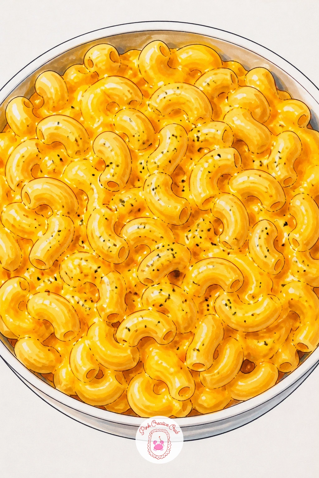
Palette: Cheddar Orange,Pasta Gold,Bowl Blue,Pepper Black
Give your cheese drawing a holiday feel with a plate set on a sunny terrace table, a small glass of wine alongside it. Decide where the light comes from before you ink: strong afternoon sun from one side throws a clean long shadow from the glass and plate, which does more to sell the terrace mood than any background detail.
Ink the plate and a simple wedge or two of cheese first, then the wine glass with just a few confident lines, leaving the glass mostly white paper with one curved marker stroke for the glass edge. A folded napkin or a sprig of herb beside the plate rounds out the scene.
Wine glasses often go wrong when overworked with too many lines, so trust the white of the paper to do the shine for you. If red wine marker is not available, a deep pink layered twice reads just as well.
Today’s tip: tilt the table surface slightly rather than drawing it dead flat, which instantly suggests you are looking at it from a seated angle.
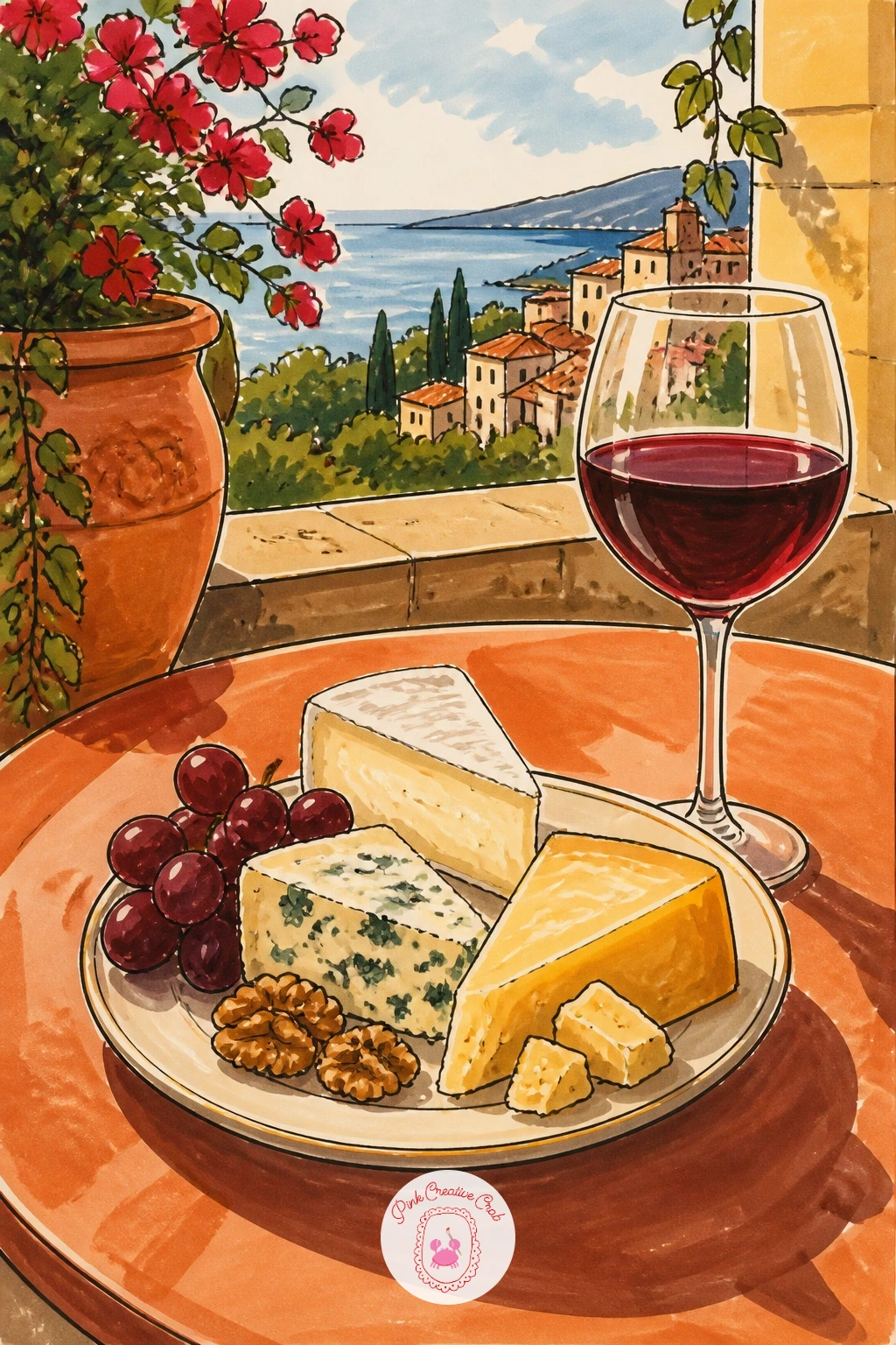
Palette: Terracotta,Wine Red,Cheese Gold,Table Cream
Zoom right in on a single wedge of brie paired with sliced figs, a quiet still life that is forgiving and quick to finish. Measure the wedge against the figs before inking: figs are small, usually no taller than the brie wedge’s height, so sketch them close in scale rather than oversized.
Ink the brie wedge first with its soft bloomy rind drawn as a slightly uneven, bumpy outline rather than a crisp edge, since brie rind is never perfectly smooth. Slice one fig in half to show the deep red interior with tiny dot seeds, and place it leaning against the cheese.
The rind is where this goes wrong if drawn too dark or too flat, so use a pale grey-white marker in soft patches rather than one solid colour. No grey marker to hand? A very light warm brown does the job just as well.
One tip for today: leave small white paper gaps unmarked on the fig’s cut face to suggest its natural shine.
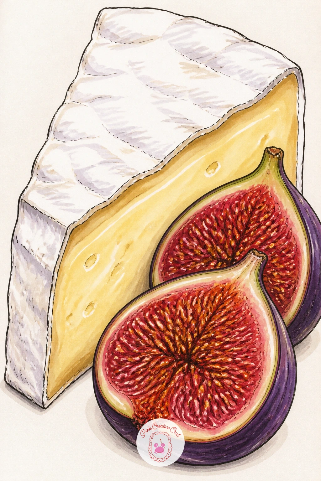
Palette: Brie Cream,Rind Grey,Fig Red,Fig Skin Purple
Step into a little story now with a cheesemaker stacking wheels in a dim cellar, a scene that uses light to do most of its storytelling. Choose one light source, most naturally a lantern or a single overhead bulb, and let everything closer to it stay pale while the cellar corners sink into your darkest marker tones.
Ink the stacked wheels along a shelf first, overlapping them so some sit further back and smaller, then add the figure in simple shapes: a rounded body, an apron, arms reaching to place another wheel on the stack. Keep the face minimal or even turned away, since the pose tells the story without needing an expression.
This scene goes muddy fast if every wheel gets equal attention, so pick one or two in the light to render fully and let the rest stay as simple silhouetted shapes. No deep brown marker for the cellar shadow? Layer blue and black together for a cool stone-wall feel.
Tip: a single warm yellow glow around the light source, blended outward, sells the whole mood instantly.
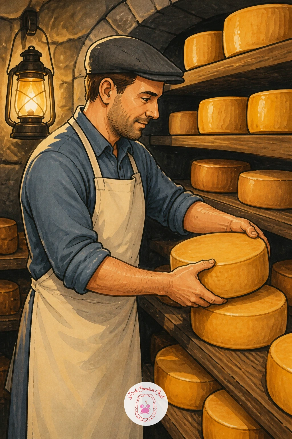
Palette: Cellar Grey,Lantern Gold,Cheese Rind,Apron Blue
Keep things cosy with a cheese toastie cut diagonally on a simple cafe plate, a subject close to the grilled cheese idea but calmer and easier to finish quickly. Sketch the two triangle halves slightly apart, one leaning against the other, since a toastie laid perfectly flat looks stiff on paper.
Ink the crisp golden crust first with short confident dashes along the edge, then the melted cheese visible at the cut, oozing just slightly beyond the bread line. A simple plate, maybe with a thin coloured rim, and a small side salad leaf or two completes it without much extra work.
Where this goes flat is an evenly coloured crust, so vary your browns, deeper near the corners and pale across the centre of each triangle. Swap a green salad leaf for a few tomato slices if greens feel fiddly to draw.
Today’s tip: let the cheese ooze slightly onto the plate itself, a small puddle that makes the whole sandwich look fresh off the grill.
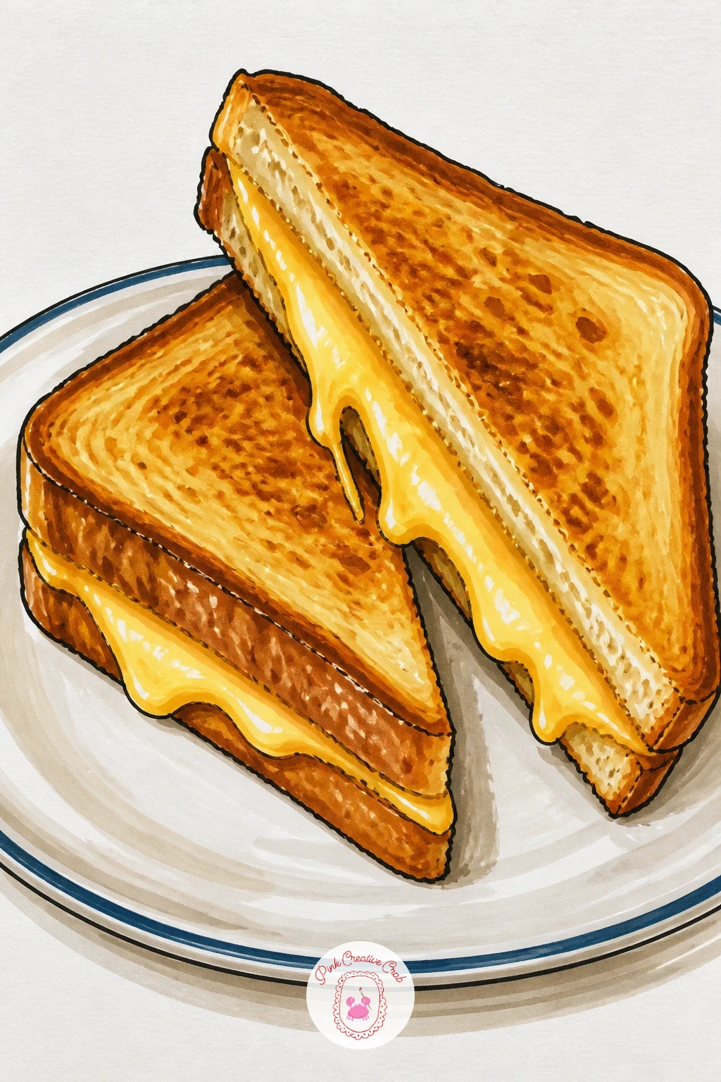
Palette: Toast Brown,Cheese Ooze,Plate White,Leaf Green
Build on everything learned from the board drawing with a fuller party platter, busier and more generous. Plan the layout in pencil first as loose zones rather than individual items: a cluster of cheese wedges in one corner, crackers fanned in another, a scatter of nuts and dried fruit filling the gaps, since planning zones keeps a crowded platter readable.
Ink the largest cheese pieces first since they anchor the eye, then work outward to crackers, grapes, berries and nuts, letting shapes overlap naturally rather than sitting in neat rows. A sprig of rosemary tucked between pieces adds a nice green accent against all that yellow.
Busy platters fall apart when every item gets equal colour weight, so pick two or three pieces to render in full detail and simplify the rest with flatter colour. If you are drawing this for a particular celebration, the heart-shaped board idea further down uses the same crowded-platter approach in a tighter frame.
Tip: leave small gaps of bare plate visible between clusters so the eye has somewhere to rest.
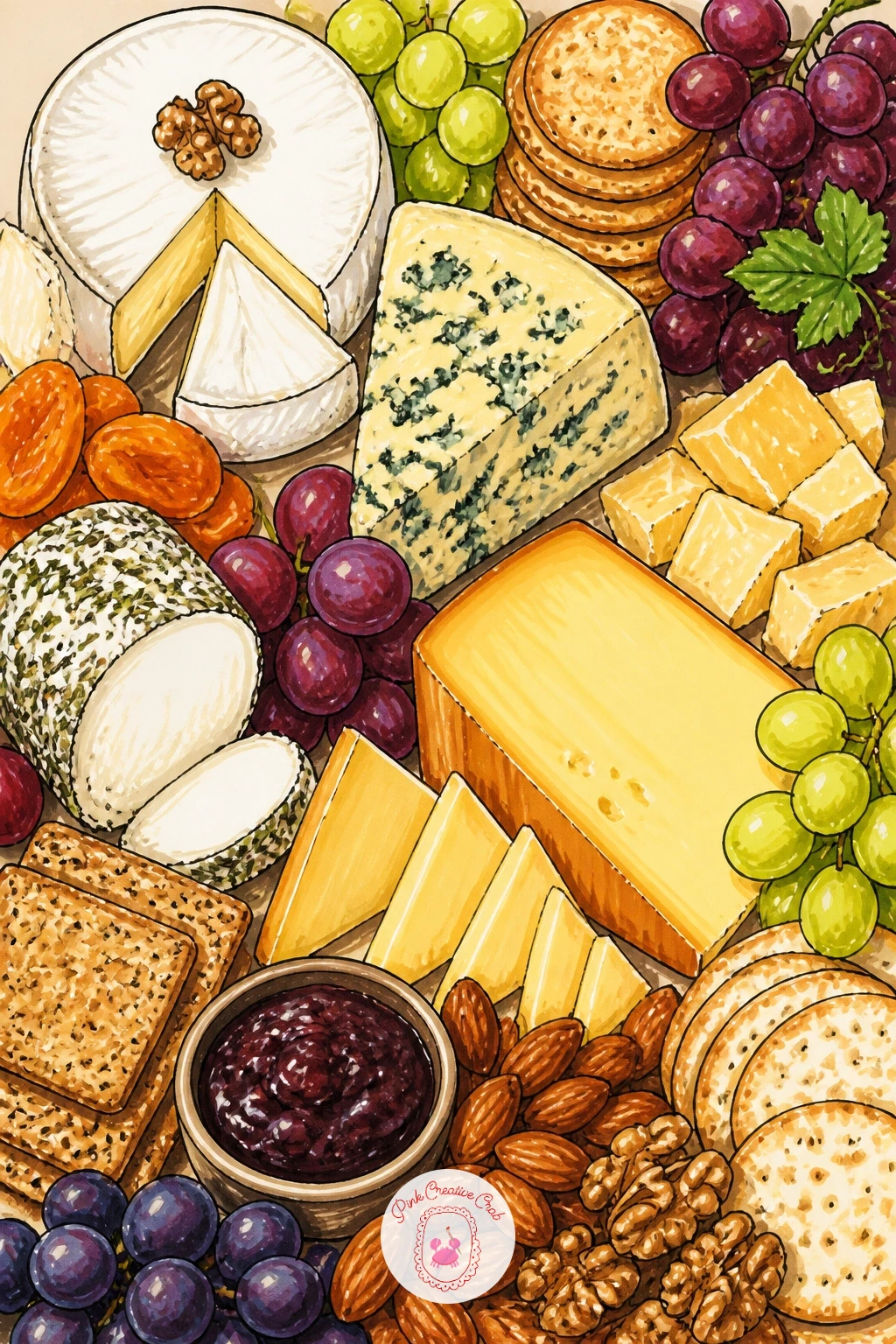
Palette: Cheese Gold,Cracker Tan,Grape Purple,Rosemary Green
Bring some char and heat into the mix with a halloumi skewer straight off the grill. Eye level matters here: looking slightly from the side at the grill grate lets you show the char marks clearly along the bottom edge of each cheese cube, which is the whole appeal of this subject.
Ink the skewer stick first as one straight diagonal line, then thread on alternating cubes of halloumi and chunks of pepper or tomato, keeping the cheese cubes pale and the vegetables in warmer reds and greens for contrast. Grill marks go on last as short dark parallel lines across each cheese face.
Overdoing the char is the easy mistake, since too many dark marks turns halloumi into charcoal, so place three or four confident lines per cube rather than covering the whole surface. No skewer stick on hand to reference? A simple straight pencil works as a stand-in shape.
One tip for today: leave the top edge of each cheese cube pale and glossy looking to contrast against the charred base.
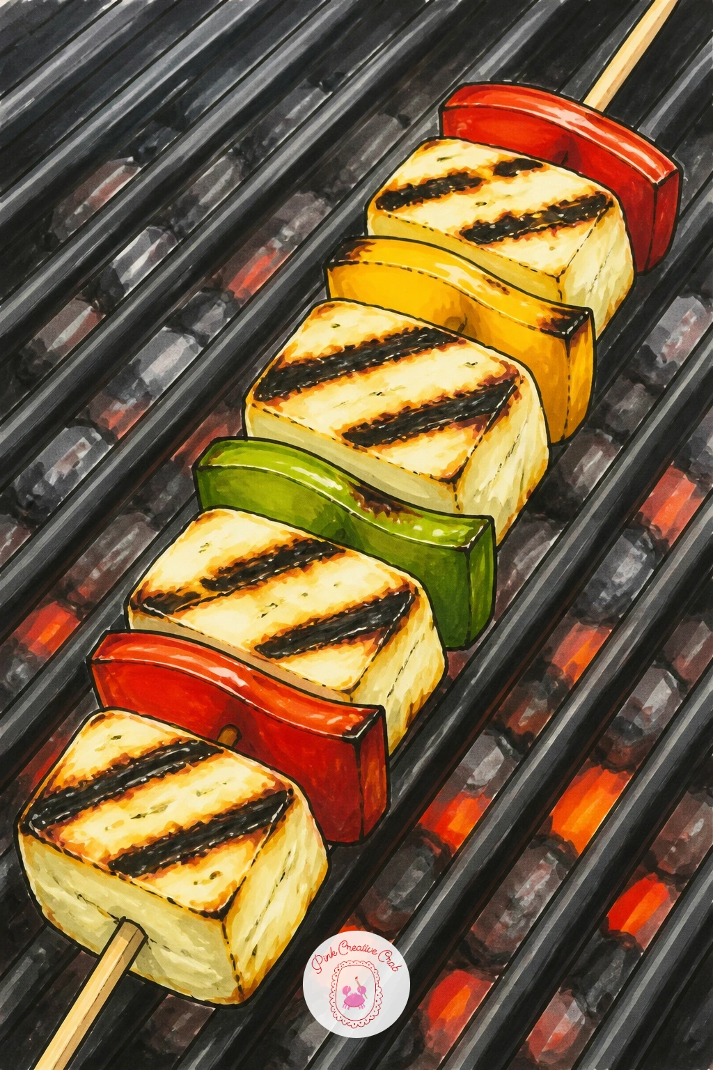
Palette: Halloumi White,Char Brown,Pepper Red,Grill Grey
Move into baking with a cheese and tomato tart, sliced to show its layers. Measure the slice against the whole tart shape before inking: a single slice is roughly a sixth of the full round, so sketch the full tart lightly first even if only drawing one slice, to keep the curve of the crust accurate.
Ink the pastry edge first with a slightly uneven, hand-crimped line, then the cheese layer beneath, and finally overlapping tomato slices arranged across the top like roof tiles. A few basil leaves tucked between tomato slices add a welcome green note.
Pastry edges look stiff when drawn too straight, so add small irregular bumps and dips along the crimped border. If fresh basil feels fiddly in marker, a simple green dash shape does the job just as well.
Tip: shade the underside of each tomato slice slightly darker where it overlaps the next one, which keeps the layered look convincing without much extra effort.
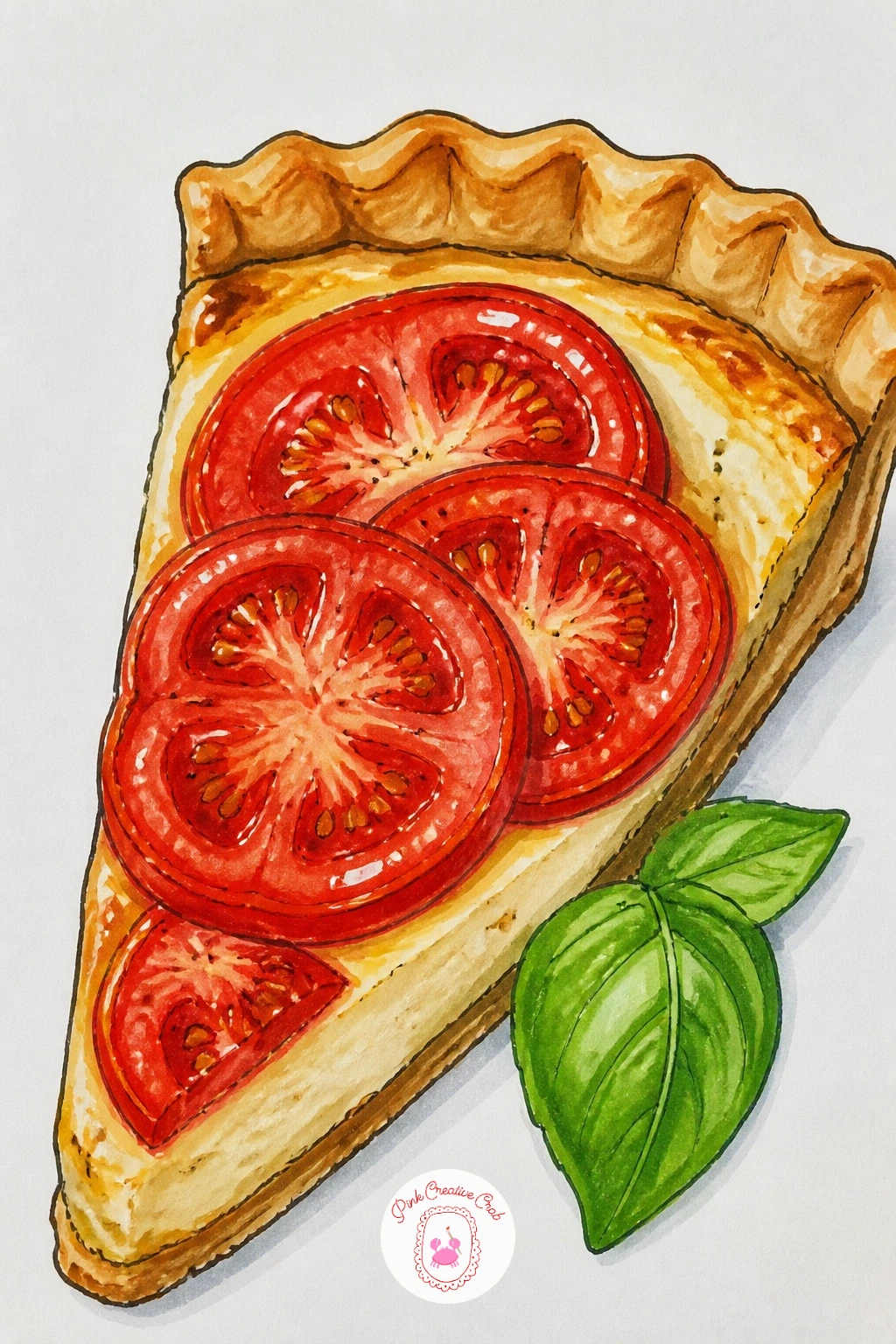
Palette: Pastry Gold,Tomato Red,Cheese Cream,Basil Green
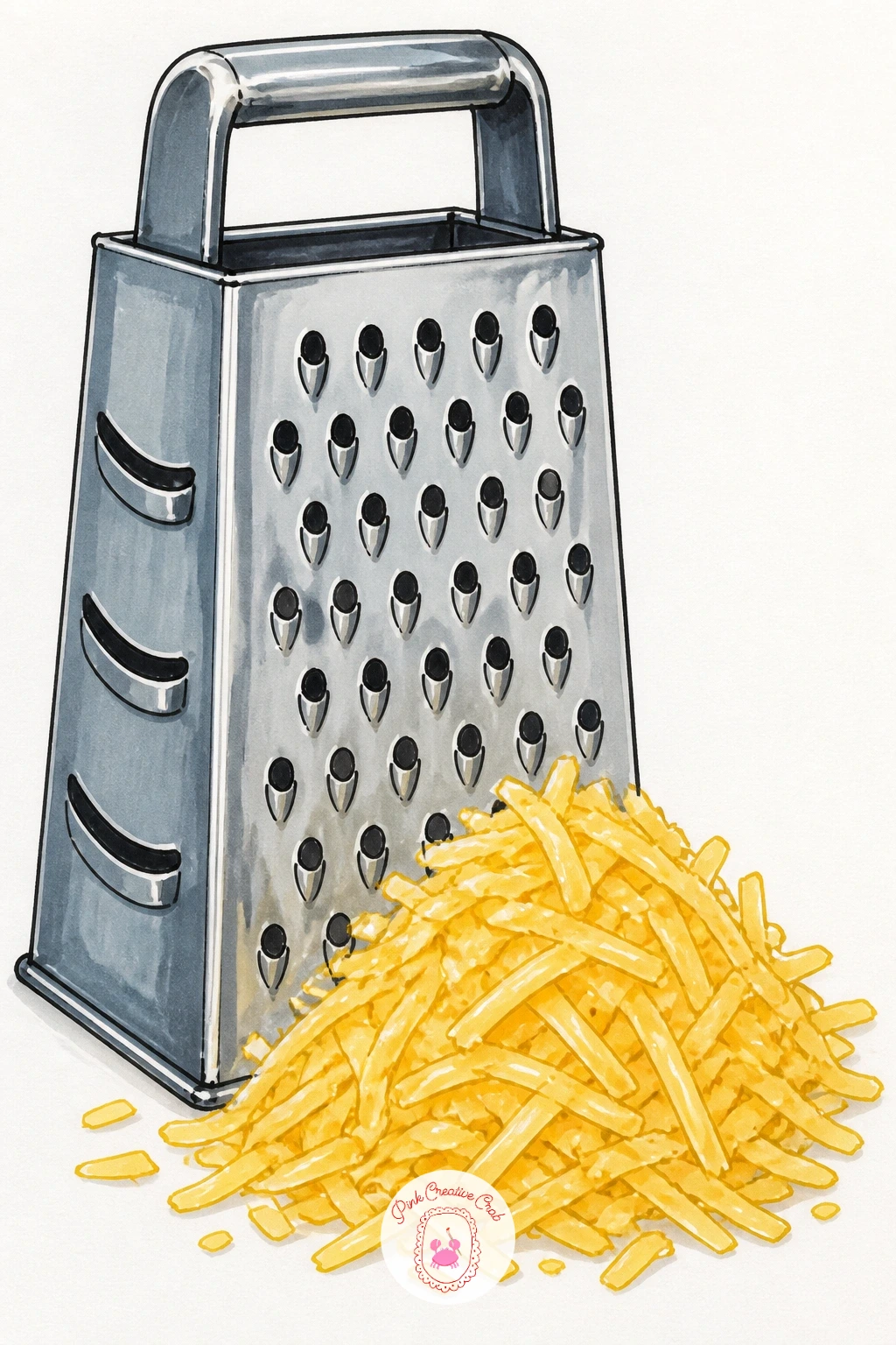
Try a kitchen tool subject next: a grater standing upright with a small pile of grated cheese shavings beside it. Texture is the whole point here, so once the grater’s basic box shape is inked with its diamond-punched holes, switch to a dry marker technique for the cheese pile, dragging a near-empty marker lightly over the paper to leave a broken, fibrous texture rather than a smooth fill.
Ink the grater first as a simple tall box shape with a handle, adding the raised diamond holes as small repeated marks rather than a perfectly even grid. The grated cheese pile goes in last, built from short overlapping dashes rather than one solid shape.
Most people flatten this pile with even colour, which loses the whole texture, so vary your pressure and leave some strands paler than others. If dry brushing with marker feels tricky, scribbling loosely with a sharp coloured pencil over the marker base adds similar texture.
One tip: a few shavings scattered loose on the table beside the main pile make the whole scene feel more freshly grated.
You Will Need
- near-empty marker for dry texture or a sharp colored pencil
Palette: Grater Silver,Cheese Gold,Shadow Grey,Table Tan
Widen the scene again with a Dutch cheese market stall, round wheels stacked high under an awning. Perspective carries this one: set your eye level low, looking slightly up at the stacked wheels, which makes the pile feel tall and impressive rather than a flat row of circles.
Ink the stacked wheels first, overlapping circles of varying sizes receding slightly into the background, then the stall structure around them, a simple wooden frame or cart with a striped awning overhead. A scale, a few baskets, or a vendor figure in traditional dress adds story without much extra effort.
Stacks of circles flatten out fast if every wheel is the same yellow, so vary rind colours between warm orange-red waxed cheeses and plainer pale ones. No red wax marker available? Layer pink over orange for a convincing waxed rind.
Tip: add a simple shadow line beneath the lowest row of wheels to ground the whole stack convincingly on the stall surface.
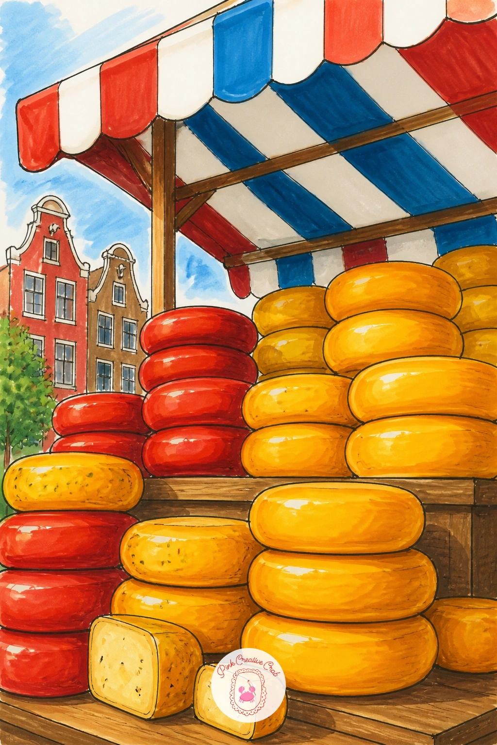
Palette: Wax Red,Cheese Gold,Awning Stripe Blue,Stall Wood
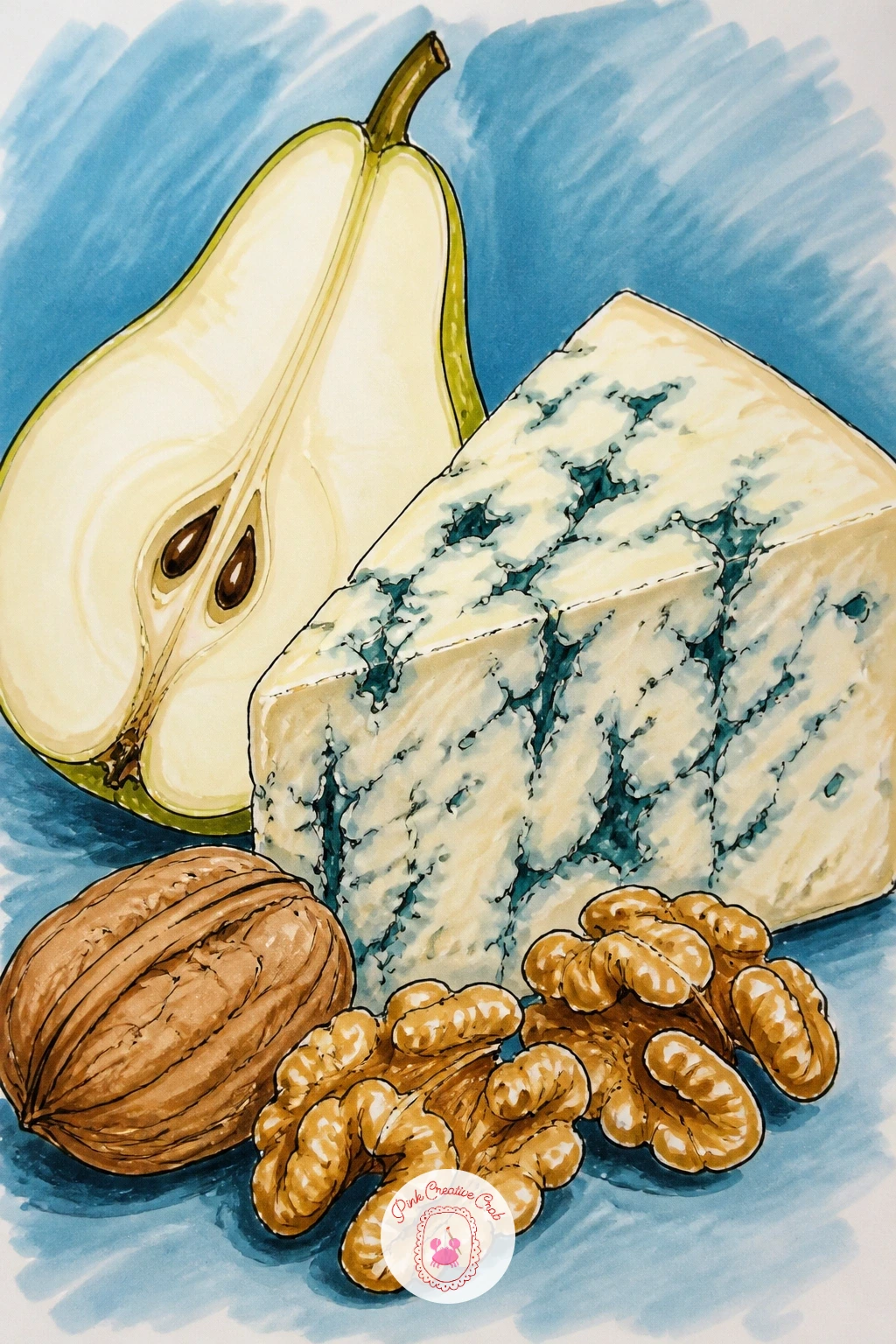
Return to a quiet still life with a wedge of blue cheese paired with walnuts and a sliced pear, a nice contrast after the busy market stall. Blue cheese’s veining is a hands-on texture job: once the pale cheese body is blocked in, use the very tip of a fine blue or grey marker to draw thin, branching irregular lines through it rather than dots or patches.
Ink the wedge shape first, then the walnut halves nearby with their wrinkled, folded interior drawn as a few curved overlapping lines, and the pear sliced to show its pale core and small seeds. Keep the pear skin colour soft, a blush of warm yellow-green.
Overcrowding the veining is the common mistake, so leave plenty of pale cheese visible between the blue lines rather than filling the whole wedge. If a fine enough marker tip is not available, a sharp blue coloured pencil draws thinner, more convincing veins.
Today’s tip: let one or two veins run right off the edge of the wedge, which makes the pattern feel continuous rather than contained.
You Will Need
- a fine-tipped blue or grey marker or pencil for veining
Palette: Blue Vein,Cheese Pale,Walnut Brown,Pear Green
Scale the fondue idea up into a full little scene with a few friends gathered around the pot, forks reaching in together. Keep the figures simple: rounded heads, basic body shapes, hands holding forks angled toward the centre, since a cheese fondue party works better as a cheerful sketch than as detailed portraits.
Ink the pot and melted cheese first as the anchor of the composition, then add two or three simple figures around it, varying their poses so one leans in, one laughs, one reaches further than the rest. Warm string lights or a simple glow in the background suggest an evening gathering without much extra work.
Too many figures crowds this fast, so two or three is plenty at this level. If faces feel daunting, turn one or two figures slightly away or keep features to simple dot eyes and a curved smile line.
Tip: unify the scene by using the same warm orange glow on every figure’s near side, as if lit by the fondue pot itself.
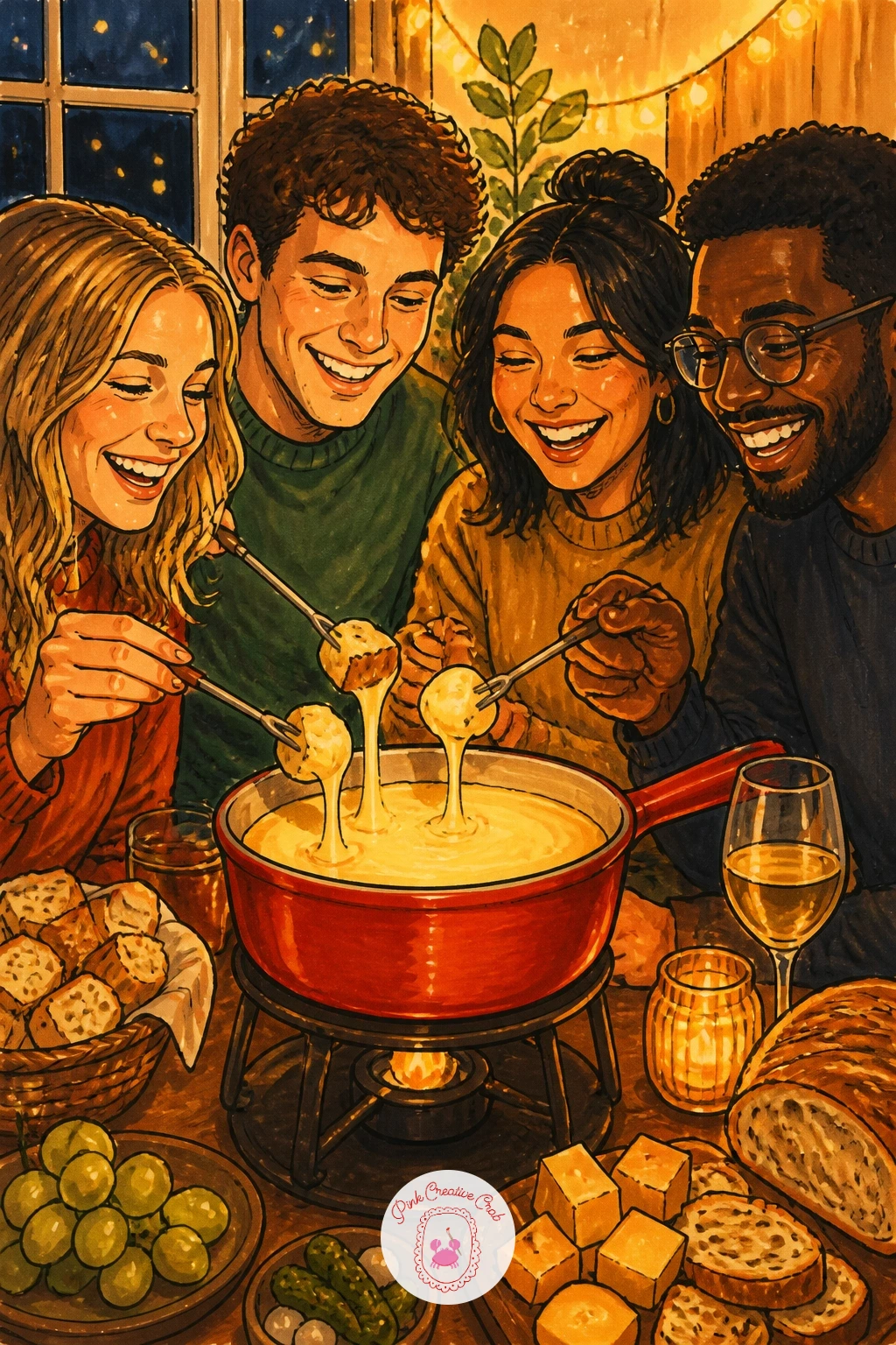
Palette: Melted Orange,Skin Warm Tan,Sweater Blue,Glow Yellow
Catch a moment of drama with a cheese souffle caught mid-rise above its ramekin, the top just cracking open. Compare proportions before inking: the risen top should stand roughly as tall again as the ramekin itself, so sketch the ramekin first and let the souffle dome rise well above its rim.
Ink the ramekin as a simple straight-sided dish, then the souffle’s puffed top with a soft, slightly cracked golden crust, using short curved lines rather than one smooth dome outline to suggest its light, airy rise. A faint wisp of steam above finishes the sense of fresh-from-the-oven heat.
Souffles go wrong when the top looks solid rather than airy, so leave small pale gaps unmarked across the crust where it has puffed highest. No steam lines wanted? A simple golden glow blended around the top reads just as warmly.
One tip: shade the ramekin’s straight sides darker toward the base, which grounds the dish and makes the risen top feel lighter by contrast.
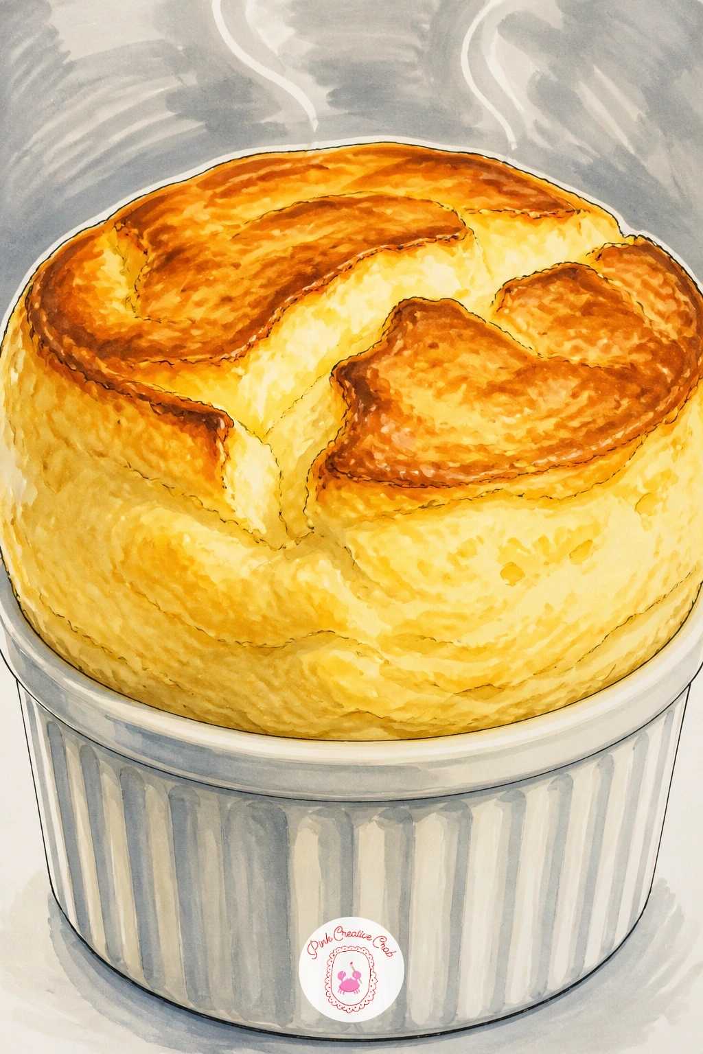
Palette: Souffle Gold,Crust Brown,Ramekin White,Steam Grey
Switch from savoury to a sweet cheese subject with a slice of cheesecake topped with berries, a popular finish to any cheese drawing collection. Ink the triangular slice shape first, keeping the base thicker than you might expect since cheesecake slices read as dense and rich rather than thin and airy.
Work from the crumb base upward: a textured dark line for the biscuit crust, a tall pale cream body above it, then a cluster of berries and a glossy sauce drizzle on top. Vary the berries, a few whole and one cut open to show seeds, for visual interest.
The cream body looks flat if left one solid colour, so leave a thin pale highlight line down one side where light catches the smooth surface. If fresh berry colours are limited, mix red and a touch of purple for a convincing mixed berry look.
Tip for today: dot the glossy sauce with tiny unmarked white highlights to make it look wet and fresh rather than painted on.
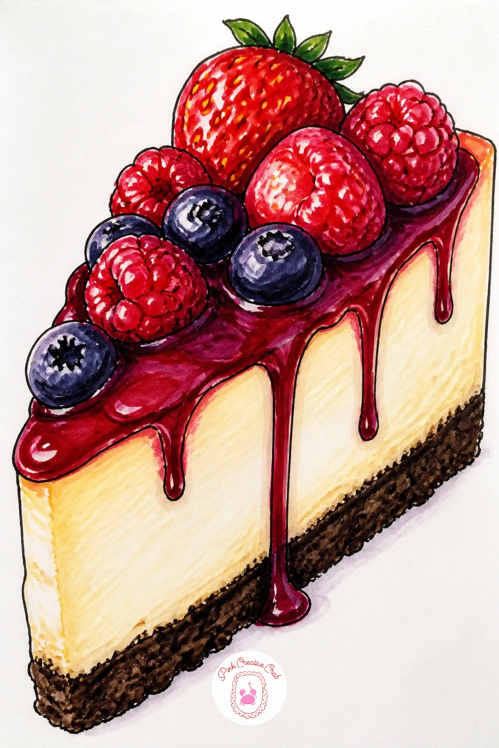
Palette: Crust Brown,Cream Body,Berry Red,Sauce Purple
Give a single wheel somewhere to travel with a small wooden cart scene, a nice bridge between still life and setting. Eye level stays fairly straight-on here, which keeps both the round wheel and the cart’s simple wheels reading clearly rather than foreshortened.
Ink the wooden cart first as a simple flat platform on two round wheels, then the cheese wheel sitting on top, large enough to dominate the whole composition. A small sign or ribbon tied to the cart handle adds a nice decorative touch without complicating the drawing.
Wood grain is where people overwork this scene, so a few short parallel lines along the cart’s planks is plenty rather than covering every surface in texture. No brown marker for the wood? Layer orange and grey lightly together for a weathered look.
Tip: let the cart’s shadow fall long across the ground beneath it, which helps the whole scene feel grounded and sunlit.
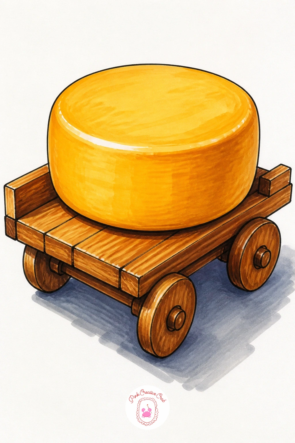
Palette: Cart Wood,Cheese Gold,Wheel Grey,Ground Tan
Take the snack theme somewhere sunnier with cheese and crackers laid out on a striped beach towel. Work the towel pattern out before the food goes in: ink a few bold stripes across the towel shape first, since the food sits better once the background pattern is settled rather than squeezed in around it afterward.
Add a small plate or simply the cheese and crackers directly on the towel, a few crackers fanned out and a wedge of cheese resting nearby, with maybe a sprig of grapes rolled slightly to one side as if just set down. A pair of sunglasses or a shell tucked at the corner adds a beachy touch.
Striped towels flatten the whole piece if every stripe is the same width, so vary stripe thickness slightly for a more relaxed, fabric-like feel. If stripes feel too busy, a single solid colour towel with a scalloped edge is a simpler substitute.
Tip: let the food cast a short soft shadow onto the towel to keep it feeling like it is really resting there rather than floating.
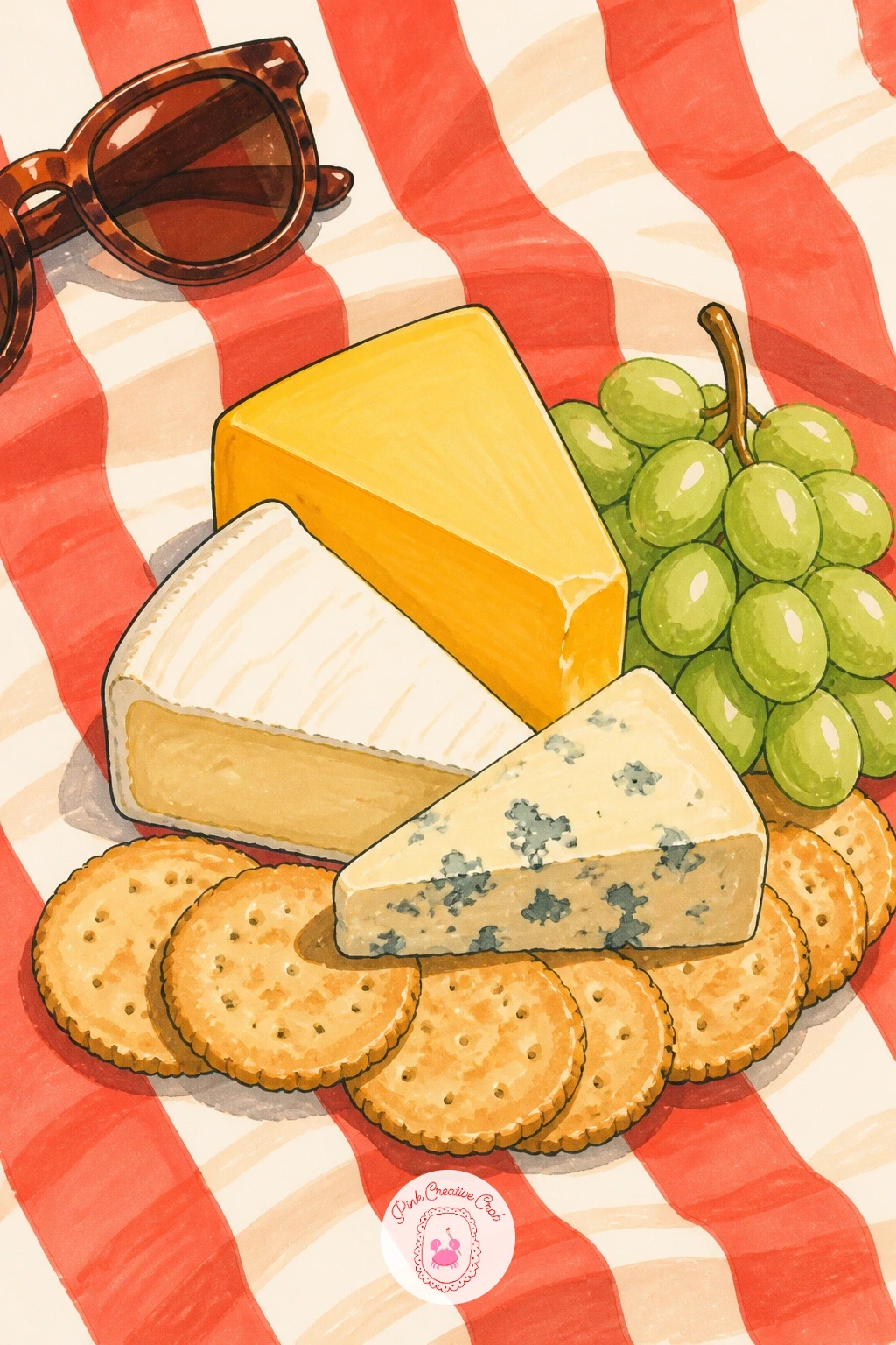
Palette: Towel Coral,Towel Cream,Cheese Gold,Grape Purple
Bring the heat back with a raclette scene, cheese caught mid-melt as it drips down onto boiled potatoes. The melting edge is the hero of this drawing, so once the solid cheese block shape is inked at the top, switch your attention to the melted section, drawn as an uneven, drooping curtain rather than a straight-edged shape.
Ink the block of cheese first, then the dripping melted section hanging below it, catching the light with pale highlights left unmarked, and finally a few halved potatoes arranged underneath to catch the drips. A small scraper or raclette grill edge in the background adds context.
The melt looks stiff if drawn too symmetrically, so let the drips fall unevenly, some thin and stretched, others pooling in thicker drops. No pale yellow marker for highlights? A white gel pen over a mid-tone yellow does the same job.
One tip: add one single long thin drip reaching almost to the potatoes below, which sells the sense of real melting motion.
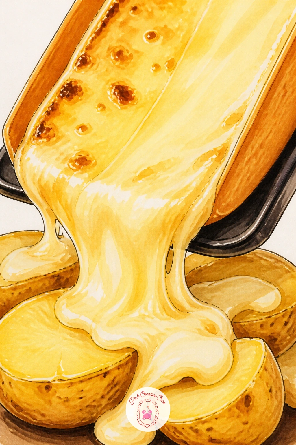
Palette: Raclette Gold,Melt Highlight,Potato Cream,Grill Grey
Cool things down with a simple caprese-style salad, fresh mozzarella slices alternating with tomato and basil. Compare the circles before inking: mozzarella slices and tomato slices are usually close in size, so sketch a repeating row or fan of same-sized circles rather than letting one type dominate.
Ink the mozzarella slices first, keeping their edges soft and slightly uneven since fresh mozzarella never sits in a perfect circle, then the tomato slices with visible seed sections inside, and finally basil leaves tucked between each pairing. A drizzle of olive oil and a scatter of pepper finish the plate.
Flat white mozzarella looks lifeless if left totally uncoloured, so add the faintest cool grey-blue shadow along one edge of each slice to give it roundness. If basil leaves feel fussy, a simple green oval shape with one centre vein line reads just as well.
Tip for today: leave a thin unmarked white line down the centre of each tomato slice to suggest the pale inner flesh catching light.
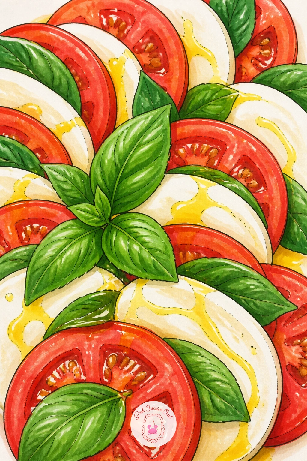
Palette: Mozzarella White,Tomato Red,Basil Green,Oil Gold
Try a different cheese shape altogether with a goat cheese log rolled in herbs, a nice change from all the rounds and wedges so far. Keep the proportions simple: the log is roughly three or four times longer than it is wide, so sketch a long rounded cylinder before adding any surface detail.
Ink the log’s outline first with soft, slightly irregular ends rather than crisp flat cuts, then add the herb coating as a scatter of small green flecks and dashes across the whole surface rather than one even green wash. A slice cut from one end, laid beside the log, shows the pale interior for contrast.
Herb coating looks pasted-on if too evenly spaced, so cluster flecks more densely in some spots and leave bare patches of pale cheese showing through elsewhere. No fine green marker for the herb flecks? A sharp green coloured pencil over the base colour gives the same speckled texture.
One tip: shade the underside of the log slightly darker where it meets the plate, which grounds the whole shape convincingly.
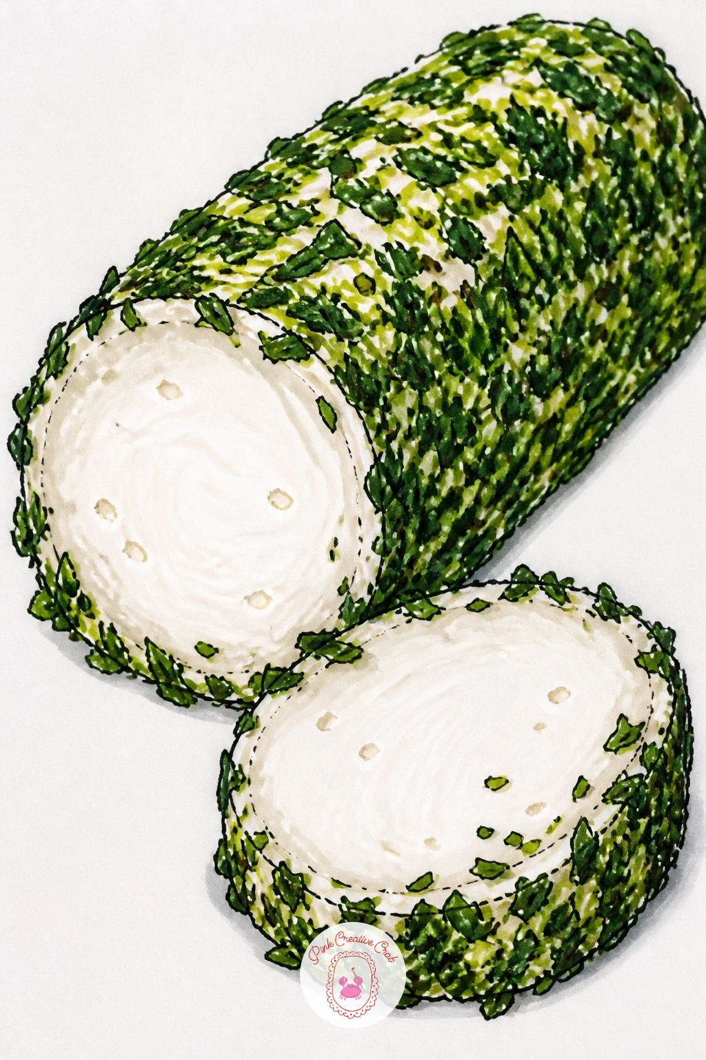
Palette: Goat Cheese White,Herb Green,Shadow Grey,Plate Cream
Give the party platter idea a romantic twist by arranging it on a heart-shaped board, a lovely subject for an anniversary or Valentine’s piece. Sketch the heart outline first in pencil as your boundary, then plan loose clusters of cheese, crackers, grapes and berries within it the same way you would a round platter, letting the heart shape guide where the clusters bunch rather than forcing symmetry.
Ink the board outline first, then the largest cheese pieces nestled into the heart’s curves, followed by crackers, fruit and nuts filling every gap until the shape reads clearly as a heart even from a distance. A few raspberries or strawberry slices tucked in reinforce the romantic colour note.
Symmetry is the trap here, since a too-perfect heart looks stiff, so let a few pieces spill slightly over the board’s edge. If wood grain feels like too much extra work, a plain painted board colour is a fine substitute.
Tip: cluster the reddest fruit near the heart’s two top curves, which naturally draws the eye to the shape first.
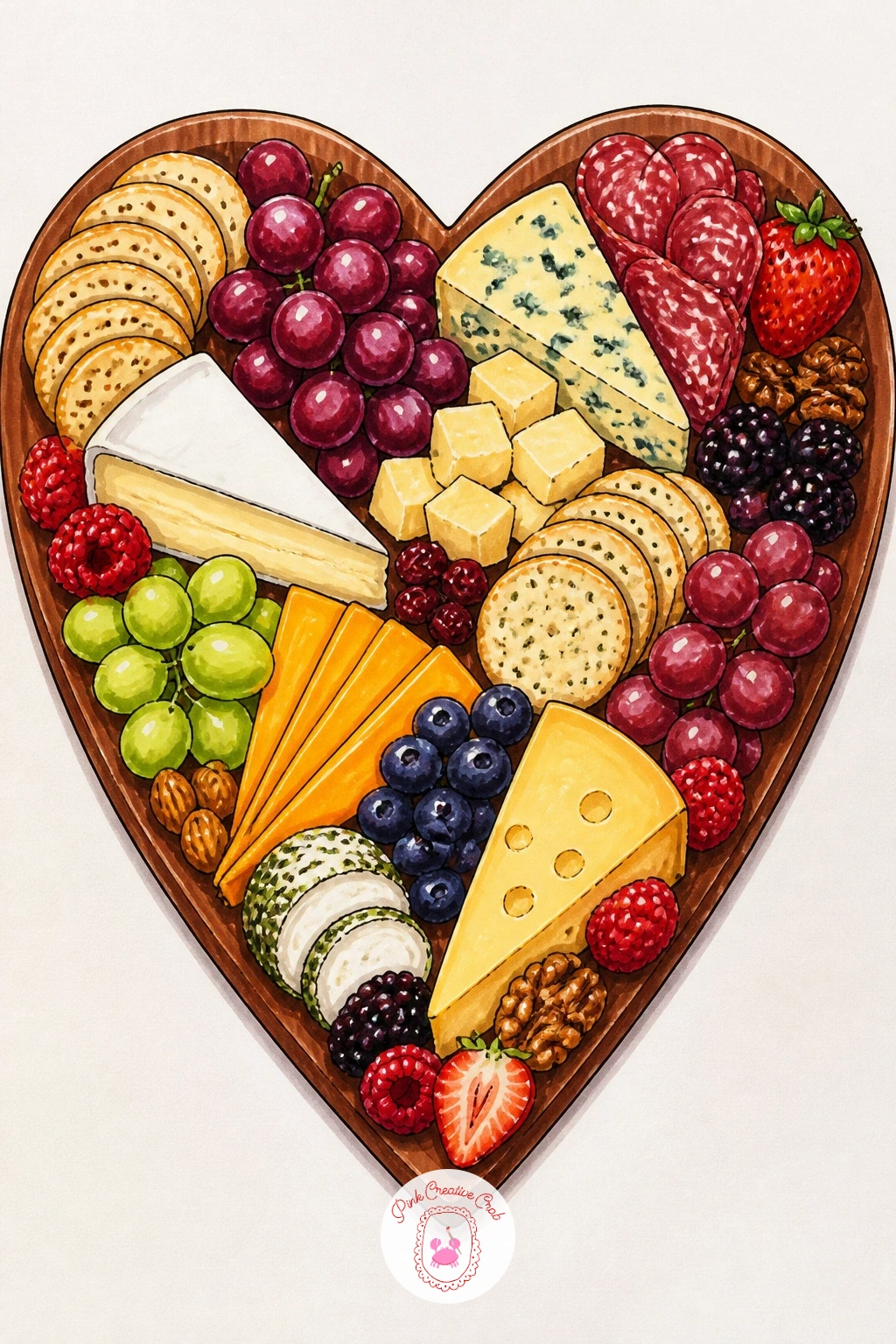
Palette: Board Wood,Cheese Gold,Berry Red,Grape Purple
Finish on something small and everyday: a cheese sandwich packed into an open lunchbox. Keep the composition simple, looking straight down into the box as if it is sitting open on a table, which lets you show both the sandwich and a few small sides without any tricky angles.
Ink the lunchbox shape first as a simple rounded rectangle, then the sandwich cut into triangles inside it, cheese peeking between the bread layers, followed by a couple of small sides like a cut apple or a few crackers tucked beside it. A folded napkin corner adds a nice finishing detail.
This scene flattens if the lunchbox colour is left totally even, so shade the inside walls of the box slightly darker than the lid to suggest real depth. No bright lunchbox colour in your set? A simple two-tone colour scheme in any two markers you own works fine.
If you enjoy small everyday scenes like this one, the drawing challenge ideas are full of similarly quick, cosy subjects for another day’s sitting.
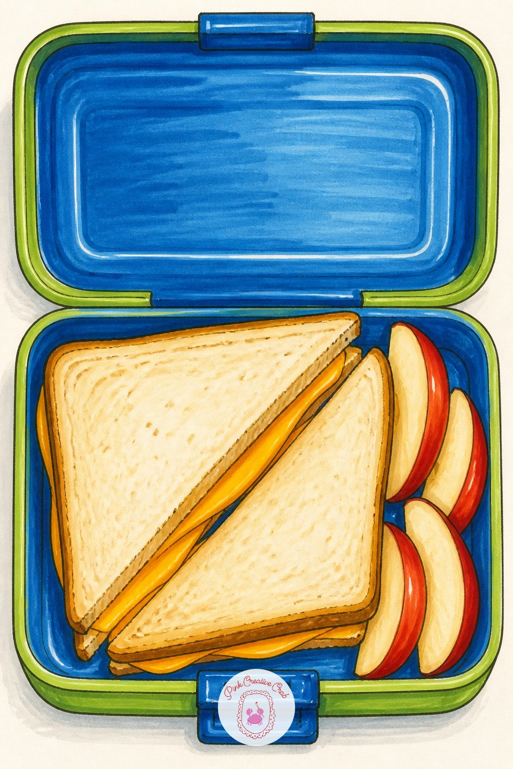
Palette: Lunchbox Blue,Bread Gold,Cheese Yellow,Apple Red
What to Do Next
Pick one idea that is making you hungry right now, grab a sheet of marker paper, and start with the fineliner outline before any colour touches the page. A simple board or a single wedge is the friendliest place to begin if this is your first cheese drawing session.
Frequently Asked Questions
What markers work best for a cheese drawing?
Alcohol-based markers work best because they blend smoothly without streaking, which matters for the soft melted and creamy textures cheese needs. Look for a set with at least two yellow tones and a warm brown for rinds and crusts.
How do you make drawn cheese look melted rather than solid?
Draw the melted edge as an uneven, drooping line rather than a straight one, and leave small pale gaps unmarked for shine. Short upward strokes and varied drip lengths suggest real movement instead of a flat, static shape.
How do you draw the holes in cheese without them looking fake?
Vary the size and spacing of the holes rather than placing them in a grid, since real holes form unevenly as cheese ages. Shade the inside of each hole slightly darker on one side for a touch of depth.
What is the easiest cheese subject to start with?
A simple cheese board or a single wheel is the easiest starting point, since both use basic rounded shapes with no tricky perspective or melting texture to manage on a first attempt.
How long does a cheese drawing like this take to finish?
Most of these scenes take between twenty and forty minutes depending on detail, with simpler still life subjects finishing faster than busier scenes involving figures or crowded platters.
Have any thoughts?
Share your reaction or leave a quick response — we’d love to hear what you think!
-
 0
-
0
-
0
-
0
-
0
-
0


