

Flower vase painting is the fastest way to get that modern decor-shop look on your own wall, and you do not need a whole still life set up to do it. Every idea below is one vase, one bouquet, one mood, built from flat bold shapes in gouache so it reads as a print the moment it dries.
Scroll through and pick whichever vase speaks to you today, a wobbly squiggle one, a face jug, a cat-shaped pot. Each one is sized to finish in a single sitting, with the color mixing and the tricky bits spelled out so you can start painting right away.
Using these images: free for personal projects such as printing, coloring, cards, journals and gifts. Handmade items that include them may be sold up to 30 pieces per design. More than that is commercial use and is not permitted, and neither is selling or sharing the images themselves or passing them off as your own. Please ask before any other use.
Start with the vase, since a squiggle vase lives or dies on the wobble. Paint it as one continuous wavy outline in cobalt, like a line that never lifts off the paper, then fill it flat with the same color once the outline is dry. Keep the wiggles loose and uneven on purpose, a too-even squiggle reads as a mistake rather than a style choice.
Once the vase shape is dry, block in the ranunculus heads as tight spirals of tomato red and blush, painted wet-on-dry so the swirl marks stay crisp. Add stems in a muted green last, kept thin and few so the vase stays the star.
If the swirl centers smudge, let the base color dry fully before adding the darker spiral line on top. No cobalt on hand, a deep teal or navy gouache gives the same graphic punch.
Try this today: paint the vase outline first and let it dry completely before you touch the flowers, it keeps the whole piece clean.
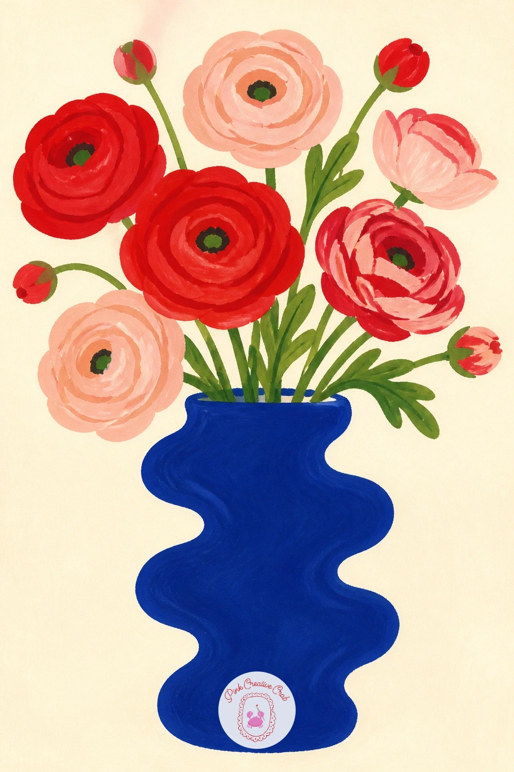
Palette: Cobalt Blue,Tomato Red,Blush Pink,Sap Green
Keep this one spare, since the whole point of a bubble vase is negative space. Paint the round glass body as a pale circle with a slightly darker cobalt crescent on one side to suggest the curve of glass, then let the white of the paper do the rest of the work.
Drop in one anemone, black center first as a small dot, then petals in tomato red painted in five or six flat strokes around it. A single dark stem anchors it inside the bubble shape.
The glass is where this usually goes wrong, too much shading makes it look muddy instead of transparent. Keep the vase to two tones only, and if you want it simpler still, swap the crescent shading for a single thin outline.
One tip worth remembering: a lone flower reads as intentional and modern only when everything around it stays empty, resist adding a second bloom.
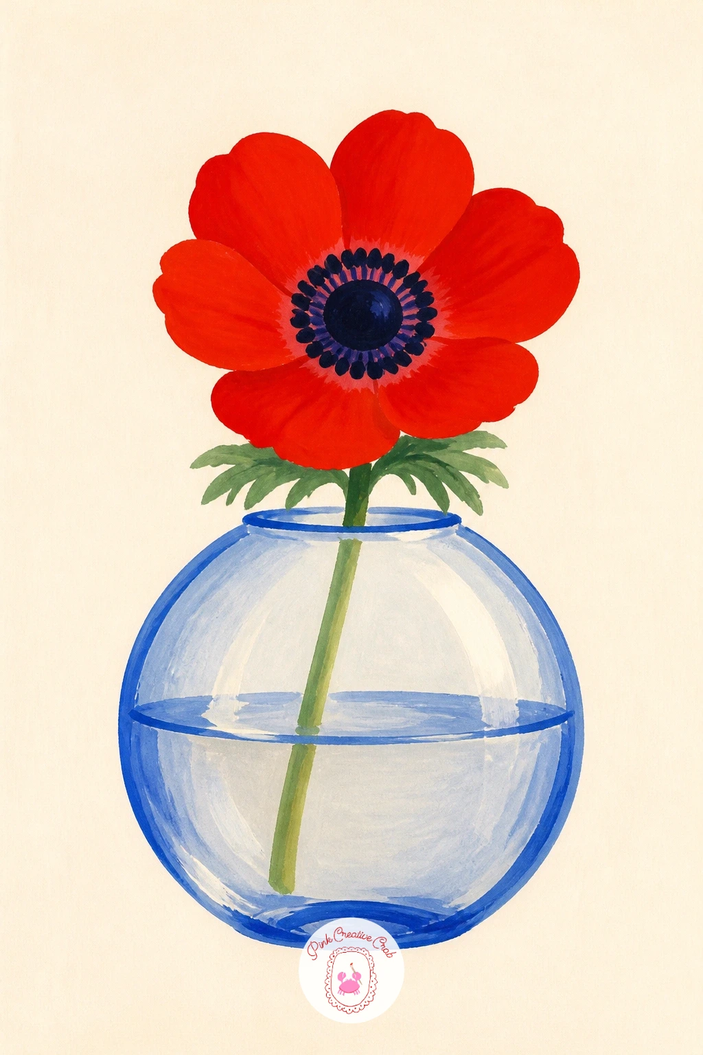
Palette: Cobalt Blue,Tomato Red,Ivory Black,Sap Green
Trade flowers for foliage on this one, since a Matisse-style arrangement is about shape over detail. Paint the vase first as a flat patterned block, cobalt and butter yellow stripes or a simple scalloped edge, in the loose cut-paper spirit of the reference.
Build the leaves next as broad, confident shapes in two greens, some overlapping, no vein lines or fussy edges. Think of each leaf as a single brushstroke rather than a drawn outline filled in.
Eye level sits low here, looking slightly up at the vase, which makes the leaves fan out above it like they are reaching for light. That upward thrust is what gives this arrangement its energy, so keep the stems angling outward rather than straight up.
For a loose-shape warm up before this one, the tips in gouache painting flowers for beginners cover flat petal shapes you can borrow for the leaves.
Today’s tip: paint three leaf shapes in a row before you commit to the final arrangement, pick your favorite three and discard the rest.
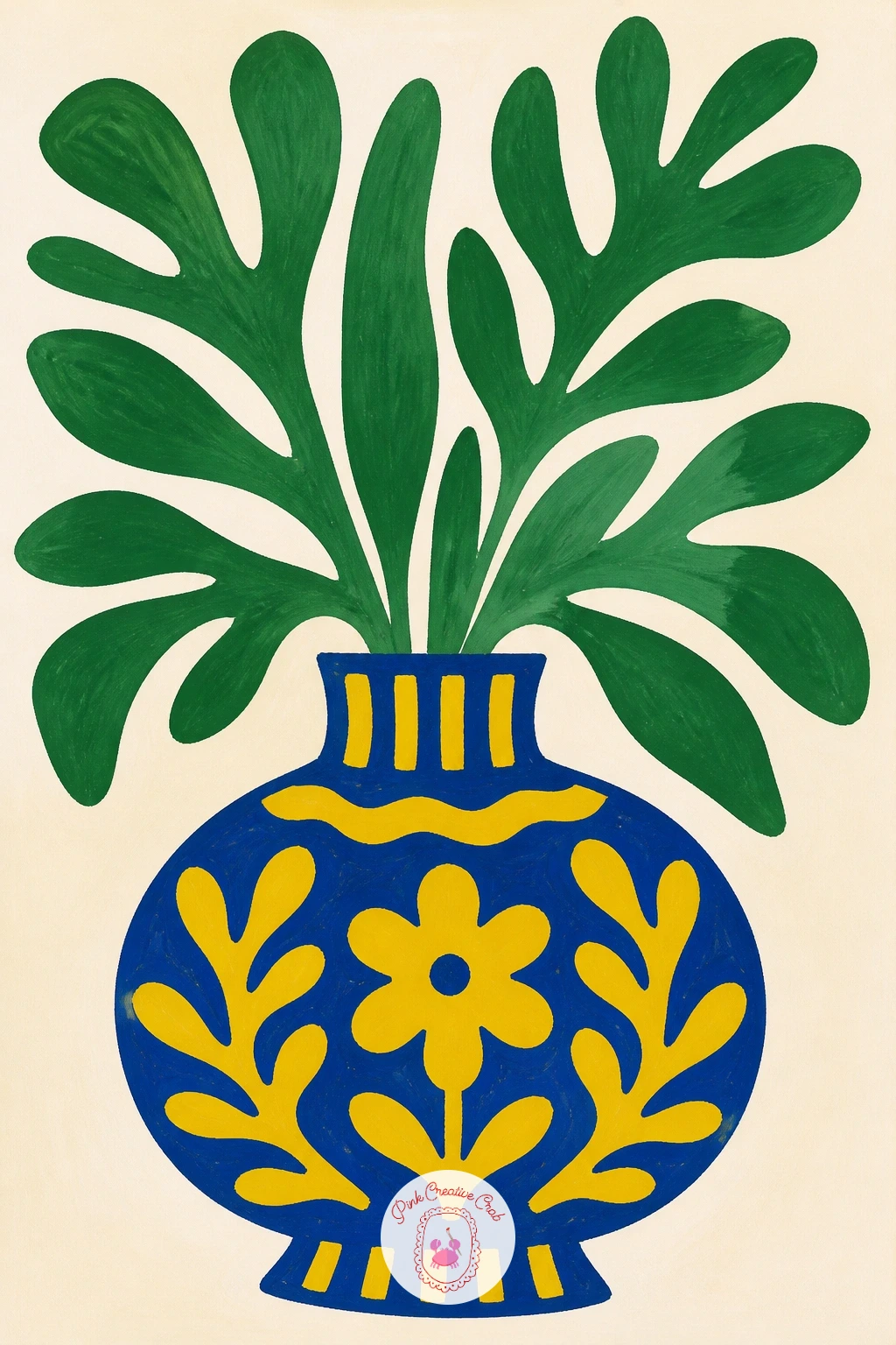
Palette: Cobalt Blue,Butter Yellow,Sap Green,Olive Green
Build the ginger jar before anything else, since its curved silhouette carries the whole painting. Sketch it lightly in pencil as a rounded shoulder tapering to a narrow neck, then fill with white gouache or leave the paper bare, adding cobalt pattern on top once that base shape is confirmed.
Paint simple motifs on the jar, a band of dots, a cloud swirl or a few leaf shapes, kept small and repeated evenly around the curve. Let that dry before adding the forsythia, thin dark branches first, then small butter yellow dabs along each one for the blossoms.
Getting the jar symmetrical is the tricky part, fold your paper in half lightly to find the center line before you sketch, it keeps both shoulders even. If cobalt feels intimidating to pattern freehand, a fine liner pen laid over dry gouache gives cleaner lines.
Finish with one practical tip: paint all the blossom dots in one pass while your brush is loaded, it keeps their size consistent across the branch.
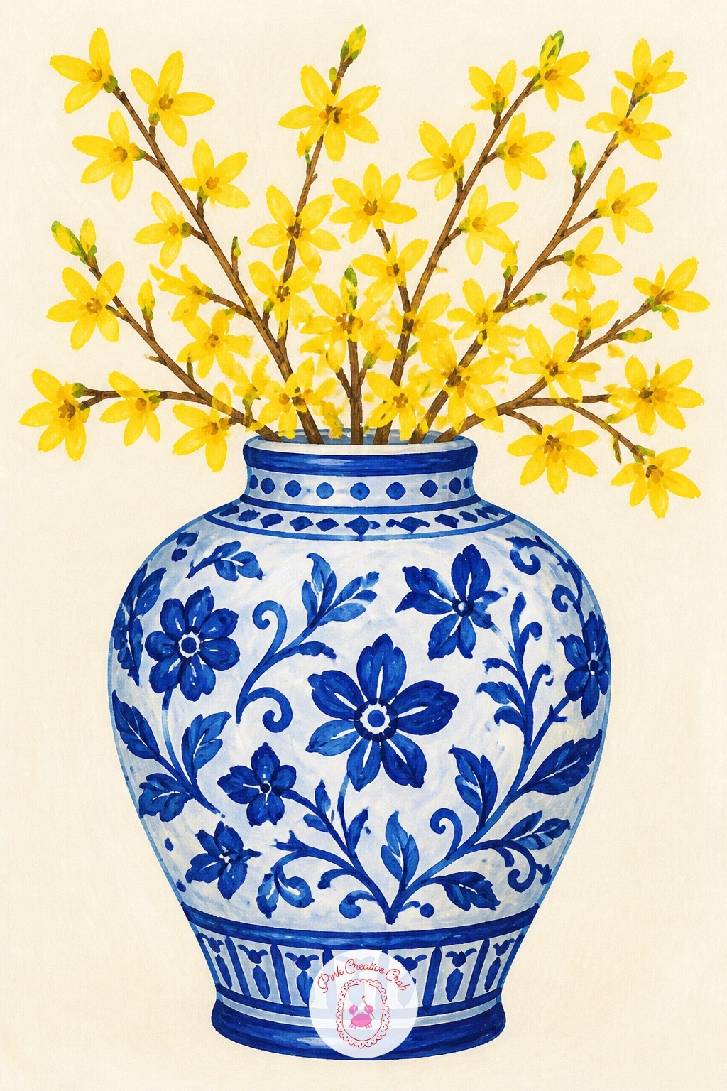
Palette: Cobalt Blue,Titanium White,Butter Yellow,Raw Umber
Give the vase a face before you give it flowers, since the expression sets the whole tone of the piece. Paint the jug body in a warm terracotta or blush, then add simple features, two dot eyes, a small curved nose line, a soft closed mouth, in a darker tone once the base dries.
Cornflowers go in next, five-petal stars in cobalt painted loosely so no two flowers match exactly, with a tiny yellow center dot on each. Keep them clustered to one side so the face still reads clearly.
Faces go wrong fastest when features sit too high or too centered, place the eyes just below the vase’s widest point for a calmer, more human look. No terracotta gouache on hand, mix tomato red with a touch of yellow and white.
Try this today: paint the face features last, after the flowers are in, so you can judge exactly how much face is still visible around the bouquet.
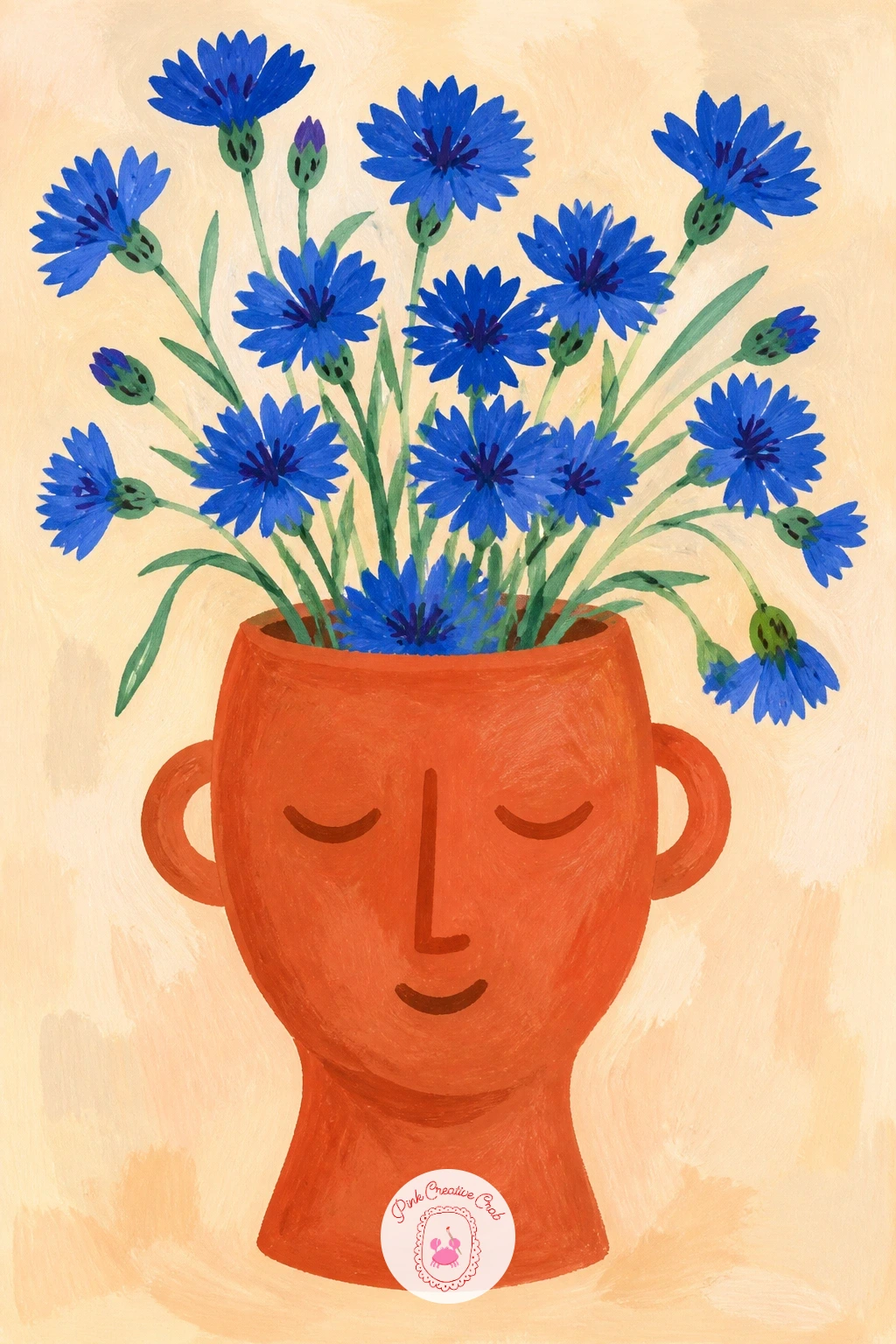
Palette: Terracotta,Cobalt Blue,Butter Yellow,Ivory Black
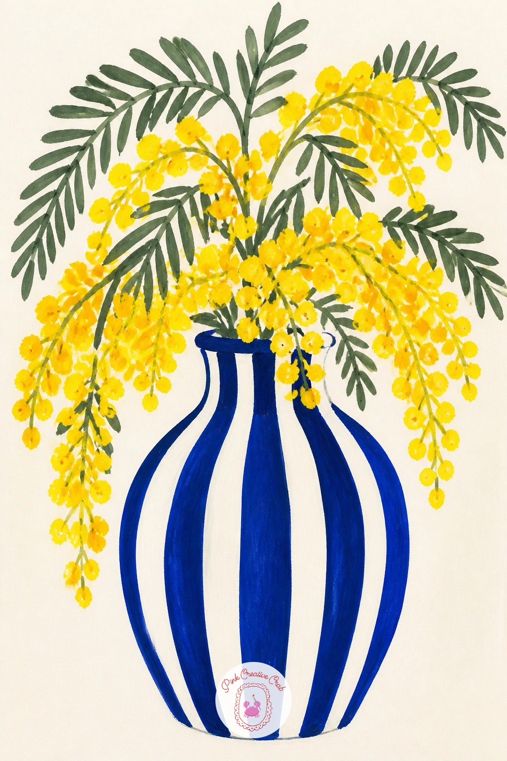
Lay the stripes down with care, since an uneven stripe vase looks sloppy rather than charming. Pencil in light horizontal guidelines around the vase shape first, then paint alternating bands in cobalt and warm white, letting each stripe dry before the next to keep edges crisp.
Mimosa comes next as the softest part of the painting, little clusters of tiny butter yellow dots along thin grey-green stems, dabbed on with the tip of a small round brush or even a cotton swab for texture. Keep the branches loose and slightly drooping, that is how mimosa grows.
A dry brush loaded with just a little yellow, dragged lightly over the dot clusters once dry, adds the fuzzy texture mimosa is known for without turning it into solid blobs. Resist overloading the brush or the dots merge into flat circles.
One tip for today: paint the stripes vertically instead of horizontally next time, it changes the whole character of the vase with no extra effort.
You Will Need
- small round brush or cotton swab for dot texture
Palette: Cobalt Blue,Titanium White,Butter Yellow,Grey Green
Paint the bottle almost invisible, since glass is mostly about what you leave out. Use the thinnest wash of cobalt or grey along one edge of the bottle shape to suggest the curve of glass, keep the rest of the bottle as bare paper, and add a simple thin outline once dry to hold the shape together.
Wildflowers go in loose and varied, small daisies in white and yellow, a few blush poppies, thin grassy stems in two greens, all painted as quick flat shapes rather than careful botanical studies. Vary the heights so the bouquet feels gathered rather than arranged.
Ten minutes gets you three or four flower types and a simple bottle outline. Forty minutes lets you add a faint tabletop shadow under the bottle and a second layer of smaller buds tucked between the main stems for more depth.
Keep today’s tip in mind: paint the stems before the flower heads, it is much easier to place a flower at the end of a stem than to draw a stem backward from a flower.
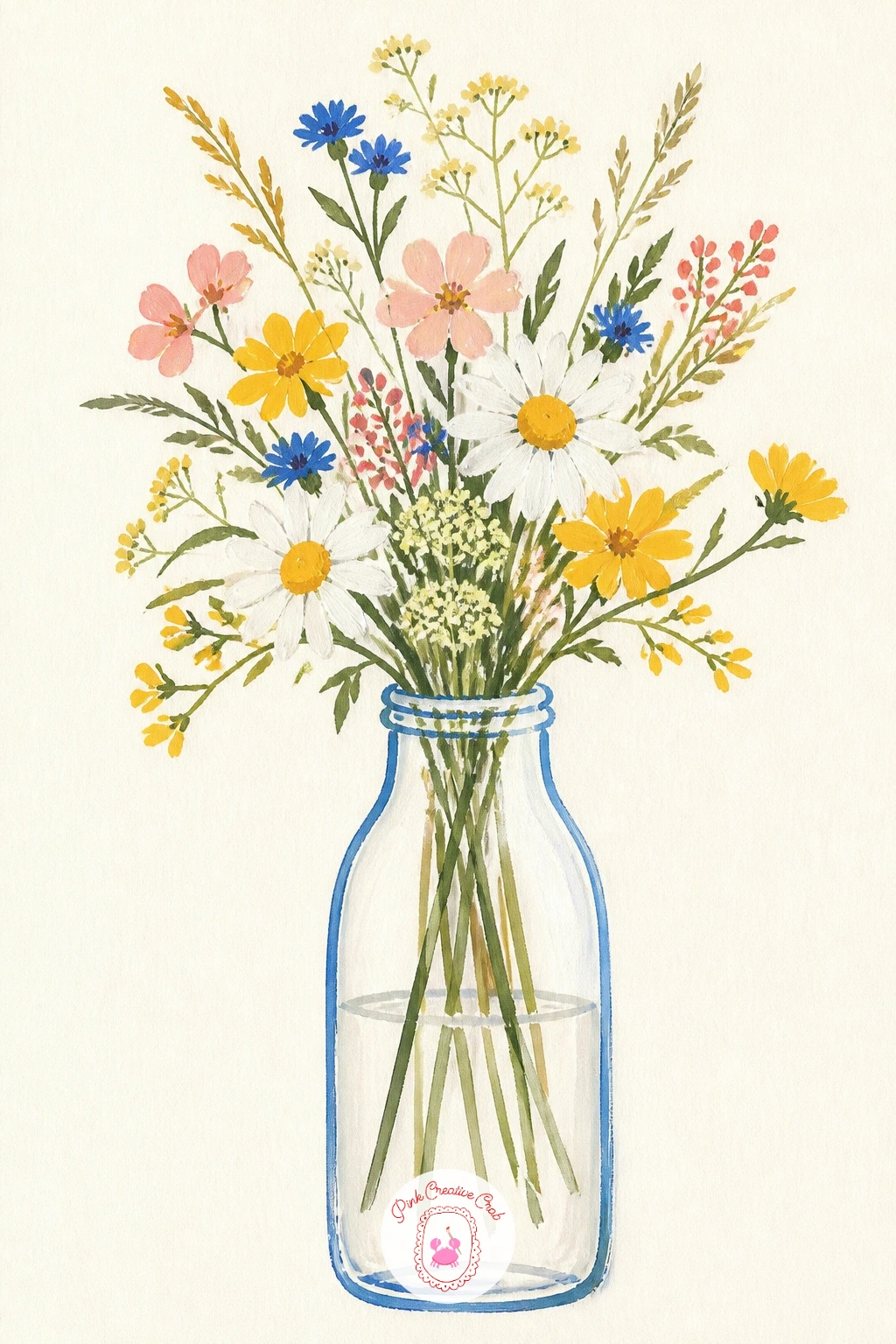
Palette: Cobalt Blue,Titanium White,Butter Yellow,Blush Pink
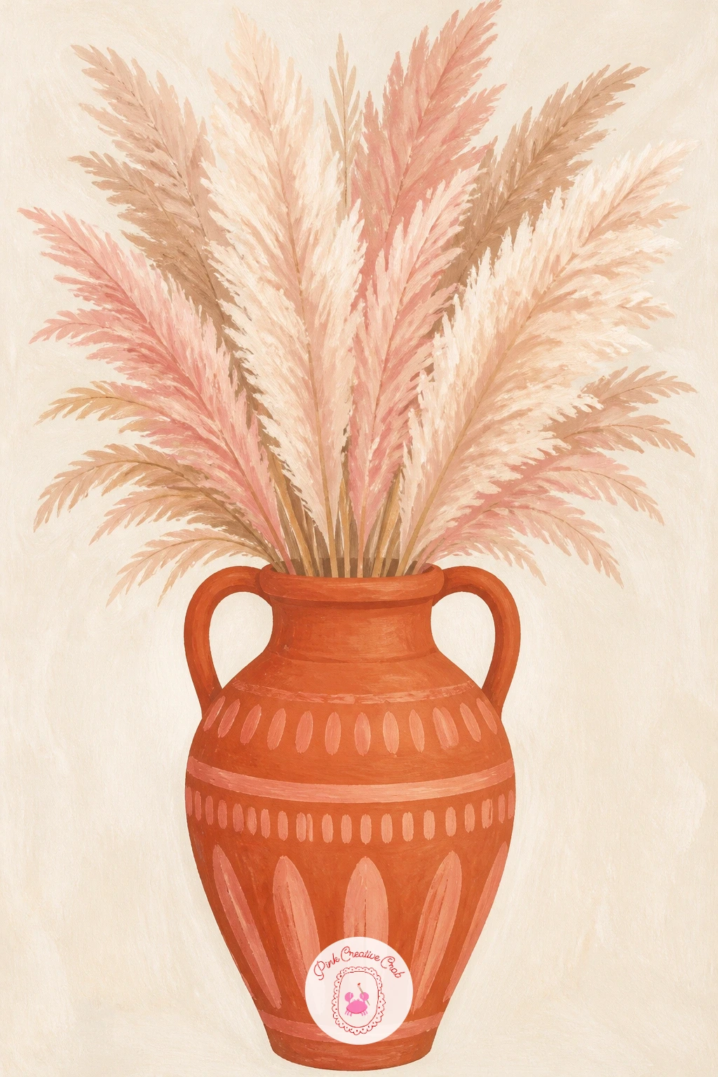
Shape the amphora with a measuring eye before you paint it, since its tall curved body needs both sides to match. Use your brush handle held at arm’s length to check that the neck is roughly a third of the total height, then sketch lightly before committing to paint in warm terracotta.
Pampas grass goes on last, in loose dry-brush strokes of warm white and blush dragged upward from the rim, the bristles splitting slightly to suggest the feathery plumes. Let a few strokes run off the top of the page for scale.
If the plumes look too solid, your brush is likely too wet, blot it on scrap paper first so the bristles separate and catch only the paper’s texture. A stiff fan brush is the one extra tool worth having here if you can get one.
Today’s tip: vary the length of each pampas stroke so the plume looks windblown rather than like a single stiff bunch.
You Will Need
- fan brush or stiff dry brush for the pampas texture
Palette: Terracotta,Titanium White,Blush Pink,Raw Umber
Choose a simple pitcher silhouette, round belly, short spout, sturdy handle, and paint it in one confident flat color so it reads instantly as a kitchen jug rather than a vase. Butter yellow or a soft sage both work well against a zinnia bouquet.
Zinnias are built in layers, paint the back petals first as a loose circle of tomato red or blush, then a slightly smaller, slightly brighter layer on top, finishing with a small yellow or green center. Three or four zinnias at different angles keeps the bunch from looking flat.
The handle is where proportion slips most often, hold your brush up to the pitcher’s width to check the handle opening is roughly a third of the body’s width before you commit. Too thin and it looks broken, too thick and it looks cartoonish.
For more layered petal practice before tackling this, acrylic painting flowers for beginners has useful layering steps that translate well to gouache. Try this today: paint every zinnia’s center the same yellow, it ties the whole bouquet together even when the petal colors vary.
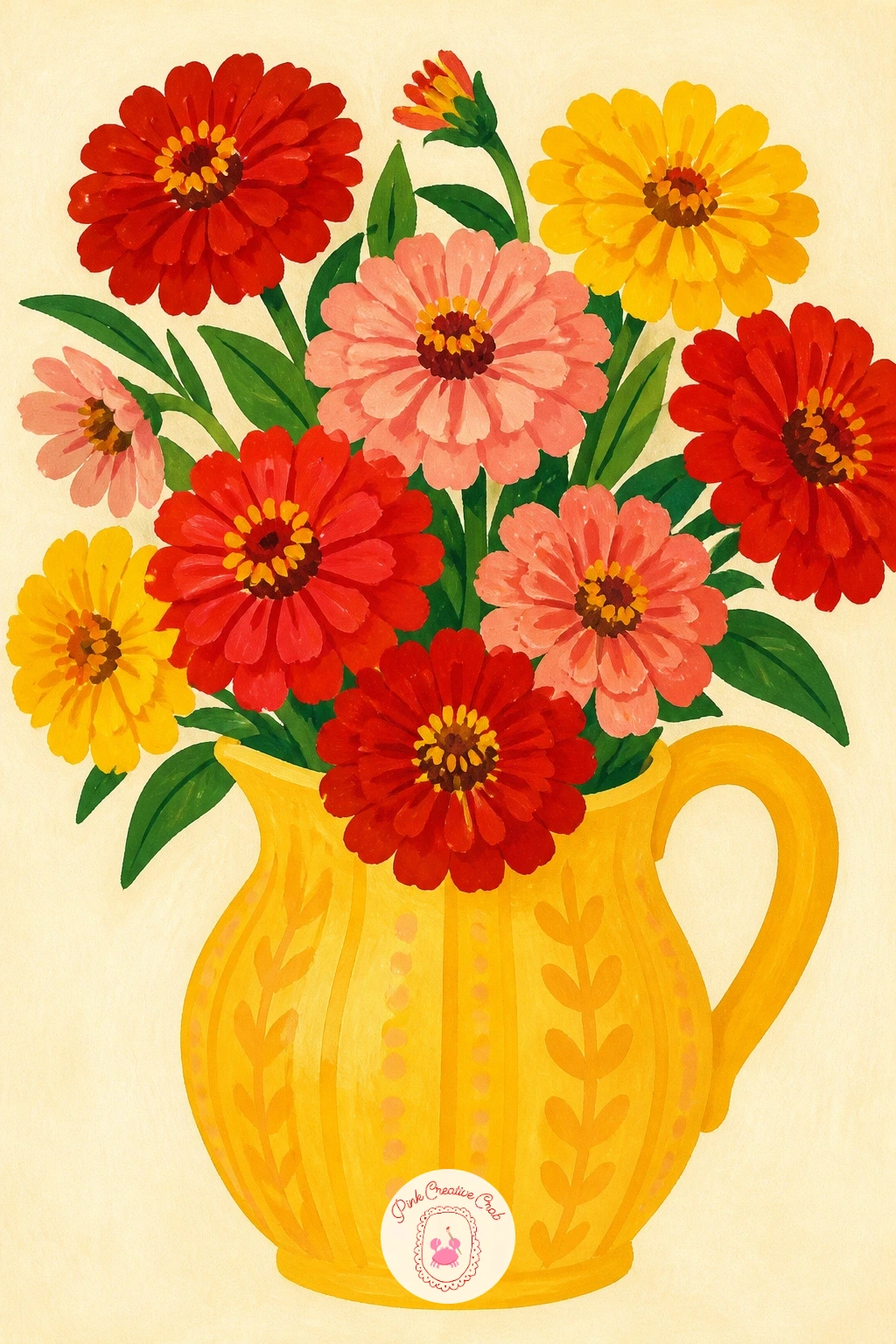
Palette: Butter Yellow,Tomato Red,Blush Pink,Sap Green
Paint the fish vase as one playful curved silhouette, a rounded body tapering to a fan tail, mouth open slightly to hold the stems. Keep the body one flat color, a soft teal or cobalt, and add a simple scalloped line or two for scales once it is dry rather than drawing every one.
The flowers spilling from its mouth work best in warm orange and tomato red, simple round or daisy shapes that contrast against the cool vase color. Keep the bouquet compact and upright so it reads clearly as coming from the fish’s open mouth.
A warm vase against warm flowers goes flat and boring fast, the cool-to-warm contrast here is what makes it pop, so resist the urge to paint the vase in the same orange family as the blooms. No teal on hand, mix cobalt with a touch of white and a whisper of yellow.
One tip for today: give the fish one single dot eye near the top of its head, it is a small detail that makes the whole vase feel alive.
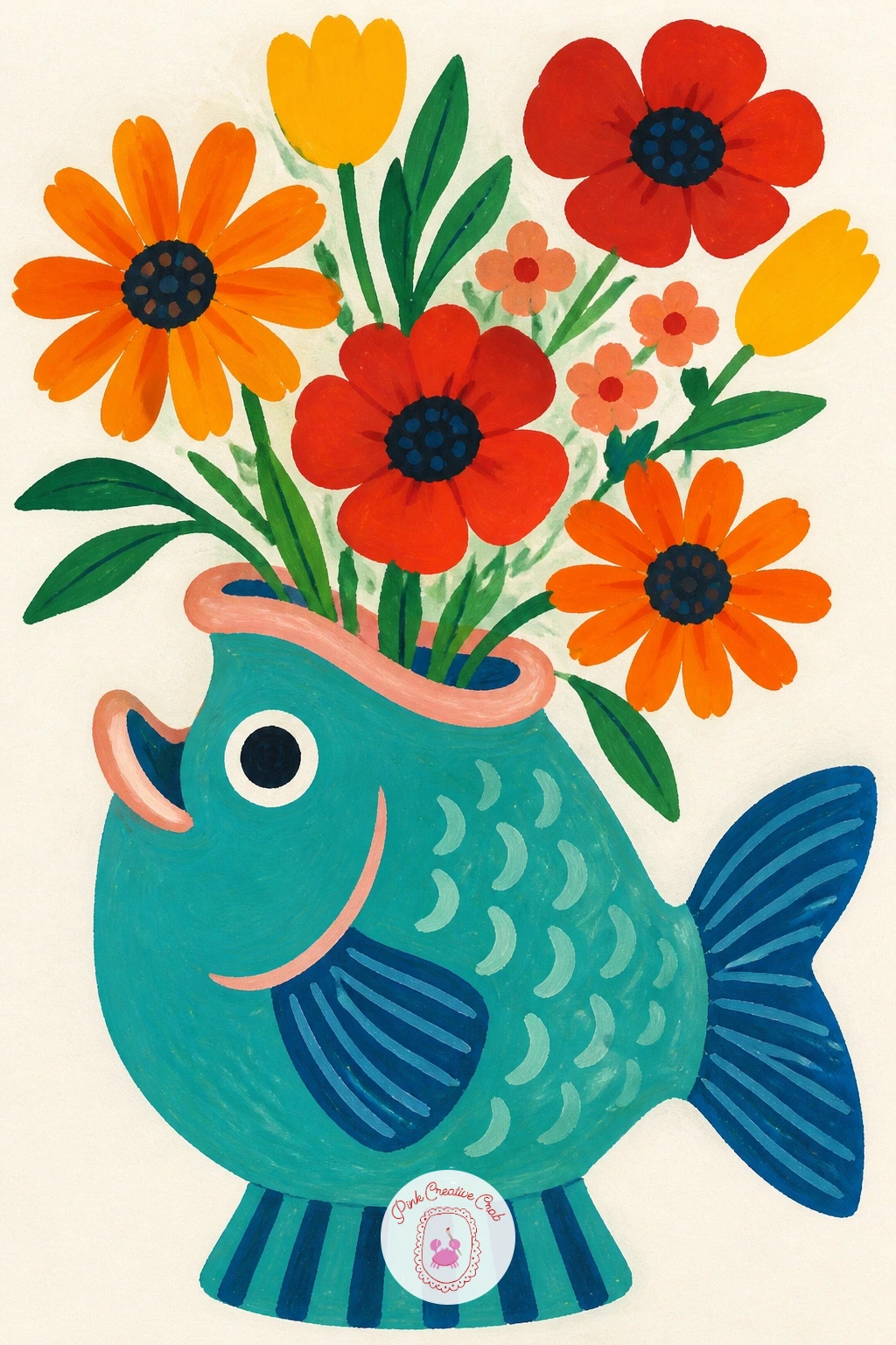
Palette: Cobalt Teal,Tomato Red,Butter Yellow,Titanium White
Map the checkerboard with a light pencil grid before any paint touches the vase, since even small squares look obviously wrong if they drift out of line. Fill alternating squares in cobalt, leaving the rest as bare paper or a soft butter yellow, and let each color dry before painting its neighbor to avoid bleeding.
Dahlias reward patience more than most flowers, build each bloom from a small center spiral outward in rows of pointed petals, tomato red for the front flower, blush for a smaller one tucked behind. Painting the back flower first and the front one on top keeps the layering believable.
If your checks start to warp partway down the vase, stop, let it dry, and straighten the grid with a ruler before continuing rather than trying to fix it freehand. Masking tape laid down before painting each square gives beginners the cleanest edges.
Today’s tip: paint the dahlia petals in short choppy strokes rather than long smooth ones, it is what gives dahlias their characteristic spiky texture.
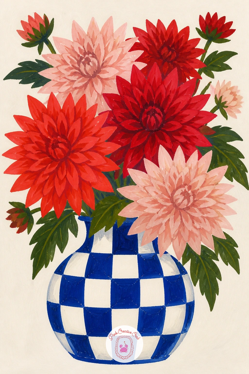
You Will Need
- masking tape for clean checkerboard edges
Palette: Cobalt Blue,Butter Yellow,Tomato Red,Blush Pink
Build the hand vase from simple cupped shapes rather than trying to draw real anatomy, a soft rounded palm shape with a few gentle finger bumps along the top edge is enough to read clearly. Paint it in a matte blush or soft white, keeping the shading minimal and the outline smooth.
Eucalyptus stems go in loose and trailing, small round or oval leaves in silvery sage painted in pairs along a thin stem, some drooping over the fingers for a relaxed, modern feel. Vary the leaf sizes slightly so the stems do not look stamped.
Hands are notoriously easy to overwork, the moment you add individual knuckle lines or detailed nails it stops looking like a sleek decor object and starts looking like an anatomy sketch. Keep every line soft and simplified. No sage gouache ready-mixed, blend a little cobalt into butter yellow with white.
Today’s tip: let two or three eucalyptus stems drape past the edge of the hand, it keeps the whole piece from feeling too contained.
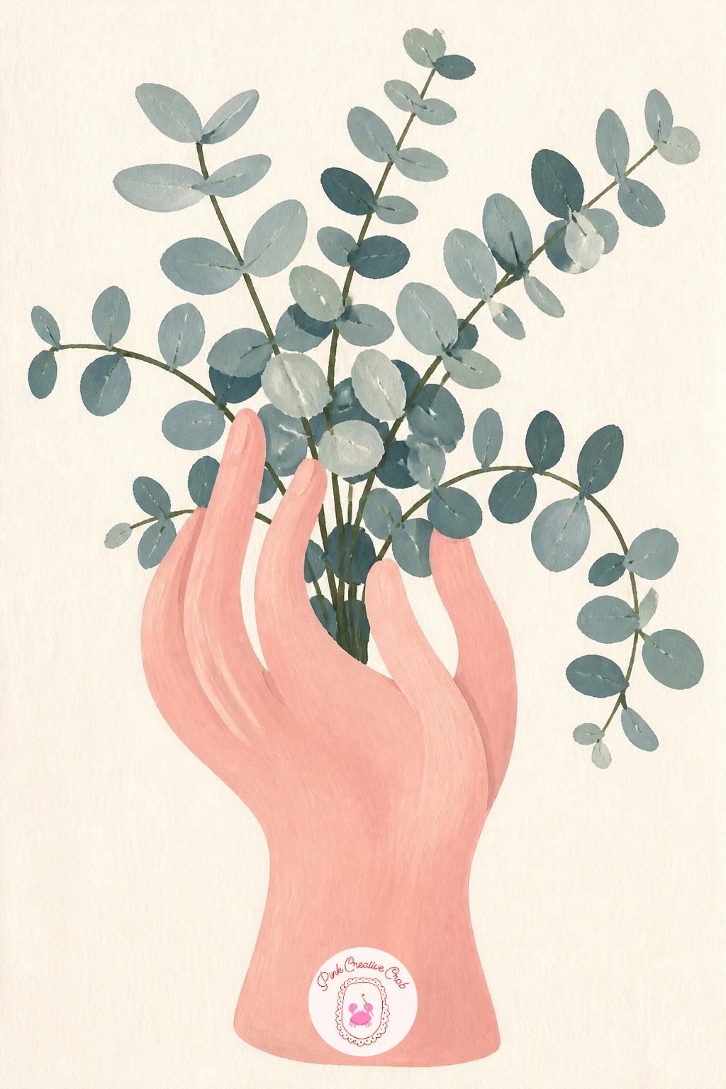
Palette: Blush Pink,Sage Green,Titanium White,Raw Umber
Place the windowsill before the vase, since the light source decides everything else in this one. Pick a side, let strong warm light pour in from that direction, and paint the sill itself as a simple flat shape with a soft shadow falling away from the light.
The Murano vase is where the real fun happens, build it from two or three overlapping curved blobs in different jewel tones, tomato red, cobalt and blush work beautifully together, blended slightly at the edges while wet to mimic how colored glass fuses. Keep the flowers inside it simple and few so the glass stays the focus.
Light coming through colored glass glows brightest right where it hits the sill, paint a small warm halo of yellow or white just below the vase’s base to sell that effect. Skip it if it feels fussy, the vase works fine without it too.
One tip worth trying today: paint the vase’s highlight, one small white dash, last of all, it is what makes glass look wet and lit rather than flat.
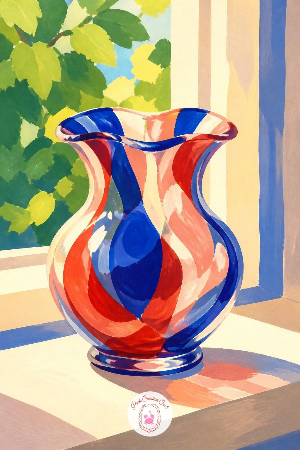
Palette: Tomato Red,Cobalt Blue,Blush Pink,Butter Yellow
Three small vases need to feel related without matching exactly, paint them in one family of colors, say blush, cobalt and butter yellow, but vary the shapes slightly, one round, one tall and narrow, one slightly bulbed. Space them unevenly rather than in a straight row for a more natural shelf look.
Each vase holds just one or two stems, a single tulip, a sprig of something leafy, a lone daisy, painted small and simple since the vases themselves carry the visual weight here. A few book spines in flat color blocks behind them ground the whole scene as a shelf rather than a floating group.
Spacing is the trap with any trio, three evenly spaced objects look stiff and accidental rather than styled. Nudge one vase slightly forward and overlap it a touch with its neighbor to break the rigid line.
For more ideas on composing small repeated objects together, the layout thinking in this guide to painting basics covers grouping and spacing in a way that applies directly here. Today’s tip: paint the tallest vase first, it sets the scale for the other two.
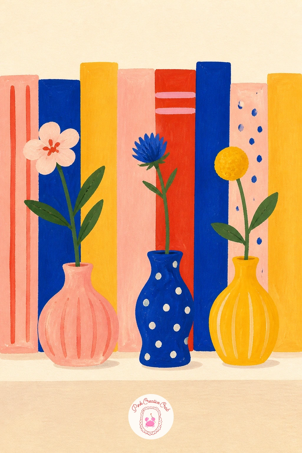
Palette: Blush Pink,Cobalt Blue,Butter Yellow,Sap Green
Decide on the spill before anything else, since the tipped vase and the trail of water and flowers across the table is the whole story of this piece. Sketch the vase lying on its side first, drawn at an angle rather than straight, with two or three flowers spilled loosely nearby and a thin puddle shape beneath.
The cat goes in as a simple rounded silhouette caught mid-leap or sitting smugly beside the mess, painted flat in a solid color with minimal detail, a triangle ear, a curved tail, no need for fur texture at this level. Keep its pose a little exaggerated for humor.
Getting the tipped vase to read as fallen rather than just oddly drawn comes down to the puddle, a flat pale blue or grey shape with a soft wobbly edge immediately tells the eye what happened. Skip the puddle and the whole scene gets confusing.
Today’s tip: paint the cat’s expression as neutral or mildly pleased rather than guilty, it is funnier and more in character.
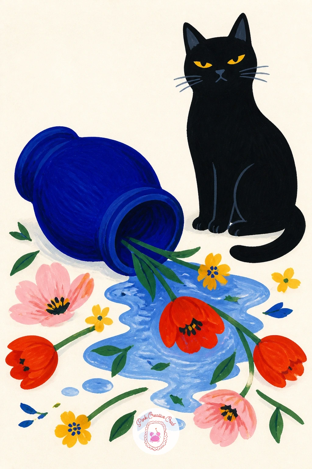
Palette: Cobalt Blue,Tomato Red,Ivory Black,Titanium White
Shape the shell vase from one smooth curved form with a few ridged lines radiating from its base, painted in a soft blush or warm white so it feels like real ceramic rather than an actual shell on the beach. Keep the ridges simple, three or four lines are plenty.
Coral-colored flowers in warm orange and tomato red fill it next, round ruffled shapes that echo the texture of real coral without copying it exactly, some painted smaller and tucked behind the front blooms for depth. A few trailing greenery bits soften the warm color block.
If this is your first time painting a shell form, start with a simple fan shape and round off the top edge rather than attempting realistic shell ridges, the flat decor style forgives a loose interpretation. No blush gouache mixed, add a little white to tomato red until it lightens.
One tip for today: keep the coral flowers all in the warm family, orange, coral, tomato, it is what makes the bouquet feel cohesive against the pale vase.
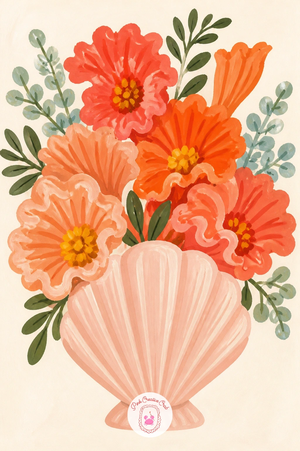
Palette: Blush Pink,Tomato Red,Butter Yellow,Sap Green
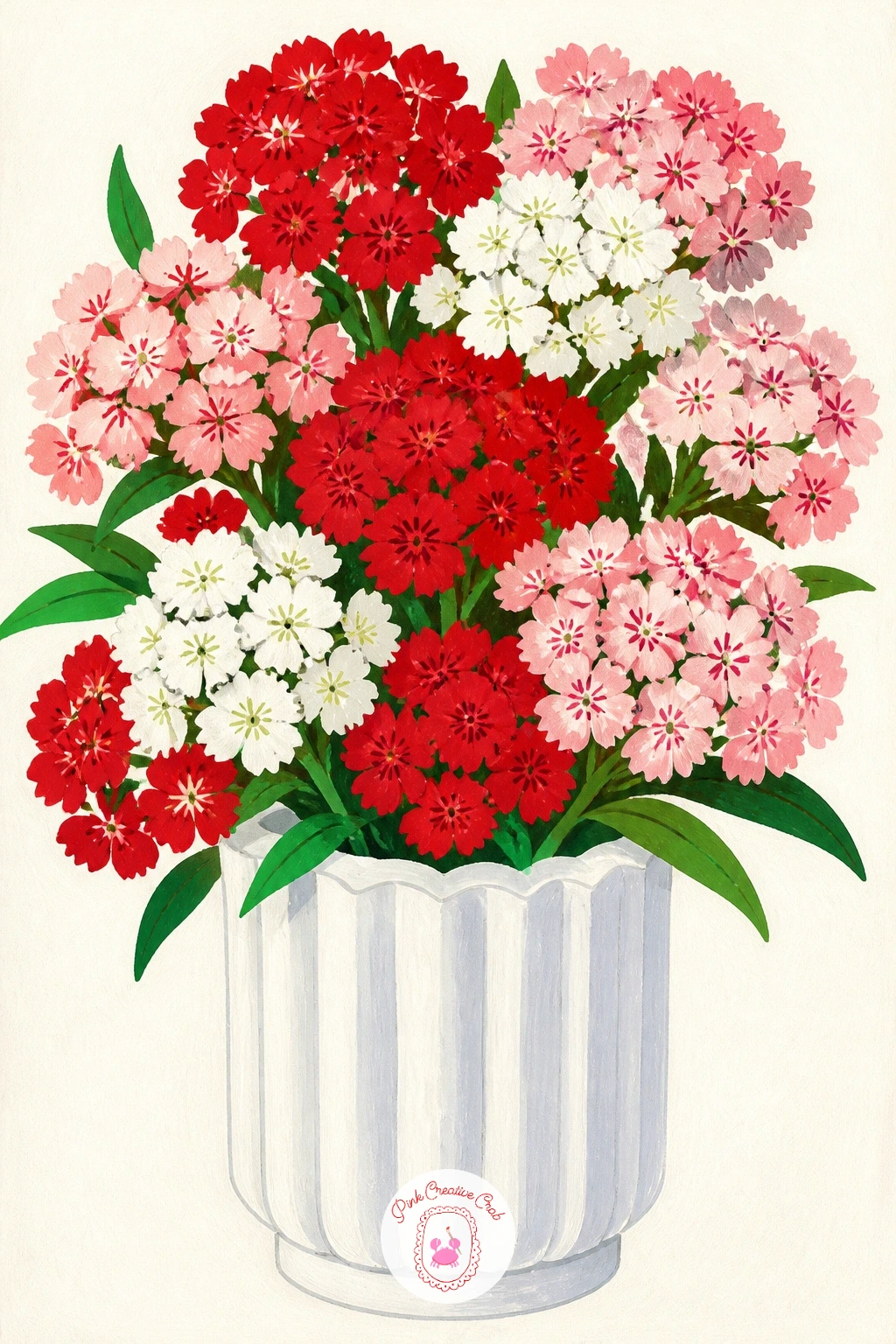
Keep the vase almost sculptural here, since the fluted ridges are the only decoration it needs. Paint it in a single warm white or the lightest blush, then add the vertical ribs as thin shadow lines in a slightly darker tone once the base coat dries, spaced evenly down the body.
Sweet William blooms in dense little clusters, so build each flower head as a tight group of five-petal shapes in tomato red, blush and white mixed together on one stem, rather than painting individual blossoms spread apart. That clustering is what makes sweet william recognizable.
Ribbed vases go wrong when the lines are perfectly straight, real fluting has a slight taper toward the base, so angle your rib lines in very slightly as they near the bottom. A ruler works for the top half but free hand the taper.
If you enjoy this dense cluster style of flower, the step by step bouquets in this flower bouquet drawing guide cover similar clustered blooms in more depth. Today’s tip: mix three shades of red-pink ahead of time so your sweet william clusters have natural variation.
Palette: Titanium White,Tomato Red,Blush Pink,Sap Green
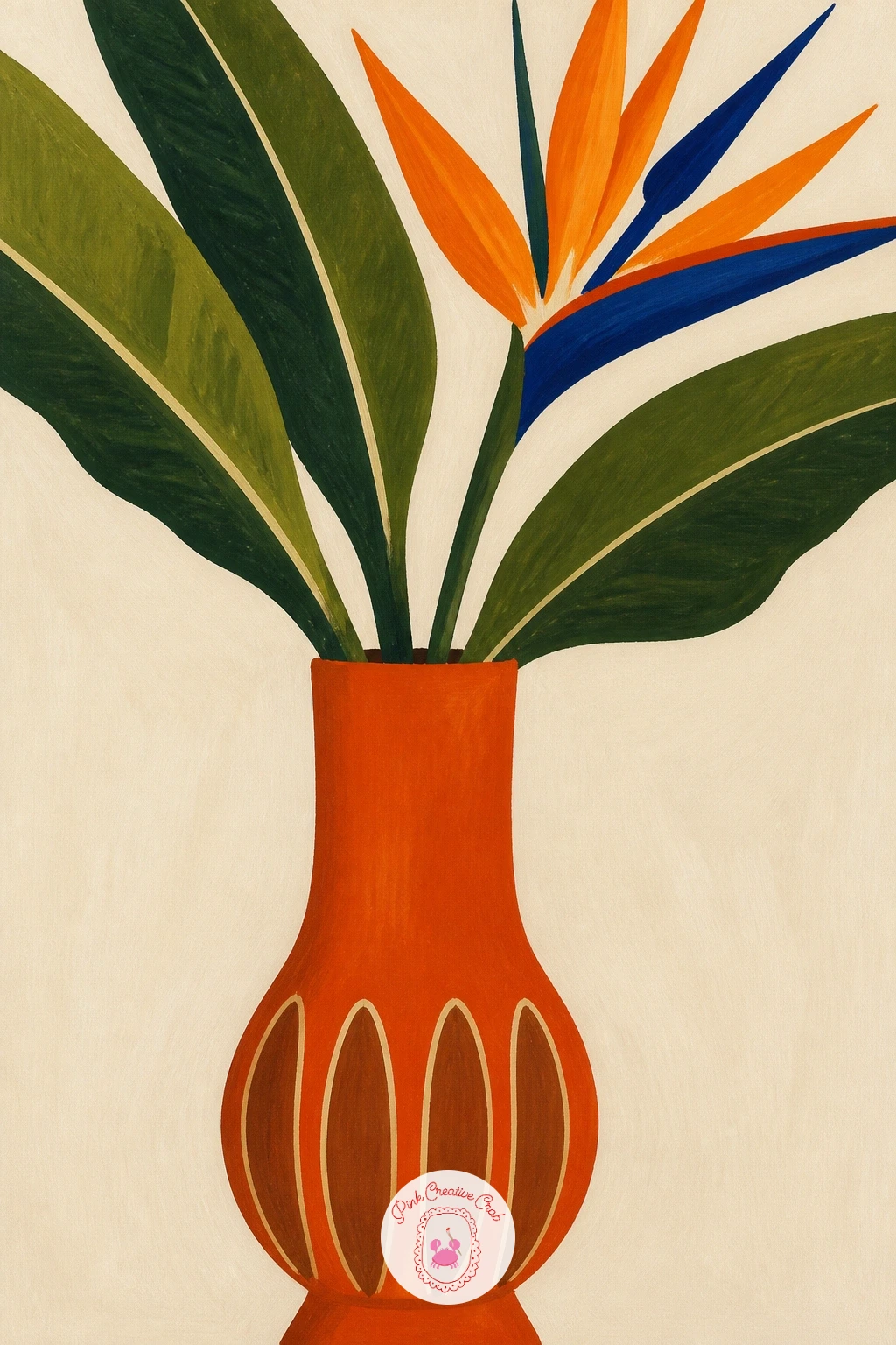
Set the eye level low on this one, looking slightly up at a tall mid-century vase, which makes the bird of paradise stems read as dramatic and architectural rather than small. Paint the vase first as a bold tapered cylinder in burnt orange, perhaps with a simple wood-tone band near the base for that mid-century feel.
Bird of paradise leaves come first, large paddle shapes in deep green painted with confident single strokes, then the flower itself on top, a pointed orange and cobalt crest shape that looks almost like a bird’s head, which is exactly the point.
Because the eye level sits low, the leaves should overlap the top edge of the frame slightly rather than staying neatly contained, that cropped feel is what sells the height and drama of the plant. Keep shadows minimal, mid-century style relies on flat color blocks, not realistic light.
Today’s tip: paint the flower’s cobalt crest in one confident stroke rather than building it up, a single clean mark reads far more graphic than a labored one.
Palette: Burnt Orange,Sap Green,Cobalt Blue,Butter Yellow
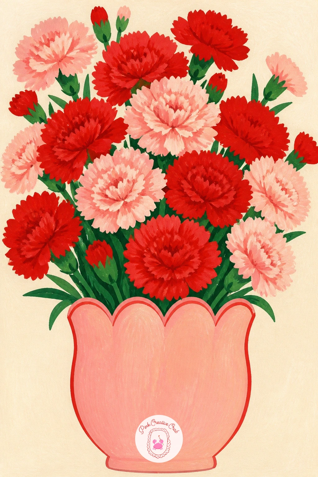
Build the scalloped edge first with a row of evenly spaced half-circles along the vase rim, traced lightly with a small coin or cap if you want them perfectly uniform, then fill the vase body in a flat blush or butter yellow. Even scallops matter more here than anywhere else in the vase, uneven ones look unintentional rather than decorative.
Carnations are built from ruffled, slightly frayed petal edges, easiest to paint with small dabbing strokes rather than smooth lines, layered in two tones of tomato red and blush for depth. Cluster several heads close together since carnations look best dense rather than spread out.
Ten minutes gets you a simple scalloped vase and three or four loose carnation heads. Forty minutes lets you add a second deeper layer of carnations behind the front ones and refine the ruffled petal edges with a smaller brush for more texture.
Today’s tip: dab the carnation petals with the very tip of the brush rather than dragging it, that stop-start motion is what creates the characteristic ruffled look.
You Will Need
- small coin or cap to trace even scallops
Palette: Blush Pink,Tomato Red,Butter Yellow,Titanium White
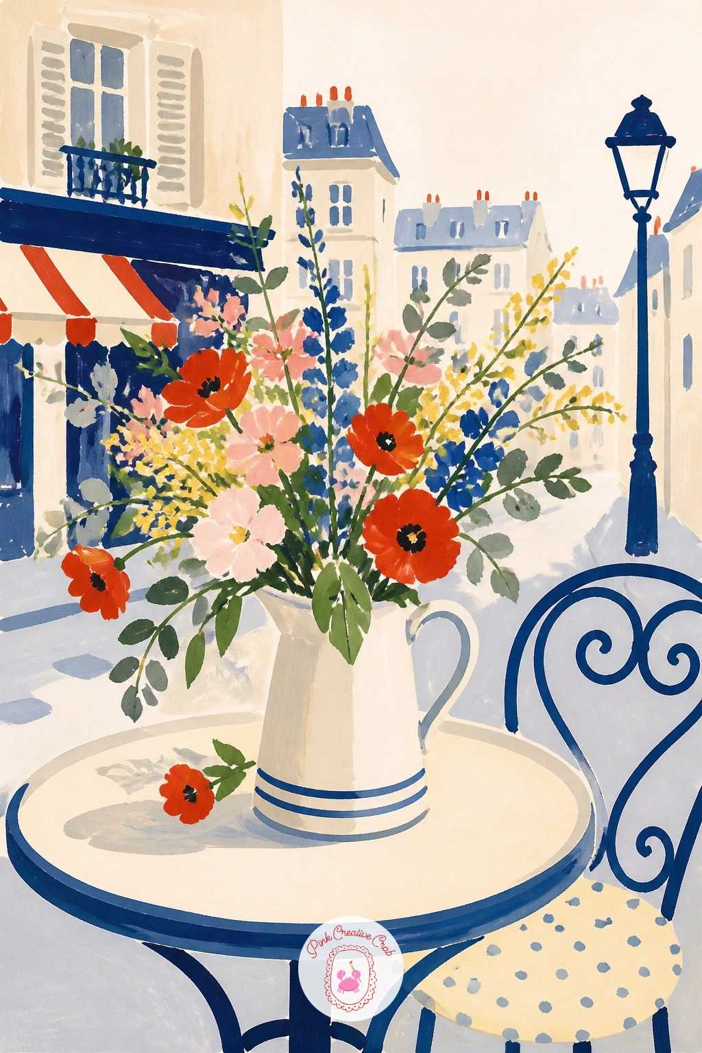
Set the scene before the flowers take over, a small round bistro table painted as a simple flat circle in cobalt or forest green, a wrought iron chair edge suggested with a few curved lines at the side of the frame. Keep the background loose, a soft wash of blush or grey is enough to suggest a Parisian street without painting a whole building.
A simple pitcher or small vase sits centered on the table holding a loose, slightly wild bunch of mixed flowers, tomato red and blush blooms with a few green stems poking out at different angles, painted quickly so the whole mood stays relaxed and café-like rather than formal.
The background is where beginners tend to overwork things, adding cobblestones and windows turns this into a cityscape instead of a still life. Keep every background element as a flat suggestion, two or three shapes at most, so the vase and table stay the focus.
Today’s tip: tilt the table slightly off a straight horizontal line, it gives the whole scene a candid, caught-in-a-moment feel rather than a stiffly staged one.
Palette: Cobalt Blue,Tomato Red,Blush Pink,Sap Green
Paint the vase as a tall soft wave, the silhouette curving in and out gently rather than straight-sided, in a warm wavy pink that feels sculptural on its own. Keep the surface flat and smooth, this vase relies entirely on its shape for interest, not pattern.
Anthuriums have a very distinct structure, a heart-shaped glossy bract in tomato red or blush with a thin curved spadix spike rising from the center, painted as a smooth single shape rather than built up in layers. Two or three stems at different heights keep the arrangement from looking stiff.
Getting the heart shape right is the sticking point, lightly pencil a simple heart outline first and curve one side slightly more than the other since real anthurium bracts are never perfectly symmetrical. A fine brush or a toothpick dipped in paint works well for the thin spadix spike.
Today’s tip: paint a small highlight of white or pale yellow on each anthurium bract, it is what gives them their glossy, almost plastic shine.
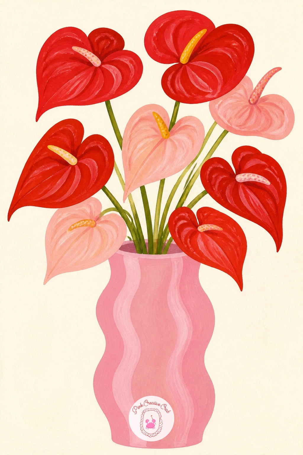
Palette: Blush Pink,Tomato Red,Butter Yellow,Sap Green
Lay the dots down with a tool rather than freehand for even spacing, the eraser end of a pencil dipped in paint or the back of a small brush handle gives consistent circles across a cobalt or blush vase base. Space them loosely in a scattered pattern rather than a strict grid for a more playful feel.
Cosmos flowers are simple and quick, thin delicate petals around a yellow center, painted in a loose ring of six or seven strokes per flower. Their wispy feathery foliage, painted as thin branching green lines, gives the bouquet a light, airy quality that suits the playful vase.
If the polka dots end up sloppy or uneven in size, a pencil eraser dipped fresh in paint for every single dot keeps the size consistent, reloading halfway through a dot is what causes smudges. No stamping tool handy, the cap of a marker works just as well.
Today’s tip: let a few cosmos stems lean outside the vase’s silhouette at different angles, it keeps the airy wildflower feeling intact.
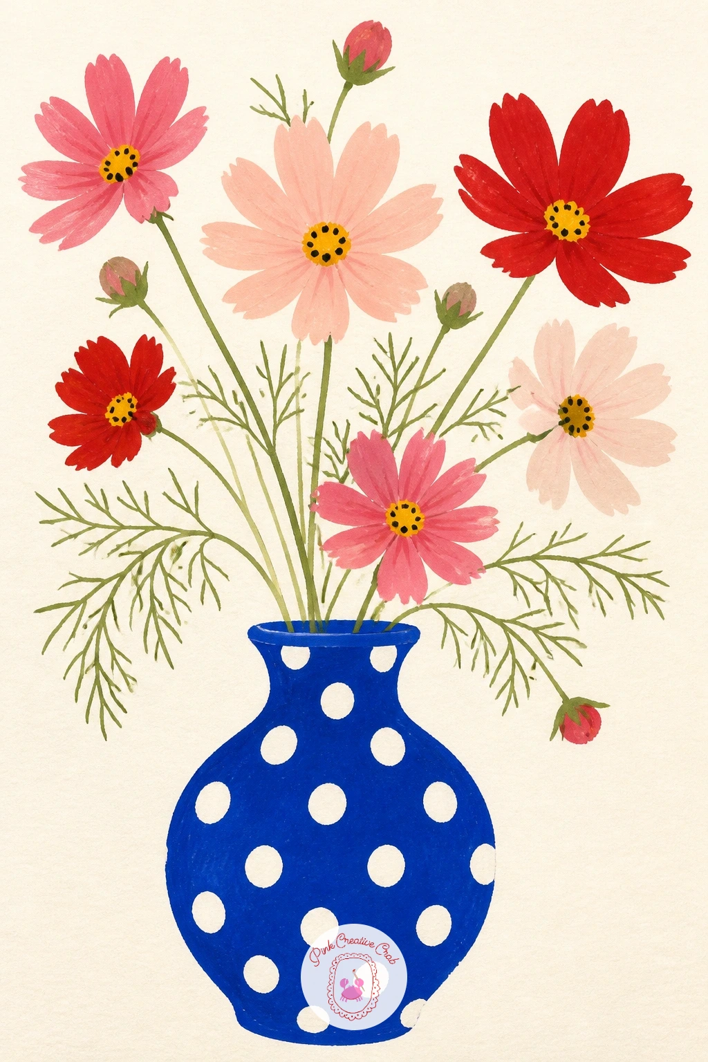
You Will Need
- pencil eraser or small round object to stamp dots
Palette: Cobalt Blue,Blush Pink,Butter Yellow,Sap Green
Build this as a small scene rather than a single object, a simple vase of flowers beside a retro radio shape, both sitting on a flat sill with warm yellow light washing across the whole area. Decide where the light source sits first, a corner of the frame, and let both objects cast soft shadows away from it in the same direction.
Paint the radio as a simple rounded rectangle in butter yellow or cobalt with a small round dial and a few speaker lines, kept basic rather than detailed. The vase beside it holds a casual, slightly uneven bunch of daisies or mixed blooms, painted loosely so the whole scene feels like an ordinary sunny morning.
Matching the shadow direction on both objects is what sells the single light source, if the radio’s shadow falls left and the vase’s falls right the whole scene feels disconnected. Keep both shadows short and warm-toned rather than grey.
Today’s tip: add one thin strip of warm yellow light cutting across the sill itself, it ties the whole still life together as one sunny moment.
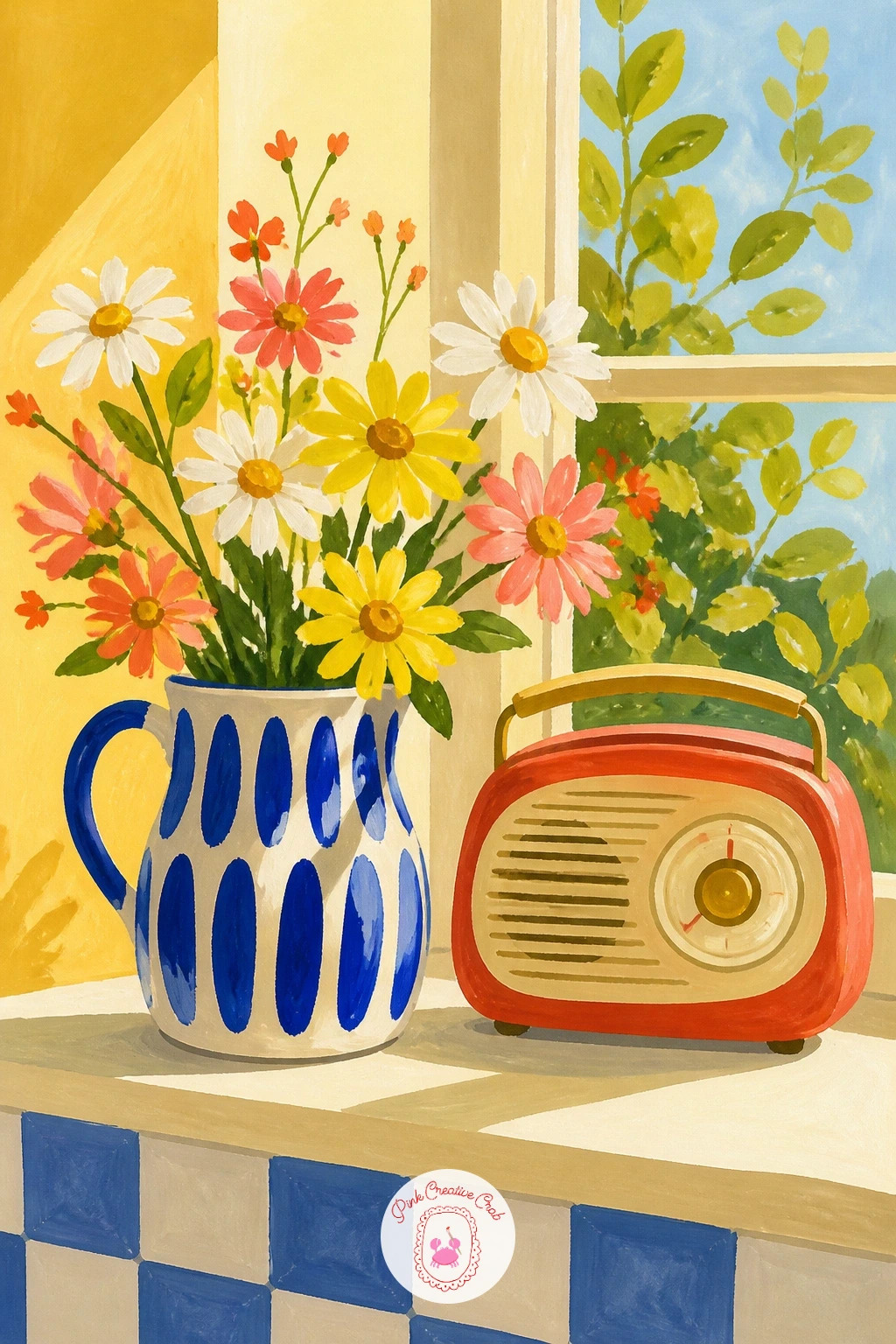
Palette: Butter Yellow,Cobalt Blue,Tomato Red,Titanium White
Commit to one blue for the whole vase, Delft pattern lives or dies on a single confident cobalt against white, no mixing in other colors to the painted motifs. Sketch a simple urn shape first, then add classic Delft touches, small windmill or floral motifs, tiny dots, thin border lines, all in that one blue once the white base is dry.
Fritillaries are the real star here, their checkered bell-shaped petals painted as a grid of small alternating squares in blush and tomato red over a drooping bell silhouette. Paint the solid bell shape first, let it dry, then add the checker pattern on top in a slightly darker tone.
Checkering a curved bell shape without it looking flat takes a light touch, let the squares get slightly smaller as they wrap toward the back of the bell, that subtle shift is enough to suggest the curve. No fine liner for the Delft details, the tip of a small round brush loaded thin works just as well.
Today’s tip: paint the Delft pattern on the vase before the fritillaries, it is much easier to judge how much blue pattern looks balanced when the flowers are not yet blocking your view.
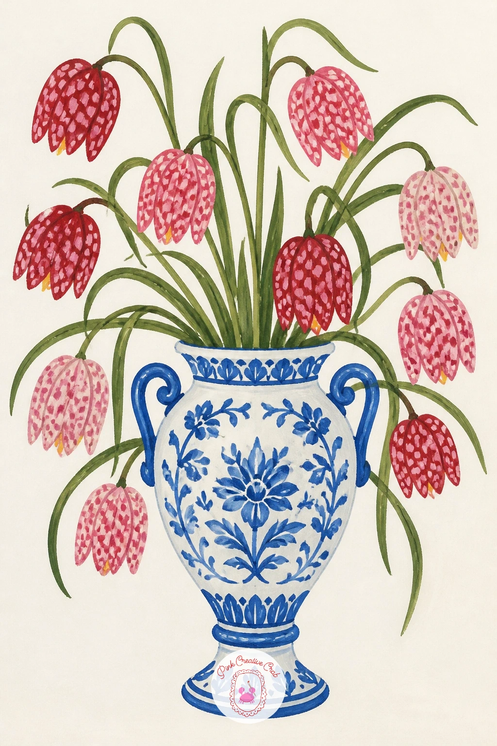
Palette: Cobalt Blue,Titanium White,Blush Pink,Tomato Red
Build the basket texture with short repeated strokes rather than one flat color, a warm tan or butter yellow base with slightly darker diagonal crosshatch strokes layered on top once dry to suggest the woven pattern. Keep the strokes loose, real basket weave is never perfectly uniform.
Ferns fill it next, long arching fronds in two shades of green, painted with a single confident stroke per stem and small leaflet marks added along each one with the very tip of the brush. Vary the lengths and curves so the ferns feel like they are reaching in different directions.
A dry brush dragged lightly over the basket’s woven texture after the crosshatching dries adds a bit of scratchy realism without extra drawing, just enough bristle separation to catch the paper’s grain. Keep it subtle, too much dry brushing turns the basket muddy.
For more ideas pairing greenery with natural materials like this, the techniques in gouache painting ideas for beginners are worth a look. Today’s tip: let one or two fern fronds droop over the basket’s rim, it softens the whole silhouette nicely.
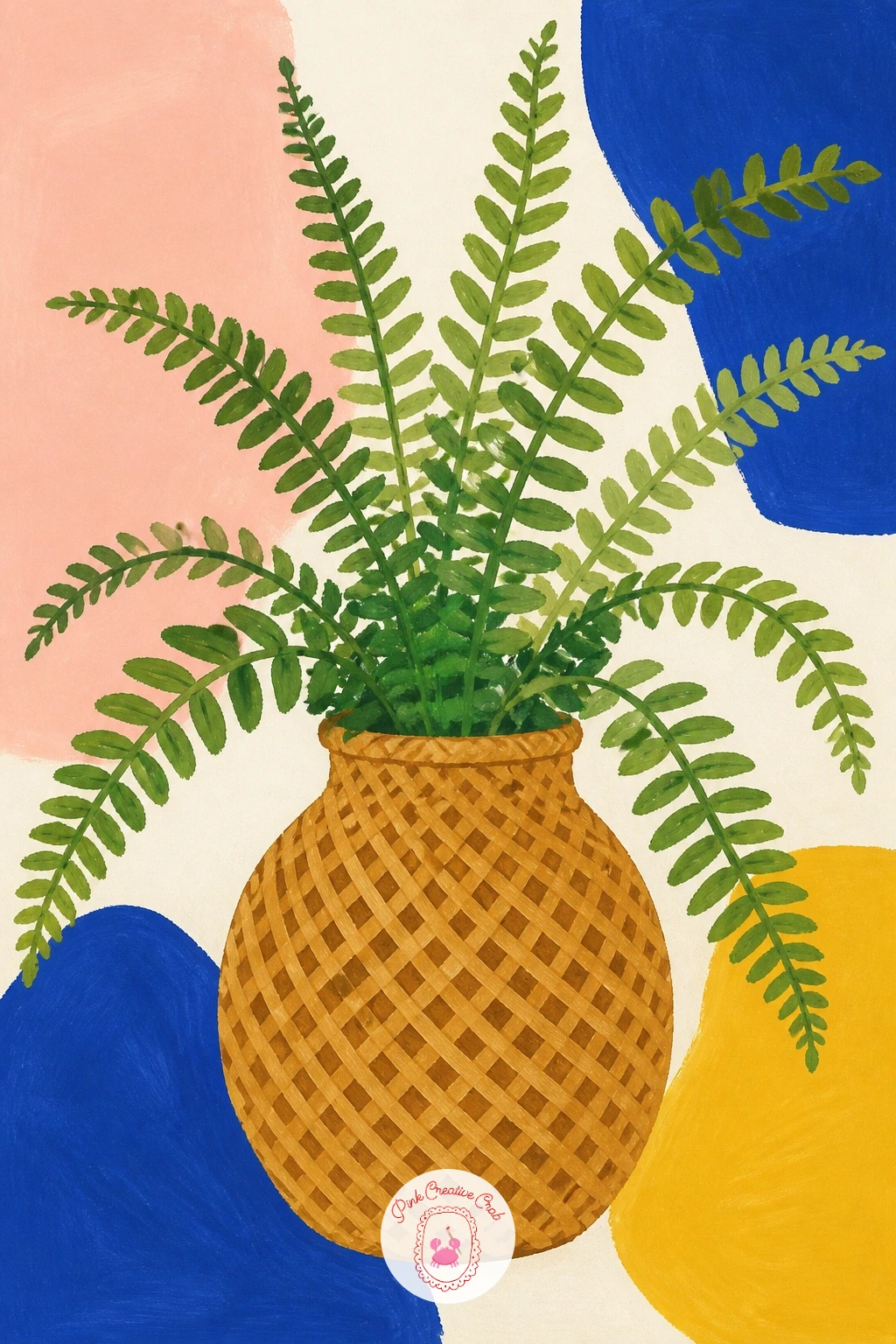
You Will Need
- dry brush for basket weave texture
Palette: Butter Yellow,Raw Umber,Sap Green,Olive Green
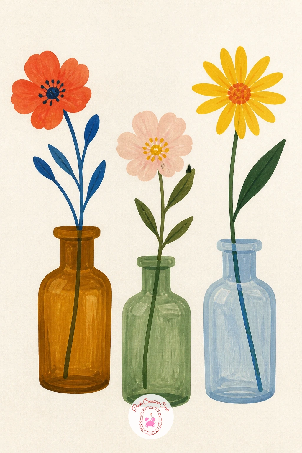
Line up three small bottles of slightly different heights and shapes, one tall and narrow, one short and round, one with a slight shoulder, painted in tinted glass colors like soft amber, pale green and a muted blue. Paint each bottle as a simple flat silhouette with just a thin highlight line down one side to suggest glass.
Each bottle holds exactly one stem, a single tulip, a sprig of eucalyptus, one ranunculus, kept small and centered so the bottles themselves carry most of the visual interest. Spacing the three bottles at slightly uneven distances rather than in a perfect row keeps the composition feeling natural.
If this is your first time painting tinted glass, mix your bottle colors with plenty of white added, true apothecary glass is always a pale, slightly dusty version of its base color rather than a bold saturated one. A straight ruler line for the highlight on each bottle sells the glass effect instantly.
Today’s tip: keep all three stems roughly the same height even though the bottles differ, it creates a pleasing uneven-yet-balanced look across the row.
Palette: Amber,Sage Green,Cobalt Blue,Blush Pink
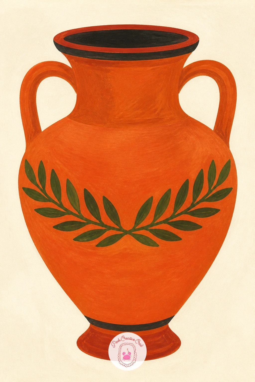
Shape the vase like a classical urn, wide shoulders tapering to a narrow foot, two small curved handles on either side, painted in a warm terracotta base. Once dry, add the laurel wreath motif as a band of small painted leaves in black or dark olive wrapping around the widest part of the vase, echoing real Greek pottery decoration.
Keep the leaf band even by lightly marking a horizontal guideline around the vase first, then painting the pointed little leaf pairs along it at a steady rhythm, slightly overlapping for a continuous wreath feel. No flowers spill from this one, the decoration is the whole subject.
The handles are the part most likely to end up uneven, pencil both in lightly first and hold the page at arm’s length to compare them before adding any paint. A ruler is not useful here since the handles curve, your eye is the better tool.
Today’s tip: keep the laurel leaf band to one single dark color, adding a second color to the leaves makes it look busy rather than classical.
Palette: Terracotta,Olive Green,Butter Yellow,Titanium White
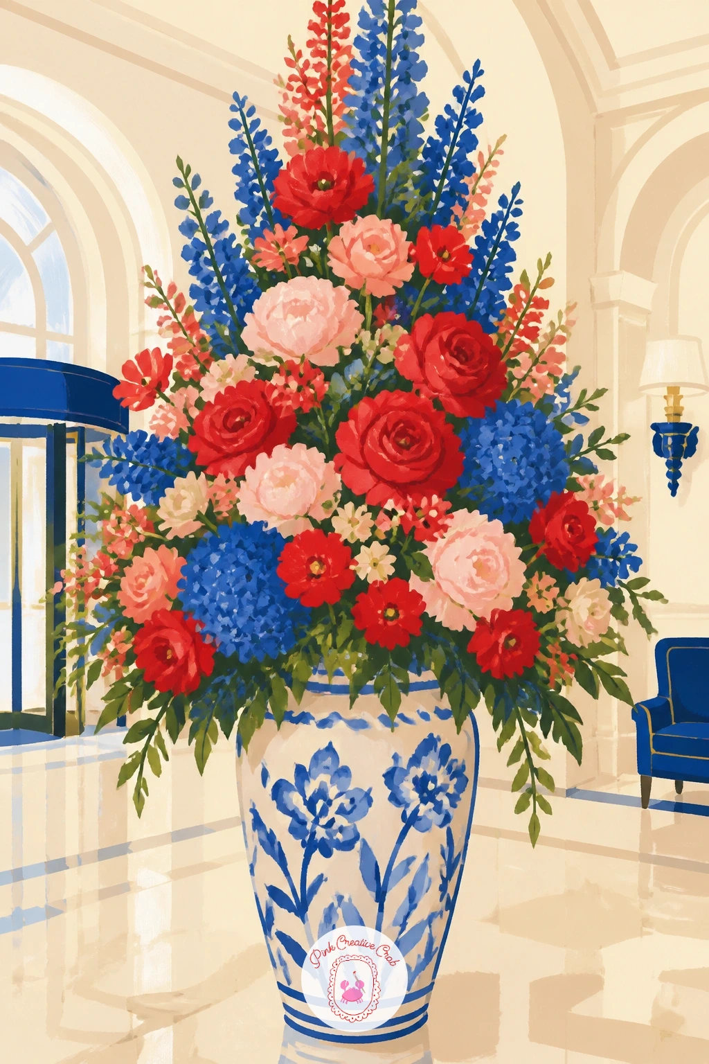
Scale decides this one, the vase sits low and wide at the base of the frame while the flowers tower up past the top edge, cropped off rather than fully contained. Paint a large simple urn or floor vase first in a bold single color, then build the arrangement in loose layers working from the back stems forward.
Mix a few flower types for that lobby-arrangement abundance, tall branches, big round blooms like dahlias or peonies, trailing greenery, all painted as flat confident shapes rather than individually detailed. Cluster the biggest blooms lower and let thinner branches rise highest for a natural pyramid shape.
The scale trap here is painting everything the same size, vary your flower shapes noticeably larger near the base and smaller as they rise to keep the sense of real depth and height. A soft marble-look floor or a hint of a pillar behind keeps the lobby setting readable without overworking the background.
Today’s tip: let two or three branches cross outside the main pyramid shape at odd angles, it keeps a huge arrangement from looking too neat and stiff.
Palette: Tomato Red,Blush Pink,Cobalt Blue,Sap Green
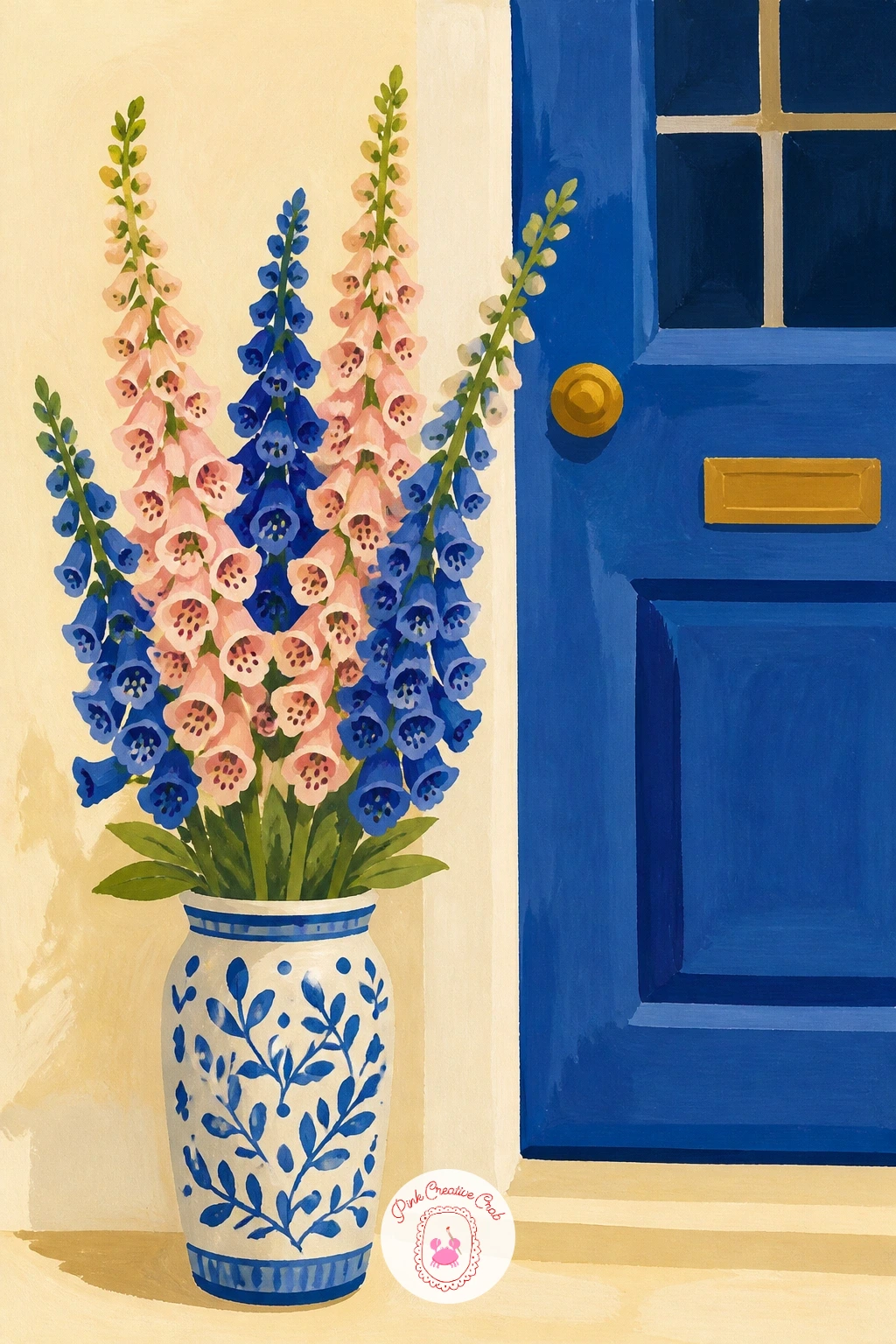
Place a simple vase right beside a painted door edge, a flat panel of color with a doorknob dot and maybe a window pane or two, enough to say front door without drawing the whole house. The vase sits on the ground or a low step, tall and simple so it does not compete with the foxgloves above it.
Foxglove spikes are built from the base up, a single tall stem first, then small bell-shaped blooms added in a spiral pattern along the upper two-thirds, larger near the bottom and smaller toward the tip. Blush or soft cobalt both suit the bells nicely, with tiny dot speckles added inside a few for detail.
Spikes that end up top-heavy or lopsided usually have too many blooms crowded near the tip, keep the top third of each spike sparse with just a few small buds to let it taper naturally. If this is your first time painting foxgloves, three spikes of slightly different heights reads better than one single stem.
Today’s tip: angle the foxglove spikes slightly away from each other rather than painting them perfectly parallel, it makes the cluster feel alive rather than stamped.
Palette: Blush Pink,Cobalt Blue,Sap Green,Titanium White
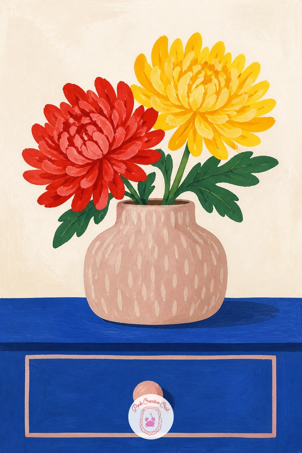
Set the dresser with just a few flat shapes, a drawer line, a small rounded knob, enough to place the vase in a bedroom without painting the whole piece of furniture. A simple round or squat vase sits centered on top, painted in a muted color so the flowers stay the clear focus.
Chrysanthemums are built from dozens of thin layered petals radiating from a tight center, easiest to approach as several rings of short brushstrokes rather than trying to count individual petals. Work from the outer ring inward, each ring slightly shorter and a touch darker than the last, finishing with the tightest, brightest center.
Overworking chrysanthemums is the most common trap, once the layered rings start looking busy rather than full, stop adding strokes even if it feels incomplete, a little restraint reads as more polished than total coverage. No fine round brush available, a slightly worn flat brush dragged in short flicks gives a similar petal effect.
Today’s tip: paint two chrysanthemum heads at slightly different sizes rather than one large bloom alone, it gives the dresser arrangement more presence.
Palette: Tomato Red,Butter Yellow,Blush Pink,Raw Umber
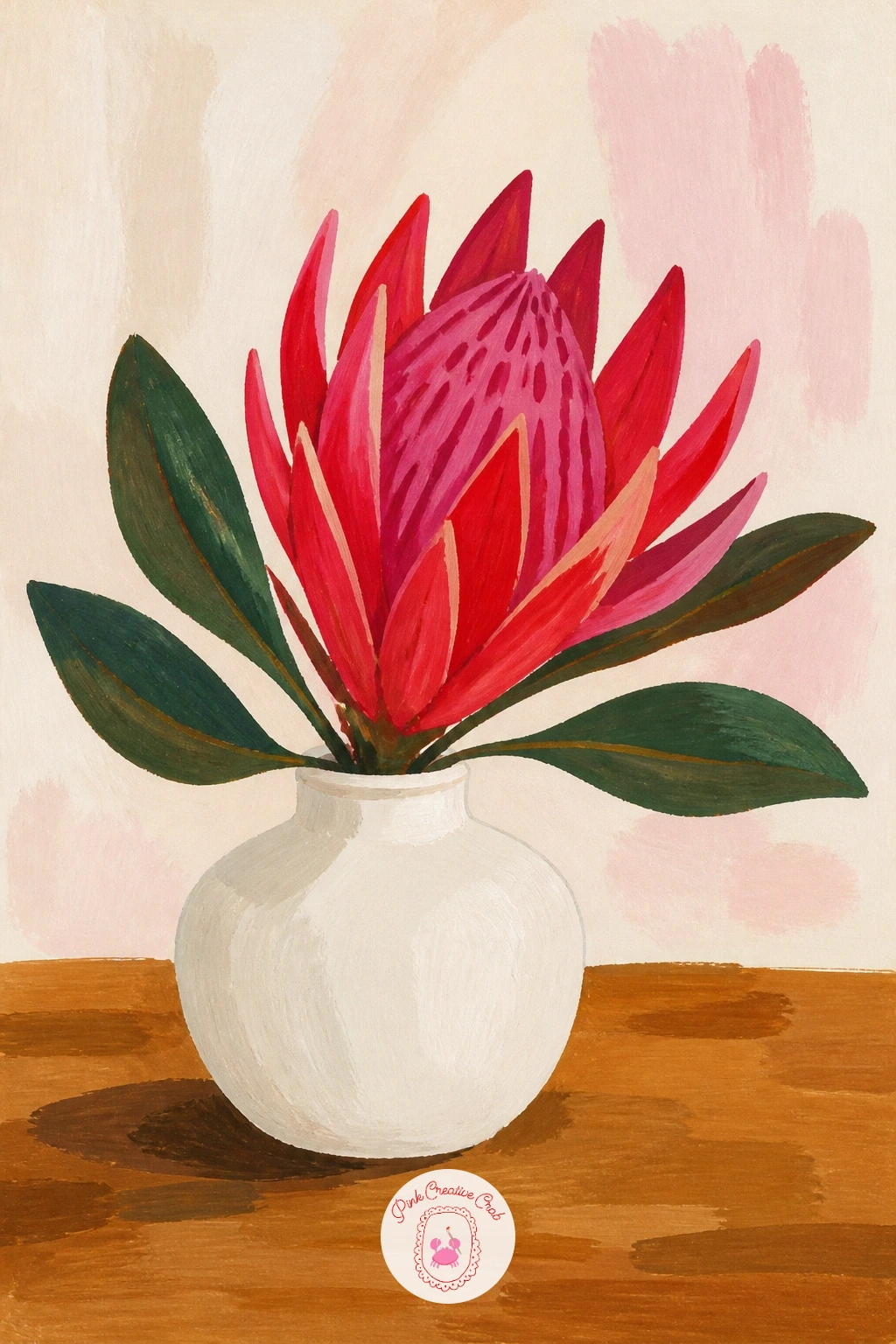
Give the table a simple flat top, a round or rectangular shape in a warm wood tone, with the vase sitting slightly off-center for a more candid, styled-room feel. Keep the vase itself plain, a low wide ceramic piece in white or sage, since protea’s bold shape needs no competition from the container.
Protea flowers have a very distinct structure, a pointed cone-like center surrounded by long curved petal-like bracts, best built by painting the central cone first in a deep pink or tomato red, then adding the surrounding bracts as individual curved strokes radiating outward, lighter toward their tips.
Getting the bracts to curve convincingly is the trickiest part, paint each one as a single stroke that starts thick near the cone and tapers to a fine point, rather than two parallel lines filled in, it reads far more natural. If deep pink gouache is not in your set, mix tomato red with a touch of cobalt for a cooler pink.
Today’s tip: leave a little bare paper between each bract near the cone, that small gap is what keeps the dense center from reading as a solid blob.
Palette: Tomato Red,Blush Pink,Sap Green,Titanium White
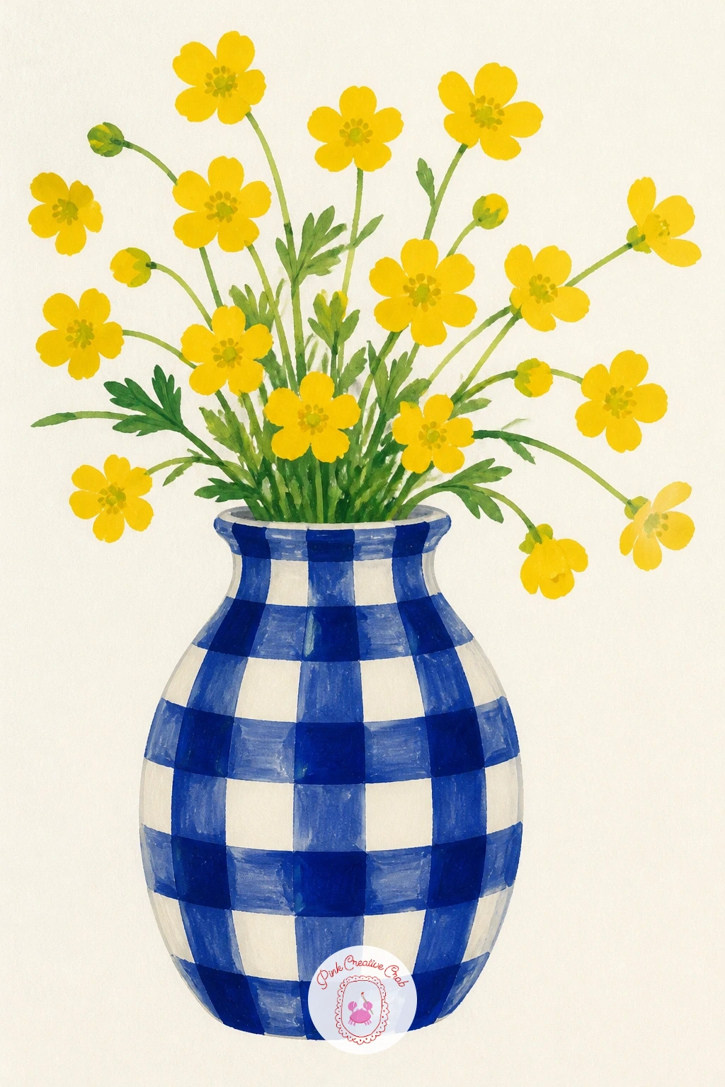
Paint the gingham pattern in careful stages rather than all at once, first a grid of pale cobalt vertical and horizontal stripes across the whole vase, then go back over the squares where the stripes overlap with a slightly darker tone to create that classic woven check look. Let each layer dry before the next.
Buttercups are refreshingly simple after that, five rounded glossy petals in butter yellow around a tiny green center, painted quickly with a small loaded brush so each petal keeps a soft rounded edge rather than a sharp point. A dozen small buttercups scattered loosely reads better than a few large careful ones.
Lifting a bit of wet yellow paint with a clean damp brush right after painting each petal creates a small highlight that gives buttercups their characteristic shine, this works best while the paint is still wet so do it petal by petal rather than all at the end.
Today’s tip: keep the buttercups smaller than you think they should be, their charm comes from looking delicate against the bold gingham pattern.
Palette: Cobalt Blue,Titanium White,Butter Yellow,Sap Green
Shape the cat vase as one smooth seated silhouette, pointed ears, a curled tail wrapping around its base, two simple dot eyes, painted in a single flat color, cobalt or a soft terracotta both work nicely. Keep the face minimal, this is a decor object first and a cat second.
Marigolds burst from the top of its head in warm orange and butter yellow, each flower built from tightly packed small petal strokes radiating from a center, similar to the chrysanthemum technique but denser and rounder overall. Cluster several blooms close together for that full, cheerful marigold look.
If the cat’s proportions feel off, compare the head width to the body width directly, a seated cat’s head is usually close to a third of its total height, adjusting the ears or body slightly to match fixes most awkward versions quickly. No cobalt for the body, a soft blush works just as well for a different mood entirely.
Today’s tip: paint the tail curling around the front paws rather than behind the body, it reads more clearly as a seated cat shape from a straight-on view.
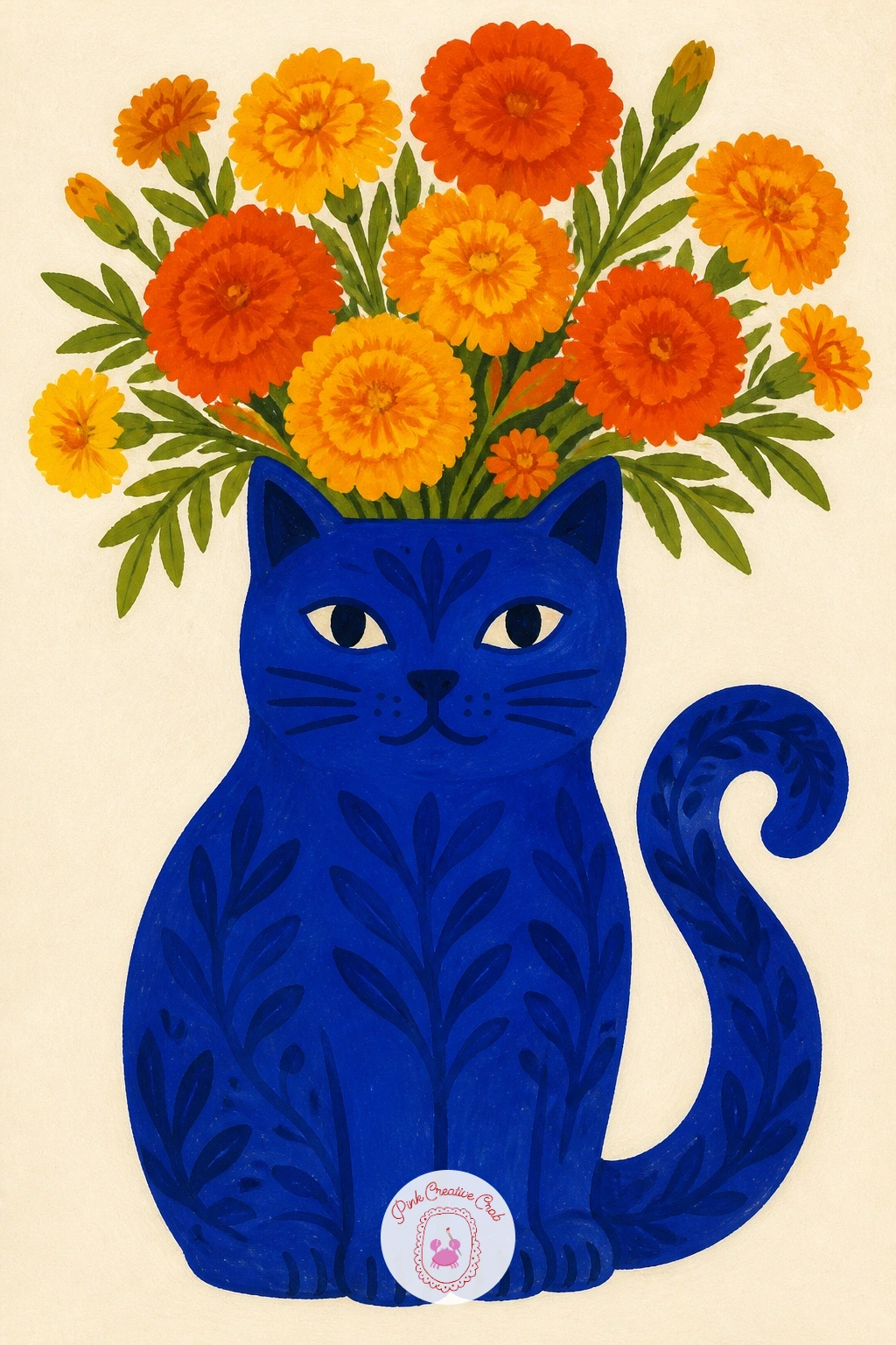
Palette: Cobalt Blue,Butter Yellow,Tomato Red,Titanium White
What to Do Next
Pick whichever vase caught your eye first, that pull usually means it is the one you will actually finish. Tape a sheet of hot press paper to your table, mix your main colors before you start, and let the vase shape lead the way into the bouquet.
Frequently Asked Questions
What paper works best for flower vase painting in gouache?
Hot press watercolor paper works best because its smooth surface keeps flat gouache shapes crisp and even. Cold press paper has too much texture and breaks up solid color blocks, which fights the clean poster look these vases need.
How do you keep gouache shapes flat and bold instead of streaky?
Load the brush generously and work quickly in one direction without going back over half-dry paint. Mixing enough color before starting, so you never run out mid-shape, prevents the patchy streaks that come from remixing partway through a flower or vase.
What if I do not own the exact colors in the palette?
Mix close equivalents from a basic set rather than buying new paint. Cobalt blends from ultramarine and a touch of white, tomato red from a warm red with a hint of orange, and blush from that red softened heavily with white.
How do I make a vase look like it has a different shape without it looking wrong?
Sketch the silhouette lightly in pencil first and check both sides match before adding any paint. Holding the page at arm’s length or comparing it to the previous vase on the page catches lopsided curves early, while they are still easy to fix.
Can these flower vase painting ideas work in acrylic instead of gouache?
Yes, acrylic gives the same flat bold color with a little extra drying time to blend edges if wanted. Thin it slightly with water for smoother coverage, and keep brushes clean between colors since acrylic dries permanently once set.
Have any thoughts?
Share your reaction or leave a quick response — we’d love to hear what you think!
-
 0
-
0
-
0
-
0
-
0
-
0


