

A puffin drawing earns its spot on every birder’s easel: that bright striped beak and the comic little waddle give you a subject that is serious fun to paint, not solemn at all. These pages keep every bird somewhere real, a cliff ledge, a wave, a burrow mouth, so each one reads as a small scene rather than a specimen pinned to white paper.
Below you get puffins first, every pose and mood you could want, then the wider cast of seabirds that share their cliffs: gannets, guillemots, a wandering albatross, a gull making off with someone’s chip. Work through them in any order, pick whichever one makes you reach for your brush right now, and keep the water loose so the birds stay full of life.
Using these images: free for personal projects such as printing, coloring, cards, journals and gifts. Handmade items that include them may be sold up to 30 pieces per design. More than that is commercial use and is not permitted, and neither is selling or sharing the images themselves or passing them off as your own. Please ask before any other use.
Start the whole set with a puffin carrying a beak full of little fish, the image everyone pictures first when they think of this bird. Pencil a simple egg shaped body leaning slightly forward, then block in the head and the big wedge of a beak before you touch any paint, because the fish need to sit inside that shape, not drawn on top of it.
Paint the body in thin grey blue washes first, leaving the white belly untouched paper, then drop in the beak with cadmium orange and a streak of grey at the base where the real color sits. Add three or four small silver fish tails poking from the beak with quick dry strokes of your brush, just the suggestion of a shape, before you go back in with a fine ink pen for the beak grooves and the eye.
The mistake to watch for is overworking the fish until they look stuck on rather than gripped. Keep them loose, a few confident strokes each, and let the white paper do most of the work for their shine.
If your orange runs muddy, rinse the brush fully between the orange and the grey base of the beak so the colors stay clean and separate. Try this one on a half sheet so the beak has room to read clearly.
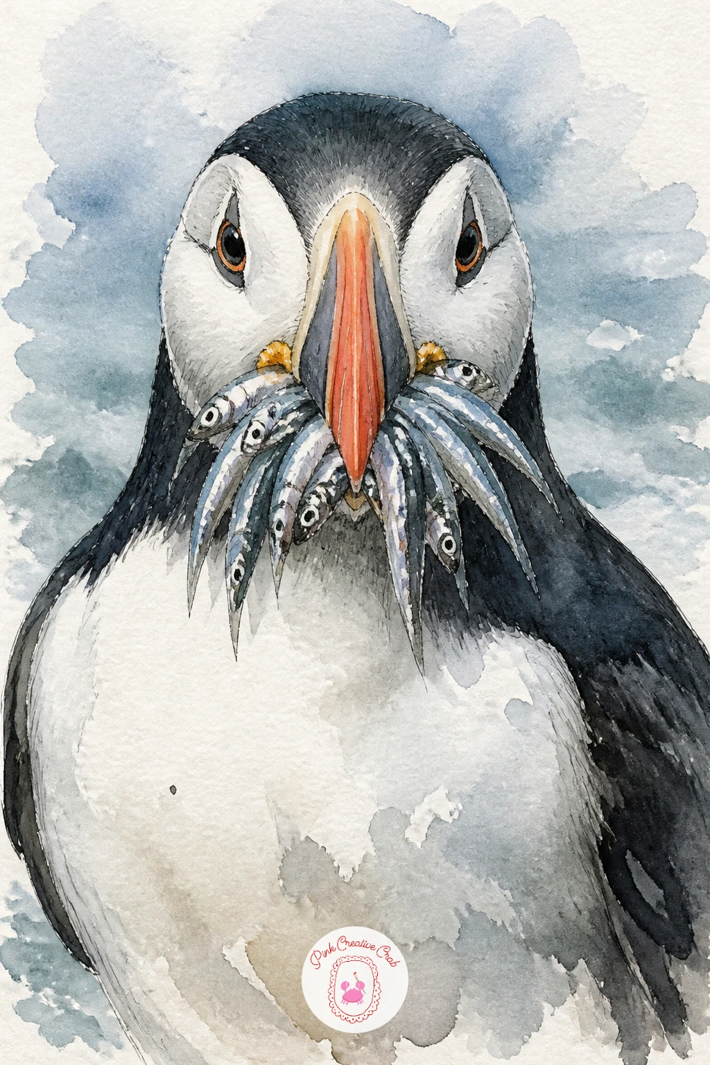
Palette: Cadmium Orange,Payne’s Grey,Silver Grey,Titanium White
Move from one puffin to two puffins standing together on a cliff edge, a chance to practice grouping birds without them looking like copies of each other. Draw the nearer bird larger and facing slightly toward you, the second one smaller and turned a touch away, so the pair reads as a real moment rather than a mirrored pair.
Measure the cliff edge first with a straight pencil line about a third up the page, then build both birds from simple ovals before any beak or foot detail goes in. Paint the sky and sea in one wet wash behind them so the birds sit against real air and water, then let that dry fully before you bring in the black and white body patterning.
Overlap the two birds slightly at the shoulder so they feel like a pair rather than two separate drawings pasted side by side. If your paper buckles from the wet background wash, tape it down on all four edges before you start and it will dry flat.
Keep one brush size for the birds and a bigger one for the cliff and sky, that size difference alone makes the scene feel properly built in layers.
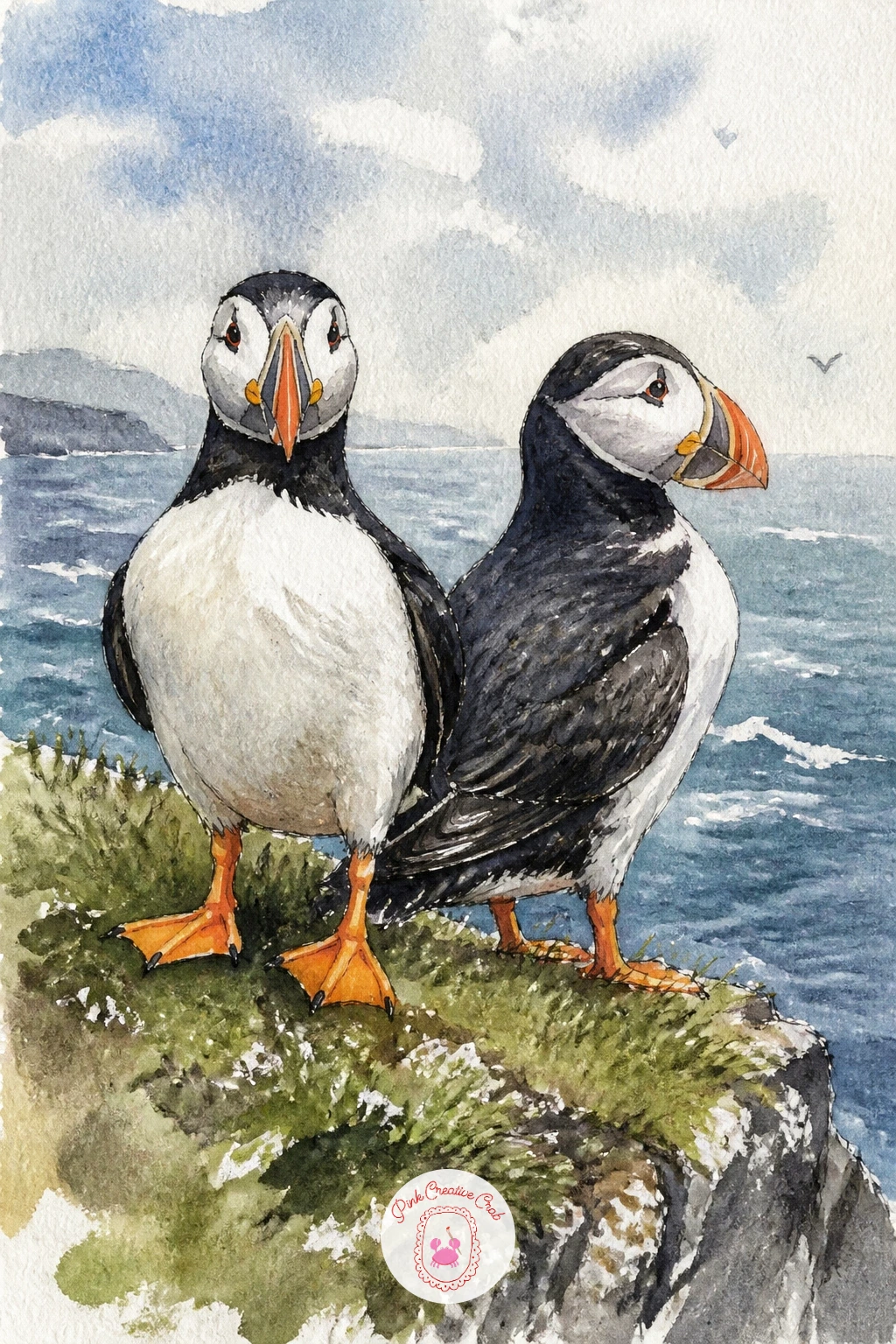
Palette: Payne’s Grey,Cadmium Orange,Cerulean Blue,Raw Umber
A puffin peeking out of its burrow gives you a lovely excuse to paint mostly dark earth with one bright face emerging from it. Sketch a rough round burrow opening first, dark and uneven at the edges, then place the head and just the top of the shoulders poking out, the rest of the body implied by the shadow behind it.
Paint the burrow interior first in a wet mix of burnt umber and Payne’s grey, letting it pool darker toward the back of the hole. While that is still damp, lift a little color out with a dry brush or tissue right where the puffin’s head will sit, so the bird reads as lit from outside rather than painted over mud.
This is a good one to try the ten minute way: a dark burrow shape, a quick orange beak and white face, done. Give it forty minutes instead and you can add individual grass tufts around the opening and soften the burrow edges with a damp brush so they blend into the turf.
Keep the eye small and bright, a single dot of white left unpainted, because that is what makes the bird look alert rather than buried.
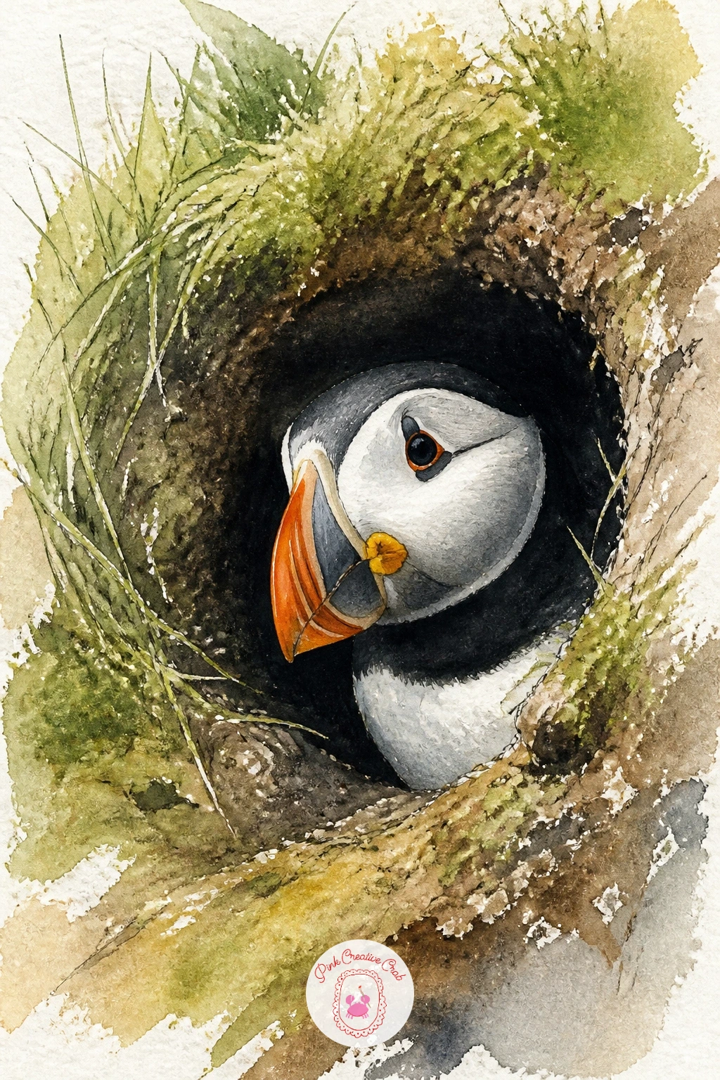
Palette: Burnt Umber,Payne’s Grey,Cadmium Orange,Sap Green
A small travel brush with a pointed tip helps you lift the puffin’s face out of the wet burrow wash cleanly, try one if your usual round feels too blunt for this.
Build on that stillness with a puffin landing, wings spread wide and feet dropped forward, the most dynamic pose in the whole set. Pencil the wing shapes first as two broad triangles angled back from the body, then add the body and head once you are happy with how much sky those wings take up.
Think about where the light comes from before you paint: if it sits high and to one side, the top of the near wing stays pale while the underside falls into shadow, and that single decision gives the whole bird its sense of weight dropping through the air. Paint the sky behind first in a soft wash so the wing edges can be dropped in wet against wet for a feathered, unforced look.
Feet reaching forward are the part most likely to go flat, so paint them last in a strong orange with a few quick dark lines for the webbing, keeping the brushwork loose rather than drawing each toe.
If you are nervous about the wing angle, hold your own arms out at the same angle in a mirror first, it sounds silly but it works every time.
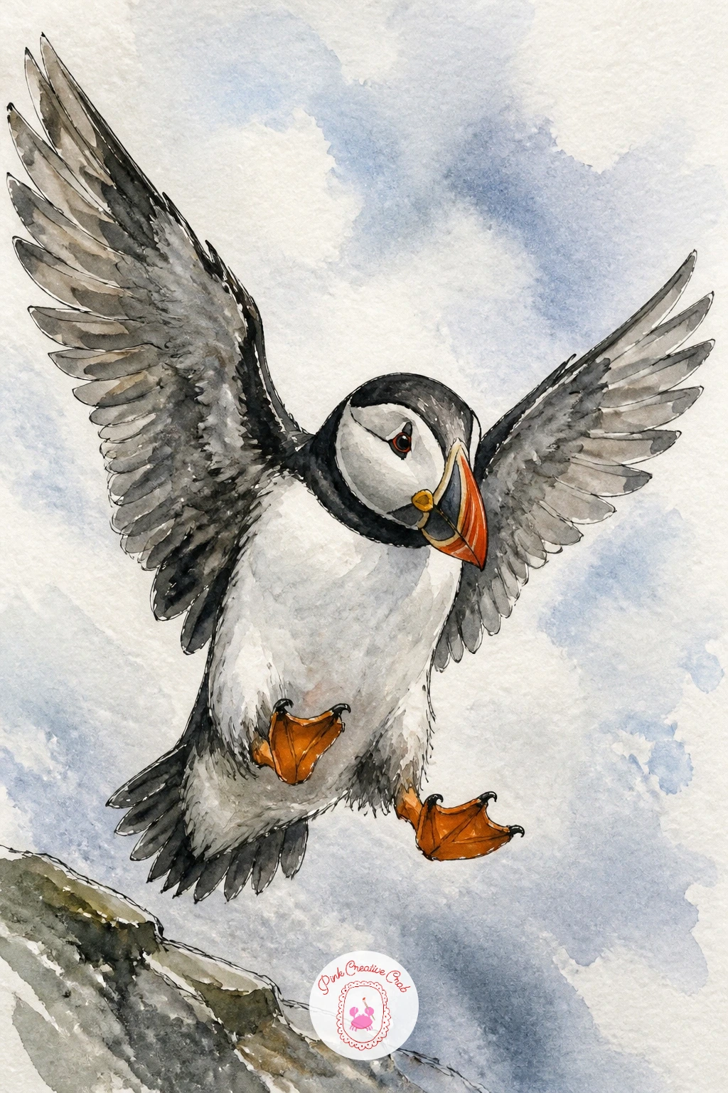
Palette: Payne’s Grey,Cadmium Orange,Cerulean Blue,Titanium White
Give the bird some company at ground level with a puffin standing among sea pinks on a clifftop, the small pink flowers that cover so many puffin islands in early summer. Paint the flowers first in loose dabs of rose pink and magenta scattered across the lower third of the page, then let that dry before you place the puffin standing among them.
Keep the puffin’s body simple here, since the flowers are doing a lot of the visual work, a basic standing pose with the beak turned slightly down as if it is looking at the ground. Build the sea pinks with a small round brush loaded fairly dry, pressing the tip down and lifting rather than dragging, which keeps each flower head distinct instead of a pink smear.
The flowers can easily overwhelm the bird if you crowd them right up to its feet, so leave a little breathing room of bare grass green around the puffin itself.
No rose pink in your set is fine, mix a little cadmium red into white or into your orange to get a close warm pink instead.
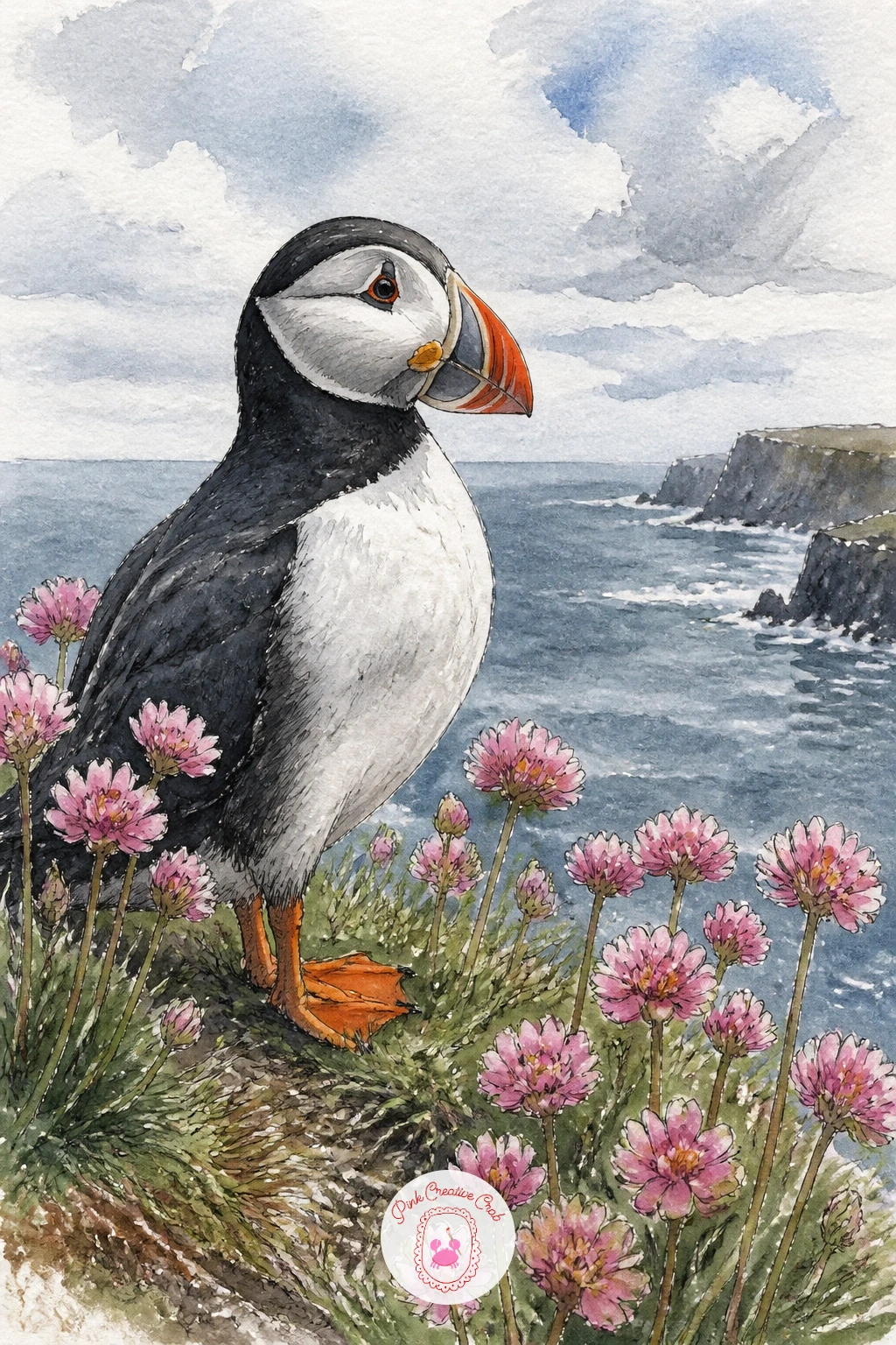
Palette: Rose Pink,Sap Green,Payne’s Grey,Cadmium Orange
Take the puffin off the cliff altogether and float it on a wave instead, since these birds spend most of their lives at sea rather than on land. Paint the water first as a single wide wash of blue grey, then while it is still wet drag a dry brush sideways in a few places to pull up the paper’s texture for the suggestion of ripples.
Once that layer is fully dry, paint the puffin sitting low in the water, more of its body hidden below the waterline than you might expect, with the orange beak and white chest the brightest points on the whole page. A thin ring of reflected color under the bird, just a soft smudge of the same orange, sells the idea of water far better than any drawn ripple line.
If the sea ends up too flat and solid, go back in with a slightly darker blue grey while the first wash is still damp and drop in a few uneven patches, wet into wet always looks more like moving water than a dry edge ever will.
Try this one again later with a stormier grey sea for a completely different mood from the same simple pose.
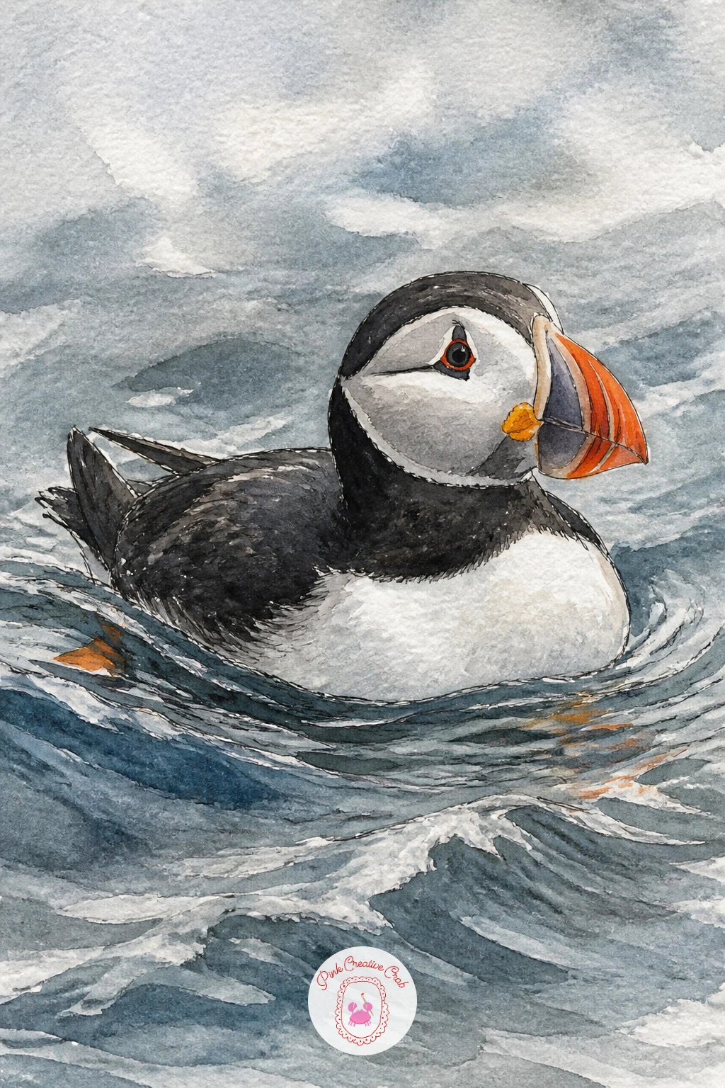
Palette: Payne’s Grey,Cerulean Blue,Cadmium Orange,Titanium White
Soften the mood with a puffin chick in a burrow, all soft grey down and no adult markings yet, tucked into the dark of the nest. Shape the chick as a simple rounded puff with barely any neck, since chicks at this age read as one soft blob with a small dark eye and a stubby grey beak rather than the sharp striped adult shape.
Paint the burrow dark and loose around the edges exactly as you would for the adult version, but keep the chick itself much softer in color, a warm grey rather than the crisp black and white of a grown bird, with no orange at all yet.
Fluffy down is easy to overdo with fussy little strokes, so instead paint the chick as one soft wet shape and while it is still damp touch a nearly dry brush to the edges in a few spots to break them up gently, that is enough to suggest down without drawing every feather.
If you only have one grey in your palette, warm it slightly with a touch of burnt sienna so the chick does not read as cold stone.
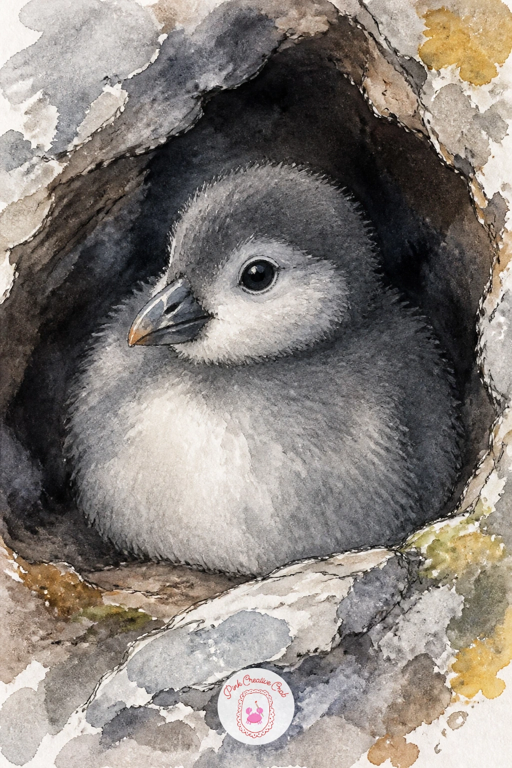
Palette: Warm Grey,Burnt Sienna,Payne’s Grey,Charcoal Grey
Give the weather a starring role with a puffin in the rain, feathers beaded with water drops and everything around it slightly dulled by grey light. Paint the whole bird a touch darker and flatter than you would on a sunny page, since rain mutes every color including that famous orange beak, which here sits closer to a burnt orange than a bright one.
Once the body washes are dry, use a fine ink pen or the tip of a round brush loaded with clean water to touch down small round drops across the back and head, then dab each one gently with a tissue so it lifts a tiny halo of color around it, mimicking a real bead of water catching the light.
Vertical grey pencil lines for rain in the background can look stiff if they are too even, so vary their spacing and let a few fade out completely rather than drawing every single one the same length.
If you do not want to risk the lifting technique on your main painting, practice the water drop trick on a scrap corner of the same paper first.
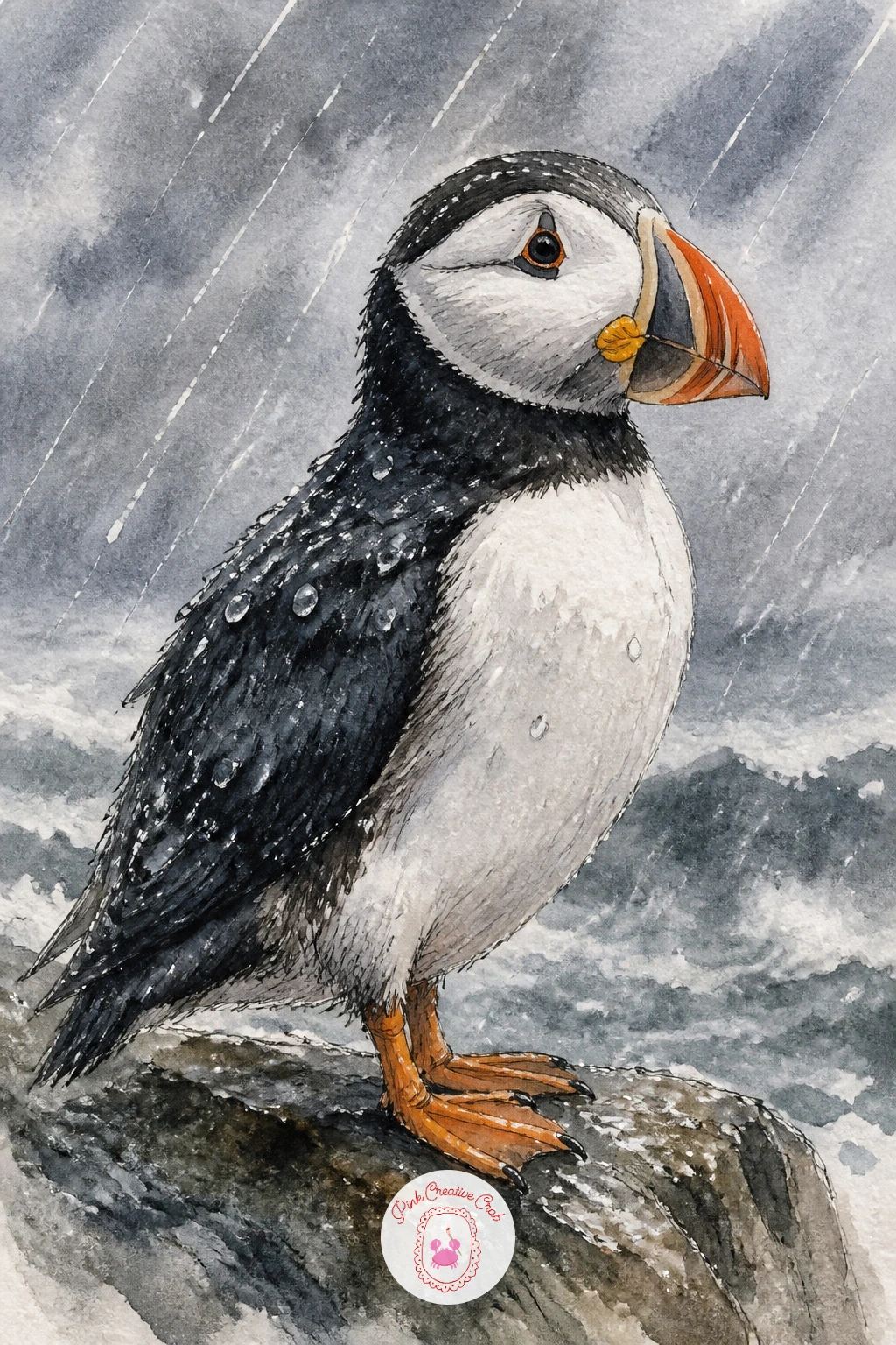
You Will Need
- tissue or paper towel for lifting
Palette: Payne’s Grey,Burnt Orange,Slate Blue,Titanium White
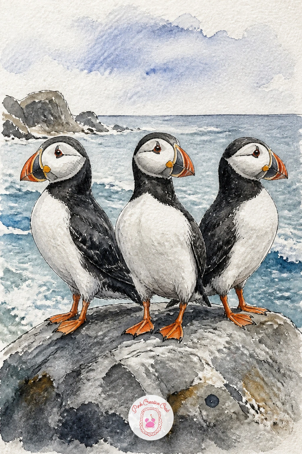
Line up a row of three puffins on a rock to practice repeating a shape without making it look copied and pasted. Draw all three at slightly different angles, one facing left, one nearly front on, one looking back over its shoulder, and vary their size a little so the nearest bird reads as closer to you.
Measure their spacing before you paint by marking three light pencil dots along the rock first, keeping the gaps uneven rather than perfectly even, since real birds never line up like soldiers. Paint the rock itself in one confident wash of grey and brown before the birds go in, so they sit on a surface rather than floating above a blank page.
The row can go flat if every bird gets identical detail, so pick one bird as the hero with the sharpest beak markings and eye, and let the other two stay a little softer and simpler in the background.
If you enjoy this lineup, the same trick works for the three guillemots or oystercatchers further down this list.
Palette: Payne’s Grey,Cadmium Orange,Raw Umber,Titanium White
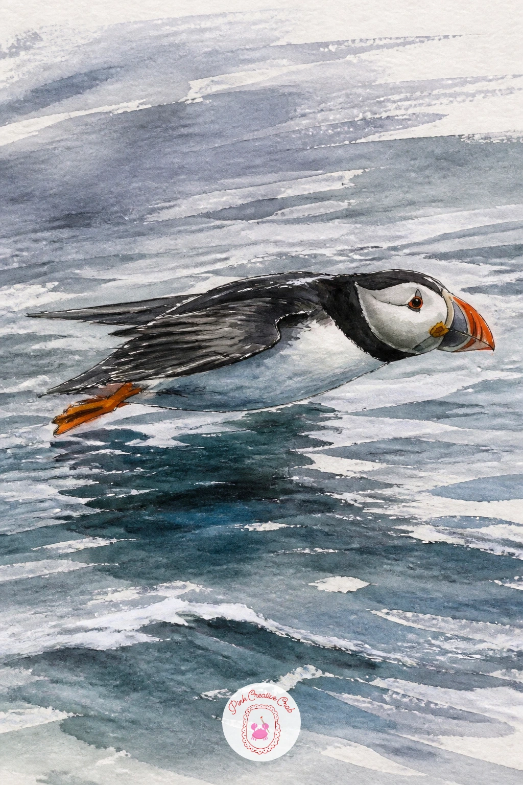
From the stingray drawing idea of a creature gliding close to a surface, borrow that same low flying energy for a puffin flying low over the sea, wings blurred with motion just above the waves. Sketch the body stretched long and horizontal rather than upright, wings pulled back close to the sides in a fast whirring position rather than fully spread.
Paint the sea first in long horizontal strokes to set up a sense of speed and direction, then paint the puffin over it once dry, keeping the wing edges slightly soft rather than sharply outlined so they read as beating fast. A thin streak of white paper left bare just behind the bird, where the sea briefly shows through a gap in the spray, helps sell how close it is flying to the water.
It is tempting to paint full detailed feathers on a bird moving this fast, but that stillness works against the motion, so keep the wings as simple dark shapes with only a hint of pattern.
Angle the whole bird slightly downward toward one corner of the page rather than flying flat across it, that small tilt alone makes it look like it is really moving.
Palette: Payne’s Grey,Cerulean Blue,Cadmium Orange,Titanium White
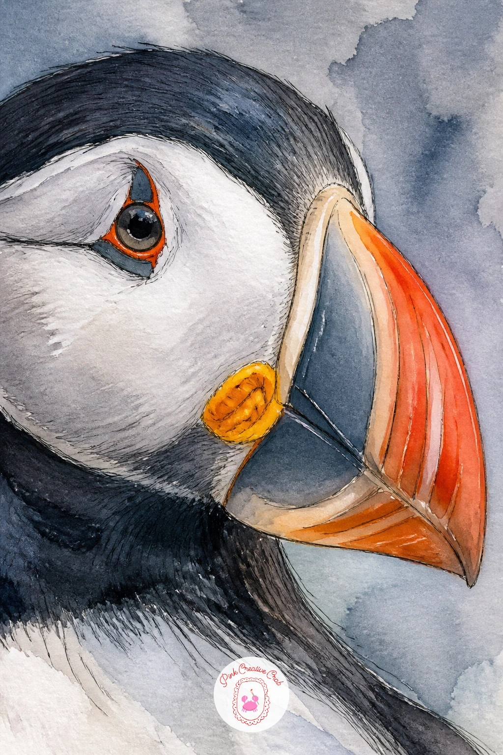
Zoom right in for a puffin close-up, just the head and that famous striped beak filling almost the whole page, the kind of study that rewards careful looking. Measure the beak’s three color bands against each other before you paint, grey at the base, a pale blue grey strip in the middle, bright orange at the tip, because getting those proportions close to even is what makes the beak recognizable.
Paint the palest band first and work toward the darkest, letting each dry a little before the next so the colors stay clean rather than bleeding together into mud. Save the fine ink pen for the very last step, just the thin dark groove lines that run across the beak and the small black triangle at the gape, since too much ink too early flattens all the color underneath it.
The eye is the other place people rush, so give it a tiny white highlight left unpainted before anything else goes on around it, that single white dot is what makes the whole close-up feel alive.
Try this one on a larger sheet than usual, the extra scale makes the beak bands much easier to control with a bigger brush.
Palette: Payne’s Grey,Pale Blue Grey,Cadmium Orange,Ivory Black
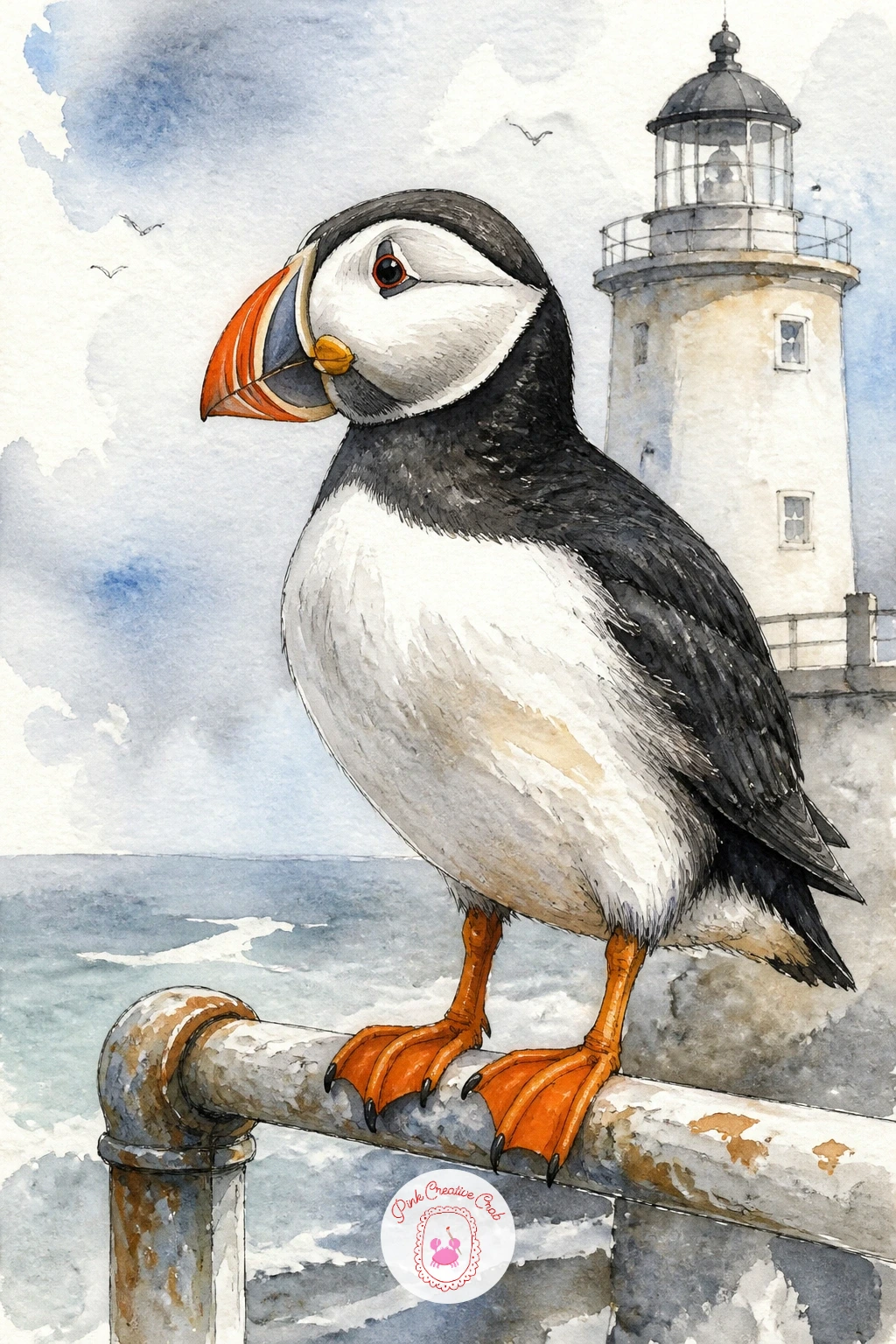
Swap the cliff for a built structure with a puffin standing on a lighthouse rail, a nice change of setting that still keeps the bird close to the sea it loves. Draw the rail first as a simple straight or slightly curved line with a few upright posts, keeping the perspective basic, the posts a little shorter and closer together the further they sit from the bird.
Paint the lighthouse itself soft and pale in the background, white or cream with maybe one red band, well behind the puffin in both tone and detail so your eye goes straight to the bird in front. The rail under the puffin’s feet needs just a few confident dark pencil or ink lines, not a fully painted structure, since too much detail there competes with the bird.
Feet gripping a round rail look odd if drawn flat, so curve the toes slightly around an implied cylinder shape rather than planting them straight down.
If lighthouses feel fiddly to draw from memory, a quick online reference photo of any simple white tower will give you enough shape to work from.
Palette: Cadmium Orange,Payne’s Grey,Titanium White,Cadmium Red
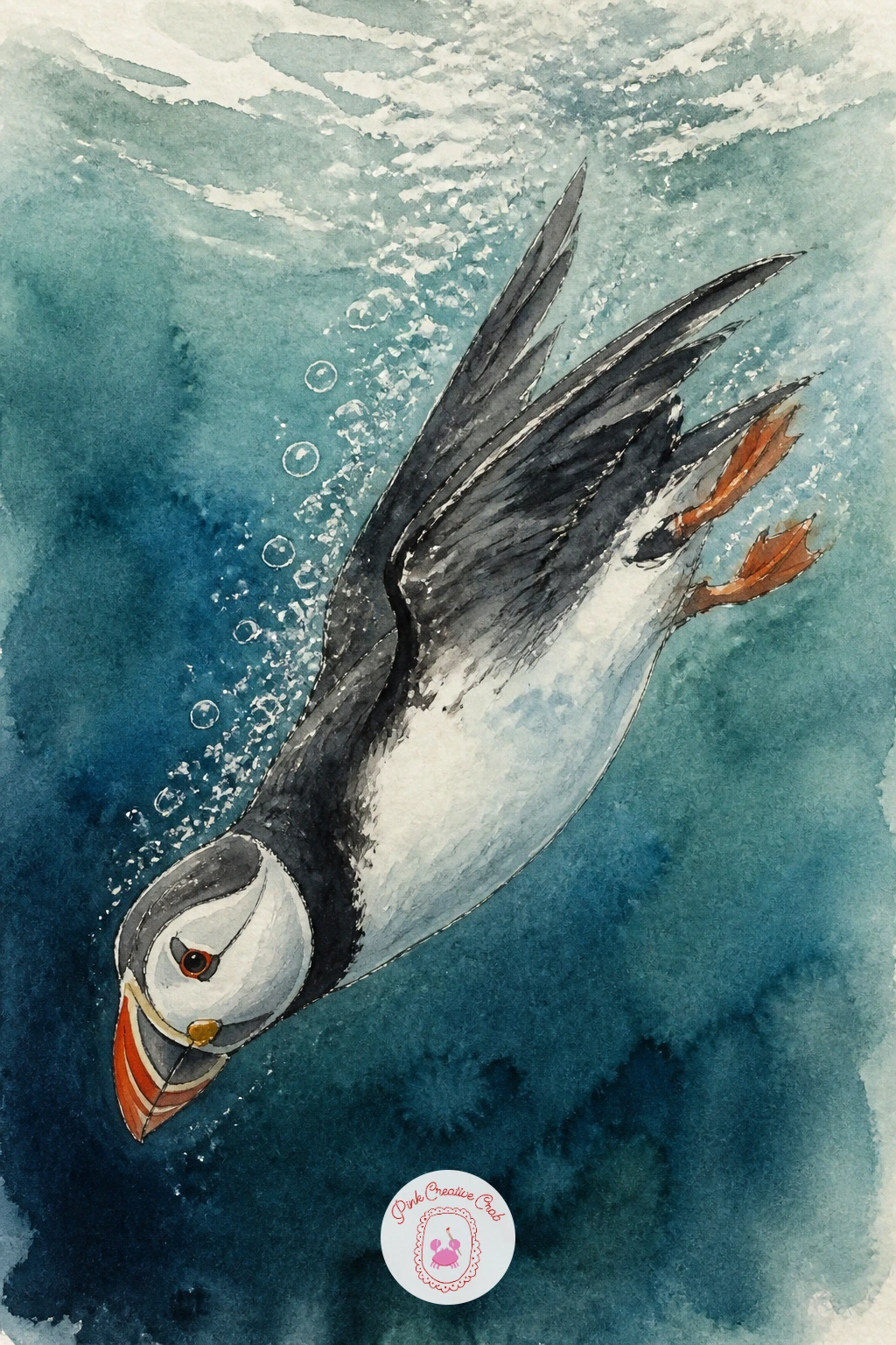
Follow the puffin below the surface for a puffin diving underwater, wings half spread as it swims rather than flies, a pose that lets you paint water in a completely different way than any wave on this list so far. Paint the whole background first in a deep wash of blue and green mixed together, darker toward the edges of the page and paler where light filters down near the bird.
Leave the puffin itself as a slightly lighter, warmer shape against that cool water, the orange beak dulled down toward brown here since true color barely survives underwater. A scatter of tiny bubbles, just small circles of bare white paper left unpainted or lifted out with a damp brush, rising up from the bird’s wingtips does more to sell the underwater feeling than almost anything else.
If the water color pools too evenly and looks flat, tilt your paper slightly while it is still wet so the pigment settles unevenly, that small accident reads as light moving through water.
Keep the wings swept back rather than spread wide here, since a diving puffin tucks them close to steer rather than flapping them open.
Palette: Prussian Blue,Sap Green,Burnt Orange,Titanium White
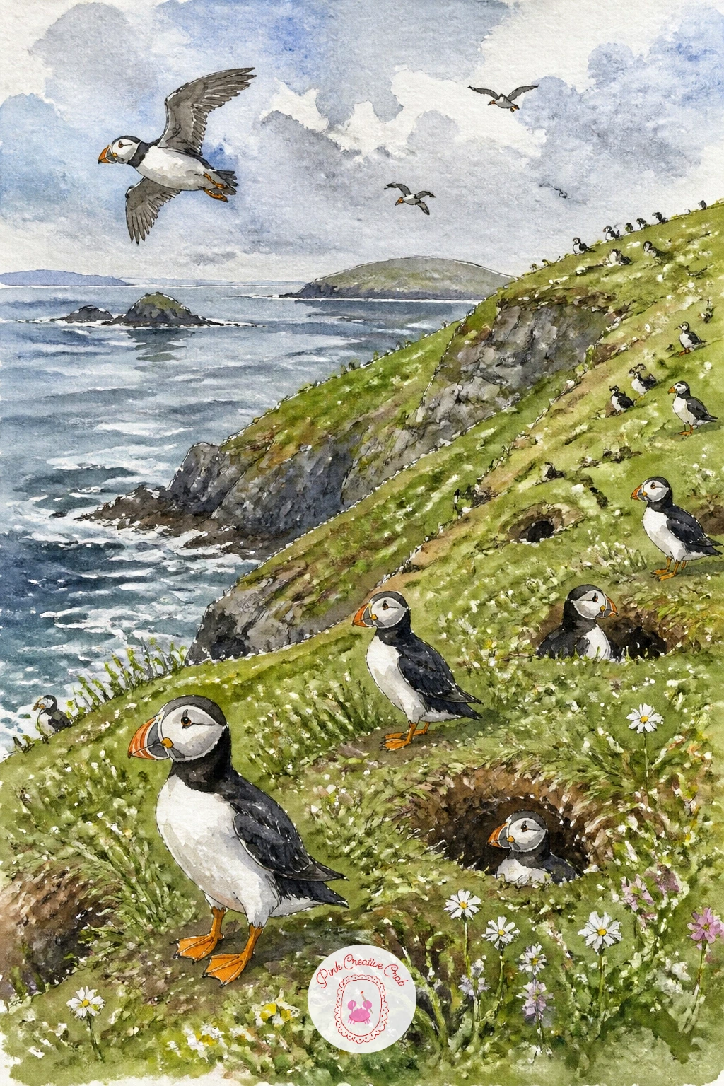
Pull the camera right back for a puffin colony on a green island slope, dozens of small birds scattered across grass and burrows rather than one bird in close focus. Paint the island shape first as one broad green wash sloping down toward the sea, then let that dry completely before a single puffin gets added on top.
Place the birds in loose clusters rather than spread evenly, since real colonies bunch up near good burrow ground and leave other patches empty, and vary their size noticeably, larger and more detailed near the front, tiny orange dashes with barely a shape further up the slope. A handful of birds in flight above the colony, just small dark V shapes, adds life without asking you to paint any more full bodies.
This scene can easily turn into a page of identical dots if you rush it, so slow down on the five or six nearest birds and let everything further back get looser and simpler.
If painting dozens of tiny birds feels like too much for one sitting, limit the colony to a dozen or so and let empty green slope do the rest of the storytelling.
Palette: Sap Green,Payne’s Grey,Cadmium Orange,Cerulean Blue
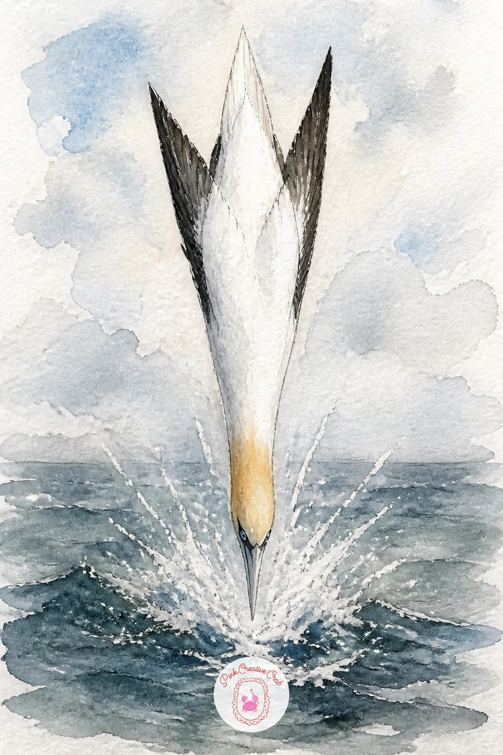
Leave puffins behind for a gannet diving into the sea, one of the most dramatic seabird poses you can paint, the whole bird folded into a straight arrow shape plunging downward. Draw the body and wings first as one long narrow triangle, wings swept fully back along the sides rather than spread, since a diving gannet closes itself into the smallest possible shape before it hits the water.
Paint the white body and black wingtips cleanly against a pale sky, then add a splash where it meets the sea, a few quick upward flicks of white gouache or a wet lifted shape, right at the point of impact. The head and neck carry a warm buff yellow wash that real gannets have, a nice small detail that separates this bird from every plain white gull on the page.
Straight body shapes are surprisingly hard to keep straight by eye, so rule a very light pencil guideline for the main axis of the dive before you commit any paint.
No white gouache on hand, just leave a ragged patch of bare white paper for the splash instead and outline its edge faintly in pencil before you paint the sea around it.
You Will Need
- white gouache for the splash, optional
Palette: Titanium White,Ivory Black,Naples Yellow,Cerulean Blue
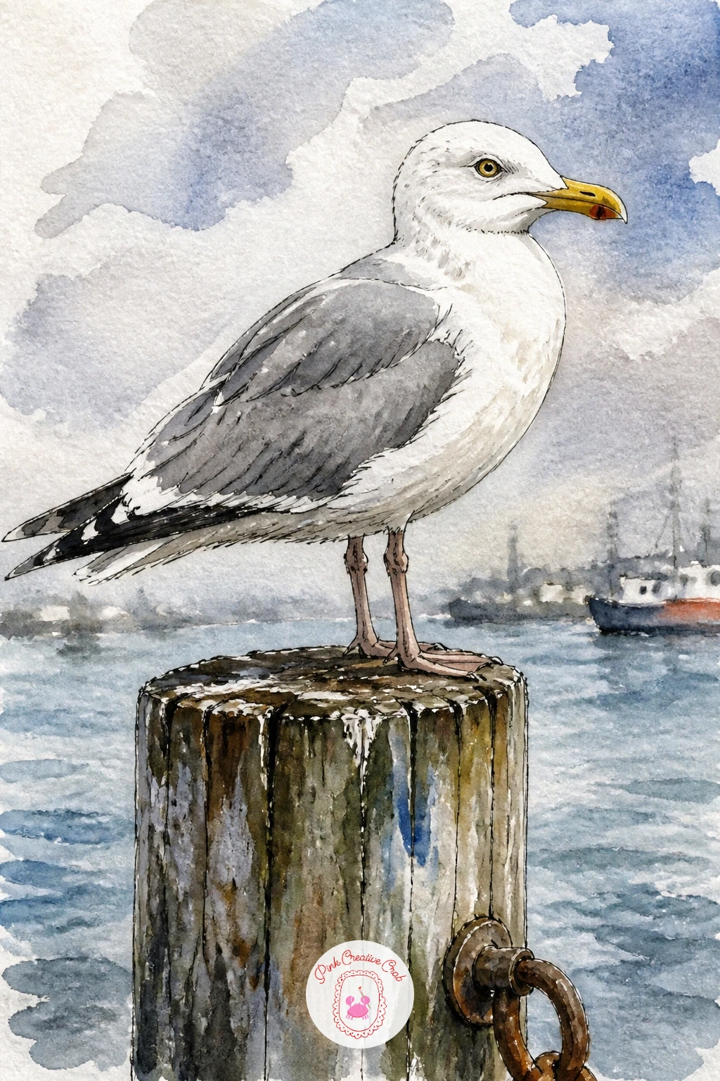
Bring the setting into a working harbor with a seagull on a harbor post, a familiar bird painted somewhere with a bit more character than an open beach. Draw the post first as a simple weathered wooden shape, slightly uneven and a little darker at the base where it meets the water, then perch the gull confidently on top with its weight settled back over its feet.
Paint the gull’s grey wing in one smooth wash while the paper is still slightly damp so the grey fades softly into the white body, then wait until that is fully dry before adding the sharper black wingtip and yellow beak on top. Harbor posts often carry rope, rust streaks or old paint, so a few quick dry brush marks of burnt sienna down the wood add age without much extra work.
Gull legs are thin and easy to lose against a busy background, so paint them last in a confident single stroke of ink or a small brush loaded with strong color, never built up in pieces.
If you want more scene around the bird, a soft blurred boat shape behind it in the same loose wash style keeps the focus on the gull while still placing it somewhere specific.
Palette: Payne’s Grey,Naples Yellow,Burnt Sienna,Ivory Black
Head back to the cliff face for a pair of guillemots on a narrow ledge, slim upright birds standing shoulder to shoulder on a strip of rock barely wider than their feet. Draw the ledge first as a single confident line with the rock face dropping away steeply above and below it, since that steep drop is what makes a guillemot ledge feel believably precarious.
Shape the birds tall and slender compared to a round puffin body, dark chocolate brown above and crisp white below, with a thin dark line dividing the two tones rather than a soft blend. Paint the dark brown first in one flat wash, let it dry, then paint the white chest right up against it, the sharp edge between them is part of what makes a guillemot read correctly rather than looking like a dark blob.
Crowding the ledge with too much rock detail around the birds’ feet makes the whole scene feel heavy, so keep the rock itself loose and let the two birds carry the detail.
Try narrowing the ledge even further on a second attempt, since a tighter space between the birds and the drop only adds to the drama.
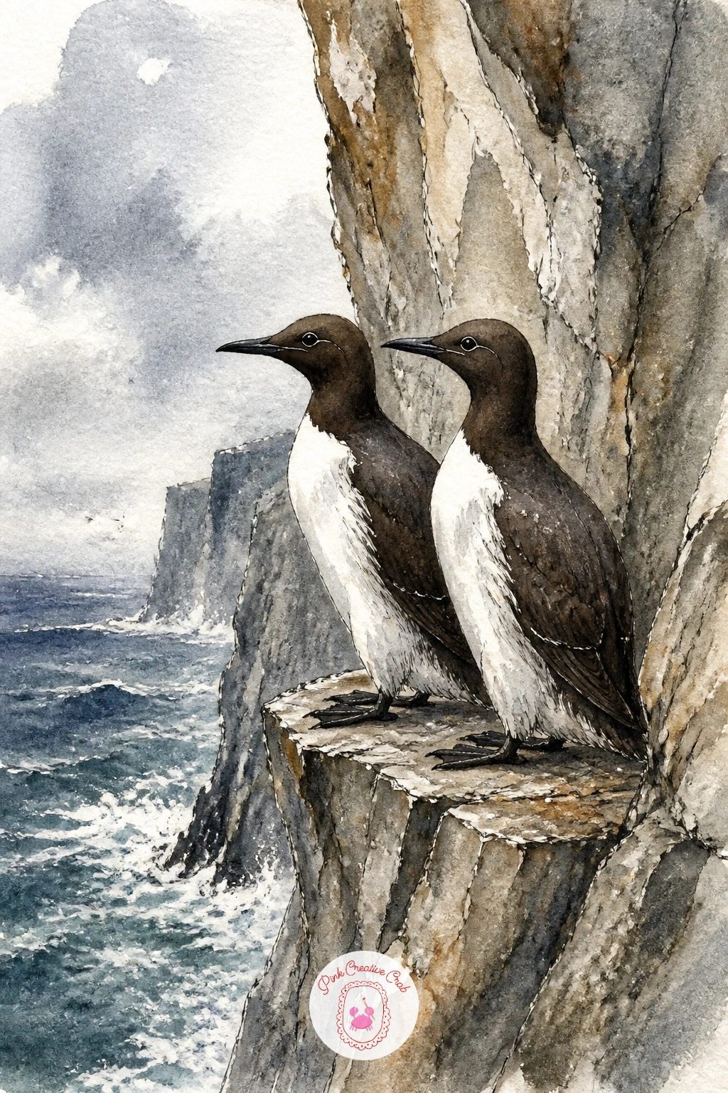
Palette: Dark Chocolate Brown,Titanium White,Payne’s Grey,Slate Blue
Paint a razorbill on a rock next to notice how close its shape sits to a guillemot’s, with one key difference worth exaggerating a little. Build the body the same slim upright way, but give the beak a flatter, blockier profile with a single pale vertical line crossing it, the detail that actually tells a razorbill apart from everything else on this page.
Work the black areas in one rich, nearly flat wash rather than the softer greys used for other seabirds here, since razorbills read as properly black rather than charcoal, and that stronger contrast against the white chest is most of what makes the painting feel right.
Paint the rock it stands on with a little more texture than the ledges elsewhere in this set, a dry brush dragged sideways for lichen patches and a few darker cracks, since a single rock supporting one bird can carry more detail than a whole cliff face full of birds could.
If your black paint looks flat and lifeless once dry, warm it very slightly with a touch of Payne’s grey mixed in before the final layer, pure black straight from the tube often looks dead on paper.
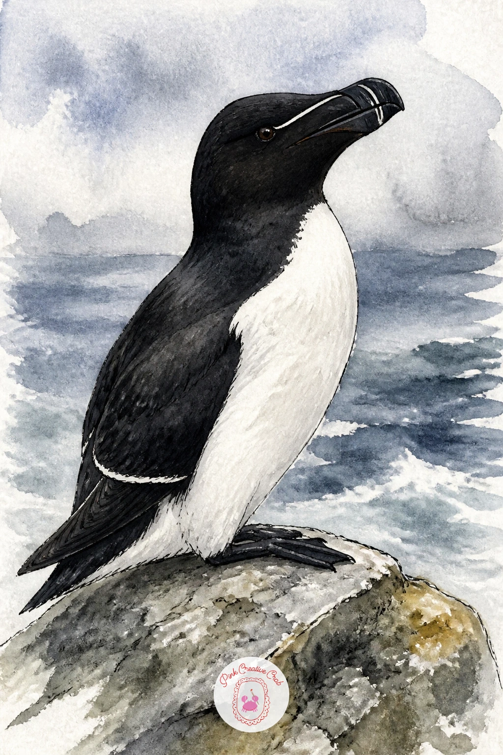
Palette: Ivory Black,Titanium White,Payne’s Grey,Olive Green
Lift back into the air for a tern hovering over the waves, a small sharp winged bird held almost still in place just before a dive, quite different energy from the heavier gannet plunge earlier. Picture the eye level low, nearly at wave height looking slightly upward, which makes the tern’s pale underside catch more light than its back and keeps the whole bird feeling lifted rather than grounded.
Draw the wings long, narrow and pointed, angled down and slightly forward in that characteristic hover position, with the black cap on the head as the one strong dark note against an otherwise pale, sunlit bird. Paint the sea beneath in bright reflective strokes, since the light bouncing up off the water onto the tern’s belly is a big part of what sells the hover.
Thin pointed wings are easy to thicken by accident with a loaded brush, so use the tip only, or switch to a fine ink pen for the final wing edges if your watercolor strokes keep coming out too broad.
Keep the body small against a fairly large stretch of open sea and sky, that empty space is what makes the hovering feel suspended rather than cramped.
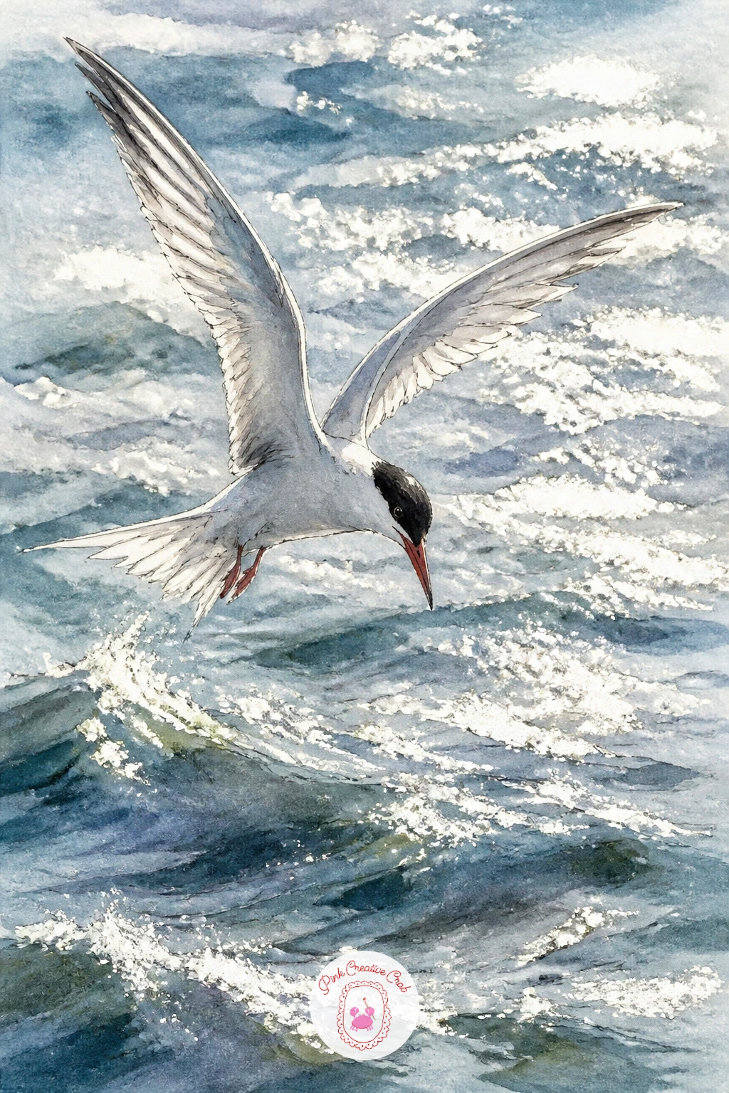
Palette: Titanium White,Ivory Black,Cerulean Blue,Naples Yellow
Go bigger and calmer with an albatross gliding over open water, wings held flat and rigid rather than beating, a bird built for distance rather than quick maneuvers. Draw the wingspan first, long and straight with barely any bend at all, stretched almost the full width of the page, since that enormous flat span is the whole point of this bird.
Paint the sea beneath it as open and fairly empty, a few long low swells rather than choppy waves, because an albatross belongs over calm expanses of ocean far from any cliff or shore. Keep the body small compared to the wingspan and the color simple, mostly white with dark wingtips and a pale warm beak, letting the shape of the glide do the work rather than any fussy feather pattern.
A perfectly straight wing can look stiff if you are not careful, so add the faintest upward curve right at the very tip of each wing, that small lift is enough to suggest the air moving under it without breaking the overall straight line.
This is a good one to paint on a long thin strip of paper if you have an offcut, the shape of the page itself echoes the wingspan nicely.
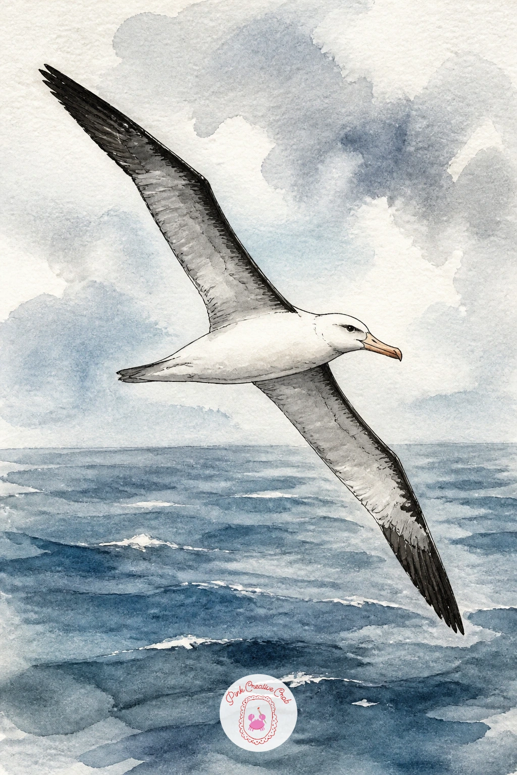
Palette: Titanium White,Payne’s Grey,Cerulean Blue,Naples Yellow
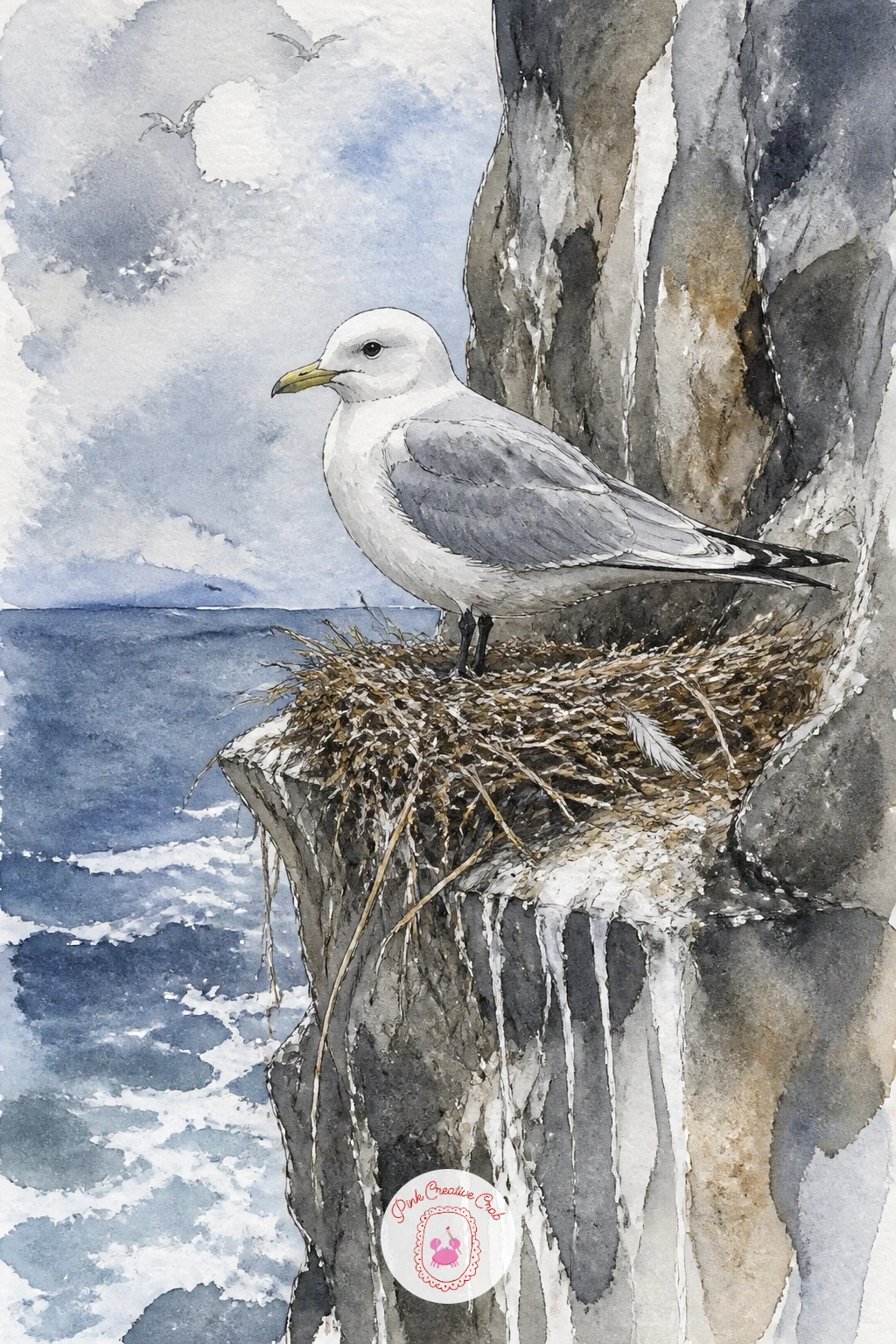
Settle back onto the rock for a kittiwake nest on a cliff, a tight cup of a nest built right onto a tiny ledge with one adult bird standing guard over it. Build the nest first as a rough rounded mound of grass and mud, painted in uneven dabs of brown and olive rather than one smooth shape, since a real kittiwake nest looks scrappy and well used.
Paint the adult bird standing just beside or on the nest edge in soft pale grey and white, smaller and simpler in detail than the nest itself, so the eye settles on the nest as much as the bird. The cliff face around the nest can carry streaks of white guano running down from the ledge, a few loose vertical strokes of pale grey, a true and slightly funny detail that instantly places the scene.
If the nest ends up looking like a flat brown blob, break it up with a kneaded eraser lifted lightly across a few spots once the paint is dry, pulling back just enough pigment to suggest individual twigs and grass.
Try adding one pale egg or chick peeking from the nest cup next time you paint this scene for a softer, more tender version.
You Will Need
- kneaded eraser
Palette: Raw Umber,Olive Green,Payne’s Grey,Titanium White
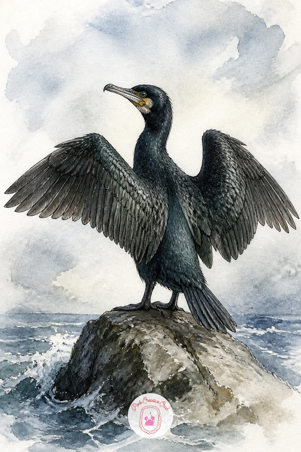
Paint a cormorant drying its wings next, that unmistakable pose with both wings held fully open and still, standing upright on a rock like a small dark cross against the sky. Draw the body first in a tall, slightly S curved stance, then add the wings spread wide and flat to either side, the single most important shape in the whole drawing and worth sketching loosely more than once before you commit in ink or paint.
Paint the whole bird in one deep near black wash with a faint green or bronze sheen worked in while it is still wet, a touch of sap green dropped into the black at the shoulder is enough to catch that oily iridescent look real cormorants have. Leave the rock beneath pale and simple so the dark silhouette of the bird reads clearly against it.
A flat black shape can look lifeless without some variation, so once the first wash is dry, glaze a slightly warmer dark brown unevenly over parts of the wing to break up the solid black just enough.
If open wings feel tricky to balance, draw a light vertical line down the center of the bird first and build each wing out from it to keep the pose symmetrical.
Palette: Ivory Black,Sap Green,Dark Chocolate Brown,Payne’s Grey
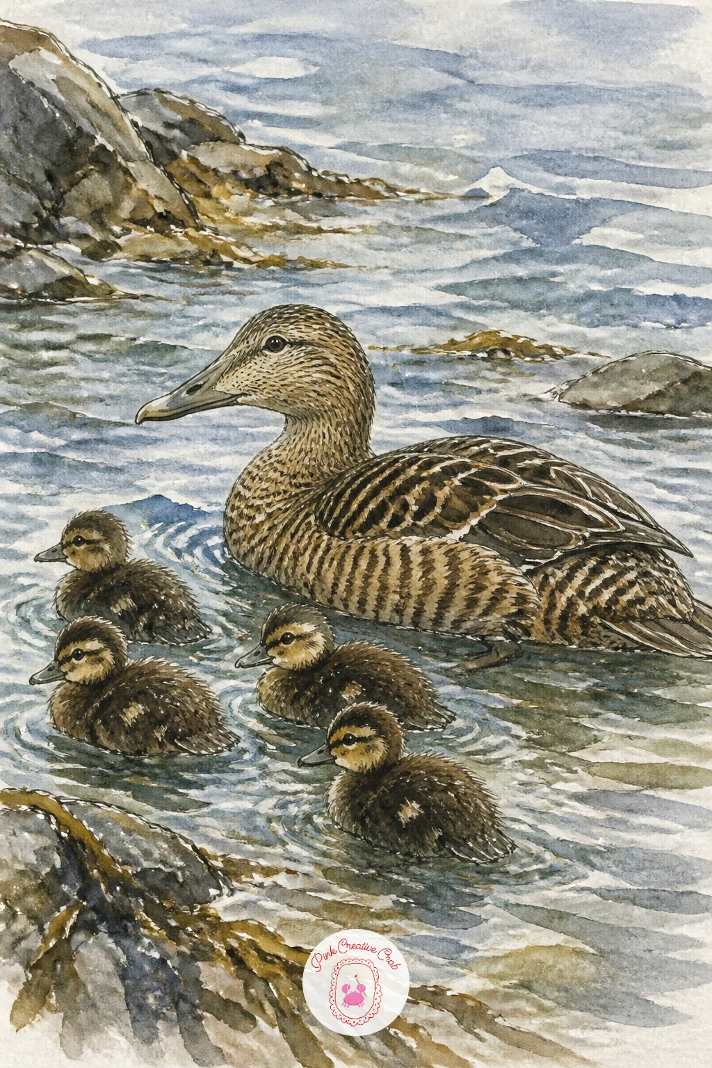
Soften the mood again with an eider duck family at the shore, a mother and a loose cluster of ducklings paddling together near the waterline. Shape the mother larger and rounder than any bird so far on this list, mottled brown all over rather than sharply patterned, then scatter three or four much smaller ducklings around her in slightly different poses, some swimming, one maybe climbing onto a rock.
Paint her mottled feathers wet into wet, dropping a few darker brown dabs into a still damp lighter brown wash so the color blends and breaks unevenly rather than forming hard patches, which is exactly how real eider feathers look from a short distance. Keep the ducklings almost solid small shapes of soft tan, far too small for this kind of detail, just a confident dot of color each with a tiny dark eye.
Family groups like this can read as scattered confetti if the ducklings are too evenly spaced, so cluster most of them close to the mother and let one wander a little further off.
If mottled wet into wet feels unpredictable, practice the brown blending technique on scrap paper first since it only takes a minute to get a feel for how fast it spreads.
Palette: Raw Sienna,Burnt Umber,Cerulean Blue,Naples Yellow
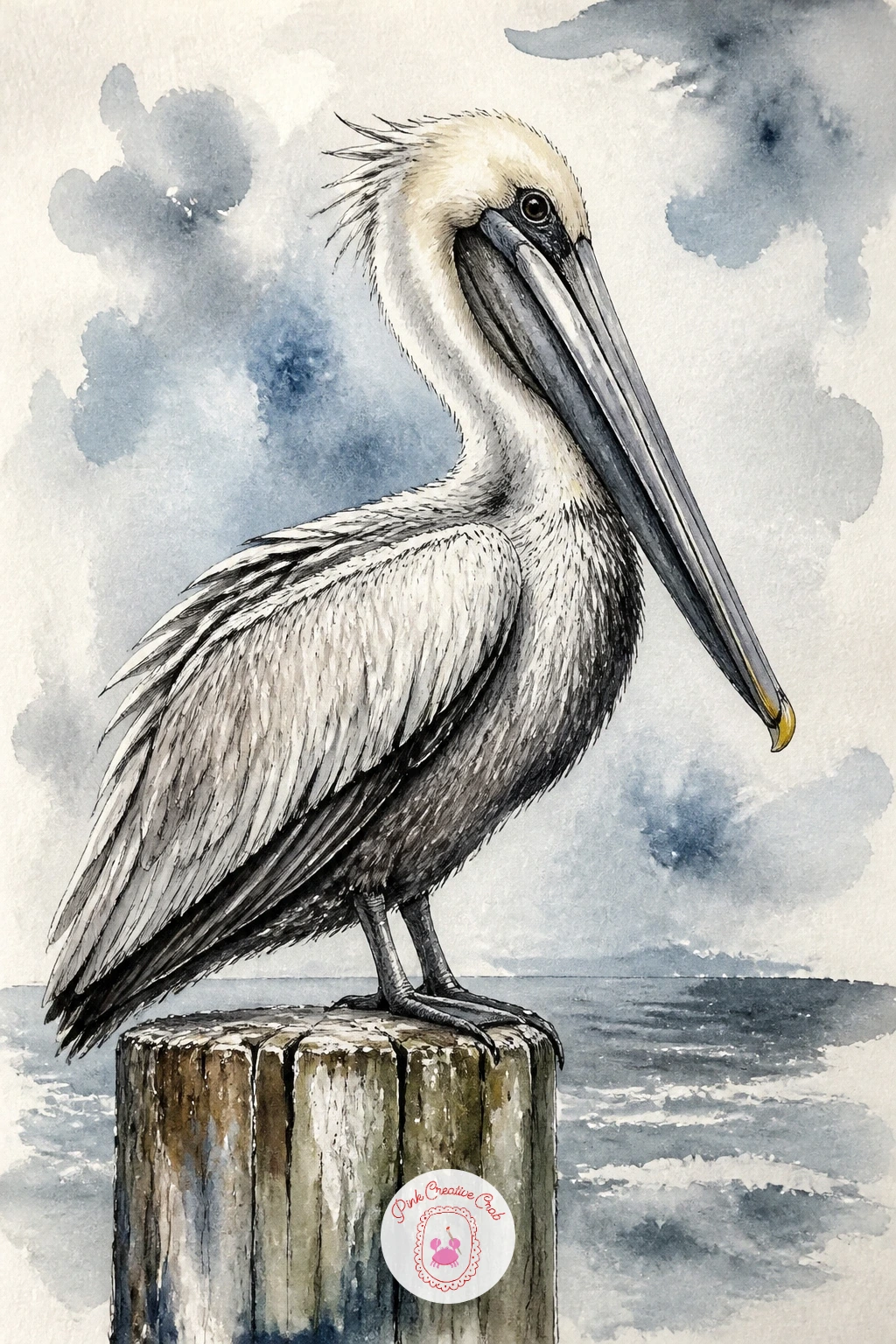
Bring in a much bigger silhouette with a pelican on a pier post, all heavy beak and loose folded pouch, a bird whose proportions reward careful measuring before any paint touches the page. Compare the beak length to the head and body first with your pencil held at arm’s length, since a pelican’s beak is strikingly long, often close to the length of its whole head and neck combined, and getting that ratio right is what keeps the bird from looking like a seagull with a growth spurt.
Paint the body in soft grey white with a slightly rumpled, loose look to the feathers, especially around the neck and pouch where real pelican skin folds and wrinkles. The beak itself takes a flat grey or pale yellow wash with a thin darker line along the top ridge and a soft shadow underneath where the pouch hangs.
The pouch can turn into a shapeless blob if you paint it too wet, so once your first wash is nearly dry, pull a few soft fold lines into it with a slightly damp brush rather than more wet paint.
If pier posts feel dull to paint, weathered grey wood with a rusted bolt or two gives the post its own small bit of character without taking attention from the bird.
Palette: Payne’s Grey,Naples Yellow,Titanium White,Raw Umber
Drop down to beach level for oystercatchers on a pebble beach, small black and white birds with long straight orange beaks picking their way across stones. Paint the pebbles first as a loose scatter of ovals in varied greys and browns, overlapping slightly and different sizes, since a beach of identical round dots never looks convincing no matter how carefully it is painted.
Build each oystercatcher from a simple rounded black and white body, the long beak painted in one confident stroke of bright orange red, straight and pointed rather than curved, the single most recognizable feature of this bird. Place two or three birds at different spots on the beach rather than clustered together, since oystercatchers tend to spread out while feeding rather than stand close.
Beaks painted too thick lose that long elegant look, so switch to a smaller brush or a fine ink pen just for the beak itself once the body colors are dry.
If plain grey pebbles feel flat, warm a few of them with a touch of raw sienna here and there, real beach stones are rarely one single color.
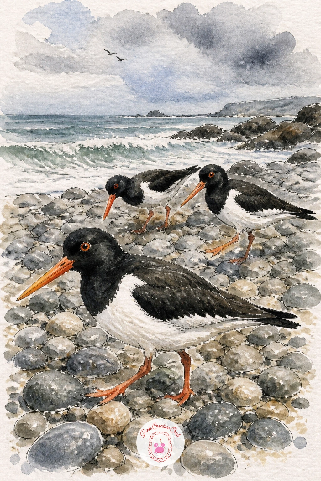
Palette: Ivory Black,Titanium White,Vermilion,Raw Sienna
Lighten things with a seagull stealing a chip, the bird caught mid snatch with its head tilted and beak wide open around one bright golden chip. Draw the head turned at an angle rather than straight on, beak slightly open, since that twist is what gives the whole scene its sense of motion and mischief rather than a calm standing portrait.
Paint the gull’s usual grey and white first, then save the chip itself for last, one small confident shape of warm golden yellow with a thin darker line or two for the ridges, held right at the tip of the open beak. A tiny spatter of loose golden dots flicked from a dry brush around the beak, a few stray crumbs flying off, adds a burst of comic energy that this bird, more than any other on the list, can really carry.
If the chip ends up too small to notice against the whole page, scale it up slightly bigger than real proportions would suggest, a little exaggeration here only helps the joke land.
No golden yellow handy, mix a touch of cadmium orange into your yellow ochre for the same warm fried color.
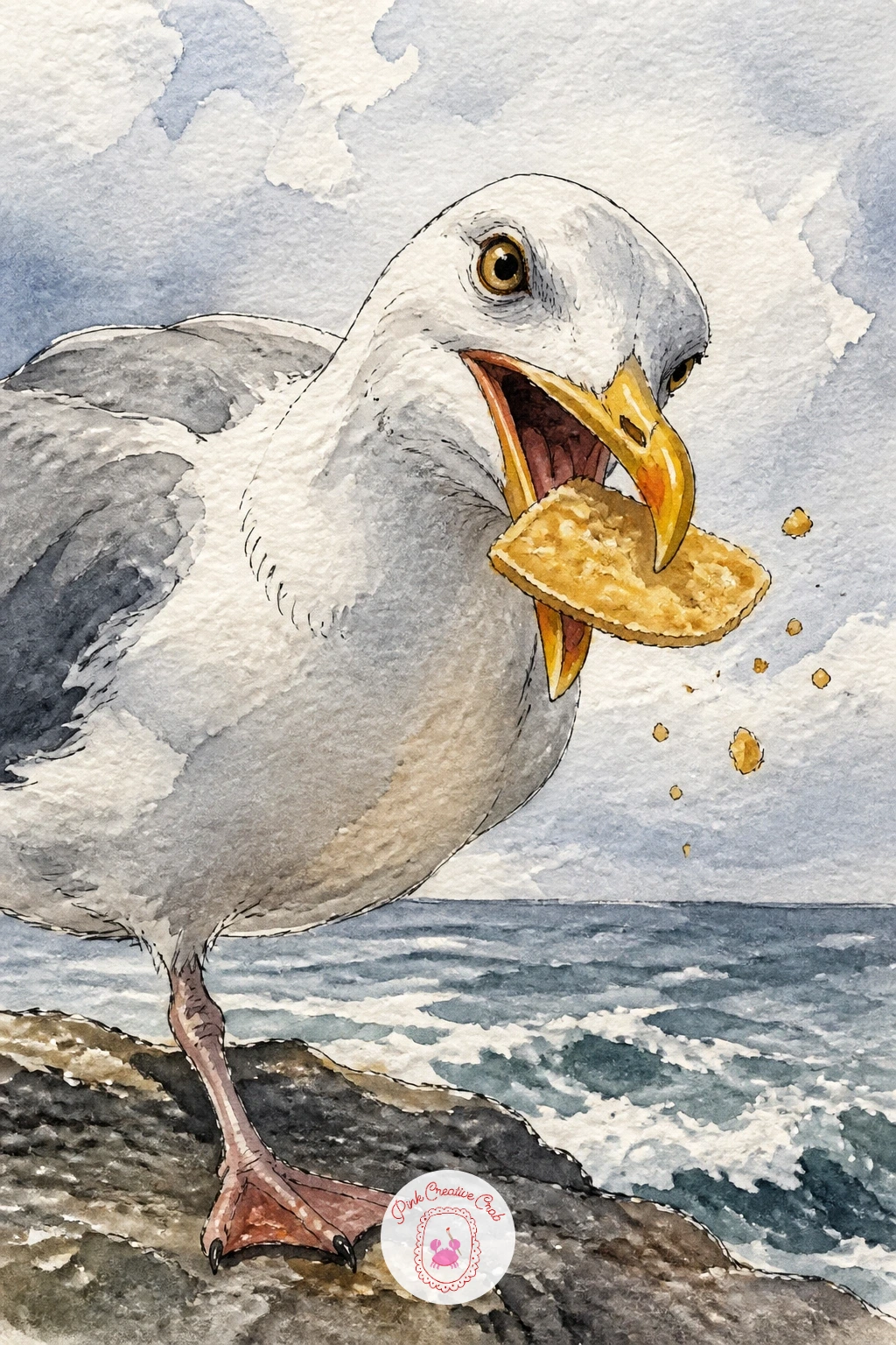
Palette: Payne’s Grey,Naples Yellow,Yellow Ochre,Titanium White
Paint a fulmar riding the wind along a cliff edge, a stiff winged flier that holds its wings almost flat and rigid much like the albatross earlier, only on a smaller, closer to shore scale. Picture the eye level set low and slightly below the bird, looking up along the cliff face, which makes the fulmar feel like it is rising on an updraft right past the viewer rather than simply crossing open sky.
Paint the cliff face behind it first in long vertical streaks of grey and warm brown, since a fulmar’s favorite trick is gliding along the exact line where rock meets air, and that backdrop needs to feel solid and close rather than distant. Keep the bird itself pale grey and white with only a thin dark eye patch for contrast, wings held flat without much curve.
Wings drawn with any obvious bend lose the stiff winged gliding look this bird is known for, so rule a faint straight pencil guideline through each wing before painting, same trick as the albatross, and resist curving it even slightly.
Try adding a little spray or mist rising off the cliff base below the bird next time, it strengthens the sense of wind the whole painting is built around.
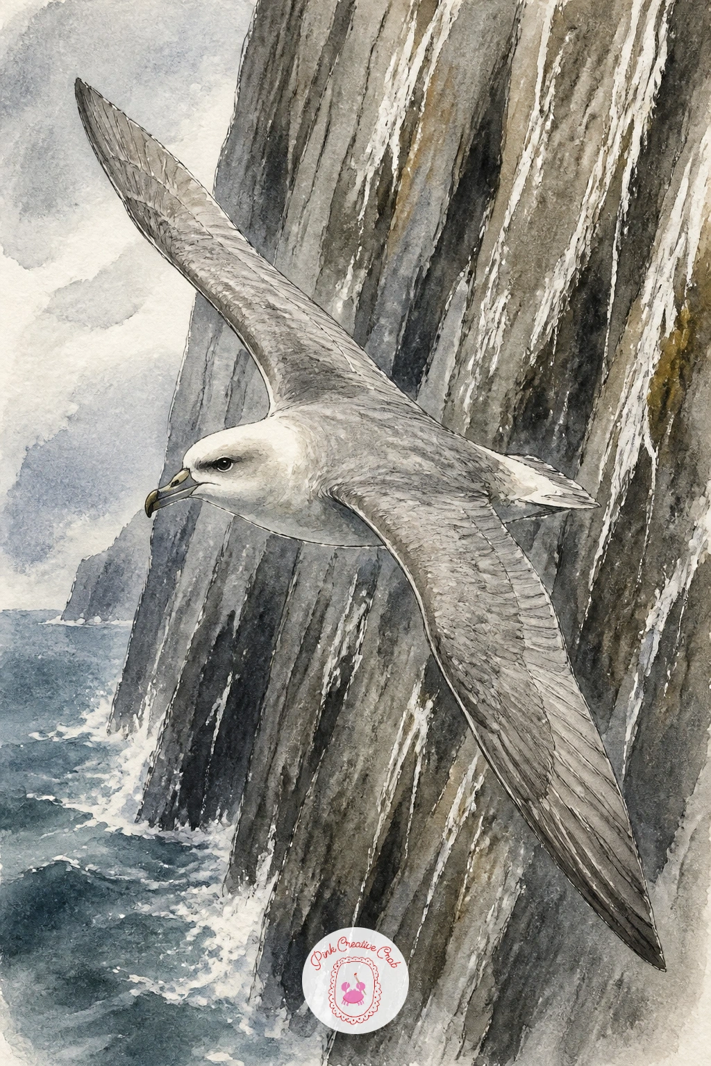
Palette: Payne’s Grey,Titanium White,Raw Umber,Slate Blue
Come back to puffins for a quieter close to this half of the list with a puffin sheltering from wind behind a rock, feathers pressed flat and body hunched low rather than standing proud and upright. Draw the rock first as a solid dark shape taking up a good portion of the page, then tuck the puffin in close against its lee side, body compressed and head pulled down toward the shoulders.
Paint the exposed, windward side of the scene with a slightly colder, greyer wash than the sheltered pocket where the bird sits, a small temperature shift in the color that quietly tells the story of wind without needing any swirling lines to spell it out. Keep the puffin’s feather edges a touch softer and flatter than in the standing portraits earlier in this list, since wind pressed feathers lose their usual crisp outline.
A hunched bird can accidentally look sick rather than sheltering if the head sits too low, so leave at least a small gap of neck visible and keep the eye alert and open.
If you want more drama, add a few sparse strands of windblown grass bent sideways near the rock, the same direction the puffin is leaning away from.
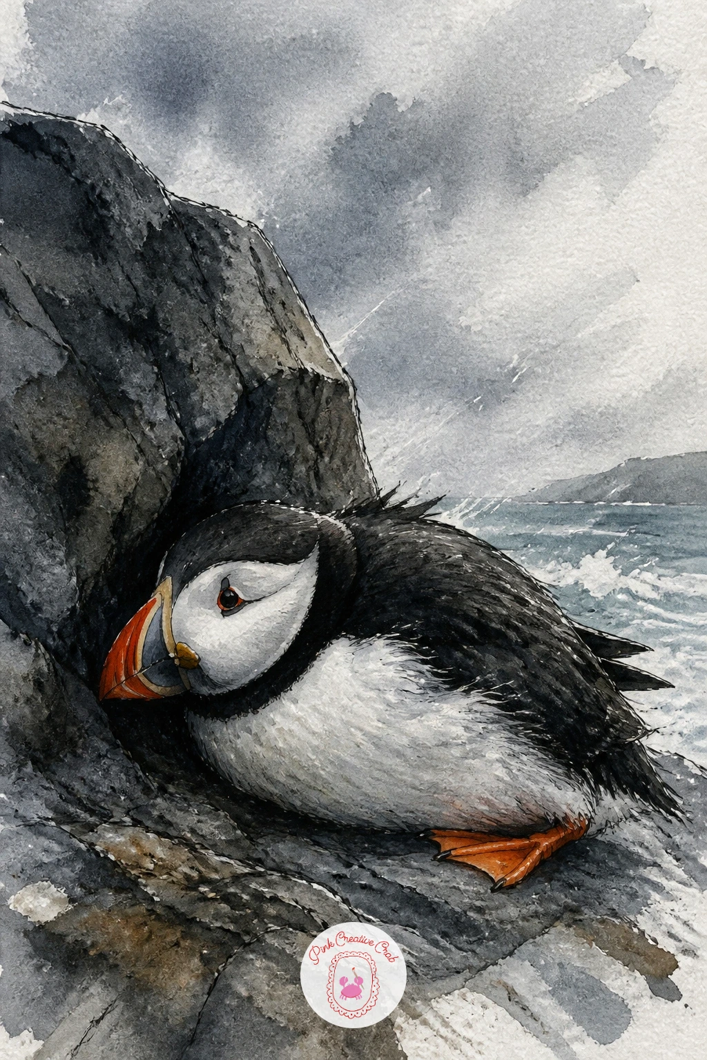
Palette: Payne’s Grey,Slate Blue,Cadmium Orange,Raw Umber
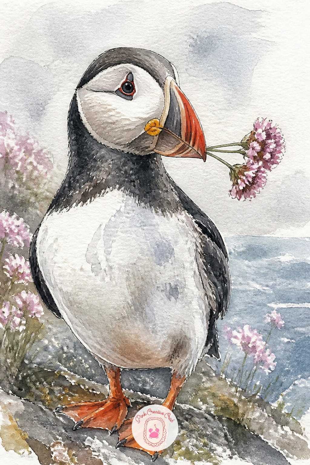
Close the whole set with a quieter, more decorative image: a puffin holding a sprig of sea pink in its beak, a small gentle gesture rather than any dramatic action. Draw the beak slightly open with the thin stem of the flower held right at the tip, the pink flower head itself small compared to the bird, since a flower that overpowers the beak will throw off the whole balance of the picture.
Paint the puffin in your usual confident grey, white and orange, then once it is fully dry add the sea pink sprig last in a few quick dabs of rose pink with a single thin green stem, the smallest, lightest touch of color anywhere in this piece. This is a lovely one to finish in ten minutes flat, bird plus flower and nothing more, or extend to forty by adding a few soft blurred sea pinks scattered loosely in the background behind the bird to echo the one in its beak.
Keep the stem thin and slightly curved rather than a stiff straight line, a single wavering ink line reads far more like a real flower stem than a ruled one ever will.
Finish by signing the piece small, this one works nicely as the final page of a puffin themed sketchbook spread.
Palette: Payne’s Grey,Cadmium Orange,Rose Pink,Sap Green
What to Do Next
Pick one puffin to start, maybe the simple standing pair on the cliff edge, and get it down on a half sheet of cold press paper before the day gets away from you. Once the beak colors feel comfortable, the rest of this list gives you somewhere new to take that same loose, sea washed style tomorrow.
Frequently Asked Questions
What colors do you need for a puffin drawing in watercolor?
A small palette works fine: Payne’s grey or a soft black for the back, white paper for the chest, cadmium orange for the beak and feet, and one blue grey for the sea. Keep the orange clean and apply it last so it stays bright.
How do you keep the puffin’s beak from looking flat?
Paint the three color bands separately and let each dry before the next, then add the fine dark groove lines with ink pen only at the very end. Painting all the color and the ink lines together usually muddies the stripes.
Is ink or pencil better for the fine detail on seabirds?
A waterproof fine liner pen holds up better than pencil once watercolor washes go over or near it, and it gives sharper, more confident lines for a beak edge or an eye. Pencil works fine for the early sketch underneath.
What is the easiest seabird on this list to start with?
A single standing puffin or a seagull on a post are the most forgiving, since both use simple rounded body shapes with no tricky wing angles. Save the diving gannet and the gliding albatross for once you feel steadier with a brush.
How do you stop watercolor seabird paintings from looking too busy?
Keep the background loose and underworked compared to the bird itself, using fewer colors and softer edges away from the subject. One sharply detailed bird against a simple wash of sea and sky almost always reads better than detail spread evenly across the whole page.
Have any thoughts?
Share your reaction or leave a quick response — we’d love to hear what you think!
-
 0
-
0
-
0
-
0
-
0
-
0


