Like Monet discovering his garden in Giverny, we’re about to reveal the magic of watercolor abstracts—but without needing years of practice. We’ve gathered 18 foolproof techniques that embrace happy accidents and turn mistakes into masterpieces. Whether you’re working with wet-on-wet blooms or creating galaxies with a toothbrush, each method builds confidence while producing stunning results. Let’s start with the easiest technique that’ll have you hooked from your very first brushstroke.
Wet-on-Wet Color Blends: Let the Paint Do the Work
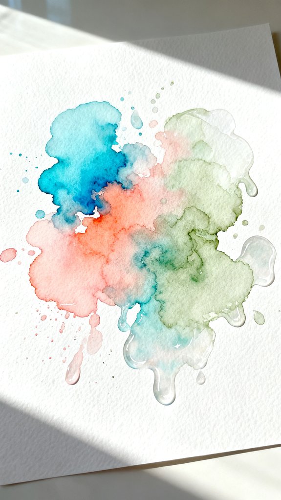
When you wet your paper first, then add paint, something magical happens. The colors bloom and spread on their own, creating those stunning layered color blends we love in abstract art.
Wet paper first, then add paint—watch the colors bloom and spread on their own, creating stunning abstract blends.
The paper should be evenly damp but not soaking. Brush clean water across your paper in smooth strokes.
Then drop in your watercolor paint and watch it flow! The pigment (that’s the color) will travel through the wet areas naturally. Try adding a second color while everything’s still wet for experimental watercolor effects. The colors will mix where they meet, creating beautiful gradients. For best results, use 140 lb cold press paper minimum to prevent buckling when wet.
Don’t touch it too much—let the water do the work. This technique removes pressure because you can’t control everything, and that’s perfectly okay!
Salt Texture Abstract: Create Instant Snowflake Effects
Table salt works like magic when sprinkled onto wet watercolor paint, creating delicate white patterns that look like snowflakes or stars.
Paint a colorful wash on your paper, then sprinkle table salt across it while it’s still wet. The salt absorbs the pigment (that’s the color), pushing it away from each grain.
Wait for everything to dry completely—this takes patience! Once dry, brush off the salt crystals. You’ll see amazing salt crystal formations where each grain created a tiny starburst.
For even more dramatic effects, try a layered salt texture by adding more paint and salt once the first layer dries. This technique embraces watercolor’s natural unpredictability, using the paper’s absorbency to create organic patterns you could never plan. This technique transforms simple paint into something truly innovative and unexpected!
Masking Tape Geometric Shapes for Clean Lines
Masking tape lets us create sharp, crisp edges that look professional and polished—even if you’re just starting out! Simply stick strips of tape onto dry watercolor paper, creating whatever shapes inspire you. Try diagonal tape patterns for dynamic energy, or experiment with overlapping tape designs to form complex geometries like triangles, diamonds, and hexagons.
Press the tape edges down firmly—this prevents paint from seeping underneath. Now paint freely over the taped areas, using bold colors or soft gradients. Let everything dry completely (this step is indispensable!). Peel away the tape slowly at a 45-degree angle to reveal those crisp white lines beneath.
The contrast between painted sections and clean geometric borders creates instant sophistication. For even more creative possibilities, explore the sgraffito technique of scratching into your painted surface before it dries to add texture within your geometric shapes. We’re fundamentally using tape as our precision tool!
Plastic Wrap Watercolor Textures While Wet
Plastic Wrap Watercolor Textures While Wet
Plastic wrap transforms wet watercolor into stunning organic textures that look like crystals, ice formations, or natural stone patterns! We’ll apply paint generously to create translucent water effects that shift and blend beneath the plastic.
Start by painting overlapping paint layers on watercolor paper while everything’s still very wet. Drop in different colors and let them mix naturally. Immediately press crumpled plastic wrap onto the wet surface, creating wrinkles and folds. The wrap pushes pigment into unique patterns as it settles.
Leave everything undisturbed for at least two hours until completely dry. Peel away the plastic to reveal intricate, maze-like designs. The wrinkles create darker lines where pigment collected, while flat areas stay lighter. Unlike working with graphite or charcoal, watercolor techniques like this embrace happy accidents rather than precise control. This technique works beautifully for abstract backgrounds!
Simple Color Gradient Washes From Light to Dark
While texture techniques create dramatic effects, sometimes the most beautiful abstracts come from mastering simple color gradients. We’ll show you how layering techniques transform basic washes into stunning artwork!
Three Fundamental Steps for Perfect Gradients:
- Start with a wet brush – Load it with diluted paint, then stroke across your paper from left to right
- Rinse and repeat – Clean your brush, add water only, and pull the color downward to lighten it gradually
- Build layers – Let each wash dry completely before adding another layer on top
These color gradation experiments teach you brush control and water balance. You’re essentially creating a fade from dark to light by controlling how much water dilutes your pigment. For even more dynamic gradients, try transitioning between warm and cool colors to add visual interest and depth to your abstract pieces. Practice makes perfect here!
Splatter and Flick Technique for Energetic Abstracts
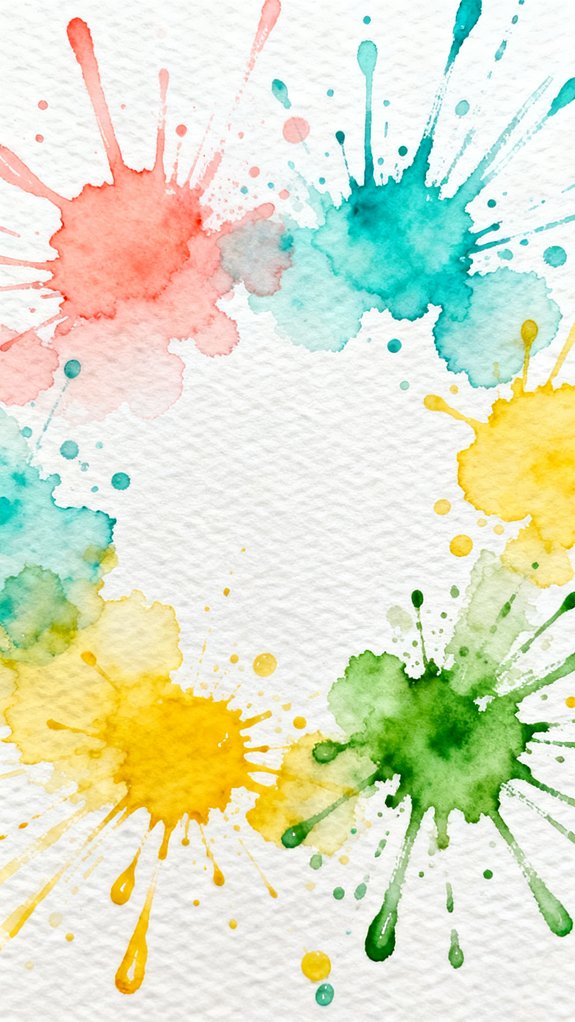
Once you’ve mastered smooth gradients, it’s time to loosen up and add some spontaneous energy to your work! The splatter technique creates dynamic, energetic abstracts that balance control vs. spontaneity beautifully.
Embrace the beautiful chaos of splatter work—where letting go of control becomes your greatest creative strength.
Load your brush with watery paint, then flick your wrist sharply toward the paper. The paint flies off in unpredictable patterns! Try tapping a loaded brush against your finger for smaller, controlled splatters.
For best results, work on moist paint layering—splatter onto wet areas for soft, bleeding edges, or dry paper for crisp dots. Start with light colors first, then layer darker splatters once everything dries. This layering approach mirrors fundamental techniques(hatching, blending, etc.) used in drawing, where building up values gradually creates depth and visual interest.
Don’t worry about perfection here. This technique thrives on randomness! Protect your workspace with newspaper, stand back, and let those paint drops fly where they want.
Coffee Filter Bleeding Hearts and Flowers
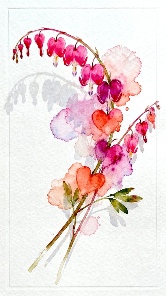
Coffee filters make surprisingly perfect canvases for bleeding watercolor effects because their thin, absorbent fibers soak up paint like magic! We’ll create stunning coffee filter blossoms that blend and bloom naturally.
- Flatten your coffee filter on a protected surface, then drop concentrated watercolor onto the center. Watch the colors spread outward beautifully!
- Add complementary colors around the edges while wet. The pigments will bleed together, creating organic petal-like patterns without any drawing skills.
- Let them dry completely (about 30 minutes), then pinch the center and twist to form dimensional flowers.
The bleeding effect happens automatically as water carries pigment through the fibers. You’re simply guiding where colors start, then letting the filter do the artistic work for you! These delicate coffee filter flowers make beautiful embellishments for junk journaling projects where layering and texture bring pages to life.
Rubbing Alcohol Droplets for Organic Patterns
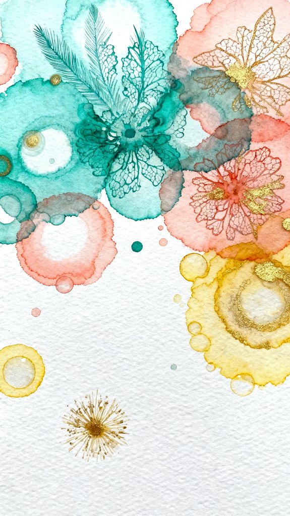
This technique produces a beautiful blotchy effect that adds depth and visual interest to abstract pieces. You’ll notice each droplet creates its own unique burst pattern, giving your artwork a spontaneous, painterly appearance. Experiment with different alcohol amounts—small drops create delicate rings, while larger puddles make bold, dramatic patterns. Let everything dry completely before adding more layers. Once dry, you can enhance the lighter centers of your alcohol bursts using a kneaded eraser to lift additional pigment and create even more contrast.
This simple trick transforms basic watercolor washes into complex, professional-looking abstracts!
Tissue Paper Lift Technique for Cloud-Like Effects
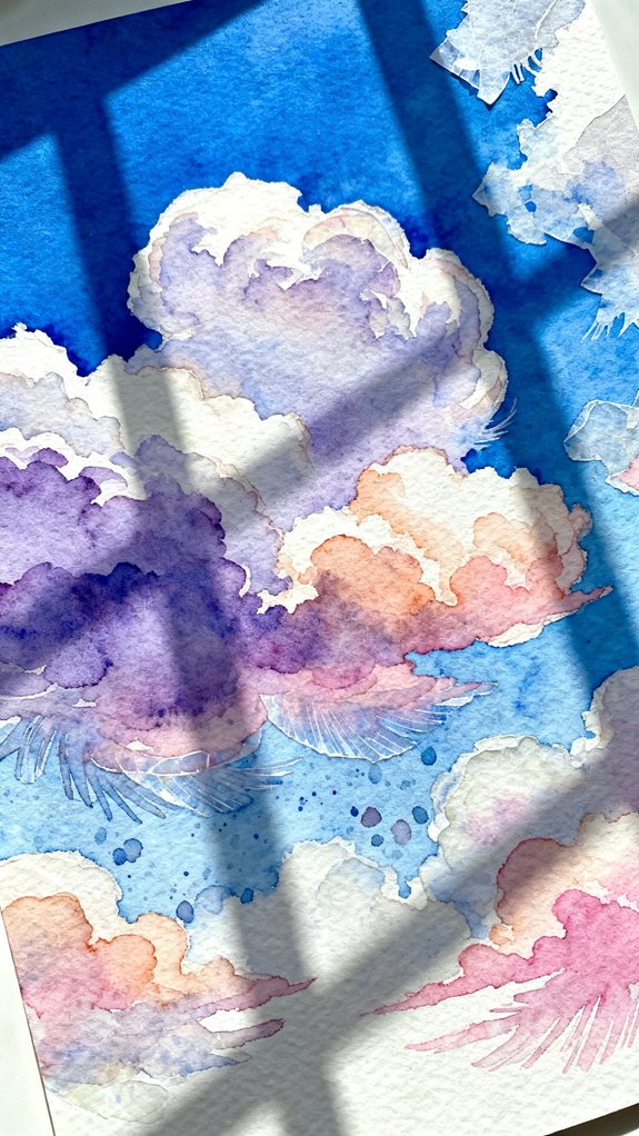
While the alcohol technique pushes pigment outward, the tissue paper lift does the opposite—it gently removes wet paint to reveal lighter areas beneath. This creates soft, dreamy cloud-like shapes that add depth to your work.
Here’s how to master this technique:
- Apply wet paint to your paper using bold, layering techniques with overlapping colors
- Blot immediately with crumpled tissue paper while the paint’s still wet, pressing gently
- Lift carefully to see the lighter patterns emerge underneath
The key is timing—work while your paint’s still glossy, not dry. Mastering water control is essential for knowing exactly when your paint is ready for lifting. Experiment with blending colors first, then lift sections to create contrast. Different tissue textures create unique effects! Crumple it tightly for detailed patterns or use it flat for broader, softer lifts.
Watercolor Resist With Crayons or Candles
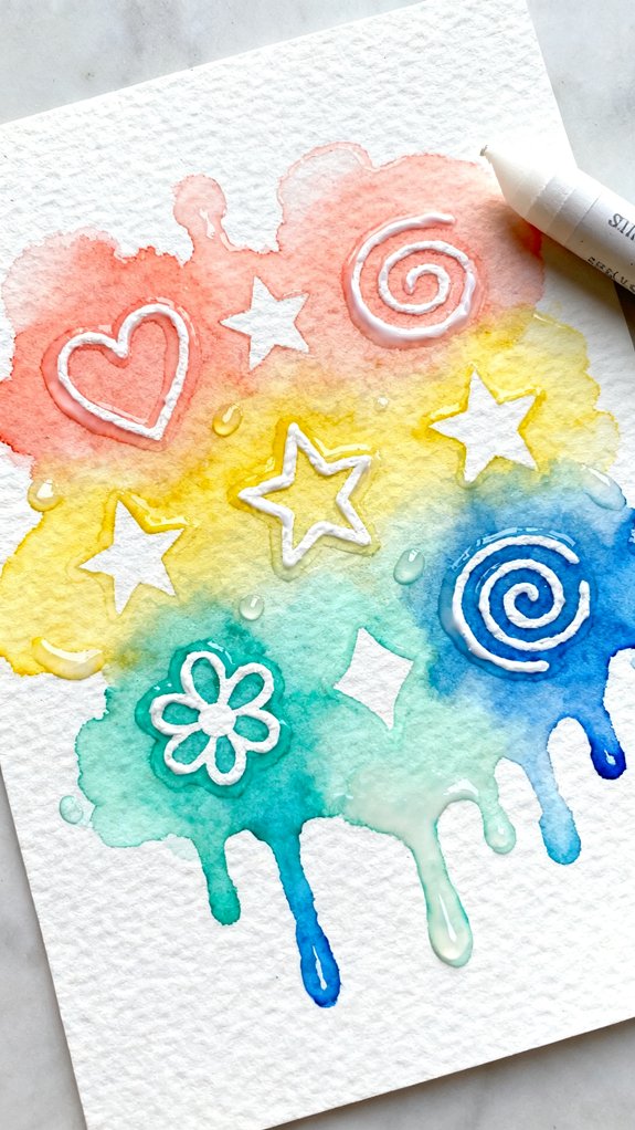
The watercolor resist technique works like magic—waxy materials repel water, creating beautiful contrast between protected areas and painted sections. Wax resist techniques let you draw hidden patterns with white crayons or candle stubs that reveal themselves when paint flows over them. Press firmly while drawing—harder pressure deposits more wax, which blocks paint more effectively. Try creating spirals, dots, or random scribbles across your paper.
Then apply watercolor washes over everything and watch your secret designs appear! For added texture, experiment with dry brush application, dragging a barely-damp brush across remaining white spaces. The semi-dry bristles create streaky, rough effects that complement smooth wax-protected areas beautifully. Understanding how different mark-making creates various textural effects helps you intentionally contrast the smooth wax-protected zones with rougher painted sections. This technique encourages spontaneity since you’re working partially blind until paint reveals your wax marks.
Straw-Blown Paint for Unexpected Branch Shapes
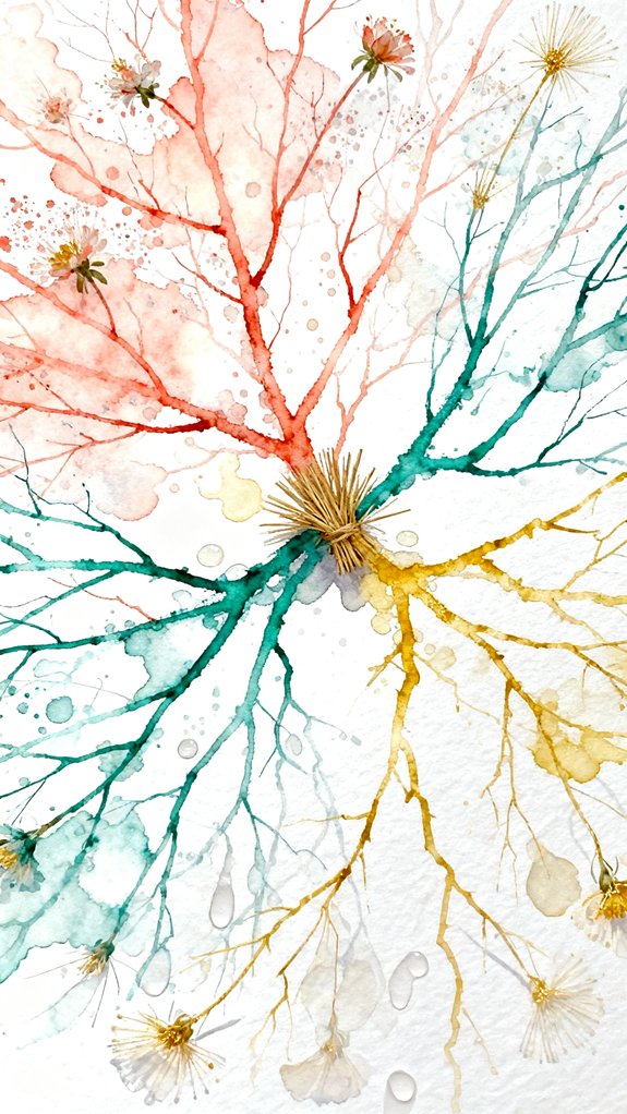
Blowing watercolor through a drinking straw creates organic, tree-like branches that you can’t predict or control—and that’s exactly what makes this technique so exciting! Drop diluted paint onto your paper, place your straw close to the puddle, and blow hard to push the paint outward. The liquid spreads into random, branching patterns that look surprisingly natural.
Here’s how to get the best results:
- Use thin paint – Add extra water so it flows easily when you blow
- Angle your straw – Direct air at the paint’s edge, not straight down
- Vary your pressure – Blow harder for long branches, softer for delicate details
You’ll create bubble blown shapes and straw drawn patterns that mimic real trees, veins, or coral. Each attempt produces completely unique results!
Negative Space Leaves Using Real Plants
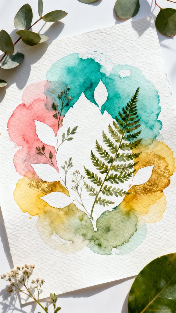
Gather fresh leaves with interesting shapes—maple, oak, fern, or even herbs from your kitchen. Place them on your watercolor paper, arranging them however you’d like.
Now paint right over them using loose, flowing strokes. Don’t worry about precision—just cover the entire surface! While the paint’s still wet, carefully lift the leaves away. You’ll see beautiful white silhouettes where the leaves blocked the paint. This technique creates stunning native leaf impressions without any drawing skills.
For variation, try dried natural elements like flowers or grasses. They work just as well! The negative space (the unpainted areas) becomes your main design. You can layer multiple colors by repeating this process with different leaves in different spots.
Drip Painting Down the Page for Flow Art
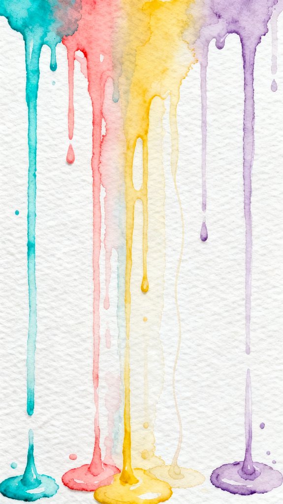
Tilt your paper at an angle and watch gravity become your artistic partner in this mesmerizing technique! You’ll load your brush with watery paint, then let it drip down the page naturally. The spontaneous movement creates stunning organic patterns you couldn’t plan if you tried.
Gravity transforms into your creative collaborator, guiding watercolor in spontaneous flows that produce breathtaking organic designs impossible to replicate intentionally.
Here’s how to create beautiful drip flow effects:
- Prop your paper at a 45-degree angle against a book or box, securing it with tape so it won’t slide
- Load a wet brush with diluted watercolor, then touch it to the top of your page and let gravity pull the paint downward
- Layer different colors while the first drips are still wet, allowing them to merge and create unexpected color combinations
The unpredictable results make each piece unique and exciting!
Sponge Stamping for Soft Abstract Backgrounds
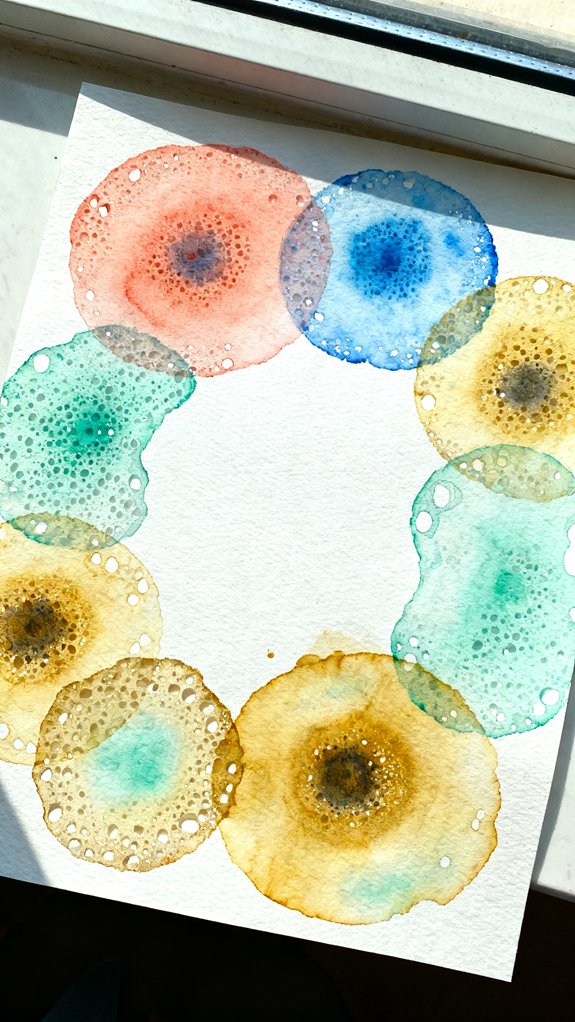
When you want a dreamy, cloud-like foundation for your abstract art, sponge stamping creates the perfect soft texture! We’ll use natural or craft sponges to build gentle layers of color.
First, wet your sponge and squeeze out excess water. Load it with diluted watercolor, then dab it onto your paper in random patterns. This foam stamping technique gives you control over where color appears.
Next, try paint blotting by pressing the sponge lightly for soft marks, or firmly for bolder shapes. Overlap different colors while they’re still wet—they’ll blend beautifully together.
Work in sections, letting some areas dry before adding new layers. This prevents muddiness and creates depth. You’re building atmosphere, not filling every space! The sponge’s porous texture adds organic variation that brushes can’t achieve.
Credit Card Scraping for Bold Textured Strokes
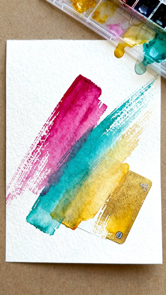
While sponges create gentle, airy effects, sometimes your abstract art needs dramatic edges and sharp energy. That’s where credit card scraping comes in! Grab an old gift card or credit card, dip its edge into wet paint, and drag it boldly across your paper. You’ll create striking lines that resemble palette knife application but without expensive tools.
Transform your abstract paintings with bold, dramatic edges using nothing more than an old credit card and wet paint.
Here’s how to get started:
- Load your card: Dip the long edge into concentrated watercolor paint
- Scrape firmly: Press down and pull the card across damp paper in one smooth motion
- Experiment with angles: Try diagonal, horizontal, or zigzag movements for variety
You can also flip the card to tap it against paper for stippling techniques (making tiny dots). This creates amazing texture!
Toothbrush Splatter Galaxies and Night Skies
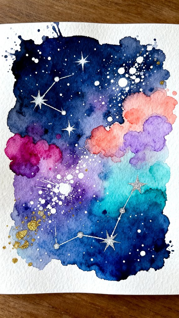
Creating a starry night sky becomes incredibly fun with an old toothbrush and some paint! We’ll use this simple tool to create controlled paint splatters that mimic distant stars and cosmic dust.
First, wet your paper and add deep blues and purples for your night sky background. Let these fluid paint movements blend naturally together.
While still damp, dip your toothbrush in white or metallic paint. Hold it about six inches above your paper, then run your thumb across the bristles. This flicking motion releases tiny droplets that scatter across your surface.
For larger stars, add more paint to the brush. For distant galaxies, create denser clusters of splatters in specific areas. The contrast between your dark background and bright specks creates stunning depth! 😊
Simple Circle Studies With Overlapping Transparency
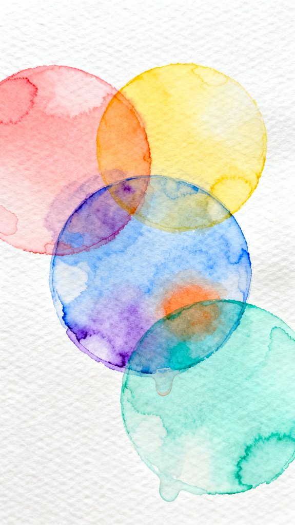
Overlapping circles teach us one of watercolor’s most beautiful properties: transparency. When wet pigment crosses over dried paint, we create fluid layers that reveal both colors at once. This exercise shows you how translucent glazes transform simple shapes into complex compositions.
Here’s your step-by-step approach:
- Paint your first circle in any color, then let it dry completely (this takes about 5-10 minutes).
- Add a second circle that overlaps the first, using a different color. Watch the magic happen where they meet!
- Continue adding 3-5 more circles, drying between each layer. The overlapping areas create new colors automatically.
Each intersection becomes a window showing every layer beneath. You’re building depth without any drawing skills required. Try warm colors (reds, oranges, yellows) or cool colors (blues, greens, purples) for different moods.
Water Spray Bottle Blooms and Organic Bursts
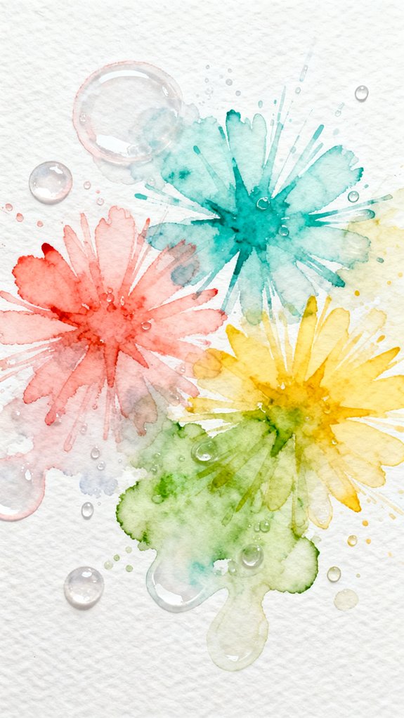
Start by painting bold color patches on dry paper. While the paint’s still wet, spray water directly onto it from 6-8 inches away. Watch the water push pigment outward, creating wavy water impressions that radiate from each droplet. The harder you spray, the bigger the burst becomes!
Try layering colors before spraying to create complex blooms. Apply yellow first, add red while wet, then spray for stunning orange bursts. This technique captures natural organic flow without any drawing skills.
Tilt your paper after spraying to guide blooms in specific directions. Let everything dry completely between layers for controlled, dimensional effects.
Frequently Asked Questions
What Type of Watercolor Paper Is Best for Beginners?
We’d recommend starting with cold press watercolor paper in student grade quality. It’s forgiving, affordable, and gives you that beautiful texture we’re looking for. You’ll experiment freely without worrying about wasting expensive materials.
How Do I Fix Mistakes in Watercolor Paintings?
We’ve found that embracing imperfections actually enhances abstract watercolors rather than ruins them. Instead of trying to cover up mistakes, we’ll show you how to work through mistakes by transforming them into intentional design elements that spark creative innovation.
Can I Frame Watercolor Abstracts Without Glass?
We recommend protecting your watercolor abstracts with acrylic sheets rather than leaving them unframed. Matted frames with UV-resistant acrylic provide archival protection while maintaining vibrancy, ensuring your innovative artwork stays preserved for years ahead.
How Long Does Watercolor Take to Fully Dry?
Drying time varies based on environmental factors like humidity and temperature, but we’ll typically see our watercolor abstracts dry to the touch in 5-15 minutes, with complete drying taking up to several hours.
What Brushes Are Essential for Starting Watercolor Abstract Art?
Let’s cut to the chase: we’ll need just three brushes—a large round for wet on wet techniques, a medium flat for broad strokes, and a small rigger for dry brush applications and spontaneous mark-making.
Conclusion
Now you’ve got a toolkit of simple watercolor abstracts to explore! Think of each technique as a brushstroke in your creative journey—some will feel natural right away, while others might take a few tries. We’ve shown you that beautiful abstract art doesn’t require years of training or expensive supplies. Just grab your paints, pick a technique that excites you, and immerse yourself. Recall, there’s no wrong way to create abstract art. Happy painting! 🎨
Have any thoughts?
Share your reaction or leave a quick response — we’d love to hear what you think!
-
 0
0
-
0
-
0
-
0
-
0
-
0


