

Kiss painting gives you the whole arc of a love story in one small canvas: a place, a mood, and two people who only have eyes for each other. You do not need a big composition or a crowd of detail to make it work. A few soft brushstrokes, a warm light, and faces kept simple will carry all the tenderness you need.
Below you will find thirty three settings for your couple, from a rainy street under one umbrella to a mountain summit above the clouds. Each one is built to finish in a single sitting, with the colour mixes, the order of work, and the one trick that saves it when it starts to go wrong.
Using these images: free for personal projects such as printing, coloring, cards, journals and gifts. Handmade items that include them may be sold up to 30 pieces per design. More than that is commercial use and is not permitted, and neither is selling or sharing the images themselves or passing them off as your own. Please ask before any other use.
Start this one with the umbrella, not the couple. Block in a dark burgundy or black dome shape first on your small canvas, then build the street around it in soft vertical strokes of misty blue grey so the rain reads without a single drawn line. Wet paint dragged downward with a dry brush gives you rain streaks in seconds.
Once the street is in, paint the couple as one soft shape underneath the umbrella, their coats a muted rose and grey, faces turned toward each other and kept loose, just a suggestion of a nose and closed eyes. Keep the kiss itself a soft merge of two shapes rather than two distinct heads.
The usual mistake is making the umbrella too flat and graphic. Angle it slightly and let one edge catch a cream highlight where a streetlamp or shopfront glow hits the fabric, and it will sit convincingly over them.
If you do not have burgundy on hand, mix alizarin crimson with a touch of black for a close match. Finish with a few cream dabs for puddle reflections at their feet and call it done.
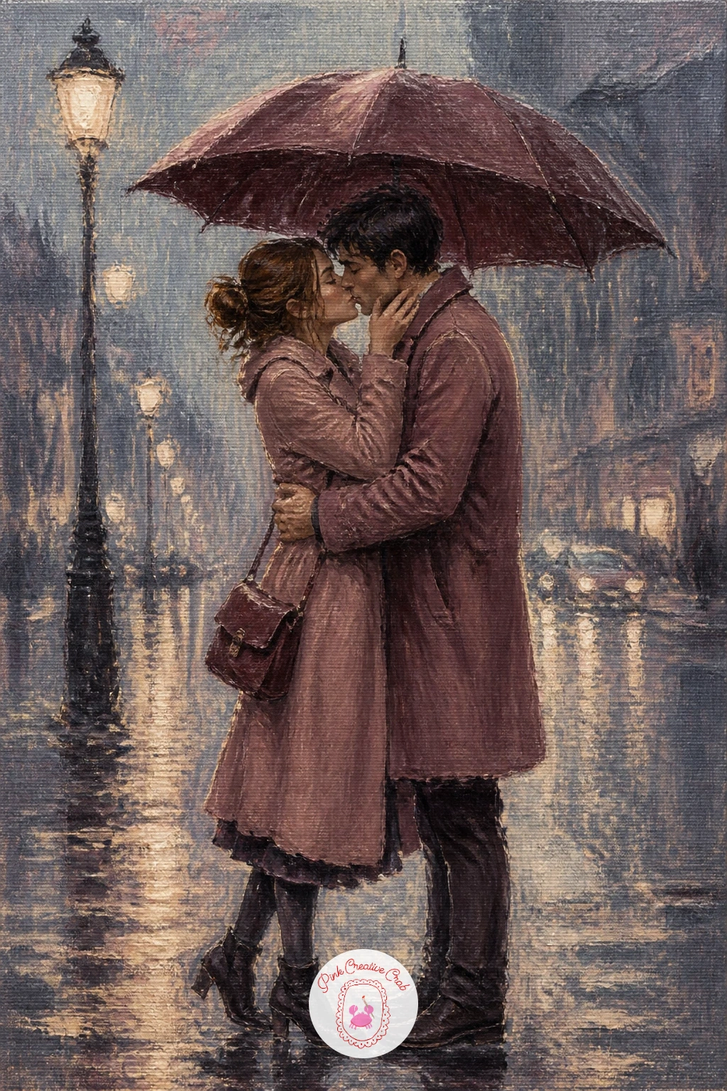
Palette: Burgundy, Payne’s Grey, Dusty Rose, Cream
A Paris bridge kiss leans on the mist behind it more than any detail in the stonework. Lay in a pale cream and misty blue grey sky first, soft and wet, then drop the river below in the same grey with a shade darker for the water, blurring the line between them so the morning mist feels thick.
Paint the bridge as a simple arched silhouette in burgundy grey, no more than a few confident strokes, then place the couple small against the rail, leaning into each other. Keep the figures no taller than a fifth of the canvas height so the bridge and mist still carry the scene.
Where this goes wrong is cramming in lamp posts, boats, and towers until the mist disappears. Resist adding more than one extra element, perhaps a single lamp post silhouette, and let soft edges do the rest of the storytelling.
If your canvas feels too empty, warm the water with a thin cream glaze near the bridge’s reflection. This sits well beside the river painting ideas if you want more practice with water and mist together.
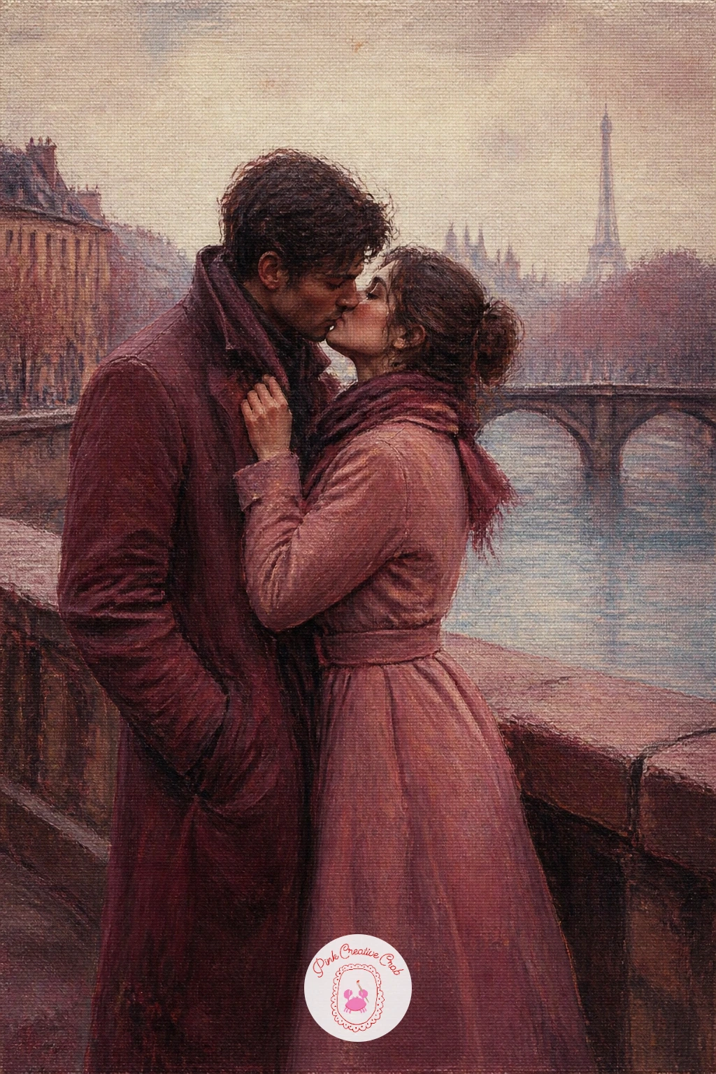
Palette: Misty Blue Grey, Cream, Burgundy, Dusty Rose
Measure before you paint this one: mark the lamp post at roughly a third from one edge, and keep the couple close to its base so the light has somewhere to fall from. That single proportion trick keeps the whole scene from feeling lopsided once the snow goes in.
Block the night sky in deep blue grey first, then paint the lamp’s glow as a warm cream halo with a dry, almost scrubbed brush so it feathers softly into the dark. The couple comes next, small and close under the light, coats in dusty rose and burgundy, faces soft and turned together.
Snow goes in last and lightest, a scatter of small cream dabs made with the very tip of a round brush, heavier near the lamp where the light catches each flake. Too much snow flattens the mood, so keep most of the canvas dark and let the light do the work.
No round brush small enough for the flakes on hand, flick a loaded brush gently with your thumb for a natural scatter instead.
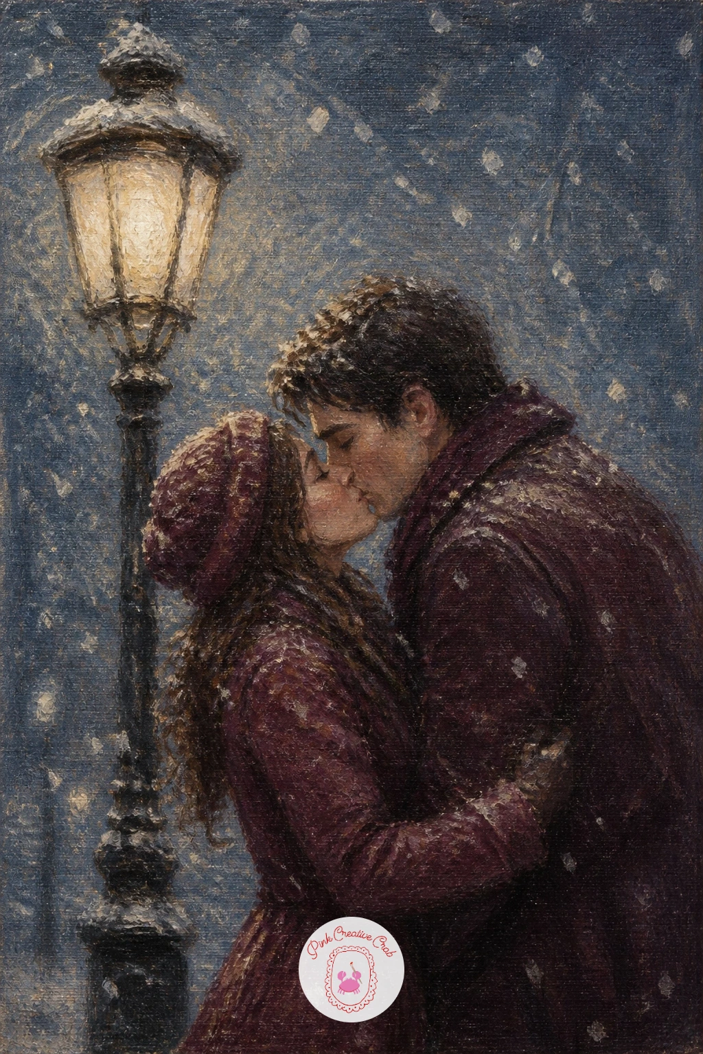
Palette: Payne’s Grey, Cream, Burgundy, Dusty Rose
Steam is the real subject of this one, so paint it before the couple. Load a soft brush with thin cream and misty grey and drag it upward in loose curling strokes across the lower half of the canvas, letting some of it swallow the edges of the train itself.
Once the steam is in and still workable, paint the train as a dark burgundy grey mass behind it, just enough shape to read as a locomotive, no need for wheels or windows in detail. The couple stands close at the platform edge, one figure’s coat caught by a gust, faces pressed close in a last soft kiss.
The common misstep here is painting the steam too solid and cloud like. Keep your brush fairly dry and let canvas texture show through in patches, which reads as vapour far better than a smooth fill.
Working from a photo, lavender grey tube paint on its own can stand in for the misty steam colour if you are short on mixing time.
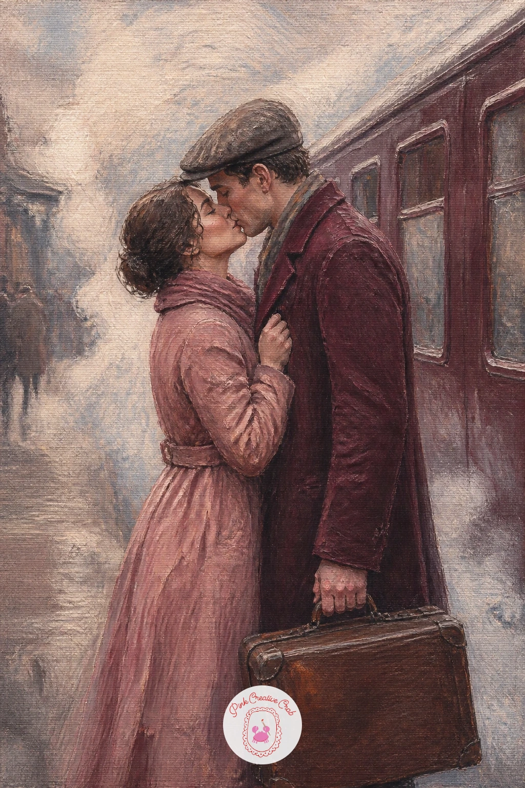
Palette: Misty Blue Grey, Cream, Burgundy, Dusty Rose
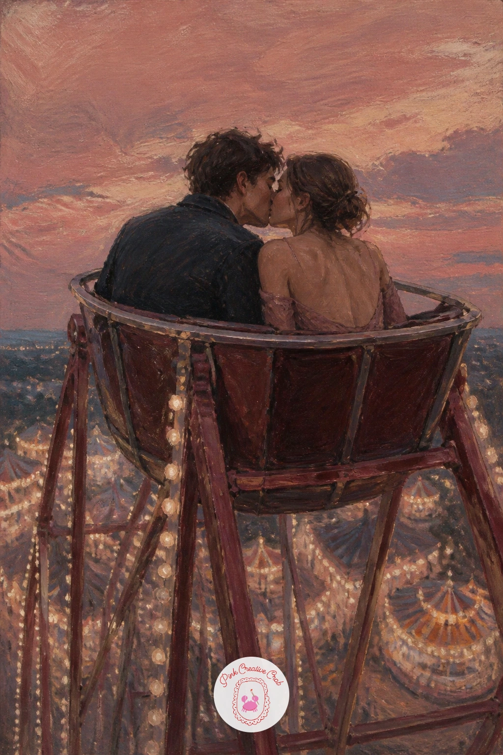
Think about eye level before you touch the canvas. You are looking up at this couple from the fairground below, so their gondola sits high and small against the sky, and the Ferris wheel’s far side curves away below the horizon line rather than above it.
Paint the sky first in a soft dusty rose to misty blue grey gradient, evening light behind them, then sketch the wheel’s circle loosely in burgundy, letting the lower half blur into fairground lights, just a scatter of warm cream dots suggesting bulbs and stalls far below.
The couple sits small in their gondola near the top, leaning together, faces soft. Keep their scale honestly tiny against the wheel, since making them too large breaks the sense of height that makes this idea work.
If straight spokes feel fiddly, a ruler edge dragged through wet paint gives you clean radiating lines in one pass.
You Will Need
- ruler for straight spoke lines
Palette: Dusty Rose, Misty Blue Grey, Burgundy, Cream
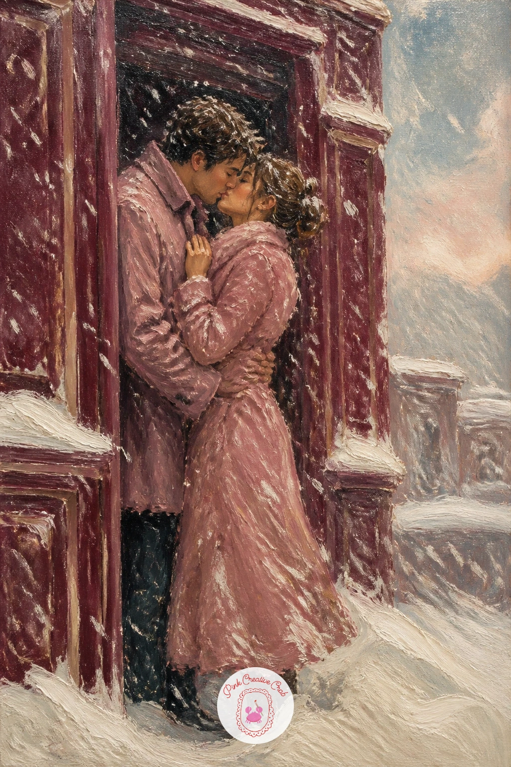
Carry on from the lamp post scene with another sheltered kiss, this time tucked into a doorway. Paint the surrounding building first in broad burgundy grey strokes, leaving the doorway itself as a slightly darker recessed shape so it reads as shelter the moment you step back.
Drybrush white and cream snow diagonally across the whole canvas once the building is blocked in, heavier at the top where the storm is thickest, lighter near the doorway where the couple stands protected. This single dry brush pass does more for the storm’s energy than careful individual flakes ever could.
Place the couple close together in the doorway’s shadow, coats in dusty rose and grey, faces turned in, sheltering from the wind as much as from each other. If the snow starts to look too uniform, vary the pressure of your dry brush so some streaks are heavier than others.
Short on a stiff dry brush for this effect, a piece of card dragged through pale paint gives a similar scattered texture in a pinch.
Palette: Burgundy, Misty Blue Grey, Cream, Dusty Rose
This pairs well with the ideas in the snow painting roundup if you want more practice building storms with a dry brush before moving on to a figure in front of them.
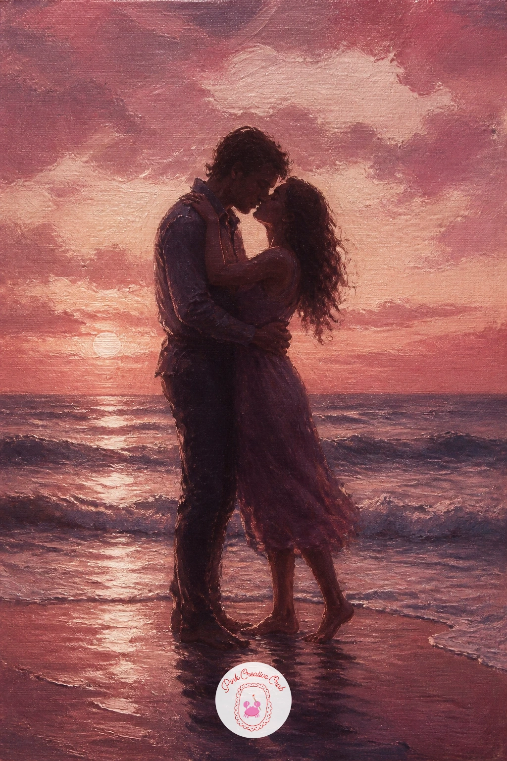
Light source decides everything here, so settle it first. The sun sits low behind the couple, which means their silhouettes read dark against a warm sky and the wet sand at their feet catches a bright cream reflection of that same light.
Paint the sky in horizontal bands first, dusty rose near the horizon fading up into misty blue grey, then lay the sea as a few confident horizontal strokes in a slightly deeper tone. The couple stands as a close dark silhouette near the shoreline, faces simplified into one soft merged shape for the kiss.
Wet sand is where beginners often lose the glow. Drag a thin cream glaze horizontally across the lower third while the sand colour beneath is still slightly wet, so the reflection blends rather than sitting on top as a hard streak.
No cream on your palette, a touch of titanium white warmed with a little yellow ochre gives the same soft glow.
Palette: Dusty Rose, Misty Blue Grey, Burgundy, Cream
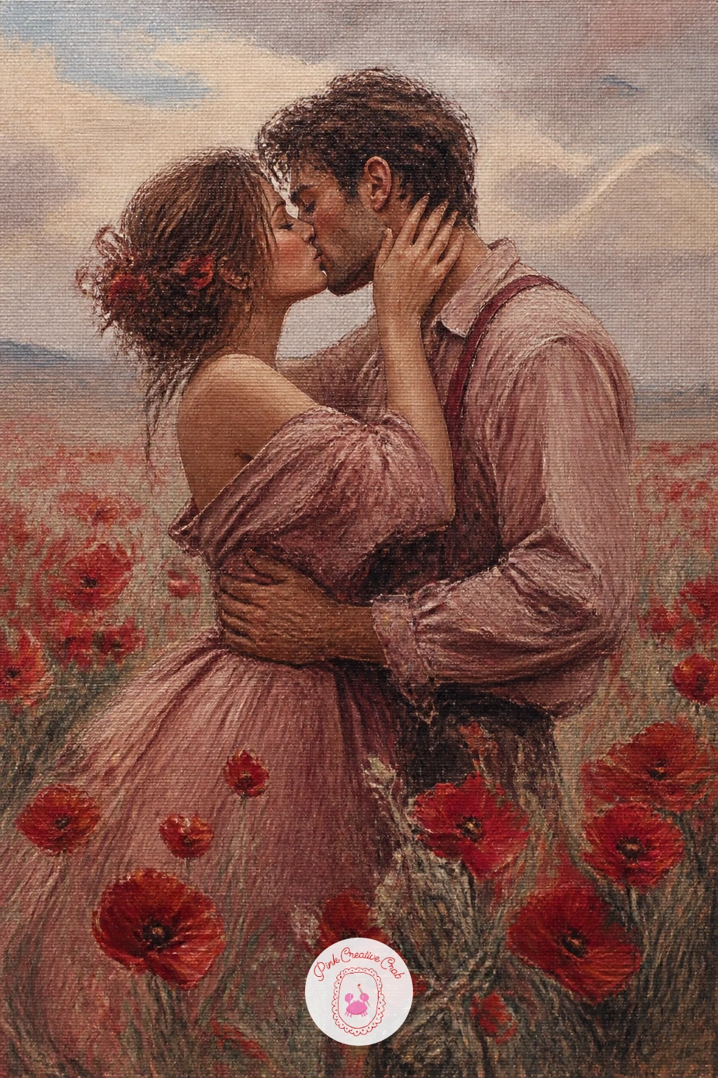
Give yourself ten minutes for the quick version of this one: block a soft green grey field, dot in red poppies with the tip of a round brush, and place the couple standing close among them with simple soft faces. That alone makes a complete small canvas.
The forty minute version adds layers to the poppies, a few darker red centres dabbed into the still wet red dots, and a gentle breeze suggested by tilting some of the poppy heads and the couple’s hair and clothing in the same direction. This single consistent tilt sells the wind far better than any extra detail.
Paint the sky loosely behind them in misty blue grey fading to cream near the horizon, then the field, then the poppies last so their red stays crisp against the green. The couple goes in after, small within the field, close and tender.
If pure red feels too harsh against this palette, mix in a touch of burgundy to soften it toward the rest of your colours.
Palette: Poppy Red, Sap Green, Misty Blue Grey, Cream
This scene rewards a little proportion checking before you paint faces. Hold your brush up to your reference or imagine a rough ruler line: the goggle strap should sit roughly level with the top of each head, and pushed up goggles sit higher on the forehead than most people first guess, closer to the hairline than the brow.
Block the snowy mountain background first in broad cream and misty blue grey strokes, then the lift station structure as a simple dark burgundy shape behind the couple. Paint the figures close together in ski jackets, dusty rose and deep grey, goggles pushed up as two small pale ovals catching light.
Faces stay soft here just like every other idea in this set, no need for sharp detail even with the goggles nearby. If the goggle shape looks odd, simplify it to a single curved highlight rather than trying to paint a realistic lens.
Swap burgundy for a deep plum if that is what your palette already has mixed.
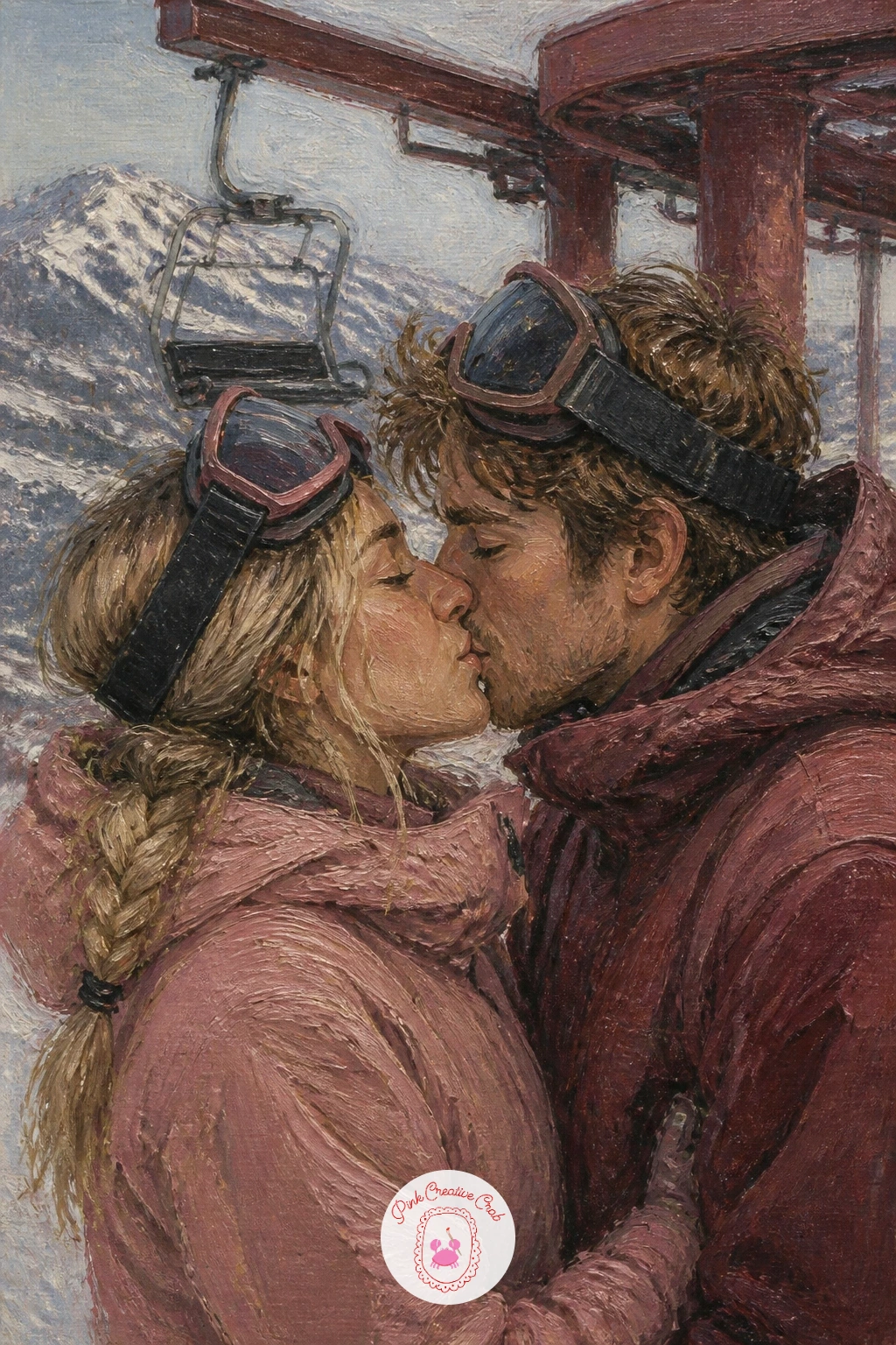
Palette: Cream, Misty Blue Grey, Burgundy, Dusty Rose
Perspective matters more than usual here, since the ice has to read as flat ground stretching away rather than a vertical wall of grey. Paint the frozen lake’s surface with horizontal strokes that get closer together toward the back of the canvas, which pulls the eye into the distance without any real drawing.
Once the ice is in, add a pale cream horizon line where it meets a soft misty sky, then paint the couple close together at the centre, skates just suggested as dark curved shapes at their feet. Keep the skating figures balanced on a slight lean, which reads instantly as motion even at this simple level.
Thin scratches across the ice, done with the wooden end of a brush dragged through wet paint, give you believable skate marks in seconds. Too many scratches clutter the surface, so keep them to a handful near the couple’s feet.
If you want a colder cast overall, add a touch more blue grey into your white mix for the ice.
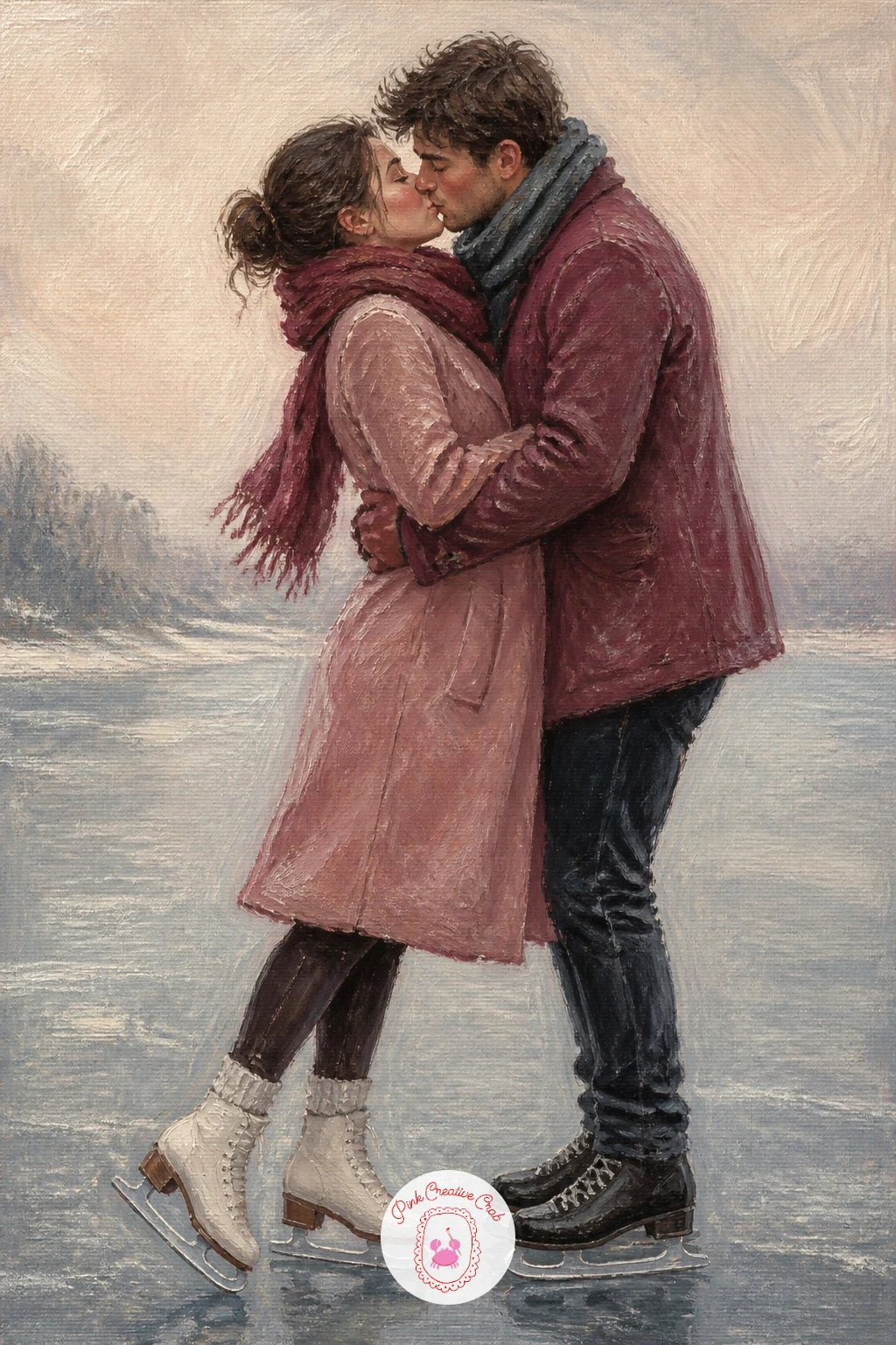
You Will Need
- wooden brush handle for scratching ice marks
Palette: Misty Blue Grey, Cream, Burgundy, Dusty Rose
Shelves give you a natural frame, so use them. Paint two tall vertical shapes in burgundy and deep brown grey on either side of the canvas first, leaving a clear gap between them where the couple will stand, and this alone creates the hushed, narrow feeling of a library aisle.
Fill the shelves with loose rectangular dabs of colour standing in for book spines, no need to paint individual titles, varying the dabs in dusty rose, cream and deep burgundy so they read as a believable row without fuss. Light comes from one end of the aisle, so keep that side a touch brighter and let the far end fade into shadow.
The couple stands close in the gap between the shelves, soft and still, perhaps one hand resting on a shelf edge. Keep their edges a little softer than the shelves around them so they feel like the warm centre of a quiet space.
If your shelf dabs start looking too neat, vary their width and spacing for a more lived in feel.
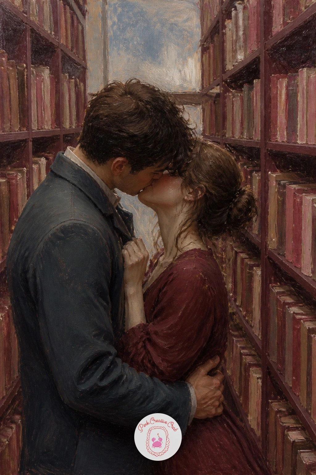
Palette: Burgundy, Cream, Dusty Rose, Deep Umber
Begin with the blossoms rather than the branches, since the canopy of pink is what carries this whole scene. Dab soft clusters of dusty rose and pale cream across the upper half of the canvas with a loaded round brush, keeping the clusters uneven so they read as natural clumps of blossom rather than a solid pink ceiling.
Once the canopy feels full, paint a few dark burgundy grey branch lines threading through the gaps, just enough to anchor the blossom in place. The path below stays simple, a pale stone grey with a scatter of fallen petals in the same dusty rose, dabbed in with the very tip of the brush.
The couple walks close together beneath the canopy, small against the blossom, pausing for a soft kiss. Keep the figures a touch darker than the pale background so they do not get lost among all that pink.
Short on time for individual petal clusters, a sponge dabbed lightly in rose and cream covers the canopy fast with a similarly soft texture.
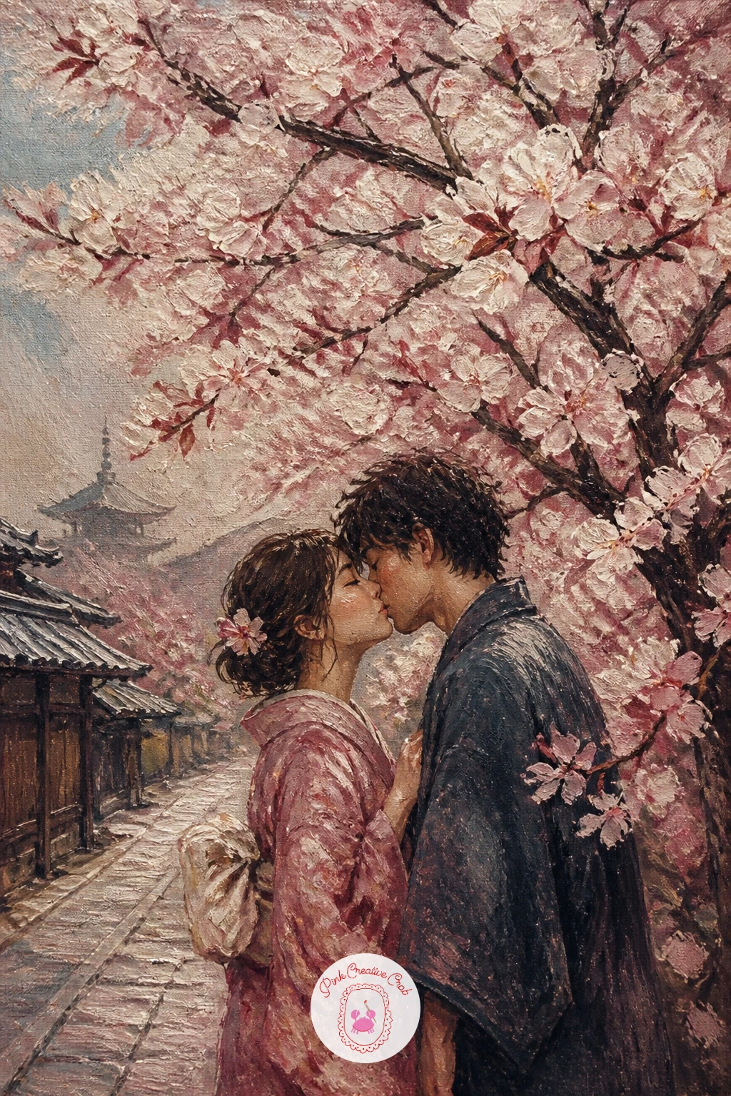
You Will Need
- small sponge for blossom texture (optional)
Palette: Dusty Rose, Cream, Burgundy, Stone Grey
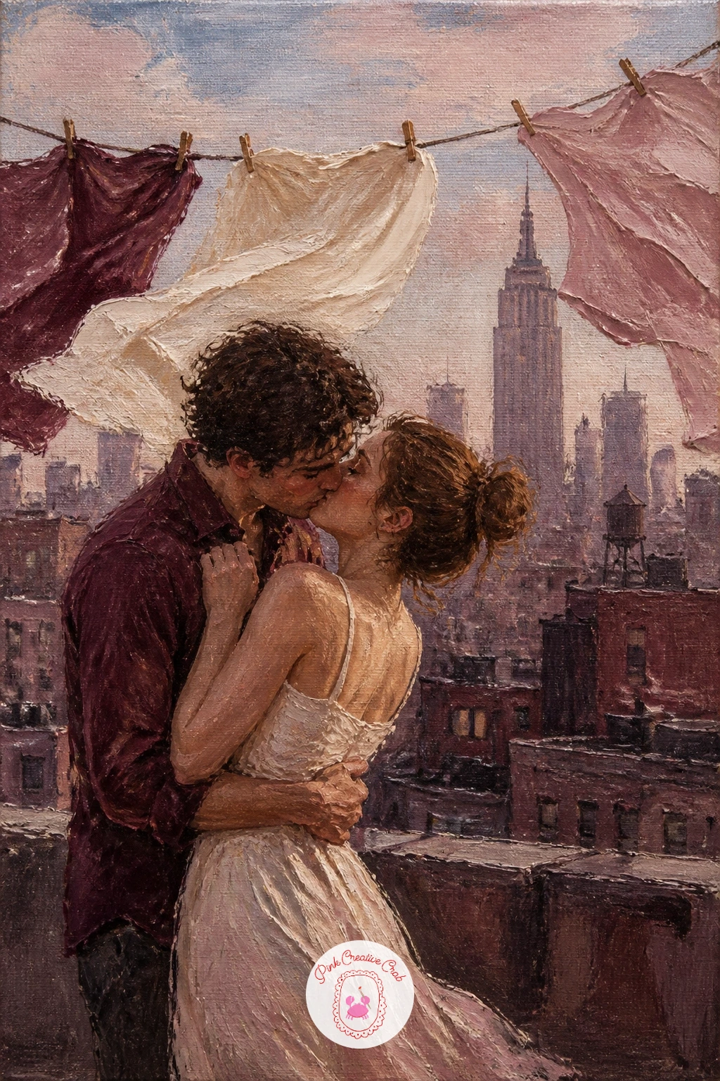
Carry the breeze from the blossom scene up onto a rooftop, where it now moves laundry instead of petals. Block in the city skyline first as simple flat burgundy grey shapes along the horizon, low and understated, so the rooftop itself stays the main stage.
String a loose line across the canvas and hang a few flat shapes of cream, rose and grey fabric from it, each one painted with a slight curve and a flicked edge to show wind catching it. Three or four pieces of laundry are plenty, more than that starts competing with the couple for attention.
Paint the couple standing close near the washing line, city light warm behind them, faces soft and turned together. If the laundry looks too stiff, loosen your brushwork and let one edge of each piece blur slightly into the sky.
A painter’s knife dragged lightly along one edge of each fabric shape gives a crisper flutter than a brush alone.
You Will Need
- small painting knife for fabric edges (optional)
Palette: Burgundy, Dusty Rose, Cream, Misty Blue Grey
A dropped suitcase tells the whole story here, so place it before anything else. Paint a simple rose or burgundy rectangular case lying at an angle near the couple’s feet, slightly tipped as if it fell the moment they saw each other, and the rest of the scene can stay far simpler.
Block the arrivals hall behind them loosely, pale cream and grey walls, a few soft vertical shapes standing in for distant figures and signage, none of it needing real detail. The couple embraces close at the centre, one figure perhaps still in a coat from travel, faces meeting in a joyful soft kiss.
Keep the background figures deliberately vague and faceless, just colour and shape, so the eye never leaves your main couple. Overworking the crowd behind them is the easiest way to lose the moment.
If you want a worn travel look on the suitcase, a dry brush dragged lightly over the burgundy once it is dry adds a scuffed texture fast.
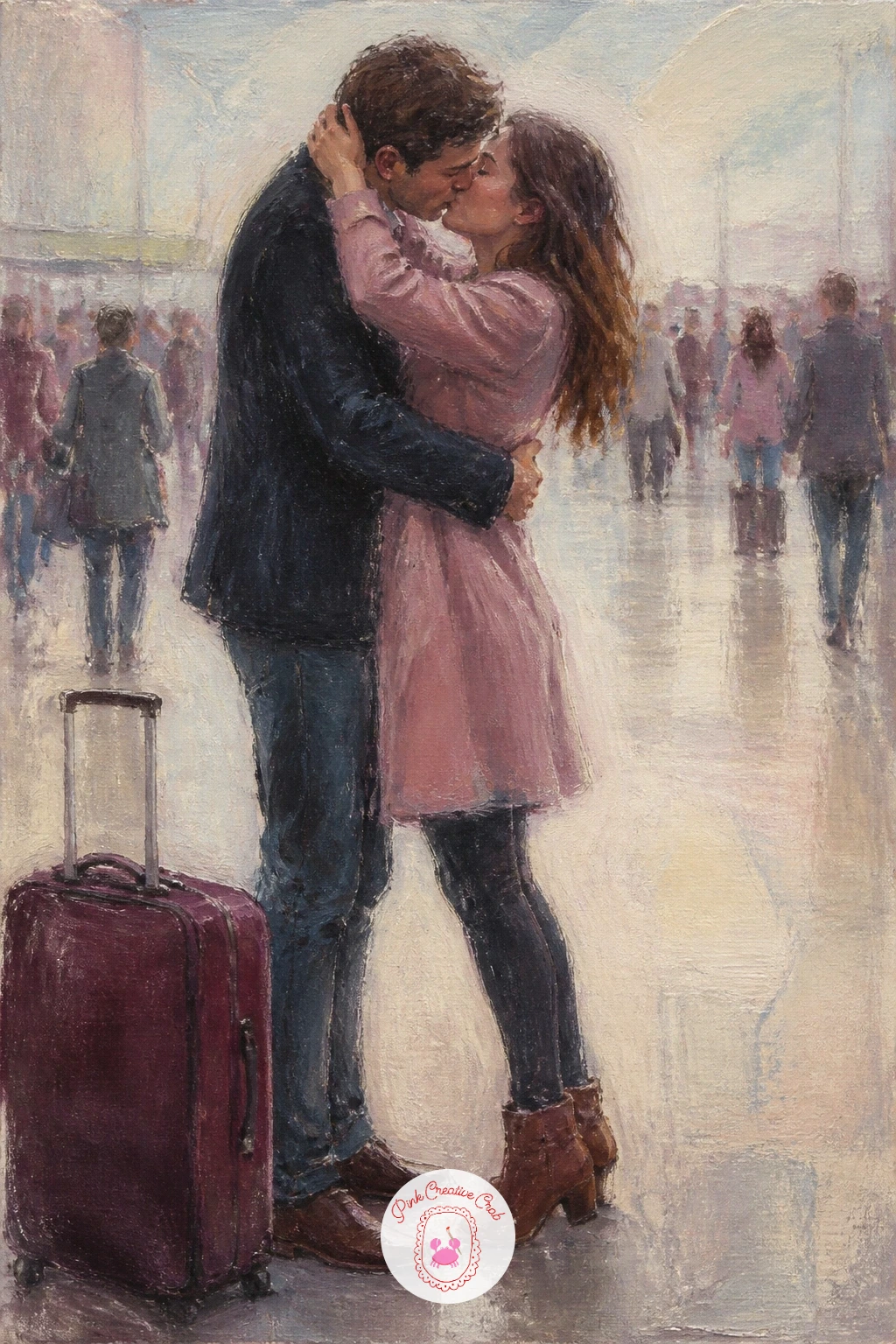
Palette: Burgundy, Cream, Misty Blue Grey, Dusty Rose
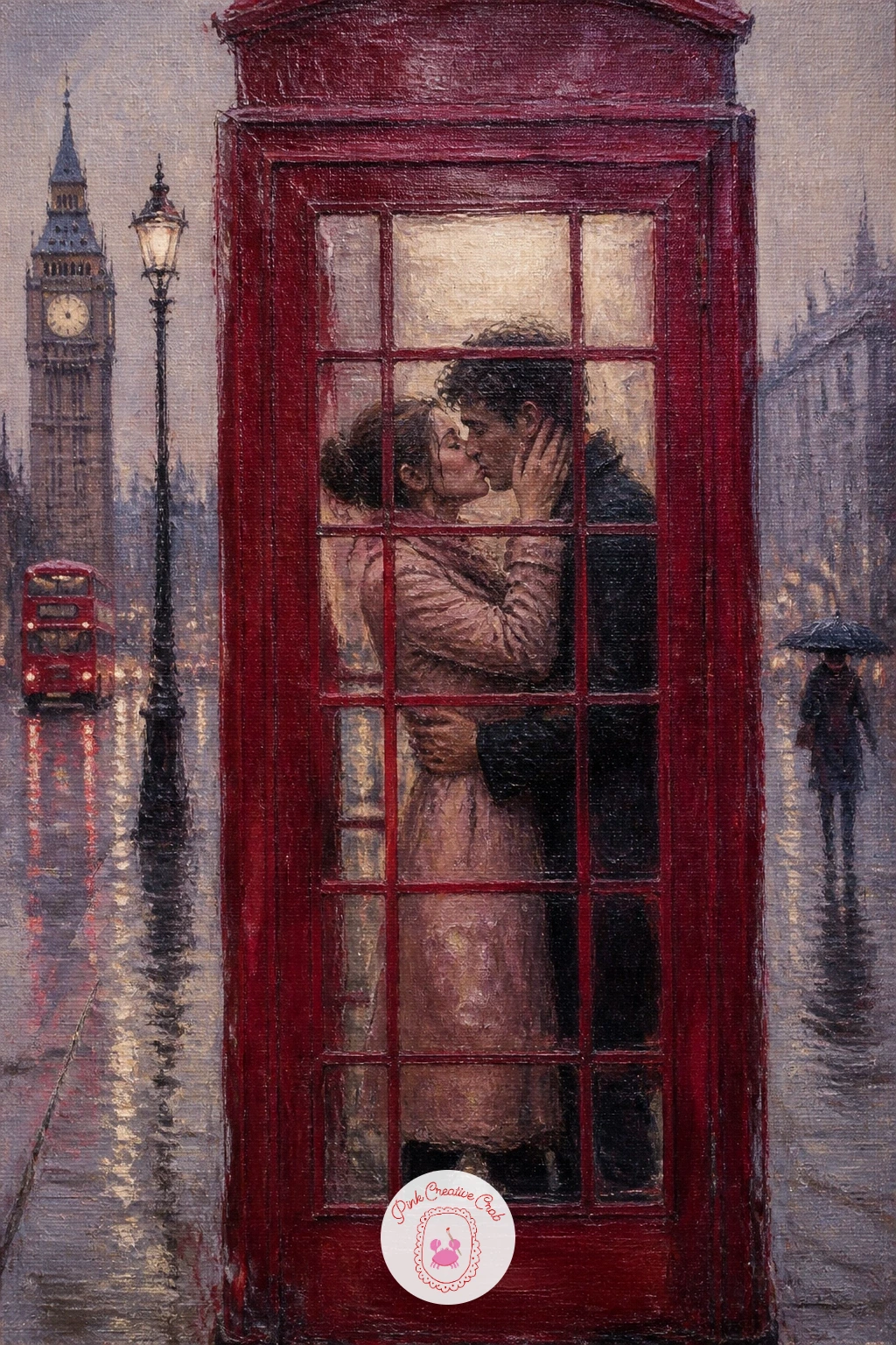
Colour contrast does the heavy lifting in this one, so start with the phone box itself in a bold, slightly muted red rather than the dusty rose used elsewhere, since this one bright note against grey rain is the whole point of the scene.
Paint the rainy London street behind it in soft misty blue grey verticals, buildings barely more than blurred rectangles, then add the phone box with clean edges so it pops forward against all that softness. The couple kisses inside or just at its open door, glimpsed through the glass panes rather than fully clear.
Suggest the glass panes with a few pale cream grid lines over the red, loose rather than ruled, so the box still feels painterly rather than architectural. If the red fights too hard with your rose and burgundy palette, mix a touch of burgundy into it to pull it back into the family.
No masking tape for crisp box edges, a steady hand and a smaller brush for the outline works nearly as well.
You Will Need
- masking tape for crisp box edges (optional)
Palette: Phone Box Red, Misty Blue Grey, Cream, Burgundy
Yellow cabs need to stay loose or they pull focus from the couple entirely. Paint them as a few quick horizontal smears of warm ochre and cream moving past in the background, blurred at the edges as if caught mid motion, rather than carefully drawn vehicles.
Block the snowy street first in misty blue grey and cream, buildings rising simply behind in burgundy grey blocks, snow falling in soft dabs across the whole scene. The couple stands close at the street corner, a little apart from the moving cabs, wrapped up warm with faces turned together.
Keep the cabs behind the couple in both position and value, slightly darker or greyer than you might expect, so they read as background motion rather than competing colour. If yellow feels too jarring against this palette, mute it with a touch of burgundy before it goes down.
The city illustration ideas are a good companion piece if you enjoy painting snowy streets like this one.
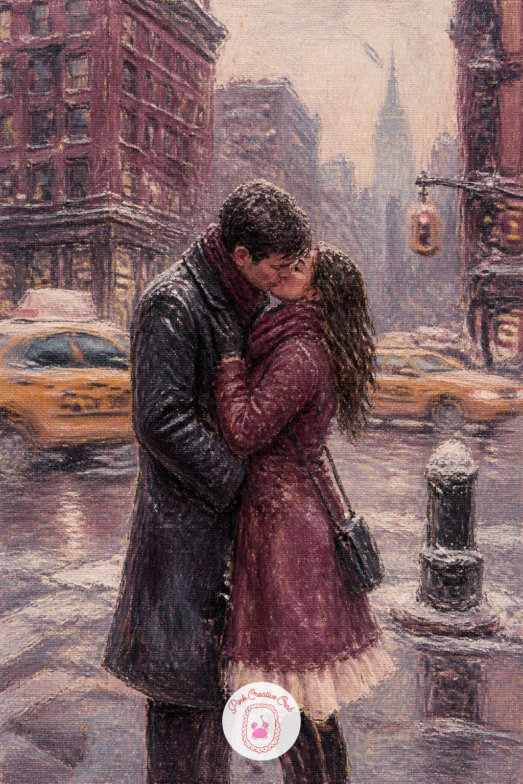
Palette: Misty Blue Grey, Cream, Burgundy, Muted Ochre
Give yourself the quick ten minute version first if the carousel feels daunting: one painted horse shape in cream and burgundy beside the couple, a loose curved canopy above, done. The forty minute version adds a second horse further back and some gold trim flicked on with a fine brush for carnival sparkle.
Start with the canopy above, a soft striped dome in dusty rose and cream, then the horse itself, simplified into a few confident curves rather than anatomical detail, saddle and mane picked out in burgundy against the pale body. The couple sits or stands close beside it, caught mid turn, faces soft together.
Lights around the canopy edge, small cream or gold dots dabbed in last, lift the whole scene and suggest evening fairground glow without much extra effort. Too many of these dots gets busy fast, so space them loosely rather than in a tight row.
If gold paint is not in your kit, a warm cream mixed with a touch of yellow ochre reads just as festive.
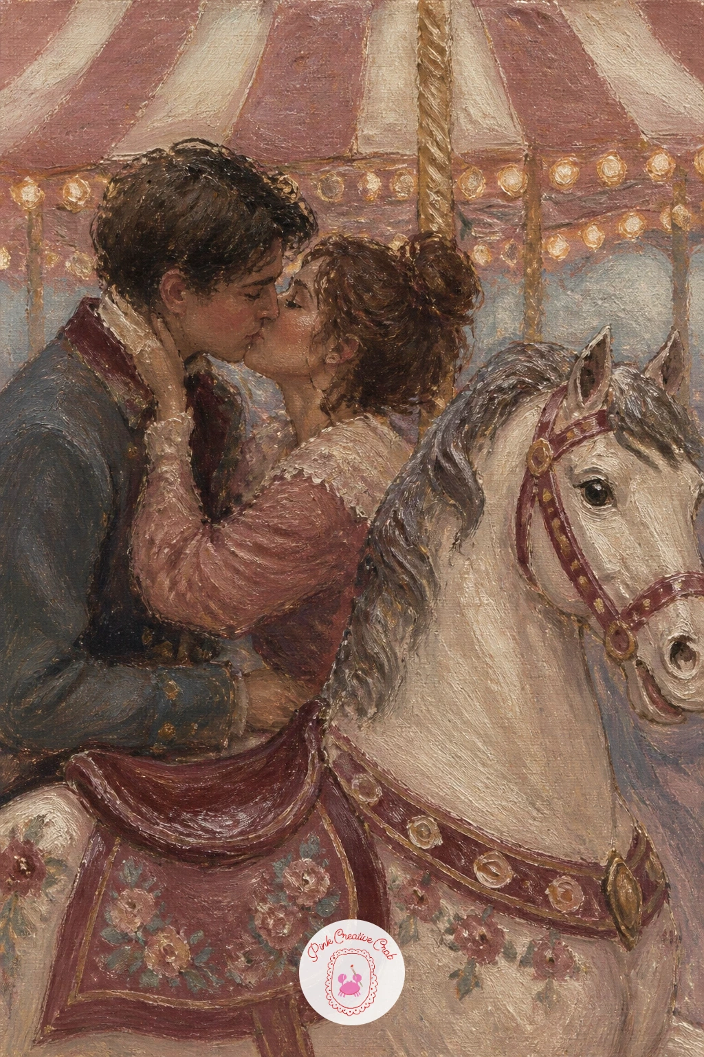
Palette: Dusty Rose, Cream, Burgundy, Warm Ochre
Flowers spilling from a balcony work best painted after the architecture behind them, not before. Block in the warm cream and terracotta wall first, simple shuttered windows suggested with a few dark burgundy rectangles, then let the balcony railing sit as one confident horizontal line across the lower portion.
Flowers come next, loaded dabs of dusty rose and deeper pink tumbling over the railing edge in loose clusters, no need for individual petals, just overlapping dabs of varying size and tone. The couple stands beneath, close together, looking up or simply embracing in the warm light, small against the wall above them.
Warm light is the mood here, so keep shadows leaning toward burgundy rather than grey, which is the easiest way to lose the Spanish warmth of this scene if you default to your cooler mixes out of habit.
A fan brush loaded with two rose tones at once gives you varied flower dabs in a single stroke if separate mixing feels slow.
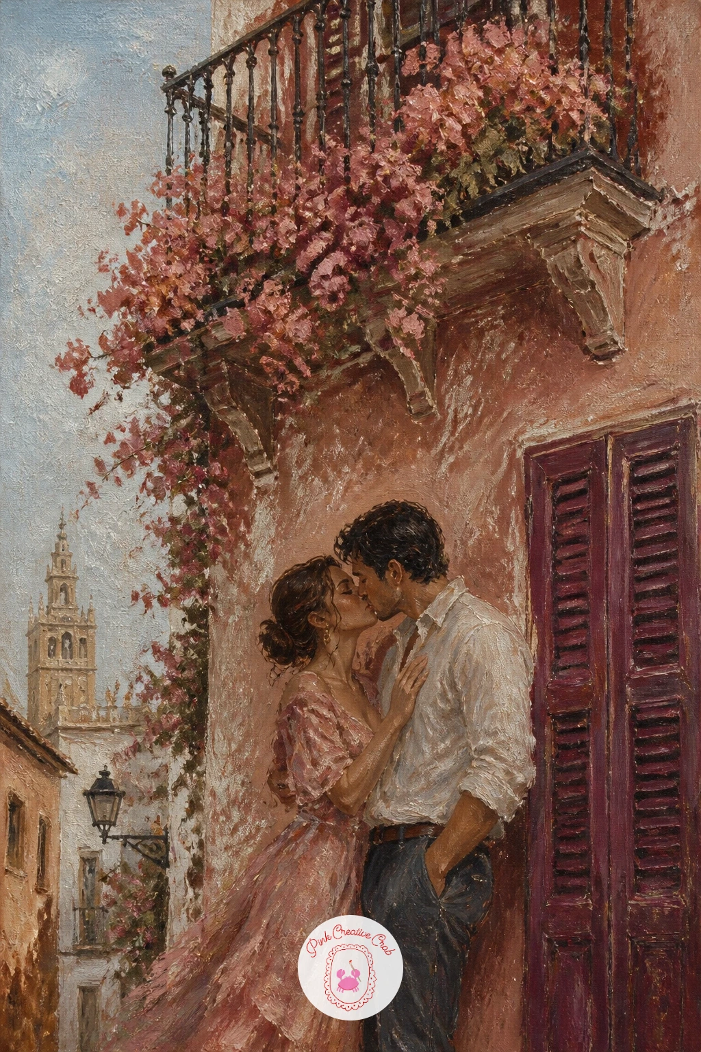
You Will Need
- fan brush for flower clusters (optional)
Palette: Terracotta, Dusty Rose, Burgundy, Cream
Light source again decides the whole mood, and this time it sits low and warm just behind the couple’s shoulders, washing the sail and water in cream and dusty rose rather than the misty blue grey used in the cooler scenes earlier in this list.
Paint the sky first in broad warm bands, then the sail as one large pale cream triangle catching that same light along one edge while the other falls into soft burgundy shadow. Water below gets a handful of loose horizontal strokes in rose and grey, catching the last of the light in small broken reflections.
The couple stands close near the mast or the rail, small against the big pale sail behind them, faces soft and turned together in the glow. If the sail’s shadow side looks flat, warm it slightly with burgundy rather than reaching for plain grey.
Short on a wide flat brush for the sail’s broad plane, two smaller brushes worked side by side cover the same area just as evenly.
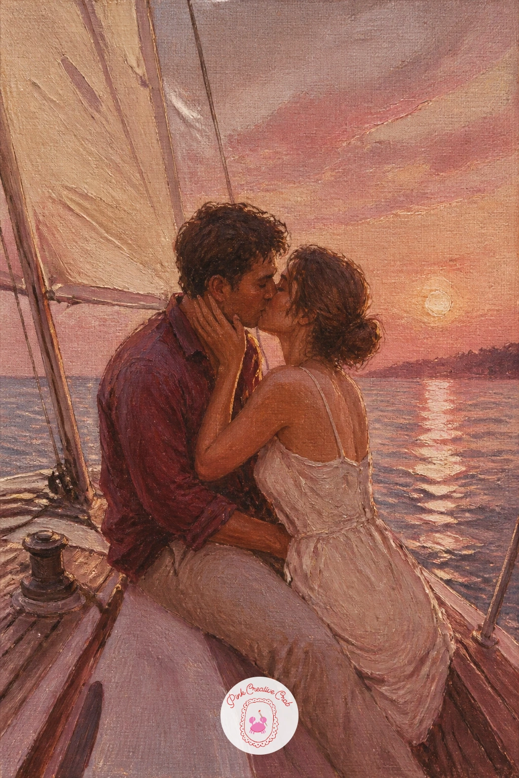
Palette: Cream, Dusty Rose, Burgundy, Misty Blue Grey
Rows are the trick to this whole scene, so plan them before any lavender goes down. Paint a few converging diagonal lines in deeper purple grey across the lower half of the canvas first, which instantly sets up the sense of a field stretching into distance.
Fill each row with short dabbed strokes of dusty rose mixed toward violet, denser and darker near the bottom of the canvas, lighter and looser as the rows recede, which does more for depth here than any careful perspective drawing would. A pale cream farmhouse shape far in the distance gives the eye somewhere to land beyond the field.
The couple stands close within the rows, small against all that colour, faces soft together, perhaps one reaching to touch a stem. Keep them a touch darker in value than the lavender around them so they still hold their place as the subject.
No violet on your palette, dusty rose mixed with a touch of Payne’s grey gets you close enough for this field.
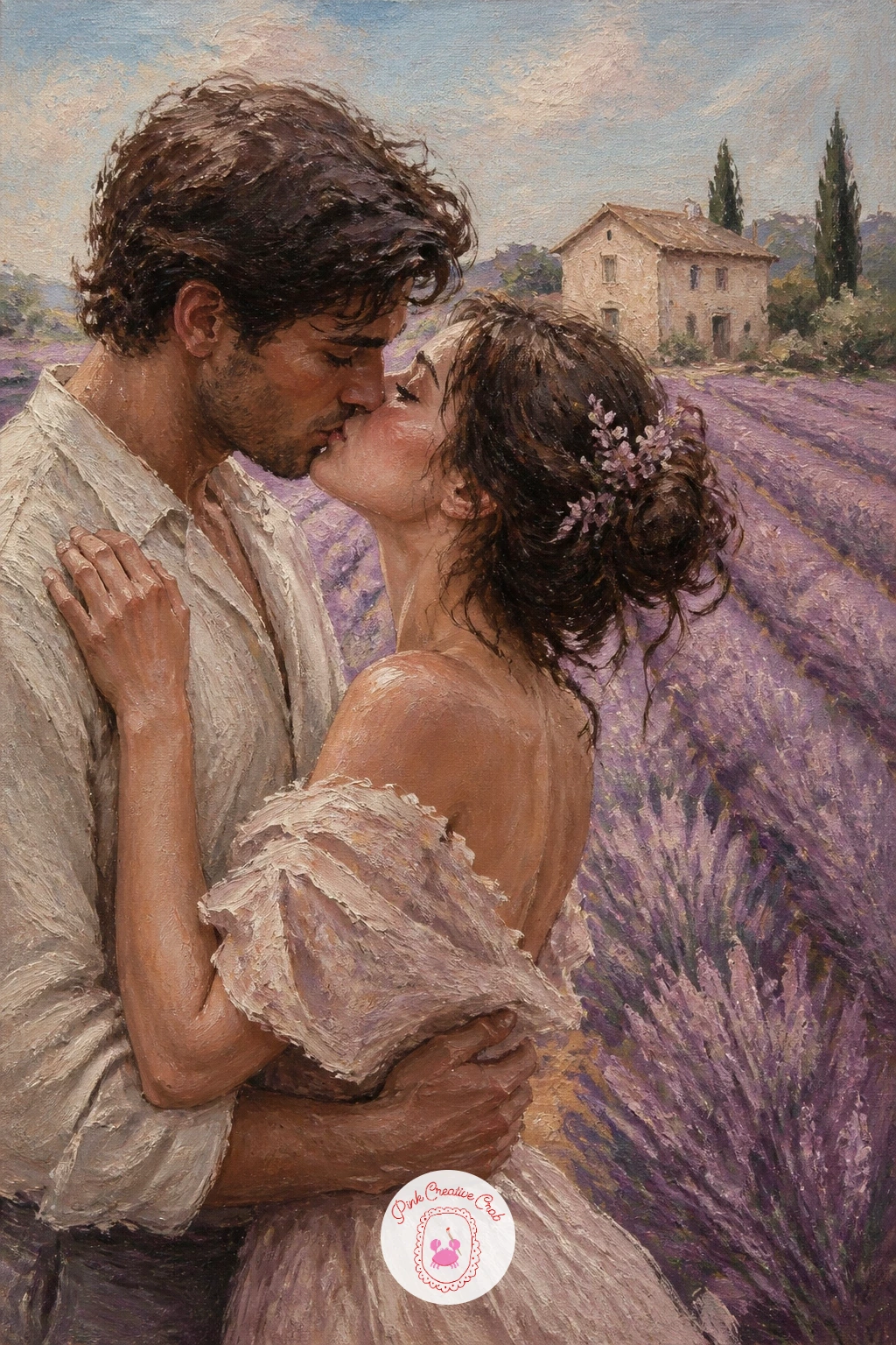
Palette: Lavender Violet, Dusty Rose, Cream, Payne’s Grey
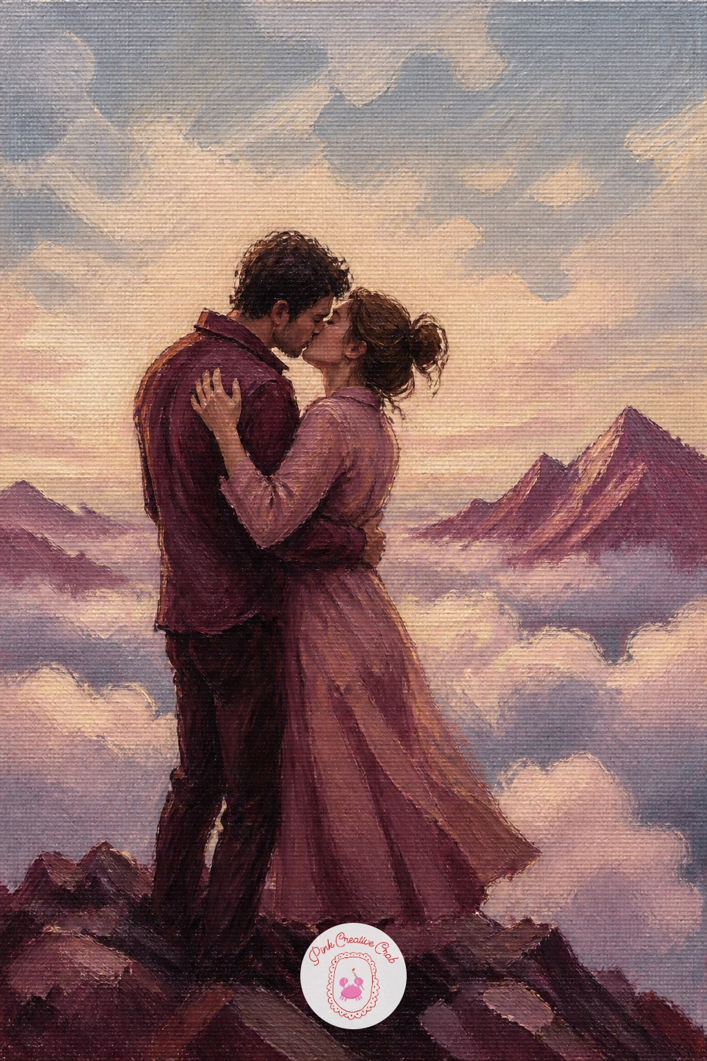
Eye level sits unusually high here, looking across rather than up, since the couple stands above a whole layer of cloud rather than beneath open sky. Paint the sea of clouds first as a soft rolling band of cream and misty blue grey filling the lower third of the canvas, blended wet into wet so no hard edges interrupt it.
Distant peaks poke through that cloud layer as a few small burgundy grey triangles scattered along the horizon, kept small and faint so the main summit where the couple stands still reads as the highest point. The rock beneath their feet can stay a simple warm grey slab, no more detail needed.
The couple stands close at the top, small against all that open space, wrapped up warm, faces turned together in a quiet triumphant kiss. If the cloud layer looks too solid, lift a little paint back out with a dry brush while it is still wet to soften a few edges.
A plate traced lightly in pencil first can help you keep the sun or a hazy glow perfectly round if you want one glowing behind the peaks.
You Will Need
- plate for tracing a glow or sun circle (optional)
Palette: Cream, Misty Blue Grey, Burgundy, Warm Grey
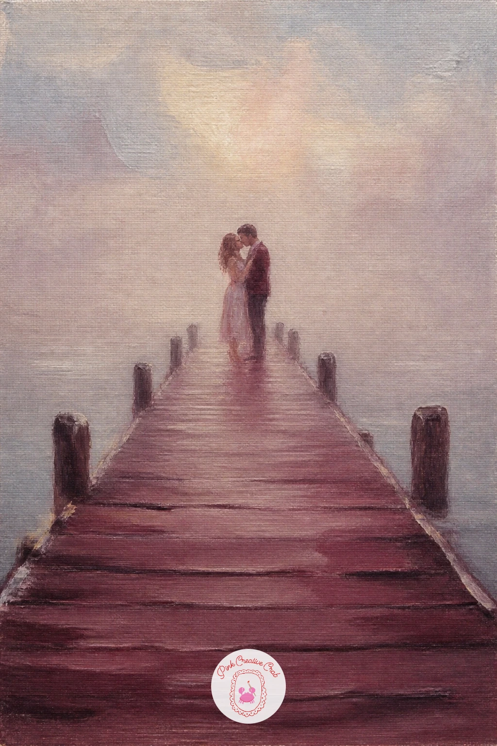
End of a pier in fog is mostly about what you leave out. Paint the wooden planks running toward the couple with a handful of confident parallel strokes in burgundy grey, fading them into plain cream fog well before they reach the far edge of the canvas, so the pier simply disappears rather than ending with a hard line.
The water either side stays almost the same pale tone as the fog above it, just a shade darker and a touch more grey, with the horizon line barely visible at all. This near total fade is what makes fog read convincingly, far more than any texture you could add.
The couple stands close at the pier’s end, the only clearly defined shapes in the whole canvas, faces soft together. Keep every edge around them slightly softer than you think it should be, since sharp edges here would break the hush of the fog instantly.
If your fog keeps looking too even, blot a damp cloth lightly over a section while wet to lift some texture back out.
Palette: Cream, Misty Blue Grey, Burgundy, Dusty Rose
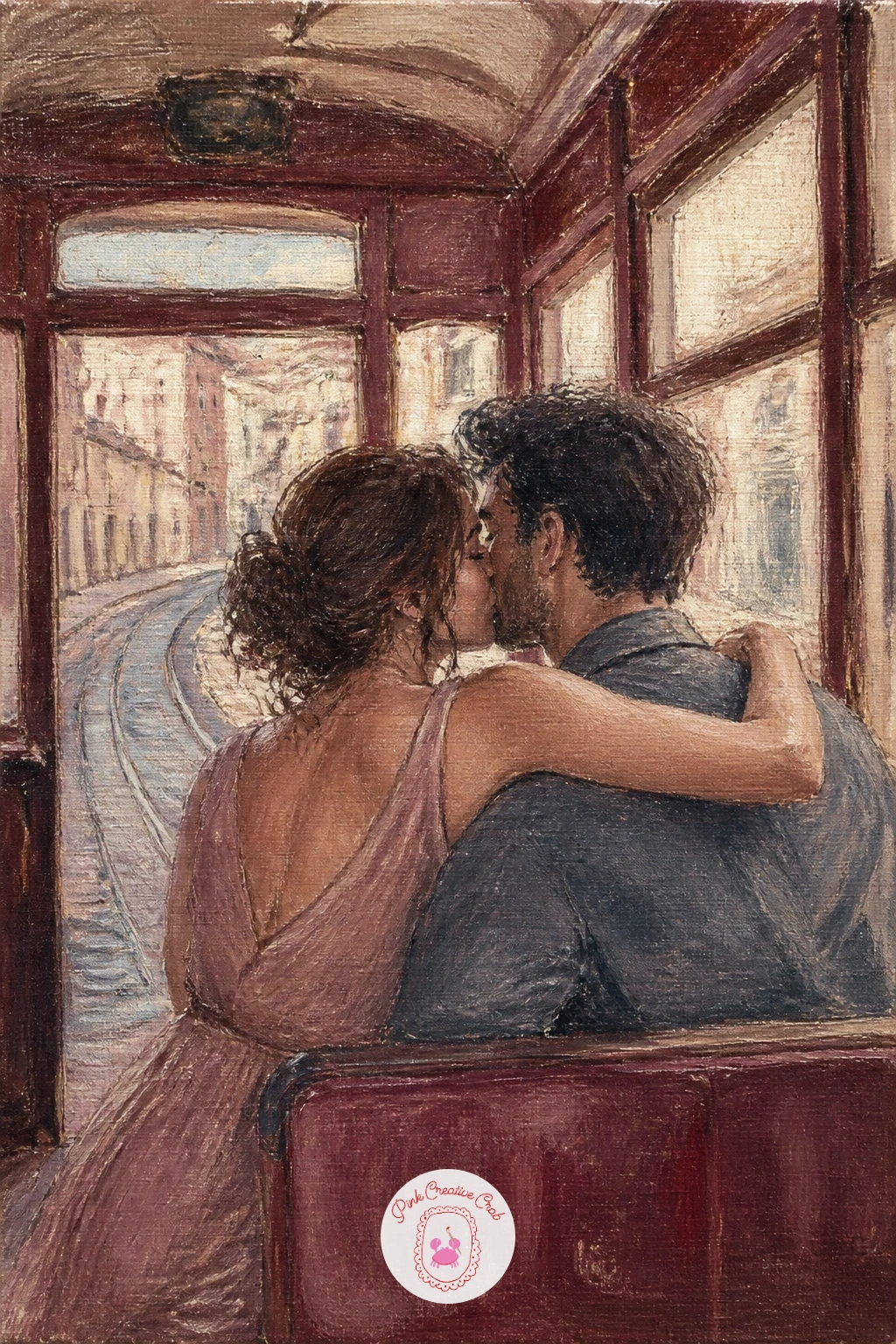
A tram interior gives you window light to play with, so decide where it falls before anything else. Paint the tram’s wooden interior first in warm burgundy and cream, simple panel lines suggested rather than drawn precisely, then cut a bright window shape letting pale cream light spill across one side of the couple.
Outside that window, a blurred hint of cobbled street and pale buildings in soft strokes is all you need, nothing sharp enough to compete with the interior. The couple sits close together on a simple bench shape, caught in that warm spill of window light, faces soft and turned toward each other.
Brass fittings or handrails, picked out with a few small warm ochre highlights, add a nice vintage touch without much extra work. If the interior starts feeling flat, deepen the shadow side of the bench with a touch more burgundy for contrast against the light.
This idea pairs nicely with the watercolor city ideas if you enjoy painting street scenes glimpsed through windows like this one.
Palette: Burgundy, Cream, Warm Ochre, Misty Blue Grey
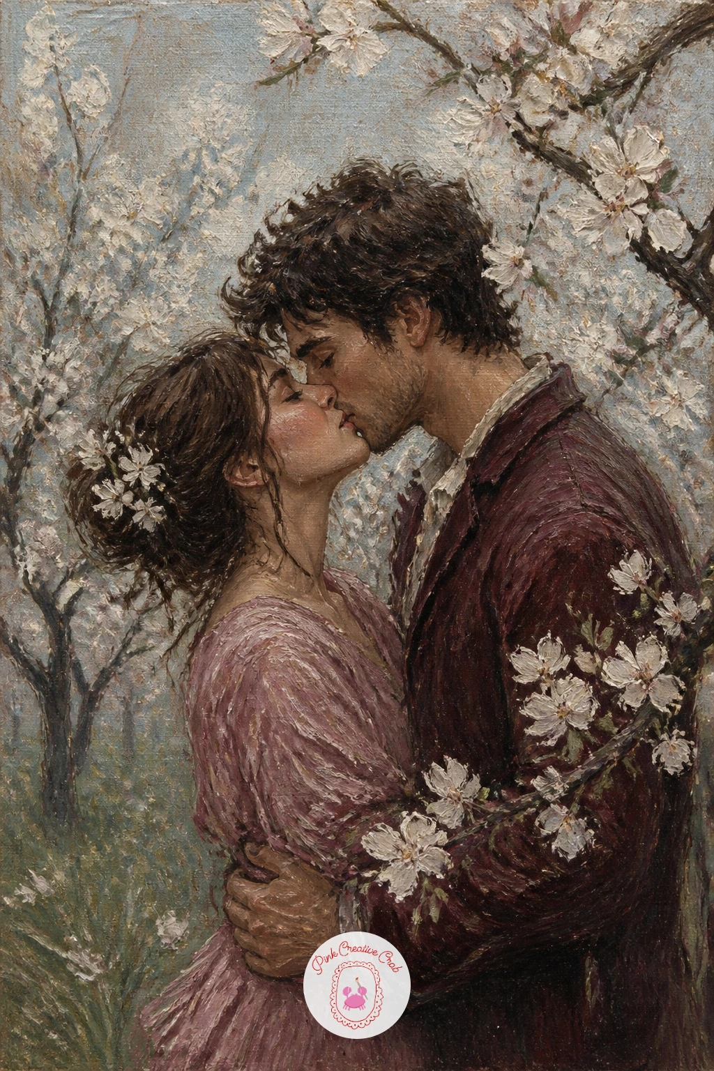
Give this one a quick version first if you are short on time: a single blossoming branch arching over the couple’s heads, cream and white dabs against a soft blue grey sky, done in ten minutes flat. The forty minute version adds a second and third tree receding behind them for a fuller orchard feel.
Block the sky first in pale misty blue grey, then the nearest tree’s branches in a few confident dark burgundy grey lines, blossom dabbed on afterward in soft cream and the faintest touch of rose so it reads as white blossom rather than true pink. Grass below stays a muted sage green, kept loose and secondary to everything above it.
The couple stands close beneath the largest branch, small against the orchard around them, faces soft together in dappled light. If the blossom dabs look too uniform, vary their size and let a few drift loose from the branch as fallen petals on the ground.
Short on time to paint a full orchard, a single blossoming branch crossing the top corner of the canvas alone still sells the whole scene.
Palette: Cream, Misty Blue Grey, Burgundy, Sage Green
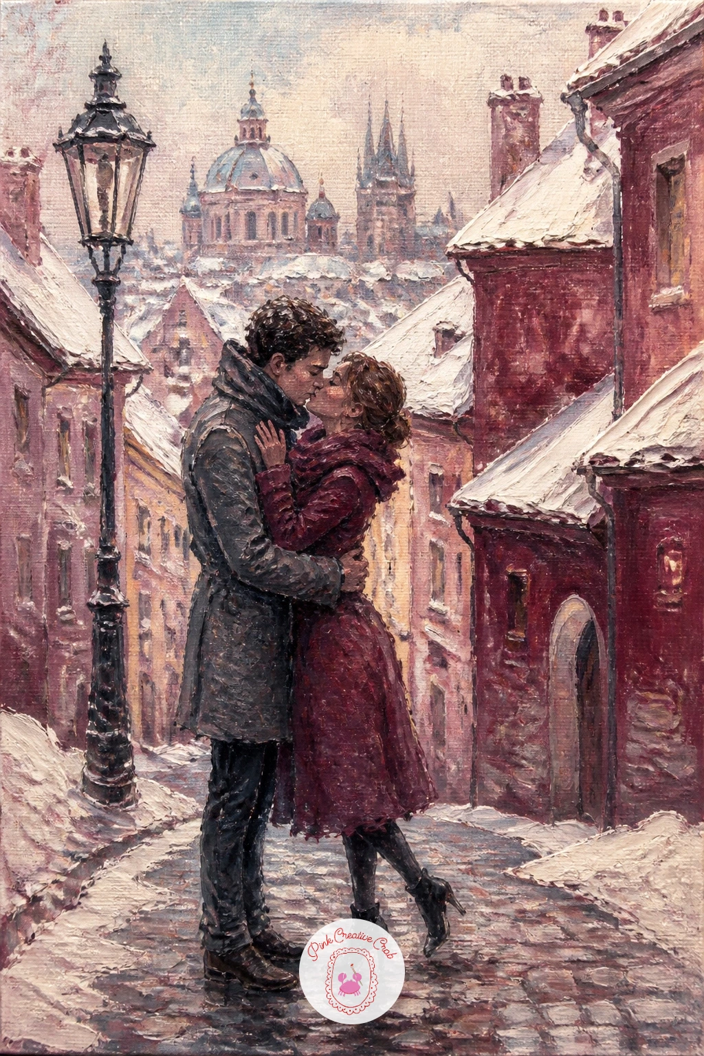
Rooftops heavy with snow need a slightly different edge than the snow elsewhere in this list. Paint the buildings first in warm burgundy and cream blocks, steep roof shapes kept simple, then cap each one with a thick, almost sculpted stroke of white and cream snow, using a palette knife if you have one for a convincingly piled texture.
The cobbled lane below gets a scatter of small irregular dabs in grey and burgundy rather than a flat colour fill, which reads instantly as stone even without individual cobbles drawn out. Keep this texture loose and let it fade toward the top of the lane as it recedes.
The couple walks close together down the lane’s centre, small against the tall buildings either side, faces soft together in the cold. If the palette knife feels unfamiliar, a thickly loaded flat brush pressed and lifted gives a similar piled snow texture.
This scene sits comfortably beside the snow painting ideas if you want more practice with rooftops under heavy snowfall.
You Will Need
- palette knife for piled snow texture (optional)
Palette: Burgundy, Cream, Misty Blue Grey, Warm Grey
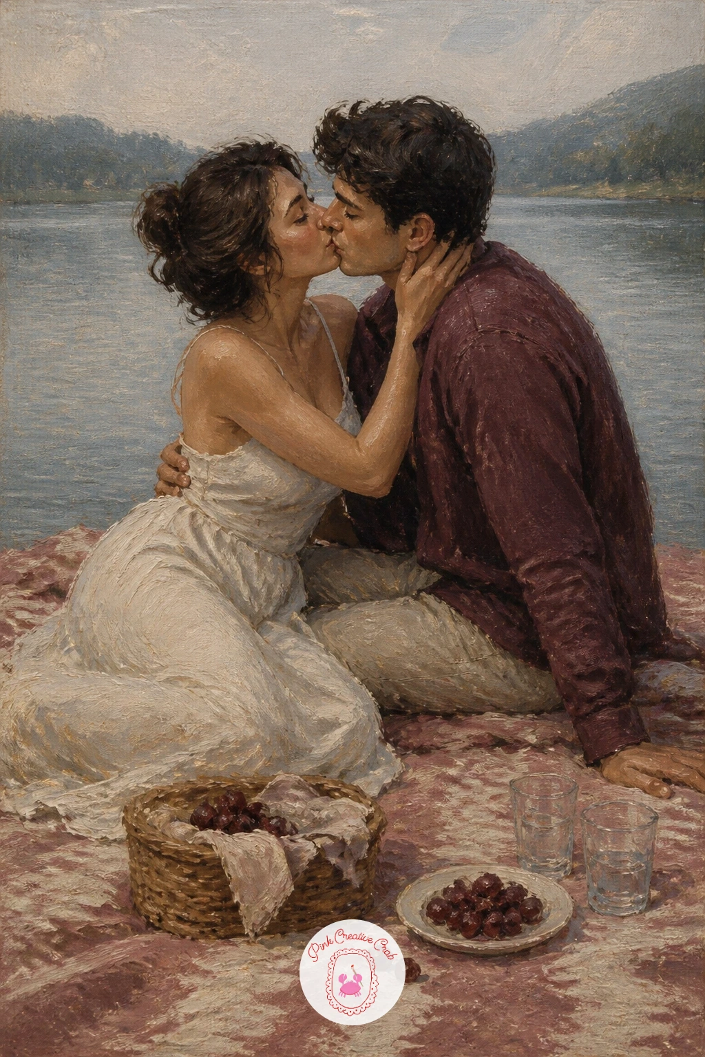
Keep this one calm and horizontal, which is easy to lose if you start adding too much around the edges. Paint the lake first as a few long flat strokes of misty blue grey, barely rippled, then a soft tree line along the far shore in muted green and burgundy, kept low so the sky above still dominates.
The picnic blanket comes next, a simple patterned rectangle in dusty rose and cream laid in the foreground, a basket or cup suggested with just a dab or two of colour rather than careful drawing. The couple sits close together on the blanket, leaning in for a soft kiss, faces simple and warm in the afternoon light.
The easiest way to lose the calm of this scene is overworking the water with too many ripples. A handful of soft horizontal strokes is plenty, more than that starts to look restless rather than peaceful.
If pattern on the blanket feels fiddly, a few simple stripes in two tones read just as well as a busier print.
Palette: Misty Blue Grey, Dusty Rose, Cream, Sage Green
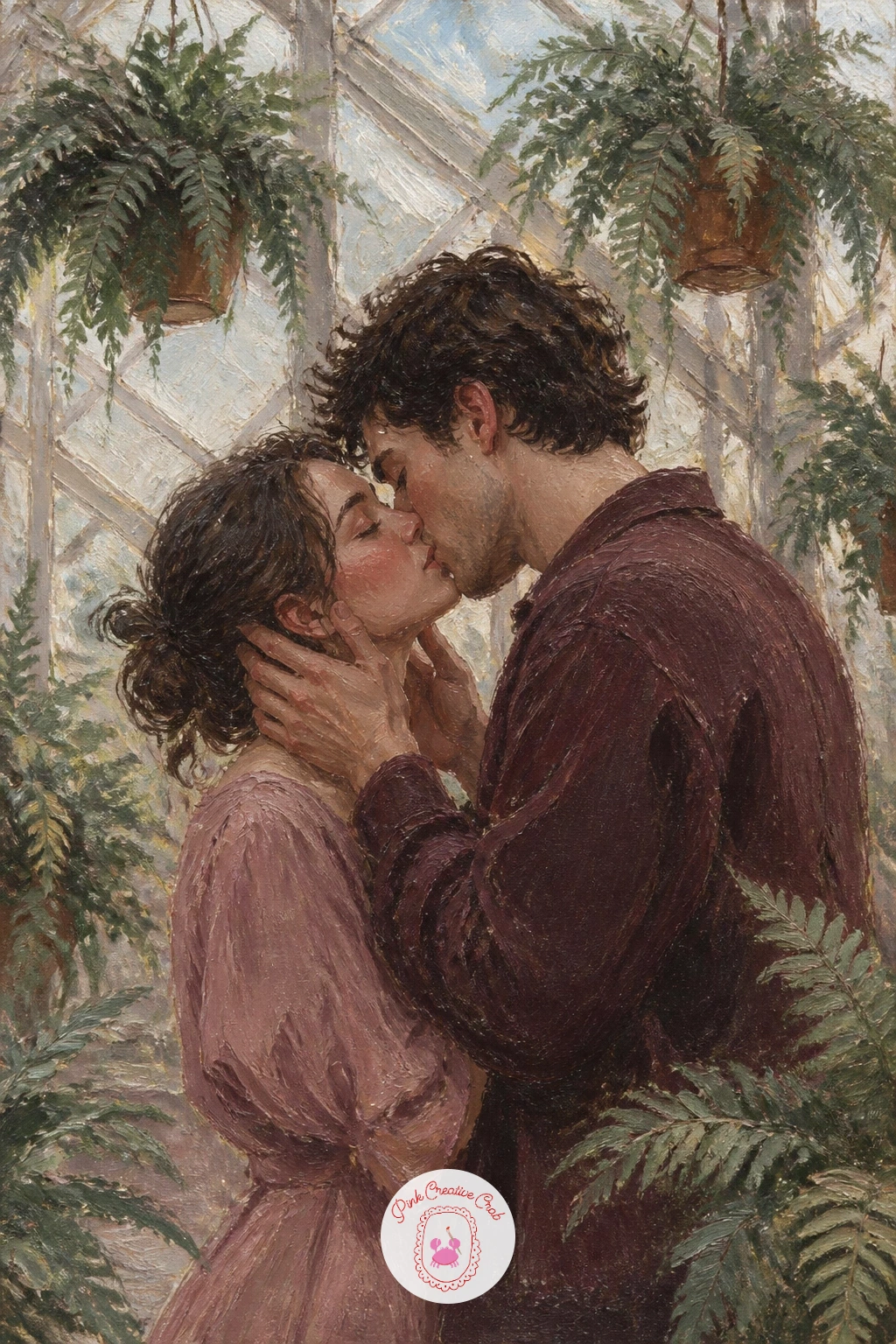
Edges are the real challenge in a greenhouse full of ferns, since too many crisp fronds will turn the whole background into noise. Paint the glass structure first in pale cream and misty grey, simple rectangular panes suggested loosely, then hang a few fern shapes from above in soft overlapping green strokes, keeping most of their edges deliberately blurred.
A kneaded eraser has no real use on wet oil paint, so instead use a soft dry brush to gently knock back any fern edge that comes out too sharp, blending it slightly into the pale glass behind. This single habit keeps the whole canopy feeling lush rather than cut out.
The couple stands close beneath the hanging greenery, dappled light falling softly across them, faces soft together in the warm humid hush of the space. If green paint runs short, mix more sage tones from what you already have on your palette rather than buying a whole new tube.
Keep at least one patch of pale glass fully visible behind the ferns so the light source still reads clearly through all that green.
Palette: Sage Green, Cream, Misty Blue Grey, Dusty Rose
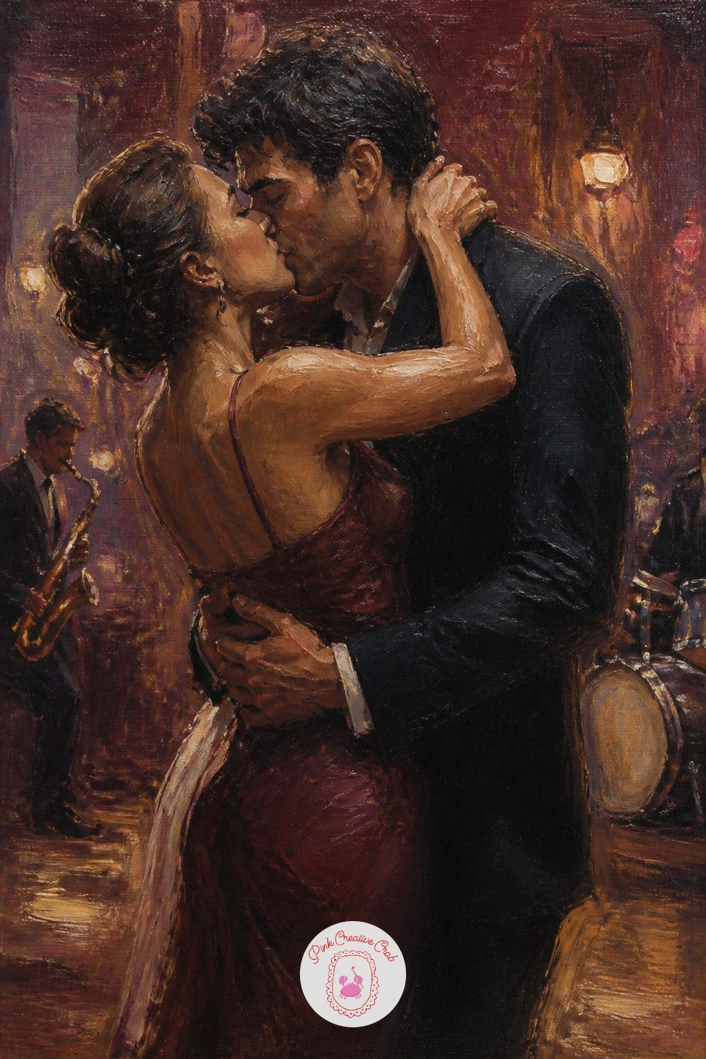
Warm, low light carries this whole scene, so build it from dark outward rather than light inward. Lay a deep burgundy and near black ground across most of the canvas first, then bring up a single warm pool of cream and ochre light around the couple’s feet, as if one small lamp or stage light holds them in its glow.
A few loose shapes in the background, a piano’s dark silhouette, a scatter of small warm highlights standing in for other dancers or tables, are enough to suggest a small jazz bar without painting it in full. Keep these details deliberately vague and darker than your main light pool.
The couple dances close at the centre of that warm glow, one in mid turn perhaps, faces soft together in a quiet kiss caught between songs. If the background feels too busy, simplify it further, since the dark should always outweigh the detail in a scene this intimate.
No ochre on hand, warm yellow mixed with a touch of burgundy gets you a close, moodier version of the same light.
Palette: Burgundy, Cream, Warm Ochre, Dusty Rose
A garden gate gives you a natural frame again, much like the library shelves earlier, only softened this time by rain rather than shadow. Paint the gate itself in simple burgundy grey verticals first, slightly weathered, with a loose climbing vine or a few flowers worked along its top in dusty rose and sage green.
Rain here stays gentler than the storm scenes elsewhere in this list, so use thin, barely there diagonal lines scratched lightly into wet paint with the end of a brush handle rather than heavy dry brush streaks. This keeps the mood soft rather than dramatic.
The couple leans together at the gate, one hand perhaps resting on its top rail, faces soft and close in a tender kiss. Behind them, a blurred suggestion of a cottage or garden path in muted cream and green is all the setting needs.
If the gate’s ironwork feels fussy to paint, a few simple straight and curved lines read as wrought iron just as well as fine detail would.
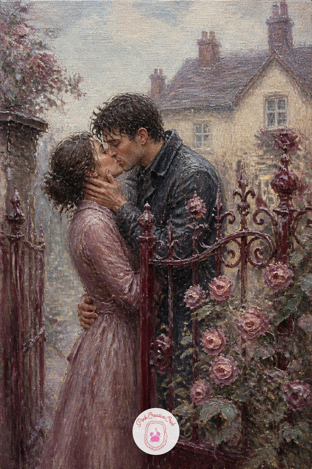
Palette: Burgundy, Dusty Rose, Sage Green, Cream
Vary the kiss itself here, since a forehead kiss reads differently from the mouth to mouth kisses through the rest of this list and asks for a slightly different pose. Tilt one figure’s head down and the other’s up, foreheads meeting, which you can test quickly with a couple of loose pencil lines on the canvas before any paint goes down.
Paint the porch and its railing first in simple cream and burgundy grey, frost suggested with small flecks of pale blue white dabbed lightly along every edge and railing top. Two mugs of coffee, held or set down nearby, add a warm domestic touch, just a pair of simple cream shapes with a thin curl of steam rising from each.
The couple stands close together in that tender tilted pose, faces soft, the whole mood quieter than the more dramatic settings elsewhere in this list. If frost flecks feel too fussy to paint individually, a lightly loaded dry brush flicked once across each edge covers the same ground faster.
Keep the coffee steam thin and wispy, since thick steam here reads more like the earlier train platform scene than this quiet morning moment.
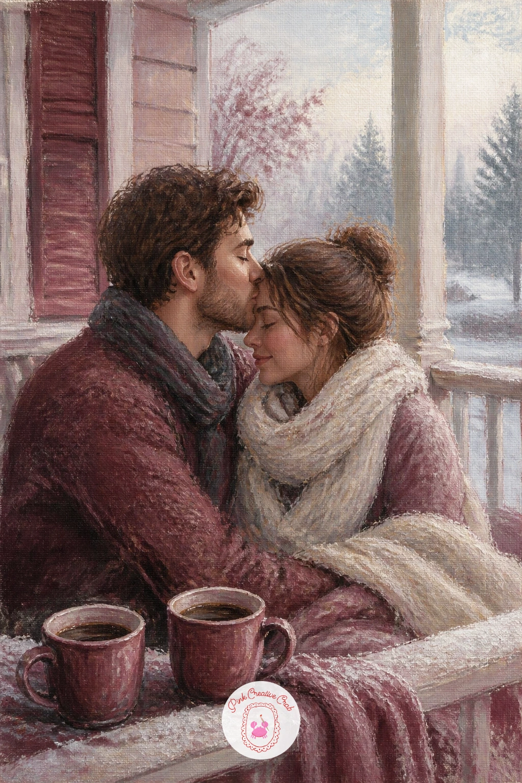
Palette: Cream, Burgundy, Misty Blue Grey, Dusty Rose
Next time you paint a couple at all, try ageing them, since a lifetime of tenderness reads differently on canvas than a young couple’s quick kiss. Keep the pose slower and more settled, shoulders close together on a simple bench shape, hands perhaps resting on each other’s, faces softened with a few extra warm shadow tones rather than sharp lines.
Build the autumn setting first, a park path receding gently into the distance, trees along it rendered as loose clusters of burgundy, ochre and dusty rose foliage, with a scatter of fallen leaves dabbed across the ground near the bench. The bench itself stays a simple weathered cream or grey.
Place the couple close together on the bench, small within the wider autumn scene, faces turned gently toward each other for a quiet, unhurried kiss. If the foliage mass feels heavy, thin it toward the top of each tree so the canopy still feels light against the sky.
Warm every shadow on the figures slightly with burgundy rather than grey, which suits the whole mellow mood of this scene far better than a cooler shadow would.
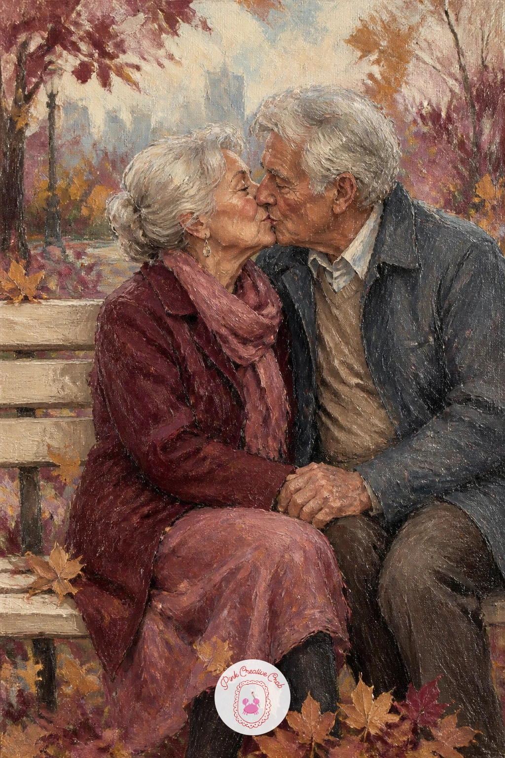
Palette: Burgundy, Warm Ochre, Dusty Rose, Cream
Petals falling in motion need the same tilt trick used in the poppy field earlier, this time applied to a whole shower of them rather than a few blooms underfoot. Flick a loaded round brush with your thumb above and around the couple so cream and dusty rose petals scatter in a consistent diagonal drift, as if caught mid throw.
Paint the stone chapel first as a simple pale cream facade behind them, an arched doorway suggested rather than carved in detail, then the couple standing close at its entrance, the bride’s dress a bright clean cream against the softer rose and burgundy of the groom’s attire.
Keep the chapel stonework loose with just a few darker grey lines for texture, since too much architectural detail competes with all that falling petal motion. If flicking paint feels messy to control, practise the flick once on scrap paper first to judge how much paint your brush needs.
A splash of white gel pen over dry paint can punch up a few petals right at the very end for extra sparkle.
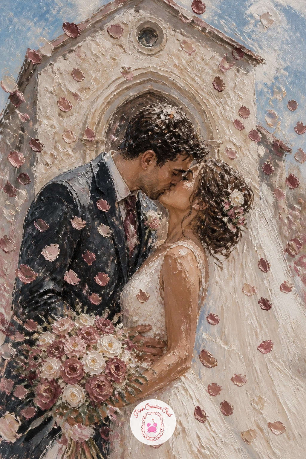
You Will Need
- white gel pen for final petal highlights (optional)
Palette: Cream, Dusty Rose, Burgundy, Stone Grey
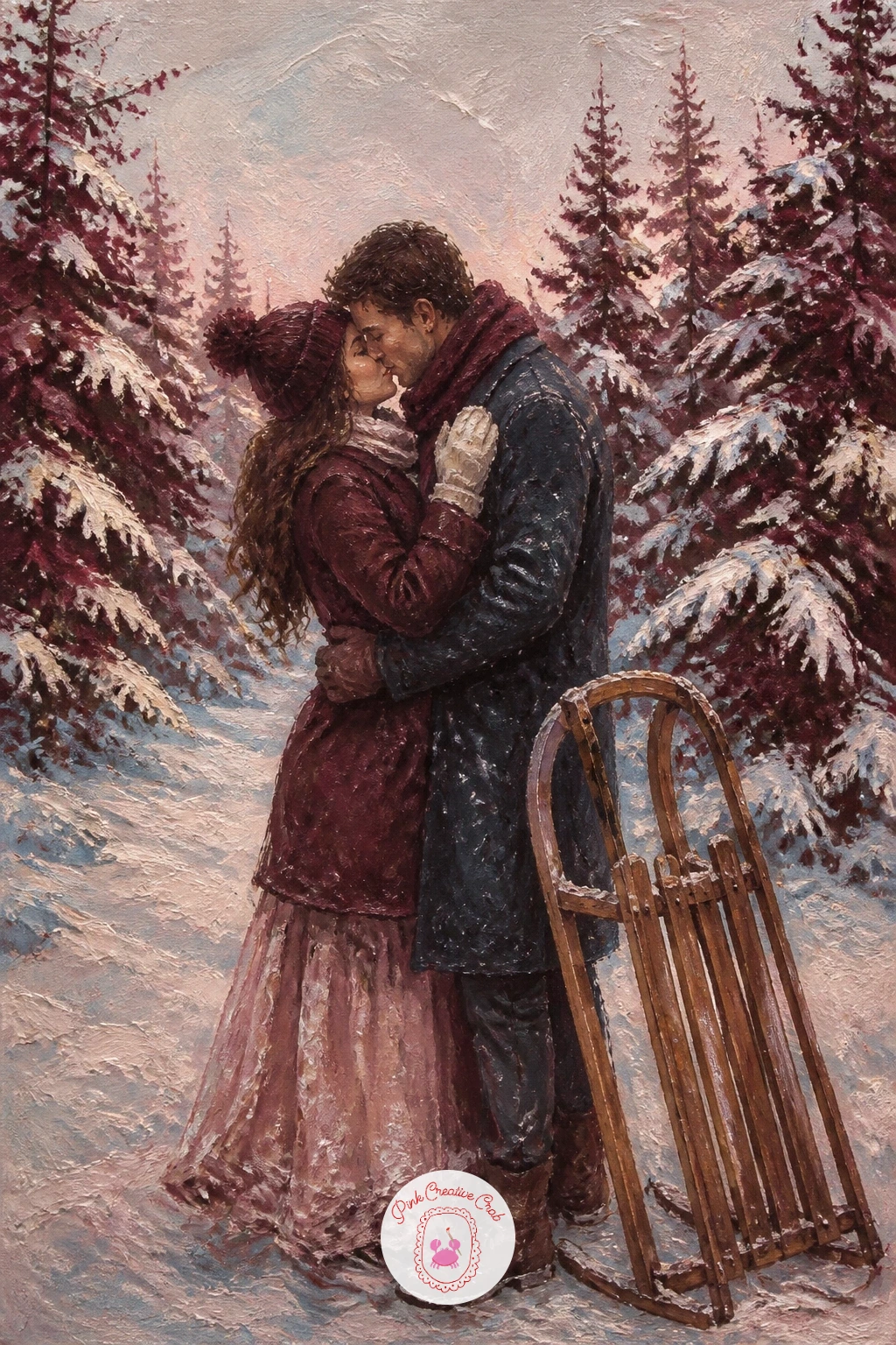
Close this list the way a good scene should, quiet and a little hushed. Paint the pine trees first in deep burgundy grey, simple triangular shapes stacked loosely to suggest a dense forest rather than individual trees, then dust each one lightly with cream snow along the top edges using a dry, barely loaded brush.
The wooden sled sits small in the snow nearby, a few simple curved lines in warm brown against the cool palette around it, resting as if just pulled to a stop. Snow on the ground gets the same dry brush treatment as the trees, scattered rather than solid, letting some of the darker ground show through in patches.
The couple stands close together among the pines, small against the forest’s scale, faces soft in a last tender kiss before heading home. If the trees start to look too uniform in size, vary a few heights and widths so the forest reads as natural rather than planted in a row.
One concrete tip to finish on: keep every edge in this scene a touch softer than you think it needs, since snow, pine, and a gentle kiss all read best through soft brushwork rather than anything crisp.
Palette: Burgundy, Cream, Warm Brown, Misty Blue Grey
What to Do Next
Pick whichever place pulls at you most, whether it is the rainy umbrella or that quiet porch with two mugs of coffee, and start there on a small canvas today. Block in the setting loosely first, bring the couple in last, and keep every edge around them a little softer than you think it needs to be.
Frequently Asked Questions
What is the easiest way to paint faces in a kiss painting without them looking stiff?
Keep faces soft and simplified rather than detailed. Suggest a nose, closed or half closed eyes, and let the two heads merge gently where they meet, which reads as tender far better than sharp, separate features.
Do I need to paint the whole background in detail for these scenes to work?
No, most backgrounds work best loose and suggested. A few confident shapes for buildings, trees, or sky carry the setting, leaving your couple as the clearest, most detailed part of the canvas.
What size canvas works best for a small romantic oil painting like these?
A small canvas, around eight by ten inches or similar, suits every idea on this list well. It is large enough to fit the couple and setting comfortably but still finishable in one sitting.
How do I stop my kiss painting from looking overly sweet or sentimental?
Keep colours slightly muted rather than bright, and let edges stay soft throughout the scene, not just on the couple. A unified soft palette like dusty rose and burgundy naturally keeps the mood tender rather than saccharine.
Can I use acrylic instead of oil for these kiss painting ideas?
Yes, acrylic works for every idea here, though you will need to work a little faster since it dries quicker than oil. Blending soft edges may need a touch of retarder medium or a quick hand.
Have any thoughts?
Share your reaction or leave a quick response — we’d love to hear what you think!
-
 0
-
0
-
0
-
0
-
0
-
0


