

Mountain painting gives you everything winter does well: big quiet shapes, a sky that does half the work for you, and snow that turns any ordinary brushstroke into something that glows. Every idea below is built for a small canvas and one sitting, and every peak comes with a tiny human, animal or building detail that gives the scene its scale and its story.
Scroll through and pick whichever one catches your eye first. You will find huts with smoking chimneys, skaters on frozen lakes, chamois on narrow ledges and lodges lit gold at dusk, all painted with the same loose, icy palette so they read as one consistent set.
Using these images: free for personal projects such as printing, coloring, cards, journals and gifts. Handmade items that include them may be sold up to 30 pieces per design. More than that is commercial use and is not permitted, and neither is selling or sharing the images themselves or passing them off as your own. Please ask before any other use.
Start with the hut, not the mountain, since everything else in this painting takes its scale from that one small roofline. Block the peak first in thin titanium white and a cool grey-blue, then let it dry a little while you work out the hut’s shape below it with a small flat brush and a mix of burnt umber and Payne’s grey.
Build the roof’s snow load in thick white with a palette knife, then drag a fine line of pale grey smoke up from the chimney with a dry brush, barely touching the canvas so it stays soft and wispy. This is where most beginners overwork it: one curling wisp reads as smoke, three straight lines read as a drawing of smoke.
If you want the hut to feel lived-in, add one tiny warm yellow square for a lit window before the paint dries. A palette knife works well for the snow if you do not have a fan brush handy, since it leaves the same soft ridges.
Finish with a single cherry red mark near the door, a shutter or a stacked log pile, to pull the eye straight to that small human scale against the huge quiet peak behind it.
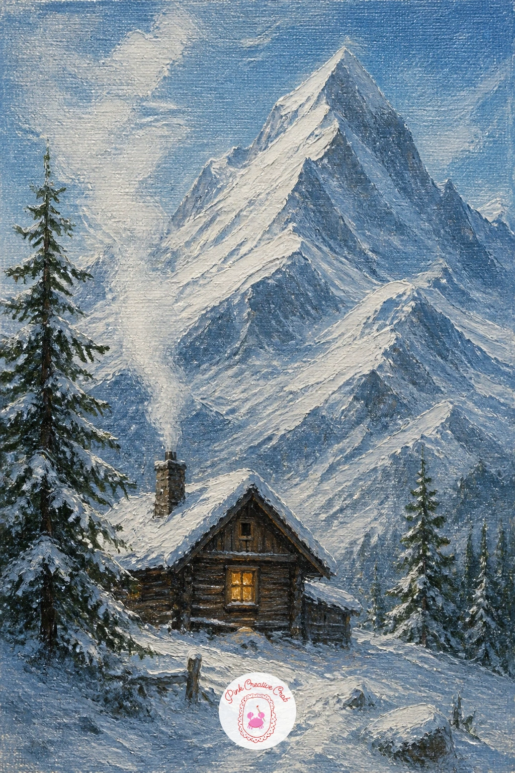
Palette: Titanium White,Payne’s Grey,Burnt Umber,Cherry Red
Mountain painting often lives or dies on the water, so lay this one in with the lake, not the peaks. Mix a turquoise from white, a touch of cerulean and the smallest amount of sap green, then sweep it across the lower third of the canvas with a flat brush in one confident horizontal pass.
Measure before you paint the mountains: hold your brush at arm’s length against the reference or your own mental image, and check the peaks are roughly twice as tall as the lake is wide in your frame. That one comparison keeps jagged white mountains from creeping up too small and timid behind the water.
Paint the peaks next in cool white and grey-violet shadow, letting the brush stay dry and broken at the ridgelines so snow texture comes through without fuss. Drop in a few darker rock patches at the base before the white fully sets, so they blend softly rather than sitting on top like stickers.
Finish with one or two pale cracks scratched into the frozen lake surface using the brush handle, and leave the far shore a little hazy. If turquoise paint is not in your set, cerulean blue mixed with a whisper of yellow ochre gets you close.
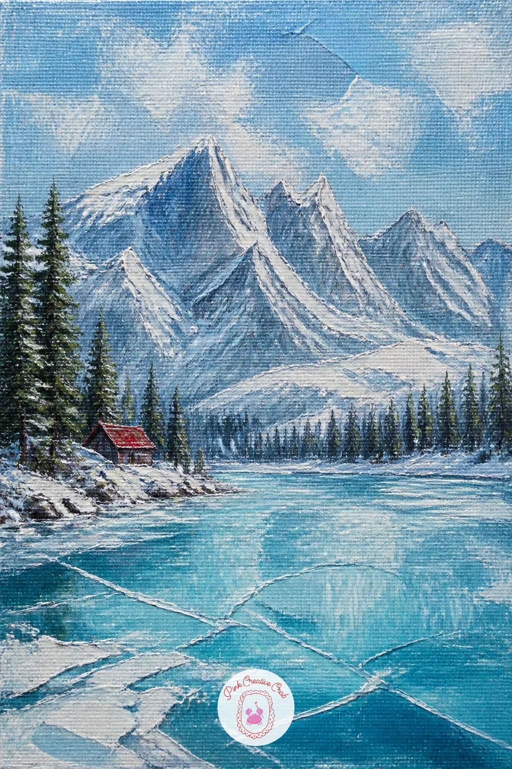
Palette: Cerulean Blue,Sap Green,Titanium White,Grey Violet
A village gives you a chance to build a whole little world in one canvas, so work from back to front: snowy peak first, then the slope, then the chalets clinging to it. Keep the peak simple and pale so it recedes, and save your darkest darks and warmest warms for the buildings near the bottom.
Paint the slope in broken strokes of white, pale blue and a touch of violet shadow, letting the brush skip so the snow never looks flat. Place the chalets as small rectangles of warm brown and ochre, each one just a few strokes: a roof, a wall, one window.
The trick that saves this scene is restraint with the windows. Light two or three of them in warm yellow and leave the rest dark, since a village where every window glows loses the quiet winter feeling entirely.
For a quick version, paint four or five chalets loosely in under ten minutes. Given more time, add a thin plume of smoke from one chimney and a single dark pine tree beside the nearest roof for scale, and if you enjoy this kind of scene the Christmas village painting ideas give you more ways to light up small rooftops.
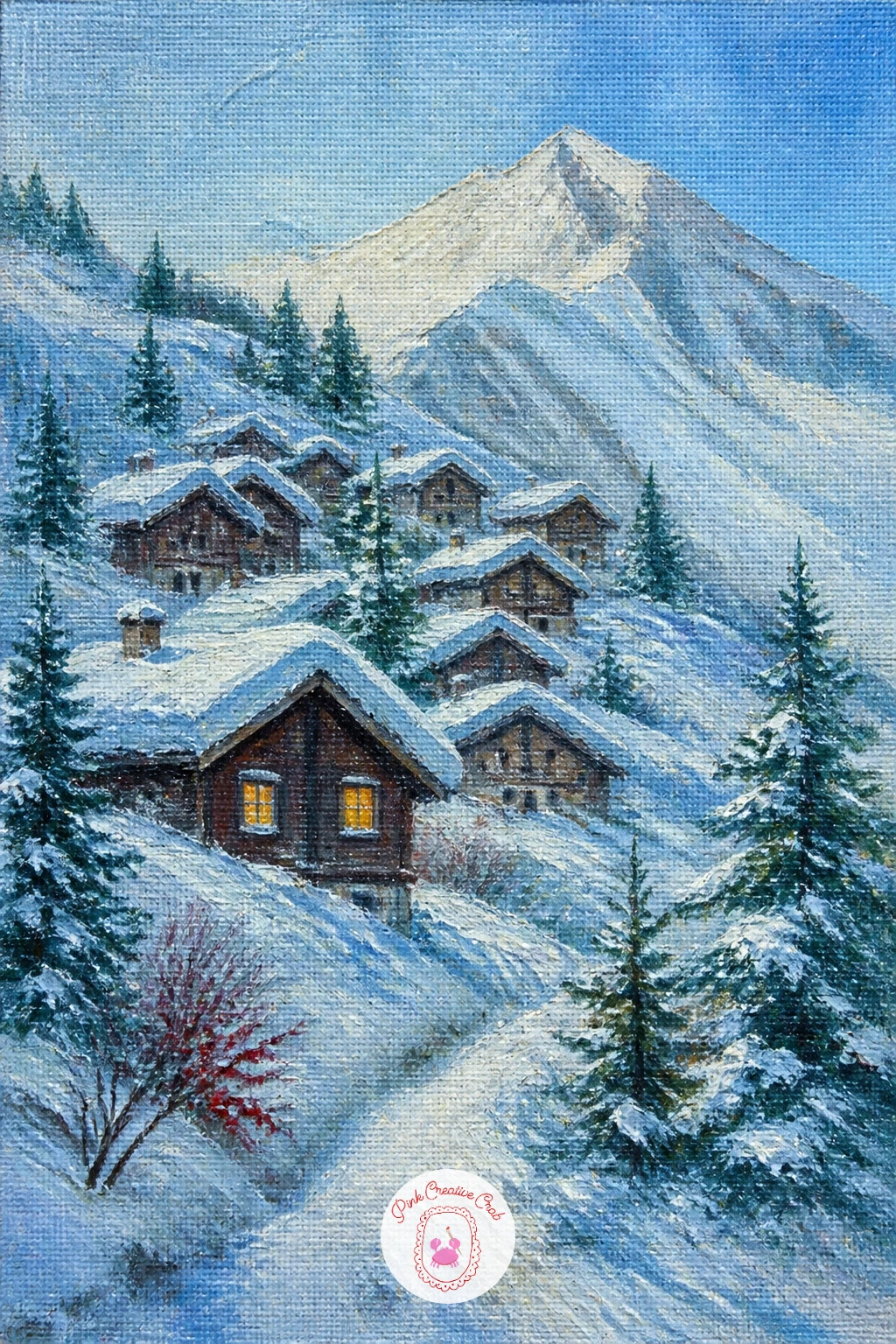
Palette: Yellow Ochre,Burnt Sienna,Titanium White,Violet Grey
Here the human figure is the whole point, so place the hiker before anything else so the ridge and sky can be built around that one small shape. Mix a true cherry red for the jacket, since this is your only strong color note and it needs to sit clean against all that white.
Paint the ridge in long diagonal strokes of white and pale blue shadow, letting the snow follow the slope’s direction rather than sitting flat. Block the hiker as a simple dark silhouette first, add the red jacket over it in two or three strokes, then a small dark backpack and a single trekking pole line.
Keep the figure smaller than feels natural. Beginners tend to paint hikers at nearly a third of the canvas height, and that flattens the whole sense of scale: aim for the figure closer to a tenth of the canvas, barely a thumbnail against the ridge.
If you want the scene to feel more dramatic, paint the sky slightly darker behind the ridge crest so the white snow and red jacket both pop forward by contrast. One confident swipe of red is better than three careful ones.
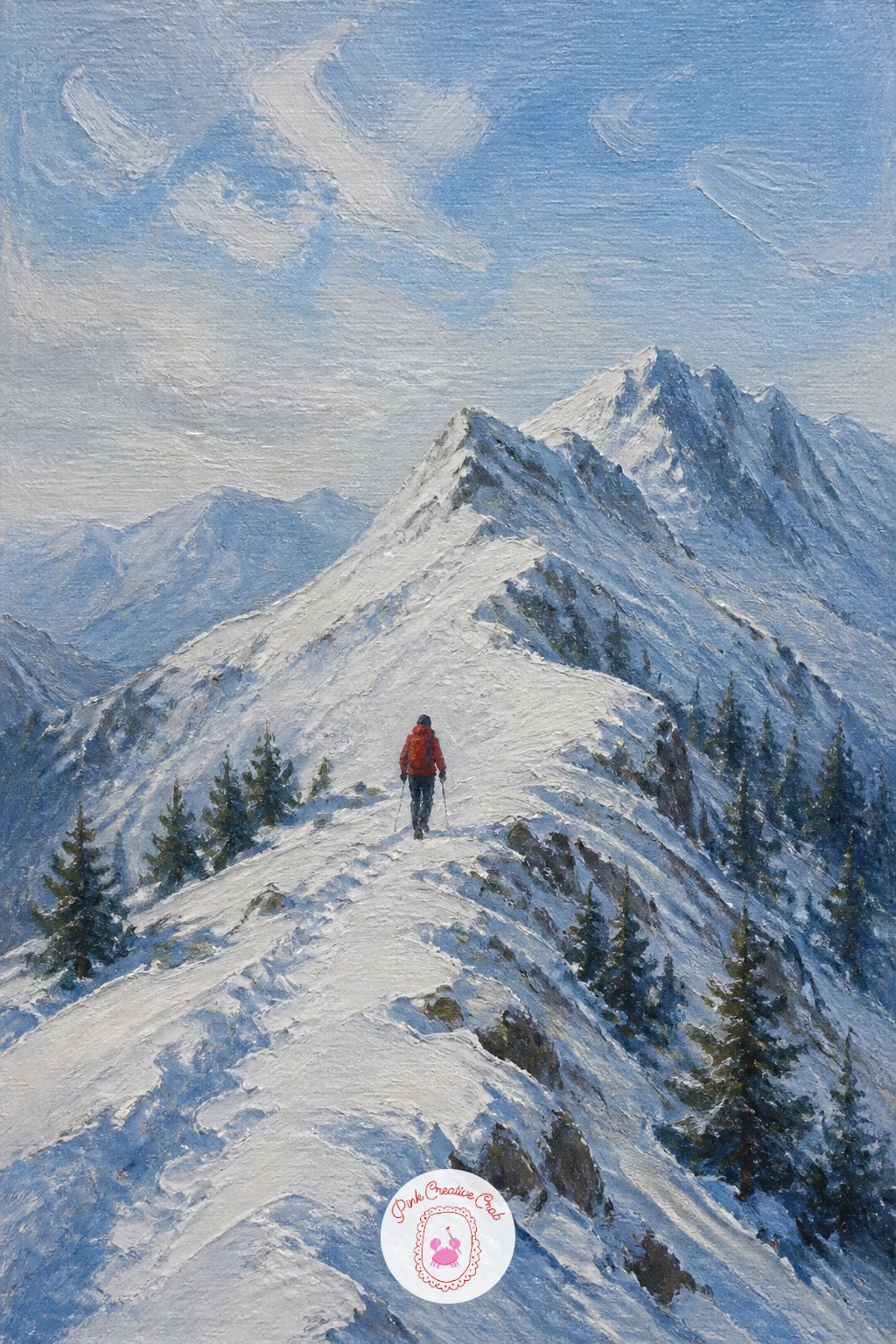
Palette: Cherry Red,Titanium White,Payne’s Grey,Cerulean Blue
Try painting the hiker from behind instead of in profile. It reads as a quieter, more reflective moment and is easier to get right at this small scale.
Chamois give you a chance to paint a wild animal without any fur detail at all, since at this distance the whole creature is just a dark silhouette with four thin legs and small curved horns. Build the rock ledge first in warm grey-brown against the snow, angling it so it reads as a narrow shelf rather than a flat wall.
Paint the chamois as one confident dark shape, head lowered slightly as if picking a footing, then add the horns with the very tip of a liner brush in two quick curved lines. Keep the body smaller than you think it should be: a chamois on a mountain face is a mark, not a portrait.
The ledge’s edge is where most of this painting’s drama lives, so paint it with a hard, clean line where rock meets open air, and a softer, broken line where snow has drifted over the top. That contrast between crisp and soft edges is what makes the ledge feel precarious.
Finish by dropping a thin shadow beneath the chamois’s legs to ground it on the rock. A fine liner brush or even a sharpened cocktail stick dipped in dark paint works well for the horns if your detail brush is too thick.
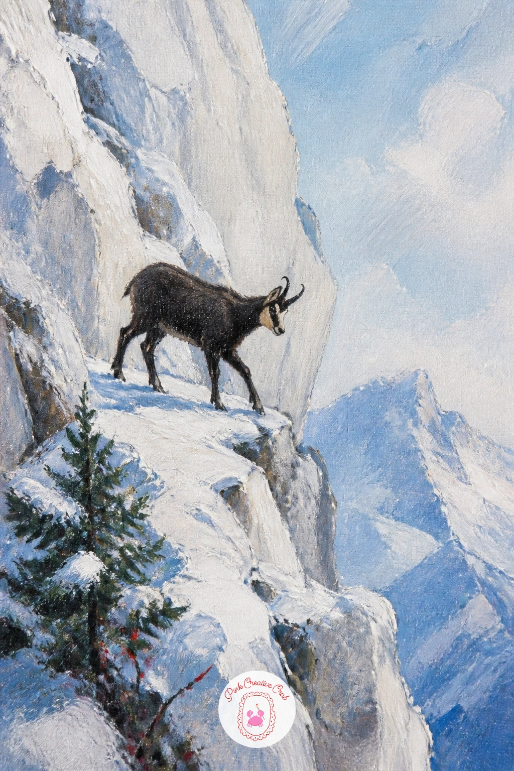
Palette: Burnt Umber,Titanium White,Payne’s Grey,Warm Grey
Cable cars are a fun bit of mechanical drama in a mostly soft, natural scene, so paint the pines and summit first and save the cable itself for last, when you can draw it in one steady, unbroken line. Block the distant summit in pale cool white, then the pine slope below it in dark green strokes that get slightly smaller and lighter as they recede.
Paint the cable car as a small red or dark rectangle hanging just below an almost invisible wire. The wire is the hard part: load a liner brush thinly, rest your hand steady on the canvas edge, and pull one continuous diagonal line from pylon to summit without stopping partway.
If the line wobbles, do not try to fix it by going over it again, since that only makes it thicker and more obvious. Wipe it off cleanly with a rag and try once more on dry paint, which is far more forgiving than wet-on-wet.
Give the car itself a tiny window of warm light if you want a sense of passengers inside, and let the pines below carry a light dusting of snow caught on their uphill branches only, since snow never sits evenly on a pine tree.
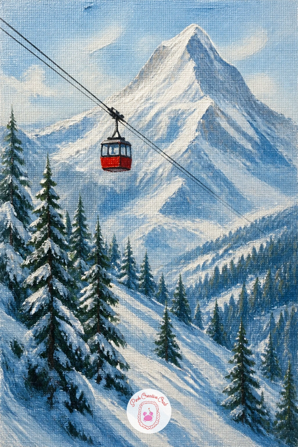
Palette: Sap Green,Titanium White,Payne’s Grey,Cherry Red
A stone bridge gives this scene a strong, simple anchor shape, so paint its arch early using a small flat brush and a mix of grey-blue and burnt umber, keeping the stones suggested rather than counted one by one. The stream below runs half-frozen, which means you need two very different textures sitting right next to each other.
Paint the frozen edges first in flat, pale blue-white with almost no brush texture at all, since ice wants to look smooth and still. Then paint the open water in short, broken dark strokes with a little white dragged through wet, which gives the sense of movement without needing to paint individual ripples.
The join between ice and open water is where this painting can go wrong, since a hard straight edge there looks like a ruler line instead of a melt line. Soften it with a dry brush dragged gently along the boundary, blurring it just enough to feel natural.
Snow-dust the bridge’s stone wall along its top edge only, and let a little water show dripping or pooling at the base of the arch if you want to push the “half-frozen” feeling further.
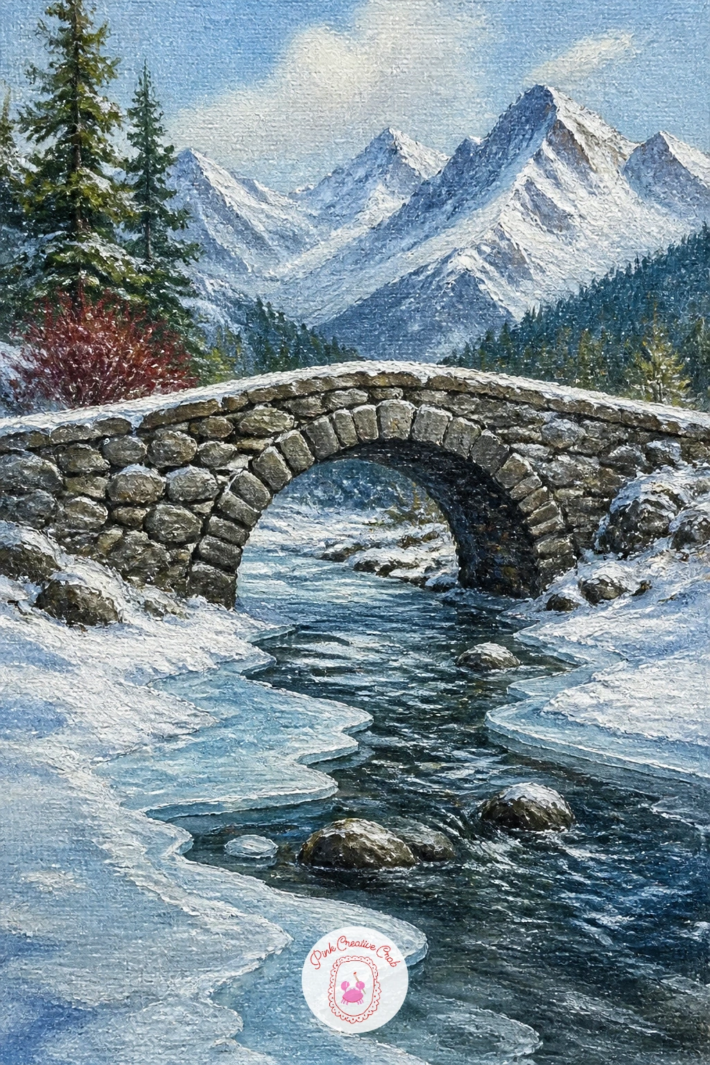
Palette: Payne’s Grey,Burnt Umber,Titanium White,Cerulean Blue
This one is almost entirely about light, since the whole story is a sunlit slope with a trail of footprints winding up it. Decide where the sun sits before you paint a single stroke: if it is high and to one side, every footprint dip gets a small blue-grey shadow on the side away from the light, and every raised ridge of snow catches a touch of warm white.
Block the slope first in a single sweep of bright white with the faintest warm yellow mixed in near where the sun would hit hardest. Then paint the snowshoe tracks as a winding double row of small oval shadows, getting smaller and closer together as the trail climbs into the distance.
Resist painting every single footprint in sharp detail. A loose row of six or seven shadow-marks near the bottom, thinning to almost nothing near the top, reads far more convincingly than a careful line of identical prints.
If you want a quick ten-minute version, stop there. With more time, add one tiny walking figure cresting the top of the trail, and let their long shadow stretch back down the slope to match the light you chose at the start.
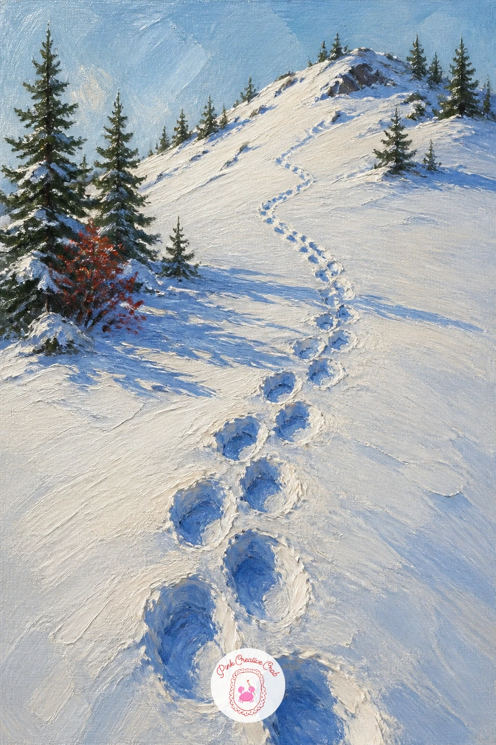
Palette: Titanium White,Naples Yellow,Grey Violet,Cerulean Blue
Sunrise gives you warm light meeting cold snow, which is one of the nicest color contrasts in mountain painting. Paint the sky first in a soft gradient from pale pink near the horizon up into cool blue overhead, blending wet-on-wet with a wide soft brush before anything else goes on the canvas.
Block the refuge as a simple stone and timber shape, keeping its roofline catching the first warm light while its shaded wall stays cool blue-grey. This is the moment to think about where your light source sits: if the sun rises behind the peak, the refuge’s near wall stays mostly in shadow, with just a thin rim of pink along one edge.
Lean two or three skis against the wall with quick, straight strokes of dark paint, angled slightly apart rather than perfectly parallel, which reads as more natural and less like a rack display. A fine brush or even the handle end scraped through wet paint gives you a clean thin line for each ski.
Finish with one small warm window if the hour feels like someone is already awake inside, and let the peak behind catch the same pink light as the sky for a sense of alpenglow tying the whole scene together.
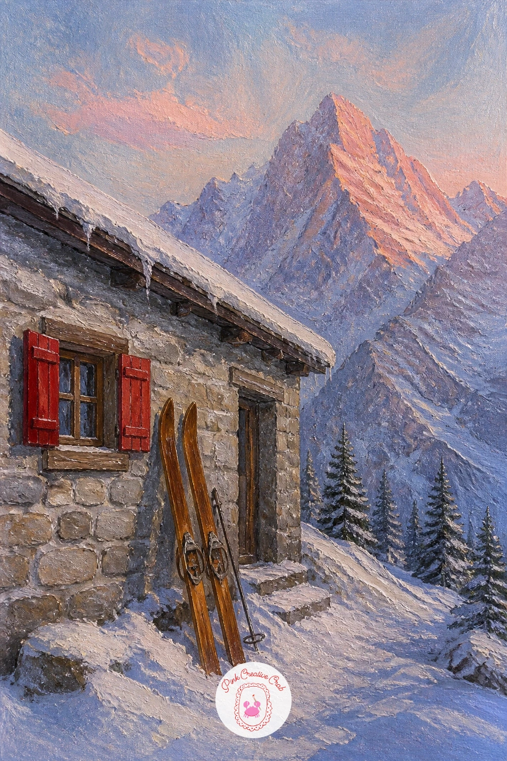
Palette: Rose Pink,Cerulean Blue,Burnt Umber,Titanium White
Alpenglow is one of the most satisfying effects to paint because it needs so little fuss: a cool mountain lit warm pink along its upper slopes while everything below stays in shadow. Start with the sky in a soft blend of lavender and pale pink, graduating lighter near where the light hits the peak.
Paint the peak next, keeping its lower two thirds in cool blue-violet shadow and only the top third, where the light actually reaches, mixed with warm pink and white. The valley below stays almost entirely in shadow, a dark soft shape that holds the whole composition down.
If you have time, the forty-minute version adds a scattering of tiny dark pine shapes along the valley floor and perhaps one small farmhouse with a single lit window, giving the “sleeping valley” something to actually sleep around. The ten-minute version skips all that and lets the mountain and its glow carry the whole painting alone.
Blend the color transition on the peak with a soft dry brush rather than a palette knife here, since alpenglow wants a gentle gradient, not a hard edge.
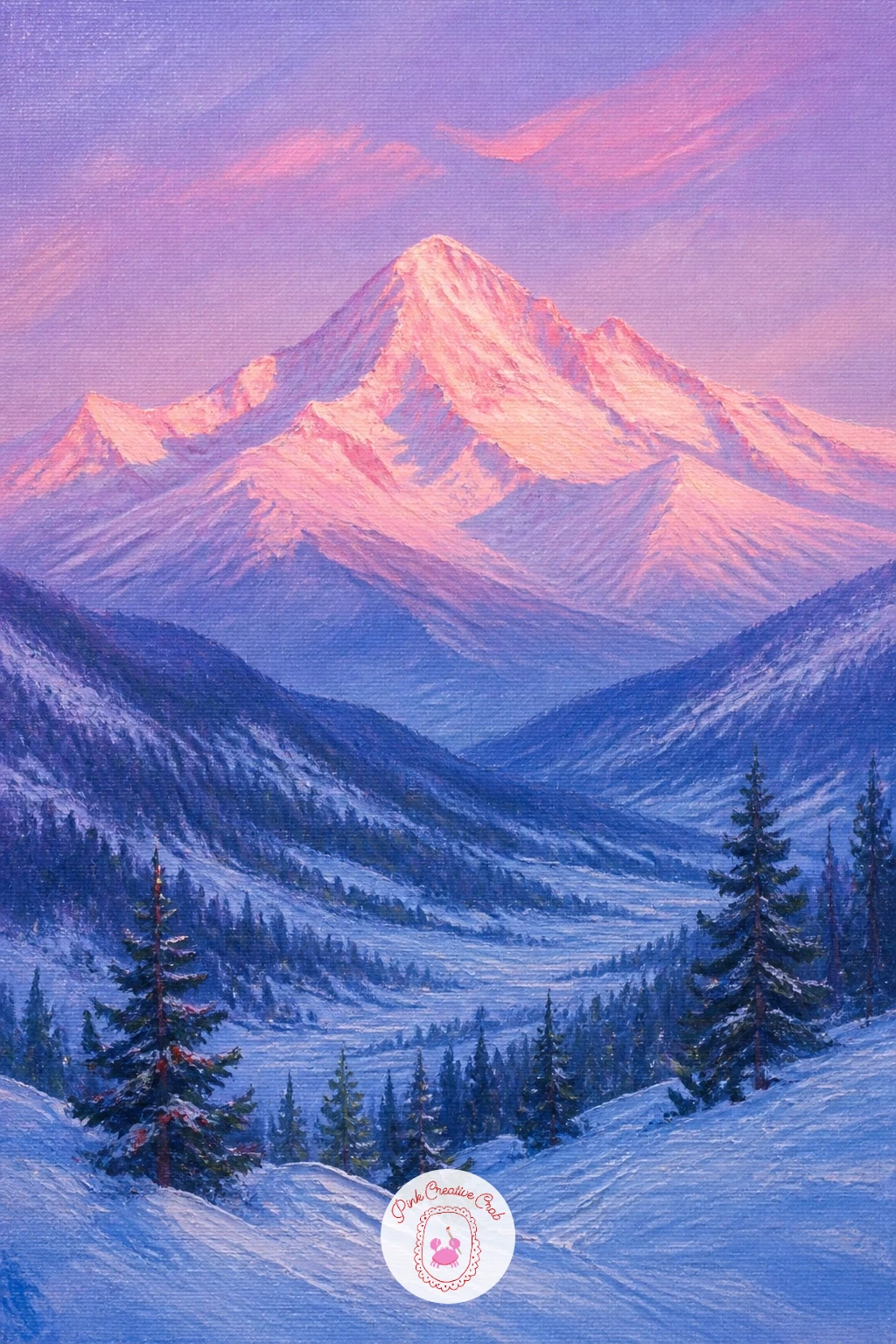
Palette: Rose Pink,Violet Grey,Payne’s Grey,Titanium White
A skater on ice gives you a single small moving shape against a vast still one, which is a satisfying contrast to paint. Lay the lake in first with long horizontal strokes of pale blue-white, leaving the surface mostly flat and smooth since ice wants very little texture compared to open water.
Paint the burgundy hat before the rest of the figure, since that is your one strong color accent and it is easier to build the dark coat and legs around it than to drop it in last and risk it looking pasted on. Keep the skater’s whole body under a few confident strokes: a lean, two legs, two arms, done.
Add a thin curved shadow beneath the skater’s blades to ground them on the ice, and a pair of short curved lines trailing behind to suggest the skate’s path without drawing an actual line all the way across the lake.
Mountains rise pale and quiet behind, painted soft and slightly hazy so they never compete with the small bright figure in front. If you enjoy frozen-lake scenes, the ice skating painting ideas are worth a look for more ways to handle moving figures on ice.
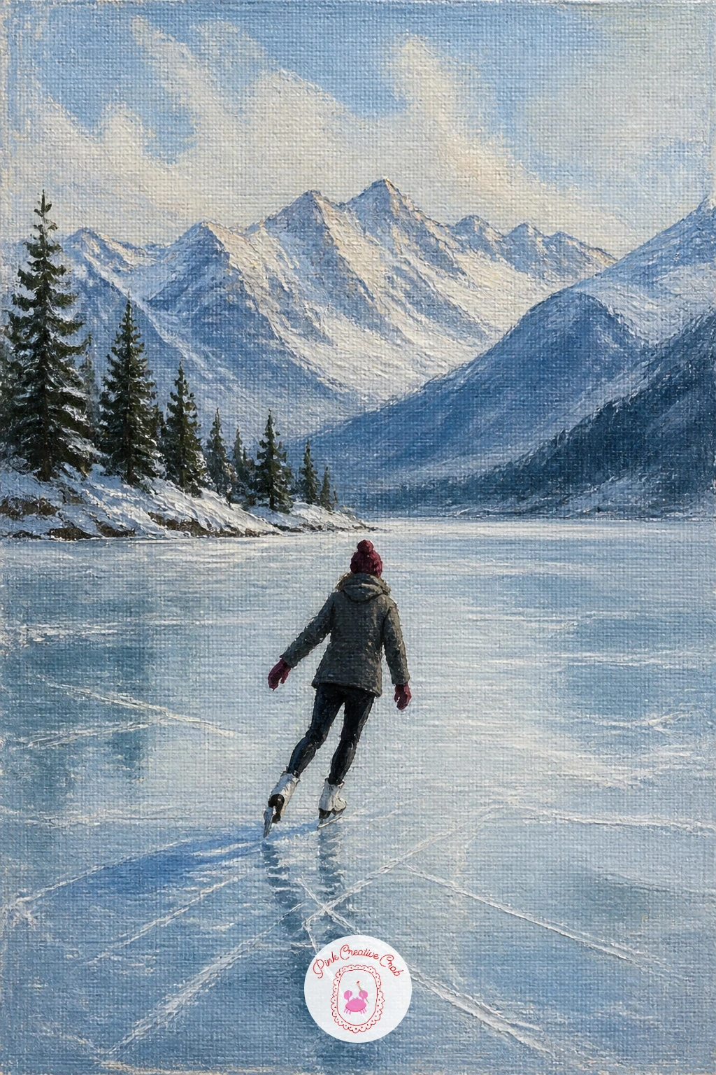
Palette: Burgundy,Titanium White,Payne’s Grey,Cerulean Blue
Steam against cold air is a lovely texture to paint loosely, so save it for last and keep everything else in this scene fairly simple and solid. Block the cabin first as a warm wooden shape with a small window glowing amber, since the whole point of this painting is the contrast between that warmth and the freezing air around it.
Paint the snowy ground and peaks behind in your usual cool whites and blues, then come back with a dry, barely loaded brush for the steam itself. Drag it upward from the cabin’s vent or door in soft, broken strokes that thin out and disappear as they rise, never a solid cloud shape.
The mistake to watch for here is steam painted too opaque and too neat, which ends up looking like a puff of smoke rather than warm air meeting cold. Keep it translucent by thinning your white with a touch of medium and letting some of the sky color show through it.
A fan brush gives a nice broken edge for steam if you have one, though a dry flat brush dragged lightly works nearly as well as a swap.
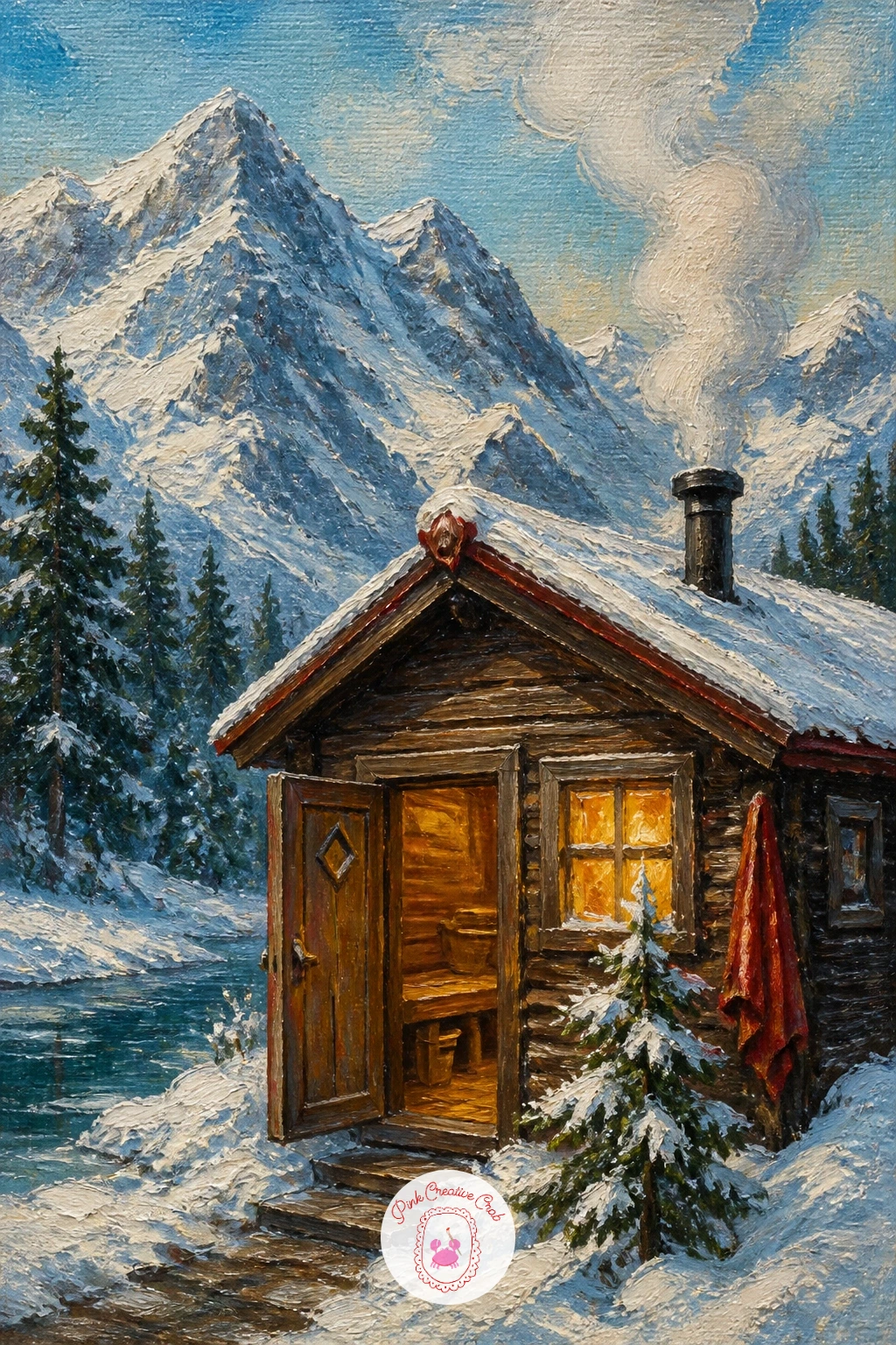
Palette: Titanium White,Burnt Sienna,Cerulean Blue,Naples Yellow
Larches carry snow differently than pines, in soft drooping clumps along each branch rather than neat caps, which makes them a nice change of texture if you have painted a lot of pine trees already. Build the jagged peak behind first in cool white and grey-blue, keeping its edges sharp and a little angular compared to the softer trees in front.
Paint the larches as loose vertical shapes, dabbing white snow-clumps along the branches with the side of a flat brush rather than outlining each branch first. This is the quickest way to get the heavy, drooping look without drawing every twig.
Measure the trees against the peak before committing: larches on a real slope rarely reach even a third of the mountain’s visible height, so keep them modest in scale and let the peak dominate the upper two thirds of the canvas.
The whole scene reads as a cool blue morning, so keep your whites mixed with a little blue rather than pure, and save true white for just the brightest snow clumps catching direct light.
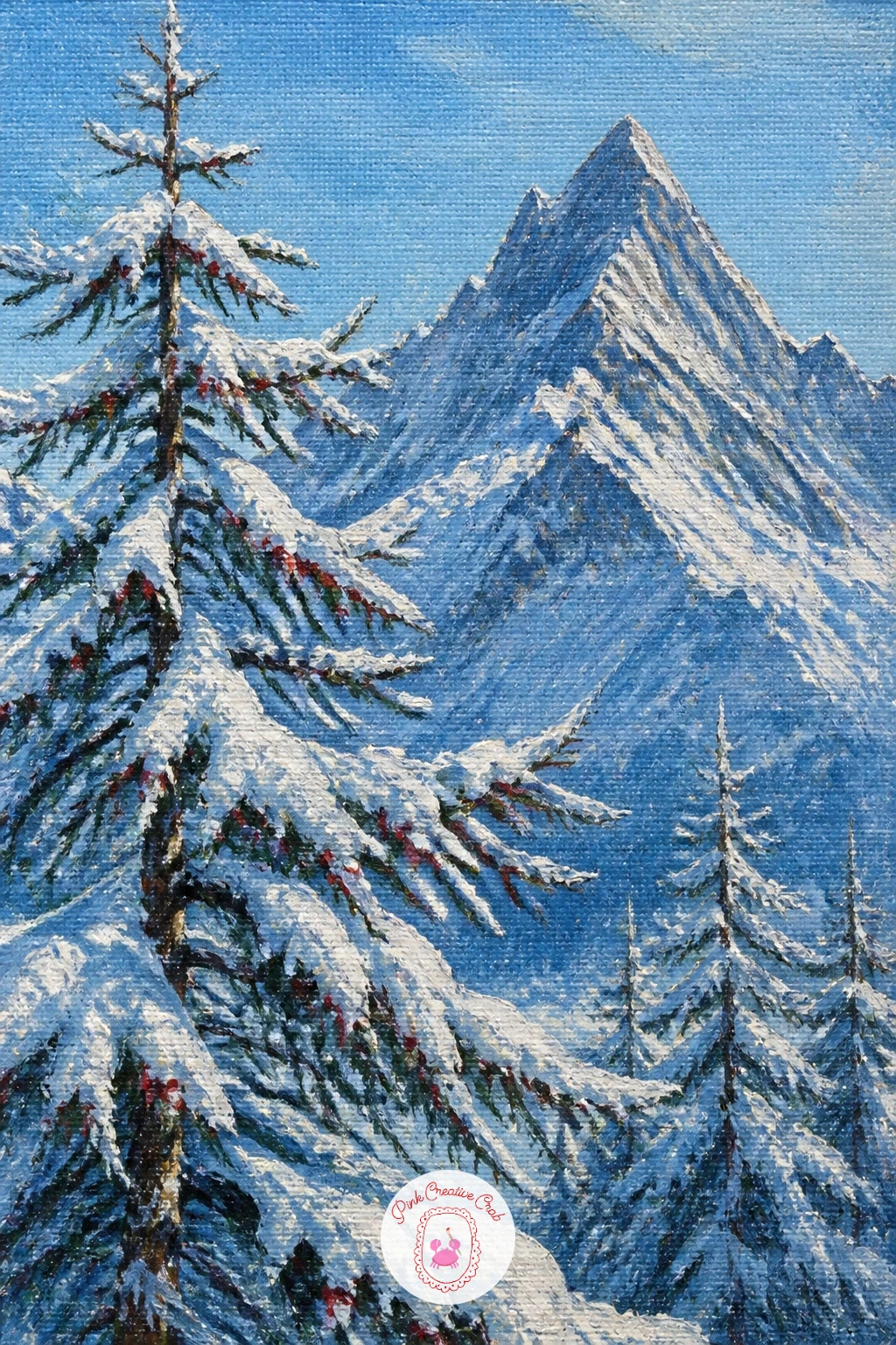
Palette: Payne’s Grey,Titanium White,Sap Green,Cerulean Blue
Here the small human detail becomes the actual subject rather than an accent, so start with the bench and figure first and build the summit view around her. Paint the bench as a few simple dark planks, then block the woman’s seated shape with rounded shoulders and a scarf or hat in one warm color note against all the cool surroundings.
The thermos is tiny but matters, so give it one clean vertical stroke of a bright color, perhaps red or orange, held in her hands or resting beside her on the bench. That little warm object is what makes the whole scene feel like a real pause rather than a generic figure in snow.
Paint the snowy summit she faces in soft, receding whites and blues, kept deliberately calmer and less detailed than the bench and figure, since this painting wants the eye to land on her first and the mountain second.
If this is your first time painting a seated figure, simplify the whole pose into three basic shapes: head, torso wedge, and folded legs, and resist adding fingers or facial features at this small scale.
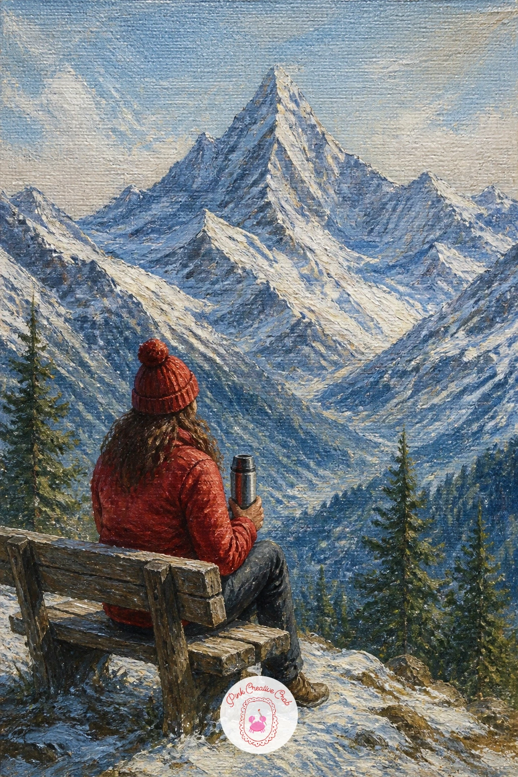
Palette: Burnt Sienna,Titanium White,Cherry Red,Payne’s Grey
Movement is the whole story here, so build the composition around a diagonal line cutting through the canvas rather than a flat horizon. Paint the pass itself first, a wide white saddle between two rising slopes, then lay in the sled trail as a pair of thin curved lines carved into the snow with the brush handle while the white paint is still wet.
Block the dogs and sled as small dark shapes strung along the trail, getting smaller toward the distance to push the sense of depth. You do not need individual dogs painted in detail: three or four quick dark ovals in a row with one slightly larger shape for the sled reads perfectly well.
One hands-on trick helps the snow feel disturbed rather than untouched: drag a dry, barely loaded brush across the trail area in short choppy strokes, breaking up the smooth white and giving the sense of packed, kicked-up snow under the runners.
Keep the peaks on either side of the pass simple and pale, since all the visual energy in this piece belongs down at trail level with the dogs and sled.
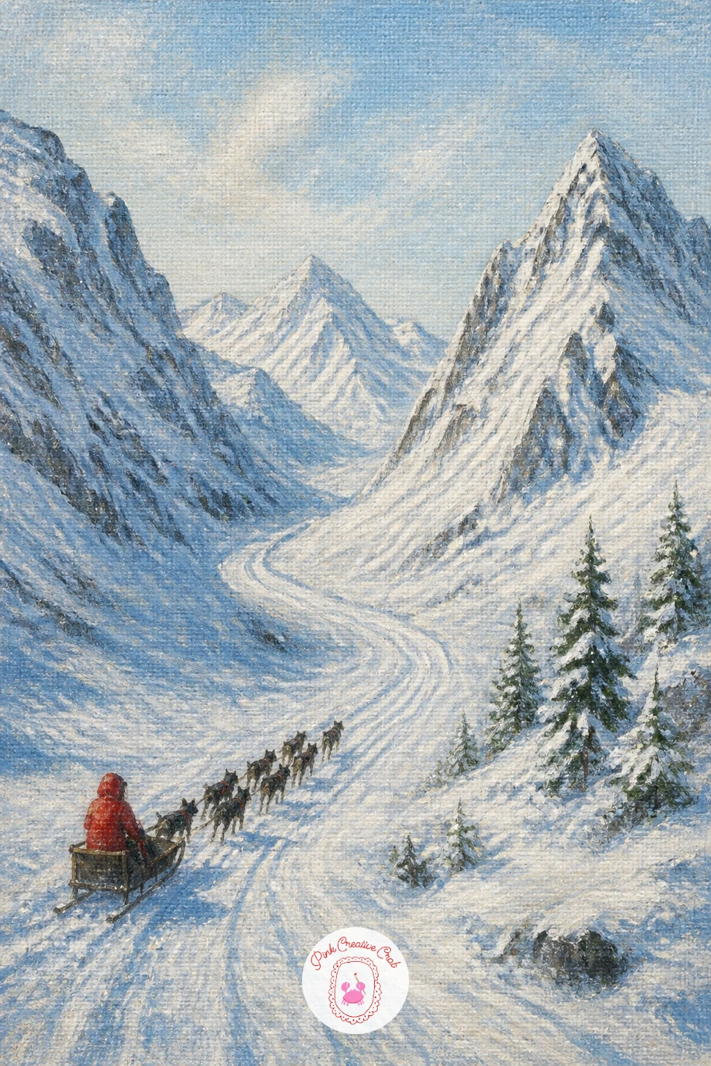
Palette: Payne’s Grey,Titanium White,Burnt Umber,Cerulean Blue
Deck chairs facing a view are a small, cheerful detail that instantly gives this scene a sense of leisure rather than struggle. Paint the terrace railing and floorboards first in warm wood tones, angled so they lead the eye out toward the mountains rather than sitting flat across the canvas.
Block two simple deck chairs with a few confident strokes each: a frame, a stripe of fabric, done. Give them a light color that stands apart from the wood and the snow, perhaps a faded blue or cream canvas, so they read clearly against both.
The peaks beyond should stay soft and slightly hazy compared to the crisp terrace in front, since that distance contrast is what sells the sense of a view being admired from a comfortable seat. Keep your brushwork looser and your whites cooler the further back you go.
If you want a quick version, skip the terrace detail and paint just the chair backs peeking over a railing. With more time, add a small table between the chairs holding two tiny cups for a story that needs no further explanation.
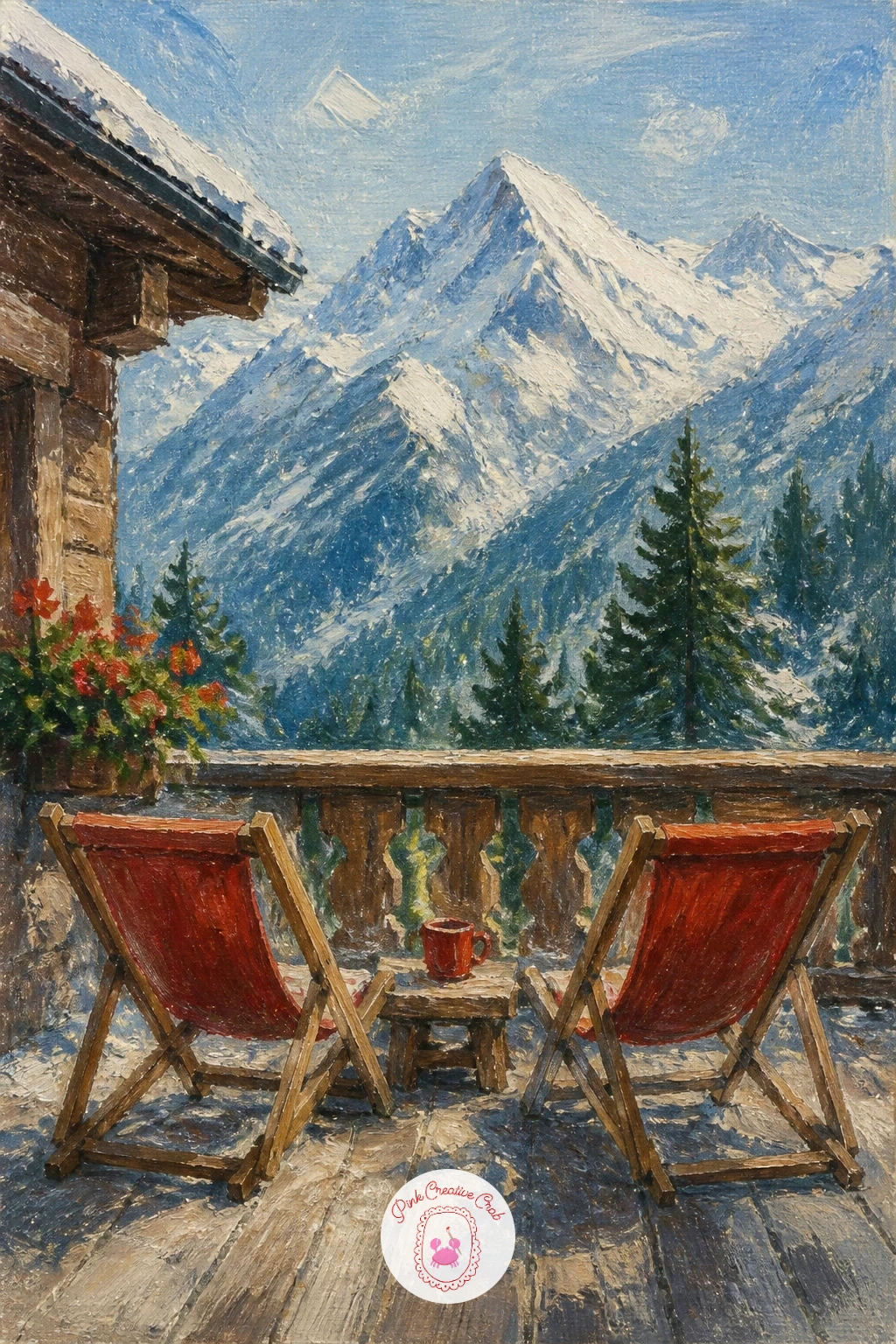
Palette: Burnt Sienna,Titanium White,Cerulean Blue,Naples Yellow
Mist gives you a chance to paint almost nothing in the lower half of the canvas and have it still read as a full scene, which makes this one of the faster ideas on this list. Paint the peaks first, sharp and clear against the sky, since they need to stay crisp to contrast against the soft mist below.
Mix a pale grey-white for the mist and apply it with a wide, dry brush in loose horizontal sweeps, letting it thin out unevenly rather than forming one flat band. Real mist pools and drifts, so some patches should be thicker and whiter while others barely cover the valley floor beneath.
Where mountain meets mist is the trickiest edge in the whole painting: blend it softly with a dry brush so the peak seems to emerge from the haze rather than sitting on top of a cloud shape. A badger-hair blending brush helps here, though a soft old brush you do not mind losing works just as well.
Leave a hint of dark treeline poking through the mist in one or two spots, just enough to suggest a valley floor exists under all that softness.
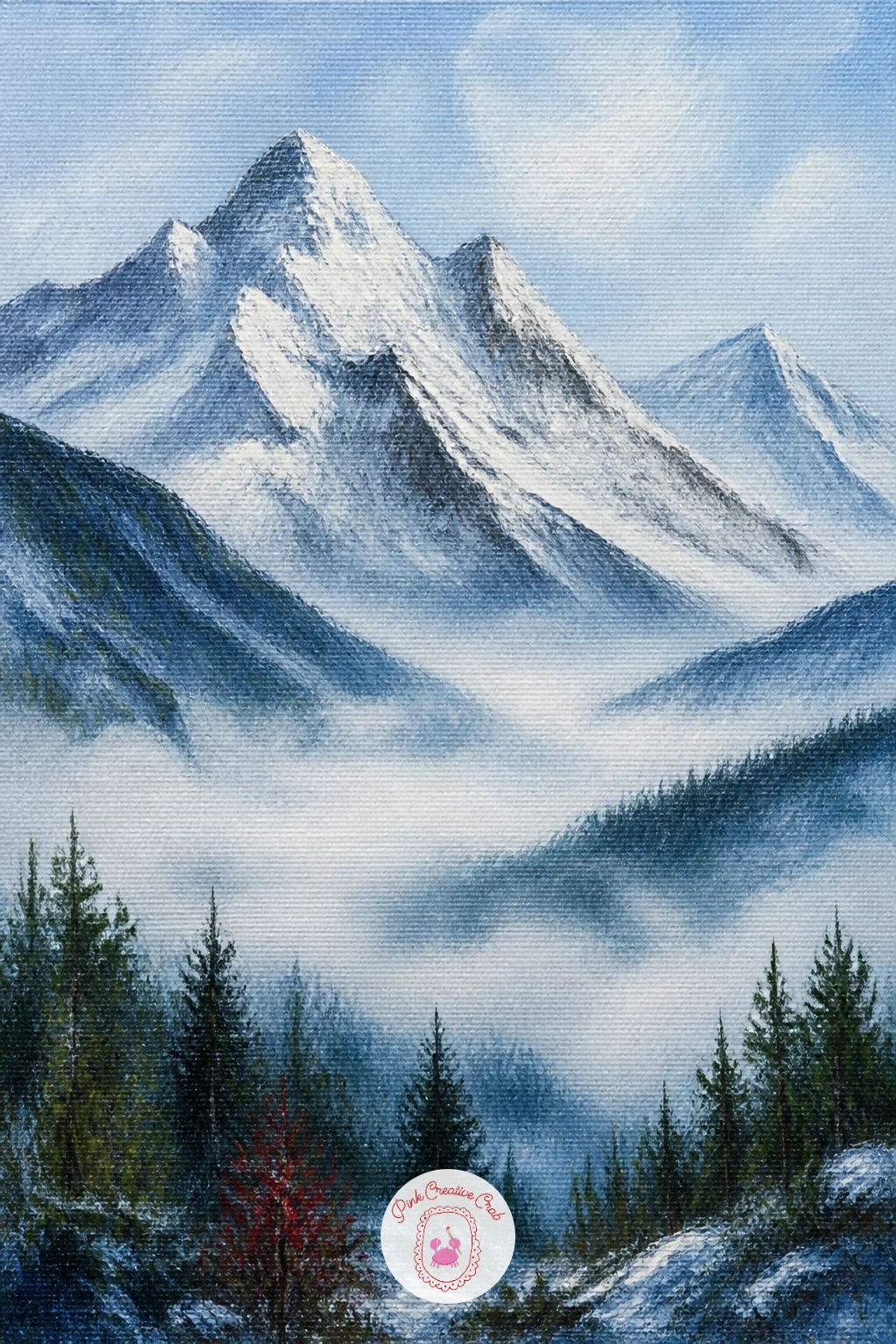
Palette: Titanium White,Payne’s Grey,Grey Violet,Sap Green
A herd gives you repetition to play with, which is a nice change after painting lone animals, so build the cliff face first and then scatter the goats across it at different heights for a natural, unposed feel. Paint the rock in warm grey-brown with patches of snow caught in its ledges, keeping the whole face steep and slightly overhanging.
Block each goat as a simple white or cream oval body on four thin dark legs, varying their poses slightly: one grazing with head down, one standing alert, one mid-step. Four or five goats placed at different heights and angles read as a herd far better than the same number lined up evenly.
Keep the goats’ white bodies just a touch warmer or cooler than the surrounding snow so they still separate visually, since pure white goats on pure white snow can disappear into the background entirely. A faint grey shadow line under each goat’s belly fixes this quickly if it happens.
Scatter the herd mostly in the lower two thirds of the cliff so the upper mountain above still feels vast and empty by comparison.
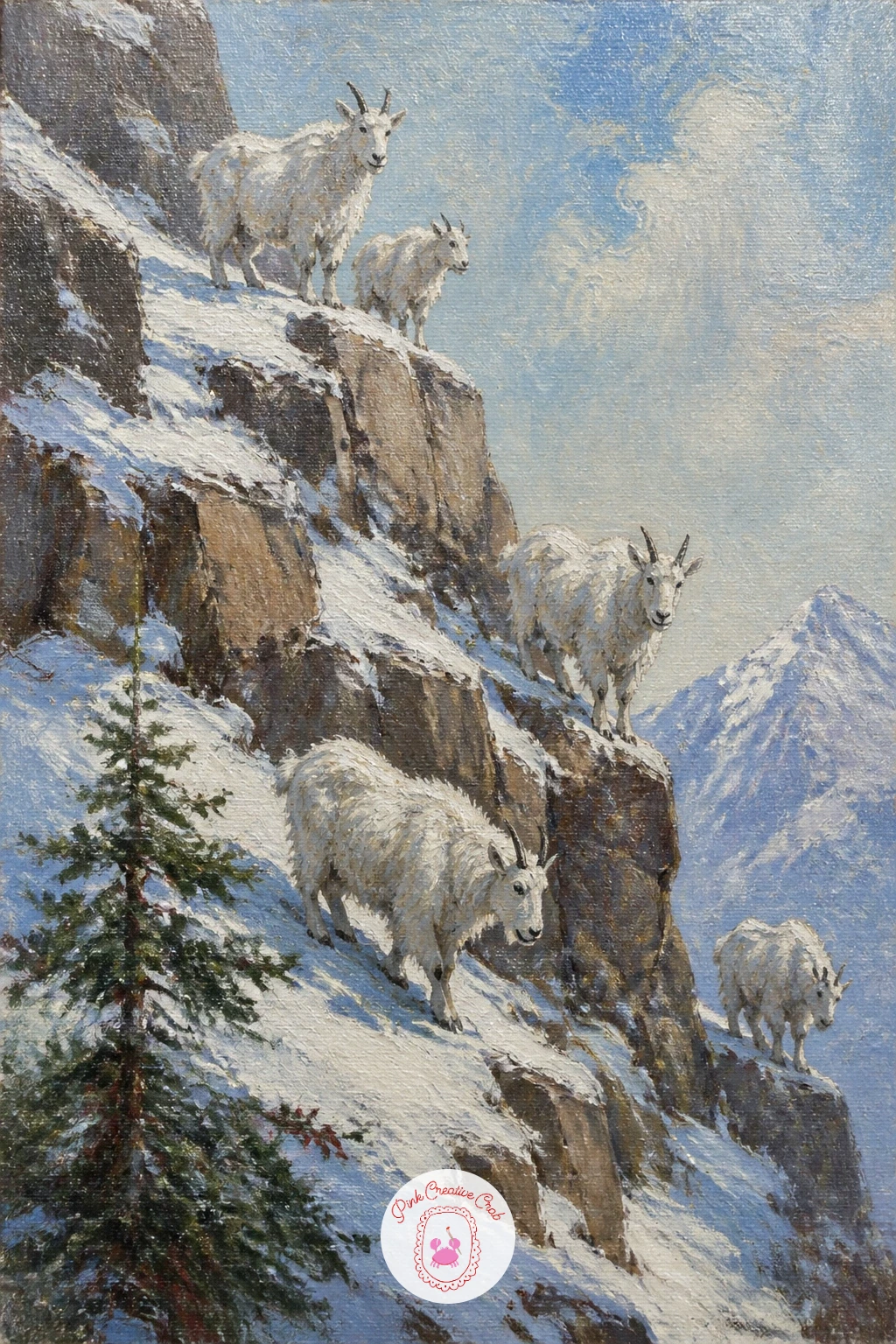
Palette: Titanium White,Burnt Umber,Naples Yellow,Payne’s Grey
The contrast between dark wet rock and pale frozen water is what makes this one striking, so build the rock gorge first in deep, almost black-brown tones before any white touches the canvas at all. Keep the rock face narrow and steep, framing the waterfall on both sides so it feels tucked into a tight space rather than standing in the open.
Paint the frozen waterfall itself with a palette knife, dragging pale blue-white paint downward in long vertical strokes that follow gravity rather than curving. Let a little of the dark rock show through in places, since a frozen waterfall is never solid white all the way down, it is ice clinging over stone.
Where the ice meets the rock is the detail to get right: use a fine brush to pick out a few thin icicle shapes along the overhangs, just three or four, rather than fringing the whole edge evenly. Too many identical icicles start to look like a drawn pattern instead of real ice.
A little snow caught on ledges either side of the gorge helps frame the dark rock and keeps the whole scene from feeling too heavy or monochrome.
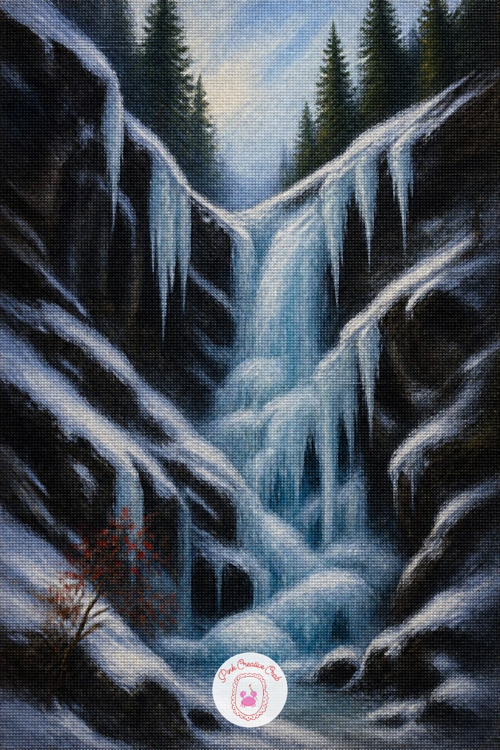
Palette: Payne’s Grey,Burnt Umber,Titanium White,Cerulean Blue
A hay barn under fresh snow is a quiet, simple subject that rewards a soft touch more than bold contrast. Paint the meadow first in a wide sweep of white with the faintest hint of blue shadow where the ground dips, keeping the surface mostly smooth since fresh snow has not been disturbed yet.
Block the barn as a simple dark wooden shape with a steep snow-capped roof, placed off to one side rather than dead center so the meadow has room to breathe around it. A few grey weathered planks suggested with two or three vertical strokes is plenty of detail for a barn this small.
If this is your first time painting fresh untouched snow, resist the urge to add texture everywhere. Fresh snow wants long, smooth strokes and very few marks, and the temptation to add sparkle or texture across the whole meadow usually makes it look trampled instead of pristine.
Snowy peaks rise softly behind, kept paler and hazier than the barn so the eye settles on that one small human structure first.
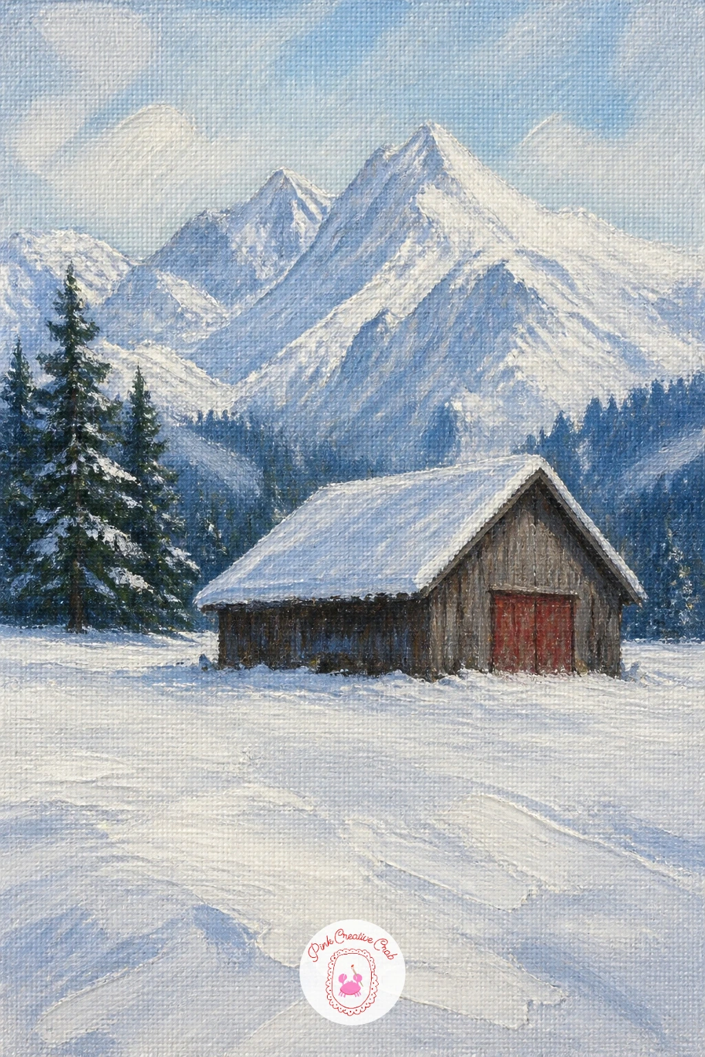
Palette: Titanium White,Burnt Umber,Grey Violet,Payne’s Grey
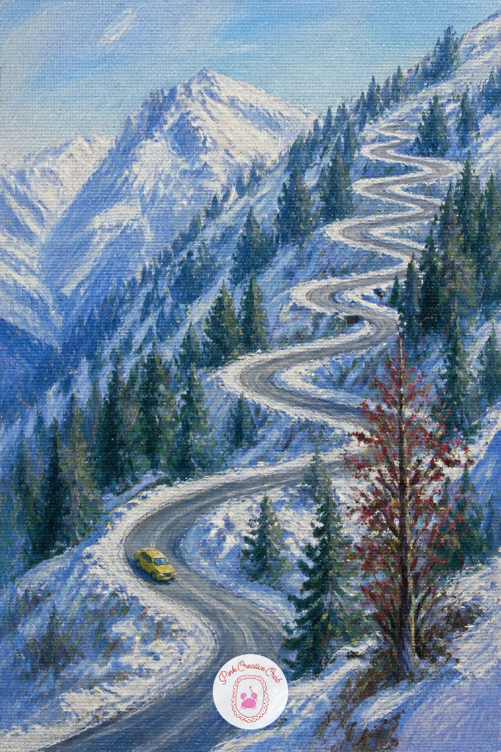
Switchbacks are a fun shape to paint because the road itself becomes the main subject, winding back and forth up the canvas like a ribbon. Sketch the road’s path loosely first with thin paint, making sure each switchback gets noticeably smaller as it climbs, which is the single biggest thing that sells the sense of distance and height here.
Paint the snow-dusted slope around the road in soft white and pale green-grey, then come back to the road itself in a darker warm grey, since asphalt dusted with fresh snow reads as grey-brown rather than pure black.
A tiny yellow bus or car on one of the lower switchbacks gives instant scale and turns a simple winding road into a scene with a story, so add one small rectangle of warm color partway up if you want that human touch.
Keep the very top of the road fading into mist or cloud rather than painting it all the way to a visible summit, since letting it disappear upward makes the mountain feel taller than the canvas actually is.
Palette: Payne’s Grey,Titanium White,Naples Yellow,Sap Green
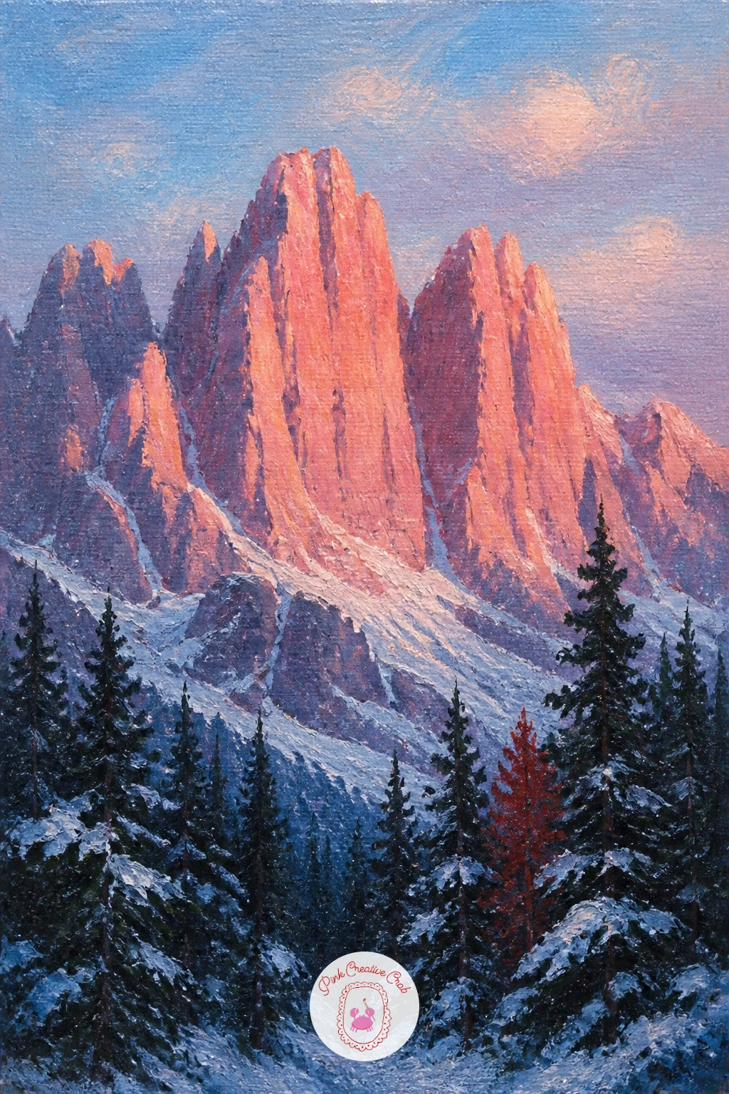
The Dolomites are known for a very particular rock color, a warm pale pink-orange that turns almost fluorescent at dawn or dusk, so this idea is really about getting that one color right. Mix a base of white with the smallest touch of cadmium orange and a whisper of rose pink, testing it on scrap canvas until it looks warm without tipping into peach.
Paint the peak’s jagged vertical rock face using that mix, keeping your strokes mostly vertical to follow the Dolomites’ characteristic sheer, ribbed look rather than the smoother rounded shapes of other ranges. Snow sits only in the gullies and ledges here, not as a full cap, so add it in small patches rather than covering the whole peak.
Below, a dark pine forest grounds the glowing rock and gives it something to contrast against. Keep the trees nearly black-green and simple, just enough shape to read as forest without competing with that pink rock above.
If you want to push the glow further next time, try the same peak at a different hour with the rock shifted toward cool violet-grey instead, which shows how much one color choice changes the whole mood of a mountain painting.
Palette: Rose Pink,Cadmium Orange,Payne’s Grey,Sap Green
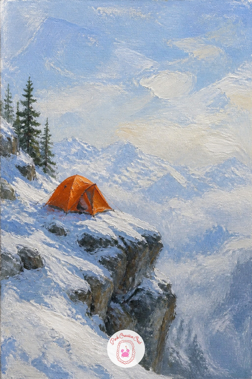
A small tent perched on an exposed rock shoulder gives this painting real drama with very few shapes. Paint the surrounding rock and snow first, keeping the shoulder narrow and the drop beyond it suggested with a sudden shift to pale, hazy nothing, which reads instantly as a long way down.
Block the tent as a simple triangular or domed shape in one bright color, perhaps a warm orange or yellow, since a climber’s tent is almost always a bold color chosen precisely to stand out against rock and snow. Two or three flat strokes are enough: a front panel, a shaded side, done.
Guy lines anchoring the tent to the rock are a small but satisfying detail: a few thin dark lines painted with a liner brush, angled out at different points, sell the idea that this tent is properly secured against wind at height.
Keep the sky above large and mostly empty, since the whole point of this scene is the contrast between one small bright shelter and an enormous, indifferent amount of rock and sky around it.
Palette: Cadmium Orange,Payne’s Grey,Titanium White,Burnt Umber
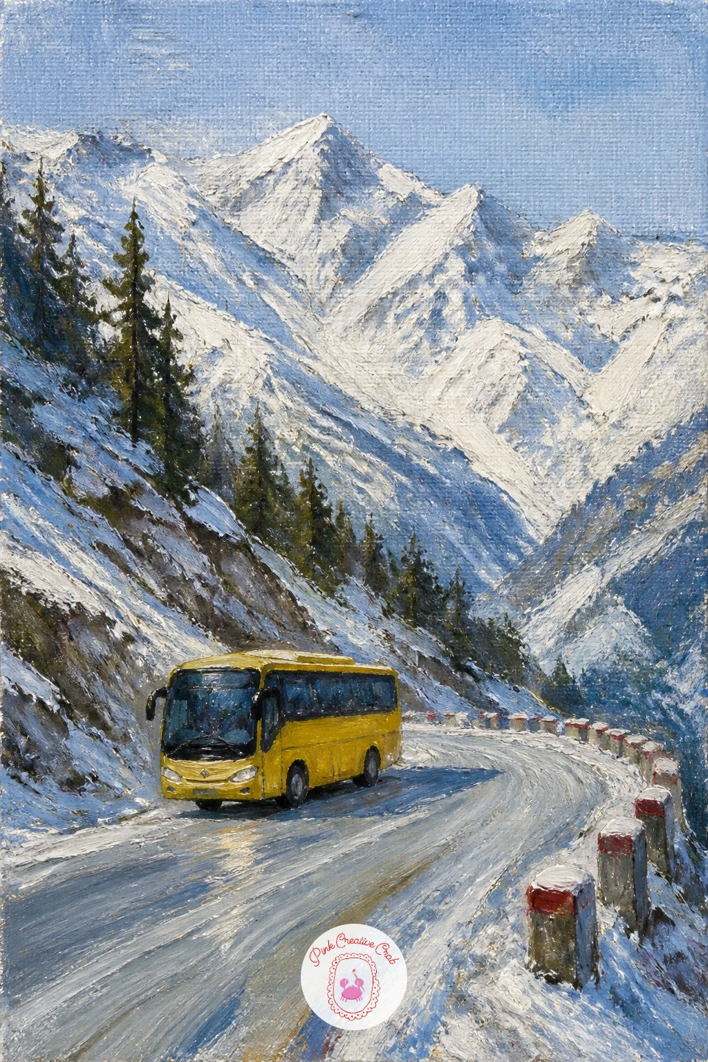
A small yellow bus is one of the cheeriest details you can drop into a mountain scene, and it works well as a companion piece if you have already painted the switchback road idea above. Paint the pass road and surrounding snowy slopes first, keeping the road itself a simple pale grey-brown ribbon cutting across the lower half of the canvas.
Block the bus as a bright rectangle, mostly yellow with a dark stripe of windows along its side, placed somewhere along the road rather than dead center. Keep it small: a bus this size on a mountain pass should never dominate more than a tenth of the canvas width.
A faint plume of exhaust or a little splashed slush behind the wheels adds a sense of motion if you want it, painted with the same dry, broken brushwork you would use for mist or smoke elsewhere in this list.
Snowy peaks rise behind in your usual cool palette, kept calm and simple so all the warmth and color interest in the painting stays down with that one small, cheerful bus.
Palette: Naples Yellow,Payne’s Grey,Titanium White,Burnt Umber
Two figures climbing in single file give you a chance to practice a simple repeated shape with small variation, which is a nice change from painting one lone figure. Paint the sunny slope first in warm white with long diagonal shadows following the angle of climb, since the direction of those shadows is what tells the eye which way is uphill.
Block both figures as simple dark silhouettes, the lead tourer slightly ahead and higher, the second a few steps behind and lower on the slope. Keep their poses nearly identical, leaning slightly into the climb with skis strapped diagonally across their packs, since real ski tourers in a line tend to mirror each other’s rhythm closely.
Vary just one small thing between them, perhaps a different jacket color or a slightly different arm position, so they read as two distinct people rather than one figure stamped twice.
Their shadows stretching downhill behind them are worth the extra few strokes, since that single detail does more to establish the bright, cold, sunny light than almost anything else in the painting.
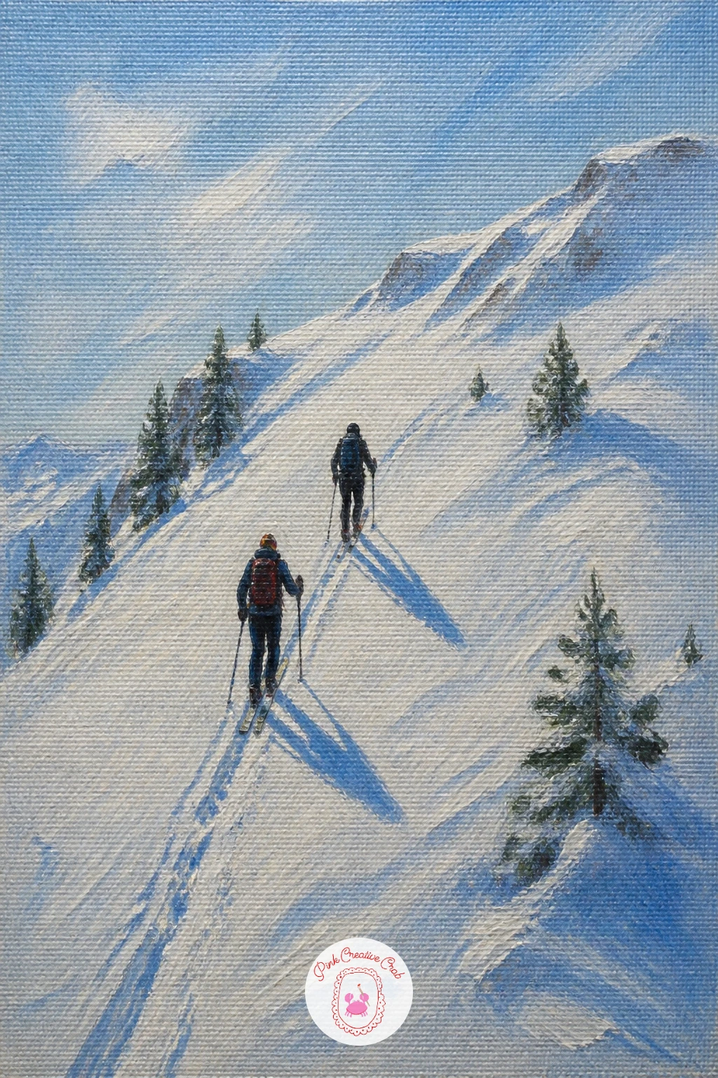
Palette: Titanium White,Payne’s Grey,Cerulean Blue,Burnt Sienna
Reflections let you paint the same mountain twice with two very different brush qualities, which makes this a satisfying technical exercise as much as a pretty scene. Paint the peak itself first, crisp and fully resolved with all its sharp white ridges and blue shadow.
For the reflection below, mix the same colors but apply them with longer, softer, slightly wavering strokes, since moving water breaks a reflection into something looser and less defined than the solid rock above it. Never paint a mirror-perfect copy: a true reflection in an unfrozen stream wobbles and stretches with the current.
A dry brush dragged lightly across the reflected area afterward breaks up the color further and adds a sense of ripple without needing to paint individual wave lines. This same dry-brush trick works for any water reflection, so it is worth practicing here.
Leave a thin strip of pale rock or snowy bank between the real mountain and its reflection to anchor the composition, and let a few dark stones poke through the stream’s near edge for scale.
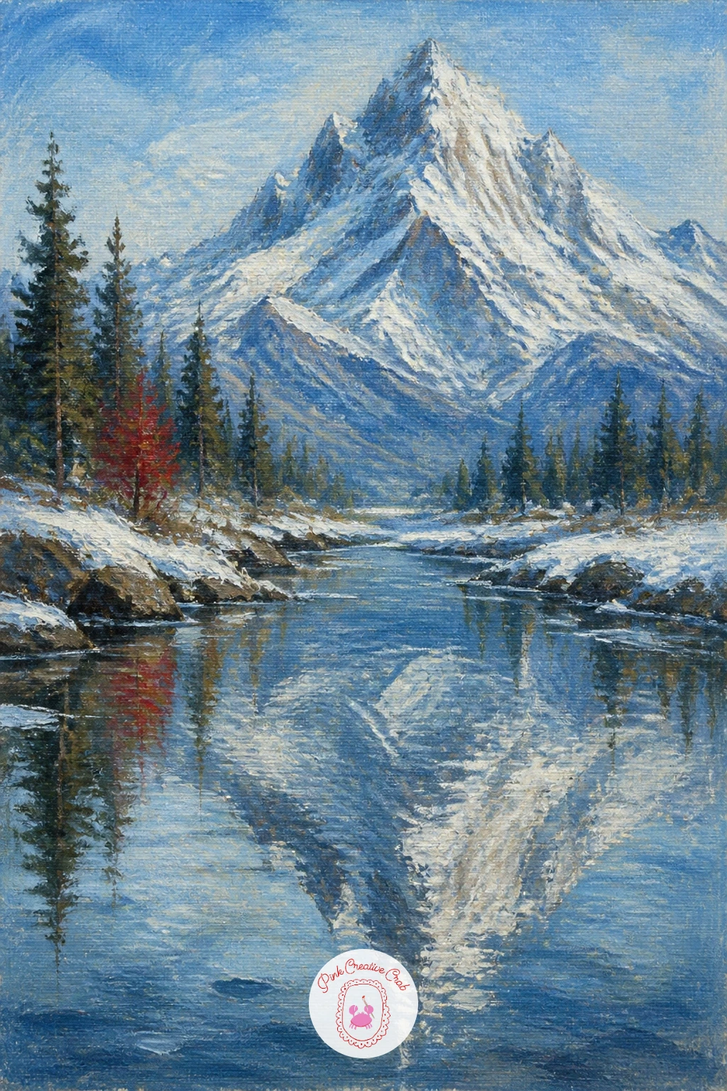
Palette: Titanium White,Cerulean Blue,Payne’s Grey,Burnt Umber
This is one of the coziest ideas on the list, built almost entirely around two small mugs and a blanket draped over a railing. Paint the balcony railing and floorboards first in warm wood tones, angled so the Alps beyond sit just over the top of the rail rather than filling the whole frame.
Drape the blanket over the railing with a few loose, soft-edged strokes in a warm plaid or solid color, letting it fold naturally rather than hanging perfectly flat. Two mugs sit nearby, painted as simple rounded shapes with a thin curl of steam rising from each, using the same dry, broken brushwork you would use for any steam or smoke elsewhere in this list.
Keep the Alps beyond soft and a little hazy compared to the crisp, warm balcony details in front, since the whole feeling of this scene depends on that contrast between a cozy foreground and a vast, cold view.
If you have not painted steam before, keep the brush nearly dry and the stroke upward and thinning, since a thick solid curl of white reads as paint rather than warm vapor.
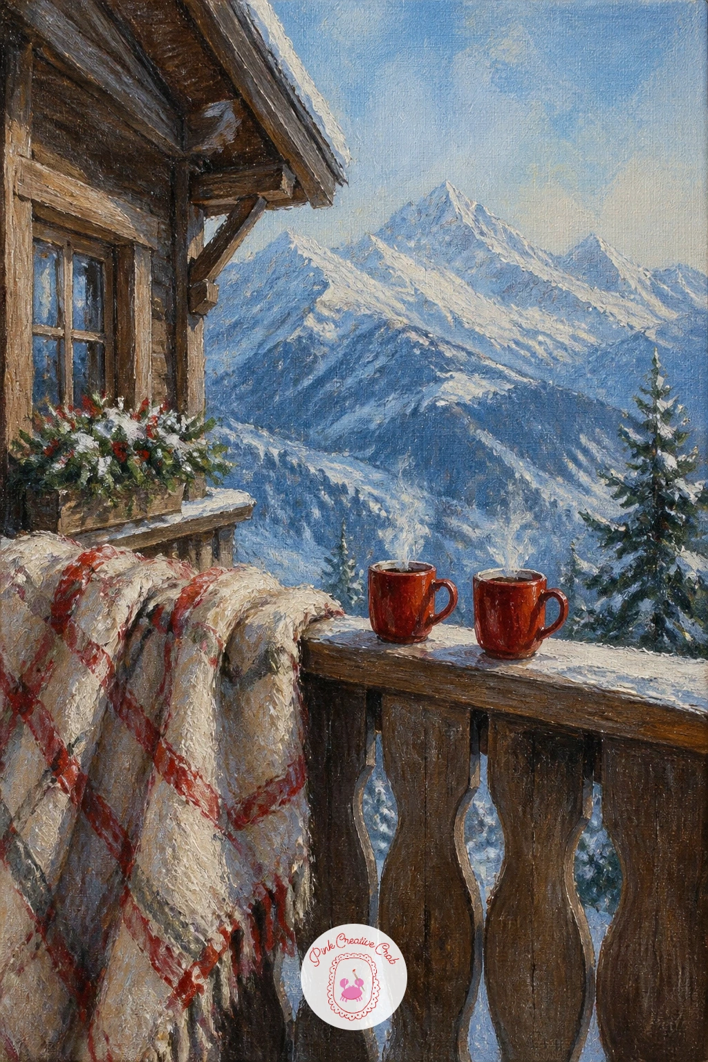
Palette: Burnt Sienna,Titanium White,Cherry Red,Cerulean Blue
Patagonian peaks have a distinct jagged, almost granite-spire look that sets them apart from the rounder Alpine summits elsewhere in this list, so lean into sharp, angular strokes when you block the mountain in. Keep the rock dark and exposed in patches even under snow, since Patagonia’s wind tends to scour the peaks bare in long vertical streaks.
Paint the guanaco below as a simple long-necked silhouette, smaller in scale than you might expect against those huge spires, standing alert with its head raised. A guanaco’s long neck and slim legs are the two features that read it clearly even as a small dark mark, so keep both a little exaggerated rather than compressed.
The sky here often carries a cold, clear look with very little cloud, so keep your blue simple and let the jagged peak’s silhouette do most of the visual work against it.
Ground the guanaco with a short shadow and perhaps a patch of windswept grass poking through snow nearby, which helps place the scene in a specific windy, open landscape rather than a generic snowy mountainside.
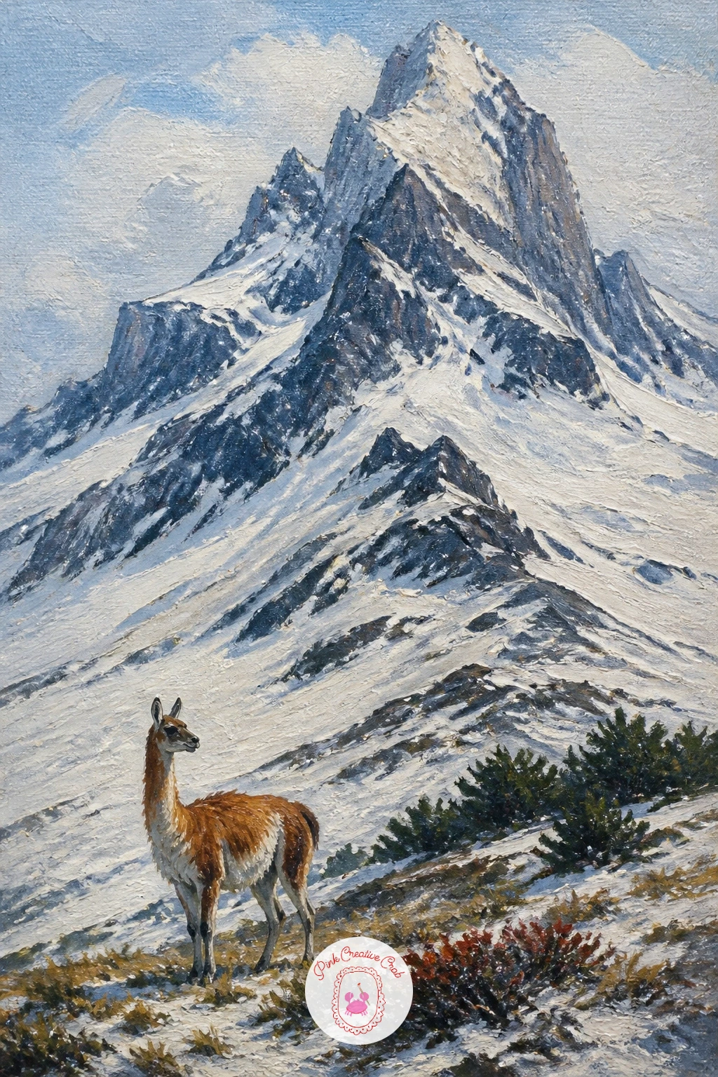
Palette: Payne’s Grey,Titanium White,Burnt Umber,Cerulean Blue
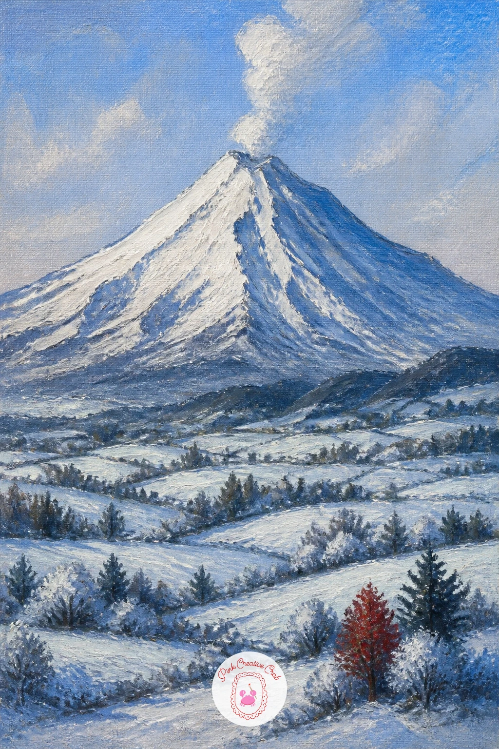
A volcano gives you one of the cleanest cone shapes in all of landscape painting, so take your time getting that silhouette right before adding any detail. Paint the cone in smooth, even strokes rising to a single point or a gently flattened top, keeping the snow cap crisp and symmetrical since volcanic cones tend to read as more geometric than jagged alpine peaks.
Below the snowline, let a little dark rock or ash color show through in patches, since a volcano’s lower slopes are rarely pure white even in winter. The frosty farm fields at the base are your human-scale detail here: paint them as a simple patchwork of pale, frost-dusted rectangles, perhaps with one small dark barn or fence line to anchor the scale.
Keep the color temperature shift deliberate: warm, slightly golden frost on the fields close to the viewer, cooling to blue-white as the eye travels up toward the summit. That gradual shift does a lot of work to suggest distance without any extra detail.
A single wisp of pale smoke or steam from the crater is optional, but it adds a quiet reminder that this peaceful-looking cone is still, technically, a volcano.
Palette: Titanium White,Burnt Umber,Naples Yellow,Cerulean Blue
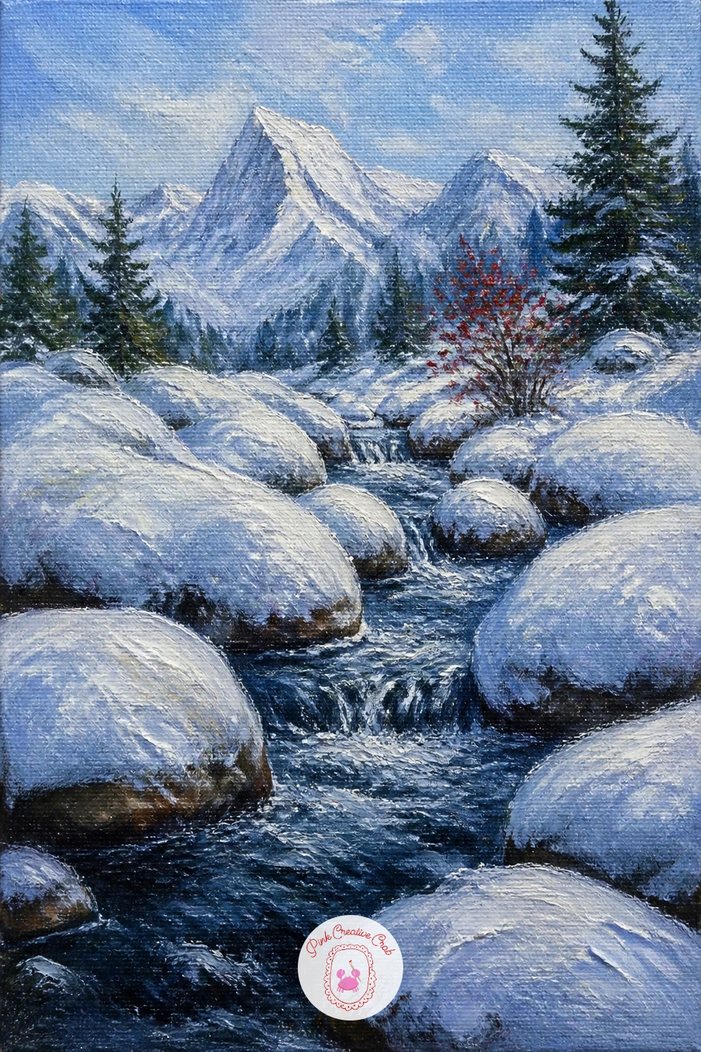
Boulders capped in snow often look almost soft, like pillows scattered through a stream bed, which is a nice textural idea to play with here. Paint the stream first in dark, moving strokes with a little white dragged through wet for movement, then block the boulders as rounded shapes sitting partly in and partly out of the water.
Cap each boulder with a thick dollop of white paint applied with a palette knife, pressing and lifting rather than smearing, which leaves soft rounded ridges that genuinely look like pillows of snow rather than flat caps. Vary the size and shape of each boulder so none of them match exactly.
If you do not have a palette knife, a stiff, barely loaded flat brush dabbed rather than stroked gets a similar soft, piled texture. The key in either case is to add the paint in one confident touch per boulder rather than smoothing it out afterward.
Let a little dark rock show at the base of each boulder where the stream has worn the snow away, which grounds them in the moving water rather than letting them float.
You Will Need
- palette knife
Palette: Titanium White,Payne’s Grey,Burnt Umber,Cerulean Blue
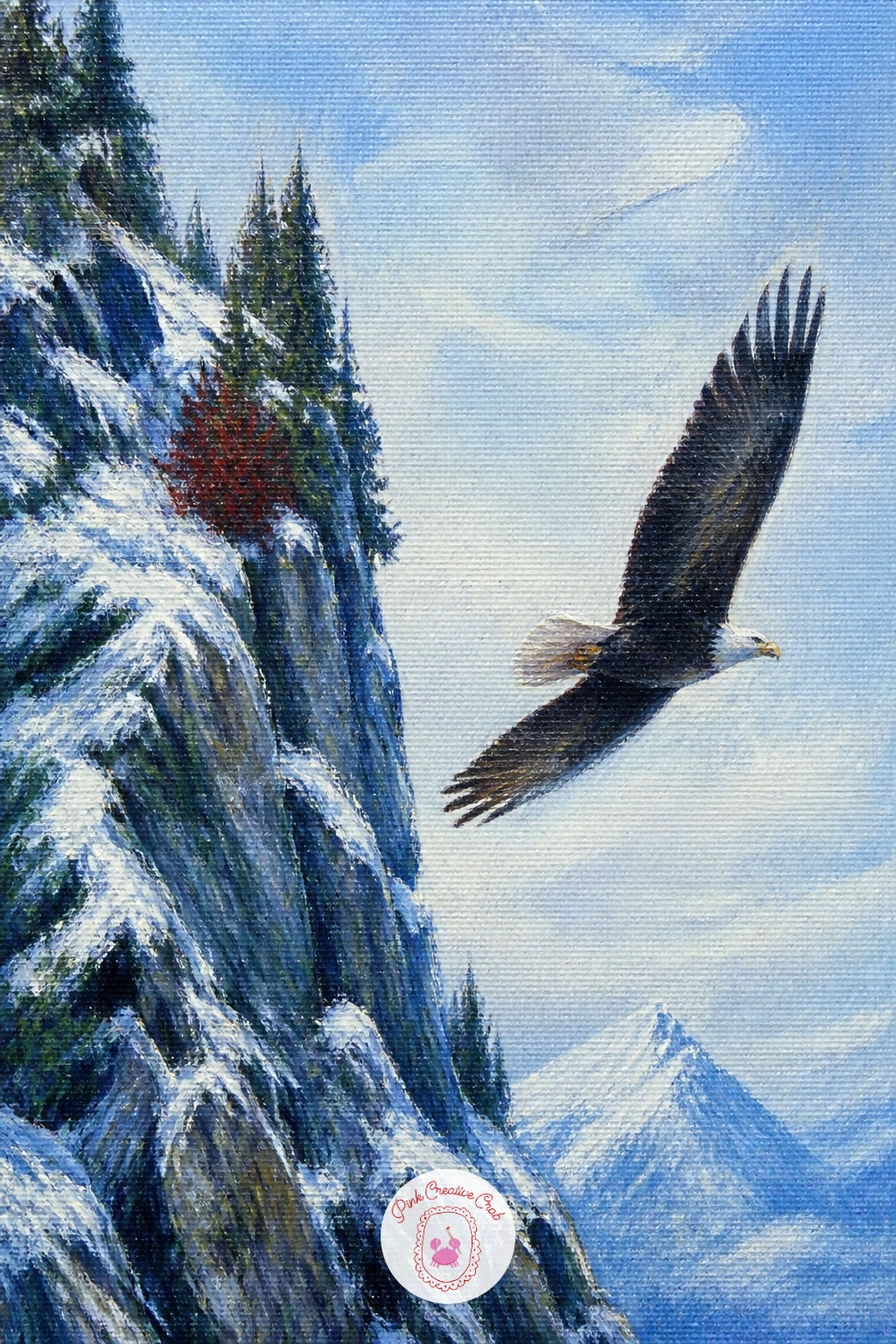
An eagle in flight gives you a chance to paint a strong diagonal shape cutting across an otherwise still, vertical composition. Paint the cliff face first in cool grey-brown with streaks of snow caught in its cracks and ledges, keeping the rock steep and slightly looming over the lower half of the canvas.
Block the eagle as a simple dark silhouette with wings held in a shallow V, one wing tip closer to the viewer and slightly larger to suggest the angle of flight. Keep the body small compared to the wingspan, since an eagle’s wings read far more clearly than its compact body at this distance.
Place the eagle off-center, closer to one edge of the canvas, with open sky stretching away in the direction it is flying. That empty space ahead of the bird is what makes the flight feel purposeful rather than static, so resist the urge to center it.
A fine brush loaded with just a touch of warm brown along the trailing wing edge, where light catches the feathers, adds a small highlight without needing to paint individual feathers.
Palette: Payne’s Grey,Burnt Umber,Titanium White,Cerulean Blue
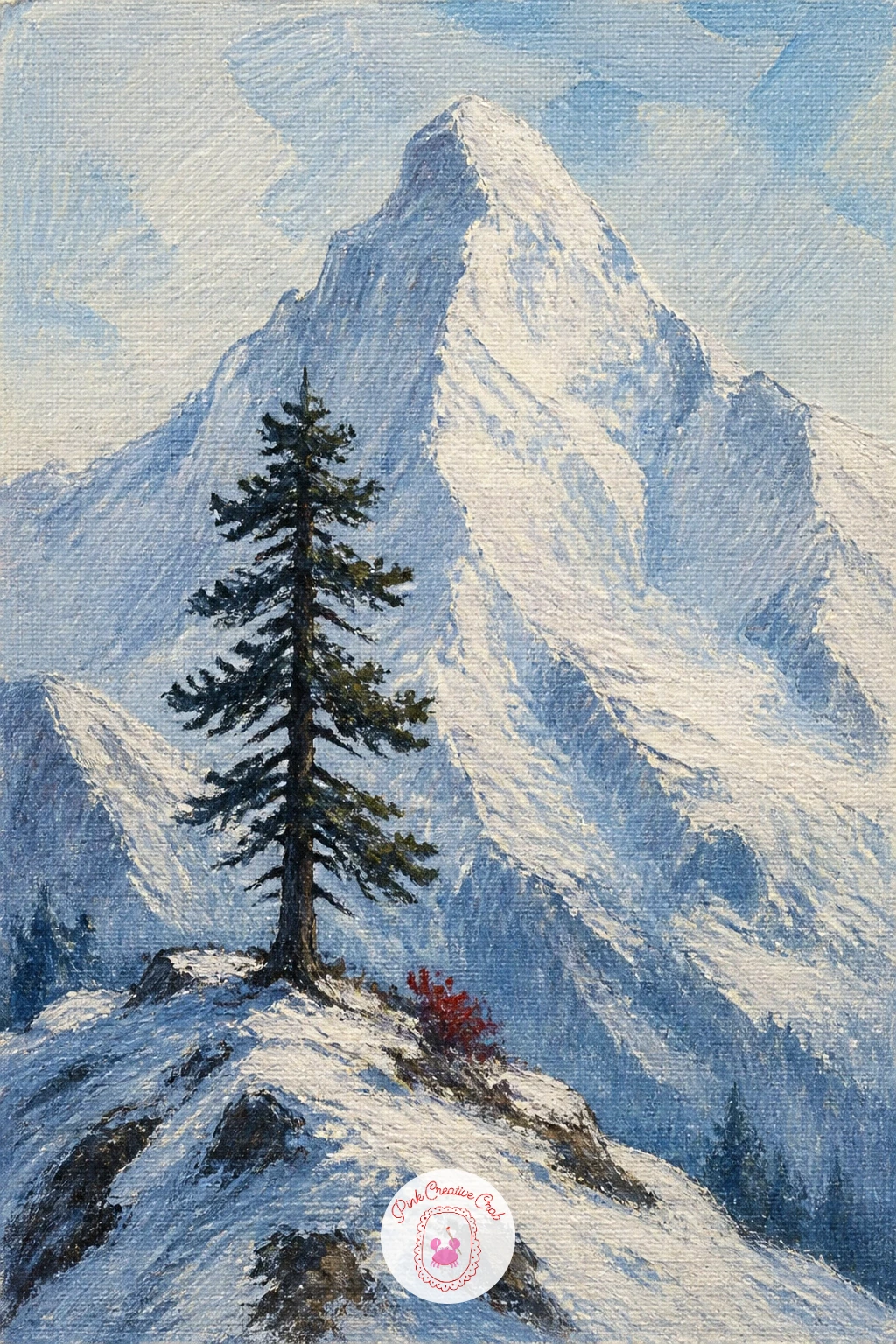
A single pine against a huge peak is one of the simplest compositions on this list, which makes it a good one to practice restraint on. Paint the peak first, large and pale, filling most of the upper canvas, then place the pine low and off to one side on the ridge in front of it.
Build the pine with a few confident dark strokes rather than many small ones: a tapering trunk, then branches suggested as short diagonal dashes that get shorter toward the top. Dust the uphill side of each branch with a touch of white, since snow gathers only on the side facing the weather, never evenly all around.
Compare the pine’s height to the peak before you finish it: it should read as genuinely small, no more than a tenth of the mountain’s height, or the sense of scale this whole painting depends on falls apart.
Keep the ridge beneath the pine simple, a soft curve of white and pale shadow, so nothing competes with that one small dark silhouette standing alone against so much pale, quiet mountain.
Palette: Payne’s Grey,Titanium White,Sap Green,Cerulean Blue
Try the same composition with the pine leaning slightly, as if shaped by wind, next time. A small tilt adds character without any extra detail.
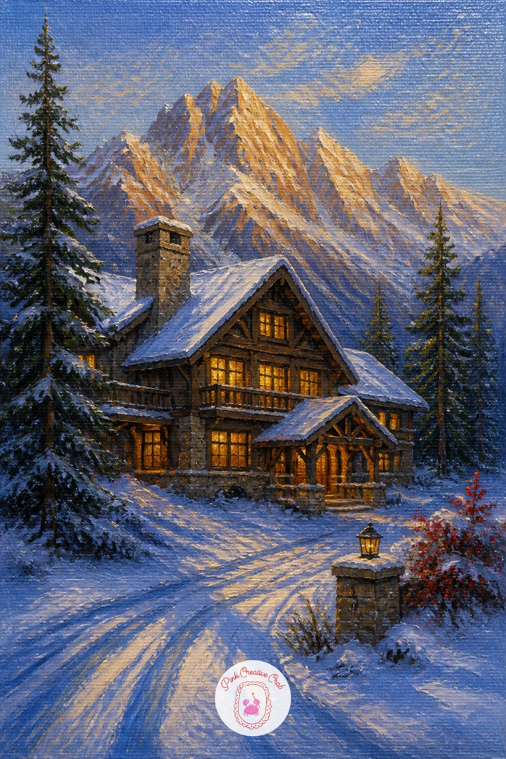
Long blue shadows are the real subject of this one, so decide on your light direction before you paint anything else: a low, warm late afternoon sun sitting just above one shoulder of the mountain, throwing shadows far across the snow in the opposite direction.
Paint the lodge first as a solid, simple shape, warm wood catching the last direct light on one side while the other side falls into cool blue shadow. Light two or three windows in warm gold, since a lodge at this hour should feel like the one warm thing in an otherwise cooling scene.
Stretch the lodge’s shadow out long and thin across the snow in front of it, angled consistently with the light direction you chose, and use the same angle for any trees or posts nearby so the whole scene reads as one coherent moment rather than several separate light choices.
Finish with the peaks behind catching the last warm light at their very tips only, cooling to blue further down, which closes the painting on the same warm-to-cool contrast that runs through the whole scene. For more ways to handle that late golden hour in snow, the winter oil painting ideas cover several similar lighting moods, and the oil painting for beginners step by step lessons are useful if blending a gradient sky still feels tricky.
Palette: Naples Yellow,Cerulean Blue,Burnt Sienna,Payne’s Grey
What to Do Next
Pick whichever idea matches the mood you want today, stretch a small canvas, and block in your biggest shapes first: sky, peak, then the small detail that gives it scale. Keep the brush loose, trust the icy palette, and let one sitting be enough.
Frequently Asked Questions
What colors do you need for a mountain painting in oil?
A workable mountain palette needs titanium white, Payne’s grey, cerulean blue, burnt umber and one warm accent like cherry red or yellow ochre. These five mix nearly every snow, rock and sky tone a winter mountain scene needs without overcrowding your palette.
How do you make snow look realistic in oil paint?
Realistic snow comes from varied, broken brushwork rather than flat white. Mix cool blue-grey shadows into the hollows, keep true white for the brightest catch of light, and use a dry brush or palette knife so the texture never looks perfectly smooth.
How do you paint mountains so they look far away?
Distant mountains need paler, cooler colors and softer edges than anything in the foreground. Mix more white and a touch of blue into far peaks, keep their outlines slightly blurred, and save your sharpest detail and strongest color for whatever sits closest to the viewer.
How small should the human or animal detail be in a mountain painting?
Keep any figure, animal or building small enough that the mountain clearly dominates the scene, usually no more than a tenth of the canvas height. That scale contrast is exactly what makes the peak feel enormous and the detail feel like a genuine discovery.
Have any thoughts?
Share your reaction or leave a quick response — we’d love to hear what you think!
-
 0
-
0
-
0
-
0
-
0
-
0


