Valentine card ideas handmade in watercolor give you something a shop card never will: a front nobody else owns, painted in an afternoon with whatever brushes and pans are already on your desk. Every idea below fits a small card panel, so you can finish the painting, let it dry flat and have it ready to fold and send without waiting on anything fancy.
Below you will find 37 soft, romantic scenes built from roses, tulips, bees, butterflies and heart-shaped wreaths set in gardens, doorways and quiet still lifes. Scroll for the one that matches today’s mood, read how to paint it, and keep this page open on your phone while you work.
Using these images: free for personal projects such as printing, coloring, cards, journals and gifts. Handmade items that include them may be sold up to 30 pieces per design. More than that is commercial use and is not permitted, and neither is selling or sharing the images themselves or passing them off as your own. Please ask before any other use.
Start with the easiest shape in this whole list: a heart made of loose rose clusters hanging on a garden gate. Pencil a faint heart outline on your card front, light enough to vanish under paint, then block in five or six rounded rose shapes along it in rose pink and a touch of cherry red, leaving white gaps between them.
Paint wet into wet for the petals so the pink blurs softly at the edges, then drop in fresh leaf green leaves while the paper is still damp so they bleed just slightly into the pink. Once everything is bone dry, add the gate with a ruler-straight ink line or two and a few curved wire strokes holding the wreath in place.
The mistake to watch for is a heart that looks lopsided once the paint goes down. Fix it by sketching both sides of the heart at the same time, checking that the two humps match in width before you pick up a brush.
If you do not have a gate reference handy, two simple vertical lines and a crossbar read as a gate well enough for a card front.
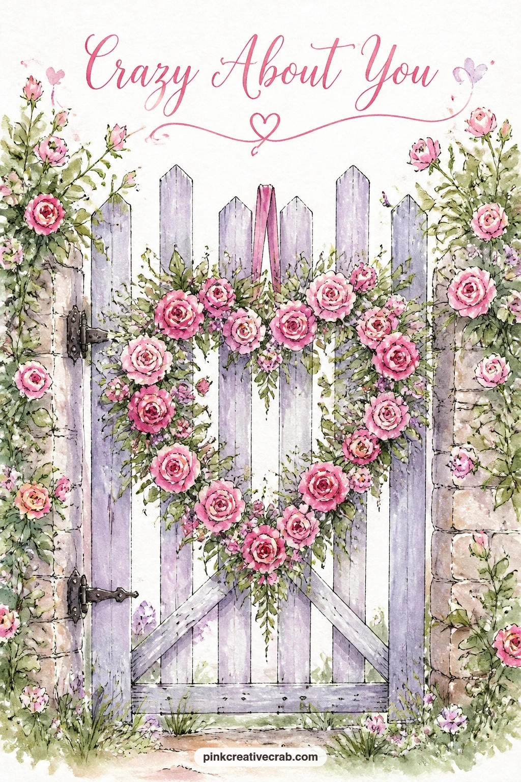
Palette: Rose Pink,Cherry Red,Fresh Leaf Green
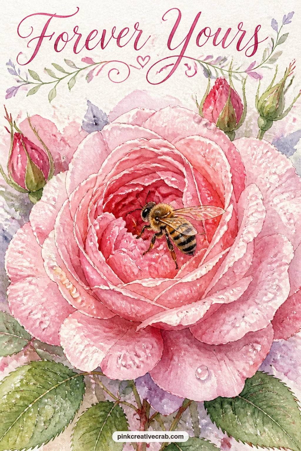
Move from a wreath to one quiet close-up: a bee resting on a blush rose just after rain. Paint the rose first as a loose spiral of petals in blush pink with a cherry red shadow tucked into the center, then let it dry completely before you touch the bee.
Add the raindrops with tiny circles of clean water dropped onto dry paint, which lifts soft pale rings as it dries, a classic watercolor trick worth trying here. Paint the bee last in black and gold with a tiny dry brush, keeping the body small so it does not fight the flower for attention.
If the water-drop trick looks too faint, go back in with a fine white gel pen once everything is dry and dot a few sharp highlights onto the petals instead. That swap works just as well for a beginner who wants the raindrop effect without timing the water exactly right.
Keep the bee’s wings as two transparent ink ovals, nothing more, so the flower stays the star of the card.
You Will Need
- white gel pen for raindrop highlights
Palette: Blush Pink,Cherry Red,Payne’s Grey
Look closely at how rain sits on a real rose petal before you paint: the drops cluster near the center and thin out toward the edges, never scattered evenly.
This still life gives you practice with a cone shape before the flowers get busy: a bunch of red tulips wrapped in kraft paper, resting on a wooden bench. Block in the paper cone first in warm ochre or raw sienna, letting the color pool darker at the fold lines, then let it dry while you mix your reds.
Paint the tulip heads as simple closed cups in cherry red, two or three strokes each, working from the bench upward so the stems come last and overlap the paper neatly. The bench itself only needs a few horizontal brown strokes under the bouquet to ground it.
Tulips often go wrong when painters try to show every petal; keep each head to two or three brushstrokes and the loose look holds together. If kraft paper brown feels tricky to mix, a plain warm beige or even a pale tan marker works as a stand-in.
Finish with a few ink lines for the paper fold and string, added once the paint is fully dry.
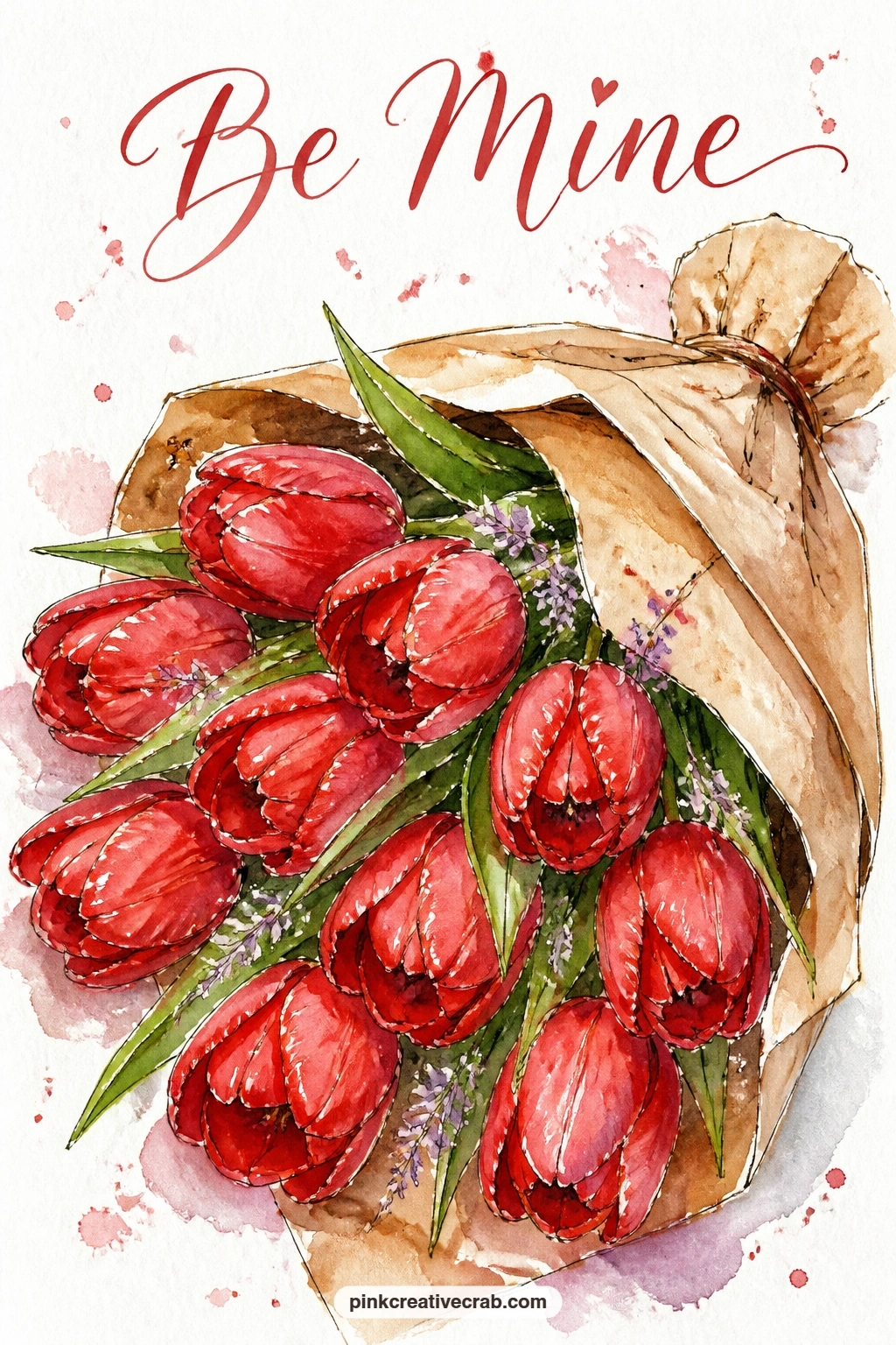
Palette: Cherry Red,Raw Sienna,Fresh Leaf Green
Sweet peas bring a ruffled, delicate edge that pairs beautifully with a butterfly, so build the heart wreath first in soft lilac and pale pink before adding your visitor. Paint each sweet pea as two or three loose curved petals, working around the heart shape and leaving small white gaps between clusters so the wreath does not turn into a solid blob.
Once the wreath is dry, paint the butterfly landing on one edge in rose pink wings with a thin ink line down the center and along the wing edges. Keep the body as one small dark dash so it reads at a glance.
The eye level here matters more than it looks: paint the wreath as if you are looking at it straight on, flat against a wall, rather than from above, and the heart shape stays clear instead of warping into an oval. That single choice keeps the whole composition readable.
If lilac paint is not in your set, mix a touch of cherry red into blue to get a close, softer version.
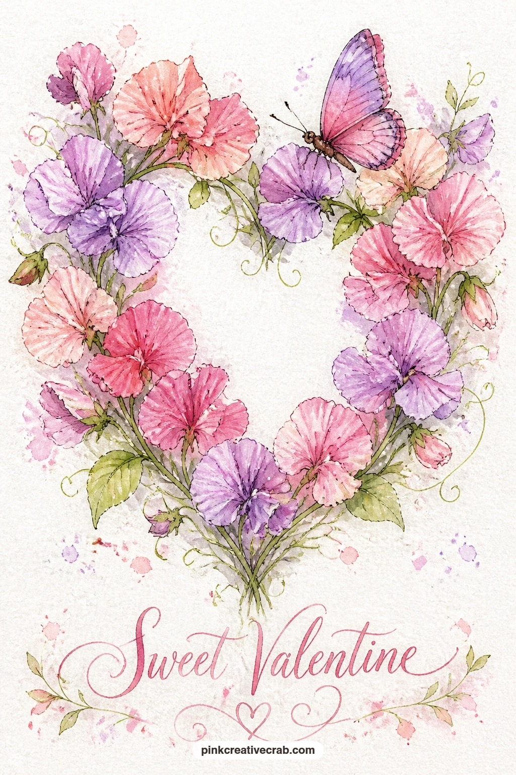
Palette: Soft Lilac,Blush Pink,Rose Pink
After two wreaths in a row, a simple jam jar still life gives your hand a rest while still looking full of flowers. Paint the jar first as a transparent cylinder, using a pale grey-blue for the glass shadows and leaving the glass itself mostly white paper.
Build the ranunculus heads in layered pink circles, starting with the lightest blush tone and dropping in small cherry red strokes near the centers while the paint is still damp, which lets the colors blend softly into ruffled petals. Work from the back flowers forward so the front blooms sit crisply on top.
Windowsills go wrong when the light direction is unclear, so decide early whether sun comes from the left or right and keep every shadow, on the jar and on the sill, falling the same way. A quick pencil arrow in the margin before you paint helps you stay consistent.
For more flower still-life practice with a similar ruffled bloom, the carnation drawing ideas page is worth a look.
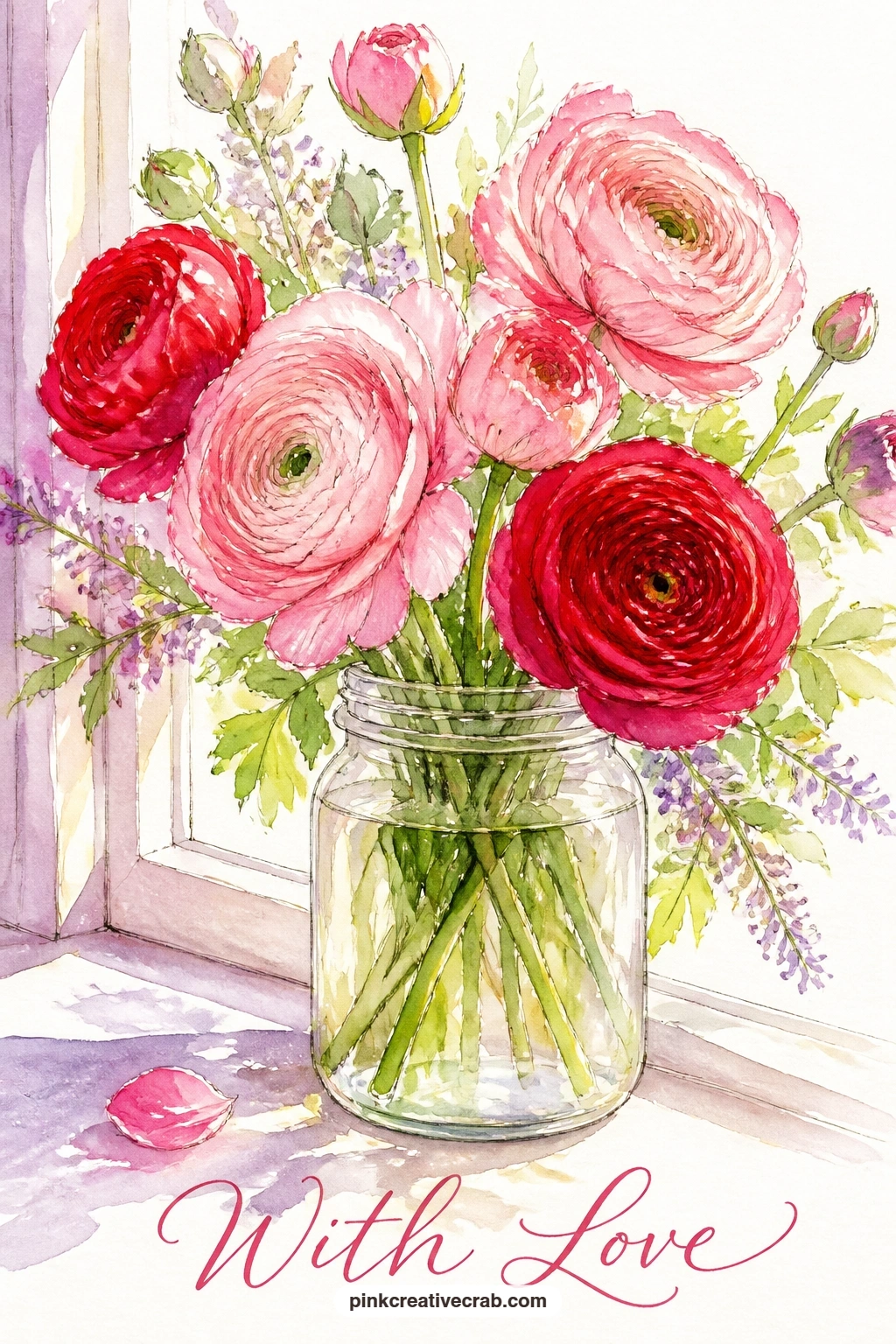
Palette: Blush Pink,Cherry Red,Pale Grey Blue
Tiny flowers call for a different hand than big roses, so slow down for this one: a heart wreath of forget-me-nots against a plain white wall. Dot the tiny blossoms around a faint pencil heart using the tip of a small round brush loaded with soft lilac, pressing lightly so each dot stays small and separate.
Vary the pressure as you go so some dots sit slightly larger and darker than others, which keeps the wreath from reading as a flat pattern. Add a yellow-green center dot to a handful of flowers once the lilac is dry, using the very point of your brush.
The edges of this wreath can turn fuzzy and unclear if you paint too wet, so keep your brush almost dry for the outer dots and save any wet-into-wet blending for the leaves tucked between flowers. If your round brush is too large for tiny dots, the corner of a flat brush or even a cotton swab makes a workable substitute.
Leave plenty of white wall showing around the wreath for a clean, airy card front.
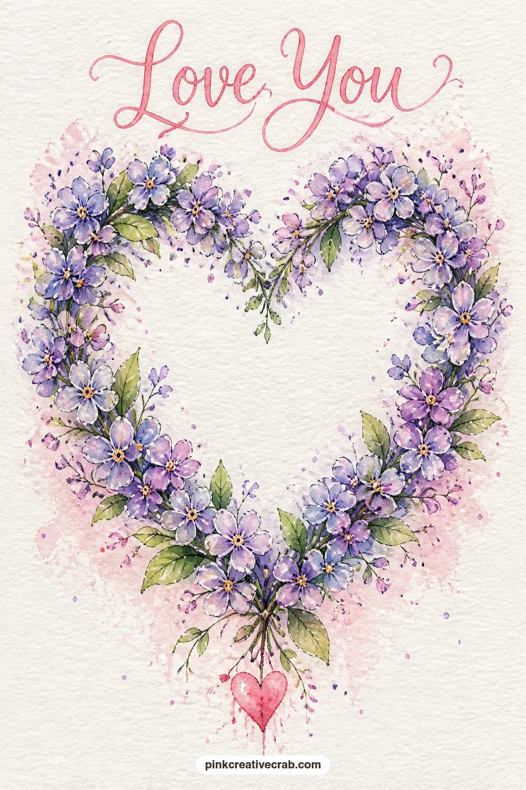
Palette: Soft Lilac,Fresh Leaf Green,Pale Yellow
Give yourself a pattern to enjoy this time: pink tulips spilling from a striped pot on a stone step. Paint the pot first with simple horizontal stripes in two colors, letting each stripe dry before the next so they stay crisp rather than bleeding together.
Once the pot is dry, build the tulip heads above it in rose pink and blush, overlapping two or three heads so the bunch feels full without adding more than five or six flowers total. Stems and leaves go in last, painted upward from the pot rim in fresh leaf green.
Striped pots often end up wobbly if you try to paint the stripes freehand around a curve, so sketch the pot’s outline in pencil first and mark where each stripe starts before you pick up paint. That small bit of planning keeps the stripes following the pot’s curve instead of fighting it.
A grey wash under the pot suggests the stone step without needing any real detail there.

Palette: Rose Pink,Blush Pink,Fresh Leaf Green
This scene asks for a little choreography: two butterflies circling one red rose set loosely in a meadow. Paint the rose first, centered on the card, building its spiral of petals in cherry red with a darker red shadow at the core, then let it dry fully before anything else goes on.
Place the two butterflies on opposite sides of the rose rather than side by side, one slightly higher than the other, so your eye travels in a loop around the flower instead of sliding straight across the page. Keep their wings small and simple, two ovals each in rose pink with a thin ink outline.
The meadow background only needs a scatter of loose green dashes and a few pale dots suggesting grass and distant blooms; resist filling the whole card with detail or the rose loses its place as the focal point. If you are short on time, skip the meadow entirely and let the rose and butterflies float on plain white paper.
Finish with ink antennae on both butterflies, added only once the paint is completely dry.
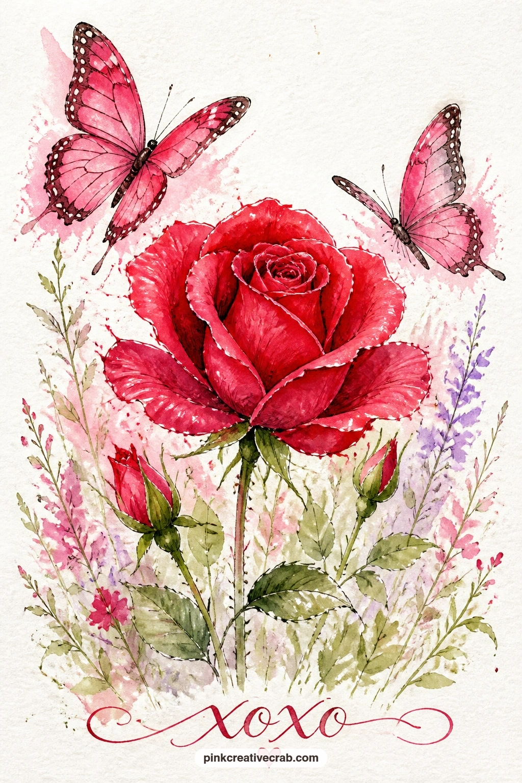
Palette: Cherry Red,Rose Pink,Fresh Leaf Green
Peonies reward a loose, generous hand, so this is the idea to practice big wet washes on: a bumblebee diving headfirst into a full pink peony in a cottage garden. Wet the peony shape first with clean water, then drop blush and rose pink pigment into the damp paper and let it bloom outward on its own for those soft, ruffled petal edges.
While the peony dries, mix your bee in black and warm yellow so it is ready to paint small and fast once the flower is set. Tuck the bee into the top petals, mostly hidden, with just its striped back and one wing showing, which makes the diving motion read clearly.
Peonies can turn into a muddy pink blob if you add too many colors while the paper is still wet, so limit yourself to two pinks and let the white paper do the work of separating petal layers. A cottage garden background can be as simple as a few loose green strokes and a wash of pale sky behind the bloom.
For more pollinators to pair with your garden cards, the bee watercolor ideas page has plenty of variations.
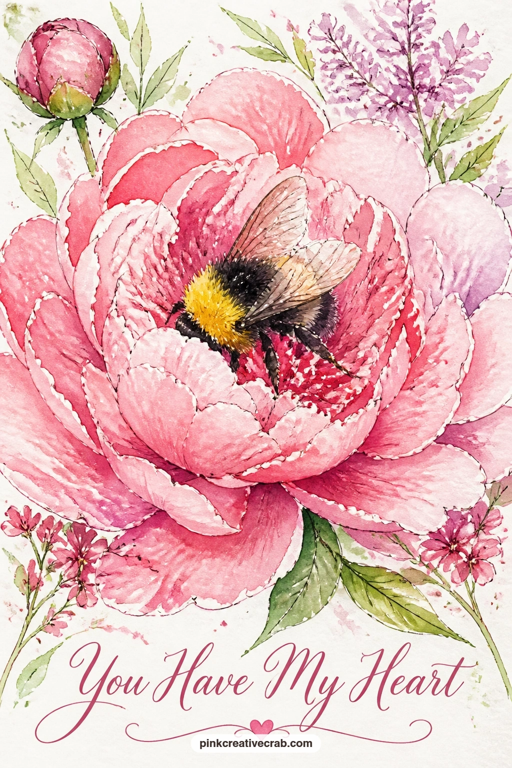
Palette: Blush Pink,Rose Pink,Warm Yellow
Carry the romantic wreath idea forward with a color contrast this time: lavender and white roses against a painted blue door. Start with the door itself as a flat, even wash of soft blue covering most of the card, letting it dry fully before any flowers go on top.
Paint the white roses as loose, barely-there petal shapes using just a pale grey shadow to suggest their folds, since the white of the paper does the real work, then tuck lavender sprigs between them as small upward brush flicks in soft lilac. Arrange both around your pencil heart guide so the colors alternate rather than clumping on one side.
Blue doors can swallow pale flowers if the wash goes on too dark, so test your blue on scrap paper first and keep it a shade lighter than you think you need. If lavender sprigs feel fiddly, a few simple dots in a cluster read just as well as individual tiny flowers.
Add the door’s wood grain or a hint of hardware in ink once everything is dry.
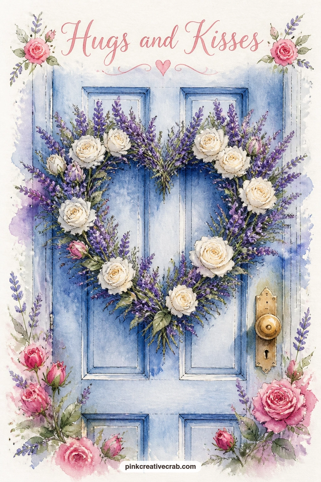
Palette: Soft Blue,Soft Lilac,Pale Grey
Give this one a sense of a moment happening: a basket of garden roses sitting on a picnic blanket with butterflies drifting above. Paint the blanket first as a simple checked or striped pattern in soft colors, kept loose and slightly uneven so it still feels like watercolor rather than a stamped pattern.
Build the basket next in warm brown with a woven texture suggested by just a few curved lines, not an actual weave drawn stroke by stroke. Fill it with rose heads in a mix of pink and red, overlapping generously since a basket of roses should look abundant rather than sparse.
The blanket pattern is the part most likely to fight the flowers for attention, so keep its colors muted and let the roses carry the boldest color on the page. One or two small butterflies floating above the basket finish the scene without needing a background at all.
If plaid feels fussy, simple wavering stripes in two colors give the same cozy picnic feeling.
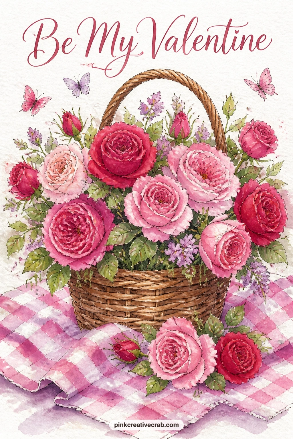
Palette: Rose Pink,Cherry Red,Warm Brown
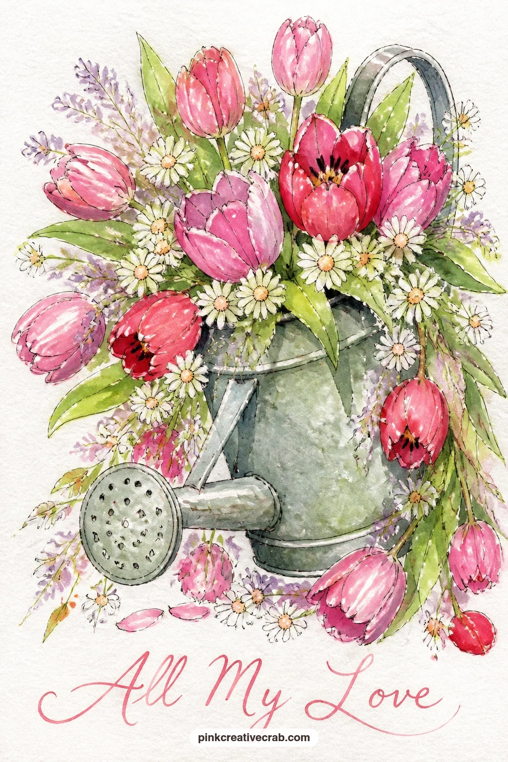
This still life plays with a pouring motion, so plan the flow before you plan the flowers: a watering can spilling over with tulips and daisies. Paint the can first in a soft grey-green, leaving its spout and handle as clean negative shapes of white paper where the light catches metal.
Let the tulip heads cascade from the can’s opening in pink and red, painted largest near the spout and gradually smaller as they trail down the card, which creates the illusion of spilling. Add a few simple daisies tucked among them, five white petals around a yellow center, painted with quick single strokes rather than careful ovals.
Spilling flowers can end up looking static if every bloom points the same direction, so angle a few tulip heads sideways or downward as if gravity is pulling them. A grey wash under the can suggests ground without any detail needed there.
If daisies feel fiddly in watercolor, a fine white gel pen can draw their petals directly over a dried yellow dot instead.
You Will Need
- white gel pen (optional for daisy petals)
Palette: Grey Green,Cherry Red,Rose Pink
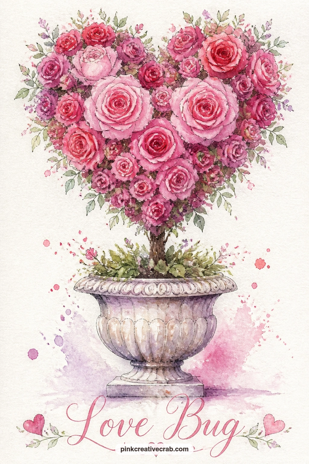
Topiary shapes need a bit more planning than a loose wreath, so start with a light pencil heart sitting on a short trunk before any paint touches the page: a heart-shaped rose topiary in a stone garden urn. Fill the heart with small rounded rose clusters in pink, packing them close together so the heart silhouette reads clearly rather than breaking into separate flowers.
Paint the trunk as a simple straight or slightly curved brown line connecting the heart to the urn below, then build the urn itself with a classic vase silhouette, wider at the top and narrowing toward a small base. Stone texture on the urn comes from a dry brush dragged lightly over the dried wash, catching only the paper’s texture.
Topiary hearts can collapse into a shapeless blob if the rose clusters spread too far outward, so keep checking the outer edge against your pencil heart guide as you paint and stop adding roses once you reach that line. If a stone urn feels like too much detail, a plain terracotta pot works just as well underneath the heart.
Let the trunk dry completely before adding the urn so the two elements do not bleed together.
Palette: Rose Pink,Warm Brown,Pale Grey
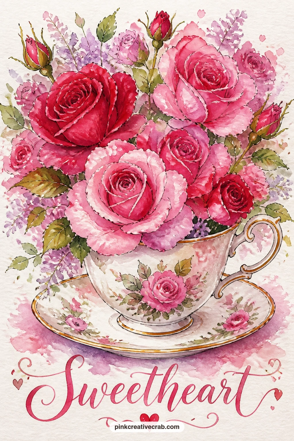
Scale shift gives this still life its charm: a full bouquet of roses bursting from a teacup set on its saucer. Paint the teacup and saucer first in a pale color with one thin ink line for the rim and handle, keeping the china simple so the roses above have room to be the busiest part of the card.
Build the rose heads in a cluster that is noticeably larger than the cup itself, which is exactly the playful oversized look this idea wants, using a mix of pink and red with a few green leaves tucked between blooms. Work from the back of the bouquet forward so later strokes land on top of earlier, drier ones and keep their edges crisp.
If the bouquet starts to feel crowded and muddy, step back and let it dry before adding any more flowers; watercolor often needs patience between layers more than it needs more paint. A mismatched teacup color is a fine swap if you do not have a reference in mind, since any simple cup shape reads clearly at this size.
Finish the handle and saucer rim in ink once the paint is fully dry for a crisp china look.
Palette: Rose Pink,Cherry Red,Fresh Leaf Green
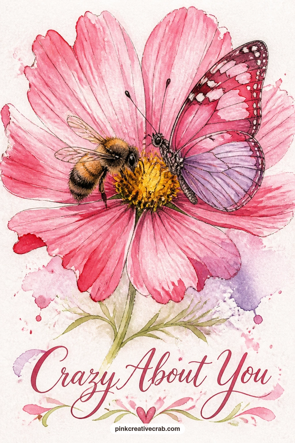
Cosmos flowers have a thin, delicate petal that paints well in just two strokes per petal, which makes room for a bee and butterfly to share the spotlight. Paint the cosmos first with eight slim petals radiating from a small yellow center, using a light touch so each petal keeps a visible gap of white paper between it and its neighbors.
Once the flower dries, add the bee perched on one side of the center and the butterfly resting on a petal on the other side, keeping both insects small so the delicate flower does not get overwhelmed. A thin ink line down the center of the butterfly’s wings and a few ink strokes for the bee’s stripes finish the detail.
Cosmos petals can look stiff if painted with a hard-edged brush, so load your brush generously with water and let the pigment feather slightly at each petal tip. If pink cosmos is not a color you can mix confidently, a simple five-petal daisy shape in any soft color carries the same idea.
Leave the center small and bright so both visitors have an obvious landing spot to paint toward.
Palette: Rose Pink,Warm Yellow,Payne’s Grey
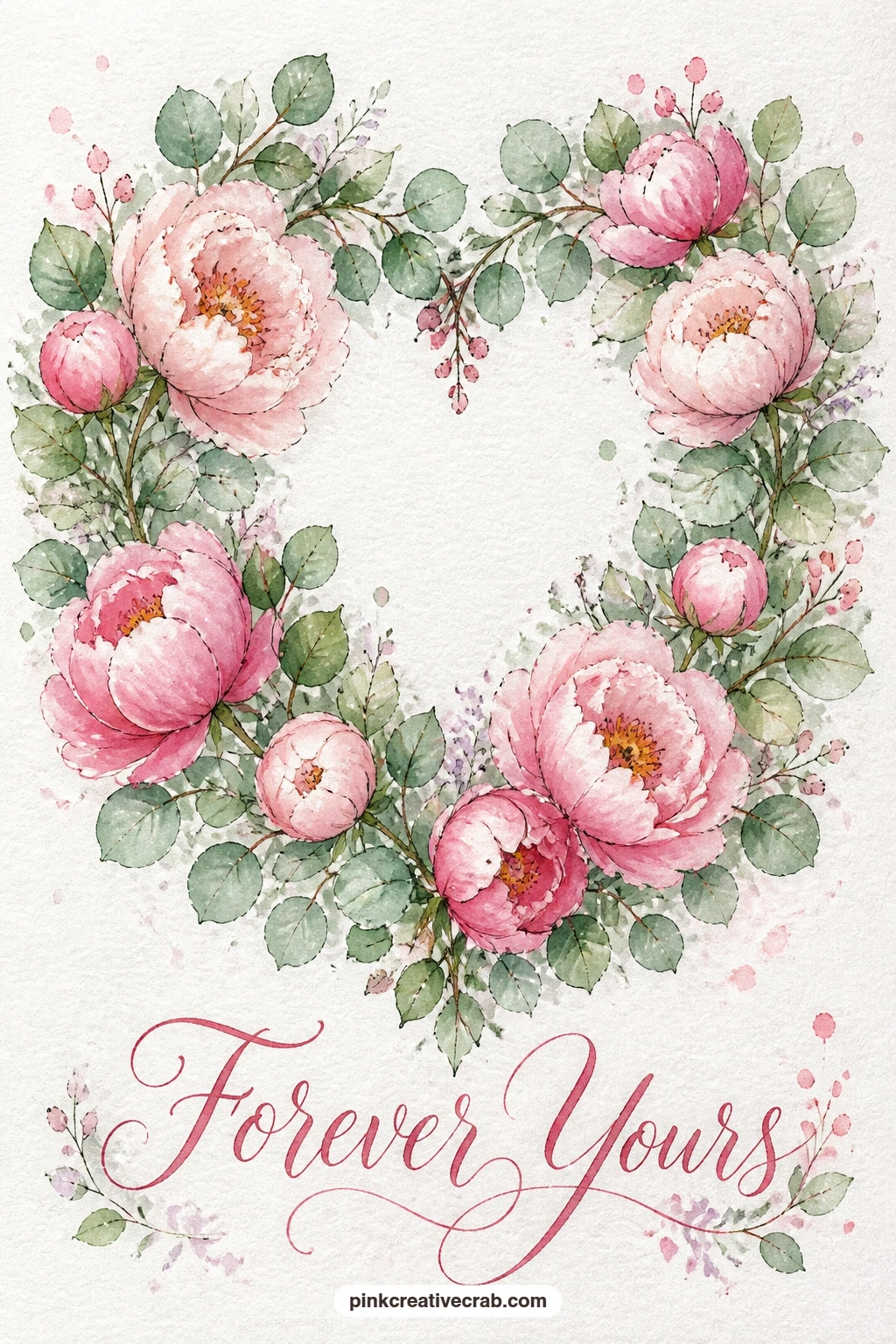
This wreath leans on greenery more than flowers, so plan the balance before you paint: a heart wreath of eucalyptus leaves and blush peonies against a linen-colored wall. Paint the eucalyptus first as small rounded leaf pairs in a cool sage green, working around your pencil heart guide and leaving gaps for three or four peonies to sit into later.
Build the peonies next in blush pink using the same wet-into-wet petal technique as the earlier peony idea, letting the pink bloom softly against the already-dry green leaves. Space the peonies unevenly around the heart, two together on one side and one alone on the other, which reads more natural than perfect symmetry.
A linen wall background only needs the faintest warm grey wash behind the wreath, added last so it does not bleed into the greenery. If sage green is not in your palette, mixing a touch of grey into your regular leaf green gets you close enough for this softer, dustier look.
Keep the eucalyptus leaves small and the peonies large so the size contrast reads clearly across the card.
Palette: Sage Green,Blush Pink,Warm Grey
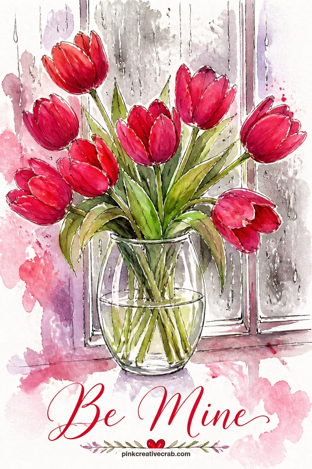
Rain on glass gives you an excuse to practice transparency, so this still life pairs red tulips with a rainy window behind them. Paint the window first as a soft grey-blue wash with a few vertical streaks lifted out using a clean damp brush while the paint is still wet, suggesting rain tracks down the glass.
Once the window background is dry, paint the vase as a simple clear shape using only pale grey shadows, then build the tulip heads inside and above it in cherry red, working from the furthest flowers to the nearest so each layer stays crisp. The water line inside the vase is just one thin curved stroke of slightly darker grey.
Rainy windows can look muddy if the grey wash goes on too dark behind the flowers, so keep that background pale enough that the red tulips still pop forward clearly. If lifting rain streaks with a damp brush feels tricky, a few straight lines drawn in white gel pen after the wash dries give the same effect with more control.
Let the window wash dry completely before the vase goes in, or the two will bleed into an unreadable grey blur.
You Will Need
- white gel pen (optional for rain streaks)
Palette: Cherry Red,Soft Blue,Pale Grey
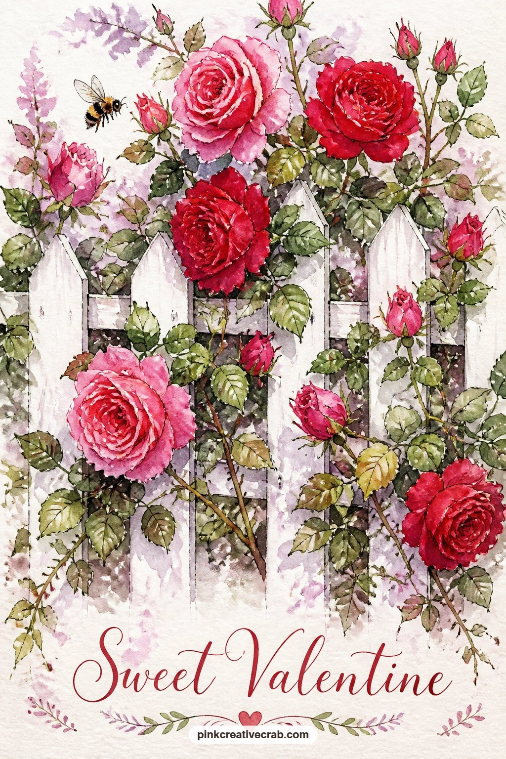
Fences give structure to a climbing rose, so lay down the straight lines first: a rose bush climbing over a white picket fence with one bee visiting. Pencil in the fence as a simple row of evenly spaced pickets, then paint only the shadows and gaps between them, leaving the pickets themselves as white paper.
Once the fence shadows are dry, build the rose bush climbing diagonally across it in pink and red clusters, letting a few stems and leaves spill both in front of and behind the pickets to suggest real growth rather than a flat sticker of flowers. The bee goes in last, small and hovering near one open bloom.
Picket fences can look crooked if the spacing drifts as you paint across the card, so mark light pencil ticks at even intervals before starting and check them with a quick glance rather than a ruler, which keeps the slight hand-drawn wobble that suits watercolor. If straight pickets feel stressful, a loose wooden lattice in the background reads just as charmingly without needing even spacing at all.
Add fine ink lines along the picket edges once the paint is dry for a crisp finish.
Palette: Rose Pink,Cherry Red,Fresh Leaf Green
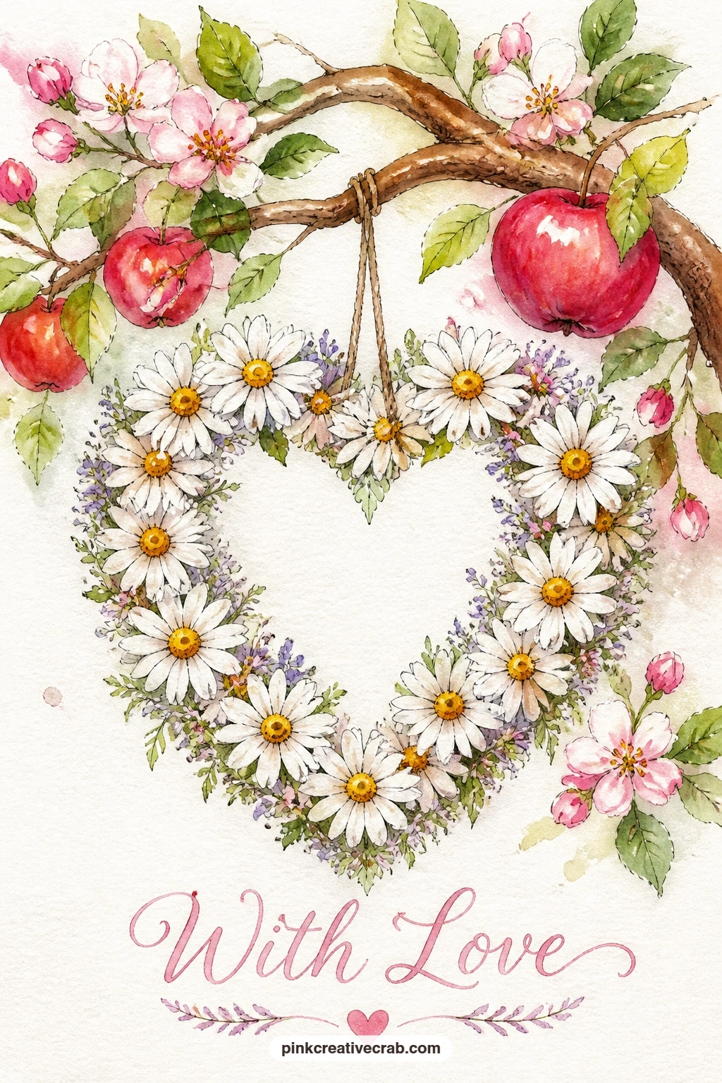
Hanging this wreath from a branch instead of a door changes how the whole card reads, so start with the branch: a single curved apple tree branch with a heart wreath of daisies hanging from it. Paint the branch first in warm brown with a few small leaf clusters, keeping the line loose rather than perfectly straight.
Build the daisy wreath below it in simple five-petal white flowers with yellow centers, arranged around your pencil heart guide, letting the white of the paper do most of the petal work and adding only pale grey shadow strokes to suggest their folds. A thin ribbon or string connecting the wreath to the branch can be one quick ink line.
This wreath goes wrong most often when the daisies get too detailed and heavy, turning simple white flowers into something fussy, so keep every petal to a single confident stroke. If a bare branch feels too sparse, two or three small painted leaves along its length fill the space without competing with the wreath.
One concrete tip: paint the wreath’s heart shape first in pencil only, then build daisies around that outline rather than trying to judge the heart shape as you add flowers.
Palette: Warm Brown,Fresh Leaf Green,Warm Yellow
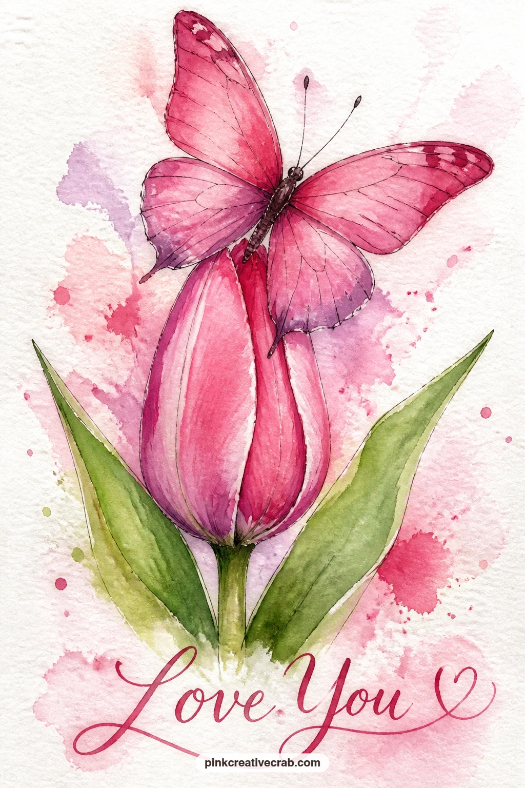
A closed tulip bud gives you a cleaner shape than an open bloom, which makes this a nice idea for practicing a butterfly’s resting pose. Paint the tulip bud first as a tall, simple closed cup shape in soft pink with a slightly darker pink line down its center seam, then let it dry fully.
Build the butterfly resting on the bud’s curved top in rose-pink wings that echo the tulip’s own color, a nice visual rhyme between insect and flower. Keep the wings angled slightly open, as if just landed, and add antennae and wing veins in fine ink only once the pink paint is completely dry.
Matching the butterfly’s color this closely to the flower’s can make the two blend together and lose definition, so add one small patch of a contrasting color, a touch of lilac or cream, somewhere on the wings to separate them visually from the bud. If a closed bud feels too plain on its own, one simple green leaf behind it adds just enough context.
This pairing works well as a smaller card insert too, alongside a larger painted front.
Palette: Rose Pink,Soft Lilac,Fresh Leaf Green
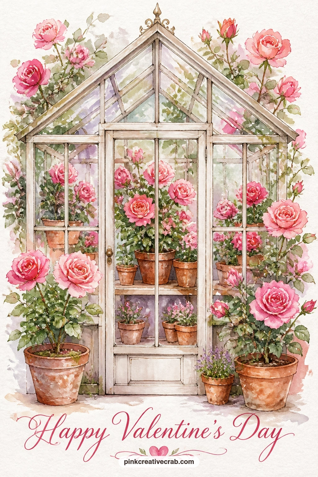
Glass panes add a structural challenge worth trying here: a small greenhouse interior filled with potted pink roses. Pencil a simple grid for the greenhouse panes first, then paint each pane as a separate pale wash, varying the tone slightly from square to square so the glass does not look like one flat sheet.
Once the panes dry, add rows of potted roses inside in warm terracotta pots topped with rounded pink blooms, keeping the pots simple triangular shapes and the roses loose clusters rather than detailed flowers. A faint horizon line of green at the bottom grounds the greenhouse floor.
The eye level matters more than it seems: paint this greenhouse as if you are standing just outside at the same height as the pots, not looking down from above, and the whole scene reads as an inviting little world rather than a flat diagram. If a full pane grid feels like too much, three or four large panes convey the same greenhouse feeling with far less work.
Let each pane dry before painting its neighbor so the pale washes stay distinct and glass-like.
Palette: Rose Pink,Terracotta,Soft Blue
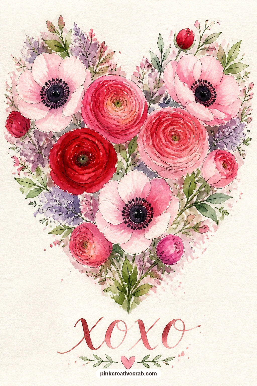
Switching your paper tone can lift this one above the others, so consider a cream or ivory card stock here: anemones and ranunculus arranged into a heart shape with no vase or setting at all. Pencil the heart outline lightly, then fill it with a mix of flower types, anemones with their dark centers and simple round petals, ranunculus with their tightly layered rings.
Paint the ranunculus first since their layered petals need patience, building up rings of pink from the center outward and letting each ring dry slightly before the next so they keep their defined edges. Fill remaining gaps in the heart with anemones, using a dark center dot surrounded by a loose circle of white or pale pink petals.
This arrangement can read as a messy blob rather than a heart if the outer edge is not protected, so periodically hold the card at arm’s length to check the heart silhouette is still clear against the paper. If ranunculus feels too fussy to layer, simple rose clusters fill the same heart shape with less precision needed.
Cream paper lets the white anemone petals glow rather than disappearing into a stark white background.
Palette: Blush Pink,Cherry Red,Payne’s Grey
Small closed rosebuds paint faster than full blooms, which makes this wreath a quick one to finish: red berries and tight rosebuds arranged in a heart on a front door. Paint the door first as a flat wash in a warm, muted color, leaving a pale rectangle for a door panel if you like the extra detail, then let it dry completely.
Build the wreath on top in alternating clusters, small round cherry red berries dotted in groups of three, and tight rosebud shapes painted as simple pointed ovals in deeper pink. Greenery threads between both, just a few curved leaf strokes holding the heart shape together.
Berries can look flat and sticker-like if they are all painted the exact same size, so vary each cluster slightly, two larger berries and one smaller, which reads as more natural clustering. If a painted door feels like too much setup, this wreath floats just as well directly on white paper with no door at all.
A fine ink line around the door’s edge, added once dry, gives the whole scene a crisp finished look.

Palette: Cherry Red,Rose Pink,Fresh Leaf Green
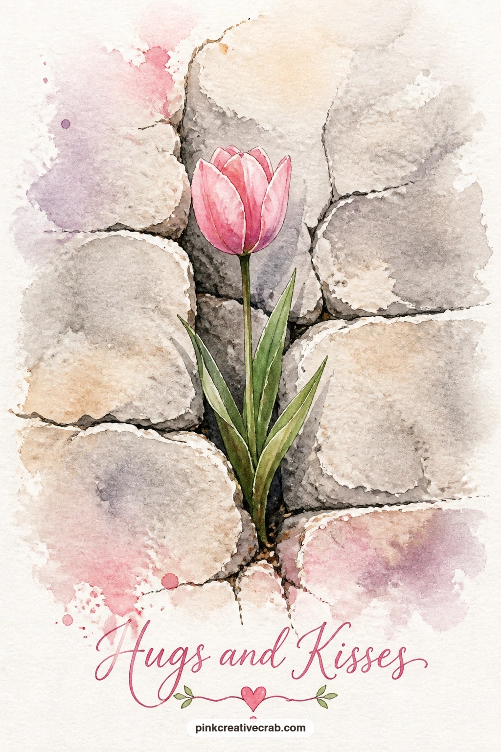
This idea rewards restraint, since the whole charm is one small flower against a large plain surface: a single pink tulip growing from a crack in a stone wall. Paint the stone wall first using a dry brush dragged across the paper in pale grey and warm beige, letting the paper’s texture break up the stroke for a believable stone surface.
Leave or scratch a thin jagged line partway through the wall for the crack, then paint the tulip emerging from it, a single stem rising with one or two leaves and a closed or half-open pink head at the top. Keep the tulip noticeably smaller in scale than the wall around it, which is exactly what makes this image feel tender rather than ordinary.
This piece is quick: a ten-minute version uses one flat grey wash for the entire wall and a simple tulip silhouette on top. A forty-minute version builds the wall from several dry-brush layers in slightly different greys and beiges, giving real texture and depth before the tulip goes in.
If dry brush technique feels unfamiliar, a damp sponge dabbed lightly over dry grey paint gives a similar rough stone texture.
Palette: Pale Grey,Warm Beige,Blush Pink
Seen from above, a flower bed shaped like a heart gives this idea its own small puzzle: keeping the heart readable from a bird’s-eye view. Pencil the heart shape as if looking straight down on a garden bed, then fill it with rows of simple tulip heads in pink and red, painted as small ovals rather than detailed side-view flowers since you are looking down on them.
Add a thin border of green around the heart’s edge to separate the bed from the park lawn around it, painted in a slightly darker green than the lawn itself. The bee goes in last, hovering just above the bed at a small scale, painted with a soft dry-brush body so its edges blur gently rather than sitting as a hard sticker on top.
Bird’s-eye views of flower beds often collapse into a flat pattern without the perspective cue of a slightly larger scale near the bottom of the card and slightly smaller near the top, which suggests the ground receding. If an aerial tulip bed feels tricky to picture, look at a photo of a public park flower bed from above before you start.
Keep the surrounding lawn as one simple flat green wash so the heart shape stands out clearly.

Palette: Rose Pink,Cherry Red,Fresh Leaf Green
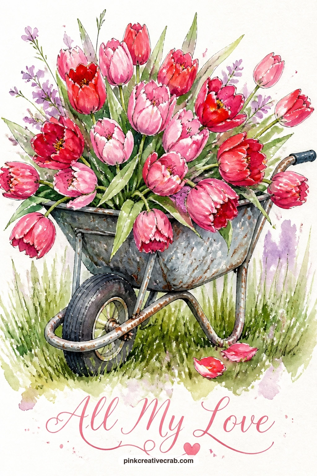
A wheelbarrow’s single wheel and simple metal body make a nice shape study before the tulips take over: a wheelbarrow full of pink and red tulips sitting in a field. Paint the wheelbarrow first in a weathered grey-green or rust color, keeping its basket shape simple and leaving the wheel as a plain circle with a few spoke lines in ink added later.
Fill the basket generously with tulip heads in both pink and red, overlapping them densely near the rim and letting a few spill over the edge toward the ground, which sells the idea of a truly full load. Stems and leaves underneath the overflow add a bit of green without needing much detail.
Wheelbarrows can look flat if the wheel and legs do not sit convincingly on the ground, so add a small soft shadow beneath the whole object before anything else, letting that shadow anchor the wheelbarrow visually once the tulips go in on top. If painting a wheel confidently feels daunting, a simple circle traced from a coin or bottle cap keeps it perfectly round.
A loose green field wash behind the wheelbarrow, added last, finishes the scene without extra detail.
You Will Need
- small round object to trace the wheel, such as a bottle cap
Palette: Cherry Red,Rose Pink,Rust Grey
This one borrows the flattened, papery look of real pressed flowers, which actually makes it easier to paint than a dimensional bouquet: a pressed-flower heart of pansies and violets on cream paper. Paint each pansy as a flat frontal shape, five simple petals in purple and yellow with no shading to suggest depth, since pressed flowers read as flat on the page.
Arrange violets in the gaps between pansies, tiny five-petal shapes in deeper purple, and keep every flower facing straight out at the viewer rather than at an angle, which is the key visual cue that sells the pressed-flower look. Build the heart shape by density of flowers rather than by an outlined border, letting the cluster itself define the edges.
The biggest risk here is accidentally adding shadow or dimension out of habit, which breaks the flat pressed-flower illusion immediately, so keep every petal as one single flat color with at most one slightly darker petal vein line in ink. If purple paint runs thin in your set, a mix of red and blue gets you a workable violet shade.
Cream paper suits this idea especially well, echoing the look of a real pressed-flower page.
Palette: Deep Purple,Warm Yellow,Soft Lilac
For real texture inspiration here, the pressed flower garden pages show how flat, papery blooms can still feel full of life.
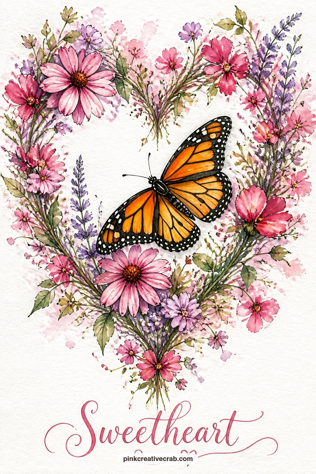
Give the monarch’s bold pattern center stage against a looser, wilder wreath than the tidy rose ones earlier: a monarch butterfly resting on a heart-shaped wreath of mixed wildflowers. Paint the wreath first with a loose variety of small flower shapes and colors, pink, lilac and a touch of yellow, scattered around your pencil heart guide without worrying about neat rows.
Once the wreath dries, paint the monarch in its signature orange and black pattern, which is the one place in this whole list where a bold, graphic color belongs. Use fine ink lines to map out the black vein pattern across the orange wings before filling in the black sections, which keeps the famous pattern readable rather than muddy.
Monarch wings lose their identity fast if the black lines go on too thick or shaky, so practice the wing outline on scrap paper once before committing to the card front. If orange feels hard to mix confidently, a warm cadmium orange or tangerine from a basic set gets close enough for this scale.
Let the wreath’s busier colors stay a little muted so the monarch’s orange reads as the brightest thing on the page.
Palette: Warm Orange,Payne’s Grey,Soft Lilac
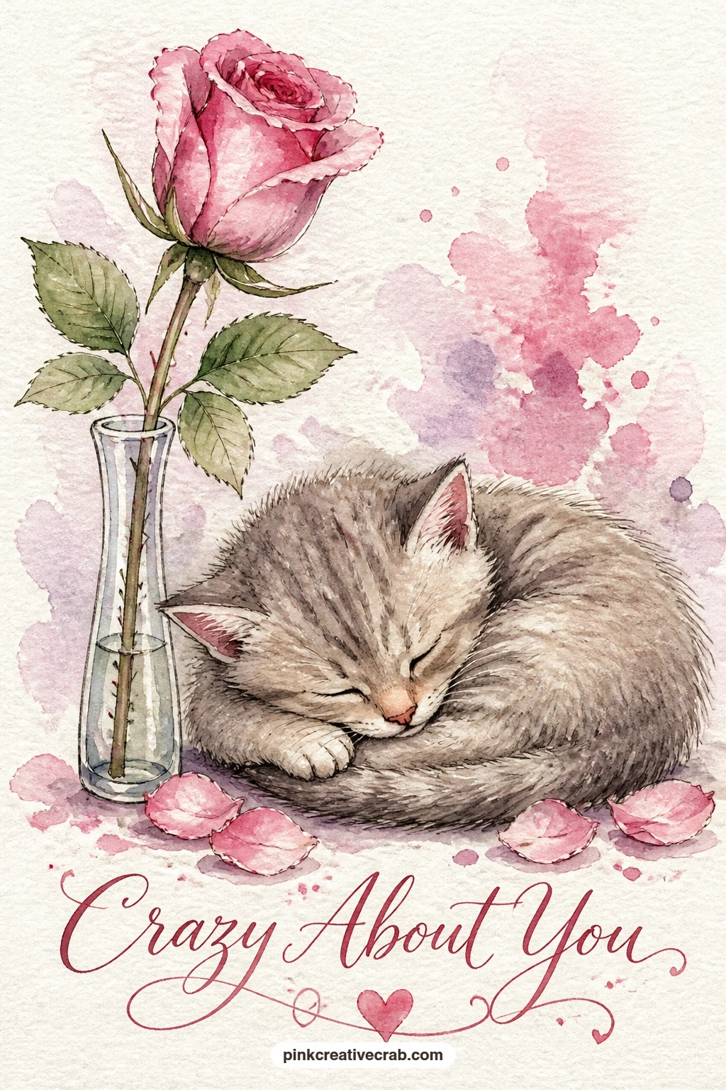
Adding one small creature changes the whole feeling of a still life, so this idea pairs a single pink rose in a bud vase with a sleeping kitten curled beside it. Paint the bud vase first as a slim, simple glass shape with just a pale grey shadow line, then add the rose on top in soft pink, keeping it as the only flower so it does not compete with the kitten for attention.
Build the kitten curled into a loose comma shape beside the vase, using warm grey or soft orange fur tones and one tiny dark nose and closed eyes. Keep the kitten’s outline soft rather than sharply defined, since a sleeping animal reads calmer with gentle, blurred edges than with a hard ink outline.
Kittens can end up looking stiff or doll-like if the curve of the sleeping body is too round and even, so vary the curve, a slightly flatter back, a tucked paw, an ear that flops to one side. If painting fur texture feels daunting, a few short dry-brush strokes over the dried base color suggest fur without drawing each strand.
Keep the whole palette soft and warm so rose and kitten feel like one gentle scene rather than two separate subjects.
Palette: Blush Pink,Warm Grey,Soft Orange
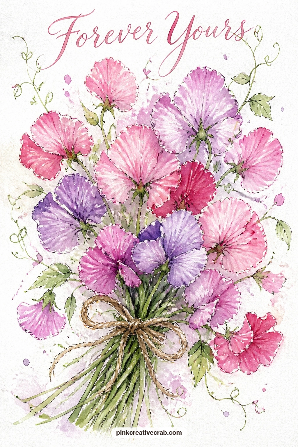
Twine gives you a small but satisfying detail to finish this still life: a loose bunch of sweet peas tied with twine on a weathered garden table. Paint the sweet pea blooms first in soft lilac and blush pink, using the same ruffled two or three petal strokes from the earlier sweet pea wreath, bunched together into one informal handful rather than an arranged bouquet.
Once the flowers dry, add the stems trailing down and the twine wrapped once or twice around the bunch, painted as a simple warm tan line with a small bow or loose knot at the front. The garden table beneath needs only a few horizontal grey-brown strokes to suggest weathered wood.
Sweet peas can look like a shapeless pink smudge if every bloom faces the same direction, so angle a few heads up, a few sideways and a couple drooping down, which is closer to how a real handful of garden flowers falls. If twine feels fiddly in paint, a fine brown or tan marker drawn over the dry flowers gives a cleaner line.
Leave the stems loose and a little wild rather than neatly parallel for the most natural look.
Palette: Soft Lilac,Blush Pink,Warm Tan
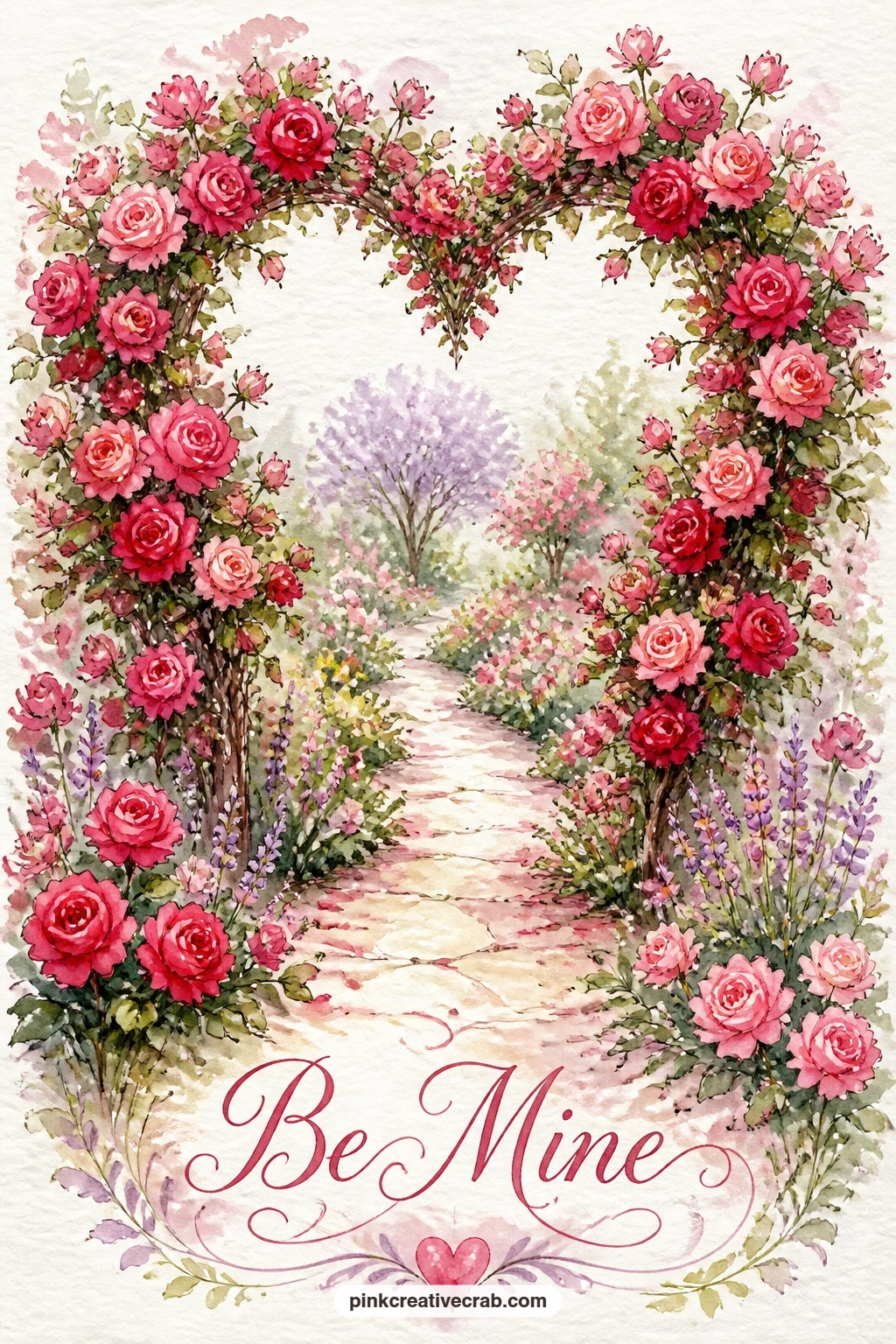
This is the most ambitious wreath shape in the whole list, so plan the structure carefully before any paint goes down: a heart-shaped arch of climbing roses over a garden path. Pencil two curved lines meeting at a point near the top and spreading into an arch shape that frames a path running underneath, essentially a heart turned into a doorway.
Build climbing roses densely along both curved arms of the arch in pink and red, letting a few loose sprays break the outline here and there so it reads as living growth rather than a stiff topiary shape. The path beneath can be as simple as two converging lines in pale grey-brown leading the eye through the arch toward a small distant point.
Arches like this can lose their heart shape entirely if the two sides are painted at very different times with your hand in a different position, so sketch the full heart outline in pencil first and keep glancing at both sides together as you add roses to each arm. If a full arch feels like too much for one sitting, painting just the top curve of the heart with roses trailing off both ends still reads clearly as this idea.
Keep the path pale and simple so the rose-covered arch stays the clear focus of the card.
Palette: Rose Pink,Cherry Red,Fresh Leaf Green
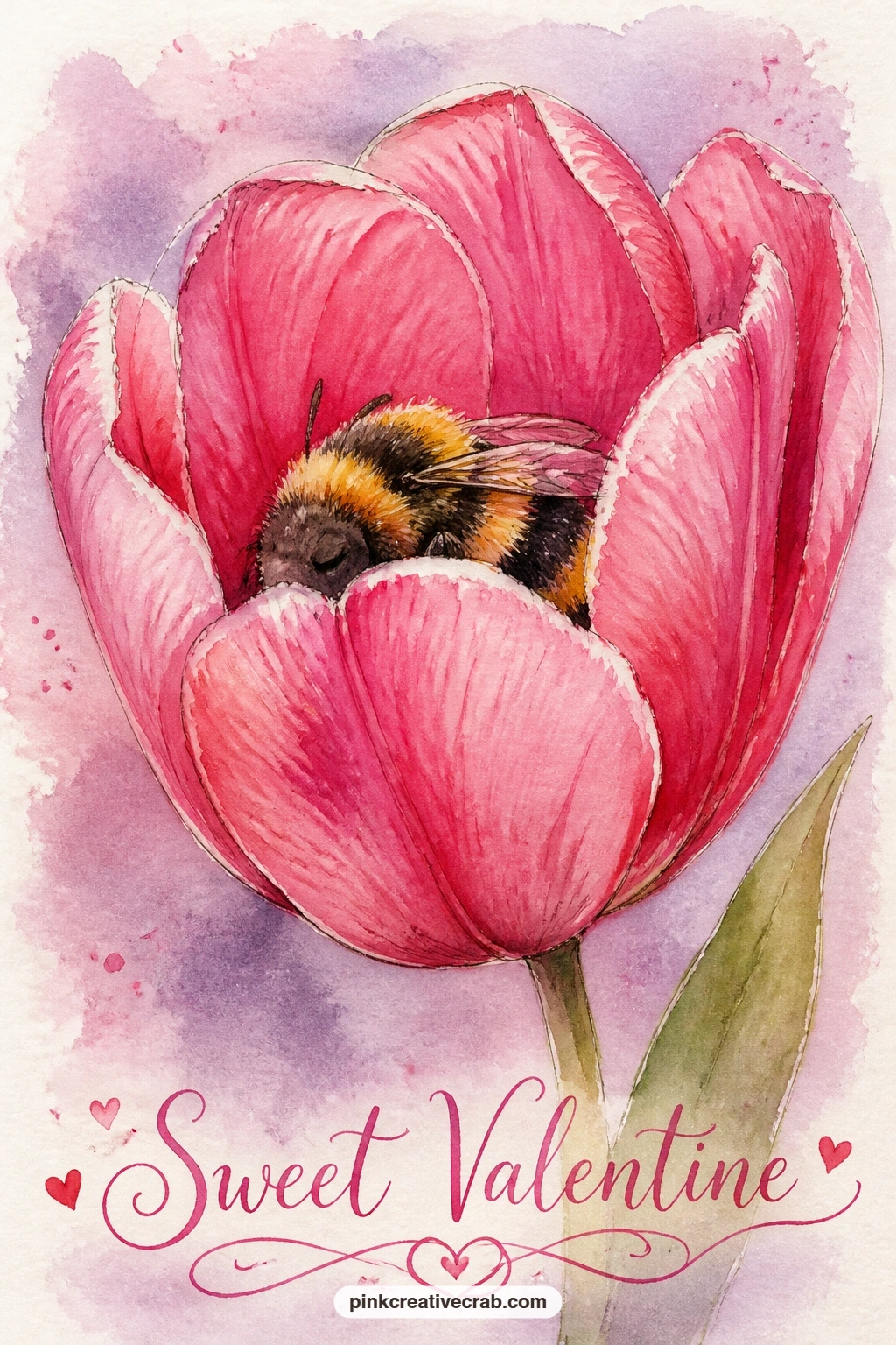
Dusk lighting gives this quiet scene its mood, so decide on the light source before mixing a single color: a bee asleep inside a pink tulip as evening falls. Paint the tulip first as a wide-open cup shape rather than closed, since the bee needs room to nestle inside, using a warmer, slightly deeper pink than your usual tulip color to suggest the dimmer evening light.
Once the tulip dries, paint the bee curled inside near the base of the petals, smaller and softer-edged than a bee in full daylight, using a dry brush so its outline blurs gently into the shadowed petal interior. A faint warm grey-lilac wash behind the tulip suggests the dusk sky without needing any other detail.
Dusk scenes often go wrong when painters forget to adjust every color for the dimmer light, leaving a tulip that looks like midday with a dark sky slapped behind it, so mix a touch of grey or lilac into all your colors here, not just the background. If a true dusk sky feels hard to judge, a simple lilac-grey wash reads as evening to most viewers without needing gradients or stars.
Let the petals dry fully before adding the bee so its soft edges blur only into the shadow you intend, not into wet pink paint.
Palette: Deep Pink,Warm Grey Lilac,Payne’s Grey
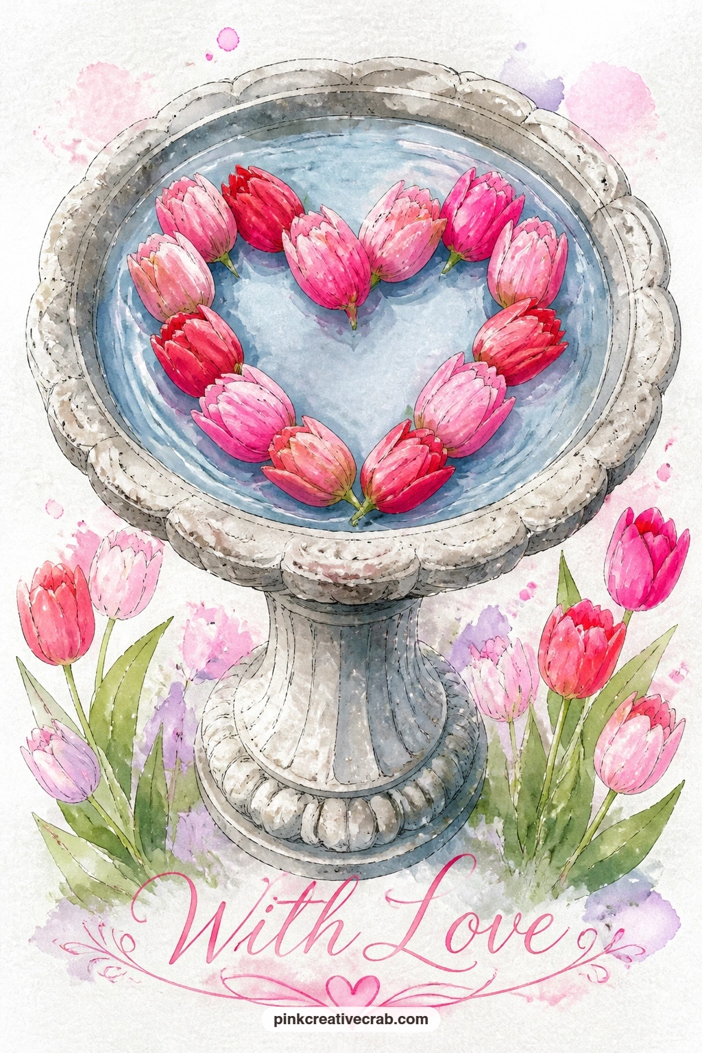
Floating flowers behave differently from growing ones, so study how they sit flat on water before painting: tulip heads arranged into a heart shape floating inside a stone birdbath. Paint the birdbath first as a simple wide bowl shape on a pedestal, using pale grey with a touch of texture from a dry brush for the stone surface.
Once the birdbath is dry, paint the water inside as a flat soft blue-grey wash, then add the tulip heads floating on top arranged into a heart shape, each flower painted as a simple top-down circular shape rather than a side view, since you are looking down into the water. A few faint ripple lines radiating from the flowers in a slightly darker blue suggest they have just settled onto the surface.
Floating flowers can look like they are standing upright in water rather than lying flat if you paint them with visible stems or shadows beneath, so leave stems out entirely and keep each tulip head as a flat colored circle. If a pedestal birdbath feels like too much structure, a simple round stone bowl sitting on the ground carries the same idea.
Keep the heart arrangement a little loose and uneven, since real floating flowers never sit in a perfectly neat shape.
Palette: Pale Grey,Soft Blue,Rose Pink
A hummingbird in motion asks for quick, confident brushwork rather than careful detail, so loosen your grip before starting: a hummingbird sipping from a deep red camellia. Paint the camellia first as a full, rounded bloom with overlapping rows of petals in cherry red, slightly darker toward the center where the bird’s beak will reach.
Once the flower dries, paint the hummingbird hovering just beside it with a few quick strokes for the body and a soft blur of color for the rapidly moving wings, using a nearly dry brush dragged sideways to suggest motion rather than a crisp wing shape. Keep the beak as one single confident ink line reaching toward the flower’s center.
Hummingbirds often end up stiff and static if every feather gets painted in careful detail, so trust a looser hand here more than almost anywhere else on this list; a blurred wing reads as motion far better than a precise one. If camellias are unfamiliar to paint, any full, rounded red flower shape serves the same purpose for this scene.
One concrete tip for today: paint the wings last, while your hand is loosest and least likely to overwork them.
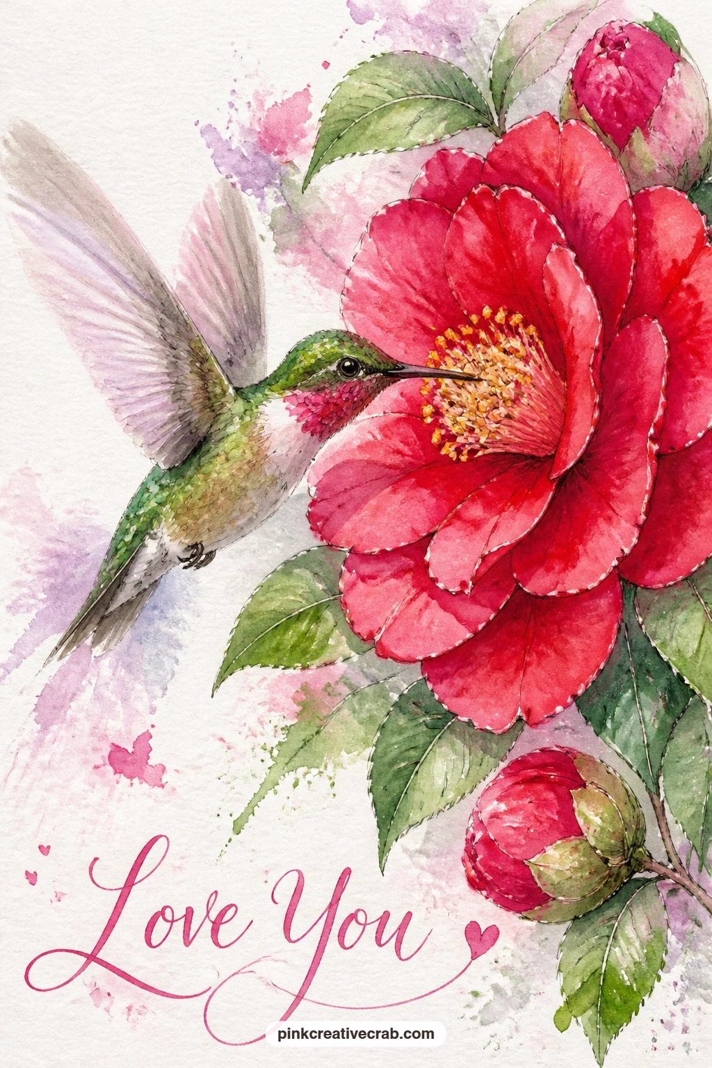
Palette: Cherry Red,Fresh Leaf Green,Payne’s Grey
A dried, autumnal palette makes a nice change of pace near the end of this list: a heart wreath of dried roses and wheat stalks on a cottage door. Paint the wheat stalks first in warm golden tan, using thin upward strokes with tiny forked tips to suggest grain heads, arranged loosely around your pencil heart guide.
Fill the remaining space with dried rose shapes in a muted dusty pink or soft terracotta rather than fresh bright pink, since dried roses have lost their brightest color and gained a papery texture instead. A dry brush dragged lightly over each dried rose once the base color sets adds just enough texture to suggest their crisp, faded petals.
This wreath can end up looking too similar to the fresh rose wreaths earlier if the colors stay too bright, so mute every color here with a touch of grey or brown mixed in, which is the real trick to a convincing dried-flower look. If wheat stalks feel fussy to paint individually, a few simple upward tan lines with no grain detail still suggest dried grasses well enough.
Keep the cottage door behind it a soft, worn color so the whole scene feels gently faded rather than fresh-cut.

Palette: Warm Golden Tan,Dusty Pink,Warm Brown
Looking at the cottage garden pages can help you picture the worn, faded colors that make a dried wreath feel right.
White flowers are really about shadow, not white paint, so keep that in mind for this still life: a jug of white tulips on a kitchen table with a small butterfly perched on the jug’s rim. Paint the jug first in a simple pale color with a thin ink outline, leaving its body mostly white paper and adding only soft grey shadow strokes where the form curves away from the light.
Build the tulip heads above the jug using the same pale grey shadow technique, since white tulips exist almost entirely as shape and shadow rather than color; a touch of soft blue-grey in the deepest folds keeps them from looking flat. The butterfly perched on the rim adds the one spot of real color on the card, painted in rose pink so it stands out clearly against all the white and pale grey around it.
White-on-white still lifes fall apart fast if every shadow is painted the exact same grey, so vary your shadow tone slightly between the jug and the flowers, cooler grey for the ceramic, warmer grey for the petals. If a kitchen table setting feels unnecessary, the jug and tulips float just as well on plain white paper with no table at all.
Let the jug dry completely before the butterfly goes on so its pink stays crisp against a settled white base.
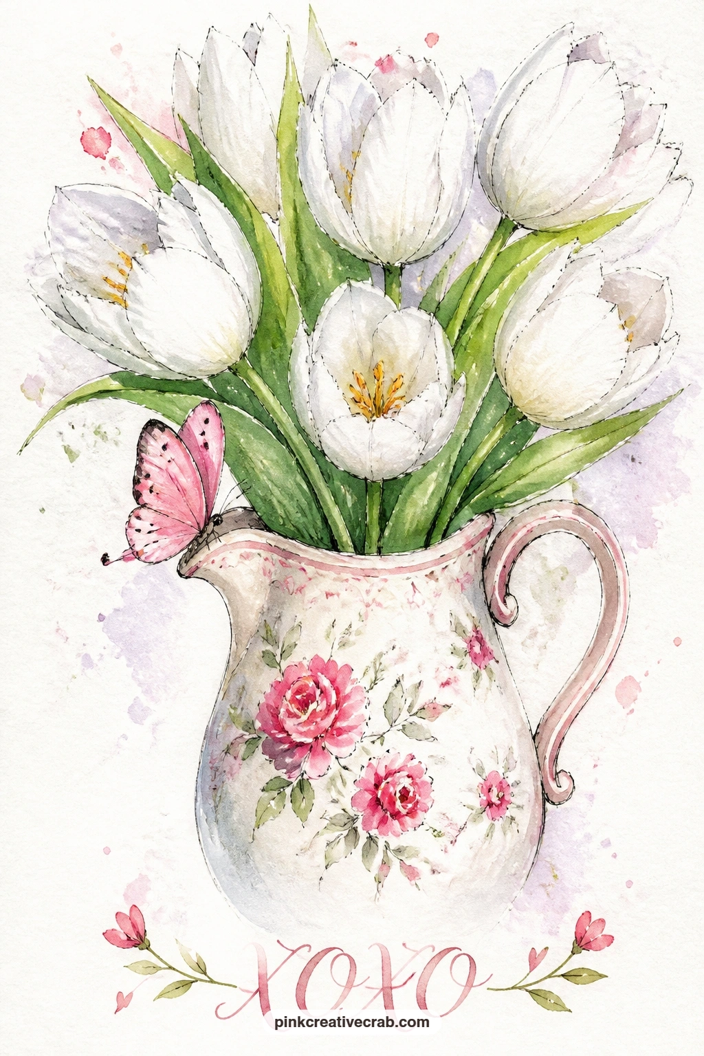
Palette: Pale Grey,Soft Blue Grey,Rose Pink
Closing out with one of the most elegant shapes on this list, a single magnolia branch in bloom gives you large, confident petals to finish on. Paint the branch first as one curving line in warm brown, then build each magnolia flower as five or six large rounded petals in soft pink fading to white at the tips, using the wet-into-wet technique so the color softens naturally outward.
Once the blooms are dry, add two butterflies resting at different points along the branch, one near a flower and one on the bare wood, which varies the composition and gives your eye two places to land. Keep both butterflies small relative to the large magnolia blooms so the flowers stay the clear focus of the card.
Magnolia petals can look stiff and papery if every petal is painted the exact same shape and size, so vary each one slightly, a little more open here, a little more curved there, the way real branches never repeat a bloom twice. If a full branch with several flowers feels like too much for today, one single large magnolia bloom with one butterfly carries the same quiet elegance.
As a last concrete tip across this whole list: keep a spare scrap of the same watercolor paper beside your card and test every new color mix there first, so the card front itself only ever sees colors you already know will work.
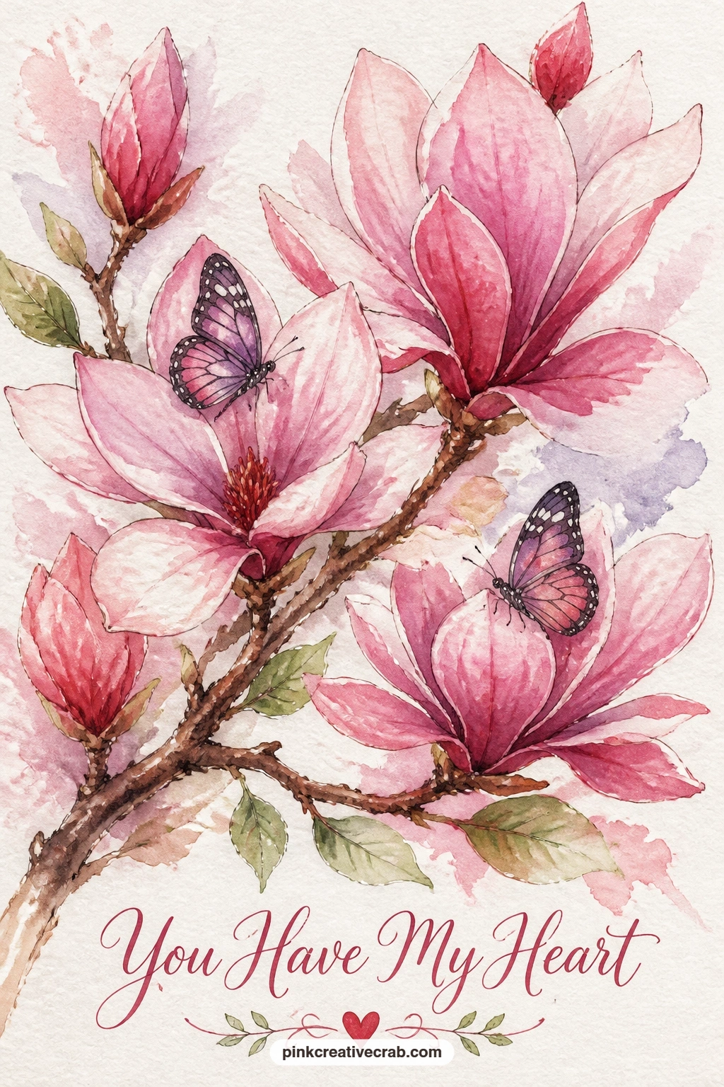
Palette: Blush Pink,Warm Brown,Rose Pink
If you enjoy painting flowering branches, the loose garden scenes in watercolor garden paintings for summer make a nice next project.
What to Do Next
Pick one idea that matches the time you have today, whether that is a quick tulip bud or a fuller rose wreath, and set up a scrap of the same paper beside your card to test colors first. Tape your card blank down, sketch lightly if the shape calls for it, and let the painting dry flat before you fold anything.
Frequently Asked Questions
What paper works best for handmade valentine cards painted in watercolor?
Cold press watercolor paper works best because it holds washes without buckling. Pre-cut watercolor card blanks save trimming time, or glue a painted panel onto a folded card once it dries fully.
How do I stop my card front from warping after painting?
Tape the paper down on all four sides before you start and let it dry flat under light weight once finished. Thicker paper, at least 140 pound, resists warping far better than thin sketch paper.
Can I skip the pencil sketch and paint these ideas directly?
Simple single-flower ideas can go straight to paint if you feel confident with proportion. Wreaths, arches and anything heart-shaped benefit from a light pencil guide first, since a lopsided heart is hard to fix once wet.
What if I do not have the exact paint colors listed in an idea?
Mix close substitutes from a basic set: red and white make blush pink, red and blue make a usable lilac. The palettes given are a guide to the mood, not a strict shopping list.
How small should I paint these designs for a standard card?
Most of these ideas suit a card front around four by six inches or smaller. Keep the subject large within that space, filling most of the panel, rather than shrinking it to leave wide white borders.
Have any thoughts?
Share your reaction or leave a quick response — we’d love to hear what you think!
-
 0
-
0
-
0
-
0
-
0
-
0


