
Wedding card ideas are the perfect small project for a loose watercolor afternoon: a tiny scene instead of a big composition, finished before the paint has even had time to dry twice over. Each one fits on a single card front, so you can paint the whole story of a wedding day without filling a big sheet, from a rose-covered chapel door to a rowboat drifting on a misty lake.
Below you will find twenty seven of them, ordered from the simplest shapes to the busier little scenes, each with its own palette, its own trick and one tip you can use the moment you pick up a brush. Keep faces simple throughout, just a soft shape and maybe two dots, and let the color and the setting carry the romance instead.
Using these images: free for personal projects such as printing, coloring, cards, journals and gifts. Handmade items that include them may be sold up to 30 pieces per design. More than that is commercial use and is not permitted, and neither is selling or sharing the images themselves or passing them off as your own. Please ask before any other use.
Start with the chapel itself, since a little white chapel is the easiest shape on this whole list to get right. Pencil a simple rectangle with a peaked roof and one arched door, keeping the walls narrow so the roses have room to climb.
Measure the door against the width of the chapel first: it should sit at about a third of the total width, centered, or the whole building reads as lopsided before a drop of paint goes on. Wash the walls in ivory, let that dry fully, then drop loose blush pink dots and small sage leaves up both sides of the door and along the roofline.
Where beginners lose the shape is painting the roses before the building is dry, so the pink bleeds into the walls. If that happens, just let it bleed on purpose and call it a sunlit blush instead of a mistake.
Finish with an ink pen for the door, a cross or simple finial on the roof, and a few fine lines inside the rose clusters once everything is bone dry.
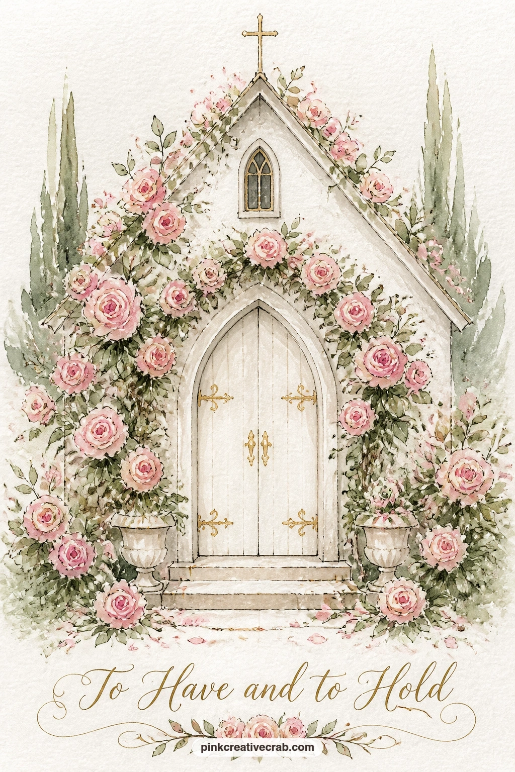
Palette: Titanium White,Opera Pink,Sap Green,Ivory
Build on that same loose wash technique for a garden arch of peonies, but this time let the structure come first and the flowers pile on after. Draw two curved side posts meeting at the top in a simple arch, then two small chair shapes sitting empty underneath, one slightly smaller to suggest it sits a touch further back.
Painting peonies in watercolor works best as rounded blush shapes with a deeper pink center, dropped in while the paper is still damp so the petals feather into each other rather than sitting as hard circles. Cluster them thick along the top of the arch and thinner down the sides.
The chairs are the part that goes wrong fastest, since too much detail makes them look stiff. Keep each one to four or five ink lines, a seat, a back, two legs, nothing more. If you want a softer practice run first, the ideas in this watercolor garden painting guide cover the same loose flower washes.
Swap in dried larkspur or garden roses for the arch if peonies feel fussy, the same rounded cluster technique works for either.
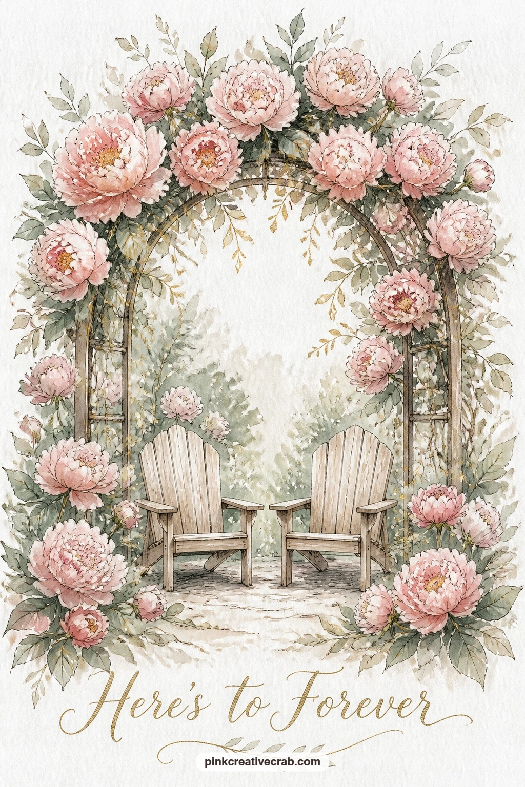
Palette: Opera Pink,Quinacridone Rose,Sap Green,Gold Ochre
After two still scenes, a vintage getaway car trailing tin cans down a country lane brings in motion and a stronger sense of perspective. Set your eye level low, near the bottom third of the card, so the car sits close to you and the lane stretches away small behind it.
Block the car body first in a simple rounded rectangle, ivory or soft sage, with two curved fenders and small dark wheels. The lane behind it should narrow sharply toward a far point, with two thin lines of trees getting smaller and lighter in color as they recede, which is what actually sells the distance.
Tin cans are easiest as a loose zigzag of small ovals on a thread of ink line trailing off the back bumper, no need to paint each one in full detail. If the car shape feels intimidating, simplify it to a boxy silhouette with just the windows and wheels picked out in ink.
One concrete tip: paint the far trees first in the palest wash, then the near ones darker, and the depth appears almost on its own.
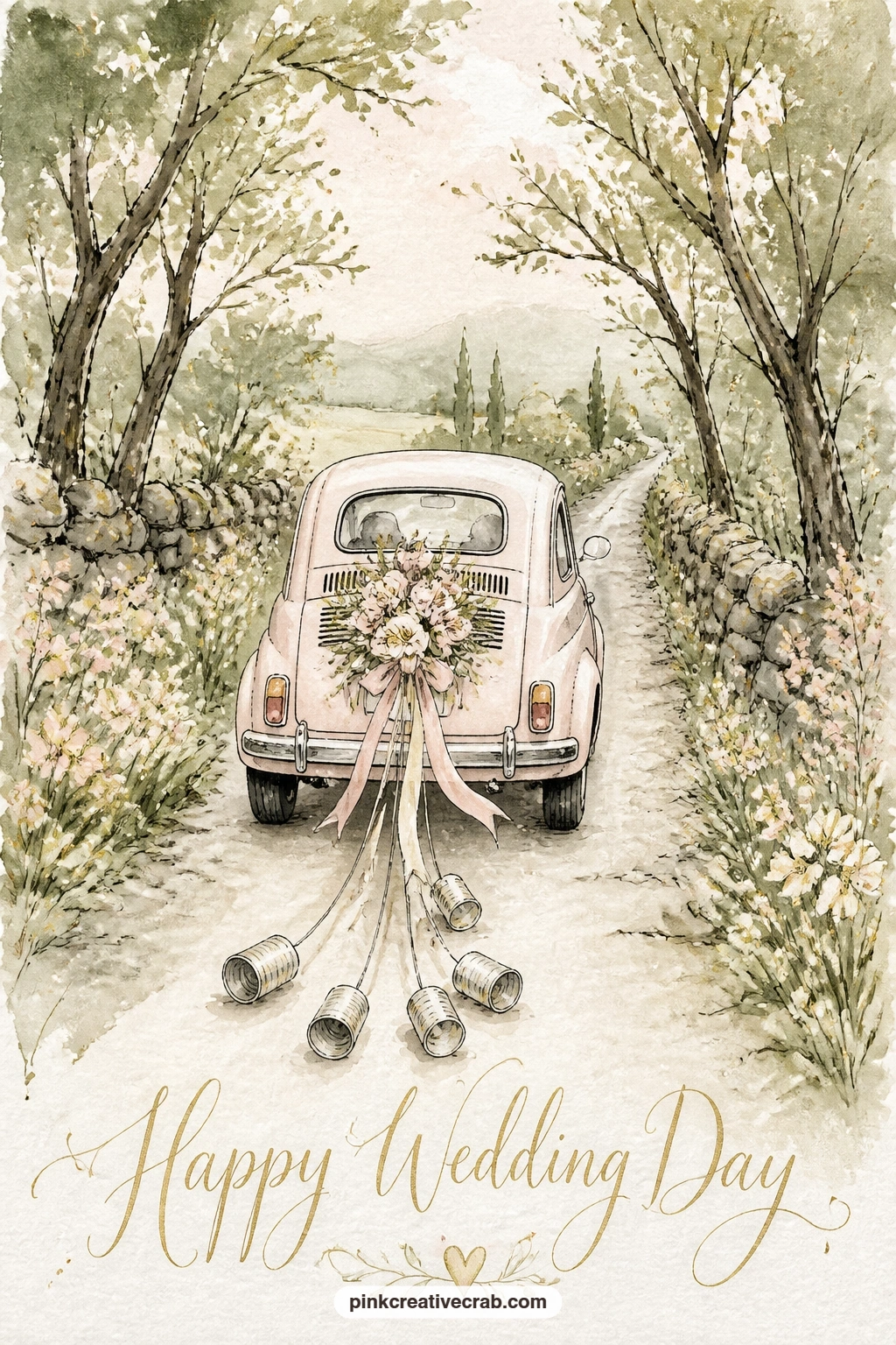
Palette: Ivory,Payne’s Grey,Sap Green,Gold Ochre
Slow the pace again with two swans touching beaks on a lake in front of a stone manor, a quiet subject that rewards a careful hand more than a bold one. Place the manor small along the top third of the card, just a rectangle with a few window dashes and a hint of roofline, then give the lake the bottom two thirds.
Paint the water first as a soft horizontal wash in pale sage and grey, leaving two curved white shapes untouched for the swans, since white paper reads brighter than any white paint you could mix. Once dry, add the faintest grey shadow under each swan body to settle them onto the water.
The necks are the trickiest part: curve them toward each other so the heads nearly meet, and keep the beaks as two small orange triangles touching at the tip. If the curve looks stiff, loosen your wrist and redraw it larger rather than trying to fix a tight line.
No swans nearby to reference? A pair of doves works just as well lower in the scene, resting instead of swimming.
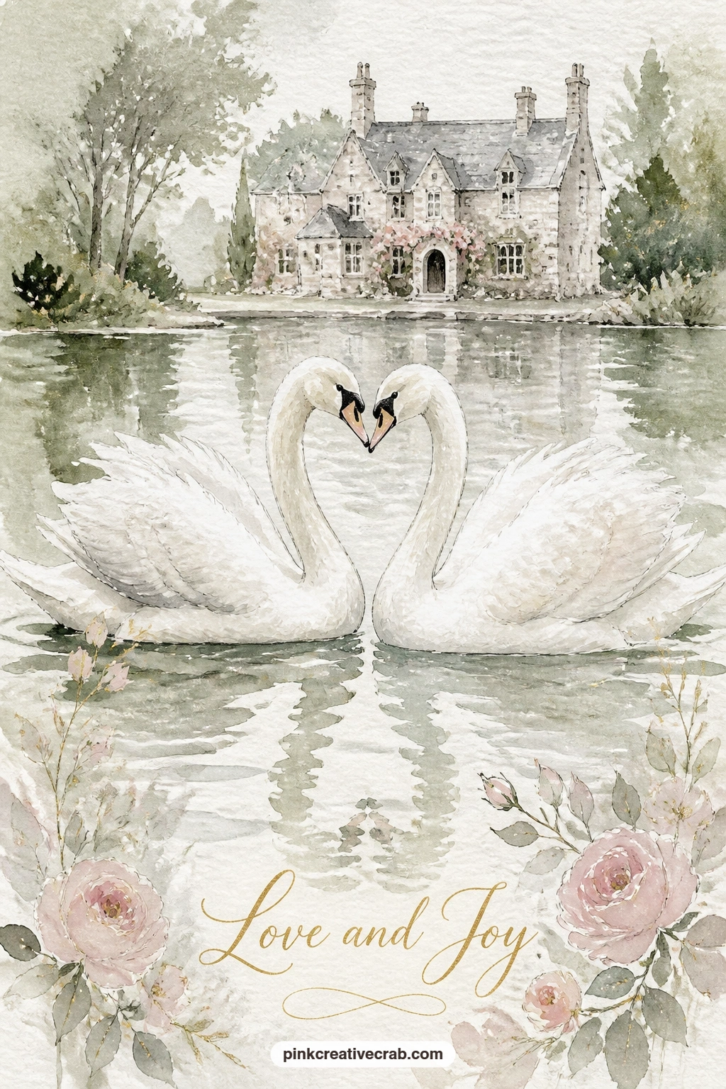
Palette: Payne’s Grey,Sap Green,Ivory,Gold Ochre
Reserve the swan shapes with masking fluid before you wash in the lake, then peel it off once dry for perfectly crisp white edges against the water.
Move from scenery to an object with a three tier wedding cake on a lace table under an apple tree, a good subject for practicing stacked proportion. Draw three ovals for the cake tiers, each one noticeably narrower than the one below, with the gap between each tier roughly equal so the stack reads as steady rather than leaning.
Wash the cake in ivory with the faintest grey shadow under each tier edge to separate the layers, then dot gold and blush icing details along the top only, since too much decoration on every tier makes it look busy rather than elegant.
The lace tablecloth is just a scalloped ink edge along the table line, a quick row of small curves, no need to paint actual lace pattern. Above the cake, a loose cluster of green leaves and a few pale pink apple blossoms from the tree can hang into the top corner of the card.
If stacking three tiers feels like a lot, drop it to two, the same narrowing-oval rule still applies.
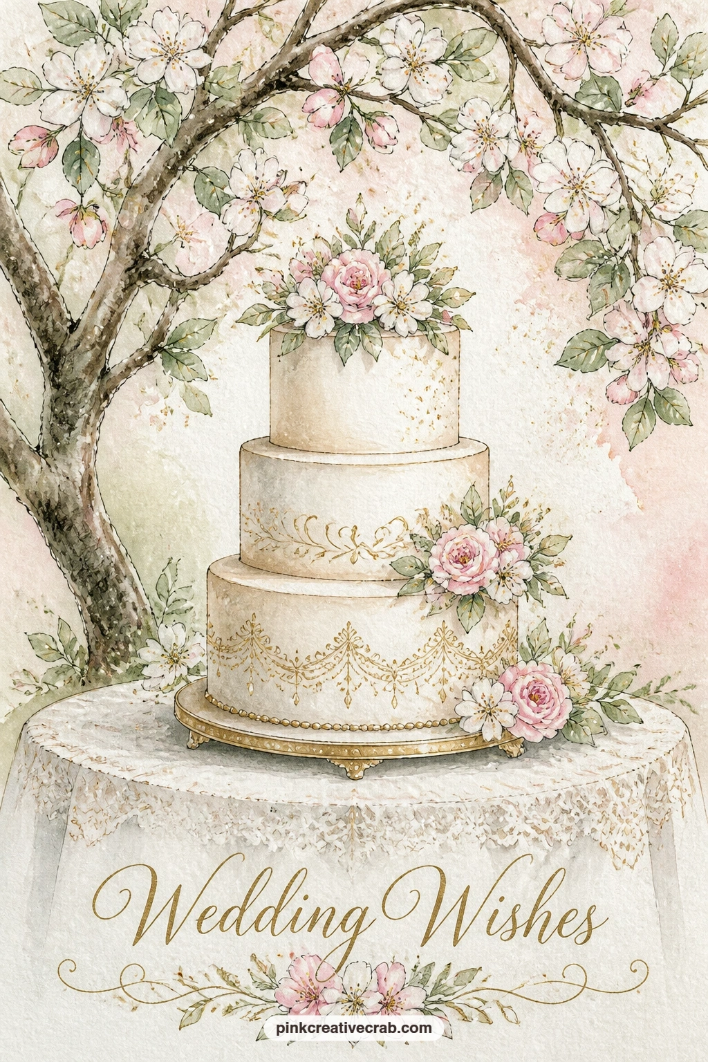
Palette: Ivory,Opera Pink,Sap Green,Gold Ochre
Bring in the first figures with a bride and groom running through a shower of petals outside a village church, a scene about motion more than detail. Keep both figures small and simple, a pale dress triangle for her and a dark narrow suit shape for him, legs mid-stride with one knee bent forward on each.
Paint the church behind them as a soft, pale, slightly blurred shape, since it should read as background rather than compete with the couple. The petals are the fun part: small loose dashes of pink flicked from a dry brush or just dotted freely across the sky above the running pair.
Running figures go wrong when the legs are too straight, which makes them look like they are standing still. Bend the front knee more than feels natural and the motion reads instantly.
If figures feel daunting, simplify both to soft rounded silhouettes with no limbs showing, just a dress shape and a suit shape leaning forward.
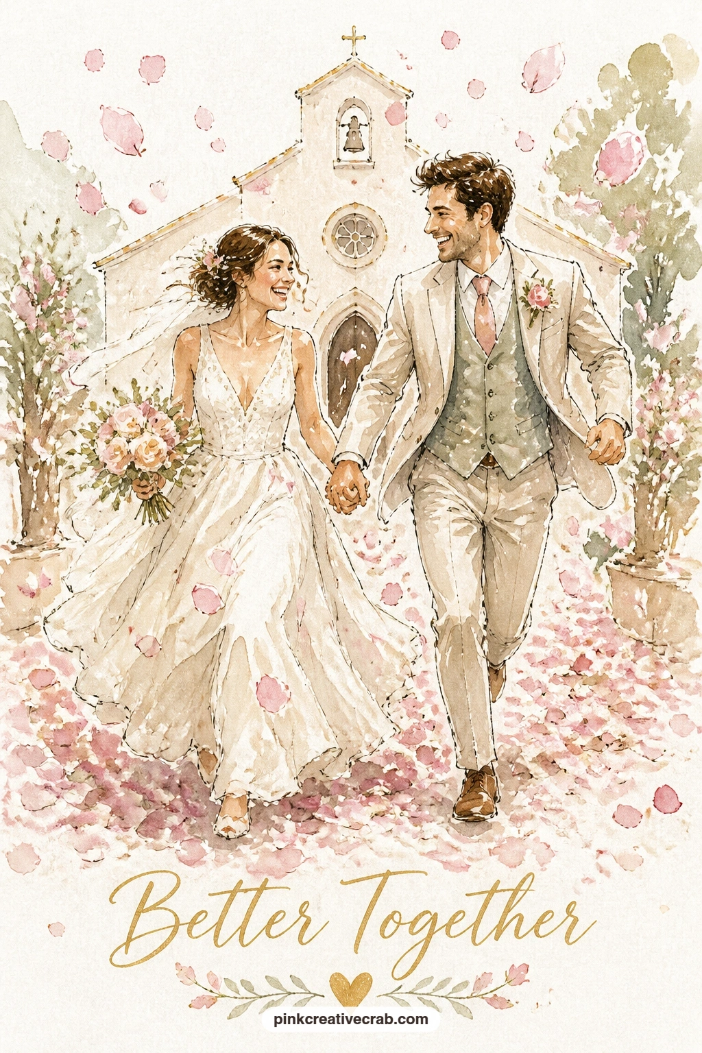
Palette: Ivory,Payne’s Grey,Opera Pink,Sap Green
From a moving pair to a wider gathering, a long garden table set for a wedding feast under string lights asks you to think about how a scene recedes. Set the table running diagonally from one bottom corner up toward the middle of the card rather than straight across, which gives it far more depth than a flat horizontal line would.
Paint the near end of the table larger with clearer place settings, small dashes for plates and glasses, then let the far end shrink and simplify into loose pale marks, barely more than suggestion. The string lights are a scatter of tiny gold dots on a few curved ink lines strung above the table against a dusky sage sky.
Overworking the table settings is the easiest way to lose the loose feel here, so limit yourself to three or four painted place settings and let the rest stay implied.
Candles in jars down the table center add warmth if you want a fuller scene, just small ivory ovals with a flick of gold flame.
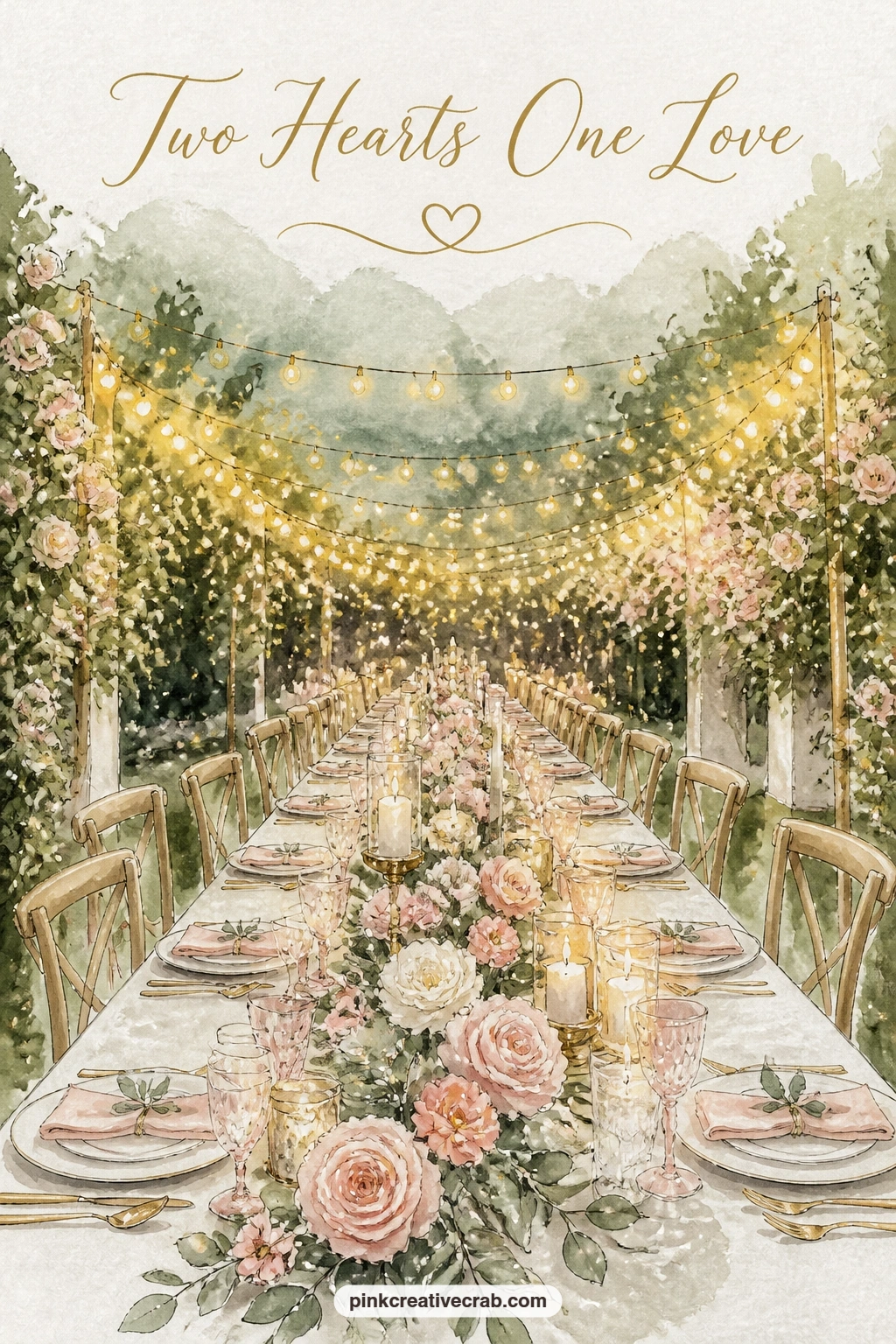
Palette: Sap Green,Ivory,Gold Ochre,Payne’s Grey
Quiet the scene down again with a bride’s bouquet resting on a pew in a sunlit chapel, a still life that leans entirely on light. Place a single shaft of warm gold light cutting diagonally across the card, since that is what turns a plain pew into a sunlit one, and let the bouquet sit right where the light is brightest.
Paint the pew first as a simple dark wooden bench shape, then the bouquet on top as a loose cluster of blush roses and sage leaves tied with a thin ribbon trailing down the wood. Keep the rest of the chapel interior almost empty, just a hint of a stone wall or an arched window in pale grey behind.
The light beam is easiest to add last with a dry brush loaded with very pale gold, swept diagonally over the dry painting, which lets the color underneath show through softly rather than covering it.
No bouquet reference handy? A single stem of roses across the pew works just as well and keeps the whole piece simpler.
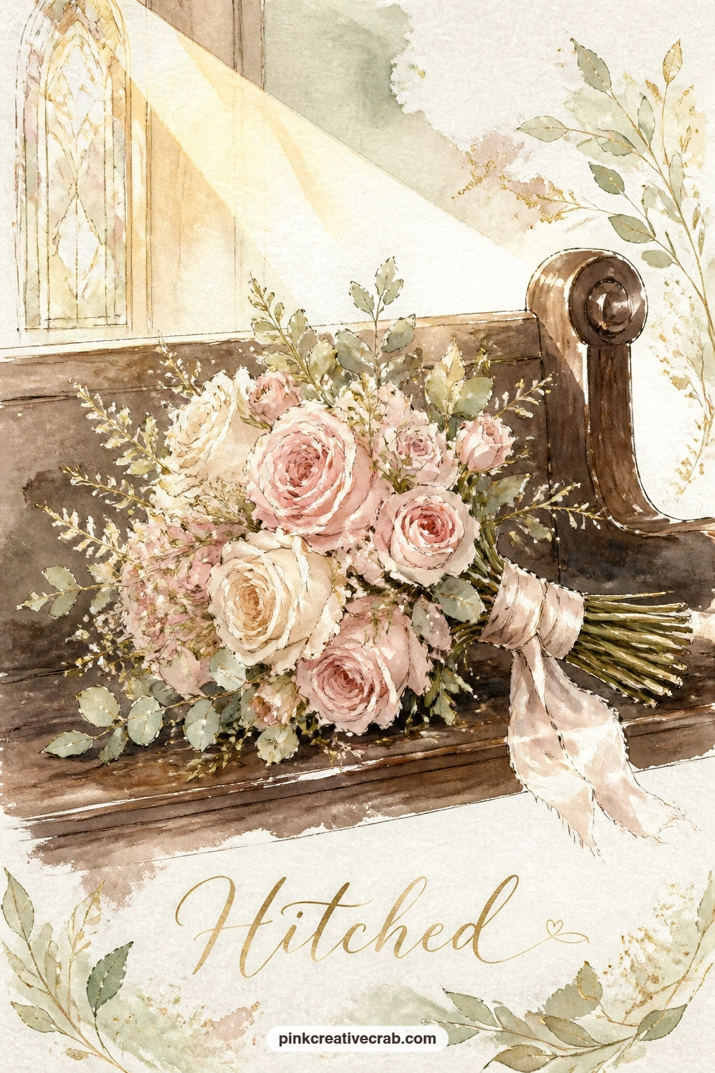
Palette: Opera Pink,Sap Green,Gold Ochre,Payne’s Grey
Carry the soft light forward into a rowboat decorated with flowers on a misty lake, a good subject for practicing edges that melt rather than stay sharp. Paint the water and sky as one continuous pale grey-sage wash first, wet into wet, so the horizon line disappears into mist with no hard edge at all.
Once that base wash is dry, drop in the rowboat as a simple dark curved hull sitting low on the waterline, with a few blush and ivory flower shapes draped along its side. A reflection of the boat painted directly below it, slightly softer and paler, anchors it onto the water.
Mist is unforgiving if you paint it too late: once the base wash dries you cannot soften it again, so commit to the blurred background before any boat detail goes in. If the result feels too pale, lift a little color back out with a dry brush or tissue while the wash is still damp to bring back some contrast.
A single swan drifting near the boat is an easy addition if the lake feels too empty.
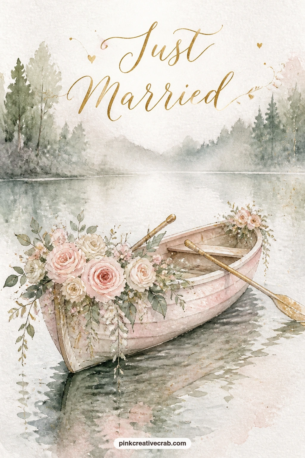
Palette: Payne’s Grey,Sap Green,Opera Pink,Ivory
Shift the mood with a barn wedding with hay bales and jars of wildflowers, a warmer, rougher texture study after all that softness. Block the barn as a simple red-brown triangle roof over a square body with one large door opening dark in the center, then set two or three round hay bale shapes along the ground in front.
A dry brush dragged lightly over the hay bales, barely loaded with paint, gives that rough straw texture far better than a smooth wash would. Scatter small glass jars along a bench or the barn floor, each one just a thin ink outline with loose wildflower dashes of blush, gold and sage poking out the top.
The barn door is where beginners add too much detail trying to show figures inside. Leave it as a dark doorway with at most two pale silhouette shapes, and the eye fills in the celebration on its own.
Swap hay bales for simple wooden crates if straw texture feels tricky, the warm rustic feeling holds either way.
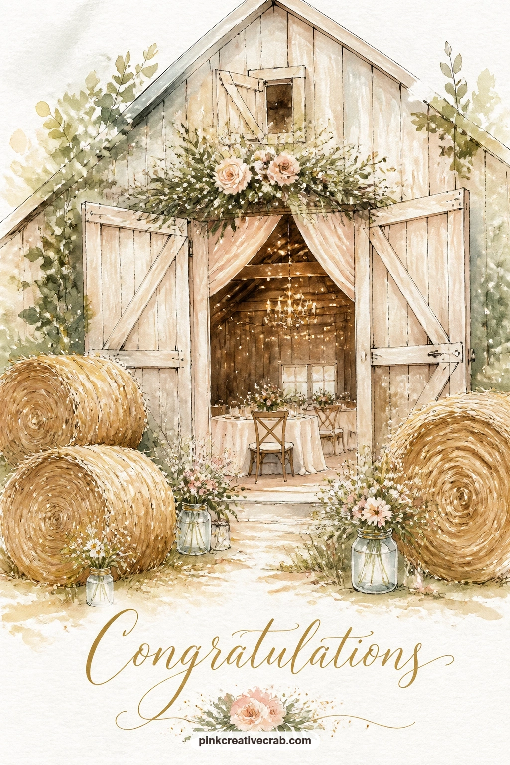
Palette: Burnt Sienna,Gold Ochre,Sap Green,Opera Pink
Open the view right up with a seaside wedding on a cliff with a wooden arch and a blue sea, a landscape built almost entirely on where the horizon sits. Place that horizon line low, in the bottom third of the card, so the sky and sea together dominate and the small wedding arch reads as perched right on the edge.
Wash the sea first in two tones, a deeper blue near the horizon fading to pale ivory-blue near the cliff edge, then let it dry before adding the simple wooden arch as two upright posts and a crossbar, undecorated except for a few small trailing flowers at the top corners.
Two tiny figures standing under the arch should be no taller than about a tenth of the card height, since making them any bigger starts to compete with the sea and loses that open, airy feeling the subject needs.
If the sea color looks flat, drop a slightly darker blue wet into wet along the horizon line while the first wash is still damp to suggest distant waves.
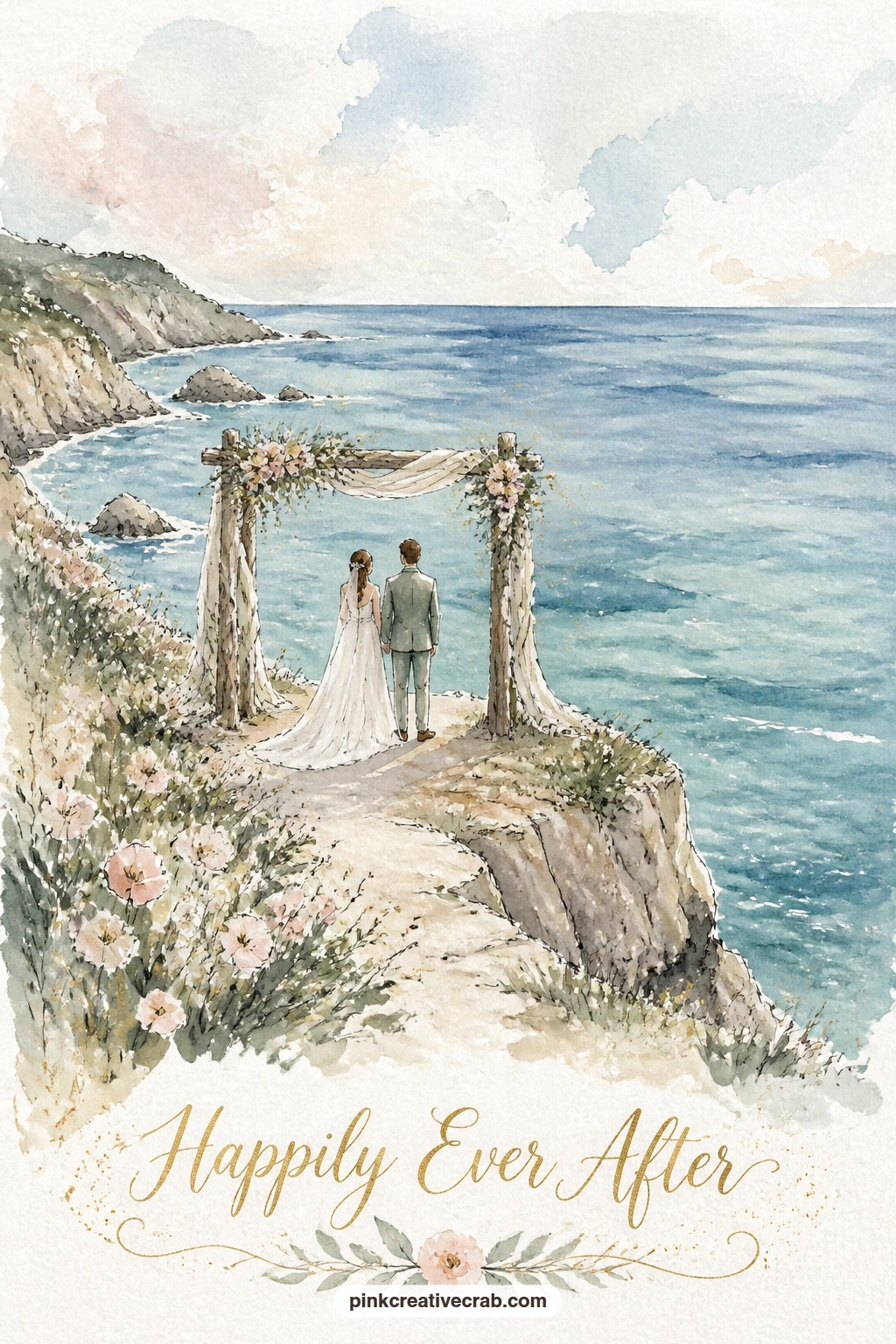
Palette: Cerulean Blue,Ivory,Sap Green,Payne’s Grey
Bring the setting into town with a couple leaving a city hall on stone steps under falling confetti, a nice change of texture from all the garden scenes before it. Draw the building front as a tall flat facade with a few simple columns or pilasters and a row of steps fanning wider as they come down toward the viewer.
Paint the stone in cool ivory and pale grey, keeping the wash flat and architectural rather than loose, which contrasts nicely against the soft confetti falling over it. The couple stands small partway down the steps, simple shapes again, and the confetti is just a scatter of small colored dashes in blush, gold and sage flicked across the top half of the card.
Steps are the part that most often go wrong, ending up as a shapeless block. Draw each step as a single straight horizontal line getting slightly wider toward the bottom, five or six lines total is plenty.
For a quicker version, skip the architectural detail entirely and paint just the steps, the couple and the confetti against a plain wash background.
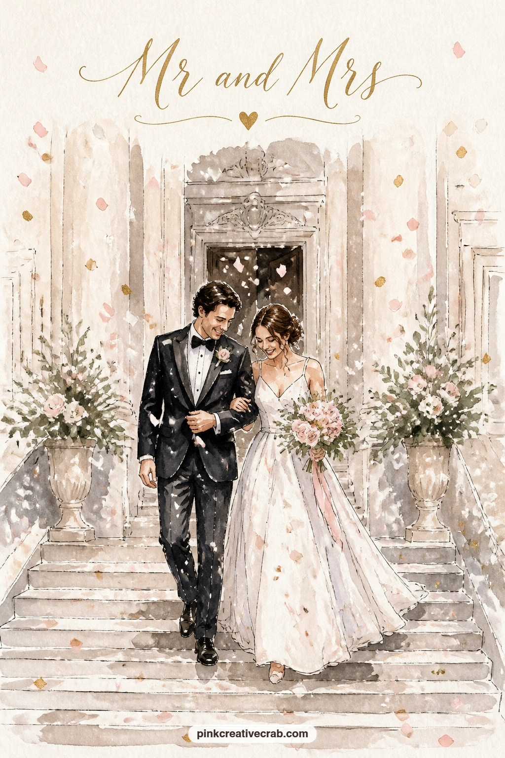
Palette: Ivory,Payne’s Grey,Opera Pink,Gold Ochre
Slow down again for a quieter still life, a wedding dress hanging in the open window of a country inn, which is really a study in one simple shape against another. Paint the window frame first as a dark rectangle with shutters pushed open on each side, then leave the dress itself mostly as untouched white paper, just the faintest pale grey shadow along its folds.
A few ivy leaves or a climbing rose at the window edge soften the hard frame line and tie the scene back to the garden settings elsewhere on this list. Behind the dress, a dim interior wash in warm grey keeps the dress reading as bright by contrast.
Painting the dress too solid is the most common slip, since any strong wash over it kills the sense of light fabric. Use only the thinnest, most diluted grey for shadow, added in two or three short strokes rather than a full wash.
If you prefer a simpler palette, strip the window of flowers entirely and let the bare wood and white dress carry the whole card on their own.
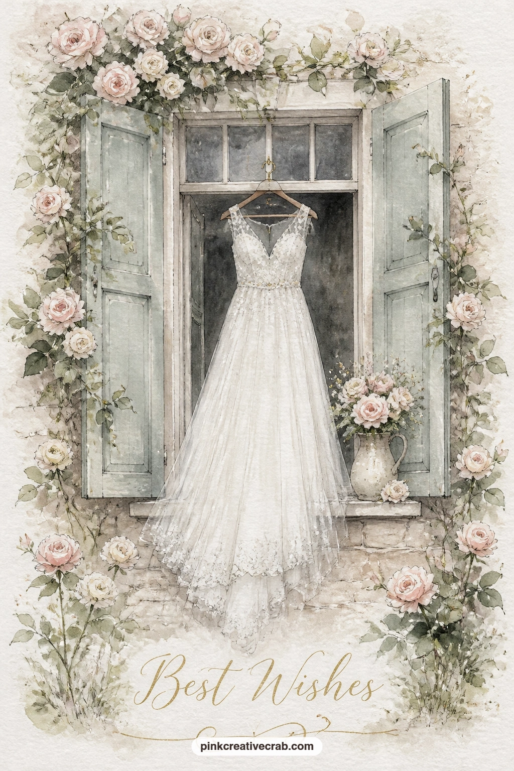
Palette: Payne’s Grey,Ivory,Sap Green,Opera Pink
For the smallest subject on this list, two gold rings resting on a white peony on a windowsill asks for patience rather than space. Draw the peony large, filling most of the card, as a loose cluster of rounded white petals with the faintest blue-grey shadow in the center where the petals overlap.
Leave the rings as bare paper outlined only in a thin ink circle, then touch a tiny dab of gold paint or even a gold gel pen along one edge of each ring to catch the light, which reads far better than painting them solid.
White flowers are easy to lose against white paper, so the trick is shadow, not outline. Paint the shadow shapes between petals in pale grey-blue and let the white paper itself do the rest of the work.
A windowsill ledge and a hint of glass behind, just a few straight pale lines, places the whole scene without needing any other detail.
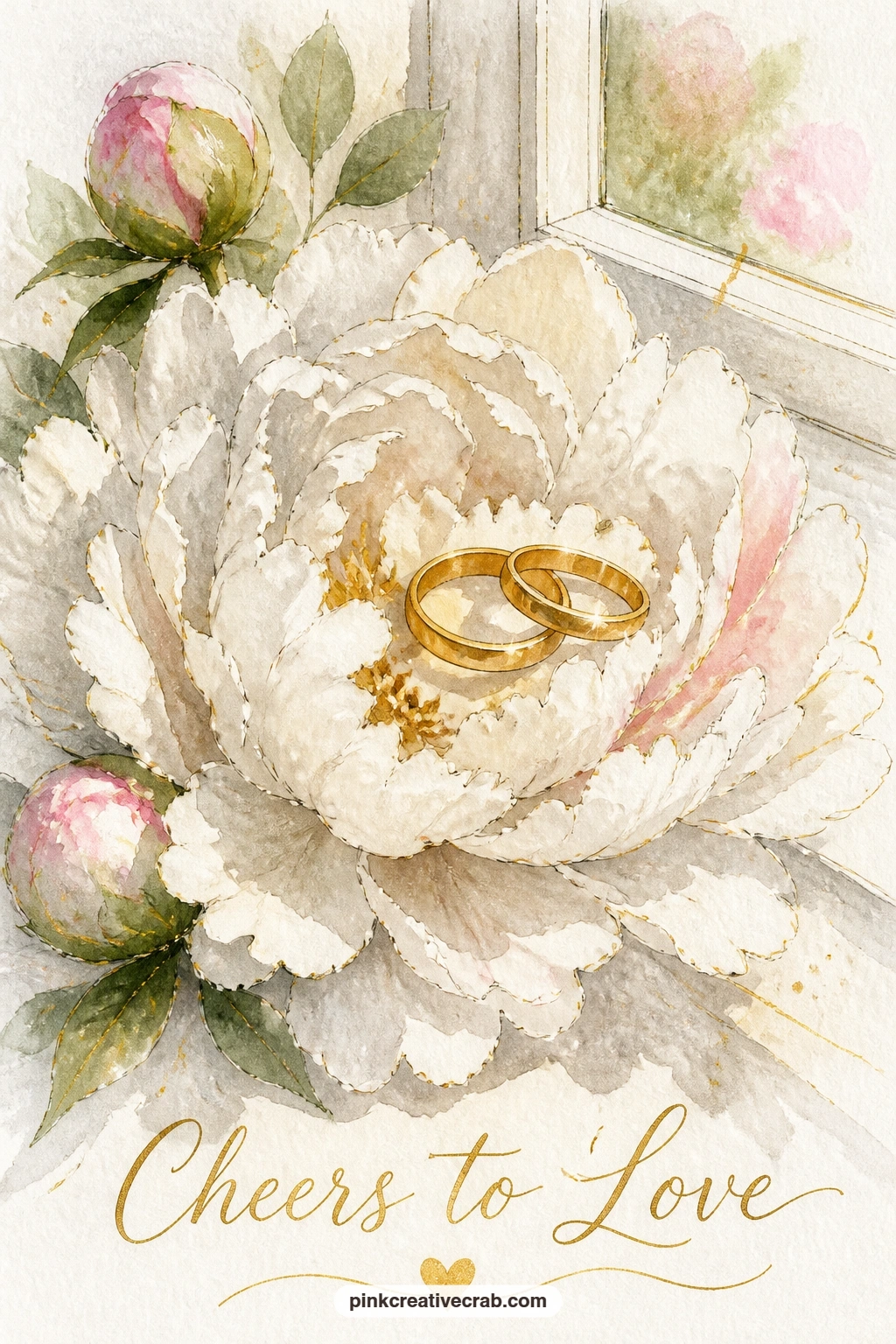
You Will Need
- gold gel pen or metallic paint
Palette: Titanium White,Payne’s Grey,Gold Ochre,Sap Green
Pick the pace back up with a bride and groom on a vintage bicycle riding through a vineyard, a scene that works best once you decide where your eye level sits. Place it low again, close to the ground the bicycle rolls over, so the vine rows behind the couple can stretch back in diagonal lines that shrink toward a small far point.
Paint the bicycle as a simple frame of thin curved lines with two circles for wheels, the couple seated and standing on the pedals, her dress trailing out behind in a loose triangular wash. The vine rows are quick diagonal dashes of green, denser and darker near the bicycle, paler and more spaced out as they recede.
Getting the bicycle to look balanced rather than tipping over is the fiddly part. Keep both wheels touching an implied ground line at the same level, even if that ground line itself is never actually painted.
If a bicycle feels too technical to draw confidently, swap it for the couple simply walking hand in hand down the same vine row.
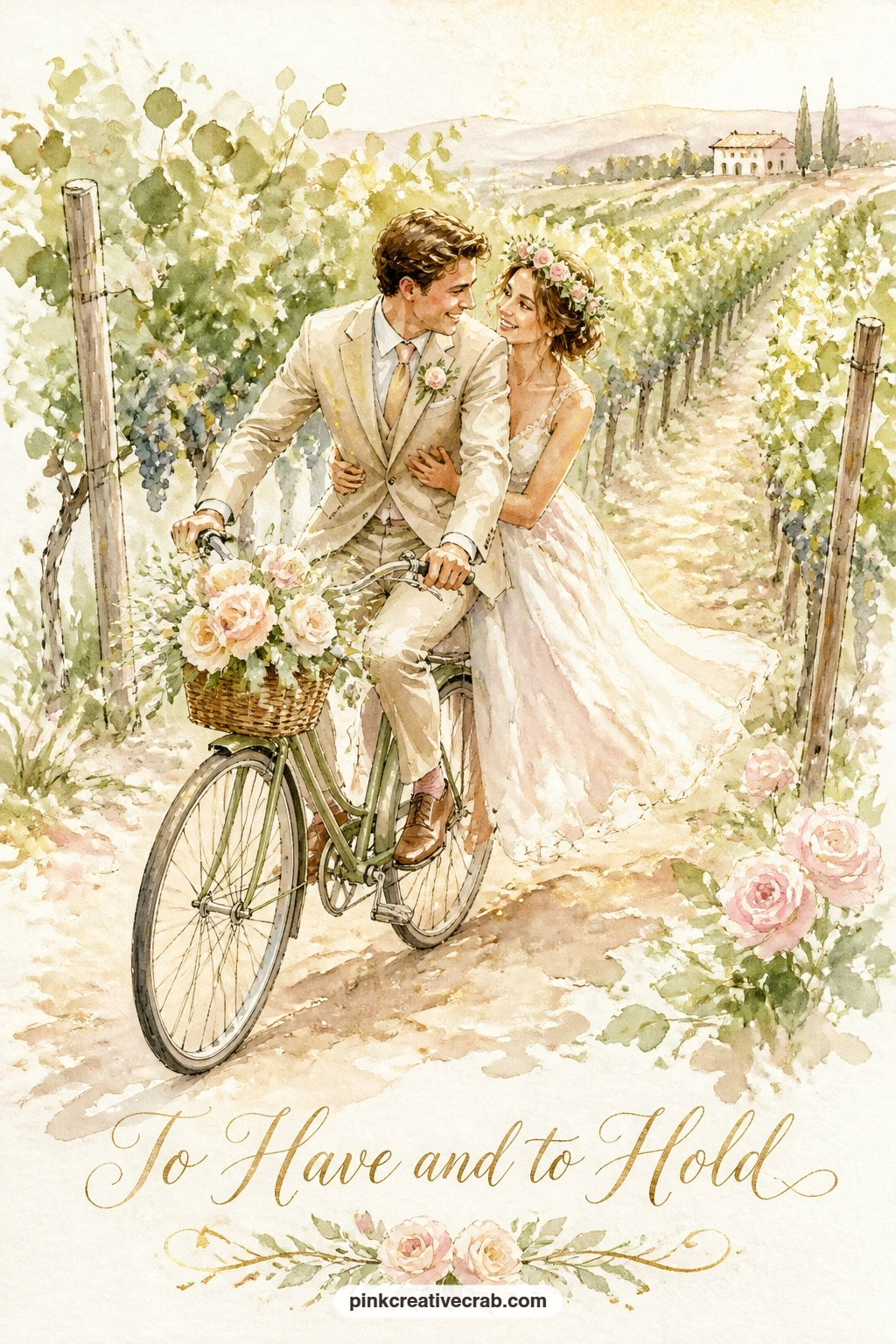
Palette: Sap Green,Ivory,Opera Pink,Gold Ochre
Jump somewhere brighter with a tiny Greek island chapel with a blue dome and a couple on the steps, a subject that lives or dies on one strong color contrast. Paint the chapel walls in the brightest clean white you can manage, which usually means leaving the paper bare and only painting the shadow side in the palest grey, then drop a single confident round dome on top in deep cobalt or ultramarine.
That blue dome against white walls is the whole picture, so keep everything else quiet: a plain pale sky, a hint of blue sea far below if there is room, and the couple small on the steps in simple shapes.
Painting the dome with a hesitant, patchy wash is the easiest way to lose this scene’s punch. Mix plenty of strong blue paint before you start and lay it down in one or two confident strokes rather than fussing over it.
Next time you paint this one, try it with the dome in deep teal instead of blue, or add a bell tower beside it for a slightly busier version.
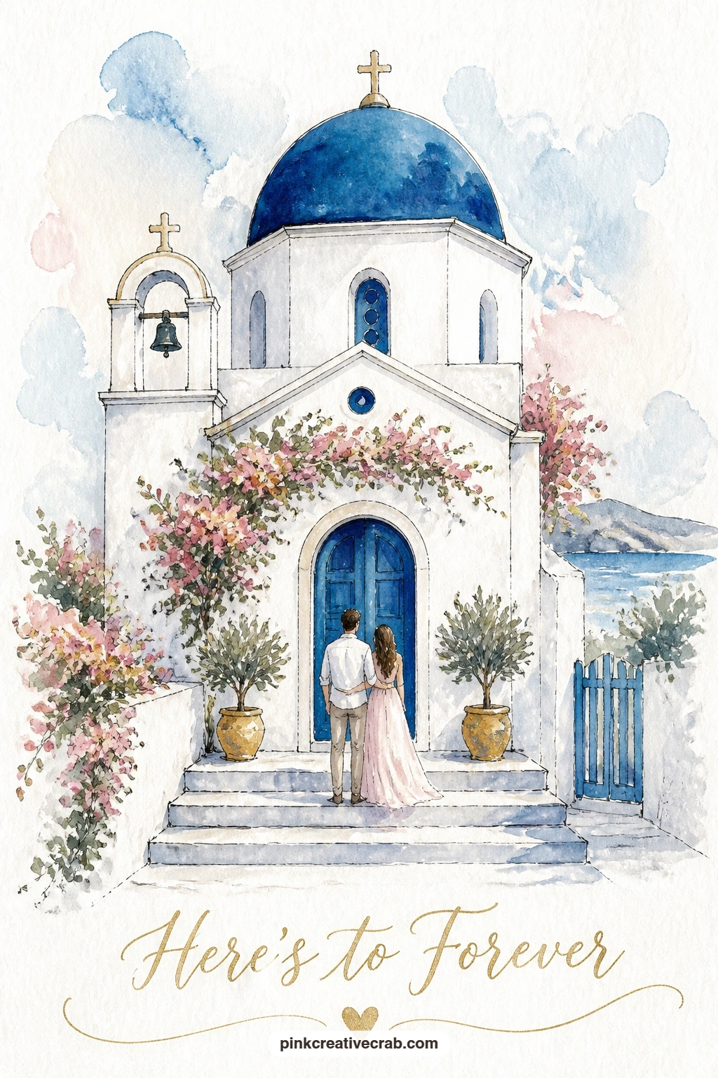
Palette: Ultramarine Blue,Titanium White,Gold Ochre,Cerulean Blue
After a bright daylight scene, a white wedding marquee lit up in a meadow at dusk works the opposite way, built from dark toward light. Wash the whole sky and meadow first in deep dusky blue-grey, then once that is completely dry, leave the marquee itself as the brightest shape on the card, a simple peaked tent form glowing warm ivory and gold from within.
The glow is easiest to suggest with a soft halo of pale gold painted just outside the marquee’s edges before the tent shape itself goes in solid, so the light looks like it is spilling outward rather than sitting flat on top of the dark background.
Painting the marquee too early, before the dusk wash is dry, is the main way this scene falls apart, since the colors bleed together and the glow disappears. Patience with drying time matters more here than brushwork.
For a quicker ten minute version, skip the meadow grass details and paint just the glowing tent shape against a plain dusk wash; the forty minute version adds small string lights strung from the tent peak and a few dark tree silhouettes along the horizon.
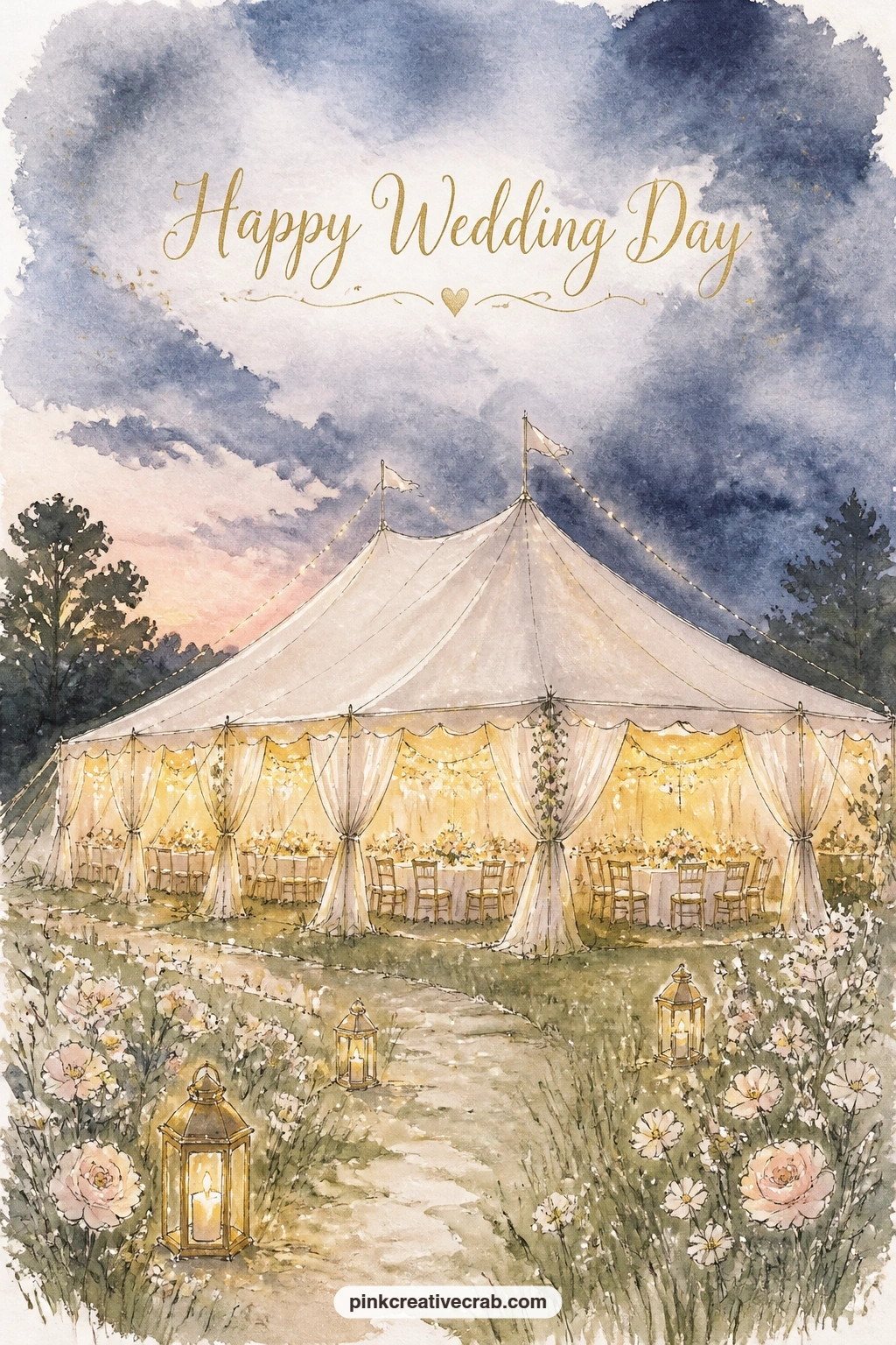
Palette: Payne’s Grey,Gold Ochre,Ivory,Sap Green
Step back onto solid ground with a garden party with a champagne tower on a stone terrace, a subject that tests patience with stacked circles more than any other on this list. Build the tower from the bottom up: a wide row of five or six small glass shapes, then four, then three, narrowing evenly as it rises, each glass just a thin ink outline with a pale gold wash inside.
Keep every glass the same size and evenly spaced in its row, since even one glass drawn larger than its neighbors throws the whole tower off balance and it reads as toppling. A faint grey shadow beneath the base row grounds the tower onto the stone terrace.
The terrace itself needs almost no detail, just a few loose stone flag lines and perhaps one potted topiary tree at the edge of the card to frame the scene.
If stacking that many glasses feels too fiddly for one sitting, drop the tower to three rows total, it still reads clearly as a champagne tower.
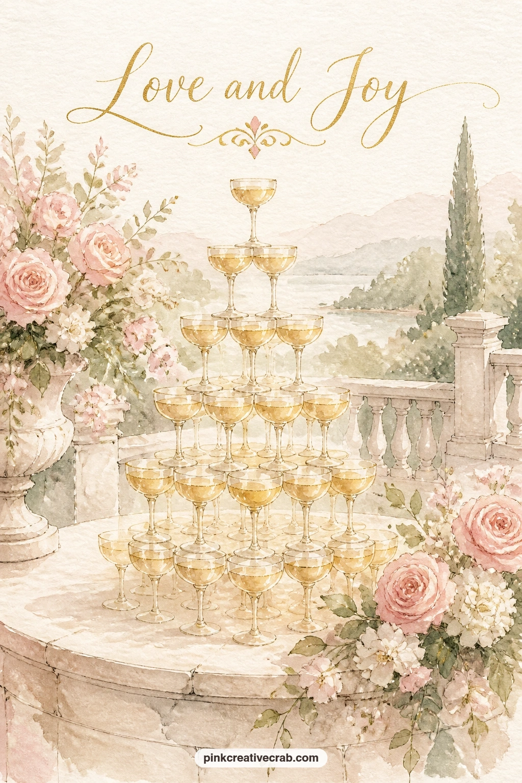
Palette: Gold Ochre,Ivory,Sap Green,Payne’s Grey
Bring the focus back to the couple with a couple sharing the first slice of cake in a rose garden, a tender close-up moment after the wider terrace scene before it. Paint the couple close together, shoulders nearly touching, her hand and his hand both reaching toward a small plate held between them, with the rest of the cake just suggested at the edge of the frame rather than shown whole.
Rose bushes filling the background work best as loose overlapping blush circles with sage leaf dashes threaded through, painted wet into wet so the colors merge softly rather than sitting as separate hard-edged blooms.
Hands holding a small plate are fiddly to get right; simplify both hands to soft rounded mitten shapes rather than trying to paint individual fingers, which almost always looks stiffer than leaving it loose.
For more practice with that same loose rose technique before tackling this one, the flower studies in this easy watercolor flower guide cover the same wet-into-wet approach.
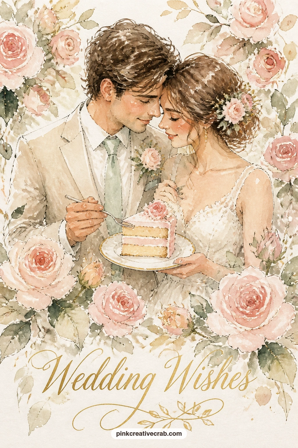
Palette: Opera Pink,Sap Green,Ivory,Payne’s Grey
Shift to a smaller figure with a flower girl scattering petals down a garden aisle, a good chance to practice a figure caught mid-movement. Draw her as a small triangular dress shape with one arm extended outward, mid-toss, and petals flying from her hand in a loose scattered arc rather than a tidy pile.
The garden aisle behind her is two soft green borders running away toward a small far arch, painted paler and looser the further back they go, which gives the whole card a clear sense of depth without much extra work.
Her extended arm is the one part that can look awkward if drawn too straight. Angle it slightly downward from the shoulder, as if the petals have just left her fingers, and the motion reads instantly.
If you want more flower drawing practice first, the loose little blooms in this flower doodle guide are a nice warm up for the scattered petals here.
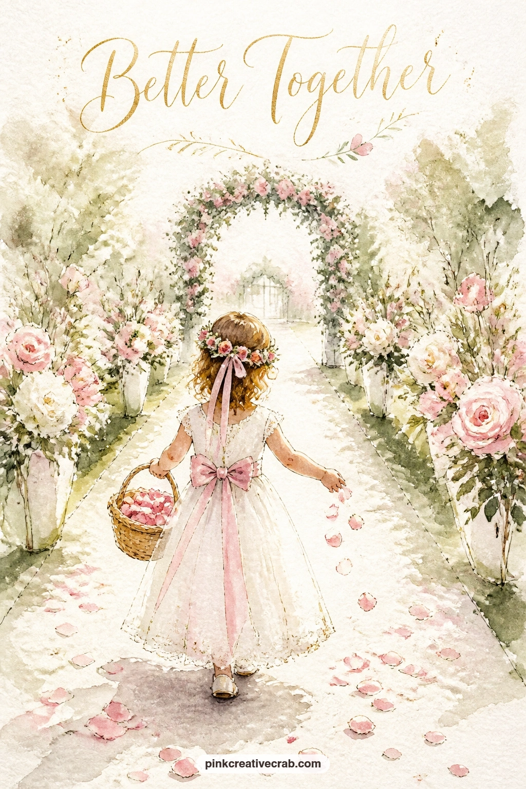
Palette: Opera Pink,Sap Green,Ivory,Gold Ochre
Return to the water for a lakeside gazebo wrapped in white hydrangeas, a structure that needs a clear sense of its own roundness to read well. Draw the gazebo as a simple domed or peaked roof over a ring of thin upright posts, keeping the posts evenly spaced and slightly shorter toward the edges if you angle the structure in perspective rather than painting it flat on.
Hydrangea clusters wrapping the posts are painted as dense groupings of tiny petal dabs rather than individual flowers, dabbed in with the tip of a round brush loaded with pale blue-white and a touch of sage for shadow between clusters.
Too much even spacing between the hydrangea dabs makes them look planted rather than growing naturally. Vary the density, thicker at the base of each post, thinning out higher up, for a much more convincing climb.
Painted behind the gazebo, a simple pale lake wash with the faintest reflection underneath finishes the scene without pulling focus from the flowers.
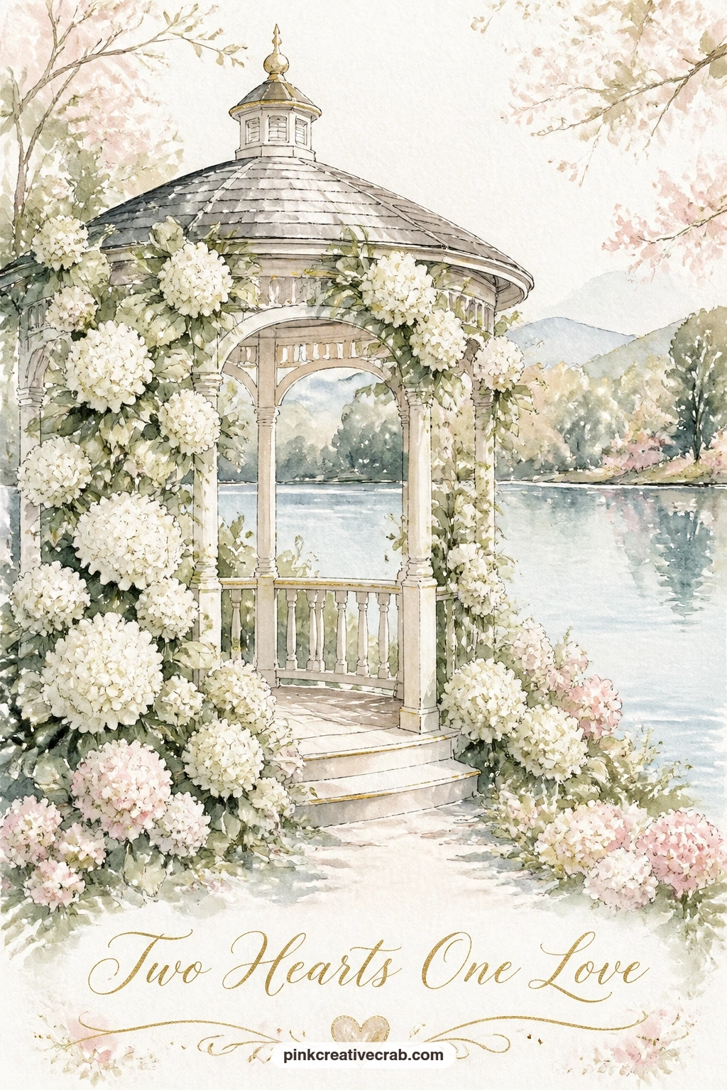
Palette: Titanium White,Cerulean Blue,Sap Green,Payne’s Grey
Bring the couple back for a couple dancing under a willow tree at a backyard wedding, which leans entirely on the willow’s trailing branches to set the mood. Paint the willow’s canopy as one soft rounded mass of sage green first, then once dry, drag a fine brush or ink pen down from the canopy in long loose curved lines for the trailing branches, letting a few sweep right down past the dancing couple.
The couple themselves can be quite small beneath that big canopy, simple shapes turned slightly toward each other, one arm raised as if mid-turn.
Overloading the willow branches with too many lines is the easiest way to clutter this scene, since real willow reads as graceful because of the gaps between branches as much as the branches themselves. Leave plenty of white paper showing through.
A string of small fairy lights woven through a few branches adds warmth for an evening version, just tiny gold dots along one or two of the hanging lines.
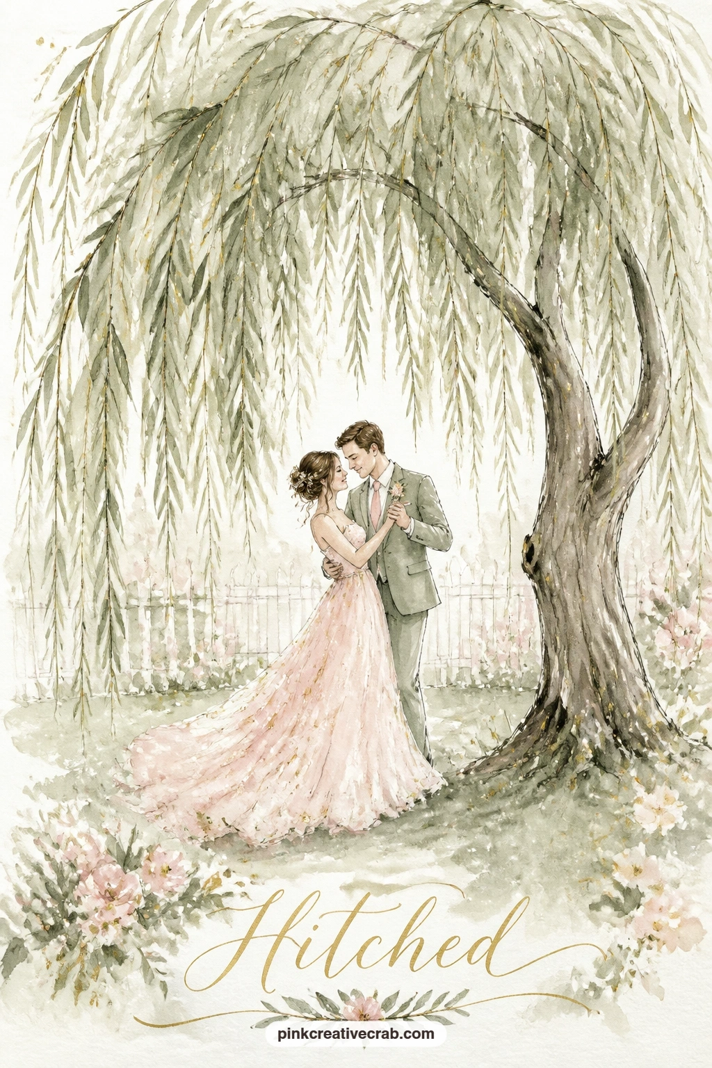
Palette: Sap Green,Ivory,Payne’s Grey,Gold Ochre
Carry that warm feeling into a wedding lunch on a Tuscan terrace with lemon trees in pots, a scene built on a strong, confident color contrast between warm terracotta and cool sage. Paint the terrace floor and potted planters in warm burnt orange and sienna, then let the lemon trees themselves stand out in cooler sage green with small bright yellow lemon dots dotted through the leaves.
A long table runs across the terrace with a loose stripe of ivory tablecloth, a scatter of small plate shapes, and perhaps a single tall bottle shape standing at the center, all kept simple enough to read at a glance rather than itemized.
Lemons painted too perfectly round and evenly spaced look stuck on rather than growing, so vary their size slightly and tuck most of them partly behind a leaf rather than hanging fully exposed.
Potted lemon trees without a terrace to set them on still make a lovely simpler version of this idea, just the trees and a hint of warm stone beneath.
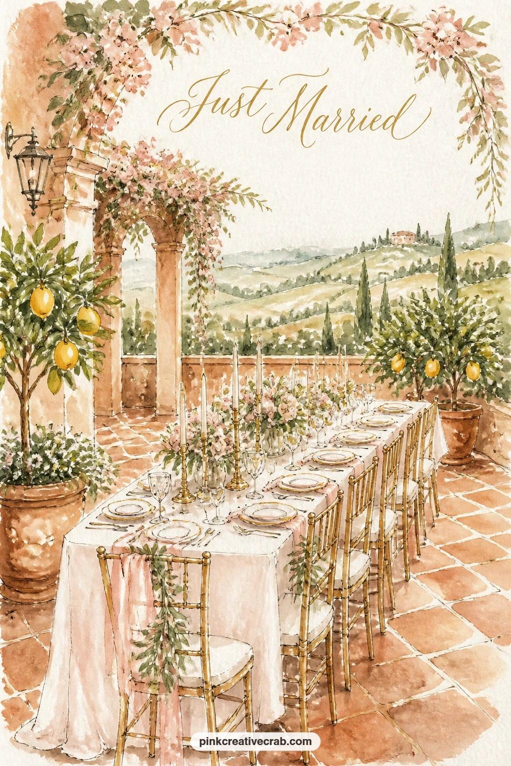
Palette: Burnt Sienna,Sap Green,Gold Ochre,Ivory
Circle back to a small, still subject with two doves on the roof of a flower-covered chapel, a nice bookend to the rose chapel earlier in this list. Paint the chapel roofline small and simple, a plain triangular peak, then cover the eaves and doorway in a thicker tangle of climbing blooms than the first chapel idea, mixing blush roses with a few sage leaf clusters for contrast.
The two doves perched along the ridge of the roof are just simple rounded body shapes with a small pointed tail and beak, left mostly as bare white paper with the faintest grey shadow along one side to give them form.
Doves painted with too much detail in the feathers lose their soft, simple charm fast. Two or three short curved lines for wing shape is all they need.
If you already painted the rose chapel earlier, try this one with a different flower entirely, wisteria or clematis both climb just as well and give the pair a different feel side by side.
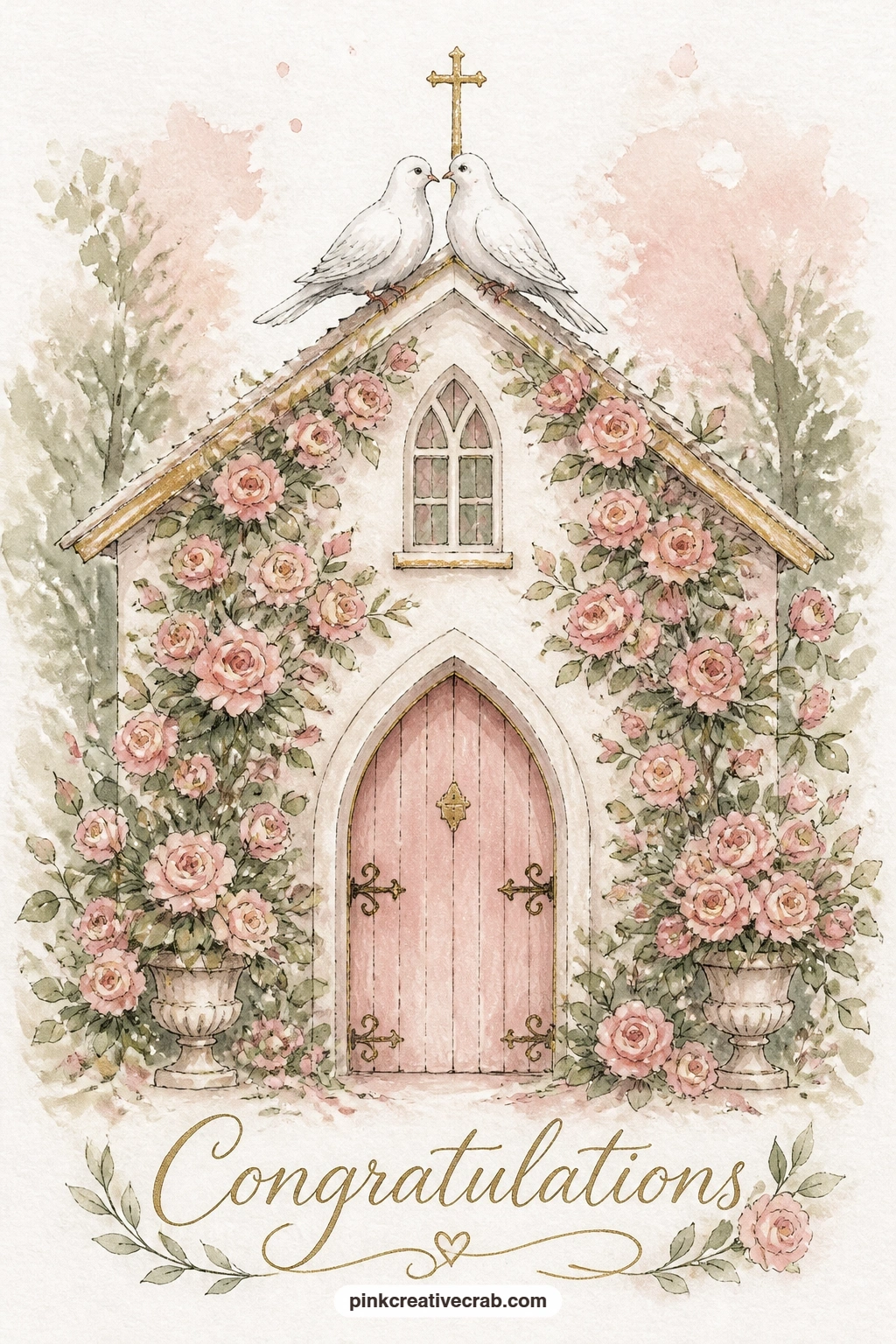
Palette: Titanium White,Opera Pink,Sap Green,Payne’s Grey
Change the weather for a bride and groom under a clear umbrella in a rainy garden, a mood piece that depends on soft grey light more than any strong color. Wash the whole background first in pale grey-blue, graduating slightly darker toward the top of the card to suggest a heavy sky, then let the couple and their umbrella stand out as the one warmer, clearer shape against it.
A clear umbrella is painted almost entirely as bare paper with just a thin ink outline for its ribs and edge, so the garden colors behind it show faintly through, which is what actually makes it read as see-through rather than solid.
Rain itself is easiest added last and lightly, a few short diagonal white-space lines scratched out with a damp brush or simply left unpainted between loose grey streaks, rather than drawn in with heavy ink lines that can look more like static than falling rain.
Drop the rain and the grey sky entirely for a simpler sunny version of the same umbrella pose if the weather mood feels like too much to manage today.
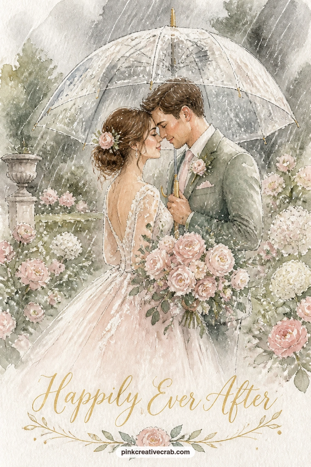
Palette: Payne’s Grey,Sap Green,Opera Pink,Ivory
Shift the season entirely for a winter wedding at a snowy mountain chapel among tall pines, which asks you to think again about where the light source sits. Place a low winter sun to one side of the card, then paint every snow-covered surface, the chapel roof, the ground, the pine branches, with a warm pale gold tint on the side facing that sun and a cool blue-grey shadow on the side turned away.
The chapel itself can be quite small against a row of tall, narrow pine triangles behind it, their branches just a few confident dark green strokes layered over a lighter base rather than painted leaf by leaf.
Snow painted flat white with no shadow variation at all looks like bare paper rather than snow, so that warm-light, cool-shadow contrast matters more here than almost any other trick on this list.
For a quicker ten minute version, paint just the chapel and the nearest two pines; the fuller forty minute version adds a soft mountain ridge in pale blue-grey behind everything else.
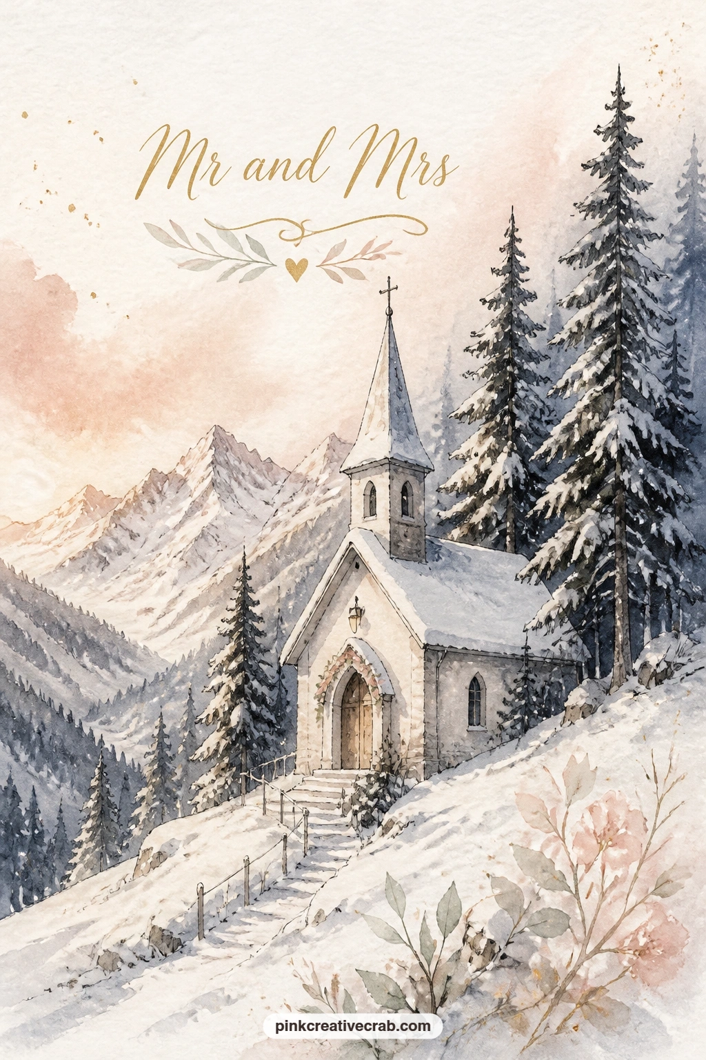
Palette: Payne’s Grey,Sap Green,Gold Ochre,Titanium White
Close the list with a wedding picnic on a hill with two glasses and a little cake, a calm, open composition to finish on. Paint the hill as one long curved sweep of sage green rising from one bottom corner of the card and dipping away toward the other, leaving most of the sky above it open and quiet.
A small picnic blanket near the top of that curve holds the two painted glasses, simple narrow ovals with the faintest gold wash for wine, and one small round cake no bigger than a coin on the page, just enough detail to read as a cake without pulling focus from the view.
The temptation here is to fill that open sky with extra detail, clouds, birds, trees, but a wide calm sky is exactly what makes a hilltop picnic feel peaceful, so resist adding much to it at all.
Once this one works, try it again with the hill painted at golden hour instead of daylight, swapping the sage and ivory for warmer gold and rose tones throughout.
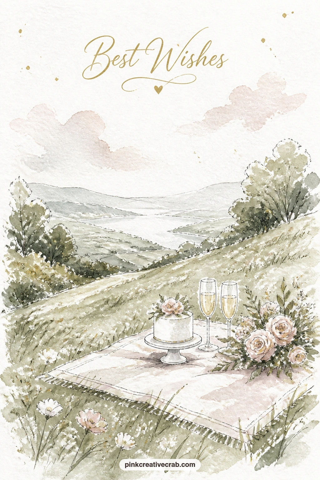
Palette: Sap Green,Ivory,Gold Ochre,Opera Pink
What to Do Next
Pick whichever scene pulls at you first, whether that is the rose covered chapel at the start of the list or the quiet hilltop picnic at the end, and set up on a small sheet of cold press watercolor paper so the whole thing fits one sitting. Keep your palette limited to blush, ivory, sage and a touch of gold, let each wash dry before the next, and the card will hold together no matter which moment of the day you choose to paint.
Frequently Asked Questions
What watercolor paper works best for small wedding card scenes?
Cold press watercolor paper around 140lb holds up best for these small scenes. It takes wet into wet washes without buckling badly and still lets fine ink details sit crisp on top once dry.
How do I keep faces simple in a wedding watercolor without them looking blank?
Paint the head as a soft pale oval with just a hint of blush on the cheek and no drawn features at all. Posture and the tilt of the head carry the expression far more than eyes or a mouth ever could.
Should I add ink lines before or after the watercolor washes?
Add most ink detail after the paint is completely dry so the lines stay crisp instead of bleeding into wet color. A few structural pencil lines before painting help keep shapes like arches and tables in proportion.
What if my watercolor wedding scene looks too pale and washed out?
Let each layer dry fully before adding the next, since stacking two or three thin washes builds real depth of color. A final touch of stronger, less diluted paint on the darkest shadows pulls the whole scene together.
Can I turn these wedding scenes into actual printed cards?
Yes, scan or photograph the finished painting and have it printed onto blank card stock at any print shop or home printer. Leave the inside blank or add a simple handwritten message once it is printed.
Have any thoughts?
Share your reaction or leave a quick response — we’d love to hear what you think!
-
 0
-
0
-
0
-
0
-
0
-
0


