Movie night drawing is the kind of subject that paints itself once you let the lamp light do the work: a bowl of popcorn, a tangle of blankets, a cat who has clearly taken the best seat on the sofa. These scenes are small and warm, which means you can finish one tonight without planning a big composition, and the soft glow from a screen or a projector beam gives you an excuse to paint moody shadows and buttery highlights in the same piece.
Below are twenty seven of them, from a single bowl of popcorn balanced on two knees to a full backyard screening under string lights. Pick whichever one matches your evening and start with the lightest washes first, the ink details come last.
Using these images: free for personal projects such as printing, coloring, cards, journals and gifts. Handmade items that include them may be sold up to 30 pieces per design. More than that is commercial use and is not permitted, and neither is selling or sharing the images themselves or passing them off as your own. Please ask before any other use.
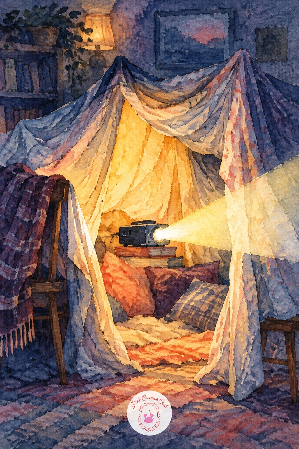
Start the blanket fort with pencil, just enough to place two draped sheets meeting in a soft peak and a dark gap at the entrance where the glow spills out. Paint the outside of the fort first in a dusky blue wash so the inside glow reads brighter by contrast, then drop a warm buttery yellow wedge of light where the projector beam hits the fabric.
Work wet into wet for the folds of the sheets, letting plum shadow pool into the creases while the paper is still damp. Once that layer dries, use your fine liner for the seams of the fabric and a few scattered dust specks caught in the beam.
The common slip here is painting the glow too evenly, which flattens the whole fort. Keep the brightest yellow small and let it fade fast into blue at the edges. If you do not have a dedicated yellow, mix a touch of coral into your yellow ochre for warmth instead.
Finish with one tip: paint the glow wedge before anything else touches that patch of paper, a clean light shape under later washes reads far stronger than one painted over dried color.
Palette: Payne’s Grey,Dioxazine Purple,Naples Yellow,Indigo
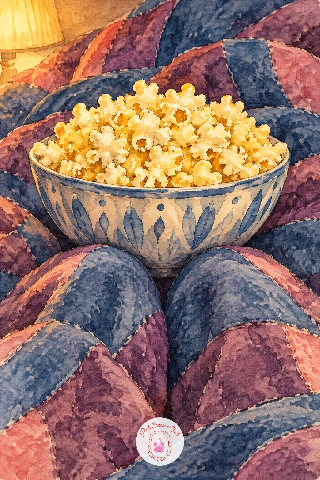
This one is mostly about the bowl and the quilt underneath it, so measure before you paint: the bowl should sit no wider than the gap between two raised knees, or it will look like it is floating above them instead of resting there. Sketch the knee shapes first as two soft mounds under fabric, then the bowl nested between.
Paint the quilt in patches of plum and dusky blue, leaving some white paper for the ridges of fabric catching light. Once dry, wash the popcorn in a pale buttery yellow and add ink squiggles for the kernels, keeping them loose rather than drawing each one.
The mistake to watch for is overworking the popcorn texture until it looks like gravel. A few confident ink marks read better than fifty tiny circles. If your yellow feels too flat, swap in a touch of raw sienna for warmth.
Try this today: paint the bowl’s shadow on the quilt before the popcorn, it anchors the whole thing and stops it looking pasted on top.
Palette: Naples Yellow,Plum,Payne’s Grey,Raw Sienna
Three friends sharing one cushion at the scary part works best from a slightly low eye level, as if you are sitting on the floor looking up at the sofa. That angle lets the cushion loom large in front of their faces and makes the hiding feel more dramatic than a straight-on view would.
Block in the sofa and three rough figure shapes first, then paint the cushion last so it reads as if it is held up in front, overlapping all three. Keep faces simple, just peeking eyes above the cushion edge in ink, with the rest of the expression left to the eyebrows.
Where this goes wrong is cramming all three faces at the same height, which flattens the group. Stagger them slightly, one higher, one lower, one in the middle, for a more natural huddle. No time for three full figures: paint just the cushion and six peeking eyes for a quicker version.
One tip for today: paint the screen glow on their faces before the ink line work, so the ink sits on top of color rather than fighting with a white face.
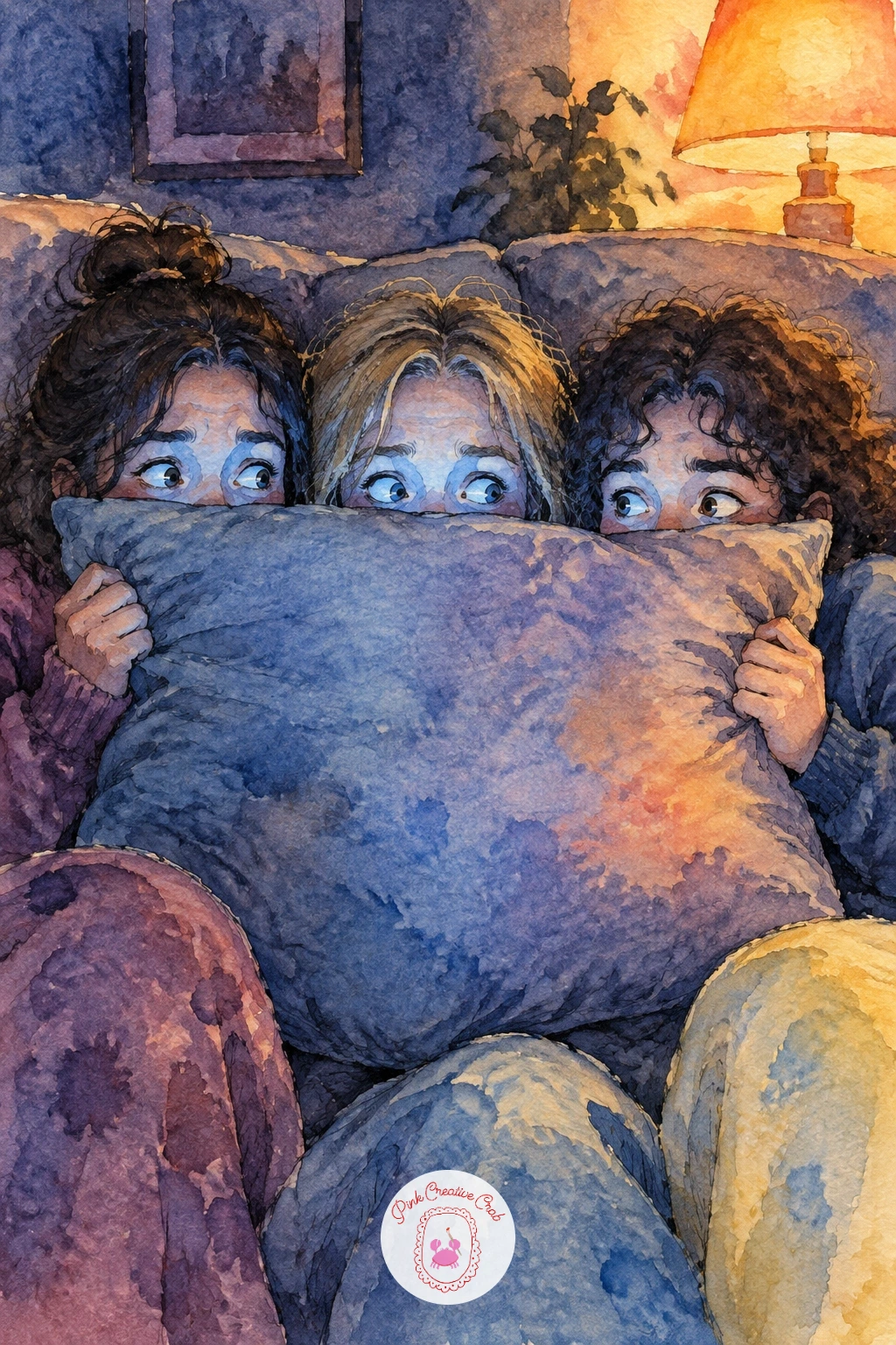
Palette: Dusky Blue,Plum,Soft Coral,Payne’s Grey
Look at reference photos of groups sitting on sofas from a low angle, it is an easier way to understand how shoulders overlap than inventing the pose from memory.
Following on from a crowded sofa, here is the opposite scene: one cat, one whole armchair, and its owner sitting on the floor below. Paint the cat first since it is the star, curling its shape into a tight comma with the tail wrapped around its paws, then build the armchair loosely around it.
Use warm plum and soft coral for the chair fabric, keeping brushstrokes loose so the cat’s cleaner, tighter shape stands out by contrast. The owner on the floor can stay a simple silhouette from behind, just shoulders and the back of a head lit by the screen.
Cats often go wrong at the face, where too much detail makes them look startled rather than smug. Keep the eyes as two soft closed lines or slits and let the ears do the expression instead. If your coral feels too bright, mix it down with a touch of grey.
Finish with one tip: paint the cat’s silhouette as one continuous shape, nose to tail, before adding any stripes or patches, it keeps the pose convincing.
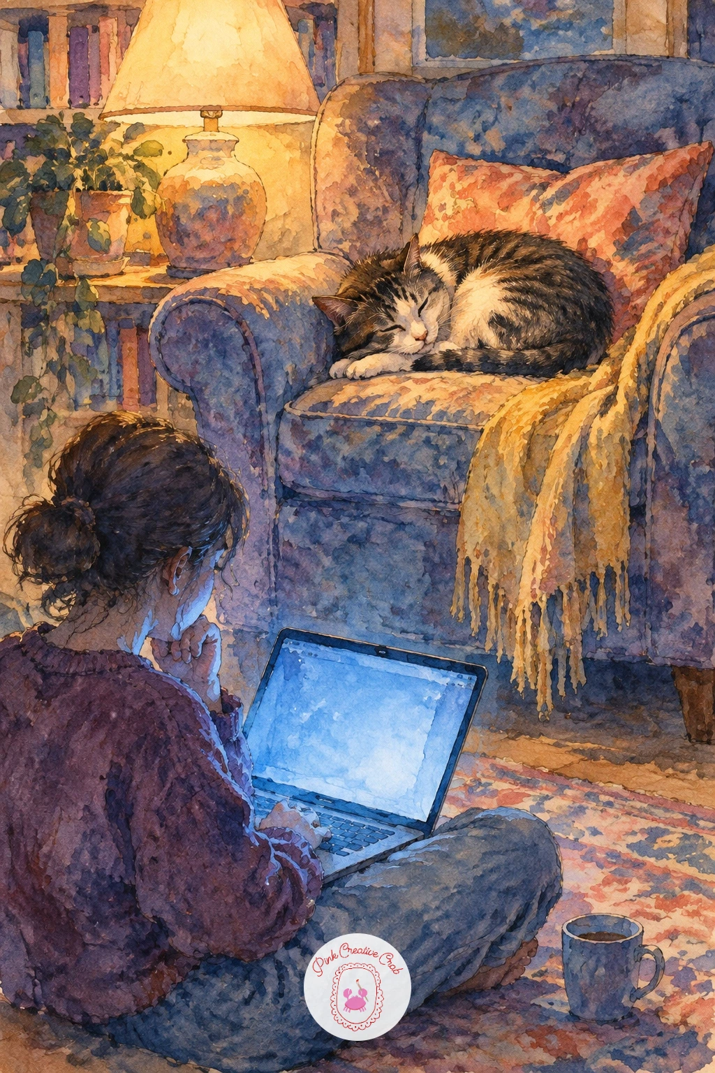
Palette: Plum,Soft Coral,Payne’s Grey,Naples Yellow
Two friends in pajamas on a double feature night pair naturally with a rainy window, since the window gives you a second light source to balance against the screen glow. Place the window on one side of the composition and let its cool blue-grey light fall across the friends opposite the warmer screen light.
Paint the rain streaks last, using the tip of a fine brush or the back of a brush handle dragged through wet paint for thin vertical lines down the glass. Build the pajama fabric in soft plum and dusky blue first, letting the two light sources mix gently where they overlap on a shoulder or a cheek.
The easy mistake is painting the rain too dark and heavy, which pulls focus from the friends. Keep rain streaks pale and sparse, just enough to read as weather. No masking fluid on hand, a dry brush dragged lightly over dry paint can lift thin streaks instead.
Try this today: paint the window glow and the screen glow as two different temperatures, one cooler, one warmer, before you add any figures, it makes the whole room feel lit from two real sources.
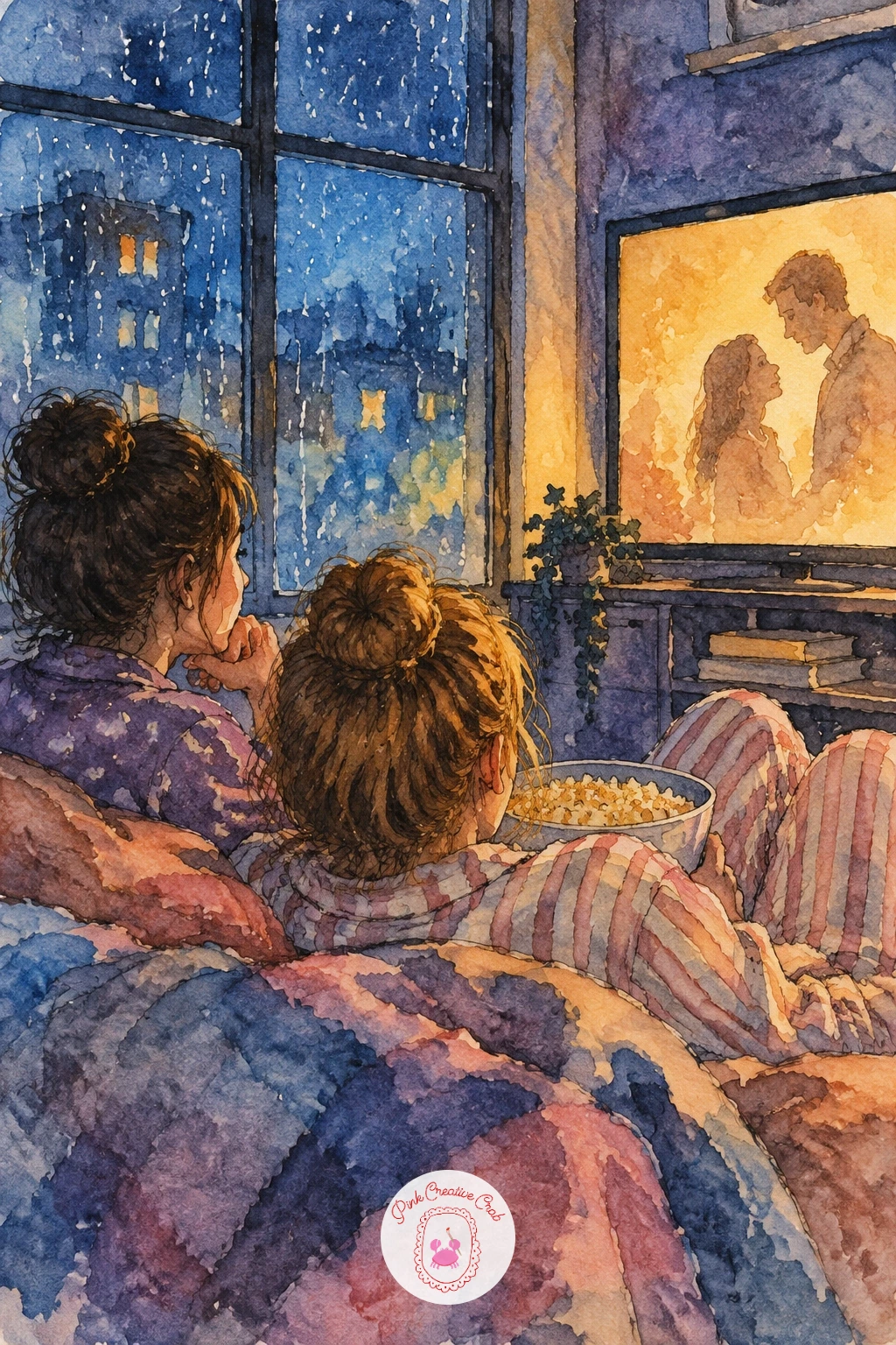
You Will Need
- masking fluid (optional, for rain streaks)
Palette: Dusky Blue,Plum,Naples Yellow,Payne’s Grey
A white sheet strung between two trees needs a horizon line placed low on the page, so the sheet and the dusk sky above it both get room to breathe. Paint the sky first in graded dusky blue fading into plum near the horizon, then leave the sheet itself as clean white paper, just shaded at the edges where it ripples.
Once the sky dries, paint the two trees as dark silhouettes flanking the sheet, their branches overlapping the top corners where the fabric is tied. A faint yellow glow across the sheet’s lower half suggests the projected light without painting any actual image on it.
The scene tips over into confusion if the sheet gets too much shadow detail, since a cluttered sheet stops reading as a screen. Keep it mostly flat white with only a few soft folds. If you lack a big enough brush for the sky wash, a flat wash brush or even a sponge works for that graded background.
One tip for today: paint the trees in one confident silhouette each rather than individual leaves, it keeps the dusk feeling calm rather than busy.
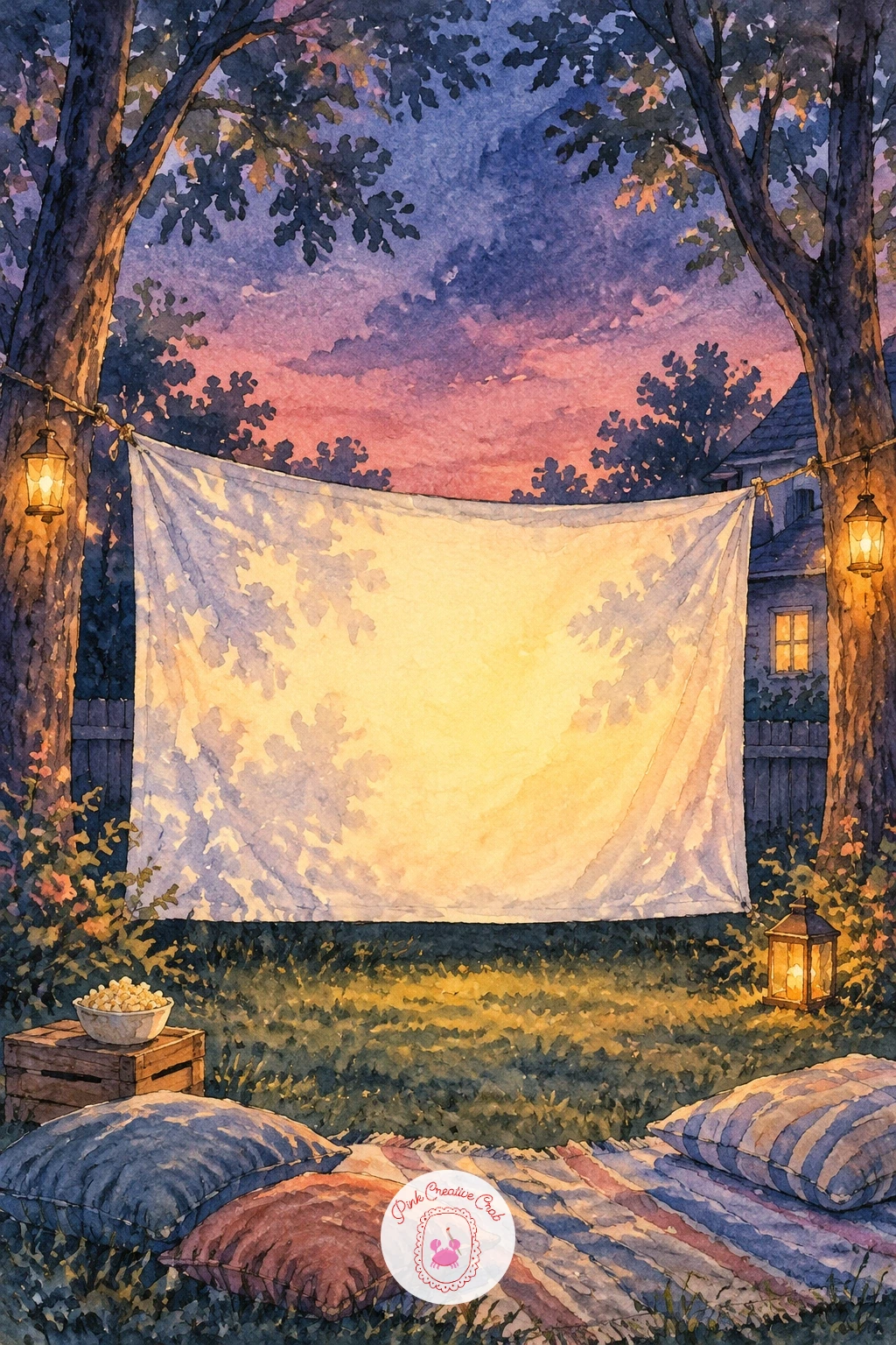
Palette: Dusky Blue,Plum,Naples Yellow,Payne’s Grey
Nothing tells the story of this dog faster than its eyes, so give the whole pose to tracking a single popcorn kernel mid-air above its nose. Sketch the kernel first as a tiny pale shape, then build the dog’s head tilted slightly, ears alert, eyes angled up toward it.
Paint the dog’s coat in warm coral and buttery yellow washes with plum shadow under the chin and ears, working from the lightest fur first and adding darker patches once that layer sets. The kernel stays nearly untouched white paper with just a thin shadow beneath it to show it is falling, not resting.
This goes wrong when the eyes end up looking straight ahead instead of upward, losing the whole joke of the pose. Angle both pupils toward the kernel and keep the eyebrows slightly raised. Short on time, a quick ten minute version needs only the head, the kernel and the shadow; a forty minute version adds the full body and a blanket underneath.
Finish with one tip: paint the kernel’s small cast shadow before anything else near it, that one mark is what makes it read as falling rather than just stuck there.
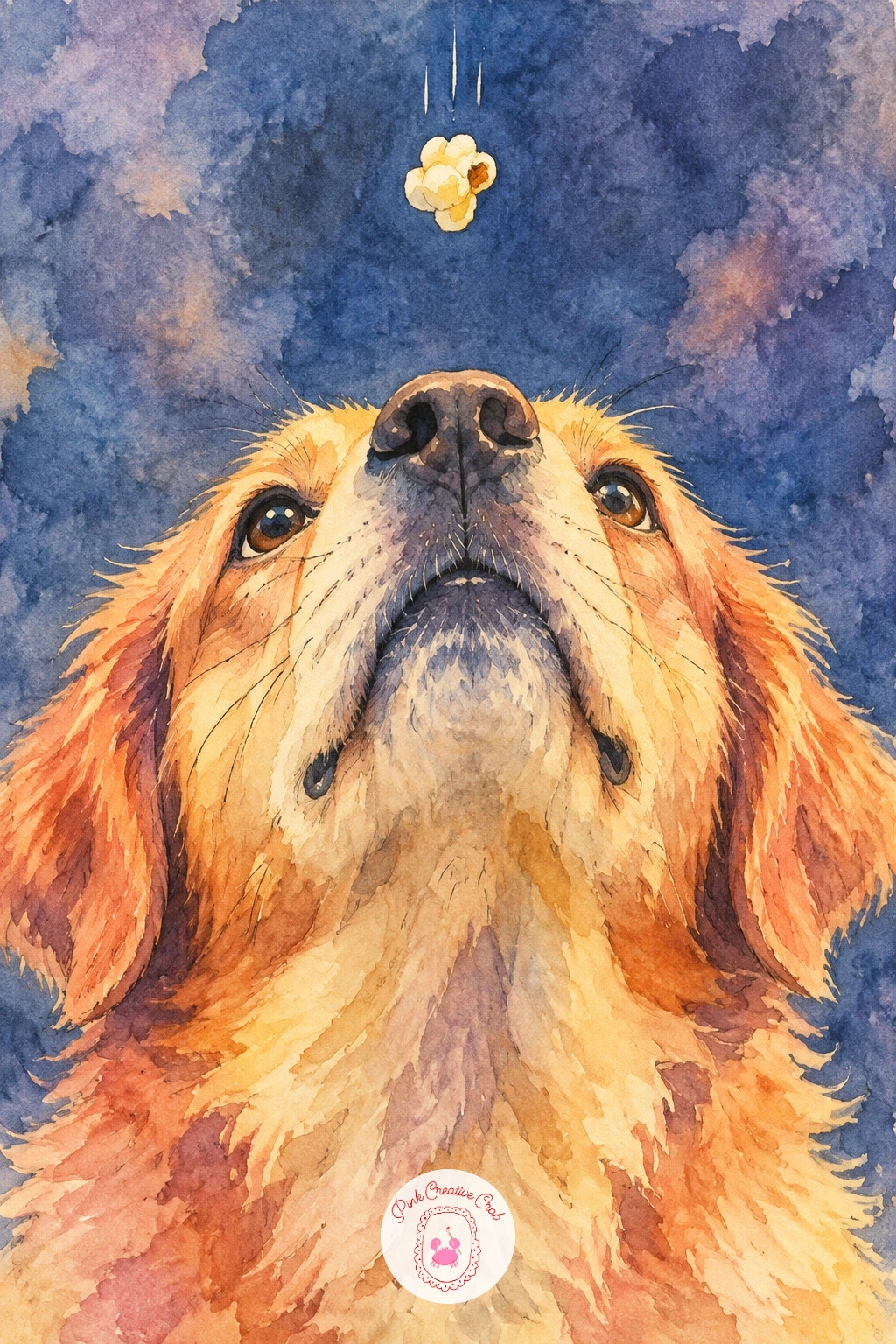
Palette: Soft Coral,Naples Yellow,Plum,Payne’s Grey
Picking up on cozy sofa scenes, this couple drifting off mid-movie needs soft, heavy eyelids and slumped shoulders more than any clever composition. Paint them leaning toward each other slightly, one head resting on the other’s shoulder, with a blanket pooled loosely across both laps.
Work the screen glow across their faces first in pale buttery yellow, since sleeping faces lit from one low source look more convincing than evenly lit ones. Once that is dry, layer plum shadow under chins and along closed eyes, and let the blanket take the boldest color in the piece so it does not compete with the quiet faces.
The common error is drawing open or half open eyes trying to look sleepy, which usually just looks awkward. Commit fully to closed eyes, drawn as single soft curved lines. No big blanket reference handy, drape a towel over a chair at home and paint from that instead.
One tip for today: paint the shoulder-to-shoulder lean before any other detail, that single gesture carries most of the story.
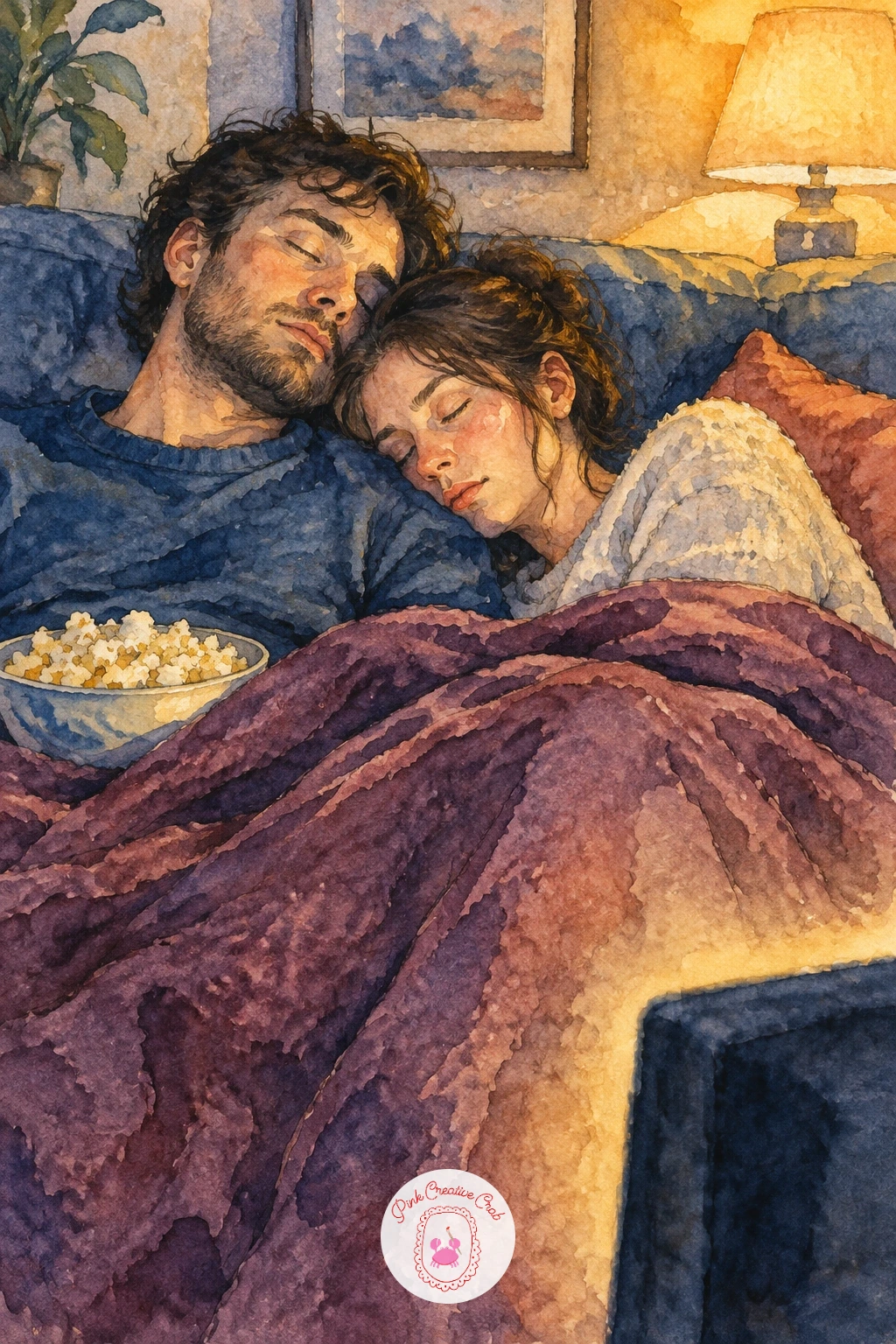
Palette: Naples Yellow,Plum,Payne’s Grey,Dusky Blue
Two sisters piling pillows into a nest on the living room floor gives you a good excuse to practice a cluster of soft shapes without worrying about faces too much. Build the pillow pile first as a loose stack of rounded rectangles in varied sizes, then tuck the two figures into the middle of it, only partly visible.
Paint each pillow a slightly different shade, cycling through plum, dusky blue and soft coral, so the pile reads as many separate pillows rather than one blob. Add the sisters last in simpler, flatter color so the pillows stay the busier, more textured part of the scene.
The pile falls apart visually if every pillow gets equal attention and equal brightness. Push one or two pillows into deeper shadow at the back of the nest so the eye has somewhere to rest. Running low on colors, two shades of one paint plus white paper gaps can still separate enough pillows to read clearly.
Try this today: paint the shadows between pillows before their top highlights, the gaps are what actually build the nest shape.
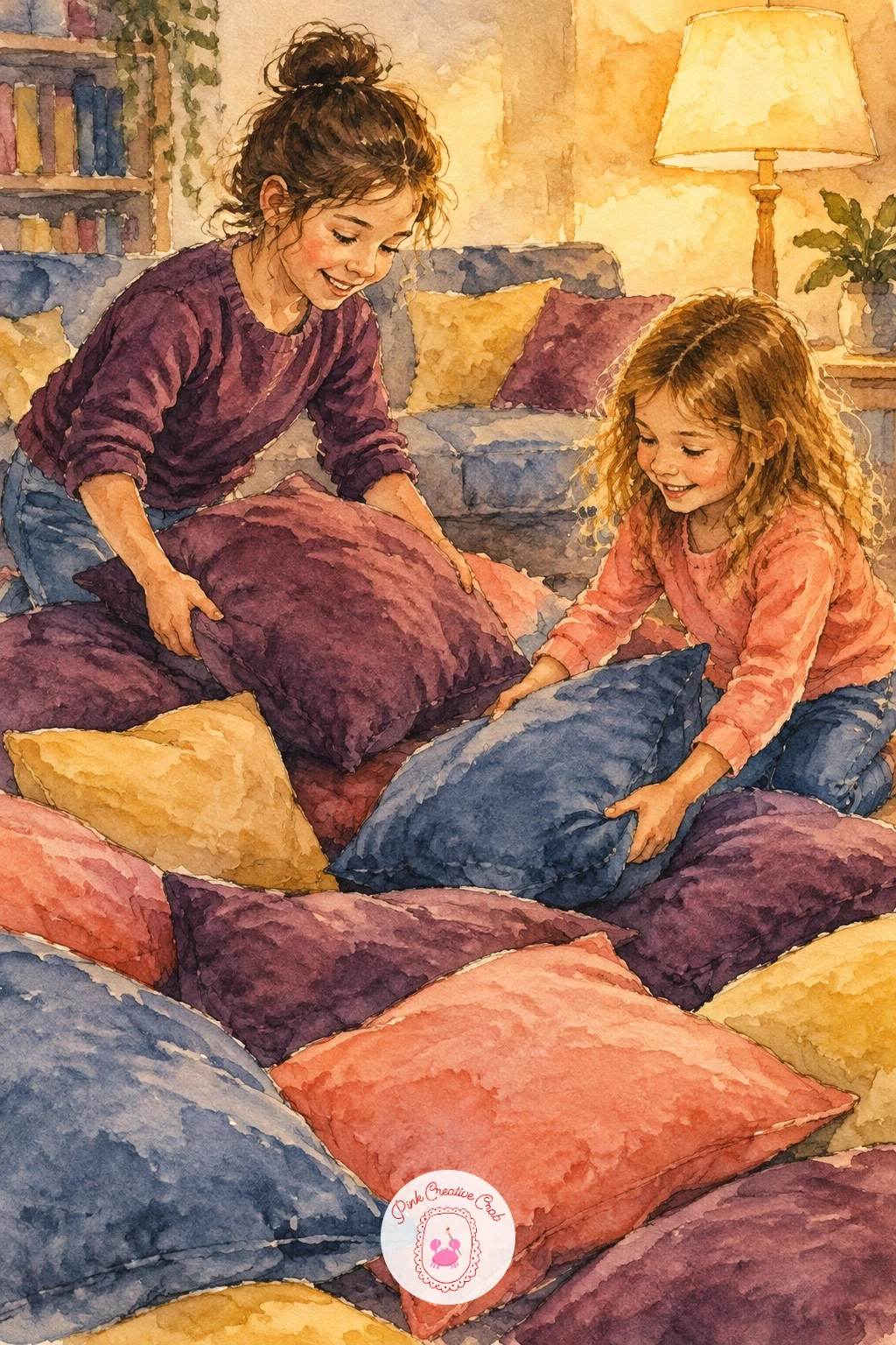
Palette: Plum,Dusky Blue,Soft Coral,Naples Yellow
This still life keeps things simple, a tray with two cocoa mugs and a striped popcorn box, all sitting on a footstool catching the warm edge of lamp or screen light. Treat it like a small watercolor still life: block in the footstool shape, then the tray, then the objects on top in order of size, biggest first.
Paint the mugs with a simple highlight left as untouched paper on one side, the steam rising from each cup suggested with the thinnest wash of grey rather than drawn lines. The popcorn box gets painted stripes in plum and buttery yellow, loose enough that they do not need to be perfectly straight.
Steam is the part that usually goes wrong, painted too solid and looking more like smoke than warmth. Keep it barely-there, almost invisible except right near the mug’s rim. For composition ideas on arranging small objects like this together, a watercolor still life guide is worth a look.
One tip for today: paint the cast shadows of the mugs and box onto the tray before adding any pattern, it is what sells the whole group as sitting on a real surface.
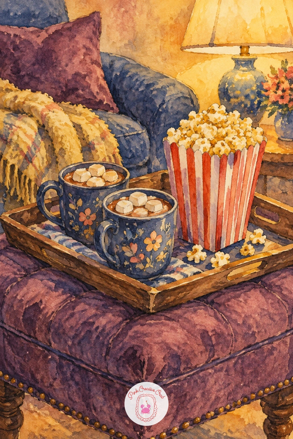
Palette: Plum,Naples Yellow,Payne’s Grey,Soft Coral
Following a quieter still life, here is a scene with real emotion: a girl crying at the sad ending while her friend pats her back. Give the crying friend a slightly crumpled posture, shoulders curled forward, while the comforting friend sits upright and leans in, one hand reaching across.
Paint the two faces in warm screen light first, keeping the crying face loose with just a few ink lines for closed or downturned eyes and a simple frown. A thin streak of clear water dragged down the cheek before the color sets can suggest a tear track without drawing a hard line.
The reaching arm is the detail most likely to look stiff. Bend the elbow more than feels natural and angle the hand slightly down onto the shoulder rather than straight across, it reads as a gentler gesture. If you find faces hard at this stage, a girl pencil drawing guide has simpler practice faces to build confidence first.
Finish with one tip: paint the comforting hand’s shadow on the shoulder before the fabric color around it, that small dark shape is what makes the touch feel real.
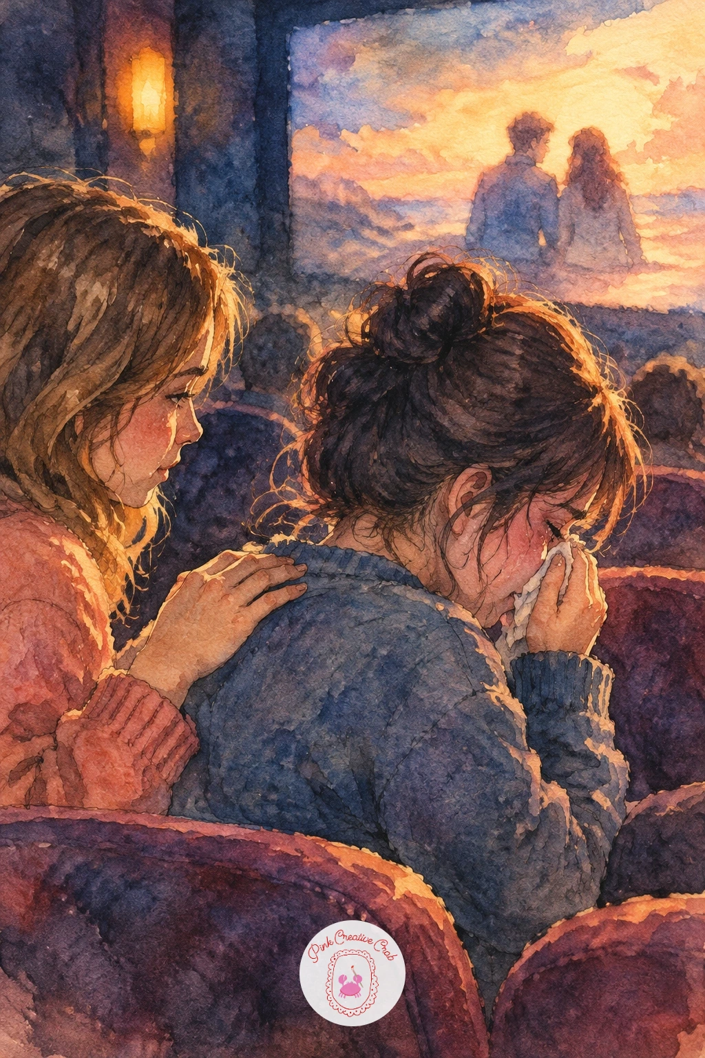
Palette: Dusky Blue,Plum,Naples Yellow,Soft Coral
Line up a row of kids in sleeping bags for a sleepover scene, each bag a slightly different color so the row does not read as one repeated shape. Place the glowing TV at one end of the composition so its light falls across all the faces unevenly, brighter on the nearest child and softer on the farthest.
Paint the sleeping bags as simple rounded wedges first, then the faces poking out the top, kept small and mostly looking toward the glow. Work the TV light in pale buttery yellow washed across cheeks and sleeping bag tops before any darker color goes in around them.
Rows of similar shapes tend to flatten out if every bag sits at the same angle. Stagger them, some straight, some slightly turned, so the line feels lived-in rather than lined up for a photo. Short on space or time, three kids instead of five still reads as a full sleepover.
One tip for today: paint the darkest shadows in the room, under chins and between sleeping bags, before the TV glow highlights, it keeps the light looking like it is actually the brightest thing in the room.
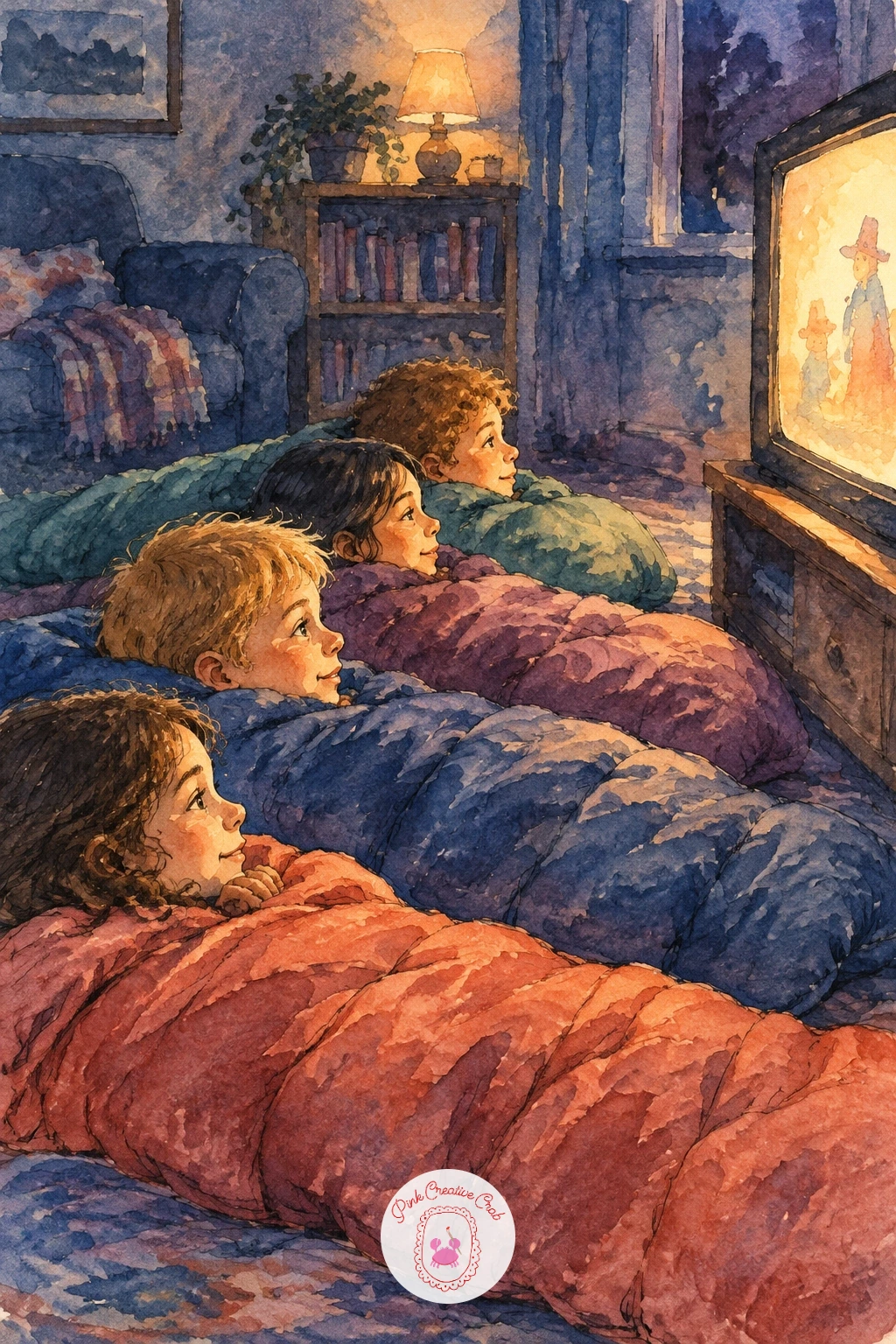
Palette: Naples Yellow,Plum,Dusky Blue,Payne’s Grey
A popcorn fight needs motion more than detail, so sketch the two friends mid-throw first, one arm cocked back, one arm shielding a face, before adding a single kernel. Scatter the flying kernels across the space between them as small pale dashes rather than careful circles, varying their size slightly for a sense of distance.
Paint the figures in loose, energetic brushstrokes, letting a little color bleed outside the lines on sleeves and hair to suggest movement. Once dry, use the fine liner to add a few short motion lines trailing behind the fastest kernels, just two or three strokes each.
Flying kernels painted in a neat grid pattern kill the energy instantly. Scatter them unevenly, with a few clustered near the thrower and a few further out, as if caught at different points mid-air. No fine liner handy, the tip of a toothpick dipped in ink makes similarly thin motion lines.
Finish with one tip: paint the kernels last, after both figures and the background are fully dry, so each one stays crisp and sits clearly on top of the scene.
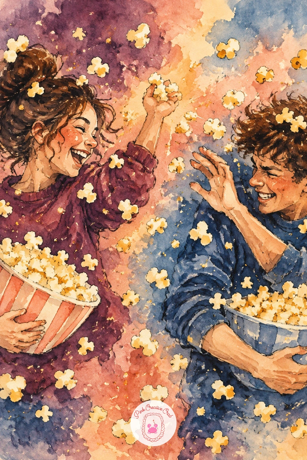
You Will Need
- toothpick (optional, for thin motion lines)
Palette: Naples Yellow,Soft Coral,Plum,Dusky Blue
Returning to the projector beam, this time make the beam itself the real subject, with a sleeping cat tucked quietly underneath it. Paint the beam as a soft diagonal wedge of pale buttery yellow cutting across a dark room, then leave small untouched flecks of white paper scattered inside it before the wash fully dries.
Once the beam layer is dry, go back in with a tiny brush or the end of a brush handle to dot a few extra pale specks of dust catching the light, some brighter than others. The cat below stays a simple curled dark shape, mostly silhouette, so it does not compete with all that floating light.
This idea tips into mess if too many dust specks get added evenly across the beam, which looks more like noise than light. Keep most of the beam clean and reserve the speckled dust for one denser patch near the middle. No small brush on hand, flick a damp toothbrush loaded with pale paint lightly across the dry beam for a scatter of dust instead.
One tip for today: paint the room around the beam very dark first, the darker that surrounding wash, the more the dust specks seem to glow.
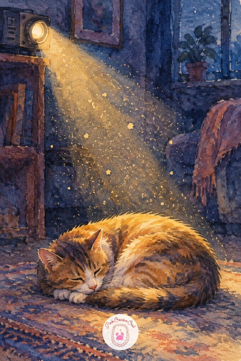
You Will Need
- toothbrush for splatter (optional)
Palette: Naples Yellow,Payne’s Grey,Indigo,Plum
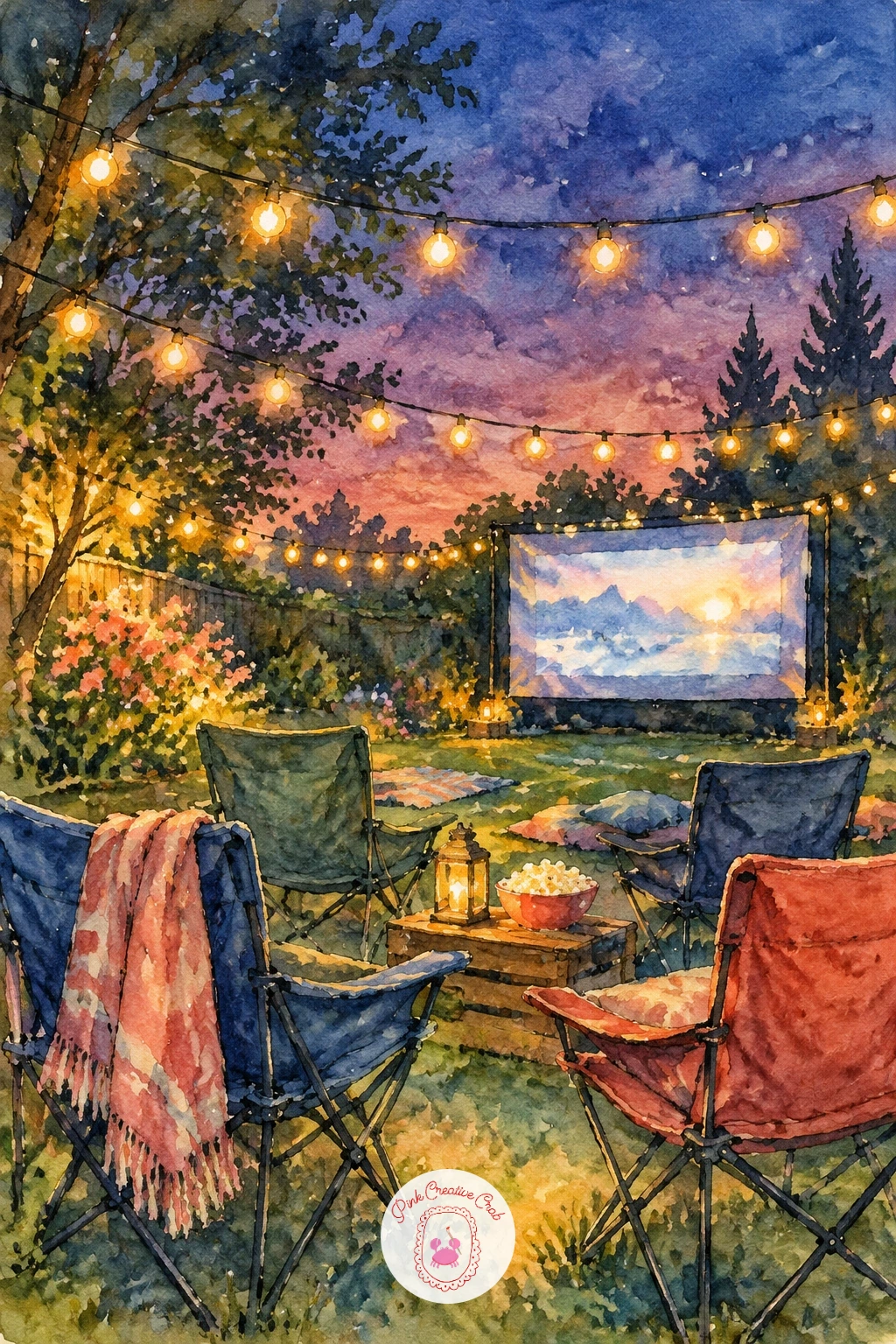
Set the eye level low for this one, roughly at camping chair height, so the string lights overhead stretch across the top of the page and the backyard screen sits further back, smaller and softer than anything in the foreground. That low angle is what makes the lights feel like they are strung right above the viewer’s head.
Paint the sky first in a deep dusky blue to plum gradient, then add the string lights as small dots of buttery yellow with a faint halo of lighter wash around each one, painted while the sky is still slightly damp so the glow softens naturally. Camping chairs and a distant glowing sheet screen come in last, kept smaller in scale since they sit further back.
Lights painted as hard, perfectly round dots look flat against a soft sky. Let a few bleed slightly and vary their brightness instead of making every bulb identical. For more ideas on painting small glowing points against a dark sky, the Christmas lights drawing ideas cover similar techniques.
One tip for today: paint the halo around each light before the dot itself, a soft glow painted first and a brighter center dropped into it wet-in-wet reads far more convincingly than a dot with a ring drawn around it after.
Palette: Dusky Blue,Plum,Naples Yellow,Payne’s Grey
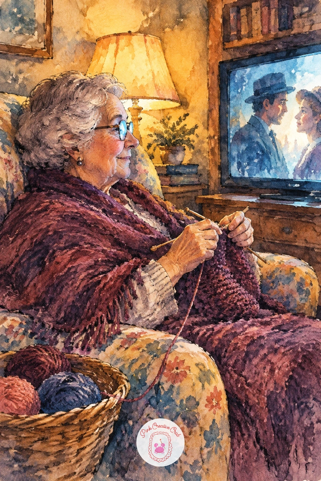
A grandma knitting in her armchair through the whole movie is a quiet, detail-friendly subject, good for slowing down after the busier backyard scene. Start with the armchair shape, generously padded and a little worn-looking, then place her seated figure settled well into it with knitting needles held low in her lap.
Paint her cardigan or shawl in warm plum with a textured dry brush pass once the base color is dry, dragging a nearly-dry brush lightly across the surface to suggest knitted texture without painting individual stitches. The yarn and needles stay simple, just two thin ink lines crossing with a small coiled shape of yarn in buttery yellow or soft coral.
Hands holding needles are the trickiest part and often come out stiff. Simplify them into soft rounded shapes with just a suggestion of fingers rather than drawing each one distinctly. If a dry brush pass feels tricky to control, a small natural sponge dabbed lightly over dry paint gives a similar soft texture.
Finish with one tip: paint the screen glow catching just one side of her glasses or face, it quietly ties her into the same movie night as everyone else in the room.
Palette: Plum,Soft Coral,Naples Yellow,Payne’s Grey
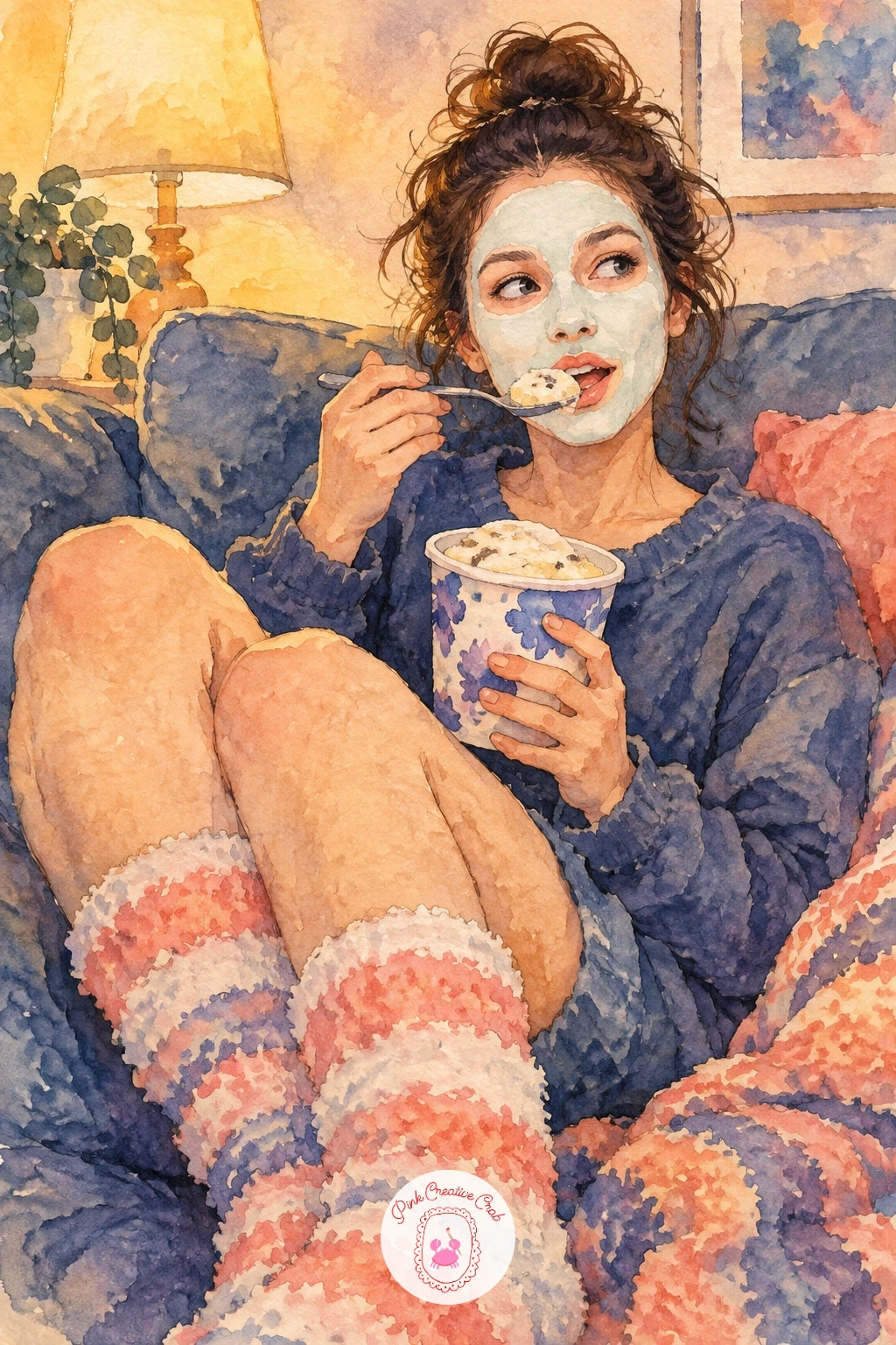
For a lighter, funnier beat, paint a girl in a face mask and fluffy socks eating ice cream straight from the tub, legs tucked up on the sofa. Sketch the face mask first as a flat pale shape covering most of her face, leaving only the eyes and a bit of hairline visible, since that flatness is what reads as a face mask rather than skin.
Paint the fluffy socks with small dry-brush dabs around the edges to suggest texture, working outward from a solid sock shape so the fluffiness sits only at the rim rather than throughout. The ice cream tub stays simple, a cylinder shape with a spoon sticking out, painted in whatever flavor color feels fun.
The face mask can look like a strange void if left too flat and pale. Add the faintest hint of texture or a slightly uneven edge so it still reads as fabric or cream rather than an empty patch. No real dry brush texture coming through, press a crumpled tissue lightly onto wet paint at the sock edges for a similar fluffy effect.
One tip for today: paint the spoon mid-air, just lifted from the tub, rather than resting inside it, it adds a small moment of action to an otherwise still pose.
Palette: Soft Coral,Dusky Blue,Naples Yellow,Plum
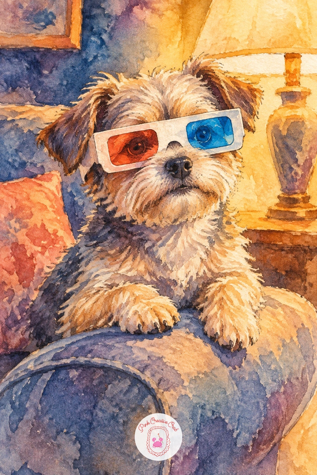
A small dog wearing 3D glasses on the sofa armrest is a quick, charming subject, good for practicing how glasses sit on a rounder face than a human one. Paint the dog’s head and shoulders first, then add the glasses as two overlapping colored lenses, traditionally one reddish and one blue-toned, held on with a simple thin ink frame.
Keep the lenses semi-transparent by painting them as a light wash rather than solid color, so a hint of the dog’s fur still shows through underneath. The armrest gets a quick plum or dusky blue wash beneath the dog, with the dog’s paws just overlapping the edge to anchor it in place.
Glasses drawn too large make the whole dog look like it is wearing a mask rather than glasses. Keep the lenses close to the size of the eyes, only slightly larger, and angle the frame gently with the tilt of the head. Quick version in ten minutes: head, glasses and a flat wash background; the forty minute version adds full body, paws and the textured armrest fabric.
Finish with one tip: paint the colored lens tints last, on top of the dry fur color, so they stay translucent instead of muddying into a single brown blob.
Palette: Soft Coral,Dusky Blue,Plum,Naples Yellow
For a different small companion in the scene, a dog pencil drawing guide has simple head and ear shapes worth practicing first.
Two friends sharing popcorn on a rooftop in front of a laptop is a city-night variation on the backyard screen, so place the laptop screen as the main light source again, this time with a skyline silhouette behind both figures instead of trees. Paint the skyline first as a flat dark shape of simple rectangles against the dusky sky, keeping windows as just a few scattered yellow dots.
Bring the two friends in next, seated close together with the laptop balanced between them, its screen glow washing pale blue-yellow light across both faces. The popcorn bowl sits in one lap or between them, small and secondary to the two lit faces.
The skyline can swallow the whole composition if it gets too much detail. Keep buildings as flat silhouettes with only a handful of lit windows, saving all the real contrast for the laptop glow on the friends. Short on laptop reference, any small glowing rectangle, even a phone screen, carries the same light logic.
One tip for today: paint the laptop’s glow spilling slightly onto the rooftop surface in front of it, that small pool of light grounds the whole scene.
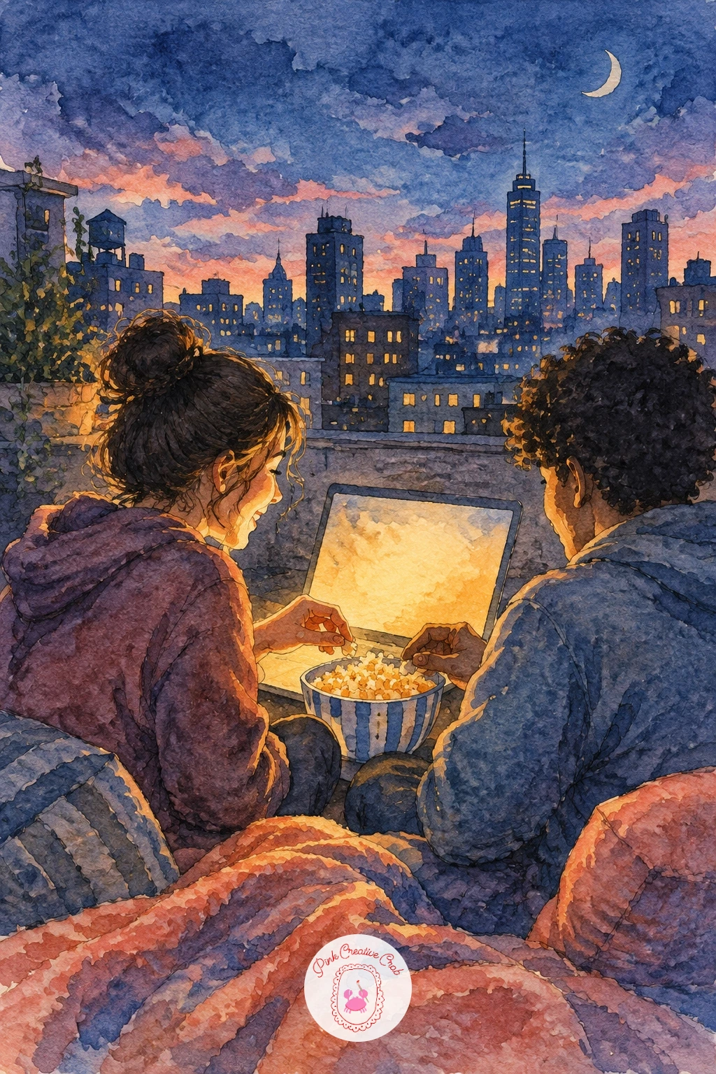
Palette: Dusky Blue,Naples Yellow,Plum,Payne’s Grey
A toddler in footie pajamas dozing off on a beanbag calls for soft, rounded shapes everywhere, since nothing about this scene should have a hard edge. Build the beanbag first as one big soft lump, slightly squashed under the toddler’s weight, then nestle the small curled body into its center.
Paint the footie pajamas in one warm, simple color with a faint pattern of a few dots or stars kept small and sparse, since too much pattern competes with how sleepy the pose should feel. The toddler’s face stays loose, closed eyes as two short curves, cheeks given the warmest, softest color in the whole piece.
Toddlers painted with adult proportions look instantly wrong. Keep the head large relative to the body and the limbs short and rounded, with no visible elbows or knees, just soft curves. If pattern feels fiddly at small scale, leave the pajamas plain and let color alone carry the coziness.
Finish with one tip: paint the beanbag’s dent where the toddler’s weight presses in before adding the toddler itself, that small sink in the fabric is what makes the weight feel real.
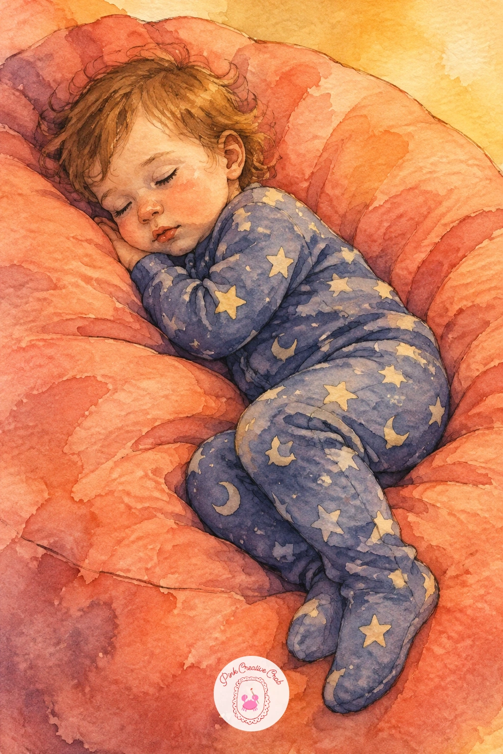
Palette: Soft Coral,Naples Yellow,Plum,Dusky Blue
Sometimes the whole story is just a heap of blankets on the couch with two pairs of socks poking out the end, no faces needed at all. Build the blanket heap as a tall, irregular mound first, varying the fold shapes so it does not read as one smooth pillow, then leave two gaps near the bottom edge for the socks.
Paint the blanket pile in overlapping layers of plum and dusky blue, letting some patches stay paler where folds catch the light, then add the socks last in a contrasting color so they stand out clearly against the darker pile. A striped pattern on the socks, painted with just three or four thin lines each, adds personality without much extra work.
Blankets painted too smoothly lose the cozy, lived-in feeling entirely. Keep edges a little ragged and uneven, and vary how much of each fold catches light. If your socks feel too flat against the blankets, a thin ink outline around just the sock edges helps them pop forward.
One tip for today: paint the darkest shadow where the two feet disappear into the blanket pile, that small dark pocket is what makes the socks look like they are actually attached to someone underneath.
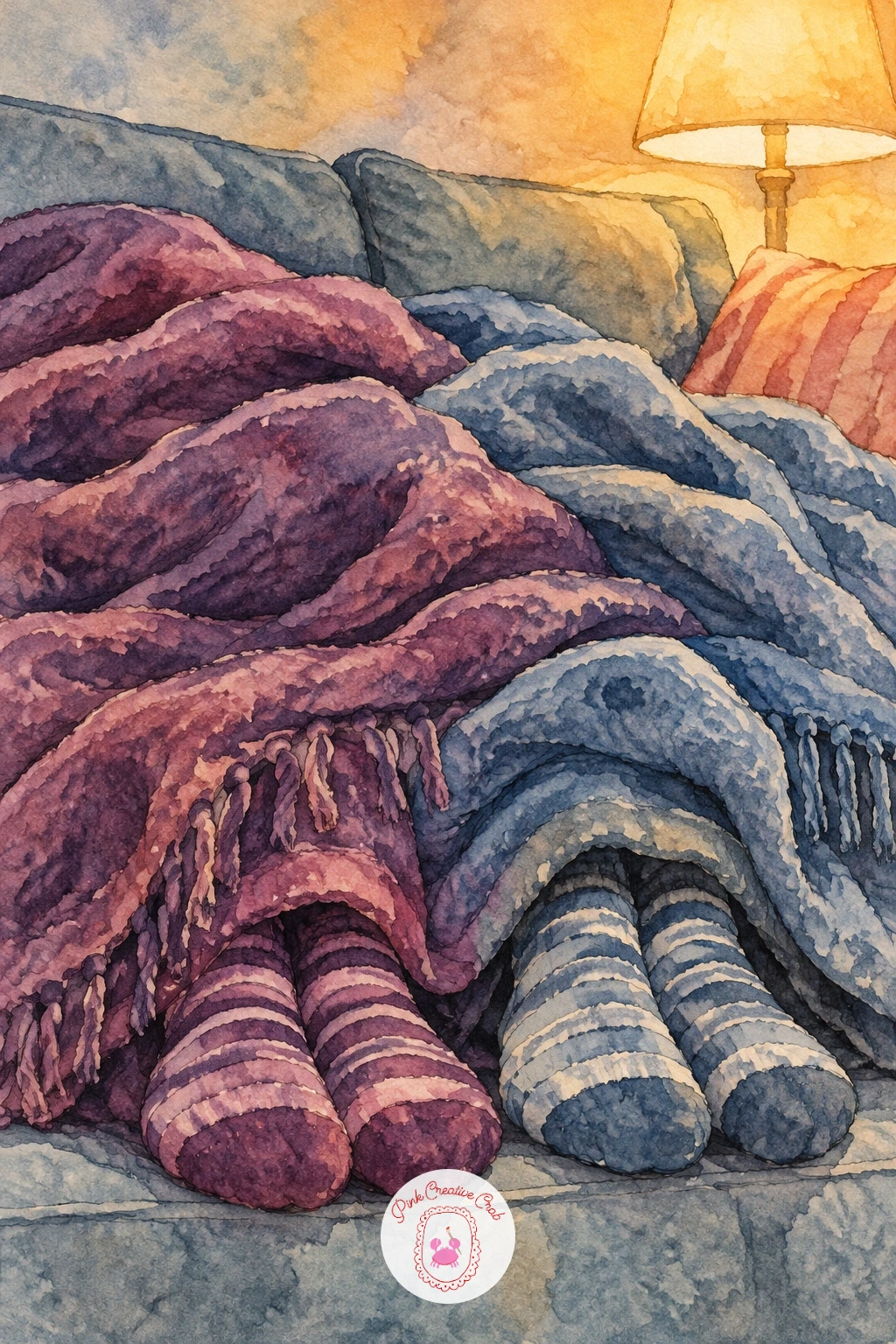
Palette: Plum,Dusky Blue,Naples Yellow,Soft Coral
An open pizza box on a coffee table during a movie marathon is a fun still life break from all the figures, good practice for painting a flat lid against a round pizza inside. Paint the box lid first as a simple open rectangle, slightly tilted, then fill the interior with the pizza’s rounder shape, leaving the crust edge as a slightly raised rim.
Work the cheese and toppings in loose dabs of color rather than careful circles, buttery yellow for cheese with a few scattered darker dots for toppings, since real melted cheese never has clean edges. The box itself can take a plain cardboard tone with just a faint shadow where the lid meets the table.
Pizza toppings arranged too neatly in a ring look painted rather than real. Scatter them unevenly, with a couple clustered together and a few isolated slices of the pie left bare. No reference pizza on hand, any round baked food photo gives you a similar crust-and-topping logic to work from.
Finish with one tip: paint the steam rising faintly from the pizza only if the box was just opened, a single thin pale wisp is enough, skip it entirely if the scene feels like the pizza has been sitting a while.
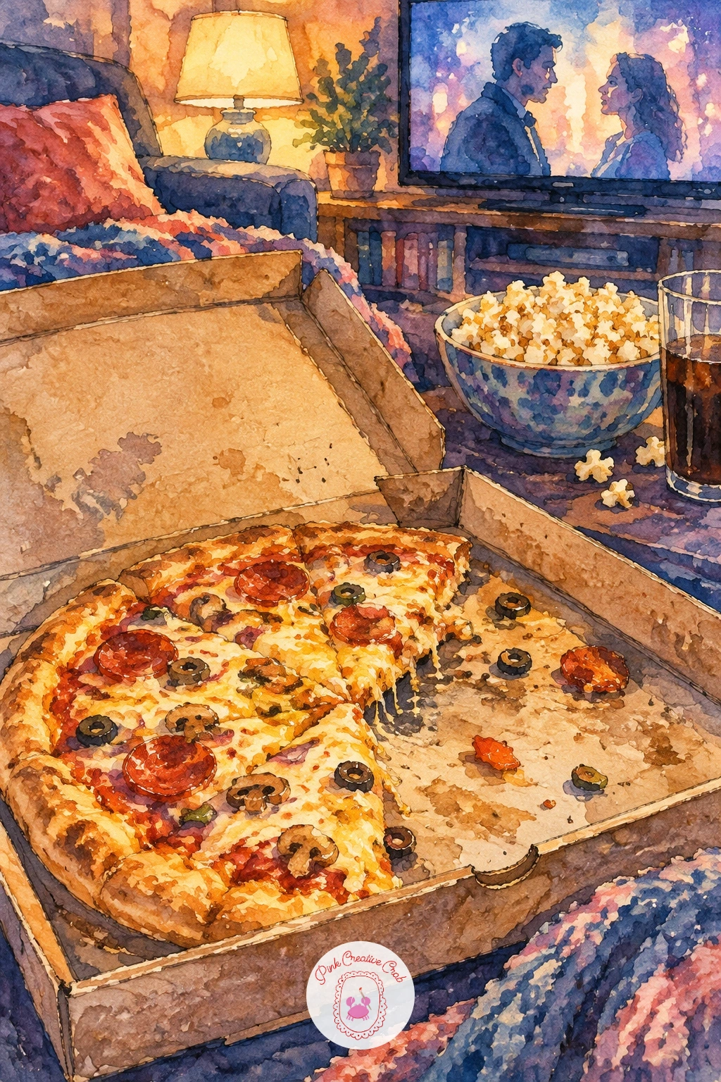
Palette: Naples Yellow,Soft Coral,Payne’s Grey,Plum
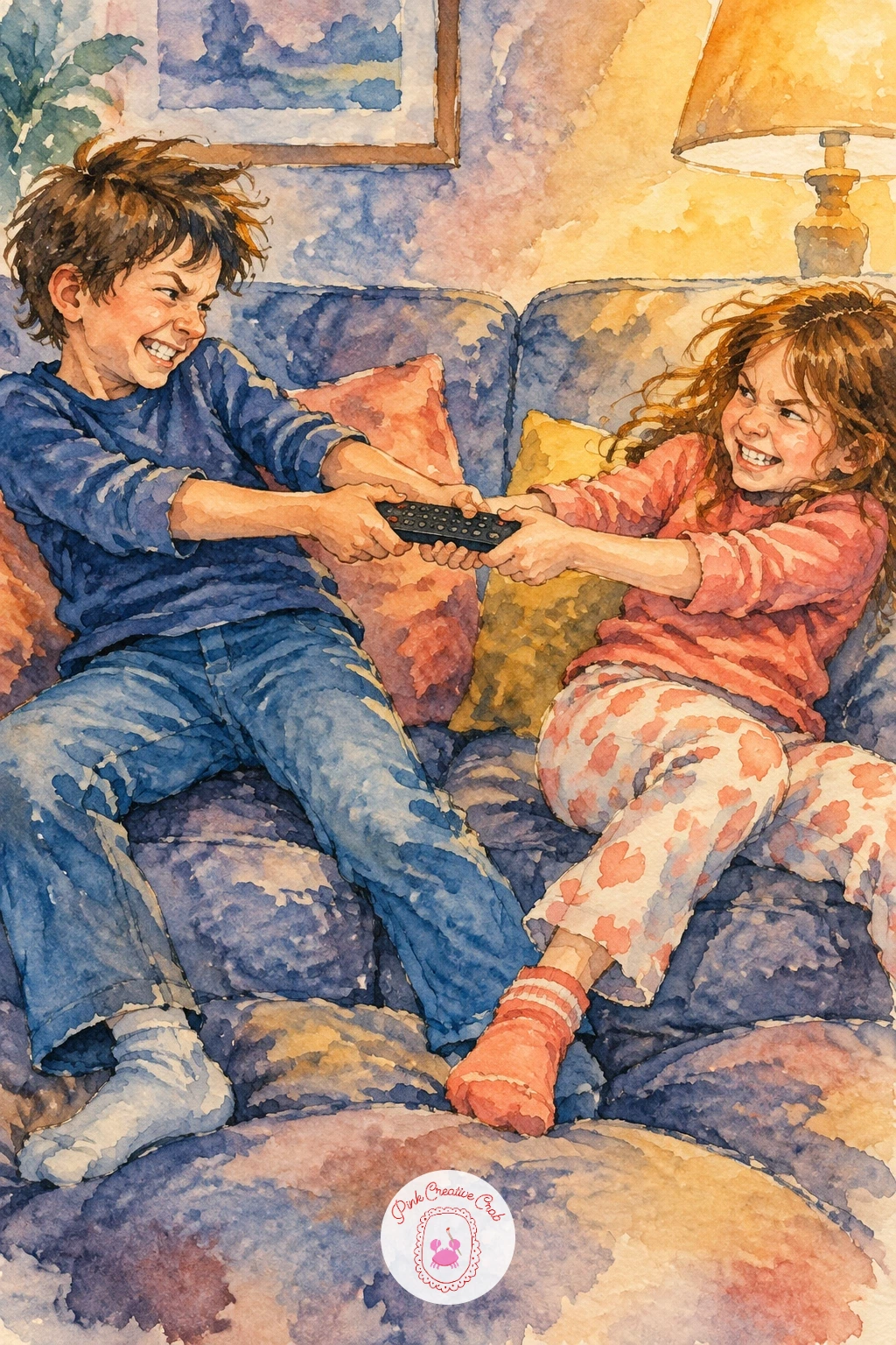
Two siblings tugging the remote between them on the sofa needs clear opposing body language, so lean one figure’s whole weight backward and the other forward, both hands gripping the same small rectangle stretched taut between them. Sketch the remote first, small and simple, then build both pulling figures around it with exaggerated lean.
Paint the figure leaning back with most of their weight sunk into the sofa cushion, using a darker shadow beneath them, while the leaning-forward figure gets a lighter, more energetic wash with less shadow, as if caught mid-motion. The remote itself stays nearly plain, just a dark rectangle with two or three tiny button dots.
Tug of war poses fall flat if both arms end up at the same angle, which removes the sense of pulling in opposite directions. Angle one arm sharply back and one sharply forward, even if it exaggerates the pose past realistic. If a clear remote reference is hard to find, any small rectangular object held in two hands works for practicing the grip.
One tip for today: paint the fabric of each sibling’s sleeve stretched slightly in the direction of the pull, a small wrinkle line toward the remote sells the tension better than the pose alone.
Palette: Dusky Blue,Soft Coral,Plum,Payne’s Grey
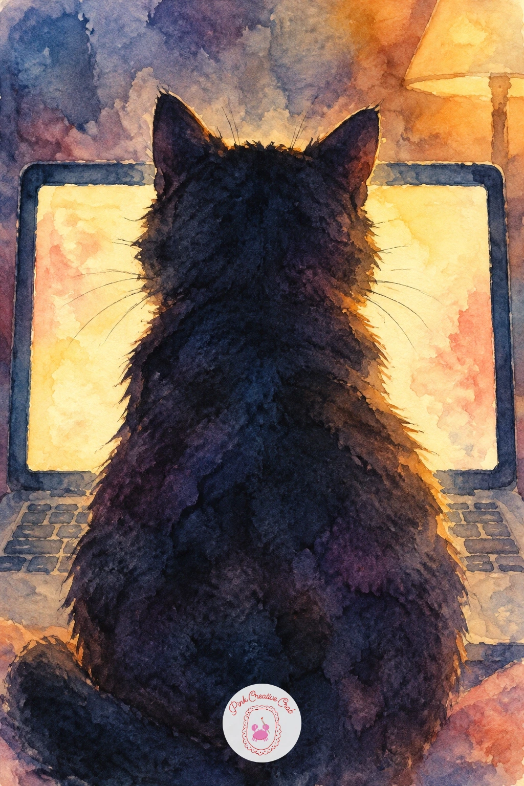
A cat sitting right in front of the screen, blocking everyone’s view, works best painted from behind the cat, looking past its silhouette toward the glow it is interrupting. Place the cat’s dark shape dead center, slightly off from the screen’s own center so a sliver of light escapes on one side, enough to show what is being blocked without showing it clearly.
Paint the screen glow first as a soft rectangle of pale buttery light, then add the cat’s silhouette on top once that light layer is fully dry, keeping the edges of the cat crisp against the softer glow behind it. A single raised tail tip catching a rim of light is a nice small detail to add last.
If the cat’s silhouette gets painted before the glow is dry, the two colors muddy together and the cat loses its crisp outline. Always let the background glow dry completely first. No screen glow reference handy, any photo of a lamp in a dark room gives the same basic light logic to study.
Finish with one tip: leave a thin, irregular rim of lighter color around the cat’s edge, caught light along fur, it is what separates a flat sticker-like cat from one that looks like it is actually sitting in that light.
Palette: Naples Yellow,Payne’s Grey,Indigo,Plum
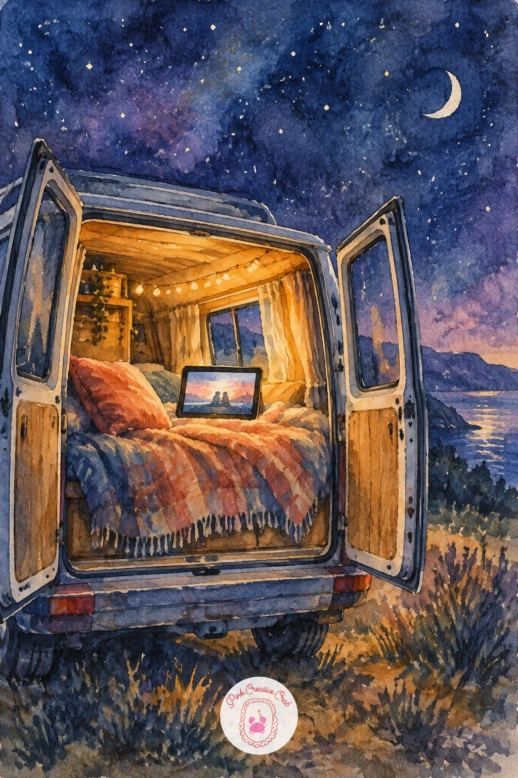
A camper van with its back doors open and a movie playing on a tablet at night brings the backyard screen idea into a smaller, more intimate frame. Paint the van’s body first as a simple boxy silhouette against a dark sky, then open the back doors as two angled panels catching a bit of interior light spilling out.
Place the tablet glow low inside the open doors, small and bright compared to everything else, with maybe a blanket or cushion shape nearby suggesting someone curled up to watch. The night sky above can take a few scattered stars, kept sparse so they do not compete with the van’s own glow.
The van’s proportions go wrong fastest if the back doors are drawn too narrow, which makes the whole vehicle look toy-like. Keep the door opening generous and roughly square so it reads as a real adult-sized space. If stars feel fiddly to paint individually, a flick of a nearly dry brush across the dry sky gives a similar scattered effect.
One tip for today: paint the tablet’s glow spilling onto the van’s interior walls and floor before adding any blankets or props, that spill of light is what makes the small space feel lived-in.
Palette: Indigo,Naples Yellow,Dusky Blue,Plum
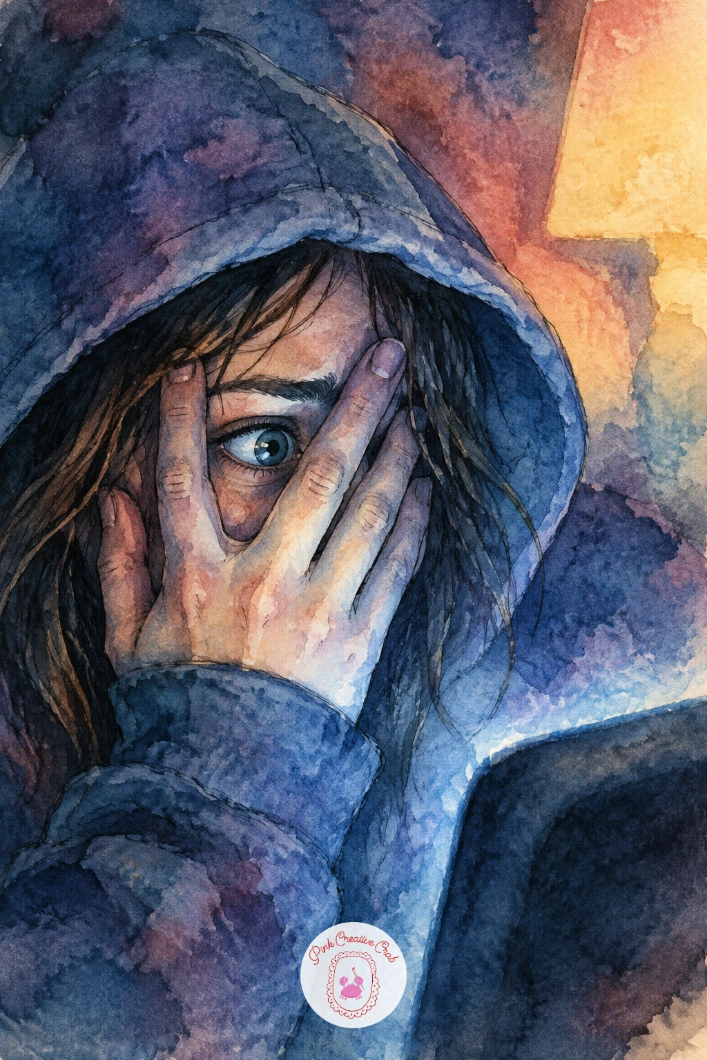
For another scary-scene moment, paint a girl peeking through her fingers from under a hoodie, her hood pulled up so only a narrow strip of her face shows between hand and fabric. Build the hood shape first as a soft rounded frame around the face, then place the hand across it with fingers slightly spread, leaving just enough gap for one visible eye.
Paint the visible sliver of face in the brightest screen light in the whole piece, since that narrow strip is doing all the emotional work here. Everything else, the hood, the hand, the rest of the room, can sit in deeper plum and dusky blue shadow by comparison.
Fingers spread too evenly across the face look stiff and symmetrical. Let them overlap unevenly, with one finger pressed closer to the eye and others looser, as if the hand is caught mid-adjustment rather than posed. If hands feel difficult at this stage, practice just the hand shape separately a few times on scrap paper before placing it over the face.
Finish with one tip: paint that single visible eye last, after everything else is dry, so it stays the crispest, most detailed mark on the whole page.
Palette: Plum,Dusky Blue,Naples Yellow,Payne’s Grey
End the set on a breezier note, a summer movie night on a balcony with a small fan blowing a girl’s hair sideways while she watches a tablet or laptop propped nearby. Sketch the hair first as a few bold sweeping strokes all moving in one clear direction, since that single direction is what reads as wind rather than just messy hair.
Paint the screen’s glow on her face in pale buttery yellow first, then build her hair in loose coral or plum strokes sweeping the same way as the breeze, letting a few strands break free from the main mass for movement. The balcony railing and a hint of night sky behind her can stay simple, mostly dark negative space framing the lit figure.
Hair painted in too many directions at once destroys the sense of wind entirely. Commit to one dominant sweep, even if it means exaggerating it slightly past what feels natural. For more practice with figures and gesture in simple poses, the silly couple drawing ideas cover similar loose, expressive figure work.
One tip for today: paint two or three stray hair strands crossing in front of her face last, in a slightly darker line, it is a small detail that does a lot to sell the breeze.
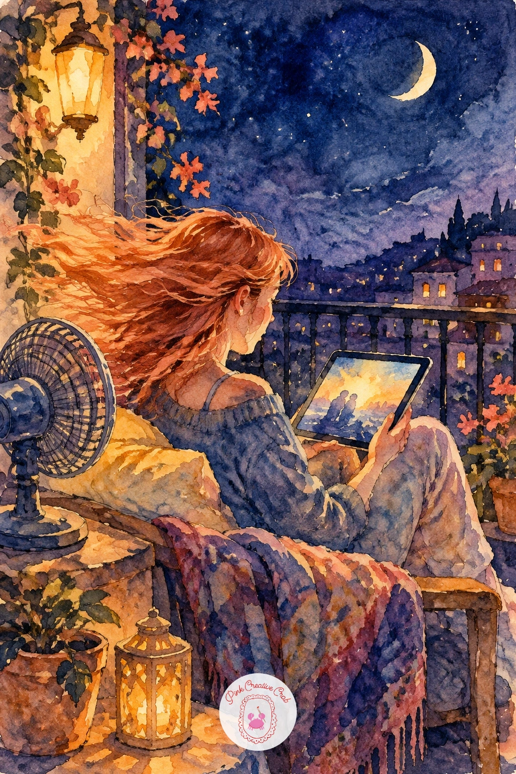
Palette: Soft Coral,Naples Yellow,Plum,Indigo
What to Do Next
Pick whichever scene matches tonight’s mood, grab a small sheet of cold press paper, and start with the lightest wash first, whether that is a screen glow, a dusk sky or a pool of lamp light. The ink details always go last, once everything underneath has had time to dry.
Frequently Asked Questions
What is the easiest movie night drawing idea for a beginner?
A simple popcorn bowl on a quilt or a single cat in an armchair works best for beginners. Both need only basic shapes, one light source and a few loose washes to look finished.
How do you paint realistic screen glow in watercolor?
Paint the glow as a pale, warm wash first while the surrounding area is still dry, then build darker shadow colors around it once that light shape has dried. Keeping the brightest area small and clean makes it read as glowing light rather than flat color.
What colors work best for a cozy movie night palette?
Dusky blue, plum and buttery yellow form the core palette, with soft coral added for warmth on skin, fabric or lamp light. These four colors mix well together and avoid looking either too cold or too saturated.
Do I need special supplies for these movie night scenes?
Most ideas need only regular watercolor paper, paint and a fine liner pen. A few benefit from extras like masking fluid for rain streaks or a toothbrush for scattering dust or snow-like texture, but these are optional.
How do I keep a nighttime scene from looking too dark and muddy?
Reserve your darkest values for just a few key shadow areas instead of washing dark color evenly across the whole scene. Leaving clean white paper or pale washes near the main light source keeps contrast strong and the piece readable.
Have any thoughts?
Share your reaction or leave a quick response — we’d love to hear what you think!
-
 0
-
0
-
0
-
0
-
0
-
0


