Table of Contents
Studies show that over 60% of watercolor beginners choose food as their first subject because it’s forgiving and fun. We’ll show you fourteen simple food illustrations that’ll build your confidence with each brushstroke. These projects start with basic citrus slices and progress to detailed spreads, teaching you essential techniques like wet-on-wet blending and layering colors. You’ll discover why certain foods make perfect practice subjects and how to capture their textures.
Simple Citrus Slices: Your First Watercolor Food Win
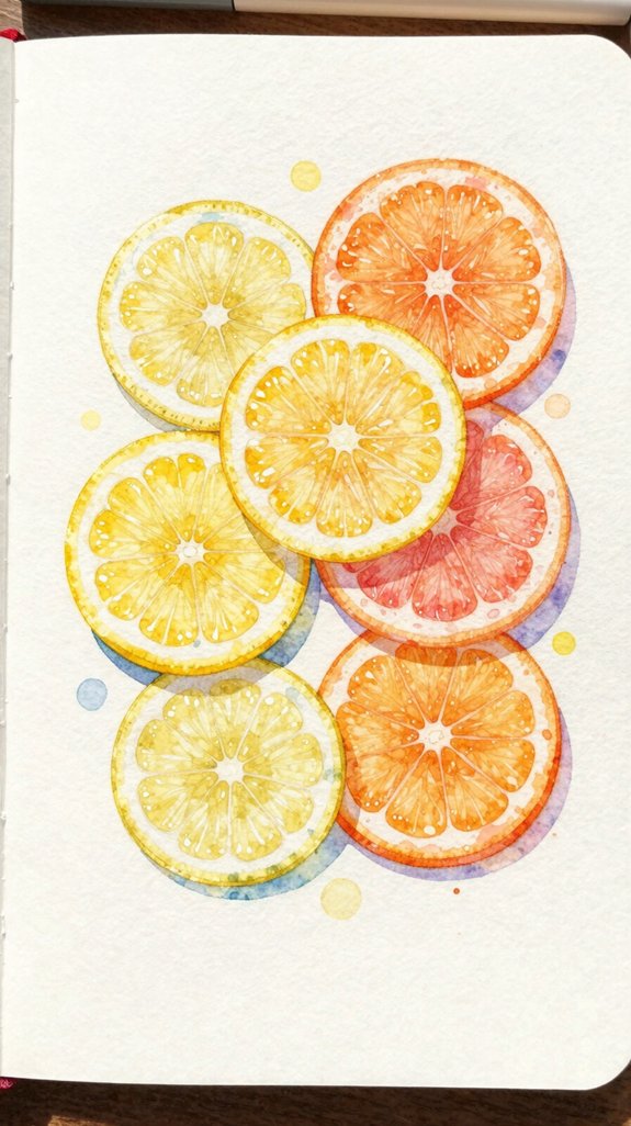
Citrus slices make perfect beginner subjects because they’re forgiving, cheerful, and built from simple shapes. Start by sketching a circle, then divide it into segments like a pie. Paint the outer rind with yellow or orange, leaving a thin white border. This creates dimension and makes your vibrant fruit slices pop off the page!
Next, tackle those juicy citrus textures inside. Mix your paint slightly watery, then apply it to each segment. Let the colors blend naturally—watercolor does the work for you. Add a touch of white gel pen for highlights on the rind and membrane lines between segments.
Practice with lemons, limes, and oranges to build confidence. Each fruit teaches you new color-mixing skills while keeping the same simple structure. Remember that your water-to-pigment ratio determines whether your citrus looks pale and delicate or vibrant and saturated.
Coffee Cups and Latte Art for Cozy Journal Spreads
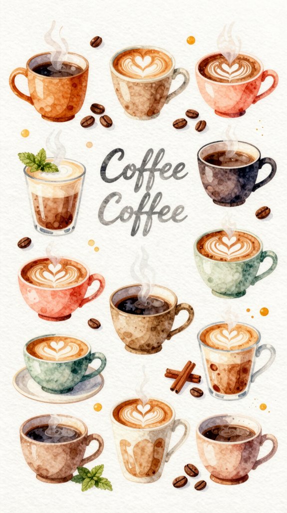
Once you’ve mastered those bright citrus slices, coffee cups offer a new challenge with warm, cozy vibes. Start with the cup’s outline using light pencil marks, then paint it with diluted brown watercolor. Let it dry completely before adding details.
Now try simple latte art techniques! Paint a heart shape using creamy white mixed with a tiny bit of brown. Keep your brush strokes smooth and flowing. The foam sits on top, so it should look lighter than the coffee beneath it.
Add steam lines with very watery gray paint for extra atmosphere. For the softest, most realistic steam effect, apply your diluted gray paint when your paper is at the shiny wet stage rather than completely dry. These cozy coffee shop scenes work perfectly in bullet journal spreads or daily logs. Practice different cup angles and latte designs—each one adds personality to your pages!
Easy Strawberries With Just Three Colors
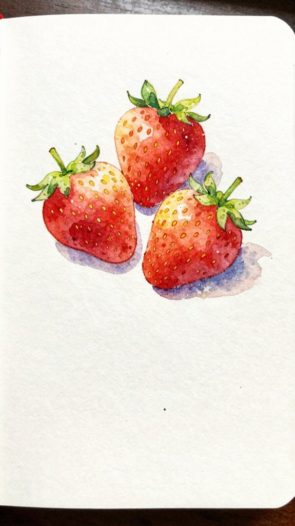
Strawberries make a perfect beginner project because they only need red, green, and yellow. Start by painting the strawberry body with diluted red watercolor, leaving a small white highlight at the top. This creates dimension and makes it look three-dimensional!
While the red is still damp, drop tiny bits of yellow near the highlight area. The colors will blend naturally, creating vibrant hues that add realism. Let it dry completely before moving to the next step.
Now paint the leafy top using green. Mix a bit of yellow into your green for lighter leaves. Since red and green are complementary color relationships on the color wheel, keeping them separate until dry prevents them from creating muddy browns. These simple blending techniques transform basic shapes into juicy fruit 🙂 Add small yellow seeds with a fine brush or pen. Practice these color shifts on scrap paper first—you’ll master the technique quickly!
Watercolor Donuts With Sprinkles and Glaze
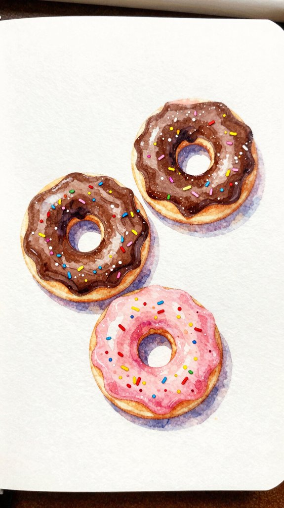
After mastering strawberries, let’s paint something even more fun—colorful donuts!
These circular treats let’s experiment with bold glazing techniques and creative sprinkle placement. Start by painting a light circle for your donut base, leaving a hole in the center. Let it dry completely before adding the glaze on top.
Paint your donut base as a light circle with a center hole, then let it dry before glazing.
Here’s what makes donuts exciting to paint:
- Mix unexpected glaze colors like lavender, mint green, or coral pink
- Experiment with sprinkle placement using tiny dots and dashes in contrasting shades
- Layer translucent washes to create that signature glossy shine
For the glaze, use a wet-on-wet technique. Apply clean water first, then drop in concentrated color. This creates natural pooling and shine. Since watercolor relies on transparency and paper luminosity, the white paper showing through your glaze layers is what gives your donut that irresistible glossy, luminous effect. Add sprinkles last using a fine brush tip!
Painting Avocado Toast in Five Simple Steps
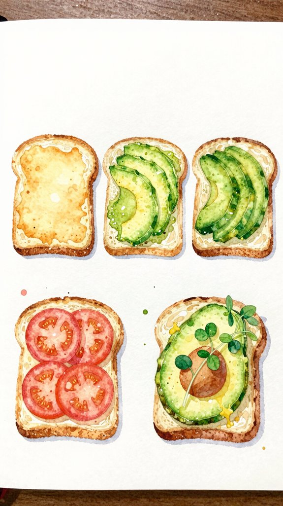
Let’s tackle one of the trendiest breakfast items to paint—avocado toast with all its creamy, textured goodness!
Start by sketching a simple bread slice, then add the mashed avocado on top. Use yellowish-green for the avocado’s base color, applying it while your paper’s still slightly damp. This creates natural blending!
Now focus on painting texture—dab your brush lightly to mimic avocado’s bumpy surface. Add darker green spots for depth and variety. Understanding techniques for rendering different textures will help you capture that distinctive mashed avocado look more convincingly.
For the toast, use warm browns and tans. Layer them to show crispy edges. Don’t forget realistic shadows underneath the avocado! Mix a light gray-brown, then paint thin lines where the avocado meets bread.
Add final details: sesame seeds, red pepper flakes, or a perfectly poached egg on top. These small touches make your painting pop with personality 🙂
Croissants and Pastries That Look Effortlessly French
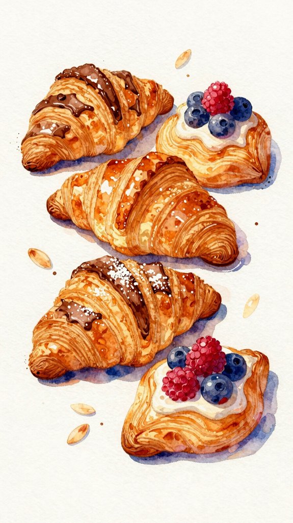
French pastries bring elegance to any journal page, and croissants are surprisingly easy to paint once you understand their basic structure. Start with a curved crescent shape, then add layers to show those flaky textures that make croissants so special.
Mastering the croissant’s elegant crescent shape unlocks the foundation for painting beautiful French pastries in your art journal.
Key techniques for perfect pastries:
- Layer your warm brown tones from light ochre to deep amber, building depth gradually
- Leave white gaps between brush strokes to create the illusion of buttery layers
- Add tiny shadow lines along the curves to emphasize that crispy, flaky texture
We’ll use wet-on-dry technique here, which means letting each layer dry completely before adding the next. This prevents muddy colors and keeps your croissant looking fresh and appetizing! If you want even more control over building those delicate pastry layers, consider practicing with colored pencils first, as they allow you to gradually build depth with precise layering techniques. Practice makes progress.
Colorful Ice Cream Cones for Summer Journal Pages
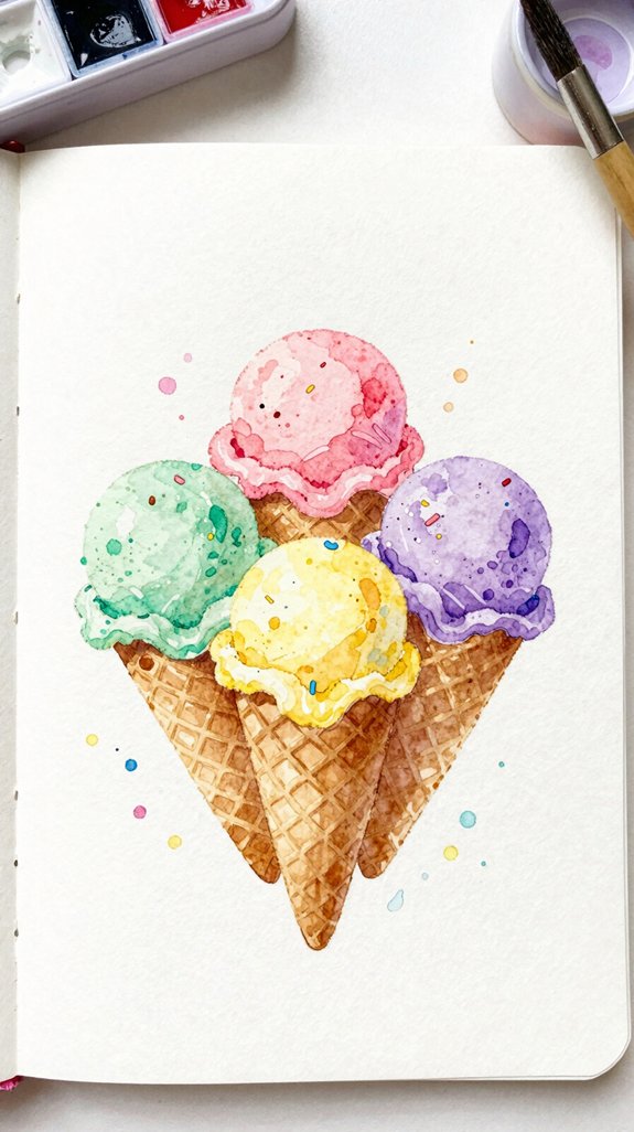
Ice cream cones capture the joy of summer with their cheerful colors and playful shapes, making them perfect subjects for brightening up your journal pages. Start with the cone using light browns and tans, painting downward strokes to show texture. Let it dry completely before adding your ice cream scoops on top.
Try vibrant pinks for strawberry, yellows for lemon, or mint greens! Add frozen pops alongside your cones for variety—these work beautifully as border decorations. Paint simple popsicle silhouettes in rainbow gradients, blending colors while they’re still wet. This technique (called wet-on-wet) creates smooth progressions between hues. Understanding how value creates depth will help your ice cream scoops look rounded and three-dimensional rather than flat. Finish with white gel pen highlights to show melting drips and make your treats look extra dimensional and delicious!
Quick Watercolor Sushi Rolls and Nigiri
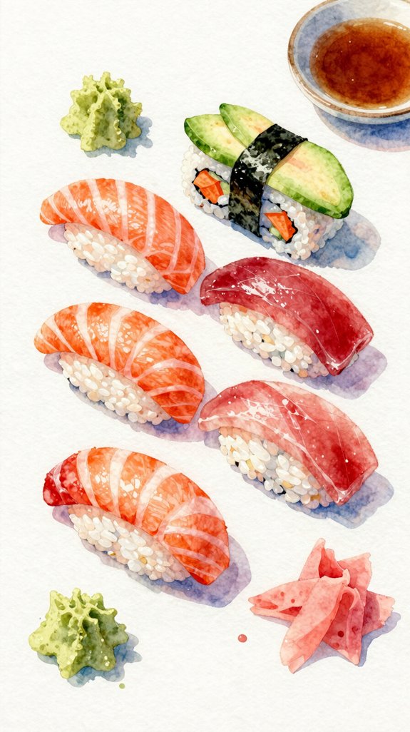
Sushi makes a wonderful watercolor subject because its simple shapes and bold colors create striking journal art in just minutes. We’ll show you how to paint plump maki rolls with colorful fillings and delicate nigiri topped with salmon or tuna.
Start with basic circles for maki rolls. Paint the rice white or cream, leaving tiny gaps to show texture. Add your filling—bright orange carrots, green cucumber, or pink fish—right in the center. Wrap everything with a dark green or black band for the nori seaweed.
For nigiri, paint an oval rice base first. Let it dry completely, then add a curved rectangle of orange, red, or white fish on top. When painting the glossy fish topping, use smooth blending techniques to capture the reflective surface and create a realistic sheen.
Try these creative variations:
- Add sesame seeds using tiny dots
- Paint wasabi and ginger alongside your sushi
- Create a whole sushi platter arrangement
Pancake Stacks With Syrup and Butter Details
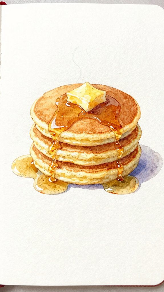
When you want to capture the cozy feeling of breakfast in your journal, fluffy pancake stacks deliver all the warmth with surprisingly simple techniques. Start by painting light brown circles in graduated sizes, stacking them slightly off-center for natural appeal.
Create pancake texture by dabbing a barely damp brush on wet paint—this lifts color and mimics those golden-brown spots we love! Let each layer dry before adding the next one above it.
Now for the best part: syrup application. Mix burnt sienna with yellow ochre, then let it drip from the top pancake down the sides. Use gravity as your guide—syrup flows naturally, pooling at edges. Add a yellow butter pat on top, and watch your breakfast stack come alive with delicious dimension 🙂 For even more realistic depth, try using a glazing technique to build up translucent layers of color in your syrup drips.
Watercolor Macarons in Rainbow Colors
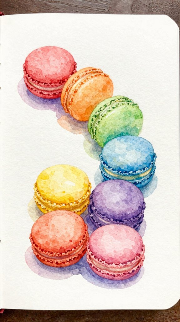
Delicate macarons make perfect subjects for watercolor practice because their simple round shapes teach you essential color-blending skills. Start with light pencil circles, then layer translucent washes to create pastel macarons that look good enough to eat! We’ll show you how to paint detailed macaron textures using wet-on-dry techniques for the smooth cookie shells.
Here’s what makes this project exciting:
- Rainbow arrangements let you practice color mixing without repeating shades
- Subtle shadows between cookie halves create realistic depth and dimension
- Tiny highlights with white gel pens add that signature glossy finish
Begin with pink, then add yellow, blue, and purple macarons. Leave white spaces for shine, and use slightly darker paint for the ruffled “feet” at each macaron’s base. This creates authentic texture! These painted macarons make wonderful additions to themed journals focused on recipes, travel memories from French cafés, or sweet treat collections.
Simple Pizza Slices With Toppings You Love
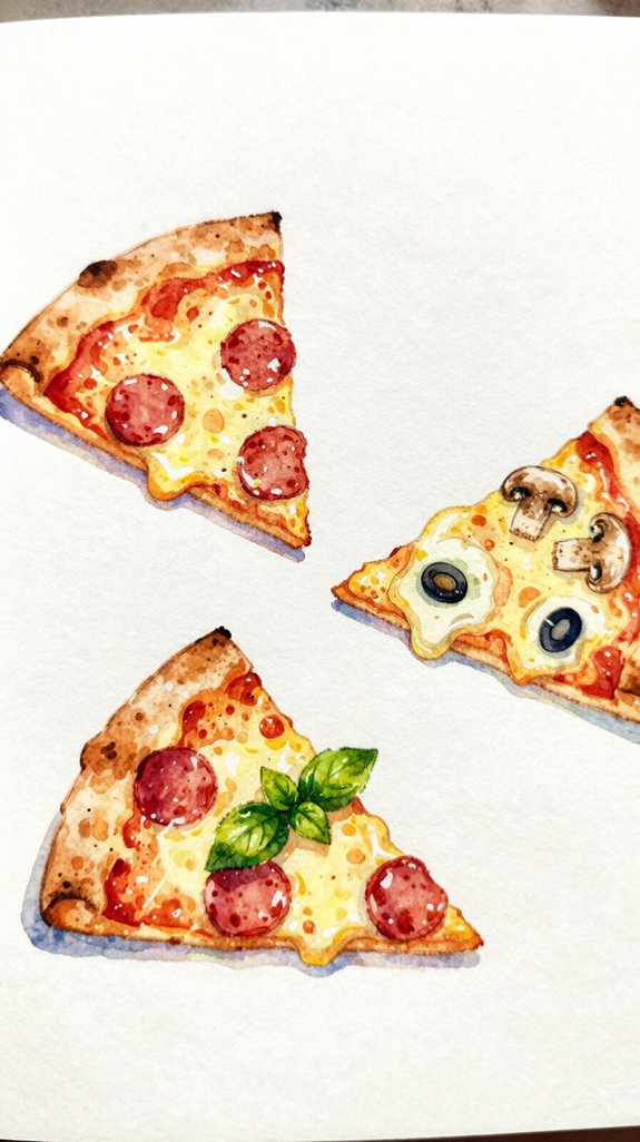
Pizza slices bring joy to your journal pages because their triangular shape guides your brush naturally from crust to tip. We’ll start with slice positioning—angle your triangle slightly for visual interest instead of making it perfectly vertical.
Begin with a light pencil outline showing the crust edge and pointed tip. Paint the dough using diluted yellow ochre, a warm tan color that looks freshly baked. Let it dry completely before adding sauce.
For the sauce layer, use thinned red watercolor and keep it slightly uneven. Real pizza isn’t perfect! Now comes the fun part—your topping combinations. Paint pepperoni circles with orange-red paint, add green bell pepper strips, or create mushroom slices with brown tones.
Finish by dotting yellow cheese highlights where light would naturally hit. Experiment freely with your favorite toppings!
Cherry and Berry Clusters for Practice Blending
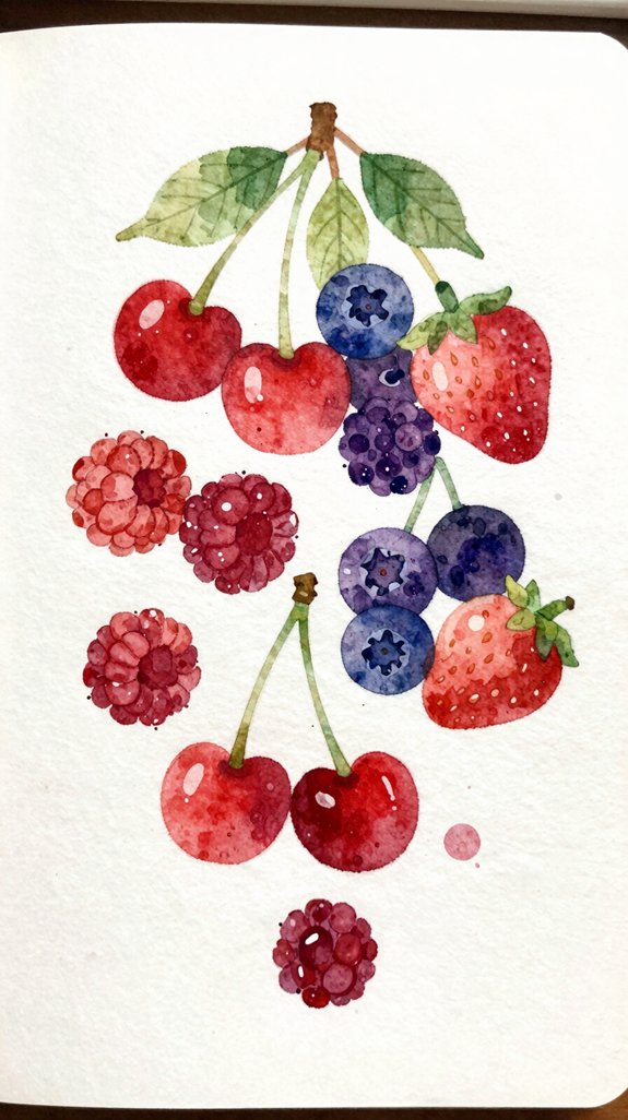
Because cherries and berries grow in natural clusters, they teach you how colors blend while wet—the most important watercolor skill you’ll develop.
Start with simple berry blending by painting one berry, then adding another while the paint’s still damp. Watch the edges soften together naturally! This wet-on-wet technique creates realistic shadows between fruits.
Quick tips for stunning fruit composition:
- Paint lighter berries first (strawberries, raspberries), then add darker ones (blueberries, blackberries)
- Leave tiny white gaps between some berries so they don’t merge completely
- Add stems last when everything’s dry to keep your cluster organized
We’ll build your cluster gradually, working from light to dark colors. Let each layer dry partially before adding the next berry. This control prevents muddy colors while maintaining soft, blended edges where berries touch!
Watercolor Cupcakes With Swirled Frosting
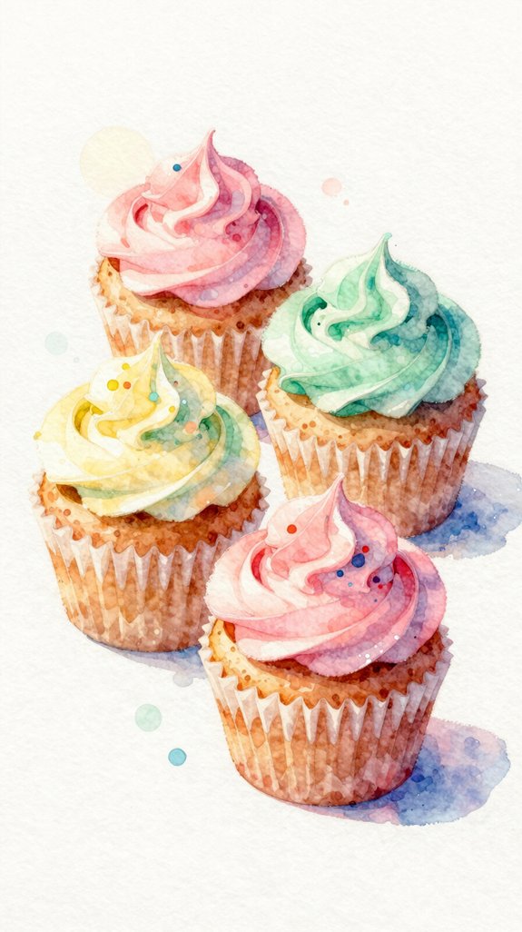
Cupcakes combine the blending skills you just practiced with berries and add a new challenge: creating swirled textures in frosting. Start with the cake wrapper using short, curved strokes in brown or pastel colors. Paint the base with a light wash, letting it dry completely before adding the frosting.
For the frosting, apply your base color first, keeping one edge wet. While it’s still damp, add a darker shade along the swirl’s curves. This creates smooth color shifts that look dimensional! Use your brush tip to trace spiral patterns from outside to center, mimicking real frosting swirls.
Experiment with varying frosting textures by adjusting water amounts. Add a cherry or sprinkles on top for extra flair. These techniques provide endless creative possibilities for your journal spreads.
Easy Cheese and Charcuterie Board Illustrations
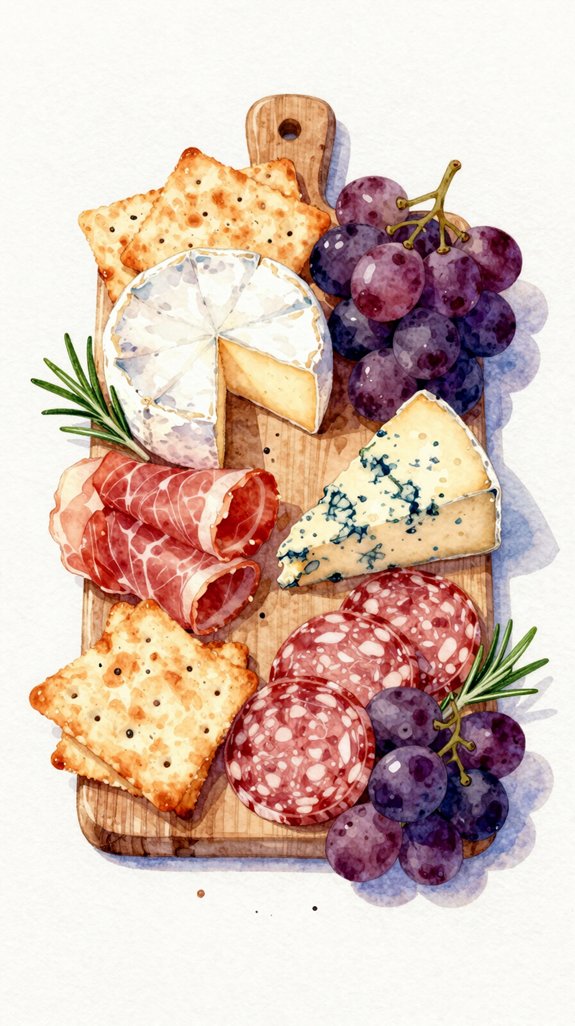
Moving from sweet treats to savory snacks opens up wonderful compositional opportunities in your watercolor journal. We’ll explore cutting board arrangements that let you practice variety and depth.
Start with the board itself using light brown washes. Layer different shapes for cheese wedges, crackers, and folded meats. Each element adds visual interest to your composition.
Key Elements to Include:
- Circular salami slices with darker edges for dimension
- Cheese wedges in yellows and creams with subtle shadows
- Scattered grapes, berries, or nuts as colorful accents
Focus on layered charcuterie details by painting one item at a time. Let each section dry before adding adjacent foods. This prevents colors from bleeding together. Build up shadows beneath overlapping items to create realistic depth!
Frequently Asked Questions
What Basic Watercolor Supplies Do I Need to Start Painting Food?
We’ll need quality watercolors, watercolor paper, and brushes to begin. Master proper brush techniques like wet-on-wet blending, then experiment with basic color palette selection—primaries plus burnt sienna create endless food hues we’ll explore together.
How Do I Fix Mistakes When Painting With Watercolors?
When painting a tomato slice, we caught a puddle forming. We quickly pressed tissue to the area, blotting excess paint before it spread. For dried mistakes, we’ll dampen the spot and gently lift dried paint using a clean brush.
What Paper Weight Works Best for Watercolor Food Illustrations?
We recommend 140lb (300gsm) paper minimum for food illustrations. This weight handles paper absorbency beautifully, preventing buckling while letting you layer strategically for ideal paint opacity. It’s our go-to for achieving professional-looking journal spreads.
How Long Should I Wait Between Layers When Painting?
We’d suggest waiting 5-10 minutes between layers—while patience feels counterintuitive, rushing ruins vibrancy. Allowing layers to dry completely prevents muddy colors. Experiment with mixing paint consistency; thicker applications need longer drying times than translucent washes.
Can I Use Regular Sketching Pencils Under Watercolor Paints?
Yes, we can use regular sketching pencils under watercolor! They won’t smudge when wet. However, controlling opacity and blending techniques work better with lighter pencil marks, so sketch gently for ideal results.
Conclusion
We’ve painted our way through a delicious menu of watercolor treats, building skills one brushstroke at a time. Think of each food as a stepping stone—citrus circles taught us blending, strawberries showed us layering, and donuts let us play with texture. Now your journal’s bursting with color and flavor! Pick up your brush whenever inspiration strikes. There’s no perfect painting, only practice that makes us better. Let’s keep creating together.
Have any thoughts?
Share your reaction or leave a quick response — we’d love to hear what you think!
-
 0
0
-
0
-
0
-
0
-
0
-
0


