

Cocktail painting is the fastest way to get a glossy, grown-up little canvas finished before the kettle boils. One glass, one bright drink, one small scene around it, and you have the kind of bar cart art that looks like it belongs in a boutique hotel, not a beginner’s studio.
Below are 32 cocktails in their natural habitat: on seaside tables, pool edges, marble bars and rooftop ledges, with real brand lettering, melting ice and sunlit glass. Pick whichever drink matches your mood today, squeeze your acrylics onto the palette, and paint something you will actually want to hang by the drinks trolley.
Using these images: free for personal projects such as printing, coloring, cards, journals and gifts. Handmade items that include them may be sold up to 30 pieces per design. More than that is commercial use and is not permitted, and neither is selling or sharing the images themselves or passing them off as your own. Please ask before any other use.
Start with the easiest glass in the whole list: an Aperol spritz, wide bowl, orange liquid, on a table with the sea somewhere behind it. Block in the glass shape first with a mix of cadmium orange and a touch of white, leaving the rim and one edge unpainted for later highlights. Let that dry before you add the ice cubes as pale blue-white squares, because wet orange and wet white will muddy together fast.
Paint the orange slice last, a half circle of cadmium orange with thin white pith lines and tiny seed dots in cream. The table can be a few loose strokes of warm white or pale blue, and the sea behind needs nothing more than two flat bands of color, one darker than the other.
If this is your first time painting glass, the usual mistake is making the highlight too small to read from a distance. Use a fat dab of titanium white on the glass edge and a thin white line down one side, not a dot.
Keep a reference photo of a real spritz open on your phone while you paint, so the proportions of liquid to ice to fizz stay believable.
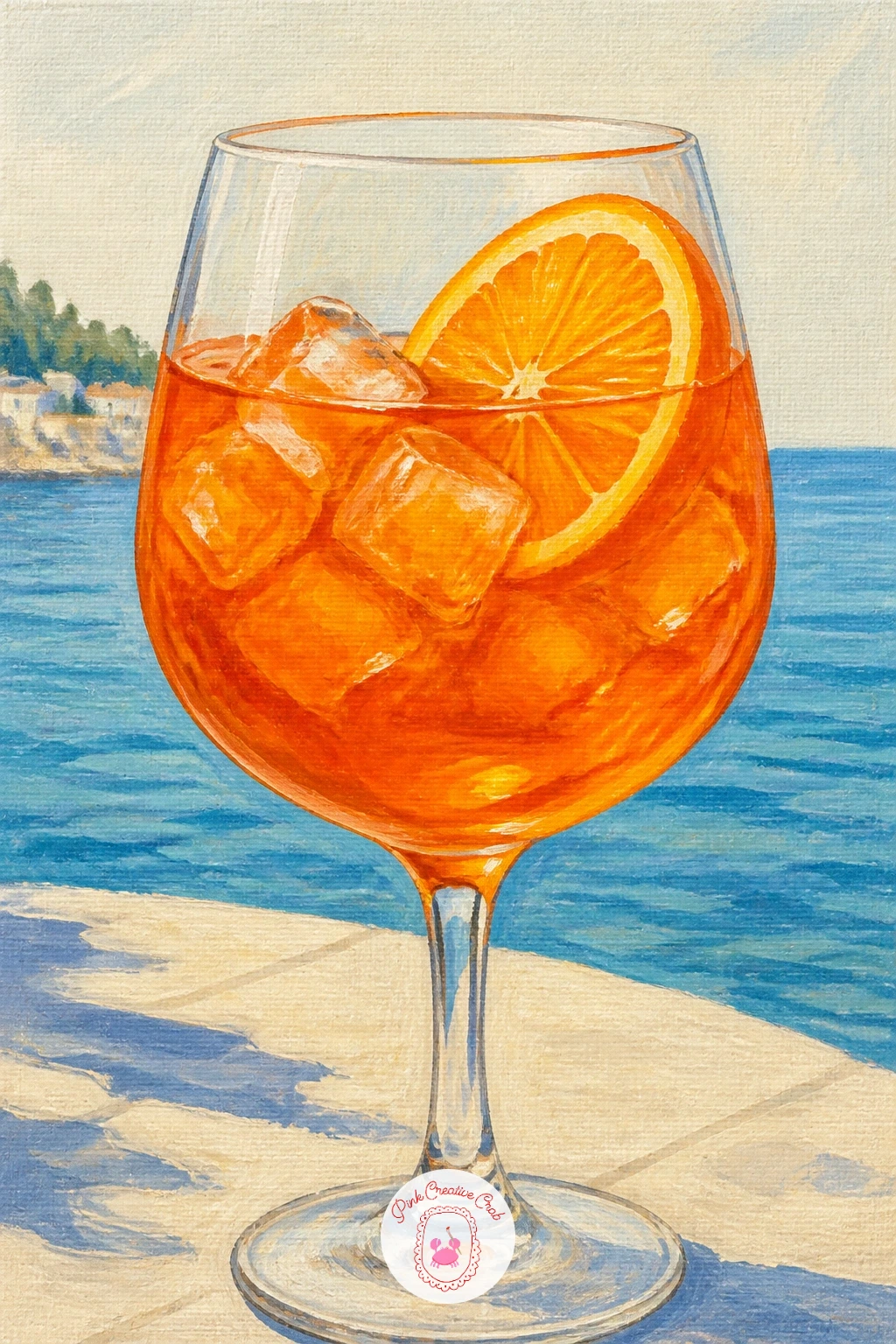
Palette: Cadmium Orange,Titanium White,Cerulean Blue,Sap Green
Measure before you mix a single color: a margarita glass is a wide shallow cone on a short stem, so sketch the triangle shape in pencil first and check its width against its height before you touch paint. Too narrow and it reads as a wine glass, too wide and it loses its tilt.
Block the pink liquid in a mix of quinacridone magenta and white, then paint the salted rim as a ragged ring of thick white paint stippled on with a dry brush so it has texture rather than a smooth line. The pool edge behind can be a flat turquoise block with a few white ripple strokes.
Where this goes wrong is a rim that looks painted flat instead of crusted with salt. Dab the white on with the very tip of a stiff brush, almost pouncing it, rather than stroking it like a regular line.
No stiff brush at home: an old toothbrush dabbed in white paint gives the same gritty salt texture.
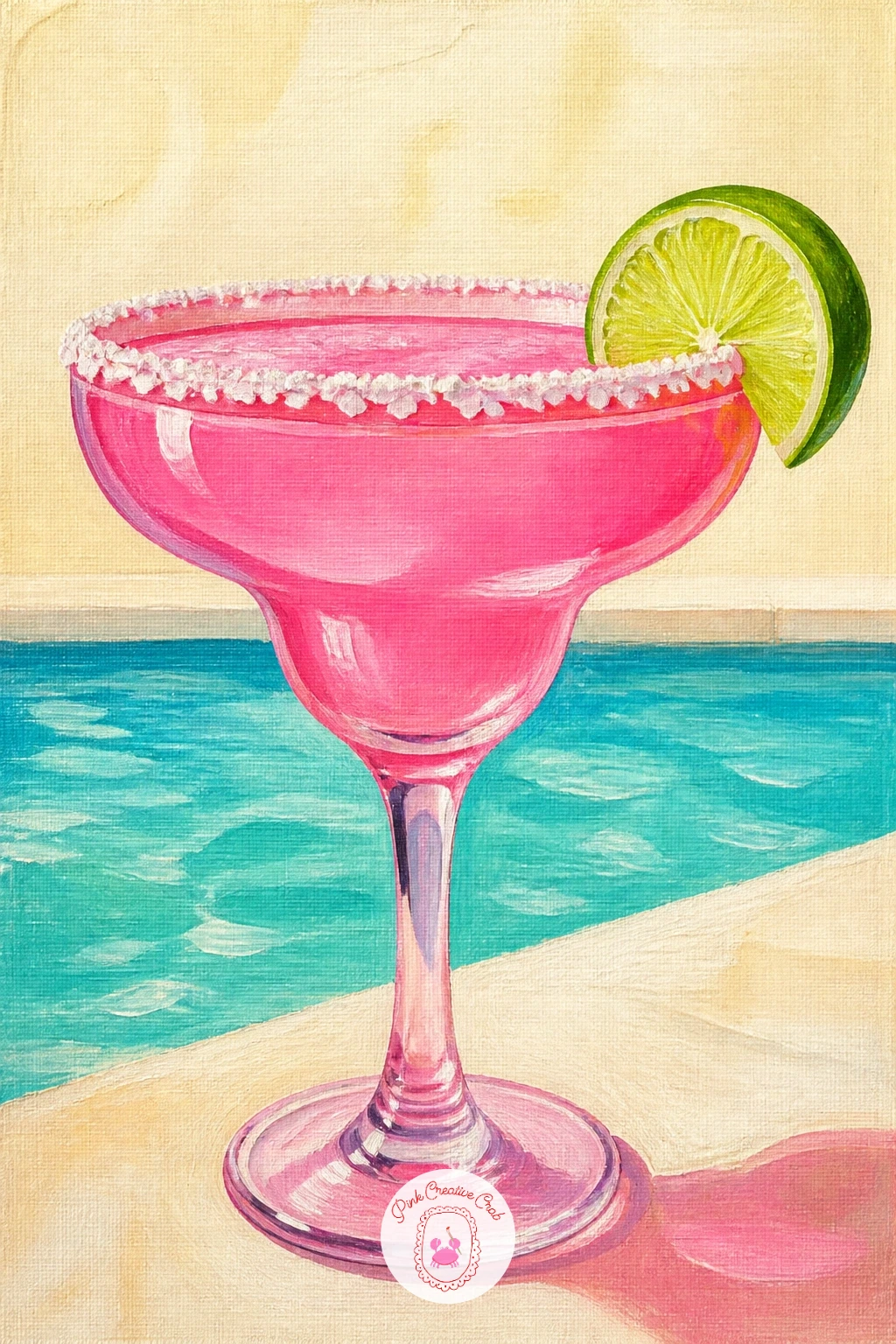
Palette: Quinacridone Magenta,Titanium White,Turquoise,Lime Green
Follow the pink margarita with its deeper, moodier cousin: a negroni glass is squat and square, sitting heavy on a marble counter. Paint the marble first as your background, a pale grey-white base with loose diagonal veins dragged on in thin grey paint while the base is still slightly wet, so they soften at the edges instead of sitting as hard lines.
Once the marble is dry, block the glass as a simple cube shape in deep alizarin crimson mixed with a touch of burnt orange, and drop in one large ice cube and an orange peel twist curling over the rim.
The marble veining is where most people overwork it. Three or four confident diagonal lines read as marble; a dozen fussy ones read as cracked glass, so stop earlier than feels natural.
If you want a bolder version, lift a little wet marble paint with a crumpled tissue for extra texture before you add the veins.
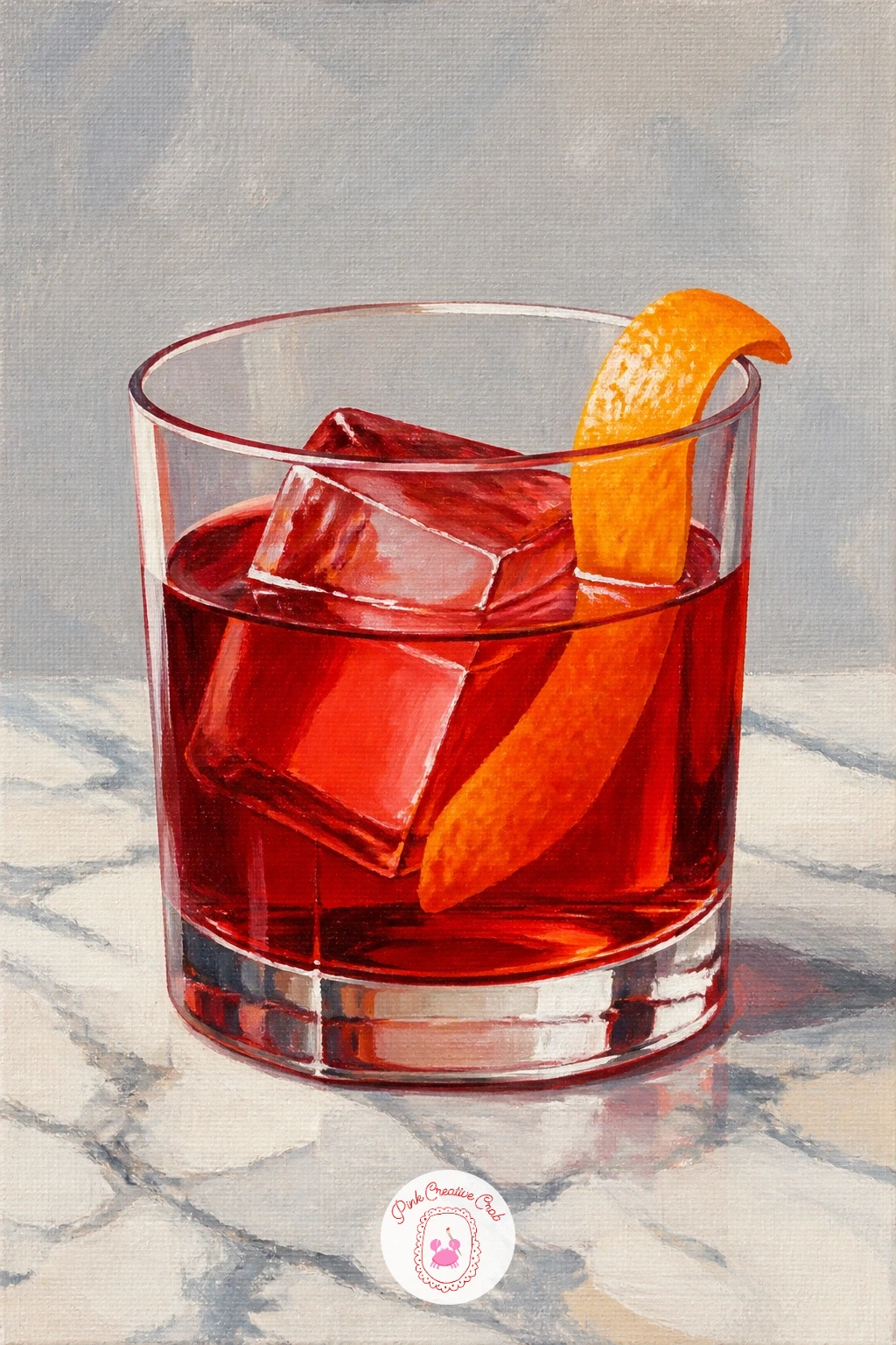
Palette: Alizarin Crimson,Burnt Orange,Payne’s Grey,Titanium White
Move from a straight glass to a whole fruit as the vessel: a pina colada served inside a hollowed pineapple is one shape stacked on another. Paint the pineapple body first as a golden oval in yellow ochre with cadmium yellow highlights, then add the diamond-pattern skin texture with a small brush once that base layer is dry.
Top it with the creamy drink peeking out, a pale cream dome with a straw and a little paper umbrella, and finish with the spiky green crown last so it sits on top of everything.
The diamond texture on pineapple skin is the trap here: painted too evenly it looks like a grid rather than fruit. Vary the size and angle of each diamond slightly and let a few blur together near the shadow side.
Swap the paper umbrella for a simple mint sprig if you do not want to paint fiddly stripes.
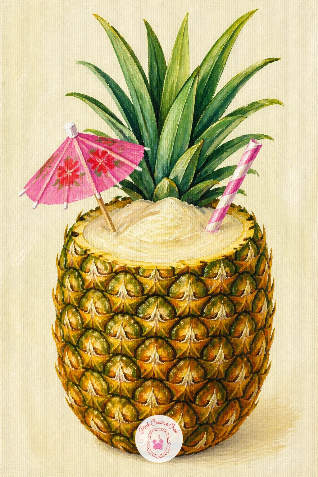
Palette: Yellow Ochre,Cadmium Yellow,Sap Green,Cream
Keep the tropical mood going with a mojito, the most refreshing glass on the list and a good one for practicing layered transparency. Paint the glass itself first as a tall rectangle in pale sage green mixed heavily with white, then once dry, glaze a slightly stronger green over the lower half only to suggest the liquid sitting below the ice line.
Add mint leaves near the top in two tones of green, a darker underside and a lighter sunlit top, and finish with a few bubbles as tiny white dots rising through the glass.
Mint leaves painted flat in one green look like plastic. Two values per leaf, light and dark, is the whole trick, so keep your brush small and do not blend them together.
A sun-bleached wooden bar plank behind the glass can be just three or four horizontal strokes of warm grey-brown, nothing more detailed than that.
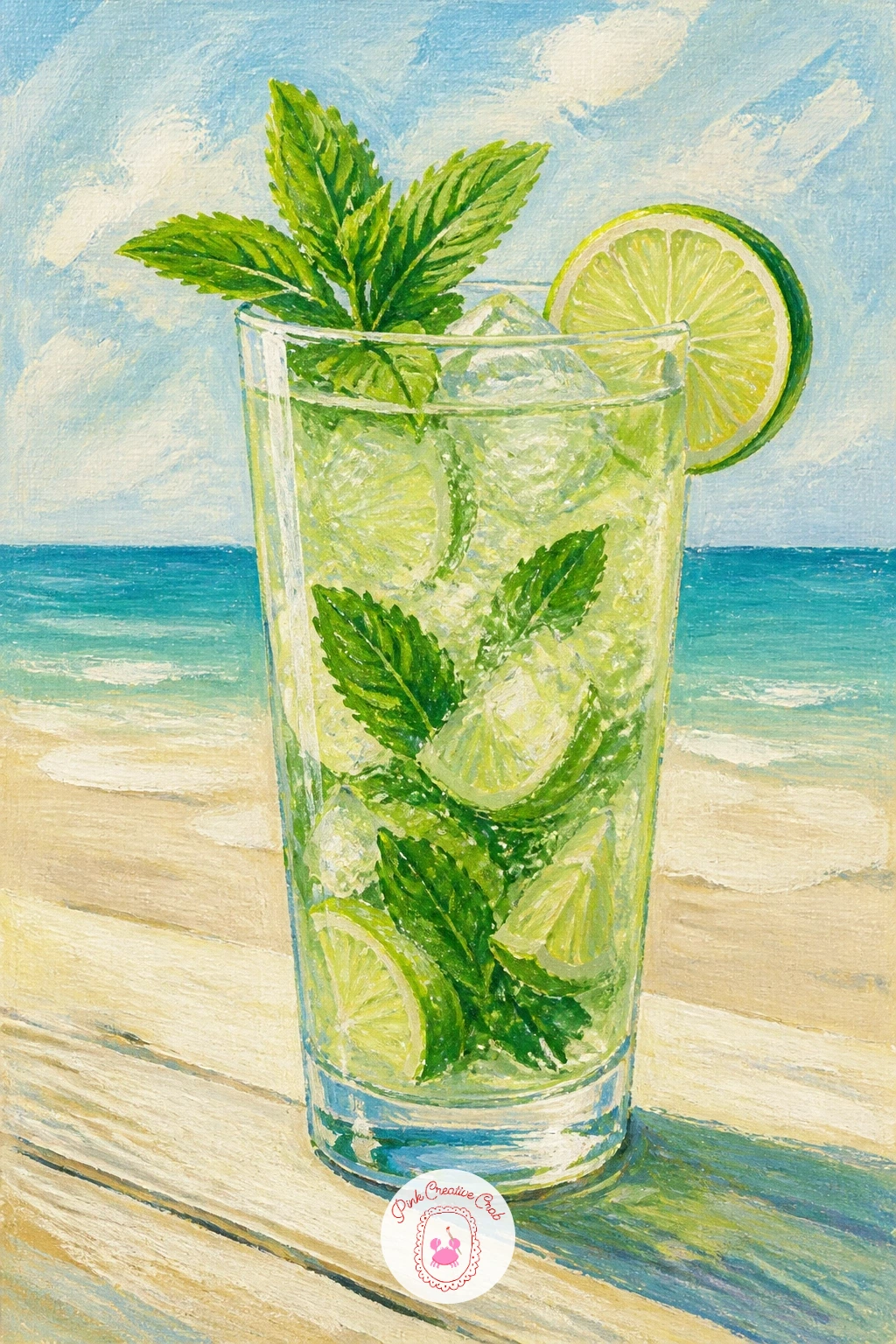
Palette: Sage Green,Sap Green,Titanium White,Burnt Sienna
Step up to the busiest scene on the list: a champagne tower is several coupe glasses stacked in a pyramid, so work out your eye level before you start. Looking slightly down on the tower, as most party photos do, means every tier of glasses sits a little lower and more oval than the one above it, so sketch three or four guide ovals first to lock that in.
Paint the glasses from the back tier forward so the front ones can overlap the ones behind, using pale gold for the champagne and leaving crisp white highlights down one side of every glass.
Bubbles are what sell this picture, so add them last as a scatter of tiny white dots rising from each glass, smaller and closer together near the bottom of each coupe.
If a full pyramid feels like too much for today, a three-glass tower reads just as festively and finishes in half the time.
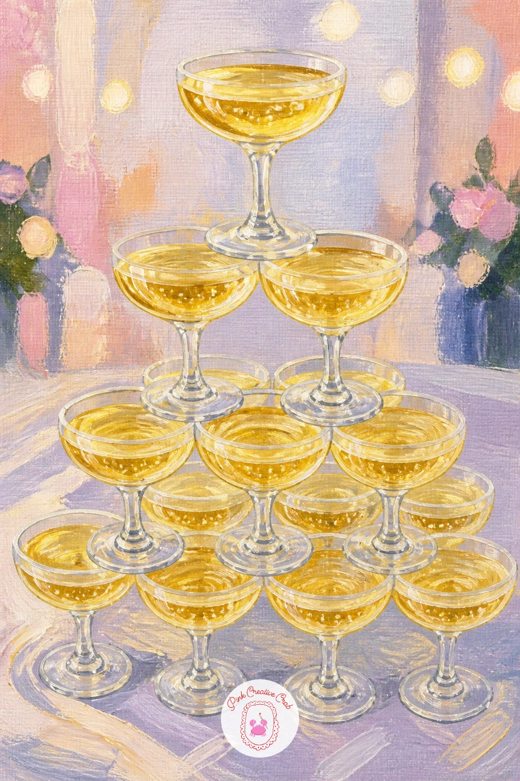
Palette: Champagne Gold,Titanium White,Pale Blush,Payne’s Grey
Slow the pace down with a single elegant glass: a dirty martini rests its distinctive V-shaped bowl on a closed book, so the glass shape is the whole challenge here. Pencil the triangle first, checking that both sides slope at the same angle, then paint the cloudy olive-brine liquid in a warm grey-green mixed from olive green and a touch of white.
Drop in two or three olives on a cocktail pick, each a simple dark green oval with a red pimento dot and a thin highlight stroke, and let the glass stem sit on a book cover painted as a flat block of color with a gold title line suggested rather than written out in full.
The V of a martini glass tips over easily on canvas if the stem is too thin. Paint the stem slightly thicker than looks right and it will read correctly once the whole glass is in context.
Try warm grey instead of olive green in the liquid if you want a cleaner, less brine-cloudy martini.
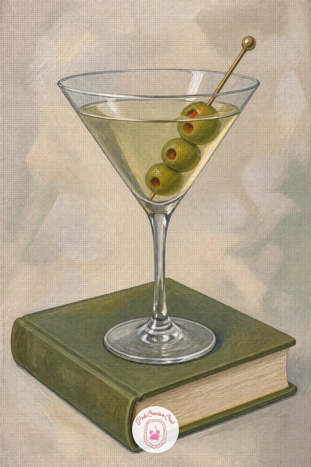
Palette: Olive Green,Titanium White,Burgundy,Burnt Umber
Turn to a window scene next, where light source matters more than anything else: a cosmopolitan silhouetted against a city window means the light comes from behind the glass, not in front of it. Paint the window and skyline first as a soft gradient of dusky pink and blue, with a few simple rectangle buildings in darker tones.
Once that background is dry, paint the martini glass with its pink-red cosmopolitan liquid, but keep the glass itself slightly darker and cooler than you normally would, since backlighting dims the front of glass and brightens only its rim.
The giveaway mistake is painting the glass as brightly lit as the window itself, which flattens the whole scene. Keep the glass body in shadow tones and save your brightest white for a thin rim line only.
A lime twist perched on the rim adds a single sharp green accent against all that pink and blue.
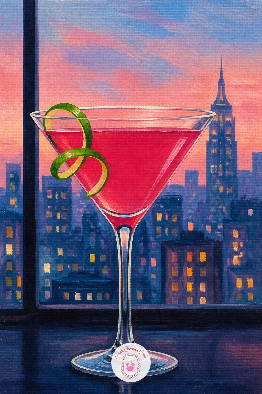
Palette: Dusky Pink,Deep Blue,Cranberry Red,Lime Green
Bridge back to brighter daylight with a hugo spritz, the palest drink on the list and a good test of restraint. Paint the glass liquid as a soft pale green-gold, barely tinted, since a hugo should look almost like sparkling water with a hint of elderflower rather than a strong color.
Add a few mint leaves and lime wheels floating inside the glass once the base liquid is dry, and finish with small white bubble dots scattered throughout rather than just at the surface.
If this is your first pale drink after painting stronger colors, the glass can end up looking empty. Keep the ice cubes and garnish doing the visual work, with crisp white highlights on every cube edge to give the glass presence even with such a light liquid.
A sprig of real-looking mint laid across the rim finishes the story without adding more color to mix.
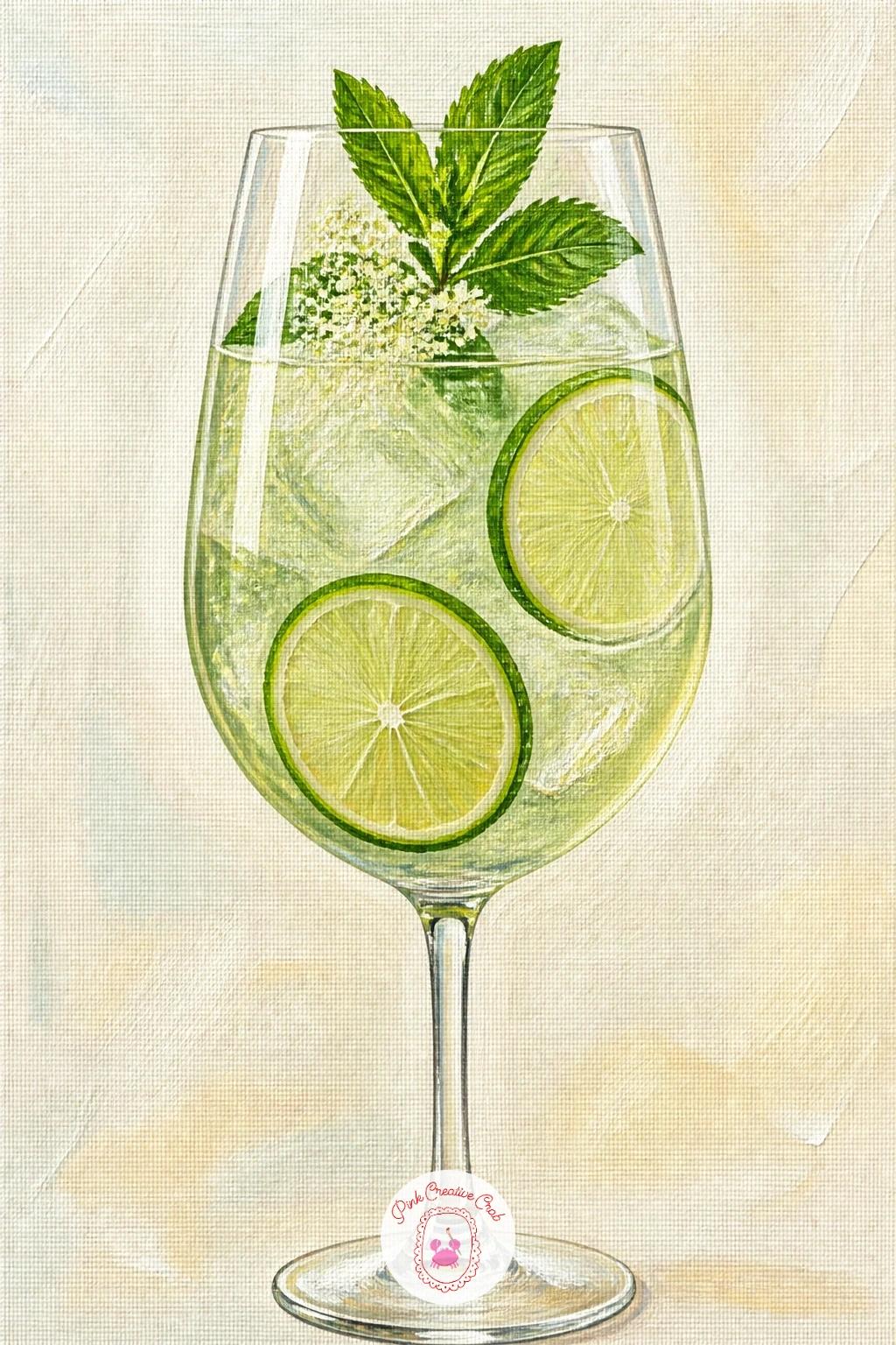
Palette: Pale Lime,Titanium White,Sap Green,Cream
Keep working wet-into-wet from the hugo but push the color further: a paloma is a grapefruit pink drink that lets you practice a clean color gradient inside one glass. Load your brush with a pale pink at the base of the liquid and a slightly stronger coral-pink at the top, blending the two together while both are still wet for a smooth transition.
Once dry, add a grapefruit wheel hooked on the rim, painted as a circle divided into segments with a thin white pith ring, and a salt rim stippled on in the same dry-brush technique as the margarita.
Gradients inside a glass often end up streaky rather than smooth. Work quickly, use a soft flat brush, and blend in one direction only, top to bottom, rather than scrubbing back and forth.
If blending feels tricky, a single flat pink works fine too and still reads clearly as a paloma.
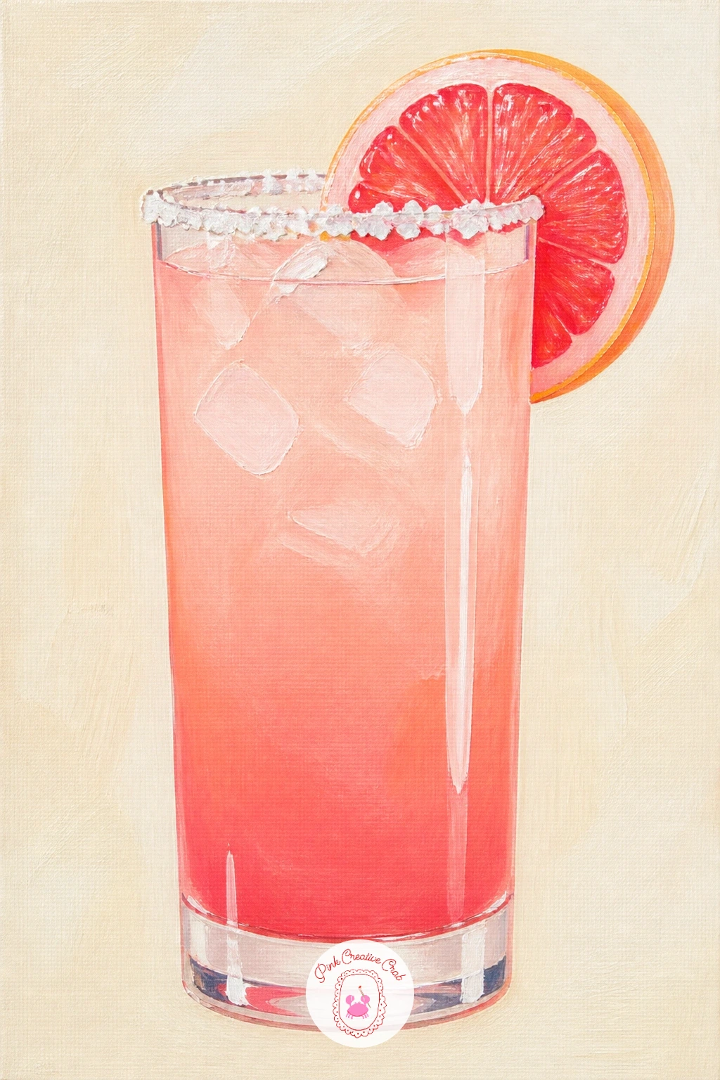
Palette: Coral Pink,Pale Pink,Grapefruit Red,Titanium White
Bring in a savory drink for contrast: a bloody mary is thick, red and loaded with garnish, which makes it one of the most forgiving glasses to paint because texture hides small mistakes. Block the tomato-red liquid first in a mix of cadmium red and a touch of burnt sienna for warmth, then once dry, build up the garnish skewer on top: a cherry tomato, an olive, a celery stick and a lemon wedge, each as a simple shape.
A rim of coarse black pepper or celery salt can be added with tiny dark dots stippled around the glass edge with a dry brush tip.
Where this scene can go flat is a garnish skewer painted too neatly in a straight line. Stagger the shapes slightly up and down the pick, the way they actually sit when skewered.
A brunch table setting behind, just a plate edge and a napkin corner, is enough context without needing a full table scene.
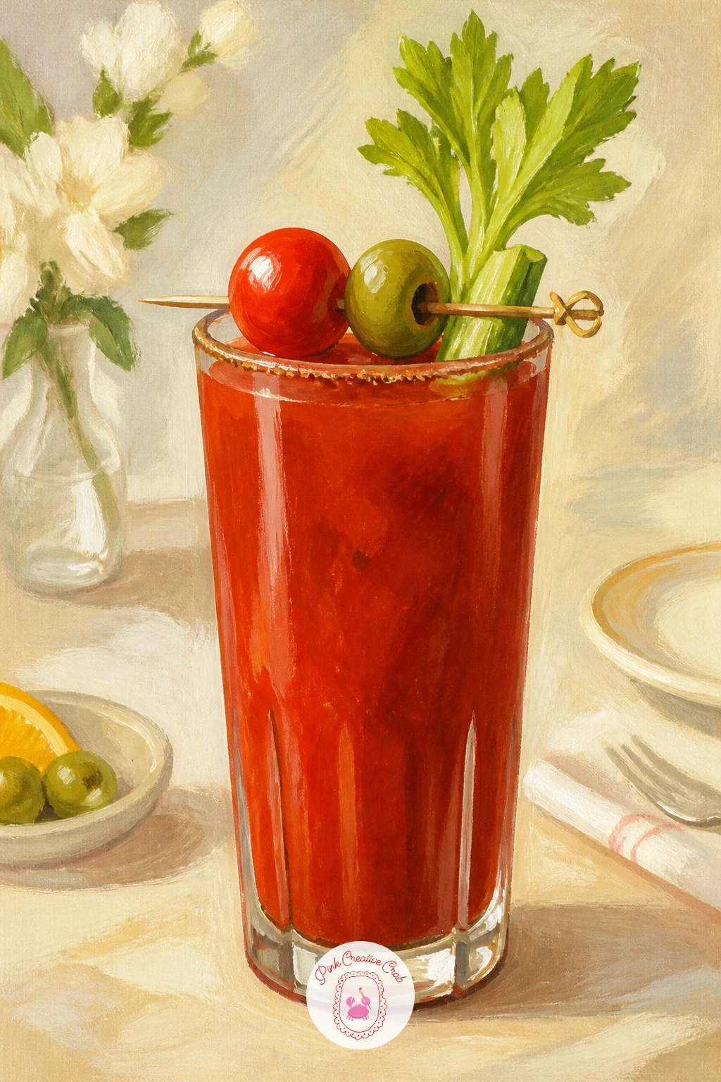
Palette: Cadmium Red,Burnt Sienna,Sap Green,Cream
Practice a soft edge next: a whiskey sour has a pale frothy foam layer sitting on top of amber liquid, and getting that boundary soft rather than hard-lined is the whole point of this piece. Paint the amber whiskey base first in burnt umber mixed with a little cadmium yellow, filling most of the glass.
While that layer is still slightly wet, stipple on the cream foam with a dry, almost-empty brush, letting a little amber show through at the edges so the two layers blend rather than sit as two flat bands.
A hard straight line between foam and liquid is the most common slip here. Go back in with a clean damp brush and soften that line the moment you spot it, before the paint sets.
Finish with an angostura bitters dot or two dropped onto the foam in deep red-brown for the classic sour garnish.
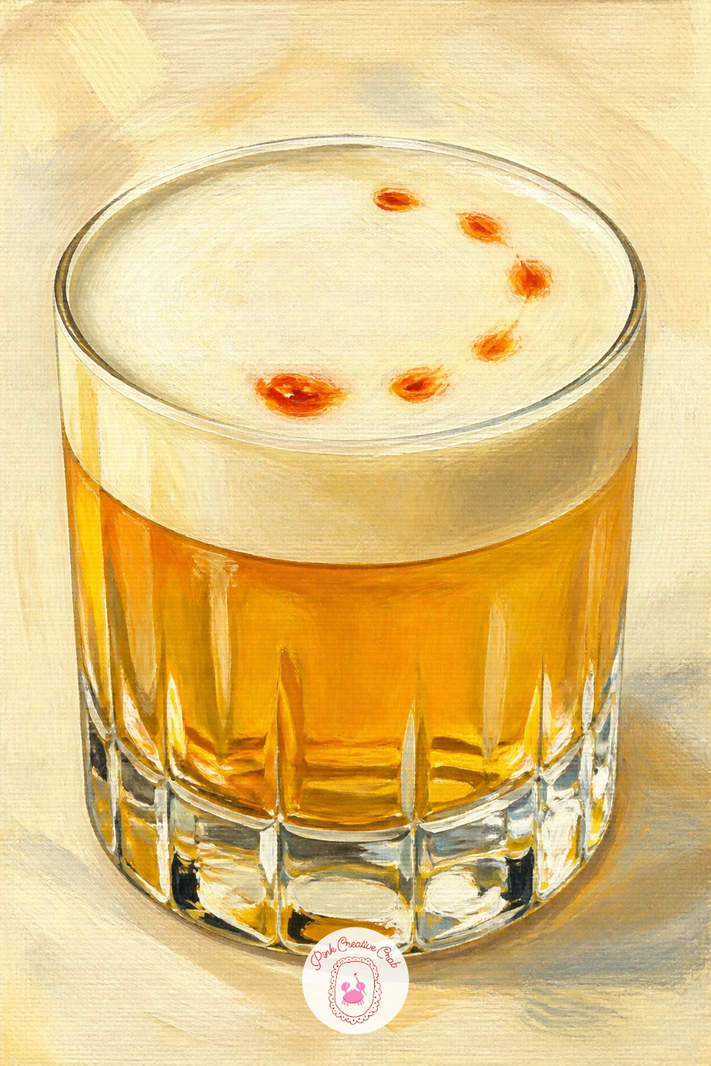
Palette: Burnt Umber,Cadmium Yellow,Cream,Burgundy
Swing to the brightest color on the whole list: a blue lagoon cocktail poolside needs confident, undiluted blue to earn its name. Paint the glass liquid in a strong mix of phthalo blue and a touch of white, then let the pool water behind it echo the same blue family but one shade lighter so the drink still stands out against it.
Add a pineapple wedge and a cherry on the rim for warm contrast, since a glass of pure blue on blue water needs that one hot accent to stop it flattening into a single color field.
If this is your first bold color like this, the mistake is painting the pool water in the exact same blue as the drink. Lighten the pool slightly and add a few white ripple lines so the eye can still find the glass.
Swap the cherry for a lime wheel if you want a cooler, less sweet accent.
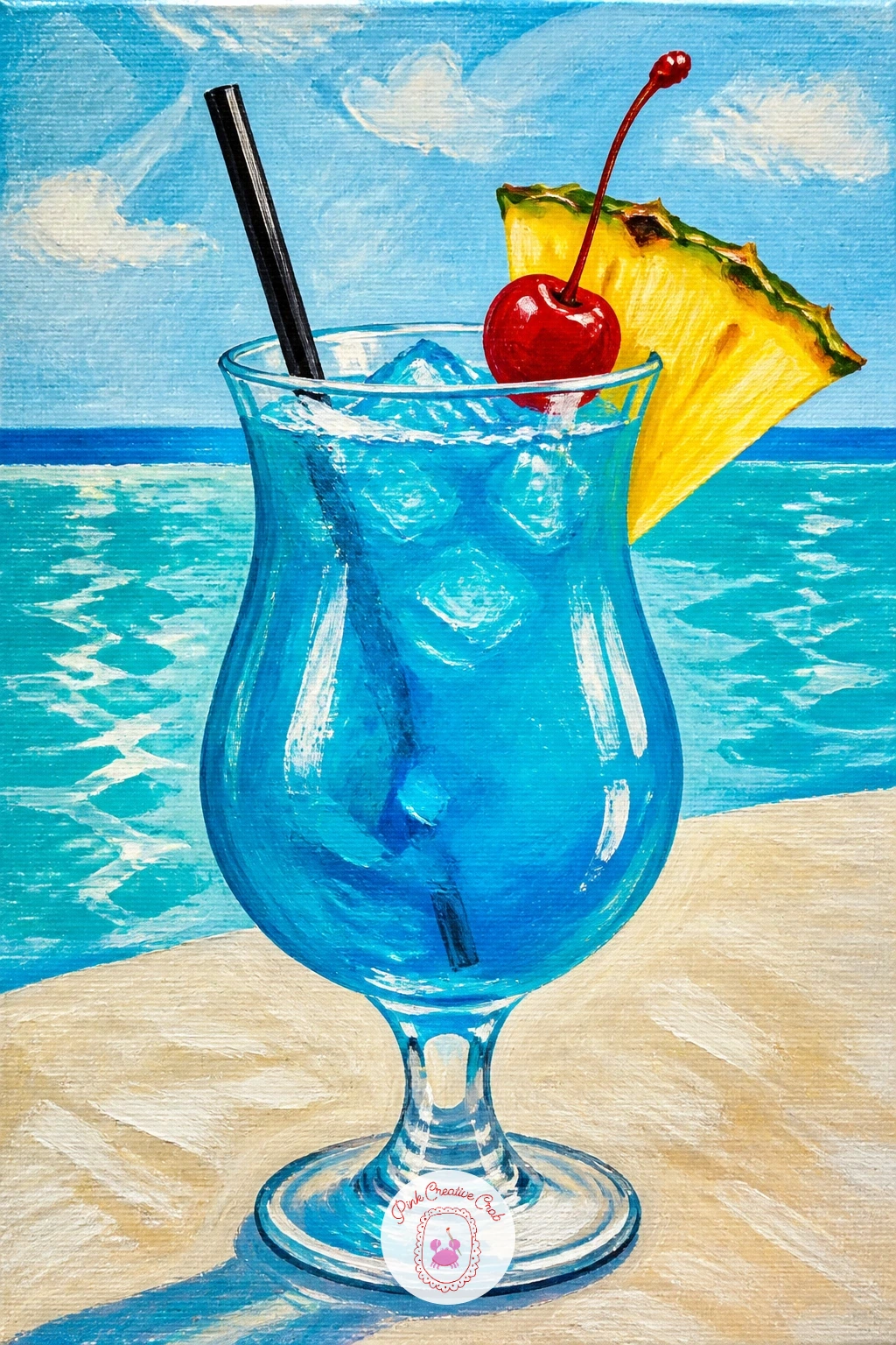
Palette: Phthalo Blue,Turquoise,Cadmium Yellow,Cherry Red
Shift away from a still glass to a moment of action: a bartender mid-shake is about gesture more than detail, so sketch the pose loosely first, elbows bent, shaker held high, rather than drawing a full figure with features. A simplified silhouette in a dark shirt reads perfectly well at this scale.
Paint the shaker itself as the star, a tall metal cylinder in cool silver-grey with one sharp white highlight stripe down the side to suggest polished metal, and keep the bartender’s face loose or even turned away.
Hands holding a shaker are the trickiest part. Simplify them into rounded mitten shapes gripping the shaker rather than trying to paint individual fingers, which reads more confidently from a distance anyway.
A blurred row of bottles behind, just soft vertical color blocks, suggests a full bar without painting a single label.
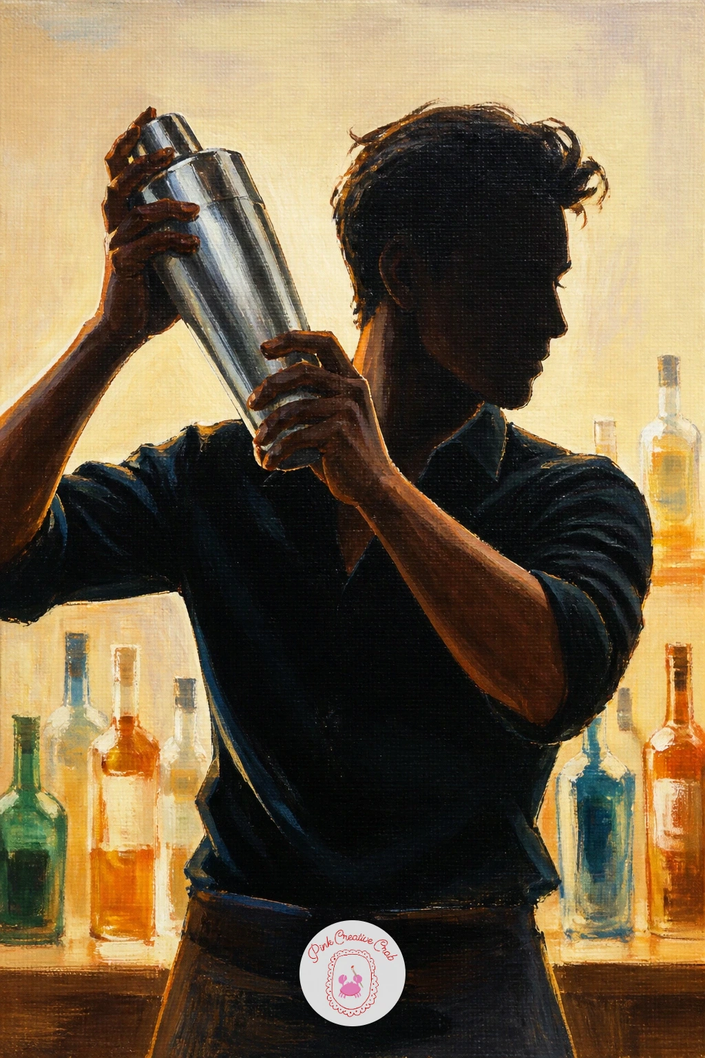
Palette: Payne’s Grey,Titanium White,Burnt Umber,Burgundy
Zoom out to a whole scene: a home bar cart holds several glass shapes together, so block in the cart structure first as simple gold or brass lines before adding a single glass. A two-tier cart drawn as two horizontal shelves on thin curved legs is enough structure to hang everything else from.
Arrange three or four different glasses and a bottle or two on the shelves, painting each one as a simplified silhouette first in pale grey-blue before adding color and highlights, back row first so the front glasses can overlap them.
A cluttered bar cart can turn into visual noise fast. Keep to four or five objects total and leave gaps of plain background between them so each shape still reads clearly.
If gold cart lines feel fiddly in paint, a fine gold paint pen laid over dry acrylic gives a crisper, more confident line.
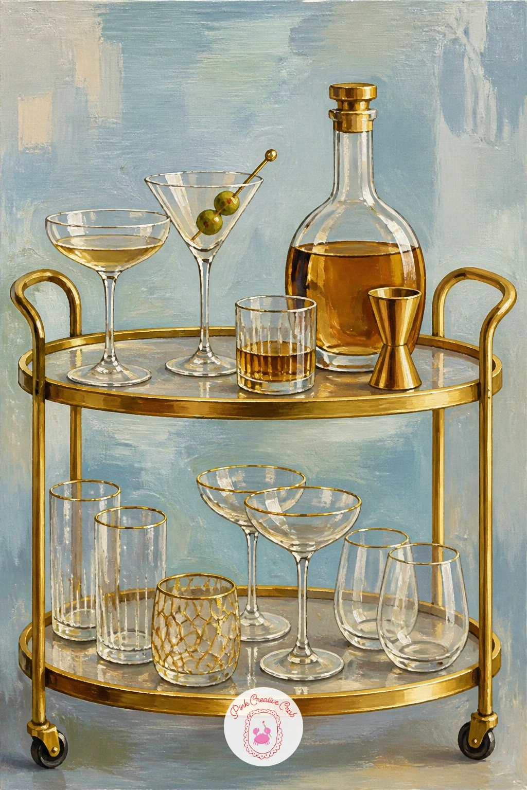
You Will Need
- fine gold paint pen for the cart frame
Palette: Champagne Gold,Pale Blue Grey,Burgundy,Titanium White
A fine gold paint pen laid over the dry cart frame gives a crisper line than mixed paint and saves you fighting a thin brush for straight legs.
Return to a single glass with a texture challenge: a frozen strawberry daiquiri is slushy rather than liquid, so the surface needs a rougher finish than any drink painted so far. Block the pink-red slush base in a mix of quinacridone magenta and white, then while it is still wet, stipple the surface with a dry stiff brush to break up the smooth color into icy texture.
Add a whole strawberry perched on the rim once the base is dry, painted with tiny yellow seed dots over red, and a straw angled into the slush.
Smooth, flat color is the enemy of a frozen drink. If your slush texture looks too even, go back in with a few flicks of white dragged upward through the still-wet surface to suggest icy crystals catching light.
No stiff brush handy: crumple a small piece of paper towel and dab it into the wet paint for a similar broken texture.
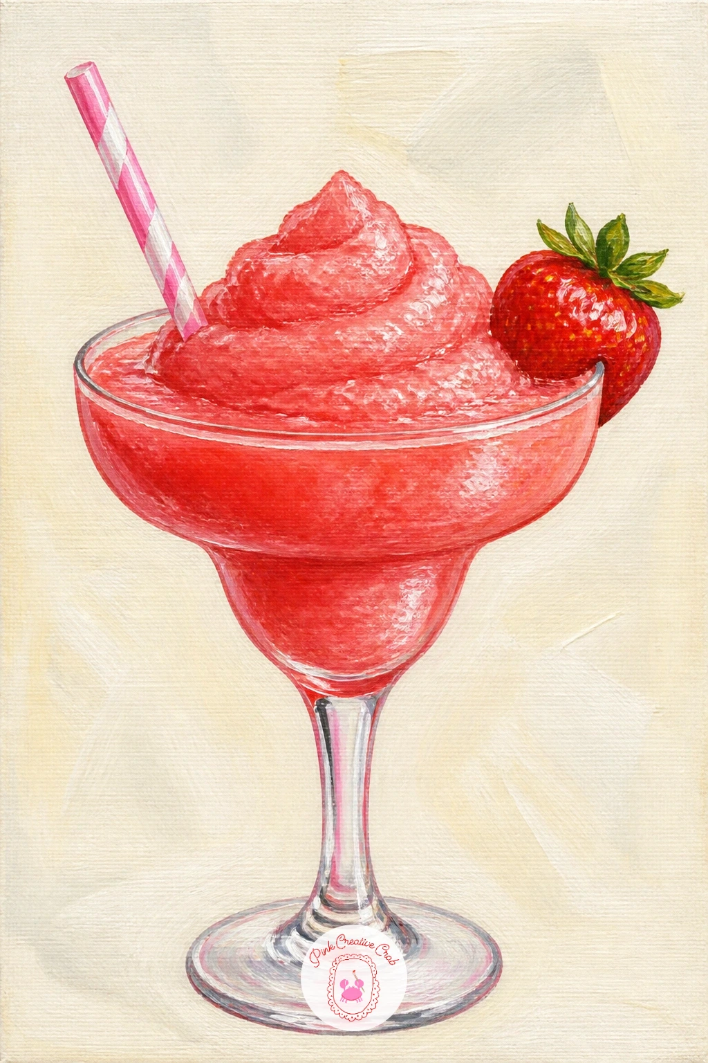
Palette: Quinacridone Magenta,Titanium White,Cadmium Red,Cadmium Yellow
Slow right down for a detail piece: a cocktail with a flower frozen inside its ice cube rewards patience more than speed. Choose any simple clear drink, a gin and tonic works well, and paint the glass and liquid first in your usual way, leaving one large ice cube shape unpainted until last.
Paint the ice cube as a pale blue-white block, then drop in a tiny flower shape, a pansy or small daisy works best at this scale, in flat color before glazing a very thin wash of white over the whole cube to suggest the ice sitting over it.
Painting the flower too crisp breaks the illusion that it is trapped in ice. Soften its edges slightly with a damp brush after the glaze so it reads as suspended rather than stuck on top.
A single small flower is plenty; resist adding more than one bloom per cube.
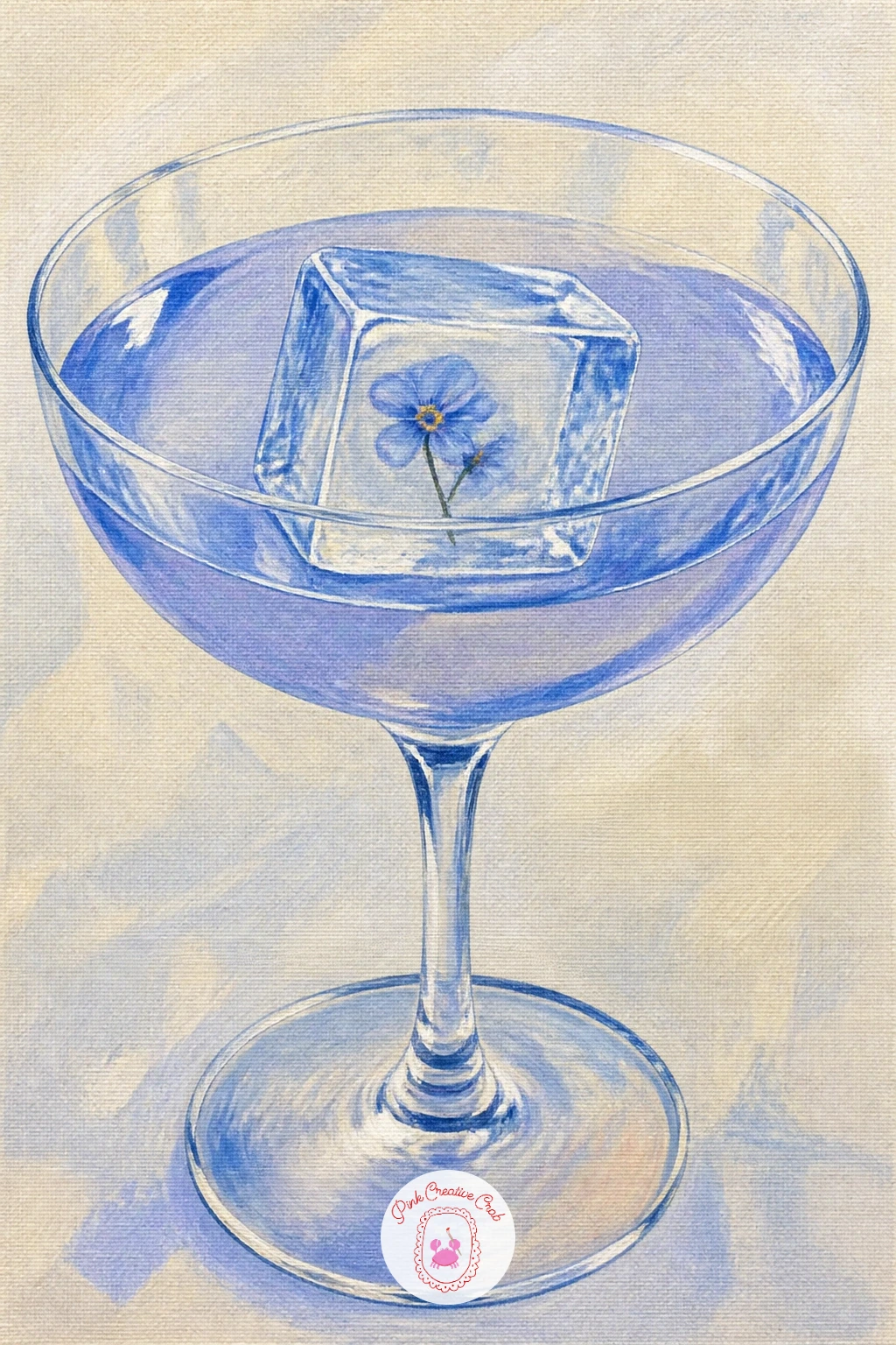
Palette: Pale Blue,Titanium White,Violet,Cadmium Yellow
Scale up from one glass to a whole pitcher: sangria is about layered fruit floating in dark red liquid, so plan the fruit placement with a light pencil sketch before any paint goes down. A tall glass pitcher shape first, then liquid, then fruit on top keeps the layers honest.
Paint the wine-red liquid as your base layer, then once dry, add orange and apple slices pressed against the inside of the glass, each one slightly flattened and overlapping the glass edge as if pressing against curved glass.
Fruit floating in liquid often ends up looking like it sits in front of the pitcher rather than inside it. A thin glaze of the red liquid color painted back over the edges of each fruit slice pulls it visually behind the glass surface.
A few mint leaves tucked near the top add a fresh green note against all that red and orange.
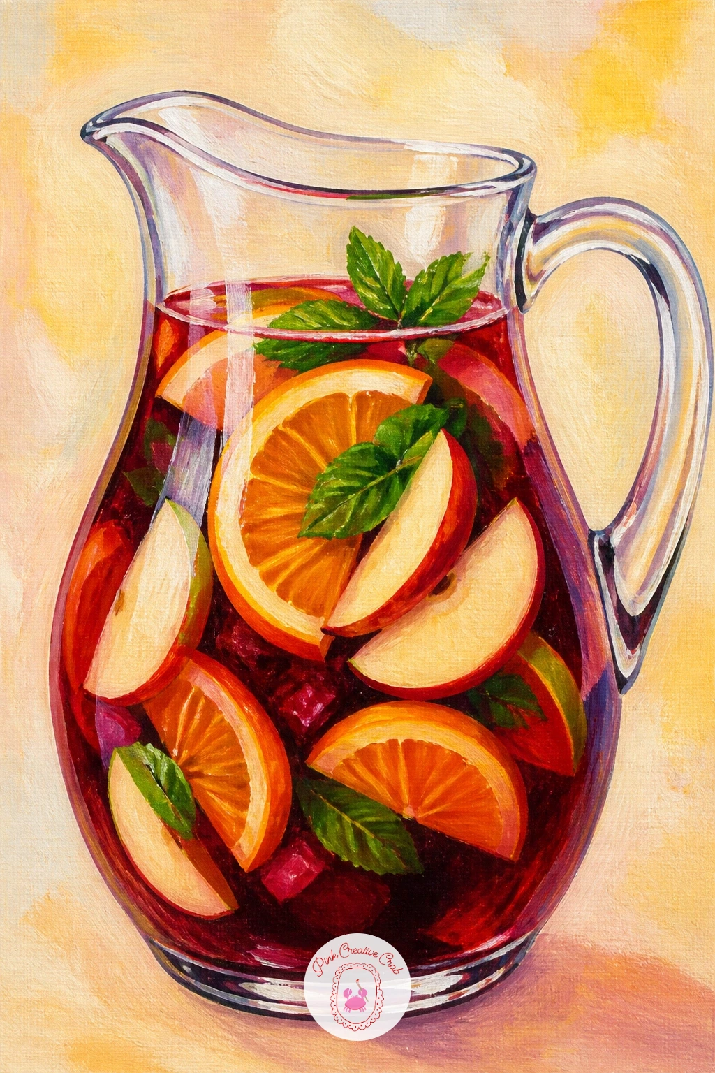
Palette: Wine Red,Cadmium Orange,Cadmium Red,Sap Green
Bring in a patterned background for the first time: a limoncello spritz sitting on a lemon-print tablecloth means painting a pattern without letting it compete with the glass. Paint the tablecloth first as a flat cream background, then add simple repeated lemon shapes in cadmium yellow, keeping them loose and slightly uneven so they read as print rather than a stiff grid.
Once dry, paint the glass on top in bright sunny yellow liquid with ice cubes and a lemon wheel on the rim, making sure the glass highlights are bright enough to lift it forward off the busy cloth.
A pattern painted too crisp can flatten the whole scene into wallpaper. Keep the tablecloth lemons slightly softer in edge and lighter in value than the glass itself so the eye still lands on the drink first.
If a full pattern feels like too much, three or four lemon motifs scattered loosely are enough to suggest the print.
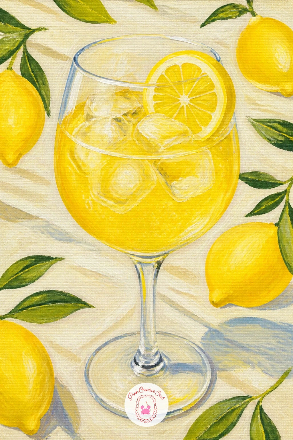
Palette: Cadmium Yellow,Cream,Sap Green,Titanium White
Work on a warm two-tone liquid next: a mai tai traditionally layers dark rum over a lighter orange base, which gives you a clean excuse to practice a gradient from amber at the top to coral-orange lower down. Paint the lighter base first, let it dry fully, then glaze the darker rum color over just the top third with a soft brush so the two tones meet gently rather than in a hard band.
Add a paper umbrella and a sprig of mint leaning out of the glass, painting the umbrella as a few simple triangle segments in a bold color that pops against the warm drink.
Two liquid layers painted wet together will muddy into one flat brown. Always let the base layer dry completely before glazing the second tone over it.
If a paper umbrella feels fiddly to paint small, a simple pineapple wedge on the rim works just as well as the tropical garnish.
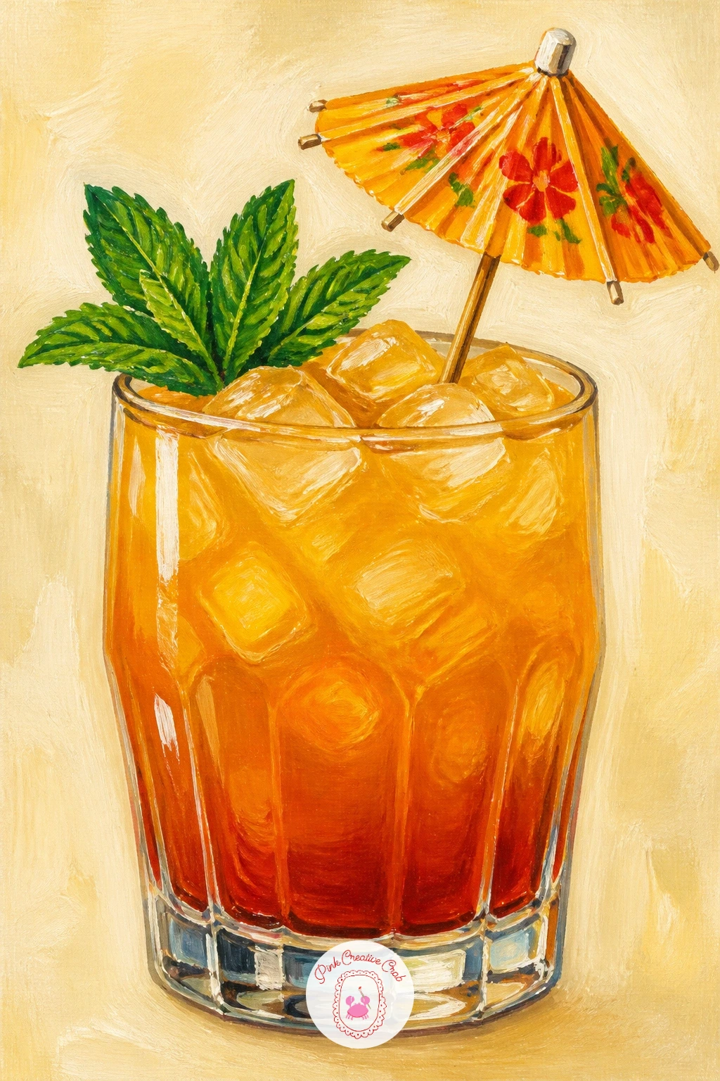
Palette: Burnt Orange,Amber,Cherry Red,Sap Green
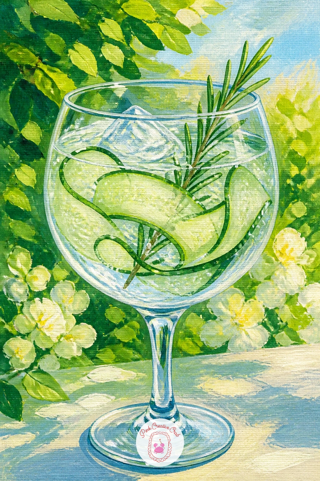
Place the next glass outdoors properly: a gin and tonic in a garden setting means thinking about where the light falls across both the glass and the greenery behind it. If the sun sits high and to one side, keep the glass highlight on that same side and let the garden foliage behind go slightly soft and shadowed so the glass stays the brightest thing in the picture.
Paint the clear fizzy liquid with the faintest blue-grey tint, then add long thin cucumber ribbons curling inside the glass and a sprig of rosemary across the rim.
Garden backgrounds can easily steal attention if painted too sharply. Keep leaves and flowers behind the glass loose, more suggestion than detail, with only the glass itself getting crisp edges and bright highlights.
A few loose green dabs behind the glass read as foliage without needing individual leaf shapes.
Palette: Pale Blue Grey,Sap Green,Titanium White,Olive Green
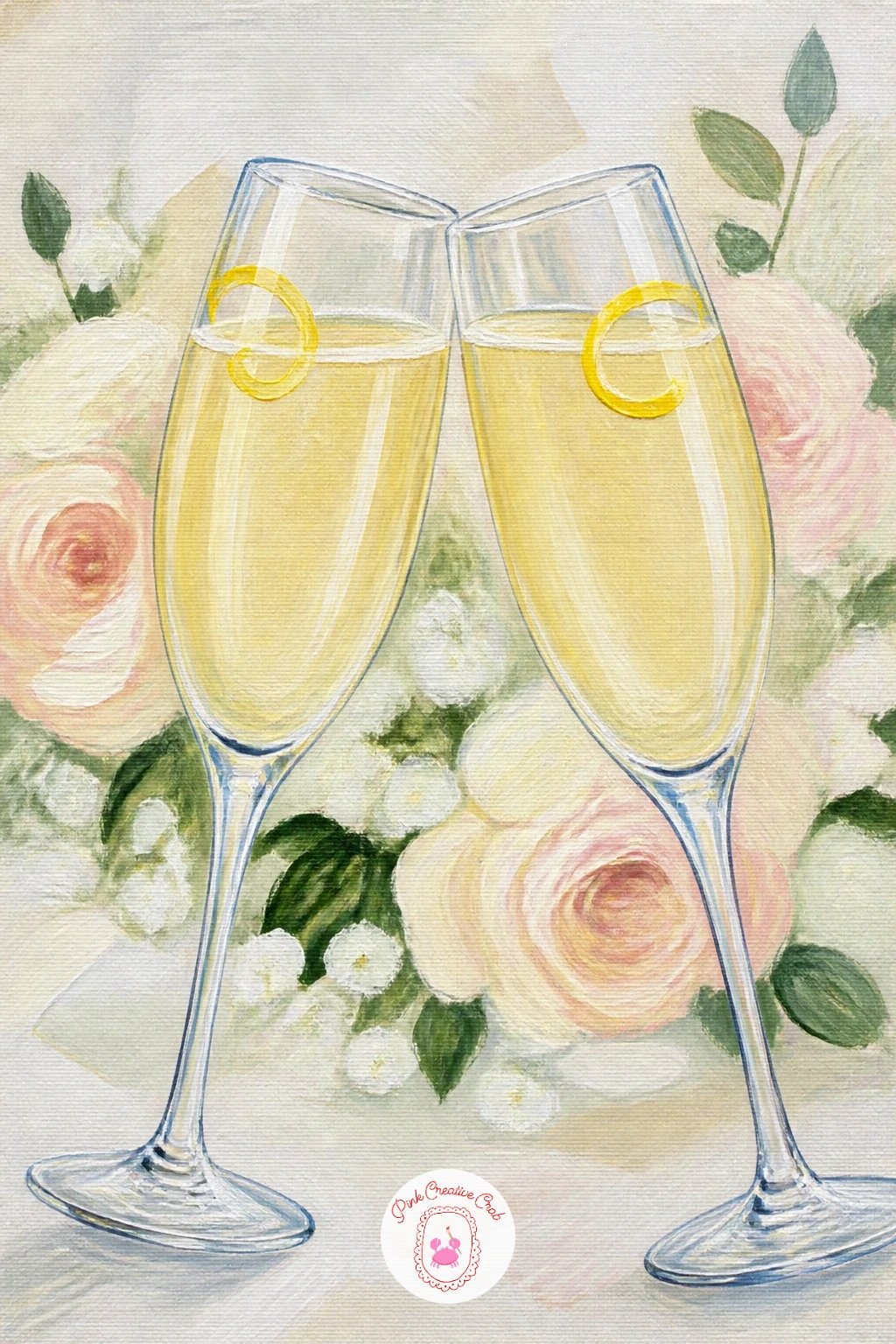
Return to a celebration scene with a quick-and-slow option: a French 75 at a wedding can be painted as a ten-minute single glass or stretched into a forty-minute fuller scene. For the quick version, paint one tall champagne flute with pale gold liquid, a lemon twist and rising bubbles, finished with crisp white highlights down one side.
For the longer version, add a second glass clinking against the first and a soft blurred background suggestion of white florals or fairy lights, built from loose dabs of cream and warm white rather than any defined shapes.
Either way, bubbles make or break a champagne glass. Keep them small, varied in size, and denser near the bottom of the glass where they rise from, rather than scattered evenly throughout.
If gold feels too warm for a wedding palette, a cooler pale silver liquid works just as elegantly.
Palette: Champagne Gold,Titanium White,Cadmium Yellow,Cream
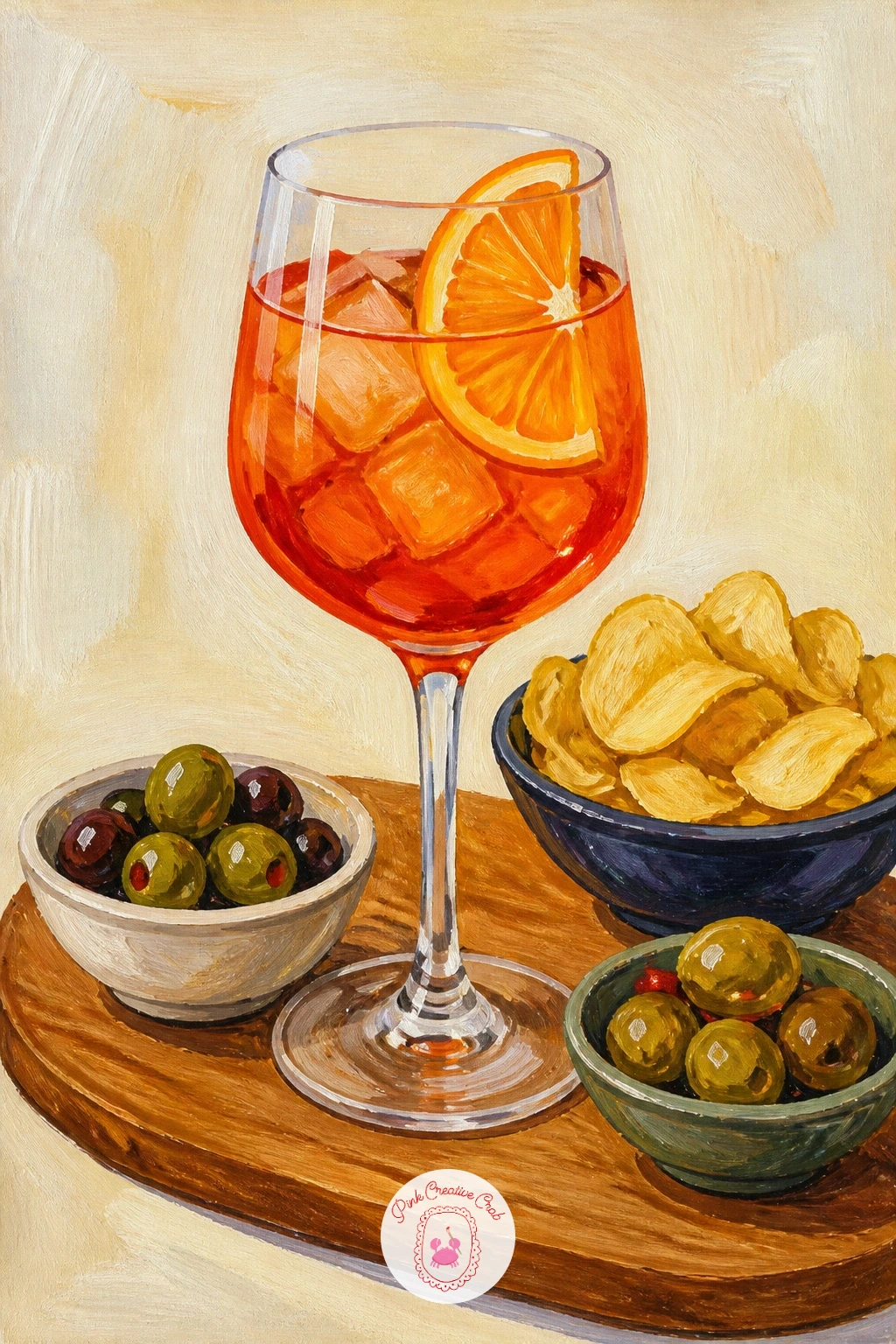
Give the drink a supporting cast: an aperitivo board brings a glass alongside olives, crisps and little bowls, which means thinking about arrangement before a single brushstroke. Sketch the board shape and three or four small bowl circles first, checking they do not all sit in a straight line, then build outward from the glass as the tallest and most important shape.
Paint the glass and its drink first so it stays the clear focal point, then add the small bowls of olives, nuts and crisps around it, each one just a simple shape with a scatter of texture dots rather than individually painted pieces.
A flat board full of same-sized shapes can look busy without a clear focus. Make the glass noticeably taller and brighter than everything around it so the eye knows where to land first.
If you want more inspiration for arranging small food shapes like this, browsing gouache painting ideas for beginners shows plenty of similar still life groupings.
Palette: Olive Green,Burnt Sienna,Cadmium Orange,Cream
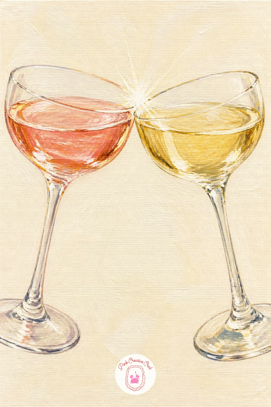
Bring two glasses together for a toast: two friends clinking coupes is really a study in matching shapes, so paint both glasses from the same basic coupe template, then vary only their tilt and the color of what they hold. Tip one glass slightly toward the other at the point of contact so the clink feels like a real gesture rather than two static glasses placed side by side.
Add a soft spark of white where the rims meet, since that single bright touch sells the whole moment of contact more than any other detail in the piece.
If the two glasses end up looking identical and flat, give them slightly different drinks, a rose in one and a pale gold in the other, so the eye has two things to compare rather than one repeated shape.
Hands holding the stems can stay as simple soft shapes, loosely suggested rather than carefully drawn.
Palette: Dusky Pink,Champagne Gold,Titanium White,Payne’s Grey
Try a moodier interior for contrast: a hotel bar scene with velvet stools leans on rich color and soft lamplight rather than the bright daylight of earlier ideas. Paint the background first in deep warm tones, burgundy or forest green for the velvet stools and a dark honey brown for the bar itself, keeping brushstrokes loose and the lighting warm.
Place a single cocktail glass in the foreground, lit as though a lamp glows just off to one side, which means its highlight sits brighter and its shadow side sits darker than any daylight glass you have painted so far.
Velvet texture is easy to overdo. A few soft diagonal strokes of a slightly lighter tone over the dry base color is enough to suggest the nap of velvet without needing to paint individual folds.
If deep tones feel intimidating, start the velvet stool lighter than you think it should be and darken gradually, since it is easier to deepen a color than to lighten it once it is down.
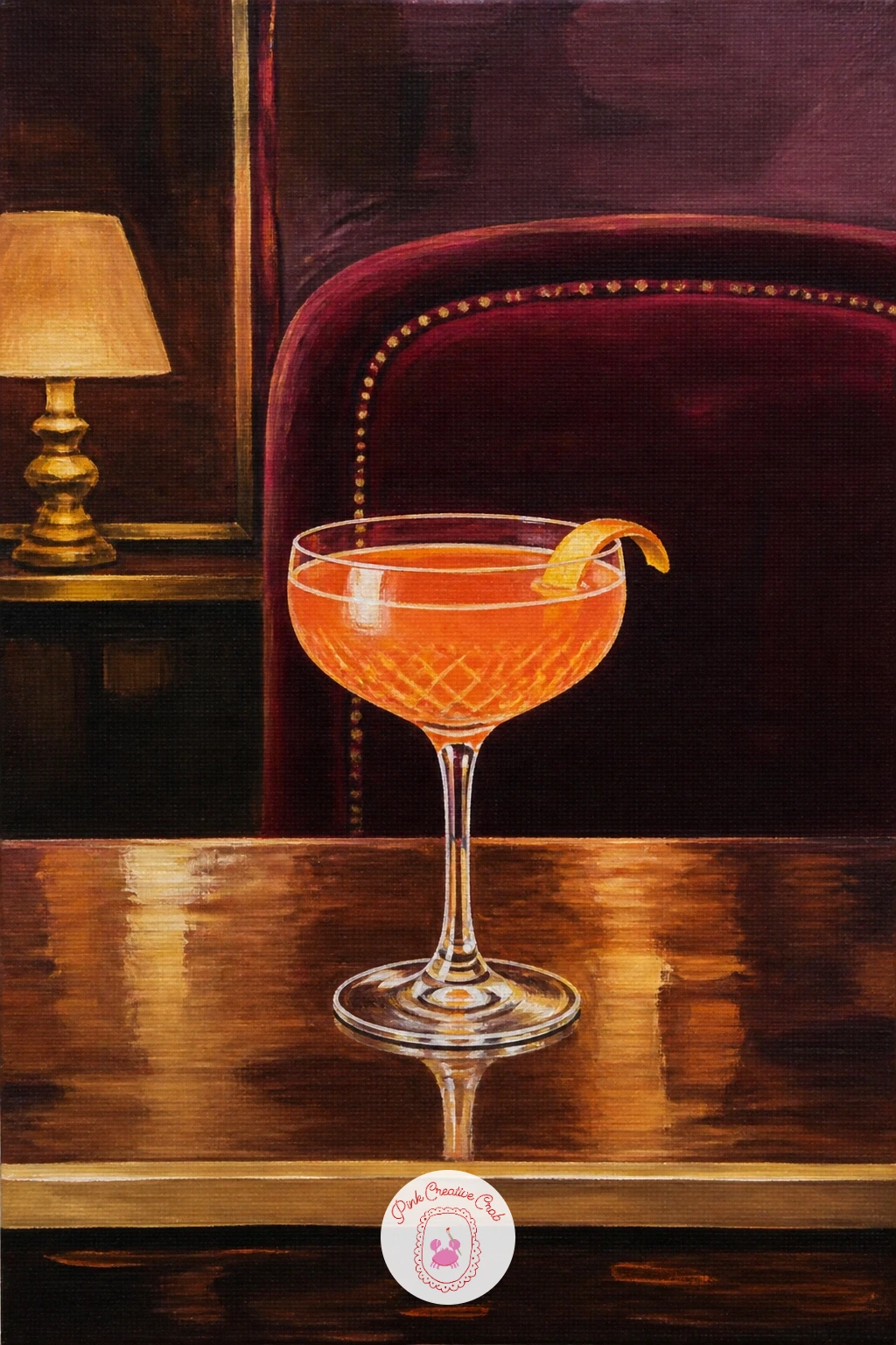
Palette: Burgundy,Burnt Umber,Champagne Gold,Payne’s Grey
Chase the light itself for this one: a rooftop cocktail at sunset works best when the sky does most of the emotional work behind a fairly simple glass. Paint the sky first as a blended gradient from warm orange at the horizon up through pink into deeper purple-blue overhead, working wet-into-wet so the colors melt into each other without hard bands.
Once the sky is fully dry, silhouette a simple city skyline along the bottom edge in flat dark shapes, then add the cocktail glass in the foreground, backlit so its edges catch warm rim light from the setting sun behind it.
A common slip is painting the glass too brightly lit from the front, which fights the backlit sky instead of sitting inside it. Keep the glass body in shadow and let only its outline catch the warm glow.
If blending a full sky gradient feels daunting, three visible color bands softened only slightly at their edges still read beautifully as sunset.
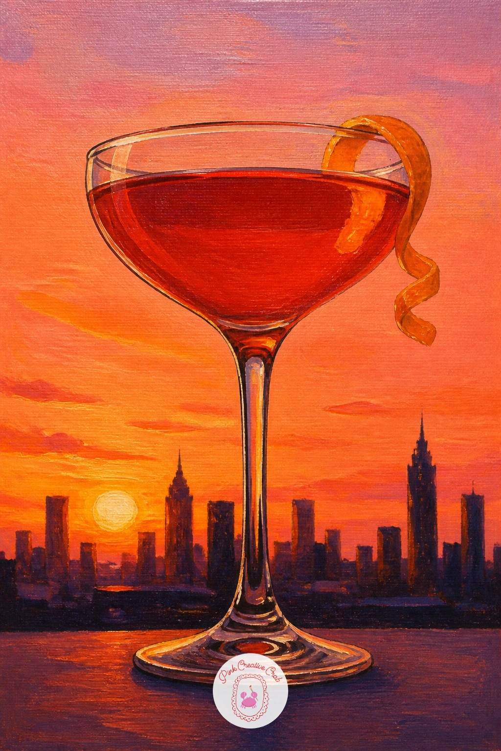
Palette: Burnt Orange,Dusky Pink,Deep Purple,Payne’s Grey
Return to a calmer daylight glass after the sunset: a Bellini is a soft peachy pink that rewards a gentle hand more than bold color. Paint the glass liquid in a blend of pale coral and white, kept smooth rather than textured since a Bellini has no foam or slush to suggest.
Add a whole peach or a few peach slices resting near the glass, painted with a rounded highlight on the sunlit side and a soft red blush where the fruit naturally deepens in color, blending the two tones together while the paint is still workable.
Peaches painted with a hard line between the blush and the pale side look unripe and flat. Blend that transition while wet, feathering one color gently into the other with a soft brush.
A few prosecco bubbles rising through the glass, tiny white dots, finish the drink without adding more color.
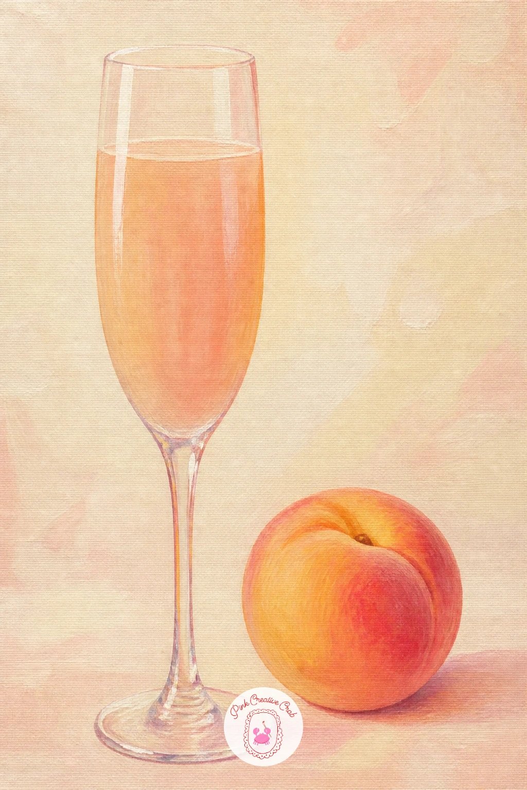
Palette: Coral Pink,Titanium White,Cadmium Orange,Cadmium Red
Bring in a warm-weather contrast for variety: a hot toddy is served hot, in a clear glass mug rather than a cocktail glass, so the shape and mood shift here on purpose. Paint the handle and mug body as a simple curved shape first, then fill it with warm amber liquid in a mix of burnt sienna and cadmium yellow.
Add a cinnamon stick standing up out of the liquid and a lemon wheel floating near the top, then finish with a few soft curls of steam rising above the mug, painted as loose, almost transparent white wisps with a dry brush.
Steam painted too solidly looks like smoke rather than warmth. Use very little paint on an already-dry brush and drag it upward lightly so the wisps stay soft and broken.
If a glass mug with a handle feels tricky, a simple heatproof glass cup without a handle is just as cozy and easier to get right.
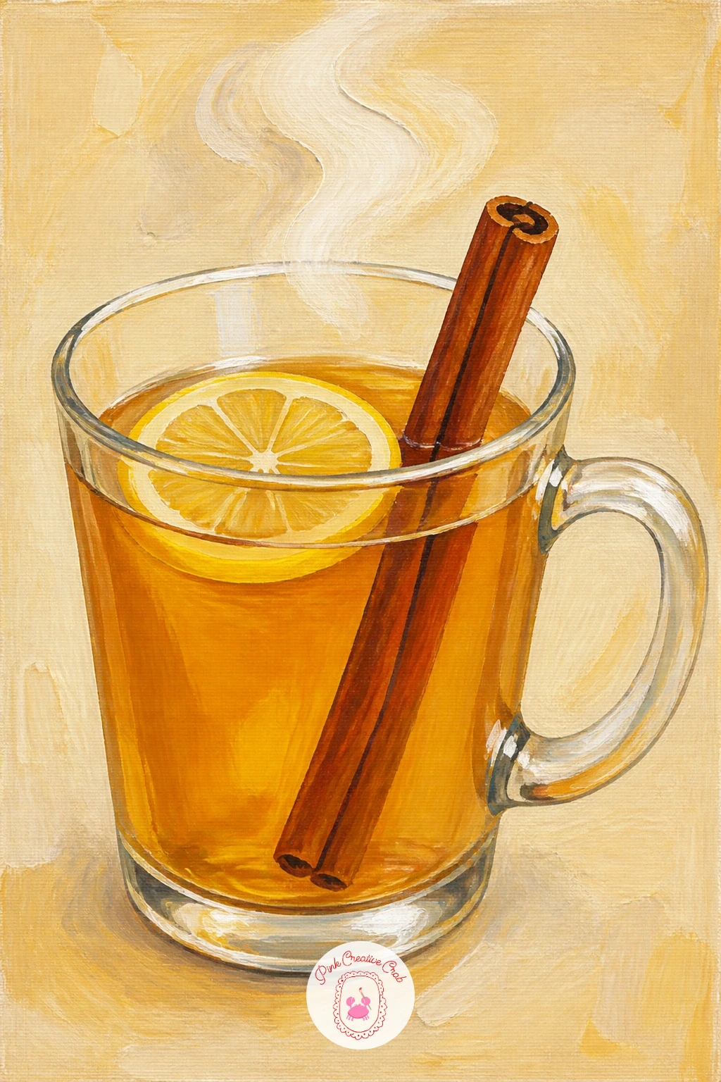
Palette: Burnt Sienna,Cadmium Yellow,Titanium White,Burnt Umber
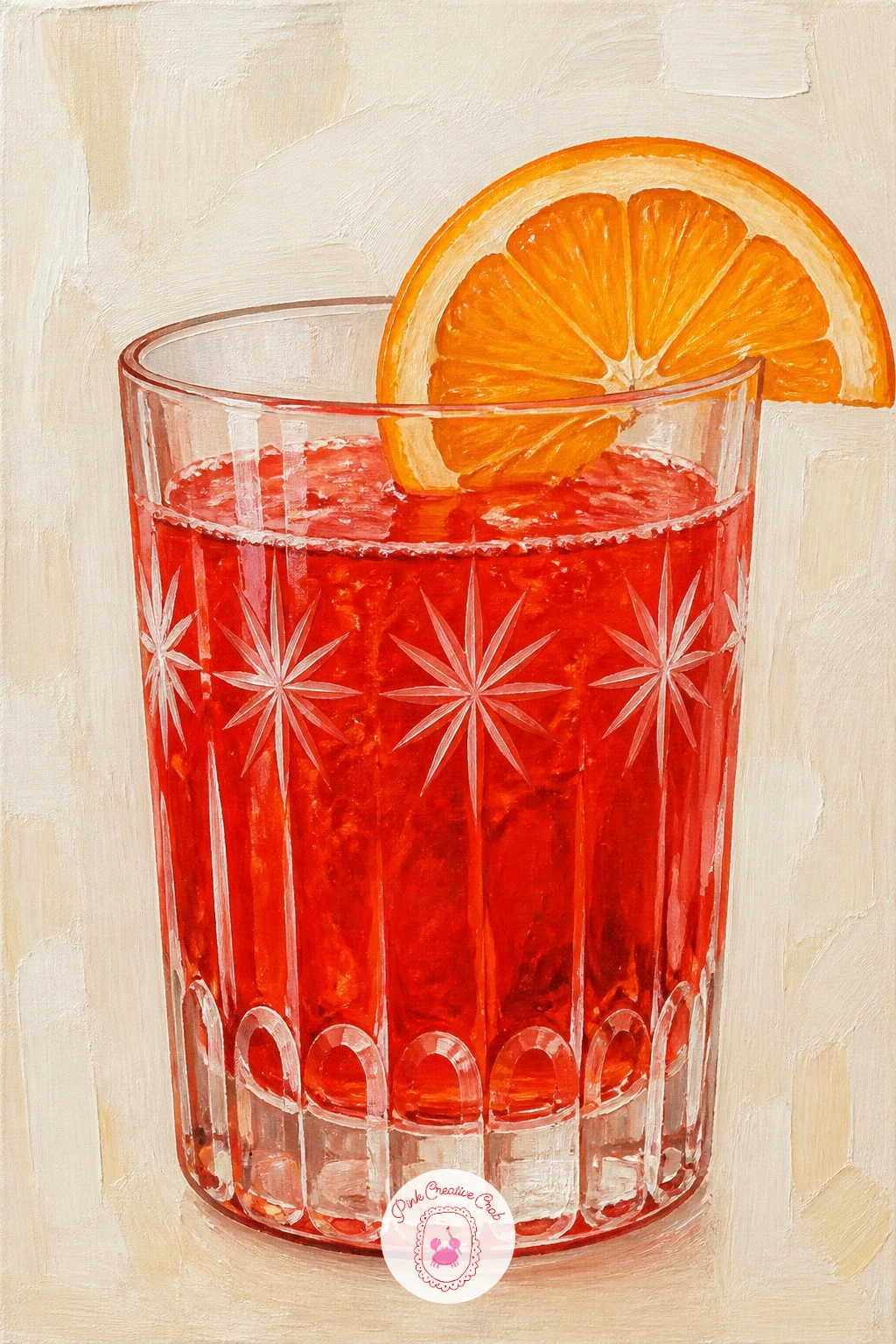
Go back to a bold single color with history behind it: a Campari soda in a vintage glass is about the glass shape as much as the drink, since vintage glasses often have an etched pattern or a slightly tinted tone. Paint the bright red-orange liquid first in pure Campari red, a vivid mix of alizarin crimson and cadmium orange, keeping the color flat and saturated.
Once dry, suggest a vintage glass pattern with a few fine white lines etched across the surface using a white gel pen rather than a brush, since a pen gives a crisper, thinner line than most brushes can manage at this scale.
Painting the etched pattern too heavily buries the red underneath it. Keep the lines sparse, just a few around the rim and base, so the red still dominates the glass.
A single orange slice on the rim is the only garnish this drink really needs.
You Will Need
- white gel pen for the etched glass pattern
Palette: Alizarin Crimson,Cadmium Orange,Titanium White,Cream
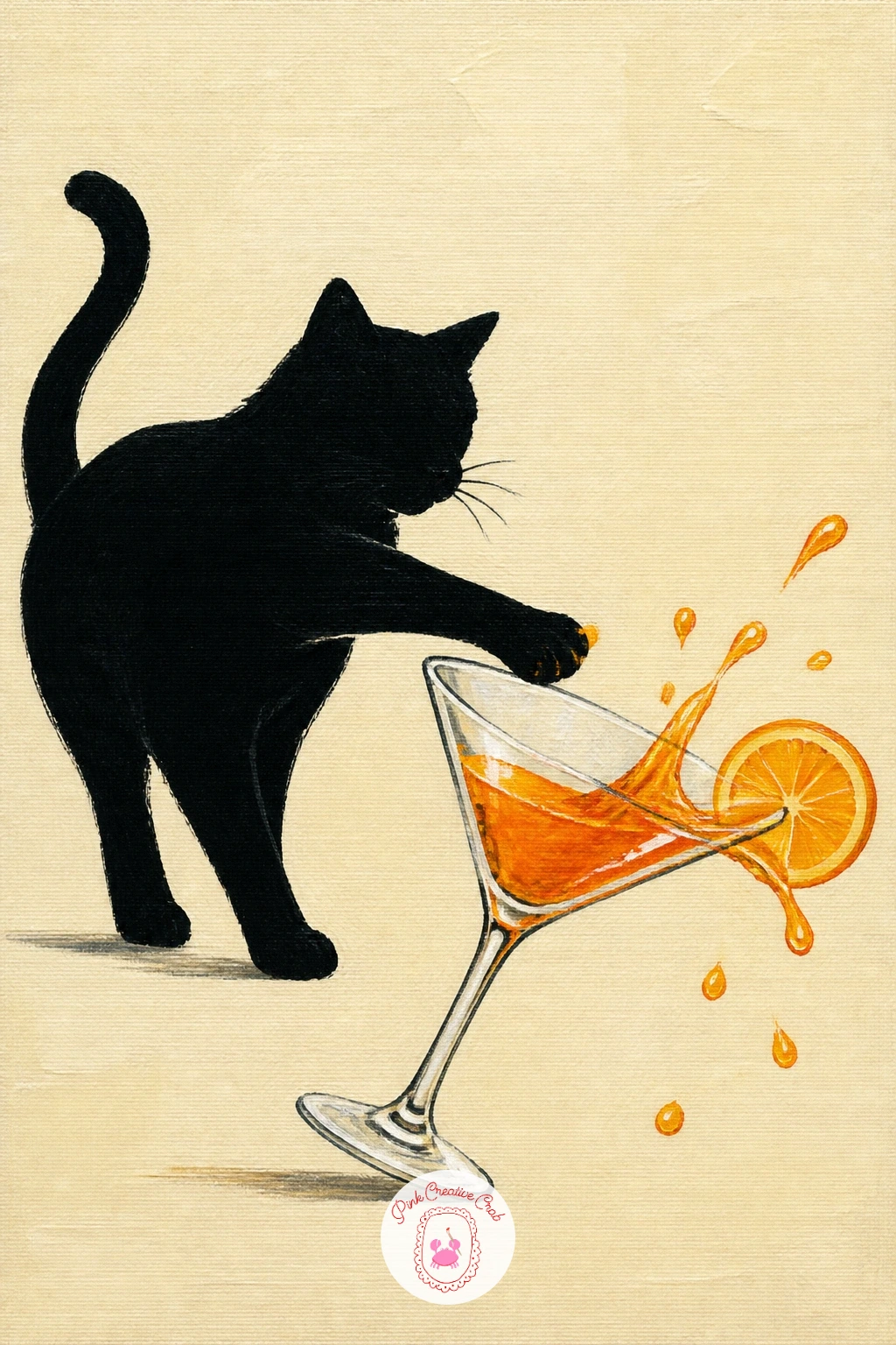
Add a little chaos and humor: a cat mid-swipe at a cocktail glass is a moment of action, so sketch the knocked glass tilted at a sharp angle first, with liquid already spilling, before you place the cat at all. The tilt of the glass tells the whole story, so get that angle committed before anything else.
Paint the spilled liquid as a loose puddle and a few airborne droplets in the same color as the drink, then add the cat as a simplified silhouette, paw extended, painted in flat color with minimal shading so it reads as a quick, funny gesture rather than a detailed portrait.
A cat painted too realistically can pull focus from the comic moment of the spill. Keep its shape loose and slightly cartoonish, with simple dot eyes, so the whole scene stays light and playful.
If a full cat feels like too much today, just a paw and tail entering the frame from one side tells the same joke.
Palette: Payne’s Grey,Cadmium Orange,Titanium White,Cream
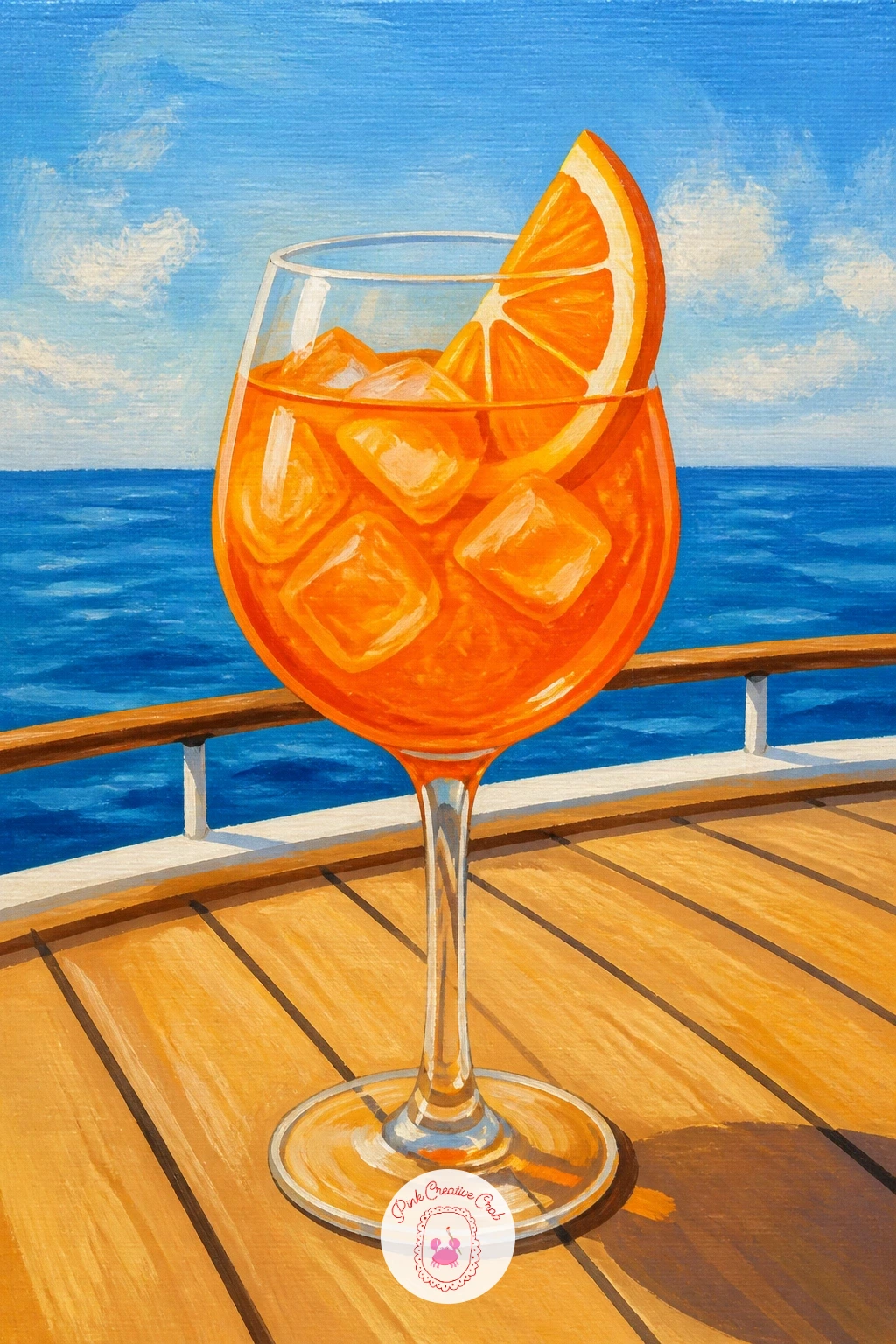
Carry the breezy mood out to sea: a spritz on a boat deck mixes a bright glass with the horizontal lines of water and wooden decking behind it, so plan those background bands before you touch the glass. Paint the sky, sea and deck as three simple horizontal stripes first, each a slightly different value of blue or warm wood tone, letting the brushstrokes stay loose and horizontal.
Add the spritz glass on top once that background is dry, keeping its highlights crisp and bright since strong reflected light off water makes glass look even glossier than it would indoors.
Horizon lines drawn wavy by accident are the most common slip in a boat deck scene. Use a ruler or the edge of a card to guide a straight pencil line for the horizon before you paint over it freely.
A rope or life ring glimpsed at the edge of the frame adds boat atmosphere without needing a full vessel painted in.
Palette: Cerulean Blue,Burnt Sienna,Cadmium Orange,Titanium White
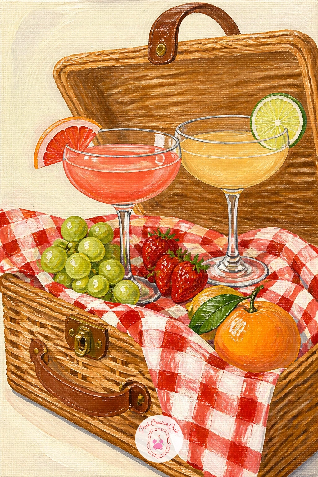
Close the list with the fullest scene: a cocktail picnic spilling out of a wicker hamper brings glasses, fruit and basket texture together in one composition, so build it in clear layers. Paint the hamper shape first as a warm tan basket, adding its woven texture with short diagonal strokes once the base color is dry, then let a gingham cloth spill out from underneath it in loose checked strokes.
Arrange one or two cocktail glasses tucked among the picnic items, along with loose fruit like grapes or berries, painting the glasses last so they stay the brightest, glossiest shapes in the whole scene.
A hamper scene can tip into clutter fast with so many small objects. Group items in twos and threes with breathing room between them rather than scattering everything evenly across the canvas.
For more ideas on arranging a full scene like this with confidence, the acrylic painting flowers for beginners list has useful composition tips that apply just as well here, and anyone wanting a related outdoor mood might enjoy watercolor cottagecore cottage paintings too.
Palette: Warm Tan,Sap Green,Cadmium Orange,Titanium White
What to Do Next
Pick one glass that matches your mood today, whether that is a quick Aperol spritz or the fuller rooftop sunset scene, and set up a small canvas or canvas board before you mix a single color. Block in the glass shape first, let it dry, then save your brightest white for the very last highlight strokes.
Frequently Asked Questions
What paint works best for cocktail painting on canvas?
Acrylic paint works best because it dries fast, layers opaquely and gives the glossy highlights these scenes need. Build the glass in flat color first, then add bright white highlights last once everything underneath is dry.
How do you paint a glass so it looks glossy?
Glossy glass comes from strong value contrast: a dark or saturated liquid color paired with one crisp, bright white highlight stroke down one edge. Keep that highlight clean and unblended so it reads as a sharp reflection.
What size canvas suits a cocktail painting?
A small to medium canvas, roughly eight by ten inches or similar, works well since these pieces put one large glass close to the edges of the frame. Bigger canvases suit the busier scenes like the bar cart or picnic hamper.
How do you keep ice cubes from looking like white blobs?
Paint ice cubes as pale blue-white blocks with a few straight edges, then add one sharp white highlight line and a faint grey shadow line along one side. That contrast gives the cube shape and shine instead of a flat blob.
Can beginners really finish a cocktail painting in one sitting?
Yes, most single-glass ideas on this list finish in under an hour once the background dries. Start with a simpler subject like the Aperol spritz or gin and tonic before moving to busier scenes like the bar cart or picnic hamper.
Have any thoughts?
Share your reaction or leave a quick response — we’d love to hear what you think!
-
 0
-
0
-
0
-
0
-
0
-
0


