

A drawing challenge works best when every day has its own small, finishable picture waiting for you, and that is exactly what you get here. Thirty one cozy little scenes, one for each day, built with colored pencils so you can keep the whole month on the same warm, storybook palette.
Nothing below needs a studio or a free afternoon. Pull out your pencils for twenty or thirty minutes, pick the day’s scene, and let the pile of finished pages grow page by page.
Using these images: free for personal projects such as printing, coloring, cards, journals and gifts. Handmade items that include them may be sold up to 30 pieces per design. More than that is commercial use and is not permitted, and neither is selling or sharing the images themselves or passing them off as your own. Please ask before any other use.
Start the challenge with a cup of tea by the window, a subject small enough to finish fast and warm enough to make you want to come back tomorrow. Sketch a simple mug or teacup first, slightly below center, then build the window frame and a hint of curtain around it so the cup feels tucked into its own little corner.
Work the steam last, with a few curved light lines left mostly as paper, and keep the outside view soft and pale so it never competes with the cup. Layer your warm tones from light to dark, laying down a pale base of yellow ochre before pushing in burnt sienna shadows under the handle.
If the mug looks flat, that usually means the shadow underneath is too thin. Widen it and darken it close to the base, then let it fade out as it moves away from the cup.
Today’s tip: use the white of the paper itself for the brightest steam curl instead of trying to erase it back in later.
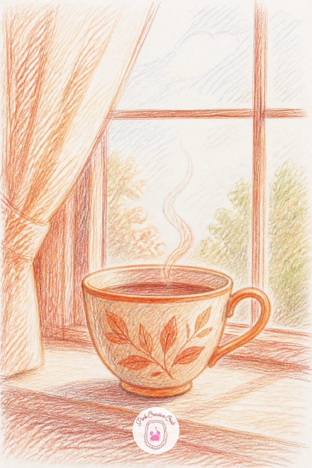
Palette: Burnt Sienna,Yellow Ochre,Warm Grey,Cream
Move from tea to a cat in a sunbeam, one of the most satisfying scenes in the whole month because the light does half the work for you. Block in the cat’s curled shape first, keeping the outline loose and rounded, then add the floorboards or rug beneath so the pose reads as truly settled and heavy with sleep.
Place your light source high and to one side, then let every shadow fall away from it in the same direction, including the long warm patch of sunlight itself stretching across the floor. That consistency is what sells the whole scene as sunlit rather than just colored.
Keep the fur loose with short flicking strokes that follow the direction it grows, layering a base coat before adding darker strokes only where the body curves away from the light.
If you only have twenty minutes, stop once the cat and sunbeam are blocked in. With more time, add a second layer of warm yellow glaze over the sunbeam to make it glow against the cooler shadow around it.
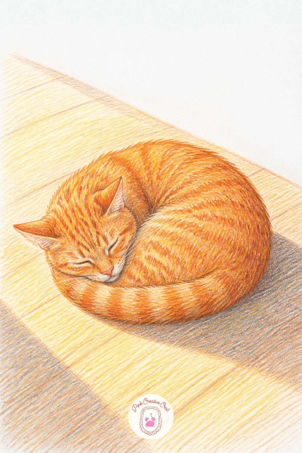
Palette: Ginger Orange,Cream White,Golden Yellow,Soft Brown
Look at a photo of a sleeping cat in real sun if you have one nearby, the way the far side of the body sinks into shadow is easy to miss otherwise.
A bakery window gives you a whole little world to fill with pastries, bread loaves and a soft glow, and if you want more baked goods after today, these food doodle ideas make a nice companion page. Draw the window frame first as a simple rectangle or arch, then fill the inside with three or four shapes for croissants, a cake stand and a loaf, keeping each one chunky rather than fussy.
Shade the glass itself with a very light grey glaze over the whole pane before adding the treats, so everything inside reads as sitting behind glass rather than floating in front of it. Save your brightest white highlights for the glass reflection, drawn last as a few diagonal streaks.
If the window goes muddy, it is almost always because the glass glaze went on too dark. Keep it pale and let the pastries carry the color instead.
Finish today by adding one small sign or price tag in the corner, it gives the eye somewhere to land besides the food.
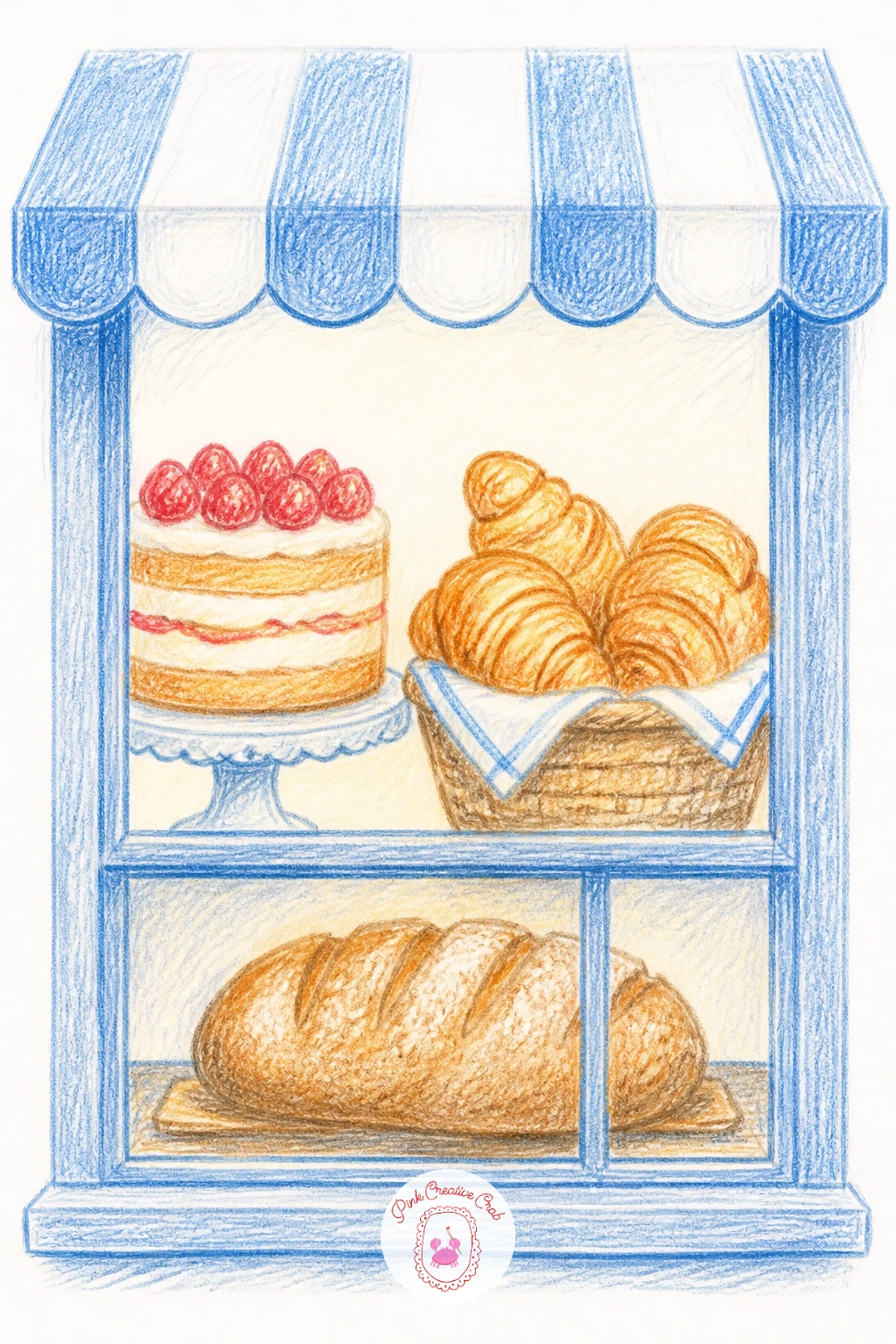
Palette: Golden Brown,Cream,Soft Pink,Pale Grey Blue
A rainy street asks you to think about where the light sits before you draw a single raindrop, so place a streetlamp or a lit shop window first and let it decide where every reflection falls. Sketch the street itself in loose perspective, a few buildings leaning toward a vanishing point, then add a figure with an umbrella walking toward or away from the light source.
Puddles work best as flattened ovals that mirror the color above them rather than plain grey shapes. Pull a little of your streetlamp yellow or window orange straight down into each puddle to make it feel wet and reflective.
Layer your sky and buildings in cool blues and greys first, then add the warm lit windows last so they pop forward against the cold.
If the rain lines look too stiff, draw them at a slight angle and vary their length, a few long streaks and several short flicks read far more natural than evenly spaced lines.
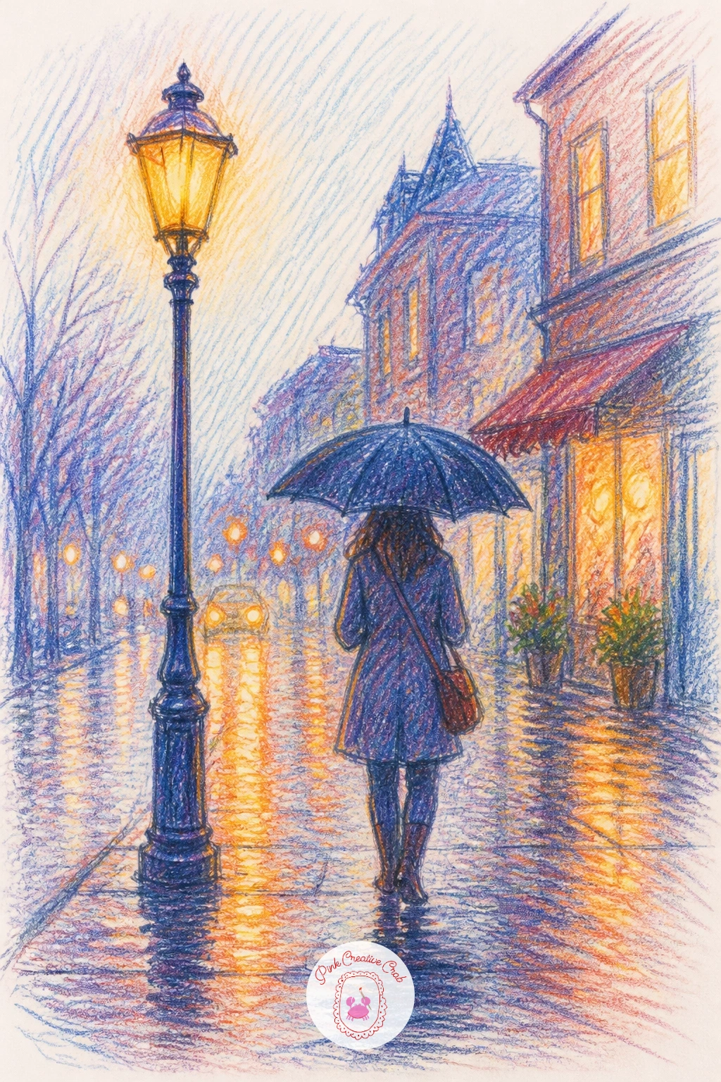
Palette: Payne’s Grey,Deep Blue,Warm Amber,Charcoal
Picnic for two keeps the proportion simple if you anchor everything to one object: draw the picnic blanket first as a flattened rectangle in perspective, then measure the basket, plates and cups against its width so nothing ends up too large or too small for the cloth it sits on.
Work from the blanket pattern outward, laying in checks or stripes before adding the food and drink on top so the pattern reads underneath rather than around each object. A small vase of flowers or a loaf of bread gives the eye a natural focal point near the center.
Shade each item with its own light source consistent with the whole scene, soft shadows falling to one side under the basket and glasses alike.
Keep today loose and quick if you are short on time, a blanket, basket and two cups is a complete picnic even without a full spread of food.
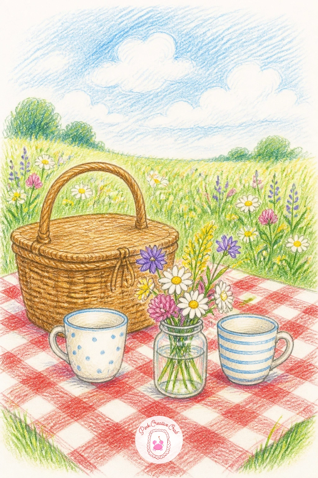
Palette: Grass Green,Red Gingham,Cream,Golden Brown
Keep the bookshelf corner from feeling cluttered by establishing the shelf as a few confident rectangles before you add a single book. Draw the shelf edges and verticals first, then pack the books in afterward, leaning a few against each other at slight angles rather than lining every spine up straight.
Vary the heights and widths of the spines as you color them, this is what makes a shelf of books feel collected over years instead of drawn in one afternoon. Tuck in a small plant, a candle or a stack of tilted books on their side for a bit of visual rest between all the verticals.
Shade the shelf interior slightly darker than the books themselves, pushing it back and making the spines pop forward in warmer colors.
If the whole shelf looks too busy, pick two or three colors to repeat across several spines, that small bit of rhythm calms the whole page down.
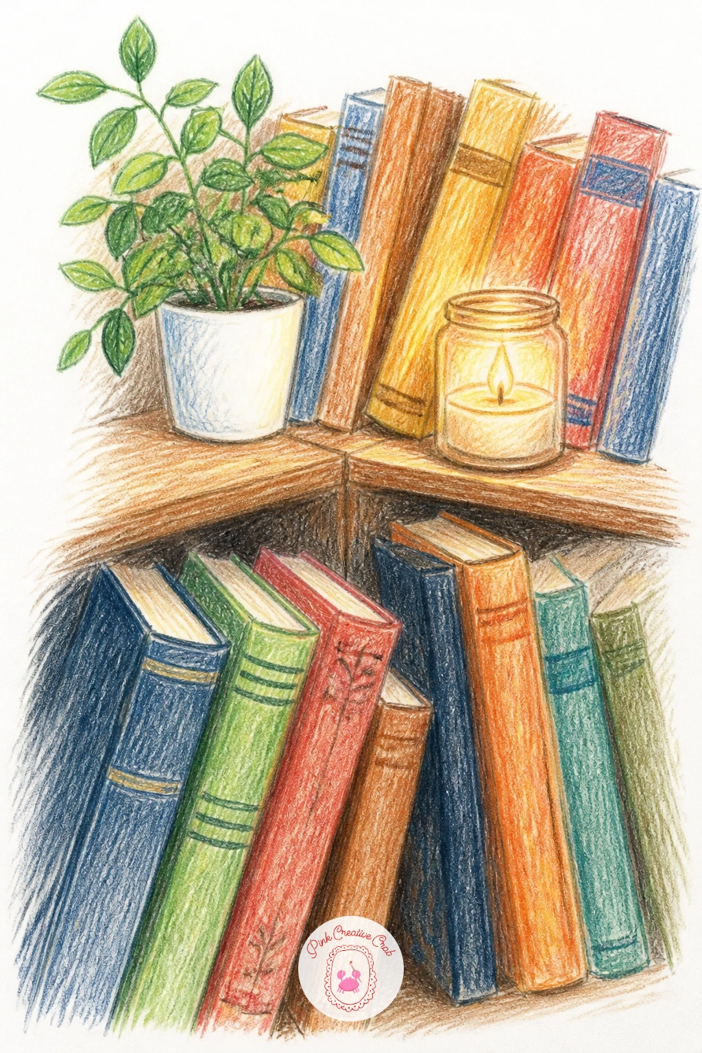
Palette: Deep Teal,Burgundy,Mustard Yellow,Warm Brown
A family of houseplants is really a lesson in grouping different leaf shapes together without them fighting for attention, so start by sketching three pots of different heights along a simple windowsill or shelf line. Give each one a distinct silhouette, a trailing pothos, a tall snake plant and a round leafed fiddle fig, before filling in any detail.
Work the largest plant first, building its leaves from the base up with layered greens, then move to the smaller pots so the whole group reads in a sensible order of importance. Vary your greens generously, pulling in a little yellow or blue into each mix so no two plants end up the exact same shade.
Leaf edges can go stiff fast, so soften a few with a light touch of a blending pencil or a slightly damp fingertip along the curled tips.
Next time you draw this scene, swap the pots for a mismatched collection of jars and tins for a different mood entirely.
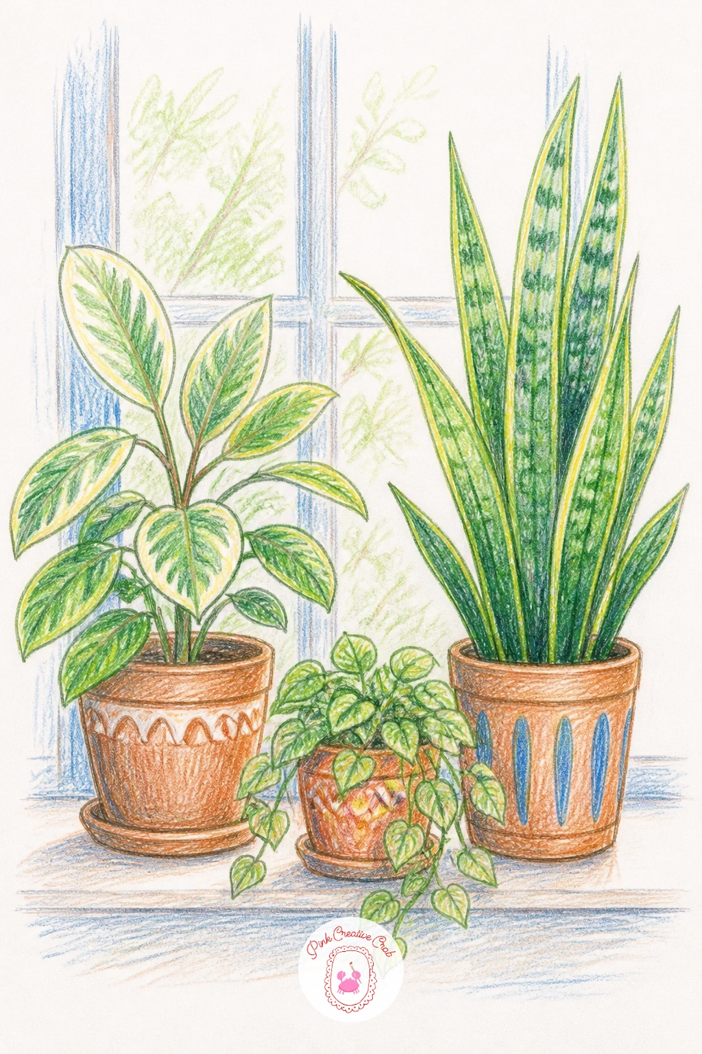
Palette: Sap Green,Olive Green,Terracotta,Deep Green
A bath with candles rewards a careful look at where light actually glows versus where it just reflects, so place two or three candles around the tub first and treat each flame as the brightest point on the whole page. Sketch the tub itself as a simple curved rectangle, then add bubbles or water on top once the basic shape feels steady.
Work the water surface with short horizontal strokes in cool blues and whites, leaving small gaps of bare paper for bubble highlights rather than drawing every bubble as an outlined circle. Let the candlelight warm up the water and the tub edge nearest each flame with a soft orange glaze.
If the bubbles look like a flat pile of circles, vary their sizes more than feels natural and overlap several of them so they read as foam rather than scattered balls.
Keep the background dim and simple tonight, a plain dark wall lets the candle glow do all the talking.

Palette: Soft Blue,Candle Amber,White,Deep Plum
A bicycle with flowers in its basket is a nice chance to practice ellipses, since both wheels need to match in size and tilt or the whole bike will look like it is leaning wrong. Draw a light guide circle for each wheel first, checking that they sit the same distance apart and the same size, before adding the frame between them.
Build the frame as a few simple connected triangles rather than worrying about exact bicycle mechanics, then add the basket at the front and fill it with a loose bundle of flowers last. Let a few blooms spill over the basket edge for a relaxed, just picked feeling.
Shade the metal frame with a cool grey base and a few sharp white highlights along the top curve of each tube to suggest polished metal.
If you want a quieter version for a quick day, draw the bicycle leaning against a wall with no rider and skip any background beyond a hint of ground shadow.
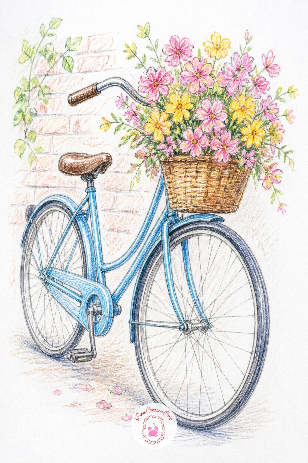
Palette: Sky Blue,Rose Pink,Sap Green,Charcoal Grey
A garden shed gives you a simple box shape to start from, so block in the walls and roof as flat planes first and decide early where your light source sits, since one whole side of the shed should stay in shadow once that is settled. A door slightly ajar and a window with a few tools or pots visible inside adds a story without much extra drawing.
Work the wood paneling with vertical strokes of varied brown tones before the vines or climbing plants go on top, letting a little of the wood show through the leaves so the planting still feels layered rather than painted flat over the structure.
Add a watering can, a stack of pots or a rake leaning against the outside wall, these small props do more to set the cozy mood than extra detail on the shed itself.
One concrete tip for today: keep the roof slightly darker than the walls, that single value shift makes the whole structure sit convincingly under open sky.
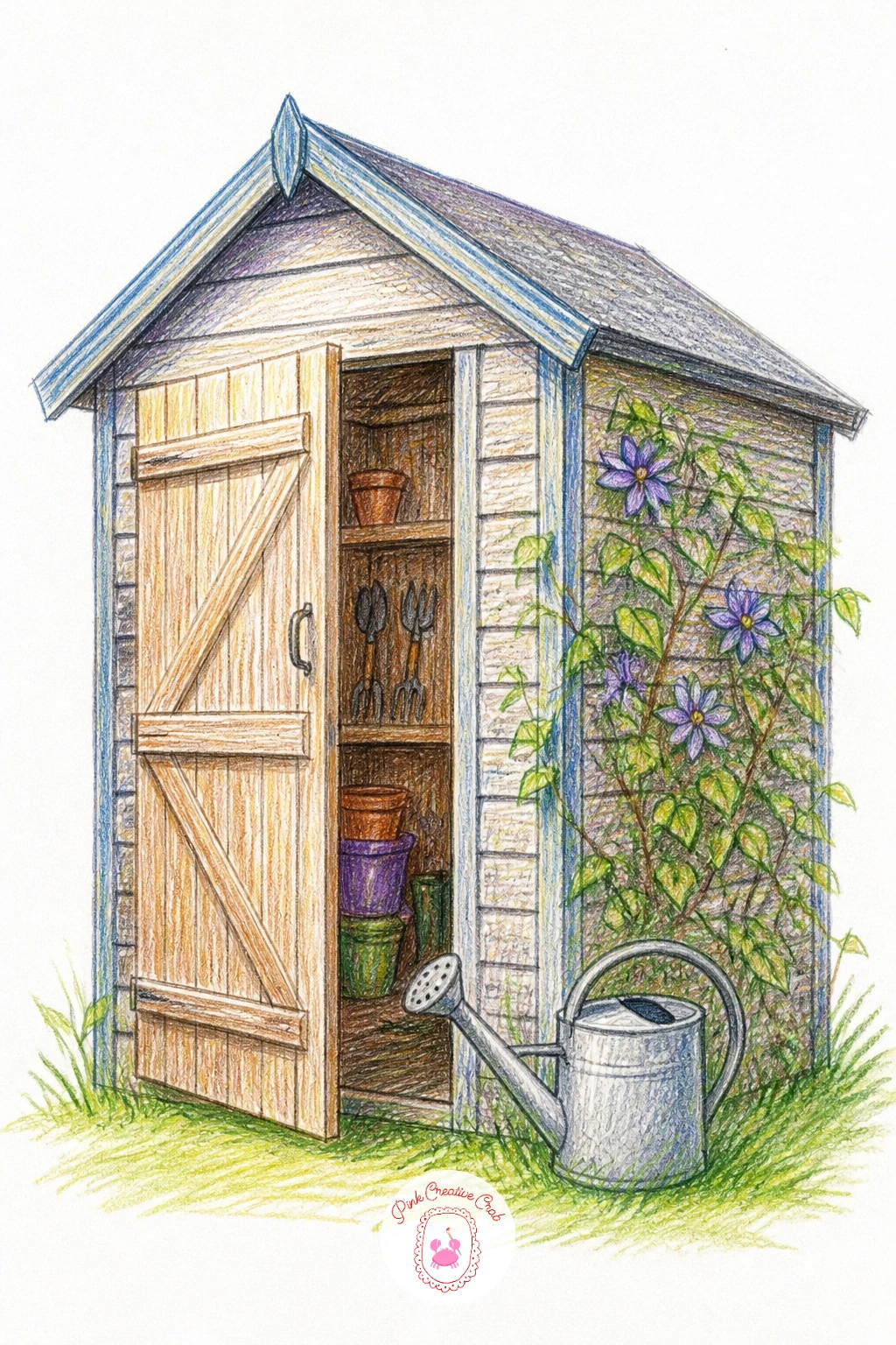
Palette: Weathered Brown,Moss Green,Terracotta,Soft Grey
A market stall works best built in layers from back to front, the canopy and table first, then the big shapes of fruit or flower bunches, and only at the end the small price signs and baskets. Keep the canopy striped and simple, a few confident bands of color rather than a fussy pattern, so it frames the goods below without pulling focus.
Group your produce or flowers in clusters of three or four rather than scattering single items, clusters read faster and feel more generous on a small page. Shade each cluster with its base color first, then push a few darker accents into the gaps between items to give the pile some depth.
If the stall feels flat, add one strong cast shadow underneath the whole table, grounding it firmly against the ground beneath.
Try swapping fruit for flowers or vice versa next time you revisit this scene, the same structure works for either.
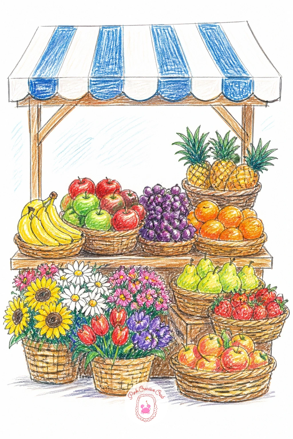
Palette: Tomato Red,Lemon Yellow,Leaf Green,Canvas Cream
A dog walk needs a clear sense of where the ground sits under both figures, so sketch a simple horizon line first and keep the person and dog standing on the same level rather than floating at different heights. Compare the dog’s height against the person’s leg as you draw, most dogs reach somewhere between the knee and the hip depending on the breed, and getting that relationship right does more for believability than any amount of fur detail. For more pet inspiration beyond today, these dog pencil drawing ideas are worth a look.
Draw the leash as a simple curved line connecting the two, and let it have a little slack rather than drawing it taut and straight. Build the dog’s fur with short layered strokes following its body direction, and keep the person’s coat or scarf loose and simple so the dog stays the star of the page.
Add a scattering of fallen leaves or a lamppost in the background for a quick seasonal touch without much extra work.
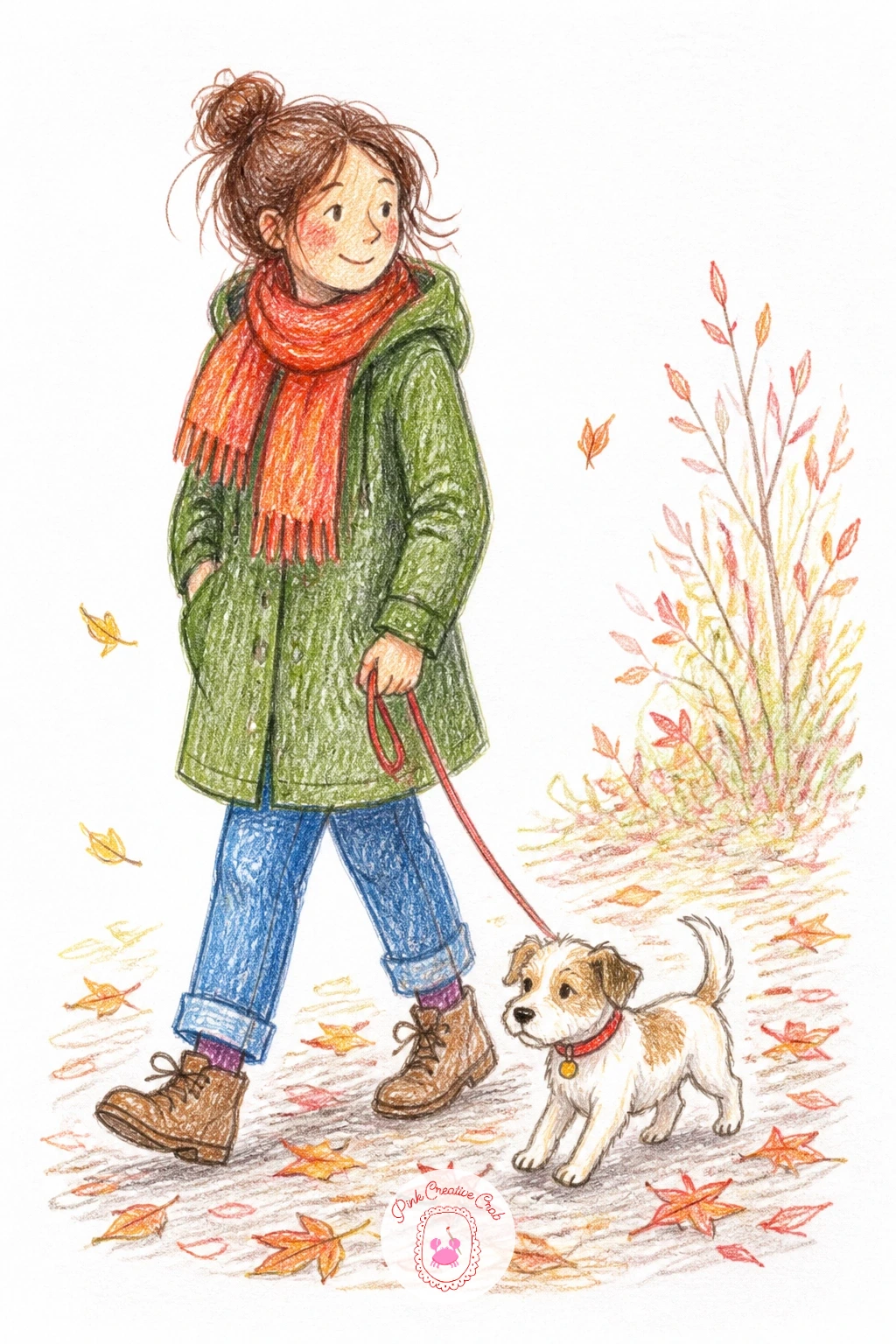
Palette: Warm Brown,Burnt Orange,Denim Blue,Soft Grey
Ice cream at the seaside is all about getting the melt right, so draw the cone first with the scoops slightly uneven in size and let one edge droop just a touch, a perfectly symmetrical scoop reads as stiff rather than soft. Sketch a hand holding the cone low in the frame with the sea and sky filling most of the page behind it.
Work the sky and water first in broad horizontal bands of blue, then bring the cone forward on top so it sits clearly against the lighter background. A few drips running down the cone, drawn as simple curved lines, sell the whole melting idea instantly.
If the ice cream looks too flat, add one strong highlight on the sunniest side of each scoop and a cooler shadow tucked underneath where the scoops overlap.
Keep the horizon line low today, it gives you more sky to enjoy filling with soft clouds.
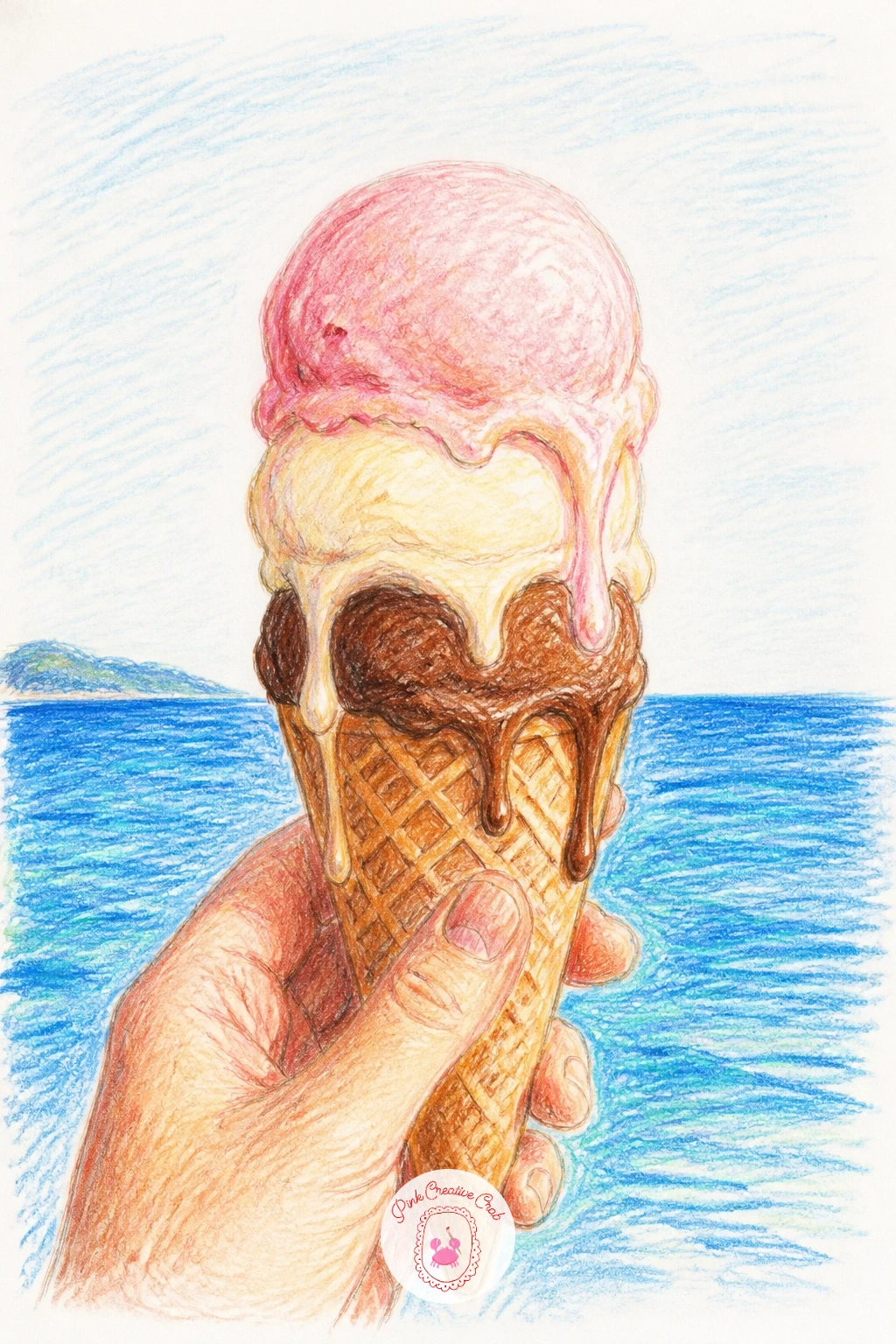
Palette: Sky Blue,Sea Teal,Vanilla Cream,Strawberry Pink
A cozy bed with a book asks you to think about folds before furniture, so start with the blanket draped over a simple bed shape and sketch its major folds as a few long diagonal lines before adding any smaller wrinkles. Place the book propped against a pillow or resting on the lap of a loosely suggested figure, keeping the page edges simple rather than drawn one by one.
Build the blanket’s texture with layered strokes that follow each fold’s direction, darker in the creases and lighter along each raised ridge. A mug on the nightstand or a cat curled at the foot of the bed adds warmth without much extra effort.
If the blanket looks stiff, soften a few fold lines with a blending pencil so they fade rather than stop abruptly.
For a ten minute version, draw just the book and blanket close up and skip the full bed and room around it.
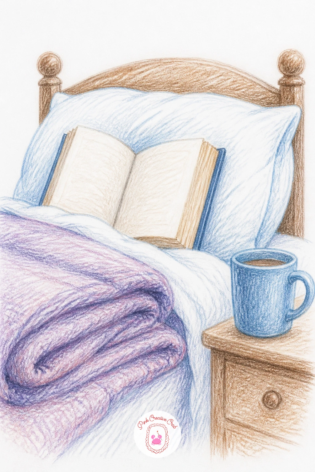
Palette: Dusty Rose,Cream,Warm Grey,Soft Gold
A kitchen on baking day gives you a busy little scene, so decide on one clear focal point before anything else, usually a mixing bowl or a tray of cookies, and build the rest of the counter clutter around it at a smaller scale. Sketch the counter line first as your base, then add the bowl, rolling pin and a dusting of flour on top.
Flour dust works best as a light scatter of tiny white or cream marks added last, over the finished counter color, rather than left as untouched paper from the start. Layer your counter and cupboards in warm woods and creams so the whole kitchen feels sunlit rather than cold.
If the scene feels cluttered, group your props in twos and threes with small gaps of bare counter between them, that breathing room keeps the eye from getting lost.
Add a window above the sink with a plant on the sill for a nice bit of green against all the warm browns.
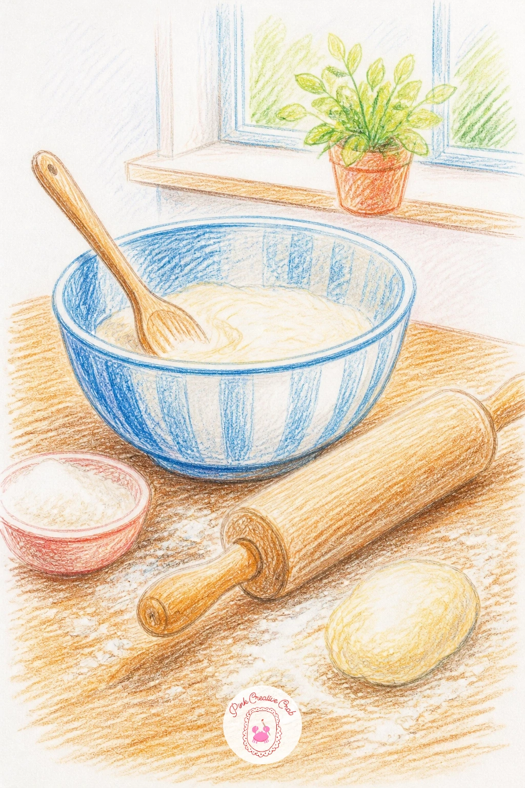
Palette: Warm Wood Brown,Flour Cream,Butter Yellow,Sage Green
A view from a train window plays with perspective in a fun way, since everything close to the glass stays sharp while the landscape rushing past gets soft and blurred. Draw the window frame first as a simple arch or rectangle, then sketch a loose horizon line for the hills or fields beyond it, keeping that outer view deliberately hazy with soft, dragged strokes.
Add a small still object on the inside sill, a cup, a book or a pair of gloves, drawn crisp and detailed in contrast to the blurred world outside. That contrast between sharp and soft is what makes the whole window convincing as glass in motion.
Layer the distant scenery in cool, muted tones so it recedes properly behind the warmer, clearer foreground object.
If the blur looks messy rather than smooth, smudge your pencil strokes gently with a blending stump in one consistent horizontal direction.
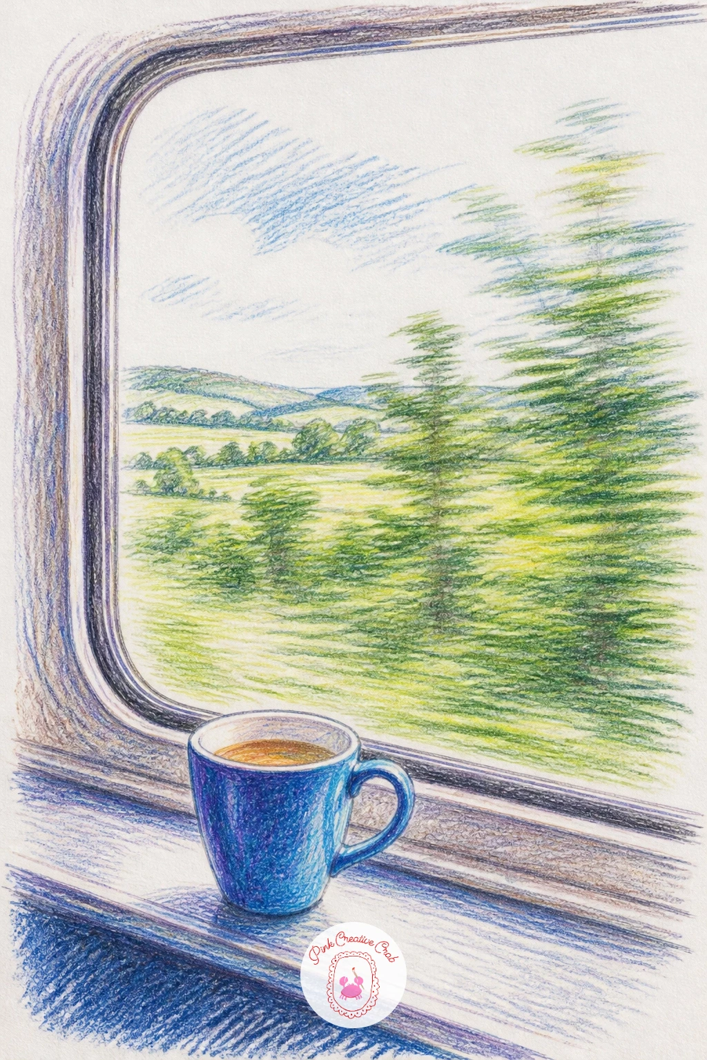
Palette: Muted Green,Pale Blue,Warm Cream,Soft Brown
A cafe table for two needs its two cups and chairs to feel like a matched pair, so measure one cup against the other as you draw to keep their sizes consistent, then mirror the chair placement roughly on either side of the small round table. Sketch the table itself first as a simple circle in slight perspective, then build outward to the chairs and finally the cups and saucers on top.
Give the tablecloth or tabletop a bit of pattern or wood grain before the cups go on, so they sit clearly on a surface rather than floating against plain paper. A small vase of flowers or a folded napkin between the two place settings adds a nice sense that someone is expected.
Shade the chairs with simple consistent shadows falling the same direction as the cups, tying the whole small scene together.
If you want a quieter mood, swap the coffee cups for teacups and add a small plate of pastries instead.
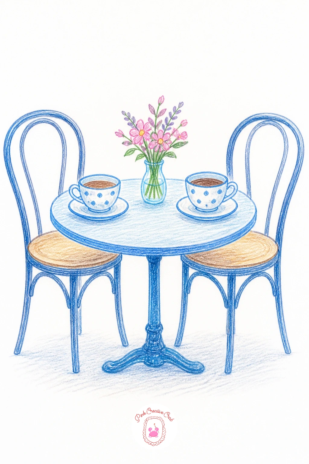
Palette: Warm Brown,Cream White,Dusty Pink,Sage Green
A flower shop lets you practice grouping again, this time with buckets of flowers lined along a doorway or window, and after today’s page you might enjoy stretching the idea further with these rose painting ideas or this daisy painting list. Sketch three or four buckets at slightly different heights first, then fill each one with a different flower type so the whole row reads as varied rather than repetitive.
Work each bucket’s flowers as loose clusters of color blocked in before any individual petal detail, keeping the brightest, most saturated blooms toward the front of the shop where the light is strongest. A striped awning or a chalkboard sign above the display finishes the setting without much extra work.
If the flowers start blending into a solid mass of color, add a few dark green leaf shapes between the clusters to break up the color and give the eye somewhere to rest.
Keep the shopfront itself simple, the flowers are the real subject today.
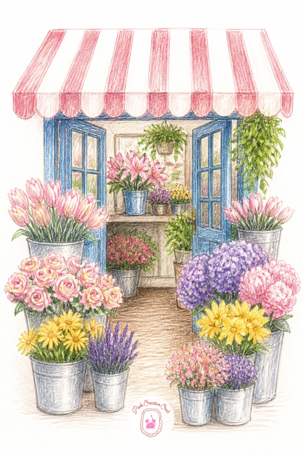
Palette: Rose Pink,Sunflower Yellow,Leaf Green,Lavender Purple
A camping tent is a good chance to think about where your light source sits before drawing a single tree, since a tent lit from inside at dusk looks completely different from one lit by daylight from outside. Decide on dusk for the coziest version, glowing warmly from within, and sketch the tent shape first as a simple triangle before adding the campfire or lantern beside it.
Build the dark evening sky and trees first in deep blues and greens, then let the tent’s warm glow punch through last as the brightest, most saturated color on the page. A small figure or a pair of boots outside the tent flap adds a nice sense of someone settling in for the night.
If the glow looks too hard edged, soften where the warm light meets the dark sky with a light blending pass so it fades rather than stops sharply.
For a quick version, draw just the glowing tent and skip the surrounding trees entirely.
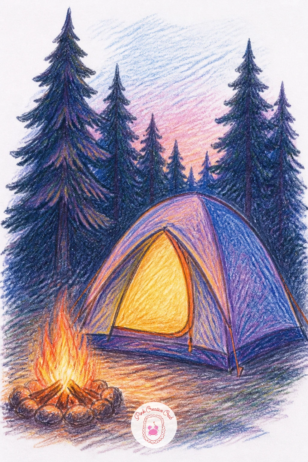
Palette: Deep Navy,Campfire Orange,Forest Green,Warm Yellow
A snowy cabin builds nicely from the roofline down, so draw the peaked roof thick with snow first and let that heavy white shape set the mood before anything else goes in. Add the log walls beneath with simple stacked horizontal lines, then a single lit window glowing against the dim winter light outside.
Layer the snow itself in cool blues and lavenders rather than flat white, since pure white snow against white paper tends to disappear and lose all its shape. Save actual white for only the brightest highlights along the top edges of the snow drifts.
A thin curl of smoke from the chimney and a few bare trees nearby finish the scene without much extra effort.
If the cabin feels cold overall, push the window glow warmer and brighter than feels natural at first, that contrast against all the blue snow is what makes the whole page feel cozy rather than just cold.
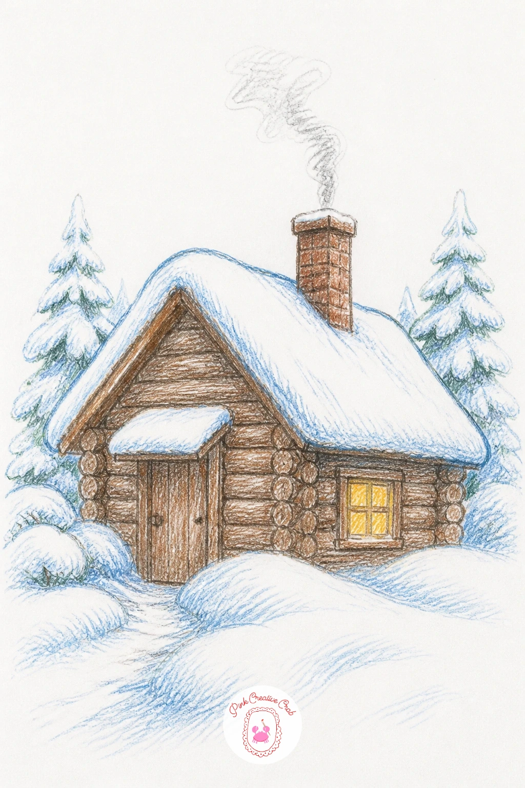
Palette: Winter Blue,Lavender Grey,Warm Window Gold,Deep Brown
A laundromat at night is really an exercise in rows, so draw the line of washing machines first as a repeated series of simple rounded squares, keeping them evenly spaced along one wall. Vary the window inside each machine door slightly though, a few empty, a few mid spin, so the row does not feel too mechanical.
Light this scene from the overhead fluorescent strip, cool and slightly greenish, bouncing off the tile floor and the machine fronts. A single figure seated on a plastic chair reading or waiting adds a quiet human moment against all the hardware.
Shade the floor tiles with simple reflected light streaks pulled from the overhead lighting, keeping the palette otherwise fairly muted and cool.
If the rows of machines look flat, add one machine slightly closer to the viewer, larger than the rest, to break the repetition and create depth.
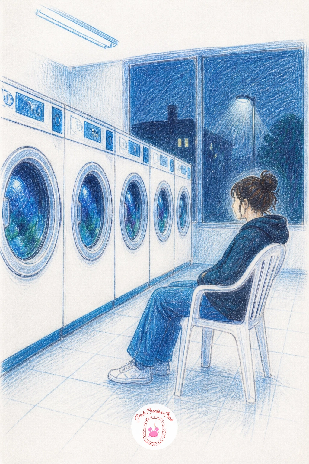
Palette: Cool Grey,Fluorescent Green White,Deep Teal,Warm Skin Tone
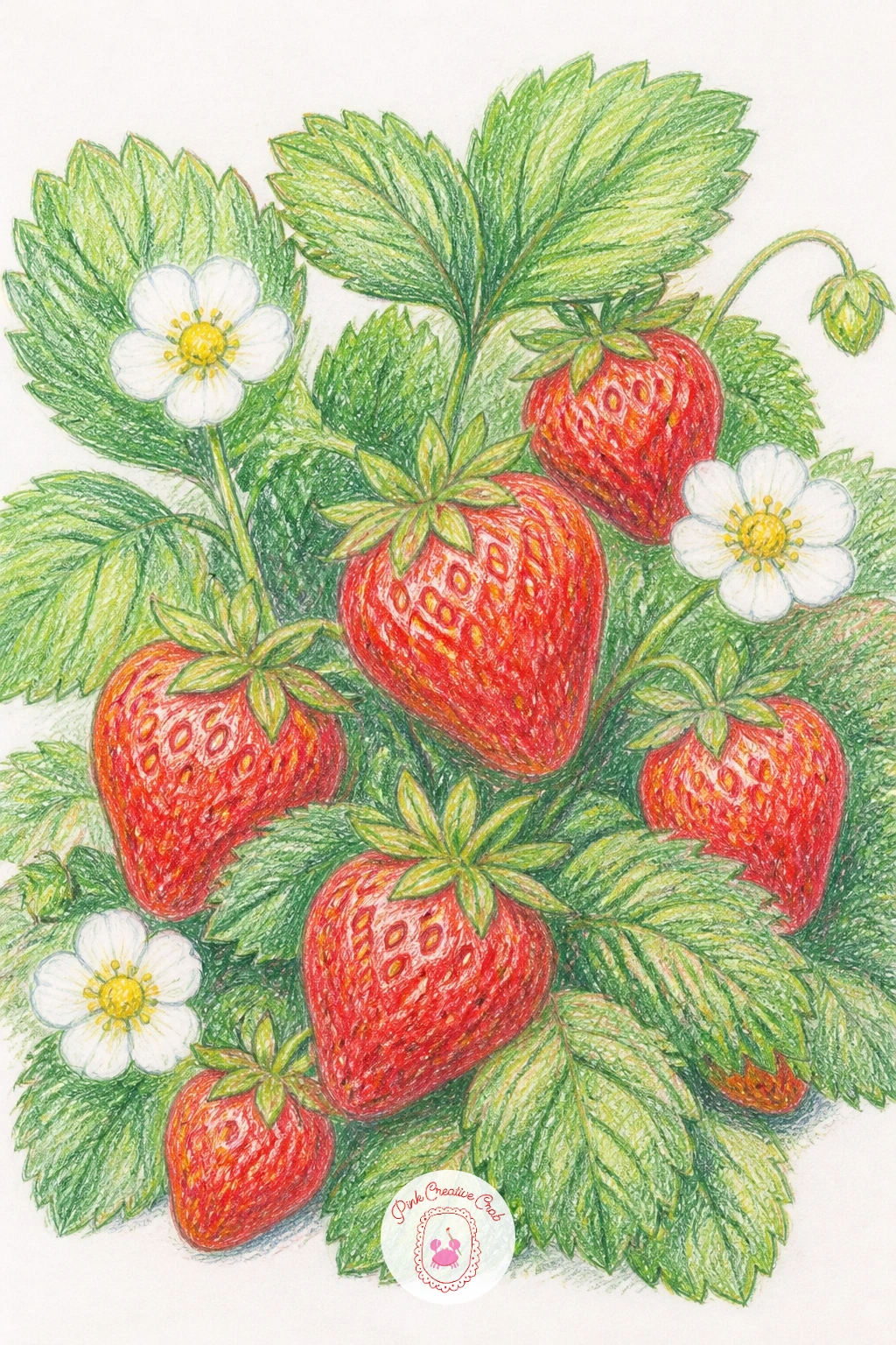
A strawberry patch is a nice break after all that structure, loose and organic, so scatter a handful of leaf clusters across the page first before adding any berries at all. Tuck the strawberries in among the leaves afterward, varying their size and the angle they hang at so the patch feels like it grew naturally rather than got arranged.
Build each berry with a red base coat first, then add tiny yellow seed dots last using the tip of a sharp pencil or a fine gel pen, placed in loose spiral rows rather than a perfect grid. Shade one side of each berry a touch darker to give it real roundness against the flat leaves.
If the leaves look too uniform, vary your greens generously from bright yellow green to a deeper blue green across different clusters.
Add one or two white strawberry flowers among the leaves for a nice contrast of color and shape.
You Will Need
- white gel pen for seed dots
Palette: Strawberry Red,Leaf Green,Seed Yellow,Soft White
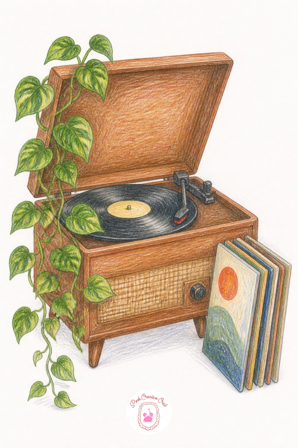
A record player with plants puts a hard, geometric object right next to something loose and organic, and that contrast is the whole appeal, so draw the record player’s rectangular base and round turntable first with careful straight edges and a true circle. Add the tonearm as a simple angled line resting against the edge of the disc.
Once the machine itself feels solid, build a trailing plant draped over one side of it, letting the vine spill down past the base in a loose curving line that softens all those straight edges. A small stack of records leaning nearby fills out the scene without much extra effort.
Shade the record player’s wood casing with warm browns and a few sharp highlights along the turntable’s metal edge, keeping the plant’s greens cooler by comparison.
If the circle of the turntable looks off, trace around a small coin or cap before inking it in rather than freehanding it.
You Will Need
- a small round object to trace the turntable
Palette: Walnut Brown,Vine Green,Charcoal Black,Warm Gold
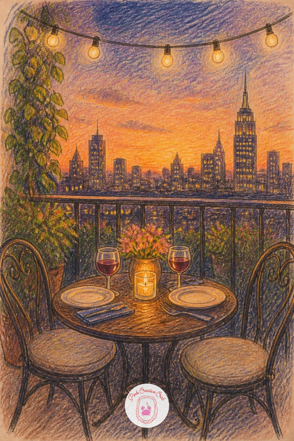
A balcony dinner works from the railing outward, so sketch the balcony rail first as a simple repeating pattern of verticals, then build the small table and two chairs just inside it with the city or sky filling the space beyond. Keep the background buildings loose and simplified, a few lit windows and soft rooftop shapes are plenty.
String lights draped along the rail or overhead add a lovely warm sparkle, drawn last as small dots of bright color over a darkening sky. Work the sky itself in a gradient from warm orange near the horizon up into deeper blue overhead, blending the transition softly.
Place the table setting, a candle, two plates and glasses, as the brightest warmest spot on the page so the eye lands there first before wandering out to the view.
If the string lights look too even, bunch a few closer together and leave bigger gaps elsewhere, real strung lights sag unevenly.
Palette: Sunset Orange,Deep Blue,Warm Candle Gold,Soft Pink
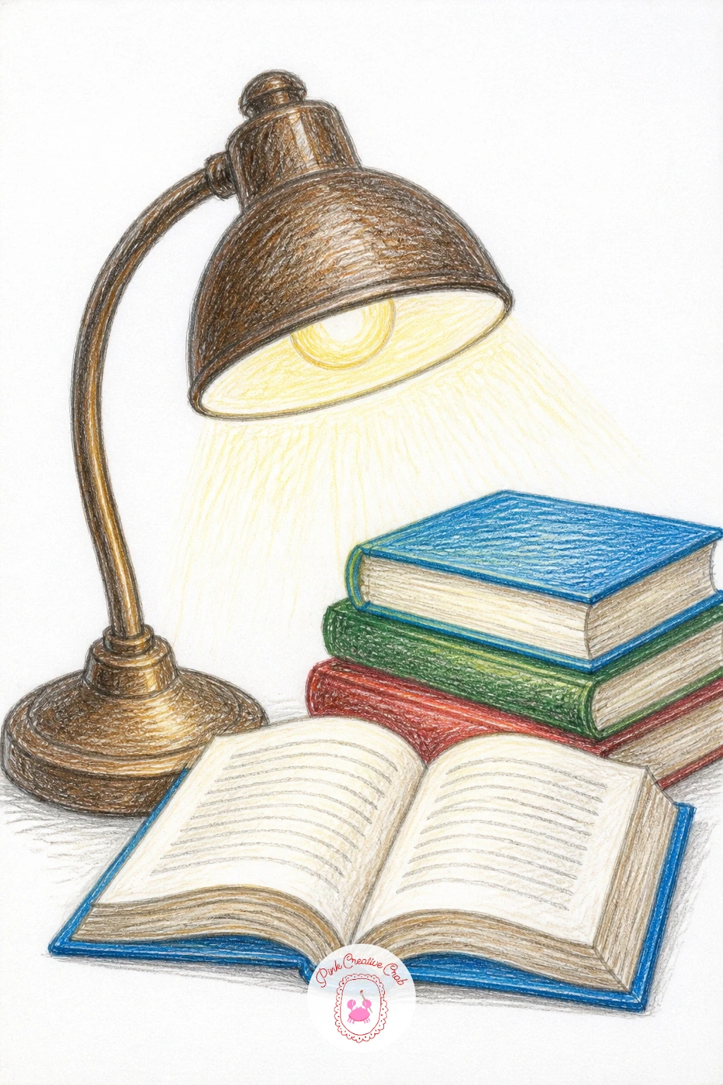
A library table needs a steady sense of perspective, so draw the tabletop first as a simple trapezoid shape, wider in front and narrower toward the back, and keep every book and lamp on it following that same angle. A small stack of books, an open notebook and a lamp cover the essentials without needing much else.
Layer the wood tabletop in warm honey tones before any objects go on top, so everything sitting on it has a consistent warm surface beneath. The lamp’s glow should be the brightest point on the page, with a soft pool of warm light spreading across the nearest books.
If the open book looks flat, add a gentle curve to the pages near the spine and a thin shadow line down the center fold.
For a quick version, draw just the lamp and one open book up close and let the rest of the table fade into loose, unfinished pencil lines at the edges.
Palette: Honey Wood,Warm Lamp Gold,Deep Green,Cream Page White
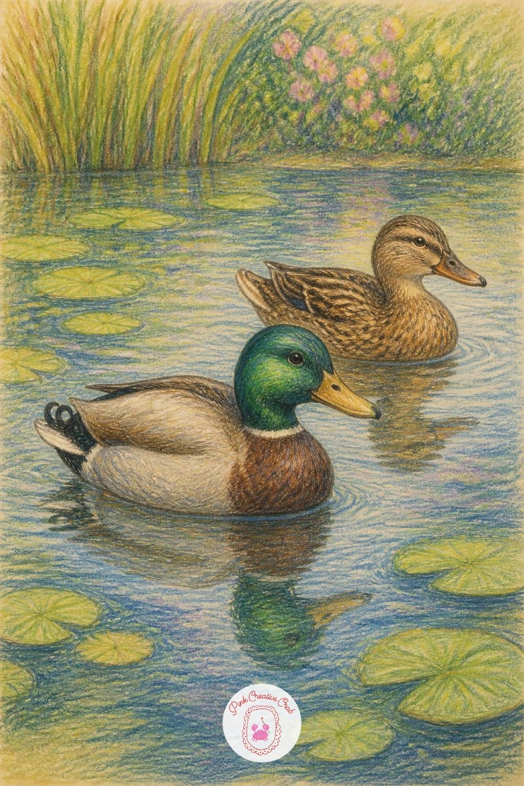
A pond with ducks is a good day to think about reflections, since whatever sits above the waterline needs a softened, slightly stretched echo below it. Draw the pond’s edge first as a simple curved shape, then place two or three ducks floating on the surface before adding their mirrored shapes beneath, each reflection a touch darker and less defined than the duck itself.
Work the water in horizontal strokes rather than vertical ones, this single choice does more than anything else to make a flat shape read as liquid. Ripple lines radiating gently from each duck sell the sense of movement across the surface.
Add a few lily pads or reeds near the pond’s edge to break up an otherwise empty expanse of water.
If the reflections look like separate drawings rather than echoes, go back and blur their edges slightly with a blending stump so they melt into the water around them.
Palette: Pond Green,Duck Brown,Soft Blue Grey,Reed Green
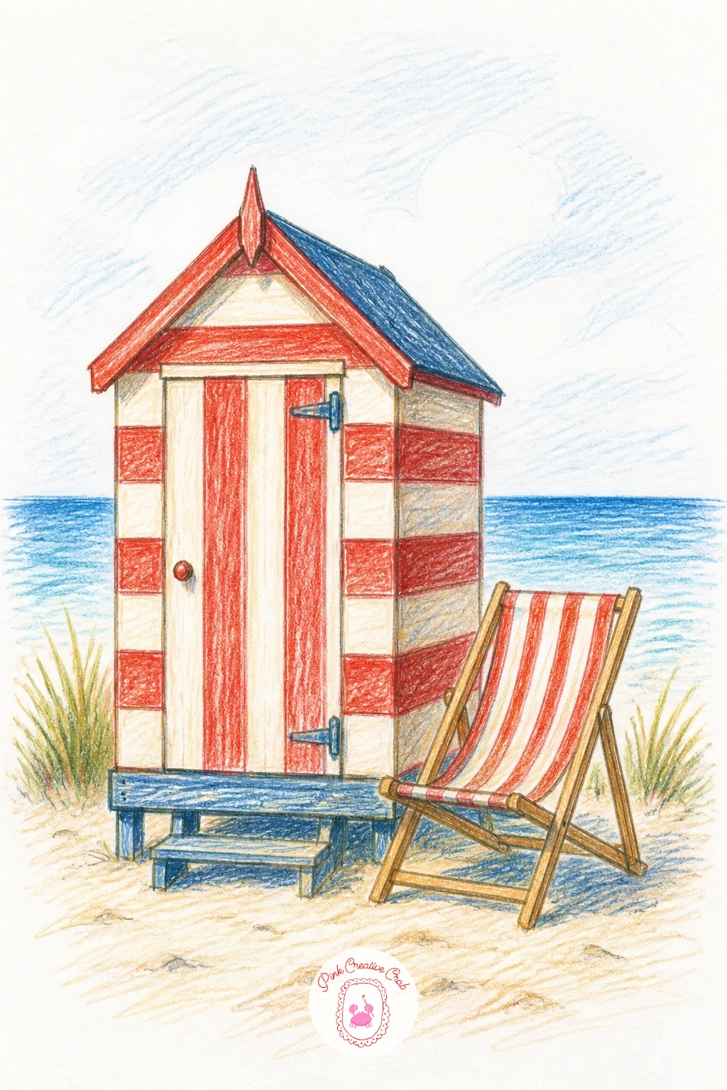
A beach hut gives you a satisfying excuse for bold stripes, so draw the little hut’s simple box shape first and plan your stripe pattern before coloring, spacing the bands evenly with a light ruler line if you want them crisp. Add the small door and window, then the sand and sea stretching out behind it in simple horizontal bands.
Layer the stripes themselves with flat, confident color first, then come back with a single soft shadow line along one edge of each stripe to give the wood paneling a touch of dimension rather than leaving it perfectly flat.
A beach chair, a bucket and spade, or a trailing length of bunting nearby finishes the scene with very little extra effort.
If the stripes look too mechanical, let the paint or pencil texture vary slightly within each band rather than filling it perfectly solid.
You Will Need
- ruler for even stripe spacing
Palette: Beach Hut Red,Sandy Cream,Sea Blue,Sky Pale Blue
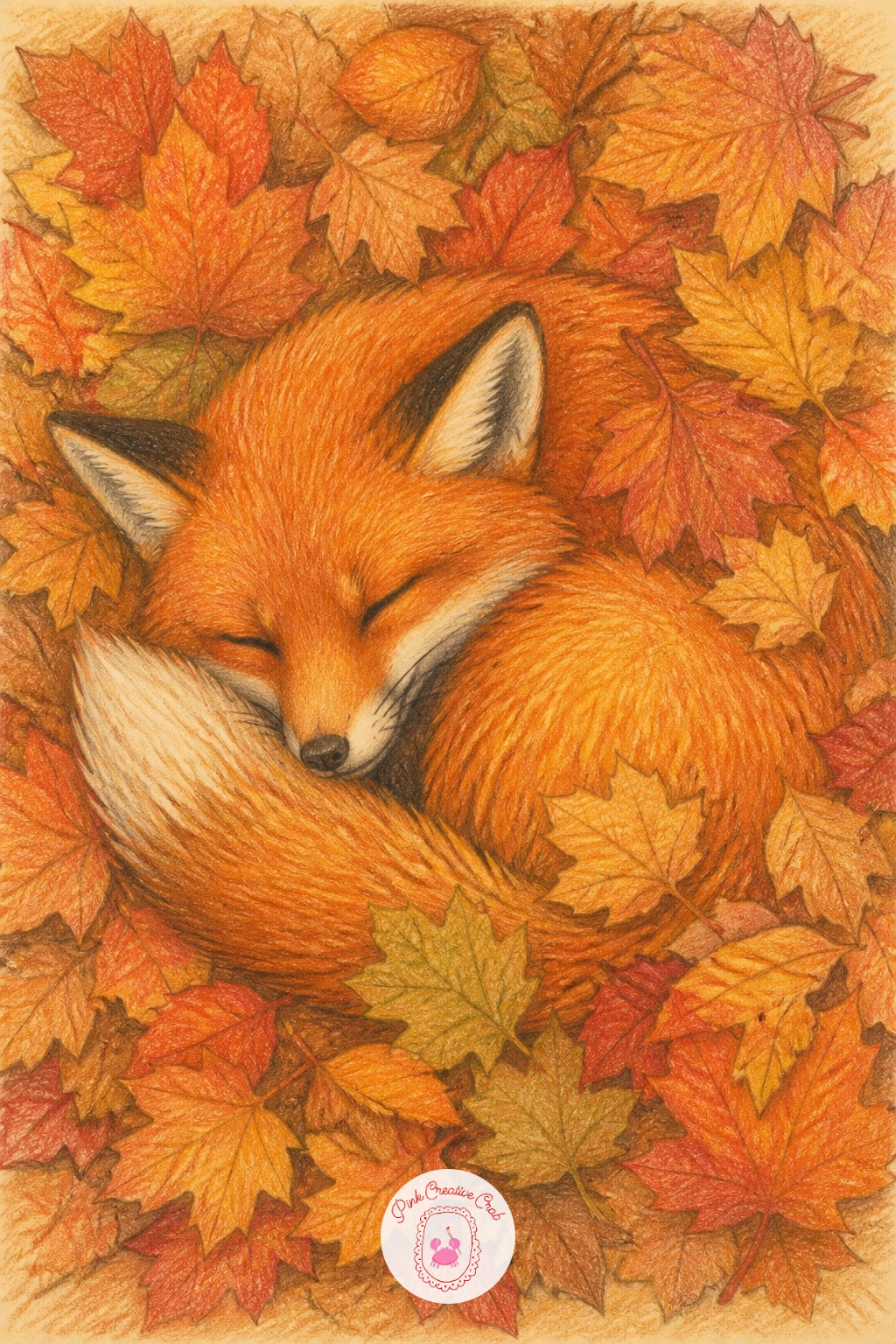
A sleepy fox in leaves asks for a little proportion check before anything else, so compare the length of the fox’s curled body against the size of its own head, a resting fox usually curls so its body reads about three to four head lengths long, and keeping that ratio steady is what makes the pose convincing. Sketch the curled shape first, then build the pile of fallen leaves around and partly over it. For more creatures like this one, these woodland animal ideas are worth exploring next.
Layer the fox’s fur in warm oranges with a cream underbelly and dark tips at the ears and tail, working from the lightest base tone up to the darkest accents last. Scatter the autumn leaves in varied reds, oranges and browns around the sleeping shape, overlapping a few directly across the fox’s back for a truly nestled feeling.
If the fox looks too stiff, round off every curve a little more than feels natural, a resting animal has almost no straight lines anywhere in its silhouette.
Palette: Fox Orange,Cream Belly,Autumn Red,Deep Brown
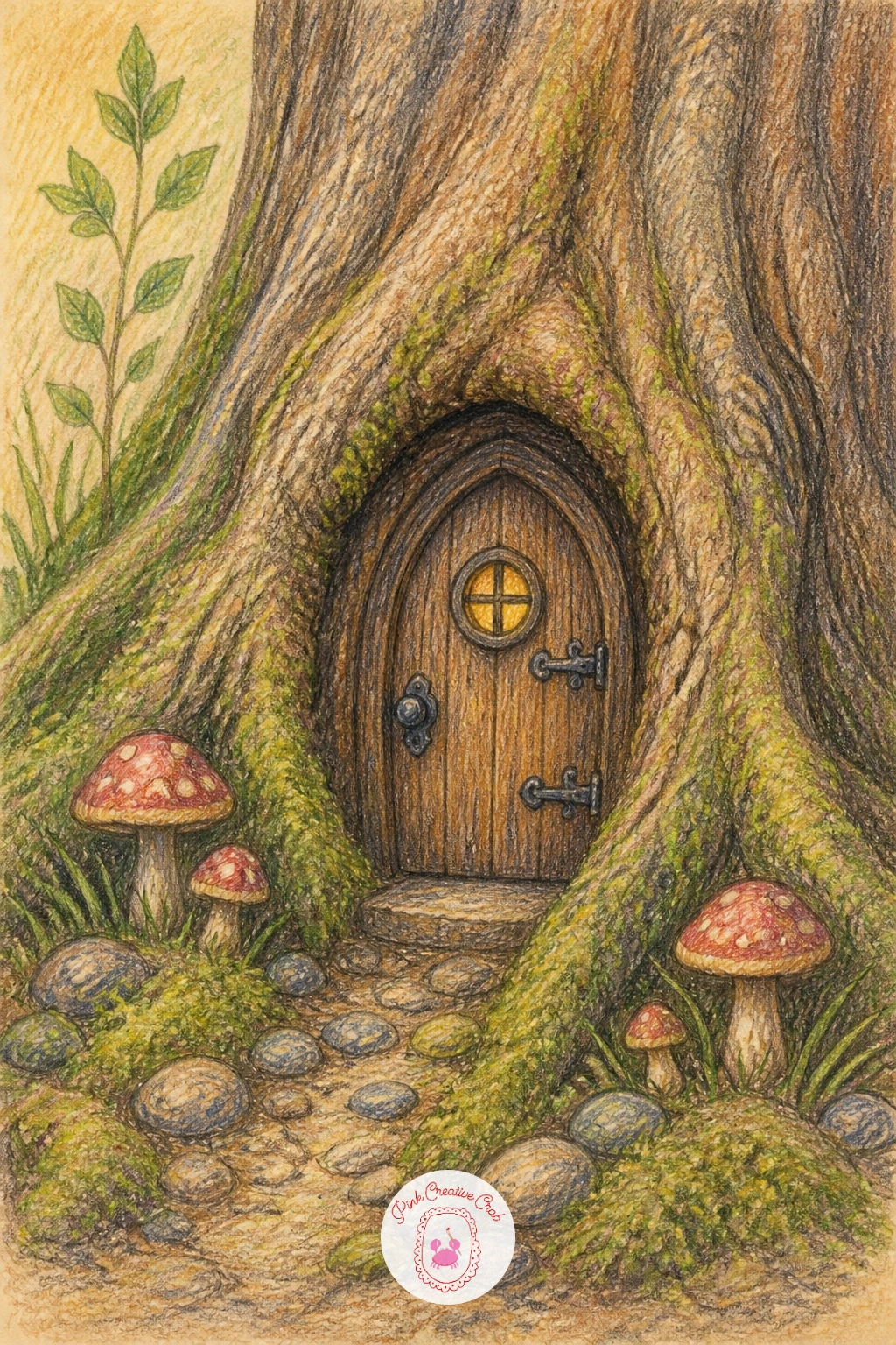
Place a fairy door in a tree by thinking about scale before anything else, the door itself should sit no taller than a large mushroom beside it, and holding that tiny scale steady across every prop is what makes the whole idea feel believable rather than cartoonish. Draw the tree trunk’s bark texture first with loose vertical strokes, then carve out a small arched door shape directly into the bark.
Add a round window, a tiny welcome mat or a lantern beside the door once the opening itself feels settled, keeping every detail in that same small scale. Moss, mushrooms and a few pebbles scattered at the base of the trunk finish the magical feeling without much extra work.
Shade the bark in warm browns with deep shadows in every crevice, then let the door itself stand out in a brighter, more saturated color so the eye finds it immediately.
If the scene feels too plain, add one tiny glowing light inside the door’s round window.
Palette: Bark Brown,Moss Green,Door Red,Warm Gold
A full moon over rooftops is a strong note to end the month on, built almost entirely around one bright circle against a dark sky, so trace or carefully draw that moon first and keep it slightly off center rather than dead in the middle of the page. Build the rooftop silhouettes beneath it as simple dark shapes, chimneys and gentle gable angles, all unified as one connected skyline rather than separate buildings.
Layer the night sky in deep blues and purples, graduating slightly lighter near the moon itself to suggest its glow spreading outward. A few scattered stars and one lit window among the dark rooftops add warmth and a sense of story.
If the moon looks flat, add the faintest hint of texture with a slightly darker grey blended softly near one edge, a perfectly smooth circle can look more like a sticker than a glowing moon.
Keep the rooftops simple tonight, the moon is carrying this whole page.
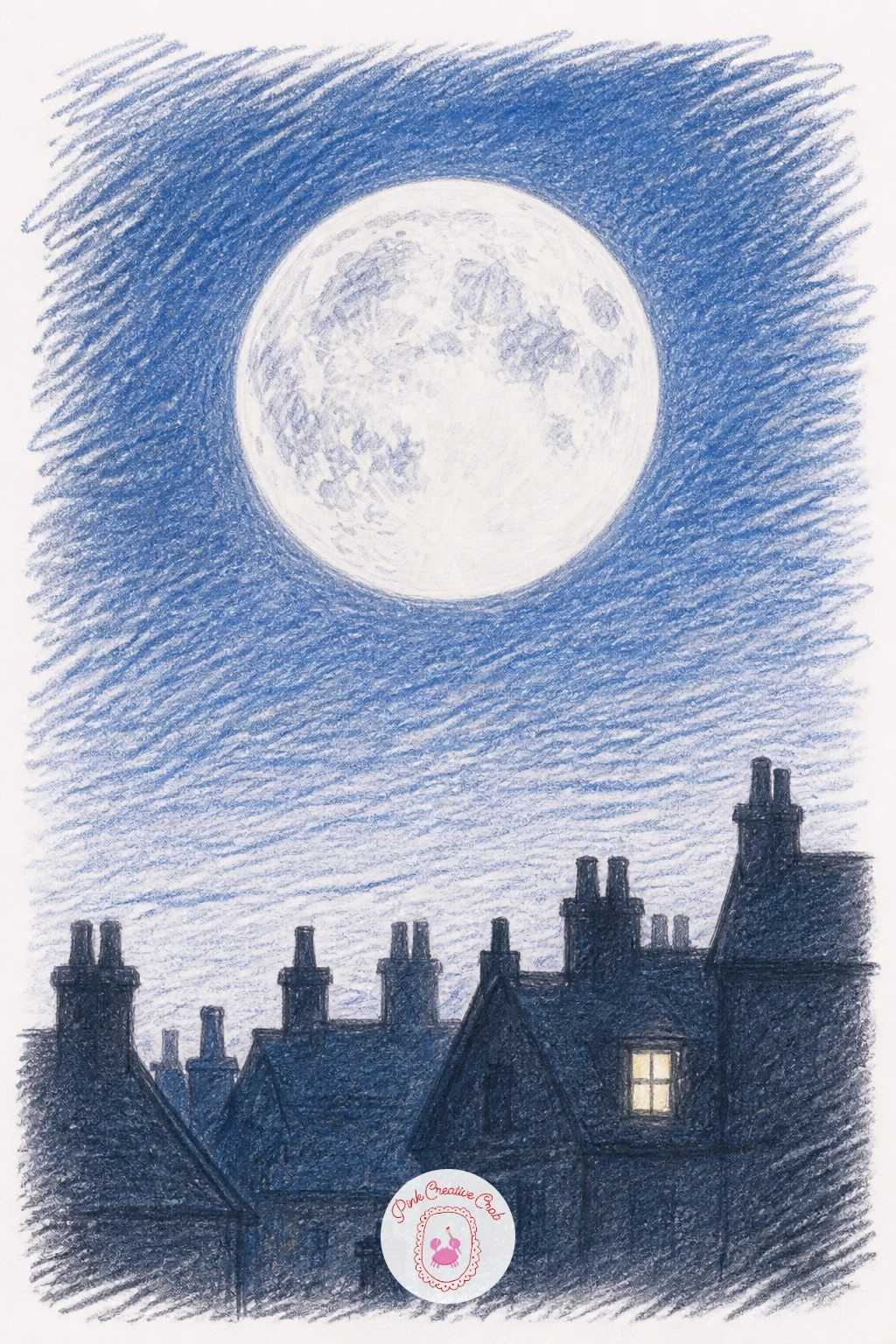
You Will Need
- a round object to trace the moon
Palette: Midnight Blue,Deep Purple,Moon White,Warm Window Gold
Close the month with a birthday cake, a cheerful subject to end on and a good one for practicing simple layered proportion, since each tier should sit noticeably narrower than the one below it. Stack two or three simple cylinder shapes first, checking that each tier’s height and width feels consistent before adding any frosting or decoration.
Work the frosting as soft, slightly uneven swirls rather than perfectly smooth icing, a little texture here makes the cake feel more handmade and inviting. Add the candles last, spacing them unevenly across the top tier and giving each flame its own small warm glow.
Layer your cake colors from the base tier up, keeping the palette cohesive, pastel pinks and creams or deeper chocolate browns depending on the mood you want.
If you want a lighter finish today, draw a single tier cupcake instead and spend the saved time adding a full scattering of sprinkles and one lit candle on top.
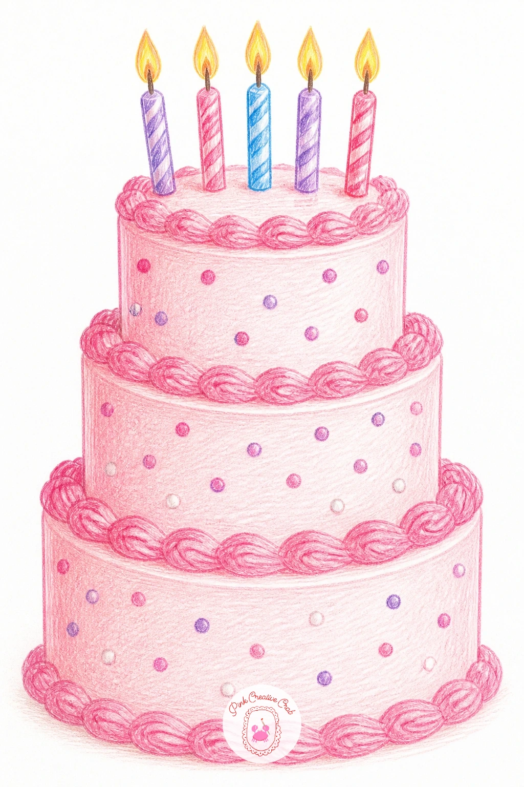
Palette: Soft Pink Frosting,Cream White,Candle Gold,Chocolate Brown
What to Do Next
Pick day one, open a fresh page in your sketchbook, and start with the simplest shape in the scene before adding anything else. Keep your pencils and this list nearby so tomorrow’s page is just as easy to begin.
Frequently Asked Questions
How long should each daily drawing take in this challenge?
Plan for twenty to forty minutes a day. Each scene is built to finish in one sitting, so a quick ten minute version covers the main shapes while a longer session adds shading, texture and small background details.
What paper works best for a month of colored pencil drawings?
A heavyweight sketchbook made for colored pencil holds up best, since layering and blending need a surface that will not pill or tear. Toned or cream paper also helps the warm storybook palette feel consistent across all thirty one pages.
Do I need to follow the challenge in order?
No, the days are not linked, so you can skip around based on mood or how much time you have. Save the busier scenes like the bakery window or kitchen for days with a little more time to spare.
What if I miss a day in the challenge?
Simply continue from where you left off, there is no penalty built into this kind of habit building list. Missing a day does not undo the ones already finished, and picking the challenge back up is always easier than starting over.
Can beginners really finish these in one sitting?
Yes, every scene is kept to a few large shapes with only light detailing, well within reach of a beginner. Starting with the easier early ideas, like the teacup or the sleepy cat, builds confidence before the busier later scenes.
Have any thoughts?
Share your reaction or leave a quick response — we’d love to hear what you think!
-
 0
-
0
-
0
-
0
-
0
-
0


