Pencil shading art is where graphite stops being a line drawing and starts behaving like light. You are not just outlining objects here, you are describing how bright a highlight gets, how deep a shadow sinks, and how fast one turns into the other across a curved or folded surface.
Below are 28 subjects picked for exactly that: smooth spheres, wet glass, brushed metal, crumpled paper and heavy cloth, each one lit from a single clear direction so the shadows actually teach you something. Work through them in order if you like, from the plain sphere up to the leather boot, or just scroll down to whichever one you want to draw today.
Using these images: free for personal projects such as printing, coloring, cards, journals and gifts. Handmade items that include them may be sold up to 30 pieces per design. More than that is commercial use and is not permitted, and neither is selling or sharing the images themselves or passing them off as your own. Please ask before any other use.
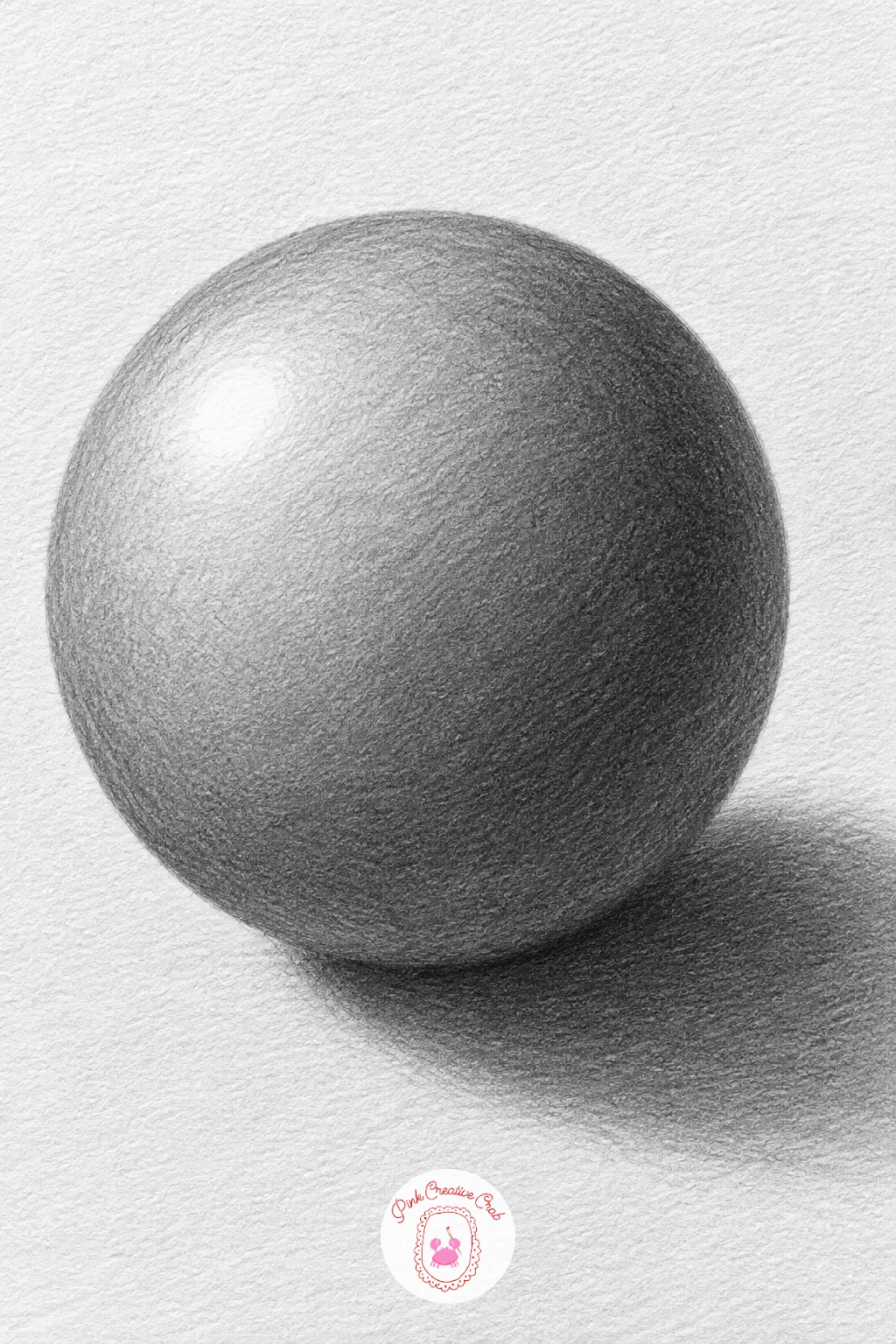
Start pencil shading art with the shape that teaches you everything else: a plain sphere sitting on a flat surface. Draw the circle lightly with an HB pencil, then mark where the light hits it before you touch any shading at all, because that spot stays untouched paper for the whole drawing.
Work the tone in smooth circular strokes, keeping the area nearest the light almost bare and building up to a dark band just past the sphere’s middle, where spheres actually go darkest before the reflected light softens the very edge. Blend with a stump in gentle sweeps, never straight across the curve, so the tone follows the roundness.
The cast shadow is not a grey smudge, it is darkest right where the ball touches the table and fades as it stretches away. If you only have one pencil, a 2B alone can do this whole study by pressing harder for the dark band and almost floating the tip for the highlight.
Check the sphere is reading as round, not flat, by measuring the highlight’s distance from the top edge before you commit to the dark band’s position, since even a slightly misplaced highlight flattens the whole form.
Palette: Graphite Grey,Paper White,Charcoal Black
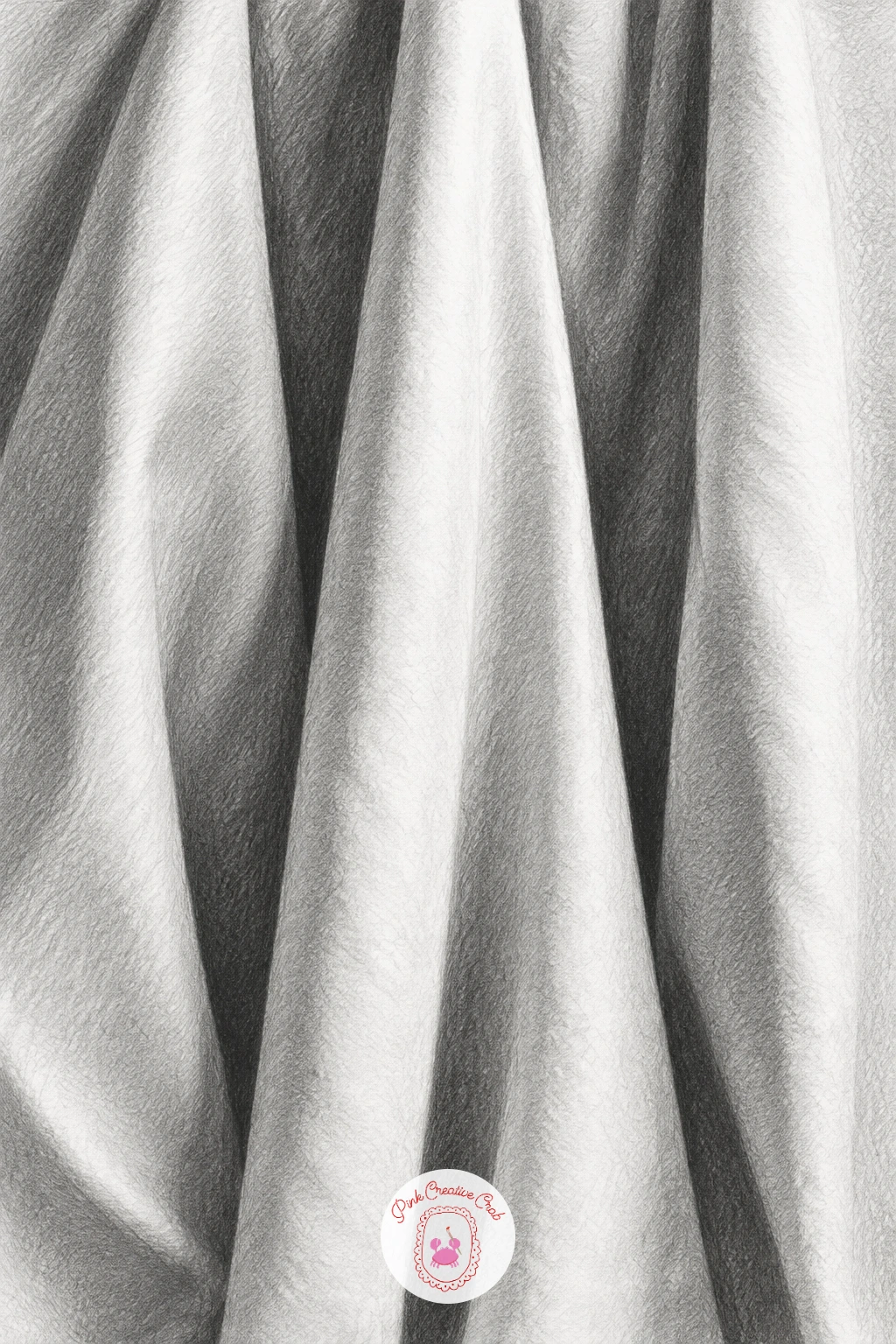
Hang a white cloth, real or imagined, so it drops into three or four deep folds and let those folds carry the whole drawing. Sketch the fold lines loosely in HB first, treating each fold as its own small cylinder lying at a slight angle, because that is really all drapery is: a row of curved tubes catching light differently.
Shade from the top of each fold outward, keeping the crest nearly white and sinking into a dark crevice wherever two folds meet, then blend with a stump so the grey ramps smoothly rather than banding in stripes. The place this usually goes wrong is treating every fold the same depth, which flattens the cloth, so vary which folds sit deepest and let one dominate.
Push the darkest graphite into the tightest crevices with a sharp 6B point rather than a stump, since blending alone rarely gets ink-black enough for those gaps. A paper towel works as a stand-in cloth if you want real folds to copy from.
Step back and squint at the drawing: if the folds still read clearly as light and dark shapes with your eyes half closed, the tonal range is working.
Palette: Paper White,Soft Grey,Deep Graphite
Pin a real pillowcase or sheet near a lamp and look at it from one angle only, since moving around changes where every fold’s shadow falls.
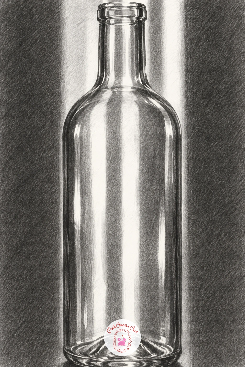
Glass is the opposite of the cloth you just drew: instead of one smooth gradient, it is a pattern of sharp light and dark shapes sitting right next to each other. Pick a simple bottle shape, sketch its outline and the vertical curve of its shoulders and neck in light HB lines, and place your light source behind or to one side so it actually passes through the glass.
Map the bright patches first, the ones where light shoots straight through, and leave those as bare paper. Then build the darker bands that run alongside them, usually where the glass curves away from the light, using a 3B or 4B pencil in smooth vertical strokes that follow the bottle’s curve rather than going side to side.
Glass drawings go wrong when every edge gets the same soft blend, so keep at least a few edges crisp and sharp, especially the highlight streak down the front, by lifting it out with a kneaded eraser pressed and rolled rather than rubbed. No bottle handy, a drinking glass or jar gives the same light-through-glass pattern to study.
Finish by darkening the area directly behind the bottle slightly, which pushes the glass forward and makes it read as transparent rather than painted on.
You Will Need
- kneaded eraser for lifting highlights
Palette: Paper White,Mid Grey,Charcoal Black
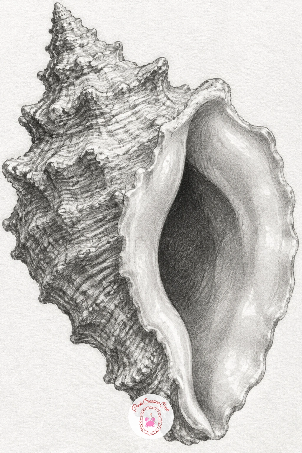
A conch shell gives you two textures in one object: a rough, ridged outer shell and a smooth, almost glassy inner lip, so this is where you practice switching shading styles mid-drawing. Block in the shell’s spiral shape loosely, keeping the proportions honest by comparing the shell’s width to its height before adding a single ridge.
Shade the outer ridges with short, choppy strokes that follow each ridge’s curve, letting the tone go darker in the grooves between ridges and lighter on each ridge’s raised edge. Then switch completely for the inner lip: long, smooth strokes blended until no texture shows at all, since that part of the shell is polished almost like porcelain.
The usual mistake is making the whole shell equally rough or equally smooth, which loses the contrast that makes conch shells interesting to draw. If you do not have a real shell, this pairs well with other seashell and curiosity subjects for reference photos.
Save your darkest graphite for just inside the shell’s opening, where the curl turns away from the light and almost disappears into shadow.
Palette: Warm Grey,Paper White,Deep Graphite
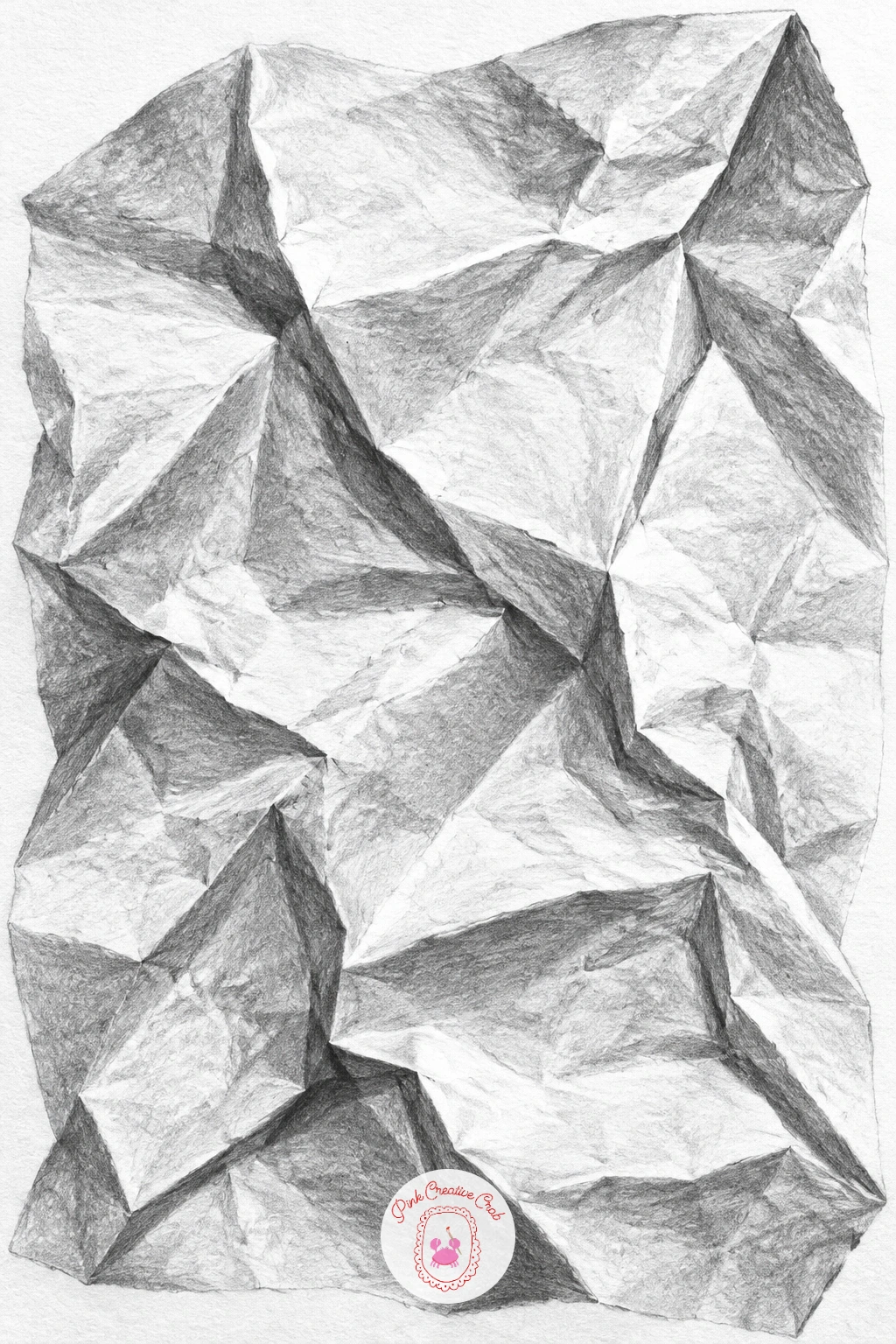
After the shell’s long curves, a crumpled napkin is all short, sharp planes, so it trains your eye to see shading as flat facets rather than smooth gradients. Crumple a real paper napkin or tissue and set it under a lamp, then sketch only the main crease lines first, ignoring every small wrinkle until the big shape is right.
Treat each flat section between creases as its own little plane with its own single tone, shaded evenly across that one facet, then move to the next plane and judge it against the first. This is quicker than blending a smooth gradient and keeps the crumpled look crisp rather than mushy.
Where paper folds sharply, the crease itself is often the darkest line in the whole drawing, so go in with a sharp 6B point right along that fold rather than trying to blend it. In under ten minutes you can capture the main folds with five or six tones; given forty minutes, add the smaller secondary wrinkles inside each plane for a much more convincing crumple.
Keep your eraser handy to pull sharp white highlights along the raised edges of each crease.
Palette: Paper White,Light Grey,Charcoal Black
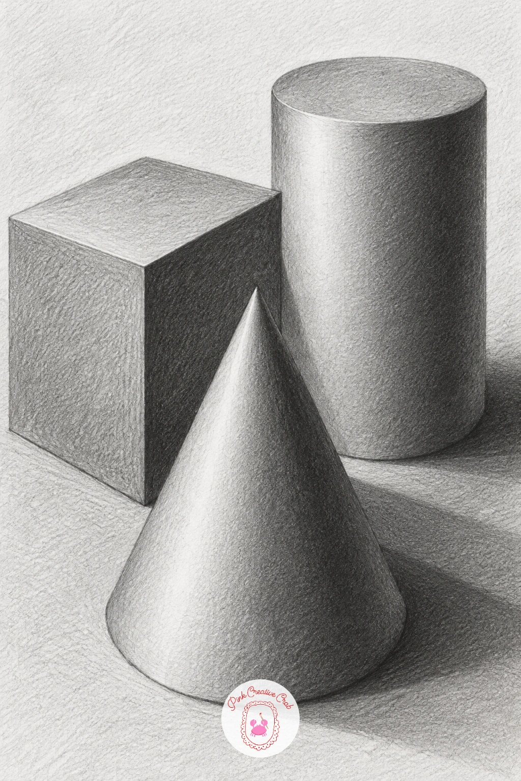
This classic trio of a cube, a cone and a cylinder sitting together is the closest thing to a shading alphabet, since nearly every object you will ever draw is built from these three forms. Arrange them, or imagine them, under one light source and block in all three shapes first in light pencil before shading any of them, so their proportions relate properly to each other.
Shade the cube in flat, distinct tones, one value per visible face, since a cube has no curve to blend across. The cylinder gets a smooth gradient around its curved side plus a separate ellipse of tone on top, and the cone blends from a bright strip near the light source around to a dark side, narrowing as it reaches the point.
Where this group usually goes wrong is giving the cylinder flat faces like the cube, or the cube a smooth blend like the cylinder, so keep checking each shape against its own rules as you go. Group all three close enough that their cast shadows overlap slightly, which ties the whole drawing together.
Measure each shape’s height against its width before shading, so the cone does not end up squashed or the cylinder stretched.
Palette: Paper White,Mid Grey,Deep Graphite
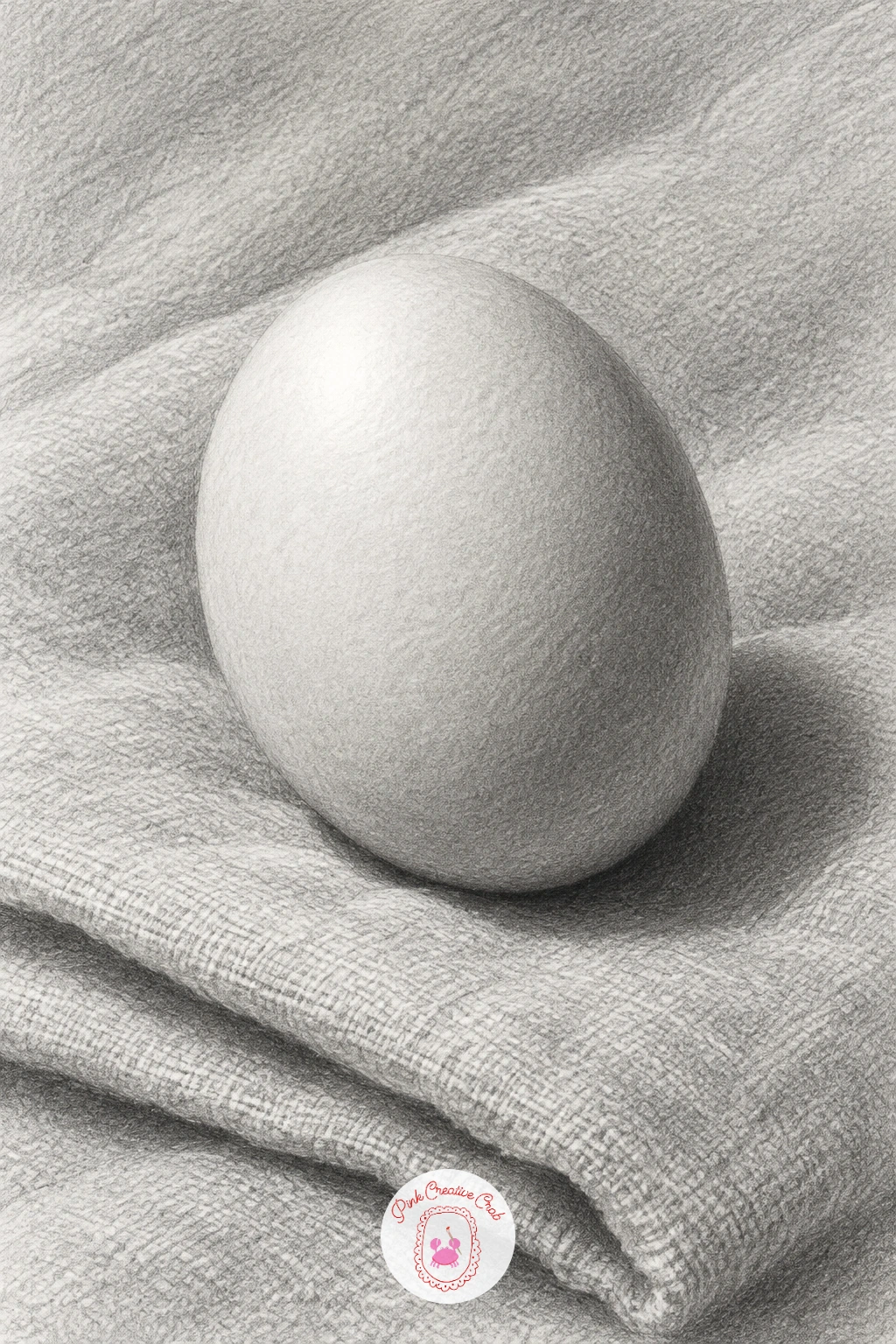
An egg looks simple but its surface shifts tone faster than a sphere because it narrows at one end, so this builds directly on the sphere study with an extra challenge. Sketch the egg’s outline carefully, comparing its widest point to its overall length before you shade a single mark, since eggs go wrong fast when drawn too round or too pointed.
Shade with smooth, tight circular strokes, keeping a soft highlight near the top and letting the tone deepen gradually toward the narrower bottom, where the curve turns away from the light fastest. Underneath, the folded linen needs its own separate treatment: looser strokes following each small fold, with a darker patch directly beneath the egg where its cast shadow pools.
The usual error is shading the egg and the linen with identical pressure, which makes the egg look like it is sinking into the cloth rather than resting on top. Keep the egg’s edge crisp and the linen’s edges softer and more broken to separate the two textures. A real egg on a folded tea towel is the easiest setup to copy from directly.
Finish with a tiny sliver of reflected light along the egg’s lower edge, bounced up from the pale linen below it.
Palette: Paper White,Soft Grey,Deep Grey
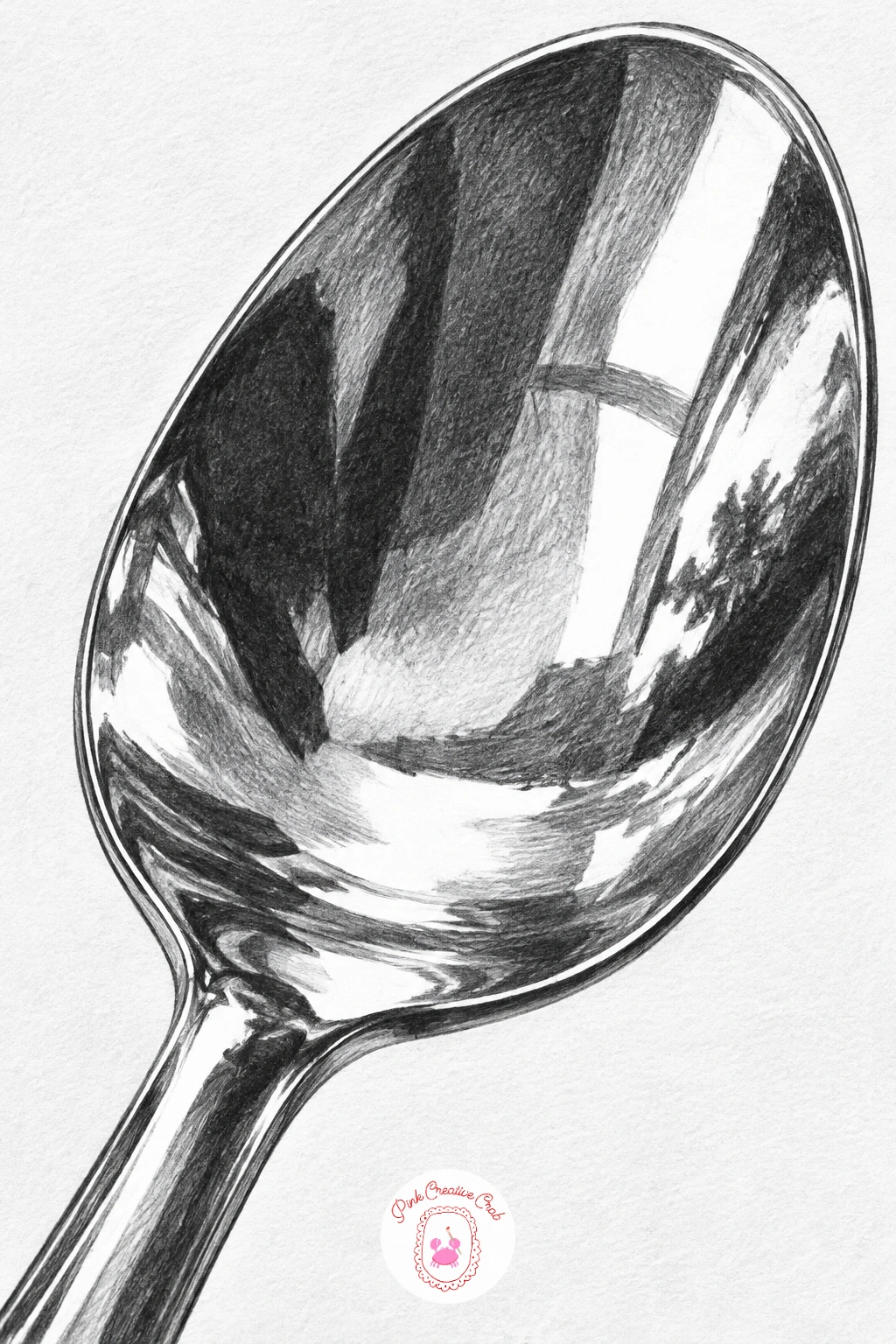
A spoon is small but punishing in the best way, since its curved bowl reflects a distorted version of everything around it, bright whites and deep blacks sitting right next to each other with almost no gradual grey between. Draw the spoon’s outline first, getting the oval bowl and the long curved handle in proportion before adding a single reflection.
Map where the brightest highlights fall, usually a sharp streak or two, and leave those completely white. Then go straight to your darkest pencil for the reflected dark shapes nearby, since metal reflections jump from light to dark with almost no soft transition, unlike the smooth blending you used on the egg or sphere.
The place this goes wrong is softening every edge the way you would on cloth or skin, which turns shiny metal into dull plastic instantly. Keep most edges within the reflections crisp, blending only the very narrow transition zones with a small stump.
If you only have a dinner spoon to look at, tilt it slightly and watch how the reflections stretch and curve along the bowl, that stretching is what makes a reflection believable rather than just patchy.
Palette: Paper White,Mid Grey,Charcoal Black
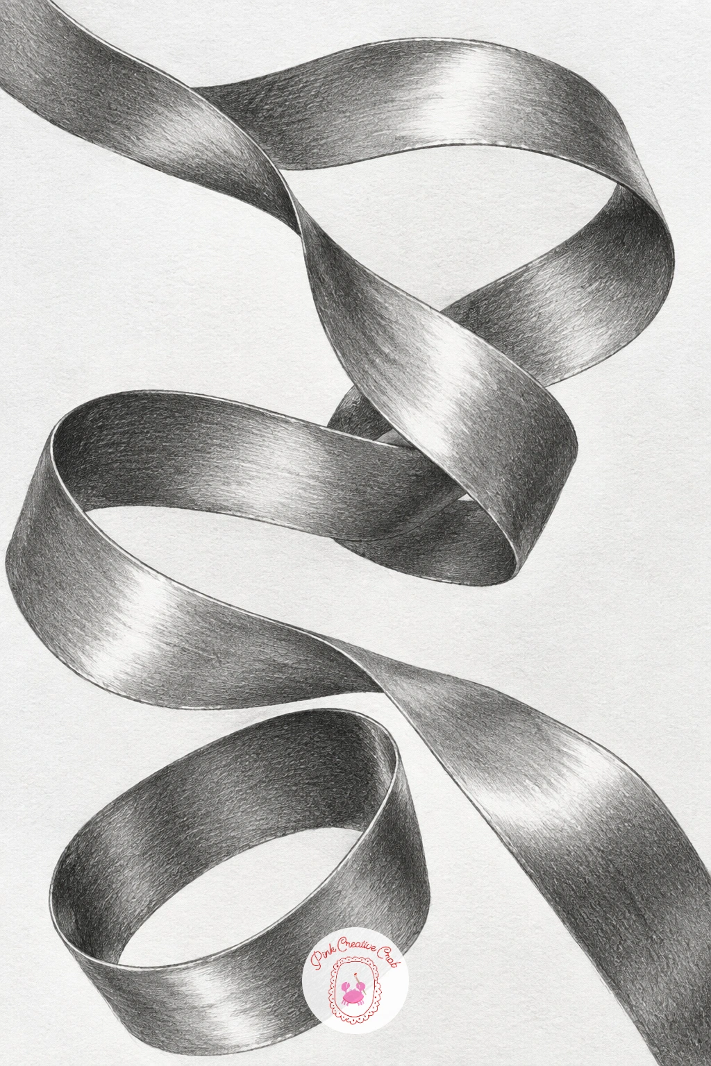
Satin earns its shine from sudden shifts between almost-white and almost-black along a smooth curving surface, which makes a twisting ribbon one of the most satisfying shading subjects once it works. Sketch the ribbon as a flowing ribbon-shaped line first, like a flattened tube that twists over itself two or three times, checking that its width stays roughly consistent along its length.
Shade each twist separately: wherever the ribbon turns toward the light, push the tone almost to white, and wherever it turns away, drop to a dark value fast, with only a narrow blended band between the two rather than a slow gradient. That fast light-to-dark jump is exactly what reads as satin rather than cotton.
The common mistake is blending too gently across the whole ribbon, which makes it look matte and flat instead of glossy. Use a stump for the narrow transition zones only, and keep the brightest and darkest areas pencil-sharp and untouched by the stump.
No ribbon on hand, a strip of foil twisted loosely shows the same fast light shifts and works as a stand-in model.
Palette: Paper White,Light Grey,Deep Graphite
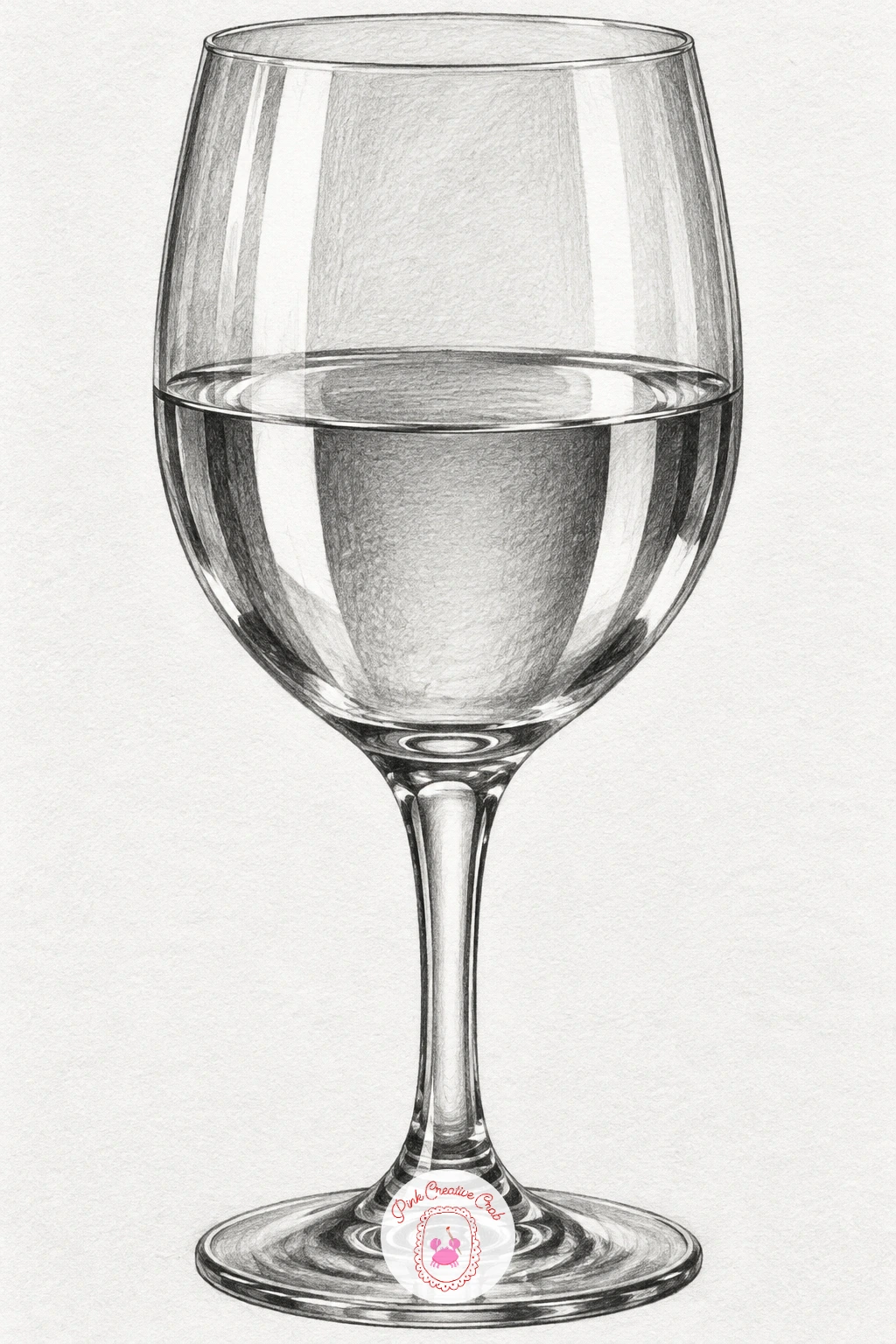
Half full of water, a wine glass gives you three different materials to shade in one object: empty glass above the waterline, water below it, and a clear bend of light right at the surface. Draw the glass’s outline first with a ruler-light hand for the stem, keeping the bowl symmetrical by checking both sides against a light centre line before erasing it.
Shade the upper, empty part of the glass the way you shaded the bottle earlier, in sharp alternating light and dark vertical bands. Below the waterline, the water bends and shifts those same bands slightly sideways and often darkens the glass’s lower curve, so look carefully at exactly where that shift happens rather than guessing.
Where this drawing usually fails is making the waterline itself too straight and flat, when really it is a thin dark ellipse with its own tiny highlight. A tall glass of water with no stem works as an easier substitute if a wine glass is not available.
Add one more highlight note today: a small bright dot directly on the waterline’s edge convinces the eye that liquid, not just glass, is sitting there.
Palette: Paper White,Mid Grey,Deep Graphite
Pearls are quiet spheres, softer and less contrasty than the metal spoon, so this idea asks you to dial back the drama while still keeping each pearl round. Draw a loose coiled line first to plan where the necklace sits, then place each pearl as a small circle along that line, slightly overlapping its neighbors the way real pearls sit against each other.
Shade each pearl with the same logic as the opening sphere, a soft highlight near the top and a gentle gradient to a dimmer underside, but keep the overall contrast low since pearls glow rather than shine. The velvet underneath takes the opposite treatment: very dark, almost black in places, with a faint sheen where light grazes across its nap, which makes the pale pearls pop forward.
The mistake here is making the pearls too bright and the velvet too light, which flattens the contrast that makes pearls look luminous. Push the velvet darker than feels natural at first, using a soft 6B pencil in loose circular strokes, then recheck the pearls against it.
Vary this one next time by coiling the necklace tighter, or letting one pearl sit slightly apart from the rest to break the rhythm.
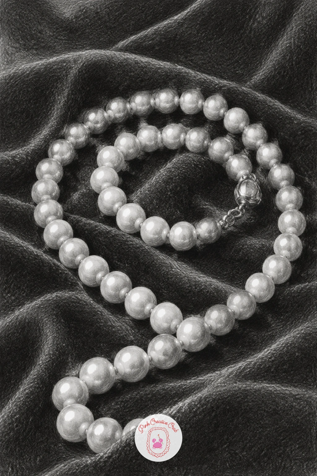
Palette: Pearl White,Soft Grey,Velvet Black
A ceramic jug combines a smooth rounded body with a trickier curved handle, and getting that handle’s two parallel curves right is usually the hardest part. Sketch the jug’s main body as a simple oval shape first, then add the handle as two curved lines running close together, checking the gap between them stays even along the whole curve before shading anything.
Shade the body in smooth, even gradients much like the sphere, since glazed ceramic is matte rather than glossy and so the light to dark transition is gentler and wider than it was on the metal spoon or glass bottle. The handle needs its own small highlight and shadow cycle, since it is essentially a thin curved cylinder looping away from and back toward the jug’s body.
Where jugs commonly go wrong is drawing the handle flat against the body instead of standing slightly away from it, so leave a visible sliver of background or shadow between the handle and the jug’s side to show that gap. A simple mug with a handle works as an easier stand-in if a jug is not available.
Finish with one soft highlight running down the spout’s edge, since that raised lip usually catches light distinctly from the rest of the body.
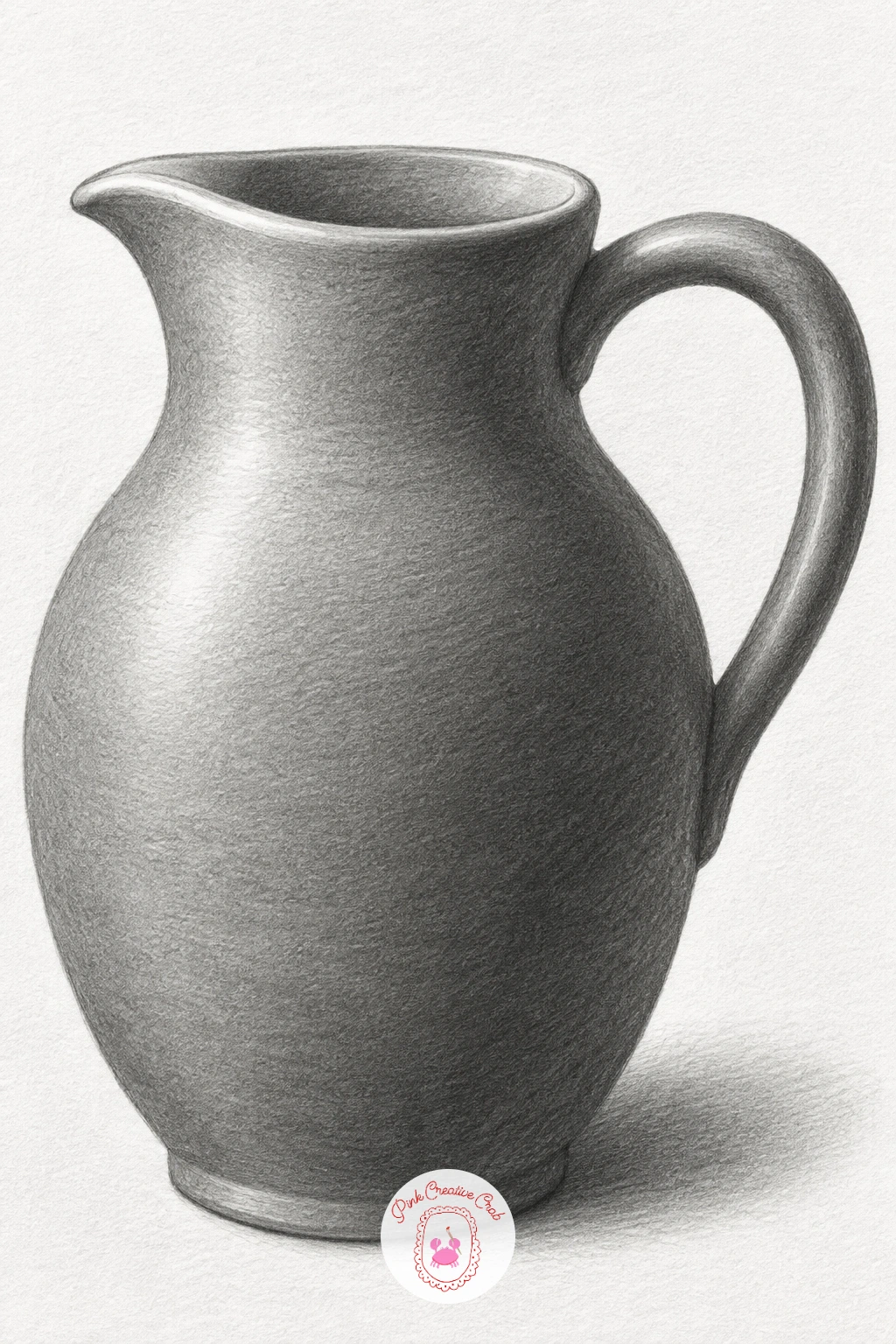
Palette: Paper White,Soft Grey,Deep Grey
Foil takes the crumpled napkin idea and turns the contrast all the way up, since foil is shiny rather than matte and so its planes jump between near-white and near-black with barely any grey between. Crumple a real sheet of foil loosely and set it under a strong light, then sketch only its biggest folded planes first, the same as you did for the napkin.
Shade each flat facet with a single tone decided by which way it faces the light, but push the range much further than you did on paper: the brightest planes stay bare white paper and the darkest get your heaviest 6B or 8B pressure. Where two planes meet at a sharp angle, that edge is often the single darkest line in the whole drawing.
The mistake to avoid is treating foil like cloth and blending softly across each plane, which kills the shine completely. Keep most edges crisp and let only the smallest transitional slivers get a light touch of the stump. If foil is not to hand, a scrunched metallic gift bag gives a similar sharp-edged crumple to study.
In ten minutes, five or six bold planes will already read as foil; given forty, add the smaller secondary creases within each plane for real sparkle.
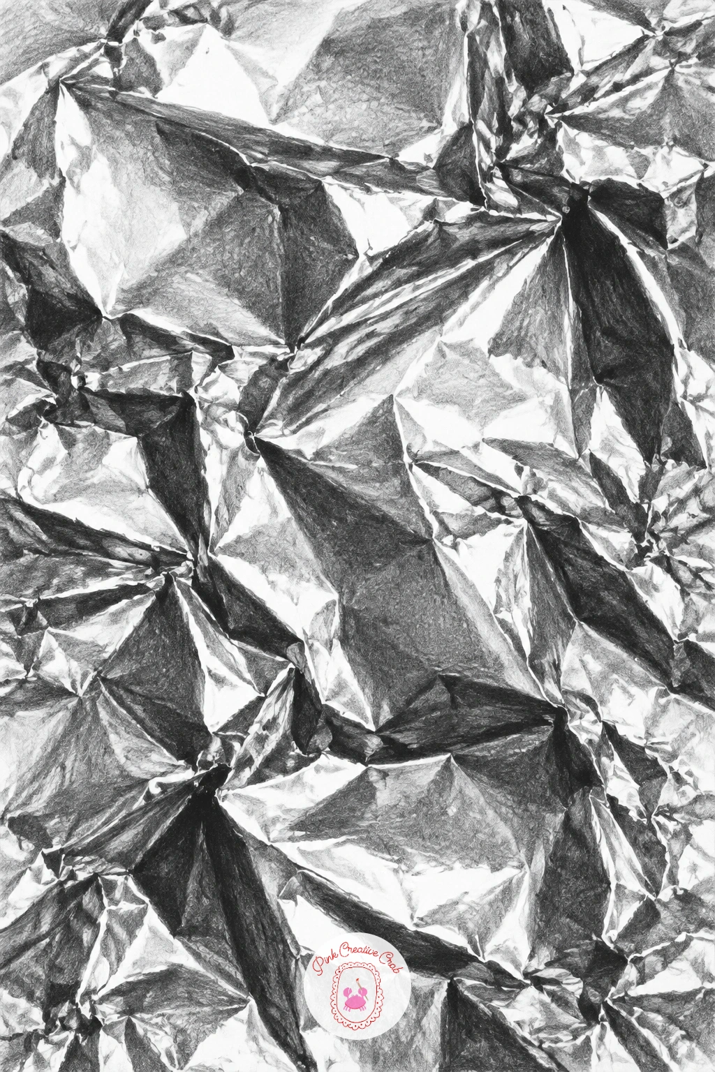
Palette: Paper White,Mid Grey,Charcoal Black
A lightbulb asks you to shade something that is itself the light source, which flips the usual rules since the glass around the filament gets brighter the closer it sits to that glowing coil rather than following one outside light direction. Sketch the bulb’s rounded glass shape and the screw base below it, then lightly mark the small coiled filament at its centre.
Shade the filament area as the brightest point in the whole drawing, almost pure white with just a hint of grey along the coil’s own tiny curves, then build outward in rings of gradually darkening tone as the glass curves away from that inner glow. The metal screw base at the bottom gets treated like the spoon from earlier, sharp alternating light and dark bands rather than a soft blend.
The mistake here is lighting the bulb from one side like every other object on this list, when really the glow needs to radiate outward from the filament in all directions. A small torch bulb or even a round lamp globe makes a reasonable real object to study this radiating glow from.
Leave a thin ring of slightly brighter glass right where the bulb’s curve meets the dark background, since that rim catches ambient light even this close to the glow.
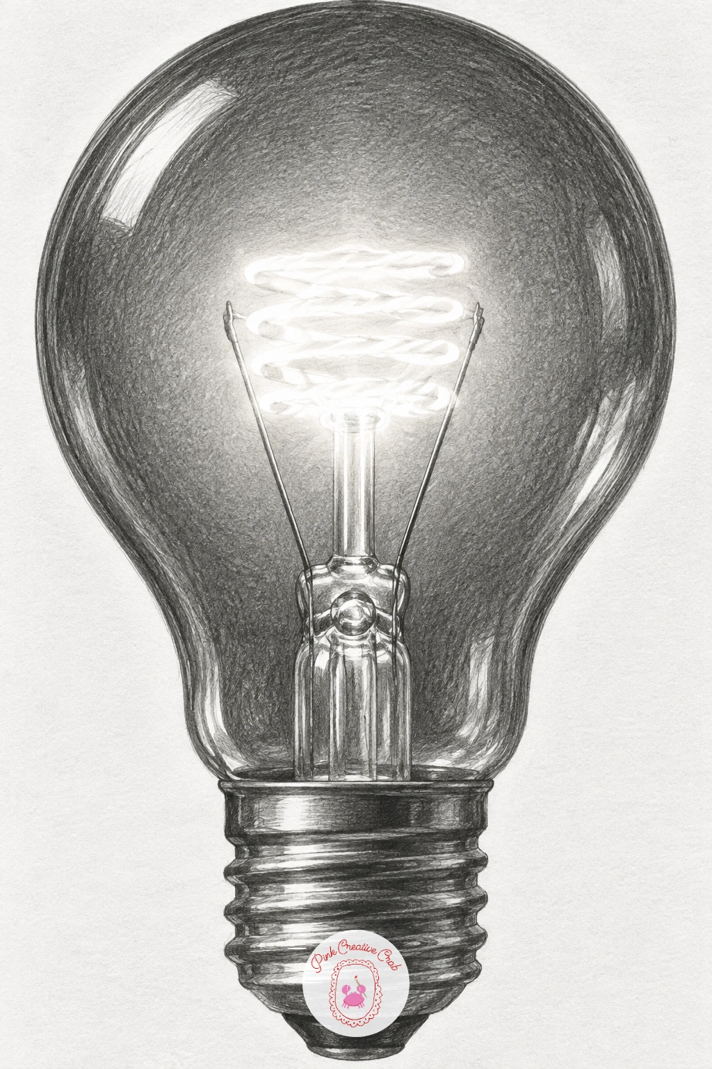
Palette: Paper White,Soft Grey,Deep Graphite
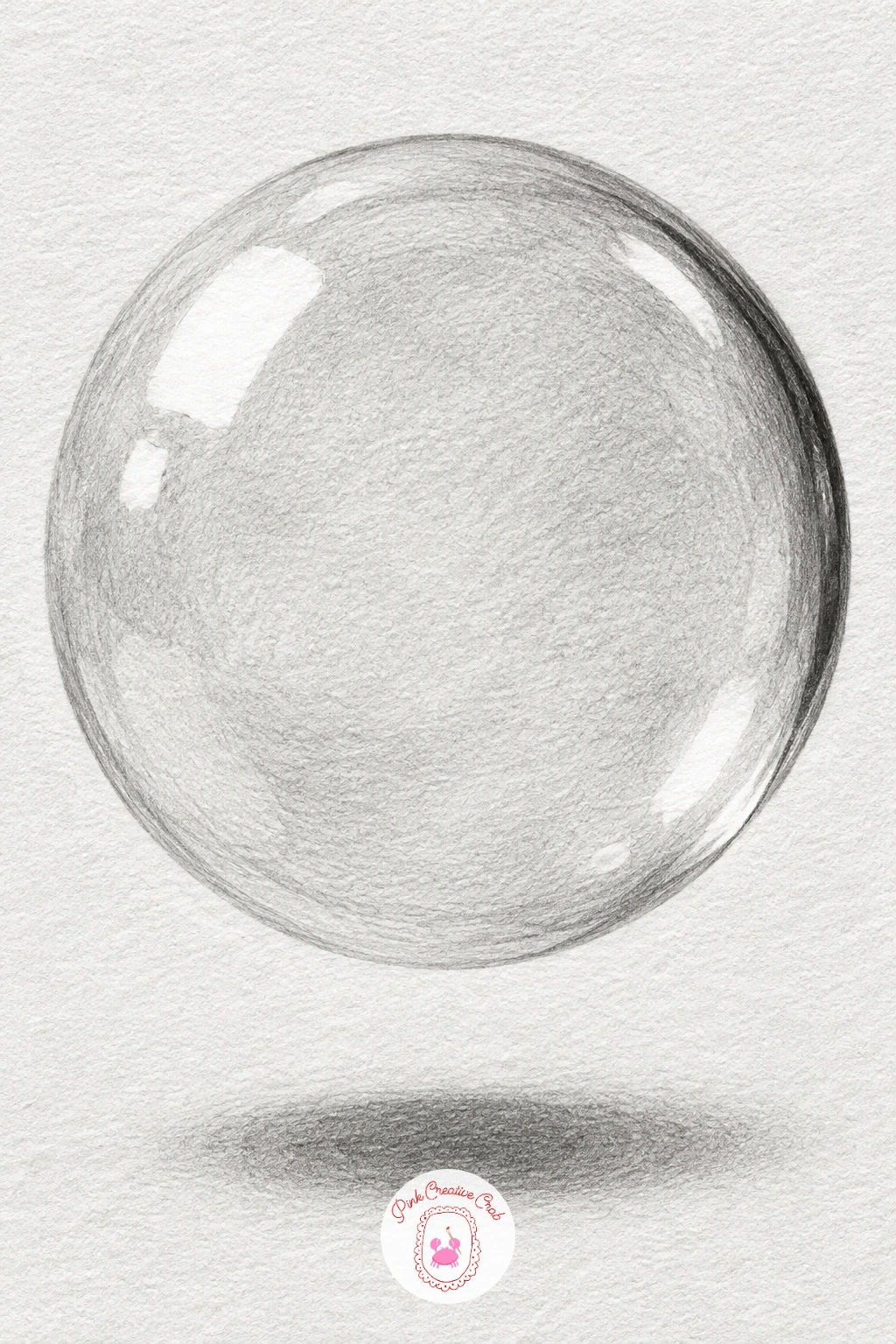
A soap bubble is nearly all highlight, so this is the lightest-touch drawing on the whole list and a good one to try once your heavier shading feels controlled. Draw just the bubble’s outer circle lightly, then plan two or three curved highlight shapes across its surface before you add any dark tone at all, since those pale shapes drive the whole effect.
Shade the bubble’s surface with a very light, even grey overall, barely more than the white paper, then add a thin dark crescent along one edge where the curve turns sharply away from the light. The brightest highlight areas stay completely untouched paper, sometimes with the faintest outline to separate them from the surrounding tone.
The mistake is over-shading a bubble until it looks like a solid grey ball instead of something thin and floating. If you catch yourself pressing hard anywhere on the bubble’s body, stop and lift tone back out with a kneaded eraser rather than adding more.
Add a tiny crisp cast shadow directly beneath it on whatever surface it floats above, since that one dark shape is what convinces the eye the bubble has real weight and position.
You Will Need
- kneaded eraser for lifting highlights
Palette: Paper White,Pale Grey,Soft Grey
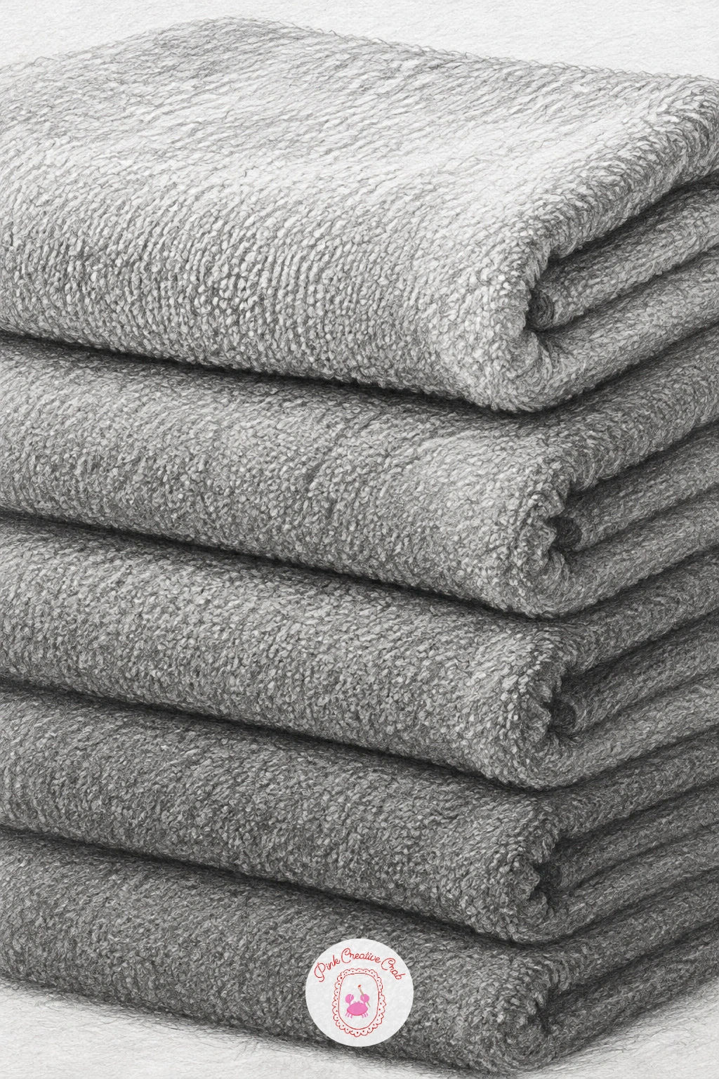
A stack of folded towels takes the fold logic from the white cloth drawing and repeats it in layers, so each towel needs to read as its own object while the whole stack still holds together. Sketch the stack’s overall rectangular block shape first, then divide it into three or four towel layers with slightly uneven lines, since real folded towels are never perfectly even.
Shade each towel’s top fold brightest and let the tone sink into a visible seam line where one towel ends and the next begins, that seam line is what separates this from looking like one solid block. The towel edges facing the light stay pale while the undersides of each fold sink darker, much like the cloth folds from earlier but repeated and stacked.
Where stacks usually go wrong is making every towel identical in tone and thickness, which flattens the pile, so vary the thickness slightly and let one towel’s fold catch more light than the others. A pile of real folded fabric from a cupboard gives an easy reference to copy directly.
Darken the shadow where the whole stack meets its surface, slightly wider than the stack itself, to ground it convincingly.
Palette: Paper White,Soft Grey,Deep Grey
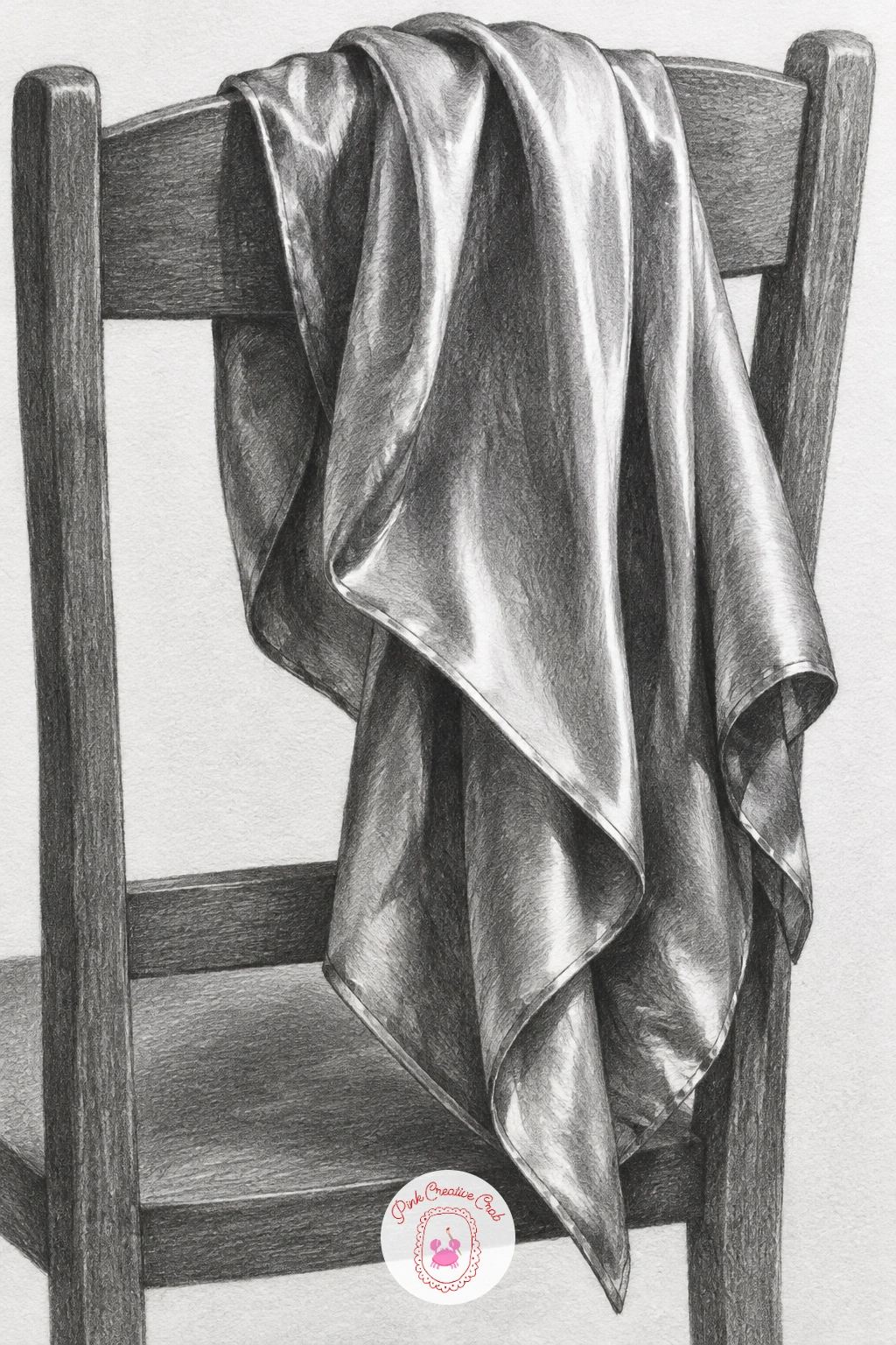
Silk drapes looser and catches light more sharply than the heavier white cloth from earlier, so draping a scarf over a chair back is a good next step once that first drapery study feels steady. Sketch the chair back’s simple shape first, then let the scarf’s outline flow over it in long loose curves, checking where it hangs furthest down before adding any fold detail.
Shade silk with fast light to dark transitions similar to the satin ribbon, since silk has real sheen, keeping the brightest streaks narrow and sharp rather than broad and soft. Where the scarf drapes over the chair’s edge, that turn is usually where the brightest highlight of the whole piece sits, since the fabric bends sharply toward the light there.
The common mistake is drawing silk with the same wide, slow gradients as heavier cloth, which makes it look like wool instead. Keep transitions narrow and let a few sharp folds interrupt the flow rather than one smooth drape all the way down. A real scarf or even a lightweight shirt draped over furniture gives a workable reference.
Add one small highlight catching the chair’s own edge beneath the scarf, since that contrast between hard wood and soft silk sells the whole scene.
Palette: Paper White,Light Grey,Deep Graphite
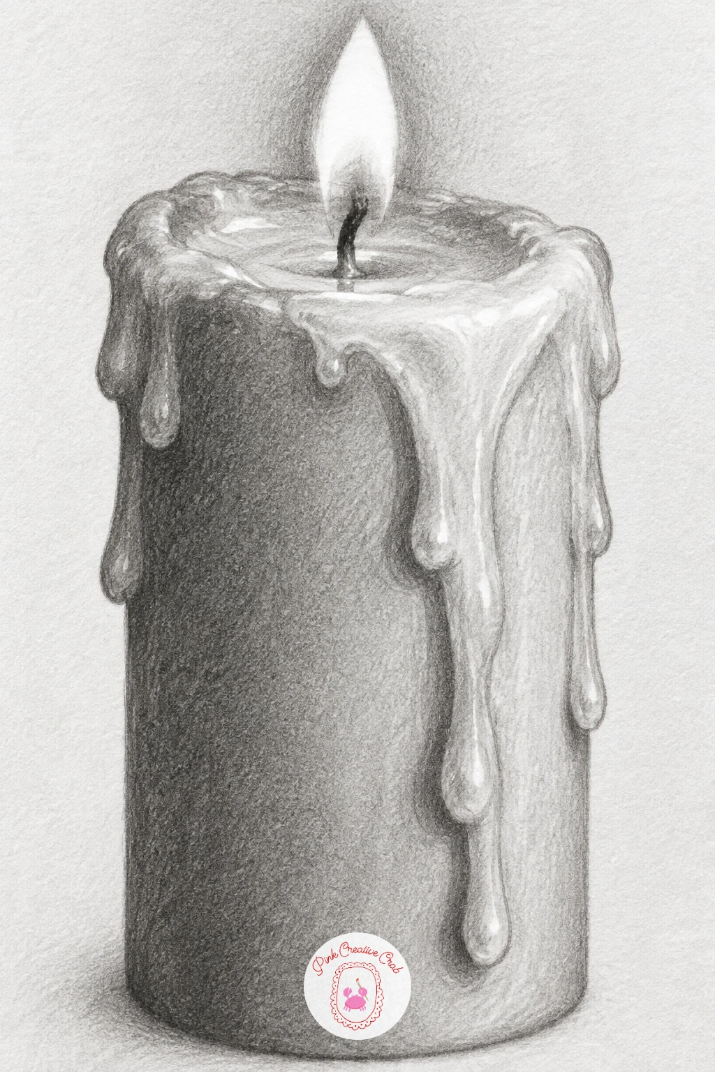
A melting candle gives you a smooth cylindrical body plus thin trailing wax drips, two different shading speeds in one object. Draw the candle as a simple cylinder first, then add a few drip lines running down one side, varying their width and letting one or two pool slightly at the base rather than making every drip identical.
Shade the candle’s main body the way you shaded the earlier cylinder study, a smooth gradient around its curve, then switch to a slightly glossier treatment for the drips themselves, since cooling wax catches a thin bright highlight line down its centre. The flame at the top, if you include it, stays mostly untouched white paper with just its edges softly greyed, similar logic to the lightbulb’s glow.
Where candles go wrong is making the drips look like flat stripes painted onto the surface rather than three dimensional dribbles, so give each drip its own small highlight and shadow rather than one flat tone. This pairs naturally with other candle drawing ideas if you want more variations to try next.
Keep the wick dark and slightly ragged rather than a clean straight line, since a real burning wick never stays perfectly tidy.
Palette: Paper White,Soft Grey,Deep Graphite
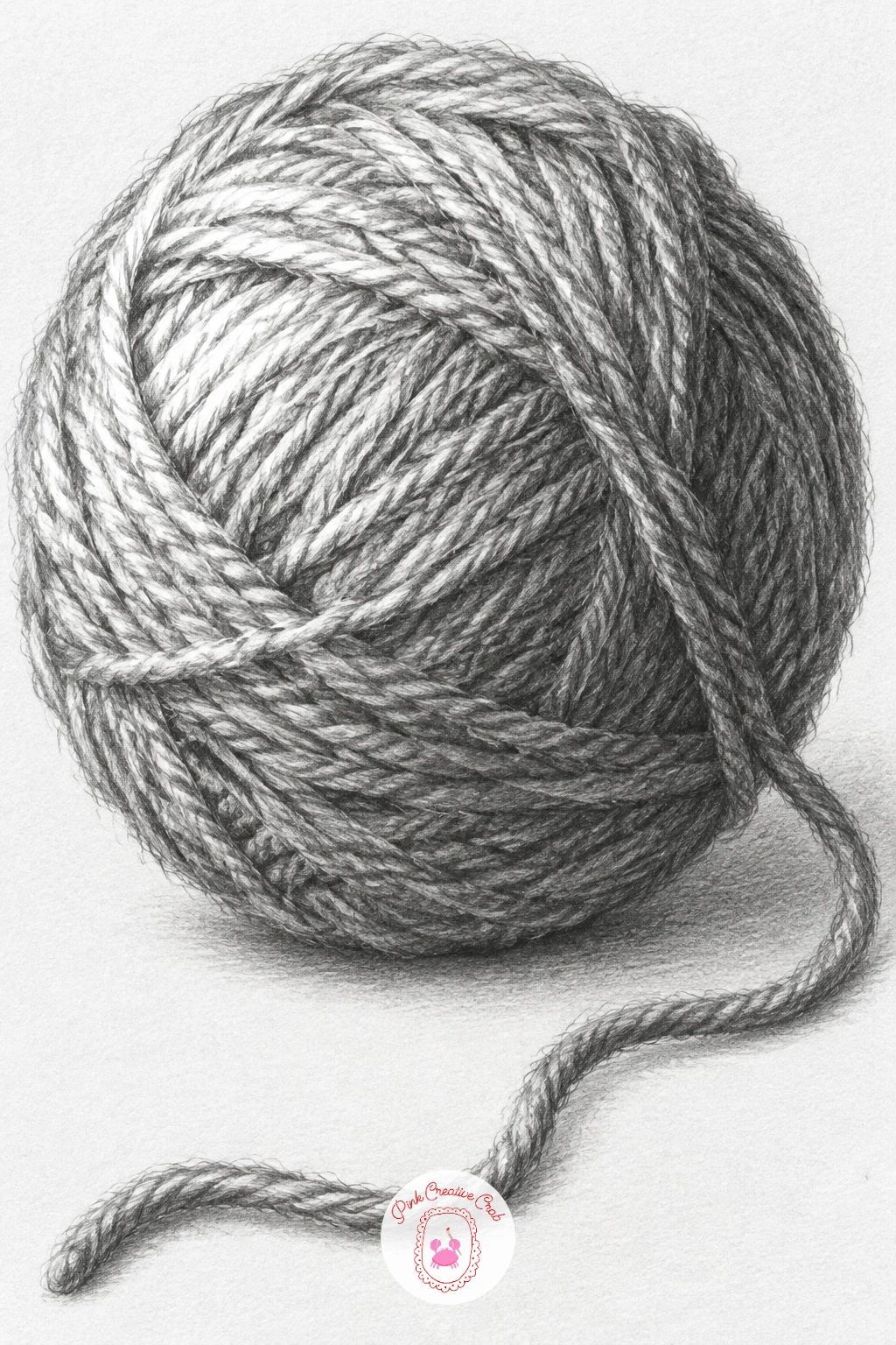
A ball of yarn is really just a sphere wearing texture, so lean on everything you learned from the opening sphere drawing and add a woven surface on top of it. Shade the underlying round form first exactly like a plain sphere, soft highlight near the light, gradual darkening around the curve, before adding a single strand of yarn texture.
Once that base tone sits correctly, add short curved strokes following the ball’s surface in overlapping directions, like you are drawing the direction yarn would wind around a real ball, keeping these texture strokes lighter in the highlight zone and denser in the shadow zone. Let one loose strand trail off the ball’s side and down toward the table, shaded with its own small highlight and shadow since it catches light independently.
The mistake is adding texture strokes evenly all over the ball regardless of the light, which cancels out the sphere shading underneath and flattens the whole form. Keep checking that the underlying round gradient still reads through the texture. A real ball of wool, or even a bundle of string, makes an easy model to copy the overlapping strand pattern from.
Vary this one next time by unwinding more yarn, or drawing two balls of different sizes touching each other.
Palette: Warm Grey,Soft Grey,Deep Graphite
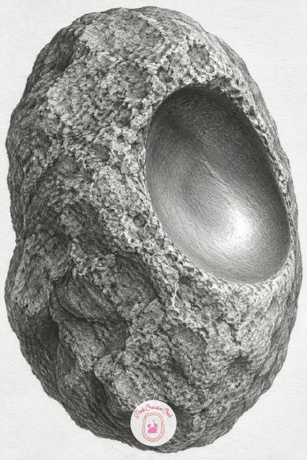
A worn stone combines a rough overall surface with one smooth, almost polished hollow where water or hands have worn it down, which makes it a nice texture contrast exercise after the yarn ball’s single uniform texture. Sketch the stone’s lumpy outline first, then mark the hollow’s edge clearly since that boundary between rough and smooth is the whole point of the drawing.
Shade the rough outer surface with small varied marks, flicking the pencil in short strokes that change direction slightly across the stone’s bumps and pits, letting some areas go quite dark where the surface dips away from the light. Inside the hollow, switch completely to smooth, blended tone with no texture marks at all, much like you shaded the pearl necklace earlier, since that worn patch should look almost soft by comparison.
Compare the stone’s overall height to its width with your pencil held at arm’s length before you commit to the final outline, since stones go wrong fast when drawn too symmetrical or egg-shaped. A real stone from outside, or any rock with a visible worn patch, gives the clearest reference for this contrast.
Finish with a small pool of reflected light inside the hollow’s lowest point, since smooth worn stone often catches a soft glow there.
Palette: Warm Grey,Soft Grey,Deep Graphite
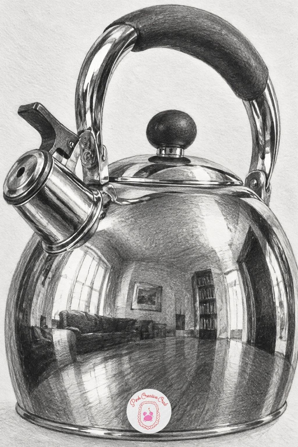
Chrome is the most demanding reflective surface on this list, since a curved chrome kettle bends and distorts everything around it into stretched, warped shapes rather than a clean mirror image. Sketch the kettle’s rounded body and spout shape first, then lightly plan where the biggest reflected shapes will sit, a window, a wall edge, a dark cupboard, before shading anything.
Shade in bold, high-contrast patches that curve with the kettle’s body, since chrome reflections stretch and bend along the surface they sit on, bright window reflections turning into long thin streaks and dark objects smearing into wide curved bands. Keep transitions between these patches fast and sharp, almost no soft blending at all, since that abrupt contrast is what reads as chrome rather than brushed steel.
Where chrome drawings fail is softening everything into gentle grey, which turns a mirror-bright kettle into a dull pewter one, so push your darks much darker and your highlights much brighter than feels natural. A stainless steel kettle, pot lid or even a metal spoon gives a smaller, easier chrome surface to study the same effect on first.
Keep one consistent light source in mind even while the reflections look chaotic, since every reflected shape still has to bend logically around that one curved form.
Palette: Paper White,Mid Grey,Charcoal Black
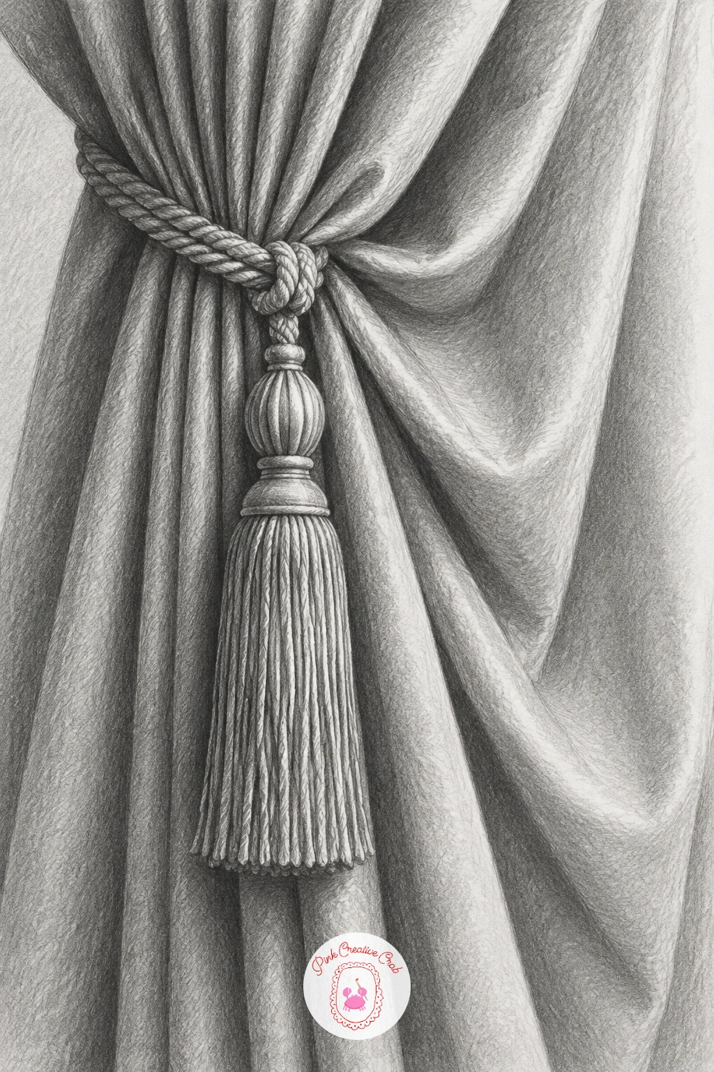
A gathered curtain pulls the drapery lessons from the white cloth into a more decorative shape, since the tieback pinches the fabric into a tight bundle of small folds above a looser cascade below. Sketch the curtain’s overall shape first, marking where the tieback sits before adding any individual fold lines, since that pinch point controls how every fold radiates outward from it.
Shade the tightly gathered section above the tieback with closely packed small folds and quick light to dark transitions, then let the folds loosen and widen as the fabric falls below, shaded with the same smooth, wider gradients you used on the original cloth drawing. The tassel itself is a cluster of thin hanging threads, best suggested with short varied pencil strokes rather than drawn one by one.
The mistake here is making every fold above and below the tieback the same width, which loses the pinched, gathered look that makes a tieback convincing. Keep the folds near the tie tight and the ones further away progressively looser. For more drapery and fabric inspiration, this sits well alongside ideas from cozy interior sketching subjects.
Add one small cast shadow where the tassel’s threads touch the curtain fabric below, anchoring it in place.
Palette: Paper White,Soft Grey,Deep Graphite
A plaster bust is the classic shading exercise for a reason: its matte, uniformly pale surface shows every shift of light across the face’s planes with nothing else competing for attention. Sketch the bust’s proportions first using basic measuring, the eyes usually sit at the halfway point of the head’s total height, before adding a single shadow, since getting this placement wrong throws off every shadow shape that follows.
Shade the face in broad planes rather than trying to render skin-like detail, since plaster reads as a series of flat and curved surfaces catching light differently, the forehead, the cheekbone, the jaw, each its own distinct value. Push the shadow side of the nose and under the brow quite dark, since plaster’s matte surface actually creates stronger, more clearly separated shadow shapes than real skin does.
The mistake is over-blending the whole face into one soft mush, which erases the plane changes that make it look sculptural. Keep some edges between planes fairly crisp, blending only within each plane rather than across its boundary. A plaster cast, a smooth statue photo, or even a smooth stone garden ornament all work as reference.
Measure the distance between the eyes against one eye’s own width before refining any final detail, a classic proportion check that keeps the whole face believable.
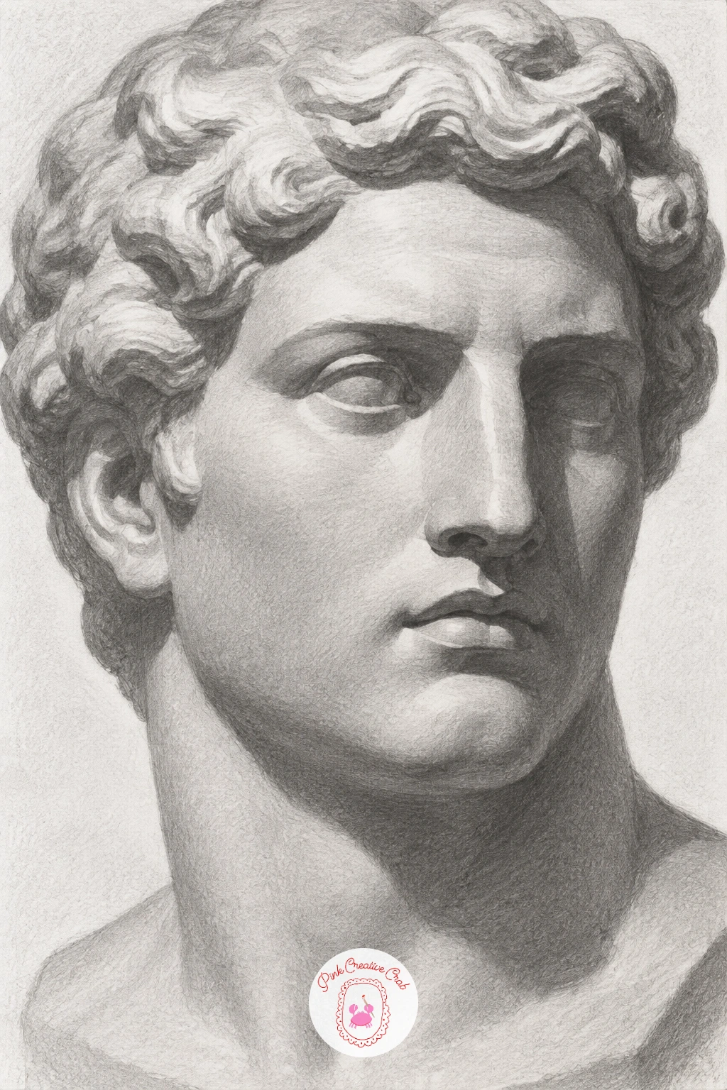
Palette: Paper White,Soft Grey,Deep Grey
Rope is a cylinder that keeps curving back on itself, so once the earlier cube-cone-cylinder group felt steady, a tangled length of rope is a satisfying next challenge in managing overlap. Sketch the rope’s path first as a single loose line showing where it crosses over and under itself, then thicken that line into the rope’s actual width only once the overall tangle’s shape feels right.
Shade each visible length of rope like a small cylinder, bright along its top curve and darker along its underside, but at every point where one length crosses over another, push the lower strand’s tone darker right at the overlap to show it is passing underneath. That darkening at each crossing point is what actually sells the tangle as three dimensional rather than flat loops.
Add the twisted fiber texture last, short diagonal strokes following the rope’s twist direction, applied only after the basic cylinder shading is settled, otherwise the texture competes with the form instead of sitting on top of it. A real length of garden rope or twine gives you actual overlaps to study directly.
Keep the rope’s twist direction consistent throughout the whole tangle, since switching it halfway through reads as a mistake rather than a natural rope texture.
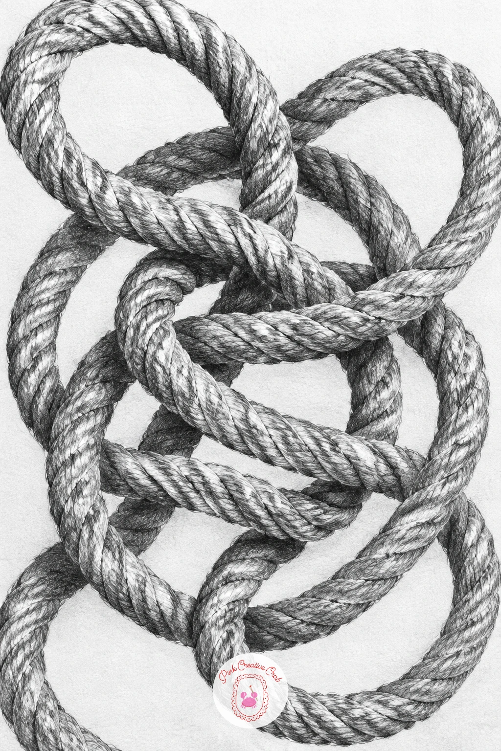
Palette: Warm Grey,Soft Grey,Deep Graphite
A fan opened only halfway gives you a fast rhythm of identical repeating folds radiating from one fixed point, which makes it a good test of consistency after the more random tangled rope. Sketch the fan’s pivot point first, then draw each pleat as a straight line radiating outward from it, spacing them evenly before shading a single one.
Shade alternating pleats light and dark in a steady rhythm, since each fold faces slightly toward or away from the light source, that alternation is what makes a pleated fan read correctly rather than looking like a flat triangle. Keep the tone gradient within each individual pleat fast and narrow, similar to the satin ribbon’s quick transitions, rather than a slow blend.
The common error is losing the even spacing partway across the fan, so pleats bunch up on one side, which throws off the whole rhythm. Lightly mark each pleat’s end point along the fan’s outer curve before drawing any fold lines, keeping that spacing consistent from the start. A paper fan, or even a strip of paper folded into a simple accordion, gives a direct and easy reference.
Darken the pleats nearest the pivot slightly more than the ones at the fan’s outer edge, since folds compress and shadow more tightly close to that central point.
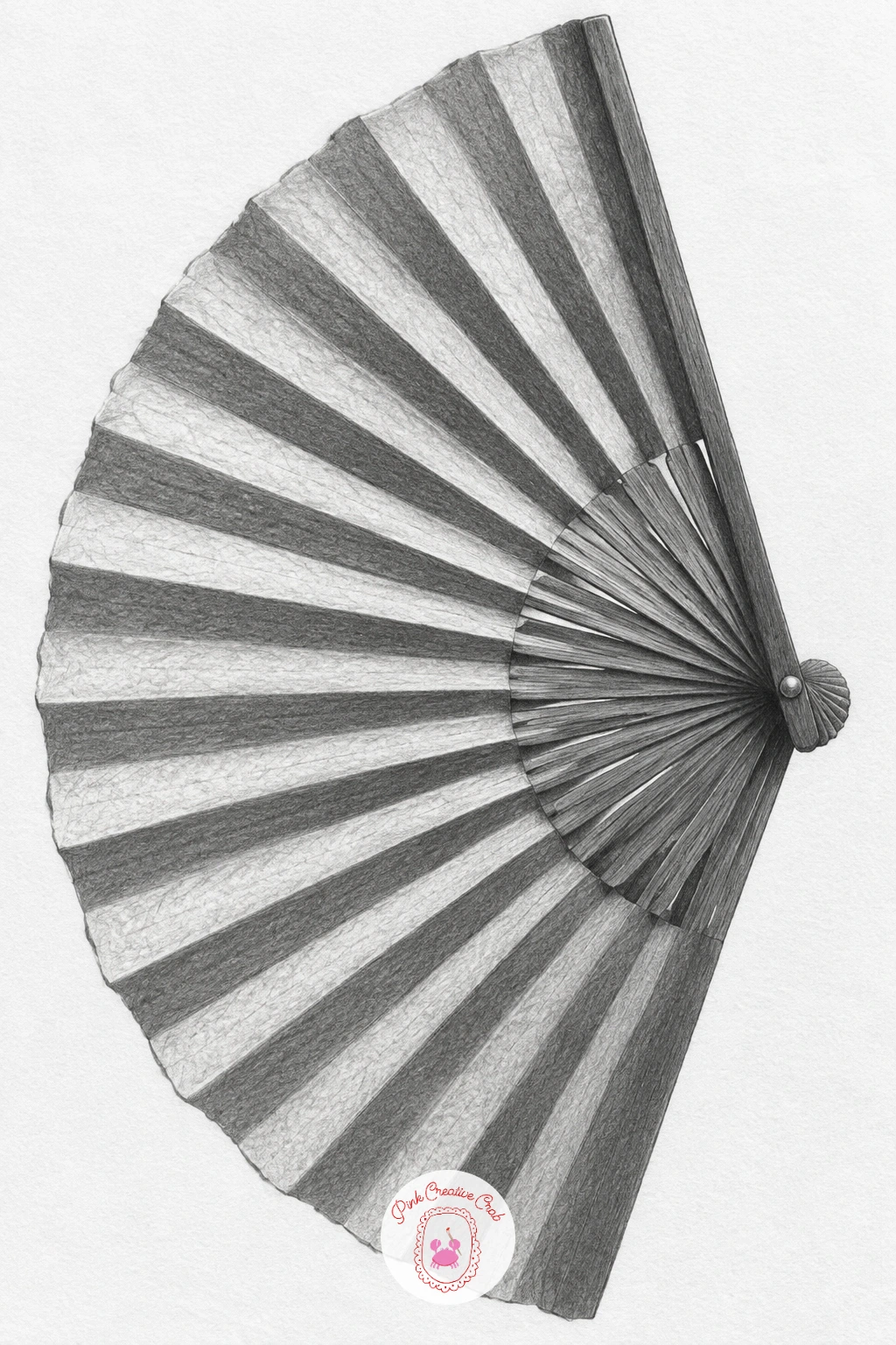
Palette: Paper White,Light Grey,Deep Graphite
A cut-glass decanter takes the earlier glass bottle study and multiplies its light-and-dark pattern many times over, since every facet cut into the glass creates its own small bright or dark shape. Sketch the decanter’s overall bottle shape first, then lightly map the facet pattern across its surface as a grid of angled lines, keeping the facets smaller near the neck and larger across the wider body.
Shade each facet as its own separate flat shape rather than blending across several at once, deciding whether that particular facet catches the light brightly or sits in shadow based on its angle, the same flat-plane logic from the cube earlier but repeated dozens of times across a curved surface. The stopper on top gets its own tight cluster of small bright and dark facets, since stoppers are usually cut just as sharply as the decanter’s body.
Where cut glass goes wrong is blending the facets together into one smooth gradient, which loses the sparkle that makes cut glass recognisable, so resist the urge to soften edges between neighbouring facets. If a real decanter is not available, any cut-glass tumbler or even a faceted glass bead shows the same multiplied-facet pattern on a smaller scale.
Keep a handful of facets pure untouched white paper, since real cut glass always has a few spots that catch light almost blindingly bright.
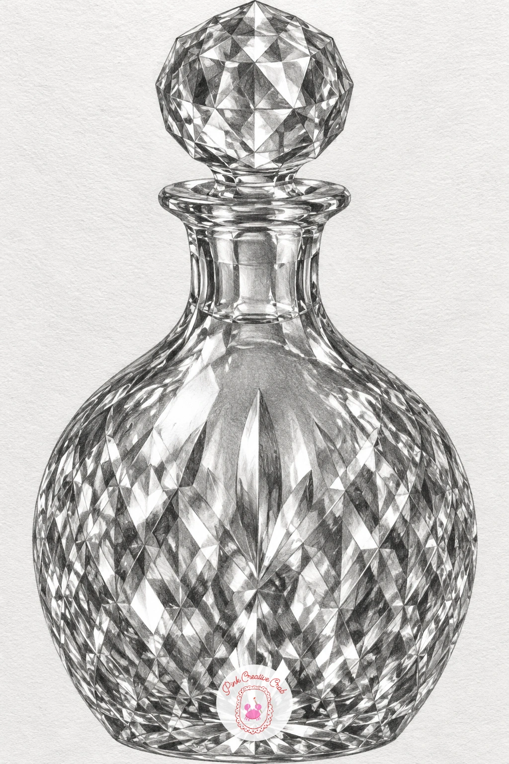
Palette: Paper White,Mid Grey,Charcoal Black
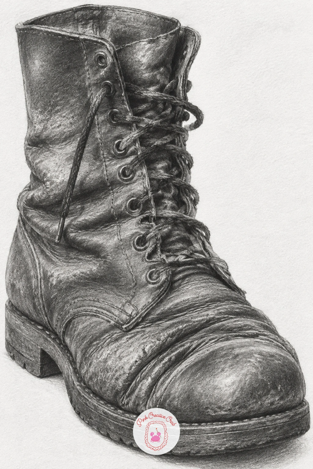
An old leather boot carries its history in its creases, so unlike the smooth forms earlier in this list, every crease here should look earned rather than decorative. Sketch the boot’s overall shape first, keeping proportions honest by comparing its height to its length, then lightly mark where the leather naturally folds across the ankle and toe before adding any deep shading.
Shade the leather’s overall surface with a slightly uneven, worn tone rather than a perfectly smooth gradient, since old leather has subtle variation across it even before you add the creases. Then go in with your darkest pencil along each deep crease line, letting some creases run almost black at their centre and fade quickly to the surrounding leather tone, much like the sharp valleys in the earlier cloth drapery but drier and more angular.
The mistake is making every crease the same depth and darkness, which looks repetitive rather than worn, so vary a few creases deeper than others, especially where the boot bends most at the ankle. A real worn boot or leather bag gives the clearest creased reference, and this pairs naturally with ideas from everyday object sketchbook prompts if you want more still life subjects next.
Finish with a scuffed highlight along the toe’s raised curve, where worn leather often catches a slightly shinier patch from years of wear.
Palette: Warm Grey,Soft Grey,Deep Graphite
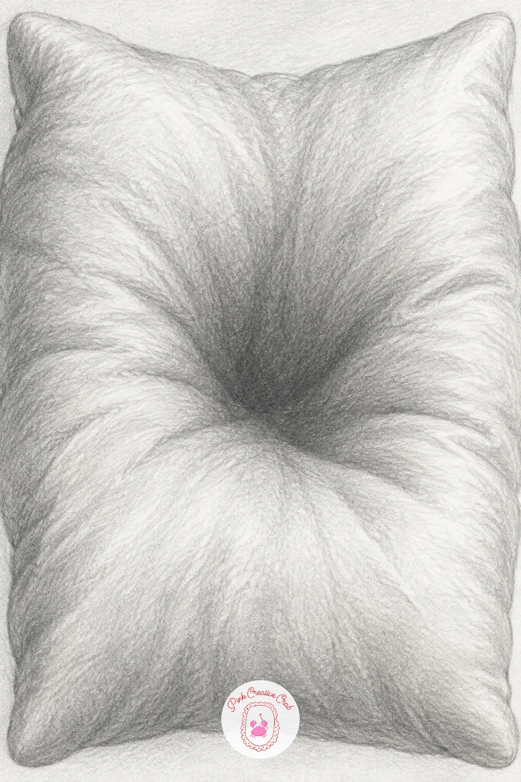
Close this list on something soft: a feather pillow dented in the middle pulls together the fold logic from the cloth and towels but asks for an even gentler touch, since down feathers compress and spring back in a way stiffer fabric never does. Sketch the pillow’s rounded outer shape first, then add the central dent as a wide, shallow curve pressing inward rather than a sharp fold line.
Shade the outer, puffier edges with soft, rounded gradients that bulge outward toward the light, then let the tone deepen gradually into the dent’s hollow at the centre, keeping every transition slow and smooth since nothing about a feather pillow should look sharp or crisp. A few very light, loose wrinkle lines radiating away from the dent suggest the fabric’s softness without turning into hard crease lines like the leather boot’s.
The mistake is shading the dent too sharply, with a hard dark line, which makes a soft pillow look like a stiff cushion instead, so keep that central shadow wide and gradual rather than narrow and dark. A real pillow pressed with a hand, or even a folded sweater with a dent pushed into it, gives a workable soft reference.
Finish with the faintest texture of tiny random dimples across the surface, added last and very lightly, since feather pillows are never perfectly smooth even at rest.
Palette: Paper White,Pale Grey,Soft Grey
What to Do Next
Pick one subject that matches a material you want to practice today, a sphere or egg for smooth gradients, a spoon or decanter for sharp reflections, a cloth or boot for folds and creases. Start on smooth bristol paper with an HB for the outline and build up through your softer pencils, and let this one finished drawing guide which subject you reach for next.
Frequently Asked Questions
What pencils do you need for pencil shading art?
A small range from HB to 6B covers most subjects, with HB for light construction lines and 6B for the deepest shadows. An 8B helps for very dark areas like chrome or velvet, but is not essential to start.
How do you get smooth pencil shading without visible lines?
Work in light, overlapping layers rather than pressing hard once, building tone gradually and blending with a stump or tissue between layers. Circular strokes blend more evenly than straight back-and-forth strokes for most rounded subjects.
Why does my pencil shading look flat instead of three dimensional?
Flat shading usually means the tonal range is too narrow, with no true highlight or true dark shadow present. Push your brightest area closer to bare paper and your darkest shadow closer to solid black for real depth.
How do you draw a believable cast shadow in pencil?
Make the shadow darkest where the object touches the surface and lighter as it stretches away, rather than one flat grey shape. The shadow’s edge should also be sharper close to the object and softer further from it.
What is the best paper for pencil shading art?
Smooth bristol or smooth drawing paper lets graphite blend evenly without fighting visible paper texture, which matters most for glass, metal and satin subjects. Rougher paper works fine for textured subjects like rope or leather.
Have any thoughts?
Share your reaction or leave a quick response — we’d love to hear what you think!
-
 0
-
0
-
0
-
0
-
0
-
0


