Table of Contents
Chances are, you’ve scrolled past those perfect fruit paintings on Pinterest and thought, “Yeah, right — that’s WAY too hard for me.” But here’s the thing: watercolor pencils make it shockably easier than one might think. (And I say this as someone who once turned a peach into a muddy brown blob.) These eleven fruit illustrations aren’t just pretty — they’ll teach you exactly which colors to layer and when to add water. So grab your pencils, because I’m about to show you something that’ll change everything.
What Do You Need for Watercolor Pencil Food Illustration?
Why spend a fortune when you’re just starting out? You don’t need fancy supplies for watercolor pencil food illustration—trust me, I learned this after wasting $200 on “professional” materials!
Here’s what actually matters:
- Water-soluble colored pencils (a basic 24-color set works perfectly)
- Watercolor paper (140lb weight minimum—regular paper turns into soggy disasters)
- Small brush set (rounds in sizes 2, 4, and 6)
- Clean water jar (recycled pasta sauce containers work great!)
- Reference photos (your phone camera is your best friend)
These watercolor pencil illustration ideas start simple. Try easy watercolor pencil food for beginners like apples or strawberries. And here’s the secret—mistakes become HAPPY accidents when you blend them with water. So embrace the chaos!
Idea #1: Easy Watercolor Pencil Food Illustration for Beginners – Meyer Lemon Sliced to Show Every Segment on a Warm Yellow Wash
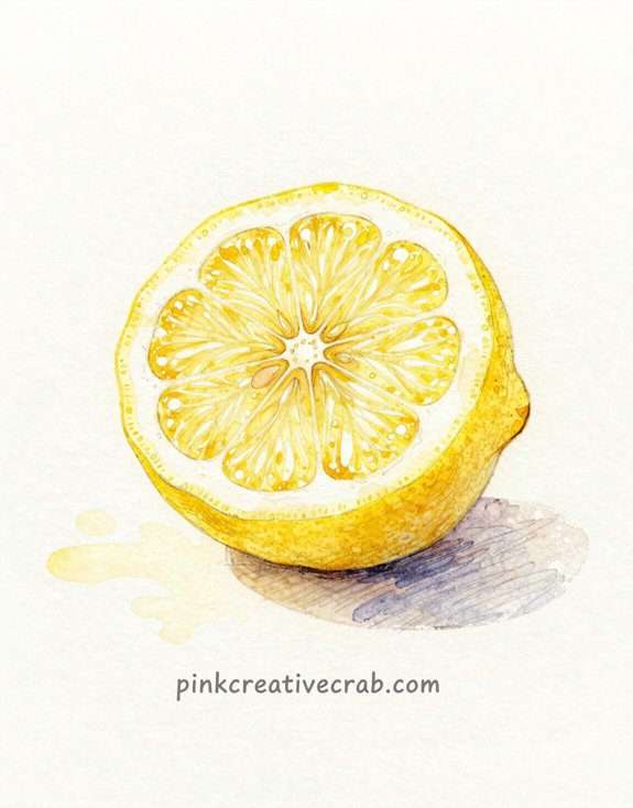
When you slice into a Meyer lemon, you’re staring at nature’s PERFECT mandala—and it’s honestly one of the easiest watercolor pencil subjects you’ll ever tackle.
Start with a warm yellow wash across your paper. Let it dry completely (I never do—classic mistake). Then sketch those radiating segments lightly. Here’s the thing about fruit watercolor pencil drawing: you don’t need precision! Those membranes? Just golden lines radiating from center to edge.
Layer your yellows first, then add peachy-orange tones where segments meet. The white pith? Leave it mostly blank—watercolor pencil fruit art shines when you embrace negative space.
Activate with water using circular motions. Watch that food illustration watercolor pencil magic happen as pigments bloom! The segments practically draw themselves. So satisfying, you’ll want to paint a whole orchard.
Idea #2: Pomegranate Cracked Open, Ruby Seeds Spilling Onto a White Surface
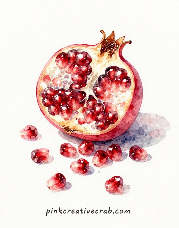
If you want DRAMA in your watercolor pencil food illustrations, nothing beats a pomegranate split wide open with those jewel-like seeds tumbling everywhere. Trust me—this fruit illustration watercolor pencil project looks way harder than it actually is!
Start with the cracked shell first. Layer burgundy and burnt sienna to build that leathery skin texture. Then comes the fun part: those gorgeous ruby seeds. Don’t try making them perfect (I learned that the hard way). Instead, vary your reds from crimson to pink. And here’s the trick—leave tiny white highlights on each seed. That’s what makes them look wet and GLISTENING.
The scattered seeds? Position them randomly. Real life isn’t symmetrical, so your fruit illustration watercolor pencil shouldn’t be either!
Idea #3: Fruit Watercolor Pencil Drawing – Bunch of Muscat Grapes with Dusty Bloom and Translucent Flesh
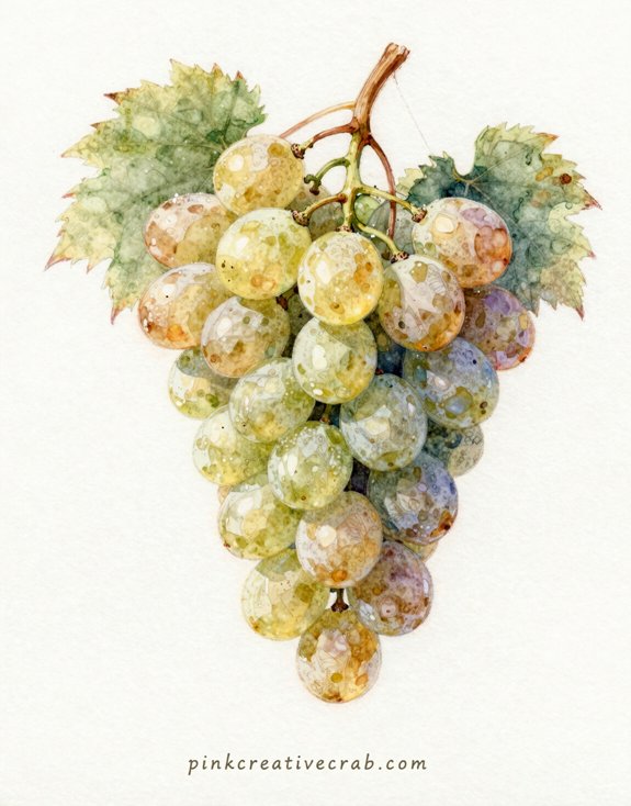
Here’s the thing about grapes—they’re basically little lanterns, and layering watercolor pencil is how you make them GLOW. You’ll build up those translucent greens and yellows gradually (I know, patience isn’t fun, but slapping on one thick layer just creates muddy blobs—trust me, I’ve ruined plenty).
The secret is letting each light layer dry before adding the next, so the colors stack like colored glass instead of mixing into mush!
How Layering Watercolor Pencil Gives Fruit Skin That Lit-From-Within Quality
Muscat grapes practically glow on the vine—that ethereal quality comes from their thin, translucent skins stretched over sweet flesh. Here’s the secret: you’ve got to layer LIGHT colors first. I used to go dark right away—total disaster! The grapes looked muddy and flat.
Start with pale yellow where light hits. Then add your greens in thin layers. Let each one dry. (Yes, patience is torture—I know!)
But wait—here’s where the magic happens. Add purple-gray shadows LAST, leaving those yellow highlights untouched. The colors shine through each other, creating that lit-from-within glow.
And that dusty bloom? Barely touch your pencil to dry paper. Whisper-soft! The natural white of your paper does most of the work.
Idea #4: Fig Sliced Crossways Showing Honeyed Interior Against a Deep Burgundy Background
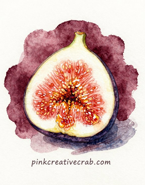
One slice through a ripe fig reveals nature’s most spectacular secret—that jewel-toned, honeyed interior that looks almost too perfect to be real. Here’s where color contrast becomes your best friend.
Paint that burgundy background FIRST (trust me—I learned this the hard way after ruining three attempts). Let it dry completely. Then build up those peachy-pink seeds with light layers—dots of coral, amber, cream. The wet brush pulls the pigment into soft bleeds that mimic actual fig flesh!
And those purple-brown skin edges? Layer eggplant over burnt sienna. The dark background makes everything POP. It’s like the fig is glowing from within. Which, honestly, it kind of is.
Idea #5: Easy Strawberry Watercolor Pencil – Sun-Warmed Strawberry with Every Seed Dimple Rendered in Perfect Detail

Strawberries seem simple until you actually try to draw one—then suddenly you’re staring at approximately three hundred tiny seed dimples wondering what you’ve gotten yourself into. But here’s the thing: those dimples are what make your strawberry look REAL.
Start with a light yellow base—yes, yellow! The seeds catch sunlight differently than the flesh. Layer red gradually, leaving those precious dimples untouched. And the leafy cap? Go darker than you think. Way darker. (I learned this after making approximately seventeen sad pink blobs.) The contrast makes everything pop.
Idea #6: Peach Fuzz Captured in Fine Layered Strokes, a Soft Bite Taken Out of One Side
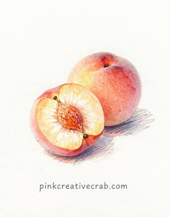
tight and directional for fuzz, smooth and blended for waxy surfaces, and—this took me forever to learn—leaving tiny white gaps for that powdery matte finish.
Painting the Difference Between Matte Skin, Waxy Skin, and Fuzzy Skin on Fruit
Peaches throw you a curveball because they’re basically THREE textures in one—and if you don’t nail that famous fuzzy skin, your peach will look like a nectarine’s awkward cousin.
The fuzzy skin needs tiny, irregular strokes going EVERY direction (I used to go one way and it looked weirdly combed). Then there’s the smooth flesh where you took that bite—blend it soft and creamy. And don’t forget the waxy highlight near the top!
##
Every foodie artist needs ONE essential tool that changes everything: a color chart made specifically for your watercolor pencils.
Trust me—I used to waste SO much time guessing which pencil would create that perfect strawberry red. (Spoiler: I was always wrong!) But a simple reference table? Game changer.
Here’s your starter chart:
| Fruit Type | Watercolor Pencil Colors | Technique Tip |
|---|---|---|
| Apples | Crimson Red + Yellow Ochre | Layer light to dark |
| Bananas | Lemon Yellow + Raw Sienna | Add brown spots last |
| Grapes | Violet + Indigo | Leave white highlights |
| Oranges | Orange + Burnt Sienna | Blend with water first |
| Strawberries | Scarlet + Pink | Use dotting motion |
Make YOUR version. Test every pencil you own. And watch your confidence SOAR!
Idea #7: Easy Kiwi Watercolor Pencil Illustration – Kiwi Cross-Section Showing Brilliant Emerald Flesh in Radiating Layers
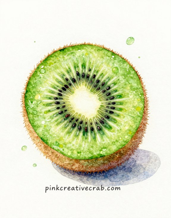
When you slice open a kiwi, you get this STUNNING natural mandala that basically draws itself—which is exactly why it’s my favorite fruit to teach beginners.
Start with the CENTER—those tiny black seeds radiating outward like spokes on a wheel. Use dark brown watercolor pencil and don’t worry about perfection (mine always look a bit wonky and that’s totally fine). Then layer your emerald green from the middle outward in a sunburst pattern. And here’s the game-changer: leave WHITE gaps between your green sections to create that radiating effect!
The fuzzy brown skin? Just rough scribbles. Seriously. I used to overthink it until I realized messy actually looks MORE realistic.
Activate with water and watch those colors POP!
Idea #8: Cherry Cluster on a Branch with Stem Still Attached, Glistening Red in Side Light
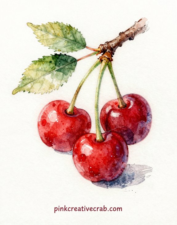
From the geometric perfection of a kiwi slice to the organic chaos of cherries on a stem—this one’s all about capturing SHINE. And let me tell you, I spent THREE attempts before realizing the secret: side lighting is everything.
Here’s what transformed my muddy cherry blobs into glistening gems. First, leave tiny white spots completely untouched (that’s your highlight). Second, layer crimson and scarlet unevenly—cherries aren’t uniform! Third, add deep burgundy shadows where cherries touch.
But the REAL magic? That stem attachment point. Go darker there. Way darker than feels comfortable.
The branch itself? Keep it simple—brown with hints of gray. Because honestly, the cherries deserve the spotlight.
Idea #9: Dragon Fruit Halved — Deep Fuchsia Skin and White Flesh Studded with Tiny Seeds
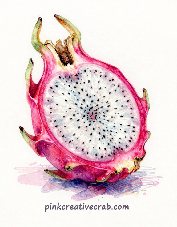
Although most tropical fruits look intimidating, dragon fruit might be the most DRAMATIC thing you’ll ever put on paper. That electric fuchsia skin against creamy white flesh? Pure magic.
Start with the outer skin—layer your pinks and magentas boldly. Don’t be timid! The color is naturally INTENSE, so embrace it.
Then comes the fun part: those tiny black seeds scattered throughout the flesh. I used to painstakingly dot each one (huge mistake—took forever). Instead, use quick flicks of your pencil tip. Way faster.
The real challenge? Making that white flesh actually look white without leaving it blank. Add subtle grays and pale blues for dimension. And here’s the kicker—a hint of green where skin meets flesh sells the whole illustration.
Idea #10: Food Illustration Watercolor Pencil – Persimmon on a Branch with Two Leaves in Autumn Gold and Orange
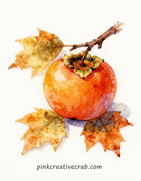
You know what makes the difference between a persimmon that looks painted and one that looks REAL? Highlights—the tiny glints and glimmers that scream “I was just picked from the tree!” So grab your white watercolor pencil and some white gouache (that’s opaque watercolor paint, basically), because we’re about to make this autumn fruit practically glow off the page.
Using White Pencil and White Gouache for Highlights That Make Fruit Look Freshly Picked
When you add those final bright highlights to a persimmon, something magical happens—the fruit suddenly looks like you could pluck it right off the page.
Start with white watercolor pencil on dry areas where light hits strongest—the top curve of the fruit, maybe one side of that glossy skin. Then (and this is where I messed up for YEARS) add white gouache on top for those ultra-bright spots. The gouache sits differently than pencil—it’s opaque and creamy. Just tiny dabs! Think of morning dew or that waxy shine fresh persimmons have. But don’t overdo it. Too many highlights and your fruit looks plastic instead of plump and juicy. Trust me—I’ve created some very unfortunate shiny orange baseballs!
Idea #11: Mango Hedgehog-Cut Open, Orange Cubes Pressing Out Against Deep Golden Skin
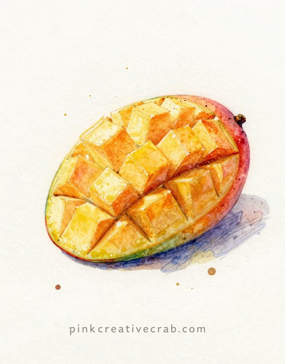
The hedgehog cut transforms an ordinary mango into something almost architectural—those perfectly scored cubes pushing up through golden skin create a pattern that’s both geometric and organic. You’ll want THREE colors minimum here. Start with burnt orange for the flesh, then layer crimson at the base where it meets the skin.
The skin itself? That’s where magic happens—use deep amber mixed with olive green for those stunning color variations. And don’t forget the SHADOWS between each cube! I used to skip this step (rookie mistake), but those tiny dark spaces make everything pop. Here’s the trick: use your darkest orange-brown to trace just one side of each cube. Creates incredible DEPTH. Finally, hit the cube edges with white pencil—instant freshness!
If you could eat one of these illustrations, which would it be — and does it change your mind about which one to paint first?
Why does the strawberry always win this mental taste test? Maybe it’s those tiny seeds — the texture just POPS in your imagination. But here’s the thing: what you want to eat and what you should paint first are totally different questions!
I always choose the chocolate-dipped banana (obviously), then immediately regret it because brown watercolor looks muddy when you mess up. And you WILL mess up your first attempt.
So pick the fruit that excites you MOST as an artist, not as a snacker. The mango’s golden glow? That teaches you about layering warm tones. The kiwi’s fuzzy complexity? Perfect for practicing texture.
Your hunger can wait. Your creativity can’t!
Frequently Asked Questions
Can Watercolor Pencil Illustrations Be Preserved and Framed Long-Term Without Fading?
You’ll preserve your watercolor pencil artwork by using archival-quality paper, lightfast pencils, and UV-protective glass when framing. Keep them away from direct sunlight and humid environments, and they’ll maintain their vibrant colors for decades.
How Do You Photograph Finished Watercolor Pencil Artwork for Online Portfolios?
You’ll want to photograph your watercolor pencil artwork in natural, diffused light or use professional studio lighting. Position your camera directly overhead to avoid distortion, ensuring you’re capturing true colors and intricate details that’ll showcase your innovative technique.
What’s the Average Time to Complete a Single Fruit Illustration?
While quick sketches take mere minutes, you’ll need 3-5 hours for detailed fruit illustrations. Your layering technique, subject complexity, and desired luminosity directly impact completion time. Masters often invest even longer perfecting translucent effects.
Can You Sell Food Illustrations Commercially or Do You Need Licenses?
You can sell your original food illustrations commercially without licenses since you own the copyright. However, you’ll need permission if you’re depicting branded products or trademarked characters in your artwork.
Do Watercolor Pencils Work on Toned or Colored Paper Backgrounds?
You’ll achieve stunning results on toned paper—artists report 40% more dimensional depth compared to white surfaces. Watercolor pencils adapt beautifully to colored backgrounds, letting you create innovative highlights and shadows that’d be impossible on traditional white paper.
Have any thoughts?
Share your reaction or leave a quick response — we’d love to hear what you think!
-
 0
0
-
0
-
0
-
0
-
0
-
0


