You probably don’t realize that watercolor and ink patterns actually fight each other — the water wants to spread while the pen lines need to stay crisp. But here’s the thing: that tension creates MAGIC when you layer delicate Zentangle designs over soft, blooming petals. I learned this the hard way after ruining three paintings because I didn’t wait for the paint to dry (rookie mistake). So which flower speaks to you — the geometric perfection of a dahlia or something wild like a poppy?
What Do You Need for Watercolor Zentangle Flower Painting?
Before you plunge into creating these gorgeous watercolor zentangle flowers, let’s talk supplies—because trust me, I’ve learned the hard way that not all materials are created equal!
Here’s what you NEED for watercolor zentangle flower painting:
- Watercolor paints (student-grade works fine—don’t overthink it!)
- Watercolor paper (at least 140lb or your paper will buckle like mine did)
- Fine-tipped pens (waterproof! Or you’ll cry when your zentangle floral watercolor bleeds)
- Brushes (round, sizes 4-8)
And honestly? That’s IT. These easy watercolor zentangle flowers for beginners don’t require fancy equipment. So grab these basics and you’re golden! The magic happens when watercolor meets those intricate zentangle patterns—not because you spent $200 on premium supplies.
Idea #1: Easy Watercolor Zentangle Flower for Beginners – Sunflower with Each Petal Filled with a Simple Wave or Brickwork Tangle
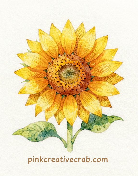
When I first started painting zentangle watercolor flowers, I nearly gave up after my third disaster—but then I discovered sunflowers are basically FOOLPROOF. Their big, chunky petals forgive wonky brushstrokes like nothing else!
Here’s why this easy watercolor zentangle flower for beginners actually works: paint your sunflower in bright yellows and oranges first (let it dry completely—seriously, wait!). Then add simple wave patterns OR brickwork tangles to each petal using a fine black pen. That’s IT.
The patterns transform your painting from “meh” to “WOW, did you really make that?” And honestly? Waves are just curvy lines. Brickwork is rectangles stacked funny. These watercolor zentangle flower ideas look complicated but require zero artistic genius. Trust me—I’m living proof! Start here, then you’ll crave MORE zentangle flower painting projects.
Idea #2: Dahlia with Every Petal a Different Tangle — Spirals, Crosshatch, and Chevron Alternating in Rings
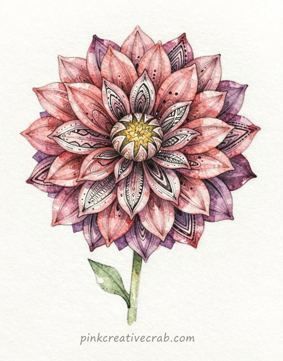
Someone told me dahlias were “advanced level” flowers, and I’m still mad about it because they’re actually EASIER than sunflowers for zentangle patterns. Here’s why: those layered petals work like a built-in organization system!
Start with the outer ring—fill every third watercolor zentangle petal with spirals. Next ring? Crosshatch. Inner ring? Chevron. The pattern rotation keeps your floral zentangle watercolor painting from looking chaotic (learned THAT the hard way when I did all random tangles).
Pro tip: Paint your dahlia base in deep burgundy or coral first. Let it dry completely—don’t be like me, jumping ahead with wet paper everywhere. Then add your tangles with a fine pen.
This structured approach to watercolor zentangle flower ideas gives you freedom WITHOUT the overwhelm. Dahlias practically organize themselves!
Idea #3: Zentangle Flower Watercolor Painting – Lotus in Soft Aqua Wash with Fine Black Ink Patterns Inside Each Petal
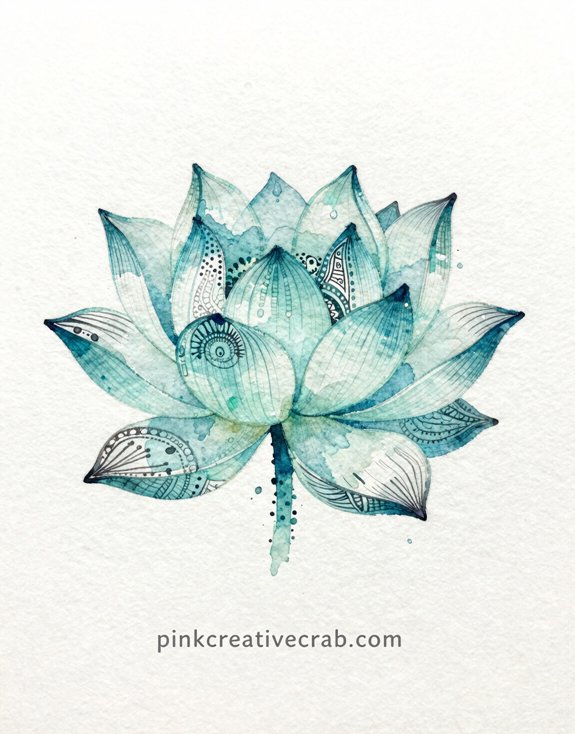
The BIGGEST mistake I made with my first lotus? Treating those curved petals like flat paper and ending up with zentangle patterns that looked like they belonged on graph paper, not nature.
But here’s the thing—your hand needs to follow the petal’s natural curve as you draw, which means rotating your paper constantly (or rotating the whole painting if you’re brave).
And those tiny patterns—dots, waves, scales—they actually HIDE wonky lines better than geometric stuff, so start with organic tangles first until you get comfortable working on those beautiful, flowing petal shapes!
Inking Zentangle Patterns on Curved Petals Without Lines That Look Stiff
Although watercolor petals look soft and dreamy when they’re first painted, adding zentangle patterns can turn them stiff and awkward if you’re not careful—trust me, I’ve made plenty of lotus flowers that looked like they’d ribs instead of decorative patterns! The secret? Follow the CURVE of each petal with your ink lines. Don’t fight the organic shape—embrace it! Let your zentangle watercolor flower ideas flow with the natural bend.
Start at the petal’s center and work outward, keeping your hand loose (death grip equals stiff lines). And here’s the game-changer: vary your pattern density. Concentrated details near the base, lighter patterns toward edges. This creates DEPTH without that trapped-in-a-cage feeling. Your watercolor zentangle flowers will thank you!
Idea #4: Wild Rose Bloom with Zentangle Leaves and Detailed Thorn Stem on a Warm Blush Wash
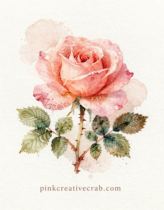
But here’s where it gets fun: go wild on the leaves. Fill them with Zentangle patterns—florz, crescent moon, whatever speaks to you.
And that stem? Make those thorns COUNT. Sharp triangles with tiny highlights create instant dimension.
Idea #5: Easy Peony Zentangle Watercolor for Beginners – Peony with Layered Petals Each Holding a Different Circular Tangle
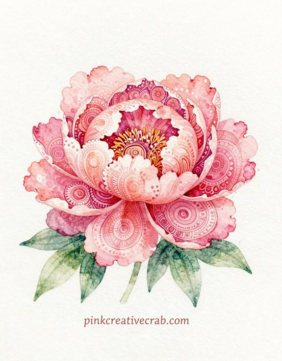
Moving from sharp thorns to soft, billowy petals might seem like a total 180, but peonies are secretly PERFECT for Zentangle beginners. Here’s why—each petal acts like its own little canvas. You’ll paint maybe five or six BIG rounded petals in soft pink washes, let them dry (patience!), then fill each one with a different circular tangle. Spirals in one, concentric circles in another, maybe some radiating lines creating a mandala vibe in the center petal.
The layered structure means you can’t really mess up—trust me, I’ve tried. If one pattern looks wonky, the others balance it out. Plus, peonies are naturally fluffy and chaotic, so your “mistakes” just look like artistic interpretation. Start light, build gradually!
Idea #6: Mandala Flower Hybrid — A Rose Drawn So Symmetrically It Becomes a Mandala
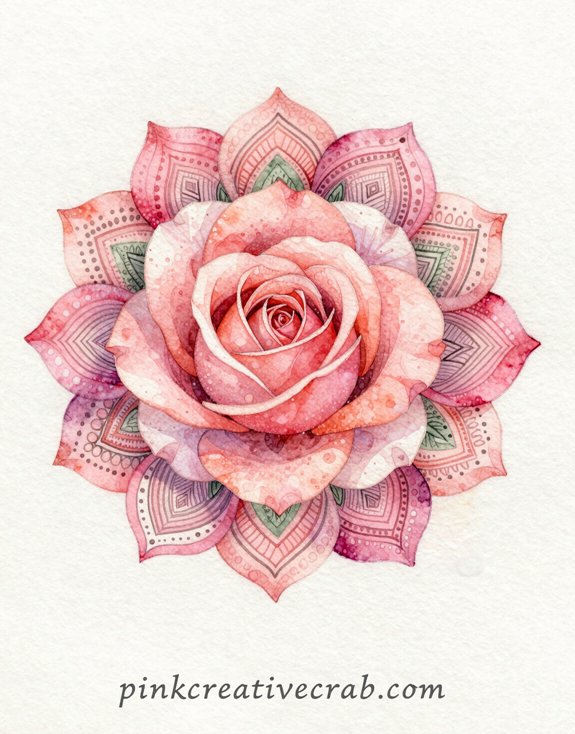
Here’s the thing about adding zentangle patterns to your mandala rose—sometimes they make it STUNNING, and sometimes they just turn it into visual chaos (trust me, I’ve created some disasters).
You want your patterns to follow the natural flow of the petals, not fight against them—think of it like highlighting the rose’s architecture instead of covering it up with wallpaper!
When the Zentangle Pattern Enhances the Flower vs. When It Just Makes It Busy
The mandala-flower hybrid is where botanical accuracy takes a backseat to geometric beauty—and honestly? That’s the POINT. But here’s where artists mess up (me included): cramming every petal with pattern until you can’t tell flower from wallpaper.
The trick? Strategic emptiness. Let some petals breathe with just watercolor while others get the full zentangle treatment. Think of it like seasoning—too much and you’ve ruined dinner.
I once drew a rose so packed with patterns it looked like a decorative doily. Lesson learned!
Your eye needs places to REST. So pick focal areas—maybe just the outer petals or the center—and go wild there. Leave negative space. The contrast between busy and calm? THAT’S what makes the pattern enhance instead of overwhelm.
##
Watercolor zentangle flowers look absolutely STUNNING when you display them properly—and trust me, I learned this the hard way after shoving my first pieces in a drawer where they got bent and faded.
So here’s what actually WORKS:
| Display Method | Cost | Wow Factor |
|---|---|---|
| Simple white frames | $10-20 | High—makes colors pop! |
| Floating glass frames | $25-40 | Maximum drama |
| Portfolio sleeves | $5-15 | Protection first |
| Digital scans (printed) | $2-5 | Share everywhere! |
And honestly? The white frame trick changed EVERYTHING for me. Your intricate patterns need breathing room—not crushed in some random notebook.
But here’s the thing: photograph them FIRST. Because accidents happen (trust me). Then you’ve got backups. Smart, right?
Display equals respect for your work!
Idea #7: Easy Poppy Zentangle Watercolor Flower – Red Poppy with Fine Black Striping and Seed Head Detailed in Zentangle Dots
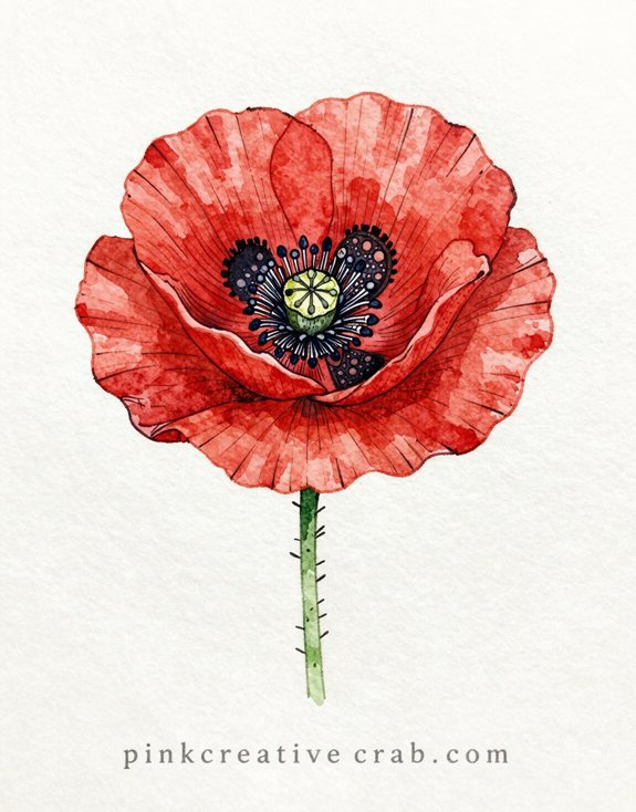
Poppies might just be the EASIEST zentangle flower you’ll ever tackle—and I’m saying this as someone who totally botched my first rose attempt (it looked like angry cabbage). Here’s why poppies work: their petals are naturally ruffled and imperfect, so your wonky watercolor blobs actually look INTENTIONAL.
Start with loose red washes—don’t stress about precision. Let it dry completely. Then add those dramatic black stripes radiating from the center using a fine-tip pen. The stripes don’t need to be perfect! Nature’s messy too.
But the REAL magic happens with the seed head. Fill that center pod with tight clusters of zentangle dots. Vary the sizes. Create patterns within patterns—circles, spirals, whatever feels right.
The contrast between fluid watercolor and controlled dots? *Chef’s kiss.*
Idea #8: Botanical Zentangle Page — Five Different Flower Species Each Filled with a Signature Tangle Pattern
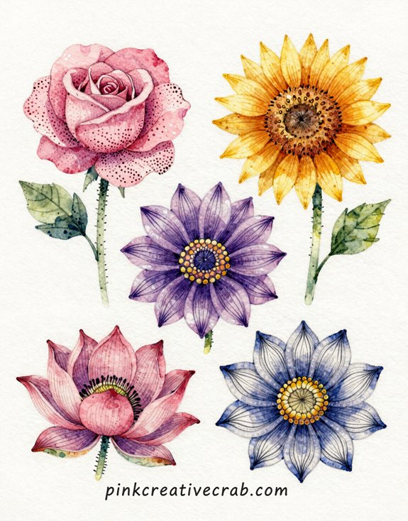
Once you’ve mastered individual flowers, here’s where things get REALLY fun—creating an entire botanical garden on a single page. Pick five totally different species—maybe a rose, sunflower, tulip, daisy, and iris. Here’s the trick: give each flower its OWN signature tangle pattern. Rose gets swirls, sunflower gets cross-hatching, tulip gets geometric triangles—you get it.
This creates the most GORGEOUS contrast! Your eye bounces from pattern to pattern, discovering something new each time. And honestly? This approach saves you when one flower turns out wonky (mine always do). The variety makes everything look intentional.
Start with pencil sketches. Space them out. Then commit to ONE unique pattern per bloom. No repeating! That’s what makes this page absolutely magical.
Idea #9: Watercolor Hibiscus with Zentangle Stamens and a Tropical Color Wash in Fuchsia and Gold
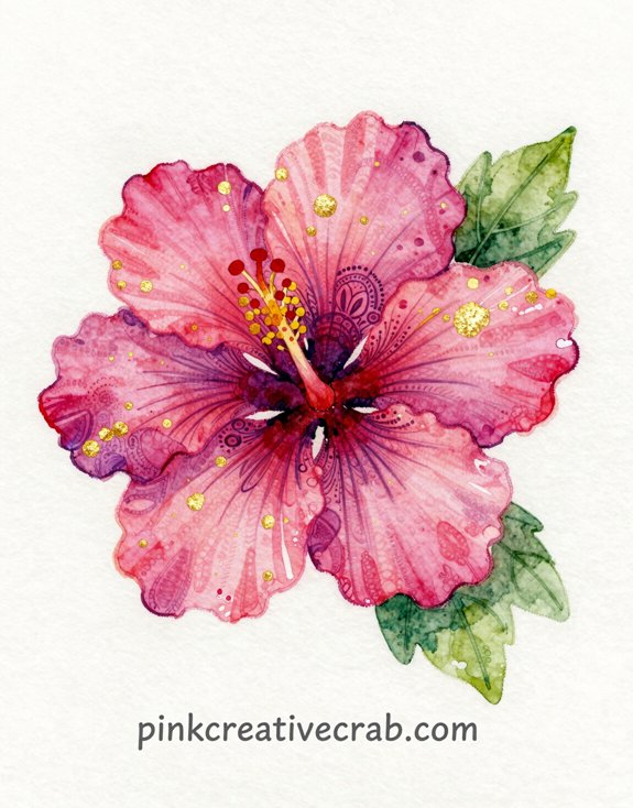
Ready for something truly SPECTACULAR? This hibiscus will blow your mind—I promise!
Start with loose, WILD watercolor washes in fuchsia and golden yellow. Let them blend on wet paper (messy is GOOD here). Once dry, outline your hibiscus petals lightly in pencil.
Here’s where magic happens: fill those stamens with intricate Zentangle patterns. Think coils, dots, and radiating lines. The contrast between loose watercolor petals and tight, detailed stamens? *Chef’s kiss.*
I initially made everything too controlled—total disaster! But embracing the watercolor chaos while keeping just the center detailed creates this amazing tropical vibe.
Pro tip: Use metallic gold gel pen on the stamens for extra POP. And don’t skimp on that fuchsia—GO BOLD!
Idea #10: Zentangle Flower Painting Watercolor – Protea Flower with Architectural Petal Sections Each Filled with Geometric Pattern
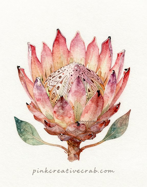
You’ve created this STUNNING protea with all those intricate zentangle patterns inside each petal—but here’s the heartbreak I learned the hard way: watercolor can make your precious ink lines fade or even disappear completely when you photograph or print your art.
So before you scan or snap that photo, you need to know which pens are truly waterproof (hint: not all “permanent” markers actually are—trust me, I’ve ruined three pieces learning this!).
And the lighting when you photograph matters way more than you’d think, because those delicate zentangle details can vanish into shadows or get washed out by flash.
Photographing and Printing Zentangle Flower Art So the Ink Lines Don’t Disappear
After spending hours creating intricate geometric patterns inside those architectural protea petals, the LAST thing you want is to scan or photograph your masterpiece and watch all those delicate ink lines vanish into oblivion.
Those black ink lines stay CRISP and scannable. But if you’ve already painted (been there!), use your phone’s document scan mode instead of regular photo mode. It sharpens contrast automatically.
For printing, specify “high quality” settings and choose matte paper—glossy makes ink lines blur into watery backgrounds. And always test print one copy first. Trust me, I’ve wasted entire ink cartridges learning this lesson! Your patterns deserve to stay visible, not disappear into expensive regret.
Idea #11: Magnolia Bloom with Each Curved Petal Filled with Fine Concentric Lines

When you tackle a magnolia bloom, you’re working with one of nature’s most elegant shapes—those thick, curved petals that seem to unfold like porcelain sculptures. And here’s where concentric lines become your SECRET WEAPON. Draw each petal outline first, then fill it with nested curves that follow the petal’s natural sweep. Start from the outer edge and work inward—trust me, I went center-out once and everything looked warped!
The trick? Keep your lines evenly spaced. Use a ruler if you’re shaky (no shame in that). These repetitive curves create GORGEOUS depth when watercolor settles between them.
Pro tip: Leave tiny white gaps between lines. The paint will pool there, creating subtle dimension that makes each petal practically glow. It’s meditative work—but SO worth it!
Idea #12: Easy Daisy Zentangle Watercolor – Simple Daisy with Long Petals Each Filled with a Bold Stripe or Spiral Tangle
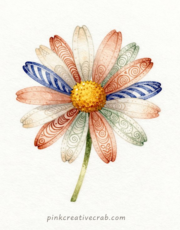
Magnolias demand patience with all those delicate concentric curves—but daisies? They’re your BEST FRIEND when you need a win. Long, simple petals practically beg for bold patterns. And here’s the magic—you can fill each one differently!
Try alternating stripes and spirals. Seriously. One petal gets thick horizontal lines, the next gets a loose swirl. The contrast? *Chef’s kiss.*
I’ve totally messed this up before (made my spirals too tight and they looked like tiny tornadoes). Keep them loose and wonky! Let your brush dance.
The watercolor base should be bright yellow for the center, soft white or pink for petals. Add your zentangle patterns AFTER everything dries. So much easier than fighting wet paper.
Want instant gratification? This is IT.
Idea #13: Cherry Blossom Branch in Pale Pink Wash with Zentangle Patterns on Each Tiny Petal
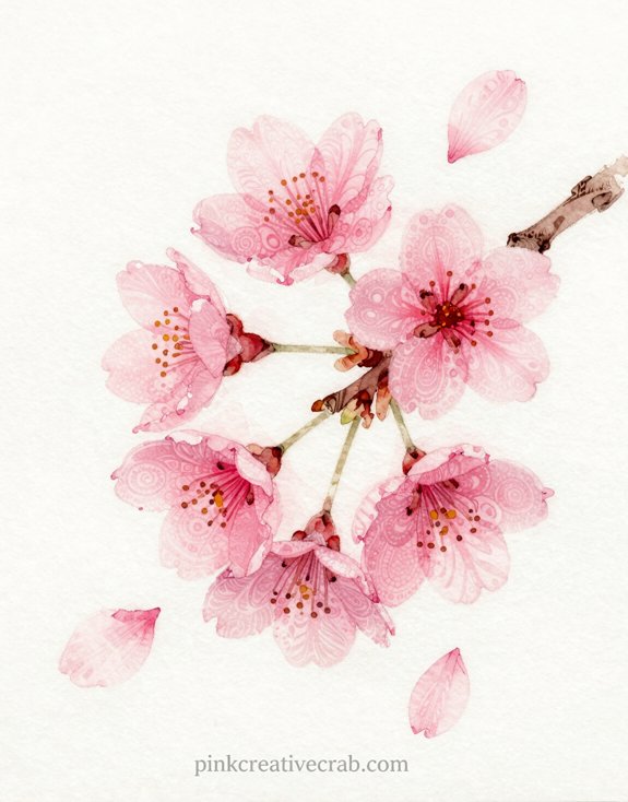
You’ve painted the most gorgeous cherry blossom branch with intricate Zentangle patterns on every tiny petal—and then you stick it in the wrong mat and it just dies (ask me how I know). The frame color surrounding your artwork literally makes or breaks how people SEE your watercolor Zentangle flowers!
Framing Zentangle Flower Art — Mat Color Makes or Breaks the Final Look
Cherry blossoms are TINY, which means you need serious mat breathing room to let those delicate Zentangle petals shine—and trust me, I learned this the hard way when I crammed my first attempt into a narrow white mat that made the whole piece look like a blob from three feet away.
Go WIDE with your mat. Like, 3-4 inches minimum.
And here’s the game-changer: skip white! Try soft gray or even pale blush pink—colors that whisper instead of shout. White creates harsh contrast that drowns out your intricate patterns.
But cream? Chef’s kiss.
Idea #14: Iris with Its Three Falls and Three Standards Each Filled with a Different Tangle on a Deep Purple Wash
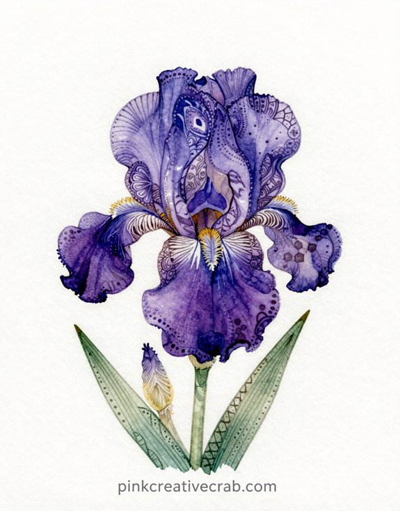
When you tackle an iris, you’re working with nature’s perfect geometry—three elegant falls swooping down, three proud standards reaching up. Each petal becomes its own canvas for experimentation!
Start with a deep purple wash—and I mean DEEP. Let it pool and bloom across your paper. (My first attempt looked like watered-down grape juice. Learn from my mistakes!)
Here’s where it gets exciting: fill each fall with a different tangle. Hollibaugh on one, Printemps on another, Flux on the third. Then switch it up for the standards—Crescent Moon, Tipple, Static.
The contrast? Absolutely stunning.
But here’s the trick—keep your tangles LIGHT. You want them to whisper against that purple background, not scream. Think delicate white gel pen or fine-tip markers.
Idea #15: Zentangle Flower Garden — Full Composition of Zentangle Blooms on a Single Page Watercolor Background
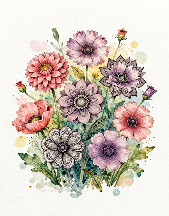
There’s something magical about watching individual flowers transform into an entire garden right on your page. This is where everything you’ve learned comes together—and honestly, my first attempt looked like a chaotic mess!
The secret? Start with your watercolor background FIRST. Blend blues, greens, and purples to create depth. Let it dry completely (I know, waiting is torture).
Then plan your flower placement. Use different sizes—large blooms in front, smaller ones behind. Vary your tangles so each flower stands out. And don’t overcrowd! Leave breathing room.
The result? A complete garden that feels alive and intentional. Each bloom tells its own story while working together as a unified composition. Pure magic!
Which flower feels most natural to fill with patterns to you — something architecturally perfect like a dahlia, or something loose and organic like a poppy?
Picking between geometric dahlias and free-flowing poppies comes down to your natural drawing personality—and trust me, I fought against mine for YEARS before finally giving in.
If you’re naturally precise, dahlias will feel like HEAVEN. Those symmetrical petals practically BEG for repeating patterns. Grid-based designs just fall into place.
But loose sketchers? Poppies are your jam. Those crinkled, imperfect petals hide wonky lines beautifully. (I spent months forcing myself to draw perfect mandalas in roses before realizing my shaky hands were MADE for organic flowers!)
Try both. Seriously—sketch a dahlia outline, then a poppy. Which one makes you exhale with relief instead of holding your breath?
That’s your answer. Stop fighting your natural style and START celebrating it!
Frequently Asked Questions
Can I Use Watercolor Pencils Instead of Liquid Watercolors for Zentangle Flowers?
You’ll achieve stunning results with watercolor pencils for zentangle flowers. They offer precise control for intricate patterns while delivering vibrant blending capabilities. You’re gaining enhanced layering options and portability, making them perfect for innovative artistic exploration and detailed petal work.
How Long Does It Take to Complete One Watercolor Zentangle Flower?
You’ll spend 2-4 hours crafting one flower: sketching the structure, drawing intricate zentangle patterns, applying watercolor layers, and refining details. Your pace depends on pattern complexity, petal count, and your experimentation with color blending techniques.
Do I Need to Let the Watercolor Dry Before Adding Zentangle Patterns?
Yes, you’ll want to let your watercolor dry completely before adding zentangle patterns. Wet paper causes ink to bleed and feather, ruining those crisp, intricate details that make your hidden patterns pop beautifully.
Can Zentangle Flower Paintings Be Framed Behind Glass Without Smudging?
Like sealing a masterpiece in a time capsule, you can frame your zentangle flower paintings behind glass once they’re completely dry. The archival ink won’t smudge, preserving your intricate patterns indefinitely.
What’s the Best Paper Weight for Combining Watercolor and Ink Zentangle Work?
You’ll want 140lb (300gsm) cold-pressed watercolor paper for ideal results. It’s heavy enough to handle wet media without buckling, while the texture provides excellent tooth for your detailed zentangle ink work to grip beautifully.
Have any thoughts?
Share your reaction or leave a quick response — we’d love to hear what you think!
-
 0
0 -
0
-
0
-
0
-
0
-
0


