

Village scenery painting gives you a whole world to explore without ever leaving your table: a hillside of white houses, a market square under striped awnings, a quiet canal with a rowing boat tied up for the afternoon. Gouache suits these little places perfectly, because its flat matte color lets you build a village out of simple shapes, stacked roof by roof, wall by wall, until the page feels like a postcard from somewhere you would love to visit.
Below you will find thirty four villages from around the world, each one sized for a single sitting. Some are coastal, some are mountain towns, some are just a lane with a girl on a bicycle. Work through them in order if you like, starting simple and building confidence, or jump straight to the one that is calling you.
Using these images: free for personal projects such as printing, coloring, cards, journals and gifts. Handmade items that include them may be sold up to 30 pieces per design. More than that is commercial use and is not permitted, and neither is selling or sharing the images themselves or passing them off as your own. Please ask before any other use.
Start a Greek island village the way most village paintings start well: with the shadow shapes, not the houses. Block in a warm grey-blue cast shadow under each cube first, then lay the white walls around it so the white stays crisp and bright rather than muddy.
Stack simple cube shapes up the hillside in gouache, overlapping the lower roofs under the upper walls so the slope reads clearly. Paint the blue doors and shutters last, in one flat sky blue, and leave thin cream gaps between buildings so each house keeps its own edge.
The common mistake is making every house the same size, which flattens the hill. Vary the cube sizes and stagger their heights, and the hillside will tilt convincingly even with no actual perspective lines.
If you do not have a true sky blue, mix ultramarine with a touch of white and a whisper of green; it reads just as fresh against warm white walls.
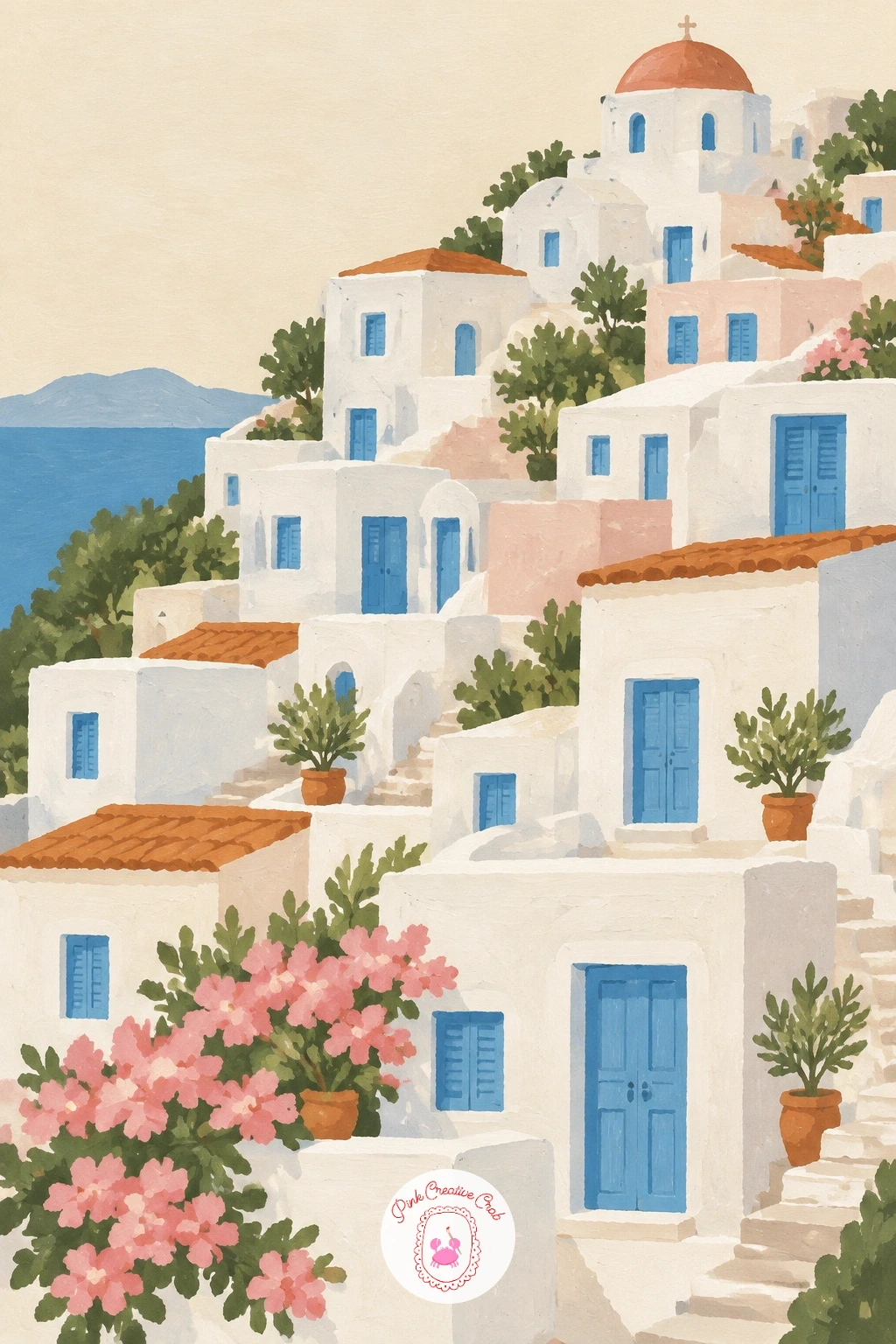
Palette: Titanium White, Cerulean Blue, Payne’s Grey, Olive Green
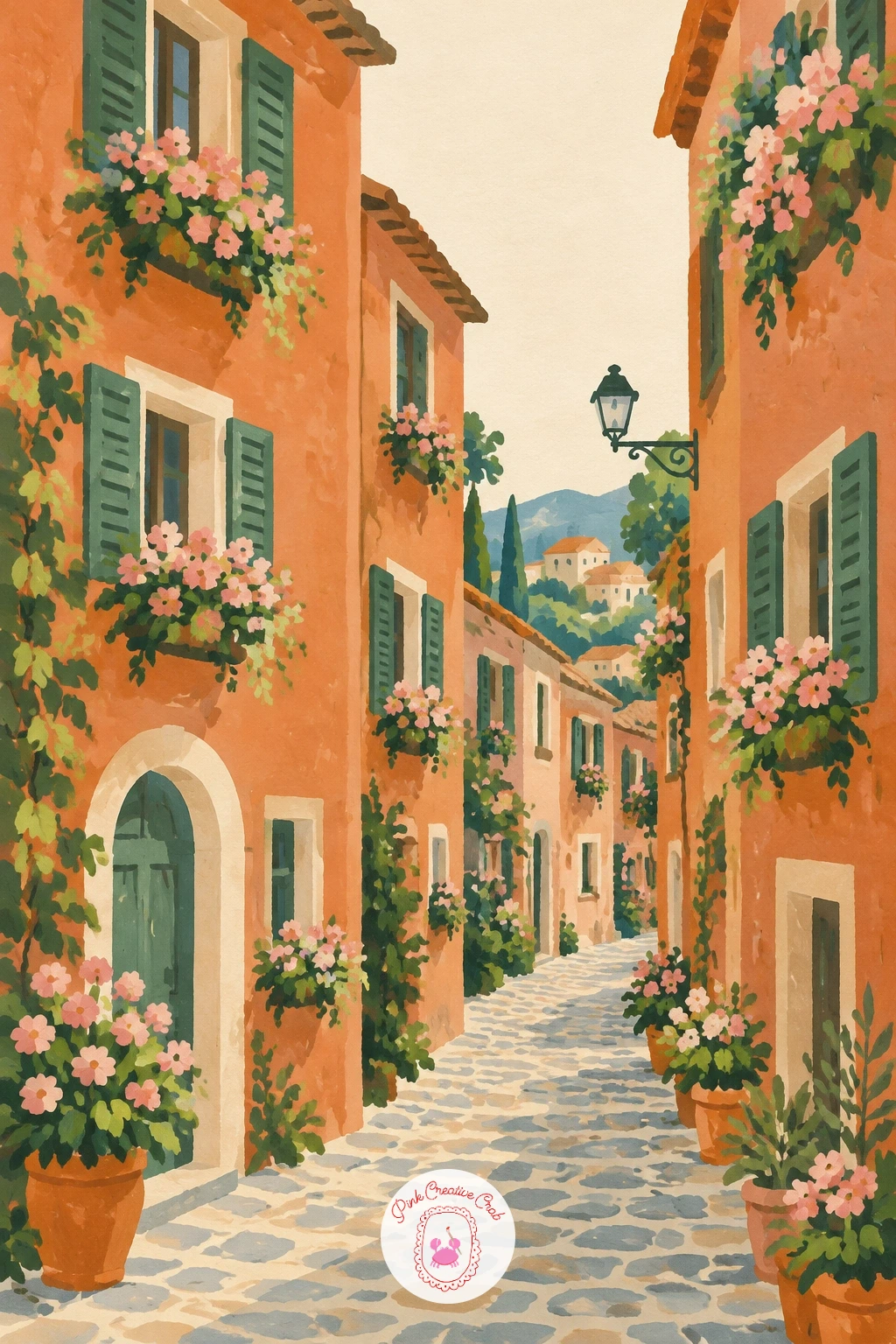
Move from open hillside to a tighter lane with a cobbled village street lined in flower boxes. Paint the street first as a pale terracotta strip running up the page, narrower at the top than the bottom, which is the one trick that makes a flat lane look like it recedes.
Build the buildings as simple rectangles on either side, leaning slightly inward toward the top of the street. Add a flower box under each window in a quick blush pink and olive green before the wall color is fully dry, so the edges soften just enough to feel like real blooms rather than stickers.
Cobbles are easy to overdo. Suggest them with a scatter of small dry-brush dashes only in the foreground, and leave the rest of the street flat, or the whole lane turns busy and loses its calm.
No dry brush on hand: a nearly empty round brush, wiped on scrap paper first, gives the same broken texture.
You Will Need
- dry brush or stiff old brush for cobbles
Palette: Terracotta, Blush Pink, Olive Green, Soft Cream
After a street of flat walls, try a row of honey-stone cottages for a softer, warmer scene with water running through it. Paint the stream as one flat band of pale blue-grey first, then build the cottages along its bank in warm ochre and terracotta.
Work roofs before walls, since a roof painted over a dry wall keeps a cleaner edge than the other way round. Add a stone wall or low hedge along the water’s edge in olive green to anchor the cottages to the bank.
Eye level matters here: keep the stream’s far bank only slightly higher than the near one, and place the horizon low, near the top third of the page, so the cottages feel close and the sky stays generous above the rooftops.
If your cottages look too orange, warm them with a touch of grey rather than more yellow; honey stone leans dusty, not golden.
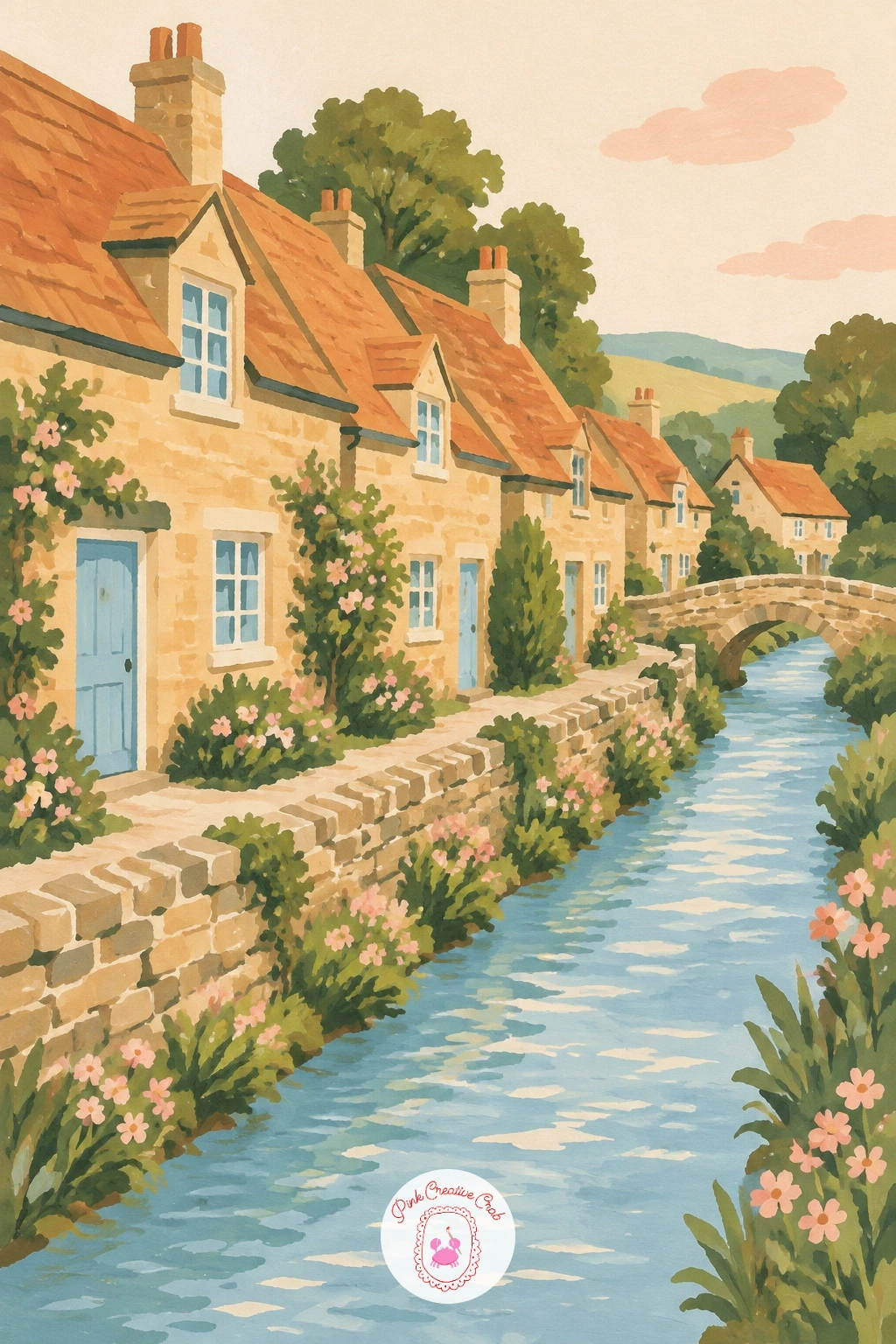
Palette: Yellow Ochre, Terracotta, Pale Blue Grey, Olive Green
Bring the village to the water’s edge with a fishing village wrapped around a small harbor. Paint the harbor water first as a flat curved shape of soft blue, then arrange the colorful houses in a loose arc around it, each one a different flat color: terracotta, blush pink, soft yellow.
Work from back to front: distant houses first, pale and small, then the nearer ones larger and brighter, with a few simple boats floating in the harbor added last on top of the dry water.
Edges tend to go soft and blurry where boat meets water. Keep that edge crisp by painting the boat hull in one confident stroke and letting it slightly overlap the dry water color, rather than trying to paint around a pencil line.
If you want a quicker version, skip the boats altogether and let the houses and their colorful reflections carry the harbor alone.
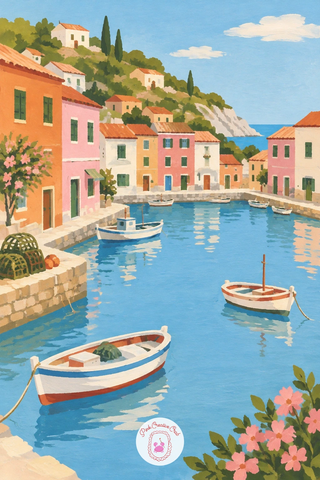
Palette: Terracotta, Blush Pink, Sky Blue, Soft Cream
Look at real harbor photos for how boat colors repeat the house colors above them; it ties the whole scene together without extra work.
Give the village a focal point with a church spire rising above a sea of green treetops. Paint the treetops first as a broad rolling band of olive green, using several slightly different greens so the mass does not read as one flat blob.
Once the trees are dry, add the spire on top: a simple triangle on a narrow rectangle, in pale stone or soft grey, poking up through a gap left in the treeline. Keep the spire narrow and tall, since width is what makes a church tower look squat rather than elegant.
The easy fix when the spire looks lost: outline just its silhouette in a slightly darker grey along one edge, which lifts it forward from the green behind it without needing a full shadow side.
A fast ten-minute version keeps the spire alone above the trees; given forty minutes, tuck a few small rooftops in among the green below it.
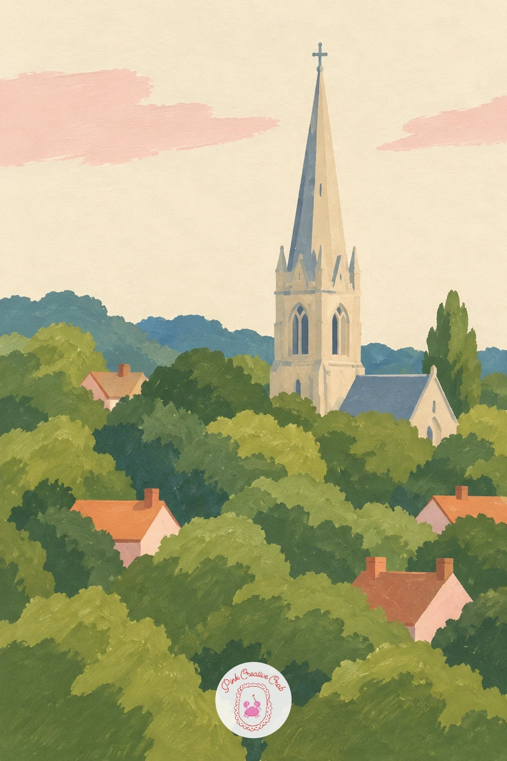
Palette: Olive Green, Sage Green, Stone Grey, Soft Cream
Head uphill for an Alpine village of wooden chalets, where every balcony carries a line of red geraniums. Paint the chalet walls in warm honey brown first, then add the dark wood trim around windows and balconies once that base is fully dry, so the trim stays sharp rather than bleeding.
Geraniums are the detail that sells the whole village, so save them for last: a quick row of small red dots along each balcony rail, painted thickly so they sit forward of the wall color.
A frequent misstep is making the chalets too tall and thin. Alpine houses read as sturdy and broad, with a deep overhanging roofline, so widen the base and let the roof eaves stick out well past the walls.
Working from a photo without a true alpine village nearby: any mountain cabin reference gives you the same deep roof and dark timber trim.
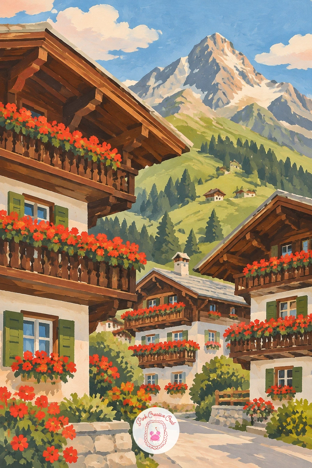
Palette: Honey Brown, Chocolate Brown, Geranium Red, Olive Green
Come down into the village center for a market square full of striped awnings and a stone fountain. Paint the fountain first, right in the middle of the page, as a simple tiered shape in pale stone grey, since everything else in the square will build around it.
Add the stalls around the fountain next, each one a simple rectangle topped by a striped awning in alternating terracotta and cream, angled slightly to show the square has depth rather than lining up flat like a shelf.
Stripes are where confidence matters most: paint them freehand in one quick pass rather than measuring each one, since perfectly even stripes actually look stiffer than slightly uneven ones.
For more atmosphere, scatter a few small standing figures between the stalls, each one just a dot head over a simple coat-shaped body.
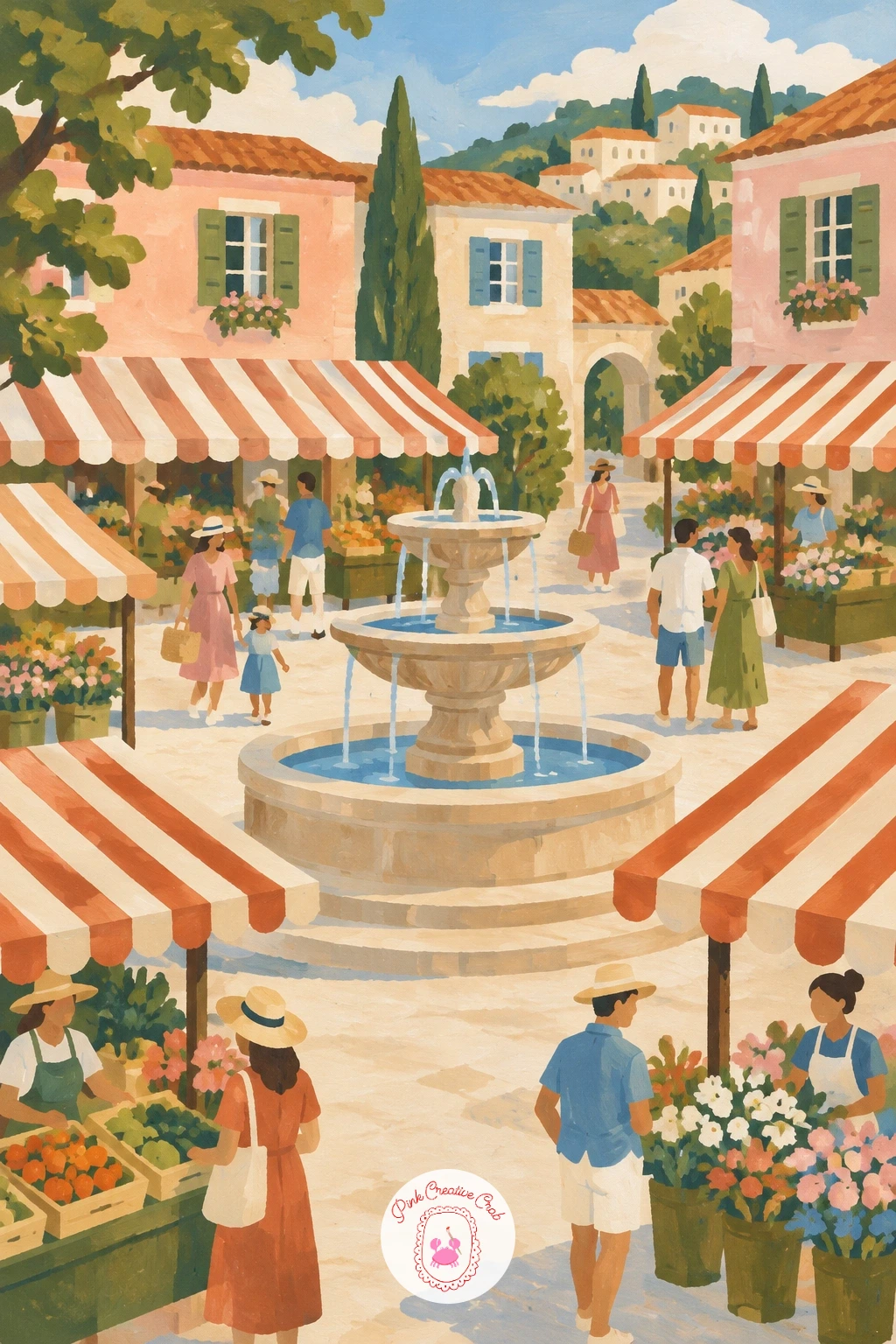
You Will Need
- ruler for the fountain’s straight edges (optional)
Palette: Stone Grey, Terracotta, Soft Cream, Sky Blue
Follow the water to a canal village crossed by a humpback bridge, with a rowing boat passing underneath. Paint the canal as one long flat band first, then the bridge as a simple arch over it, keeping the arch’s curve gentle rather than steep so it reads as a real humpback and not a loop.
Build the houses along both banks after the bridge is dry, smaller as they recede toward the back of the canal, and let one or two reflect faintly in the water in a slightly duller version of their own color.
Getting the reflection wrong is the usual snag: paint it as a soft vertical smear under the house rather than a mirror copy, since gouache reflections read better loose than literal.
If you prefer a different mood, this is a good moment to look at how a river painting handles the same kind of bridge and water for comparison.
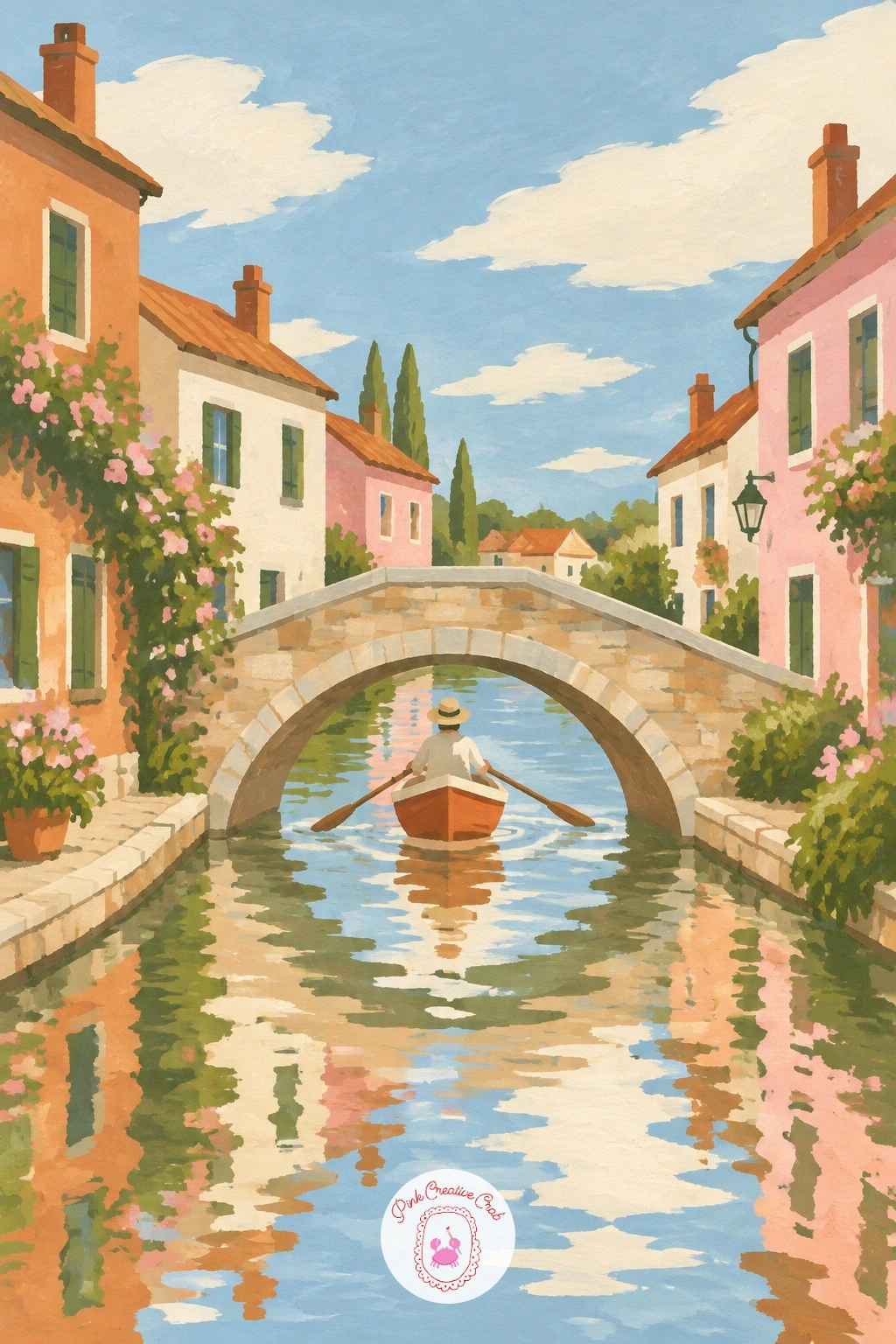
Palette: Sky Blue, Terracotta, Soft Cream, Payne’s Grey
Climb a Tuscan-style hill next, where terracotta roofs cluster among tall dark cypress trees. Paint the hillside first as a simple warm green slope, then place the cypresses as tall thin triangles standing taller than any rooftop, spaced unevenly rather than in a neat row.
Add the houses in clusters, not a single line, with roofs in two or three shades of terracotta so the hillside does not read as one flat orange patch.
Perspective does the work here: put two or three cypresses close and large near the bottom of the page, and a smaller, paler cluster of houses near the top, and the hill will feel like it climbs even without any horizon line drawn in.
No deep green for the cypresses: mix blue into your darkest olive rather than reaching for black, which keeps the trees looking alive rather than burnt.
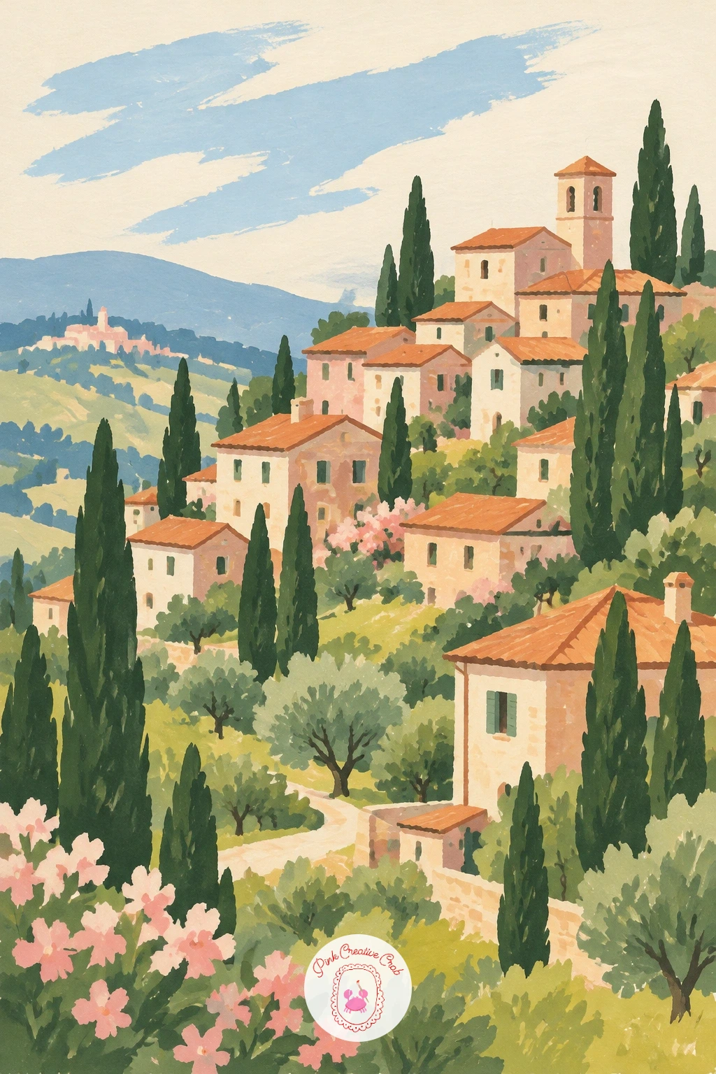
Palette: Terracotta, Dark Cypress Green, Olive Green, Soft Cream
Shift continents for a Japanese mountain village of steep thatched houses set among rice fields. Paint the rice fields first as flat bands of pale green and gold running across the lower page, since their horizontal lines will anchor everything built above them.
The thatched roofs are the character here: paint each one as a tall, steep triangle, much steeper than a typical cottage roof, in warm straw brown, sitting on a simple dark wood base.
Where beginners lose the shape is flattening the roof pitch. Keep it genuinely steep, almost two thirds of the house’s total height, and the silhouette will read as unmistakably this style rather than a generic cottage.
A quick ten-minute version keeps two or three houses in a row; with more time, add a distant tree-covered slope behind them and a few thin vertical lines in the fields to suggest planted rows.
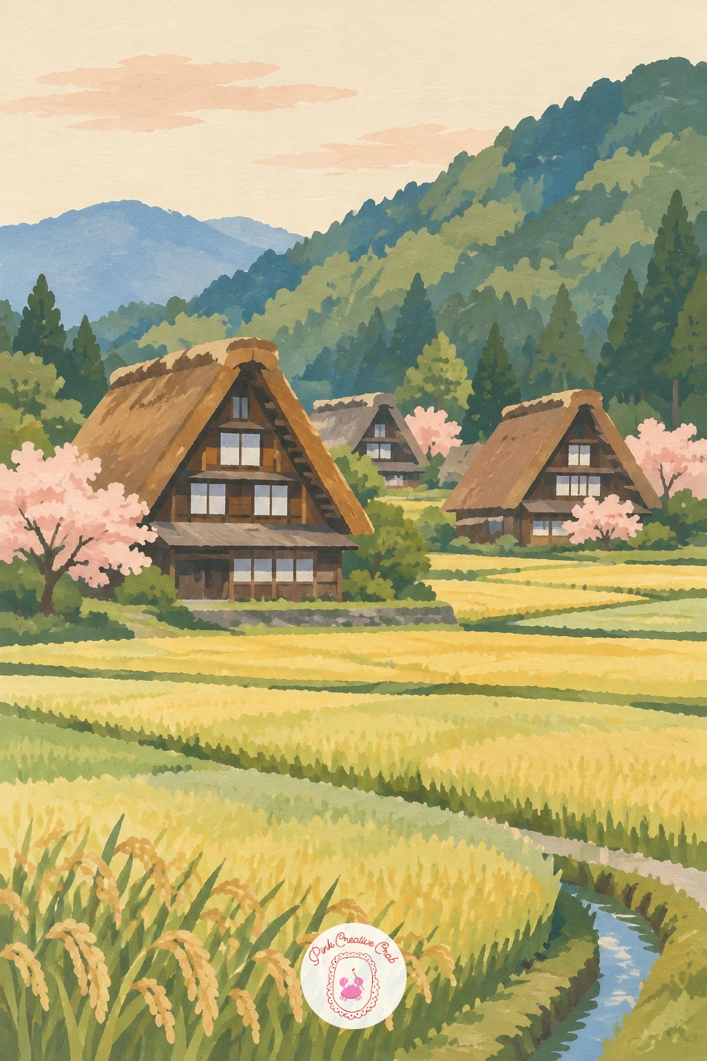
Palette: Straw Brown, Rice Green, Soft Gold, Payne’s Grey
Return to flatter ground for a Dutch village scene built around a windmill beside a canal. Paint the canal as a wide flat band of pale blue first, then place the windmill on its bank as a simple cone body topped by four thin sails, crossed in an X rather than drawn as a plus sign, which reads far more convincingly as motion.
Add a cluster of small brick houses to one side of the windmill, keeping them low so the windmill stays the tallest shape and the clear star of the page.
Sail blades are the fiddly part. Paint them as four long thin triangles meeting at a center point, and if one comes out uneven, a thin outline in a darker tone over the top straightens it without a full repaint.
Working without a fine liner brush for the thin sails: the pointed tip of a small round brush, loaded well and barely touching the paper, gives the same clean line.
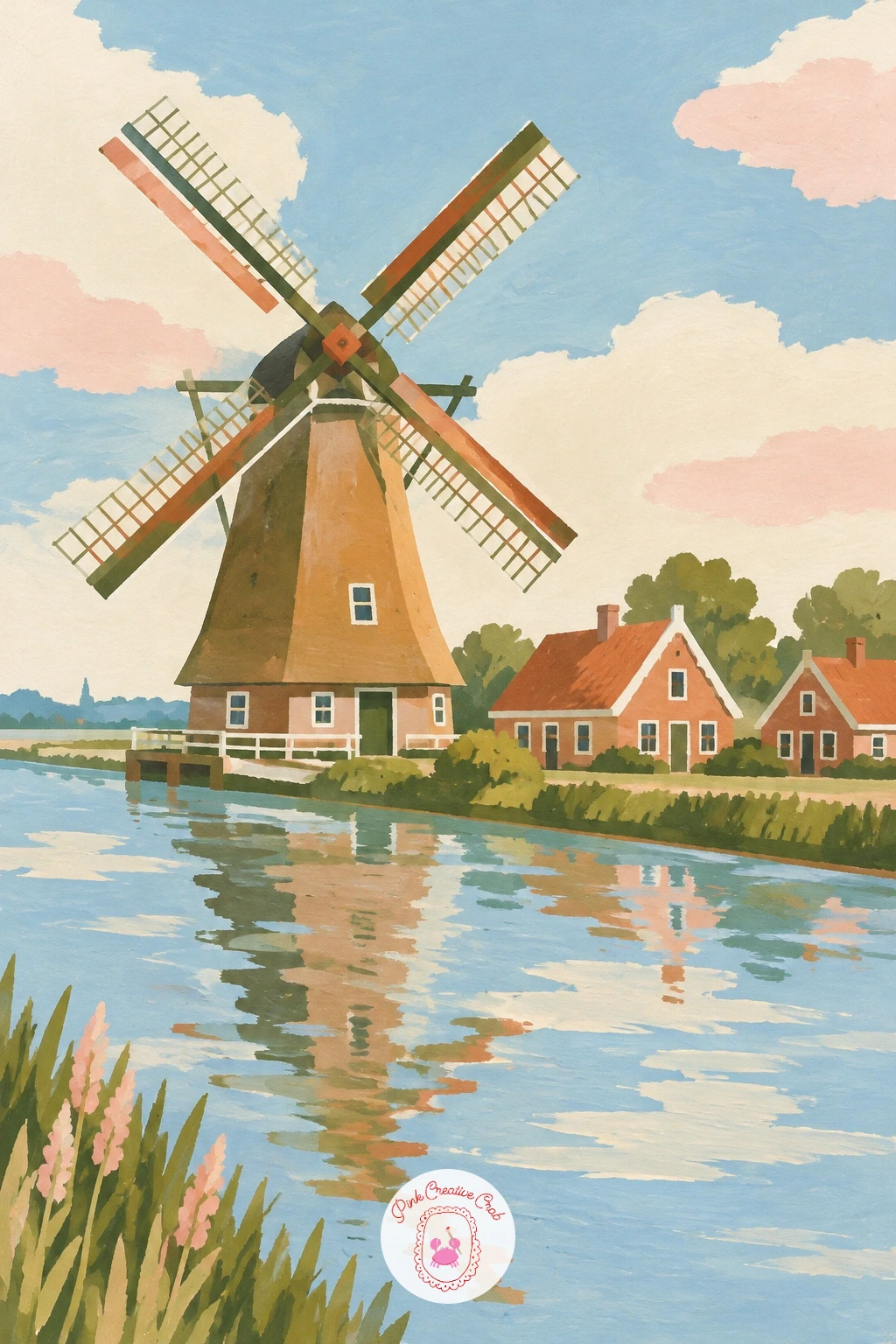
Palette: Sky Blue, Brick Red, Soft Cream, Olive Green
Bring a figure into the scene with a village lane and a girl riding a bicycle, flowers spilling from the basket. Paint the lane and the simple cottage walls behind her first, then add the bicycle and figure last, on top of the dry background, so her outline stays crisp against it.
Keep the figure simple: an oval head, a triangle for the dress or coat, two thin curved lines for the bicycle frame. The flowers in the basket are just a cluster of small color dabs in blush pink and olive, no individual petals needed.
Proportion check before you commit to paint: the bicycle wheels should sit at roughly the same height as the bottom third of the cottage doors beside her, which keeps her from looking oversized or like a toy against the buildings.
If figures intimidate you, this scene also works beautifully as the sort of charming detail explored in whimsical painting ideas, where small simplified characters carry a lot of charm.
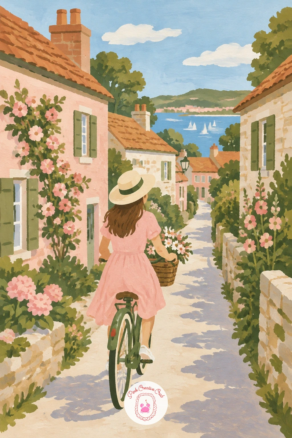
Palette: Terracotta, Blush Pink, Olive Green, Soft Cream
Head to the coast for a Cornish seaside village, its lane dropping steeply down to the water. Paint the sea first as a flat band across the very top of the page, then build the lane as a diagonal strip running down from it, widest at the bottom of the page where it is closest to you.
Stack small whitewashed cottages along both sides of that diagonal lane, slightly smaller as they climb toward the sea, which does most of the work of making the hill feel steep.
The edges trip people up here, since cottages on a slope can end up looking like they are sliding. Keep every roofline and doorway strictly horizontal even though the lane itself runs on a diagonal, and the houses will sit firmly despite the steep ground.
Swap white gouache for a very pale warm grey on the cottage walls if pure white feels too stark against a cream background.
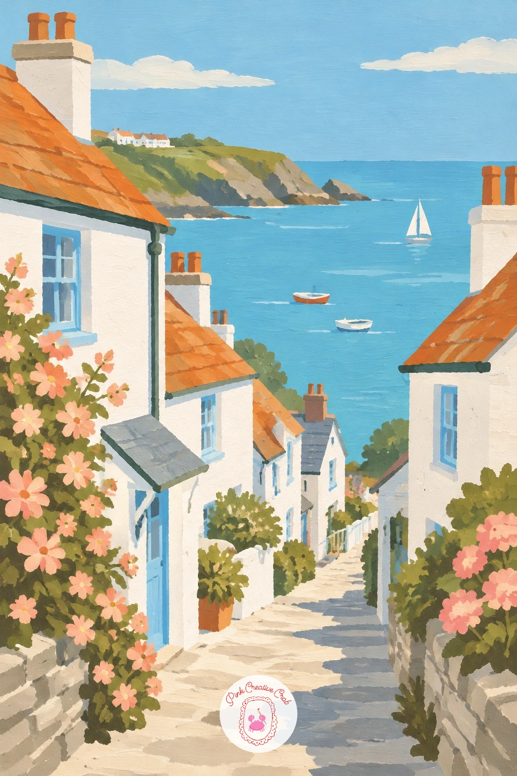
Palette: Sky Blue, Soft Cream, Stone Grey, Terracotta
Settle into the shade of plane trees for a Provence village square, where old men play boules under dappled light. Paint the ground first as a flat warm sandy color, then add the plane trees as simple rounded canopies on thin trunks, overlapping to cast a cool shadow across part of the square.
Place the boules players last, in a small cluster near the center: two or three simple figures bent slightly forward, a scatter of small round dots nearby standing in for the boules themselves.
Light direction decides the whole mood here. Keep the shadow side of the square cooler and slightly blue-grey, and the sunlit side warm and cream, and the square will feel like real afternoon light rather than flat daylight.
A faster version skips the figures and keeps just the trees and fountain-dotted square; the full forty-minute version adds a distant row of shuttered houses behind the trees.
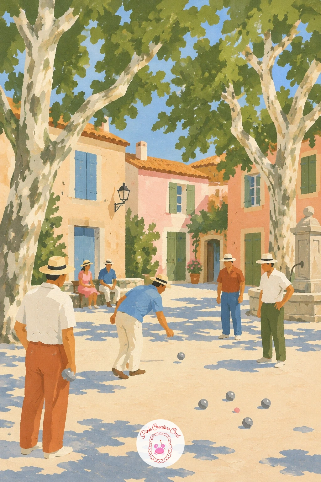
Palette: Sandy Cream, Olive Green, Payne’s Grey, Terracotta
Climb further for a Moroccan mountain village built entirely of earth-colored houses stacked up a dry hillside. Paint the hillside first in warm sandy ochre, then build the houses as simple flat-roofed cubes in a slightly deeper terracotta, stacked tightly together so their walls nearly touch, the way real hillside villages pack in.
Keep rooftops flat rather than peaked, which is the detail that marks this village apart from an Alpine or Italian one, and add a few small dark window squares scattered irregularly rather than lined up in neat rows.
The hillside can look muddy if every building is the same shade. Vary each cube between warm ochre, terracotta and a dusty pink, and the stack will separate into distinct houses instead of one block.
If strong contrast feels risky, keep the whole palette close in tone and let the small dark windows provide the only real punctuation.
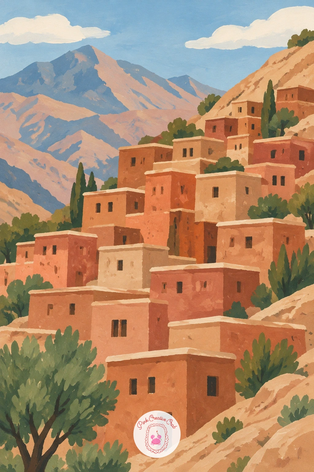
Palette: Sandy Ochre, Terracotta, Dusty Pink, Payne’s Grey
Soften the mood with a village pond ringed by thatched cottages and a small family of ducks. Paint the pond first as a flat oval of pale blue-green, then build two or three thatched cottages around its edge, their steep straw roofs sitting low over honey-colored walls.
Add the ducks last, right on the water’s surface: each one just a simple curved body shape with a small raised head, painted in two or three quick strokes rather than labored over.
Reflections are the natural trap on a still pond. Rather than painting a full mirror image, drag a thin, slightly paler smear of each cottage color straight down into the water, which reads as a reflection without doubling your workload.
Swap the ducks for a single swan if you want a calmer focal point; one larger shape reads just as clearly as a cluster of small ones.
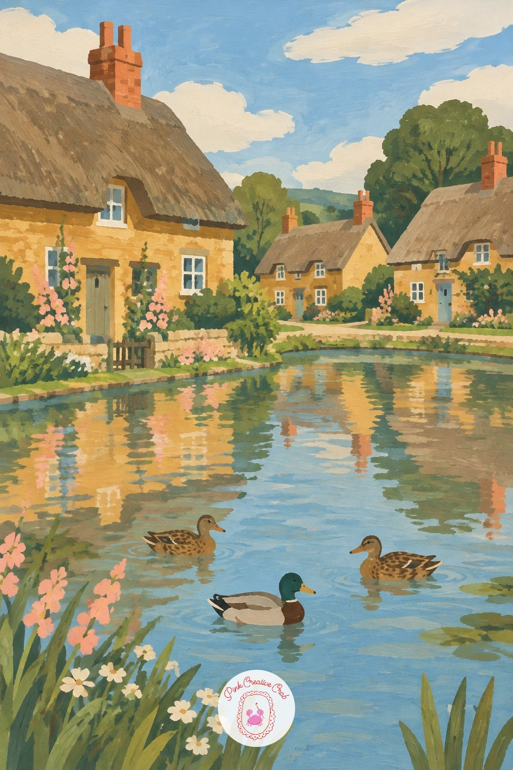
Palette: Pale Green Blue, Straw Brown, Honey Brown, Soft Cream
Raise the village off the ground with a wooden stilt village standing over a calm river. Paint the river first as one flat band, then the stilts as a row of thin dark verticals rising out of the water, slightly irregular in spacing so they feel hand built rather than ruled.
Build the houses on top of the stilts after they are dry, each one a simple box with a steep or gently sloped roof, connected by a thin raised walkway running between a few of them.
The stilts are the part most likely to go wrong, usually by looking too thick or too evenly spaced. Keep them genuinely thin, no wider than a pencil line in gouache, and vary the gaps slightly so the row feels natural.
A quicker version paints only two or three houses close together; given more time, add a small boat tied beneath the walkway and a few faint ripples around the stilts.
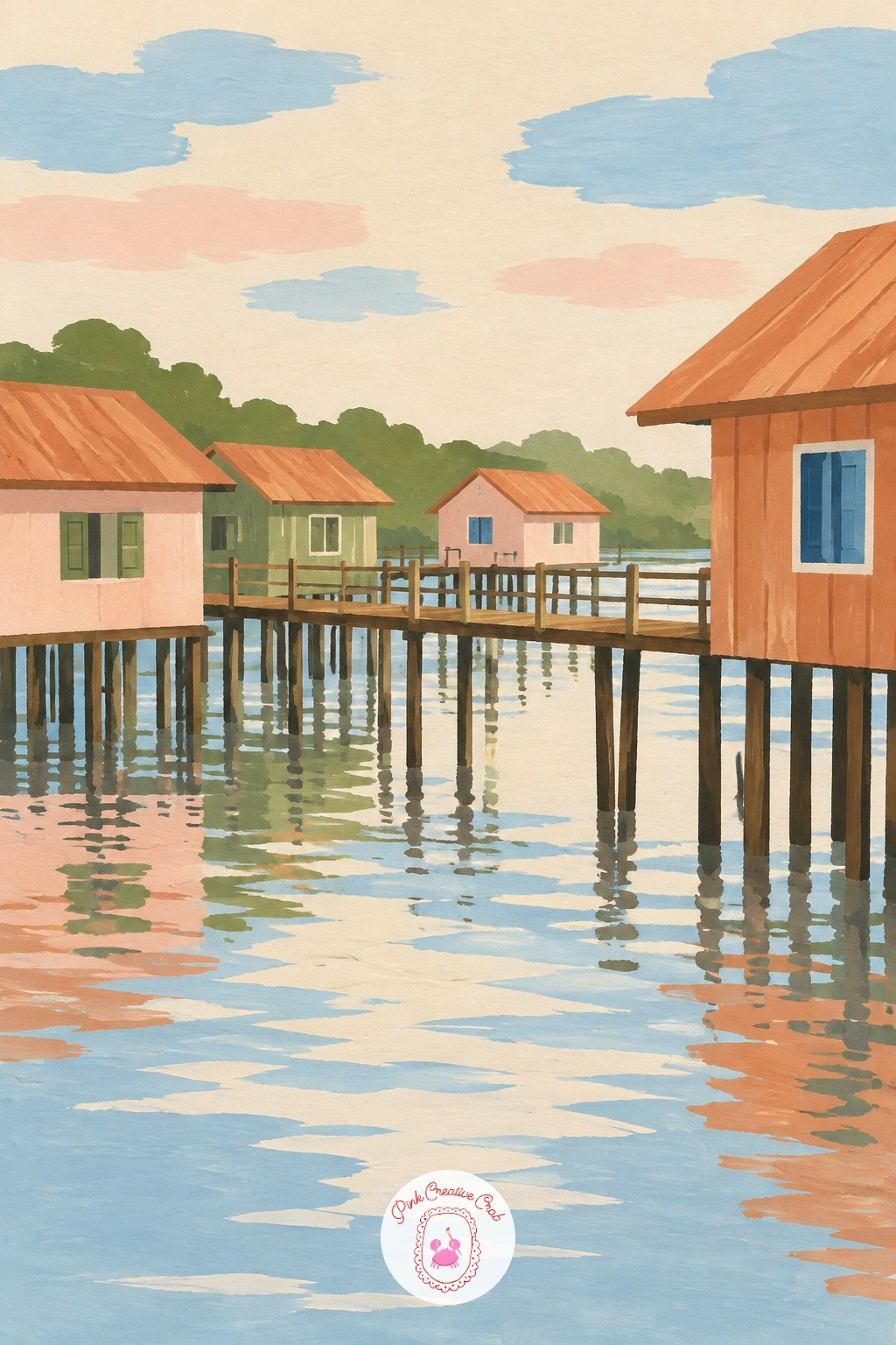
Palette: Sky Blue, Dark Timber Brown, Terracotta, Soft Cream
Move north for a Norwegian village of red wooden houses standing at the edge of a fjord. Paint the fjord water first as a long flat band of cool deep blue, then the steep hillsides rising behind the village in muted olive and grey-green, since that backdrop sets the whole mood before a single house goes in.
Add the red wooden houses along the shoreline last, each a simple rectangle with a steep dark roof, their red standing out sharply against the cool blues and greens around them.
That contrast is the whole point of this scene, so resist softening the red. Keep it bold and saturated against the muted hillside, and the village will glow the way it should rather than blending in.
No true fjord red on hand: mix a warm cadmium-leaning red rather than a cool crimson, since the warmth is what makes it pop against cold blues.
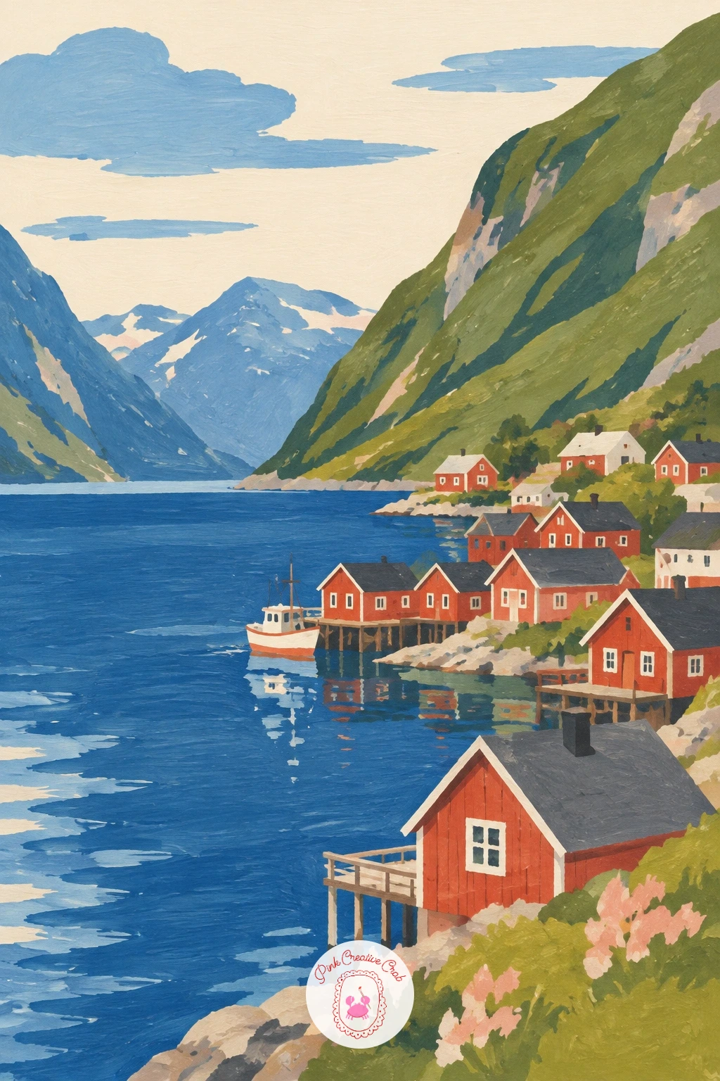
Palette: Fjord Blue, Olive Green, Fjord Red, Payne’s Grey
Lighten the mood with an English village green hosting a small cricket match beside a white pavilion. Paint the green itself first as one broad flat stretch of olive, then the white pavilion as a simple pitched-roof rectangle set along one edge, its roof in a soft contrasting tone so it does not vanish into the cream sky.
Add a handful of tiny figures scattered across the green last: simple standing shapes in pale cricket whites, no more than four or five, since a crowded green loses its calm quickly.
Figures this small live or die on proportion. Keep every one roughly the same height and standing on the same implied ground line, or the green will tilt oddly even though nothing else moved.
For a simpler read, drop the match entirely and paint just the pavilion and a few trees at the green’s edge; it still carries the same quiet charm.
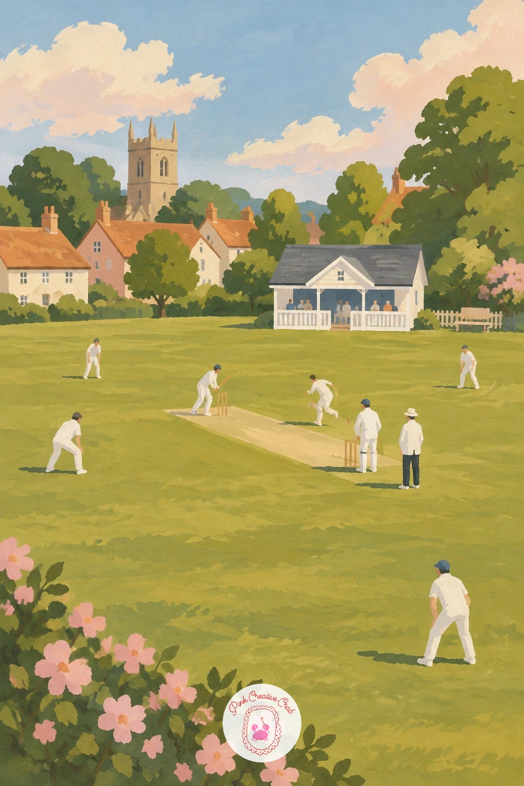
Palette: Olive Green, Soft White, Stone Grey, Terracotta
Narrow the view right down for a laundry line strung across a tight village alley between two walls. Paint the two facing walls first, warm on one side and slightly cooler on the other so the alley reads as having depth even though it is barely wider than a doorway.
Add the laundry line last as one thin sagging curve strung between the walls, with three or four simple flat garment shapes hanging from it in blush pink, cream and soft blue.
The line itself often ends up too straight, which flattens the whole alley. Give it a gentle sag in the middle, the way real washing lines droop under weight, and the depth snaps into place.
If pure white sheets feel too flat and stark, tint one garment pale blue-grey instead, which also helps separate the shapes from the cream wall behind them.
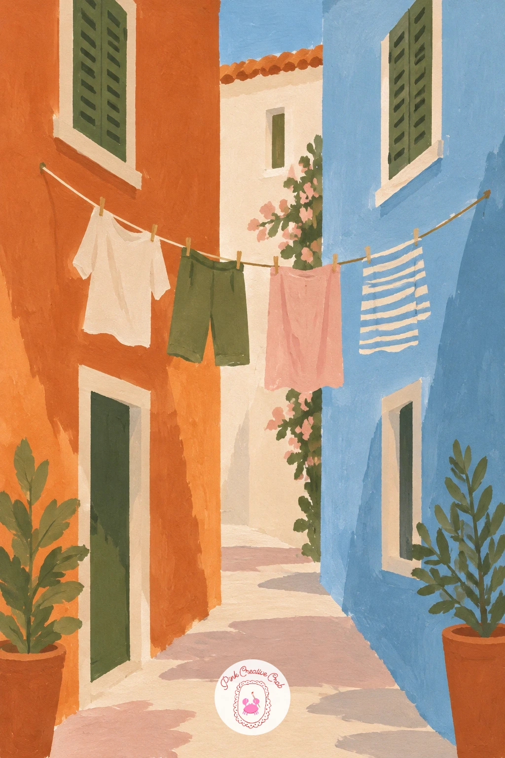
Palette: Terracotta, Stone Grey, Blush Pink, Sky Blue
Step up to a tiny village shopfront, its door flanked by crates of fruit set out on the step. Paint the shopfront wall first as one flat color, then the door and window frame in a contrasting tone, keeping the whole front simple since the crates are the real subject here.
Build the fruit crates last, each one a simple stacked rectangle holding a cluster of small round dabs in two or three colors: terracotta oranges, blush pink apples, olive-toned limes.
Painting individual pieces of fruit slows this down fast. Work each crate as one loose mass of color dabbed quickly rather than piece by piece, and the crates will read as full and fresh without the fuss.
Keep the storefront free of any signage or lettering, letting the awning color and the fruit itself say “shop” without a single word on the page.
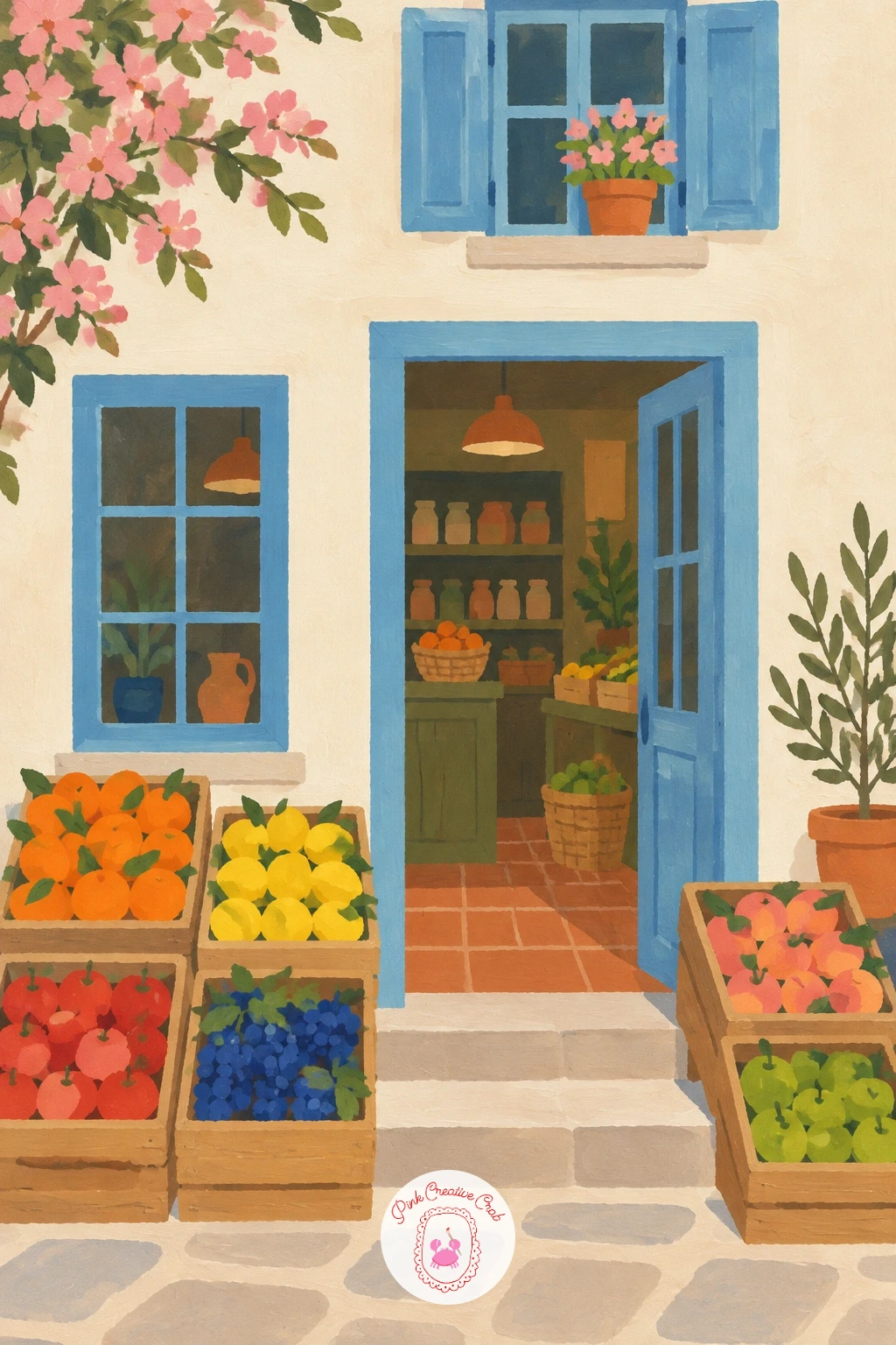
Palette: Terracotta, Blush Pink, Olive Green, Soft Cream
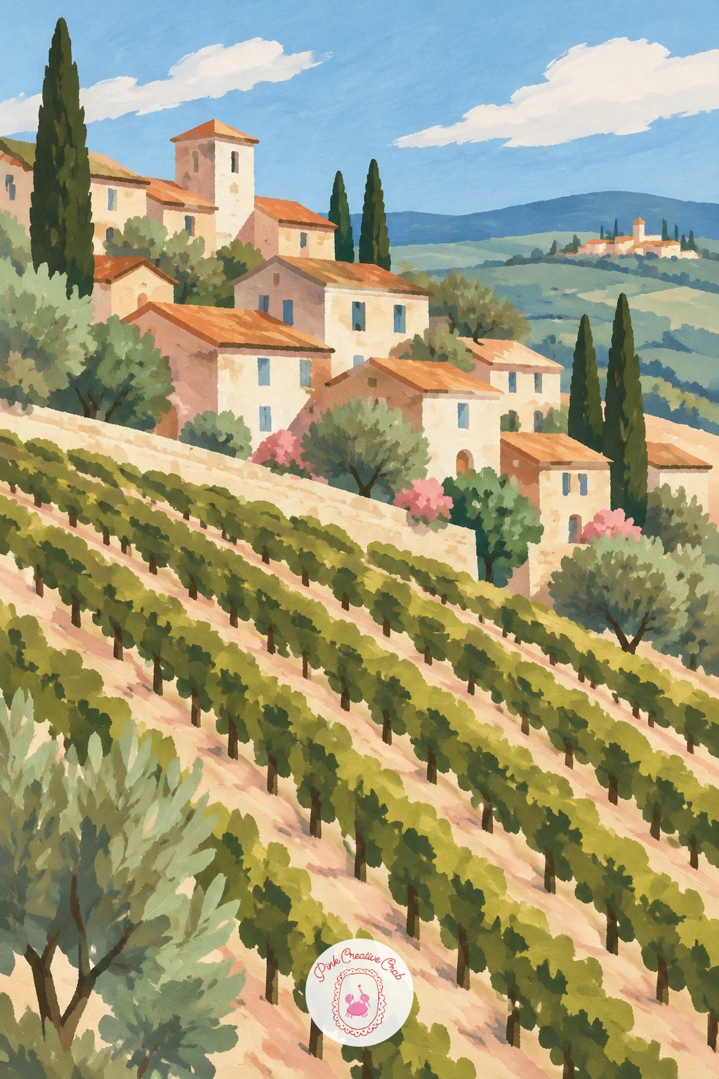
Open the view wide for a vineyard village, its stone houses set among neat rows climbing a sunny slope. Paint the vineyard rows first as repeating diagonal stripes of olive and warm green, slightly closer together near the top of the page to suggest the slope rising away from you.
Add the stone houses in a small cluster partway up the hill, their walls a pale warm grey against the green rows, with just one or two deeper green cypress accents nearby for height.
The rows are the trickiest part to keep convincing. Paint them with a slightly drier brush so each stripe breaks a little rather than sitting as one smooth flat band, which reads far more like planted vines.
If stripes feel fussy to repeat evenly, loosen your grip and let a few rows wobble; a vineyard on a real hillside is never perfectly straight either.
You Will Need
- dry brush or stiff old brush for the vine rows
Palette: Olive Green, Warm Green, Stone Grey, Terracotta
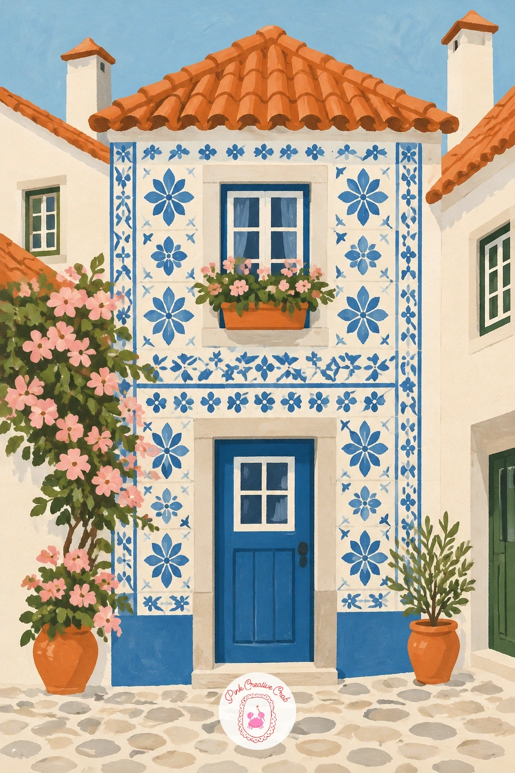
Shift to a Portuguese village where whole house fronts seem patterned in blue and white tile. Paint each house wall first as a flat white or cream base, then add the tile pattern on top once dry, using a small brush to dab simple repeating blue motifs rather than painting every tile as a separate square.
Keep the pattern loose and suggestive on most of the wall, with only a small section rendered in crisp, clear tiles near eye level, which is where the viewer’s attention naturally lands first.
Overworking every wall with full tile detail is the easiest way to exhaust yourself and flatten the scene. Pick one or two houses to carry the pattern fully and let the rest stay plain cream or pale blue.
A fine liner brush or even the tip of a cotton swab dipped in blue can stand in for a detail brush if yours has lost its point.
You Will Need
- fine detail brush for the tile pattern
Palette: Sky Blue, Soft White, Payne’s Grey, Terracotta
Turn up the color for a Mexican village street lined in pink, yellow and turquoise houses standing shoulder to shoulder. Paint each house front as one bold flat color block, choosing a different hue for every building so the row reads as a cheerful sequence rather than a repeated pattern.
Add simple dark window and door shapes once each wall color is dry, and a thin strip of shadow along one side of the street to show where the sun is falling from.
The street can tip into chaos if every color fights for attention equally. Let one house, maybe the turquoise one, sit a shade brighter than the rest, and the eye will have somewhere to land first before taking in the whole row.
If you only have primary colors, mix your own turquoise from blue and a touch of green rather than buying a new tube; it keeps the palette consistent with everything else on the page.
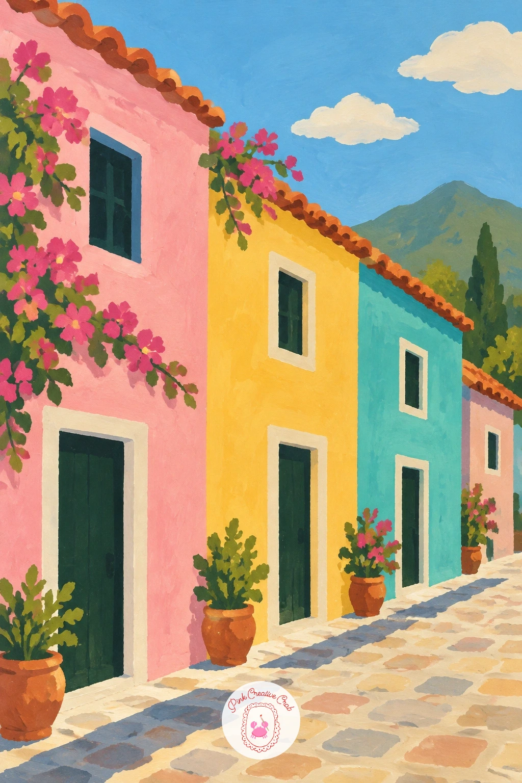
Palette: Hot Pink, Sunny Yellow, Turquoise, Terracotta
Settle by calmer water for a lakeside village, its wooden boathouses standing right at the waterline. Paint the lake first as a broad flat band, then the boathouses along its edge as simple box shapes with small sloped roofs, their lower walls meeting the water directly with no visible shore between them.
Add a thin paler reflection beneath each boathouse once the water is dry, and a distant tree-covered hill behind the row to close off the background.
Boathouses sitting flush on water are easy to get wrong by leaving a gap of shoreline underneath, which breaks the illusion. Paint the water right up to the base of each structure in one continuous stroke so they look genuinely built over the lake.
Swap a bright blue lake for a softer grey-green if you want a more overcast, quiet mood instead of a sunny one.
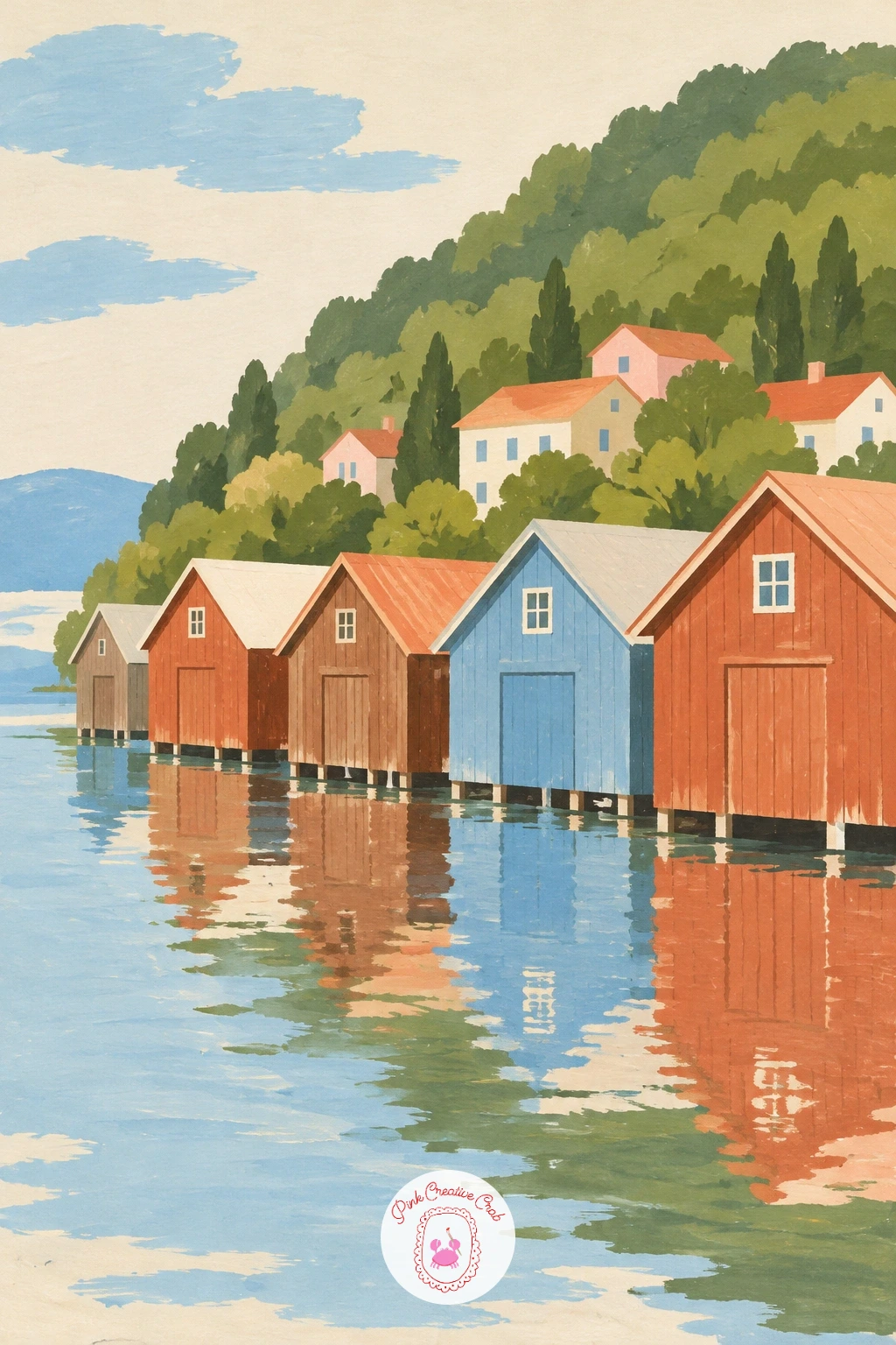
Palette: Sky Blue, Dark Timber Brown, Olive Green, Soft Cream
Crown the village with a hilltop castle ruin, its broken towers rising above a cluster of small houses. Paint the hill first as one rounded flat shape, then place the ruin at its very top: a simple crumbled wall and one or two uneven towers, their tops jagged rather than neatly pointed to show age.
Build the houses in a smaller cluster lower down the hillside after the ruin is dry, keeping them pale and modest so the ruin stays the clear focal point above them.
A common slip is making the ruin look too tidy and symmetrical, which reads as a toy castle rather than a real one. Break one tower shorter than the other and leave a gap in the wall, and the age shows immediately.
No warm grey for old stone on hand: mix a little yellow ochre into your grey rather than leaving it cool, which keeps ancient stone feeling sun-warmed rather than damp.
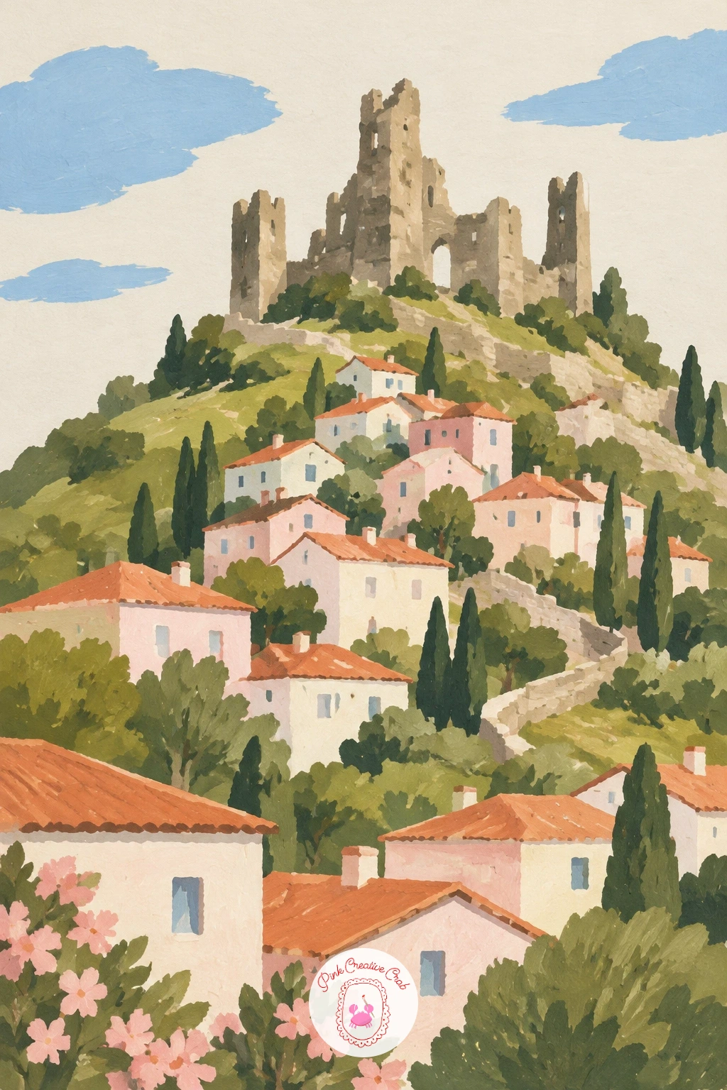
Palette: Stone Grey, Yellow Ochre, Olive Green, Soft Cream
Step into a village orchard next, enclosed by a low stone wall with a donkey grazing quietly inside. Paint the stone wall first as a simple low band running across the lower page, then add two or three fruit trees behind it as rounded green canopies on short trunks, each canopy dotted lightly with small fruit in terracotta or blush pink.
Add the donkey last, standing or grazing with its head lowered: a simple rounded body, four short legs, two long upright ears that make the shape unmistakable even at this small size.
Getting the donkey’s proportions wrong is the easiest way to lose the charm. Keep the body roughly the same length as its leg height, and make the ears clearly longer than a horse’s, which is what reads as donkey rather than pony.
If animals feel daunting, a sleeping or seated donkey is far more forgiving to paint than a standing one, since you can skip the legs almost entirely.
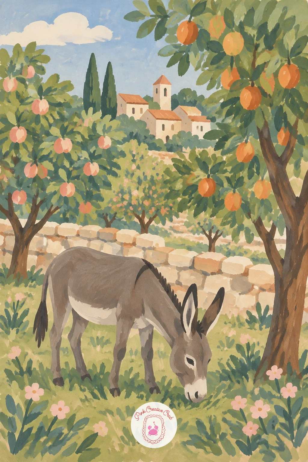
Palette: Olive Green, Stone Grey, Terracotta, Soft Cream
Return to the street for a row of pastel painted cottages lining an Irish village lane. Paint each cottage front in a different soft pastel, blush pink beside pale sky blue beside a soft buttery yellow, keeping every wall perfectly flat so the row reads as a clean, cheerful sequence.
Add simple dark doors and small square windows once the walls are dry, and a scatter of hanging baskets or window boxes in olive green along a few of the fronts to soften the straight lines.
Pastel rows can look washed out if nothing anchors them. Keep the doors and window frames in a genuinely dark tone, nearly black-brown, which gives the soft colors something firm to push against.
For a scene with a related mood but a different kind of charm, the shopfronts in village drawing ideas take a similar row of buildings in a looser pencil and marker style worth comparing.
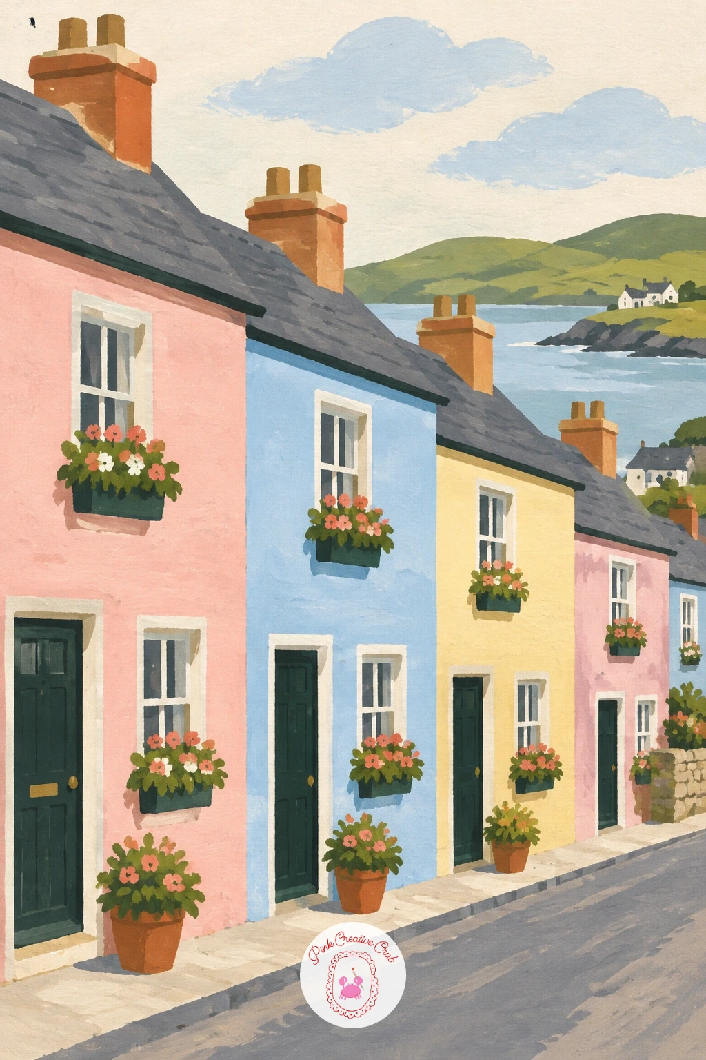
Palette: Blush Pink, Pale Sky Blue, Buttery Yellow, Dark Brown
Head into a Swedish village next, its yellow and red cottages standing at the edge of a birch grove. Paint the cottages first in two simple flat colors, warm mustard yellow and deep barn red, then add the birch trunks behind them as tall thin white verticals with small dark horizontal dashes, which is the quickest way to make a trunk read instantly as birch.
Keep the birch canopy light and loose, a pale green haze rather than a solid mass, so the white trunks stay the clear feature against it.
The dark dashes on birch trunks are easy to overdo into stripes. Space them unevenly and keep most trunks mostly plain white, adding just a few marks per tree, and they will look natural rather than patterned.
A faster version keeps just two or three birches behind one cottage; with more time, let the grove run the full width of the page behind a small cluster of houses.
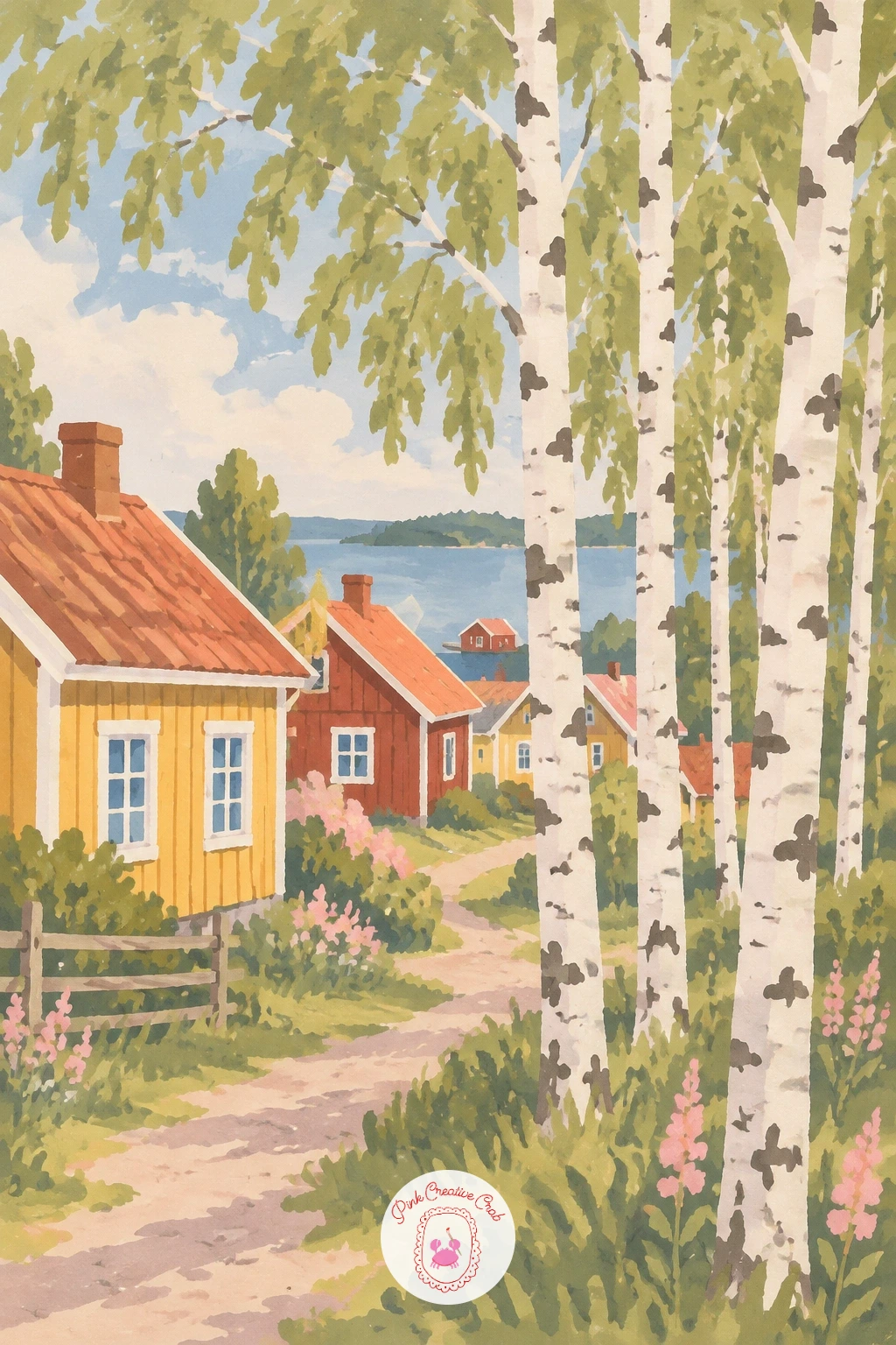
Palette: Mustard Yellow, Barn Red, Birch White, Pale Green
Bring the scene down to a single courtyard for a village well, where a woman draws water with a simple figure and bucket. Paint the courtyard walls first as flat warm stone, then the well itself as a simple round stone base with a small peaked roof over it, centered in the space.
Add the figure last, standing beside the well with one arm raised toward the rope or handle: an oval head, a simple dress shape, no detailed hands needed since a small gesture of the arm tells the whole story.
The well’s roof often ends up too large for its base, making the whole thing look top-heavy. Keep the roof modest, no wider than the stone base below it, and the structure will balance properly.
If a standing figure feels too ambitious today, a seated figure resting beside the well, bucket already filled, tells the same quiet story with far simpler shapes.
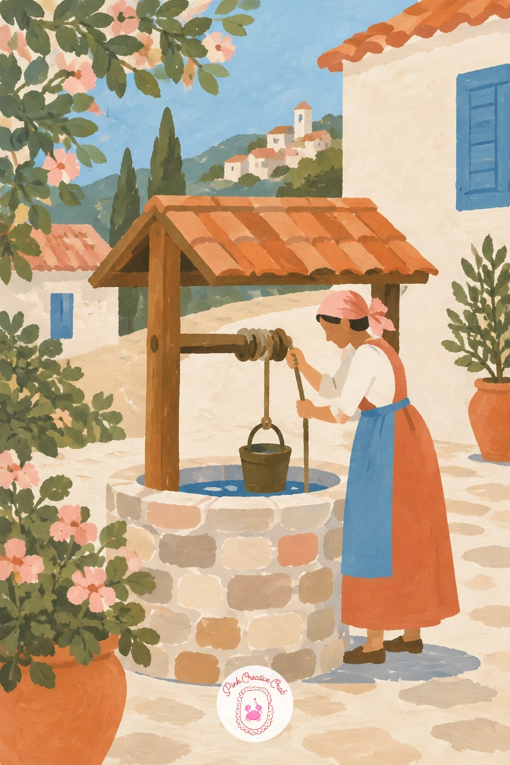
Palette: Stone Grey, Terracotta, Blush Pink, Soft Cream
Cross back over water for a village bridge, a small line of geese waddling over it. Paint the river first as a flat band beneath the bridge, then the bridge itself as a simple arched stone shape spanning it, keeping the arch’s curve smooth and unbroken for a clean, confident silhouette.
Add the geese last, walking in a loose single file across the bridge: each one just a rounded body, a curved neck, and a small triangle beak, varied slightly in pose so they do not look stamped from one shape.
Lining the geese up too perfectly evenly is the usual tell. Space them a little unevenly, with one straggler slightly behind the rest, and the crossing feels alive rather than mechanical.
For a scene that leans more on the bridge itself as the main subject, the structures explored in acrylic bridge painting ideas offer useful comparison even working in a different medium.
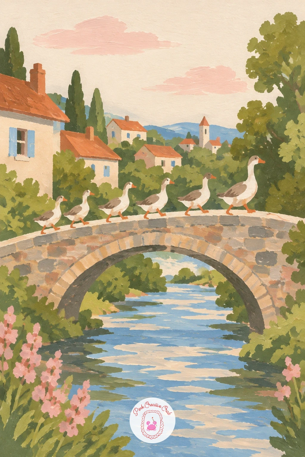
Palette: Stone Grey, Sky Blue, Soft White, Terracotta
Travel to a Chinese water town next, its white walls and black roofs doubled by arched bridges over quiet canals. Paint the canal first as a flat pale band, then the white house walls along both sides, keeping them genuinely plain and unpatterned so the black roof trim can carry all the detail.
Add the black tiled roofs on top once the walls are dry, each one a simple gently curved line rather than a straight roof edge, which is the detail that marks this style apart from a European roofline.
Finish with one or two arched stone bridges connecting the banks, their curve echoed by a soft pale reflection in the water below.
The curved roofline is easy to flatten by accident. Lift the brush slightly at each end of the roof stroke so it tips upward at the corners, the signature shape that reads instantly as this architecture.
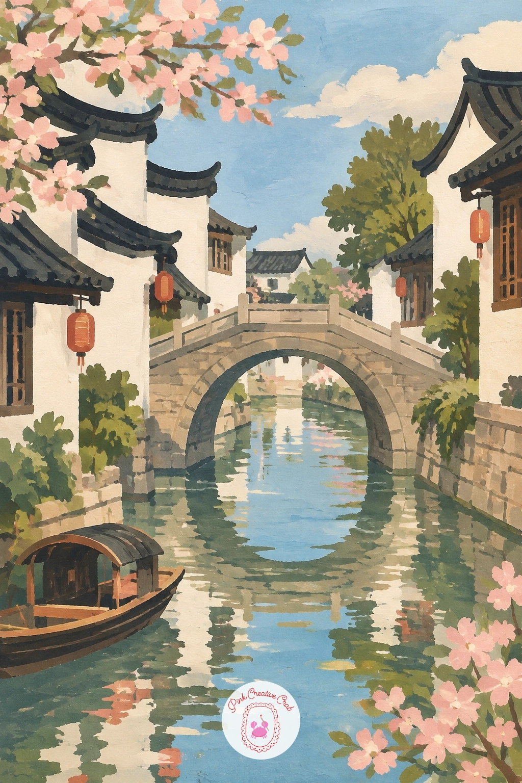
Palette: Soft White, Charcoal Black, Sky Blue, Stone Grey
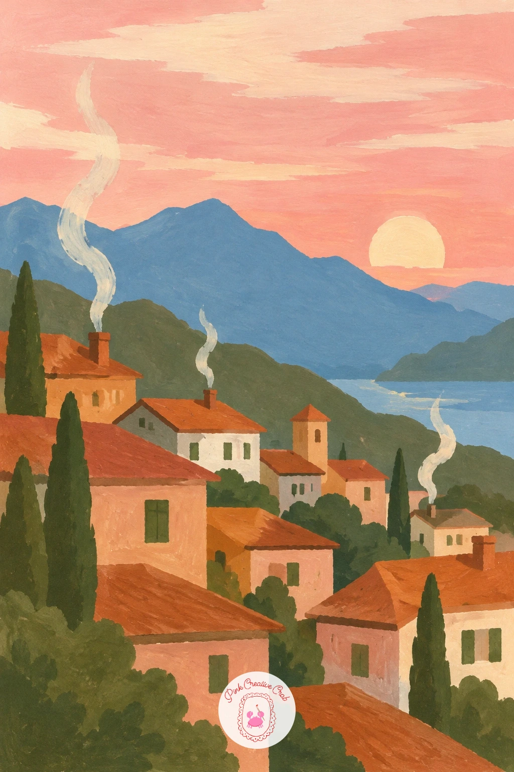
Warm the whole page for a mountain village at sunset, thin smoke curling from every chimney. Paint the sky first as a soft gradient of blush pink into warm cream, letting the two colors blend slightly while still wet along their border for a gentle, glowing transition.
Add the mountain silhouette and village rooftops on top once the sky is dry, keeping both shapes dark and flat against the glowing sky so they read clearly as silhouette rather than detailed form.
Finish with a few thin curling lines of pale grey smoke rising from two or three chimneys, painted loosely rather than as neat corkscrews, which keeps them looking like real smoke drifting in evening air.
If blending a smooth sunset gradient feels tricky, work the sky wet into wet on damp paper, letting the pink and cream merge on their own rather than fighting them into a perfect line.
Palette: Blush Pink, Soft Cream, Charcoal Grey, Payne’s Grey
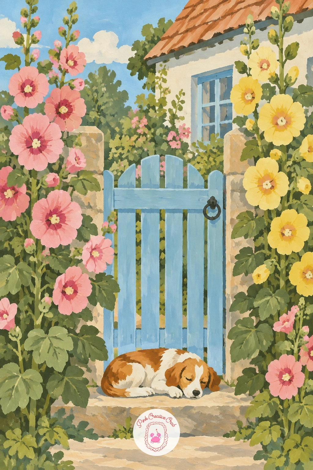
Close the village tour at a single cottage garden gate, tall hollyhocks standing beside it and a dog asleep on the step. Paint the gate and low fence first as simple flat shapes in soft weathered wood tone, then the hollyhocks rising behind and beside it as tall thin stems topped with a loose stack of small round blooms in blush pink and soft yellow.
Add the sleeping dog last, right at the base of the gate: a simple curled oval body, no visible legs needed, with just a small ear and tail tip to make the shape read clearly as a dog rather than a cushion.
Hollyhocks can turn into a messy tangle if every bloom gets equal attention. Paint most of the stem’s flowers as quick loose dabs and save full petal shape for just two or three blooms near the top, which keeps the whole stalk feeling light rather than heavy.
One concrete tip to finish on: paint the gate itself last of all, right over the dry hollyhock stems, so its clean edge sits crisply on top and holds the whole small scene together.
Palette: Weathered Wood, Blush Pink, Buttery Yellow, Olive Green
What to Do Next
Pick one village that caught your eye, mix your five or six core gouache colors, and work it through in order from the back shapes to the front details. Start on a small sheet of smooth paper if this is a new style for you, since a village scene always finishes faster, and looks sharper, at a modest size.
Frequently Asked Questions
What gouache colors work best for village scenery painting?
A small core palette of terracotta, sky blue, olive green, blush pink and soft cream covers most villages in this style. Add a warm ochre and a stone grey for stone buildings and roads, and you rarely need more than seven or eight tubes total.
How do you keep gouache edges crisp in a village painting?
Let each flat shape dry fully before painting the next one on top of or beside it. Working wet gouache against wet gouache is what causes the muddy, bleeding edges that soften this otherwise crisp, print-like style.
Do I need to draw the village in pencil first?
A light pencil sketch of the main shapes helps, especially for rooflines, arches and figures, but keep it minimal. Blocking in large flat shapes first and refining with a small brush afterward is usually faster than a detailed underdrawing.
How do you make a flat gouache village look less stiff?
Vary building sizes, roof heights and color shades slightly rather than repeating one template house across the page. Small irregularities, an uneven roofline or a slightly crooked chimney, read as charm rather than mistakes in this style.
What paper suits gouache village paintings best?
Smooth hot press watercolor paper or illustration board gives the cleanest edges for this flat, matte style. Rougher cold press paper works too, but it breaks up crisp edges more, which suits a looser village than a tidy print look.
Have any thoughts?
Share your reaction or leave a quick response — we’d love to hear what you think!
-
 0
-
0
-
0
-
0
-
0
-
0


