A mountain landscape painting gives you a whole mood in one small shape: a ridge, a lake, a hut with smoke drifting sideways, a hiker no bigger than a thumbnail. Gouache is made for this kind of picture, because its flat matte color lets a peak sit crisp against the sky without any fuss, and you can finish a strong, print-like scene in one sitting.
Below you will find 32 different mountains in 32 different moods, from still turquoise lakes to gorges, glaciers, terraces and ridges above the clouds. Each one tells you what to paint first, where it tends to go wrong, and how to fix it, so pick the one that matches your afternoon and get your brush wet.
Using these images: free for personal projects such as printing, coloring, cards, journals and gifts. Handmade items that include them may be sold up to 30 pieces per design. More than that is commercial use and is not permitted, and neither is selling or sharing the images themselves or passing them off as your own. Please ask before any other use.
Jagged peaks reflected in a still turquoise alpine lake make a gentle first project, because the reflection is really just the sky shape painted upside down. Block in the lake first with a flat wash of turquoise, then let it dry fully before you add the peaks above the waterline.
Paint the mountains as simple angular shapes in slate blue and dusty lilac, keeping the edges straight rather than wobbly. Flip your reference mentally and repeat the same shapes below the shoreline in a slightly softer, more muted version of the same colors, since reflections always read calmer than the real thing.
The common slip is making the reflection too sharp, which flattens the water. Drag a dry brush loaded with pale turquoise across the reflected peaks once they are dry, in one or two horizontal strokes, to suggest the faintest ripple without losing the shape.
If you do not have turquoise, mix a cool blue with a touch of white and a whisper of green. Keep your lightest color for the single strip of sky between the peaks and the water.
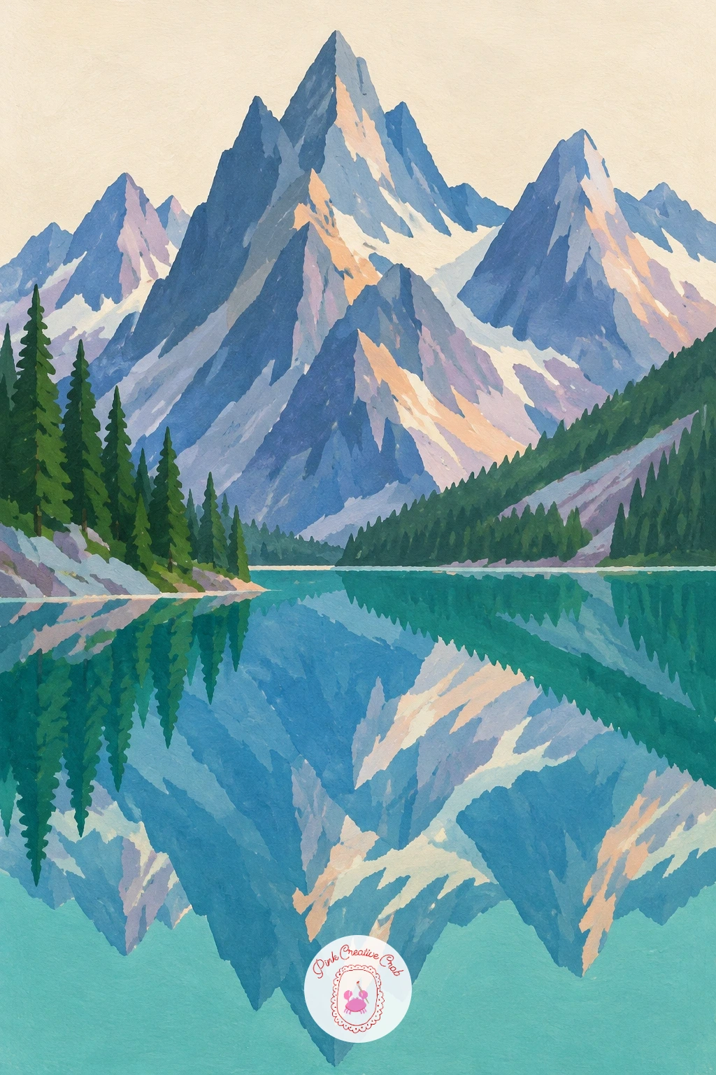
Palette: Turquoise,Slate Blue,Dusty Lilac,Soft Cream
Move from water to land with a wooden cabin at the foot of a pine-covered mountain, a subject that rewards simple, blocky shapes. Start with the mountain itself as one large pine green triangle behind the cabin, keeping its outline fairly smooth so the pines do not have to be individually drawn.
Paint the cabin as a small rectangle with a steep peach or dusty lilac roof, added once the mountain green is dry so the edge stays crisp. Add the pine trees as a cluster of narrow dark green triangles at the base of the slope, overlapping the cabin’s edge slightly so it feels tucked into the hillside.
The mistake here is making the cabin too large, which kills the sense of a huge mountain behind it. Keep the cabin under a fifth of the picture’s height and the mountain will tower the way it should.
No pine green on hand? Mix a blue-leaning green with a touch of black. Finish with one or two tiny peach-yellow window squares, since that warm glow against all the green and blue is what makes the cabin feel lived in. If this is your first time painting a building this small, draw its outline faintly in pencil first.
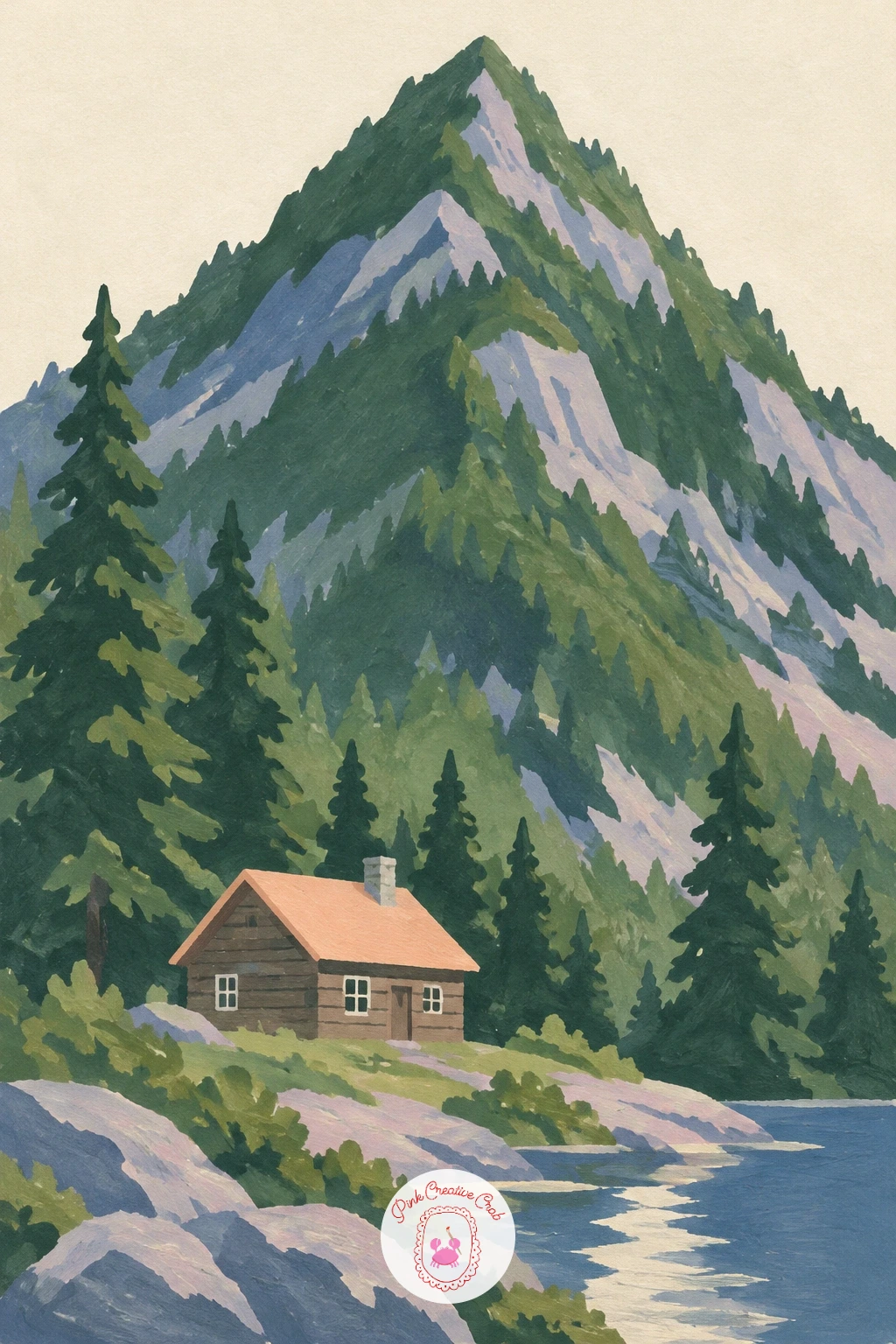
Palette: Pine Green,Peach,Dusty Lilac,Soft Cream
A hiker standing on a ridge above a sea of clouds turns on one measuring trick: keep the figure tiny, no taller than a fingernail, so the clouds below feel endless. Paint the clouds first as soft, rounded lilac and cream shapes filling the lower two-thirds of the page, slightly overlapping so no gaps show through.
Add the ridge as a dark slate blue silhouette cutting across the clouds, then paint the hiker as a simple standing shape right on its edge, facing out toward the view. A few more distant peak tips can poke through the cloud sea in the background to add depth.
Painters often make the clouds too flat and gray, losing the sense of light. Mix a touch of peach or pale pink into the cloud color on one side, as if the sun sits low, which lifts the whole scene without any extra shapes.
Swap lilac for pale gray-blue if lilac is not in your set. Keep the hiker’s silhouette solid black-blue with no detail, since from this distance a person is only ever a shape.
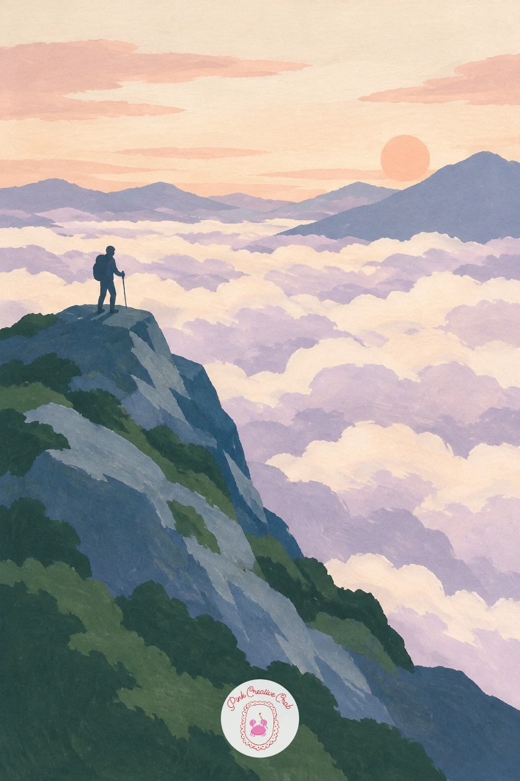
Palette: Slate Blue,Dusty Lilac,Peach,Soft Cream
Try this scene again at a smaller size as a tiny print for a frame. The tiny hiker silhouette reads just as well shrunk down.
Layered blue mountain ranges fading into mist is where eye level and light really do the work, since this whole painting is about distance rather than detail. Decide where your horizon sits, then paint the farthest range as the palest, most lilac-blue shape right at that line.
Work forward in bands, each range a little darker and a little more saturated than the one behind it, finishing with a near-black slate ridge at the bottom of the page. Keep every range a simple, low, rolling silhouette: it is the repetition of shapes that sells the haze, not any single peak’s outline.
The usual error is making all the ranges the same value, so the painting goes flat. Squint at your work partway through; if you cannot tell which range is furthest back, darken the front ones further.
If you only have one blue, add more white for each layer going back and more black coming forward. A single thin cream strip of sky above the farthest range finishes the sense of distance.
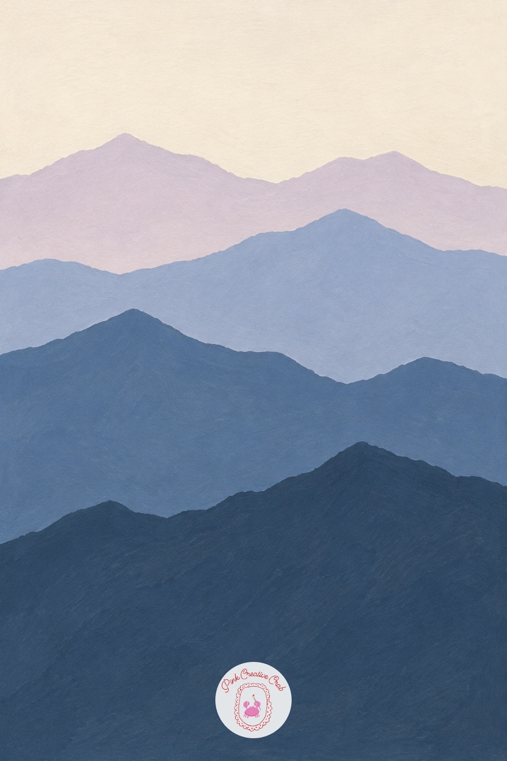
Palette: Dusty Lilac,Slate Blue,Deep Indigo,Soft Cream
A winding mountain road with a red car on a hairpin bend gives you a fun excuse to paint one bright accent against all that blue and green. Lay in the mountainside first as a large pine green or dusty lilac slope, then paint the road as a pale cream ribbon zigzagging down it in two or three visible switchbacks.
Add the car last, as a small red rectangle with tiny wheel marks sitting right on one bend. Because red is the warmest, strongest color on the page, even a car the size of a grain of rice becomes the first thing the eye finds.
The road often ends up too straight, which flattens the slope. Curve each switchback at a slightly different angle and width, narrower as it climbs, so the road reads as going uphill rather than sideways.
No pure red gouache? Mix cadmium yellow into alizarin crimson for a warmer, punchier red. Keep the car tiny and simple, just a box with a windshield line, since any more detail will fight the scale of the mountain.
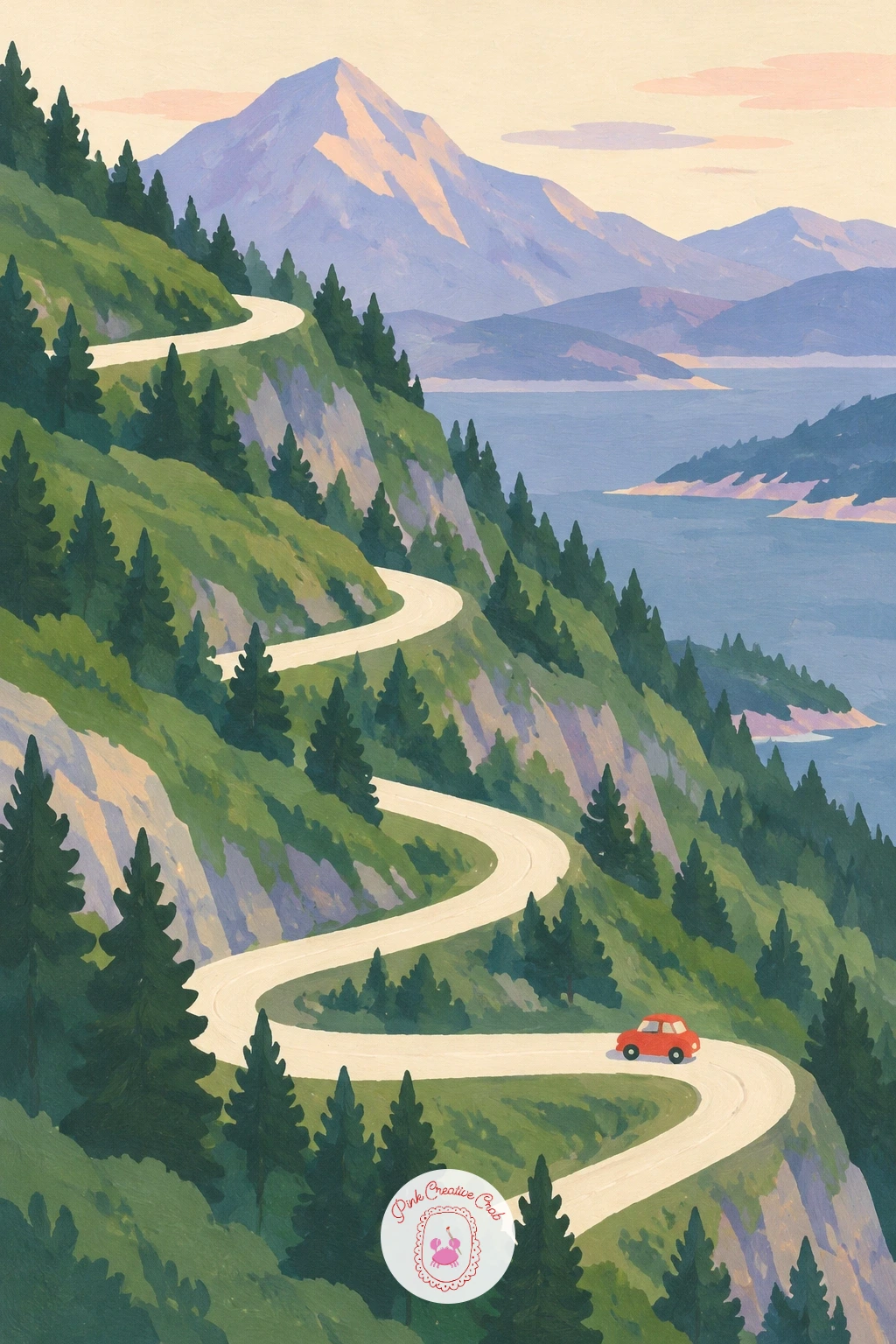
Palette: Pine Green,Soft Cream,Red,Slate Blue
A mountain meadow full of wildflowers below grey cliffs works best if you resist painting every flower separately. Start with the sky and the grey cliff face as two flat shapes at the top of the page, keeping the cliff’s edge jagged but simple.
Fill the lower half with a solid mid-green meadow shape, then scatter the wildflowers as small dabs of peach, lilac and cream using just the tip of a round brush, working loosely rather than methodically. Thinking of the flowers as a pattern of dots rather than individual blooms keeps the whole area lively instead of fussy.
Overworking the flowers is the main trap here; once you have dotted about two-thirds of the meadow, stop. Leave some green showing through, since gaps are what make the dabs read as flowers rather than a solid mass.
If your round brush is too large for tiny dabs, use the wooden end of the brush dipped in paint instead. One or two slightly bigger dabs near the front add a sense of scale to the smaller ones behind.
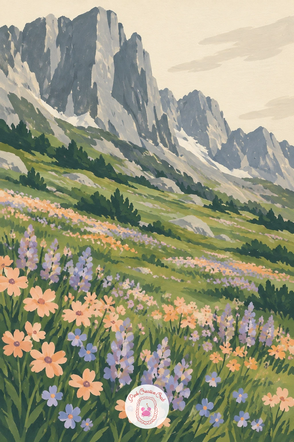
Palette: Grey,Pine Green,Peach,Dusty Lilac
A lone tent lit up at a lakeside camp under tall peaks is really a lesson in where your light sits, since the glow inside the tent is the one warm note in an otherwise cool, dark scene. Paint the sky and peaks first in deep slate blue and indigo, then the lake as a slightly paler, flatter version of the same blue.
Add the tent as a simple triangle shape near the shoreline, leaving its center unpainted until last. Fill that center with warm peach or cream, since it is the only warm shape anywhere on the page and your eye will go there immediately.
If the glow looks weak, it usually means the surrounding dark is not dark enough. Push the sky and peaks closer to black-blue before you add the tent’s light, so the contrast does the work rather than the brightness alone.
A tiny reflected streak of the tent’s glow in the lake below, painted as one short vertical dab, finishes the scene. Swap peach for warm yellow if that is what your set has.
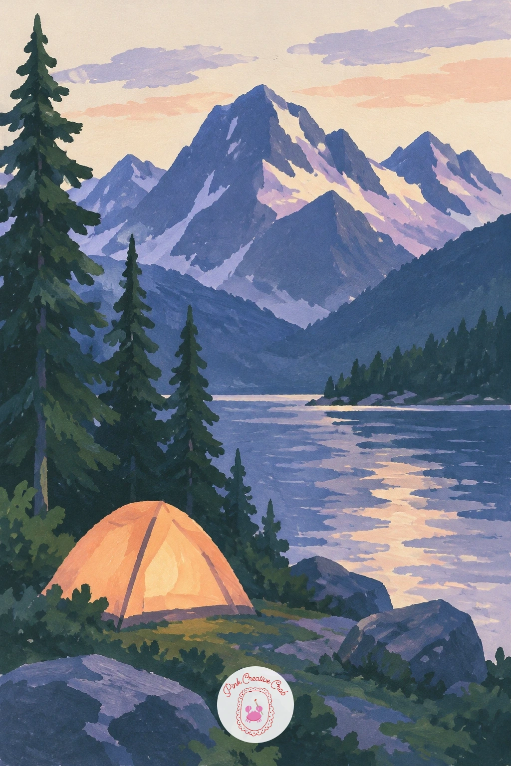
Palette: Deep Indigo,Slate Blue,Peach,Soft Cream
A cable car gliding between two green mountains asks for a steady hand more than careful shading, since the whole scene hangs on one straight cable line. Paint the two green slopes first, one lighter and one in shadow, leaving a clear gap of sky between their peaks for the cable to cross.
Once dry, draw the cable as a single thin, taut line with a ruler or the edge of a card dipped lightly in dark paint, running from one slope to the other. Add the cable car itself as a tiny box hanging just below the line, roughly a third of the way across.
A wobbly or sagging cable is the thing that breaks this painting fastest. If your line comes out uneven, let it dry and paint a second, steadier line directly over it rather than trying to scrub it out.
No ruler handy? Use a straight-edged piece of paper as your guide instead. Keep the cable car plain, just a rectangle with one small window dot, so it stays legible at this size.
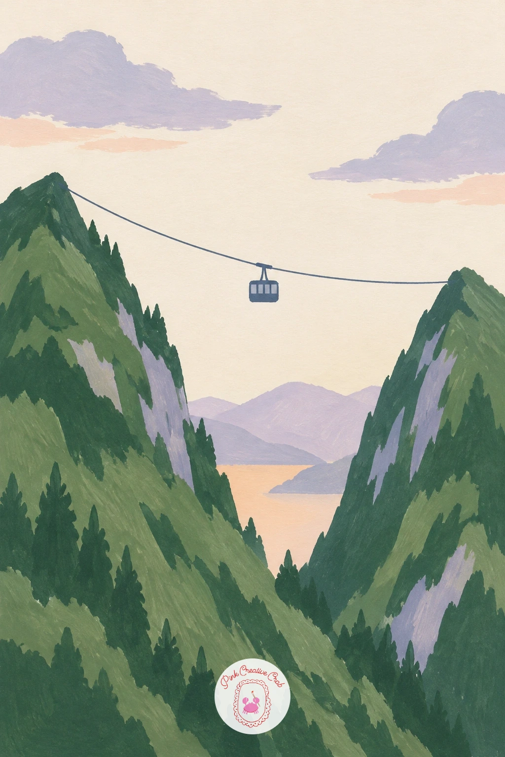
Palette: Pine Green,Deep Green,Slate Blue,Soft Cream
Terraced tea fields climbing a misty mountainside are a satisfying subject because the whole hillside is built from one repeated curved shape. Paint the base slope first in a mid green, then layer thin, curving bands of slightly darker and lighter green across it, each band following the contour of the hill rather than running straight.
Leave soft, irregular patches of cream or pale lilac mist between some of the upper bands, painted while the green below is dry so the edges stay soft rather than muddy. The terraces should get narrower and paler as they climb, which is what pushes the top of the slope back into the mist.
Painting every terrace the same width is the easy mistake, and it flattens the hill into a ladder. Vary the curve and spacing of each band, and let two or three disappear entirely into a mist patch partway up.
If you do not have a fine brush for the thin bands, use the edge of a flat brush turned sideways. One or two tiny dark dots near the base can stand in for distant workers for scale.
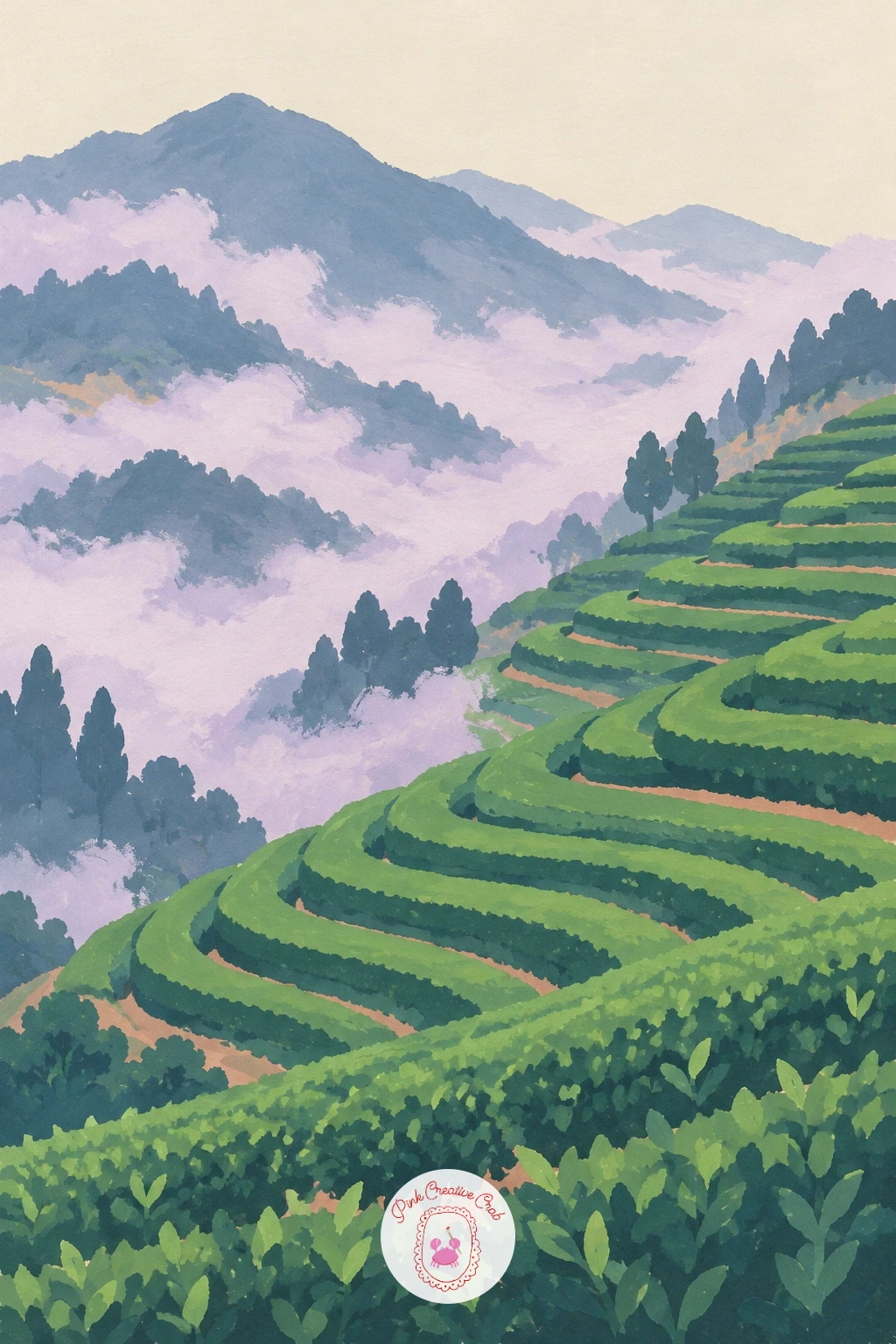
Palette: Mid Green,Deep Green,Dusty Lilac,Soft Cream
A waterfall plunging down a sheer mountain wall is mostly about the rock, since the water itself is just a narrow vertical gap of pale color. Block in the cliff face first as one large slate blue or grey shape, keeping its outline rough and angular to suggest rock without drawing every crack.
Leave a narrow, slightly wavering vertical strip unpainted, or go back and paint it in pale cream once the rock is dry, running from near the top of the page down to a small splash pool at the base. A thin halo of white gouache along both edges of the waterfall, added last, gives it the sense of spray catching the light.
Making the waterfall too wide and straight is the most common fix needed; narrow it and add one or two small kinks in its path so it feels like it is finding its own way down. The splash pool at the bottom should be slightly wider than the fall itself, with a few pale ripple dashes.
No pure white gouache? Mix your cream with extra white until it is noticeably paler than the rest of the painting.
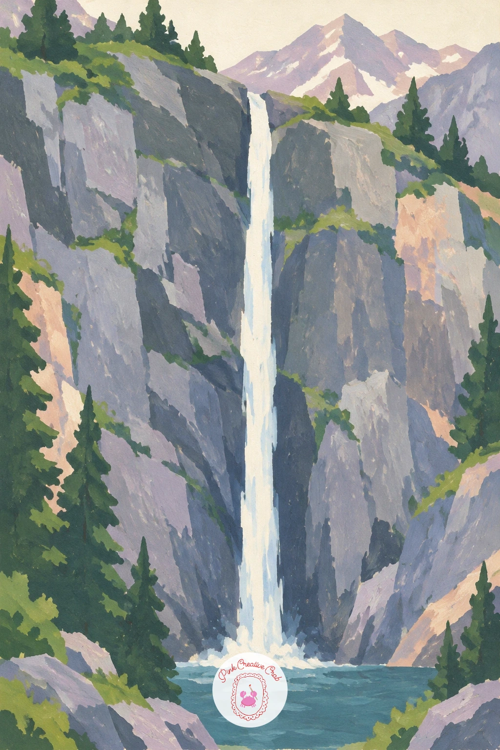
You Will Need
- white gouache for the spray edges
Palette: Slate Grey,Deep Indigo,Soft Cream,White
A herd of goats on a rocky mountain ledge is an easy way to add life without drawing a single detailed animal, since from this distance each goat is just two or three simple shapes. Paint the cliff face and ledge first as flat grey and lilac shapes, with the ledge reading as a narrow pale strip jutting out.
Build each goat from a small oval body and a shorter neck-and-head shape, painted in cream or pale grey, standing at slightly different angles along the ledge. Four or five goats, no two posed identically, read far better than a dozen identical ones.
Painters often line the goats up too evenly, which looks more like a toy shelf than a mountainside. Stagger them front to back and let one or two overlap slightly, with one standing apart looking out over the edge.
If pale grey is hard to mix cleanly, use your cream straight from the tube with a touch of blue-grey shadow underneath each goat’s belly. That single shadow dab is what plants their feet on the rock.
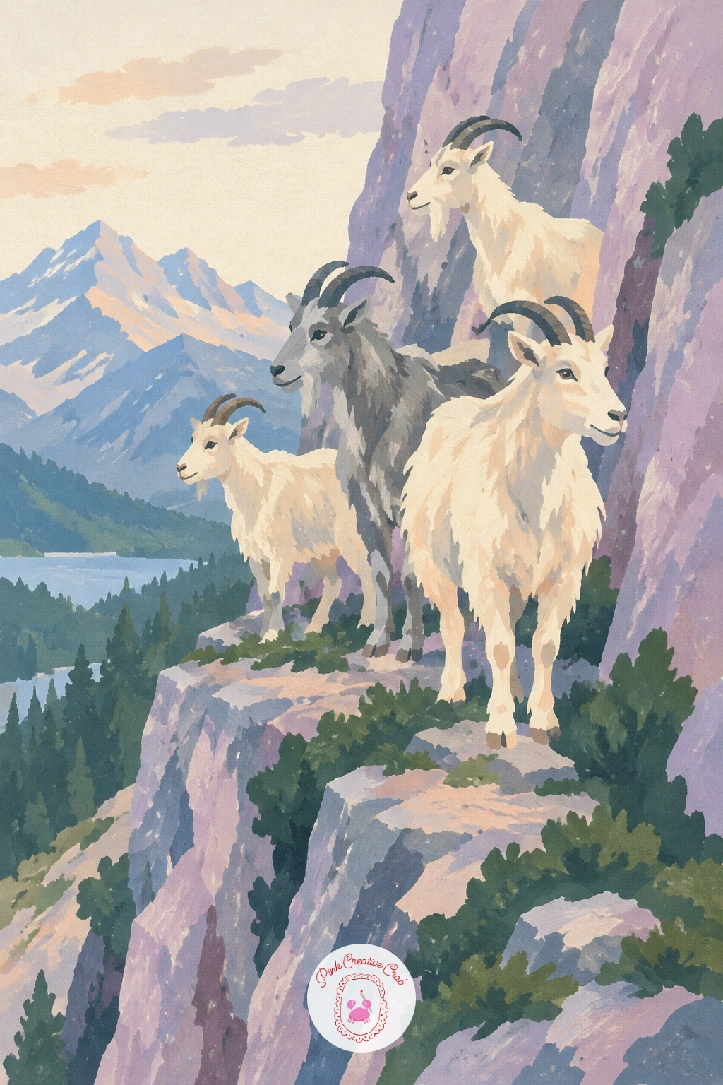
Palette: Slate Grey,Dusty Lilac,Soft Cream,Deep Grey
A stone hut beside a mountain pass with strings of prayer flags gives you a nice rhythm problem to solve, since the flags are a repeated shape strung on a line. Paint the hut first as a simple grey-stone box with a dark doorway, set against a backdrop of pale, distant peaks.
Run one or two thin lines from the hut’s roof to a post or rock nearby, then add the flags as tiny overlapping triangle or square pennants in alternating colors along the line, slightly smaller toward the far end to suggest distance. Keeping the flags irregular in spacing, rather than perfectly even, makes them feel like cloth rather than a printed pattern.
If the flags come out too neat and stiff, add a slight downward curve to the string itself, since fabric never hangs perfectly straight. A faint shadow beneath the string onto the hut’s wall ties the two elements together.
No fine brush for the tiny flags? Dab them with a flat brush corner instead, which gives a naturally rough little edge.
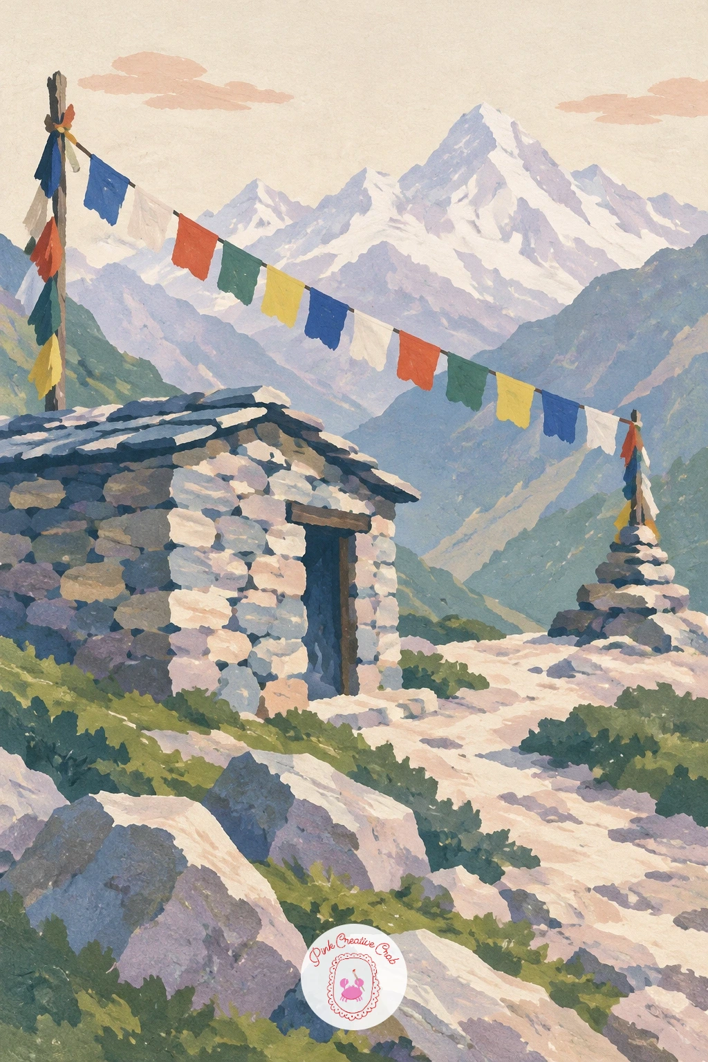
Palette: Slate Grey,Peach,Dusty Lilac,Pine Green
The sun rising behind a pyramid-shaped peak in pink light turns a single triangle into the whole painting, so get that silhouette right before anything else. Paint the sky first as a soft gradient from peach near the horizon up into dusty lilac higher up, blending the two while both are still wet for a seamless change.
Once the sky is dry, paint the peak as one solid, dark, crisp triangle, placed slightly off-center so the composition does not feel too symmetrical. A small glowing rim of peach or pale yellow along the peak’s upper edge, added with a very fine brush, is what sells the sun sitting just behind it.
The edge of the peak is where this goes wrong fastest. Keep it perfectly crisp and dark, since any softness there reads as haze rather than a mountain cutting a hard line against bright sky.
If blending peach into lilac goes patchy, work on slightly dampened paper so the colors meet more gently. A few smaller, paler peak shapes to either side add scale without competing with the main pyramid.
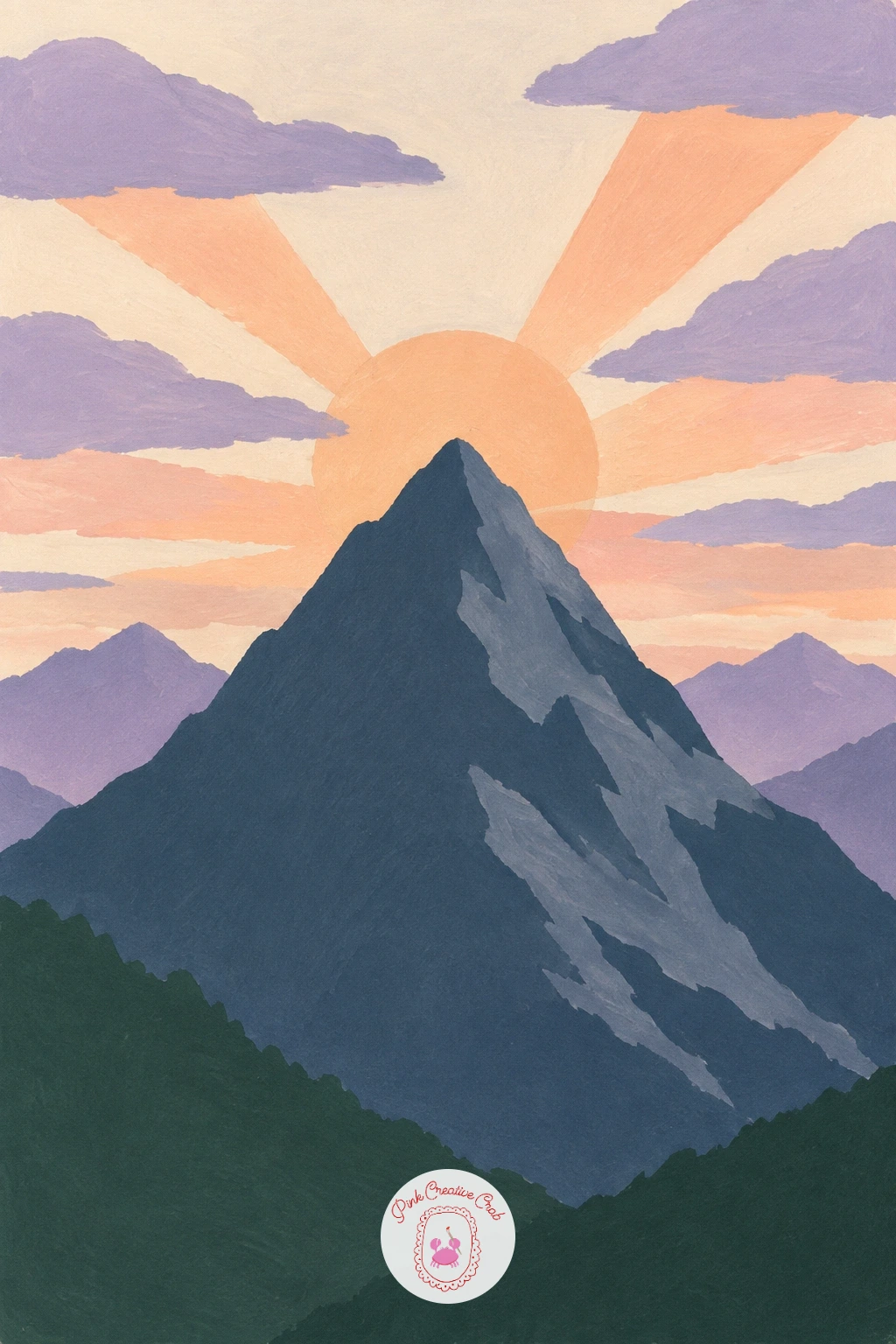
Palette: Peach,Dusty Lilac,Deep Indigo,Soft Cream
A glacier tongue flowing into a pale blue lake is a good next step up, since the ice itself needs a little texture rather than one flat shape. Block in the dark mountain walls on either side first, then paint the glacier as a wide, pale blue-white wedge flowing down between them into the lake.
Once that base layer is dry, dry-brush a few short streaks of slightly darker blue and pale grey along the glacier’s length, following its downward direction, to suggest the cracks and ridges of old ice without drawing each one. The lake at its foot should be a slightly deeper, more saturated blue, since meltwater reads richer than the ice itself.
Making the glacier perfectly smooth is the usual flat result. Keep your dry-brush strokes uneven in length and spacing, and leave some pale areas untouched so the texture does not cover the whole shape.
If you do not have a texture brush, a slightly worn-out flat brush with very little paint works just as well for the dry streaks.
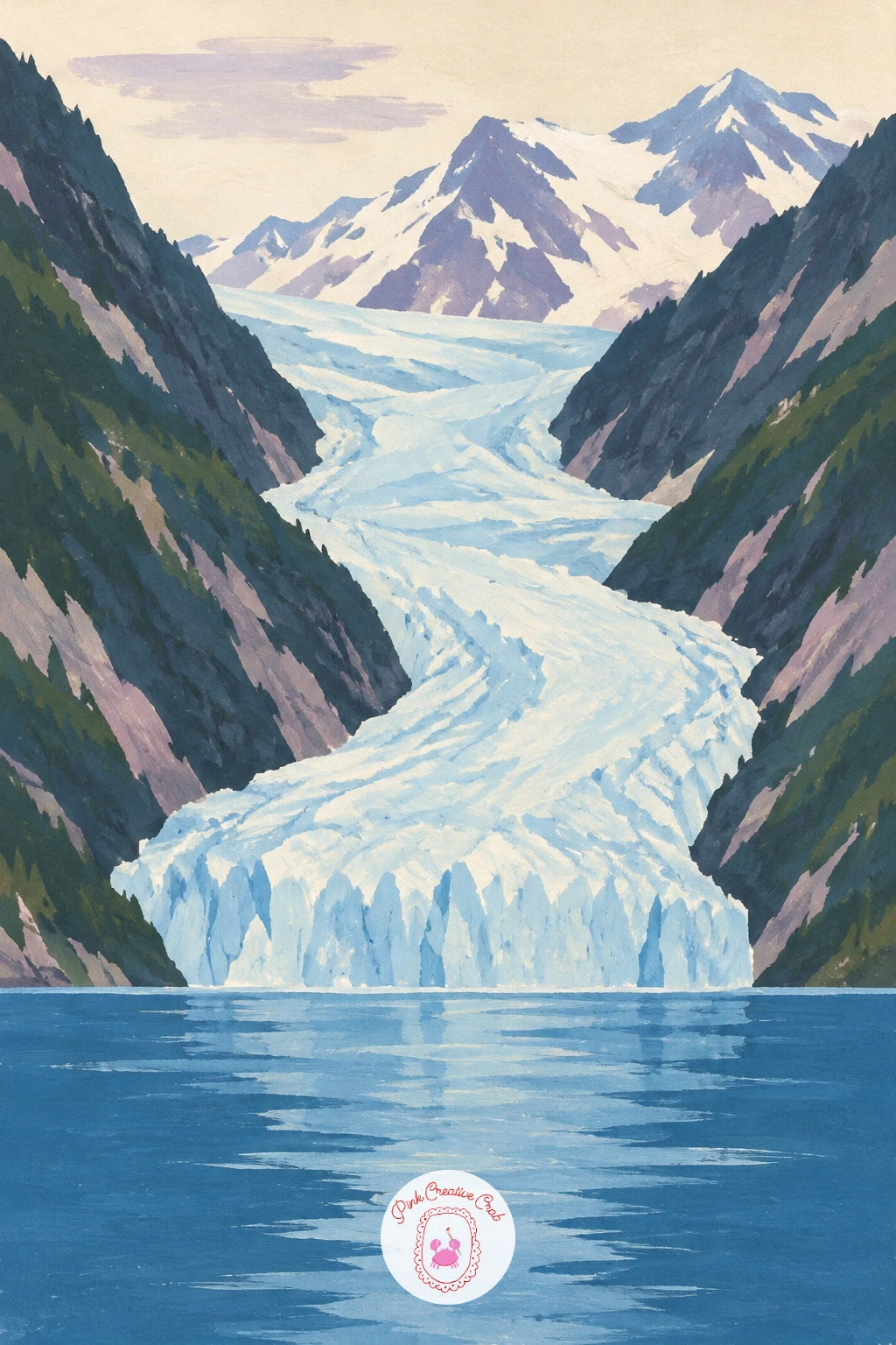
Palette: Pale Blue,Slate Blue,Deep Indigo,Soft Cream
A narrow trail along a ridge with a hiker and a dog brings in a second small figure, and keeping their proportions right against each other matters more than detail on either one. Paint the ridge and distant peaks first as simple overlapping shapes, then add the trail as a thin pale line curving along the top of the ridge.
Place the hiker on the trail as a small standing silhouette, then add the dog just behind or beside, roughly a third of the hiker’s height, which is about right for most breeds seen from this distance. Keeping that size relationship consistent is what makes the pair read correctly rather than like a dog the size of a toddler.
Painters sometimes make the dog too large out of wanting it to show up clearly. Trust the small scale; a dark, simple four-legged shape is recognizable even at a few millimeters tall.
If you want more challenge, give the dog a slight forward lean to suggest it is trotting rather than standing still. Swap the dog for a walking stick in the hiker’s hand if figures feel tricky today.
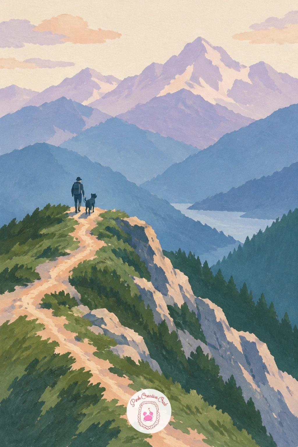
Palette: Slate Blue,Dusty Lilac,Deep Grey,Soft Cream
A little red train climbing a mountain track through pines works like the hairpin road idea, with one bright shape doing the heavy lifting against green and blue. Paint the pine-covered slope first as a large textured green mass, using short diagonal dabs rather than one flat fill so it reads as trees from a distance.
Add the track as a pale, gently curving line cut into the slope, then paint the train as a small red rectangle with two or three tiny carriage divisions, sitting right on the track partway up the hill. A thin puff of pale smoke or steam trailing from its front car adds motion with almost no extra effort.
If the train looks stuck rather than climbing, angle the track slightly uphill from left to right (or the reverse) instead of running it flat across the page. That one tilt convinces the eye the train is in motion.
No red in your palette? Mix crimson with a touch of orange for warmth. Keep the pine dabs varied in size so the slope does not look like a solid green carpet.
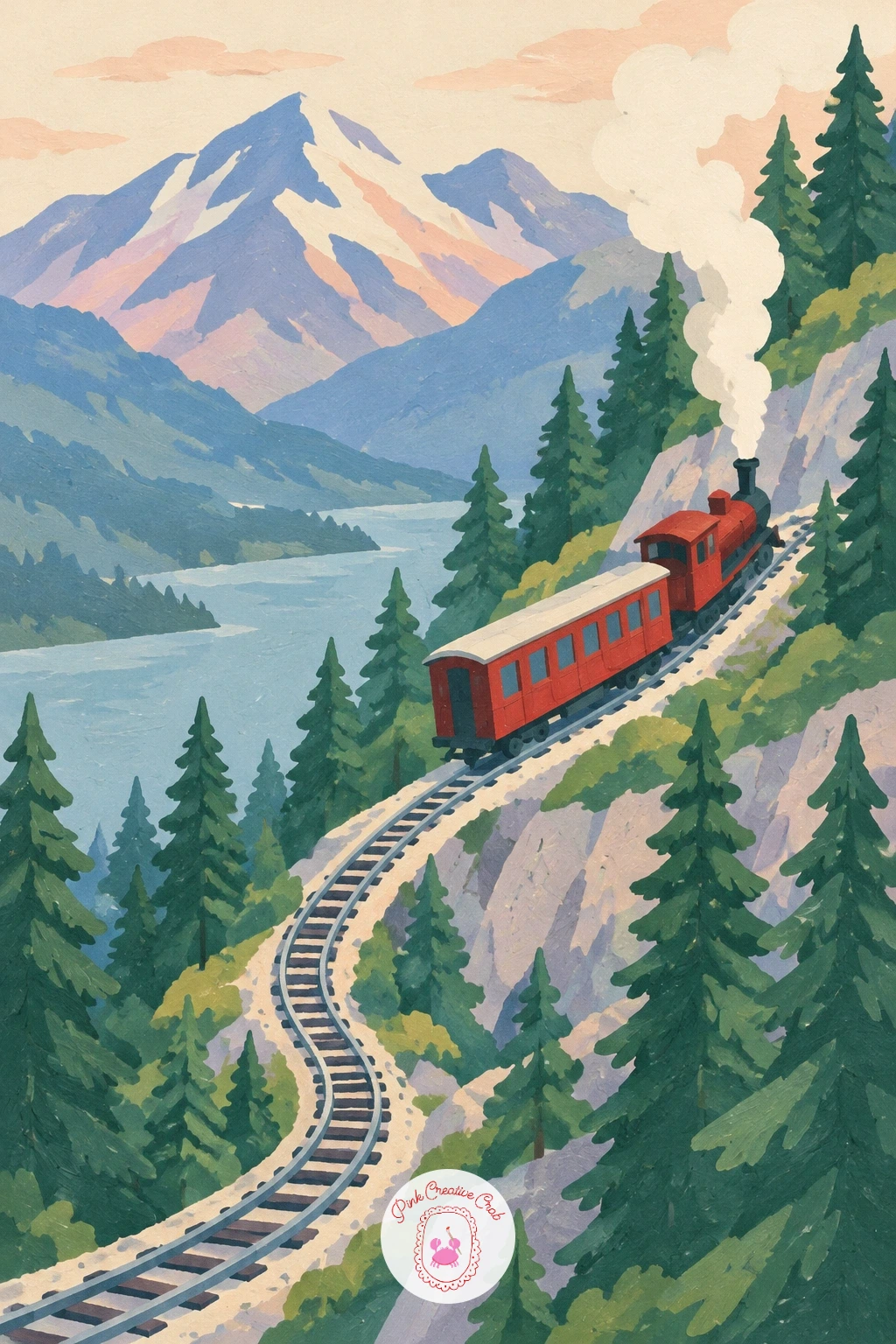
Palette: Pine Green,Red,Soft Cream,Slate Blue
A mountain lake with a red canoe pulled up on the stones is a quieter scene, and it is a good one for practicing a quick, confident version before a slower one. For the ten-minute version, block in the lake, peaks and stony shore as three flat shapes, then drop in the canoe as one simple red oval shape on the stones, no paddle or rope needed.
Given forty minutes instead, add individual stone shapes along the shoreline in varied greys and warm browns, a thin paddle resting across the canoe, and a soft reflection of the canoe’s red in the water just below it. Those small additions turn a quick sketch into a fuller scene without changing the composition at all.
Either way, the canoe’s shape is where accuracy matters most: keep it a simple pointed oval, wider in the middle, never boxy. Painters who rush this part end up with something closer to a loaf of bread.
If red gouache looks too flat alone, mix in a touch of orange on the sunlit side of the canoe for warmth. Stone colors can come from mixing grey with tiny amounts of leftover peach and green.
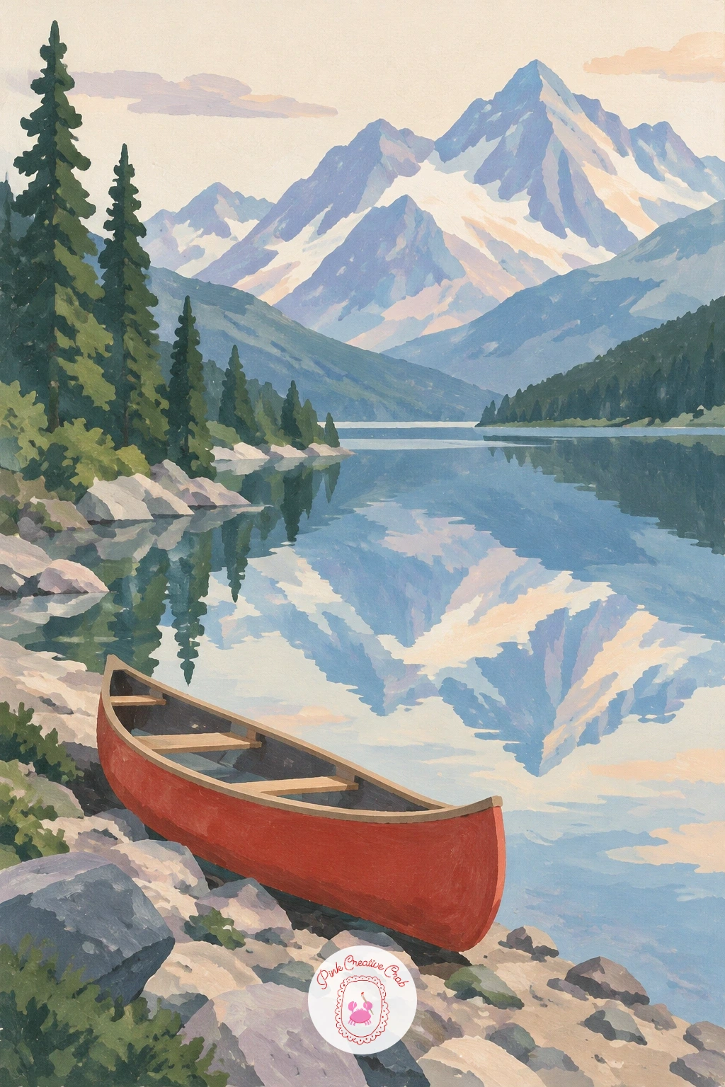
Palette: Red,Slate Grey,Slate Blue,Soft Cream
A volcano cone with a thin trail of smoke is a satisfying single-shape subject once you nail its proportions. The classic measuring trick: the cone’s height should be roughly equal to its base width, giving that recognizable steep-sided triangle rather than a bump or a spike.
Paint the cone first in deep slate blue or grey-lilac, keeping its slopes perfectly straight on both sides using a ruler if your hand needs the help. Once dry, add a thin, wavering line of pale grey or cream smoke drifting sideways from the very top, widening and softening as it moves away from the crater.
A cone that is too narrow reads as a hill, not a volcano; check the base-to-height ratio before you commit to paint. A small flat plain or a cluster of low hills at its base gives the volcano something to rise dramatically out of.
If straight lines by hand are shaky, lightly pencil the cone’s outline first using a ruler, then paint inside it freehand.
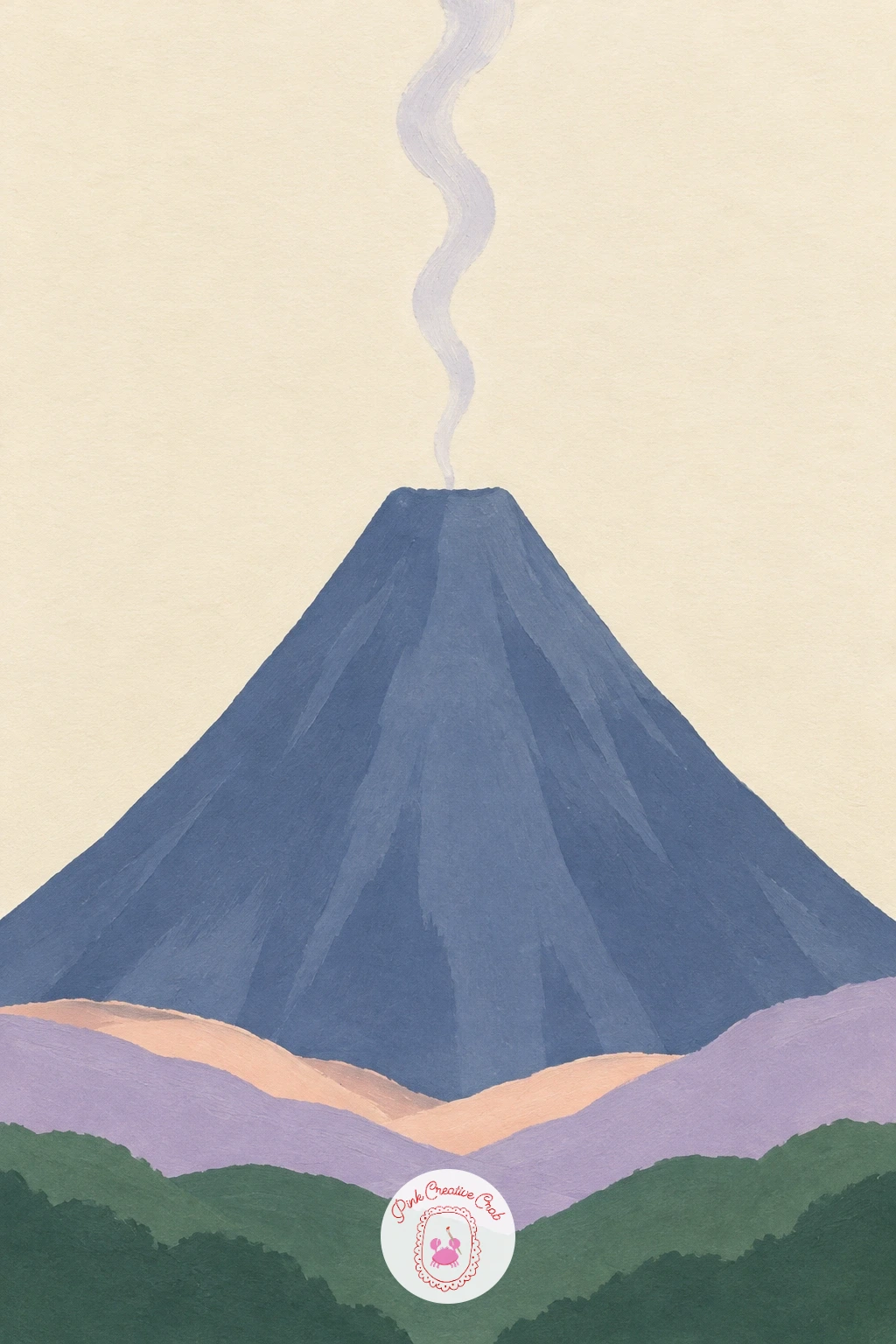
Palette: Slate Blue,Soft Cream,Dusty Lilac,Pine Green
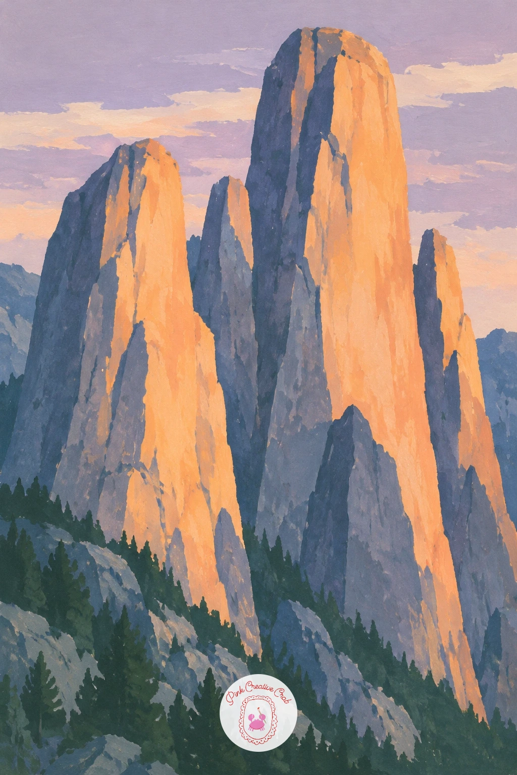
Sharp granite towers in orange evening light is where the light source decides almost every color choice you make. Decide the sun sits low on one side, then paint each tower’s sunlit face in warm orange-peach and its shadowed face in cool slate blue or indigo, keeping that same light-and-shadow split consistent across every tower in the group.
Build the towers as tall, narrow, angular shapes of varied height, overlapping slightly so they read as a cluster rather than a row. Painting the sky behind them a deep dusty lilac, darker than the glowing towers, pushes them forward and makes the orange genuinely sing.
Mixing the warm and cool faces into the same gray muddy tone is the main risk with this subject. Keep a hard, clean line where sunlit meets shadowed on each tower, with no blending between the two.
If pure orange looks too hot, cut it with a little peach first. One or two tiny birds as small dark dashes in the sky give the scale away.
Palette: Peach,Deep Indigo,Dusty Lilac,Slate Blue
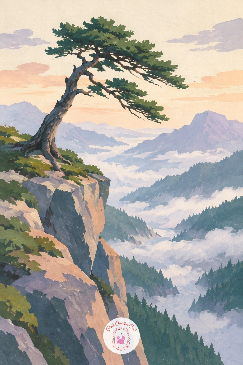
A lone pine clinging to a cliff edge above a valley puts all the attention on one tree, so its silhouette needs to earn that focus. Paint the cliff face and the valley far below first as simple pale and dark shapes, then add the pine last, right at the cliff’s edge, leaning slightly outward as if it has grown around the wind.
Build the pine from a narrow dark trunk and a handful of short, irregular branch clusters rather than one neat triangle, since real wind-bent pines are lopsided, often thicker on one side. A touch of white gouache dry-brushed lightly over the branch tips can suggest the texture of needles catching light.
Painters often make the tree too symmetrical and upright, which loses the sense of exposure. Tilt the whole tree a few degrees and thin out the branches on the windward side to tell that story without any extra brushwork.
No white gouache for the dry-brush texture? A very pale cream mixed thin works nearly as well.
You Will Need
- kneaded eraser if you pencil the trunk first
Palette: Deep Green,Slate Grey,Dusty Lilac,Soft Cream
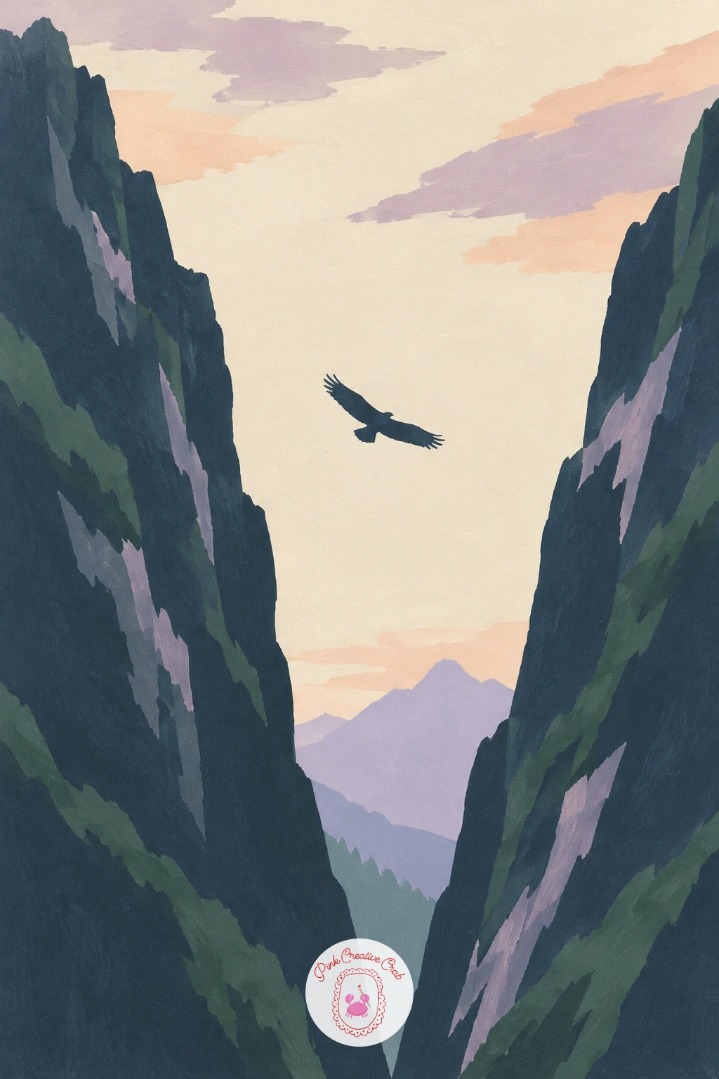
An eagle soaring between dark peaks is a small, confident shape surrounded by a lot of empty sky, which makes its placement the whole composition. Paint the dark peaks on either side first, leaving a generous gap of pale sky between them, then add the eagle as a simple dark silhouette with wings spread flat and slightly angled, sitting in the upper third of that gap.
Keep the eagle small, no wider than a fingernail, since scale against the peaks is what makes the mountains feel huge. A pair of long, straight wing shapes with pointed tips reads clearly as a soaring bird from any distance; there is no need for individual feathers.
Centering the eagle dead in the middle of the gap tends to look stiff. Shift it slightly off-center, closer to one peak, so the eye has somewhere to travel across the empty sky toward it.
If dark silhouette shapes feel intimidating, pencil the eagle lightly first using two simple curved lines for the wings.
Palette: Deep Indigo,Slate Blue,Soft Cream,Dusty Lilac
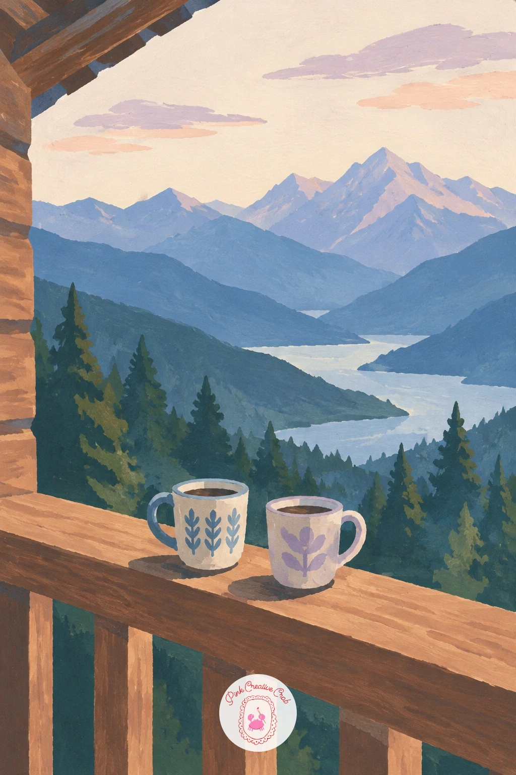
A mountain hut balcony with two mugs and a view of the peaks is a cozier, close-up change of pace after all those wide vistas. Paint the distant peaks and sky first as a simple backdrop filling the upper half of the page, then add the balcony railing as a dark horizontal band across the lower third, with a few vertical posts.
Place two small mugs along the top rail or on a tiny ledge, painted as simple rounded shapes with a thin loop handle each, one slightly larger than the other. Giving them two different colors, such as cream and dusty lilac, keeps them from reading as one blob.
The balcony can swallow the view if it is painted too tall. Keep the railing band to roughly a quarter of the page height so the peaks behind still feel like the main event.
If mugs feel fiddly at this scale, simplify to two plain circles with no handles; the color pairing alone still tells the story.
Palette: Slate Blue,Dusty Lilac,Soft Cream,Pine Green
Green mountains wrapped in low clouds above a river is a good subject for softening your edges on purpose, after so many crisp ones. Paint the river at the bottom of the page first in pale blue, then the green mountain slopes rising behind it, leaving the upper portion of each slope unpainted for now.
While the green is still slightly damp, dab in loose, irregular cream or pale lilac cloud shapes across the upper slopes, letting the two colors blur softly into each other right at that edge. This single soft transition, kept to just the cloud line, is what makes the rest of the crisp painting feel atmospheric rather than sloppy.
If the blur spreads too far and the whole mountain goes mushy, you have added the cloud too early; wait a little longer for the green to be just damp, not wet, next time. A few small dark tree dashes along the river’s edge anchor the scale.
No time to wait for damp paper? Paint the cloud shapes with soft, slightly feathered edges using a drier brush instead.
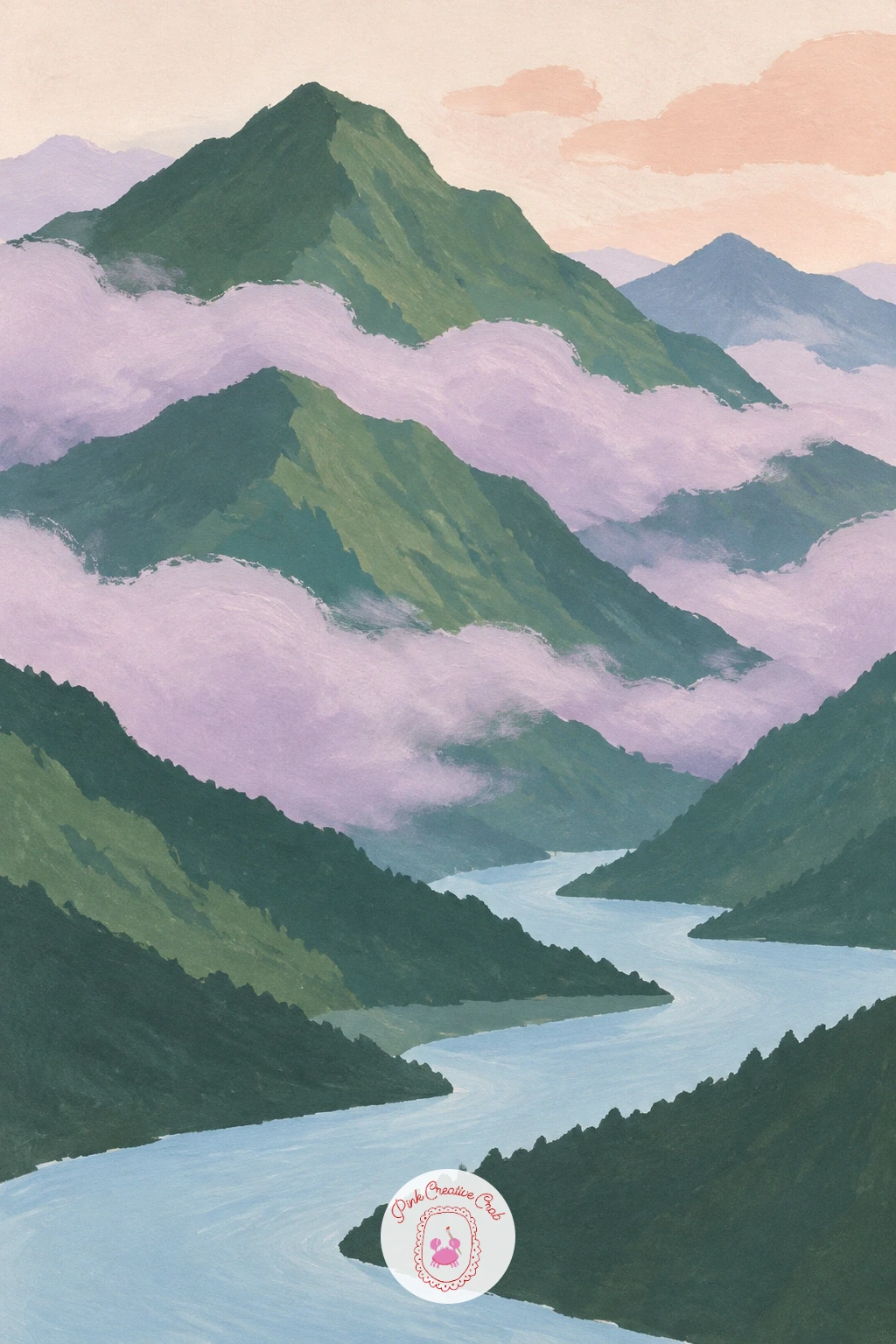
Palette: Pine Green,Pale Blue,Dusty Lilac,Soft Cream
A field of purple lupines under a towering grey mountain gives you tall, upright flower spikes rather than the loose dabs of the earlier meadow idea, so the technique shifts a little. Paint the grey mountain and sky first as a large simple mass filling the upper half, then fill the lower half with a mid green field.
Add the lupines as short, narrow vertical strokes of purple and lilac, slightly tapered at the top, standing in loose clusters rather than a single even row. Varying their height and tilt as you go keeps the field from looking like a planted garden bed.
Painting every lupine spike the exact same height is the easy trap. Let some lean, some stand taller at the front, and thin the clusters out as they recede toward the mountain’s base for a sense of depth.
If your purple looks too blue or too pink, mix a little red into ultramarine for a true violet. A fine brush or even the tip of a cocktail stick works well for the thinnest spikes.
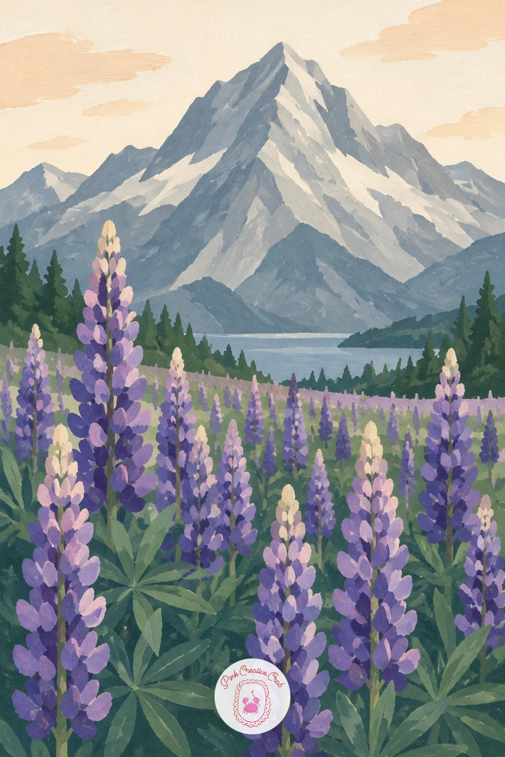
Palette: Slate Grey,Violet,Dusty Lilac,Pine Green
A rope bridge across a deep mountain gorge is a strong composition built almost entirely on a sagging curve. Paint the two gorge walls first as dark, steep shapes on either side, leaving a clear gap of pale sky or distant mountain between them for the bridge to span.
Draw the bridge’s walkway as a single gentle downward curve connecting the two walls, then add two thinner curved lines just above it for the handrails, each sagging slightly more than the walkway itself. Small vertical dashes connecting the handrails to the walkway at even spacing suggest the rope ties without needing to paint each knot.
A bridge painted perfectly straight and taut looks more like a plank than a rope structure. Let the central dip of the curve sit noticeably lower than either end, since that sag is what reads as rope under its own weight.
If the curve comes out uneven, a light pencil guide first, then paint over it, keeps the line confident.
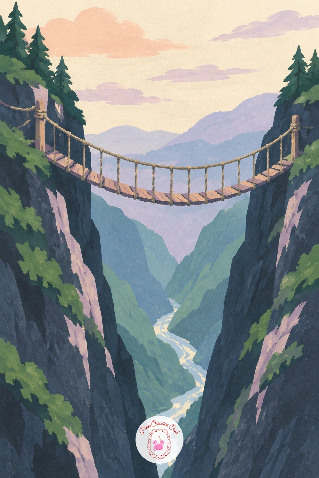
Palette: Deep Indigo,Slate Grey,Soft Cream,Dusty Lilac
Paragliders drifting over a green mountain valley let you try this subject at two speeds depending on your afternoon. For a ten-minute version, paint the valley and surrounding green slopes as a few simple flat shapes, then add two or three paraglider canopies as small curved crescent shapes with a thin single line hanging below each for the pilot.
With forty minutes to spend, vary the canopy colors between peach, lilac and cream, stagger their heights clearly across the sky, and add a soft shadow dab on the green slope below each one to ground them in space. Those shadows are a small touch that does a lot of work, since without them the gliders can look pasted onto the sky rather than floating above the valley.
The canopy shape is where accuracy counts most: it should curve like a wide, flattened crescent, never a full circle or a straight bar. Painters who rush this tend to end up with something closer to a line of balloons.
No fine brush for the thin hanging lines? A sharpened cocktail stick dipped in paint makes a clean, thin mark.
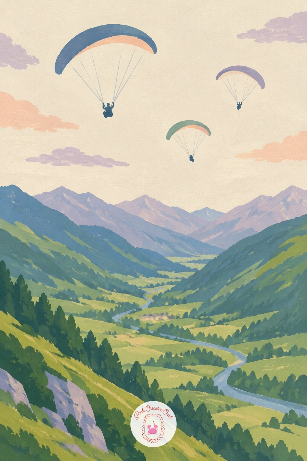
Palette: Pine Green,Peach,Dusty Lilac,Soft Cream
A turquoise river braiding across a wide valley floor between peaks is a pattern-painting exercise more than a landscape one. Paint the peaks on either side and the valley floor first in muted greens and greys, then add the river as several thin, branching turquoise channels that split apart and rejoin as they cross the flat ground.
Keep the channels narrow and let them wander at slightly different angles rather than running parallel, since a braided river looks more like a loose net than a set of tidy lanes. Small pale gravel-bar shapes left unpainted between the channels, in the same tone as the valley floor, complete the braided look.
Painting too many channels, too evenly spaced, turns this into a grid rather than a river. Limit yourself to three or four main channels with a couple of smaller offshoots, and let some pinch almost to nothing before opening up again.
If turquoise feels too strong against muted greys, cut it slightly with white so it sits as a highlight rather than a shout.
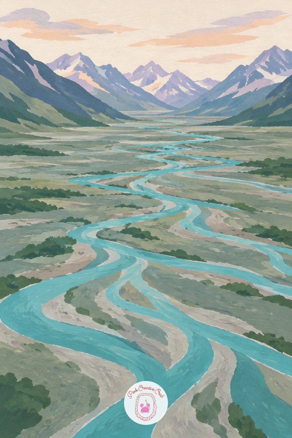
Palette: Turquoise,Slate Grey,Pine Green,Soft Cream
A monastery perched on a steep mountain cliff is a satisfying architectural subject once you get the proportion between building and rock right. Paint the cliff first as one tall, dramatic shape, steeper and taller than feels natural, since this subject depends on an almost impossible-looking perch.
Add the monastery as a cluster of small rectangular shapes with flat or gently peaked roofs, stacked and staggered along a narrow ledge partway up the cliff rather than at its base. Keeping the whole building cluster under a sixth of the cliff’s total height is the trick that makes the location feel precarious rather than just a building on a hill.
A monastery that is too large relative to the cliff loses that vertigo. If yours has come out too big, extend the cliff upward and downward around it rather than repainting the building.
A thin trail of dashes leading up to the ledge, and a tiny dark doorway on the nearest building, finish the sense of scale without extra color mixing.
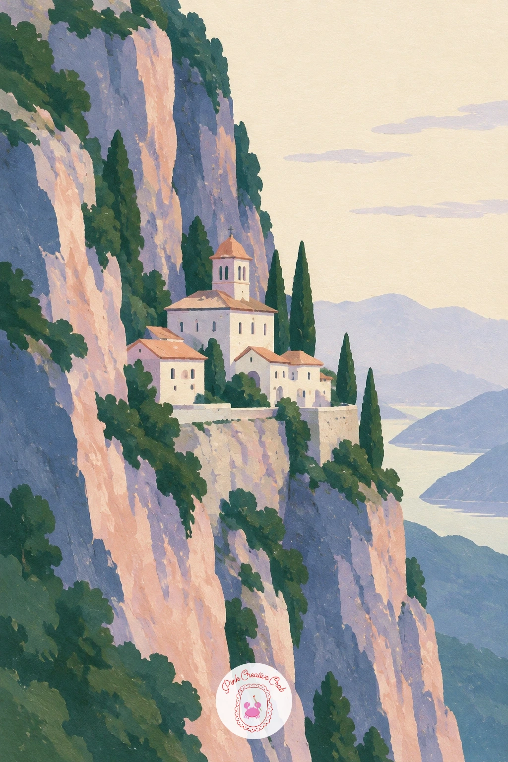
Palette: Slate Grey,Peach,Dusty Lilac,Deep Indigo
A llama grazing on a high green slope with peaks behind brings in one more animal, and getting its long neck in proportion is the one thing to watch. Paint the green slope and the peaks behind it first as simple layered shapes, then build the llama from a rounded body oval, a long slender neck, and a small head, with the neck roughly the same length as the body itself.
Keep the legs thin and simple, just four narrow lines ending in small dark feet, since a grazing llama’s head is lowered and its legs barely show beneath the wool. A touch of texture along its back, a few short dry-brush strokes in a slightly paler tone, suggests wool without drawing individual strands.
Shortening the neck too much is the fastest way to lose the llama’s character and end up with something closer to a sheep. Measure it against the body before you commit the paint, and err on the side of a touch too long rather than too short.
No fine brush for the texture strokes? A stiff, slightly dry flat brush works just as well.
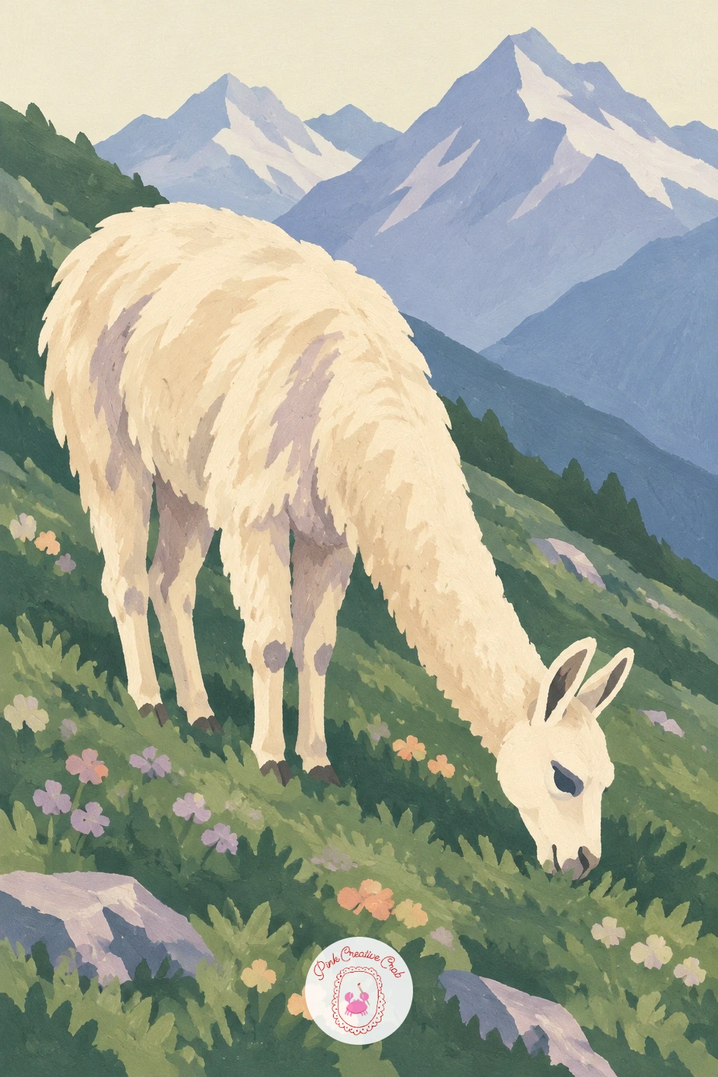
Palette: Pine Green,Soft Cream,Slate Blue,Dusty Lilac
A chairlift crossing green grassy slopes borrows the same steady-hand trick as the cable car, but with several small chairs instead of one car. Paint the rolling green slopes first, keeping their contours soft and low, then draw the lift cable as one long, gently sagging line running diagonally across the hillside using a ruler or straight edge as a guide.
Add four or five small chairlift seats hanging below the line at even but not identical intervals, each just a tiny rectangle with two short lines for the support arm. Varying their height very slightly, since they sag at slightly different points along the cable, keeps the row from looking mechanically perfect.
Spacing every chair exactly the same distance apart tends to flatten the illusion of a working lift. Let a couple of chairs sit closer together and one further apart, as if caught mid-movement at different points.
If straight diagonal lines feel difficult freehand, lightly pencil the cable’s path first, then paint over it in one confident stroke.
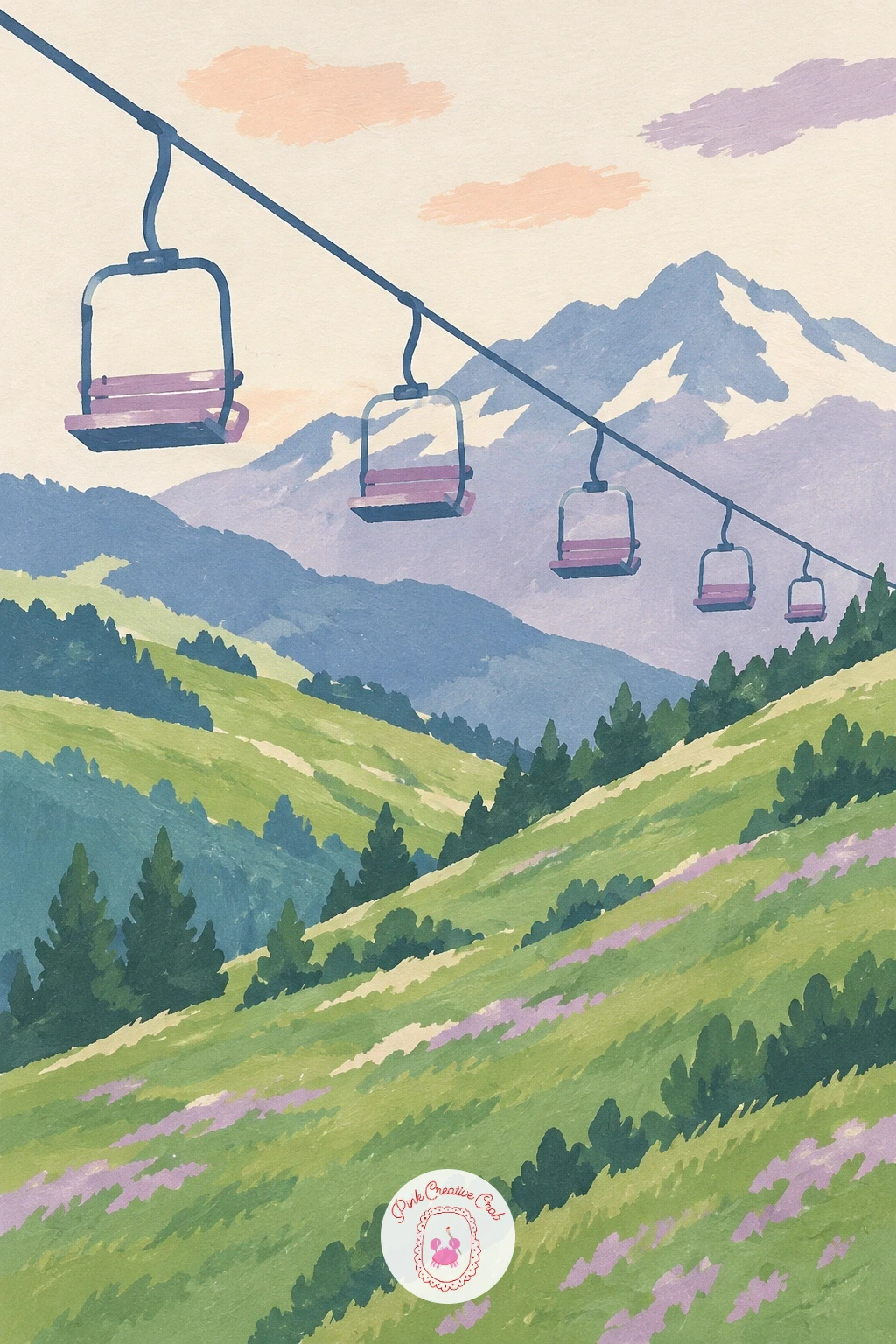
Palette: Pine Green,Soft Cream,Slate Blue,Deep Grey
A mountain lake at dawn with mist on the water and a wooden dock pulls together a few tricks from earlier ideas into one calm scene. Paint the peaks and sky first in soft dawn colors, peach near the horizon fading up into dusty lilac, then add the lake below as a pale, slightly misty version of the same palette rather than a sharp reflection.
While the lake area is still a little damp, dab in a few soft cream mist shapes drifting just above the water’s surface, letting their edges blur gently into the lake color beneath them. Add the wooden dock last, once everything else is dry, as a simple narrow plank shape with two or three post lines extending into the water, its crisp edges a deliberate contrast to the soft mist around it.
If the mist ends up as a hard-edged cloud shape sitting on top of the water, it was likely added once the lake had dried completely. Catching that damp window, even a minute or two, makes the difference.
No time to wait for damp paper? A very dry, barely-loaded brush dragged sideways gives a similar soft, broken mist effect on dry paper.
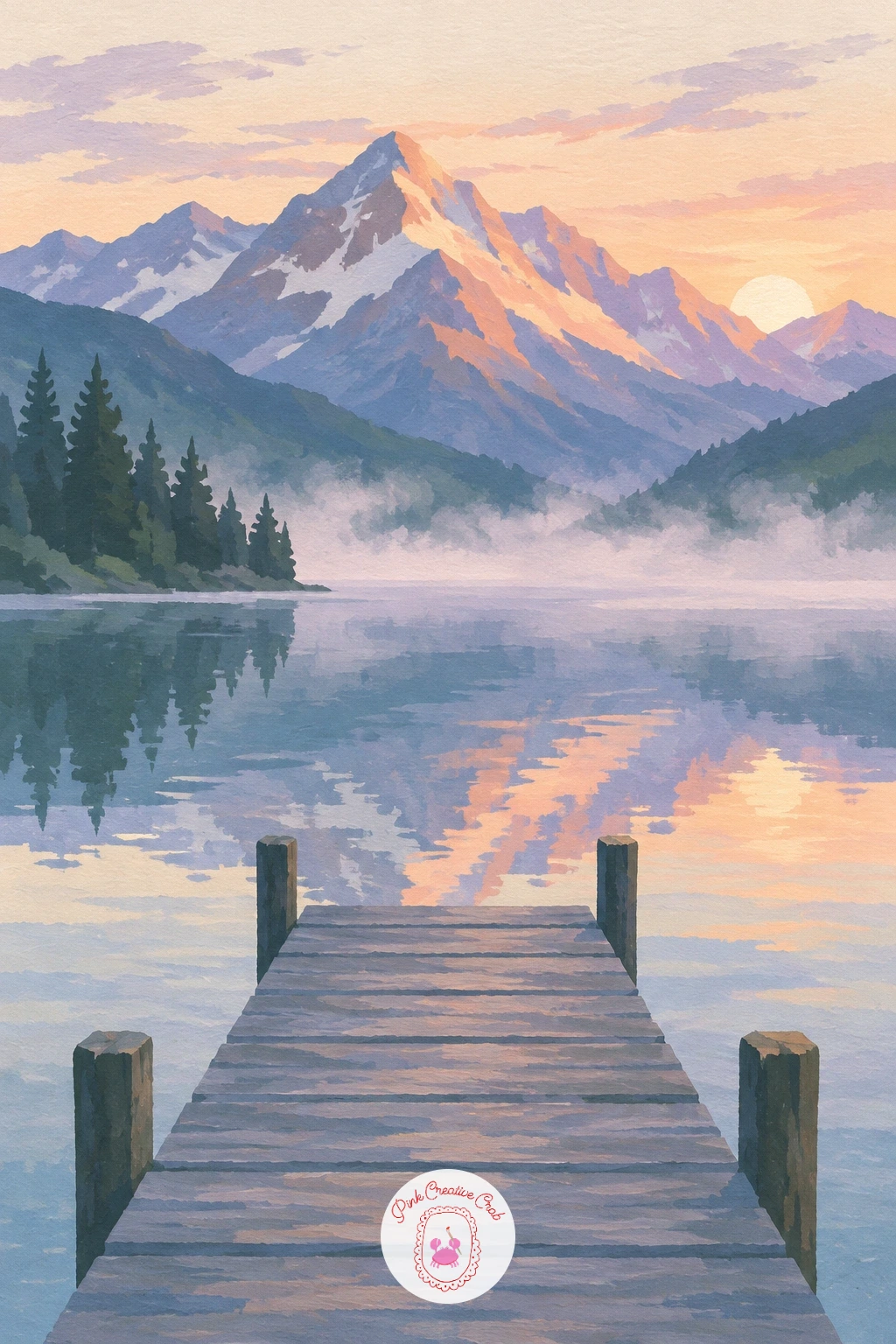
Palette: Peach,Dusty Lilac,Soft Cream,Slate Blue
For more practice with calm water and soft light before this one, the step by step lessons at easy landscape painting for beginners cover similar reflections in detail.
Two climbers roped together on a rocky summit at sunrise is a good closing challenge, since it combines a small figure group with the strongest light of the whole set. Paint the summit rocks first as simple angular slate and grey shapes, catching the low sunrise light on one side in warm peach while the other side stays cool and shadowed.
Add the two climbers as small standing silhouettes near the top, one slightly ahead and higher than the other, connected by a single thin rope line that dips gently between them. Keeping one climber visibly smaller and set further back, rather than side by side at the same size, is the proportion trick that sells the sense of a steep, exposed summit.
Painting both figures the same size and height flattens the drama of the climb. Stagger them clearly, with the rope line sagging slightly between, the same gentle curve as the earlier rope bridge idea.
If warm and cool rock colors feel tricky to separate cleanly, paint the whole rock mass first, let it dry, then glaze a thin wash of peach over just the sunlit half. For more peaks in this same warm, graphic style, the ideas at mountain painting ideas are worth a look, and the gouache painting ideas for beginners cover more ways to build flat shapes like these.
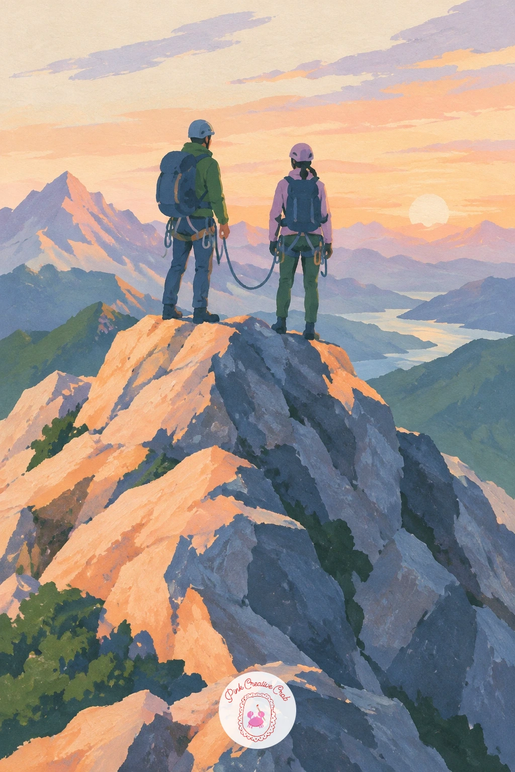
Palette: Slate Grey,Peach,Deep Indigo,Soft Cream
What to Do Next
Pick one mountain that matches your mood today, whether it is a quiet lake reflection or a cluster of roped climbers at sunrise, and get it down on paper before you second-guess the choice. A small sheet of hot press paper and your core five colors are all you need to see it through to the last brushstroke.
Frequently Asked Questions
What is the best gouache palette for a mountain landscape painting?
A small palette of slate blue, pine green, dusty lilac, peach and soft cream covers most moods in this style. These five mix together for shadows, water, rock and sky without needing many extra tubes.
What paper works best for gouache mountain scenes with crisp edges?
Smooth or hot press watercolor paper gives the crispest edges, since its surface has less texture to break up a brushstroke. Cold press paper works too but softens fine lines like cables and rope bridges slightly.
How do you keep gouache mountain shapes from looking muddy?
Let each shape dry fully before painting the next one over or beside it, and mix fresh paint for each color rather than scraping leftovers together. Clean brushes between colors keep edges crisp instead of grey and dull.
How do you add a tiny hiker or hut for scale without it looking out of place?
Keep the figure or hut small, simple and dark-toned, placed on a clear edge like a ridge or ledge rather than floating in open space. A single shadow dab beneath it anchors it convincingly to the ground.
Can these mountain landscape painting ideas work in watercolor instead of gouache?
Yes, though the flat matte look softens into translucent washes and edges will not stay as crisp. Painting on dry paper with minimal blending keeps watercolor versions closest to the graphic look shown here.
Have any thoughts?
Share your reaction or leave a quick response — we’d love to hear what you think!
-
 0
-
0
-
0
-
0
-
0
-
0


