Thank you card ideas get so much better when flowers are doing the thanking for you: a basket left on a step, a bee delivering a daisy, a teacup spilling over with sweet peas. Gouache suits this job perfectly, since its flat, matte shapes print and photograph beautifully and dry fast enough to finish a card front in one sitting.
Below are 31 small scenes built for exactly that, from a quick posy in a scalloped circle to a fuller bouquet bursting out of a terracotta pot. Work through them in order if you like, easiest first, or just pick whichever one matches the person you are thanking.
Using these images: free for personal projects such as printing, coloring, cards, journals and gifts. Handmade items that include them may be sold up to 30 pieces per design. More than that is commercial use and is not permitted, and neither is selling or sharing the images themselves or passing them off as your own. Please ask before any other use.
Start with the easiest scene in the set: a wicker basket of garden roses left on a sunny doorstep. Block in the basket first as a simple trapezoid in a warm ochre, then cover the top third with overlapping rose shapes in blush pink and a deeper rose red, painted as rounded petal clusters rather than individual petals.
Work the basket weave once the base shape is dry, using a liner brush loaded with burnt sienna to drag short diagonal strokes across the form. Add a few sage green leaves tucked between the roses to break up the pink, then finish with the doorstep in a pale warm grey so the basket has somewhere to sit.
The basket weave is where this goes wrong if you paint it before the base colour dries, since the lines bleed into a muddy smear. If you do not have a liner brush, the fine tip of a round brush loaded thin works just as well.
Keep the roses as simple spiral shapes with no shading at first; the flat colour alone reads perfectly as a card front.
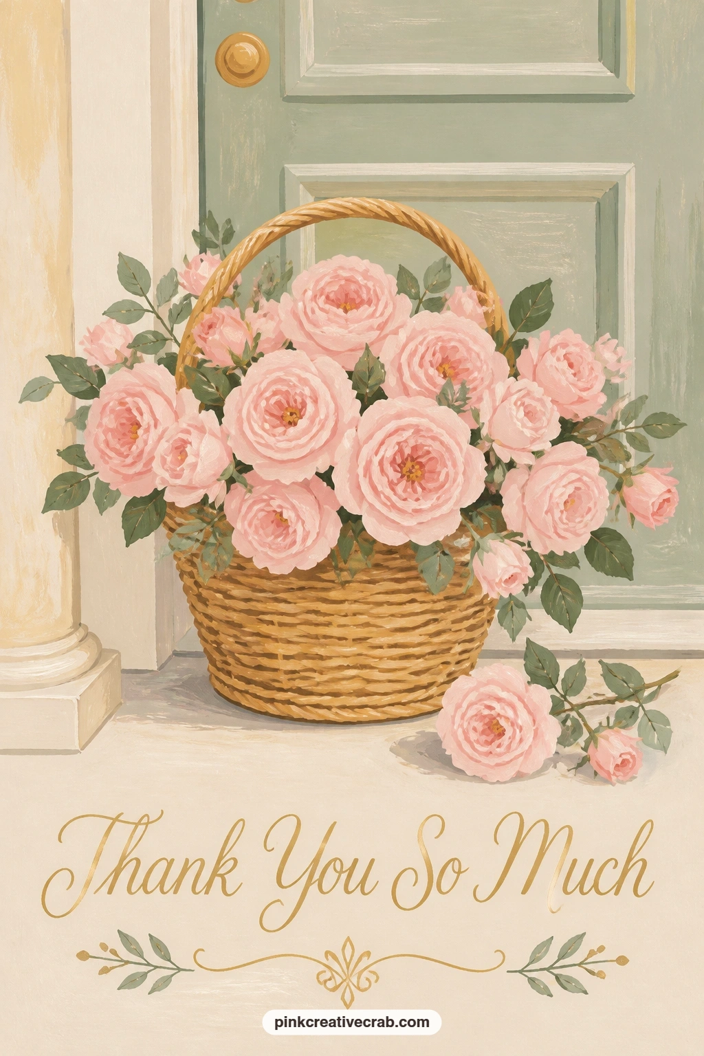
Palette: Rose Pink,Burnt Sienna,Sage Green,Buttercup Yellow
Move from a still life to something with a little action: a bumblebee carrying a tiny daisy toward a pink teacup. Paint the teacup first as a simple rounded shape in buttercup yellow with a gold rim line, then let it dry fully before anything else goes near it.
Block the bee’s body as two ovals, one striped in black and buttercup yellow, with small translucent wing shapes added last in a thin grey wash. The daisy the bee carries is just a tiny circle of white petals around a yellow dot, small enough to sit between its front legs.
Eye level sits slightly above the teacup here, looking down into it just a little, which is what makes the bee read as flying toward it rather than past it. If gold paint is not in your kit, a yellow ochre line does the same job on the rim.
Keep the bee’s stripes loose and slightly uneven; perfectly straight stripes look stiffer than real insects ever do.
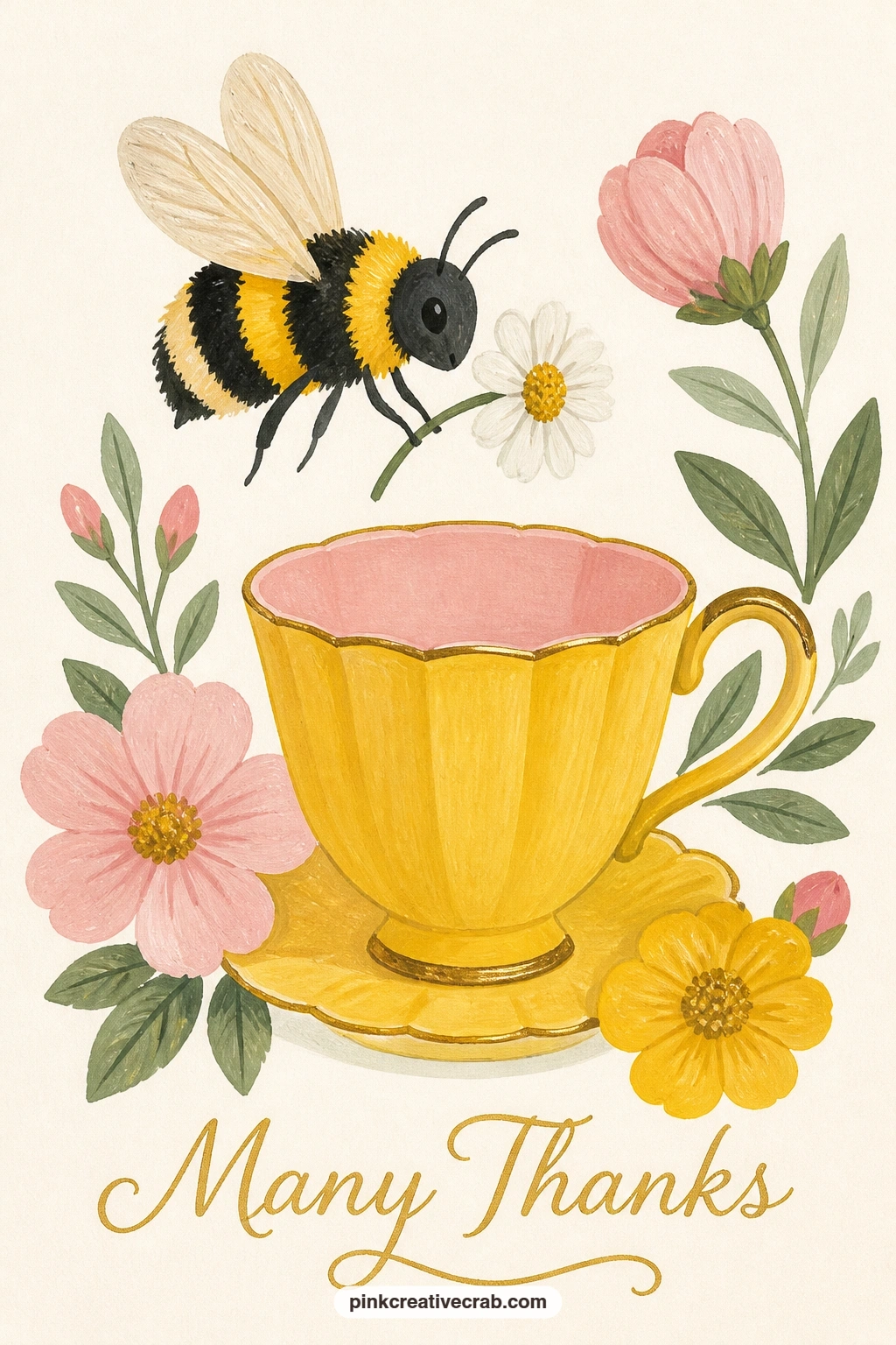
Palette: Buttercup Yellow,Ivory Black,Blush Pink,Payne’s Grey
For more small pollinators to practice before tackling this one, the bee watercolor ideas guide on this blog has plenty of reference poses.
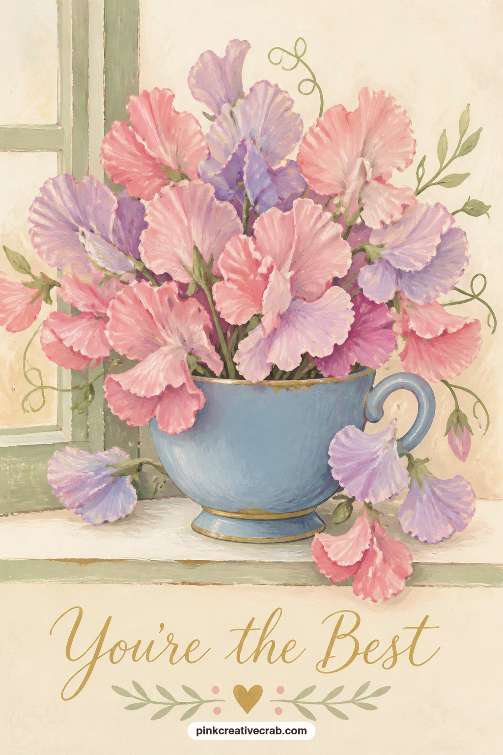
Chip and all, a blue teacup overflowing with sweet peas on a windowsill is a forgiving next step. Paint the cup as a rounded shape in a dusty blue, leaving one small triangular notch of bare cream paper on the rim before you seal the edge, which becomes the chip once you outline it later in a darker blue line.
Build the sweet peas on top in loose, ruffled petal pairs, two or three tones of pink and lavender layered so the flowers do not all sit flat at the same depth. Add thin pale green stems threading between the blooms last, since they read better once the flowers are already there to connect to.
The windowsill behind should stay a plain pale strip so the cup stays the star; too much detail back there competes with the flowers. No blue gouache on hand? A grey-blue mixed from black and white plus a touch of ultramarine gets you there.
Finish with a single white gouache dot on the chip’s edge to catch the light.
Palette: Dusty Blue,Lavender,Blush Pink,Soft Sage
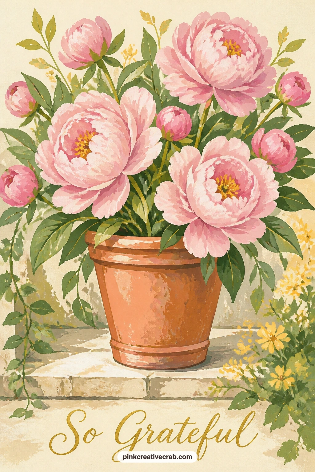
From a small cup of flowers to a full bouquet: peonies bursting from a terracotta pot on a garden step. Block the pot first as a simple tapered shape in warm terracotta orange with a darker rim line, then let it dry completely before the peonies go anywhere near its edge.
Build each peony from the centre outward, a small tight cluster of petal marks first in deep rose, then looser, larger petal shapes layered around it in blush pink, so the flower reads as rounded rather than flat. Work three or four peonies at slightly different sizes so the bouquet does not look stamped from one shape.
If this is your first time painting peonies, resist painting every petal; six or seven well-placed petal shapes per bloom already reads as full. No terracotta paint? Mix burnt sienna with a touch of white and a hint of orange.
Finish with one or two sage leaves low down to anchor the pot to the step.
Palette: Terracotta,Deep Rose,Blush Pink,Sage Green
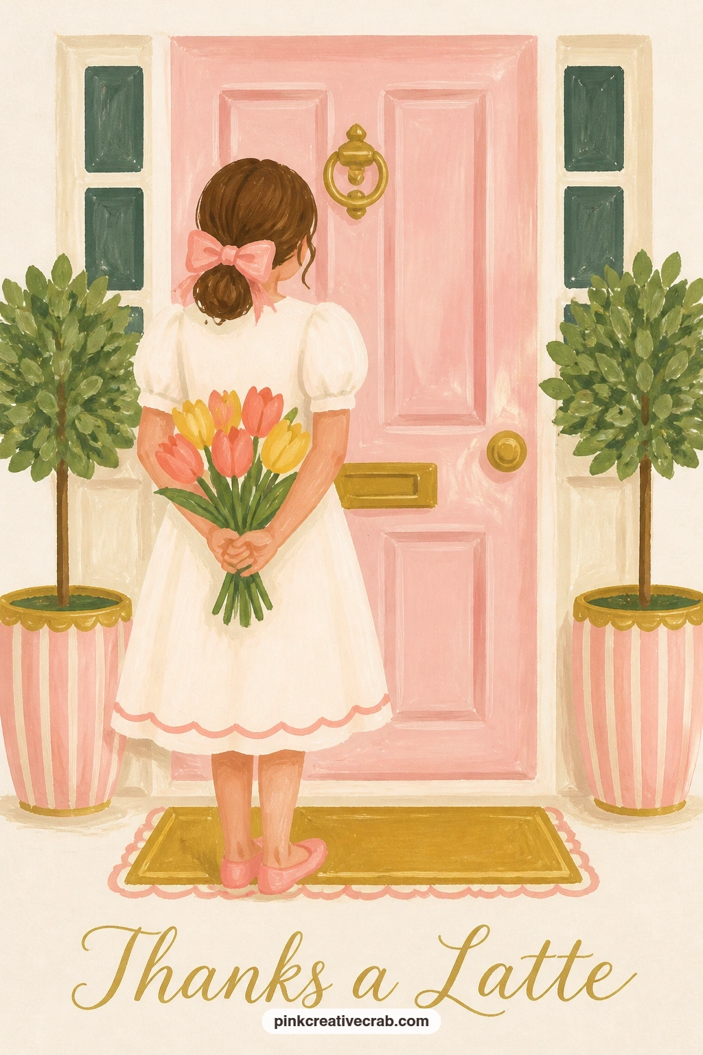
Bring in a figure for the first time: a girl holding a bunch of tulips behind her back at a front door. Start with her silhouette as a simple dress shape and rounded head, painted in one flat mid-tone so she reads clearly against the lighter door behind her.
Keep her face almost featureless, maybe two small dot eyes and a soft curve of a smile, since a simple face at this scale avoids looking stiff. Paint the tulip bunch peeking from behind her side last, three or four closed tulip cups in buttercup yellow and coral, with thin green stems just visible past her hip.
Measure her head against her body before you commit to paint, roughly one head height to every four or five body heights for a believable adult proportion, which keeps her from looking either too childlike or too stretched. If you prefer not to paint a face at all, a hat or sun bonnet covering it works just as well.
Keep the door behind her a flat colour block so she stays the focus.
Palette: Coral,Buttercup Yellow,Dusty Blue,Sage Green
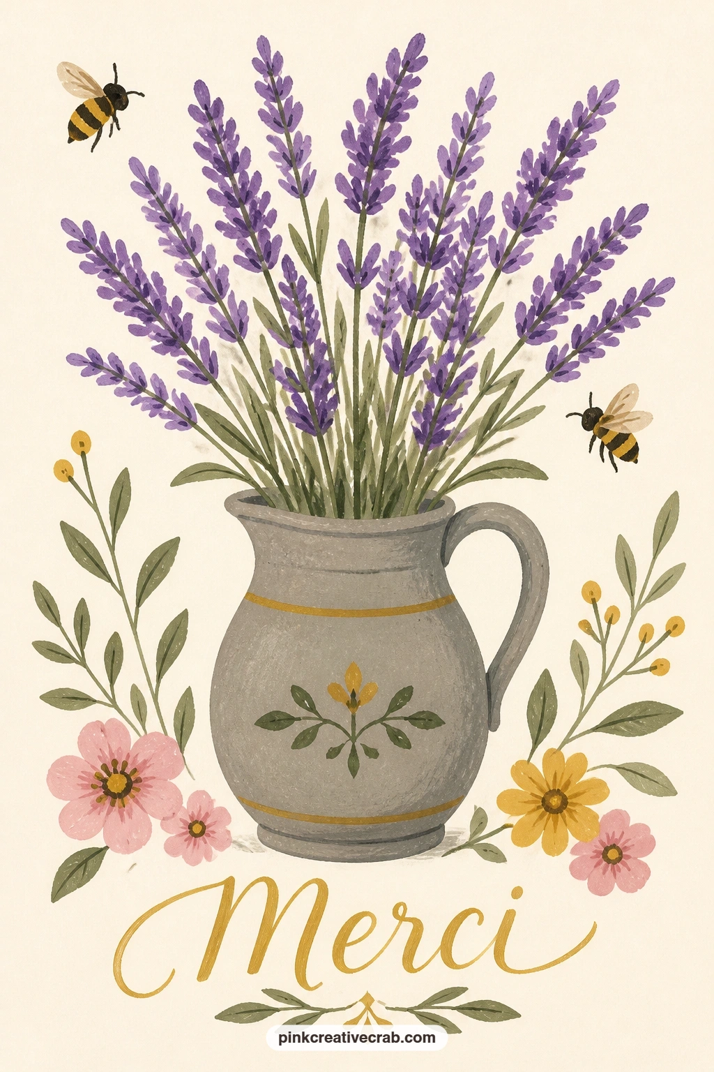
Back to a still life with movement added: bees buzzing around a jug of lavender on a garden table. Paint the jug first as a simple rounded form in a soft stoneware grey, then fill it with upright lavender stems in a repeated purple dash pattern, each stem just a short line of small oval marks stacked up the stalk.
Add two or three bees in different positions around the jug once the lavender is dry, one near the top, one lower, one slightly turned, so they feel like they are actually circling rather than pasted on.
Light here comes from one side, so give the jug a soft shadow on its far edge and a highlight stripe on the near side, which is what makes a plain rounded shape read as a solid object rather than a flat cutout. No purple gouache? Mix a little blue into your rose pink until it leans lavender.
Finish with a thin gold line along the table edge to lift the whole scene.
Palette: Lavender Purple,Stoneware Grey,Buttercup Yellow,Gold
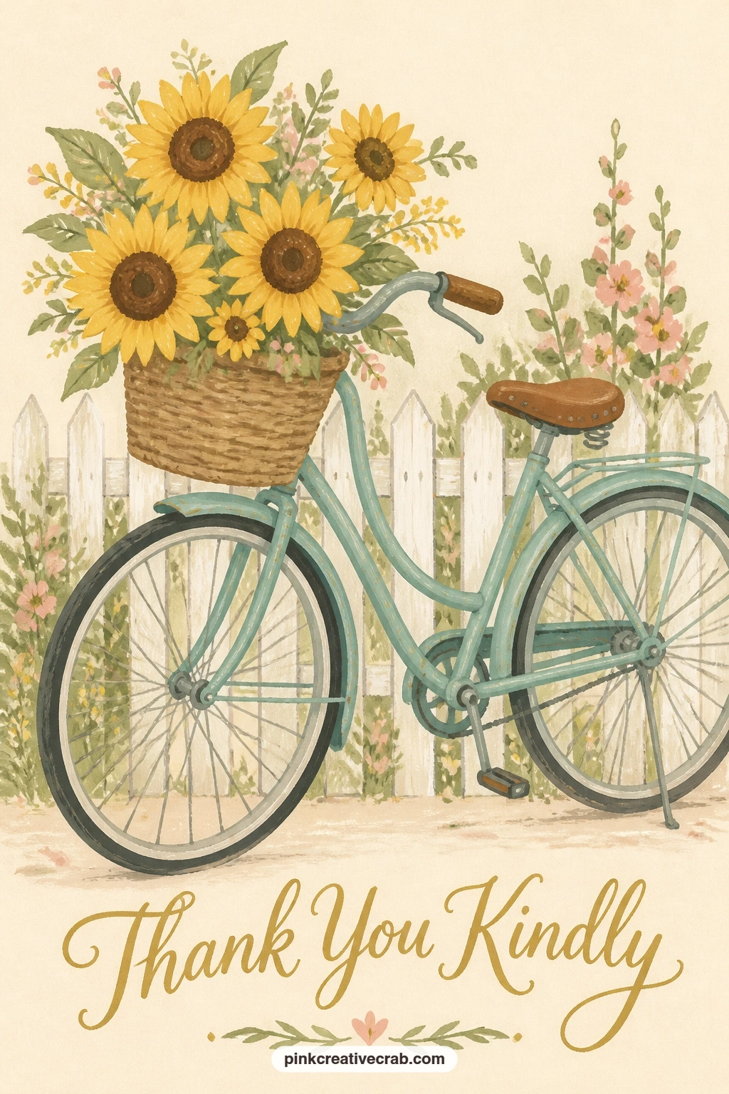
Scale up the scene again with a bicycle basket full of sunflowers parked by a white picket fence. Paint the bicycle frame first as thin, confident lines in a dusty teal, keeping the wheels as simple circles rather than trying to render spokes in detail.
Build the basket as a woven oval in warm brown, then pack it with sunflower heads in buttercup yellow with small brown centre circles, overlapping two or three so the basket looks genuinely full rather than holding one flower each.
The picket fence behind should stay simple white rectangles with gaps of cream showing through, painted last so you can keep the edges crisp against the already-dry bicycle. If teal is not in your palette, any muted blue-green mixed from blue and a touch of yellow will do.
Try the whole scene in under ten minutes first with flat colour only; if you have more time, add a thin shadow line under the bicycle to settle it onto the ground.
Palette: Buttercup Yellow,Warm Brown,Dusty Teal,Cream White
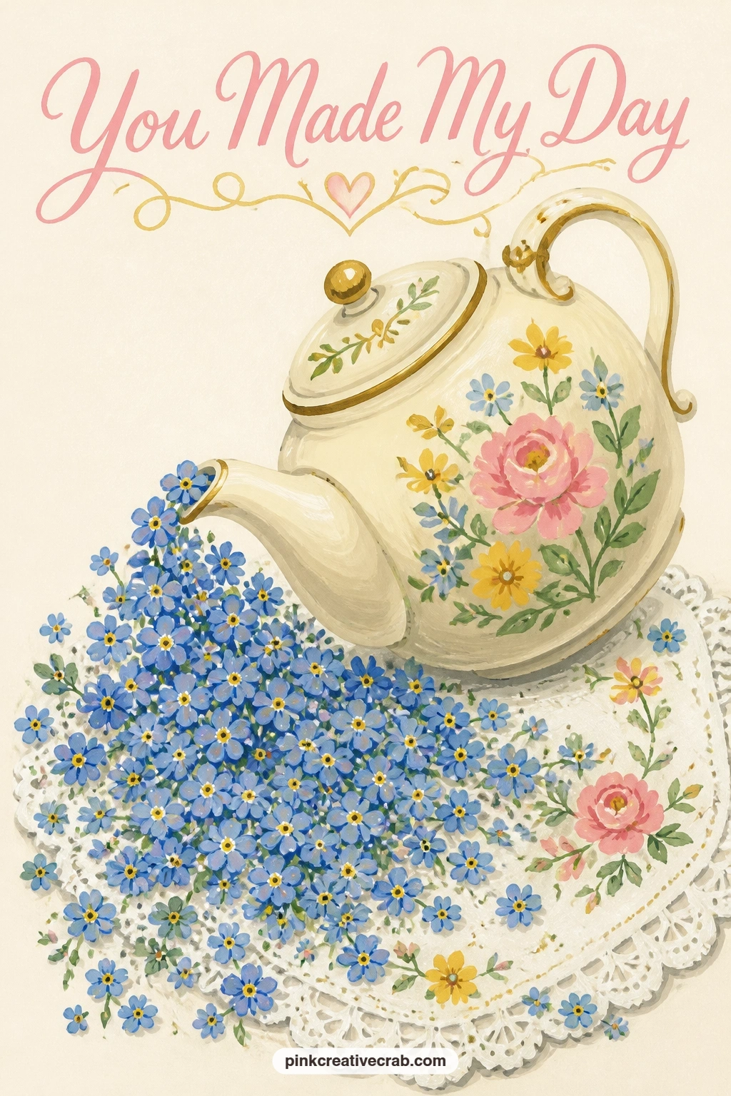
Here the flowers themselves become the spill: a teapot tipped so a cascade of forget-me-nots pours onto a lace cloth below. Paint the teapot first as a rounded body with a simple curved spout and handle, in a soft cream or pale blue, tipped at an angle so the spout points down toward the cloth.
Build the cascade next as a loose stream of tiny blue dot flowers with yellow centres, denser near the spout and thinning out as they scatter down, which is what sells the idea of pouring rather than just scattered flowers near a pot.
Save the lace cloth for last, suggesting the pattern with small white scalloped edges and a few simple dot clusters rather than painting every thread, since over-detailing the lace will fight with the flower cascade for attention. No fine liner for the tiny blossoms? The tip of a toothpick dipped in gouache makes neat small dots.
Keep the dot flowers small and consistent in size so the cascade reads as one continuous motion.
You Will Need
- toothpick or fine dotting tool
Palette: Cream White,Forget-Me-Not Blue,Buttercup Yellow,Soft Grey
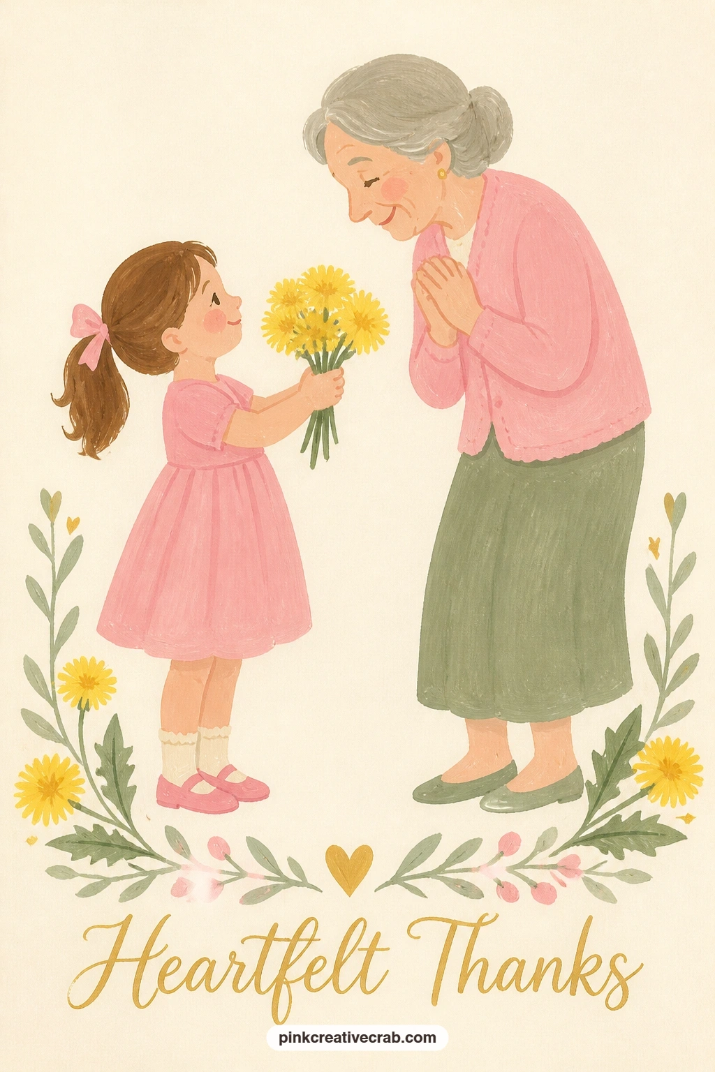
Keep the figures but soften the scene: a little girl offering a handful of dandelions to her grandma. Block both figures as simple rounded shapes first, the girl smaller and in a bright dress, grandma a little taller and softer in colour, standing close enough that their outstretched hands can meet in the middle.
Paint the dandelions as small loose yellow starbursts, three or four held together in the girl’s hand, with one or two fluffy white seed heads mixed in for variety so the bunch does not read as identical flowers.
Compare the two heads before you paint either body in full: grandma’s head sits a touch higher than the girl’s, and keeping that gap small and consistent is what makes them read as family standing close rather than two unrelated figures. If you would rather skip faces, two simple head shapes turned slightly toward each other still tell the story.
Finish with a thin green line for grass under both pairs of feet.
Palette: Buttercup Yellow,Blush Pink,Sage Green,Soft Grey
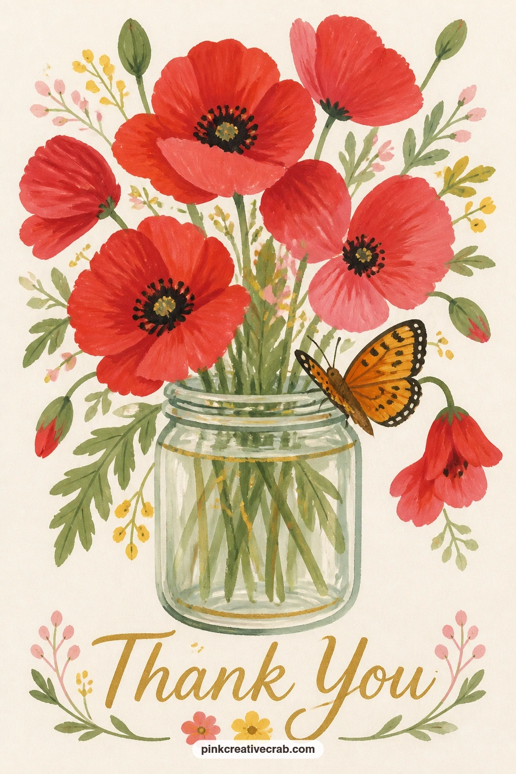
Return to a quieter still life with a butterfly resting on a jam jar of wild poppies. Paint the jar first as a simple cylinder in pale translucent grey-blue, leaving a lighter vertical strip down one side to suggest glass before anything else goes on top of it.
Build the poppies inside in a bright coral red, each flower just four or five loose rounded petals around a small black centre dot, painted slightly overlapping so the bunch feels gathered rather than lined up in a row.
Add the butterfly resting on the jar’s rim last, wings painted as two simple symmetrical shapes in a soft orange with a thin black outline, since painting it last lets you place it wherever the composition needs a little lift. No grey-blue for the glass? A thin wash of black mixed heavily with water gives a similar translucent look.
Keep the poppy petals loose and slightly ragged at the edges; poppies never have tidy outlines in real life either.
Palette: Poppy Red,Ivory Black,Soft Orange,Pale Grey Blue
Move to a market setting with a paper cone of ranunculus sitting on a florist’s marble counter. Paint the cone first as a simple triangular shape in kraft brown or soft cream, leaving its top edge open and slightly uneven rather than a perfectly straight line, which reads more like real wrapping paper.
Fill the opening with ranunculus heads in layered pink and coral, each flower built from tight concentric petal rings rather than loose petals, since that tight swirl is what makes ranunculus look distinct from a rose or a peony.
The marble counter behind benefits from a few thin grey veining lines added once the base colour is fully dry, dragged in loose diagonal strokes with a nearly dry brush so they stay soft rather than looking like cracks. If marble veining feels fiddly, a plain flat cream counter works just as well and keeps the focus on the flowers.
Vary the ranunculus sizes slightly so the bunch reads as gathered by hand rather than printed.
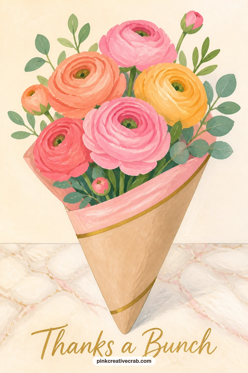
Palette: Coral Pink,Soft Cream,Pale Grey,Sage Green
Bring in a bird for the first time: a garden robin perched on the handle of a flower-filled watering can. Paint the watering can body first as a simple rounded galvanized shape in soft grey, with the spout and handle as separate thin curved forms added once the body is dry.
Fill the can’s open top with a loose bunch of mixed small flowers in pink and yellow, just enough to suggest a bouquet without detailing every stem, then paint the robin perched on the handle in a simple rounded body shape, warm orange breast and soft brown back.
The eye level here sits close to the ground looking slightly up at the can, which is what gives the robin’s perch some height and makes the whole scene feel like a real garden moment rather than a flat label. No grey for galvanized metal? A mix of blue, white and a touch of black gets close.
Keep the robin’s orange breast the brightest colour in the scene so your eye lands on it first.
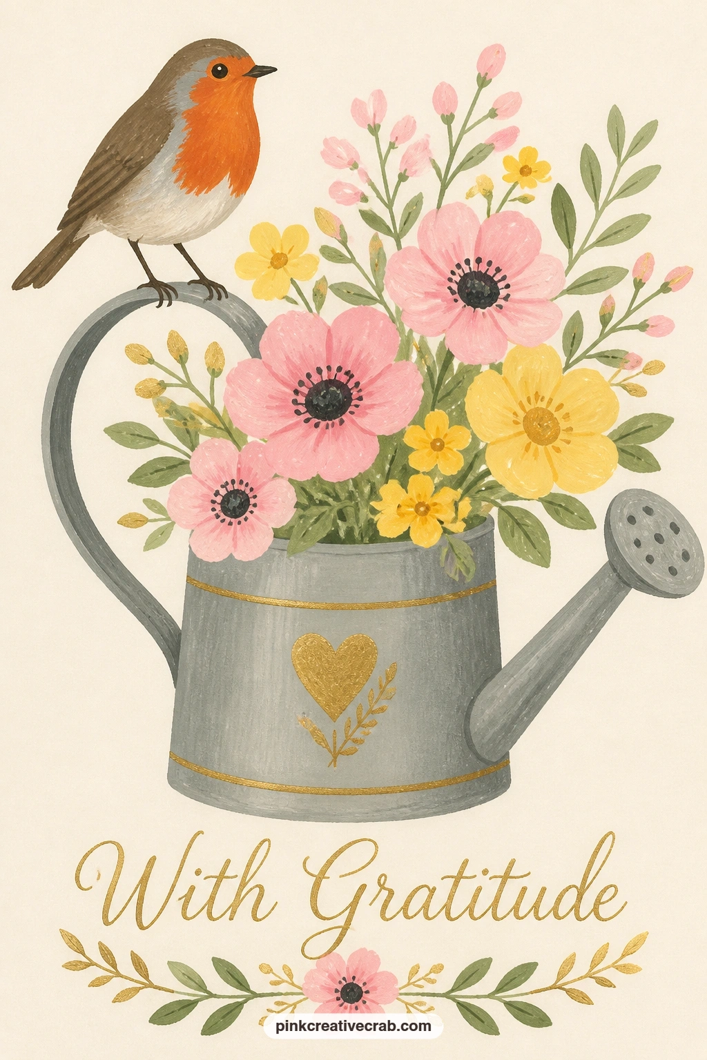
Palette: Galvanized Grey,Robin Orange,Warm Brown,Blush Pink
Try a framing device next: a round window opening onto a cottage garden full of hollyhocks. Paint the circular window frame first in a soft weathered white or pale blue, leaving the inside completely blank until the frame edge is fully dry and clean.
Inside the circle, build tall hollyhock spires in pink, coral and pale yellow, painted as stacked rounded petal shapes climbing up thin green stems, with two or three spires at different heights so the garden feels deep rather than flat against the window.
A small strip of cottage roofline or sky at the very top of the circle gives the scene somewhere to breathe; without it the hollyhocks can feel cramped against the frame edge. No compass or circle guide handy? A plate, jar lid or cup traced in pencil first works just as well for a clean round frame.
Keep the window frame a flat, even colour so the garden inside stays the brightest part of the card.
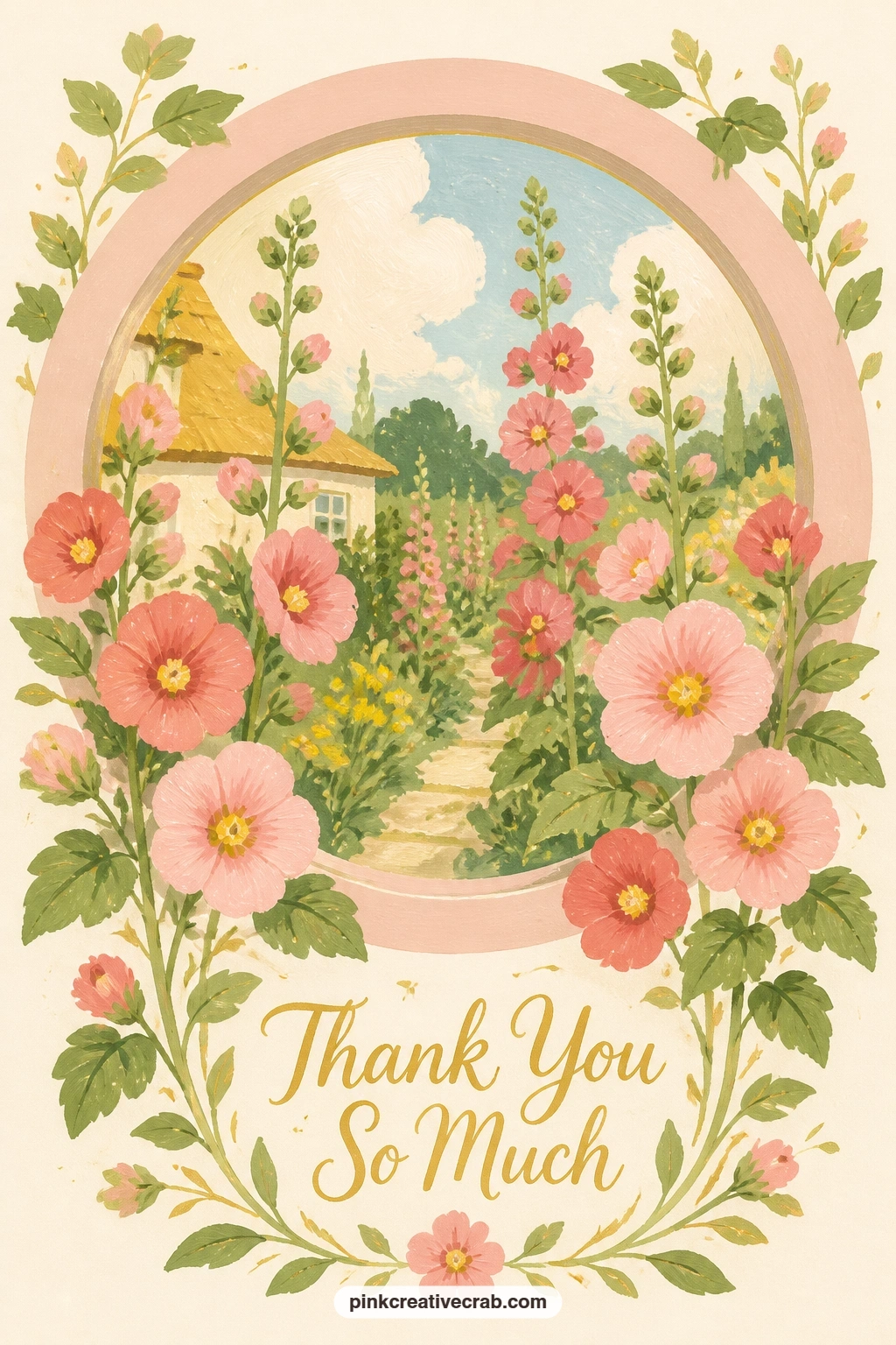
You Will Need
- plate or cup to trace a circle
Palette: Pale Blue,Coral Pink,Buttercup Yellow,Sage Green
For more cottage garden scenes with gates, arbors and hollyhocks like this one, the cottage garden junk journal collection has plenty of related ideas.
Keep the framing idea but simplify the subject: a bouquet of anemones tied with twine, resting on a kitchen chair. Paint the chair first as a simple flat shape, just enough of its back and seat visible to give the bouquet somewhere to sit, in a soft faded wood tone.
Build each anemone with a dark centre disc first, nearly black, then add loose white or deep purple petals radiating out around it, which is the order that keeps the centre from disappearing under the petals.
Add the twine last as one simple looping line wrapped twice around the stems, painted in a thin brown so it reads as tied rather than drawn over the top. If you do not have a chair reference in mind, a plain stool or simple bench shape works the same way.
Vary which anemones face forward and which tilt slightly sideways so the bunch does not look like it is facing one direction all at once.
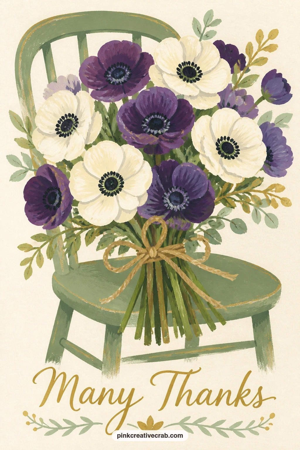
Palette: Deep Purple,Soft White,Ivory Black,Faded Wood
Bring in a pet for the first time: a cat sniffing a vase of pink roses on a sunny sideboard. Paint the vase first as a simple tall cylinder in soft sage or cream, then fill it with three or four rose shapes in blush pink built the same way as the earlier basket roses, spiral clusters rather than individual petals.
Add the cat beside the vase next, a simple sitting silhouette with its head tilted up toward the flowers, nose nearly touching one bloom. Keep the body one flat colour block, whether tabby, ginger or solid grey, and save whiskers for the very last step as thin white lines over the dry fur colour.
Compare the cat’s seated height to the vase before committing to paint; a cat sitting tends to reach roughly the same height as a mid-sized vase, which is what makes the sniffing gesture believable rather than the cat looming over the flowers or disappearing beside them.
Finish with a warm yellow wash behind both for the sunny sideboard glow.
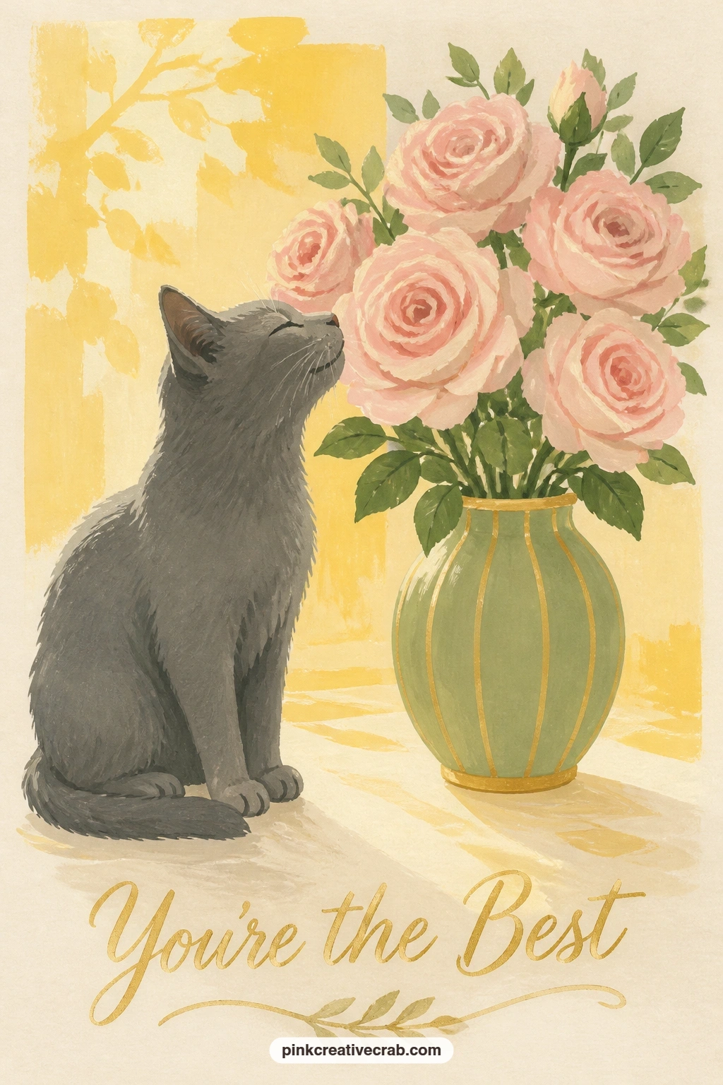
Palette: Blush Pink,Soft Sage,Warm Grey,Buttercup Yellow
Slow right down with the simplest subject yet: a single pink camellia floating in a teacup on a saucer. Paint the teacup and saucer first as two simple rounded shapes in pale cream or soft white, keeping the inside of the cup a slightly darker tone to suggest water sitting inside it.
Build the camellia as one flower only, layered rounded petals in two tones of pink with a small cluster of golden stamens at the centre, painted sitting just on top of the darker water tone rather than floating above it.
This is the piece to try fully in under ten minutes, since one flower and two simple vessel shapes leave little room to overwork it; if you have more time, add a soft shadow under the saucer and a single reflection line across the water’s surface for the forty-minute version.
No gold for the stamens? A few small dots of buttercup yellow read just as well at this scale.
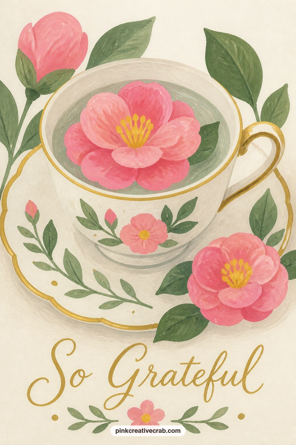
Palette: Camellia Pink,Deep Pink,Gold,Soft White
Scale back up with a wheelbarrow of potted geraniums outside a blue garden shed. Paint the shed wall first as a flat blue rectangle filling the background, then the wheelbarrow in front as a simple rounded metal tray shape with one visible wheel, in a warm rust tone.
Fill the barrow with three or four terracotta pots of geraniums, each pot a small trapezoid topped with a rounded cluster of red or coral blooms over simple green leaf shapes, varied slightly in height so the load looks genuinely piled rather than lined up.
The wheel is where this composition can go wrong if it is drawn too small or too central, since a wheelbarrow wheel actually sits well forward and low; nudging it toward the front edge is what keeps the whole barrow looking balanced rather than about to tip backward. No rust paint mixed? Burnt sienna straight from the tube is close enough.
Finish with one flower pot slightly overflowing the barrow’s edge for a lived-in feel.
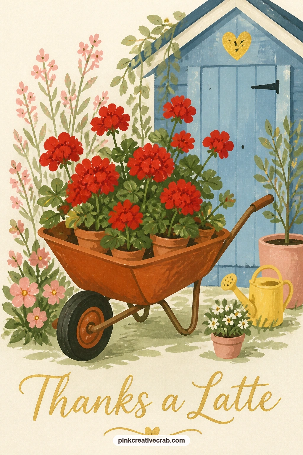
Palette: Shed Blue,Rust,Geranium Red,Terracotta
Take the scene to a picnic with a honey jar and a bunch of clover on a blanket, a bee hovering nearby. Paint the blanket first as a simple flat shape with two or three wide stripes in sage and cream, since a loud pattern will compete with everything placed on top of it.
Build the honey jar next as a simple rounded shape in warm amber glass, with a small gingham or plain fabric cap tied over its lid, then add a loose bunch of clover beside it in soft green with small round pink-white pompom flower heads.
Add the bee last, hovering just above the clover rather than landing on it, since a hovering bee with simple wing shapes slightly offset from its body reads as mid-flight more convincingly than one drawn flat against a flower. No amber paint on hand? Mix buttercup yellow with a touch of burnt sienna.
Keep the blanket stripes evenly spaced so they read as fabric rather than background noise.
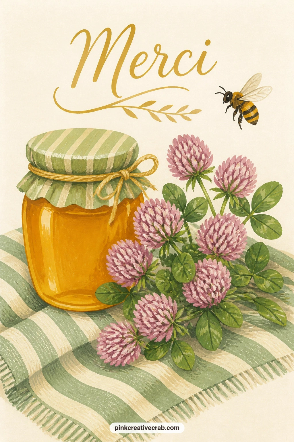
Palette: Honey Amber,Sage Green,Blush Pink,Cream White
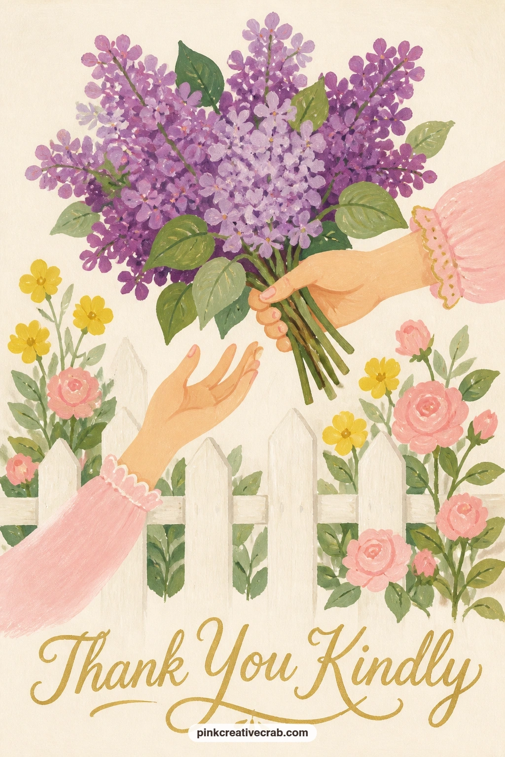
Bring back a human gesture with a hand passing a bunch of lilacs over a garden fence to a neighbor. Paint the fence first as a simple row of flat white or pale grey pickets running across the lower third of the card, leaving one small gap where the hand will reach through.
Build the lilac bunch next in soft purple, painted as dense small clustered dot shapes rather than individual blossoms, since lilac heads are really made of hundreds of tiny flowers and a cluster of dots reads far more convincingly than trying to paint each one.
Add just one hand reaching over the fence holding the stems, kept simple with soft rounded fingers rather than detailed knuckles, and a second hand reaching up from the other side to receive them if there is room. If purple feels too cool, warm it slightly with a touch of pink for a softer lilac.
Finish with a thin green stem line connecting the cluster to the holding hand.
Palette: Lilac Purple,Soft Pink Purple,Pale Grey,Sage Green
For a deeper dive into lilac colour mixing and more lilac scenes to practice, the lilac junk journal roundup pairs well with this idea.
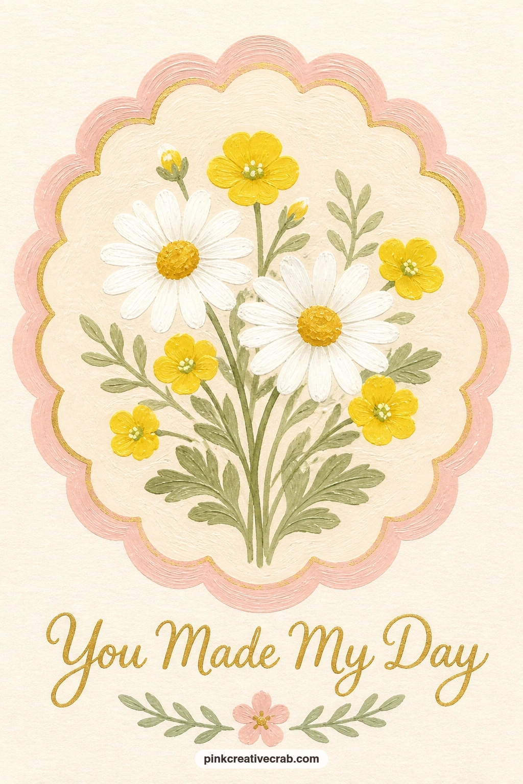
Return to a simple framed posy: a scalloped circle framing daisies and buttercups. Draw the scallop edge first in pencil using a small coin or lid traced repeatedly around a larger circle guide, then go over the final outline in paint once you are happy with the spacing.
Fill the circle with a small gathered posy, simple white daisy shapes with yellow centres mixed with smaller buttercup blooms, keeping the whole bunch loosely centred so there is breathing room between the flowers and the scalloped edge.
This is another ten-minute piece at its simplest, just flat daisy and buttercup shapes with no shading; for the forty-minute version, add a thin gold line tracing just inside the scallop edge to give the card a finished, pressed-print look.
No second circle guide for the scallops? A row of small dots spaced evenly by eye works nearly as well once you connect them with soft curves.
You Will Need
- coin or small lid to trace scallops
Palette: Soft White,Buttercup Yellow,Sage Green,Gold
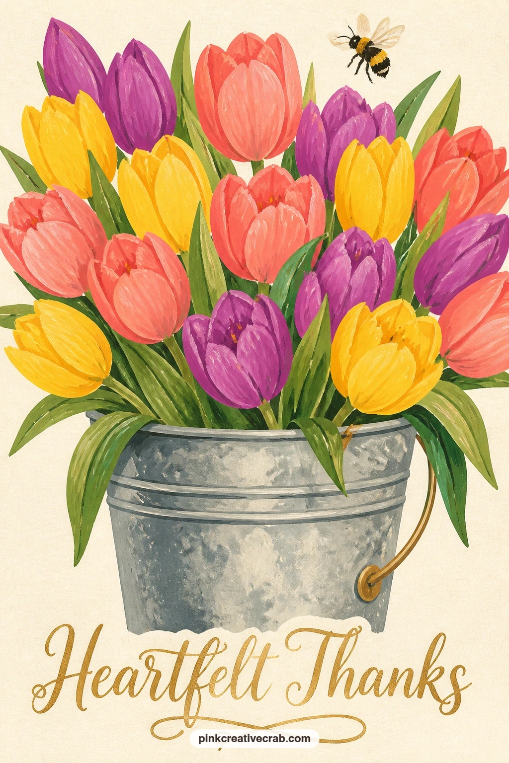
Head back to a market scene with a bucket of mixed tulips and a bee hovering above. Paint the bucket first as a simple galvanized cylinder in cool grey, slightly narrower at the base than the top, then fill it with a dense mix of closed tulip cups in coral, pink, yellow and soft purple.
Vary the tulip heights so some sit higher than others, since a market bucket bunch never has every flower at the same level, and that small inconsistency is what makes the bunch feel genuinely gathered rather than arranged in rows.
Add the bee hovering just above the tallest tulips last, small and simple, mostly there to draw the eye upward and give the composition somewhere to breathe above the bucket. No galvanized grey mixed? A plain mid grey from black and white works fine.
Keep the tulip colours in just three or four tones so the bucket reads as a considered bunch rather than a random scatter.
Palette: Coral Pink,Buttercup Yellow,Lavender Purple,Cool Grey
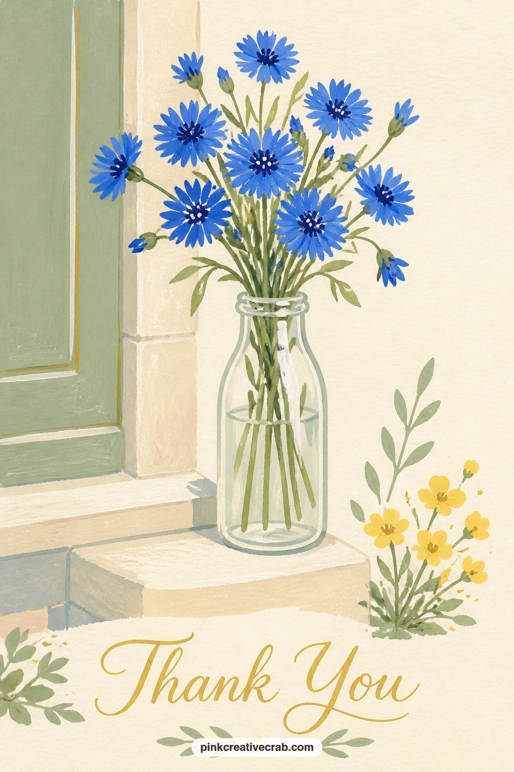
Simplify again with a bunch of cornflowers in a milk bottle on a front step. Paint the bottle first as a simple tall glass shape, leaving a thin vertical highlight strip of bare cream paper down one side to suggest the glass before the cornflowers go in.
Build the cornflowers above the bottle’s neck in a bright true blue, each flower just a small cluster of thin jagged petal shapes around a darker centre, since cornflowers have a distinctly spiky silhouette compared to the rounder roses and peonies earlier in this list.
Keep the stems simple and mostly hidden inside the bottle, with just a hint of green visible through the glass where the highlight strip breaks. If true blue leans too purple in your set, add a touch of white to lighten and cool it.
Finish with a small shadow beneath the bottle to settle it onto the step.
Palette: Cornflower Blue,Soft White,Sage Green,Pale Grey
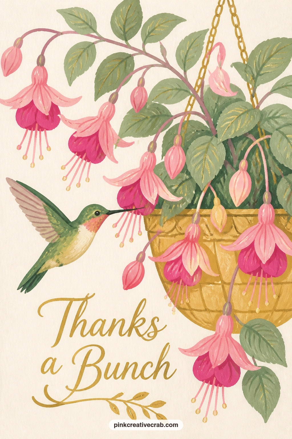
Bring in a second bird subject: a hummingbird sipping from a pot of pink fuchsias on a porch. Paint the hanging pot first as a simple rounded basket shape in warm brown, then fill it with drooping fuchsia blooms, each flower a small teardrop shape in two tones of pink with thin stamens trailing below.
Add the hummingbird next, its body a small simple oval in iridescent green, with a long thin beak reaching toward one of the lower blooms and wings suggested as a soft blurred smudge rather than a sharp shape, since real hummingbird wings move too fast to see clearly.
That wing blur is the trick worth practicing: load a nearly dry brush with a thin grey-green and sweep it quickly on either side of the body, letting the edges stay soft rather than outlined. No iridescent green in your set? A mix of sage green and a touch of blue gets close.
Keep the fuchsia blooms drooping downward; upright ones read as a different flower entirely.
Palette: Fuchsia Pink,Iridescent Green,Warm Brown,Soft Grey Green
For more hummingbird poses and porch flower settings like this one, the hummingbird junk journal collection is worth a look.
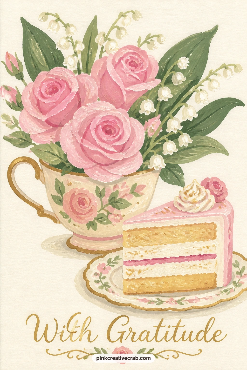
Pair flowers with food for the first time: a teacup bouquet of roses and lily of the valley beside a slice of cake. Paint the teacup first in soft white or pale pink, then fill it with small rose clusters and a few drooping lily of the valley stems, the tiny bell flowers painted as simple rows of small white dots along a curved green stem.
Add the cake slice beside the cup next, a simple triangular wedge with two or three flat layers in cream and soft pink, topped with a thin line of white icing drizzled over the top edge.
Keep the cake smaller in scale than the teacup bouquet, since the flowers are the real subject here; a cake slice that competes in size pulls focus away from the thank you message the flowers are carrying. No lily of the valley reference handy? A row of tiny white half-circles along a stem reads close enough.
Finish with a thin fork resting beside the cake for a lived-in, just-served feel.
Palette: Blush Pink,Soft White,Sage Green,Cream
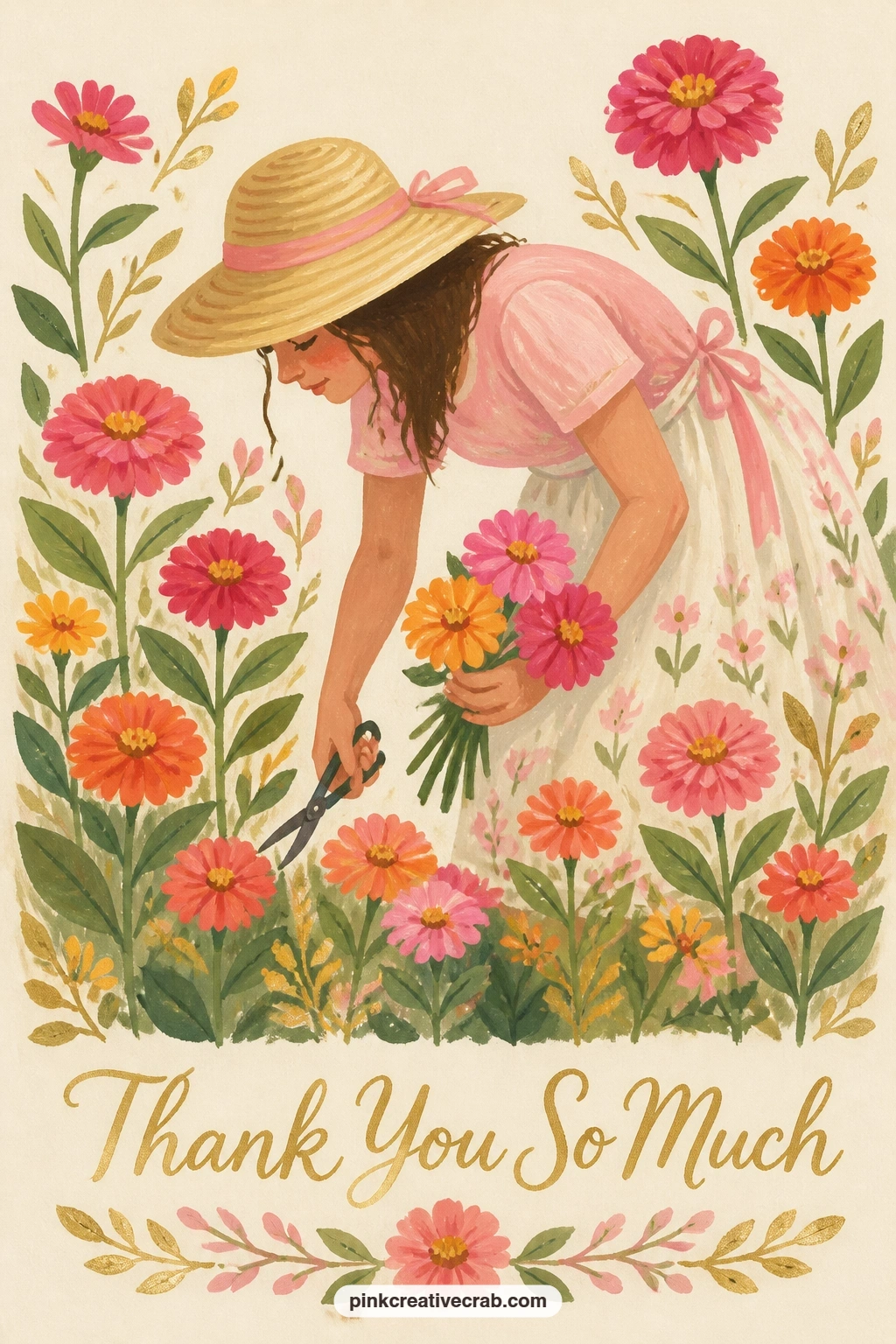
Bring the figure back into motion with a girl in a straw hat cutting zinnias in a sunny garden. Paint her simple standing silhouette first, bent slightly forward at the waist, straw hat as a flat oval with a thin brim line, one hand reaching toward a zinnia stem and the other holding small garden snips.
Build the zinnia bed around her next, a cluster of bold round flower heads in hot pink, orange and buttercup yellow, each one just layered concentric petal rings similar to the ranunculus from earlier but flatter and bolder in colour.
Compare her bent posture to a straight standing figure before you commit to paint: the forward lean should come from the waist, not the neck, which is what keeps her looking like she is reaching for a flower rather than peering down awkwardly. No snips in mind? A small pair of scissors held loosely reads the same.
Keep the zinnia bed dense and bright so it reads as abundant rather than sparse.
Palette: Hot Pink,Orange,Buttercup Yellow,Straw Tan
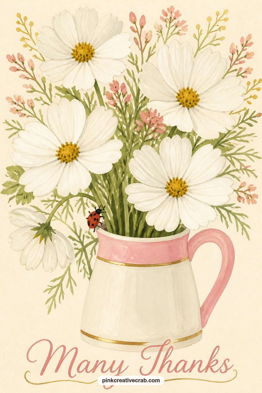
Slow back down with a ladybug climbing a stem in a jug of white cosmos. Paint the jug first as a simple rounded glass or ceramic shape in a pale neutral tone, then fill it with loose cosmos blooms in soft white, each flower just a ring of thin pointed petals around a small yellow centre disc.
Add the ladybug climbing one visible stem near the base of the jug, painted as a simple red dome shape with a thin black line down the centre and small black dots scattered across its back, legs suggested as just a few thin lines rather than fully articulated.
The dry brush trick suits the cosmos petals well here: load a flat brush with mostly pigment and very little water, then drag it lightly from petal base to tip so the edge breaks up slightly and feels papery rather than solid. No white gouache that covers well? Add the thinnest touch of yellow to warm it and help it stand out from the cream background.
Keep the ladybug small; it should read as a detail you notice second, not first.
Palette: Soft White,Buttercup Yellow,Ladybug Red,Ivory Black
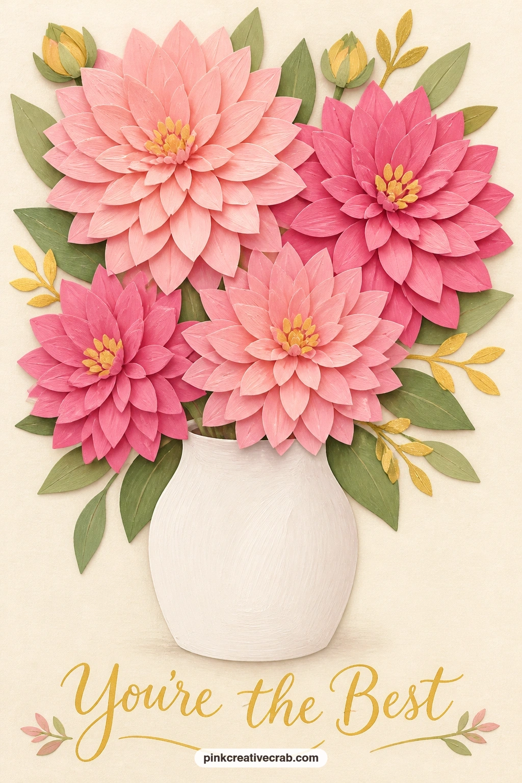
Push the flat gouache style further with a layered, paper-cut look bouquet of pink dahlias in a white vase. Paint the vase first as a simple clean cylinder in soft white with a thin grey shadow edge, then build each dahlia from the outside in, starting with a large back layer of long pointed petals in pale pink.
Add a second, slightly smaller layer of petals in a deeper rose on top of the first, offset so the two layers overlap like cut paper shapes stacked on each other, then a small tight centre cluster in the deepest pink or coral to finish each bloom.
This layered build is the whole appeal of a paper-cut look, so keep every petal edge crisp and let each layer dry fully before the next goes on top; rushing it blurs the layers into one flat shape and loses the effect entirely. No three pinks in your set? Mix one base pink and simply add more or less white between layers.
Vary how many layers show on each dahlia so the bouquet has rhythm rather than repeating one flower three times.
Palette: Pale Pink,Deep Rose,Coral,Soft White
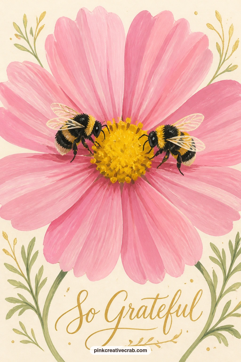
Simplify the subject again, down to two bees sharing one big pink cosmos flower in a meadow. Paint the single cosmos bloom first, large and filling much of the card, with thin pointed petals in bright pink radiating from a yellow centre disc, since this flower carries the whole composition.
Add the two bees next, positioned on opposite sides of the centre disc so neither crowds the other, each built from the same simple striped oval body as the earlier bee idea, just turned at slightly different angles so they do not look identical.
Vary this one next time by swapping the cosmos for a different large flat flower, a zinnia or a single dahlia layer, since the same two-bees composition works with almost any big bloom once you have the bee shape comfortable. No meadow background planned? A few soft green blur strokes behind the flower suggest grass without any detail needed.
Keep the petal tips slightly ragged, since cosmos petals often have a small notch at the end.
Palette: Cosmos Pink,Buttercup Yellow,Ivory Black,Soft Sage
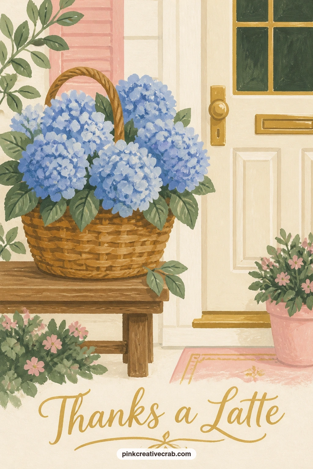
Build back up to a fuller scene with a basket of blue hydrangeas on a bench by a cream front door. Paint the bench first as a simple flat wooden shape in pale grey, then the basket sitting on top of it in warm brown, leaving the top open for the hydrangea heads.
Build each hydrangea head as a dense cluster of small four-petal florets in two or three blues, from pale sky to deeper cornflower, packed close together so the whole head reads as one soft round mass rather than individual tiny flowers.
Hydrangea heads are large and soft-edged compared to the roses and tulips earlier in this list, so keep the floret shapes loose and slightly varied in size; too much uniformity makes the cluster look printed rather than grown. No deep blue to mix the shadow tones? A touch of Payne’s grey added to any blue darkens it without muddying the colour.
Finish with the cream door behind kept completely flat so the basket stays the brightest part of the card.
Palette: Sky Blue,Cornflower Blue,Payne’s Grey,Warm Brown
For more blue hydrangea colour mixing and cottage scenes, the hydrangea junk journal collection has related porch and basket ideas.
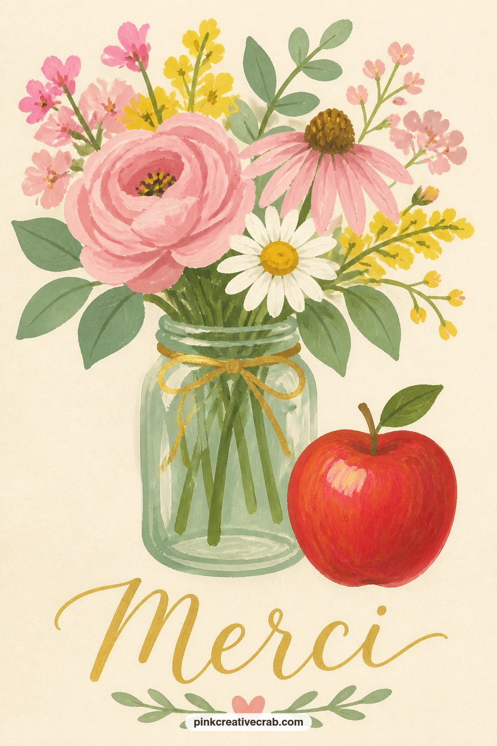
Shift the setting indoors with a teacher’s desk holding a jar of garden flowers and a red apple. Paint the desk surface first as a simple flat plane in warm honey brown, then the jar sitting toward one side, filled with a loose mix of small flowers in pink, yellow and white similar to the earlier daisy and buttercup posy.
Add the apple next, a simple rounded shape in bright red with a small brown stem and one leaf, placed slightly in front of the jar so the two objects feel grouped rather than lined up side by side.
A stack of books or a simple pencil cup behind the jar fills out the desk without much extra work, since a single flat rectangle for a book spine reads clearly at this small scale. No bright red on hand? Mix a touch of orange into your rose red to warm it toward true apple red.
Keep the flowers smaller in scale than the apple so the whole arrangement feels like a thank you gift rather than a still life lesson.
Palette: Apple Red,Honey Brown,Blush Pink,Buttercup Yellow
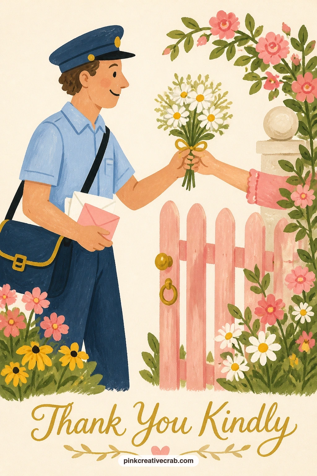
Close the set with a small story: a mail carrier receiving a small posy at a garden gate. Paint the gate first as a simple flat shape in weathered blue or grey, then the mail carrier standing just beyond it, a simple figure in a plain uniform colour with a bag slung across one shoulder.
Build the posy being handed over next, small and simple, just a few daisies or buttercups tied with a thin ribbon, held between a second hand reaching through the gate and the mail carrier’s own hand reaching to accept it.
Keep both figures’ postures slightly turned toward each other rather than facing straight ahead, since that small twist is what makes the handoff feel like a real moment rather than two stiff figures standing side by side. No uniform colour reference needed: a simple navy or grey shirt reads clearly enough on its own.
Finish with a small mailbox or satchel detail to anchor who this figure is without needing any lettering at all.
Palette: Navy Blue,Weathered Grey Blue,Buttercup Yellow,Soft White
What to Do Next
Pick one idea that matches who you are thanking, whether that is a quick scalloped posy for a quiet thank you or a fuller rose basket for something bigger. Start on a small sheet of watercolor paper, block in the largest shape first, and let each layer dry before the next; one sitting is really all any of these take.
Frequently Asked Questions
What is the best gouache for thank you card ideas like these?
A student-grade gouache set with at least pink, yellow, blue, sage green and white covers nearly every idea here. Student quality works fine for flat, matte card fronts since the thick, opaque finish is what matters most, not the price point.
Do I need watercolor paper or can I use regular card stock?
Watercolor paper or paper specifically made for cards holds up best, since gouache can cockle thin card stock. A light cold press paper around 140 pounds gives enough body to paint on without the surface warping as it dries.
How do I keep my gouache flowers looking flat instead of muddy?
Let each layer dry fully before adding the next, and avoid overworking one petal with too many brush passes. Mixing colours on the palette rather than blending wet paint directly on the paper keeps edges crisp and shapes clean.
Can I turn these thank you card ideas into a printed card?
Yes, painting the design on a separate sheet and scanning or photographing it works well for printing onto blank card fronts later. Keep the subject centred with a little margin around it so nothing important sits too close to the edge.
What size should I paint these thank you card scenes?
A square or portrait shape around five by seven inches gives enough room to work comfortably while still matching standard card proportions. Painting slightly larger than the final card size also makes fine details like bee stripes or lace easier to control.
Have any thoughts?
Share your reaction or leave a quick response — we’d love to hear what you think!
-
 0
-
0
-
0
-
0
-
0
-
0


