

Goldfish drawing turns into something much warmer than a textbook fish shape once you give that little orange body a bowl to live in, a cat to stare down, or a lily pad to hide under. Each setting below asks for the same loose, happy watercolor touch: a wet orange body, a few ink lines for the fins and face, and whatever glass, water or garden it calls home.
Scroll through all 29 and pick whichever one makes you want to wet a brush right now. Every idea below fits on one page and finishes in a single sitting, so you can go from blank paper to a finished little fish world over one cup of tea.
Using these images: free for personal projects such as printing, coloring, cards, journals and gifts. Handmade items that include them may be sold up to 30 pieces per design. More than that is commercial use and is not permitted, and neither is selling or sharing the images themselves or passing them off as your own. Please ask before any other use.
Start with the easiest setup in the whole list: a round goldfish bowl sitting on a windowsill, one fish curled inside it. Pencil a simple circle for the bowl, a smaller curved line near the top for the waterline, then the fish as two ovals (body and tail) tucked low in the glass.
Paint the water first in a pale blue-grey wash, leaving a thin white streak near the bowl’s edge for the glass shine. While that’s still a little damp, drop in the orange fish so its color softens at the edges, then once everything is dry, go back over the bowl rim and the windowsill with fine ink lines.
The usual snag here is a bowl that reads flat instead of round. Curve the waterline more than feels natural and keep the glass shine as a clean, untouched strip of paper, and the roundness will show up on its own.
If you do not have a windowsill reference handy, just paint a simple curtain line and a patch of sky blue behind the bowl to suggest the window without drawing it in full.
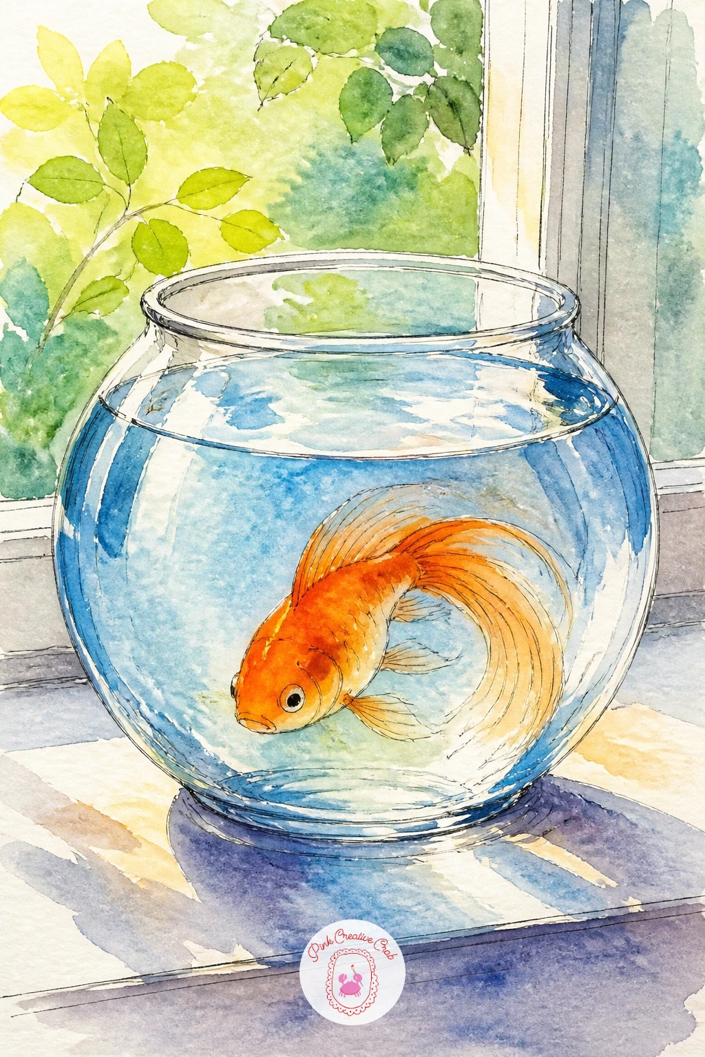
Palette: Cadmium Orange,Payne’s Grey,Cerulean Blue,Sap Green
Two goldfish swimming nose to tail make a heart shape almost by accident, which makes this one a favorite for a quick, sweet little painting. Sketch two curved C shapes facing each other so their bodies and tails form the two lobes of the heart, then let their tails taper to a point at the bottom.
Measure before you paint: hold your pencil up to compare the two fish bodies so they match in size, since a heart with one fat fish and one thin fish loses its shape fast. Paint both in the same warm orange, wet into wet, and keep a thin white gap of paper between the two bodies so the heart outline stays readable.
Add fine ink lines for fins and faces once dry, and a light blue wash behind them for water. If the heart shape gets lost, a few curved pencil guide marks on your first sketch will save you every time.
Keep the water around them pale so the heart stays the star of the page, not the background.
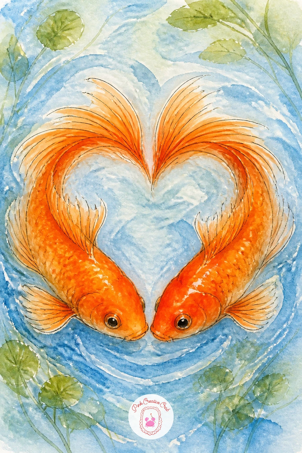
Palette: Cadmium Orange,Alizarin Crimson,Cerulean Blue
Try this one for a Valentine’s card insert, since the heart shape reads instantly even at a small size on thick cardstock.
This little face-off between a goldfish and a cat gives you a story in one small scene. Draw the bowl first, fish centered and facing outward with a wide, curious eye, then add the cat as a simple rounded head and paw shape pressed up against the outside of the glass.
Paint the cat in a flat, pale wash (grey or cream) so it reads as sitting behind the glass rather than in the water, and keep the fish’s orange bright and saturated by contrast. Work the bowl’s glass last with a few curved highlight lines in white paper left bare.
The composition tends to go wrong when the cat looks like it is inside the bowl too. Keep the cat’s outline fully outside the circle of the bowl and give the glass its own faint blue tint to separate the two worlds clearly.
No cat reference on hand? A simple round-eared silhouette with two whiskers reads as a cat instantly, so there is no need to draw a full face.
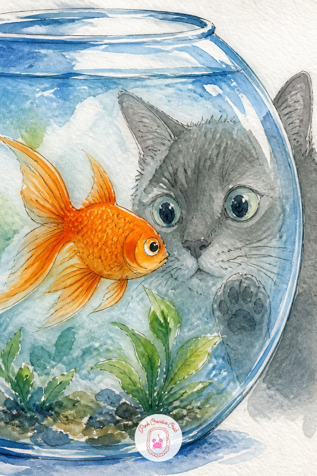
Palette: Cadmium Orange,Payne’s Grey,Raw Umber,Cerulean Blue
Move the fish outdoors for this one, into a small garden pond scattered with lily pads. Block in the water first with a loose green-blue wash, then paint two or three lily pads as flattened green ovals floating on top, leaving gaps of water color between them.
Drop the goldfish in last, partly tucked under one lily pad so only its head and part of its body show. This hidden placement is the whole charm of the piece and also hides any wobbly fish anatomy, so it is a forgiving choice if fish shapes still feel tricky.
Where this one usually goes wrong is pond water that looks muddy from overmixing greens and blues. Keep your washes separate and let them merge only a little at the edges, and leave small white sparkle flecks for sunlight on the surface.
Swap lily pads for simple round leaves if you want an even quicker version, since the shape reads the same from a distance.
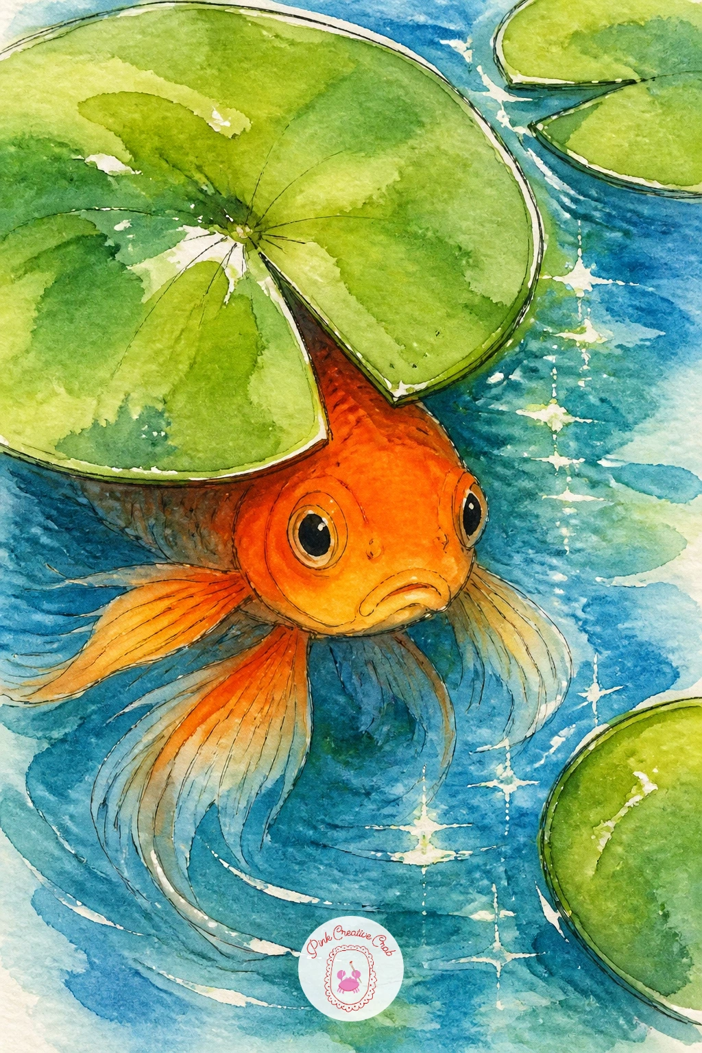
Palette: Sap Green,Cadmium Orange,Cerulean Blue,Hooker’s Green
Give the fish the full spotlight here, since a fantail’s tail is the real subject of the piece. Sketch a short, round body first, smaller than you’d expect, because the tail will do most of the visual work and needs room to flow across the page.
Paint the tail in several overlapping translucent layers, letting each dry a touch before adding the next so you build up soft ruffled edges instead of one flat shape. Keep your brush loaded with plenty of water for this part, since a dry brush on a flowing tail looks stiff rather than silky.
The eye-level trick matters here too: paint the fish as if you are looking at it slightly from above and to the side, so the tail can fan out across more of the page instead of hiding straight behind the body.
If layering feels fiddly, one single wash with a few darker orange lines dragged through while still wet gives a decent flowing effect in far less time.
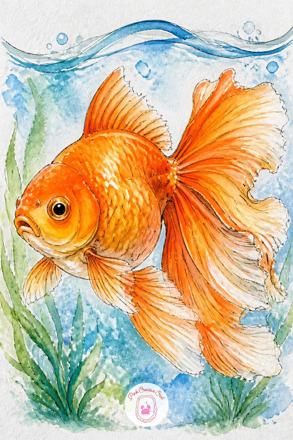
Palette: Cadmium Orange,Permanent Rose,Payne’s Grey
Carry on with the fairground feeling through a goldfish won at a fair, sealed in its clear plastic bag of water. Draw the bag first as a simple rounded rectangle with a twisted knot at the top, then paint the water inside it a touch lighter than you would in open water, since the thin plastic flattens the color.
Paint the fish small and slightly distorted, as if seen through the curve of the bag, which actually makes this an easier fish to paint since perfect anatomy matters less here. Leave thin diagonal streaks of white paper on the bag for the plastic’s shine, added last with a dry brush or simply left unpainted from the start.
This idea tends to fail when the bag disappears into the background. Keep a faint blue-grey outline around the whole bag shape so it reads clearly against the page, even where the plastic is see-through.
No fair reference needed: picture a loosely knotted sandwich bag and you have the shape exactly.
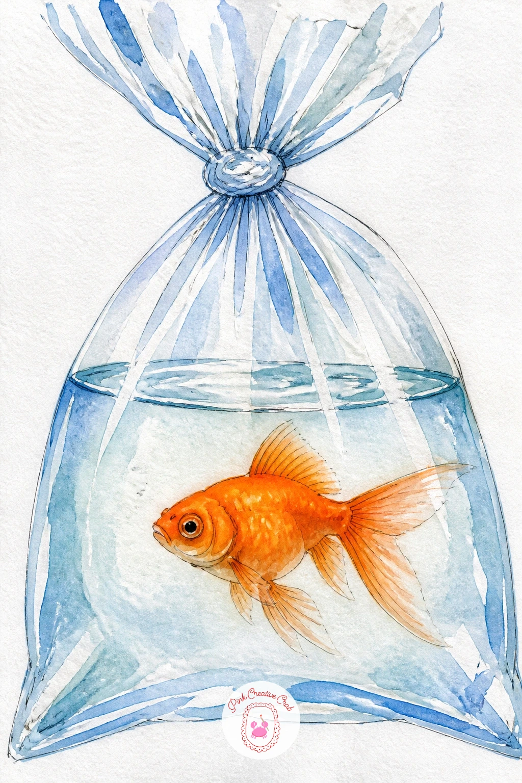
Palette: Cadmium Orange,Payne’s Grey,Cerulean Blue
Add a classic bit of fishbowl furniture with a tiny castle ornament sitting at the bottom of the glass. Paint the bowl and water first, then sketch the castle as a simple cluster of small rectangles and triangle roofs, kept noticeably smaller than the fish above it so the scale still reads as a toy, not a real building.
Color the castle in a muted grey or sandy tone so it sits quietly behind the brighter orange fish, which should stay your main focus swimming above or beside it. Paint the fish last, slightly overlapping the castle’s outline, to keep the sense of depth in the water.
The composition often goes flat when the castle and fish end up the same size on the page, losing any feeling of distance. Shrink the castle more than feels right and the bowl will instantly read as deeper and more three-dimensional.
A simple pebble pile works as a stand-in castle shape if turrets feel like too much detail today.
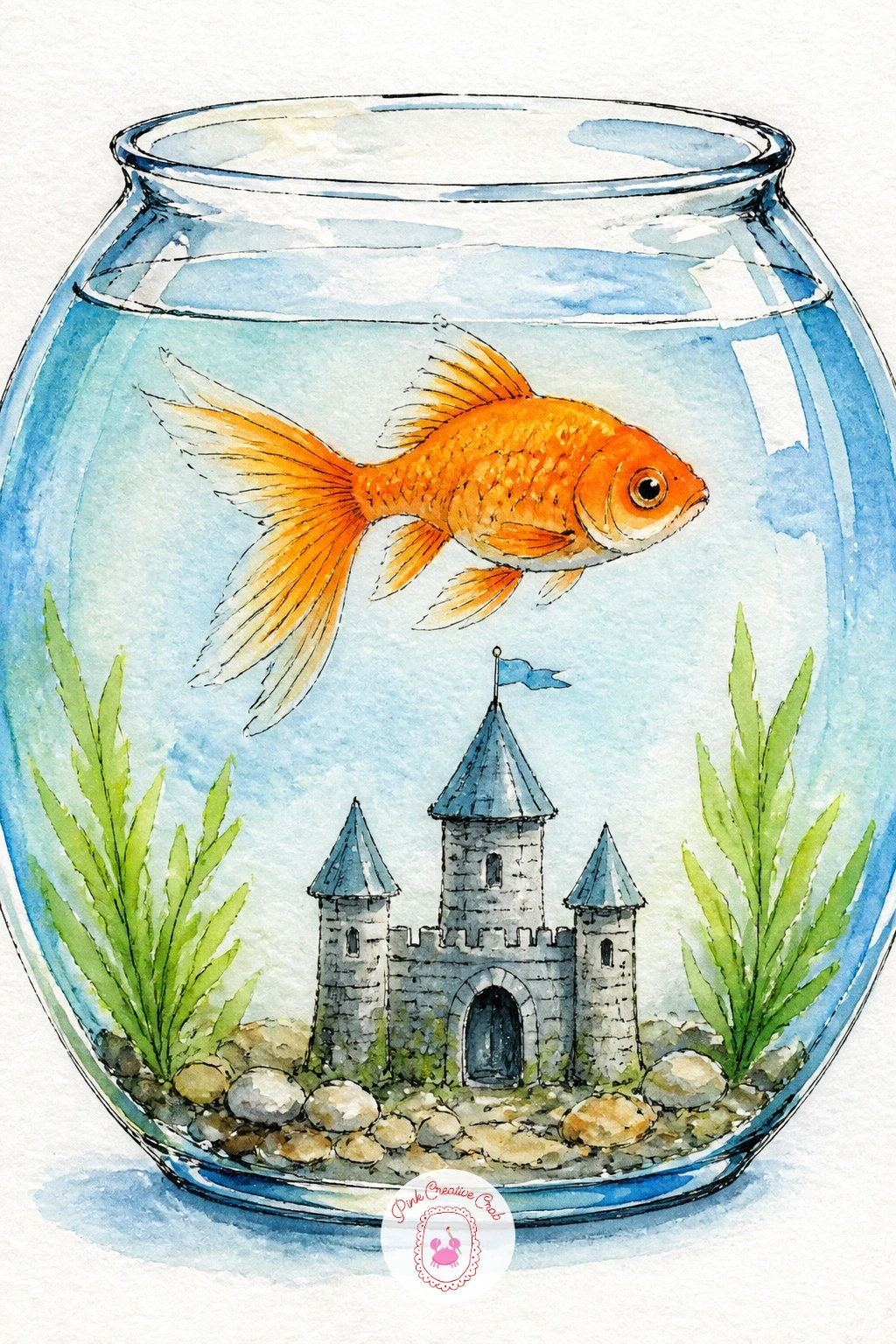
Palette: Cadmium Orange,Payne’s Grey,Raw Sienna,Cerulean Blue
Keep the fish the only character on the page this time, caught mid-bubble with its mouth puckered into a small round O. Paint the body first in your usual orange wash, then while it’s still slightly damp, lift a tiny circle of color near the mouth with a clean damp brush to suggest the start of a bubble forming.
Once dry, paint a trail of small circles rising from the mouth toward the top of the page, leaving the centers of each one almost white with just a thin ring of pale blue-grey around the edge. A kneaded eraser can lift any pencil guidelines peeking through once the paint is dry.
Bubbles often end up looking like flat dots instead of glass spheres. A single tiny white highlight dot in the upper corner of each circle, left unpainted or added later with a white gel pen, is what makes them read as round and shiny.
Vary the bubble sizes as they rise, smaller near the mouth and slightly larger near the surface, for a more natural trail.
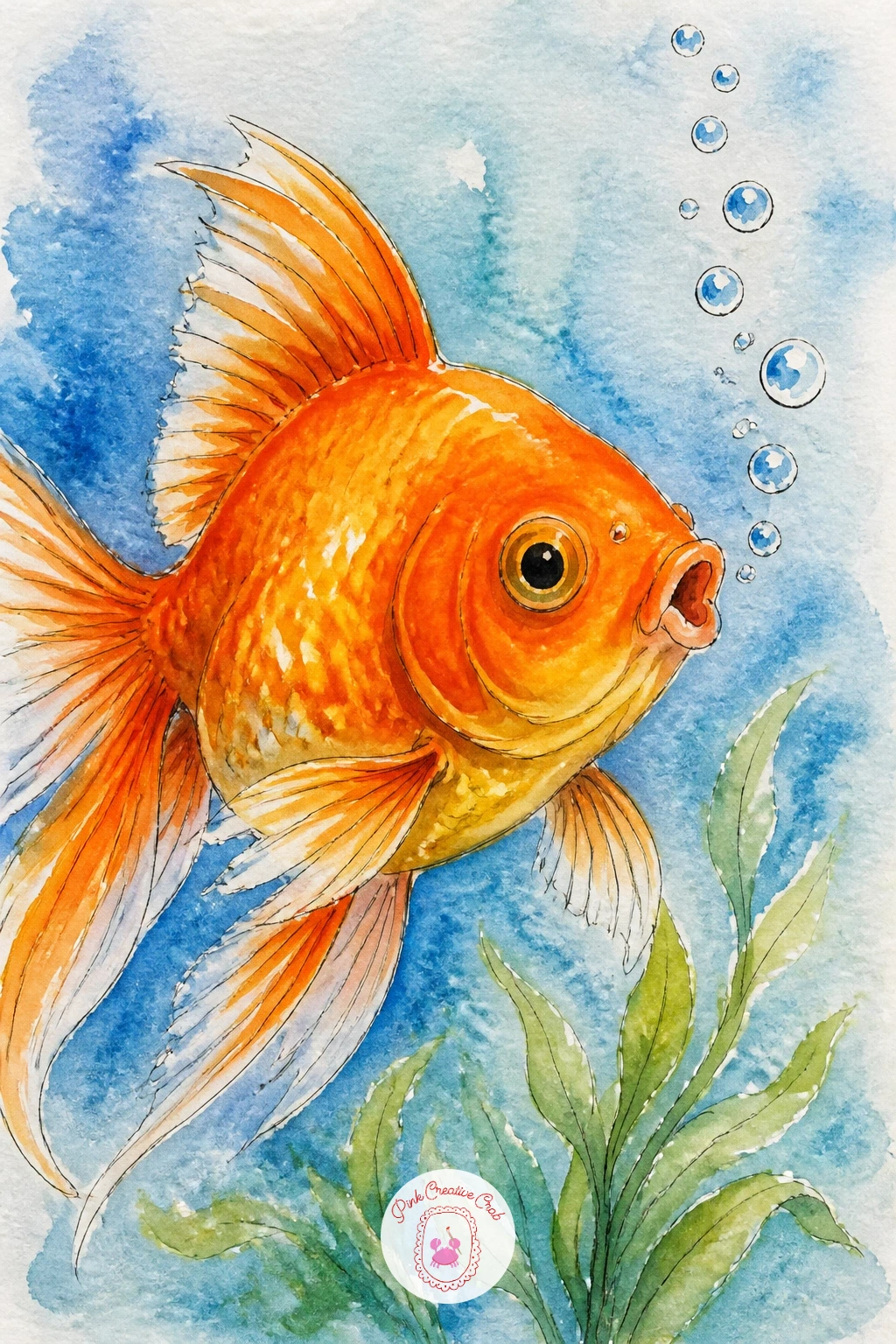
You Will Need
- white gel pen
Palette: Cadmium Orange,Payne’s Grey,Cerulean Blue
Shrink the whole world down to a teacup for this charming little scene. Draw a simple teacup shape first, rounded body with a curved handle on one side, then fill it with water just below the rim, leaving the top edge of the cup as a clean white rim.
Paint the fish tucked inside, scaled down so its whole body fits comfortably within the cup’s curve, since an oversized fish here just looks squeezed in rather than playful. A floral pattern on the cup’s outside, just a few small dot-flowers in pink or blue, adds charm without much extra work.
The quick ten-minute version skips the pattern entirely and keeps the cup plain white with a thin ink outline. The fuller forty-minute version adds the painted flowers, a saucer underneath, and a steam-like wisp of pale blue rising from the water’s edge.
If a curved handle feels tricky to draw freehand, trace around a coin or a bottle cap for a clean oval guide.
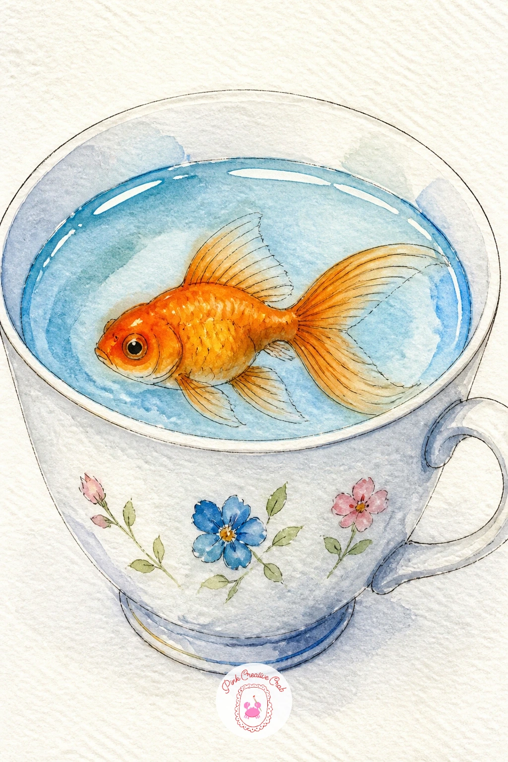
Palette: Cadmium Orange,Cerulean Blue,Permanent Rose
Widen the scene for a goldfish pond set in a quiet Japanese garden, with a small red wooden bridge arching over the water. Block in the pond as a loose irregular shape rather than a perfect oval, since real garden ponds curve unevenly, then paint the bridge in a simple flat red-orange with just a few ink lines for the railing.
Add the goldfish swimming beneath the bridge, small against the wider pond, and a cluster of reeds or a single maple leaf drifting on the surface for a sense of place. Keep the water in cool blue-green tones so the warm red bridge and orange fish stand out clearly against it.
If you enjoy this wider garden setting, the koi fish painting ideas page has more ways to paint ponds like this one with a Japanese garden feel.
Keep the fish smaller than you think it should be here. A pond this size makes the fish feel believably distant, and that scale difference is what sells the whole garden setting.
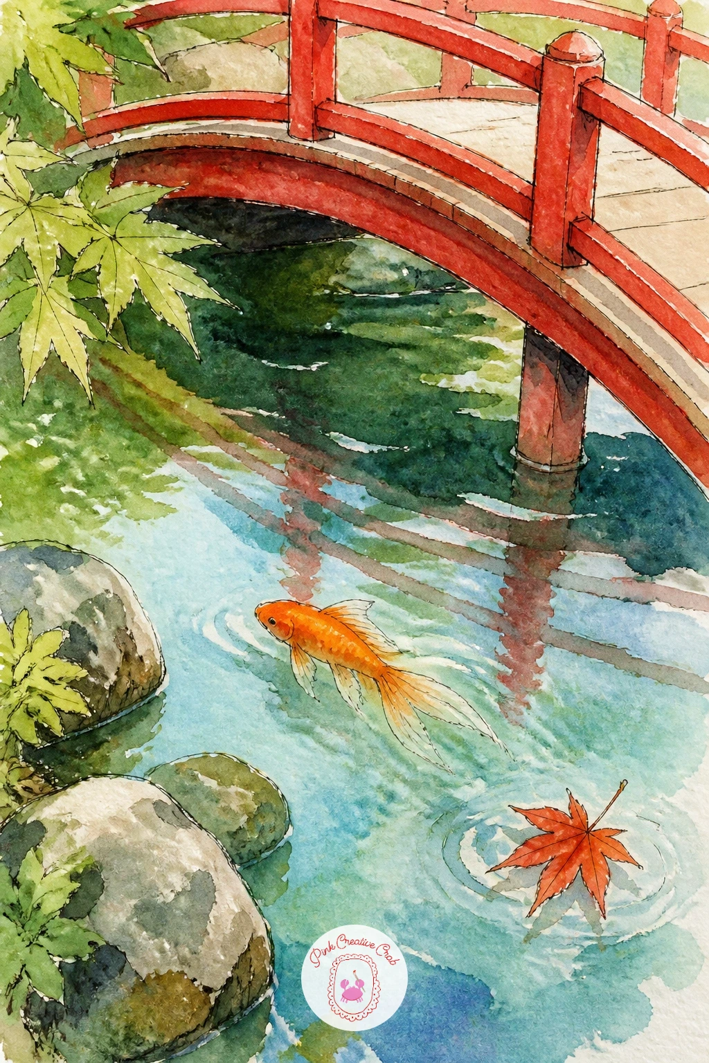
Palette: Hooker’s Green,Cadmium Red,Cadmium Orange,Payne’s Grey
Give this one a sense of motion with a goldfish mid-leap, arched above the surface of the water. Sketch the body in a clear curved C shape, tail flicked downward and fins spread wide, since that curve is what reads as a jump rather than a fish lying flat.
Paint the water’s surface as a simple horizontal band with a few splash droplets scattered above it, painted as small loose dots and commas in the same blue as the water. The fish itself should sit mostly above this line, with maybe just the tail dipping back into the surface.
This idea often falls flat when the splash looks too neat and symmetrical. Fling your droplets at uneven angles and sizes, even flicking a loaded brush lightly over the paper for a few random spatters, for a much livelier splash.
If splatter feels messy to control, a few quick comma-shaped brushstrokes around the fish do the same job with far less risk.
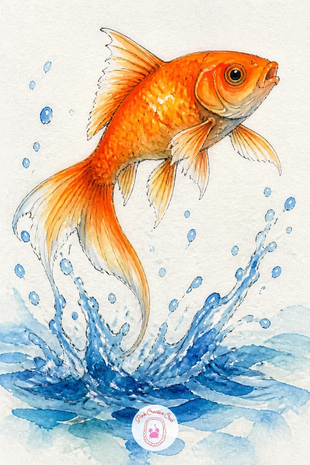
You Will Need
- old toothbrush for splatter (optional)
Palette: Cadmium Orange,Cerulean Blue,Payne’s Grey
Turn the bowl into a bit of cozy still life by perching it on a small stack of books. Draw the books first as simple overlapping rectangles of slightly different widths, stacked a little unevenly for charm, then set the round bowl on top, its base just overlapping the top book’s edge.
Paint each book a different flat color, muted tones work best so they don’t compete with the bright fish above, then add the bowl and water in your usual blue and orange. A thin cast shadow painted in pale grey beneath the bowl where it touches the top book helps ground the whole stack.
Without that shadow, the bowl tends to look like it is floating above the books rather than resting on them. One soft grey shape under the base fixes this in seconds.
If straight book edges feel fussy freehand, a ruler for just the pencil guidelines keeps the stack looking tidy without flattening the loose watercolor finish.
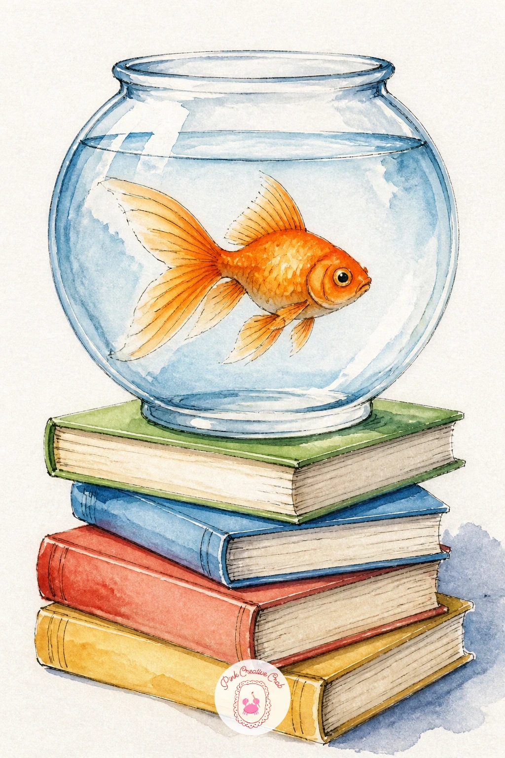
Palette: Cadmium Orange,Cerulean Blue,Raw Sienna,Payne’s Grey
Bring a small figure into the scene with a girl crouched at the edge of a pond, watching the goldfish below. Keep her figure simple: a rounded head, a short dress or coat in one flat color, and her arms resting on her knees as she leans forward, since detailed faces are not needed when she is shown from the side or slightly behind.
Paint the pond beneath her in loose blue-green washes with one or two goldfish visible near the surface, partly obscured by the water’s reflections. Her reflection, a soft pale smudge of her dress color in the water, ties the two halves of the painting together.
If figures feel daunting, simplify her shape to almost a triangle with a round head and you still get a convincing crouching pose. For more ways to ease into drawing people in small scenes like this, the easy step by step drawing ideas page has gentle starting points.
Keep her clothing in a single flat color so she reads clearly as the foreground subject against the busier, more detailed pond water behind her.
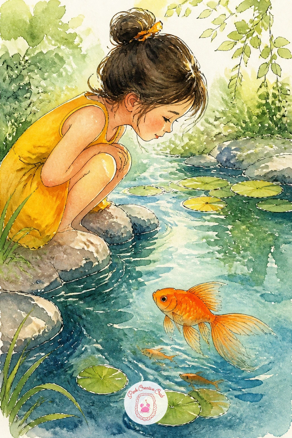
Palette: Hooker’s Green,Cadmium Orange,Raw Umber,Cerulean Blue
Pair the fish with a small bunch of flowers for this softer, more decorative scene. Paint the vase first as a simple tall glass shape, water filling the lower half, then add two or three flower stems rising up out of the water and above the vase’s rim, as if the vase serves double duty as both fish home and flower vase.
Keep the flowers loose, just a few small round blooms in pink or yellow with simple leaf shapes, since too much floral detail will pull focus from the fish swimming below. Paint the goldfish last, in the lower portion of the vase, letting its orange pop against the cool glass and water tones.
The lighting question matters here: decide where your light comes from before you start, since a single light source from one side lets you leave one edge of the vase bright white paper and shade the opposite side softly, which is what makes glass look like glass.
If a tall vase shape feels wobbly freehand, trace a drinking glass or small bottle for a clean, even outline.
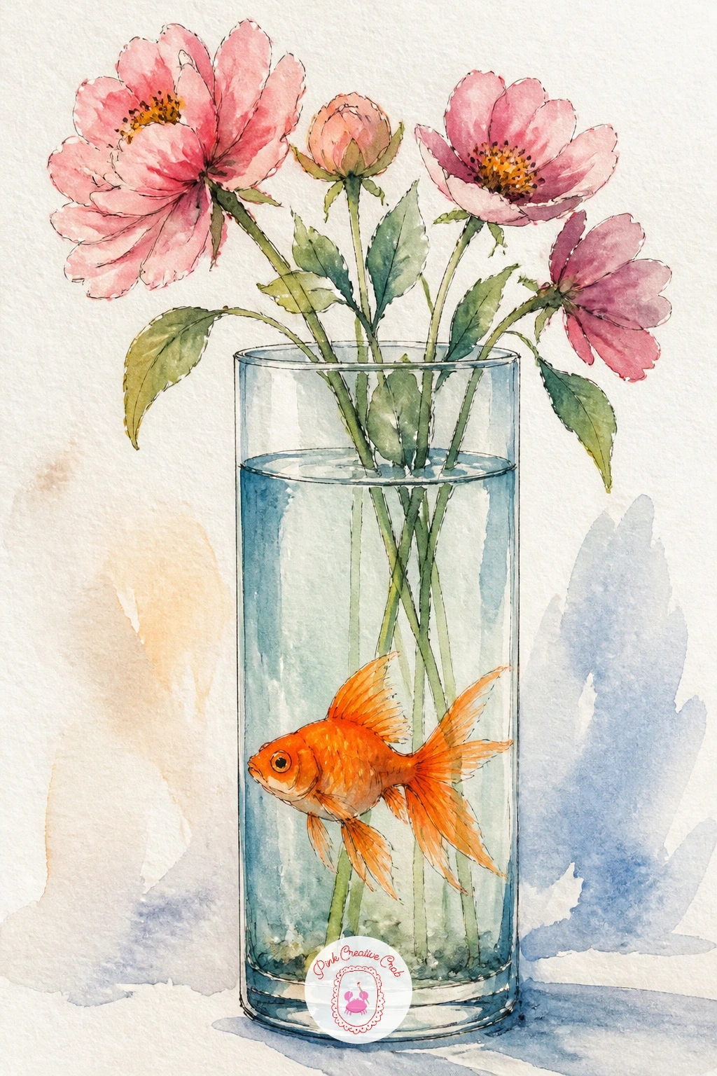
Palette: Cadmium Orange,Permanent Rose,Cerulean Blue,Sap Green
Pair the fish with a single, fuller water lily bloom this time, rather than the flat lily pads from earlier. Paint the flower first as a cluster of pointed petals radiating from a small yellow center, using a pale pink or white wash with slightly deeper color pooled at the base of each petal.
Once the flower is dry, paint the goldfish swimming just beneath and beside it, angled as if curious about the bloom above. A ring of green lily pad just visible at the flower’s base grounds it on the water’s surface.
Lily petals often end up looking stiff and identical. Vary each petal’s length and tilt slightly, and let a little color pool unevenly at the tips while the paper is still damp, for a far more natural bloom.
If painting the full flower feels like a lot today, three or four petals showing from a side view is plenty and still reads clearly as a water lily.
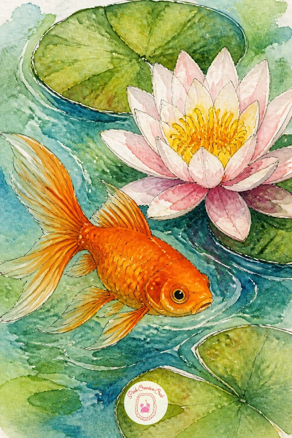
Palette: Permanent Rose,Cadmium Yellow,Cadmium Orange,Hooker’s Green
Set the mood a little differently with a fish seen from below a rain-dotted surface. Paint the water as your usual blue wash, but this time keep the top of the page slightly darker and more textured, suggesting an overcast sky pressing down on the surface above.
Once that wash is dry, add small raindrop ripples across the top portion using thin circular pencil-then-ink outlines, a handful scattered unevenly rather than in a neat grid. The goldfish swims below, calm and unaffected, which is the quiet charm of this scene.
The ten-minute version keeps it to just three or four ripple circles and one fish. The forty-minute version layers in more ripples at different sizes, some overlapping slightly, and deepens the water color gradually from light at the bottom to darker near the rippled surface.
If ripple circles start looking too perfect, a slightly wobbly hand-drawn circle actually reads as more natural water movement than a compass-perfect one.
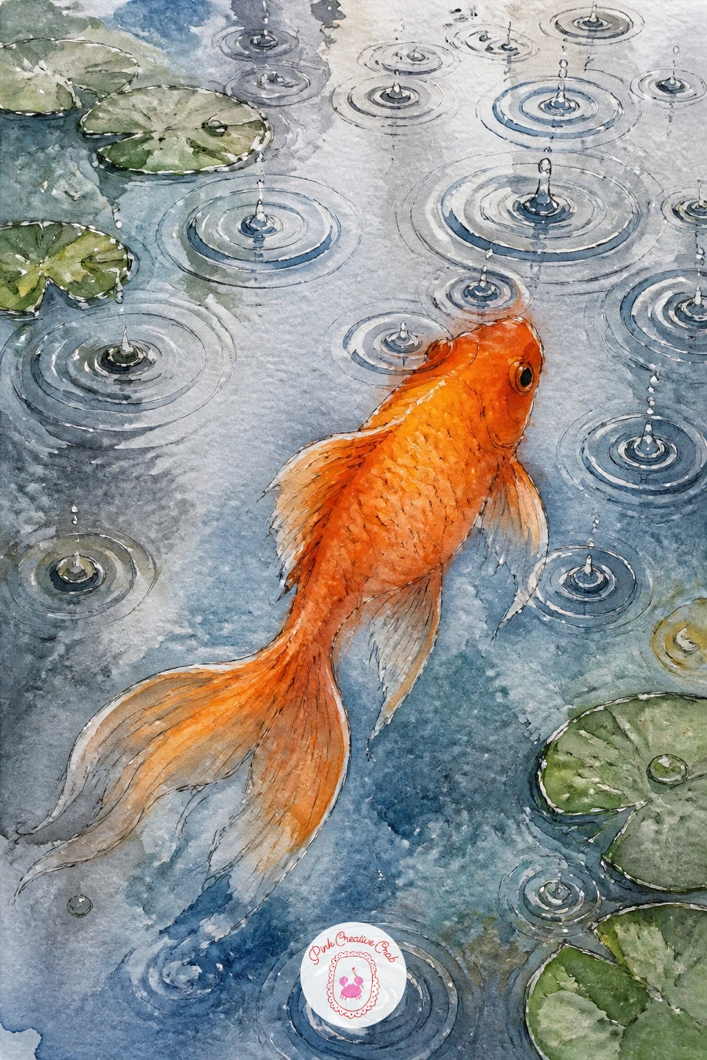
Palette: Cerulean Blue,Payne’s Grey,Cadmium Orange
Have some fun with proportion on this one, since bubble-eye goldfish are famous for their oversized fluid-filled eye sacs that give them a permanently startled look. Sketch the body small and round, then draw the eyes as two noticeably large circles hanging just below and beside the head, far bigger than a regular fish eye would ever be.
Compare sizes before you paint: the eye sacs should look roughly as big as a third of the whole body, which feels exaggerated on paper but is exactly what makes this breed recognizable and a little funny. Paint the sacs in a very pale, almost clear wash so they read as fluid-filled rather than solid, with the small dark pupil floating inside each one.
The usual mistake is making the eyes too small out of habit, which just looks like a regular goldfish with a strange face. Push the size further than feels comfortable and the breed reads instantly.
A single raised eyebrow-like ink line above each eye sells the surprised expression nicely if you want more personality.
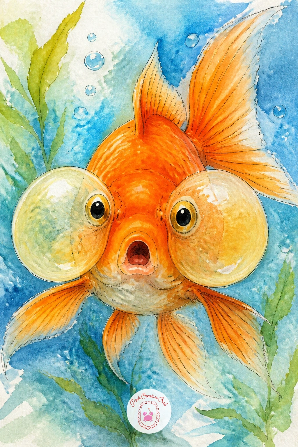
Palette: Cadmium Orange,Payne’s Grey,Cerulean Blue
Keep this one calm and simple, just a bowl, a fish, a small plant and a scatter of pebbles at the base. Paint the bowl and water first, then add a single leafy plant rising from the bottom, a few long curved leaf shapes in a deeper green than the water around them.
Scatter small oval pebbles along the bowl’s base, varying their sizes and leaving thin white paper gaps between them so they don’t blend into one grey mass. Paint the fish last, weaving between the plant leaves so it feels tucked into its little home rather than floating in empty space.
If the pebbles start looking like a solid grey smear, paint each one separately and let each dry a touch before adding its neighbor, which keeps their edges distinct.
A single thicker leaf shape works fine as a stand-in plant if a cluster of thin leaves feels fiddly to paint today.
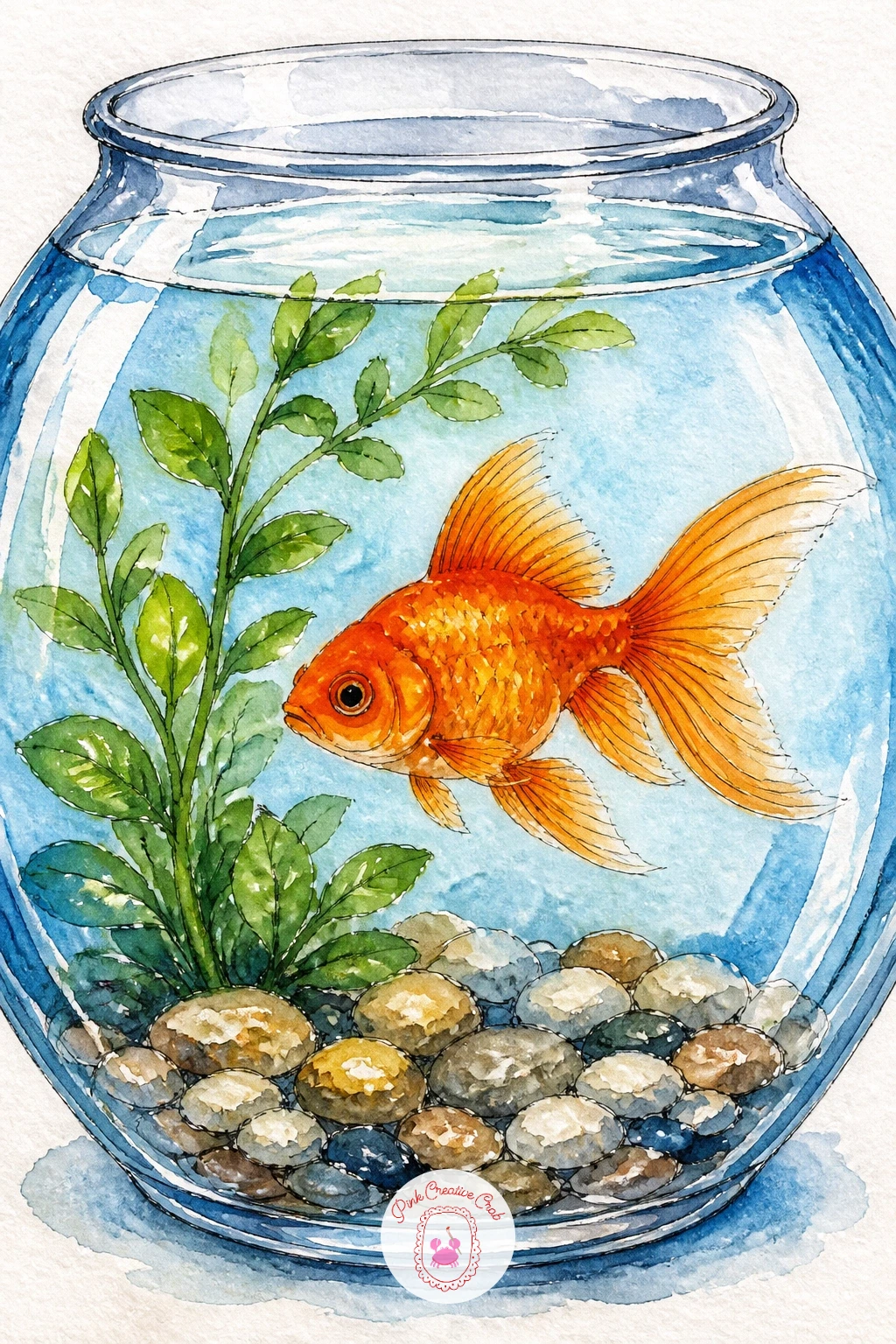
Palette: Cadmium Orange,Hooker’s Green,Payne’s Grey,Cerulean Blue
Take the fish outdoors for a sunny picnic scene, held in a simple mason jar sitting on a wooden table. Paint the jar first with its distinctive ridged sides, just a few vertical lines to suggest the texture, then fill it with water and the fish, leaving the jar’s metal lid rim as a thin band of grey at the top.
Paint the wooden table beneath it in warm brown streaks, letting the grain run in loose horizontal strokes, and maybe add a corner of gingham picnic cloth peeking into the frame for extra charm. Keep the background simple, a soft green or sky wash, so the jar and table stay the focus.
The ridged jar texture often disappears under too much paint. Add those vertical lines lightly with a dry brush once the base coat of glass is fully dry, rather than trying to paint them wet into wet.
No gingham reference needed: a few crossed pencil lines in red and white make a convincing picnic cloth pattern at a glance.
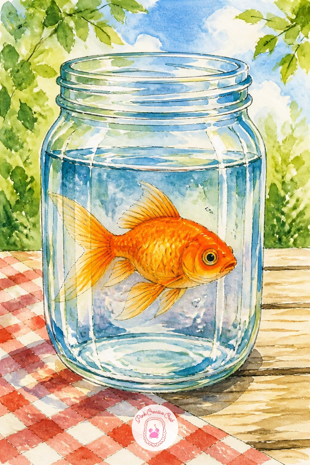
Palette: Cadmium Orange,Raw Umber,Cerulean Blue,Cadmium Red
Simplify things with three goldfish swimming in a loose, slightly staggered row, each one facing the same direction. Draw the first fish at full size, then use it as your measuring guide for the other two, keeping all three roughly the same length so the row feels orderly rather than random.
Vary each fish slightly in pose, one with tail curved up, one straight, one curved down, so the row has a little rhythm instead of looking like three photocopies. Paint them one at a time in the same orange, letting each dry before starting its neighbor so the colors stay crisp instead of bleeding together.
If the three end up looking too identical and stiff, nudge their heights slightly out of line with each other, since real fish swimming together are never perfectly aligned.
A faint blue wash behind all three, added last as one continuous background, ties the row together as a single swimming group rather than three separate paintings.
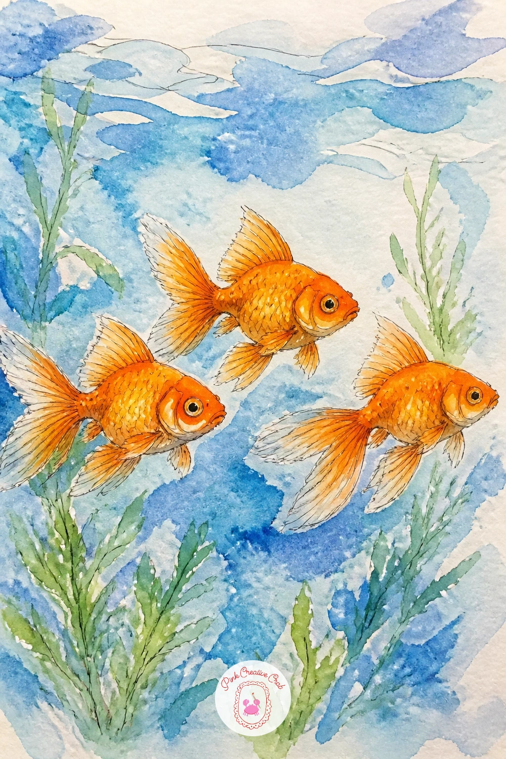
Palette: Cadmium Orange,Payne’s Grey,Cerulean Blue
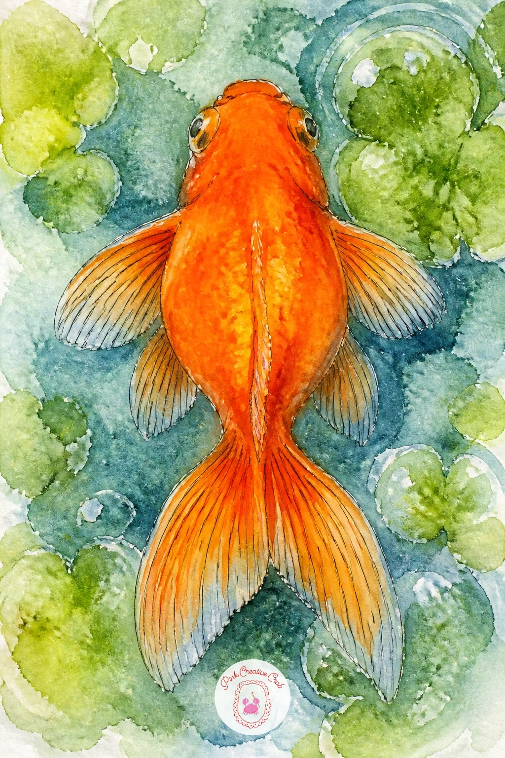
Shift your angle entirely for this one, looking straight down at a goldfish from above the water’s surface. From this eye level the fish reads as a flattened oval shape with the tail fanning out behind, rather than the familiar side profile used in most of the ideas so far.
Paint the water first in a slightly mottled blue-green wash to suggest the surface texture seen from overhead, then add the fish as this foreshortened top-down shape, its fins spread flat to either side rather than angled upward. A faint ripple ring around the fish’s position reinforces the sense of looking down through water.
This view trips people up because old habits pull the fish back into a side profile shape. Keep reminding yourself the body should look shorter and wider from above, almost diamond-shaped, with the tail as a soft fan rather than a narrow point.
If the top-down shape still feels unfamiliar, looking at an overhead photo of any fish for thirty seconds before you start will reset your eye quickly.
Palette: Cadmium Orange,Hooker’s Green,Cerulean Blue
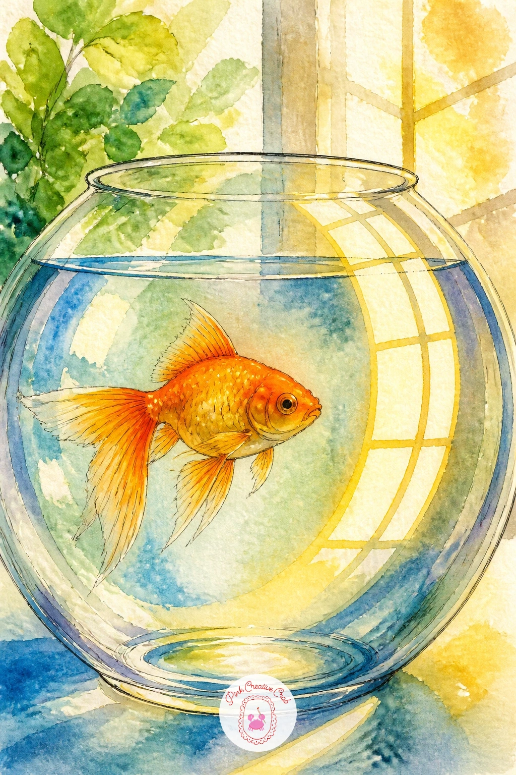
Bring light into focus for this piece, a goldfish bowl catching the bright reflection of a sunny window on its curved glass. Paint the bowl and fish as usual first, then once fully dry, add a soft diagonal band of warm yellow-white across the glass to suggest the window’s reflection curving with the bowl’s shape.
Keep this reflection band simple, just one or two curved streaks rather than a detailed window pattern, since the point is suggestion, not an accurate windowpane. A little extra warmth in the water itself, a touch of yellow mixed into the blue, helps sell the feeling of sunlight pouring through.
The reflection reads badly when painted as a straight-edged shape, since straight lines on round glass look like a mistake rather than light. Curve every reflection streak to follow the bowl’s roundness and it will click into place.
If you want an even simpler version, a single soft highlight crescent near the top of the bowl does nearly the same job with far less fuss.
Palette: Cadmium Orange,Cadmium Yellow,Cerulean Blue
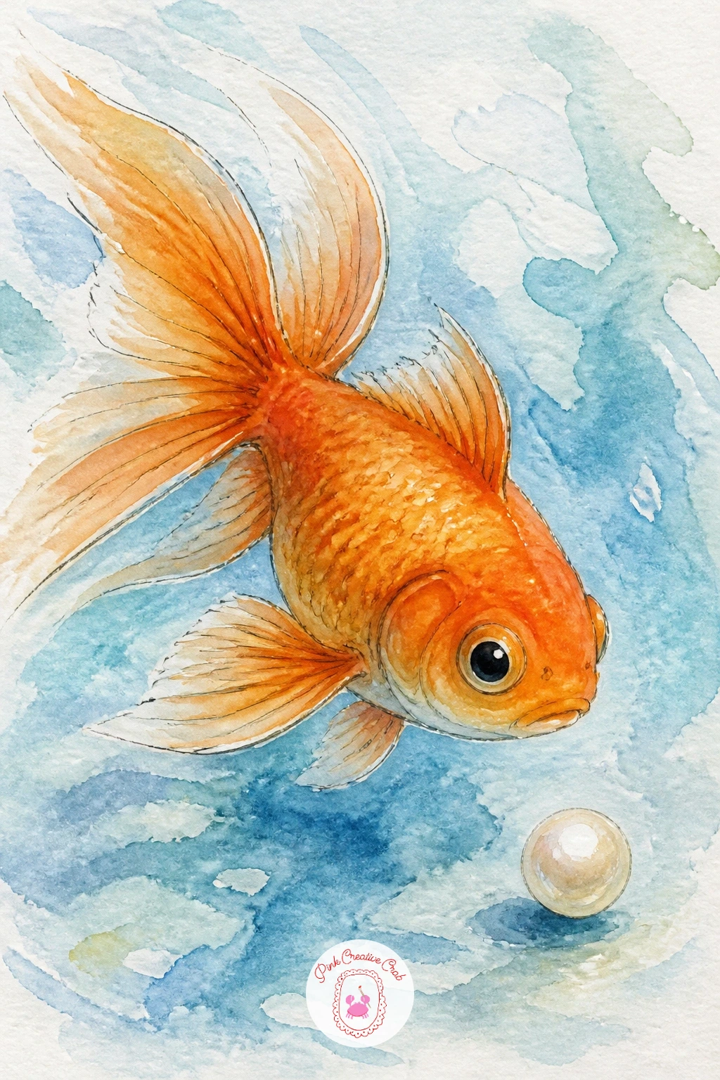
Give the fish a tiny treasure to carry for this playful idea, a single pearl held gently near its mouth or resting just beside it. Paint the fish first in your usual orange, then add the pearl as a small circle in pale grey-white with one tiny bright highlight dot left unpainted or added with a white gel pen.
Shade the pearl with the faintest grey crescent along its lower edge to give it a sense of roundness, since a flat white circle just reads as a ping-pong ball rather than something precious. Keep the water around the pair calm and simple so the pearl stays the clear focal detail.
If the pearl disappears against a pale background, a thin ring of warm grey just outside its edge separates it clearly from the water without needing much extra paint.
No white gel pen on hand? Simply leave the highlight spot as untouched white paper from the very start of painting the pearl.
You Will Need
- white gel pen
Palette: Cadmium Orange,Payne’s Grey,Cerulean Blue
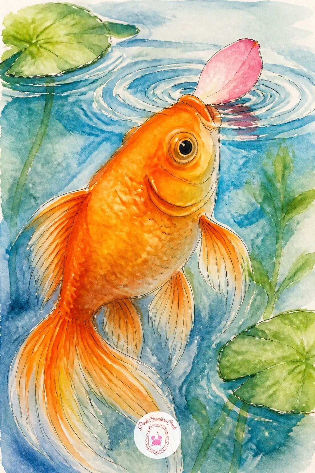
Give the fish a small snack for this gentle, slightly funny scene, a single flower petal drifting on the water’s surface with the goldfish nosing up to nibble it. Paint the petal first as a simple curved teardrop shape in soft pink, floating flat on top of the water wash.
Paint the goldfish just beneath it, mouth tilted upward toward the petal’s edge, which is a small pose change from the usual straight-ahead swim and adds a lot of personality for very little extra effort. A tiny ripple ring around the petal suggests it has just landed on the surface.
The quick version keeps it to one petal and one fish in under ten minutes. The fuller version scatters two or three more petals loosely across the water and adds a soft pink tint to the water directly beneath the main petal, as if its color is just beginning to bleed into the pond.
If a teardrop petal shape feels stiff, round off one end more than the other for a more natural, slightly asymmetrical petal.
Palette: Cadmium Orange,Permanent Rose,Cerulean Blue
Widen the scene again for a goldfish swimming in a stone fountain set in a small town square. Paint the fountain’s basin first as a simple rounded stone shape, textured with a few dry-brush strokes for a weathered surface, then fill it with water in your usual blue wash.
Add the goldfish swimming near the fountain’s center, and if you want more scene around it, a soft suggestion of cobblestones or a building facade in the background, kept loose and pale so it doesn’t compete with the fish. A thin stream of water spouting from a central fountain spire, painted as a few vertical white gaps left in the blue wash, adds movement.
Stone textures tend to look flat without this trick: drag a dry, barely loaded brush lightly across the basin’s surface once the base wash is dry, which catches only the paper’s texture and suggests weathered stone instantly.
Skip the background buildings entirely for a simpler version, letting the fountain and fish fill the whole page on their own.
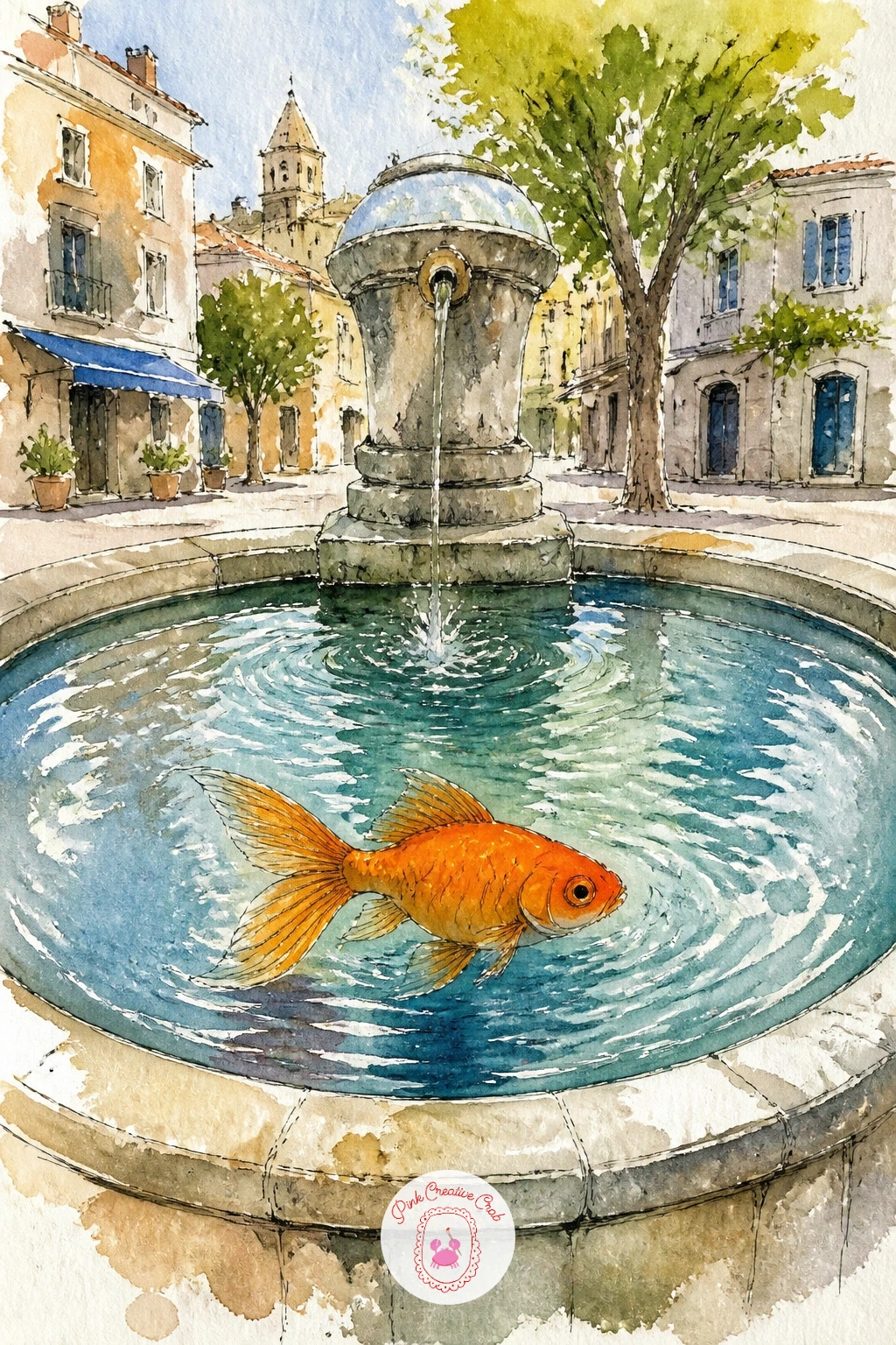
Palette: Payne’s Grey,Raw Umber,Cadmium Orange,Cerulean Blue
Bring back the fairground atmosphere with a goldfish bowl displayed on a fair stall counter, strings of small flags or lights hinted above it. Paint the bowl and fish first as your main subject, then add a simple wooden counter beneath it in warm brown tones, with a corner of colorful bunting draped along its edge.
Keep the bunting simple, just a row of small triangle flags in alternating colors strung along a thin line, since too much detail here pulls attention from the fish. A soft blurred wash of warm string-light color in the background, yellows and oranges merging loosely, suggests the festive setting without needing to paint actual bulbs.
This scene can get busy fast if every element is painted with equal detail. Keep the background flags and lights loose and soft-edged while the bowl and fish stay crisp, and the eye will know exactly where to look first.
If bunting triangles feel fiddly, three or four simple colored dots strung along a line suggest festival lights just as well.
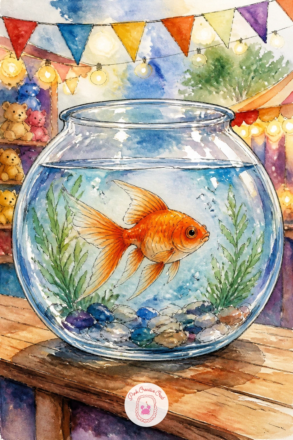
Palette: Cadmium Orange,Cadmium Yellow,Permanent Rose,Raw Umber
Turn the fish itself into a decoration for this one, a goldfish-shaped paper lantern glowing above a quiet pond at dusk. Paint the lantern first as a simplified fish silhouette, rounder and flatter than a real fish, in warm glowing orange with a soft yellow core to suggest light shining through paper.
Paint the pond beneath it in deeper, cooler blues than you’ve used in the other ideas, since the contrast between the warm glowing lantern and the dark evening water is the whole mood of this piece. A soft reflection of the lantern’s orange glow rippling on the water’s surface ties the two halves together.
Next time you paint this one, try hanging two or three lanterns at different heights across the page instead of just one, which turns it into a fuller evening garden scene.
If painting a glow feels tricky, a simple soft-edged yellow wash kept inside the lantern shape, blended gently into the orange edges while still damp, reads as light easily.
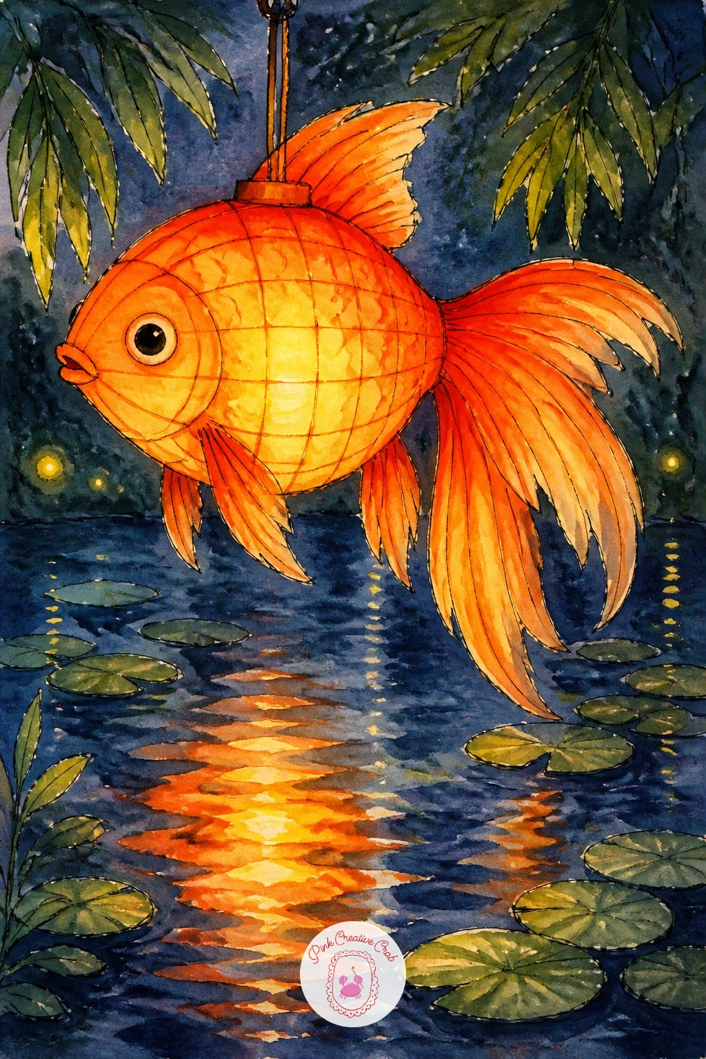
Palette: Cadmium Orange,Cadmium Yellow,Payne’s Grey,Cerulean Blue
Bring the fish indoors for a cozy bedtime scene, its bowl sitting on a nightstand beside a small glowing lamp. Paint the bowl and fish first, then add the lamp beside it, a simple rounded shade shape with a soft warm glow painted around its base in loose yellow, blending gently into the shadowed room around it.
Keep the room’s background dark and simple, deep blues or soft greys, so the warm lamp light and the bright orange fish both stand out clearly against it. A thin streak of lamp light reflected on the bowl’s glass, left as untouched paper or added last in pale yellow, ties the light source to the bowl convincingly.
Lamp glow often looks like a flat yellow blob without this edge trick: keep the glow’s outer edge soft and blurred by working wet into wet, while the lamp shade itself keeps a crisper, drier edge.
If you’d rather skip the lamp, a single lit candle beside the bowl gives the same cozy warm-glow feeling in an even simpler shape.
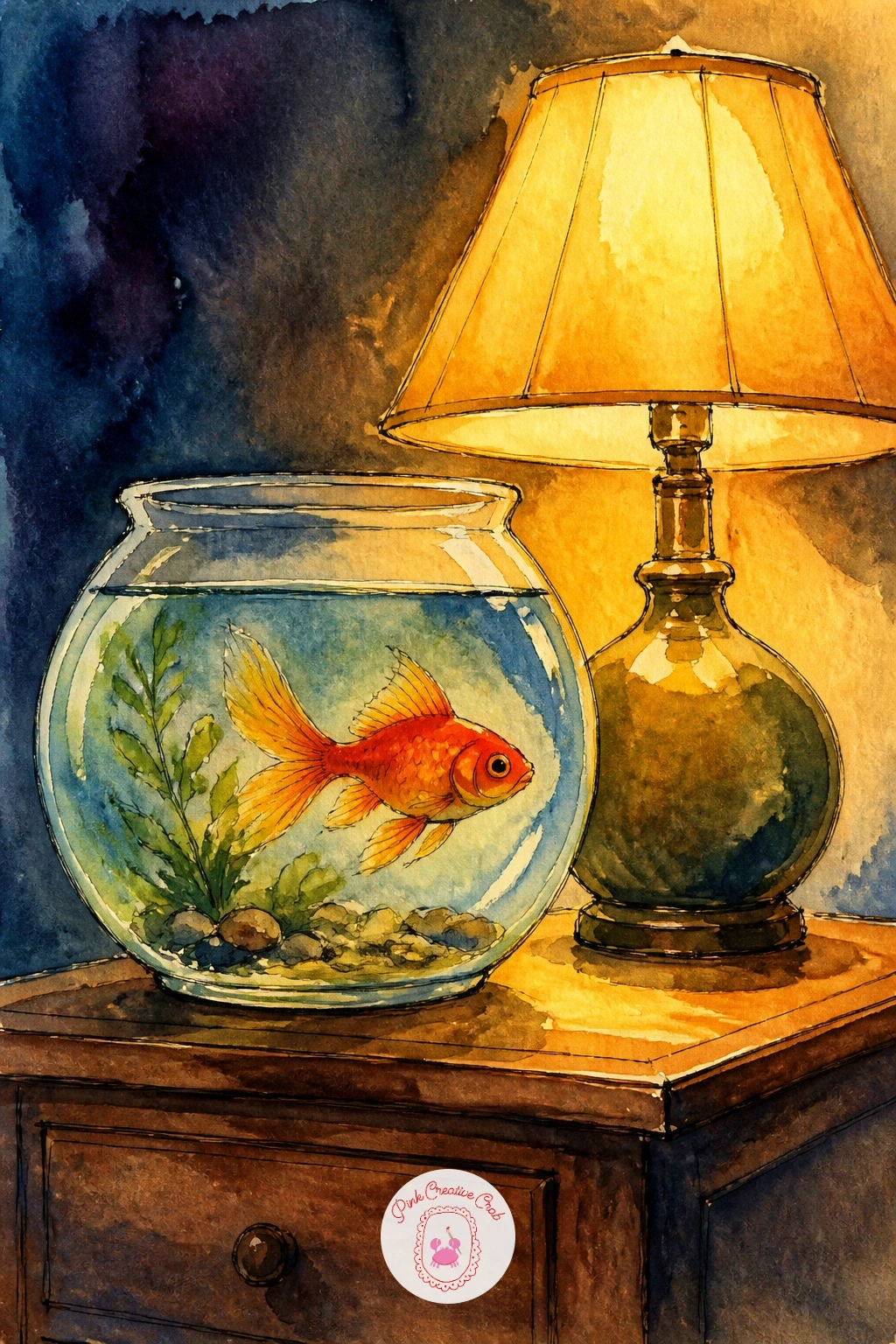
Palette: Cadmium Orange,Cadmium Yellow,Payne’s Grey,Cerulean Blue
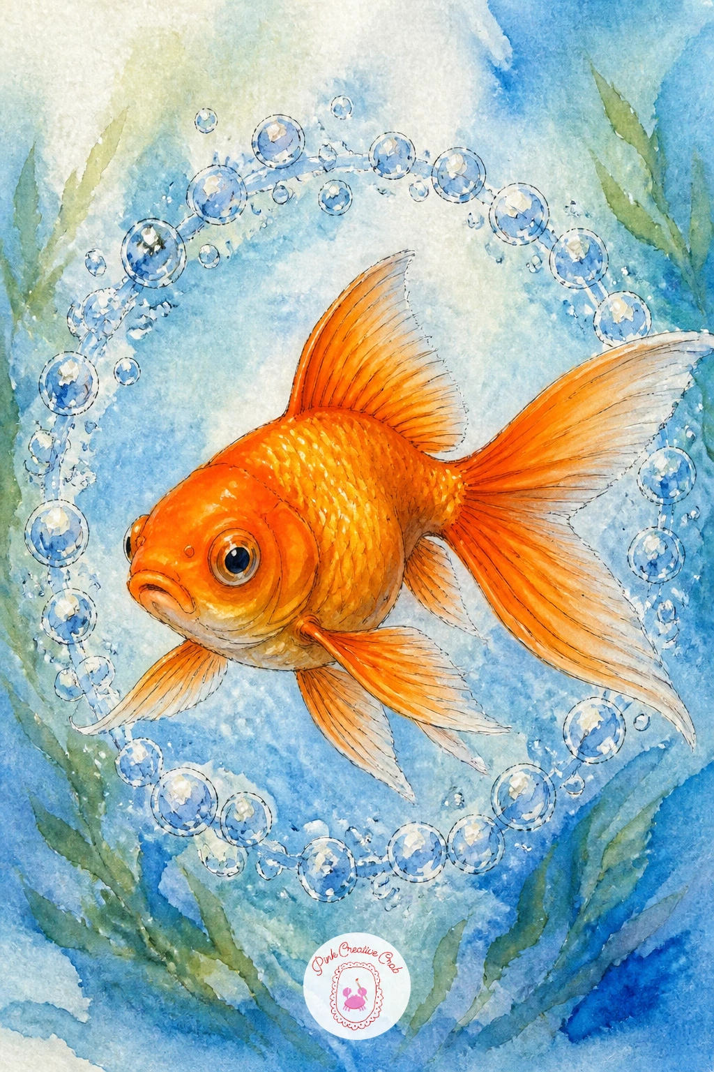
Close out the set with a goldfish swimming straight through the center of a ring of bubbles, which makes a nice circular, satisfying final composition. Paint the fish first, angled slightly as if pushing forward through the ring, then once dry, paint a circle of small bubbles surrounding its body, leaving the fish itself untouched by any bubble shape.
Vary the bubble sizes around the ring so it feels playful rather than mechanical, larger near the bottom and smaller toward the top, each with its own tiny white highlight dot left as bare paper or added last with a white gel pen.
If you enjoyed working through a whole set of small fish scenes like this one, the fish doodles ideas page has more quick little swimmers worth trying next, and the drawing challenge ideas page is a good place to keep the daily painting habit going.
Keep every bubble in the ring a touch irregular in shape rather than a perfect circle, since real bubbles wobble slightly and that tiny imperfection is what makes the ring feel alive instead of stamped on.
You Will Need
- white gel pen
Palette: Cadmium Orange,Payne’s Grey,Cerulean Blue
What to Do Next
Pick whichever scene caught your eye first, whether that’s the simple windowsill bowl or the full fountain in a town square, and start there on a small sheet of watercolor paper. Keep your brush loaded and your orange bright, and let the next goldfish on the list wait for another sitting.
Frequently Asked Questions
What is the easiest way to draw a goldfish for a beginner?
Start with two simple ovals, a rounder one for the body and a tapered one for the tail, then add small triangle fins and a curved mouth line. This two-shape approach works for nearly every pose in this list.
What watercolor colors do I need for goldfish drawing?
A warm orange like cadmium orange is the main color, mixed with a touch of red for shaded areas and grey for fins and outlines. Add a cool blue for water and a green for ponds, plants or lily pads.
How do I stop my goldfish from looking flat?
Leave a small streak of unpainted white paper along the top of the body for a highlight, and shade the belly and lower fin edges slightly darker. That single contrast between light top and shaded underside gives the body real roundness.
How do I paint water around the goldfish without it looking muddy?
Keep your blue wash loose and let it dry before adding more layers rather than mixing colors directly on wet paper. Overworking wet washes is what turns clear water into a grey-brown smear.
Can I draw these goldfish ideas with colored pencil instead of watercolor?
Yes, colored pencil works well for every idea here, just build the orange body up in thin layers and blend the edges with light circular strokes. Use a cool blue pencil lightly over white paper for water instead of a painted wash.
Have any thoughts?
Share your reaction or leave a quick response — we’d love to hear what you think!
-
 0
-
0
-
0
-
0
-
0
-
0


