

Park drawing gives you a whole world in one corner: a bench, a pond, a bandstand, a dog mid chase, and you get to decide which slice of it fills the page. Every park has its own rhythm through the year, and that rhythm is exactly what makes these scenes so satisfying to build with markers.
Below are 28 park corners to draw, from a duck pond with a little bridge to a gardener kneeling at the flower beds at dusk. Each one is sized to finish in a single sitting, with a clear order of marks so the ink and color never fight each other.
Using these images: free for personal projects such as printing, coloring, cards, journals and gifts. Handmade items that include them may be sold up to 30 pieces per design. More than that is commercial use and is not permitted, and neither is selling or sharing the images themselves or passing them off as your own. Please ask before any other use.
Start the bandstand as a simple domed roof on thin posts, drawn with the fineliner before any color touches the page. Keep the dome a clean half circle and space the posts evenly, since a lopsided bandstand is the fastest way to throw off the whole scene.
Measure twice before you ink: mark the roof width, then divide it to place four or five musicians along the platform at even gaps, each one just a rounded head and a simple instrument shape (a trumpet bell, a drum, a tuba loop). Keep the figures small compared to the bandstand itself so the structure reads as the star.
Block in the roof and platform in a warm cream or grey marker first, then add brass instruments in a hot yellow with a touch of orange for the shine. Finish with park green around the base and a pale blue sky behind.
If the dome looks flat, add two or three curved lines radiating from its peak to suggest the ribs of the roof, which instantly gives it shape.
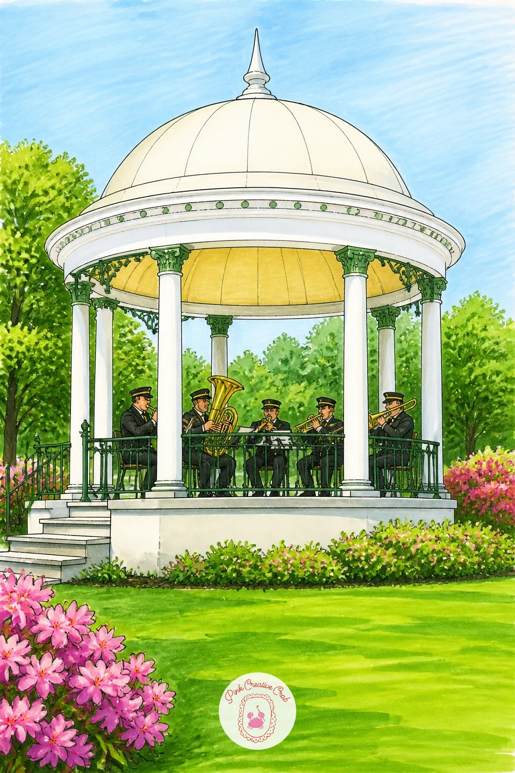
Palette: Golden Yellow,Cadmium Orange,Park Green,Sky Blue
Duck pond drawing works best when you settle the horizon line first, low on the page, so the water and sky both have room to breathe. Sketch the bridge as a simple arched shape crossing the pond at roughly one third from either edge, which keeps it from splitting the page in half.
Ink the bridge rails and a handful of ducks before you touch the water, keeping each duck a simple oval body with a small wedge head. Lay the water in with horizontal strokes of a mid blue-green, leaving thin white gaps untouched by marker for shine.
Where beginners lose the reflection, the fix is simple: pull a few vertical marker strokes straight down from the bridge and ducks into the water, using the same colors but a touch paler, so the eye reads them as reflected rather than floating.
No blender marker on hand? Lighten the water tone by pressing less firmly and overlapping fewer passes, which softens the color just as well.
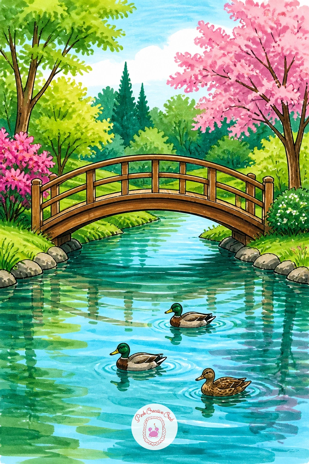
Palette: Teal,Pond Blue,Mallard Green,Chestnut Brown
Following on from the pond, settle the eye a little closer to ground level for this one: draw the bench low in the frame so the blossoming tree above it can stretch tall and fill most of the page. Ink the bench slats and legs first, keeping the perspective simple with the front legs slightly larger than the back ones.
Build the tree trunk next, letting it lean slightly for a more natural look, then add the canopy as loose cloud shapes rather than individual branches. Color the trunk in a warm grey-brown and fill the canopy with soft pink marker, dabbing rather than stroking so the blossom looks soft-edged.
If the canopy ends up too solid and heavy, flick a few small dot clusters of pink just outside its main shape to scatter loose petals, which lightens the whole tree instantly.
Swap pink for white petals with pale green shading if you want a springtime magnolia instead of cherry blossom.
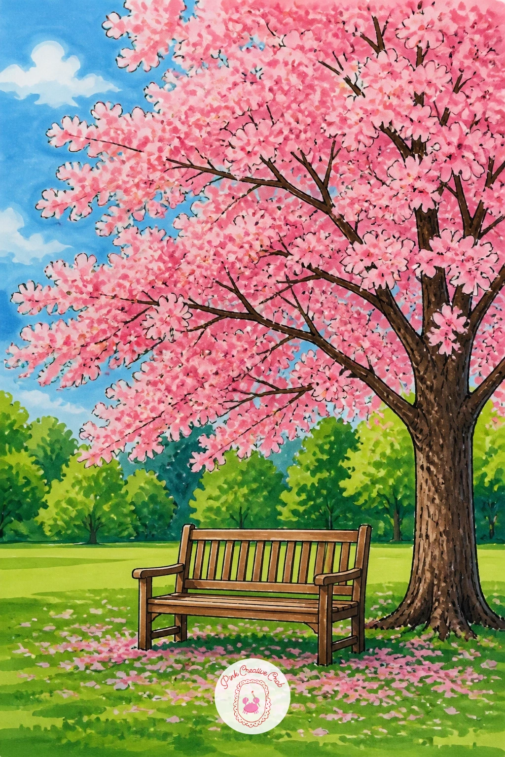
Palette: Blossom Pink,Bark Brown,Grass Green,Soft Grey
Picnic scenes live or die on the blanket pattern, so draw the blanket first as a simple rectangle laid at a slight angle to the page, never perfectly square to the frame. A gingham or striped pattern drawn with a ruler-straight fineliner reads as crisp fabric once color goes down.
Place the basket at one corner of the blanket, a simple curved-top shape with a handle, then scatter a few props around it: a cup, an apple, a folded cloth. Color the blanket in red and white or blue and white checks, then fill the basket in warm wicker tan.
In ten minutes, stop at the blanket, basket and grass, which already makes a full little scene. Given forty minutes, add a thermos, a small vase of flowers and dappled light shadows under the basket for a fuller picnic moment.
Keep the grass simple with short upward flicks of green marker rather than solid fill, so it still reads as lawn and not a flat carpet.
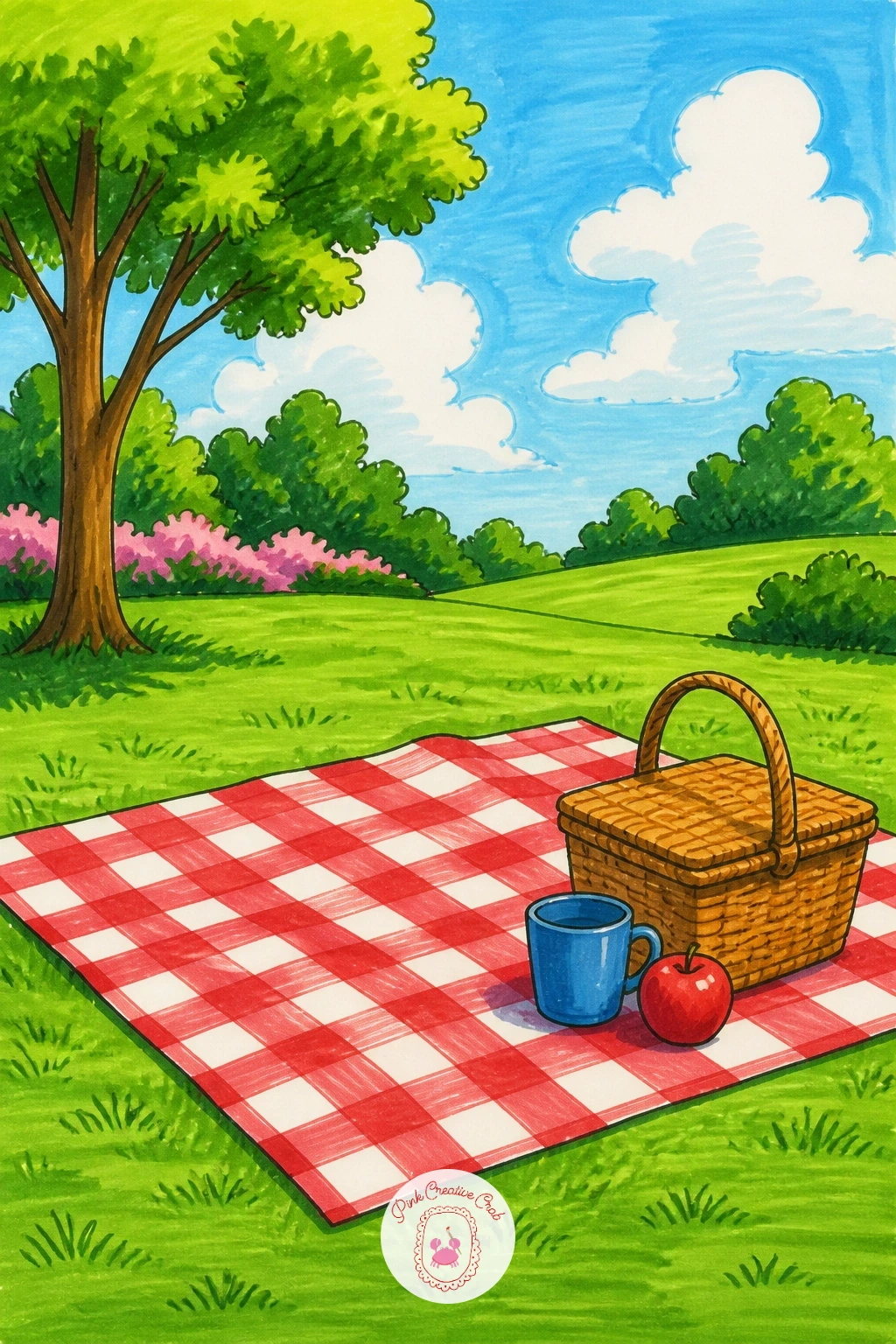
Palette: Cherry Red,Cream White,Wicker Tan,Lawn Green
A girl on a swing is mostly about the angle of the chains, so draw them first as two long lines meeting a simple frame bar above, tilted slightly to show the swing mid motion rather than hanging straight down. Keep her figure simple: an oval head, a dress shape for the body, two legs kicked forward.
Ink the swing frame and seat before the figure, then add her last so she sits cleanly inside the structure. Color her dress in a bright color like coral or yellow against the more muted park greens behind, which makes her pop as the clear focal point.
If her proportions feel off, compare her head height to the swing seat height: a seated child’s head is usually about the same size as the seat itself, which keeps the scale believable.
Try the same setup next time with a boy on a slide instead, keeping the same simple figure-building approach.
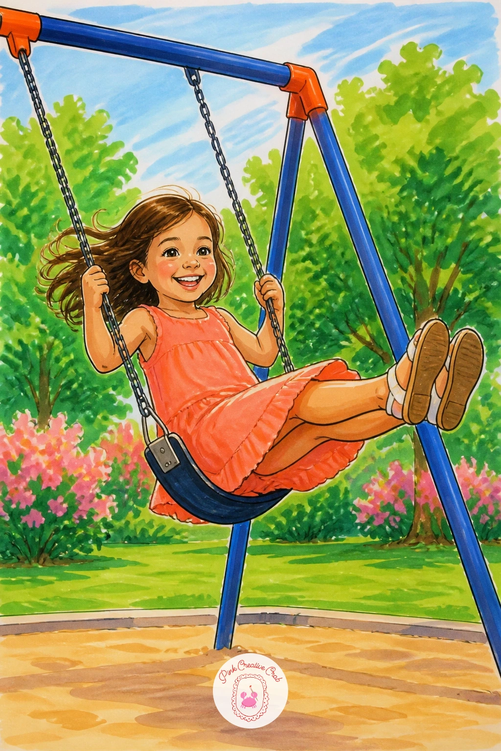
Palette: Coral,Steel Grey,Park Green,Skin Tone
Center the fountain exactly in the middle of the page for this one, since a square’s whole design usually radiates out from that point. Draw the base as a wide circle, then a narrower tier above it, then the spout, keeping each tier perfectly centered on the one below using a light vertical guideline you ink over later.
Add the water spray last, using short upward fineliner flicks rather than solid lines so it reads as falling water rather than static sticks. Color the stone tiers in cool grey, then lay a pale blue-white over the spray itself with very light pressure.
Where fountains often go wrong is symmetry: step back and check both sides of the basin match before you commit to ink, since an uneven fountain looks unsettled.
No pale blue marker on hand? Leave the spray white and simply outline it, which still reads clearly as water against the stone grey.
For more scenes built the same deliberate way, the village scene drawing ideas are worth a look.
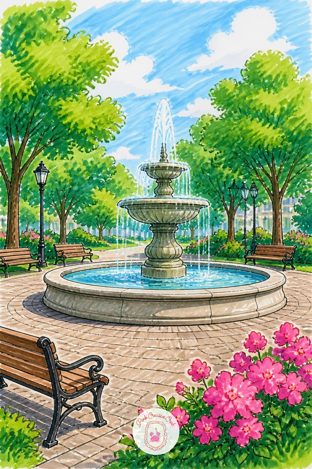
Palette: Stone Grey,Pale Blue,Moss Green,Warm White
An ice cream cart gives you a fun small object to anchor a bigger scene: draw its box shape first, a simple rectangle on two wheels, with an umbrella or striped canopy rising from the top. Keep the canopy stripes evenly spaced by marking the halfway point before you add more lines between.
Place the park gate behind the cart as a simple arched iron shape, drawn in thinner fineliner strokes so it does not compete with the cart. Color the cart in cheerful candy stripes, pink and white or mint and white, and leave the gate a cool grey-black.
If the wheels look flat, add a small curved highlight line near the top of each one, which gives them roundness without much extra work.
A quick swap: turn the ice cream cart into a lemonade stand by changing the signage and canopy color to yellow.
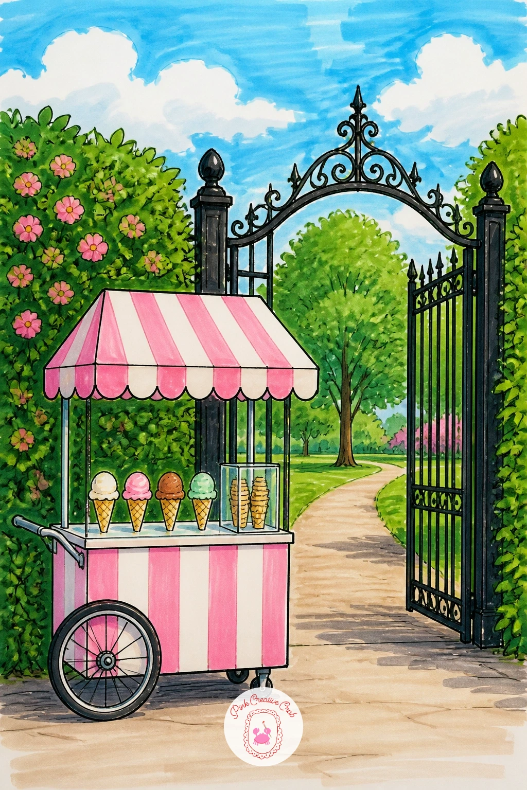
Palette: Bubblegum Pink,Mint Green,Iron Black,Cream White
Keep the jogger simple and dynamic: a forward-leaning torso, bent arms, one leg stretched back and one forward, which reads as motion even in a still drawing. Ink the figure first in a loose, confident line, since hesitant lines make a runner look stiff rather than moving.
Draw the tulip bed low in the frame as a long curved strip, then fill it with simple cup shapes on short stems, spaced close together but never perfectly even, since real tulip rows have small gaps and clusters. Color the tulips in a mix of red, pink and yellow so the bed reads as varied rather than one flat color.
From a low eye level looking slightly up at the jogger, the tulip bed sits lower in the frame and the runner feels like she is passing right by you, which adds energy to an otherwise still page.
Finish with a quick swipe of pale blue sky behind to keep the whole scene airy and bright.
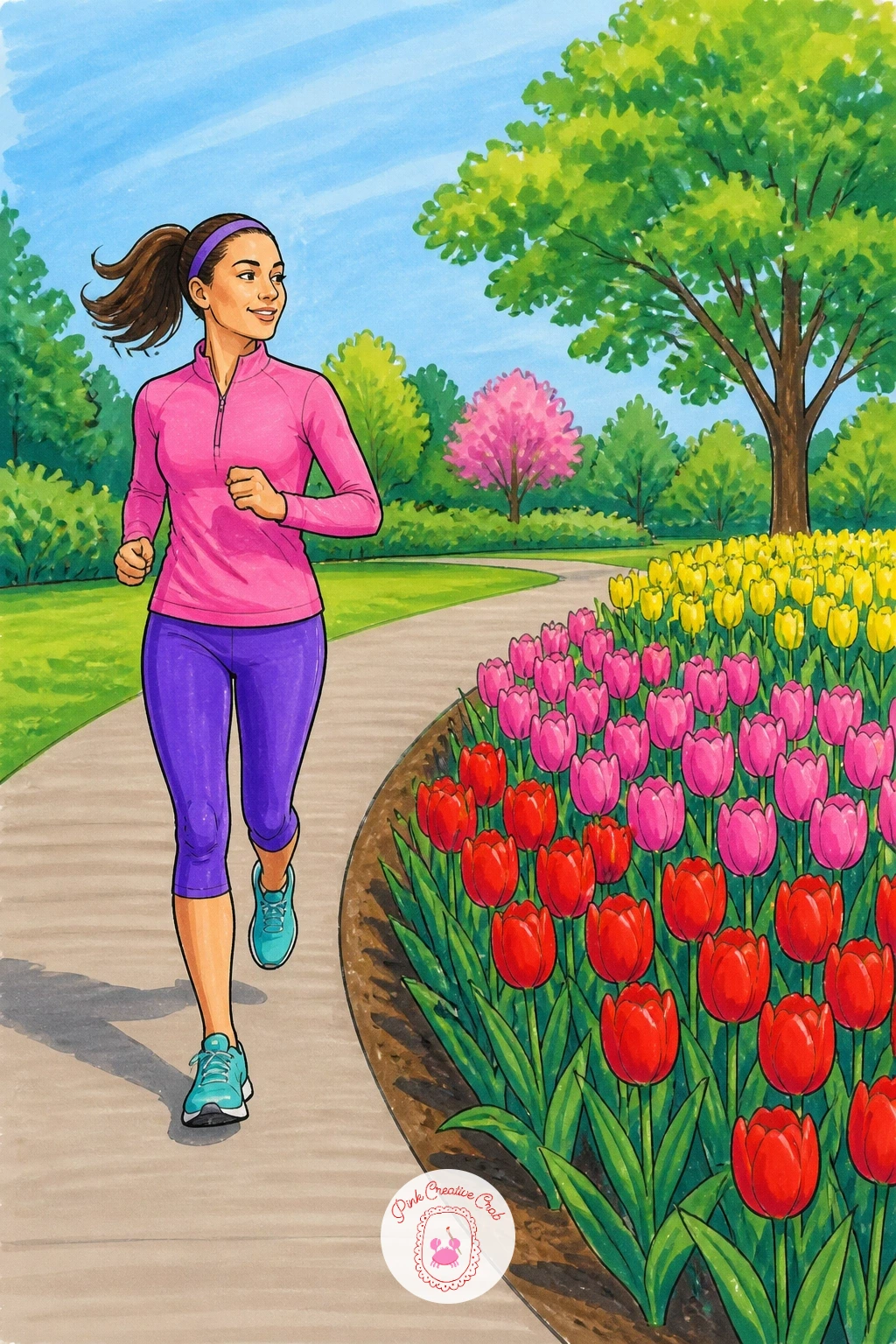
Palette: Tulip Red,Tulip Yellow,Leaf Green,Sky Blue
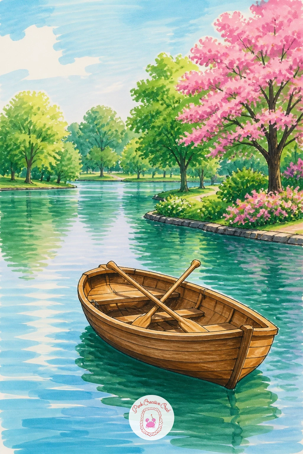
Settle the boat gently at an angle across the water rather than straight on, since a rowboat drawn head on loses its whole curved shape. Draw the hull first as a long shallow curve, add the pointed bow, then the two oars crossing slightly as they rest in the water.
Ink the ripples around the hull as a few short curved lines rather than full circles, which keeps the water looking calm rather than stormy. Color the boat in a classic wood tone or a cheerful red, then lay the lake in soft blue-green with lighter strokes near the boat to suggest disturbed water.
Where this often goes wrong is the waterline: make sure the boat’s reflection and the ripple lines sit at the exact same level as where the hull meets the water, or the boat looks like it is floating above the surface.
If you want a faster version, skip the oars entirely and draw the boat simply resting, tied to a small dock post instead.
Palette: Wood Brown,Lake Teal,Soft Blue,Cherry Red
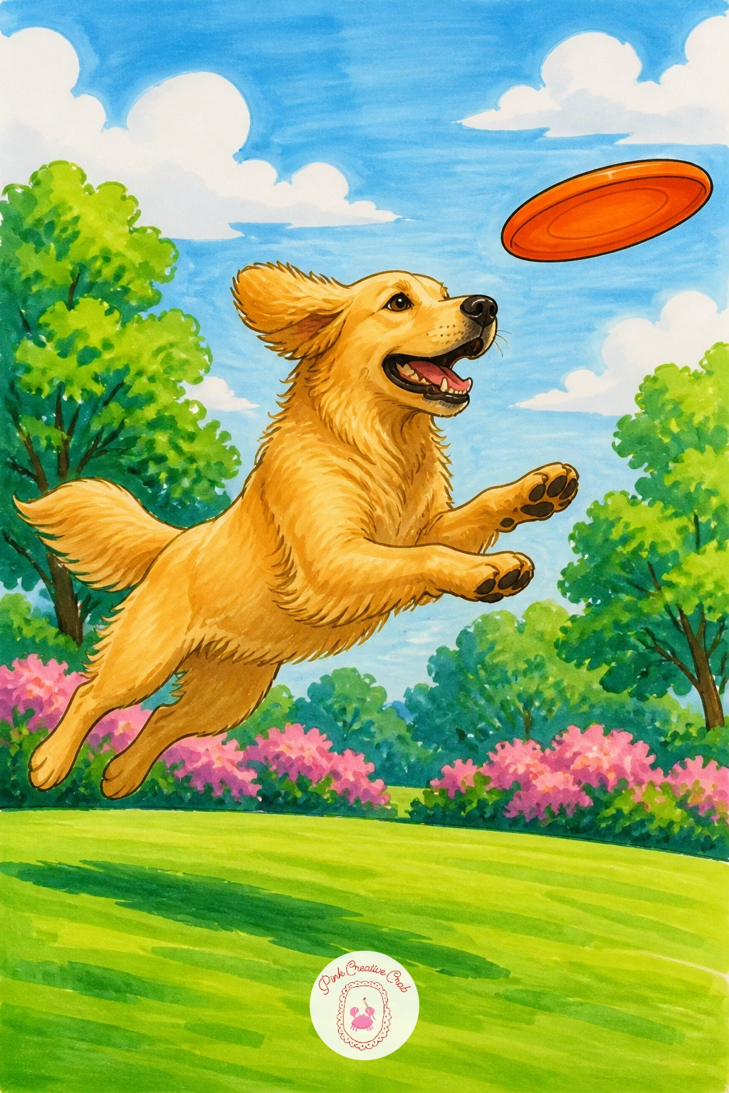
Catch the dog mid leap for the most energy: draw the body stretched long and low, front paws reaching forward, back legs trailing behind, ears flying up rather than down. A simple trick for proportion is to keep the dog’s body length about twice its head size, which holds true across most breeds.
Draw the frisbee as a simple ellipse just ahead of the dog’s nose, tilted slightly so it reads as spinning through the air. Ink the dog’s outline with quick confident strokes, since a leaping dog needs energy in the line itself, not just the pose.
Color the coat in warm golden or brindle tones with short quick marker strokes following the direction of the fur, which helps the body feel textured rather than flat. Leave the frisbee a bright contrasting color like orange or teal so it stands out clearly against the grass.
If you do not have a park-green marker, any mid-tone green works fine as a stand-in for the lawn underneath.
For more dog poses built the same confident way, the dog pencil drawing ideas are a good next stop.
Palette: Golden Tan,Burnt Sienna,Bright Orange,Lawn Green
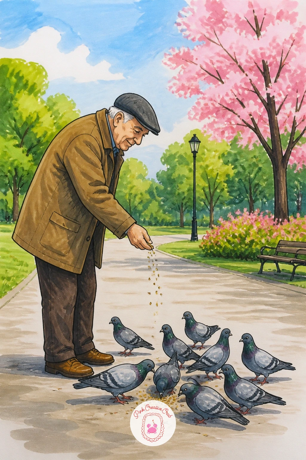
Build the old man as a simple seated or standing figure first, rounded shoulders, a cap or hat, one arm extended with a scattering hand. Keep his proportions gentle rather than sharp, since a softer posture reads instantly as an older figure at rest in the park.
Scatter five or six pigeons around his feet at different distances, each one a simple rounded body with a small head bob, some pecking down and one or two mid flutter with wings half raised. Varying their poses this way keeps the group from looking like copies of each other.
Color the man in muted browns and greys, then keep the pigeons mostly in soft grey with just a touch of lilac-pink at the neck, which is the detail that makes a pigeon read as a pigeon rather than a generic bird.
One concrete tip: draw the pigeons’ feet as tiny simple strokes right into the ground line rather than floating above it, which keeps the whole flock grounded on the page.
Palette: Dove Grey,Lilac Pink,Charcoal,Warm Brown
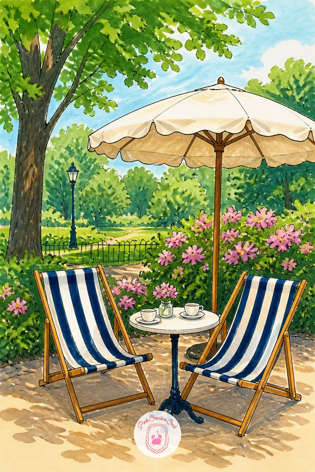
Line up two or three deck chairs at a gentle angle rather than straight on, which gives the scene depth without needing full perspective drawing. Draw the wooden frames first as simple X-crossed legs, then stretch the striped fabric seat across in a shallow curve.
Add a small round cafe table between the chairs with a cup or two resting on top, then a cafe awning or umbrella behind to tie the whole corner together. Color the stripes in classic red and white or navy and white, alternating cleanly so the pattern stays crisp.
If the stripes start to wobble as you color, go back over them lightly with the fineliner once the marker is dry, which sharpens the edges back up.
Swap the deck chairs for simple park café bistro chairs if stripes feel fiddly, using solid color blocks instead for a faster result.
Palette: Navy Blue,Cream White,Cherry Red,Warm Wood
A greenhouse is mostly geometry, so block it in lightly first with a ruler if you have one: a simple peaked roof over a rectangular glass structure, with evenly spaced vertical lines marking the panes. Keeping the pane lines consistent is the single thing that sells the glass structure.
Ink the frame in a clean grey-green or white, then add a few plant shapes visible through the glass, simple leafy silhouettes rather than detailed botanicals, since too much detail inside competes with the structure itself. Color the glass panes in the palest blue-green with light, even strokes.
Where this often goes wrong is making every pane the exact same tone, which flattens the whole building. Vary the pane shading slightly, darker where shadows fall, lighter where the light hits directly, to give the glass some dimension.
No pale green marker available? A light grey works just as well for the glass, keeping the structure feeling cool and glassy either way.
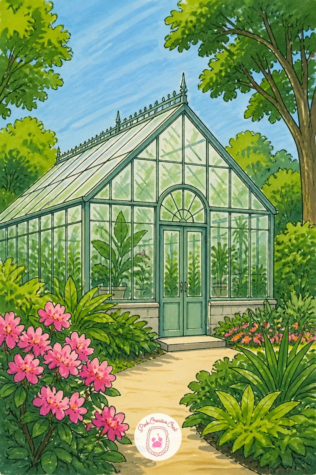
Palette: Glass Green,Frame White,Leaf Green,Soft Grey
Place the hill low across the bottom third of the page so the kite and sky have plenty of room above it. Draw the kite first as a simple diamond with a long curved tail of small triangle flags, floating at a jaunty angle rather than straight up, which instantly suggests wind.
Ink a thin curving line from the kite down to a small figure on the hill, the only connection the two need. Color the kite in bold primary colors, then keep the hill a simple rolling green and the sky a soft gradient blue, lighter near the horizon.
In ten minutes, stop at the kite, string and hill. With forty minutes, add a second smaller kite further back and a scatter of tiny birds for more depth in the sky.
One tip worth keeping: let the kite tail curve rather than hang straight, since a curved tail is what makes the whole kite read as airborne.
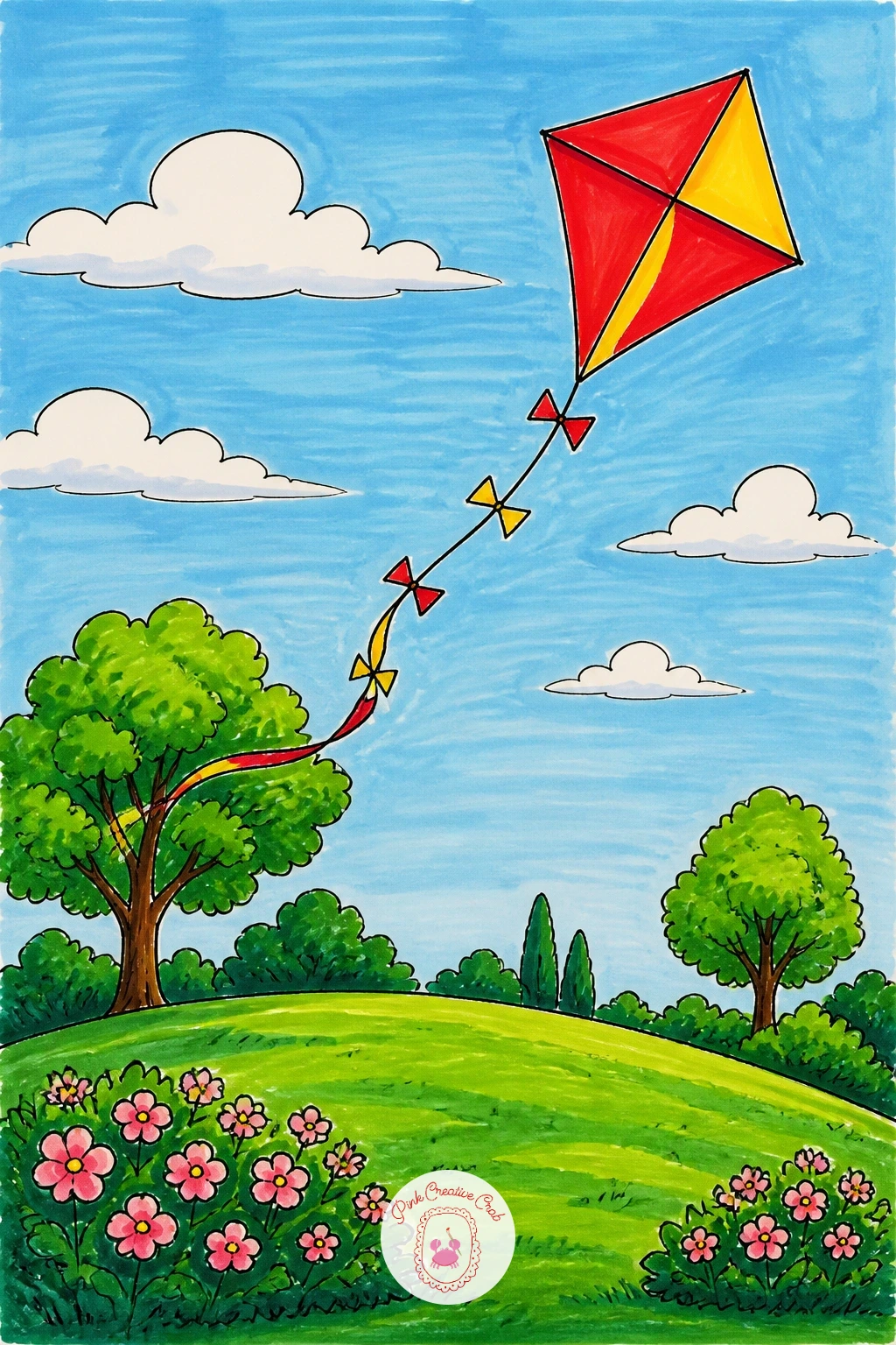
Palette: Kite Red,Kite Yellow,Hill Green,Gradient Blue
Following the kite’s open sky, bring the season down to earth here: draw a bare or half-bare tree first, trunk and a few main branches in dark brown, then a loose pile of leaves heaped at its base. Keep the pile as one solid rounded mass rather than individual leaf shapes, which is faster and reads better from a distance.
Scatter a handful of single leaves around the pile and drifting mid air for movement. Color the whole scene in warm autumn tones: burnt orange, deep red and golden yellow blended loosely together across the pile and the remaining leaves on the tree.
One hands-on trick here: once the base colors are down, go back in with a darker orange or brown marker and add short choppy strokes into the pile’s shadow side, which gives it real texture without drawing every leaf.
No orange marker on hand? Layer red and yellow directly on top of each other while both are still workable, which blends close enough on the page.
The fall watercolor ideas offer more seasonal color combinations if you want to borrow a palette.
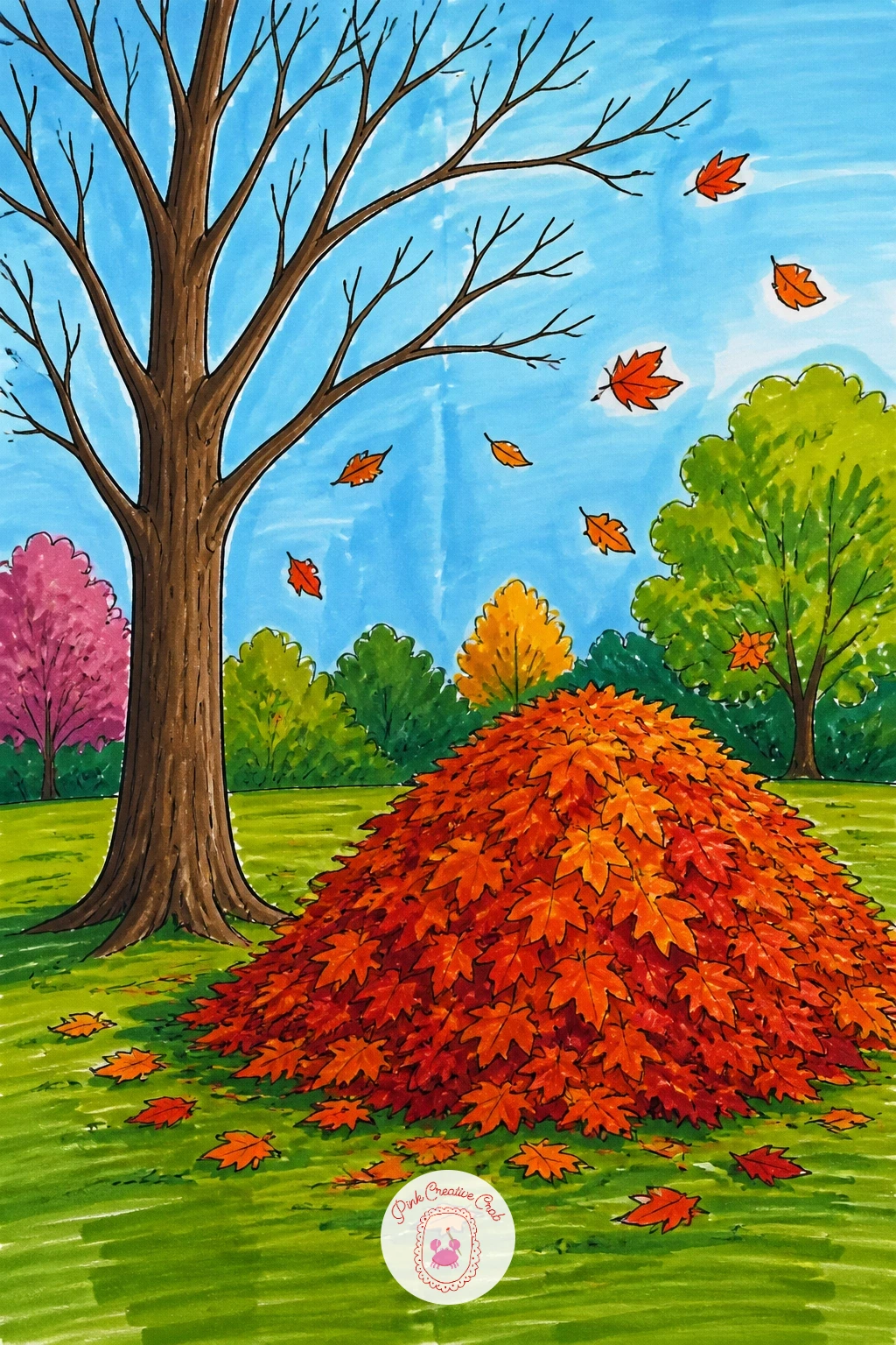
Palette: Burnt Orange,Deep Red,Golden Yellow,Bark Brown
Leave most of the page untouched white paper for the snow itself, which is the fastest way to make a scene feel properly cold. Draw a simple hill slope first, then a sled with a small figure on it, body leaning back slightly to suggest the downhill rush.
Ink bare winter trees along the hill’s edge, trunk and a few sparse branches, no leaves needed. Color the sky in a pale cool grey-blue, the sled in a bright red or green for contrast, and leave the hill almost entirely white with just a few grey shadow strokes along its curve.
If the snow looks too flat, add light blue-grey shadow patches just behind the sled and under the trees, since shadow is what tells the eye where the snow actually dips and rises.
Try this scene again next time with a snowman beside the hill instead of the sled, using the same white-paper approach.
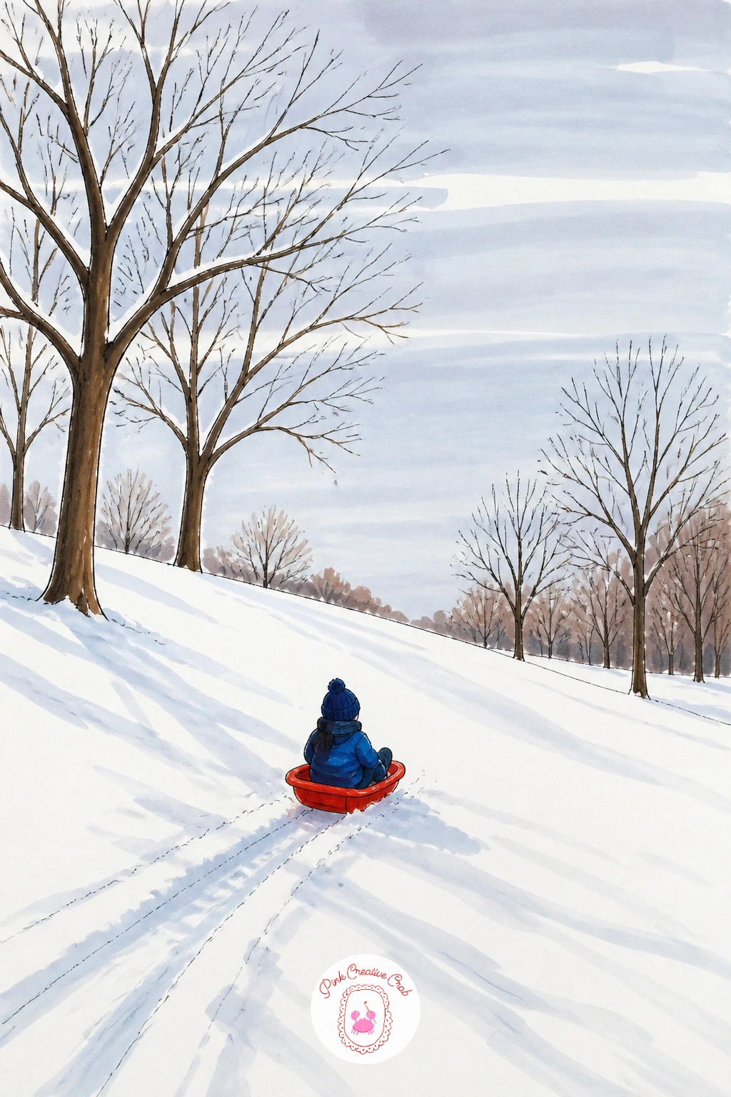
Palette: Sled Red,Cool Grey,Pale Blue,Bark Brown
Measure the gate’s width against its height before you ink, since most park gates are noticeably taller than wide, and getting that ratio right is what makes the structure feel grand rather than squat. Draw the two main posts first, then the arched or straight top bar, then fill in the scrollwork detail between.
Keep the scrollwork simple: a few curved swirls repeated symmetrically rather than an intricate pattern, since symmetry reads as wrought iron even with minimal detail. Color the gate in a deep charcoal or black, leaving thin white highlight lines along each bar to suggest the metal catching light.
Where gates often go wrong is making every scroll identical in size, which looks mechanical. Vary them slightly in scale and the gate feels more hand forged.
Behind the gate, a quick wash of park green and a glimpse of path is enough, since the gate itself should stay the clear subject.
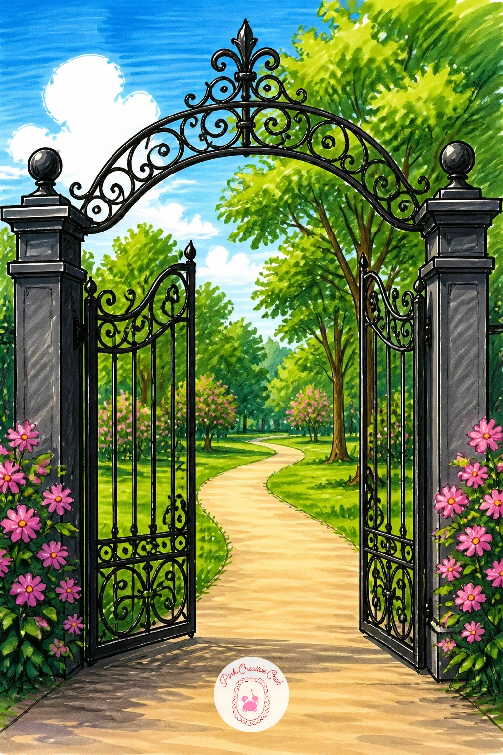
Palette: Iron Black,Charcoal,Park Green,Warm White
Carousels reward a little planning, so sketch the central pole first, dead center on the page, then the roof as a shallow cone radiating out from its peak, and the platform as a wide ellipse below. Keeping the pole exactly centered is what keeps the whole structure from leaning.
Add two or three horses around the platform edge, simple arched necks and raised front legs, spaced evenly using the platform’s curve as your guide. Color the roof in bold alternating stripes, the horses in cream and warm brown, and add strings of small colored lights or flags around the roof’s edge for festivity.
From a slightly low eye level, the roof cone appears larger and the horses rear up above the viewer, which makes the carousel feel more impressive on the page than a straight-on view would.
Simplify by drawing just one horse clearly in the foreground if the full platform feels like too much for one sitting.
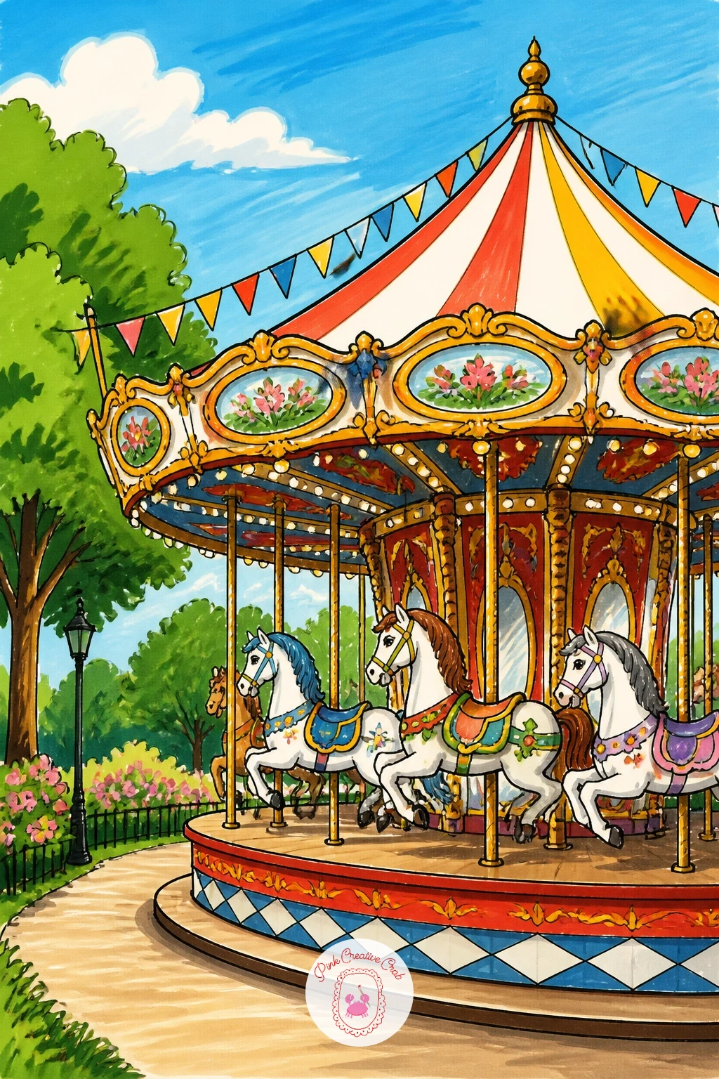
Palette: Carnival Red,Golden Yellow,Cream White,Warm Brown
Group two small figures at the pond’s edge first, simple rounded bodies and bent arms reaching forward with bread in hand. Keeping both children roughly the same height but in slightly different poses, one crouching, one standing, adds variety without much extra effort.
Scatter three or four ducks just in front of them in the water, necks stretched toward the bread, which is the detail that sells the whole interaction. Ink the water’s edge as a simple curved line separating grass from pond.
Color the children in bright simple outfits, the ducks in classic mallard green and brown, and the water in a calm blue-green with a few white gaps left unmarked for sparkle.
One concrete tip: angle every duck’s head toward the bread rather than in random directions, since that single alignment is what makes the whole scene read as one moment rather than several separate ducks.
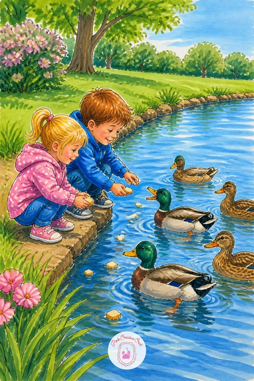
Palette: Mallard Green,Warm Brown,Bright Coral,Pond Blue
Draw the two trees first, trunks planted a comfortable distance apart on the page, then stretch the hammock between them as a shallow sagging curve rather than a straight line, since a flat hammock looks unused. Add a figure lying inside, following the same curve so the body sinks naturally into the fabric.
Ink the hammock’s weave with a few simple diagonal cross lines rather than a full net pattern, which is enough to suggest woven rope without slowing you down. Color the trees in rich green canopies, the hammock in a bright striped fabric, and the figure in a relaxed, simple pose.
If the hammock’s curve looks too deep or too shallow, compare it against the distance between the trunks: the sag should be roughly a third of that distance for a natural, comfortable look.
No striped marker combination at hand? A single solid warm color for the hammock reads just as restful.
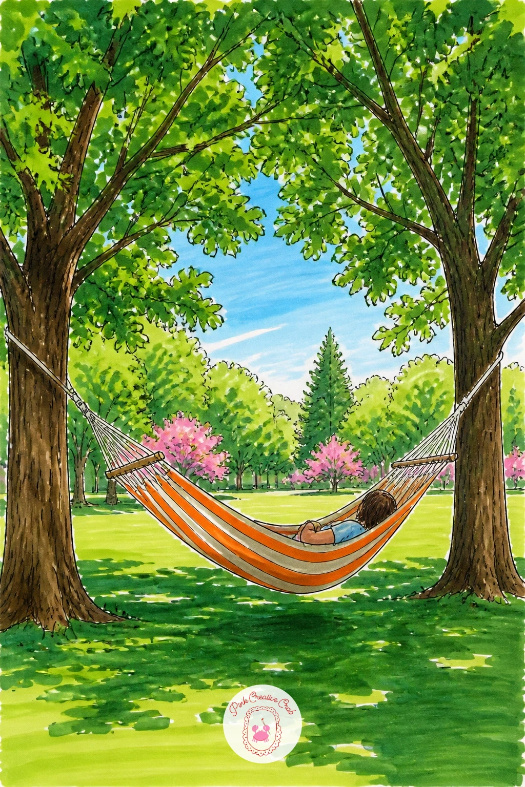
Palette: Canopy Green,Hammock Orange,Warm Cream,Bark Brown
Center the chess table and draw its checkered top first using a light grid of equal squares, since an uneven grid is the one mistake that ruins a chessboard instantly. Add two simple chairs facing each other, then a few chess pieces scattered across the board, kept simple as small geometric shapes rather than detailed figures.
Ink two seated figures leaning toward the board in a thoughtful pose, elbows on the table, which gives the scene its story. Color the board in classic black and white or cream and brown, and keep the figures in muted, calm tones so the board stays the visual anchor.
Where checkered patterns often go wrong is inconsistent square size: use a ruler or a consistent finger-width measurement across the whole board before inking any color in.
Swap chess for a checkers board instead if the piece shapes feel fiddly, since checkers pieces are just simple circles.
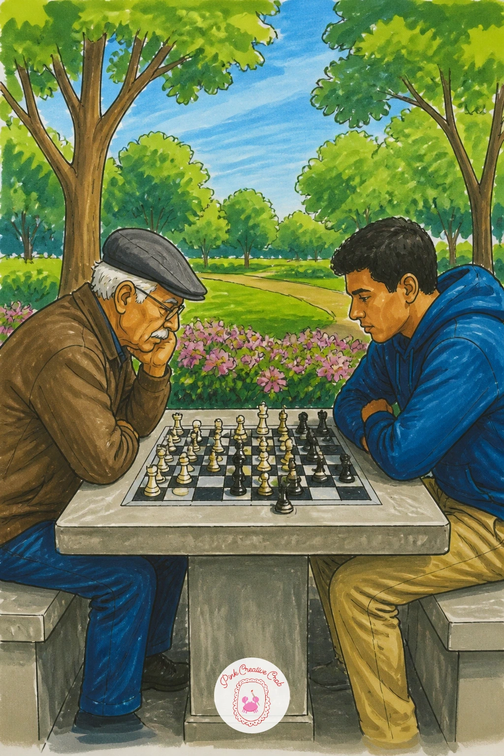
Palette: Charcoal,Cream White,Stone Grey,Park Green
Lay out the rose beds in gentle curved rows rather than straight lines, since curves feel more like a planted garden path. Draw each rose as a simple spiral of two or three curved petal layers rather than attempting every petal, which keeps a whole bed achievable in one sitting.
Vary the rose colors across the bed, deep red, soft pink and pale yellow mixed together, rather than one solid color block, since real rose gardens are rarely a single shade. Add simple leaf clusters between the blooms in a deep green.
If the bed starts looking crowded and messy, leave small gaps of bare green between clusters of three or four roses rather than filling every space, which actually reads as more realistic and lets each bloom stand out.
A trellis or arbor arch behind the bed, drawn in simple criss-crossed lines, adds a nice architectural frame if you have the time for it.
For more flower-filled scenes at this same pace, the sketchbook ideas for drawings are worth browsing.
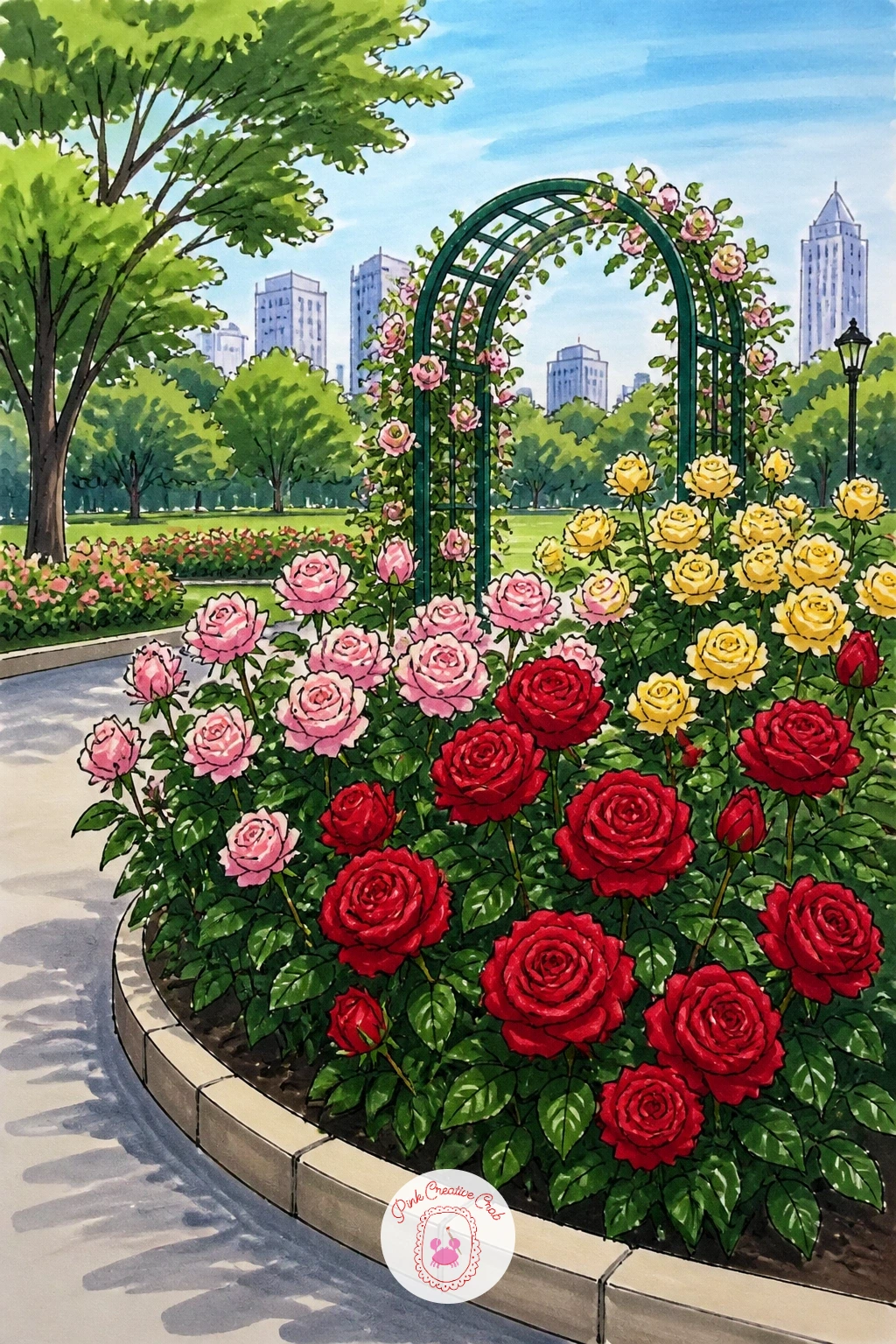
Palette: Rose Red,Blush Pink,Pale Yellow,Deep Leaf Green
Keep both figures low and relaxed, lying or sitting close together on the grass with books held loosely, since a stiff pose undercuts the whole restful mood. Draw the two figures slightly overlapping rather than fully separate, which ties them together as one group on the page.
Ink simple details only: a book shape in each hand, relaxed limbs, no need for detailed hands or faces at this scale. Color their clothing in soft, complementary tones, and lay the grass beneath them in warm green with a few short white highlight strokes where the sun catches the blades.
In ten minutes, the two figures and a patch of grass are enough for a complete scene. With forty minutes, add a basket, a dog curled nearby, or dappled tree shadow falling across them for a fuller moment.
One tip to finish on: keep the books angled toward each other slightly, which quietly suggests the two are close and comfortable rather than simply side by side.
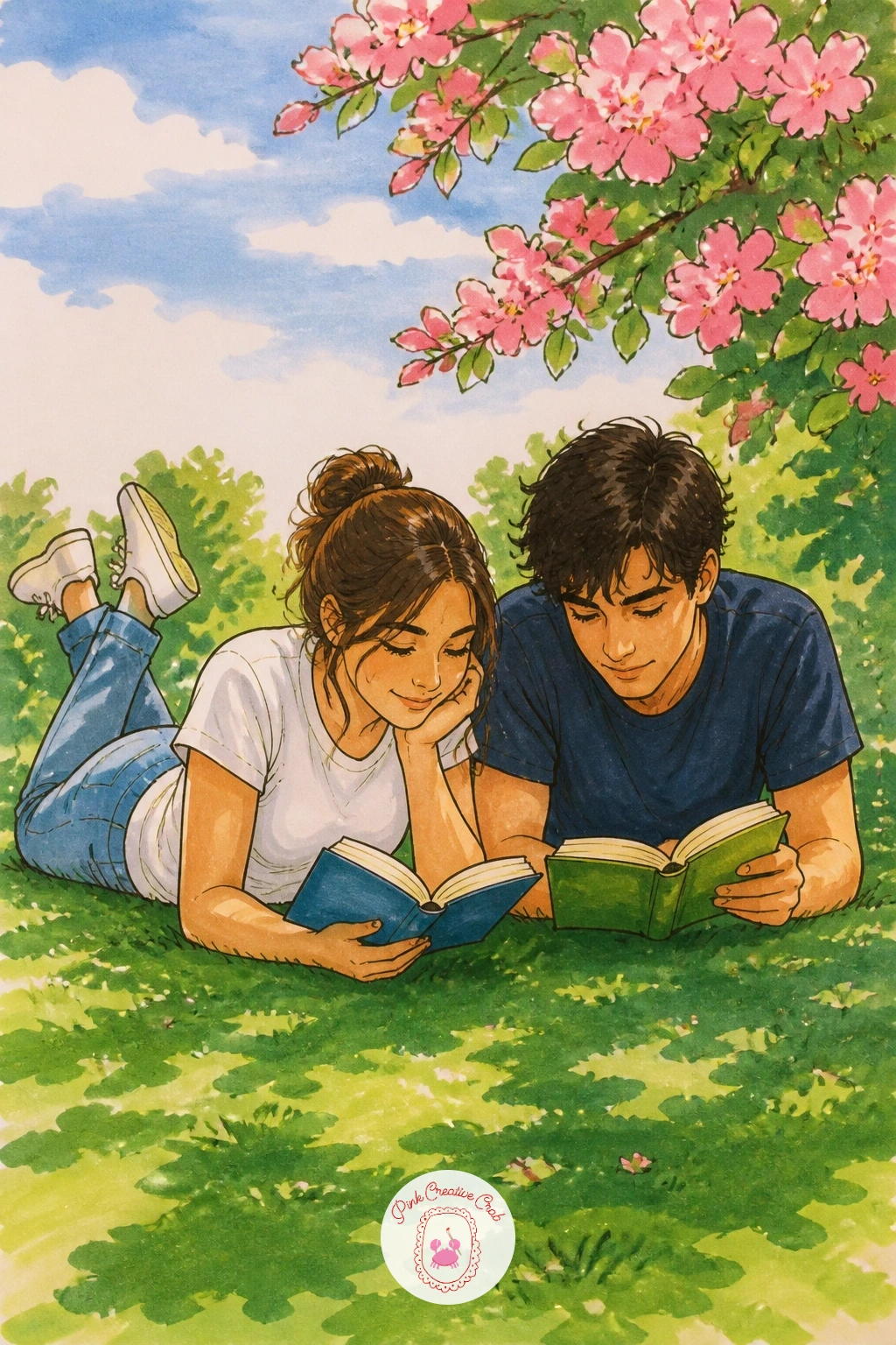
Palette: Soft Denim,Warm Mustard,Lawn Green,Warm White
Set the lamppost just off center and let it anchor the whole scene, a tall thin post with a simple glass lantern top, drawn with a ruler if you want the post perfectly straight. Place the bench beneath or beside it, angled slightly so it does not simply mirror the lamppost’s vertical line.
With the light source coming from inside the lantern itself, let that decide where the glow and shadow fall: color a soft warm halo around the lamp in pale yellow-orange, then deepen the surrounding sky and trees into dusky blue-purple as they move away from that glow.
Leave the bench mostly in shadow tones, with just a touch of warm light catching its top edge nearest the lamp, which is what sells the whole evening mood.
No purple marker available? Layer blue and a touch of red marker directly on top of each other for a close dusk tone.
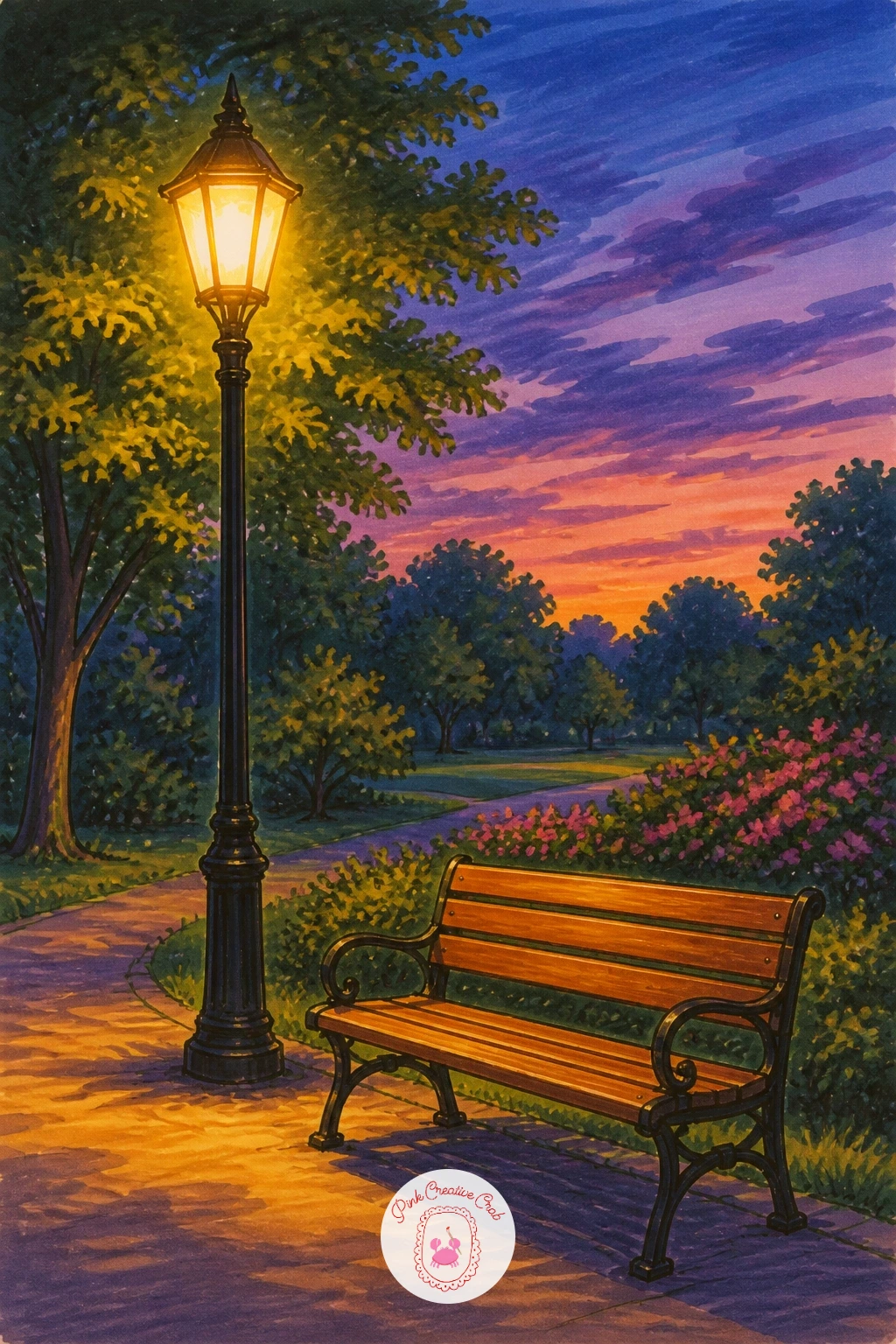
Palette: Dusk Purple,Lamp Gold,Deep Blue,Bark Brown
Let the path lead the eye straight into the page by drawing it as two converging lines narrowing toward a vanishing point roughly a third up from the bottom. Place tall trees along both sides, trunks drawn slightly smaller the further back they sit, which is the single trick that sells real depth here.
Ink the tree canopies as overlapping rounded clusters meeting overhead, leaving a gap of visible sky down the center where the path runs. Color the canopy in layered greens, darker where they overlap and lighter toward the gap, and keep the path itself in a warm sandy tone.
Where paths often go flat is the surface texture: a few short horizontal dashes along the path in a slightly deeper tan suggest worn dirt or gravel without much extra work.
A single small jogging figure far down the path adds scale and a sense of real distance if you want one more detail.
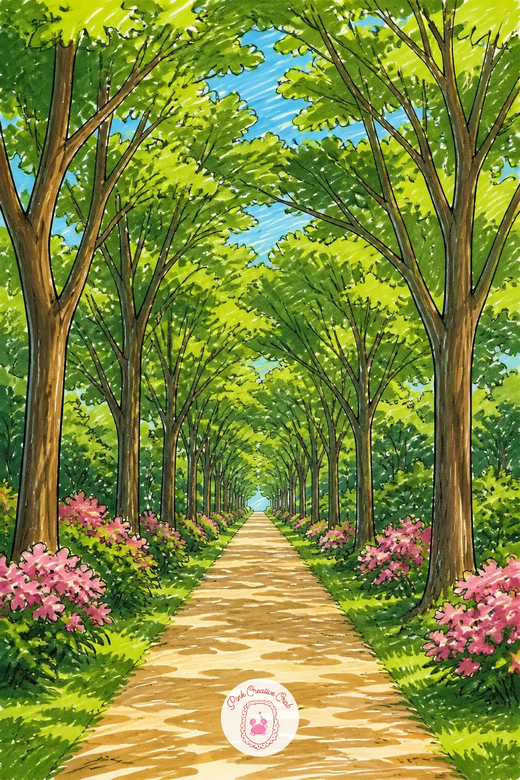
Palette: Canopy Green,Sandy Tan,Deep Green,Sky Blue
Unlike the earlier square fountain, give this one a looser, more natural pond setting: draw an irregular pond outline first rather than a perfect circle, then place a simple fountain jet rising from somewhere off center within it. Off-center placement keeps the composition more relaxed than a formal park square.
Ink the spray in short upward fineliner flicks fanning out from the jet’s tip, then ring the base with a few soft ripple lines. Color the pond in a deep blue-green, lighter directly under the spray where disturbed water catches more light, and leave the spray itself mostly white with just a hint of pale blue.
If the ripples look too mechanical, vary their spacing and curve slightly rather than drawing them perfectly even, since real water rarely repeats itself exactly.
Add lily pads scattered near the pond’s edges next time for a quieter variation on the same setup.
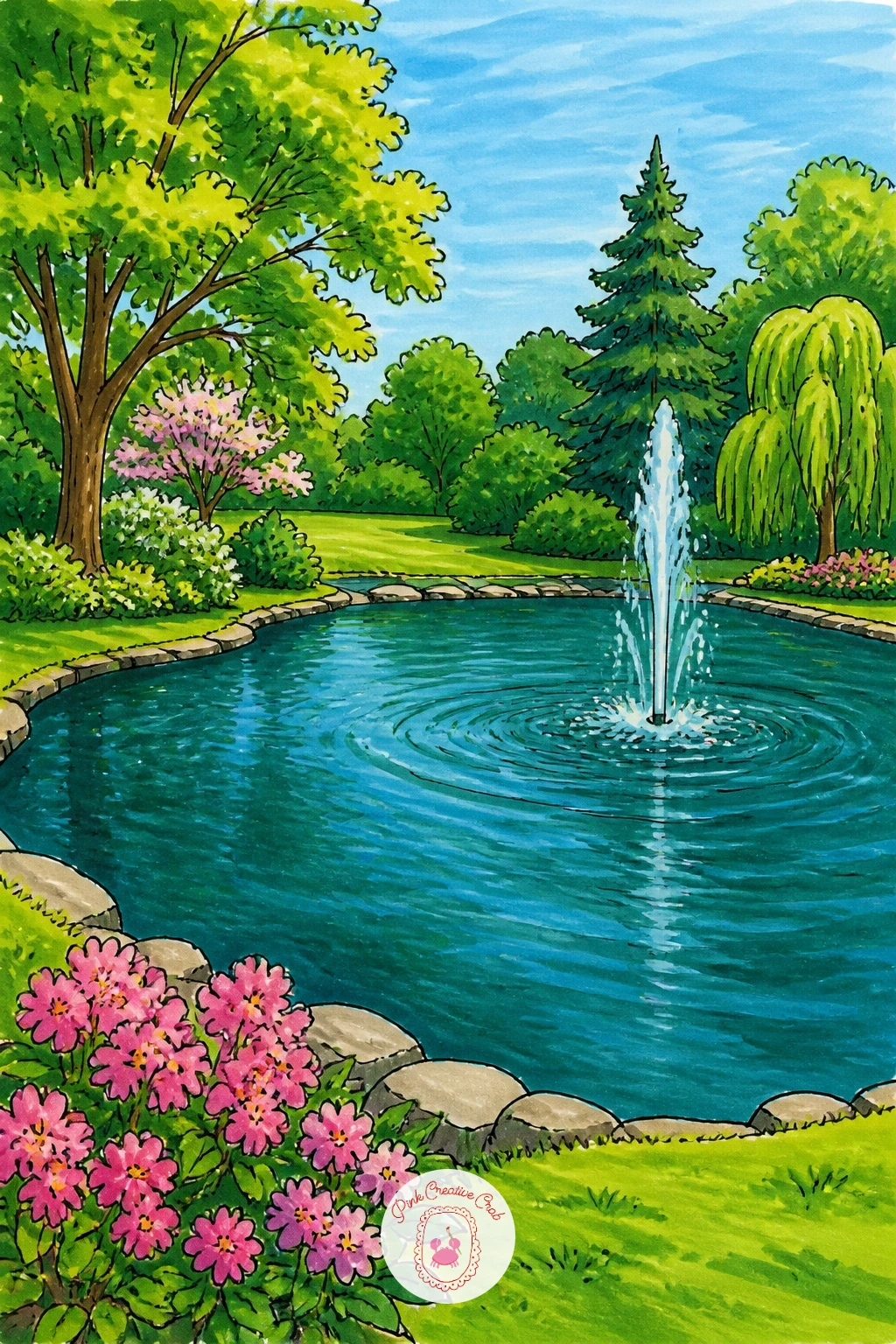
Palette: Deep Teal,Pale Blue,Lily Green,Warm White
Build the two figures first, the mother standing taller with one arm raised holding the string, the child beside her looking upward, since that upward gaze is what connects both figures to the kite above. Compare the child’s height to roughly the mother’s shoulder for a believable size difference.
Draw the kite string as one single continuous curved line rather than straight, running from the mother’s hand up into the sky, which keeps the whole composition flowing rather than static. Color their clothing in warm, cheerful tones against a simple green park ground and open blue sky.
Where figures standing together often go wrong is matching their shadows: a single simple shadow shape beneath both of them, slightly offset to one side, grounds them firmly on the page.
If a kite feels fiddly to add at this scale, a simple pinwheel held by the child works as an easier substitute with the same warm mood.
The girl pencil drawing ideas cover more figure poses if this one feels like a stretch.
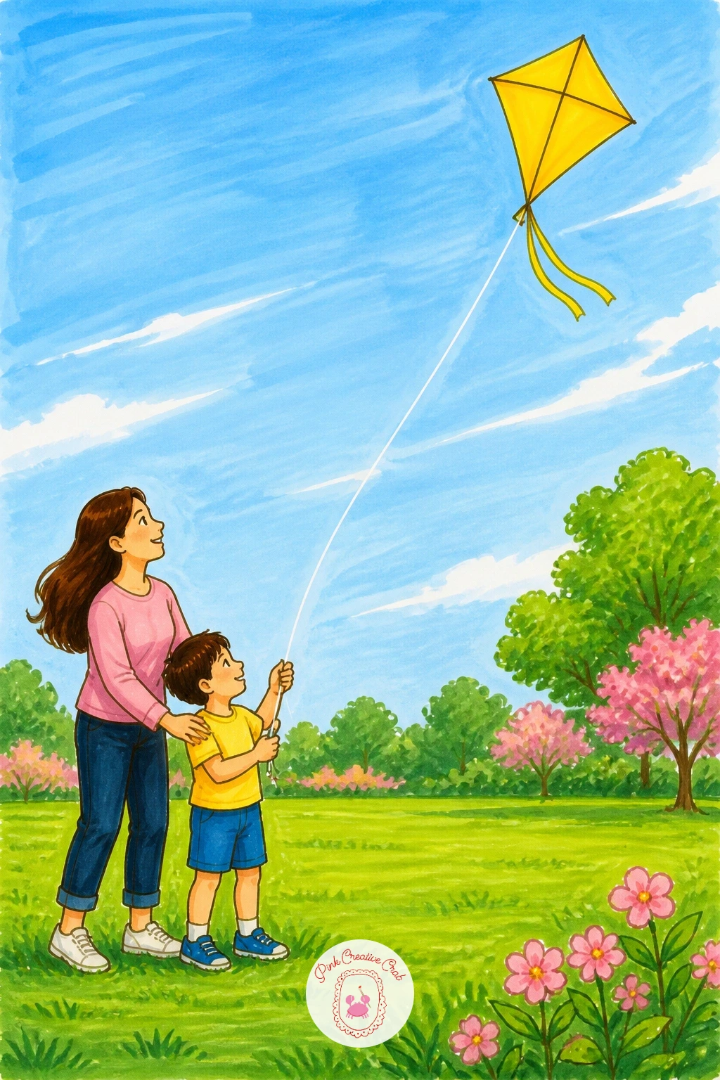
Palette: Warm Coral,Sky Blue,Lawn Green,Kite Yellow
Close the set with a quieter working moment: draw the gardener kneeling beside a curved flower bed, one hand reaching toward the soil, a small trowel or watering can nearby. Keep the pose simple, a rounded back, bent knee, and a sun hat or cap, which reads clearly even at a small scale.
Build the flower bed behind the figure with a mix of simple bloom shapes, a few taller stems with round flower heads, some low clustered mounds, varied in height so the bed does not look like a flat row. Color the blooms across a few different hues, reds, yellows, purples, against a consistent green foliage base.
If the bed starts to feel busy, group the flowers in loose clusters of three or four rather than spacing every stem evenly, which mimics how real planted beds actually grow.
One last tip for the whole set: keep a damp paper towel nearby while you work with alcohol markers, since it cleans small mistakes off smooth paper far better than most people expect.
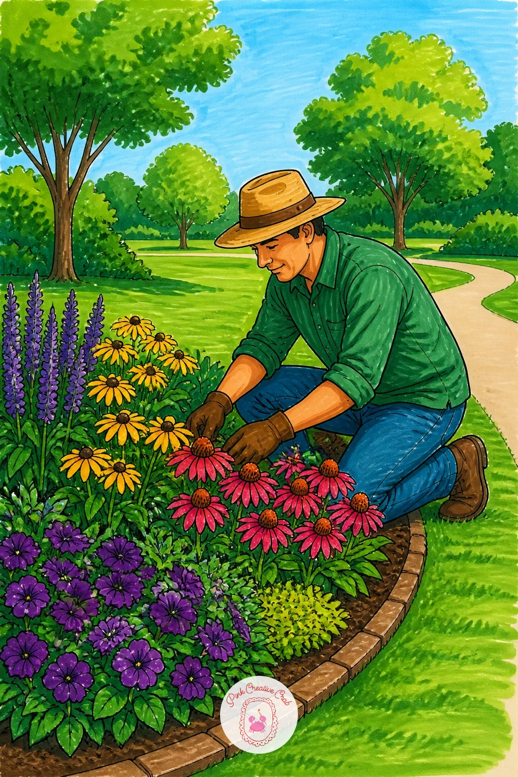
Palette: Violet,Sunflower Yellow,Deep Leaf Green,Earth Brown
What to Do Next
Pick one park corner that caught your eye, whether that is the duck pond bridge or the Sunday bandstand, and start with a smooth sheet of marker paper and your fineliner. Ink the main shapes first, then build color from light to dark, and let the scene stay loose rather than perfect.
Frequently Asked Questions
What markers work best for park drawing scenes like these?
Alcohol-based markers work best, since they blend smoothly without streaking. Pair them with a fine black fineliner for outlines and smooth, uncoated paper so colors glide and do not feather or bleed through.
Do I need to draw the whole park in one scene?
No, each idea here focuses on one corner or detail rather than a full park. Picking a single bench, pond or gate keeps the scene finishable in one sitting without overwhelming the page.
How do I keep figures in a park scene looking natural?
Keep poses simple and compare body parts to each other for scale, such as head height against seat height on a swing. Loose, confident outlines read as more natural than careful, hesitant ones.
What is the easiest park idea to start with as a beginner?
A park bench under a tree or a picnic blanket on the lawn are the easiest starting points. Both rely on simple shapes and flat color blocks rather than tricky perspective or crowds of detail.
How do I stop alcohol marker colors from streaking on grass and water?
Work in one direction with overlapping light strokes rather than scrubbing back and forth. Let each layer dry for a moment before adding a second pass, and keep a blender marker handy to smooth any hard edges.
Have any thoughts?
Share your reaction or leave a quick response — we’d love to hear what you think!
-
 0
-
0
-
0
-
0
-
0
-
0


