Scenery painting does not need a big canvas or a week on your easel. These views are built from flat shapes and clean edges, so you can mix a handful of gouache colours and have a finished piece ready for a frame before the light changes outside your window.
Below you will find thirty one small worlds, each with a quiet human touch tucked into the view: a bench facing a field, a bicycle against a gate, a boat tied up for the evening. Work through them in order from the simplest shapes to the busier compositions, or jump straight to the one that matches the wall you want to fill.
Using these images: free for personal projects such as printing, coloring, cards, journals and gifts. Handmade items that include them may be sold up to 30 pieces per design. More than that is commercial use and is not permitted, and neither is selling or sharing the images themselves or passing them off as your own. Please ask before any other use.
Start the whole set with a poppy meadow, since its flat red dots and green ground teach the matte, cut-out look you will reuse in every later piece. Block the sky in sky blue across the top third, then lay a sage green field below it with a flat brush, keeping the horizon line dead straight with a ruler or a strip of tape.
Once the field is dry, paint the wooden bench as two simple brown rectangles and four thin legs, sitting low and centred so it faces away from you into the view. Add the poppies last with a small round brush: dozens of poppy red dots, smaller near the horizon and larger near the bench, with a tiny dark centre dabbed into a few of them.
Measure the bench against the width of the field before you paint it. It should sit no taller than about a fifth of the canvas height, or it will fight the meadow for attention instead of inviting you into it.
If gouache feels too thick for the dots, switch to a fine paint pen for the poppies and keep gouache for the big flat shapes underneath.
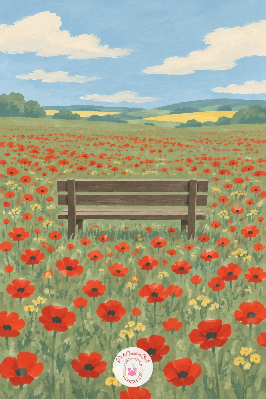
Palette: Poppy Red,Sage Green,Sky Blue,Soft Cream
Move from an open field to a lane with edges, since hedgerows give you two new flat shapes to practice: a curved road and clipped greenery. Sketch a lane that bends gently from the bottom corner up toward a small gap in the hedges, then fill it in butter yellow or warm cream, leaving the hedgerows as flat sage green blocks on both sides.
Paint the wooden gate as a simple cross of pale lines where the lane narrows, then add the blue bicycle leaning against it last, built from two overlapping circles for the wheels and a few straight strokes for the frame. Keep the bicycle small against the gate so the lane still reads as the main shape.
The lane usually goes wrong when its curve looks stiff rather than winding. Fix this by drawing the centre line first in pencil as a loose S shape, then painting the road colour on both sides of that guide rather than trying to paint a straight strip and bend it after.
No cobalt blue paint at hand? A mix of ultramarine and a touch of white gives a close, flat bicycle blue.
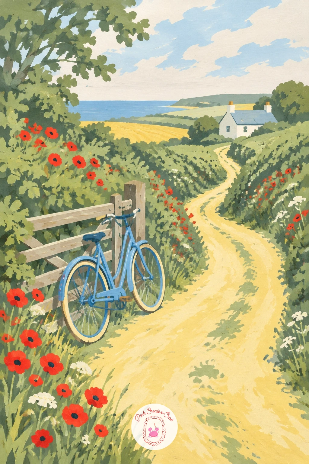
Palette: Sage Green,Butter Yellow,Cobalt Blue,Soft Cream
Bring in water next, since a still lake behaves differently from a field: it needs one flat colour below the horizon and a thin reflected shape rather than texture. Paint the sky and the lake in the same sky blue, with the lake just a shade deeper, divided by a single straight horizon line about a third of the way down.
Add the jetty as a narrow brown plank running out from the shore, with a few short vertical posts holding it above the water. Paint the rowing boat tied at the end last, as a simple curved hull shape with one flat bench inside, then drop a soft echo of its colour straight down into the water for the reflection.
Eye level sits low here, right at the waterline, which is what makes the lake feel calm and endless rather than tilted. Keep the far shore as one thin strip of sage green at the top of the water so the eye has somewhere to land.
If your reflection looks too hard edged, soften its bottom border while the paint is still slightly damp.
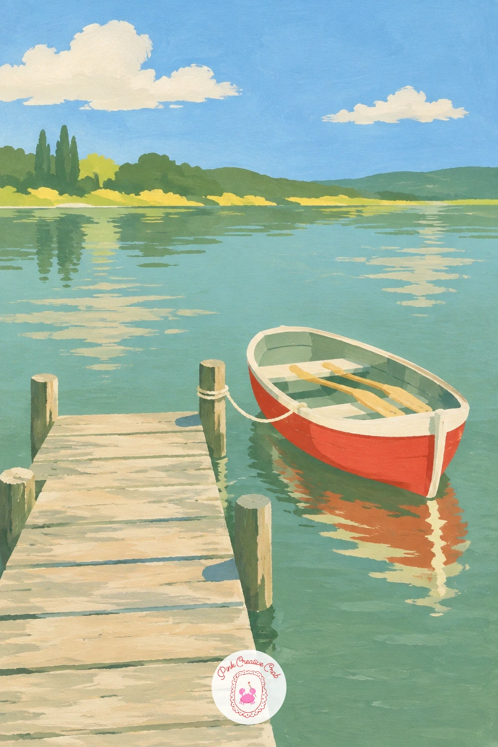
Palette: Sky Blue,Sage Green,Raw Umber,Soft Cream
Try this same jetty composition for a piece in the lake painting ideas list if you want more quiet dock and canoe scenes to practice with.
Lavender rows are a chance to practice repeated stripes, which is a different rhythm from the scattered poppy dots you may have already painted. Lay the field in diagonal bands running from the bottom left toward a small stone farmhouse in the upper right, alternating two close shades of purple for the rows so they read as separate stripes rather than one flat block.
Paint the farmhouse as a simple square body with a triangular roof and two small window rectangles, kept pale and low against the sky so the stripes stay the star of the piece. Finish with the sky in soft cream or pale butter yellow, since lavender fields often sit under a hazy summer light rather than a bright blue one.
Count your rows loosely in pencil first, about six to eight bands narrowing as they near the farmhouse, which is what gives the field its sense of distance without any shading. Crowding too many rows close together near the house flattens that effect, so keep the gaps even as they shrink.
Swap purple for a dusty plum if you want a cooler, late evening version of the same field.
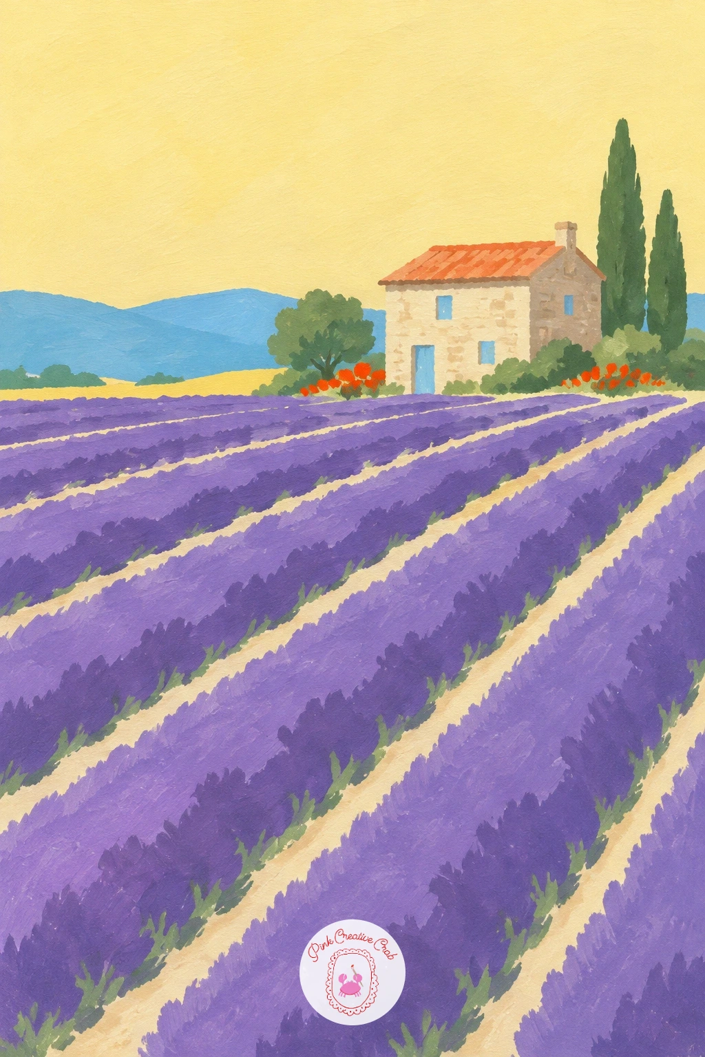
Palette: Dusty Lavender,Plum Purple,Butter Yellow,Stone Grey
Climb above the ground for this one, since the view shifts from eye level to looking down, which changes how every field reads. Paint a patchwork of small rectangles and odd shapes below in sage green, butter yellow and soft brown, fitting them together like a quilt with thin cream lines between them standing in for hedges and paths.
Add the hot air balloon drifting in the upper half, a simple rounded dome in poppy red or sky blue with thin basket lines hanging beneath it, small enough that the patchwork still carries the composition. Paint the sunrise sky behind it in soft bands of cream, pale pink and butter yellow, lightest near the horizon.
Looking down rather than across means every field shape gets smaller and flatter the further it sits from the balloon, with no single field drawn larger than its neighbours just because it is closer to your eye. Keep every patch roughly the same size for that calm aerial feel.
If blending three sky colours smoothly worries you, paint them as three flat bands instead and let the hard edges sit, which suits this flat print style anyway.
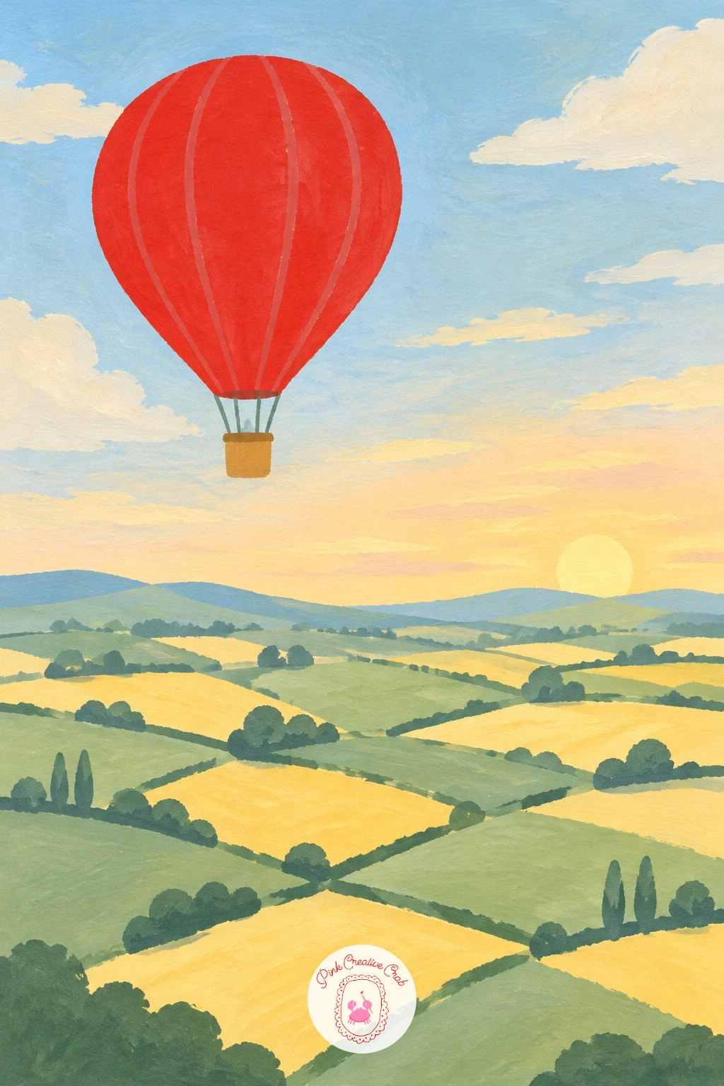
Palette: Poppy Red,Sage Green,Butter Yellow,Soft Pink
Return to ground level with a gate that frames the whole view rather than sitting off to one side, which is a useful composition trick to carry into later pieces. Paint the white picket gate first, left slightly open, as a row of narrow vertical boards and one simple cross brace, placed just off centre in the lower half of the canvas.
Fill the meadow beyond it in sage green with loose dabs of poppy red, sky blue and butter yellow scattered through it for the wildflowers, keeping the dabs smaller as they near the horizon. Finish the sky in a flat pale blue and let the gate stay the cleanest, whitest shape in the whole painting so the eye settles there first.
If this is your first time painting a picket fence, pencil in evenly spaced verticals with a ruler before you touch a brush, since uneven gaps are the fastest way to make a tidy gate look wobbly.
No white gouache on hand? Leave the gate as untouched cream paper instead, which reads just as clean against the painted meadow.
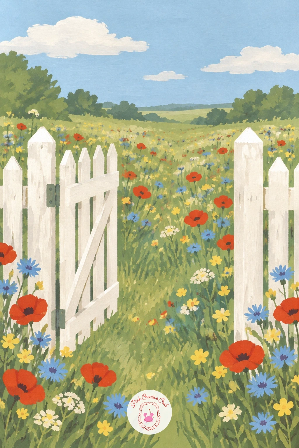
Palette: Soft Cream,Sage Green,Poppy Red,Sky Blue
Give the composition a single point of interest this time, since one sunflower facing the wrong way does more work than a whole field facing the sun. Paint rows of sunflowers in butter yellow with dark brown centres, all tilted the same direction toward an unseen sun, except for one flower near the front turned to face you instead.
Work the field from the back forward, painting the furthest flowers smaller and closer together, then leave more space around the single turned flower so it reads clearly as the odd one out. Keep the stems and leaves in flat sage green strokes, simple vertical lines rather than detailed foliage.
Try a quick ten minute version with just two rows of flowers and the one turned bloom for a small print sized piece. For a fuller forty minute version, add a hazy pale sky with a few soft clouds and a thin strip of farmhouse roofline on the horizon.
Keep every sunflower head the same rounded shape, since it is the single turned flower doing the storytelling, not variety in the flower shapes themselves.
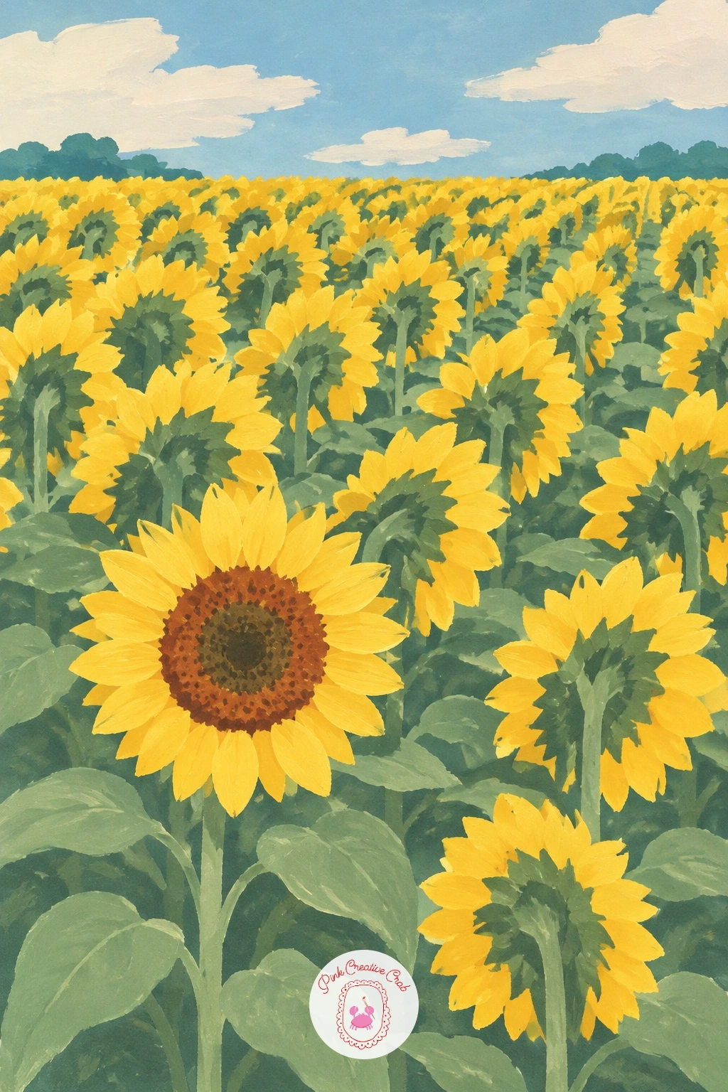
Palette: Butter Yellow,Raw Umber,Sage Green,Sky Blue
Curves take over from straight rows here, since a stone bridge arching over water asks you to paint a clean half circle rather than a flat block. Pencil the arch first using a coin or a lid to trace a true curve, then paint the bridge in warm stone grey with a flat brush, keeping its edge crisp against the river below.
Let the slow river run in flat sky blue under the arch, with a soft echo of the stone colour reflected beneath it, and line both banks with willow trees painted as loose teardrop canopies in sage green hanging low toward the water. Finish the sky plainly so the bridge and the willows carry the piece.
If the arch looks lopsided, check that both ends meet the riverbank at the same height before you paint over your pencil line, since an uneven arch is the single most common slip with this subject.
Swap the stone grey for a warmer terracotta if you would rather paint a brick bridge instead.
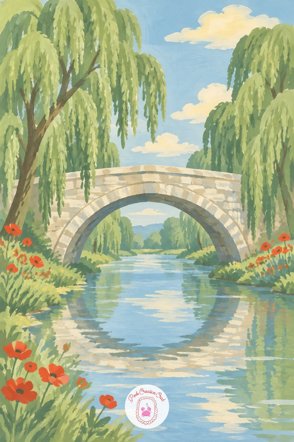
Palette: Stone Grey,Sky Blue,Sage Green,Soft Cream
Keep this one deliberately simple, since a single tree on an open hill is one of the calmest compositions in the whole set and a good one to practice confident flat shapes on. Paint a gentle rolling hill in sage green across the lower half, then add the tree as one round canopy shape and a straight trunk, placed slightly off centre rather than dead middle.
Hang the rope swing from a low branch with two thin parallel lines and a small flat seat, letting it hang just above the grass. Finish with a plain sky in soft cream or pale blue, since any more detail here would crowd a picture that works because of its empty space.
Painting the tree’s shadow pooling just to one side of the trunk, in a deeper green, is the fastest way to ground it on the hill rather than letting it float. Decide where your light comes from before you paint that shadow and keep it consistent.
If this is your first tree, round canopies are more forgiving than pointed ones, so start there before trying a willow or a pine.
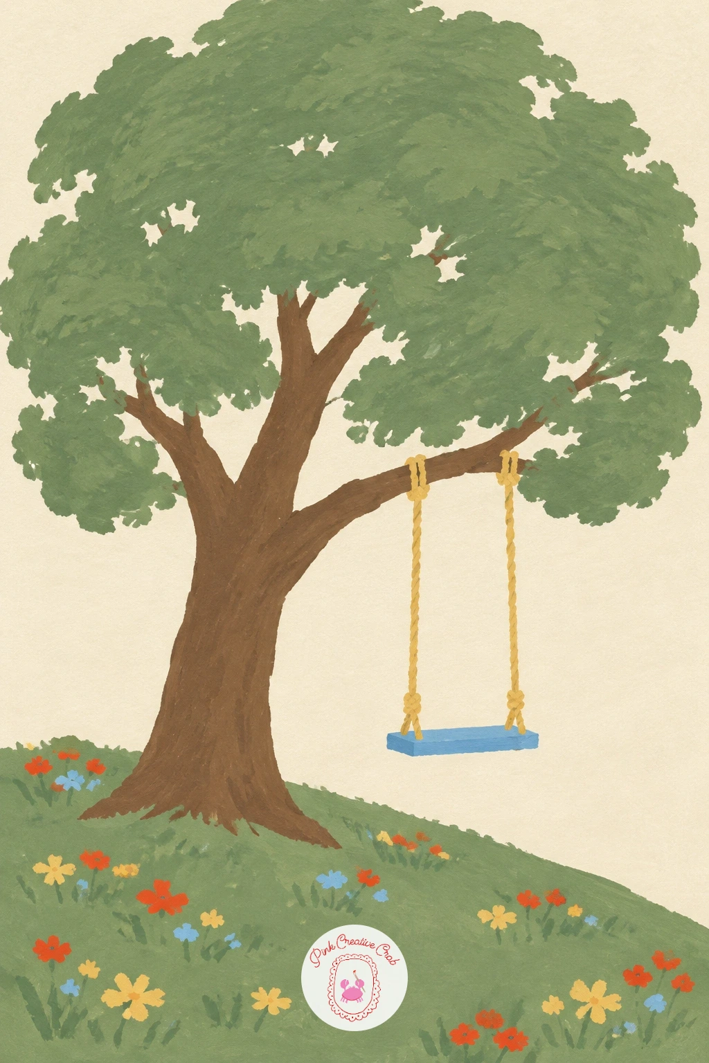
Palette: Sage Green,Raw Umber,Soft Cream,Deep Green
Terraces ask for a different kind of repetition than lavender rows, since each curved level follows the shape of a hillside rather than running straight. Paint a series of stacked, curving bands down the hillside in alternating shades of green and pale water blue, each terrace slightly narrower than the one below it as the hill rises.
Add the small farmer figure in a straw hat low in the composition, built from a simple cone hat shape, a straight body and two thin legs, standing on one of the lower terraces. Keep every terrace line flowing with the same gentle curve so the whole hillside reads as one continuous shape rather than separate stripes.
Working from the top of the hill downward keeps your curves consistent, since each new band can follow the one above it. Painting from the bottom up tends to make the top terraces drift out of rhythm.
If a confident curved line worries you, lay a piece of string in the shape you want and trace along it lightly in pencil before committing in paint.
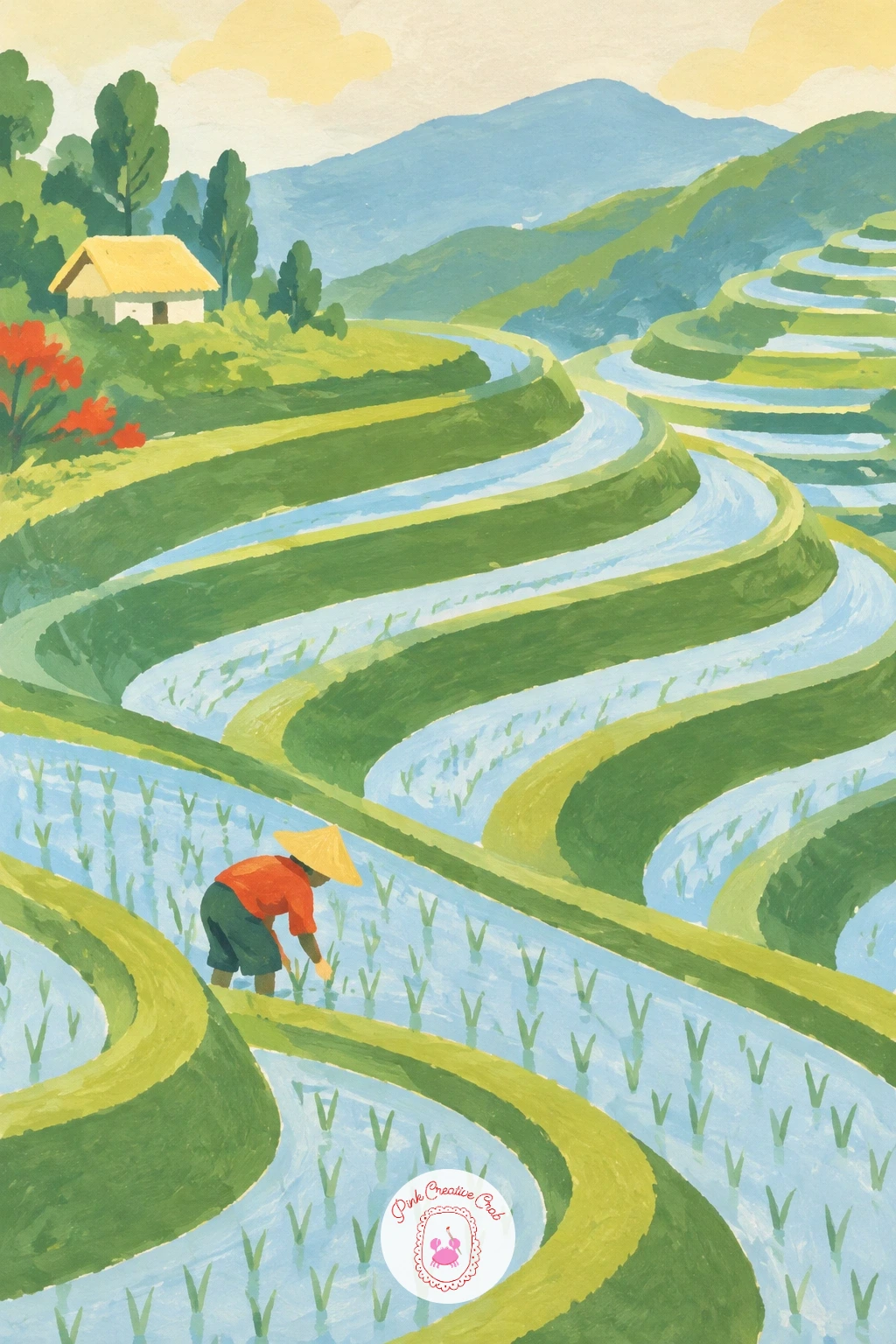
Palette: Sage Green,Water Blue,Raw Umber,Butter Yellow
Bring back the striped field technique from the lavender meadow, but this time in three alternating colours instead of one, since tulip rows traditionally run in bold blocks of pink, red and yellow. Lay each stripe with a flat brush working from the back of the field forward, keeping the rows narrower near the horizon for depth.
Paint a small windmill far in the distance on the horizon line, little more than a simple tower shape with four thin crossed sails, kept pale and small so it never competes with the bold stripes in front of it. Finish the sky plainly in soft blue so all the colour energy stays in the field.
If three colours of stripe feel busy to plan, paint one test row on scrap paper first to check the pink, red and yellow sit comfortably next to each other before committing to the full field.
For a fresh version later, swap the windmill for a single distant barn and keep the same striped field underneath.
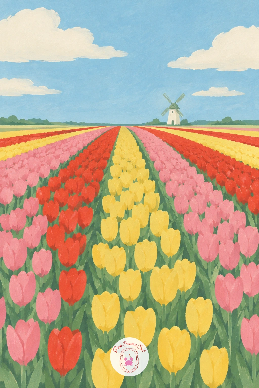
Palette: Soft Pink,Poppy Red,Butter Yellow,Sky Blue
This same windmill-on-the-horizon trick works well for a windmill painting if you want to try more mill and tulip combinations.
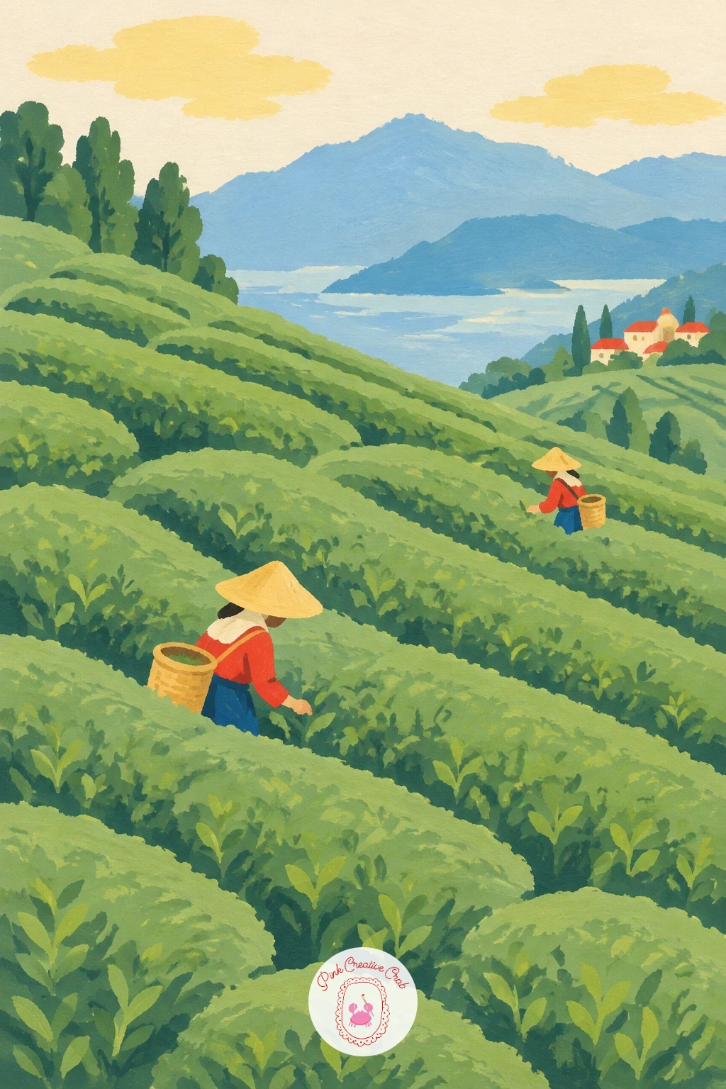
Rounded hills take over from straight rows for this one, since tea bushes are trimmed into soft bumps rather than flat beds. Build the slope from overlapping rounded green shapes, like a field of low clouds laid on their sides, darker sage green at the base of each bump and a lighter touch near the top of each curve.
Add two or three small pickers scattered across the slope, each a simple cone hat and straight body with no more detail than that, standing between the rounded rows rather than on top of them. Keep the sky plain and pale so the textured slope stays the main event.
The slope often goes flat and mushy if every bump is painted the exact same green. Mix a second, slightly darker sage for the shadow side of each bump, placed consistently on the same side throughout, to keep the rounded shapes readable.
A small natural sponge dabbed lightly over the dry green rows can add a soft texture if flat brushwork feels too smooth for this subject.
You Will Need
- small natural sponge
Palette: Sage Green,Deep Green,Raw Umber,Soft Cream
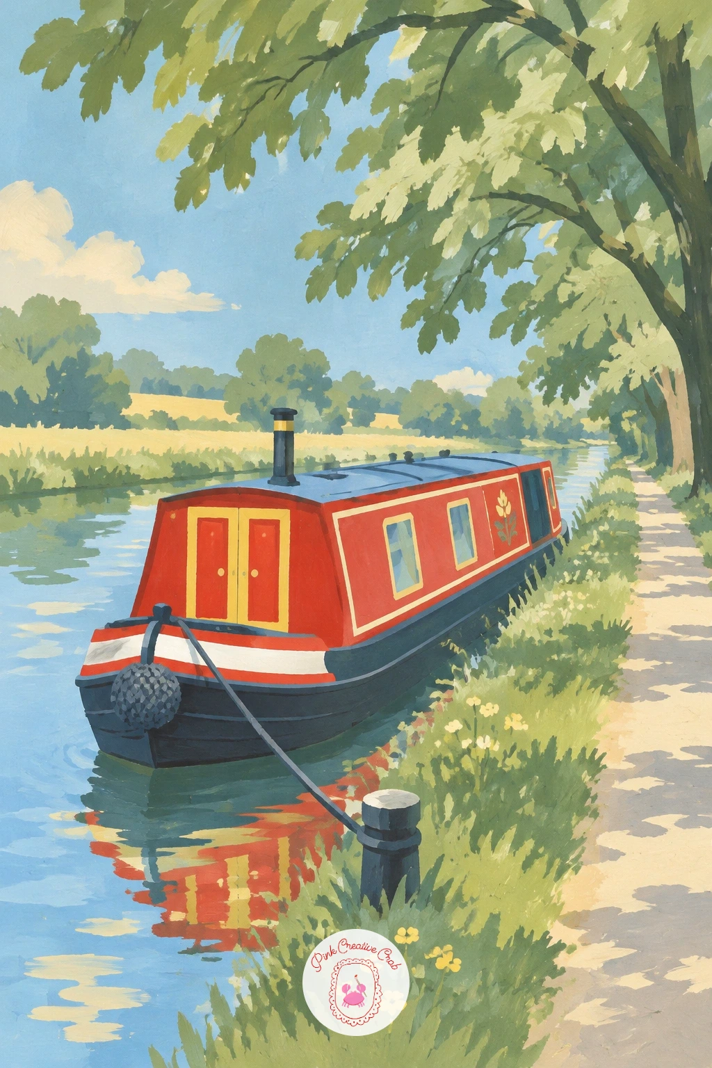
Narrow the water right down for this scene, since a canal reads very differently from a lake once it sits in a tight channel lined with trees. Paint the canal as a straight sky blue strip running across the lower third, with a flat grassy towpath along one edge and tall sage green trees leaning in from both banks above it.
Moor the narrowboat along the canal’s edge, painted as a long low rectangle with a slightly curved roofline, finished in one or two bold flat colours such as poppy red or deep green with simple round portholes. Let its shape sit parallel to the bank rather than at an angle, which keeps the still water feeling calm.
Painting the tree canopies so they overlap the top edge of the water line, rather than stopping cleanly above it, is what gives this scene its closed in, shaded towpath feeling. Leave gaps of cream sky showing through here and there so the canopy does not turn into one solid block.
If a long straight boat intimidates you, mask off its top and bottom edges with low tack tape before painting the body colour for perfectly crisp lines.
You Will Need
- low tack masking tape
Palette: Sky Blue,Sage Green,Poppy Red,Deep Green
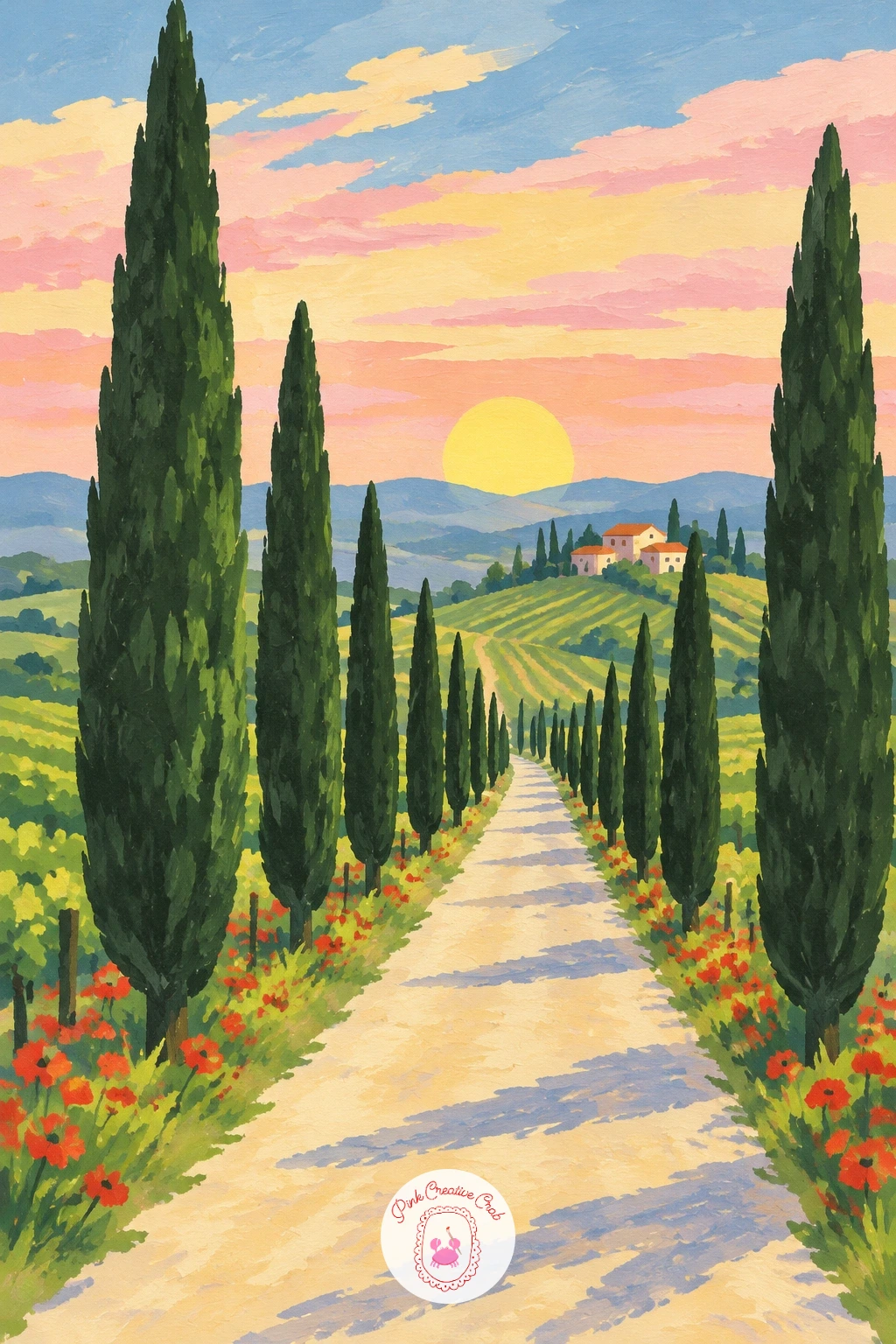
Trade curved water for straight rows receding into the distance, since a vineyard road lined with cypress trees relies on perspective rather than texture. Paint the road running straight from the bottom edge of the canvas up to a small vanishing point just above the centre, with rows of low vineyard vines fanning out on either side in sage green and warm brown.
Stand a line of tall, narrow cypress trees along both edges of the road, each one a thin dark green flame shape, getting smaller and closer together as they near the vanishing point. Finish the sky in warm sunset bands of soft pink, butter yellow and a touch of orange behind the furthest trees.
Every cypress tree should lean toward that same vanishing point in height and spacing, which is the single trick that makes a straight road feel like it recedes rather than just narrowing randomly. A ruler for the road’s edges keeps this perspective honest while you learn it.
If dark green cypress trees look flat and heavy, warm them slightly with a touch of raw umber mixed in near their base.
Palette: Deep Green,Sage Green,Soft Pink,Butter Yellow
Bring back the confident flat blocks from the earliest ideas in this list, since a red barn against green corn is almost entirely about two bold shapes placed well together. Paint the barn first as a simple square body with a triangular roof in poppy red, sitting roughly a third of the way across the canvas, with one small dark rectangle for a door.
Fill the rest of the canvas with tall corn in sage green, painted as loose vertical strokes rather than individual leaves, taller near the barn and slightly shorter as the field recedes. Keep the sky plain and pale so the red barn stays the brightest, cleanest shape in the whole piece.
If the barn’s roof angle looks uneven, fold a scrap of paper into the triangle shape you want first and trace around it, rather than freehanding both roof slopes separately.
Swap the poppy red for a weathered barn red mixed with a touch of raw umber for an older, sun faded look instead.
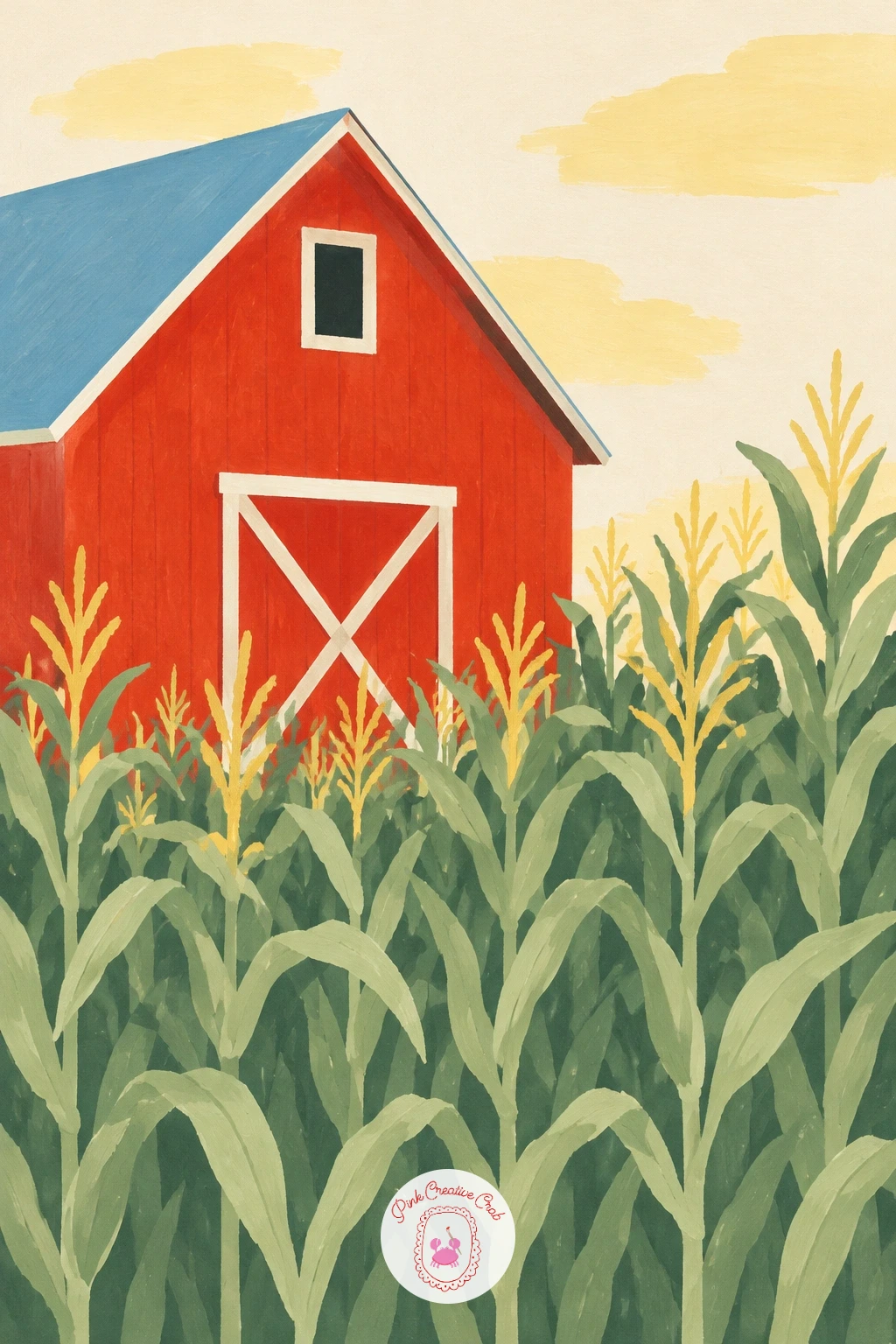
Palette: Poppy Red,Sage Green,Soft Cream,Raw Umber
Step into the trees now for a cosy, enclosed version of a meadow scene. Paint a ring of tall sage green trees around the edges of the canvas first, leaving an open sunlit clearing in the centre in a lighter, warmer green where the light breaks through.
Lay the picnic blanket as a flat rectangle of butter yellow or poppy red checks in the middle of the clearing, with the wicker basket beside it painted as a simple rounded brown shape with a curved handle. Keep both small against the clearing so the forest still feels like the main subject.
Painting the clearing’s grass a shade lighter and warmer than the shaded grass under the trees is the quickest way to suggest sunlight falling through a gap in the canopy, without adding any actual sun or rays to the sky.
If gingham checks on the blanket feel fiddly, a few simple cream stripes crossing a red rectangle read just as clearly at this scale.
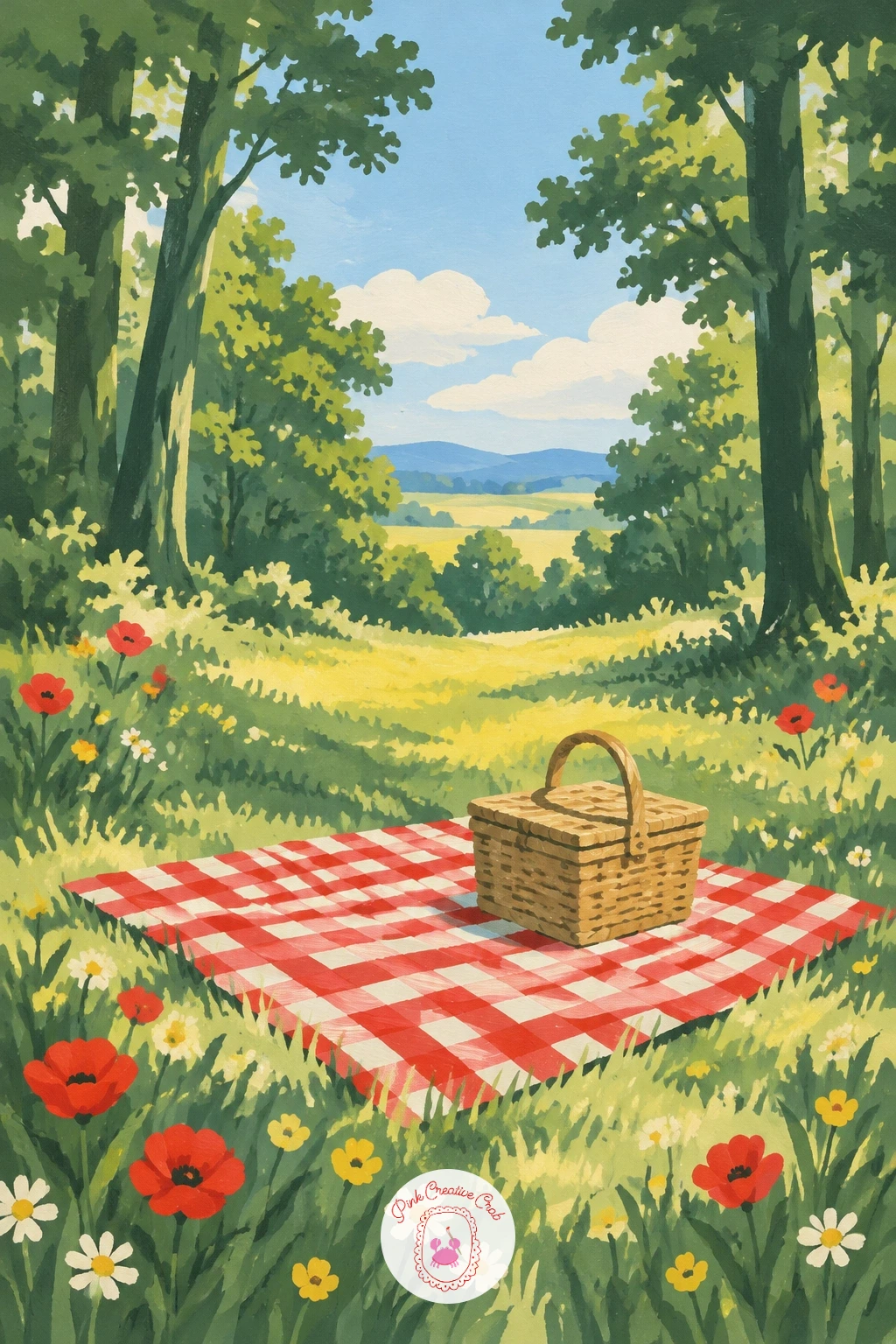
Palette: Deep Green,Sage Green,Poppy Red,Raw Umber
Pair this clearing with a mossier path from the forest painting ideas if you want a second, shadier woodland piece to hang alongside it.
Lead the eye somewhere specific this time, since stepping stones curving toward a door give you a clear path for the viewer’s gaze to follow. Paint an old stone wall running across the canvas in warm grey, with a single blue door set into it slightly off centre, kept simple as a flat rectangle with one small round handle.
Lay stepping stones curving from the bottom edge of the canvas toward the door, each one a soft oval of pale stone colour, spaced slightly closer together as they near the door for a sense of distance. Fill the gaps between the stones with sage green grass and a few scattered flower dabs along the path’s edges.
Curve the stepping stones gently rather than in a straight line, since a straight path to a door feels stiff while a slight curve feels like a path someone actually walks. Check the curve reads well by squinting at it from a distance before you commit the final stone colours.
If blue feels too bold for the door, a soft teal or a deep green reads just as inviting against a stone wall.
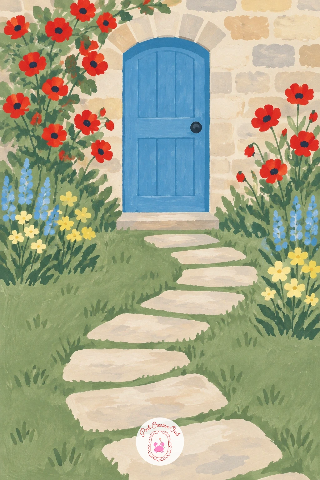
Palette: Cobalt Blue,Stone Grey,Sage Green,Poppy Red
Return to the water with a settled, lived in scene, since the lakeside cabin lets you combine the flat lake technique from earlier with a simple building shape. Paint the still lake and pale sky first, divided by one straight horizon, then add the cabin on the grassy shore as a simple log coloured rectangle with a pitched roof and one small window.
Pull the canoe up onto the grass beside the cabin, painted as a narrow curved shape in a contrasting colour such as poppy red or butter yellow, resting at a slight angle to the shoreline. Finish with a few tall sage green trees behind the cabin to settle it into the landscape.
Painting the canoe at a slight diagonal rather than perfectly parallel to the shore is what makes it look recently pulled from the water rather than placed there by a ruler. Leave a thin dragged mark in the grass behind it if you want to suggest it was just dragged up.
If log cabin walls feel fiddly, a flat brown rectangle reads just as well as a simple cabin wall at this scale.
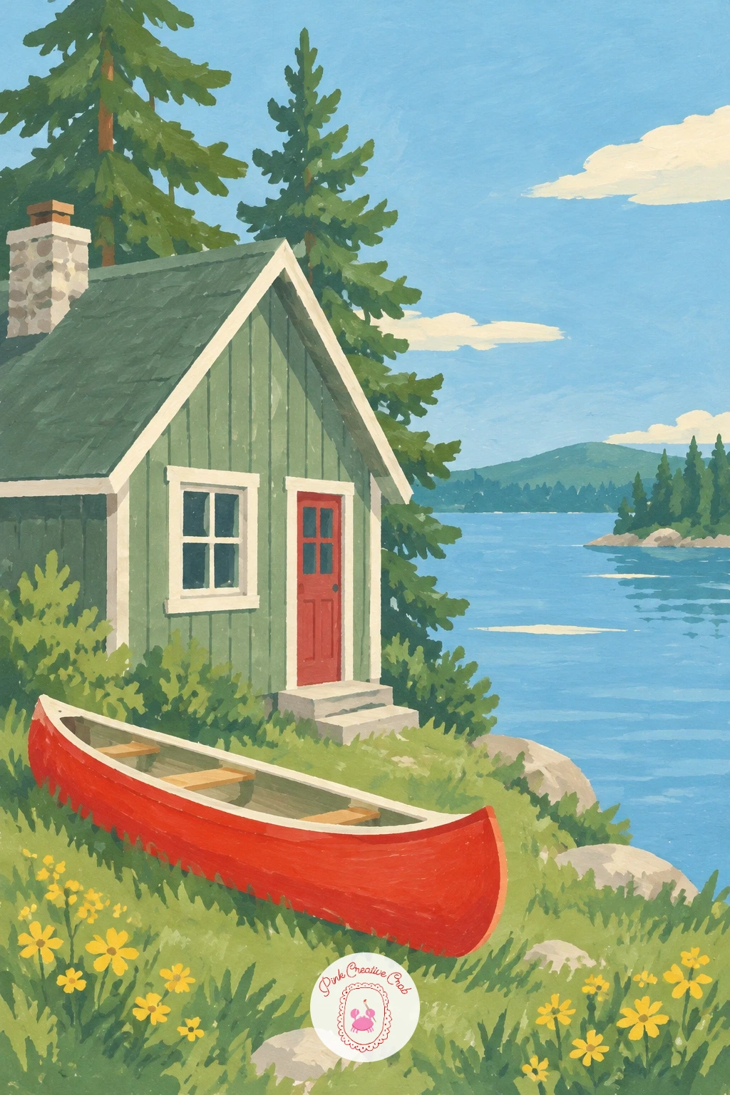
Palette: Raw Umber,Sky Blue,Sage Green,Poppy Red
Bring in a stronger sense of movement now, since a waterfall is one of the few subjects in this list that benefits from a soft, slightly broken edge rather than a crisp flat one. Paint the mossy rocks first in deep green and grey blocks, stacked to leave a gap for the water to fall through, then paint the pool below in flat turquoise with a slightly deeper shade near the base of the falls.
Add the waterfall itself with vertical strokes of pale blue and white, left slightly loose and broken rather than one solid block, so it reads as moving water rather than a painted ribbon. Dab a soft ring of pale foam colour where the water hits the pool to settle the splash.
Lifting a little wet paint with a dry brush along the edges of the waterfall, right after you lay it down, softens the line between the falls and the rocks and keeps the movement convincing.
If turquoise gouache is not in your set, mix a cool green with a touch of white and a whisper of blue to get close.
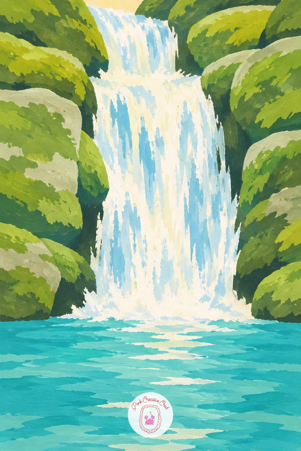
Palette: Turquoise,Deep Green,Stone Grey,Soft Cream
Carry the straight road and perspective idea from the vineyard scene into open countryside instead of rows of vines. Paint a road curving gently through rolling sage green hills, the hills stacked in overlapping rounded shapes that get paler as they recede toward a soft horizon.
Place the yellow vintage car small on the road, built from a simple rounded rectangle body, two circle wheels and a curved roofline, facing along the road rather than straight at the viewer. Keep the car bright against the muted hills so it reads clearly as the one moving thing in a still landscape.
Painting each distant hill slightly paler and cooler than the one in front of it is the simplest way to push the furthest hills back without any detail at all. Keep this fading consistent across every hill for the trick to hold.
If yellow feels too bold against green, a soft butter yellow rather than a pure bright one keeps the car friendly instead of jarring.
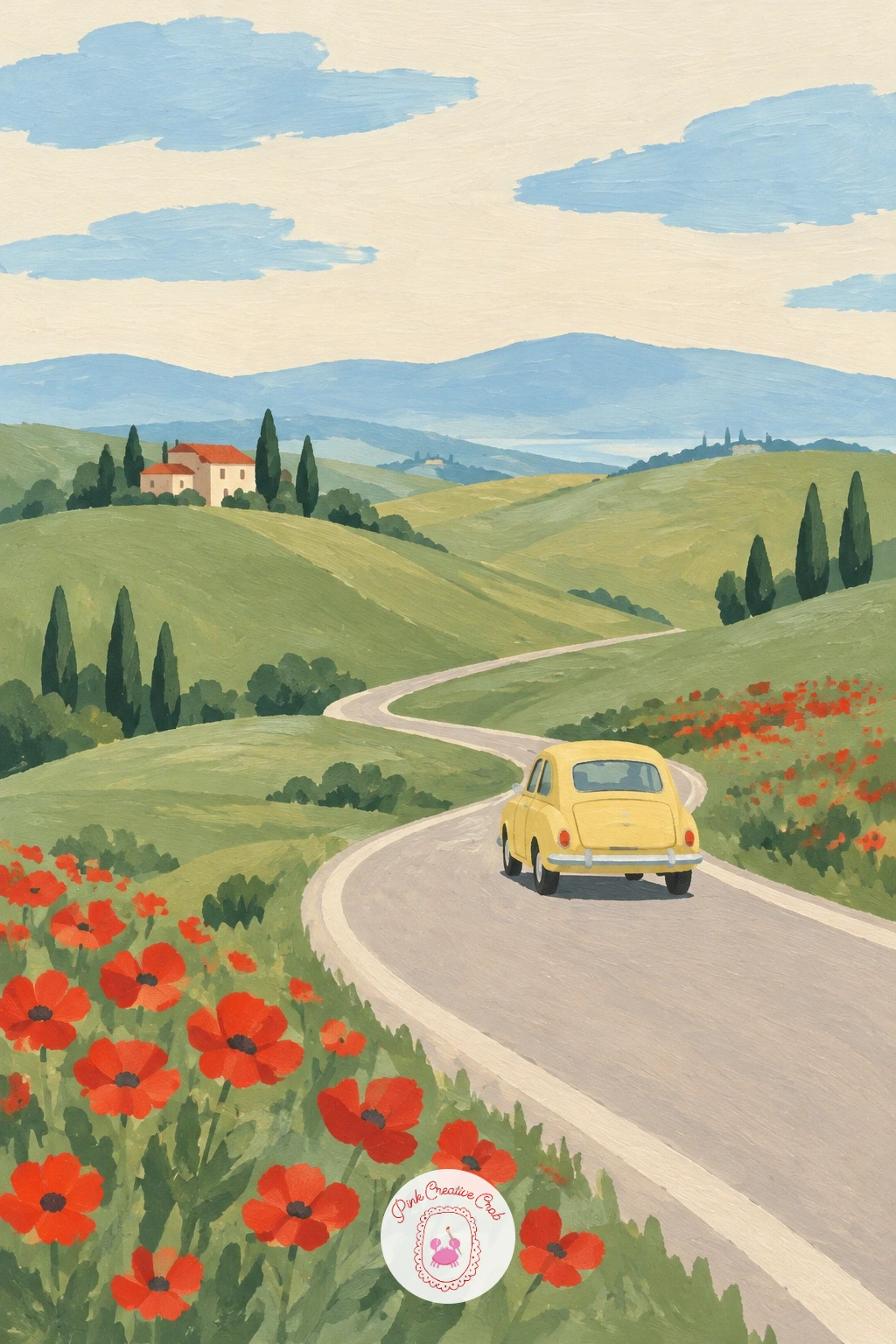
Palette: Butter Yellow,Sage Green,Stone Grey,Soft Cream
Return to a small arched bridge, but this time over a quiet pond rather than a river, which lets you focus on water lilies instead of willows. Paint the pond as a flat still green shape filling most of the lower canvas, then add the small arched wooden bridge crossing it in one gentle curve, painted in warm brown with thin railings.
Scatter lily pads across the pond’s surface as flat round shapes in a slightly deeper green, with a few small poppy red or butter yellow dabs on top for the flowers, clustered more thickly near the edges and sparser under the bridge. Keep the sky plain so the pond stays the main attraction.
Vary the size of the lily pads rather than painting them all the same, with a few larger ones near the front of the pond and smaller ones further back, which does more to suggest distance here than any change in the water colour.
Next time, try this same pond at dusk with a deeper teal water colour and pale moonlit lily pads instead.
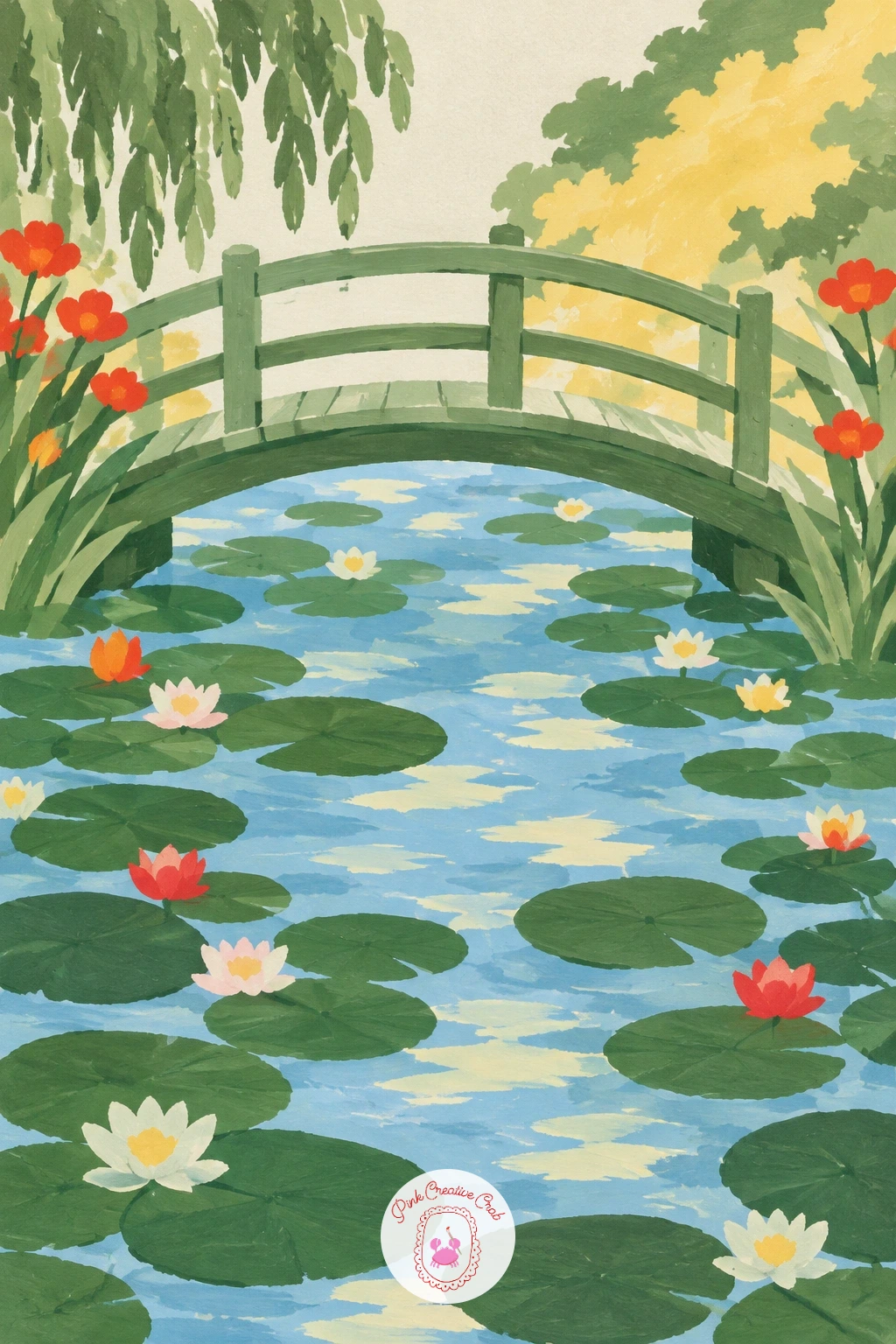
Palette: Deep Green,Raw Umber,Poppy Red,Butter Yellow
Work with a cooler, silvery palette for this one, since olive trees sit apart from the bright greens used everywhere else in this list. Paint a low stone wall running across the lower third in warm grey, then fill the slope behind it with rows of olive trees, each a soft rounded canopy in silver green over a short grey trunk.
Space the trees in loose, slightly uneven rows rather than a perfect grid, since real groves rarely line up exactly, and keep every canopy roughly the same size and tone to hold the calm, repeated feeling. Finish the sky in a warm pale cream to suit a dry, sunny grove.
Mixing your green with a touch of grey or white rather than using a pure green straight from the tube is what gives olive leaves their silvery look. Test the mix on scrap paper before committing, since it is easy to go too grey and lose the green entirely.
If a whole grove of trees feels like too much, four or five trees along the wall is plenty to read as a grove at this scale.
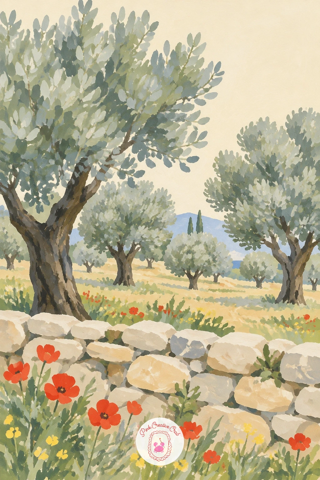
Palette: Silver Green,Stone Grey,Raw Umber,Soft Cream
Bring the viewer right into the scene for this one, since a balcony railing in the foreground is a simple way to suggest you are standing there looking out. Paint rolling green hills filling most of the canvas as your background view, then add a plain railing across the very bottom edge, just a few horizontal bars in warm wood or pale stone colour.
Rest the coffee cup on the railing near one corner, painted as a simple rounded cup and saucer in soft cream with a thin curved handle, small enough that it sits naturally rather than dominating the view. Keep the hills behind it loose and calm so the cup feels like a quiet detail rather than the whole point.
Placing the cup off to one side rather than dead centre on the railing is what keeps this composition feeling candid, like a moment glimpsed rather than staged. Centring it tends to flatten the sense of looking outward.
If you want the hills to feel further away, cool their green slightly with a touch of blue mixed in.
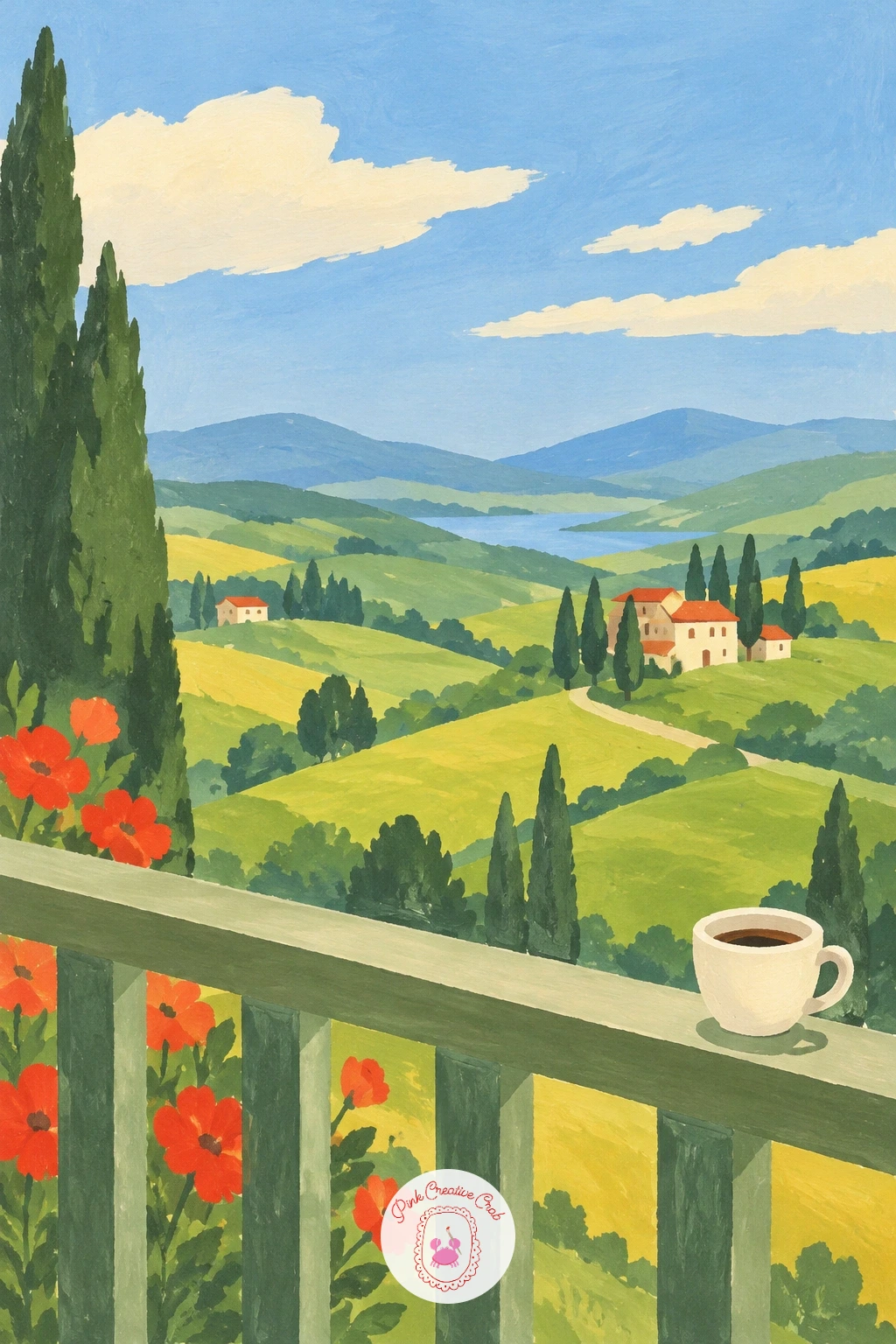
Palette: Sage Green,Soft Cream,Raw Umber,Sky Blue
If you enjoy this looking out framing, the full window view painting list has more scenes built around a foreground frame like this railing.
Revisit the red barn shape from earlier, but set it against water instead of corn and shift the light to evening, since the same simple building can carry two very different moods. Paint the sky in warm dusk bands of soft pink, plum and butter yellow, then lay a winding river in front of it reflecting those same colours in softer, flatter tones.
Place the red barn on the near bank, kept as the same simple square body and triangular roof shape as before, with one small warm light coloured window to suggest the end of the day. Let a thin strip of sage green grass separate the barn from the water’s edge.
Painting the river’s reflection in slightly duller, flatter versions of the sky colours rather than the same bright tones is what sells the still water at dusk. A reflection painted as bright as the sky itself tends to look more like a second sky than water.
If plum feels like an unfamiliar mix, a touch of red into blue gets you close enough for this dusky sky.
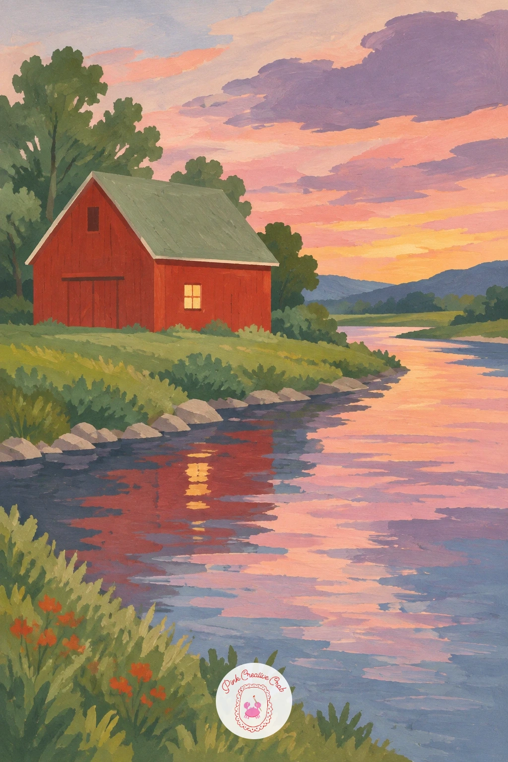
Palette: Poppy Red,Plum Purple,Soft Pink,Sage Green
Give the sky more room to work than in most of the earlier ideas, since big rounded clouds over a grazing flock need space above the hill to feel generous rather than cramped. Paint a simple rolling green hill across the lower third of the canvas, then fill most of the remaining space with large, soft edged clouds in cream and pale grey against a sky blue background.
Scatter a small flock of sheep across the hillside as simple rounded white bodies on four thin legs, with a tiny dark face poking out of each, grouped loosely rather than lined up in a row. Keep every sheep roughly the same small size so the flock reads as one calm group.
Varying the spacing between sheep, with a few standing closer together and one or two further off on their own, is what keeps a flock from looking like a repeated stamp. Resist painting them in a neat line across the hill.
If clouds feel tricky to shape, trace around a few overlapping coins or lids lightly in pencil first for soft, rounded cloud outlines.
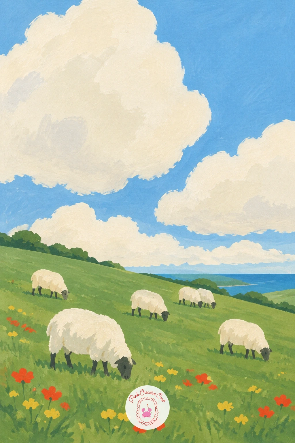
Palette: Sage Green,Soft Cream,Sky Blue,Stone Grey
Return to still water once more, but fill it with life this time instead of lily pads, since a pair of ducks among reeds needs a gentler, quieter palette than the bolder poppy meadow earlier in this list. Paint the pond as a calm flat green shape, then add tall reeds in sage green along one edge, painted as simple upright strokes with small brown seed heads at the top of a few.
Swim two or three ducks across the open water between the reeds, each built from a rounded body, a smaller round head and a simple flat bill, kept small and evenly spaced so the water still reads as the main shape. Add a thin soft reflection beneath each duck to settle it onto the surface.
Painting the ducks slightly closer together as a loose group rather than spread evenly across the pond is what makes them feel like a family drifting together rather than scattered decorations.
If brown and white ducks feel busy to paint this small, a single flat colour per duck with a tiny bill dab is plenty of detail at this scale.
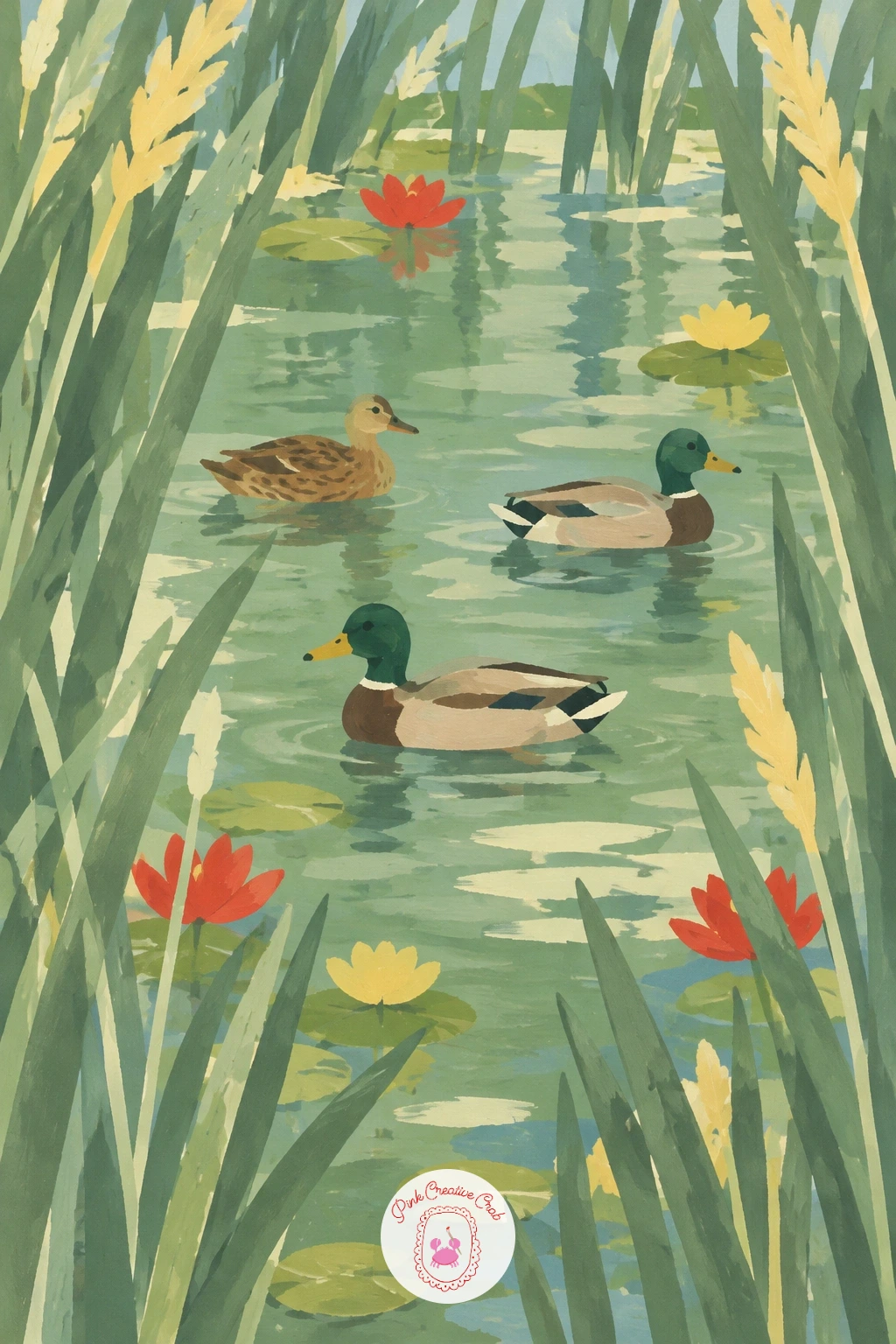
Palette: Sage Green,Deep Green,Raw Umber,Soft Cream
Add a touch of architecture into an open meadow for this one, since a small glass greenhouse gives you a chance to paint clean geometric lines against the loose shapes of wildflowers. Paint the cornflower meadow first across the whole canvas in sage green with scattered sky blue dabs for the flowers, then add the greenhouse as a simple glass box shape with a peaked roof, kept pale and slightly transparent looking.
Use thin cream or pale grey lines for the greenhouse’s frame, leaving the panes themselves almost the same tone as the sky behind them so the structure feels light rather than heavy. Keep the greenhouse small, sitting a little off centre in the meadow rather than filling much of the frame.
The greenhouse goes wrong fastest when its lines are painted freehand and come out wobbly. Use a ruler for every straight edge on the frame, since even one shaky line will read as a mistake against the tidy geometry.
If pale grey panes feel too flat, a whisper of blue mixed into the grey keeps them feeling like glass rather than painted card.
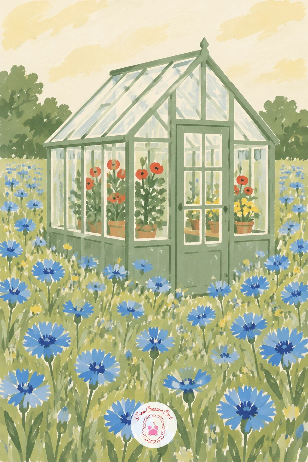
Palette: Sage Green,Cobalt Blue,Stone Grey,Soft Cream
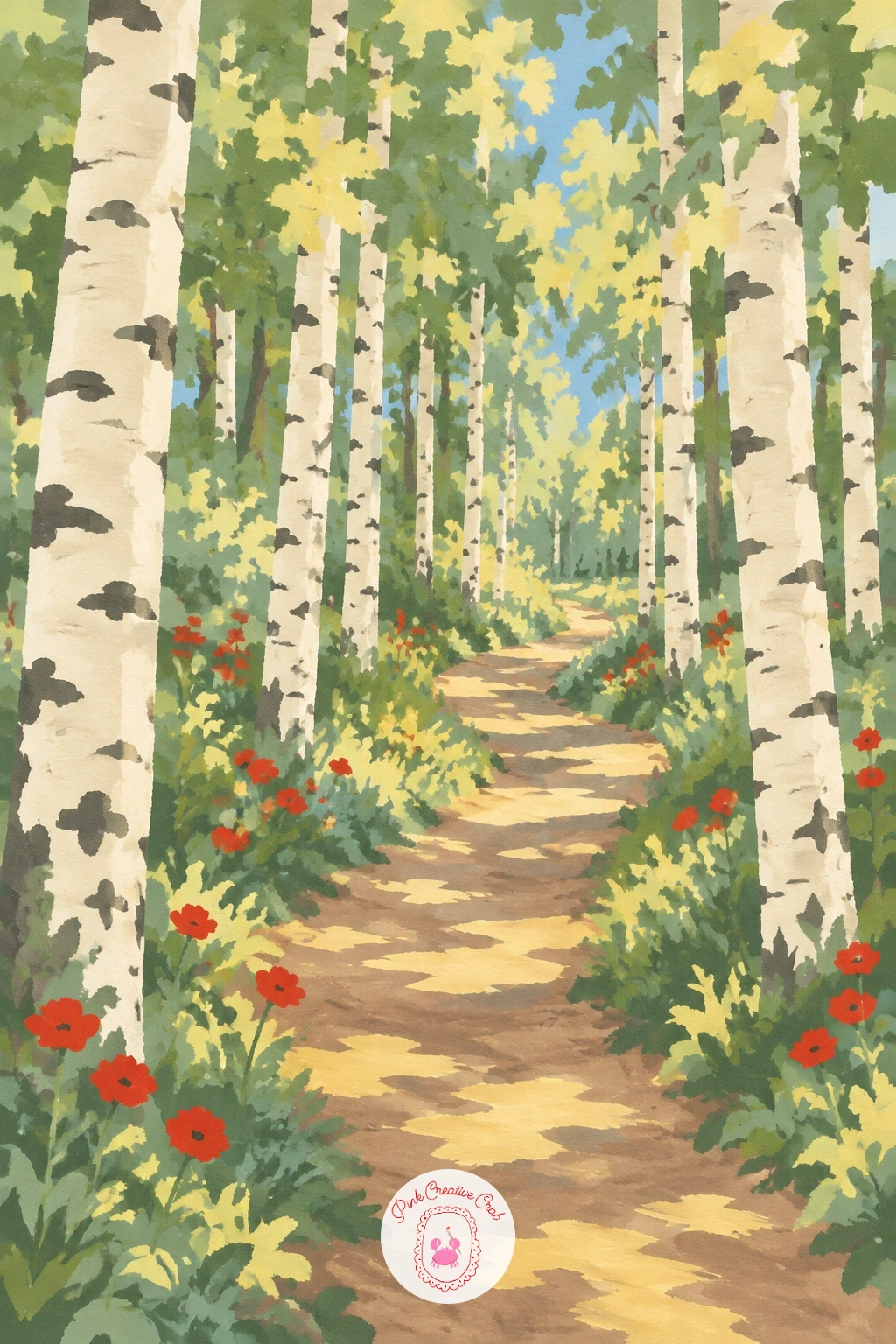
Work with light falling through trees for this one, since dappled light is painted as a pattern of pale patches rather than any kind of blend. Paint tall, narrow birch trunks in soft cream with small dark horizontal marks for the bark, spaced across the canvas with a dirt path winding between them in warm brown toward a soft distant glow.
Fill the canopy above loosely in sage green, then drop small pale patches of butter yellow light onto the path and the trunks here and there, keeping them irregular in shape and size rather than evenly scattered. Darken the ground slightly in the gaps between the light patches to keep the dappled effect readable.
If your light patches start looking too neat and regular, step back and add a few larger, a few smaller, and a few that overlap a trunk rather than sitting only on the path, which is closer to how real dappled light actually falls.
A kneaded eraser can lift a little pencil guideline cleanly before you start painting over it, so the final birch bark marks stay crisp.
You Will Need
- kneaded eraser
Palette: Soft Cream,Sage Green,Raw Umber,Butter Yellow
Combine two trees and a stream for a slightly busier composition than most of the earlier ideas, since this scene asks you to balance three separate shapes at once. Paint two oak trees with rounded canopies on either side of the canvas, trunks angled slightly inward, with a thin stream of sky blue winding through the meadow grass between and below them.
Hang the hammock between the two trunks as a simple curved shape in sage green or butter yellow, sagging gently in the middle, with a few thin lines at each end to suggest where it ties on. Keep the meadow grass plain and calm so the hammock’s curve stands out clearly against it.
Getting the hammock’s sag convincing matters more than any other detail here. Paint its curve lower in the middle than you think it should be, since a too shallow sag reads as a stiff plank rather than fabric.
If two full oak trees feels like a lot to plan, sketch both trunks and canopies in pencil first and check the hammock’s curve fits comfortably between them before adding any paint.
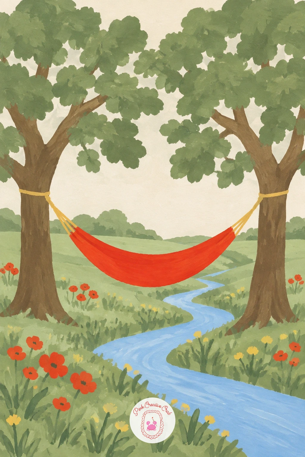
Palette: Deep Green,Sky Blue,Butter Yellow,Sage Green
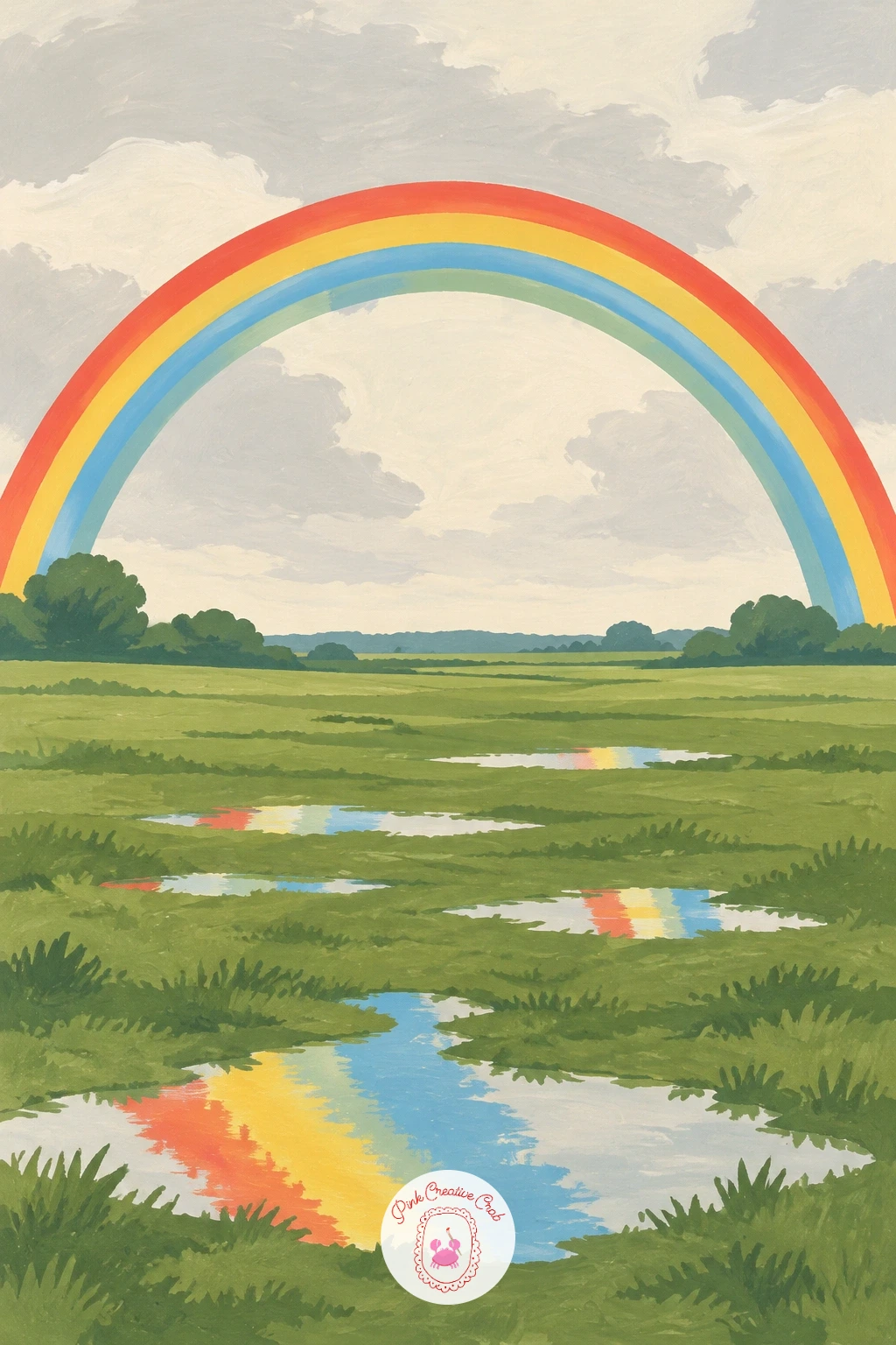
Close the colour heavy ideas with a full arc of colour across the sky, since a rainbow is one of the few subjects here that earns a true curve stretching the whole width of the canvas. Paint the fields below first in two or three shades of sage green, slightly deeper than usual to suggest they are still wet from rain, with a few small reflective puddles dabbed in here and there.
Arc the rainbow across the upper half using a plate or a large lid to guide a smooth curve, painting each band as a flat strip of colour rather than a blended gradient, in the order red, yellow, green and blue from the outside in. Keep the sky behind it a soft grey cream to suggest the clearing storm.
If this is your first rainbow, pencil the full curve first with your tracing guide, then paint from the outer red band inward, since painting from the centre outward makes the final outer bands much harder to keep even.
Masking fluid over the rainbow’s curve before you paint the sky grey keeps its edge perfectly clean if your hand is not steady with a brush.
You Will Need
- masking fluid
Palette: Poppy Red,Butter Yellow,Sage Green,Sky Blue
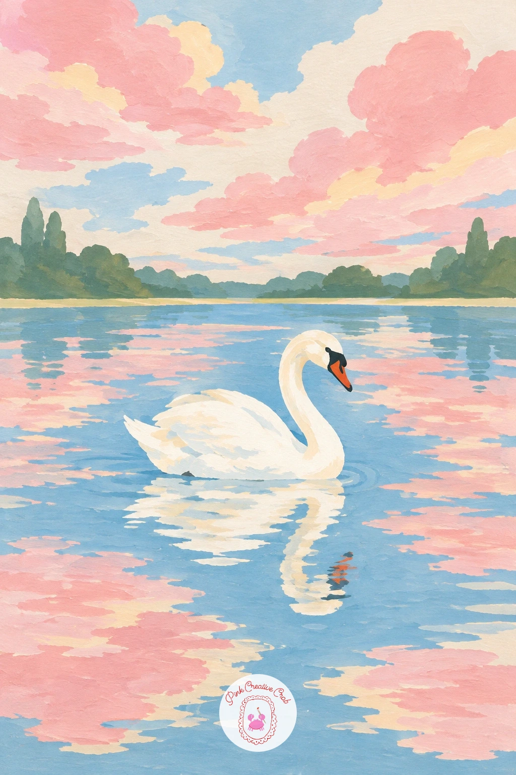
End the set the way you began it, with still water, but trade the rowing boat and the morning light for a single swan and a soft evening sky. Paint the lake and sky in matching soft pink and cream bands, divided by one clean horizon line, letting the lake’s colours sit just a touch deeper than the sky above it.
Place the single white swan on the water, built from one smooth curved body and a thin S shaped neck, kept small against the wide calm lake so the stillness of the whole scene carries the piece rather than any detail on the bird. Add a faint soft reflection trailing beneath it.
Keeping the swan the only white shape anywhere in the painting is what makes it stand out instantly against the pink and cream water. Any other bright white shape nearby will pull attention away from it.
If pure white gouache looks too stark against a soft pink lake, warm it very slightly with a touch of cream before painting the swan.
Palette: Soft Pink,Soft Cream,Stone Grey,Sky Blue
For more calm water scenes like this one, the lake painting ideas list has further quiet lake and dock compositions to try next.
What to Do Next
Pick one idea that matches a wall in your home, mix just the four or five colours it calls for, and work through it shape by shape from the back of the scene to the front. Keep a sheet of smooth watercolor board ready and you will have a finished, frameable piece before the afternoon is over.
Frequently Asked Questions
What gouache colours do I need for scenery painting like this?
A small set covering sage green, poppy red, sky blue, butter yellow and a soft cream covers every idea here. Add raw umber and stone grey for buildings and paths, and you can mix most other shades from these.
Why do my flat gouache shapes look streaky instead of smooth?
Streaks usually mean the paint is too thin or the brush is too dry. Mix gouache to a thick cream consistency and load the brush fully, then lay each shape in one or two confident strokes rather than scrubbing back over it.
What paper or board works best for this style of scenery painting?
A smooth, heavier watercolor or illustration board holds flat gouache shapes best without buckling. Cold press board gives crisp edges, while rough textured paper tends to break up the flat, matte look this style depends on.
How do I keep edges crisp between shapes like a field and a sky?
Let the first shape dry fully before painting the one beside it, and use a fine round brush to trace the border carefully. Low tack tape also works well for long straight edges like horizons and roads.
Can I paint these scenery ideas without gouache?
Acrylic paint gives a very similar flat, matte finish and works on the same board, so it is a close substitute if gouache is not available. Keep your acrylic slightly thinned so it still moves and blends as easily as gouache.
Have any thoughts?
Share your reaction or leave a quick response — we’d love to hear what you think!
-
 0
-
0
-
0
-
0
-
0
-
0


