Realistic drawing rewards patience, and there is nothing quite like the moment a flat pencil mark starts to look like glass, wet fur or crumpled paper. Each subject below is chosen for one stubborn texture or reflection, the kind that forces you to slow down and really look before you draw.
Below you will find 32 small studies, from an easy dewdrop to a rhino’s armored hide, each one sized to finish in a single sitting. Grab a sharp pencil, a soft eraser and some bright white paper, and pick whichever one catches your eye first.
Using these images: free for personal projects such as printing, coloring, cards, journals and gifts. Handmade items that include them may be sold up to 30 pieces per design. More than that is commercial use and is not permitted, and neither is selling or sharing the images themselves or passing them off as your own. Please ask before any other use.
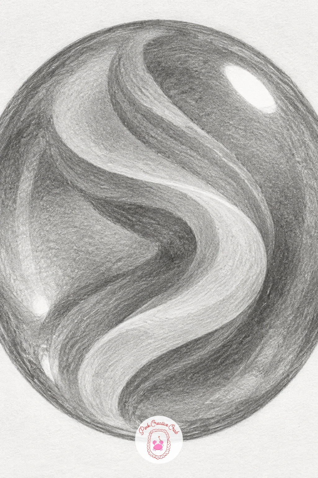
Start with a glass marble, since its round shape and one sharp highlight make it a forgiving first study in reflection. Draw a careful circle first, lightly, using a coin or bottle cap to trace it if your circles wobble, because an uneven outline will throw off every tone you add inside.
Work the shading in rings that follow the curve of the sphere, darkest near the lower edge where it sits on the table, lighter through the middle. Add the swirl as a ribbon that curves with the glass rather than across it, using a sharp pencil point for the thin lines inside.
Leave one crisp white highlight untouched from the very start, and a smaller, dimmer one opposite it for the reflected light bouncing off the surface below. If you accidentally shade over the highlight, lift it back out with the corner of a kneaded eraser pressed and lifted, not rubbed.
The trick that saves most marble studies: squint at your drawing from a distance, since a convincing sphere reads correctly even when you blur the details.
You Will Need
- round object or coin to trace the circle
Try drawing the marble resting in a shallow dip of soft fabric, which gives you a second surface to shade and makes the glass look more grounded.
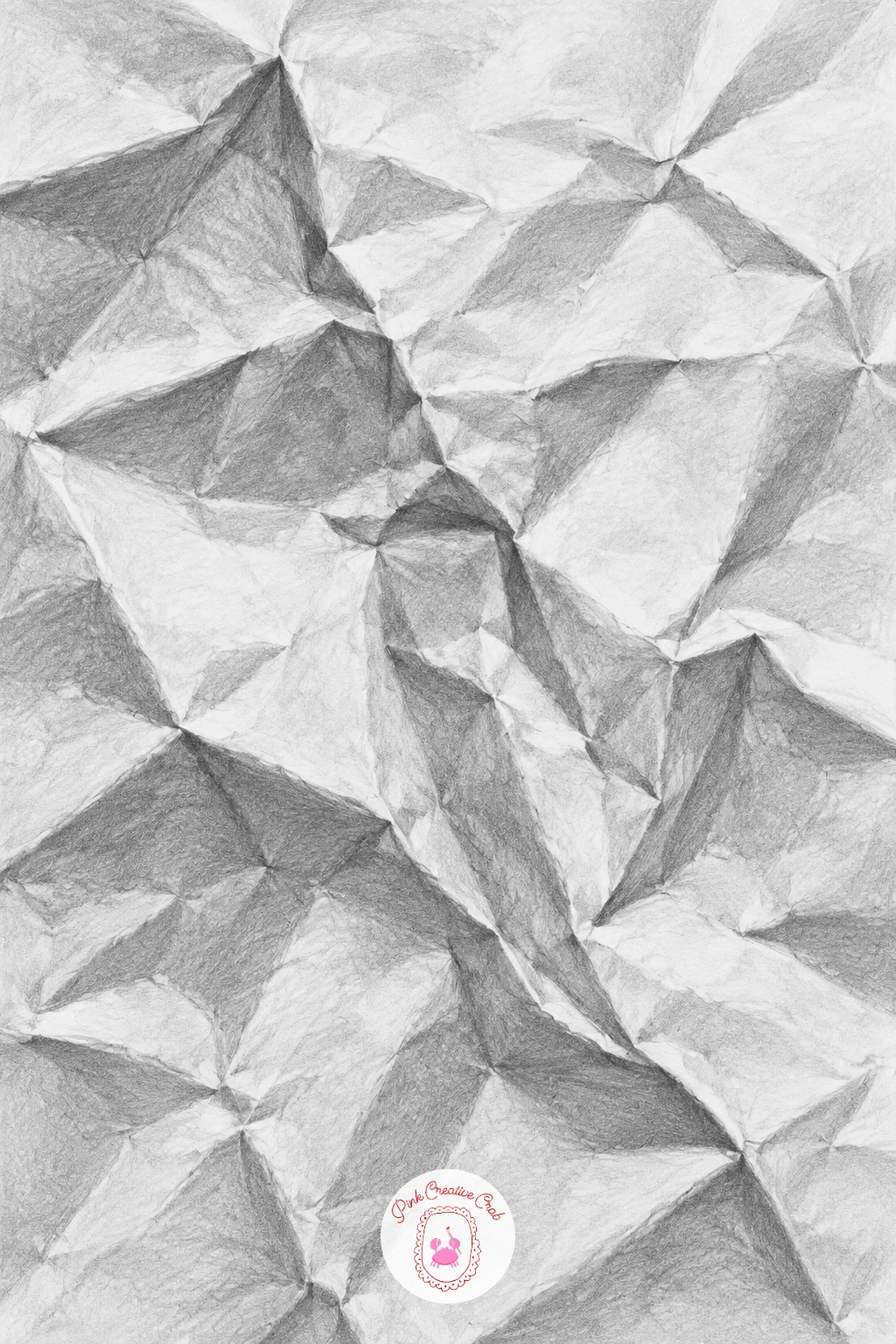
A crumpled sheet of paper looks intimidating until you break it into planes instead of folds. Crumple a real piece of paper first and keep it beside you, since drawing from an imagined crease never looks quite right.
Sketch the big flat shapes lightly in pencil, treating each facet as its own small triangle or diamond, then shade each one as a single even tone before you touch the crease lines themselves. This keeps the drawing from turning into a tangle of scribbled lines too early.
The deep folds are where beginners rush: go back in with a sharper pencil and darken only the tightest inner corners of each crease, where two planes meet at the steepest angle, leaving the broad faces lighter. If the paper starts to look muddy, a clean putty eraser can lift soft highlights back along the raised ridges.
One tip worth keeping for life: light edges next to dark edges, side by side, are what make paper look three-dimensional, not shading alone.
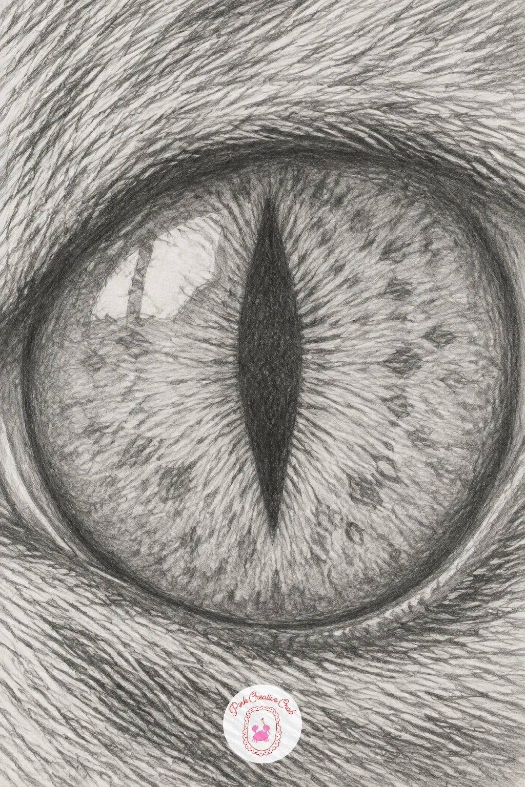
Move from paper to something alive with a cat’s eye, close enough to see every fleck in the iris. Begin with the almond outline of the eye and the narrow vertical slit of the pupil, placed slightly off centre rather than dead middle, since a perfectly symmetrical pupil looks stiff.
Shade the iris in short strokes that radiate outward from the pupil like spokes, varying the pressure so some rays are dark and some almost disappear, which is what gives a flecked iris its texture. Keep the darkest, hardest edge around the pupil itself and let the outer iris edge stay a little soft where it meets the lid.
Fur around the eye always wants to look flat if you draw it before the eye is finished, so save it for last and work it in short, directional strokes that follow the way fur actually grows, fanning away from the eye.
If you want a quicker version, skip the surrounding fur entirely and let the eye float on white paper as a tight ten-minute study of the iris alone.
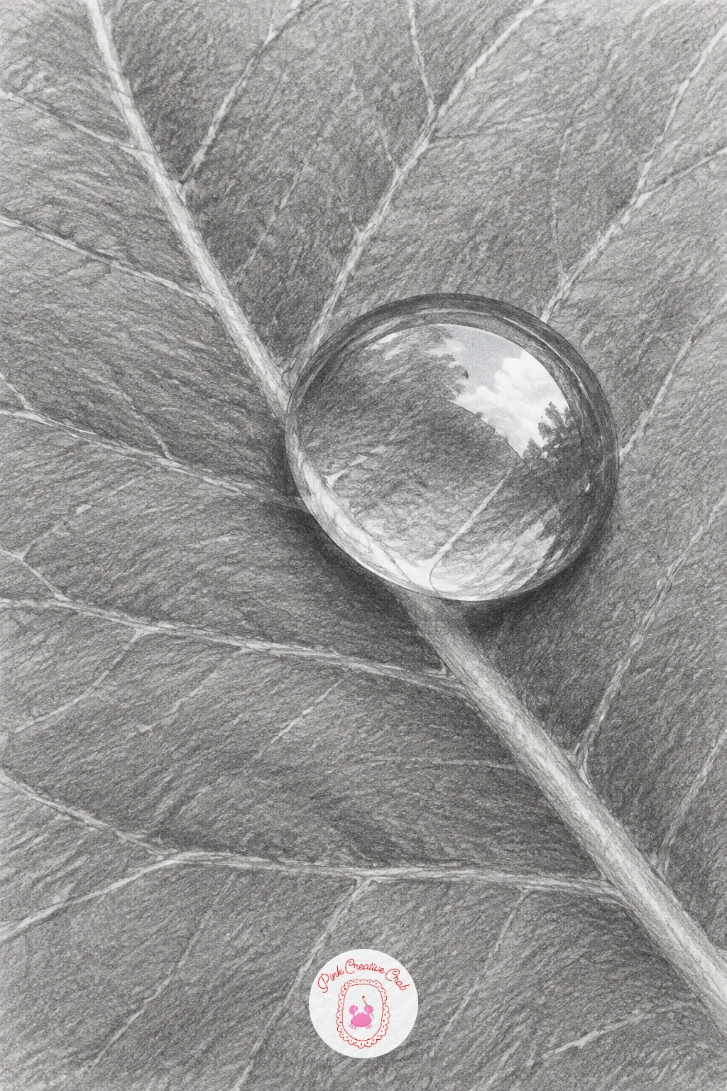
A dewdrop on a leaf is where reflection starts to feel like magic, and it is simpler than it looks once you accept one rule: the drop shows an upside-down, compressed version of whatever is around it. Pencil in a soft oval first, then lightly sketch the leaf’s veins running underneath and behind it.
Shade the drop as a sphere, dark along one curved edge, bright where the light source sits, with a small inverted sliver of sky or leaf colour sketched inside, kept pale since it is only graphite standing in for colour. The leaf surface underneath darkens slightly where the drop’s shadow falls, which is the detail that pins the drop to the leaf instead of letting it float.
Where this goes wrong: too much detail crammed inside the drop. Keep the inner reflection loose and soft-edged, because a dewdrop is mostly about light, not information.
Today’s tip: draw the cast shadow before you second-guess it, a thin crescent right under the drop’s lowest point, and the whole drawing clicks into place.
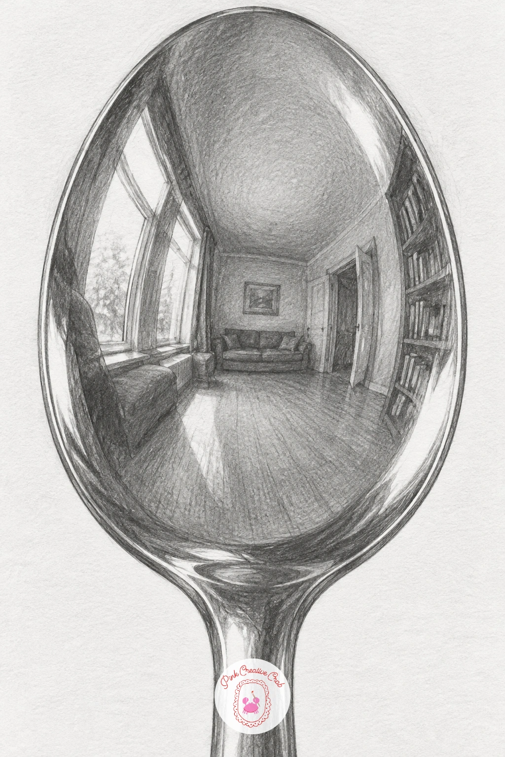
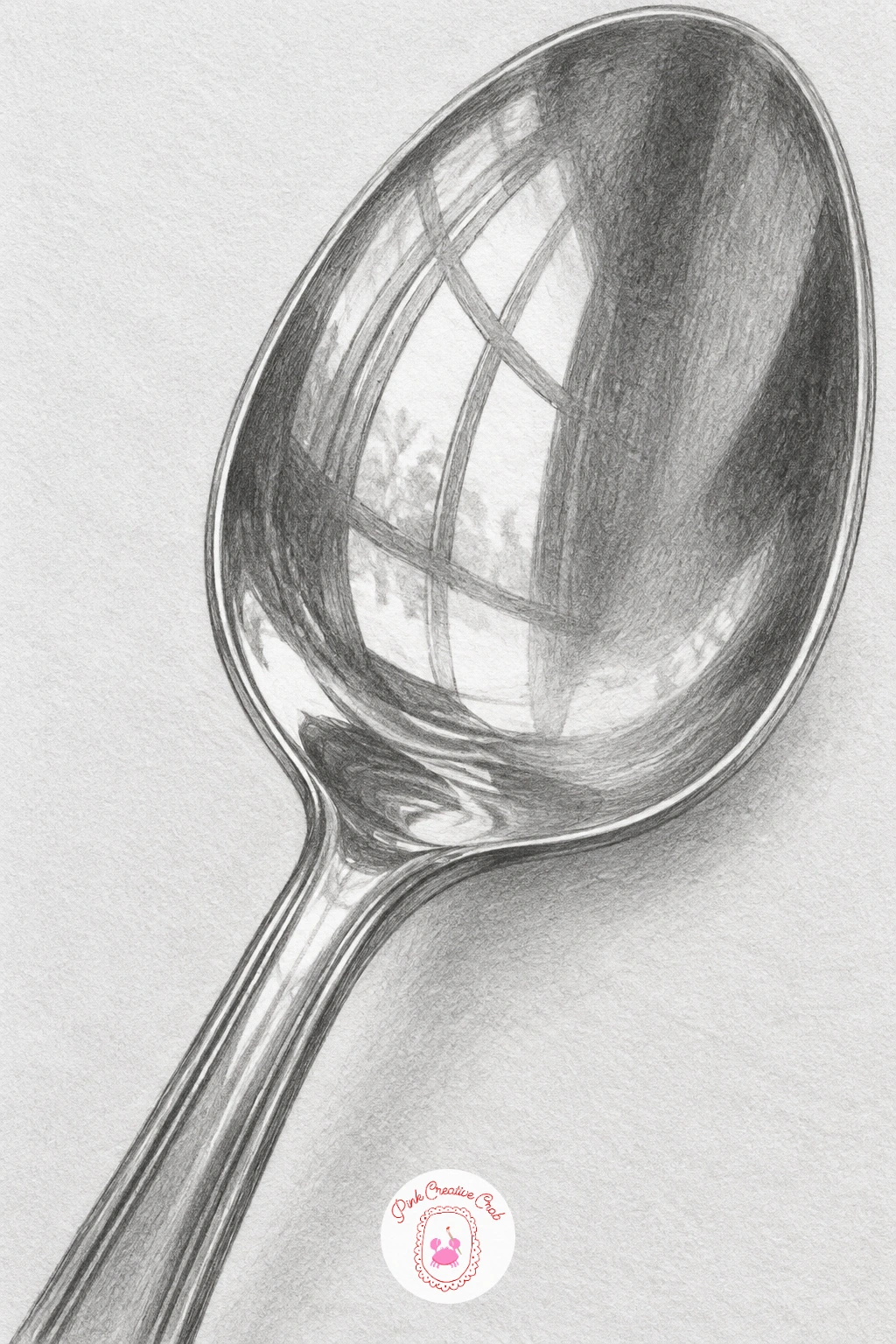
A metal spoon takes the dewdrop’s reflection lesson and turns it up, since its curved bowl distorts everything around it into a stretched, fisheye version of the room. Draw the spoon’s outline first, bowl and handle, then lightly map where the room’s window, walls or furniture would fall if the spoon were a tiny curved mirror.
Shade the metal itself in bands of very dark and very light sitting right next to each other, since chrome and polished metal have almost no smooth gradient, just sharp jumps in tone. Work from the darkest reflected shapes first, then add the brightest highlights last, using the eraser to carve them out rather than trying to draw around them.
Beginners often shade metal too evenly and it ends up looking like plastic. Push the contrast further than feels natural, and check your reference often for exactly where the darks sit.
If you have time for the forty-minute version, carry the stretched reflection all the way around the bowl’s curve rather than stopping halfway, which sells the illusion completely.
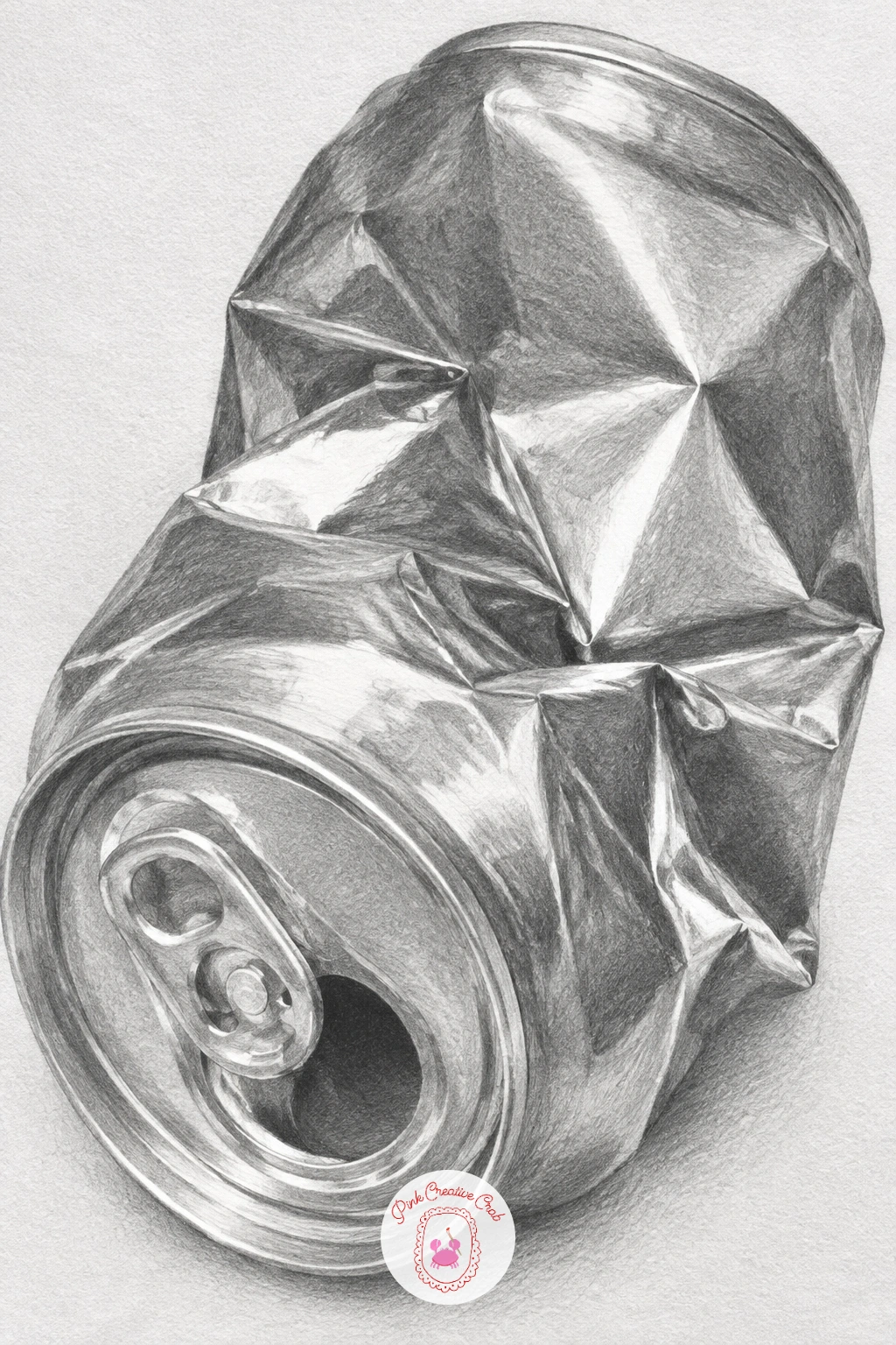
A crushed soda can lying on its side combines sharp metal highlights with the same crumpled-plane thinking from the paper study earlier. Sketch the overall cylinder shape first, then push and pull the outline inward wherever the can has been dented, keeping the creases angular rather than round.
Shade the undamaged curved sections first, smooth graduated tone from light to dark, before tackling the crushed areas, which need sharp-edged facets like the crumpled paper did. The label, if you include one, bends and breaks across every dent, so draw its lines following the can’s new crumpled surface rather than as if it were still smooth.
The easiest way to ruin this drawing is to smooth over the dents with soft shading. Keep every crushed edge crisp and let the contrast between adjacent facets do the work of showing the damage.
No metal can handy for reference? Any crushed aluminum container, even foil scrunched into a rough cylinder, teaches the same dent logic.
You Will Need
- crushed can or scrunched foil for reference
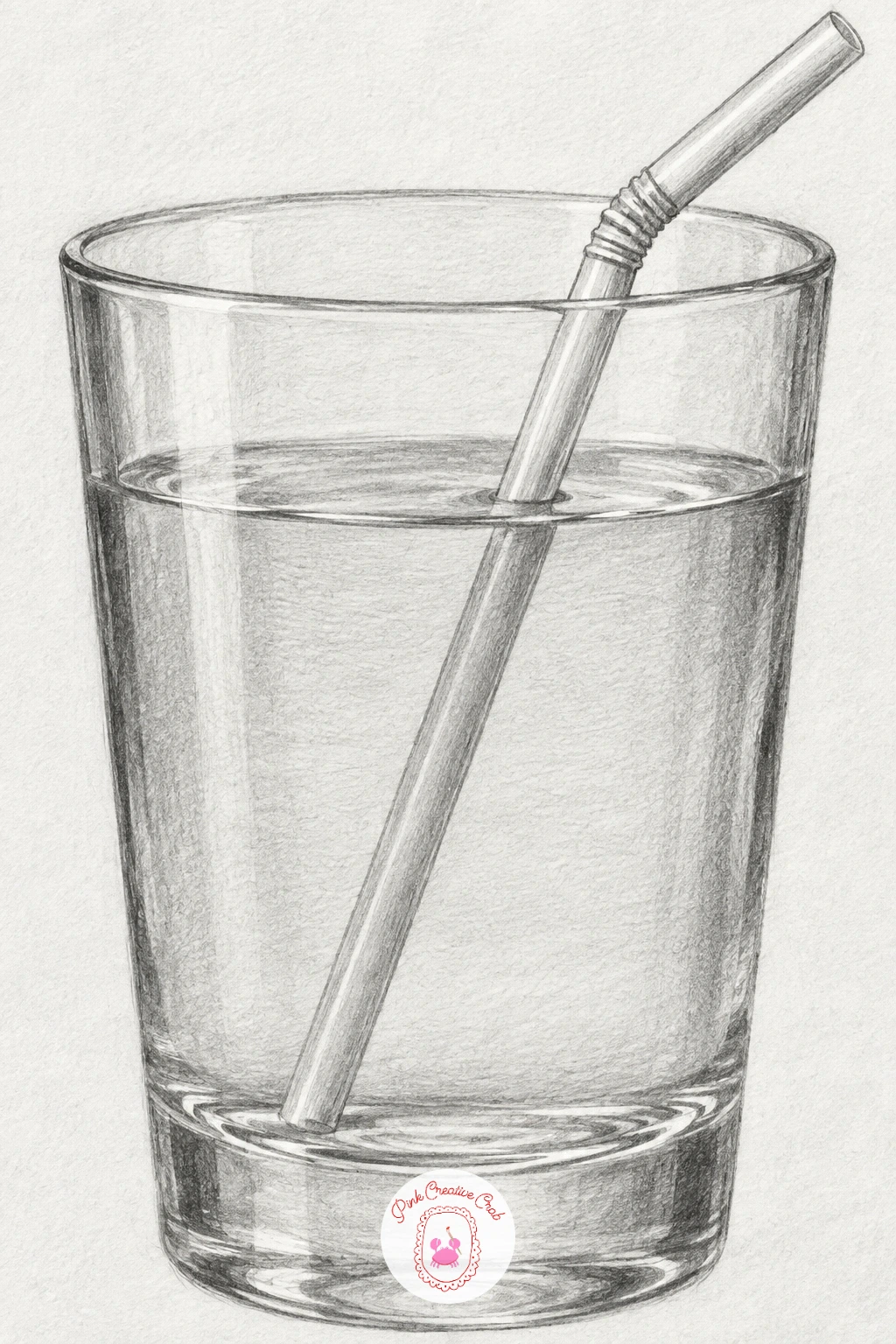
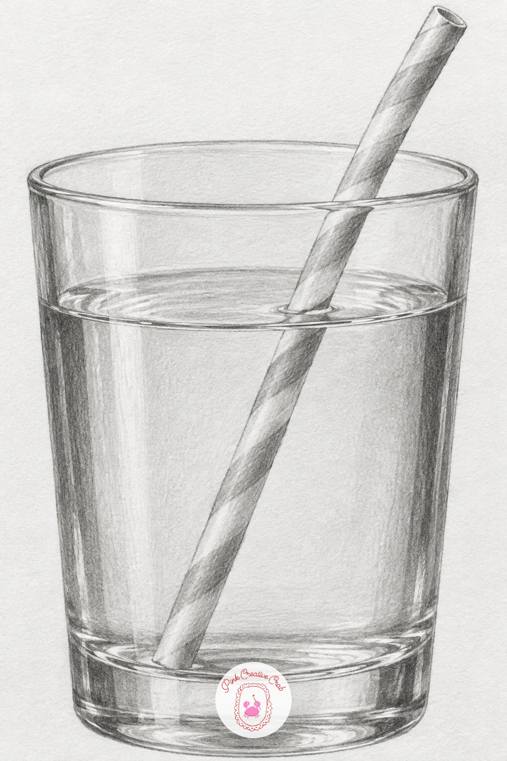
A glass of water with a straw bent by refraction is a classic for a reason: it teaches you to trust what you see over what you know. Lightly draw the glass outline and the straw as one continuous straight line first, then erase and redraw the straw so it visibly shifts sideways right at the waterline, the way refraction actually bends it.
Shade the glass itself with vertical streaks of light and dark rather than one flat tone, since round glass catches and loses light in bands as it curves. The water inside gets a slightly different, denser grey than the empty glass above the waterline, with a darker curved shadow where the glass base sits on the table.
The offset at the waterline is where this drawing most often goes wrong: if the shift looks too subtle, exaggerate it slightly, since a convincing refraction reads as more dramatic on paper than it does in life.
Keep a highlight running vertically down the glass’s front curve the whole way through shading, and the glass will hold its shape even with heavy tonal work elsewhere.
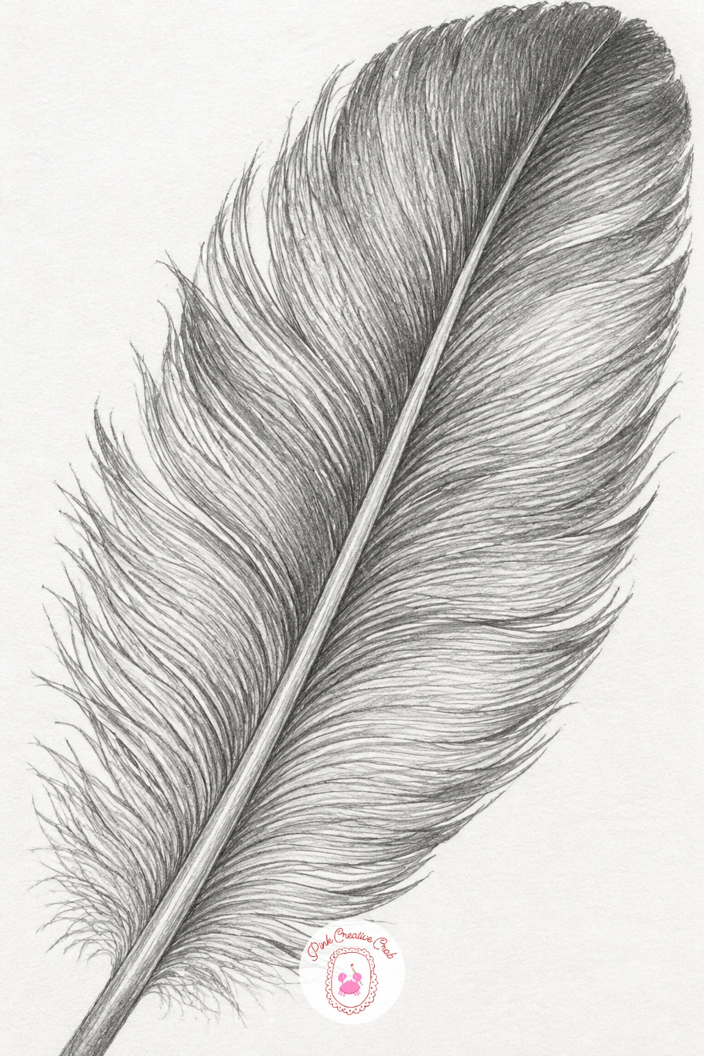
A single feather asks for real patience, since every barb needs to read as its own tiny stroke. Draw the central shaft first, a slightly tapering line, then mark the angle at which the barbs fan away from it on both sides, usually leaning toward the feather’s tip.
Shade in short, overlapping strokes that follow each barb’s direction exactly, working from the shaft outward and keeping pressure lighter near the feather’s outer edge where barbs are thinner and more separated. Near the base, the barbs sit looser and fluffier, so let those strokes go softer and less structured.
Where feathers usually fall apart on paper is the edge, which turns into a solid outline instead of a row of tiny points. Break the silhouette deliberately, letting a few barb tips stick out past the main edge and a few gaps show through to the paper.
If you want to try this again later, a feather from a different bird, a jay’s barred blue, a peacock’s eyed tip, gives you a whole new pattern to study inside the same basic structure.
A magnifying glass or a zoomed photo reference helps enormously here, since the barb pattern is finer and more irregular than memory usually suggests.
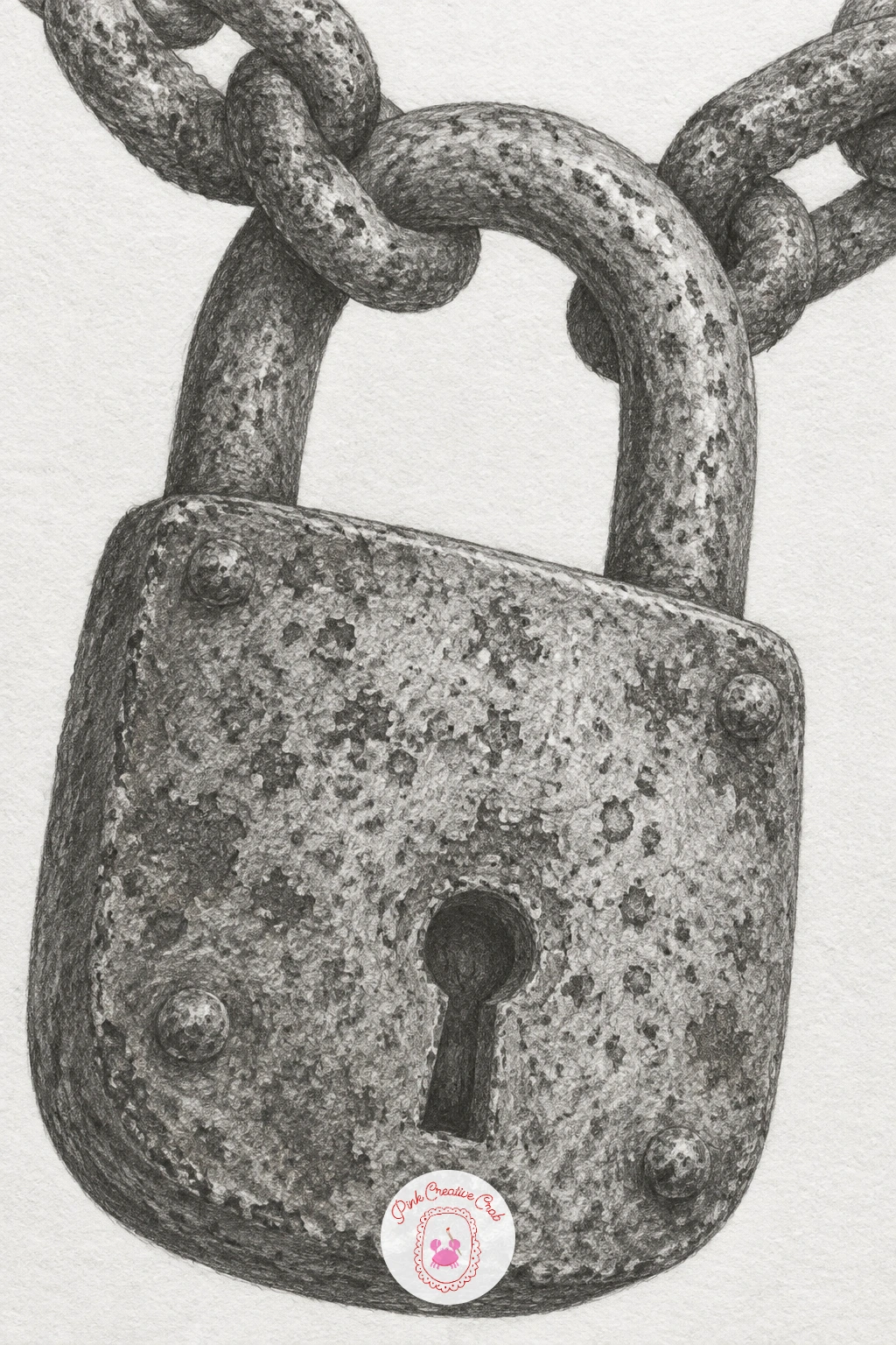
A rusty padlock hanging on a chain gives you two textures in one drawing: pitted, rusted metal and the smoother curve of chain links. Block in the padlock’s basic shape and the shackle first, then rough in just two or three chain links rather than a long tangled run, since a shorter chain is easier to read clearly.
Rust shading works best as a speckled, uneven texture built from small irregular dark marks scattered across the surface, layered over a base tone rather than drawn as a uniform grey. Leave some patches of the lock noticeably cleaner and shinier, since real rust never covers metal evenly.
Chain links are where beginners lose the three-dimensional feel, flattening them into simple ovals. Shade each link with a dark band on the inner curve and a bright highlight on the outer curve, and let each link overlap its neighbor convincingly where they link together.
Keep the keyhole and shackle edges crisp and dark, since those sharper contrasts anchor the softer, rougher rust texture around them.
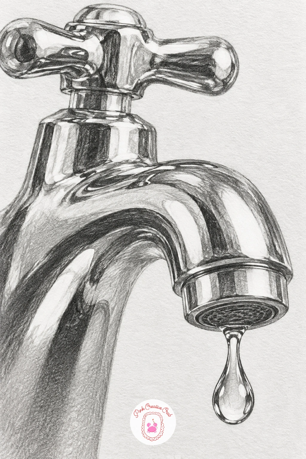
A chrome faucet with a drop about to fall pushes the metal reflection skill from the spoon study even further, since chrome holds harder, more exaggerated contrast than brushed metal. Sketch the faucet’s curved silhouette first, keeping the line smooth and continuous, then lightly plan where the window or ceiling light would reflect along its length.
Shade in bold alternating bands, bright chrome highlight right beside near-black shadow, with almost no gradual transition between them, since that abrupt jump is exactly what reads as polished chrome. The water drop at the spout gets its own small sphere treatment, a dark underside, a bright top highlight and a thin bright rim where the surface tension holds its shape.
If the faucet starts looking grey and flat instead of shiny, you have probably softened too many edges. Go back in with a sharp pencil point and firm pressure to restore the hard contrast lines chrome needs.
No faucet on hand? Any chrome tap, kettle spout or bathroom fitting around the house gives you the same bold reflective pattern to study.
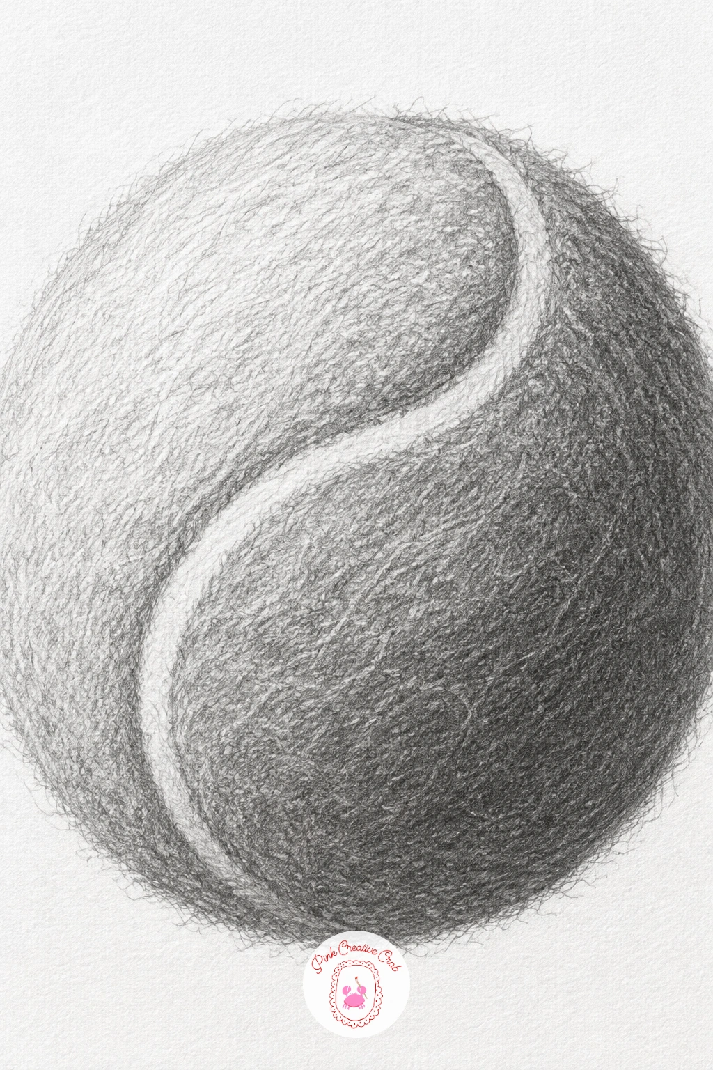
A fuzzy tennis ball shifts the challenge to texture built from thousands of tiny marks rather than smooth tone. Draw the sphere outline and the curved seam first, since that seam’s S-shaped path across the ball is what makes it immediately recognizable, and getting its curve right matters more than the fuzz.
Build the felt texture with short, scribbly, directional strokes rather than one flat shade, layering lighter strokes first and darker ones on top only in the shadowed half of the ball. Leave the area right around the highlight noticeably lighter and less scribbled, since dense fuzzy strokes there will flatten the highlight and kill the sense of roundness.
The seam itself needs crisp, continuous edges even while the fuzz around it stays loose and broken, and that contrast between a clean line and a scribbled texture is what makes the ball convincing.
For a faster version, draw the ball with light, sparse fuzz strokes all over in ten minutes; the forty-minute version layers three or four passes of strokes to build real depth in the shadow side.
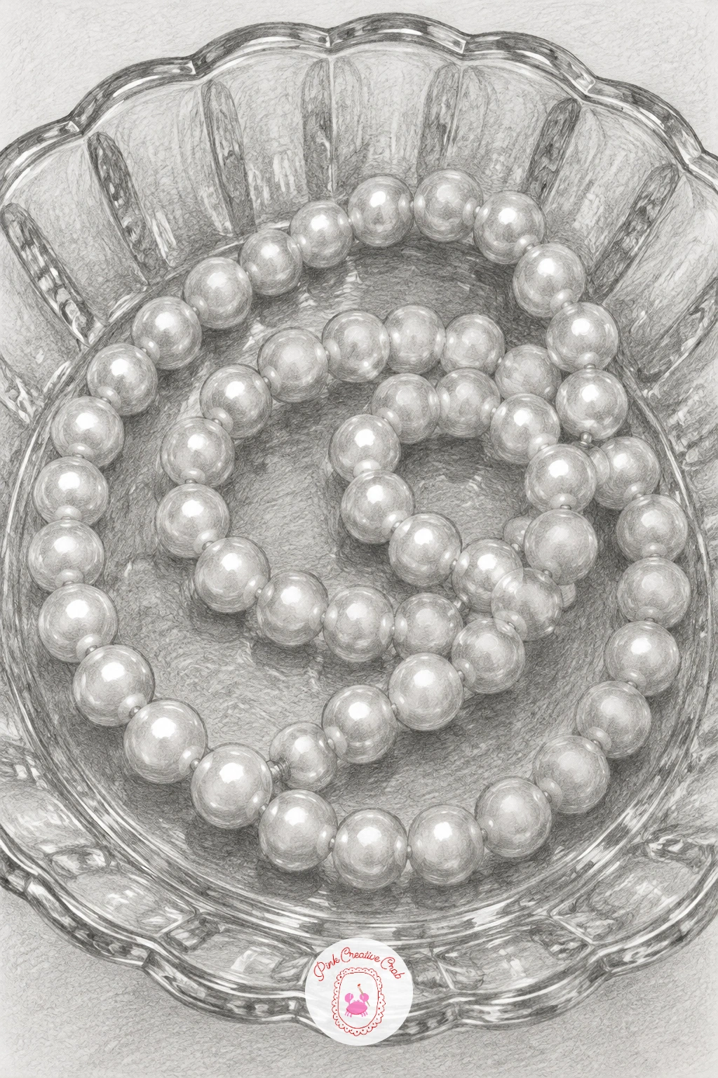
A pearl necklace coiled in a glass dish lets you draw two very different surfaces side by side: the soft glow of pearls and the hard transparency of glass. Sketch the dish first as a simple ellipse with depth, then loop the necklace loosely inside it, letting some pearls overlap others rather than spacing them in a neat row.
Each pearl gets a small, soft gradient from light to dark with one tiny bright highlight kept consistent in position across every pearl, since pearls catch light from the same source and that repetition is what makes them look like a matching set. The glass dish around them stays mostly line and a few careful reflected highlights, with its edge slightly thicker where the glass is viewed through its own rim.
Pearls often come out looking like plain grey balls if the highlight placement wanders from pearl to pearl. Keep checking that every highlight sits in roughly the same spot relative to each pearl’s curve.
One tip to use today: draw the cast shadows the pearls throw onto the dish and each other first, before the pearls themselves, and the whole coil will sit convincingly inside the glass from the start.
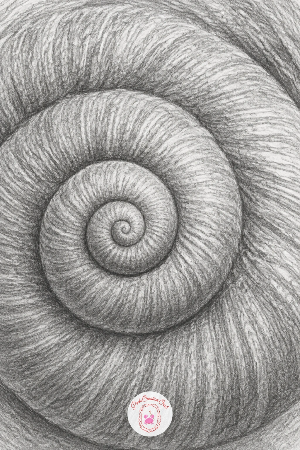
A snail shell spiral rewards careful measuring more than almost anything else on this list, since one lopsided curve throws the whole spiral off. Lightly sketch a loose spiral guideline first, checking that each successive loop sits a consistent distance from the one before it, rather than widening unevenly.
Once the spiral guide feels right, build the shell’s ridged pattern along it, a series of short curved lines following the spiral’s path, each ridge catching a thin highlight on its upper edge and a thin shadow just beneath. Shade the whole shell with an overall gradient too, darker toward the shell’s inner coils and lighter near the outer rim, so the ridge pattern sits on top of real volume rather than looking flat.
If the spiral looks stretched or uneven, measure the gap between loops with your pencil held at arm’s length before committing to ink-dark shading, since fixing a light sketch is far easier than fixing finished tone.
Try varying the shell’s pattern next time, since different snail species carry stripes, bands or mottled patterns across the same basic spiral structure.
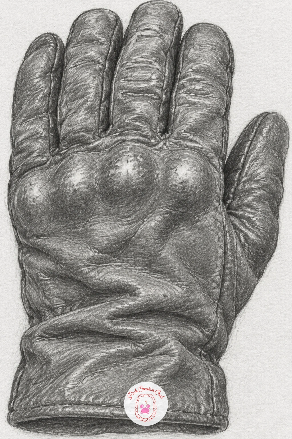
An old leather glove full of creases builds on the crumpled paper study with a softer, more organic material. Sketch the glove’s overall hand shape loosely first, then map the major creases, at the knuckles, across the palm, along the wrist, as soft curved lines rather than sharp folds.
Shade leather in smooth, blended gradients, since it bends more gently than paper or metal, darkening gradually into each crease rather than snapping abruptly. Worn, shiny patches at the knuckles and fingertips get a small bright highlight left clean against the darker surrounding leather, which is what gives old leather its used, polished-in-places look.
The seams and stitching along the glove’s edges are easy to forget until the end, but they matter: a thin row of small dashes along every seam line finishes the illusion of real stitched leather far better than extra shading would.
If leather feels tricky, an old leather wallet or belt gives you the same creased, worn surface to study in a flatter, simpler shape.
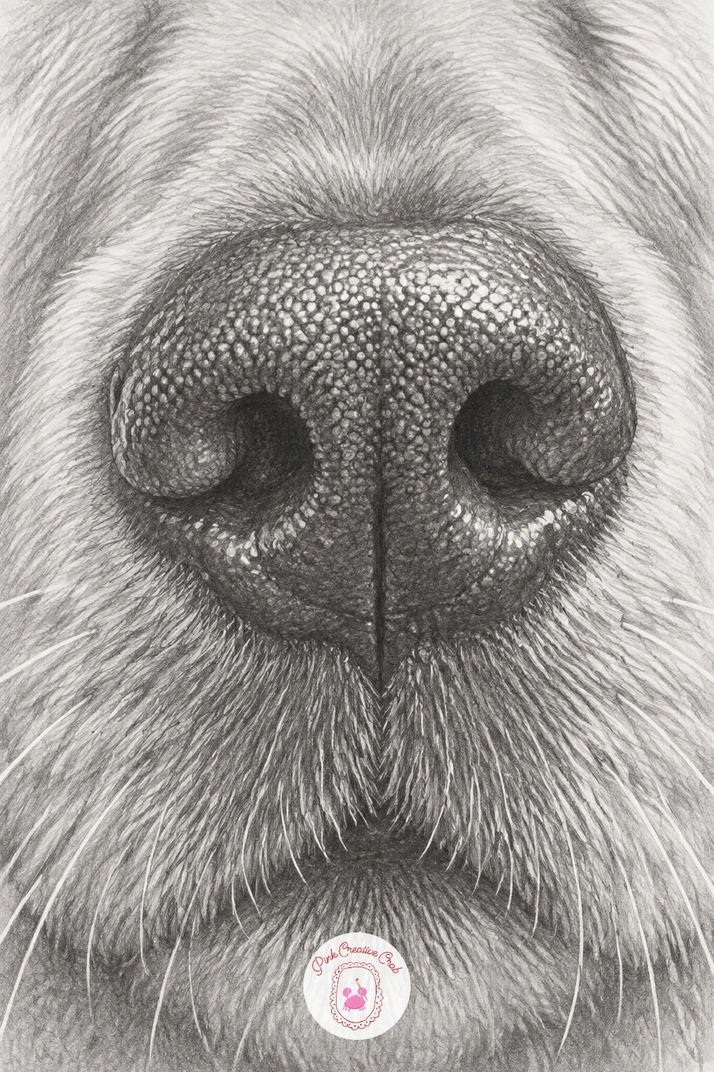
A retriever’s wet nose and whiskers up close gives you a small, forgiving study in shine and fine detail. Draw the nose’s basic rounded wedge shape first, then map the nostril openings as soft curved shapes rather than hard holes, since a dog’s nose surface is leathery and slightly textured rather than smooth.
Shade the nose dark overall, since retriever noses read as nearly black, then lift small bright highlights with a kneaded eraser for the wet sheen, placing them where the surface curves most toward the light. The pebbled texture across the nose’s surface comes from tiny dot-like marks rather than long strokes, built up gradually rather than all at once.
Whiskers are the detail beginners either skip or overdo. Draw them last, as a handful of single clean strokes with a sharp pencil point, lifted slightly off the fur beneath with a thin gap of white paper on one side, and resist adding more than a few per side.
If you enjoy this close study, it pairs naturally with the fuller portraits over in this dog pencil drawing list for more practice with fur and expression.
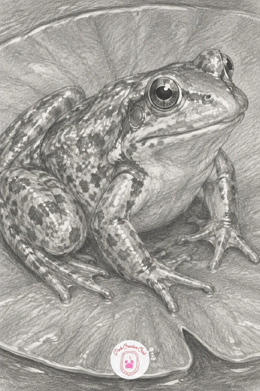
A frog on a lily pad with glistening skin moves the water and reflection theme onto a living subject. Block in the frog’s rounded body and bulging eyes first, keeping the overall shape simple and smooth, since frog anatomy reads as a series of soft curves rather than sharp angles.
The skin’s glisten comes from scattering small, irregular bright highlights across the body wherever the surface curves toward the light, left as untouched paper against a mid-to-dark base tone. Between those highlights, add the frog’s mottled pattern in soft, blended patches rather than hard spots, since real amphibian skin markings blur at their edges.
The lily pad underneath needs its own glossy highlight running along its ribs, and a visible water droplet or two sitting on its surface ties the whole scene together. If the frog starts looking dry or matte, go back and add two or three more sharp, tiny highlights along the back and legs.
For a quicker ten-minute version, draw just the frog’s head and front legs peeking above the lily pad’s edge rather than the whole body.
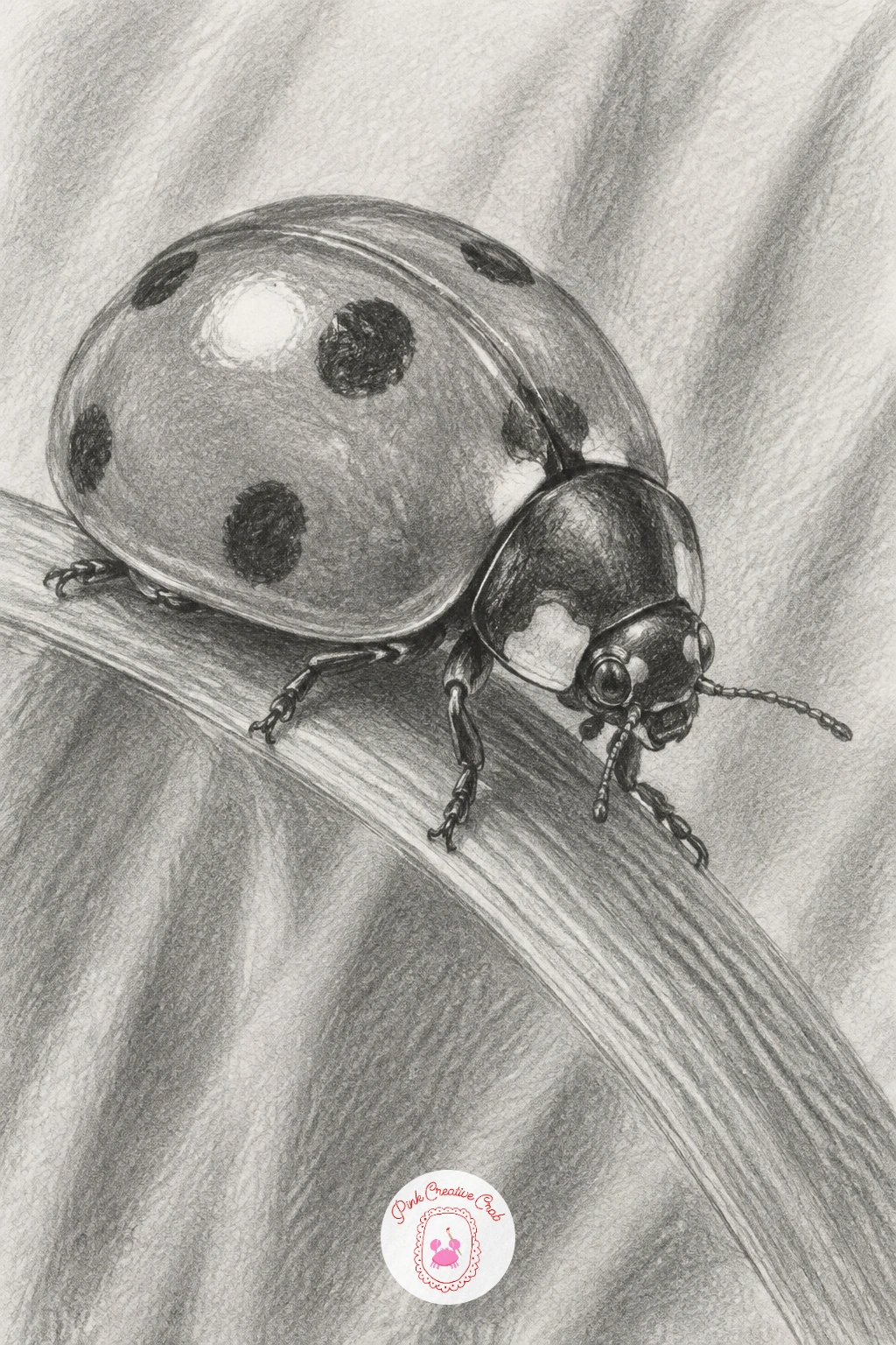
A ladybird crawling along a blade of grass is a small, satisfying subject once you get the eye level right. Draw the blade of grass first as a single long curve, then decide whether you are looking at the ladybird from slightly above or dead level, since that choice changes how much of its domed back versus its legs and underside you can actually see.
Shade the shell in a smooth, glossy gradient with one strong highlight kept bright and small, since a ladybird’s shell is hard and polished rather than matte. The spots sit on top of that gradient, darker where the shell curves away from light and slightly less intense where the highlight falls across them.
The thin legs and antennae are easy to draw too thick and heavy. Use the sharpest point on your pencil and the lightest touch you can manage for these, since even slightly thick legs will make the whole insect look clumsy.
A grass blade bending slightly under the ladybird’s weight, just a touch, sells the sense of real contact and weight far better than a flat, unbent blade would.
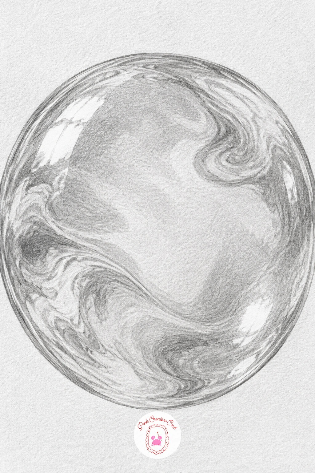
A soap bubble with swirling reflections is one of the trickiest studies on this list, since its surface shows faint rainbow-like swirls even in plain graphite. Draw a clean circle first, then lightly map a few curved swirl bands across its surface, following the sphere’s curve rather than running straight.
Shade the overall bubble very lightly, since most of its surface should stay close to white, with the swirl bands rendered as subtly varied grey tones rather than one solid shade, some darker, some barely visible. The bubble’s edge, the thin rim where the film is visible against the background, should stay a touch darker and more defined than the interior.
Overworking this subject is the most common mistake: too much shading and the bubble turns solid and heavy instead of thin and floating. Step back often and compare it to a reference bubble photo, erasing back toward white wherever it feels too dense.
Keep one or two small bright highlights completely untouched from the very first pencil mark, since once graphite covers them, lifting pure white back out again is much harder.
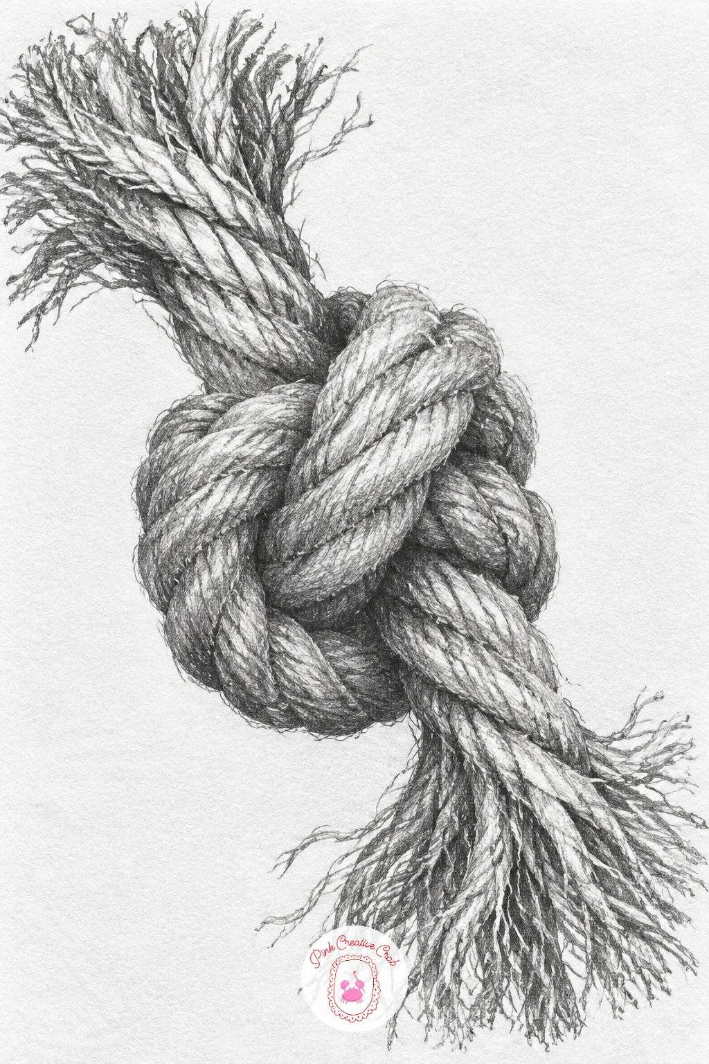
A rope knot with frayed ends is a good study in overlapping forms, since a knot is really just rope crossing over itself several times. Sketch the rope as a simple tube shape first, following its path through the knot loosely before adding any twist texture, so the overall structure reads correctly before detail goes in.
Add the twisted fiber texture with short diagonal strokes that spiral around the tube’s form, darker where one loop of rope passes under another and lighter where it rises back over the top. That consistent under-over shading is what actually makes a knot look tied rather than just tangled.
The frayed ends need a completely different, looser touch: individual thin fiber lines splaying outward at slightly different angles and lengths, drawn last with a sharp pencil point so they read as fine strands rather than a solid fuzzy blob.
If you have only synthetic cord on hand instead of natural rope, that works just as well for reference, since the under-over knot logic stays identical across rope types.
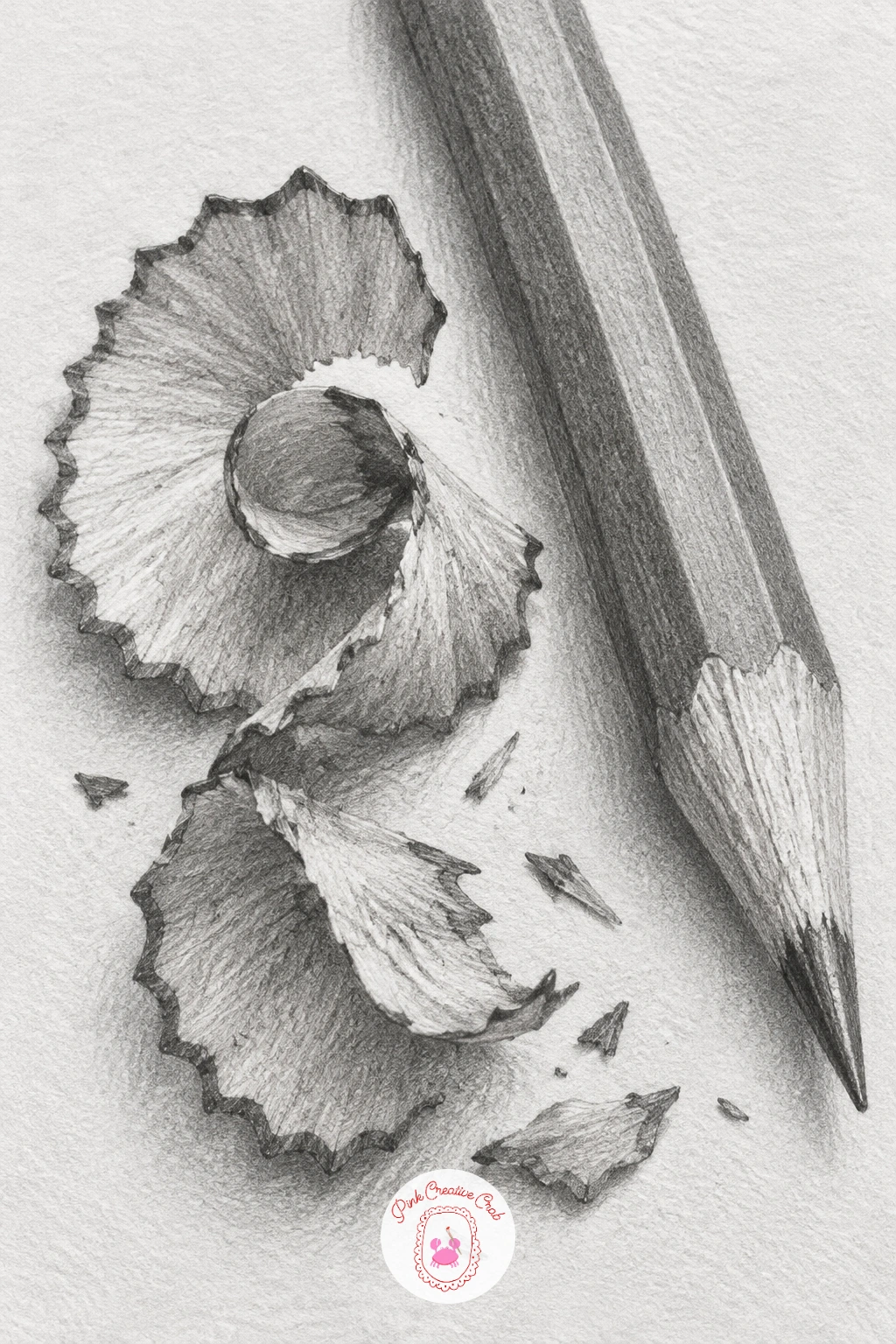
A wooden pencil with curled shavings beside it turns your actual drawing tool into the subject, which makes reference easy to find. Draw the pencil’s long cylindrical body first, keeping the sides perfectly parallel, since even a slight taper error makes a pencil look warped.
Shade the wood grain in long, faint streaks running the length of the pencil, then add the painted section’s smoother gradient on top, darker where the cylinder curves away from light. The sharpened tip needs its own careful treatment: a pale wood cone narrowing to a dark graphite point, with a crisp transition line where the two meet.
The curled shavings beside it are the real test of this drawing. Shade each curl as its own small spiral form, following the twist around and tightening the tone toward the inner coil, and vary the size and tightness of two or three shavings so they do not look identical.
Try varying this one later with a colored pencil instead, drawing its exposed wood casing and waxy tip for a slightly different texture puzzle.
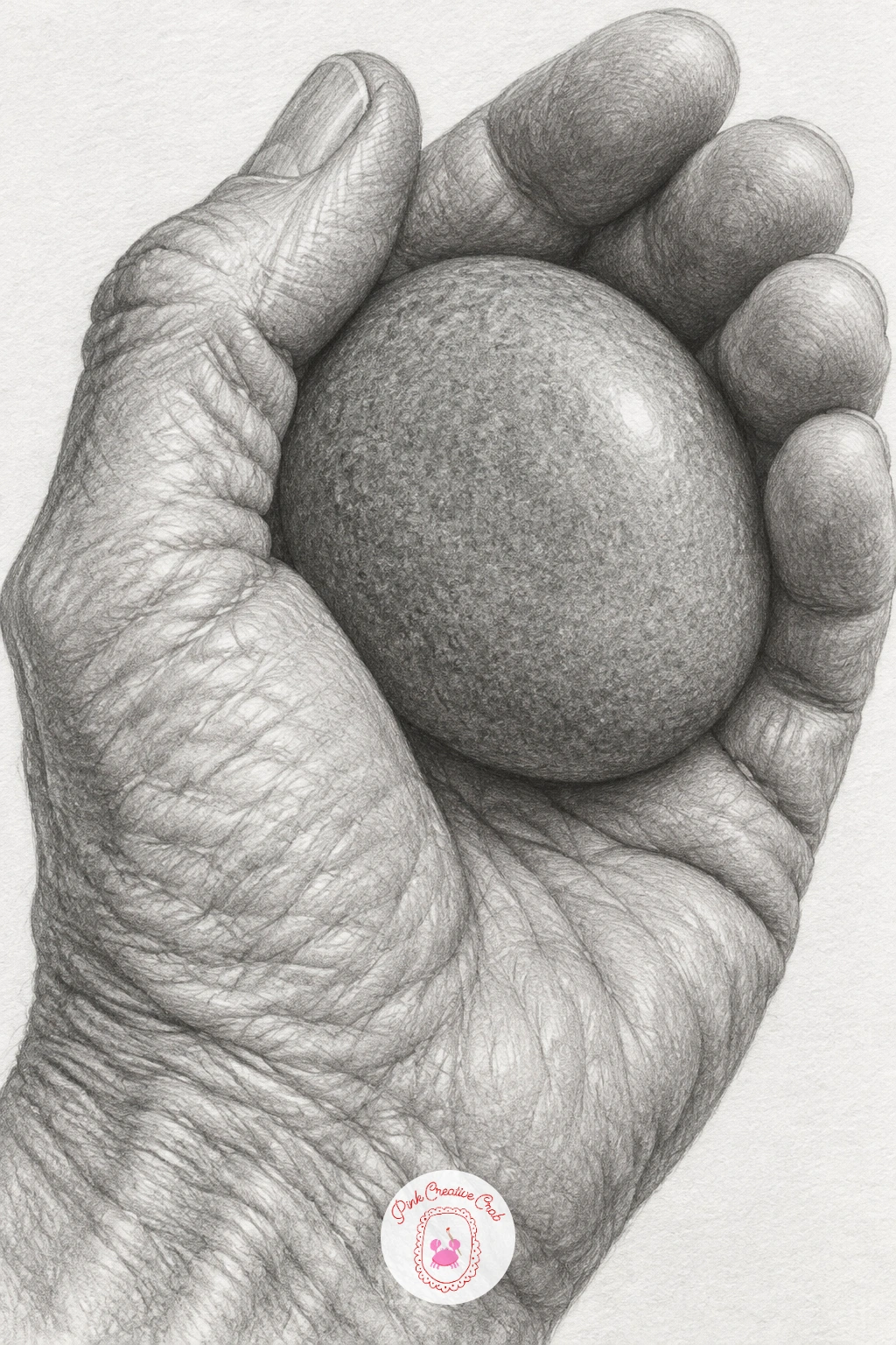
An old hand holding a smooth river stone pairs weathered skin texture against a cool, polished surface, and the contrast between the two is what makes this drawing work. Block in the hand’s overall shape and the stone nestled in the palm first, keeping finger proportions honest by comparing each knuckle segment against the width of the thumb.
Shade the skin in soft, blended gradients that follow the hand’s folds and wrinkles, with slightly deeper tone pooling in the creases around each knuckle and along the lifeline, since age and texture live in those recesses more than on the flatter areas of skin. The stone, by contrast, gets a smooth, almost unbroken gradient with one clean, bright highlight, since its polished surface has none of the hand’s texture.
Hands often go wrong at the fingernails, overworked into dark blobs. Keep them simple: a faint outline, a thin highlight near the cuticle, and otherwise let them stay close to the skin tone around them.
If you want a simpler version today, crop the composition to just the fingers curled around the stone rather than drawing the whole hand and wrist.
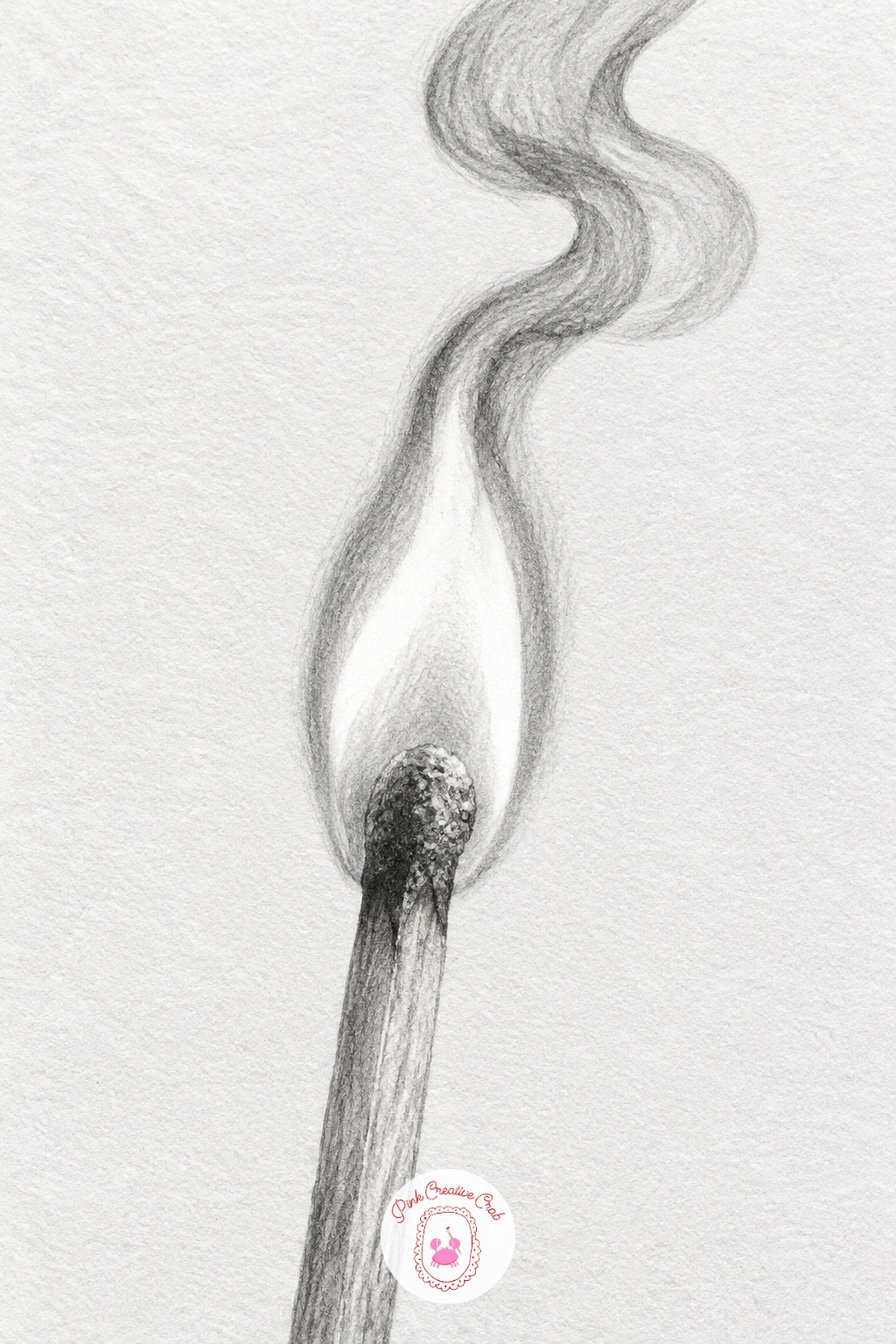
A lit match with a curl of smoke introduces fire and vapor, two things that look nothing like the solid objects drawn so far. Draw the matchstick first, a simple thin rectangle, then place the flame above the burnt tip as a few overlapping teardrop shapes rather than one solid blob, since real flame has layered, slightly separated zones of brightness.
Leave the flame’s hottest core nearly untouched white paper, then build outward with increasingly darker, softer-edged tone toward the flame’s outer edge, which is where light sources sit in this drawing and the only place true brightness belongs. The burnt matchstick itself goes dark and slightly textured, with a thin char line where unburnt wood meets blackened wood.
The smoke curl is the hardest part: use a very light touch and a blending stump to drag soft grey tone upward in a loose spiral, keeping edges fuzzy and indistinct throughout, since any hard edge on smoke breaks the illusion instantly.
For today’s tip, draw the smoke last of everything, after the match and flame are finished, so you are not fighting to preserve its soft edges while shading harder-edged objects nearby.
A glass of water with a bent paper straw revisits the refraction study from earlier, but a paper straw’s softer, slightly fibrous surface changes the texture work. Sketch the glass and the straw as one straight line first, then shift the straw visibly sideways at the waterline, same as before, to show the refraction break.
Shade the paper straw with a faint striped or fibrous texture running along its length, since paper straws have a visible seam and a slightly duller, less glossy surface than plastic ever did. Where the straw passes into the water, soften that texture slightly, since submerged surfaces lose some crispness through the water’s own slight blur.
The water and glass shading follows the same vertical banding approach as the earlier version, light and dark streaks curving with the glass, with a denser grey for the water itself and a lighter zone above the waterline.
If paper straws feel repetitive after the earlier glass study, swap in a metal straw instead for a shinier, harder-edged version of the same bent-refraction trick.
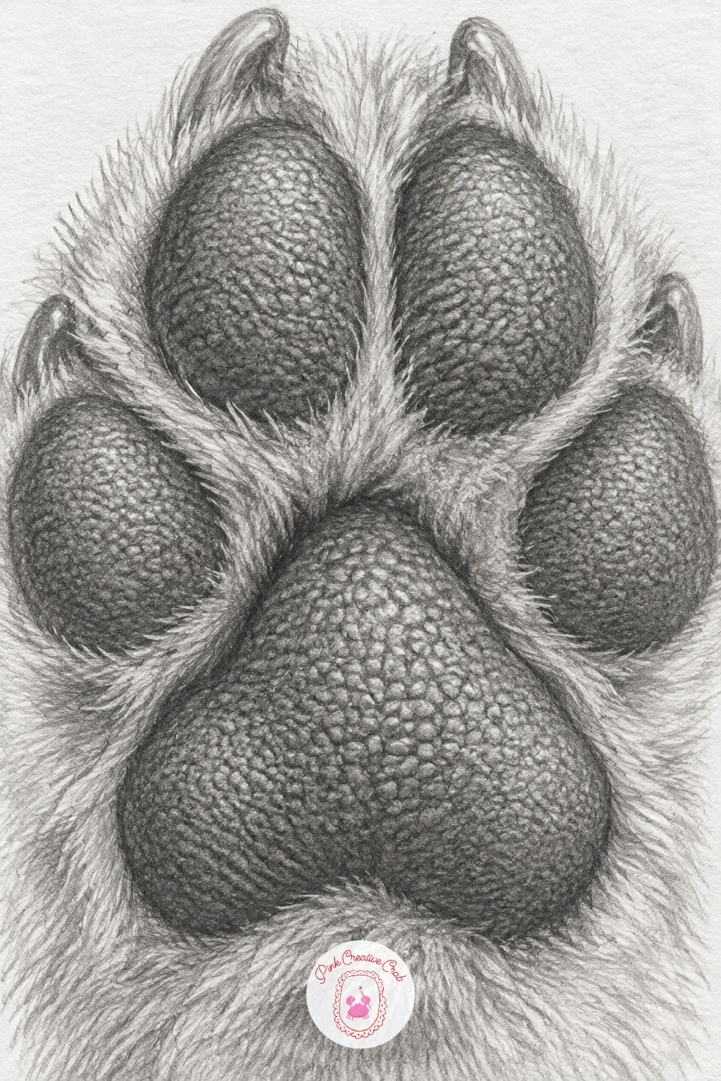
A dog’s paw pads up close is a small, textured subject that looks far more complex than it actually is. Draw the overall paw shape first, the central large pad and the smaller toe pads around it, checking that the toe pads are noticeably smaller than the central one and spaced with slight gaps of fur between them.
Shade the pads themselves in a dense, pebbled texture built from tiny irregular dark marks over a mid-grey base, since paw pad skin is rough and granular rather than smooth. Leave small scattered highlights untouched to suggest the pad’s slightly worn, shiny high points.
The fur surrounding the pads needs a completely different stroke: longer, softer, directional marks that contrast against the pad’s tight stippled texture, and that contrast is really what sells this drawing. If the fur and pad textures start blending together, push the pad texture darker and tighter to separate them clearly.
A close paw study like this works well paired with the whiskers and nose idea earlier, building a small set of close animal-detail studies from the same reference photo.
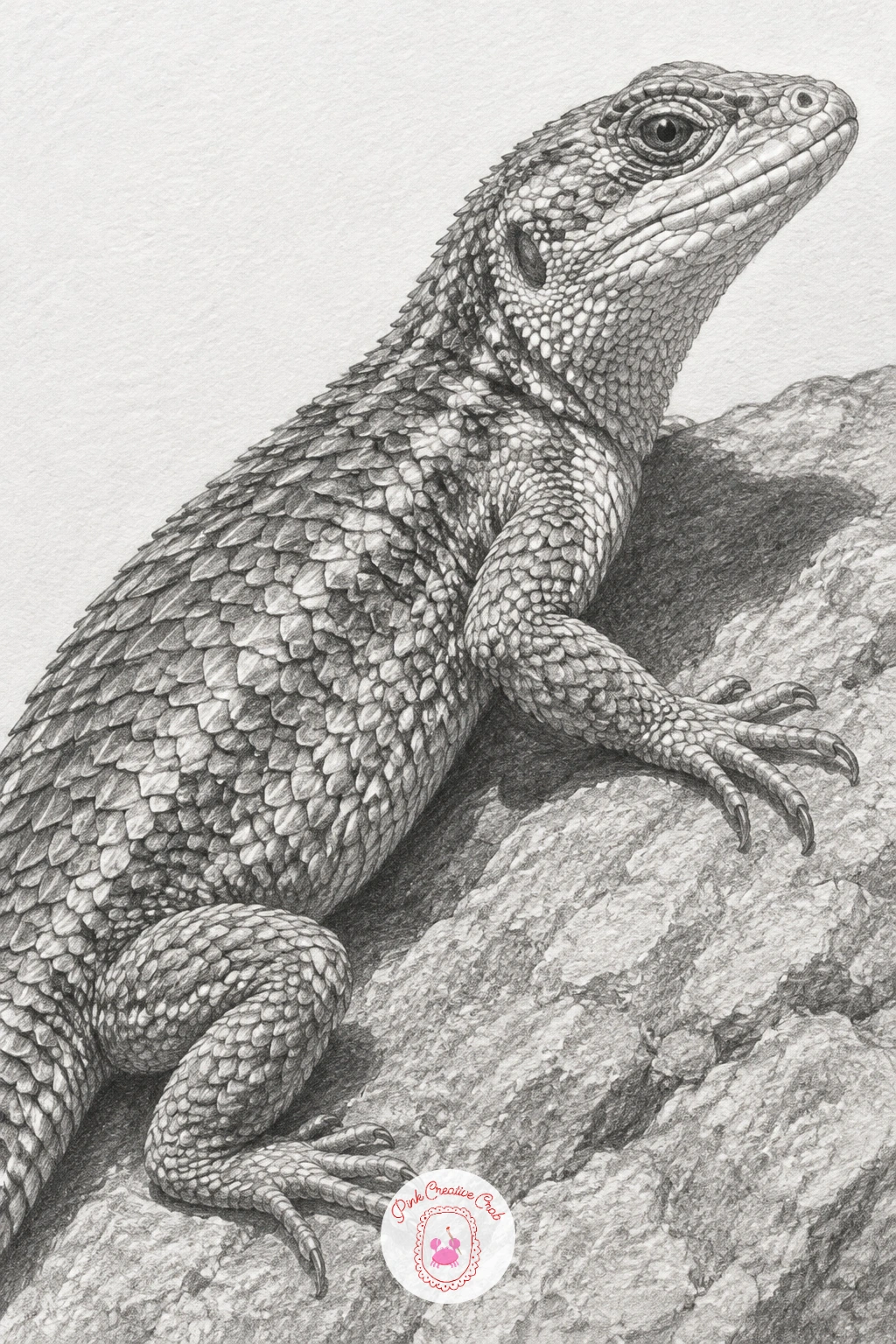
A lizard basking on a warm rock lets you draw scaled skin against rough stone, two very different textures sitting side by side. Block in the lizard’s body and the rock surface beneath it first, choosing a low eye level looking slightly up along the rock, which makes the lizard’s silhouette read clearly against the sky or background behind it.
Build the scale pattern in small, overlapping curved marks that follow the body’s contours, denser and smaller along the back and tail, slightly larger and more spread along the belly. A low, warm light source from one side, even in plain graphite, means one whole side of the body stays noticeably darker in shadow while the lit side keeps crisp scale edges.
The rock surface should stay rougher and more broken in texture than the lizard’s smoother scaled skin, with scattered pits and cracks rendered in short, irregular dark marks rather than the lizard’s tidier repeating pattern.
Try this scene again later with a different reptile, a gecko’s bumpy skin or a tortoise’s plated shell, using the same basking pose and rock setting.
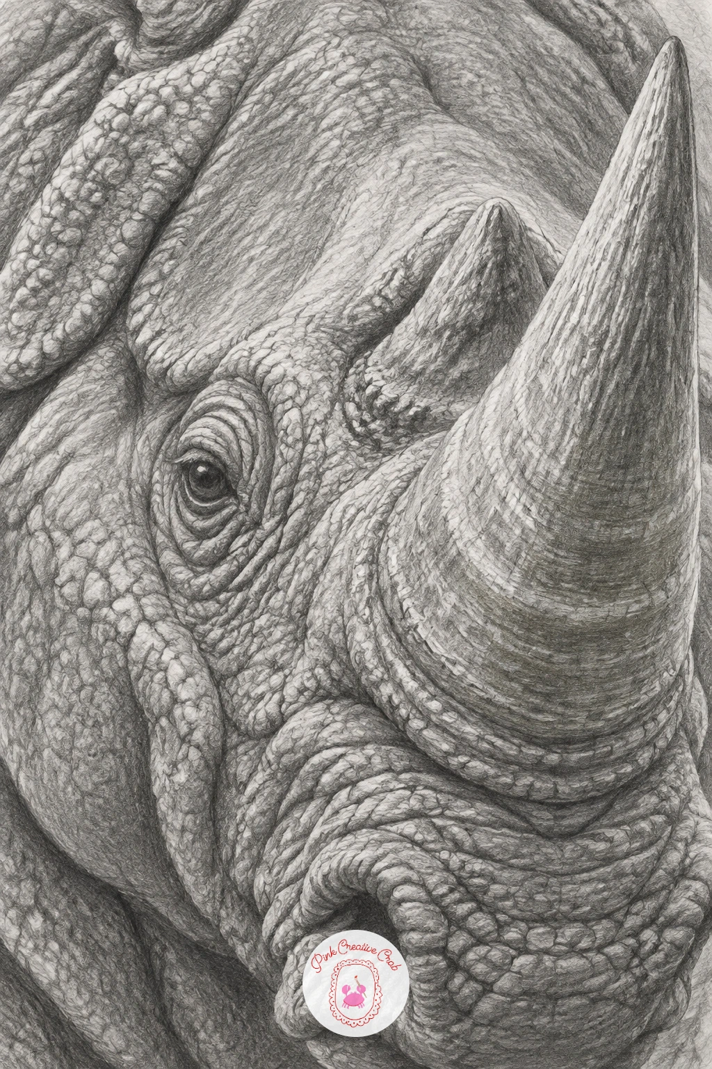
A rhino’s armored hide and horn is one of the more involved studies here, built from thick folded skin and a dense, ridged horn. Sketch the head and the base of the horn first, then map the major deep folds across the neck and shoulder as simple curved guidelines before any texture goes in.
Shade the hide in overlapping plates, each with its own slightly separate tone, since rhino skin moves in large armored-looking sections rather than one continuous surface. Within each plate, add a fine cracked, pitted texture using small irregular dark marks, keeping the deepest folds between plates noticeably darker than the plates themselves.
The horn gets a different, more fibrous vertical texture, ridged lines running from base to tip with a slightly lighter, worn tone near the point. If the hide starts looking smooth instead of armored, push the contrast between plate and fold deeper, since the folds are doing most of the structural work here.
For a quicker version, crop in tight on just the horn and the skin immediately around its base rather than drawing the whole head.
A silver spoon reflecting a bright window takes the earlier metal spoon study and pushes it toward a single strong light source instead of a whole room. Draw the spoon’s shape first, then decide exactly where the window sits relative to it, since that placement determines where the brightest reflected rectangle of light falls across the bowl’s curve.
Shade the spoon in the same sharp, high-contrast bands as before, but this time keep one clear, slightly distorted window-shaped highlight as the brightest element in the whole drawing, distinct from the smaller scattered highlights elsewhere on the metal. Everything else on the spoon stays a notch darker by comparison, which keeps that one highlight reading as the strongest light in the piece.
Silver tarnishes slightly differently from chrome, with a warmer, softer grey in its mid-tones rather than chrome’s cooler, harder contrast, so let your mid-tones sit a touch softer here than in a pure chrome study.
If silverware is hard to find, any polished metal spoon near a bright window works, and the reflected shape will change naturally with whatever window you actually have.
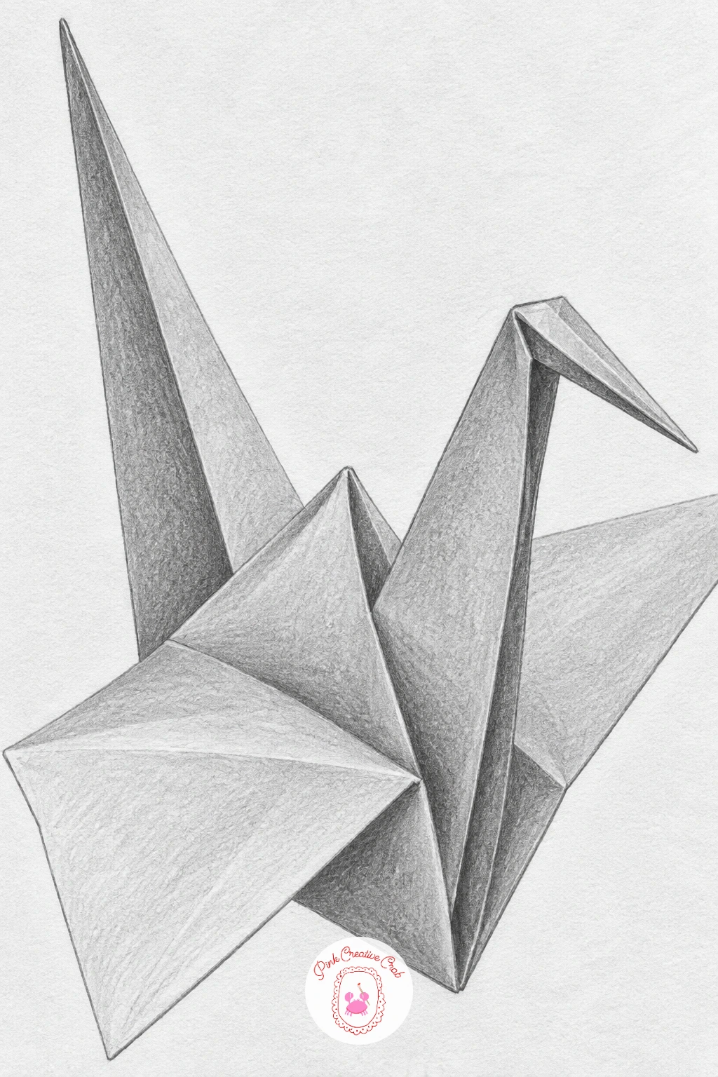
A folded paper crane returns to flat planes and sharp creases, but origami’s geometry is far more precise than a random crumpled sheet. Sketch the crane’s overall triangular, angular silhouette first using light straight guide lines, since origami forms are built from flat faces meeting at clean, deliberate angles rather than organic curves.
Shade each flat face as one even, consistent tone, changing tone only where a new fold begins, which keeps the geometric, faceted look intact instead of letting the shading blur across fold lines. The crease lines themselves stay crisp and ruler-straight, drawn last with a sharp pencil and a light touch so they sit on top of the shading rather than cutting through it messily.
The most common mistake here is softening the fold edges the way you would for fabric or skin. Resist that instinct completely: every edge on a paper crane should stay hard and precise.
If you enjoy this kind of precise paper form, the same careful plane-by-plane approach shows up again in the ornaments over in this Christmas ornament drawing list, worth a look for more structured subjects.
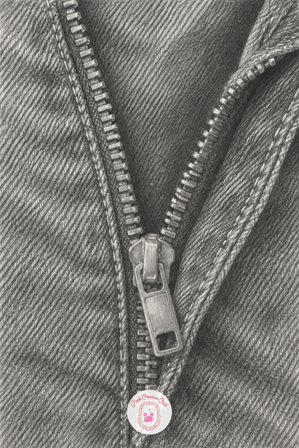
A half-open zipper on a denim jacket brings metal teeth and woven fabric into one small study. Draw the zipper’s two tapes first, running slightly apart where it sits open, then place each metal tooth as a small, consistent shape along both edges, keeping the spacing even since an uneven zipper reads as sloppy immediately.
Shade the metal teeth with tiny, sharp highlights on each one, since repeated small bright points along a line are what make a zipper look metallic rather than drawn as a flat grey strip. The denim fabric around it needs a completely different texture: short, criss-crossing diagonal strokes that suggest woven thread, with visible stitching lines as a row of small dashes along every seam.
Where this drawing tends to fall apart is the fabric bunching around the open zipper pull. Add a few soft diagonal fold lines radiating from the pull tab to show the fabric gathering there, rather than leaving the denim perfectly flat around it.
For a quicker take, crop right in on just the zipper pull and a few teeth rather than the whole jacket front.
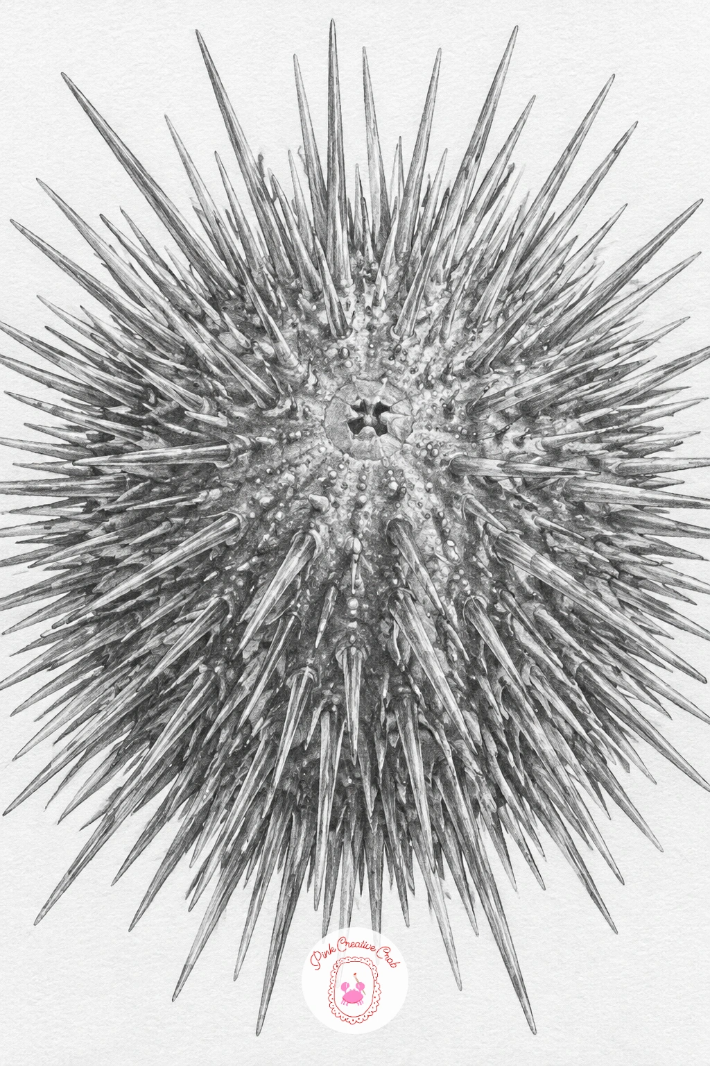
A sea urchin with fine spines is a study almost entirely about controlled, repeated line work. Draw the rounded central body shape first, then lightly mark the points around its surface where spines will radiate outward, spacing them a little unevenly rather than in a perfectly uniform grid, since real urchin spines vary slightly in density.
Draw each spine as a single confident line tapering from a slightly thicker base to a fine point, working from the spines nearest you outward to those at the silhouette’s edge, so closer spines can overlap and interrupt farther ones convincingly. Vary spine length and angle noticeably, since identical, perfectly parallel spines look mechanical rather than organic.
The body beneath the spines gets only a small amount of visible shading, mostly in the gaps between spine bases, since the spines themselves do most of the visual work and too much extra shading will clutter the piece.
If hundreds of individual spines feels like too much for one sitting, a smaller urchin, or a close crop on just one section of its surface, keeps the piece finishable today.
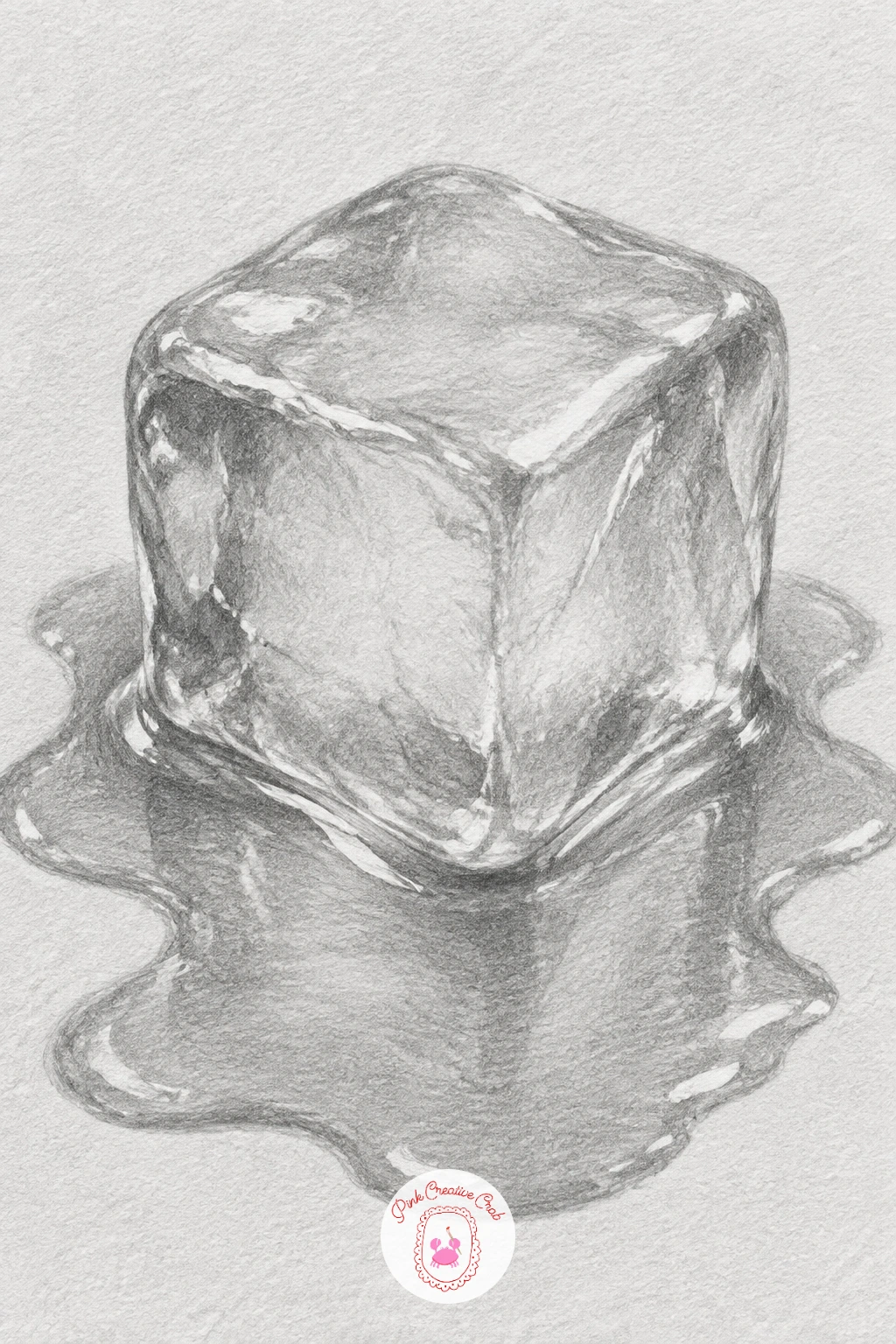
A melting ice cube in a small puddle combines a solid, geometric form with the loose, reflective behaviour of standing water. Draw the cube’s basic blocky shape first, then round off and soften a few of its edges unevenly, since melting ice loses its sharp corners first while flatter faces stay more intact longer.
Shade the cube itself with the same sharp light-to-dark banding used for glass earlier, since ice shares glass’s transparent, light-bending qualities, keeping one strong highlight along its most rounded, wet edge. The puddle spreading beneath it needs a much flatter, more even tone with a few thin reflected highlights streaking across its surface, distinct from the cube’s steeper internal contrast.
Where this piece often goes wrong is the puddle’s edge, drawn as one hard, continuous outline. Break that edge up into an irregular, slightly blurred boundary instead, since water spreads unevenly rather than in one clean shape.
A few tiny air bubbles trapped inside the cube, drawn as small pale ovals, add convincing detail without much extra time.
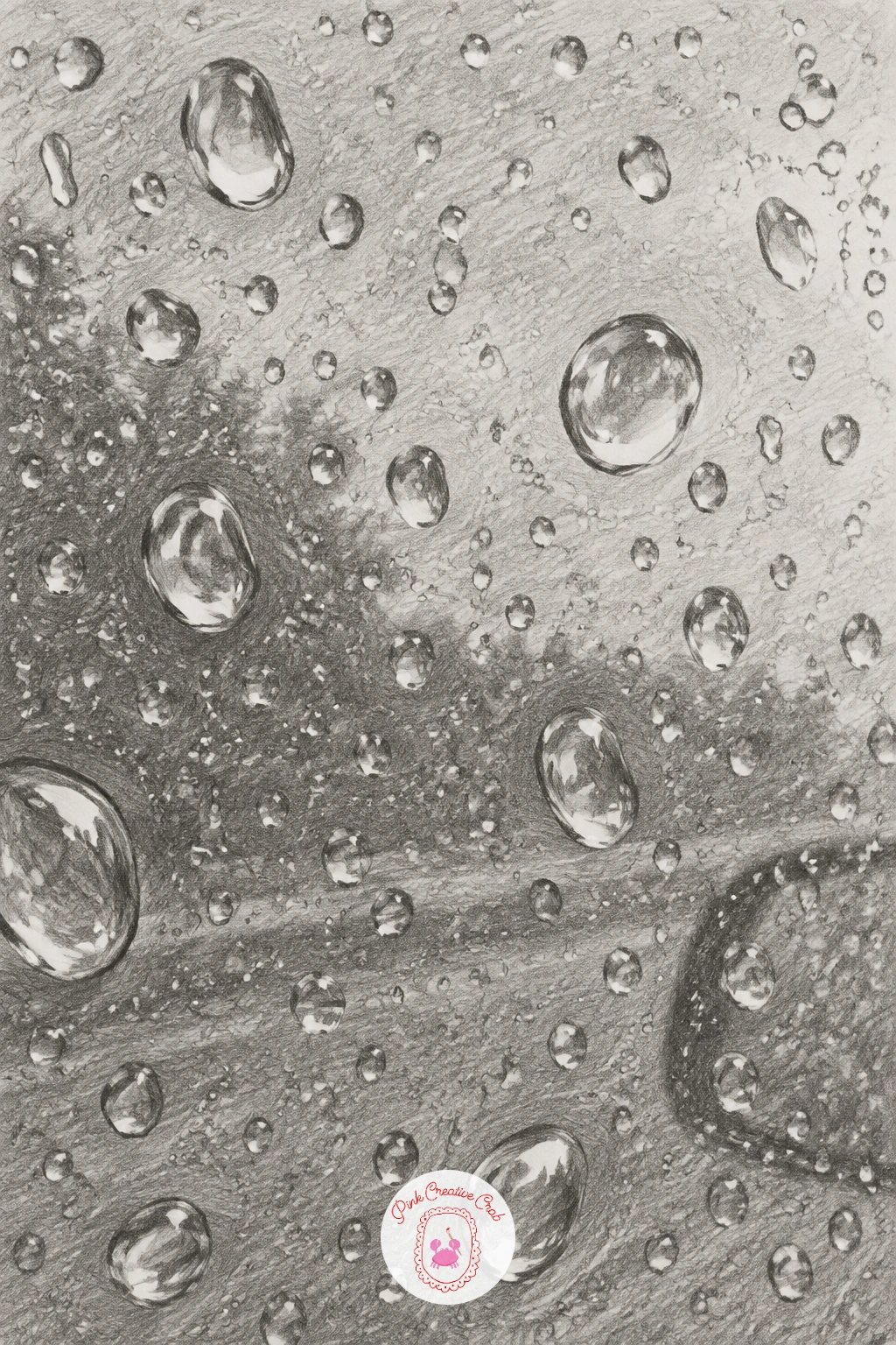
Water droplets beaded on a car window close out this list with a field of small reflective spheres rather than one large subject. Plan a loose scattering of droplet positions first, varying their sizes noticeably, since a window with only one droplet size looks artificial.
Each droplet gets the same basic sphere treatment as the dewdrop earlier, a dark curved edge, a bright highlight, and a small inverted glimpse of whatever sits beyond the glass, kept simple and pale. Because there are many droplets here, keep that inner reflection detail minimal on most of them, saving a slightly fuller reflection for just two or three larger, more prominent drops.
The glass itself, visible in the gaps between droplets, should stay mostly untouched white paper with only a faint overall haze of tone, since too much background shading will compete with the droplets for attention. If the whole piece starts feeling busy, remove a few smaller droplets entirely and let more bare glass show through.
For more practice with small repeated reflective studies like this, the techniques covered in this guide to shading techniques for realistic drawing are worth a read before you start.
What to Do Next
Pick one idea that matches a texture you already enjoy, whether that is the shine of glass or the roughness of rust, and start today on a sheet of smooth white paper with a sharp pencil close at hand. Keep your eraser nearby for highlights, work from light to dark, and let the first study teach you something you can carry into the next one.
Frequently Asked Questions
What is the easiest way to start realistic drawing with pencil?
Start with a simple, smooth-edged object like a marble or dewdrop. Focus on one clear highlight and one strong shadow first, then build mid-tones between them gradually, rather than reaching for detail too early.
Which pencils work best for realistic drawing textures?
A small set of graphite pencils from hard to soft, roughly 2H through 6B, covers most textures. Harder pencils suit crisp edges on glass and metal, softer ones build deep shadows in fur, rust and folds.
How do you make glass or metal look reflective in pencil drawing?
Reflective surfaces need sharp, high-contrast bands sitting close together rather than smooth gradual shading. Keep highlights pure white paper and push shadows noticeably dark, since that abrupt jump between tones reads as shine.
How long does a realistic pencil study usually take?
A small study like a feather or paw pad can finish in thirty to forty minutes once you know the steps. Larger or more textured subjects, like the rhino hide or a full glove, may take closer to an hour.
What is the most common mistake in realistic pencil drawing?
Softening edges and textures too early is the most common mistake, which flattens glass, metal and fur alike. Keep hard edges crisp and save soft blending only for genuinely soft surfaces like skin or smoke.
Have any thoughts?
Share your reaction or leave a quick response — we’d love to hear what you think!
-
 0
-
0
-
0
-
0
-
0
-
0


