Small sketch ideas are exactly what a half empty page corner is asking for: something quick, something real, something you can finish before your tea goes cold. None of these need a plan or a background, just a pencil, a bit of white paper and five or ten quiet minutes.
Below you will find 31 tiny subjects, from an old brass key to a sparrow on a twig, each one built to sit alone on the page and still look complete. Work through them in order if you like, easiest first, or just flip down and pick whatever catches your eye today.
Using these images: free for personal projects such as printing, coloring, cards, journals and gifts. Handmade items that include them may be sold up to 30 pieces per design. More than that is commercial use and is not permitted, and neither is selling or sharing the images themselves or passing them off as your own. Please ask before any other use.
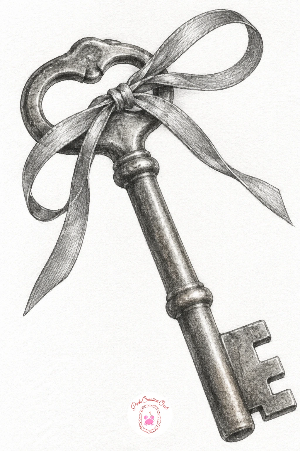
Start with the brass key, since its shapes are just a few ovals and a rectangle stacked together, which makes it a forgiving first sketch. Lightly draw the round bow at the top, the long shaft, and the notched teeth at the bottom, keeping the whole thing no longer than your thumb on the page.
Shade the metal in smooth gradual layers, darkest where the key curves away from the light and left almost white along one clean edge to suggest shine. Work the ribbon last, two soft loops with a few pencil lines for the fold, since it reads better loose than tight.
If the teeth come out too even, stagger their widths slightly, real keys are never perfectly symmetrical. A fine point 2H pencil for the thin ribbon lines keeps them from going muddy.
Measure the bow against the shaft before you commit to ink level pressure: most keys have a bow roughly as wide as the shaft is long, and getting that one ratio right makes the whole drawing read as a key instantly.
Palette: Graphite Grey,Warm Highlight White,Soft Charcoal
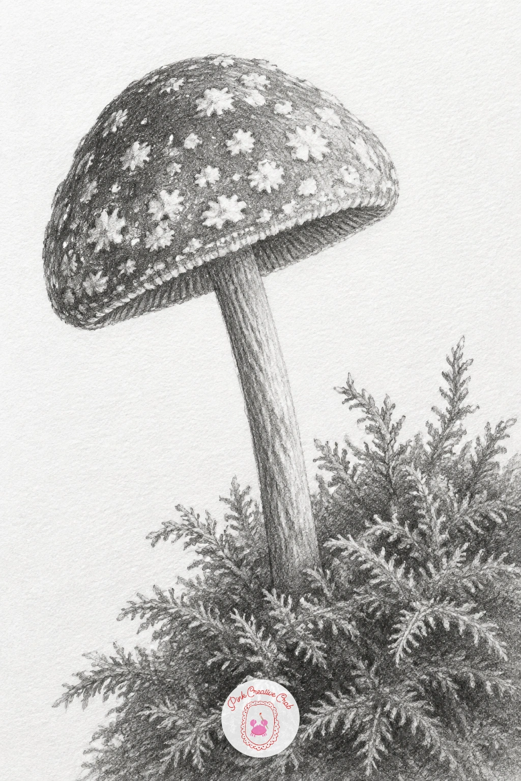
Move from metal to something softer with a tiny mushroom, cap first as a rounded dome, then the slim stem beneath it. Keep the cap no wider than a coin so it still reads as small once the moss tuft is added underneath.
Shade the cap in one direction with a soft pencil, then lift tiny dots of highlight out with a kneaded eraser for the speckles, rather than drawing each speckle as a dark dot. The moss tuft at the base is just scribbled texture, clusters of short curved pencil strokes pressed lightly, never outlined.
If the cap looks flat, remember the light usually comes from one side: shade one half of the dome darker and leave a thin crescent of white along the top edge where it catches light. A 4B pencil gives the moss enough softness without smudging the cleaner cap above it.
Finish today by keeping the stem shorter than feels natural, a too-tall stem is the easiest way for a tiny mushroom to stop looking tiny.
You Will Need
- kneaded eraser for speckle highlights
Palette: Mushroom Grey,Moss Shadow,Page White
The thimble picks up the metal shading from the key but adds a pattern: a grid of tiny dimples pressed into the surface. Draw it as a short dome shape, then mark the dimples with a very sharp pencil point as a loose scattered grid rather than perfectly ruled rows, since hand-pressed dimples are never even.
Set the spool of thread beside it as a simple cylinder with rounded ends, the thread itself just a few diagonal lines wrapped around the middle. Shade the thimble bright and metallic with strong contrast, and keep the spool softer and matte so the two surfaces feel different.
Where eyes slide off is usually the thimble rim, so darken that single edge where it meets the spool to pin the two objects together in the same light. No embroidery thread on hand to study from, a pencil on a desk works just as well for the cylinder shape.
Compare the two heights before you shade: a sewing thimble usually stands about as tall as half the spool, which keeps the pairing believable at a glance.
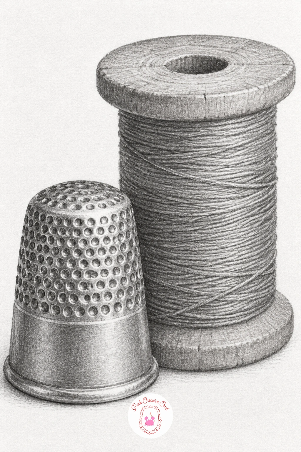
Palette: Silver Shine,Thread Grey,Deep Graphite
After two still objects, give the page some gentle life with a garden snail. Draw the shell first as a tight spiral, starting at the centre and curving outward two or three turns, then add the soft curved body stretching below it with two small tentacles.
Shade the shell in bands that follow the spiral, darker toward the centre, lighter where it catches light near the outer curve, which is what makes a drawn spiral look like a shell and not just a circle. The blade of grass it climbs is one long tapered curve, shaded along one edge only to keep it thin and simple.
If the shell spiral looks flat, add one small cast shadow where the body meets the grass blade, that single shadow gives the whole drawing weight. Swap the grass for a twig if that is easier to draw convincingly.
Quick version, ten minutes: shell, body, one blade of grass, done. Given forty minutes, add the faint ridge lines across the shell bands and a touch more texture in the body’s underside.
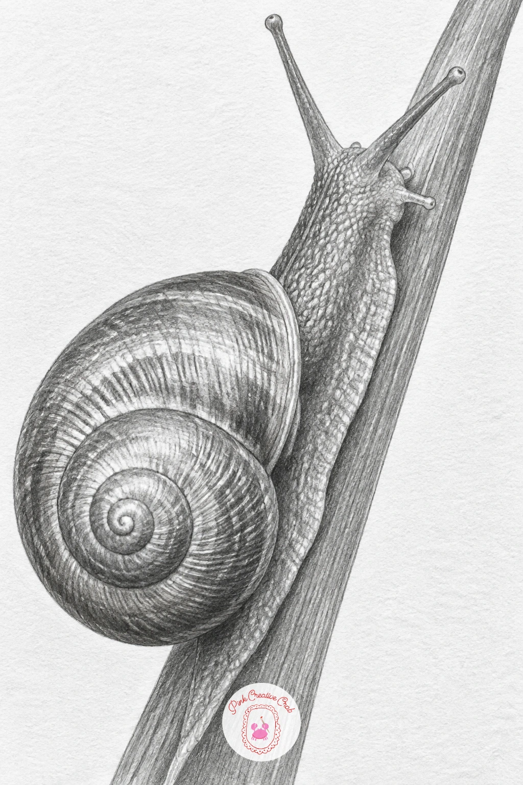
Palette: Shell Grey,Grass Edge Grey,Soft White
Look at a real snail shell photo for the spiral direction, most curl clockwise when viewed from above, which makes the shading bands easier to place correctly.
Fold a scrap of paper into a simple boat shape first if you want the real folds in front of you, or work from memory, the structure is just a triangle sail shape sitting on a flat hull with sharp straight creases. Draw the fold lines as crisp pencil strokes rather than soft curves, since paper always creases in straight segments.
Shade each flat panel of the folded paper a slightly different value, since even plain paper catches light differently panel to panel once it is folded. The puddle beneath needs almost no line at all, just a soft oval smudge of graphite with one pale streak left for reflected light.
Where this goes wrong is over-softening the paper creases until the boat looks like cloth: keep every fold edge sharp and straight, only the shading gradates. If you have no paper to fold for reference, picture a square napkin folded corner to corner twice.
Keep the puddle smaller than the boat itself, a puddle that spreads too wide pulls focus away from the little paper folds that make this sketch work.
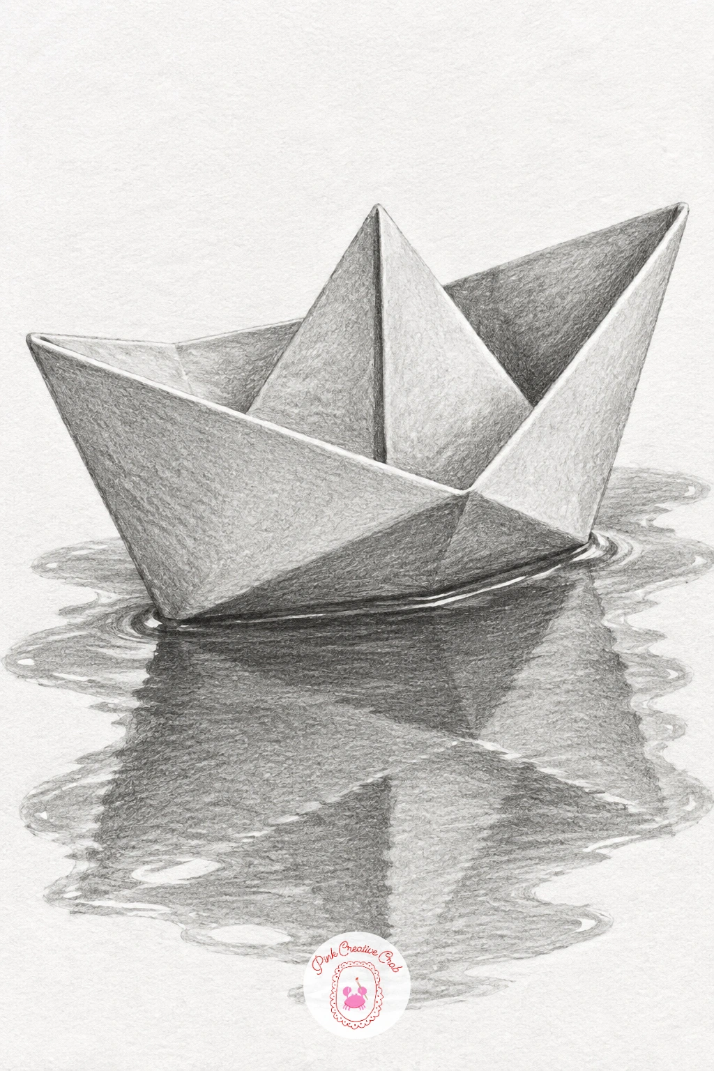
Palette: Paper White,Crease Grey,Puddle Grey
Return to something solid and quick with a single acorn, an oval nut shape topped with a textured cap. Draw the smooth oval first, then the cap as a shallow dome sitting over the top third, slightly wider than the nut at its rim.
Shade the nut body smooth and glossy, leaving a small streak of white for shine, then switch to short cross-hatched marks for the cap’s rough scaly texture. That contrast between glossy nut and matte scaly cap is what sells the whole acorn in just a few strokes.
If the cap looks painted on rather than textured, press a little harder and vary the direction of your cross-hatch marks instead of keeping them all parallel. No acorn on hand, a chestnut or even a large bead gives the same oval to practice shading from.
Keep the cap no more than a third of the total height, any taller and the acorn starts reading as a tiny hat on a ball instead of a nut.
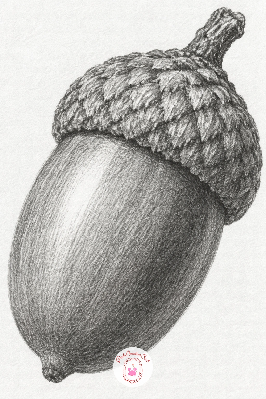
Palette: Acorn Brown Grey,Cap Texture Grey,Highlight White
Step up slightly in detail with a vintage pocket watch, lid open to show the face. Draw the round case first, then the open lid as a slightly flattened circle hinged to one side, and finally the watch face with simple roman numeral marks rather than full numbers.
Shade the metal case with the same bright metallic contrast you used for the key, strong dark next to near-white highlights along the curved rim. The face stays flat and pale by comparison, just two thin hands and small tick marks, which keeps the eye drawn to the shinier case around it.
Hinges are where this usually falls apart, so keep the small hinge detail simple, two or three short lines, rather than trying to draw every link. Swap the roman numerals for plain dots if lettering of any kind feels fiddly at this size.
Picture the open lid at roughly a right angle to the face for the most readable silhouette, laid flatter and the watch reads as closed, propped too upright and the face disappears from view entirely.
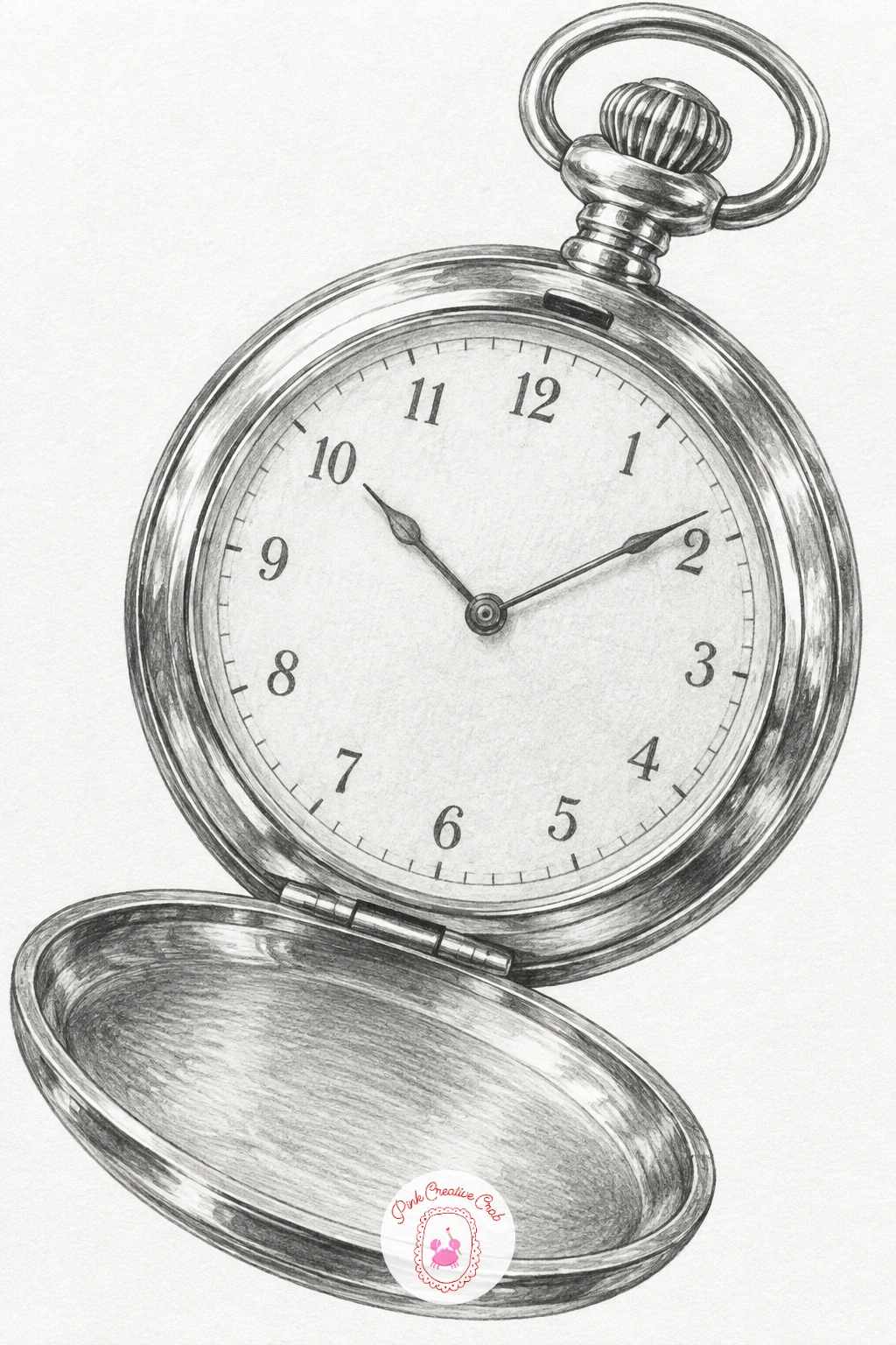
Palette: Case Silver,Watch Face Cream,Deep Shadow Grey
Pair a feather quill with a small ink bottle for a classic writing-desk subject. Draw the bottle first as a simple rounded shape with a narrow neck, then lean the quill against it, feather fanning out above the shaft at a gentle angle.
Shade the glass bottle with a few vertical streaks of light left untouched to suggest transparency, darker where the glass curves at the edges. The feather barbs are short diagonal strokes fanning from a central shaft line, lightest near the tip and slightly denser near the base.
Glass is the part most sketches fumble, so resist shading it as a solid grey block, leave real white gaps for the reflections or it will read as stone instead of glass. No ink bottle nearby, any small jar or bottle on a shelf gives the same rounded shape to study.
Lean the quill at roughly the same angle you would hold a pencil to write, around thirty degrees off vertical, which keeps the whole arrangement looking natural rather than stiffly posed.
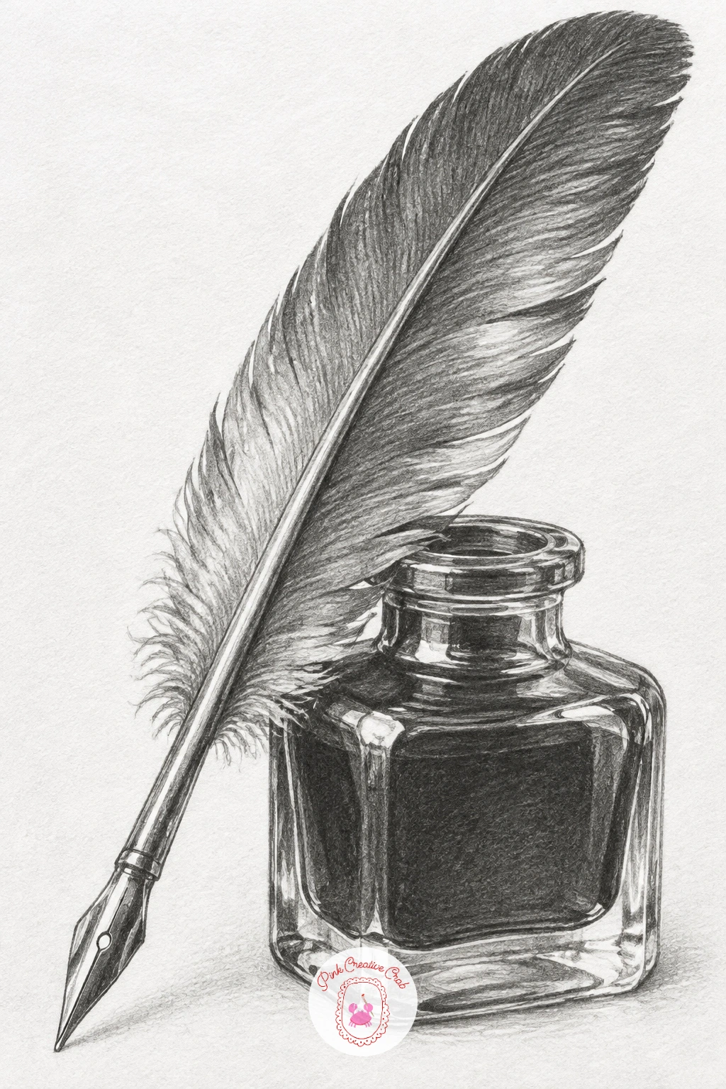
Palette: Glass Grey,Feather Grey,Ink Shadow
Carry the spiral skill from the snail shell into a standalone seashell, this time with finer ridges running across the curve. Start with the same inward spiral construction, then add the opening at the base as a small curved slit.
Shade in bands that follow the spiral direction, and once the base tone is set, use the tip of a sharp pencil to draw the fine ridge lines radiating outward from the centre, following the curve of each band rather than running straight across it. That ridge direction is what makes the shell feel three-dimensional instead of flat.
If the ridges end up looking like random scratches, slow down and space them more evenly, even natural shells repeat their ridge pattern fairly regularly. A scallop shell at home works just as well as reference if you have no spiral shell nearby.
Once this one works, try drawing the same shell from the side next time to show its thickness, which adds a whole new shape to practice without learning a new subject.
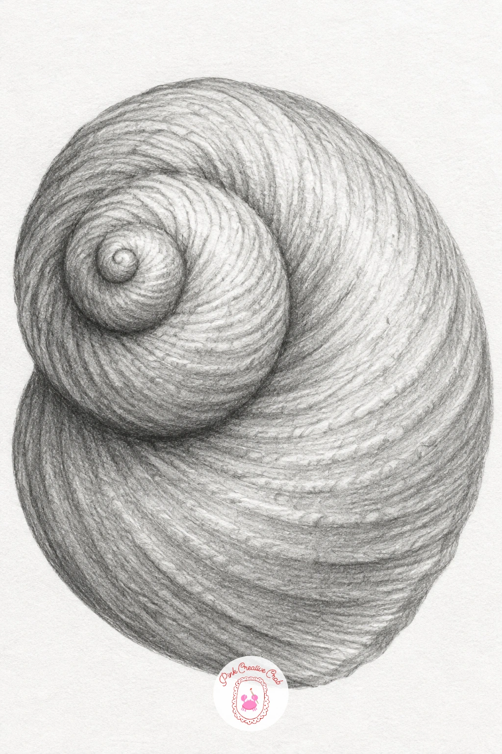
Palette: Shell Cream,Ridge Shadow,Deep Spiral Grey
Draw four plain sewing buttons in a loose stack, each one a flattened circle with two or four small holes near the centre. Vary their sizes slightly so the stack feels hand-gathered rather than cut from a template, and let the top button sit a little off-centre on the one below it.
Shade each button with a soft curve of shadow along its lower edge to show the slight dome shape, and leave the holes as small clean white circles rather than shading into them. Thread looped through the top two buttons and tied in a loose knot ties the whole stack together, drawn as a few soft curved lines rather than straight ones.
Buttons stacked too neatly in a perfect column look stiff, so let each one tilt a few degrees from the last. If thread is fiddly to draw convincingly, a single ribbon loop through one button works just as well.
Keep the thread looser than feels right at first, a slightly slack loop reads as fabric thread far better than a tight, taut line ever will.
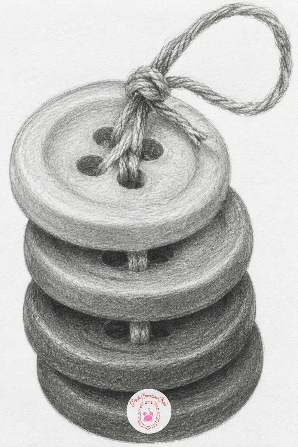
Palette: Button Grey,Thread Line Grey,Shadow Grey
Draw a wooden matchbox as two simple rectangles, an outer sleeve and an inner tray pulled slightly open, with two loose matches resting half out of the tray. Keep the whole box no bigger than a postage stamp on the page so the scale still feels like sketchbook margin work.
Shade the sleeve with short horizontal strokes to suggest the grain of the striking strip along one side, and keep the inner tray a touch lighter than the outer sleeve to show the gap between them. The two matches are simple thin rectangles with a small rounded darker tip.
If the open drawer looks like it is floating, add one thin dark line where the tray meets the sleeve, that single shadow line is what grounds the whole box. No matchbox around, a small drawer pulled from a jewellery box gives the same two-part shape.
Angle the matches slightly differently from each other rather than laying them perfectly parallel, which is what makes them look dropped in rather than placed with tweezers.
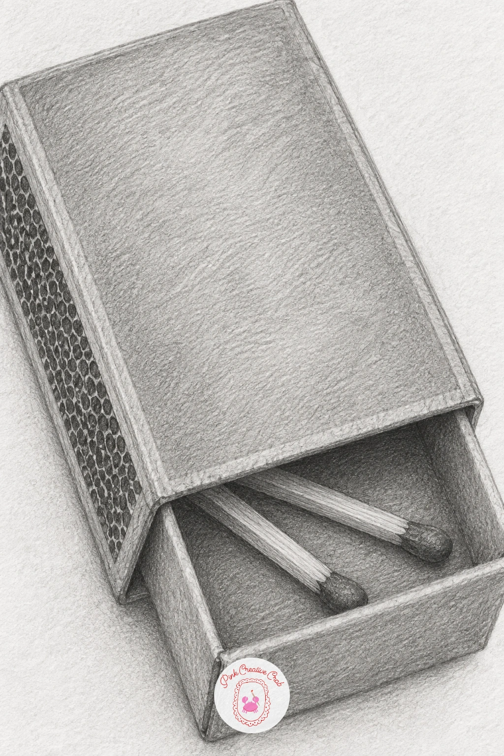
Palette: Box Brown Grey,Tray Shadow,Match Tip Grey
Keep the desk drawer theme going with a bent paper clip paired next to an open safety pin, two familiar wire shapes drawn with clean confident lines. Draw the paper clip as two overlapping ovals of slightly different sizes, bent a touch out of shape rather than perfectly symmetrical, then the safety pin as a simple curved spring with its clasp open.
Shade both as thin cylinders of wire, a bright highlight line running down the centre of each curve with darker edges on either side, which is the quickest way to make flat pencil lines read as round metal. Keep the shading light and consistent across both objects so they feel like the same material.
Wire shapes often go wrong at the overlaps, so leave a tiny gap of white paper wherever one loop crosses another, it reads instantly as one piece passing in front of the other. No safety pin handy, a second paper clip bent open works as a stand-in shape.
Bend the paper clip slightly more than a fresh one would be, a little wear in its shape gives the sketch more personality than a perfectly factory-straight clip.
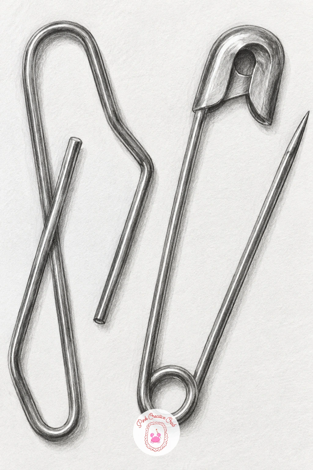
Palette: Wire Silver,Wire Shadow,Deep Grey
Bring in the first tiny creature with a honeybee resting on a single clover flower. Draw the clover first as a rounded puff of small overlapping petal shapes on a short stem, then add the bee’s body as two simple ovals, head and abdomen, settled on top of the petals.
Shade the bee’s stripes in alternating bands, keeping the wings almost untouched by pencil except for a few faint curved lines to suggest their edges, since wings read best as mostly open white space. The clover head gets soft all-over shading with slightly darker shadows between the individual petal bumps.
Overworked wings are the most common slip here, so pull back and leave them lighter than you think you should, a heavy grey wing looks solid and loses the insect’s lightness entirely. No clover to look at, a small daisy or dandelion head works the same way structurally.
Picture the eye level low, right at flower height, so you are looking at the bee almost side-on rather than from above, which is the angle that shows its stripes most clearly.
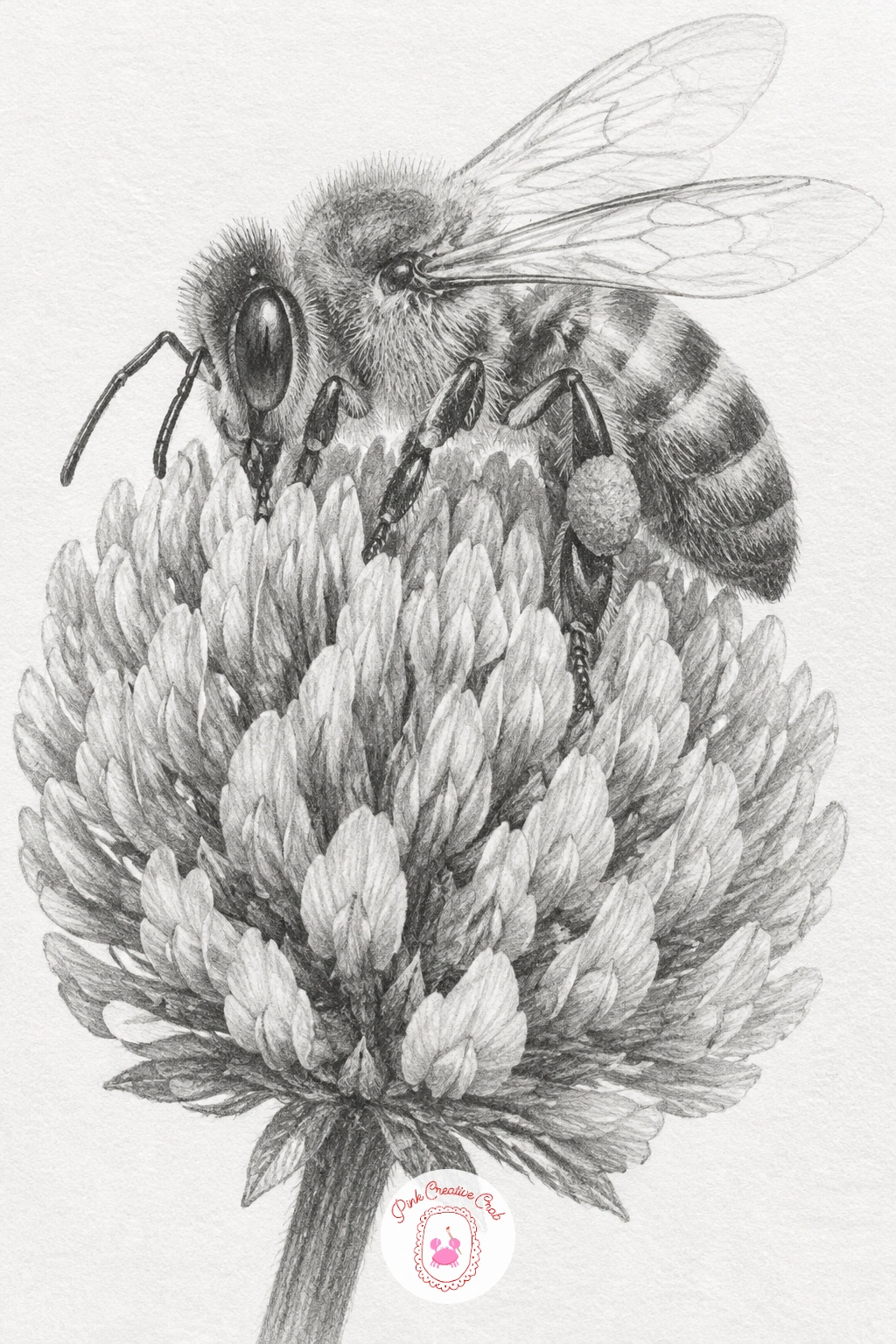
Palette: Bee Stripe Grey,Clover Petal Grey,Wing Pale Grey
Move from the bee to a ladybug perched right at the pointed tip of a single leaf, which gives the sketch a nice sense of balance. Draw the leaf first as one simple pointed oval with a central vein line, then place the ladybug’s domed body at the very tip, slightly overhanging the edge.
Shade the ladybug’s shell smooth and glossy, leaving one small bright highlight near the top of the dome, then add its spots as solid dark ovals once the base shading is dry under your hand, not before. The leaf stays much flatter and matte by comparison, with a few soft shadow lines fanning out from the central vein.
If the spots look stuck on top rather than part of the shell, let one or two spots touch the shell’s dark shaded edge instead of floating only in the lit area. Any small rounded leaf works if a specific one is not to hand.
Keep the ladybug noticeably smaller than the leaf beneath it, the size gap is what makes the leaf tip feel precariously, charmingly small.
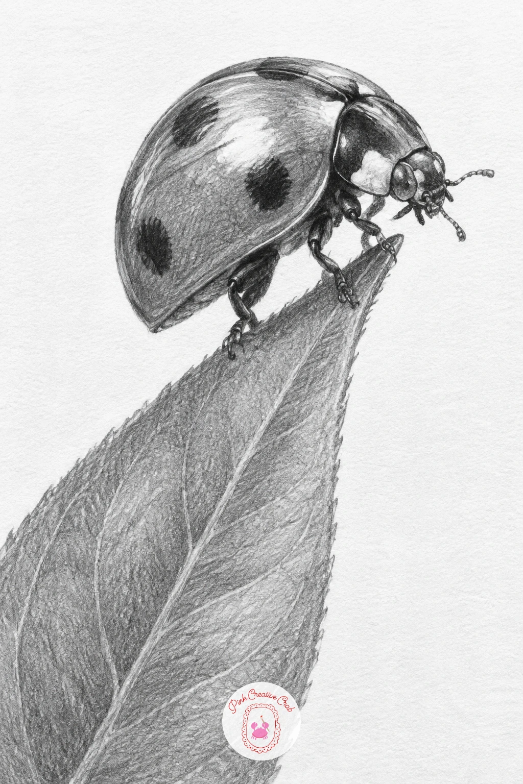
Palette: Shell Red Grey,Leaf Grey,Spot Black Grey
Draw a small cactus in a clay pot next, a shape that is forgiving because cacti rarely grow perfectly symmetrical. Start with the pot as a simple trapezoid, narrower at the base than the rim, then the cactus body as a rounded column with a few soft vertical ridges running up its sides.
Shade the clay pot with warm even strokes and a slightly darker band near the rim where it catches shadow from the lip above. For the cactus itself, shade each ridge individually, darkest in the groove between ridges and lightest along the raised edge of each one, then add tiny dot clusters of spines along those raised edges with the very tip of a sharp pencil.
Too many spines drawn too evenly can make the cactus look like a hairbrush, so group them in small irregular clusters instead of one continuous line. No clay pot nearby, any small plant pot or even a teacup gives the same simple vessel shape.
Quick version, ten minutes: pot, ridged body, a few spine clusters. With forty minutes, add the fine crackled texture of real clay and a cast shadow where the pot meets the page.
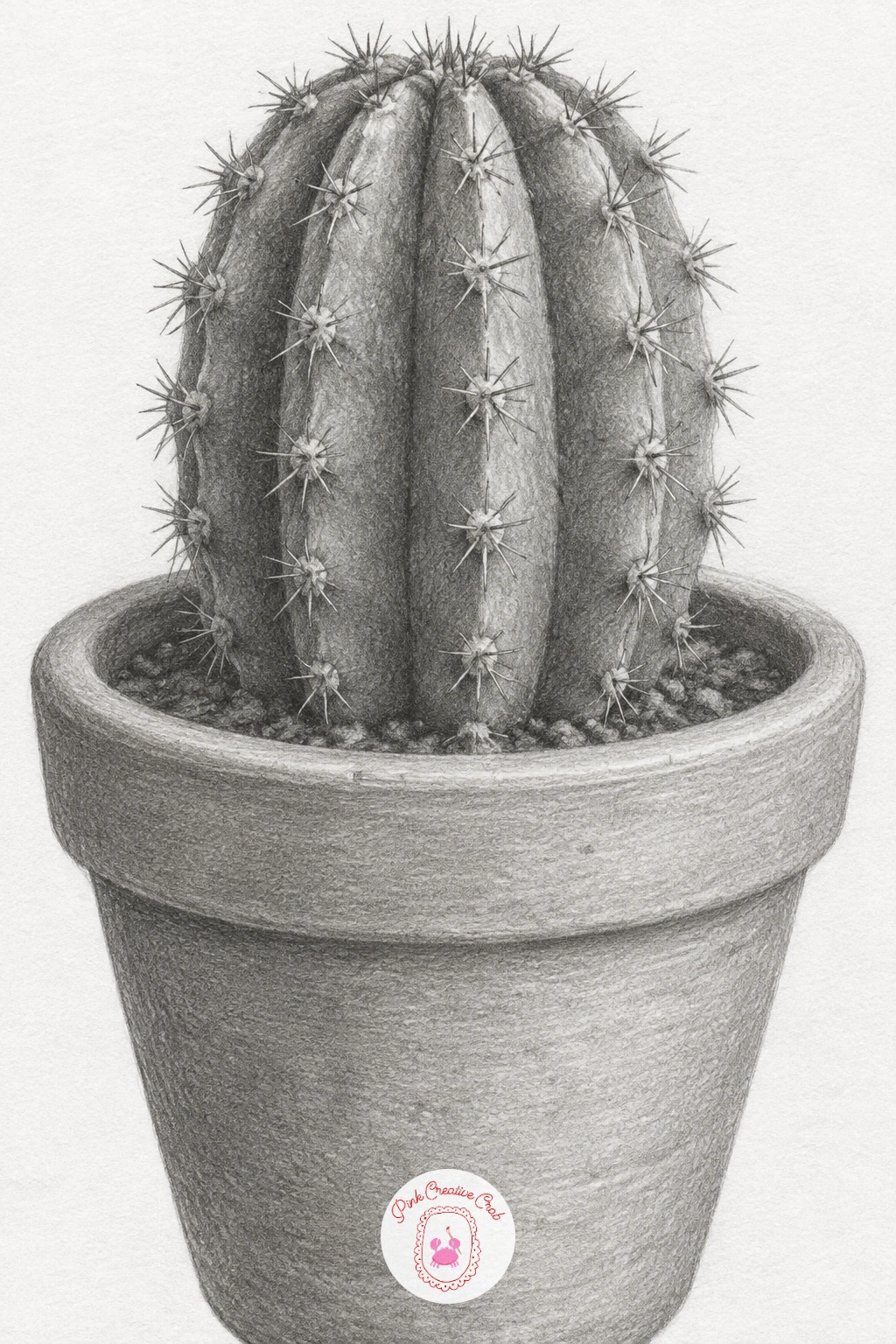
Palette: Clay Pot Grey,Cactus Green Grey,Spine Highlight
Draw a small postage stamp with scalloped edges and a simple bird printed inside it, a nice change of pace since it mixes a geometric outline with a tiny illustration inside. Start with the scalloped border as a row of small evenly spaced bumps around a rectangle, then sketch a simple perched bird silhouette inside, just a rounded body, a small head and a thin beak.
Shade the stamp’s background paper very lightly and evenly, leaving the bird illustration itself slightly darker and more detailed so it reads as the printed image within the paper. A faint postmark smudge in one corner, just a loose circular scribble, adds age without needing any actual lettering.
Scallops drawn too perfectly round can look like a drawn border rather than a torn perforation, so keep each bump slightly uneven in size. If a bird feels fiddly, a simple flower or star silhouette works just as well inside the scalloped frame.
Space the scallops slightly wider at the corners than along the straight edges, which is how real stamp perforations tend to fall and keeps the border looking authentic.
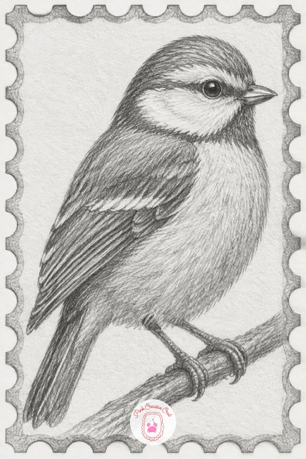
Palette: Stamp Paper Grey,Bird Print Grey,Postmark Grey
You will find more tiny paper subjects like this one in these printable junk journal stickers of old keys and postage stamps if you want extra reference for the scalloped edge.
Fold an actual paper crane if you can, since its sharp straight creases are much easier to draw with the real thing beside you, though memory works too once you know the shape. Draw the body as a diamond, the neck and tail as two pointed triangles extending from it, and the wings as two more flat triangles folded up and out.
Shade each flat panel a slightly different value, exactly as with the paper boat earlier, since every fold catches the light a little differently. Keep every crease line straight and crisp, never curved, and leave the sharpest, brightest highlight along the topmost folded edge of each wing.
The wings are where cranes usually go soft and droopy in a sketch, so keep their edges perfectly straight all the way to the tip, a slightly curved wing edge reads as a tired, wilted crane rather than a crisply folded one. No origami paper on hand, a square cut from a magazine page folds just as well for reference.
Lift the wings at a slightly steeper angle than feels natural, closer to flying than resting, which gives the small sketch a bit more energy on the page.
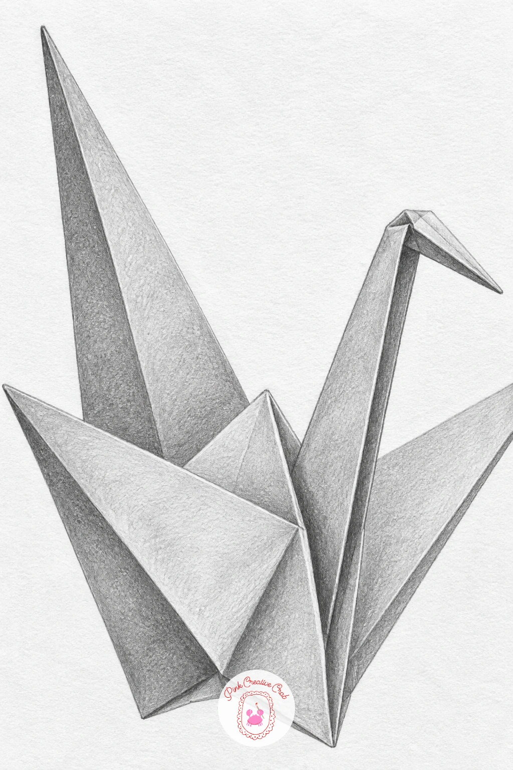
Palette: Paper Fold Grey,Shadow Fold Grey,Highlight White
Draw a simple teacup next, the kind with one small chip in its rim that gives it a bit more character than a perfect one. Start with the cup as a gentle curved bowl shape narrowing toward the base, then the handle as a single looping curve attached at two points, and finally the small chip as a shallow notch cut into one section of the rim.
Shade the inside of the cup darker than the outside to suggest depth, with the darkest point just below the rim on the far side, and leave the outer surface mostly light with one soft shadow curve where it turns away from the light. The chip itself needs only a tiny dark crescent and a thin highlight along its broken edge to read clearly.
If the cup looks flat rather than round, check that your darkest shadow sits exactly where the curve is steepest, usually just past the midpoint, not centred in the middle of the cup. Any mug or bowl at home gives the same curved form to study if a teacup is not available.
Keep the chip small and off to one side rather than centred on the rim, a chip placed dead centre tends to look like a deliberate decorative notch instead of an honest little accident.
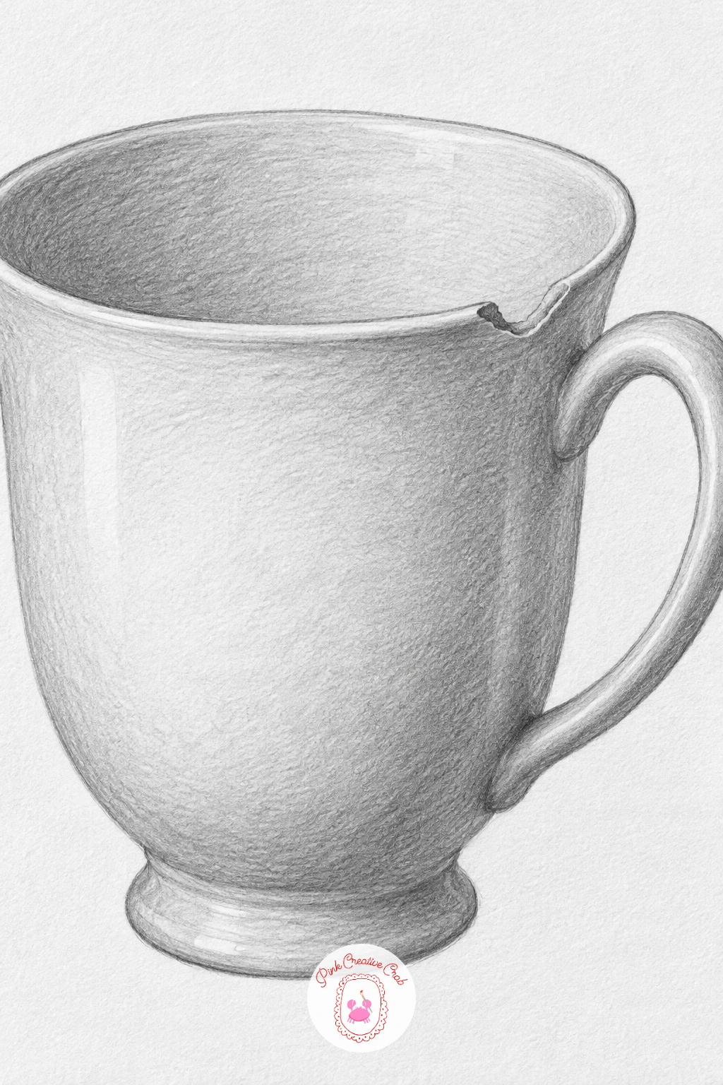
Palette: Porcelain White,Cup Shadow Grey,Chip Edge Grey
Draw a small sprig of lavender, a thin stem with several tiny rounded flower buds clustered along its top portion, tied partway down with a loose loop of string. Lay the stem in gently first, then add the buds as small overlapping ovals stacked up the stem, denser near the top and thinning out toward the bottom of the cluster.
Shade the buds in small clusters rather than one at a time, working the pencil in short dabbing strokes so the texture stays soft and slightly fuzzy rather than smooth, which is closer to how a real lavender head actually looks. The stem stays a clean simple line with just a touch of shadow on one side, and the string tie is two or three soft curved lines with a small loose knot.
If the flower cluster looks like a solid blob, break it up with a few small gaps of untouched white paper between bud clusters to separate the individual bumps. A sprig of rosemary or thyme gives a similar long thin stem shape if lavender is not familiar to draw from.
Try the same sprig again later lying flatter across the page instead of upright, which changes how the buds overlap and gives you a second version worth practising.
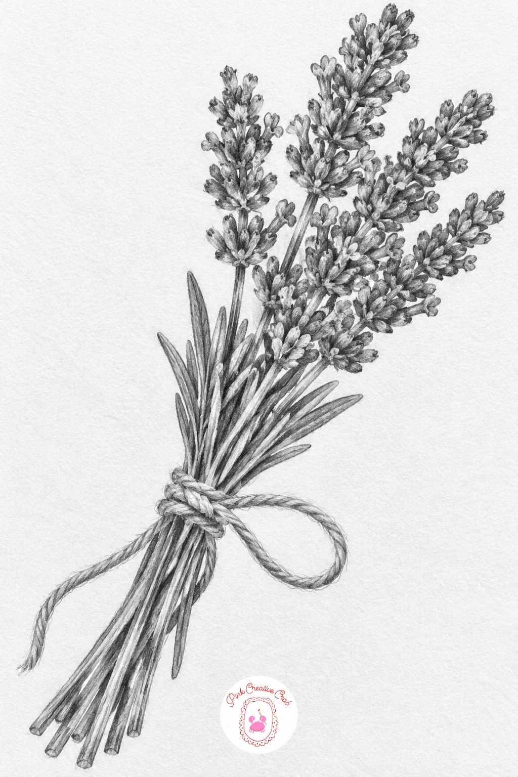
Palette: Lavender Bud Grey,Stem Green Grey,String Grey
Draw two small dice mid-tumble across the page, each one a simple cube shown at a slight angle so you can see two or three faces, with the round pips sketched in once the cube shape is settled. Place the second die at a slightly different angle and a little further along the page than the first, as if caught mid-roll rather than sitting neatly side by side.
Shade each visible face of the cube a different value, lightest face toward the implied light source, darkest face in shadow, which is what makes a few flat squares read instantly as a solid cube. The pips stay small clean circles, slightly darker where they sit on the shadowed face and crisper on the lit one.
Cubes often come out looking warped if the corner angles are not kept consistent between the two faces, so sketch very light guide lines for the cube’s edges before committing to pencil pressure. No dice handy, a small box or sugar cube gives the same cube shape to study.
Draw this one in ten minutes as two simple cubes with pips, then with forty minutes add soft cast shadows beneath each die and a touch of edge wear on the corners for a more tumbled, well used look.
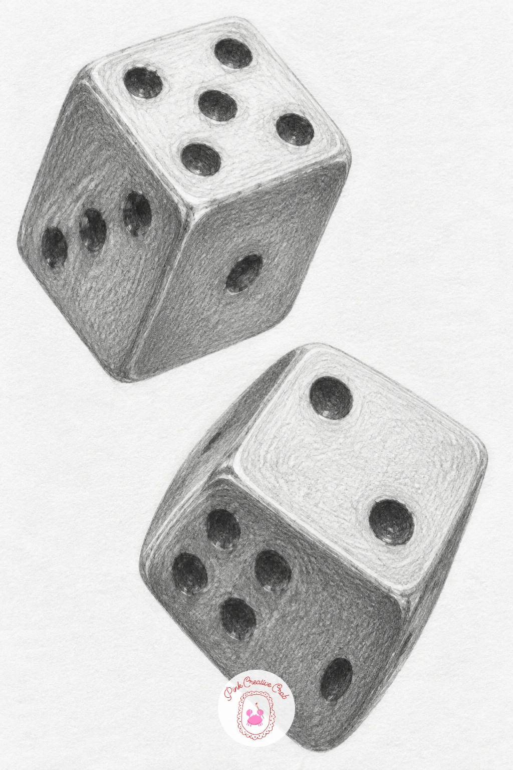
Palette: Die White,Shadow Face Grey,Pip Grey
Draw a little wind-up toy mouse next, a simple rounded body with oversized round ears, a long thin tail curling behind it, and a small key sticking out of its back. Build the body as one soft oval, add the ears as two slightly flattened circles near the top, then the key as a small cross shape on a short cylinder.
Shade the body smoothly to suggest painted tin or soft fur, whichever you prefer, keeping the ears a touch darker inside to show their cupped shape. The key is the one part that should look distinctly metallic, bright and clean against the softer body shading around it, since that contrast is what signals the mouse is a wind-up toy rather than a real one.
If the mouse starts to look like a real rodent instead of a toy, flatten the nose slightly and round the whole body more, toys are rounder and less detailed than anything alive. No toy mouse at hand, a tin wind-up toy of any kind gives the same key-in-the-back shape to borrow.
Curl the tail into a loose spiral rather than a straight line trailing off the page, which keeps the whole tiny toy contained neatly within its small corner.
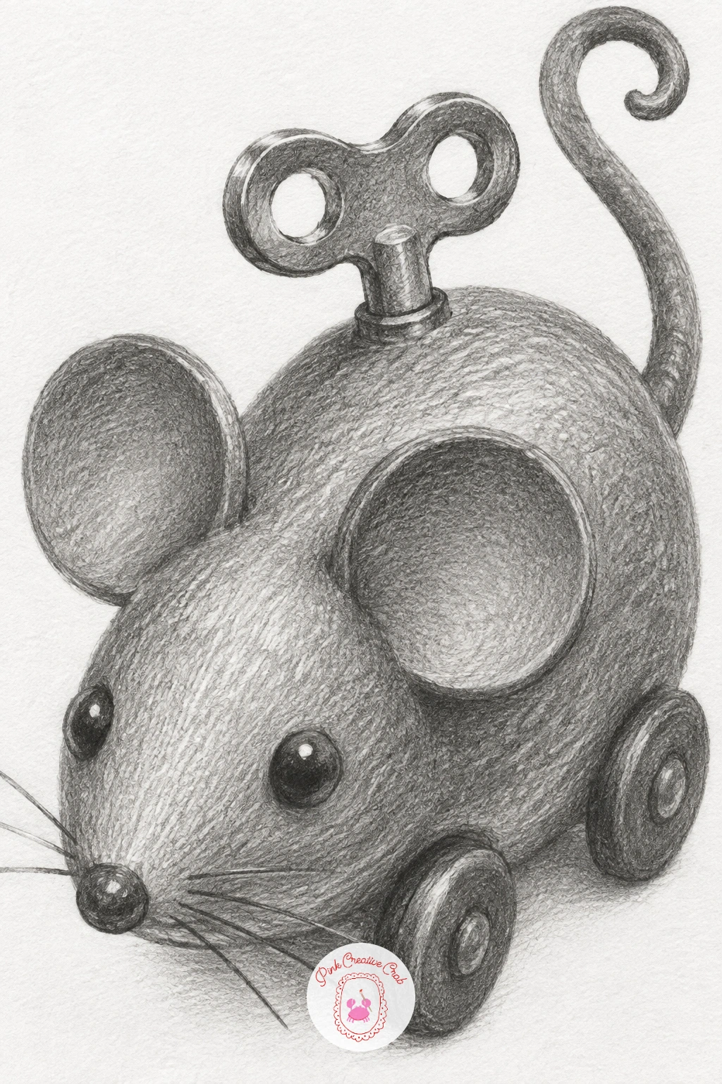
Palette: Toy Body Grey,Ear Shadow Grey,Key Metal Grey
Draw a pressed four-leaf clover, flattened and slightly dried looking rather than fresh and plump. Start with four small heart-shaped leaflets arranged around a central point, then a single thin stem trailing off one side, keeping every leaflet edge a little uneven as pressed leaves rarely stay perfectly symmetrical.
Shade each leaflet with the central vein left as a pale untouched line and the edges slightly darker, flattest and most even in tone compared to a fresh leaf, since pressing removes most of the natural curl and shine. A few faint creases or small tears at the leaflet edges add to the pressed, dried feeling without needing much extra work.
If the clover looks too crisp and fresh, flatten your shading further, pressed leaves lose most of their contrast and go quite uniformly pale grey all over. Any four similar small leaves, even from a houseplant, give a workable stand-in shape if clover is out of season.
One concrete tip for today: draw the stem slightly bent rather than straight, a small kink is exactly the kind of detail that makes a pressed specimen feel genuinely found rather than drawn from imagination.
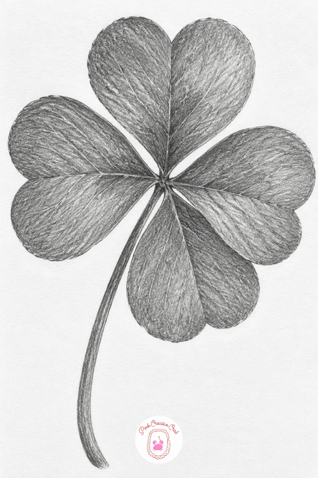
Palette: Dried Leaf Grey,Vein Pale Grey,Stem Grey
Draw a simple hairpin topped with one tiny pearl, a thin bent wire shape with a small round bead fixed at one end. Lay the bent wire down first as two long curved lines meeting at a soft point, then add the pearl as a small circle perched at the bend.
Shade the wire the same way you shaded the paper clip earlier, a bright centre highlight with darker edges to suggest its round cross-section, and shade the pearl with one strong bright highlight dot near the top and a smooth gradual fall-off to a darker edge, which is what separates a pearl from a plain flat bead. Keep the wire thinner than feels right, hairpins read as delicate mostly through how slim their lines stay.
If the pearl looks flat and chalky, push the contrast a bit further, a true pearl highlight should be nearly pure white against a mid grey body for that soft glow. No pearl bead nearby, any small round button or bead gives the same sphere shape to practise the highlight on.
Angle the hairpin’s bend only slightly rather than folding it sharply, which keeps the whole shape looking like it would sit comfortably in actual hair.
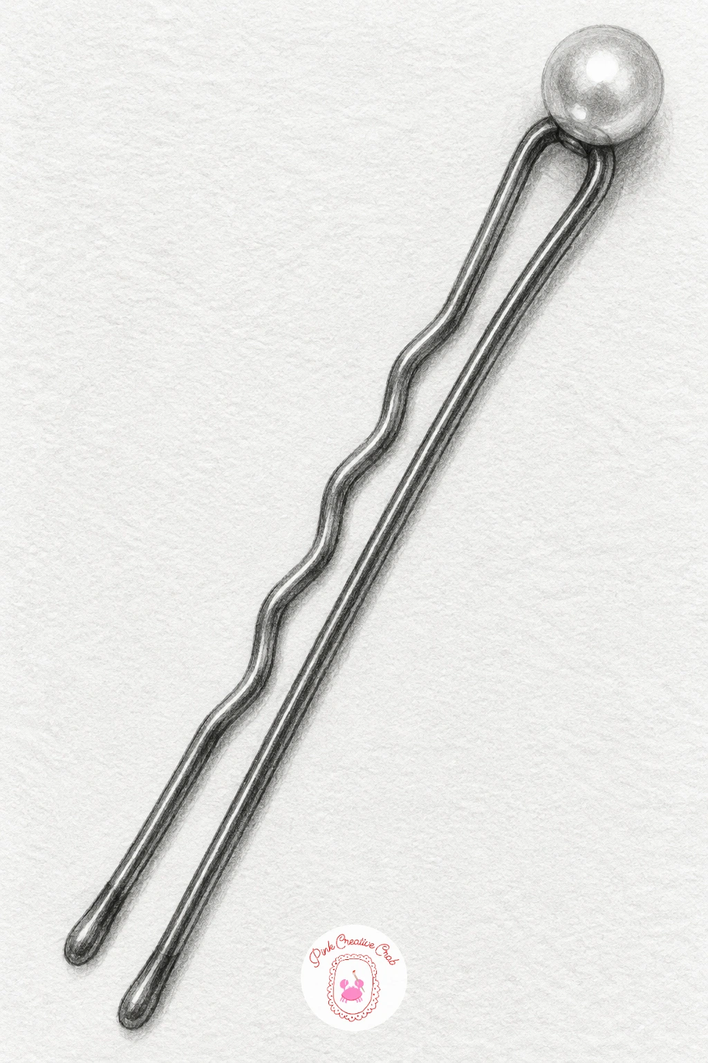
Palette: Wire Grey,Pearl Grey,Pearl Shadow
Draw a small ring sitting in an open box, a nice step up since it combines a soft fabric lining with one bright metal and stone detail. Build the box first as a simple hinged cube opened at an angle, then the ring as a thin band with a small faceted stone sitting on a raised cushion inside the box.
Shade the box’s velvet lining with soft even pencil pressed in overlapping circular motions, since that is what gives velvet its characteristic soft, slightly fuzzy darkness compared to the box’s harder outer shell. The ring itself gets the brightest, sharpest contrast in the whole drawing, a few hard-edged highlight flecks on the band and a tiny sparkle shape on the stone.
If the ring disappears into the box, push the velvet lining darker rather than making the ring lighter, contrast against a dark setting reads better than a pale ring on a pale background. No ring available to study, any small jewellery piece or even a drawing pin shows a similar small bright metal shape against fabric.
Picture the light source coming from slightly above and to one side, which is what lets you place that single sparkle on the stone convincingly rather than guessing at its position.
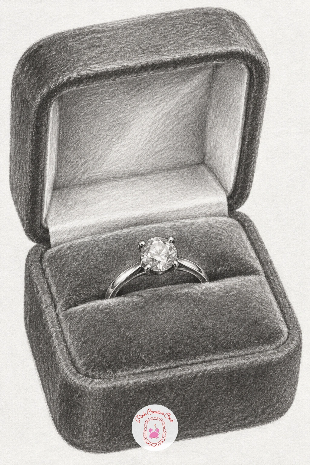
Palette: Velvet Grey,Box Outer Grey,Ring Metal White
Draw a pair of reading glasses folded shut, lying flat so both lenses overlap slightly and the two arms fold neatly against the frame. Start with the two lens shapes as simple rounded rectangles, slightly overlapped since they are folded one behind the other, then add the thin folded arms trailing off to one side.
Shade the lenses with a soft grey tone and one or two pale streaks of reflected light running diagonally across each one, since glass or plastic lenses almost always catch some light even lying still. Keep the frame and arms a clean, slightly darker line than the lenses so the thin metal or plastic rim stands out clearly against the softer glass shading.
If the folded arms look too stiff and straight, add one small hinge bump where each arm joins the frame, which is a tiny detail but it is what makes the fold look mechanically real. No reading glasses to hand, sunglasses folded shut give the same basic structure to copy.
Overlap the two lenses by about a third of their width rather than drawing them side by side, which is how most glasses actually sit once folded and keeps the pose convincing.
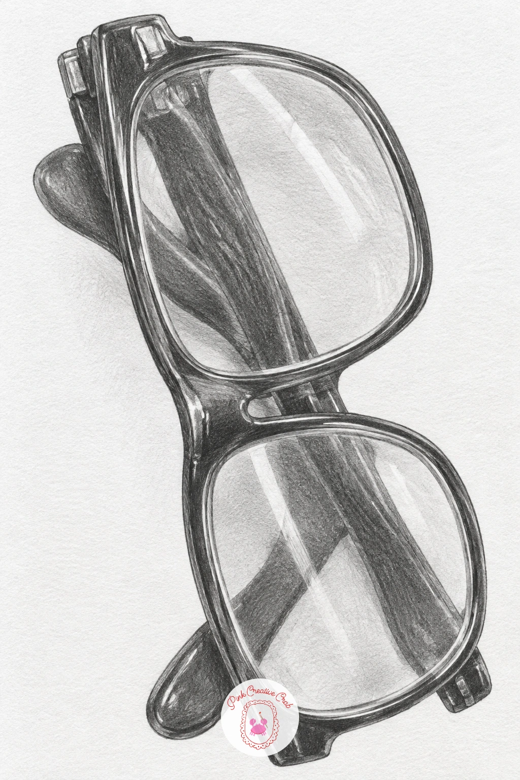
Palette: Lens Grey,Frame Grey,Reflection White
Draw a small beetle with glossy wing cases, a good subject for practising strong shine on a rounded body. Build the body as one smooth oval dome, add a thin centre line down the middle where the two wing cases meet, then small thin legs tucked underneath along the sides.
Shade the wing cases dark and smooth, leaving one clear, almost untouched streak of highlight running along the curve of each case to suggest its hard glossy shell, exactly the kind of shine you would see on a polished car bonnet. Keep the legs and head much flatter and less reflective by comparison, just enough shading to show they are there without competing with the shiny body above them.
If the beetle looks dull rather than glossy, your highlight streak is probably too soft or too wide, narrow it down to a crisp thin line of bare paper for real shine. No beetle reference handy, a glossy dark bead or even a car’s curved bonnet shows the same kind of reflective highlight to study.
Try the same beetle again later from above rather than the side, which changes how the wing case highlight curves and gives you a fresh version of a shape you already know.
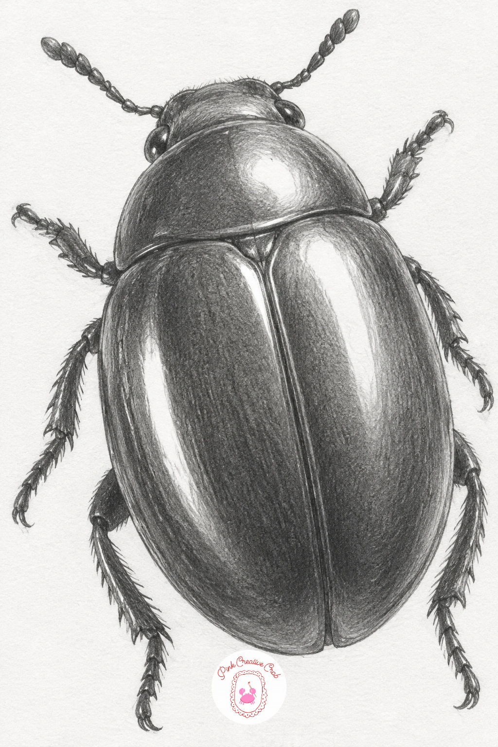
Palette: Shell Black Grey,Leg Grey,Highlight White
Draw a short candle stub sitting in a small enamel holder with a handle, the kind used for carrying a candle from room to room. Build the holder first as a shallow dish with a thin curved handle, then the candle itself as a short cylinder with a slightly melted, uneven top and a thin curling wick.
Shade the enamel holder smooth and a touch glossy, with a small bright highlight where the curve catches light, then shade the candle wax more matte, letting a few soft drip lines run down one side from the melted top. The wick gets just a few tiny dark strokes, never a full black blob, since an unlit wick is thin and slightly frayed rather than solid.
If the candle looks like a plain straight tube, soften the top edge into an uneven, slightly lopsided curve instead of a flat circle, real candle stubs are never cut perfectly level. No enamel holder around, a small saucer or shallow dish holds the candle shape just as well.
Let one wax drip run further down the side than the others, a single longer drip is a small detail that makes the stub feel like it has actually been burned before.
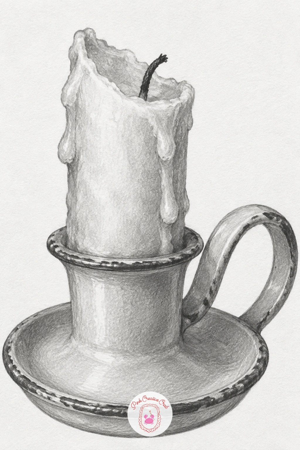
Palette: Enamel Grey,Wax Cream,Wick Grey
These small still-life objects would also sit nicely in a vintage junk journal page with old letters and faded lace if you want to build a fuller spread around them.
Draw a small crescent moon pendant hanging from a fine chain, a nice chance to practise a curved metal shape with real shine. Build the crescent first as two overlapping circles, the second slightly offset so that what remains is a clean thin crescent sliver, then add the chain looping up from one tip.
Shade the crescent with strong contrast, very dark along the inner curve and a bright clean highlight along the outer edge, since that single strip of brightness is what reads as polished metal catching the light. The chain stays much lighter overall, just a row of small linked ovals with a tiny highlight dot on each one rather than full shading on every link.
If the crescent looks chunky rather than delicate, thin the shape further than feels natural, a jewellery crescent is usually much slimmer than a drawn moon in the sky. No pendant handy to study, any curved metal clasp or hook shows the same kind of thin reflective curve.
Hang the chain slightly off to one side rather than perfectly straight down the middle, which gives the small sketch a bit of natural movement on the page.
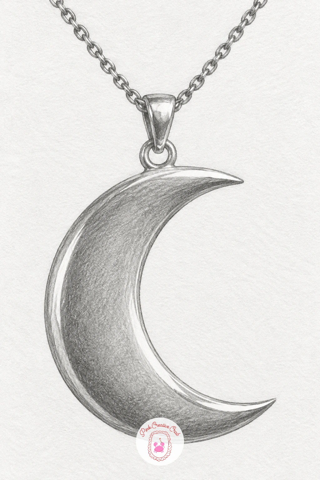
Palette: Pendant Metal White,Chain Grey,Deep Crescent Shadow
Draw a pencil stub with a worn eraser, a fittingly self-referential little subject for the tool you are already holding. Build the hexagonal shaft first as a simple elongated shape, keep it noticeably short to read as a well used stub, then add the metal ferrule band and the rounded, slightly flattened eraser on top.
Shade the painted shaft in flat bands to suggest its hexagonal faces, each face a slightly different value, and shade the metal ferrule with a bright thin highlight the same way you shaded the key and watch case earlier. The eraser gets a smudged, slightly grubby texture, uneven and worn down more on one side than the other, since a fresh clean eraser belongs on a brand new pencil, not a stub.
If the pencil tip looks too sharp for a worn stub, round and flatten it slightly, a stub this short has usually been sharpened many times and rarely holds a fine point for long. No specific pencil to copy, any stub of chalk or crayon worn down short gives a similar shape.
Keep the stub shorter than your own pencil currently is, since exaggerating the wear is what sells the idea that this one has had a long working life already.
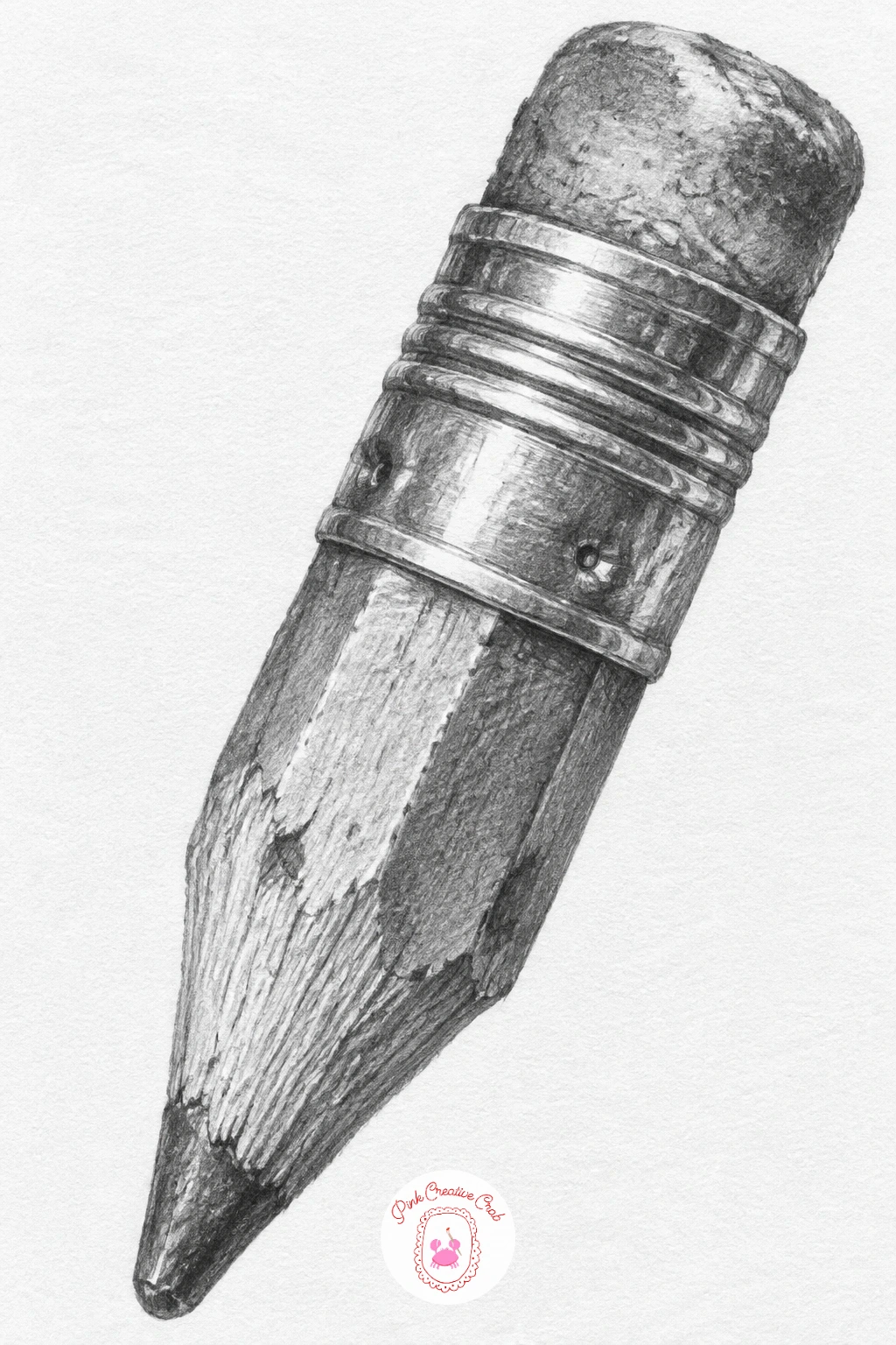
Palette: Shaft Yellow Grey,Ferrule Metal Grey,Eraser Pink Grey
Draw a little sparrow perched on a short twig, a gentle return to a living subject after several still objects in a row. Build the body as one rounded oval, the head as a smaller circle overlapping it, and the twig as two or three thin branching lines beneath the bird’s feet.
Shade the sparrow in the soft mottled pattern typical of its feathers, working in small overlapping strokes rather than one smooth tone, darkest along the wing and back, palest on the belly and throat. The twig stays much simpler, just a few confident lines with light shading along one side to show it is round, not flat.
If the bird looks stiff, check that the head faces slightly to one side rather than straight ahead, a sparrow rarely sits perfectly front on and the turned head gives it some personality instantly. No live sparrow to study, any small garden bird photo gives the same rounded body and perched pose to work from.
Picture the light coming from above as it would outdoors, which puts the darkest feather shading along the top of the back and keeps the throat and belly believably paler beneath it.
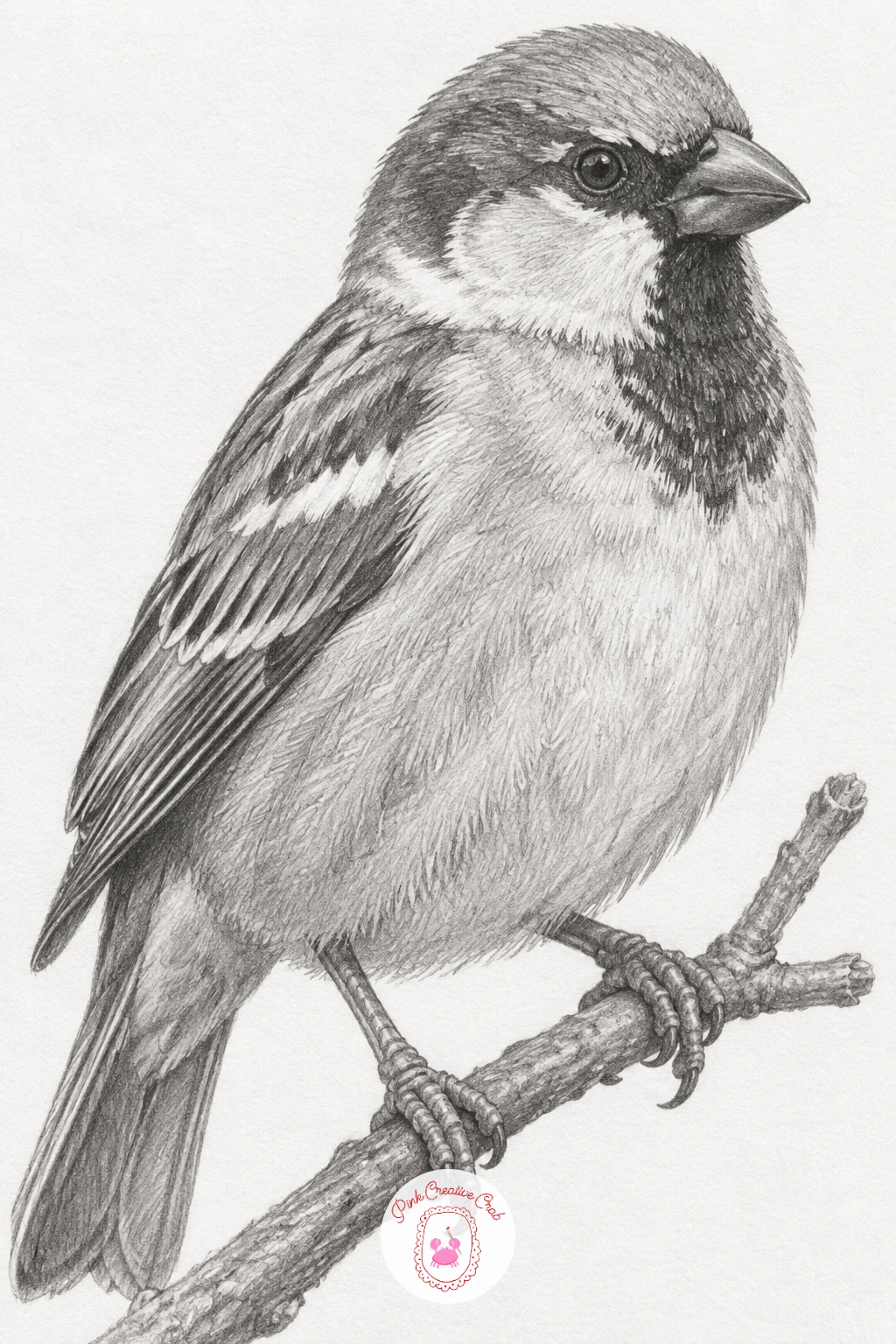
Palette: Feather Brown Grey,Belly Pale Grey,Twig Grey
If birds are a subject you enjoy, the small fluffy pets and animal ideas here make a good next sketchbook page once this little sparrow is done.
Finish with a rolled letter closed with a wax seal, a satisfying last subject since it combines soft paper curves with one small glossy detail. Draw the rolled paper as a simple cylinder shape, slightly uneven along its length the way a hand-rolled page never sits perfectly even, then add the wax seal as a rounded blob pressed flat across the overlap where the roll closes.
Shade the paper roll with soft curved bands of tone running along its length to suggest the cylindrical form, lightest along the top curve and darkest where it turns away underneath. The wax seal gets much stronger contrast and a glossy highlight, since wax is far shinier than paper, with a few small raised lines or a simple pressed pattern if you want extra detail without any actual lettering.
If the roll looks flat rather than tubular, add one more soft shadow line just past the midpoint of its curve, that single extra band is usually what was missing. No sealing wax to study, a blob of melted crayon or even a thick dollop of glue shows a similar glossy raised shape.
One tip to end on: keep the seal smaller than feels dramatic, a modest wax blob pressed slightly off-centre on the roll looks far more like a real sealed letter than a large, perfectly centred one.
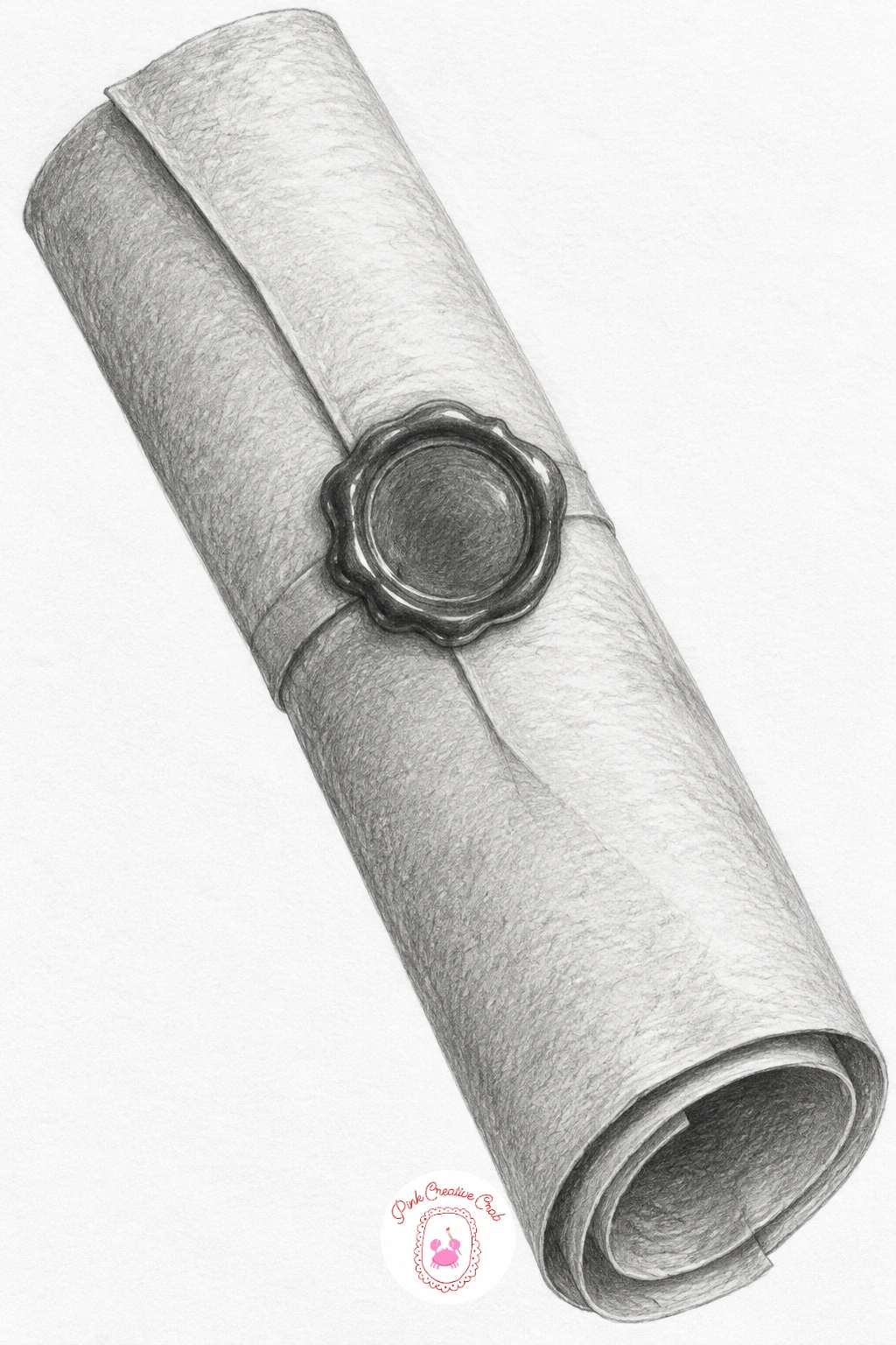
Palette: Paper Roll Grey,Paper Shadow Grey,Wax Seal Dark Grey
What to Do Next
Pick whichever subject is sitting closest to your actual desk right now, a mug, a pencil stub, a pin on your jacket, and give it ten honest minutes in the corner of today’s page. Keep a sharp pencil, a soft one, and your kneaded eraser close, and let the next small sketch find its own little corner tomorrow.
Frequently Asked Questions
What pencil grade works best for small sketch ideas like these?
A mid-range pencil around 2B to 4B handles most of these subjects well. Keep a harder 2H nearby for fine details like ridges or whiskers, and a soft 6B for the darkest shadows on metal or wax.
How big should each small sketch actually be on the page?
Aim for roughly the size of a matchbox to a playing card, small enough to sit in a margin but large enough to shade with real control. Drawing too tiny makes shading and small details much harder to manage cleanly.
How do you keep a small drawing from looking stiff or flat?
Vary your pencil pressure across the form rather than shading it one even grey. Push darkest values where the shape turns away from the light and leave a clear highlight where it catches light directly.
Do these small sketch ideas need any special paper?
No, any bright white sketchbook paper with a slight tooth works well for graphite. Smoother paper suits crisp metal and glass subjects, while a touch of tooth helps soft textures like moss or feathers.
What is the best order to draw these small objects in?
Start with the light construction shape, then block in the broadest shadow areas before adding any fine detail like speckles, ridges or highlights. Detail added too early often gets lost once the main shading goes in.
Have any thoughts?
Share your reaction or leave a quick response — we’d love to hear what you think!
-
 0
-
0
-
0
-
0
-
0
-
0


