

Purple painting gives you the one color family that can do dreamy and dramatic in the same afternoon, from the softest lilac wash to a plum so deep it almost reads black. This list stays in that range on purpose: flowers, food, little streets and quiet skies, all leaning into violet, lavender and plum instead of borrowing green or blue to carry the scene.
You will find twenty nine subjects below, ordered so the simple washes come first and the busier scenes come later. Pick whichever one catches your eye on the scroll, keep your palette narrow, and let the white of the paper do as much work as the paint.
Using these images: free for personal projects such as printing, coloring, cards, journals and gifts. Handmade items that include them may be sold up to 30 pieces per design. More than that is commercial use and is not permitted, and neither is selling or sharing the images themselves or passing them off as your own. Please ask before any other use.
Start with a lavender lane because it is mostly one gesture repeated: a road narrowing toward a horizon line set low, maybe a third of the way up the page, with two ragged bands of lilac and violet running along either side. Pencil in just that horizon and the road’s two edges meeting near a vanishing point, nothing more.
Wash the sky first with a pale lilac, let it dry, then build the lavender rows with a loaded round brush dabbed rather than stroked, so the texture stays rough and plant-like. Drop in a small bicycle leaning against a post with a few ink lines once everything is dry, no more than five or six strokes.
The usual snag is making the rows too neat and flat. Vary the pressure and the tone as you dab, some rows darker violet, some paler, so the lane has depth instead of looking like a striped rug.
If you do not have a true violet, mix ultramarine with a touch of alizarin crimson and adjust until it reads purple rather than blue or pink.
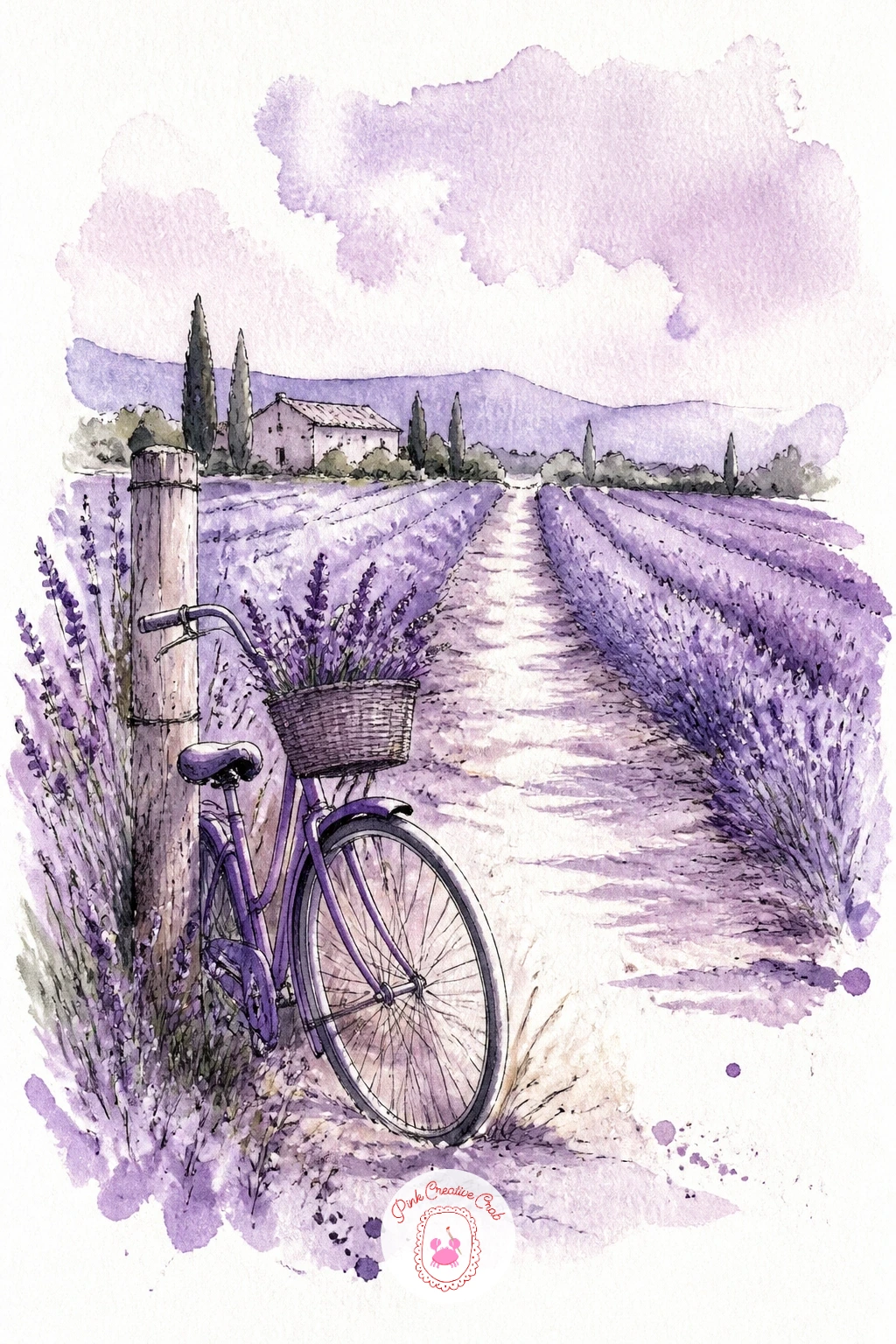
Palette: Dioxazine Violet, Lilac, Sap Green, Payne’s Grey
Move from the lane to open sky, since a plum sunset is really just one big soft gradient with almost nothing drawn on top of it. Wet the whole upper two thirds of the paper first, then drop plum and violet into the wet paper near the top, letting it bleed down into a paler lilac near the horizon.
Leave a thin strip of white or pale paper for the water’s horizon line, then pull a few horizontal strokes of the same plum, lighter and drier, to suggest the lake’s surface holding the color. A silhouette of a far tree line in dark violet ink, just a jagged low shape, grounds the whole wash.
Working wet into wet like this is about light source and where the color pools: the deepest plum sits where the sun would be, usually just above the horizon, and everything fades as it moves away from that point. If the colors muddy together, lift a little with a dry tissue while the paper is still damp.
Try it in ten minutes as a single wash, or spend forty minutes layering a second glaze once the first is bone dry, deepening just the top third for more drama.
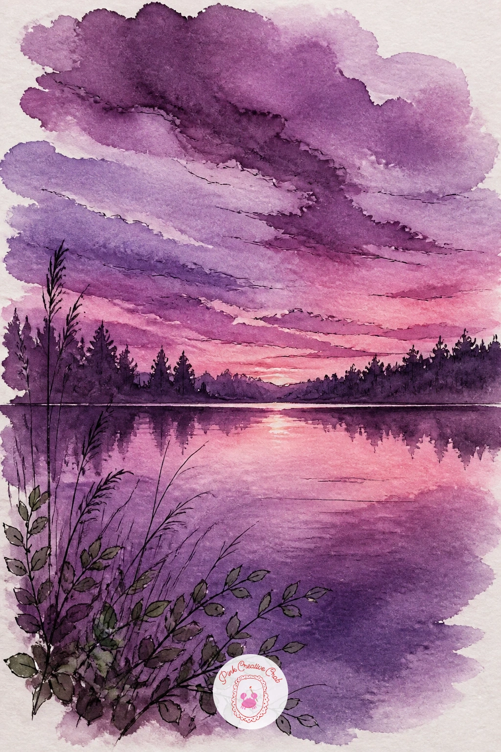
Palette: Plum, Dioxazine Violet, Lilac, Payne’s Grey
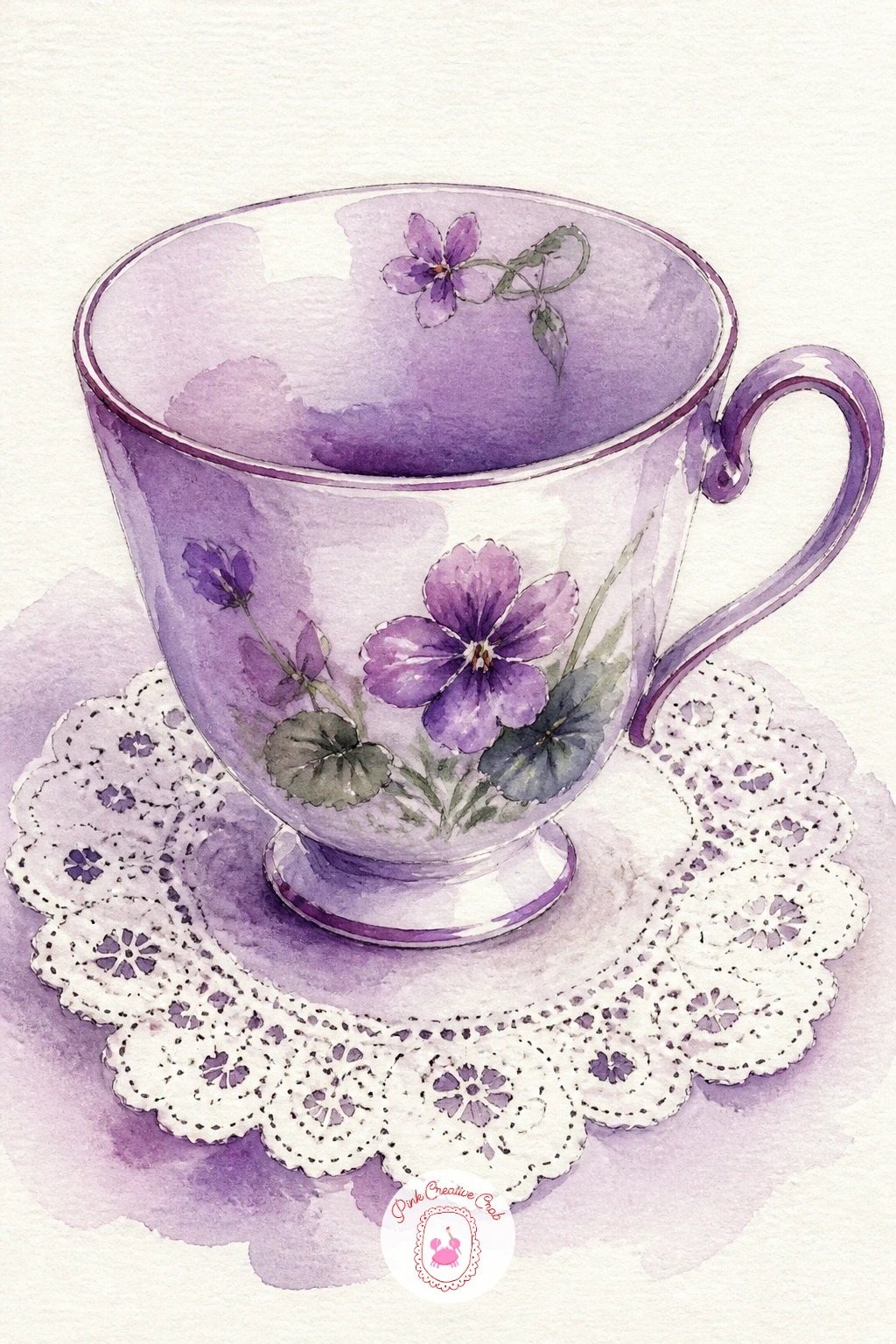
Set up something small and still after that big sky: a violet teacup sitting on a lace doily works well because it is really just an ellipse, a handle, and a lot of patient white space. Draw the cup lightly first, checking that the ellipse of the rim is noticeably wider than the ellipse at the base, since a cup drawn too symmetrical looks flat.
Paint the cup in one or two violet washes, darker where the shadow side curves away, then let the lace doily stay mostly white paper with just a scalloped pencil edge and a scatter of tiny ink dots and loops to suggest the pattern without drawing every stitch.
The easy mistake is overworking the lace until it fights the cup for attention. Keep the doily mostly implied, just enough marks at the edges for the eye to finish the pattern itself.
No lace doily on hand to reference: a folded paper napkin or even a plate with a scalloped rim gives you the same curved, patterned edge to work from.
You Will Need
- fine waterproof ink pen for the lace detail
Palette: Dioxazine Violet, Lilac, Payne’s Grey, White (paper)
Figs are forgiving because their shape is just an irregular teardrop, so a bowl of purple figs is a good next step toward still life. Sketch three or four fig shapes overlapping inside a simple curved bowl outline, varying the sizes so none look identical.
Paint each fig wet on dry with a plum base, then drop a darker violet or even a touch of Payne’s grey into the still-damp lower half of each one before it dries, so the color pools naturally into shadow. A thin ink line around the bowl’s rim and a few short ink marks at the top of each fig, where the skin puckers, finish the read.
Compare the width of the bowl to the height of one fig before you commit to the full sketch: it is the fastest way to catch a bowl drawn too small or figs drawn too large for it. Fix it by erasing just the bowl’s outline and redrawing it slightly wider, the figs can stay as they are.
If you do not have Payne’s grey, mix a touch of burnt umber into your violet for the same soft dark without it turning blue.
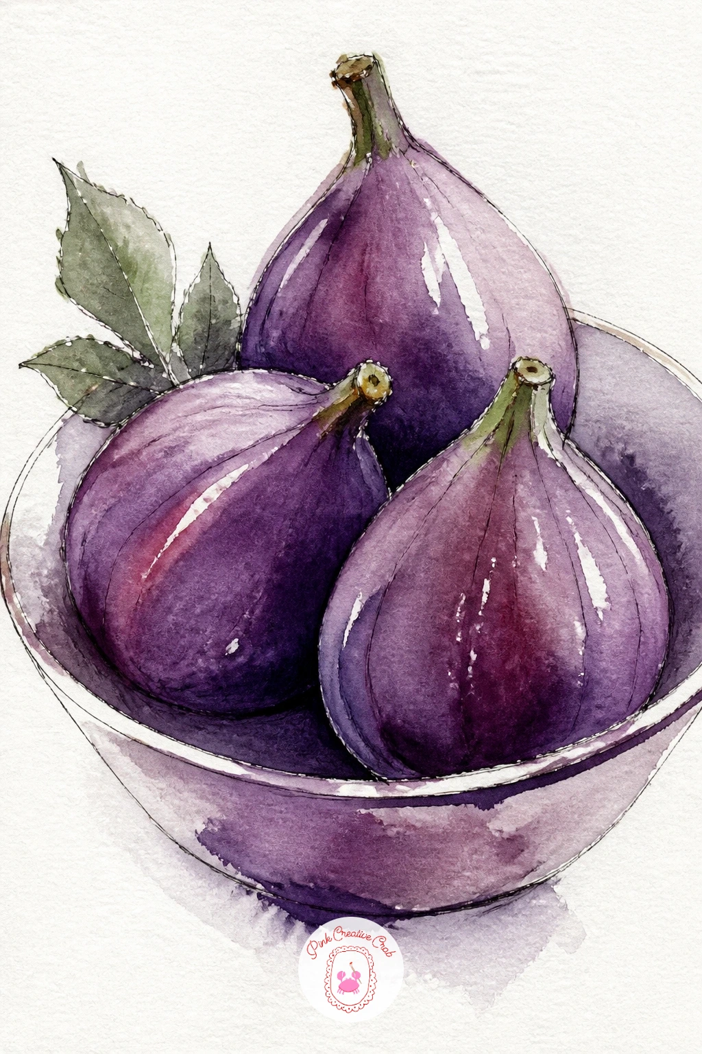
Palette: Plum, Dioxazine Violet, Payne’s Grey, Sap Green
A lilac bush brings the sage accent color into play for the first time, since the leaves need a cooler green to hold the purple blooms apart from the foliage. Pencil a simple gate shape low on the page, two uprights and a crossbar, then let the lilac bush spill over the top in a loose rounded mass.
Paint the leaf mass first in sage green while the shape is still a little wet, then press small clusters of lilac and violet dots and short dashes into the green with a smaller brush, working from the top of the bush down so gravity and light both favor the upper blooms being brighter.
Where this goes wrong is blending the flowers into the leaves until the purple disappears. Keep the green underneath slightly dry before adding the lilac dabs, so each flower cluster stays distinct rather than melting in.
Finish the gate with a few confident ink lines once everything is dry, including one hinge mark, it is a small detail that reads as a working gate rather than a drawn rectangle.
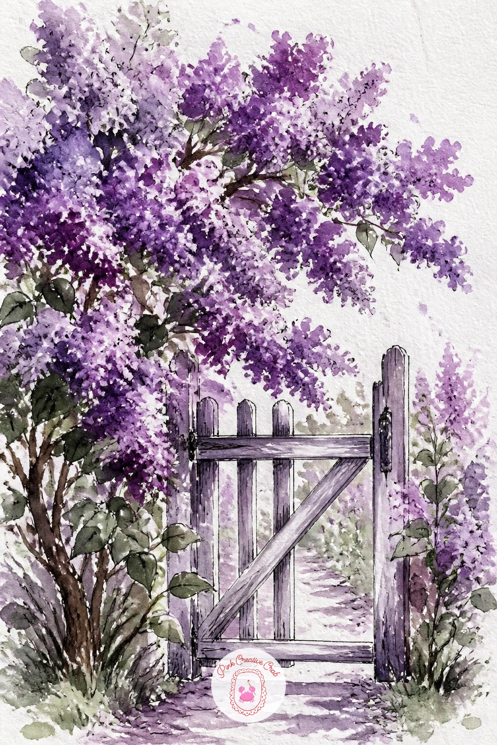
Palette: Lilac, Dioxazine Violet, Sap Green, Payne’s Grey
Try a dry brush dragged lightly over the dried leaf mass afterward, it breaks up a flat green area into a more convincing cluster of individual leaves.
Move from the gate to a front door, since a door is just a tall rectangle that gives you a reason to practice a straight ink line against a loose wash. Paint the door first in a flat violet or plum, leaving the panel lines and a doorknob as untouched pencil marks until the paint dries.
Once dry, drape wisteria down from the top corner in loose teardrop clusters of lilac, painted the same way as the lilac bush: sage leaves first, purple dabs pressed in after. Ink the door’s panel lines, knob and a house number last, keeping every line straight with a ruler if your hand wavers.
If the door’s rectangle looks slightly off, measure its height against its width with your thumb and pencil before you paint: most front doors run about twice as tall as they are wide, and eyeballing it often makes them too square.
No ruler at hand, a strip of stiff card or even the spine of a sketchbook makes a straight enough edge for the ink lines.
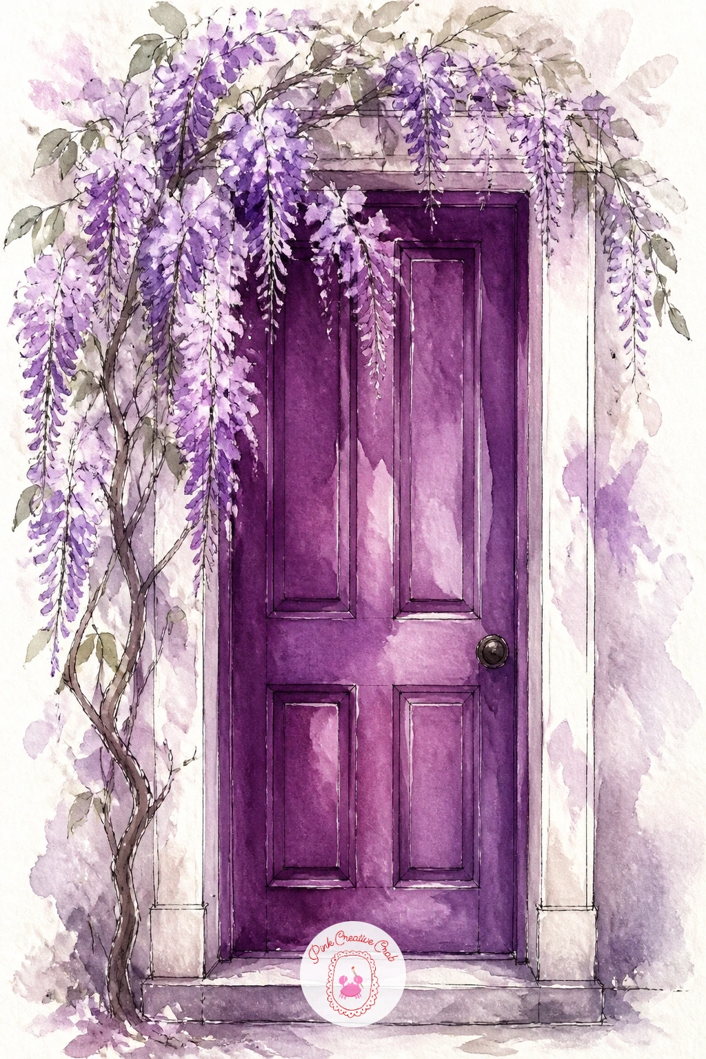
Palette: Plum, Lilac, Sap Green, Payne’s Grey
Crocuses let you practice painting many small things fast rather than one careful thing slowly. Lay a pale wash across the lower half of the page for bare early spring ground, then while it is still slightly damp, press in short upright strokes of violet and lilac with the tip of a round brush, scattered rather than in rows.
Leave plenty of bare paper between clusters so the field reads as emerging flowers rather than a solid carpet. A few short sage strokes at the base of each cluster suggest leaf blades without drawing every one.
The eye level here sits low, almost at the flowers themselves, which is what makes a crocus field feel close and immersive rather than viewed from above. Keep your horizon line, if you include one at all, very close to the top of the page to hold that low viewpoint.
For the quick ten minute version, stop after the flower dabs. For forty minutes, add a soft wash of pale sky above and a single far tree to give the field some depth.
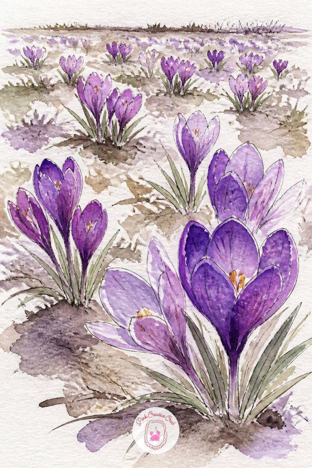
Palette: Violet, Lilac, Sap Green, Payne’s Grey
A plum tart on a cake stand is a nice return to still life with a circle and a pedestal to practice. Draw the tart’s round shape first, slightly flattened like a real ellipse seen from a gentle angle, sitting on a simple stemmed stand beneath it.
Paint the tart’s filling in overlapping plum and violet circles for the fruit slices, letting some edges stay soft and wet while others dry harder, which mimics the way real fruit catches light unevenly. The pastry edge takes a dry, warm wash, and the stand gets a thin grey-violet shadow where it meets the table.
Overworking the fruit slices into a solid mass is the common trap. Leave a sliver of pale pastry crust visible between slices so each one still reads as a distinct piece of fruit.
If your tart looks closer to a chocolate drawing in tone, warm up the plum with a touch more red before your next layer.
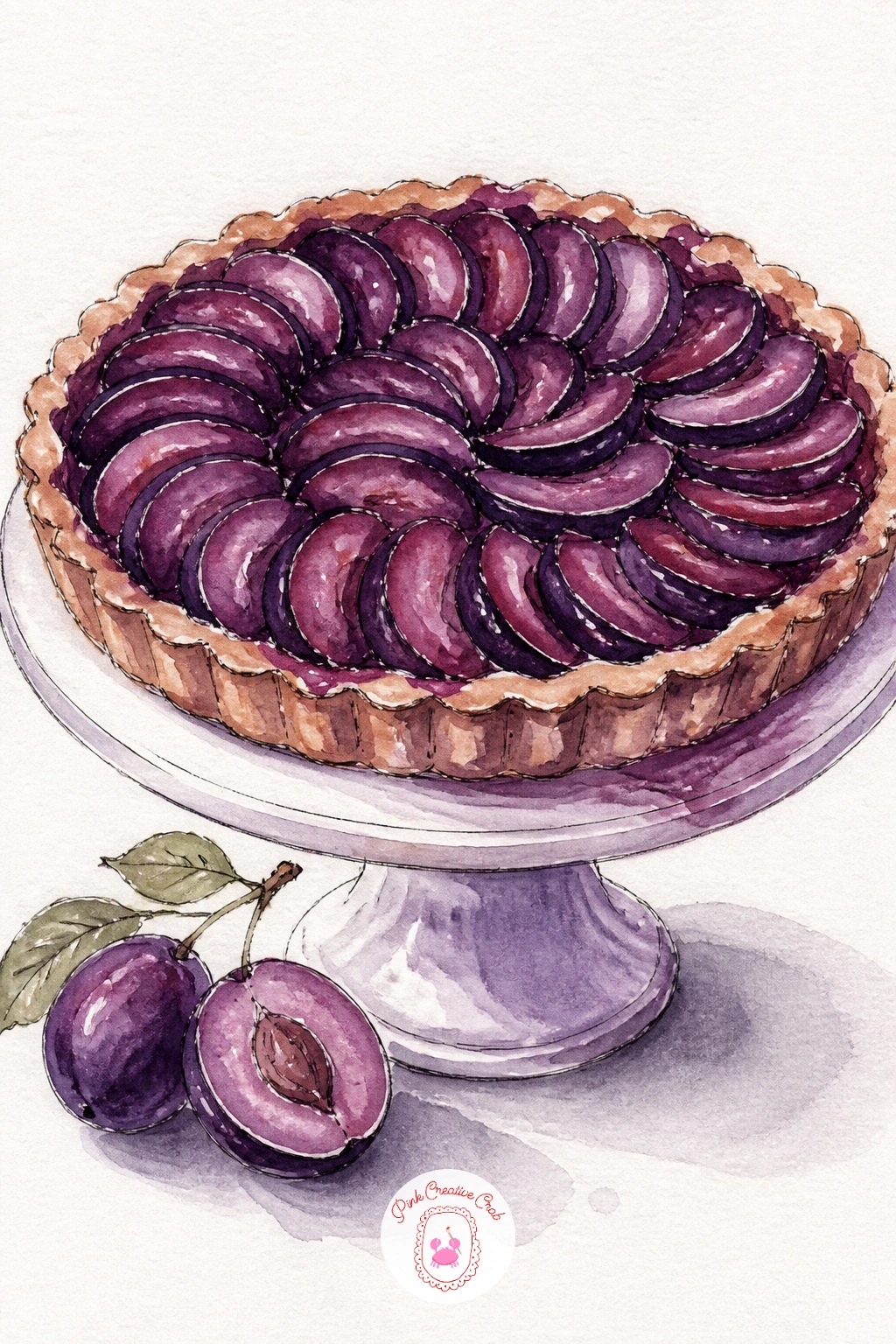
Palette: Plum, Violet, Payne’s Grey, Sap Green
Furniture is a good test of soft edges, and a purple velvet chair gives you plenty of rounded shapes to practice them on. Sketch the chair’s silhouette loosely, an armchair with a rounded back and soft arms, positioned near a simple window frame on one side of the page.
Paint the chair in violet and plum wet into wet, letting the two colors bleed together across the seat and back so no edge inside the chair stays hard, that softness is what reads as velvet. The window gets a few straight ink lines for the frame and a pale wash of light coming through onto the chair’s nearest arm.
Deciding where that window light falls first changes everything else: the side of the chair nearer the window stays paler and warmer, the far side holds the deepest plum shadow. Paint the shadow side before the lit side so you are not fighting to darken an area you already made too pale.
If your velvet looks flat, lift a little color with a damp brush along the arm’s highlight once the wash is just barely damp, not wet.
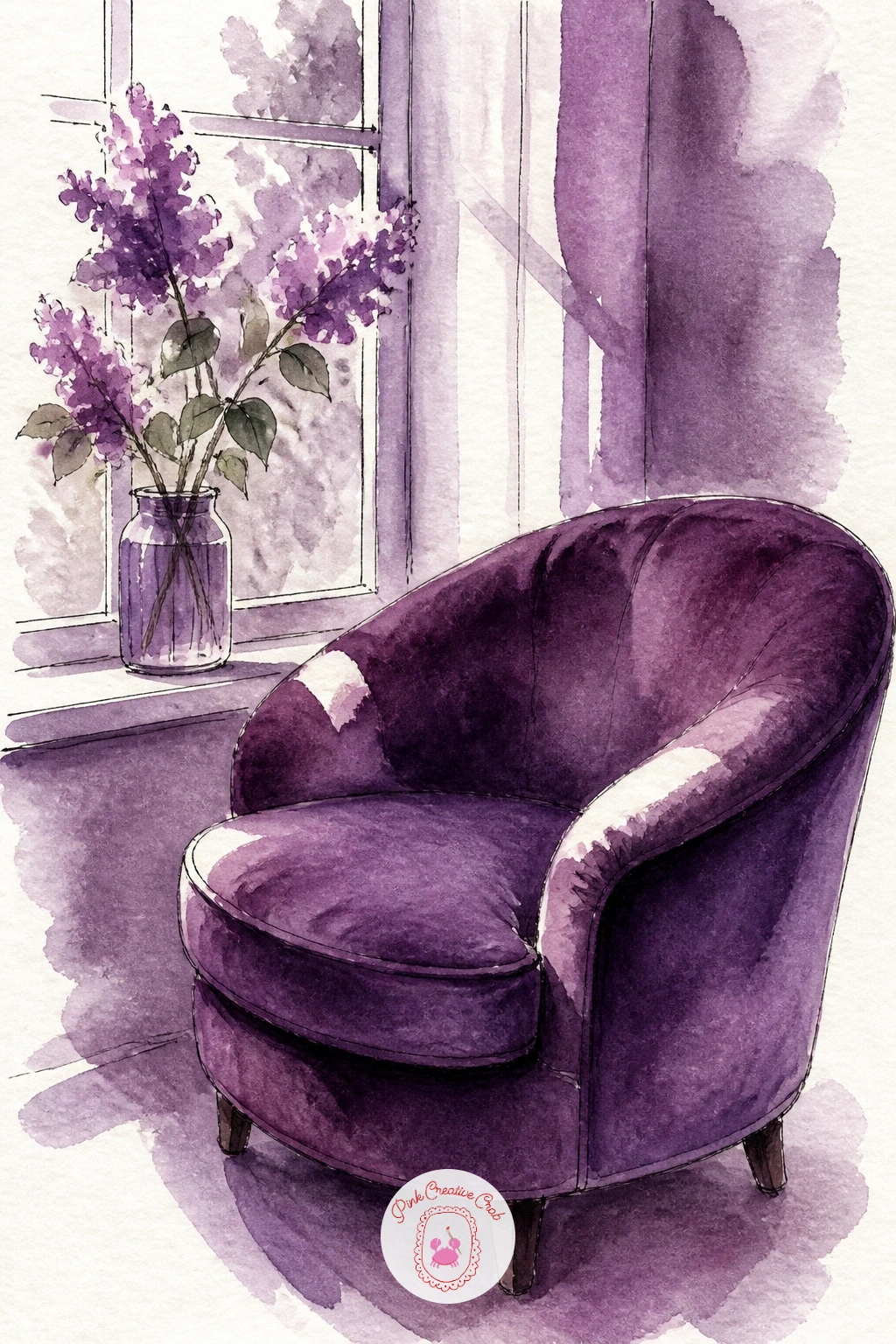
Palette: Plum, Dioxazine Violet, Payne’s Grey, White (paper)
A geode is really a cluster of small triangles, which makes it a satisfying change of pace after all the soft curves so far. Draw the rough outer rock shape first, then fill its hollow center with jagged triangular crystal shapes pointing inward from the edges toward a rough middle.
Paint each crystal triangle individually in violet, lilac or plum, keeping the colors distinct between neighboring triangles so the faceted look survives, then add a small patch of white left unpainted on each crystal for the sparkle. A shelf edge and the spine of a book or two behind it, in muted tones, gives the geode a setting without much extra work.
The edges are what make or break this one: keep every crystal edge sharp and straight rather than letting washes bleed between triangles, which means working on dry paper and waiting between neighboring shapes if your paper buckles easily.
No real geode to reference, a photo search for amethyst geode gives you plenty of crystal patterns to borrow from.
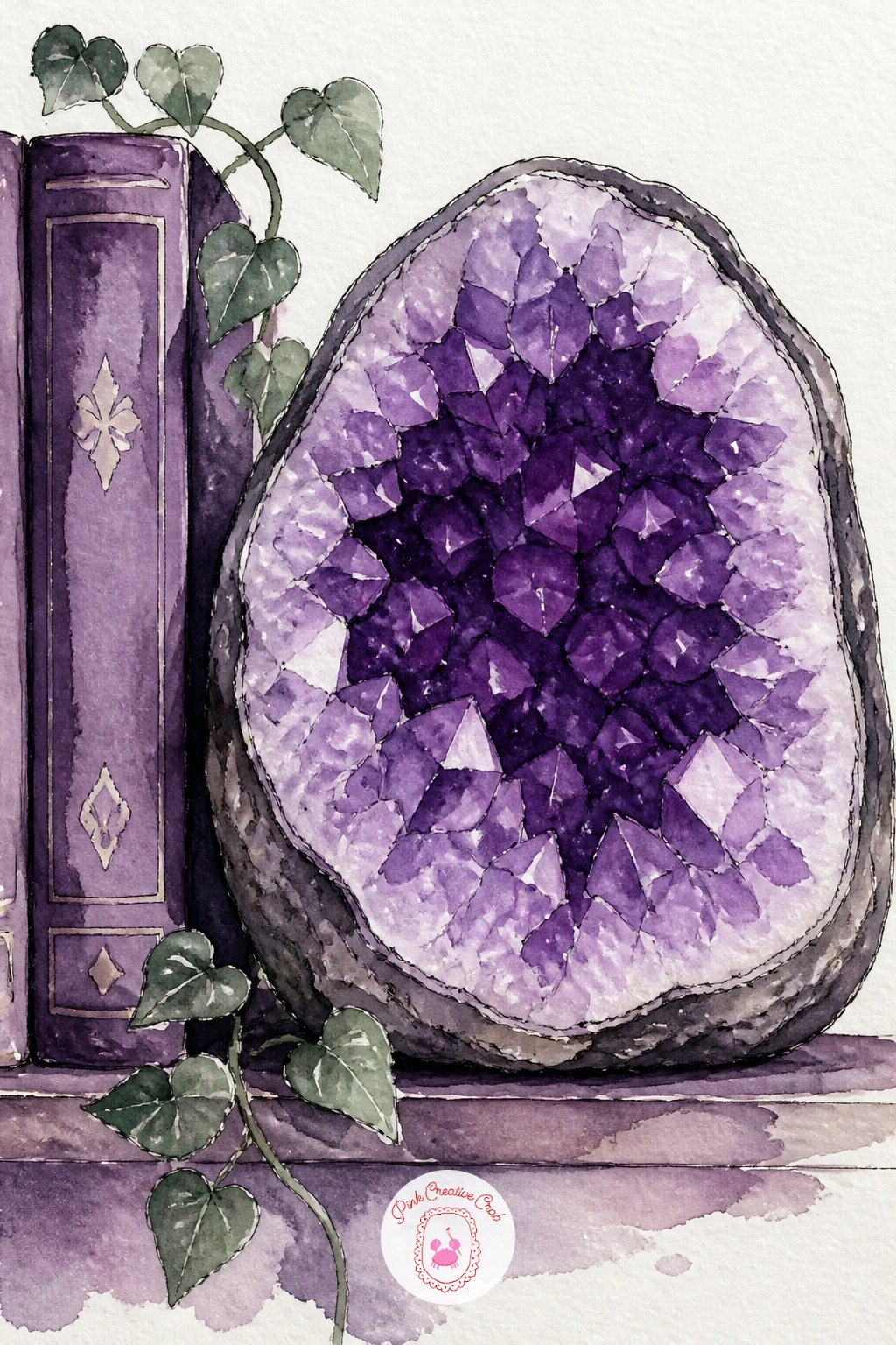
You Will Need
- reference photo of a geode for the crystal pattern
Palette: Dioxazine Violet, Lilac, Plum, Payne’s Grey
Irises reward a loose hand because their petals are already dramatic without much help. Paint three ruffled upright petals first in violet, each with a single confident stroke per petal rather than many small ones, then add the three lower petals drooping outward in a slightly deeper plum.
While the petals are still damp, touch a thin line of yellow or gold into the throat of each flower, letting it bleed just slightly into the purple around it, that small warm accent is what makes an iris recognizable. Sage green sword-shaped leaves go in last, painted in one or two long strokes each rather than filled in solidly.
If you want more irises in the bed, next time try painting the whole garden from a slightly higher eye level, looking down the row of blooms rather than straight at one flower, which lets you repeat the shape smaller and paler into the distance.
For more flowers in this same purple family, the ideas in this iris painting collection pair well with a garden scene like this one.
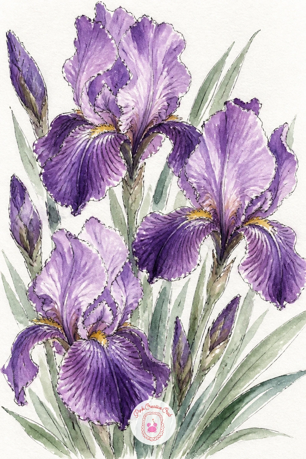
Palette: Violet, Plum, Sap Green, Payne’s Grey
Hydrangea blooms are made of many tiny four-petal flowers clustered into one big rounded head, which sounds fiddly but actually paints fast if you work loose. Block in the whole bloom shape first as one soft round wash of lilac, then while it dries slightly, dot in small darker violet marks scattered across the surface to suggest the individual florets, without drawing every petal.
A simple jug shape anchors the bottom of the page, painted in a flat muted tone so it does not compete with the flower head, and a few sage stems connect the two. Ink a handful of tiny plus-sign florets only at the very edge of the bloom, where the eye naturally looks for detail, leaving the center looser.
The common mistake is dotting florets evenly across the whole head, which flattens it. Keep the dots denser and darker at the edges and shadow side, sparser and paler where the light hits the top, so the round form still reads.
Working from a flower painting idea you have tried before in another medium can help you plan the bloom’s shape before you commit to paint.
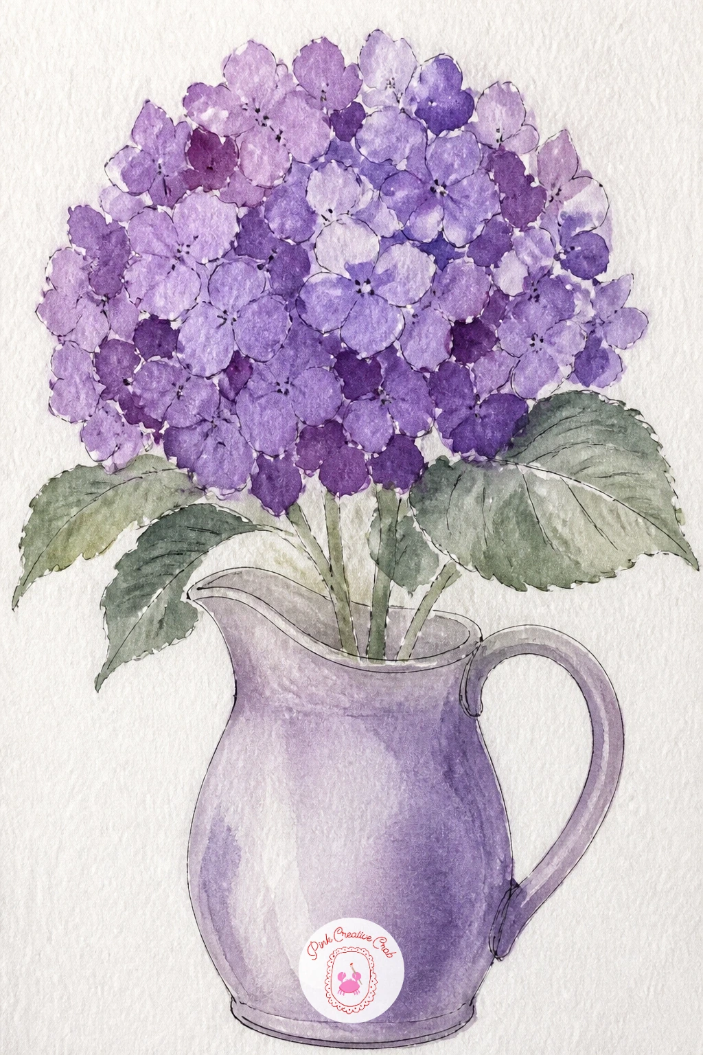
Palette: Lilac, Dioxazine Violet, Sap Green, Payne’s Grey
A jacaranda in full bloom is one of the few trees that is genuinely purple from top to bottom, which makes it an easy, satisfying subject once you stop trying to paint individual leaves. Mass the whole canopy in with loose lilac and violet dabs pressed from a fairly dry brush, building up a cloud-like shape rather than a hard outline.
A narrow street beneath it, just a sidewalk line and a couple of simple building shapes on either side, gives the tree scale, and a scatter of small violet dots along the pavement suggests fallen blossoms without painting each one. Trunk and branches go in last with ink, kept thin and a little irregular.
Painting this scene in ten minutes means just the canopy and a hint of street; the forty minute version adds one small figure walking beneath it and softer reflected lilac light on the nearest building wall, which takes real patience with edges.
If your canopy looks too solid, dab a clean damp brush into a few spots while the paint is still wet to lift soft gaps of sky through the blooms.
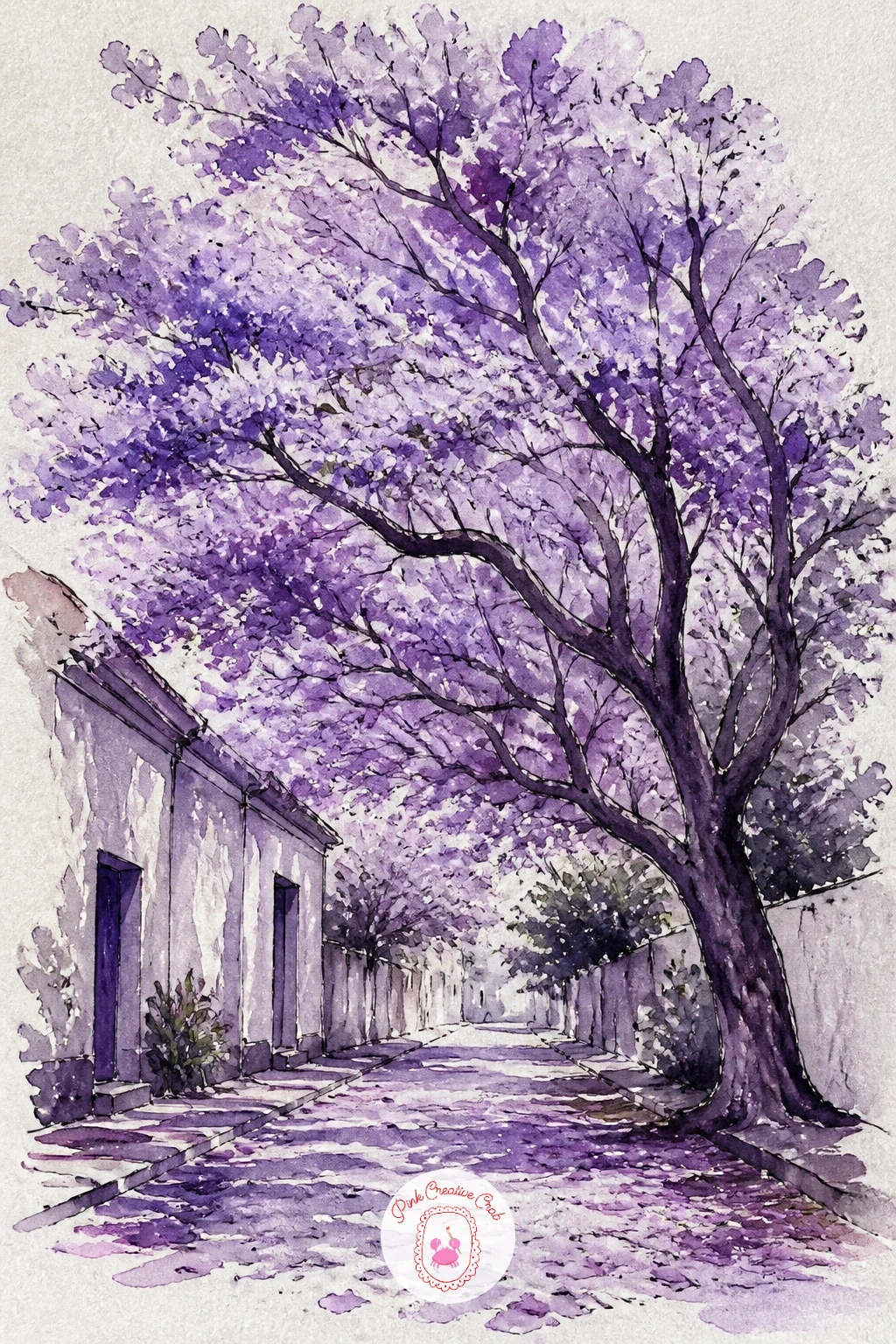
Palette: Lilac, Violet, Payne’s Grey, Sap Green
Berries are small round shapes with big personality if you let the light do the work. Paint a cluster of circles for the blueberries in a dusty violet-grey, leaving each one a tiny ring of white paper at its edge, which reads instantly as that powdery bloom real blueberries have.
Blackberries sit beside them, built from a tight group of smaller overlapping dark plum dots per berry rather than one solid circle, since a real blackberry is made of tiny drupelets, not a smooth sphere. A simple bowl shape holds both, with one ink line for its rim and another for its base.
Comparing the size of one blueberry against one blackberry before you sketch keeps the bowl believable: blackberries run noticeably larger and more elongated, and drawing them the same size as the blueberries is the easiest way to flatten the whole composition.
No violet-grey mixed and ready, a touch of Payne’s grey stirred into plain violet gets you there quickly.
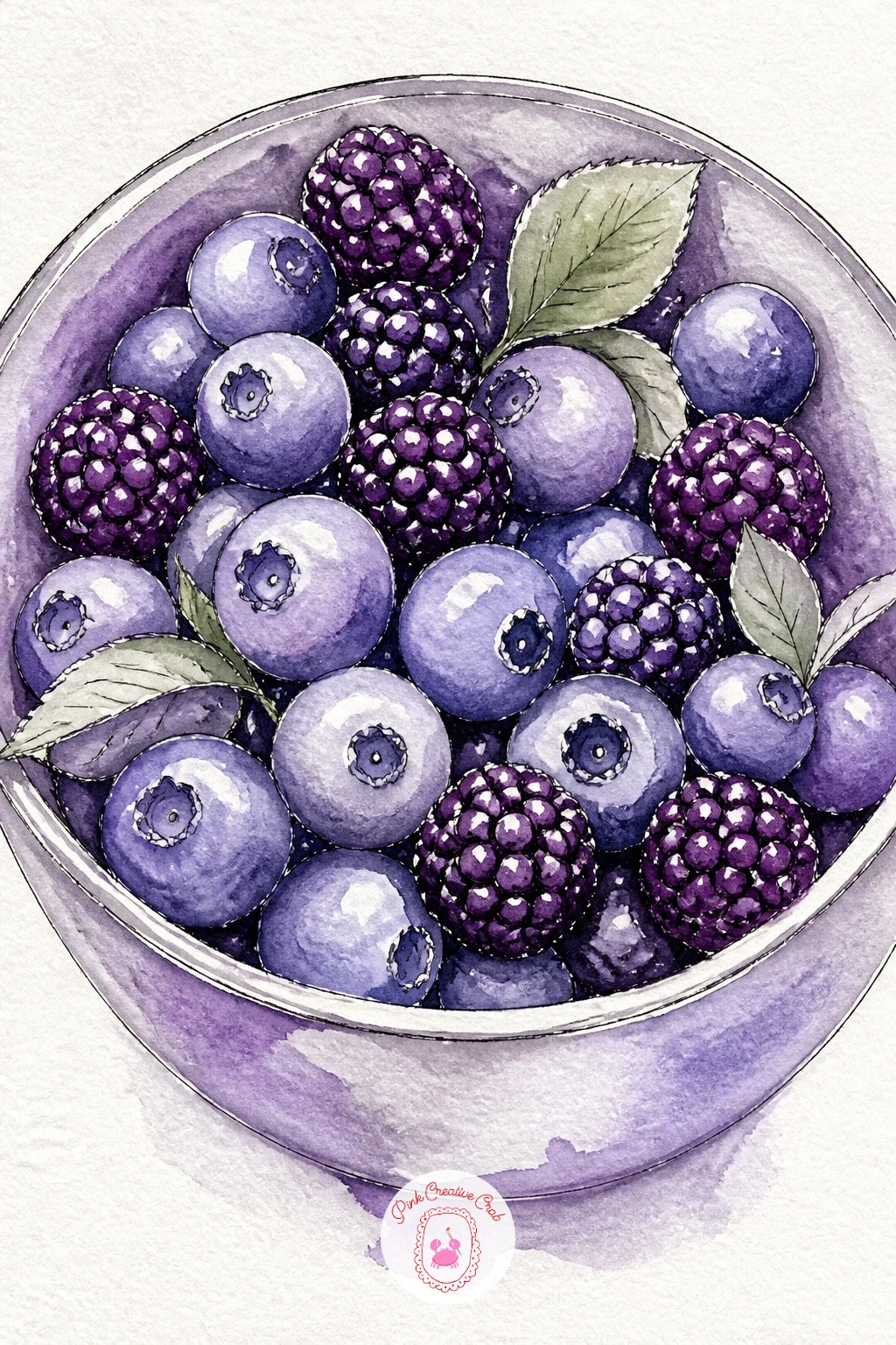
Palette: Violet, Plum, Payne’s Grey, White (paper)
An open umbrella is a cone shape wearing a lot of personality, and painting one in the rain lets you practice a wet mood without a full landscape behind it. Draw the umbrella’s canopy as a simple fan of triangular panels meeting at a center point, then paint each panel in violet or plum, leaving the ribs between them as thin unpainted lines.
Once the canopy is dry, splatter a light grey wash around it for rain, or flick a loaded brush gently over the top with a flick of the wrist for scattered drops, and drag a few vertical grey streaks down the page for falling rain further back. A simple curved handle in ink finishes it, held by nothing, or by a glimpse of a hand and sleeve if you want a figure.
The streaks are where this usually goes wrong, too many and the scene turns busy rather than rainy. Keep most of the page calm and let a handful of long thin lines carry the whole feeling of weather.
A toothbrush loaded with thin grey paint and flicked from a short distance gives a finer, more convincing rain spatter than a brush alone.

You Will Need
- toothbrush for the rain splatter
Palette: Dioxazine Violet, Plum, Payne’s Grey, White (paper)
A heather moor trades the umbrella’s single clean shape for a whole rolling landscape, which is really just two or three overlapping hill shapes stacked toward a low horizon. Wash in the sky first with a soft dusky lilac fading to a deeper violet near the top, then let the furthest hill, the palest and most blue-violet of the three, come in once the sky is dry.
Each closer hill gets painted a little darker and warmer than the one behind it, finishing with the nearest slope in a rich plum-violet dotted all over with tiny dry-brush marks for heather in bloom. A single dark shape, a lone tree or a distant stone, placed off-center gives the eye somewhere to land.
That dry-brush texture on the nearest hill is the trick worth practicing: load the brush, then dab most of the paint off onto scrap paper before dragging it lightly across the dry hill shape, which breaks the color into the rough, speckled texture heather actually has.
If you want the scene more dramatic, try it at the same dusk hour as a lavender field at golden hour, swapping the rows for rolling moorland.
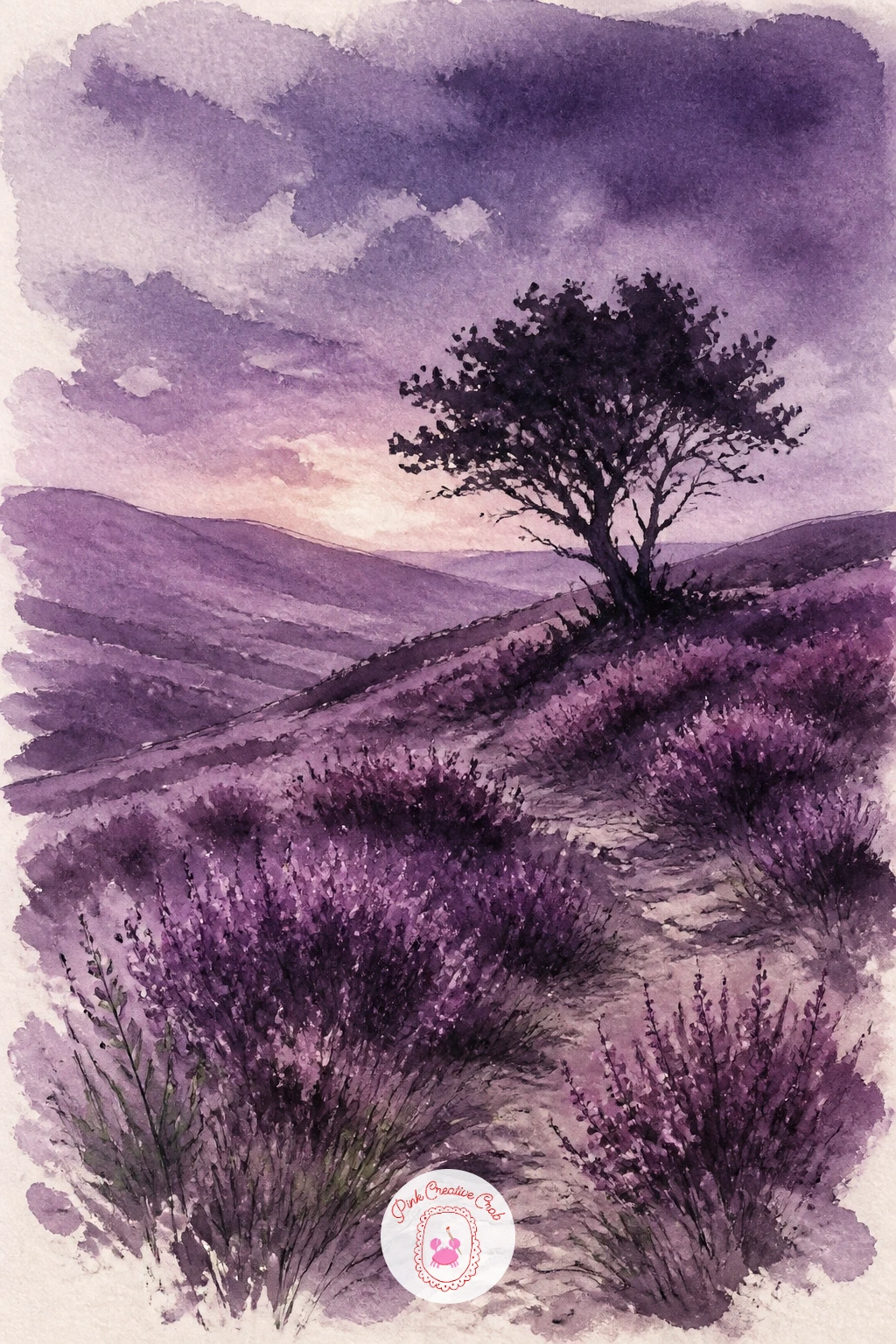
Palette: Lilac, Dioxazine Violet, Plum, Payne’s Grey
A scarf left on a bench is a quiet little scene built from folds, and folds are just soft shadows following a shape you can plan before you paint. Sketch the bench lightly as a simple rectangle of slats, then drape a scarf shape over one arm or the seat, drawing its edges as a loose wavy line rather than straight.
Paint the scarf in violet, dropping plum into the folds while the first wash is still damp so the shadows settle naturally into the creases instead of looking stuck on top. The bench stays a cool grey-brown, kept simple so the scarf remains the only strongly colored thing on the page, and a dusting of pale blue-grey around the base suggests leftover snow.
If this is your first time painting fabric folds, look at the scarf’s edge for where it changes direction sharply, that is where the deepest shadow line sits, and everywhere the fabric curves gently gets a softer, paler version of the same shadow color.
No real scarf to look at, a dish towel draped over a chair back gives you the same folding behavior to study.
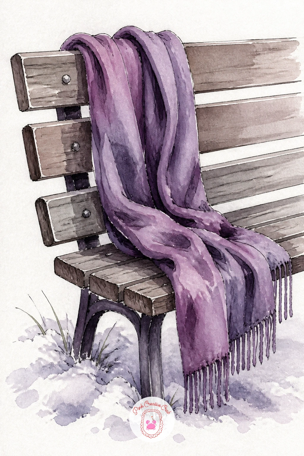
Palette: Dioxazine Violet, Plum, Payne’s Grey, White (paper)
A sweet purple sweet potato pie is a nice excuse to paint one clean triangular wedge rather than a whole circular dish. Draw the slice first, a wide triangle with a slightly curved crust edge at the back, sitting on a small plate.
Paint the filling in a smooth violet-plum wash, kept flatter and less textured than the fruit tart earlier since this filling is a custard rather than visible pieces, and add a thin pale line where the crust meets the filling. A dollop of whipped cream in pure white paper, outlined only faintly in grey, sits on top without needing any paint at all.
Where sweet potato pies tend to go wrong on paper is in the crust, which looks odd if painted too thick or too even. Vary the crust’s edge with a few small irregular bumps and a slightly browned tone along the very rim where it would have baked darkest.
If your violet-plum filling looks too purple to read as pie at first glance, warm it slightly with a touch of burnt sienna before the final layer.
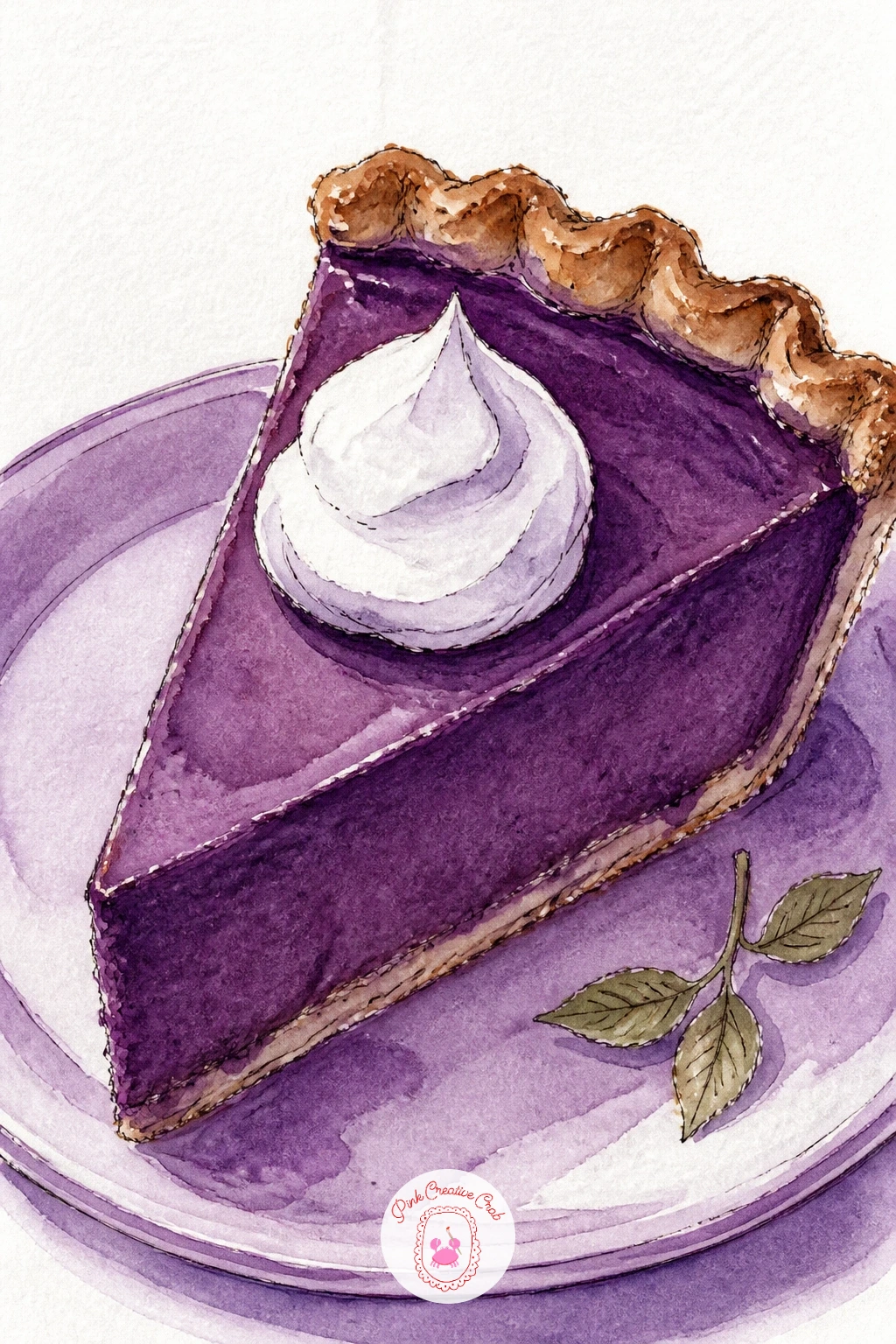
Palette: Plum, Dioxazine Violet, Payne’s Grey, White (paper)
A lilac latte in a clear glass is mostly about painting glass itself, which is really just leaving white paper where the light bounces off the curved surface. Draw a simple tall glass shape, then paint the drink inside it in two soft layers, a paler lilac foam at the top and a slightly deeper violet below where the espresso or syrup would settle.
Leave a narrow curved strip of white paper running down one side of the glass untouched, that single highlight is what sells the glass as glass rather than a solid violet shape. A thin grey-violet shadow beneath the glass on the table, and a tiny swirl of foam pattern in ink on top, finish it.
If this is your first time painting glass, resist painting the whole glass outline in a hard dark line, since real glass edges are often barely visible except where they catch shadow, usually just at the base and the very rim.
Working from one of the cafe scene ideas on the blog can help if you want to set this latte on a table with a saucer and spoon around it.
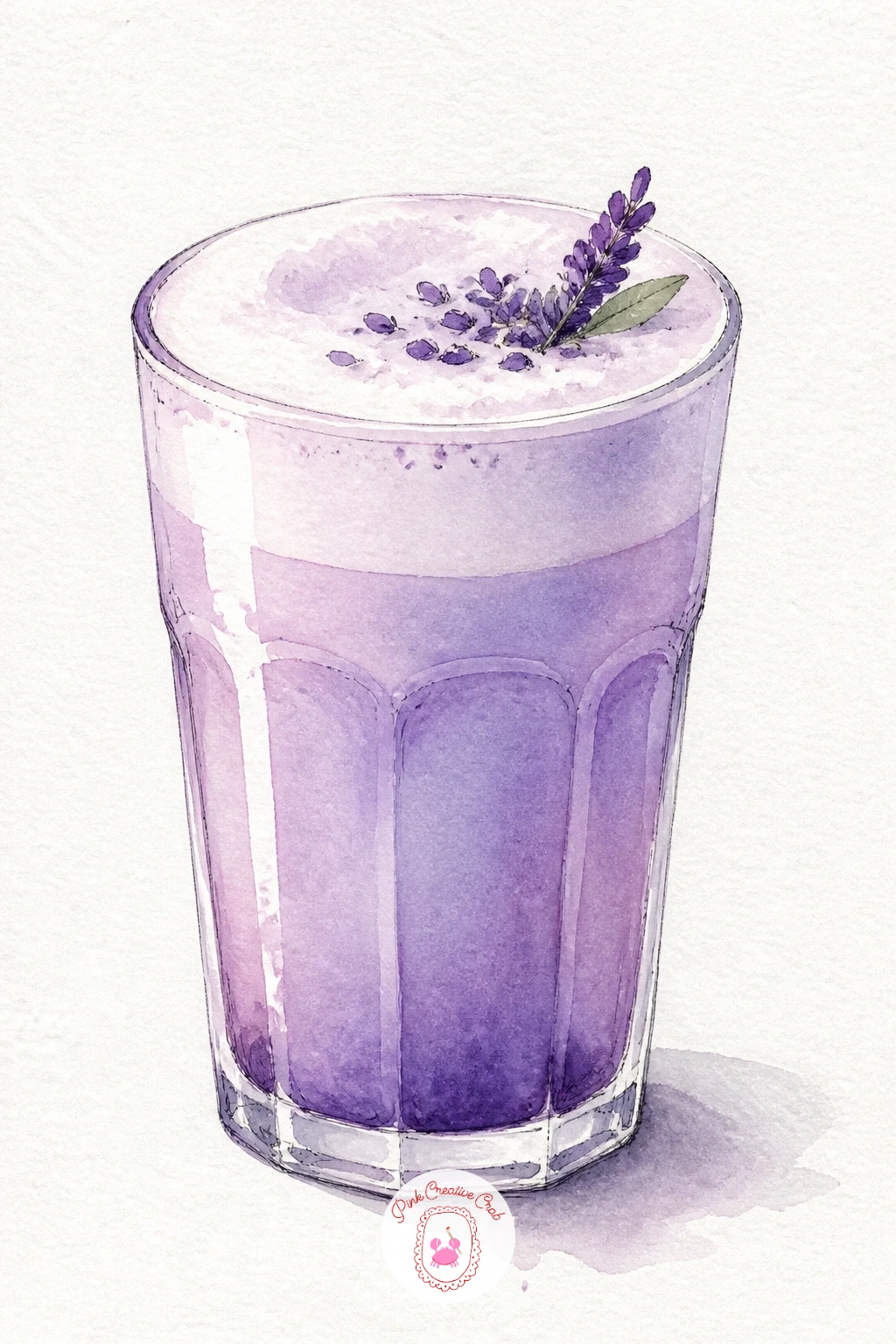
Palette: Lilac, Dioxazine Violet, Payne’s Grey, White (paper)
A desert sunset trades the lake’s calm water for dry, jagged silhouettes, which makes it a good place to push the plum sky even further than before. Wash the sky in overlapping bands of plum, violet and a warmer dusty rose near the horizon, working wet into wet so the colors melt together with no hard lines.
Once that sky is fully dry, paint a row of low rounded desert hills in flat dark violet silhouette across the bottom third, and scatter two or three simple cactus shapes along the ridge in pure black or deep Payne’s grey ink, kept small since desert silhouettes read better understated than oversized.
The usual trap is making the hills too detailed, which fights the simplicity a silhouette needs. Keep every hill and cactus shape completely flat and dark, with all the interest living in the sky’s gradient instead.
No dusty rose in your set, a touch of plain red mixed into your violet gets a close enough warm undertone for the horizon band.
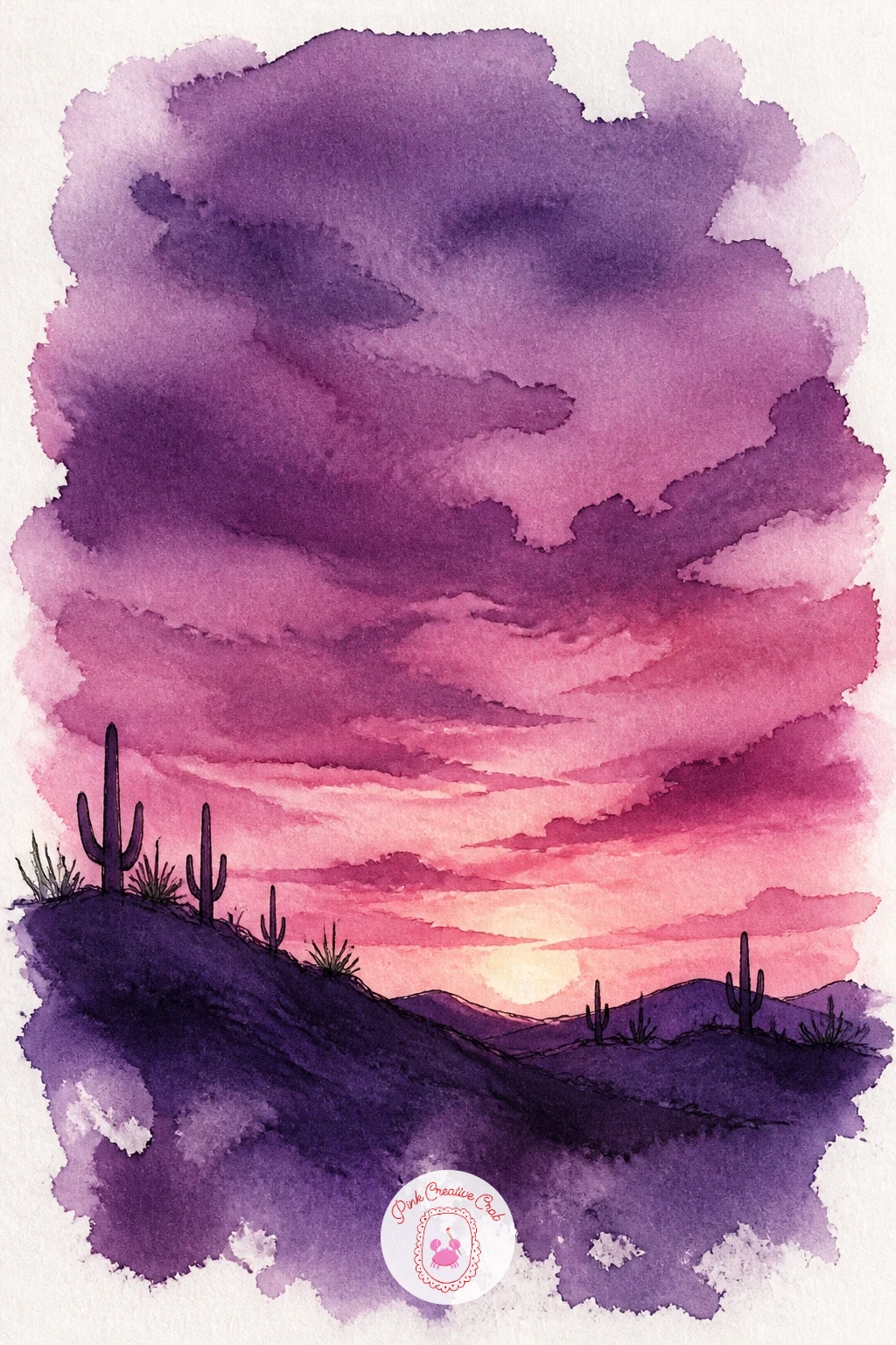
Palette: Plum, Dioxazine Violet, Payne’s Grey, White (paper)
A dish of plums sitting right on a windowsill lets you bring light and reflection into a still life without much extra effort. Paint three or four plum shapes, each a slightly lopsided circle, then press a strong highlight of untouched white paper on the side each one faces the window.
The shadow side of each plum deepens into near-black violet, and a thin band of warm reflected light sneaks back in along the very bottom edge where light bounces off the sill, a small but convincing detail. The windowsill itself stays a simple pale grey-lilac strip, with a hint of a window frame suggested by just two or three straight ink lines rather than a full window drawn out.
Deciding where the window sits in relation to the plums changes every highlight and shadow on this page, so settle that before you paint: a window to the left means every highlight sits on the left side of every plum, no exceptions.
If you enjoy still life fruit like this, the ideas in this fruit basket drawing list translate well into a watercolor palette too.
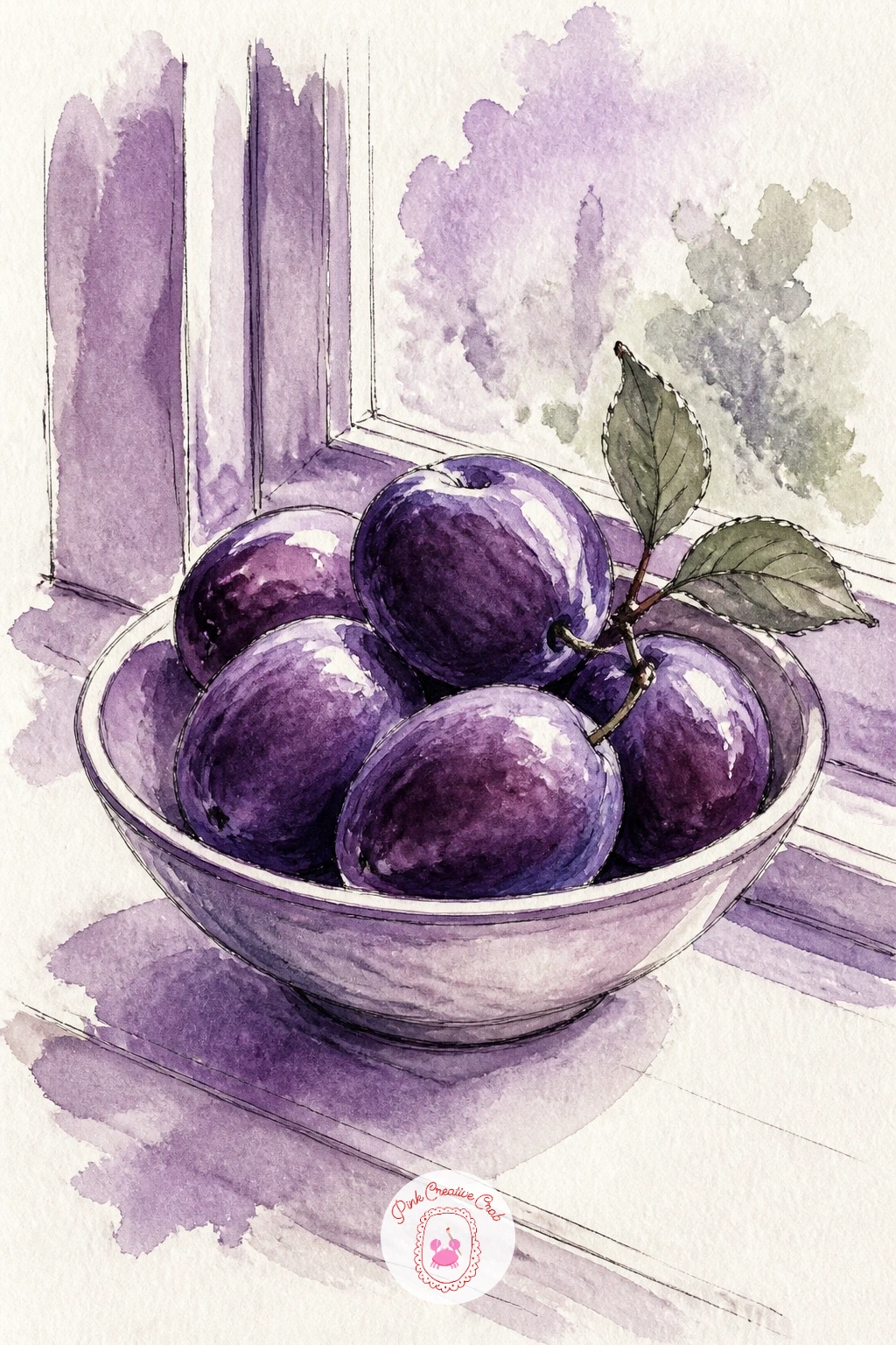
Palette: Plum, Dioxazine Violet, Payne’s Grey, White (paper)
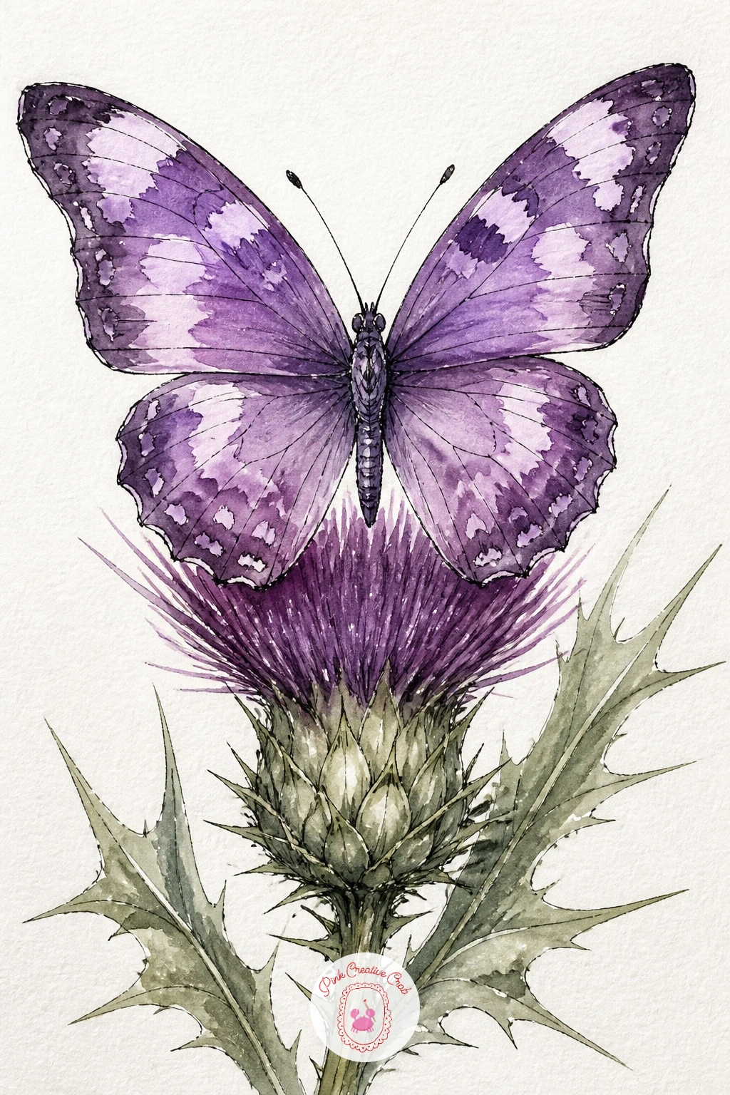
A butterfly gives you a chance to paint fine, careful shapes after several looser scenes, since its wings are symmetrical in a way that rewards a steady hand. Fold a scrap of paper in half to find the wing’s true mirrored shape if you are unsure, then paint one side in violet with small lilac spots, letting it dry before pressing a damp cloth or tracing paper against it to transfer a faint mirror image for the second wing.
The thistle beneath gets a spiky sage-green head and a few jagged grey-green leaves, painted with quick angular strokes rather than smooth curves, since a thistle’s whole character is in those sharp edges. Ink the butterfly’s body and antennae last, in one thin confident line each.
The wings are where symmetry matters most: measure the butterfly’s total wingspan against its body length with your brush handle before painting, most butterflies span close to double their body length, and drawing the wings too narrow is the easiest way to lose the shape.
No thistle nearby to study, any spiky flower head photo gives you the same jagged silhouette to copy from.
You Will Need
- reference photo of a thistle flower head
Palette: Dioxazine Violet, Lilac, Sap Green, Payne’s Grey
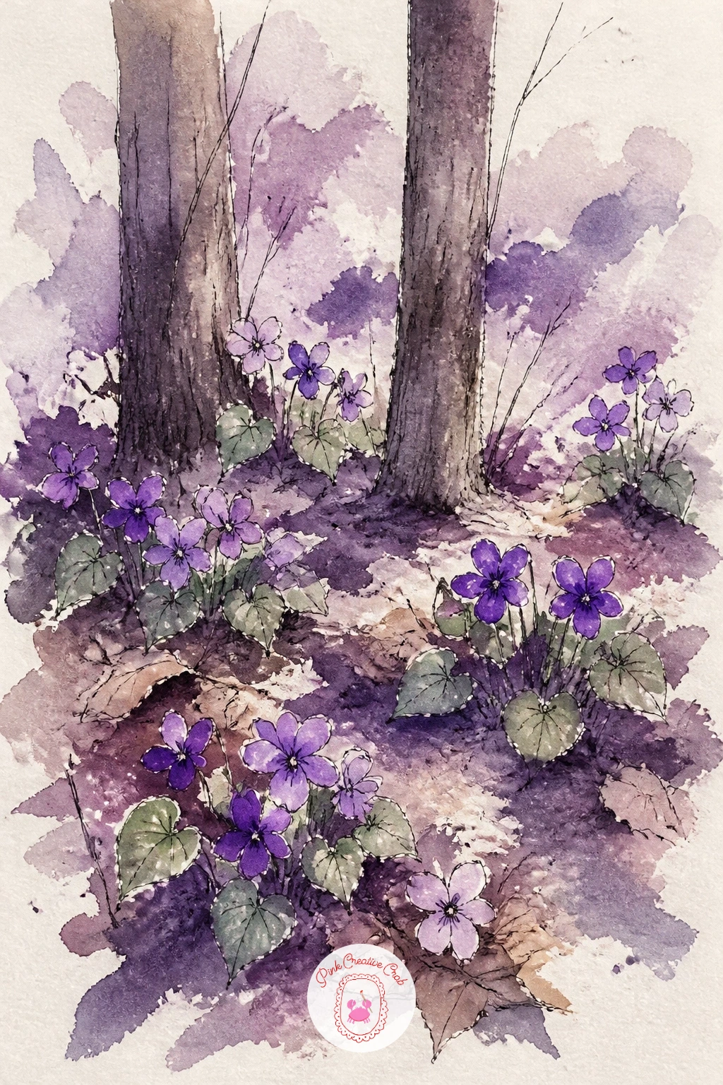
A patch of wild violets growing in dappled woodland light builds on the crocus field idea but adds trees and shade overhead. Wash a soft mottled green-grey across the ground first, darker in patches to suggest shadow falling from branches above, then once dry, scatter small clusters of violet flowers low across the foreground the same way you handled the crocuses.
A few simple tree trunks, just vertical ink lines with a little violet-grey shadow on one side, rise up through the scene without needing full canopies, since the woodland floor is the real subject here. Heart-shaped sage leaves nestle around each violet cluster.
For the ten minute version, keep it to the ground, the flowers and one trunk. For forty minutes, add a soft wash of pale golden light breaking through in one diagonal shaft across the clearing, which takes a careful wet-into-wet blend to keep soft-edged.
If you enjoy woodland floor scenes like this, the cottage and garden settings in this cottagecore painting collection share a similar mood.
Palette: Violet, Sap Green, Payne’s Grey, Lilac
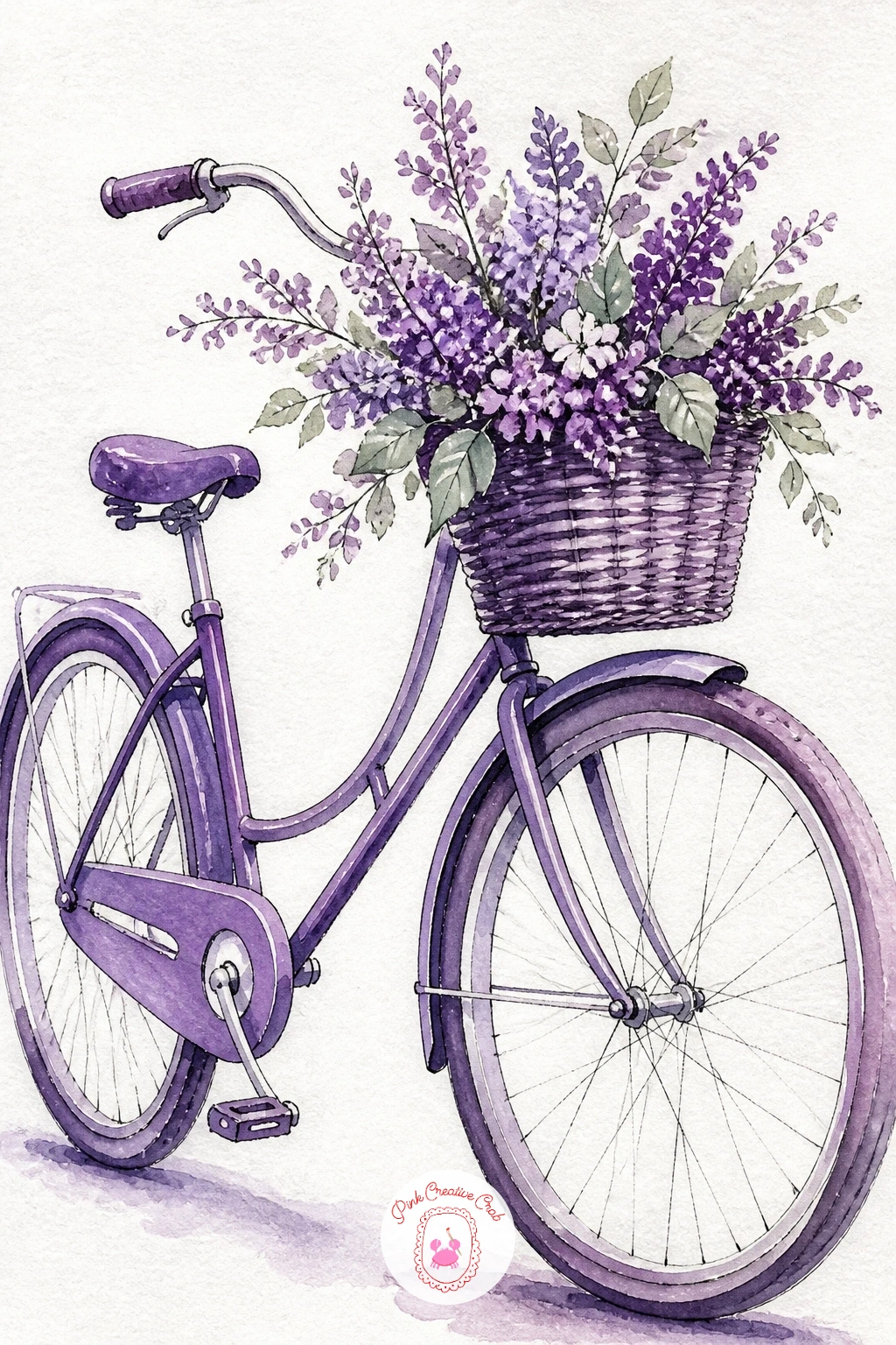
A bicycle brings back the structured drawing of the front door and chair, since its frame is built from straight and curved lines that need to meet at the right angles. Pencil the two wheels first as careful circles of matching size, then connect them with the frame’s triangle shapes before adding the handlebars and seat.
Paint the frame in a flat plum or violet, keeping the color smooth and even since a painted bicycle frame has a hard, glossy surface rather than a soft one, then fill the front basket with a loose tumble of small lilac and violet flowers with sage leaves tucked between them.
Checking that both wheels sit exactly on the same baseline, rather than one slightly higher, is the single most useful thing to confirm before you paint the frame around them. A ruler or the edge of a book held horizontally across your sketch catches this fast.
No ruler handy, lining the bottoms of both wheels up against the edge of your table while you hold the paper works just as well.
Palette: Plum, Lilac, Sap Green, Payne’s Grey
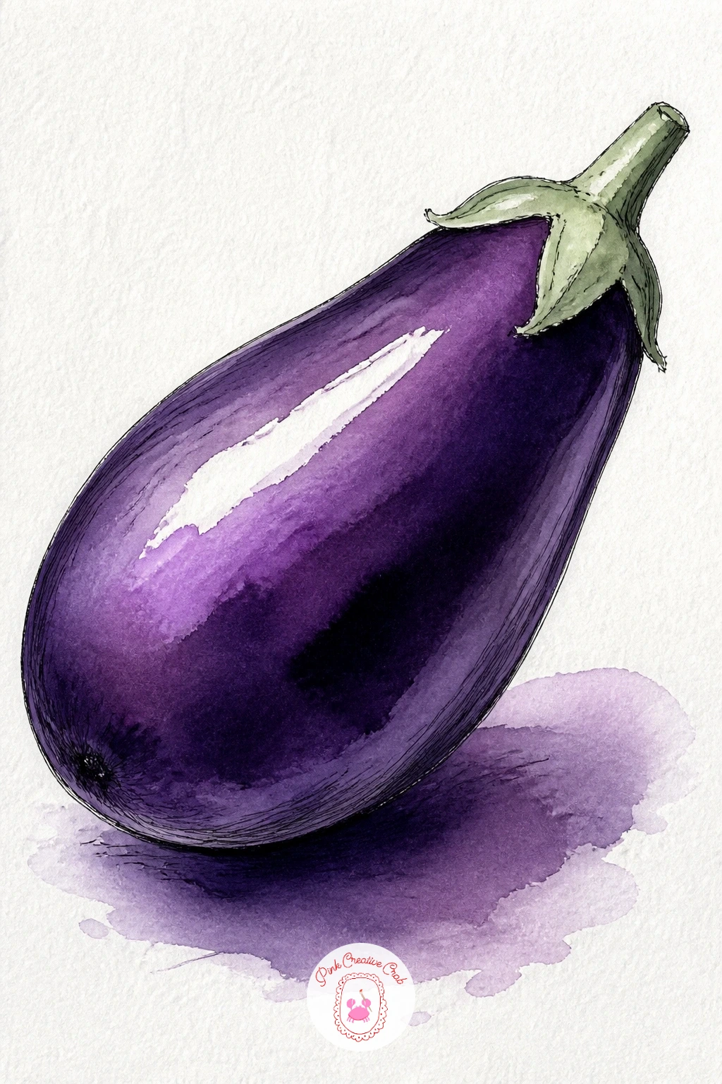
An eggplant has one of the most satisfying glossy skins to paint in this whole list, so place one or two on the page as a simple still life after the bicycle’s harder lines. Draw the eggplant’s elongated rounded shape, slightly pinched near the green stem end, then paint it in a deep violet-plum left wet enough to pool darker toward the shadowed underside.
While that first wash is still damp, dab a small patch of near-white left bare, or lifted gently with a dry brush, along the top curve where the light would catch its glossy skin hardest, that single bright streak does most of the work of making the skin look shiny rather than matte. The stem and cap get a short burst of sage green, the only non-purple note in the whole piece.
The glossy highlight is the trick worth practicing here: lifting color with a dry, clean brush pressed and lightly dragged across a still-damp wash pulls pigment away cleanly, which reads far more convincingly as shine than simply leaving a hard-edged white gap would.
If your violet dries too flat and matte-looking, try glazing one more thin violet layer over everything except that highlight once the first coat is fully dry.
Palette: Dioxazine Violet, Plum, Sap Green, White (paper)
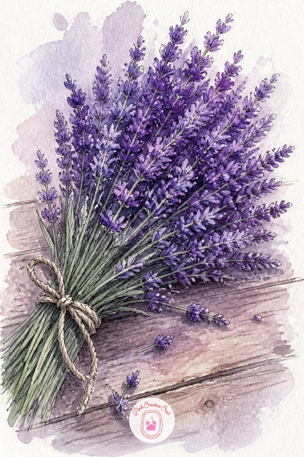
Tying the lavender lane’s loose dabs into one bundle resting on a table gives you a tighter, more controlled version of that same texture. Sketch a simple cluster of stems gathered at one point, fanning out into dozens of small flower spikes above, then paint the spikes first as a mass of short upward violet and lilac strokes, denser at the top of each spike and fading near the base.
The stems below the tie point stay a pale sage green, painted in a few long clean strokes, and a small loop of ink or a thin brown wash suggests the twine holding the bundle together. The wooden table beneath gets a warm flat wash with a few streaky grain lines in ink.
If you want more bundles next time, try varying the angle the lavender lies at, loose and scattered across the table rather than tied and upright, which changes the whole composition using the exact same color mixes and brush strokes.
For a deeper look at this exact flower across many settings, this lavender painting collection has further variations worth trying.
Palette: Lilac, Dioxazine Violet, Sap Green, Payne’s Grey
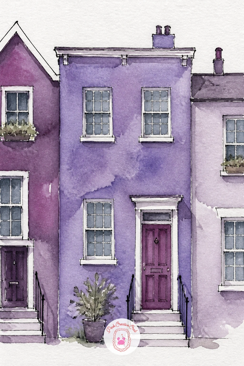
A single purple house set among a row of neighbors is a chance to practice a small building after the simpler door and gate studies earlier. Draw one house as a simple box with a triangular or flat roof, then sketch just the edges of two neighboring houses cropped at either side of the page, suggesting the row without painting every one in full.
Paint the main house in violet or plum, its neighbors in muted contrasting tones so the purple one stands out clearly, and keep window shapes as small flat rectangles of a cooler grey-blue, since real glass rarely matches the wall color behind it. A simple ink line roof edge and a door outline finish the facade.
Cropping the two side houses right at the edge of the page, rather than fitting all three in fully, is what keeps this composition feeling like a real street glimpse rather than a stiff row of dollhouses lined up for inspection. Let the edges of the page cut through the neighboring rooflines without hesitation.
If a street scene like this appeals to you, browsing a painting collection built around a different color can show you how the same cropped-row trick works outside the purple palette too.
Palette: Plum, Dioxazine Violet, Payne’s Grey, Sap Green
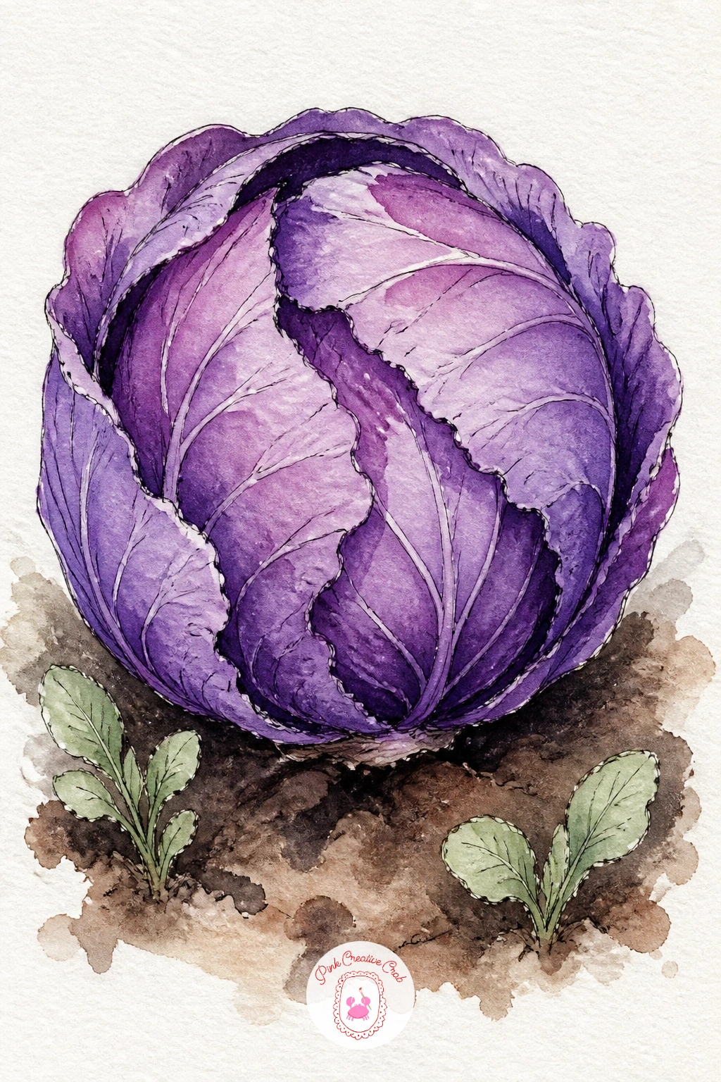
A purple cabbage sitting in its garden bed is one of the few vegetables that is naturally this exact color family, which makes it an easy and rewarding one to end the vegetable side of this list on. Paint the cabbage’s rounded form in overlapping curved strokes of violet and plum, following the direction each leaf layer would actually wrap around the head rather than painting flat circles.
Leave thin ragged lines of untouched paper between some of the leaf layers to suggest the papery edges where one leaf overlaps the next, and darken the tightly packed center with a deeper plum once the outer leaves are dry. A patch of soil in warm brown and a scatter of small sage leaves from a neighboring plant root the cabbage in its garden bed.
The layered leaf strokes are the texture trick here: follow the curve of the head with every stroke, almost like drawing contour lines around a sphere, rather than stroking straight across it, which is what makes the leaves feel like they wrap rather than sit flat.
If your violet looks too uniform across the whole head, deepen just the strokes nearest the center and keep the outer leaves noticeably paler for a far more convincing cabbage.
Palette: Dioxazine Violet, Plum, Sap Green, Payne’s Grey
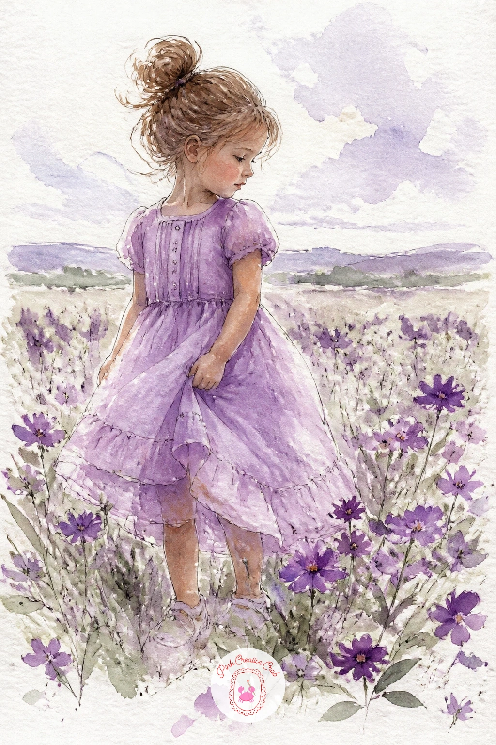
Finish the whole list on a small figure, since a girl in a lilac dress standing in a flower field pulls together the soft washes and the flower clusters you have been practicing all along. Sketch her simply, a loose standing pose with the dress as one soft triangular shape flaring slightly at the hem, her face left mostly suggested rather than detailed.
Paint the dress in lilac with a slightly deeper violet pooling at the folds near her waist and the hem, then build the field around her feet the same way you handled the crocus field, scattered dabs of violet and lilac with sage leaf strokes, fading smaller toward the horizon.
Keeping her figure proportionally small against a tall field and sky, rather than large and dominant, is what gives this scene its quiet, peaceful feeling, so sketch the horizon line and the field’s height first, then fit her in at no more than a third of the page’s total height.
If you enjoy figures set in flower fields like this, the gouache flower painting ideas on the blog offer a different medium to try the same kind of scene in.
Palette: Lilac, Dioxazine Violet, Sap Green, Payne’s Grey
What to Do Next
Pick one idea that matches how much time you actually have today, a teacup or a dish of plums for a short session, a street scene or figure for a longer one. Tape down a quarter sheet of cold press paper, mix your violet and plum first, and let the white paper carry at least a third of the page.
Frequently Asked Questions
What colors do I need for a purple painting with watercolor?
A dioxazine violet, a plum or quinacridone magenta, and Payne’s grey cover most of this list on their own. Add a lilac mixed from violet and lots of water, plus a small tube of sap green for leaf accents.
How do I mix a good purple if I do not own one?
Mix ultramarine blue with alizarin crimson or a similar red, adjusting the ratio until the color leans purple rather than blue or pink. Add more red for a warmer plum, more blue for a cooler violet.
Why does my purple painting look muddy instead of rich?
Muddy purple usually comes from overmixing too many colors on the same wet area, or from using a brown or black to darken violet instead of adding more pigment. Deepen shadows with more concentrated violet or plum, not with added black.
How do I stop every purple subject from looking the same shade?
Vary the ratio of blue to red pigment between subjects, and lean warmer toward plum for food and fruit, cooler toward violet for sky and flowers. Leaving some areas as pale lilac against darker plum also keeps a single painting from reading flat.
What paper works best for loose purple washes with ink accents?
A cold press watercolor paper of at least 140lb weight handles both wet washes and fine ink lines well without buckling badly. Add the ink details only once every wash is completely dry so the pen does not skip or bleed.
Have any thoughts?
Share your reaction or leave a quick response — we’d love to hear what you think!
-
 0
-
0
-
0
-
0
-
0
-
0


