

Chocolate drawing is one of those happy little categories where the subject is as fun to look at as it is to make, and that is exactly the point of this list. Every treat below sits in its own small cozy scene, so you get the satisfaction of a finished page without the pressure of a complicated still life.
You will find truffles, cocoa stalls, melting ice cream cones and a cat sniffing a steaming mug, all built from flat shapes and crisp edges rather than fussy detail. Scroll through, pick whichever one makes you want to pick up a brush right now, and plan on finishing it in one sitting.
Using these images: free for personal projects such as printing, coloring, cards, journals and gifts. Handmade items that include them may be sold up to 30 pieces per design. More than that is commercial use and is not permitted, and neither is selling or sharing the images themselves or passing them off as your own. Please ask before any other use.
Open with a box of truffles, since the shapes are simple and forgiving for a first gouache attempt. Start with a light pencil outline of the box lid and the row of round truffles inside, keeping each circle close in size so the grid reads as tidy rather than careless.
Block in the box interior with one flat midtone, then drop in each truffle as a single confident circle of brown, cherry red or a dusted white. Let the paint dry fully before adding a thin cream line around the box edge, since gouache lifts easily if you work back into it wet.
If circles wobble, a coin or bottle cap traced lightly in pencil first keeps every truffle the same size. Finish with tiny flat dots of white gouache for sugar dusting on one or two truffles only, so the eye has somewhere to land.
Keep your brush fairly dry for those dots, a loaded brush will bleed into the brown underneath.
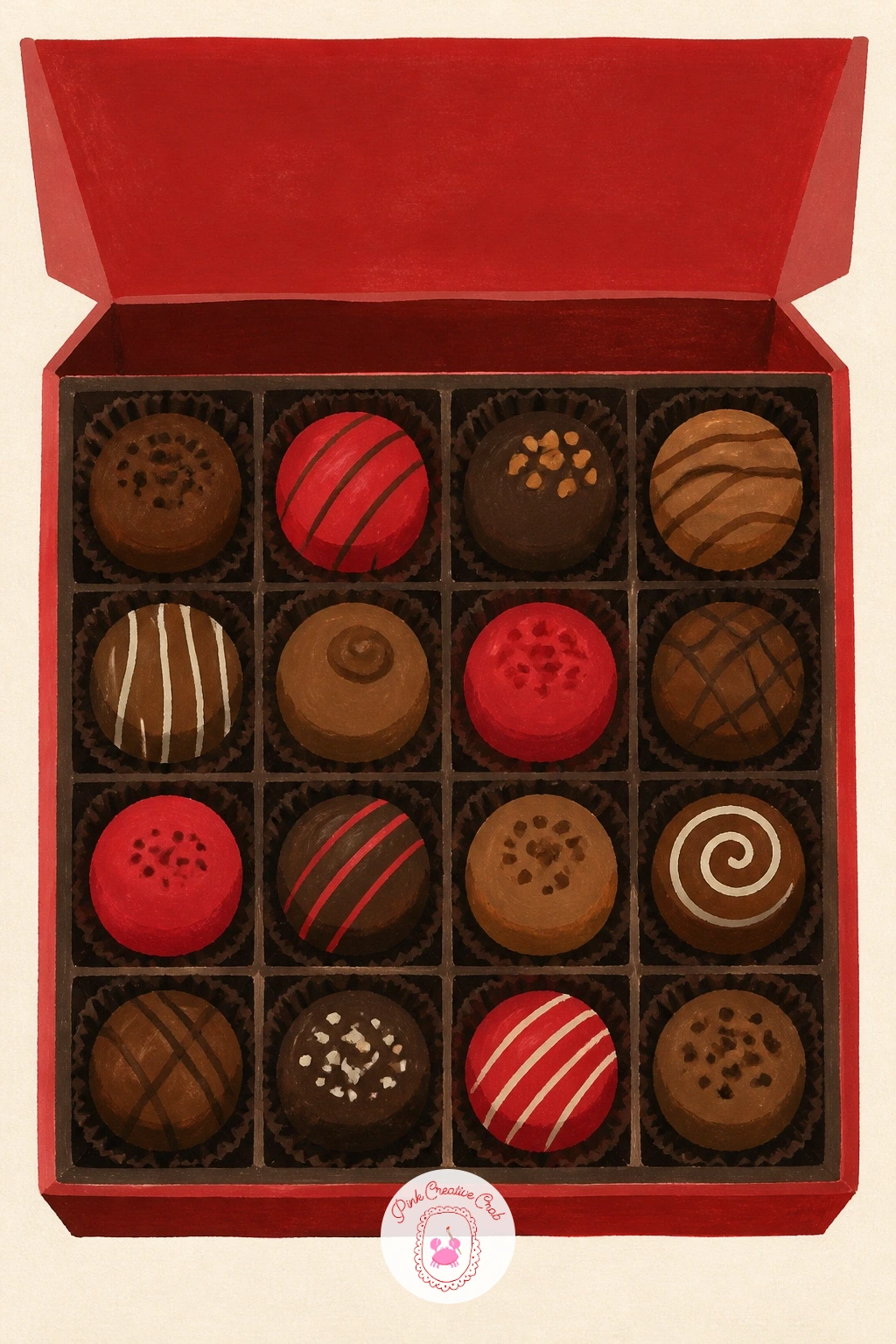
Palette: Burnt Umber,Cherry Red,Butter Yellow,Cream
Move from truffles to a mug of hot cocoa with marshmallows, a subject built almost entirely from stacked ovals and one curved handle. Sketch the mug shape first, keep the rim slightly elliptical to show it is round, then add two or three marshmallow shapes peeking over the top.
Paint the mug in one flat color and let that dry before layering the cocoa surface in a darker brown, so the two shapes stay crisp rather than muddy. Marshmallows go in last as flat white or cream ovals with a thin outline, since painting them before the cocoa risks smearing brown into the white.
If the steam lines feel stiff, loosen your wrist and paint them as two or three soft curved strokes rather than straight marks, that single change makes the whole mug feel warmer. For speed, a short ten minute version skips the steam entirely and still reads clearly as hot cocoa.
Give yourself one extra minute just for the handle, a wobbly handle is the fastest way to flatten an otherwise good mug.
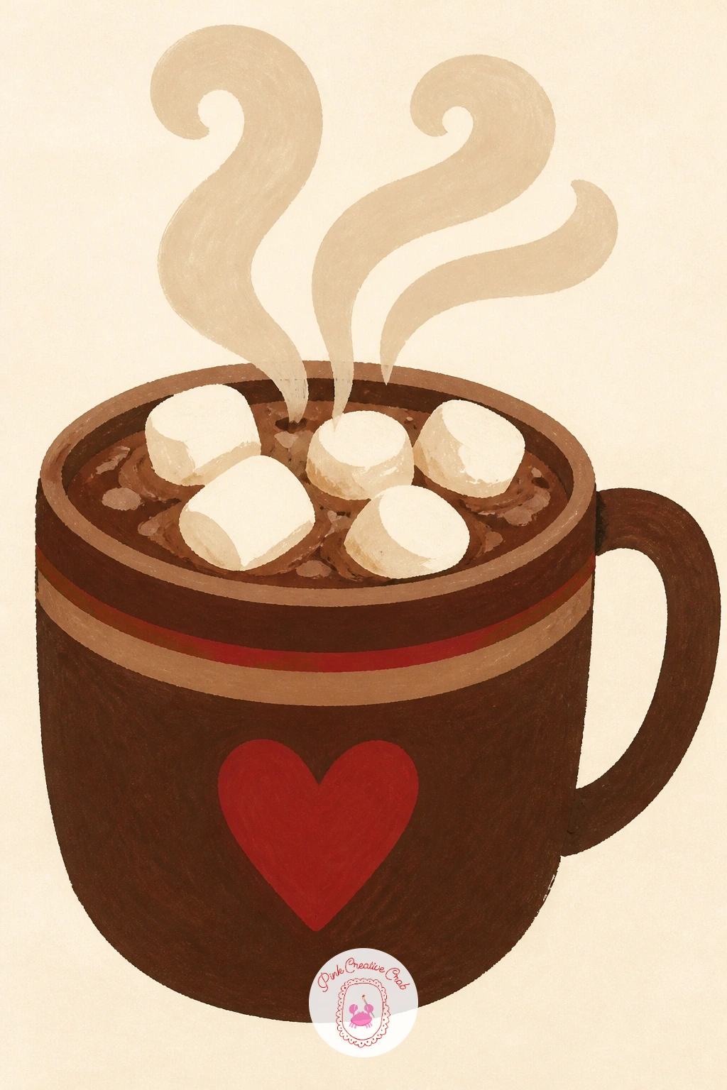
Palette: Chocolate Brown,Cream,Cherry Red,Warm White
Try this one in a chunky mug with a little dessert plate underneath if you want more page filled, a plate reads as cozy without adding real difficulty.
A chocolate shop window is a step up from a single mug, since it asks you to arrange several small chocolates behind one larger frame. Lightly pencil the window frame first as a simple rectangle or arch, then plan three or four treat shapes inside before you touch paint, so the display does not get crowded.
Work background to foreground, painting the shop wall and window trim first, then the shelf, then each chocolate shape last in flat color blocks. Keep every chocolate a basic shape, a circle, a rounded square, a little dome, rather than trying to paint real texture, that is what keeps this one finishable in a sitting.
If this is your first time drawing an interior, a single center shelf with a row of treats is far easier to balance than two crowded shelves. A butter yellow glow painted just inside the glass gives the window warmth without extra detail.
Finish with one thin cream line along the window frame to separate it crisply from the wall color. For more cozy shopfront ideas with the same small, tidy feel, the village scene drawing ideas are worth a look.
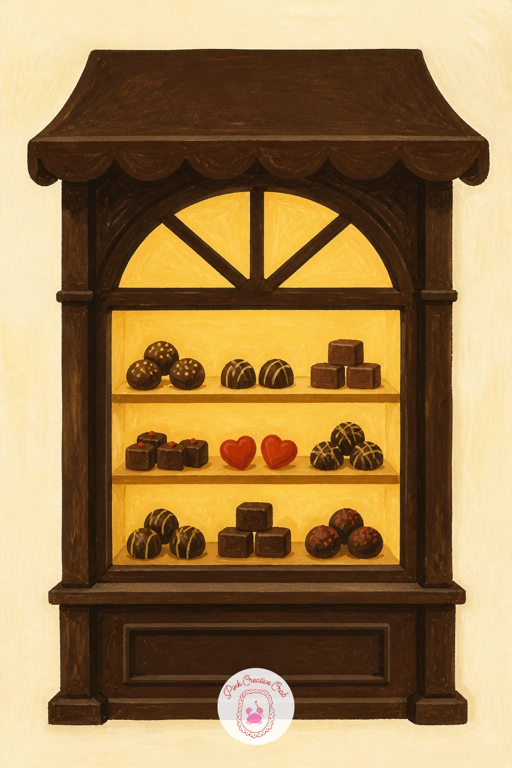
Palette: Butter Yellow,Chocolate Brown,Dusty Rose,Cream
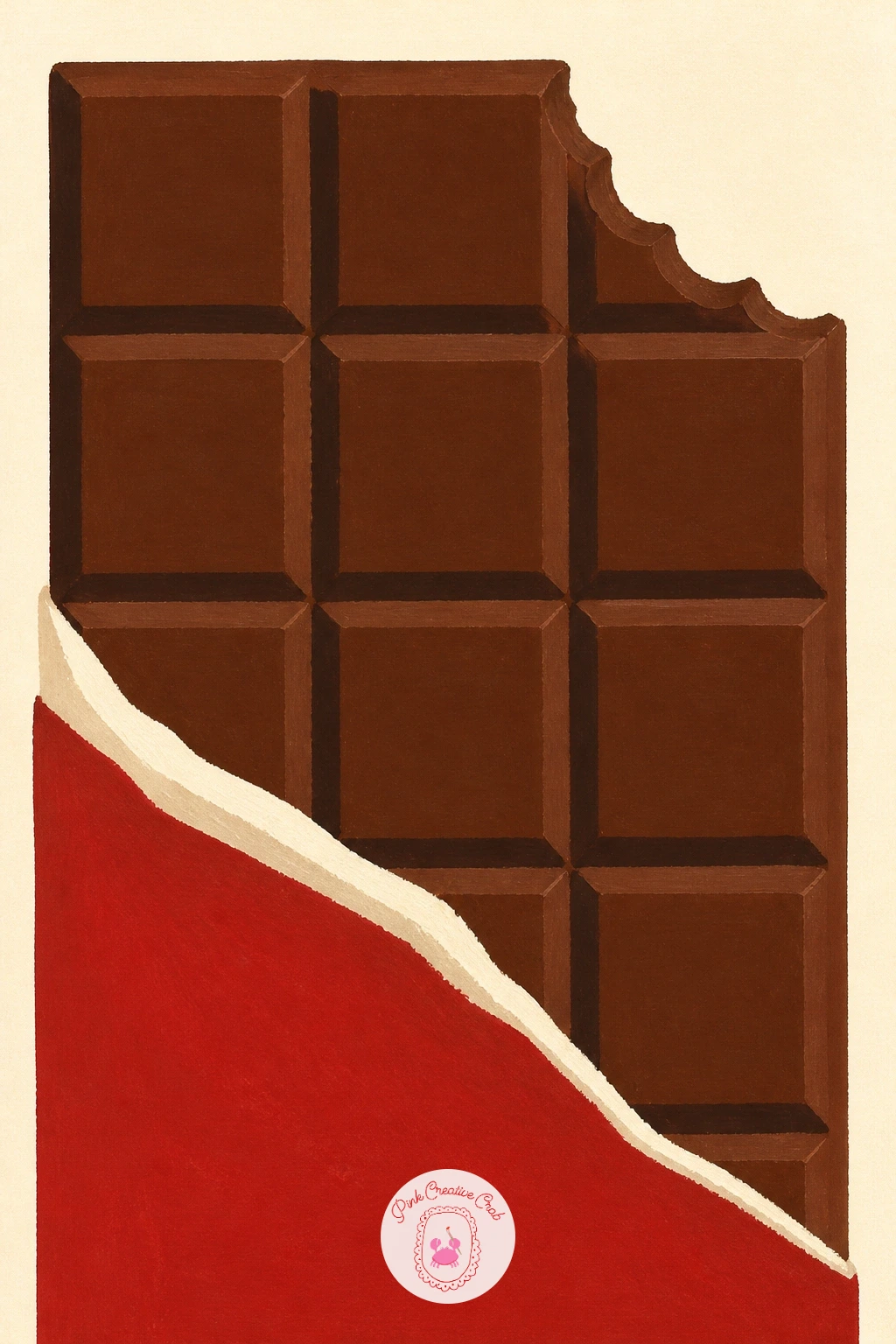
Switch gears to a chocolate bar with a bite taken out, a fun graphic subject since the broken edge is the whole personality of the piece. Pencil the rectangle bar first with its grid of squares, then erase and redraw one corner as a jagged bite before you paint anything.
Paint the wrapper color first if any wrapper shows, then the chocolate itself as one flat brown rectangle, saving the bite edge for a slightly darker brown to show where it breaks. Keep that bite edge sharp and angular rather than smooth and rounded, a smooth bite reads as a melted bar instead of a bitten one.
The grid lines between squares are easiest added last with a thin brush loaded with a touch more water than usual, so they sit as fine dark lines rather than thick smears. If lines go crooked, a straightedge held lightly against the paper keeps them honest.
One bold cherry red wrapper corner peeking out is an easy way to add the accent color without extra work.
You Will Need
- ruler or straightedge for the grid lines
Palette: Chocolate Brown,Dark Cocoa,Cherry Red,Cream
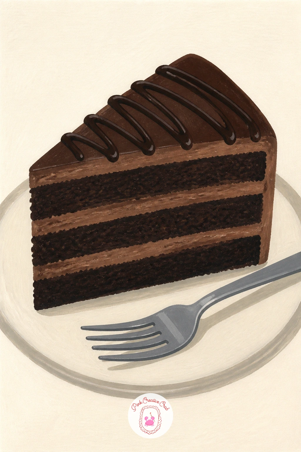
Build up to a slice of chocolate cake now that flat shapes feel comfortable, since this subject adds layers that need to line up evenly. Draw the triangular slice shape first, then mark three or four horizontal guide lines inside it before adding frosting, so each layer stays level.
Paint from the plate upward, laying the bottom cake layer first, letting it dry, then the frosting band, then the next cake layer, so each flat color stays crisp against its neighbor rather than blending into mud. A thin strip of lighter brown between layers reads as frosting without needing any texture work at all.
Eye level matters here, and placing the slice low on the page so you look slightly down at the top frosting makes the cake feel like it is sitting on a real plate rather than floating flat against the paper. A drizzle of melted chocolate on top, painted as one loose wavy line, sells the whole plate.
Add a small fork beside the plate as your one concrete finishing touch, it gives the eye somewhere to rest outside the cake itself.
Palette: Dark Cocoa,Milk Chocolate,Cream,Cherry Red
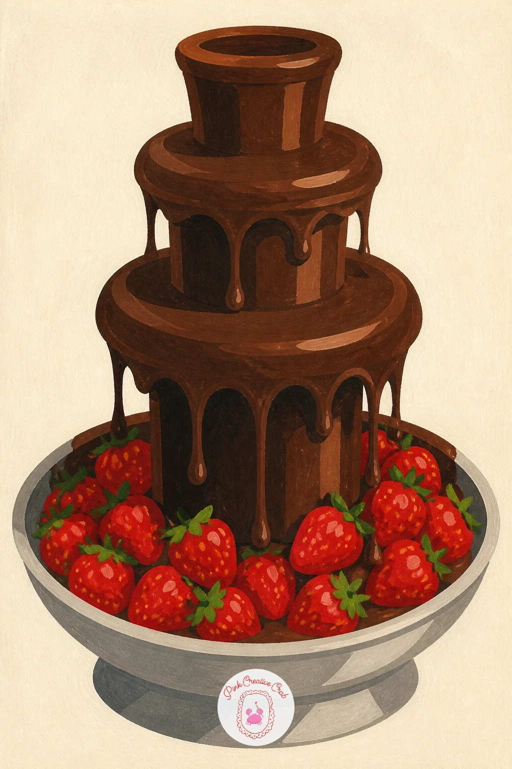
A chocolate fountain with strawberries brings in a bit of perspective, since the fountain tiers get narrower as they rise and the strawberries sit lower around its base. Sketch the fountain as two or three stacked cone shapes first, smallest at the top, then ring the base with a handful of strawberry shapes, no more than five or six so it stays simple.
Paint the fountain tiers in one flat brown from top to bottom, then let that dry completely before adding the lighter chocolate drips flowing down each tier, since wet brown over wet brown loses the crisp tier lines fast. Strawberries go in last, red bodies first, tiny cream seed dots added only once the red is fully dry.
If the fountain looks top heavy, widen the base tier slightly rather than shrinking the top, it is an easier fix and keeps the silhouette elegant. Light coming from one side also helps sell the dripping chocolate, so keep highlights on the same side of every tier.
One extra tip: leave tiny unpainted cream gaps between drips rather than painting one solid sheet of chocolate, the gaps read as shine.
Palette: Milk Chocolate,Dark Cocoa,Cherry Red,Cream
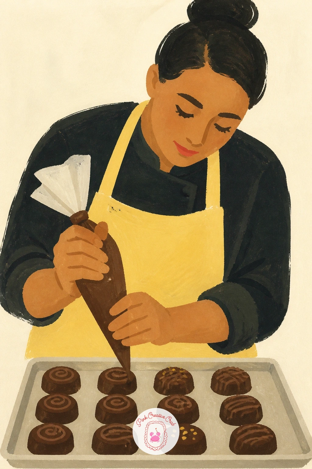
Bring a figure into the mix with a chocolatier at work, piping a line of chocolate over a tray of treats. Keep the figure simple, a flat apron shape, rounded head, and arms reduced to a few clean curves rather than detailed joints, since a loose figure fits this flat style far better than a realistic one.
Build the scene from back to front, the apron and body first, then the tray and treats on the counter, then the piping bag and the thin chocolate line coming out of it last, painted in one continuous confident stroke. A shaky piping line is the most common slip here, so practice that single stroke on scrap paper two or three times before committing to the final page.
Place the chocolatier slightly off center with the tray taking up more of the lower page, that small shift in balance makes the scene feel like a real moment rather than a stiff portrait. A butter yellow apron is an easy way to work in your accent color.
If figures feel tricky, the girl drawing ideas for beginners cover simple ways to block in a figure before you add a scene around her.
Palette: Butter Yellow,Chocolate Brown,Cream,Dusty Rose
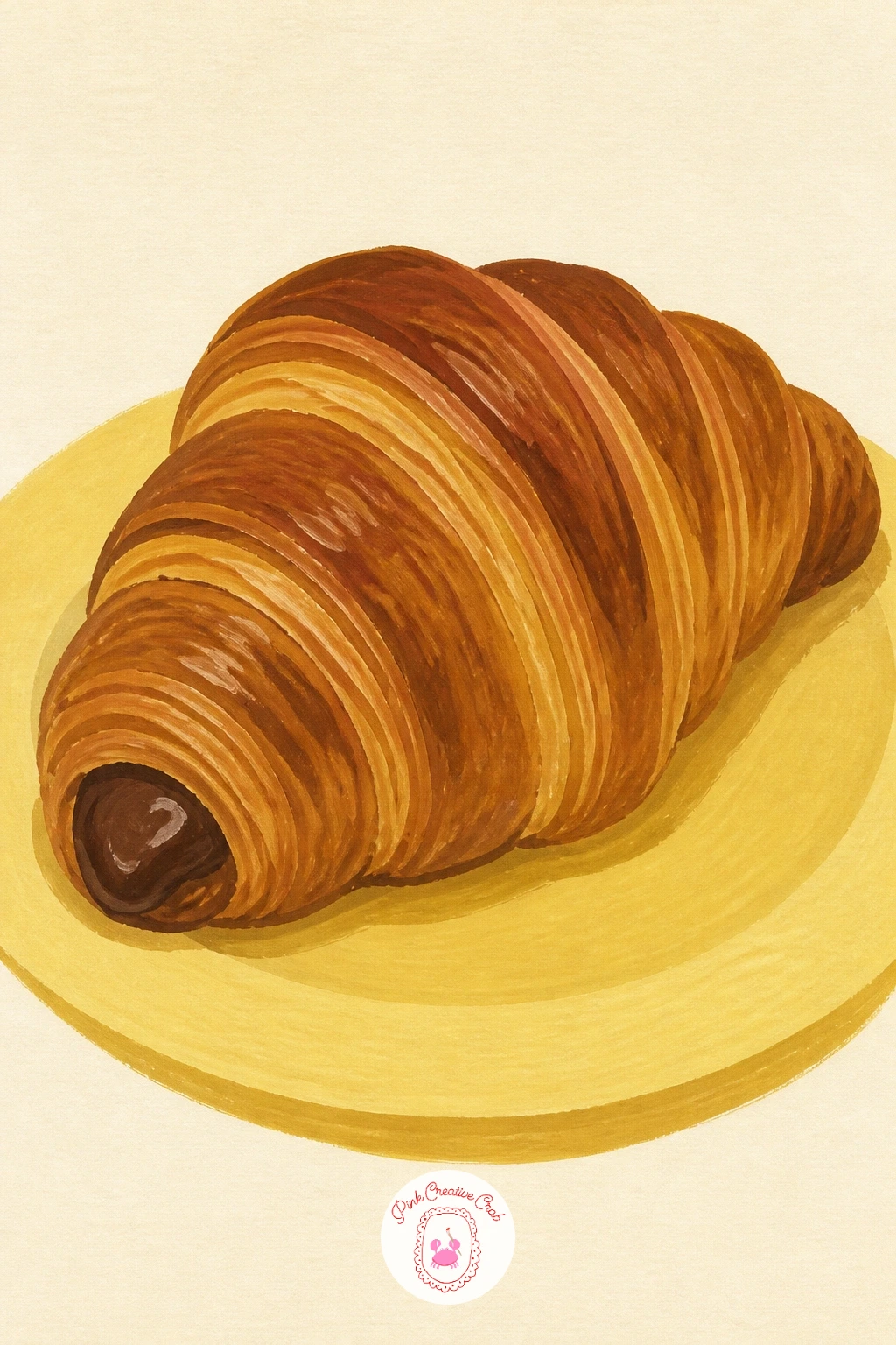
Settle into something smaller again with a chocolate croissant, a subject that rewards a loose, quick hand more than careful outlining. Sketch the curved crescent shape lightly, then break its surface into three or four large flat sections rather than many tiny flakes, since too much detail fights the flat style.
Paint the base croissant color first in one warm golden brown, then while that first layer is fully dry, add a slightly darker brown in long diagonal strokes to suggest the flaky ridges, always following the curve of the crescent rather than cutting across it. The chocolate filling peeking from one end goes in last as a small dark wedge.
If the shape looks stiff and symmetrical, nudge one end slightly higher than the other, real croissants are never perfectly even and that small asymmetry reads as more natural. A butter yellow plate underneath finishes the page quickly.
Ten minutes gets you the crescent and filling alone, forty minutes lets you add that full ridge texture and a dusting of white gouache for sugar on top.
Palette: Golden Brown,Dark Cocoa,Butter Yellow,Cream
Return to small repeated shapes with a tray of bonbons, which is really an exercise in keeping variety inside a tidy grid. Pencil a simple tray outline, then divide it into a loose grid of six to nine bonbon shapes, varying the toppings, a swirl, a dot, a drizzle, so no two look identical even though they share the same base dome shape.
Paint the tray surface first, then each bonbon as one flat base color, letting the whole row dry before adding any topping marks on top, since toppings painted too soon smear into the base. Group your colors in twos or threes, a few brown, a few cream, one or two cherry red, rather than scattering every color across the whole tray.
If the grid starts to feel mechanical, stagger the rows slightly rather than lining every bonbon up in a perfect square, offset rows feel more like a real confectioner’s tray. A thin gold or cream line around the tray edge adds a nice finished border.
Save one bonbon for a bold topping, like a cherry red swirl, it draws the eye and breaks up an otherwise even row.
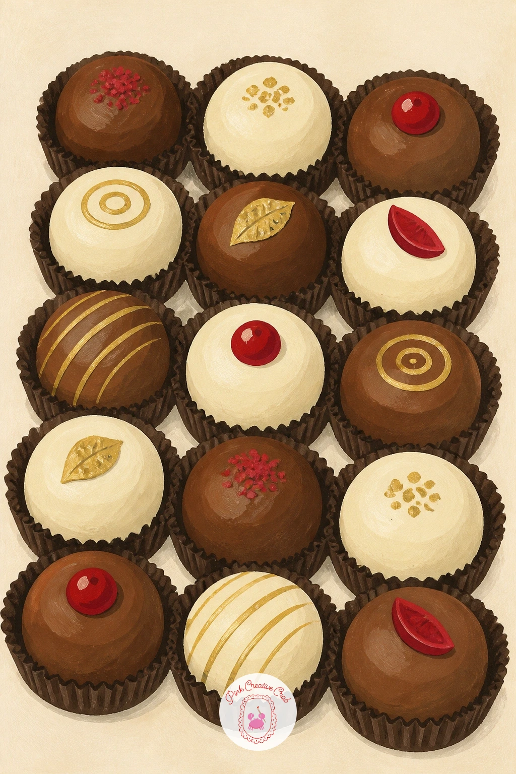
Palette: Chocolate Brown,Cream,Cherry Red,Gold
Try a cocoa pod cut open next, a nice break from desserts and a chance to paint something closer to botanical. Draw the pod’s long ridged oval shape first, then slice one half open in your sketch, showing the row of cocoa beans nestled inside in soft white pulp.
Paint the outer pod in a deep reddish brown or green, following its ridges with slightly darker lines added once the base color is dry, then fill the inner cut half with a pale cream pulp shape before dotting in the individual beans. Keep the beans simple ovals, slightly irregular in size, since a perfectly even row looks more like candy than real seeds.
Looking at reference photos helps here more than with most desserts, since pod color actually ranges from yellow to deep red depending on ripeness, and picking one true color keeps your pod convincing. A whole pod resting beside the cut one adds depth to the page without much extra work.
If ridges feel fussy, three or four confident curved lines say “ridged pod” just as well as a dozen careful ones.
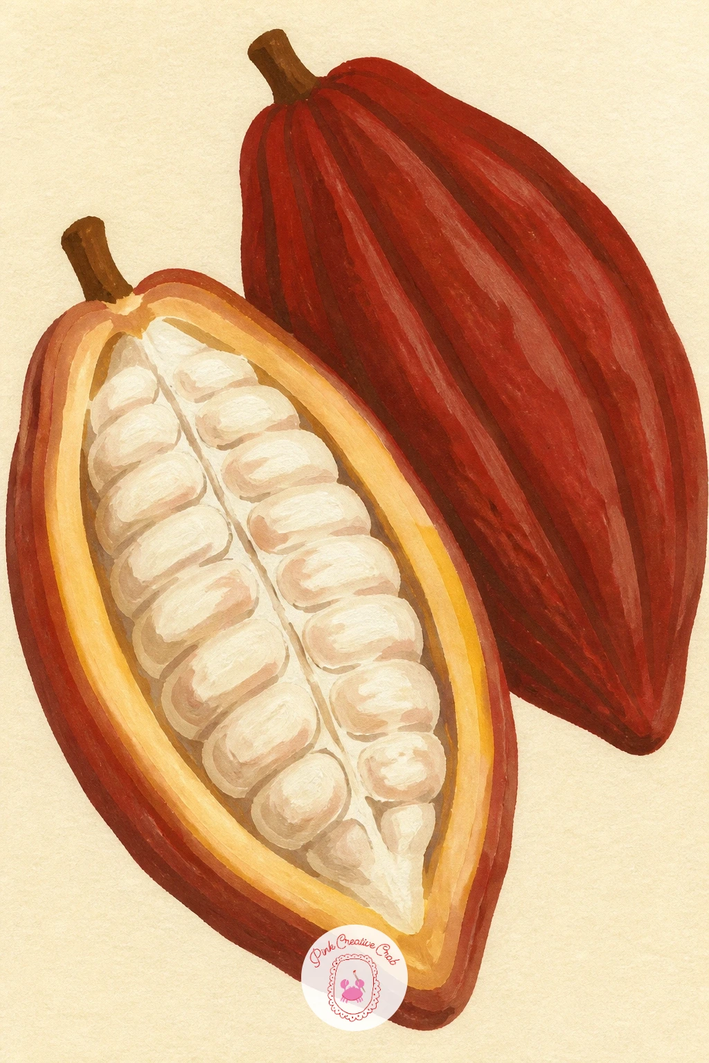
Palette: Rust Red,Olive Green,Cream,Dark Cocoa
Keep the rhythm going with a tray of brownies, cut into neat squares that let you practice crisp edges inside a bigger shape. Pencil the baking tray rectangle first, then rule light grid lines across it to mark where each brownie square gets cut, keeping the lines even so the squares read as deliberately portioned.
Paint the whole tray as one flat dark brown base, let it dry fully, then add the cut lines back in with a slightly lighter brown so each square still reads as part of one connected tray rather than separate floating pieces. A scatter of flat white dots across the top reads instantly as powdered sugar once the brown beneath is bone dry.
If the squares come out uneven, trim your guide lines with a ruler before you paint rather than trying to fix it after, gouache does not erase cleanly once it sets. For speed, four brownies in two rows is a fine ten minute version, while a full nine square tray fills more of the page for a forty minute sitting.
Vary it next time by swapping the powdered sugar for a few whole walnuts painted as simple brown ovals on top.
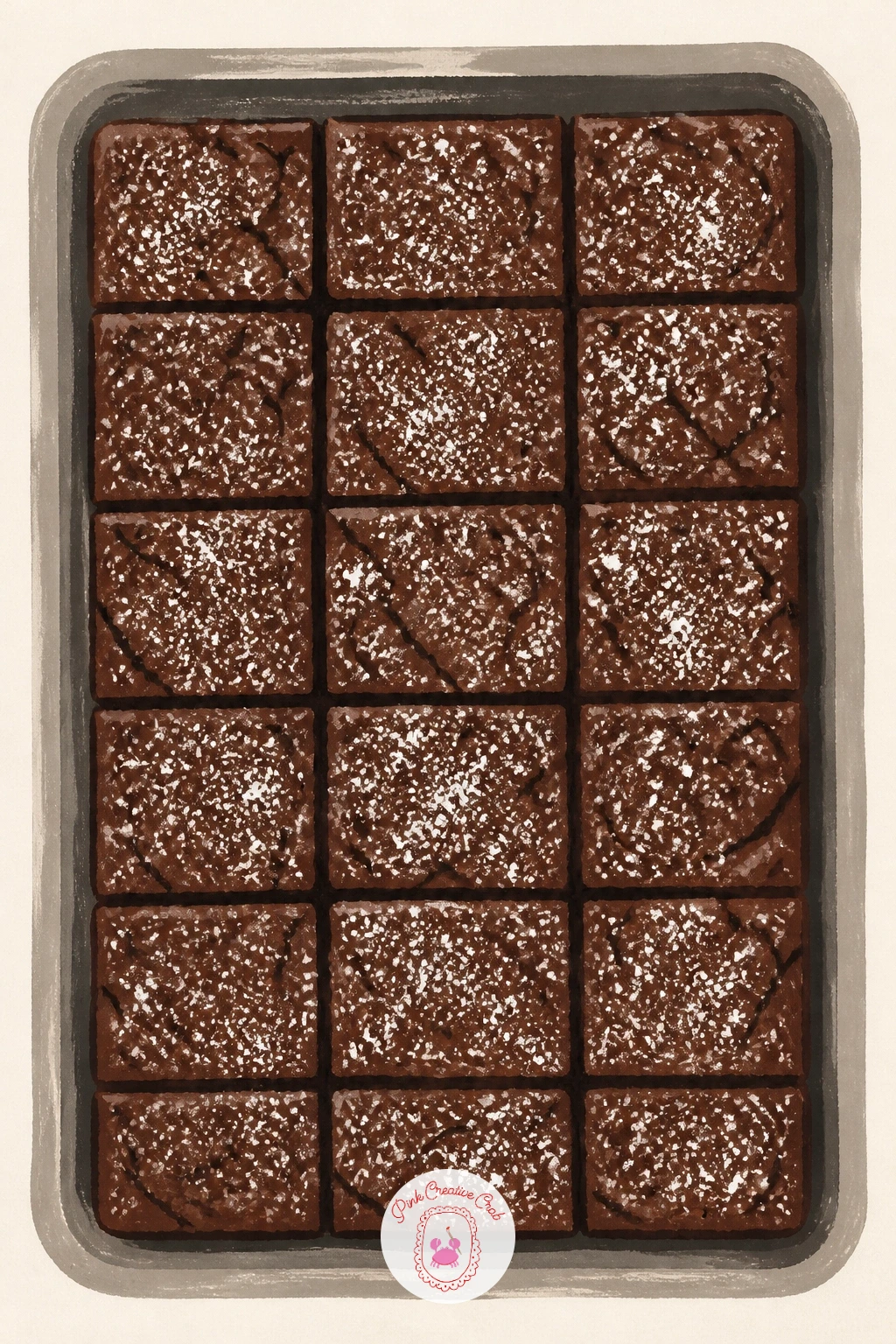
You Will Need
- ruler for grid lines
Palette: Dark Cocoa,Milk Chocolate,Warm White,Cream
Cool things off with a chocolate milkshake, tall and curvy where the brownie tray was all straight lines, a nice contrast in shape language. Sketch the glass first as a simple tapered cylinder, then add the swirl of whipped cream on top and a straw leaning at a slight angle, since a perfectly straight straw looks stiffer than a slightly tilted one.
Paint the milkshake body first in a flat milky brown, then the glass outline in a thin darker line once that is dry, then the whipped cream swirl last in flat white with one or two shadow curves to give it shape. The straw and a cherry on top are the final small details that finish the whole glass.
If the glass looks flat rather than round, add one narrow highlight strip down one side in pale cream, that single strip is often all it takes to suggest glass curving away from the eye. Chocolate shavings scattered on the whipped cream, painted as small dark flecks, add texture without much extra time.
A cherry red cherry on top is an easy, obvious place to land your accent color.
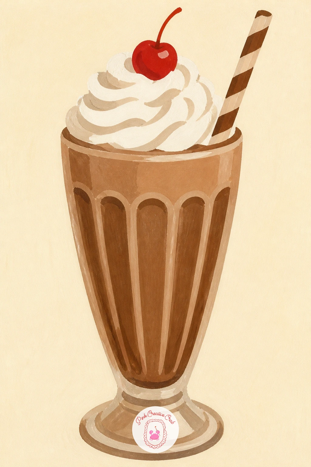
Palette: Milk Chocolate,Warm White,Cherry Red,Cream
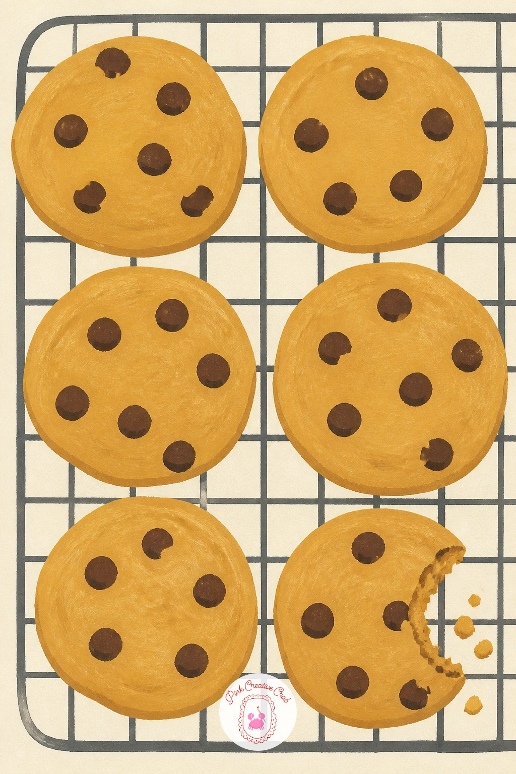
Chocolate chip cookies cooling on a rack is a lovely next subject, since the wire rack gives you a nice geometric base to build the whole scene around. Draw the rack first as a simple grid of thin parallel lines, then place four or five cookie circles resting on top, overlapping the rack lines slightly so they look like they are really sitting there.
Paint the cookies first in a flat warm golden brown, dotting in the chocolate chips while that base is still slightly tacky so each chip sinks in just a touch rather than sitting stiffly on top. The wire rack goes in last, painted as thin confident lines over the dried cookies, since painting the rack first would mean working around it awkwardly.
If chips look too uniform, scatter them in slightly irregular clusters rather than evenly across every cookie, real cookies never distribute chips perfectly. One cookie with a bite taken out adds a nice bit of story to the tray.
Steam lines above one warm cookie, just two or three soft curves, finish the cozy feeling in seconds.
Palette: Golden Brown,Dark Cocoa,Cream,Warm White
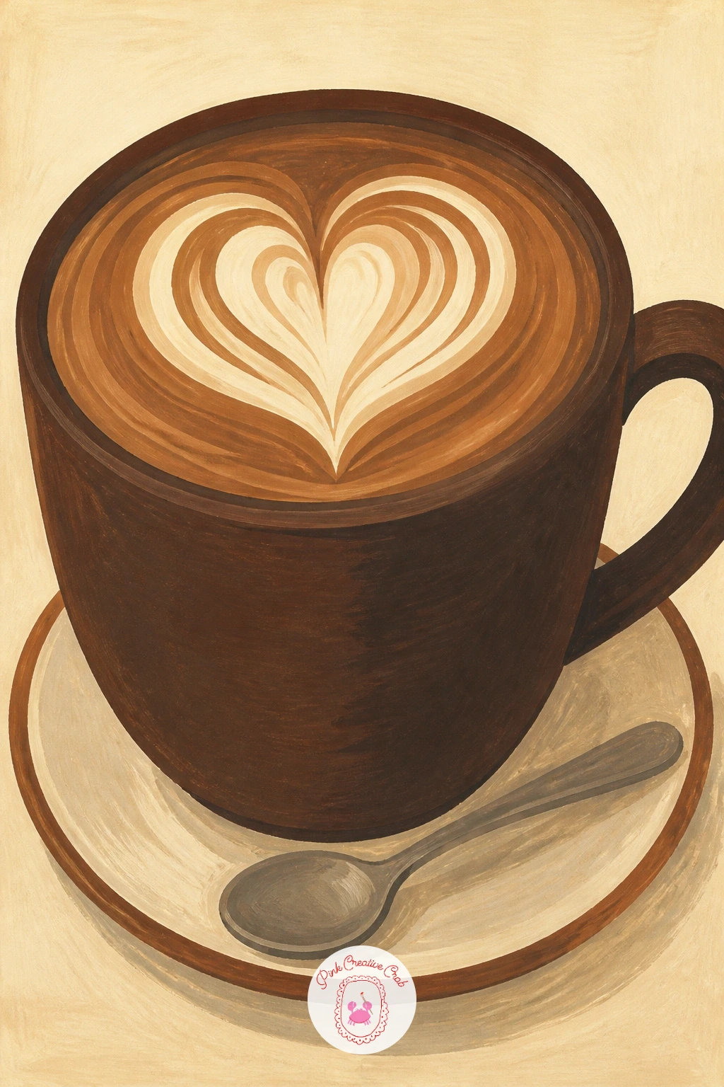
A mocha in a big mug feels like a cousin of the earlier cocoa idea, so lean into the differences, a wider mug, a visible latte art swirl, maybe a saucer underneath. Sketch the oversized mug first, slightly wider than tall, then plan a simple spiral or heart shape for the foam art before you paint anything.
Build the mug in flat color first, then the coffee surface in dark brown once dry, then the foam pattern on top in cream using one continuous unbroken stroke, since a shaky foam swirl is the fastest way to lose the illusion of latte art. A saucer and small spoon beside the mug round out the little table setting.
Light from one side matters more here than in the cocoa mug, since a mocha’s glossy coffee surface shows a clear highlight where the light hits, and adding that one pale streak across the dark coffee sells the shine instantly. If the mug handle looks awkward, a simple curved rectangle reads better than trying to paint a true ellipse from an angle.
Keep the foam pattern simple, one heart or one spiral, a busy pattern fights the flat graphic style.
Palette: Dark Cocoa,Warm White,Cream,Chocolate Brown
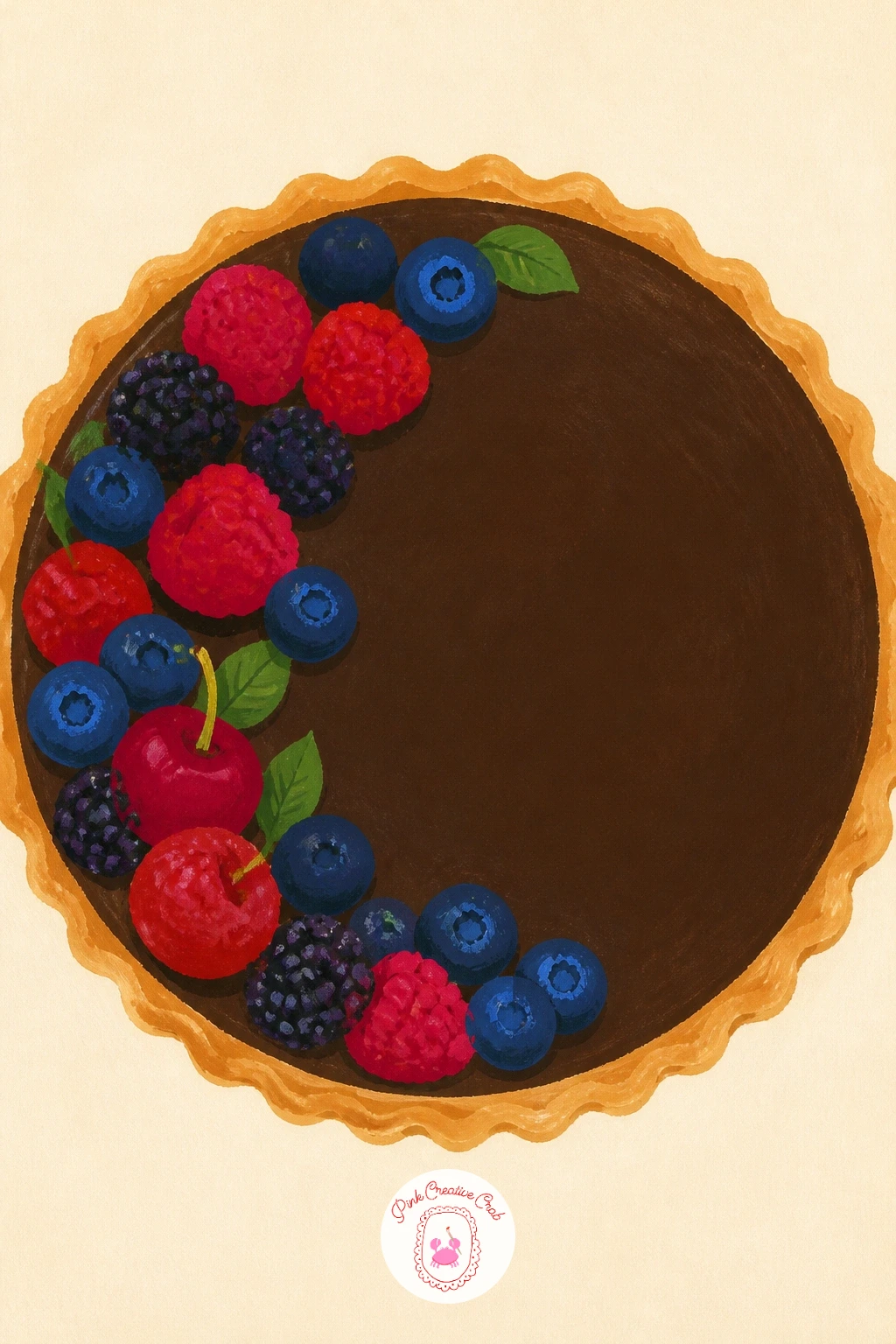
A chocolate tart brings back the slice composition from earlier but with a crisp fluted crust that rewards a steady hand. Draw the circular tart shape first, then mark a scalloped edge around the rim to suggest the fluted pastry case, keeping each scallop roughly the same size so the rim reads as deliberate.
Paint the glossy chocolate filling first as one smooth flat dark circle, letting it dry completely before adding the lighter tan crust around the rim, since the contrast between the two colors is what makes the tart look baked rather than flat painted. A thin pale highlight streak across the chocolate surface, added last with a dry brush, suggests the shine of set ganache.
If the scalloped edge feels fiddly to paint evenly, stamp light pencil dots around the rim first as a spacing guide before committing to the brush. A few fresh berries arranged along one edge of the tart break up the dark circle nicely and work in a red accent.
Dry brushing that highlight rather than painting it wet keeps the streak crisp instead of smudged.
Palette: Dark Cocoa,Golden Tan,Cherry Red,Cream
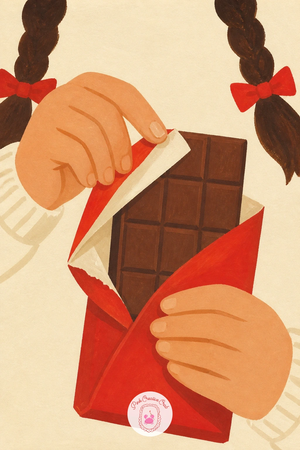
Bring a little character back with a girl unwrapping a chocolate bar, her hands and the wrapper doing most of the storytelling. Sketch a simple close cropped view, just her hands and the top half of the bar, rather than a full figure, since cropping tight keeps the composition easy to manage and more intimate.
Paint the wrapper first in your accent color, leaving the chocolate bar itself as a flat brown rectangle underneath, then add her hands last in a simple flat skin tone with minimal finger detail, two or three curved lines are enough to suggest fingers in this graphic style. Keep the wrapper peeled back at an angle rather than straight across, it reads as a real mid-unwrap moment.
If hands feel intimidating, the BFF drawing ideas page has some friendly starting points for drawing simple hands and gestures at this level. A torn edge on the wrapper, painted as a jagged line rather than smooth, adds a nice bit of texture.
Keep her hands overlapping the bar slightly rather than floating beside it, overlap is what makes the whole gesture feel believable.
Palette: Cherry Red,Chocolate Brown,Skin Tone,Cream
A chocolate ice cream cone is a satisfying shape study, two scoops stacked with a little lean to one side so the whole thing feels light rather than stiff. Draw the cone as a simple triangle with a crosshatch texture plan, then stack two rounded scoop shapes above it, offsetting the top scoop slightly so it does not sit perfectly centered.
Paint the scoops first in flat chocolate brown, letting each one dry before the next so the edges where they meet stay crisp, then add the waffle cone’s crosshatch pattern last in thin confident diagonal lines over a dried golden base. A few drips running down the cone, painted as thin tapering lines, suggest melting without needing any blending.
If the scoops look too symmetrical and stiff, tilt the whole cone a few degrees off vertical, a slight lean instantly makes a dessert feel handheld rather than posed. One small detail like a chocolate flake pressed into the top scoop finishes the page quickly.
Keep the crosshatch lines loose and slightly uneven, a perfectly even waffle grid actually looks less convincing than a casual one.
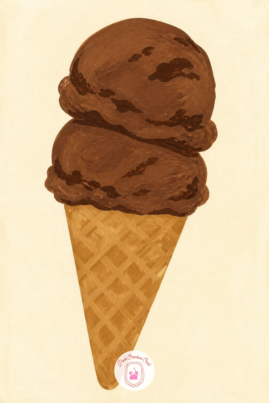
Palette: Dark Cocoa,Golden Tan,Cream,Chocolate Brown
S’mores by a campfire adds a light source to think about, since the glowing fire changes the color of everything near it. Sketch the stacked s’more first, graham cracker, chocolate square, toasted marshmallow, then a few simple flame shapes beside or beneath it to suggest the campfire without painting a full fire pit scene.
Paint the s’more layers first in their true flat colors, then once dry, warm the shadow sides of each layer with a touch of orange or red mixed in, since that warm glow is what ties the dessert convincingly to the fire beside it. The toasted marshmallow benefits from a dry brush dragged lightly over a darker brown base, which leaves soft streaky marks that read as char without any fine detail work.
If the flames look too cartoonish, two or three overlapping curved shapes in orange and yellow read calmer and more convincing than sharp pointed flame shapes. Keep the fire small and tucked to one side so the s’more itself stays the clear star of the page.
That dry brush char effect on the marshmallow is worth practicing once on scrap paper before the final page.
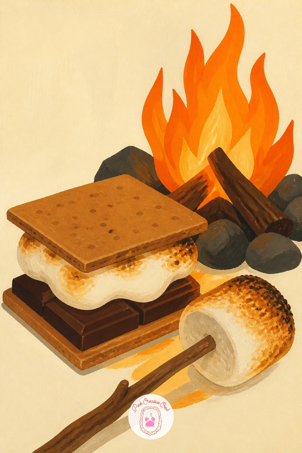
Palette: Golden Brown,Dark Cocoa,Cherry Red,Butter Yellow
A chocolate mousse in a glass is a quieter subject after the campfire, built on soft layers rather than sharp detail. Draw a simple short glass first, then divide its interior into two or three horizontal layers, mousse, cream, a few chocolate shavings on top, before adding any color.
Paint the glass outline lightly, then fill each layer from the bottom up, letting every layer dry before adding the next so the horizontal bands stay crisp rather than bleeding together. The whipped cream top layer works best left slightly lighter than you think it should be, since gouache darkens a touch as it dries and a too-dark cream layer loses its contrast with the mousse beneath.
If the glass looks flat, one thin vertical highlight down the side, left as bare cream paper or a pale stroke, instantly suggests glass catching light. A few curls of dark chocolate shaving scattered on top, painted as small simple spirals, finish the glass with very little extra effort.
A small spoon resting against the glass is an easy way to add a bit more to the page without adding real difficulty.
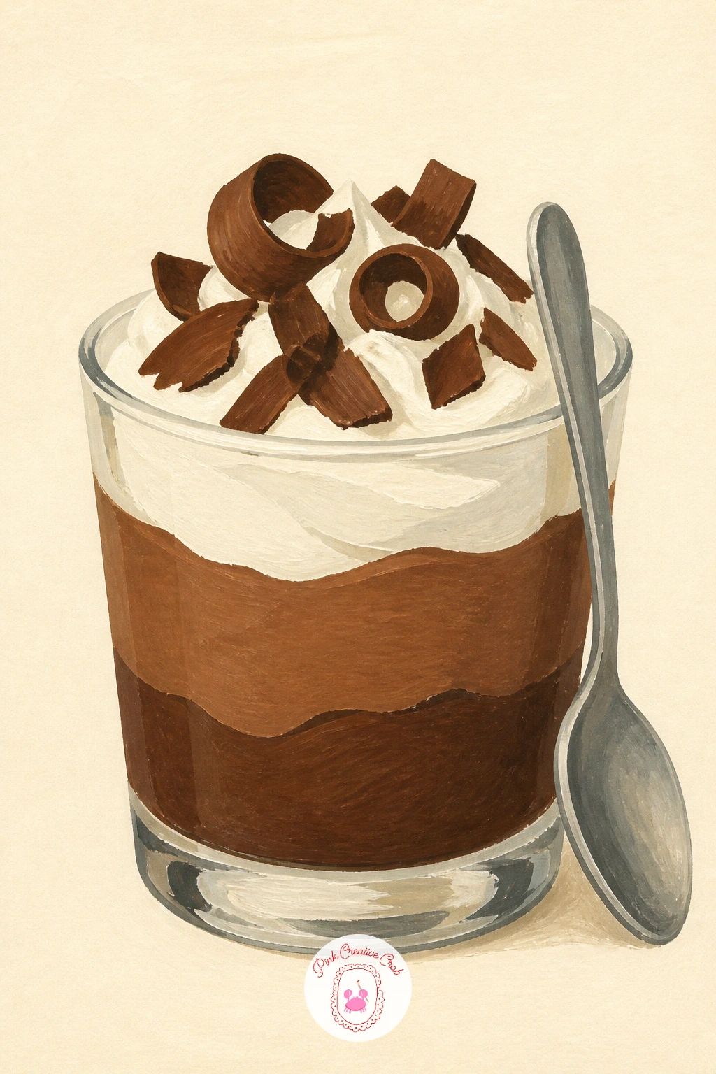
Palette: Dark Cocoa,Milk Chocolate,Warm White,Cream
Hazelnut spread on toast is a nice everyday subject that still fits the cozy dessert theme, and it is one of the quicker ideas on this list to finish. Sketch a simple slice of toast first, slightly irregular around the edges rather than a perfect rectangle, then plan the spread as one swooping shape rather than a flat even layer.
Paint the toast base in a warm golden brown first, leaving the crust edge a touch darker, then once dry, add the hazelnut spread in rich chocolate brown with a visible swirl pattern left by a knife, a single curved stroke or two is enough to suggest that motion. A few whole hazelnuts scattered on top or beside the toast, painted as simple ovals, finish the page.
If the toast looks too stiff, an uneven, slightly torn crust line is an easy fix and instantly more believable than a ruler-straight edge. For a quicker version, skip the scattered hazelnuts and let the swirled spread carry the whole picture.
Keep the spread’s edge uneven and a little drippy at the crust, that small detail makes it look freshly spread rather than printed on.
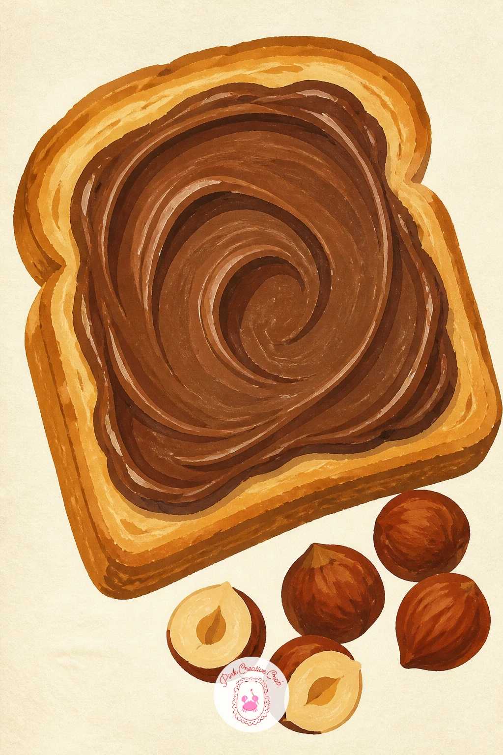
Palette: Golden Brown,Dark Cocoa,Milk Chocolate,Cream
Gather a collection of pretty wrappers next, a flat lay style subject that is really an exercise in pattern and color balance. Scatter four or five wrapper shapes loosely across the page in pencil first, some flat, some slightly crumpled, overlapping just a little so the arrangement feels casual rather than lined up.
Paint the largest wrapper shapes first in flat color blocks, then add their individual patterns, stripes, dots, a small foil shine, once each base color is dry, working smallest and most detailed wrapper last so you do not smudge finished work while reaching across the page. Vary your two or three wrapper colors clearly, repeating the exact same color twice makes the collection look less intentional.
If the crumpled wrappers look stiff, a few short angled lines inside the shape suggest foil creases without needing real shading. This is a lovely one to revisit later with a completely different color scheme, since the same loose scattered layout works for any season or palette.
Keep one wrapper fully flat and unwrinkled among the crumpled ones, that contrast reads as more natural than uniform crumpling everywhere.
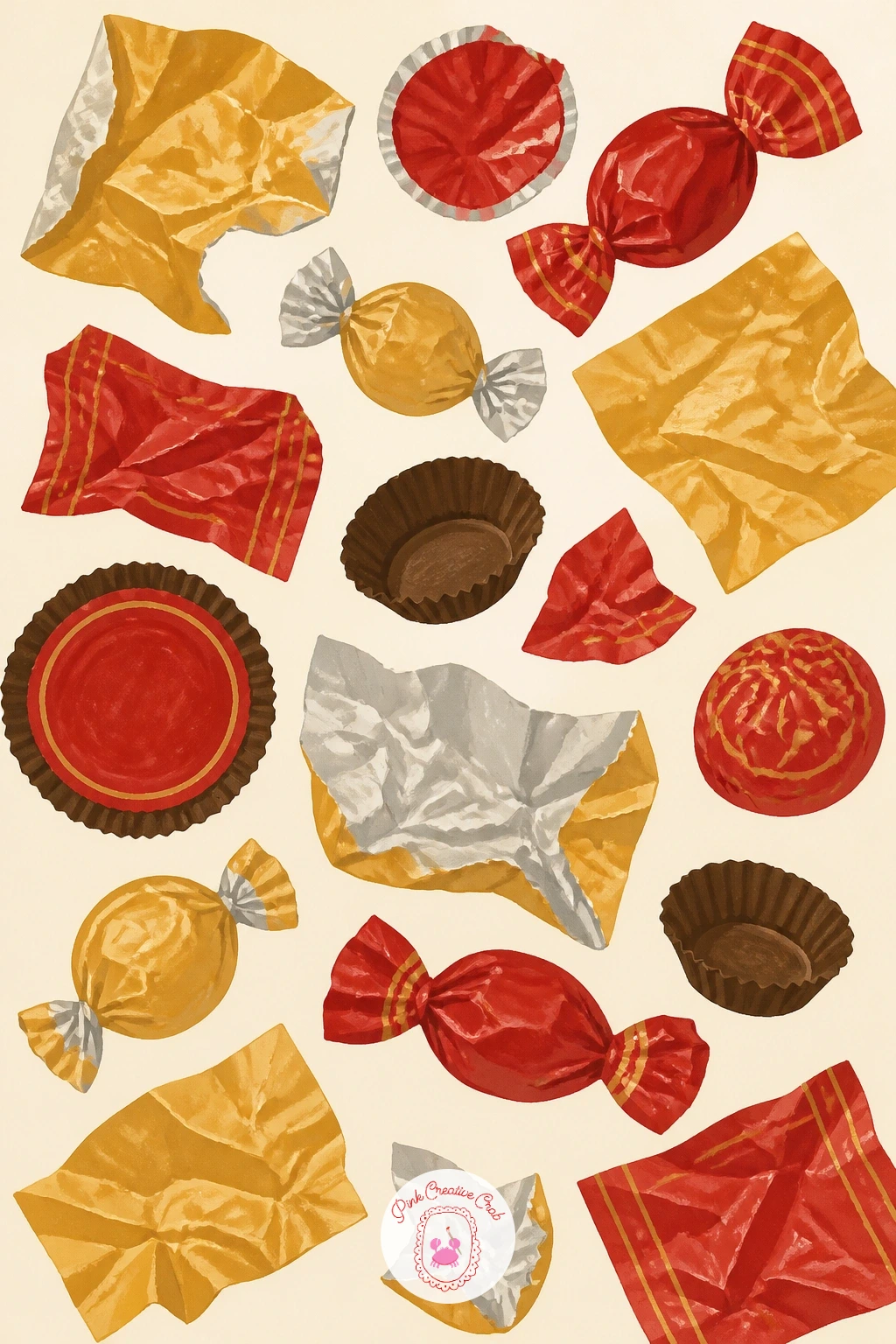
Palette: Cherry Red,Butter Yellow,Gold,Cream
Chocolate letters, the kind given as little gifts, let you combine simple shape drawing with a touch of lettering design. Pick one short word or a single initial, sketch it in large bold block letters first, then thicken each stroke evenly so the letter reads clearly as a solid chocolate shape rather than a thin outline.
Paint the letter in one flat chocolate brown, keeping the edges crisp with a smaller brush around any curves or corners, then once fully dry, add a thin lighter brown line along one edge to suggest the letter catching light, which gives it some dimension without real shading. A dusting of cocoa powder, painted as a few soft flat dots around the base, finishes the little scene.
If the letter shape warps while painting, work in short sections rather than trying to load one brushstroke across the whole word, patience here keeps the edges honest. A simple ribbon or paper tag resting beside the letter is an easy way to add more to the composition.
Choose a letter with mostly straight strokes for your first try, curved letters like S or O take a steadier hand.
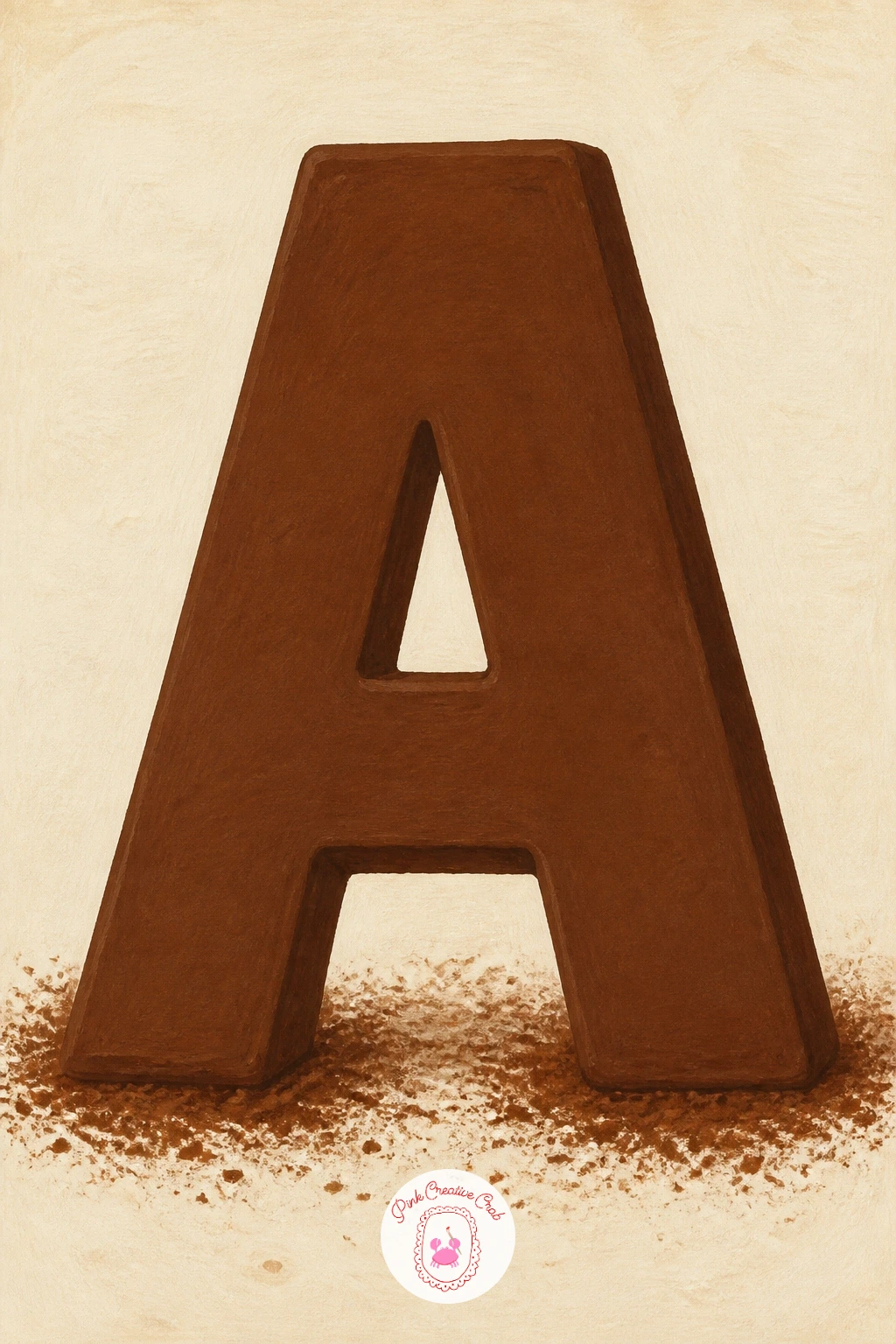
Palette: Chocolate Brown,Milk Chocolate,Cream,Cherry Red
A chocolate pudding in a small dish is one of the simplest remaining subjects, so use it to practice restraint, fewer marks done well beats a crowded page. Draw a simple round dish first, then the pudding surface as a smooth dome rising just above the rim, with one small dollop of cream on top.
Paint the dish in a flat cream or pale color, then the pudding itself in one smooth even layer of dark chocolate brown, working quickly in one direction so brush strokes do not show through once it dries. The dollop of whipped cream on top goes in last, kept small and slightly off center so it does not compete with the smooth dark surface beneath it.
If the pudding surface looks patchy, thin your gouache slightly more than usual for this one shape, a slightly wetter mix flows into one even layer more easily than a thick stiff mix. A single chocolate curl resting on the cream dollop is the one extra detail worth adding.
Resist the urge to add texture lines to the pudding itself, the smooth flat surface is what makes it look rich.
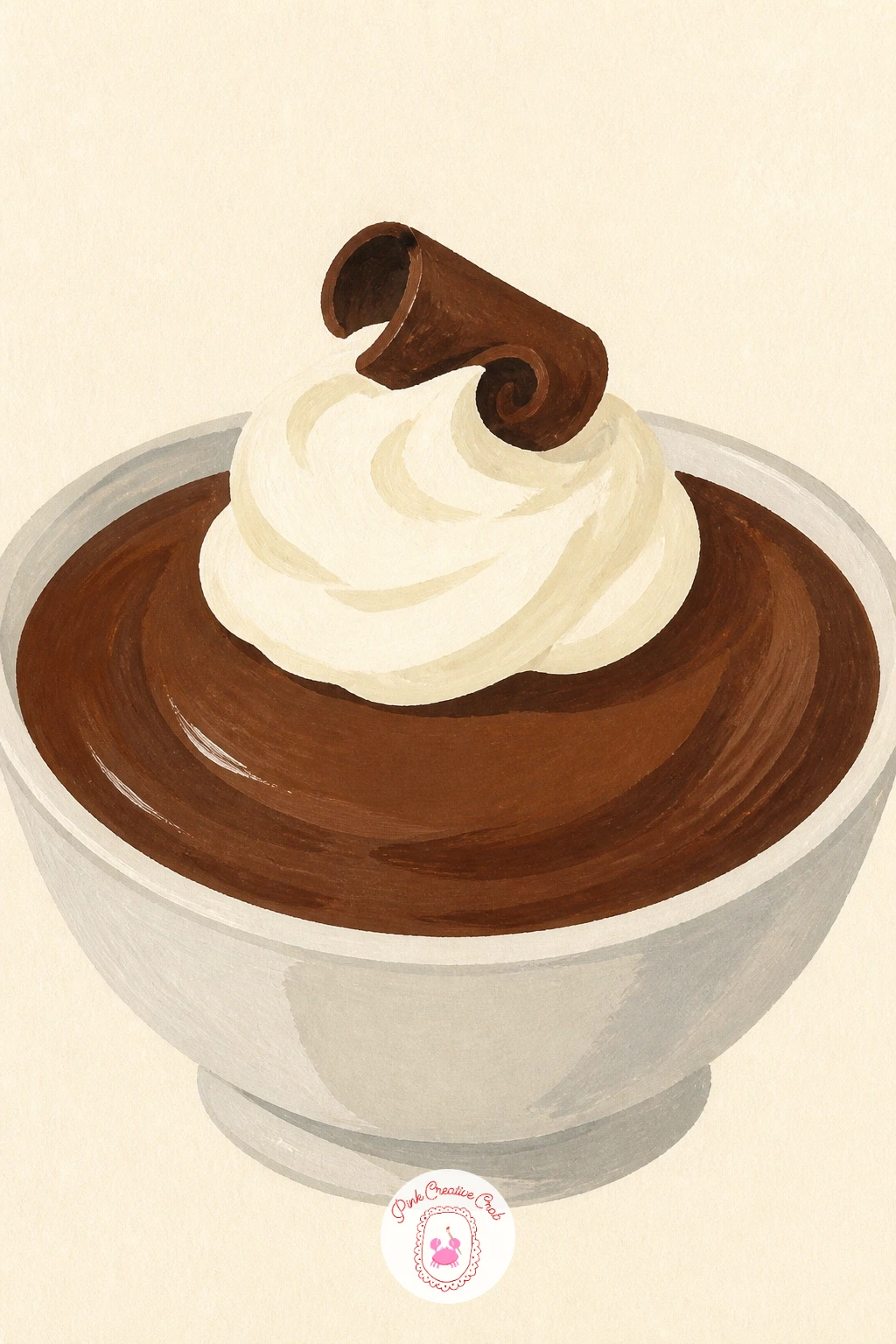
Palette: Dark Cocoa,Warm White,Cream,Milk Chocolate
A chocolate gift box brings back the ribbon and lid shapes from the truffle box idea, but dressed up for giving rather than opened and ready to eat. Sketch the box as a simple rectangle with a separate lid shape sitting slightly askew on top, as though it has just been set down rather than perfectly centered.
Paint the box body in one flat color first, then the ribbon crossing over the top in your accent color, keeping the ribbon’s crossing point crisp by letting each strip dry before painting the one that crosses over it. A small bow or simple knot shape sits on top, painted last in two or three confident loops rather than many fussy little folds.
If the ribbon looks flat and lifeless, a thin darker line along one edge of each ribbon strip suggests a fold and gives it a bit of dimension fast. Vary this one next time by swapping the ribbon color or adding a small gift tag for a different occasion.
Keep the bow loops uneven in size rather than perfectly symmetrical, real ribbon never ties into a perfectly even bow.
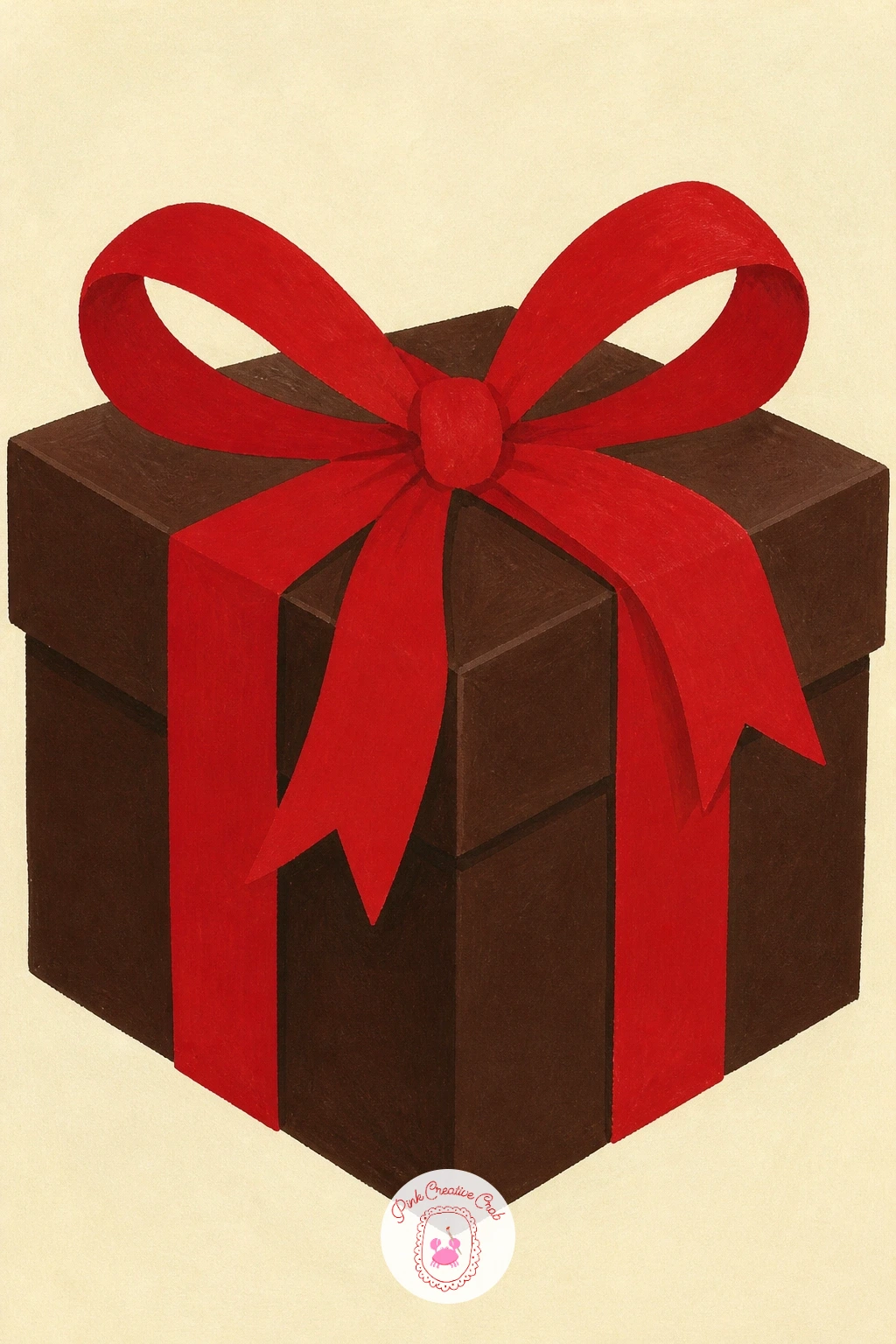
Palette: Cherry Red,Chocolate Brown,Gold,Cream
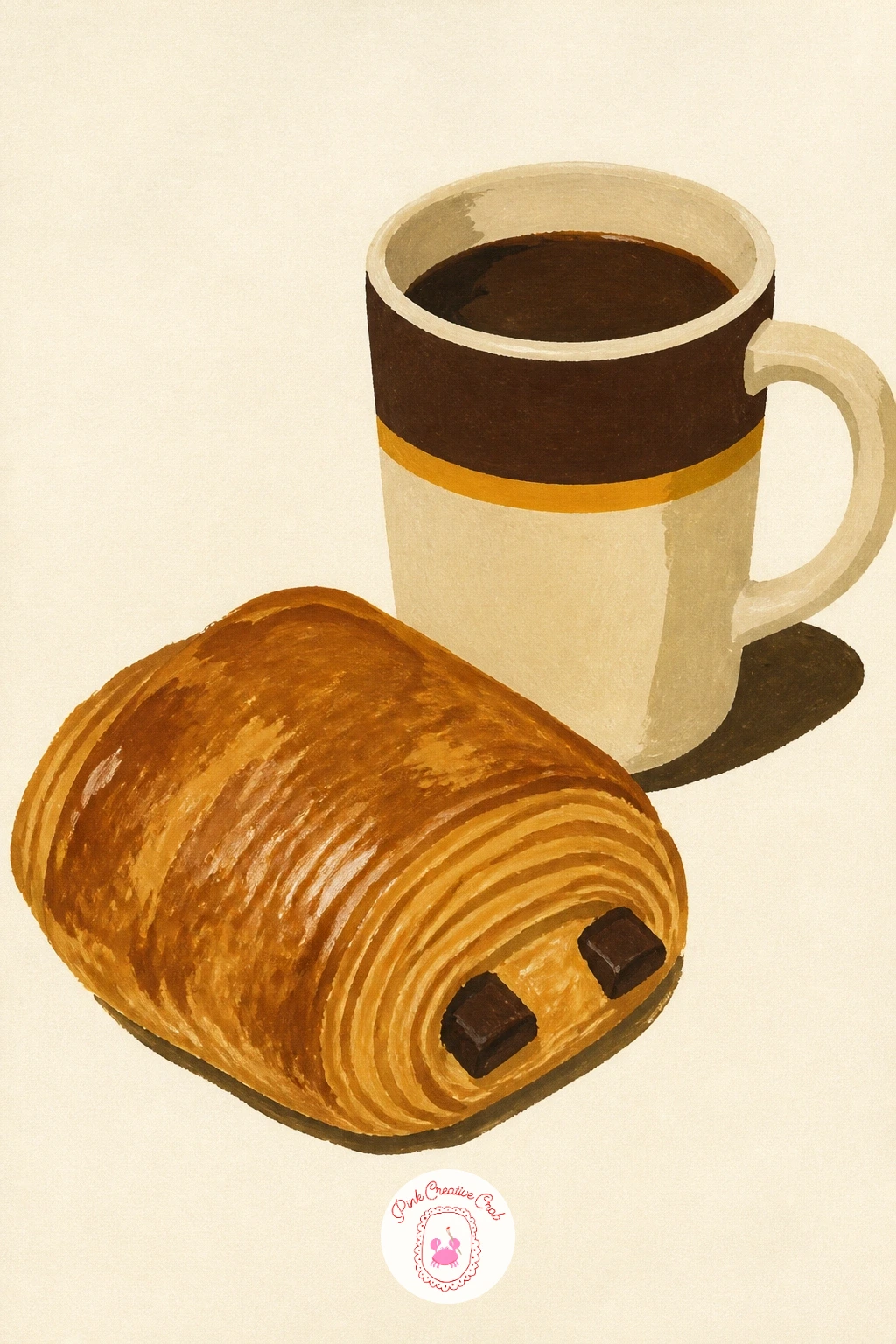
A pain au chocolat with coffee pairs two shapes you have already practiced, a layered pastry and a simple mug, side by side on a small table setting. Sketch the pastry first as a rounded rectangle with soft flaky ridges, then place a mug just behind or beside it, overlapping slightly so the two feel like one composed scene rather than two separate drawings.
Paint the pastry in its warm golden tones first, ridges added once the base dries, then the two dark chocolate strips running through the center, which is the detail that instantly identifies a pain au chocolat over a plain croissant. The coffee mug comes last, painted in the same flat method used in the earlier cocoa and mocha ideas.
If the two objects feel disconnected on the page, a shared shadow shape painted beneath both of them ties the whole scene together in one quick step. A small saucer under the mug also helps anchor the composition.
For a related cozy scene with similar bakery energy, the Japan sketchbook ideas include a few tea house moments built the same simple way.
Palette: Golden Brown,Dark Cocoa,Cream,Chocolate Brown
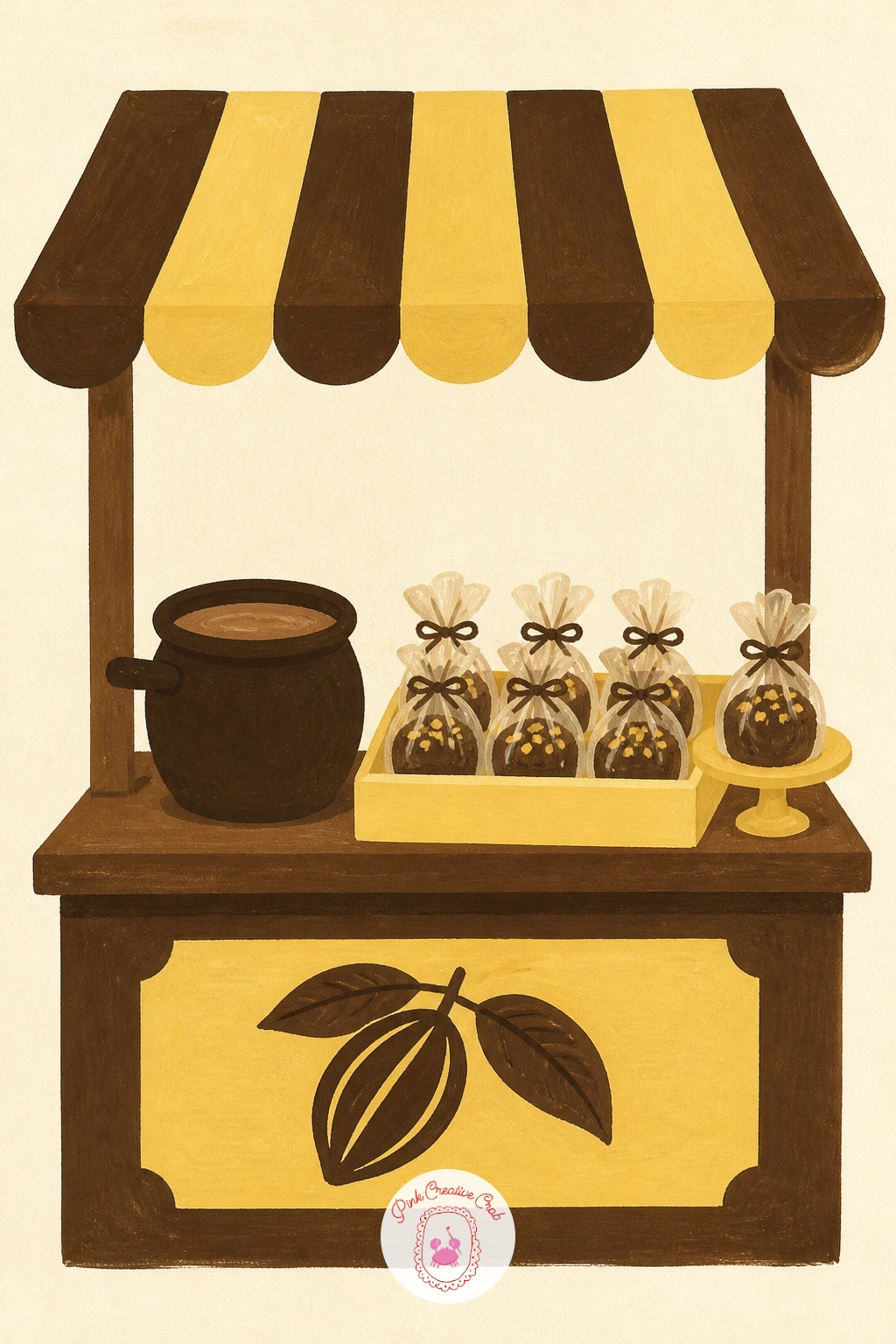
A cocoa stall at a village market is the most involved scene on this list, so plan it in simple blocks before adding any treats. Sketch the stall structure first, a simple canopy shape and a counter line, then place three or four small items along the counter, a few wrapped sweets, a jar, a small sign, keeping each one a basic shape rather than a detailed object.
Build the scene in clear stages, canopy and structure first, counter surface next, then the small items along it last, letting each stage dry before the next so colors stay separate and crisp. Keep the background behind the stall almost empty, just a soft flat color or a hint of another stall shape, since a busy market background competes with the stall itself at this scale.
If the whole scene feels overwhelming to plan, start with only the canopy and counter, finish that fully, and only then decide how many small items you genuinely have room and patience for. A string of small flags or bunting across the canopy top adds festivity in one quick repeated shape.
Keep the counter items few and well spaced rather than crowding the stall, three confident shapes beat eight fussy ones.
Palette: Butter Yellow,Chocolate Brown,Cherry Red,Cream
For more small scene composition practice with the same tidy, uncluttered feel, the village scene drawing ideas work through similar little stalls and shopfronts step by step.
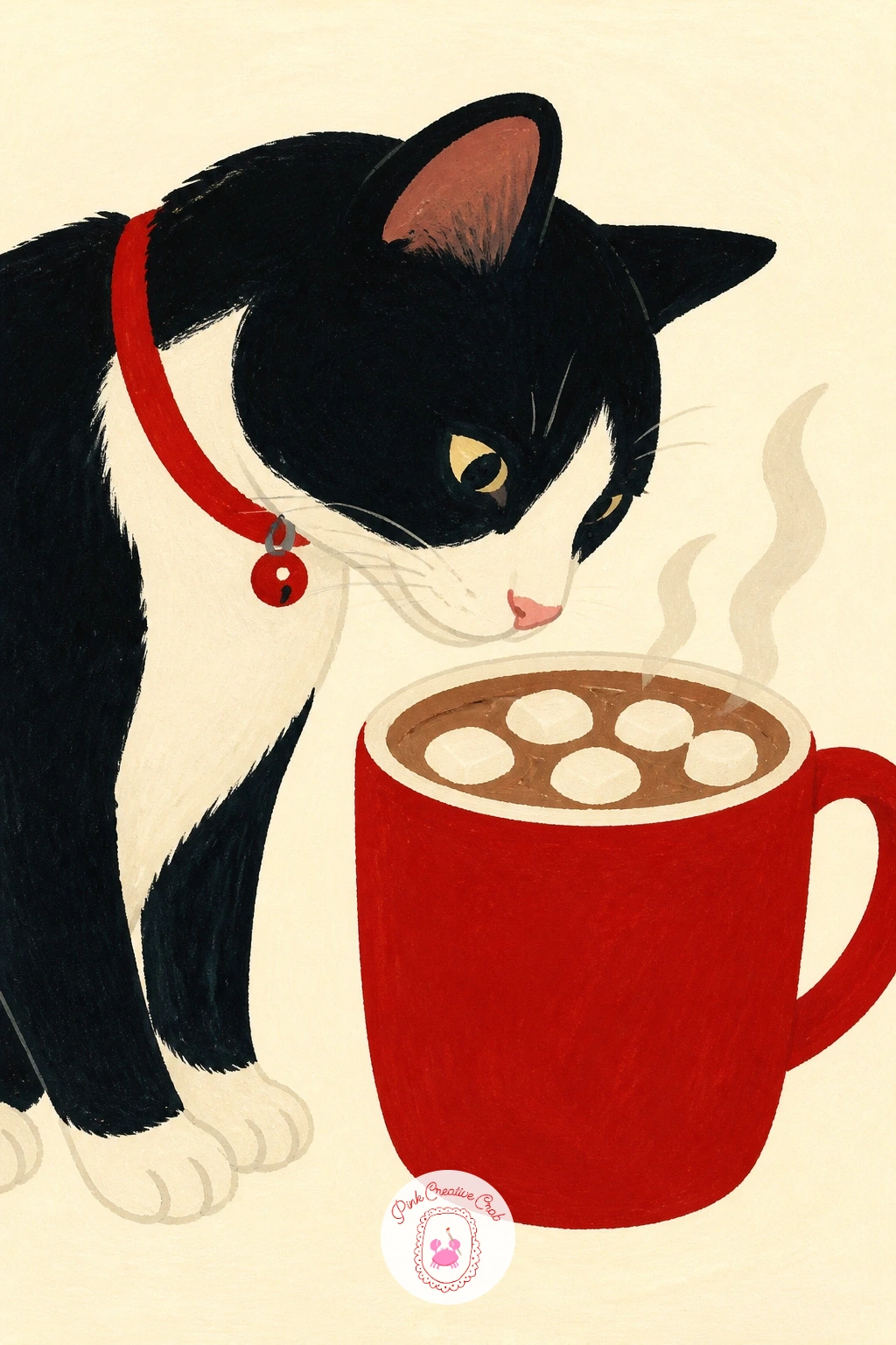
Close the list with a cat sniffing a hot chocolate, a sweet pairing of a simple animal shape with the mug you already practiced earlier in the list. Sketch the mug first exactly as before, then add the cat beside it, built from a rounded body, triangular ears and one curved tail, leaning its head toward the steam rather than toward the viewer.
Paint the mug and cocoa first using the same flat layering as your earlier cocoa mug, then the cat last in one flat fur color, keeping its face simple, two dot eyes, a tiny triangle nose, since too much facial detail fights the flat graphic style of the rest of the article. The steam curling toward the cat’s nose is the detail that ties the whole scene together, so give it a touch more care than steam alone would get.
If the cat’s pose looks stiff, tilt its head and ears slightly toward the mug rather than keeping everything upright and symmetrical, that small tilt reads instantly as curiosity. A cherry red collar is a simple, obvious place for your accent color on this final piece.
Keep the cat’s shape made of only three or four large curves, a fussy, many-lined cat looks out of place beside all the flat treats around it.
Palette: Warm Grey,Chocolate Brown,Cherry Red,Cream
What to Do Next
Pick whichever treat is calling to you most right now, truffles and cocoa are the easiest places to start, and keep a sheet of the same heavy paper ready so the flat gouache layers dry clean. Work through a few more from the list over the week, the same simple shapes and steady layering carry every one of them.
Frequently Asked Questions
What is the best medium for a chocolate drawing like these?
Gouache suits chocolate drawing best because it dries to a flat matte finish and covers evenly in one layer. Acrylic works as a close substitute if gouache is not on hand, since both dry fast and sit opaque on paper.
How do I keep chocolate browns from looking muddy?
Let each layer dry fully before adding the next, since wet brown painted over wet brown blends into a dull gray-brown. Mix brown from a warm red and a dark blue or green rather than straight from the tube for richer color.
What paper works best for these gouache treats?
A heavier illustration paper or gouache pad, at least 300 gsm, handles the flat layered washes in this style without buckling. Thinner sketch paper can warp once two or three wet layers go down one on top of another.
Do I need to draw a full pencil sketch before painting chocolate subjects?
A light pencil outline of the main shapes helps keep edges crisp in this flat graphic style, especially for grids like brownies or bonbons. Keep the pencil lines faint, since gouache does not always fully cover a heavy line underneath.
How can I make my chocolate drawings feel cozy rather than flat?
Add one small living detail, steam, a melting drip, a tilted cat, since that single touch of movement warms up an otherwise static flat shape. A limited palette with one bright accent color also keeps the whole scene feeling inviting rather than cold.
Have any thoughts?
Share your reaction or leave a quick response — we’d love to hear what you think!
-
 0
-
0
-
0
-
0
-
0
-
0


