

Sketchbook cover ideas are the fastest way to turn a plain notebook into something you actually want to carry around, and the front cover is the one page that never gets buried behind a hundred others. Give it twenty minutes with a few paint markers and suddenly the whole book feels like yours before you have even drawn on a single inside page.
Below you will find thirty one covers, from a quick monogram with flowers to a full city skyline, all built with the same handful of tools so you can start with whatever is already in your pencil case. Pick one that matches the mood of the book inside, grab your markers, and fill that front cover today.
Using these images: free for personal projects such as printing, coloring, cards, journals and gifts. Handmade items that include them may be sold up to 30 pieces per design. More than that is commercial use and is not permitted, and neither is selling or sharing the images themselves or passing them off as your own. Please ask before any other use.
Flowers and your initials make the gentlest cover to start with, because the layout is just one big letter with blooms tucked around it. Pencil your initial large in the center first, three or four inches tall, then build small flowers and leaves around its curves until they frame the letter rather than cover it.
Work the letter in solid Posca color first, then add the flowers in two or three shades so the eye still finds the initial under all the petals. If the flowers start to crowd the letter into mush, stop adding stems and outline the letter in black or white to pull it back forward.
No Posca set on hand works fine with acrylic paint and a thin brush, you just need to let each flower dry before the next one touches it. If this is your first cover ever, draw the letter with a stencil or printed outline underneath the kraft cover as a guide, then trace it through in pencil before you paint.
Keep one tip in mind: pick flower colors that already sit together in nature, like dusty pink with sage green, so the whole cover feels chosen rather than random.
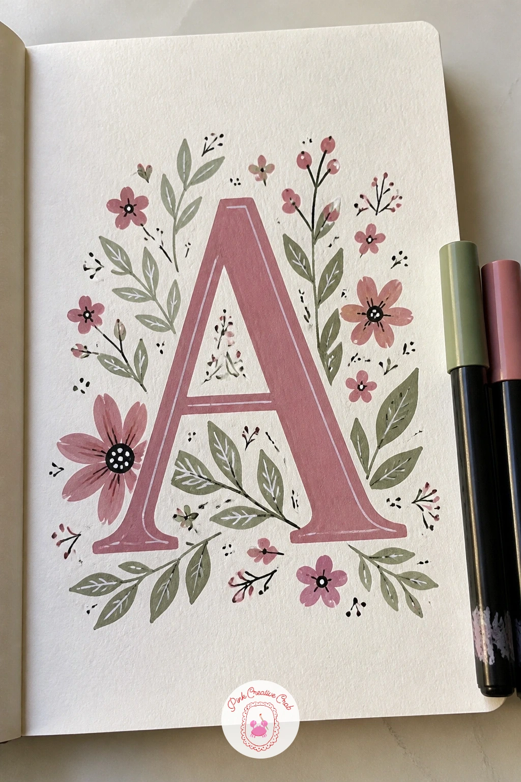
You Will Need
- letter stencil or printed initial for tracing
Palette: Dusty Rose,Sage Green,Mustard Yellow,Soft White
A cat peeking over the edge turns the bottom of the cover into a little stage, with just the top of a head and two ears showing above the line. Pencil a horizon line about a third of the way up from the bottom, then draw the cat’s head, ears and two paws resting on that line as if the rest of the body hangs off the cover.
Paint the face shape first in flat orange, grey or black, add the ears and paws, then go back in with a fine marker for the eyes, nose and a few whisker lines last. The usual slip here is making the head too small against the cover, so measure it against your own hand span before you commit to the size, a head the width of three fingers reads clearly from across a room.
No orange or grey marker in your set, plain black and white still makes a strong cat this way. For a fun variation next time, add a second smaller cat peeking from the opposite corner, or swap the cat for a curious dog.
For more feline inspiration, these cat watercolor ideas work nicely as a reference for expression even though you are painting in flat marker here.
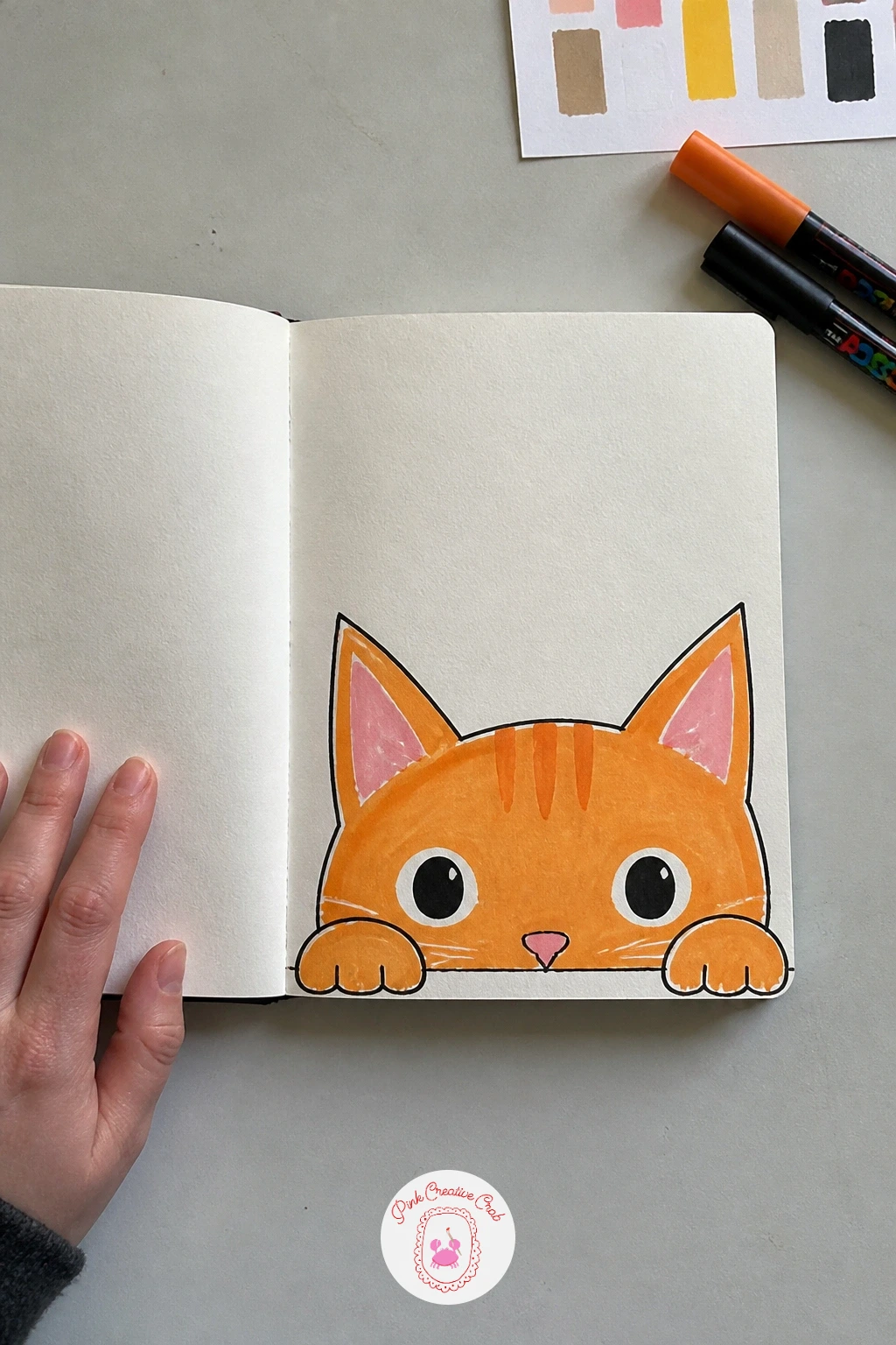
Palette: Burnt Orange,Charcoal Black,Cream,Soft Pink
Moon phases line up beautifully across a cover because the shapes repeat at a steady size, which makes this one of the easiest covers to measure out evenly. Pencil a row of six or eight small circles across the middle of the cover, spaced with a ruler so the gaps match, then paint each one as a different phase from full to new moon.
Fill the dark portion of each moon in deep navy or black first, leave the lit portion in white or cream, then go back with a fine white marker to add soft craters on the brightest moons. The spacing usually goes wrong when the first few circles are drawn too close together, so mark all the center points in pencil before you paint a single one.
No compass or circle stencil, a bottle cap or coin traced in pencil gives you a consistent circle size instead. Once this version works, try arranging the phases in a soft arc instead of a straight line for a more dreamy feel.
One tip for today: paint the night sky background in deep navy before placing the moons, that way the white phases pop immediately instead of looking washed out against bare kraft.
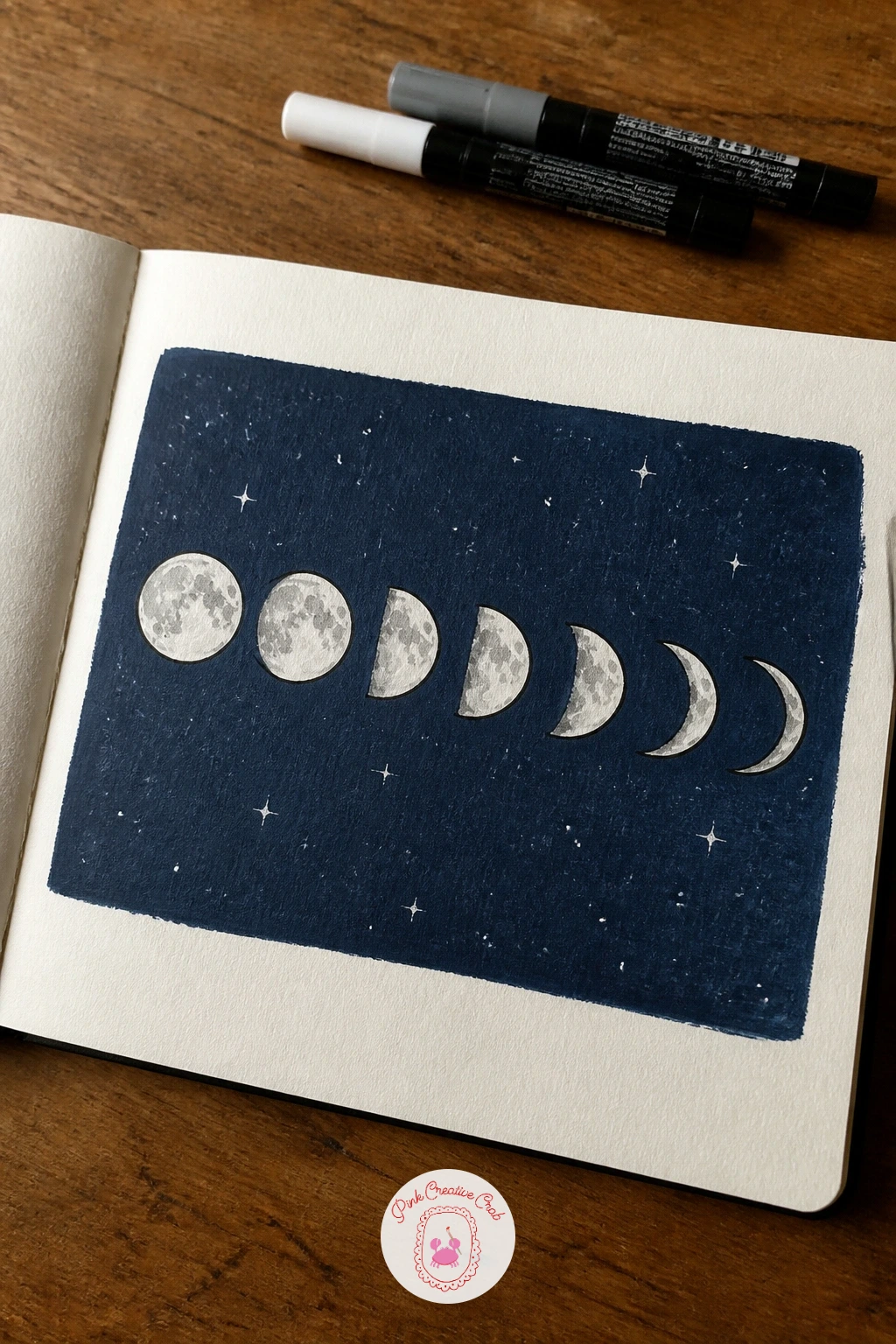
You Will Need
- small circle stencil or bottle cap for tracing
Palette: Deep Navy,Soft White,Silver Grey,Charcoal Black
A checkerboard with a cherry gives the cover a bold graphic base before any detail goes on top, and it is one of the quickest patterns to get looking sharp. Pencil a light grid of even squares across the whole cover, four or five across, then fill alternating squares solid with your darkest color while leaving the others bare or in a second shade.
Paint the checkerboard squares first and let them dry completely, then drop a single plump cherry with its stem curling across two or three squares near one corner. The grid falls apart fastest when the squares drift uneven as you go, so use a ruler for every line rather than eyeballing it halfway through.
No ruler nearby, folding the cover in half repeatedly gives you crease lines that work as a rough grid guide instead. For a quick ten minute version, keep the checkerboard to one corner only; given forty minutes, extend it edge to edge and add a second smaller cherry trailing off the first.
Keep the cherry glossy by leaving one small white highlight dot unpainted on each round shape, it reads as shine instantly.
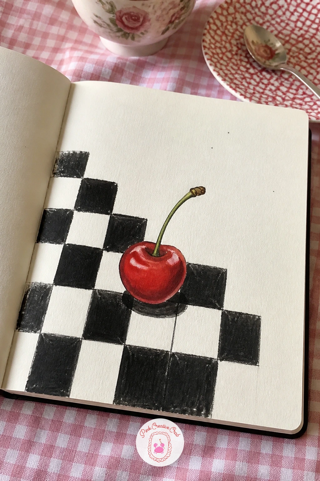
You Will Need
- ruler for grid lines
Palette: Cherry Red,Charcoal Black,Soft White,Forest Green
A mushroom forest cover moves the design into a small scene rather than a single motif, with three or four mushrooms of different heights clustered near the bottom of the cover. Sketch the mushroom caps first as simple domes and ovals, varying the sizes so the cluster reads as a little forest floor, then add short stems beneath each cap.
Paint the caps in warm red, brown and cream, let them dry, then dot white spots on the red ones and add a few blades of grass and tiny white dots for spores drifting up. Mushrooms usually end up looking flat and sticker-like if every cap faces forward the same way, so tilt one or two caps slightly sideways to break the symmetry.
No red marker to hand, a cluster of all brown and cream mushrooms looks just as charming and a little more woodland. Think about the light source before you shade: if it comes from the upper left, keep the right edge of each cap a touch darker so the cluster feels grounded rather than pasted on.
Finish with a scatter of tiny dots or dashes around the mushrooms to suggest moss, it fills the empty space without adding more drawing.
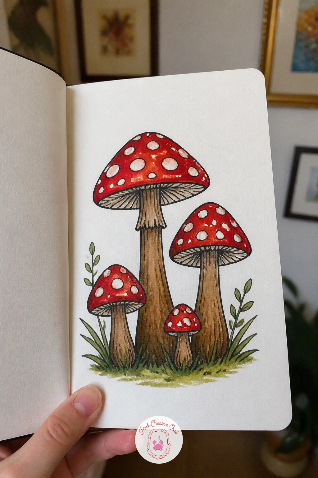
Palette: Poppy Red,Cream,Umber Brown,Moss Green
A window with a sea view borrows a frame-within-a-frame trick, where an open window shape sits in the middle of the cover and the sea fills the space behind it. Pencil a simple window frame first, square or arched, then draw the horizon line and a few wave shapes inside that frame as if you are looking straight out at the water.
Paint the sky and sea in flat bands of blue first, working inside the window shape only, then paint the frame itself last in white or cream so any stray sea color gets covered by the frame’s edge. The scene falls flat without a sense of distance, so keep the sea near the horizon a paler blue and the water closest to the frame a deeper shade.
No arched window, a plain square frame with shutters reads just as well and is easier to keep straight with a ruler. If you enjoy this one, the easy beach watercolor ideas offer more wave and horizon tricks worth borrowing for the next cover.
Add one small sailboat or seagull near the horizon line, it gives the eye somewhere to land inside all that blue.
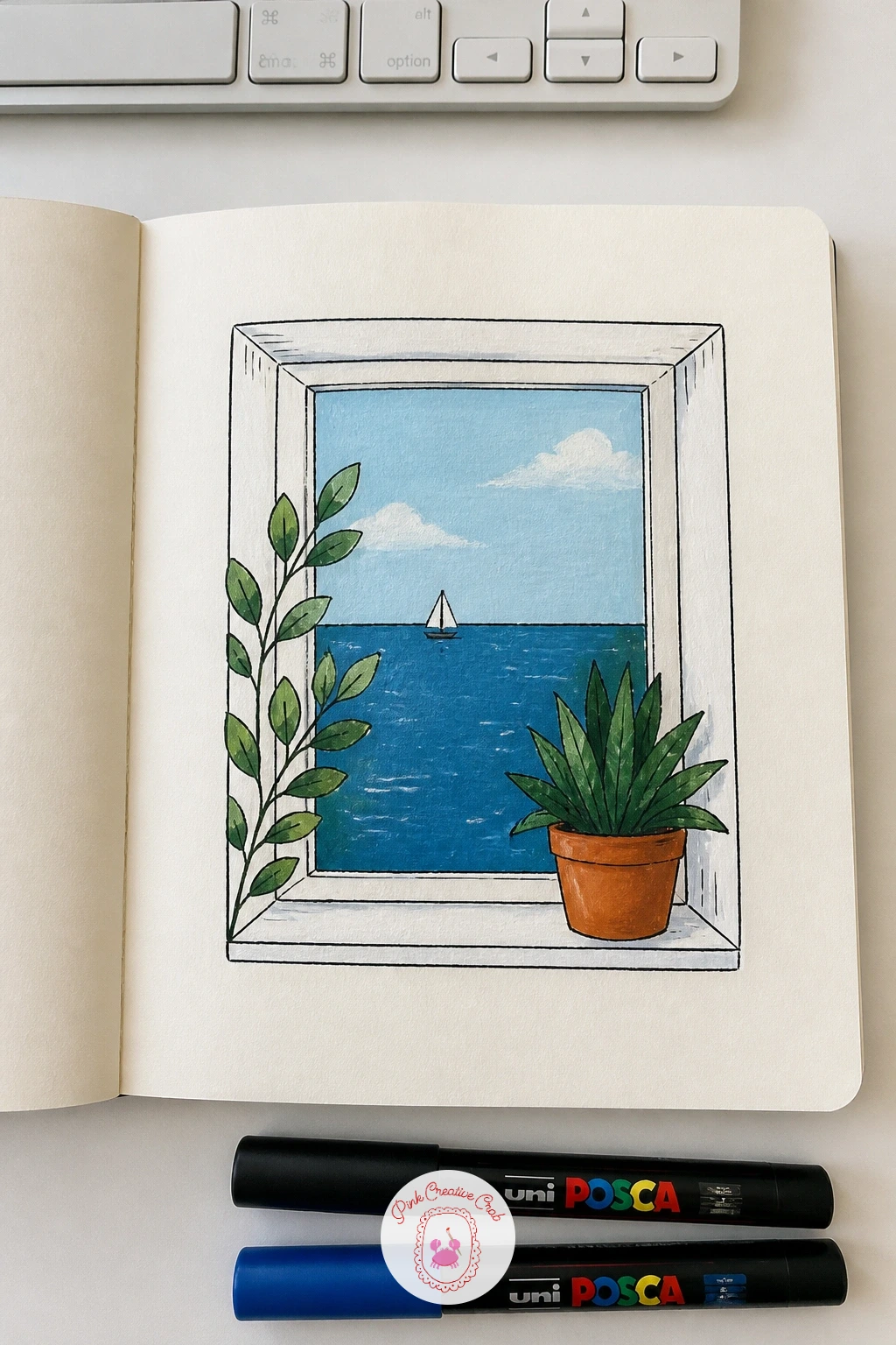
Palette: Sky Blue,Deep Sea Blue,Soft White,Sand Beige
Stickers and stamps turn the cover into a travel trunk, with a loose collection of painted postage stamps, luggage labels and little icons overlapping across the surface. Sketch five or six different shapes first, a rectangle stamp, a round seal, a torn label, scattered at angles rather than in a neat row, then fill each one with a tiny motif like a flower, a flag or a number.
Paint the shapes in flat color first, add a scalloped or torn edge to a couple of them with a fine marker, then finish with tiny dotted lines around the stamp edges to mimic perforation. The layout turns messy fast if every shape is the same size, so make one stamp noticeably larger as a focal point and keep the rest smaller around it.
No stamp reference in mind, old postcards or luggage tags online give plenty of shapes to borrow. For a quick ten minute cover, paint just three overlapping stamps in one corner; with forty minutes, spread six or seven across the whole front with a bit of overlap.
Use a ruler only for the straight-edged stamps and draw the round ones freehand, mixing the two keeps the whole thing feeling collected rather than drafted.
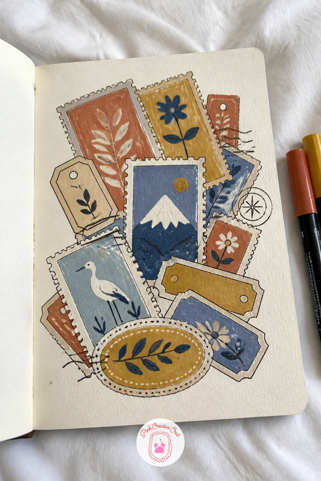
Palette: Mustard Yellow,Terracotta,Dusty Blue,Cream
A botanical frame with a title label keeps the center of the cover empty on purpose, leaving room for a small rectangle label where you can write the book’s name or the year. Pencil a loose wreath of leaves and small flowers around the outer edge of the cover first, leaving the middle third completely clear.
Paint the greenery in two shades for depth, then add the label shape in the center last so it sits clearly on top of the open space. The wreath can swallow the label if the leaves creep too far inward, so leave more empty space around the label than feels necessary while you are sketching, it always tightens up once paint goes on.
No two greens on hand, one olive shade with white highlight strokes still gives the leaves enough variation. These flower sketchbook ideas are worth a look for extra leaf and bloom shapes to mix into the frame.
Write the title inside the label last, in a simple print rather than fancy script, so it stays legible at a glance from across a desk.
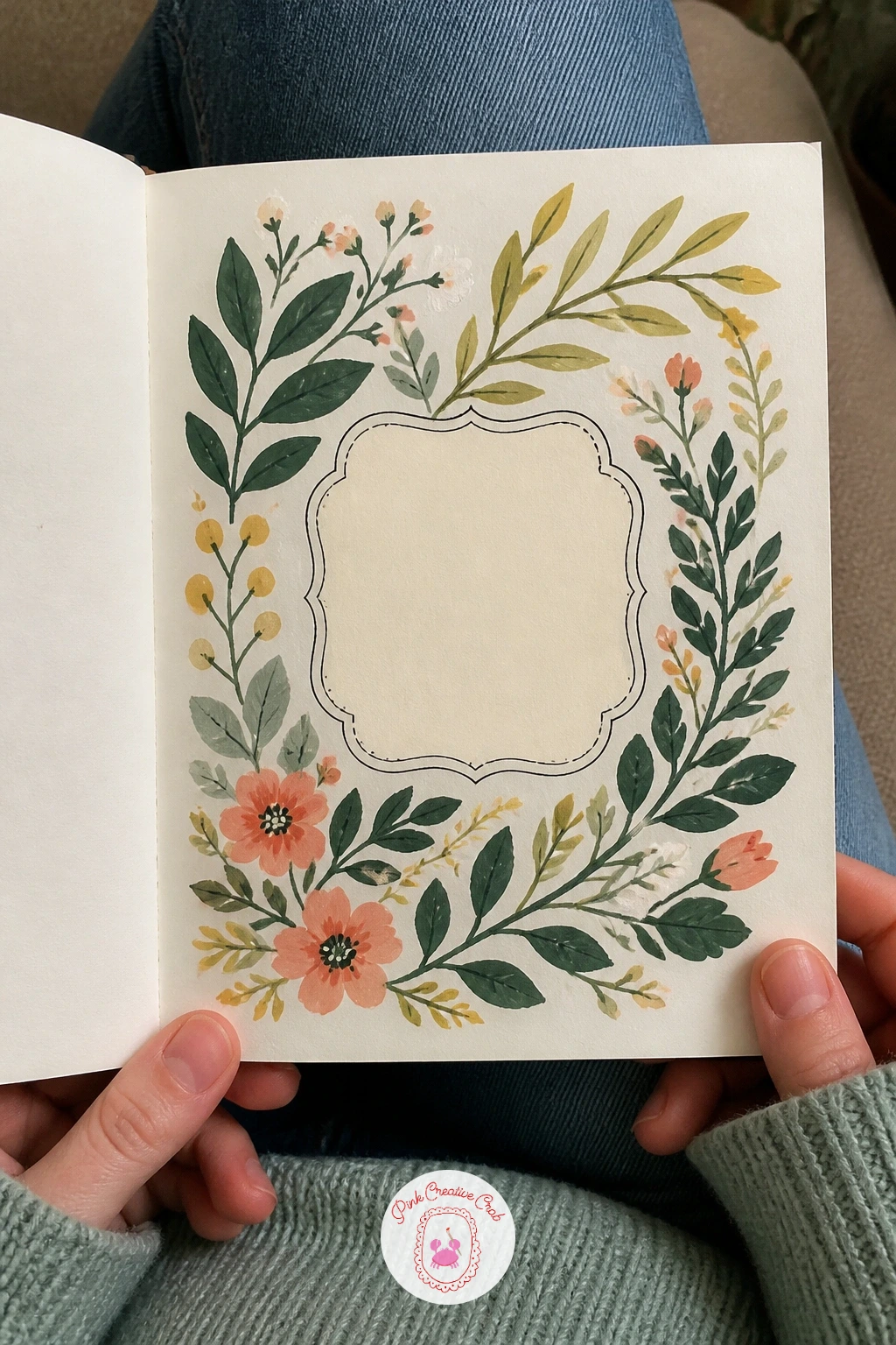
Palette: Olive Green,Sage Green,Cream,Dusty Rose
A giant strawberry works as one bold shape filling almost the whole cover, so it rewards confident painting more than careful drawing. Pencil one large strawberry outline from edge to edge, pointed end down, then fill it solid in bright red before any seeds or leaves go on top.
Once the red dries, dot the seeds on in small yellow marks following the curve of the fruit, then add the green leafy cap at the top last so it sits crisp against the red. Seeds painted too evenly in rows look like a grid instead of a strawberry, so scatter them slightly off pattern and let some cluster closer together near the tip.
No bright red on hand, a coral or raspberry pink still gives the same cheerful punch. For a bolder version next time, cut the strawberry in half instead so the pale seeded center shows, a nice contrast to the solid version here.
Leave one curved streak of the red unpainted near the top of the fruit, it reads instantly as a shine or highlight without any extra blending.
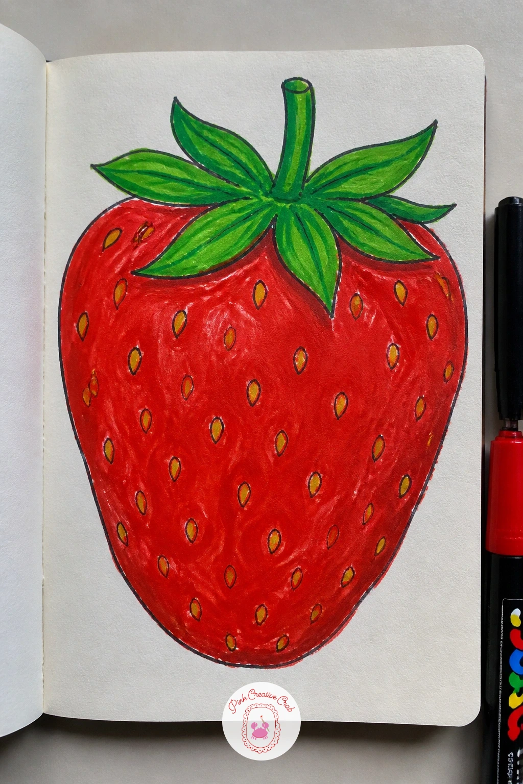
Palette: Cherry Red,Golden Yellow,Forest Green,Soft White
A vintage library label cover borrows the look of an old card catalog card, with a ruled rectangle, small printed lines and a borrowed-date stamp look near the bottom. Pencil a rectangle label slightly smaller than the cover, then rule a few thin horizontal lines inside it like the lines on an old library card.
Paint the label background in aged cream or tan first, add the ruled lines in a soft grey, then write a title and a few mock due dates in a typewriter-style print along the lines. The look falls apart if the lettering is too neat, so let the letters sit slightly uneven and press a little harder on some strokes than others to mimic an old rubber stamp.
No tan marker handy, plain cream over a kraft cover already looks aged enough without extra tinting. Once this version works, try adding a small red stamped circle in one corner, like an old return stamp, for extra character.
Smudge the edges of the “stamp” letters very slightly with a dry finger while the ink is still damp, it sells the worn look instantly.
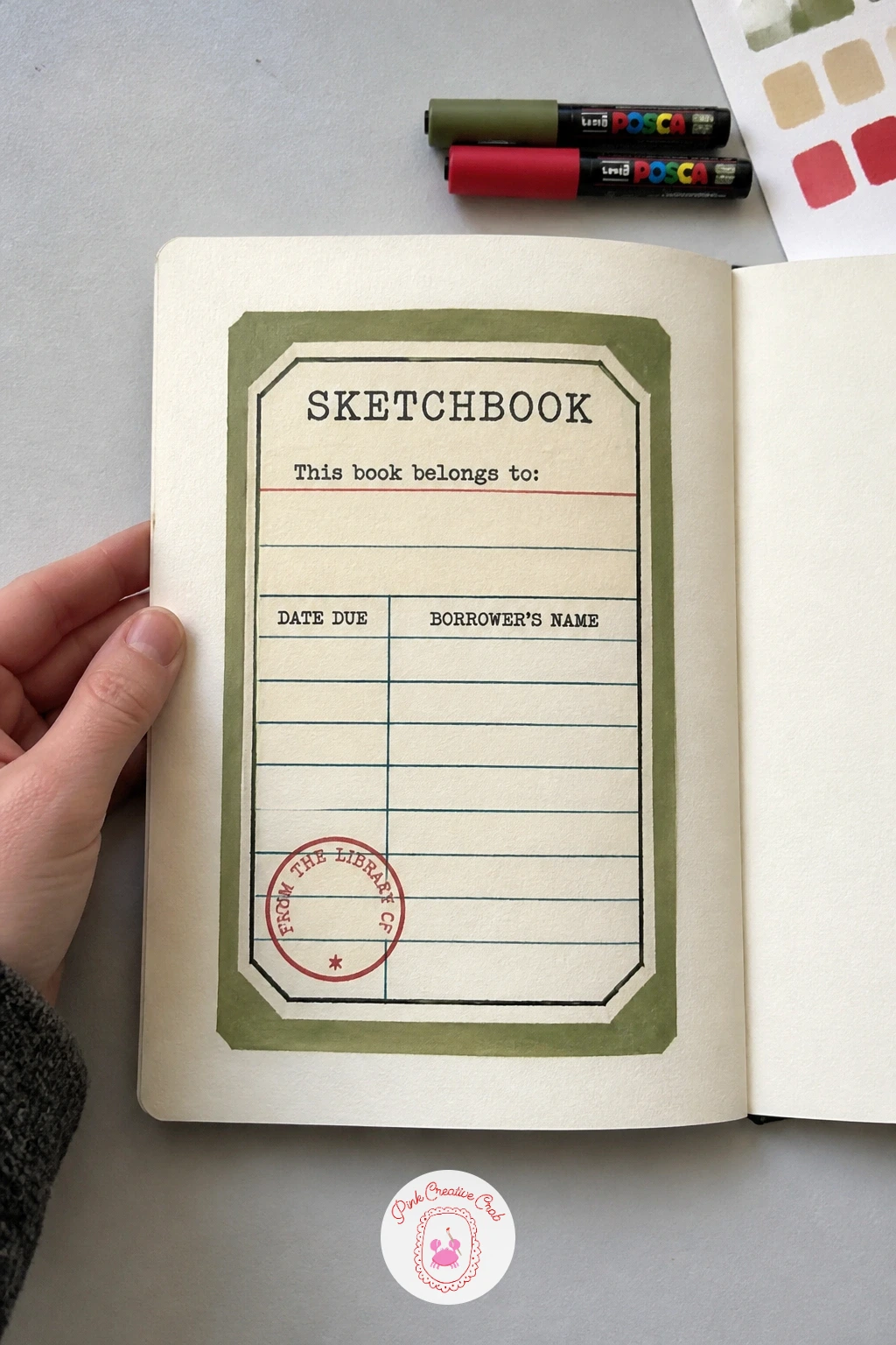
Palette: Aged Cream,Soft Grey,Charcoal Black,Brick Red
A painted sunset covers the whole front in soft bands of color, which makes it one of the most forgiving designs since there is no precise drawing to get wrong, only blending. Work from the top down, laying the palest color near the top and the deepest orange or pink near the horizon line, blending where the bands meet while the marker or paint is still workable.
Add a simple silhouette along the bottom edge, a row of hills, a line of trees or a few birds, painted flat black once the sky colors are fully dry. Sunsets usually look muddy when too many colors get blended at once, so limit yourself to three bands and let each one dry a little before starting the next.
No gradient blending markers, Posca works fine layered wet into wet for a few seconds before it sets. If you enjoy a sky like this, these mountain painting techniques share more on layering distant and near shapes against colored skies.
Keep the horizon line perfectly straight with a ruled pencil guide, it is the one line on this cover that really needs to be exact.
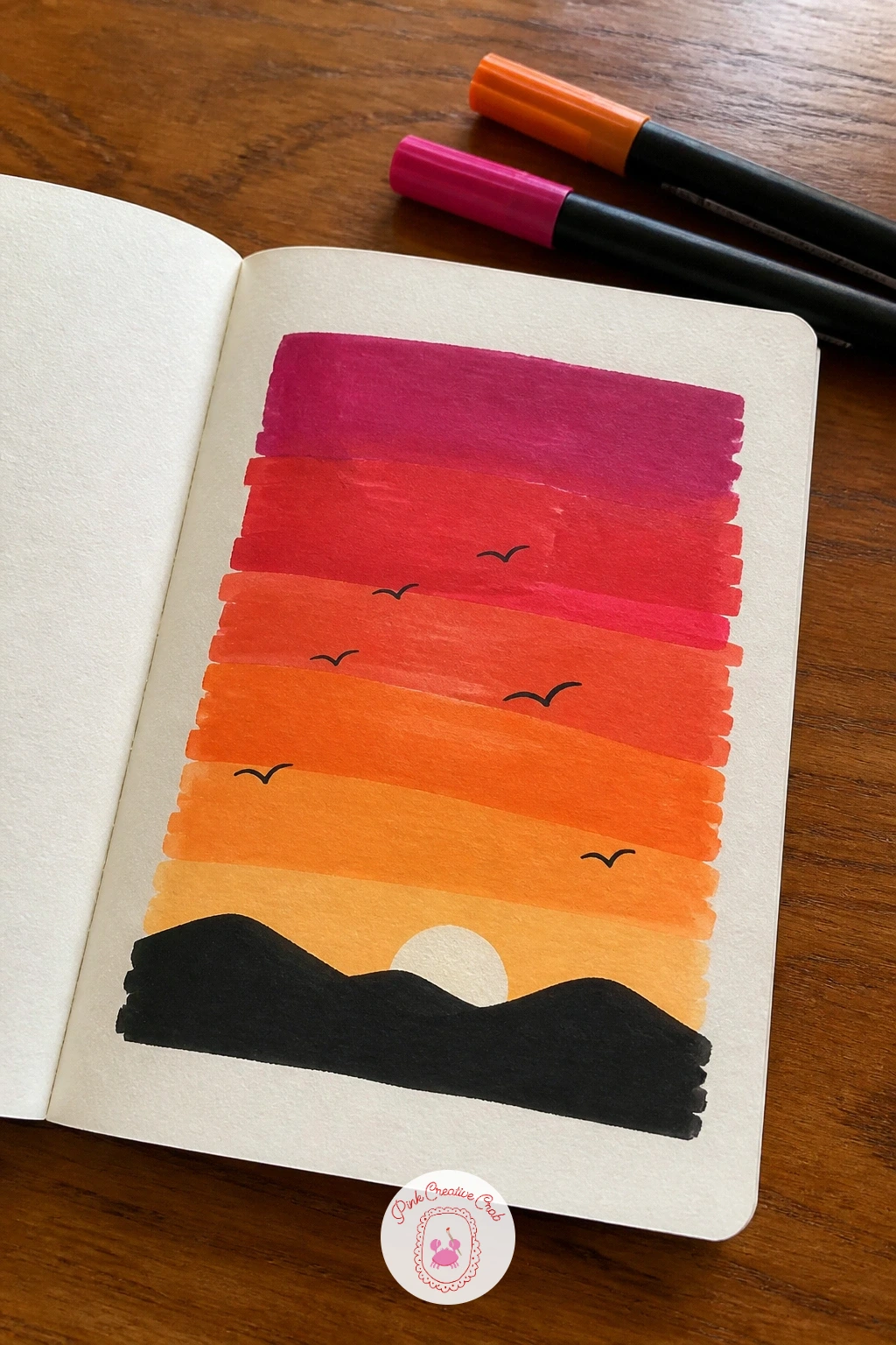
You Will Need
- ruler for horizon line
Palette: Warm Orange,Coral Pink,Deep Plum,Charcoal Black
A doodle crowd fills the cover with dozens of tiny faces, each one different, packed together like a page from a very friendly phone book. Start by pencilling small circles across the whole cover in loose rows, varying the sizes slightly, then give each circle one simple expression, a smile, closed eyes, a wink, before moving to the next.
Paint the faces in a mix of skin tones and a couple of fun colors like a purple or green face thrown in for variety, then finish every circle with two dot eyes and a simple mouth in black marker last. The crowd reads as chaotic rather than charming if every face is the same size, so mix in a few noticeably smaller or larger heads among the rows.
No wide marker range, even a cover of faces in just black outline on white still feels lively because of the variety of expressions. For a quick version, fill one corner with ten faces; given more time, pack the whole cover for a proper crowd scene.
Give two or three faces an accessory, like glasses or a tiny hat, it adds character without adding much drawing time.
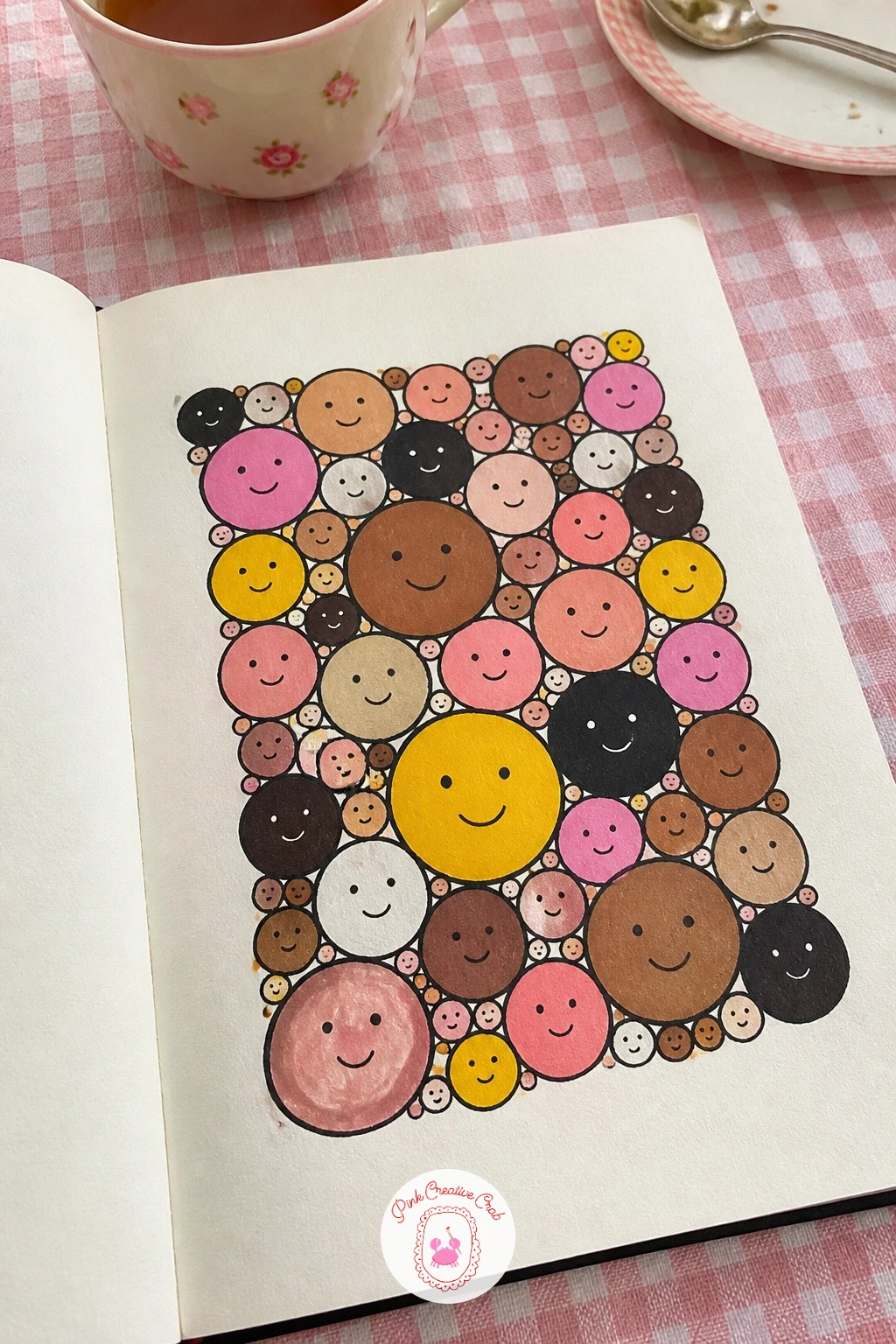
Palette: Warm Beige,Soft Brown,Lavender,Charcoal Black
A koi pond cover sits two or three fish in a loose circular pond shape, which gives you a natural frame without drawing a hard border. Pencil the pond as a soft oval across the lower half of the cover, then sketch the koi inside it with simple curved bodies, one swimming toward the top and one dipping toward the bottom for movement.
Paint the water first in pale blue green with a few darker ripple lines, let it dry, then paint the koi on top in white, orange and black patches. Koi tend to look stiff if the body curve is too straight, so bend the spine of each fish into a gentle S shape before you add the fins.
No teal or green marker, a plain blue pond still works and keeps the orange koi bold against it. Try varying the next pond by floating a lily pad or two across the surface, or adding ripples radiating out from where a fish just broke the surface.
Paint the darkest ripple lines in short curved strokes rather than full circles, it keeps the water looking light and moving instead of static.
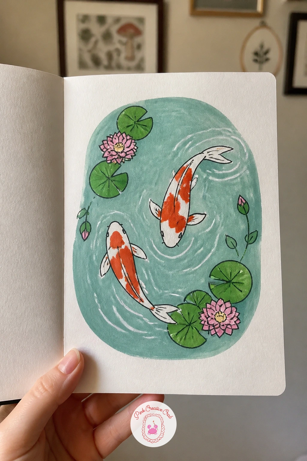
Palette: Pale Teal,Deep Teal,Bright Orange,Charcoal Black
A teacup with steam makes a cozy, simple centerpiece, just one cup and saucer sitting mid-cover with a few curling lines rising above it. Pencil the cup shape first using an oval for the rim and a slightly narrower oval for the base, add the saucer beneath it, then sketch two or three soft curling lines above the rim for steam.
Paint the cup in a flat pastel color with a contrasting pattern like small dots or stripes, then add the steam last in thin white or pale grey curls so it reads as light and rising. The cup often ends up looking tilted if the rim ovals are not aligned, so check that both ovals share the same center line before you paint them in.
No pastel marker on hand, white on kraft with a black outline still makes a clean, graphic teacup. If this is your first time drawing an ellipse like this, draw it lightly several times until the oval looks even, then commit to the final line in pen.
Add a small spoon resting against the saucer, it is a tiny detail that makes the whole scene feel more lived in.
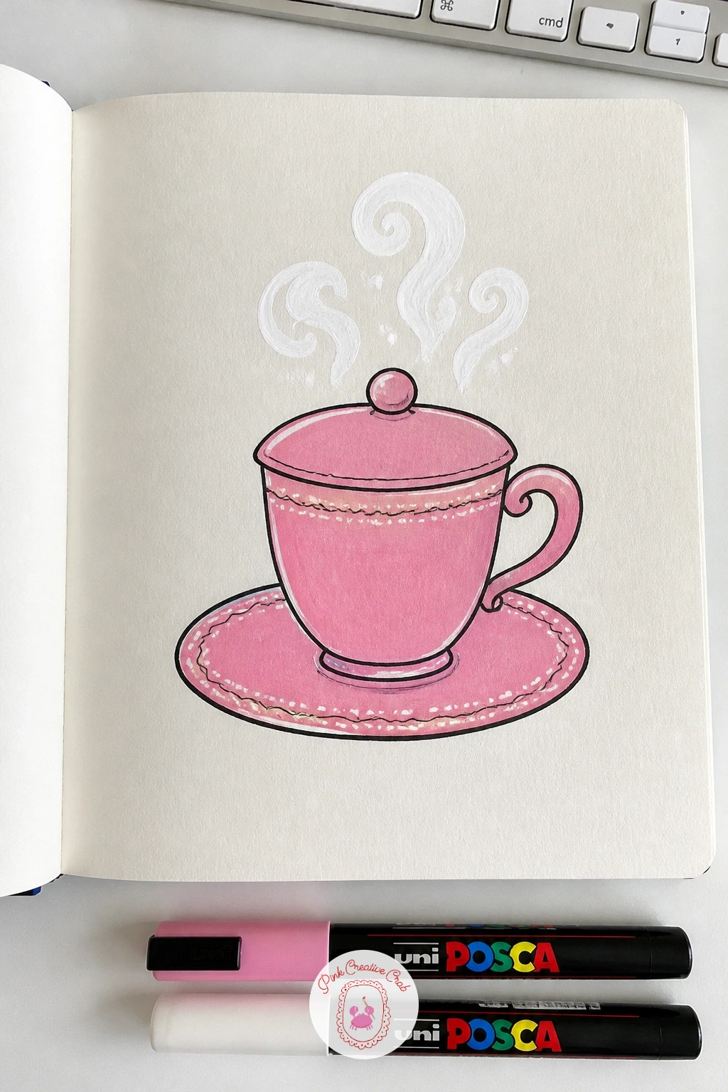
Palette: Dusty Pink,Soft White,Charcoal Black,Pale Grey
A bookshelf cover turns the whole front into a row of colorful spines, which is an easy way to fill the space with pattern using nothing but straight lines and rectangles. Pencil a horizontal shelf line partway up the cover, then divide the space above it into narrow vertical rectangles of varying widths for each book spine.
Paint every spine a different flat color, then go back in with a fine marker to add tiny titles, stripes or dots on a few of the books for variety. The shelf looks too uniform if every spine matches in height, so let two or three books sit taller or shorter than the rest, leaning slightly against their neighbors.
No ruler for the vertical lines, folding the cover into sections first gives you straight creases to paint along instead. Once the flat shelf works, try adding one book pulled slightly forward or a small plant pot sitting at the end of the row.
Keep the color palette to four or five shades repeated across the spines, it stops the shelf from feeling scattered.
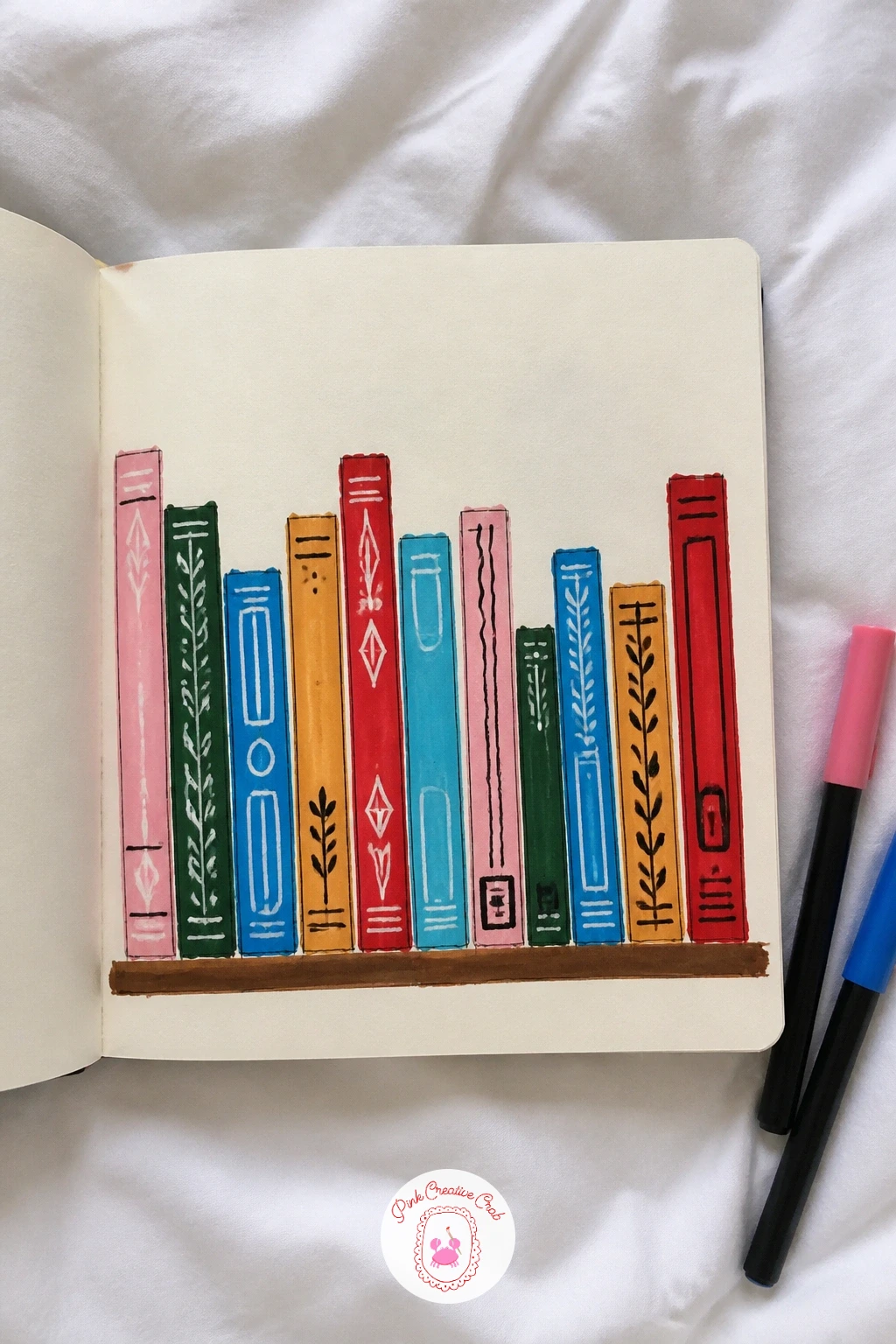
You Will Need
- ruler for spine lines
Palette: Terracotta,Mustard Yellow,Dusty Blue,Sage Green
Butterflies flying off the cover use one solid butterfly near the bottom edge and a trail of smaller ones drifting up and off the top corner, which gives the whole design a sense of movement. Pencil the largest butterfly low on the cover with symmetrical wings, then scatter two or three smaller butterflies in a diagonal line heading toward the opposite corner.
Paint the biggest butterfly first in bold flat color with a simple wing pattern, then paint the smaller ones progressively lighter or more faded as they move toward the edge, as if they are disappearing into the distance. Wings often end up uneven if drawn freehand on both sides, so fold a scrap of paper to trace one wing shape and flip it for the matching side.
No second color for the pattern, a single bold color with black vein lines on the wings still reads clearly as a butterfly. For a bolder cover, add a few flowers near the bottom where the butterflies seem to be lifting off from.
Use a fine black marker for the body and antennae last, that thin dark line is what makes the wing shapes read as an insect rather than a loose blob.
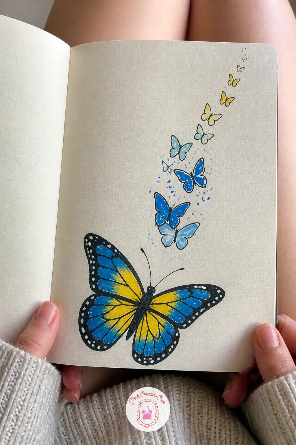
You Will Need
- scrap paper for wing symmetry template
Palette: Cobalt Blue,Golden Yellow,Charcoal Black,Soft White
A city skyline sits low across the cover as a row of simple building silhouettes, which makes it an easy composition even though it looks impressively put together. Pencil a horizon line about a third up from the bottom, then draw a row of rectangle and triangle buildings of varying heights sitting on that line, some with a simple spire or water tower on top.
Paint the sky behind the buildings first in a flat color, let it dry fully, then paint every building solid black or dark navy so the skyline reads as a clean silhouette against it. The buildings look flimsy if they are all the same height, so vary the widths and heights noticeably, with one or two tall shapes anchoring the row.
No navy or black marker big enough to cover the shapes solidly, outline the buildings in pen and fill with pencil crosshatching instead for a sketchier look. For more on arranging buildings and depth, these watercolor city ideas cover plenty of skyline layouts worth adapting here.
Add a handful of tiny lit windows in yellow dots scattered across the dark buildings, it instantly suggests evening without any extra painting.
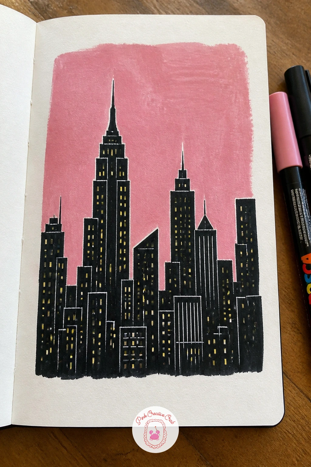
Palette: Dusty Pink,Charcoal Black,Golden Yellow,Deep Navy
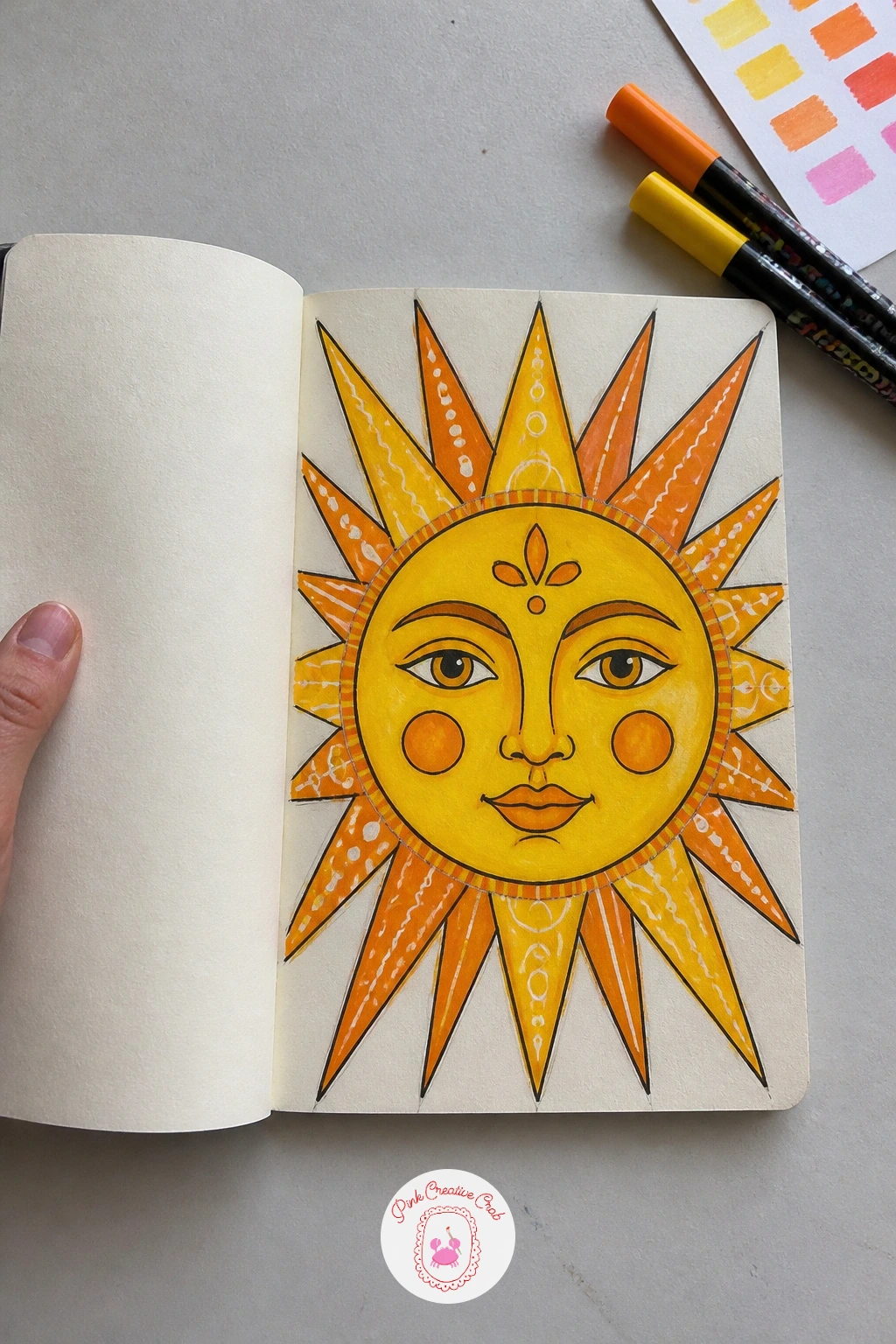
A bold sun face plants one big friendly face in the center of the cover, radiating triangular rays all the way to the edges, so the whole design grows outward from a single point. Pencil a circle in the middle of the cover first, add a simple face inside it, then draw triangle rays extending from the circle’s edge outward in all directions until they reach the cover border.
Paint the rays first in alternating colors, let them dry, then paint the face circle on top in a contrasting solid color so it sits forward from the rays behind it. The rays end up uneven if drawn freehand all the way around, so mark light pencil guide lines radiating from the center like clock hands before drawing the triangle shapes between them.
No compass for the center circle, trace a cup or small bowl instead. Once the front-facing sun works well, try a variation next time with the face turned slightly to one side, eyes glancing toward one corner for a more playful expression.
Keep the face simple, two dot eyes, a curved line mouth, so it stays bold and readable from across the room rather than fussy.
You Will Need
- round object for tracing the circle
Palette: Golden Yellow,Burnt Orange,Cherry Red,Charcoal Black
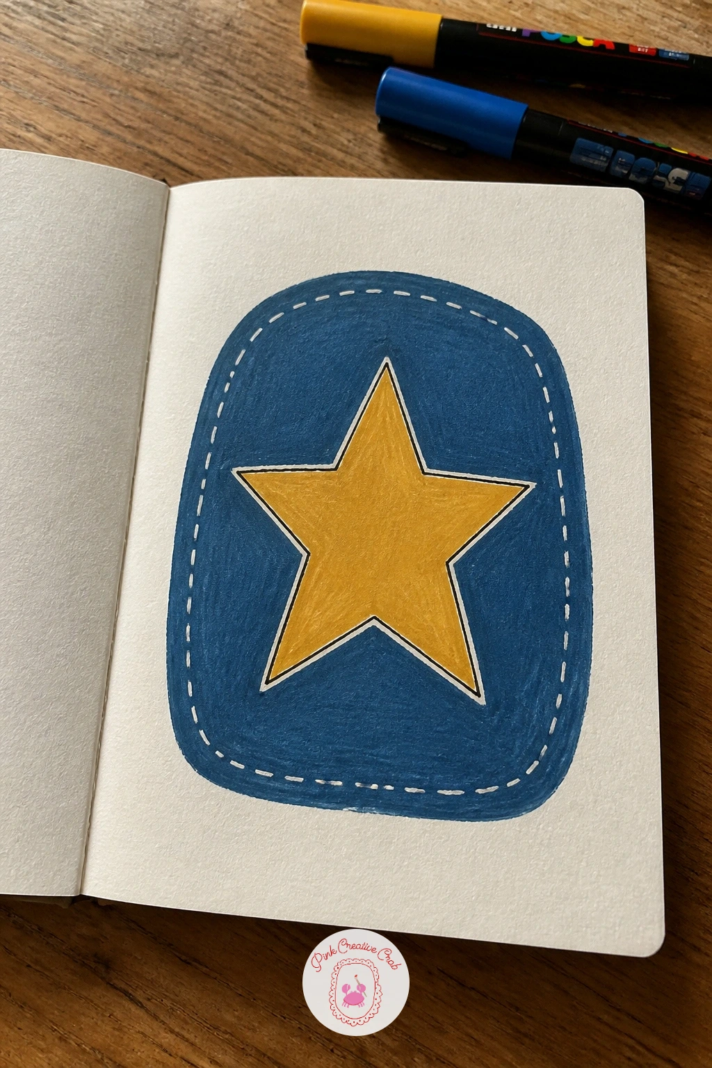
A sewn fabric patch cover mimics an embroidered badge, with a rounded shape, a simple icon inside and a dashed border line that reads like machine stitching. Pencil a rounded rectangle or circle patch shape first, draw a simple icon inside it, a flower, an anchor or a star works well, then trace a second line just inside the patch edge for the stitch border.
Paint the patch background in one flat color, paint the icon in a contrasting shade, then go around the inner border line with short evenly spaced dashes in white or black to suggest stitching. The stitched line looks sloppy if the dashes vary wildly in length, so count out loud as you mark each dash to keep the rhythm even.
No white marker for the dashes, scratch tiny dash marks into wet dark paint with the tip of a toothpick instead. For a bolder cover, add a second smaller patch overlapping the first corner, like two badges pinned together.
Round every corner of the patch shape rather than drawing sharp angles, it is what makes the shape read as fabric instead of paper.
You Will Need
- toothpick for scratching stitch marks
Palette: Denim Blue,Mustard Yellow,Soft White,Charcoal Black
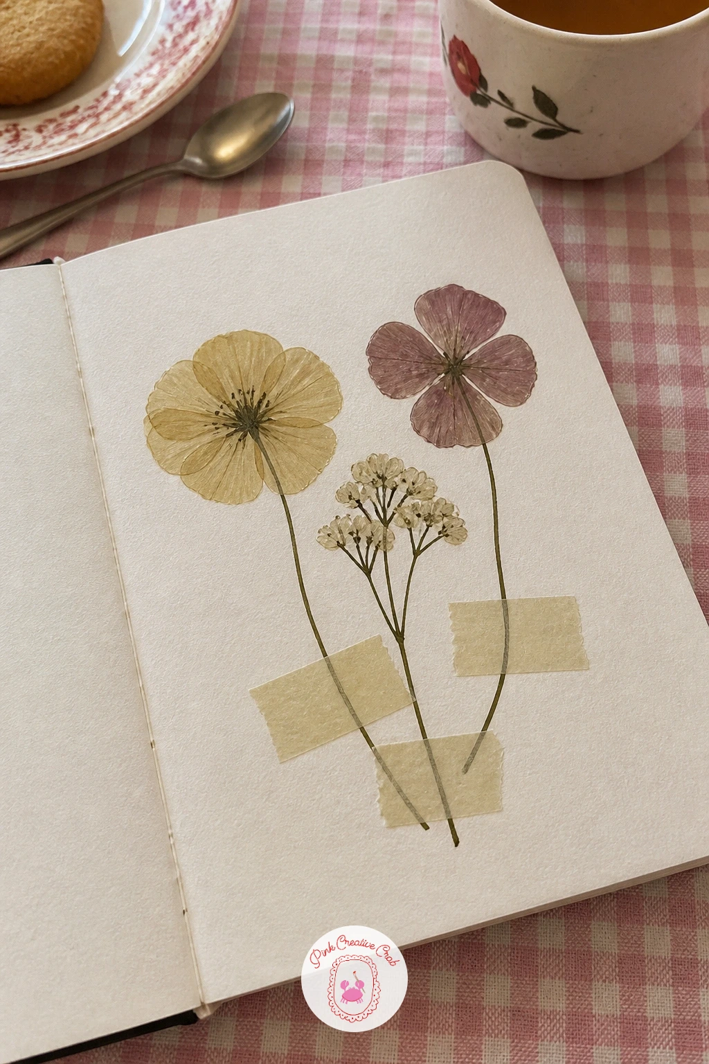
Pressed flowers under tape gives the illusion of real dried blooms stuck under strips of washi tape, painted entirely flat so nothing actually needs pressing or gluing. Pencil three or four flattened flower shapes scattered across the cover, flowers viewed from directly above with thin stems, then draw a few overlapping translucent tape strips crossing over the ends of the stems.
Paint the flowers first in muted, slightly faded colors to suggest dried petals, then paint the tape strips last in a very pale semi-transparent color so the stems show faintly through them. The tape reads as solid paper rather than see-through plastic if it is painted too opaque, so keep that layer thin and let a hint of the stem line show through underneath.
No pale washi-style color mixed, a thin white strip with a faint outline still suggests tape convincingly enough. If you enjoy pressed botanical layouts, the flower sketchbook ideas page has more flat flower shapes worth borrowing for this one.
Fade the flower colors slightly more toward the petal edges than the centers, that small shift alone makes them read as dried rather than fresh.
Palette: Faded Lavender,Dusty Rose,Sage Green,Pale White
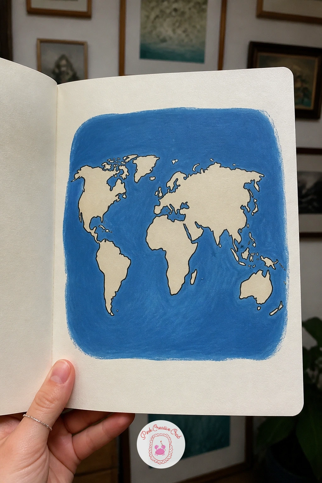
A world map cover simplifies the continents into soft rounded shapes rather than exact geography, which keeps the whole thing approachable instead of intimidating. Pencil the major landmasses loosely across the cover using a simplified world map reference as a guide, rounding off coastlines rather than copying every inlet.
Paint the ocean background first in a flat blue, let it dry, then paint the continents on top in a contrasting cream or green so they sit clearly forward from the water. Map shapes look wrong fastest when the continents are sized incorrectly relative to each other, so glance at a real map or globe once before you start and note which landmasses are largest.
No atlas on hand, any simple world map image on a phone screen works as a quick reference to trace the rough shapes from. For a quick ten minute version, paint just two or three continents loosely placed; given forty minutes, add dotted travel lines and small star markers over a few favorite places.
Mark one star on a place that matters to you, it turns a generic map into something personal without much extra work.
You Will Need
- world map reference image
Palette: Ocean Blue,Cream,Sage Green,Charcoal Black
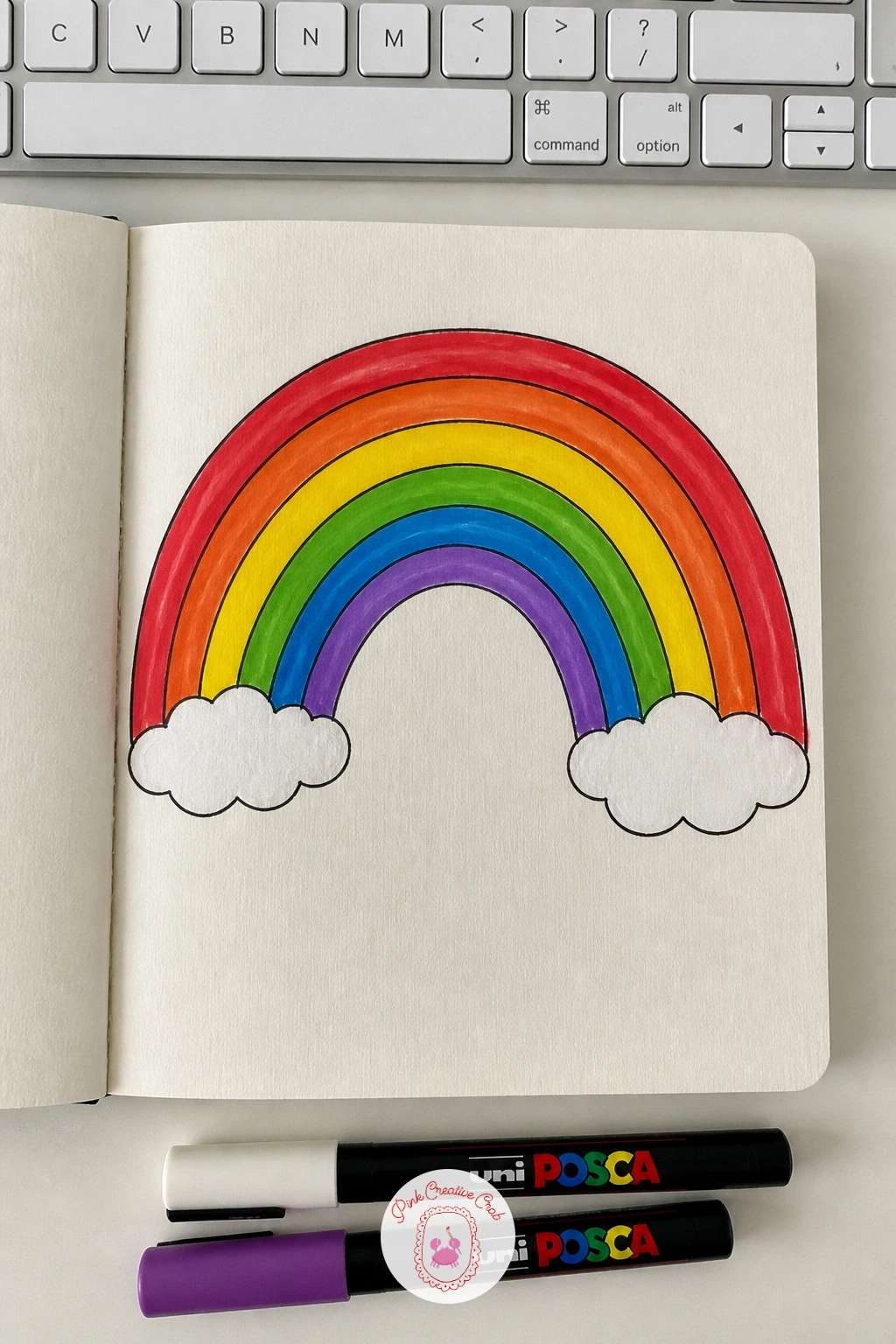
A rainbow arch sweeps across the upper half of the cover in even bands of color, with a bit of soft cloud or ground detail tucked at each end to anchor it. Pencil a large arch shape first using a plate or bowl to guide the curve, then divide the arch into five or six even bands from the outer edge inward.
Paint each band in order from the outside in, keeping a thin gap of bare cover between each color so the stripes stay crisp rather than bleeding together. The arch looks lopsided fastest when one end sits higher than the other, so check both ends line up with a level horizon before you commit to paint.
No plate big enough for the curve, bend a piece of string into an arch shape and trace along it instead. Once a plain arch works well, try tucking a small house or hill under one end of the rainbow for a scene rather than a pattern.
Add a few small white clouds at the base of each end, they soften the spot where the rainbow would otherwise just stop abruptly.
You Will Need
- large plate or bowl for the arch curve
Palette: Cherry Red,Golden Yellow,Sage Green,Cobalt Blue
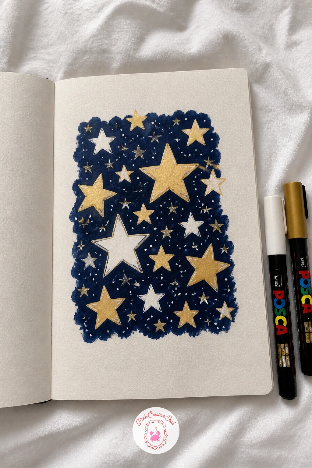
A pattern of stars fills the whole cover edge to edge, which makes this one of the simplest designs to complete quickly since every shape repeats. Pencil a loose grid of dots across the cover as placement guides, then draw a five point star at each dot, varying the sizes slightly so the pattern does not feel too mechanical.
Paint the stars in two or three alternating colors across the cover, filling every other star solid while leaving some as outlines only for contrast. The pattern reads as cluttered if every star is painted the same size and color, so vary both consistently as you move across the rows.
No second color on hand, a single gold star pattern on a navy cover still looks rich on its own. For a quick version, scatter stars loosely rather than following a grid at all, which also saves the step of plotting dots first.
Add a handful of tiny plus-sign sparkles between the stars, they fill gaps in the pattern without competing with the main star shapes.
Palette: Deep Navy,Golden Yellow,Soft White,Dusty Pink
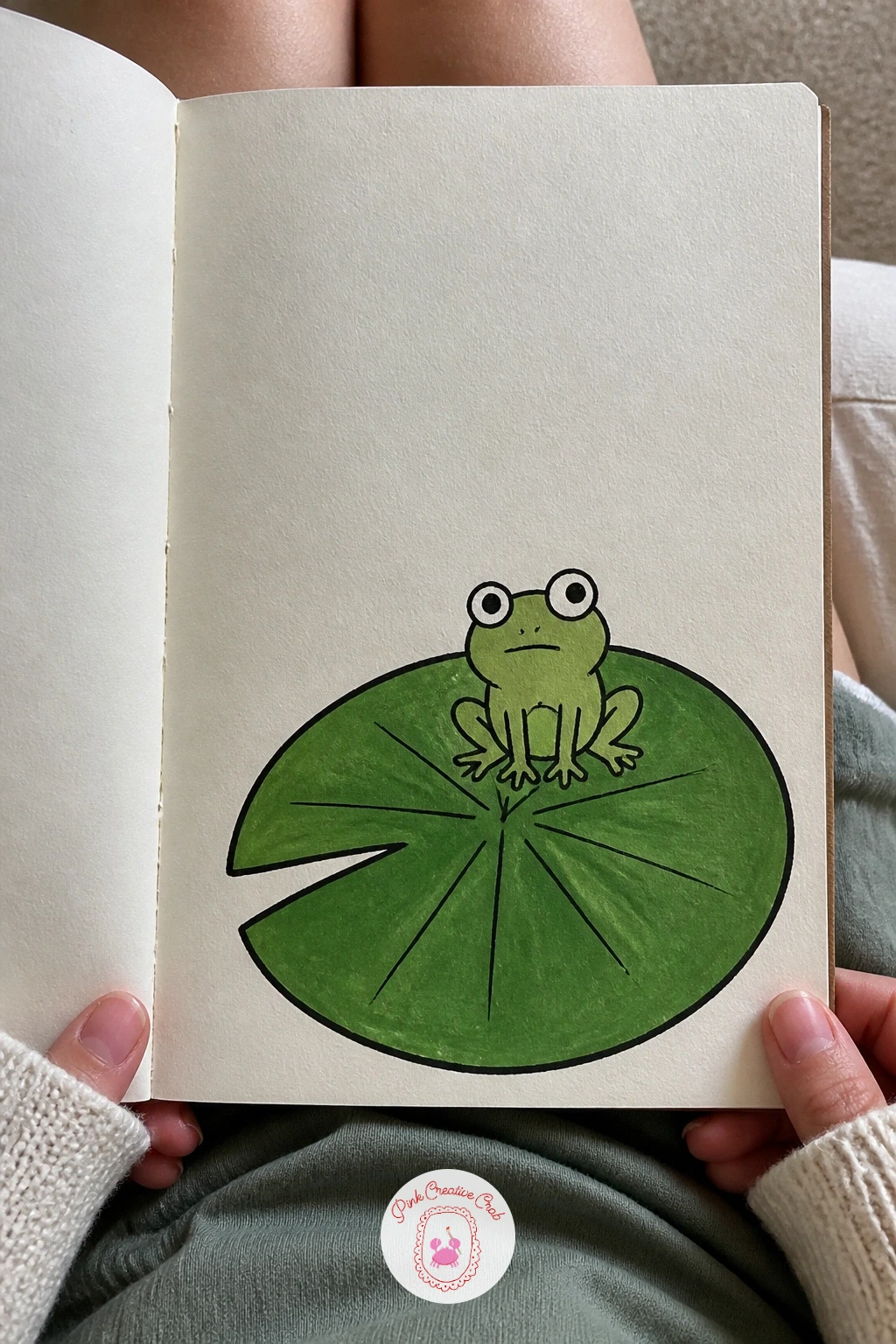
A frog on a lily pad sits as a single charming scene near the bottom corner of the cover, leaving the rest of the space open and calm. Pencil a large rounded lily pad shape first with a wedge cut out of one edge, then draw the frog sitting on top with round eyes bulging above its head and folded legs tucked beneath its body.
Paint the lily pad in flat green first, add a few darker green vein lines radiating from the center, then paint the frog in a slightly different green so it stands apart from the pad beneath it. Frogs tend to look stiff if the legs are drawn too straight, so bend the back legs into a folded zigzag shape like they are mid-crouch.
No two greens available, paint the pad in green and the frog in a soft yellow or brown instead for contrast. Looking for more pond creatures to practice, these cute animal drawing ideas cover plenty of simple animal shapes at this same friendly level.
Paint two tiny white dots on the frog’s eyes last, that single highlight makes the whole face feel alert and alive.
Palette: Leaf Green,Moss Green,Cream,Charcoal Black
A hand-lettered quote turns the cover into a message you will see every time you reach for the book, built from a short line of text rather than a picture. Pencil light guideline rows across the middle of the cover first, then sketch the letters in a simple rounded print, keeping the word spacing even before any paint goes on.
Paint the main words in one bold color, then go back with a fine marker to add a thin shadow line along one edge of each letter for a bit of dimension. Lettering drifts crooked fastest when the guideline rows are skipped, so always rule those faint pencil lines first even if the rest of the design is loose.
No fine enough marker for small text, keep the quote to just two or three words at a larger size instead, which also solves most spacing problems. Once straight lettering feels comfortable, try a slight upward slant across the line next time for a friendlier, more casual feel.
Choose a short phrase of five words or fewer, anything longer gets cramped fast on a cover this size.
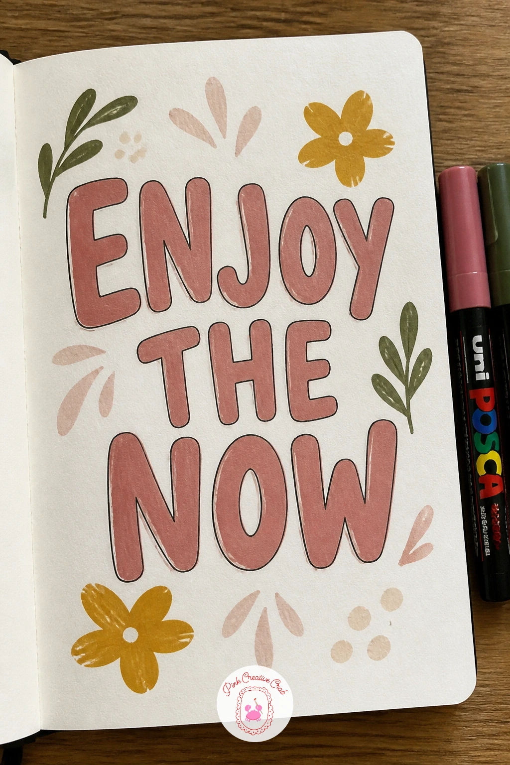
Palette: Charcoal Black,Dusty Rose,Cream,Mustard Yellow
A tiny house and garden packs a whole cozy scene into one corner of the cover, a small cottage with a pitched roof surrounded by a few garden rows and a path leading up to the door. Pencil the house shape first, a simple square with a triangle roof, then sketch a winding path and a handful of small shrubs or flower rows around its base.
Paint the house walls and roof in flat contrasting colors first, add a tiny door and windows, then paint the garden last so the greenery sits in front of and slightly overlapping the house base. The scene feels empty without a sense of depth, so paint the shrubs nearest the front of the cover slightly larger than the ones tucked behind the house.
No second roof color, a plain cream house with a brown roof still reads clearly as a cottage. For more cozy house and garden scenes to pull ideas from, the winter sketchbook ideas page has several small cottage layouts worth studying.
Add a thin curl of smoke from the chimney, it is a tiny detail that makes the house feel lived in rather than empty.
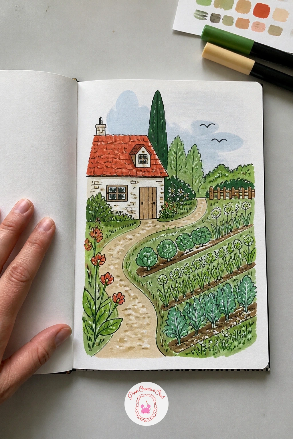
Palette: Terracotta,Cream,Sage Green,Dusty Rose
Paint swatches turn the cover into a sample card straight from a hardware store, with a grid of small color blocks stacked in rows, each labeled with a tiny made-up name. Pencil a grid of rectangles across the cover, six or eight blocks per row and several rows stacked down the page, then leave a thin strip below each block for a little label.
Paint every block a different flat color working row by row so wet edges do not smear into the next block, then once everything dries, write a short invented color name under each swatch in fine marker. The grid looks stiff if every block sits the exact same size, so let the rows shift slightly in width as they stack, like a real hardware swatch card that has been trimmed by hand.
No ruler for perfectly even blocks, free-handing slightly uneven rectangles actually makes this one look more charming rather than less. Once the grid version works, try cutting a few blocks into smaller sample chips scattered loosely instead of a strict grid.
Pick a loose color theme, like every shade you would want in a garden, so the swatches feel intentional rather than random.
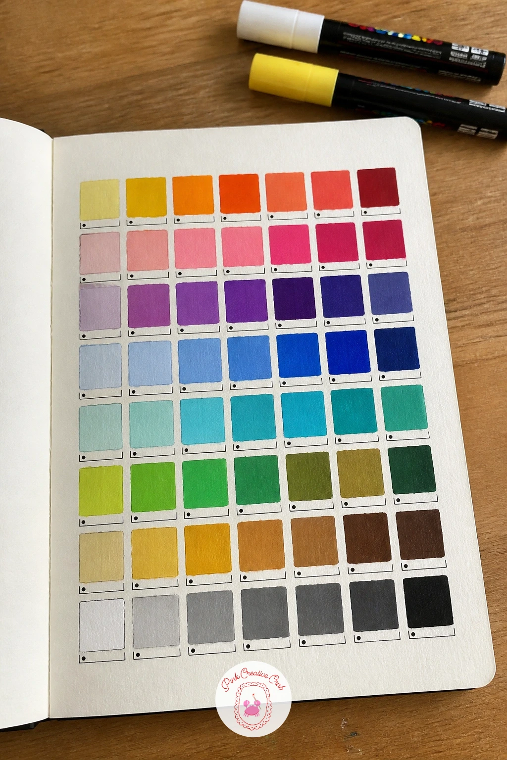
Palette: Terracotta,Sage Green,Dusty Blue,Mustard Yellow
A girl drawing puts a simple seated figure in profile near one side of the cover, sketchbook open on her lap and pencil raised, which makes a lovely cover for a book you are using for exactly that. Pencil the figure’s basic proportions first using simple ovals for the head, torso and knees, keeping the pose simple and seated rather than attempting a full standing figure.
Paint the clothing and hair in flat blocks of color first, then add the small sketchbook and pencil in her hands last so they sit clearly on top of the figure. Figures drawn at this scale often end up with a head too large for the body, so compare the head size against the torso length before painting, the head should fit roughly three to four times into the total seated height.
No confidence yet with full figures, simplify further to just her head, shoulders and the sketchbook held up in front, cropping out the rest. If you enjoy drawing figures at work like this, the funny junk journal pages page has more relaxed, simplified figures worth studying for pose ideas.
Keep the face simple, just a hint of a nose and a small smile, so the figure stays charming rather than needing perfect likeness.
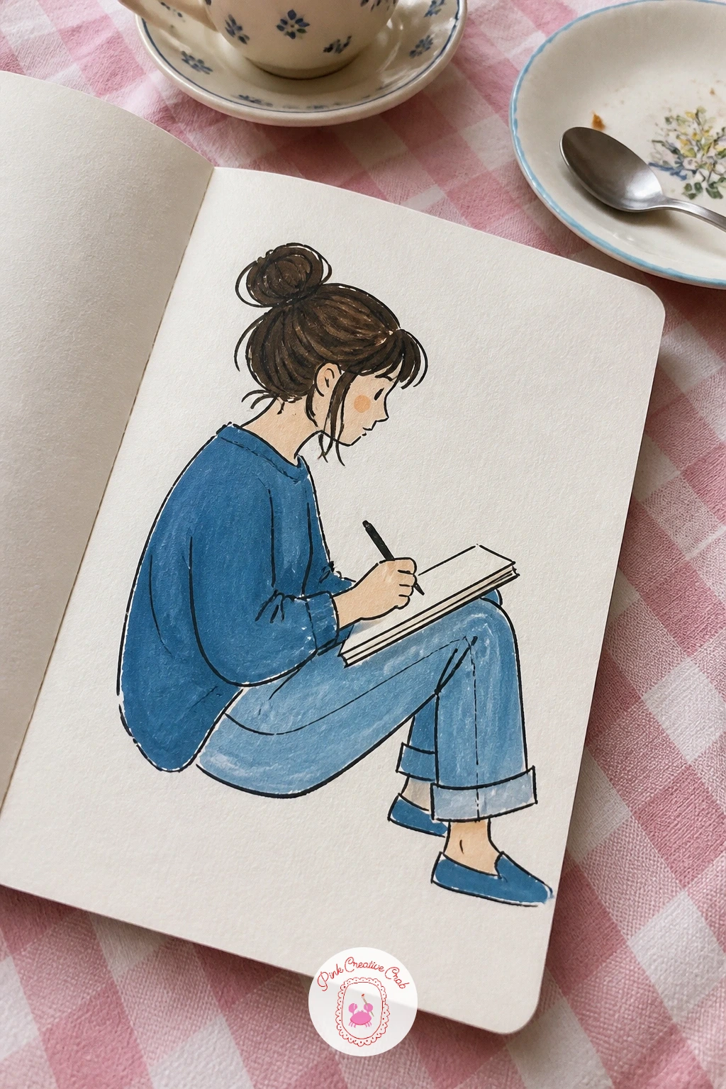
Palette: Warm Beige,Dusty Blue,Soft Brown,Cream
Lemons bring a bright, simple cluster of fruit to one side of the cover, easy to paint quickly since each lemon is just an oval with two pointed ends. Pencil three or four overlapping lemon shapes together, add a couple of green leaves tucked behind them, then sketch in a slice of lemon beside the cluster showing the pale segmented inside.
Paint the whole lemons in flat bright yellow first, add the leaves in green, then paint the lemon slice last leaving the segment lines as thin unpainted strokes so they stand out against the pale yellow flesh. Lemons look flat without any shading, so add a slightly darker yellow strip along the bottom curve of each fruit before the first layer fully dries, to suggest roundness.
No two yellows mixed, a single flat yellow with a thin black outline still reads clearly as lemons against kraft. For a bolder cover, scatter a few small white blossom flowers among the leaves, as if the lemons are still growing on the branch.
Dot a few tiny texture marks across the lemon skins in a slightly deeper yellow, it is a quick way to suggest that bumpy citrus peel.
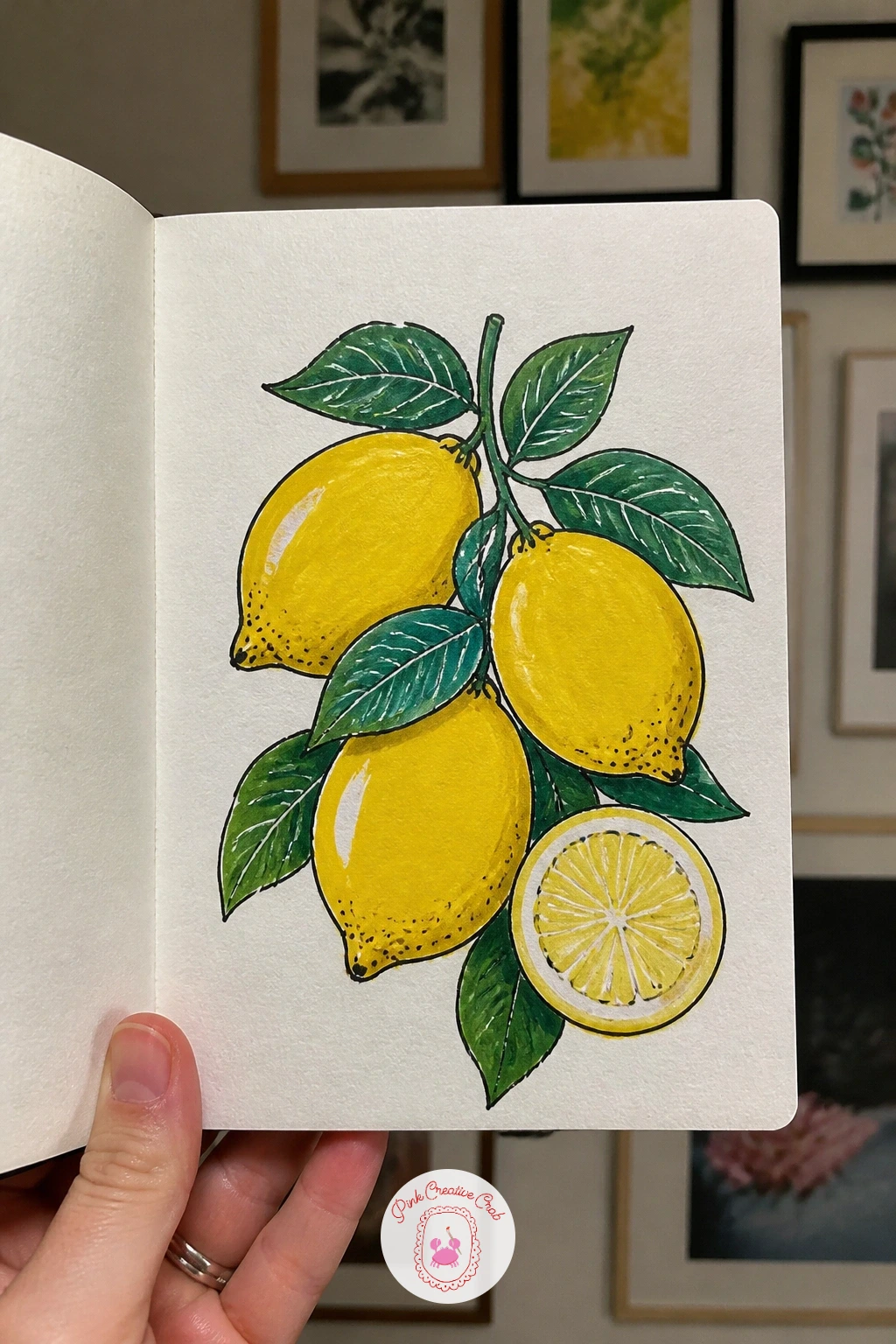
Palette: Lemon Yellow,Golden Yellow,Leaf Green,Soft White
A celestial eye makes a striking centerpiece, one large stylized eye shape with stars, a crescent moon and small dots filling the space around the iris like a night sky. Pencil a wide almond eye shape across the middle of the cover first, add a circular iris in the center, then sketch a crescent moon and a scatter of small stars around the outer points of the eye.
Paint the iris in a rich jewel tone first, add a dark pupil and a small white highlight dot, then paint the surrounding lash lines and the moon and stars last in gold or white against the kraft background. The eye looks off balance fastest if the two outer points are not level, so check both corners sit on the same horizontal line before adding any lashes.
No jewel tone marker on hand, a deep navy iris with gold detailing still looks suitably celestial. Once the front-facing eye works, try tilting the whole eye shape at a slight angle next time for a more dynamic, less symmetrical layout.
Ring the iris with a thin ring of a second color before the pupil, it gives the eye extra depth with barely any added time.
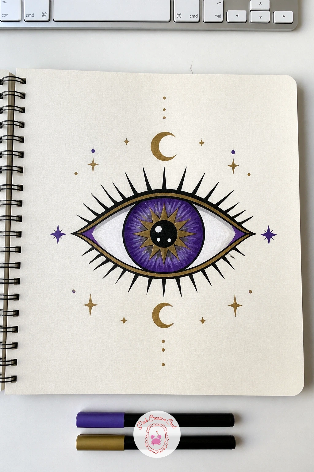
Palette: Deep Navy,Golden Yellow,Amethyst Purple,Soft White
A stitched-look border frames the whole cover with a painted line of dashes running just inside the edge, like the whole book has been hand sewn shut along its perimeter. Pencil a line about half an inch in from each edge of the cover, going all the way around, then mark even dash positions along that line with small tick marks before any paint touches it.
Paint the dashes one at a time in a single contrasting color, keeping the length and spacing consistent on each side, then once the border is finished, add a simple centered motif inside it like a small flower or initial so the border has something to frame. The dashes drift uneven fastest around the corners, so slow down and mark the four corner points first, then fill in the dashes between them on each side separately.
No steady hand for small even dashes, a wider marker making short dabs instead of thin dashes still reads as a stitched border. Once a single border line works well, try doubling it with two parallel stitched lines for a more finished, bookbound look.
Keep the centered motif simple and small, the border is the star of this cover, so anything inside it should stay understated.
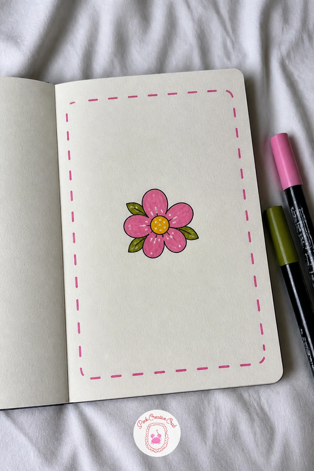
Palette: Charcoal Black,Cream,Dusty Rose,Sage Green
What to Do Next
Pick one cover that matches the mood of the sketchbook waiting on your desk, start with a kraft or white cover and a pencil for the light guidelines, then bring in the paint markers once the layout feels right. One finished cover is often all it takes to want to decorate every book after it.
Frequently Asked Questions
What markers work best for sketchbook cover ideas on a dark or kraft cover?
Opaque acrylic paint markers like Posca show up best on kraft because the pigment sits on top rather than soaking in. Fine tips suit lettering and detail, broad tips cover large flat shapes faster.
How do you keep a sketchbook cover design from smudging after it is finished?
Let every layer dry fully before adding the next color or outline on top. A light coat of matte spray sealant protects the finished cover from scuffs once all the paint has cured.
Should you sketch the design in pencil before painting the cover?
Yes, a light pencil sketch keeps proportions and spacing correct before any paint goes down. Pencil lines under most acrylic markers disappear completely once the color layer covers them.
What if the sketchbook cover is too glossy for paint markers to stick?
Lightly sand a glossy cover with fine sandpaper so the surface grips the pigment instead of beading it up. A thin base coat of gesso also gives paint markers a matte surface to hold onto.
How do you fix a mistake on a finished sketchbook cover design?
Paint over small errors with a matching background color once it dries, then redraw the detail on top. For bigger mistakes, a thin coat of white or cream acrylic resets a whole section before repainting.
Have any thoughts?
Share your reaction or leave a quick response — we’d love to hear what you think!
-
 0
-
0
-
0
-
0
-
0
-
0


